Transcripts
1. Welcome to the Class!: Hi everyone. I'm artist and teacher, Tracey Capone, and welcome to the latest installment in my Birds and Bird Houses in Affinity Designer series. In this class, we're going to focus on Designer's brush from selection feature and I'll show you how to create beautiful textured elements in the vector persona that we're going to turn into a scatter brush on the pixel side. I'll show you how with just one brush and a few setting adjustments, you can create an illustrated nest from two different perspectives, top-down and side view, which is a real time-saver. We'll add shading to our nest to give them depth, and then use the vector persona to create texture dimensional egg shapes to fill it up. I'll also show you how you can use Designer's transparency tool to easily bring sunshine into your illustration. When you take this class, you'll receive my gritty texture brush pack and woolen backgrounds assets pack, which we'll use to add additional visual interests to our illustrations. This class is a follow-up to my Birds and Bird Houses in Affinity Designer class. However, if you haven't taken that class yet, don't worry, you'll still be able to follow along. Now just to note, while the class is beginner-friendly, it's intended for users with at least some experience in Designer. If you're brand new to the app, I recommend beginning with my Textured Florals in Affinity Designer class, where I take you through the entire app and show you how to use the various tools to create beautiful textured floral and leaf shapes. I can't wait to see your beautiful nest creations. So grab your iPad and Apple Pencil, and let's get started.
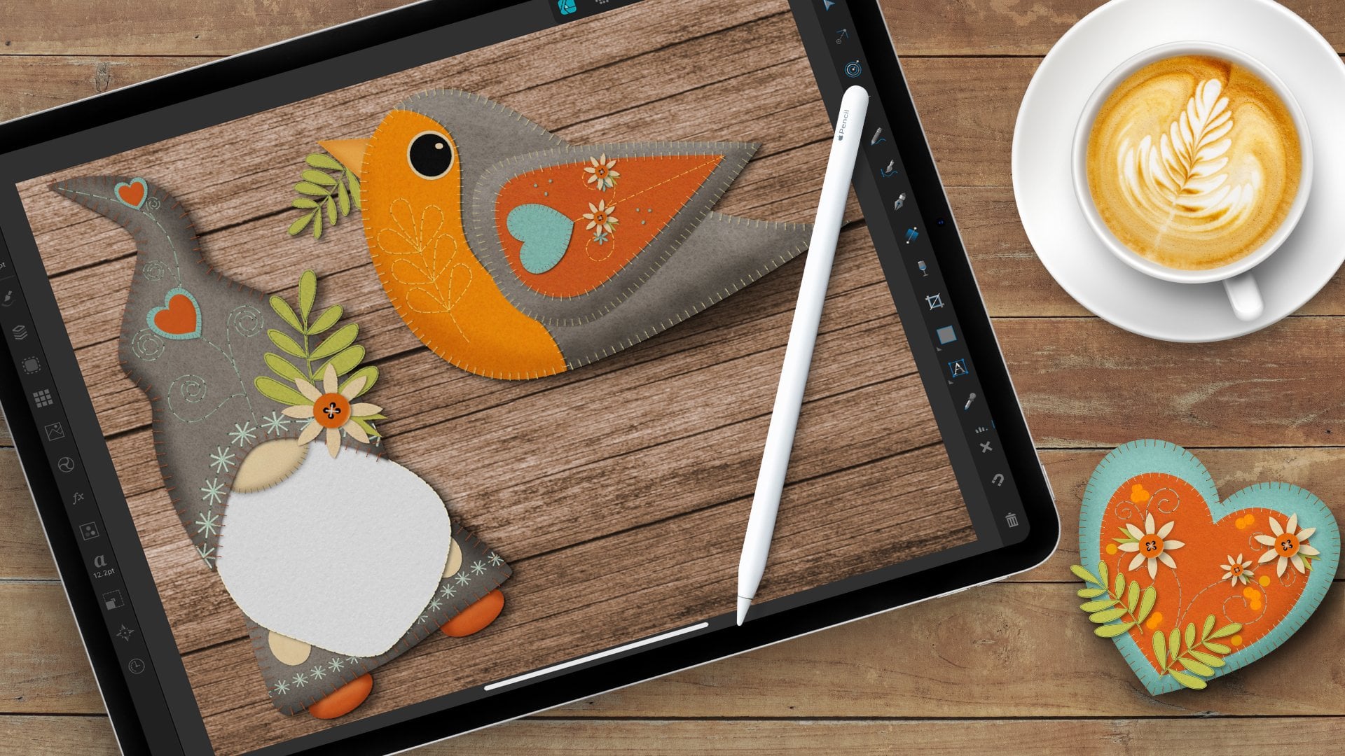
2. Downloads & Resources: The links to the downloads for this class can be found at the top of the projects and resources section. Now you're going to need to access this from a browser, not through the Skillshare app. If you've already taken the original birds and birdhouses in Designer class, you already have the assets for this one. If you haven't, just click the link at the top of the Projects and Resources page. It's going to take you to a screen where you're going to need a password, which I'm going to put up on the screen right now. Once you're in the download screen, you're going to find the links to the Downloads towards the middle of the page. These are automatic downloads. If you have the Dropbox app on your iPad, they're going to automatically go there. If not, then they'll go directly to the Downloads folder on your iPad. Either way, make sure that you put the two links or the two files in a place that you can easily access from designer because you're going to need to import both of them from inside the app. Let's take a look at how to import the brushes into designer next. The brushes for this class are pixel-based, so you're going to need to import them into the pixel persona. Now before we proceed, I want to mention that my screen in designer are set up for a left-handed person. So icons might be flipped opposite of one another if yours isn't. Go ahead to the pixel persona and next go to the brush studio. If you can't find an icon, you can always tap and hold on the question mark and these labels will come up. I'm going to go to the brush studio. Now, I already have this pack loaded on my iPad, but you're going to go to the burger menu at the top here. Choose Import Brushes. Locate the file that you saved again, either on your iPad or out in the Cloud. Select it and it should automatically import into your iPad. Now, it should automatically pop up. But if you don't see it after a couple of seconds, you can actually tap in the middle here and use the flywheel to find them, or you can use the arrows back and forth. Let's go ahead and load the assets pack next, you can access the Asset Studio from either the designer or pixel persona. It's this little icon that looks like nine individual squares. Go ahead and open it up. Now again, I already have this pack on my system. But you'll go up to the burger menu just like you did with the brushes. Tap on "Import Category", locate the file, select it and it should automatically import. It might take a second or two so just give it a moment and once it's in, you're all set to go and we'll use these a little later in the class. Okay. If you have any questions on how to import them or any issues, please feel free to reach out to me either in the discussion for this class or by emailing me. I'm happy to help. In the next video, we're going to take a closer look at the brush from selection feature and talk a little bit about planning out your scatter brush. I'll see you in the next video.
3. Using the Brush From Selection Feature: We're going to begin by creating the top-down version of the brush first. But before we do that, I want to talk about a few things that you're going to want to consider when using the brush from the selection feature in Designer. The first is that while we'll be creating the elements that make up the brush nozzle on the vector side, we are going to be adding texture image files and rasterizing the entire brush nozzle before we pull it to the pixel persona to create the brush. Since there are raster elements involved, you're going to want to plan accordingly with your original document. I have a document here that's 10 by 10 inches at 300 dpi, and that's plenty to avoid any sort of [inaudible] of textures or pixelation. Now you're going to want to make sure that you use high-quality, high-resolution textures so we'll be pulling our from the stock studio in this class so there's no issue there. But if you're pulling textures from anywhere else, just make sure that they were created at a high resolution. The next thing I want to mention is that whatever color you create your brush nozzle is the color of the final brush. In other words, you're not going to be able to use the color studio to adjust the hue settings before you use the brush. So you'll need to think ahead as to what you want your final output to look like. Here, in my case, I wanted my nest to have twigs of three different colors so I created a dark brown, a medium brown, and then a light gray-brown, put them all together as a brush nozzle and that's what created my final brush. There are some things that you can do on the back-end, like using color overlays or certain adjustments in the adjustment studio, but you are limited there, so just plan ahead and think as to what you want your final output to look like. Finally, if you took the bird in birdhouse class and created the scattered leaf brush, you might remember that we used the texture category in the brush studio to add texture to the overall brush. We're going to approach it a little differently in this class. We're actually going to add individual texture image files to each of the twigs that make up our brush nozzle. We're going to do that in the vector persona, therefore, you will have access to the stock studio and you don't need to download anything ahead of time. In the next video, we're going to go ahead and set up the brush nozzle, the individual element that's going to make up our scatter brush. I'll see you there.
4. Creating the Brush Nozzle: When I use the term brush nozzle, I mean the individual element that makes up the overall scatter brush. So in this video, we're going to create something similar to this, where we create twigs in the vector persona that we're going to texturize, put together and then rasterize so we can bring them to the pixel persona and create the final brush. Now that's where we're going to tell designer how we want this nozzle to behave as it's being duplicated across the canvas. So how we want it to rotate, how we want it to size up and down base on pressure, how far apart we want it to be space-based, things like that. Now I'm going to create a three different twigs of three different colors, a dark brown and medium brown and a light gray you can create yours in whatever color you'd like. The reason I'm doing this here, is as I mentioned in the last video, you need to think ahead as to how you want your final output to look. So since I want my nest to have some dimension and not be one flat color, I'm going to give it dimension here by creating three different sticks. Now we only have to create three shapes. We're actually going to just duplicate their shapes, resize and rotate them differently and make some subtle changes to them. Again to create something like this. So let's go ahead and turn this off and start creating our brush nozzle. So I'm here in a designer persona. We're going to start with the vectors to create our twigs, again, then we'll texturize them and move them over to the pixel persona. So I'll select the "Pencil tool" and I want to go to my stroke studio and I want to make sure that the pressure settings are flat. I'm going to go ahead and tap and I hit "Reset pressure", we are going to make adjustments to that but I like to start with a flat stroke just so I can see how it looks as I'm making the changes. Again, I only have the stroke set, no fill and I'm just going to go ahead and draw out my shape. Now obviously this is too flat, it doesn't look anything like a branch, so that's where we'll go back to the stroke studio and start making adjustments to the pressure. The first thing I'm going to do is pull down the ends. I pull this one down to about here and this one a little further so it's more pointed. I'm just going to start adding nodes and dragging up and down and you'll see the pressure settings change as I do that. Make sure you don't do anything too harsh like this or you're going to get some strange effects. So keep it nice and flowy. So I like the pressure settings on this, but the twig itself is too straight. I want it to be a little bit bend. Because when I create my final nest, I want twigs sticking out here and there. So I'm going to go to my node tool for this and use the nodes that make up the stroke to make those changes. So I'll go and select it, and I have a couple of nodes to work with here. I'm just going to go ahead and tap on this one and maybe drag it this way, and I'll tap this one, drag it up and out. Now I'm just making some subtle changes here. We're going to make some additional changes once we convert this from a stroke to a fill to add the texture. But for right now, I'm just going to use my nodes to bend things here and there. You can use your handles as well. This is one of the things that I love about working with vectors, is that there's so many different ways that you can make a change to an individual shape. Whether it's the nodes, the handles, the paths, or even a stroke studio. So I'm going to go ahead and leave this as is. I might just pull this down just a little bit, maybe this way. I'll go ahead and move this out of the way. Now, I'm going to create my other two colors, but I'm going to speed it up at this point because the process is exactly the same. I'm going to go ahead and lay out a flat stroke, adjust the stroke settings and then just make some minor changes. So I'll speed it up now and I'll see you on the other side. I have my three shapes here and I want to add some texture to them. But before I do that, I need to convert them from single line strokes to fill's because you can't add texture to strokes only fills. So I'll go into my layers studio, I'm going to select all three of these. Go to the Edit menu and choose "Expand Stroke". That's going to turn them from single line strokes into fills. Now I lose the ability to use anything like the stroke studio to make changes. However, I do have additional nodes to work with and I'm going to use those to make some additional cosmetic changes to the branches themselves before we add the texture. I want these to have a little bit more of a realistic twig of feel, and right now they're a little too smooth, so I'm going to go ahead and just add some bump outs here and there, and I might turn some of the nodes into sharp nodes and just pull them up just to give a little bit of a sharp feel there. So I'm just going to follow this around and see where I want to change it. So again, I'm just going to go and add a node in the middle. I'll just pull out a little bump out here and there. If you need to just zoom in, and I'm going to do this to all three of my twigs. I'm going to speed it up and I'll see you on the other side. So I have my three shapes that I have done a few additional edits to. I had a little bump outs here and there. I changed some of my nodes to sharp nodes and just made some sharper points. Again, just to give it a little bit more realism and not make them so smooth. Now at this point we went to add some texture to it and we're going to use the stock studio for that. I've already gone into the stock studio and pulled in the three pieces, the texture that I went to use just so you don't have to watch me hunt and peck to find the ones I want to use. What you're going to do is go to the stock studio, I just typed in bark because again, I want these to have a bark feel. Now, these are going to be relatively small, especially in the final brush. But what we're looking for is to add some contrast, right now these are too flat too plain. Even though you're not going to see the really fine detail of the texture, these types of files are actually going to help add some of that dark and light to give us the contrast that we need. So what I'm looking for is something that's shot straight on. If you're not really going to see big bits of texture, so when you have something with chunky pieces like that, but if you size it down, you'd be surprised as to how much contrast you can get with just the light and dark values in the image itself. So go ahead and find a three different types of texture that you want to use for each of these three, and we're going to go ahead and add them. So you'll just tap and hold, release and it's going to download it into your Canvas. So I'm going to delete this. I'm going to go ahead and add the three that I already downloaded here to my individual sticks. Let's see the first one I want to add, I'm going to go ahead and pull this up and clip it to the medium brown. Now you can already see it's adding some dark and light there. Now, even though it's not going to be very obvious, I do want to shift this so that the line of the texture is following the line of the branch. I'm trying to drag this up and I'll find a nice spot on the texture image file here. I'm just going to change this from me, going to the blend mode of this texture image file up here in the layer options, and I'm going to change it to soft light and maybe drop the opacity just a bit. I'm not looking for anything overwhelming as far as the texture. I just want a little bit of subtle texture just to break up that flat look. So I'm going to do the same thing with the other two, and again, I'll speed it up and I'll see you on the other side I've added my texture to my three pieces. Now the final one for the really dark brown, I didn't actually change the blend mode, I just dropped the opacity a little bit. It's really difficult to add texture, something really, really dark and really, really light. Sometimes it's just a matter of adjusting the opacity and not adjusting the blend mode. I'm happy with these three. I'm ready to start duplicating them and creating the brush nozzle for our scatter brush. I've turned on my original brush nozzle here because I want to talk a little bit about setting up the nozzle itself before we begin doing it with the pieces that we just created. If you look at the illustration of my final nest, there's a lot of pieces sticking out here and there. That's mainly because it's a scatter brush and it's rotating as it gets duplicated across the canvas. But it's also because when I created the nozzle itself, I have little pieces sticking out here and there. As I'm duplicating these little pieces that we just created, I'm going to rotate them in different directions to make sure that while some of them remain inside, some of them are actually rotated to move out in different directions. The other thing that you want to make sure is that you don't create anything that's too condensed, but also something that doesn't have too much space. If you have really large gaps, you're going to see them in the final brush. If you have something that's too condensed, it's going to get gummy wherever the brush nozzle is condensed. Just give it enough room to breathe, but not too much. Then finally, you want some variation between the individual sticks. Even though we're going to be duplicating them, we're going to size them up and down, we're going to rotate them in different directions. You want to avoid keeping any textures that look exactly like right next to each other because even though it's difficult to see in the final brush, if it's too much, you're going to see a patterning effect when you create it. Then I am actually going to show you how to use the contour tool to make changes in the width of some of your branches to vary them that way as well. Let's go ahead and get started creating our brush nozzle. I have my medium brown one here I selected. I've shut the other two off for right now just to keep them out of the way. I'm just going to start two-finger tap and dragging this to duplicated and rotating it as I go. I'll size it up, I'll size it down and again, just give it some variation. I'm just going to go ahead and I'm trying to be random about this just because if you overthink it, you're going to start finding that you have things placed in a pattern. I just keep going back to the original one, sizing up and down, moving it in different spots. Now right now I have these two little bump out in the same direction and I don't like that. I just go to my transform studio, I'm going to flip it and just bring it down to here. Again, I'm keeping it separate and not too condensed, but again, not too spread out. Now this one when I size it down, it got really thin. I'm going to show you a really quick and easy way to increase the width using the contour tool. Again, if you ever can't find an icon, just tap and hold on the "Question mark" and you'll get these labels. I'm going to go ahead and choose the contour tool and with the selected, if you see this, you can see that the path is right here. I can use the contour tool and drag out or drag in and change the width of my fill here. Right now when I drag out, it's adding to the contour and I'm reducing it here. It's a non-destructive edit so I can change it. It's basically masking it away when I pull it in and just adding to it here. Now because the texture itself is larger than the shape, I don't need to drag that around. I don't need to change that at all, it's automatically added to whatever I pull out. It's just a really nice way to increase or decrease the width of one of your shapes as you change them. Go ahead and zoom back out here. I might just do one more, maybe I'll repeat this one. Oops. Make sure that you're out of the contour tool before you start to drag because otherwise, that's going to happen. I'm going to go to the move tool, two-finger tap and drag. Again, I'm just going to make this smaller, rotate it, put it right about there. Now I'm going to go ahead and do the same thing with my other two shapes, so I'll go ahead and grab my gray one. I'm just going to get a little smaller so that it's in the screen. I am going to speed it up at this point because the process is exactly the same. I'll see you on the other side. I've duplicated each shape about three times. I rotated them, sized up and sized down. I used the contour tool to make some changes. I'm going to go ahead and I want to randomly select three of my shapes. This is an easy way to add additional half to your brush nozzle without having to go into each individual one. Let me go ahead and two-finger tap and drag out and just rotate that shape. Again, I'm just adding a little bit more to my brush nozzle by using duplicates of ones I've already put in place. I'm just rotating it so you can't see a pattern and I find the right spot. You can always delete something if you don't like how it looks. Put it right about there. I think this one is jetting out a little too much. Let me pull that one in. Now the final thing I want to do is, right now, my layer stack is all of the gray, all of the medium brown, all of the dark brown, and that doesn't look natural because once you create the brush, you're going to see a pattern when you do that. I'm going to randomly start dragging some of these layers up and down just to keep duplicates away from each other and it's going to shift them in the illustration itself. I'm just picking random layers. I'm not thinking too much about it and I'm just moving things up and down. If there is a particular one that you want on the bottom or the top, you can locate it and pull it where you'd like. I think I actually want one of my dark ones to be a little bit towards the top here and maybe rotate this. Sometimes turning snapping off helps. I'll turn that that way. I might actually flip this so that it's not following that curve. I like how that looks. I have my layer stack nice and varied. It's varied here and not all another and then the third in this image here. I'm ready to rasterize this. Now right now I have multiple layers. There's probably 15 layers making up this nozzle. I could go into each individual one and rasterize it, but what I ultimately want is one single pixel layer that I'm going to take into the pixel persona. Instead, I'm going to go ahead and tap on this 1st layer, two-finger tap on the top to select all of them in between, and then I'll go ahead and hit Group. Now at this point, I can rasterize it as a group, but before that, I recommend creating a duplicate of this. The reason I recommend that is, if you want to go back in and make any changes to the vector shapes that you just created, you're not going to be able to do that once you rasterize it. If you keep a spare in your layer studio until you know you don't need it, it gives you that option of going back and making changes. I've gone ahead and duplicated mine and I just turned off the duplicate to get it out of the way. Now I'm going to rasterize this as a group. I'll go up to my burger menu here and I'm going to hit Rasterize and now it gives me one-pixel layer. It means I can't use my node tool anymore. None of those tools will work. It's all set to bring to the pixel persona to create the brush. That's what we're going to do in the next video. So I'll see you there.
5. Creating the Top Down Brush from Selection: We have our brush nozzle all ready to go. We're going to go over to the pixel persona. I'm going to make sure that that is selected, and I'll go to my brush studio. Now you can add this brush to an existing category. You can find the category by tapping in the middle here and using the flywheel or the arrows on either side, or you can create a new category by going to the burger menu at the top and using Add Category, you can also rename it here. Now, I'm going to put this brush in my texture brush pack that I provided with the class. I'll go ahead and select that. I'll go back up to the burger menu, and I'm going to choose New Brush From Selection. That's going to take us to the brush studio. This is where we're going to tell designer how we want that brush nozzle to behave as it's being duplicated across the Canvas. There are three tabs on the brush studio: General, Dynamics and Texture. The general is only about the individual nozzle itself. In other words, how far apart it's spaced, its rotation, its overall shape, things like that. The only thing I'm going to change on this screen is the spacing. I want to drag it out so it's just about touching. I don't want it to be too far out because we're not creating a stamp brush at this point, I also don't want it too far in because then it looks more like a blended brush. I'll just pull it out probably to about 37 percent. I can always adjust this. Then I'm going to go to the Dynamics tab. The Dynamics tab is where we're going to impact the brush overall. Again, how the nozzle behaves as it's being duplicated to create the overall brushstroke. The first thing I'm going to change, is the size here. I'm just going to drag it out to about, I think 40 percent. It's already set to Pressure, and I'm going to keep it that way. This is just going to size it up and down based on the pressure of my pencil. The next thing I want to change is rotation, this is going to be a scatter brush. I'm going to pull Rotation all the way up to 100 percent and I'm going to change the drop-down to Random, that's going to randomly rotate it as I move around the Canvas. The one final thing I'm going to change and just slightly is the Scatter Y. I going to bring this up to about 20 percent and change it to Random. That's going to randomly scatter this on the y-axis up and down. Again, it just helps with the scatter effect. At this point, I'm not going to change anything else on here. I don't need to change anything in the Texture category because we've already added our texture and this is something that would add texture to the overall brush. I don't want to do that. I'm just going to go ahead and click "OK", and we're going to test our brush. I want to go ahead and turn off the brush nozzle and I'm going to add a new pixel layer. In Designer, if you don't add a new pixel layer, it's automatically going to add all of your pixel strokes to one layer. I'll go ahead and select the paintbrush tool, make sure my new brush is selected, and I'm going to size it down. I just want to test it at this point, I want to see how it's laying the stroke down as I create a nest shape. I'm just going to go ahead and start dragging around. It's a little too small. Just see how it's laying the stroke down, how it's rotating randomly, and if I like the overall effect it's getting. Now, make sure that when you're doing this, you don't go off the edges of the Canvas because you'll actually clip part of what you're creating. Let's go ahead and fill this in, see if I like how this looks. I like how this is rotating, I like the randomness of it. I don't see any weird patterning, so I'm actually going to call this okay and good. Now, what if you wanted to make changes to yours? You could go back into your brush studio, tap and hold on the brush, hit Edit, and it's going to bring you right back to the brush studio. You could make some changes here and there. You can go into your Dynamics, you to change the spacing, you could add other effects to it, go ahead and hit OK, and it'll update your brush. The other thing you can do is, if you don't like how the shapes themselves look, remember you made a copy of the original vector shapes. You can always go back and you can delete this brush completely, you can change the group that you saved, that spare group of vector shapes and then remake the brush. There's a couple of ways that you can adjust that as long as you made a copy of that original group. Again, I like how this looks, so I'm ready to start creating a nest from it. We're going to add some additional effects to it in the next video. I'll see you there.
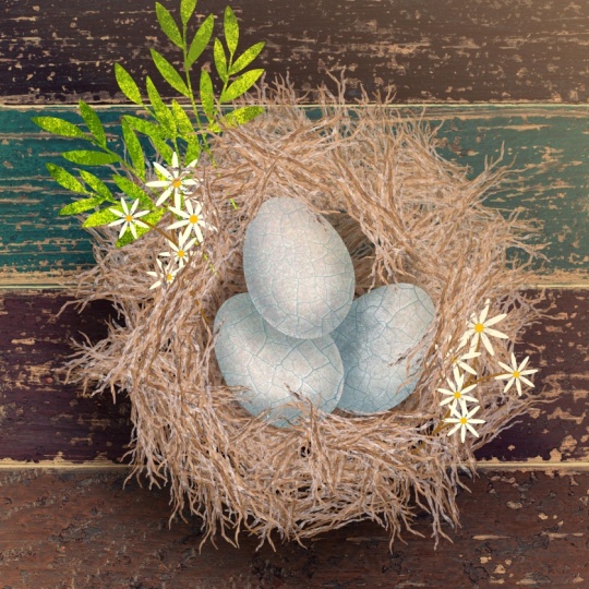
6. Building the Top Down Nest: Okay. If your brush looks the way that you want it to and you've gone ahead and created your initial nest shape, you're all set to start adding some additional depth and dimension to it. Because obviously, this is really flat and if we were to go ahead and create the egg as just to place it on top, it would look okay, but it wouldn't look great. At this point, we're going to go ahead and add a little shading to give our eggs a nice little space to sit in, as well as a shadow underneath it. I'm going to stay in my pixel persona to do this, and I'll go to my paintbrush tool. I'm going to use one of the sprays and splatters brushes that's built into Designer. So I'm going to go ahead and select "Airbrush one and I want to choose that dark color that's in there. I'm actually going to be changing the blend mode to multiply and changing the opacity of it but I'm going to start with a nice dark color. I also want to add a new pixel layer to this because I want to be able to adjust the blend mode and so I can't put it directly on here. I'll go ahead and tap "Plus", add a pixel layer and I'm just going to clip it to the nest layer just so that they stay together. I'm just going to start drawing a circle here, just roughly where I want my egg to sit. Again, this is going to look really harsh to begin with, but we are going to be changing the opacity and blend mode once we're done. Let's step back and take a look at this. Now when you clip it, the other benefit of that is you can see all the little spaces from the nest itself so it's not just sitting on top and coloring beneath the nest. It's clipped into the individual pieces that make it up. Let's go ahead and take a look at this. I think I'm going to go ahead and use my eraser brush, make it a little bit smaller. I'm just going to brush away some of the outside here so that it's not as harsh as the middle. Just a little bit. Now because this is a separate layer, if you want to make it a little bit bigger, you can. I can just go ahead and drag up. All right, so I like how that's looking. I think it gives a nice space for my eggs, but I want to go ahead and change the blend mode and the opacity just to knock it back a little bit. I'll go into that layer and I'm going to change it to multiply because that's a perfect blend mode for shadows and I'm just going to drop this down. I don't want to drop it too much because once the eggs are in there, you're not going to see it as much but I still want it to be visible enough that you can see it from behind them. You can keep it at about 58 to 60 percent. I can always drop it if I want it, it is it's own separate layer. I have the center done but again, it still looks flat because it's just a flat nest sitting on the background. Now we are going to be adding some background elements like a piece of wood behind it or if you want, you can create a large branch for underneath it. But I want to add a drop shadow directly to this just so that it has additional dimension as if it's coming up. I'll go to my rectangle tool and choose the ellipse. I'm going to use that same dark brown, I don't use black for shadows because I find it to be too harsh. I'm using a dark brown that's not quite black, but also not too light. I'm just going to drag out an ellipse and that's a stroke I want it to be a fill. I might just make it more of an oval. I'll go to my layer studio and I'm going to drag this beneath my nest. Now, this is the point where you need to determine where you want your fake light source to come from. In my illustration, I'm going to have my light source coming from the top right here, which means my main shadow is going to be over here. I'm just going to go ahead and drag this over and I'll rotate it a little bit. I have a little bit more coming out here than here. Now obviously this is a really flat piece of ellipse here. It doesn't look anything like a shadow. Let's go-ahead to the FX Studio. Turn on the gaussian blur, tap to get the contextual menu, and then just drag up. I want it to be blurred enough so it has a nice blur on the outer edge, but that it's still nice and sharp towards the edge of the nest so right about there. I'm going to go back to my layer studio, change this again to multiply and then just drop the opacity a little bit. Now, this is always adjustable. Once we get it into the background, if I want to increase the opacity or decrease it, change it somehow I can do that, but it's a good start. I might just adjust it a little bit so that it's in on this side and again a little bit further down here. Now if you wanted to, you could add some additional highlights to things. I'm actually going to show you how to add some sunlight, some additional atmospheric elements to come in when we add the background elements. But if you wanted to, you could use that same process and just hit the nest with a lighter color and some highlights. I'm not going to do that in this case, I'm actually ready at this point to add the eggs to it and we're going to do that in the next video. I'll see you there.
7. Illustrating the Eggs: Now that we have our nest in place, it's time to create some eggs for it. We're going to use a designer persona for that. I'm going to create one egg using the ellipse tool, add some texture to it, and then we're going to duplicate it three times. We'll make some minor adjustments to the texture, just to give variation between the three eggs, and then we're going to place them in the nest and add some shadowing to it, just to give it more depth and dimension. I'll go ahead and select my ellipse tool. I'm just going to choose this blue color for my fill, no stroke, and I'll drag out an ellipse shape. Now this is egg-like, but it's not quite there. I'm going to go ahead and convert this to a curve by tapping to Curves, because I want to be able to use my Node tool. What I want to do is take this top node. I'm going to go ahead and select it. I'm just going to start dragging it up, so it makes it a little more narrow. I'll hold my finger down to keep it straight. Then I'm going to use my move tool and just make the whole thing a little bit wider. I want my top to be a little bit more narrow than the bottom. I'm going to keep it this size. We'll size it down when we put it in the nest, but I'll keep it this size just so you can see it. Now we're ready to add some texture to it. Now, just like with the twigs, I've already pulled some texture in from the stock studio that I want to use so you don't have to watch me search for it. But you can just go into the stock studio, type in texture or whatever keywords you'd like. I'd like to find something that has nice variety. Because again, we're going to be moving the texture around just to give some variation between the three eggs. I like this particular texture because it has an egg shell-like quality, and it also gives me a lot of room to work here. I'm going to go ahead and drag this up over the top and just clip it to my egg. Now you can keep it this color if you wanted. I actually like this, I think it's really pretty, but I want that Robin's egg blue to come through. I'm just going to go ahead and change my blend mode to soft light. You could play around with the blend modes and see what you like best. If one of the other ones, like multiplier or something works better for you. But I actually tend to lean towards soft lights. That's why I'm going to use here. I'm trying to move my texture around a little bit. Now I'll go back and select the overall layer. I want to duplicate this three times, because I'm going to fit three eggs in here. Then I'm going to adjust the texture on the two duplicates just to give them some variation. I'll two-finger tap and drag with my move tool. Let's go ahead this way. While I have this one selected, I'll go into the texture and I'm just going to move it around to a different spot on the texture image file. I like that right there. Let's go ahead and do the same thing with this one. Bring it right about there. It's subtle changes, but enough to make the three eggs look different. Let's go ahead and size these down, and we're going to place them in the nest. Just go ahead and grab this first one. You want to make a note of the order that they're in, because the order that they're in is going to determine how you add your shading. This one is on the top, this one is in the middle, and this is your bottom egg. Let's go ahead and size that one down first. Actually, I think I'm going to move this one to the top, because I like the texture the most on that one and I want that to show. I'm going to go ahead and size it down. I'll place it right about there for now. I'll go to my second one. You can make one a little bit bigger than the others, place it about there, and then bring this one down as well. I'm going to place this one here, make it a little smaller so it fits in the nest better. Bring this one down a little bit. Again, this one's on top. Maybe I'll place this direction. Then this one sort the middle. We're going to make the entire thing a little bit smaller. I'll just go ahead and select the three eggs and just hold my finger down to keep their proportions and set them into that shading spot. We have our three egg shapes, but it's not exactly looking very egg like. It looks like a big blue blob. So we need to add some shadowing to it. Again, this is where you want to pay attention to your layer stack. This top one is going to be adding shading to this egg here, as well as this one here. But it's not going to have really its own shading because it's sitting at the top of the nest. This one's going to be adding some here to the one beneath it. We're going to add some to this one just as if the nest itself is adding shadow. Now when we're all done this, we are actually going to be adding some additional nest pieces over the top of them. So if you want to add a little shading to the top where you might do that, you can do that as well. I'm back in my pixel persona because I want to use the airbrush from the sprays and spatters again. I'm going to select that same blue color, but I wanted to drop the light value a lot. I'm not using black on this because again it's going to be too harsh. You want to use one of the colors from the egg itself, it's going to make it more realistic. I'm just going to drag this down. Not too dark, but not too light. I'm going to start with my egg on the bottom. Let me go in here and I'm going to add a pixel layer between the image file and the egg. That's where I'm going to add my texture. If you remember, my light is coming from this direction, so I'm going to shade down here a little bit. I want to make my brush a little bit smaller. I'm just going to hit here with some shading. I'm going to make this a lot smaller and really focus towards the edge of the other egg, and then just bring it out a little bit. I'm going to do the same thing with the other one. I want a nice deep line towards the edge of the upper egg, and a little bit more here, maybe drop the light value. Then just lightly hit it here. I'm going to go ahead and change the blend mode of that to multiply. You can see it, a lot more of the difference there in where I hit it harder than in one spot than the other. I'm just going to drop the opacity slightly. Let's go ahead and add some shading to this one, because it's sitting beneath this one. Again, I'll go ahead and add a pixel layer. I want to really add it right here, so it's nice and dark. Then just lighter as I move out. I'm going to add a little bit on this side too as if the nest is shading it a little bit. Again, I'll go ahead and change that to multiply, and drop the opacity. I think I added a little too much there. So I'm going to go ahead and grab my erase tool and just tap away some of the shading there. But now I'm feeling like that's not dark enough on the edge. I'm going to make a much smaller brush and just hit it right about there. I'm really just trying to define that that egg is sitting on top of the other. I think I will add a little bit of shading here as if something is sitting over the top of that top egg. I'll go ahead and add a pixel layer. I'm just going to lightly hit it with some shadowing. Change the blend mode to multiply, and drop the opacity. Let's just back up and take a look. This is the point where you can adjust your opacity, you can erase away some of the shadowing. I'm just going to drop the opacity on this one a little bit. Maybe this one as well. I want it to be subtle, but I do want it to exist, because now it doesn't look so much like one big blue blob, it actually looks like three eggs. Let's see. Sometimes if you go back and forth and just keep getting smaller and smaller, you can find that sweet spot where you want it. You get really extreme and really just keep moving in closer and closer until you get it right where you want it. I like that. I feel like the eggs overall are a little too large still. I'm just going to select the three layers, hold my finger down and keep your proportion, just make it a little smaller. I might also drop the opacity of the shading just a little bit inside the nest. Let's give it a little bit of highlight on the top of the eggs. I'm going to be creating some sunlight coming in from the top right. I want to hit certain areas of these just to mimic that. I'm going to go ahead and I'm just going to grab a nice peachy color. Nothing too yellow. I want to add a different pixel layer to each of these. Because I need to change the blend mode to something different and you can't change the blend mode to two different things on one pixel layer. I'll go ahead and add one here. That's the bottom egg. I'm just going to use that same airbrush and just lightly hit it here, just as if the sun is just kissing the top of it a little bit. Zoom in a little bit. Just a little bit. I'm going to change the blend mode of that to screen, or let's see, darker color probably, or lighter color. Choose darker color and just drop the opacity a little bit. It's just a touch of a peach tone to it as if the sun's coming through the nest a little bit. I'm going to go ahead and do this top one. I'll add a pixel layer. I'll hit it right about here. Then hit this one a little bit more than the other since it's sitting on top. Again, I'll go ahead and change the blend mode. Just drop the opacity. Then I'll do the middle one here. I'm just going to go ahead and hit it right about here. You want to make sure that you're not adding it where shadowing is because it wouldn't make sense. I'm just going to go ahead and change that, drop the opacity. Again, we'll be adding some sunlight coming in from one of the corners to hit the edge of the nest just to really accentuate that sunshine hitting the eggs. One final thing I want to do is I going to add a little bit more texture to my eggs. I want to give him a little bit more life. I'm going to use one of the grunge brushes, the gritty brushes in the texture pack that I provided. I just want to have fun with it. It doesn't have to look like any particular egg. I just want to give it a little bit more visual interest. I'm going to go ahead and grab the spotty brush. I think I'll use just a really light peach. You can use whatever color you'd like. But again, I'm going to go ahead and add another pixel layer just so that I can change the blend mode. I'm just going to hit the sides with that spotty brush there. I might just drop the opacity a little bit, but I'm not going to change the blend mode. I'll go ahead and do the other two. Again, I'm adding another pixel layer because if I want to change the blend mode, I can't do something different than the other two. I can't do that on a single layer. I'm going to keep the opacity where it is there. Then just do one final touch there. I like how those are looking. The final thing that I want to do here is give it a top. I'm going to use that nest pressure again. I'm just going to stamp on spots. I'm going to do this on a separate pixel layer than the original nest so that I can adjust it where I want to. I'll go ahead and add a pixel layer above all of the eggs. I'm going to grab my paintbrush tool, and I'm just going to tap, make it a little bit bigger. I'm you to tap some spots on here. Again, remember it's going to randomly rotate. If you don't like how it looks, you can just two-finger tap to remove it and start over. The other thing is, because this has its own layer. I like how that's laid out, but it's a little too tight in on the eggs. I'm going to go to that layer and with my move tool just drag it out a little bit. Then I can adjust it. But I just want some of the pieces just hanging over the top of the eggs. Just a touch, just to give it like they're keeping it warm. I like how the eggs are looking, I think the shading is fine there, and I like the texture that's on the eggs. I'm going to go ahead and call this done. In the next video we're going to add some additional visual elements, like flowers and some leaf shapes, as well as a background and the sunshine that I mentioned earlier. I'll see you in the next video.
8. Adding Visual Interest to the Nest: Now that we have our nest in place, I want to add a little bit additional visual interest to it. We're going to have background layer. I'm going to add some sunlight coming in from the top right like I mentioned earlier. I want to use the wooden's background assets to add some floral and leaf shapes interwoven into the nest a little bit. Again, just to give it a little visual interest. Let's start with the background. You can choose whatever background you'd like, grass, you could create a branch for this, it's totally up to you. I'm actually going to use a piece of barn wood texture as if it's sitting in an old barn up in a loft somewhere and the sunlight's coming in through the window. Now, I've already found my again, just so you don't have to see me hunt and peck for it. But you can go to the Stock Studio in the Designer Persona and just typing whatever keyword you'd like and go ahead and choose your background. I'm going to go ahead and turn on the one I have in place. Now I've already placed it. I've also dropped the opacity of it a little bit. If I have it all the way up, it's a little too harsh and it competes with the nest, and when I was changing the Blend Modes of it, I didn't exactly like how it was looking. I'm just going to go ahead, make sure that layer is selected, and I'm going to drop the opacity to about 70 percent. It's just knocking back those really dark lines a little bit. I really like something like this because I'd like the interests that this not adds in some of the lines in the barn wood. Again, it's completely up to you what kind you'd like to use. I'm just going to check my shadow and make sure that I like how it's looking, but I don't need to change the opacity or move it around. I think mine's good here. If you needed to change it, just go into that layer. Remember, we created this as a separate ellipse layer, and you can move it around. You can adjust the shape of it, change the opacity, just to make it so it's not competing with the background. The next thing I want to do is create the sunlight coming from the top right and I'm going to do that with a combination of the Trapezoid Tool in a rectangle, as well as the Transparency Tool, which is this little icon that looks like a wine glass. Again, if you ever can't find something, just tap and hold on the question mark. I'm going to go ahead and select. I think that maybe that peachy color that we used on the top, but perhaps a little bit darker. I'll select my Trapezoid Tool and just drag out a trapezoid shape. I'm going to go ahead and rotate this. I want my sunshine to be coming from the top right corner and just hitting the edge here. I want to be able to drag this out a little bit. So I'm going to go ahead and convert this to a curve, grab my Node Tool, and I just want to grab these two nodes and drag them out to the edge of the canvas. It's creating a triangle shape from the top here. Obviously, this is a very solid shape and even if I change the opacity or the Blend Mode, it's not going to look quite right. I'm going to use the Transparency Tool in this case instead. I'll go ahead and select it, and I'm just going to drag down from the top here and pull in. What that's going to do is give me a nice gradient. I have a nice bit of sunshine or whatever you'd like to call it, coming in from the top right here, and I can use this little handle to adjust the intensity of it. If I feel like it's a little too much, I can just bring it past this middle line here. I want to bring it right about here, and let me go ahead and deselect this and just turn it on and off and we can take a look at how it's looking. I like how that looks. I think I'm going to keep the Blend Mode the way it is but just drop the opacity. I could change the Blend Mode to something like screen. Let's just see how that looks, but I lose the color that I want. Let's just turn this off and on and see how it's looking on the screen. I actually might keep it this way. We're getting a touch of that peach color here, and you can really test it do it just by turning it on and off and see if it adds a color tone to it. I like how it's just hitting it there, but it's not too much on the nest. Let me just back up. That's a really quick and easy way to create a sort highlight coming in from a particular direction. Again, that's using the Transparency Tool and the Rectangle Tool on whatever shape you'd like to create. One final thing I want to do here is add some floral and leaf shapes using the Assets Pack I provided with the class. I'm going to go ahead and create the leaf shapes first. I'm just going to pull in a couple of them here, and let me size this down. I think I'll make this one a nice orangish color, a rusty color on a fill and no stroke. I'm going to add some texture to this. I'm just going to find something here. I just typed in texture in the Stock Studio, not going to spend too much time looking for something, but I'm going to go ahead and pull this one in. You'd be surprised at what rust textures can do when you're adding something to your leaf shapes, it looks really natural. I'll go ahead and just change the opacity of this and the Blend Mode. I might just move it around to see if that's exactly where I want it. I think I'm going to go there, and I want to add a little bit more to this. I'm going to go to my Pixel Persona and grab the Paintbrush Tool and one of the brushes in the Gritty Texture Pack. I'm going to go ahead and choose the Rocky Shimmer Brush and just a pixel of a light orange color. I'm going to go ahead and add my own pixel layer in here. I'm not going to wait for it to automatically do it. I'm not using this as highlight, I'm just adding additional texture to it. So I'm not really worried about where I'm hitting it on the leaves. I hit the stem a little bit, and I'm actually going to leave the Blend Mode and the opacity as it is because I actually like that and how that looks. I want to tuck this. I think over here to the right, I'm going to have some flowers sitting on top of it, so I'll keep it relatively large. I want to bring this beneath that top layer of nest so that it looks like it's woven into the nest itself and I'll just adjust it here. The next thing I want to do is create some flowers. I might create one additional leaf shape, but I'm not sure at this point. Let's go ahead and create the flowers first. I'm just going to go ahead and bring in a flower shape, and I'm going to make that off-white, and I'll bring it a little center here. This particular asset has a stroke and a fill on it. I'm going to go ahead and change the fill to orange and the stroke to this dark brown color and just bring up the stroke width. So this is a brush that I created to look like flower stamens. It's actually from the brush pack I provide with the textured florals class. I want to make sure that my scale with object is on. This is in the Stroke Studio under advanced. Whenever you're using a stroke, you want to make sure that's on. So that as you're sizing things up and down, the stroke size is with it, otherwise, it's going to either get really tiny or really large and you don't want that. I'm going to go ahead and group those two pieces together. I want to make a little grouping of flowers. I'm going to bring this a lot smaller. Again, I think I'm going to place it up here. I'm just going to duplicate this a few times and just size up and down, and just create a cluster of flowers. I'm just two finger tapping and dragging, maybe one more down here. Now, I want something to pull those together, so I'm going to create a stem for it. I'm going to back to my vectors, my vector persona and grab my pencil tool, turn my fill off and select a green stroke. I'm going to keep my pressure settings the way I did. This is actually the pressure setting that was left behind from creating the sticks and I already know that I like that. I'm just going to bring my width down a lot because I want it to be a nice, thin stem. I'll just go ahead and draw out the first piece. I want to bring this beneath all of the flowers so they're tucked behind. I'll just go ahead and create little branches off of this. Sometimes it's easier to start from the flower shape rather than the stem itself. Now, I want to create one large curve out of that stem because right now, I have five individual curve layers. So I'm going to go ahead and select all five. Go into my Edit menu and I want to tap "Expand Stroke" to turn them into fills. Now I'm going to use the add function to make one big curve out of it. It just makes it easier if I do want to add any texture to it or I just want to move it around. It makes it a lot easier than working with individual curve layers. I'm going to group all these florals together. I selected that stem, two-finger tapped on the top layer. I'll go ahead and hit "Group." Again, I want to drag this beneath that top nest layer. I'll just rotate it. It's going to sit on top of these leaves and just come out a little bit. I think I'm going to two-finger tap and drag to make a duplicate of those florals. I want to bring something just popping out over here on this side. I'm going to go ahead and use my Transform studio and just do a vertical flip. I'm going to bring it right about here, I think. I might make it a little bit smaller than the other one. Again, it's beneath that top layer there, just so that it looks like it's woven into the nest. Now, if you needed to, you could go in and you could add a mask layer to these and just erase away where you need to. But I actually don't see there is any issue here because it's sitting beneath that top nest layer. It looks like it's woven in. So I'm not going to make any additional changes to that. But I am going to put one final little leaf layer here. Actually, now that I'm looking at that, I might erase away some of this. So let's go ahead and select that curve. I'm going to go into my pixel layer and grab my erase brush. I'm just going to erase away some of that stem there. It looks like it's tucked further down in the nest, and it's just peeking out there. It was standing out a little too much. Using masking is a really easy way of getting rid of things that you don't want. It's all non-destructive, so you can always delete that and bring it back if you want. I'm just going to do one final leaf here. I think I'll pick this one. I'm going to make this a dark green. No fill. I'm just going to add texture to this. I'm not going to use a pixel brush on it. Again, I'll type in texture. I think I'll use this one here. No, that has lettering on it, so I'm going to skip that one. I know there's another one in here that I like. I'm not going to spend too much time finding new texture. But let me just scroll down here a little bit. I'll go ahead and use this one. This is the one I wanted. I'm going to move this into place and rotate it, drag that down and clip it. Again, I'm not going to use the pixel brush because it already has a nice texture there. I'm just going to change this to soft light or overlay. I think overlay and just drop the opacity a little bit, and maybe make the green of the leaves a little bit lighter. I'm just going to drag up the light value there. So let's go ahead and put this in place, and make it a little bit smaller. I'm going to go ahead and put it probably right about here. I just want it peeking out from the nest, like we have with the other side. Again, I'll drag it down beneath the nest layer there. Actually, I'm going to try and drag it beneath the entire nest and see how it looks. Maybe just have it peak out a little bit more. I'm going to do that instead. Again, if you wanted to, you could have it further up and just mask away. But I actually think this is good. I might just move my leaf layer out a little bit here. You can make this entire thing smaller if you need to. Now, now that I've moved that, I can see the stem of my leaves peeking over the eggs. So I'm going to go ahead and find that curve. Go back to my pixel persona and just erase away that little section there, just so it's not laying over the top of my egg. I like how that's looking. If you wanted to, you could add little blades of grass in you could do all sorts of things to add subtle little elements, just add a little additional visual interest to it. So I'm just going to take a step back and take a look at my illustration and see if there's anything else that I want to change. I'm actually liking how this looks, so I'm going to leave it as is. In the next video, I'm going to show you how you can take that same brush that you created for this nest, make a few minor changes, and create a side view version of that nest. So I'll see you in the next video.
9. Creating the Side View Nest: Now that we've created the top-down version of the nest, what if we wanted to create a brush to do a side perspective, so we could put it in a tree or something like this. Well, the cool thing is you don't have to start all over again and recreate the brush, you can simply duplicate the existing one and make some minor edits to the settings. What we're looking for with the side view brush is, unlike the original brush where we had a 100 percent rotation and had a full scatter to it, we just want a slight rotation. For the most part we want our brush nozzle to be horizontal, but we want it to tilt up and down just a little bit just to give us, just some random spots here and there, so it's not too tight, but it's also not all over the place. Let's go ahead and get started. I'm here in the pixel persona, because again, we're not going to start fresh and recreate the brush, we're just going to duplicate the original one and just tweak the settings a little bit. I'm going to go to my brush studio and I'm going to tap and hold on that ''Scatter brush''. I'll hit ''Duplicate'' and then I'm going to go into that ''Duplicate'' and hit ''Edit''. Now again, the general screen is about the individual nozzle and the only thing that we changed on the original brush was the spacing. This time we're actually going to change the spacing as well as the rotation, but before we do that, I want to turn all of my dynamics off just so I have a nice fresh start. I'll go back there. Our original brush nozzle was tilted like this and we actually want it to be horizontal, so I'm going to drag this out, drag the spacing out so I can see the individual shapes. I'm going to bring it up to about 75 or 74 and I'm going to start bringing my rotation up to about 34 percent. I like how that's looking, I think the spacing is good. I'm going to go into dynamics and I'm going to go ahead and pull my size up again just to about 30 percent. I'm going to leave the scatter right off. I don't want it to scatter at all. I'm going to bring the rotation up, but again, this isn't a scatter brush, we just want it to rotate it just a bit up and down as we're laying out the side view. I'm going to bring this up to about 8 percent. We can always change it, but I'm going to test it first. You can see that it's rotating here and there. I'll click ''Okay''. I have that brush selected, I just need to add a pixel layer up here, actually, I already have one. I'll just grab my paintbrush tool and I'm going to bring the size down a little bit. Now I find with the side view nest, because I want more control over what I can remove, that I'd rather tap out the shape rather than draw it out. If I draw it out and I don't like how it's laying down the shapes, I can't two-finger tap without deleting the entire thing. So if I'm really careful about it and I just start tapping it out, if I don't like the rotation of something like that one, I can just two-finger tap and start again. I'm just going to go ahead and build up my nest. Again, if I don't like how it's laying out the shape, I can always change it. I'll just build it up. Now I bring it something down here. Now if you find that you need to, you can always change the rotation. Let me go ahead and make this a little bit bigger and wider. I like how my sticks are nice and horizontal. I can actually just turn it a little bit like that. I might add a couple more pieces here and there. I like how my nest is looking here, I'm going to call my brush good to go. Now again, if you wanted to make changes to it, you could just go into your brush studio, locate the brush, tap and hold on it and hit "Edit'' so you can go back in and make changes or if you wanted to, you should still have that group of original vectors and you can make changes to those and just start the whole process again. I'm going to go ahead and place this back in my scene, so I'll go ahead and turn on the original scene. I'm going to turn off that nest here and just drag this down and maybe make it a little smaller. Because we have it all on one layer, you can just use your move tool and drag it down. Now, I've used the same flowers from the top-down. I've just gone ahead and duplicated them and pulled them into this layer group. I've also used the same eggs, I'm not going to start that process over again. I just went ahead and adjusted their positioning, so that you could see them peeking out over the top of the nest. I added a little highlight there from the sun and I might just adjust my flowers here a little bit, let's see. Just move them down here. Up here, there we go. Now the tree shape I cover how to make this in the birds and bird houses, the original word series class, so I'm not going to cover that in this class, but if you do want to know how to make a nice textured tree or branch, I recommend checking that class out. In the next video, we're going to go ahead and talk all about the class project, so I'll see you there.
10. The Class Project: The project for this class will be to create your own scattered nest brush using Affinity Designer following the process that you learned in the class. You can create the top-down version or the side version or both, it's totally up to you. Go ahead and create a nest. You can add elements to it, you can put it in a background, whatever you'd like to do. I'd love to see what you create and it's always helpful for prospective students to see what they're going to learn when they take the class. So I hope you'll consider sharing your project to the project section of the class. The easiest way to share to the project section is to take a screenshot of your work. I'm going to show you a really quick and easy way to do that using your iPad and the Apple Pencil. I'm just going to swipe up from one bottom corner to the opposite top corner and it's going to give me this bounding box. I'm just going to drag my corners in just to crop it. I'll hit done and I can either save it to my iPad or my photos. It's super easy and it's an easy way to share your project.
11. Closing Thoughts...: Here here we are at the end of class. I hope you enjoyed learning how to create beautiful texture bird's nest using the brush from Selection tool. Now this is the second in a series of classes about creating all things birds using Designer. So if you haven't already, click Follow on my Skillshare profile to receive a notification whenever I create a new class. If you share your illustrations on social media, please feel free to tag me at the handle on the screen as I'd love to share your beautiful work in my own feed. Finally, if you love texture in your illustrations as much as I do, I welcome you to join me in my Facebook group, dedicated to all things digital texture, where you can share your work, ask questions or get and share tips and tricks in all digital illustration apps, both iPad and desktop, all in a friendly environment. You can find the link to the group on the About page of this class. As always, thank you for trusting me with both your time and your creativity. I look forward to seeing you in the next class. Happy creating.
 Tracey Capone, Illustrator, Photographer & Designer