Transcripts
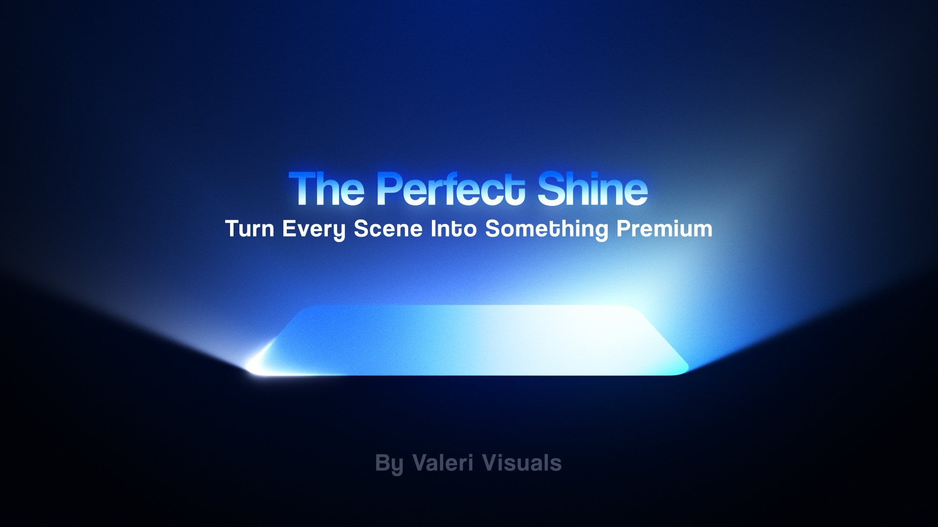
1. Intro: And convert a static picture into a stunning
motion design piece. Hi, I'm Valerie, and I'm super
excited to tell you about my new course on creating animated posters
in after effects. By the end of the course, you will learn how with
smart composite techniques, a static picture can
look super dynamic. We'll start by learning how to prepare the picture
for animation. While doing so, we'll
explore using photoshops, mind blowing AI features. Then we will dive
into after effects and learn how to prepare
the scene like a pro. You will learn all the hand
compositing techniques, focusing on how to make it to the scene look like a
dynamic treaty environment. We will play around with
the camera to create a minimalistic but super
interesting motion in the stein. As a bonus, you will practice creating a smooth
stretch text animation. Once you master the
techniques in the scores, you can start using them in
your own designs or pictures. So get ready to jump into the asm world of
animated posters.
2. Get prepared for the course: Hi, and welcome to the course. First things first.
Make sure you have downloaded the main folder for the course that I attached. In this folder, you will
find four more folders. You will also see
a PDF file here. In this PDF file, you will find all
the relevant links we will discuss in the course. All right. And now let's talk about the
folders we have here. In the AE folder, we will save our After effects project
file that we will work on. In the render
folder, we will save the final animation that we will render once we finish
working on the project. In the design folder, we will save the files that we will prepare for animation. And in the final
folder called assets, we will find the assets we
will use in this course. This is the folder where we will save the assets we received from the client or assets we downloaded from the Internet. You will also see another
folder called font. In this folder, you will find the font we will use
later on in the course. Speaking of assets
from the Internet, I want to show you a few cool
websites where you can find free photos for your next poster design or poster
animation projects. The first one is Unsplash, an awesome place for you to find unique and high quality
photos taken by amateur and professional
photographers around the world. The next one is Pixabay, a great place to find both real photos and graphic versions of what
you are looking for. All right. Moving
on to the next one. This one is called Pexels. Another great place to find some awesome high quality
real life pictures. Great, and the last
one is Freepi. You might know this website for finding great graphic assets. But you can also use the filters to find
some nice photos, whether raw pictures or
already edited ones. Awesome. Let's get
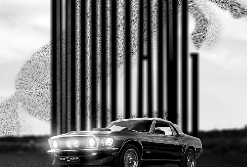
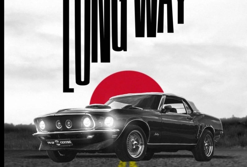
back to our folder. I found this super cool photo of a Muscle American
car on Unsplash. And for this road texture, I found it on Freepi. Soon, you will
understand why we need this one in addition to
our main photo of the car. All right, with this, we are finished with
the first part, and we are ready to move
on to the next one, where we are going to dive into photoshop and prepare our
poster for animation. It's going to be awesome.
So see you there.
3. The power of AI in Photoshop : Welcome back. In this lesson, we will learn about photoshops ie features and
practice a variety of selection techniques to
separate the objects in our picture and
prepare it for animation. All right, so after reviewing the assets we are going
to use for this project, we will use Photoshop to prepare our poster
for animation. Since we will be using
Photoshop Sie features, make sure you are using
Photoshop version 2024 or above. With that said, let's open
Photoshop and get started. Now, let's head to
file and open up the photo of the car we
have in the assets folder. And now, to make sure we're all on the same page with
the panel layout, let's open the windows
menu, go to workspace, and pick essentials, which is the default photoshop
panel arrangement. Next up, we need to
open the AI feature. If you can't find it, open
the windows menu again, scroll down a bit, and be sure to activate the
contextual task bar. Okay, now we're set to start prepping this
photo for animation. What I mean is that
we need to split the objects in this picture
into separate layers, so we can animate them in the animation phase
and after effects. But before we dive into that, I want to share
something super handy. That'll help you
understand how to split the objects in the
picture you're working on. So when you're working with a picture that has
a main object, like a car in a background. And you want to give your
poster a three D look. You can split the picture
into three main parts. This helps you figure out which parts of the photo
need to be separated. The three main parts
are the foreground, mid round, and background. The foreground is the part of the picture that's
closest to the camera. The mid round is the part
in the middle of the scene, and the background is the
farthest point from the camera. Dividing the photo
into these parts, you can really
improve the look of the animation and
decide which parts need to be separated
and placed in the three D space when
creating the animation. With this in mind, let's figure out where each part
is in our photo. In our case, the foreground is the blurrest part of the road since it's the closest
to the camera. The mid round is
where the car is, and the background is the
farthest point behind the car, where we can see the
forest and the blue sky. Now, we can start breaking down the objects in this photo, starting with the
main one, the car. First, let's unlock
our layer and make a duplicate using the
control J shortcut. We can then turn off
the original layer. Let's also quickly
go over how to move the canvas panel
before we continue. For example, you can scroll
the mouse wheel while holding control or the command key
to move the canvas sideways. Scrolling the mouse
while holding out or the option key
will zoom in and out. Awesome. So now let's get to work on separating the
car from the picture. But before that,
we need to remove the man's head that we
can see inside the car. We'll use the generative
fill feature, one of the AI features
in photoshop. To start, we need to select
the problematic area. We can do this by long pressing the L asso tool and selecting
the regular Lasso tool. Next, let's manually
select the head area, making sure to close
the shape we drew. Then click on generative
fill and generate. Now, we wait a few seconds
for the process to finish. Please note, this process can sometimes take
a few minutes, so let's be patient and
wait for the results. Once the process is finished, photoshop will generate three variations for
us to choose from. If you extend this area, you can see the
versions visually. Your options might be
slightly different from mine, but they will be pretty close. In my case, I'll choose
the third version. Now, let's finish this action by merging these
layers together. We can do this by right clicking on the layer and choosing, merge layers, or you
can use the shortcut. Okay, so now that we've dealt with the person
inside the car, we can select this layer and separate the car
from the background. Do that, we can use the
select subject action from the contextual task bar or the Quick Selection tool by clicking on the select
subject function. I'll use it from the
contextual task bar. Now, we need to adjust the
edges of the selection. Make sure you're working with
the Quick Selection tool. Let's adjust the size of
the brush we're using, either from here or by
using the bracket keys. Once we're good with
the size of the brush, pay attention to
the icon inside it. The icon we see here is a minus, which means that if
we click somewhere, we'll actually delete some
areas of the selection. In our case, we need to
add more to the selection. To do this, hold down the shift key to convert the brush from a
minus to a plus. Then let's click the areas we want to add to the selection. Go over all the
cars edges to make sure we're not missing
any part of the car. In this area, let's use the left bracket key
to minimize the brush, and now hold shift and
click in this area. Let's continue selecting
the part up here as well. Don't worry too much about the rough areas
of the selection. Soon we'll fix them all. By the way, to move the screen, hold down the spacebar key and drag the screen
wherever you need. Keep checking the car's edges to get a nice
selection of the car. I had some problem selecting
this area, but that's okay. Let's press Control Z to undo the action and come back
to deal with this later. Okay, I think we're done
with the selection, and now we're ready to mask it to separate it
from the background. To do that, we can either click here or here to
mask our selection. Now, let's deal with the
problematic part manually. For this, we need
to make sure we're selecting the mask and then
select the brush tool. You can press B to switch
quickly to the brush tool. And now to choose a
different brush type. We can right click and then
select the hard round brush. Now, if we click here, we can mask the
area we clicked on. To unmask this area, just switch the brush color to white and click
on the picture. To quickly switch
between colors, we can use the x key. With that said, let's mask and unmask the problematic part
we have in this selection. You can hold down the shift key while using the brush to
make the line straight. Let's continue doing it
for the rest of the car. We can straighten this area. We can straighten this area. Once we are good
with the selection, let's leave this
layer with the mask, so we can go back to the
mask and adjust it if we want to adjust some areas
of the car in the future. All right, and now let's press enter and change the name
of this layer to car. Awesome, now we can turn
this layer off and duplicate the original layer again to separate the forest we
have in the background. First, we need to get rid of the car so we can
get a full forest. Right now, because of the car, we can't see some
areas of the forest. First, let's use the
rectangular marquee tool, Zoom out a little bit, and
then select roughly the car. I. And now to remove it, we can use the generative
fill tool again. This process can take a while, as it is a very hard task for the software to remove such
a big object from the scene. So be patient and don't
cancel the process. Awesome. Now let's pick the best version and
merge these two layers. I like this one. Now, select these two layers and merge them. And now, when we have a brand new picture
without the car, we can use the quick selection
tool to select the forest. Let's increase the
size of the brush. Now zoom in and start
selecting the forest areas in the picture. Awesome. And now, let's
learn how to tackle the dense areas with small
leaves like this one. In this situation, we need to use the select
and mask function, and then use the refined
edged brush tool, which is perfect for
these situations. Let's make sure the
brush is the right size and start clicking once on
the dense areas with leaves. Let's go over the entire forest and fix the problematic areas. If you want to
reverse the action, hold down the Ault key and click once on the area
you want to adjust. All right. So once we are
good with the selection, we can click, and then click here to create the mask
from the selection we made. Awesome. And now I want
to give you a small tip. When you know that
in the near future, you will move this layer across the three D space in your
after effects scene. Always create an extra area for the assets that will
be used in your scene, like mountains, skies,
forests, et cetera. And to create the extra
area for our forest, all we need to do is to select the bottom part of
the forest and use the generative fill future
to let photoshop do its magic and create the rest of the forest that
is missing here. I'll say it once again, please be patient with
this process because it is very difficult for photoshop to generate the
missing area we need. Let's see what we've
got. In my case, the first version is
better than the others. Great. Now let's merge these two layers and change the name of this
layer to forrest. And now let's turn off this layer and
duplicate the original again using Control J to separate the sky
from the picture. Let's position the canvas to see the upper part
of the picture. Now, we can select the sky
and mask the selection. Remember, it's better to have an extra part of
the layer when you know this layer will be used in the three D space
in after effects. This gives us more freedom
to experiment in the scene. Question. What do we need to do to get the missing
bottom part of the sky? We can use the generative fill to create the missing part. Just make sure you
select the picture, not the mask, and then choose the area to use
the generative fill. Let's wait a few minutes for photoshop to generate something. In my case, photoshop generated something
that I don't need. In cases like that, we can
delete the generated layer. Then select the mask, delete it, and then apply
the mask to the layer. This way, we will have a layer
only with the sky in it, which will not confuse
photoshop when we try to generate as it was when there
was a mask on this layer. All right. So now we have
some better results. I'll go with the
second variation since it only has
the skies in it. Just so you know,
you could also grab a cool sky image from the Internet and use
it in your project. I didn't do it this time
because I want us to practice using the generative
fill feature in photoshop. Anyway, let's keep
going with the lesson. Now I want us to create a
layer just for the road. So let's select
this layer and then make a selection of everything
that is not the road. Now, just hit the delete
or backspace keys to remove the selected area. Let's call this layer, road, and then exit
the selection. Make sure you've got the
rectangular Marquee tool selected and click once
somewhere in the picture. This will stop the selection. With this, we're all set with prepping the photo
for animation. I'd suggest not flattening the car layer and leaving
it with the mask, since we might need to
adjust the mask later. Now, let's go to file
and click on Save as to save the file
in our design folder. Don't forget to change
the name and make sure you save it as a
photoshop PSD file. Now, click on Save
and then okay. That's it for this part, and we're ready to move
on to the next one, where we'll dive
into after effects. It's going to be awesome,
so see you there. But before that, feel free to
take a break from sitting, grab a refreshing drink, and do some light stretches before diving back
into the course. These quick activities will help you stay focused for
the next lesson.
4. Dive into After Effects and prepare the scene for animation: Welcome back. Now that we've prepped our
photo for animation, it's time to jump
into after effects, so let's open it up together. Now, let's close
the home window and make sure we all have the
same panel arrangement. Just click on default
arrangement up here. And now, before we start
working on the project, let's make sure your
software preferences are all set for a
perfect workflow. To do this, go to edit, then preferences, and
click on General. For Mac users, the preferences might be accessed in a
slightly different way. Okay, so once we're here, just make sure all the
checkboxes match mine. Now, I'll go over the
rest of the preferences, and you can pause the video to check and adjust your
preferences like I did. In the memory and
performance section, you might see different numbers. This is because your computer's capabilities are
different from mine. But that's no big deal. All you need to know is
that the installed RAM on your computer is what gives
power to your applications. To make after
effects work better, just lower this number. This way, after effects
will get more power. All right. Let's move on. Once we've done that, we are ready to start working
on the project. If you are new to After effects, I highly recommend watching the beginners guide to after
effects that I created, especially for those who want to understand the software
better and learn in depth about the
functions and actions we will use during
the animation phase. All right, enough
with the talking. Let's create our
first composition. We can name it master comp, since this will be
our main composition where we will work and
create our main scene. Next, let's choose the size
of our first composition. Let's choose the social
media portrait HD preset, which is great for
social media platforms. We can leave the
frame rate at 30. Now, set the duration to 15 seconds and the
background color to black. Awesome. And now let's go over some key things to keep
us all on the same page. If you spot a red message
in the preview panel, hit the Caps lock
key to turn it off. If the black color isn't
showing in your preview screen, click here to toggle the
transparency background. Also. Make sure the
preview resolution is set to full and the preview
screen is set to fit. Next, if the numbers in the timeline look
different from mine, hover over the time
display, hold down control, and click on the numbers once to switch between
frames and seconds. Let's set it to show the
seconds in our case. Lastly, make sure your
keyboard language is set to English so that the
shortcuts we'll use during the workflow
will work properly. Awesome, and now it's time to bring our photoshop file
into after effects. We'll start by
double clicking in the empty area in
the project panel, and then locate the file, select it, and press Import. Importing, we should
choose to import it as a composition with the
retained layer size option. This way, the layers will match the size of the object
inside the layer, not the size of the document. This way, it will be much more comfortable to work with the
layers in after effects. Then, let's choose
to import it with a merged layer styles
into footage option. In our case, this does not really matter
since we don't have any layer styles applied to the layers in the original
photoshop document. After importing, we'll
see a new folder with all the layers separated
and a new pre comp. That is an exact replica
of our photoshop document. Great, so now we're ready to set up our scene
in after effects. The first thing we should
do right now is to make sure each layer is placed
in a different pre comp. That's because it will be much easier in the future to replace the objects in each pre comp to get different results
for the final animation. We will do it later
in the course. For now, just follow my steps, and it will be very clear
why we do it very soon. So first, let's put the car
layer in its own pre comp. To do this, simply drag the car layer to the pre comp
icon in the project panel. We will then be taken to the newly created pre
comp automatically. The size of this
pre comp is based on the layer size,
which is great. However, in our case, we may need to scale the size
of this composition a bit, because we will be adding
more graphic assets to this pre comp later. To change the size
of this pre comp, use the shortcut control K. Now, let's increase the dimensions
of this pre comp a bit. Set the height to 800
and the width to 2000. Awesome. We can now go back
to the master composition, and before moving on, change the name of
our new pre comp. Select it and press Center, and then change the name to car. Press Center once again
to finish the action. Now, we can drag this pre comp
into our main composition. Then, let's repeat
this process for the rest of the layers we
have in the photoshop file. Let's select the forest layer and put it in a new pre comp. In this case, we don't
have to change the size of the pre comp since we don't want to add
anything here later. Now, let's adjust the name of the forest pre comp and drag
it into the master comp. Awesome, Let's move on to the next layer.
Which is the road? So let's nest it into a
pre comp, in this case. Also, don't change
the size of it, since we are good
with the fact that this pre comp fits the size
of the original layer. Now, let's change the name and drag it into
the master comp. Finally, let's repeat this
process for the sky layer. I'm good with the size
of the prep as well, so I'll not change its size. I'll just change the name and drag it into the
master comp as well. Well done. We have finished preparing our
layers for the animation, and now it's a great time to save the project
before moving on. So let's go to file
and click on Save As. Now, locate the folder
for the course, enter the AE folder, and give this After Effects
project file a name. Let's call it animated
poster and it Save. Awesome, and now
before moving on, let's organize our
project panel quickly. Hold down the control or the command key and select
all the pre comps we created. Now drag them out from
the folder like this. Great. Now let's
click on Type to organize all the files here
according to their type. Finally, let's tag
the master comp in a different color
to differentiate it from the rest
of the pre comps. And with this, we have finished this part and are ready to
move on to the next one, where we will spread
the layers across the three D space in after effects to create a
nice parallax effect. It's going to be awesome. So see you in the next one.
5. Creating a unique Parallax effect: Welcome back to give your animated poster
a very cool look. Think about adding a
parallax effect to your sen. This technique makes a
two decomposition look three D by moving the layers
apart in a three D space, creating a sense of
depth and perspective. All right, and now, let's put this principle into action
in our composition. First, we need to change all our two D layers
to three D layers. If you don't see the
three D function, click here to find additional functions in the layers panel. Now, just select all the layers and convert them
to three D layers. Make sure to use the
classic three D render. If you can't find it here, you can press Control K to enter the composition
settings and then go to the three D
renderer and select the classic three D. Great. So the next thing we
need to do to create a cool parallax effect is to add a new
camera to our scene. To do that, just right click on the empty area in
the layers panel, then go to new and pick camera. Make sure to go for
the one node camera, not the two node. You can find more info about
the difference between those two and other
camera settings in the beginners guide to after effects that I
mentioned earlier. Then, let's use a
35 millimeters lens and click k. Awesome, we've got a new
camera in the scene. To see it and move
it around manually, we can use two views. Now select the left view. The blue frame will show that you've picked
the left view, and all the preview functions will now only affect this view. This means we can now adjust this view from different angles. For now, let's go
with the top angle. And now we are viewing
our scene from above. Here is our camera, which is pointing at the
layers in the scene. Now we can easily move this
camera manually backwards, increasing the distance of
the camera from the layers. As a result in the right view, we can now see a bit
more of the scene. Let's place the camera
somewhere here. Now, let's work with our
layers in the scene and create the parallax effect by moving the layers closer or further
away from the camera, creating a scene
with a foreground, mid round, and background. But first, let me teach you an interesting
technique to enhance the parallax in you're
seen even more than just moving the layers
in three D space. So, don't do anything. Just watch and
listen to what I'm about to explain. Don't worry. We will soon do it together. So, in cases where you have a layer used as the
floor in your scene, you can place the layer
in the right position, and it will look fine. And now, I'll just place the forest below the road
so we can see it better. On second thought,
let me turn off all the layers so you can concentrate on the
road and the car. Now, let me switch the view to see it from the
left side quickly. That's better. As you can see, when I move the
camera up and down, the scene looks very boring, especially when we have a
perspective look in our road. That's why I want
to teach you how to create a real three D
floor in your scene, using a very simple trick. So let's do it together now. First, we need to create a real three D road
for the scene. To do that, we will
go back to photoshop. Open the road texture we
have in the assets folder. To create a three D
road in after effects, you should use a flat picture
of the floor or a road, without perspective
angles in the picture, just a picture
from the top view. All right. And now let's create a new layer to add yellow
strokes on the road. To do this, select the
brush tool and choose a Grene brush from the Built in Brushes library and photoshop. I'll choose this one. Next,
select a nice yellow color. You can use this tag to use the same yellow
that I'm using. Now, increase the
size of the brush. Here's a question for you. What is the shortcut to increase or decrease brush
size in photoshop? To do that, we will
use the bracket keys on our keyboard. Don't
make it too big. Now, place the mouse in
the center of the canvas, and while holding shift, draw a line to the
other side and back. Next, select the move tool and position this layer in
the center of the Canvas. You'll know that you
are in the center by the horizontal purple
line on your Canvas. I'm talking about this one. Great. Now let's quickly change
the names of the layers. And now, to make the stroke, we created look realistic. Let's change the blending mode
of this layer to overlay. After that, let's save this file in the design folder
and name it road. Then, back and After Effects, double click in the
project panel to bring in the new road design
we just created. Make sure to bring it in a separate layers with the
merged layer styles option. As you can see, after effects automatically
change the name of the new pre com to road two because we already
have a named road. Let's bring the new road com to our scene and
delete the old one. Now, I want to show you
a quick trick to make this road and the entire
scene look very realistic. To understand better
what we are doing, let's turn off all the
layers besides the road pre comp and then convert
it to a three D layer. Next, let's press R to open
up the rotation properties of this layer and now rotate it in the x rotation axis
by -90 degrees. Let's move this
layer down a bit. And as you can see, we already
got some awesome results. Now, we need to
rotate this layer so that the strokes on
it point to the camera. So let's rotate this
layer 90 degrees in the z rotation axis. Now, we need to deal with the missing parts
of the road from the right and left sides of it. But before that, let's
turn back on the car pre comp and place it right above the road we just created. All right, let's set the previous screen to
fit and switch back to two views to check how our scene looks when we
move with the camera. As you can see, now we have a nice illusion of
depth in the scene. Now, let's go back to
working with one view and learn how to create a shadow for the car in the scene. To create a realistic shadow, we can duplicate the car pre comp using the shortcut control. Then select the bottom pre
comp and press R to rotate this layer on the x rotation
axis to -90 degrees. Next, press P to see the
position property of this layer and move the
layer down using the y axis. Place this layer just
above the road surface. We can also move this layer
backward a little bit. Great. And now, let's press enter and change the name of
this layer to car shadow. Next, to make it look
like a real shadow, we need to apply a few
effects on this pre comp. So head over to the effects tab, and first, search
for the fill effect. Now drag the effect onto the pre comp and change
the color to black. The second effect we will use is the fast box blur effect. Let's apply it to
the pre comp and adjust the blur radius until
we get a look that we like. We can zoom in a bit and
continue adjusting the value. Now let's try 15 or maybe 50. I think 50 looks great. I also think we should move
this layer forward a bit. That looks better. Now,
let's open the position for the camera and move
it up and down to see how the shadow looks
from different angles. To improve the look
of the shadow, let's select it and press to open up the opacity
of this layer. Now, set the opacity to 85 so it will look more
like a real shadow. Awesome. Now it's
a good time to hit control as to save everything
we've done so far. Now I've noticed that there are several areas in the car's
mask that need to be adjusted. To fix this, we can return to photoshop and modify the
mask on the car layer. First, select the mask and zoom in on the
problematic area. Then choose the brush tool. Right click on the Canvas to
select the hard round brush. Now, when we draw on the mask, it will hide parts
of the picture to reveal the hidden parts, change the brush color to
white by pressing the X key. Now, let's scale down the brush size and go over
the problematic areas. Now I'll press and scale down
the brush to fix this area. Once we're satisfied
with the mask, let's save the photoshop
file by pressing Control. When we return to after effects, the car layer will be
updated with the new mask. Awesome. Now we can move on and continue organizing the
layers in the scene. First, let's focus
on the forest. For convenience, let's
work with two views. Now, select the left view and change it to see
the scene from the top. Now, select the forest pre comp and find a good place
for it in the scene. Let's place it here for now. Turn off the car to
have a clear view. I think we can
lower this layer a little bit and then
move it backward. Considering the
size of the trees, it should be
positioned way behind the car's position.
Let's place it here. However, the forest seems
too small for the scene, but that's not a problem. All we need to do is
select this layer and press and scale
this layer up. Try different values to
see what looks best. I think 170 is okay. Note that we can't see
the bottom part of the forest due to
the scaling process. So let's bring it
up a little bit. All right, I think
it looks fine. Now let's move the camera up and down to see if
it looks good from different angles. It looks nice. And now let's learn out how to show the missing parts
of the road in the seam. To add more of the
layer we have, we can use the CC
reptile effect. So let's find the effect and drag it onto the road pre comp. And now let's expand this
layer from the lower part. Why the lower and not the left? It's because this is actually the bottom part of the pre comp. We see it as the left side
in the seam because we rotated this layer from its
c axis rotation earlier. That means that this is the
bottom part of the pre comp. Therefore, we will
expand it from down. All right, I think we can
set the value to 600. Now, let's do the same
for the right side. In our case, we need to expand it from up because
this is actually the upper area of the road pre C. Now I want to
show you something. If I go back with the camera
to see more of the scene, you will see that
the expanded areas we just added look awful. Fix that, usually, we need to change the tiling of the
effect to checker flip H, which means creating a mirror
duplication horizontally. But since we rotated the layer and expanded its upper
and lower parts, we need to change the tiling
to checker flip vertically. Now it will look much better. Let's set the preview to
fit and place the camera somewhere here where
we see the car in the center of the frame. From this camera angle, I see that we need to
expand the road even more. So let's select the road and set the values to 1,000 for both. We also need to
scale the forest. 200 looks good. Now, let's deal with
the last pre comp we have in the scene,
which is the sky. To see where to place it. Let's work with two
views once again and move the sky to be
placed behind the road. Somewhere around
here. Now, let's scale this layer up to
300 and move it up. L et's see how that looks when
we are moving the camera. I think everything
looks great and we are ready to start
animating the camera. But before that, let's
bring everything back to normal and now activate the
action grid for convenience. And place the camera
where we think will be a good place for the
animation to start. Oh, I think this is a
good starting angle. And before moving
to the next part, let's create another line for
the road for a better look. So let's enter the
road pre comp, select the stroke layer, and duplicate it
using Control D. Now let's place the strokes
in the center of the comp. We can turn off the
road texture for now to see the center
of the comp better. And now, let's
select both layers, zoom in a little bit, and move
the layers up. Looks nice. Let's turn back on
the road texture and go back to the master comp
to see how that looks. I think they are too far
apart from each other. Let's adjust it until we
get some better results. Awesome. I think it looks great. Let's save the project one more time and start
animating the scene. And we will do that in the
next part. So see you there. But before that, feel free to
take a break from sitting, grab a refreshing drink, and do some light stretches before diving back
into the course. These quick activities will help you stay focused for
the next lesson.
6. Camera animation: Welcome back. After finishing
setting up the scene, we are now ready to animate it, starting with
animating the camera, let's learn the best
way to do that. To move the camera,
we can change the three different values
in the position property. The Z axis is for moving the
camera forward and backward. The y axis is for moving
the camera up and down, and the x axis is for moving
the camera to the sides. Right now, all the axis are
combined, which is fine. However, if you want
more control over the camera movement,'s better
to separate each axis. To do this, right click on the position property and
select separate dimensions. Now we can control and
animate each axis separately. So now, let's adjust
the y axis to get an interesting angle for the beginning of the
camera animation. This will give our
animation a dynamic start. I think that's a nice angle from which to start
the animation. Now, let's make sure the time indicator is
at the beginning of the timeline and create the first key frame for
the cameras y axis. Then, let's move to second number two and
bring the camera up. O. Somewhere around here. Next, let's go to
second number four. Now copy the first
keyframe and paste it here to bring the camera
to its initial position. This will create a
smooth animation loop. Now, let's go back
to the beginning of the timeline and
create keyframes for the Z axis as well to create a smooth zoom
in and out animation. First, let's find a
good camera angle for the initial keyframe. Next, move to the second two and move the
camera backward. Finally, let's go
to second four and duplicate the first key frame
we created for the Z axis. I think it looks great. But if you want to
adjust the animation, make sure you are standing with the time indicator exactly on the key frame you want to change and only then
adjust the value. Let's adjust the y position at the beginning
of the animation, which is the position
of the first key frame. Now, click here to
deselect the key frames, and then let's move to the second key frame,
and adjust it. After making adjustments,
remember to copy the updated first
keyframe and paste it on the last keyframe
to update it as well. Let's see how it looks now. I think we can lower the camera
a bit more at this point. That's better. Additionally, we can bring the forest layer. Let's see how that looks. I think we can scale
it down a little bit. This is the process of
creating a parallax scene. Based on the camera animation, you can always move the
objects in the scene and adjust their location until you get something that you like. All right. So once we are
good with the results, we can move on and
improve the look of the scene by adding some
nice depth of field to it. This is basically creating a
focus point in your scene, where the other areas
will be blurred out. Let me show you how to do that. To turn on the depth of field. First, we need to enter the camera options and
turn it on from here. Now, let's increase the aperture to increase the
blurriness of the camera. As you can see, we already see
some changes in the scene, but not in the right place because we want the
car to be in focus. To fix it, we need to adjust the focus point to
the car's position. And to do it, first, let's work with two views to see what we are doing better. Now, if I select the car, we will see its
position in the scene. Now all we need to do is to
bring the focus to this area. But first, let's go to the
beginning of the animation and zoom in a bit in the
right view to see what we are doing
better. All right. Now let's select the camera and adjust the value of
the focus distance, which is the white line you
can see in the left view. I'm talking about
this line right here. Let's bring it to
the car position. Awesome. It looks great. You can also change
the blur type if you want to see which
fits your scene the most. Go over the different types and see what you love the most. In my case, I'll choose
the triangle version. Awesome. So now after creating a nice depth
of field effect, we have a small problem. When the camera moves, the focus distance
will move with it and won't be pointed
at the car anymore. As you can see, the focus distance point
is here right now. You might not see a lot of
difference in our scene because this is not a big change in the camera's position, but I still want to teach
you a very useful trick to make the camera focus point always at the
object you need, no matter where we
move the camera. In our case, we need the focus
to stay always at the car. And we can do it by parenting the focus of the camera
to the car's position. But as you can see
in the example, parenting the values won't work. So let me show you
how to do it using a very simple expression.
What is expression? Expression is a piece of
code that you can use to automate and control various properties
of your animation. It is a powerful tool that enables you to create
complex animations without having to keyframe every single element
manually. All right. So now, let's create a cool
expression in our camera so that the focus distance always points at
the car's position. Making it the focused object in the scene no matter
where the camera moves. So first, we need to open up
the car's position property. And now, to create the expression
for the focus distance, hold down the Ault key
Option key on Mac, and click on the Stopwatch of the focus distance property. Now, in the expression text bar, write, length and
choose the preset. Then in the parentheses, write, transform, dot, position. And now drag the focus piquip to the car's
position property. Make sure your expression
looks exactly like mine, and then click somewhere outside the box to
finish the action. If you see a yellow icon, that means you have
some missing word, character, or symbol
in your expression. Double check to make
sure you're not missing anything. All right, so now. The camera focus will stick
to the car's position, no matter where we
move the camera. I think it looks great. And if you don't want
the focus effect, you can always turn off
the depth of field from the camera options and turn
it back on when needed. Moreover, remember that
you can always adjust the blurriness in the scene by changing the
aperture property. Also, keep in mind that
the more aperture you use, the more difficult it
will be for your computer to process the preview
and render the scene. Moreover, we can also
animate the aperture to have a different level
of blurringness in the scene at different
points in time. Let's start at the beginning
of the animation and create the first keyframe for the
aperture with a value of 100. Then to blur out the
road in the second part, let's increase the value
until we get a nice result. Pay attention to this area. I think 800 will work. This will make the car stand out even more in the scene. Awesome. Now let's move to the
end of the animation, copy the first keyframe, and paste it here to bring the blurriness back to the
level at the beginning. Great. Now let's select
the camera and press you to see only the key
frames we have on this layer. Then check the
animation we created. See a quick preview, we can lower the preview
quality to quarter, go to the preview tab, select our composition, and set the preview playback
to skip two frames. This way, we can see the preview playback
render much faster. Finally, let's go to the end of the animation and bring the
work area to this point. We can do it manually
or use the end key. This way, the work
area will jump to the time indicators
position. All right. Now let's hit the space bar key and see what we've
got a few times. I think that looks very good. We can bring everything back to normal and move on
to the next part, where we will learn how to enhance our scenes
look with basic, but very useful color
correction techniques. It's going to be awesome,
so see you there.
7. Color Correction techniques: Welcome back. In this part, we will learn how to use basic color
correction effects to improve the look of
our animated poster. In this case, we will make it look like a black
and white poster. Usually, to use color
correction effects like curves and levels. I recommend applying them to
a new adjustment layer in the scene so that they will affect all objects in
the scene at once. But in our case,
I want to create a unique color
correction process for each object separately. Will give us more control over how the scene
will look in the end. With that said, let's go to the effects tab and search for a hue and saturation
effect to apply it to the car and reduce all
the colors in this pre com. Then, let's add a curves
effect and adjust it until we get a nice and
contrasting look for the car. Drag this point to the right to increase the black colors. And drag this point to the left to increase
the white colors. Finally, to get a cool highlight on the upper areas of the car. We can right click
on the pre comp, go to layer styles, and add an inner shadow effect. For now, the inner
shadow is black. To make it look
like a highlight, we need to open the effect and
change the color to white. Let's set the opacity
to 100 for now. Finally, to see the white color, we need to change
the blending mode of the effect on the
layer to screen. And there you go. We have some nice highlights on the car. We can now adjust the
angle of the effect, so we can see it only on
the upper areas of the car. So adjust the value until you get something
that you like. I think we can set it to 100. Now we can set the size to ten to get a bit more
soft look to it. You can play around with
these parameters until you get something that you
like and fits your design. I think it looks great. Let's finish by setting the
opacity of the effect to 80, so it will look more realistic. Great. Now we can move on to the next object in the
scene, which is the road. This time, I won't add a hue and saturation effect on the pre comp because I want to keep the yellow lines in color. Therefore, I'll go into
this pre comp and add the hue and saturation effect only to the road texture layer, then reduce the saturation. Now let's return
to the master comp and see how that looks. I think it looks great, and since the road is already
a very contrasted picture, I won't add the
curves effect to it. All right, let's move on
to the forest pre comp. To save some time, we can
select the car pre comp, copy the effects on it, and then paste them onto
the forest pre comp. Now, let's adjust
the curves effect here to make the forest
look a bit darker. We can also open
up the car layer to copy the inner
shadow effect on it. So let's select the layer
style on this layer. Press Control C, then select the forest layer and press
Control V to paste it here. Let's turn off the sky to
see what we are doing. I think we should soften the effect on this
layer a little bit. For this, we can adjust the size and opacity
of the effect. Let's set the opacity to 60. Great. Now we can close the
layer and copy the effects, then paste them onto
the sky pre comp. I think we should add
more contrast to the sky. We can achieve this by
adjusting the curves effect. All right. I think
it looks great. Let's save everything we've done so far by pressing controls. And before we move
on to the next part, I want to show how
we can enhance the camera movement in the
scene by animating the sky. Let me show you what I mean. First, place the
time indicator at 2 seconds so we can
see more of the sky. Then select the anchor point
tool and grab the y axis of the anchor point of
this layer to bring it down near the bottom part
of the layers boundaries. Now, let's go back to the selection tool and bring
this layer up a little bit. Next, let's go to the
beginning of the animation to check if the new sky looks
all right at the start. We shouldn't move
it too much up. Everything looks great, so
we're ready to animate it. We'll animate the
scale of this layer, so let's select it and process
to see the scale property. Now, let's scale this layer
down as much as we can, so it will still be
entirely visible on the screen and create
the first key frame. Then move to second two and
scale this layer to 300. Finally, go to 4 seconds and copy and paste the
first keyframe here. Let's see how that looks. Be patient and give
it a few seconds to the preview to
render the scene. As you can see, the scaling
animation of the skies, together with the
camera movement, has added a more dramatic
feeling to the scene. I think it looks super cool. We can now save the
project once again. With that, we've
finished this part, and we're ready to move
on to the next one, where we will add some cool new graphic elements
to the scene and learn how to create a super cool stretch
text animation. It's going to be super
fun. So see you there.
8. Stretched Text Animation: Welcome back. In this part, we'll learn how to improve the animation using
simple elements like a shape layer and a text layer that we'll
animate in a stretchy way. Let's get started. First, let's create a simple sphere that
we will place behind the car. So first, let's click here to ensure no
layer is selected. And now, click and hold the rectangle tool and
select the ellipse tool. Choose a nice red color for
it and turn off the stroke. Now, hold down the shift
key and create an ellipse, set it size to 500. Now name it and align it to the center of
the composition. Next, switch to the
selection tool. Convert this layer
to a three D layer. We can place this layer
below the forest, and now use the two views to place it behind the
forest in the scene. Awesome. Isolate this
layer to see it better, then select the
anchor point tool to move the anchor point to
the bottom of the layer. This way, when we
animate the scale, it will scale up
from the bottom, which looks more interesting. Press S to bring up
the scale property, isolate the layer, and move the time
indicator to the beginning of the animation to create
the first key frame. Set the size to
500 at the start. Switch back to one view and
set the preview to fit. The sphere looks too big, so let's change the size to 400 or 450. That looks better. I'll create the first keyframe. Move to the two second mark
and set the size to zero. Finally, go to the end of the animation and set
the size back to 450. Let's see how that looks. Great. It looks awesome. Now let's create the
stretch text animation. But first, let's bring
everything back to normal. Then create the text
that needs to be here. To do that, select the text
tool and type long way. Now, to see better
what we are doing. Isolate this layer and turn on the transparent
background. Change the text color to black. Use the anybody font
from Google Fonts. We'll use the condensed
version with a bold weight. Now set the font size to 200. Then go to the paragraph panel, center the text, and align it to the center
of the composition. I think the text
should be bolder. To make the text bolder, go to the character panel, make the text all caps, and select the black
weight. That's better. Now let's switch back to
the selection tool and try to find a good place
for the text in the scene. So isolate the layer to see the rest of the scene and
find a nice place for it. I think it should be
somewhere around here. All right, and now for
a better workflow, let's precompose this layer. This will make it
easier to work on without any objects in the
scene interrupting us. Moreover, it will be
more convenient to find a good place for it in the scene after animating the text. Awesome. Now let's
learn how to create a stretch text animation
in after effects. By the way, if text animation interests you and you want
to learn more about it, you're welcome to watch my
course, text in motion, and learn everything
you need to know about text animations
in After effects. All right, so to change the form of the text
and stretch it, we first need to convert this
layer into a shaped layer. By doing this, we get a path that we can
modify however we want, similar to the create
outline function in Adobe Illustrator. This gives us the
freedom to change the form of the text by
adjusting the created path. To do this in after effects, right click on the text layer, go to Create, and select
Create Shapes from text. We can now delete
the original layer and rename the new one. Just remember that after
converting the text to a shape, you will not be able
to edit the text since it's no longer a text
layer, but a shaped layer. All right, now I
want the text to stretch from the center
upwards and downwards. So first, let's use the aligned tool to center
this layer in the composition. Then let's center its
anchor point as well. To do this, we can use
the Anchor Point tool, hold down Control or command on Mac, and
double click on it. This is a quick way to center the anchor point on a layer instead of moving it manually. Just don't forget to switch back to the selection tool
after doing that. Now, to stretch the text
upwards and downwards, we need to find the path
of this shaped layer. So open it and then open the contents inside
this shaped layer. As you can see,
this shaped layer consists of a bunch of
smaller shaped layers, which are actually the shapes created from the letters
of the text layer. There is a path for each shape that we can change
and manipulate. We will create key frames for these paths to create
a stretched animation. Here's a quick tip when creating stretched
text animations, try to work with
sounds cerre fonts. This makes it much easier to create the stretch
text animation, since there are fewer points to adjust after converting
the text to shapes. Great. Now instead of opening the path for
each shape manually. We can just select
this layer and use the layers panel search bar to open all the
paths on this layer. Since there are
many shapes here, we can adjust our panel arrangements for more
convenient work. Let me show you what I mean. First, hover over
the timeline panel. When you see the mouse cursor, I can showing two white panels, that's how you know you can move this panel to another place. Let's drag it to the
right side here. Now we can enlarge the
preview panel and set it to fit so we can see
the entire frame. Let's also enlarge
the composition panel and zoom in on the timeline. Make sure you are at the
beginning of the timeline, then create the
first key frame for all the paths of all the
shapes in our shaped layer. Now, press you to see
only the key frames we created and move to
the two second mark. Awesome. Now let's
start adjusting the paths for each shape to
create the stretched defect. We'll start with the letter L. Select the bottom points
and drag them down. Hold down the shift
key while doing so. Then select the upper
points and drag them up. Now let's do the same for the rest of the
three letters here. Click on one of the points to unselect the previous selection, and now select all the bottom
points of these shapes, and then move them down. Note that if you are
using a different font, you will get different
points on your path. This might cause your letters
to stretch in a weird way, especially with rounded letters. In such cases, you
will need to add additional points to the
shape before stretching it out. All right. Moving on. Let's bring these
points down here. Then let's select the upper
points and drag them up. Great. Now let's try to fix the end path because it
looks too condensed. For this, we can select one
of the points in this area, delete it, and then move the remaining point
down a little bit. Let's do the same for
the bottom part as well. So select one point, delete it, and move the
remaining point up. Let's see how that looks. All right. I think
that looks very nice. Let's place the time
indicator back to second two, and we can move on
to the next word. Select one of the points here to unselect the previous selection. Now, select all
the bottom points of the word and drag them down. As you can see, the selection
I made was not good, which can happen sometimes. Press Control Z to
undo the action. Hold shift, and click on these two points
to unselect them. Let's try it now. All right. Now I see that I should reselect the point in
the letter A path. So let's press Control Z and reselect the
right bottom points. Okay, I see that I need to unselect some
points in the path. Let's press Control
Z once again. Hold shift and unselect these
two points. That's better. Now let's drag the
selected points down here. Next, let's deal with
the upper points. Great, and now we can fix the condensed areas
in the A and W paths. So let's click here to
unselect the selected path. Now, select one of the
points, delete it, and move the remaining
point to the correct place, which is where we move
the point of the letter. We can move the path
point here too. But first, let's delete
the necessary point. Now, move the remaining
point up a little bit. Let's do the same
with the W path. Let's see how that looks. I think it looks awesome. Now, let's move to second four and copy all the
first key frames. Then paste them here to finish
the animation. All right. Now I want us to create a small offset in the
animation between the letters, to make it look a little
bit more interesting. But first, let's make some
room for the timeline panel. Set the preview to fit, and learn to create a nice
offset in the animation. I want the first letter to start moving to be the letter L, and then the rest
of the letters will start the animation
one after another. First, we need to
identify the key frames that belong to the
letter L. To do this, we can reopen the contents, and to make it more convenient. We can close all the
open properties. Hold down control, or command, close the contents, and then reopen them once again
without holding control. Now we will see all the shapes with all the properties closed. All right, so here is the
path of the letter L, and now I'm sure these keyframes need to be first in the order. Now, let's press
you to go back to working with the keyframes
and start off setting them. Select all the keyframes
except the L path keyframes, then zoom in a bit
on the timeline. Move all the selected key
frames one frame forward. And now, I want to show you a nice shortcut to move the key frames
forward or backward. First, select all the keyframes except the L and O
paths key frames. And instead of moving them
manually one frame forward, hold down the ult key and press the right arrow
on the keyboard. Let's use this shortcut and continue offsetting
all the key frames. Now we have a more
interesting animation. And now, I want to note
something important. If we open the contents and
see the path of the letters. We will notice that
some letters consist of two paths like the shape
that creates the letter O. As you can see, there are two paths that create
the shape of the O. In cases like this, we
should align the timing of the key frames of
these two paths together so the animation
will look good. We have another example of this situation
with the letter A. Let's align the key frames of the second path of this
shape to the first one. Now we have a perfect animation. Let's select the layer and press you to see only the key frames. And now, if you want to
create a larger offset, select all the key
frames and move them one frame forward
in the timeline. Be careful not to create an offset between
the aligned paths, like in the letters, and A. All right. I think
it looks very good, and we can bring this panel
back to its original place. Then, let's return to the master composition
and convert our text pre comp to a three D layer to find a suitable position
for it in the scene. Let's set the preview
to quarter and work with two views
for more convenience. Now, let's drive the text to somewhere around here
and raise it slightly. Okay, I think we can
bring it closer. By the way, for more precise
movement of this pre comp, you can press P to access the position property and
adjust the values from there. Let's move the time
indicator to see how it looks across
the entire animation. While doing so, let's continue to find a good spot for
the text in the scene. I think we can bring it closer to the car and scale it up. Let's lower this pre comp
using the Y position. Now, let's select the pre comp and press S to scale it up. L et's bring it much
closer to the car. Now, let's adjust the position
to find the perfect spot. So press P and adjust
the position values. I think that looks very good. Let's bring everything
back to normal. All right, I think
it looks nice, and we can move on to creating the final asset to
enhance the scene, which is adding a
flashlight to the car. For this, let's enter
the pre comp of the car, select the ellipse tool, make it white with no stroke, and create a small sphere. Just make sure no layer is selected before
creating the sphere. Now, let's set its size to 300 and change the
name to flash. Now, let's open the layer, select the ellipse from here, and add a pucker and
blow defect to it. Now, by adjusting the
amount of this effect, we can achieve a star shape. Next, let's go to
the effects panel. Find the fast box blur effect, and apply it to the flash layer. Now, let's adjust the value of the blur radius until we
get some nice blur effect. Then let's fine tune the
amount of the pucker and bloat effect until we
achieve a desired look. Finally, let's move this
shape here and find a suitable blending mode for this layer to make
it look realistic. In our case, we
can set it to add. We can also press t to reduce
the opacity of this layer. Great. Now let's duplicate
this layer with control D, move it to the left and
scale it down a bit. L et's duplicate the new
layer again and move it here. Awesome. Now let's go back
to the master composition and see how it looks
in my opinion. It's a bit too bright.
Let's return to the car composition and
reduce the opacity to 65. I think it looks much better. We can now press control
us to save the project. With this, we've
finished this part, and we're ready to move on to the final section
of this course, where we will learn
how to enhance the animation and
render the final piece. It's going to be awesome,
so see you there. But before that, feel free to
take a break from sitting, grab a refreshing drink, and do some light stretches before diving back
into the course. These quick activities will help you stay focused for
the next lesson.
9. Improve the animation and render the final piece: Hi, and welcome to the final
part of this course in which we will improve
the animation and render the final project. Let's start with
improving the animation. And when I say improving
the animation, I mean adjusting the key frames. We can do it by converting all the key frames we
got to EZ Es key frames. For this, we need to see all the key frames
we have in the scene. So let's make sure no
layer is selected and press you to see all the
keyframes on all the layers. Let's set the preview to fit, and now select all
the key frames. Now, right click, go to keyframe assistance
and choose EZ Es. Or we could use the
shortcut F nine. So now, if you check
the animation, we will see that the motion
is now soft and less robotic. Give after effects
some time to preview the scene. Looks nice. Now we can improve the motion even more by going
to the graph editor. So first, let's select all
the keyframes once again. And click here to enter
the graph editor. Now, right click here to make sure we are using
the speed graph, and now we can adjust the
acceleration of the motion and the acceleration of the motion by adjusting the
key frame handles. This will make the
motion start slower, gain speed in the
middle of the motion, and slow down the motion at
the end of the animation. To make the motion look
a bit more uniform. That is, to maintain
the acceleration of the motion to be exactly the same at the beginning
and at the end. We can try to set the
influence percentage to be the same at the beginning and at the end of the animation. But as you can see, it can be very difficult
to do it manually. It's hard to set the
influence percentage exactly the same number as
the rest of the key frames. That is why I want to show
you a quicker way to do that. So first, we need to select the key frames of the
property we want to adjust, then right click on one of them and enter the keyframe velocity. Here, we will see the
influence percentages that we saw in the graph editor, which controls the incoming
and outgoing velocity. That is, the acceleration at the beginning and the
end of this animation. I usually set both to 85%. However, you can try
different combinations to see how that affects the motion in your scene in your
future projects. In the graph editor,
it will look like we dragged the handles of
the key frames like that. An important thing
to remember while using this method
is that you can't select different
property types and adjust the velocity
for all at once. As you can see, even if I
selected all the key frames. Right now, I will
change only the cameras depth of field
aperture property key frames. So make sure to adjust each
property type one by one. And now, I want to show you a handy short cut to enter
the key frame velocity panel. Let's select the Z
position key frames, hold down the alt key, and double click on one of the key frames. And there it is. Now, let's set the
velocity to 85 and hit ok. If you want, you can use
free plugins and scripts to control the velocity of your
key frames even quicker. In our case, I'll continue
doing that by myself. Here, I can see that we have
two same scale properties, which means I can select all of the scale keyframes I have here and change the
velocity for both. All right. Let's
see how that looks. Looks great. And now let's do the same for the
stretch text animation. So let's enter the text comm. Here is a question for you. Can we change all the
key frames here at once? Or we need to select and
change them on by one? We can change the velocity for
all the keyframes at once, since there are key frames
for the same property. As you can see, by changing the velocity
of the keyframes, we get a much more
interesting motion. And if you go to
the graph editor, it will look like we
move the handles of the keyframes here to
create an Easys motion. All right, so now
let's go back to the master comp and
continue with the project. But before that, I noticed that the text timing
was not quite well. As you can see, at
this point in time, the text is out of the frame. It's happening because after
offsetting the key frames, the entire animation
lasts over 4 seconds. If we go back to the text comp, we will see that some key frames pass the four second mark. That means we need to speed
up this animation a bit. We can do it by moving all
the keyframes to the left, so the animation will end
at the second number four. Let me show you how to do it. First, select all
the key frames, hold down the ult key, and drag the last keyframe
in this layer to the left. This will move all
the keyframes at once while maintaining
the same distance between them during the process. And now, if we check the
animation in the master comp, the text animation will fit the timing of
the entire scene. Let's see how that looks now. Great. We are now ready
to render the animation. But before that, let's close all the open pre comps and
organize our project panel, because working
with an organized project panel can save you time in the future and finding
the right pre comp or asset you are searching for. To start, let's change the color of the text
pre comp to sandstone, matching the rest
of the pre comps. Next, create a new folder
called pre comps and move all the pre comps from the project panel
into this folder, except for the Master comp, which should remain
outside for quick access. Then create another
folder named assets and place all the graphic assets from the project into it. Awesome, and now, let's improve the scene by
adding a noise effect. To apply the effect
to the entire scene, we can use an
adjustment layer that will affect all the
layers in the scene. To do this, right click
in the layers panel, go to New and select
adjustment layer. Make sure the adjustment layer is placed above all the layers, so the effect will be
applied to all them. Now, let's change the
name of this layer to noise and search for the
effect in the effect tab. To create a high quality noise, let's use the HLS noise effect. Let's zoom in a bit and adjust the properties of the effect until we get something we like. Make sure the preview
quality is set to full, so you can see how it will
look in the final output. All right, I think
it looks great, and now we can render
the animation. Here's a quick tip for you. If you want to
render your projects in better quality
in terms of colors, you can click here to enter
the project settings and change the bit depth to 16
or 32 bits per channel. It might slow the render times, but the result will
look a bit better. All right, so to
render the project, we can go to composition and select one of the two
options for rendering. And if you can't select it, it's because you didn't select the comp you want to render
in the project panel. So let's select the master comp and try to render it again. Now, we can choose
between the two options. Here, you will go to
the render panel of the external program
called Media Encoder, which is totally fine. But since After Effects updated their rendering
settings in 2022, to render MP four files right from the After
Effects render panel, we can use the render K of After Effect without going
to the Media Encoder. So to start, open the
output module and choose the 50 megabits per second option from the presets, which provides a high
quality MP four file. If you can't find this option, click here to access
the rendering options. And now, in the format section, select H 264, then go
to format options. Ensure that VBR one
pass is selected, and set it to 50. Click and choose where
to save the render. To do this, click
on the output mode, locate the folder
for the course, enter the render
folder, name the file. After that, click save and
finally hit the render button. Now, be patient and wait
for the render to finish. When the render is finished, we can open the output mode and click the link
provided here. It will take you straight to the rendered folder where
we rendered the project. Let's see how it looks. I think it looks awesome, but I want to point out
something very important. Although our animation looks good during the
rendering process, I noticed that I rendered the project with no
background layer. As you can see, if I turn on and off the
transparent background, you will notice that because of the blurred areas created by the depth of field
of the camera, these areas are transparent. It does not affect the project, but it can affect you
in your next projects. That's why I want you to
experience this situation and make sure you pay attention to the small details
before rendering. Right, so let's
fix it real quick. For this, right click in the layer panel and
create a new solid. Make it white and name it BG. Finally, make sure it's the composition
size and hit okay. Now, place this layer
below all the layers. And if you don't like
the bright look, just select the solid layer and press control shift it
to enter its settings. Now, change the color to black. I think it looks much better. And now, before rendering
this comp again, I'd like to share a quick tip to avoid any issues during
the final render. Let's go to edit, then head
over to the Purge function, and select all memory
and disk cache. By doing this, we'll
essentially clean up unnecessary data
that's accumulated behind the scenes in a
folder on our computer. This data can slow
down after effects and cause bugs and
preview and workflow. By clearing this cache, we can prevent these issues. If you want to locate or change where this data is
stored on your computer, you can find it in
the preferences under the media and disk cache
section. All right. Let's hit okay and
wait a few seconds. Great, and now let's select the master composition and
render the project once again. We can choose the
previous render to replace it with a new one, then click Render
and k. Awesome. With this, we have
completed the course. Let's see the final
render once again. Well done, I'm
really proud of you, and I hope you enjoyed creating this animated
poster that you can showcase in your portfolio or share on your social
media channels. You can now return to After Effects and close the project. Be sure to save it
before doing so. Also, let's close the
photoshop designs we worked on and exit Photoshop.
Thank you for watching. And now it's time
for you to move on to the homework
I prepared for you. Don't be lazy and do it after taking a few
minutes of break. I'll be glad to
see your home task and give you an honest review. So make sure you do it well.
10. Home Task: Hi, and congrats on
finishing the course. Now it's time to put
your skills to the test. Your task is to create a similar animated poster like the one we
made in the course. You have two options, an easy one and a
challenging one. It's up to you to choose. Let's go through each option. So the first one
is the easy one. This task, all you need to
do is use the animation you already created
during the course and replace the assets
we got in the scene. Now, when you get the new asset, make sure it fits the comp size. But in case you want to
change the comp size, make sure to scale it and place it in the right
place in the scene. By the way, now you know that putting assets into
Preps is very useful, especially when you
know you'll want to swap out some assets
in the scene later on. Right. And now I want to mention a very important note to
remember while doing so. When replacing assets,
like a car or road, try to use images with the same angle and perspective
as the original ones. Using photos with
different perspectives can make things look
really strange. Also, if you're looking
for a four texture, try to find one taken
from a top down angle. All right. And now let's dive into the second
option for the task, which is a bit challenging. For this one, you'll
need to create a completely new animated
poster from scratch. Here's what it should include. I'd like you to create the
parallax effect in the scene, which means you should
have foreground, mid round, and background
parts in your scene. In the mid round area, you can add a different
main object like an animal, a character, or a
product of your choice. Another thing I
want you to create is a floor or a
road in the scene. I also want you to add some
nice camera animation, like moving up and down, zooming in and out, or
panning side to side. Your new animated poster
should last 4 seconds. And as a bonus, I would like you to add some stretch
text animation. As for the colors, you can
use any colors you want. That's it for the home task. Choose the option
that you like and start working on it
as soon as possible. If you have a question,
feel free to ask me. I will do my best to
help you out. Good luck.
11. Outro: Hey, and congrats on
completing the course. I hope you enjoyed it
and learn something new. Don't forget to finish the home task and make
sure to share it with me. You can follow me
on social media and feel free to
ask me anything. With that said, thanks a lot for watching and I'll see
you in the next one.
 Valeri Visuals, Adobe After Effects Instructor