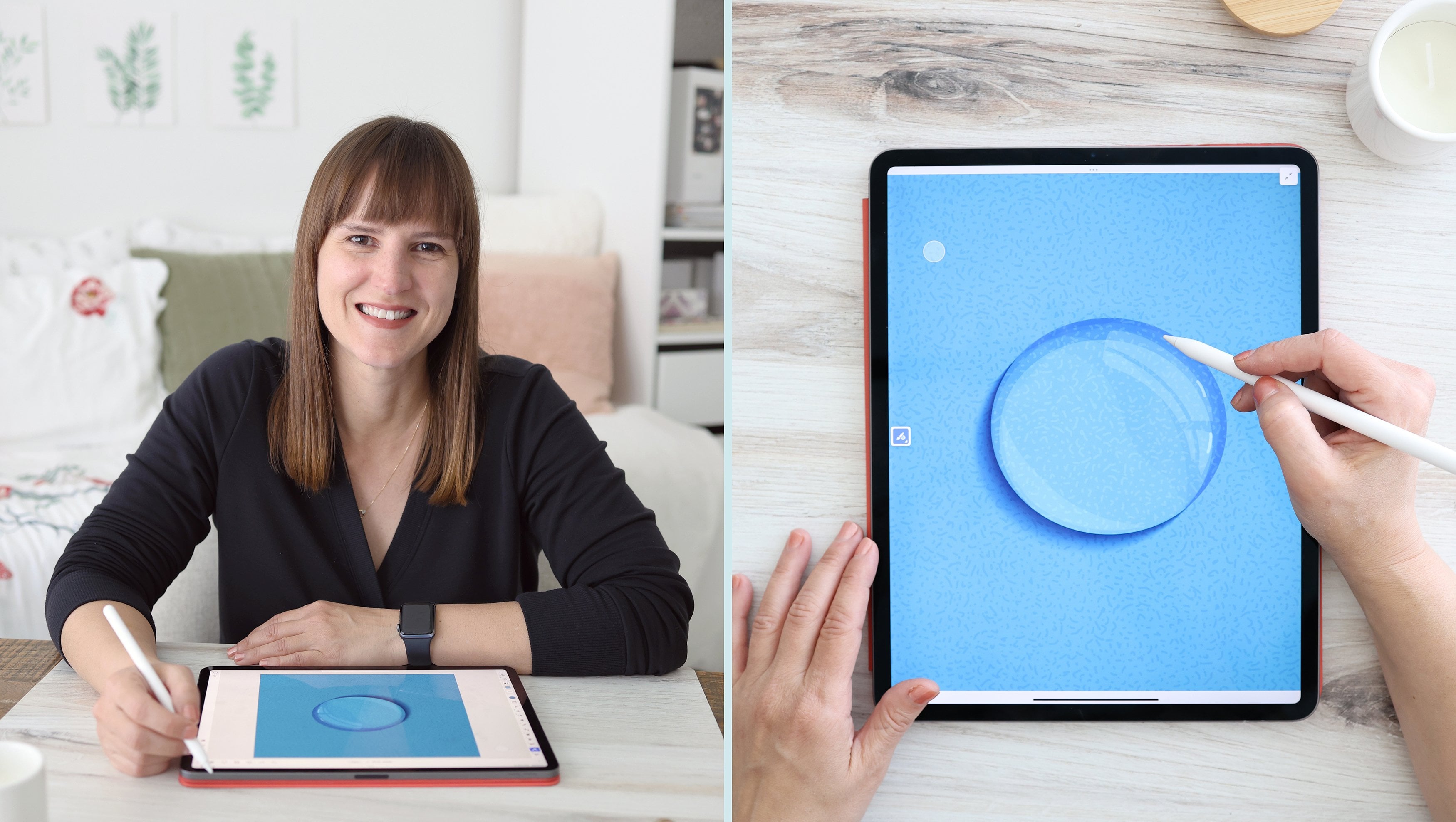
Transcripts
1. Class Introduction: Hi, I'm Amy. I'm a surface pattern designer and illustrator. Welcome to Part 3 of my Intro to iPad Art series designed to help you get started creating digital artwork on the iPad. I've been drawing since I was young and I studied Fine Art in school where I focused in oil painting. But I transitioned over the last five years to creating art on the iPad. Transitioning to the iPad Pro and Apple Pencil completely changed my workflow. In one device, I have a portable sketchbook, Canvas, and every tool or brush that I need. In this series, I'm sharing my workflow tips with you to help you get started. If you've been interested in the iPad and Apple Pencil, but you're not sure where to start or which apps are right for your project, I'm here to help. In this class, we will focus on learning Adobe Illustrator for the iPad. This class is part 3 of a three-part series where I'm teaching Procreate, Adobe Fresco and Adobe Illustrator for the iPad from start to finish. I use all three of these apps in my workflow and I want to help you get started on your journey to creating beautiful works of art on the iPad. No matter the project, whether you're hand-lettering, designing a logo, painting a portrait, or creating a repeating pattern, you will learn tips and tricks to make your project shine. We will review the basic tools and features and go over some some gestures and shortcuts to make your workflow faster. We will go step-by-step through Adobe Illustrator for the iPad, starting with our initial design and finishing with a final piece. At the end of the class, you will have completed a greeting card that you can share. If you're ready to get started, join me in the first lesson.
2. Class Project Introduction: For the class project, we're going to be creating a greeting card. At the end of the class, you can print it out or share it digitally. This could be a thank you card, a birthday card, or a holiday greeting. It's your choice. I encourage you to work on your project as you go along through the lessons, you'll be learning all the tools necessary to create your project. At the end you'll be able to export your work and upload it to the project gallery. By working on the project as you go along, you'll get familiar with all the tools and get comfortable working on the iPad. This course will walk you through the step by step process to create your project. We will be learning how to import images and files to be used as reference materials. You can import sketches to trace over with the drawing tools. I'll show you how to create clipping masks and how to use the repeat tools to create symmetry in your design. We will go over how to create complex shapes with the combined shapes menu and how to add text to your card with the type tool. Finally, we'll walk through all of the export options available. You can export your project as a PNG to upload to the project gallery. In the end, you will have a finished card that you can share with your loved ones. I can't wait to see what you create.
3. Getting Started: First things first, let's open up the app. Now, I am working on a fourth-generation iPad Pro 12.9 inch with a second-generation Apple pencil in Adobe Illustrator for the iPad. When you come to the home screen, you're going to see first your recent work. Down here, you'll see three ellipses next to a document and you can tap on it, and you'll be able to rename it, duplicate it, make it available offline, delete it, or view version history. If I tap on "View version history", it'll open up my various versions. Now, versions expire after 30 days, but you can mark the ones that you want to keep and they'll be up here under your Marked versions. All you need to do is tap on the little bookmark icon and it'll end up in your Marked versions. You can tap on the three ellipses and rename the version. If it isn't the current version, you can also tap on the three ellipses and revert to that version. To exit your version history, just tap "Done". Up here in this section, you'll be able to tap and view the new and upcoming features. Just tap "View" to view the new features and then the list of anything they're working on. This little Cloud icon will let you know if you're sync to the Cloud, and this icon is for your app settings. Now this will also be available to edit in the document itself. Over here you'll see that you are in the home screen, but you can also view your work and you'll see all of your Cloud documents. You can organize these into folders. To add a new folder, you just tap the "Create new folder" icon. You can rename that folder and hit "Save". You can view these as a list or as a grid. To add a file into a folder, you'll simply drag it and drop it in, and it'll be organized into folders. You can view your work by date modified, date created, or by name, and you can view it from ascending or descending order. You can import and open files. If you, for instance, saved at Fresco document, you can save it as a PSD or a PDF, and then open it up in Adobe Illustrator and it will contain all of its layers to keep working on it. You could also, for instance, import a set of sketches from Procreate or Fresco as an image file that you'll be using to trace over. We can start a new canvas in two places. You can hit "Create new" to come up with your menu. Also from the home screen, you can create a custom size. We can tap here and you'll see several tabs. You have your recent work, your saved files, you also have standard print, screen, and illustration sizes. To create a new file, you can tap and name that file. We'll tap the little keyboard icon and we'll name this greeting card. Hit "Done". We can choose the units. You can see you have several units, but I'm going to choose inches. I'm going to do a five by seven card. If I tap the width and tap five, height, I'll do seven, and then I can lock the proportions so that if I ever make an adjustment to the width again and I change this, it'll automatically change my height because it's locked at that ratio. Go back and change that to five. We can change the orientation from portrait to landscape. We also have the option to choose the number of artboards we have. Now, if you took Part 1 and Part 2 of this series with Procreate and Fresco, you'll know that you only have one document, one canvas that you can work on. But in Illustrator, much like the desktop version, you actually have artboards then you can select multiple artboards to work on. You could start with one and add them in the document, or if you know you need to start with several, you could add the number right here. I'm just going to have one artboard for now. You can also choose the color mode. You can choose between RGB and CMYK. Now, RGB is for screens and CMYK is for print. You can also save this size. If you've created a custom size, you can save the size and name it, a specific name. Hit "Done" and then it'll be part of your saved sizes. Now, we just hit "Create" and you set up your new document and we're ready to get started. To recap, we learned about the home screen and how to organize our documents. We learned about making our work available offline and how to save a document version in our version history. We also learned how to set up a new document and save a custom document size. Next up, we'll take a tour of the workspace.
4. Workspace Tour: Now that we created our first document, let's take a tour of the workspace. Now, I'm going to go over each of these tools and features throughout the courses in depth but I just want to give you an overview and get you comfortable and accumulated to where everything is in your workspace. First up, we have the left-hand side which is our toolbar. You have at the top your selection tool and this lets you select, move, and adjust an object or path or a group of objects. The direct selection lets you adjust anchor points, the next two are your drawing tools. First you have your pen tool and next you have your pencil. You'll notice that there's a little icon, a little triangle in the bottom right corner. That means that you have additional tool options. If we long-hold, we'll open up a float menu and you'll see you also have your blob brush. You have the eraser, your shapes. If you long hold you'll see you have additional shape options here. Your text tool which is your regular horizontal text and then you also have a vertical text option. You have your Artboard options. It has some standard presets. As I mentioned, you can have more than one Artboard. You can tap on one of these presets and add an additional Artboard of that size. You can also come down here and tap duplicate and it will copy over your Artboard. You have your import options, and then you have your color chip. You can change the fill color and the stroke color. If I were to draw a shape here, you'll see that it has a blue fill and a purple stroke. Now, you'll notice that with my selection tool selected, I have a little menu that comes up at the bottom and it is your common actions panel. This gives you quick access to some common tools that you'll need when you're working with the selection tool. A different common actions panel will show up when you have the direct selection tool selected. Now, all of these are over here on your task bar. Up here at the top you have your layers panel and you can add a new layer by tapping the plus symbol. You can lock a layer, you can turn off visibility or turn it back on. You can also swipe across to the left and you can rename your layer. Just type something in and hit ''Okay''. You can also delete a layer. Now, if your layer is locked or it's the only layer on the Artboard, if you swipe across you can't delete it. You have to at least have one layer. Next up we have our properties panel. If we select an object, you'll see that you have various property options to adjust. We have our transform which will change the size, shape, and rotation. We have our appearance panel where you can change the opacity and the fill and stroke. You can also change the blend modes. Then you can also change your stroke properties. This icon is for the precision panel. You can turn on and off your snapping, your grid, and your guides. This is your combined shapes tool. If you have at least two shapes selected, then you'll have options under your combined shapes tool. We have our edit options. We have our cut, copy, and paste. We have our alignment tools, align, distribute, and flip. Our object panel has options for making clipping mask, compound paths, creating guides and so on. Our type panel has options for when we have type on our document that we have selected and we want to adjust. The options under the path panel are available when we have our direct selection tool selected. You'll notice that our little common actions panel down here are the same options under our path panel. You can use them down here and if you're not sure what they are or can't remember, then you can look at the names here. Lastly we have our repeats. We have radial, grid, and mirror repeat options. Up along the top we have our title bar. This little arrow will take us back to our home screen. We have our document name, we have our Zoom panel. If I tap, I can manually enter in a Zoom amount. I can also slide up and down using this little slider, or I have a minus and a plus. If I tap and drag, I can quickly zoom in and out as well. I have our undo and redo buttons. You can invite someone to edit a document with this little icon. A share menu for exporting our document. Under the help menu you can view gestures, touch shortcuts, take a tour of the document and browse the tutorials. The settings menu lets us rename our document. We can also change the units. If we wanted to switch from inches to pixels we could tap and change that. We also have access to our app settings here. This is the same menu that was available when you tap the little circle in the top right of your home screen. Now, there's a few options that are helpful. For instance, the palm rejection, I would leave this turned on. This way if you rest your palm on the screen, it won't confuse the app and think that you're trying to make an adjustment. It will only read touches from the Apple Pencil or from your fingers if you're doing quick gestures or touch shortcuts. You also have the option to double-tap the top of your Apple Pencil and you can select what it does. You can open up the color picker, you can de-select an object or path, you can switch to the pen tool, zoom out to 100 percent and have it do no action at all. If you don't want to have one of these, you can turn it off. But if you do, for instance if I have de-select an object or path, currently this one is selected, if I double-tap it'll de-select the object. You can personalize that to whatever you prefer. Lastly we have our view mode. We have our preview, outline, and transparency grid. We also have the little touch shortcut over here. If you took Part 2 or are familiar with Fresco already, then you are familiar with the touch shortcut and it works the same here in Illustrator. There are slight differences because the tools are different but most of the touch shortcuts are very similar to what you have in Fresco. Over here you'll see that we can drag it around the screen. If you tap the little white circle and the center is your primary touch shortcut. If you slide out and it goes full circle, you have engaged your secondary touch shortcut. Now in Fresco, you're able to lock the primary and secondary touch shortcuts by double tapping and it would lock that in blue. One more tap and it would lock the secondary outer ring blue. That is not currently a feature in Adobe Illustrator. I'm not sure if they plan to make that available or not but for now and that is not an option you have here. You do have to engage it. I often am drawing with my Apple Pencil so I'm going to engage my finger and then I slide in and out. Now, we're going to go over how the touch shortcut modifies the tools throughout each lesson. But if you can't remember what all they do, you can go up to your help menu, view touch shortcuts, and it'll give you a list. Next up we have our quick gestures. These quick gestures are going to feel very familiar if you've worked in Procreate or Fresco before or took Part 1 or Part 2 of this series because the gestures are all very similar, a two-finger tap will undo, a three-finger tap we'll redo, a two-finger pinch will zoom in and out. You can also use those two fingers in pan and move your Artboards around. You can use the two fingers to rotate. If you do a two-finger pinch very quickly, you'll fit the canvas to the screen and also rotate it to zero degrees if it was rotated. Let's say you have this object selected. You can also double-tap to open up your direct selection mode. Just tap done to come out of there and go back to the tool you are using. That is a quick overview of the workspace and where to find each of your tools and features. To recap, we learned about the tools in the toolbar and how to find additional tool options. We learned about the layers panel, the properties panel, and the precision panel, and where to find the options under the taskbar. We learned about the title bar options and how to adjust our app settings. We also learned about the touch shortcuts and a few quick gestures. Next up, we'll talk about the Pen tool.
5. The Pen Tool: In Adobe Illustrator, you have three tools for drawing objects: the pen tool, the pencil tool, and the blob brush. We're going to start by discussing the pen tool. With the pen tool selected, if I tap anywhere on my document, I'll create an anchor point. Now, objects in Illustrator are made up of paths which are created by connecting anchor points. This square anchor point denotes a corner. If I simply tap several times, I'll create a shape, and if I tap on my original anchor point, I'll close that shape. You'll see that this shape is made up of several corners. You also notice that it has a blue fill and, zoom in, you'll see it has a purple stroke. Your fill and stroke colors over here. I can switch those by simply tapping the arrows. If you were to tap and drag, you'll create a curve anchor point. You'll notice that this one is a little blue circle instead of a square, and that's how you know it's a curve. If I keep tapping and dragging, I'll put down several curve anchor points, and if I close the shape, you'll notice that now I have a rounded shape. Each time that I dragged my curve anchor points, it'll continue the curve in the same direction. If I were to drag, drag my next one, and then tap, it will break it and it'll go in the opposite direction. I can go around in the same curving motion or I can break it and create this wave pattern. Now you'll notice that these anchor points have handles. If I tap and I drag a handle, I can adjust the angle of the curve. I can also lengthen each handle and then I'll link them independently of one another. They'll keep the same angle, but they'll lengthen separately. Now to break a handle, bring this up here. I'll tap on my primary touch shortcut and if I break it, you'll notice that my handle moves independently. You'll also notice that this became a square or a corner anchor point because I've broken the handle and created a corner. If I slide out and engage my secondary touch shortcut, it automatically matches the handles, so both the length and the angle of the handle are matched. You'll also notice that it now becomes a curve. If I double-tap this anchor point, it'll switch to a corner. Double-tap that one, it'll switch to a curve. With my pen tool selected, if I tap anywhere along this path, I will create additional anchor points. If I have my secondary touch shortcut engaged, I can actually slide that anchor point along the path; so I can move it. Engage my secondary shortcut, it'll move it along the path instead. Now if I engage my selection tool, I can actually move my object or path that I've created around. I can also resize it using the little nodes on either side, top or bottom and in the corners, and I can just resize it as needed. With this little handle, I can rotate my object. If I engage my primary touch shortcut, if I were to resize, it will resize proportionately. If I rotate, it rotates and snaps to every 45-degree. You can't rotate it in small increments. It'll only rotate in 45-degree angles. If I move it, it is constrained, and it actually constrained to 45-degree diagonals or horizontal and vertical. With my secondary touch shortcut engaged, I can resize it and it'll resize from the center no matter which node that I use. I can rotate and it rotates every 10 degrees. This time, if I were to move it, it actually duplicates the object. Now you'll notice that with my selection tool, you have the common actions panel that comes up. If I were to click on this first one, it's the opacity, and I can drag across this line and change the opacity. Tap out to come back to your common actions panel. I can also tap and drag up or down and achieve the same effect. Same goes for my stroke width. If I drag up and down, I can change the stroke width. I can also tap and use this little slider instead. Tap to come back out. This is the stacking order. If I were to move this in front of these objects, you'll notice that the stacking order will change, whether it's in the foreground or the background or somewhere in the middle. Now if I were to open up my layers panel, you'll see that it's literally moving it up. If I move up and if I move it down, it changes it so that the layer is moved beneath these other objects. Now this is your little nudge icon, where you can move the object around. You can select it and move the object itself. But sometimes when there are other objects nearby, then it can pick up the wrong object, and so I find that the nudge tool makes that much easier at times. You can lock it and it'll have this little lock symbol. Now I can't select it or move it. To unlock it, simply tap the lock symbol, and it'll be unlocked and you can move it around again. You'll notice that this is my grouping function and because I only have a single object selected, I can't use that. If I were to swipe and select multiple objects, I now am able to group them or ungroup them. If you come up to your layers panel, you'll notice that you've created a layer group. I can also duplicate using this little icon here. Now it doesn't look like I did much, but I have actually duplicated it, and it lays directly on top of the original object. But if I were to move it, you'll see that I now have a second object duplicated, and I can use this little trash can to delete it. The direct selection tool will let me manipulate anchor points. If I were to tap on here, you'll see that I can see all of the anchor points. These two are currently the ones that are selected and that I can adjust. If I were to move them around, I'm just moving these two anchor points. These in white are de-selected. You'll notice that I have a little common actions panel that pops up here as well. If you are having a hard time at first remembering what they each do, then you you use this path panel. Now, the first option is to cut the path. If I were to have this anchor point selected and I were to hit ''Cut'', it will cut the path at that anchor point. The next tool, you can convert between a corner in a curve. Right right I have this one selected and it's a curve, so I can't turn it into a curve but I can turn it into a corner. You'll notice that when I have a corner selected, my convert-to-a-curve is now available. Depending on which type of anchor point you have, the other one is available to you. If I have multiple paths selected, I can use join path to join them together. If I have this selected, I can also use the simplify path to keep the same shape, but simplify the number of anchor points. You will notice that if I go back and undo, I have several anchor points, and with simplify path, I've moved down to simply four anchor points. Now simplifying your objects is important because the more anchor points in your objects, the bigger the file size can be. Simplifying them retains the general shape, but decreases the number of anchor points absolutely necessary to create that shape. The Smart Delete function. If I have this selected, it will smart-delete and you'll notice that I now only have three anchor points. This anchor point has been removed, but it didn't break the path. I can also select one and hit ''Delete'' and it completely removes it and cuts the path. To recap, we learned about the pen tool and how to use anchor points. We learned about the selection tool and its common actions panel, as well as the direct selection tool and its common action panel. Next up, we'll discuss the pencil tool and the blob brush.
6. The Pencil Tool & Blob Brush: While the pen tool allows you to create paths with precise placement and adjustment of anchor points, the pencil tool and the blob brush tool are free form drawing tools that let you create paths by drawing objects in a more fluid manner. First up, we're going to discuss the pencil tool. At top here I've engaged my pencil tool, and I can start drawing a shape and as I draw, it will create my anchor points along the way based on the shape that I drew. I have one ability to adjust the pencil tool, and that is the smoothing. This little icon is to adjust the smoothing. With this shape that I just drew, I had the smoothing turned up to nine. The max is 10. I had it turned up pretty high. If I take that down to a one for instance, and I start drawing, it will let me draw a lot more little variations in my line, and it doesn't smooth out my lines as much. You'll notice that I have a ton of anchor points, whereas this shape has just a few basic anchor points. I often keep smoothing turned up pretty high just to simplify the anchor points in my path. I can edit my shape that I drew with my pencil tool the same way that I edited the shapes that I drew with my pen tool using the direct selection tool. If I come over here to the properties panel, I can make additional adjustments to my shape. For instance, I can use the transform options to change the width and the height. If I tap on any square, I can use this little slider, and so I'm manually adjusting the width. I can also hard key in an amount. I can do 3.5 inches, and it's now 3.5 inches wide. If I lock the aspect ratio, if I adjust the width or the height, it'll adjust both in unison. I can also adjust the x and y-axis. I can adjust the position horizontally on the x-axis and vertically on the y-axis. I can adjust the rotation by manually entering in a number. I can also use the slider here. In the appearance section, I can change the fill and the stroke. I can adjust the blend mode. If I were to come over here and I were to adjust this so that it's behind here. I'm going to take this object, and I'm going to adjust the blend mode. Anywhere where the two shapes overlap, they'll now be adjusted by the blend mode that I have selected. I can play around with some different adjustments to my objects. I can take the opacity up or down using this slider. I can also manually adjust from this little menu here. This final section down here is to adjust the stroke. I can have a solid stroke or a dashed stroke. I can manually increase the size of my stroke by tapping on this box and adjusting. If I have a dashed stroke, I can also adjust the size of the dashes as well as the size of the gaps in between the dashes. Anytime you have a box with a value in it, you can tap and open up the fly out menu with this slider, the pluses and minuses, and also you can manually enter a number. You can also just adjust by sliding up and down after tapping on the box. I can also adjust the stroke in a few other ways. Right now, my stroke is centered in the middle of my color. I can also have it where the stroke properties, the adjustment points, are on the exterior or the interior of my shape. If I come over here and draw this line, I can change where it's a rounded end cap. I can also change a squared end cap, or adjust it so that the anchor point is at the very edge of my stroke. If I were to keep drawing, I have right now a 90-degree angle for my corners. I can also have a rounded corner or a chamfer corner. Next up, if we press down, and long hold, we have access to our blob brush. I have four basic options. I have my basic round, flat, chisel or terminal. With my basic round brush selected, I can make further adjustments with this little panel down here. If I tap, I can adjust the size of my brush. I can adjust the smoothing. I also have a few additional brush settings, so I can adjust the roundness and the angle. I can use the slider, or I can use this little value box here to manually adjust. I can select whether or not it has a taper at the end. What's most important to me is the merge brush strokes option. I usually leave this on. I'm going to select these and delete them. With merge brush stokes turned on as I draw, if I continue the brush stroke, it is one one object and where I left off and picked back up again, it is connected. If I come in, and I turn merge brush strokes off, when I draw, you'll notice that it is actually a separate object. Depending on what you need in terms of drawing objects, you can turn this on and off to your liking. I tend to keep my merge brushstrokes turned, on because as I'm drawing I want to keep building up that shape. Now an important thing to note about the blob brush tool, unlike the pencil tool and the pen tool, which creates stroked paths, the blob brush tool draw strokes that are immediately expanded into shapes. If I have my pencil tool, and I draw a shape, you'll notice that it has a fill and a stroke. If I were to use my blob brush tool, and I were to draw that same shape, I don't immediately fill it in. What I'm actually creating is a compound path. If I were to select this object and I were to switch from a fill and a stroke over here, then you'll notice that it just keeps the same line and it outlines the exterior and interior linework and fills that in. What it's actually doing is creating a compound path. If I come up to my layers panel, you'll see that it is a compound path. A compound path is two or more shapes that create holes where they overlap. If I were to come over here to my objects panel, and I were to select Release compound path, I will then have two separate paths. You can see here I have an interior circle, and an exterior black circle, and they are just overlapped. I can actually just select this circle. It is a completely separate shape. If I line them up again, and I were to select Make a compound path, I now have this illusion where it is a hole and I just have an exterior line outlining my circle. Now if I were to move this over this shape, you'll see that it is actually a transparent hole in my shape. If I were to come over here, Release the compound path, and my artboard is white, so I'm going to select this shape as white. If I select both and were to group them, it looks just the same as it did before, except now if I were to drag this over the shape, you'll see that it isn't actually a hole, because it's not transparent and you can't see the shape below it. It just happens to be that this smaller circle is the same color as the artboard, so it has the appearance of it having a hole in it. Now if I were to make this a compound path again, it creates that illusion again. One other thing to note is if I were to release the compound path, I'm going to slide this over. I'm going to select both of my objects again, and I'm going to make a compound path. It only creates the hole where the two shapes overlap. This area is outside of this circle, so it's black, and same with this side. If I were to move it across again, it's this hole cutout in that shape. On the flip side, if I were to release that compound path and do the same thing where I created it in white, it doesn't do that. If I were to group them, I now just have an object where there's a white circle on top of a black circle. With these tools you can start drawing out some motifs on your card. Now keep in mind that there are no sketching tools in Illustrator, because it's a vector-only drawing app. Sketch brushes like your basic pencil tools that we used in Procreate and Fresco in parts 1 and 2 of this series, they are pixel-based brushes, so they're not going to be available in Adobe Illustrator. But you can bring in a sketch from another one of those programs. Or if you've drawn something on pencil and paper, you could take a photo of it and import it in. I'm going to come over here. I'll delete this image. To get started on our card layout, I have several card templates and theme ideas in the resources section of this class that are available for you to download. These are just suggestions and ideas to help you get started, they aren't necessary, if you'd like to do something different, you are welcome to do so. If you take in part 1 or 2 of this series, then these resources will be very familiar to you. First I'm going to come over to my import options. You'll see that I can import by using my camera from my camera roll files, cloud documents, or libraries. Now I have my card templates setup and saved under My Files, so I'm going to tap Files, and then it'll open up my folder with my card templates. I'm going to select this card template, and it'll pop right onto my artboard. I am going to leave it just as is, but I could adjust this by rotating it and resizing it, if I needed to. What I am going to do is I'm going to take the opacity down a little bit, so that it's just faintly in the background. I'm going to also lock it, so that I can't adjust it and remove it. It's just going to be there in the background as a template. I'm also going to double-tap on this artboard, and I'm going to name it Template. Over here, I'm going to select these, delete them. I have actually drawn some sketches of some motifs, some little floral motifs that I want to trace over in Illustrator. I did them in Fresco. I'm going to come over here to my import menu. I am going to come over to my Files, and I'm going to select this image right here. Now this is just a JPEG of sketches that I did in Fresco. If I had actually drawn out my motifs in Fresco as vector illustrations with a vector brush, I could actually import those directly in here instead. But I'm going to opt to use my sketches as a background layer and actually draw over them with my drawing tools in Adobe Illustrator. Again, I'm going to take the opacity down a little bit so I can just use them as a reference. I'm going to lock this layer. Now I can't move it or adjust that sketch layer as I draw over it. Now, next up, I'm going to my blob brush tool, for instance, I'm going to select blacks. I always start in black, and I'm going to keep my smoothing turned up pretty high to make very simple paths. I'm going to take my size down to a one, merge my brushstrokes, I'm going to leave rounded edges, not tapered. Everything looks good. I can just start drawing out and tracing over my motifs. Now let's say that I have this little end cap here. It's not perfectly aligned where I picked up and put down a new stroke. But what I can do is tap on my direct selection tool, and I can make adjustments to the anchor points. For instance, this anchor point here really doesn't need to be here. I'm going to use Smart Delete and just simply delete it. I haven't broken my path. Then I could also make further adjustments by selecting my little anchor points and adjusting them here. Now I have a nice clean edge. I can pick my blob brush tool up again and just keep adding to it. I like to have a little bit of an organic feel to my linework, but I could also keep this a lot more precise if I wanted to, by using my pen tool. If I instead wanted to make my adjustments and put this down here, I could use my pen tool and create my shape that way instead. Whatever tool you want to use to draw out some elements for your card, you can choose them and draw them out. Now I'm going to finish drawing these and I'll meet you in the next class. To recap, we learned about the pencil tool, and how to make adjustments in the properties panel. We learned how to use the blob brush tool and how to create compound paths. We also learned how to import images and files into our documents to sketch out our motifs. Next up, we're going to talk about building complex shapes in Illustrator.
7. Shape Builder Tools: I finished drawing out my floral elements using the drawing tools, so now let's talk about the shapes tool and how we can use it to create complex shapes. Over here, I have my shapes menu. If I tap and tap again, I'll see a flow out menu of additional options. I can create squares, circles, triangles, and stars. If I have my shape selected, I simply drag, and I can create a free form shape. I can create a rectangle or a square. If I want to create a perfect shape as I drag, I simply touch my primary touch shortcut and I will create a perfect square. This works with all four of my shapes. If I start drawing and I engage the secondary touch shortcut, I actually draw a perfect shape from this center point. With any of my shapes selected, I can drag this little node here to adjust the corner of radius. You'll notice that all four of my corners are adjusted equally. If I wanted to adjust a single corner, I will come up to my drag selection tool and I will adjust this one corner or this one corner. I can adjust each corner independently as well. I'm going to adjust this a little shorter. In this way I can create an interesting shape. Now with my shape selected, I can come over here to my align tool and I can align it to the art board to the left, right, top, bottom, or centered vertically or horizontally. With a second shape, if I come over here and I draw a second shape, I'm going to give it a new color. With both of these objects selected, I can use the align tool and align them to each other. Now if I align left, it doesn't align the left of my art board, it aligns to the left of these shape boundaries. I can align to the right, to the bottom, to the top, and I can also center them. I can also flip them, and if I had a third object, so let's create a third object by engaging our secondary touch shortcut and duplicate that. When I select my Align menu, I can distribute using these tools. Now, I can drag and move these and align them, but they won't quite be perfect. If I didn't want to use my align tools, I can come up to my precision panel and turn on snapping. With snapping turned on and my smart guides checked, I can now move this object, and you'll notice that you get these little pink lines that come up. If I were to align this here, you'll see that I have a pink line horizontally and vertically showing me that I have aligned it to the very center of my art board. I can also align it to the center of another object. Here I've aligned it to the center of this black shape on the back. I can tell that because my horizontal and vertical smart guides are only extended to the boundaries of my background shape. If I wanted to align this, say, to the topmost, and rightmost edge of my shape, I'll wait until I have these little smart guides come up top and right, and now I know I've aligned it just to the edge of that. Now, if I select both of my objects and I come up to my combine shapes menu, I have several options to combine this shape in different ways. I have the four options in the middle, I have combine all, minus front, intersect, and exclude overlap. Now combine all will just make this one large shape. Minus front will subtract the area of the circle from the background shape because the shape of the circle is on top or in the foreground. I can choose intersect which will only keep the area that is intersecting between these two shapes. This will be removed, and this will be removed, and then exclude overlap is the exact opposite. It will remove the interior that is overlapping. Now, I can select any one of these, and I can actually switch between them because these are non-destructive formats. They act almost like masks instead of actual full permanent shape builder tools. If I want to turn one on and off, I can just preview what it looks like, but I can also go about and continue to work, and it will act as a shape. If I want to make this permanent, I would need to come up here and convert it to a path. Then when I do that, the exclude overlap is now permanent. If I want to undo that, I can simply hit Undo, and you'll notice that my exclude overlap is now selected again and I can switch between the options. I can also choose to divide all. If I select divide all, and then I ungroup these shapes, you'll notice that I actually separated each one of these into three paths at the points where they intersected. Now, this is not a mass, this is permanent. If you did not want to keep this, you would simply tap and undo, and if I come back up here, I can come up and I can combine the shapes. I can use the shape builder tool, and if I draw from one shape to the next with this little blue line, I will now create this as one permanent shape. I can do the same thing with this shape and combine it, and now I have a single shape. When I'm done, I can tap done, and now my shape has been combined. Much like the divide all option down here, this shape builder function is permanent. If you don't want to keep this, then you would need to undo that option. Let's talk a little bit more about the precision panel. I'm going to come over here and turn my grid on. I have two options for my grid. I have lines and I have these little dots. You can just barely see that I have these little tiny dots in this grid pattern. You can select which option you like if you'd like to turn on your grid. I'm going to keep the line option turned on. I can adjust the color, I can make it darker or lighter. I'm going to turn it up so that it's easy to see, and I can adjust the spacing. The spacing is the actual individual grid lines. I can tap and I can make adjustments and make my grid larger or smaller. I actually want it to be one inch, and I can also increase or decrease the number of subdivisions within the squares of the grid. I can drag and increase the number of subdivisions, and you can see I've got many more, and I can also decrease down to zero or just a few. I want to have eight, just like it was. With my grid turned on, I can choose snap to grid. When I go to draw, let's say I want to select this square and I want to draw a square, it'll actually snap to each grid subdivision along the way. I can use my grid as a guide to create this perfect trim around my art board. It also works when I have to use snap to grid if I were to need to move this shape around. If I move it, it'll snap in place as well. Whether or not I have my grid turned on or not, it'll actually continue to snap to that grid in the background if I have snap to grid turned on. I can also turn on my guides. If I turn them on, right now you won't see much of a difference because I don't have any guides set. But I can take this shape that I created and I can come over to my object panel and I can select convert to guide. When I do that, if my guides are turned on, I'm going to turn off my grid so you can see this a little better, you'll see that I now have this bright blue line which is the color of my guides. I can adjust this or if I want to keep the guide in place, I will lock it. Now the thing about the guides is I can turn off snap to grid, but with my smart guides turned on, it will act as another area for it to snap to. If I were to draw a shape and then we come over here and move it, you'll see that it'll snap, and you'll see the smart guide come up as I align my shape to my guide. I can create as many guides as I need to with my outline or my background to make adjustments and align my shapes using my smart guides. I can create another guide with my circle. I'll create a perfect circle. I'll move it. I'm going to move it into place, align it to the center. I'll use my secondary touch shortcut to expand it from the center point and keep it centered, and then I'll come over here, I'll convert it to a guide, I'll lock it in place, and now I have a guide in the center as well. I can make as many of these guides as I want. I'm going to add some shapes in the corner to my card template. I've created these little corner shapes that I'm going to use in a future element. Next up I'm going to draw some squares, I'm going to convert that to a line. Using the pen tool, I'm going to create additional anchor points on my shape, and then use my direct selection tool and make little minute adjustments. I'm going to select, use my secondary and duplicate that shape, and use my direct selection tool again, and I'm going to select my anchor points and create slightly different versions of the same geometric shape. Now, I finished drawing some basic shapes that I'm going to use for some elements in my card. To recap, we discussed the shapes tool and how to use the combine shapes menu, we learned about the align panel and the precision panel, and we discussed the grid options and how to create guides. Next up, we'll talk about the symmetry tools in Illustrator.
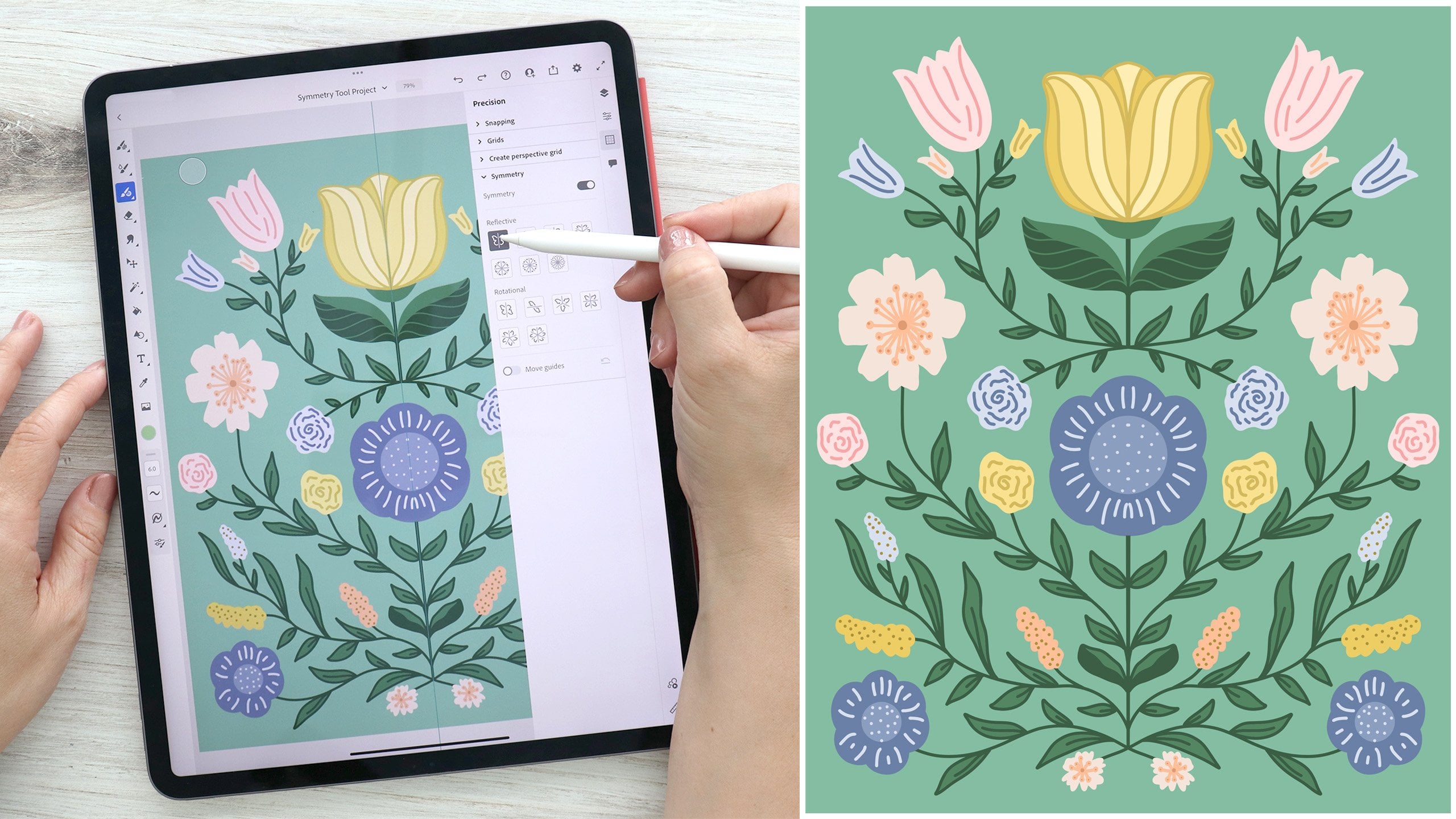
8. Symmetry Tools: Now that I've drawn out my floral elements from my drawing tools and used my basic shape tools, let's talk about the repeat options in Adobe Illustrator. I'm going to lock each of these elements in place and I'm going to come up here and I'm going to turn them off so that we can see what we're doing with these repeats a little easier. I'm going to unlock my floral motifs. I'm going to duplicate this one and I'm going to pull it out of the group and lock those back. Now pull it over here to this art board so I can adjust it. I'm going to first start by making some adjustments to the size and the rotation. With this element selected, I want to repeat it around this circular guide. I'll come over here and I'll tap radial under my repeat panel. You'll see that it repeats this in a radial pattern. I can move this repeat around my art board. I can adjust the size using either of the corner nodes. I can adjust the spacing in the rotation of my radial repeat. You'll see I can just move it around and adjust it until it fits exactly where I want it to. It goes all around a full circle. I'm going to adjust it just about there. I can also determine if it goes around the full circle or just part of the circle. I can move these nodes and adjust them and it'll only repeat from one end to the other. If I only want to do, say, a semicircle of a radial repeat, then I can just adjust these nodes. If I want to go full circle again, I simply drag them back together. I could also increase or decrease the number of elements repeated. Now, if I want the ability to keep readjusting this radial repeat, I will leave it as a radial repeat in my layer panel and I can keep adjusting it. Once I am happy with the placement and orientation of the elements, I can come over to my objects panel and if I tap "Expand", I now have just a group of the two objects rotated in a radial repeat, but it's no longer an editable repeat. I can also ungroup these, and now I'm able to adjust them independently. I'm going to leave those grouped and I'm going to lock those in place. I'll turn them off and let's talk about the grid repeat. I'm going to take my blob brush tool and I'm going to make several little random dots. I'm going to select these and I'll group them, and I'm going to come over to my repeat panel and select grid repeat. Now I can adjust the overall size of my repeat, just as I did with my radial repeat options. I can adjust the bottom and the right side and increase or decrease the area of my repeat. I can also increase or decrease the spacing both horizontally and vertically of my repeating elements. I can decrease this spacing so that they overlap quite a bit. Once I'm happy with my repeat, I can come over here and I can choose to expand, or I can leave my elements in the repeat to be able to adjust later. I'm going to tap, "Expand". You'll see that I have a clipped group. I'm going to release my clipping mask down here and I am going to resize it and adjust it to fit my art board. I'm going to lock that in place and turn it off. Lastly, we're going to talk about our mirror repeat. If I come over here with my blob brush tool and I draw a half of a heart, I'm going to select that and turn on my mirror and it will mirror the object on the other side of this vertical line. Now, I can resize this. I can stretch and adjust my object using the corner or the side top and bottom nodes. If I adjust and expand the shape inward, you'll notice that where it crosses the line, it will simply erase it. It's like it masks the shape and cuts it off so that you don't have to worry about the overlapping areas. I can also adjust and rotate the angle of my line both from the top and from the bottom. I can adjust this little node here and slide in and out the spacing between my two elements. I can also flip it completely so that my spacing is now vertical instead of horizontal. Once I'm happy with my shape, I can leave it as is or I can expand it. I'm going to delete this object because I don't need it. I'm going to come back to my dots, and I'm going to create a clipping mask using the triangles that I drew earlier. I'm going to come over here, ungroup each of these, and I am going to adjust the size of my shapes here. Now that I've created a much larger group, I am going to select my dots and I will make it a clipping mask. Now the dots are contained within the shape. I'm going to turn off my guides and I'm going to turn off my background layer. You'll see that the dots that I created are now contained within that shape of corner squares that I expanded into a single shape. Using the clipping mask, I can release my clipping mask and make adjustments. If I want to go back, I can simply make my clipping mask again and contain my shapes. Within there I can make adjustments to the underlying layer. I can adjust my dots if I want to. I can move them around and you'll see that they move and change, but still are constrained within the underlying shape of the mask. To recap, we learned about the repeat panel options. We learned how to create radial grid and mirror repeats. We also learned how to use clipping masks to hide and reveal elements in our document. Next up, we'll learn about the color panel in Illustrator.
9. The Color Panel: Now that we have created several of our card elements, let's add in some color. I'm going to come over here to the color chips. I'll tap on a color chip and it will open up our color panel. Up at the top here, I have my color wheel section. I can change the color by adjusting this outer ring. Simply drag this little circle around the outer ring. The inner box is where I can change the value and saturation. I'll just drag this little node around this box here. On the outside I have three quick chips. I have pure white, pure black and transparent. I also have my eyedropper tool, which will allow me to select colors from an image or an area of the canvas or another object. In this middle section here, I have my sliders and my hex code. The hex code is a format for identifying colors for the web. If you know a specific hexadecimal code that you need to use, you can enter that here. If I tap on the three ellipses, you'll see I have four additional slider options. I have my CMYK sliders, my grayscale slider, my HSB sliders, and my RGB sliders. For any of these, you can simply slide along each of the colors or tap on the box and manually enter a value, or use this little slider here, or the minus and plus symbols. Whatever color mode you need to be in, you can adjust with any one of these options. Lastly, we have our swatches. Now every time you open up an illustrator document, you're going to have this basic set of colors. If you would like to remove any of the colors simply long hold on the color and you can edit or remove it. If I wanted to delete this from my swatch, I simply remove it. If I long hold and press Edit, I can edit the swatch. I can change it from global or not. I can change the color mode. I can rename it. I can also change whether it's a process color, a spot color and then I can use my RGB sliders because I'm in RGB color mode. If I were to change to CMYK, I'd have CMYK sliders. If I'm happy with my changes, I can hit "Save" or I can hit "Cancel" to come back out of that. Up here on my three ellipses, if I tap, I have two options for viewing this swatch. It's as a grid or a list. Now, I prefer the grid just because I can see more colors at once. I also have my color books. You'll see that you have quite a few color books. For instance, I have pantone colors that I can choose from. Go back. I can also access my Adobe libraries. If you have created a new swatches in Adobe and save them to your libraries, you can access them here. To add to my swatch, I simply tap on a color or adjust the slider and hit the plus symbol, and my color will be added to my swatch. Now, I have a solid color tab up here, but I also have a gradient tab. Now this gradient tab is only available on my fill color. If I were to move to my stroke color chip, you'll notice I no longer have the gradient option. It's only available when I access my fill. If I tap on that, you'll see that I have the same basic list of options, but I also have these three additional gradient options up here. I'm going to drag a circle, lock that in place and I will drag a circle onto my canvas. We'll take a look at these gradient options. I have three options. I have linear, radial and free form. If I tap on the linear gradient, it will show a line with two little color chips and this little blender line in the middle. Now, the current colors that I have selected and is available to edit will be slightly larger and you'll see this little common actions panel underneath. That's how you know that is the one you're editing. If I want to change this color while it's selected, I simply drag any of my areas in this color panel that I want to choose, I can adjust it in any section. I can also adjust the opacity by dragging or tapping and dragging just as I did before. You'll notice that there's a little trashcan symbol, but it is grayed out. That's because I cannot delete this color chip. It is an end node. I can only adjust the opacity and the color. I can adjust the point at which these two colors blend together by sliding this little line back and forth. If I want to adjust this color over here, I simply tap. Now it is the larger chip, and I can make adjustments. I can also drag any one of these end nodes around and stretch it out and adjust my linear gradient. If I tap in the center or anywhere along the line, I can add as many additional colors as I want. This color could be a blue color. I'll slide this little slider and it'll adjust the blend point between this color and this color. Then same will hold true for this color and this color. In this way, I can stretch and adjust my linear gradient to my shape. Now, you'll notice that when I have my central color selected and it's not one of the watercolors, I have the little trash can symbol. If I tap that it will delete it. But I can also tap and simply drag my color off my line and it'll also delete the chip. Next up we have our radial gradient and the adjustments are basically the same. You simply tap, change a color, change the opacity, change the blend point. Except in this way, it'll change it in a radial pattern. I can stretch my radius and I can also rotate it. In addition, I have this little circle here up the top, which can change the proportion of my circle into an oval shape. Now, I can also tap additional colors, and it'll change and add an inner rein. I could create this interesting effect here by adjusting the blend points to where they're very sharp. I can play around this by radial gradient in that way. Lastly, we have our free-form gradient. In this way, you can add as many nodes as you want, and they're not restricted to any line, they're just free form. I can drag this little node around, I can resize the radius. Now, it only goes to that size minimum and this size maximum, but you can adjust and you'll see that it interacts with this other node over here in the sizing. I can also drag the opacity level down as well. I can actually delete this node and leave this one. Now, at this point is just a solid color, but if I tap and adjust to new color, I can add highlights and shadows to my object. That's the free-form gradient. Now, it's important to note that the free form gradient cannot be used on a compound path unless you've already added it to your shape prior to creating compound path. I'm going to come up here, I will draw a circle. I'm going to put it in the middle here. I'm going to select both, and I'm going to make it a compound path. If I come up here to my colors and I were to need to edit my gradient, I can drag these little nodes around but I won't be able to add new nodes. I can delete them, but I can't add any new ones. You're limited to being able to adjust a free form gradient only when you have released the compound path. Now, if you were to have just a solid color, I'm just going to select a solid color and I came in, I made it a compound path, I can't actually add a free-form gradient to this compound shape once it has been created. You are limited on your free-form gradient with compound paths. Just something to think about if you do want to add a gradient to that. I'm going to delete this object, and I'm going to set up a color palette. Now, I have a few different options. I can come in here, I can just select a color, make an adjustment, and add it to my swatches, and I can delete an add as needed. I can also come to my Import menu, tap my photos, select a photo, and then I can use my eyedropper tool by tapping the eyedropper, and it'll bring up this little circle. I simply drag it around my image and select the color. Now, the top color is going to be your new color that you're picking. The bottom color is going to be your current color. If you are trying to pick a color that matched it or contrasted with it, then you can see the way those two interact. The color that you're actually picking is the color that's right in the center of this circle, underneath this little plus sign. Aim for right about there, pick your color, and when you're done, simply tap the plus symbol and add it to your swatch. Your eye dropper doesn't remain open. If you want to add more colors, simply tap the eyedropper again and drag it around. I could manually create my color palette using this image or using the color wheel. In this case, I actually already have a swatch in my library that I want to use. I'm going to select from my color library and use this swatch. I can collapse these and have a nice little compact color panel. Now, I can also detach this with this little gray bar and slide it around my workspace. I can also drag it over here. You'll notice that it turns this hazy blue color, and if I let go, it now adds it as a permanent color panel. If I choose another tool, my color panel stays open. You can either drag it around, open it up, or have it permanently sitting against your toolbar. I'm going to come here, take my image, delete it, and I can start coloring my motifs with my new color swatch. I finished colorizing each of my motifs that I've drawn so far. To recap, we discussed the color panel and how to create a color palette. We also learned how to use gradients to add dimensions to our objects. Next up, we're going to add texture card with the type tool.
10. The Type Tool: As you can see, I have added some of my floral motifs over here to my card around the radial repeating stem leaf pattern that I created earlier. Now I'm ready to add in some type. I'm first going to come up here to my layers panel, and I'm going to turn on my template layer so I can see a general guide of where I want to put my text. I'll come over here to my Type tool, and if I tap, I have two options. I have horizontal type and vertical type. With either of these options selected, I can simply tap on my screen to bring up a textbox. If I were to select the vertical type and tap, I would get a vertical text box. I can also drag a text box out and size it as needed. Now, as soon as I add a text box, you'll notice that my property panels pops out and I have an additional set of options to adjust the appearance of my text. I also have a common actions panel that is specific to my text editing tools. First up, I can double-tap and it'll select my text and my keyboard will pop open. I can tap the keyboard and I can start typing in a word or phrase, I type in this, and when I'm done adding text, I can hit the keyboard again and simply tap outside of my box to access my common actions panel and my textbox again. Now I can adjust the size of my textbox by simply dragging the nodes on either end. I can also rotate my textbox around, and down here I can make additional adjustments. I can adjust the size of my text just as I would with other common actions panel, I can tap or I can simply slide after tapping the tool that I need. I can adjust the text size, I can adjust the letter spacing, I can adjust the line spacing. If I had more words, I would adjust the spacing of the two lines. I can adjust the stacking order. I have my text box open, so this would actually adjust the stacking order of my text within my layer group. I can move it around, lock it, duplicate it, or delete it. With my text selected, I have a few slightly different options. After the line spacing, I also have a cut, copy, and paste option here when my editable text is open. In the properties panel, I can do several other things. I can adjust the font, so I could pick from any one of these fonts. I also have more fonts down here that are available to me. I have the full range of Adobe Typekit available to me in this panel, just like I did in the Fresco class if you took Part 2 of the series. I can select any one of these categories and select one of these fonts, play around and test different options out. Once I have selected my font, I can go back out and make additional adjustments. I can adjust the font style, and my style options will be dependent on the font I selected. I can adjust the horizontal and vertical scale of my text. I can adjust the size and the line spacing. I can also adjust the letter spacing. I can make it all caps, small caps, underline it, or strike through it, and over here, I can adjust my text container. Right now I have it selected so that I can resize, and it will resize the text container. If I choose this option, when I resize my text container, it'll actually adjust my text size because my textbox is set to fit the text that I have in place. I can also adjust the alignment left, center, right, or justified. Just like any other shape, I can also adjust things like fill and stroke color, blend mode, opacity, and the stroke properties. I can come in and add additional text boxes. Once I have my text placed generally where I think I'd like it to go, I can come over here, tap on a text box, and I have a few additional options available to me under my type panel. The first one is the outline text option. Now, once I select outline text, my text becomes an object and I can adjust anchor points just like any other hand-drawn element that I have on my canvas. Once you've chosen to outline your texts, it is no longer editable as text, so you can't change the font or the line spacing or the capitalization, and so on. You are now just stuck with an object. There are times when you might want to outline your text. For instance, if you have finalized your document and you're sharing it with a printer, they may not have the font that you've selected, so you would want to outline your text so that they can see it in its full format. But most of the time you want to probably leave it as editable text while you're working on your piece so that you can continue to make adjustments. I'm going to undo that and I'm back to my editable text options. The next two options are type on a path and edit the path. What we need is an actual path to work with. I'm going to lock this text so that I can't make any adjustments to it, I'm also going to lock each of these elements that aren't already locked. I'm going to adjust this word right here. What I need is a path to adjust the text on. I can come up here to my shapes menu and I could draw a circle. Now I'm going to outline this so that I can just see it a little easier, and I'm going to adjust it to about this size. I'm going to come over here and I'll align it to the center, and with both my path and my text selected, I'm going to come over here to my Type tool, and you'll see that I have type on a path now as an option. I'll tap type on a path, and now I have my type added to the path, the curve of this path, and I can make additional adjustments. I'm going to turn off these few layers so we can see this a little easier. Now with this, I can actually rotate my shape, I can resize it, and I can also make adjustments to the area of the text. I can adjust the starting and endpoints where it starts on my path and where it ends. I can also edit my path and make additional adjustments with the anchor points, so I could create an extra curve shape and make adjustments to the path itself. Up here in my Properties panel, you'll see that I also have some additional type on a path options. I can have my text go on top of the path or underneath it. I can also choose whether or not it is baseline, center, descender, or ascender. I'm going to choose baseline. I also have some different options for how the type will interact with the path. Rainbow, skew, 3D ribbon, stair-step, and gravity. Now I'm going to come back here and I'm going to adjust my path. Once I have it generally where I wanted, I can tap out, and I can also adjust the text box that is right underneath it. I'm going to turn my elements back on so I can see how this text is going to interact with them. The last thing I want to do is I'm going to add a background color. To recap, we learned about the Type tool and how to edit our text, we also learned how to outline text and to type on a path. Next up, we'll export our final document.
11. Exporting Your Work: Now that we've finished our card, let's talk about how to export our document. I come up here to the title bar and I tap the share options. I have a few options for exporting. First of all, I can quick export as a PNG. I simply tap and I can choose where I want to save my file. Under Publish and Export, I have some additional formats. I have the Quick Export as a PNG option again, I also have Quick Export as an AI, which is an Adobe Illustrator file. Now, it's important to note that if you have Adobe Illustrator on the desktop, anything that you work on in Illustrator for the iPad is automatically synced to the Cloud when you're online and available as soon as you open your desktop app. There's no need to export your file from Adobe Illustrator on the iPad to Adobe Illustrator on the desktop, but if you needed to simply save your file as an AI file or you are sharing it with a friend or a client, then you can choose Quick Export as an AI to save in your files and share. Under Export As, we have a few additional options. First of all, we could rename our file here. Under format, we have several options, first of which is the JPEG. A JPEG option will export our document as a flattened JPEG image. We have the option to change the color mode. We can change the quality and the resolution. We also have the option to embed ICC profile. If you're not sure whether or not to keep this, just always leave that checked. We have the option to select all of our artboards to export. We can also select a range and we can type in the number. We can also simply select and deselect our artboards by checking this box. We can also have the option to select our full document. Under the PNG format, we have some slightly different options. We can change the scale. We can also choose whether or not we have a transparent background, a white background or a black background. Now one of the benefits to exporting as a PNG is that you can have a transparent background. I could select just my floral elements, and right now they actually don't have a background, each of these elements are sitting on top of a white art board, but there is no actual white background. I could export these floral elements as PNG and they won't have a background, and then I can edit them in other programs without worrying about having to erase the background image. I can export it as an SVG, a Scalable Vector Graphic. With this option, I have two options for my fonts, as SVGs or outlines. You can choose whether or not you need a responsive SVG. Again, I can select all artboards, a range or the full document. Next up, I have PDF options. Now it's important to know whether or not you need to check off preserve Illustrator editing or to leave it unchecked. If you leave it unchecked, you will export whatever artboards you selected as flattened images and single pages in your PDF. In this case, this would be a single flattened image on one page, and this would be a single flattened image on a second page, and I would have a two-page PDF. If I check this box, then I will have the same pages in my PDF when I open it up as a PDF, but if I were to open it up in Illustrator, then I would actually have access to all the layers that I have in my document. If I uncheck this, when I open up in Illustrator again, they will be flattened images, so I won't be able to edit them. It's really important to know whether or not you're exporting this to be used in the future to edit again or if you simply want to send flattened pages as a single image. Now, preserving Illustrator editing will increase the file size because it's saving all of those layers. If you don't need to edit it, I would uncheck this and simply share flattened PDF pages. Again, you can select all artboards or a range. Lastly, we have our PSD options, so this is our Photoshop file. We can select our color mode. We can also select set resolutions. We have our standard 300 ppi, 150 ppi, and 72 ppi. Ppi stands for pixels per inch, and 300 ppi is considered high resolution, 72 ppi is considered low resolution. You can also set a custom range, and the max ppi that you can export as in Illustrator is 2,400 ppi. Again, you have the same options for all artboards, range or full document. Once you've decided how you want to export, simply tap "Export" and select how you want to export it. You can save it to your files, save it as an image, AirDrop it or any other option you have available to you. When you're done, you can exit out and go back to your main screen. At this time, be sure to export your document as a PNG so you can upload it to the class project page. I'd love to see what you've been working on. Next up, we'll wrap up the class and talk about final steps.
12. Conclusion: Thank you for joining my class. Today, you've learned all you need to know to get started with Adobe Illustrator for the iPad. You've learned all the tools, some tips for a faster workflow, and how to export your work. Now is the time to take what you've learned and go explore more on your own. This class is Part 3 of a series designed to get you started creating work on the iPad. If you enjoyed this class, I hope you'll check out the rest of the series to round out your skills and learn additional tools. It's time to upload your work to the project gallery, because I'd love to see what you've created. Be sure to check out other student's work and give them some encouragement. It's been an honor to teach you, and I hope I'll see you in my next lesson.
 Amy Bradley, Surface Pattern Designer & Artist