Transcripts
1. Intro: Hi, my name is
Carmen Luz Guzman. I am a Dominican
living in Madrid. I am part of the Operary team, an animation studio
based in Madrid, where I work as an animator, illustrator, and a scriptwriter. We have more than 10 years
of experience creating amazing vector
illustrations to produce animator explainer videos for hundreds of companies worldwide. In the illustration field, customers are
increasingly demanding. You need to learn quick
and easy methods to create attractive illustrations in
the shortest time possible. But you know what's best? You don't need to be a great illustrator to make
wonderful illustrations. In this class, I will
show you how to make creative vector illustrations in record time with
Adobe Illustrator. We will start talking about the language of shapes and its impact on your
designs and illustrations. We will also review
the tools and shortcuts used
during this course, and then we will design a quick sketch using
Adobe Illustrator. Next, I will show you how to vectorizing color your
designs in a simple way. Finally, you will
learn how to make your designs shine,
adding organic textures. If you are a creative artist, an illustrator, a graphic
designer, and animator, or simply want to
learn how to make creative vector
illustrations easily, this course is for you. There is no time to lose. Join now, and let's get started.
2. Before to Start : For the class project, you will create an
illustration from scratch. At the end of each lesson, I will give you some
instructions to get the best results
from this course. Make sure you don't skip it, as practicing is the
only way to thrive. We look forward to
seeing your work. Please, upload it to the
course project gallery. If you have any
doubts, comments, or questions, please post
them on the Discussions tab. We cannot wait to see
what you come up with. Have fun.
3. The Language of Shapes: Hello everyone. In this class, I want to talk about a very important topic in the design field that
is often ignored. The language of shapes. The language of shapes is
a key design principle widely used in character design
to emphasize personality. However, it is essential to use the correct traits to ensure the success of any of your designs whether or
not characters appear. When creating a design, it is made up of
different shapes. In each of these shapes is usually given a
set of meanings. Three main shapes
appear in most designs: circles, rectangles,
and triangles. The idea is to understand
the meaning of these shapes to create coherence messages
with our designs. The rectangular shapes produce
a feeling of robustness. They convey reliability
and safety. As a general rule, rectangular shapes should not be overused because
they are not related to anything exciting and can be boring if we use
them in excess. Triangles are dynamic,
strong, and energetic shapes. Triangles can have
different meanings depending on how
they are placed. An upright triangle can evoke
strength and stability. However, an inverted triangle can convey risk and danger. Lastly, let's talk
about circles. In general, circles, all of shapes and curved
lines convey positive, friendly, and close emotions. They are also related to
adaptability and movement. Taking this information
into account, we can't say they're
circular and triangular shapes are more exciting than
rectangular shapes. But we can also say circular and
rectangular shapes are usually friendlier than
triangular shapes. We wanted to make a
friendly and closest sign for the course project. Although it is an
abstract design in which we are not trying to
send any specific message. We can see that it transmits positive sensations at a glance. For this reason, we
have chosen to give priority to circular
shapes in curved lines. However, creating contrast
is always a good idea. We have left room for rectangular
and triangular shapes. Of course, if you realize
the only triangular shape in the video is in a vertical position to maintain the coherence
of the design. Before starting to design, think about the message
you want to convey with your illustration and choose the appropriate shapes
based on that message. See you in the next lesson.
4. Tools & Shortcuts: Hi there. In this lesson, we will take a quick look
at some useful tools and shortcuts to speed
up the work process. First, we will create a new document in
Adobe Illustrator. Give it a size of
1920 by 1080 pixels, what we commonly
know as full HD. Let's see how the
pen tool works. Clicking on different points
creates straight elements. Position the pen tool over the first anchor point
to close the path. As you can see, a
small circle appears next to the pen tool pointer
when it is set correctly. Click to close the path. To leave the path
open, press control, click on "Windows"
or command-click on Mac away from all objects. You must take in a stretch to draw curves
with the pen tool. It's that easy. Once we have created a curve, we return to the
last anchor point and click again to
retake the path. Then we made the next curve by clicking on the next anchor
point and stretching. We can modify the anchor points by using the direct
selection tool. Select the anchor
point and drag in. If we choose an anchor
point with curves, we can change the
curves as well. Of course, we can select our designs with
the selection tool. Move them, rotate them
from their corners, and modify their size. If we hold down the shift key
while adjusting the size, their design will keep
its proportions intact. Polygon tools are
much easier to use. Right-clicking on
the rectangle tool will bring up all
the polygon tools. Just select them, click and
drag to adjust their size. Remember that to keep
the proportions intact, we must keep the shift key
pressed while dragging. We will remove the fill color from here to see
what's underneath. If we drag from one of the circles that
appear in the corners, we can quickly run them. On the other hand, if we select one or
more of those corners and then drag only the corners we have chosen will be rounded. With the polygon tool, you can press the up
arrow and down arrow keys to add and remove sides
from the polygon. Of course, we can easily
color our designs, the fill, and the stroke. We can also modify
this rock size. If we don't want it
to have a stroke, we simply delete it from here. Let's take a look at
the drawing tools. These tools allow us to work faster than with the pen tool. However, if you don't
have a graphics tablet, it is better to design
with the pen tool. Let's take a look at
the paintbrush tool. It is very easy to use. We simply select it and
we can start drawing. We can modify the stroke scholar and size and choose
the brush type. Also, if we double-click
the paintbrush tool, we can configure the
stroke's fidelity. The pencil tool is very similar. If you can't see directly
just right-click and my tools will appear, including the pencil tool. Its use is very similar
to the paintbrush tool. The main difference is that the pencil tool allows you
to create closed paths. If for example, we make a shape without closing, we can place ourselves on
one of its anchor points and continue the form
until is closed. I prefer to use the
paintbrush tool to create a sketch are open lines. On the other hand, I use the pencil tool
to create shapes to which I will
later add a fill. Let's delete everything. Now we are going to create a rectangle and several circles. We select all the shapes and choose the
shape builder tool. This tool allows us to
create new shapes by mixing parts of the
circle and the rectangle. We just have to trace over
the parts we want to join. If we deselect by
clicking outside and moving the new
shape we have created, we see that it is independent. Let's select the shapes again and select the shape
builder tool again. If we hold down the alt
key while clicking, instead of adding the shapes, they will be subtracted, an excellent tool that allows us to create shapes
quickly and easily. Perfect. Now, I will show
you the shortcuts we will use during the course. Shortcuts help us to save
time and be more productive. I'm going to create a square to be able to interact
with the tools. The most used shortcuts
in Adobe Illustrator refer to the tools
we commonly use. Some of them are the
same in after effects. Let's see how to access the main tools at
the touch of a key. Press "V" for the
selection tool, "A" for the direct
selection tool, "P" for the pen tool, "B" for the paint
and brush tool, "N" for the pencil tool, and "R" for the rotation tool. To use the rotation tool, we first need to
select the shape. By default, it will
take the center as the axis of rotation. Still, if we click
on another point, this will be the new
axis of rotation and then we drag it
so that the shape rotates around that
point of rotation. For the Zoom tool, we will press the Z key. We zoom out if we hold down
the alt key while clicking. Finally, if we click and drag while holding down
the space bar, we will move across the
Canvas like in after effects. As you see with shortcuts, we can change tools
quickly without the need to waste time
going to the tool panel. I have left you a PDF file with the most useful chart
so you can download it. It takes time to
familiarize yourself with the tools and shortcuts we have seen in this lesson, as they will be very
useful during the course. See you in the next lesson.
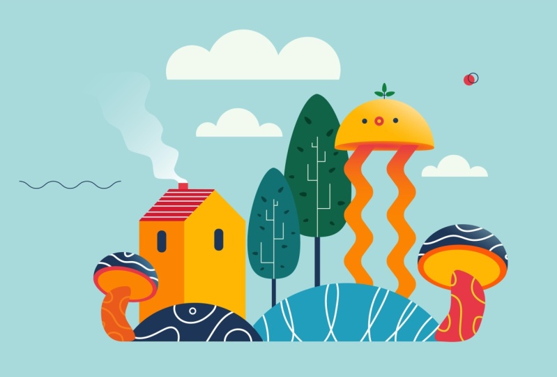
5. Sketching: Welcome to this class. In this lesson, we will make a quick sketch of our design, I always recommend sketching
before starting to design. This way, we will work
faster as we have a guide. If you don't have a
graphic tablet to draw, you can do this using
pencil and paper and then take a photograph
or scan the drawing. First, we will create a new document in
Adobe Illustrator, give it a size of
1920 by 1080 pixels, name it and click "Create". You can always look for
references to get inspiration. The main tools I use to search for references are
Google images, Pinterest, and Adobe Stock. Instagram is also a good
source of inspiration. In our case, we have done
a previous investigation and we have found that these
images serve as inspiration. It is not about
coping from others, but about looking
for consistent ideas that help us visualize, mark clearly what we want
to capture in our design. I'm going to drag them into the document we just created, and we place them on
top of our Canvas to help them as a reference. If you have two screens, that's great because you
can have the references on the second screen and
work more comfortably. Perfect. Now we go
to the Layer panel. With a double-click, we name the layer
with the references, block it, and next we create
a new layer called sketch. Everything is ready
to start designing. To draw our sketch, we will use the paintbrush tool. From here, we can
choose the brush type. I will select the pencil, charcoal brush to give our sketch a more
hand-drawn aspect, but you can use a default
brush if you prefer. If we double-click in
the paintbrush tool, we can adjust its fidelity. In this case, as we're
doing simple draws, we can leave it in the middle. Eliminate the field color
and color the stroke black, and now we can start drawing. Let's start designing the
bushes in the foreground. To save time, we are going
to duplicate the brush, drag it while pressing the
Alt key to duplicate it. Remember, this is a sketch, we don't need to be precise. Our goal is to see if our idea works well before
we start designing. If you are not used to draw, I recommend you make a design
made of simple shapes. Remember that you don't have
to be a great designer. Later, we will turn
these sketches into beautiful illustrations in a very simple
way, you will see. Let's continue
creating the tree, make the lines safely, and avoid making many
lines for the same stroke. The cleaner the
sketch, the better. Perfect. Now let's continue
with the house, and we draw the smoke. We will continue
with the left side, drawing the circles
and the play symbol. We can not forget the funny
eye listening to music. Finally, we go with the most complicated
part, drawing the hand. If you don't have
much experience, it can be challenging
to draw a hand. In this cases, it is best
to use a reference image, put it next to it, and copy it. Finally, we finished
drawing the arm. I usually prefer to
draw the sketch with a pencil and paper
and then scan it. But in this case, I have decided to
do it directly in Illustrator so that you can follow the process in real time. As you can see, the
reference images are just that, references. In no case it is about copying
the designs of others, instead, we are looking
for inspiration. Don't forget to save the work. See you in the next lesson.
6. Let's Design: [MUSIC] Hi there. This
is getting more fun. Let's start designing
our project. First, select the sketch
and color it red. We will also lower the sketch's
opacity to 40 percent, for example, this way, we can easily differentiate
the new designs. So that you can better see
the thumbnails of the layers, I'm going to
increase their size. Let's go to Layer Panel Options. We select "Row Size," "Others", and increase the size to
50 pixels, for example. We're also going to lock the
layer to avoid mistakes. Let us start by
designing the bushes. We create three new
layers and name them. Let us start with the
bush on the left, which corresponds to
the Bush 2 layer. Make sure you have
that layer selected. Before starting, I'm
going to remove the fill, and we're going to
use a black stroke. That way, we forget about the colors for now and
we can move faster. Remember that the
goal is to create attractive illustrations in
the shortest time possible. We can use a three-pixel
stroke, for example. This is not very
important because the design will
not have a stroke, but it helps to see
better what we're doing. To create the bush, select the ellipse tool
and create three circles. Remember that to create
a perfect circle, we must keep the Shift key pressed while making the circle. Perfect. Once we have
the three circles, we select the rectangle tool
and create a rectangle, to create the base of the bush. Now we select all the shapes
with the selection tool. Select the "Shape
Builder Tool" and trace over the part
to make up the bush. It's that easy. If we hold down the Alt key, we can delete the parts
that are not useful. Simple? To save more time, we can double the bush. With the selection tool, we simply drag while
holding down the Alt key. Now we go to the
Layers panel and drag this bush to its
corresponding layer. Perfect. We already have our
first two bushes created. Now, we will make the central
bush which we have called Bush 1 since it will be
ahead of the other two. This one is simpler. We create a circle and a
rectangle to make a tree space. We select the two shapes, the Shape Builder Tool and while we keep the
Alt key pressed, we delete the parts below that we're not interested
in appearing. I am going to adjust the
size of the bushes a bit. They are a B2B. Don't worry about not
following the sketch, it's just a reference. Now that we have
created all the bushes, we are going to lock their
layers so they don't bother us while we
continue designing. We're going to continue
creating geometric shapes. Now, it is the circle's turn. To do this, we will
create a new layer and drag it below, and we name it. With the select layer, we create a perfect circle. Next, we go to the
Layers panel and drag the circle we made to the
Create a New Layer icon, symbolized with a plus. By doing this, we duplicate the circle in the same
position as the original. Select a duplicate circle
and modify it to scale with the help of the Shift key
to not deform the circle, and the Alt" key to take the circle center as
a reference point. We select both circles. Select the Shape
Builder tool and delete the central circle by clicking on it with the Alt key pressed. Once again, we lock the layer
and create another layer. I always like to keep everything
well organized by layer. Initially, I used to work
in a very chaotic way. Still, when I started
learning animation, I was taught the importance of working in an
organized manner. In this way, you
make fewer mistakes, and although it seems
a bit heavy to create layers all the time when
you get used to it, you realize that
it allows you to speed up your work
process a lot. To create the play symbol, we select the Polygon Tool. Remember, you can press
the up arrow and down arrow keys to add and remove
sides from the polygon. Then we pull the circle to slightly round the
edges of the triangle. Finally, we rotate it until we place it in the
desired position. Again, we lock the layer
and create a new layer. Let's call it eye. We create a circle again. From the layer panel, we duplicate it two times by dragging the circle
to the plus symbol, and we modify the scale of the circles to our liking
to create the eye. Remember to hold down the Alt and Shift
keys while dragging. Finally, we can zoom
in a bit to create another leader circle in order to create a
light in the eye. I will select the
layers of the eye for a moment to give them
all the same stroke. It is not necessary to do it. It is a habit that I have. Like this is perfect. We lock the layer and create a new one for the headphones. We will use the
rounded rectangle tool to create the shape. We duplicate and drag
it to the other side, and return it with right-click, transform, reflect,
vertical, okay. We select the outer
protection of the headphones and send
it back with right-click, arrange, send to back. We do this so that when
coloring this part, it is behind the rest of
the headphones' parts. To create a headband, we will use the Pen Tool. Select the path and increase
the stroke value to four. Next, we make another slightly shorter line
that covers the first one. Increase the stroke
to seven pixels, and from the Stroke panel, we round the ends by applying
the round cap option. Finally, we select
the layers that form the headband right-click, arrange, send to back. To finish this lesson, we are going to continue
designing the house. Once again, we lock the
layer and create a new one. We create two rectangles. We select the first one
and add an anchor point. With the Direct Selection Tool, we stretch upwards to make
the peak of the house. Perfect. Next, with the
help of the Pen Tool, we quickly create the roof. Now, we only need to make
the chimney and the windows. For the windows, we will use
the rounded rectangle tool, and for the chimney, we will use the rectangle
tool, and ready. We already have 1/2 house
of the illustration ready. In the next lesson, we will put my
geometric shapes aside and start drawing to
create more organic ones.
7. Let's Design 2: [MUSIC] Hello again.
In this lesson, we will continue with
the project design. It is time to start
designing the tree. But first, let's adjust the
position of the house a bit. We will also reduce the size of the circles and the play
a bit. They are too big. Great, now I like it much more. Let's start drawing
the tree trunk. There seems to be a problem. Oh, sorry, I forgot
to create the layer. Now, we're going to create a new layer that we
will call tree trunk, and trace it with
the Pencil Tool. To make it easier, we're going to draw it in parts. First, we draw the main
parts of the trunk and then we move on
to the branches. Remember, if you don't
have a graphic tablet, you can design
with the Pen Tool. If we work with the mouse, it is difficult to draw
with the Pencil Tool. I like the drawing
tools much better, they are less rigid and allows
us to work much faster. However, the Pen Tool is
a very versatile tool with which we can draw anything. Once we have seen it, we do as usual. We select the elements and unite them with a
Shape Builder Tool. We lock the layer and
create three more layers. We have already seen how to
create this type of design. I would do it quickly
so you don't get bored. We'll duplicate this bush here, dragging while holding
down the Alt key. We can modify it
to scale a little so that it is not
exactly the same, and inside the layers panel, we drag it to the
tree part one layer. We lock the layer, go to Tree 2 layer, and continue doing
the same process. Perfect. Now we will
continue creating shapes with the help of the
Shape Builder Tool. As we have already
seen how to do it, I will speed up
the process a bit to not repeat the
same over and over. It looks like I've
got the wrong layer, I forgot to lock the layer and select the Tree 3 layer. Now we're going to
drag the circles to the correct layer. Perfect. We create a rectangle,
we select everything and create the desired shape with the Shape Builder Tool. Perfect, we have it ready. We lock the layers and create a new one that
we will call Horn Hand. We drag the layer
below the house layers since the house will
be in the front. We will see it better
when we apply the colors. With the Pencil Tool, we draw the hand quickly. Remember that we must
make clean strokes. Also remember that we can
always resume the path at the point where we left off. To make the details
of the fingers, I will use the Paintbrush Tool. Perfect, we almost have it all. I'm going to select
everything and adjust the value of the stroke, and I will adjust its position within the illustration
a little bit. We lock. To finish, we're going
to create a layer for the decorative
details of the sky. We create a circle
and we duplicate it. For the waves, we will create a horizontal line
with the Pen Tool. We go to the Stroke panel
and select Round cap. With the stroke selected, we go to Effect, Distort and Transform, Zigzag. We leave the size
in 10, as it is, and we set five
ridges per segment. Finally, we select
the Smooth option. Before I finish, I'm going
to flip it vertically. That's it, we already have
our illustration done. Now, all you have to
do is make it shine. See you in the next
lesson. [MUSIC]
8. Choosing Colors: Welcome to this class. Choosing colors is
definitely one of the most essential
parts of the design. A color palette can
distinguish between a great design and a
boring, forgettable design. Through color, we can
reflect moods and emotions. We can modify the impact that our designs will have on users. A bright, warm color palette create different
sensations that are pale, cool palette, or a
dark color palettes. As a general rule, when I want to create a
powerful illustration, I try to mix warm colors
with cool colors, and dark colors
with bright colors. In my experience, when these
mixes are well-balanced, they usually work very well. In addition, thanks to
this mixture of colors, we can make it easier
for the viewer to identify the elements easily. For this project, we will use a color palette from
another project. We have the color palette
prepared in another file. We simply go to File, Place any parts of the color palette into
the working file. We create a new layer and drag the color pallet
inside this layer. I'm going to delete
the reference layers so we can work more comfortably. Perfect. We put the color
palettes on top of the design. I have left you a PDF with some useful tools to create color palettes
quickly and easily. You can download it from
projects and resources. In the next lesson, we will apply color
to our design. See you there.
9. Applying Color: We can now start coloring
our illustration. We're going to unlock all the layers to be
able to work faster. We only need to select
the different parts, and with the eyedropper tool, take the colors from
the color palette. To select multiple items, remember to hold down the Shift
key while selecting them. I forgot we are going to delete the sketch so it
doesn't bother us. Great, let's continue coloring. I am going to send this
circle backward so you can see the other
circle for the pupil. We continue coloring. We select and color
like this all the time. Remember that you can
also choose to color your illustration
directly without using my color
palettes especially, if you have been designing
for a short time, creating a color palette will help you speed up
your work process. Of course, it is not
always that simple. Many times, you will need to touch up your colors as you go, but this is totally normal. Finally, we are going to create
a layer for the background and drag it below the
rest of the layers. We create a rectangle
with the size of the composition
and color it too. We will already have
everything colored. Now, we're going to add some gradients to
improve this look. We select the circle and
open the gradient's panel. If you can't see directly
in your workspace, you can go to Window
and select Gradient. We select a circle, we ensure we have the fill
selected so that the gradient is applied over the fill
and not over the stroke. From the panel, we create a linear
gradient by clicking here. We select the black circle, and with the color picker, we select the desired color. We leave the other circle white. If we want to change the color, we could double-click
in the circle. From the panel options,
choose RGB mode, for example, and modify
the colors to your liking. Next, we select
the Gradient tool. We click and drag to create a gradient in the
desired direction. We can quickly move
around and modify it. I also want to apply a
gradient to the tree. The process is the same; we select an element and, with the fill activated, we apply a gradient. We select the colors and apply the gradient
to our liking. To save time, we can
select the other layers and copy the gradient we applied previously with the
eyedropper tool, and we adjust the gradient
as simple as that. Reviewing the design, I just realized that we
haven't drawn the smoke. Let's go for it. We create a smoke layer and draw the smoke
with a pencil tool. Let's zoom in a bit to
draw more precisely. Now, we can draw the smoke. We are going to delete
the black stroke we have created and apply a gradient to it. The idea is that the smoke progressively disappears
as it rises higher. To do this, we
apply a white color and at one end of the gradient, we lower the opacity
to zero percent. Finally, we adjust the
gradient to our liking. We are going to adjust
its size a little so that it does not
cover the hand so much. That's it, we already
have our colored design.
10. Make it Shine: [MUSIC] Hello, everyone.
We have reached the most awaited lesson of all. We will turn this
design that we see on the screen into unattractive
and font design. Before we start, we are going to remove
the color palette. Let's start with the bushes. The idea here is to play with curved lines that
flow naturally. Of course, we must be careful not to saturate
the design too much. We will leave some elements
without adding textures. We start by selecting the first bush and selecting
the paintbrush tool. Next from down here, we click on drawing modes and select the option draw inside. We color the stroke white
and remove the field. We verify that the thickness of the brush is to our liking. We can start drawing
lines as simple as that. To get out of draw inside mode, double-click outside
the selection tool. Now, we will continue with the second bush following
the same process. We select the bush, select the paintbrush tool, and choose to draw
inside option. To save time, we select
the eye dropper tool, and copy the stroke
properties we made in here. With the paintbrush tool
we draw the texture. [MUSIC] It's like
that all the time. We select the object on which we want to
create a texture. We select the paintbrush tool we choose to draw inside option. We choose the stroke color
and we draw to our liking. We will continue doing exactly the same process
with the rest of the layers. In order not to be
too repetitive, we're going to go
faster to be able to continue with the
rest of the elements. The idea is to flow with the
design. Just draw lines. That's the fun of
this design style. You don't need to
waste time thinking, enjoy while you draw, and surely something
nice will come out. [MUSIC] In the case of the house roof, we're going to draw
a single line, then we double-click with the selection tool to be
able to modify the line. Now we just duplicate
the line by pressing Alt while dragging. Once this is done, we press the combination of keys Control D or Command D on Mac several times to create
more equidistant lines. Finally, we double-click
to exit the editing mode. Before continuing
to avoid mistakes, we will lock all the layers
except the hand layer. Great. I really like
how it's turning out. The truth is that I am
enjoying this course. I really liked this
style of illustration. To finish, we are going
to create the arm hairs. To do this more efficiently, we will make a new brush. We're going to create a
hair with the pen tool. With the help of the
eyedropper tool, we copy the wave
scholar and stroke. Next, we select the hair, go to the brushes panel
and select new brush. As you can see, we will
create different type of brushes and we will select
a scatter brush option. The idea is that when
applying the brush, hairs are created with a random rotation to
give it a more fun look. To do this in the rotation
option we select random. We leave the first value
or the minimum possible, and the second is set
at its maximum value. In this way, we're telling Illustrator that we want
the hairs to rotate by a random value between minus 180 grades and 180 grades. In colorization method, we choose the tints option
to be able to modify the color of the brush if
later we want to change the color of the stroke
and finally press okay. Now, if we select
the paintbrush tool, and the new brush
we have created, we can make the hairs we want
by clicking with the mouse. [MUSIC] This is perfect. Looking at the illustration,
I have realized, there is a small detail
that I have overlooked. I forgot to color the head
band and the headphones. We will fix it quickly, [MUSIC] and that is
it, we already have our beautiful illustration
completely finished. If we go to file, export as, we can export our illustration in the format we like the most, I am going to export it in JPEG. We name the file and export it. When exporting it, more
expert options appear. Since we aim to export the
illustration in web format, to share it on
social media, etc. We said the quality to
the maximum issues or resolution of 72
pixels per inch. Now, we have our illustration finished and ready to
share it with the world. See you in the next
lesson. [MUSIC]
11. Final Thoughts: Welcome to the finish line. You have successfully
completed the course. Congratulations.
During the course, you have learnt a lot of things. The shape language, how to use the tools, sketching in illustrator, vectorize your
designing a simple way, how to apply colors
and gradients easily, how to add creative textures, and some tips and tools to
speed up your work process. Now, it is time for you to design your illustration
from scratch, applying everything you've
learned in this course. Don't forget to upload your project to the
course for your gallery, or tag me in your
Instagram post. Practicing is the key. As a teacher, I can show you the road but only
you can walk it. Remember, failure and mistakes
are part of the process, be kind to yourself. I invite you to visit my profile to discover
all my other classes. Your opinion is important. If you enjoyed the course, please leave me a review. I will be very grateful. I hope to see you again
in future courses. Thank you very much. Don't forget to
follow me for more.