Transcripts
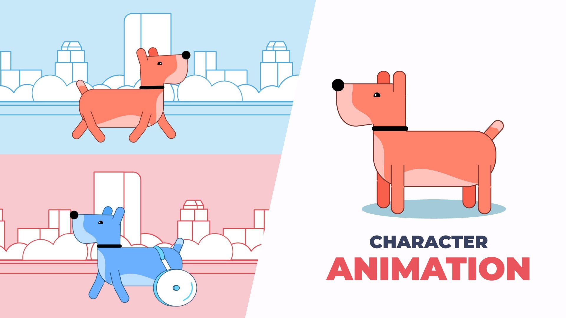
1. Intro: Hi, my name is Carminys Guzman. I'm an animator, illustrator, and scriptwriter based in Spain, originally from Dominican Republic. In this class, you will learn how to create beautiful designs for animation, at light, shadows, textures, and animate everything in Adobe Illustrator and After Effects. I'm part of the Operary team, an animation studio based in Madrid. After nine years of creating animated videos for companies worldwide, I want to show you my favorite method to create beautiful designs and animating easily. In this class, I am very excited to share my knowledge with you. We will start looking for references to get inspired, and then we will design a quick sketch of our project using Adobe Illustrator and vectorize it. Next, I will show you handy tools and tricks to color your design in a simple way. Once the work is done in Adobe Illustrator, we will pass all our material to Adobe After Effects to add lights, shadows, and textures. Finally, I will show you how to animate it. Because we apply the lights, shadows, and textures directly in Adobe After Effects, you will be able to animate them faster. This course is ideal for animators, illustrators, graphic designers, creative artists, and generally anyone who wants to learn how to make amazing illustrations easily and animate them. If you haven't used After Effects before, I recommend that you do my previous course, animate your illustrations in record time using Adobe After Effects first. There is no time to lose. Join now and let's get started.
2. Project: For the class project, you will create your own design, add lights, shadows, textures, and animate it. At the end of each lesson, I will give you some indications. Please don't skip it; follow them and practice to get the best results. Feel free to download and use my artwork to practice, if you don't have time to create your design from scratch. I'm looking forward to seeing your work, so please upload it to the class project gallery. If you have any questions or comments, please post them on the discussion tab. We can't wait to see what you come up with. Have fun.
3. Looking for References: Hi, there. As you know, doing this course, we will design a wonderful landscape. But before we start designing, we will look for some references to get inspiration. The main tools I use to search for references are Google images, Pinterest, and Adobe Stock. Let's try with Adobe Stock for example. Write landscape in the search bar. In the filters which is the vector subcategory. From now, it is about searching for the images that most inspire you for the [inaudible] design. In case you don't find anything you like, you can modify the keywords. I have seen an interesting image, but I will scroll down the page, I need more. I will take the image that I like. I Selected, Right-click, and Copy it. Next, we go to Adobe Illustrator and create a new document. with 1920 by 1080 pixel size. This is a size we will use during the course. Once created, we paste the image with Control V or Command V on Mac. The image is too small, we can enlarge it by dragging from the corner while holding down the Shift key to maintain the proportions intact. Don't worry if it is pixelated a bit. It is just a reference. Following the same process, I have compiled different reference images. Here, I show you all the images that I have collected in my search.
4. Tools & Shortcuts: Hi there. In this lesson, we will take a quick look at the tools and shortcuts we will use during the course to speed up our work process. Mainly, we are going to use four tools to make our design. The pen tool, the polygon tools, the paint brush tool, and the pencil tool. First, we will create a new document in Adobe Illustrator. Give it a size of 1920 by 1080. Let's see very quickly how the pen tool works. Clicking on different points creates straight segments. To close that path, position the Pen Tool over the first anchor point. As you can see, a small circle appears next to the Pen Tool pointer when it is set correctly. Click to close the path. To leave the path open, press "Control" click on Windows or "Command" click on Mac anywhere away from all objects. Now select the shapes we have created so far with the selection tool and delete them. To draw a cross with the pen tool, you have to click and stretch. It's that easy. Once we have created a curve, we return to the last anchor point and click again to retake the path and then we made the next curve by clicking on the next anchor points and stretching. We can modify the anchor points by selecting the direct selection tool, selecting the anchor point, and dragging. If we select an anchor point, with curves, we can change the curves as well. Of course, we can select our designs with the selection tool, move them, rotate them from their corners, and modify their size. If we hold down the Shift key while modifying the size, the design will keep its proportions intact. Polygon tools are much easier to use. Right-clicking on the Rectangle Tool, we bring up all the polygon tools. Just select them, click and drag to adjust their size. Remember that to keep the proportions intact, we must keep the Shift key pressed while dragging. If we drag from one of the circles that appear in the corners, we can quickly round them. On other hand, if we select one or more of those corners and then drag, only the corners that we have selected will be rounded. With the polygon tool, you can press the up arrow and down arrow keys to add and remove sides from the polygon. Of course, we can easily color all our designs, both the fill and the stroke. We can modify the size of the stroke and if we don't want it to have a stroke, we simply delete it from here. Let's take a look at the paintbrush tool. It is very easy to use. We simply select it, and we can start drawing. We can modify the size of the stroke and even choose the type of brush. Also, if we double-click on the Paintbrush Tool, we can configure this stroke's fidelity. Finally, we are going to take a look at the Pencil Tool. If you cannot see it directly, Right-click and more tools will appear, including the Pencil Tool. Its use is very similar to the Paintbrush Tool. The main difference is that the Pencil Tool allows you to create closed parts. If, for example, we make a shape without closing, we can place ourselves on one of its anchor points and continue this shape until it is closed. Personally, I prefer to use the Paintbrush Tool to create a sketch, or to create open lines. On the other hand, I used the Pencil Tool to create shapes to which I will later add a fill. Perfect. Now I'm going to show you the shortcuts that we will use during the course. Shortcuts help us to save time and be more productive. The most used shortcuts in Adobe Illustrator refer to the tools that we use most commonly. Some of them are the same in after effects. Let's see how to access the main tools at the touch of a key. Press V for the Selection Tool, A for the Direct Selection Tool, P for the Pen Tool, B for the Paintbrush Tool, N for the Pencil Tool. For the Zoom Tool, we will press the Z key. Finally, if we click and drag while holding down the space bar, we will move across the Canvas in the same way we do in After Effects. As you see with shortcuts, we can change tools quickly without the need to waste time going to the tool panel. I have left you a PDF file with the most useful shortcuts so that you can download it.
5. Sketching: Hi there. In this lesson, we will make a quick sketch of our design. I always recommend making a sketch before starting to design. This way, we will work faster as we have a guide. If you don't have a graphic table to draw, you can make this process using pencil and paper and then take a photograph, or scan the drawing. First, we will create a new document in Adobe Illustrator, give it a size of 1,920 by 1,080. Where we commonly know it as Full HD. Name it, and we click Create. Next, we select the references that we liked to select multiple elements at the same time, we shall hold down the Shift key while we select them. Now, let's drag them to the sketch document. We placed it on top of our Canvas to have them as a reference. If you have two screens, great, as you can have the references on the second screen and work more comfortably. Perfect. Now we go to the layer panel. We double-click. We name the layer that has references, block it and next, we create a new layer that we'll call sketch. Everything is ready to start designing. To draw our sketch, we will use the paintbrush tool. From here, we can choose the brush type. I will choose the pencil charcoal brush to give our sketch a more hand-drawn aspect. But you can use the by default brush if you prefer. For now, I will leave the brush size as it is. If we double-click in the paintbrush tool, we can adjust its fidelity. In this case, as we are doing simple drawings, we can leave it in the middle. We color just black and eliminate the filler. Now we can start drawing. If we click and drag while holding down the space bar, we will move through the workspace. Remember, this is a sketch. We don't need to be too precise. Our goal is to see if our idea works well before we start designing. As you can see, we are making clean and simple lines. Now we will draw the sun and clouds. We don't need to draw all the clouds. We can draw just one and duplicate it. With the selection tool, select the Cloud, right-click group. Next, we drag the Cloud while we press the Alt key to duplicate it, and we modify the size of the clouds just later. If we drag from the corner while holding down the Shift key, we can modify the size, maintaining its proportions intact. I like it. Now, I will draw some plants at the bottom left. Again, don't waste time trying to make it perfect. In this phase, we shouldn't waste time on the details. I will adjust a bit the size of this plant right here. Now, I'm going to draw the house simply. In front of the house, we can draw a bush so that the design is not too flat. Now, we select a bush and fill it white to see how it looks. Perfect. Now it's time to draw the [inaudible]. We will draw her from behind looking at the horizon with her hair blowing in the wind. Avoid making many lines for the same stroke. The cleaner the sketch the better. I usually preferred to draw the sketch traditionally with a pencil and paper and then scan it. But in this case, I have decided to do it directly in Illustrator so that you can follow the process in real-time. As you can see, the reference images are just that references. In no case, it is about copying the designs of others. Instead, we are looking for inspiration.
6. Let's Design: Let us start designing our project. First, select the sketch and color it red. We're also going to lower the opacity of the sketch to 40 percent, for example. This way, we can easily differentiate new designs. We're also going to lock the layers to avoid mistakes. We're going to start with the plant that is at the bottom left. We create a new layer and name it. We select the Pen tool and start creating a straight line. One trick to make it easier to design, is to do it in a vertical position and after designing, we can rotate it and put it in place. We're going to work with a black stroke and a white field, so we don't worry about colors for now. We select the line and expand the size of the stroke a little to six, for example. Next, I'm going to create the plant's leaf. We duplicate the leaf, rotate it, and place it. Now we duplicate the leaf again, but this time, in addition to the Alt key, we must hold down the Shift key so that when we duplicate it, we follow a perfect straight line. Now, if we press a key combination Control D or Command D on Mac, several times, the leaf will be duplicated following the same path as the last duplicate we made. We select the leaves and group them, right-click "Group". We duplicate the group and flip the leaf horizontally. Right-click "Transform", "Reflect", select the vertical axis, and press on the "Okay" button. We select the entire plant and group it. We rotate it a bit and put it in place. Now, we are going to duplicate the layer instead of duplicating the plant directly so that each plant is on a separate layer. To do this, we go to the Layers panel, click on the top right and duplicate the layer. We double-click on the duplicated layer and name it. We go to the plant that we have duplicated, we place it and we scale its size. I'm going to change the order of the layers in the Layers panel to place a small plant in front of the big one. Perfect. We have already designed our plants. Now, I'm going to hide their layers so they don't bother us. Let's continue with the house. We create a new layer and name it. We select the Pen tool and begin to design it. For the fireplace, we're going to create a rectangle. We duplicate it to give it some perspective. I'm going to adjust the strokes size a bit. This doesn't really matter because our final design will have no stroke. But I find it more pleasing to the eye while designing. To create the door, we create a rectangle. We select one of the points that appear in the corners and while we hold down the Shift key, we press on these other leader circle and drag. In this way we round only the selected corners and we create a line with the Pen tool to finish the door. We select the two lines that form the door and group them. Next, we duplicate the door and place it on the side. With a direct selection tool, we modify the position of its anchor point. To do this, we simply select the points and drag and we add a horizontal line. Now, the door has become a window. We select all the elements of the window, and group it, and duplicate it to create another window. Here is a line with a little mistake. It has a curve that we don't want. To remove it, we right-click on the Pen tool and select the angle point tool. We click on the angle point that has a curve applied and it is solved. To finish with our house, we are going to create a bush very quickly with the Pencil tool. We will have our leader house ready. From the Layers panel, we hide the layer. Now let's go for the sun and the clouds. We create a new layer for the sun. We select the Ellipse tool and we create a perfect circle by dragging while holding the Shift key. We lock the layer and create a new layer for the clouds. Once again, we are going to design them with the Pen tool. We can actually design them much faster with the Pencil tool. I use a Pencil tool a lot to design this type of organic shapes. Still in the clouds, I am using the Pen tool because I think it is important to become familiar with this tool. Once we have our cloud ready, we just have to duplicate them, place them, and modify their size as we did in the sketch lesson. We lock the layer and create the layer, Land 1. Again, we select the Pen tool. We lock the layer again and create a new layer. We call it Land 2. Let's zoom in a bit to see it better. This shape is going to be below the grass of the Land 2 layers, so we don't have to worry about the areas that are not going to be seen. The same for this shape, will go under the grass. We select the two forms, right-click, "Arrange", "Send to the back." We continue with the same process. Lock the layer and create a new one. In this case, we're going to create a shadow of the land 2 layer. The shadow layer must be below the land number 2 layer, so we drag it underneath it, from the Layers panel. Now we only have to create a layer for the water and another for the mountains. The water layer must be below both land layers, so we drag it below them. We select the rectangle tool and create the water. To finish, we draw the mountains. We drag the layer below the water layer. To draw them faster, we will do it with a Pencil tool. We're going to add a white filing to better see which one is in front and which one is behind. We can place them as we have already seen by right-clicking "Arrange" and choosing one of the option or directly from the Layers panel. Now, we only have to activate the layers that we have hidden and place them in the correct order. Right now the strokes are not even. Some are thicker than others, but don't worry about that because when we apply color to the field, the strokes will disappear. Before I forget, let's save the project. We go to File, Save As, and save the project.
7. Let's Design 2: Hello again. In this lesson, we will continue designing our project. It is time to start designing the character. First, we will hide all the layers, except the sketch one. We block the sketch layer, and now we can erase the references layer. We won't animate the character's body for this project, but we will animate the hair and the t-shirt moved by the wind. We will separate the hair and the piece of the t-shirt from the rest of the body by layers. Going back to our design, we go to our layer panel. Create a new layer, and call it ''Character''. I always like to start by designing the head. For this, we're going to create a rectangle. We drag from one of the four points that appear in the corners to round all the rectangle corners. Perfect. We get a little closer and create a ear with the lips too. We select it, right arrange, send backwards. We design the rest of the body with a pen tool, following the same method that I showed you before. To make it easier for us, we will design the body in parts; the neck, the body, the arms. We can draw the hand with a pencil tool. We will make a very simple hand. We are not looking for a hand with much detail. Remember that we can retouch the strokes with the direct selection tool. We select the complete arm and duplicate it. We reflect it, we right-click, transform, reflect, vertical axis, okay. We continue with the legs. We will draw the pelvis on one side and the legs on the other to make it easier. With a pencil, we trace the pelvis. Next, we create a rectangle for the legs and round it. We duplicate the leg and put it in place. Perfect. We almost have it. We're going to apply some details to improve our illustration. First, we are going to improve the neck. We zoom in with the zoom tool to see better. With the pen tool, we shade the neck of t-shirt. Perfect. Now we're going to apply a shadow on the neck. We create a shadow path. The head and ears should be above the neck. To solve this, we select the head and the ear and bring them to the front with a right-click. Selecting arrange, bring to front. We can add a belt to give her a pretty look. Great. We already have it. Now we only need to create the hair and a t-shirts that will move with the wind. We will lock the character layer and create a new layer that we will call hair. To design the hair, we create a rectangle. We round it and place it on the head. It's that easy. We create a new layer for the t-shirt. We just create a triangle with the pencil. In the same way as with the hair, we will shape it using After Effects. We will already have our complete design. We activate the rest of the layers to be able to see everything. I'm very happy with the result.
8. Color Palettes: Thinking in colors is not always an easy task, but don't worry, I will show you some useful tools. First, we have Google images or Pinterest. We can find color palettes related to our interests that will surely inspire us. On the other hand, we find very advanced tools like Coolors. It is a fantastic website where we can create our own color palettes or simply browse between the palettes already created. The web is intuitive and guides you step-by-step if you want to create your own color palettes. Lastly, I want to mention the Adobe Color. From its website, we can extract color palettes from images. From the Explore option, we can use this search engine to find what we're looking for, another very interesting option. While it is true that having a color palette as a reference is very helpful, you can also color as you go. This method will offer you freedom to be more creative, and you will be able to apply color following your sensations. For this project, we will use a color palette that we had previously used in another project. We have the color palettes prepared in another file. We simply go to File, place any part the color palettes into the file we are working on. We place it on top of where it is more comfortable.
9. Colors & Gradients: We can now start coloring. We're going to start by coloring our character. We block all the layers except the one of our character. We only need to select the frame parts. With the Eyedropper tool, take the colors from the color palette. We continue coloring. We select and color like this all the time. We're going to unlock the layers of the hair and the t-shirt to color them too. Perfect. We already have our finished character. It seems that there are some small design mistakes. I will take the opportunity to fix them. With color, we appreciate these mistakes much better. With the help of the Direct Selection tool, we tweaked those details. Next, we're going to color the house. We continue to follow the same process. I would change this brown as it is too dark. That's better. By applying color to the door, I have to remove the stroke. That's where we select the stroke and apply color to it, and we increase its value. We select windows and take the colors of the door. For the windows, I'm going to reduce the size of the stroke a bit. Now that I see the housing color, I have the feeling that something is missing. I'm going to add detail to the roof with the Pen tool. Perfect. Now is much better. We block the layer of the house and continue with the plants. Here is a small difference: when selecting the plant, we can see that it is grouped. We have to use the Direct Selection tool or the Group Selection tool to select the plants separately. We are going to choose the Group Selection tool that is best suited for this type of task. We do the same with the other plant. We select the plants and color them. I have accidentally colored the stem of the plant. To solve this, I select the stem of the plant, and with the Eyedropper tool, I choose the same path of the other plant. We continue coloring the rest of the landscape with the same process. Selecting, and with the Eyedropper tool, take the colors from the color palette. It seems that I have forgotten to color the bush of the house. I didn't quite remember which layer it was in. I'm going to unlock all the layers for a moment to see. Perfect. It is the house layer. I also like to lock the layers that I'm not using. This way, we avoid coloring in the wrong layer, and we have everything well organized. For the shadow layer, we can apply a black color and apply an opacity of 20 percent, for example. We continue coloring following the same process. Now we only have to apply color to the sun and clouds. But first of all, we will add a layer for the sky that we forgot in the previous unit. We name the layer, and create a rectangle. Now we are going to color the Sun. In the clouds, we will color a couple of them only with a stroke to give a different touch to our illustration. We're going to round the corners and add just off the path. If we get closer, we can see the rounded edges better. We color the rest of the clouds whites without strokes, and set the opacity to 40 percent. We will already have everything colored. However, we see that everything is too flat. We're going to add some gradients to improve the look. We select the sky and open the gradient panel. If you can't see directly in your workspace, you can go to Window, Gradient. From the panel, we create a linear gradient by clicking here. We have applied the gradients over the stroke. I'm going to remove the stroke, and then I'm going to select the fill. Now, if we create a linear gradient, it will be applied to the fill. We select the black cycle. With the color picker, we select the color of the sky from the color palette. We leave the other cycle white. If we wanted to change the color, we could double-click on the cycle. From the panel options, choose RGB mode, for example, and modify the colors to your liking. Next, we select the Gradient tool. We click and drag to create the gradient in the desired direction. We can quickly move around and modify it. I also want to apply a gradient over the water layer. We select it, and to save time, we copy the sky gradient with the Eyedropper tool. Again, with a Gradient tool, we configure the gradient. Perfect. Finally, we are also going to do the same with the land 2 layers brown shape. Again, we create a linear gradient, and we color the gradient. We double-click on the cycle and open the coloring options. We choose the HSB option to modify the color tone more comfortably. Adjusting the values, we give it a lighter tone. Again, with a Gradient tool, we create the gradient to our liking. I'm going to adjust the shades of the dark brown a bit. We select the other brown shape, and with the Eyedropper tool, we take the gradients that we have previously configured. That's it. We already have our color design.
10. Preparing Files for AE: Now we just need to organize everything to import the design into After Effects. We have been separating everything by layers during the design, so we don't need to make many adjustments. If you look at the three mountains, they are located in the same layer. We will create two new layers to have our mountains separated by layers and be able the lights to them more easily in After Effects. We're also going to separate the bush into a new layer to apply the shadows without problems. The clouds are not going to be animated nor are we going to apply any effect to them, so we can leave them all in the same layer. The rest of the elements are perfectly organized. We only have to worry about separating the elements that will be animated into layers and on which we will apply details at the illustration level. We will already have our file ready to import it into After Effects.
11. Shortcuts in AE: Hi there. In this lesson, we are going to talk about shortcuts. The most used shortcuts refer to the properties of the layers and the tools that we use most commonly. Let's see how to open the layer properties with a single click. Press A for the anchor point, P for the position, S for the scale, R for the rotation, T for the opacity. If we hold down the Shift key, we get up in several properties at the same time. Now, we are going to see how to access the main tools at the touch of a key. Press V for the selection tool, hold space for the hand tool, Z for the zoom tool, W for the rotation tool, and Y for the pan behind tool. It's about practice. I have left you a PDF file with the most useful shortcuts so that you can download it.
12. Lights: In this lesson, we're going to start designing some lights for our illustration. Are you ready? We simply have to use common sense to apply the lights in the places where the sun hits and the shadows in the areas where it cannot reach. In animation, it is not necessary to be a 100 realistic, and sometimes we can play with the lights to make our illustration more interesting. For example, in our animation, we have highlighted our character with a slight glow to emphasize the illumination moment that she is feeling while looking at this beautiful landscape. We have also decided to omit the cast shadows so that the design is cleaner except for the cast shadow reflected in the water. Also, thanks to the gradients that we used in previous lessons, we could create the illusion that sunlight is reflected in the water. Open a new 1,920 by 1,080 composition. Name it, give it 24 frames per second and a duration of 20 seconds, for example. Now, it is time to import our Adobe Illustrator design. To import a file, double-click on the project panel, select the file. In the import as option, we must select Composition Retain Layer Sizes. Drag the imported composition into the main composition. Enter the composition with a double-click. Let us start by applying a glow to the sun layer. To do this, we select the layer, right-click Layer Styles and apply Inner Glow. If we access the Inner Glow configuration options, we see that it has many options to configure. We are going to modify their values until we achieve the desired results. First, we are going to apply a noise texture, 17 percent, for example. Let's get a little closer to see what we're doing on the sun's layer better. We can modify the color of the glow a bit. We increased the size option to make the brightness more evident. We have already added shine to our sun with a noise texture that I personally like a lot. If we modify the source option, we can make the brightness appear from the center. But we better leave it as it was. Great. Again, we select the layer, right-click and we apply a different layer style, in this case, Outer Glow. Here, we are simply going to increase the size option. To save time and be more productive, we will copy the Inner Glow configuration that we have applied in the sun and paste it in the mountains. To do this, we select Inner Glow and with Control C or Command C on Mac, we copy it. Next, we select the layers of the tree mountains and with Control V or Command V on Mac, we paste it. That simple. We have applied lights on our mountains. Now we're going to put all the layers of the character together in a new composition. To do this, we select the character, hair and t-shirt layers. Right-click, pre-compose. We give it a name and click Okay. Perfect. Now we can apply the lights on the new composition. As we did before, we apply an inner glow to our character and we configure each option to our liking. When applying the Inner Glow effect, it is applied over the entire edge of the character so that the bottom part is not visible. We move our character down a liter. Now we're going to apply lights on the lamp to layer with a different method. But before applying this method, we must make sure that there is no element selected to a body creating a mask. For these, we go to Edit, de-select all. Now select the Pen Tool and we draw the shape of our lights. We need to apply some effects on the shape that we have created. We go to the Effects and Presets panel. If you can't see it, go to Windows, effects, and presets. Now we look for the Fast Box Blur Effect, and with a double-click, we apply it on the selected layer. We set the blur radius value, we give it a 27, for example. Next, we apply the Scatter Effect and we increase the scattered amount up to 50. To finish, we apply the Set Matte Effect. In the Set Matte from layer option, we choose the layer on which we want to apply the lights, in this case, the land two layer. For this effect to work well, we need to go to the land two layer and activate the continuously rasterized box. Next, we drag our shape layer just above the land two-layer. We click on Toggle Switches Modes and apply the overlay mode, and we will already have our lights create it. If we wanted to create a shadow instead of creating a light, we will only have to change the white collar of the Shape Layer to a dark color. Okay. Now we're going to apply the same method on the land one layer. Again, we deselect all and we draw the shape of our lights. We select all the effects that we have applied in the previous layer and copy them, and we paste them in the new shape layer that we have created, and we modify its configuration. In the option Set Matte, we take Matte from layer land one. We go to the land one layer and activate the option 'continuously rasterize'. We drag the layer just above the land one layer and apply the overlay mode, and we already have all our lights applied.
13. Shadows: Hi guys. In this lesson, we're going to continue adding details to our design. Now, let's see how to add shadows. In the previous lesson, we already saw one of the methods to adding shadows. Remember, it was the same effort we used to draw lights, but changing the color for our darkest one. Now, we're going to see another method to add shadows simply. We select the house layer and apply the layer style inner shadow. As we did with the rest of the layer style, we will configure its options to our liking. We're going to increase the distance. We increase the size. Right now the light is at the bottom, but the line must be at the top. To solve this, we're going to modify the angle. Of course, we can also add noise to our shadows. I'm going to lower the opacity a bit so it won't be so dark. We copy the layer style inner shadow. Next, we select the land 2 layer and paste it. Again, we configure the options until we achieve the desired results. We can modify the angle, the size, the distance, and of course add noise. We're going to add shadows to the plants. We select the plants one layer and paste the inner shadow configuration of the house again and we adjust the settings. We are going to make the plants a little darker than the background elements. Ready. Copy the inner shadow and paste it on the plant 2 layer. We will remove the lights from the top by modifying the angle and increasing the distance value. Perfect. Now, we will apply some adjustments with the help of the hue saturation effect to reduce the intensity of the lights in some of the layers and we reduce the value of master lightness, so it can be worth it. We copy the effect, we control C or Command C in Mac and paste it on the plants 1 layer. Now we select the character layer and paste the hue saturation effect again. We modify the value of master lightness a bit. I'm going to tweak the Inner Glow settings from the previous lesson. We select the house layer and again apply the hue saturation effect. We copy the effect and paste it on the bush layer. We're going to apply the inner shadow in the bush layer. We adjust their values until we achieve the desired results. We're also going to adjust the bush rotation a bit. It gives the feeling that it is a bit rotated. Maybe it has been too dark, I'm going to make a quick adjustment on the layers that we have applied the hue saturation effect.
14. Textures: During the previous lessons, we have already applied different nice textures, thanks to the layer styles. In this lesson, I will show you some more techniques to add textures to your illustrations. We're going to apply this image as a texture for our sky. From pages like pixabay.com, you can download images for free to create your own textures. In pexels.com, you can also find excellent material as well as in unsplash.com. From these three webpages, you will find hundreds of thousand of free high-quality images to use in your projects for both personal and commercial use. Perfect. Let's import the image into After Effects. We drag it just above the sky layer and apply the blending mode soft light to it. Remember that you just have to click on the "Toggle Switches Mode" option if you cannot see these options. Later, I will teach you to animate this texture in a very simple way. Now, let's create a filter. We go to Layer, New, Solid, name it, and apply a color, an orange, for example. Click on "Accept". We apply the layer modes overlay. The layer must be on top of all the others for the filter to apply over the entire design. Perfect. Now we apply an opacity of 20 percent. If we activate and deactivate our layer, we can see that we have applied a filter in a very simple way. Finally, we are going to add a slight nice texture to our design. We create a new solid again, name it, and apply a 50 gray to it. We put the layer in overlay mode, and then we apply the noise effect. We're going to apply an amount of noise of 10 percent, and that's it. We have our finished illustration. Are you enjoying the course? Please follow me on Skillshare, so you won't miss any of my upcoming classes.
15. Let's Animate 1: Now that we have our illustration ready, it's time to move to the next level, bring it to life with animation. We are going to start animating the plants. The simplest way to animate the movements of plants produced by the wind is to animate their rotation with the expression Wiggle. But first of all, we will place the anchor points with the help of the Pan Behind Tool. Keep in mind that the anchor points will be the axis on which the plants will rotate, so we will place it at its base. Perfect. Now, we can animate their rotation. We need to click on the stopwatch while holding the Alt key pressed to apply an expression. Next, we write the Wiggle expression. With the first value, we establish the frequency per second at which our movement will occur. On the second value, we set the amplitude of the movement. You can modify the values to your liking. We are going to preview our animation, pressing 0 on the numpad, to see what happens. As you can see, after you add this expression, the rotation starts randomly moving from side to side. Perfect. Now that we have our finished plant animated, we only need to copy the expression and paste it on the second plant. To do this, we right-click on the Rotation property and click on the option Copy Expression Only. We select plant number 1 and with Ctrl V or Cmd V on Mac, we paste the expression. We preview again. We already have our two animated plants. I am going to move them down a bit. Now, we are going to animate our character. To do this, we double-click inside the character composition. First, we are going to animate the hair. For this, select a layer. From the Effects & Presets panel, we apply the Wave Warp effect. Let's configure its values. We increase the wave width value to 100, for example, and we increase wave speed a little bit to 1.5. Now, we set the direction of the effect. In this case, we will simulate that the air comes from the right side to the left and we configure the Pinning on the Right Edge to stay fixed. Let's see what happened. Nice. Now, copy the effect and paste it on the T-shirt. I'm going to increase the wave speed a bit for the T-shirt; I'm going to leave it at two. I like it. To give the hair movements a bit of dynamism and make it more realistic, we can animate the rotation property with a Wiggle expression. But first, we will locate the anchor points with the help of the Pan Behind Tool. Perfect. Now, we click on the stopwatch while holding down the Alt key. Next, we will write the Wiggle expression. We already have our animated character. Easy, right? Let's go back to the composition design. We select the Shadow layer and, again, apply the Wave Warp effect and adjust its value to our liking as we saw before. The movement of the water will be much smoother, so we are going to reduce the speed. In this case, it is not necessary to fix any of the edges. Let's take a look to our animation to see how it looks. Nice. It only remains to animate the smoke that comes out of the chimney. For this, we are going to draw a simple shape with the Pen Tool. But first, we must make sure that there's no layer selected to avoid creating a mask. To do this, we go to Edit, Deselect all. We select the Pen Tool and create a triangle. We remove the fill, and color the stroke white, and we give a value of 6 to the stroke. It seems that there is some mistake. Let's go to the layer we have created to see what happens. I can see it. I don't know why the stroke was created with a five percent opacity; I will increase its value to 100 percent and that's it. Next, with the layer selected, we apply the Wave Warp effect again and configure the different options. If we try to configure the options directly, we will see that something does not work. This is because we must set the direction in the correct direction. In this case, it should be directed upwards since that is where we want the effect to occur. We configure the Pinning on the Bottom Edge. We are going to drag the new layer just below the house layer. If we enter the layer options, we can modify the shape layer that we have created. We select the path option and modify it quickly. Let's take a look. We just need to slow it down a bit; we are looking for a smoother movement. Great. Now, we only have to animate the texture of the sky. To do this, we have to animate the position and rotation every four frames. It is unnecessary to follow any order, we simply move and rotate the texture every four frames. We create about five keyframes. The last keyframes must be the same as the first, so we select and copy the first keyframes and paste them to make the loop correctly. Now, we select all the keyframes, make a right-click, Toggle Hold Keyframe. This will stop the interpolation that After Effects automatically performs between two keyframes. We apply an expression at the position by clicking on the stopwatch while holding down the Alt key. We apply the expression loopOut() to create an infinite loop. We copy the expression and paste it in the rotation. Let's see the result.
16. Let's Animate 2: Now it is time to animate the sun, the lights, and shadows. Having applied the lights and shadows directly in After Effects, you can animate them very quickly. Let us start by animating the position of the sun. We go to the second four, for example, and create a keyframe. Next, we move to the beginning of the timeline and make this sun disappear between the mountains. Okay. Let's animate the opacity of the sky texture. We create a keyframe, and lower its opacity to zero. We advance four seconds, and we raise it to 100. Now, we can begin to animate the lights of the mountain, one layer. In this case, we enter the Layer Styles options and create a keyframe in the size option again, in the second four, we move to the beginning of the timeline and lower the value to see zero. To speed up the process a bit, we select the keyframes and copy them. Next, we select the mountain two and mountain three layers and paste the animation. Let's take a look at our animation. I like it. As you see, we can animate the lights very easily. That's why we have applied them directly in After Effects. Now, it is time to animate the light created by the shape. In this case, we only need to animate the position property, as simple as that. Remember that to see the path of the layer, you have to select this symbol here. We do the same with its shape layer too. Go to second for it and creates a keyframe at the position. Move to the beginning and move the layer on the vertical axis. Looks good. We almost have it, as you can see, it is a very simple process. We can not forget about our wonderful character. We enter the Inner Glow options and animate the right size, just as we have done with the mountains. I think I'm going to increase the intensity of the light a bit so that the effect is more noticeable. We can also animate the opacity of the filter. We can animate everything we want. We will select all the keyframes that we have created. With F9, we apply Easy Ease to smooth the animation movement. Finally, we're going to exaggerate the effect with the help of an adjustment layer. To create it, we go to Layer, New, Adjustment Layer. This layer must be above all the others since all the layers below these will be affected by the effect we apply to it. With the layer selected, we go to Effects panel, Color Correction, and apply the Hue Saturation Effect. We create a keyframe in the channel range property and reduce the value of the master lightness. We advance four frames and reset the master lightness value to zero. I'm going to select the keyframes and apply Easy Ease and we already have it, guys, our fully animated, beautiful landscape. I love combining Adobe Illustrator and After Effects. As you see, we can create amazing animations in a very simple way.
17. Next Steps: Would you like to learn new illustration and animation techniques, I'm pretty sure you will love my course, Collage Animation, creative motion graphics with Photoshop and After Effects. Hope to see you there when you finish this course.
18. Rendering: Okay, guys. Now that we have our project ready, we can export it. Keep in mind that the composition that we currently have open will be exported. We go to Composition and select "Add to Adobe Media Encoder". Media Encoder helps us export projects more efficiently. First, we choose a codec. In this case, we will use H264. It exports the video in mp4, the most used format for web carbon link. Regarding the output solution, we can choose the "Match Source". High or medium bitrate option to avoid mistakes and export it in the same size we have worked on the project. If we choose the High bitrates option, our file will wait more. In principle, there is not much difference in quality, so you can select any of the two options. Finally, we chose the location where we will export the video and give the file a name. To finish, click on the "Play" button here.
19. Final Thoughts: Congratulations on reaching the end of this course. Thank you for working hard and getting so far. During the course, you have heard learned many things. How to get inspiration, sketching in Illustrator, vectorize your designs in a simple way. How to apply colors and gradients, preparing the file for Adobe After Effects, how to add lights, shadows, and textures. Animate your design easily and some tips and tools to speed up your work process. Wow, you have done a lot of work. I'm so happy you allowed me to make this journey with you. Now is the perfect time for you to design from scratch your design applying everything you have learned in this course. If you also animate it, it will be even better. I will love to review your projects, so please don't be shy and show me what you got. Don't forget to upload your projects to the course project gallery or tag me in your Instagram post. Practicing is the key. As a teacher, I can show you the path, but only you can decide to make the journey. Remember, failure and mistakes are part of this process. Be kind to yourself. I invite you to visit my profile to discover all my classes related to the animation world. I value your opinion. If you enjoyed the course, please leave me a review. I will be very grateful. I hope to see you again soon in future courses. Thank you, and don't forget to follow me for more.
 Carminys Guzmán, Motion grapher