Transcripts
1. Intro: A. This class, you will learn how to use
alcohol inks to paint a whimsical flower vase with
flowers in your sketchbook. Hello, beautiful. My
name is Trena Brannon. I have a passion for color and a passion for
helping others. That's why I'm excited to be
teaching here on SkillShare. I have many identities. Among them, I'm a children's
book Illustrator, a surface designer, and
I license my artwork. I'm a multi facetst artist. I did traditional art
and digital creating. I am also a founding contributor to the Alcohol Ink Art Society. I just love coloring. My
favorite art supplies are the ones I have in my hand. In this class, I'll have alcohol inks in my hand along
with a few other tools. This after party is targeted
towards those of you who like vivid colors and want to create a
vase with flowers. If you have never used
the alcohol inks before, I recommend you watch the Alcohol Ink Party intro to alcohol inks class
here on SkillShare. But, you don't have to
go to the party first. You can come straight
to the After party. I will cover the basics
of alcohol inks. In class, I will cover how to safely use the inks and
what to be aware of, how to prepare your sketchbook
to receive the inks, how to add layers, detail, and texture to your art
piece using the inks. The techniques can be applied to any subject or composition. Creating vibrant and
interesting work with alcohol inks
is easy and fun. For the class project, you will paint a vase with
flowers in your sketchbook. Or you can use a piece
of paper if you choose. If you've taken
any of my classes, you know I recommend
a smaller size, such as a greeting
card or in this case, a sketchbook page
for a few reasons. Practicing the techniques
you will learn in class on a small surface gives you the opportunity to get to know the technique
on a smaller scale, which you can then apply
to a larger scale. The techniques I'm
showing you can be used on other surfaces that
play well with the inks, like metal and glass. I think you'll find the class
to be fun and relaxing. You can use your new skills for any subject matter for just met or to create lovely
artwork to hang in your home, give as a gift to
others, or even sell. When you participate in class, you will see how easy and fun it is to create with these
simple techniques. You'll get to experience how the inks blend and
dance around together, and each vase with
flowers will be unique. I encourage you to use these techniques
in your own style. It will be interesting
and inspiring to see what everyone is making.
So let's get started. I'll see you in the
Alcohol Ink After Party. Up next, we'll talk about
the project. See you there.
2. Your Project: Hello, I'm glad you're here. And this project video we'll
talk about your project. The lessons are for a
whimsical stylized design. Of course, please use
the techniques to follow along with me or paint in a
style that makes you happy. For your painting, you'll
need a sketchbook. You can also use
paper or card style. I'll go over all the supplies I use in detail in
the next video. You can choose whatever size
that you want to work on. Regardless of the size of paper, the techniques will be the same. I recommend something smaller or equal to an eight by ten just so you get to
use the techniques. But if you feel comfortable
with a larger size, please feel free to use that. I'll review the supplies I used in the safety and
supplies lesson. Please let me know if you have any questions in the discussion
section of the class, and please share
your progress and your project in the project
section of the class. It will be interesting
and fun to see all the different styles of
vases that people create. In the next video,
we are going to talk about safety and
supplies. See you there.
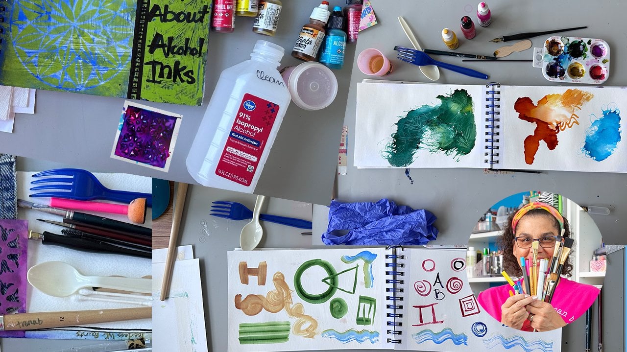
3. Supplies & Safety: In this video, I'm going to talk to you about
supplies I used. Now, in general, let me just say that don't
feel like you have to have the same brand
names that I have to use. So I am showing you
the ones that I use, but if you just have something
similar, you'll be fine. With alcohol inks, they can sometimes have
a strong smell. So you'll want to
make sure that you're working in a well
ventilated area. With the window cracked or
a fan or some open space, you want to protect
your work surface, so you want to have something laid down there to
catch the inks. You may want to protect your skin if you have sensitive skin or
you don't want to get the inks stained on your hands and you want
to protect your clothes. You'll want to wear old clothes or wear an apron to
cover your clothes. For the actual painting, you'll need some type
of sketchbook or paper. I have here a mixed media
sketchbook that I actually had cut in half at my office supply store so that I could have
a smaller size. The paper doesn't have to be really thick because
we're actually going to put a layer
of gesso over it. If you have a very thin paper, you'll want to use
two coats of gesso. You also need some
isoprofle alcohol. I use 91% because I like the way that the inks
behave with the percentage. What I found is the higher
percentage you have, the more flexibility you have and the better the inks flow. But if you can only
find 70% in your area, you can still do this technique. It may just look a little bit different than what
you see me doing. You'll need a few paint brushes. One for your gesso, I used a larger one to
paint the page and then two smaller ones depending on the size
of your painting. As you will see, my painting
is relatively small, so I'm using a very small one for detailed and a
medium size brush. You'll also need a pencil. If you want to do your
drawing and pencil first, if you want to go
straight in and paint, you can do that too. For the last
technique that I do, I use a black pen, a permanent pen
that has a tip that allows you to get
thick and thin lines for the technique that I do. But if you have any
black pen, sharpie, any permanent black pen, you can still do that same step. Of course, you'll
need alcohol inks. I use two type
Ranger and pinata. I'll take a picture of all
the colors that I've used, but of course, use the
colors that make you happy and some type of palette. For this technique,
you're actually going to drip the inks on a palette. It can be a flat piece of
plastic or one that has wells. The nice thing about
this one that has wells is you can save your
palette and reuse it. I have a couple of these where sometimes I just create a whole painting from the palette. I don't even need
to drop new ink. In the next video, we will get started in our
sketchbook. See you there.
4. Prepare the Page and Draw: In this video, we will prepare the page and drawing
vase and flowers. So I am all set here
with my journal. I am in a room that
is well ventilated. I have my hands protected, my work surface protected, and I am ready to get started. So to prepare my journal, and this is a mixed
media journal. Pages aren't real thick, but they're nice quality. I applied gesso we
have the paint brush. And for my background, I like a lot of movement. Well, in general, in my art,
I like a lot of movement. So I applied the
gesso in a kind of a criss cross mismatch type of method because I like all that texture
in my background. If you want a smooth texture, then what you can
do is water down your gesso a little bit and use very light strokes
across your page. So that you can
smooth out the lines. You can even use a sponge to apply your gesso
for a smoother look. I let my gesso dry overnight
because I wanted to make sure that it was completely dry before I go
to the next step. I am going to use a pencil
to draw in my vase. I'm only going to use probably half of this page and just make a smaller drawing and eventually I may make
another drawing over here. But my size that I chose is
basically in a square format. So for drawing a vase, I'm just going from the kind
of shape vase that I like. You can look on line and find a reference for whatever
type shape that you like. But basically, I like
the thinner neck at the top and then around base. So I'm making the bottom
flat and then I'm drawing a horizontal line to help identify where my
table is going to be. Next, I want to
put in my flowers. For the flowers, I did get some reference images
from Unsplash, and these are going to be
very whimsical flowers. I'm not trying to
draw realistically. I'm just trying to
draw some fun flowers. First, I'm going
to add some stems, where the flowers
may be coming out, and then I'm just going
to use my reference to get an idea on some
shapes of flowers. No real flower probably
looks like this. But in my mind, this is flower I like. I'd also like to do
flowers that overlap. It gives some
interest to my piece. I'm not worried about
if the drawing isn't perfect because I'm going to cover that up with alcohol ink. I just finish putting
in some flowers and then add details later
with the alcohol inks. That is the drawing, and now we are ready
to add some color. And the next video
will block in color. See you in the next video.
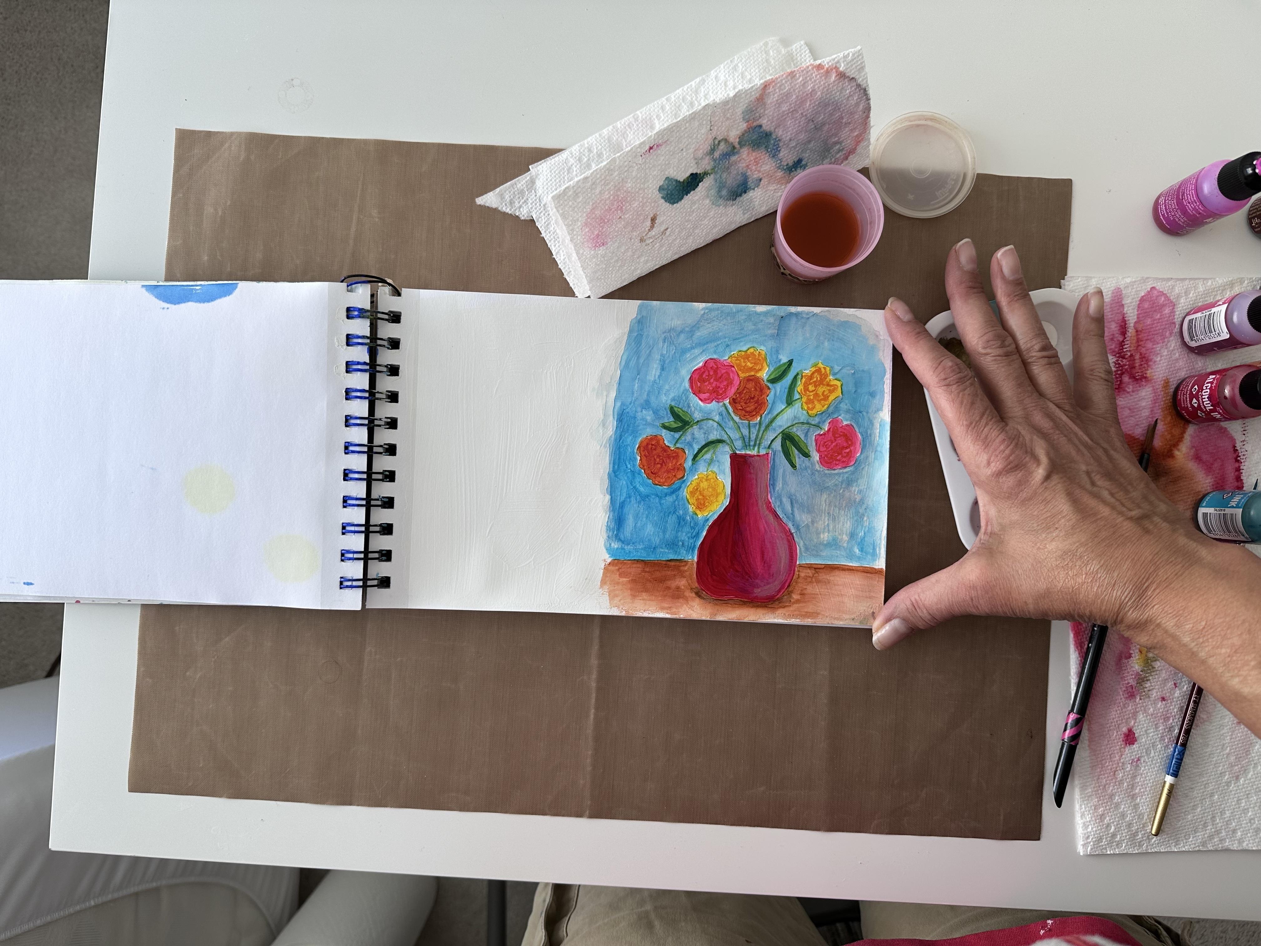
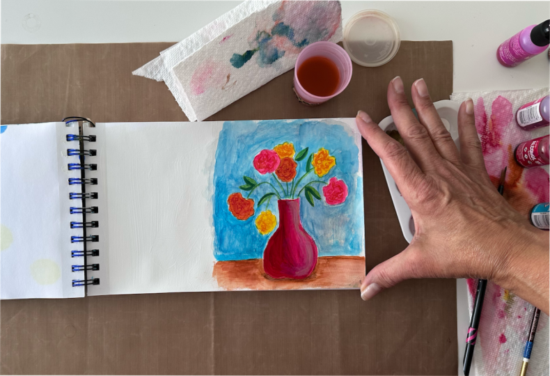
5. Add the Base Color: This video, we will add a
base color to our drawing. I have decided I
want a red vase. Red is just calling my name
for this particular style. I can pick out some colors. With alcohol inks, I like to have more than just
one straight color. I'm thinking with my red, I would like to have
another warm color and pink makes me happy. I have a little
palette here that I am going to drip
my alcohol ink in, and then the technique
we're using is to pick it up with a paintbrush
and spread the color. So a tip when first
starting out, you're dripping color
into a palette. Save all that
beautiful rich color, and what you'll end up
with is something like this that has a
variety of colors in it that you can re wet with alcohol to bring
that color back alive. So save those palettes. I also have a small
cup of rubbing alcohol here that
I'm going to use like water to watercolor paint. That's what you'll do with this little Let's drip in some red. I do a little shake and
always unscrew away from your artwork so you don't drip on it. That's a big tip. I'm just going to put
a few drips in here. I tend to close my tops because I've had experience
where I just get too excited painting and an
accident is sure to happen. Then I'm going to add a
little pink on the side here. The idea with this
technique is not to use your alcohol ink when it's sopping wet because
that's when it spreads. What you want to do is
just play with it a little bit to get it into
a less liquid form. It gets a little drier and then when you
lay down the ink, it doesn't spread as much. You can see here,
it's spreading nicely within my control on the
gesso in my sketchbook. So when I want a
little bit more color, I dip into my palette and just wipe it on the
side a little bit to let it dry a little bit because
I don't want it sopping wet because when alcohol
ink is sopping wet, it loves to spread and mingle, and that is one
of the features I absolutely love about the inks. I'm not getting as
much pink as I want, so I am going to actually
put that in its own well. Dab off my red onto a paper towel just to
take some of that color off, dab into my pink and rub
it along the side so it is not so sopping wet
and then pull it in here. And you can see that it adds a little bit of
variance to the color. I love that. I love all those streaks because
I am a texture person. I love texture in my artwork, so you can experiment with how you use your
paint brush in pulling the inks around to see what you like, the
results that you like. I'm going to let that dry. I am going to rinse off all
that red and by the way, you see this is getting dirty. Save this alcohol. You don't have to have
perfectly clean alcohol, like you do water
and water color. You can get enough
off by dipping it in the alcohol and then
wiping it on a paper towel, and you don't have to worry about getting it
completely clean. Next, I am going to put in some yellow in my flowers because that is my
color of choice. Feel free to follow along
with me or deviate to the colors that you really like or the colors you already have. I'm also going to
use a little orange. I'm going to put
that in my palette because I know I'm
going to want that to work with the yellow. You could also mix the yellow and red
to create an orange. If you don't have
an orange already. These colors blend
beautifully together. I am going to rinse a little bit more because I'm
going to a yellow. I'm trying to get some of
that red off my paint brush. Then just like with
the red and the vase, I'm going to dip into
the yellow and then spread it around a little
bit to let it dry a little. So I'm going to paint a few of these yellow,
and I want to be careful. I dip maybe too quickly, see how fast it spreads, be sure to give it a
little opportunity to not be so wet by wiping it on the side so
you have more control. I got happy. The
color made me happy, and I just wanted to jump in. So now I have a couple
yellow flowers. I'm gonna clean
that off a little bit and jump into my orange. On the side and spread
and see how that spreads, I probably didn't wait
long enough on the side. But with this technique,
it's not that critical because I'm not doing that detailed work and
flowers are organic. They're not perfect shapes. I'll do another orange and
I'll try to take my time this time and not be so quick. I'm going to make
this one orange. This is my first layer. Let me mention. I'm going to add some more layers
and some more color. So it's not critical
that I cover every pencil line up right away. And I want some pink ones. I'm going to need a
little bit more pink. Color. I'm dripping that in. I'm going to pull it up
on the side and just let it get a little dry so it's not as wet and dripping as
when it comes out the bottle. And then the next color. Be careful when you're painting two different colors
next to each other because they will mingle,
just like watercolor. The color will
reactivate with alcohol. You see, I went over that pink, it reactivated a little bit, because I have so much
yellow on my pink brush, the yellow overpowered the pink, although it colored it a
little bit, but not that much. You can get pretty
close when you're using this technique and it shouldn't run because it's
in a drier state. That is my first layer. And so next we will
work on the next layer. I'll see you in the next video.
6. Add the Next Layer: In this video, we're going to
add the next layer of inks. I've added some more color into each of the wells that
were already there, and I added a white and a
gold for our next layer. I'm using a smaller
paint brush this time. Dip it into my
alcohol and just let it sweep across the paper towel so that it's not dripping wet. I'm starting in the yellow and I'm going to
pick up some color, wipe on the side
because I want to add some detail into the
flour for the next level. It's very subtle, but you can see that it's a
little bit darker. Even though it's the same
color, I'm layering. I'm just tapping
around and making some swirls to give
interest to the flower. And I'm going to
continue around to all the yellow flowers. Okay. Then I'm going to rinse it
off and go to my next color, which is the orange,
which is over here. And just like with the yellow, I'm going to go in and make some swirls dipping off on the side before I go in to make sure
it's not too fluid. Then to the next orange flower. During this part, I'm just
relaxing and enjoying the process of putting down color and letting
the inks do their thing. That's one of the reasons I love the alcohol inks is because they create such beautiful textures
with very little effort. It looks like you
have done a lot of detail and spent all day
painting when in reality, it didn't take you that long because the alcohol
inks are so helpful. Now moving on to the pink. And you'll notice
with this color, it almost looks like
it lifts the color. That's because of the
properties in the inks. Inks that have more
alcohol binder that binder in
them than pigment, it will cause them to
lighten other colors. So that's one thing
to be aware of. So it's fun to play with the inks to just see how
they mingle together, the different colors and
what kind of textures and designs that you can create by just letting
them play together. Okay. So now I'm finished
with the flowers. I want to add some more
color into my vase. I'm going to go
back to the bigger brush and I'm going to pick up some red and wipe it on the side so that it's
not too drippy drippy. I say that as if, you
know, that's a bad thing. It's a preference thing because sometimes I do like my alcohol ink drippy, drippy. But for this technique, I am working to have a
very controlled painting, and so I want them to go where I want them to go,
not where they want to go. Sometime many times I love it when they go where they
want to go because they create beautiful beautiful
results all on their own. I'm thinking that my light
is coming over here. That's why I'm making
this side darker. My light is coming
from the right. I'm painting another layer
over here on the red. Then I'm going to use pink on the right side to make
it a little bit lighter and show the variance in the vase of where the
light is coming from. I'm taking a little
bit of that red off and wiping it
on my paper towel. Then I'm going into the pink, wiping it on the side. Then I'm going to come
in with the pink. As we saw up here in the flower, it's going to lift some of
that pink that's there, so it's making it really light. I went over a little bit, but I'll fix that when
I do the background. That's the beautiful
thing about alcohol inks is if you don't get it how you want it the first
time, you just rework it. They are very forgiving medium. So I'm working that in there, and I went over a little
bit further than I wanted as an example of fixing. I'm going to come back
in with some red. I want to dab off a lot of that alcohol from my paint brush so that it's not too damp. Pick up the red and
bring it in here. I also want to mention that
I am using a light touch. I'm not pressing hard
with my paintbrush. So I'm going to clean this up, and I actually want
to add a little white at this point
on the right. So even that's light right
there with the pink, I want to add a
little bit of white. And then I'm going to come
back in with a little bit of red to tone that down. And I almost have kind of a dry brush gives
you that dry brush effect. Going in the shape of my object, which down here, it's round. I'm just following
the shape of it. And without adding
any more paint, I'm just blend all
that together. Okay. Now we are gonna add a little bit more texture to our flowers in the next
video. See you there.
7. Add Texture to Your Flowers: In this video, we're going
to add some more texture and interest to each of our flowers by using a darker
shade of color. I going back to
my smaller brush, I'm going to dip it in the
alcohol and just wipe it on the paper towel so it's not too wet for my yellow flowers, I'm going to use a little bit of orange and go to a darker
shade to add interest. I want it to be subtle. I don't want anything
real staark. I'm going for subtlety. I'll move on to the
next yellow flower. I hope you see how this can be relaxing and not too
stressful because there's no specific fine details
that you have to do. It's very loose
and just relaxing. I think you could even have
a glass of wine and do this and it wouldn't impact
your painting at all. For the orange, I'm going
to go into a little bit of red that's going to give
it another level of detail. Just taking the
color off the side. You just want to do this
until you're satisfied. There's no specific trigger
to say when it's done, it's just the results
that you want. I'm going to rinse my
brush off for the pink, I am actually going into the orange because that is a
darker value than that pink. I don't want to go straight
to the red because I feel like that would
be too strong for me, but you can try it and
see how you like it. You see how each layer you get a little bit more
interest to your flowers. At this point, I also want to add a little pizzaz to my vase. You'll remember I said I added
that gold into my palette. I'm going to add a
little bit of gold. I'm going to stir this color up. Wipe it on the
side a little bit. On this right side, I'm
going to be careful, not add too much, but add some. I'm actually going to take
my smaller paint brush, dip it into the alcohol and work this around
so it's not as dark. I don't want to dripping wet though. I have to be careful. I'm re wetting the
white a little bit that's coming
through, and that's okay. These colors are all going to just work together just fine. A little bit more gold. It's getting a little too dry, so I'm going to add a
little bit of alcohol, not dripping, so I
just want it damp. I'll wipe it on my paper towel coming from after I've
dipped it into the alcohol. I don't want to
go straight to my painting because I still want that dry brush look. Okay. So now I believe I am ready
to add a little background. So please join me
in the next video.
8. Paint in the Background part1: In this video, we are going
to paint the background. For my table, I want to
make it on the brown side. I'm going for more of a neutral. I've used all warm colors up
here in my vase and flowers, so I'm going to add
a little bit of ginger on my palette and I
don't have any more wells, but there's plenty
of palette space. If you see my dirty
palette over here, you can see I use all the
spaces to mix colors. I am going to put a
little bit right here. Just a little bit because
this is a big brown color. I am going to paint in my table
in a horizontal position, adding a little bit of brown
and a little bit of orange. I mix the colors up here and then I'm just
going to sweep them across getting close to my
base going across. It doesn't have to be
perfectly filled in. For me, I like that look. It's more of a
scratchy fun result. Now, I could spread some of this color by just
dipping into the alcohol, wiping it off on my towel because I don't
want it too strong. When I do that, I get some variant in the
color and then I just take it in that
horizontal movement so that it looks like a table. If I do want a little
bit more detail, what I can do is use
my spalar brush. As far as making it horizontal
close to the vase itself. I'm also going to put
in a little shadow, I'm not going to I want to be careful not to overwork this. And that gives me my table. Now, for the background, I'm thinking I want
a cool color to complement these warm colors. I am going to use a turquoise. Also, it's one of
my favorite colors. All the colors are
my favorite colors. I'm going to add a little
bit on my palette here. I'm actually going to use
my big brush for this and and I'm going to spread this a little thin because I
don't want it really strong. It's a strong color. I want it more of a
subtle background. So and also I want
all that texture of the gesso to really
show through. And as a side note,
this is why I didn't color my stems yet
because they are so thin. I will color them
last and see how I just got some of that
red, get some alcohol. I can pull that up a little bit. I can use a paper towel
and pull that up. That's because of the gesso. I still have a little
red, so I want to make sure I get that
off my paper towel. Get that turquoise going. It will fill in nicely. Again, just like
with everything else in this little piece of artwork, it does not have to be perfect. We are going for a good time and create something
colorful and brings you joy. Um, So I continue just painting really
loose this background. I'm going to do another pass. I know it doesn't show
up much right now, but we're going to do
another pass and you'll be able to see how you can build color and create a really
pretty background. And so I'm getting close to the flowers but being
careful not to get too close so that I pull color and
also cleaning off my brush. In case I do dip into any color, I won't spread it around. So you see I'm messy and loose
all away from the flower. But then when I get close to the flower, I'm moving slower. And I'm going to
be moving really slow when I get
close to the vase. I may even use a
smaller paint brush so that I don't risk going into the color like I
did just now with the flour. But I'm going to use a clean part of the paper towel to pull up some of that color. Actually, when we
do the final step, those little bobos that I
make you won't even notice. So now I'm going to
come back in here and add some more
color over here. And it's just back and
forth to get that color in. And I'm going to come
back in here and clean up that little area right there. I'll show you how to do that. You want to have a
clean paper towel. I'm going to go to my
smaller paint brush. I don't want it to be
dripping wet, but I want to. Then I'm going to
re wet that area and pick up color with
my clean paper towel. Similar to watercolor. I is very similar to
how you pick up color, fix mistakes with watercolor. I'm just going to repeat this until I can get as
much color out as I can. Okay. So you see I've
gotten that pretty clean. Now I'm going to go
back in with the blue, the turquoise. Mmm. Mmm.
9. Paint in the Background part2: Mm. Okay, so I walked away for a while and came back and
looked at my artwork, and I decided I want to add some more color
in my background. So I'm going to take my large brush and wet it with alcohol and pick up some of
my blue color here. I need to reactivate it
'cause it all tried. And then come in and
just deepen this color. It's going to take
me a few minutes and I'm just going to go
around and darken this. I'm going to speed
up the video a little bit so you won't
have to sit through it. But basically, you see
the technique that I'm using and you can
hear how the paint is on the paper so you
get a feel for how I'm using basically a
scrubbing technique to help create this
texture in the background. Okay, at this point, I just step back
and look at it and see if there's any other
changes I want to make. And I like how the
background is looking. I like the contrast of the background with the
table and the flowers. Next up, we'll add some details, the leaves and stems and a little bit of
shadow on the table. See you in the next video.
10. Add Leaves and Stems: In this video, we will add
some stems and leaves. Thinking about what color I want for the stems and leaves, I like this bright green. I am going to find a spot
to add this on my palette. I'm taking my smaller
brush for the stems. I dip it in a little bit
of alcohol to dampen it. Tap off the excess and
then go into my green, scribbling a little bit to get a little bit thicker
paint more dry. Then I'm right handed, so I'm going to start
on the left side, I'm just using my pencil
lines as a guide. I can still see
them a little bit and so I want to cover those up. Thinking about, I do have a flower up here,
so it needs a stem. I like actually how the
pencil line helps give a little bit of shadow to the inks because
it's transparent. I'm just going to add now a few leaves not any
particular type, just the way I like
to make leaves. Kind of random and just get in that basic shape. Oops, I want to make
sure that I don't have too much dripping alcohol, so I go back to my
palate and just smush it around a little bit more so it dries a little bit. Because this particular
color has a lot of alcohol in it
relative to the pigment, you can see that it lightens the background a little bit
when it mixes with the blue. It reactivates it basically and pushes some of
that blue away. I'm just trying to get
a balance of leaves. I'm going to further define some of them now that
they've dried a little bit. I like my leaves to have
a little bit of a point. One of the things I love about the alcohol inks is how they naturally create some texture
without working too hard. I'm going to let that dry
for a moment and think about if I want some more contrast or a little bit more
definition in my leaves. And I'm back. After looking at it, I do want a little
bit more contrast. So I'm going to use some blue, this dark blue indigo, and just add it to my
palette next to the green. Just a little drip. Well, supposed to
be a little drip, but a lot dripped
out, but that's okay. I'll thin it out. I still
have a little bit of green on my uh pat brush. I'm going to dip into my alcohol to get some of that color off. I think I am going to
have to add some green. That was a lot. Sometimes it's
hard to get just a little. When that happens when
some of the color that I'm adding drips into
another color I have, I don't worry about
that too much. That's probably going to
create some color that I'll like and can add someplace else. Since the inks mingle so well, they follow color
theory very well. Oh, and I'm glad this happened, so I can tell you
what to do when this happens to you is just take a paper towel and wipe that off. You can dip it in some alcohol
to pull that color out. Because chances are this
is going to happen, and I just pull it
away off the page. Actually, this works out fine because my light is
coming in on this side, so this side of the table
is going to be lighter. So that was one of
those happy accidents. So now I'm being mindful of my fingertips and just wiping
them off with paper towel, and then I'll go back to
working on my leaves. So I'm going to pull
some of that color down and just paint on one side of my leaf. Then I'll go back in. I'm not
going to add any more ink, but I'm just going
to go back into my stems and put a little
color on one side. They're very thin. But this
just helps define them, add a little bit at a line on the and I like how
this is turning out. This aligns with my style and
how I like to paint lots of color and contrast in
color and in value. So I think the only
other thing I want to add is a little bit of
shadow at the bottom. So I'm going to clean
off this brush. And dab off the excess alcohol
and go back into my brown, which is here on my palette and go on that the deeper brown, I had mixed two colors, so I go to the
deeper side and just add a little bit of shadow
down here ever so slightly. It's pretty dry, so I'm going
to dip just gently into my alcohol so I can get a
little flow going here. I feel like I don't
need much more on the left side because our
light is coming this way. And that's all I feel like I
need a hint of the shadow. At this point, if you
like your drawing, you can stop right here. I'm going to show you
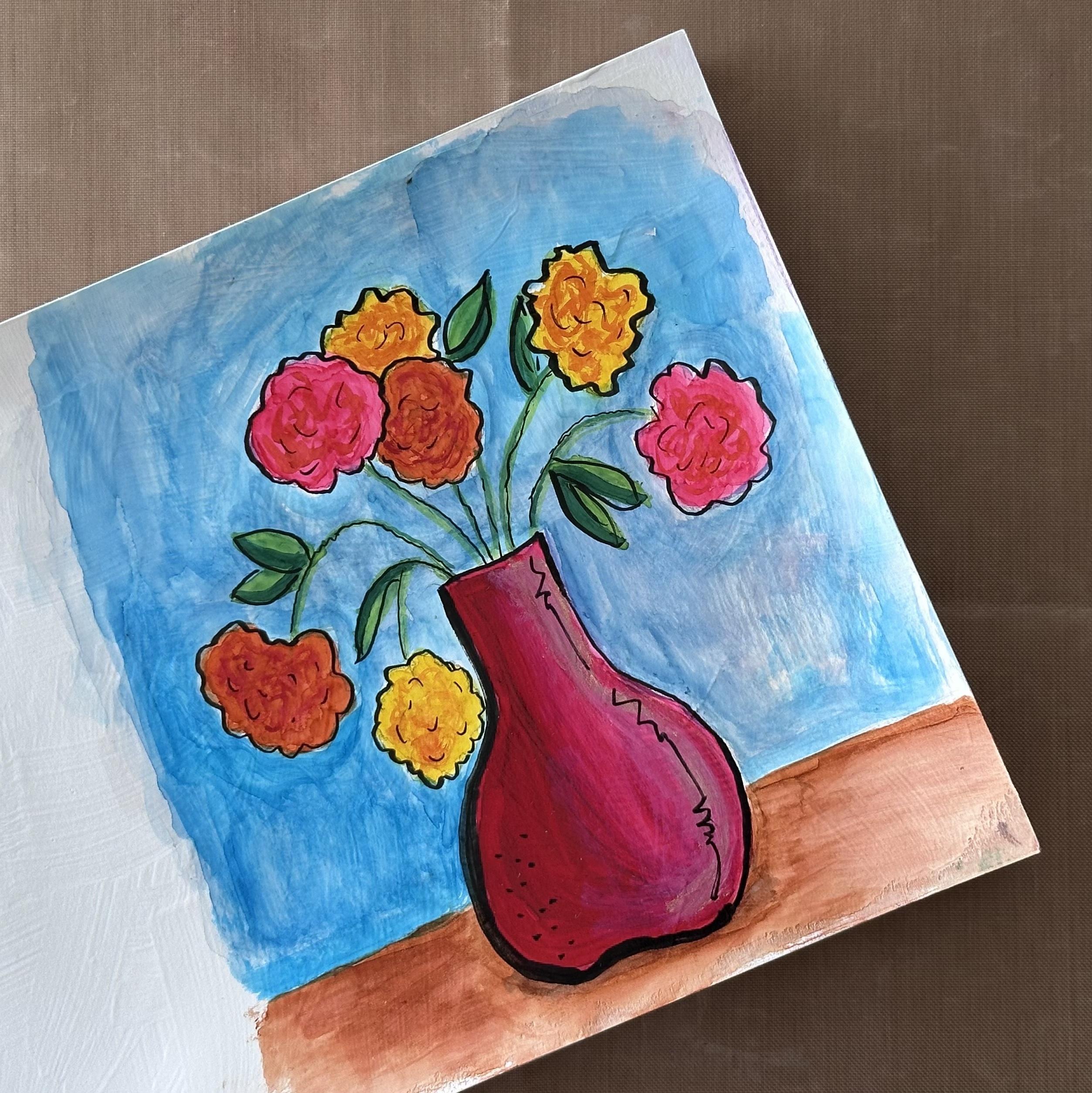
another variation using a black pen to outline it.
11. Add an Outline: In this video, I'm
going to show you how I outline my artwork
to make it pop. In this video, I'm going
to show you a variation to the drawing using a black pen. This particular pen
is a calligraphy pen. So when you push
down on it lightly, it's a thin line. When you push down on it harder, it can give you a thick line, so you can have some variation. So one of the techniques
I like to do with my artwork sometimes
is to just outline it. So of course, you want
to make sure that your painting is totally
dry before you do this, and then you're just going
to make outlines around your artwork to emphasize
the different parts. This is an opportunity
to add some details in addition to what
you already have on the page that you use with
different color paints. And so I like to go
around and just add my touches to make it more of my own style and
how I like to do paintings. And so I'm being mindful of the bigger areas where I can use the thick
part of the marker, and then the thinner areas
like the stems where I want to use the thin
part of the marker. This also gives me
the chance to clean up any pencil lines that
still shine through that I don't like and add
a little flare or extra to areas that I want to further
define my leaves. Lines don't even have to be continuous. They can be broken. It's like whatever style
that you like that adds your own unique
touch to your painting. Now I'm using a
really thick line on the left because that's
where my shadow is, and a thinner line on the right side and also
thick on the bottom. I just for fun. I like to add squiggles
and dots to my artwork. And so that's just
another way that you can make the design your own and give it
a different look. And I just noticed I
forgot to do a flower. So always step back and
look at your artwork. In the next video, I'll share
a summary of the class, and I'll also share some additional alcohol ink
resources. See you there.
12. Summary: Congratulations. You
have finished the class. I hope you learned some new
techniques, enjoy painting, your vase and flowers, had fun and just found
moments of relaxation. In the class, we covered how to safely use the inks
and what to be aware of, how to prepare your sketchbook
to receive the inks, how to add layers, detail and texture to your
piece using the inks. The techniques can be applied to any subject or composition. Be sure to save the student handout with
a summary of steps, the list of supplies with links, and additional alcohol
ink resources. If there's one thing I hope
you take away from the class, it's seeing how easy and
fun it is to paint with the inks to paint with
the inks in a sketchbook, I didn't know that when I
first started using the inks. I thought I always
had to use UboPaper. You can create with the inks and save them in
your sketchbook. Kindly leave me a review. I appreciate knowing what
you thought about the class as well as it lets others
know what to expect. Also, please follow me here on SkillShare so you'll hear
about my upcoming classes. If you post your work on
social media, please tag me. I'd love to share your
artwork with my followers. On Instagram, it's
at Trena Brannon. Thank you so much for joining
me. See you next time. Take care and stay positive. M.
 Trena Brannon, advocates kindness inclusion positivity