Transcripts
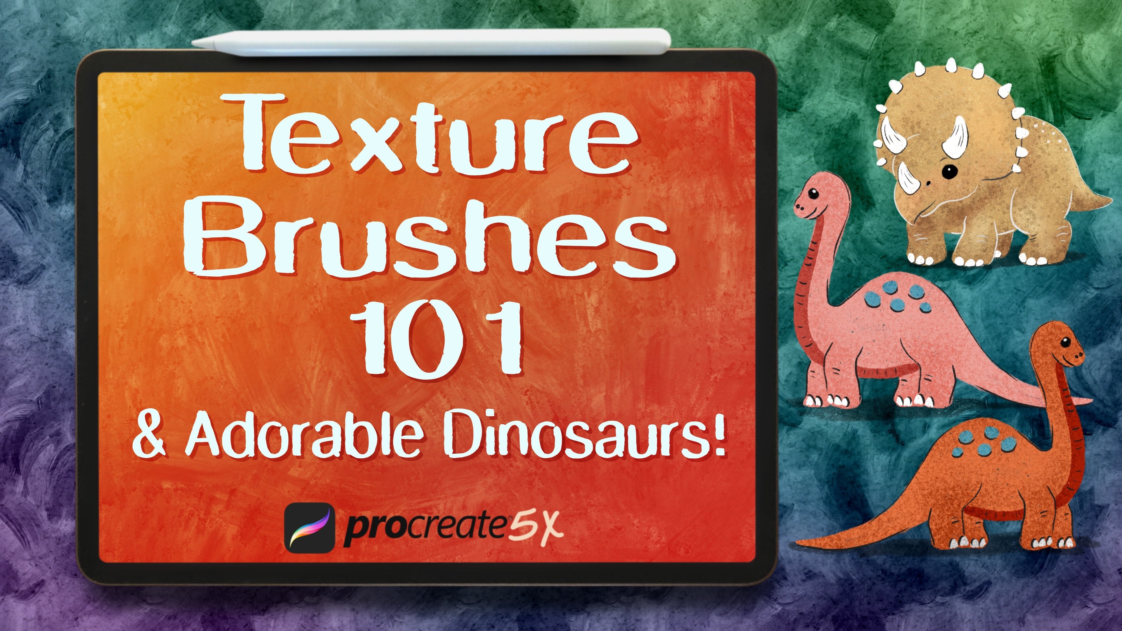
1. Introduction: Hello, I'm Jennifer Nichols of Leila & Po Studio. I'm an artist, a teacher, and a fabric designer. In this class, I'm going to show you how to make six beautiful advanced repeat patterns in Procreate. This class is best suited for intermediate to advanced students, and I highly recommend my previous class on repeat patterns before taking this one. If it's been a while since you've taken that class, no worries, I will review some important reminders before getting started. Just like my first pattern class, the focus of this class is on the process of making the patterns, not on an illustration style. I will walk you through six different types of advanced patterns, using very rough sketches, but along the way, I'll also discuss the steps I take when completing a design. We'll examine some complete designs for each pattern as well. As always, you'll get some free brushes, palettes and more. I've even added a bonus lesson on creating a seamless texture overlay that you can combine with any of your repeat patterns, and of course, you can use those skills to make as many overlays as you like. Procreate is an excellent choice for creating repeat patterns, thanks to its amazing illustration capabilities and its user-friendliness. I can't wait to show you these techniques, and I hope you end up enjoying it as much as I do. Let's get started.
2. Class project & Downloads: Really quickly to create a project, you're going to go to the class and go to Projects and Resources, tap Create a Project, just really quickly I wanted to tell you because this confuses a lot of people. This Upload Image, it's just for the cover image of your project and also it sometimes takes a couple of minutes for it to show up on the project page itself. It also needs to be a pretty small size and it's going to crop to a rectangle. This Image button adds images to the body of the project. You can let me know what you think of class although a review of classes is a great way to do that too but you can let me know what your favorite part was and things like that, you don't have to write anything at all. But that's where you can let me know something and add a bunch of images, you can actually add quite a few images. You can only have one project per class but you can add multiple images in that project, and then Publish. Your project is actually just going to be to pick your favorite repeat pattern and try to make one, and I know that there are advanced designs so let me know if you have any questions. Your downloads are right here, you have a couple of brush sets. One's the honeycomb one for this stamp right here, and then these bees and hives are in a regular brush set. You have three swatches and then you have the PNG of those flowers and birds, the sketch that I provided. That will come into Procreate with no background so you can easily copy and paste like I did in class. When you are in, you have to be in a browser, not on the app, and you have to be in this landscape mode. I use Safari, so it might be different in other browsers but for brush sets, you tap, Download and you're going to see up here. Once it's downloaded, you can just tap there and go to it from there, and then it's in your downloads, it's in alphabetical order which can be confusing, I think you can change how it orders them. I just go to recent and it should be this very first one. Once you tap it, it'll import into Procreate and it'll be at the top of the list in your brush library. For the swatches, it's basically the same process, but they're going to be at the bottom of your list of pallets in Procreate, so I don't know why they do that. For the PNG, let's go ahead and tap it and download it. It just downloaded it, you can tap it and it'll open up. Then from there you can get to it in your files, but you can also just save it to your camera roll right here, Save Image. I know it looks like it has a white background, but it doesn't. Let's get started.
3. Important Reminders & New Canvas Info: I highly recommend taking my first class on seamless repeat patterns in Procreate 5X. I have some older classes that aren't really relevant anymore. Just the one that's labeled Procreate 5X, that is the best one to take if you are unfamiliar with making seamless repeat patterns, because this class is going to have some tricky patterns and it might go a little faster than you might be comfortable with if you know nothing about making patterns. Some reminders from the first class, when you're placing your elements on the page, you can't touch the edges of the canvas. You need to focus on laying out your elements where the horizontal and vertical lines are because when the next step happens after you lay out your initial elements, you're going to be spreading duplicates to to four corners and it's cutting along those lines and you won't be able to add anything to those areas after the second step, so you need to think about filling in, not that you need it all filled in, but you do need to focus on those areas, making sure you have the corner marks so that you can turn the background layer off and have a transparent background. The corner marks allow you to save as a PNG where the Procreate will save the entire canvas size instead of just going to the edge of whatever is drawn on the page. Having your snapping tools, the distance set to max, is going to help things snap really easily. Velocity is just to do with how quickly you move it around. I find the middle to be good. For snapping also, it works really well if you have all the other layers turned off. We'll talk about that a little bit as we go as well. One of the biggest issues that people can have is things are off by a pixel. When something is selected on your page and it's highlighted, and you accidentally tap over here, it will nudge and you won't necessarily see it nudge. So be really careful not to nudge a selection. Let me see if I can do an example here. Right now this is highlighted, and if I tap over here, the whole box moved over one pixel. If you have an entire selection for your whole page highlighted and you accidentally tap on the side over here or over here, it's going to shift it and then everything's going to be off by a pixel. Those are the big reminders. You can touch the edge if you use the symmetry tool. We'll be doing that in one of the lessons where we need the horizontal symmetry so we have something coming up off the page here and extending down here. But other than that, you need to make sure you're not touching the edges when you lay out your initial layout, and then in the second step when you're adding some fillers, no touching the edges on either of those steps. A lot of the designs I'm going to show you today actually start out with this diamond shape. Even if you're not staying within the borders of the diamond, it's a shape that you're going to want to have in the background so you can see approximately where it is, and we'll talk about it with each design that we do and the changes that you can make to this diamond shape. For some of the designs, we're going to be having our original design here in the middle, and we're going to make four duplicates of it and move those to the four corners. Then we'll still have one in the middle, and that will be our repeat. It will be complete. This red line just indicates where the canvas edge is. The diamond in the middle is where you'll do a design. By duplicating and moving that design to the four corners, you can see how the repeat pattern is formed. But we're focusing on just the one diamond in the middle. We're going to do a few different things with that diamond, and I'm going to show you how to get that diamond setup right now. Go ahead and tap the plus sign, and then this plus sign right here. I go to Inches. I'm going to do 12 inches by 12 inches. I have an iPad Pro, and so I get 37 layers with that. If you don't have an iPad Pro and you get fewer layers, go ahead and go down to 10 inches by 10 inches. Then 300 DPI is important if you can manage that. If that's still giving you too few layers, maybe go down to nine inches or eight inches, and then tap Create. Now go to the wrench tool, Canvas, turn on the Drawing Guide, Edit Drawing Guide, Symmetry, Options, and Quadrant. I'm going to go ahead and turn up my thickness and opacity on the line on the grid there, and then tap Done. That automatically turned on the drawing assist for this layer, which is great. Choose the Jen's Monoline big brush and let's go do a really small size. I'm at two percent. Start here where the grid line intersects. Go over to the other side and let it snap, put your finger down so it snaps straight, but then edit the shape so that you can really zoom in. I should have made my line a little longer. Hope that works. Edit the shape so that you've got them intersecting right on the line there, doesn't have to be super-duper precise. You don't want it to be down here, or way up here. But as long as all of these, the edge of the canvas, the red line, or whatever line color you have, and the line you drew, all intersect approximately right there, then you're good to go. Then you can turn the opacity down on that. It's really just a guide, and you're ready to go with your canvas. If you want, you can just duplicate this canvas so you don't have to do that every time. We're going to be doing a few designs, so just duplicate that one and leave a blank one each time and start out fresh like this. I'm not going to show that process every time we start a design. Then I have one design where we need another guideline, and I'll talk to you about that later. Make sure you spend some time getting that ready and I'll see you in the next video.
4. Seamless Texture Overlay: I'm going to show you a very quick lesson on making a seamless repeat texture overlay. In the future lessons, you're going to hear me talk about how you can go to my texture brush making class to learn how to do that. You can still do that but I used a different method in that class. I used very watery brushes. I'm going to show you this with artist crayon. It's a very dry brush and a slightly different step we're going to take in this compared to the texture brush making class. Go to sketching and go to artist crayon. If you don't like artist crayon, you can play around with other brushes later. Go to the green and zoom, bump it up to cropped so it's maxed out, and then scroll down and turn off offset jitter. What you just did was you made it so that you can change your brush size and it doesn't change the grain, no matter how big or small you go. You can still color on top of this and it's not filling in and filling in and filling in. That's the offset jitter. I'm seeing this repeat here. I'm going to go back into my brush and just scale it up a little bit. Let's go to 50 percent. That will just make that repeat a little less obvious. We're going to fill in a little bit of the middle of our canvas here. We're going to not worry too much about anything at this point. Just get a nice, somewhat even coat here and then switch to something solid. I'm just going to go back to inking and studio pen and get my corner marks on and duplicate, duplicate, duplicate, we need four. Make sure snapping is on. I'm going to see if this is going to snap easily. I got my gold lines, it snapped easily. Again, in my future lessons in this class, I hadn't planned on doing this lesson. It's going to keep saying, you can make an overlay in this other class. We're going to merge those four and just select the corner marks and get them off the page. Now I need to fill in these gaps. I'm going to go to a new layer. I need to go back to artist crayon, so back to drawing. No, sorry, sketching. Go to artist crayon. I'm looking at the width here and I'm just making something that's somewhat the same width. I'm going to turn that off. I'm going back to inking, putting corner marks on that and I'm going to duplicate that. I want one to slide directly to one side, making sure I have my golden lines and one to the other side. Making sure you have gold lines, merge those and get rid of these corner marks. Let's see how that looks. That looks good. Now when I do the same for top and bottom. I need to go to a new layer. I think we can safely merge those other two layers. I need to go back to artist crayon, and this one is a little wider, so I'm going to get a bit of a splotch here that's a little wider. Right in the center it's wider. Turn those other things off. Go to something, any brush where you can get a nice solid line and duplicate that, snap right into place. That one, there's the gold line. That took me a minute to get to that gold line. Merge those, get rid of your corner marks, you can just erase them, turn that back on. I have a tiny gap here, but I think I'm okay. I'm going to go ahead and I merged all of that and I'm going to go to a new layer, go back to artist crayon and try to fill this in without it being really obvious that I'm filling in this plus sign here. That's why we changed the brush setting, I'm barely touching my canvas too. If I need to go to a really small size, I can fill this in at this small brush size and keep that grain size the same. I can't touch any edges. I got super close to that edge but I'm not touching the edge. I'm just going to fill in somewhat squiggly so it doesn't look like I have a plus sign. I can't fill in because we turned off the offset jitter. I can keep filling in right here, so that's okay. You now have a seamless repeat. That is if you merge all of that. This is a one-by-one of it. You might want to set that aside. Turn that bottom one off and select the four top ones and shrink them. De-select the bottom two and raise the top two up. De-select one of those top two, re-select one of those bottom two, and slide it over. You can somewhat see that repeating, that x we made in the middle but as far as a repeating texture overlay goes, this is a nice two-by-two, this is a nice one and what you can do with this is just keep it in its own file, come in and copy a layer and apply it. I made sure it was a 12 inch canvas, so I can apply it to any seamless repeat pattern, any. If you made that on a 10 inch canvas and you tried pasting it into a 12 inch canvas, it's going to paste in small and you don't want to upscale. Make your texture overlay on a big canvas. I never go bigger than 12-by-12, so 12-by-12 is just fine. I have this and I can go ahead and paste this right on top because I had copied it. De-select it. Now I can Alpha lock it, changed the color. Gray is always nice for different blend modes. I'm going to zoom in so you can see what's going on here. I have this gray, awful looking texture overlay up here. I can just start playing with blend modes. Color burn worked really well. It's not showing up on the white at all, so that's nice if that's the look you want. Sometimes it's not the look you want. That looks really cool screen. It's using the gray and lightening those areas. Overlay on gray isn't working, but it would work if you did black. Let's keep it on color burn. There you have a really awesome texture on the top of your repeat pattern. Since the texture is also a seamless repeat, then when you save this and you put it in Spoonflower or something like that, the whole thing will still be a seamless repeat pattern. Then of course, you can play around with the opacity too and have a more subtle texture. That's really pretty. I really like that. I don't know if you've taken many of my classes, but I play around with blend modes a lot. Choosing a different color entirely and different blend modes, you can just play around loads and loads and see what kind of different looks you can get. I have my favorites, color burn is one of my favorites for sure. With this design, that's exactly what I did. I used artist crayon on a texture overlay. Even though my design had no texture in it whatsoever, none at all, it's this beautiful textured image because of that texture overlay. So have fun with those. I would recommend just keeping them all in one file. You can have this file, you can group and rename it artist crayon, and then do an entirely different one, turn those off. What I have grouped as the two-by-two and then the one-by-one. It's handy to have both, depending on what your needs are, and then you can just have a whole file of different texture overlays that you can come and copy and paste into any of your designs. Now you can ignore all of the info later in class where I talk about how I'm not going to show you how to do that in this class. See you in the next lesson.
5. Crazy Swirls Part 1: For the swirl design, we can go ahead and turn off the layer that had the diamond. We don't really need that. I'm going to go ahead and Alpha lock it, so I don't accidentally try to draw on that layer. You can't draw on it when it's turned off but in general, Alpha locking a layer that you don't want to accidentally draw on is a good idea. Just can't really see it very well, the diamond. You could stick with monoline brush. I'm going to choose the crisp studio pen. You just need a nice solid brush that doesn't have texture because we're going to be doing some color fill and it just works best with brushes that have a crisp edge. This one is similar to procreate studio pen, but procreate studio pen actually has a shape source that has a fuzzy edge and this one doesn't and then there's a couple other differences as well. I'm going to keep my color on black and my size is about 30 percent, that's really up to you. This could be a practice or it could be a rough draft, or it could be your final. If it is something that you think you might want to call your final work, then make nice clean lines. Really practice making nice smooth lines. Remembering that we need to get close to these four spots, but not touch any edges and we need to do everything we want our pattern to include that are along these lines. We need to do those now in this step before we move things to the four corners. Those are the things that I'll be thinking about and then the other thing I'm thinking about when I make my swirls is, I don't want to have too much that's going straight up and down or left and right, those really end up standing out in the final pattern. So if you have a lot of swirls that come off of one vertical line like this, it will really stand out. Go for lots of different angles. Make sure you're closing your shapes. If you have something like this that's not closed at the end, when we do our color fill it won't work, so make sure you completely close your shapes. To get started on this swirl design, like I said, I'm just going to focus on this center area and you can leave open-ended lines that you can finish after we push the pattern to the corners. But it's hard to have an open-ended line that you then start on. That one of course, looks perfect, but a lot of times it'll end up looking like that where you can see a little edge. You can two-finger tap to undo and just take a lot of time and practice getting your nice smooth lines. Don't worry about that too much. I'm going to go ahead and start with a curve up here, do your curves wherever you want. I'm just focusing on getting one curve that's pretty close to the edge up there and then that's good. Then I'm thinking about those crazy starfish that's what comes to mind these days when I've been doing these swirls designs. I have a point where I keep extending pieces like the arms of the starfish and then I'm thinking about this line. This is way too big of a gap. You can think about how small you want your spaces to be. Have some consistency or have inconsistency and have that be the look as well, that's possible. I'm going to make something come way over here to this line. Close to that line, but not quite close enough. Make another one coming over, they don't all have to start from this spot. You can start from another tip like this and you also don't need to fill in the whole thing, it's best if you don't actually. What you're really focusing on is this line here and this line here. Because I can't add anything else to that line later. You'll see me two-finger tap to undo a lot. Really just make your design however you want it. If you want flowers on here, see life. I could have this curve around and meet up with that and then I've gotten close to that edge. I don't really like this curve here I'm going to redo that. That's a little better. I'm going to tap and hold the eraser and just clean up that curve a little bit so I can go in a broader direction with that. We got really close to that edge there, but I did not touch so that's good. The fewer ends I have, the better before I duplicate and move this to the corners. This end is okay, but these types of ends are a little trickier. The final section I need to think about is this line right here. I need to have some more lines that cross over that. I actually don't really need this line right here and I think it'll be easier to not have it there so I have more space to work with when I'm filling in the rest of the pattern. I normally don't like to erase because I want to make sure I get a nice smooth, continuous look to the line but there I just filled it in a little bit, again and that should be fine. Let me put in another little swoop here. I don't really want all the swoops to go into this one point though so I'm just coming up a little bit from there. I'm almost ready. I have this one end and then I have these points, these points are easier to deal with. Just because it's hard to tie up an end with another segment later. I'm just looking at my lines, I've got lines that come over to all the edges of the Canvas. This one's probably the farthest, but this one's pretty close and those are going to end up joining. Just looking around some more. I think that this is ready for the next step. What I'm looking at, again, one last time is that I have plenty of lines crossing over my vertical and horizontal lines. I can't mess with those lines after this next step, so anything that I want crossing those lines has to be done now. For example, once we do the next step, I won't be able to do that because one side is going to be up here and one side is going to be down here. It's almost like we're cutting the paper here and here. In the next lesson, I'll show you what we do next.
6. Crazy Swirls Part 2: I'm going to grab a bright color that's nothing like what I have on the screen and do my corner marks. Turn my background layer off, let me go ahead and turn my light interface on. So now I can capture the entire canvas size and just duplicate since this is all on one layer, even my corner marks, I can simply just duplicate this. I need four of them so I can move them into the four corners, but I'm going to make five and turn that original one off. I'm always duplicating the original, so that all of my duplicates are as the best quality as possible. But I'm turning my original off just to have it in case I need to go back, start over, make some edits. Turn all of them off except for one, select it, make sure snapping is on, I'm turning magnetics off, snapping on. My distance is always at max, my velocity is always at five and I'm just going to slide it to the four corners, one to each corner. It might be hard to see in video, but I have gold lines horizontally and vertically. Sometimes they show up here in the middle, sometimes they show up here on the edges, just make sure you have them in both directions. You can probably leave that on, but if you start struggling with getting the snapping to be perfectly in the right place then turn everything else off. But this one already been snapped into the corner is usually okay. So turn another layer on, tap on it, select, move that one to another corner, I see my gold lines; tap on another one, go to that layer, select, snap to the gold lines, and the final length. Now I can merge those four layers, don't merge the original that we have turned off there. Oops I'm on rectangle. Freehand, select this or erase the little corner marks that are now in the center of the page and you can turn your background layer back on. You no longer need the guidelines, so you can go ahead and turn those off if you wish. The next step is just filling in the rest of the space. Go back to your original color, we're still on the same pen, make sure you don't change your pen size during all of this so you can have that continuity there. Now, everything I talked about that was on the horizontal line is now cut and put up here and down here, everything that was on the vertical line is here and here, and we can't cross over. We can't touch that line, we can't fill in any spaces over here, we just need to fill in in here, no touching the canvas edges. I'm going to do it on a new layer and then merge them later just in case I goof and want to erase. So I have the one end and then I have these points and I just need to start, filling everything in. It just takes time and you just slowly fill in all the spaces. As I step back and look at it, I would probably do a couple of things differently. These little clusters I'm not super excited about, but once the color gets filled in, it's just going to all look really cool, so you just have to trust the randomness of it. I do think these are somewhat small spaces for the overall look of the whole entire piece, but what I'm doing to help fix that is making some of the bigger spaces a little smaller just to not have such a contrast between really big ones and really light ones, big ones and small ones. Then this spot right here is a little bit weird, just the curve is weird on this line, but that's okay. We're going to call that done and now it's time to add color. Come back to the next video, and this is the funnest part.
7. Crazy Swirls Part 3: To add color, we need to merge the two layers. We have the layer that we just did, the filling in on and the layer that was all the outer areas. We're going to merge those two layers. The original, we don't really need anymore. You can hold onto it and just move it out of the way. Then we need a few blank layers, however many colors you want to add, that's how many layers you need. We're going to tap on the Outline layer, tap the Layer itself and tap Reference, and then go to another layer below it. We're going to be filling in one color on each layer. All the colors will be separate from different layers. Pick a nice color palette that you like. I'm going to pick this bright one here. Right over here on TrickyRepeats2. Tap the ribbon here, the Selection tool and Automatic. Go ahead and Alpha lock the outline layer so you don't accidentally fill on that layer. You really don't want to fill on that layer. I'm going to keep that layer separate so you have options for changing the color later. We're on any layer that's underneath doesn't matter which one, you going to pick the first color you want to do. Tap the Selection tool and Automatic. Then we're going to tap somewhere once and we're going to change the threshold. You can see up here where the threshold is telling me what number. You're going to go up until it fills the whole space, but then come down a little bit. It's just barely to that point where it fills everything. This is why you have to close all your spaces. Oh, I forgot a step. We need some better grid lines so that we can connect from side to side and I'll tell you about that in a second. Go to the Canvas, turn your drawing guide back on, edit drawing guide, 2D grid, and then I'm just going to put it at about, I don't know. I have it sectioned off maybe about eight squares. I'm going to turn the thickness and opacity up so it can be seen and I'm going to make it red just since my black outlines are going to make it hard if it's not red. The reason I did that is, whenever we fill a section that touches the edge, we need to find the section that it continues onto on this side. That can get really confusing without those grid lines. With the grid lines, I can go, okay. This section is bumping, it's overlapping this red line right here, which means that down here, it's this section that matches up with that one. That's what I'm going to be doing. Let's go ahead and select Automatic. We already changed the threshold. We only need to do that at the very beginning. Now we're all set, and just tap on all the areas you think you want to have in the first color that you've chosen, so just come through. Anything that is in the center, that's a cool shape, and isn't bumping into the edges. You just need to tap and you're done. Anything that touches an edge, you need to find the adjoining piece. This one is just over from this red line. It wasn't on the red line, it was the one next to it. That's why I have that grid line turned on. I'm also thinking about dispersing the colors. I want some red over here, that one bumps into the edge, continues over here. Some of these little spaces are really tiny, so make sure you get even the tiniest ones. I don't know if I have too many tiny ones on this design. Let me see. This might be the tiniest one I have right here. Sometimes there are teeny tiny and you really have to zoom in. I'm going to get some red here. That when touches on two sides. On this one, that's a tiny one. Look at that. If you touch the line, doesn't work. Just two finger tap to undo, so that one is the continuation of that. Then I have the continuation of this one over here, which is this one. That one goes right to the edge so it should be fine. I don't think it continues down here, but if it did, then I would need to find where it comes out. It would be coming out right here. Sorry, lots of zooming in and out there. Let's get some red here. How about here? This one might bump into this red though, so let's see where these two come out. This one comes out here. No, it's not bumping into that red. This one is here. Oh, goodness. I'm not sure what's going on. Maybe the threshold ended up too high. I'm not sure what's going on here. I ended up lowering my threshold and now I need to raise it again. That was a little bit of a bug there. Then I need to get this right there. There's probably a way to do this with color fill too but I'm just liking it this way for now, you can play around with color fill. I do some red here. That red extends to right here. Sometimes you have to backtrack if you end up having two that are too close to each other, I think that one will be too close. I think I must have not continued this one to over here. Sometimes you'll find mistakes that you need to come back and fix. This one goes to here. I think I have a nice disbursement of red. I might do a little bit right here. That wasn't a tricky one. It gets that one. Once you get all the red for now, you can change it some more later. Go to the Fresh layer and tap Fill Layer. Now go to a new layer and a new color. Select again and start doing the same thing with your new color. Just spreading out my colors here. That one continues up there. This one continues in a second spot right here. Fill, go to a new layer, go to a new color. Select, and fill, new layer, new color. Let's go to this dark blue select. It's nice to get some contrast in and have at least one dark color. Fill, new layer, new color. I'm going to go to the bright orange. Select a new layer, a new color. Let's see, we haven't done this medium teal, there's light medium and then this dark line down here. Let's do this darker teal. Let's see. I'm really be in pretty random about it. I am trying to disperse the colors so they're not all clustered up. I goofed here. This is a continuation of something that I missed up here. Maybe the orange. Yeah, it looks like the orange. I have to come back and fill that orange. Let's do the teal here in the corner, which also goes to this corner. Then this teeny piece goes to this teeny piece. I'm going to do this big one instead. Oh, I goofed again. This one extends and it should be orange. I missed orange there as well. Let's go ahead do the teal there, teal here. Part in the airplane going over. I need to go to my orange layer, go to my orange color and figure out where I goofed here. I have orange that should be coming over to here. Then I have this orange that extends to here. Let's go ahead and add that. I'm going to go ahead and make this orange and that orange. Start filling in my gaps there. I think I'm going to make some yellow here. Let's go to the yellow, fill layer. What color do I want that to be? How about light teal here? This one right here. I went to the teal layer. I'm on the teal color, and fill layer. Let's turn the grid line off.
8. Crazy Swirls Part 4: That's it. That's your completed design. Now, you need to keep the outline layer on because underneath that, if you turn it off, you're going to see a lot of pixelation, and that's because of the threshold because we have that color going under the outline layer. It's just making sure there's no gaps between the two color layers. Just keep the outline layer on bit since it's alpha locked, you can just go ahead and change it to any color you want. I really like the white with these colors and you can check your pattern, see if you like it by three-finger-swiping down, Copy All. Let's go ahead and group all of these together and turn it off and now three-finger-swipe down and Paste. Now we need to keep duplicating the bottom one each time so you have better image quality. I'm going to do a fifth one because I'm going to turn one off and keep it there as my one-by-one completed with the white outline. I'm going to select the other four. Select them, make sure snapping is on, and then shrink them all, it'll snap right to the center with he gold lines. De-select the bottom two, so that you can slide the top two up. De-select one of those top two and reselect one of those bottom two so you can slide those over. You can do that however you want, you can just slide them one at a time into the four corners, but that's just how I do it, and it's pretty fast. Merge those together so you have the two-by-two and the one-by-one. With the two-by-two, you can zoom out and see if you like how you've dispersed to your colors, if you want to make any changes, rotate it and see if it's great from all angles which the swirly design really should be. This looks really great. I was worried about some of these areas that have a lot of little tiny spaces, but it looks really great. It takes a little practice. I'm going to show you what you can do to make some color changes to the other layers as well. I already showed you how to change the colors on the outline layer, but you can do the same thing to any of these other layers. You can alpha lock them all and you can go in and pick entirely different colors for those layers and have a completely different look. You can do an entirely different color palette. If you decide, "Oh, I want this to be red instead of yellow," don't turn alpha lock on, but go to the yellow layer and just erase that one section. You would just erase that one section of the yellow layer. Now I'm seeing that my outline layer is actually a light blue, not a white, so that's funny. Sometimes Procreate does that, it doesn't go to a full white. Now that that is erased, I can go to my red layer, which I actually just turned pink, let me turn it back to red, Fill Layer. I'm going to take the alpha lock off of that so I can now select that section and I'm already on the red layer and fill it. Now I have that that way, but I actually liked it better the other way, so I'm just going to double tap and go all the way back to red. One thing I forgot to mention when you have that two-by-two is to make sure that you got your colors aligned correctly. Everywhere that there was a seam where you have two of your patterns combined there, you need to make sure that the red goes to red, the blue goes to blue and so on. That was part of the mistakes that I made earlier that I fixed. Sometimes I don't catch them at that stage and then I catch him at this stage when I see two different colors that should be the same, that means I need to go back to all these layers and fix it from here. Then I'll just mention it this one time, but since this is not a beginner class on repeats, you do need to make sure when you make the two-by-two of your design that you don't have any gaps here and here. Not only gaps, but also offsets this way or sideways too, but you need to make sure your pattern lines up. It should be fine if everything is snapping with the gold lines and you don't accidentally nudge and all of that, everything should be super simple, just like I showed you it all is pretty easy and if it's a struggle to deal with the snapping tool, it's usually because other layers are on and it's interfering because it's trying to snap to something on those layers instead. I'm just noticing I have orange up against orange here, so I'm going to change that just to show you again how to do that pretty easily. Where is that? It's right here. I'm just going to change this one, so go to the orange layer, make sure you're not erasing from that section. Then it extends over here and now I just need to pick a different color for it. It looks like yellow would be safe and light blue would be safe and I think I'm going to go for yellows. I need to take alpha lock off of that layer and select it, and select the yellow, and tap those two sections, and fill. Here we go, now these are obsolete. Those are patterns that aren't representing this exact pattern anymore, so you just need to three-finger-swipe down, Copy All, three-finger-swipe down, Paste, and now you have all of these again. I'm going to keep one. I'm going to take the other four, I'm going to shrink them down. I still have my one on. It's a solid image so I know it won't interfere with the snapping. There we go. Where was that? Now I can't even tell where that was. It was right here. It was orange up against orange. It's okay if colors butt up against each other, it's just for me, I wanted at different. Then finally, one last thing, let's merge those four, so now I have my two-by-two. I can load that up onto Spoonflower or whatever you want, or I have my one-by-one, so just the base block. I still have my reference layer turned on. That will bug you later if you continue to do other stuff on this canvas, it's going to confuse you. It's going to keep referring to this layer when you fill colors, so if you find that you're struggling with something and you can't figure out why something is filling a certain way, find out if you have a reference layer turned on and it's usually the problem. Beautiful design. I can't wait to see your guys' swirls. Hopefully you guys are going to be able to do something like this and post it in the class project section, I'm so excited. This is the best color palette, so you'll get this color palette, this is a nice muted tone color palette. This one is also muted, but they work really well together, and then this one, I put this solid blue here because it's a nice blue for a background and then these on top. Then my honey and the black with the grays and yellows on it, I will show an example of. These are two different honey and bee palettes and you'll get all of those.
9. Damask Part 1: It's time to learn to Damask. This is contemporary Damask. A real Damask would be more two toned but the overall appearance is what gives it that Damask appearance. This one has the bee and the hive alternating. You can also just use one single design and have a bee in every single triangle. Let me show you that too. This one just has the hives. It's a little bit different as well, but this one just has the hives. Start thinking about what you might want to do. This is more of a traditional Damask, just being two tone, and it also has more of a traditional framing around it. I'm going to show you the way to do it, the techniques to do it. But again, we're not doing the full illustrating. I did provide the brushes to do this though, and we'll start with that. We do need our diamond. Go ahead and grab a canvas that you've made with your diamond on it. The grid, I'm trying to remember, we might need it, we might not, but it can't hurt to have it there, the grid lines there. That can either be accomplished using the drawing guide set to quadrant or the 2D grid set to max, either way. Let's go ahead and go to the bee and honey palette here and just have some fun golds and yellows to work with. I'm going to pick this darker gold here. The brushes I provided to try to make your own bee design, I actually added two bees because one is going to look better as a dark stamp on a light background, and the other one is going to look better as a light stamp on a dark background. Here's an example of that. The texture that you see on these bees is the same texture. I'm going to go ahead and go back to that color that this brush has. I'm calling it "My Screen Print Brush." I feel like it looks like something that's been screened, printed, and has some texture to it. When you draw with this brush, it doesn't matter how many times you draw over the same spot, even if you change colors, the texture is staying there. I made that happen so that you can't fill in to a solid color. If you find some areas that you want to have filled in a little bit more, what you need to do is just rotate the canvas a little bit and then maybe fill in those areas a little bit more. The nice thing about this brush, besides that, is that you can change the size and it still maintains that same texture. No matter how much you go over that same spot, it's not filling in. If you rotate the canvas though, that's what messes with the texture and then it does fill in. All right. That's a little bit about that brush. I used that brush to make the pretty little framing, and that's where we're going to start. You have your diamond, and all you need to do is one side of your diamond. But you need to think about how you want your framing to look. A more traditional Damask would have this scooping around on top, and then maybe something like that on the sides. Then those are reflected down here. That is going to be over here and that is going to be over here. These are mirror images of each other but you don't do a mirror image here. You actually move this to here this way and you move this, this way. You just need to make sure you're not crossing this line, or this line, or going off the edge, obviously, and you can make your frame as massive as you want. The more space you take up with the frame, the less space you're going to have in the middle for another design. If we just start out with a bit of a vine, like I said, we're not illustrating a full illustration in the lesson, but I want to show you how to make the full frame here. I need a solid brush like Monoline, so I can make sure I'm getting all the way to the edges. I need to just put my corner marks on that same layer and make four of these layers, so a total of four. I'm going to take two of those, select it, and flip it horizontally. The reason you needed corner marks is to get it to flip over completely instead of just flipping right here. It's taking the whole page and flipping it over, and that's exactly what you need. Now we need to take one of those that we just flipped, so select that, and snapping is on, and we need to slide it into place. I was able to do that easily even though the other layers are on. Now we need to take one of the ones that's up here, there's two, select it and slide it into place. That is how you make the frame. Merge those together and erase your corner marks. That's a simple version of a frame. You might notice that you have gaps over here. One of the things that you can do to fill the gaps is go to another layer, make a cute medallion of some sort and we're going to make four copies of that. I'm just going to make a cute little flower, not so cute little flower I'm going to make sure it's in the center by letting it snap till I have my golden lines. It might be helpful to turn off your diamond. Then I'm going to grab four of those, take one at a time, and because it's small, you might need to zoom in. Sometimes the snapping is weird when it's small. It's going to snap just in half, and you do see the gold line right here. Make sure you see the gold line. We're going to do that to all four sides. It's bouncing around, it's not going where I want it. I'm not really getting my gold line going this way, so I'm going to two-finger tap to undo, and I'm going to turn off my other layers and just do one layer at a time. That'll be super easy. Now we have a gold line here, you can see it extending right here, and I can see a gold line here. It might not be visible on the camera. I'm going to turn it off, turn on another flower, select it, and slide it up; turn that off, turn on another flower, and slide it down. Again, you might need to zoom in to get that to where you want it to be. Turn on all four and you can go ahead and merge those. Look at that. You would want that layer to be on top. If it were a different color, you would see that these vines were on top of that. Now you have a complete frame that goes all the way to the edges, that flower masks those edges, it doesn't mask it, but that flower takes care of those little gaps. Now, we need to decide what's going to go in the middle, and if you're going to have two designs, one of those is going to get split up into the four corners. That's what we'll do next.
10. Damask Part 2: I went ahead and switched over to the drawing that I did earlier, not the one I just did in the previous lesson. I have my flowers, and I have my four vines, and I do have flowers on those as well. You can make these however you want. I'm going to go ahead and group those together. You could probably merge them safely, but at this point until you're really sure that you don't want to make any changes, maybe just group. I don't need my diamond layer anymore, and I did turn my grid off as well. I can't remember if I mentioned that the screen print brush has the same texture as these three stamps down here. You can get a nice even texture for everything. I'm going to go ahead and pick the bees at the hive stamp, and pick a color over here. Think about size. I'm on a new layer. I like that size, I'm going to turn the snapping off and just make sure I have it as low as I want. Then I'm going to turn off that group, select it again, and turn snapping back on again and center it. It just dropped it. I didn't want it that low, but I did want it on that center line. Now that I know it's on the center line, I can turn snapping off and magnetics back on, and then I can adjust a little bit more easily, straight up and down. If I just make sure that blue line is going to stay straight up and down, I can easily get it into place, and I know it's still centered. I'm just going to make room for bees around here. My bees, I don't care if they're centered, so I'm not going to worry about that. I'm just going to stick with the same color. Let's do this, light on dark. I haven't used this one in a design yet. Just turn the canvas so you can get it to how you want it. As soon as you're done with that, we're going to turn off the other layer. Make sure you're on a nice solid brush and get your corner marks. Duplicate it so that you have four. If you want this to be your only design, then you need to make sure you have five because you're going to keep one here in the center and you need four for the corners. But I'm going to just do four. I need to make sure snapping is turned back on, magnetics is off, and I'm going to slide them into the four corners. They're sliding easily without having an issue that the other layers are on. If they don't slide easily, just turn off the other layers. I'm going to merge that and erase the corner marks there. Now you have one that's outside. It's going to be the second of your design and you're going to need another design here. Turn this back on so you can see where to place it. Start a new layer and pick your second stamp or whatever you want to do. This can be whatever you want to do. I just provided the stamps so everyone has a fun time with the bees. I think I'm going to have him low, I might have him bigger though. If it's not as big as you want, you can adjust that. Just go into the properties and you can change the brush behavior maximum size to get bigger. I'm going to turn off my other layers so I can center him. See if it'll just let me do it. Yes. It just jumped down. He's centered and he's at the height that I want him to be. Maybe that's a her, I don't even know. Now I want to get that honeycomb here. I'm going to do the honeycomb on a new layer. Go to the Jen's honeycomb brush set. This is free on my website, so that's why it's a separate set. I'm just going to select this stamp number 2. I can make that a smaller size later if I want. I also want to erase some of these. Actually, I'm going to make it a bigger stamp, and then I'm going to use the selection tool to just come through and select this circle of them right here. You can do little taps to get it to weave through here. Invert, and then slide that right off. Now I have this one. But as you've probably noticed, that's interesting. That doesn't look centered, but it's saying it's centered. This stamp, when I created the pattern, the pattern might not be a perfectly symmetrical pattern. But just to check center on that, let's turn everything off. That's so weird. That edge of this is going way over here for some reason. I'm going to just select. Yeah, there must have been a pixel on there and get that pixel off of the edge. It looks like I might have one on the top too, but that's okay. But now the borders go right to the sides and I can truly center it. I think I'm going to rotate that too. I'm going to rotate it with magnetics, so it goes perfectly this way, so the top and the bottom are this way. Then I'm going to make sure it's centered again. Let's see if that's lined up well. That looks great. As you can see, it's a solid stamp. It doesn't have the texture that everything else on the page has. There's a way we can fix that. To do that, I'm going to go to a layer underneath it. I'm going to pick the color I want that to be. I'll just stick with this same color and go back to this screen print brush. Go to a big size and just color over the top of it, although I'm on a layer under it. Now tap on the honeycomb layer, tap "Select", tap "Invert", go to that color layer that we just added, that we just scribbled on there, and tap "Clear". Now turn that honeycomb layer off, and you have the textured layer that you scribbled on. Basically, has the honeycomb shape because you've cleared everything around it, except for where that honeycomb stamp was. You don't need that anymore, you can delete that. If you want to do any color changes and you could have done it to your hive as well, you have to do it before you move it into the corners. Just alpha lock, and then add color. If you want to add some dark, got to be on the right layer. Add some dark down here, maybe right here. Add some gray to the wings, anything you want to do. I'm going to add some dark to the honeycomb too. I can probably merge these layers actually. Add some dark to the honeycomb too. Then on the smudge tools, I've just been using the color changing gouache for smudging. Still with alpha lock on, you can smudge that color around and get some cool looks. The texture will be maintained because you have alpha lock on. Do any color changes you want before you move to the corners. I'm going to add a little bit of brightness on this one in the center, and then smudge it a little bit more. That's your complete design. Now you can turn the background layer off. You don't need corner marks because you have pixels of color touching all four edges. You just need to do three-finger swipe down, copy all. Then we can turn that back on. Turn these off. I'm going to group them. Turn these both off. Three-finger swipe down and paste. Good. Now it's all in one layer, and we can check the pattern by duplicating. Select all of them, make sure snapping is on. Shrink them right into place. De-select the bottom two, move the top two up. De-select one of those top two, re-select one of those bottom two, and move them to the side and merge them. You can do that one more time. You can do it probably just one more time because things in Procreate pixelate if you keep shrinking them too much. I'm going to do five here so I can keep one of them just like this. Turn that off, select the other four, shrink them down, de-select the bottom two, raise the top two up, de-select one of the top two, re-select one of the bottom two, move them over, and merge them. I don't know how many is that? Four-by-four and the two-by-two. You can really take a step back, zoom out, see if you like it. To me, the hive really stands out. Maybe next time I might make a smaller hive, but I like it. Come back really quick and I'm going to show you the more traditional framing so you can see how you get that as well.
11. Damask Part 3: If you really look closely at damask, like traditional damask designs, you'll see a lot of swirls and flourishes and leaves and all sorts of really awesome things. This is more in line with that, and I still used that great texture brush, and then I used the diamond guide. But you can see that I have this top section that's facing in, and it's capping over the center design. Then I have this bottom section that's going to be facing out because in the end that is going to be down here. Let me show you what that looks like when it's complete. That just turned everything on. When that's complete, that one gets duplicated four times. Two of them get flipped with the corner marks on. One of those flipped one's gets slid down here and then one of the two that you have left here gets slid down here. Make sure you're not doing mirror images. These are mirror images of each other, but these are not. Then what ends up happening is you have this center area where the bottom half looks different than the top half. You have a nice swirl top up here and a different swirl down here, and then that whole thing gets repeated. It's just in a diamond pattern, but the same exact thing is happening in each diamond section. The top will have the big swirl in, and the bottom on this section will look just like that but down here. It's just repeating and repeating, and I'll show you that too. This one is a complete one, and you can see, even though I have the bees and the hives, you can see the framing is exactly the same for all of them. I didn't need that middle flower, they got pushed to the edges. I just have a small gap instead. This is more traditional because it's two-tone. The cool part about something like this, I have some texture layers on as well, if you have it without a background turned on, then you can Alpha lock that layer and change the color to any color you want, and you can change the background to any background you want, and make all sorts of color variations. You can add some texture overlays on top. Again from a different lesson, I referred to my texture brush making class to learn how to make texture overlays. Those are seamless and so you can use them on seamless repeat patterns. Anything you do with any texture, I think I used artist crayon for the texture on this one which you can't really see super well unless you zoom way in. Let's see, how do I have the opacity? There you can see some texture and I have that texture underneath the color just because that has its own texture and I don't need to add more. Here is a really pretty one. I love this honey color. Can you see the texture not the texture of the stamps, but the texture back here? That's one like what we're looking at. I really like this one too. I'm not sure how well it will print. I'm probably going to redo the bees to the opposite bees, so it has light wings. I really like this one too. I couldn't pick my favorite between these four. Although now that I look at them again, I think this one would be my favorite. For me being on Spoonflower, I can easily change colors with this one design. Spend all my time on one design and get several colors from one design and post them all. I have a class on Spoonflower as well and there is an easy way to not have to spend a whole bunch of money to get a swatch of every single design that you make, so it actually works out really well to make a whole bunch all at once.
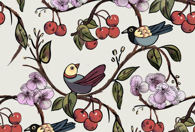
12. Flowers in a Diamond Part 1: It is time to show you this design right here and it is another diamond design. This is the two-by-two version of it, but this is the original. I just designed this center diamond and I'm going to come back to this. The first thing that we need to do is figure out a sketch. The second thing we need to do is rough in some color, and then the third thing is to do a complete final illustration of that one section. You can see I have all these different layers. Let's turn all these off. I probably added that later, but I started out with the stems and leaves, all on one layer. I probably went to the flowers next and then I wanted the black to go under that blue so I came down a layer to the layer the leaves were on and put the black there. I Alpha-locked to get that color added to that. I did add this on its own layer. Probably could have just done it on the same layer, but I was thinking I might change the color of those veins to a darker green and then I just started to add all the details. I have all of my little filler pieces in which isn't necessary. More details all on separate layers so that I can change colors as I wish. This isn't an illustration class, so I'm not going to show you how to illustrate the flowers like this, but I want to show you how I got to this point. I did not start with my sketch looking like this. Let me turn this off. I did not start with a beautiful sketch like this. I started with a very not beautiful sketch. Before I even chose these colors, I knew my palette, but then I wasn't sure if I wanted a green background and so I just played around with color here, and I quickly decided on this one. My palette does have two shades of green in it. This little bit of a darker green, I think I went with a lighter green in the final design but I don't think I gave you this palette though. This is my pellet. I can't give you everything. We're going to start fresh. We're going to go ahead and turn the grid to the 2D grid, or max, or the symmetry on quadrant to see you can get the cross hairs here. Then you need your diamond, which I showed you how to do in a previous video. Then you don't draw on the diamond layer, so just add a bunch of layers here. We need to think of a sketch. You don't need to do flowers. You don't need to do the stems and flowers. You can do anything at all. You can put some ukuleles and hibiscus flowers, or pina coladas and scatter them around, but keep them somewhat in this diamond. You can overlap a little bit, but remember from the other video, this diamond is repeating right here. Anything you have here is going to repeat right here, and the same with here to here. If you have some overlap, say you have some overlap up here, if you also have some overlap down here along this line, don't have it right here because those will completely overlap each other entirely. Maybe have some over here or over here. Think about that and kind of visualize it and after a couple of times with practicing, it gets a lot easier, I promise. Just design your space here. We are going to do a stem because I do want to show you how you can just do the symmetry tool to go off the edge here. I know I just had you turn on that grid, but let's just go ahead and do it right now. Go to edit drawing guide and symmetry, and then horizontal. Even though this is just the sketch, I'm going to go ahead and do it. You need a monoline brush because you need the thickness to be precise. Nothing that has pressure sensitivity for thin and thick, and make sure the assisted layer is there. Then you're going to draw a line, let it snap straight and put your finger down so it's perfectly vertical. Even though right now, Procreate is not snapping perfectly vertical, or horizontal, or 45 degrees, It's good enough. If you do that trick on your final draft, then you don't have to worry about the fact that you've touched the edge here, it will match up with this edge up here. I'm going to show you that right now, even though we're not doing a final draft. I'm going to switch to sketch and I'm going to go back to my grid because you do still need to pay attention to filling in these lines because it is going to be cut along those lines so you can't fill in later. If I have my stem coming up here, I know it's going to be up here too. It can be hidden behind a leaf. Whoops. I have a symmetry tool. I have Drawing Assist on, so it's doing the 2D grid, which was making perfectly straight lines. That's another way you can do it. You can do it with the 2D grid on and just draw straight line all the way through and then erase part of that line, and now when you repeat your pattern, it will be perfect. Turn Drawing Assist off. We don't need that right now. We're just doing a rough. I'm going to get my sketch, 6B, I'm going to rough in those again and I'm just going to think about where I want my flowers. I might want one here and I don't want anything super straight across from each other, and have that overlap that edge a little bit. I need to remember I need things close to that edge. It doesn't have to be super close. It's okay if there's gaps. Maybe I'll have a leaf on this side and have a couple more small flowers like that, and then start sketching out your stems. You don't want to have a lot of straight up and down. It just stands out later. So if you can get things to be curvy, then that's the best way to go about this particular thing. I'm going to move this and then turn Snapping off so I can move it a little over that way, get that curvy stem. Maybe this one is over here. I need something attaching this stem or just have a giant leaf here. This is going to be a really obvious, long section of street, right here, that's going to connect up, this is going to connect up to this. If you can cover this up a little bit, maybe with a leaf, maybe another little flower down here, that would be a good thing. Let's do the flower, and then some leaves. I'm thinking about filling in these lines. This line is very filled in. Then any little flourishes you want to do, any fillers you want to do, this is the time to do it. You can change them later. This is just your rough sketch to sort of see if you like your layout. I'm going to make that flower bigger because it didn't really look like I could fit a leaf comfortably in there. We have a rough sketch. We're going off the edges in a couple of spots. You know what I don't like about this? I can already see if I zoom out, I have three very horizontal leaves. I don't like those at all so I'm going to fix these leaves and I'm just going to roughly erase those. I told you my sketches are very rough looking and let's make this one. Really big one, that's going to stand out a lot. Maybe like that. Maybe make this flower a little bigger. I'm just trying to get the angle of the leaf a little bit nicer here. Maybe even have another leaf stick out. Something like that. Then I had one up here that I need to have come up more like this so that it's not horizontal. I had one down here. Maybe it's behind that flower, something like that. Now when I zoom out, I'm not too concerned about the leaves being super horizontal. This leaf is behind this flower, but I want to extend it and have it come up there. That fills in that space a little bit more. This leaf is going to fill in that space too, so we don't need to worry about that too much. I can see that this leaf is going to overlap that flower. These are going to overlap a tiny bit. These are going to overlap a tiny bit, but not bad. I could probably raise this up a little bit. Get that stem going over to it. All right, super rough. Come back to the next lesson and I'll show you what we do next.
13. Flowers in a Diamond Part 2: I made a couple minor edits here. I fixed up this leaf and I made this a little bigger and lower to cover more of that stem down here. I'm going to pick a contrasting color and put some corner marks on. I'm going to do some nice big corner marks so I can see them. I remember that they're there and turn off my diamond. At this point, I can turn off the grid as well. Now I need to duplicate that. I have a total of five. I'm going to go ahead and try to push them into the corners without turning them all off, but it might not work, so I'm turning Snapping on. They snapped pretty easily. If it doesn't snap easily, just turn other layers off and do one layer at a time. You should not have a hard time snapping. We're going to merge those. I'm going to turn that layer off and erase the corner marks. I'm going to turn that layer off and that layer back on and erase those corner marks. I'm going to see if I like my sketch. I think I like it. I see a bit of a gap here and I see lot of clustering going on over here. But that will get hidden. This part will all be underneath. Let's see how can that work. It won't look as clustered and jumbled as it did just now, because there'll be some hidden parts. You don't need to worry about that too much. Now that you know, you like your original, let's go ahead and rough out some color so you can do that with the big monoline or maybe this one, anything you want. Let's pick our palette. Let's pick this first one in the tricky repeats one and just pick some colors. Well, there's not a lot of options for flowery colors here. I'm not going to make that the same color as that because I know those will be next to each other. These look like oranges right now. I think this one's going to be close to that one. It's okay if there's two colors that are similar, that are close to each other. Because obviously flowers grow in bundles too. But just plan out your colors. You can even plan out some of the leaves. I'm on a layer under the sketch, so I'm not smudging the sketch at all. I had a gap and I can't remember where that gap was now. It's probably over here. I'm going to go to the Monoline. I need to go ahead on this same layer and put my corner marks on. I'm not going to see that very easily. I think I'm going to go ahead and merge those two layers. Then it's easy to just go ahead and duplicate. We need five. I know we just did this. But the first one was just to get the sketch how we like it. If there were changes to make, you would make changes to that sketch before you roughed in any color. It saves you time because if you had roughed in a bunch of color and then change to the sketch, then you've wasted your time. I want this layer on top. That's what I thought it was. The large blank spaces right there and that would be taken care of if I made that flower bigger. I think that's all I'm going to do to fix that gap. That gap is the same as this gap right here. If I make that flower a little bigger, it feels both of these gaps once you do the repeat. I'm really happy with the repeat the way that it is right now. Now I can start illustrating. I'm going to go ahead and make that flower bigger while I'm thinking about it. Turn off snapping, so I have control over that. That should work. I'm going to go back to my final design. You would go ahead and complete this design however you want to illustrate it, making sure that you have the symmetry tool. Use for the two pieces here that are touching the edge, then you will have a fine repeat pattern. Let's go ahead and do that one more time. You can see making that flower bigger, filled in that gap. It's great. Don't really need any fillers. There's some bigger gaps here that look really great because they're not really staring you in the face. You can copy all and paste and make four of those. Just to double-check that you like this pattern in the two-by-two version of it. There's the two-by-two version of it. I see what we've done here. We've made some rows of orange and red. That's something to watch for. That's a really good reason to make the two-by-two version. If you look back at this, it's harder to see because some of them are down here and some of them are up there. To fix that, you go take this off and you look at where your reds are. Well, look at that. We have reds that are right next to each other. You can come in and say now, I'm going to go ahead and make this one orange instead, or pick an entirely different color. I picked a really limited color palette here when I picked this one. Maybe a yellow one. Maybe a yellow one here too. Are those going to be next to each other? Then you just go through the whole process again. All of this time-consuming stuff is worth it. Because if you do this before you have your final, you're going to be very happy with your final repeat pattern. Make sure you go through this little bit of trouble. Copy all, turn these off, paste. Make four, select them all, shrink them down, move them to the four corners. There you can see that's much more dispersed. The reds are polkadoty all around. We have a little cluster of yellows right here, which is fine. It doesn't really make a row. The oranges are still in a row, but they're a color that doesn't really scream at you. It's not super noticeable, but you can go ahead and go through that, change that as well. Once you have all of your colors decided on, then it's time to finish the illustration and I'm just going to hop back over to the other one to show you how to do that.
14. Flowers in a Diamond Part 3: I showed you the original set here that I have, all of the originals. I'm going to turn the background layer off. Three-finger, I need corner marks on it. The corner marks can be on any layer. I'm going to make, super bright red. You really need the corner marks. You can't forget corner marks because otherwise it will only create an image that's all the way to the edge of this ink here and this ink here. It'll go to the top and bottom because we've got lines that go all the way. Add your corner marks and then three finger swipe down, "Copy All" now you can get rid of your corner marks. You can turn the original off, three-finger swipe down and "Paste" I'm going to go ahead and turn my background layer back on so it's easier to see. I have this all on one layer now, I have my originals if I need them, I'm not going to be erasing any sections of my originals. On the previous lesson where you got everything all figured out. Now you color it all and finish coloring everything and make it all in one layer just like this. You're going to need five of those. Duplicate that bottom layer each time until you have five. Make sure "Snapping" is on and slide them into place. Merge those four, turn that one off, erase those corner marks, turn that one off and this one back on and erase those corner marks. I'm going to put this middle layer on top of the other layer. Now I just need to decide where I'm going to erase because I have some overlaps that are inconsistent, which is okay. I have this stem up here. Over here I have this stem below this flower. Over here I have this flower below this leaf, but over here I have the flower above the leaf. If you want to have those things like that to be consistent, you just need to do some erasing. It's okay to erase because you have your originals down here. You're not erasing your originals. I have this layer I need to select. So tap on that layer, go to the layer that has the green, because I want to erase some of the green to make it look like it's under that flower. Go to the erase. Because this layer is selected, it's only going to let me erase right where that layer is. I can do the same thing anywhere I need to. So I can do the same thing over here. Now I have erased. If I turn this layer off, you can see, oops, this layer, I've erased part of this centerpiece up here, and down here to make it look like this leaf is going under that flower and this flower is on top of that stem. That's your final design. You can go ahead and merge those if you're completely sure that you're done with the erasing, you can merge. You can now copy and paste and make this into a two-by-two. You can add texture layers like I did here. Once again, it's my texture brush class. You'll learn how to make overlays, seamless repeat textures. That is it. I hope I didn't make it sound simpler than you feel like it is. It just takes practice and it will start coming naturally to you. Enjoy.
15. Curly Branches: I want to show you how to do this really fun, curly design, curly vines. It is much more simple than it looks. Let's get started. You're not going to need your diamond on this one, you're just going to need your 2D grid. Let's just go ahead and get a nice sketch going here. Colors don't matter here. Just like in all of our repeat patterns, you're going to need to do anything that is needing to be done along these midlines in this stage. I'm going to start having a big curl that ends up to that edge up there because I know that this is my only chance to get close to those edges. Don't touch any of the edges of the canvas though. Maybe another one over here. Maybe this one can go like that. How about that? It really is just your own preference. You can have these really densely packed. We did a lot of dense curly cues in the crazy swirl design. Then maybe this will extend up here, but I'll have another little branch, let's see. If I'm going to fill up anything here, it needs to be at this stage. I'm going to backtrack a little. I'm going to make this curve this way. I don't know. Just winging it here. Then maybe something, I think I might want a bird here. Go ahead and bring in your sketch that I provided or make your own bird entirely and duplicate one of the birds, and we can move him around. I'm going to turn snapping off so I can move him more easily. I'm going to keep him near the center, and that way, when we move things around, the next bird, if I want to do another bird, I can have a nice center-ish place for that one on the next step. I'm having a hard time finding a good place for him with his feet in the current position that they're in. I'm going to go ahead and change those feet later, you can change them now, you can change them whenever you want. Remember, this is just a sketch. Here we go. This is crazy, but maybe we can have a leaf here covering those feet. I have my first set of curly vines that I want, but I need to still have any little flowers, leaves, little curly twirls, anything, whatever your theme is, any little smaller aspect of it is going to need to be added at this stage as well. The bird is currently on a different layer, but I'm going to merge those two layers. This side is okay, anything that's in these corner spaces, you don't need to worry about. You really just need to worry about those two midlines. I can't emphasize that enough. I've got this midline pretty well taken care of. I might add a swirl here. I'm liking having that space there but maybe I'll go ahead and extend this curve of this branch like that so that I can have maybe a couple of leaves here instead, something like that. Anything where I need that midline taken care of, I do it now. Then put your corner marks on. You need to have only four. You're pushing all of them to the four corners. My snap wasn't on. Make sure snap is on. Again, repeating myself about turning off layers, if you're not having an easy time getting your design to snap with the gold lines. I keep repeating myself just in case people are bouncing around to different lessons. I'm going to merge those four layers and erase my corner marks. I don't need those guidelines anymore. All I need to do now is fill in the rest, remembering not to touch the edges, that's the only thing you need to remember now. I'm going to go ahead and bring in another bird. Let's go ahead and bring in this cutie, although I think I used that one. You can copy flowers, you can do whatever you want with that with my provided sketches. This bird, turn snapping off so I can get him really placed into position. That's cute, they'll end up looking at each other. I'm going to keep him on a separate layer for now, and I have this layer with this outer one here. I'm going to go to a different layer to start adding more branches, curly vines. But I need to have a little flexibility with where the vine might come down here by his feet. I do like the idea of them looking at each other like that so I want him approximately in this place. This vine here is a nice long curl, if it doesn't work with your design, you can erase anything that's not touching the edges. You're not going to want to erase too much, but these ends, because it would look weird to erase part of a leaf or something. But these ends can be erased so that you have some flexibility with what to do to extend them at this stage. If I have this bird in approximately this position, I'm going to want a vine here or here. I think it makes most sense to have it here. Maybe I'll have this vine just do a thing, like that. I want to make sure that the angle that they meet up right here is nice. That looks good. I like that. I have an end of a vine here that I can maybe bring around, possibly, or maybe just hide it behind that leaf right there. That looks good. I'm going to have a curl here just because that's a decent sized gap. I don't think I want to connect to these because that might look funny there but maybe I'll go ahead and curve that. This looks like it needs a curve here, maybe that direction. Just play around, it's really just a lot of trial and error. At this stage, you can start thinking about more flower types, more little spirals that you might add, some filler things and start filling in your design. This is from our original design here, but you can add to it because it wasn't on the midlines so you can add anything to the edges. Those were the areas that were along the midlines, but you can continue to add to anywhere else you see. Sketching out what you think you want your final design to look like. I know I have some gaps here, but I don't want this class to be five hours long. Now I'm going to copy all. I can go ahead and merge my bird. I'm going to not merge the outer layer, I'm just going to merge my bird with this layer here and turn those off and paste, and just do the two-by-two version, and turning snap back on. I de-select the bottom two, slide the top two up, reselect one of the bottom ones and de-select one of the top ones, oops, and merge them. Then if you zoom out, that's pretty cute. The birds don't end up looking like they're looking at each other because of this big leaf section that's in the way. It might be really cute to have a big flower here, like they're both going towards that flower. If you go back, that's the leaf section right there, it's what I just added. You could come back and just change your mind, rough sketch, rough, rough, rough. You could even erase part of the vine on this other layer so that you can add a flower there instead. I'm going to go ahead and merge those, Alpha-lock them, and make them all one color. We have those black birds and now they're all one color and I'm going to copy all and check my design one more time. I like that a little better, having the flower there. I'm not sure I like having that right on the vine, but you get what I'm talking about. It turned out that I ended up connecting this whole section surrounding that bird too, so I might go back and make some changes, but that is the general idea for the curly vines. I'm having a hard time trying to decide what to name all of these lessons, so hopefully I picked names that will trigger your memory for which one I'm talking about. To do your final illustration, you would start with your original sketch and you would do a complete final illustration on just that section. Turn the background layer off, do your corner marks, duplicate it, push it to the corners. Then you would do the same thing for the next step. All of the vines, birds, flowers that you add in the next stage, what we just did as our sketched version, you would do the complete and final illustration on those as well. You can do that with your other layers turned on, it doesn't matter. This is what the other one looked like when it's pushed to the four corners, and then you would complete this part of your illustration as well, so you can see where all the vines are touching. That's the stages that you would do, so you complete the initial one, push it to the four corners, complete this new centerpiece, and then you're done. That's your final illustration, turn the background layer off, you don't need corner marks if you have color going to all four edges somewhere, anywhere, which you will likely have, and then you can three-finger swipe down, copy, and paste to do the two-by-two. Doing it that way allows you to have all the options for different background colors. There are some of these that don't work because for example, this one, I really like the look of it, but I already have that color here on the tail and on the back, and on one little set of flowers. I had a different plan for this, I had these lighter colors planned out for this design, so I didn't use these lighter colors in my palette in the design itself so that I could use those lighter colors as the background. Enjoy.
16. Random Branches Part 1: I'm calling this lesson random branches because it can really be whatever branch pattern you want. I'm going to show you how to do this with the alternating birds. You can see this bird is facing that way, the head at least is facing that way on this one. It's almost like a checkerboard. It's the same design that's been flipped, and then moved up. That's what I'm going to show you. There's some little tricks like the butterfly here on the branch that just hide where the branches meet and so you don't have to have this perfect joining spot of the branches. You can see this main branch goes from butterfly a butterfly, and then it has this twig sticking up here that the bird is on. It's nice that it goes at angle like this because then when you zoom out, you're mostly seeing the curve back and forth, because these designs are flipped. The little branch that's sticking up here is pretty hidden by the leaf, the bird, and so on. But if you have anything that's too vertical, you would end up seeing quite a column of straight branches. Think about that when you're designing your branches too. But I'll just show you a similar design I did to this, and also some other things to think about if you want a totally different branch pattern. That's why this one's called random branches. Here's the one I did. As you can see, I wasn't paying attention closely enough in my sketch to notice I have this very vertical line here of this smaller branch. I'm really happy with the bigger branch, and my peacocks are alternating. I think it's beautiful. But at the sketch phase, you can try to catch this thing and prevent it by changing the angle of that branch a little bit. The other thing you can do is add something to cover it. Just like the picture we just saw where most of that smaller branch was covered up by the bird and some leaves. You could add a flower here, or add a leaf here, and it'll break up that very vertical look, when the pattern is reassembled it won't be super obvious. I will probably do that eventually, but for now I wanted to show you this. I'll show you the branch pattern for this really quick. That is the branch. I'm going to turn on my guides here. I'm going to lighten my background layer a little bit so you can see the guides better. My branch starts here, and it doesn't really end. It ends in flowers and leaves. This one goes up to a flower, this one goes over to a flower, and this one also goes over to a leaf. That is something that you can totally do. I'm going to show you how you disguise the end of the branch, and how you will lay out your branch patterns in order to end up with a disguised cut end or however you want your branch to look at the end. You will need the diamond. You're going to need to draw a big X, from corner to corner. It doesn't matter what color it is. You can just turn the opacity down, and start some layers below it or above it. It really doesn't matter. The most important part that you need to consider is these intersecting points right here. Because we're designing a whole design around the diamond, when that pattern gets shifted, the branches are going to end up lining up in those four points, or fewer than four points too. Just like the design I just showed you. This particular design is getting a flip, like we talked about with the birds alternating. It's a bit trickier to visualize as you're laying things out. Let's just go ahead and start with the basics. For me that means a nice big branch. I'm going to go to a sketch because I think it'll be easier to think of this in a sketch. If I think of a big main branch, I need it to go from one side to the other. I don't want it to go from here to here. We need to be connecting up these four intersecting points. Let's call that our biggest branch. If you want to add more branches, you can go ahead and get some smaller branches added like this, and think about these four points. Also think about you don't want anything super vertical, or super horizontal. If you can't avoid that, then maybe you cover it with a bird, or flower, or a leaf. I'm going to come back and make this one a little bit more curvy. In flowers in a diamond, we did the stem coming up and extending up there. We didn't do a flip. If you have a branch coming to each one of these points, when your design gets duplicated and flipped you are actually going to end up with these two points meeting up, and these two points meeting up. If you put a little butterfly, like we did saw at the beginning of the lesson, on one of these. Let's put a flower. It doesn't need to extend way out like that, and it doesn't need to be big at all. In fact, I'll make this one just a little solid circle. I think I might even make those at different color entirely so that we can see exactly what's going on with the branches when they meet up. If we're just talking about branches right now, I'm going to show you what happens when you duplicate this design and do the moving around. You can test out different branch schemes as well. If you just create a total of five, and then make sure snapping is on and get four of those to the corners. Then you're going to take your original center one, and you're going to flip it. Once you do that, you can merge those four that you move to the corners. Let's turn that center one off so you can see the center there more easily. So you can erase the corner marks. Got to be on the right layer. Then you can erase the corner marks off of this one as well. You don't really need to do that until your final idea. What you're seeing here is the designer's flips. We had the flower over here, and now it's over here. We had the dot over here, and now it's over here. But the duplicated dot is right above it. Then the duplicated flower is right above that. You're going to see some overlap of this design. I'm going to turn the grid off so that we can see things better. I like to move this center one, I don't know why. I always like to move it above the rest. What you're seeing is this flower hiding the end of that branch. It doesn't matter how ugly the end of that branches. It doesn't matter if it's going to line up perfectly with anything. It's hidden by that flower. That's what the butterfly was on the other design that we were looking at at the beginning. This one's hidden by this little dot. Now up here, because this layer is on top. It's on top of the flower and on top of the dot. That's why you're seeing the black lines up there and up there. On the final design, you would go ahead and erase that really easily by selecting this outer layer here, that layer that's on the outside. Select, going to the layer that has the black lines overlapping and erasing. It perfectly erases where the branch overlapped the flower and the dot. Now it looks like the branch is going under the flower and under the dot. My point to all of that was, it doesn't matter what your branch design is. If you've figured out that in the end, you've got something that's going to end up covering the end of your branch, by the beginning of your branch, that's all that matters. If we come back to our grid break here. I have a branch that starts here and I just want it to do something over here. If I have it ending in a flower, I'm not too concerned about what's going on up there. If all I have that needs to be covered. This doesn't need to be covered, because it's not the end of a branch. It's only the branch ends that need to be covered. This is an end and I want it covered at the end of this process. I know that this is the matching spot. If I have a flower in my design that's right here. In my other design I showed you with the peacock, I had a branch coming up and it had some leaves on it. It actually had a leaf right here. That leaf ended up covering up the end of the branch right here. This isn't the end of a branch, and there's no end of a branch right here. So there's nothing to cover up. There's no problem here. That flower will just end up in the final design to be a duplicated flower right here. But if you wanted to have a branch come down here, then you're all set because this flower is going to end up covering the end of this branch right here. Let's go back and look at the peacock. This end of the branch here is covered by that leaf in the final design. There's nothing going on over here. Up here is just the branch fading out into flowers. Those flowers end up being right here in the final design. Here you can see it. Let me turn my grids off here. The end of the branch is covered up by the leaf. The end of the branch is covered up by the leaf. We're going to go through, I know that was a lot of information. But basically you just test out different things and know that this is only because of the flipped design. This part is going to cover up this spot or vice versa. This spot is going to cover up this spot or vice versa. We'll run through a full sketch in the next video so it can sink in a little bit more.
17. Random Branches Part 2: Here is a bit of a rough illustration for making one of the flipped bird designs. I'm just going to use this XP for a sketch. I brought in my sketched birds, and I'm just going to select one of those. Duplicate. I'm going to turn snapping off so I can move it into a good spot without it snapping around. I'm going to make it pretty big so it's dominating the design. You're going to want your bird to be pretty much in the middle. If you have it on this side, it's going to end up lining up in a column. Have it in the middle and when you flip your design, the next one one be in the middle, up here, down here, over here, over there. If you approximate where you're going to have it, then you can add a branch. I'm going to go ahead and add a branch to a different layer so I can adjust the bird. I need to go from here to here or from here to here. I really I'm probably going to need to move the bird here. But let's just start with a bit of, maybe just a little adjustment right there. Then I'll just move that bird a little bit. I might just forget the feet altogether and have it look like it's sort on the branch facing away from us, and magically we can't see those feet, which also means that we can't see the branch right here. I'll go ahead and erase that and merge those layers. Once you're happy with where your bird is, you can keep those on the same layer. That's good. Avoiding bird feet, I like it. The next thing I need to do, well, I need my grid lines. So go ahead and get your grid lines for the mid, horizontal, and vertical lines. Everything you do on this, you're going to need to focus on filling that and filling the diamond, overlapping a little bit outside of the diamond here and there. Finally, because we have an end of a branch here, I'm going to need something right here. Because we have an end of the branch here, I'm going to need something right here. Look at that. I have a bird tail right right. That works beautifully. I'm just going to make it a little longer. It religious barely needs to extend past this intersection. That bird tail is going to cover that branch now. The rest can be wherever you want. I'm going to fast forward this part, because it takes a long time for me to stop and think and where I'm going to put everything. But it is going to be a very, very, very rough sketch. Remember, I'm keeping in mind my mid-line and my diamond. Very rough sketch. I filled in everything I want to have filled in along this line. I'm going as close to the edges as I really need to. I have a butterfly for that, I have the tail for that. I'm ready to duplicate. Now we just need to put our corner marks on. We can turn our grid lines off now. We need to make five of these. Merge those four. Erase the corner marks. Before we erase the corner marks on this, we need to flip it. If you flip it without corner marks, it's not going to flip evenly. It's just going to flip the actual image itself which might not be centered. Then you can erase those corner marks. I have to fill this, it's bugging me. Turn that back on, and see what we've got. I'm going to take one more copy of this and just set it aside, because I'm going to do some erasing on this. Normally, I don't erase at this stage. We have this branch that needs to look like it's under that tail. We need to erase this branch right here. We have this branch that needs to get erased here. This is a little different than on the final draft. We have this branch that needs to look like it's under the butterfly, and this branch that needs to look like it's under the butterfly. The other spots where there was some overlap, it looks pretty busy over here. I would say, that that looks a little too busy in my opinion. I like this flower overlapping the tail here. But these flowers and leaves, and that butterfly right there and right there, that is looking a little too crowded to me. What I would do is, I would come back to my original and I would get rid of that butterfly. This is why it's good to do the rough drafts. So I'm just going to totally get rid of it. You don't have to redo this whole process if you want to just get rid of them on the rough draft too. If it's something simple like a butterfly, you can get rid of them here, there and there. I like that a lot better. But those are the little decisions that you need to make. You can zoom out and see if you like it. Then you can three finger swipe down, copy all. I'm going to turn my grid lines off, turn these off, paste and make a two-by-two. Merge those, zoom out, see if you like it, you can see these birds flipped. Looks great. It's not really obvious where the repeat is. If it were, a diamond would be standing out to you right in here. One of the rough drafts I did, there were too many gaps along those edges of the diamond. So it was really obvious where the diamond was at this stage. It wasn't until this stage. It's really important to get to this stage before you decide if you're going to keep going with that as your design. Once you like your rough draft, then you're ready to go. If you're just going to do all the flowers the same color, you don't really need to rough out your colors and get all the way back to this stage to decide if you like your color choices. If you have several colors of flowers, you're going to want to rough out your colors, get all the way back to this stage, and see if you've dispersed your colors well, and then do your final illustration. Once you're happy, this looks like maybe a cherry blossom tree. Maybe they'll all be pink with a nice pretty spring green. You can go ahead and reduce your opacity, and start working on some layers underneath it and plotting out your final illustration. That is all you need to illustrate. Your final illustration is that, and then you do the duplicating. You do the corner marks, duplicate, move things, flip them, and do the a little bit of erasing where things overlap. That's your flipped bird, random branch design. The reason I called it random is just because you can make your branches however you want. The next lesson has very specific spot for your branches, so it can't be random. Enjoy.
18. Wavy Branches Part 1: William Morris is a famous art nouveau artist who, I think he's mostly known for wallpaper and interior design like curtains. This is one of his most famous, I think it's called Golden Lily. I'm always drawn to this and I couldn't figure out how to get this lovely hourglass look with such a condensed, filled in repeat pattern until I started doing these designs in the diamond. So I'm really excited to show this to you. I've figured out how to do this, just like in the other lesson with the branches where I showed you the photo that had the black background and the peacocks that have the alternating look to them, and if you remember, I showed you the butterfly that sometimes sat on their branch. Those things, I am pretty certain, are placed there with the specific reason to mask where the edges of the repeat are. If you look at this, that's exactly what I think is happening with the flower, and maybe the leaf here crossing over the vine, this big chunky vine. Once I figured that out, I started piecing this together, and I'm super excited to show you how I've recreated a different look, it's not art nouveau, but a similar design. Here is my version, it's not art nouveau, but it has that same look of having those big wavy vines and a very densely packed design. I'm going to show you how I did this, and I think you're going to be surprised at how easy it is. Of course, I spent a whole bunch of time figuring out my sketch. I'm duplicating and moving things to the four corners just like we've been doing and making sure I'm super happy with the sketch, and then roughing out my colors just like we've been doing, and figuring out if I really like those roughed out colors in the repeat, which I did, even at the two-by-two level. I do have this diagonal of red that really stands out to get rid of that really strong line. Probably just placing them differently so they don't make this wide section of red, or even just coloring them a different color that doesn't pop out so much would be good, but I really like this design. There's the final, of course. All right, let's get started. We do need to have your diamond and also a diagonal. So I'm going to put it on the same layer. Whoops, I'm still on this quadrant, repeat, that's okay. You just need to roughly know where the diagonal is, and the important parts on this design are, again, these intersections. Your branch, your wavy hourglass branch, all it is, is a curve right here, and a curve right here. That is what's going to get repeated, and this duplicated piece going up here is going to make this curve right here, so then it's going to curve there. It's going to make this curve right here, it's going to curve there. This one is getting duplicated up here, so it's going to curve there, and it's going to curve there. That's going to end up being what your repeat is doing, when all you have to do is this one section. You don't need to worry a lot about this meeting up perfectly with this when it gets repeated. We're going to cover those spots and I'm going to show you how to do that now. Go ahead and turn on vertical symmetry and for the chunky vine I'm just going do a nice thick monoline brush. Make sure drawing assist is on, and I'm just going to make a pretty simple curve. You can let it snap if you want. If you make it too flat, you're just going to have a wavy line. So that could be something that you want for a specific design. I like to make it a little bit more like a circle. That's going to make a pretty defined hour glass look, and let's just go to a new layer and drawing assist will not be on. I provided that image of all the flowers. I'm going to grab that for you. I provided this, you can use this and trace. I'm just going to copy this layer. You can save it as a PNG. I know I said it was going to be a JPEG. I'm hoping that Skillshare let's it be there as a PNG. I'm going go ahead and paste it into my canvas here so you can do the same, it's a download. You can just pull it into Procreate or you can have it in your camera roll and do add photo right here and bring it in to one of your layers. Let's turn our chunky line off. I'm going to turn this guideline off. The design I just showed you was using that leaf, that flower, these flowers, one of these was the big yellow upside down one, two of these were my red ones. I didn't copy and paste these leaves or these guys, I just hand drew those in. But you are welcome to even trace any of these. This is the peacock from the other design I showed you, and just make sure on the layer and circle it, go around it, three fingers swipe down and I would just duplicate. That leaves that still intact and then turn that layer off, and you can just bring it down just to keep organization here. Just get these into place, turn Snapping off so you can really adjust. Since it's just a sketch, you can change the size and really just get these to be exactly how you want them, remembering that when you're making a design, you still need to focus on the horizontal and the vertical lines. So if you need that reminder, go ahead and go back to Drawing Guide and put it on quadrant. I think we just turned on Drawing Assist for that layer too. I just turned Drawing Assist off. Now I have those quadrant lines. I can now be constantly reminded that I need to fill in anything I want to have in my design along those lines before I do my duplicating and moving them into the four corners. Fill in your diamond. Any overlap like this, you can picture is going to be overlapping into your design right here, so these are going to be right here. If you want overlap, that's great, just be careful when you do it so it doesn't get too crowded. Copying and pasting, I know I'm not in the right brush category here, I'm going to go to my 6B. Then you can just extend and make them how you want them, so you don't have to draw the flower itself. Of course, your design does not need to be floral at all. You can do whatever you want. The two big tricks that you need to know are to cover something, a little overlap on this point right here, I'm going to choose a nice bright red, this end of the branch here, and then you can either do the one next to it or the one above it. When this repeats, it's going to go down here. If you have something that's overlapping, like a flower right there, it's going to overlap where those branches are touching each other. If they're not perfectly lined up, it doesn't matter, it's going to be hidden. I did mine here and here on the example I showed you. Let's go ahead. I'm going to keep it red actually. Since we're not doing a full illustration, I'm just going to make a silly red flower. It just barely overlaps outside of the diamond and it's covering up my vine there. Let's make a bright yellow flower on this side. Maybe more like a daisy. I did a leaf on this side and then a big flower on this side when I did my design. The rest is honestly just filling in. If you want leaves, think about some of the stuff we've talked about in other lessons. If you have anything that's really horizontal, it's going to really stand out. If you have anything that's really vertical, it's going to really stand out. If this is a little too vertical, maybe add another leaf like that. Of course, don't touch the edges of the canvas, and fill in anything along these two midlines at this stage right here. I would go through and fill large things at this point. Once you get all of your large pieces; big leaves, big flowers, big anything, then fill in the teeny-tiny gaps with some of those smaller designs, like the little vines like this with the little leaves. I'm going to keep going with some really awful design here. Let's make this flower. I'm going to go down here. Now I'm on a Drawing Assist layer. I'm going to color underneath this flower and just give it some color, and then some leaves. I had very little stuff overlapping in my design. Let's see here. I can merge those now. Maybe do a couple of biggish flowers here. After you get all of your giant things placed, then fill in all your little gaps. This is a big gap for that horizontal line, so we don't want that. This vertical line has a teeny-tiny gap right there, maybe we'll have a little cluster of yellow flowers there and this one as well. Let's go with something that really bright red again. I have everything I need, this is crazy, along those two middle lines. Now I can do all the teeny-tiny things in here. But before I do that, I want to show you what you can do with some awkward gaps that you might not want to fill yet at this stage. If you look at this gap right here within the diamond, this is going to come down here and it's going to join this gap right here. That's cool because we can fill that as one gap in the next stage. So that's something I'm going to keep aside and show you. That's only because those aren't along those lines. If they were along those lines, we can't do anything else. If you're going to have any sort or maybe a little teardrop filler piece, anything like this that's along those lines, you need to do it now. In the next video, I'm going to show you what you would do next.
19. Wavy Branches Part 2: I'm going to go ahead and turn off the grids. We don't need those anymore. Sometimes they're just making things a little too busy, and we need our corner marks. They can be on this page, they can be on any other page, any other layer. It just doesn't matter. I would just pick a really contrasting color. Put your corner marks on, three finger swipe down after the background layer is turned off. Copy All. I'm going to turn those off. Turn my Layer back on and Paste. Now, I have that all on one layer. It does not have a background. I need to have five because I'm going to keep one in the center and move the others to the corners just like we've been doing this whole time. It's sliding well, without me having to turn other layers off. That one's a little trickier. If it's a little too difficult, just turn all the other layers off. I have the four in the four corners. I'm going to merge those, that's this right here. I'm just going to erase the center marks on that. I'm going to erase the corner marks on that. In a previous design, we didn't erase those corner marks until we flipped it, but we're not flipping this so it's okay. I like to have the center one on top. Here you can see this branch goes under the red flower, this branch goes under that yellow flower and is hidden. Up here, we need to do some erasing. If you see here because our center diamond, our original design, is on a layer above this outer design, we have the branches going above the flowers. We're going to do the same thing we've done in a previous lesson, where we have to do some erasing. We need to select this layer and erase from this layer. I'm going to come down to this layer and tap Select, and then go back up to this layer and erase right where that branch is on top of that flower and right where that branch is on top of that flower. There's probably other places. There's only one more place that's really jumping out at me, that there's some overlap that's a little bit different. That's just this red flower and the little stamen from this big blue flower. It's under the red flower in this and it's over the red flower in this. I'm just going to leave those alone. I'm okay with those. What you've done is you've just created a perfectly wavy vine here. That is, where those vines meet up, is masked by that flower and that flower, that flower and that flower. Could check your design, Copy All. There's one more thing I want to show you before we do that. We talked about the gap right here and right here. Now, you can see it's a bigger gap. I don't know if this is going to be super obvious for people. If you think of this V that these leaves make. I'm going to go on a new layer and draw it here so it stands out more. This gap right here within the diamond, and this gap right here are now joined up. This diamond is right here now and this shape is right here, so those are now one piece. To fill gaps like that, at this point, you go to a new layer. I would find something that you've already done in your design. Don't do something that's totally different from everything else you've already done or it will really stand out. You can go to a layer under things so that you can hide branches. If you have anything with a branch, I'm doing this in red, but I'm going do it in purple so it really stands out. But you don't do something that stands out. You can hide a branch underneath that leaf right there and you can fill in that gap, and it's on its own layer. You have it just like that. Then you do the same thing. You put corner marks on it and you duplicate it and you slide one up and over. Look at what you have. You have it now duplicated over there in a perfect spot to fill the same gap in that spot. If you have any gaps that you really want filled, you can do that the same way. This is just the sketching stage. If that were the final stage, you would complete the illustration entirely before you duplicated it and moved it up to the equal spot there. I know I used a lot of color and that was really supposed to be a sketching phase. I would normally sketch out the entire thing and then fill in with color and check my design. I would check it at the sketching phase and then check it again with the roughed out color just like I showed you. Now, let's go ahead. You do have corner marks on here to take care of as well. I'm just going to turn this red and have it blend in a little bit more with our design. Copy All and Paste. Let's just see what this looks like as a two-by-two here. Shrink it down. There's your complete design as a two-by-two. Something that didn't stand out to me before this step are these two purple flowers directly horizontal from each other, so that's something I would go back and change. I'm going to merge those and turn it off and go back here. They are there, but I think I just didn't notice it. If you find something you really don't like, you come back to the original. Here's the reason why those ended up being next to each other. Because the way that this duplicates is this slides down to here. That flower slid right to here, right to here. They ended up being right next to each other. I think it's a little bit further this way, more like that. We would need to move one of these entirely or change a color, probably this one. Since that one's overlapping a leaf, this one looks pretty easy to move. This is tedious work at this point because I've done it in all of the lessons that you can go ahead and move that flower, maybe move it over. I know Snapping is on which is making it hard. Then maybe just add another flower here. Remembering that the reason that flower was in that spot was to try to get to that corner down here along that line. Then you can just go through and check your pattern again and make sure that you're happy with it. Even though I did provide the outline drawings for these flowers and leaves, be sure to place yours in different areas just so it's not identical to mine and maybe choose different colors. You should have just as beautiful of a piece. It's definitely okay to use those and trace those flowers that I provided. Sometimes it's nice to not have to try to draw your own as you're learning a process. That's why my first class on repeats was with polka dots and things like that, so you didn't have to really think about the illustration of the flowers or whatever you wanted to repeat, so you could focus on the process of how to do the repeats. Enjoy. I really hope that you enjoy this and it's not too frustrating or anything like that. Have fun. I can't wait to see what you post.
20. Recap & Thank You!: I'm going to do a super quick recap. For our swirls, we designed within the center, not touching any edges. Then we moved duplicates to the four corners and filled in the rest of this center space. Remembering to always focus on the midline for the horizontal and vertical of your canvas. Then we used the selection tool to turn our outline layer on as a reference layer, use the Selection tool to tap and select different areas to add color all to different layers. I turned on Grids so that I could easily figure out where this blue extends to over here and so on. Then you can alpha lock all of your layers at the end to change the colors easily. For the mask, you design one side of your frame. That duplicate is going to get slipped down to here. A duplicate of that is going to give flipped over to here, and a duplicate of that is going to get slid down to here. These two are mirror images of each other, but these two are not mirror images of these two. For your centers, you can design either just one and push them into the four corners and have a fifth one there in the center. Or you can design to have one get pushed into the four corners and one stay in the center. Then for this center flower that covers these corners, we made four of them and slid them directly across and up and down on the canvas. For designing the flowers in the diamond, remember to use your horizontal symmetry with a monoline brush if you're going off the edge and you want it to be perfectly matched up with that side. Remembering your branches need to be pretty curvy, so you don't end up with these big columns. Then your placement of your colors, you need to be careful with so you don't end up with these diagonals of all one color. I think we had this as red with this one and we ended up with a whole bunch of red, something like that. Then you're designing in the diamond and anything that goes over the edge of the diamond is going to overlap on this side. You can just draw a line straight over. Anything that goes outside of your diamond over there is going to overlap on this side. For this design, you're going to make five. You're going to push four to the corners and have one in the center as well. For the curly vines, much like the swirly design, you just design the center. Move to the four corners, design the center again, and you're done. Always paying attention to those midlines. For the random branches, remember that you're going to be flipping a design so that the main focus of your design is alternating as you look at it. Because you're flipping that center diamond, the parts you need to focus on are, let's go ahead and turn this off. The parts you need to focus on are these four intersections of your big X and your diamond. This and this go together, and this and that go together. A flower up here will cover an end of a branch down there, and so on. Finally, your hourglass, chunky vine, Art Nouveauish, wavy branches. All you're designing is this one section in the diamond. You don't flip this design. All you need to do is move it to the four corners and keep the fifth one in the center. If you complete your rough draft of your design all the way to the two-by-two version of it. Then you're going to really save yourself some in the end, because the last thing you want to do is finish an illustration and get to that two-by-two version and find a problem that you want to fix. It's not the end of the world, but it will be more time-consuming. I hope you had a lot of fun with this class. I know it's long. Be sure to hop on over to my Skillshare profile where you can find links to me on Instagram, my Facebook group, and more, and check out my other classes as well. Thanks for taking class. Don't forget to post your class project and leave a review and let me know what you think.
 Jennifer Nichols, Artist & Teacher, Procreate