Transcripts
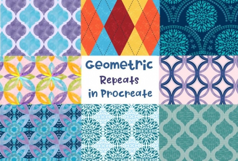
1. Introduction: Hello. My name is Jennifer Nichols of Leila and Po Studio. I'm an artist, a teacher and a fabric designer. Today I'm going to continue with my obsession of doing repeat patterns in Procreate. This time I'm showing you geometric designs. We'll be taking advantage of snapping and cropping, blend modes, texture, symmetry, and more. As I was creating examples, I realized there are too many possibilities. I can't show them all. I decided to teach you all of the tricks I used for various shapes and give you all the skills you need to let your imagination go wild. You'll be able to create anything you can imagine. Like my other pattern classes, this isn't an illustration class. That part is up to you, but I will walk you through several completed examples so you can see how I assembled mine. With the techniques I show you, you'll be all set. There are a few designs that were a bit too involved for a simple review, so I've made complete lessons for those at the end. You'll be best off having taken my basic class on repeat patterns before starting this one. But if it's been a while since you've taken it, I do give a bit of a refresher so don't worry about that. Be sure to hop on over to my Skillshare profile where you can see all my other classes as well as all the places you can find me online. I have a new venture. I'm starting with surface design, so I have an additional Instagram account that you can check out as well. I'm really excited for this class. Let's get started.
2. Refresher, Canvas Set-Up, Downloads: This is a little bit of a refresher, and then also I'm going to talk about how this class is going to go. This is actually from my last class on advanced patterns. I apparently did keep this little image here. It's a nice visual to remember the Azure corner marks, so that you can turn the background layer off, and then you three-finger swipe down, copy all, and then three-finger swipe down and paste. We do that a lot in class. When you're laying out your design, remember you cannot touch the edges of the canvas without precisely calculating that whatever you've put there is going to repeat on the other side. That is mostly done with symmetry, and we'll do that a couple times. It's not as big of a deal in this class. We're not doing a lot with that. Be careful not to nudge any selection when it's actively selected. If you tap on the screen anywhere, it will nudge in that direction, and that will throw everything off. This whole mid-line thing, we don't do too much focusing on that in this class. Then for snapping, I keep my settings at distance, max, velocity, five. You can play around with what works for you. When snapping things into position, you will get gold lines into directions, like these lines right here. Sometimes they'll be over here and down here. If you're not getting those really easily, then you just need to make sure you're turning other layers off and then work at one layer at a time. Those are some quick reminders. This is an advanced class as far as making patterns goes. You don't need to have illustration skills for this class, but you do need to know enough about Procreate, so I recommend taking another class of mine. This class right here is a great beginner class for getting to know the process for doing repeat patterns in Procreate, and what to do if you do want to go off the edge, what you need to do to make sure that it's okay. We don't do illustration in this because we're just focusing on remembering the steps. This is for basics and half-drop repeats. This is more advanced. We, again, don't talk about illustration in this one is just more advanced ways to do the repeat patterns. Then the one I'm working on, the one you're watching now is fine. You don't have to take this one first. If you take this one, that would be great, and then you'll be ready to go. The way this class is going to go is, I'm going to show you some tricks. I don't know what to call them, but I have tricks for different types of shapes, and then I have examples. I have circle tricks, circle examples, diamond and triangle tricks, diamond and triangle examples, and so on. When I go through the examples, they aren't full tutorials, but they will make sense once you know the tricks. Then I have a few at the end that are full tutorials because they're a little bit trickier and they need a little bit more explanation and not just a quick overview. Hopefully, the way this class is laid out, you'll be able to realize the tips and tricks that I've used to make different designs, and then your imagination can just run wild with all sorts of designs. There's so many ways to combine what you learn in this class, that I didn't want to restrict you to very specific designs. We're going to talk about starting a canvas, and everybody should hear, but then after that you can go ahead and get started if you already know how to download projects and resources. Start a Canvas by tapping this plus sign and then this plus sign. I'm just going to speak in terms of pixels today because everybody around the world can watch this class and not very many people use inches. I typically do 12 inches by 12 inches at 300 DPI, which is 3600 pixels. The reason I'm talking about it in pixels today is because you need to make sure you have an even number. If your typical canvas size for repeat patterns results in an odd number, you're going to want to modify that, because I have heard about some people having a pixel gap that they can't get rid of, and I have a feeling its because they start with an odd number. We're doing a lot of cutting things in half and in quarters, and if you have an odd number of pixels, there's no way to cut a pixel in half. Just make sure you start with an even number. As far as layers go, that varies depending on your iPad. Try to get 15 or 20. If you need to go down to 3,000 pixels by 3,000 pixels, that would be fine to just keep it at 300 DPI, and then tap ''Create''. For color profile, I personally always use this very first sRGB. This isn't a class on that, so you'll have to decide what you need for that, depending on where you post your work, and then tap ''Create''. If you already know how to get downloads, you can go get started. If you don't know how to get downloads, then stick with me and I'll show you how. Go ahead and go to the Projects & Resources tab of class. I'll probably have more stuff written here. There might be a drop-down button to expose all of this, and these are the resources. The new brushes, I only gave two brushes today because it's not an illustration class. In Safari, you need to be in landscape mode on your iPad, not in the app. It doesn't have to be Safari, but it can't be in the app. For Safari, It does this. It gives you the option to download, and you just tap it. You can see the little download here. You can do that for each one. Some PNGs, some images might just open up in a new window. You can tap on those and save them where you want. Then the dot swatches are palettes. These are all images. There is a grid seamless repeat pattern in here, and an hour glass template, and then a couple other images for you to reference if you need those examples. The swatches are the palettes, and they end up in the very bottom of your list of palettes once you import them, and the brush sets end up in the top. Tap on that. You can just go right to it this way. It goes into alphabetical order, I think you can change that here. I always like to go to recent, so it's right there, and it'll import right into Procreate, and it'll be at the top. When you tap on your palette, you'll need to go to palettes here, and it'll be way down at the bottom. Then this isn't it, but then you can drag these around in and change their order. I always move my active ones to the top-ish. This is it right here, I set it to default, and then I personally go to this disk view of the palettes. But that part doesn't matter, it's just your preference. For create a project, you just tap on it, and this is where it throws people off right here, is the upload image is actually for the cover image, and then the content of your project, you can add images with this icon here and they'll go right in. You can add multiple. This one will crop to a rectangle, and tap ''Publish''. Then of course going to the Reviews tab to leave a review would be awesome, and that's about it. Let's get started.
3. Before You Start: In this class, we're going to be doing a lot of snapping shapes. So snap, put your finger down, let it snap do the circle. You can leave it as a ring, or you can fill it. You can do things on different layers. What I want to show you about this really quick is if you're not familiar with my other classes, I always put corner marks on things and turn their background layers off. Then use three fingers swipe down, copy all, three fingers swipe down, and paste. What that does is, you can see right here, it has all of the layers that you had showing are all now on one layer. This is a great method. So if you have some layers that have certain blend modes, you can't just flatten those layers. The blend modes will not quite stay the same. But in this version, you can get the same look all on one layer for one piece. Now, we can turn these off. The corner marks come into play because you need ink to all four sides in order for the whole entire canvas to be captured. I like to do that without the background color so that you have a chance later to change the background color separate from your design. Once you have everything on one layer, the other thing I do a lot is I say push things into the four corners. What I mean by that is making copies, sometimes four, sometimes five. If you need a 5th one for the center, and four for the corners, I push things. You have to have snapping turned on. I push things into the four corners. One and you have to make sure you get your gold lines. Two, if they don't go super easily, you need to turn to other layers off and then push. It really should happen easily. I have one in each corner, and I have the center one, and you always need to delete your corner marks. When you push things into their four corners, you're always going to have just this center of corner marks, and then you need to erase the corner marks on your other one there, and that could be your design. This is just an example obviously. Now, I do have ink all the way to all four sides, so I don't need any more corner marks. If I want to check my design, which is another thing to talk about in class, I turn the background layer off, three-finger swipe down, copy all. It's going to paste above the current layer that I'm on, so I'm going to go upper layer and paste, and then I'm going to turn all these off. This is the pasted one now all on one layer. To check your design, you're going to squash your designs into the four corners. I made four copies, and selecting all of them. Sometimes I make five, and I keep one, and I turn it off, and I just keep it there. In case I need it later, select them all, shrink them to the four corners, and then move one to each corner in any way that that works for you. For me, I deselect the bottom two. In my mind, they're going to stay on the bottom. The top two in my layers are going to move to the top. So I deselect the bottom two and move the top two up, and then I deselect one of the top two, and re-select one of the bottom two, and then I move those over. It just takes two steps. I made a nice diagonal. Then doing that, your background is separate from your work, so that's nice. The other thing that's critical when making repeat patterns is checking for offsets or gaps. That is something you need to do when you check your pattern, when you check a two-by-two of your design. Before you merge these four layers, you need to toggle this on and off and zoom way in, and really look along these borders for all of these areas and make sure that it all looks good. Then squash them together, and they're all on one layer. I don't explain all of that every time in class, so I wanted to explain it now. We're going to be taking advantage of procreates cropping and snapping a lot in this class. So really get a good grip on the snapping, and certain ones are trickier, we'll do a Celtic knot one that's not snapping very easily. Also in the Celtic knot lesson, I recorded it before I decided to include it as a download. You do have a reference, so you can reference where the erasing needs to happen in the Celtic knot lesson, and I didn't mention it in that lesson, but I didn't want to rerecord, and the erasing part will make sense later. As far as the layers when you're working along, depending on what you're planning on doing with your work, you may need to keep some layers separate. So that's something that you'll decide on your own. Otherwise, if you don't think you need to keep layers separate, you can really start deleting. I sometimes will just keep a one-by-one and then a two-by-two of the design, but I am starting to think about keeping layers like that as well.
4. Circle Tricks: The palette I provided is just a fun palette that I came up with. You can use any colors you want. The texture brush, I'm not going to use much today, but I am going to show you what you need to think about before you use it. When the texture is on your design and you need that design to repeat anywhere, you just need to make sure you're using exact duplicates before you push anything off to one side or the other so that the texture matches up and repeats properly. I'm going to be using the regular monoline brush. Also, I want to let you know that you can do some of these designs in a very painterly way. I'm going to start with circle designs. I'm going to show you the basics and then just review some of the designs I've already done. The basics would be to draw your circle, hold it there, let it snap to an ellipse, put your finger on, and then have it be a perfect circle. The menu is still up here, so you have to tap it once to get rid of that and then tap another time to select and then fit to screen and then deselect it so you don't accidentally nudge it. This is a really great way to make some circle designs, and you have ink all the way to all four sides because it started out as a perfect circle, that won't work with a painterly circle. You can do rings just like this and do various things or you can fill and do various things. I wanted to show you we're taking advantage of the cropping and the snapping. I know a lot of people don't like that Procreate crops when you have something off the edge, but we are using it a lot in this class. Go ahead and take your circle. Well, let's duplicate actually. Let's get four and let's turn others off so we can actually see what we're doing. You are going to snap that. I don't need my corner marks, because I know that has ink already to all four edges and you can see the gold lines. Now, when you deselect it, that has cropped and you can leave it there, if you want to do your design, leave it there, or move it right back perfectly into place where it was and you can do that with all four. It's going to be easier if I show it to you with different colors. I'm just alpha lock in. I think I have to turn them on and I'm changing their colors. Crop and move back. You now have a really great template for all sorts of circle quarter, circle design patterns. Actually, before we crop that yellow one, let's duplicate that and then we'll crop it. You could also have something where you're getting a half. If you want to crop it in half, you can do quarters and halves in a design. You have the ability to rotate these or flip these get all sorts of different shapes instead of circles and it's awesome. The other thing you can do is a smaller version. Let's turn that off and go to a new layer. I'm just going to do black for speed. I'm going to make a smaller circle, snap it, fill it, and then I should be able to snap it. I've got the gold lines, that means it's snapped right to center. Then you can duplicate this one and do the same cropping and have quarter circles of a smaller overall circle shape in the center and do all sorts of different color variations. You can also, of course have a background color that's specific to this design. Now, that looks like a doughnut. Let's change the color of this black circle. There we go. If you want to have a background that's a specific color to this, then you would have it, just use a square on its own. If you want to save your design with no background, then when you make your completed design, you have the ability to change the background color to anything you want after you're done. That will make more sense later when I show you my finished one. So completed circles. Let's try a thicker one here. Let it snap. I'm going to go ahead and boost the size before I fit to screen. Now, if you make five of these, five total, and push one into each corner, these are snapping well because they are all full size circles. If you push one into each corner, anything that you have in the four corners is one design, so it's going to merge back into another circle. So you can merge those together. I'll show you by changing the color of that layer. Let's make it bright yellow for contrast. We have the original circle and then the one that we pushed to the four corners. Again, I don't need the corner marks for this because I have ink to all four sides. When you duplicate this copy all, turn these off, paste. Now, I can turn the background back on and make that back to whitish. Sometimes Procreate doesn't want to give me white. Then I can show you exactly what that's going to look like by just making a two-by-two grid of that same design, shrinking them and putting one in each corner. What we made was a gold layer on top of a dark red layer because that's what these look like. If you want, you can do things like group those together and duplicate the whole group. Turn that one off just to have it, just in case you need the original and then now we have the duplicate. If you want to make them look interlocking, you can do things like erase certain parts of the upper layer, remembering that this side repeats over here, and up there, and down here. If I erase the yellow here, I need to erase the yellow here. The easiest way to erase the yellow precisely is to select the red layer, so tap on it, tap "Select", and then go to the yellow layer. Make sure you're on a nice brush for erasing and then it erases precisely where the red layer is and then deselect. Now let me show you what that does. "Copy All", turn that back on, and "Paste", and then get four of those. I'm going to shrink them to the corners and move one to each corner and merge them. Now, I merged them because I already know they're seamless. You're always going to want to check for gaps or offsets where the little quadrants meet but if you look at this now, you see the yellow rings on top of the red rings here, and the yellow rings under the red rings here and they look all linked together. That's just another look. I'm going to show you more of what you can do with this same design later. One more thing I'm going to show you with some circles is a really fun way to make a pattern that I've been calling bulls-eye, because I've been making the bulls-eye. All of these things, if you decorate them before you crop them, that's the process that you would do. Using solid colors doesn't really show you how cool they can look, but I'll be showing you my examples later but this one isn't going to look cool because it's not a bulls-eye right now, but I want to show you the method to make the bulls-eye, so I have four yellows and a red. The yellows are going to be pushed to the four corners and stay there. I have those in the completed design. Those are going to merge into one but we have a fun way to make them look like the red one is mixed in, weaving in and out. What you need to do is match these two together or any of that opposing corner ones, so this one and this one. Make sure those are near each other and merge them and then the other two. If you've got these two together, then you need to have these two together, and then red layer just goes in between those two layers. Just like that. That's it. I'm going to show you that later with the bulls-eye. I'm going to show you how to make a template for a design we'll be doing later. I'm going to show you the full process for the design we're doing later with this template. I have this circle snapped into a perfect quarter here and I'm going to select it and move it halfway up and it does snap. I have the gold line over here and here. Now, I need four of those. Sometimes my Procreate crashes when I'm using selection mode, so I need to hop out of this and I'll be right back. So select that and go up and snap it right to the middle and now, I need four of those. I need them on all four sides. I need one over here, I need one up here. That one's not snapping with my gold lines. There's gold this way. I'm pretty sure it's in the right spot. You're going to want to double-check by turning off all your other layers. This is a template we're going to use later, so go ahead and get that ready as well. In the next, lesson we'll look at some of the designs I've already made and I will walk you through on how I did them, but they won't be full tutorials.
5. Circle Examples: This one's just to show you, I already showed you the lesson, but I just showed you with boring, plain colors and you can decorate your circles however you like before you start. Always do it before you start cropping anything, make your designs on your circles first. Here is the bullseye print I was telling you about. I also added a little shadow layer under the top and the middle piece. You just have to make sure the blurred areas don't go to the edges of the canvas. Here is a painterly version of the bullseye and because it's painterly, I couldn't get the circles to go all the way up to those four edges and now I have these gaps. If you don't like having white or black or whatever you want there, you can match to one of these colors that's nearby and it goes away, like that. That was one of these corner marks because I don't have ink all the way to the edges and duplicated and push to the four corners and then having a second color option for filling the center. For this one. My squares were like this because I cropped my circles and left them in the corners, just like in the bullseye design. Pretend like this part is not here. Then I didn't think about moving them back to the center. I chose my colors and then I just hoped for the best that when they matched up to the other ones that I made that they were going to look good. I think the way I showed you was a better option so that you have the circle completed right here in front of you and you can choose the colors that you like to go together. Then this has a texture layer. So speaking of texture, I did offer the grid texture repeat as a download. If you want to learn how to do painterly textures, I have two ways. I have a texture brushes 101 class, and we do make seamless repeat textures in that class. If you are using a 12 inch canvas for your designs, make sure you do those on 12 inch canvases as well. Then I have a less painterly texture lesson in my previous class called advanced repeat patterns in Procreate or whatever it's called, the advanced class. I do another slightly different way to make a seamless repeat texture. I just like to keep a canvas that has different layers of all my favorite textures and then copy and paste stem. Play with blend modes and Alpha lock them to change their color to play with color and blend modes and until I find something I like. Because not all blend modes will apply to lighter colors and darker colors in a great way on the same canvas. So you do have to play around. This one I didn't have any backgrounds on my circle designs so all the background can be adjusted by me later. With this one, I did have a colored background with each circle set. The same with the last one, I designed four full color versions. I have a green, a pink, a dark blue and a light blue for the backgrounds, and then it's hard to see with this other stuff going on on top, but I have four different combos of quarter circles on each of these. Then for this one, I flattened the layers of the circle itself so the quarters were all flattened into one circle. Then I used clipping masks on top with blend modes set to overlay or something. You can play around with that and so I have two clipping masks on each one of these to get this crazy look. Then the grid texture. This is a two-by-two of the completed design. I created each one of these at the full size, shrunk it to a quarter of the canvas, and then made the whole canvas fit four. So that was a completed design. This is a Celtic knot design. I'm going to show you how I made it without going through the full illustration. I made a ring with a textured brush. You can see, I think I used dry ink. It doesn't go all the way to the edges, so you do have to put corner marks on. I like texture and with all the texture added to this layer to make it look so rustic or stone or whatever you want to make the look. If you have crisp, clean, monoline brush edges, you are not going to have a very textured look overall. If you have clean edges no matter how much texture you add on top of it. I did use a texture brush for this. I still let it snap to a circle and I got it pretty close to the edges and then use corner marks and duplicate and you're going to need, well, 1,2,3,4,5,6,7,8, eight more. You'll need this one plus eight more. For those eight more, you're going to snap two, to the top and the bottom, two to the sides, and four to the four corners. After that, you can decide to merge them if you want. It makes it a little bit easier to have them merged and then you have to figure out where to erase. For me, I was looking at a reference photo so I could see that I needed to erase these edges that go off the edge. I needed to erase these middles and these edges, and then I had to find out where to erase in here to get them to look all woven together. That would have been something really difficult for me to do without a reference photo. I can't really show you and tell you how to figure that out. You just have to find a photo for inspiration. Then I added clipping masks. This is what it looks like after all the erasing I did. You can see I did some erasing here. All in here too. That's all from the photo I looked at, and I added some clipping masks for texture. I have a couple of different blend modes going on. Those don't need to be seamless repeat textures because they don't go all the way to the edges anywhere. The clipping masks don't. But then I have textures underneath as well, and those need to be seamless repeat textures. That's what it looks like when it's repeated. This one is really fun. I just did that. I already showed you once, but I kept them all the same color. The one that goes into the corners is the same color as the main circle. Then I did that on a thinner width circle in a smaller space so it doesn't snap, it doesn't fit to screen. So you do need the corner marks on that one. This was the starter circle here. Put corner marks on it, duplicate and push it to the four corners. You have lots of options, you can do more than two. You can play around with different thicknesses, you can do that. The possibilities really are endless, which is why it was really hard to figure out what to show you in class. I'm hoping that just showing you the ideas and the little tips and tricks will help you just go crazy making all sorts of patterns. This is what that looks like, duplicated. This one has a bunch of the whites erased except for the center areas, and this one has some more interlocking linking circles like I showed you in the first lesson. I can't wait to see the results from this class, honestly, because there's so much you can do. That's about it for circles, except for the full lesson on a slightly more complicated design that I want to show you later. See you in the next lesson.
6. Diamond & Triangle Tricks: It is time to look at diamonds. Similarly to the circles with the cropping and snapping, we're making diamonds the same way. You can, of course, do square designs as well. You don't have to draw a square and have those roundy corners of the monoline brush. You can just fill the whole Canvas and you can play around with Freeform, if you want to do rectangles. Anything will snap into the center, it doesn't have to be a perfect square. Play around with blend modes and overlaps. You can even make it seem like it's one giant monoline brush and go off the edges. I'm not doing a lot of information on the square idea. But if you take this square, and you rotate it, and then you fit back to screen, we have a perfect diamond. That diamond fits perfectly when you duplicate it and push forward to the four corners. You have this diamond checkerboard. It's exciting. It's really exciting. I'm going to show you quite a few designs that you can do with this diamond. Another thing you can do with the diamond, though, before I do that is squashes. It's not this perfectly symmetrical square turned into a diamond. Unfortunately, and I don't know why, even if it's on free form, if your boundary box is around the actual diamond, you need to deselect and reselect, and it selects the whole canvas. Then put it on free form, and you can shrink it and you can snap right into the center so you have this half Canvas diamond. If you've seen some of the designs I've been posting, you'll know how exciting this is. All the things I'm going to show you with this diamond can be done with a big white diamond or this narrow diamond. What can you do with a diamond? Well, you can duplicate this and snap it into all different places. This diamond will perfectly snap here, it'll perfectly snap here, and it'll perfectly snap into the four corners. Remember if you have a diamond design and you want this to be one diamond, you would need two duplicates. Push one there, push one there, and then these four corners are going to merge into one diamond as well, so you'll need four and push one to each corner. You can snap them to the centers too. Also if you end up snapping, you can snap them perfectly to the edges too. If you do something like that, remember it has to repeat over there unless you want that to just be the end of your design and that's your shape. You don't need to have it repeat if you don't want it repeating. But if you need the diamond to continue, you need to duplicate this one first. Push one to one side, push one to the other side. Keeping your blend modes all the same, same colors, you can do all things with this. But if you start playing with blend modes, you're going to see that you can have all sorts of fun. The diamonds that I have split to the sides, I'm going to end up merging those whenever I do that so that when I change something, I know it's changing both or four. If there's one in the four corners, you need to have the four of them merged. Having these at different colors is going to be lots of fun with their different blend modes. You can see the possibilities are actually endless. I know I say that a lot in this class and maybe it's getting annoying, but it's a conclusion I've come to with trying to make all designs to show in class, it's that there's just too many. There's too many to show. This isn't snapping. Oh, there we go, there is a snap. There I have just a gray one that's set to multiply. I would probably set it to color burn or linear burn, looks like color burn for this one. You can play around with the opacity. The different blend modes do different things. You just have to play unless you really want to dive in deep and learn how each one works. Of course, I use gray, but you can use other colors as well. On the overlay blend mode, black and white is nice. Whites will lighten and blacks will darken. Possibilities are endless with gesture diamonds alone, and layering, and blend modes. But guess what? Just like with our circles, you can crop these, and now you have diamonds. That increases your potential designs greatly. These can be, of course, rotated in any way you want and moved around. They snap nicely if you want them to be precise. If you have anything that you don't care about whether or not it's repeating over to the other side it doesn't need to be precise. It can be right right here if you want something a little more abstract. I don't do abstract so well. I love this snapping, chaotic look that's definitely a repeating pattern that doesn't look abstract, but it still looks crazy. This diamond is just going to end here as a triangle instead of continue over here as a diamond. You can touch the edge without repeating if that's your intention. I'm going to show you several diamond designs just to give you just a starting point to get your thought process going. Oh, one thing I need to show you with the diamonds, it's a little unfortunate. This design doesn't matter. Let's see. Let's turn a bunch of these off. When you have one that is repeating right next to it, you're going to have a little bit of a pixel gap, teeny tiny gap. See that? That can be taken care of in multiple ways. I could go on a layer underneath it and draw straight line in that color to fill in that gap. I could change the background color if that works for the whole design. I could go on a layer on top of everything and draw a line to add to the design and some some work. But, again, if you do that and you touch the edge, you've got to be careful what you're doing. The reason for those is because pixels are in grids, straight up and down and crossed. So when you take a straight thing and you rotate it, it has to zig-zag in that grid to try to look straight. That's just how pixel programs are. Photoshop is also a pixel program. That's one of the differences between vector programs and pixel programs, and that's also why we use high DPI. We have more of those little dots, so it looks less zig-zagy because from afar, you can't tell that that looks zig-zaggy. If it were low DPI, you would be able to tell. Just pay really close attention to that. You only need to if you're having some diamonds that are right next to each other and you need there to not be an obvious gap. A lot of the stuff I was just showing you, that didn't apply. Of course, you can do more pushing things up and down. I'm going back to this if you have more that you want to snap into place in different places. It doesn't look good with the same color here. Let me fill it. Fill it with a green. Blue, green, and orange is probably not going to look good. I need two if I'm going to push one up and one down. You don't have to leave these white gaps. You can do it however you want. Time to look at more designs.
7. Diamond & Triangle Examples: This ones fun. I just randomly started pushing triangles around. Some of them were on a regular blend mode, the normal blend mode, and others were on multiply. This is a two-by-two of that design. I wanted to show you really quick what the one-by-one looks like, because I do have one small triangle going off the edge over here and coming back over here. That looks like that. This is where the edge of the repeat is, goes off the edge over there, and then it finishes off over here. That's what it looks like with a white background. Here's just a super simple two-by-two of a diamond design. Here there are same design is with some more of probably overlay diamonds on top, lightning everything, and then off-center. Here is the basic design, but with some darker diamonds on top and the whole thing is rotated. Even more of the darker diamonds on top, gets a little crazy. That's just a simple one, you can see the one-by-one, this is right about there. What I was showing you before. Same thing we talked about before, but I have a texture layer added. I also used triangles and filled the whole thing with triangles, making sure I have the same ones over here and over here. Then I used diamonds on top with a different blend mode. That was fun. For this one, I actually used a solid color of a diamond, and just added some clipping masks to get the shadowing how I wanted it. Then I three-finger swipe down after the background layer was turned off and copy all and paste, so it was all in one layer. Then I started duplicating and duplicating, and duplicating and pushing that same diamond into all those spaces. Then this is a two-by-two of that design and a four-by-four. Then I duplicated this and made some other color variations with [inaudible] saturation brightness. It's all about what's fun. This one is just that same simple diamond design. I used vertical symmetry on the one squashed diamond to make both sides the same. Then I just repeated that one. This one is the full diamond that's not squashed. With that pink layer back there just to show me where the diamond was, I drew the cream-colored layer with some fun symmetry, and used corner marks to duplicate and push it into the four corners. You can turn off the pink layer. Then you have that design that you can repeat. Then you can change the background layer to whatever you want. The same thing with this one, but I designed it before I rotated it. Then rotate and repeat, I should say rotate and fit to screen and then repeat. The chain saws are nice and active right now. I'm going through it. Am getting it done. This one I want to show you really quick on one square. I did my square rotated, fit to screen, have my perfect diamond. These are all color clipping masks with different blend modes. You only need to do this part one time. Just have a blend mode that I fill the whole layer, and then I pushed it to the corner with snapping on. I did that for all three of these corners, just so I had four different colors and I did a full layer of texture on top of the whole thing, still on a clipping mask. Without the background on, I three-finger swipe down, copy all, and paste. I have my individual ones up here. Instead of having to redo all these clipping masks for every single color, all I did was duplicate the base color and then change the color of that. Then I can just copy all and paste for that color. The reason I was duplicating this, so I had a history of the colors that I was using for my base colors. Once you get all of those that you want and you need eight of those, so you would have five that snap perfectly into these positions. When that snaps left and right, so you will need a duplicate of that one. Another one that you need a duplicate of is the top and bottom. These are slightly different, but they look similar. Then you need four duplicates of the one that you push to the four corners. That's designed. There's a two-by-two of it and a four-by-four of it. I'm sure you like this one. This diamond design, it came to me after I did an outline drawing of a similar thing. I designed this separate from the background. Because it had color all the way to the edges, I did not need corner marks. I rotated it, I squashed it. Then I duplicated a whole bunch of times to make this design and I thought, "Wow, that's a really cool design." But what if I don't want an outline drawing for my pattern? I started out with the same idea with the quadrants plus the square in the middle, and did copy all and paste. That was all in one layer. I kept in group so I could come back and make different color versions if I wanted, like my quarter-circle pattern. But I squashed that design down, duplicated that, and then I have that. I thought that was fun too. Of course, when you are back here at this stage, you can Alpha lock, you can use clipping masks. You can't design the squares. What I mean by that, in triangles, diamonds, circles, squares, all the shapes that we're talking about today, you don't need to use solid colors on these. You can make a pattern, anything you want. You can use a pattern brush and go over it with a pattern brush. Then do all of the duplicating, squashing, or maybe you squash it first and then do your patterns so your pattern isn't squashed as well. This stage, you could do a pattern brush. You could probably figure out a way to do this design with this on a separate layer, so you can do the pattern brush under it and keep the pattern off of that. There's a lot of options. I'm really hoping that you'll start just practicing these things and more ideas will come to you. Right now this being super plane, I think it's really cool. Reminds me of Argyle, I'm a '70s kid so I really like this. I think I might like it even more with some texture because I love texture. But yeah, I can't wait to see what you guys do. These ones I erased some texture, I just designed one and then I duplicated it. I just did a solid triangle and erased a whole bunch of texture. I have one more diamond design that it deserves its own lesson, just like the circle design that's going to come up later with its own lesson, and that's this one. That needs a full lesson all by itself.
8. Fixing The Diamond Pixel-Gap: All right, I wanted to address the little pixel gap that I mentioned earlier, and that would be this. When you create your square and rotate it and fit it to screen and make this diamond, and then you move duplicates into the four corners. You have those. Basically all of the diamond designs, you are going to have this little pixel gap in between, and it's not noticeable in all cases, and this is the reason for it. Basically, you're taking a straight line and rotating it into this grid and it has to do a bit of a zigzag to make a line. So it's got the transparent layers on each of these. To get rid of it, you can duplicate and merge. You can do it at this stage right here before you push into the four corners, or you can do it with both stages, right here and right here. What I'm going to do is zoom way in and show you. I'm just going to duplicate this middle diamond. You can see it filling in because it's just a transparent pixel. Then I can merge those. Duplicate, merge, it's almost filled in. I can't zoom in anymore than that. Now it's filled in. So if you do that, you no longer have a pixel gap. Let's pretend like that one wasn't made yet, that when that's pushed all out there to the sides. So now we have this one that doesn't have those faded pixels. When you take one of those and move that one into the corner and zoom in, we won't know where it is because it's gone. So I'm just zooming in and I know that that pixel gap should be right here, right there, and it's not there. That was an idea from one of the students in class. I really appreciate that feedback and I'm always open to these types of ideas for things. So I wanted to give you guys that information so you can fill in those gaps if it's necessary. It's not necessary for all of your diamond designs. So just when it is, you have that option. It's not going to be always ideal because if you have a painterly thing here, it will affect the look if you duplicate and duplicate and duplicate like that. It will not look as painterly. You might have to just go in a layer underneath your designs and choose the color that will fill in the gap. I'm just going to create a gap here by tapping once. That still didn't, there we go. So I've just created a gap here instead of starting over. If you go to a layer underneath and you choose a good color for whatever's going to match your work here. You can fill in underneath. I don't know what brush I'm on. Not a great one. You can fill in underneath, just like that, in a lot of cases. So there's just a couple options. All right. I hope you're enjoying class.
9. Ogee/Hourglass Tricks: I provided this template in the Downloads. The reason I provided it is because it is a tiny bit tedious, at least for me, the way that I do things. Maybe there is a calculated way to do this, but if you have this design, I know I have color all the way to four sides, so I don't need corner marks. But when you duplicate this design and push it to the corners, it's a perfect match. When you have a repeating pattern of this design, these four corners are going to make this same exact shape. That is something that is just a matter of preference. If you don't want to have two of the same exact shapes, what you do is you just go into quadrant symmetry, make sure drawing assist is on your layer. I'm just going to choose a darker color. Just make any design you want so it's going to go on all four sides. We made basically that design earlier and the template is, but you can make any design you want. It doesn't even need to go all the way to the edges as long as you put corner marks on when you duplicate. So what you're going to do is make four of those. You would also design the inside. You're going to do something super fancy and beautiful on the inside just like this and you're going to need four of those. Push all four of them into the corners. We're not having a fifth one in the center. You could, I'm not sure what it will look like, but you can test it. Then merge those four, erase the corner marks and this is your new area to design in a completely different way. Anything you want, make sure you have drawing assist on. You can do it on a new layer just in case you don't like it and now you have this to design. You don't have to keep using symmetry. But now, when you do your repeat three finger swipe down, copy all, three fingers swipe down and paste. You don't have consistent shapes between the one that went into the corners and the new center one that formed, when you did that. You have this very closed off shape because we made it that way to begin with and then you have this one though, if you used the 2D drawing assist, you could have gone off the edge if you wanted those to connect up. Same with over here. So that's just having fun with that kind of pseudo hourglass. You don't have to have it be perfect like this. Another thing you can do with this outline that I provided or with others that you make is set it to reference layer. Once you have it set to reference layer, you do that by tapping on it and tapping reference. Then you can go to another layer and you can drag and drop and fill. Then to get your threshold, you have to let it fill and keep your pencil down. You can see the threshold up here. If you go all the way up, it's going to fill the whole page and just come down a little bit so it doesn't fill the whole page. That'll make sure you don't have any white areas around. But if you want to turn off this layer, you can have a jagged edge on this because of the threshold. To get rid of that, and you can see if I turn the opacity down, you can see where they overlap. That's just part of the threshold and it's just to prevent the blues from having a gap in-between, so they overlap them. I want to use my outline layer to erase from this layer. So I select my outline and go to my light blue layer and tap "Clear" and that just cleared that overlap. Now I can turn my outline layer off and I have a smooth edge. That is a fun design that I'll show you what I've done with as well. Yeah, we're just going to quickly hop over to some more examples of these almost like a Christmas ornament look. This is a full-page and just like we had the full page diamond, we don't have to keep a full paged hour glass I don't know what to call it. You can select it, turn on free form and shrink it and treat it like this squashed diamond. You can design it, move it around, fill in all the other gaps with it. I'll show you something that I've done with that coming up in the next lesson.
10. Ogee/Hourglass Examples: Here's one of the squashed and rotated hourglass designs. I don't like the colors I chose for this one, so I'm not liking that at all. For this I did snap it into the center and then I started to duplicate and move into all of the spots, that's it. This is when you might recognize that shape is the shape we were just working with and thinking back to the diamond lesson we use different blend modes so they show through each other. I have some of these shapes rotated and facing this way and that's all I did. These don't touch all four edges so you do need to make sure that you have corner marks when you're duplicating and pushing things around to edges, corners, centers, everywhere. I guess not everywhere because really it's just the edges, if you have something up here that needs to duplicate down here those are the ones that need to be perfect. Anything within the design does not have, it can be wherever you want it to be. Another thing I don't have very many examples of using circles, squares, and triangles all in the same design so you can just go crazy with all sorts of options. Geometry-palooza. Here is when that random like the one I showed you with all my scribbles. That was my initial design. Corner marks, pushed it into the four corners, duplicated it four times, pushed it into the four corners, ended up with that once I pushed it into the four corners. I also did the initial design in three different layers. You can do that too just group them. Once I push them into the corners I just had to fill in this space with a new section of design and that's what I got for that and that's what that looks like when it's duplicated. This one I love, this is the perfect hourglass template one and I made two color versions so make one, duplicate it, push it into the four corners, and then make another one. Actually, what I probably did was just used Alpha Lock so let's go back to the bottom here where we have that design. We have a lot to show you in here. Having one, let me turn my stamp off. If you just make five of these, because it's a nice solid thing we got a bunch of design on it and no texture, you can just make five of these. Push one into the four corners and then on the initial one that you pushed into the four corners you can just drag and drop colors to it. I have reference on a layer somewhere. Whenever you use reference, here it is right here, that's Drawing Assist. I turn reference off. Whenever you use reference in a Canvas, turn it off or you will go crazy later. You'll go, wait, why isn't it filling where I want it to fill. Anyways, you can drag and drop to fill. Sometimes dragging and dropping to a piece that already has color makes a different, weird color, so if you find that drag and drop doesn't work for you, you can just color it in by hand with Alpha Lock. Even if you had textures as clipping masks then you can still change the base color underneath it and the texture stays wherever you put it. I like that orange. I might go back to that orange. Then this dark gray is pretty dark. I could even change it at this stage as long as I change all four pieces so that one's already Alpha Locked. Maybe I want to put that as this dark teal instead. I'm just going to try dragging and dropping. It did and since symmetry is on it, it did both sides. That I designed with the template turned on, but then I turned the template off before I did all my duplicating and of course having to use corner marks as well because it wasn't going to all four edges. Of course, I used symmetry, just to use vertical symmetry to make this or quadrant symmetry. I can't remember now. Here's that same template. I use symmetry to just do some line art inside. I duplicated it and pushed the duplicates to the four corners and kept one in the center. That's all I did for that. Then I made a single layer version of that and used the reference layer and filled in. You can keep the outline layer on. By using that reference layer, I used the drag and drop and fill to fill the colors below. You just have to make sure if you haven't done something like this, go back to my advanced repeat class to the crazy swirls design and this will make total sense so I had to make sure that I went, okay, this is dark green, so this is dark green, and this is yellow, so this is yellow, and so on. There's that version repeated or just the outline version repeated. Here's another fun design that I did with all the same piece, that same exact design with two different color versions, looks like that. This actually does have two different color versions but because I'm using the same palette they're similar enough. It doesn't really pop out at you, but if you look this one's orange and this one's blue. They all have the same lighter colored tip so that was fun too. I just designed that with the template turned on, so I had it like this, had it faded. I don't know if you can see that with the black background here. This is a slightly different template that I had it faded and then I designed on a different layer and then I turned that template back off, duplicated that, pushed it to the four corners, had a fifth one there, but I changed the color version of it. I'm noticing right now, I missed a little spot here so I'm going to fix that real quick and it fixed both sides because of the symmetry. Now with that one, I think that's it, no, that's not it. Here is one that is not the template that I provided at all so I just use the quadrant symmetry and made that swoop, filled the lines in, duplicated that, and kept this as a fifth one and kept it here in the center. The duplicates push to the corners look like that. I could have designed an entirely separate center and had a look like I showed you before where it's alternating designs, but I kept that same one in the center and then this is the result. I like that a lot, and then you could do something similar with the colors just like you did up here, you could do some drag and drop filling with reference layer. All right, that's hourglass.
11. Scallop Tricks: It is time to do a scallop. I'm just going to darken my background a little bit. Then I go to my monoline brush. I don't know if these are called scallops or scales. They look like scales, and all I do is make a big circle. Perfect circle, select it, fit it to screen. Then you need two more and you pop one down in one corner, and you pop one down in another corner. Then go back to the big circle and you can erase these sections right here. For this perfect circle one you are good to go just like this. If you had something that was not a perfect circle, you would want to duplicate that main circle four times and push one into all four corners and I'll show you why. The best way to explain why you would need a duplicate pushed into all four corners is to just show you an example. I'm only going to draw this top half of my example. The reason I made a full circle was because I needed a perfect circle for this particular design. But normally you would just need to draw the top half. To do that, I just turn on symmetry and it'll default to this vertical symmetry, which is all you need. Then make sure it's on the layer. Oops, I'm on the wrong layer, go to a new layer. Turn on Drawing Assist. I'm going to turn this back on and just turn it down just to have it as a little bit of a guide. Now whatever I do over here is going to also happen over there. If you want a scale that has slightly different shape like this, you have to play around with how close to the edge you want it to be. If you touched the edge, that means it's going to merge with that same spot over here. Also when you have this swoop up here, this line is going to need to be a little longer. I'm going to make this a little longer. Here we go, then just put your corner marks on. I have all four corners since I have quadrant symmetry on. I can go ahead and turn that other one off and duplicate this one time just to see what it looks like. We made our little line a little too long. But if you had made it too short, you would have a gap right there, right now. To fix this long piece, all you need to do is go back to that and do a little erasing right there and it erased on both sides. Now we put another one down in this corner just like we did before. But look where these lines are. These lines are going off the edge and they need to continue up there. Whatever type of scale or scallop you design, if it's not the one with the very perfect circle, you're going to need to make sure you duplicate this initial design four times and put one into all four corners. You can play around with what type of shape you like. Now you can see how they extend right there. I think I'm safe to merge all of those layers and still be able to erase all of the corner marks that I'm seeing here. I'm going to go ahead and keep Drawing Assist on and that's your scale. If you have too big of a section that ends up here, that goes down and comes up in here, you won't be able to really design in that section. You'll need to only design in this part that's visible here. As far as designing within these shapes, you've got one that goes into the four corners and one here. The four corners need to be the same design. You would make four copies of it, push it into the four corners, and then you can have the same design here as well. Or you can have an entirely different design here. You would design both of those in this space. You can choose to keep the outline drawing on with your design, or you can turn it off and just keep it as a guide for now. But then go to a new layer, turn on Drawing Assist. It's still on the vertical symmetry and maybe we'll do, I don't know, we'll stick with the green, some sort thing. Anything you want, you can decide to design it within this shape. Leave the shape on or turn the shape off and put your corner marks on and duplicate this. That's scales or scallops and you can flip them. You can put them in any direction you want. You can just keep this as a template. Keep that as a template. You can make all sorts of different ones. In the next one I'll show you just a couple of things I've done with this.
12. Scallop Examples: Here's just a fun painterly example I did. Probably with my milky chalky Larapuna, just scribbled on some paint using the symmetry. There's another fun way, and I don't think I intended that to have a black background, but that was another fun one you can layer things up. You can also just stick to doing outlines. If you like a simple outline drawing, you can do fun things with just outlines and no other painty color. You can fill this like we've been seeing in some of the other things we've done, you can use it as a reference layer and fill. This one doesn't give a scallop look at all but I did use the template and then I just used symmetry to draw leaves on this side and of course, it duplicated over there. Then I did my corner marks and put one in each corner, kept one in the center. That's what that looks like when you do a two by two and a four by four. Then this one, I don't care for so much but just wanted to give you a quick example. It doesn't need to be a clean crisp drawing. It can be super textured, crazy painterly, anything you want, you would just make that one design and then duplicate it once you're done. Then here's when that has flowers inside. I've seen a ton with shells, like scallop shells, clam shells, all fun things. Flowers are a fun one to do inside. Then here's another fun one I did, that is quite simple. I just did little lines. I off a lot to them and did some shadowing. Then I did cute little leafy bits up there. These make a great complimentary pattern to other hero patterns. I hope you really enjoy these.
13. Overlapping in Your Designs: I just wanted to quickly go over with you what happens if you, say, you have that scallop design or the scale, whatever you want to call it, and you go over the edge. It is totally perfectly fine to do that. Just test your pattern before you do and what you're going to find is that you'll have some overlap. That's all. For this one, it looks like scallops because of the way I did this design, but I just used the diamond. If you took my last class, you know we did a lot of designing in the diamond. Once you have the diamond on here or you can have this, the scale shape, any design that you do in here, if it goes past the edge here, it will overlap with what you have down here on this end. With the peacocks I just showed you, I had one color of a design here and one color of a different color as the four corners. That resulted in this. I'm going to show you what it looked like at the early stages. Here it is in the early stages. You can see I actually went out of the diamond down here and up here. You can just copy and paste that into the four corners. Keep a fifth copy for yourself, and then alpha lock and change the color. For this design, I use vertical symmetry to just make one feather and then I copy and paste it. You don't have to draw them all separate. Of course, you can do whatever you want. Then I have that. You do have to do some erasing. You can see here what I erased. That's just doing select one layer, erase the other layer, and erases perfectly. The reason you have to do erasing is because you have a layer that's under in this area and it's over in this area. The only way to really avoid erasing is if you had these two layers merged into one layer and it's under this layer, and you have these two merged into one layer that's over this layer. That works just the same. Here's a two-by-two. I wanted to go back and show you the reason I kept these separate is so I can come back and do alpha lock and fill them into different colors anytime I want. There's a four-by-four. There's another color option. There's a totally different design. I made this design in the diamond and pushed it to the four corners here. Then I still have my feathers here. That's that design. You can do all sorts of things. Have fun.
14. Ogee-Scallop Design: I wanted to show you this one. I showed you how to make the template earlier in the circle lessons. You can go back and check those if you haven't watched those yet. Then I just want to show you how to move him around. Now, I've just used really bolds, neo-curved lines in this but you can make any design you want. It would be really cute with a loopy loop, flower pattern, and all sorts of things. I'm actually really excited to give this some more time and figure out what else I can do with it. This is the design you need to start with, those are all quarter circles, I just shrunk a circle down into a quarter and then moved them to all the halfway points on the page. Go ahead and get that ready. Then what you're going to do is turn on vertical symmetry. Once you have vertical symmetry on, what you're going to do is you're going to design one of these scallops. If you want to turn that little template down, that's not going to be in our designs, just showing us where we need to put the design and I'm just going to do a simple, light creamy color. I'm just going to do something super simple here. I am going to come all the way down to the middle. You can decide if you want your lines to go along this circle, if you do, there's going to be a more crowded look. You can play around with different ways. I'm going to start out with a bit of a gap here. Then the other area that causes a little bit more of a gap or crowdedness between the two designs is how close you go to the edge of this circle. Basically that scallop shape, if you're really close to any of it, you're going to cause more crowdedness. I'm going to go, just do a few of these. Then this one I'm going to go and I'm just going to snap it. I think I should use 2D grid to go off the edge here. I need to make sure that I have it match up down here. But I think I'm going to just make sure that my line is centered. I'm going to go to a new layer. I'm going to now switch this to 2D grid and make sure drawing assist is on on that layer. I can tell that this is the center right here. I'm going to draw my line right above the edge. But I am going to try to center the line perfectly as well. I'm going to turn off everything else. I'm going to zoom way in because as a thin line, make sure snapping is on. I have a gold line, which means my line is centered. That's good enough for me. I can go ahead and merge that with my other. Turn that back on. Then I don't think I need my symmetry anymore, so I can go ahead and turn the grid off as well. I think my black background is a little much here. Let's go to teal. That design can be as elaborate or as simple as you want. That's where you would spend a ton of time making it exactly how you want it. Then once you have it, you're going to put your corner marks on. Symmetry is on on the layer still. Put your corner marks on. You're going to make three more. We're going to do 1, 2, 3. We're going to take one and just flip it. That's good. You can merge those two. We're going to take another one actually, let's take them both, swipe both of those other two and we're going to rotate those. Now we're going to take one of those, and slide it, we need these two to have the fan part facing in. That one now snapped right into place. This one now needs to be flipped and slid into place. That's it. Merge all of those and erase your corner marks. I have corner marks right here that are now merged with my design. I need to go back until I unmerged those and make sure I erase corner marks. I can merge these two layers. I need to erase all corner marks before I merge. Now I can merge. That's your design. If you didn't go all the way to the edges, that's fine, you're doing all the same thing, but with your corner marks there you'll get a different look but it'll still work. Now you just make four more, and push one into each corner. Now we can merge all of those and really check our pattern with four that we've squashed and placed into the four corners. Looks good. That's that design. The gaps I was telling you about at the start, the way that I did it this time is it formed this big, almost a square here. That's different when I was talking about making sure your line was either not too too to this or too far or too close to the edges up here. All of that is determining how crowded the design looks. If you've got the top fan pieces really close to the edges, they will get really tightly packed in here. If you have these side pieces going way along those circle of the little pattern, the little template, then you would not have these gaps in here. If you look at what I've done on mine, it ended up the way I did it. This is just random, I didn't plan it like this. It ended up with a pretty cool swirl of negative space in there. I used these wider lines and I also Alpha-locked my design and changed the color in a bit before I duplicated, you do have to be careful a little bit. If you can see here I have light pink up against dark pink. That is a seam. I have decided I like it this way, so I'm going to leave it. But I was able to not have it in this spot probably because my design was actually probably like this. I was able to make sure that that didn't have a seam. But if that was the edge of my paper, ray of my canvas, then I have dark pink over here and light pink over here, and when they repeated, they touched each other and they're different colors. That's just all stuff to watch for as you go. But I was able to get a multitonal thing here. It's fun. I've seen some flower designs with this as well.
15. Square-ish Celtic Knot Design: It's time for this design. The first thing we need is the 2D grid. We need drawing guide, edit drawing guide, 2D grid. Make sure Drawing Assist is on either there or here. Get a nice wide brush. You can change the color later, so don't worry about that. Nice white brush and just make a nice straight line using the Drawing Assist. I like going back and forth sometimes, and now I need to make sure that line is perfectly centered. Usually, you have to zoom in to do that. Now, I have the gridline both directions, and that's our starting point. Now, I need to go in and turn Drawing Guide to quadrant symmetry and go to a new layer. With the half over here if this is half of that, go a little bit further than that, so you're a little further away from the line than halfway and make a little line and let it snap. You can snap it to vertical. Then this line, you're also going to let it be nice, good connection so that this spot looks nice and clean, and then you should test this design, so just put corner marks on and duplicate that, and what I mean by testing is we need to see what is going to look like up in the corner so you have a good distance or if you don't want a good distance, then you need to change that initial design. Then also check it here. It's not wanting to snap exactly right to the point where it needs to, but you can tell they have a gap, which is nice. They're not going to be right on top of each other. We know this is a good shape and we can continue to go forward. I'm going to go back to the layer with the line and erase the inside here, and that is your base shape. I'm going to go ahead and erase, we can merge those two, and I'm going to erase the corner marks. I only erase the corner marks because I didn't want four. We already have ink there and there, so I just need corner marks on the sides now. It'd be smart to put those in a different color. If you're going to add texture or some pattern or design on this, this is the point that you do that, but you have lines that go off the page here, which means those have to match up. If you're doing a texture, your texture needs to match up too. That's something that you need to figure out. What I did is I did a line design on top and I did it on a clipping mask so I can make some adjustments before I merge them, and I just made sure the little line didn't touch the edge on the top or the bottom, but that's not part of our lesson today, so we'll just do it solid, and if you want to just add a seamless repeat texture of any sort on top of this, you can do it either now or you can do it at the very end. If you have the full page seamless repeat textures that we've been talking about. You can just apply one of those and then add a clipping mask to get it to apply just to the lines. Just like the Celtic knot, we need eight more of these because we're going to be putting one up here, down here, over there, over there, and in all four corners. We have our marks, so we have ink to all four sides, and we just need eight more. I am going to turn them off. It's a little finicky, just like we found with the Celtic knot. It went up. Went down. This is a good time to check that your lines meet up. I'm going to merge those and erase the corner marks. One left. One right. My gold lines over here. I may emerge those anyways, and now one into each corner, merge, erase, and I can see where I can merge. Then the center one, I am going to duplicate that and turn one off just to keep an original, and then on this one that I'm using them in the design, I'm going to erase the marks. We can do some more merging, anything that's not crossing over. Those can be merged and these can be merged. Now, you have your whole design on two layers. You can get rid of your grid line. Now, it makes it easy to figure out how to erase. I didn't mention this earlier, but I'm going to go ahead and post a JPEG of mine so that you can see where to erase, and I'll do the same thing with the circular Celtic knot as well. It's a little tedious to do the erasing. Let's check our pattern here. Turn all that off. Looks great. Remember, before you merge, always check your pattern. Looks good. It's pretty cool. I like this one better than the one I originally did. All the changes, all the differences that you see are going to be because of the thickness of line that you start out with, and because of how far out you came with this initial little spot here, if it were a little closer in, this gap would be smaller. Where this line is on your initial design, if it were higher than these two lines will be really close together, and it's good just to experiment. Once you're happy with your design, so this one is all on one layer. I can plop a seamless repeat texture on top of that and use the clipping mask and clip it right to that, and then merge those layers, whatever you want to do. Have fun.
16. Mountain Peak Design: All right. I'm really excited to show you this. I've been calling it Mountains. This is just one way to make it. So basically what you need to do is have two different color schemes on a rectangle design. You need to make sure that the bottom one of one design is the same color as the top of the other design on both designs. So the bottom line here is the same color as the top one here. So I'm going to show you how to do it from start to finish. So I like to do these all in separate layers. But that's going to give us a little tricky spot at one point. So I'm going to start with dragging and filling with any color, selecting, rotating Fit to Canvas. So I'm just going to start with that. It'll work to just use this as a template. But what I did was I went ahead and made four, and pushed these into the four corners. Now, I have this as a template for an erasing thing that I need to do later. All right. We're going to go to a layer underneath and we're going to turn on vertical symmetry. So go to the drawing guide, symmetry, and it just defaults to vertical. Then think about your colors. I'm going to actually change the color of this to a color that isn't in our options here in our inner palette. All right. So I have a blank layer with Assist turned on and I need a few of those. So I have Assist. I'm just going to do one that starts with a light color down here and ends with a dark color. So drawing Assist design, so it'll do the same thing on both sides. I'm being a little messy about this. I'm going to just, you don't have to do this at 45 degrees, but I am going to snap this to 45 degrees. We're going to go to a new layer and do a new one. Let it snap. You can edit the shape and you can drag it around a little till you get it right on there. It doesn't need to be right on there, but you can make your own adjustments that way. If you want that to be a little thicker, you can just go ahead and make another line here. Next layer. I could have just started with a thicker brush size. I wasn't sure what I was going to do here. A new layer and a new color. Let's see, I started lights, so I need to end dark. I am doing approximately the same thicknesses, but not really. You can experiment with what you like when you see the final end product here. I'm going to end on this could have middle orange here. I'm on a new layer. Let that snap. I'm going to edit that one a little bit. Here we go. The gray template we have here is hiding all of that mess. In order to crop, I need to erase all that mess. So what I'm going to do is just group these layers together. Turn off everything and get it all onto one layer, copy all and paste. So now, I have it all on one layer and I can turn this one off. So now, I can, ''Select'', you don't even have to turn this layer on, but I can select it and go to this single layer and tap, ''Clear.'' I've cleared it all to that perfect diamond shape. So I need to do that one more time. If you have enough layers, you can go ahead and duplicate this whole group. Otherwise, just start again, just over lock these and change the colors. It's not the end of the world if you have to start from the beginning. So I need to start with the color up here, and I need to end with this color. So those are the only two I really have to be careful with making sure they're the same. So I'm going to make this one the pink and I'm going to make this one the middle orange that we chose there. Then you can do whatever you want in the middle. We're going to do the same thing. Everything else is off so we can three finger swipe down, copy all, come up here above to the group heading or add a new layer and turn that off and paste. All right. Select that diamond outline there and clear. So now, we have two diamonds. Let's turn our line off. So if you didn't want to make that outline diamond and you only had a regular diamond here, rotate and fit to screen. If you have that as your template and you wanted to use that to select, you just need to de-select and an invert and then go to the layer that you need to clear. All right. We have two colors schemes here. You just need to pick one to duplicate and push into the four corners. It doesn't matter which one. We're not squashing them, I was just about to select them. My magnetics is on but my snapping wasn't. Push to the four corners making sure you have your gold lines. You can merge those four. Essentially what you've done by having that second design end with this light pink is you've let this light pink continue and the same thing with the orange. So that's how you get that little peak. All right. Let's see what this looks like when it's duplicated. Pretty cool. I'm going to do that one more time and keep one that's at this size. So I'll make a total of five, turn one-off and then shrink these four. So that is your design. Go ahead and pinch those four, of course, before you merge I didn't do this enough in this class, but before you merge you always him in and make sure that you don't have any gaps or offsets. So if you have them separate, you can see where the lines are for you to look. So there is a super cool design, but I want to show you some other things that you can do with this. So if you go back to the anyone, you can actually go back all the way back to the base, two diamonds. I'm just going to duplicate this and turn one off and select make sure you're on free form and it'll snap right to the center. Then you can duplicate that, and put another one there. Just like we've done with our squash diamonds, you now have a much steeper mountain, squashed peaks, whatever you want to call this. But you can also do other things like have them go sideways, have them go upside down, whatever you want to do. Then I thought, well, I should be able to do the same and make really squashed short, wide, stout mountains. But for some reason, I'm going to duplicate this again and keep one turned off. Even though I have free form on, this, won't snap. It'll show me the gold line right when I'm in the right spot. Well, it didn't even do that, but it won't snap this way. So what I did was I rotate it and snapped at this way and then duplicated it. I don't know why, but that's a little way to get around that. Then you can rotate it some more, have it be whatever you want. Now, you have these squatting mountains. Pretty cool. I like those. All right. That's your mountain design. Really you can make it with as many lines as you want. You can see, let's go back to the original here. If you made this bottom square really thick, but you didn't make this upper line very thick, you'll have a big discrepancy there when it zigzags right here. I have one I can show you. So here's one that this one actually ends with a very light color on this one and a very dark color on this one. The contrast is really great. I like that. Then the squashed one or I guess squashed this way. Now, we have other ways to squash. Then I decided to try one where my diamond just had four really thick lines. This one is a little thicker than the rest. So what that ended up looking is this zigzag here is chunky there on both of them. Just be aware of that. It doesn't have to be exact, but try to keep them the width of the upper line the same as the width of that square on the other, on each of the designs. All right. If you do a gray-scale when like this, you can then play around with hue saturation, brightness, or Gradient Map. Anything with a gray-scale, sorry, you can't play around with hue saturation brightness because there's no color. But you can go to Gradient Map. So just to show you hue saturation brightness doesn't work. So if you go to Gradient Map, you can play and play and play. You don't have to have a gray-scale when in order to do this. But it will take a colored one and it will apply a gray-scale tone or whatever to these colors. Then do the Gradient Map based on what the gray-scale version of this would be. So it basically be taking that and making it look like that and then applying the gradient map colors to it. All right. Have fun with that.
17. Thank You!: Thank you so much for watching my class. I'm really excited to share this information with you and see what everybody creates with these techniques. Please go ahead and post at least one class project of any one of your designs. Be sure to hop on over to my Skillshare profile, where I have links to other places you can find me online, including a great Facebook group. Follow me over on Instagram, where I will be doing a couple more examples of some that I didn't show in class. If you're watching this later, it will be in my IGTV. Again, thanks for watching, class. I hope you had a good time.
 Jennifer Nichols, Artist & Teacher, Procreate