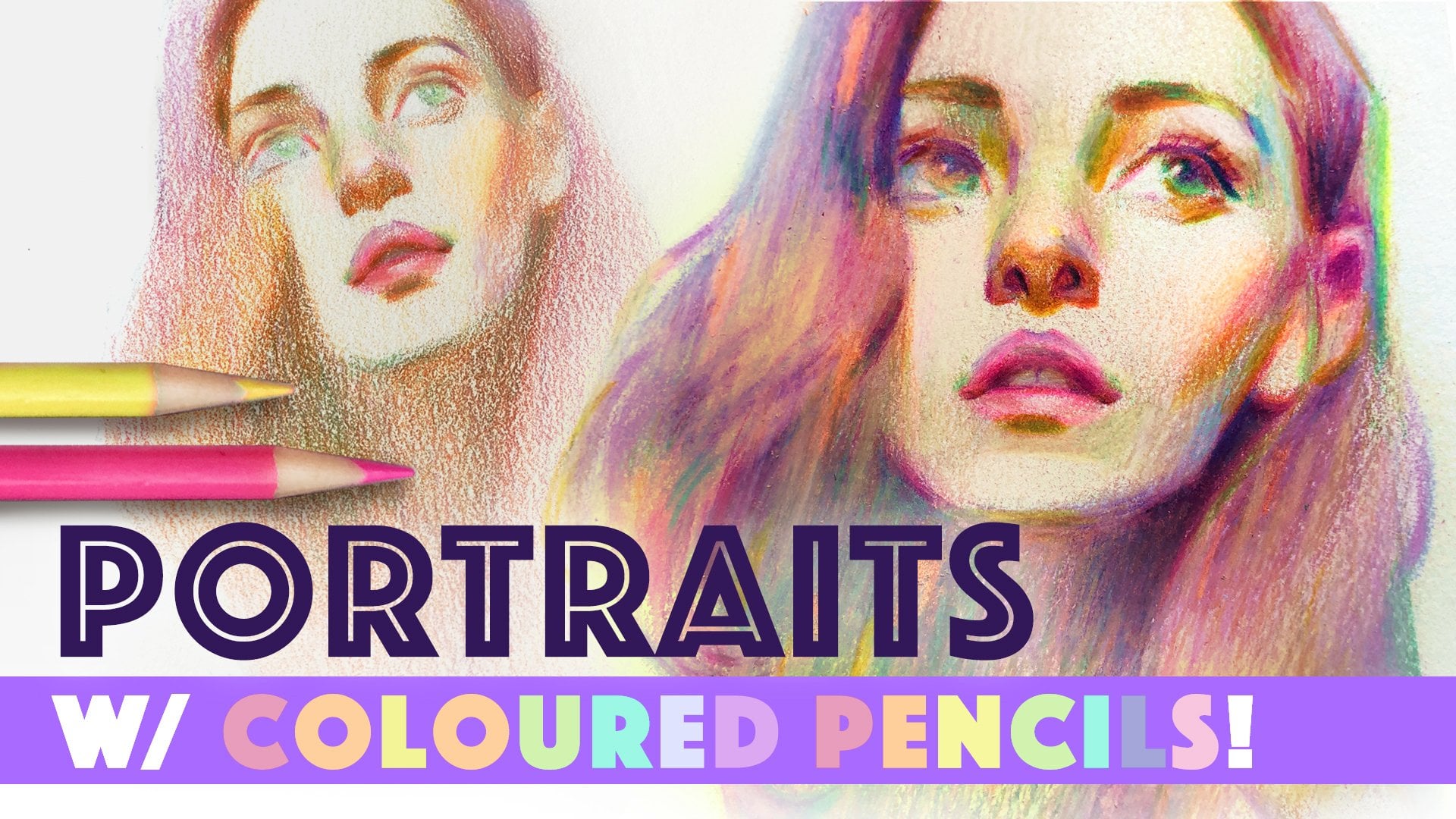
Transcripts
1. Intro: Hi everyone. My name is Chris Hong and
I'm back with another class. This class is a
full process demo that serves as a follow-up to my first color pencil portrait
class that reiterates all the major concepts
and techniques from that first-class to help students further
their understanding. This class is fully narrated, demonstrating how to set up a solid foundation
for your portrait. How to easily establish
a color scheme. How to inject color and
life into your portrait. And tons more tips
along the way to help elevate your portrait and
truly make it your own. So grab a sketchbook and of
course your colored pencils. And let's get started.
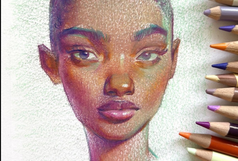
2. Shadow Shapes: So here is my pencil
drawing for the portrait. As you can see, the
drawing is fairly rough. You can see a lot of extra lines in there that
I probably don't need. I don't necessarily
feel the need to go in and erase
everything out. I think some of those
lines kind of lend a nice sketchiness
to the portrait, so I don't personally mind, but that's definitely a
personal choice if you want your pencil lines to
be cleaner and you don't want some of the
graphite to show through, then definitely feel free to take a kneadable
eraser like this. And just like pick up some of the lines that you maybe
don't necessarily need. It doesn't add to the portrait. Maybe I will clean up around
the eyes a little bit so that the graphite
doesn't impede too much when I go in
with the color pencils. Just doing a scan
around the portrait, going around with the
kneadable eraser and just picking out some of
the lines that may be, I don't necessarily
need in there. So the first thing I want
to do in this portrait is to establish shadow shape. And I'm going to do
that first by picking a color that I want to
use for the shadows. And what that does is it helps establish a color
scheme for your portrait. And when I say shadows, I think the natural first thought for most people would be
to think in terms of dark neutrals like
browns or even black. But for me I love to pick a more unconventional color
to use for my shadows, e.g. a, bright blue or a pink. If you are here, then I assume that you kinda familiar with my
style and aesthetic. And as you know that
I love incorporating as much colors into
my work as possible. And so picking a fun, kind of unconventional color to use to establish the shadows. It is just one of my
favorite ways to, one not only build a foundation to build
our portrait upon, but as a way to, again, establish a color scheme for your portrait or
right off the bat. Personally, I'm feeling
purple for my portrait. So I think I'm going to
go for a mid-tone purple. This is a purple that
I'm gonna go with. So I'm looking at my photo
reference and I'm seeing that the shadows are predominantly along this left-hand side here. So presumably the light
is coming from over here. So I'm going to try to basically simplify and draw the
outlines of the shadows. The boundary between the light
and the shadow ARN aren't so clearly defined to the point where you can
actually see a line. So this is where we
have to use a bit of our creative liberties and just make our best guess as
to where that line is. E.g. I'm going to start drawing in the shadow to show
you what I mean. I'm going to start
with this cheek here. In the photo reference. I don't necessarily
see that as a line, but I am deciding to design it. I am making the decision
to put that line here. This is the line that divides
the light from the shadow. And I talk about this
concept of designing your shadow shapes in much more detail in
my actual class. So I definitely encourage
you to brush up on that. If this concept
seems new to you are still a little bit
unfamiliar or so I'm going to go around and try to design this shadow shape. Once I have the
shape all drawn out, I'm going to fill it
in with this color. I see a shape like
this along the chin. Again, I'm just trying to
use my best guess here. None of this is really
right or wrong. It's really just depends on, on how you design your shape. And this is the way I'm
choosing to design my shape. You don't have to necessarily draw it the way I'm drawing it. Or portraits don't necessarily
have to look the same. But notice that I am trying to create one large
shape with this. And I am joining these
shapes together. You'll see better what I mean. Once I start filling it in and I'm going
to treat it like. As one big shape as opposed to all these separate
little shapes. Part of this is
definitely informed by my understanding of
the human anatomy, of course, and my understanding
of how light works. So it's definitely
something that comes with more practice and studying. So definitely encourage
you to do that. So I'm including
this whole ear into the shadow shape that
we see on this side. I usually include the eyebrows
into the shadow shape. All right, I'm going
to try to fill it in now so you can see what I mean. And I'm going to
use a light hand to start because we
can always build on top of this as we go along. And I don't want to create
too much contrast to quickly. I'm going to also fill
in the iris here. Before I do that
though, I'm going to draw in this
highlight of the eye. So I don't go over that
because I wanted to preserve the white of the
paper for the highlight. And similarly on
this side as well, going to makes sure I don't color over the
white of the eye. Because as you know, if you have experienced
with colored pencils, that the white of the
paper is quite precious. Colored pencil is very
difficult to erase and lift. So any highlights or very light areas we want to try to preserve that if possible, and color around it. So as you can see,
this is what I mean. When I say I'm treating
it as one shape, I'm not saying, oh, the shadow on the lip here is a separate shape from
a shadow on the nose. I'm feeling it all
with the same color, pencil and in
continuous strokes. So it looks more uniform and
doesn't look disjointed. And it's also just quicker
to do it like this. And again, I'm trying to
use a fairly light hand here because I want room
to be able to go darker. I want to be able to layer
my colors as I go along. So what this does, establishing the shadow shape, as you know, color
pencils are very buildable and layer trouble. So if I go over
this entire thing with another color with the
same amount of pressure, because I know I've
already established this tone and color
in this area, whatever other color
I lay over top of it, this air is going to
stay consistently dark. Then this area, if I were to go over the entire thing
with the same color. And that is very helpful
because it keeps the shadow area consistent
throughout the portrait. I'm not constantly having
to say I have to be very light handed
here and then have to go darker in this area. No, I don't have to do
that because I already did that work with just
the shadow shape here.
3. Local Colors: So from this point
on in the portrait, I think we are ready to
establish the local colors. By local colors, I really mean, what is the color
of her skin tone, what is the color of her lips, her eyes, her hair? I'm just going in with
this kind of beige energy, light, medium brown color. Before I do that though, before I go in and lay this
color all over her skin, I am going to block
out the highlights. Some of the brightest
points on the skin that I want to preserve the
white of the paper, block out this
highlight on her nose. I'm doing that just by drawing it out lightly
with this color. I'm also going to block
out this highlight on her nose or down her nose here. So the key with highlights is to be very selective about it. To not try to have
too many going on because then the
individual highlights don't feel as impactful. It's really a personal choice, but I will encourage you, at least in this demo, to keep the highlights
as minimal as possible. I know this part of her
eyelids here and down here, just under her lower lives, they definitely appear lighter
in the photo reference. But in my opinion, the biggest, most obvious highlights
are on the ball of the nose here and along
the bridge of her nose. And I know some
people are going to maybe look at her
forehead and say, Hey, there's a lighter
patch of color here. If I were to block that out, I think it would look a
little bit distracting. And I think the better statement and the cleaner statement would be to just keep this forehead as smooth and clean as possible. Alright, so I'm gonna go in finally with this color
all over her skin. Notice that I did go in
to that shadow area. And I'm trying to keep
a light hand with it. Because again, I want to
be able to build as I go. So I'm going to color
around the highlights. And notice I am going
into the shadow area. But It's still
keeping its shape. It is losing its shape
a little bit and I will bring back the shadow color
to try to draw that back out. And that's something
that you will kinda constantly have
to do throughout the portrait to reinforce
that shadow shape. I guess I could
have gone a little bit stronger in the shadow, but I also didn't want
to accidentally create too much contrast to quickly. Again, I'm going to bring
back my shadow color and kinda reinforce
this area a little bit. Now that there is more
color in the portrait, I have more context
and I can see that the shadow is not
as dark as it could be. So kinda strengthening
this shape. So I don't lose it because I don't want to lose
the lighting statement. We need the values to
be clearly different, to be able to convey
that sense of light. So again, I'm going in with the shadow color and just strengthening this backup
and bringing it back out. I'm not losing it. Yeah. Reinforcing
the shadow statement is something that you'll have to do throughout the portrait as you continue to build it up. The more colors you have, the more information you have, the more contexts you have. And you'll be able to see, oh, this actually wasn't as
dark as it could have been, or sometimes vice versa. Sometimes you will actually need to pull back a little bit, and that's just all
part of the process. The path to the finish is
not going to be so linear. You have to constantly
re-examined and reassess how your portrait is turning
out and act accordingly. Just strengthening some of
the shadow area back up. Because again, I
don't want to confuse it with the areas and the light. I don't want to
lose the sense of structure that we built. So now I'm going to go in and establish some
color for her lip. I'm going in with
this more pink color. And again, I'm
gonna go and block out the highlights that I see on that bottom lip so that we can established a sense
of shine on that lip. And I will lightly fill that in. So at this point clearly the portrait still
has a ways to go. The skin. You can see a lot of the white of the paper is
still showing through. But again, I really want to
build a skin gradually so that we can inject a bit
more interests in nuance, as opposed to just
taking one color pencil and solidly filling it out as hard as possible to make
it as smooth as possible. It's not as instantly
gratifying, but have some faith over time. We will be able to smoothen some of the texture out and really build on the portrait so that it feels more substantial
and it feels more finished. Towards the end.
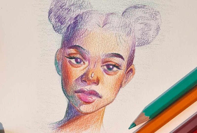
4. Bringing Life into Skin: How can we build on the
skin a little bit more, give it a little
bit more interest, a little bit more
complexity to it. So something that I love, love, love to do is what I call bringing more warmth
and life into the face. So our skin isn't uniformly
one shade of color. Certain areas across
the face tend to have a certain
color cast to them. And oftentimes it is the
cheeks and the nose and around the eyes tend to
have this kind of warmer, cast, warmer color. And of course, we are artists so we can exaggerate this or not. But personally, I really
love to exaggerate that. So I'm going to bring in an
orangey color into the mix. And I'm going to bring some
warmth along the cheeks here. So I'm just going to
lightly glaze and glide this pencil along the cheek. If I were giving her some blush, makeup, just ever so lightly, I can always go darker, but it's harder to pull back. So try to be as light
handed as possible. And our ears tend to
be warmer as well. So I'm also going to bring
this color into the ear, light handed as well. Also to let the, the colors underneath that I've already built up a show through. Hopefully you can see how
that's showing through there. I'm also going into the nose. The nose has this warmer cast and it will be tempting to do
that all over the picture. But remember, once you do that, then it won't feel
special anymore. If we want these areas to
feel special from the rest, then we have to be very
selective about where we put down our colors
and our effort. Alongside that, another
great way to add some warmth to the
face and therefore add more interest to the color
palette of your portrait is to throw some warms in
the under facing planes, planes that are facing the ground as opposed to
facing up and into the sky. These under facing planes tend to receive the
warm bounce light. And so by bringing some warmth into those
under facing planes, I am basically creating the feeling and the look of
sunlight in the portrait. All you really have to
think about is what part of the face must be facing
downward as opposed to upward. So underneath the eyes here, underneath the lower lids, I'm going to throw in some warmth in that area because that area
is facing downward. And also underneath
the chin here. I'm going to lay some warmth
under here because that part is facing down and presumably receiving some
warm bounce light. And also under the
eyelid, the top eyelid. But that's also
maybe just warmth of the vessels in our eyes. Eye socket, bridge area here. We can throw some warmth
in there and also in the under facing
planes of the nose. So basically like the
whole bottom of the nose, I would just kind of glaze with the warm color
there in the shadows. So basically, these
under facing planes are in the shadows because presumably the light
is coming from above. Therefore, the under facing
planes are in shadow. So what this does by establishing this kind of warm cast in those
under facing planes, you're really strengthening
your lighting statement. Not only are you making the
colors more interesting because we're introducing
another color into the palette. But you're also strengthening your lighting statement because this warm cast in the shadows is what we
would naturally observe. Sunlit environment where the sun is shining downward
onto an object. So we're making our portrait not only more interesting, but also, I guess injecting more realism and believability
into it as well. One last place that
we're going to throw some of this warmth is. In the creases or the deep
areas in the skin where light has a hard time
getting into and therefore you see a dark shadow. So the most obvious
crease I can apply this warmth into is probably the crease
of the eye lids here. Line has a hard
time getting into those creases and therefore, it is darker in those areas. And we can clearly see
that in the photo as well. I'm usually these
areas kind of present themselves as a
line even though we know that there are technically
no outlines on a face because these areas are so tight and light can't
get through these areas. The shadows that are
present is often so dark, we see them as outlines. And by the way, this
shadow is called occlusion shadows with
the same orange color. I'm going to just go
in to the crease here into any kind of dark shadow areas like
underneath the lip here. At this point, I think I'm going to go back and
strengthen some of that shadow shape
because I worry the further we develop the face, the light side of the face
that we're going to lose. This lovely shadow statement
that we've established. The shadow color that
I was using initially was this one which has kind
of light to mid tone purple. But going forward
I'm gonna bring in this darker purple because
I think at this point we're ready to go in a
bit darker in order to be able to create
some stronger contrast. So I'm actually going to look
towards my photo reference. And I noticed that it is definitely darker
beneath the chin here. So I'm going to follow that. I don't want to completely discouraged my students from
using the photo reference. Definitely use the photo
reference if you can. And if you want to, again, gonna go in with
this darker purple to strengthen the shadow shape. I hope it's not too dark. Just going over some
of these areas, some of the shadows. So something I'll
mention about the hair. I often find when
I'm doing portraits, whether that is in color, pencils are watercolors
or in pencil. When I start to pay
too much attention to the hair without having
worked out the face. I end up going too
far with the hair. I end the overstating the hair, and I find that portrait
often looks more appealing when the hair plays a more of a secondary role to the face. And the hair is just a
very simple statement. So that is why I am not really
concerned with the hair at this point and I am
treating the hair simply as one entity. For now, I will probably
address the hair once I feel that the face is a
bit more, figure it out. The feeling that this purple is a little bit on the blue side. So I think I'm going to bring
it back to a more like a warm toned purple because I feel like this blue purple is doubling the color scheme
more than I would like. And it's okay to
make these kinds of changes as you go along and you see how your
picture is coming out. You never have to feel bound by the decisions that
you make at any point. You can always change your mind. Pick up a different color,
different direction. So right now, I'm just
kinda fine-tuning my drawing a little bit
with this darker color, reinforcing the shadow shape and rendering out the features
just a little bit better, deepening some of the
very obvious darks in the photo, e.g. these like corners of the mouth. And this shadow underneath
the lip here makes a lip feel like three-dimensional and makes it pop from the face. I'm bringing back
this color that we used initially to establish
the local color of the skin. And I'm now able to see what
areas could be a bit darker. And I could go in a
little bit harder, are a little bit stronger. Still keeping a light hand. But now I'm able to
go in a little bit. Well, that's stronger
than the initial pass.
5. Gradients: So something to keep in mind
for your portrait that is going to add just another
element of interests. Another element of movement is keeping in mind the subtle
gradients in the portrait. So e.g. when we observe
her photo reference, we can tell that the
light is coming from this side down because the shadows are cast mainly
along this left side here, the colors are
going to tend to be lighter on this side because that's where the
light is coming from. And then gradually
the form as it turns away from the light
and as it moves further away from
the light source, it is going to turn
darker and darker. So that's actually something pretty subtle and we might not necessarily pick up on that
in our photo reference. But if we apply that
in our portrait, that's going to add an
added element of interests. Make your portrait feel
more believable as well. It will just create this nice
movement for our eyes to travel through it because
it's not just like a solid Single tone of color. But there is just this
like very subtle gradient. There is some variety. So that is what I'm going
to try to portray here. So as I'm laying down this
color again for the skin, I am keeping in mind that
it's going to be lighter here on this side and
then darker along here as we move towards
the side here. So I'm establishing that
by adjusting my pressure, how I'm laying down
this layer of color. So again, darker, kind of
along the bottom and on the left side and then lighter, less pressure on
this side to keep it keep it lighter there. So again, you're
probably gonna get very sick of me reiterating this, but I'm going to bring my
shadow colors and again, to bring those shadow
shapes back out. Because the more we layer, the more we add onto
the portrait is just going to get a little
bit lost over time. Don't want that to happen. So I'm going to go back in and bring out some of
those areas back out. You probably have noticed that I have been refraining myself from drawing any outlines
or many hard edges. And that's because again, I really want it to
be selective with it. But by this point, I think I am ready to go in and start defining certain edges. So I'm going to
just start defining certain hard edges
in the portrait to fine tune my
drawing and design. It's something that I can
do throughout the portrait. Constantly fine
tuning your design, constantly fine
tuning your edges. I'm being selective where
I throw hard edges. I don't want every thing to have a hard edge because then
everything will feel outline. And I don't necessarily want everything to feel
outline because I want a sense of
believability and realism. But that's definitely, again, is a matter of
personal taste, right? If you like a more
stylized look, then you can definitely throw
more outlines in there. Then I'm doing, I'm probably
going to reserve some of the lines until the very end when I'm doing my finishing
touches in a portrait. We've still got a
little ways to go, but I think the bulk
of the work is done. I feel like everything
is in place. Features are all starting
to come together. When in doubt, constantly
check your shadow shape. Does a face feel flat? Does suddenly feel kinda loosey-goosey
and not structured. It's probably because you're losing that lighting statement. So always check that there's a clear separation between
the light and shadow. So similar to
reinforcing the shadows, I'm going to reinforce the, the warmth that we established
by going in a little bit more with the warm
tones along the cheeks. Maybe I don't want to
go overboard there. I definitely tend to
have a preference for very warm cheeks and nose is
so if that is not your jam, then definitely feel free to use a little more
restraint than I'm doing. Use your judgment, understand what you can take and what
you can leave behind. So again, trying to create
a sense of that gradient, trying to stay darker on
this side and then fade to a lighter tone so that there's this sense of movement and just added believability
and adherence to how light actually works.
6. Colour Wash: I'm happy with how this
portrait is turning out so far. I feel like we have
a really solid base established at this point. I am starting to wonder like
what my next steps are. And usually when that happens, I tried to make some
more creative decisions. So let's do that. Let's make some creative choices here to make this portrait
a little bit more interesting and inject
a little bit more of a personal touch and an artistic statement
than something that we can copy from a photo. Not that there's anything
wrong with that, but again, I want to give you the
tools to be able to do so should you choose to inject more of a personal
flair into your work? What I'm going to
do now is lay in a very light color
for the background. But instead of just
applying it in the back, I'm actually going to lay it kind of all over the portrait. And they're really
easy way to do that is just to simply take a color like this,
minty green e.g. and just lightly glaze
it all over the picture. And what that's gonna do is
in part some of this color over all the colors that we have already down established. And that might be
really scary to some not going to turn
everything suddenly green. It's just going to
give a little bit of green cast so that
the figure kinda looks as if they are in
a green lit environment. So again, I'm going to
just kind of lightly glaze the screen across so
that in parsec color. And also what that's
gonna do obviously is establish a bit
of a background. I think what I will do a
going back to the idea of establishing subtle
gradients is I'm going to go harder
with the green over on the top and then kinda fade to a lighter
green near the bottom. So I'm gonna go in now with the green and I'm going to
use a very light hand and just place it over. The portrait. Gonna be a little bit
lighter handed in this area. Just to start, we'll see if I want to go in harder than that. I think I liked the idea of
it being greener at the top. So it creates a bit
of a gradient again. So it's not all uniform. So we keep things moving. We keep the eye moving
across a portrait. And I'm being careful not to go too heavy on the
actual portrait. Just in case that green
is a little much because color pencils are hard to erase. I'm going into the white
of the eyes as well, but trying to keep a light
hand as much as possible. So I'm not going in too
dark because I still want to keep these
as highlights. So I think what I will have
to do is go in again and make sure to bring
these highlights back out by darkening
around the highlights. I'm actually really liking how
this looks with the green. Definitely making the portrait
more exciting for me, which will make it
more fun to work on. Like that decision of having
it darker at the top there, more green than below. So at this point I think
I really want to see the features more
developed and finished. I'm just going to go in
to the features and try to render them out a bit more through in
some more contrast. Where I had kind of held back on doing that
because I wasn't sure how dark I want it to go in certain areas and bringing that green color in the mix. Because why not? I always try to re, purpose all the colors that I use are bringing into
the portrait because that is the easiest way to make all the colors in the
portrait feel cohesive. If you'll seal all, bring in the orange back. So again, I kind of
want to go back into the highlights on
the nose here and bring that back out by
darkening the surrounding area. So it feels like a highlight. Making the nose feel a little
bit more finished or fully rendered by deepening the
dark, darker shadows. Bringing some of that warmth
back that probably got lost over time that we
established earlier. I tried to color around
this highlight on the lip makes the lips
look quite juicy. Think I'm going to throw
in some lines here. Finally, feel ready to do that. And this side of the face here, I love this like bright pop of orange on the top of the nose. Maybe a bit much for some again, but I personally love it. So definitely going to
throw that in there. Also just bring this highlight back out again because it got a little bit lost when I was
putting down the green. So you're always again, constantly checking or
your shadow shapes. Still reading my shadows and highlights still reading
like highlights. It's a constant adjustment
throughout the whole process. I don't stop until the very end because the context of your
picture is always changing. Going a little bit stronger. Now with the skin, this is the same color that
I went in the first time. Throw some hard edges
to make the portrait feel a little bit
more finished and the drawing a little
bit finalized. I know I'm probably jumping
around a lot at this point, but I just wanted to remind my students that
at least for me, the progress of these portraits, it's really not a very linear
process because again, the context is always changing. I find I can't really stay and
do one thing for too long. Otherwise, I might
end up going a little bit too far, too quickly. So have to massage my
picture to the finish. Throw some orange in here again. So it has kinda warm glow. I really like my
decision of bringing the green into the picture. I think it definitely kinda cools all the purples and
the warm colors a bit. And it feels more
balanced this way.
7. Colour Opportunities: So I think the portrait
is looking really good and I'm definitely feeling ready to bring it into that finishing
stage of the process. So something I really like
to do at this stage is just to find opportunities, places in the portrait where
I can throw in more colors. And this is a technique that
I talked about in the class, which is bringing in a
third color into the mix. So basically, I look for areas in the portrait
where I think I can introduce a third color in that area where there are two
main colors present, e.g. on this transition here, this line here of the shadow and the
light part of the neck. I think this area
in my mind calls for a nice color in-between
that transition there along the eyebrows here
against the dark purple and the light part of
her skin basically anywhere where you see two
colors next to one another. I think a third color in the mix will make it even
more interesting. So along this cast
shadow of the neck, I'm actually going to go in
with a warm orange color. And I'm going to basically, Let's just draw that
in there like that. Instead of just lightly
glazing this time, I am very intentionally
drawing a line there to throw that third color into
that mix along here as well. I think I'm going to throw
that orange in there. I'm going to throw
this orange here. I'm actually going to strengthen this shadow along the cheek
here so that I could go in with this orange
and throw that color along that transition
because it gives more context to all
the colors around it. For me, a really great
place to throw in just a bunch of random colors
I find is the eyebrows. I'm going to bring in this fun turquoise color on going
off the screen here. And again, I'm not
glazing this color. I am going in pretty
strongly so that I can leave that color
fairly intentionally. Instead of just
glazing this color, I want a solid line
of that color. I'm also going to bring
this turquoise color to outline the portrait with are outlined
some of the lines. I'm also, I think I'm going
to layer the hair with it as well so I can bring it into more areas of the
picture so it doesn't feel so, so unique, so it has a
place in the picture. Why not? Let me just try throwing in this minty color underneath the eyebrow here just because, again, no rhyme or
logic behind it. I just want to see more
colors in the mix. Pay attention to some of the, the textural elements
in the picture. So the eyebrow has
some level of texture. That's why I just went in to define some of the
other lines there. I don't have to draw in
individual hairs or anything like that as long as we leave
an impression of it, It's all good things underneath. Here. I'm throwing this minty color. So when you're doing this, when you're introducing
more colors into the mix at this stage, when it's already
becoming so colorful. The key is to not try to
bring that color everywhere. I really tried to keep
the colors almost in its own isolated island so that you can distinguish each
of the colors separately. Otherwise, they would all just mixed together and create mud. I want to be able to see the orange and I want to
be able to see the mins. I want to be able
to see the purple. So that's something
to keep in mind.
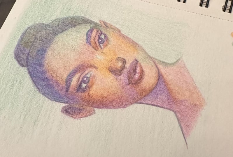
8. Hair: Alright, so I think
now all we have to do is define the hair
a little bit more. And I think this portrait
might be on its way. The hair again, I
want to keep it very simple and I haven't
keeping it very simple. I've really just
been layering colors on top of one another as I go. I do want to pay a little nod
to the texture in the hair, but just just make
an impression of it. So that's what I'm
going to try to do. I'm going to pick this area here to bring out some
texture of the hair. I'm going in pressing harder
with this pencil and trying to mimic that curly
hair texture. Hopefully, you're starting
to see that coming through. When you want a darker
value of a color, but you don't really want
to bring in another color. You don't want to
introduce another color. A great way to do
that is to obviously just layer different colors together that you've
already used. It's not like a
rule or anything. You can definitely
bring as many colors into your portrait as possible. But I do find the more
variables you introduce, the more work you'll
probably have to do to make sure they
all work together. So even though I was tempted to bring in a darker
color for the hair, darker than the
colors that I've been using up until this point. I am trying to make do
with the colors that I have used so far that are already on the desk to try to make that impression for
the dark area of the hair. For this area, I'm
not going to go in as as much as I
did on that side. I want an area of rest. I don't want it all
to be same same, all cross the hair
because that's going to flatten things out. Again. Want to keep the hair more
simply stated so that the face is the star
of the show here. I think I'm gonna go in with
this kind of toby color to darken the hair overall because I still feel like it's a
little bit light. Because I guess I have neglected to establish a local
color for the hair. I think that we'll
maybe do the job there.
9. Reducing Paper Texture: So at this point, I am feeling pretty good and it's looking
almost finished. We're almost there. But I wanted to
address the texture. So I think texturally, if things have definitely
improved as we kept their bring on more colors
throughout the portrait, we see less of that
paper texture. And things look a little bit
smoother from earlier on. But I think I still want to soften up some of
these areas so that I have some very soft areas contrasting against
more textured areas. The hair, e.g. I. Kinda want to leave
more textured because obviously the hair
itself is textured. And I think because I don't want that much attention
going to the hair. I want the hair to be
a supporting role, but parts of the face, e.g. along the cheeks
and the forehead, I do want to lessen that texture so that it
looks more polished. And a great way to do that is to bring in a color like this, or a very light neutral color. This is like a
beige, yellow color. Any color that is lighter than the colors that you're
trying to go over top will help fill in that white
of the paper and not alter the colors that you have
down already too much. What I'm gonna do, I'm
gonna go over the forehead, I'm going to go over some of
the cheek here and the chin, and I guess the neck maybe, maybe I'll be a little
bit more selective than that to fill in the white. So hopefully, smoothing the
texture make the area look more uniform by filling in
the white with another color, it will make that
area feel more rich as well in terms of the colors. So that's what I'm gonna do. And, um, yeah, color like this, it won't affect the colors
underneath too much. It's not going to
lighten it to too much. But it will soften and
kinda diffuse the textures. So it's not so noticeable. Yeah, the cheek area is already
starting to feel so soft. And really I'm just just
glazing this color over top, trying to fill in, fill in the white. The paper. While that actually
makes a huge difference. Bring this up into
the forehead as well. Some people might not
mind the texture as much. But I liked the idea of having these contrasting textures
throughout the piece. Maybe the neck, I will keep more texture because
I don't want the neck to be a
focal point anyway. So the cheeks look extra soft. Yeah. I think that's
what I'll do.
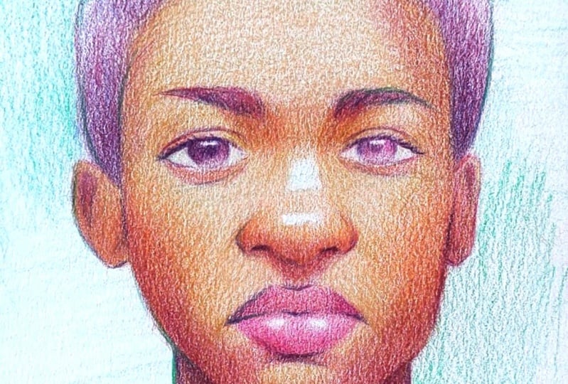
10. Adjusting Contrasts: Making sure the eyes
feel defined enough. Throwing in some eyelashes. Now, the finishing touches. Tempted to go in with
a darker color for, for the eyelashes
or for the eyes, for the dark. Darks in general. Maybe OLS try this
just to punch up some. Might actually be a bit strong. But maybe yeah,
maybe that's fine. I'm really feeling I
need to punch up some of the darker values so I can leave my finishing
marks and be done. Being selective
as to not go over the entire thing with
this dark color. Because after all, I want
it to just be an accent. But I do feel like certain areas need to be
punched up a little bit. At this state, I'm really
scanning the picture and seeing what areas. Use a bit more contrast. Remember, I was being very
sparing with it throughout, but now I have a
better understanding of where I want to
place that contrast. Dark in the iris a little bit, make this highlight pop. And I think I'm going to
make this pop a bit more. I'm going to choose
to highlight this I more than the other. That's another thing that
I touched on in the class, which is to play around with
the levels of contrast. The idea about maybe
one eye is more unfocused and therefore there's more contrast than the other. So again, do not be afraid to constantly reassess
your picture and see what it might need
in order to inject as much of your creative
vision into it as possible. So I think what I will do is try to diminish some of
the darker value here, lighten that iris up a little
bit so that this becomes R, the eye with the contrast, and this eye falls back in
contrast a little bit to hopefully make that
I pop a bit more. So I'm just going over this
one with this yellow pencil. Bringing the values
closer together. I'm going to actually
do that here as well. I think that's really all that I wanted to
cover in this demo today. I mean, there's always, always more room to, I think go further. But then again, maybe not again, colored pencil does have a limit with how much you can layer over top as the paper will tell you. And I'm definitely starting
to run into some of that resistance with the paper. So I think this
might be a sign for me to gracefully bow out
and call this finished. Okay. I think that
might have been it. I think that's it. For maybe one more, one more, one more. Kind of want to accentuate
this little part of the nose here and
the opposite side, but not using the same color because that would make
it too symmetrical. I'm always trying to vary up, especially a front
view like this. I'm trying to vary up
the colors that I use. I'm not using the same
color use on that side, on the other side, minus the
top of the eyebrows here. But like e.g. I. Went
in with a purple there. But here I want him
with the orange. I could have gone in with
a purple there as well, but I want to avoid
making it all same, same as much as possible. The line that I outline, the neck here is different
from the color here. Also to try to vary things
up as much as possible.
11. Outro: So that is it for this demo. I hope you found this helpful and hope that
there were lessons here that you can apply and
adapt to your own process. Because now it's time for you to create your own color
pencil portrait. Feel free to use the same
reference image I did, or use one of your own choosing. Once you've created
your portrait, don't forget to upload it to
the student project section so we can all take a look
at everyone's amazing work. Thank you so much again
for taking this class, and I'll see you
in the next one.
 Chris Hong, Artist and YouTuber