Transcripts
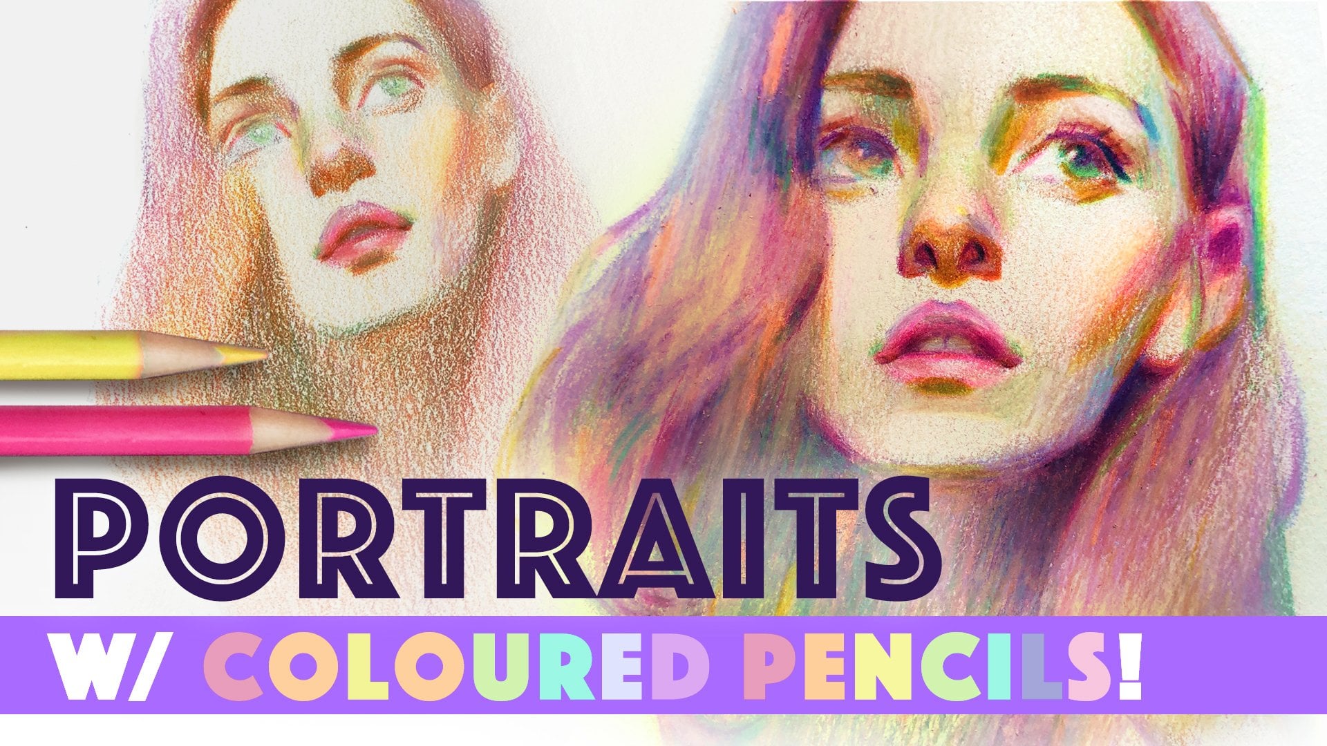
1. Class Intro: One of my favorite
subject matters as an artist is portraits. And if you don't believe me, I published an entire
book filled with 200 of my portrait drawings
and paintings last year. My name is Chris Hong and I'm an independent
artist based in Canada with over 600,000 fans across Instagram
and YouTube. Well, I'm thrilled to be back with a watercolor
portrait class, which has been highly requested by many of
you over these years. This class is all about my three value group method to approaching watercolor
portrait painting with lessons on how to break down the values and design your shadow shapes through tons of real time demos on the major features
of the face. The 1 hour final portrait demo is fully narrated in real time, where I walk you through a watercolor portrait
from start to finish, explaining my
thought process and decision making every
step of the way. Watercolor can be a
challenging medium, but I believe breaking
down the values into simple groups makes it
much more approachable. My hope is that by
the end of the class, you'll walk away with
the knowledge and skills to create more impactful
watercolor portraits. So grab your watercolors
and let's get started.
2. 3-Value Group Concept: Most artists would agree that watercolor is quite a
challenging medium, and truthfully, myself included. And yet I keep coming
back to it time and time again because watercolor
is just so magical. Well, what if I told you
there was a way to think about painting in watercolor
that made things easier? Over the years of
creating portraits, I learned that the key to a successful portrait painting
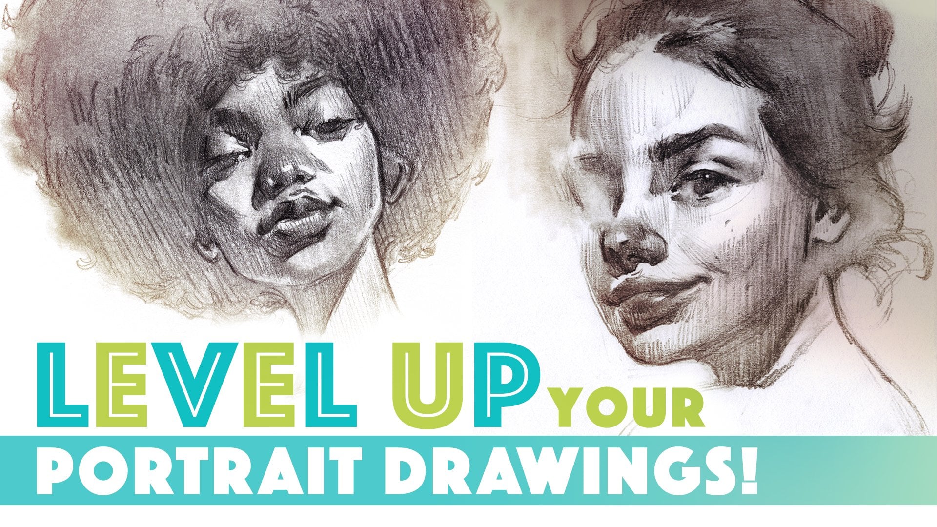
is really in the values. If you've taken my level up your portrait drawing class or my color pencil
portrait classes, you're likely already
familiar with the concept of grouping values and
designing shadow shapes. But in short, to group values is to draw shapes to
separate the areas that are darker in value into the shadows from the areas that are lighter in
value in the light. To help you visualize
this concept, let's take a look at
this photo reference. How would you group the values? If I take it into Photoshop
and push the values in the levels adjustment
layer and force the values to pick aside
from white or black, you can see the
value groupings more clearly and see the
shadow shapes emerge. Here are some photo
references and an example of how I might group the values and design
the shadow shapes, keyword being design, because there's no one right
way to approach it, and every artist will probably draw it
differently from another. Distilling down the values to just a few value groups provides the necessary building
blocks for our paintings, upon which we can then build
more nuance and complexity. So the concept of
grouping values into shapes is really the basis of my portrait
painting approach. It really isn't a secret, but here's how I like to
break down my values for watercolor portraits to just
three major valley groups, the shadow shapes, the
midtones, and the highlights. Here are some examples that demonstrate these three
valley groups very clearly. These are painted
monochromatically, which makes it easier to see
the value relationships. Now, I don't normally paint
monochromatically like this, but this is essentially how
I organize the values of my colors when I paint down into these three distinct
groups of values. Let me further explain how I use these three value groups
to structure my portrait. I identify the darkest values
in the photo reference, then group the values and design the shadow shape in the
block and drawing stage. Then I start by painting in the shadow shapes
with a darker value, which I feel provides
the bones of the portrait that I can
then build on top of. Then I'll establish the
midtones and the highlights, which are both
areas in the light. So I'll make sure to use lighter value colors than the
ones I use in the shadow. Highlights are
actually super simple. They are the brightest
points in a portrait, usually found on the eyes and the tallest points on
the nose and the lips. To establish the highlights, I simply paint around them when establishing
the mid tone values, since the white of the paper is brighter than any
watercolor paint. Midtones is sort of used
like a catch all term for all the values that are between the shadows
and the highlights. And it is in the mid
tones that usually reveals the local color of
the object most clearly. If you feel intimidated by
watercolor portrait painting, I hope breaking down
the values like this makes it seem much
more approachable. So now that I've exposed my secret to
watercolor portraits, are you excited to put this three valley group
approach into practice? In the upcoming demos, we'll take a look at
the major features of the face and learn how to approach breaking
down the values, then build up the
painting step by step. Then finally,
you'll learn how to put all the features
together and put all those new skills to
the test as I walk you through the final portrait
demo from start to finish. So grab your paints
and let's get started.
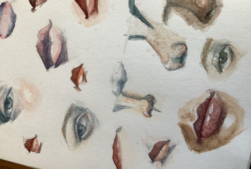
3. Eyes Lesson: Eyes can be somewhat tricky as it requires a bit more work than lips or noses and figuring out how to go
about drawing the shapes. In general, this
is how I tend to approach breaking down
the values of the eyes. I include the eyebrow, the line of the crease,
if there is one, the lash line, the iris, and the lower lid into
the shadow shape. If you look at an
eye from the side, you can better understand why I choose to
group them this way. Assuming the light source
is coming from above, which is the case in most
typical lighting scenarios, these areas will appear
darker since they are down facing planes and therefore
turning away from the light. Whereas these areas, the
upper lid and the water line, which is the edge
of the lower lid, face up and therefore catch
the light and appear lighter. Of course, eyes are
going to vary wildly from case to case depending
on many different factors. Sometimes most of the eye is entirely in shadow like this. So you're going to
have to approach each eye on a case
by case basis. But I try to design
the shapes in a way so they're
as descriptive as possible as to what the
eyes are doing in terms of the eye direction and the expression and the overall
shape of how it looks, prioritizing the clarity of
the read above all else. Now it's time to finally get
into the painting demos.
4. Eyes Painting Demo #1: I love this reference because
the eye is so sparkly. So I feel like it's a
really great opportunity to show the highlight, like, the full strength of how bright that highlight can feel
if you set it up right. So I'm just drawing
blocking this in as I would if I were
doing a portrait painting. So drawing as much as I
think I would need to with all the information that I need in order to
do my best painting. Here, I will block out where
I think the highlight should go instead of doing
it in paint because I want it to be placed
pretty intentionally. I think I think we might be
ready to bring in the paints. So here we have a pretty
strong shadow in this one. I'm going in with
my shadow color. I'm kind of echoing
off the color of the iris of the model here. And I'm using a dark, like cobalti blue
turquoise color. I'm starting with the darkest
point in the reference, which is this shadow in the
eye sockets brow ridge area. And I think I'm going to include the eye brow,
the rest of the eyebrow. But notice that I'm now
kind of dipping my brush onto or wiping my brush onto my paper towel next to
me, which you can't see. But I'm just wiping away the excess paint so I
can kind of grade it to a lighter finish there. And then I'm going to continue
on with that shadow color. To this area. And also carefully paint
around those highlights. Can't lose those
highlights. Okay. I already feel like I get
the sense of that I paint. Going I get the
shadow underneath the lower lid
crease which really helps so that the eyeball is round because it
hugs the eyeball. So while my paint is
still a little bit wet, I'm actually going to bring in some orange because I want to bring in some warmth
into these areas. So into this shadow
shape we established, I'm going in with this
orange color and, uh, just kind of bringing in some warmth
into these areas here. While it's still sort of kind of wet so that it blends a
little bit more seamlessly. Again, these down facing planes, they are likely to get
that warm bounce light. And that's why. That's why I'm bringing
the warmth in to try to mimic that phenomenon. And then, I'm gonna go in
and and color the pupil. Or the iris. I always say.
I always mix the two. But, the iris is technically, I think, part of
the shadow group. So I really should have just
painted it all together. But sometimes I like to separate things,
too. It's tempting. It's tempting to
want to separate separate all these elements,
paint them separately. But honestly, the best the best result
you're gonna get by grouping like valued things together instead of
separating them. Right now I'm actually
going back into the shadow shape
and strengthening it because I feel like it
got a little bit light. But maybe I shouldn't
have done that. Maybe I should move
on to other things. Getting a little bit distracted, is towards the end
of the day here. So I might be getting
a little distracted. Alright. So now let's focus. I'm going to go in with
a or a light color, just a little bit of
paint on my brush, a little bit of dirty kind
of water, dirty blue water. And I'm toning the
white of the eye because the white of the eye
is really not that light, especially because it's kind
of cradled by the flesh, and it's like, inside
the skull, right? So it's actually not
gonna be that light. It's actually in the shadow. So the trick to
making eyes look more realistic is, I mean, one of many tricks is to
darken the white of the eye. And I am working white on wet here because I find with eyes, working white on wet gives a more naturalistic
kind of effect. So I like how that's
looking so far. So now I'm going to establish the local color of the skin. And I'm going to work this area, this top fleshy part of
the upper eyelid area and, like, the eyebrow area. I'm going to tackle that
together in one kind of shape, in one single kind of
stroke, I suppose. You'll see what I mean
when I get into it. And that is to keep
it kind of cohesive. So I'm going to
start from here and kind of move it up this
way and towards the brow. So working together like this, I find it kind of helps marry all these
separate elements together, like I had with, for example, the eyebrow and the
little crease of the eye, painting over this whole area and treating it
like one big shape, it kind of it marries
those separate elements together and makes it feel a
lot more cohesive that way. That's kind of a trick that
I use when I'm painting, and I want to make certain, like, disparate parts
feel more cohesive. I will I'll start painting in, like, overarching
shapes like that. So kind of similarly, I'm going to paint
this whole lower lash or lower eyelid altogether. But I'm actually going to leave a tiny light sliver right
along the waterline. As a little bit of
a highlight there. A little bit of a little bit of pinky oranginess in because I feel like it looks a
little bit too cool. I think I'm almost done, but I'm gonna go in and strengthen strengthen the
shape a little bit more. It's got a little bit
a little bit muddied. Warmth. And under facing planes or down facing planes. Yeah. Pretty happy with that.
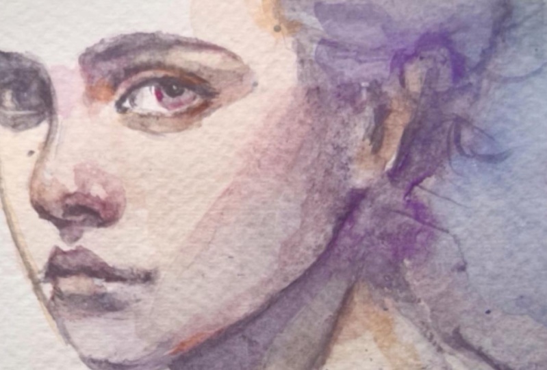
5. Eyes Painting Demo #2: So in this example, I'm going to approach painting
this eye a little bit differently because
this whole eye here is actually
technically in shadow. And so instead of
trying to pick out all the shadow areas first and then establishing
the mid tone values, I'm actually going to start
by putting it all in shadow first in a kind of
a mid value tone, and then I'm going to carve out the darker values
from that point. So yeah, every photo reference presents its own challenge. You're not going to be able
to use the same solution for every single situation. But I guess that's
part of the fun. So I'm going in here with kind
of a dilute wash of paint, so I'm not going in
too dark, hopefully. But dark enough so that it
feels like it's shadow. So I am going to
kind of paint all over all over except that little white
of the highlight because I really
want that to pop. But otherwise, putting this
whole thing into shadow. Even though I see a lot
of nuance in this area, this is just going to help me establish a nice base
to work off from. I'm going to let this
dry a little bit, and then I'm going to apply
the darker values on top. But while it's wet, actually, we can throw some colors around throw some warm
colors underneath here because we see a lot of warm colors in
the photo reference. The skin around the eyes
tend to be very thin, and so it shows the
blood vessels more. So they tend to be
warmer around the eyes. So I'm not changing the
value up too much just yet, just kind of glazing
on these colors. I'm trying to bring
warm colors wherever I think is a down facing plane. Now I'm gonna go in with a slightly darker value
build up the values. We'll start with the pupil. But remember that
I'm trying to keep the values pretty close
together because technically, this is all in one shape. But I do want to
bring some contrast around the highlight there, so it really pops. Building up the values. Building up the nuances. Trying my hardest to
keep these values close. I don't want anything to
start standing out too much because I want the main focal point to
be that bright highlight. Hm. So, yeah, this is, um, how I would
approach an eye like this or an example like this where the eye
is mostly in shadow. And see how closely I've
kept all these values together so that it reads as
one shape for the most part. With an exception of
just a few areas of contrast around the white of the eye or the
highlight of the eye. So to recap, you can bring a lot of nuance in the colors and the modeling of the form if you can control your values and these shapes that
you're creating. I'm just going to
try to bring out that crease I lost
it a little bit. Yeah, I find with eyes, it's more effective to
be just a little bit understated and a little bit left more to the
imagination than trying to define everything,
everything that you can see. Our brain just kind of does the job of making up
the information anyway, filling in the blank space. So yeah, with that said, I think I'll just leave it here. Okay.
6. Nose Lesson: Here is how I typically break down the
values in the nose. For me, the easiest
shape to start with is to find the bottom
plane of the nose, because in typical
lighting scenarios, that is where the form turns away from the light
and falls into shadow. Of course, noses come in all
different shapes and sizes, but anatomically, they are
all pretty consistent. So I find that I generally
draw this kind of M shape as a shorthand for
the bottom plane of the nose. Here are a few
examples where you can see some variations
of this shape. Establishing this bottom
plane helps us skim past the complexity and visualize the nos as a simple
geometric shape. So first, I start with the bottom plane of
the nose as the base. Then I look for case shadows. In this example, there is a clear case shadow
under the nose. In this case, I group
the case shadow into the same shadow shape as the
bottom plane of the nose. When the values
are this similar, it's a simpler and
stronger statement to combine the shadow shapes
into one bigger shape. You'll see later in
the upcoming demos how easy it is to introduce more value range and bring out the subtle details in the
anatomy within these shapes. As for the highlights, I take a pretty
minimalist approach and limit them to very small
areas for maximum impact. I try to limit to just one
small highlight on the ball of the nose and thinner strip of highlight along the
length of the nose, depending on the shape
of the nose, of course. The key is to keep these
shapes small so that they feel bright and contrasty
against the mid tones. Usually, I don't even draw the highlights in
the blocking stage, since I paint them in when
I paint in the midtons. And what about the
size of the nose? In this example, you can see that the size
of the nose are subtly darker as these planes
slant away from the light. Unless there is a very clear
cast shadow like this, where the nose is more at
a three quarter angle, I tend to group the
size of the nose as part of the
midtone valley group, as opposed to drawing them
into the shadow shapes, since they appear too
harsh when treated with the same darker values
as used in the shadows. So I often find it more appealing to simply group
the size of the nose as part of the
midtones and bring out the definition in
the painting stage. So to recap, the main thing I look for when it
comes to building up the nose is to find the bottom plane of the
nose and the case shadow, then grouping them
into the shadow shape. Seems pretty simple, right? Well, let's get into the
demo where I'll show you how to use this concept and
build it up in paint.
7. Nose Painting Demo #1: Alright, so I'm going to
go in with a shadow color, and I'm going to block
out that shadow shape like we had established earlier. And, you know, I'm
as I'm moving up, I'm gradually getting
a little bit lighter, dabbing a little bit of
the paint off as I go. Because I want that cast shadow area to be
the darkest point, like, along down here. So I'm kind of
dragging the paint up as I go in and then wiping
the excess off as well. So there's a bit of a gradient. So I'm gonna now paint in this little triangular
shape that I uh created and just
behind the nostril there. And then the brow ridge area. And here I'm just gonna
kind of feather it out. And then on the other side, So that is our shadow shape, the darkest dark value
shape established. Feel like it really provides
a structure for the nose. So now I'm going to go
in with the mid value. And by doing that, I'll also establish
the highlights because I'll be
painting around them. But even though I see a wide
range in the mid values, I'm just going to try to paint
it as evenly as possible, just establish it as an
even shape to begin with. And then once I have all
the structure in place, then I can start to add the nuances in the
values that I see. So again, I'm going to go in and draw around the highlights. I feel like I didn't
do the best job there. So I'm just gonna glaze
this color all over. But before I accidentally paint over the other highlight on the nose or on the
ball of the nose, I will do that, so
I don't forget. And actually, while it's wet, while it's still kind of wet, I'm going to bring some
more reddish color along the ball of the nose here. And the nostril down into
the shadows or down into the bottom plane of the nose
in these areas as well. So now that we have these
the structure established, now I'm going to go in and apply some of that darker
value that I've been talking about along here where the nose is turning away from the light
on this side. And the warmth I'm bringing in the noses tend to have
a lot of blood vessels, and so that's why I'm throwing
all this warmth around. Um, I find that brings a quality of
life to the painting. And it's just, like, it's a nice contrast to the green that we started with
for the shadow. And I'm going to go in
and indicate the nostril. And then Just kind of keep
glazing this warm color. Right now, I'm kind of taking a really dark color and cleaning up the
shape a little bit. Hopefully that will provide a little bit more
structure there. Help strengthen the
painting a little bit. Strengthen the side of the
nose a little bit there. We got the shadows. We
got the mid tone values, and we got the highlights.
8. Nose Painting Demo #2: So here is the
blocking of the nose. This is how I would probably
draw it before painting it, which is what I'm
going to do now. I'm mixing up a kind of a turquoise color for the
shadow pass, the shadow shapes. Yep. And I'm going to start with the cas shadow
here and then move the paint up into the
bottom plane of the nose. And, uh, yeah, move
that feed up there. And fill in the brow ridges
or eye sockets. I honestly don't know
what to call them, but I keep calling
them brow ridges. I think that makes sense. Hopefully, that
makes sense to you. And yeah, that's our
structure for the nose. Just establishing
these shadow shapes just makes it feel like
a nose, doesn't it? Like, our brain
intuitively understands these shadows because we observe them when we look at ourselves, when we
look at other people. We inherently know what
these shadows mean. Um, so my brain, I mean, you can look at these
as three little blobs or four little blobs
on a piece of paper, but does this not look
like a nose to you? It looks like a nose to me. I mean, the lines definitely
help underneath as well. But even without the lines, I feel like most people would say that this
does look like a nose. And I'm going to go
in and establish the a mid value of the nose, which is basically
the local color of the nose or local
color of the skin. And while I do that, I will also establish the
highlight on the nose by drawing around it or
painting around it, and then I can glaze this
color all around. But let's also get
that highlight there. I did go in intentionally
a little bit darker here to show that forehead
kind of curving in. And, you know, I'm gonna work a little bit wet on
wet and I'm gonna throw in some warm
warms along there. And here, because I'm picturing
that warm sunlight bouncing into these areas, as well as the bottom
plane of the nose. I'm gonna work that up into the ball of the
nose a little bit. And the nostril. And, I'm going to pick up that
turquoise color again and, indicate some shadow on this
side. I forgot to do that. So it gives that nose a little bit something
to work against. A little bit of
structure on that side. I'm going I went in with an orange color for
that transition. The transition between
shadow and the light area, basically the terminator along the skin tends to
have a warm color. So that's why anytime any transition along the skin,
especially places around, like, the nose, eyes, the lips, where there are a lot of blood
vessels to be found, ears. I always use those
as opportunities to throw or bring a warm color in because it really
it really gives a lifelike quality
to the painting. Just go to strengthen
this shape here. So I'm fairly happy with that, but I think I could bring a little bit more nuance in
terms of the values here. I want to kind of accentuate the ball
of the nose a little bit and also darken this area, the side of the nose
here a little bit so that it doesn't feel so flat, so we get a sense of the this plane of the
nose, the side plane, but I have to be careful not to go too dark because
that will I still want, remember the midtones I want to make it
read as one shape. I don't want it
to read like now, this side of the nose is a
part of the shadow shape, that is not what I want. I still want to
feel part of this just the midtne
shape midtone group. And, uh Yeah, I wonder
if that is enough. I'm not sure. I totally love the highlight
placement of there, but it's too late now. Got to kind of work
with what I got. So again, I'm still
trying to kind of, uh, show this ball of
the nose a little bit. So I'm rendering this
kind of ball here. I think that I think
that did the job. So now I'm gonna go in with a darker value to try to
indicate the nostril. We'll see how that goes
if it'll be dark enough. I think so. And on this side. And just kind of cleaning around the shapes that
we've established Yeah, just cleaning up
the shapes a little bit. Throwing in some harder edges. So it doesn't feel so mushy. You need a balance of
both hard and soft edges. Honestly, I'm really using
whatever color at this point. But I really love starting out with kind of an
unconventional shadow color, like I did with the
turquoise and then, you know, basing it off the photo to build up the
rest of the portrait. So it still feels
grounded in reality, but you get that pop of color that you wouldn't
otherwise have gotten if you had just tried to stick to
what's in the photo. Yeah, I still trying
to model this, like, ball of the nose here. That's why I'm kind
of working in this, like, spherical motion. So there, there is our nose. I'm pretty happy with that one. I think this one turned
out pretty well. I think this one was a
pretty good demonstration of how I used that three value structure to build up features like this. But
9. Lips Lesson: I treat the lips very simply when it comes to
breaking down the values, usually to just two
main shadow shapes, the upper lip and the area just underneath
the bottom lip. I personally find
it easier to draw the entire upper lip as
a single shadow shape, because in most typical
lighting scenarios where the light is
coming from above, the upper lip is
actually mostly in shadow since it is a
down facing plane. I draw sort of an
elongated M shape again as a shorthand for
the upper lip shape. The second major shadow shape is the area under
the bottom lip, where the form dips just
above the top of the chin. I usually simplify this
into a trapezoid kind of a shape or a rhombus
depending on the viewing angle. So those two are the
main shadow shapes, and sometimes these
shapes look a little bit different if there are
cast shadows involved, since the lips protrude from the face and also
cast small shadows. But notice how these shapes, like the shadow
shapes for the nose, stay fairly consistent and somewhat predictable
from one another. You'll eventually develop
your very own shorthand for building up your portraits. As for the highlights, you can observe them usually along the top part
of the bottom lip, as the bottom lip is an up facing plane that
catches the light. On some lips, the highlight is more obvious than the others. So in the case where
I can't really identify a very clear highlight, I'll use artistic liberties
and just create one. I like to draw a small, horizontal highlight shape to suggest a shiny
surface of the lips. So this is a very simplified way of breaking down the
values in the lips. But hopefully, it gives you an idea of how I try to distill the complexity of what I'm seeing down to something
much more manageable. In the upcoming demo, I'm going to show you how I take this simple statement to
bring the lips to life. Um
10. Lips Painting Demo: How I would group the values in this lip in
this photo references that I would group the
entire top lip with the opening of the
mouth together because even though yeah, the opening of the
mouth is darker, I feel like the values
are close enough together that it doesn't justify
breaking these two apart. They're close enough in
their value range and different enough from these
lighter values around them to justify
grouping them together. And then for the highlight, I'm just going to there's a little bit of
highlight maybe on that side of the
lip there as well. And then basically everything
else is the midton values. So this is how I
would break down the values in this
photo reference here. Again, with this photo as well, I'm going to just group the entire upper
lip into one shape. And include the shadow underneath the
lips here as well. And just to show you, I will probably block the highlight out like this
when I'm painting in paint. And then, you know, the rest is the
midtone Valley group. I'm mixing up my shadow color, so bring in my shadow color pass here with a pretty
thick mix of paint. And again, I'm just simply blocking out this entire upper lip
with this mixture. I'm also going in to this kind of fold in the
corner of the mouth there, as well as this part of
the corner of the mouth. And then the shadow underneath the lip. The lower lip. I'm going to, um, soften the
transition a little bit here because I actually
maybe here as well. So now I'm going to establish the midtone values while
painting around the highlights. So really establishing both
highlights and the midtones. So I see the highlights
somewhere along there. Actually, I'm just going to Do something like that, right? And then quickly
glazing the wrist. Kind of like that, I think. Maybe I just feel this. Yeah. This is a
simpler statement. I feel like this shadow shape down here is getting
a little bit lost. It's competing a little bit
with the midtone value, so I have to go in and
reinforce that a little bit. So initially, I thought
that, you know, this was quite dark
when I laid it down, but because we established just midtone value, in context, it doesn't look quite as dark, so it's getting a little bit a little bit muddied up here, especially because I didn't do the cleanest job boundary here is getting a
little bit muddied, so I'm going to
kind of reinforce the shadow underneath
here with a darker value. And because I'm doing that, I'm also going to now bring a little bit more nuance
in that upper lip. With some darks. So I'm just laying on a darker
color within that shape. So I'm being careful not to go too dark because I don't want
to create I don't want to start creating
all these disparate, like, shapes within
that upper lip. I want the upper lip to
read as a single shape. So I got to keep the values
still pretty close to each other. And you know what? I think I kind of just like
the simplicity of that. And here I'm just kind
of softening this edge. So it feels a little bit more naturalistic. Maybe. Maybe the one last thing
I'll do is I want to bring another color
between this area here and the shadow
so that there is a more gradual transition
from the lip to the shadow. And I want it to be kind of
like a brighter pink color. I think we're in business. Yep, I think we're in business.
11. Features Recap: Eyes, Nose, Lips: [No Speech]
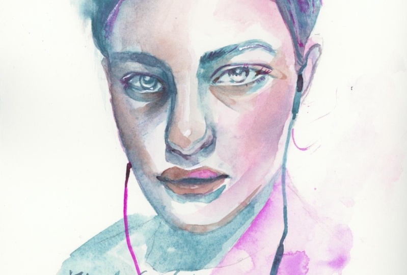
12. Full Portrait Demo Part 1: Block-in Drawing: I'm going to start off by
blocking in the drawing. So I'm trying to
kind of measure with my hand how much space I want this portrait to
take up on the page. So I get the general size of
the portrait that I want. Okay. And I'm going to go
in and roughly measure out the outer shape of the silhouette of
the head because I find that this photo has a
very clear silhouette of that. Whatever is the easiest for you to pick out is what you probably
want to start off with. And for me, that is the head,
the silhouette of the head. So just trying to find the overall angles of
what I'm seeing erasing, the less kind of
accurate lines as I go. And then building up from that get our lines
in for the features. I like to draw these
parallel lines for roughly where the eyes sit, roughly where the
base of the nose is, and then roughly where
the line of the mouth is. And then from that point,
I'm going to measure out the hairline. You know what? I'm just going to start
over with the features. I'm really not liking how the
features are turning out, so let's just start over. I'm gonna find the line
for the eyes again, approximately where they sit, line for the base of the
nose and line for the mouth. And this time, let
me try to walk things in a lot looser establish the bigger
shapes sooner. And maybe and maybe yeah, establish the big shapes first. And then break the shapes down further once I feel like I've
gotten a good placement. Yeah, I mean,
that's kind of what I recommend to students, so I should probably, uh, follow my own advice. So that to me, looks better than
what I had before. And then I'm gonna go into more detail with the
drawing and find the eyes. Yeah, I feel like the
eyes are really the key to this particular
portrait here, so I that's why I
want to make them. As accurate as possible. So I'm paying closer
attention to things like how wide the creases, how much wide of the eye
is showing in relation to the iris because that really
affects the eye direction. I definitely want to set myself up for success
with this one. So I am being a little bit more meticulous about the drawing
than I normally would be. I think I will I
usually don't like to include any kind of accessories, but I think I will
include the earphones. Just as a fun little prop. H. Part of making the
drawing to your taste is, I think, really
understanding what it is that you want to accentuate
with your painting. For me, I really, really want that intensity of the eyes to really come
through, and as well, something I really want
to highlight is her nose because I feel like it's
a very striking nose. Right now, I'm actually
extending her head a little bit because I feel like we see more of that top of the head
than maybe how I drew it. So, yeah, it's
okay to constantly reassess and adjust
your drawings. You know, give your
painting its best chance at life before you get in there, a it'll be hard harder to
fix these kinds of things. It's harder to fix proportions
once you start painting. But yeah, my main goal for this portrait will be to highlight the
intensity of the eyes. And also, I want this
nose to feel very, like, structural and kind of be one of the focal
points in the picture. I'm gonna try to go in with some of these
shadow shapes now. I just realized that I
made her nose ginormous. I'm going to fix that. See, this drawing drawing can take me quite
a while, actually. And then I'm gonna get that
casado underneath the lips. And it's making me
realize maybe I should draw her chin a
little bit longer. So I'm always always adjusting. The more marks I put down, the more information
I have to work with to measure
everything else out. I'll draw in this
other earphones. So I'm going in
trying to kind of roughly map out and make mental note where I'm going
to paint in that shadow pass. So here is my drawing
for this portrait. I don't normally flesh out
my drawings nearly as much. But for the purpose of
this demonstration, I figured better go in a little bit further
than I usually would. But before I bring
in the watercolors, I just wanted to talk about how I'm going to
approach painting this. So I really want to highlight
the intensity of her eyes, and I do want to also
highlight her nose because it's such a a
prominent feature on her face. But that said I don't want to highlight all the
features and have them compete against
each other because that's going to be a
little bit overwhelming. So I'm only going to
highlight one of her eyes, and I think the eye
that is going to be in focus is going
to be this one. It's a really good idea to have some areas of focus
and some areas of rest so that not everything is competing
for your attention. And also, you can use that as a way to move your audience's
eyes through the portrait. I think I want my
audience's eyes to generally stay on this
side of the face. And this side, I kind of want for your eyes to get
lost a little bit, so not have so much to grab onto so that this side can
pop against something. Because I want to highlight
the nose as well, I feel like the lips could take a little bit
of a back seat. So again, similarly,
I'm not going to build up my values as much as I would in the focal points, and I'm going to keep the values pretty close to one another so that there's not
as much contrast there to draw your
eyes and focus. So that is kind of what I'm thinking of
when I'm looking at the photo reference and thinking about how I'm going to approach this portrait painting. But once I get into the
actual painting itself, things could change on a dime, so we shall see, but I'm excited to get into it. But before I start painting, I think I will take
my needle bot eraser and lift off some of these lines because they feel a little bit too
heavy for my liking. So I'm gonna do that
by just gently rolling my need eraser across, picking up some of
the graphite off. The lines are a little
bit too strong, and I don't want to feel confined by the lines
when I'm painting. I want to be able to see them, so I know what I'm working with, but not so much that I feel constrained by
them in any way.
13. Full Portrait Demo Part 2: Shadow Shapes: So I'm going to start
this painting off by establishing
the shadow shapes, doing a shadow pass first. And that's going to establish
a very strong sense of structure to our
portrait to work with. Alright, so I'm
going to go in with a pretty dark mixture
of this kind of turquoise color and
establish some of these shadow shapes and
see what we come up with. Little bit nervous, but
hopefully it works out, and hopefully we can all learn
something along the way. Wetting my paints so that if I want to grab a little bit of
orange along the way, then it's kind of ready to go. If I want to grab
a little bit of red along the way,
then it's ready to go. I don't really have, like, pre mixes or anything like that. I just like to kind
of pull from and incorporate colors as I go. Alright. Gonna go in
with the shadow pass. And I think for
the shadow color, I'm going to pick a
turquoise color for the shadows and kind of work off that base and see
what we end up with. Alright, so I'm
going to go in with this prominent shape here. And then be careful to leave that highlight
of the eye because that's kind of the
whole star of the show. And I'm gonna pull some
orange into these areas 'cause it looks warm
in the reference, as well, while this is wet, I'm going to throw some
orange in this area. We'll see how that
looks once it dries. Yeah, trying to carve
out those shadow shapes, those dark patches of value. And then I'm going to go into the shadow shape or the case
shadow of the nose here. Again, starting with the blue. And remember how I
said I'm going to keep the contrast on this
side pretty condensed. So I think what I'm going
to do is actually treat this whole shapes as one shape instead of
breaking it apart, although I will try to leave a little bit of
the highlight for that kind of water
line on the eye. But I'll see if I want to
kind of kill that later on. Maybe it's not necessary. From this point, if I want to, then I'm going to pick out certain darker areas to
bring out in this shape, but painting it as one shape
like this to start with, that's going to help me keep
those values close to one another so it doesn't
feel too contrasty. It's going to soften this
edge up a little bit. So whenever I'm like, I don't know what to paint next. Just like paint
the easiest thing. Paint what you think is the easiest thing to paint
and then go from there. And then it gives you a better
idea what to paint next. I'm using the turquoise color as a base for these darker shadows, but I'm also pulling into
other colors like the orange, for example, especially around areas like around the features where they do have
that more warmth, where it is a little bit warmer than the
rest of the face. And I'm going to tone the wide of the eye
down a little bit here. Use the white of the
eye is not that light. And then I'm going to
go in with the lips. Again, I don't want the lips to take too
much focus away. So I'm bearing that in mind, and I'm going to keep the values here kind of
close together, I think. See using the
turquoise as a base, but also just kind of pulling other colors into it as I go. Maybe I'll throw a little bit of a highlight on the bottom lip. Just in case, because highlights I can kill
down the line if I want, but it'll be hard to get them
back if I change my mind. So I will put one in
there just in case. So so far so good, I think, in establishing the features. Let me try to get that iris in. So I'm going to now mix color
for the mid tone values, which is essentially the
local color of her skin. And then, yeah, just kind of
lightly glaze it across to establish that Uh, the midtones. And that feels a little
bit too red for me, so I'm gonna bring a little bit more cooler
colors into that. I'm going to leave a tiny
highlight along that waterline. Then I'm going to
carve out this shape. For those under eye bags, which I feel are very
characteristic for her face. I feel like it wouldn't feel the same if I
didn't have that. Then I'm going to go
in with the nose now, establish the midtone values
there and the local color. And so I'm going in
and I'm going to draw around that highlight on
the ball of the nose. Make sure I have the
right placement. Then Just glide that bead of paint around. And then I'm going to establish a highlight
on the bridge, as well. Maybe not quite that big. I just kind of merge these features
together a little bit. I'm going to try to soften this edge up
here a little bit. I don't like how
stark of a line it is all the way from the top
to the ball of the nose. So just breaking up this line. Just trying to lift up
some of the paint there. Alright, so now I'm going to try to tackle the shadows
kind of along the face. And I'm going to
probably have to work a little bit quickly because I don't want to create too hard of an edge
all over the face. I want to because that's not what I
see in the photo reference in the
photo reference, the edge is between the, like, form shadow and
the areas in the light. They're a lot softer. So once
I go in with the shadows, I'm probably going to try
to go in and establish the mid tone values for
the rest of her skin. So I'm gonna probably
work a little bit fast. But we'll see, maybe, maybe not. Let's go in now. And again, I'm gonna pull
in other colors into that base turquoise color. So pulling some oranges in here. I'm pulling some right along this side cause cheeks tend to be a little
bit more reddish. And then back to turquoise. And this ear back here is
gonna be a little bit warmer. So I'm gonna try to soften up this edge of the cheek here. Bye giving her a
little bit of blush. And then I'm going to
go in and even out this kind of under eye
shadow on this side as well. So the last bit of very
clear shadow shapes that I see in the
photo reference that I can throw in here is the shadow
shapes in this ear. And for that, I'm
going to go in with a bright orangy reddish color because of subsurface
scattering, the shadows inside the
ear tend to be warmer. I'm going to even out
this side of the cheek and give her some cheek
definition on this side, as well. So I'm gonna go in carve
start with the darkest side. And then gradate out to a softer finish, softer edge. Like so. So it balances out
that side because, you know, our faces
are symmetrical. So I kind of like how this
portrait looks at this point, even without the midtne of
the skin really established. This is why I like working
like this with watercolors because I think I could technically stop
here if I wanted to. And I think it's still like it's an
interesting statement that I'd be making
with this portrait. You know, not every inch of the painting has
to be filled in. Everyone's definition
of finish is different. Again, I kind of like
how it looks right now. And from experience, I know that you if you
like how it looks, honestly, just kind
of step away from it. Don't try to mess
with it too much, and then see if it's
even really all that necessary to build
it up any further, I kind of really like
how it looks right now. So I'll move on to the nose
and define what I can there, just kind of cleaning
up and bringing some of those darker values. But honestly, I feel like I
don't need to do too much. I'm just cleaning up the
drawing a little bit with some darker values while bringing in a little
bit more color. So I brought a
little bit more of an intense orange
color in this area. And I will bring a little bit darker color in this corner of
the mouth here just to kind of pinch that corner of the
mouth in a little bit, maybe on this side as well, but that may be the
only dark value I throw in the mouth because I don't want
the mouth to take over. Alright, so from this point, I think I want to now start working on this
eye a little bit. But because I really
like the contrast between this eye that's in focus and then this eye that's fading into
the background, I really don't want to
do too much of this eye. I just want to bring
out just a hint of detail in there so that we
still get what's going on. So how I'm going to do it
is just keep working with the turquoise color so that we have less visual
interest than this side. But I have to be really careful with this
because I really, really don't want to bring too much detail in here if
I can get away with it. And I'm definitely
not going to go in with the highlight
on that eye. We're gonna kill that highlight. Honestly, that might be enough. Maybe a little bit, I already feel like I'm going
a little bit overboard. Yeah, honestly,
that might just be enough and a little bit more definition of
the eyebrow there. So, the values in here stay
very close to one another, so that the overall
impression is that this whole eye is in
shadow, and meanwhile, I'm going to bring a little bit more definition
to this eyebrow. I'm going to bring some
color into that ear. Now that we have established
that shadow shape, all I need to do is just to kind of glaze a more dilute color over. And that shadow shape holds the structure of the
ear together. Like, so
14. Full Portrait Demo Part 3: Filling in the Mid-tones: So really at this point,
all I need to do is fill in the remaining
part of the skin, which is going to be
the mid tone values and then work on the hair. And before I fill in
the rest of the skin, I just want to talk about how
I'm going to approach it. So because the light
is coming from above and from this
side on the right, we can observe a a gradual
falling off of values. So it's lighter on this side, and then it kind of gradiates towards a darker
color on that side. That's also what I want
to achieve when I go in to fill in these blank areas. So I'm going to start off
by working on the forehead, and what you're going
to see me try to do is establish a gradient going from darker to
light on this side, and probably a little bit of a gradient in terms
of the colors as well, a little bit more
bluish on this side, as opposed to maybe warmer on this side to play with
that sense of movement, not just in terms of values, but in terms of
color temperature. So that's what you're going
to see me attempt to do, and I want to also try
to see if I can get, like, a rounded feel
on the forehead. So we're going to try to do
a lot in just a few strokes. But here we go. Maybe that's a little bit
too too dark. Too blue. And I am leaving out some shapes that I want to keep
a bit lighter. So we'll see how that looks. Yeah. I think that is pretty
much what I set out to do. We'll see how it dries. So while this is wet, I'm actually going
to go and bring some warmth into the edges here where the skin meets the hair because it
tends to be warmer. In this area. And also because the
hairline tends to be softer. So that's why I'm doing
it while it's wet. So hopefully it
doesn't create, like, hard edges while I impart
some of the warmth. So I think that worked
out pretty well. Now I'm going to fill in
this side of the face here, and it's going to be kind of a similar color
to whatever is up here. So again, I'm
trying to establish a bit of a gradient going from darker to
lighter on this side. So yeah, I'm going to try to go in with what I think
will achieve that. And I'm going to tint that And then the chin. See how since I've established
that shadow shape, it's just so easy to just kind of glaze
on colors like this for the remaining
parts of the portrait. Just kind of filling
in the blanks. And yeah, trying to pull a
little bit more yellow into this area to keep it warmer. But yeah, there you have it. I think I might actually
go back in to this side. I feel like it in context, now it looks a little
bit too light. But I do have to be careful
not to layer too much. I don't want to lose some of these shapes
I've established. The more kind of fiddle around
and layer paint together, the uh, riskier it gets. I think I want to glaze on a little bit more color onto onto the lips cause
it does feel a little bit, little bit anemic,
especially the bottom lip. So I'm just glazing
this color onto it onto the structure
we've established. So There should be pretty
easy and straightforward. Actually, I'm going to glaze a color onto that
highlight as well. So it's, like, a bright pink
instead of a stark white. That will help also keep the visual interest
down a little bit, and keep the interest up
on the eye and the nose. I'm going to carve out one more shadow shape
on the ear here. I find painting ears
this way so easy. You just, like, pick out whatever geometric shape you see and draw it
exactly as you see it, and then somehow it
looks like an ear.
15. Full Portrait Demo Part 4: Designing the Hair: Okay, so I'm pretty happy
with how the face looks. Now I have to address
painting the hair. Usually, when I'm painting
the hair in these portraits, I really try to err on the side of leaving the hair
understated rather than overstated because
it has the potential of taking over the portrait and taking too much attention
away from the face. And I think in this case, I will try to use the
hair as an opportunity to incorporate some more
water coolory effects. So work wet on wet
in certain areas. So now I'm trying
to decide where I want that wet on wet area to be because I
know I don't want a harsh outline all
around the hair here. I want a little bit of the boundary of the hair to
be broken and have that, like, wet on wet
water coolory effect. So I'm trying to decide where I want that water colory effect
on this side or this side. I'm thinking kind of up
in this direction here. So maybe wet the edges along this side and then keep the
harder edges on this side. So we feel that crispness on
this side of the portrait, and then on this side, things are a little bit more, like, loose and lost and up
to interpretation. So yeah, maybe let's do that. And because her hair is
a pretty dark color. I'm not really going to
see, this is the thing. When you're working on a full portrait and you're
not working on separate just like
features individually, then you have to really take into consideration
the entire picture, which makes you realize that
you don't necessarily need to bring every part
of the picture to, like, full detail to, like, the full range of values. You can really just leave things a lot more simply stated. Hopefully, you'll be able to
see what my plan is here. So actually, first thing
I'm going to get ready is try to mix that
color for the hair. But actually, I'm going to work off the kind of turquoise base, and then I'm going
to incorporate, pull the color of her hair
into that turquoise base, just like how I
did with her skin. So we keep that kind of turquoise shadow base consistent throughout the entire portrait. All right. Now that I have some paint kind of ready to go, hopefully I can work
pretty quickly. Alright. So I'm just dipping my brush into my
water container. It's a little bit dirty,
but we'll go with it. And I'm going to just wet
wet this whole area here. So wet paint can disperse into that the area that
I wet on the paper. And then I'm gonna go in with the blue and see what
we get out of this. Oh, boy. Try to corral
it a little bit, so it doesn't get
too out of control. So, yeah, starting
with the blue, but I'm going to slowly
pull pull those colors in And, yeah, you know, I'm not gonna worry
about the highlight. I think I'm just pain over it. Because the highlight
on the hair is actually not that not as
bright as we think it is. Again, bringing in or starting
with our turquoise base. Incorporating Incorporating the color of her hair. And this side is going to be a lot more
crisp in contrast. How do I make sure to draw
draw that edge pretty clean. So I'm glancing up, and I'm not sure
how much how I love that what I ended up with
on the left side there, but hopefully we have
some time to address that and get it to a
place where we're happy. Maybe I'll leave that
little highlight up here. Well, too late. Actually, I'm going to
kind of double down on this and darken it. While it's sweat?
Yeah, double down. Maybe it just
wasn't dark enough. You know what? I'm actually gonna I really like
the soft edges here. I think I'm going to
try to create an area where it is not so
soft like that. Just to break up the
line a little bit. So we go from soft to
less soft to soft, 'cause I think that might be a little bit
more interesting. And once this dries
up a little bit more, then I'll be able to control the shape that outer
shape a bit better. Yeah, because I hadn't
wet this area because I knew I wanted a little bit
of a tension point there. So I I want to have that
hard edge on that side. Let's even out this
hair a little bit more. So again, yeah, I don't want to end up doing too
much with the hair, but right now it is feeling a little there's a little bit too much going
on on this side, so I want to even it out
as much as possible. So now I'm gonna try to soften up this hair
line a little bit. Actually, I feel I kind of feel like the hair here
is a little bit too dark. So I'm gonna try to Hmm. I think I can live with that. Maybe. Try to do that as well. Yeah, I feel like I went a little bit too
dark on the side. So I'm kind of lifting up
parts of the paint here. I'm dabbing it with
my tissue paper. And I actually kind
of like the effect, 'cause I felt like
this whole top felt way too heavy in terms
of the value distribution. So even though that
looks a little bit splotchy, I
kind of like that. Right now I'm strengthening this little cast
shadow of the hair. The hair, like anything
else, has masks, and it's going to cast a little bit of a
shadow onto the face. Paying attention to
things like that. Like, that's really
what's going to give your portrait a sense
of, like, realism.
16. Full Portrait Demo Part 5: Fine-tuning the Details: So now I'm going to clean up the kind of edges
around the hair slash, give it a little bit
more of a design. So that's when you can
now go into picking out little shapes,
little flyaway hairs. The little shapes that kind of break away from the main shape. But I don't try to go
too far beyond that, 'cause I don't think
it's necessary. I like letting our brain kind of do most of the filling
in the guesswork. So I know that we wanted to
create this soft edge here, but I do want to I
feel the need to kind of draw a little bit
of a line there. So, I guess, now I am
moving into kind of the putting in the final
touches part of the portrait. Because I feel like everything
everything is in place. And so it's really
just about now fine tuning the drawing and
adding any little bits of color variants to just push up the interest of the
portrait and just fine tuning the colors and the shapes and just overall design of the
portrait and making sure it's reading how
you want it to read and reinforcing shadow shapes
like what I'm doing here. Just kind of simplifying that. And, um, what else
do I want to do? Trying to pick out
just a little bit of the hair texture just so
it doesn't look so smooth, but really being very
minimalistic and very selective. Yeah, and even that
might be too much. Even that might be too much, so I'm gonna knock it
down a little bit. I'm gonna put a cast shadow
on this part of the earphone. So yeah, I'm kind of
scanning scanning around now and trying to
see what else I could do. So I'm gonna try to define
the earphone a little bit. But I'm gonna keep
it crisp white. So I'm not painting over it. I'm painting kind of around it. Well, other than the
little shadow areas. But yeah, painting
around it. Like so. Now that we're in
the finishing stage, I'm kind of jumping. My eyes are jumping
all over the portrait, and I'm trying to see, like, what more I could do
to make this better. And right now, I just
kind of feel the need to punch up the saturation
on the lips a little bit. I know that I said I didn't
want too much focus there, but I just I want the
lips to feel saturated. I want a punch of color there. And I'm going to
bring a little bit of a shadow detail
along the jowl here. But trying to keep the value here pretty
close together as to not create too
harsh of a shadow. I think I'm going to draw
out this ear a little bit, put an outline around
it to kind of punch it up 'cause I really like I want this area to
feel a little bit punchier and stronger and also defining this corner
of the jaw a little bit to kind of echo those
lines that I did for the ear. I'm going to darken
this ear in the back. So one of the last few things
I want to do is I want to suggest a little bit of
the hair for the eyebrows, this part of the eyebrow anyway, the eye that's in focus here, so that when you look,
you get rewarded a little bit with some detail. Strengthening some
of the show shapes. And just punching
up some colors, bring a little bit more
of an intense orange in that crease here. Bring a little bit of
an orangy transition along this along
the shadow here, along the chin 'cause it feels a little bit
boring there to me. I always look for
opportunities like that. I like looking for areas where I can bring
any more color into it. Alright, so I think the
last last last thing I will do from
this point on is I want because I drew in the ear foams and I want
to keep them white, I have to now paint the
background a little bit so that the earphones
actually stand out, and it's not just supported
by the pencil linework. I want the background
to have a subtle color, but I don't want it to have any, like, hard edges anywhere. I think I want to just highlight this one out in the front. But maybe maybe this
one in the back, I can just paint it in. And I think that might create
an interesting contrast. Alright, so what I'm going
to do is I'm going to just wet around it, wet around the earphone. 'Cause I don't want
hard edges around that. Alright. Alright,
let's get in here. I think I want just, like, just our shadow color, again, maybe a little bit I don't know. A little bit more subdued. Maybe I'll play around with bringing some other
colors into it as well. I don't know. We'll see
how I feel about this. Okay. But yeah, I like trying to incorporate
as much of that wet on wet. Watercolory effect as much as
possible because I tend to have a pretty
structured approach to painting watercolors, painting portraits
in watercolors. So I try to look for opportunities where I can be a little bit
less structured, be a little bit
more spontaneous, bring a little bit more of
that uncontrolled quality of watercolors that is
so appealing and so, you know, iconic of the medium. So I like that, but I think I'm going to dab away a little bit underneath here
and actually just keep the brightest
point near the top. And actually, once this dries, I'm probably going to
paint this because right now it's reading
a little bit flat. Now I'm going to So
I think that yeah, that makes it feel more like, less flat on the page.
And I like that. I'm going to try to draw in a little bit
of the flyaway hairs. So the hair doesn't
feel like this so, um, you know,
smooth and perfect. But trying to be careful not to disturb what
we've established. So keeping the value very light. I'm constantly still trying to refine the design of
that outer shape. And, I know I said I wouldn't bring too
much attention here, but Alright, I'm pretty
happy with that. I think that is our portrait
demo for the class. I really hope you guys liked it. I hope you found it insightful. I walked away from my
portrait and came back to it, and I think I do want
to darken this area. A little bit, because it does feel a little
bit too light. And maybe with the
little details in it, it does feel a little
bit too contrasty now. So the point that I
want to make with this is it does help to kind of walk away from
your portrait a little bit, get a zoomed out look
at it from, like, a different point of view, and it'll help give you
ideas on what to do with it. If you feel stuck in any way, it'll give you a
fresh perspective on how to approach
it differently. But, yeah, I kind of felt
when I thought I was done, I just checked back my
recording, and I realized that, I think I want to I want this
area to be a little bit. So I think I want to
darken it a little bit. Just give it, like,
one even kind of pass all over. So let's see. I am going around the
highlights this time. So hopefully it kind of
simplifies that whole area. And once that area dries, I might go in and glaze this
highlight down a little bit so that it's not so
bright cause I still feel like those highlights
are a little bit too bright. But yeah, I like how I made
that decision to go in there. I like it a lot
better now, actually. I don't have any patients.
I'm gonna go in. I'm gonna go in now and try to darken this highlight a little bit. Or maybe too much. There. Okay, finally finally
ready to call this done. Bring a little bit more
shadow definition along the crown or along the
part of the hair there. I'm actually going to
soften up this edge. It looks a little
bit too too strong. So I'm just lifting
it up a little bit, soften up this area. That gives nice contrast to
the harder edges along there. Alright, now I think I'm finally happy with it enough
to call it finished. I really like how this
portrait turned out, and I hope you like how
it turned out as well, and I hope you found this
demonstration helpful. I
17. Student Project: Thank you all so much
for taking this class. I sincerely hope you
found it helpful because now it's time to create your own
watercolor portrait. For the beginners, I
made this drawing from the full portrait demo
available to download, which you can print
out and trace onto your watercolor paper or even print directly
onto the paper, or simply just use as a guide when drawing
your own blocking. There are no rules
here. Just make sure to simplify those values and group them into
the three value groups and see what kind of
result you can achieve. Have fun and don't forget to upload your work into the
class project section. I can't wait to see
what you can do.
 Chris Hong, Artist and YouTuber