Transcripts
1. Introduction to colored pencil blending with solvent: in this class. I'm going to go through how you can use solvent where your color pencils to really enhance your drawings and give them more of a painterly style. This is a great technique to use if you're trying to do realistic drawings and you want to enhance and make your drawings look more vibrant unless grainy, I'll start this class by going through all of the necessary supplies that you'll need for this technique from the color pencils that you need. And I recommend some different brands as well as how to choose the right type of paper. For this technique, I'll also go through little bits, like the brushes on blending tours that you can use to get the best results with this technique as well. Next, we'll do some simple demonstrations, toe warm you up and to get used to the different techniques are withdrawing to serve fears On the 1st 1 I'm going to demonstrate all the correct techniques for how to hold the pencil , how to do the shading, how to blend with solvent and how Ted layer the pencils on top of the solvent and then with the red sphere, I will be demonstrating some mistakes to avoid and some pitfalls that you might find yourself falling into. And then, finally, we're going to put all of these techniques into practice by working on a project of final study. We're going to do a nice, realistic drawing off a cat where we're going to practice the layering techniques and how to shade the pencils, get that base layer of shading and then go through again, how to blend with the solvents on, then add detail and for texture on top off that layer off solvent and how you can really build up these layers to create a realistic drawing. So I really hope you guys join me in this class and let's get started.
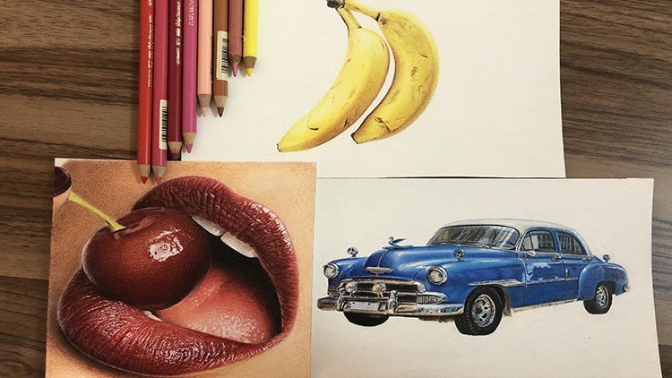
2. Materials: colored pencils, paper and other supplies: in this lesson, I'm going to go through all of the supplies that you will need when blending color pencils with solvent. So I'm gonna start off by talking through the colored pencils that you can choose for this technique. Now, when it comes to colored pencils, I have yet to come across a brand of color pencils that doesn't work with the solvent technique. So the technique that I'm going to be displaying in this class is where you use solvent or an odorless, minimal spirit. Something like that to actually blend out your colored pencils. Andi, I've tried cheap brands of color pencils like Cray Ola up to the really expensive brands of color pencils like Karen Dash New minutes on. I haven't come across a brand a color pencils where solvent doesn't work with them. So don't worry too much about what color pencils you I need for this class. Jewish use whatever you have, whatever you can get your hands on. Whatever is in your budget on, they will work great for this technique. I personally will be using Prisma colors for this class. For both of the studies on these are great. They are quite affordable. But if you want a bit more quality as well as affordability, then these are a great option to go with. They have a great selection of colors, and they are wax based, which means that they have a really soft core, making them also great for using the burnishing blending effort. Where you just use the pressure of the pencils actually blends them. So those are my preference for this class. There's lots of other great brands. I also use fabric. Castell Polychrome owes quite a lot of the time now. These are oil based rather than wax based, which means that they have a harder lead and they hold their point better. But that doesn't change how they work with solvent. They blend just as well. But it just means that they are great for adding lots of detail because the point of the pencil stay sharper for longer. So if you have these pencils, then they will also work great for this class. And these are another brands that I really recommend. If you have a bit more to spend on your colored pencils, they're also really good because they have a great light Fastness rating. which means that they won't fade as much over time when exposed to light. But like I said, if you don't have much of a budget or you just want to get feel for colored pencils and you don't want to invest too much straight away that a simple pack of Craiova pencils would also work, I have you solved them with ease in the past and creative, really realistic looking drawing. So these definitely work on and work exactly the same as there's more expensive brands. So don't worry. If you have simple Crayola pencils, you can still jump into this class as well. One thing that I would recommend, though, is that they're white. Pencil isn't very good. So if you can get a white pencil in a different brand like a luminous aura prisma color white pencil, then that will be great as the creative pencil isn't very opaque now, then you also have really expensive color pencils. For example, the Karen National Luminant. They are very expensive, but I definitely don't think they are necessary, and they aren't my choice when it comes to blending with solvent because they are so soft. It just means that They work better with the burnishing technique, but you can use them with solvents. They work really well as well, but again, it is not necessary to have really expensive pencils for this class. Whatever pencils you have, though, is always fun and really useful to do a simple color Swatch charts so that you know the colors that you have available. Now let's talk about paper, and I'm gonna give you some tips on what paper to choose and to look for when using solvents to blend color pencils. Let's start with three papers that I would recommend now for blending was solvent. I always like to use watercolor paper, and this is because even though color pencils are a dry medium when you're adding solvent to them, that is a wet medium. So you need paper that can handle adding wets mediums on top of it. And so quite often I use watercolor paper cause obviously it can handle wet mediums being applied to it. I like the fact priano artistic oh cold press paper, and that is the one that I'll be using for the castor D at the end of this class. But then you can also use cheaper watercolor paper, and they will work just as well like this are tease apart of paper that I have. What you want to look for is a part of paper that's a decent weight. Something like £140 in weight is that will make it heavy duty so that it can handle lots of layering on and the wet solvent being applied to it. It doesn't matter, though, Whether you're using hot pressed watercolor paper or cold pressed, they will both work just the same. But the cold pressed does have a bit more texture to it, which means that it can handle more layers of color pencil. But that's down to preference. You can also use things like mixed media paper as long as it says it's used for wet media as well as drawing media than it should be fine. And as you can see, this toned gray mixed media paper is really thick, so it's very heavy duty on it says that it's suitable for wet mediums. So that's what you want to look for a heavyweight paper on one that can handle wet mediums being applied to it on potentially paper with a bit of texture so that it can grip onto lots of layers of color. Paper pencil. What you don't want is papers like these three. So these free have always got something wrong with them, which makes them unsuitable for use with solvent. So here I've got the Strathmore Bristol Smooth paper. The Strathmore Drawing Paper on Strathmore Charcoal paper, Now the 1st 1 the Strathmore Drawing Paper. It is a medium surface, which means that it's probably got enough texture to grip Ponta lots of laser color pencil . They specifically says it's only useful with dry media, and you'll also know if it's useful for dry media. Rob them wet media if it's very thin. So this is only £80 in paperweight, which means it's far too thin to handle the wet mediums. It would just buckle on war. Now the struck more Bristol paper is a bit thicker, but it's got a smooth surface, which means it won't handle lots of layers of color pencil very well on. So the solvent also may just sit on top of the paper and slide around, and it may not absorb and dry properly, and so will be hard to to blend, so I wouldn't recommend a paper that has a really smooth surface, even if it is heavyweights. Because you do need that tooth is while for the pencil to grip on to. Now. This charcoal paper, on the other hand, has got laid finish, so it will be very textured. But it is so thin you can see it's very, very thin paper. And so again, it just wouldn't handle the wet medium being applied to it very well. So those of a few tips on how to choose the right paper for your solvent drawings and the technique by recommend watercolor paper above all, house now for the solvent. I am using the zest it pencil blend, and I've got the Citrus free version because I found that there Citrus version made me have some chest pains, and I didn't really like working with it. I found a bit too toxic, but you can get odorless mineral spirits or any sort off solvent. A gum soul or anything like that will work great with this or even something like paint thinner. So just experiment or use what you can get your hands on. But I'm using the zest it pencil blend on four brushes. I like to use filbert brushes because they are very dense and sturdy and grateful, blending color pencil with solvents and working out all off the graininess off the pencils . I have two sizes here. I've got a size six and a size 12 on. They are both by the company daily rounding. They're not super expensive brushes, and I mainly use the size 12 1 and that's the one that will be using today to demonstrate blending with solvents. But you can see that the Filbert brushes a super dense super study, which means that you have a lot of control when blending with solvents. But again, it doesn't matter if you have really expensive paintbrushes or some cheaper ones. These were fairly cheap. You can also use call timbers if you don't currently have brushes, and you just want to experiment with this technique and see if you like it before purchasing. Some Russia's cotton birds work greats because they're also obviously very sturdy and grateful, getting into those smaller details and blending, so they are another great option. But I won't be using those today for this class now for the sketch outline. I've also got simple hate Beav mechanical pencil, such just to do the sketch outline and here amusing some Scotch magic tape, which I'll use for the border when we do our final study. But that is all of the supplies that you'll need for this class. And so let's get started with our first demonstration, where I'm going to go through how to draw two spheres. I'm gonna teach you all of the techniques you need to know.
3. Shading with colored pencils- tips and mistakes to avoid: in this class. I'm going to go through some tips on how you can shade your color pencils to best prepare them for blending with solvent. And so I'm going to be drawing two spheres in this first lesson on going to go through the proper layering techniques with the green sphere. And then I'm going to go through some mistakes that you need to avoid when doing your shading with the red sphere. And here you can see the final results. After we've completed this lesson, you can see how nice and smooth shading looks on this. Corinne Sofia on dawn, The red sphere. You may already be able to notice some of the mistakes that you'll need to avoid. Now let's get straight into it. And for the green sphere, I've just got three different shades of green, a light green and mid tone green and then a darker green as one as a white pencil. And it doesn't matter what shades of green that you have, but I recommend having a few different sort of values of green, a lighter one on the dark, ones that you can get in some of those lights of values as well as some of the shadows. Now I use thes scotch tape to draw a circle for the sphere as a guideline, and I use the needed a razor just to make sure that that graph right sketch wasn't too dark . Now, the first tip that I have when doing your shading is try to hold your pencil further back. You can see that I'm holding my pencil quite far back. I'm not holding it right at the front, and this is great because it helps you to get nice and even shading on. This is because you are applying an even pressure throughout your shading because you're holding it further back. You replying less pressure to the pencil, and therefore it gives you more even shading across the area. Also, you can see that I'm being very light handed. I'm not applying much pressure, and that is a great benefit of using solvents. Toe blend your colored pencils. You don't need to go in with a lot of pressure. You can just be very light handed and build up your layers gradually and get a beautiful, vibrant result. Also, you'll want to go in circular motions and keep your pencil strokes fairly close together because one of the key components of blending with solvent is that you have enough pigments down on the paper before you go in and start to blend. It's so important that you've built up enough pigment, enough color pencil on the paper before you blend so that the solvents has enough pigment actually fused together to remove all of that graininess. You can see that I started off with the lightest green and sort of shaded in the light of values off the sphere. The light source is coming from the top right hand corner, so that's where it's lightest. And then it's darkest on the bottom, left hand side off this fear. And I'm using my mid 10 green just to build up some of the shadows. Further on, when I'm building up these darker values, I'm not applying any more pressure to the pencil. I'm just simply building up more and more layers on because I'm using cold press paper. The paper has got a lot of texture to it, so it can grip on to lots of the color pencil without you having to apply a lot of pressure , and you can see that I'm making sure that I overlap all of my pencil markings so that we've got some really nice smooth shading on. This really helps minimize the graininess because we are fitting in a lot off the white of the paper here and the way that you can fill in war. White of the paper is just by going over and over each area multiple times, using circular motions and working in layers. And it will catch the white of the paper and those crevices at different angles, and it will minimize the grainy look. And then when you blend with solvents, you can completely eliminate any graininess. I'm now building up some even darker shadows with the darkest green, and I like to work from light to dark. But I'm doing this method, and even in the lightest areas, you still need to make sure that there's enough pigment down on the paper that is crucial when blending with solvent. To get rid of any graininess, like I said, and to make it look like a painting, you've got toe have enough pigment down on the paper, which means that even in the lightest areas off this fear. We need to make sure that there's some sort of pigment down. So for any of the highlights, if you haven't added much color with the green like I hadn't, it's important to go and add a layer of white pencil so that there's still some pigment down on the papers that when we use the solvent, it can still fuse those colors together. And you can keep and preserve that highlight as well as sort out any graininess. That's an important tip I want you guys to remember is when you are doing your lightest areas. If there's not a lot of pigment down on them, compensate by shading a bit of white in those areas to bulk up the pigment in that area and all I mean by pigment is just the amount of colored pencil that's down on that area off the paper. I'm just using a gray pencil just to get in the shadow for the sphere and its darkest right , where it meets with sphere. And then it gradually gets lighter, which means that I will have to go in with the white pencil around the edges where it's the lightest, just again to bulk up the amount of pigment that's down, but the whole time on keeping a very light hand. But if I need to do something in a bit more detail, like when I wanted to go around the edge of that sphere, I move my hand from the back of the pencil more towards the front second, have more control and get Morva defined edge. So now I'm gonna go in and add a bit of green to. That shadow is, well, just for the reflection off the sphere. And so the key tips that I want you to remember from this fear is toe. Keep building up lots of layers so that the pencil strokes are overlapping so that we are reducing the graininess and the white of the paper showing through. Also used a white pencil toe. Add pigment to any of your lightest areas and go slowly. Hold your pencil further back. You don't have to keep your pencils to sharp when you're doing this step as you'll see when I do the final study, I don't keep the pencil super sharp. It's not necessary, but it does help produce the graininess on the white of the paper showing through. If you do have a sharp pencil as the point of the pencil can get into all of the nooks and crannies of the paper. So I really recommend doing these spheres demonstrations before you go into the final project toe, warm yourself up on practice these techniques and get a feel for how much pigment is enough when blending with solvent. You'll know if it's not enough because you won't be able to get rid of all the graininess because there's simply not enough pencil down on the paper to blend out and get a smooth look. Now let's demonstrate the mistakes. And again, I'm just using a few different shades of red. The first mistake that you want to avoid is making your pencil strokes too far apart. You can see that even though I'm overlapping some of my pencil strikes and going in different directions, there's still a lot off gaps between each of the pencil strokes and all of the shading. And those white gaps are going to give us a really grainy result because there's not enough pigment down on the paper. If you're leaving large gaps between your shading and you can vividly see your pencil strokes. Then it's gonna make it a lot harder for your solvent to give you a smooth result. You're making it have to work a lot harder to get a smooth result. Where, as you can see with our green sphere, it's already pretty smooth. The solvent won't have to work that hard to give a really smooth, nice result. Where is with this fear? It's very messy on being very careless. My pencil strokes very messy on. I'm also holding my pencil more towards the front so you can see that some of the pencil strokes of darker than others. And it's all very inconsistent, which means that's gonna be super hard to blend this out and give a really smooth result. Another mistake that I want you guys to avoid is applying too much pressure. It can be very attempting when you want to go darker, just simply to apply more pressure. But again, this might give you pencil strokes that's like darker than others. It's harder to keep a constant pressure if you're applying more pressure to the pencil, which means that when you blend with solvent, you may have stumbled pencil strokes that is showing through and that can't be blended out . And so, if you want to have a really smooth result, avoid applying too much pressure to the paper because you will have a couple of stubborn pencil strokes. They're really ingrained since the paper that are hard to fully blend out. And also the main reason you don't want to apply too much pressure straight away is because you're flattening out the tooth off the paper, which inhibits the ability to actually build up lots of layers on top. And when we using solvent, we want to do a layering process. We want to have a base layer and then blend out with solvent, then bill details on top. So if you apply a lot of pressure at the starts, then when it comes to adding more layers on top of the solvents, the tubes, the paper may be flattened out too much and damage too much that it can't hold on toe all of those extra layers of color pencil that you want to add on there. So the less pressure you add to the pencils, the more layers that you'll be able tow ad and so the more depth you can create in your drawing. Another mistake that I'm doing with Sphere is are not adding white pencil to the highlighted areas. I've just used that little bit of red, but I'm not adding any extra pigments. And so what you will notice when I blend out is that it looks very grainy in this area because it's simply not off pigment there to blend out all of those pencil strokes. And so here are the final two spheres. I really hope you found that the tips in this clash useful, and I really encourage you guys to test out these techniques yourself and get comfortable with them before you blend with solvent. And that will be what we're focusing on in. Our next lesson is how to blend with solvent.
4. Blending with solvent- tips and mistakes to avoid: Now that we've added our Baisley shading twice fears in this lesson, we're gonna focus on blending it out with solvent. And so I'm gonna give you all of the tips that you need to know our mistakes to avoid. When blending with solvent, he can see the final spheres. After we have completed this lesson, you can see that with the green sphere, all of the graininess has been removed. And it looks really nice and smooth on with the red sphere. That definitely a few mistakes on problems that we will be talking about so that you can avoid them on Do not make them when you do your final project. So things that you'll need to have on hand for this lesson is a bit of tissue paper on also your brush or whatever Brendan tour you've decided to use and you're solvent again. I'm using the zest, it pencil penned, and so you want to start by getting some solvent on to brush on. I just wiped the solvent off onto my brush just to make sure that my brush is nice and clean and you can use the solvent actually clean your brush. I then make sure that once it's clean, I removed all of the access solvent from my brush by again tapping it onto that tissue. And I simply start working in circular motions from the lightest area off my severe, which is the top right hand corner, and I move around and gradually get to those dark areas, and I'm applying a bit of pressure to the brush to really work in tow. All off those pencil strokes on buff the mounts get rid of any graininess, and really, you don't need much solvent on your brush at all, so make sure that you remove all of the access onto your tissue. When you feel like you need a bit more solvent, just dunk the brush again into the solvent pots on. Then remove the excess on that tissue before going in to your drawing again. And it's super important that you remove the excess solvent from your brush onto a bit. Paper bibs, tissue paper or a tea towel. Something like that, a cloth before you go in and blend your drawing. Otherwise, what will happen is the solvent will spread and you'll have a horrible oil stain, which you'll see in a minute. When I do the other sphere spoiler alert as they could see the I'm gradually working from the lightest areas down to the darker sections off the drawing. And the reason that I'm doing this is because if you was to start at the darkest areas and then go on, blend the light areas, you'll be smudging all of that dark color pencil into those lighter areas, and you would lose all of your highlights. So that's why I like to work from the lightest sections and gradually build out to those dark areas and blend out those darker areas. Last. But remember, you really do not need a lot of solvent on your brush when doing this a little bit goes a long way a lot further than you may think, and you can see that I'm going in those circular motions and it really has removed all of the graininess and buffed out all of those pencil strokes. Now, whenever you want to move on to a different color like I'm now gonna blend the gray shadow , you want to clean off your brush that you don't blend green onto that gray area, so I'm just taking a bit solvent onto my brush on making sure that I scrub it on the tissue to get rid of any bits of green that are on the brush still, and then I go in on. I can blend the new color. I can blend out the gray shadow without getting any of the green from the sphere onto this area. So whenever you're switching colors and blending a new color, make sure that you remove and clean off your brush. Use in the solvent so that you don't smudge the previous color onto the new area that you want to blend out. And so now you can see that this fear is really nicely blended out. It looks so much more vibrant. All of the colors are nicely fused together. It's got really painterly look, and you can't see any of the pencil strokes or any graininess. Now let's move on to the red sphere, and there's definitely a few things that you want to avoid doing and that is donkey or brush into the solvent and forgetting toe. Wipe off the access. If you have too much solvent on your brush, what will happen is when It will be very hard to control when blending out the color pencil , because I would just be so much wet medium down, and it's just gonna make it very messy when trying to blend the color pencils. So having a little bit of solving on your on your brush will make it easier to control the blending process. But also, if you have way too much solvent on your brush, you're going to get a stain. Form a wet stain around your drawing, which will see when this has dried. Also, what I did wrong here is I was blending from the darkest areas into those lighter highlights on. What you can see has happened is that we've smudge some of the red onto those highlights, and they are no longer as bright as they waas. Also, I haven't cleaned my brush off here, and you can see that when I've gone to blend out the gray shadow. I've transferred a lot of that red pigment onto the shadow and completely ruined it, and you can see how much pink residue red residue has been left on my brush. So it's so important that you clean out your brushes before blending a new color. So here you can see the green sphere close up. Once it's fully blended out with solvents and compare it to that red sphere, you can see that we can still see a lot of the graininess because we left a lot of space when we did this shading. You can see that the solvent wasn't able to blend out all of those pencil strokes. And also we got this horrible red stain on our nice shadow. Whereas we have not got that with the green sphere because we cleaned out our brush. Now here you can also see the ring very faintly formed around the left, on side off this fan. Where is that oil stain? And so that is it for this lesson. Those are a few tips for blending out your color pencil with solvents off, demonstrating this a lot more when we do our final study. But now, in the next lesson, we're gonna focus on layering color pencils on top off the solvent layer and adding seen shadows on highlights. One thing that you want to make sure that you do before jumping into the next lesson is wait for the solvent. Dry weight for the cell layer to dry before you go in and add any more color pencil on top , so it will only need about five or 10 minutes for it to dry.
5. Layering colored pencils: in this lesson. We're gonna finish off our green sphere just by going in and building up a few more shadows on highlights, and I'm gonna show you how easily color pencil layers over the top of previous layers of color pencil. When you use a solvent to blend, your color pencils out and he can see the final sphere was. We go in and add a few shadows and highlights. Now it's important when you do your color pencil drawings to make sure that they have a good contrast. So you may notice when you blend out with solvent that you want to go in and deepen Epsom shadows or add some highlights. And the great thing about blending with solvent is that you can totally go back in and lay a more color pencils over the top when she blended with solvent because it's sort of breaks down all of the pigment of uses them together. It actually makes a really nice base to build more layers of color pencil on top of something that it's very hard to do if you don't blend with solvent, so actually gives it a new lease of life, and it makes the color pencil easily stick on top off that previous layer of color pencil, even though we've built up so many laser color pencil the first time around when doing our bass player so you can see that I've gone in with a white pencil just to add a few highlights. And now I'm going in with that darker green. And I'm just bumping up the shadows a bit more, making them bit darker so that this fear stands out a bit more and it pops a bit more because we are heightening up the contrast, and you can see how easily this color pencil glides on top of our base layer of color pencil. And that is one of the reasons that I love using solvent. It just makes everything such an effortless process. You don't have to apply a lot of precious still to build of these dark shadows. Even when you get into this stage where you're now probably on your third land, you don't have to apply a lot of pressure any point in the drawing process because of how easily the color pencils glide on top of that first base layer. After we've blended with solvent, so you'll notice a lot that when you blend with solvents, that's just sort of a bass player. I often used this final layer to build up a lot of details, especially if I'm drawing something like an animal study. I will get in all of the base values first in the base colors and then once off, blended with solvent. I then focus on adding in all of the details is pointless to do the details first because they simply get blended out with solvent. So it's great that once you've blended with solvent, you can actually add in so many details. And it's actually so much easier to add details when blending with solvents. Then it is with any other blending technique I have found. And so that is why I love using solvent, especially when I do animal studies because of when you're drawing for, you need to include a lot of detail, and this technique aids itself so nicely to building up a high level of detail. And we'll practice that a lot in our final study where I get to show you how easy it is to build up a large levels of detail and to get that layered look in a drawing by using solvent. I'm also using the white pencil. Just smooth out the edges of the shadow and you can also go back in with your solvents on. Blend out certain areas that still look a bit grainy once again. So you can't. You don't have to just do the solvent trick. Once you can go in and blend with silver multiple times in the same area, so you can add a bit of shading at some shadows and then blend this house with solvent once again to keep it really nice and smooth. One tip that I have if you're doing that, is the more layers that you add, and the more times you blend with solvent, the less amount of solvent you need. So when you're blending with solvent for the second time, you need even less solvent on your brush to blend than you did the first time. So make sure that when you're blending was solvent again for a second time. Like I'm doing now, you really make sure that you get off all of the access solvent onto a bit of tissue? Is that you only have the bare minimum on your brush. Otherwise, it may disturb all of your layers of shading that you've done underneath is most effective when you have minimal solvent on your brush. So much so that you feel like you've got rid of it all on the tissue. You only need a trace amount of solvent when you're trying to smooth out small areas of shading like undoing. Now you can see how much more this sphere pops. Now that we've been able to go in and add some highlights and deepen up some shadows and make sure that you complete this lesson yourself on your sphere demonstration that you've created and you practice the layering on top off the solvent on blending was solvent for a second time so that you can engage how much solvent actually takes to smooth these areas out for a second time. And so now that we've practiced these techniques, I think we're ready to go in and actually apply them to a final study. And we're going to be drawing a cat. So get your supplies ready on Let's get started
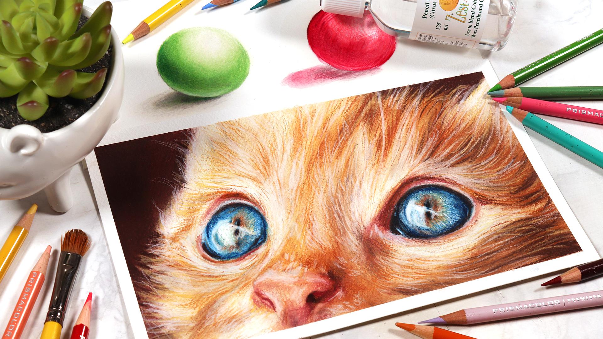
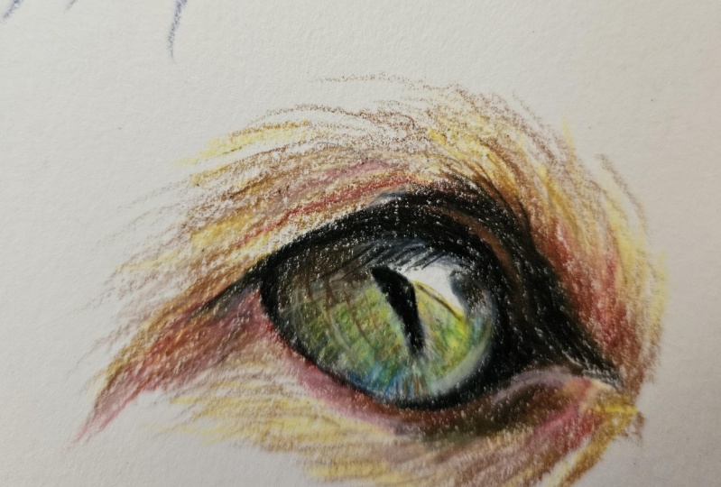
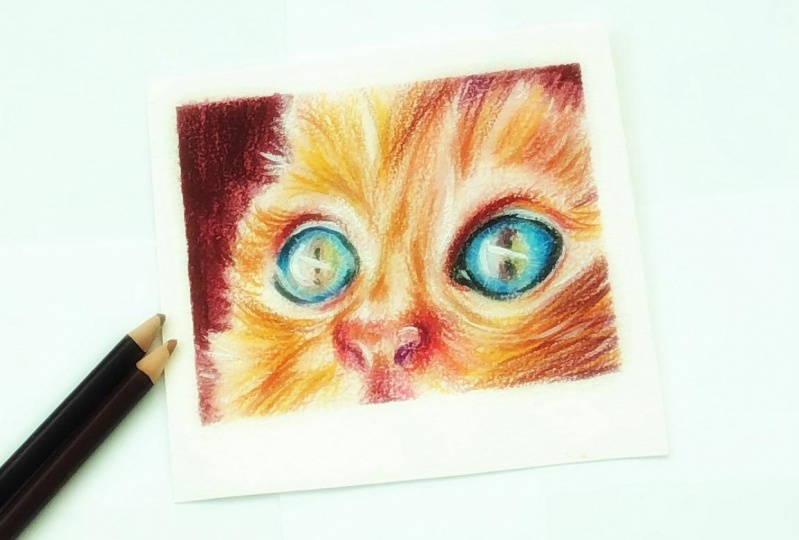
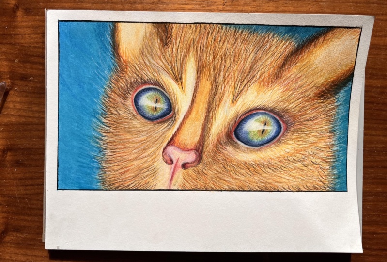
6. Final animal study: part 1: now that I've gone through some basic tips about how to blend with solvent, how to do the layering in the shading on also, how to actually blend out with solvent is time to put all of those techniques that we've learned into practice on. We're gonna do this really cute study off these cat eyes, focusing on the cat eyes, but also the for on the note on a bit of the background as well, to really practice what we've lent. Now let's start off by going through the colors that I'll be using that thought. This study. Now, you don't need to use these exact colors that I'm using. Just use whatever you have that is close to the ones that I am showing you here. So, firstly, for the for, I'll be using again all prison clothes apart from the white pencil, which is Karen Dash. I'll be using Jasmine for the bass player for the for or so mineral orange to add a bit of vibrant seat to the firm. Off also got burnt Okha, which is more of a warm turned brown, and for the shadows. I've got a dark brown, all of the's colors will be listed out in the materials in the resources for this class, as well as the reference on the sketch outline for the cats roaring as well for the nose. I'll be using Peach and Hannah for those flesh tones and then for the eyes. I've got this really nice light green. I've got a nice light blue and a dark blue as well, so the light blue is called cloud blue on. Also, we've got this really nice light. Bluey Green. You don't have to know the exact color names, but I will list them out and we've got an indigo blue full the brush for blending with solvents. I'm using that size 12 filbert brush by daler Brownie on again. I'm using the zest it pencil blend for the solvent in terms of paper. I am using the cold pressed Fabbiano artistic awards color paper for this study, but you can use any watercolor, paper or paper designed for use with wet mediums and has a decent texture to it, so you can see that I've already got my sketch outlined down on the paper and, like oh, said the sketch outline as well as the reference image will be attached as downloads in the resources folder for this class so that you can use this and get this down onto your paper before you start. I'm starting off by taking the indigo blue, and I'm using this on the eyes to start off with. The cat had some really nice blue eyes with hints of green and brown around the people. I'm not actually using a black pencil for this study. Instead of I'll be layering the indigo blue and the dark brown to give the look of a really natural dark black color. And you could see that we're playing the navy blue to the pupil and also many the outside of the eye. So at the top weathers a nice shadow and basically around the outer edge of the whole I and again, you want to keep a very light hand. You don't need to apply a lot of pressure at school and still follow the tips that I I gave you in the previous lesson when we went through how to shade with the color pencils to best prepare your drawing for blending with solvent. Now I'm going in with that dark brown and I'm simply layering this over the top off the blue because, like I said, when these two colors mixed together, they'll give a really natural looking black. And so I'm layering the brown over all of the darkest areas that I can see when I look at the reference for the eyes. So that's the pupil. And again, the inner corner off the cat's eye and around the top on the bottom edges of the irises. Well, and I'm gonna repeat that for the other. I you can see that I'm keeping my pencils fairly sharp as this will help to get rid of all of the white of the paper because, like I said in the previous part, the pencil is able to get into all of the nooks and crevices off the paper. And as we know, the more pigment that's down on the paper, the easier it is for the solvent to blend sound. Also going in with that light blue, the cloud blue. I'm using this to fill in the rest of the iris. Apart from the highlighted areas that you can see in the reference, you can see that there's quite a large highlight in both of the eyes. And so at the moment I'm just preserving that highlights, and I'm not applying any of the blue to that area. We're also going back in with the indigo blue and just tying the shadows that we've applied first with that light, a blue area so that it goes from that really dark, shadowed color gradually into the lighter blue. And it's important to go back and lay the color pencils if you notice that they're lacking a bit of pigments and they and then taking that green and I'm focusing that around the edge of the pupil, especially around the top. I don't also start into a price some of that green into where that highlighted area is, and I'm gonna repeat that process for the other. I, like I said, with the color of this cat's eye, is mainly blue. But then, as you get around the pupil, there's this nice, greeny brown tone to it. So that's why I'm adding most of the green around. The people are now going in with the bunt Okha, which is this warm brown tone, and I'm also lightly layering that around the pupil is well around the edge of the pupil, and at the moment the shading looks very grainy. It's gonna look so nice and beautiful when we blend with solvent. On what? Also going to get rid of all of this graininess. The colors are gonna become so vibrant on the colors, actually become darker when we blend with solvent as well, which you may have noticed for my previous demonstration. Now, Like I said, it's important to go in with a white pencil and fill in the lightest areas that haven't already got much pigment down. So I'm taking the white pencil, and I'm just layering the white for the highlights in the iris. I'm now going to take the peach time, and I'm gonna start to lay this wherever I can see flesh colors in the reference. So that's mainly around the top and bottom of the I just above and below the eye, and also, of course, the nose. And you can see that because my paper has got quoted quite sort of texture to it. It really picks up a lot off the color pencil. A lot of that color pencil comes off onto the paper, and this really helps because you don't have to work super hard to get a lot of pigment down onto the paper. I'm now layering the same peach color for the nose, avoiding the nostrils because they are much darker. And I'm also avoiding any highlighted areas that I can see in the reference as well for the nose, which has made me in the middle that middle section of the nose on a little bit at the top . There's also a slightly yellow tinged twit, some taking that jasmine color, which is this nice light yellow. It's creamy color, and I'm layering that for the highlights as well. Now for the nostrils, which are darker. I'm first going in with that brown that dark brown and establishing the darker shadows that conceding the nostril. And then I'm going over the top with Hannah Color. And this is a great shadow tone for the nose. Wherever I can see more shadow in the nose on going to lay out some of the Hannah and so there's a bit more shadow on the right hand side of the nose as well as the nostrils. Those three areas that I'll be mainly layering this henna color. So this is a nice deep ready plum color. And like I said, it doesn't matter if you don't have these exact shade names. Just have whatever you have on hand that is close to this color was. Most important is that you are using colors that are the same values. So if you don't have a hand and make sure that you have the color that is similar, but that is darker than the peach. Now I'm going in with the white pencil, and I'm starting to add a bass player for the for for the highlighted areas. Now, some of the areas of for for the cats are pretty much white, so I'm very much aware that I won't be adding much pigment to these areas with the other colors. So that's why I'm going in first with the white pencil, and I'm just establishing a base layer of pigments down on these really light areas of for so that I'm sure that will have enough pigment when it comes to blending with the solvent. Then for the other areas of for I'm going in with the jasmine, and I'm just simply shading a base layer of jasmine all over the other areas of the for No , you don't have to worry too much about adding details because it's all gonna be blended out anyway. So when it comes to getting in the firm, I sometimes do pencil strokes going in the direction that the first going in, if there's very if there is a very obvious direction. Otherwise, I'm just using circular motions to get in that base layer all over. The firm in this lesson would just establishing the colors for each area. We really aren't work worrying about adding detail or texture. We'll focus on that in the final part of this study. At the moment, you just want to identify what is the main color of each area and layer that in and block in those colors. Now I'm starting to build up more of the mid tones now that we've got that lighter color established as a base value on going in with that mineral orange, which is a nice and natural orangey tone because the cat's fur was more ginger college on. I'm just using this to start Teoh build up more of the mid tones, and again I'm gonna apply this color in quite a few areas of the for all of the areas, apart from the lightest values in the for and again, it doesn't hurt to go in the direction that is going in, it will all add to the realistic effect onto the texture of the firm. Now, if you look at the reference, you can see that with the for there is more of a shadow on the right hand side of the cat, then on the left hand side. So we'll be targeting a lot more of thes darker colors on the right hand side than we are on the left. Because the left is in more lights, it's got more like hitting it now. You can also add some of these colors on top of the White Aires of for because quite a lot of the time there will be the odd bit of for within white areas off from. But I'm trying to preserve those highlights as much as possible for now. So the moment they pretty much just got that first layer off whites that I applied at the start. I'm now going in with that bunt. Okay? Andi, I'm just working from light to dark, building up the's shadows now with these darker colors. So we've got in all of the highlights we've got in those lights of colors with the jasmine Andi with e mineral orange. Now it's time to build up those darker shadows to really add depth and contrast to add roaring but going in with this dark brown on the burnt okay, to start to establish those darker values on. Like I said, we're mainly adding these dark colors on the right hand side. Off this drawing, I'm shading a lot of the dark brown so that it really has those darker shadows in there. We want to utilize the full range off the value scale we wanna have the really bright highlights on. We also want to have some of those intense shadows bear in mind as well that as you blend with solvent, these colors will appear darker. So half that's in your mind as well that these colors will look darker and more vibrant when they're blended with solvents. So leave a bit of wiggle room for that. You don't want to darken something up a lot and get it perfect with shading and then add solvent, and then it becomes too dark. So account for that when you're doing your shading. I'm also layering that dark brown just for the background, a little bit on the right hand side at the top. But mostly it's this section, right on the left hand side that we can see, and I'm just gonna combine the dark brown Onda, also less some Hannah over the top to give an accurate color for the background. And the dark value for the background is nicely contrasting against the light for on the left hand side of the cat. And so that is it for the layering process and now are drawing is ready to blend with solvent.
7. Final animal study: part 2: in this lesson, we're going to blend out our cat study using solvent. So just to recap the supplies that your need for this lesson is the brush. So if you're using a brush or cotton Virgil Needle blending tour, I am using the Filbert brush size 12. You need your solvent. I'm using the zest it pencil. Blend Andi. Then also, I recommend you have some tissue or towels that you can wipe off the excess solving from your brush. I'm going to be using the exact same method that I did when we did ask FIA demonstration. So it's super important that you blend the lightest area first and then move your way to those darker areas. So when I'm blending out the I I started with the highlights and now on gradually working my way to the darkest areas of the eye, which is that dark blue and brown that would go around the edge of the I. Otherwise, we'd really muddy up our colors and end up lending these darker colors into the lighter areas. So remember to work from the lightest area to the darkest. Also, remember to remove all of the access solvent from your brush and clean the brush. When you're blending different colors, for example, we are blending the eyes, which has got a lot of blue in them. And then when you move over to blending the for, which is yellow or even lighter than that, you want to make sure that you cleaned off your brush of the wise, your end up adding blue by accident to the for, and that's very hard to remove. Now I'm blending out the flesh tones underneath the eyes, and whenever you can see my hand out of frame, I'm just picking up more solvent on the brush on wiping off on my tissue just the same as I did before. And it's really, really useful to not have too much solvent on your brush because it allows you toe buff out the pencil strokes and get a really airbrushed luck. Whereas if you use a lot of silver and you don't quite get that saying result, so you actually get a better result where using less solvent so now cleaned off my brush, and now I'm going in and I'm starting to blend out the for around this I now going to repeat the same process with the other I cleaning off my brush again, going from the lightest highlight, working my way out to the dark a blue areas of the I, and you can use a small a paintbrush if you want. For these smaller, detailed areas like the people, you can use a tiny paintbrush. You don't have to use one this big if you want to have more control when you're blending areas like the people that I definitely suggest that you switched to a smaller paintbrush. I've just got a lot more experience and so I can manage blending out there small areas with this brush on maintain control now going in and I'm blending out the for just below the left eye once again went on, blending the for starting with those lighter areas many of the areas that we added that base layer of white shading to. And then I'm moving on to those dark areas of for I'm starting on the left hand side with the for because that is the area that was lighter because the cats has got the light hitting it on the left hand side and then the right off the cat. The right hand side of cats for is in more shadow in makes sense to start blending out from left to right from the left, where it's lighter to the right hand side, where it's DACA and maybe ongoing in circular motions to get rid of all of the graininess. Even though we're painting while drawing in for you don't have to worry about details at the moment, so you can just buffer out in circular motions, and you can see how vibrant the colors look and how the eyes now look like a painting rather than a drawing. Now, blending the for just above the nose and remember to avoid the look of oil stains of round your drawing. It's important that you get off. He access solvent sheikhoun. Dip your brush into the solvent as many times as you want, but just make sure that you're only using a little bit at a time. Yes, you could dip your brush into the solvent, not double off the excess, and get it done in one go. But you would have a lot off the cage with the solvent. It will disperse a lot on give you those oil stains. Now I'm blending out the darkest areas of the firm, and when you're blending out for you can blend in the direction of for is going in. So if you do have any blending marks showing through their already going in the direction, the first going in and so it will add and enhance the texture of the for so that those streaks are acting in your favor and working in your favor. Rather the making the drawing look messy, spending out the nose as well, lending out the lightest area off the nose and then going down to the nostrils, blending especially that right nostril, which was a lot darker. Blending the outlast. Make sure that between each color you clean off your brush. Get rid of any off the excess residue from that previous color so that you don't contaminate these of the areas, and you can see that I've not in the background yet. I'm going to leave that to lust because that is the darkest areas on. We're blending from the light areas to the dark areas. You can see that in some of these light areas of for I'm actually pulling down some of the color intentionally into those lighter areas to tone it a little bit. So if you do notice that an area is a bit light, you can drag some of that color down into those lighter areas to tone it obits and give it a darker value. No, finally, I'm going in on blending out the shadow in the background, the really dark background going in circular motions because we want this to be a flat color. So you really want to get rid of a lot off the graininess, all of those pencil strokes. So you could say I'm really buffing it out. We're going in circular motions, and it helps to give ready full coverage by not having too much solvent on the brush. Because if you had a lot of solving, it would really don't loot and thin out the color pencils. Where is when you don't have much solvent on their The pigment stays a lot more and you get a nice, thick, opaque coverage, whereas with lots of solving, you really dilute and give a watery luck to the color pencils. And so the graininess shows for a lot more, and so does the pencil strokes. But now we finish blending it out with solvents on a really important thing to do is wait for the solvent to dry before you go in and build up your next layers of color pencil.
8. Final animal study: part 3: in this final lesson, we're gonna finish off. This can't study by adding in all of the detail and texture to the firm on. Also, add some shadows and highlights Toe Admiral contrast and definition to our drawing. Somebody start off by working on the eyes, and I'm simply gonna layer the same colors that I did in the first lesson of the study, just over the same areas, just again to darken them up a bit more so you can see that I'm going in with the dark blue , and I'm adding that again around the edge of the eyes just to add another layer. Adding another layer gives it more pigment and therefore gives a more concentrated and darker results. So you can high put the shutters just by layering the same color again in that area, Also going in with the white on brightening up. The highlight in the iris Whitely is Rudy nicely on top of color pencil when you blend with solvents, even on top of those dark areas. So that's why this is a great technique for drawing for us. Well, because you can lay a lighter colors over darker colors. Ah, lot easier than you can with other blending techniques like furnishing. I'm gonna go in with the green color again. Just layer that around the edge of the pupil just once more just to give a more concentrated looking to make it bit darker, more vibrant. And I'm also layering a bitter that where that highlight is because it's not bright whites , there is a little bit of color to it, and really, I'm just going in with these colors into the eye again. Just that had a bit of definition, a bit of clarity to the eye on. Also, add some details so you can add patterns in the iris as well as darkening up the values and adding the highlights. You don't really need to do a lot of extra work, really. The solvent has given us such a route a nice base. There's just additional little tweaks. And these little tweaks, though, are going to make the I look so much better with very little efforts. As you can see, the left eye pops so much more than the right one. Just because we've been able to go in and add a bit of definition and dark in of the shadows and brighten up the highlights a little bit. Also going to take that white pencil and start to Bryson up and establish the highlights on the nose. You can see how effortlessly that white pencil glides on top of that paper and how brights we are able to get these areas, even though they have darker colors already added to them. So it's really easy to go back in and pull up some highlights and add the shadows because of the fact that the light colors easily layer on top off those darker values. And now establish in the highlights in the other eye, using the white pencil again on When you're doing these details, you want to make sure that your pencils of really nice and sharp so that you're able to get all of that nice, crisp definition that you're looking for and all of those little details. It's very important that you wait for the solvent to dry before you go in and add in all of these details. Otherwise, you risk damaging the paper. If the paper is still wet and then you try and apply color pencils on top of it, then the papers in a fragile state, and so you can risk damaging the paper and tearing its if you got thin of paper and the colors won't be ableto layer as well, on top of what paper are mainly going in with the white pencil now and just pulling up the highlights, some going over the nose again, and I'm going over those lighter areas of for and just brighten them, brightening them up once again. I'm also started starting toe ad bits of for texture. Now I'm gonna establish the shadows for the right high. We added in the highlights, but we haven't added in the darker collision that we haven't added in the Browns and the Blues. We just started in the white so far on the right high. So now I'm gonna do the same thing that I did with the left eye earlier and just do the exact same. There's exact same steps with the right eye now. So going in with more off the brown, more of that dark indigo blue and adding that around the outer edges over the I the outside of the eye, and you can see how that dark brown and that dark blue has merged together to give us this really nice, deep black tone that looks supernatural. I'm also going in with that dark blue and adding some little details, these little lines going from the outer edge of the iris and going towards the pupil to give this really intricate looking pattern to the I, which will help add to the realism because you're adding more detail. And I'm just blending over the top without, with a bit of the lighter blue to soften out those harsh details that I just added him with the dark blue. I'm also going back home with that green, and once again I'm just layering that on the right high around the edge of the pupil. And I'm doing the same thing with the Burt Oka just to intensify those colors. And you can see that the eyes look a lot more realistic now, have been rendered a lot more a lot more detail on. They pop more because he that there's no white of the paper showing through the solvent has give us a really nice base layer by refusing all of those colors together and filling in all of the crevices of the paper, and so it looks a lot more like her painting than a sketchy drawing. I'm now going over those flesh tones around the eyes using the Hannah, and I'm gonna use those colors too dark, and Upton knows so once again, using the hand of mainly on the right hand side of the knows where it's darker, where it's in more shadow just going over the nostril. Just intensify those shadows, and I'm doing the same thing around the other. I and I'm also layering more off that peach for those lighter areas of flesh color underneath and above the I. Now, Like I said, if you have any areas that look a bit grainy when you add a second layer of color pencil, then you can always go in with the solvent again wherever you need to to soften out those areas a bit more. But remember, because you're blending out for the second time, you don't need as much solvent on your brush. So really scrub it on that tissue to get rid of all of the access. If you're going to soften out second layers of color pencil and you can use the solvent technique as many times as you want. I've seen people do 10 layers where they're adding color pencil and then blending with solvent and then adding more color pencil on blending with solvent, especially if you're doing something like an out of focus background. I've used solvent in layers quite a lot where you build up three or four layers to achieve that really soft background. So don't feel like you're restricted to blending one time with solvent and that you have to get it perfect the first time you can go in and lay amore color pencil and blend it out until you get them is docked that you want. I'm now going in with that mineral orange, and I'm starting to establish the details in the for now, and you want to make sure that your pencils are really nice and sharp whenever you're trying to do detail. So because I'm trying to add detail to the for now, I want to make sure that my pencils a super sharp. Otherwise, I'll get really fuzzy pencil strokes on whenever you're drawing for and you're doing the details like this. This is where you really want to focus on the direction the fur is going in an overlap the sections of first so that it's not just lows of individual lines you want across to them together. So it looks like groups of I'm using the burnt Oka to get in some of those darker shadows. And also, like I said, we can lay a lighter colors over dark colors. So if you look at the left hand side of the cat, especially the top of the cat and by the ear, you can see that there's a very harsh cut off point between the cat and the background. At the moment, where is because we can add light colors over the darker areas? We can add individual individual bits of for over onto the background in a minute to soften everything out and to make the cat in the background tie in together. But for now, I'm just working my way around the whole off the cat study throughout all of the for and just going in with this burnt Ocampo just going over all of the shadowed areas, adding that for texture when you're looking at the reference, you want to look at the length of the firm the way it's curving, how dense it is. Onda do your pencil strikes the same length as the for so just above the knows where the for is really short. You want to do really short pencil strokes, whereas by the ear where it's a lot longer, you can do longer pencil strokes. So now I'm going in with the jasmine on all going with the white and like I mentioned a minute ago on going in and tie in the background and the cat together by adding little bits of for going over onto the background. And it's kind of like working with pastors, where it's really easy to add light colors over dark colors. That's how it feels when I'm used solvent with color pencils, because you could just easily go in and add the's highlights really effortlessly. And that's why I recommend that when you use color pencils, you try the solvent technique because it could be a real game changer when it comes to drawing realistically, because it just makes things so easy, like adding light colors over dark colors. Now I'm going in with the white pencil. As you can see, it's really sharp so I can get these really detailed bits a for and I'm just adding some bright of its affair from the ear going over into the background. And if you have any little bits of crumbs on your paper from the cut pencil, I recommend blowing them away rather than wiped them off with your hand, just in case the solvent is still a bit where and you smudge your work, we could use a large, fluffy brush something like that, just to get rid of them. I wouldn't recommend that you use your hand to wipe off the bits of colored pencil just yet . So now I'm going in with the white pencil and adding in some of the little white whiskers that you can see just above the cat's eye. And now that we're getting into our final layer, you can start to apply more pressure to your color pencils to get them as dark. They need to be and to make those highlights really bright. So if I'm adding in really bright bits of for like those bright whiskers over the top of those dark areas, I will apply quite a lot of pressure to my pencil to get them as bright as they can get. I'm also going in with that talk of brown, and I'm intensifying the shadows just on the right hand side of the for. As you can see, I'm going with. The direction of the for is curving upwards, so making sure to to do only for going in that direction having upwards towards the and you want to make sure that each area for ties him with next So you want to do bits of further transition between each area. As you could see, I'm using a bit of solvent to soften out this area and soften out the shadows. Now I'm going in with the white pencil and I'm overlapping, highlighted bits of for over onto those shadows. So, like I just said, it's important that between different areas of for you don't just have harsh cut off points , so you don't want there to be a really harsh cut off point between the white bits of for on the dark brown, for you don't want it to be off us where the white for ends on the brown first dance. That's why I'm adding little wisps off the white for into the brown first so that it's more of a gradual transition. And I want to do that in every lake, every area where the for is changing color. You want it to be a soft transition. You want to give a nice, layered effect. I'm just finishing off this drawing now. We're going in with the dark Brown is on establishing those darker shadows, and you can go in and add another layer to the background to soften too dark. And that's up. And to soften it out even more if you feel like it still looks grainy, intensifying the highlights just above the eye with more of that white pencil. I'm also gonna add a bit of shadow just above the nose on the right hand side. But really, it's just about tweaking things and adjusting them, as you see as you see is necessary. And you have so much control when you use this technique, you really can go back and forth and tweak things, blend things out again at a bit more detail, light and things ups and dark in it, and you have so much freedom and flexibility with this technique, so you really can go back and forth until you're happy with your drawing and keep adding more details and then soften it, suffering it out with solvent and the brush if it looks a bit too harsh so you can fully relax and enjoy the process without worrying about messing up When you're using this technique, I'm just adding another layer off the brown to the background to deepen it up too high. Put that contrast a bit more, and I'm darkening up the shadow around the nose as well, adding a bit more henna to the nostrils. And I'm just finally going in with my brush with a tiny bits of solvent on its and just softening out any areas that look a bit grainy and, as in some finishing touches. But that is it for this study. I really hope you enjoyed following along with this one, and you can see how using solvent to blend makes other areas and other aspects of the drawing a lot easier. It's not just about the blending process that makes the layering so much easier and adding details so much more effective and efficient. I hope you've learned a lot of tips about how to use the solvents and how you can build up details over the top. So I'm just wrapping up destroying just by adjusting any little bits. But I think need to go darker or lighter and soften in them out with the brush. And so here you can see the final during. I really hate me like how yours turned out. And I'll see you in the next video. I'm just gonna wrap up and summarize this class.
9. Class summary: in this class, I've demonstrated how you can use solvent to really enhance your color pencil drawings make the more vibrant. Remove any graininess on really make them look realistic. I hope you guys have learned a lot of tips on how to use this technique correctly and most effectively on also, how to render a realistic looking study. Using this technique here, you can see the final cat study that we worked on in the last couple of lessons. As you can see, the solvent technique was really effective at giving us a beautiful, realistic looking drawing where we were able to lay a lots of detail on top of it. Now, if you enjoyed this class and you want to see more tutorials and educational content from me, then you can check out my editorials at Kirstie partridge dot com. Over on my website. I have got lots off courses where you can master your color pencil techniques even more. I've got courses for realistic drawing during animals during portrait, so I recommend checking out the courses that I have available on my website. Also, I offer riel time tutorials on a monthly membership site called Patron, so on Patriot. I have over 300 real time tutorials, not just for color pencil, but for other mediums, like charcoal and watercolor for as little US $5 a month Yoga access to hundreds of real time tutorials. Why take you through all of my techniques that by step so you can get access to them on my skill share profile? But thank you so much for following along with this class. And I really hope you enjoyed it. Remember toe shade. The projects that you created with the arrest of these students that took this class. I cannot wait to see what you guys produced and thank you for taking the class.
 Kirsty Partridge Art, Traditional Artist, Entrepreneur