Transcripts
1. Course Trailer: Here is how to create
advanced animation in after effects as a beginner without
years of trial and error. Watch closely because
going advanced in after effects can feel
like it takes years, especially if you're self taught like I was. I was there, too. I used to think that my
animations were good until a client told me that they
weren't and I had to refund. It hurt more when it
repeated several times, and I realized that
tutorials weren't enough. So I studied the real
fundamentals through books, blogs, podcasts and breakdowns. I started improving and
a Dutch tipped me 100 on $1.50 project
because they really liked the animation and
I delivered earlier. But what if you could
skip the confusion, the failures and borrow my
experience that I gained over six plus years of working
with clients like this. Now, this course is a
step by step roadmap that teaches you how to create
advanced level animation, even if this is your very first time
opening after effects, or you are a beginner
who is stuck in that learning loop without
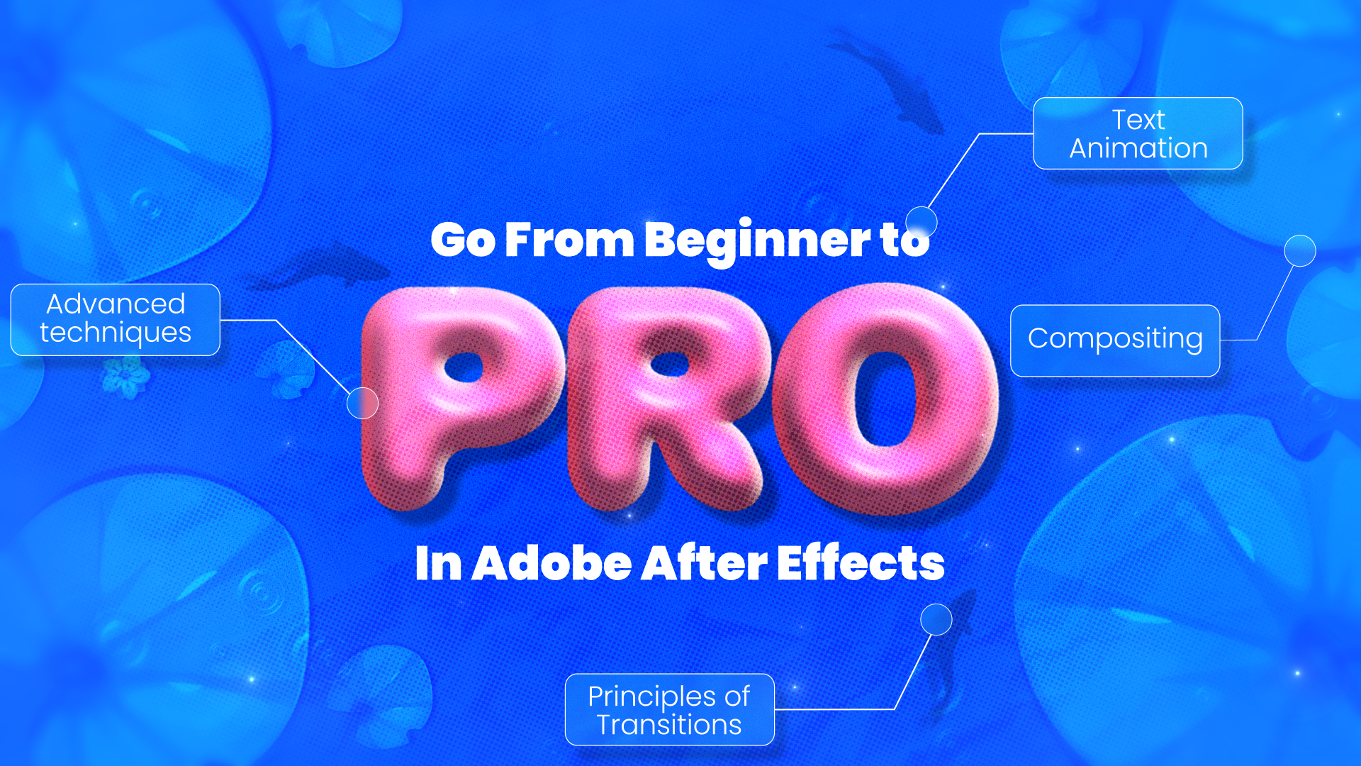
making any real progress. By the end of this course, you want just to be
following steps, you will understand what
makes motion design work. You will have the principles and fundamentals behind
transitions and high motion. You will have control over
the graph editor like a pro. You will have a full
mastery of text animators, puppet pins, trim
paths, taper, and more. You will learn
compositing principles for motion design
to make them look premium and a process that you can apply across animation, explainer videos,
logo animation, text reviews, editing, anything that you want that is
related to after effect.
2. Class Project and Requirements: Class project, you have to pick any four letter
word that you like. It can be fun, meaningful
or just something random and animate it using the techniques you have
learned in the class. We are sticking to four
letter words so you can easily follow along without
feeling overwhelmed. It is short enough to repeat
techniques multiple times, which helps you practice and really understand the process. This repeton will train you to create your own
animation confidently, so you are free to follow
along with me step by step. And once you are comfortable, feel free to make your own. Once you are done, upload your finished project to
share your creativity. For the class requirements,
you will need Adob after effects 2020 or a newer version. I'm using Ado after
effects 2024 version. The taper feature was
introduced in May 2020, so older versions
don't include it, and you won't be able to follow certain parts of
this class without.
3. Use cases Or Real Life application: Are the use cases
or I should say, real life applications
or uses of this topic that you are going
to learn in this course. Okay? So first one, if
you learn puppet pins, you will be able to create
character animations. You will also be able to create organic motions like clothes, plants, the benefits of
learning puppet pins. It brings still artwork to life. It adds subtle natural movement without frame by
frame animation. And most importantly,
it is easy to use on layered Photoshop or Illustrator assets and even PNG files. Okay, so it is very flexible. Then we have text animators. So once you learn
text animators, you will be able to create kinetic typography or
those lyrical videos, you will be able to create
title animations with character by character
or word by word control. You will be able to
create lower thirds and dynamic captions that are
popular on social media. The benefits of learning
text animators it is highly customizable with minimal
keyframes and minimal efforts. It saves time, can
save your animation as a preset and reuse
it in your project. So here is a brief example. So here is a text
animation that was done by animating position
and opacity properties. Now, this took me around
5 minutes to make. So this position and
opacity properties are transform properties. This text animation was
done with 80 keyframes, 20 layers, and making a tiny change would
ruin so many things. Now, here is the same text
animated using text animator. Is done with just one layer, two keyframes and
instead of two, I animated three properties
with just two keyframes. And here you can change anything in a matter
of seconds and you will have full control pimps
and taper for Shap layers. So once you learn trim
parts and tapers, you will be able to
draw on effects for strokes, logos, reveals, icons. You'll be able to create those loading animations
or even infographics. Once you learn trim parts, you will be able to create
stylized handwriting or path following effects. It is great for UIUX animations
and explainer video. We have graph editor. Once
you learn graph editor, you will be able to smooth out your robotic or
linear animations. It can take your animation
to a whole new level. You will be able to
fine tune, motion, timing, overshoot, bounce,
ease in and ease out. You can do so many things
with graph editor. You will be able to create expressive and
realistic animation. The benefits of
learning graph editor. So you will have total control over motion curves and
so you can control the motion and not be bound by plugins or you don't have
to compromise with it. You will be able to
make your animation feel natural, snappy, or fluid. You will have total
control over your motion. You can easily execute 12 principles of animation
if you know graph editor, hence making it a
perfect tool for creating professional
advanced level animation. Last one is the
principle of transition. So if you learn
principle of transition, you will be able to
move smoothly from one scene or one
idea to the next. Transitions keep
things connected so viewers don't feel
lost or confused. The benefits of learning
principles of transition is that it makes your animation feel
smooth and easy to follow. And remember, your transition shows how advanced
you really are. And also, it keeps people interested by adding
variety and timing. Transition also
helps different part of your video feel like
they belong together.
4. Animation Lesson from an Abused Cat: Recently saw a video where
a couple adopted a cat. Before the adoption,
this cat had been brutally abused and
carried a lot of trauma. When she arrived at
her new safe home, she wouldn't leave the
bathroom sink for some reason. That's why she felt
mostly protected. Her new family didn't
force her out. They simply let her be. She stayed in that
sink for days. Slowly, she began
accepting gentle pets. Over time, she left the sink and started
exploring the house. And today, she's deeply
loved and thriving. We all live in our own
versions of that sink. Often, it's not a physical
place but a mental. Some people call
it comfort zone. I've been there, too, and I'm guessing in some
ways you are, too. This course is designed to
help you leave the sink, not by force, but by encouragement because it's
okay to make mistakes. It's okay to fail. We all do. But I also want you to
adopt some of the mindset, the philosophy of
advanced animator. So advanced animators focus
on solutions, not problems. Instead of saying, why is this so hard or I don't
know what to do, ask yourself, what can I try right now that moves me forward? Even advanced
animators get stuck, but they don't stay
stuck. That's the they let go of the outcome
and trust the process. This is the most important one, which is, of course,
easier said than done, but they're so in love
with animation that they don't have time to worry about
whether it will get likes, views or even approval. They just show up and animate. Finally, advanced animators
are advanced because they practice fundamentals
more than regular people. They enjoy the stuff
that doesn't give instant gratification
because animation is a time consuming art. And remember, a cat must
leave the sink herself. People can help and support, but it is the cat who has
to make the decision.
5. Chap 1: Basics for beginners: Okay, so, hi. So welcome
to this chapter. This chapter is going
to be basically basics for complete beginners. So the reason why I'm making a specific chapter on this
is because I want to ensure that even complete beginners
feel confident and they don't get overwhelmed
in the later chapters. Also, if you are not a beginner, you can skip this
chapter completely. So these are all the parts
that we will be covering. Of course, we will focus
on the essential tools. For now, I'm going to explain and not the
entire software. Okay this is
basically a toolbar, and the most important
part here is this, which is selection tool. So selection tool is your
primary tool for selecting, moving and resizing, okay, all the layers that you want. So that's the selection tool. It's the most important part, and you will be using it
more than anything else. Then we have hand tool. So this one is hand tool. Now, you don't have
to specifically, go here and select this, okay. So by the way, shortcut
for the selection tool is V. The shortcut for
hand tool is H, okay? So tool is used for basically panning and navigating
around your composition. So for example, if
you have zoomed in and if you want to
navigate, okay, right? And so that's how you do it. But you don't have
to press even etch. So the shortcut for that
is basically spacebar. When you hold space bar, the hand tool will be
activated on its own, and when you let go of the
space bar, it will deactivate. Then we have Zoom
tool. So it's basic. Zoom tool helps you to zoom in and zoom out of the composition. These are all the three D tools. You don't have to worry
about them right now, but they are basically related
to the three D camera. Okay then this is
a rotation tool. It basically helps us
to rotate, like this. Then the shortcut for that is W. But this is the tool
that I rarely use. Okay? I don't think I ever used that, and I'm going
to tell you why. Then this one is the most
important tool which is phindP behind or
anchor point tool. The shortcut for that is why. This tool is really crucial for adjusting a layer's
anchor point. So this is an anchor point, and we will go that into deep, I'm going to explain that later. Okay, so don't worry about that. This an anchor point, and this tool basically helps us to arrange that anchor
point to wherever we want. Okay? Then we have this, which is called ctangleTol here. Okay. It allows us to create multiple
shapes that we want. The shortcut for that is
Q, pay attention here. Okay? So when I'm pressing Q, I'm basically switching, see? Now we have Ellipse tool. Now we have polygon tool. When you press Q, it
basically switches, and then you can
select that and then you can draw whatever
it is that you want. Okay? It's that simple. Now we have pen tool. So the pantol is also
equally important. Of course, every tool is
equally important here. But pantol within shape, draws the custom shapes, it draws custom shapes. For example, let me change to
white or something of this. Okay, so it basically
draws the custom shapes. That you want, it can
draw like stroke. It can do so many things, right? And that is pent. It can also draw motion
parts and masks. Okay? It basically creates masks when you have already
selected a layer. For example, if I select this, this tool basically
creates a mask, so I'm going to just here. Now we have a mask. See? Okay? So that's
the use of Pen tool. Pen tool is going to be important
in this course as well. Then we have text tool. So it's basic text tool allows
us to create an dit text. By the way, the shortcut
for the pen tool is G, and the shortcut for
the text tool or type tool is Control D.
Then we have Brush tool, all these one, two,
three, and four. So all these four tools are
used for advanced editing. Brush tool can be
used for animation. So Brush tool is
basically you paint, it is used to paint on layers. Clone stamp tool is basically
clone the pixels, okay? Then eraser tool is you understand you get the point
and the roto Brass tool. Roto Bras tool is used
to there is a person talking in front of the camera and you want to remove
the background, then this tool is for you, but we are not going to use these tools like one,
two, three, four. We're not going to use this, but I just wanted to
give you the basic idea. Then we have Puppet Pin tool. This one is going to be really
crucial in this course, make sure that you
pay attention. The Puppet Pin tool
lets you add points. Let me show you really quickly. I'm going to just
draw rectangle here, and don't worry about
anything for now. I'm just demonstrating, okay? And the things that you
see here are called pins. Okay? We are going to go into much detail into this,
but don't worry. I just wanted to demonstrate
how powerful it is. Okay? It's really,
really powerful and you can do some
wonders with this. So Puppet Pin tool lets
you add points or pins. So this yellow things that
you see are called pins, and you can add it to any image, any shape layer, and move
those points to create smooth, organic, and stretchy motion. These are all the basic tools. Let's understand the basic
transform properties. So I'm going to get
rid of this, okay? And so these are all the basic transform
properties, okay? So the first one is
the anchor point. Now, like I said, anchor point is the most important
tool, okay? So, the reason why the
cursor is still at the puppet pin is because I haven't pressed, so
I'm going to press. And when we do that,
we basically switch to the selection tool, okay? And so we are back to
the selection tool. Like, you should be in habit of pressing V every
now and then. First of all, let's
understand the anchor point. The shortcut for the
anchor point is A, okay? So when I press A, I will be able to see
only anchor point. Okay? So the anchor
point is the point around which all the
transformations happen. Okay? It's basically the
layers pi or center. Okay? So why it's crucial? So the position of
the anchor point dramatically affects
how animation looks. Okay? For example, think of
it like a hinge of the door. So I'm going to
just place it here. Don't worry about anything. Like I said, I'm
going to just press R and then I'm going to
just show you, okay? So, see, it basically
changes from this point, right? So you get
the point, right? So anchor point is basically
the center of the layer, but you get to choose
the center of the layer. Okay. So like I said, think of it like a
hinge of the door. If the hinge is on the side, the door swings open
differently than if the hinge was at the
center. It's that simple. Okay? The shortcut for that
angle four anchor point is A, then we have position which is P. So position basically
controls the layer's location. So this is X coordinates. This is Y coordinates. And when you turn
this into three D, we get z coordinates, okay? S? This all these three, this is Y. X, don't get confused
about this for now, we are going to walk into D. We are not going
to use this at all, but if you wanted to know, this are all the different
coordinates. The shortcut for
the position is P, and then we have scale. The shortcut for the scale is S. Scale basically
controls the layers size. But there is something
that I wanted to tell you. We get something like this
constrained portions, okay? So basically, what it means
is that if I change this, this will change it in
the same proportion. For example, let's change this 200 and this 200 as well, okay? So I'm going to just
get rid of that, and I think I'm going to keep
both of them at 400, okay? The reason why it wasn't
constrained and they both weren't in proportion
is because I did something back and that's why? And if I change it,
they both changed in a linear way and look it's changing from
the anchor point, right? And so you get the point of the anchor point and the
scale property as well. The last property is opacity. The shortcut for the
opacity is not O, but It basically controls the
layers transparency, right? So 0% is invisible, 100% is fully visible. So these are all the
transform properties. Now, if you have updated tool
like the latest version, okay, you are going to have all the layer transform
properties here. Once you understand
the basic properties, let's understand the
key frames, okay? So what is a keyframe? So a keyframe is
a marker in time that defines a specific
value for a layer property. Example, I'm going to just
press S to bring up the scale. I'm going to this stopwatch is basically what allows
us to drop a keyframe. So this is called TV stopwatch. So I'm going to just drop a keyframe and this
is called keyframe, then I'm going to
go at ten frames. So this is basically
a time indicator, and this is called a
time line, by the way. And then I'm going
to go at ten frames. These are all the
frames by the way, and then keep this at I'm going
to drop another keyframe. If you want to drop another
keyframe, just click here. Okay, so it basically adds or removes the keyframe
at the current time. Then I'm going to go here, and then I'm going to just
change this to zero, okay? And then I'm going to just play by pressing Space bar, okay? And this is a basic animation, and these are all
the key frames. So keyframes are really
fundamental in after effects. Okay. So animation in after effects
is created by setting at least two keyframes with different values for
a property over time. Okay? After Effects, then what it does is
that it basically calculates the frames between
and it animates, okay? And in the olden age, what they did is what
they had to do is basically they had to draw
everything in between, right? Now we don't have to do that. We just have to assign the starting animation
and the ending animation, and in between is taken
care by the software. Okay? Let's move on
to the last part which is layer Cs and precons. So what is a layer? So layer, so this is
basically a layer, right? So a layer is a fundamental
unit of composition representing an individual
elements like videos, images, text or effects that contributes
to overall design. For example, let's say if I import let me import
a random image, okay? I'm going to import something
like this astronaut, okay? So let's bring that astronaut. So we now have
astronaut dot PNG. So I just render if I
place it here, okay? So it is now basically layer. Okay? So a layer is basically a fundamental unit of
composition and everything that you import in after effects
and then you import into this timeline will be turned and will be
called layer. Okay? Composition. So composition
is a container. So this is basically
a composition. And here is how you create
a composition, okay? So you just click here and
you will have a composition. Okay? We will go through
this at the next lecture, we will start animating. Okay, so don't worry
about that for now. Okay? So composition is
basically a container or a canvas where you
organize and arrange. Layers to create final video
or final animation, okay? So it's basically a canvas
for animation, right? Then we have something
called precomps, okay? So what is precom? So precomps is a feature in after effects
that allows us to group multiple layers into new and independent composition
within your main project. For example, let's say, I want to animate
both of them, right? For example, I want to animate both of
them at the same time, but there is already
this animation. So After Effects allows
us to precompose. So I'm going to just pre
compose and then Okay? So now look at them. Everything is like
both of them are. And if I change this, okay? I can you get the point, right? And so basically becomes an
individual layer, right? And that is what
we call precomp. So this new composition or pre comp can then be tweeted
like a single layer, like I said, and it
makes things really easy to manage complex
animation and effects. Okay? So why we use precom? So precoms like I
already show you, it helps us organize
complex projects. For example, if you want
to let's say you want to export both of them for
a different project, you can just precomp them, and then you can just save them as a completely different file, and then you don't have to redo this into a different project, you can just import this. Basically, you can
create templates for yourself with precoms, o. Then you can also
reuse animation, and then you can apply
multiple effects. Of course, you can
apply multiple effects on a multi layer, but some effects has
its limits, okay? And this allows us to
apply multiple things. Okay? This is effects
and presets, okay? So effects and presets, I'm not going to go much
deeper into this because it's really huge and you don't have to
understand all of them. I don't even know all of them. Okay? So you don't have to
worry about that for now, but this is effects and presets, and if you want to apply any all you have to
do is just go here, and then you can search it, and then you can apply the
layer, apply the effect, if you want to apply the effect, all you have to do is
just search your effect. For example, let's
apply the fill. So I'm going to
just apply or let's apply something that makes
things a lot cooler. So I'm going to search for dropshadow and then I'm
going to just apply here. Then I'm going to just
whenever an effect is applied, this panel will we will
have the effects control. So these are all the properties. These are all the parameters
that you can control. Okay? For example, we have opacity, then we have direction, then we have distance, then we have softness of this shadow. Okay, so I'm going to just see. It's really simple, right? And so this is the
basic of after effects, and it's really simple and
just stick with me, okay?
6. Chap 2: Workspace And folders : First thing that we always do in the courses is we start by setting up the workspace so
that we are on the same page. So this is my
workspace right now. It's not something that I want, I'm going to start setting up. So first of all, I'm
going to click on this. Okay? So when you click on this, you have this dial up box or the panels open up and I'm
going to just close it. I'm going to close panel and I'm going to close
this panel as well. And then I'm going
to bring this. So whenever you drag it
like this, it becomes blue. So this basically
means that it will be aligned to the already
existing window. I'm going to just drop
that here like that, and it will be aligned
to that panels. Okay? And so we now have a
group that we want, okay. But let's add character. Character is basically the text, but I'm going to add in something
called paragraph, okay. I'm going to add
everything here, okay. So on this side, we have
aligned properties, effects, and preset,
character and paragraph. Although everything is
added into the properties, okay, I still sometimes
may use them. Okay. Then on this side, we have project here we will add the assets that we want,
then effect controls. Okay. Now, once that is done, we want to save this. Once the workspace is set, what we do is we
create this folder. So I have already created these folders to
create a folder. All you have to do
is just click here, and then you can redeem it to whatever it
is that you want. Okay? So if you don't do this, what will happen is that your project will
not only look bad, but it will be
tough to navigate. So you need to have
these systems in place, and that is why I always
start courses with this. First, we set up workspace, and then I introduce
you to the folders. And it is because
I want students to have the systems in place. It makes you efficient, okay? Okay? So first of all,
00 PC is where coms, 01 AI is where we store
Illustrator files, if we have any 02 footage is where we store video footage. 03 images is where
we store the images. 04 audio is where we
store the audio files, and 05 randoms is the
place where we store. Let's say I have a pre, I have a plugin that
I have used and that plugin has
created some folders. Okay, I will keep that
folders in randoms. A after effects has a
tendency to create solids. I will also add that
to the randoms. Okay? So if I want to find I can easily find them
in this folder. It will save lots of time, especially if you're working
on projects that are big. These are the habits that are really crucial when
you are starting out. If you become a pro
and then you are adopting these habits, it
could be really tough. So it's better to start early.
7. Chap 3: Creating Text: We are going to start by creating and
separating the text. So first thing we need
is we need a canvas. Okay? I already explained what is composition in the
previous chapter. So to create a new composition, I'm going to just click here. Okay? And then we have this. Now, make sure that you
pay attention here, okay? So we have composition name. So I'm going to
rename this to text. Renaming is really important. Okay. And then we have basic advanced three
D render tabs. Okay, keep everything as it is. We don't have to
really use much. Then I'm going to go
into this preset. Okay, and then I'm
going to select this social media landscape HD, 1920 by 1080, 30
frames per second. Okay? Keep everything as it is, except for this duration. So the duration is
basically 1 second, which is something
that I don't want. I'm going to change this
duration to 10 seconds. Okay? And the background color is I'm going to
keep it at black. But the thing that you have to remember is most of the time, the background color do
not get rendered out, especially if you are
rendering out AVI files. My point is that
you have to create background on your ON
after effects as well, ok? And then I'm going
to just hit on o. The next thing that
I'm going to do is I'm going to show you the importance of choosing the right fonts. Okay? So the fonts are going
to be crucial here, okay? So the font that we need in this project to achieve this look that you see on the screen, we need them to be really
playful, bubbly and rounded. If it's not rounded and thick, it won't look good because the effect will look like
something is off, right? It has to look playful. And as you can see
on the screen, I'm going to edit
all the pictures of using the fonts
that we shouldn't use. Make sure that you use fonts
that are bubbly and rounded. So I'm going to select this, which is horizontal type tool, and then I'm going
to create a text, Okay, select them in best time. Okay? The. So this
is the font size. Okay? This is the leading, okay? Leading is basically, for
example, let me show you, okay? This is leading, right?
You get the point. Then we have this, which is the tracking, okay? See? Then we have filled,
then we have stroke. So this is vertical scale. This is horizontal scale. This is the baseline shift. Okay, I don't even use this. I don't know what is this.
I have never used this. Okay? It's like that 80 20 rule, we always rely on the 20% stuff to create
80% of our projects. So that's the thing
with me as well, okay? So I'm going to just recenter
the anchor point, okay? So to recenter the anchor point, all you have to do is
press control allt home, which is the shortcut, okay? And I don't know why
it doesn't work. Okay, it worked Now I'm going
to scale this up. Okay. Now the next thing that I
want to do and I want to remind you is that this size may not be adequate for the animation that we are
trying to create, right? And I'm talking about
the composition size, because see, the animation, the blobs or like
the strokes that will be coming in has
to come from distance. Okay? So I'm going to
just press Control K. So Control K basically opens
up composition settings, and if you want to
open it manually, you just click on
this Hamburger menu, you go to composition settings, and then you will have that. Okay? And so I'm going to just
increase the height, okay? Span this much further where
this might be too much. So this is like a
random call, okay? Now I'm going to align
it to the center, and to align anything
to the center, all you have to do is
just use this align tool, and then this is align left, aligned horizontally, and
this is aligned vertically. These are the two of the most
important elements here. Apart from that,
I don't use much. Okay. Now the next thing that
we need to do is we need to have every text on its own. Okay? So I'm going to duplicate this and I'm
going to rename this. And to rename it after
effets all you have to do is just press Enter, okay? And then I'm going to
call this original. The shortcut for duplicating
is Control D, o? As you can see here, Control D. I'm going to call this Loo. Let me change this color, okay? So I think I'm going
to use this color, you can see that
because of this, right? And it's much better for now. So I'm going to lock
this, and this is lock. Basically, it prevents layers
from being leted, right? And then what I'm going
to do is I'm going to select this and I'm
going to just delete that. Then I'm going to place
it on top of that, and I'm going to duplicate this. It's not getting
renamed on its own. Of the times, it does
get renamed on its own, and I'm going to place it here, then I'm going to type in O. Then I'm going to
duplicate this. Then I'm going to all this. Then I'm going to place
it here, then type it. But this one is capital. I don't want it to
be a capital, okay? Then I'm going to
duplicate this. Then we have E. Okay. So I'm going to just place
it accordingly, right? Now I'm going to give
this a different color so that at least I know. I'm going to give this
fusia and then I'm also going to change its color to the color that
I picked, okay? I'm going to hide this for now. Okay? Now, let's understand what I did and why I did, okay? So first thing that I did
is I created the text, and then I separated all the
like this isn't renamed. I separated all the letters
of this text on its own. The reason why I
did this is because I want more control over this. It will be much easier to.
8. Chap 4: Animating stroke, Taper & Trim Path: So in this chapter, we
are going to create those stroke
animations to create those stroke animation we
need of stroke, obviously. And there is something
that I need to tell you I completely forgot in
the previous chapter. So these are all the
labels, by the way, okay? They don't play that much of an important role in animation. But, for example, I have
labeled this as hia, let's call it pink for now. That's how I know that all these layers are
in the same group. It gives me this visual idea. Okay, so this is this,
and that's what label is, okay so first of all, what I'm going to
do is I'm going to hide everything, okay? And so this eye, which you see, it's called video here.
It basically hides. Okay, so if I click on this, everything else is gone. And now I can have this, okay? Or there is another option, if you want, it's called solo. Okay? So solo, basically
it's this, okay? It hides all the
known so layers. Okay? So for example,
I click on this. Okay, I will be
looking at this only, and then we have lock, so I can lock it. It's that simple, don't
worry about all this. We will go into them
as we move along. Okay? It's like a movie, right? Like, not everything is going to be given to you at the start. Okay? You have to wait and you
have to enjoy the process, so enjoy the process
of learning. Okay. And so I'm going
to just get rid of this. Now the next thing
that I'm going to do is I'm going to choose this. So this is a pen tool. The shortcut for
the Pen tool is G, or you could just go
here and click right? And now I'm going to show
you what both of them are, and I'm going to reduce
this to something like 24. Now, don't worry. That's a
stroke width, by the way. Then I'm going to
draw the shape, okay? So I'm going to draw
the shape in a way that ends at L. Okay? And so this is shape layer. Every shape layer
in after effects, even text layer has two
properties for the color. The first one is fill, and then we have stroke. So fill is basically the color on the inside
of the shape layer, and stroke is basically
the outline, okay? And these are called
handles, by the way, okay? So let's say, let me
get rid of this again, and let's say that you
have created like this, and now you don't
have those handles. Okay? So what you do is
you basically hold Alt or option and then click on
this and then you have this. Okay. Now the reason
why I'm keeping this at a distance is because
if the stroke starts here, our animation will start here. Okay so make sure that this is the starting point
is at the end, okay? And you can make changes
as we move along. Okay, so don't worry about that. What we want is basically
a stroke animation. So we don't really need fill. Okay? So how do we
get rid of that? So I'm going to
just click on this, and it opens up
this fill options. So we have four options.
First one is none. I basically gets rid of the fill then we
have solid color, which basically is just color. And we have gradient
color linear gradient and then radial gradients. These two are gradients, and we don't really use
these options because these options are already
available in the layer. Okay? So I'm going
to click here, and it basically gets
rid of the fill, okay. And I'm going to
just make sure that this one looks really nice. Okay? And what we are
basically doing is we are going to use this stroke
to reveal this letter. For now, what I'm going to do is I'm going to increase the
stroke width in a way that it matches with the stroke
width of the L. Okay? Now this is completely
uncalculated. Okay, so don't worry about that. You have to do that on your own. Now, let's move on
to something that is really cool, might
sound complicated. But I'm going to make
it as easy as possible. So whenever you toggle down into this, you
have two things. First one is transform, which I already explained
in the first chapter, and then we have shape one. Shape one is basically
this shape, right? And if I create
another shape, okay, it will be called shape two, and you can also rename
this, by the way, ok? For example, delete, okay? I'm going to delete this.
And whatever control you have in this stroke, you will have control
on this stroke as well. Great thing about
shape layers is that you can animate this, okay? And don't worry, I'm
going to explain that. But you can individually
animate this. You can individually
animate this, and you can individually
animate the entire layer. I hope that makes sense. I'm going to just
delete this for now to make things less
complicated for you. Okay? So I'm going to
trouble this down, and so we have this option. Part one, which basically is
this path that you see here. Can also keyframe animate
the path as well. Then we have stroke, stroke one. It's called stroke one here. Okay? This one is the key here. Okay, we are going
to animate here. Then we have color,
which is crucial. I have used this pink color. Then we have opacity, the
transparency of the stroke, then we have stroke width, which is basically the
stroke width, right? Then we have this line cap. Let me get rid of the L
as well for now, okay? So as you can see, this
is really flat, okay? The end of the line is flat. It's basically called cap, okay? And it's called butt cap. That's funny name, by the way, but I don't like this. Okay? I don't want
this to be flat, okay? So I'm going to call
this round cap. I'm going to change
this to round cap, and now we have
this rounded edge. Okay. Then we have line Okay. So line join is basically how this joint affects
how they render. Okay? So we have round join. It doesn't really
affect much because I have already changed it. Okay, then we have dashes. So you can also add
dashes to a stroke, okay? All you have to do
is just click on this plus icon and
then you have dashes. But you might be thinking,
Oh, where are the dashes? Well, you have to
change here, okay? So you have to make change here. This basically changes
the amount of dash, okay? And this basically
offsets the dash, okay? It basically shifts the
entire segment, okay? But I don't want that. I'm just explaining to you right now. So I'm going to just remove it by clicking on
the minus option. Then we have taper, which
I'm going to explain, and then we have wave, okay? So wave basically lets you
create these cool waves, okay? See? It's really cool. You can do so many
great things here. Now I'm going to
shift the phase. Phase is basically
the offset here, but when we are
dealing with waves, I don't know they have
called this phase. I'm going to change the amount to zero because we are
not going to use that. These are all the properties of shape layers
in after effects. Now I'm going to show you
something that is really cool. That is this option. This option is basically the option of shape
layer animators. Shape layer animators, are these special tools or settings that we
find in this part. These are all the
shape layer animators. And these are all the
settings that allows us to add different properties to our already existing
shape layer, okay? And it gives us more control
over shape layer, okay? Because these things
are not enough, and so after effects provides us with all these other
additional things. Okay? For now, we are going to use something called trim paths. So I'm going to click on this, and now the trim
paths has been added. Okay? What is a trim path? Let's understand that, okay? So a trim path basically allows you to reveal or hide
a path over time, animating the stroke
as if it's being drawn on or erased, okay? So see? So it's basically
like being drawn, right? That's why it's
called trim path. If you want to
visualize trim path, the best way to
visualize it is, like, it's a magical pen that lets
you draw along your shape. But if you are working
on logo animation, trim paths are your go to to locate trim paths
are really useful. They are handy and probably
the most used layer animator out there is trim paths
because it's really easy. And once you get hold of it, you can do wonders with it. Okay? So the key properties
here are start, okay? So start basically
controls where the visible part of
the stroke begins. So if I change this, okay, it basically starts from here because I'm changing the
start property, okay? Okay? And all the
properties are in percentage, by the way, okay? And so the end controls where the visible part of
the stroke ends, okay? Along the path. So when I'm changing this, this one is changing because this one is, this one is start. Now, what determines
the start and end? The first thing that we draw
is going to be considered as the start and the last point is going to be considered
as the end. Then we have offset. I'm going to trim this so
that I can show you offset. Offset basically shifts
the entire visible segment along the path without
changing its length. So it's perfect for making
things move along the path. Now I'm going to
change this to zero, and then I'm going to
bring it here for now. Okay, I'm going to change this. Okay, so what I'm going
to do is I'm going to change this to 20 for now, and then I'm going
to bring here, okay, so that you can see
more properly, right? Now, the next thing that we need is we need taper, okay, right? So let's understand taper. Taper lets you
control the thickness of a stroke along
with its length. It basically creates
this liquidy stroke, and it instantly adds style and organic feel to
these simple lines making them look
drawn or stylized instead of those uniform
boring lines, okay? So it's really great for speed lines if you
want to show motion, taper makes things
really simple. So just look at the
difference, right? I'm going to just
duplicate this, okay. Then I'm going to
bring it here, okay? And I'm going to go into taper, and then I'm going
to change this S. Look at the
difference between them. Which one do you think is moving in the direction?
This one, right? And this one looks boring, and that's why taper
is really cool. And really important. Okay. So let's understand
them these properties. Okay. It's really simple and you have to
play around, okay? It's not as complicated
as dream parts, okay? This one is you have to play around and you
will understand. But we have start length
and end length, okay? So start length
and end length are how far the tapo stretches. Okay? See how far the taper stretches from each
end, okay? See? Okay, so I'm going
to change this 200. Then we have start
with and end width. So I'm going to change
this zero for now. So start with and end width are basically how thick the
stroke is at the start, okay? So it doesn't affect much because we haven't
changed anything here. But if I change here, okay? And I change here, you can
see the difference, right? And then we have
start is and is. For that, I need this
to be 100. Okay. So start is and end is this properties
basically controls how smooth the taper
transition is. So the taper transition is
basically this part, okay? So this is basically
transitioning into taper, okay? So if I change this
or not this this, see Now, this
doesn't look great, because the transition
isn't working right. I'm going to change
the zero and it really looks that drop, so this is taper. Now trim parts are what
drives the animation. Taper is what gives
that look of animation. These two hand in hand
works really, really well. You can do wonders
with this and by wonders I sincerely
mean wonders. Right now, what we
are going to do is we are going to animate
the trim parts. So in trim parts, what we're going to do is we are going to animate the offset. So I'm going to
change this to zero. I'm going to go at the offset here and then I'm going to drop
the key frames. Then I'm going to
press Shift page down, these are all the frames, o. So when I press Shift page down, I'm going to go ten frames
move ten frames ahead, okay? And shift page down
is the shortcut. I don't know why it's not
getting displayed here, but I'm going to go shift page down again and don't
worry about the timing. We are just going to
start the animation. So I'm going to change
this to here, okay? Now, I'm going to turn on the L, and then I'm going to
rename this, okay? So I'm going to
call this L, okay. And I'm just going
to keep it at that. Okay? So I'm going to
keep it blue, okay? But let's look at
the basic animation that we have created
so far, okay? See? So let's say you have
set up the keyframes. Now I want to see the
keyframes, right? So how do we do that? Now, normally, what you would do is you could
go here and then, Oh, here is the offset, okay? That's how it works, basically. So I'm going to press U, and now we have the offset here. Okay? So basically reveals the
keyframe set on the layer. Okay? So I'm going to bring
this bit further, okay? Okay. So we have some really simple animation,
nothing really much. And I'm going to make changes
to this cur as well, okay? So that it looks better. And then what you can do
is you could just come here and then you
could make changes. And now, of course, you can do some crazy
things here, okay? So if you want to make
it something like this, you can do so many things here, and we are going
to do that here. Okay. I think I'm
going to keep it here and then I'm going to
bring it like this. Okay. So this is our
first animation. It's really simple and you
can do wonders with it, okay? Just learning these two things
like taper and trim path. And I'm going to edit some of the animation that I have
made using the trim paths, like additional animation just to show you how
powerful it is, okay? Look at the screen,
everything has been created using the same thing
that I taught you right now. I haven't done anything differently other than
what I have taught. Okay? So that's how
powerful this chapter is. And so make sure
that you practice it and I will see you
in the next chapter.
9. Chap 5A: The Graph Editor: Okay, so in this chapter, we are going to create
this taper much better. Okay? So first of all, what I'm going to do is I'm going to rename this rename in After Effects all you have
to do is press Enter, then to just call this taper so that I don't
get confused moving further. Okay? And so let's
look at the animation. Okay? So I'm going to
play this and to play, all you have to do is
press space bar, okay. And the animation is
really slow, okay? To speed up, what you
can do is you can basically just change
the timing of it, okay? So I pressed and when you press, it reveals the key frames
on the layer, okay? So I'm going to
bring this in, okay? So let's say 20 frames
or 19 would be. But you can change the
timing in later stages. But for now, I'm going
to go at 19 frames. We are going to
understand graph editor. And I'm going to really quickly show you what is a graph editor. So these keyframes right now
are linear keyframes, okay? Nothing in the real world
moves linearly, okay? This is really robotic and
we don't want that because real world doesn't real
world is not robotic. Real motion, real
world moves in arcs. Okay. And after effects, what it does is that
it allows us to create and mimic those real
world movements. And to do that, there is a
tool called graph editor. Okay? So this is graph editor. And let me tell you something. So if you know this tool, you don't need anything else to make your
motion stand out. And if you don't know this
tool, nothing will help you. Nothing will save
you. Nothing will make your motion better. Okay, no matter how many
tools you buy, okay, it won't change a thing because you don't
know the fundamental. Okay, so I'm going
to really quickly explain what is a
graph editor, okay? So the graph editor is
a visual representation of how a property's value
or speed change over time. Okay? So let me bring this up so that you can
see more clearly. So if you want to visualize graph editor, here's the thing. So think of it like driving a car from point A to point B. Point A and point B
are your key frames. Graph editor is how you drive between point
A and point B. Okay, and how you
drive between point A and point B is really important. I'm not going to go into that, but you get the
point, this graph right now is linear graph. I'm going to press
you these keyframes are called linear keyframes. But I don't want that because
it really looks robotic. I don't like that. There is no subtle movements to it, okay? So what I'm going to do is
I'm going to select this. So these two points that you see are basically two
keyframes, right? And they are represented here in time as these yellow boxes, and I can select them
and make change to them. I'm going to select them,
and then I'm going to right click keyframe
assistant and Easy Ease. So this Easy Ease is basically a way to create or mimic those
real life movements, okay? And so let's look at
the difference, okay? So I'm going to duplicate this Okay, by
pressing Control D, I'm going to go out,
and then I'm going to just bring this here so
that I can just show you. Okay? So I'm going to turn this into linear keyframe and to turn them into
linear keyframe, all you have to do is just
select them and then click on Control and then
just click, Okay. And then these are
linear keyframes. Now let's look at this. Okay? See? Now you can
see the difference. Okay, so I'm going
to get rid of this. That was just for
an example, right. And now let's go into the graph
editor and let's in this. If it's empty, don't get scared. All you have to do
is just click here, and then you basically have to select property so that
it's visible here. Okay? So there are two
graphs in graph editor. The first graph is
called speed graph. So speed graph shows
change in speed over time. Okay? Then we have value graph. Value graph shows change
in value over time, okay? So look at this. So this is zero
degrees per second, and then the speed increases, it increases, it
goes to the pick, and then it comes
back to the zero. So this is the change
in speed, okay? Let's understand value graph. In value graph, the value
goes from zero degrees to da, da, da, da, da, da, da, da, da, da, and it stays here. It doesn't go back to zero. It doesn't go back to zero because this is
not a speed graph. If it was speed graph, it
would have been a zero. But these two points here are representation of the values. These two points here are the representation of the speed. That's why they are
on the same plane, and these two are not on
the same plane, okay? So let's make it better. So this easy east key frames
are also not that great. Okay? So what these
are called is these are called handles,
influence handles, okay? So what I'm going
to do is I'm going to change my graph to
something like this. Okay? Now, I'm going to give you two rules
of thumbs, okay? So the first rule of thumb for the speed graph is
that higher the curve, okay, faster the object. So this curve if it
goes higher, okay, if it goes higher, it means that the object
is really fast, okay? And how do we know that? Okay. So look at this, okay? So we go from here. It basically starts
at -21.60 degrees. Okay, it goes, goes,
goes, it goes, it goes, and here it
goes really quick. Okay, and it goes back to zero. Okay? So let's look at
the animation before we move on to the speed
graph or value graph. Okay? See? Huge difference. Okay. Now I'm going to give
you the second rule of thumb. The rule of thumb for
the value graph is that steeper the curve,
faster the object. Okay? Here, the graph is
not that steep, right? But here it becomes
really steep, okay? And so wherever
there is stiffness, it means that the value
changes really quickly, right? See? Okay, so here we go and here it goes in
really quick succession, and we go back, go to the final value. Rule of thumb that you
have to remember in value graph is that steeper
the curve, faster the object. Here longer the curve or taller the curve
faster the object. So that is graph editor. I don't want this graph. As you can see, this
graph is too abrupt, see? It's too abrupt, it's too
quick and I don't want that. What I'm going to do is
I'm going to change this, so I'm going to press
Shift F three, o. Now I'm going to reset this. To reset an already eased graph, all you have to do is right click on a keyframe
then Easy Ease, or you could just press F nine. Then I'm going to change
this graph, okay? First of all, I'm
going to change this, then I'm going to explain, okay? So this is the graph
that I want, okay? And the reason why I want this is because I
don't want it to be too abrupt and I don't want
it to be too slow as well. Okay? That's the only reason. Okay? So we go from here
and it is gradual, right? Before this, it was too abrupt. Okay? So this is our graph, and let's play it.
Okay, much better.
10. Chap 5B: Text Reveal: Now we are going to
reveal this text, okay? So how do we reveal that? So I already taught you trim parts in the
previous chapters, okay? Trim Paths are mostly used to reveal the shape layer, okay? But the problem that we are
facing right now is that L, the letter L is
not a shape layer, and we need a shape layer. Of course, what
you can do is you can turn this into a
shape layer, okay? You could just go here, create and create shapes from text, but that won't solve
your problem as well. You would need to
create another layer, and then we would be using some advanced
techniques for that, but that would be too
advanced for now, and we don't want
that because there are easier ways to do that, and we are not going to
use strim parts to reveal. We are going to use an
effect called stroke, I'm going to select L, and then I'm going to go
into Effects and Presets, o? And once you go into
effects and presets, you go to generate stroke. Okay, here is stroke or you could just write
type here stroke. And then I'm going to
just table clic on it, and now we have
the stroke effect. So let's understand
the stroke efect. The stroke effect
is used to draw out lines or stroke along
the path or shape. It's commonly used
for revealing text, animating lines or creating
handwriting effect. The problem here is solved. So Trim Paths basically
uses shape layer, but we cannot always
use the shape layer. We cannot always turn
everything into a shape layer. And that's its limitation. So what stroke allows us is that the stroke
effect is generated, not using any shape layer, but it is generated using masks. Okay? So if you don't know what a mask is, well,
in After Effects, masks let you show
or hide the part of the layer controlling its
visibility. With custom shapes. It's the same like that mask. It basically hides,
let's understand stroke. So we have this stroke. Okay. Now here it's set to nun. So what I'm going to do
is before we do anything, I'm going to create
a mask so that I can explain all the
parameters in action. I'm going to select the Pentool, the shortcut for that is G. Okay, and then I'm
going to zoom in. Then I'm going to
draw a mask, okay? And I'm clicking Alt. Okay? You have these handles
so that you can make it. And if you don't
want to click Alt, all you have to do is just
track while clicking, okay? Then I'm going to bring this down and I'm going
to make this straight. We now have created
a mask and make sure that this mask is not closed. You don't want to
close this. This one is an open ended mask. Now, let's understand
the parameters. So first parameter here is path here I'm going
to select mask one. Then we have color, then
we have brush size. The brush size is the size of the brass.
Okay, let me show you. See. Okay? This is the
size of the brass. Okay. Then we have
brush hardness. Okay? So the brass hardness shows the softness or
sharpness of the edges. So I'm going to increase
this, and then I'm going to increase this.
It makes a difference. You can see the difference.
Then there is opacity. Well, it's the opacity
of the stroke. Then we have start and end. So this is the
same thing that we saw with the trim path, okay? So start and end are basically used to animate the stroke
along the path, okay? Tart basically controls
the starting part and controls the ending portion. Okay? So you get
the point, right? And then we have spacing. So spacing here affects the dashes if you are
using custom strokes. Okay. See? You can create
dashes if you want. Okay. Then we have paint style. Okay? So this one is really crucial. Make
sure you pay attention. So on original image, what happens is stroke appear. Stroke will appear on top of
the original image, okay? Then we have on transparent. So on transparent, only the
stroke is visible, right? And then reveal original image. It basically reveals
the underlying layer. And I'm going to reset this for now and then I'm going
to quickly set this up. Okay? So I'm going to select mask one it's
already selected, and then I'm going to change this to reveal original image. And now, it's not being revealed because the brush
size is at two, okay? So I'm going to
just increase it in a way that everything is filled. Now, the next thing that we are going to do is it's
really simple, okay? Now, all you have to do is
just animate the end, okay? So what we're going
to do is I'm going to zoom in by using
this shortcut. Okay? Then I'm going
to press V. Okay. And then I'm going to just go at the frame where should
I should animate. Okay. And now the thing that
you have to remember about the Taper is that the Taper
is not set in stones, if you want to
change it, all you have to do is just press Go, then select this and
now you can change it. So I'm going to turn this on. So this is why this
layer is used, right? Because let's say if I
can't see this right now, I have to disable this effect. But if I want to
see the reference, I can use this original image and then I can make changes. But I'm going to
just disable this, and I'm going to make change to the Taper because I think Taper. I'm going to teach
you the principles about this as well, okay? So don't worry and
don't get confused. And Taper is not setting stones. Okay, so make sure that
you remember that. And you can change as
the time passes, see? Okay? So this one is much
better. I like this one. Okay? So I'm going to bring
my current indicator here, and then I'm going to
animate the end, okay? So I'm going to turn
this on back the effect, and I'm going to
animate the end. Okay? So what I'm going to do is I'm going to drop a keyframe here. Then I'm going to press you.
You reveals the keyframes. Then I'm going to
press Shift page down. Shift down brings your
current time indicator to ten frames forward.
Shift page down. Okay. And then I'm
going to change this to something like hundred. Okay? Now I'm going to go to Selection Tool and then I'm going to play and
see what's happening here. Okay? So it comes and now
I'm going to increase this. Okay. So this is
basically work area. Okay? This entire thing
that you see is work area, and this blue part is
called work area start. This one is work area. Now, let's say, if you
want to play this part, all you have to do
is just press zero, and it will be looped instantly. It will be looped continuously. And if you want to
play whole thing, all you have to do
is just brag this. Okay, you get the
idea. First of all, I'm going to change the
easing on this, okay? Easing is the most
crucial part here. I'm going to press
Shift F three, or you could just click here. Then I'm going to click
Keyframe assistant, easy es, you could press F nine, then I'm
going to zoom in. But basically, this is
fit all graph to view, fit selection to view.
You get the point. Then what I'm going to
do is I'm going to bring the graph like this. I'm going to explain what
is happening. Don't worry. Okay, so I'm going to change
this to something like this. Okay? So what I want is I want this animation appear
really quickly, right? This part of animation
appear really quickly, but I want this part, like the end part, like
this part to be slow, Okay? And that's the reason
behind this graph, okay? And it's not set
in stones as well. But once the puppet
pins are set, okay, it could be difficult. So make sure that
you remember that. Okay? So let's go back
and see what's happening. See? We have created the easing, but now the next thing that
we want is we want to make sure that we make the
timing even better. I'm going to bring
this keyframe here. The next thing that
I'm going to do is I'm going to trim this layer. I'm basically
trimming this layer. What we are doing is we are
basically matching this. We are matching this with
this. I'm going to show you. To trim, all you have to do is press Alt and you can
see the shortcut, I don't know what to call it,
but those square brackets, you see the shortcut. Okay? So I'm going to bring this here, let's see how it looks. Well, it looks decent, but we need to work
on the timing. I'm going to bring this here. I'm also going to trim this, and it's not set in stones, you can trim like this, so the cursor changes and it basically looks
something like this. Okay? And the shortcut
to bring this work area end to the current time
indicator is N, okay? And the shortcut to bring
the work area start to current time
indicator is B, okay. So let's see, right? The next thing that you can do that I'm going
to do is I'm going to push as just a little
bit further, okay? I think something around here would be fine or here, right?
11. Chap 6: Puppet Pins: In this lecture, we are going to animate and use the puppet pins. So let's understand
Puppet Pin tool, and before that, I'm going
to drop some pins on it. Okay? I already
explained what are pins in the first lecture. But don't worry, I'm going
to explain it again. I'm going to select this, the shortcut for
that is Control P, then I'm going to just drop it for now and then I'm
going to show you, okay. So I'm going to go
at the first frame, and I'm going to
disable this for now, then I'm going to drop the pins. Okay. So let's
understand puppet pins. I'm going to toggle this. Okay. So whenever you
add pins to a layer, you have two to three
things that happen. Okay? First of all, the
effect is applied, right? And then you have
these options open up. Okay? So first of all, puppet pin tools lets you
animate static images, characters or illustrations
by placing pins, right? These are pins that
act like joints, okay? Joints. It's like turning a steel image into
a flexible puppet. You have to pay attention
where you are placing your pins because these
are basically joints, and so make sure
that it's not placed somewhere that won't make
your animation look good. First of all, let's understand this. What is happening here? First of all, the puppet engine. The puppet engine
it has two options. The first one is legacy
and then advance. This has more
control and this is the older version
of puppet engine. This is the more developed
and more advanced version. Then we have mash
rotation refinement. But before that, let's
understand what is mash. I'm going to select
this. So mash is basically a grid made
up of small triangles. This grid is what allows
the layer to bend, stretch, and deform, okay? See? So this grid is what
allows layer to bend, stretch, and deform smoothly
when you move puppet pins. So why is the mesh important? I mash is not showing up because it's because you
are not clicking here, and when you click on the show, you will be able to see that. So the mash defines
which part of your layer will move and how
smoothly they will move. Now, mash rotation refinement. So this basically controls how naturally parts rotate
when they are animated. Okay. Higher numbers equal
smoother bands and twist. The default here is 20. You cannot go
further than the 20. Then we have on transparent. I don't use this option much. I haven't used I have
never used this, but if you check, it basically treats
transparent areas as solid affecting
mesh behavior. Leave it unchecked if you want natural flexible motion
on cutout shades. This is puppet, and
then we have mash. I really explain what is here. Then we have expansion. Okay. If it's not active, if you cannot see the grid, it's because you
haven't selected this. Okay? So expansion basically
expands the mesh area. It helps include or
exclude more of the image. Like if you want to animate just this part, only in
the internal part, then you can do that, but make sure that you keep it at two, or you could also keep
it at zero, I guess. Okay? You don't have to expand, but I'm going to keep it
at two for now. Okay. Then we have density.
So the density is the number of triangles
in the mass, okay? So if I increase this,
let's increase this to 20. While it's 12, see how
many points we have. But the problem with
this density is that higher the number equals
smoother deformation, but it will slow your system
down, really, really down. So make sure that you keep it
keep everything at default. The final option that we
have is the record options. Hold down the control key while dragging the puppet pin
to record animation. I basically allows us
to record animation. What I'm going to do is I'm
going to just show you. I'm going to click
Okay, and then I'm going to just
hit on Control, when I hit on
Control, the cursor changes to clock and then I'm
going to just animate it, C. And now we have
this animation. Of course, I don't want that. This was just for demonstration. Now let's move on
to the final part, which is mesh one, ok? So ever you drop
pins on your layer, you will have this option. Okay? We already
understood this too. Now let's move on to deform, ok? What we have here is one, two, three, three pins, right? Okay. So whenever you drop pins, you have the deform option, and under that deform options, these are the
number of the pins. And under each pin, you have pin type and the property that
depends on the pin type. Okay? So first of all,
let's understand that. First one is position. This is basically lets you
move parts of the mesh. This one is used for
the basic animation, we are going to
use this one only. And then we have starch. Okay? So starch basically
stiffens the area. Okay? So let's say that I don't want to move
this part, okay? See how it acts. Okay? It basically makes
that part unmovable. Okay. Then we have band. So when you click on band, it adds two properties. First one is rotation
and the scale. Okay? S. And now you have
control over this, okay? So if you get more
controls here, okay? S. And you can play
around with this as well. See, you can do so
many things, see? Okay. So bend basically
adds scale and rotation, and then we have advanced. Okay? So advanced basically
adds position, scale and rotation, right? And you can control and
animate all of them. Okay? And one thing
that you may have noticed is that whenever
you drop up at pins, you will have key frames
added to it automatically. Okay? You don't have
to do it manually, and you can also get
rid of them, okay? And so I'm going to
change this to position. And you know what? I'm
going to redo this. So I did this to just explain. Okay? Now I'm going
to just delete this. Okay? Now, I'm going to
drop four pins, okay? So one Okay, I'm going to
change this density to ten, two, three, and four. Okay? So we have four pins, and I'm going to explain why I did what I did. Okay,
so don't worry. And then what we do is
we move here, okay? And then we go into deform or if you don't
want to do that, all you have to do
is press, okay? So when you press, you will have the pins right in
front of you, okay? So I'm going to select this. Now, let's understand and let's see where we can
put our animation, okay? Now I'm going to enable this
so we can see more properly. Okay. Now the next
thing that you have to remember
is that whenever, and this is general, okay, this applies not to just
this course or this project, but this applies
to every project and every animation that
you are going to do. And this is the principle that
took me so long to learn, but make sure that you always begin with the end.
What do I mean by that? Let's say you are
a beginner, okay? And I told you that we
want to animate this, and what you did
is you basically changed any puppet pin, right? But now when the letter
is being revealed, it is tough to get back
to that shape, right? You can do that. Of
course, you can do that. You have to match it with
the original text, okay? And that's too much
of work, right? And so to avoid that, what we use is we use this principle called
begin with the end. So what you do is whenever you have these key
frames that are important, what you do is you don't
change them, okay? You bring them to the end. Okay? So this is basically the end frame of the animation. So I'm going to bring that here. Okay. Then I'm going to go here, and then I'm going to
copy these keyframes, ok? Then I'm going to paste this, so I'm going to press Control
C and then Control B. Okay? Now, what we do is we basically animate
in between, okay? And so I'm going to go here. I'm going to select this pin. Okay. I'm going
to bring it here. Then I'm going to bring
this pin like this. Okay. Now I'm going to
enable the stroke, okay? And let's look at the animation. Okay? See? Now, we have
some issue here, okay? I don't know if
you can see that. So we need to work on timing. I'm going to press
you on the taper. I'm going to bring this here. Okay? I don't think it needs to be trimmed at there, okay? See? Now, it makes sense. Okay? And you can do too many things here,
by the way, okay? By too many, I really
mean too many, okay? And so I think I'm going
to make this better by bringing this up
like this. Okay? And of course, make sure that you if you are here
and if you change, you will have another keyframe. So make sure that you limit the numbers of the key frames
as much as possible, okay? And I'm going to drag
this down, okay? So I'm going to explain the motion in the
match cut chapter, okay? So don't worry about that. But for now, just follow along and try to understand what
I'm trying to tell you, okay? So I'm trying to create
that stretchy look, okay. See? It looks nice. Now, Puppet Pin one is basically not getting animated because
it should be starch. But I'm not going
to change that. We are going to easy ease
these three keyframes. So I'm going to select
them, right click Keyframe Assistant,
and then Easy Ease. Then I'm going to go
into Graph Editor. Okay. Now I'm going
to select this. Okay, I'm going to zoom in and then what I'm going
to do say this is the So this bounding box is the bounding box of
the keyframes, right? You can also stretch
the keyframes. Okay, so I'm going to Okay, so why this graph, right? So let's call this graph
because it looks like. I don't know what
it's called really. But what I want is I want this stretch to happen
really quick, right? But I want pause here, okay? And it's not a literal pause, but there is still
some movement, but it slows down and
then it goes really up. Okay? So let's see. See? So I think
we're to go back, and I'm going to
change this one, of course, you can
rename this as well, but I don't think we
need that right now. Okay. If you want, you can also expand
the last keyframe. So I'm going to select them, and then I'm going
to just drag it out. Or what you can do
is I'm going to go press Control and
I'm going to just expand only this key frames
just to see what happens. This is the thing that
you have to remember that whoever learns animation like
myself, I'm self taught. I learned animation by simply experimenting and you can learn too many things by
simply experimenting. Make sure that you
keep experimenting. Just don't follow the system. What I'm asking you
is I'm asking you to make sure that you
play and have fun. While animating. You know, animation is not
that serious. Okay? We basically move these
pixels on the two D screen, and we want to make people feel something
different with that. If you think about it,
it's really stupid, but well, it works. I love animation. So calling
it stupid hurts my feeling. But the new age is going
to be filled with screens, and so your job will be more important
as the time passes. So make sure that you're
good at what you do, okay? And so let's see when I
increase the timing here, okay, what is happening here
is that the pause increases, and of course, I can
change this as well, okay? Let's see. This one
looks much better. I think I'm going
to bring this here. So what it looks like is the taper is
basically coming in, it's drawing this, okay? And we have this animation. Now, in the next chapter, I'm going to explain
the principle behind the animation
that we created, and you are going to understand why I did what I did and why we trimmed this and what is the role of easing
in this, okay?
12. Chap 7: Duplicating "That" Effect: Chapter, we are
going to duplicate this effect that we created. But before we move any further, let me because this
exaggeration is, I think it's too much, so I'm
going to press you, okay? And I think this exaggeration
is a bit too much. Okay. So what I'm going
to do is I'm going to bring both the puppet pins, like puppet pin four and three. I'm going to bring
them up, okay? So I'm going to just drag this. So these two are
basically the dimensions. This is X dimension,
this is Y dimension. Or if you don't want to do that, you can just grab both of them like this and then you can, you know, because that was, I think, too much, okay? This is also so I'm going
to drag this bit down, and I'm going to So like I said, this is not set in stones. You can make changes as
you move forward, okay? So I'm making changes
as my preferences. If you don't like this,
if you like exaggeration, that's completely
fine, go with it. But I think this is
too much for me, okay? So I'm going to change this. Okay? So this one
looks really nice. And I think I'm going to
bring this one in, okay? So it looks as if the leg is
kicking out like this, see? Okay. I think I'm going to
bring this like this. Okay. So you have to remember
this that you have to make changes at
the exact time, okay, or else you will be
creating different keyframes. Okay? So let's see. Okay, much better.
I like this one. In this lecture, we
are going to focus on duplicating
this effect, okay? So I won't be showing
you every letter, okay? I will be showing that to you in a fast forward, so
you have to see that. But I'm going to
show you the most complicated one
here, which is O. So O is going to be the
most complicated letter to mimic, okay? And you will see Y. Okay. So I'm going to introduce you to
something called Shy, okay? So this is Shy. So Shi basically hides the
layer in timeline, okay? So for example, I now don't
need to see E and, okay? So I'm going to click on
this. Well, nothing happens. So if I click on this, so this basically all this
activates this, okay? So if you want to activate, for example, Shy, you
have to click here. Okay? So this is
basically switch. Okay? So I'm going to click on
this and they are gone. By gone, they are gone
from the timeline, okay. In reality, they exist, so it's not deleted. Okay? So don't worry if it doesn't really
gets deleted, okay? So I'm going to do that. Duplicating is going to
be really easy, okay? So first of all, I'm
going to duplicate this. So I'm going to
press Control D to duplicate this, okay? Right? The next thing that I'm
going to do is instead of, like, moving this manually, what I'm going to do is
I'm going to press G or just choose the pen tool, okay? And then I'm going to
hover around, okay? And then I'm going to
bring this here, okay. Now, the direction of the taper is going to be really important. And I'm doing this
completely manually. There is no logic or there
is no reasoning behind this. But it's really crucial that you place it in a way
that it looks good. Okay? So I'm going to
bring this bit back and then I'm going to
so we are going to start from this like
this, not like this. We're going to start like this. I think I'm going
to bring this here. And see, this is not
a curved line, right? And so I want handles here. So I'm going to just hold Alt, and then I'm going to drag this. Also, it's crucial that you
understand this before you start dropping the pins and dropping that stroke
effect here, okay? It's really important. So make sure that you
decide what it is, what direction it's
going to be. Okay? So I'm just going
to review so that, okay, this one is nice. And I think I'm
going to bring this. And so I'm going
to bring this out and so it goes
something like this. Okay, I'm going to bring
this closer, right? So we have an
animation like this. But see, this is
the reason why you should keep it a bit back. Okay. Okay, do like this path. Okay? That is done. What
we do is we rename this. So I'm going to call
this I'm going to get rid of this underscore two, and then I'm going to
change this to O. Okay? Now, the next thing
that we do is we repeat the process that we
did in the previous chapters. So what we did is we basically created the stroke animation, and then we added the
puppet pins, okay? So you don't have to restart
and redo everything. And another thing that you have to remember is that
you have to make sure that the timing
of the taper, okay? Timing and the easing
stays the same. Okay? So we are basically
copying everything. You don't have to offset
anything in short, right? So I'm going to just go to L. Then I'm going to
go to EX and presets. Okay? And then I'm going
to control C. Okay. Then I'm going to go to O
and then press Control V. Right? Now the
problem here that we have is that we don't
have mask already. So I'm going to get rid
of this for now, okay? And I'm going to zoom in. Now I'm going to create a mask. And then for that, I'm going to press Control G, G, not control, G. Okay. And now I'm going to start
dropping the mask, okay? But before that, I'm
going to just adjust this in a way that
it matches. Okay. So we are basically going
to start from here. So I'm going to select O, make sure that O is selected so that you don't mask
something else. And then I'm going to just
draw a mask around like this. Okay? So this is our mask on O. It doesn't have to be it
doesn't have to be perfect. But make sure that
it looks decent. I bring this here so that
I can make it look better. Now, let's say you make
change to this handle, okay? Everything else moves, right? But what if you only want to
make change to this part? So all you have to do
is press Alt, right? And in that way, you
will be making change to this without
disturbing this, okay? So I'm going to just
drag it out. This. Now I'm going to turn this on. But before that, I'm going
to select mask one, okay? And let's see what
happens, okay? So it comes here, okay? And it draws like this. See? So we have
major issues here. First of all, the issue
is the brush size. Okay. So the brush
size is at 105. And so I'm going to
just increase it. And if you look closely, here is a black spot, okay? So we don't want that either. So I'm going to just
increase it even further. Okay? So it goes up to 156 to fill up the
entire thing, okay? And so that's an issue
here, right? See? Okay. But this doesn't
look good at all, right? So what can we do? So we can do so many
things here, okay? So first of all, I'm
going to select O. And now I'm going
to press you to bring up the
keyframes here, okay? And then I'm going to
see what happens, okay? So like I said in the beginning in the
first or second lecture, that you always
begin with the end. So I'm going to
keyframe brush size, and I don't think
I need to keyframe anything else apart from
that for now, okay? And the reason why
I'm key framing and animating the brush
size is because I'm going to basically
reduce this, okay? So let's go for
something like 50. Right? And then it goes
up to like this, right? But the problem that I'm seeing right now is I don't
want this part, right? I don't want this
part. It looks bad. So it basically begins here, and it basically
extends here, see? As it moves forward,
it extends here. This should not be the case. It should basically extend
or reveal like this, right? This should be the
shape, not this. So this reveal
should not be here, right? And so I don't want that. So I'm going to press you
again to reveal the key frame. So I'm going to bring
this in like this. Okay right? It's still not working, right? So I'm going to key
frame this path. Okay. And I'm going
to press M. So M basically reveals
the mask, okay? And then you have here mask one. So when you toggle down mask
one, you have mask path. So this is basically the
path, then you have feather. So if you want to feather, like, smoothen things up, that
is what feather is. Then we have opacity, which is the opacity of
the mask and then expands, and it basically
expands the mask, okay? So what I'm going to
do is I'm going to keyframe the mask path, right? And then I'm going to press you. You always begin with the end. Remember? You always
begin with the end. And the second thing that
you have to remember is that the mask path
and the brush size, both of them should have the same timing or else
it won't work, okay? So I'm going to go back, right? And then what I'm
going to do is. And so this dialogue box, it may bother you, but
it's autosave, okay? So autosave has been option. But if you don't want
to lose your work, uh, you go to edit references, and then autosave, okay? So when you go here, what
you do is you basically, for example, I have changed
save every 2 minutes, okay? It's because I had some terrible
experience in the past, and that's why I save my
work every 2 minutes, and that's why we have that
dialogue box open up, okay? So okay, that's how
I save if you want, you can copy that as well, okay? So what I'm going to
do is I'm going to bring this up like this. I'm going to bring
this up like this. Now let's see. Okay? Well, it's still it is still bothering me. So what I'm going to do is I'm going to change
the timing of it. I'm going to bring this. So I'm going to bring this in. Okay, I'm going to
bring this here, right? And I'm going to change this
to something like this. Okay? Now, let's review it. Okay? So we have an
issue here, see? So it basically begins here. What we can do is
we can basically, drag this forward
and see where it. So here is here is
the issue, right? So what I'm going to
do is I'm going to bring this here, right? And so this is what I
call cheap tricks, okay? You have to adapt with time. You don't have to, like, perfect everything. You don't
want to do that. Okay? That's not a good habit. Okay, it works, but
it still bothers me. And the reason why it
bothers me is because of this little tiny portion
that comes out, okay? But don't worry
about that. So this is the thing that I want
you to remember is that you have to keep moving forward despite things not
working in your favor. And this is not working
in my favor right now. That's completely fine, okay? So I'm not going
to get stuck here. What we are going to
do is we are going to try something else. So what we are going to
do is we are basically going to mimic the puppet pins. So we're going to start by
dropping the pins here and I'm going to just using
this as a reference. So this is going to be
my reference for timing. And now I see that this is
the main reference time, ok. And the reason why I use reference is because I want
to keep everything same. So I'm going to go at
the first frame, right? I'm going to disable this
effect. I'm going to zoom in. Then I'm going to
select this or you would press Control P, right? Now, one, two, three, and four. Okay, so these are
the four pins. Now I'm going to press
you to reveal them. Okay? So these are
our pins, right? Now I'm going to go
at the last keyframe, right, select them,
Control C, control V. Right now, I'm going
to press you on this. I'm going to use this
reference as well. So I'm going to go here, and then I'm going
to turn this on. I'm going to turn the
stroke effect on this on. Okay. What you can do is
if you don't like this, this one is like
I said, this one is not working in
our favor, right? So what we can do is we
can mimic this, right? So I'm going to drag this
in like this, right? And then I'm going to
bring this bit up. I'm going to bring
this up. Then I think I'm going to
bring this in, see. Okay, so let's see how it looks. Okay. So it looks much better. We have this portion
which I don't like, so I'm going to make it. I'm going to drag this here. It doesn't have to be
perfect, like I said. Okay, so I'm going to this one looks much
better than what it used to. Right? And that's the thing. You have to overcome
perfectionism. Then I'm going to just
open up the graph editor, and I'm going to see how
this graph looks, okay? So I'm going to copy
this graph, right? I'm going to just
select all of them. Not all of them, all of them, but just this part, one, two, three, and four. I'm going to select them right click Keyframe Assistant
and Easy Ease. Then I'm going to select this. I'm going to move these
handles like this. Then I'm going to move
these handles like this. Okay? Now I'm going to see how
it looks compared to this. Okay, much better. Much better. Okay. Now I'm going to
zoom out. And let's see. Okay, so as you can tell
that you have to, like, sometimes let go of your perfectionism because this works much better
than I expected. Okay? The thing that I'm going to do is I'm
going to make sure that this taper here ends
at this portion. Okay? So it basically
hides that part. Okay. Also, I don't like how
it moves inside, right? See? For example, I'm
going to bring this in. I'm going to bring this up. Okay? So when it moves here, see I don't like this. And it is probably happening because of the
brush sharpness, okay? So I'm going to change
this to I think 100. Okay. That basically
solves our problem. And if you see that
issue in the L as well, you can change that as well. Okay? So I'm going to
change this to 100, right? And that basically solves
our problem, right? But I'm going to
select this, okay? And you can not only
key frame this, we can also key
frame this. Okay? So what I'm going to do
is I'm going to bring this bit in, okay, like this. See? Now, it begins perfectly and that
issue is gone, okay? So let's look at that. See? Now it works perfectly fine. And so that's how
you do it, okay? Just click on this,
which is Shy button. Then I'm going to
turn this on, right? Now I'm going to show you
how to quickly duplicate. I already told you
how to do that. Now, I might fast
forward this or I might even just
keep it as it is. Okay? For the
people that want to watch the entire thing,
you can watch it. Now let's focus on creating this effect as
quickly as possible. Okay, now about. Okay? So
we already have turned on. So what I'm going
to do is I'm going to duplicate the L taper. Okay? So I'm going to come here, and then I'm going
to duplicate this. Okay. Then I'm going to
move this here, right? Then I'm going to click
I'm going to press Enter, then I'm going to
get rid of the two. Then I'm going to type in. And also, I'm going to keep
this sequence as it is, okay? So this is LVO. Okay? So I'm going to
change this to LOVE. Okay. And now I'm going to
change this motion path. And I think I'm going to
bring this like this. Okay? Okay. Let's look at how all three of them enter and how
it looks, okay? It looks nice. Now, we already have taper for. Now let's create animation
for the stroke effect. So I'm going to go to O. I'm going to select this. Or let's copy the
stroke from L. Okay? So I'm going to copy this.
I'm going to select this. And also, I'm going to
click on this for now, and I'm going to hide the E so that it doesn't
bother me, right? And then I'm going to press U. So you basically have to
keep the reference in mind. Now, let's say that
you don't want to open this up and see
the reference, right? So what is a better way? So the better way
is marker, okay? So the shortcut for
marker is tisk. I don't know if
it's called trisko? Pardon my English. I mean, I apologize for my bad English. It's not my first language. But anyways, these two are
basically the markers, okay? And so now I don't have to open this up every time, right? And you can also drag
marker from here, right? So if you want to drag this, all you have to do is just
bring this here, right? And if you want to delete them, you just hold on control, and then you hover over to the marker, and then
it will be deleted. But I don't want to delete that. So this is going to be
our timing for now, so I'm going to just
copy this, paste this. Then I'm going to
dress you right? Now we haven't created
the mask, okay? So first of all, I'm
going to get rid of that. Then I'm going to
draw mask, okay? This mask is going
to be really simple. So for now, these two are basically getting merged
and I cannot see properly, and I'm going to turn on solo. Okay? So one, two, and three. Right? That's simple. And then I'm going
to select mask one, and I'm going to turn this
on, right? Now, let's see. Now I'm going to urnslo this. Now let's look at this. Okay? Well, it looks
really nice, to be honest. I like this. But say, here we
are running into that same issue that we
ran into with Oh, okay? We are going to do the
same thing, right? So I'm going to animate
the brass size. I'm going to frame this, right? Then I'm going to press M. Then I'm going to
keyframe that as well. Then I'm going to
press U, right. And now I'm going
to go back here. And before we move any further, I'm also going to drop the
keyframes on the puppet pins, okay, so that we can change
everything all at once. So I'm going to go
at this marker, and then I'm going to
select this that I'm going to drop the pins. Okay? So we are going
to have three pins. I'm going to solo this so
that I can see more properly. So I'm going to solo one, two, and three, right? Okay. Now I'm going
to press U again. So basically, okay,
it basically closes. Then I'm going to go into this. Then I'm going to
press Control C. I'm going to take my
time indicator here, press Control V, right? Now, I'm going to
activate this, okay? So we can make changes
as we move forward. So first of all,
I'm going to drag this bit down like this. And the reason why
I'm doing that, I'm going to unsolo this is
because this O may touch V, and I don't want that, okay? And so I'm going to mimic the timing of the
stretch as well, okay? So I'm going to just
see where it annulates and I'm going to copy the
timing of the key frames, okay? And then I'm going
to move this here. Okay? So it basically
stretches out, right? And I'm going to
bring this like this. Then I'm going to, I think, bring this up like this. Okay? This is completely
spontaneous. Okay? I didn't plan this,
and it goes back, see? This one looks much better. But before that, we
have work to do. Because I'm going to
change the brush size. I'm going to reduce
the size of it. Okay. So I think this
one looks much better. Then I'm going to
select the mask path. Now, I cannot see the mask path. Oh, my God, where is mask path? Well, mask path cannot
be seen is because we have puppet
position pint active. I'm going to just select
this and now we have mask. I think I'm going to bring
this here like this. And I'm going to
bring this here. Let's see. So let's
look at that. Okay, this one looks
really better. And it looks too
car to me, I guess. So I think I'm going to change this because
this is too much. So I'm going to select this
and I'm going to bring this in just a little bit. I think it's a good idea. It's completely spontaneous, by the way. I did not plan this. Okay, but it looks good.
It looks good. Okay. So now what we have to do is we have to mimic
those key frames, okay? So first of all,
I'm going to press. I'm going to select
these keyframes and then I'm going to eases. I'm going to select
this keyframe, then I'm going to
easy ease, okay? One thing that I
forgot is I forgot to ease these keyframes. I'm going to keyframe
assistant, Easy Ease. I'm going to select
this. Then I'm going to go into
the graph editor. Okay. Now let's look at
them one by one, okay? So this one is mask path, okay? So I want it to be slow
at first, not fast, slow at first, it
basically slows okay. So if I change
this, look at this. What happens is it
grows quickly, right? I don't want that. Okay? So this is going to be the
graph for the mask, okay? And it looks much better. Now, I'm going to animate this and I'm going to
basically do the same thing. So it is slow at first, and when it joins, it
basically grows, see? It looks better. See
letters are dancing, right? And we're going to copy the
same thing here as well. So I'm going to come out
of the graph editor. I'm going to zoom in. First of all, let's change this. Okay, let's say that
you haven't animate, we haven't animated Puppet
position pin one, right? And so if it's not animated, just don't get rid of
the keyframe, okay? Right? So I'm going
to select this. I'm going to press
Shift F three. I don't know why, but
Shift F three does not get displayed. Okay? So I'm going to select
this keyframes. I'm going to change
to this. And to this. So it basically grows, but there is this
gradual stoppage to it, and there is this
gradual slowness and it basically grows quick, and then we have that
same pause again. Okay. Now I'm going
to select this, then I'm going to
mimic that, okay? Now I'm going to crush Shift F three after
selecting both the keyframes. Then I'm going to just
click Keyframe assistant, easy is, keyframe
assistant, easy is. Then I'm going to
select only one, which is this, then I'm
going to move this. Then I'm going to select this, then I'm going to move this. Right? So let's look at
the animation so far. I think I like the
animation of really. It's really cool. So
I'm going to go here. I think needs a bit
of exaggeration. I don't know if you feel
it that way or not, but I think needs an
exaggeration, a little bit. Okay? So it grows up. Right. This might be too much. And I think I'm going to
change the mask path as well. Oh brush size. No,
not brush size. I'm going to change the mask. Okay. Let's look at that. This one is much better. And see, they both are
on the same plate. Right? It's not
calculated by the way, this is completely spontaneous. Now we have done
our work, so LOV. Let's create the final letter. I'm going to get rid of this and then I'm going
to turn this on. I'm going to come here
and then I'm going to select this 10,
basically, O Saper. Then I'm going to
duplicate this, bring this on top. I'm
going to rename this. I'm going to call this
E underscore taper, select this anchor point
and then bring it here, something like this, right? Now, the motion path of this is going to be
really interesting, okay? So what I'm going
to do is I'm going to exaggerate
something like this. So it basically moves up, right? Okay, I'm going to move
this back a little bit. This is what happens when
you have Pen tool selected. Okay? So it might basically connect both of them.
We don't want that. Okay, so here it's
getting, I think, bit I'm going to bring this in. Okay. I think this one
looks really nice. Okay. Now, I'm going to copy
the stroke from to E. Okay? Then I'm going
to press U, right? Now I'm going to
get rid of this. I'm going to solo this. Then I'm going to mask this, okay? And remember, you have
to start masking from the point where the stroke
or the taper touches. So if taper is touching here, you have to start
masking from here. First point should be the point of touch where
the taper touches. It has to be that way. So
if taper is touching here, it has to start from here. The mask has to start from here. Then I'm going to just
bring this in like this. I'm going to draw this
mask, and it's done. It doesn't have to
be perfect at all. The thing that you have to
remember is that you cannot always have perfection
in everything. Okay? So, this one
looks much better. And it's okay if it
grows like this, okay? That's completely fine. So the thing that
you have to remember is that in the next lecture, we are going to
create effects, okay? In a way that will make
this look plastic. Well, it expands, and so
that's completely fine with whatever we are
trying to create, right? And so I think I'm
going to reduce the brush size because I don't want these
cuts to be there. Okay. See? Now, the next thing
that we are going to do is we are going to add
in puppet pins. Okay? So I'm going to select
the puppet pins. Then I'm going to
go at this marker. I'm going to go to
efec and Control. Then I'm going to
get rid of this. Then I'm going to drop one, two, three, and I think this point is going
to be the fourth one. This is completely intuitive. Then I'm going to go here, then I'm going to
press Control C, Control V. Now I'm
going to press U, and then I'm going
to select this one. And I'm going to turn this on. So it basically
starts like this. Let's increase this a bit because this is
too thin, right? So I'm going to go and I'm
going to unsolo this, okay, so I can see what is
happening with other pins or other letters as well so that they don't like they don't
have to touch each other. I'm going to bring
this up like this. I'm going to bring
this up, as well. I'm going to bring
this up as well. So it starts And you might have to change
taper as you move forward. So I'm going to get
rid of this so that I can see more clearly, okay? And then I'm going
to just change the taper to here, okay? Then I'm going to
go back to eat, turn this on, and let's see. Okay? So it basically
starts from here. It moves in, and
then we have this. Okay, so what I
don't like is how this pin is moving
beyond this path. Okay? So let's try to keep
this pin on its path. Okay? So I'm going
to select this pin. Okay, I'm going to
select this pin. I'm going to bring this here. Okay. Then basically grows and won't you bring this in? Why does this look like a shark? You know, I don't know if
you can see this or not, but this looks like an
evil shark smiling. Anyways. Won't to
bring this down. Yes. Okay, so let's look at the
animation without the sing. Okay, this one
looks much better, although you might
find flaws in E. But there is no flaw
in E. You know why? Because, well, flaw wall
doesn't have E in it. Anyways, I'm going
to increase the because this looks like it
doesn't have eaten for days. I'm going to change
the brush size. Okay. Like, you have to be mindful with all the settings
that you have to do. So make sure that everything
looks consistent, but they are not
at all consistent. But it looks as if it's
consistent, right? And I think I'm going to bring this like this pin
bit up this one as well. Okay? So it goes. Yes. And then I'm going to bring
these keyframes. Bit like this. Okay? Now, this is
the final letter, and let's start our
final walk of easing. So I'm going to
select all of them, keyframe assistant, Easy
Ease, press Shift F three. But let's do that
one by one, okay? We don't have to overwhelm ourselves ourselves. So
I'm going to select this. Now, let's say that whenever
you move keyframes, you have these two instances
of one keyframe, right? So this is basically outgoing, this is incoming velocity. Okay? What is happening
here is that if your keyframe is resting
at zero pixels per second, as you can see here, but this is the ending velocity
of this keyframe, right? But the starting
velocity of the keyframe is 0.31 pixels per second. It doesn't make
any sense, right? Be starting point and ending
point should be at like, for example, if the
keyframe ends here, it should basically
start there, right? And so they basically get separated here and we
don't want that, right? And that might
accidentally happen. If you don't want that, double click on this and we have
this dialogue box open up. This is keyframe velocity. Okay? So if you basically
click on continuous, you will have lock
outgoing to incoming. So this is outgoing, this is incoming and
this locks them, you don't have this, right? So if you click on this, you won't have that problem. Well, it's a minor problem. Then I'm going to do this. Right? I'm not going to
look at the animation now, and that is the thing that
you have to remember, okay? Like, you don't have to look at animation while you are walking. Okay. By the way, this button is basically fit
all graph to you. So if your graph is like, Oh, my God, it's too tiny,
how do I zoom it? All we have to do is just Taha. Okay, so I'm going
to select this. I'm not going to do
that continuous thing. I just wanted to tell
you how it works. Then I'm going to
bring this like this. Okay. Then I'm going
to select this. Then I'm going to go
into the graph editor. Then I'm going to
move this like this. Then I'm going to move
this like this. Okay. So let's look at our animation, and let's see if we
have any final changes. Oh, my God. The E looks
so better, so much good. I like it. Okay. So even if you see issues
here, there are no issues. And the reason why
I'm telling that is because this is animation. You don't have to
make things perfect. Just make sure that you
enjoy the process and if it looks good to you
while it is good. And as you move forward, you will understand how to
make your craft better. Okay? So for now,
this is good for me. This is good enough. Okay? It
doesn't have to be perfect. We are not striving
for perfection. Okay? We are striving for good enough because we
are good enough.
13. Chap 8A : "That" Look, Plastic & shadow: So in this lecture, we are going to
create that look. But before we move any further, what I want is I'm
going to adjust a few of the settings, okay? I think I'm going to just
readjust the timing of this. And so I'm going to
select all this, and then I'm going
to press you, okay? And I'm going to select all these starting
keyframes, okay? But as you can see, some of the keyframes are
displaced, okay? So I'm going to
bring it back, okay? So I'm going to select all this and then I'm going
to just bring it here. And then I think this
one looks much better. I don't know why that
timing problem happened. And now I'm going to trim
this from here, I guess. I'm going to bring this here. Okay. I basically
selected all of them, and then this cursor activates
at the end of the layer, and so I basically trimmed
it, let's look at it. So I'm going to press zero. Okay? Now, this one
looks much better, okay? I'm going to create a
new composition, okay? So I'm going to call this
Okay, so pay attention. So first of all,
I'm going to call this main text Windows score PC. Okay? And then it's
going to be landscape, 1920 by 1080, and it's going
to be 30 frames per second. Keep everything as it is. Keep it at 10 seconds, okay? Copy these settings. I haven't changed a thing
on the other parts. Okay? So I'm going
to just hit on Okay. Now we have the
composition, okay? That I'm going to do is
I'm going to move all of this into PC. Now I'm going to
also rename this. I'm going to call this
text under scope PC. Okay? I'm going to
bring this text and discoePC into the
main composition. Okay? And these are
the markers that are set in the composition. Okay? So if you see
that, it's this, okay? So I'm going to get rid of
that. I don't need them. So I'm going to
just hold control and then get rid of them. Then I'm going to change the size of this
so that it fits, and let's see how it looks. I think I'm going
to reduce the size. Let's see. Okay. The only
thing that you have to remember while reducing the size is that you have to see that not anything is getting
trimmed off the screen. Okay? So that's the only
concern that you should have. The next thing that we are
going to do is we are going to start applying
the effects, okay? So the first effect
that I'm going to apply here is called CC plastic, okay? And to apply the effect, all you have to do is go to effects and presets
and you wait. Then I'm going to
search for plastic. Okay? Then I'm going
to just drop it here. Okay? And then I'm going
to go back to align. Okay? Now, what is CC plastic? Okay. So let's see,
first of all, okay? So you can see the
difference, right? See? It's visible, but it's
not something that we want. So it's set default
settings, okay? So CC plastic allows us to simulate bump
late plastic like surface on our layer using the lighting
and surface textures. Okay? It gives this fake
three D material effect two or two D layer. So it's based on highlights and shadows that is created
from a bump map, okay? Now, here we have three
categories, surface bump. Light and shading, okay? So the surface bump, this section controls
the bump mapping, which simulates surface texture based on a gray scale layer. Okay? Don't worry,
don't get confused. I'm going to explain everything. Okay, then we have light. So light controls the
direction, intensity, and type of light that hits the bump mapped surface, okay? And finally, we have shading. Shading controls how the
surface react to the light. Okay? So it basically is like
the material options that you have in the three
D softwares, okay? And so go into them. Okay? So first of all,
we have bump layer. Okay. I'm going to select
text underscore PC, we don't have any
other layer here. But if you have many layers, make sure that the
layer that you apply on is selected.
Then we have property. So in property, we
have lightness, luminance, Alpha,
blue, green and red. Okay, so these are basically channels of the
bump layer. Okay. So here, in the property, I'm going to change the
property of luminance to Alpha. So Alpha uses the transparency
for depth and luminance. Uses brightness levels, okay? Although you might not be
able to see that right now, but once we start tweaking, you will be able to see that. Then we have softness. Softness controls
how blurred Okay. How blurred or sharp
the bump edges are. Higher equals smoother
or softer texture, okay? So if I change this, okay, you can see the
difference, right? See? So I'm going to bring
this to around 60. Then we have height. So height controls how deep
or raised bumps are, okay? Higher values exaggerate
the three D look, okay? I'm going to change this to the highest, which is 100 here. Then we have cut
men and cut max. These two property defines
threshold for which grayscale values are
considered in bump mapping. So this property removes
lower grayscale values. So it basically flattens
the shadow. Okay? So if I change this, okay, it will flatten
the shadow, okay? Then we have cut max. So cut max basically
flattens the highlight. Okay? So if I change this, it basically flattens
the highlight, okay? See? Okay. So I'm going
to change this 200. Okay. Then we have light. I already said light
controls the direction, intensity, and type of light. Okay. So I'm going
to open this up, and let's understand
all of them. So first of all, we can choose
which light we want, okay? So you have effect light, and then we have Alights, okay? So effect light uses
the built in light inside the effect, okay? And Alight basically uses actual three D lights from your composition if
you have any, okay? So you have to, like, create a light from here, this. Okay. You have to
create this light, and it basically uses that
light, but we don't want that. We want to use
inbuilt effect light, so we don't have to go too
advanced and our computer will be slowed down
with the native Alight. Then we have light color. So
this is self explanatory. It is a color of light. And before that, we have
light intensity, okay? So it basically changes the
intensity of light, okay? And I think I'm going
to change this. I'm going to change this to something around here. It might look too much, but don't worry. We
are going to fix that. So we have light type. So this determines how
the light behaves. Point light radiates from
a point like a bulb. Then we have distant light. Okay? So distant light is
parallel rays like sunlight, great for uniform lighting and you want to go with
distant light here. I'm going to reduce this
to something around here. Then we have light direction. Okay? So this determines
from which point the light is directed
on our object, that is our text here. Okay? So I'm going
to change this because these highlights
are not looking that nice, but as you can see, effect
is starting to be visible. So I'm going to change
this just a little bit. Around 18 70, let's go with 17. Then we have ambient
light color. Ambient light color is
a general fill light that softens the shadows
and adds base light, if I change this, so
many things change here, but we don't want that, right? You can see Okay. So I'm going to
keep it at white. Okay? So we are done
with two sections, so I'm going to just
minimize them for now. Then what we have is shading. So shading basically
controls how the surface reacts
to the light, okay? So basically, like I said, it is material
properties of, like, three D softwares that
is used to mimic, like, real three D. So first
of all, we have ambience. Ambient is brightness of
the overall field lights. Higher equals less
shadow contrast. So I'm going to change
this because since the color of our original
layer is quite different. So I'm going to reduce this. Okay, so I'm going to
bring this around. Let's go with 60. This one looks much better. Then we have diffuse. So diffuse affects how matt
the object looks, okay? So it basically diffuses the
light around the material. So I'm going to increase this. Okay. Then we have dust. Dust basically adds a dusty, foggy layer over our material like it is usually used
for aging or that grunge. Okay. So I'm going to
just increase it, Okay, just to show you and
well, it looks bad. Okay? So I'm going
to bring it down to Let's go with zero. Okay? So with zero, it looks nice because I don't
want any grunge over this. Then we have speculars. So specular controls
highlight intensity. High values make the object
appear glossier or seiner. Okay? So I'm going to so
we have it at 100, okay? So if I reduce it, you
can see the difference. So I think this
might be too much. So I'm going to just
reduce it around 50. Let's go with 45. Okay.
Then we have roughness. Roughness affects how scattered
the specular highlight is so low value equals sharp highlight
like polished plastic, and high value equals
soft highlights. Okay? So let's increase
this and see how it looks. Okay? See? So this might be too much. I'm going to change this to So whenever you are changing, pay attention here,
not here, okay? I'm looking here. So
make sure that you make changes based on how this
looks, not on the values. I don't pay attention here,
I pay attention here. Okay, so make sure that
you do that, right? And the final thing
that we have in CC plastic is something
called metal. So metal basically controls how metallic the surface looks. So higher makes it
more reflective and chrome like it basically gives
it chrome like vibe. Okay? So it makes it more reflective. But if I reduce this, okay, it won't be as reflective. Okay? So I'm going
to keep it at 100. Or let's change it to something You know, let's change
it to zero for now. Okay? So let's see
the difference. I'm going to change this 200, I'm going to change
this to zero. So I'm going to keep
this at 50, okay, right? So we are done with
applying the effect, okay? Now, the thing that I
don't like right now is that I want to add more
highlights to this part, okay on this side. We are going to add
specific highlights later. But for now, what
I'm going to do is to add highlights
on this side, I'm going to use something
called layer styles, okay? So I'm going to right click Layer Styles
and inner shadow. Choose inner shadow. These are all the layer styles,
by the way, okay? And I'm going to explain
it really quickly. So layer styles are effects
you can apply to any layer. Like text layer, shape layer, or even image layer. Okay? So it basically gives this Photoshop like
visual treatment. So it is borrowed
from Photoshop. It makes things look
visually stunning, and this is non destructive,
okay? And customizable. You can add shadows, bawels, strokes, glows, gradients,
and so much more, okay? So this is really,
really handy tool, okay? And then we have applied an effect called layer
styles called inner shadow. Okay? So I'm going
to open this up. I'm going to bring this up so that you can see more properly. Right? So first of all,
what we have is blend mode. So blend mode is these are
all the blending options. Okay? So this controls how this shadow
inner shadow that we have created blends
with the layer. Then we have color. So
I'm going to change this color to
something like red. Okay. Then we have opacity. So opacity is
basically the opacity. Then we use global light. So global light is
basically using the global lights
that you have set up. Before. Okay? So I'm
going to keep it off. I don't want to
use global light. Then I don't like the angle
that we are at right now. Okay? So I'm going
to change this. And whenever you are changing, make sure that you pay attention on the composition
and not the values. Okay? So we have
something like this, but it is not blending well, and it's not blending
well because I have selected a blend mode
that is not really great. And I'm going to explain
blending modes later. But I'm going to change
this to something like ten. Okay? See how better
it looks or screen. Okay. So I think I'm going to go with screen
because it's subtle. Then we have distance.
So distance is basically the distance of
the shadow, okay? So I'm going to change
this to extreme so that you can see
the distance, okay? So I'm going to bring it at pi. Let's change it to
something like this. Okay. Then we have choke. So I'm going to expand this and then I'm going to
show you what choke is. Okay? This parameter chokes
or shrinks the shadow, making it tighter around
the edges of the layer. Okay? So a higher choke value makes the shadow
appear harder, okay? And lower choke value
makes it softer. I'm going to keep it at zero. Then we have size, okay? So the size is the spread. Okay? So it basically
spreads, C, okay? C? I'm going to
change this to ten. I changed that for
example, only. Okay? And the final property
that we have is noise. So this adds that little noisy texture here as
you can see, okay? But I don't want that, okay?
14. Chap 8B : Adjustment Layers & also "That" look: So now we have created
the text that we want, the effect that we
want, but I want to make it more chunkier. So this is not as chunkier
as I want it to be. Now, we are going to create
an adjustment layer. So what is an adjustment layer? First of all, let me create an adjustment layer
and then I'm going to explain what is
an adjustment layer. So I'm going to right click
New Adjustment layer, or you could press Control Y. So this is adjustment layer ten. I'm going to just call
this chunky effect. This icon, this basically means that this layer is an
adjustment layer. If you create a like this, a shape layer, and then
you click on this, not this, this, it becomes
an adjustment layer. Let me tell you what is
an adjustment layer. So an adjustment layer
is a transparent layer. So as I applied this, it became transparent, right? So an adjustment layer is a transparent layer that
lets you apply effects to all the layers beneath it in the timeline without
affecting the layers directly. I'm going to get
rid of this, right? And then I'm going to go and select this
adjustment layer. The first effect
that I'm going to apply is called gaussian blur. Okay? Not Gaussian blur. It's called Gaussian blur. Okay. So I'm going to apply
this, not this, this. So I'm going to apply the
gaussian blur effect. Okay? So what we are
trying to make here. So we are basically
trying to expand this layer or this
composition to further. Like, I want to just make it
chunkier if it makes sense. We have three values here. First, blurriness, this is the
amount of blur, okay? See? Then we have blur dimension. So you can here decide in
which direction you want blur. To go, for example,
if you want it to go in the horizontal
direction or you want it to go in the vertical
direction or you can select both,
keep it at both. Then finally, we have
repeat edge pixels. This prevents dark edges
from appearing during blur by repeating the pixels
near the edge of the layer. If I check this, you
won't be able to see that because this
is an adjustment layer. So Adjustment layer is the
size of the composition. So nothing goes out of
this adjustment layer. But if I change, for example, if I reduce the size of it, you might be able
to see this. Okay? So if I uncheck this, S. Okay. See, see the difference. Okay. I'm going to just press
controls at multiple times. I'm going to keep
it at unchecked. Then I'm going to change this to something around 12 Okay. Once this effect is applied, the next effect that we want
is called simple choker. Simple choker shrinks or expands the edges,
okay, Alpha edges. So I'm going to go here
and search for choker. We have two choker.
One of them is simple choker and the
other one is mat choker. So I'm going to just
bring this here. So here, the first one is view. Here we have final
output and mat. Okay? Then we have choke mat. So the negative value, okay, it basically expands. Okay? See, look, so it
is basically expanding. It is making it chunkier
than it was, right? And the positive value,
it basically shrinks. Okay? That's why
it's called choker. It basically chokes, right? Then I'm going to change this to I think minus three is five. Something around this. You have to pay attention
here, not here. See the difference.
Huge difference. Now, once that is
done, I'm going to apply another effect
called Mt choker. Mat choker is a more advanced
age refinement tool. It basically works
in iteration and gives finer control
over the edge softness. As you can see here, we have bit like this little pixelated, if I get rid of that,
although it's still there, but I think I want to
make this more finer. First of all, we have
geometric softness. Geometric softness softens the
edges like feathers, okay? So I'm going to keep it at zero. So this choke is basically
this choke, okay? So it does the same thing. So if I go into minus, it will expand. Okay. I will go
around here -114. Okay. The effect is
getting visible. Then we have gray
level softness, okay? So this basically softens the mat based on
gray scale levels, useful for anteilized
edges, okay? So it basically softens the edges if it gets
pixelated, okay? So I'm going to
turn this to ten. Okay. Then we have
geometric softness, too. The second pass
softness also zero. So I'm going to keep it at zero. Okay, I'm going to keep the
choke two at zero as well. But if you want to see, you
can make changes to it, but it won't be affected much. I'm going to keep
everything as it is. I hope I made things clear here. This was a bit complicated. I think these are the
effects that are like, you know, once you
learn it, you don't have to learn deeply. For example, these two effects are used to expand and
shrink objects. Okay? That's the only thing that
you have to remember, right? We made it chunkier, and now what we need is we
need a highlight, okay? So how do we create a highlight? So I'm going to create
another adjustment layer by pressing Control Alt Y, or you could just go here
and adjustment layer. So I'm going to
press Control Alt Y. Okay? I'm going to
call this highlight. And I think I'm going
to bring it below. Also, this adjustment layer will also affect this
adjustment layer, okay? So you have to be careful in the order of the
adjustment layers, okay? I did this because I know and I have practiced this, okay? But you might, for example, if you might do this, and you might say, Oh,
it's not working. Well, it's not working because it's not in the same order. So you have to pay attention to the order
of this as well. Okay? So the first effect that
I'm going to apply here is called fill where is fill. Okay? So I'm going
to apply fill. So filled overrides the
color of your layer, replacing it with a solid color. And I'm going to
change this to black. Then I'm going to add an
effect called Babel Alpha. Okay. We have two effect
bevel edges and Bewl Alpha. I'm going to apply Bevil Alpha. So this basically adds a three D beveled edge look
based on Alpha channel. So I don't know if
you can see this, but you can see the
highlight already. Alpha is basically the
transparency of layer. Okay? So first of all, we have edge thickness. Controls how thick
the bevel edges. So I think I'm going
to change this to four. Four looks nice. Right? Then we have light angle. So this controls
the direction from which the virtual
light is coming, okay? So if I change this, okay? So I'm going to
make around here. Okay. Then we have light colors. So this is self explanatory. This is the color of the light. If I change this, well, we might have a
different result. But let's keep it
at white for now. We can make changes to
it in the later stages. Then we have light intensity. This controls the brightness. You can see the effect
taking place, right? So now we have our
highlight ready. But you might be thinking, Well, why can't I see it? Because this isn't
something that we want. So what is happening
here is that the fill effect is
affecting this, okay? So if I get rid of
this, we have this. But we also want highlight. Only on these edges, okay? So how do we do that? How
do we solve this problem? And so there is an easier
way to solve this problem, which is through the
blending modes, okay? So I'm going to change the
blending mode to screen. Let's go with AD.
Add is too much. So what is a blending mode? So blending modes
control one layer, so how this layer
interacts with this layer. Okay? If I change
this to multiply, we will have a different result. If I change this to add, we will have a different result. Let me quickly explain what are these
blending modes, okay? So first of all, this mode are basically called
darkened modes. This makes things darker. Okay. Then we have
lighten modes. So these are all
the lighten modes. Okay? They make things brighter, like we already saw, so
multiply made it darker. This made it brighter. Okay? Then we have
contrast mode. So it basically adds
this punch to it. So if I change overlay, you can see how it looks punchie it's going to punch
you in the face, right? Okay, so it adds that you know, like over the top effect. Okay? So you can try different things then we have inversion
or difference modes. These are the difference modes, these are basically used
for special effects. It won't be visible here, but if I was using a video, you will be able to
see how they behave. And then we have
color component. Okay? So there's hue, saturation, color,
and luminosity. Okay? So this basically affects
specific image qualities. Okay. So if I change this
to color, well, it changes. So you have to play around
to see how it works. I'm not going to go much
deeper into the blending mode, but you have to
play around, okay? I learned this on my own. This is all you have to
remember is blend mode is used to make things
visually more appealing, okay? And normally you would be using only this from this to this. I haven't used this, but
these are all used for mats. Okay. And so I'm going to
change this to screen. If you want, you can
also go with Add, but I think add is too much. So let's look at our animation. Okay? Now you can
see the difference. Now it's completely changed. We went from this to this. Huge difference, right?
And we did it 12, three, four, five and six. We did it with just six effects. So in this chapter, we created this
really cool effect. And also, let's say that you want to
apply this effect to, for example, let's
say CC plastic. You want to apply this effect
to another of your project. So you don't have to go through the same trial and error of
changing values every time. All you have to do is
just go here animation. Make sure that the effect is
selected and save animation preset and then just rename this to whatever
it is that you want. Right? And then hit save,
and it will be saved. Okay? So next time, you can just go here and
then search for your effect. Or if you have saved
it somewhere else, all you have to do is just go to apply animation presets, okay? And then what you have to
do is you have to search for the effect wherever
you have saved, okay? And then all you have to
do is just click on it, then open, and then it
will be applied, right? That's how simple it is. Okay? You can save this
highlight as well if you want to apply highlight
to your next project. All you have to do is just
an adjustment layer and then apply this effect and then just change the blending mode
and it will be applied. Same thing goes for this if you want to make
things chunkier. Okay? You can do that here. You can make changes
as time passes. Okay? But you get the point.
15. Chap 9A: Adding Text & boxes: Hi. So in this lecture, I'm going to simplify
text animators. The text animators could be
really tough to learn because people teach how to
create text animations, but they don't teach what are the fundamentals
of that, okay? But before that, I'm going to rename this composition, ok? So I'm going to
press Control, okay? And I'm going to call
this text effect, underscore PC, okay? Then I'm going to
hit Okay, right? Now, the next thing that I'm
going to do is I'm going to create a new composition, okay? And then I'm going to call this main text underscore PC and keep everything
as it is, okay? I haven't changed a thing here. I'm going to hit
on, okay, right? Now, I'm going to
bring this text effect underscore PC into
this composition. So I'm going to just
drag this and drop it. Okay? Now I'm going to move
forward and see how it looks. Now, I think the text effect is really huge at this point. Okay? So I think I
want to tame it down a little bit and I want to make it a little bit smaller. Okay. But before that, I'm going
to create a new solid. Okay? So solid is
basically a background. Then I'm going to right
click New solid, right? Or Control Y, and then
we have the solid. I'm going to keep this color
at blue for now, okay? Right? And so this color is the color that I
chose last time. Okay? So it basically
remembers so I'm going to import color palette to import
anything in after effects, all you have to do is
double click here, right? Or you could go to File,
Import File, right? Or the shortcut for
that is Control I. Okay. And then I'm going to just quickly import this color. Okay? Now, I'm going to
just press Control Shift Y. Okay. So whenever
you want to change the color of the
already existing solid, all you have to do
is press Control Shift Y or you go here, and then you find something
called solid settings, okay? So I'm going to press
Control Shift Y, ok. And then I'm going to
just use this color picker, and then I'm going to just,
that was the same color, but I just wanted to show you, don't worry about importing. We're going to work on
that in the next chapter. So I'm going to just
drop that there, right? Now we have this. It looks decent at the time, but we are going to
make it much better. So first of all, I'm going to lock this so I don't
accidentally select this. Now I'm going to
create a new text. I'm going to just select
this horizontal type tool, and then I'm going to
type in made with. Okay. Now, I'm going to select everything by
pressing Control A, and then I'm going to
change the color to white. Okay. And then I'm
going to change the font to something like this. Okay. Then I'm going
to change this fonts to something around here. Then I'm going to go
to align panel and then I'm going to align
it to the center. Then I'm going to recenter
the anchor point. The shortcut to reenter
the anchor point is controlled home, and then I'm going to bring
it below like this, right? Now I'm going to
just lock this layer so that I don't
accidentally move it. Okay, now think this
compared to this text, this text is much bigger. You can definitely change the
size of it from here, okay? But look at the problem
that you will face, okay? So that's not a great idea. The good idea is to go into the composition and you
change the scale here, okay? So I'm going to go
up to let's see. And by the way, if
you want these values in the decimal points, okay, all you have to
do is hit control. Okay? So when you hit control, and then you change,
you will have more control over it, okay? So I think I'm going to
go with something this, okay, pay attention here whenever you are changing
values, not here. Okay. The results,
this is the effect. Okay. All you have to
do is pay attention here and this will
take care of itself. Okay? Now I'm going to go back
into the main composition. To go back, all you have
to do is press tab. So when you click on
tab, this opens up. This dialogue box is
basically a flow chart, okay? And then I'm going
to go click on this. So if you can
basically travel here. So this is text underscore PC. Okay? This is the
comp we created, then we have text effect PC. Okay? And then we have main
text underscore PC. Okay? So I'm going to click on
main text do score PC, and then we are
in our composion. Now look how decent it looks
compared to what it was. Now, I want to create
few rectangles, okay? So I'm going to select this. Okay. Then I'm going to
click on that and then I'm going to select
rounded rectangle. And then I'm going to
get rid of the fill. And I'm going to change
the stroke to one. Okay. Now I'm going
to just track this. And very carefully, I'm going
to create a rectangle here. Okay. So I'm going to go into so whenever
you create any shape, okay, you have this option. So this is rectangle
path. This is stroke. Basically, this is stroke,
and this is field. Now, fill is invisible here because we disabled
it here, okay? Now, I'm going to go into this, and I think I'm going to
change the values here, okay? So something around here. Okay. So I think I'm
going to reduce this one. I'm going to change this around. Let's go with 70, and I don't want any points, so I'm going to just
get rid of this. Okay. So we now have our
rectangle, okay? So first, we have size. Okay. So this one is size, basically the scale
of the rectangle, but this is different
than this one, okay? This is the size and
scale of the shape layer. And these are the size and
shape of the entire layer. And this is the position. The position is zero
because it basically counts the place from where we have created
the layer as the center. But if I change this, we have, and this is the
anchor point of this. This is basically the
anchor point of this. Okay? It's not the anchor
point of the entire layer. So I'm going to
press control that. Then I'm going to
zoom out, okay? And then I'm going to change the size of it because I
think this is humongous. Before that, I'm
going to reenter the anchor point to
reenter the anchor point. All you have to do is
press control all at home, and then I'm going to
just make it smaller. Something around this. Okay. So these are all these
supporting elements, right? It doesn't have to be the
main character, okay? So it doesn't matter if
it looks nice or not. It just has to make the
design feel good, okay? Now I'm going to duplicate
this by pressing Control D. Then I'm going to bring it here. I'm going to zoom in so
I can see more clearly. Okay. Then I'm going to
select both of them, press Control D, bring
it below, right? Then I'm going to select this, press Control D, and
then place it like this. Okay? The next thing that
we are going to do is we are going to add
some text into this. Okay? Now, I'm going to
just select this. Okay. Then I'm going to
just duplicate this, bring it here, and then
I'm going to lock that. I'm going to zoom in. Let's
go with faith for now. So I'm going to reduce
this to around 25 or 26. Let's say you want this text in the center of the rectangle. All you have to do
is hit Control. Control activates the snapping. It's this C. If you click on
this, it will be activated. Then I'm going to
press Control D, and then I'm going to type
in something like this, but we already have
that word, okay? So I think let's go with nature. And then I'm going to
recenter the anchor point. Okay. Now I'm going to
duplicate both of them. Control D, bring it below, hit Control, and it snaps. Okay. Then I'm going
to call this water. Then I'm going to recenter
the anchor point. Then I'm going to
select the nature to and then I'm going
to let's see design. These are just
some random words. Then I'm going to line it. Then I'm going to press Control D. Then I'm going
to bring it here. Then I'm going to
make this hope. Then I'm going to recenter the anchor point and then I'm going to snap
it to the center. Okay? Then I'm going to just and see how
beautiful it looks. Okay. Although it's not done, it looks nice, okay? And I'm going to unlock this
and I'm going to bring it just a little bit
down like this. You can change the size of this, okay, at later stages. So don't worry about that fun
16. Chap 9B: Notorious Text Animator: We are going to animate each and every text on this, okay? And we are going to we are basically going to
learn the text animators. Okay? So I already
have the text here. It is Lou. So let's understand
text animators, okay? So the text animators are not as intuitive as you
would think, okay? Everyone is afraid
of text animators. I haven't seen many people
using text animators. When people who are
extremely professional, I have seen them using
the transform animations. Create text animators. That is a waste of time
and a waste of potential. Okay? Because text animators
is not that tough. Yes, it's not intuitive, but it's not that difficult
once you understand this. Okay? And so in this lecture, we are going to understand that. Okay? So first of all, we open up this text. You have three options. The first one is source text. Okay? So source text basically
stores the text, okay? So if I click on this, okay, then I go forward. Then I change something
like this, okay? I so these keyframes are
called hold keyframes. It basically holds the
value of the text, okay? And there is no linear
keyframes here, so it won't change it between, but it will change
on this frame. That's why it's
called hold keyframe. It basically holds
it in the place. Then I'm going to
get rid of this. Then we have path options. Let's say that I'm going to
create a mask, like this. Now, we have a path. Okay? So masks are basically
used to give paths. So let's say that
if you want to wrap your text around some
you can use this option. Then I'm going to select mask one and then we have it here. Okay? Then when you do that, you have many options that open up first one
is reverse path, you can basically reverse
the path if you want. Perpendicular to the path
is self explanatory, but it basically means that it will stay perpendicular
to the mask. Then force alignment will see. You don't want that.
Then we have for margin. Okay, and last margin. Okay? So first margin basically
moves the first margin. Last margin moves the
last margin, okay? It's not that difficult. Okay? So I'm going to get rid of this. I'm going to get
rid of the masks. Then we have more options. Okay? These are not that
important for now, okay? So let's understand
text animator. Okay. So to add text animator, what you need is you
need text animator, and this is text animator,
when you click on this, you have all these properties
that you can animate, okay? So let's go with some
of the simplest, okay? So for example, let's go with position because
we are going to animate the position in the
main composition, okay? So I'm going to go
with position for now. Okay. So when you add position, see what happens, okay? I'm going to just
toggle this down, okay? So first of all, we have
animator one, okay? And this is text animator, okay? And in text animator,
we have two things. First one is the property that we selected from this portion, and the ther thing is
the range selector. Okay? Now, first of all, I'm going to quickly
create the animation. Okay. And then I'm going to
explain it to you in detail, so that you understand. I'm going to just go into
range selector, don't worry. I'm going to explain
each and everything. I'm just going to quickly
set up the key frames, I'm going to just bring
it out like this. No out. I'm going to bring it here. Okay. Then I'm going to go into advanced then I'm going
to go with amp up. Okay. And here I'm going to
keep it at characters, and then I'm going to
change this to -100. I'm going to set up a keyframe. Then I'm going to press Shift
page down, one, two, three, four, five, and then
we are at 15 frames, then I'm going to just Okay. So we have animation like this. Okay? Let me drag this out
of the screen for now so that you don't think that we
are not accomplishing Okay? So we have an
animation like this. Okay. Really quickly, right? Now, let's understand
text animator. Okay, which is
considered to be one of the toughest concept
for some people, but it's not that tough. So imagine your text is a line of people in
the stadium, right? Okay? So if you just use
regular transform tools, like positions, scale, rotation, okay? The whole crowd. So consider them as
individual people, right? And so if you animate this, whole crowd will move on
its own with it, right? And we don't want
that. Okay? What we want is we want to
create a wave of this. For example, I want L to
come first, then I want O, then then E. Okay, that is what I want to create. Doing that with the
transform properties would be really, really tough. And by tough, what I mean
is that we would have to bring each letter
on its own layer, and then we would
have to animate. Imagine the time it would waste. That would be waste of time and energy, and
we don't want that. Okay? And so that
won't work, right? Because these properties
are very limited, okay? And it's chaotic. So this text animator, if these letters are people, we want them to wave to the
camera one by one, okay? And that is our goal
right now, okay? Now the text animator
is a director, okay? And they walk down the line, tapping people one by
one to stand up or wave. Now, this basically
creates a smooth ripple, as you can see here, okay? Now, text animators do not
actually animate, okay? Text animators do not
actually animate. They store the states, okay? Now, before I make
it more complex, okay, let's simplify it. So when you add a text animator, you are telling
after effects what the state of the text
should be, okay? So now, I'm going to explain. Okay? So, so I'm going to get
rid of the keyframe, okay? Now, so that I can explain it
to you more clearly, okay? So this is basically
a state, okay? I'm going to bring this up. Okay. So this is
basically state one. Okay? And this is
our final state. So what text animator does
is that text animator stores both the values and
then it allows us to animate. Okay? So basically, when
you add a text animator, you are telling
after effects what the final state of
the text should be. Okay? So to simplify
things even further, what I'm going to
do is I'm going to get rid of this animator, okay? And let's simplify this. Okay? So for example, let's say that you want to
animate the scale. Normally, you would
just animate this, but it won't always work. What I want is I
want each letter to come out scale up
one by one, okay? So what I'm going to do is I'm
going to just select this, go to animate, and
then add scale, okay? Then this is the state. So this 100 is the value. This scale value is the value of the text animator
and not the layer. Okay? So if I make
change to this, for example, let's go
with 50 for now, okay? So you can see that the
text strings to 50, right? Now, in selector
is the director. Like I said, rain selector
is what allows us to bring the text to the
final state. Okay? So this is state one. Now, I
want to animate and I want to make it and take it
to the next state, okay? So what I'm going
to do is I'm going to simply change this 200, okay? So I'm going to go back to zero. I'm going to drop
a keyframe here. Okay. Then I'm going to
press Shift page down, and then I'm going to
change this to 100. Okay? And as you can see, we have our animation. Now you get the point, right? So you have to
remember two things. First one is the animator, okay? The animator sets
what the new style, motion or effect is
going to be, right? Okay? And the range selector controls the when,
who gets affected. Okay? And this combination
of this combination, this combination creates
a wave that we want. I'm going to quickly
get rid of this. Now I'm going to explain to you each and everything
from the beginning. I just wanted to give you the
basic idea of states, okay, and so that you don't
get confused right now because I'm going
to speed up this, okay? So I'm going to just
get rid of this. I'm going to delete
the animator, okay? Now I'm going to
add position, okay? Okay. So first of all, let's understand range selector, okay? So when you open up
range selector, okay? So this is basically
the control panel for the wave that we
want to create, right? Okay? So an selector determines which part
of the text, okay? So you look at this, see? These two arrows, they are
basically start and end, okay? This one is start. This one is end. Okay? So they are basically assigning range to our text
that is going to be affected. So these two are not
used much, okay? What we use is we always use offset when it comes
to text animation, okay? So this is the most
important property, like I said, to animate. It basically shifts the
entire selection, okay? See? See? It is shifting
the entire selection. Pay attention to
these red lines. Okay then I'm going to
change this to zero, and animating offset is the standard way to make effect travel from
beginning to the end. Then we have advanced. Okay? So these options
are confusing, and some of them are pretty
much useless, in my opinion. But well, they are for
a reason here, okay? So let's not go there. Okay? So this drop down menu give
you precise control over the behavior and the
quality of the animation. Okay? So first of
all, we have units. So this is percentage and index. So percentage is the default
and the most common way. So this is basically
measurement unit, okay? So we are basically
measuring in the unit. Okay, if you change this to
index, well, it changes. Okay? So index
basically it basically measures based on number
of characters or words. You should keep
it at percentage. Then we have based on. So this one is important. So based on characters, excluding spaces,
words and lines, okay? So if I want to animate the
entire if I want to animate, let's say you have some
entire paragraph and you want each word to come
out on its own, okay? And then you can
change it based on determines the building
block of your animation. Okay? For example, character. So character affects the text, one letter at a time. Okay, characters
excluding spaces. Well, it's same as above, but it basically ignores
the spaces in between. Then we have words. It basically affects one word at a time, okay? And then we have lines. So it affects one
line at a time, especially if you are working
with paragraph, okay? Then we have mode. Okay. So mode is how the animators effect is
combined with the text, okay? So add is default and works for almost
all situations. Okay? So this, okay, mode units. And I'm going to
tell you a few of the settings that you have
to keep it at default. You don't have to worry
about them at all, okay? And then we have amount. Well, keep it at 100
because this is okay. Then we have shape. This one is crucial, okay? So the shape is a
critical setting that defines the edge of your
animation's influence, okay? So this is basically
the transition, okay? How your text transition from one state to the another is
defined using the shape. Okay? This is not
really a shape. This is basically a
shape of transition. So the first one
is square so it's basically on or off transition,
it basically snaps. Then we have ramp up. Amp up creates a smooth, gradual transition as the
effect moves up, okay? So if you want anything to move up, you should
choose ramp up. If you want anything
to move down, you should choose ramp down. Amp down basically
creates a smooth, gradual transition as the effect moves out. Then
we have triangle. So triangle ramps
the effect up to a peak in the middle of the
range and then ramps it down. It basically goes up and down. And don't worry, I'm going
to explain each one. Then we have round which creates even softer or more
organic transitions, okay, than we have smooth. So smooth basically creates even smoother and more organic transitions
between the states, okay, than we have
the smoothness, okay? So smoothness as the character leaves the peak
of the animation. This is the same peak
as the graph editor. Don't get confused about that. There is no graph here. Okay, but I just wanted to
give this picture of this. Okay? Then we have es
high and Es low, okay? So these two are
basically easing, okay? And the ribbon tolds
the smoothness as the characters
enter the animation, okay? Then randomize order. So when turned on, it ignores the natural
selection, okay? And it will randomize things. Okay? Now, let's understand
this really, really quickly. So I'm going to get rid of this and I'm going
to add in position. Okay. Then I'm going
to rename this. You can also rename
the animator, so I'm going to recall
this position in. Okay? Now, I'm going to
define the state first. So this is the first
thing that you do. First, you define the state, so I'm going to bring this here. Okay? Then you set
up the keyframe. You don't touch this two, you may mess with this two. But before you mess with that, you have to change
advanced options. Okay? So you go
into advanced Okay. And you don't worry about
anything else except the shape. Shape is basically
the transition, okay? So I'm going to change
this to ramp up for now. And now I'm going to
change the offset to -100. So I want this, which
is the end range, okay? I want this to be here. Okay? So I'm going to
change this to -100. And then I'm going to
press Shift pate down. Okay, I'm going to
go at 15 frames, and then I'm going
to change this 200. Okay? So we have an
animation like this. Really simple, really sweet,
nothing complicated, right? Now, let's see the
shape, aka transition. Okay? This is basically
a transition, okay? So I'm going to change
this to square and see how messed up it gets, okay? So square is where it snaps from one thing
to another, okay? This is one thing, this is
another, and it gets back. And I'm going to change this, and ramp up really walks here. Okay? And if I change
this to ramp down, we have different results, okay? So it basically
comes down, okay? Then I'm going to
change it to triangle. Okay? So it basically
comes down and goes back. Then I'm going to
change this to round. Okay. Then I'm going to
change this to smooth. Okay. So the reason
why they are acting like this is because
of the offset. So offset is basically
traveling from -100 200. And the reason why
they are going back is because if I could, okay? So they go back because here, the position somewhere in
between goes to zero, okay? And if I had to explain it
through the graph, okay? I'm going to just right click if I'm
assistant, ess, okay? So this is what
is happening, ok? So the text is getting
animated here. So here is the one cycle
where it reaches the zero. It's not zero, but
you get the point, okay? Then it goes back up. And that's why it's
behaving weirdly, okay? And it's not behaving
weirdly in ramp up, okay? And I'm going to
change this to back. Okay? So we have an animation
like this. Really sweet. Okay? Now I'm going
to change this. So this is Es high
and Es low, okay? So here, the main
properties are one, two, three, and four. These are the only properties that you have to
play around, okay? So I'm going to
change with words, okay, just to see, see? Now I'm going to go
with characters. See? Okay. Now, what I'm going to do is I'm going to just change the ease high to
see how it looks, okay? Okay. Now you might
be thinking, well, this text is basically
coming from here to here. What's the use of it, right? And that's a valid question. And here is where the
great thing comes in, and that great thing
is you can also add multiple properties
in the same animator. Okay? If you use this part, it will create a
different animator. But if you click on this, it will you will
have two things. First one is this.
These are basically the selectors range
wigly expression, okay? Then we have properties. Okay? So I'm going
to add in opacity. Okay. And as you can see, we now have another
property as well. Okay, so I'm going to
change this to zero. Okay. And now let's
look at the animation. See how beautiful that
looks, how easy it is. I animated two properties
with two keyframes. Okay, so that's
how simple it is. Now, when you look at
this, you have two things. First one is the property. So these are all the
properties that you can add. And you can play
around here, okay? You don't have to
worry about anything. Okay? And you can play
around with a lot of things. For example, if you want
to add in a color, okay? So see, you can already
see the difference. See? Okay. I animated three properties with
just two keyframes. That's how powerful it is.
17. Chap 9C: "Out" Animation: Let's say that you want to create an animation,
text animation, right? Now, doing this all the time would create lots of problems, you have to redo
this continuously, right? That would be an issue. After Effects allows us to basically create presets, okay? And these presets
will help us to apply this animation directly
without doing anything. So what I'm going to do is I'm going to just minimize this, and then I'm going to go to animation, save
animation, preset. And now I'm just going
to call this posh, for my sake, and I'm
going to show you. So I'm going to just call
this posh and score in. And then save. Okay? Now this is basically
a warning because I'm saving this in a folder
that is that will not, for example, if you
save in that folder, what would happen
is that you can directly apply it from
effects and presets. But what I like to do is I
like to keep it separately, and I don't use it normally. Okay? So I save it in
different folder, okay? If you do that, this
warning will pop up. So I'm going to just hit Okay, and now we already
have our preset. Okay? So this is basically
saving the preset, okay? Now, let's say that you want
to apply the preset to this. For example, let's
apply the preset. I'm going to log this and I'm
going to just apply this. So what you do is animation, go to animation, apply
animation presets, these are all the presets
that I have created, and then we are going
to find something this. Okay? So pause and score in, I'm going to just apply it. Okay. And I'm going
to press you. Okay. And key frames will be applied at the time
indicator, okay? So we now have our
animation ready. See? And you can make
any change to it, okay, and it will be affected. For example, let's say that this distance I think is too much. Okay? So I'm going
to open this up, then I'm going to
go to position. Okay, so I'm going
to find position. Okay. And I'm going to
bring this up like this. Okay? So here is
the primary state, okay? And I don't want that. So I'm going to just
bring this up like this. Okay? See? That's simple. Okay? And that's
how you do that. Now I'm going to go
back to text animators. I'm going to just press you, and I'm going to
just delete this. This was just for
an example, okay? So I'm going to go back
to text animators. I just showed you how to easily
apply the presets, okay? Now, let's say that you have created this
animation, right? But you also want to add
something that like, for example, this
is in animation. Now you also want to
create an out animation. So how do you do that? Now,
to create an out animation, you don't have to use this. Okay? You have to create
another animator. Okay? So you cannot add. Of course, you can do that,
but I suggest don't I'm going to go and add
something called scale. This is just a random thing. Okay? So I'm going to
add in scale, right? And then I'm going to
call this SCA underscore. Out. Okay. So this is going
to be our scale animation, which is going to be an
out animation, okay? So it will basically
start from here. So let's refer our steps. So the first thing
that you change is you change the
final state, okay? So state here is going to be
okay, something like this. So I'm going to
change this to zero. Okay? This is the
final animation. This is the final state. Okay. Then you go
into advanced, okay? And then before you
change anything, change shape to ramp up or in
this case, ramp down. Okay? And then you
basically move this. For example, I'm going
to go at 1 second. Okay? And then I'm going to key frame this
shift pit down, one, two, three, four, five. We are at 15 frames, and then I'm going to
just change this 200. Okay. Now you can make
any change that you want, for example, let's
change this to 50, okay? And if you want, you can also add different
properties here, but this is just an example, okay So let's look at
the final animation. So the text comes in and
then it scales out. Okay? And the final thing that you
want to do is you want to enable motion blurs on every animation that
you perform, okay? So this is motion blur, okay? It basically simulates
shutter duration, okay? So I'm going to just enable this here and then here, okay? Now this animation
is not that great, but this was just
for an example. Now you can play around
with this however you want. Now, the sky is your limit, and this is really easy.
18. Chap 9D : Applying Text animation: So what I'm going to
do is I'm going to go into the main composition, and I'm going to give it
a different label color. Okay, so I'm going to give it, right, because it's
easier to see. Okay. Now I'm going
to select this, and then I'm going to
apply that preset. Okay? So I'm going to
apply animation preset. And I already have created another preset that
I really like. It's not that different. But I'm going to show
you. So I'm going to just select that and
I'm going to apply it. So it's called smooth up, and I'm going to press U. Okay. The only difference here is the difference
of easing, okay? These keyframes are east. Those keyframes were
not east, okay? I accidentally opened
up a different Okay, so I'm going to
just bring it here. Okay. And I'm going to give you this preset
as well, okay? So don't worry even
the easing is simple, okay so let's look at
this preset, okay? So it has the same thing here. The only difference
is the position. Okay, the position
is at hundred here, the position was at a different. For example, it's 300. You can change this 200, okay and then it will
change from that. Okay? You get the point. Okay? So apart from that, look at this, nothing. I haven't changed
anything except this. So this E high is -50, es low is 100. Okay. And see, these
values are not set in stones and they
are not intuitive. You have to play around and see what works,
what doesn't work. Okay? And that's how I got this. So let's see, okay? So really simple
animation, okay. And one thing that
I'm going to do is I'm going to bring this, okay, text effect underscore PC on top of everything, right? We are going to work on the
timing, but before that, I'm going to apply
this animation preset to each and every text. So you don't have
to go every time. All you have to do is
recent animation preset, and then or there is
this shortcut as well, which is Control Alt Shift F. I'm just going to apply this. Okay? And we have
animation like this, okay? But they are really quick, and I'm going to bring
them in like this. Okay. Also this one. And I'm going to zoom in, and I'm going to
expand this, okay? Now, I'm just going to
offset them randomly. Okay? So the animation is
too quick and it's too quick because of
the easing, okay? And the other reason why
I don't like this is because it basically
comes out of the box, and I don't want that, okay?
So how do we solve that? So to solve this issue, I'm going to bring current
time indicator at the end, and then I'm just going to
start by masking, okay? So first of all,
let's go with faith. I'm going to select
rectangle tool, draw a mask. Okay, select this, draw a mask and make sure that the mask
aligns with the rectangle. So when you do this,
the mask will act as a mask and this text will appear only when they are
inside the mask, okay? C pay attention to
both of them. Okay? See? Then I'm going
to mask not nature. And you have to select
them, by the way. So I'm going to select nature. Okay, I'm going to mask this. Then I'm going to select design. I'm going to mask this. Then I'm going to
select hope and then I'm going to mask this one out. Okay. And I'm going
to get rid of the easing on this because
I think easing sucks here. So I'm going to just hold
control, click, okay. And let's see how it looks. Okay. Well, it
looks much better. And you can also change
the easing for example, if it's too fast, I think this
animator was much better. Okay? This animator is much
better than what we did. Okay? So you can change it. I'm going to change it later. I'm not going to show
that to you, okay? If you look closely, we
have two things here. One of them is property and
the other one is selector. We have covered property so far, and in the next lecture,
we are going to cover
19. Chap 9E: Text Selectors: Lecture, I'm going to explain
all the selectors, okay? So I'm going to go
into text animator. I'm going to open this up, and I'm going to get rid of
this by going at this frame. Now, let's understand selectors. Okay? So first of all, I'm going to add in two properties. I'm going to add
in the position. Once that is added,
I'm going to add in the rotation, okay. And let's see the
selectors. Okay? So we have three selectors. First one is range,
wiggly and expression. Okay? So in After Effects, selectors are tools that controls which
characters in your text, which character in your text gets affected by
the text animator. Okay? So first one is
the rain selector. So this one is rain
selector as well. So it is automatically added
when you add from here. But if you want to add
an extra rain selector, you can add extra rain
selector, okay? From selector. So it's the same thing that I explained in the
previous chapter. Then we have wiggly selector. So wiggly selector add as random jittery motion
to the animation, okay? It works like the
range selector, but instead of smooth control, it randomly picks letters and changes the value,
great for, like, those subtle movements,
okay, like subtle movements, it could be used for chaotic effects or
glitch effects as well. Okay? Then the final one is
the expression selector. So what are expressions
in after effects? So expressions are
small piece of code. Can write inside After Effect. It's basically a
code in JavaScript. It is used to create smart dynamic animations
without key frames. So expressions are really handy. They automate animation. They can link
properties together. They can add randomness and you can make so many things
with expressions. Expressions are endless, but don't worry if
you are not a coder. I'm not going to go into that. I'm just explaining what is it. Okay? So I'm going to add
wiggly expressions here, okay? So not wiggly expression,
just wiggly selector. Okay? When you add
wiggly selector, you have the same
thing that happens. This is mode, which
is add subtract, intersect mean max difference, and keep it at intersect. Okay. Then the max amount. These are the max and minimum
amount of the wigels. This is based on what do
you want wiggle to affect? It could be characters. Yes,
this is the same thing. This is the wiggles per second. This is self explanatory. This is co relation, meaning the relation between the wiggle. Okay? This is temporal
phase, that is the time. This is the spatial phase, that is the space, okay,
and lock dimensions. Okay, so this basically
locks the dimension, and this one will work only when the scale
animation is applied. Then we have random sets. So if you want to randomize
stuff, you can do that. Okay. I'm going to change this to let's go with three and three. And here I'm going to
add in three, as well. Okay? So let's look
at the animation. See? Whenever you
are using selectors, you have to follow the
same process, okay? So the steps are
going to be the same. First you add a
property from here, then you add selector, and then you make change
to the properties. And finally, you make change
here as per your preference. So for example, I think
this motion is too much. So I'm going to reduce
this to 50 and -50. I'm going to change this to 0.5, and I'm going to change
correlation to zero. And let's see if it looks nice. Is very subtle. As you can see, it
is very subtle. So I want to change this, so I'm going to change
this to 70 and -70, and I'm going to increase
this to something like this. Okay? Such a
beautiful animation. It's really subtle.
Look at this. Really, really subtle animation. Okay? But I'm still going
to add expressions. Okay I said expressions
are the code. So I'm going to add
in expressions, okay? So to add expression
to any property, all you have to do is hold Alt, and then you click
on the stopwatch. Okay? So I'm going
to click on this, and then this is the
editor for the code. So I'm going to add in wiggle 0.3 Homa one. Okay. Okay. So here we
have three things. First one is the expression. Then we have frequency. One is amplitude. So what is frequency
and what is amplitude? So frequency is the
property wiggles, 0.3 times per second. Okay? 0.3 is the amount
of wiggles, okay? And amplitude is the
maximum distance the property move from its
original position, okay? So we have assigned one here, so it can move up to one
pixel in any direction, X or Y, especially if we
have used position, okay? So and by the way, wiggle and those bracket. These are the functions
that are in build, okay? So all you have to
do is just add this. Okay? So let's amp this up. So let's go with ten here. Okay? Now let's look at
the difference. Okay? You can see the
difference. It's subtle. And I want to create the effect of as if it's floating
on the water, okay? So I'm going to reduce this
to something like Phi, okay? And it's subtle, see? And I'm going to increase
the rotation, okay? And I'm going to copy this, and I'm going to paste this in the rotation as well, okay? So that it rotates. See? Now it looks as if it's
floating on the water, but I'm going to change this
to something like three. Okay. And make sure that
the code looks like mine. Okay? If there are any errors, you will have errors here, okay? So any change to it could
create error as this is codes. Okay? So I think
I like this one. Okay? So what I'm going to do is I'm going to save
this and I'm going to call this wiggle
on water. Okay? So wiggle water. And I'm
going to go to animation, save animation presets,
and I'm going to call this wiggle on water. Okay. Now, we're going to
go into the main text. Okay. And first of all, I'm going to select only one. For example, I'm going
to select letter E, and then I'm going to go
to animation presets, recent animation, and I'm going to select wiggle on water. And as you can see here, the animation breaks here. And the animation
breaks because we are wiggling out
of the proportion, and this breakage is happening because
of the puppet pins. So like I said, puppet
pins are destructive. Are preventing layers
from rotating. I'm going to open this up, and I'm going to go into text
and then I'm going to go into wiggle wiggle water, and then I'm going to get rid of the expressions by
just pressing Alt, and then I'm going to
change this to three, and I'm going to
change this to three. Okay? This is still too much. I'm going to
key frame this. Then I'm going to go one, two, and three frames ahead, and then I'm going
to drop key frames, and then I'm going to
change this to zero. Zero and zero. Okay? So we have
something like this. But there is still this
breakage here, okay? And if you think
that it's too much, what you can do is you
can change this to. Let's go with two. That
breakage is still there. Now, let's say that you
don't want that breakage. So what you can do is you
can basically press U, and then I'm going to press Control Shift D basically
breaks up the layer. Okay. I'm going to just
select this layer, okay, this upper layer, and then I'm going to get rid of both this and it will work, see? Doesn't break anymore. The animation is complete, and once the animation
is complete, we have this effect. Okay? So let's look at it. These are the things that
you have to remember, okay? So I'm going to get rid of the key frames from this, okay? And I'm going to press I'm
going to just press, okay? And I think I'm going to change
this to three, not here. Okay. I'm going to
go at this keyframe, and then I'm going
to change this to three, three, and three. Okay? So let's see how it works. Well, it looks nice. So we go from value zero, and then we start
the animation, okay? So it looks nice.
Okay, so I'm going to do the same thing with
everything, okay? And you don't have to like
repeat the same process. All you have to do is
press Control C, okay? And then I'm going to
minimize all of them, Okay, except E,
and then I'm going to press Control, Shift B. Okay, this is a huge shortcut. I don't know why
that didn't work. Control Shift D. Well, I have to do that one by one. So Control Shift D,
Control Shift D. Okay? So I'm going to select all
these top layers and then I'm going to give them
a different color. Let's go with green. Okay? Then I'm going
to press on this, and I don't need
this anymore, okay? So I'm going to
just select them, and then I'm going to
press Control V. Okay? Now, let's see that
we have this, okay? So I'm going to minimize
each and everything, and then I'm going
to just quickly see whether it looks nice. Well, it looks nice, and if
you want to make it abrupt, you can make it abrupt as well. So I'm going to just
select this label group, then I'm going to just hide it. Okay. And I'm going
to open this up. Okay, this is another
way of doing this. I'm going to just press Control V. Then I'm going to press
you so that I can see that. And now you have the
same thing here, see? Okay? So you can choose
the method that you want, and also we have this issue. So I'm going to trim this.
I'm going to bring that here. Okay? So these are
the two ways that you can solve this
problem, okay? But you have to
remember that you have to think outside of
the box. You see? One thing that I have learned is that we always want
to control things, we want to plan things. And I'm not against planning. I plan things as well.
I plan this course. I plan so many things. With that being said, there are going to be times where
you will run into problems that are unseen and you cannot predict them from the moment you
started working on. Okay. And when such
problem arises, what you have to do is you
have to keep your cool and you have to think in
terms of the solution, not in terms of the problem. If you want to go to
an advanced level, you have to remember this. Okay? The philosophy, if you want to go
to advanced level, you have to think and you have to become a solution
oriented person. Okay? You are going to make
mistakes. I make mistake. Everyone makes mistakes. It's part of our life, except that mistakes
and ugly animations are the starting point of your career and that's
completely fine and accept it. So that's really important. But when such problem arises, think in terms of solution, not in terms of problem.
20. Chap 10A: Assets: Lecture, we are going to create that final look and
we are going to create all the elements
before we begin, what I'm going to do is
I'm going to import. I already showed
you how to do that. I'm going to click here and then I'm going to
press Control I. So these are all the assets. So first of all, this
is BG water lilies, o this one is an AI file that
I have already prepared. And if you don't want to
create your background, you can use this background. And we also have This one, okay? Okay? So this is another
background that you can use. This force is mostly focused on creating that effect, okay? But if you want to
make it look better, because it is important to make them look
visually stunning. And for that, I
have included this. Okay, all you have to do is just import them and
you can use them. Then we have this green
screen, fish, okay? So you can create this animation
on your own, too, okay? But it would take too much time because this animation can be easily created using the puppet pin animation that
I have already shown you. What you can do is you
can use this video as a reference to create
your own animation. All you have to do is
just drop some pins here, and then you will be
able to create that. Then we have the
half tone texture. Okay, and here is the
pond element, okay? So I have included a fish, frog, then we have this dragonfly, and then I have also
included another water lily. This has this watercolor
effect to it. Okay, so that's why
I have added this. So you can add and use
these elements if you want, and you can create your
own background, okay? And finally, we have particles. So this is particles. So I'm going to go into After Effects and then I'm
going to press Control I, and I'm going to
import all the assets. Import an Illustrator file. You have to do something
differently, okay? So first, I'm going to
import Illustrator file. So I'm going to select
this one, two, and three. And then all you have to
do is selectimport a, and here composition
retain layer sizes. Okay? Now, let's say that you are importing only one thing. For example, I don't want
BG underscore water lilies. I want this so all you have to do is just select that import. And when you import,
you will have a dialogue box
that will open up. And this dialogue box is really, really important because
if you don't select this composition and
you select footage, it will be a simple two D layer, okay and you won't
be able to do much. But when I choose composition, the AI layers, okay, Adobe Illustrator files layers will be a layer in
after effects as well, and keep this at layer size
and then hit Okay, right? And what happens
is when you import illustrator files into after effects, you have two things. First one is these
are all the layers, okay, that are created in Illustrator and that are
separated in illustrator. I'm going to give
you the bonus about that as well, so don't
worry about that. Focus on this right now. So these are all the layers that are separated
in Illustrator. And when you import
an illustrator file, After Effects creates
this automatically, okay? You don't have to do anything. Now you can animate this. Okay? That's how simple
and powerful it is. Okay, but make sure that you don't delete this because
if you delete this, you will mess this up, okay? So these layers are
basically this. See, Layer two is layer two, if I delete here, from here, this will be
deleted as well, okay? So I'm going to move
this into AI, not PC, I'm going to move
this into Okay, this could happen sometime. So all you have to
do is just click on this shortcut that you
see and then just drop. With this shortcut, you
can maximize the screen. Okay? If that makes sense,
then I'm going to go back. And I'm going to move this in PC and then I'm going
to press Control I again. Okay? So let me input this as well so
that I can show you. Okay? And if you want
to import directly, all you have to do is
select composition here and then it import, and the composition
will be selected, okay? And then I'm going to move this into AI and I'm going
to move this into PC. Okay? So I'm going to open
up the pond elements, okay? Now, let's say that you want
to animate the fish, okay? So you can do so
many things here. Also, one of the things that
you have to remember is that whenever you import an illustrator file
into after effects, you can also turn that into a native shape layer
of the after effect. Okay? By shape layer,
what I mean is by this. Okay? Just like this, you can have so many
controls over here. You can use the animators. But if it's just an
illustrator file, all you can do is just use this transform animation
and add some effects. Okay. With that
being said, you can also use puppet pins on this. So all you have to do is
just drop some pins on this. Okay, and then you can you can create the animation
that you want, okay? And it's that simple,
okay? A fish is dancing. Okay? So accidentally
hit control, see? That's a cute animation. Yeah, it's dancing.
It's, you know, one of those Bollywood
masala dance. It looks like this, see? Tura, turn a turn Okay. Anyways, now I'm going to get rid of the
effects from here, and let's say that you want
to animate this dragonfly. So if you want to animate them, this could be really tough, see? What you are going to do. What you can do is
you can basically create some mask and
then separate them, but that would be
too much of a work. Okay? So I'm going to just go to create and create
shapes from vector. And just like that, we now
have everything on its own. So group one, two,
three is the body, and then everything
else is wings, ok? And so that's how you can
animate them as well. So I'm going to
just delete that. Next thing that I'm
going to do is I'm going to import another footage. Okay so I'm going
to press Control I, and then I'm going
to import one, two, and three and then import. Okay. And I'm going to move this
half tone texture into images, and I'm going to
close this because I don't need that right now.
21. Chap 10B: Animating Water lilies: Now we are going to start
importing the assets. So first of all,
I'm going to import the water lilies into
this composition. So I'm going to go into PC and then I'm going to
just bring that in. Okay. And well, it looks I don't think
it looks that great. So I'm going to first
of all, resize it by pressing S and then
just scaling it down. Now, if you want to create
a composition like this, composition is created in a way. Okay, first of all, let me close this. That is distracting. If you look closely, every leaf is kind of facing
towards the main character, and that is how I have
composited in this. Okay? But the another
option that I've shown you, it would not be that great for making it
visually appealing. I'm going to bring
this here, okay? And before we do anything, I think I'm going to
change the blending mode. Let's go with overlay. Okay. I'm going to
bring this here. Okay? Well, it looks
much better than this. Okay? You can also try
different blending modes. You can try add. You can try multiply. Well, multiply looks really bad. You can try softlight. You can try overlay. So I'm going to go
with overlay for now. You can make changes to this, I'm going to show you some of
the things that you can do. But for now, let's
go with this, okay? Now, I'm going to go into
the BG Water Lies too, and then we are going
to animate this. So I'm going to zoom Okay. Move to so many. And then I think I'm going
to select all of them, okay? And I'm going to push
them here. Okay? Then what I'm going
to do is I'm going to select the top layers, o and the top layer. Okay, C, they haven't moved, so I'm going to
move them as well. Then I'm going to
select any one layer, but this layer is an
empty layer, see. So this is mistake on my part. So I'm going to delete them. Then Okay, this one is fine, but we have a few
issues here, see? So what happened is when I
was creating this asset, this two layer may have
been on the same layer. If you want to animate it, it should be on its own layer. Now, this is an issue. How do I solve this? So I'm
going to just mask this. I'm going to mask this. Then I'm going to re center
the anchor point. And I'm going to place the
anchor point on the flower. Then I'm going to
duplicate this. I'm going to press M.
There I'm going to invert this and I'm going to
place the anchor point here. Okay, the anchor point
is important here is because we are going to
animate the scale property. So I'm going to press V now, and I'm going to just
scale the scale up. Okay, so I'm going to
drop the keyframe here. Then I'm going to go with one, two, three, four and five. Okay? So let's go with 20
frames animation, and we can change
that animation later. Okay? So I'm going to
bring this to zero. Okay. Then I'm going to right click keyframe
assistant, Easys. I'm going to go into
the graph editor. So we have an animation
like this, see? Really nice, really subtle. Okay. And I'm going to copy this by
pressing Control, see? And I'm going to
select all of them. Then I'm going to recenter the anchor point by pressing
Control all at home. So the anchor point
are at the center. Okay? Then I'm going to go at this frame and then I'm
going to press Control V. Okay. Now, I'm going to press Control V on this
one elsewhere. Okay? So now we have an animation
like this, right? But they all are appearing
at the same time, okay? So I'm going to
roughly change this. Okay, so I'm going
to push this back. I'm going to push
this like this. Okay, so this is
completely random, okay? I'm going to push this further. But I think I'm going
to push this back. So just randomly do this. Okay, you can push
some in front as well. So let's look at see now it looks decent and much
more interesting. Just make sure that everything has a different timing, okay? It looks beautiful. I like this. Okay? Now, I'm going to go into
the main composition, and I'm going to
bring this up here. So I'm going to zoom in just
to see the timing of it, and I think I'm going to. So what I want. The reason why I'm pushing this back
is because I want people to focus
on this animation because we have worked
hard on this, okay? So I'm going to push it back. Do something around here. Okay? So the animation
takes place, and when it's done,
we have this. Okay? So I think I'm
going to go with this. Okay, 15 frames.
Okay, let's see. Well, that might be too much, so I think I'm going
to go with one. The text effect doesn't
look really nice. I'm going to just look
up for drop shadow, in this effect, and I'm
going to bring that here. Another effect that I'm going to drop is hue and
saturation. Okay? So this is used for
color correction. First of all, I'm going
to get rid of this and I'm going to work on this. So I'm going to just sample
the background color, and then I'm going
to make it a bit darker, something around here. So let's look at this.
What we have shadow color. Okay, self explanatory.
We have opacity. The direction is the
direction of the shadow, and then we have distance. The distance is the
distance of the shadow and softness softens the shadow, when you click on this,
we only have shadow. Okay? I'm going to push this
further. It's too much. Okay, then I'm going
to soften it up. Okay. 16 looks nice, right? Now, I'm going to
enable this effect, and Human saturation,
like I said, you have to play around
with this effect, and I'm going to just make things look more
interesting, okay? Hue and saturation. So hue and saturation
changes colors. It shows how strong they are and how bright or
dark the image. Looks. The first parameter
is channel control. It helps you to pick which color range
you want to change. Then we have master hue. So it shifts all the colors around the color wheel like
changing red to blue, right? Then we have master saturation. So it makes color more
or less vibrant, okay? Then we have master lightness. So it makes everything
like darker or brighter. Then we have colo ize, okay? So this turns everything into
one single tone of color. Like you know those filters, yes, that is colorize. Then we have colorize hue,
saturation and lightness. So this basically
changes the tone, strength, and brightness
of that color filter. Also, I don't like the place from which the highlight
is coming here, okay? So I'm going to go
into the text effect, and I'm going to change this
to let's go with plus 63. Okay? Yeah, this one
looks much better, and we have a contact
here and it looks nice. I don't mind that. So
I'm going to go into the composition and Okay, so this tiny effect is
making a huge difference. So I'm going to take this
to 16, I guess, okay? And you can change this to
something extraordinary, but don't go
overboard with this, and I'm going to
go with 16. Okay. And I'm going to
keep this at one, I guess, or zero would
be, zero is much better. So we have done the major work. Right? Now, I'm going to improve on the
timing of the text. So this made with this text comes in really,
really quick, okay? And I don't like
that, to be honest. And this is the stage
where we change things. We work on the timing as well, okay so make sure that you don't run away from this stuff. So I'm going to zoom in
so that I can focus. And I'm going to bring
this on top, okay, because that one is
really important. So I think I want
this animation to begin at 15 frames, okay? And I'm going to just, like, you know, arrange
them in this way, okay? So first, we have faith, then we have water,
then we have nature, then we have design,
then we have. Okay. So I'm going to just
make this sequence better. So I think nature
should be here. I'm going to bring this here and I'm going to
push this here, okay? So the animation goes
something like this, see? Now we are talking. Okay? So I'm going to play it, and this timing
could be improved. Okay. So I think
I'm going to push it back just a little bit, okay? And I'm going to go into
the I'm going to press you, and then I'm going to
just increase this. Okay. Let's see. Oh, my God, it looks nice, really nice. I think I'm going to push
this just a little back. Okay, I won't So you have to work on the timing because timing comes in
with trial and error, okay? It's not something that will happen with you
intuitively, okay? Also, if you don't
like this overlay. Now the reason why
this is not something like this is because because you can do so
many things here, right? You can add in drop shad. Of course, we are
going to add in drop shadow to this as well. But the reason why it's not in its original career is
because we want to make sure that people focus
on our main content and not on the things
that are not important. Like I said in the
previous lectures, that this all are these supporting
elements made with love. This are the only
important stuff. These are all the
supporting actors, okay? Of course, supporting
actors are crucial. So I'm going to change
this back to overlay, and I'm going to add
drop shadow, okay? So let's add drop
shadow to this, okay? And let's increase. See how beautiful it's
starting to look. Okay. So I'm going
to feather this up. You want to make sure
that your eyes stay on the main subject of your video and not on the secondary
objects, right? Once that is done, we
need something that will make viewers focus
their eyes on the center, which is made with love. Okay? And to do that, I'm going to create a new solid. Okay? I'm going to
press and let's say that you have
selected this and there is no place
to select anything. You can, of course, click
here, but it won't solve you. The shortcut to deselect in
after a fix is F two, okay? E, F two. Then I'm going
to press Control Y. And this is going to be so I'm going to
call the radio waves, and I'm going to apply an effect called radio waves on this. So radio waves helps us create those circular loops
of non destructive. You can play around with
this as much as you like. And it's a great
effect, if you ask me. I'm going to change
this expansion. So the expansion is the
expansion of those radio waves, you can go like abrupt or, you know, so I'm going to
place it back first of all. Okay. So I'm going
to place it here. Okay? And this is
too much, okay? So I'm going to
change this to around let's go with four. Okay. And I think I'm going to
keep everything as it is. I'm going to just
select this color and make this a
bit darker, okay? Or you know what? Let's
keep that color as low. You can also change
the strokes Okay? There are so many things here. If you want to change,
this is wave type polygon, you can change this
to image contours. Okay? And if I change
image contours, I have to select the image. So if I change text effect, we might have something
different, okay? And see this is happening. So it could create
many great effects, but I would suggest don't walk where you don't
need to work, okay? Let's go with six because Okay. And I'm going to change the opacity because
as you can tell, this is too much. So I'm going to press T, and then I'm going to reduce the opacity to
something around 23, and I'm going to change
the blending mode and multiply and I'm going to Okay, this is perfect. Okay?
22. Chap 10C: Texturing: Thing that I'm going
to do is I'm going to import that texture. So I'm going to go into images, and I already have this
half tone texture, and I'm going to
bring that in, okay? And one more thing that
I'm noticing right now is the shadows of the lilies are a bit distracting
for me, okay? So I'm going to change
this to let's go with six, and this is too much. So I'm going to go with
something around 160 or 28. See the difference,
okay? It's not. It's subtle. It's subtle. You have to remember
the word subtle. Okay? Now I have imported
the half tone texture. Okay? Now it's white.
I don't want that. I want to change it to black. Okay? So how do I do that? So there are many
ways to do that. You can apply an
effect called fill, and then you can change it. But let's try something else. So I'm going to apply an
effect called invert, okay? So this innards color. Okay? And I'm going to press S, and then I'm going
to scale it down. This depends on your preference,
on your taste, okay? You can also change this to 180. Well, if you want, okay? I'm not going to do that. I
was just going to show you. Okay. And I'm going
to change this to blending mode to Let's
go with overlay. Okay? This might be soft light. Soft light is really nice. Okay? Now you can see how beautiful this texture
is looking here, okay? So I think the size is too much, so I'm going to keep
it at 100 for now. Okay, 100 is a bit too much, so I'm going to reduce it and I'm going to reduce
the opacity as well. Let's go around here. This one is softer on the ice. Then we need noise, okay? Not that noise. Okay, I'm not talking
about that noise. I'm talking about the texture. Noise. Okay. So for that, I'm going to create
another solid. And if you want to
experiment with effects, the best way to experiment with an effect is to
apply it on solid, and then you change the
blending mode and you will see how effect interacts
with other effect, okay? So I'm going to just
press Control Y. Okay. Okay, that was auto sieve. Okay? And I'm going
to call this noise and make sure that it
is comp size, okay? Then I'm going to just
hit on, Okay, right? Now, the first effect
that I'm going to add is fill effect. Okay I'm going to drop fill, and I'm going to change this to something around like pinkish. Okay? Like I don't know
if it's called pink, but something like this orange. Okay? This could be orange. Once that is done, I'm going to apply an effect
called turbulent noise. Okay? So there are so many noise here in
my background as well. There are kids playing.
Okay? So turbulent noise. Okay. And when you
apply turbulent noise, oh, my God, what is this? So turbulent noise creates animated cloudy
or wavy textures. It is often used for smoke,
water, or distortions. Fractal type. So factaltype is the type of pattern
that is used for noise. Then we have noise type. So this changes how smooth
or rough the noise looks. Then we have invert, which flips the
black and white part of the pattern. Then
we have contrast. So it increases the difference between dark and light parts, then we have brightness. So brightness makes the whole
texture lighter or darker. Then we have overflow. So overflow controls how
extreme brightness is handled. And transform, this
allows us to transform. These are all the
transform properties that we have here, okay? See? This is
something like that, and you can change it and it
will change it on its own. I'm not going to change
much uniform scaling, okay? If you uncheck
this, you will have to scale width, scale height. Okay, you can do so
many things here. And we have complexity. So complexity adds more
detail to the noise. So if you want to make
things like less complex, all you have to do is
just decrease it, okay? And more complexity makes your computer
slower, by the way. Then we have evolution. So evolution is normally animated on effects
that has evolution. You change values on
every other parameter, and at the end, you
animate evolution. Okay? So evolution here
animates the noise over time, like it's moving or
changing, right? So it's basically evolving and it looks as if it's moving. Then we have opacity. Well, it is the opacity. This is not the
opacity of the layer, but this is the
opacity of the effect, okay it controls how see
through the effect is, right? Then we have blending mode, well it decides how this effect mixes with the original layer. We are not going to do so
many things here, okay? And they go to change the
complexity to one. Okay? And I'm going to animate
evolution, okay? Okay. Now I'm going to
add in an expression, okay, on the evolution. And this expression is going to be the time expression, okay? So the time expression gives you the current time of the
timeline in seconds, you can use it to create continuous and
automatic animation without using keyframes, okay? So we have something like time, then we have star that is
asterisk and then value. Okay? So I'm going to click
on the evolution, and then I'm going
to add in time, then I'm going to type in 50. And then I'm going to apply another effect called
noise, this noise. Okay, so I'm going
to apply that here. Noise adds grainy
texture like old film or static amount of noise decides
how much grain to add, and we have used color noise. So it adds colored grain instead
of just black and white. Well, this depends
on your preference. Then we have clip result value. So it keeps the
brightness levels within the safe fringe,
no overexposure. And I'm going to change this around 75. Let's go with this. Okay. And then I'm going
to change this to overlay. Okay? This is too much too
much, I mean, really too much. Then I'm going to reduce the opacity to
something like 40 Okay. But this is also
too much, I guess. Okay. So I'm going to reduce
it around here, okay? Now, let's see what
is this noise doing. See? It is adding that
jittery motion, okay? And if you don't like this, you can get rid of that, okay? Now I'm going to
create a mask on this. Okay. I'm going to show
you something really cool. Like, I know that this effect is not looking that great
right now, okay? And what I'm going
to do is I'm going to select this and then I'm going to
create a mask on this. Okay. So let's go around here. Okay? So this is a
random mask, right? And then I'm going to press
F. F brings up the feather, feather softens it,
and then increase it. Okay, let's look at the
djiary motion, okay? See? Anyways, that's done. Okay, now, the next
thing that we are going to do is we need to create and give that feeling of the pain. Okay, I
want to give that. So I'm going to unlock this, and I'm going to apply an
effect called drizzle. Okay? C see drizzle. This simulates this
rain water effect. It's already visible. Okay?
But I think it's too much. This is self explanatory. I'm not going to
explain each and every effect in this lecture. But these effects are
self explanatory. You can play around with them. They're basically
simulation. Okay? So I'm going to change this
to around let's reduce this. 0.6. Okay. Then I'm going
to change this as well. Okay? So pay attention
here, not here, okay? This one is nice.
Then let's change the Okay, something around. That's COVID 88. Okay, 88 is making it disappear. Okay, this one is nice. Wow. It is 88. See? Good. And I think I'm going to change the
spreading as well. I want to make it as
subtle as possible. So let's go with 60. Okay. Then I'm going
to go into lights, and I'm going to change
the light intensity to let's go with 44. Okay. And I'm going
to change this. Okay, this is too much. I'm going to bring
this up as well. Okay. So let's look at
our animation. Okay. So it really looks
decent now. Okay?
23. Chap 10D: Fish animation: Going to add fishes to this. Okay? So I'm not going to
add fish directly here. I'm going to
precompose the fish, and then I'm going to
bring that comp into this. So to precompose
Hollywood to do is just bring it on top of the
composition button, and now we have our fish. So the problem with this video
is that the fish doesn't start dancing until
this point, this point. So I'm going to
sotten the walk area. I'm going to bring this here, and then I'm going to
press Control Shift X. Okay? It is this composition
trim comp to walk area. I basically trimmed
the walk area, right? Okay. So I'm going to change
this to full full num, and I'm going to apply an
effect called key lite. Okay? So key lite helps us to get rid of
the green screen. Okay. Then I'm going to go
here and then select this. Okay? Now, I'm going to
go into the main text, okay PC and then I'm going
to bring in the fish. But before that, I'm
going to rename this. I'm going to call
this let's call this fish underscore PC, and I'm going to move that here. Okay. And I'm going
to bring it here. Okay, right? Where is our fish. Okay? So we already
have an issue here. See? There are two
lines here, okay? And I don't like this. I
don't know why they are here, so don't worry. All you have to do
is just mask it. Okay. Just make sure
that you are not masking out the
parts of the fishes. Okay? And then I'm going to
apply an effect called fill. Okay. Then I'm going to change
this to dark blue. Okay. I'm going to reduce
the size of it, right? Now, the next crucial thing here is going to be the timing, when do you want
your fish to come? So I think I'm
going to keep it at the same timing as
that of water lilies. But if you want the
fish to come earlier, well, you can do that as well. So I'm going to change the
rotation here by pressing R. And I think I'm going to change the blending mode here because fish is
sketching my eyes. It's not good, it's not good. So I'm going to change
this to multiply. Then I'm going to
reduce the opacity. You know, when I
was starting out, there was a part of
me that wanted to make stuff in which everything
is important, right? So when everything is important,
nothing is important. And that's a sad part, I guess. Now, I'm going to teach
you another shortcut. If you want to drop a keyframe
on the position property, you have to press P, and then you have to drop
keyframe here, right? That's too much of work. So the shortcut for that is Alt Shift P in the same way
Alt Shift R, Alt Shift S. Then I'm going to go around here and I'm going to place it
below the water lilies, it looks as if it is
coming out of that. Okay? So I'm going to press you. Then let's go
somewhere around here. Okay. And let's
bring this keyframe. So now, if you want to
select this keyframe, right? So these two points, this square is basically
a keyframe, right? See, when I selected that, so I'm going to select this. So this one is
basically a keyframe. Now if I want to change this, all you have to do is just
drag this back, right? And now let's look at
our animation, okay? Now, the fish is too fast, of course, so I'm going
to just drag this back. Okay. So I'm going to mark
the place where it enters. But before that, I
want to see how is the speed of it is
nice or not, okay? So this is too fast. Okay? So now, when the
things like this happen, you can push the
key frames really, really back, okay?
So I pushed it back. Now, what I'm going to do is I'm going to come here
and then I'm going to push I'm going to mark this
by pressing this shortcut, and I'm going to come here and then I'm going to
just print this here, and then I'm going to drag
this even further, okay? And I'm going to change
the rotation as well. So I think I'm going
to keep this rotation. So basically this
line, it follows that. Then I'm going to duplicate
this by pressing Control D. I'm going to press U, and
I'm going to zoom out. Well, I cannot see
another keyframe here. And the reason why
I cannot is because that keyframe is out of
the work area. Okay? So I'm going to
bring this here and I'm going to just
select this, okay? And I think I'm going to go here and I'm going to
just drag this here. Okay. So let's see if
it looks nice, okay? When the keyframe the fish is moving in
different directions. So I'm going to
change the rotation. All you have to do is just
match this rotation with this, then I'm going to see the size of it because
I think it's too much. I'm going to change
the size on that. I'm going to just
reduce this to 55, and I'm going to duplicate this. Then I'm going to
press Control D, and I'm going to go at
the first keyframe, then I'm going to bring
it here like this. Okay. And I'm going to
change the rotation. Okay, that fish was spinning. Then I'm going to bring
it something around here. So we have some moments. So I'm going to bring
both of them around here. Another thing that I'm going
to change is I'm going to reduce the size because I don't
know if you can see this, but something looks off, and it's because of this. I'm going to change
this to around here. Okay, this one
looks much better. All right. And if you want,
you can also mask this, okay? But we are going
to do that later. So let's look at the animation, and let's work on the timing. Because this fish, I don't know why I keep
pointing my fingers, but this fish is faster
than it should be, I guess. Okay. But as far
as I'm concerned, it looks this scene
really looks nice. And let's say that the timing on this is you want
to slow this down, right? This text effect is
too fast, right? And you want to
slow things down. But we already have done
so much work here, right? Changing the timing
in this would cause lots and lots
of issues here, okay? And I'm going to
show you something called time remapping, okay? So this is time remapping. So time remapping allows
us to remap the time. Okay? So if you want to slow things down, you
can slow things down. If you want to make
things faster, you can make them faster. So I'm going to press Control T. So these key frames
are basically the time. Okay? This one is
starting point, this one is the
ending point, okay? If I change this, I'm basically
changing the ending. Okay? And I'm going to push that further so that we
have died slowdown. Okay? So we might have
to change things, but I'm just trying stuff, okay? Okay, I like this timing. This timing is really nice. It looks good. Everything
works out really, really well. So I'm going to show you
something really quick. So this is an old file, and I have this watercolor, I'm going to bring that
in really quickly. And I'm going to show you
something really cool, okay? So I'm going to change
the rotation on it. I'm going to change this to 90. I'm going to scale this
up, like really up. And you can already see
the difference, right? Then I'm going to
change this to add, then I'm going to
reduce the opacity. And we now have
watercolor effect, okay? But this is of course, this requires so much of work, but you get
the point, right? I do so many things
with this background. So I'm going to bring this
into another composition. So I'm going to bring this here, and I'm going to rename this. So I'm going to press Control K, and I'm going to call this advanced text animation. I'm going to bring
in the particles. Okay. Then I'm going to
change this to add, okay? Now the next thing that I'm going to do is I'm
going to create an adjustment layer really
quickly, control all to Y. Then I'm going to bring it here. And I'm going to apply an
effect called camera lens pl, really, really handy effect
and really great effect. But this effect will slow
down your computer, okay? So I'm going to change
this to around 15, okay? And it is blurred. I'm going
to go here and I'm going to select the rounded rectangle, and then I'm going
to just draw a mask. Now, let's say that you want
to make things more rounded. Okay, all you have to
do is press the arrows. But these arrows, I mean
up and down arrows, okay? So I think I'm
going to change it. And this is already heating
up my computer, okay. So make sure that you disable the effect
before you do this. Then I'm going to just
enable this effect, and I'm going to invert this, and I'm going to feather this. Okay. I think this looks really nice. This effect is bringing
everything together. Okay? Now, the next thing that I'm going to do is I'm
going to go into this and I'm going to
bring this into this. I'm going to place
it around here. Let's go around with 27.
24. Chap 11: UFO & Principle Of Transition: Chapter, I'm going
to introduce you to the concept of match cut, which is a type of transition
that is used in animation to seamlessly move from
one shot to the another. And now I'm going to play
this example that you see on the screen so that you
understand what is going on. So first of all, let's
understand what is a transition. So a transition is just how
you move from one frame to the another without making it awkward, forced or sudden. Now, match cut is a type of transition that
is really common. It's really easy to achieve, and once achieved,
it looks good, but it's principle based. Meaning, once you learn it, you will be able to apply that into anything
that you want. Okay? A match cut is
a type of transition where two shots are
connected, okay? Where two shots here, this one. So for example, here we
go from taper to the UFO. Okay? So these two shots are connected through a
visual similarity, Okay, such as motion. So this paper and UFO are connected through
the motion, okay? So it could be connected through motion, shape, direction, speed. There are so many
things to achieve that to create match court. You need to understand
something called continuity. Continuity is maintaining
visual consistency and flow between frames for
seamless storytelling, okay? It's one of the most
powerful and stylistic tool in animation and motion design, allowing you to transform
one object into the another. Now, I'm going to explain the key principle behind
the match cot and then I'm going to show you how I achieved and used that not only here, but this one, but in
this example as well. So this one basically
uses match cut as well. We are basically matching
this tapers speed, okay. With this, this is basically establishing the
continuity, okay? And that is the principle
behind this transition. And then now we are going
to go deeper into that. Okay? So the key principle behind match cut is continuity. Like I said, key
thing that you have to remember is continuity, okay? And don't worry about anything. I'm going to explain everything. Some people might
call this morphing, but I don't think
morphing is really a right word for this because I think professionals call it match cut, especially
in filmmaking. Okay? It's basically
called matchcut. So I'm going to call
this match cut. You could call it
morphing if you want, but I don't think morphing
is that appropriate for it. Okay? I'm going to
go into the UFO, and now I'm going to show
you how I created this. It's really simple example, so don't worry about that. Okay. So I'm going to bring
this up so that you can see. Now, I have two compositions. First one is where the
cow is getting abducted, and the second one is
where the dinosaurs, basically scares them away. Okay? So I'm going to open up the UFO dino because both of
them are essentially same. So first of all, let's open up with UFO and the score cow. Now, I'm going to
bring this here. This is a sound effect. This is a text. You don't need to I'm
going to get rid of that. This is a cow mat. Cow mat is basically the mat, Matt is basically
it acts as a mask. I want this cow to
disappear here. What I did is I basically
created this shape layer. This is a shape layer.
See? This is a a layer. Okay? And what I want is
I don't want this cow to, like, go over this part, okay? I wanted it to feel at
least feel like that this cow is moving into
this white part, okay? And that's why I created this random shape
with Pentool, okay? And then I basically
created this Okay, which is called track mat. And then I inverted it. Then I created this ground. I created this ground
using just solid, and then I applied an effect
to, like, roughen it. The effect is called
roughen edges. And this is a random
choice, by the way. So if you want to, like,
roughen things up, for example, if I don't roughen it up, see how it looks bad, right? And so I wanted to make
it feel more authentic. And that's why I added this
effect. I changed this. I don't think I have
changed many things, but okay, that's how I
created this ground. Then the most
important part here is UFO in UFO out, and all this. Okay, so one, two,
three, four, five, six. These are the most
important part here. Everything else is like supporting you know
how in movies, there are supporting
actors, okay? So everything else is
supporting actor except this. This is main character. So
I'm going to solo this. Now, the most important thing that you have to
remember whenever you want to achieve match
cut is the match cut cannot be achieved if you
don't know graph editor. Graph Editor is the
crucial part here. So this is UFOI. So this is basically this taper that
comes in here, okay? So I'm going to
go here, and then I'm going to press you, okay? So let's see what's
happening here, okay? So here, I have created the
shape like we did here, okay? I have created the shape
using the Pen tool, right? But right after that, what we did is we animated
the offset, right? But as you can see here, I have animated the
start and the end, okay? Now, what could be the
possible reason for that? Now, the reason for
that is because here, I don't mind if that tail or this taper
remains consistent. But since we are dealing with the objects that are
in the space, right? So I wanted to, like, you know, how spaceships when
they move really quick, they leave this tray, okay? And that's why I did this. So basically, what I did
is I basically animated start and end from
zero to hundred, okay? And then I offset this
by few key frames. Okay? Now, what I did after that is I duplicated it and
I placed it here, okay? But but there is huge
butt here, okay? So this taper basically
ends where the UFO begins. So this was the initial
position of the UFO. Okay? So this is
going to be the UFO. And if I change the trim, okay, you can see here that this
taper basically ends here. Okay? So basically, what I did, and now I'm going to reveal
how I did what I did, okay? So first of all, I imported
this, okay? Illustrator file. Okay? I imported this
as an illustrator file. Then don't get confused. Okay, pay attention. Okay. Then what I did is I basically created
shapes from that, okay? And now before doing anything
before animating UFO, what I did is I basically
created this using Pentool, okay, this shape using Pentool, and then I animated this, okay? And so what happens is I now
have the initial position, so it will be easier to match. So if you look closely, okay, this is where it matches. C, it matches perfectly, right? And that is why it's
called match cut. Okay? So I'm going to press
Control Z to trim that. Okay. Now, once that was done, I basically separated
every part of the UFO, o every part of this
UFO is on its own. For example, we have exhaust, then we have this body
which is this blue part, and then we have
this window, right? So every part of this
layer is on its own. So this UFO was basically built or separated
in Illustrator, and there is a chapter
on that as well. So don't get confused right now. Your focus should be on understanding the principle
and not how I made this. Okay? So focus on learning and understanding
the principle. Okay? So what I did is I basically separated everything on its own. And the reason why I
did that is because I wanted this exhaust to
have its own animation. I'm going to press
you on it doesn't open up because I have created
an expression for this. Okay. So if you look
closely, say, Okay. Like, it's really busting
with energy, okay? And so I'm going to press E. E basically opens
up the expressions. And so I applied
this expression, and I searched for this, This is not my creation, okay? So what I did is I
basically went to Cha GPD and I said,
Hey, had GPD, I want to create this UFO that is busting with energy
and abducts a cow. Okay? And so give me an
expression for that wiggle. Okay? But I want it to be abrupt and in a way
that looks good, okay? And so that was the prompt. And I'm going to give
that prompt to you. Okay, so don't worry
about that, okay? So this is the
prompt that I used, and I got this expression,
and then I applied it. Okay? And that's how I did that. Okay. Now the next
thing that I did is these two are not
animated, right? But I still want to
animate them, right? But the problem
is, I have already created an expression on the
position property, right? So animating it would
ruin this, okay? So what we use is we
use something called null so null object is basically an invisible
helper, right? So this is basically
a null object, okay? So, see, this is null one. So null object is basically
an invisible helper. Like it doesn't show
up in a final render, but it's just a blank layer that you can use to
control other things. Okay? So think of it like this. You can parent other
layers to null object. And then when you move, okay? When you move, scale,
rotate the null, all the connected layers, all the parented
layers follow, okay? So let's understand what
is parenting first, okay? I taught you null, now let's understand what is parenting. So this is basically parent, and these are all the child. Now, how do you determine who are the child and who
are the parent? Okay? Now, in real life, you do not get to
choose your parents. But in after effects,
you get that freedom. You can choose and
create your parents. As stupid as it sounds,
I'm not kidding. Okay? So this portion, right, is what is called parent. So this is basically parent
pick Whip tool, okay? So if I drag this onto this, okay, null one will
be the parent. And these layers, these layers will follow the it's the same
thing in life, okay? This is how parenting works
in after effects, right? Now, I'm going to
show you something. So I'm going to press you. Okay, first of all, I'm
going to select them, then I'm going to
press you, okay? Then I'm going to
press you on this. Okay. And don't
get confused here. I'm going to explain. I'm
going to bring this up. So here, this and this, there is no difference
on both of them, okay? So I'm going to select them, and then I'm going
to click on this. So this is basically shy, okay? So it's like that shy
guy in the school. He basically hides. Okay? So
I'm going to click on this. And now he has, like, you know, how we put our head on the
bench to hide our face. I think that's the symbol. I don't know if
it's true or not. And then I'm going to click
on this to activate this Shy, and so it's gone. It's not gone. It's here, but it's
basically hiding. And that's why it's called Shy. Okay? This is a Shy button. Okay? So I'm going to press you
and I'm going to hide this. So there is no difference
between this animation, ok and this animation. Right? There is absolutely
no difference. Okay? So let's understand
this key frames so that you can understand
it more clearly. So here, I'm going to match this incoming taper with
this and how I did that. So I already have the
path for the paper. And I already know
the ending point, which is going to be this point. And it has already
been keyframed, right? I already taught
you the principle of begin with the end, okay? So what I did is I dropped
these keyframes, okay? And then I went
back. Okay? And then what I did is I tried to match this like this null
with this path, okay? And then I trimmed it in a way that it looks as if they
both are the same object. And that is how you
achieve the match cut. Okay? Now, key part here
is the graph editor, and I'm going to show you it's
not that complicated here. I'm going to show you
graph on each of them. So I'm going to open this up, and this is the graph
for this, okay? So we go slow and then
really really quick, okay? So how do you know
how to match cut. Okay? So why I trimmed
this layer at this point? Okay, why not here? Why here? And the answer to
that is on the peak. So I'm going to
press Shift F three, or I'm going to just click here. And so this basically is where both the layers are on the
peak of the speed, okay? So it's in between, right? So whenever the
object is fastest, you trim there, okay? That's the principle that
you have to remember. Okay? So I basically trimmed it there and then look at
all these layers, okay? So they basically begin here. Okay? And then it goes
from here to here, okay? Don't worry about this, focus
only on this part, okay? So let's understand
this one by one. So first of all, I
created this, right? Then I matched the
null with this path, okay, with this path. And then I created the graph in a way that I can trim this
layer at the end, okay? So it basically is the
fastest at the end, okay? So you have to remember that if you want to
create match curd, you have to cut or trim this layer at the
fastest point, okay? And if I make a
tiny mistake here, it will be ruined, see? See? Okay. So this streaming is really crucial and now I'm going to show you
this one as well. So I'm going to go into
graph editor, okay? Right? So let's see position. So position has
this graph, okay? And it's completely fine, S. And it's completely fine because we
basically start here. So it turns and then it
goes really quick, right? And then it stops. And so that's how you
achieve the match cut. And that's what we did in
the previous chapter, right? So you can also label
keyframes in after effects, all you have to do is
just select the keyframe, right click right click on
the keyframe, by the way, right click on the
keyframe, label, and then whatever it is
you want to choose, okay? Now, the reason why I labeled these keyframes is because
these keyframes are basically this subtle movement
of the UFO here, okay? And that's why I have changed this color
so that I remember that, okay, yeah, this is that, right? The next thing is, it
basically goes here, right? It goes back and then it
disappears into the space.
25. Proof: Compositing principles at work: Start with the surfaces
created using rectangles. Add green gradients, and
then it acts as a stage. The darker base underneath
adds contrast, shadow, and depth, making
the whole thing feel grounded in the frame. Feel the background
with the solid, then add repeating text. This text adds texture and
rhythm without pulling focus. On top of that, the main title stands out clearly
thanks to visual now the sneaker comes in
where it's placed matters. Using the rule of thirds gives its presence and makes it the clear focal
point of the scene. Now the second sneaker
comes in the background. Adding tint, change
the tint to green, blur it using camera lens blur. This creates a shallow
depth of field, which helps guide the viewers eyes towards the main sneaker, reinforcing it as the
star of the scene. The shadow under the sneaker
isn't just a dark shape. It's what connects the
object to the platform. It's masked to fit perfectly, which helps sell the idea that it's really sitting there
to make things feel alive we add a tiny bit of motion, a soft float, just enough to keep the scene from
feeling static. It adds elegance without
being distracting. Texture and light
bring the vibe. Some noise breaks
up the flatness, a soft vignette and window
overlay suggests a static, adding a flicker effect on an adjustment layer
in the beginning. Unites everything together. This flicker effect
is an inbuilt effect. Each element here began as
something basic created with standard built in after effects tools,
nothing out of the blue. On their own or
poorly assembled, they could easily look mediocre. However, applying
core compositing principles like unity rule of thirds hierarchy transforms
the simple components into expensive looking video. It's not about fancy
plugins or complex tricks. It's about knowing how to
use the fundamentals to make something that looks polished, professional,
and expensive.
26. Compositing principles: Great composition is about
guiding the viewer's eye, creating visual hierarchy, and establishing
harmony and unity. In this lecture,
we will go through the core principles that will instantly
elevate your work. The common mistake
most animators make is that they focus too much
on animation itself. While animation is important, the average viewer cares more about overall
visual appeal. If your motion design
looks stunning, it will stand out even
without complex animations. Most people struggle because
they don't understand the fundamental principles
behind good composition. But once you learn
these principles, you won't have to
reinvent the wheel. You will follow the proven
patterns that make creating great composition
effortless and make your work look stunning
without much hard work. And when your
composition is strong, your animation becomes more effective because it
enhances communication. You will know exactly what needs animation and to avoid
unnecessary animation. This will save you lots
of time, lots of effort, and it will make your work
look good and professional. I'm sure you have looked
at your motion design and sometimes you feel
like something is wrong. Maybe it's too cluttered, overloaded with animations or it doesn't have
that clear focus. Now, most of the time you
realize this after you have made your motion design and you look at it and you
have to restart it, so this waste your time, okay? So this is where the
compositing principles come in. Of them as cheat codes
to instantly make your designs and motion and your dits look more
polished and professional. Okay? So let's break them down. Rule of thirds. Stop centering everything. Many beginners
instinctively place elements in the
middle of the frame, but that often looks
stiff and boring. Instead, divide your frame into nine equal sections using two horizontal and
two vertical lines. Position key elements along these lines are at
their intersections. This naturally draws
the viewers eyes making the composition feel
more dynamic and engaging. Then we have leading lines. So have you ever looked at
an image and felt as if your eyes are being pulled
towards a specific point? And if you have, that's the
power of leading lines. Roads, pathways,
building edges or even object arrangements
can create a natural flow. Instead of hoping that our viewers might look
at a right place, we use the lines consciously to direct.
Then we have balance. A well balanced composition
just feels right. If something seems off, it's likely missing balance. So there are two
types of balance, symmetrical balance and
asymmetrical balance. Symmetrical balance is where everything is
evenly distributed, creating a structured
and harmonious look. Now, if you are getting confused about the topics, don't
worry about that. There is a detailed example, included in this course, so
don't worry about that, okay? Then we have
asymmetrical balance. So instead of mirroring
the elements, contrast is used, for example, a large object on one side, balanced by a smaller or high contrast element
on the other side. So the goal is to avoid one side feel too visually heavy. Okay? So in symmetrical balance, there is symmetry
between two objects. In asymmetrical
balance, there is an asymmetry between
the two objects. Okay? The point of
them is to make your main element look
more appealing, okay? Then we have hierarchy. So your audience shouldn't have to guess what's important. Design with intent by
establishing hierarchy, okay? You have to work on paper
before you start animation, and it's going to save
you lots of time. And so I want you to
design with intent. Okay? And to design with intent, hierarchy is one of the key compositing principles that could really
help you, okay? You can design with intent by establishing hierarchy in size. For example, bigger elements
draw more attention, or you could use two bigger
elements to make them irrelevant and make the audience feel on the smaller element, which is the key element, right? Then there is color. So high contrast bright
colors stand out. Then there is placement, the top left and center of the frame naturally
attract the eye first. So if you want to test
this, here is what you do. So you look at your
design and ask, where do my eyes go first? If it's not the key element, your hierarchy needs work. Then we have contrast. So if everything looks the
same, nothing stands out. But if everything stands out, the viewer will
feel overwhelmed. The key is to balance
the contrast. In terms of colors,
it's light versus dark, warm versus cool, in size, it's big versus small. In shapes, we have sharp edges, and now we have these rounded
cows, right, soft cows. So too little contrast makes design look flat and
too much creates chaos. So find the sweet spot for a
polished and we have unity. So unity ties
everything together, making your motion design and
edits feel more cohesive. So I'm sure you have
seen the videos, like you're looking
at the video, and suddenly you feel like, What the hell am I watching
a different video? Because this feels like a
completely different video. This is what happens when you don't establish unity, okay? So poorly designed
videos often look like a mix of unrelated scenes. If you are experimenting
with different styles, there should be unifying
element in your videos. Okay? So how do
we achieve unity? We achieve unity through
consistent use of colors, okay, which I think is the
most powerful tool for unity. Then we have fonts and styles. So keep them aligned
with your theme. Then there is visual flow. So your transitions and your composition should
feel connected, okay? It should feel as if
it's intentional. Okay? Everything in
your animation and your edit should feel as
if they are intentional. A lack of unity makes your
work look unprofessional, while strong unity makes it feel intentional and high end.
27. Elements of Premium motion design: So besides the strong
compositing principles, here are the key
elements that makes motion design and your
edits look expensive, okay? So the first one is high
quality typography. Use professional and
well paired fonts. There are resources
in the description. Make sure that you look at it. Okay? It has all the
resources that you need related to everything
that I'm going to explain. Okay? Then we have smooth easing
and animation curve, okay? So avoid linear animation. Use easing for smooth animation. Graph editor is
your best friend. So adjust speed graph or
value graph to create satisfying motion follow the
12 principles of animations. It could be overshoot, squash and stretch, and secondary motion to
add more realism. Then we have subtle details
and micro animation. So you don't have to make huge changes to make your
animation look expensive. Sometimes small movements like subtle three D animation,
parallax effects, like shuttle textures
or tiny glows makes design and your edits
feel more richer, okay? Texture overlays,
slight noise or grain can add so much to the
quality of the video. Okay. Then there is my favorite, which is cinematic
effects and blurs. Use shadows for depth, for example, but when it
comes to shadows, be mindful. Then you can use
fake three D depth using layered motion
and parallax effects. Which one is my
personal favorite? Then you can use glow effect, lens flares and
environmental lighting, like lights in after effects
is an underrated tool. Okay, you can really use
that to add more realism. And one way to make
your composition instantly look better
is through vignettes, and the other one is depth of field using
adjustment layers. Okay. Then you should use
color palettes intentionally. So use color harmonies. There are analogous,
complimentary and triadic. So many color harmonies, okay? Instead of random colors, pick colors with intent, decide what it is that you
want your audience to feel, and based on that feeling, pick a color and then
from that color, make your color palette, okay? Colors are really,
really crucial, especially if you're
working in motion design. Color grading can add cinematic or brand
specific look, right? Then we have seamless
transitions and flow. So expensive looking
motion design don't have abrupt cuts, okay? Everything is intentional, like I'm saying in each
and every point. You should use smooth motion. You should use
smooth transitions. Everything must
feel intentional, so take your time
with preproduction. Write everything down on paper before you
start animation. So the last point is
consistency and unity. So make sure that
your fonts, colors, and animation style,
create a cohesive video. Avoid too many styles
mixed together. You don't want to
overload your audiences. Simplicity and
consistency feel premium. And also, you have
to use white space effectively instead of
cramming too much into frame, you can sometimes
tell so many things by using so little as well. And that brings me to
the last tape which I consider to be a pro tape
which is less is more. So expensive design isn't
about adding more effects. It's about polishing the details and using motion strategically. See, expensive
looking motion design comes from precision
and intention, not overloading everything
with animation. And that's the thing that
you have to remember that it is a means and medium
of communication.
28. Litmus test of GREAT motion design: So in this lecture, I'm
going to show you why complexity is not
always a great idea. So I want to show
you an example of video I made back in 2019. So this video took me
about three days to make. It is packed with effects, textures, and visually
pleasing colors. At least, that's what I thought. But despite all that,
something felt off. It just didn't look good, or it just didn't look
right is what I should. Now here is another video that I made for a class for
this class project. I made this in just 40 minutes. The key images in center are AI generated and
are free to use. So what makes this simpler
video more effective? To understand that, let's
break down the core of motion design and compositing
that is storytelling. In the first example, there is no clear focal there are
two important elements, a telescope and an eye. But when I revisited the video, I had to ask myself, what was I even trying to say? Well, my original
intent was to highlight the importance of health of
our eyes as motion designers, because we work on
screens all the time. And that reminded me of a crucial principle when
I looked at the video. And that is, if your
composition doesn't communicate your story without a sound or a voiceover, it's not working. So this is the ultimate
litmus test of motion design. So watch your video without
sound or voice over. And if the flow of the
video makes sense, great. If not, your video lacks the most essential
element of motion design, and that is storytelling. So if you don't know this is what some great directors do, I have heard many directors like Martin Scorsese say this, okay? They watch the entire
movie without any sound, okay and so that's how they look at the
composition and story. Okay? So composition is basically a visual
storytelling medium. Your key element, that is the main character
of your scene, that is the main
character of your scene, should stand out
and interact with other elements in a way
that conveys meaning. Now, in the second example, the storytelling is clear. There is a structured
flow leading to a conclusion reinforced
by the text at the end. Even though this video
is much simpler, it has a higher chance of connecting with viewers
than a more complex. Reason behind this is
the kiss principle, KISS, which stands for, keep it simple, stupid. Okay? So we often think that adding more motion and
complexity will grab attention. But that's not always true. A simple approach doesn't mean sacrificing quality
because there is simple animation does not
mean that it is low quality. Instead, focus on crafting
a strong narrative first. And once you have
that, ensure that every composition
reflects your message. The first video is
overloaded with animation, diluting the story,
or I should say, doesn't even have a story. Meanwhile, the second video has just one or two animations, yet the impact is much stronger
compared to the first. Difference is staggering, and the difference
is storytelling. I'm going to give you a
simple yet effective formula for crafting a story, which is an A, B, CD formula. A stands for attention, B stands for buildup, C stands for conflict, and D stands for delivery
that is resolution. Okay? So first of all,
you start with A, which is you start with a hook that grabs
audience's attention. This could be a surprising fact, an intriguing question
or an emotional moment. For example, John
had everything, money, a great job,
and a loving family. But what he saw on the way
home changed everything. Then we go to build
up, which is B. So introduce the context. Who is the main character?
What is their goal? What challenges are they facing? So, for example, after years
of walking on the same road, John takes a different road. But he found a huge spider
web and got stuck in it. Okay? So this is a build up. Then we have C,
which is conflict, the tension or the
turning point, okay? So what obstacle must
the character overcome? What's at stake here, okay? So for example, here, he tried to break free. Like, he was worried
about his family. He just wanted to go back home, but it has been three days
and he's still stuck, and his body is getting weaker and weaker
as the time passes. All of his efforts were failing. Of course, I haven't mentioned that really well through
the visuals, okay, I have kept this example
as simple as possible, but I'm just exaggerating
the conflict here. That's the principle of
animation as well, okay? You should sometimes
exaggerate your stories. That's completely fine.
Then we move on to D, which is delivery or the
resolution of the story. So how is that
conflict resolved? So here we the story
with a lesson, a realization or
a transformation. There is a huge transformation
between the character. Okay? So, for example, John freed himself from the web the moment
he realized that his struggle to get out was only tightening
the web's grip. And the instant he stopped fighting and just he
let go of everything, the web loosened itself, and he able to
effortlessly break free. Okay? So our character
goes through a massive transformation
from A to B to C to D, okay? So A is starting point and
D is the ending point. So this is the basic
formula that you can use, and just because I talk about character doesn't mean it always have to be characters, okay? There are so many ways
to tell your stories, but make sure that your story reflects in your composition. Okay? And that's
the entire point. If your composition
does not tell your story and you still
use these principles, that will be useless, okay? First, craft a story, and use these principles to draw better drawings of
your thumbnails, okay? And then you start
animating, okay? So it's really crucial
that your composition reflects what it is that
you are trying to tell, and you must have
conviction in that, okay? And so that's the
end of this class
 Animator's Oasis, Simplifying the complex!