Transcripts
1. 1 Intro: Hello, everyone, and welcome to this Adelbe Photoshop
Master class on creating bold ad compositions
with Photo Compositing. My name is Tom and I've been
working in graphic design and creative direction
for over 15 years. I've had the chance
to design for brands such as Pokemon Go, Marvel Snap, Bally Sports, and I've led
creative teams to build eye catching visuals for campaigns across
different industries. When it comes to advertising, photo composition is one of the most powerful skills
that you can have. It's how you take
everyday images and transform them into
something imaginative, eye catching and
professional kind of visuals that
make someone stop scrolling on social
media or make a product feel larger
than life in a campaign. In this class, we're
going to focus on that exact process. I'll walk you through
how to plan your idea, select and prepare assets, build out a background, place, and blend your product, and then polish everything
with color, light, and typography so that
it feels like a real ad. We're going to be working
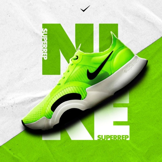
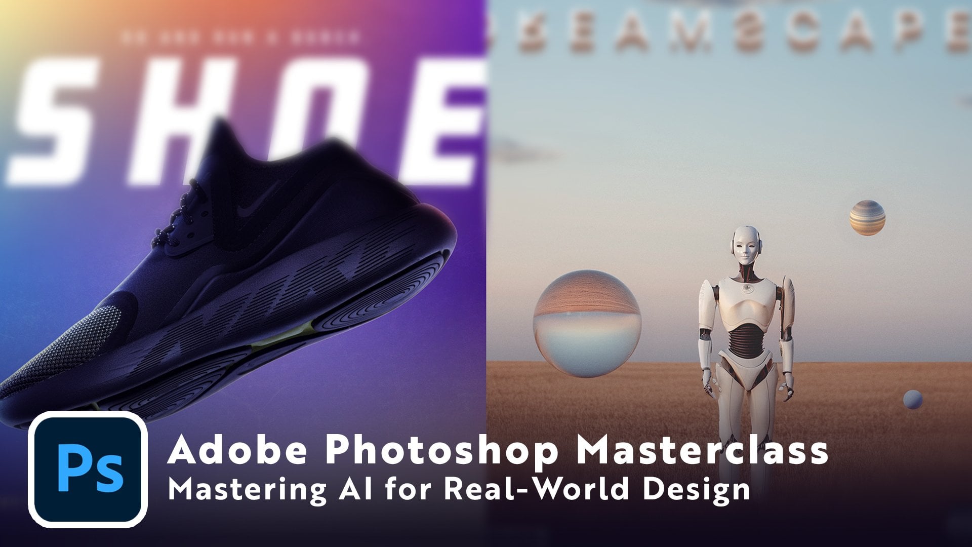
on two projects today. The first is a simple
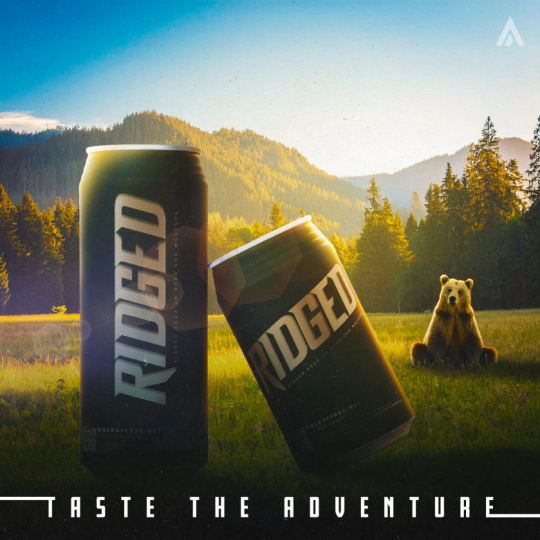
sneaker ad that you might see for any major sneaker brand when they launch a new product. And the second is a more complex fantasy beverage
ad where we'll take a simple product
and transform it into something surreal
and larger than life. Perfect. Social media campaign. This class is
designed for beginner to intermediate Photoshop users. So even if you're
new to compositing, I'll break down everything
step by step and show you on screen every
single button that I press. And if you're more experienced, you'll still pick up plenty of productivity hacks and creative
techniques along the way. By the end of class, you'll not only understand the process of building professional ad
compositions from scratch, but you'll also have a couple of polished portfolio
ready pieces that you can show off to
potential clients or to just add it to
your own portfolio. I'm really excited
to dive in with you, so let's jump in to
the very first lesson.
2. 2 Photoshop UI Overview: Alright, welcome to the class. I'm so happy to have you here. Before we jump into
making any projects, I just want to go
over the Photoshop UI with you really quickly. We're not going to
dive too deep into it, but I will go over a
couple of things that we'll need to know for
the upcoming projects. Now, when you first
open up Photoshop, it might look completely
different to mine. Every designer has their own custom way to have the layout, but if you want to
follow along and have the same layout as I do, I'm going to show you
exactly how I do it. I'm just going to go
ahead and reset mine back to the essentials,
reset essentials. So if you're opening up Photoshop for the
very first time, yours might look
something like this. You'll notice my brushes have disappeared off of
the left side here, and things look a little bit
different here on the right. The first thing that I
like to do is I like to take the properties
panel over here. You can just click and drag, and I like to pin it
just underneath here. You'll see that
little blue line. That means it's going to
snap in place over there. So just click drag and drop, and now it's over there,
and I can open that up. That's just what I need
to and hide it away. And whilst we're talking
about the modules over here, I also like to enable
a couple more. What I like to enable
is I like to go to Window, and character. This really helps.
Gives us a lot of customization options
for our type. We can force a full
bold or italic, change our tracking and leading between the
letters and lines. Over a lot of customization
options here for your type. So I always like to
have that ready to go right here in this bar. And when you add
that, you also add in this paragraph panel as well. This will let you change
how the text is aligned, left, center, or right, and how it's justified. Again, left, center,
right, or justify all. So we'll touch upon
these character panels a little bit later in the class. Next, we come down over here to our adjustments and libraries. See some of my
previous libraries here for some other
clients and projects. But what I like to do, I like to have my adjustments shown. And if yours look different
than these icons, yours might have
the modern view. So this is how the modern view now looks like for
the adjustments, but honestly, I feel like it
takes up way too much space. You can see here if you
go to single adjustments, you kind of have to scroll through and find what you want. That takes up too
much space for me. So what I like to do is I like
to have the classic view, very small icons here, and I just drag that. So I always like to
have my layers panel be the biggest can see how
my file is laid out. I can see the hierarchy
of the different layers, and I can keep
things organized in folders and with proper
naming conventions, and I'll make sure to go over all of that as we move forward. Next, you may have
noticed on the left, I had my brushes out here. Now, why would you
want to do that? Well, when you're doing a composite and
you're trying to do the shadows and highlights and trying to get
different brushes, it can be a pain to hit
be on your keyboard, go into your brushes,
hold it down, get the right brush tool if
you're not already there. Find your brush down here in this list of all your brushes. And then whenever you find
a brush that you like, it ends up closing once you
click and start painting. And we don't really
want that, do we? So what I like to do is
I like to just go to window and enable
my brushes window. And you'll see that opens up here onto the right by default. And what we're going to do is
we're simply going to click and drag this whole window
by clicking up here. We're going to detach
it from that side bar, and we're going to bring
it up over here to the left until you see
this blue line up here. Again, it's going to snap in place, and then you just let. If yours is too narrow, it'll only show one column of brushes, but you can easily drag that out until you have two or
even three, if you like. I found two is the
sweet spot for me, and then you can easily go from a soft brush. You
start painting. You can switch over
to a hard brush, do something else, jump
down to yet another brush. It's incredibly helpful
for efficiency, for fast workflow, and
it's going to save you so much time and headache
from having to find brush. That is the basic
user interface setup for Photoshop for how
I'm going to be using it in this class today
and how it might also be helpful for you to
have it laid out as well. Now, another part
of Photoshop we're going to be using a
bit today is going to be the generative AI features that are now part of Photoshop. If you don't already
see it down here, there is something called
a contextual taskbar. If yours happens to be
hidden, let me hide it. If it's not there, you can
enable it very easily. Just go to Window, Contextual
Taskbar, and it's there. This is where you can go
to generate your images. Let's say I want something here, we're going to be
going into this in a lot more detail later to just show you a
quick overview of this, you can click Generate Image, and you'll be met
with this dialogue box where you can go through, describe the image
that you want, choose any inspiration image, choose if you want it
to be art or photo. You can go through
all sorts of effects. There's seriously so many here, so many that you can go
through and play with. It can give you some really,
really cool designs. You can also reference
a certain style. You can have a reference image you can bring in by yourself or choose one of the already
provided styles here. And same goes here
for the composition. You can choose an image that you already have if you
want to reference that particular composition or choose something
that they have here, more landscape focused, more product photography
focused or something else. Once we have that, we just click Generate and Photoshop
does its magic. It generates something
really cool for us, and we're going to be playing
around with this later on. Now, another feature that
we're going to be using later in this class
is called Harmonize. This is a new feature that's now part of the Contextual taskbar, but it is only available
on Photoshop Beta. So I'm going to show you
exactly how to get that. So when you have your Creative
Cloud desktop app open, this is the home
screen here and it is incredibly easy to find
the Photoshop Beta. You simply go over here to Apps, you click that and up
here you will find Beta. Go ahead and click
that. And for me, it says, open for you. It's going to say Install, like you see here
that I have for the substance three D viewer. You're just going to go
ahead and hit Install. It'll take a couple of minutes
to download and install, and then you're going to
have another installation or Photoshop that has some
really cool Beta features, one of which we're
going to be using in the second project
of this class. So for now, just install that
and we'll be ready to go. And lastly, every single font that we're
going to be using today is actually going to be an Adobe font. So
what does that mean? You don't have to download
any font files or install any I'm going to show
you how to enable them on the Adobe Fonts website. When you go to fonts adobe.com, you're going to have access
to thousands upon thousands of high quality fonts straight
from Adobe's library. They're honestly some of the best fonts that you
can get out there, and they're included with
your Creative Cloud plan. You can go ahead and
enable any one of these, but one of the fonts
we're going to be using today is called Fresno, and it's very easy to
find and to enable. All you do is go up
here to the search bar, start typing the
font that you want. And it's already
suggested there. It's a font family. Go
ahead and click that. And you'll be taken
to this page. Now you see this family
has two fonts in it. There's Fresno black
and Fresno Inline. All you're going to do is for you it's not going
to say remove. I'm going to remove it just
to show you the example. For you, it's going
to say Add family. All you're going to do is
click that add, and that's it. It's available in all of your Adobe apps from Photoshop
Illustrator, you name it. It's there. You can just
go into your type tool, start typing, and it'll be in the list of
fonts that you have. It is so simple. You
can go to Browse. You can find really cool
fonts for any projects. And you can filter
by different tags if you want it to be geometric, rough, brush pen,
luxury, or anything. You can even get really down into the details and
adjust the weight, the width X height,
the contrast, italics. There's so many filters
here where you can really hone in on the exact
font that you want. And like I said, if
you look over here, there are over 5,000
font families for you to choose from that are
all available to you since you have the
Adobe Creative Cloud, and that is going to provide you with limitless creative
possibilities. So I'm going to put on
screen now the font set. You have to enable
for this course. So take a moment, go over here to the Adobe Fonts website, get all of those
installed and enabled, and we're going to
be ready to move on to the next
part of the class. So with your user
interface setup, fonts downloaded and
the Photoshop Beta downloaded for
later in the class. You are now ready to move into the next part of our class. But we're going to talk
about what goes into planning a professional
ad composition. It's not as easy as you think.
3. 3 Planning out an ad: Before we ever touch Photoshop, we need to talk about planning. And I know, I know. Planning isn't exactly the
flashy part of design, but trust me, it's one of
the most important steps. When you jump straight into Photoshop without a clear plan, what usually happens is you end up with something
that feels messy. You've got too many images,
nothing looks cohesive, and halfway through,
you're kind of asking yourself where am I
even going with this? You kind of lose track. But when you spend even
5 minutes sketching out an idea or building a mood
board, everything changes. You already know
where your product is going to sit in the frame, what kind of background
you're generally looking for, and what type of atmosphere
you're trying to create. And that clarity will honestly save you hours of backtracking. Early on in my career,
I would get to the final stages
of a composition and then scrap the entire thing when I realized I
didn't really like it. It wasn't coming together and not what I had envisioned
in the first place. So learn from my mistakes
and plan it out. Think of it like
building a house. If you start laying bricks
without blueprints, the walls won't line up
and the roof won't fit. But if you've got a blueprint, you can move quickly
and confidently because you know exactly what the final structure
should look like. Photoshop is no different. The better the plan,
the smoother the build. So with that said, let's go
ahead and start building out some sketches for our
very first project. You can always use something
like Google or Pinterest or even Adobe's on Be hands
to collect inspiration. But I urge you to make
sure that that stays just as an inspiration,
as a reference. Don't copy it, okay? Always try to never plagiarize, never steal someone's work. Just use it as an
inspirational source, and that's going to be reflected
in your own composite. Now, if you don't already have your artboard looking like this, you can just go to File New. And this is a 2000
pixel wide by 2000 pixel high document with a resolution of 72
pixels per inch, and nothing else is changing. It's just a very
simple square artboard for us to play around with
some thumbnail design. So go ahead and hit Create, and you're going to be
met with this screen. I'm going to go
ahead and close that because I already have one open. So let's go ahead and
make a new layer above this background layer and hit B&R keyboard to go
into our brushes. I'm going to go ahead
and just go with the very simple, hard round brush. It's at eight pixels. So you can see that
is how white it is. I might go ahead and make
that even smaller with the left bracket here on the keyboard or right
bracket to make it bigger. And I'm going to go ahead
and make it a nice blue color so that we can
see what we're doing. And if you have a
drawing tablet in Sless, that's definitely
going to help you in this part of the process,
the sketching process. But you can get by with doing some sketches using
just a computer mouse. But like I said,
it's going to be way easier if you have
a drawing tablet. So if you can afford to get one, even just a $100.01
is going to be so helpful for you and open
up so many opportunities. So what I like to do is
I like to usually break up my artboard into
four quadrants, just like so, and that gives me four mini thumbnails
to work with. So hitting Z on your keyboard, let's go ahead and zoom
into this first one. Now for the first project, our client has given us
this following brief. They're launching a new
sneaker. How cool is that? And they want you to
create an ad for it that simply just showcases
the sneaker itself. That's going to be the
focal point of it. They're going to have some branding that
goes along with it, the name of the sneaker,
the name of the brand, the logo is going to
be provided for you, and they're giving
you quite a bit of free reign as to how
you want to present it. Want it to be fairly simple, fairly minimal, and
not too elaborate. They don't want too
many flashy things and things jumping
around on the image. So that is our
starting off point. Now, the client has said
that they can provide us photos of the shoes from
any angle that we want, whether we want that
to be a top down view, side view, three quarter, anything we want, they
can get it for us. That's going to give
us quite a bit of creative freedom as we
explore our options. Let's go ahead and let's just
start throwing ideas down. When you're at this
sketching process, anything goes and don't
worry about being messy. These thumbnails, these sketch explorations are just to get your ideas out there and explore different
layout options. So one thing we can do is we
can have very simple shoe, be kind of the main
focus of our image here. And like I said, this is not
going to be very pretty. This is just for a layout here. And if you ever want
to erase anything, you can just say E
on your keyboard, get to the eraser
tool and erase that. And if you want to
undo something, it is Control or Command Z, and then B to get
back to your brush. So we can have something
like a shoe here. We can have maybe some
branding up here, maybe, like, the main title of the shoe could be down here,
whatever they have. Maybe like a little tag
line could be under there and maybe some call
to action, but maybe not. So if it's something
that is this simple, then we might want
to go ahead and add in some extra little shapes
going behind the shoe. And like I said, this is, like, very very simple line work, playing around with layout. We might want to have
some shapes going here. And as you explore the ideas, you might even stop halfway through and be like,
I'm not feeling that. And that is fine. You just
move on to the next one. I could potentially just
have kind of like the tip of the shoe coming up,
maybe taking up, like, a good portion of our whole
image here in case the client wants to really focus in on a particular part of that
shoe, something like that. So this would be
the lace is going. So we can just have,
like, a very close view of the hip of the
shoe, honestly, and then we can have, again, maybe some sort
of title or name. I'm just going to go ahead
and play around with that. So if I have the name,
then I can have a subtext. That could maybe work. And
everything is centered here, so you might want to
have logo up here, logo, or you might even want to push
that off to the side. So this is a potential
layout that I could go with. For the background,
I would probably keep this just one background, honestly, maybe something
like a concrete or a marble. So even that, I
would make a note somewhere here,
concrete background. Okay, so that's
another option here. Now I could also do something that's a little bit crazier. So let's go ahead.
I want to, like, split my image, kind of like a cool angle going through it,
because this is a sneaker. This is going to be like an
athletic, sporty sneaker, so I kind of want to have
that edgy kind of look to it. So if we break up the screen in two with some
kind of divider, we can play around
with that later. And then let's go ahead.
Let's add in our shoe. I would maybe want the shoe to follow this diagonal line here. I would maybe even crop
that in even more, have the shoe take up a
larger part of the image. We could have
something like that. And honestly, we can
have something like the name of the shoe
be right behind it. So that's what a lot of
these companies do sometimes is they kind of have the name right behind the shoe itself. I would maybe go a little
bit bigger with that. Let's go ahead erase that. I'm not a fan of that. Let's
go really big with the name. So if we have name,
Something like that. So kind of the shot is over it. Name Logo. We can then have the
logo be maybe up here. Because now what we have here, we have a lot of weight in
the dead center of the image. So what we can do then is just have the logo
off to the side, try to counterbalance that. And this layout as well, also
offers a lot of possibility to then change our crop to
horizontal or vertical. If we go back to the second
thumbnail that we did, this one does lend itself
well to a vertical crop. But if we were to do a very long online web banner
that is horizontal, this will be a little bit
difficult to work with. We would probably
have to rotate it. So that's something to
keep in mind, as well. Go ahead and try to
get a fourth design. I'm kind of happy with this. I like how simple it is.
So I kind of like that. For the background, I'll
maybe do some kind of, like, an athletic
clothing material. So I'm going to have a
note here for myself of, like, a cloth slash
fabric background. Something like that. And also, if you want to just move
around your screen like this, whilst you have
your brush enable, just hold down space
on your keyboard. It's going to turn
into the move tool, and then you can just
click and drag and move around very easily
on your project. Now, also a classic design that a lot of shoe
companies do is kind of like that signature
Nike look, so to speak, where you have kind
of a little bit of a divide down here at the bottom usually there would be some information
or call to action. So they would probably
have call to action. And it never hurts to explore
what is usually done, what the norm is
within an industry because that is what works. It's the norm in the
industry for a reason. So it's always worth
exploring it and seeing if you can maybe
make a change to it, mix it up in some way to
make it more interesting. So usually, like I said, with some Nike shoe ads, you'll have kind of
the shoe at an angle. It's usually floating
off the ground. So it's usually at a side profile or even
a three quarter view, and you'll end up having
kind of a shadow below. And they usually have
their phrase of do it going right
behind everything. Very similar to
the third option. So that's usually
what they would have. They may have some extra
text here to the side. That just adds some visual
interest to the whole design. Maybe even some over here. You could see how you
want to balance that out. And for this background,
it would honestly just be kind of like a
gradient color. They usually have a
very bright color here in the middle and
it radiates outward. So here, the background
would be a radio gradient. And also we would
have to figure out where we want to put
our logo with this. We could potentially
have our logo down here and balance it with
something else on this side. But if we're not provided
that by the client, then we may just have to
put it into our image, maybe have that somewhere here. So let's go ahead and zoom out, hit Z on your keyboard. And let's see what we have. So within just a
couple of minutes, we've explored a few
different options. Now, if I were to
have more time, I would probably explore and do anywhere 9-15 different
thumbnails to just really play around and see what kind of a
layout would work best. So looking at these,
I'm honestly most drawn to this one here with the cloth
slash fabric background. I like the dynamic
diagonal line in that. I also like this
one where we have a focus in on one
part of the shoe. But I think for now,
I'm going to eliminate this one for the sole purpose
that this is a new product, a new shoe that is coming out, and our client might
want the world to see the whole shoe,
the whole design. So I'm going to go
ahead with this design. This is what we're going
to get started with. Now, in this
hypothetical scenario, our client has already provided us a photo of the sneaker, but in case you don't
have one or in case you want to find one for your
class project later, hint hint, I'm going to
show you where you can find some free stock photography that you can use in
any of your project. Let's jump into our web browser. Now, depending on your
Adobe Creative Cloud plan or credits that you may have, the first place I'm going to
recommend is Adobe Stock. You can see right
here, you can get ten images or one video
with a free trial. So even if you're just exploring Photoshop and using a free
trial with Photoshop, you have ten images that you can get for free from Adobe Stock. You just go over
here, go over to photos or start searching, and you can find
anything that you like. So in our case, we can
go here to search, and let's say we want
to find a sneaker. Just type that in, hit Enter, and look at all these
fantastic images that we have. This is already cut
out and ready to go. You don't even have
to mask anything out. But there are so many options, so many cool sneakers that you can really
get creative with. And depending on your
creative cloud plan, these will be available to you. Next place where you can get fantastic royalty free images is pixabay.com. This is
one of my favorites. They have almost 6 million
images, videos, and music. Anything you can imagine, you can see up here
all that they have. They have illustrations,
vectors, music, sound effects, even three
D models and gifts. They have so many options. So again, here, you can
just go ahead and type in sneaker, hit Enter. And again, you have so many
photos you can look through. Some are ready to be cut out. Some are already a
clip art vector image. We're not going to be
working with those. They have some three
D rendered sneakers. So again, so many options. And if you find
something that you like, it is as simple as
just clicking on it. And open up this dialog window. And when you click Download, don't just click Download
right off the bat. Click this Drop Down
and make sure you download the highest quality
that you possibly can. You're going to have
way more information in your image to work with. Just select that and download. The third and final place I'm
going to recommend you get royalty free images
is onsplash.com. As you see here, all their
images can be downloaded and used for personal
or commercial projects, which is really good if
you plan to monetize or do anything of that nature with the images
that you download. So again, here, you can
go ahead and search. I'm going to search Sneaker
and as you see here, you have so many options. You have three D
renders, textures, film, people, so
many cool things. I'm going to go ahead and
hit Enter on Sneaker. And look at that. We have
so many options here. And hint hint, this one here is the one that we're
going to be using today, and it is the one
that is provided in your class resources folder. So to make things fast
for the class today, I'm not going to go
through and download every single asset with
you live on the sites, but I will provide them to you in the class resources that you can download under the resources section
of this class. But for any future imagery
that you may need, I highly recommend you bookmark these websites you can find
anything and everything. Just look, we typed in Sneaker, and there's almost 3.5
thousand photos of just sneaker your project
involves something else, let's say it involves
a bottle of some sort. You search a bottle,
you're ready to go. Let's say your project includes
a watch. Look at that. We have 8,000 watches we
can scroll through and find something cool that
we can use and work with. Now, let's jump back to
Photoshop. All right. So before we move forward,
make sure that you have indeed downloaded the class
resources for this class. We will be using
everything in there as we build out our
very first project. Last point that I want to make
when it comes to planning a professional ad
composition is keeping in mind exactly where
this is going to live. Many times designers
may not realize it, but these ads go everywhere, and they end up needing very unique and very
specific dimensions for all the various platforms. Here's an example
of just a couple of popular online
advertising banner sizes and aspect ratios. In the dark purple here, we have ones which
are more popular, and in this pink color, we have those which
are less popular. These are just
some of the sizes. Your client may come
to you with even more. These ones don't even include the ones that go
to social media, which tend to be 1080
by 1920 or 1080 by 13 50 to have that four to
five or nine to 16 ratio. So just a couple of the sizes
here that are very unique. You have leaderboard
ads that are 728 pixels by 90 pixels. You have a mobile
portrait interstitial ad, which is 320 by 480 pixels. So you have so much variety in the different types of sizes
and ratios that you have to design that is definitely
something you need to keep in mind when you
are in the planning stages. As you see here as we were
planning our composite, our second option here that
I actually really liked a lot would maybe not necessarily work in
a leaderboard ad, which is 728 pixels
by 90 pixels. So if you want an idea
of what that ratio is, I'm just going to
go ahead and draw that really quickly for you. So we have a width of 728. And we're going to
have a height of 90. This is the ratio that
we're talking about. And if you want your
whole ad to fit in that, how are you going to lay it out? Let me just change the
color of that so we can see it a little bit
better. There we go. So how will I lay
out this ad in here? Well, I have the shoe
coming in from the side. How far in can I have it? How much detail am
I going to lose? These are all things you have to keep in mind as we design, you want something
that is going to be fairly modular and fairly easy to adapt to any aspect
ratio that you are given. So I'm going to go ahead
and delete that for now. We're definitely going
to keep that in mind as we design our
very first project here to make sure that
it's something that can be used in a
vertical format, a horizontal format,
square format, and everything in between. And the last point I want
to make when it comes to planning is to always
think like a brand. The product is going
to be the hero. In this case, it is our shoe. It has to be the
focus of the image. Don't focus too
much on the logo. The focus is going to be
the product, the hero. Next, the environment
is going to give you the emotional hook
for the image. So over here, we had a
concrete background. That's going to create
an emotion of a grungy, rougher vibe that may
appeal to people, and it may be part
of the branding. But something like what Nike does with their radio gradients gives more of a sense of
athleticism and energy, and that might be more of the emotional hook that
you're trying to go for. And always with text, you want to make sure
that it is clear, but it is secondary
to the product. That is why for
this third example and even in this fourth example, be afraid to cover up
the name of the product. That is a tactic that is
often used by some of the biggest brands in the
world like Nike, like ADIDAS, because people know the
brand, and at this point, their logo and the text in
any of their ads are just secondary to their
product, to their shoes. So just keep that in mind
as you sketch your ideas. So I think for this project, option number three is going
to be the one that I go for and the one that we're
going to start building out together in the next
part of our class.
4. 4 Project 1: Awesome. We are ready to get started with our very first ad. So let's go ahead and get
ourselves a new file. Let's just go over to File New. And I want this to
still be 2000 by 2000 at 72 pixels per inch. I want this to be a square so that later on I can go
ahead and adjust it very easily to make it into a vertical and a horizontal
version as we build out our ads for all the different platforms
that they may live on. So let's go ahead
and click Create, and we're going to get
started with our shoe. So you're going to find that in the class resources folder, and it's going to be as
simple as going to file. Place Embedded. You're
going to navigate over to your class
resources folder. And under Project
one, you're going to simply place this
file called shoe. Go ahead and click Place, and then hit Enter on your
keyboard. There you go. We have our shoe in the image, but I don't really
want this background. So how are we going
to get rid of it? Well, there are definitely
a couple of ways, and I'm going to show you just a few of the ways we can do that. You can hit W on your keyboard, and that's going to take you to this quick selection tool. Now, if you click and Hold down, you have other tools such as
the Object Selection tool, Magic W these are all suitable selection
tools that you can use. For example, if I do the
Object Selection tool, it's going to
naturally know where the shoe is. I can click that. It's going to get me a pretty good selection of
the actual shoe, after which I can just
mask it out and I'm done. But if you hit Z on your
keyboard to zoom in, you see it may not do
necessarily the best job. You see it's missed out
something down here. There's some jagged edges. It's not the best
selection in the world. So let's go ahead,
Control Command Z. Let's undo that and then
Control Command D to deselect. Go ahead and play
around with some of the other selection
tools that we have. We have Quick Selection Tool, which is kind of like a brush
that you can click and just drag over all the parts that
you want to be selected. And if you want to add to it, you can hold down Shift and you can add to
that selection. And if you want to take away, you can hold down
Alt or option on your keyboard and paint
away from the selection. So with this, this
does an okay job. I find this to be somewhat
the least reliable. As you see over here, it went outside of the white
part of the sneaker. So this one isn't
going to be the best. So let's go ahead and Control
or Command D on that. And the last one we have here is the Magic One tool, which again, you can just click,
and it's going to select based on the color
that it is sampling. So I can still hold down
Shift and add to it. But now that I've
clicked this green, it's selecting all of the
similar green in the image. So the magic One Tool is not going to be our
best friend here. Let's control or
Command D to undo that. What are we going to do? Well, this is where
the AI features of Photoshop really come into play because if you see down here in the contextual task bar, it has changed now that we
have an image in our artboard. We now have an option to select subject and to
remove background. So with one button click, it can do exactly
what I want it. So let's click that, and let's see how good of a
job Photoshop does. Let's click that. It's going to take a second, and that's it. You see, it's made the mask. And if we zoom in by
hitting Z on our keyboard, you see there's no
jagged edges here. There's a little bit of
feathering over here. We see some of the green
from the background is still on the white
part of our image, but that is fairly easy to fix. And other than that, it has done a very, very nice selection. I'm very happy with that. I'm just going to go
ahead and zoom out. Yeah, that is
awesome. I like that. So now that we have our shoes selected let's just
go ahead and hit Control or Command G. That's going to put
it into a group, and let's just rename
that as H. Just like. I always like to keep the very first version of my product on its own layer so
I can go back to the very first iteration
of it at any point. If I want to start over, I
have the starting point. Now, I've had some
students ask in the past, why do I always say to
mask out your object? Why not just erase it away? I'm going to show you very
quickly why that is important. Go ahead and place
this shoe in again. Alright, so here we have a
fresh placement of our shoe. Now, first thing
you'll notice is that this is a smart object. So even if I were to
hit E on the keyboard from my eraser tool
and I wanted to erase, I'm not able to erase it.
So what's the deal here? Well, you cannot do that
with a smart object. It says here, the smart
object must be rasterized before proceeding. I
guess I have to do that. Now, when you have
a smart object, you can resize that
as much as you want. I can make that big, small, big, small, over and over, and it's always going to
retain all the information, all the quality, no problem. With a rasterized image, every time you stretch
that and compress it, make it bigger, make it smaller, you start to lose detail
every single time. So if I undo the rasterization, so now I'm back to
a smart object. If I do Control or Command T, and I make this shot
very, very tiny. And I hit Done, and then I
want to resize that again. Let me bring that up to
the full size again. Look at that. No
information was lost. I still have all the
details from the image. Now, what if I did do what it tells me and
rasterize the image? Well, right, control or command T on this rasterized image. I'm going to make that small, just like before. There we go. And then Control or Command And now I want to
make it big again. And oh, no, look at that. I've lost all the
detail in my image. Now, I can do
Control or Command Z and undo until I get back
to the Smart Object, but Photoshop does
have its limits. I believe by default, you have about 20 to 25 steps you can go back with your
Control or Command Z. Anything beyond that,
Photoshop does not say if you want to
really go back in time, you're not going to have
too much flexibility unless you are working
with smart objects. That way, you're always
keeping your information. And that is why we use
masks because then you can just create a mask
for that smart object, and at that point, you can go ahead and paint away
whatever you want, if you zoom in and if
you paint in black, you can go and do the
painstaking process of painting away the
background of your image. That's another
method you can do, but this is going to take
you a very, very long time. The last method that a lot of designers like to
use is the Pen tool. So if you hit P
on your keyboard, you're going to be met
with the Pen tool. And by default, I have mine
with a fill and a stroke. I don't want any fill as I
start working with this. But for the stroke, let's
go ahead and make that. Just white. And by
default, it's one pixel. So what does the pen tool do? Well, the pen tool
allows you to draw a custom shape
around your object by clicking and dragging these nodes around and
getting a selection. This can also take
a very long time, but it can get you some very nice crisp and clean results. And the benefit of
using the pentel is I can go back to any
one of these nodes, Control or command, click on it, and adjust any of
these as I see fit, either by control or command clicking and dragging
these out and changing both sides or by holding Alt option and just
dragging one side. You have a lot of
customizability with it, but for the purposes
of today's class, we're not going to
be using the pentol. It's going to take way too long. But it is important to show
you because this is one of the staple tools that
us designers use. So I really want you
to be aware of that, and I want you to
play around with it. But because AI has become such an integral part of
Adobe and design in general, we will be using that today. Let me go ahead and delete that, get back to our shoe
that we selected with our AI selection tool. And we are basically
good to go with that. Now that I have my shoe
selected and cut out, kind of want to start
working on the background. So if we look at our
thumbnail exploration, we have our shoe. So that is check right there. Now I want to build out
this background with some sort of a cloth
or fabric background, and you're going to find
one in the class resources. So let's go to File
Place Embedded, and we're actually going to go with this poster background. Click and place, and here
we have our background. Just going to go ahead
and stretch this. Now, if you end up stretching
this out and you see that it's elongating it and not keeping the
proportions properly, all you need to do is click this link icon over here between the
width and the height. You click that and then it's going to scale in proportion. So let's go ahead
and click that. I want that to fill
up our screen, and let's just hit Enter. And I'm going to hit Z on
my keyboard to Zoom out. Because I want to play
around with this. I like that this one by default, has a line going through it, so that's going to
make our lives a lot easier with some of the
design that I want to do. So let's do Control
or Command T. And I do kind of like I
had in the thumbnail, I want some kind of
an angle for this, something like so let's see
if we can make this bigger. This is a very high
resolution texture, so we can stretch
this out quite a bit and maintain
all of our detail. That is looking good. So I kind of want to play
around with this. Maybe have that like so. Yeah, I like that. I'm going
to go ahead and hit Enter. But I see that this
part down here is still not as I like it. Let's just keep playing around. I'm going to drag this out,
make it a little longer. So, take your time, play
around with this until you get the exact angle and
composition that you want. I'm going to go with
something like so. Maybe bring that in
And there we go. So once you have that,
go ahead and hit Enter. And I'm going to drag
that below our shoe, and I'm just going
to hide that by toggling this e icon over here. And now I really
want to separate this into a top
and bottom piece. So let's go ahead and do that. There are several
ways you can do this. What I'm going to do is
hit Control or Command J on the keyboard to
duplicate that. Now you have poster
background copy. I'm going to name
this one poster top. And I'm going to name this
other one poster bottom. There we go. So for the bottom,
like the name implies, I kind of want to remove
everything that is above it. So one quick and easy way
that you can do this is hit L on your keyboard
to get your Lasso tool. And I don't want
the plain lasso. I want the polygonal Lasso tool and you can simply
click and drag. This is going to drag a nice
little selection for you. And I do want to keep the
shadow that is cast by this little fold in this paper or material,
whatever this is. Something like that. And
it doesn't have to be perfect, just like that. So we're going to make
our selection go up and outside, and there we have it. And now that we have that mask, we're just going to hit
Control or Command Shift I. We're going to invert
our selection. So now this lower
area is selected, and we're going to hit mask. So this is going to
keep everything that is within the selection. There we go. The top is hidden. And to mask out the
top, it is very simple. We're going to
Control or command click on this mask
preview over here, and it's going to get
us our selection again. We're then going to enable
our poster top layer. Make sure we are on
the poster top layer, and then Control or
Command Shift I again. We're going to invert back and we're going to hit
the same mask tool. And you can see already here in the masks that
they are different. So if I toggle the
poster bottom off, you can see our top is now
separated from the bottom. Now, I do want to do a little
bit of cleanup work here. I don't like this
spill or this stain, whatever this is on the top. So I'm just going to go
ahead and make a new layer. S on your keyboard to get
to the clone stamp tool. And with Alt or option, you can sample any
part of your image. So I'm just going to
sample this area here. It's kind of similar. And then I'm just going to
simply paint that away. And I believe that is the
only stain I don't like. Yeah, everything
else is good for me. So let's go ahead
and zoom out with Z. And now, with our little
edit that we did, getting rid of the stain
and the poster top, you can shift click
between the two to select them both and then control or command G to group
them together. And I'm just going to
rename this poster top. Just to keep things
organized and labeled. So looking at our shoe, I actually like this
green that we have in it. So I do want to sample that just to have for us to work off of. So let me go ahead
and sample that. I like that bright neon
green that we have going on. So by hitting I
on your keyboard, you're going to get to
the eyedropper tool, and then by Alt option clicking, you can color sample any color, and it's going to add
it to your swatches. So let's go ahead. Let's hide our shoe, and let's hit P on our keyboard
to get to our pen tool. I had mentioned
that the pentol is great for getting
nice selections, but it's also great for
drawing custom shapes, and that's exactly
what we want here. So with your pen tool selected, you see, because I use
the eyedropper tool, I now have that neon
green as a fill color, and that is totally fine. So let's go ahead
and let's start clicking and dragging
our nodes out. And we're just very simply going to start drawing
our shape here, making sure to go a little
bit into the shadow section. And you can already see hints of that green coming through, and that's exactly what we want. So just take your time, follow
the crease of this image. It's a very nice and
clear dividing line that we can use to get a very nice and striking background. So now that we have that, we can just simply
click around here. There we go. And
we have our shape. We have a custom shape here now, and we're going to change
the blending mode. So in this drop down, you have so many options you
can go through. If you hover over
each one of them, you're going to see a
preview of what that does. So we have anything from
multiply linear burn, light and screen, overlay. You can see how it's
affecting our image. But the one that
we want today is actually going to
be linear burn. Go ahead and do that.
And we're going to keep that at 100% opacity. Now I think this bottom part
is a little bit too dark. If we toggle our shoe on, you see how bright this is. I want the bottom to
also be nice and bright. So let's go ahead and add in a curves adjustment
layer. So let's do that. And I'm going to give this
a slight little S curve, which means bringing this
down just a little bit, and then pulling this side all the way up so
we have a nice, almost neon effect
going on. Very nice. But now you see
this has affected our image here on the
left, on the top, as well. So I don't want that. I want to mask out this up here as well. Well, funnily enough, we
already have some masks. So I kind of want to pull in this poster bottom
mask that we have. So if you Control or command, click on that and then simply hit Control or Command Shift I. That's going to invert
your selection. And then if you hit
G on your keyboard, you're going to get to
your paint bucket tool. And then by simply filling
this in with black, that is gone. That
is masked out. And our curves adjustment layer is only affecting
the layer below. So just do Control
Command D to deselect. You can see you can
toggle that off and on. It's a lot richer, more bright, more saturated, and that's
what we want right now. Next, I want to add in
a hue saturation layer, and I kind of want to bring
the overall saturation down just a little bit. So I'm going to pull
that down to about -12, bring the lightness up
to about plus five. So again, you can always
toggle that off and on. And you see, I just took the edge off that
just a little bit, so it's a little
bit too saturated. Now I'm going to add a
levels adjustment layer and I'm going to bring
this down here to about three this to
about 1.2, like so. So what has that done if you
talk about that on and off? Again, it's just added in a little slight little fade to the darker parts
of our image. So I'm trying to
get that rugged, grungy type of look here. And the last thing
for the background, I want to add in one
of our textures. So let's go over to
File, Place Embedded. And in your class resources, you're going to find
this scratch texture. So let's go ahead
and place that and I do want to rotate
this by 90 degrees. So if you hold down
shift when you rotate, it's going to snap to the different degrees here,
different angles. So I want that at about 90. Going to extend that
past our actual artboard and just bring that up a
little bit and hit Enter. And then I want to change the blending mode of
that down to screen, and I want to bring the
opacity of that down all the way to about 30%. I don't want to
get rid of all of the texture I do
want a little bit of that texture coming through adding just another
level of noise, another level of detail. And that is going to be
our background for now. So what you're going
to do is with the scratch texture layer selected, shift, click all the way
down to poster bottom, and that's going to
select everything. And you're going to simply
do Control or Command G to group that together,
and double click on that. We're going to rename
that as background. So let's go ahead and re
enable the shoe layer. And what I'm going to do on that is I'm going to right click and I'm going to convert
to Smart Object. So what that does is
that has now applied the masks that we
had to this image, and you can see it on
the thumbnail here. But now we have this
shoe as its own layer. We can click and drag it around. And that's exactly what we
want because now we want to start putting our
composition together. So if we go back to our
thumbnail exploration, I had our shoe kind
of at an angle here. So what we want to do is control our command T to get
into our transform tool, and I want to start
playing around with this and getting it to the size
that I want it to be. I do want this to
take up quite a significant part of the screen. And looking at it now, I
want to match the angle up. With the green here, you
have white and green, and you have green and white. I would love to match that up. That would be very cool. So something like this, I think, maybe a
little bit bigger. Like, so over here as well. Like I said, the product
is the hero of the image, so you always want
to make sure that is the big focus that you have. So let's go ahead and
hit Enter on that. I like that angle. I
like that placement. I think we're good with that. Now we're actually going to
jump over to Photoshop Beta. Like I mentioned,
Photoshop Beta has a really nifty new
feature called harmonize, and I actually want
to use that on our shoe to really get it
blended into this background. So what I'm going to want
you to do now is just save this file close out
a Photoshop and open up Photoshop Beta that
we installed earlier and open up this same
file in Photoshop Beta. Once you have your class project open up in Photoshop Beta, it's going to look
something like this. You're going to notice
the interface looks a lot different than
what we had set up, but don't worry about
making it match what we had in the other
version of Photoshop. We are here for just one reason, and it's already on screen. It is this button over
here that says Harmonize. So what Harmonize does, it merges the objects
into a scene by matching color,
lighting and shadows. And that's exactly what
we want to do here. So let's go ahead and
see what Photoshop does. Just go ahead and
click Harmonize. And it's going to take a
few seconds to generate, and it's going to give
you three options. So this is going
to be our jumping off point for our color grading, color matching,
lighting, shadows. So we want to see what
it generates for us. And after a few seconds, we have a couple of options. So you can go through each one. This is our first option, our second, and our third. I kind of like the second one. There's very nice tones in it, very nice moody tones almost. So I'm going to go with
the first variation. Now, if you want to make
your file size smaller, you can go ahead and
click the trash icon for any variation that you
do not want to use. So I'm going to go
ahead and do that. I don't want these
two, and don't worry about what the shadow is
like underneath our shoe. We're going to do our own shadow in just a couple of moments, but just focus on
the actual colors and tones in the shoe itself. So if we collapse that
properties panel down, we can toggle our harmonized
layer off and on, and you can see it's
done a very nice job. A really integrating that
into our background. So now we're going
to hit Control or Command S to save our file, and we're going
to jump back into the other version of Photoshop. And once we're back in the
normal version of Photoshop, I kind of want to do
a little something with our new harmonized layer. Now, it is worth noting
that if you want to make any changes to this
harmonized layer, can. If you open up this
dialogue box here, it'll say that the selected generative layer was created in a newer version of Photoshop and is not
supported by this version. Now, by the time you
take this class, that might have changed
with an update. They might have implemented those Beta features into the regular version
of Photoshop. But at this current
stage, this is how it is. So on our harmonized layer, I'm just going to go
and hit Control or Command G. I want that
in its own folder, and I'm going to rename
that Harmonized. Shoot. Just like. And I want to mask
away this shadow. I want to do my
own because I kind of want to have a little
more control over it. So what I'm going to do is
I'm just going to control or command click on our
original shoe layer. That's going to give us
our nice selection here. And then I'm simply going to click this mask
button down here, and there we go,
our shadow is gone. So I want to have a nice custom shadow
underneath this shoe, and there are several
ways you can do it. You can always go ahead and just paint it in with a brush. If you B on your
keyboard on a new layer, have a big enough brush. You can go ahead, get a nice black and start
painting in a shadow, and it can look pretty decent. But I want to have a
little bit more control. So what I'm going to
do is I'm going to control or command
click on this shoe. So I have my selection, and on a new layer, you can click this little
square with a plus icon. I'm going to go
ahead and hit G on my keyboard to get
to the paint bucket, and I'm going to fill that with a color I'm
going to sample. So if you hold
down Alter option, you're going to go into
your eyedropper tool, and I want to sample
this darkest color here. It is not exactly pure black,
and that is what I want. I want it to be from
the image itself. So once I have that
sampled, just click. It is now filled in
Control or Command D. And what I'm going to
do is I'm going to make this into a smart object. So right click on that,
Convert to Smart Object. And we do that
because I'm going to apply a blur to this layer. And if I ever want
to go back and adjust the radius of that blur, having it be a smart object
will allow me to do that. So now that we have that, we can hit Control or Command T. And if we move that down, you see, we now have
a little shadow going on. So that is very cool. I want to bring
that out to about here just a little bit down so we can see what
we're playing with. And I'm going to go up here to filter Blur, Gaussian blur. And I want that to be
about a 15 pixel blur. And with the move tool, if you just hit V
on your keyboard, you can use your arrow keys
to move your layer around. And if you hold down Shift, it'll move it more than by
just a pixel at a time. So I hold down shift, and I use the arrow keys to really move that around and get the nice
depth that I want. Now, I also want to change the blending mode a little bit, so I'm going to make that be a multiply and at the same time, bring the opacity down
ever so slightly. To about 95, I think, will work. Let's go 90. You can talk about
that on and off. And like I said,
with the move tool V on your keyboard, you
can move that around. If I want to bring that in
closer to the sneaker, I can. So something like
that will work. But if you haven't noticed, there is a slight issue with this shadow because we use
the selection of the shoe. I also filled in this area up here by this part of the
sneaker here and this part. So we can see some of the
shadow peeking through, and I don't really want that. So with this shadow
layer selected, I'm going to make a mask on it. And by hitting B on our
keyboard to get our brush tool, you can choose any brush at full opacity and make
sure it's black, and you're just going to
paint it away. That's it. Simple as that, that shadow is now gone. I don't
want it there. So we have our first
part of our shadow done, keyword first part. I kind of want to have a little bit more of
the color going in here because the way that light interacts with a surface, you're going to end
up having some of that color bouncing
around onto your object. And in the shadow itself, shadows aren't exactly
just pure black. So in this case, the
shadows must have some of this dark green in it because that's what
the object is on. So let's go ahead and
make ourselves a new layer by hitting this
plus icon down here. And with B on our keyboard
selected our brush, I want a soft round brush, the default brush will do. I'm going to bring
the size down to about 100 pixels,
maybe maybe more. I'm going to increase
that to 200. And I'm going to sample a
darker green in the image. So holding down alter option, one of the darker greens that I can find, I think
that one would work. So just go to the dark
parts of the image. I think this one here is
going to work for us. And I'm just going to
start painting in like so. But you're going to be telling me that this doesn't
look very good, and I'm going to be
agreeing with you on that. What we're going to do on
this, we're going to change the blending mode down to
multiply and the opacity down to about 70% as close
to that as you can get. So now if we toggle
that off and on, you'll see that has
now added in some of that green to our shadow itself. And we're going to do
that one more time. So let's do a new layer. And with our brush selected, we're going to now go
for a lighter green. So I kind of want any one
of the greens in our image, the main one that we
have and this time, I'm going to bring the
opacity down to about 20%. And before I even
start painting, I'm going to turn this into
a multiply blending mode. And I'm just going
to start to paint, and you're going to see a
little more richness coming in on the outer edges
of that shadow, really softening it up and blending it into
our image nicely. And don't worry.
We're going to do the shadows on our
shoe, as well. This is just the shadow that
the shoe itself is casting. So something like that, I might even lower
the opacity of this layer down as
well, maybe to 70. You can talk about
that off and on, and you'll see exactly what
the effect of that is. And I'm pretty happy
with that shadow. So let's go ahead and
group those together. So with our topmost
shadow layer selected, shift click down to
the lowest one and control or Command G to
group that together. And we're going to double
click on that and rename that ho shadow. And
we have that done. You can talk about that
whole thing off and on, and you can see just how much of an impact a good shadow
does to the image. Now it's time to actually
start working on our shot. So let's start blending it in, doing all the color grading, shadows and highlights
that we need to do to make this really
work for our composite. So the first thing I'm
going to do is just have a curves adjustment layer and I'm going to clip that
down to the layer below it. So using this button
here, to clip it down. So anything that we adjust is only going to affect
the shoe itself. If we don't have that clicked, it's going to affect
our whole image, and that is not what we want. So make sure you have
that clipped down, and then we're simply
just going to adjust our curve to be
something like this. Going to bring that
lower section down. And I think just
these two points are going to do
what I wanted to. I kind of want to
deepen the shadows a little bit because the
cast shadow is so dark. So I kind of want to build up that contrast ever so slightly. Next, I want to add
a gradient map, and that is the very last adjustment that we
have over here. So click that. Let's
clip that down. And if we want to adjust
this gradient here, we want to make sure
we're clicked on the actual thumbnail of
the adjustment layer, not on the mask. So now that we're on the
actual thumbnail here, you're going to
click this gradient. And for the darkest
color, instead of black, I want one of the darkest
greens I can find. Like so. And for
the lightest color, I want one of the
lightest greens that I can find the brightest,
maybe over here. Hit Okay on that.
Let's close that. And I want this to be on
an overlay blending mode. At just about 15 to 20%. You can talk that on and off. You see, it's just
adding a little bit of that green tone into
our actual shoe. So that's what I
want with this one. Just add a little
bit of that green to it as we're building
up all the layers. Now, I want to really start
blending our shoe in, and there are many
ways you can do it. Some people like to paint
in the shadows themselves. They will end up adding in
a layer like so and just using a brush with a dark color and just start painting in. And that is a completely
valid method of doing things. What I like to do, however, I'm going to go ahead and delete this layer
that I just did. I like to work with
adjustment layers because it gives you a
lot more flexibility, and I'm going to show
you exactly how. So let's go ahead. Let's add in another curves adjustment
layer, clip it down. And for this one, I'm really
going to crush that all the way down until everything
is completely black. Okay? That's what
we're going to do. And with our mask selected here, we're going to hit
G andr keyboard to get our paint bucket tool, and we're going to fill
that in with black. So now we've masked out that
entire adjustment layer. So now it's as simple as erasing away what you want to be darker. So hit B on your keyboard
to get to your soft brush. And on a low opacity, I already have mine at 20%. I'm gonna have the flow at 100. I don't need that
to be that low. And painting in white, you're going to hit on
your keyboard to switch to the white if you don't
already have it selected. Now, if I start painting, you're going to see instantly our image is getting darker. So I like to build
it up in layers. I might even lower the
opacity down to ten or 11, so I can really take
my time with this and just essentially paint
in what I want to be dark. Now, if I've gone too far and I want to get
some of this back, you just hit X on your keyboard, and now you paint in black. So now I'm painting
some of that back. Lovely. And it again to go to white and continue
with your shadows. So you can tackle
that off and on. You can see we've really
incorporated that very nicely. I'm just going to soften up
some of those a little bit. Maybe a little bit more up here. I'm happy with that. Now that
we have these shadows in, I want to add in a little
bit of a rim light. Now I want to add in a little
bit of an edge light to our sneaker to just give it an extra little
bit of dimension. Let's go ahead. Let's make ourselves another
new layer here. And we want to clip this down. So by holding alter option and hovering between the layers, you're going to have this icon. Just click, and
now this new layer is clipped down to
everything else. So whatever we paint is only
going to be on the shoe. So now let's go ahead and
sample the very brightest, lightest yellowish
green that we have. And hitting Z on our keyboard, I'm going to zoom in all
the way onto our shoe, hit B&R keyboard, and I want
a very small, small brush. And I'm going to put
the opacity up to about 20% so I can
actually see it. And you're going to
slowly start painting a nice little edge light
take your time with this. You don't want this to be too
sloppy because this will be noticeable if you do
this in a sloppy way. So just take your time. With a nice soft brush, you're just doing a
nice little edge light just to give that added
bit of emphasis here. And we're not doing it
for the whole shoe, just for this right side and a very little
bit on the left. You can always hit
Control or Command Z to undo or hit E on your
keyboard for the eraser. So something like that, up here, you're not going
to see too much of it because it's
already very bright, but feel free to add
in just a touch. It's these little details that
will end up really selling your photo composites as being
part of one actual image. I'm just going to
go ahead and keep going down this
side of our shoe. This side is already
fairly bright, so this edge light isn't
going to do too much. But as we get down here, you're going to see
it come into play yet again just a little bit. I want that to go just around the shoe as it disappears
into the shadow. And again, you can have the
eraser equipped with E, and on a low opacity, you can soften up some of
these brushes as well, these brush strokes that you do. And you can bounce
between brush and eraser with B and E. And
then let's zoom out with Z. Let's see what our edge
light has done to our image. So if we toggle that off and on, you'll see it's added a nice
little edge light here. And if you really want to add in a little bit more emphasis, you can go ahead and
make that brush bigger. Like so, lower the opacity
even more to about 10%, and then just bring
that in a little more. Let that edge light
bleed onto the shoe. As it wraps around
just think these are three dimensional objects, okay? So light is going to
wrap itself around it, and you want to make
sure that we show that in our actual composite. So again, hit Z on your
keyboard. Let's zoom out. You can toggle that off and on. That is looking pretty nice. So the last little bit that
I want to do is to add a little bit more brightness to certain parts of our shoe. So let's go ahead and add in a brightness and contrast layer, clip that down, and
I'm just going to drag that all the way up to about 77. And like we did before
for the shadows, I'm gonna hit G on the keyboard and fill in this mask
layer with black. Hit B on our keyboard
to get our brush, and let's make that bit bigger. Something like 160
will do just fine, opacity of about 20%, and now you're going to
want to paint in white. And you see, as you
do that, that's going to brighten up certain areas. So I just want to highlight some of the highlights
of our actual shot. Maybe add a little bit more
of a highlight on this edge. Like that, maybe a
little bit down here. There we go. And
another reason why we do these edits on adjustment layers is
you can always go in, double click on the
adjustment layer and change these values. I can make this go up and down. And if I want that
to come more down, if I want that to
be darker instead, I want that to be
brighter instead. I can do that very easily. But I'm going to keep that
at 77 what I had before. I actually like that amount. So we're going to close that. And you can always
adjust the opacity here as well if it's too strong. But I think at 100% opacity,
that is pretty good. And you can see very
simply how we went from no edits, no blending in. We simply just did a couple
of adjustment layers, and we now have a nicely blended in sneaker
with our background. And finally, for
5. 5 Project 2: All right, now we
are ready to get into our second project. So let's go ahead and open
up a new file for ourselves. Let's go up here to File New, and we're just going to have
the exact same file size as we had for the
very first project. It's going to be 2000
pixels wide by 2000 pixels high and a 72 pixels
per inch resolution. No need to change anything else, let's go ahead and click Create. And there we go. We have a blank canvas
to get started with. Now for this project,
I'm not going to walk you through the
thumbnail process, but I will show you
the thumbnails that I sketched and came
up with for this. Just something to keep in mind, our hypothetical client has come to us with the launch
of a new beverage. They want us to
showcase this product, this new drink that
they're launching, and it's for an outdoors drink. So the general mood
and vibe for this is going to have to be
adventurous, outdoorsy. We don't want this
to be too simple. We really want to explore
our possibilities with our compositing to
make something that is almost surreal and
larger than life. So let's hop over and look at the thumbnails that
I came up with. So here are a couple
of very quick sketches that I did for some
possible layouts. The very first one over here is a very generic drink ad
that you may see anywhere, really, with the
drink in the middle. I have some smoke billowing
out behind it and also some electricity
coming off the can just for some added
extra elements. But as you see, this one
isn't too interesting, so I kept exploring. A lot of the summertime
drinks will have the cans almost floating
in the middle of nowhere. So I have two cans here
just floating with some citrus wedges
floating there with them and a light source coming
in from the top, right. Again, this is something that
you see all over the place, and not too much
compositing goes into it. I think we can do a
little bit better than. Our third option was exploring
more of that beach vibe, having our drink can
reflected in the water. I was imagining some kind
of an ocean scene with a sunset background and a little bit of a
tag line down here. But then going along with
the theme of nature, our last option here has a
mountain and forest at sunset, and we have our two cans here in the foreground
with a tag line. And then I thought it
would be cool to add some kind of animal
in in the background. This case, I have somewhat
of a bear drawn in here. Well, that could
be anything, maybe like a moose or a deer, something really
rugged and outdoorsy. That could really
help tie everything together and sell the idea of
this being an adventurous, outdoorsy type of drink. We're the type of person
who likes to be in nature. So after this very
mini exploration, I've decided to go with
option number four. I think we're going to
get the most surreal and larger than life ad
out of this one, so I'm very excited to
start exploring that. We're going to dabble
into a little bit of the generative AI
features here in Photoshop to get us our
background for this. That's right. We're not
even going to go to any stock photography
websites for the background. So let's hop back
to the other file, and let's get started. Okay, so we're going to jump right into this and get
the background going. So let's go ahead and
click Generate Image. Again, if you don't have the contextual
taskbar down here, just enable it by
going up here to Window and enabling the
contextual taskbar. Let's go ahead and
click Generate Image. And I already have
a prompt for us, I'm just going to go
ahead and paste that in and what I have here is a forest and mountain
environment with a focal point on a clearing
in the foreground. I need to have some space to actually put the cans
of drinks in there. The time of day is sunset
with dramatic lighting, and the angle is
low to the ground. I want to make sure that I have plenty of the sky in there as well to really give
us a nice composition. For the content type,
I want this to be a photo and for the effects, let's see if there's something
that we can go with here. I think I'm going to
go with cinematic. I think that's going to get
us a very nice look here. And I think that is
all I'm going to use. You can feel free to use something else if
you would like. You can definitely
choose something else. You can add in a
minimalism, maximalism. But I'm just going to go ahead
and stick with cinematic. I'm not going to touch
style or composition. I just want to see what Photoshop is going
to generate for us. So let's go ahead and click Generate and give
Photoshop just a moment. Okay, so here we have
our three options. Here's the first one. It did a pretty
good job, actually. I'm pretty happy with these. The second one and
the third one. Oh, I do like this curve
in the trees here. That is very nice. Let's see. I like I do like the overall
composition of this one. There is kind of leading lines going towards the center
here so we can have the cans of the
drink somewhere over here and maybe some
animal in the background. So I think I'm going to
go with this option here, but I also want to get rid of this mound of plants
here in the front. I just want all of this
to be plain grass. So let's go ahead and fix that. So let's hit Elon R keyboard
to get our Lasso tool. And I don't want the
polygonal lasso tool, so just click and
hold down on this, and let's just go to
the regular Lasso tool. And let's just go ahead
and draw a selection around this. Very simply. And we're going to
hit generative fill, and we want this to remove
plant, replace with grass. Just that and hit Enter and
let Photoshop do its thing. About 5 seconds later, Photoshop has done exactly
what we wanted it to. It's given us three
options here. I'm going to go ahead and go with I think this
second or third option is going to do
what I want it to. I'm going to go with the second
option. I like this one. This has removed the plant, so we are looking a lot better. And you can talk
about that off and ones, you see, it
just got rid of that. It was a little
bit of an eyesore, a little bit of a distraction, and we want the focus
to be on our product, on the hero part of our image. So there we go. And that is going to be it
for the background. So with the top layer selected, hold down Shift and click this first layer that we have generated
for the background, and then hit Control
or Command G on your keyboard to
group that together. And let's go ahead and
rename that very simply as background. Just like that. Now, before we go ahead and add anything else to our image, I want to do a little bit of a treatment to our background. I want to adjust the shadows, the highlights a little bit, just to get the background to be in a semi finished state. So first thing I'm going
to do is just go ahead and add in a curves
adjustment layer. I just want to add in a
slight little S curve. Just get ourselves a little bit more of a contrast going
on, nothing too crazy. You can talk about
that off and on. You see we're adding just a
little bit of contrast there. Then I'm going to add in a
vibrant adjustment layer, and I want to bring
the vibrance of our whole image up
quite substantially, actually, maybe to about 35. You can talk about that
again, off and on. You can see some of the colors are just a little bit richer. And the reason we're
going with vibrant over saturation is because if you oversaturate the
colors in an image, the colors will tend
to be washed out, whereas if you just
increase the vibrance, it tends to make
the colors richer as opposed to overly saturated. And that's what we
want in this case. Want to add in a little bit of glow coming from
our sunset here, add in a little bit of that
warmth to our overall image. So let's go ahead and create
a new layer here by clicking this plus icon down here and hit B on your keyboard to
get into our brush tool. Now, I have a very large brush, about 1,300 pixels large, but you can make that
smaller or larger using the left and right
bracket on your keyboard. I'm going to keep it at 1,300. I think that's going
to be good. And if you hit or option on your keyboard, you're going to get
the eyedropper tool, and I want to sample
this nice orange color right from our
sunset in our image and I'm going to go ahead
and click right here once and maybe twice,
just like that. I'm going to go ahead and change the blending mode of
this all the way down, and you can scroll through to
see what each of them does. But what I'm going to settle
with here is with screen, and I'm going to bring
the opacity of that down all the way to about 30%. So you can talk that off and on. And you see it's added a
nice glow to our image. And the last little bit of background effects
that I want to do is I want to add in a brightness and contrast adjustment layer, and I want to
increase the contrast all the way up to
maybe about 25. Let's see how that looks. It's added in a little bit
of contrast, which is, I think it's going to
really add a bit of that epic WOW factor
to this composition. So with that brightness
contrast layer selected, shift click down to
your curves layer and Control or Command G
to group that together, and let's rename that very
simply to background Effects. Just like that. Very simple. And you can talk about
that off and on. And you see we really added quite a bit of richness and
contrast to this image, giving it a little more
of that cinematic look. Now it's time to
bring in our drinks. Let's go with a File,
Place Embedded. And in your class resources, if you go to Project two,
you're going to see C. So just click that and
let's click Place. Let's go ahead and let's
resize that just a little bit. I'm really going
to want this to be quite large in our composition. Let's go ahead and
do that. I want to remove all of
this background. So I'm going to see
if the generative AI here can help us out. So let's go and click
Remove Background on the contextual task bar, and let's get Photoshop
just a second here. That's actually done
a fantastic job. I'm very happy with
that. So let's go ahead and hit Control
or Command T. Kind of want to resize
this ever so slightly. And move this around
just a little bit. Just to give ourselves
some more breathing room for our overall composition. And I think something like that is going to do us just fine. I do want to leave some space. So some kind of animal maybe
here in the background, I think would look really cool. So I really want to stick to
that, if at all possible. And I think this
is going to be it. I think this size is going
to do us pretty good. So I like this size
and this placement. So let's go ahead and hit
Enter on our keyboard. So for now, let's go ahead
and hide the cans here. So let's talk all that off. And actually, we want to
add in our animal here. So now that we have our
placement for our cans, I know what space
I'm working with, and I'm going to want to do a
special color treatment for the cans in a different
way in just a moment. So for now, let's
talk all that off, and let's hit L on our
keyboard to get to our Lasso I kind of want to
have a bear sitting in here, like I had in our
thumbnail drawings. I'm going to want the bear to
live somewhere around here. So I'm just going to
draw in a random shape. I do want him to live
somewhat in this area. Like, so I'm just going
to talk on the cans just to make sure that
doesn't conflict in any way. Yeah, I think that would work. Yeah, I think that would work. So let's go ahead and
hit Generative fill, and I have a prompt. I'm going to paste in here. It's very simple.
Bear sitting and looking at the
camera. Very simple. So let's go ahead and click
Generate and give Photoshop. Just a moment. Alright. And we have our options here, and I've zoomed in
just to give us a clear look at what
we are working with. So here's our first option. Here's our second option. Now, when it comes to
animals and humans, Photoshop doesn't do
necessarily the best job, but it is getting a lot better. As you can see here
with the third option, actually really like this one. This is definitely usable, especially if you hit Z on
your keyboard to zoom out. That is definitely going to
work a lot better for us. And it's also done
a very nice job at blending in the grass
with the bear itself. So we don't really need to
do any masking of that. All that I would need to do
is add in a little bit of a cast shadow because the sunset is very
low on the horizon. So this bear would have
a nice long cast shadow. So let's go ahead and
do that to really blend it into our image. So let's close up
this dialogue panel. Let us hit B on our keyboard
to get to our brush. And I'm going to make
that a whole lot smaller. This case, I'm actually going to paint in our custom shadow. Now, your instinct might
tell you to paint on the layer below the bear because you want the
shadow to be down here. But let's see what happens
if I try to do that. So I just go below that layer, make a new one,
and let's go ahead and choose a nice dark
color from our image. I'm just going to hold
down Alt option on our keyboard and sample
one from the trees here. So if I start to paint
with any kind of brush, you can see I'm
painting in a shadow. But what is this?
What's going on? When I use a generative AI, I had a selection. So everything within that
selection has been generated by AI and is now on its own
layer with the bear. So I can toggle that off, and you'll see that the
shadow is below that. So how are we going
to remedy that? Well, in this case, you have to be very careful
with how you paint. So I'm going to go
ahead and delete this layer and make a
layer above this bear. So we're going to actually make the shadow above the bear, which is counterintuitive,
but that's kind of what you have to
do in these scenarios. So let's go ahead and
let's just get in a general shape here of where the cast shadow would
be going to make sure we cover all of the grass
that is right by the bear and bring that off screen
here, just like that. And let's go ahead and make this into a multiply blending mode, and we're going to want to
bring the opacity of that down just a little bit
to about 84 is good. Let's go ahead and make
a mask on that layer. And with our brush selected, we want to paint with black. Now, if you don't
already have black here, a very quick and easy
shortcut you can do is just hit D on your
keyboard to get to the default colors and hit X
to get black to be on top. So with the black brush now, we can go ahead and make the
opacity a little bit lower. I'm going to bring that
down to about 20%. We're going to actually paint away some of this shadow just to make it a little more
realistic and get some of that shadow off
of the bear itself. So let's go ahead and let's
just start painting here. You can see we're already pulling some of the shadows off. I'm going to make
the brush a bit bigger and soften
up these edges of our shadow. Just like that. Very nice. And just like that, we have a nice little cast
shadow made by our bear here. Might even do something
like that. There we go. It doesn't have to be too crazy, too detailed, a very
simple cast shadow. And that's looking pretty good. So for now, let's go ahead and group these two layers together. So we have our shadow of
our Bar and the bear. So shift click
those together and Control or Command G to
group those together. And let's rename that very simply as Bar. And there we go. It took us just a
couple of seconds here, and we have a bear in our image, blended in very nicely using AI. We didn't even have to do
any custom compositing, which makes our lives easier, especially when we have a
high turnover of projects. The new AI features in Photoshop
is a total time saver. Not worry. We will be doing some custom light
painting for the cans. Now, if you remember
from Project one, we actually used a feature
from Photoshop Beta, and we're going to actually
use that right now, as well. I want to use a new
harmonized feature in the Beta version
of Photoshop to actually blend in
our cans and to give us a nice starting
point for our compositing. So what I want you to do now
is just save this project and open up the same
project in Photoshop Beta. And in Photoshop Beta with
the cans layer selected, just go ahead and click
Harmonize down here on the contextual taskbar
and let's give Photoshop just a moment to
think and do its magic. Here we go. We have
three options here. It's done a very
nice job actually. So let's go through these
three. This one is very nice. It's gotten the color
and the nice rim light here going on from the sun. And our third option is nice, as well. Let me see. I'm almost leaning
towards option one. I think that's going to
work the best for us and give us a very nice
starting off point. So I'm going to go ahead and
keep that as is Option one, and I'm just going to
save this and head back into the normal
version of Photoshop. And back in the
regular version of Photo I want to do is on
this harmonized layer, I want to get rid of this shadow that it has generated for us. I kind of want to
do my own shadow, and this hasn't done
the best job of it. So all I'm going to do is with this harmonized layer selected, control or command G, just to put that into its own group, and I'm going to rename
that as harmonized. Here, Enter. And I'm going to
make a mask on that layer, and we're actually going
to click the thumbnail of our cans that we
have from before. So Control or command, click on the thumbnail, and we're going to have a
nice clean selection here. And I want this to mask out
everything but the cans. So we're going to hit
Control or Command Shift I to invert our selection. And then we're going
to hit G andr keyboard to get our paint bucket tool. And with black as the main color here, we're
going to fill that in. And as you see, our
shadows are gone. So let's go ahead
Control Command D. And you can toggle that off, and we have our original
cans right below that. But for the time
being, we can actually turn that layer off for now. We're not going to
need it. As you can see, by having that there, there is actually a
little bit of a hint of the original cans behind,
and we don't want that. We want very nice clean lines. So let's just go ahead
and toggle that off. And we have a very
nice starting point for our composition here. So before I continue to work on the actual cans themselves, I actually want to get in
the cast shadows first because we're going
to start working our way up from the
bottom of the cans here, and it's going to
be nice to have the contact point
of the shadow down here that's going
to dictate a lot of what we do with
the cans themselves. Let's go ahead and let's close
up the harmonized layer. And below the cans, we want to make a new layer. So on the background effect, go ahead and click Plus. So we have a new layer below the harmonized layer
and the original cans, and now we're going
to want to start to add in our shadows. I'm going to show you a very
quick and easy way we can do this where we're not
actually painting anything. To have more control over it, I'm going to have the shadow
for each can separately. You could do
something like this, have a selection and
fill both of these in and have both cans
with one shadow, but I want each can to
have its own shadow. So let's go ahead and let's get rid of this
what I just did. Now that we have
this new layer here, I'm just going to control
our command click on the thumbnail of the cans here
from the harmonized layer, and that's going to give
us a nice selection. And there are 100 ways you
can do shadows on any object. I'm just going to show you one very quick and
easy way to do it. So with the selection, hit B on your keyboard to get
to your brush tool, and I'm going to sample one of the nice dark greens in the image by holding
down Alt or option. This one here is going to do. And all I'm going to do is I'm actually just going to
paint in for this one can. So you may not see
exactly what's going on, but we are actually painting in a silhouette of this one can. Just like, and you can see it on the thumbnail here.
It's been updated. And now I want to
make another layer. And I want to do the same
for this can on the right. So with the brush
tool still selected, I'm just going to
paint in this can. And for this shadow, it
doesn't have to be perfect. So just do a quick
little pass over that and you can see that the
thumbnail is now updated, and you can hit Control
or Command D to deselect. And if you toggle the
harmonized layer off, you'll see we now have two
cans and their shadows here. It's not exactly perfect. I can go down and paint
over that if I want to. But honestly, it's not going
to be that big of a deal, and you're going to see
why in just a moment. So toggling the
harmonize back on, I want to make both of these
layers into smart objects. So let's go ahead,
right click and convert to Smart
Objects for that one, and right click Convert to
Smart Object for that one. And we're doing this
because we're going to apply a Gaussian blur
to both of these. And if we want to go back
and make any changes to it, having it be a smart object is going to allow us to do that. So with our first shadow
selected down here, let's hit Control or
Command T on our keyboard. And if you hold down
Control or Command on any of these nodes, you're not just going to
scale it up and down. But what you're going to
be able to do is you're going to be able
to move it around. You're going to be able to skew it around your composition, and that's exactly
what we want to do. I want to bring this
all the way down here, something like that. You can hold down
space on your keyboard to get the move tool and
then you can move around. So I kind of want
to drag that out to match the angle
that the sun is at, so you want to make sure
you keep that in mind. I want to bring this
up just a little bit. And these sides may flare
out ever so slightly, and down here, it
might flare inward. So, something like that
is going to be good. Lovely. And I'm going to do the same
thing for this other can. So with the other
shadow selected, Control or command T on the keyboard, and we're
going to do the same thing, Control Command click on one of these nodes and drag that down, keeping in mind where
the sun is in our image. So in this case,
this shadow is not going to go over
to this direction, nor is it going to go all
the way to the left here. It's going to be
very central here, and I'm going to want to
bring it just like so. And I might bring this node
in ever so slightly because here we just have
just a little corner of the can touching the grass. So, that's all we
need to touch there. Fantastic. Let's hit
Enter on our keyboard, and we can go up here to
Filter, Blur, Gaussian blur. And a nice 15 pixel blur is going to look
really nice on this. So go ahead and hit
Okay. And we're going to do the same thing
for this other shadow, so make sure you have
that one selected. Filter, blur, Gaussian blur. Or you can go right up
here on the filter menu. It's going to have your last
use filter right up there, so you can click
that if you want just a one click solution there. And again, a 15 pixel or so blur is going to do a
really good job on that. Now, these aren't really
blended in too well yet, so I want to change the
blending mode on those. Let's go down and
make it a multiply. And an opacity of about 80% kind of to match the shadow of the
bear that we have as well. And over here, I want to change the blending
mode of this one as well to multiply and opacity. I might even bring that down
to 75 for both of these. There we go. That's
close enough 74%. So now we have two very nice
shadows for our cans here. And looking at this, I'm
actually going to scooch the shadow for the right
can up a little bit. So with that can selected, and by hitting V on your
keyboard to move things around, you can hit the arrows
on your keyboard. Move that up ever so slightly. Lovely. Now, I want to
add a little bit of a contact shadow on the
grass right below the cans. But if you're thinking
about this can actually being here
in this field, you're going to have
blades of grass going right above here
onto the can itself. And whenever we paint
that contact shadow, we want to make sure
that we're getting those blades of grass as well. So in order to do that,
we're going to have to hop back to our can layers here. So select the harmonized
layer and the cans, and let's just group
those together, control our coman Gi, and let's rename that as cans. Very simple. And let's go ahead and create a
mask on that layer. Now, I've included in the class resources a very special brush
that I've made myself, and that is a grass blade brush. It is this brush over here, and as you paint with it, let me go ahead and go to a
new layer just to show you. As you paint with that,
it gives you a very nice, varied grass type effect. And that's exactly
what we want as we paint away some of
the grass over here. Oh, that's going to be
in your class resources. And the way that
you install that is in your brushes
panel over here, you're going to
click this button over here. There are
a couple of lines. You just click that,
and it's going to be as simple as going down
here to import brushes. And in your Project two folder, you're going to
have grass brush. You're going to click
that and then a load. And once you load
it, it's going to be right here in your brushes. So, again, it's this button
over here in the top right. You're going to go over
to import brushes, navigate to the
Project two folder, find the grass brush,
make sure it's selected, and click Load. And then
you'll be good to go. So hopping back to our cans
here, we've made this mask. Let's go ahead and zoom in it Zn ar keyboard and let's zoom in all the way to
this can on the left. Let's hit BNR keyboard and go to our custom grass blade brush
that I've provided for you. And let's go ahead
and make that small. You want the grass
blade to match the size of the grass
in the image itself. So you're not going to
want to make the grass all the way tiny
to be this small. And at the same time, you
don't want it to be this big. It doesn't match the scale that we have currently
going on in the photo. So I like to just match it up against some of
the other blades of grass that we have at
that level in our photo. So I think something about
this size is going to work. And now, if you paint in black, you're going to start
painting away and painting in some
grass by doing that. And don't worry about the different colors
that you see here. We're going to fix
that in just a moment when we hop back to
the shadow section, and just take your time here. You want some bigger blades, maybe some smaller ones, some messier ones,
some straggler ones. So just take your time here, really blend everything in so that it looks
nice and natural. And don't be afraid to zoom
out, see how that looks. That's looking pretty convincing,
actually. I like that. Let's zoom back in with
Z on our keyboard. Let's go over here to
the can on the right, and we're going to want
to do the same thing. But just for this little area here where it's actually
touching the grass. So again, be on the keyboard, and this side is almost
a little bit smaller. So I'm just going to go
ahead and start painting. Again, this side isn't going
to need too much, actually. What I'll do a smidge
to show that it is actually in the
grass and not just floating above it
or pasted in there. So let's zoom out, and that
is looking a lot better. You see how nicely
that blends it in a couple of seconds with
a very simple brush, and you have some
very nice detail. But now I want to
get rid of some of these highlights
that are brought in from the grass that's behind the cans, so let's go
ahead and do that. Let's go back down here to our shadow layer and make
a new layer above that. Very simple and hit
B on your keyboard. And we're just going
to go back to a nice soft round brush. And with that brush, let's
go ahead and sample one of our dark green
colors here that we have in our shadow,
something like that. And on a low opacity, I like to go to about 20%. Just start painting away.
Just a couple of clicks. We'll do exactly what
you wanted to do here. And all that detail
from the highlights of the grass in the background
is gone. You don't see that. You can talk about
that off and on, and you see just how cool
of an effect that has done. And we can do the same thing
over here on the right. There we go, because the
grass blades in front of the cans here aren't
going to have any highlights from the
sun in the background. So that is all that we're
painting away here. And that looks a
whole lot better. The cans are very much
sitting in the composite, and that's looking a lot better. And one more thing
that we can do is group all of these
shadow layers together. So with this last
layer selected, go ahead and shift click down through all of these shadows, Control or Command G to
group that together. And let's go ahead
and rename that as C shadows. Hit Enter. And let's go ahead
really quickly and make a mask on that. And with the Zoom tool,
hitting Z on your keyboard, let's go ahead and zoom in here. So why did I make a
mask on this layer? Well, let's go ahead and hit B on our keyboard to
get to our brush, and let's go back to the grass blade brush that you have downloaded
and installed. And let's play around
with this a little bit. So let's make that ever
so slightly bigger. And all I want to
do is paint away a little bit with
this grass brush. Just to add in some
of that uneven detail because some of
these grass blades will be catching
some of that light, and they will happen
to be in front of the shadow that
is being cast. So we kind of want to highlight
that a very little bit, if we possibly can
on both sides here. And you can change the
color to paint that away by hitting X
on your keyboard. You have white in
the foreground. Something like sew. And I also want to soften up this corner here
ever so slightly. So with a soft brush
and a very low opacity, about 15%, I'm going to
make that brush bigger. And I'm just going to soften
that up ever so slightly. Just like sew and same on
this shadow on the left, just to soften up the
edges a little bit. So let's go ahead and hit Zn
r keyboard. Let's zoom out. Let's see how our shadows
are looking here. You can talk about
that off and on. That's looking a lot better. And you can always
paint that back. That's why we use masks. That's why we use non destructive editing so
that if we do want to, we can go in with our
brush, paint with white, and get some of that
shadow back just like so. And that is going
to pretty much do it for the shadows of the cans. And now we can really get into blending in our
cans to the image. So let's go over here to our
cans. Let's open that up. And with our harmonized
layer selected, I want to add a brightness
and contrast layer, and I want to clip that down. And like I said, I want to be working my way from
the bottom up, and that's why we
did the shadows down here in the first place. So let's go ahead and put the brightness all the way down. Let's increase the
contrast, as well. We really want to darken that, and let's go ahead
and collapse that. And on our mask layer, you want to hit G
on your keyboard to get to the paint bucket tool. And with black as a
foreground color, we want to paint
that away entirely. Lovely. Now, let's hit
B on our keyboard, get to a nice soft round brush. 15% opacity is going to be good, and we're going to be
painting in white. So make sure that white
is a foreground color, and you're just going
to start gently painting in little
shadow down here. And up along the can itself. And you really want
to keep in mind for the objects that you're
trying to composite together. This one, in this
case, it's a cylinder. It's a three dimensional object, and light and shadow
is going to wrap around different objects
in different ways. So in this case, the light is
going to be hitting both of the edges and not necessarily
the very front of our cans. The front is going to have
more shadow than the side, so we want to make sure
we keep that in mind. So let's hop over
here to the can on the left and just
start painting in a little bit of this shadow down here and up along the
middle of the can. Just like so. Nice
little bit of detail. And you can talk about
that off and on. And you can see with just
that little bit of detail, it's already blended that
into our image very nicely. Now, right down here at the
very bottom of the cans, I want it to be even darker. It's going to be a very
dark contact shadow. So let's go ahead and add in a curves adjustment
layer. Clip that down. And for this, I
really want to bring that all the way
down to pure black, essentially. That's
what we want here. Get hit G on the keyboard
for paint bucket tool, making sure black is
a foreground color, and we want to paint
that away entirely. That's B on our keyboard, and we've the exact same brushes before with white as
a foreground color. We're going to go ahead and
paint ever so slightly. The very bottom edge. This one, you really want to go
light handed on it. You don't want to
bring it up too much. Just a little
bit down there. So if we toggle that off and on, you'll see just a little bit of that extra dark shadow
right down at the bottom, where it'll be nestled
into the grass itself. And this is where if you want to go back to the shadows where we had painted on the extra shadow, this is where you can go in, paint even more if you would like to sell the idea of the grass being
darker around that area. Very cool. But hopping
back to our cans here, let's collapse the shadows. I'm pretty happy with that
curves adjustment layer. It's given a nice
little extra bit of depth there where it
is touching the grass. Now, I want to start brightening up the edges of our cans here. So let's go ahead and add in
a brightness contrast layer, clip that down, and let's pull that brightness up all
the way to the right. And it's going to be
the same process. Let's hit G on our keyboard with black as a
foreground color. Let's go ahead and
mask that away. Hit B on your keyboard to
get to the brush tool, and painting in white
on a low opacity. We're going to start painting in just a little bit of that edge life for
both of our ens here. There we go. Just
take your time here. This is just a
general adjustment, but we're starting to build
up the layers a little bit and adding in some of the
light that's in our image. So you can talk about
that off and on. And you see we've added
just that little bit of depth to our cans. Okay? Now I want to
add in a curves layer. I want to bring in
a little bit of the contrast back to
the cans themselves. So let's clip that down. Now I'm going to just have a
very subtle S curve dragging this left side down a little
bit and the right side up. Nothing crazy, a
very small S curve. So you can see if
we toggle that, we now have just a little
bit of extra contrast. That curves layer has kind of
darkened part of our image, so let's go ahead and add in
a brightness contrast layer. Clip that down, and
I want to bring the brightness of
this up to about 20. That's a nice whole number. And if we toggle
that off and on, you see, again,
that just brought back a little bit
of the brightness. Now I want to start painting
in some of the light. And it's very nice because we have a sunset in this image. So that means we're
going to have a lot of gold warm tones that are going to be going
over these cans. So let's go ahead
and make a new layer here by clicking the plus icon down and let's clip that down by holding Alt Option and
clicking right below that. And let's go ahead with
our brush tool selected. I want to sample a nice
orange in our image. So let's see what kind
of orange we can find. I might actually pull
one off of the bear itself here so that it matches. So let's go ahead,
find a nice one. I like this one here,
and I actually want to change the blending mode
of this layer to overlay. And with the blending
mode now as overlay, let's start painting,
making sure our brush is at a low opacity. And you can see
we're bringing in that orange golden tone into our actual cans
themselves. Very nice. Just bringing in that warmth. Like, so you can talk
with that off and on. And you see just that
little detail has added quite a nice effect to
our overall composite. Next, I'm going to
add in a little bit of an edge light on both of the cans because that's really
6. 6 Resizing for different ratios: Okay, so now we're going to
get into a little bit more of the technical side of things when it comes to creating ads. And when you create ads, you really need to be mindful of all the different formats and sizings and ratios that you're going to
have to deal with. That includes assets
that are horizontal, vertical, and any other shape in between that you can imagine. So we want to make
sure that we can adapt our design to fit those needs. So what we're going to do
is we're going to take the square projects that
we have for both Project one and Project two
and create both a horizontal and a vertical
version for each one of those that will
be very adaptable and very usable for any other
ratio that we have. And we will get to
that when we get to the exporting section
of the class, which will be in the next part. So for now, make sure you
open up Class Project one, and let's go ahead
and get started. Now, we want to make
sure that we do not save over this original
class Project one file. This is going to be our original square format that we have. So the first variation we're
going to do is going to be the horizontal
version of this ad. So what you're going to do
is just going to go to File, Save as save this as
Project one horizontal. And as you see, I have now saved mine as Class Project one, horizontal, and now we get to
the actual fun part of it. The first thing we're
going to do is we're actually going to
turn off the logo. The logo is something that
we are manually going to be resizing and replacing for each image that we
need to export, and that's just
going to give us a good amount of flexibility, which we're going
to want, and you're going to see why later on. So for now, let's
just go down here to our text plus logo and
for the checkmark, just turn that off for now, and that's going
to be just fine. And now let's hit Z on our keyboard and let's
zoom out quite a bit. So, whenever you're resizing for a horizontal or vertical format, you really want to think, Where do you want the
focal point to be? Do you want to extend it left and right to keep your
subject in the middle? You want to extend it just to the right or just to the left. What is the overall layout
that you want to stick with? And for the case of this, I'm actually going
to drag all the way out to the right and maybe
a little bit to the left, but I think I'm going to focus on dragging it out to the right. So all you're going
to do is hit C on your keyboard to
get to the crop tool, and we're going to click on
one of these sides here. We're going to go
with the right side, and you're just going
to click and drag. And your screen is going
to look very funny for a little bit as
you stretch this out. And I want this stretched
all the way over here. Like, so width of
about 11,000 pixels. I think will do us just fine. And let's go ahead and
hit the checkmark. And that's looking a little
bit scary right now. We have to fill in
this whole area, and it might take a
little bit of time, but I'm going to show you very quick and easy
way to do that. And before we do that, for
this horizontal cut here, I kind of want to
make the font and the shoe a little bit smaller. So let's go ahead.
Let's select our shoe. Let's select our text. Let's hit Control or Command
T, and just click Okay. And we can now resize this. I want to bring this
down just a little bit. To be like, so go ahead and
hit Enter on our keyboard. And now we want to
expand everything. So the easiest way to
do this is to turn every layer off and work
from the bottom layer up. Otherwise, you're going
to have a very hard time figuring out what is not
looking good on what layer. So just toggle everything off. We're going to go
all the way down to our poster bottom layer,
toggle that off, as well. We have our background here, and that's where
we're going to start. So with the very bottom layer, hit Control or Command T, strag that all the way across
by holding down Shift, and let's hit Enter,
and that layer is done. Next, let's toggle
the poster bottom on. And now we really want this
to fill up this whole area. So that's going to take
us a little bit of time. So let's go ahead with our
poster bottom layer selected. We want to paint away
whatever we can on our mask. Let's hit B on our keyboard
to get to our brush tool. And in white, let's
start to paint away and see what exactly
we have to work with. So up here, we're
going to have an edge. Let's zoom in with Z. And this can be somewhat rough. We want to paint in a black here just to get
that edge going. There we go. So
we've made sure that this bottom poster section
goes all the way to the edge. That's exactly what we want. And next what we're
going to do is we're just going to duplicate this
with Control or Command J. And with V, our move tool, we're just going to click
drag that over here, and we want to paint back
now the other side of this. And with B selected on our
keyboard, painting in white, we're going to paint
back everything that has been masked out, including this section here. So let's just carefully
paint that back in. Like so, lovely. Let's click and drag that
a little bit over here. I want there to be somewhat
of an overlap. Just like so. And all we're going to do is, again, with our brush tool, we're going to get
a nice soft brush, bring the opacity down, and we're just going to
soften up those edges, blend these two together so that it looks somewhat
seamless, and that'll do. And now we're going to repeat this whole process
quite a few times. So we're going to do two
of these layers at a time. So poster bottom and
polster bottom copy, make sure you have both
of those selected, and let's do Control
or Command J. So those have been duplicated. And now let's do
Control or Command T, and let's just bring
them over here. To the right, make sure
it overlaps a little bit. Let's enter, and you can go ahead and group
those together with Control Command G and just
make a mask on that layer, and it's going to
be the same process to make our brush
smaller or larger, but smaller would work better, and we're just going to
blend out those edges, might even zoom in so I can see a little bit better what I'm doing and work with a little
bit of a smaller brush. Let's paint back a little bit
of what I've painted away. So just take your time here, paint over these edges. And we're going to
fix some of the seams here in a little bit. It's not going to
be too difficult. Just like so, let's
zoom out with Z. Let's go ahead and duplicate
this group that we have. Control or Command
J, and then control or Command then we
can move that over. And we already have the
blending kind of done, so we're not going to
do much with that. Let's hit Enter. Let's keep moving to the right.
Control or Command J. To duplicate that, control or Command Let's move that over. Let's hit Enter. Let's do Control or command
J one more time. Control Command T to move. A, we're almost there. We
almost made it to the end. And in fact, you know
what I'm going to do? I'm going to hit C on
our keyboard and just bring that in so I don't have to do another
group of these. That'll be totally fine for us. Fantastic. So let's go ahead and make a new layer above that. And now you can see this
looks very much like it has been copied and
pasted a couple of times, so we really want to fix that. So let's zoom in,
and let's hit S on our keyboard to get to
our clone stamp tool. And we're going to want to
make that be a nice big brush. And I always like to have
my clone stamp tools on about a 50% opacity. That's going to help the
blending very nicely. And let's hold down Alter option to sample part of our image, and you're just going
to start to click and try to stamp away some
of these edges here. And it's just a process
of going back and forth once you blend
those edges out. You get a nice seamless look
to your composite here. So this may take a
couple of minutes. What I'm going to
do is I'm going to keep doing this process, and I'm going to encourage
you to do the same thing. Just old option
click and keep going over the places with
this 50% opacity clone stamp tool and keep
doing this until it looks less like it's been copied and pasted so many times. And I'm going to meet you back here once I have done that. And a couple of minutes later, I have something that
looks a little bit better and something that
I think I can work with. So moving forward, let's go to the next layer, our poster top. And here we have to extend
this by just a little bit. And I think we can
get away with it by just working with the mask. So on the mask layer, hit B on your keyboard, and we're going to paint with a hard brush with 100% opacity, and this should take us all
the way to the edge here, which is going to be perfect. Fantastic. Go ahead and
zoom out. There we go. And let's toggle
this next layer on. That was just getting rid
of that one little drip over there. Fantastic. So that section is all done. Next, we have our
green shape here. So make sure we have that layer selected and hit P
on your keyboard for the Pen tool and Control or Command
click into the shape, and it's going to bring
you up all of these nodes. And I simply just want to drag a couple of
these nodes out here. I want to drag this one up here. This can be a
little bit rough of a selection that's totally fine. Let's bring that
over there just to fill out this whole
right section of our image, and that is that. Fantastic. Let's go ahead
and zoom back out with Z, and that is going to look
fantastic for the shape layer. Let's go ahead and turn
back on the curves layer. Again, we have to
adjust our mask here. So let's zoom in. And with our brush tool, just like before, we're
going to paint in black. Over on our mask just to make sure that we're
getting what we want. Let's zoom back out. Next, we have our hue saturation layer.
We can turn that back on. We can turn our
levels layer back on, and we can turn our
scratch texture back on. Now, for our scratch texture, we want to stretch this
across the whole image. So let's do Control Command T, and just hold down Shift. We're going to stretch
this. It's totally fine. It's a scratch texture, so it's not going to look
bad if you stretch it out, especially in this
particular context. So that's our background
done completely. We can toggle back
our text and logo. So that's going to
be okay where it is. We can toggle back our shoe. We've placed that there
because we want it there, and we will be copying and pasting in our logo separately. Now, let's go ahead and go into our color
grading and effects. We can toggle that
whole folder back on. The color grading is already
applied to the whole thing, as is the faded effect. All we need to do is stretch
out this noise layer. So with the noise
layer selected, just hit Control
or Command T. Just hold down Shift and drag
it across the whole image, hit Enter, and there you go. We have a horizontal
version for this. Perfect to put any kind of call to action or logo in here, and you're going to see
how we're going to play around with this later
on in the next part. Let's go ahead and save that, control our Command
S. And let's go ahead and open up the original
version of Project. Okay, so we have the
original version here, again, and this time, I'm going to save another
version of this as Class Project one Vertical. So now we need to do the
vertical version of this ad. So simply just go up to File, Save As and save it wherever you would like
as class Project one, Vertical, as you
see I have done. So let's go ahead and
zoom out a little bit. One is going to be vertical. And again, the same
thought process applies. When I make it vertical,
do I still want this main focal point of my
image to be in the center? Do I want it to be top
weighted, bottom weighted? So that is something
to think about. So let's go ahead and hit C on our keyboard to
get to our crop tool. And we're going to start
by dragging out the bottom just a little bit or
quite a lot of bit, actually, to about down here. And we're also going to drag
it up ever so slightly. To be something like that. I'm not going to adjust
the width whatsoever. But that is going to
look good, I think, for a vertical crop of this. So let's go ahead and hit
the check mark there. And it's going to be
the exact same process. You turn everything off, go down to the very bottom
layer and start there. So with the very bottom layer selected, control or command T, stretch that out to
fill the whole screen, hit Enter, and let's
move to polster bottom. On the mask layer
for poster bottom, let's go ahead and hit B on
our keyboard for our brush, and with it being white, let's just paint and get
back as much of the original that we can just like that. And let's go ahead and duplicate this layer with
Control or Command J. And with our move tool
selected, V on the keyboard, let's just click and
track that down like so. And then let's zoom in
and let's soften up that. Let's blend that
together with our brush, V on the keyboard, soft brush. Let's put down the
opacity to about 40%. And on the mask of that,
let's paint in black. And again, take your time to just get rid of that harsh edge. And we're going to
do a little bit of the clone stamp tool as
well in just a moment. So let's zoom back out with Z, and let's duplicate this layer
again, Control Command J. And with a move tool V, let's
click and drag that down. And let's do that one more time. Control or Command J. And with V selected, we're just going to
bring that down. Just like so now, let's go ahead and use
our clone stamp tool. Let's make a new layer above
this, and let's zoom in. We're going to do the
exact same process. You're going to hit
S on your keyboard and you're going to sample
using Alt or Option somewhere on screen
and just start to click and blend all
the layers together. Until it looks
nice and seamless, and you're happy with moving
on to the next stage. So I advise you to
take your time here. You don't have to go at
the same speed as me. Take your time, really
go back and forth, zoom out, zoom in, make sure it's all
blended together very nicely so that it looks
as seamless as possible. It doesn't have to
be 100% perfect. Don't think that it
does, but just get the general idea across and
have it blended together. So I'm going to take a moment
here to just finish up, and I suggest you do, too. And there we go after
another minute or so. I think I'm happy with that. So let's keep moving on. Let's go up here to
our polster top. And we're going to
do the same thing on the mask layer. I
want to zoom in. And with my brush, I'm going
to go for the hard brush, full 100% opacity and
painting in white. I want to paint back and see
how much we have up here. Fantastic. We don't have to stretch or clone
stamp or anything. Awesome. Let's go ahead and
turn on the next layer. That's just getting rid of
that little drip over there. Then let's turn on
the next layer, which is going to
be this shape here, and it's going to be
very similar as before. So on the shape layer, hit P on your keyboard to get
to the pen tool and control or command click within the shape to get all
the nodes to show up, and we're just going
to click and drag down these two nodes here. Like, so just to fill out all of the bottom of this
part of our image. And let's hit V on our keyboard. Click outside of that,
and then we will be done. Let's hit Z. Let's zoom out. Fantastic. Let's go ahead, turn on our curves layer. And let's adjust our mask here. So zooming in, let's
hit B on our keyboard. And we're going to
paint in black, so make sure you have that
as your foreground color. And then let's just
paint that away. That is done. Let's toggle
back to hue saturation. Let's toggle back to levels. Let's toggle back
to scratch texture, and the scratch texture
we're going to have to stretch to fit this whole thing. So control or command
T. Then just shift, click, drag all the
way down, hit Enter. That is done. Let's
toggle our text and logo. And, like before,
we're going to turn our checkmark logo off. We're going to paste
that in manually. Let's turn on our shoe, and let's turn on our
color grading and effects. The only thing we have to
change that again is our noise. So control or command
T. Shift click. Let's drag that all
the way up and down, and let's hit Enter. And that looks awesome. So go ahead and save this by
hitting Control or Command S. And now let's open up our original file for
Class Project two. So here we have our
second project, and this one is going to be
a whole lot easier to get our horizontal and
vertical versions of because we're going to
use AI to help us out, and it's going to
do such a good job. So we are going to
go ahead and save a copy of this as
our original file, and we're going to save one as Class Project two horizontal. We're going to start out
with the horizontal crop. Let's go to File, Save As, and I have saved as Class
Project two horizontal. So the process for this
one is going to be very similar to that
of the first project. So let's go ahead and hit C on our keyboard to get
to our crop tool. And I want to drag this
out a little bit on the left and quite
a lot on the right, all the way to about
I'm going to say about 8,000 pixels
or so, like so. But before we hit Enter, I'm actually going to see what the generative expand feature
is going to do for us. So right down here in
your contextual task bar, you'll see generative ex
go ahead and click that, and let's see what Photoshop
is going to do for us. No need to fill in any
prompt. Just click Generate. And after a couple of
seconds, we end up with this. I ended up cropping in a
little bit on the right because I felt like it was
getting a little bit too wide. So I just cropped
that into about that 6,000 pickle point. Well, let's go ahead and look
at the generative expand. Let's see the options
that it gave us. Our first option was
this, which is okay, but I didn't exactly like
how much shadow was in it. Our second option
was fairly good. And this was our third option. I didn't like this
artifact here on the left, so I decided to go with this one in the middle,
our second option. And I think this
is going to do us just fine for what
we need today. So let's go ahead and hit
Control or Command S, and we have our
horizontal version done. Let's go ahead and close
this out and open up the original version of
our class project two. So now we have the original
version of our class project. Again, it's going to be the
same process file save as, as class project
to dash vertical. Okay? So file, save as, and I have it saved now as class project to dash vertical. And we're going to
go ahead and hide the text and logo layer. We don't want that to influence anything that degenerative
AI is going to do, so let's toggle that off
and let us zoom out. Now for this vertical
composition, I would like if this
would stay dead center. So I'm going to make sure
I keep that in mind. Let's go ahead and hit
C on our keyboard, and let's drag this up to about this point and
this down to about here. Something like that. That
looks pretty centered to me. And again, I'm just going
to hit generative Expand. Not going to give it any prompt, let's go ahead, click Generate
and give it just a moment. And after a few seconds, here are our options. I'm just going to go
ahead and zoom in so we can see a little bit clearer. So this is our option
one, option two. I like Option two a lot
better. And option three. So I think I'm going
to go with Option two, and I'm going to just add
one little tweak to this. I'm going to go ahead and
make a U layer above this, hit G on my keyboard and hold down till I get
the gradient tool. And I'm going to sample one of the darkest colors down here, like so, and making sure I have this gradient option
selected under basis. I'm just going to click and drag right up from the bottom, help splend that section
in a little bit better, and that is all I'm going to do. So now we have our vertical version of
this done, as well. Let's go ahead and hit
Control or Command so now within a
couple of minutes, we have a square version, a horizontal and a
vertical version for each of our ads that we can then place into
various templates and use in various formats. In the next lesson,
I'm going to be providing you with
a template that has several different sizes of exports that we need to
provide to our client. And that's why we made
these different versions, the square, the
horizontal and vertical. It was all made so
that we can have an easier life when we are
working with these templates. After we get everything
into our templates, we're going to export
and have everything packaged and ready to
go for our clients. So let's keep moving
forward and wrap things up.
7. 7 Exporting your ad: Alright, so in the
class resources folder, you should find a file called
template for resizing, and this is what we're
going to use to lay out our ads and get them ready
to export for our client. Now, when it comes to ad design, you're going to have dozens of sizes that the client is
going to come to you with. Some are incredibly obscure, and I've tried to include
a few of them over here. For example, you have a
leaderboard ad that is 728 pixels wide by
90 pixels high. You have a Billboard ad, which is 970 by 250. And you can look through. I did just a couple of them just
for your reference here. And I also included some
social media sizings, as well, such as 1080
by 1080, 1080 by 1920. So and so forth, you can
use across Instagram, Facebook, YouTube, you
name it. You can use it. So let's go ahead and
let's get started. So now, when you
have this template for resizing file open, go ahead and save this and
add to the end of it sho. We're going to use
this first template just for the shoo
ad that we created. So just file, save as, and save it as template for
resizing Shoe. Very simple. Go ahead and get started. I'm going to start
with our social ads here because that's going
to be probably the easiest, let's go ahead and hit ZnR
keyboard and let's zoom in. Let's hit VNR keyboard
and click one so that we are in this
particular artboard. So all we're going to do
is we're going to place a linked file back to the Photoshop files that we
had for each of the sizes. By placing it as linked, as opposed to placing
it as embedded, it's going to keep our
file sizes smaller, and anything that we change or alter on the original
Photoshop files will be updated all across these templates because they
are linked to those files. So let's just go to File Place Linked and wherever
you have your project saved, let's go ahead and click on
Class Project one and Place, and there we go just like that. Easy, done. Let's move on
to the next 11080 by 1920. This is going to be
our vertical crop. So it's going to be
the same process file, Place Linked, and this time
class Project one Vertical. This is exactly why we did that. Now we can drag that to
fit the full width and bring that down to
be around there, slightly top weighted,
how I want it. Awesome. Let's move on. We have 1080 by 13 50. This is a four to five ratio. And since this is also vertical, I can just go over here
to the 1080 by 1921, click Control or Command C, head back over here
to the 1080 by 13 50. Make sure you click
between these two, and then just hit Control or
Command V to place that in. And now we can adjust the
exact spacing of this. I kind of want to center
that a little more on that. Done. Let's go ahead
into our 1920 by 80, click into that artboard, File, Place Linked, and let's
place in our class Project one horizontal, like so. And we're going to
click and drag this out to fill the full height. And we're going to
bring this like so. Might even make that larger. Et's just keep resizing that. Something like that.
And as you see, there is a little gap
here on the left, which I can fix it very easily. All I'm going to do
is on that layer, make a new one above that. Let's go ahead and zoom in. And very simply with
our clone stamp tool, let's just hit S on the keyboard and make that a
little bit smaller. And we can go with full
opacity for this first pass, and I'm just going to pull in from other areas
of our image. Just to get that blended in. Everything is pretty
uniform and equally lit, so it's not going to be that difficult to have it look
seamless and blended, and that looks pretty
good as it is. Fantastic, let's go
ahead and zoom out. And I'm going to
do the same thing I did for the vertical ones, make sure I have this
horizontal one selected, Control or Command C, and let's go down to
our 12 80 by 720, and let's hit Control or
Command V to place that in. And let's resize that. We really want to bring the
size of this one down something like that. Going to have that be
a little bit bigger. I don't want this to be actually slightly to the
right of our image. Just add an extra bit
of visual interest. Let's hit Enter, and we're going to do a very
similar process here. Try to clone stamp what we need. So let's go ahead and make
a new layer above that, hit S on our keyboard, and it's going to be
the same process. We're going to clone stamp, used option to sample any
part of the image, and you're just going
to get started with painting away what you
want to paint away. Take your time with this.
But because we have a very simple and
plain paper texture going on here in the background, this is going to be very
simple and very quick to do. As you see within a
couple of minutes here, I'm ready doing it. Very simple. And you just want to
make sure that you avoid repeating too many
noticeable tells, like the same mark
over and over. Might pull in a little bit of
this paper up here as well. Like so and a little bit
of this darker section, maybe down here.
That'll be fantastic. And, look, done. So we
pretty much have all of our social media
sizes ready and done, and now we're going
to move on to some of our specific ad sizes. Let's go ahead.
Let's go down here, and we're going to be starting this whole same process again. So let's start moving
from left to right. Let's go into our portrait
ad. Click in there. Let's go File Lace linked, and this is going to
be our Vertical one. So class Project one
Vertical, hit place, and this is why we
made it so long because some of these
unique ones that we use for ads will be
very skinny and very long. So we really need to make sure
that we account for that. It's going to scooch that over
ever so slightly, like so. And let's just copy
and paste that into all of the other vertical
layouts that we have. I hit and control or
command C to copy, and then control or
command V to paste that in and it's just a rinse
and repeat process. This is why we made them a size that we can just repurpose
and reuse all over the place. So I want this one to be like that ever so slightly
toque weighted. Might even make this
a little bit wider. There we go. And our
last vertical one, control or command
T to resize that. Let's go ahead hit Enter. Lovely. Some of these very
tiny and very skinny ones are the most difficult
to work with, but that is completely fine. Let's go over here to our mobile landscape
interstitial ad. Make sure we click in
there, File Place Linked, and let's go ahead
and do our class Project one horizontal. Let's hit Place, and
let's resize that. Let's make that even bigger. Drag that over. And there we go, have it nice and centered. And you can move that around
with V on your keyboard. I think something like
this will do just fine. And let's hit Control
or Command C on that. Let's paste that into
our Billboard ad. This is why we made it
so long and so skinny, so we can work with
crops like this. Let's bring that over and we can still resize that
just a little more. You always want to use
as much of it as you can so that your product
is as big as possible. So something like this, let's enter and down here as
well in our leaderboard ad, Control or Command V. Let's
go ahead and resize that. And this is probably the most awkward size that
I've ever had to work with. But you make it work, so
let's drag that over. So we see a little
bit more of it. Might even bring it
like so. Hit Enter. And for this one,
I'm going to do a little bit of a cheat code, since this is such
a small image, you're not going to
see a lot of detail for this particular one. An easy solution you can do is just make a new
layer above this one, and with your brush
tool selected, hit B on your keyboard.
Let's make that small. Let's sample the
color of our paper here by holding
down Alt or option. And let's make sure we're
on a soft round brush, and I'm just going to
paint in the same color. There's such little detail at this scale that you can get away with just
painting it in. So no need to do any kind
of clone stamp tool, and that's going to do
exactly what we want it to. And looking at that,
I might even bring this in further to this point. So our sneakers at about
the one third mark. So back on our layer
where we were painting, we can hit B again.
Let's just fill that in. Just like so Lovely. I like that a lot. So
now we have all of our sizes in and we have
two more little steps in. We need to add in our logo that we have here in our square crop, but we need that
across everything. So let's open up our
original Project one, and in Project one, let's go over to our text and logo layer. Go to our checkmark, and let's
hit Control or Command C, and we're going to
be pasting this all over our other template. So back in our template, let's start and go through
each one of these. Our first one here,
1080 by 1920. Let's hit Control or Command V, and let's hit Control Command T to transform. And
let's move that up. I want that somewhere
around here. Just like that, let's move
over to our next one, 1080 by 13 50. Click on that Control
or Command B. And let's hit Control Command
T again to transform. Want to bring that up
here, maybe resize that by using Control Command
and that's that one done. Let's go over to 1920 by 1080, hit Control Command V, and then Control Command
T to transform. And I want this to live here
in the top left corner, and I'm going to make
that a little bit bigger. Like so, let's move down to 12 80 by 720, hit
Control Command V, and then Control
Command And again, I want this to live
here in the top left. But I want to make
sure that this is actually above our
proper layer here. So let's make sure we
drag that checkmark layer above where we had clone
stamped and again, Control Command and just
get that into place. Like so. And I might scooch
that up just a little bit more by using V on the
keyboard. And that's that. So let's go down here to our actual ads for our portrait ad, let's take Control or Command
V to paste that in and then Control or Command T to
transform and move it. And let's bring
the logo up here. Let's resize that to be
a little bit smaller. And then using V, let's just scooch that on up
just a little bit. Let's move on to this one here, our mobile landscape Institial. Let's hit Control Command V, and then Control Command
Let's make that smaller. And let's get that up
here into the top left. And I'm going to zoom
in just a little bit with Z so that we can
see what we're doing. Hit V on your keyboard
to move that around. Great. Let's move to
our Billboard ad, control our Command V, and then Control Command Again, I want this to live
here on the left, so I'm going to resize
that, make that smaller. Easy. And let's go down here. Let's do our vertical
interstitial Control Command V, and then Control Command
Spring that up to the top. Let's make that nice and small. Done our half page ad,
Control Command V, Control Command strag that up, make that nice and
small. There we go. And then we have
our wide skyscraper ad, Control Command V, Control Command This one's
going to be very small, but let's bring that up
here to the top to enter. And then last but not
least our leaderboard ad. Let's hit Control or Command V, and then Control or Command and let's bring that
size down a little bit, and this is going to live just here on the left of our image. Let's hit Enter. That
is looking good. Now, a lot of these ads are
going to be on a website, and they're going to
have a call to action, a button that says
something like B now. So let's go ahead
and do that for just a couple of these, okay? So let's start with
our Billboard ad. Make sure you click there. Let's go ahead and hit on our keyboard so we get
into our shape tool. And instead of the triangle, let's click and
hold down so we get our rectangle tool,
just like that. And let's go ahead and
click and drag ourselves a nice little rectangle,
something like that. And for the fill, I have it sampled to the color that
we have in the background. So make sure that
you're using that. And then all you want to
do is let's click and drag these little nodes here to
round out those corners. And let's close up
that dialogue box. We don't need that
here. And then let's see where we
want this to live. I think somewhere like here
will look pretty good. And then let's go ahead and
give this a nice drop shadow. So let's double click
on that layer here, and that's going to
give us our layer style panel over here. Let's do a drop shadow. And we have a drop shadow with a very simple black opacity of 43% angle at about 56 degrees, distance of ten pixels, size of 13 pixels. Just a nice, subtle little drop shadow. Let's go
ahead and hit Okay. Now, let's go ahead and hit T on our keyboard to get
to our type tool. Let's just click anywhere on
here so we can start typing. And I'm simply just
going to type by now. Using this nice
dark green color. If you want the exact
hex code for it, it's 5a802 B, or you can sample any of the
dark greens on this image. This is just the one that I
think would look very nice. Let's hit the checkmark on that. Let's hit Control or Command T. Let's go ahead and drag
that into our button here, make that a little bit smaller. And then just make
sure it is nice and centered, and then hit Enter. And I think that
could go a little bit over to the right and down. That looks pretty good. And now all I'm going to do
is for this text, the B now and the rectangle, I'm going to Control or
Command click both of them, or you can do Shift
Click between the two. I'll select them
both, and then hit Control or Command G to
group them together. And I'm just going to
rename that as button. Just like that. Let's hit
Control or Command C on that. And I'm just going to paste
that into our Portra ad, our half page ad, and
our leaderboard ad. So let's start moving
from left to right. Let's go to our Portra ad, Control or Command V.
And we can resize that very easily with Control Command
Let's make that smaller, and let's have it live
somewhere around here, about two thirds down the page. That'll look good. Now let's
go to our half page ad. Same thing. Control
or Command V. Let's resize that with Control
Command and let's bring that down to live about here, just like that and last but
not least our leaderboard ad. Let's hit Control or Command
V. And for this one, we definitely want to resize that as well with
Control Command T. And this can live
all the way over here, making sure it's centered vertically in the whole
composition there. And in a couple of
minutes, we have about 12 different exports
that we have from one design. So this is going to make your
client very happy having multiple options readily
available to them fast and easy. Go ahead and hit Control
or Command S to save this. So we're going to do the same thing for
our second project, and that one is going
to go a lot faster. So let's open up the
original template and Class Project two. So here we have the
original template again. So let's go ahead and
save that. This time, adding dash Cs to the end of it. So file, save as, and now it is template
for resizing dash Cs. And I have Class Project two here open because I'm
going to be taking both the logo and the text from this for our social media
post versions of this. Go back to our
template, and let's start placing everything in. It's going to be the
exact same process. So our first 11080 by
1080 file place linked, and you're going to
go with Class Project two. And there you have it. Now let's go to 1080 by 1920, File, Place Linked Class
Project two Vertical. Let's hit place on that and just simply drag that out, like so. And I might bring this
down just to see a little bit more of the
sky, something like that. And we'll add in the text
and logo in just a moment. Let's go ahead and copy
this with Control Command C. Let's go over to
1080 by 13 50 and Control Command V. Let's hit Control or Command T to resize this and
let's bring this up, have it be a little bit
more centered like that. Lovely. Let's go
over to 1920 by 80. Let's go over to
File, Place Linked, and Class Project
two horizontal. Set place, and
let's resize that. So I do want this to still
be somewhat centered, let me see if I
can resize that to the point where it can be. Something like so. And again, control command C on that. Let's go down to 12 80 by 720 and Control Command and Control Command
T to resize that. So let's make that
smaller, pull that over. And we're going to
have to resize this just a smidge because I
still want the cans to be centered Something like so let's go ahead and
hit Enter on that. And let's focus on the
social media posts for just a moment here. So let's go back to our
class Project two file, and let's copy our
text plus logo folder. So making sure that's selected, Control or Command C. And let's go back to
our template here. Let's go to 1080 by 1920, and let's zoom in with the Z. Like so. Let's hit Control
or Command V. There we go. Let's hit Control or
Command T to resize that. And I'm just keeping my
eye on the text here. There we go,
something like that. And then let's bring
that down to about here, giving nice little bit of breathing room both above
and below the text. And let's go in there.
Let's find our logo. Let's take Control Command T. Let's bring that
into our composite. And I actually want this to be a little bit more centered. Let's make it a
little bit bigger. Let's drag that over to
be somewhere around here. Again, if you want
the exact center, you can drag in a ruler
off the side here, but I know the center of
1080 will be about 5:40, so it is already
pretty much there. It needs to go four
pixels to the right. So I'm just going to hit
V on the keyboard and then hit the right
arrow about four times, and that'll be four pixels. So we can now bring
that ruler off the screen, and
we're good to go. So now let's go ahead and take that exact text
plus logo folder, Control or Command
C to copy that. Let's head over to
our 1080 by 13 50. Let's go ahead hit
Control or Command V. So let's go and make
sure we find our logo. So let's press V on the
keyboard, hold down Shift, and just press the down
arrow as we bring our logo into this particular
crop. Like so. And then let's go ahead
and bring the text stuff, making sure you have taste the adventure text and
those two lines selected. Let's hit Control or Command T, and let's hold down
shift as we just drag that up and then just
hit the checkmark. And there we go.
That is good to go. Let's go over here to
our 1920 by 1080 cut. Click there, and let's
hit Control Command V. We're going to paste that in. And for this particular one, we're not going to
need those two lines on either side of the text, so let's go ahead
and hide those. Let's just go to Taste
the Adventure text, hit Control or Command and we're just going to click
and drag that up like so, and let's hit Enter. And for our logo, I'm actually going
to select our logo, hit Control or Command and
click and drag that all the way up and over
here to the top right. Let's hit Enter. And now let's
head down to 12 80 by 720, and let's hit Control or Command V. And it's going to be a
case of the same thing. We do not really want
those two lines. So let's click the
drop down here. Let's hide both of those, and let's go to Taste
the Adventure text. Control or Command and we're just going to
click and drag that up. Maybe resize that, bring the
size down ever so slightly. Hit Enter and have
our logo selected, hit Control or Command and we're going to
click and drag that. Again, to live over here in
the top right of our image. Might need to resize that a bit. Let's go ahead and hit Enter. And let's zoom out, and those
are pretty much good to go. Now, let's head
down to these ads here in the bottom left, and let's do the same thing. Let's get started with
the Portra ad here, File Place Linked Class
Project two Vertical. Let's place that in and just stretch this out
ever so slightly. Let's bring that
over. And hit Enter. And let's just hit Control
or Command C on that, and let's fill that in for
all of these vertical ones. Hit Control Command V, and then Control Command
T to transform. Let's make that a little bit smaller and then click and drag that down. Like so. Go to the half page ad, Control Command V, then
Control Command T to resize, bring that down and drag that down to about here to enter, and then our wide skyscraper
hit Control Command V, then Control Command
T to transform. And let's bring that all the
way down and all the way up. And let's bring that in like so. And let's go ahead and finish
up with our horizontal one. Let's go to our mobile
landscape interstitial, file place linked
class project to horizontal place and let's just click and drag that to
fill up the whole thing. And I'm going to have that
be left weighted like so. Let's hit Control
Command C on that. Let's go to our Billboard ad, Control or Command V, and then Control
Command T to transform. That is actually almost
already in the perfect spot, so I'm just going to move
that over ever so slightly. Let's go ahead and
hit Enter on that. And same thing with
the leaderboard add. Let's hit Control or Command V. And let's hit Control or
Command T to transform. And let's make that little bit smaller and bring the size down. And you'll notice this one
is actually not wide enough, so we're going to actually
fix that in just a moment. So we can actually cut
off a little bit of the bottom of the can. So
we're going to do that. Like, so let's go ahead and zoom in with
Z on the keyboard. Let's make a new
layer above this one. Let's hit B on our keyboard
to get to our brush tool, and let's sample
the darkest color that we have on this side. And I'm just going
to start painting. It's one of the easiest
and quickest hacks to make the brush nice and big, and you're essentially
painting in a nice gradient. That's not going to
be very noticeable, especially once we have a call to action or a button over here. Go ahead and zoom out,
and now it is time to add in our logo and then finish
things off with a button. So let's go back over to
our class project two file. And here, let's just go ahead
and take our logo folder. So click that and then
Control Command C, and let's head back
to our template. Here in our template,
let's go to our portra ad, and we're going to add
that into all of these. So let's it Control Command and then Control or
Command T to transform. Let's make that little bit
smaller and bring that up. To be somewhere around here, and you can still move that
around with V if necessary. I can live somewhere
there. Let's go to mobile landscape here, Control Command V,
Control Command T. And I want this one to live in the top right for this one. Like that, let's go
to our Billboard ad. Let's hit Control Command V, and then Control
Command T to transform. Want that to be nice and small. And again, in the top
right, it can live there. Let's go to our mobile
vertical interstitial, hit Control Command V, then transform
Control Command Let's have this live right
here in the top center. Move that around with the
V and your arrow keys if necessary to get
the exact position. Now I'm going to
zoom in a little bit because these ones are
getting very small. So on our half page ad,
hit Control Command V, then hit Control Command T, and then let's resize
that yet again. Bring that up here. Maybe
a little bit smaller. And then reposition that
with the V on the keyboard. Let's move over to
a white skyscraper, hit Control or Command V, and then Control
Command T to transform. I'm going to bring that
all the way up here. Have that live right there. And last but most
certainly not least, I'm going to add it right
here for our leaderboard ad, Control Command V. Let's hit Control Command
T to transform. And I'm going to
bring that all the way over here to the right. And as you see,
what we painted in, that gradient is covering it. So let's just click
and drag that above that gradient, and
that is looking good. So last thing that
I want to do is actually want to
bring in the buttons that we had from the very
first template into this one. So let's open up the first template that
we had for the shoe. So here we have our first ad. So let's go ahead
and grab our button, hit Control or Commands. I'm taking this from
the Billboard ad. Let's go back to our
template for the C. Back here in this template, let's go to our Billboard ad. Let's hit Control
or Command Shift V, place that in the
exact same space. I want to change the
color of the font. That's not going to match
this particular composite, but I will keep the same font. I just want to change the color. Let's go ahead and click
on that By now font. Let's click this button here. And let's go ahead and sample the darkest color that we have. Let's go ahead and hit Okay. So we're still using
that same Amboy font. It's a Adobe font. So if you don't already have it,
make sure it is enabled. Let's go ahead and copy this
by hitting Control R Command C. So let's go over to
our portrait ad now. Let's hit Control R Command V, let's hit Control
Command T to transform. Let's make that like so,
bring that down here, have it be nice and
centered. Like that. Now let's go over to
the half page ad, Control Command V. T Control
Command T to transform. And we're going to bring
that down to about here. You can move that over with V on the keyboard and
your arrow keys. And last but not least
in the leaderboard ad, let's hit Control or Command
V. And let's go ahead and resize that with
Control Command Want that to be about that big. And I want it to
live about here. And don't forget
to drag that above the gradient that we had
painted in, like so. Let's go ahead and
zoom out. And now we have our second project ready to go with 12 different versions yet again for our client. So go ahead quickly and hit Control or Command
S to save that. So the very last thing
that we have to do is export all of our files. Several ways that
you can do this and several things that you
should keep in mind. So let me quickly go
over some of these. So when you export, you
can go to File, Export, and you can do a
Quick Export S PNG, and that is not going
to give you any kind of dialogue box, any kind of options
to play around with. So I tend to stay
away from that, especially if you have
multiple files like this. You may have a certain naming
convention you want to use a file structure that
you want to save this too. So Quick Export as PNG is
not always going to work, especially not for
this particular case, but it can be handy if you
just have one image and you do want to have it
Quick Export as a PNG. Now, you also have Save for Web. This is a legacy format
of saving that is specifically made for saving images that will be
used on the web. So this is going to drastically decrease the size of the files, and it's going to do its best
to not lose the quality. So if you know from
your client that all these images are going
to be used on the web, then go ahead and
save for web legacy. But because we have
some of these going to social media don't know exactly where all of
these are going to go. The safe bet is to just go
ahead and click Export As. Let's go ahead and click
that. When you do that, you're going to be met
with this dialog box and you see all of the different
artboards that we have. All of them are checked
and ready to be exported. So we're going to export
each one of these as separate files in one click. So that's going to
be pretty awesome. Let's quickly go
over this dialog box for the export and get
everything ready to go. So first things first, you can change the size of all of these. So let's say you
have one of these, which is 1080 by 1080, but your client says that they want this to be twice that big. They want this to
be 21 60 by 21 60. You can simply go
ahead and click this dropdown and make it
two times bigger. So this is going to just scale up your image when it saves it. So that's a very quick
and easy way to adjust the scale if you want to do
it for every single image. Now, moving over here, you have a couple of options. You have the format,
and if you click the dropdown, you have PNG, you have JPEG, and you
have this particular case, we're going to avoid
GIF altogether. That's mostly for
animated GIF graphics. So we're going to
be focused here on the PNG and the JPEG. Now, if you select PNG, you have the option to maintain transparency and turn
it into a smaller file. If you're working
with a 16 bit file and you want to decrease
it down to an eight bit, you have the option
to do that with the PNG because in this case, I'm not really too
concerned about any transparency being saved. I'm just going to go ahead
and choose JPEG as my option. And for the quality, I always like to go
with six or seven. Seven is obviously going to make the file sizes slightly larger. You can see here,
these aren't that big of file sizes as they are. They're 326 kilobytes, 1,000
kilobytes, 61 kilobytes. These are very small files. So I'm going to go
ahead and have this be seven to have the
highest quality. So good thing to keep in
mind, higher quality, higher file size, lower
quality, lower file size. So you really want to balance and see what your client needs, what your client
wants, and go from. Next, you have the image
size section where, again, if you want to change
the size of this image, I can go ahead and
change the size of this to be 2000 pixels wide, and it's by default going to scale up this other
one, as well. It's going to scale up
the height to match that. But I don't want to do that. So I want this to stay at 1080. And as you saw, that updated the scale by percentage as well. So if you have a specific
percentage in mind, let's say you want
to make everything 300% larger. You can
go ahead and do that. Just click 300% and instantly it's going to do that for you. You'll be ready to go. But I'm going to keep
my scale at 100%. And for now, do not worry
about the resample options. Let's just keep that
at bicubic automatic. This is a lot more technical
and it's not going to really play into this beginner to
intermediate level class, so just keep that as
bicubic automatic for now. And next, we have
the canvas size. And here, this is different
than the image size. When you just the image size, this adjusts the whole image. When you adjust the canvas size, this is going to adjust the
canvas that the image is on, not the image itself. So if I go ahead and make the
width be 2000 pixels wide, you're going to see it has now added that amount
on either side, but our image is
still 1080 by 1080. So if for any reason
you want some type of a border for your
image, you can do that, but this is not necessarily the best way to go ahead and
add a border to your image, but this is a way in
which you can do that. I'm not going to do anything
with the canvas size today, so I'm just going to
go ahead and hit reset on that to get that
back to the original. And by default,
it's going to match the image size that you have and that you are working with. Next, moving on to
the metadata section. You're working with some
copyrighted material from a client and they
tell you specifically that they want to maintain
the copyright and any other info within
the actual image itself, you can go ahead and
click the checkmark. Many times with Photoshop, it's going to have your
personal copyright and contact info saved into
the metadata of the image. So in many cases, the
client does not want that. They may not necessarily want your name attached
to the file itself. So for now, let's just go ahead and keep that selected as none. And the last section here
we have is color space. By default, it's going to have these checked convert to SRGB
and embed color profile. Keep those both checked for now. We are working in the
RGB color space anyway, so it's a good idea to
just keep that as is. And then let's just go
ahead and click Export. When you Export, you're
going to be met with this File Explorer dialog box, and this is where you are
going to save your project. So I always like
to stay organized. So I'm going to make
a new folder here, and this is going to be
called Project one Sho. Just go ahead and enter on that. And whilst I'm at it, I'm going to go ahead
and click New Folder, and I'm going to name
this Project two hands. So let's open up
Project one shoe, and this is where I want to save all of these as an
export for my client. So let's go ahead and
click Select Folder. And that's it. It is safe. Let's go to our File Explorer
and see what we've done. So here in our class files, we have our Project
one shoe folder. You can click that, and
everything is saved with the file name from the template file that
we were working with. So you see the 1080 by 1081
is called 1080 by 1080. The Billboard ad is
titled Billboard Ad. So you can change up your naming conventions however
you would like. Many times the client will have a certain naming
convention that they want. So just always make sure that you follow what the
client wants you to do. Now, let's go ahead and do the same thing for
our second project. This is going to
go a lot faster. So let's go to File export as I'm going to
drag the quality of the JPEG up to seven let's
go ahead and hit Export, Let's go to our
Project two CNS folder and click Select Folder. That's it. That is how
quick and easy it is. Let's just double check
that everything did Export. Here we are in our
Project two Cans folder, and everything is ready to go. We have our leaderboard ad, half page ad with the sizes, all ready to go for our
client, ready for delivery. All you would need to
do is do right click on here and compress to a Zip file, and that is ready to
send off to your client. You can do the same
thing for Project two. You can do right click,
Compress two zip file, and that is ready to
go to your client. You can see these file sizes are not Project one and Project two, each one are about 3
megabytes in size, very high quality still, but nicely optimized
for the web and for any other platform that your client chooses
to use these on. And just like that,
you have 12 exports done for these two projects, ready to go and deliver
to your client. In the next part, I'm going
to wrap up this class, give a little recap of
what we've done today, and give you your assignment for this class because I really
want to see what you can do. So let's move to the next
part and wrap things up.
8. 8 Assignment + Final Thoughts: We've made it to
the end of class. So let's take a moment to recap everything
that we've covered. We started by planning
our compositions, figuring out the story
we wanted to tell, sketching out a layout, and choosing the right assets
to bring that idea to life. Then we dove into compositing, cutting out products cleanly, building our backgrounds,
and blending everything together so that it feels like one seamless image. There we focused on polish, adjusting light and
color to unify a scene, and then bringing in
branding elements such as typography and logos to really make it feel
like a real ad. And finally, we wrapped
it up with exporting, making sure your files are
ready to share online, sent to a client or added
into your design portfolio. Now, let's take a look
at the two projects we created side by side, the simple Sneaker ad with its sporty and grungy energy
and the fantasy beverage ad, which shows off how
far you can push imagination while still keeping it professional and polished. About what you've
accomplished here. If you can create these
types of composites, you now have the
ability to create professional level advertising
visuals in Photoshop. That's something you can
confidently present to a client, an employer or include
in your portfolio to show that not only do you
just know Photoshop tools, you can design entire campaigns and tell stories
with your designs. Here's the thing. Don't stop
with sneakers and drinks. The real fun is experimenting with products that inspire you. For your class project, I want you to pick one of your favorite products and build your own ad composite around it. Head over to one of the
stock photo sites I mentioned earlier in the class and search for that product. It can really be anything. A perfume bottle,
a phone, a car, or something completely
different. The key is this. Make it seamless. When
I squint my eyes, the whole composition
should feel like a single unified photograph. Not a collection of cutouts. That's the mark of
a strong composite. Once you finish,
make sure you upload your ad design to
the project gallery. Not only will I be
checking them out, but your classmates will, too. And that's where a lot
of inspiration happens. Seeing how different
people approach the same process is
always eye opening. And you'll be surprised at the creative direction
others take. Thank you again for taking
this class with me. I know Photoshop can feel overwhelming with all
its tools and features, but I hope you're walking
away, feeling confident, inspired, and excited
to keep creating, whether you're building
a portfolio piece, trying to attract clients or
just experimenting for fun. Photo coompositing is a skill
that will open new doors if you've enjoyed this class, check out my teacher page to see the other classes
that I've made. They range from beginner level
all the way to advanced, so you are sure to
find something great. With that, thank you again. Congratulations on
completing the class. I can't wait to see the
incredible ads you create. I'll see you in the
Project Gallery.
 Tom Kai, Senior Graphic Designer & Art Director