Transcripts
1. Introduction: And there are so many areas on graphic design and more specifically, there are so many areas that you can specialize it using just photoshop alone. Being a jack of all trades is all well and good. And it's great to know wide array of skills as it can make you usable in a multitude of situations. However, I can tell you from experience that companies and agencies and applicant for very specific types of designers. For example, in the magazine rolled, you have specialized layout designer to specialize and the layout of pages, images and text. Then you also have ad agencies that will specifically look for specialized ad and marketing designers. They won't care if you know logo design because they don't need it. Whereas the design agency that offers logo design as one of the services may specifically look for a logo designer. I'm starting a new series of courses that are going to cover the specialized niche areas of Photoshop based graphic design because everyone has to find their specialty and I want to help you find yours. Today we're going to cover the incredibly fun and lucrative world of musical album cover design in today's course, Adobe Photoshop album cover design. My name is Tom Chi and I've been a photographer and graphic designer for almost 12 years now and from the United States and I traveled around shooting photos and designing for various clients and companies. But I specialize in fashion lifestyle and commercial photography and Photoshop manipulation based graphic designer. It's honestly the best job because I'm able to be creative every single day. You'll see a few examples of my work on, on the screen now. But if you want to see more, please, you can check out my website at www dot the real-time kind.com weren't looking up on Instagram at the real-time. Cai You can even leave me a follow to see what I'm up to. Now. What's so special about album covers? Why am I starting this new series with that particular topic? It's quite simple. It's incredibly lucrative and a fantastic starting point for anyone wanting to delve into the world of graphic design. Album covers only really became a thing in the sixties and seventies when record companies using the album covers as a marketing tool. Think of that iconic Beatles album cover where the band crosses Abbey Road, or the iconic Pink Floyd album with the light bending prison, or the iconic Nirvana album of the baby and a pool chasing the dollar. Just mentioning these albums, I can guarantee that you can see them in your mind and that's what this is all about. Creating an iconic image that last for ages. Even very early in my career, I'd artists reached out to me asking for album covers, both established bans and also just new artists wanting to have a professional look to their new music that they're putting out. When starting out, you can easily charge 25 to $100 for an album cover, because a well-designed cover, it would catch the attention of people and in turn generate more listens and thus more money for the musical artists. Once you've made a name for yourself and start working with big bands, you can charge into the thousands per album cover. This is why I want to teach you this really awesome niche of graphic design because it's such a fun area to get into. Now, I value my time, but more importantly, I value your time and that is why I want this to be the only course you will ever need to learn all you need about creating album covers in Adobe Photoshop. I've been in your shoes on course to course tutorial after tutorial and things not being good enough. So my goal is to make this course the best and most information pack course you'll need to make album covers for fun as a hobby or you want to do this professionally to actually make money. Discourse is for you. Today I'll be covering eight different styles of album covers. We'll be, we'll be creating them together from start to finish. So I hope that you decide to enroll in this course. And if you do, I'll be seeing you in the very next video.
2. Finding Resources: Alright, if you're here, that means that you've decided to enroll in my course. And I'm so happy for that because we're gonna be learning a lot of fantastic things. But before we even get started, we need to actually get our resources. We need our images, we need different vectors, we need brushes, and we need fonts. But where are we going to get this? Because we have to make sure that we can actually use them and I'll explain that to you in a second. So let's hop into my web browser and let me show you some great resources to get free images and fonts for your designs. So here we are at my first website I'm going to show you, and this is a vector VC.com. And here you can get any kind of vector image. This is going to be fantastic for a few of the different styles that I'll be showing you today. And as always, I'm going to be including all the resources that I use in the downloads for this course. So make sure you download them. But for any of the other designs that you want to do by yourself, this is a great place to get vectors. So for example, let's say I want a vector of a moon. Please just search moon. And then it's gonna do its thing and look at all these different moon vectors that you can use. Now you do want to pay attention to the license type for these images. Okay? You can hover over these question marks here and that'll explain exactly where you can use these. For this particular course. I'm only going to be using free license images, but for your practice you can use other ones if you want. And if you have a pain client, you can include the price of these paid licenses in your particular design. So I'm gonna click the free license here. And it's going to filter all of this. And this is exactly what we want if we hover over the question mark for the free license, these are free to use with an attribution. So for the file names, for all of these, I'll have the attribution right there with it. So you can be sure of that. But look at all of these, you can find some really great vector images to use on your album covers. Now, we don't just need vectors, do we? We also need some funds. So how are we going to get those? Will my favorite resource is the font.com. Now this might look a little bit complicated with all these different selections here, but it's actually very simple and it's a really cool website to get your fontanel. So for example, let's say I have a very sci-fi type of album cover I need to do. I'll look at the sci-fi fonts over here and look at all these options. Now, a few things that you can do. You can type in the text here to see what it will look like in that particular font. So for example, let's say in the name of this album is moonlight. So let's just go type here. Moonlight. And I'm going to click Submit. And all of a sudden all these fonts are going to show that word in that font. So you can really look through these and filter to see what would actually look good with that particular name. Now another thing to be very careful of is under the More options here in a few different ways in which you can use the Svante of public domain. You have 100% free, free for personal use, donation where shareware demo and unknown. So when it comes to any of this stuff, if you're going to be using it on your own personal portfolio, it's probably going to be fine to use public domain, a 100% free and free for personal use. It says this where a paying client. And then you're gonna wanna make sure you have the proper licenses for that public domain will still be fine. A 100% for You'll be fine. But I won't be fine for the personal use because this isn't for your own personal use. You're selling what you're creating Santa, make sure you're using the right type of font. So everything I'll be using today will be public domain and 100% free. So you can filter it out with that and then click Submit. And look, we still have over 11 pages or font, so you can definitely find what you need here. All right, and again, I'll be including all the fonts that I used today in the downloads for the course. Now we have fonts, we have vectors, what else do we need? We need brushes because I can be very useful in album covers. I can add a really nice. Nice little touched your final design. So where do we get free brushes? On? My favorite resource is a brush easy. It's essentially sin company that does affect easy. It's brushes E and you'll see the similarities in just a second. But for example, let's say I want a brush. So let's go to the category. And let's say on a brush using a sketch, heart sketch. Let's see what we have here. And let's say I particularly like one of these brushes here, but again, you also have licensed types here that you want to be mindful of the of standard your premium, Creative Commons and editorial use only. Now for today's schools, unreasoning only Creative Commons brushes. But depending on your situation and might be able to buy licenses to another one or use other license types. But let's just use the creative commons. And immediately we have some pretty cool brushes here, some heart brushes and different sketched patterns that could be particularly useful. So you can definitely look around here, look through all the book, through all the different categories that are. Because if we look here, let's go back to the main site here and go to category. Look at all these categories. You have texture, the painting of patrons, different shapes. So if you have a particular texture that you need, you can go and look at a cracked texture brush. And you can find really, really cool crack textures. So again, I'll be including the brushes for this course. Again, make sure you download those. Now the most important part of the album is probably going to be the actual image that is used. So where do we get free to use images on the show? Three of my favorite resources, none, one is pectoral.com. It's a very high-quality and can get some really cool album were the images you just have to take our time, search through and don't be afraid to actually search it in the search bar up here. So if I want maybe just a bicycle that might be suitable for an album cover. And you might end up cutting it out, using it in some different ways. So we look around here. They're very high-quality images here on pixels, which is why I like it. Now another site that I use a lot is actually pixabay.com. They have nearly 2 million images. So that is absolutely insane. And right off the bat you can see some really cool things already that can be used in a, in a potential album cover. Now they also have the vectors and videos. But for example, you can search things like a UFO. And you'll actually find that here on Pixabay. You're not gonna find them on some of the other sites that I'm going to show you like on splash or pixels, you're not gonna find UFOs on websites. So if you want to get some more out of this world, unique type of things, then pick space definitely the place to go. Particularly UFO here I can see that being used in some kind of an album cover, very much self. And my I didn't mention on splash, didn't I? So let's go over to ans slash. Now on splash is my favorite website to get free images because they, in my opinion, have the highest quality images out there. And anything you want, you can probably find it here. Aside from those sci-fi and fantasy type of images. And again, they have all these categories of here and I can search something very specifics. You'll find a butterfly. I can get any type of butterfly image that I want and it's going to look very good on an album cover. So again, make sure you download all the images that I've included for this course. But the way I'm going to be doing this course is for each particular style of album cover, I'm going to go over the vector, the font in the brush, and the images for each one, because I'm randomly going to generate the names of both the albums and the artists. So it's all going to be random just to show you just how quickly and easily you can generate and make these album covers. Okay, in the next video, I'm gonna get started with the very first style of album cover, and that is going to be an image-based album cover. So let's go.
3. Image Based: All right, we're finally ready to get started on the first one we're going to be getting started with today is the image-based album cover design. Now this is possibly the simplest of all that we'll be doing today, is going to be just an image and then the name of the band, name of the album on that. And that is essentially it's very minimal, very minimal editing, should I say. And it's actually really fun and easy to do, but you have to be mindful of the image that you use. And it's actually really captivating and catches the attention of the viewer. So let's first start with setting up our actual document. Now, most album covers are a very specific size. So LPE he so LP EP album covers 12.375 inches squared or 31.43 centimeters squared. It's a very specific size, I know, but that is what the industry standard is. So let's go ahead and let's set up our document to be that size. So right here I Photoshop open. It's the very newest version of Photoshop, Adobe Photoshop CC 2021. So let's just go ahead and click Create New. And then we have this dialogue box here and we're going to type in the size ourselves. So like I said, it's 12.375 inches. You want to make sure we have inches here. And height is going to be the same thing, 12.375. Alright. I'm gonna keep the resolution at 300 pixels per inch and keep everything else the way that it is. So let's just go ahead and click Create. And it's gonna give us a nice square canvas to work with. There we go. Let me just zoom out here so we see that a little bit better. Very nice. Now if your screen does not look like mine, it might end up looking like this. I'm quickly going to show you how to get your screen to look like mine. So I'm going to reset essentials. And I do work in the Essentials workspace will make sure that you're in that. Now first thing I do is I drag properties over here to the sidebar. And instead of libraries, I make sure that I see my adjustments. That's where I want to see. And then I just drag this up here so that I see more of my layers. And when it comes to the colors, I make sure that I use the color wheel. It gives you way more freedom than any of the other options here, you can adjust the hue, you can adjust the saturation as well as the black level. You see it's bringing it closer to black. So it's not brightness. It's beat four black here, okay? And just adds black to that color. So I absolutely love using the color wheel where now you remember here on the left we had some brushes here. And that really makes workflow so much quicker and easier to how do we get that? Very simply just go to Window and then you click brushes. And it's going to pop up here on the right. If I just click up here on this part of the toolbar up here, click it and drag it off, and you drag it to the left until you see a blue line appear on the left side there. And then you let go and it is now clip of there. So I'm going to include all the brushes for you and I'll show you how to install them in just a second. Okay? So before we get started, I want to randomly generate the name of both a band and of the album. So lets hop over into my web browser. All right, so here I am on name, dash generator.org dot uk slash band slash name. It's quite a complicated name. But make a note of that because here you can generate a random name for your Ben. So I'm gonna be using this. So what I'm gonna do here is I'm going to fill the entire form of random ideas, but you can definitely go through here and get very specific band name that you want. So I'm gonna click this whole, entire film with random ideas. Let's just click submit. For now. Let's see what bending here would actually look good. So you can just look through. If it doesn't look good, you can go back and do it again. So band name, ideas. Could division, I like cool division, actually, let's go with cool division for the band. So let's keep a note of that. And now I'm gonna go over here to fantasy name generators.com forward slash album names. Okay? And you can just randomly click this until you find something that looks good. So let's keep in mind the name of our band. It's cold division. And let's see until we find something that actually looks good. Broken ice. I like that broken ice for cold division. So now we have both the name of our band and our album. So we're going to need an image and we're going to need some texts for that. So let's head over to the font. Okay, so this is what we were using just earlier. And now I'm going to go and look for some really nice type of font. I want this to be a sensor font. So just say an all censor means none of those extra little nibs at end of letters. So if we look at serif, serif has these extra little tails and things on the letters. I don't want that right now. So I want sans serif, which means without serif. Okay. And let me see. I want to make sure like I said, that I'm using public domain and 100% free, and I click Submit there. And now I can start looking through here for something that I think would look like this. A sonics, someone actually hit download for that. And there we go. And now I want one that's going to be a little bit thinner than that. I like this key owner, so let's go ahead and download Qiaonan. So now we have those two lovely 90 some images. I'm gonna head over to ans slash.com. And now the name of our album, if we remember here, is broken. Ice. Solid has to be a very striking image of some ice or an iceberg. So let's see if I can find something iceberg. And it might take a second to look through. I do like this one over here. And this one is nice actually. So let's go ahead and score of this image. I'm gonna download this now when you download the images, you want to make sure you don't just click download free. You click this arrow here and you'll want to download or original size. Okay, let's just click that. Perfect. And now I'm going to hop back into Photoshop. Alright, we're back in Photoshop of a foreign Kantians really quickly going to show you how you can install these fonts that we've downloaded. Okay? So you're going to navigate to where you have your font. So I've included them in the fonts used section for you. She essentially can just double-click on that zip file and double-click on the font file over here and just click install. Now already have these installed on my computer by just click Install, and it's gonna do it right there in just a second. You don't even have to unzip this file. How cool is that R? So let's hop back into Photoshop. So now we need to actually get our image into here. So as always, make sure you place your image as an embedded. Going to make it a Smart Object and make it a lot easier for us to work with. Okay, so let's go to File Place Embedded. And now I have included all the images and the images used zip. So make sure you download than unzip it. And we're going to use this image that we downloaded just a second ago. Lovely. I'm going to central, just stretch this to fit our Canvas and a nice way. There we go. Now if you want to get your rule is I can just drag this down and use the rule of thirds to get some nice aligns going on in your image. So you can set up a nice little grid for yourself if you'd like. And we see this iceberg is down here in the lower thirds, looks pleasing to the eye, and I can hide this with using Control or Command and colon on your keyboard. And with all those rules are gone. So now let's go ahead and let's type in the name of our band and the name of our album. Just hit key on your keyboard to get your type tool out. And let's start typing. Just click once on the mixture my font as wipe. And I'm going to use the Azzam onyx font that we downloaded. Okay? And it's just a regular font. And we're gonna go ahead with the name of our bank, and that is cold division. Alright, so we're just going to write that now and now we need the name of our album. And name of album was broken, IS select by. Let's get our type tool out. And we're going to type broken ice. But want to make sure we change this to the other font that we downloaded. So make sure you control command a to select all of that. And then instruct, I'm going to find our other font, which was Qiaonan, K i, o n a. So just scroll down here and it's going to live right over here. Okay? Again, keeping that as white for now. And this also only has a regular size. So let's go ahead and let's get art. And the name of the band called Division, the hit Control Command T, because it will give you more of the snapping grids here we see it snaps to the middle. Now not just to be very centered. So let's have this up here called a division. Lovely. And we have broken ice and actually have that layer selected and controller command t. Now for this, I actually want to change the spacing between the letters here. So just click here into that text control command a to select all of that. And now we need to get our paragraph panel over here. So let's do Window. And rationally gonna go down to paragraph. It's gonna give you the paragraph and the character. And we won't actually go over to the character style. And we want to look at this here. V a is going to change the spacing between the letters. So you see if we drag this up, the letters are going apart. And so I want to make this the spread out until the two sides are about where the title is. So let's go about here. Let's close this. And now we can use shimmy this over a little bit. There we go. We have cold division, broken ice now might want to change the colors just a little bit. So it's called division. It's a little bit too in your face. So you can do a few things. You can one lower the opacity. Chum might do actually, but alternatively can just change the color of this text. So get your Type Tool, select all of that, and then just play around. Maybe a gray would look nicer there. And you can also just go ahead and pull colors in from your actual image. So in order to sample a color from the image, you click this square up here, and you have this eyedropper tool now. So let's say I want to match this color here, which actually looks very good and I'm gonna keep that. And I'm, I want to bring it a little bit brighter. Let's hit OK. And I might lower the opacity down to about, let's go up to about 90%. Nice. And I might make that just a util a little bit bigger. So Control Command T, and I'm going to run that just ever so slightly up, like so, and then bring it back to the left to center it. There we go. And there we go. We have our first album called Division broken ice. And there we go. This is a very simple image based album cover. So let's get going. In the next video, I'm gonna show you a portrait based album cover. It's very fun to do that one. Let's keep going.
4. Portrait: All right, so let's get set up for our second style, which is going to be the portrait style. Now the portrait soldiers also incredibly simple to use, but the portrait style focuses on having the main musician or artist fill in as much of the album cover as possible. So it's usually a close up of their face or part of their face, maybe their eye, their lips, something along those lines. So let's go ahead. Let's set up our document again. Now if you didn't save this first one that we didn't make sure you save it as both a Photoshop file and a jpeg if you want to upload it anywhere else. But let's go ahead and let's set up a new file for ourselves. Okay, so I just do File New. And I'm going to use this previous one that we just did. And I'm going to click create and we're going to have another one here. Very, very nice. So let's hop back into my browser. Now let's randomly generate the name of a musician and an album. And this is a musician named generator. So fancy name generators.com, four slash musician slash names dot PHP. And this wouldn't randomly generate names for you can have male names, a female names, and neutral names. So I'm gonna go with female names for now. And I'm going to click this a few times so I find something very, very good sounding here. I'm looking in this button section because it's top section doesn't really have good names for these names down here are actual names that you could possibly see. So I'm going to keep going until I find something that catches my eye. Let's go ahead. Casey elliot. That sounds like a name that would be realistic. So we're gonna go with Casey Elliott and we're gonna go back to our album name. And we're going to keep doing this a couple of times in 321. Let's see anything here that looks good. Devil's advocate lifted, Devil's advocate for our musician who's called Casey Elliott. Okay, so I'm going to hop over into on splash and I'm gonna get an image of a model. Okay, so very simple. I'm just gonna write in female model. And let's see what comes up. So I'm gonna scroll down here a little bit. You can also specify it to be just female face, which I might do to see if I get something a little bit better. Let's just briefly now face. This is a little bit better. This is fairly album worthy here. But I'm not going to use are just now. I don't just want to be black and white because we'll be touching upon black and white in the next particular video. So let's just keep going a little bit and I'm gonna come back once I found a good image, IS I found this image, which I think was really cool. So I'm going to download this and use this again, click the dropdown and download original size. Lovely. And let's go ahead and let's jump into the font and get a few more fonts. So I think for this one I wanted to be again since serif, but on a few different ones, I don't use the same fonts all the time and I want to show you that you can really easily just use random ones all the time. So I'm going to go down, I'm gonna go to page four. And I'm going to find something from here. And again, make sure public domain a 100% free. And I'm going to use, I like this booleq. Let's use a small leak. Let's download that. And then let's go ahead and get one that might be thinner. Because usually pairing a thicker font with a thinner font and will look very good. So I'm gonna go with, let's go soft line, suffering will look good. So now I have those two and again, there'll be included in the fonts file. So just download them and install them. And I'm going to hop back into Photoshop. All right, so we're back in Photoshop. I've installed the two fonts, I've downloaded some mics, you install them as well. It's very easy to double-click on the zip file, double-click on the font, and then just click Install. So let's go ahead and let's place our portrait image here. So we'll use File Place Embedded. Let's navigate to where we have our image. Just click Place. And there we go. We have it in our image. And now I'm actually going to drag this. Still looks big and because it's a smart object, I can keep resizing as much as I want. So I'm going to actually keep making this even bigger. Something like something like this. I wanted to really fill in the cover as much as possible. Very nice. So now let's go ahead and let's get our text in here. Okay, so let's go ahead and click T FAR type tool. So name of our senior here is Casey Elliott. And all to make sure that we change both the color for now, I'm gonna make it be black font. Now I'm gonna change the type of the font to be bullied. Every Go. And the name of her album, which is the devil's advocate. There we go. And this is going to be, and the other font that we downloaded, which should be over here, it's called soft line. There we go. So let's go ahead and actually make this look better. Alice devil's advocate might get a little bit too thin, but we shall see. Okay. So let's focus on her actual name here. Kc Eliot wants make her name a little bit larger. Actually, we're gonna make her name smaller this time. And we're going to have a be a little bit off center up here. And there's so many ways to do these, you can really play around with this. So devil's advocate, let's see. There's no bold version of that, but I do want everything to be an uppercase. So I'm going to retype that devil's advocate. And let's go ahead and make that a lot bigger. Kinda want us to go across her forehead. And there we go. Have that be centered. And that's you do want this to be a little bit bolder. You can just duplicate the layer control command J and it's going to slightly get thicker. Alternatively, let's just undo all that. You can double-click over here. And you're gonna mean that with this layer style dialogue box. And I can easily just add a stroke to this. So for example, I can make the stroke be black. And there you go, it's already thicker. Sets a three pixels extra stroke. I'm going to add a one pixel stroke. And for now I'm going to keep it in black. Not let's make it. Let's make it. I cannot get two pixels get, I'm going to type that in to pixels for the size and for the color actually wanted to be this color of her lips here. It's nice and maroon type of color. Nice, dark maroon, lovely. Let's hit OK. And now I also need to change the color of the actual text. So let me just zoom in here. There we go. So I can actually see that. And I'm going to use t, make sure I have that text selected. Use the eyedropper tool. And now I'm going to go down and I zoomed them examined to be very specific with the color that I'm grabbing here. So this is going to be as close as possible. I think that I can get. So now let's zoom out. And now if we look at this, all the text is that color, which is exactly what we want. Okay. Now for her name, actually want to do something maybe a little bit different. So let's just have her name line up over there. And let's change the color of that to be something more matching of what's in the image. Let's take some of the dark brown that's in her hair. Let's hit okay. And I'm just going to have that be very low opacity or something like that. And you can always move this around. You can even completely taken away player on the fonts. I can even just have this be down here, which honestly doesn't look too bad. I want to make that a little bit smaller. Yeah, I think that looks a little bit better. And I'm, I want to put opacity of that up to about 70%. And there we go. We have our second album cover, devil's advocate by Casey Elliott. And this is our portrait based album cover. You can get very creative with this. You can even go ahead, change all the colors if you would like. So just to show you what that would look like, let's say I want to put a color lookup over all of this that I just did. I can just add a color lookup. And this is essentially like a preset that you'd have in Lightroom. And let's find something that looks good. Film stock, for example, or let's go with foggy night. It was very moody. And I'm just gonna lower the opacity of that down to about, let's do about 45%. And then I can also bring the brightness of maybe just a little bit. And there we go. Album number two is done. Devil's advocates measure saving these as a Photoshop all energy pick. So I want you to be able to show these up, you know, post it to your Instagram and where you'd like. And there we go. Our second album cover is done. Next video, we're going to go over our third zone. That's a black and white album cover. I really like this one, so let's keep going.
5. Black & White: Alright, we're moving through these styles where onto the black and white album cover style. You see these all the time. And most famous that I can think of off the top of my head is the Adelle album 21, I believe is what it was called, is so famous, is very iconic. It was essentially a portrait but not super close up of the artist. And very simple, very clean, very minimal to very elegant type of album cover. So let's go ahead. I've loaded up another file for us, which is the same file size we've been using. Let's go ahead and let's randomly generate again and name and an album. So this time I want this to be a male name. So let's go ahead and let's click male names a few times here until I find something that looks very name worthy for an album. Don Mike might be good, kinda wanna go a little bit more. Something that you might see. Actually like one that I just saw, it was Lucas's Bishop. So I might do that if I don't forget it. Let's go ahead and let's click this a few times. R, Let's do harry black. Okay, that's the name of our musician. I saw no, not gonna use harry black because it's black and white image and black enlightened. I don't know. It's not going to look very good in my opinion. So let's go ahead and let's do it one more time. So I think I'm going to use this one, Harvey rows. Let's go with that for the name of our artists and for the album name. I kind of want this to be just a one word, one if possible. So I'm gonna go a little bit slowly so I don't go and miss anything that I don't want to. At most that might be interesting to use. So usually the artists, you'll have all of this with the Brown has shown how you can randomly do all of this and really build up your portfolio very, very quickly. Well, I like this sweet bitter. Let's go with that sweet bitter by Harvey rose. All right, so I'm going to get an image of a male model. And it's fine if this isn't black and white, you can make it black and white later on. So I'm gonna go and see if I can find something that's going to be album where the clung to cut to the point where I actually find a good image. So I found this image, I think it looks really, really interesting. So let's go ahead. Let's download original size. Very cool. And now I also need a font. Now for this one I'm only going to use one font. Okay? So again, I want it to be sensitive, but I'm going to go to page 11. And anything I find here, I'm going to use. So let's see if I find something that I like. And now I do kind of like this. The lark sends that to the lark sense. Okay, so download, make sure you install this as well and let's hop back into Photoshop for BEC and Photoshop summation that he did install the font that we just downloaded. And let's go ahead and let's place our image in here. A File Place Embedded. Place your image. Lovely. And I'm gonna go ahead and get started with the resizing this actually. So I'm actually I'm not going to have as full Bonnie and now should I? I like this crop down here though. So I'm gonna keep this around here. Let's hit enter. Now I want this to be black and white, so I can do this a few different ways. Now the way I like to do it is I just a hue saturation on this layer. Reduce a saturation completely. And then I go ahead and mess around with the curves. Some might bring the highlights up a little bit, bring the darks down, get a nice contrast going there. And I might even go ahead and add a little bit of a gradient going in from the bottom. So Gradient tool going from a color to transparent. And I'm just going to sample the darkest color in our image. And I'm going to hold down shift. I have a straight line going up, something like that. And I'm gonna do some facet of that all the way down to about maybe 40%, no more than that. Very nice. Now let's get the name in here of both the artist and of the album. Let's start typing. His name is Harvey rows. And I want to select all of that. And the font that we downloaded was right over here. Lark ascends and we have normal and we have a bold version of it. I might do a bold version. Can't really see it. So I'm just gonna go ahead and make that white for now so we can see it there. And the name of the album is sweet and bitter. Okay. Actually like that as an album name. It's pretty cool. So now let's play around with this and move this around and let's see what we can do. Okay? So mike, go ahead. Make Harvey rows a little bit bigger. Play around with where you want this to actually live. I'm, I have Harvey rows B up here at the top. And I might make that the non-bold version. So if we scroll down here to where we have that and just do the regular Lark. And I'm gonna change the color of that to be the darkest that we have, not said. Ok. So we have Harvey rows and sweet bitter. I want that to be as dead center as possible. So I don't have that meet like so. And it is snapping somewhat to the center here. Let's hit Enter. Now I want this to be also just a regular Lark. Now I'm going to do a trick that I did earlier and that was to spread the letters out. So on just to go across the whole album here, I might be a little bit too much. So definitely play around with this. Now might want an excess space in-between here. Because that's gonna make it look a little bit better when I'm splitting up the letters or something like that. And let's hit that button there. So we got our Move tool here. Now for the sweet bitter part, actually might wanna darken that down. So let me find. There we go. I'm using the color of the wall. You see that difference. It's a little bit darker, but it's blending in better. So I always recommend you use colors in the actual image itself. So we have sweet better BY harvey rows. Now might remove this harvey rolls around. I don't necessarily know. Could also be down here. So I have it up here. I could put the opacity of that down. And I might look good just very faintly. It's their Harvey rows not going look pretty cool. And essentially that is it far Black and White album cover tweet better BY harvey rows. Now that I'm looking at this actually sweet bitter should be one word. So I can get rid of that one space that I had because that doesn't make sense. So this is actually the way it should be. So there we go. We have this album done, Black and White album. I think it looks pretty cool. Next, I'm probably going to show you my favorite style out of all the eight I'm going to show you it's my favorite is going to be the minimalistic album cover. Absolutely loved this. So let's hop into that.
6. Minimalistic: All right. You know the drill by now I've made a whole new document here again, and now we're going to go over a minimalistic album art. So let's go ahead and let's hop back into my web browser and let's generate a random name. So I want us to be for the album name, not necessarily musician name, such as do an album name. So I'm gonna keep going until I find something that looks interesting. Curves are like curves. Now, the thing with this, we're not going to necessarily use any text. Actually like patient zeros. Well, I'm going to look through the album names and see if I find something that would be interesting. Alright, so I found this name rocket surgery and I'm actually going to go with that. So that's an inspiration. I'm not going to use this in my actual album cover. And you'll see why I'm using an image or actually going to use a vector for this. So let's go over here to vect easy. And I'm going to search rocket. And let's see what comes up. I want this to be as minimalistic as possible, okay? So again, I want this to be a free license. That's all I'm working with today. And I'm going to look here until I find a vector that I think looks good. So I like this one over here, so I'm just going to click it here. The attribution is going to be required to include the name of this person graphic in the heart, in the name of the actual vector here. So let's go ahead and click Free Download. All right, so we have the rocket, but remember this is called a rocket surgery. So I kind of want this to be also be a needle. Let's try and find a vector of a needle. So I'm going to combine the two vectors into one. Now we could just use this actually have the end of a needle that could work. So let's just look through here again a little bit. Still on the free license. So let me look at this one over here. This is too detailed. I want this to be ultra minimal. Ultra minimal. That's the key here. Ok. So I found this needle over here. So I'm going to download this wonderful light, Muhammad Ali, some include the name of that as well in the actual vector. So let's go ahead and let's click Download R. So now that I'm in Photoshop, I'm going to place the two vectors that I've downloaded. Okay, let's go to File Place Embedded, and we're gonna do the exact same thing on the place of our vectors. And I want to make sure that you do place a EPS file, that's going to be the vector file RS. I now have both of these vectors in here as you see it, because our vectors, they have the transparency and everything. It's just this vector image here. And it's actually transparent here because it's an EPS file. Let's go ahead and let's actually rotate these to both be facing up. So let's do this. And because we place them as embedded there also smart objects. So let's center this and needle here. Let's get our rocket ship to be on top of. It doesn't matter to too much. At this point. Second line this up here. Something like that. Let's bring this down because I'm trying to get the width. I'm trying to get the width of this part of the rocket, the rocket fins to be the width of this part of the needle. Okay. So I still have to bring it together just a little bit more. So something like this, some a b here because I can adjust some things later on. So now I need to mask out certain parts of this. Okay, so let's go ahead and let's create a mosque on our rocket ship layer. Now whenever we paint in black, are going to be painting away that layer. So I'm gonna turn opacity up and have a heart around brush. And you can always paint things back. So if I want that part of the record back, I just painted white and it's magically returned. Okay, so now let's be intentional with what we want to actually get rid of. Okay, I do want this part of the rocket here. Let me zoom in here a little bit. Now if you hold down shift, you actually get a straight edge here can reduce the size of this. I don't want to mask out these little corners there. Okay, let's zoom out. Now this looks like it's wearing a share of some kind. I'm not the biggest fan of that. Someone's going to Moscow and this part here. And just this internal section of the needle here. Just unlike so. So we have a little bit of what we had before mixed with the rocket. Okay, now I might want to have a mascot Little bit in here like that. Let me undo this. Like so. And if I wanted to talk, it always draw in extra here. But it might not be necessary. Straighten that Agile a lot cleaner. So essentially added the bottom part of the rocket to our needle here. Now, we're still little bit far from being done with this particular album cover. But let's go ahead and add some color to this. Okay? So we're going to make a new layer on the bottom of everything. And I want this to be really bright, really in your face. Suddenly have the speed, somewhat of a green color and fill that in with my Paint Bucket tool. There we go. And this I wanted to be another color, so let's group these together. Nothing I want to call it could be applied to just what is in here. I can go ahead and click a new layer above here, clip it down. And for example, if I want to fill this with a bright blue, okay, it's now filled in with that bright blue. That's how simple it is. It's really simple. But I might want a different color than this particular one. I want us to be really striking and really in your face. Something I'll actually look good. Bright yellow would stand out against this up very nicely. So let's do this actually. Because yellow and green, that's kind of like cautionary colors, radioactive rocket type of colors. So let's go ahead and do that. And we can resize this whole group controller command t.test. And I'm actually going to resize this and I'm, I have this be diagonal across the screen. So hold down shift it will snap to the 45-degree. And then I can just resize this along just to fill in as much of the screen as possible. Just to enter. And now you see the lines clean up very nicely, goes up. And if you want to go back in, and it just any of this and come in here. And I can paint back in the Mosque of I initially had. And it can fill this in even more. Now might want to after the fact, come in here and paint some of this in. Because I do kind of like having this texture inside, maybe up until this line. So again, it is a little bit of back and forth when it comes to album cover designs. Yeah. Like that. I didn't like that a lot. Now I didn't mention if you wanted to add or take away from here, what do you do? It's very simply just go to layer above this. And if you paint them black, anything you paint will be covered with a vat yellow. Okay. So let's go ahead, let's get our brush. So if you're painting with black and then it's gonna paint everything yellow on that page because it's having the CLV applied to the ri. So I had to redo everything really quickly because Photoshop just crashed home. Now I'm back to the point where we were at. And we're playing around with our colors here. So I have a nice bright yellow on this orange, I think it looks fairly good actually. Now if I do want to add a little bit of a drop shadow, I could do that, so I can double-click on this whole group here. Was I ended up grouping together both the needle and the spaceship. I can add a little bit of a drop shadow. And you see now we have a little bit of a drop shadow. But I might not want it to be that particular color, or maybe I do. Let's go and lower the opacity just a little bit. Then we can change the distance on my bringing capacity up just ever so slightly. So about 17% less said, Okay, very nice. Now you can go ahead and clean up these edges if you want. I'm also going to add a parental advisory little sticker here down in the bottom right. If I pulled this from the internet, you can just find this anywhere that you want to use my Lasso Tool. And I'm going to cut out a nice rectangle of this. There we go. And we're just going to mask this out. Like so. Now I can add this to the bottom right corner. And there we go. We have our minimalistic album cover. How cool is that? Rocket surgery? I really like how this came out. So let's continue. Let's move on. The next one that we're going to be doing is a type of based album cover. Let's keep going.
7. Type Based: Alright, now we're moving onto the type based album cover. And as the name implies, it's essentially just focused on the type. It's very clean, it's also very minimal, but this one focuses on the type that is used. So let's go ahead, let's find a name of a band. So I said Let's find the name of a band button. It's actually fund the name of an album. I don't want any band name on the sluts, gotta good album name here. I'm gonna click this a few times until I get something that looks very interesting to me. So let's keep going here. I'll like infatuation. That's pretty good. Let's do infatuation. That's the name of our album. Now let's go ahead and let's go ahead and find a nice font. So I'll go over to the font. And again, I want to use a sensor because I like how that looks. And I'm gonna go to page 17 just to keep things interesting here. Natural number with head thinker, that looks good. There we go. So make sure you install that. And now let's go over here and I'm going to type in abstract. Let's see what comes up for that y like this over here. I'm actually going to use our right off the bat. I really like the colors in here. So just click the dropdown here, download original size, and let's hop back into Photoshop. From now on Photoshop, let's get our image in here, Castle just File Place and that it endplates your image. There we go. We have our image placed in. Let's resize this to fit our board here. And it might move this around a little bit, but honestly I like it centered. Very nice. Now let's go ahead and let's type in the name of our album. And that is infatuation. And we can't really see us. Let's select on, let's get our font that we just got, which we're looking for the bot called head thinker. That's all we just got. A thinker. There we go. And we only have a regular version of that. But let's go ahead and change the color of this to be white for now. And actually wants to be all uppercase. And effectuation actually looks like this one does not have uppercase. So that's interesting. That's fine. I'm gonna roll with it. Okay, so let's select all of that over here onto the Character panel. I want to bring those letters very tight. Something like that. Okay, let's resize this. So I'm going to have the main text here. Like so. Very nice. Now I might want to actually do something else with this. So let's go ahead and let's create a copy of this controller command J. Now on this copy on to go to type and I want to convert it to a shape. It's all of a sudden this is the shape, this is no longer texts. What that allows us to do is something very, very interesting. So now if we go over here, so we have our Shape tool, you see everything here is now selected. What I want to do is actually create a stroke on this, which is going to be one of these colors here. Actually. Let's look at the RGB colors here. Let's uses pastel colors. Pestel pink is nice. And I want this to be a, there's going to be a ten pixel, ten pixels stroke. And asks for the fill. Know Phil. Okay, now I'm going to drag this below. It could be above this actual, let's turn on the layer below. And now actually want to move this. I'm going to drag it down to about that point. And I can just copy this and copy it twice. And I'm going to hide one of them from one that I just copied here. We're gonna go back into the shape to something that changed the color of the stroke here to be a purple color. Okay. And again controlled 90 to move that. We're going to bring that down a little bit more this time. Something like this. Now I'm going to turn on this other layer that I just made. Again back to the Shape tool, change the color of this to be a bright blue. Okay? And you can always click of this over here for the color picker. And I might make this really bright. Like So I said, Okay, and I can move this down as well. And bring that down to this point here. And, um, I want to bring this first infatuation to the very top of everything. So you can play around with this. Actually. I do like having the pink on top of that. So let's go ahead, let's select all of this control command t. And I'm going to fill this in and have that be centered as much as possible. Nice. And you can go ahead and ask any of this out that you want. So for example, on the pink layer which we have over here at the very top, I can simply create a mask to zoom in. And if I paint them black, I can paint away things that I don't want. So I can easily go ahead and paint things away. But I'm actually just going to keep that the way it is. So here we have infatuation. It's a text-based album covers, very simple, very clean, very nice. I like it a lot. So next we're going to go onto a hand-drawn album cover I'm gonna show you and make a hand-drawn album cover very simply and very easily. Let's hop into that.
8. Hand Drawn: Now we're moving on to the hand-drawn style of an album cover. Now, hand-drawn Sal gives a really more of a personal feel, more reconnecting to the artists itself. But remember, this is a hand-drawn effect, so it doesn't always have to be entirely hands-on. I'm gonna show you how you can create a really cool-looking handling effect, right in Photoshop. So for this one, I want a band name and an album name. So let's hop into our web browser and get that. All right, so here we are for the bending generator. Let's do a random name ideas. Let's do one more. And let's see what do we have here for a cool band name, like McCarthy. And that's pretty cool. I actually don't think anything is let me do it one more time. Let's do another random ID here and one more. And let's see if we get something that's a little bit better. Okay. And I like the name King blonde. That's a nice name for a band. So we have the name of our Ban Ki-moon VLAN. Let's get our album name generator. So let's click this seven times 1234567. And this is going to be called class act. Actually like that class act by Qingwen. So now we need to focus on having this be hand drawn. So we're gonna go to our brushes here because I need a hand-drawn brush. Now told me, awesome drawing brushes over here, but let's just go over to categories. And now let's take a look at the paint section. Here we see we have some different types here. We have stroke, we have texture splash, zone to go until we find something that is a nice texture of a pencil or pen, something along those lines. Alright, so let's go ahead and go to click Stroke. Particularly find something nice over here. You can always just type in pencil. And let's see what comes up. K1 has to be a creative commons. And we have a nice brush set over here. So let's do pencil brush set this one. I'm gonna download this and include it for and show you how to install in just a second. I thought to push downloaded by now alpha one, a nice font. So let's go back to the font.com. And this time, I don't want a sans serif. I thought something that is hand written as handwritten as possible. For that, we can go over here to the handwritten section. How cool is that? And again, public domain on the percent free click Submit. Now I'm gonna take a second and just find something that is illegible, readable like this. That's on an iPhone actually. So am I done with two or three here and see what looks good on them, but with my handwriting does well as eliminated Tuesday lemon to LET looks pretty cool. So let's Donald Beth. Again, I'll have that included. Make sure you install those denials wanted an image to work off of. So let's go ahead and find that. Let's keep in mind the name of our album is class ACT. So let's go ahead over here. Now first, I do want a picture of a notebook. Okay, I want this to be very realistic looking, so I shall like this one. Very nice contrast there, like a little bit of green not necess, let's go ahead and download that original size. Lovely. And now let's find another nice image. Let's go back to the home here. And would I like experimental, something that's out of this world, would look like that. But now it is called class actually, let's just do tuxedo. If we can spell it. You tuxedo. Lovely. This would be cool. Made into like a drawing, I think. Well, let's try and see if there's anything on that. Looked through this for a second and come back once I found my image, I, so I found this image that I'm going to use. So again, it has been here, original size, and let's hop into Photoshop. Alright, we're back in Photoshop efforts and the source, I want to install the new brush that I just downloaded. So let's go ahead and do that. You just click this button over here and do import brushes. And you're gonna navigate to where you have your brushes. Once you have your brushes here, just click Load and immediately have the brushes over, you can right-click and rename. Rename this pencil brushes. Let's hit OK. And immediately look at all these pressures that we have. Different console type of textures. It's gonna be really useful later on. Alright, so let's go and let's place our images here like we've done before. That's going to do that real quick. Are where both the images here, let's get them resize. So first of all, honoree sizes notebook to fill in all of the album cover here. I wanted to be a little bit more centered, like so nice. Now I do want to paint this out. So if you have a drawing tablet, this is where it's going to be actually really useful if you have one. So I want to do, we want to essentially cut this man out of this photo. So let's get started and let's hit W for objects flux in tone and see how good of a job this can do. Let's draw a selection around the man here. This is done a fairly decent job actually, and this doesn't have to be perfect, Not right now, at least some of the mask out in this part in here. And this is actually fairly recent selection. So I'm not going to do too much else and I'm going to hit this mosque. Luca, he's masked out how cool is that? Now want him to be centered again. Like that. Now when it comes to drawing, he's gonna be faded out from the bottom. So with my brush again, I'm gonna go ahead, get a soft brush for now. Down here, make it a little bit smaller. And I'm going to bring in the flow down to about 10%. So now if I start painting away and essentially painting away and part of his feet here. So I'm gonna go until that looks at a point where I'm happy with that. Nice. Okay, now is where I go ahead and do the pencil effect. So you have a bunch of really cool filters within Photoshop and working with the smart object, we'll have you do smart filters. So let's go over to Filter. Make sure we have our guy here selected. And go to Filter. And we're gonna go and open up our filter gallery. Okay, it's gonna take a second to load that up. And let's just go down to the point where you can see the man here. Let's zoom out just a little bit. I'm gonna bring this more into the middle of the screen for you. And we don't want this patchwork. Now we don't want that. We want to go to this sketch section over here. And we're going to use the graphic pen option here. Notice immediately this has been changed. You can see that, right? So we can zoom in a little bit here. And we see it's using the, the green here for the foreground color. So we don't want that to happen. We can change that in just a second. Let's just click cancel. And I'm going to hit my keyboard, Dr. black as my main color, non-legal, back to where I was just about to filter gallery. Going to navigate back to the sketch section. And this time when we select graphic pen, now we have black, which is exactly what we want here. Okay? So we're going to look down here, everything looks fairly decent. But let's zoom in a little bit just so we see what we're working with. So you can change the stroke length and can be a little shorter. It can be longer. I'm going to have this be somewhere around let's see, 1212 looks like a good, good area here and lighten dark balance. You can mess around with this as well. So this isn't gonna do too much as of now. But you can see light-dark boundary is going to make it lighter or darker, gonna keep that fairly middle balanced schemes that around 50. And so stroke direction, you can change that to be right diagonal, horizontal, lip, diagonal, vertical. And I recommend for sketching. And one of the diagonal ones is going to work best. So I'm going to keep it on right diagonal and I'm going to click OK. And as you see, we now have this as a sketch, but it still doesn't look too good, doesn't look so very place. It's not matching in very well while we're gonna fix that just now. Ok. So first things first you can go ahead and lower the opacity if you would like. And that's going to be a good start with blending it into your actual image here. And now let's zoom in just a little bit so we see what we're working with. Because we want the whites of the image to actually be blended out. So there's a few things you can do. First of all, you can just go ahead and bring that down to a multiply blending mode. And immediately that's gone. Okay? But now we still want it to be a little bit more detailed. It's not that particularly good mountain drawing. You're never gonna have pure black like this. So we're going to end up doing a little bit of levels on this. Okay, we're gonna clip that down. And we're going to bring this a little bit up from the right. And now a few. Just move this around a little bit. We can bring the black levels up ever so slightly as well. And you see it starting to blend in a little bit nicer into our image. So we see before and after. Alright, so the point here is trying to make it blend onto the paper as much as possible. Now one thing that I really like to do is I end up going onto the Mosque of this layer and with a brush. And for a lower capacity, maybe like 5%, 4 percent. I just start painting away section I just click, click. I want to bring capacity up a little bit so you actually see what we're working with. And there we go, that's being blended away very nicely. Very nice. Now what I'm going to do is I'm going to put all of this, both the model and its levels into our groups will suck back control command G intergroup. And now I'm going to create another mask on top of that list. And I'm going to use these pencils brushes. So let's go down to our pencil brushes and see what we have to work with. Okay? So I'm gonna make some very small. And now if you draw with this, we're going to have to make sure we put our past seti and flow all the way up so you see what we're doing here. So for every new layer here, and we start painting, we see we have a nice pencil brush. We can zoom in to actually see what it looks like. You see that's a very nice, it's very natural looking. So what are we going to do this? And so I'm going to do two things. One, we're going to mask out a little more of this person here. But you are also going to add in a little bit more detail around the face goes off. If we zoomed in at really does not look good, does it? So go ahead and let's get our brush here. And you can play around. One might look better than the other. So I'm gonna go and use this one. Person number two here, bring it down to a size of about, maybe not all the way to five. And I'm going to sample the color of this particular dark here. And you can just start creating a nice edge. Now might decide to use an even at different brush here whose keep it as natural as possible. And think a time of this. Because this is what's gonna make a look a little bit better having these extra edges here, okay? And you can erase everything that you do here as well. She essentially you just want to define some of these lines here a little bit more. And the more imperfect, but you do this the better it's actually going to be my brush and a little bit smaller. Size three. It's a little bit hard to see at this point what I'm just defining some of these edges here. Especially down his neck. Singing, Take your time here and go across all the edges here. And I'm going to come back here once I've done all of my edges. So I now have my little edges in here. So let's look at before and after. So I'm essentially just adding these hand-drawn lines. They're making it look a little bit more realistic. Like actually went and threw in here everything. So another Russia is actually go to the one that comes with Photoshop. It's a kyle ultimate pencil hard. You're going to use that one as well as playing around with using both of these. Sinan also mentioned I want to mask out some of this. So on this mask layer that I have, and we'll go down to this brush that I have done here. And let's make it a little bit smaller so we see what we're working on. So now if I paint them black, I'm actually going to paint a way part of this image. So let's look at these different brushes and see what shapes they are. This one is not too bad. Actually knew some of this down here. You can put the flow of this up a little bit. And we go and look at brush number three, what shape is that? I talk to them, let's have that be a little bit larger. Essentially want to Moscow part on the bottom of his foot here and kind of have a little bit of a fade going up. If possible. Let's get brush them before. That's fairly nice. Actually. We can combine all of these down here on a problem that's a good question number five. Okay, that's actually a good one. Right now we can get our other brush back on a soft brush, on a very low pass, say Let's go about 18%. Can paint out a little bit more around these actual imperfections that we did. Now let's make that even bigger. And we're going to go down to about 12%. Nice little fame valence zoom out. Nice. And now I can just go ahead and reduce the overall Passfield. Everything that we've done to these two together. Let's lower that down to about 81%. Very nice. Mightn't grow hue saturation on that. Because if we look at it, it has a little bit of a color to it. So it's kind of like a reddish color and I don't want any of that. So let's go down and down to minus 100%. And now let's get started with adding in art text. So if you remember the name of the span is King David and the name of this album is actually called class act. Okay. Get my type told. King. King blonde. That's actually the name, King blonde. And the name of the album here is class act. Now we did download to defend fossil. Let's try them out. The first one that we got was a lemon Tuesday. So let's find lemon Tuesday in our list here. I already see a little right here. That's not too bad. Let's look at class act here and let's make that the other font that we got, which was called my handwriting sluts account, we find that my handwriting. I shall like both of these might do the second one. So take this first one. And instead of wanting to say, let's make that be my handwriting. And very cool. So make the speed a little bit bigger. King blonde. Come into control community on this, make this fit diggers well. Class act. And we go on from both of these, actually, we're going to reduce the opacity just a little bit, makes it a little bit more realistic, you know. And that is about it for this album, correlate, looks pretty cool. King blonde class. I could see that being on an album for sure. So next I'm gonna go on to a digital style of album covers. So let's go into that.
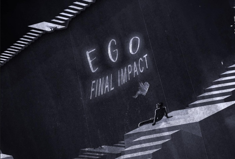
9. Digital: And we're onto style number seven. We're almost done. And this style is the digital style of album covers for the digital album. So everything is digital. So it can be an illustration, it can be vectors. It has to be purely digital is really captures the attention of a younger audience. It's more punchy, more in your face. So let's go ahead and let's hop into the web browser and let's get started with this one. I, so here I'm looking for a name for my musician here, I want us to be neutral names. Let's just do this for a little bit. And I kinda ones to a one word name, flux. If we can get something that looks interesting. Let's go to this a few times. Let's keep going and we'll find something here in just a second. Eagle, I like ego, that's a really cool artist name actually. So we're gonna go with ego for the name of the artist. Okay, now we need a name for our album. So let's do, let's do five clicks, OK, 1-2-3-4-5, K. This is going to be called final impact. I like that. So our album is called final impact by Eagle ego, should I say? Okay, so final impact, that's pretty cool actually. So now let's go ahead and let's get our font. So final impact, that sounds kind of sci-fi. So let's look at a sci-fi font, see if we can find something that's good. And Republic domain a 100% free. And I'm going to go to something that will look very interesting for us. And you like this one that looks very interesting. I'm gonna do Potter for one. And let's go to page six. I do like the belt. That's a nice one. Heroes, a nice font. Okay, and lets you something definitely from this page. Let's do the belt. Let's click download. So we now have our fonts. Make sure you install those nine images. Now I'm gonna go and use Pixabay because you can get really cool images from here. So let's look at Pixabay and trying to find something that is a little bit more suitable for our needs. So let's go ahead and let's look at illustrations on specifically illustrations for this because all going to be digital. So let's go and let's look at a picture of Earth. Picture of Earth if possible. And we have some really nice options here right off the bat. I like this. This itself could be an album cover. A might try and use a staircase from this. Mostly I'm gonna see if I use that. Let's look through everything here. I'm gonna take this image here. So I'm gonna download this done. So we have that banana illustration. I do want a planet of some time. So let's see if we can find something that would work. This is actually really nice here. I might have to mask this is astronaut out of it, but that could potentially work. Ok, let's get this image here. It's not all this. Alright, so we have that image there. And I think that's all I'm going to use for now. Alright, so let's hop into Photoshop. So now that we're in Photoshop, you know the drill again, we're going to place our images in. Let's go ahead and do that real quick. All right, so we have our images placed in here and I would like to cut out the staircase and this person from this original image. So let's start with that, shall we? So there's a few ways we could do this. Let's use our quick selection tool. And let's see if we can get a nice selection going here. So I'm not going to worry too much about the right edge here. You can hold down shift to add to your selection. That's looking fairly decent. Let's get our person here. Well, let's get all of the stairs going here. Something like that would be organize knows to do this edge over here. Alright, so let's try and masks out, see how it looks. So it's definitely not perfect. Let's zoom in here and let's trying to fix the head over here. So I'm just gonna get a normal brush here. This one here. So now if we painted in black, we're gonna paint away. Or if we paint in white, can actually pay back the head of this boy here. So otherwise, I think it looks fairly decent for a selection. Let's just go in and resize this. So let me get a little bit over the size that we need. So goes off the edge, which is a enter. I see up here is a little bit of blue that I want to get rid of. Cues, paint and black can hold down shift and get a straight line. Like so. And you can go in here and clean up this as much as you'd like. But I'm gonna do a little effect later on to actually blend the two images together. So let's turn on this Earth that we have underneath it, lets it controller command t. Let's see if I can make this work for this image. So I don't want to have the SMR in it. I'm gonna pull this all the way over here. And it looks a lot nicer, actually, kinda like that. But obviously these aren't color matched or anything for now, but that's fine. So for this image here of the earth, I want us to be more cartoony, more stylized. Let's go to Filter. Lets go to filter gallery. I'm going to try and match it to what we have. So the original is kind of a watercolor type of thing. So let's go ahead and let's look at these different options that we have. So you do have a watercolor option. It's gonna take a second to actually apply the filter and we can zoom out to see what we're working with. Okay? Zoom in a little bit here. That might potentially work under painting might work even better because we get a little bit of more texture, more blocks Yunus. Yeah, I'm gonna keep it as an under painting. Now texture, I do want it to be a canvas texture, way of brick, burlap or sandstone. And I'm going to have more of that little more relief of the texture. And I'm going to go with that. Let's hit OK. It's going to apply this filter to our actual image and can see the under painting coming through here. And there we go. Now I want to add a little bit of a dark purplish color to our original image here. So let's make a new layer above that. Let's flip it down. Get our pink bucket tool. And we're going to sample this dark color here and just fill all of that in. And we're going to apply a nice blending mode to this. You can play around which one you think will work. But generally speaking, overlayer soft light will work well for this. I'm going to use soft light and bringing opacity of that down just a little bit to about 89. Very nice Nelson to get orange on the top of this. So I'm gonna do the exact same thing. Flip it down, and I'm gonna get this nice yellow, orange color gone here. Fill that in as well. And this time, let's see. We'll see what works. You just go through here. Sometimes one of these works and the other doesn't definitely play around with this. And I do want orange applied to the top there. So let's just keep going here and let's see what's going to look good. Darker color is along the lines of what I want, but it's not exact. But choose darken. And I'm actually going to get more of a redder color. I'm gonna go till I find the exact right shade of orange here. This looks like it's about right. And I'm going to turn to a passage that was done. Well, I'm gonna do that to about 52%. So kind of tying these two together, okay? Now I'm going to group all of these together and then duplicate it and then flatten it. Singers do control command G to group it, and then control or command to flatten that. So to rendering that out to one flattened layer, it's gonna take a second because actually a lot of information for Photoshop to process right now. So let's give it a second to do its thing. And now you see we have this on just one layer. Everything is one layer now want to work with this one layer here. So you can right-click that and convert that to a Smart Object. Okay, we're gonna go in to our filters filtering gallery. And they should work a little bit faster now because we're working with just one jpeg here, okay, but still it will take a second to process everything I'm going to do not so I see pretty much my whole image. This time I'm gonna want something that's going to be a little bit more stylized. Ok, so let's go down here and look through all of these different options that we have. Okay, signal to accented edge. Let's look at accented edge. I shouldn't like how that looks. Very Digital looking. Could also do Ink outline. And you can also always apply multiple of these filters if you want. That's definitely not an issue. So I'm gonna look through this really quickly and see if I find something that will look good. Alright, so I found the pink Dobbs filter with a brush size of, let's see, 16 or 17. Let me put this down. Let's go 15 and see what that does. Is it looks really nice, actually sluts hit OK. So and this is more like a digital painting style, but we're not done yet. We need the actual name of the band and everything in here. So let's go and let's hit T4 title and let's get in the name of both Ben and the album. So the name of the band or artist here is ego. Ok. And the name of the album here is final impact. Lovely. Now we did go ahead and get some fonts for the sorts like ego. And let's go ahead and find our first font, which was a Pottruck PO TRA. So let's go down here. Right there. Very cool. And for the color national going to sample from here. So still part of the actual image here. So if I centered this center markets play around with it to find the exact center here at Control Command T. There you go. There's a center of ego up their final impact. We'll try it. The other Fanta we got and that was called the belt. So let's look for the belt here. I see a right here. Final impact. And I'm going to sample fairly similar color. And we go. And again, this only has a regular version and no no uppercase letters. So we have final impact here. Let's change the size of that. Let's center this with our image. Now I want to have this down in this corner. Like there's so many ways that you can have this laid out and is entirely up to you honestly. Ok, let's have this over here. From the lower the opacity of that down to about 90%. And Ingo, O-ring that down here. Final impact by ego cycle. That's a pretty cool album cover from being completely honest. So let's go ahead. And, Let's go and add one more final touch here really quickly. And above this, I'm gonna get my Gradient tool and I want this purple color to come up from the bottom right here. Okay, but I'm gonna bring an opacity of that down to about 48%. There. You just have a little bit more of that going on. Okay, so before after getting rid of that gray color going on, so it's pretty cool. Let's go ahead and save this and go on to our last type of album cover design. And that's going to be a photo manipulation style. It's going to be very cool, very simple. Let's keep going.
10. Photo Manipulation: And we've made it to the very last style of album cover design, and that is my personal specialty and that is photo manipulation. Now, photo manipulation album covers end up turning into pieces of art themselves. You can place the whole band underwater. You can place them on the moon. You can get really creative with this. So let's go ahead and do that. This is going to be the moshe randomized cover that we've done so far, but it's going to be really fun. I'm excited for it. So it's up into my web browser real quick. So here we are with our band name generator. So let's go ahead. Let's do random ideas once, twice. Let's see what we get here. If we can get something that will look or sound interesting along, these are toothbrush based and I don't want persuasion works. Let's go back. Let's do that one more time. Let's do random ideas. Random ideas. Let's see if there's anything that looks good. So I'm gonna go with unspeakable key. I like that for the name of the band. Now let's get a name for our album. Okay, now I'm gonna pick a random number here. Let's put 11, okay, 1234567891011. So something here is going to be our album name. Let's go ahead and let's choose nemesis, actually like that. So we have nemesis by unspeakable key, subscribe. Let's find a random fonts and go all the way here, back to the front. And let's try and get something that's going to be various. And again, public domain or 100% free. And let's click Submit. Alright, now this is interesting because I've never actually looked in this section of the fonts. This is nice blackouts, sunrise. With ice loads, use blackout sunrise. Then let's go ahead. Let's use us via phone. Let's download them, make sure you install those. Let's go ahead and find some images. Now when it comes to photo manipulation album covers, they can be entirely random. So let's go ahead and get a very random image. So I want a desert, wants something that I could potentially work with. I do like to work with deserts and low angled images. So if I can find something like that, it would be fantastic. This one could be a potential use butter. I don't like the perspective here, so let's keep looking until we find something that is usable. So here's the first image that I found. It's often desert. I have a cool idea from the salts. Go ahead, download the full size of this. Now I'm going to go ahead and find all the other images I'll be using and I'm going to show them to you in just a second. I'll be using this image of a pastel sky. Make sure you demo dot one. And I'm going to be using this bust that I found and be really cool. Let's download that. And the last lecture I'm going to be using will be of this guy standing, looking sideways like this. And let's hop into Photoshop. For another one, Photoshop, let's go ahead and let's import our images. Making sure to place embedded. Alright, so I have three images in here. You might notice I did not put. The pastel sky, I'll be using that in just a second. So it's good. Let's hide this man. What's heightened boast the face there. Let's focus on this layer here is going to bring this down to about here, control command. I'm going to resize that just a little bit. Like that. Something to fill in the whole screen and naturally need to get my sky in here. So let's go ahead and do that. I'm gonna do an AI powered sky replacement really quickly. Now before we do the AI powered skier placement wretchedly need to fill in the sky with something, right? You don't want to have just white here. So let's create a new layer here. And what I'm going to do is I'm gonna just get my lasso tool. I'm just going to create a nice little selection of my sky here, okay? And now I want to do is edit. And you're gonna do content aware fill. So it's gonna take a second and it's going to sample everything in your image to essentially, as you see here, stretch out your Skype. So just hit okay. And actually hit apply. You can hit OK and hit control. Can I need to deselect and look, it's a seamless sky. How close up? So now what we can do is combine these layers Control Command E, and then right-click and convert it back to a Smart Object. So now we can go into the sky replacement tool. So let's go to Edit Style replacement. And now what you're going to do is in this dropdown here, we're not gonna use this default sky. This looks horrible. So I'm gonna click this drop down. We're going to click this plus 1.5. We're gonna navigate to our pastel sky. So here we have the pastel sky. I'm gonna click open and it's going to be added to the very bottom of this lesson is gonna click OK here. And you see it right there, Editor in here. So it's gonna take a second to apply, but we see it has applied it. But we might want to adjust this just a little bit. So let's go ahead and actually flip this for now. So you can play around with how you want to actually look. Let's go ahead and make this guy a little bit brighter. Like so Shift Edge, let's bring the edge into the negative a little bit. I think. Let's go talk about minus 46, and it looks nice enough of the foreground lighting. I don't want it to adjust the color. Quite drastic moment to to match up some of the lighting and bring that to about 49. And you can assemble these to find a looked at CSU. Exactly. But I think I like this and I want to make sure to output this to new layer ok. So let's hit OK right now. So I know I would like to 100 pastel foggy Stein the back, which is very cool. So a little bit more interesting than this. All right, it's kind of changing the time of day as well. And now let's go ahead and get our bus down here. And let's try and mass per cell as easily as possible. So let's get our objects selection tool. I really liked subject selection towards really good actually. And look at that, it's done a fairly decent edge around everything. Now, I'm going to ask yourself and see how good of a job that does that did not do a very good jump at all. So I'm going to undo that. And what I'm going to do is I'm actually going to use a pencil and make a nicer edge around this plus deselect that. Let's go in with our pen tool. Let's zoom in. And I'm going to really quickly just draw around. Are little statue here. And I'm just about finishing up my selection. There we go. A 100% perfect. What's gonna be good for this, such that controller command enter connector selection. And let's go ahead and mask that out. So that's a lot nicer and we'll still fix some of the edges here in just a second. And let's go ahead and control command t. Let's resize this. I don't actually flip this because the light on our statute is coming from the right, but in our images coming from that left. So let's go edit, transform, flip horizontal. And we are going to have this be like so, square out of this, something like that. So let's go ahead and, and that's actually blend this into our image. I'm going to do this one at a time. So using a brush, I'm gonna get a nice soft brush regard and we can actually fix some of these edges if we zoom in here. My going to smaller Bashir flow. Let's get that all the way up. And I can change the hardness of the circle to about 60%. National wonders to be fixed for the size. So don't have to worry about the pressure on my drawing tablet. You can run and get rid of these very harsh edges here. But I don't want any of that blue coming through. And I will fix this touch will look better in just a second. And it comes to photo. And it comes to photo manipulation definitely takes a little bit more time. So I'll just pay attention and have fun with it. Ok, I think that's gonna be good for now. Do a little bit on his neck here. But first I want to actually get him blended into the San Juan, him coming out of the sand itself. So let's go ahead and go back to our brush. I want us to be very hard and it like maybe 87 hardness. So now when we think it's going to be a harder edge, zoom in here. I'm going to imagine that he's buried by the sand up until this point. Okay. Some Moscow morale and we'll add the shadows and everything here in just a second. And I'm gonna imagine here's some sand built up on the side here. Like some. There we go. So now he's buried in the sand. And let's go ahead and let's color match him. Let's add some shading. Let's add shadow. Let's do this. Okay, this is going to be really fun actually. So first things first that I want to do them wanna do a little bit of a hue saturation on him. Let's reduce the saturation. I'll add color back in later. And now with a brightness contrast, I just wanted to reduce the contrast on him. Something like flat, perfect. So let's go ahead and add our colors to this image. So I like to do one solid color layer, this user paint bucket tool, like to sample a color from the image itself. So I'm gonna take this nice, I don't know what color your call that purple, orange. Let's fill that in. And let's make this be soft light. Let's reduce the opacity of that. Lovely. Let's go ahead and add in some shadows and highlights on the sorrow, the highlights. We clip that down. And I'm gonna sample some of this orange that we have going on. Make it a little bit brighter. And let's go ahead and get a thicker brush hair. Maybe like 200 pixels or so. There we go. And I want this to be soft for sure. So now when I paint this writing a little bit of a highlight along this left edge of her statue. So take your time of this a little bit goes a long way. So just take your time. Let me go and make the brush a little bit figure and lower the opacity all the way down to about 17%, which to paint in a little bit more going onto his hair here because that would catch some of that sunlight as well. Ok. Same with his face here. It's gonna reflect a little bit off to the ground. And logo passage of that a little bit if you'd like. And I'm going to add another layer. And this time it's going to be for the shadow is going to sample this dark blue here. I add a little bit more black into that and be saturated that just a little bit. And we're essentially going to do the same thing. I'm gonna bring opacity up though. That's a little bit too light. So lets add more, lock into that. Very nice. Lower the opacity and add more shadow to the side of his face. 90 doesn't look very good. On time. We're going to add a little bit of a blending mode here in just a second. Are blending Modes. And I do like to use multiplying this situation here. But overlay can do a good job as well sometimes. So let's go ahead and let's use, let's use Multiply. And I'm gonna lord the past study of the skull down to about this point here. Okay. Another nuclear weapon down. So the photo manipulation method is the method of multiple layers, like ridiculous amount of layers, but it ends up looking really good in the end. So now I want to add the cast shadow by this head. Okay, so let's go down underneath this layer here. Now I want to click on the layer mask controller. Can I click on the Layer Mask? And we now have a selection gay or paint bucket tool. And let's fill it in with a nice dark shadow color that we've been working with. And you don't really see it. But let's deselect control commanding, and let's transform a control command. And now Holton control command and click on the stop little note here and you can just drag it across. Going to drag this up over here. So I'm not going to look at the angle that we have this app. And just do a little bit of a nesting here, something like so. And now we can simply go and do another blending mode here. Dark multiply actually. Let's lower the opacity of that down to about 40%. Now let's look at our guy here, okay, now he's a vastly different. He's very contrasty. So let's go ahead and let's deal with him and zoom in. And I want to actually mass came out. Let's see if our objects selection tool do a good job with him. Don't want this gap in between his legs. Alright, everything looks like it's selected nicely now to zoom in here. And you can always take the Lasso Tool, hold on, alter option. And it's going to take away from your selection. So if I do this, look at that part of the selection is gone. She didn't clean up some of these lines just by using your trusty lasso tool. And again, you would get a better edge using something like the pencil, but this should be a good enough selection. So let's go ahead and let's must come out. There we go. That's not too bad of a selection. Let's transform him. And we're gonna make him very small. And let's go ahead and we're going to want to turn him around because remember the light is coming from the left than our image, but it's coming from the right on him. The edit transform flip horizontal. And we're going to actually have an even smaller. And somewhere about here. Something like that. Looks good. And now let's make him actually blend into this image because he'll could impede us not blend in very well. Now, looking at the sun here, I want to touch really much that it's actually going to hit him. So part of it is going to be in the shadow. Part of him is not. So place them there should be a little bit more believable. She don't want to keep that in mind as well. And let's go ahead and let's get started. Let's be saturate him first of all, because his way to saturated fats don't brightness contrast on him and increase the brightness a little bit, but decrease the contrast and vastly. And I might even go ahead and do a Levels adjustment on him. Why bring up the black levels? Merry go round. I subscribe and do essentially the same thing we did before. And add a colorful layer using one of these purple, orange colors and had a nice soft light on that, can bring an opacity of that down with added a bit of that color. Okay, it's getting there slowly but surely. And now I want to do a new layer above that, clip it down. And I want to do essentially what I did for our statue. I want to get that nice highlight going on. Phones. Make sure a great color that we're zoomed in. But a nice small soft brush. And we're going to start painting onto bringing opacity apps. We actually see what you're doing because we can always bring opacity down afterwards. Okay. Nice little bit of a highlight on him and lovely. And zoom out. And let's make that a nice. Let's do overlay what we're going to bring an opacity of that weigh down some before, after adding a little bit of that. And we're gonna do the same thing with the shadow. So let's get that nice and dark blue color we were working with. And we're going to add that to the back side of him. Connected brush bigger. To get more of that gradient going on. Ok, and now what we're going to do is let's darken on that. Yeah, that definitely looks a lot better. We can reduce the opacity a little bit. We've added a little bit of that to him. Not too bad. So let's go and add his shadow. So you can control can I click on his Layer Mask here? And we're gonna do essentially what we did for our statute here. Okay, so use your paint bucket tool and get a nice dark color here. So that in I'm going to deselect and then we're gonna transform. So I'm going to just similar angle here. And just make sure that it's matched up as best as you can get it. Okay? And our neutral passage of that as well down to the same as we had the other one. So what's that, about 40%. And we're getting there, we're almost done. And now he tells a little bit too much orange in him. Sort I'm going to do is I'm going to do another hue saturation clip down. But the son, I'm going to look at the reds and yellows. Yellow, Let's desaturate the yellow. Let's look at the Reds. And we're going to decelerate the reds. Something like that's a little bit more accurate. Okay. And now for some finishing touches on him, I'm going to group them together. I know what I'm working with. This. I'm just gonna get a nice and black brush. I'm just gonna do a little bit of a shadow on his back and also pass any of that. And I'm gonna do essentially the same thing for our statute here. Group that altogether. We can you layer above that, clip it down and with a nice and black brush, make a bigger for the statue. In a nice little shadow along this side. Here, black, just lower opacity. Okay? So now we have essentially the main part of all of this done. Well before I even do that text, I want to finish up our PCI slots. Go ahead. Let's add a little bit of a gradient for the foreground color. Let me sample one of these dark colors here, bringing that up from the bottom. Traditional pass three of that. Something like that. Now might even want to add a little bit of a blurb to this guy over here. Which if you wanted to do that you could, you'd have to flatness in order to do the, to do that. But I'm not going to write now. But in my opinion, that might look a little bit better. And then add a color lookup over everything here. And do my favorite foggy nights. What I'm also going to reduce the opacity of this vastly to about 30%. I'm going to do a brightness contrast. Increase the brightness by about 38, looking good. And I honestly might do an overall blurred everything. So let's group all this together. Let's do filter. Let's group these together. And then let's flatten that really nice and economic anymore changes. But let's go ahead. What makes us into a Smart Object. Now I'm going to filter blur. A little bit of a Gaussian blur. Maybe half a pixel of blur mini, up to one pixel is do one pixel blur. And also going to do filter. And what we're going to do is we want to add some noise. We're going to do noise. Add noise. Just to be very honest, a grunge looking type of thing. You can have it be a Gaussian type. Can also be monochromatic if you wanted to be. So you can definitely mess around with this. So I'm gonna have a uniform monochromatic and amount. Don't be too crazy, but something around 13%, this looks fairly good. Am I put it down to ten? Is to 10%. Can type that in specifically. And I'm going to click Okay. So that's not looking to Ben. So let's go ahead and add in our texts the main part of this, right, because this is an album cover salt. Let's start typing. So we have this is by unspeakable, unspeakable key. And we'll change the font in just a second. Okay, and albums name is called nemesis necessary window. So let's look at our first one over here, unspeakable key, and let's change that to one of the fonts that we downloaded. So let's use that to blackout Sunrise, which should be right over here. Blackout, very nice, unspeakable key. And let's change the number since let's change this to our other font, which was via fonts. So let's just go down, should be closer to the bottom here. Via font. Rennes, actually like unspeakable keys on might actually have this nemesis also be in that same font. Saltwater, blackout. Lovely. So let's go ahead and play around with this snake and speak a wiki for everyone needs to know who is seamless. Mixer that is centered with the unspeakable key. For Nemesis. Let's make that over here centered. Like so. And let's look at this. Let's make this a little bit better. Duplicate this two times. Now one of these copies, I'm gonna change the color and everything else, but I'm gonna make the color of this one of these pink. So let's go ahead and try and find a nice reddish pink, Something like that. Said, okay, I'm going to be too noticeable right now. Let's find, let's look at this top layer. Select all of that. We're going to select a different color. We're gonna go to like a light blue. And we're gonna make it in very lightly and said, okay. Okay, so I'll turn everything on. So I'm going to have our main one up top, which isn't black. And now let's slide each one of these. Just over. Going to slide this over to the right by a few pixels. I'm going to slide the pink one to the left by a few pixels. So this is going to create a little bit of a 3D effect. So a little bit here. Now for this one, I might actually change the color. The closer to read, a little bit more noticeable. Let's set okay on that. Remembering that also in a little bit of the blue or something like that. So let's zoom out. It looks nice. Shape unspeakable key nemesis. That is very nice. So there you have it. We have our third and final album on mike, go ahead and bring this unspeakable key in here and just a little bit, give it a little bit more breathing room on either side. Lovely. That's looking good. So we're gonna save that. Now in the next video, I'm going to go over your assignment for this course. That's right. So let's go and let's wrap things up.
11. Your Assignment: And you've made it to the end of this course. You've made eight count that Eight fantastic album covers with me today, and that is really fantastic. You can put all these into your portfolio and use them to get some really good gigs night your assignment for this course, I want you to choose three of the different styles that I did today and create your own album cover for three of those styles. I want you to go get a random name for the band or the singer Can a random name for the album and then create your image, your album cover art based off of that. Alright, and once you've done that, drop that down to the students submitted project section of the course. Have a lot of fun with this. You can get really creative. As you saw, everything I did today was completely randomized. That's where everything was random. So definitely have fun with this. And in the next video, I'm going to go over some final thoughts for this course.
12. Final Thoughts: Well done, you've completed my course, Adobe Photoshop, album cover design. There was quite a lot of information to cover what I'm glad that we did. And now you have the skills you need to go out and create your own album covers with ease. Not only that, you finished the course with eight count that beat of your own composites, as well as the ones you'll be making for the assignment, you're free to include all the pieces you made during this course in your portfolio. And would like to mention that I'm selling the Lightroom presets right now for a special introductory price over on my website. So head over to www dot near real-time chi.com forward slash presets to get your precepts today. These are perfect cubes on Lightroom to fly, preset color grades to your photos and edit. That's that I've already made and tested over many years of practice and use. You can even use them on album cover designs. And you know the best part, both precept packs that I'm selling are cheaper than a cup of coffee. Or really want to make these very easy for you to get in, very easy to use. And really hope they've learned a lot today about album cover design and all the different ways and styles in which you can make them. If you've enjoyed this course, I encourage you to leave a review and rating as I helped me out a lot as a teacher and feel free to check out my teacher page, to check out other Lightroom and Photoshop courses that I've made, ranging from beginner courses all the way up to mastering level courses. Also, if you have any suggestions or requests for courses that you would like to see me cover, leave it in the comments for the course and I will try my best to cover any topic that you suggest. It's been a pleasure teaching today and I hope to see you again in a future course. Take it easy.
 Tom Kai, Senior Graphic Designer & Art Director