Transcripts
1. Introduction: Photoshop is an incredibly powerful tool, one that is absolutely essential. And if photographers and graphic designer's toolbelt, one of the effects in Photoshop that has taken off in recent years is the dual tone effect. But as simple as it may seem, it takes a lot of nuance and technique to pull it off, right? Not only that, there are actually many ways in which you can tackle the dual tone effect, each different effect. But all if done right, can create an incredibly stunning creation. But where exactly as it used, why is it so important? While these are questions that I'll be answering in today's course, Photoshop masterclass, Duo tones. My name is Tom Chi and I've been a photographer and graphic designer for almost 12 years now. I'm from the United States and I travel around shooting photos and design for various clients and companies specializing in fashion, lifestyle and commercial photography. You'll see a few examples of what I've done and going on the screen right now. But if you want to see more, please take a look and head over to my website at www dot the real Tom Chi.com or look me up on Instagram at the real tom time. I'm so excited to bring you this course today because I honestly think that the dual tone effect is one of the coolest stuff that's a you can add to your photos in Photoshop. Many large companies nowadays uses effect in their marketing, and I'll show you examples of that in the next video. But it's important to note just how important dual Corning has become in modern culture. Having the skill in your arsenal can put you ahead of the crowd and help your work to stand out from the rest. Now, I value my time, but more importantly, I value your time. I've sat where you are wanting to learning new technique and struggling to find one video, one course or one tutorial that showed it all to me. While my goal is to make this the only photoshopped dual tone course that you will ever need and to equip you with all the skills and knowledge that you need to keep on creating Dalton creations forever. This course is for anyone who wants to up their photography and graphic design game with dual tone effects. It's a lot more than just knowing some colors onto your photo. It takes a lot of thought and careful consideration of space, color, and the meaning behind what you're doing. Whether you're doing graphic design and photography for fun, or you have to make a living from this creating for clients. This course is for you. Now I think this introduction has gone on long enough. I'm sure you are as eager as meat to dive into this. So let's go ahead and do that. I hope that you decide to enroll in my course because I've got so much to share with you. And if you do enroll, I'll be seeing you in the very next video.
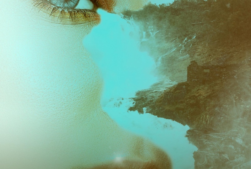
2. What Is Duotone?: Do all tone. What exactly as it was actually quite simple. Don't own comes from the two words Duo, meaning two or double, and tone meaning color. Toning in photography is usually referring to recolor, a grayscale image. Many times it is used in colorizing black and white photos, but dual tone is using that same principle and applying one color to the darks of an image and another color to the lights of the image. Now, where have you maybe seen this? Well, if you know what sepia tone images are there. One of the earliest forms of dual atoning. Back when cameras first came out, photographers wanted to warm up their images from the cold black and white. So then sepia toning came around in an effort to warm up the images and allow them to have a bit more life. Later on in history in the early 20th century, printing costs started to run. Height, Inc is very expensive, so having a pulsar with multiple colors will often cost a lot of money and a lot of time to make as a printing process at the time would require multiple prints of various colors over one image. So in order to mitigate the costs, dual toning roasted popularity in the sixties and seventies, but at the same time it created a whole iconic look, one that has seen a resurgence in the modern digital age of design. Today, it's not the Castlight people in companies choose to do it on their images and adds, it's more of a stylistic choice, one that works to advance job. Many companies, wherever you may be seen or used, dawning when you see it all over the place, from website backgrounds and banners to marketing ads, album covers, book covers, to purely aesthetic portrait treatment. Some of the most popular places in companies that have used this technique and recent years include Spotify, Adidas, Apple, and many more. In many regards, these companies are at the forefront of what the thing is InDesign and taking a cue from these companies and others is important for designers to see what trends are and where trends may be going. Now this is all good, but where exactly am I going to find the right colors to use? Well, I'm going to show you just that in the very next video. So let's keep going.
3. Finding Good Colors: Finding colors can be one of the most difficult things when it comes to dual toning. I remember when I first started out, I wouldn't essentially just guessed the colors. I would go to the colonial, look at opposite sides of the wheel. And it did work out for some of my images, but for some, it came out with some really terrible results. So I'm gonna show you a really great tool they can use to get really, really cool colors. So we're, I go if I ever need color, inspiration is right here, Adobe color. Now if you have any kind of Adobe programme, Adobe account, you have access to this website. And I'm going to show you the whole interface here and some really good benefits to it. So when you go to the website, it's color dot adobe.com. And it's going to load you up to the Create tab, which has a color wheel here. Now when it comes to dual toning, you mainly use three color harmonies. You will end up using analogous, which is just colors that are right next to each other on the color wheel. Then you'll also use a monochromatic, which is one color and just different shades of that one colour. And the most popular color harmony that will be used is complementary. So we'll be using a lot of the complimentary, but I'm gonna show you the others as well. Now how exactly am I going to bring this into Photoshop? Let me show you. First of all, let's get a good color combination. Let's say I want to work with a cyan orange combination. You can drag these bubbles around and get a very specific color. You can click and drag each one of these separately. Very nice. So let's say I went to work with these colors. How am I going to bring this into Photoshop? Very easily. You can save it to your library. It's gonna save it to the cloud. So you can choose to save to another library. I have to write out my library and opposed to that I was designing. But you can add a new one and I can just call this dual tone colors. And then just click Create. So now I can choose to save us to deal tone colors and call this one. Let's just call this cyan plus skin because this looks like a nice skin taller over here since skin tones. And you can create tags for this if I ever want to search for it, and you can publish it to color or just keep it for yourself. I'm going to keep it for myself. And you click Save. So now we're going to jump over to Photoshop really quickly. Alright, so now we are in Photoshop and if we look over to the right here, right next star adjustments, we have a library's panel. So let's go ahead and click our library panel. And we'll see here are library of dual tone colors that we just created. So let's click that. It's going to give you some. So there, that's just click Cancel. But now we have this color theme here of science plus skin. So now we can click that any color from here, and you see we haven't picked out. So that's going to be fantastic for sampling colors for our dual tone effect. Now, let's jump back into Adobe color. Okay, we are back in Adobe Color and now there are few more tabs here which are really, really important and useful. So let's go to our Explore tablets. Do we just want to see what other color combinations people have come up with. So the color of the year we see is a classic blue. But let's say we want to just look at some dual tone colors once very simply just come here and type in very simply dual tone. Other people have already created dual tone color samples and tagged it with the word delete_one and you can just search it. So let's search dual tone. That's hit Enter. And it's going to fit through everything that people have made. And you can already see it's loaded here, a couple of them that we see already, Adobe Stock images that are being used here, but we see some really good combinations of colors here. And now you have two options. You can add it to your library or download this as a.jpeg. So if you don't want to use the cloud and have it to your library, you can download this as a.jpeg, pull it into Photoshop, and then use the eyedropper tool to sample the colors from that. Let's say I really like this color combination here. We're just purple and magenta. Let's add that to the library. It's added it to the library and we see down here it's added it to dual tone colors. It's going to add it to the most recent library that you've used. So now for in Photoshop will be able to access that in the very same place. Now I want to show you one more tab here on the Adobe Color website, and that is the trends. That's a really, really cool tab, especially if you want to stay up to date with what's going on. So one thing click that it's going to show you the current color trends in different industries. So we have fashion, graphic design, illustration, architecture, game design, wilderness, flavor, and travel. So let's say, for example, for myself, I do a lot with fashion. So let's just click View More. And now we see the colors that are popular in trending in the fashion industry. And we can see here is going to be a duo tone effect. So we can see a slight dual tone effect on this image here. But let's go down and let's see if we can find a really good deal tone image. I spend a lot of time looking through the trending section here to get really, really good color combinations. So we see here this, here would be a monochromatic color set used for dual atoning. But even if one of these images aren't dual tone, perhaps the colors that are being used are on the opposite sides of the color wheel. So let's keep looking through here. Let's find a good one on the third page here that we can use in our edit. So I happen to really like the colors in this particular image. Very earthy, very nice. So let's just add that to the library, and I'm going to use that later on in one of my edits. So this is a really great resource to get your ideas going when it comes to color, to see what's trending, to see what other people have created, and to have the creative freedom to create your own. So in the next video, I'm gonna go over a basic photoshop interface overview, get our images imported into Photoshop and started with our edits. So let's hop into it.
4. Photoshop Interface Overview: And we are finally in Photoshop, we're ready to get started. So let's go ahead and let's go over the whole interface that we'll be using today and let's import our images. I'm going to keep things very simple for you today. So when you load up Photoshop for the first time, you will be met with this screen. So let's go ahead and open up one of our images. If you haven't already, make sure you download all the images, I've provided a raw photos for you to use. So that's gonna get you the most detailed and most color possible. So make sure you download those and they're labeled with a proper names to make sure you open the appropriate images. So let's go ahead and let's click open. And we're going to start out with our model in front of a red background that's just click that and then let's click open. Now because this is a raw image, it's gonna open up the raw image interface when you pull this into Photoshop. So you can go ahead and do some edits to your image. I'm gonna do just a very slight exposure edit, but I'm going to do more later on. So once you've edited your image to look how you want it to look, we're going to click Open. And then it's gonna take a second to apply any edits that you've made and it's going to open it up into a Photoshop document. Very nice. Now, if your interface does not look like this the first time you open up Photoshop and might look something like this. I'm gonna go ahead and reset my workspace. There we go. So it might look like this when you first load it up. Now I use the essentials workspace. You might be on a photography workspace or a graphic and web workplace. I use the essentials because it has everything that I need and everything that I'll be using today. So let me get to how my workspace looks like right before I reset it because that's a very efficient way to do things. Now first of all, I tend to drag my properties over into this panel because you don't use that too often. So just keep that hidden over there. Now, over here where we have our adjustments and libraries. You can see all the colors that we brought in from before. I usually have my adjustments open and I tend to pull my layers tab up so I can see all my layers here on the right side. Now when it comes to the color area up here, you might have swatches enabled, you might have gradients are patterns. I like the color wheel and yet a few different options. You have color wheel, a hue cube, RGB slider. So you might have something that looks like this. I personally prefer to use a color. We'll have a lot more freedom. You can choose the Hue. We can choose a saturation of your image. And you can also choose the amount of black that is in your image. So if we look here on the color wheel, the closer I bring that down to 0, the closer our color gets to black. So no matter where we'd get started over here, we bring this down, it's going to hold on to black. So there's a lot of customizability here with our colors. So that's why I tend to use a color wheel. It's a fantastic color picker. Now you might have noticed here on the left I had brushes now a lot of time in my workflow I use in many different brushes. I go back and forth and it makes sense to have my brushes just here on the panel that I can pick and choose from. Instead of always going here to the drop-down for the brushes, finding my proper brush, and then going from there. So how do I get my brushes to appear? It's very simple. You just click the window up here and we're gonna go down until you find brushes. But now it's not in the right places that you're going to click and drag the top bar here. And you see it detaches from that right side. And we're gonna pull it until we see a blue line appear on the left, just like that, and then you let go. Now we have all our brushes here, always open. So for example, let's say I'm painting, I mean, make a new layer here. Let's say for whatever reason, I have some shadows that I'm painting onto my image. And I'm painting down here. And let's say I want another brush now want a harder brush to paint some more red up here. I can easily come and switch between my brushes just like that. It's just click and switch. So that's one reason why I have that always open. And this is going to be the basic interface that we'll be using for all the edits that we do today. Nothing too complex is going to be very simple, very easy, and very, very effective. So I'm going to load up all of our images. Make sure you go ahead and open up all the images. You can follow along with the next couple of videos. But the first method of melatonin that we're going to tackle is using gradient maps. So let's jump right into that.
5. Gradient Maps: Now the first method of dual atoning Now we're going to be using today is using gradient maps. Now, before you even get started, if you want to clean up your image in any way and now is the time to do so. So for example, if you do want to do anything, we'll just do a little quick thing here. I'm going to use my Spot Healing Brush Tool. Make that big and just get rid of anything that might seem distracting. I'm not going to get rid of all of these points because these are beauty marks and you don't want to over edit your images, but you might want to get rid of a few of the things if you wanna do any skin friction, now is the time to do so. So you can go ahead and do that. I did go ahead and already do that on another layer. So let me just enable that, that rigorous I cleaned up a little bit of these spots and everything. So I'm gonna delete the layer. I just mean. So you can go ahead and do that now is the time. But let's go ahead and look at our gradient map. So that's an adjustment layer that we can use and that lives are right here on the bottom, right, out of all the adjustments. And let's just click that. And immediately we have this apply to our image. Now, we want to click this drop down. And let's just select one that is two colors. So let's click this. Close the dropdown. This is already dual tone effect, but as you see, it's way too intense, too saturated. So let's click on the actual gradient here. And you're going to be met with this dialog box. Now we can actually adjust these colors and more specifically to be more in line with what we want. Now for this very first one, I'm going to use the purple orange combo that we have here, but I'm going to subdue the colors just a little bit. So let's click on our orange here. And now let's click on the color itself. My nice. And here we can adjust the colour and that we will be using. So I definitely want this to be less saturated because as you see, this is all the way up in the top right. So as you see, as we bring this down and it's going to update it on our image. So I do want it to be fairly bright, but definitely more desaturated. So I'm gonna bring that down to about that point. Now let's click OK, and let's go over to the purple. So to explain this gradient slider here, the left side is going to be the color that is applied to the darkness of the image. And the right side is going to be the colors that are applied to the lights, to the highlights of your image. That's one thing to keep in mind. Now let's click on our purple tab over here. And now we have that color to adjust. So let's click that. And as you see, this is a fairly dark color. I do want this to be desaturated a little bit more. So we can bring that to the left. Maybe a little bit brighter. So you can really get customers these colors Jan, you can change the exact color that want that to be a little bit more blue. That's looking fairly nice. And then we can hit OK on that. So now we have a very nice dual tone. But what if we want this gradient to be different? Well, you have a few different options here. You can click this middle point here and drag it to the right. And as you see, more of the purple is coming over into the mid tones of our image. And as you see now, more of that is affecting the mid tones, which we see here on her arm and more of her face here. Now if we drag that to the left and we're bringing more of that orange into our shadows. And as you see, more of that is now present in the shadows in her hair in the background. So generally tend to keep this in the middle here. But you also have the option to add a third color in here. So what happens if we just click here? We've not added another color. Not my word of advice is to have a middle color that is similar to either one of the two colors that you're using. So for example, let's say I want to use the exact orange. So let's find that orange might be better to pick it ourselves. So let's go to our orange here. Get a nice desaturated orange. And you see this as being applied to the mid tones of our image. So this can be a hit or miss. You can add a lot to your image or it can completely ruin it. Adding a third color to it that might play around with this a little bit and find that it's actually not going to work out for me. So if you do not want this middle color here, you simply click, pull it off, and now it's gone and we're back to our original dual tone image. So actually like this the way that it is. So let's click OK. And now you can do some other final touches. You can add a brightness contrast layer, for example. And we have the properties up here. We can bring the brightness up just a little bit. We can bring the overall saturation down. Now, obviously, if you had this on a bigger canvas and it was just a small part of your image. You would click this down to the actual image itself. But since we're editing the image as a whole, we don't need to do any clipping right now. We'll do some later on. But let's actually finish up our image. That's kind of a little gradient going. So let's get our gradient tool here. And I usually use this option here, which is going to use the foreground color and take it to transparent. So let's choose our purple that we have here. And let's just make that little bit darker. Now if you hold down, shift will get a straight edge going up. And then I just bringing opacity of that down. And we now have a very nice dealt on image using a gradient map. How cool is that? In the next video, I'm gonna show you how to do a solid color layer with blending modes to achieve another dual tone effect. So let's keep going.
6. Solid Color: All right, so we're ready for our second method here using a solid color adjustment layer. But first we need to import our image. So for this example, I'm using model with sunglasses. So make sure you put that in. And these are the little adjustments I'm making to this before I'm pulling it into Photoshop, feel free to pause the video, take a look at this, make the same changes and then bring it in right after me. I've increased exposure and contrast a little bit about the shadows up ever so slightly and will the Whites down just a little bit. So let's click open and let's get right into it. All right, we have our image right here in Photoshop. Lovely. Now what I'm going to do is I will make a quick copy of this layer. So let's just hit Control or Command J. We now have a new layer. I'm gonna be working with this particular layer. So let's go down here and let's choose solid color. And now we have one solid color applied to our image. Now, let me find a very nice color that I would like to use. Let's go with a nice I'd like them to be like a nice magenta type of red. Sar first color is going to be a color that is applied to the lights in our image. So let's go ahead and let's use this pink color. Let's hit OK. So we're going to do is, we're going to change the Blending Mode and bring it down to multiply. And now this is going to be specifically for the highlights in our image. Now let's go ahead and let's do another color fill layer. So let's go back down here. And then let's go ahead and add another solid color layer. And this is going to be for the darker colors in our image. So let's go ahead and get close to where we were and something like this for now and we'll see how it looks. And in the drop-down here we're going to select lighten. So if we go down here to lighten, now that's being applied to the ducks over image. And now we can change the order of this, so might pull that down like so. And you can see the difference that each of these are making. And this is a point where you can adjust the colors. So now if I click color for our darks and our image, I might find that I'm losing too much of the detail. So I can play around with this until I find a nice color. Let's go something like that listed ok. And you can also change, are lighter color here, something like so. And you can play around with this and get some really cool looking effect. Let me do another quick color combo for you. So let's hide this. Instead of being monochromatic, I'm gonna do opposite sides. So let's go ahead. Make another new layer with a solid color. Let's say this time I want a similar orange, purple, blue. So let's use this blue here and we'll have this be for our shadows. So select that, let's hit OK. And for our shadows, we're going to use lighten. As you see. It's a really bringing out all of that. And we're gonna do another color, solid color Adjustment Layer. And this time we're gonna go and get a nice orange cream color. Let's hit OK. And this time we're going to make this meet and multiply. And now you might want to change the order of these. For this one, I am going to have the shadows B on top. So feel free to play around. Have fun with this. And you can see what happens if I turn this on and off. And you can still go in and adjust all of this. Sum. I want to maybe D saturate this ever-so-slightly. Very nice. And I might want to adjust this purple color to be a little bit less saturated as well. And never go to unique looks, this is one look. And this is another look. Very cool. So I'm gonna keep this look for this one. And that is a really simple way to create a very quick DO tone effect using just a solid color layer that was so quick that took like one minute, not even so you can really use this to your advantage. So next, we're going to go into a more refined, sophisticated method of creating a dewar tone affected to your image. And that is using a grayscale image with a dual tone effect on it, which is specifically built into Photoshop. So let's hop into that because that's a little bit more nuanced, but I still want to show it to you. Let's keep going.
7. Grayscale With Duotone: All right, third method. Here we go. I'm using the girl standing in front of a white wall image. Make sure you're putting this in and I'm in the raw image editing panel here now this is a little bit skewed, so I might want to fix that. Let's go over here to the crop and rotate Tool. And I'm just going to fix that ever so slightly. And we go, that's a lot straighter. Very nice. Now let's head back over to us sliders here. And let's play around with this. Everything looks fairly good. I might pull my Whites down ever so slightly. Whites and the highlights down. Just so we get some more detailed back in the wall. So I like some of that texture, right, nice. And let's just hit open. So it's gonna take a second for Photoshop to open this, we have our previous image right there. And let's zoom out in just a little bit. Now for this effect when we need our image to be in a grayscale format. So we're gonna go to image mode. And then we'll see grayscale in this dropdown. And we do see Dalton here, but we cannot click that right now. We will in a second. So let's click grayscale and it's going to ask you to discard all color information. We can just hit discard and so not a problem. Next we're going to go to image mode. And now we have dual tone as a selectable option. So we're gonna click DO tone. And now we're going to have this dialog box come up. Now you have many different presets that you can choose from. There's a ridiculous amount of presets. But for example, let's say I want this image to have green. So this is already Dalton image with black and this pantheon green image, green color being used. So you can really go ahead here and find a really interesting look. We can have a cool setup here using cyan, magenta and yellow. But let's go ahead and the type we can select dual tone. And let's say for Inc one. Let's say we want this to be a nice pink type of color. And for the second color, we want this to be almost a mint. Very nice. And again, you're going to want to play around with these colors. So we see in Q1 is being applied to the shadows of our image. So let's go ahead and bring more of this to the shadows. Very nice. Let's hit OK. And we might want to actually darken the summit color ever-so-slightly. Very nice. So hit OK. And before you hit OK here you will need to rename these. But I highly recommend you look through these because there are some really, really interesting preset colors. So we have red, orange, and brown. So that's a duo toned setup time of a tritone, but it's more of a dual tone here that we see. So definitely feel free to go through these. And you might find something that actually matches your image very well. This is an interesting color combination. I like this one quite a bit actually. I might try to lighten up this now if you click here most using the Pentagon, you're going to have a book of Pantone colors. So be mindful of that. And my goal of this, a lighter process, Blu ray nice. And make sure everything has a name here and you can click ok. How cool was and that's applied it to your image as a permanent edit. And there we go. Now this is going to be a permanent edit. If I wanted to make another layer, for example, it's going to be the same thing, the same Dalton is applied to that layer. It's not just applied to this layer, this is applied to the whole image. It's adult when applied to the whole image. So you might want to be very careful with how you use this particular way of dough tuning your image. But you can get some really fine tuned effects with this. I'm just gonna get rid of this new layer that I made and finish up this initially might want to come in here. Maybe bring the brightness down just a little bit, get a little bit of that detailed back into your image. And you might want to do another little gradient going up from the bottom here. So let's make that nice and dark. And we go lower the opacity. And there we go. That's a really nice dual tone edit. And you can have the other color be anything. This could be a cream and blue. But for this particular one, we have like different shades of blue, which is a very, very nicer to monochromatic dual tone, which is very nice and very clean and professional looking. Now, the last method I'm going to show you in the next video is probably my favorite method and that's going to use channel masking. It sounds complicated, but it's a very easy and very, very effective. Let's keep going.
8. Channel Masking: All right, and we're ready for our fourth and final method of dual atoning. And that is my favorite, actually, I like to call it channel masking. There's a few different ways of calling it, but does follow along. I'm going to be using this image of man and alleyway. And these are the adjustments that I've made to the image just to make a little bit more contrast the pop a little bit more. So feel free to pause the video, make the same adjustments, have increased exposure and the contrast just a little bit brought down the highlights, increase the shadows and the whites and blacks might go ahead and increase the texture just a little bit like the gradients of the floor here. So let's go ahead and click Open. It's going to take a second to load up. There we go. N for this one, we're going to actually deal with the Channels panel over here. So let's go ahead, let's look at the channels here. And we're gonna go ahead and look at which of these channels are the most contrast the, so we have read, we have green and blue. So all of these have fairly decent contrast. Though I'd see green or blue would be the best for this particular image. Let's go ahead and let's use green. I think that is a good, good amount of contrasts. So all you do is you're going to Control or Command click on the little thumbnail icon here. And that's going to load up a selection of all the highlights and lights in our image. Very nice. So now let's go back over to our layers. We still have our selection loaded. And all we're going to do is we're gonna create a new layer here of a solid color. And immediately we have this selection apply to the color that we've chosen. So let's bring up the color. So now this is going to be the color that is going to be applied to the lights in our image. So wouldn't like a nice yellow, creamy color. Let's go with something like this. Let's hit OK. Very nice. And now it's as simple as creating another solid color under this. No selection needed and just find a nice color to match this. How simple is that? This is my preferred method because it gets the highlight section perfectly. So it's bringing the lightness of this up just a little bit. Very nice. And this could be used as an album cover, anything you can really use this affect so many ways and you can go ahead and change the colors. Just click, double-click on this icon here with the color. And let's see how to mix this up. I want the lights to have a nice cyan blue to it. Nice light blue to that. Let's hit OK. And let's say I want the darks here to be more of a purple. Dark purple. Maybe. She can really play around with this. And then obviously once you have the dual tone that you want, you can go ahead and increase the brightness over the whole image. So you got a really nice looking image. It's so simple, so efficient, and honestly it's really fun to use. You can make some really high-quality and impressive looking work. So again, you can finish this up as well. For the simple gradient going across the bottom, that's my preferred way to finish off an image. It's got a nice gradient going on the bottom. Very nice. So where exactly would we use all of this? In the next video, I'm gonna show you a real-world example. We're gonna create an ad it together, something you might see a company like Spotify use or Adidas or Apple, even that I mentioned earlier in the course, we're going to create an actual usable piece together. So let's go into that because that's going to be really, really fun. Let's go.
9. Real World Application: Alright, we're ready to do our real world example, but let's set up our canvas for that first. So let's go to file. Let's create a new document here. And now this is where we're going to have to think of where exactly we want this to be used as a going to be on a phone. This is an Instagram ad or is this more like a banner or a website background? And have this be more of a banner or add you might see on Spotify or one of these websites. So let's go ahead and create one that's going to be nine by 16 inches. Except we want this to be landscape. So the height is going to be nine inches, width is going to be 16, resolution 300. Let's go ahead and click Create. And now we have a nice canvas to work with. Let's go ahead and place two of our images. Let's go to File, Place Embedded, cuz we want this to be a smart object. We're gonna navigate to our images that we've used and we're gonna use our guitar image. Let's click Place. And again, this is going to bring up the raw image panel. Very nice. And that's only gonna leave the swayed as I might just increase exposure ever so slightly and hit OK. And then just to enter on that, this is not a smart object. So let's go ahead and get another image in here. File Place Embedded. This time, I want man by wall with stripes of shadows. So that's good place on that. You're gonna get the same dialogue box coming up. Very nice. And for this, I might bring the shadows up just a little bit and hit OK, very minor edits for these. And one other thing I'm going to bring in, I'm gonna go File Place Embedded. I'm going to bring in some vector images. So we have some music icons here, use an EPS file. Let's click place because this keeps the transparency. Hit enter. And let's just hide that for now. Lovely. Let's deal with our guitar image first. So what I'm going to want to do is let's bring this over. Like so. Let's have that. They're very nice. And we're going to have our men be here. And I might want to actually mask some of the l. So let's use a mosque over here. I would like to have a perfect square around ten. So what we're going to do is pull down from the top right. Now we have a perfect square for him. And we're gonna take our paint bucket tool, hit Control or Command Shift to invert our selection. And we're going to paint with black this section away. So now we have a perfect square of this man here. Let's de-select. Very nice. And we're going to pull our guitar image a little bit further over, like so. So now let's start and add some dual tone effects to our image. So let's deal with the guitar first. Now we can use any of the methods that we've done. I'm going to do a gradient map for our very first one here. Now this is where you're going to start to clip it down. So let's go ahead and find one that's going to work for us. Let's click here. And let's go with that's kinda nice. Light red, light pink color for our light colors. Very nice. And let's put this over here so we see what we're actually doing. And further darks here. Let's go ahead and get ourselves more of a blue. That'll be a nice color unless hit ok. So we have our first image here done. But what if I want to have two dual tone is going on at the same time in the same image. Well, that's going to be very easy because I want to bring in the angle of this through this image here. Let's go ahead and create another gradient map. Let's hide the one from before. And let's make sure this is also clipped and down to the layer below. And we have this on black and white right now. We do not want to do that. We do not want it to be black and white. So let's click this. Let's get to our gradient. And this time let's choose colors that are vastly different to what we just had. Some gonna go more into the Green family. So first shadows. Let's get a nice dark green and said OK. And for our highlights. And let's go with a nice cyan type of color. Nice, let's hit OK. And it might actually change the dark. I might actually changed the dark color here. Like that and that's it. Okay. And okay there and not want to have this angle follow through. So how are we going to do this? Let's hit p on our keyboard to get our pen tool. And we're essentially going to follow that same angle down. You can control the command click on this handle here to make sure that it matches the angle that we have going on here. So we can go from the top to the bottom here. Very nice. Now hit Control or Command Enter and we now have a selection. So we went to Moscow, everything but this lower corner. So it's going to be very easy and we're gonna hit Control or Command Shift I. And again, we're going to use our paint bucket tool. Fill that in. We now have that section with a, with a gradient map. So let's deselect this. We can re-enable the layer below it. And we now have that effect going through this. So we have that same line flowing through. So now let's go ahead and deal with this image over here on the right. So we're gonna go to that image and we're gonna do another gradient map on this. In this particular situation, it's going to be the easiest thing for us to do. So let's go ahead and do another gradient map. And this is why it's important to clip it down because at this point it's going to affect everything in our image. So make sure you clip it down. Now it's only going to affect our image on the right. Okay? So this is also where you can use color harmony to use a triad of colors. So we have a purple, we have a green. So purple, green. So we can use either a blue or an orange, and that would be a nice, almost a triadic color here. So let's look at this. Let's get our nice gradient map that we like so much. So I'm actually going to use orange and blue, the two opposite sides here. So let's use our orange that we already have. And first of all, let's just click OK here real quick. So I can move this out of the way so we see what we're doing. So let's go back here to color. And I really want to subdue that orange. It's actually really nice color there. And for the shadows, for the darks in our image, I do want this to be closer to the blue family. And I might want to D saturate this a little bit. Very nice. Let's hit OK. And now we can see that that's matching very nicely. So let's hit OK. Let's close that tab up and let's increase the brightness of our whole image. So let's bring the brightness up. And very nice. And then let's get some text and stuff going on in our image here. Okay. So let's hit t to get our text tool. And we're gonna type fairly random words here. This can be anything you want, whatever the company would require, whatever your client would require. But for now let's come up with something just on a spot here. Let's do artist spotlight. And you can use any font that you have. I'm just using a lemon milk bold. If you don't already have it, you can find it online or use anything else. Members knew is one of my favorite fonts to use. So you can go ahead and get some nice texts going on here. We can have artists spotlight. We can have the name of this person. We'll just call him jimmy. I don't know Jimmy under Blues. It can be anything that you want. Let's make this irregular. And this is where you can play around with how you place your text and everything. Different colors that you might use. To have artists spotlight might want a whatever colon going on in their Mellon to make the SPI medium text. I might even want to make this be a different font entirely. So let's go and do quick sand. So, so one of my favorite fonts to use. So let's have this go up to that point. Have its still aligned to the left. Very nice. Well now let's bring in some of these icons that we had. So he might not see them very clearly right now, but let's hide everything besides our music icons and see what would work well for this image. So for example, let's look at what would work. Well, I do like this and musical note here. But I also like these headphones. Let's go ahead and choose. Let's go with the headphones. So all I'm going to do is I'm gonna make a lesson around that. And I'm going to mask everything else besides that. So now when we have this on, We have our headphones here. How cool was that? But now we want this to be white as well. How on earth are we going to do that? Very simply. There's a few different ways you can do it. You can go ahead and simply do a hue saturation on that layer and bring the lightness completely up to the top. And now we have a white logo here. You can also change the brightness contrast, anything really. So I might want to bring this like so. Into the bottom right here. Like a nice little icon. You can add some more text. I'm up here and then added date to this. Let's say for example. Spotlight. This is going to be happening on December 14 through 20. And we might want that to be a little bit bolder against. So I'm going to go back to the lemon milk medium font here. And then line that up with the text up at the top. So this is some of the real life application where you'll be able to use this. So you might see something like this shop on your Spotify artist spotlight. And again, you can play around with this. I can move the text around. So I want this to be in the center. So feel free to play around with this, have fun with it. Because you can get some really, really cool effects. And if you want, you can do this with just one image. Let me show you this exact same thing, but using just this image of this man in the background. So first of all, let's go ahead and group all of this together. And let's set controller command G. We now have this in its own layer. Now let's take control command J to duplicate that. And we're going to hide the layer beneath this. Okay, so now what I'm going to do is I'm going to delete everything to do with the guitar layers. So it gets harder layer delete, that's gone now so I can get rid of the gradient map that was on there. Both of those. And now we have the man wall of shadows. Okay, so we want to get rid of the Layer Mask. And we can essentially stretch this out to fit the full screen. The simpler you happenings, the better it's going to look. So I'm going to have this island be in the top third of our image. That has to do with where the eyes focus. Very nice. And let's go ahead and change the Gradient Map for this just so we see just how different it can look. So let's get some different colors here. For the Highlight, let's get a nice, nice light blue going here. And for the shadows. Let's go with like a nice, nice dark red, orange type of color that might look good. So feel free to play around, get a nice color that's actually going to work my go more of this purple here. So something like this would look fairly nice, light blue with a little bit of a dirty dark purple in there and said, OK, let's hit OK. And let's change the text here. So I'm going to artists spotlight. We can change the color here, use our eye dropper tool. We can do something like that. Hit ok. Same for that tool name here. So this is a real life application of this set, okay, and who might want to make this medium so it's a little bit easier to read. Write nice, and Ignacio change the text here. Let's keep this white, but instead, let's put us over to the right. And we can make this a little bit skinnier. So instead of medium, let's go regular. Very nice. And I might want to finish this up with little bit of a gradient. So let's go ahead and buffer brightness contrast layer. We're gonna get our gradient, but our gradient tool here got our darkest color and go a little bit darker than that. We're going to pull up a gradient across our image. And this is something that you might see on your Spotify page. So this is a real-world example. We have one image here, and then we have our second version here. So you can get very creative with this. This is stuff that you'll see gone all over the internet, all of our advertising on the TV, on billboards, on your phone, everywhere. It's very useful and it's very effective as well because you can have this be an album cover. You can simply crop this to be a square and boom, you have an album cover very easily. So I hope that you've learned a lot. In the next video, I'm gonna show you how you can save this for both web and for printing. Cuz there's some very interesting nuances that you need to take into consideration. So let's go and tackle that.
10. Saving Your Images: Okay, so now that you've finished creating your actual piece, you're going to want to save it. But depending on where you want to save it, you might need to save it in different ways. I'm going to cover four different ways in which I save my images and that you should save yours as well. So the first, which is probably the most obvious, is the Photoshop file. You always want to be able to come back and just all the different layers and change things around. So if you haven't already, I highly recommend you save your Photoshop file. It's very simple. File, Save As in the Save as type. You're gonna make sure you select Photoshop and name it whatever you want. I have this name, Spotify example add. I've already saved Rome, but you just click Save if asks you to replace it and just click yes. And we're going to click ok there. And now this has saved it as a Photoshop file. So you always, always going to want to save this as a Photoshop file. But what if you want to save this for something else? Let's say you want to save it to print it out. Now, JPEG is not going to cut it because many printing shops or printing companies that you're going to go to will require a TIF file, TIFFs. That's because it's going to give them more freedom and flexibility when it comes to printing. So how are we going to do this? Well, it's very simple. Just File, Save As. And this time in the dropdown here, we will have a tiff all the way at the bottom. And in the file name I always add the extension of what it is. So I would have Spotify example add to soil at a glance, I can see that. Plus click save. And let's click OK. It's going to include all the layers. We're just going to click OK, no need to change anything else. Now, the file size of tif files are massive. You're not going to want to put those onto your website. Any image you put to your website, you want them to load fast. So what is the default image format you think of when you're thinking of web, that would be JPEG. So let's go ahead and save this image as a.jpeg. Lets go to File, Save As. And let's go down here and this drop-down to JPEG. So this time we're going to call this JPEG. And let's click save. And we'll have this dialog box come up and it's going to give you a preview of the file site. This is 8.5 megabytes. That's actually way too big for a website because it's going to take forever to load. Now much in if you have a 100 images on your website portfolio, that's going to be over 800 megabytes of data that needs to load before anyone can even see your work. So when it comes to your own website, you generally want images to be under one megabyte. I personally keep might under 500 kilobytes, but between 500 kilobytes on one megabyte per image, your image will load fast and still have good enough quality. So for now, let's just click OK here. Just so we have that saved as a JPEG. But let's save this for the web. Let's save this for our website. We're gonna go to file, we're gonna go to export and safer Web Legacy. We're gonna click that. And now a new dialog box is going to come up with our image here. It's gonna take a second to load in. We have our image here and we can zoom out and we will see our whole image is right there. And we have a few options here. Now we see already it's at 8.85 megabytes. This is a size over here. But let's say we want to bring this down to 50% of that image size. Let's click enter. And now we're down to 2.6 megabytes. We're getting there. Let's go down. Let's try 30% for file size. We're now at the one megabyte mark. And if we zoom in, we still have plenty of detail, which is going to make this look good on our website. So I'm gonna have this be at 30%. And there are other presets here for different JPEG, JPEG high, low, medium, PNG, all kinds of things. And you can also customize this to be maximum very high-quality blur. You can get very in-depth with this, but we're going to just keep this. We have the percent of the image size. Did want this to be maximum quality on this percent size of our image. So we have one megabyte image. Let's just click Save. And we're gonna navigate to where we have our images. And we're going to want to make sure we name this as JPEG for web. Simple as that, you're going to click save. And there we go. Now it's ready for your website. Now, the last way that I'm gonna save it is, for example, if you want to upload it to Instagram, you want to show off to everyone of what you mean. I generally tend to save anything I put on to Instagram as a PNG file. I've personally found that it keeps the best color, it keeps the best sharpness and the best quality. So let's go ahead and save this as a PNG is very simply just go to File, Save As. And in a top-down here, we're gonna select P and G. I'm gonna change the end of this three, P and G. I'm gonna hit save. And it's going to bring up this dialog box if you want to have a large file size, medium or small, usually just have the largest file size. Click OK. And I usually upload this to the cloud and I downloaded on my phone and upload it. It's as simple as that. So depending on where you want to actually use these images, there are different ways that you should be saving them. So I hope that this has helped you with that. In the next video, I'm going to give you your assignment for this course.
11. Your Assignment: Now we've come to the really fun part of the course and that is where you show me what you can do. Now for your assignment, I want you to create your own dual tone affect advertisement, and let me see what you can do. Get creative, as you see in this example that I've made, this is for a shoe, not a portrait, so it doesn't have to be for a portrait, you can feel free to play around. It could be a car, it can be a landscape, it could be a building, it could be a shoe or clothing, anything at all. Get creative. Take your own photos if you want, or find some free to use photos from the internet. This plenty out there on websites like on splash, Pixabay pixels, you name it, you can find some really good images to work with. And once you've created your dual tone effect, I want you to drop it down into the student submitted projects section of the course. Now I personally recommend that you follow along with your favorite method of creating a dual tone whilst you do your assignment. So go back to the video that you like, whether it's a gradient maps, the solid color, disgraced scale will dual tone or the channel masking, whichever method you prefer. Goal back to that and watch that as you create your own assignment project, okay, once you do that, upload that because I really want to see what you can do. Have fun with it, get creative, and show me what you can do in the next video. And the last one, I'm going to go over some final thoughts for this project.
12. Final Thoughts: You've done it, you've completed my course, Photoshop, masterclass and dual Tones. That's fantastic. And we've ended up with six of your own faded pieces that you've made throughout the course, you should be really proud of yourself. I highly encourage you to go ahead and do the assignment that I covered in the previous video. So I will just see what you can do on your own. Feel free to follow along with the course again as you work on your own piece and follow all the steps on your own piece that you create. I would like to mention that I'm selling Lightroom presets and right now for a special introductory price over on my website. So head over to www dot and the real Tom Chi.com forward slash presets to get your presets today, these are perfect to use in Lightroom to fly preset color grades to your photos and edits, presets that I've already made and tested over many years of practice and use. And you know the best part, both preset packs are cheaper than a cup of coffee. I really want to give you the means to get great results in your edits and photos. I really hope that you've learned a lot about using the dual tone method and just how useful it can be to create some incredibly stunning edits and pieces. If you've enjoyed this course, I encourage you to leave a review and rating as I helped me out and feel free to check out my teacher page to see other Lightroom and Photoshop courses that I've made, ranging from beginner courses all the way to mastery level courses. It's been an incredible pleasure teaching you today and I hope to see you again in a future course. Take it easy.
 Tom Kai, Senior Graphic Designer & Art Director