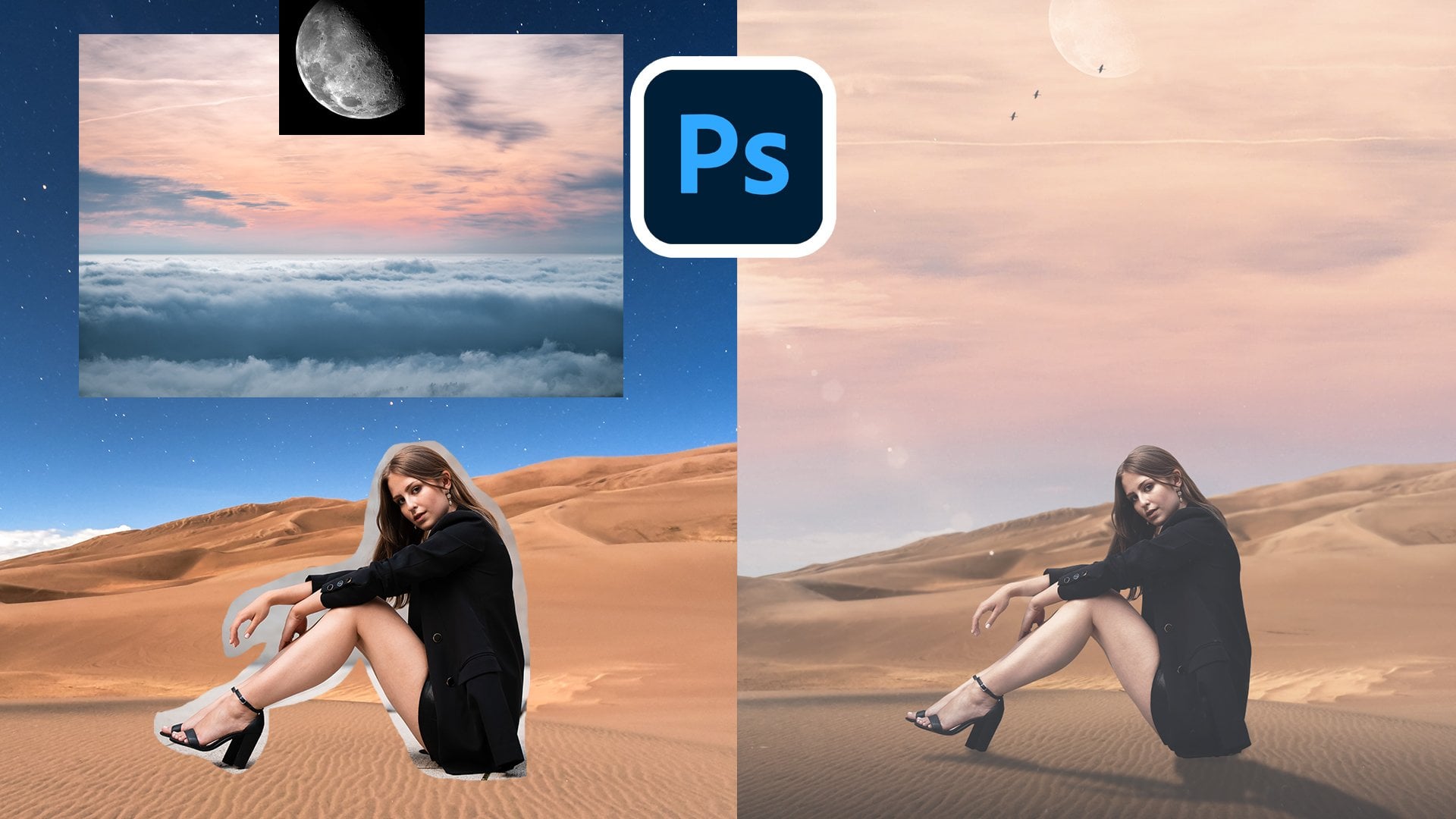
Transcripts
1. Introduction: Well, hello there. So, you know how Photoshop
has always been this magical place
where you can make stuff look way better
than real life? Well, it just got
even more magical. Say hello to AI, and no, it's not going
to take your job. It's actually your
new design side kick. My name is Tom, and I've been
a senior graphic designer and art director for
the past 15 years. The privilege of
working on some of the coolest brands
in the entire world, including Pokemon,
Marvel, Bally Sports. And now I want to pass
on a bit of what I've learned to help you get ahead
in your creative career. Now, let's get
back to Photoshop. With just a few clicks
and a little prompting, you can remove objects, expand backgrounds, and
generate creative elements. Basically, you can
make your designs look like you've spent
absolute hours on even when in reality,
you did not. And let's be honest,
design can be an incredibly fast
paced industry. So saving time and working more efficiently won't just help
you to make more money, but save you hours from
the tedious side of design and free up your
time to be more creative. In this class, I'm going to
be showing you how to use Photoshops AI tools to
create real world graphics. Things like social posts,
ads, product showcases, portfolios, even wild
creative composites, all while having a little
fun along the way. By the end of this
course, you're going to be designing like a Photoshop Pro with AI as your
trusty companion. So grab your coffee,
fire up Photoshop, and let's see what kind of
magic we can create together.
2. Welcome and Photoshop UI Overview: Alright, we are
finally in Photoshop. But before we jump into the
really fun projects ahead, let's make sure that
Photoshop is set up and that you're comfortable with
the tools that we'll use. Now, the very first thing that I want you to do
before we even open a file is to make sure that Photoshop is updated
to the latest version. We can make sure that we are
completely up to date by going into our Creative
Cloud desktop app. Go over here to updates, making sure that
everything is up to date. Now, if yours is not
instead of open here, you're going to see update now. So make sure you update and you will be good to go because we are going to be using some of the newest features that
are within Photoshop. So make sure you're updated. Also, make sure that you
download the class resources. They're attached to this
class, so just download, extract to a good location, and you're going to have all
the files that you'll need for every single
project in this class. Finally, before we really
dive into Photoshop, every single font that
we're going to be using today is available
on Adobe Fonts. I'm going to make sure to put on screen every single font
that you're going to need, so just follow the next couple of steps to install each one. I'm going to demo with one in particular that
we're going to be using that is called
Benton Modern Tech. All you're going to do is
going to go to fontstb.com. Simply here in the search bar, you're going to type in
the font that you want. So ours is called
Benton Modern text. So this is the one that we want right here. You're
going to click that. It's going to take
you to the font page, and I already have
mine installed, but if yours isn't, I'm going to remove it. So there we go. We can do this
together. And then all you're going to
do is add family. And that's it. It's going to be within Photoshop and within every single Adobe program
that you have ready to use. And when you install
the family of fonts, you're going to usually get
more than just one version. So as you see here,
we have Roman, we have Italic, we have
bold and bold italics. So that's going to bit of extra flexibility
and creative freedom as we use these different fonts. So when you first
open up Photoshop, you're going to come to
this home screen here. There are a lot of
things here. You can immediately start something new. You can see some of
the latest features that Photoshop has to offer, and you can jump right back into some of your
recent projects. What we're going to do today, we're just going to go
ahead hit New file, we're going to open
up a document that is 2000 pixels by 2000 pixels. File is not going to be used
for anything in particular. It's just for us to
get into Photoshop. So we're not going to
change anything else, and we're just going
to click Create. And with that, we have
our first Canvas. Now, your interface might
look different from mine. Every designer likes to have their Photoshop set up
in a different way, and I'm going to show you how I have made mine look like this. Now, when you first
open yours up, yours might look
something like this. I'm just going to go ahead
and reset essentials. It might look like
this. This isn't necessarily going to work
too well for what I want. So first thing that I'm
going to do is on the right, I'm going to drag
properties right over here. I don't need to have
that always open here. Next, we're going to go
over to adjustments. I like to have
that in this view. A new version of Photoshop
does have a modern view, but I feel that takes
up too much space. I don't like to have to scroll through any of
these adjustments. So I just go ahead and make
that into the classic view, keeps everything nice
and small and organized. And when you're
designing things, you want to stay organized. Next, I like to keep my layers, channels, and path
right where they are. Sometimes they will default
down to the bottom here, but just keeping your layer
tabs here is going to be great for navigating
through your file. Now, on the left hand side, you might have noticed I
had my brushes out here. Now, if you use a drawing tablet and you're using
multiple brushes, it helps to just have
them out here kind of like a painter has
their palette out. You can just switch
between brushes, jump from one to
the other without having to go over
into your brushes, going to this drop down and
trying to find what you need. So how do we get that? Well, we're just going
to go to windows. We're gonna go to brushes. And we're going to drag
that over until you see this little blue line
appear, and there you have it. Now, if you're only
having one column here, that might mean that you're
a little bit too narrow. So you can just drag
that until you have two if that is what you like. I like to have mine sorted
out to have two columns. And then I can easily
go between brushes. I can go from this brush. Over to this, pick
something else. And it's a very easy
and efficient way to get between your brushes. And with that, we have
our basic interface setup for how we will be using
it in today's course. Now, whenever I'm going to
use any key or control, I'm going to make sure to
put it on the screen for you for both Windows
and Mac users. For example, if I
have multiple layers here and I'm going to want
to group them together, I might say something
like, we're going to press Control or Command G to
group them together, and you're going to
see it on screen. So that should help both Windows and Mac users stay on top. Now, we're here to talk
about AI, aren't we? So what are the AI tools that we're going to be using today? The very first one you might actually already
see on your screen. It is right here in the very
center, down at the bottom. This is the contextual taskbar. And if you don't see it, you can easily enable it by
going to Window, and right at the bottom here, you will see contextual taskbar. Make sure that's checked, and that's going to be down here. Now, the contextual taskbar,
as the name implies, it changes what it is based
on the context of the image. Sometimes it'll give you the option to generate the image. Sometimes it'll give
you the option to select a subject in the image. And as you will see later on, there'll be many other
options that show up. This is a very dynamic and
adaptable contextual task bar, and we're going to be
using it very heavily. Another AI tool that
we're going to be using quite heavily
today is going to be up here under filter
and neural filters. Now, a lot of these
neural filters are using AI to completely change images. You have several options here. They're called filters,
but run on AI and really change up your
images and give you some very unique
options to design. We're not going to use every
single one of these today, but just so you can be aware, there are several
that you have here. Work on portraits
to smooth skin. You can adjust portraits, make people happier,
sadder, older, younger, give them thicker hair, change the direction
off their eyes, and even give them
different expressions. So you can really
have fun with this. If someone isn't looking in the right direction in a
photo, you can fix that. We can also transfer makeup
from one image to another, one person to another. We can switch up landscapes. And as you see, some
of these are in Beta, so they're not going
to be perfect, but it's getting better
with every single update. Then we have style
transfer where you can transfer the
style of any image, any photo, any artist
to your own graphic. Be really cool. You can get some really
cool effects of that. Next, we have
harmonization where you can harmonize the color and luminosity of one layer to another layer to make
a flawless composite. So as you can see in the
little thumbnail image there, we have the image of the model with the autumn background, and it matches up the colors
to have nice harmony. Next, we have color transfer, where you can transfer the color from one image to another. We have colorize where you can colorize an old black
and white photo, which I've done this myself for some of my old
family photos. It gives some really cool
results. We have Super Zoom. If you need to zoom
into an image, there's not enough detail, this will zoom in and enhance those old TV shows where they tell you to zoom in and enhance. Yeah, you can now do that. Next, we have depth blur, if you want to artificially add in some depth to an image, create some very moody type of looks with your photography. This can be a
really nice effect. Next, we have the JPEG
artifact removal tool, which is really good
for clearing up images that have artifacts from
the JPEG compression. That can happen
when you're saving images as JPEG or
shooting in JPEG, you'll end up having this
noise that is in the image, and this just clears that up. And last but not least
is photo restoration where you can quickly restore old photos with the power of AI. Imagine combining
this with colorize. You can go from a
scratchy old photo to a nice colorized clean photo. It's really cool
what the AI does, and it does all of
this within seconds, and we're going to have a lot of fun playing around with this. And a few quick notes on
this neuro filter section, you will have to download each one separately, and
they're different sizes. So this one is 768 megabytes. Some of these other ones are
smaller, as you will see. This one is 326. So whatever we're
going to use today, just make sure that you
download and it'll take just a few moments to download
and we'll be ready to go. And as I mentioned, Photoshop is always growing,
always developing, always innovating we do
have a wait list for some of the upcoming neuro filters that are going to be in here. We're going to have a
portrait generator, we're going to have
water long exposure. We're going to have
a shadow generator, and a noise reduction
generator coming very soon, and I'm very excited to
see how those come out. So in future AI classes, we will most certainly be covering these
once they are out. Now, I've gone ahead
and opened up one of the files we will be
using later on in the course give an example of another part of AI that has now been implemented
into Photoshop, and that has to do
with selections. So there are a few
ways now the AI has integrated with
selecting an image, a person, an object. And one of the ways
you can see right now down here in the
contextual task bar, it has changed from what
it was just a moment ago. We can select the subject. We can remove the background entirely with just
one button click, and we can adjust the colors. Now as you see, I've put
another layer below this one, that is gray just so we can
see the effect of this. So I'm going to ahead
and zoom in with Z. Just a little bit so we
can see more of our image. And let's go through
these very quickly. So you can just do
select subject. It's going to take
a quick moment, and there you go. It's
already selected. And with that, you can go ahead, mask it out and you have
something you can work with. You can refine that later
on if you would like. And that was just one click. Now, what else can
we do with that? I'm going to just control or Command Z to get back
to where we were. Let's go ahead and click
Remove Background. Again, you just click the button once you get Photoshop
just a second. It took less than it took
me to finish that sentence, and it has done what
I just did before and cut out our shoe
and masked it out. So now we can play
around with this. We can refine the edge
if we would like. And as you see, the
contextual task bar has changed now yet again. We can generate a
new background. We can import a background, and we can do a whole
lot of other things. We can fill, change
size of our brush, and so many other options. We can also adjust the color. So if we click this,
it's going to add a hue saturation layer
over here on the right. And what we can
do here is we can just select one of
the colors here. Let's go with one of the
greens and change that color. As you see, there's
a little bit of green right here in
the center of the hue. So if we wanted that to be
more of a blue, let's say, the campaign or whatever
ad we're working on wants this to be a deep
blue. There we go. We have gone ahead and changed just that part in one click. That took me what,
a few seconds, and it is ready to
go, ready to edit, and you can continue with
selecting the subject, removing background, and
working with your object. So we will be getting
more in depth into this object selection
later on in the course, but I wanted to
show you how that's been integrated down into the contextual task really
made life a lot easier. One thing I like to
emphasize to all my students is to always work
non destructively. We want to make
sure we always keep our original image
that we can go back and edit anything
that we need to. So always work non
destructively. Now, what does that
mean? That means having proper layers here
in the layers tabs. Want to make sure that
we're using masks, that we're using
adjustment layers, and as much as possible, keep your objects
as smart objects. Now, I'm just going to
show you an example here. Going to duplicate our
shoe that we have. And what I'm going to
do is right click, and we're going to
just convert to layers. We're going to say yes. And now this is no
longer a smart object. Now, the difference
between these two is this. Let's say on a smart object, I want to blur this image for whatever reason,
I want to blur this. So let's hide our non
smart layer here, our shoe copy, and on our
smart layer, let's blur this. I want to blur this shoe. So we're going to go to
filter, blur, Gaussian blur. And I want this to have a 9.6 pixel blur because
that's just what I want. Okay, cool. And now I'm
working, I'm working. I have other layers going on, and I want to go back
and change my mind. I don't like that
9.6 pixel blur. Because I'm using smart filters because this is a smart object, I can go back non destructively. The original image
is still there, and I can adjust this all
the way back to zero, 0.1, in fact, I can delete the blur if I want
to can adjust that. Let's say I want this to
be even more intense. I want this to be now 23 blur. There we go. So I can always go back to the original,
always edit that. But what happens if it's not a smart object? Let's
take a look at that. So now we're on our
shoe copy layer. We're going to do the
exact same thing. We're going to go filter, blur, gausean blur, and we're
going to do the same thing. I want to have a 9.6
or ten pixel blur. Okay. Look at that. There is no smart
filter applied to this. This has permanently altered
the pixels of this layer. I can't do anything with that. I cannot toggle the
blur on and off. What I can do is control
or Command Z to undo that. But there is a limit
to how far you can control or Command
Z in Photoshop. You can change that
in the settings. I believe I have mindset to
a 20 or 25 step history. So anything beyond
that, I cannot recover. We always want to use
smart workflow practices, making sure that we
work non destructively. A alteration that
we do to our image, we want to make sure
it's an adjustment layer that we can clip to that and we can adjust whilst preserving the
original layer below. This is especially important whenever we're working with AI, generating new parts of images. We want to make sure
that we are keeping our original so that if we
ever need to go back, generate something again from the original image that we
have that original image. As you're going to
see in some of the upcoming parts of this class, I'm going to keep a copy of the original graphic
at the bottom of my whole file so I
can go back there at any point to start
over if necessary. And lastly, with smart
workflow practices, you want to make sure
that you name and organize your
layers for clarity. You don't want to be
stuck with hundreds of layers over here.
Nothing is labeled. Everything is all
over the place, and you're just confused. This is going to
be shown more in the upcoming parts
of this class, but we're going to
definitely utilize folders, colors, naming conventions
to make sure that we stay organized and keep our
workflow running smoothly. Next, we're going to talk about prompting tips. So
what are prompts? Prompts are what you type
in when you generate an image or alter
part of an image. And it's important to keep certain things in
mind because we have a limited amount of generations that we get with
our Photoshop plan. Now, if you have a very
basic photoshop plan, you're going to have
about 500 generations you can do every month. So we don't want to
be wasting them using poor prompts and
generating images that we're not
really going to use. So let's go over some
prompting tips that are going to be very
helpful for this course and for any future AI
generation that you're going to do within photo
first and foremost, be clear and descriptive. Don't just say dog. Say a golden retriever
puppy sitting on a wooden floor in
natural sunlight. The AI generally needs context. So think subject, plus
setting, plus detail. So I'm going to use up some of my monthly tokens just to
show you this example. So let's go ahead. Let's
click Generate Image. And this is what happens
if I just type dog. We're going to go
deeper into the UI of this generation panel here, but for now, let's
just type in dog. We're not doing anything else, and let's generate.
What happens? Photoshop is going to
take a second here. It's gonna generate
us a nice dog. It's usually going to give you three variations that you can toggle between. It might
be something good. It might be a good
option. But look at this. We have kind of iconography. This isn't necessarily
what I wanted. I just gave it the word dog, and this is what it gave me. So let's go ahead and
let's try that again. So let's go ahead and give a little more context
and try to get a golden retriever
puppy sitting on a wooden floor in
natural sunlight. Shall we? So we're going
to toggle this off. I'm going to keep
that there just so we can see what happens. And now you see the
contextual taskbar doesn't show you generate. How can we get back to our
image generation panel? We're just going to go
up here to edit and down to generate image
and voila we are back. Now I'm gonna type right here, we're going to go a
golden retriever puppy, sitting on a wooden floor. In natural sunlight. Let's go ahead and give it
a little bit more context. I want this to be a photo.
I want to be able to maybe use this in an ad
or a social media post. And we can also use a
prompt inspiration. So you can look through
this, try to get a little more specific in what
you want it to look like. Going to see if there's anything that looks like what
I'm envisioning. And if there isn't totally fine. This is just kind of
a jumping off point, but it doesn't look like
there's anything there. Look at effects. And here
you have different things. We can have it be three D, acrylic paint, anime, Bohemian. Take your time to look through
this because there are a lot of different effects
that you can choose here. I generally tend to stick to very minimalist
type of things. I'm going to go ahead
and do minimalist, and let me see if
there's anything else that jumps out at me
that would look very good. You can get very nice
stylistic options here, such as yarn, a wood carving, but I'm going to
stick to minimalist. And I don't think anything else is jumping out at me right now, so I'm just going to keep
that very simple for now. So now you can also have a
reference image for a style. If you have one,
you can pull it in right here if you've
downloaded off the Internet. And they also provide you with a couple of examples
for the style. But I'm going to
skip this for now. I want to see what
Photoshop does by itself when given a little
bit more information. We're going to leave that alone. And same thing for composition, we can choose an image if
we have one to give as a reference for the composition or choose something from
what they have here, but none of this looks
very relevant right now. So let's go ahead and
click Generate now that we've provided a little bit
more detail to Photoshop. So we're going to
click Generate. We're going to give that
just a few seconds as we watch that loading bar
go across the screen. Look at that. We have something that is definitely
closer to what we want. We have a nice little
golden retriever puppy on a wooden floor
in the sunlight. This is ready to use
for some type of ad, for some dog food or
some vet doggie daycare. This is definitely
usable generated art. And like I said, you're given three variations with
every generation here. So you can look through,
I would say the second and third are far more
usable than this first one, but that may differ for you. And because of the
nature of Photoshop, these three images that
are generated will be entirely different for
you than it is for me, than it is for every other
student that does this class. And if we see here
as an example, by just giving dog,
this is what we had, and we can still toggle
through the variations. And when we gave
more detail we got something that was a
whole lot more usable. And a great practice
with Photoshop, if you want to keep
your file sizes down, once you find a
variation that you like and you really don't
want to use the others, just hit this trash icon
over here and delete them. Delete them from your file, and that'll make
the file size a lot smaller and just better
for file management. It's going to be
better all around. The next prompting tip is
to use style keywords. So you can use adjectives or
genres to guide the result, such as surreal
minimalist cyberpunk, photorealistic, painterly. This basically helps the AI know how to interpret
the subject. One thing that you
could say is instead of just asking for
a city street, you can try saying a futuristic
cyberpunk city street at night with neon lights. It completely changes the mood. So let's go ahead and let me show you that
really quickly. We're going to go to
Edit, go generate image, and right off the bat, if we just type
in a city street. No style keywords, nothing else and generate it may
generate something usable, but like I said, it's
not going to be very specific to what
I want it to be. There we go. We have
a nice city street. This could be usable
depending on the context, but this isn't
exactly what I want. So let's go ahead and
use some style keywords. So we're going to go
ahead and turn that off. We're going to go to
edit, generate image, and now we're going to go a futuristic cyberpunk city street with neon lights. And what we can do I
want this to be, again, more photo style
as opposed to art. And under effects here, this is where we can actually start using this
a little bit more because here we do have
one that is cyberpunk. So we can go ahead
and click that. And let's keep scrolling down. And you're going to see we have one here called futuristic. So now we have futuristic and cyberpunk reinforced
with this effects panel. That is fantastic.
So keep going down. Style. I'm going to
keep it as it is. I'm not going to put
in any other style here or composition.
Let's generate. Can we get something that is more in line with what we want, a futuristic cyberpunk city
street? And look at that. We have a futuristic cyberpunk
city with neon lights. This is definitely usable
for multiple contexts. I can see this being
used in many places. The next step that
I have is keep it concise, but intentional. So super long rambling prompt don't really work
well with Photoshop. I'll get too confused with
all that information. So just stick to the
short, punchy phrases. Like I said, a good
rule is a subject, plus a style, plus a detail. So in the context of this, we have our subject,
which is the city. We have our style,
futuristic cyberpunk, and we have our added
detail with Neon Lights. And Photoshop was able to create exactly what we wanted with
three very cool variations, which we can use in
some very cool places. The next tip is
something that I've been showing you with every
single generation, and that is experiment
with variation. As you see, with
each generation, we get three variations,
and you can keep going. Let's say these three are close but not
exactly what I want. I can generate. Again,
it's going to generate a new set of three variations
with the same prompt, with the same setting,
and it might give you something that is better than
what you originally had. So now we have
another set of three. And as you see, now we have six variations
to look through. You might find that this new set of variations are better
and you like this one, and then that's
what you go with. Alternatively, you
might like two of these variations that you want to explore for your design. So now I can use
this variation for one design and pull in this
variation for another. I can do a little
bit of AB testing to compare two
different generations. The next tip is to use negative prompts if needed.
So what does that mean? So basically, Photoshop's
generative AI tool can even let you guide
what not to include? So example of this could
be a clean product shot of a watch with no text, no people. So you specify that.
You don't want that. It helps to avoid
unwanted clutter. So let's go ahead and do
that. I'm going to show you. So we're going to go to
edit, generate image, and I want a very
clean a clean product. They watch. No text, no people. And that's all I want.
And I'm going to add in minimal minimalist style, okay? I want this to be a photo. And for this, I might
even have something that I can reference here for the prompt inspiration,
but maybe not. And that's totally fine. But it's always worth scrolling through this because
it can help. And what we're going to do here, we're going to go all the
way down to minimalism. And I believe that
is going to be all. Let me see if there's
something for products does not look, product photo, there you go. Just thinking of it
means it might exist. So now we have product
photo and minimal, and we've specified
no text, no people. We're going to keep the
style and composition as is. We're not going to put
anything into that, but might do a quick
glance through it. Nothing is jumping
out at me as working. So we're just going to go
ahead and hit generate. So using negative prompts can really help you avoid
the un clutter, sometimes you have these extra
artifacts, extra people, extra objects, and you don't
need it. And look at that. We have a clean product
shot of a watch, no text, no people. We have three options, and that is fantastic. I would rock any of
these watches any day. And one thing that I'm very impressed with for
this generation in particular is the shadows on
every single one of these. It is really good.
Is it perfect? Maybe not, but it is very good, very usable and fantastic for
any product related shot. And the final tip in terms of prompting is
iterative refinement. You run the AI again
on a result you like. Basically, you add
or remove details to really hone in on the image
that you have in your mind. So let's go ahead
and do something for this image to build it
up a little bit more. What can we add to
it to refine it? Now, we can see that the
colors here are very pastel, very muted, and we have a pink. This is a very muted pink, almost a beige color, and then we have a peach. So I can specify here that
I want it to be let's say I want to be
rugged and dark blue. Let's go ahead and do
that and hit Generate. We are refining our generation, iterating on it, adding to it. We might remove from it and see if we can get something
that's a little bit closer to what we
would like that is more suitable for this brand. And as you can see, we have
three new generations here. This is definitely
a more rugged, some might say more manly here of generation here
with the dark blues. I definitely like this image, and we can keep iterating
on it for on and on and on. You can remove what
you don't like and hone in to the exact
image that you need. Think of it as treating the generation kind of
like sculpting. So each pass, you
can add or subtract details until you get to
the image that feels right. But don't forget you do
have a limited number of generations with Photoshop
unless you pay more. So be very smart with what you generate and how
you generate it. And that's going to do
it for a brief overview of Photoshop of the
user interface and of what AI tools we're
going to be using in the upcoming parts of
the class. Don't worry. You don't need to know and
master every single tool that we've used in this
particular demonstration here. But as we go on through
each part of the class, we're going to dive deeper
into each part of it. You're going to grow
more comfortable, and you are going to be
creating some fantastic things. So now that you're
comfortable with the Photoshop
environment and with the basics of these
generative AI tools, let's move forward to the
next part once you're ready, and we're going to be
creating a social media post. So let's keep moving forward.
3. Project 1 - Social Media Post: Okay, so now we are ready to
actually start making stuff. Now is the fun part, and we're starting with
project number one, a social media post. Now, the main goal of this post, just to keep a general
theme and idea in mind, is we have a new coffee company. They've approached us and they have a new brew
that is coming out, a new flavor, and they want you to showcase that
in a very cool, very fun social media post. And the theme for them is a
Viking Nordic inspired brand. So that is a context behind this social media
post. Let's go ahead. We're in Photoshop. Let's go
ahead and click New File. And for most social media posts
on Instagram, especially, you're going to want
something that has a width of 1080 and a height of 13 50. This is going to give us
a four to five ratio, which is going to be
fantastic for viewing. We're not going to change
anything else here. We're going to keep resolution
at 72 pixels per inch. We're not changing the color
mode or anything else. Let's just go ahead and click
Create. And there we go. We have our file ready to go. And we see we have our layers
over here on the side, and we're just going
to go ahead and jump right into so first thing
that we're going to do is we're going to import our starting image which
you should have downloaded and should be in the very first labeled folder. So what you're going to do is
you're going to go to File, Place Embedded, navigate
to the class of resources. Project one, I'm going to go ahead and click this coffee mug. Let's hit Place. And let's
change this up a little bit. I'm going to shrink this down
because we're going to use AI to generate the
rest of this image. So let's go ahead. I kind of like that as it
is right there. Might bring it down like, so something like this. So let's hit Enter. And when you place it, it
places it as a smart object, and that is exactly
what we want. Now, right off the
bat, what we're going to do is we're
going to hit Control or Command G. It's going to put this coffee
mug into a folder, and we're going to
double click that, and we're going to label
it original image. This is going to help
keep us organized. If we ever need to come back to the original, we have that. Now, another thing that
is helpful is if you ever want to have the middle of
your image, the midpoint, making sure everything
is centered, you can just click
on this ruler, drag it out to the middle, and it should snap as you see it snapping there, and
then we have that. You can hide that by
Control or Command colon. I'll hide it or show it. And if you don't see
your ruler here, you can just do
Control or Command R to make it visible or invisible. I like to have mine visible. And sometimes I like to have
the midpoint line going through just so I make sure
nothing is off balance. But for the time being,
I'm going to hide that. I'm going to bring back
our original image and keep moving forward. All right, so let's start generating some
parts to our image. So first thing I'm
going to do is make sure I have our
image selected here. And what we're going to do
is just Control or command. Keep that hell down, and
we're going to click on this. So now we have our
image selected. And next, I'm going to
do Control or Command I to invert that selection. So now we have this
white section selected. I want to fill that
in with something. So what I'm going to
do is generative fill, and I'm just going
to hit Generate. I'm not going to put
anything in here. Photoshop is smart enough
to recognize what is in here and it's going to generate something
that matches that. So I just want to
extend my image using AI just to have more of an environment. So
let's hit Generate. Give it a few seconds to give
us a couple of variations, and then we can see
what is going to work. And there you have it.
We have three options. You can click through them and choose whichever
you like the most. So I do like this one the
most, I think, option three. So for the time being, I will keep these others, but feel free to erase them if you do not
want to keep them. And by default, this may have gone right above
your coffee mug layer, but let's drag that out
of that folder, okay? We don't want that
in there. And next, we want to do a couple
of other things. I don't really like this leaf sticking out here in the
middle of our image. So what I'm going
to do is hit L on the keyboard to get
our Lasso tool, and yours might be on a selection brush or
polygonal lasso tool. So if it's not defaulting
to just the regular Lasso, just click and hold
down here. Go to Lasso. And we're going to do
a general shape around this making sure we
have the full leaf, and we're going to
hit generative fill, and I'm just going
to type remove this leaf plant and hit Enter. What I want to get from here is just this blurred background, this bouquet effect,
just to replace that. I don't want any leaf there. And let's see what
Photoshop generates for us. And there we go. We have
a couple of options here. I would say, this option
here is the most usable. I'm not the biggest
fan of this leaf here. So I'm going to do is draw
another lasso over this. And again, I'm just going to
type remove leaf. Hit Enter. And this is what I
was talking about in the previous part of
iterating on your edits. Just refine it. Tell
Photoshop what you want. I don't want this
leaf. I do want this leaf and see
what it does for you. And there we go. It is gone. I don't even need
to look through the other options,
although I could. But this first one is fantastic. So the next thing,
I kind of want an extended blurred
leaf down here. I think that might
give a little bit of a better balance down here. So let's go ahead and draw
in a general leaf shape. And I want a blurred
leaf in the foreground. So these are very basic and simple prompts
that I'm giving the generative AI here
because it's just a very simple thing
that I need added. But this would take me
several minutes to just find a good leaf or copy
and paste something in. And let's see. We
have a couple of options here. This third one. Let's see. This first one is actually something
I will go with. So just extending
that blurred leaf just a little bit to
refine what we want. Now, this coffee mug is
looking a little bit empty. I would like if it was
a little bit more full. So we're just going to drag
here wherever we want coffee, generative fill, and
I'm just going to say, full mug of coffee. Because that's a
little bit empty. We're trying to
sell this coffee. This is a very cool
coffee. Very delicious. I want the mug to be
full. And let's see. We have a couple
of nice options. I like this last one,
actually. That is very nice. The edges here could be cleaner. I could generate
another version, but I think I'm going
to go with that. And now, lastly, I would like a little bit of steam
coming off of the coffee. There's a little bit
kind of over here. But let's just draw in kind of a shape of where
we want some steam. And I'm simply going to write in steam coming off of
coffee. Let's hit Enter. And as you see, we have a couple of options here for the steam. I'm between option
one and option three. Let's go with option three. I think it has a nicer shape. So now that we have all
of our AI edits done, click on the topmost, this last steam layer, pull down shift, and click this lowest generative
fill layer that we have, and that should select
every single one of them. Now that we have all
of them selected, we're going to hit
Control or Command G to group them together and
double click on the name here, and we're going to label
this AI generation. So now we've gone from this original image
to this one just by using a little bit
of AI and telling Photoshop what we want.
Very simple, right? So, next, I want to add in a little bit of color correction to our image as we start
to refine it even more. So the first thing
I want to do is add a brightness and contrast layer, and let's bring the brightness
up just a little bit. We're going to go up to ten, bring the contrast
up ever so slightly. So we just bring in a little
bit of extra brightness. You can toggle
that on and off by clicking this I icon over here. Next, we're going to
hit this curves layer. We just want a nice
little S curve. So we click and drag this
part down just a little bit, and we're going to click this
upper part and drag it up. So it's creating a
nice gentle S curve, and that's going to
bring our highlights up, bring our shadows down, and just add another
extra little bit of depth to our image, make it richer and nicer as we try to sell
this delicious coffee. Next, I want to add a little bit of a vignette to this image. And there are dozens
of ways that you can add a vignette to
an image in Photoshop, and I'm just going
to show you one of the ways that I do it myself. So what I'm going
to do is I'm going to hit brightness and contrast, and I'm going to bring
that all the way down. Minus 150 contrast. Let's bring it up to plus
85. That is completely fine. And doesn't look amazing.
No, it does not. We're going to hit
G on our keyboard, and that should bring us
our paint bucket tool. And we're going to paint this
mask layer here with black. If it's not already black, just hit D on your keyboard. I'll default the colors
to white and black and then hit X to bring
black to the forefront, and we're going to paint that
away with the paint bucket. And now I like to have
control over my vignette, so I zoom out a little bit. And then I hit B on my keyboard
to get into my brushes, and I just want a nice
soft round brush. The default brush is going
to work totally fine. And we're going to make the
size of our brush about 400. I'm at 390, and we're
going to bring the opacity down just to about 10%. We're just going to
paint on very lightly. And we're going to hit
on our keyboard so that we have white in the
foreground layer here. So now when you paint in white, you see we're painting in a
little bit of a vignette. And if you have a
drawing tablet, you can use that. No problem. That might make this
a little easier, but using a mouse is
completely fine, as well. Now, you might find
as you paint on here, you might accidentally click on something on this
contextual task bar. So what do you do?
You can simply click these three dots and
just simply hide bar. So now I can paint down here, and I don't have to
worry about clicking any of those buttons and doing something that
I don't want to do. So now we have our little
bit of a vignette, bringing the eyes in here
into the coffee mug itself. But now I want the coffee mug itself to pop a little bit more. So let's zoom in and now I'm going to do a
brightness contrast again. Again, I'm keeping these edits very simple so anyone
can follow along. And we're going to
bring the brightness up to about 30 ish. Let's go ahead and do that. And we're going to do
the exact same thing. We're going to hit G, make sure we have black
as a foreground, and we're going to
paint that away. And we're going to hit
B, get our brush back. And this time, we want to
make that a lot smaller. Maybe let's go 74. And let's go ahead. We're just
going to paint with white. Make sure white is
in the foreground. And we're just going to
paint across all here. Now, for this particular case, I might bring the opacity up to about 30% so we actually
see what we're doing. And I want to paint over this
white part of our image, maybe a little bit
on the handle, a little bit on the inside, and a little bit on the
highlight of the coffee itself. And it might not look
like it's done much, but if you go ahead and
toggle that off and on, you'll see that we've added just a little bit of
pop to our image. And if you ever
want to blend that in nicely, if you hit B, go back to black, you can paint back in that
darkness here. So if we want to paint in
a little bit of the shadow of the mug from the
original image, we can have that in,
and there we have. A little bit of extra
emphasis on the mug itself. So now that we have these
color corrections done, again, make sure you have
the top layer selected. Shift click down to
the slowest one, the brightness and contrast, and we're going to do
Control or Command G to group those together. And we're going to label this one simply
color correction. It's not so much
color correction as it was brightness adjustment, but it gets the idea across. We've enriched the
colors very nicely. Next, we're going to
start to build up more of the text in the image, and we're going to start
with a nice little logo for our coffee brand. Now, you're going
to have this within your resources that
you downloaded. So let's go ahead and do File, Place Embedded, and we're going to place in
this Norse glyph. Just click Place, and we have that in our image and hit Enter. And this isn't too
usable right now, is it? But I picked this one
because it is very similar to the glyph
that is on the mug, so it's going to work
for this lesson. What we want to do here is we
want to invert this image. We want what is white to be black and what is
black to be white. So we're going to
do that very simply by going up here, we're
going to go to image. We're going to go
to adjustments, and we're going to
go down to invert. And as you see, you could
also do Control or Command I, but I'd like to show you
multiple ways of doing things. And you can toggle
that back and forth, Control or Command I, and we are back to this. So what we're going to
do is we're going to go here where it says normal, and this is going to
adjust the blending mode. So the blending mode changes how this layer interacts
with the others. Is it going to hide the
dark parts of the image? Is it going to hide
the light parts of it? How are the different
colors going to interact? So what we're going to do
for this particular one, as you scroll down, it's going to change and give you a preview of
what each one does. But what we're going
to do is we're going to go to this section here and we're going
to go with screen. So now, as you see, all the
black part of that is gone, and we're left with
just this logo. So now we're going to hit
Control or Command T, and it's going to say
any smart filters that are applied will be
turned off temporarily. That is totally fine. And we're going to make this
nice and small. We're going to bring
that to about that size, and we're going to
bring this down here. Something like that. Hit Enter, and let's zoom
in on our little logo here. Now, I want to type also
some words around here, and I can't exactly do that
in this current context. So I want to have a shape
here that I can work off of. Let's go ahead. Let's
hit U on the keyboard. That's going to go into
this shapes section where you can draw
rectangle, ellipse triangle. And by default, for
me, it went to line. So I clicked and held down, and I want to go to an ellipse. So I'm just going
to hold down Shift, and that's going to
create a perfect circle. And we're just going
to have a random shape here just so we can see
what we're working with. I'm going to give
it a fill color. You can feel free
to do the same. I'm just going to
drag that to be around where we have our logo. Now, it's a little bit small, so I'm going to resize that with Control command T and hit Enter. So why did I do this? So I want to make
sure that I type the company name going
around this circle here. But if I were to hit T on the keyboard to type
and I start typing, it's not going to adhere
to any circular shape. So by having this ellipse
here, the circle, and I have the text
tool selected, when I hover over that,
you see the icon changing. When there's a dotted
circle around that eye, you're going to see
that it's going to type within the shape. When I hover over that outline, that changes to that
dotted squiggle, and that means the text is
going to go around the shape. So let's go ahead and click. And look, we have fun and
text going around the circle. And I just want this to be
simply called Nordic Coffee, C. That's all I want it to be, but I
can't really see that. So I'm going to hit
Control Command A, so I can highlight all of that. And let's make that white. It's going to pop better. And next, we don't need
this ellipse here anymore. We're done with it. So for now, let's just hide that. And let's tweak our text
here a little bit, okay? So we're going to
make sure we have T selected, our text tool. We're going to click in here. And I want to change some
of the settings here. So we have the properties up, and as we do Control Command
A to select all of our text, we can adjust the tracking
for our characters. So as you see, that's going to change just the spacing
for everything. And I don't want it to go
around the whole circle, but I would like it to be
somewhat semicircular. That is about
semicircular right there, and just go ahead and
hit the check mark. But that still
doesn't look good. It's offsite. It's not
centered. It doesn't look good. So next we're going to hit
Control or Command and you're going to have
this bounding box where we can now
rotate our image. So I would need to rotate this about 90 degrees
plus a little bit more. So holding down Shift, we've gone 90 degrees. You can hit Enter
and it'll update, hit Control or Command T again. And let's go another
additional 20 or so degrees. That's almost there. You might have to play around till you get the
exact right one. Now, I want there to be
a little bit more space between the text and the logo. So I'm just going to go
back to the glyph itself, hit Control or Command T, and just make that
slightly smaller. Hit Enter, and then bring that
in so it's nice and snug. So we now have a nice little
handy dandy logo lockup just to make this look a
little bit more professional. We can then also go ahead and delete this ellipse
layer completely. And with the nordic
coffee co text selected, we can shift click
down to the glyph, and as we've done all along, Control or Command G. And let's rename
this to logo lockup. So there we have logo. Lockup. There we go. Now, I want to have the main text of my image. So let's go ahead and create
our coffee brand here. So just hit T on your keyboard. We're going to get our
text tool and just click and we're going to come up with a name for our new coffee drink. And I'm going to call
this one Odin's. If I can type, I'm going to call this one Odin's space Brew. I'm going to hit the
checkmark there. And let's bring this out into the center here so we see
what we're working with. And just so you are aware
I'm using the font, freight Sands, Pro and the
black version of that. So make sure you have
that downloaded and enabled through Adobe fonts. Now I want this to be a
little bit bigger than it is. So I'm going to hit
Control or Command T on here and just drag that until
it's at a size that I like. Want that to be somewhere
up here. There we go. And as you see that little
line down the middle, that means that it is
centered, which is fantastic. So let's go ahead and
do that. Hit Enter. Lovely. Next, I also
want to make sure people know that this is a
new brew that we have. We're launching
this. This is new. So let's hit T on
our keyboard again. Click up here and
let us type New. This is a new drink
that we have going on. I'm going to keep the
same freight sense Pro font that we had before. But what I'm going to do is I want to make this be italic. But if we click
this dropdown here, we'll see that this freight
sense Pro only has one type. So how are we going to
remedy? Very simply. We're going to click Window, and we're going to
click character. And now we have a new
section over here, and this is going to give
us some very cool options. We can change a lot of parts
of our font over here. But the one I'm interested in
the most is this one right here that is going to
italicize any font. As you see there,
it says Fo italic. So we're going to click
that and look at that. We have a fake italic. And I want to change
the color of this. I want it to pop a little bit. So we're going to
hit color, and I've already pre selected
color before. This is a hexadecimal value. If you want to copy that in, it is A five D F ten. And we're going
to hit Okay, it's a nice, earthy green color. And we're going to make
sure we move this to be centered as
well, right there. And it's a little bit too big, so let's go ahead
and hit Control or Command T. Transform. And we're going to
make that quite a bit smaller whilst
keeping it centered, and just have that
live up there. Now, I want to have
a little bit of extra flavor text down here, something to give
more of to the image, let people know what
they're getting. So I'm just going
to start typing in three words here, okay? The first word, I
want to be strong. But look, this is now
exactly what it was before. I don't want this to be italic. I don't want this
to be necessarily this font even. So
what am I going to do? Before I even do the
other two words here, I'm going to undo this italic, and I'm going to change
my font to one that is called Abolition regular. That is also a
creative cloud font, so just enable that, and
you will be good to go. So now that I have that font, I'm going to make that
a whole lot smaller. I'm going to pull that
it over here for now. And I want this to be the exact same size
across the board. So I might even make
this a tiny bit smaller. So if I want to duplicate this, I'm going to hit Control or
Command J once and twice. And as you see here, we
have two copies now. So I'm going to hide the
original strong and the top one. And I'm going to hit T on the keyboard to get
into my typing tool. Click on here and I'm going
to call this ancient. This is a very old
time ancient recipe for coffee. Now let's hide that. Next, we're going to re
enable this strong copy two. Again, with a text tool, we're going to click in
there, Control or Command A, and we're going to
rename this Earthy really drive that idea
home. This is very natural. So we want to have that there. So now we have three words. We have strong, ancient and
Earthy all in the same space. So what I'm going
to do is on Earthy, I'm going to hit
Control or Command and just drag that all
the way over here. I want that to be
living somewhere here. And ancient, make
sure you select Ancient Control or Command and we're going to bring
that somewhere over here. Now, how do I know that all these three are
equally spaced apart? Well, we don't right now. So what we're going to
do is click Earthy and shift click down to strong so we have these three selected. And right up here, as long as you have pressed V so that you have
your move tool, going to click this button here, and it's just going to
equally space all of them. There you go. As you saw,
it moved ancient around, and that is fantastic. But now, is this centered in my whole image? Well,
let's find out. Let's hit Control
or Command Colon, and that is where
our center line is, and it doesn't look like
we are exactly centered. So with these three
still selected, we're going to hit Control or
Command and we're going to bring that over ever so
slightly until it is centered. Fantastic. And we're going
to hit Enter. Very nice. But now I want to add another little
element to our image, and that's just a little bit of a line between these words just to give it a
little bit more grounding and better spacing. Again, there are many
ways you can do this. You can simply use
the line tool, or I'm going to show
you another method is just using the Marquee tool. So you're going to hit
M on your keyboard, and it's going to let you
draw out a little shape. I've drawn this
little rectangle, and if you hit G
on your keyboard, we're going to fill
that in with white. So make sure you have
white selected here and on a new layer by clicking
the plus down here, we're going to fill
that in and then hit Control or Command
D to deselect. Now this is a little bit too thick for me, so I'm
going to zoom in. Hit Control or Command and I'm going to make that
just a little bit thinner. I just want a little
bit of a line there. Hit the checkmark,
let's zoom out. Yes, that is a lot better. Now, sometimes in design, you may have to eyeball things. And in this case,
I'm eyeballing that this is centered
between here and here, that there's an
equidistant space. So now let's do
Control or Command J. So that's duplicated our line. We're going to do Control or
Command And we're going to click and drag that all the
way across here, hit Enter. And then just by using our
arrow keys on our keyboard, we're going to position that to be somewhat between these two. Now let's do Control
Command colon, hide our central line
there. And look at that. We have new Odensbr strong
Ancient Earthy, fantastic. But I'm seeing there's
a little bit of a trouble reading
these three words. And what I'm going to do is I'm going to add a little bit of a drop shadow to
all three of these. So let's go to Earthy first. We're going to
double click on it, and you're going to come up with this layer style interface. So let's go ahead and
click Drop Shadow. As you see, it's added in a nice little shadow just to give it a little
bit of a separation. Now, I've had this
set up before, so I'm not going to
change anything here, but this is generally
what I'm going to have an opacity of about 14%. Our angle is 56 degrees. Our distance is four pixels. We're not going too far away, and our size is
just five pixels. We're leaving our spread at 0%, and that is all
that we're doing. So let's hit o on that. Now I want to put this effect to these
other words as well. So let's right click on Earthy. And what we're going to do
is we're going to go down here to where it says
copy layer style. Go to click that. Then
click on Ancient. Right click Paste layer style. Done. Now you go to strong, right click Paste
layer style and done. And that is it for
this top section. So let's click this very
top layer, our line, and shift it down to
our Odin's Brew title. Now hit Control Command G, and we're going to
double click on the name here and label that as pop. Text. Now we are almost done. There are two more things
that we want to do. Next, we want to have
a call to action. This is our new drink. We want to make sure people
are going to go and buy it. So let's go ahead and create ourselves a nice
little call to action. So we're going to hit
you on our keyboard, and by default, we're going back to the Ellipse tool,
but we don't want that. We want our rectangle. And let's go ahead and draw
in a nice little shape here. Let's just get
something down for now. And you see these dots that come in when you draw rectangle. We're going to click and
drag that all the way in so we have a nice
rounded button. Next, we're going to go
to our fill section, and we're going to use
that previously used green that we have from above. Fantastic. We can close that. We can hit V on our keyboard, and we can move this around. You can play around with how thick you want
this button to be. I'm going to hit on my keyboard. This is a little bit too thick. I'm just going to bring that
down something like that. Fantastic. I like that spacing. Might even bring that down
just a smidge with the arrows. And now I want to add a
little bit of a drop shadow, so we're going to double
click on that rectangle. Click dropshadow. It's
going to be very subtle. We're going to bring
the opacity up. Just to ensure that there
is some separation. And next, I want to paint on
a little bit of a shadow, a little bit of a color
differentiation onto our shape. So we're going to hit this plus icon here for a new layer, and we're going to hold
down Alt on our keyboard, and you're going to see
this little arrow pop up between the layers when
you hover your mouse over it. And what that's going to
do, it's going to clip this new layer to
the rectangle below. So whenever I paint anything with my brush, let me
just get a color here. It's only going to show up
on the rectangle below. So we can use this
in a very smart way. What I'm going to
do is I'm going to sample one of the dark
greens in our image, and you do that when you have
your brush selected with B, you hold down the Alt key, and you're going to get
this eyedropper tool. This lets you pick any
color in the image. And I want to pick this
dark green over here. And now, with a
very low opacity, I'm talking down to, like, 10%. We're just going to
paint just a little bit of a shadow on this lower edge. So if we talk about
that off and on, it's ever so subtle, just a little bit of a shadow. And now I want to add a
little bit of text here. What do we want
our people to do? So we're going to hit T, and we're going to just
start to type. Let's click we're going to
tell people to order in bio. This is going onto social media, onto their company page, and I want this
to be bold again, like our font up here. So control our Command A, and we're going to
make sure we want to use our previous font, which was the freight
Sands P Black. Going to make sure we
have that selected. The checkmark and
Control or Command A to bring that over and make sure
it is sized accordingly. I already like the size
that it's at now, actually. So I think I'm going
to keep it at that and make sure you choose a color that gives you a nice contrast. The color I have on mine is this nice dark green
that I sampled. So that color is
going to work for me. It's going to have
fantastic contrast, and it's going to
be very readable. And again, I want to make
sure this is centered, so just going to make sure dragging that around until
I see that purple line, hit Enter, and we have
the order in bio done. Next, just to make things look a little bit more professional, I'm going to hit Z on my keyboard and zoom in
by clicking and dragging. And down here, I'm
going to hit T. I'm going to click making
sure our font is white, and I'm just going to type
in a fake website address. So I'm going to go www dot. We're going to go
nordic coffco.com. Just to give a little
bit of authenticity. We're going to hit
Enter, go down a row. And I'm going to put a
disclaimer that this is not a real product. This is made for
Skillshare. There we go. And in other situations, you may add a
different disclaimer that the company may give you. So let's hit Control or
Command A, select all of that, bring out our character
menu here and we're going to adjust this over here.
This is the leading. This is a space between lines. So if you click and drag
and make that small, you see we're bringing our text. So that is what we want. And we want to make this
font very, very small. We want this to fit within the width of this
order in biosection. So we're going to make that very small, something like this, bring the leading down even
more and hit the check mark, and pull that over, make
sure it is centered. And hit Enter. So now we have our little bit of a call to action section here. So with this top layer selected, shift click down
to our rectangle, Control or Command
G. And let's rename this as CTA or call
to action section. Now we're moving on
to the final steps. We want to do some final effects over all of this to really bring it together
and really make it pop in someone's
Instagram feed. So I want to add a little
bit more of a vignette. I want to really
draw people's eyes into the center of the image. So let's go ahead and
make a new layer. Hit B on your keyboard. Now let's make our brush
nice and big, about 300. And I'm going to sample some of this darkest color that
we have in our image. I always recommend to people to pull from the colors
in the image, not just choose
the darkest color here because some of these
will have a tone to it, and you want to keep
that within the image. So I sampled that
on a low opacity. We're just going to go ahead and paint in a little bit down here. With our soft brush, kind of want to hide both of these lower corners and
take your time with this. You can use a tablet or a mouse, and maybe I want a
little bit just in the very top 50 corners of that. So now we have a little
bit of a vignette, if we toggle that off and on. You see, it's really drawing your eye into the
middle section here. Next, something that I
like to do in all of my images is to add in
a little bit of noise. You won't believe how much that actually helps to
unify an image. So let's go ahead and
make a new layer. And I'm going to fill this with just the middle gray
that I can find. A gray, hit G on your keyboard, and we're filling
this whole thing in. Fantastic. We're going
to go to filter. We're going to go to noise, and we're going to go to add noise. Mine is set to 331%, and
I'm just going to hit Okay. We're keeping that at
Gaussian distribution and monochromatic. Hit Okay, and this doesn't
look very good, does it? I'm going to shift this down
to an overlay blending mode. And bring the opacity
of this down all the way to about anything 3-5% I found adds a nice
amount of noise to the image. Really blends it together
and makes it look very nice. If you zoom in, you can
see that noise here. I might even bring
that down to about 3%. If you talk about
that off and on, gives a nice little bit of
aesthetic to your image. And generally speaking,
it helps to blend in the AI generated
elements even better. Next, I'm going to do a bit
of color grading to our image to get that final,
nice, cinematic look. So the first thing I'm going to do is I'm actually going to make a black and white adjustment
layer over everything. We're going to keep
the reds at 40. We're going to keep
the yellows at 60. Greens at 40, cyans. We're going to keep that at 60. We're going to have the blues at 20 and the magentas at 80. So we're not really doing
anything with that, but what we are going
to do is we're going to bring the opacity
of this whole thing down to about 60%. There we go. And there is a method
to my madness. Next, we're going to add in a curves layer where we're going to adjust each
separate channel separately. So let's go ahead.
Let's go to our reds. I want to give this a nice
little bit of an S curve. So bring this lower
section down. This upper section,
just like so. Next, we're going to go
to our green channel. And for our green
channel, we kind of want to bring this
top section over a little bit like so and not
do too much else with that. And for the blue, we want to
bring this end up ever so slightly and this end down ever so slightly,
just like that. And that is all we're going
to do with that layer. Now we're going to do
another curves layer, this time adjusting everything, and we're just going to bring down the belly of the curve, so to speak, like so next we're going to add in an exposure adjustment layer. We're going to bring up
the exposure by about 0.30 0.36 Gamma correction
can stay at one, offset can stay at zero. Next, we want to do a
vibrance adjustment layer, and we're going to
bring the saturation down to -15 or 16%. And lastly, we want to do a brightness and contrast layer, where we just bring the
contrast up by about ten. Fantastic. And now what we
want to do is we actually want to group all of these
color corrections together. So we're going to select
this brightness and contrast and shift click down to
the black and white, and you're going to do
Control or Command G, group those together,
and we're just going to rename that color grading. Now, all we're going
to do is bring our opacity down
all the way to 25%. And as you see, our image
has turned out very nice. So if we toggle that off and on, all we've done essentially is deepen the mood of the image. We've lowered some
of the vibrant, we've tweaked some of the
highlight and shadow values and just did a bit
of color grading. For more in depth tutorial
on color grading, check out some of
my other classes. But for the convenience
for this one, we're going to be using this color grading
that we've done in this project in every
other one in the class. So all we're going to do is copy and paste this over
to everything else, and you're going
to be good to go. Now, there are a few more final
tweaks that I want to do. So let's go ahead and add
in another curves layer. And what we're going
to do is, again, just an ever so slight S curve. We're going to bring
lower end down. And we're going to
bring this upper end up just like so like that.
4. Project 2 - Photo Retouching: Now, we're going
to be moving on to a little bit of
photo retouching. Now, you may have a time when
a client comes to you with some photos from
a photo shoot and they want you to do
some skin retouching, just some general touch
ups on their photos. So how are we going
to do that in a fast and easy way with AI? That still looks really good? Well, let's do just that. Now, keep this last
project open that we just did in the previous
part of the class because we are going to be using the
color grading part out of our final effects in every
single project moving forward. So just keep this
open. It's going to be very simple to just copy
and paste that over. So, for now, let's go
ahead. Let's go to File. Let's new and let's
get ourselves a new page to work with. Going to go ahead and
make this the same size as before width of 1080 pixels, height of 13 50. Keep the resolution at
72 pixels per inch, and let's just go ahead
and click Create. Now, let's go ahead and
go to the files that we downloaded with this class, and we're going to go to File, Place Embedded and make your
way over to Project two, photo retouching, and we
have our raw portrait photo. Now, go ahead and click Place. And because this is a raw photo, you're going to be
met with this camera raw import dialogue box. Now, we are not going to
be doing anything else to this within this camera
raw dialogue box. So just go ahead and hit Okay, and we have our image. Now, let's go ahead and
resize this to fill up our page just like that. And let's center our model. This is a file that we've
gotten sent over by our client, and she wants us to clean
this image up a little bit. You see the necklace
is showing that it's a little bit turned
around on her neck. We don't really
want to see that, and we maybe want to fix some of these stray straggling
hairs and just do a general skin
retouching on this image. So what we're going to do right off the bat is we're
going to keep this and hit Control or Komanji to
put this into a new folder, and we're just going to go
ahead and label this original. There we go. So we can always go back to our original photo. We are now immediately going to go into some of our AI tools. So on this folder, let's just
hit Control or Command J, and that is going to
duplicate our original layer. We're going to rename this
to be Skin Smoothing. We're going to smooth out
her skin just a little bit. And when we have our
image selected here, we're going to go to
filter neural filters. And we're going to use some of these filters that are
now part of Photoshop. The very first one that
we're going to be using is this one up here
called Skin Smoothing. And as you see, it gives you a nice little
description of what it does. It adjusts and removes skin imperfections and
acne from portraits. So I've noticed
this photo can use a little bit of some
skin smoothing. So go ahead and toggle that on. And if by any chance, you do not have this here
and you have this icon here, go ahead and download
this filter, and then you'll have
this toggle switch. Now what we want to
do is we want to have this blur be about. Let's pull that up and
see what looks good. I'm going to go.
Let's go to about 65. And there we go. It's
giving a nice little bit of a blur there and smoothness. Let's just have that a plus one. And now another thing I
would like to do is let's do a little bit of JPEG
artifact removal. Now, again, this
will give you a nice little description
of what it does, and we see that it removes artifacts resulting
from JPEG compression. We don't really have
too much of that in this particular photo
because it is a raw photo. But let's go ahead and just
have a high strength pass of JPEG artifact removal just to keep things nice and smooth. We want to make sure that we output this to a smart filter. So we can always
double click that, come back here and
adjust as we need it. Now, if you click this, we have a couple of other options. We can put this to a
completely new layer. We can have this to
a new layer mask or to a new document entirely. But I just want it
to be a smart filter applied to this photo. Let's go ahead and
make sure that is selected and click Okay. It's going to take a
moment, and there you go. We have a smart
filter attached to this raw por trip
photo with our filter. And we can go ahead and
toggle that off and on. And you can see, now that
we toggle it off and on, there is quite a
dramatic difference, especially once you
zoom in to the face. We haven't gotten rid of all the details, and
I don't want to. People have unique
features on their faces, unique marks, and we don't
want to remove all of that. So let's go ahead,
toggle that off. And on. So we just
smoothened it up and we made it look just
that much cleaner. Next, let's use some of
the generative AI tools to really clean up
this image and get it looking exactly how we want. So first, let's go
ahead and get rid of some of these
imperfections that the client has told
us she does not want in this photo. So
let's go ahead. Let's select our Lasso tool
with L on our keyboard. We're just going
to draw circles, little lassos around
what we want to remove. And remember, hold down Shift on your keyboard to add
to our selection. So just click that.
We don't want that. We don't want this mark. There's a little glow spot right underneath the nose there. This part looks a
little bit weird. There's like some hair
going over that part. It's hard to tell if that's the hair or some
mark on the body. And like I said,
we're not removing every single mark.
We're leaving that. We're leaving all the
freckles and everything. So, you know, you want
to be very selective. Use good judgment
in what you do. A do a little bit down there. Fantastic. Now
that we have that, you may see that I do not have my contextual task bar anywhere.
That is completely fine. Let's go to Window, and let's go ahead and turn that
on right here. And right away, we can
do generative fill, and I'm not going to
type anything in here. I'm just going to
hit Generate and Trust Photoshop to do
what it needs to do. And that looks like it's done a phenomenal job
right off the bat. Now, I happen to think I like
the third option better. I think it does a better
job around the cheek area. Yes, so I'm going to
go with Option three for this particular
round of edits. Fantastic. Next, I want
to fix this necklace. For some reason, the
chain has turned around on her neck and that
just does not look good. It doesn't look like it's
supposed to be like that. So again, let's hit L on our keyboard to get
into our Lasso tool. And let's just draw
a nice little lasso around that part
of the necklace. Let's click Generative fill. And I just want
this to be a chain make into a chain
of the necklace. Now I could also just
leave that blank and Trust Photoshop
to do what it should, but I'm just going to tell it
and give it a little bit of direction and hope that it
does a decent job with that. And we should have another
couple of options here. Now, here's an example of when I need to iterate on it
just a little bit more. So this version three has removed most of what
I needed to remove, but it is not
exactly what I want. So I'm going to draw
another lasso over that. And on degenerative film, I'm just going to write remove
and replace with chain. Hit Enter on that, and
we're going to keep iterating until we get exactly
what we want out of this. And there we go,
we've iterated on it, and we have something
that is far more usable. That is looking a lot
better. Very nice. And lastly, what I want to do here is maybe clean up some of the stray hairs
that we have going on in the upper
left of this image. So once more, let's
hit E on our keyboard, get into our Lasso tool. And I'm just going
to click and drag the general shape that I
want her hair to be in here. Just like so. And I want this to be selecting
everything but her hair. We want to remove all the
stray hairs in this section. So we're going to go ahead
and click General Phil, and I'm simply going
to type remove stray hairs. Hit Enter. And let's see what it does. Will it do a decent job or will I have to
reiterate on that? Okay, we have decent
options here. As you see, it has cleaned up. I would say option
one is the best. It's given the cleanest look. And as you see, it's
cleaned up some of those stray hairs
just a little bit. And lastly, I kind of
want to maybe get rid of this one singular hair
going over her eye. So I'm going to go
ahead again with my lasso tool just draw in here. Making sure the hair is selected
and hit generative fill. Generate I'm not going to
give it any instruction. So let's go ahead and look
at what that has done. That's done a decent job. I would say option two
looks the most usable. One or two, I would say. I'm going to stick with option two for this particular one. And now, with your top
generative fill layer selected, shift click down
to this lower one, and we're going to do Control
or Command G to group that together and double
click on that and let us rename that AI Edits. Fantastic. And now
we can zoom out, talk about that on and
off and just see what we have done with our
generative fill edits. We can talk about
that off and on. So we've removed and cleaned up just a little bit of the image. Like I said, we don't
want to remove and wash out every single detail
in the face person, but just cleaning
it up a little bit. People have acne, people have scars and things they
may not want in photos, so it's good to be
aware of that and do as your client asks in as
respectable way as possible. All that is really
left now is to do some color grading and to
finish up our image here. So first thing that
we're going to do is we're actually going to go back to our project
file from project one. So make sure you
still have that open. Over there and go to
the final FX folder, click that, drop it down, and we're going to go to
our color grading folder. Like I said, we're
going to be bringing this across every single project in this class so
that we don't have to do color grading
each and every time. So when you have that color
grading folder selected, just hit Control or
Command C to copy that and go back into our
photo retouching file. Now you're just going to
hit Control or Command and Shift V. That's going to paste it
in the exact same spot, so we don't have
to move it around. If you do just
Control or Command V, it may not necessarily
paste it in the exact same spot
that it was originally. So now that we have that
there, look at that. We already have a nice little
edit going for our image. Next, I like to add a nice
little bit of noise overlay, so make yourself a new layer by clicking this
plus icon down here. Select a nice gray, hit G on your keyboard to
get your paint bucket, and just fill that in
entirely. Isn't that lovely? Next, go to filter, go down to noise, and we're going to add noise. Keep that just as it is. Gaussian monochromatic
amount I have at 331.03%. You don't need to be that
specific and hit Okay. And we're going to go over here blending modes and make
this into overlay. And we're going to make this
be just about 3% hit Enter, and that adds just a little bit of a grain of a little
noise to our image. It really helps to tie
all the edits together. Now, I want to add a little
bit of a vignette down here just to help bring
the focus up to her face. So let's go ahead and make
ourselves a new layer. Hit B on your keyboard to
get to our brush tool. And I'm going to keep my
opacity at about 10% size. Hey, I think the 245 is
about what I want it to be. And hit Alt on your keyboard, maybe option if you're
on Mac, so alter option. And we're going to sample one of the darker colors
here in our image, and we're just going
to start painting in our own custom vignette. And again, if this contextual
task bar is in the way, just click these three dots. Hidebr. I generally just like to keep that up
whenever I'm using it. If I'm not using it, I
like to have it hidden. Fantastic. So just
a little bit of a vignette, as you can see, pulling from the darkest colors that we have in our image, and that is looking fantastic. Now, I really want to bring out a little bit of the
brown in her eyes. As we see with our
color grading, we've kind of lost it
just a little bit. Now that I'm zoomed in and I can see what I'm working with, I'm going to add in just
a simple brightness and contrast layer and
I'm going to bring that brightness up until I see a little bit of
that detail in her eyes. We see the nice
brown coming out. And on this mask here, we're just going to
hit G on our keyboard. And if you don't already have black as the foreground color, hit D. That's going to default
to the white and black, and then hit X to bring that
black to the foreground. We're just going to
fill that in because we only want this
to affect her eyes. So hit B on your keyboard
to get to the brush, and we want this to
be very, very small. So make our brush
small, just like that. Opacity, let's have that
up to about 20, 23%. And now we're going to
be painting in white. So make sure white is the
foreground color there. I'm going to start painting
in just a little bit around her eyes to bring out that
little bit of a detail. There we go. You don't want
to go too far with it. And if you feel like
you have gone too far, just hit X to bring black as a foreground color and
paint it back a little bit. So you can talk about
that off and on. And you see we just brought in a little bit of extra
color to her eyes. Now I want to do a similar
thing but for her lips. So what we're going to do
is we're going to create a new hue and saturation layer. So just click that. And we're going to do the exact
same thing here. First of all, let's bring our
saturation up just a little bit Let's go to about plus 20, and that's all I really
want to do with that. Hit G on your keyboard. That'll bring us back
our paint bucket, make sure black is
a foreground color, and fill in this mask. Now we're going to
go back to our brush by hitting B on the keyboard. Just like so, and I'm going
to make my brush a little bit bigger. Something like that. And again, we're going
to paint in white. We're gonna paint away
as out of this mask. So let's just start with that. Still at that 23%
opacity for a brush. And you can always
toggle that off and on to see exactly
what you're doing. We're adding in just a little
bit of color into her lips. So now we can zoom out, hit Z on your keyboard, and we can zoom
out to our image. The last step, having that hue
saturation layer selected, hold down Shift on
your keyboard and click down to the
color grading folder, should have everything selected and then control our Command G, group that together,
and double click that. We're going to rename this
as ColorEdits hit Enter on that and we have gone from our original
image from this image, did a little bit
of skin smoothing using the neural filters
built into Photoshop. Then we use generative AI to help clean up
some of our image, and then we did some of
our own color edits. And just like that,
with the help of AI, we've been able to do some
nice photo retouching for this portrait photo. So go ahead and save
this on your computer. We will be coming
back to this later, but now we're going
to move on to our next project
where we're going to use AI to create
a product showcase.
5. Project 3 - Product Showcase: Now we need to make
a product showcase. A client has come to us and they are launching a brand new shoe, a brand new sneaker, and they want you to create a nice little product showcase that they can post
on social media. They can send out in emails and put onto their own website. So let's go ahead and make
something for that client. So as you see, I still have Project one open,
and that's because, like I said, we will be using the color grading from this
in every single project. But let's go ahead and hit
File and then let's hit New. And this time, we're
going to make this be 2000 by 2000 pixels. This is a great general
purpose size which you can then make into
a horizontal crop, a vertical crop and use it
in a wide range of places. Very easy to work with. So let's go ahead and click Create. So let's go ahead and start importing things into our image. Let's go ahead and go to
File, Place Embedded. And in the class resources, we are going to go to Project three, our product Showcase. And you see we have a shoe. We have our gradient,
and we have a check mark icon.
So let's go ahead. Let's place our gradient in. I want this to be
rotated a little bit. So I'm going to hold down
shift as I rotate this around. If I don't hold down shift, it's not going to snap
to any particular point. So just hold down Shift
and it's going to snap nicely to
where you want it. Fantastic. Let's just
hit the checkmark or enter on the keyboard and
we have our nice gradient. Now, I need to actually
have my shoe in the image. Let's go ahead and hit File and let's go ahead
place embed it again, and we're going to
place in our shoe. Fantastic. Now, this is a little bit small, so I'm
just going to go ahead, make that a little bit bigger, make sure that it takes up a good chunk of our screen here. Something like that
will be just fantastic. But now I really want to get rid of this white background. So we're going to go ahead
and go to Window and enable our contextual task
bar if it already is not. And with one click, we're
just going to click Remove Background and
just let it do its thing. And there we go. That's
done a very decent job. But now, this shoe lace
doesn't really look too good, and I could use generative
AI to get rid of it. But if I want any
text around here, I'm going to have to deal with the AI generated gradient
that is over here. So what I'm simply
going to do is on this mask layer for the shoe, I'm going to hit B,
get my brush out, get a hard round brush, full opacity, and make sure
that I'm painting in black. I'm just going to
essentially paint it away. You can zoom in to get
a better view of it. So I kind of want to
get rid of all of this, but I still want it to
look somewhat believable. So right around here,
what we're going to do is make sure that it's
nice and rounded. And you can always paint back parts of your image
as you see here. So you can really get
a nice nice curve to that as if it's
going around the shoe. And if we zoom out, there we go. That has solved most of the problems that
we have for this. Now we're going to want to
have a word behind here. So we're going to go down, click on our gradient layer, and then we're going to hit T on our keyboard so that we
have our text tool come up, and let's just click and
we're going to start typing. And let's go ahead
and just type ho. Just simple shoo I'm not
going to use any brand names, even though there is a
brand name on this shoe, but I'm just going to
call it Shoo, Alright? And I'm using the font Amboy
the Black version here. Let's go ahead,
Control or Command A to select that and I want
the font to be white. Then let's make this bigger to fill up most of the screen here. I want it to be about this big, and I do want there to be a little bit more space
between the letters here. Let's go ahead and click our character panel
over here and increase the tracking between the letters. Nothing too much. I'm going to go back on
that just a little bit. So about 2:20 will do
the job for me here. Fantastic. Now,
also looking at it, this little part of
the shoe here may not necessarily look the best. So I'm going to go
ahead and go in, hit B on my keyboard, and I'm going to paint
that tag away there we go. Just for the sake of
showcasing this product. Now, we want to
make sure we have the placement of our shoe exactly how we want it before
we go to our next step. So let's go ahead and hit
Control Command T on the shoe, and I might want to have a little bit more of
an angle on it, move it slightly like this. Just a little bit
of an adjustment. I don't like how that line
is lining up with the shoes, so I'm actually going to go
back on what I did and just play around with
it until you find a position that looks good. And don't worry about
taking your time here to really play
around with this, really play around
with the placement. Because that's what
this is all about. So something like this, I think is going to work well,
go to hit Enter. And now we're going
to do something why interesting
because I want to blend all the colors on this shoe with this
gradient background. But how am I going to do that? Well, first of all,
let's go ahead and group what we've done together. So from shoe, our shoe
text and our gradient, hit Shift and click down here, Control or Command G,
group that together, and we're going to
rename this original. So this is our original image. No real edits done
besides just cutting our show out and
removing the background. So what are we going to do next? What we're going to do is
we're going to save this file, and we're actually going
to open up Photoshop Beta. So at the time of
recording this class, there's a feature in
Photoshop Beta that is going to make our lives
so, so much easier. So I'm going to show you
really quick how to get Photoshop Beta and how to
do that edit over there. So when you have Creative
Cloud desktop app open, it's very simple to get to any
Beta version of your apps. So you're just going
to go over to Apps. Right up here is
already a Beta section. You can see all your
apps and you have other different
filters here if you want other types of programs. But we want to
just focus here on the Beta section and you see you have Beta for all
kinds of programs. You have it for
Photoshop, premiere pro, Illustrator, after effect, everything you can imagine, but we are very much
focused on Photoshop Beta. Now, for me, I already
have open here. I have mine installed, but yours will not say that. Yours will say
something like this. It will say Install. So just click that. It is free. It is part of your plan. So just go ahead
and click Install. And you're going to
have that downloaded within a couple of minutes. So what we're going
to do is we're going to open up Photoshop Beta, and we're going to open
up our file within that. So now that we have a file
opened up in Photoshop Beta, you will realize that
my user interface looks quite a bit different. We don't have all
the brushes from the regular version
of Photoshop. And my general setup here
is a little bit different. But we do not need
to worry about that. We're just in the
Beta version just for a brief moment to use one of
its cool new AI features. And that is called harmonize. With one click, we
can color grade this shoe to match the
background perfectly. So what we're going to do is we're just going to
go to our drop down. Make sure we are
on our shoe layer. And you can see in the
contextual task bar, we already have an option
that says harmonize. And as you see, if
you hover over, it's going to tell you you
can merge objects into a scene by matching color,
lighting and shadows. So let's go ahead
and click Harmonize. This in itself can
save you minutes, even an hour or two of trying to blend images together
and match the colors, the lighting, the shadows. This is such a really cool, awesome timesaver, and I've used it quite extensively in
my graphic design work. So let's give Photoshop
a second to do this, and it's going to pull
from the background image, the purples, the deep
oranges, magentas. And you see, we have a
couple of variations, just like with every other
generative AI feature here. We can go through here. We have one. We have two, and we have three. Now, don't worry about how it is affecting everything
outside of the shoe. That is not something we are too concerned about right now. We just want this to be blended nicely into our
image of the colors. Now, I would say this is a
little bit on the darker side. So what I might do is have it generate another round
for us to look through. So let's go ahead. Let's
hit generate one more time. And let's look at our new
set of three variations. We have this. This one does
not look too bad at all. I like that. I also like this. I would like to have
a little combination of this one and this one. But I think I'm going to go with this particular option here. So I'm going to go
ahead and close up that properties tab, and now we have our
harmonized layer. And I want to bring
that outside of our original folder because that is not part of our
original image anymore. And we can toggle
that off and on. As you can see, that is
quite a dramatic change. So what I want to do now, I want to make sure that none of this harmonized layer is affecting anything
else in our image. So I'm talking
about the gradient. So what I'm going to do is make sure that the mask
that we have on our harmonized layer is exactly the same that
we have on our shoe. So you're going to just
control or command, click on the mask
of the shoe layer. Then very simply on the mask
of the harmonized layer, you're going to hit
Control or Command Shift. We're going to invert
that selection, hit B on your keyboard. We just want a plain brush with black as a foreground
color, opacity 100. And now if you paint
on this image, you're actually
painting any edits that were done outside of the shoe. I don't want anything to be
harmonized outside of it. I don't want any
shadows to be created. So I'm just making sure double
and triple checking that the mask is the exact same on our shoe layer and
our harmonized layer. And that is looking good to me. You can hit Control or
Command D to deselect, and we have a very nice
harmonized image to work with. So now what we're going to
do is we're going to save, and we're actually
going to go back to the regular
version of Photoshop. That is what is really
cool about this is you can take edits
and things done in the Beta version of
Photoshop and bring it back to the regular version
that you are working in. So let's hop back to the
regular version of Photoshop. And we're back in the normal
version of Photoshop. And you see, we still
have our harmonized layer here with the edit
that was created. But you will notice, if we look under the
properties of that, it says that the select
generative layer was created in a newer
version of Photoshop, and it's not supported
by this version. So what does that mean? If I want any other variations, if I want to change this up, I'm going to have to go
back to the Beta version of Photoshop to play around with
that harmonized feature. But as long as you are happy
with what it has created, you can feel free to just
use the basic version of Photoshop and continue
with your edit from there. And that is what we're
doing because this is where we have all our brushes
and everything set up. You are completely free
to do all your edits exclusively in the Beta
version of Photoshop, but just be aware that there
still might be some bugs and some glitches when you work
with the Beta version of it. So let's go ahead and continue our edit a little bit further. So let's go ahead and add in a brightness and contrast layer, and I want to clip it down
just to our harmonized layer. And as you can see, here's
an example of why I said, I want to make sure the
mask is over just the shoe. Because now that we see the
brightness gone up to 140, we see that part of the mask
was not actually masked out. We can fix that very easily. Make sure you're
on the mask layer, hit be on your keyboard, and want to have a decently
sized brush with black, we're just going to paint that in because we don't want to affect anything
besides what we want. So if you ever want to
double check that your mask is working like you
intended, just do that. Now, again, going back to our brightness and
contrast layer, let's bring that
down to about 100. We want to have a nice little
bit of brightness added in, and let's hit G on our keyboard, and we want to fill in this. Fantastic. Hit B
on our keyboard, and let's go to a
soft round brush. Let's make that about
about 200 pixels, I think, is going to be a decent size and opacity down to about 20. Fantastic. And now, you
want to make sure you are painting in white or
painting away the mask. And I want to have a
little bit of brightness brought in from down
below because as you see, we kind of have a little bit of bright area from down here and from above here in
our gradient background. So I just want to paint
that in a little bit, maybe a little bit across
the center so that our shoe brand pops
out just a little bit. And you see we talk
about that off and on, and we see a little
bit of extra detail. Now, I want to have
a little bit of an edge light a rim
light from both the top left and the bottom right to really accentuate
this even more. So let's go ahead and make
ourselves a new layer, and we're going to clip
that down yet again. Hit Alt option on your
keyboard and make sure you click between the layers
to clip that down below. Now with your brush selected, you're going to hit Alt
option on your keyboard, and we're going to color sample
this color right up here. I always like to pull from
the image itself instead of trying to make up a color
in our color wheel here, you already have
it right there, so just pull from your image. Now, let's zoom in a little bit because we are going to
paint in some of this light. Going to make my brush smaller, maybe something
around this size. And we're just going
to start to paint in just a little bit
of that rim light. So this light is hitting just
this one edge of our image. And this is one of the parts of the process that
is still manual. But by using AI,
you've already saved so much time in your entire process with the color matching
and everything. Doing this gives you
still a sense of having some hands on
touch to this work. So we are finishing up
this particular part here, and I think that is
going to be good. We might have a tiny bit
hitting this edge over here. But overall speaking,
we have now a nice edge light
from the top left. And now, if that's a little bit too harsh, which
I think it is, I want to bring the
opacity of that down to maybe about 60%, have that blend in just
a little bit more. And you can toggle that on
and off just like that. And I might add in a
tiny bit to the edge of our sneaker here.
Just like that. And now we want to do
that exact same process, but for the bottom part. So let's go ahead. New layer. Make sure we clip that down with Alt option and
click between that. And with our brush selected, we're going to sample
this color down here. Now, it may be the
same color as up here, but it may be
slightly different. So I'm going to
sample this one down here and we're going to
do that exact same thing. Zoom in. And with your brush, we're just going to do a
very nice subtle rim light going across the bottom. It's going to give a very
nice effect to our sneaker here and help it pop off of the background
just that much more. And we're also going to
add in a little bit of a glow behind the shoe
in just a moment, and that's going to help it
tie it together even better. There we go. So once you're
happy with what you've done, which I think I am,
let's zoom out. And as you see, we
have that there we can tole that off and on. It's very subtle,
but it does a lot. I'm going to bring the
opacity of that down again to about 60%. And the last thing I'm going to do at this particular point, I want to add a brightness
and contrast layer, clip down to the chute, and I want to bump both of those up just ever so slightly. So let's bring that
up to about 25, and let's bring the
contrast up as well. To about 20. So if we toggle that off and on, it's just adding an
extra little bit of contrast to really bring all
of these edits together. And what we can do is now
with the top layer selected, shift click down all the way
to the harmonized layer, control or command G, and we're going to rename
this layer AI Edit. So we've just gone from
our original cutout image, which was not blended
in whatsoever, not color corrected or anything to this
very nicely blended. It looks like it's
part of the image. We have all the colors
bouncing off of it in a very, very awesome stylized
way, and I'm liking that. Now, I want to add a very
simple glow behind everything, and that's just going
to take a few seconds. So on your original layer, click this plus icon. We want a new layer here and hit B on your keyboard to
bring up your brushes, and we want this one
to be quite large. Let's go ahead, have our
brush be about 1,200, 1,500. Let's go 1,700 pixels, and we want to sample
with alter option. We want to sample this
yellow color up here, and we want to have our
opacity down to about 30%. And all we're going to do is we're just going to click around the center of our
image once, twice. We're going to go ahead and
make our brush smaller. To about 1,200, you're
going to do another click, make it smaller down to 900, 800, and another click. So now we have a nice little
glow within our image, but that is not the end of it. We're going to go to
our blending mode. We're going to make that
into the ten version, ten blending mode, and
we're going to bring the opacity of that all
the way down to about 50%. We're as close as you
can get on the slider. So now if we toggle
that off and on, we've added just a little
bit of glow behind our shoe just to help
it pop that much more. You can go ahead and throw
this into a folder on its own, Control or Command G
when it is selected, and we can just
rename that as glow. Just like so. Now, I want to get some
more text in here. We want a little
bit of a tagline, we want a little bit
of a call to action, and a place for these people to buy this new shoe that
is being released. And to also add in a
little bit of branding, a little logo to this
image. So let's go ahead. First things first,
let's hit File, Place Embedded in our
Project three files. We're going to go
ahead and click on this checkmark icon and place. This is just a very
simple generic check no brand associated
with it whatsoever, and we're just going to
go ahead and place that. Just up here in the
top right corner, can move that around with our
arrow keys on our keyboard. Just like so. And what you're going to do is
double click on that layer. It's going to bring you up
with this layer style menu, and we're simply going
to do a color overlay. And I want to make that white. Very simple way to create an
overlay, and that is that. We have a nice
little logo there. We can play around with
that, maybe move it around later should
we decide to do so. In fact, I'm going to
hit Control Command I want that to be just
a little bit smaller. Fantastic. Next, let's
hit T on our keyboard, and let's get our
tagline in here. This can be anything
that you want it to be unless your client
has told you what it is. So our tagline for
this is going to be go and run a bunch. Just something silly
for the class. It can be something
more professional or cool if you would
like it to be, but let's go ahead, Control
or command A on that. And the font that we are going
to be using for this is, again, an Adobe font, so make sure you
have it enabled. It is called BbusNu. It's a whole family of fonts, so we're going to go ahead and use the regular version of that, but there is a bold attached should you decide to use that. And we're going to go ahead
and hit checkmark on that, hit Control or Command and
let's make sure this is centered with our image,
something like that. Let's make that slightly larger. We don't want it to
be the full width of the word shoe itself, but something like this
would do just like that. And let's go ahead with our
text tool still enabled, click down here in
the bottom left. And we want to make
sure people know that this is a limited supply. So we want them to know that
this is while supplies last. Just a little bit of not
necessarily call to action, but to help encourage people to go and buy
it while they can. Now, I don't want the spacing to be so far apart down here. So as long as you have that font selected or that
piece of text selected, we can go over to
our character menu here and we can
bring that together. I'm going to bring
this over here. Is tracking down to maybe 300, maybe even 240 would work. I'm actually going
to go down to 200. And let's go ahead and
hit Control or Command And I'm going to
make that slightly larger and pull that up to be centered
within this lower area. Something like that. Fantastic. Hit Enter. Now I want
to add in a website, but I want it to be the
exact same settings, the exact same size, the exact exact same tracking
as this section here. So let's go ahead
and hit Control or Command J on our keyboard. That's going to duplicate that. And then simply Control Command and whilst we hold down Shift, we can drag this
part of the text over so we have
that to work with. It's exactly in line
and everything. So hit Let's click
on this part of our text and Control or
Command A to select it all, and we can start typing
our new website address. So we're going to go
with www.fakeshsite.com. Now, this is just for the
educational purposes. So this is a fake shoe site. Nothing real. Hopefully,
it's not real. So you can make up your website. This is just for the
demonstration purposes. And now do Control or Command T again and bring that
slightly to the right so we have about an equal
distance space from the left of the image to the
text as we have from the right of the
image to the text. But now you will notice that, especially on this website here, it's a little bit difficult
to read with this background. So we're going to do is add a little bit of a
drop shadow to that. So it's a double click on the layer that has
the fakeshsit.com, and we're going to
add in a drop shadow. And by default, you
may have some settings that's going to make it
look in a certain way. And I like the angle that I have the shadow going at and
the size and distance, but it is way too
high of an opacity. We want to bring that down to
about that 30 to 40% mark. We don't want it to be too
in your face with that. So let's go ahead, simple 30%. And just for symmetry purposes, I'm going to bring that over
to the while supplies last. Let's right click on
that, copy layer style, and then right click and paste layer style on the Wile
supplies last layer. Fantastic. Now what we can do is whilst having the
website layer selected, shift click down to the checkmark icon to
select all of these layers, and we're going to hit Control
OC and G on our keyboard, group that together,
double click that, and let's rename that as text. Plus a logo so that we know where everything
is and hit Enter. And we basically have
one more step here. We want to do our
color grading and final edits to our
overall image. So let's go ahead and paste in that color grading folder from our very first project, again, with Control or Command Shift
V. And immediately you see our image has a
nice little color grading to it, just
looking awesome. Thing we want to do is
add in a nice little bit of noise that I like to
have in all of my images. Now I'm going to show
you another reason why I do this noise in
all of my images. Let's go ahead and
filter noise, add noise. Now, if you do want this to be non monochromatic, you can. For this example, I
will do just that. So let's go ahead and do that. And we're going
to make this into an overlay and bring
that down all the way to just 5%. Fantastic. Now, why do I add in a noise to every single piece of
artwork that I do? Now, one reason is
it's really good to help with protecting the
image from being stolen, being repurposed, because
let's say someone comes in here and they decide they
want to paint away this text. They can do or what they might
try to do is with a brush, they might try to
sample this color. But as you see, as I'm hovering
and sampling the colors, because I have that noise, every pixel is a
different color. So if they choose
one color here, it's not going to match
the entire image. Then they might choose
this different one, but now it's not matching again. So you kind of protect yourself
a little bit with that. This is especially useful if you're doing digital artwork, but I like to use that in all of the things that I create. And the very last thing that
I want to add to this image is one of the textures that we have. So let's go ahead file. Embedded. And in
class resources, we have this Textures folder, and we're going to go again with this very
first texture one. Now, we're not going to
use every single texture that I have in this folder, but I wanted to provide these
for you for you to play around with and to have
in any of your projects. Let's go ahead and place
texture one in there. And I'm going to resize that. Just make it bigger and let's
go ahead and rotate that. It's 90 degrees so that it
is something like this. Now, I don't want this
particular scratch in my image, so I'm going to try to
size it out just like, so let's hit Enter, let's zoom out so we see a little bit better
what we are doing. So now on this,
I'm going to make the blending mode
be overlay as well and the opacity all the way down to maybe let's go with 15%. So if we talk about
that off and on, we've added a little bit
of a grunge texture. It's really helped give richness to the colors in this graphic, and it's done a very
nice job of just adding a little bit of extra
something to the image. So let's go ahead
and group these layers together with
the texture selected. Shift click down
to color grading, control or Command
G. And let's rename that as color plus FX. Fantastic. So now we can see if we toggle
all of these off, we can go through the
journey of this edit, how we started with
our original image. We added in our shoe, our text. Then we took it over into the Beta version of Photoshop where we used AI to blend and color grate our shoe itself
to harmonize that with our background with then add it in a nice glow to our image. Right behind the shoe to
help it pop even more. We added in some
more text and a logo to make it look more
like a product showcase. And last but not least, we added in a little bit of color grading that
we pulled from our very first project
and a nice bit of noise and texture to really
give it that gritty, grungy texture of running, of being athletic and helping to sell the overall feel
of this graphic. So go ahead and save that. We'll be coming back to this project later
on in the class. And in the next project,
we're going to be using AI to create ad design.
6. Project 4 - Ad Design: More and more companies
are now using entirely AI generated graphics
to sell their product. So what happens when a
client comes to you and asks you specifically to use AI to
generate both the product, the environment, and
everything that is in it? Well, in this ad design project, we're going to be
doing just that. In the class resources folder, you will see that there is no
folder labeled project for, and that is because
for this project, everything will be
generated with AI. Let's jump right into it. So let's go ahead and
click Generate Image. We're jumping right into this Generate Image
dialogue box. Now, I've gone
ahead and I already have a prompt that I'm
going to put in here. I'm just going to
paste it in just to save us the time
of typing it in. So I'm just going
to paste that in. But here is our prompt. I want a spa like vanity close
up with a skincare bottle. Top of an abstract shape that
is sitting on the counter. Have some abstract
three D shapes floating in the
background of the scene, and I want it to be very clean, modern and earthy tones. Now, I want this to be a photo. I don't want this
to be too artistic. I don't want this
to be a painting. This is a product, photo that
we would like to generate. And now let's go into
the effect section, and we're going to spend a
little more time going through these since we are fully
generating this graphic. Let's slowly scroll
down and we can see all of the options
that we have here. And there will be
a couple that I'm going to want to focus in on. You see, we have
some very cool ones, and I, highly encourage you
to play around with these. You may find that something
that is a fantasy type of product shot might
look really good if the product in
question asks for it. So it can be a very good
tool for you to use to create uniquely
stylized graphics. But the effects that I am most concerned with would
include minimalism. And very down here under P, we have one that
is product photo. That is going to be the main one that we want to focus on. And I'm just going to keep
scrolling all the way down just in case something else
really jumps out at me, but nothing is fantastic. So we have two effects
here, which is awesome. We have the minimalist and
we have product photo. Now, for the style, let's see if there is
something that I would like. It would be something
more along these lines. I would like it to be
focused in on that. But I don't necessarily want
it to pull those colors, especially since I'm
saying earthy tones. I don't really want to confuse Photoshop because
with these styles, it's going to pull this style. It's going to pull the
colors that are in here, and I don't want to
confuse Photoshop. I don't want to waste
my credits that I have on the generation
if I don't have to. So let's just keep
scrolling down just in case something
really jumps out at me. And this is the
general workflow for generating fully AI images here, especially for product shots. You really want to
take your time, put some thought behind it. Don't just click Generate. So there's nothing
under the style, but is there something
under composition? Perhaps this would be
good for the composition. And I think that is the only one here that I
think would work. But I'm going to
leave that blank. I want to see what
Photoshop comes up with. So let's go ahead
and hit Generate. And another quick
note, whatever you generate is going to look
different from mine. 100%, it will look different. But if you follow
the similar steps, we can get to the same result or very similar result
of a very cool product. And here you have three options, very cool generations here, some skin carat bottle here. We can go through I wish it was a little bit
more zoomed in, but that is entirely
fine with me. I do like this one
quite a bit, actually. All of these could really work. I think I'm going to go
with this very first one just because I
like this composition. I like the colors, and I have plenty of white space around
it to include any text, any titles, any fonts, anything that I
want in our image. So let's go ahead. Let's keep this very first
image that we have. But now I want there to be
a name on our bottle here. I need some kind of a brand. So let's go ahead and let's
zoom in a little bit. So we're just going to
hit L on our keyboard, get our Lasso tool out. And generally speaking up here, I would like some kind of
a logo on our bottle here. So let's do that. Just get
the general shape going. Let's hit Generative fill. And again, I have text already, so I'm going to copy
and paste that in. And I'm going to show you
exactly what I have written. So I have add in label design
with the brand name DEL VX, so kind of like Deluxe, okay? That is clean and minimal, and that is all I have. That is all I wanted
to do. So let's hit Generate give it another moment. Let's see what it creates. Now, here's the thing. See,
these do not look very good. So again, here's my point of doing things over
and over again. This first one could be usable, but I might go
ahead and generate another round of variations. Again, I don't
like any of these, so I'm just going to go
ahead and keep generating until I find
something that works. Alright, so after a
few generations here, I have one that I
think I can work with. So here we have DL
VX, and as you see, it took me 21 versions, so that's about
seven generations. And as you see, some of these
are really, really bad. It comes to logo generation, don't always rely on
Photoshop for that. If you can get one
from the company, use a E provided
logo or branding. But that is fine. We
came up with one. All I did was added black text only to the end of my prompt, and then it gave me a
few better options. So I'm going to go
with this one here. Now, the last thing
that I want to do with the logo here itself is I want to blend it into the bottle just a little bit better,
especially over here. You see the highlight
of the bottle and you see that this
label is going over that. That would also be blown
out in the highlight. So I'm just going
to throw this into a quick folder with
Control or Command G. Just rename that
as a label title. And I'm going to do a
mask on this folder. Okay? So anything that
I paint would be in black is erased from
the whole label, okay? So what I'm going to do
is get a soft brush, bring the opacity
down to about 20%. And I just want to paint
this away just a little bit. Just make our brush
a little bit bigger. Just have that
blend a little bit in to the highlight
that is happening. And you can do a
little bit of the same here on both sides. You don't want to
go too crazy with that because it's not
going to look too good. But if we toggle
that off and on, so you can right click
here, disable layer mask, you see, this is like,
really pasted on. We can enable the layer mask. It's a little bit
blended in better. Now, another thing
that I want to do with this AI generated image
is I want to blur some of these shapes here on
the right because it's weirdly in focus here
but out of focus, but in focus, it's a
little bit not the best. So what we're going to do is
on our main generated image, we're simply going to go to
filter, blur, Gaussian blur. And I want that to be about I think eight pixels will do what I wanted to
do. Let's hit Okay. And this is by default, a smart filter, which is
exactly what we want. So hit G on your keyboard, hit X, so that you have
black as a top layer. And we're going to
paint that away. And now with our brush
selected with B, have a nice, a big
brush around 200. We'll do just fine. Hit X so that we have white
as our foreground layer, and we want to paint in some
of this blur to our image. Certain parts of it, we do not want to be in focus at all. It's distracting to have that. So I'm going to do
that with that side, maybe a little bit with
these feathers or whatever these leaves are these details. Like you see some of it is
in focus, some of it is not. So let's just go ahead
and blur all of that. A little bit of
this shape as well. Let's blur it. Lovely. So again, you can toggle that off and on, and you see how we've
just shifted the focus a little bit more down
into this intersection. Fantastic. So let's go ahead and group together
what we've done. Shift click, make sure
everything is selected, Control or Command G, and let's label that.
Double click there. Let's label that
as our AI design. Lovely. Now I want
to add a little bit of text onto our bottle itself. Our client has sent
over what they want, the contents of the bottle, how much is in it, the volume. So let's go ahead
and type that in. So just hit T on your keyboard,
get our type tool up, and we're going to click here, and we're just going
to type very nicely. I'm going to write crim,
go to the next layer. Fmage. Now, for the
example of the class, I'm just having fun with
it. I know what this means. Don't worry. And the
font that we want is what we use in the
previous project. I want this to be BebsNu. So make sure you
navigate to that. Fantastic. I'm going to
keep that as the regular. Hit the checkmark
there, and let's play around with
the positioning. Want to make sure it's
centered to our design. Get slightly bigger
but not too big. We'll keep it, like, so lovely. And I'm also going to add
in the volume of this. So this is going to
be 255 milliliters. So let's hit the
checkmark on that. And this can be a
little bit bigger than our other subtext up there. Make sure this is also
centered with everything and bring that down
to about here. Lovely. No, I do want these to be the same color
of font as that, so I'm just going to
make sure I click this. Click either one of these, Control or Command A
to select all of that. And when you're
selecting a color here, you can pull the
eyedropper tool into your image and just
sample from there. So now we have the
correct color, and I want to do the same
thing for our volume. Fantastic. So now we have the same color going
throughout all the text. I'm actually going to bring
this crime de fermage down just a little bit. Now I want to add
in a little bit of the idea that this
is on the bottle, give it a little
bit of a highlight on this one particular side, where the light is hitting it. So what I'm going to do is
group these two together, make sure you have them both
selected and Control Command G. And let's make a new layer above that
and clip it down. Now there are so many
ways you can add highlights to text to
any parts of your image. So I'm going to show
you just another way. You can use these
adjustment layers, or you can get very
hands on with it and hit B on your keyboard,
get a brush tool out. I'm going to make that
a little bit smaller. And I'm going to sample directly from our image, this color here. Then simply on 20% opacity, going to start painting
just a little bit, a little touch on this one
side. And look at that. We've already added
a slight bit of a highlight to our
image to that text, blending it in ever so slightly. C even do a little more. And if you think
you've done too much, you can always erase. You can do Control
Command Z to undo. Or what I'm going to do here is, I'm just going to put the
opacity down to about 80% here. I think I went a
little bit overboard, but I want to bring that back. So now let's group
that together. With Control or Koman gi. And let's rename
that as bottle x. Next, I want to add in a
little bit of a gradient, accentuate this one that's
coming in from the top left and from down
here at the bottom. I really want to bring the
focus in to our product. So let's go ahead and
hit G on our keyboard. And as you see, we are on
the paint bucket tool, but if you click and hold
down on that section, you will find the gradient
tool. Now, I love this tool. You can do some really,
really cool things with it. And we want to sample one of the darkest parts of our image. Always pull from what you have. I'm going to sample
from the bottle itself. We have a nice, very
dark brown here. Just go ahead and click that. But you'll notice it's not
updated the gradient tool. If we click now,
we're bringing in this light brown,
washed out brown. That's not exactly
what we just sampled. Go ahead and hit
Control or Command Z. How can we get this color
to show up in our gradient? Well, just click this drop
down of your gradient menu, go to your Basis tab, and it is this
second option here. This uses the foreground
color that's been sampled and it's
going to transparent, which is exactly what we want. So you click that,
and immediately we have exactly what
we are looking for. So I'm going to bring
a gradient down here from the top
left of our image. Something like so. And since your
image is different, you may have to do this from the other side or from a
completely different angle. And I'm going to go to
another layer and bring up another one just from
the bottom here. Like, so so now we have two
gradients in our image. I think that this
one in the top left is a little bit too much. So I might bring
the opacity of that down all the way
maybe to, like, 70%. Yes. And you can
always adjust this, move this up and down, bring the midpoint of the gradient
up and down, as well. But I generally keep that as is, especially at the basic level. So let's go ahead and select both of these gradient layers, hit Control or Command
G on your keyboard, group them together,
and let's label this as gradients. There we go. Now we have nice little bit of extra gradients in our image, again, directing the eyes into
the middle of that image. So next, we want to
add a little bit of extra text to the actual
ad design itself. So that includes a tagline for this product
and the main logo, the main name of this brand. So let's go ahead and do that. So hit T on your keyboard, have the text tool selected, and we're just going
to start typing. Now, we came up with this
name for the brand DEL VX. So I just want to type that in. DEL VX. That is our brand. Check and let's bring
that out to the middle so we can actually see
what we're working with. Again, with your
text tool selected, make sure you click in that, Control or Command A to select. And the font we're
going to be using for this is right here. It is a Benton modern text. So let's click that,
hit the checkmark. And again, for this font family, you do have Roman italic
bold or bold italic, but we're just going to go
with the Roman variant of it. And I want this to take
up the full image here. So let's bring that up scale that up with
Control or Command T, and let's place that
somewhere down here. Make sure people know
exactly what brand this is and what
they are all about. Lovely. And now I also want to add a little
bit of a subtext up here. So with the text tool
selected, let's click up here. And I just want a
very simple tag line. I wanted to say glow naturally. Just like that,
Control or Command A, and the font we're going to
be using for this is called R Zacl and I may be mispronouncing that,
but that is what we have. Now, this font
family has a lot of options for you from
regular medium, bold, black, and all the italic
versions of each one of those, but I'm just going to
stick to the regular. I want a nice thin font. So let's hit Check on that and Control or Command
T to transform. Let's go ahead and bring
that in all the way like, so And what I actually want to do
is make that font very small, something like that. And what I'm going to
do is I'm going to increase the tracking between the letters by going over
here to our character panel, and let's increase that
quite significantly, actually, to about 1,200. I think that's going
to look very nice. A nice clean, modern luxury
type of skincare brand here. Let's go ahead and shift click
to select all of our text, Control or Command G to
group that together. And let's double click on that, rename that as text. So now we have our text
as well in our image. And lastly, if you haven't
already guessed it, we are going to be doing
a bit of color grading and adding in some noise
to finish our image. So let's go ahead and paste in our color grading folder from our very first project with Control or Command
Shift V. There we go, and we're going to
add in a new layer. Find ourselves a nice
gray that we want to use, hit G on your keyboard to get to our paint bucket tool and
fill that in with gray. Go ahead and hit filter,
noise, add noise. And I want to switch
back to monochromatic. Keeping that agasean
and 331%, hit Okay. And as always, let's bring
that down to overlay, and about 5% should do
what we wanted to do. So let's go ahead and shift click down to our
color grading layer, Control or Command G. And let's rename that as color grading. Plus noise, so we know what
we have and hit Enter. So with this, you can see how we've gone from
the very beginning using AI to generate our entire product shot. We
have our product shot. We generated our label, and then we went ahead, added
in some of our own text. We added in some of
our own gradients. We finish it up with syntax and color grading and a
nice layer of noise. So now this is ready
to go as an ad, just showcasing a new
product for our client. This could be put onto their
website, onto social media. It could even be in some sort of a luxury magazine as
a half page spread. And like I've said before, it is very easy to adapt
a square image like this to use in horizontal
or vertical purposes. You can just move the text
around and even generate extra parts of the image with AI or just crop
into what you have. So go ahead and save this
file, like with every project. We will be coming back
to this later on. But in the next project,
we're going to be creating a branding mockup.
7. Project 5 - Branding Mockup: Times a client will give you a final image or a final product and want you to put it into a mockup, a blank environment. So a wall, a desk, a billboard, someplace where
they can showcase their product or their imagery. But sometimes it's a
tight turnaround time, and you don't necessarily have the time to go looking
for that online. And sometimes you may need
a very specific type of mockup in a very specific angle with very specific colors, and it can get very hard to find images that are so
super specific. That's where AI comes in, and we're going to use AI to generate a couple of
blank environments where we can showcase some of the things that we've
already created. So I have an artboard here
that is 1920 by 1080, the standard widescreen
file for us to work with. And I'm going to go ahead and
start generating a mockup. So the first part
of this project that we have to do is to create a mockup showcasing
the photo that we've edited earlier
in this class. So let's go ahead
and generate image. And I already have a
prompt here that I'm just going to paste in and
go over that with you. So what I'm asking
for is a mockup of a blank portrait picture frame on the wall shot
from straight on. Now, it's very
important that you specify that you
want it to be shot from straight on because
that's how we are showcasing our photo
to our client. So let's go ahead,
have that there. We want this to be a photo. We want to make sure
we specify that, and I'm not going to
change anything else. Let's go ahead and
click Generate. This should be a
very simple thing for Photoshop to generate, and as you see, it very much is. Now, these are a little
bit too square for me, but this last one is
actually very usable. So I'm going to go
ahead with this one. So go ahead and place in
your image from Project two. So now we are here
in Project two. This is the photo
that we want to put into our portrait frame. Now, the easiest thing you
can do is just export this as a JPEG or as a PNG
and just work with that. Alternatively, you can drag
all of these layers over, group these together,
drag that over. So what I'm going to do today
is just to keep it simple. And what you can
do as well is just file quick export as PNG. Find a folder to save
it to and hit Save. Back in our mockup file, we're just going to
go simply to file. Place embedded and find where
we save that and click Ace. And if you hit Enter, this
is placed as a smart object, which is why we
place it like we do. And let's go ahead and
let's size that down. We want to make sure it
fits into our frame. And this is actually almost a perfect ratio for our image. So let's go ahead and zoom in. We want to make sure this is as pixel perfect as possible. And I'm surprised at how well ratioed this
picture frame is. It is almost perfect. You don't want to
go and get rid of the highlights of the
edge of the frame. This piece of cardboard in a
frame is three dimensional, so it will have lights
and shadows on it, and we do not want to get rid of that that'll make our
photo look too placed. So let's go ahead and zoom out. Now, in our actual mug up here, there is a light source
coming from up here. So we kind of want
to reflect that a little bit in our photo. So we're going to do
that very simply here. We're going to add
in a curves layer, clip that down to our photo, and we just want to
brighten up our image. Don't worry about how exactly
the image looks right now. We want to wash it
out ever so slightly. Like, so have a little bit
of a brighter area up top. So let's go ahead and
hit GNR keyboard. Make sure you have
black as a foreground, and we're going to paint
that away entirely. Hit B on your
keyboard for brush. Make that nice and big. Maybe like 200 ish, 250 pixels, and make sure
you're painting in white. Low opacity, I have
mine down to 20%, and we're just
going to paint away a little bit of this top corner. And we don't want
to go too much on the highlights on the
actual image itself. We just want to have a
little bit of a sign that there is some external
light source on this image. And I may do a little bit down here just to wash out that, make it look like it is
actually in our environment. And there we have it. That
is one of our mockups done. And we are actually going to do two mockups. That's
how fast these go. So let's go ahead and shift, click on all of these layers, Control or Command G,
group that together, and let's rename
that as mockup one. And let's go ahead
and hype that. Cool, so we have
one mockup done. Now time for our second one. Let's just go over to
edit and generate image. Again, I have a prompt
already written just to make things go
a little bit faster. So what I want is
a mockup of a hand holding a blank smartphone
shot from above. So this is from the
client that we created the luxury skincare product
in the very last project. That client wants us to do is
to take that ad that we've designed and put it
into a mockup of a hand holding a
blank smartphone, especially shot from above. And specifically, they want us to show
what it would look like on a social media site such
as Instagram or any other. So let's go ahead and generate
a mockup of our hand. Again, we want this
to be a photo, and let's click Generate. So we have some nice
wooden tones here. So I'm not too happy
with all of this, even though it is fairly usable, but I'm going to go ahead
and specify with a comma, and I'm just going to say
earthy tones and hit generate, hit Enter on your keyboard. And let's get ourselves a
couple more variations. Okay, so now we have
a little bit of a fall vibe going on
with all of these, which is very interesting. Sometimes Photoshop
will do that. It'll just go with
a particular style, but I don't want it
to be fall style. So I'm going to keep specifying earthy tones and minimalist. And I want it to be light. Let's hit Enter. And let's see if we can really
hone in on what we want, because we want the mockup
to match the brand, as well, match the graphic
that we've created. So, again, we have a lot
of these all items here, which is very weird
that it would do that. So this is where we can
specify things not to include. So I'm going to say
no other items, no all items. That's all I want. I'm going to specify things I do not want in this image.
And there we go. I had to remove the earthy part of our prompt, and I got this. So we no longer have
all these ball items that we have pine cones and
wheat and harvest things. That's not what our brand is. But if it is, then you
can definitely use that. So I'm going to go with this. I do like the green
tones that we have, and that is a nice
starting off point. So before I even get our
mockup put into here, what I want to do is
get a rectangle going. So let's just hit
on our keyboard. Now let's draw ourselves
out a nice rectangle. And let's specify the
ratio we want this in. We definitely want this to
be in a nine to 16 ratio. So the easiest way
you can do that is just have the width be 9 ". Let the height be 16 ". Let's hit Enter. Make sure that's not
linked. So let's do that. Again, 9 " by 16. And we have our nice
rectangle here. If you hold down Shift,
it'll maintain that ratio, which is exactly what we want. So there we go. Let's
hit Enter. Fantastic. And what we're going
to do is right click and convert
to Smart Object. So now we're going
to double click on this rectangle icon here, not on the name on this
little thumbnail image here, and it's going to open up
another little file for us. And here we can really have
some fun. So let's go ahead. Let's go to File,
Place Embedded, and you will find a social
media blank template under the project five folder. Let's place that in and by holding down Shift,
we can scale that, and I want to scale that to fit the entire image that we
have, the entire rectangle. This is going to be the
screen of our phone. And we can go through see which one we want to
use in particular. The most usable ones will be the second or the third one here. And I think I'm going to
go with this third one. Fantastic. Now,
you'll see there's a lot of extra space around it. So we can easily just stretch this image out ever so slightly. And trust me, it's
going to be okay. Stretch that doesn't have to be perfect. Stretch that back. There's a little bit of
back and forth with this, but that is entirely okay. And let's hit Enter. Next, on a new layer, just hit this plus
icon down here, hit B on your keyboard. Now I want to get rid of all
of this pink that we have. So with a hard brush,
full 100% opacity, I'm going to go ahead and zoom in and just make sure that
I paint all of that away. Again, being mindful of any
other lines that we have. Don't want to erase too much. But with muck ups, it's
generally a little bit of leeway that you have,
especially with clients. They just want the general
idea of what is going on. So let's just take our time. Let's go around and erase or
paint over what we have to. Just like so. And just like that,
we have that done. And now it's time to actually bring our muck up in our image. So make sure you've exported
our project of our luxury skincare product
because that is what we're going to be
placing in here. So just go ahead and do File, Place Embedded for that image. And once it is placed in, just get it put into position. So we have our template here. Now, we don't have
multiple images, so I'm actually going to go
over that, bring that up. Just have this fill
the space nicely. And I don't want to
stretch this too much, but just a little
bit will be fine. And now I don't want
this checkerboard right behind our image. So let's go back to where we
were painting with white, get our brush again and
just get rid of that. This is just a basic
mockup template, so it is fine if it's
not 100% accurate to what the interface
looks like of Instagram. So now what we're going to do
is we're just going to hit Control or Command
S on our keyboard, and that has saved
that PSB file. So now let's go back
into our mockup file, and you will see that
this rectangle has now updated with what we want. So now what we're going to do
is we're going to fit this to the phone that is in
our generated image. So hit Control or Command T, and now we can move
things around. Now, you want to make sure
that you hold shift so that it maintains the
ratio and the proportions. And what I like to do is
I like to bring this to be about the size of our screen. Like, so, hit Enter, and then I zoom in. Especially on the corners here, hit Control Command T. And
then if you hold down Control, you'll see that your
cursor will change. What you do is you click
on one of these points. And once you've done that once, you can now move that
one point around. So I'm going to do that
again so that you can see. So when you're in transform
and you hover over any one of these corners and you hold down Control or command
on your keyboard, it'll change your cursor
to this cursor icon. You just click once on whatever point you
want to move around, and then you can
click and move it. So by doing that, I
can select each and every point to perfectly
match this phone. So let's move down here. And what I'm doing is I'm
just lining up the edges of my mockup with the
edges of the phone. So over here and down here. We will worry about the
curves in just a moment. But we have that done like so. Let's hit Done. And I could probably move this one just
a little more like that. Fantastic. So now it has matched the phone just a
little bit better. And lastly, we really
want to fix these curves. There are many ways
you can do that. I'm just going to go ahead
and create a mask by clicking this icon down
here next to the FX, add a layer mask, hit
B on your keyboard, get a nice brush going. And I just like to
erase everything before I paint back
in white what I want, what's already there
in our mockup. So again, with black,
paint away with white, paint back where
you have the curve. Very simple, very
easy and very quick. So again, we have two
more curves here. That is one and that is, too. And you see how fast this goes. Within a couple of minutes, you've made a fantastic muck up, custom muck up might I add for your client to showcase whatever it is that
they want to see. Now, this corner here
is a little bit funky, so what I'm going
to do is just paint away just a little more than I probably
want. There we go. Now we have a nicer curve. With that, we have
a fantastic mockup for our luxury skincare product. All we need to do is just
shift click that together, Control or Command
G, group that up, and now we have mockup two. Now, make sure to save this. We will be coming
back to this project as well in one of the later
projects. So just save this. And next, we're
going to be using AI within a creative
composite setting, creating a fantastic
whimsical album cover. This is the one I'm
most excited about, so let's move on to
the next project.
8. Project 6 - Album Cover: We've now finally made
it to what is possibly my favorite part of
this entire class. And here, we're
going to be using AI to do a creative composite, making an album cover. It's going to be a lot of fun. And we're also going
to be exploring different styles that
we can create using AI. So without further ado, we can begin or write away. This artboard is also 2000 pixels wide by 2000 pixels high, and it is 72 pixels per inch. And one more quick
thought before we jump into generating our image
is that for this project, our client has come to us. They've released a new album
and they want us to surreal out of this world composite made in Photoshop for
their album release, and they're basically
letting us run wild with it. The album is called dreamscapes, and the only thing he would
really like it to have is to have a robot humanoid
somewhere in the cover. That is going to be
the focus of it. So with that said, let's go
ahead and generate our image. So right here on the
contextual task bar, make sure you click
Generate Image, and I'm going to
paste in our prompt. The prompt that we have is a robot to be standing
in the middle of a vast field with nothing but the field going as far
as the eye can see. The robot should be humanoid and shot from a straight on view. Now, this is one of
the longer prompts that we've used in this class, but we definitely had a little bit more that we
needed to specify. I specifically want there to be nothing else around this robot. This robot is lonely. He's alone in the field. So I really want
to make sure that the AI captures the
essence of that. So I'm going to make sure
that this is a photo. I want it to look as
photo real as possible. And we're going to
go over to effects. Now, the only one
that I really want to focus on here is minimalism. So let's go ahead and
go down to minimalism. But when it comes
to album covers, you can really play
around with this. And I'm going to show
you in just a moment a few different versions that we can do using these
different styles and effects. So let's go over here, then two styles,
speaking of that. And the one specifically
that I do want to reference is this one over here. We have a door in the
middle of a field, and that's kind
of what I want to go for something
with a similar vibe, maybe even similar color tones. So I'm going to keep that
for my style reference. And if you want something else, you could choose that. And I'm going to be
showing you a few examples of that later as well. With that, let's
go ahead and click Generate and let's see
what Photoshop gives us. So let's see if it
can take our prompt, even though it's
long and give us something that we
have in our mind. Okay, we have a very,
very buff robot here in the first iteration
here. That is totally fine. This is definitely along the lines of what
I'm hoping for. This one is not too bad. I actually like this
third one the most. I think we can do
a little cleanup on the head, but just
for the sake of it, let me generate another
three versions of this to see if I can get
something that's a little bit less janky. Alright, so we have
three more here. So I think I will go
with this one here. I like the size, the general feel of this, and there will be a little
bit of tweaking that I do. But just to show you
some examples of how the same prompt can give you completely
different results, I'm going to go ahead
and turn this layer off, and I'm going to show
you just two more quick versions that
we can play with. And like I've said before, what you generate
is going to look entirely different from mine. So I'm going to paste
in the same prompt. This time, I want
this to be art, okay? I don't want it to be
photo under the effects. Let's say I want the
effect of this to be, and you can really go as
random as you want with this. I want this to be a cinematic, and I want this to
be digital art. For the style, we can
keep the similar style, but what I'm going to do,
I'm going to get rid of it. And I'm going to see
if there's maybe another style that I
would like to go with. I would say, maybe something within this style could work over here.
I'm going to click that. And let's see what the
AI can do with that. Actually, I do like this. This kind of aurora borealis. I do like those colors in that. So hopefully the
AI will be smart enough to choose
and pull from that. So let's go ahead
and hit Generate, and let's see what the AI
does with that if it can give us something that is also
usable for an album cover. That's a great thing
with album covers, is you can pretty much use
anything as the album cover. And I absolutely am loving
some of these results here. This one is a very cool one. As is this, so these are some
really cool generations, and I'm going to do one more before we move on
to the next step. So again, edit, generate image. I'm going to paste that in, and I'm going to choose photo. And I'm really going
to go crazy with this. I want this to be
art deco fantasy, and I'm really picking
these at random. I'm really not thinking
too much of this. I want this to be modern art. And let's do science fiction. So these were completely random. I have no idea what this
is going to give me. As for the style for this one, I'm not going to choose
any style whatsoever. So let's generate, again, the exact same prompt. So here's what we've
generated in this round. And honestly, all
of these are very, very much usable, I think. I particularly like this one. There's very little
jenk going on. It looks very, very nice. But for now, what
I'm going to do is just hide those layers and pull the layer that we are going to work with
up to the top. And I'm going to go ahead and
close this dialogue window, and let's do a little bit
of fixing on our image. So let's just hit Z on our
keyboard and let's zoom in, and let's see if we
can fix the face. So I'm going to pick
my last little tool, hit L on your keyboard, and I kind of want to
change the head entirely, if at all possible. So I'm going to draw
around our robot here, and I'm just going
to say, remake the head to be more robotic. And let's see what the
AI can do for us because there's a little bit of weirdness
happening on this side. The mouth isn't exactly good, nor are the eyes. So I would like to
see if it can give us something a
little bit better. And there we go. That
is a lot better. I'm actually going to zoom out, so I see the whole composition. Fan of this particular
pace or this one, but this first one, that is actually way better
than the first phase. So you can even iterate just on a small little
part of the image. Alright, so now that
the head is done, I'm actually going to
leave this leg over here. I think it is workable. It is usable, at
least at this stage. If this were to get into
a more refined process, I would go in with
a clone tool and probably fix that a little bit. For now, make sure you
shift click this layer with the little head edit and
the original artwork and hit Control or Command
G on your keyboard. And let us double click on
that over there and rename it to be original art. Layer. There we go. And I'm keeping these other
examples here just because if we ever
want to go back to those and use
those, we can do that. Now, I would like
to add some sort of floating element into our image, something like floating
planets or orbs, something of that sort. So let's go ahead and
hit Eleanor keyboard to get to our Lasso tool, and I'm going to start
drawing, generally speaking, where I want that shape to live. So I want one to be
somewhere around here, a nice big planet or
sphere, just like that. I'm going to hit
Generative fill, and I already have the
prompt ready to go, and that is floating
orb like planet. And let's go ahead
and hit Generate. And here we have our
results. Very cool. I do like this one, actually, but I'm not sure this
is exactly what I want. So I'm going to do
generate again. And now I could do
multiple selections and try to generate
multiple orbs at once. The problem with that is
that sometimes the AI will generate it only in one
spot and not the other. So sometimes doing it one at a time will give
you better results. So let's go ahead and look
at what we have this time. This one is not too bad, actually. I do like that one. And actually, for this
one, this sphere works. It's reflecting the
sky a lot better than these other orbs did in the first iteration.
So let's go ahead. I'm going to keep that, and
I'm going to go ahead and draw one more sphere. In fact, I'm going to do two
more by the time we finish, but I'm going to do
one more right here. Like, so generative fill, exact same prompt and hit Enter. Okay, and we have a
couple of options here. Again, some are
reflecting the sky, some are more glass like,
some are more metallic. I like this more
planet like one. So I'm going to go with that, and I'm going to have one more sphere just somewhere down here, maybe a little bit
smaller than that. Something like, so
generative fill, exact same pron and
let's hit Enter. And there we go. We have
a couple of options here. Now, this is blending in
a little bit too much. I'm going to generate
another round. Okay? We have our second
round of iterations. And again, I'm not
too happy with this. I'm going to tweak
our prompt here, floating orb like planet. I want it to be more gray scale, or at least matching colors
that would stand out against that orangy that we
have in our image. So I'm going to say gray. That is all I want it to be. Ray and I want it to be Rock. So let's hit Enter,
and let's see if third time is the charm. And there we go. We have our
next round of variations. And looking through here, I think this third one is
actually going to be usable. Now, the shadows are
opposite to what we have on our robot here and
in our image in general. So what I'm going to do is
one more quick generation using this exact same prompt. And after several variations, I finally have something
that I think will work. I had to do I actually had to
erase that layer completely and redraw with the Lasso tool at a slightly
different location, and that sometimes helps Photoshop get out
of its AI funk. But we now have an orb that is matching some of the
colors up in our sky, and it's giving a
nicer contrast with the wheat and also is matching the lighting in our
image with the light coming from the left and
shadows being on the right. Now that our orbs are done, make sure you have this
top layer selected. Just hold down shift, and
we're going to click down to select Blayers and
Control or Command G to group them together, and we're going to rename
that folder as orbs, like so. Now, I'm not happy with how empty the top part
of this image is. I would like to maybe
add in some clouds. So let's go ahead and do that. Let's hit EleonR keyboard
to get our lasso tool out, and let's start by drawing
some random shapes where we can imagine some
clouds living in the sky. Now, make sure you
hold down Shift on your keyboard to
add to our selection. And let's just draw in some nice random shapes where it would be nice
to have some clouds. And let's go ahead and
hit generative fill, and we're going to
type in clouds like, so let's hit Enter. Alright, we have our
first iteration here, and these aren't too
realistic per se. However, it could still work. What I'm going to do is
I'm going to generate a couple more
variations of this and see if we can get
something that's stylistic and that
still looks fantastic. I do kind of like these swirly almost cinnamon bun looking
clouds in the sky here, but let's see what
else we can generate. So I have now nine
variations to choose from, and I think I have found one
that's going to work for us. Now, for some reason,
the AIO Photoshop is really stuck on
these orbs and planets. And sometimes that
can happen when you generate so much
of the same thing, it thinks that you still want the same thing. And that's fine. Just keep iterating
until it gets the message of what it
actually needs to do. So looking through what
I have created here, it started to get
back into what I wanted it to do because
I specified for it to be fluffy clouds for
these last three generations. And we have this one here that I think is going to work
just fine for us. Was the very last one that we generated, but I like this one. All that we're going
to have to do with it is just reduce the opacity of it just to help it blend into our image
a little bit better. So down to about 75%, I think, is going
to look just fine. And on this layer, make sure you just hit Control or Command G, put that into a group, and
let's rename that as Clouds. Next, it's time for us to get the title of our album in here. So our client has given us
the name of this album, and that title is dreamscapes. Let's go ahead and hit
T on our keyboard, and let's just click anywhere so that we can start typing. And I'm going to
go all uppercase or capital letters for this, and just slowly going to type
in dream scapes, like so. And the font that I'm
going to be using for this is Parcent text book. So make sure that
you have enabled that on the Adobe font website. Let's go ahead and hit
the checkmark over here, and we need to make this
a whole lot bigger. So holding down Shift, we can drag that
all the way across. I wanted to fill up as much
of our cover as possible. Let's bring that a
little bit up like so. And we can make sure we are
centered with our image. Like that. So we have
that purple magenta line going down the middle
and let's hit Enter. Now, I do want to get a little
bit creative with this, and I would like to flip some
of these letters around, specifically these two Ss and the R. So how are we going
to do that in a simple way? Now with Photoshop,
there are many ways to do the same thing, but I'm going to
show you just one. So let's go ahead on
this dreamscapes layer. We're going to right click
and we're going to convert to Smart Object, like so. So now, this is no
longer editable text. We cannot go in
with our type tool unless we double click
on the thumbnail here, and then we can still edit that. But let's just go back here. We're not going to be
doing any of that. What we're going to
do is we're going to duplicate this layer. So just hit Control or
Command J on your keyboard. Now we have dreamscapes copy. And what we're going
to do with this, we just want to flip
this upside down. So you're just going
to go to edit, transform flip vertical,
just like that. Now, on our original
dreamscapes, what we're going to do is
create a mask like so, and hit beyond your keyboard
to get to our paint brush. We would like a
hard round brush, 100% opacity, and we're going to want to make sure
we're painting with black. So make sure that is
at the very top there. And go ahead and make
that brush just a little bit bigger so
we can work with it. And on this layer,
we're going to be erasing or painting away, masking away the R, this S and this S. Now we can toggle that off and toggle our copy back on, just like so. Now, make sure you have
that layer selected, I'm going to create
another mask. And on this mask, we're
going to be erasing or painting in black
away everything else. But what we kept in
the very first layer. So we're going to keep the R, the S, and the other
S, just like so. So now that we have that and we talk about the
other one back on, we have a little bit
more of a unique title to our album called dreamscapes. So let's go ahead and
group these two together. So with the first one selected, shift click down to the second
one and Control or Command G. And we're going to
rename that as text Min. Just like so. And
we're going to do something else just to mix
things up a little bit. So what we're going to do
is hit Control or Command J to duplicate our whole title, and we're going
to drag that down below our text the main. So now we have our copy below. And we're going to simply double click over here on that folder, and we're going to
choose a color overlay. So make sure you check that, and let's open up
our dialogue box. Going to pick a different color. Just click that color square, and then we can sample
a color from our image. And I would like
to sample one of the darker type of orange brown terracotta
color that we have. So I like this one over here, and I'm just going
to click Okay. Let's hit Okay there.
And let's zoom in so we see exactly
what we have going on. So now, with our
move tool selected, just by hitting V
on your keyboard, we can move this layer
down with our arrow keys. And as you see, as I'm slowly
hitting the down arrow, this is coming down away
from our original title. I want to line this up as closely as possible
as you can see here to be just touching
the layer above like so. And now, what I'm going to do is I'm going to
bring the opacity of that down to about
90%, just like that. And now I'm going to
repeat this several times. So on this layer
control or command, J, we're going to bring the opacity of that
down now to 70%. And again, we're going
to bring that layer down until it is just
barely touching. And rinse and repeat
all the way until we get down to 10% opacity, going down by 20% each time. So control or command
J to duplicate, we're going to make
this new layer, 50% opacity, and we're just going to bring
that down just like so. Now, I did notice a little bit, if we toggle this one off, this other one has a little bit of a gap by the A
that I don't like, so I'm just going to bring
that up so it's nice and snug. I don't want any gaps there.
And then we're just going to keep on duplicating
and moving this around. So let's go ahead and
duplicate that again. Opacity down to 30%, and we're going to
bring that down like. And we're going to do
that one last time, duplicate opacity down to 10%. And again, we're going to
bring that down like so. So gives us a nice little effect of the font blending away. And again, there are dozens of ways you can achieve
the same effect, but this is a fun little way to have a little bit of hands on experience whilst AI is doing everything
else in this design. So now that we have our
main title done here, we want to make sure we
select all of these layers. So we have text main all the way down to all the
copies that we made, Shift click down, and then
Control or Command G, like so. And we're going to now rename
this as title. There we go. We're almost done. Now, I want to add a little bit of a gradient coming down from the bottom here in preparation for another step
that is coming up. So let's go ahead and
hit G on our keyboard, and that's going to bring us to our paint bucket, but
that's not what we want. So let's hold it down and
let's go to our gradient tool. Fantastic. And let's
go ahead and pick one of the darker terracotta
colors in our image. I like this one over here. Fantastic. And we're going
to bring that up down here. But don't forget in
a previous project, we talked about how we
have to make sure under basics that we select our foreground color
to transparent. So make sure that
you've done that. And you can hold down shift
or have a slight angle to it. I'm going to hold down shift.
I would like it to be a very even gradient,
just like that. And then we can play around with some of our blending modes here, and I'm going to make
this be multiply. So we now have a nice
little gradient going on, and I'm going to bring
the opacity of that down. To about 75%. I think that is going to
work for us just fine. Now we want to make
this look more like a legitimate album cover, and album covers have a few little extras
that are on there. Usually you have a
parental advisory sticker, explicit content sticker,
deluxe edition sticker. So we're going to get a couple
of those added into this. So go ahead and do File place embedded and navigate
to our class resources. In our class resources, if you go to Project
six album cover, you will find two things here that we're
going to be using a parental advisory badge
and a deluxe edition badge. So go ahead and place both
of those into your image. We're going to start
with parental Advisory, and we're going to
want to resize this. So holding down Shift, we can resize that, and we're going to place this
in the bottom right, like so, maybe
make that a little bit smaller and then hit Enter. Lovely. Let's go ahead and
place in our other stickers, so file place embedded, and then our deluxe
edition badge. And this one has
some transparency, and that is totally fine. That is one reason
why we added in our gradient is so that we can actually see
through all of that. Now, as you move this around, you'll see it's lining
up with different parts of our parental
advisory sticker, and I want this to line
up with the very bottom. So just drag it until you
see this bottom line appear. And then we're going to drag
it over to the left to have approximately the same order
here on the left as on the right between the
stickers and feel free to use your keyboard to just nudge
that around pixel by pixel. And that is looking
fantastic to me. So let's go ahead and group
these three layers together, Shift click all of these, and then control
or Command G. And we're going to rename
this as extras. Then let's hit Enter. And finally, we're going
to finish this up with our color grading from
our very first project, so go ahead and place
that in. Like so. Now I want to add in our
noise layer as always, but before I do
that, I do want to add in a lighten layer. So let's go ahead
and make a new layer here with our paint
bucket tool selected. I'm going to go ahead and
choose a nice dark gray here. Change that to lighten. And what that has done
is just kind of given a nice little washed
out effect to all the black that
is in the image, kind of tying it together
in a very nice and way. And the very final
step here is, again, I'm going to use
the paint bucket, hitting G on the keyboard, and I'm going to fill
this with a nice gray. I'm going to go up to
filter, noise, add noise. And I'm just going to use our gaussian monochromatic at 331%. Turn that into overlay and
bring the opacity down to 5%. Let's go ahead and group these three together with
Control Command G, and let's rename that as color plus effects,
just like that. And we are basically done. You can see how we went from our very first
original art layer, generating our first
image, fixing the head, adding in some orbs, some clouds, adding
in our title, a couple little extras, and then our color and effects to really tie all
of this together. Is an album cover that I can see being used anywhere
really from Spotify, Apple Music, anywhere
that you can find it, I can totally see
this being there. In the next project,
we're going to be using AI to help create some concept art variations for a fashion client and then
putting those into a moodboard.
9. Project 7 - Concept Art and Mood Board: We are now into the last
big project of this class. And in this project,
we're going to be creating concept art variations for a fashion
designer that we are then going to throw
into a mood board. Now, the prompt for this is that a fashion designer
has come to you with three different concepts
that they would like to explore for an
upcoming fashion show. The fashion designer can only really create one of
these designs in time, so they need you to
create a moodboard of the various
concept variations for them to visualize
what they want to create and for them
to then make it. So we're going to go ahead
and set up our file here. Our width is going to be 1080 and our height
is going to be 13 50. So that's going to give us
a nice four by five ratio, and we're going to
stick with a 72 pixels per inch resolution. So let's go ahead
and click Create. So we're going to
get to generating the image right off the bat. So let's go ahead,
click Generate Image. And we're going to
be doing a lot with the composition section
over here this time. So I'm going to
paste in a prompt here and go over that with you. So here's our prompt. We have model wearing clothes
made by a fashion designer, and the clothes are urban style. Wearing a streetwear
fit with old patterns, setting is in an urban
city environment with the person in the
center as the focus point. We want to make sure
this is a photo, and we're going to
specifically go down to the composition here. And this is why if you look
in your class resources, I have provided a reference
image for our composition. So let's go ahead and click Choose Image and navigate over there here in our class
resources under Project seven. We have a wooden doll pose. Now, you can get these
all over the Internet. You can look up
different pose websites, find one that suits you. But I think this pose, this angle is going to showcase these fashion designs in
the best way possible. And I'm going to want the
strength to be fully maxed out. I want it to really adhere
strongly to this pose, but you can feel free to
play around with that. So let's go ahead
and click Generate. And let's give Photoshop a
second to give us our image. And here we go. We have
a couple of options. So let's go through and see
what we have as you see, because we had the strength
dialed up to the Mx, we have some very
good options here. Now, whenever you're
working with humans, the AI is still not 100%
perfect with Photoshop. You will see some issues
with the hands and various body parts to the point where it is not really usable. However, some of
these are very much usable and can pass in
concept art exploration. So I'm going to go
ahead and choose this one for our
very first option. So I'm going to go
ahead and close this dialogue box and hit
Control or Command G on this. And let's just
rename that as one. This will be our
very first option. So let's go ahead
and hide that layer, and we want to generate two more concepts for
our fashion designer. Go over to edit, generate image, and I have ourselves
a new Pmtier, let's go ahead and
paste that in. And here is what we have model wearing clothes made by a
fashion designer, very similar. And the clothes are
futuristic minimal style wearing cyberpunk style clothes
with neon glowing trims. The setting is in an
urban city environment at sunset time with the person in the center as the focus point. That
is what we want. Again, I want that
to be a photo with the composition referencing what we have in our resource folder. Again, this wooden doll post, let's click Open and
full strength again, and let's generate our image. And here are our results. So let's look through and
see what we have if there's anything that is usable.
This one is kind of cool. I kind of like that
futuristic type of shorts that this
model is wearing. So for this particular one, I'm going to give it another pass. Let's see what else
it can generate us. And here we have
the second round. So it's really leaning
into that neon look. The second one is not too bad. So I would say, for the
purposes of this exploration, let's go ahead and stick
with this second one. Fantastic. So let's close
up that dialogue box. And again, control or Command G on this to put it into a folder, and let's rename
that simply as two. Fantastic. Let's close that up. Let's go ahead and hide the second concept that
we just created, and let's do that a third time. So let's go up to Edit. Generate image, and let's
paste in our new prompt. So this time we have model wearing clothes made
by a fashion designer, and the clothes are modern
minimalistic style. Wearing monochrome clothing
with clean silhouettes, setting is in an urban
city environment with the person in the center
as the focus point. Again, we want
this to be a photo and the composition we want, again, to be this wooden doll pose so that they
are all the same. Full strength, and
let's hit Generate. And we have our results
here. This first one. I'm not really liking
what's going on with the arm or with the
face for that matter. So let's see what else we have. This one is right but not
entirely fashion forward. So I'm going to keep
moving forward here. Now, this one could work
for what we are asking. This one is a little
bit weird with his left leg more in the
foreground than his right leg. It wouldn't necessarily
work in this perspective, but I'm going to keep
this just because I like the fashion
that is going on. So let's go ahead
and close that up, and I'm going to hit
Control or Command G yet again and rename this as three. Fantastic. Now what
we're going to do is for each one
of these images, we're going to export them
very simply as a PNG. So all you're going to
do is select each layer. File, Export, Quick Export S PNG and save it to a folder where you
can access it easily. So now that we've exported
our three concepts, let's go ahead and get our
moodboard put together. So let's just go
over the File New, and our new file is
going to have a width of 1920 and a height of 1080. So let's go ahead
and click Create. There we go. And let's get ourselves a nice background
color to work with. I would like something
that's a little bit on the cream side, so let's pick something like so make sure we have
ourselves a new layer. Let's hit G on our keyboard for our paint bucket
and fill that in. So it just gives us a nice little warm canvas to work with. Fantastic. And let's go ahead, control or command
G, group that in, and let's just label
that as background. So now let's go
ahead and place in our three concepts
that we just created. So simple as going to File, Place embed it and find
where you have saved it. Now, I save mine to the
Project seven folder, so I'm just going to
go ahead and place each one of these one by one. Okay, now that I have all
of these three in here, they're all the exact same size. So it's going to make
resizing them very easy. So shift click all of these, and let's hit Control
or Command T on our keyboard so that we get
into our transform function. Let's hold down shift, and let's resize this. We want to have a little
bit of space below it so that we can
have some text, and we definitely want
to give it a nice border up above something like that. Let's go ahead. Let's drag our third concept over
here to the right. And let's grab our first option, our first concept, hit Control Comane and bring
that out to the left. Just like that. Now, there's definitely not equidistant
spacing between these. So how can we fix that? Well, let's select all of these. Again, shift click
these three layers. When you have V selected the
move tool on your keyboard, you're simply going to go
up here and we're going to click this button here that
says distribute horizontally. Once you click that, now it has aligned them to have equidistant
spacing horizontally. But now I still want to make
sure this overall image, all these three are centered within this canvas
because as you see, on the left, this space is
larger than this on the right. So with these three selected, we're just going to do
Control or Command T, and whilst holding down Shift, we're just going to
drag it to the left until it snaps to the midpoint. And there we have it. We
have our spacing done. Now, one thing that I
like to do is when I provide mood boards to
any kind of client, I like to pull out the colors of the images to have a nice, quick color palette
for them to reference. It gives them a nice idea of the colors that
are going on in their designs and
can actually be really helpful in their
decision making process. I'm going to do that really
quickly for these images. So hit Z on your
keyboard and let's zoom in to this very first image. Next, just simply hit M on your keyboard to get
to your Marquee tool, and let's start by
just drawing out a random little rectangle
like so, just like that. Then hit G on your keyboard to get into your
paint bucket tool, and you want to
make sure you have a new layer made
above this first one. Let's start by sampling one
of the colors in our image. So orange is definitely
one of them. So let's go ahead
and fill that in. Fantastic. Now, let's do Control or Command
D to deselect that. And let's duplicate
this three times. Okay? We're going to hit
Control or Command J once, twice and three times. So let's go ahead and hide
these two that are on top. And for this second layer
here, layer two copy, we're going to hit
Control or Command and click on the thumbnail, and it is time to pick
our second color. So let's go ahead and pick this nice blue and
drop that in. Ovely. Now we're going to do that.
For this third layer, again, control or command, click on the thumbnail, and
let's sample this yellow. I'm going to go with
that and drop that in. And last but not least
on this third layer, control command, click
on the thumbnail. And let's sample this kind of tan color of this
undershirt. Paste that in. Fantastic. And now it's as
simple as just dragging each layer out with your
move tool and holding shift, and it's just going to snap nicely to where
you want it to be. Just like so. But now these need
to be made into the same width as
our image up here. So with these four
rectangles selected, just hit Control or Command and now we can move this around.
So let's hold down shift. Let's drag it over
to the left until it snaps to the left
side over here. And then let's resize this. We want to take
our fingers off of shift so that we can adjust
this however we want. If we held down shift, it would increase the height of these rectangles as well,
and we don't want that. I want to keep it
the same height. I just want to make
it match this width. Fantastic. And go
ahead and hit Enter, and you can rename these
layers if you would like. So this one on the
bottom is one. The second one is actually
the fourth rectangle. This one here is the third, which would mean that this
one here is the second. So what we can do is just simply drag number one
above number two, and let's group those together like so with Control Command G, and let's rename
that as Hallett. Just like. So, so now
let's duplicate that across and do the same thing for these other two concepts. So Control or Command
J once and twice. And now for our first copy, Control or Command and hold down shift as
you drag it along, and it's going to snap into place perfectly
where you want it. And let's do the same thing
with palette copy two. Let's do Control or Command and hold down shift as
you drag it across. So now it is important
for us to really be organized and label
these appropriately. So the one on the bottom here is palette for one, so palette one. Second one here,
we're just going to rename that to palette two and drag that above our palette two just
to stay organized. And this last one is going
to be palette three, and we're going to drag that
above our third concept. So let's zoom in
here to the middle, and let's get our
colors for palette two. So again, it's going to
be the same process. Control or command click
onto the thumbnail. Make sure you have G hit on your keyboard to get
our paint bucket tool, and let's start sampling. So this first color,
I'm going to sample that same second layer
here, our second color. Let's sample go for this
bright magenta here. Let's the select that. And our third one
Control Command click. Let us sample. I want this
green that is in there. Get some of those
neon colors going in. Maybe even a brighter one. Like so and let's
do this fourth one. What color could we pick? This one doesn't have
too many to choose from. So I might go with this. If I can grab this, this bluish purple within his
jacket and deselect. That gives a general overview
of the colors in that. So let's collapse that down, and let's move over
to our palette three. Exact same process here. Control Command click one. And I'm going to pull some of the colors here from his pants. Like, so let's move
on to the second one. And I actually want one of this lighter gray in his pants. This is a very nice
monochromatic color scheme here. So for the third one, let's go ahead and sample
his jacket here. Like, so it's a little bit hard to see with our background, so I might actually
sample something else. This one's a little
bit brighter. It should show better. Yeah, that looks a
little bit better. And for the fourth one, it's going to be a little difficult with this being
so monochromatic, but that is entirely fine. Let's go ahead and sample part of his shoe is
a nice light gray. So let's go ahead
and deselect that. And we have our three palettes done for our three
concept images. Lastly, I want to add some texts just to give a little
bit of context to whoever this is going
to be presented to or what each look
is supposed to be. So let's go ahead over here
to our look number one. And hit T on your keyboard
to get into our Type tool. Let's click and let's
type in Look one. And control or command A
to select all of that. And I want the font to
be a nice, dark gray. I always recommend
people to stay away from using pure
black and fonts. Having a nice, dark
gray, dark brown, dark, blue, dark green, anything dark is going to look
very, very nice. So we have a L one, and the font that I'm using
for this is Parcen text Bold. Again, that's an Adobe font. Just make sure you enable it
on the Adobe font website, and you'll be good to go. So I'm going to go ahead
and have that there. And with the type
tool still selected, I'm going to click again and I'm going to type this time urban. That is the style for L one. But I don't want this
to be bold as well. I want to create a little
bit of hierarchy here, so control or Command A
to select all of that. And within the same font family, I'm going to go down to book. As you see now, it's
a nice thin font, and I'm also going to
decrease the size of it. So control Command A, and we can hold down
Shift to resize that to something like
so we can line that up. To where we want it to be. And I think about this size
is going to look just fine. Now, with V on your
keyboard selected, you can move this around
with your arrow keys, and we can move this
until it looks good. So I want that to have a
nice little space above it. And with both of these selected, we can move that over again
with our arrow keys to match where the line
is of this concept. If you want to make sure
that it's lined up, you can also pull in a ruler or a guide off of the
ruler of your image. And as we see, this is pretty accurate right here
on the first try. I might move it
over by one pixel, but I think that is
fairly accurate. So let's go ahead and
group that together, Control or Command
G on those two, and let's give that
the name of text one. And let's pull that
down above palette one. Let's go ahead and duplicate
that two more times, so control or command
J once and twice. And let us zoom out so we
can see our entire image. And let's rename
this text one copy. We're going to rename
that to text two. Text one copy two, we're going to rename
that to text three, and let's drag them to
the appropriate place. So above palette two and
above palette three. Now let's take text two, have that selected
and then Control or Command T to transform, and let's drag it over until it lines up with our
second concept. And the same thing for text three, make sure
that's selected, Control or Command and let's hold down Shift as we drag that over to the third concept. Lovely. So let's zoom in
here to our second one. Hit T on your keyboard to get into our type tool,
and let's change this. This is L two, hit
the checkmark, and this is not the urban style. This is the futuristic style. Now, as you see, this
is center align, so now it doesn't
look very good. We can left line though that still
doesn't fix our problem. So control or command T on that, and let's bring that to
where we want it, just like. So let's move over to our
third and final look. With the type tool, let's
change this over to L three. Hit the checkmark, and this
isn't the urban style. This is the minimal style. Again, I'll make
this left align, even though either way I
have to move it around and shift click as I do Control
Command T to transform it. And I might need
to use the arrows here just to get that
pixel perfect as possible. And we are basically done. You can hit Control
or Command Colon to hide that guide that
you've dragged out, or you can simply just click and drag it off back to
the ruler section. This is ready to
go. You can export this, put this into a deck, a Power Point, and present it to your client for the
different options. In the next and last
project for this class, we're going to be throwing every project that we've created today into a portfolio
project showcase. This will be a final finished product that you can showcase, you can send to a
potential employer, or just put it up onto your website to show the
world what you've created. So let's move on and create
our final project together.
10. Project 8 - Portfolio Showcase: All right, you've created seven projects throughout this class, and now it is time to
throw that all into a portfolio to show it off
to any potential client, potential employer, or to just
put it onto your website. Now, before we get
started with that, I will note that for every single project that we've done, I would like you to export
it very simply as a PNG. All you're going to do
is go to File Export. Quick Export as PNG is going to do just fine for
what we need today. So click that and save it
to an accessible folder. And once you have all
of those exported, it should look
something like this. And as you see, I have labeled
each one with what it is. So, for example, Project
one is a social media post. Project four was Ad design, Project six album cover. I'll just help as we move on to make our portfolio showcase. So our portfolio is
going to be 1920 by. 80 at a 72 pixels
per inch resolution. We intend for this to be able to view full screen
on any computer, so we're going to stick
to that 1920 by 1080. And let's go ahead
and click Create. So let's go ahead and get
our title page set up. Let's hit GnRkeyboard to
get our bucket tool out, and I'm just going to drop
in a nice dark color. Our hue is at zero, our saturation is at zero, and our black level is up at 5%, so it's ever so
slightly off black. It's a very nice, dark gray. Go ahead and unclick this lock icon here
on our background. And let's go ahead
and click File, Place Embedded and navigate
over to our class resources. In our class resources, we're going to go over
to Project eight, and we're going to select our
triangle halftone pattern. Let's just place that
in and hit Enter. And we're also
going to hit File, Place Embedded, and go for
this Adobe color palette. Now, as a quick side tangent, where did I get this
Adobe color palette Well, let's jump over to Google. You can simply head
over to color.adob.com, and you're going to come
to this website here. And here, you can do
a lot of cool things. You can make your
own color palettes based on different
color harmonies, which you can see
in this drop down. What I like to do is
I like to go through the Explore tab or the trends. If you want to see
what color palettes are currently trending
in the world, just click that and
you can explore a whole variety of
different color palettes. And this is exactly where I found that color palette
I just showed you. If there's any color palette that you like,
simply hover over. And you can add to library
or download as JPEG. I like to download as JPEG because I don't like to clog up my creative cloud with adding all kinds of color
palettes to the library. So if you're ever stuck for
finding a good color palette, head over here and
find one that works. I'm just quickly
going to show you the Explore tab as well. You can go through all
different color themes, and you can search
for a specific feel. If I want a vintage look, I can look at specific
color palettes for that. And there are literally millions of color options for
you to choose from. So don't be afraid to exper. Now let's head
back to Photoshop. So now that we're
back in Photoshop, we can take our color
palette that we have and hit Control
O Command T on that. And I just like to make that small and have it
off to the side. That's just going to
be a reference for us to use as we create
our portfolio. Now, let's go to our
triangle half tone pattern. I want this to be just a nice little detail here
on the bottom right. So with that half tone
pattern selected, let's hit Control O
Command T on our keyboard, and let's play around with
this. Let's rotate this. Let's move it to where
we would like it to be. Something like down here, and I'm going to click
and drag and stretch it out. Something like that. I want to make sure we don't
have any hard edges here. So I'm going to
make sure that is pulled off the artboard, something like so but I don't
really like this color. I don't want whatever blue
color that we have here. So let's double
click on this layer, and we're going to come up with our layer style dialogue box, and I'm going to do
a color overlay. So let's go ahead and select
that and open that up. And this is why we have our color palette
because now we can click this color and we can
sample anything in our image. And I specifically want to sample one of these
colors that we have. This one here in the top
left I really like a lot. So let's go ahead and
click Okay on that. And okay on that to close it up. But I don't like this
hard edge that we have. I want it to blend in
a little bit nicer. So let's go ahead
and create a mask on this layer by clicking down here and let's hit B on our keyboard to
get ourselves a brush, and let's make that soft. I'm going to make my brush
size quite large, actually. Maybe thinking four to 500
is going to do me fantastic. And for the opacity, let's bring that down to 20% as we paint away
a nice gradient. And we're going to be
painting with black. So make sure you have that as the foreground color over here. So let's just go ahead and let's just start slowly painting away until we have a nice
gradient going on. There we go. I am happy with that.
The only thing I'm still going to maybe do
is bring the opacity of this down to about 80% just to soften that
up ever so slightly. Now we can shift click this halftone pattern together with our background color and hit Control or Command G to
group that together. And let's rename
that simply as BG as shorthand for background. Now, I would like to add in some page numbers so that if we're presenting to a client, we can refer them
to a specific page. So let's hit T on our keyboard. Let's get our type tool out, and let's just click once. And we're going to just
type in the number one. And we want this font
to be brother 18 16. This is also an Adobe font. So if you don't already
have it enabled, enable it on the
Adobe font website. And with Control Command A, we're going to
select all of that. And using this color
selector up here, we can drag that over here, and we're going to pick one
of our colors from here. Specifically, I want this
one here in the bottom left. I gives a nice
slightly cream tone that we see is different
from the current color. Let's just hit Okay on that. Let's click our checkmark, and let's do Control or
Command T to transform, and let's shrink that
down ever so slightly. And we're going to move
this over to be in the bottom left of
our page to enter, and let's see how
that looks like. Let's toggle off our
Adobe color palette by clicking the I icon. And let's look at that. This contextual taskbar is a little bit in the
way for me right now, so I'm just going to go
ahead and hide that. And using the move tool
and the arrow keys, I'm going to just
slightly move that around until it has a nicer
visual balance, and I think that is going
to be a great point. Now, I want to add a title
here to our presentation. So let's go ahead with
our type tool selected. Let's just click, and we're
going to type in your name. And on the next line, we're
going to type portfolio. So feel free to customize
this with your name. If you have an artist's name, you can feel free
to put that there. And let's hit Control
to select all of that. And the font we're
going to use for our title is called Obviously. Again, that's also
an Adobe font, so make sure you
have that enabled, and we're going to
specifically choose the wide bold version of this. Let's go ahead and
hit the checkmark, and let's hit Control or
Command T on our keyboard. And let's start dragging
that out whilst holding down Shift to make this nice and big. So let's move that to about
where we want it to live. I'm thinking nice place here. So there's an equidistant space above and to the left of it. Like so and you can adjust the spacing between the lines and the letters
if you would like, using this character
dialog box over here, but I think I'm going
to keep it as is. I like that. And the last thing I'm going to do for this
is I would just like a nice little separator line underneath the word portfolio. So let's hit on our keyboard. This is going to bring
us over to our shapes. But by default, it is here on the rectangle tool, and
that's not what I want. I want the line tool. So just click and
hold down on that and let us select our line tool. Let's line that up as
best we can over here and hold down shift to make sure it is a nice straight line. And I'm just going to
pull it to about there. Now, for the fill, I
don't want any fill, so let's just make
that transparent. But for the stroke,
I'm going to choose the same color that
we have for our font. So let's click that and we can change the
thickness of our line. And you might not see
anything at first, but once we go high enough,
you will start to see that. So for this, I'm thinking
something nice and narrow, maybe just three pixels. You can type that
in specifically if you would like.
And let's see. Yeah, I like that
three pixel wide line. I'm just going to zoom in here, make sure it is lined up
nicely with our move tool. If you click and drag, it may snap to
where you want it, but sometimes it's
going to snap to the bounding box of the text, not the text itself. So that's when we can
simply pull out our ruler. And make sure that our
line is not in the way. We can line up our ruler with
the font, with the text, and then we can shift, click
and drag our line back, and now it is lined
up perfectly. We can hide that,
and with Z selected, we can zoom out of our image. Fantastic. So this is
just our first page. So let's shift click that together everything
we've done so far and control our Command G. And this is going to be
labeled as page one. So now we're pretty much going to go through
every project that we've done and build a page
out for each one of those. So with page one selected, let's just hit Control or
Command J to make a copy, and let's rename
that as page two. Let's hit Enter, and
let's open that up. So for now, let's hide everything
that we have except for our background and let us enable our color palette, just like so. Now, I don't really need this triangular half tone anymore, so let's go ahead and
delete that entirely. And with our paint bucket tool selected and holding
down Alt option, let's sample this color
here in the top right. And we're just going
to drop that in, and that is our new
background color. Perfect. So now
let's collapse that. Let us enable our page number. So we have number one
down in the bottom left, but we cannot really see that. So once we have that selected, we can just simply hit
T and our keyboard, get our type tool out, and we can change the color
of it up here. So let's go ahead and
sample this top left color, that nice, dark brown. And now that is
looking fantastic. Let us enable our title. And again, we can do the same thing with our
type tool selected. We can change the
color of the font, sample that right up here, hit Okay, and we're going to do the same thing for our line. Let's enable our line, and with it selected, you can hit U on your keyboard, and you'll have the
fill and stroke, and we're changing the
color of the stroke. So just select that, and the previously sampled
colors are already there. So let's go ahead and select that so now we are set up and we can
hide our color palette. Now, this page is
not going to be called your name portfolio. No, we're going to hit
T and our keyboard, get our type tool
out, and control or command A on our text. And this is our first project
our social media host. But we don't need
this to be so big. So let's just hit the
checkmark up here and let's do Control or Command And
let's shrink that down. I only want this to cover
about half of the page. Like so. So let's hit Enter, and now I'm going to bring
out this character panel, and I do want to decrease the tracking between
the letters. So let's just drag
that down to about 40. I like how that looks. And let's go ahead, select
our line and with Control or Command T. We can simply drag that up a little bit, hit Enter. I like how that is positioned, and we can hit and
our keyboard to adjust the length of our line. So you can hold down
Shift and it'll maintain the angle there for us. And I just want to drag
that in to be smaller. Now, with all of these selected, our line and our social
media post title, have those two selected
here by holding down Shift and clicking
between the two layers. And we're going to hit Control
or Command T to transform, and we're going to bring
that over here to the right. And I might move that
a little bit up. So there's more
equidistance spacing on the top and the
right of that text. So now let's bring in
our project one, okay? So let's go ahead and do
File, Place Embedded, and navigate to where you
saved all your projects. Here in my class exports, I'm going to select
Project one and hit place. And now, whilst holding down
Shift, we can resize that. I want it to be equdistant from the top and the
bottom, if possible, something like so, and
let's drag that over here, making sure we snap it
to the center line. And I like how that
looks. Lovely. Let's just hit Enter.
Lovely. And now we need a little bit more
text here on the right. So with the type tool selected, let's go ahead and
drag ourselves a rectangle for what we
want our paragraph to be. And by default, it's
going to populate it with some orm Ipsum. And the font that we're going
to be using for this is the din 2014 narrow
extra light font style. And this is also an Adobe font, so just make sure
you have it enabled and you'll be good to go. Let's click the
checkmark on that. So you can fill this in with
your own custom description. But generally speaking,
you want to keep it nice, short, sweet, and to the point. You generally just want
to explain what you did, what programs you used,
and if necessary, what the prompt was and your
thought process behind it. And one thing to avoid, make sure you never
have hyphenated words in your descriptions. So just go ahead and put that to another line until you have
no more of those, just like. Now, I want to use the
same font from up here, this obviously font down
here to add the date. It's a great idea to
put the date that you create every single
project in your portfolio. It gives whoever you're
showing it to an idea of a timeline of your projects to see your development
through the months, through the years of the
projects that you have created. So again, with our
type tool selected, let's just click down here, and I'm just going to
put in a very fake date. I'm going to put
in December 25 for Christmas in the
year it is 23 86. Okay. Any random date will do. And let's go ahead, control our Command T on
that to resize that. We want that to be very small. And just in the bottom corner, I want it to snap to our
image, and on the right, I want it to snap to our title, like, so, there we go. So we have a nice little
container for our content, and that is page two done. We basically have the template done for every single page. So we're going to fly
through the rest of this. Let's go ahead and hit
Control or Command J, and this is going to
be our page three. So let's start flying
through this, shall we? So for our background, we're going to change the
color of our background, enable our color palette. And with G hit on our keyboard, I want this to be this
bottom left color. Slightly different,
but it'll give us a nice variation and difference. And we can go ahead
and hide our palette. And it's going to be as
simple as hitting T on our keyboard and changing
all these numbers. So this is page three.
Hit the checkmark. And looking at that,
I just realized I did not change the
number in page two. Let's go ahead, toggle
page three off and change the page number
of page two to page two. I bet you guys were
screaming at me for that. So I have that done. Let's
go back to page three. Fantastic. So here,
this is going to be our photo retouching project. Photo retouching. Like so. So now, let us go ahead and
delete our Project one by selecting,
just hit Delete. So let's select our
photo retouching title, our line, and our Lum Ipsum, and hit Control or
Command T to transform and hold down shift as we drag that over to the left side. I like to create a little bit
of variety with each page. And let's select our date, Control or Command
And this time we're going to snap that to
the left of our text. Let's hit our checkmark. Now we can place in our
photo retouching. So let's do Place Embedded. And here we have Project
two photo retouching. Now, a great idea with
photo retouching, if you really want to showcase
what you're capable of, it's nice to have a
before and after. So go ahead and place the very beginning image without any of the edits.
And there we go. I have the before version
of our photo retouching, and we can tuggle
that on and off. We have two layers here, and with both of them selected by holding down
Shift and clicking the two, you can hit Control or Command
T and hold down Shift, and we want to resize both of these to fit nicely
next to each other. I'm going to click and
drag that about here. Like so. I want to make sure the before is on the left and the after
is on the right. So with the after
version, selected, control or comante and
let's drag that over here. I don't want these to
really go off the screen, so I'm going to keep resizing
these two wall selected, holding down shift to maintain their proportions until I have a nice balance of space between the left
and right of the image, and to make sure
they are centered vertically in our page here. Fantastic. And let's hit Enter. And that's it. Page three
is done. Moving forward. Control our Command J on that, and let's rename
that to page four. Let's hit Enter. So right away, we can delete these two images. We don't need those anymore. And I'm actually
going to get rid of the line for this
one. I don't want it. We're going to hit T
on our keyboard for our type tool and
change the title here to be product Showcase. And I want this all
to be on one line. I know. It's absolutely crazy. Let's Control or Command T. Also want to increase the size
of this because, you know, you're going to have certain projects that
you want to have a little extra emphasis on that you have a
little more pride in, and this is one of them. Let's place that in there. Let's change our
page number to four. Like so. Let's go ahead and
paste in our third project. Here we have a product showcase
and holding down Shift. Let's resize that.
Something like so. And I want to have a little
bit of fun with this. I'm going to make this ever so slightly go above
our text, like so. So let's go ahead on our
product showcase control or command Want that to be a little
bit bigger and drag that up ever so slightly. It's always fun to
add a little bit of extra visual interest
whenever possible, because it adds just a little extra thought to
what you've created. Now, our Loren Ipsum text
here is kind of cut off, so just hit T and
click within that, and now you can edit
this box for a text. So I'm just going to
drag that in here. We're going to have
a narrow bit of text describing what this is. And I'm just going to
end it right there. This will be a very
short description. Let's just hit the
checkmark there. And I'm actually going
to bring our date over to the other side
Control or Command T, just so that we have a
little extra space on the left for our text here. If we can get in an extra line and make sure that it finishes nicely without any hyphens. So let me go ahead and just
do that. That'll work. Lovely. And there
is a hyphen up here that I am not a fan
of, so let's go ahead. Go to erase that like so. And it might seem a little bit annoying having to
do all of this, but it looks a lot better
without having the hyphens. Fantastic. So now we
have page four done. Now for page five, I want a similar design that
I had on page two. So I'm just going
to duplicate page two, Control or Command J, drag that all the way up, and let's label
that as page five. We can turn the other
layers back on. And this here was
actually our add design. So let's simply rename
that as add Design, hit the checkmark there. And let's just move our
date over here this time just because and
let's place in our image. So file place embedded, our project for ad Design. And I'm keeping
our previous image here just so we can have a reference to have a size
that is similar height, like so, and you can go ahead and delete
that other image, and you can move that around
if you feel the need for it. And let's go ahead and
change our page number. To page five, like so. And that's page five done. For page six, I kind of want
a duplicate of page three. So let's duplicate page three, drag that all the
way to the top. And let's rename that page six. So let's go ahead
and rename that. This was actually our muck
uppGeneration. There we go. And we don't need either
of these photos here. Let's go ahead and
change this to page six, and we're going to keep
everything else for now, but I will also change
up the colors on here. So let's go ahead and let's
reenable our color palette. Let's go to a background,
hit GnR keyboard. This time, I'm going to sample this color over here
in the top middle. And let's change that. Lovely. And let's go and change
everything else. So for our mockup
generation text, so with our type tool selected, we can click this
color selector, and let's choose our light
color here in the top right. Fantastic. And we're going to
do that for all the texts. So we have our date,
color in the top right. We have our page number. W that to be color
in the top right. We want our Lorem Ipsum, color in the top right, and we want our dividing line by hitting U on the keyboard, change the stroke color to
that color in the top right. Now we can hide
our color palette, and we're ready to
place in our mockups. So place in both of the
mockups that we created. Here's our first one,
here's our second one. Now with both of those selected, just hit Control or Command T, and hold down Shift as
you resize these images, and we're going to be stacking these one on top of the other. So let's just make sure we're going to have enough
space for that. I like this spacing here. And with this top one selected, just click and drag that down. And I want this to line up
with our date at the bottom, and that is very
nice. I like that. Might even bring this
one down a little bit. So we have more
equidistant spacing above and below. And that is it. Page six is done. For page seven, I
actually want to duplicate page four
because I really, really like that album
design that we did. So let's go ahead
duplicate page four, Control or Command J, and let's click and drag
that all the way to the top. And let's rename
that as page seven. And right away,
let's go ahead and change our page
number to page seven, hit the checkmark, and
let's change the title. This was our album cover. Hit the check on that,
and let's resize this. Just like that, and let's
make sure we have that centered with our image here. Lovely. And for this one,
I'm going to mix it up. I'm going to switch
where our date and our lorem ipsum is. So let's have our
lorem epsom selected, control our Command T, and just click and drag that
over to the right side. Hit Enter on that.
And with that said, let's bring our date
over to the left. Control or Command T, transform and hold down shift, and we're going to bring that to about here. Let's hit Enter. And I'm going to keep
this project three here just so that we
have the same size. I want to keep consistency. Let's go ahead, file
place embedded, and we're going to do
our album cover project. So hold down shift as resize. And we're just going to match it up to that previous project. Let's hit Enter, and
we can go ahead and delete that project
three. And there we go. Page seven is done. Now for page eight,
we're going to do something
different yet again. So let's go ahead and
duplicate this page seven, Control or Command J. Let's just rename
that to page eight. Like, so let's go ahead and
get rid of Project eight. We don't need that
here right now. And our seventh project was actually our moodboard concept. And variations. And as you see, it's gone off the screen here, so just Control or Command
A to select everything. And let's bring that down to a much more reasonable
size, something like that. And you can check that you've
made no spelling mistakes. So let's go ahead
and first of all, change this to page eight, like so, and let's get
our image in here. So just go file place
embedded and we're going to paste in our whole
moodboard, just like that. And now hold down
Shift and let's resize that so that it exists
within this page. Like, so. Lovely. And
for the background, I actually want to
change the color of it. So let's turn on our
color palette like so. And on our background layer, let's hit G to get
to our Bucket tool. And I'm going to
select our light color here in the top right. Like so and drop that in. Let's go ahead and
hide our palette. We don't need that anymore. And let's start
moving things around. So first things first, I
want to move my date with Control Command I want that to live up here in the top
right section of that. I want our title.
Live down here, so control or command T on that, and we're going to
bring that down, so might need to move that around with the
arrow keys a little bit. So with our move tool selected, with V, you can move
that up pixel by pixel. So I want that to live there. I actually want that
to be a bit bigger. I want that to fill
out not that much, but I do want that to fill
out this whole width, if possible, or
most of the width. Holding down Shift on each side, and then re centering
everything. Yes, I like that a lot better. Now with our type tools
still selected with T, let's click into
our text box here. And let's drag our
corners down here. We're going to want this to live down in the bottom
half of our image. So we're going to resize this until we have these
two lines here. And again, no
hyphens, if possible. Fantastic. And let's go
ahead and hit the checkmark. So with V selected, I'm just going to
use my arrow keys to just move that around
and move that down. So now we have a space to put in our description and
extra information. And actually, looking at this, I might remove everything
except for one line. I'm going to keep one line here. This can be a very
simple explanation, concept exploration for
fashion forward client, so we can keep that as is. I want to have a little bit
of extra breathing room down here at the bottom. That is page eight, done. And for the ninth
and final page, we're going to keep
it very simple. We're going to duplicate
our very first page. So on page one, just hit
Control or Command J, click and drag that to the top, and let's rename
that as page nine. Like, so let's change
our page number by hitting T on our keyboard and clicking on that be page nine. Lovely. Here, I don't need the line anymore.
We can get rid of that. And when you're showing
your client your portfolio, it's generally a good idea
to say thank you at the end. It's just a very professional
and polite thing to do. So that's what
we're going to do. Here. So we're simply
going to type in, thank you, thank you for your time looking
through our portfolio, and we're happy that
you're considering us for the position or whatever you may be using this portfolio for. So let's go ahead
and center that horizontally and
vertically, like so. And that is our ninth
and final page. Now, we want to put
all of this into one PDF to deliver to a client, to a potential employer or to
just put onto our website. And there are many
ways you can do that. I'm just going to
show you one of so let's go back to
our very first page, and we're going to export
each page as its own PDF. So we're going to go
to File, Save As, and we're going to
make sure this is a Photoshop PDF file with
the title of page one. Let's hit Save and hit Okay
for everything that comes up. And yes, just click
for everything, and we're going to
do the same thing for every single page. So save as. And this is
now going to be page two. And we're going to continue
for every single page. And here's our ninth
and final page, and that is saved. So now we want to put all
of those into one PDF, and it is very simple. We're simply going
to go to File, automate, and PDF presentation. And we're simply
going to browse and add all of the PDFs
that we saved. So here we have all of these, and you can simply shift, click every single one of them. So let's hit Okay, and
they're in the right order. We want to save this as
a multi page document, all of these in
the same document, and we're not changing
anything else. So let's go ahead
and click Save. Again, the dialog box
is going to come up, and I'm going to
save this here as your name, underscore portfolio. Like so and just go
ahead and click Save. Save PDF and let
it do its thing. And just like that, it is done. So here we have our portfolio
opened up in Chrome, and you can see just how
nicely it's exported out. All of our pages are
in the right order, and it is looking very
clean, very professional, and quite ready
for you to send to any potential client or employer or to just throw
this onto your website. It is great to have
there as a showcase of what you can do
with the power of AI and with our portfolio
that means all of our projects are now
complete for this class. In the next chapter, I'm
going to wrap everything up, give you your assignment
for this class, and give some final thoughts on AI and the use of it
in your design work.
11. Class Assignment: Alright. Now it's your turn. For your class project, I want you to take
what you've learned in this class and create
something uniquely yours. The challenge is to combine two or three techniques
that we've covered today, things like compositing,
generating elements, style variations, or
cleaning up an image. Honestly, I want you
to have fun with this and choose any format
that you like the most. As a starting point, you can follow along and try
to do something that we've covered in this class and do your own version of it. A few examples could include an album cover built entirely
from AI generated graphics. A showcase that's ready
for advertising or a social media post
designed to grab attention. The only rule is
that all the visuals you use must come from AI. That means no stock photos. I want you to push yourself to see just how far you
can take your ideas, especially when you're generating everything
from scratch. When you're done, share the
project in the class gallery. I would love to see
how you combine these techniques with
your own unique style. It'll give your
classmates a chance to be inspired by your work. Think of this as a chance
for you to show off what you can do and not just by
following all the steps, but by experimenting and making something
that feels original. Have fun with it, and I cannot wait to see
what you create.
12. Final Thoughts: And with that, you have made
it to the end of the class. Give yourself a round of
applause and a pat on the back. By now, you've seen how
Photoshop's AI tools can completely change the way we approach design from
generating images, placing products in
realistic environments to exploring bold
creative composites. You've added a whole
new layer of speed and possibility to
your creative process. But this is really
just the beginning. AI Insight Photoshop is
evolving incredibly quickly. We're already seeing
more control, higher quality generations, and smarter integration
with the tools designers have always relied on. AI is here to stay, and over the next few years, these features are only
going to get faster, sharper and more intuitive. As designers, that
doesn't mean that AI replaces our creativity. It means we get to focus
even more on ideas, storytelling, and
problem solving. While letting AI handle
some of the heavy lifting, think of it as another tool in your toolkit, like
layers, masks, or typography or any other
tool within Photoshop, the power still comes from how you use it. So as
you move forward, keep experimenting. Push
the tools, break the rules, and most importantly, use AI as a way to unlock your
imagination and just have fun. I want to thank you so much
for joining me in this class, and I cannot wait to see
what you've created. So make sure that you upload your projects to the
class gallery so that we can all learn from and inspire each other
until next time, keep designing, keep
exploring, and keep creating.
 Tom Kai, Senior Graphic Designer & Art Director