Transcripts
1. Welcome to Social Media Banner Ads Design in Photoshop: Hello guys. In this course, I am going to teach you
step by step how to design professional social
media banner ads for different brands and
clients all over the world. In this course, I'll
put you through the design processes from
beginning to advanced level. I will put you
through the different social media banner ad sizes for different websites including
Facebook and Instagram. Also, I will put you through navigating the
Photoshop interface. Then understanding principles, which will include the understanding of
colors and meaning of colors and why different brands use different colors to
portray their brands. Also focal points,
hierarchy alignments, contrast balance, and so on. Next, I will teach you several techniques
on how to design different social
media banner ads for different brands and
clients all over the world. Brands that are into social media brands into
different types of foods, snacks, and junk sales brands, into tech and so on, which will help you
take your social media, banner ads design skills
to the next level. Next, I will teach
you how to export images for prints and webs. Lastly, I will also
show you websites to download HD images
and icons from. I have also made the resource
files available for you to download and follow along as
I design Audible Photoshop, CC social media,
banner, arts design. Take your social media banner at Design Skills to the next level. I will see you in the
next lecture video.
2. Getting Started: Hello guys. Thank you
for taking this course. Before you begin, you should download the resource
files for this course. Is that the resource files? Okay for you to download
the resource files. You will find the link
to the resource file in the class description
and project description. Go downwards to
the last sentence, where you are the HTTP copy from the HTTP down
to the last word. After downloading
the resource file, it's going to be a five. Let me take you back to where exactly to be.
This is downloads. Okay, this is a five and it'll be like this.
So what do you do? Just come over here.
You right click on your right click,
you extract file. When you extract five words, you select click, it's
actually extract, because I have one already. After it's finished extracting, then you would have this, okay? You double click,
you come into it, then you have this, then
you have the resource file. Now let me push you
through the resource file. When you double click on
this, you actually have this. Use all the resource
files that are available for you to use
in this whole course. This is it, we have all this from the
beginning to the end. You have resource file
as you using it at any time you want from
one year to ward to Z. All the resource files are for you to use to
make your words, your design very easy. Then apart from that, we have what we do have
the exercise for. But at the end of this course, the last lecture,
the last lecture, an assignment is being given
for you to use these to create different things for
different brands, okay? The next thing is what? Then
you have all the forms. Now, all the forms are used in this course are available.
You can control. They can control right
then what's installed, but have it installed already, so I want to cause
any confusion for it. Then coming over, I
want to actually, it's been copied again. Coming over here we
have a Photoshop shortcut PDF, so you
can select this. It's actually meant for the
window users and mark users. Okay, Window users
and words mark users. For the window users you
have control plus something. Shift control out and the like, all the shortcuts you
need in Photoshop here. Then for the Mac users we
have command plus something, command plus k, command
plus n and the like, everything is set here for you. It is very, very important
to download words. You download the
course resources, I you download the
court material, I mean the resource files from
the beginning to the end. When you download it, it
would help you to boost your work and help you to
follow along in whatever I do. I'll see you in
the next lecture.
3. Social Media Banner Sizes - Part 1: Lecture I'm going to put you through the different
social media. Banner sizes are for different
banner arts designs. We have different ones used
by different websites, used by different social media
platforms, and the likes. Firstly, we just need
to understand that the most used one out of the size, because you're learning
about the sizes, actually would help you to have a fundamental
background knowledge of how the sizes are
knowing the sizes. Is it the vertical ones, the horizontal ones,
or the square ones? Fine. Each website
will have their size. Probably it's going
to be much more longer or much more shorter. Much more bigger or
much more smaller. Anyhow, it is okay because different websites
have different ways of putting the banners. But this is a
fundamental banner size which cuts across
almost everything. Now in the next lecture, which
is the part two of this, I'm going to show you
real life examples. Show you different
websites that have these different social
media banner ads on your website in
different sizes. Both horizontal vertical square, social media banner ad design
sizes on those websites. In the next lecture after is
one, which is the part two, which is the part two
of this, I'm going to show you real life
examples that I've said. Going to different websites show you different ways it is, it will give you more
experience in real life, in the real time banner ad
designs with their sizes. The first firstly, we would
actually notice that normally we have what we call
the square banner. Social media banner
ads designed size, it's square. Okay. This is it. Very perfect. Sorry, Very, very perfect. This is 1,000 pixel
by 1,000 pixel. Most times it's speak cells, but if you want to
change it to inches, that'll be ten by ten. Okay. If it speak cells, that's 1,000 piece
by 1,000 pixel. If it is inches, ten by 10. ". Okay. So we have things
like this very much. Well, okay, we have Si
banner sizes like this. Also we'll see it. We will see how it is being
used out there. Actually you can see, for example, we have
things like this. Can see actually the
designs we're going to make in this
particular tutorial, in this particular course. Okay? They are going to
be exactly like this and fixed those designs
into the space. Because I designed
all the banners in accordance with all the
sizes we have here. All the sizes we have here, you can see all the sizes, all the banner sizes, all the banner designs fits
in into the exact size. So let's go back here and see. Okay, we also have
on, all these ones are vertical in nature, except from this, which
is, which is the p square, okay? Vertical in nature. 1,000 by 151002 by
2,400 pixels, okay? These are the burden of
fundamental sizes, okay? But they can just be
a little adjustments. It might be higher
in some websites that you can see
in the part two. It can be lower
in some websites, 2000 by 1,000 2000, 1,000 Also also this
is 2000 by 300 pixels, or 8,000 2000 pixels. It depends on the website
you're working with. They would actually
give a size or tell you to use the
fundamental and the normal sizes in these are the sizes you
actually have in mind. The social media banner ads I designed are
actually in the size. That's where you can
actually see it fits perfectly well into
all the sizes. Square the vertical,
vertical, and also words. And also what's the horizontal, which is this and which is this? Then lastly we have this, which is what the
social media banner sizes for Instagram
and Facebook. This is the exact
size for Instagra, which is 1,000 by 80
pixels square egg. And for Facebook,
1,200 pixel by six. For Facebook, 1,200 pixel
by 628 pixel for Facebook. Actually, you,
understanding this side would actually help you in
designing perfectly well. Okay, we have this,
as I've said, the row one and also
I actually make sure that the designs I made
are also in line with what? In line with all this. Okay. You can see perfect. Now we have this also, very perfect for Instagram
and for Facebook. In the next one, which
is the part two, we're going to see the life sizes on different
websites being used. It's either you just increase it a little bit or decrease, or actually it's the
perfect size for it. I'll see in the net. Let go to different websites and view
difference, banner ad sizes.
4. Social Media Banner Sizes - Part 2: This lecture, I'm going
to put you through real life social media
banner design sizes from different websites. First website is Gsm.com Okay. From there we see
different banner sizes being used by this website. Here it is, loading. Now the
first thing you see is what? Seeing this type
of banner design, which is just like this. Okay, just like we are. Let's go to the
Photoshop. Okay, just like we are perfectly, you can see coming over here, you can see just like the
example we have here. Okay, so when we come back here, we can see, look at this, it's like the horizontal
one we have actually, which is 2000 by 300 pixel, or 8,000 by 2000 pixel. So you can see this is a live
website, Gsmrena.com Okay? And we have this perfectly
like this horizontal. You can see this is
a real life example. Apart from that,
apart from that, we also have a square banner ad. You can see advertisements right here is what you can see. Advertisement right here. This is just like what Diqua
Square banner at this. And you can see very perfect. So now we can come down and see a little more if possible. Okay, Coming down, you can see this is
exactly another one, very perfect look at
this, Crown premiums. You can see that
actually it changes. The add changes depending
on how many minutes, how many seconds it
has to be there. Another one, actually,
look at this vertical one, just exactly, just
exactly as this one. You have 1,000 by what? 1,500 perfect.
Very, very perfect. We've seen the square,
we've seen this also. We've seen this also. Almost the same thing as
this one. Very perfect. Let's continue. Let's go down and let's see if
there is more to see. Okay, fine. This website actually we've been
able to see the square. The square, okay. The vertical one,
which is a tall one. Okay? And apart from that,
we'll be able to see what? We're able to see
something like this. The Horizon Tower, very perfect. Not going to any other
websites this enough. We're going to try
on our website, which is what I go to. Free Pick.com Free pick. Free pick. Okay. Then
we go into free pick. It loads. Okay. 91. Yeah,
we have Fp over here. Let's just type something like
live then enters loading. You can type anything there. Actually, anything you feel
like typing, just type it. Then you'll see what
I'm trying to say. You see the ads popping up. The different different website has made different spaces. They have different spaces
available for them to their any ads they feel like it it changes in seconds,
minutes, and the like. Now it's loads. Now we have this coming down.
You can see right there. We have a okay, look at. It's going to pop up, okay. It's going to pop up.
Pop, just come just down. You can see under one as he
is going to pop up just now, you can see very perfect. You can see this is
exactly vertical. Just like something
we have like this. Okay? Just like
this and like this, but actually it's something like this size 1,000 1,500 bots, Much more longer
accord to what I said. Different websites
have different sizes. You must, okay. But understanding
this fundamental size will actually up
a lot, go a long. We can see, you can see
the size very perfect. It's from yet down
to this space. This space is still loading,
actually, very perfect. Apart from that, you can see, okay, this is not an ad, sorry, we've seen the vertical, we see the horizontal,
we've seen the square. Okay, very, very perfect. You can see again, ILT, they are actually advertising
lots on ILTS. You can see this also the
square. Okay, coming over here. This is not loading.
It's not still loading. Okay, But it's still
going to load. Okay, let's just click on one. When we click on one,
let's click on this then. We're clicking on, it's actually probably
want to download. You can see on under, Okay,
it's going to pop up. Yeah, you can see Rock
Pixel.com If you visit this particular website
forwards for vectors, you can see this is square like we've seen the square
like we've seen the square like we've
seen this type of vertical almost resembling this. And also we've seen this, this
horizontal type of design. You can see almost
something like this, but longer than this one. Okay. You can see just like we've designed perfectly well, just like something like
this, like this and this. Okay. Let's look for
another website. Okay. Perfect. Let's
go to another website. Okay. Which is Flaticon.com
Flat, Flat oh, sorry. Yeah, it's a flaticon. Okay. And we'll
move into Flaticon. Yeah, Flaticon, just loaded. Now we can press out or we
can try to search for house. Okay. There's an icon. It's brings it out and
you would see different, different banner
ads you can see. Okay. This is still, this is from them actually
set your own limits. Okay, let's go down, slowing it actually
some like an art area, okay, for arts to pop up. Okay. You can see
perfect ILCS everywhere. I don't know why actually. Probably it's almost
close to the example. Okay. The International
Exam stop, You can see that is for ILCS, like this type of tact, just exactly like this,
but a little bit longer. Just like this, but
not as tiny as this. Okay? Not as tiny as
this. Very perfect. Let's come. Now you can see exactly
almost the same thing. There they are, as actually
there they are trying to. It changes with seconds. It changes with
minutes and like. So that is the real
examples of the vertical, horizontal squared have actually as the example of
horizontal square, like acts we have
exactly just like this. So you'll see when
we start designing, you go to use this fundamental
basic sizes, okay? It depends on the website
you want to design for. When they give you a size,
you see it is actually in line with the
vertical on square. Also in line with
the horizontal ones. It will actually help guide
you in designing things. That is it for this lecture. I'll see you in
the next lecture.
5. Understanding Layer Mask: In this lecture, I'm
going to put you through, I'm going to be teaching you
how to use a layer mask. So that whenever you start using layer mask immediately
after this lecture, you would get it perfectly. Now, let's move here.
Come over to five. Come over to open. Okay, come resource, use the project file. Okay. Normally, let's go back. Okay, Go to your
download where you have your resource files and then
select the Add Photoshop CC. Instead of picking
a project file, I want to use the
exercise files. Ok. I want to use this
two, this, okay this. I can decide to use this also. Okay, Let's start
actually like this. Let's use this and
this present control. Then select what open it opens. I selected five, that's nice. Two oposs as a document. One is the right here,
one is the right here. What I'm trying to do
now is that I'm going to select for this, actually I want this to be part of this image. How do I do? I select, Click, click the drug. But before you do that,
look at it is locked. So you do what? You unlock. Perfect. Now what do you do? You move, you click
old and draw this. Do not drop. Stay here, still holding the left mouse
supporting. Then bring down. Then what do you do?
You drop. Perfect. I'll repeat the step. Let me go back again. I opened
this, I've opened this. You select these documents, you make sure you
unlock the layer, then you click Old using
the left mouse button, then drag to this place, because this is where
you want it to be. It shows, you can
see then bring down, you can see the couscle
has a plus at the back, or let me say underneath it. You drop, then you drop. So you can come over
here towards you, delete you don't need,
then delete. Okay. Then come over. You can zoom
in on zoom in very perfect. Firstly, just try
to unlock this. Okay, I'm designing to
be pre unload that. Okay, now it's very important to pay attention to the layer
mask because it's very tricky. Now you can press on
control then what the wards to fit to screen. Press on odds and use Minibal button to
scroll out the little. Select this first
layer of control C then contra to select
the contra selected. Come over with your
click Oden drug. When click it goes like this,
I want something like this. I want it to be in
proportion together. Present out. Then you see it actually goes something
like this. Drop it. When you come here, click olden, drag to the middle here, and that's perfect enough. You can watch Present Out, then zooming using the
minimal supporting. Then come over to
this navigation here. Click Oden, drag down sorry. Click and drag down. Come over to click Drug. Then you can click
and drag like this. Then you check check over
the Mark button here. You can also click and drag like this. It will
actually work. Now what do we want to do? What are we trying
to achieve now? It's going to be like a
rough use of the layer mask. Okay. Just to achieve something, just to make sure
that the layers are interacting together. That is the first,
this white layer is actually going to be
part of this down layer. That is, this layer one is
going to be part of what? Layer zero. So how do we do it? There's something
we call layer mask. What particular layer
do I want to ask? This layer maintains
itself. This whole layer. But this whites
background layer. This layer with a white
background. This one exactly. Okay, This layer with
a white background is the one I want to
use the layer mask on. I want to make some
particular places. When you want to
use the layer mask, it means you want to make some particular
pieces disappear. Invisible. I make some
particular pieces visible. So what do you do? You come
here, what can you see here? You can see layer
mask you select. When you select layers,
see what happens to this layer? Select
the layer mask. You can see there is a
white plain paper here. What happens? What really
happens? What do we do? Now when you select
the layer mask, it's very important you select this particular place before
you use the layer mask. When you select this
layer mask won't work. It's very important you
should know the layer masks, what won't work. You
select this or what? You select this,
you've set layer. Okay. But if you're about
to use the layer itself, you select the layer
itself, which is this. Now when you select the layer, you would actually
see that the colors, when I select this, you see you can see the color
was gray and black. But when I select the
layer, what happens? It becomes white and black. Because white and black must be the colors showing here if
you want to layer mask. Firstly, you do what? You
select the layer mask, it shows this white plain paper. Then you select this
white pain paper. You don't select this.
You select this. When you select this white
pain paper, what do you do? You come overwe you come
over here and make sure this is white and black.
Actually, you can change. There are reasons why we change. White means visible,
black means invisible, It's very important to the
white area means visible. When there is a black
area, black spots, That is, that black
spot is invisible. It's important to know that, don't forget, white
means invisible. White spots, white spots
means visible white, Black spots means invisible. It's very important
to take note of that. Something we call, and ops, something we call the opposite. Just like that. In using the
layer mask, what do we do? First, we have to understand this is
black, this is white. You can toggle it. Okay. Make that one black, make
the upper one black, make, make the upper one
black make glow and white. Okay? Because when you're
using your brush to, you're going to be
using the brush to, it would actually paints that color of the F because
of the foreground color. This is the foreground
color, which is the black and white. And the background color is, you can say set background color. White color is the
background color. Why the black color is what
is the foreground color? Whenever you're
painting on something, it is the foreground
color that appears. Okay. So you can toggle
between the two. Okay? But what we have is just like
resetting back to normal, which is white and black, but toggling between the two car. You can also use what your
shortcut, which is word Xe, X. I'm pressing the
X press, press, press, press, press,
press, press, press. It is toggling itself. It's very important
to know that. Now, how do we
apply this effect? You come towards to the brush. To select the brush,
you can see select it. When you select the brush,
this is just like a plus. The reason why change a
plus is either two ways. It's either it's too small lock, my capslock is on,
my capslock is on. Actually, let me
let me turn it off. You see, after I turn
out what happens? It shows a caple. What do I do to increase it? To decrease it,
there are two ways. Either use shortcuts or use the normal manner
in the property. In the properties
by come over to the properties where
you can see this for three, select this. Then you can see the size, you can see the cost,
it's increasing. You can see when I bring it out, you can see it increasing. You can see it's increasing. So you can decrease it most times when we're
using the layer mask. Most times like
99, 9% The addness of the brush should
not be 100% okay? It should be worth zero. You can see the
add addness until you paint on something, okay? You can see this is the size, Say this is the
size, for example. You can see now is
the addness zero. You can see, bring
it around here. You can't see the
changes at all. You can see the changes at all. Just make sure it's in zero. Make sure this is this
is not too small. But something like
something like that. Apart from that, what are we
going to do apart from that? I like the short
cut, and shortcut is very easy. What
is the shortcuts? The shortcut is that you
press on out and old on out. You can see the
cursor has changed. Finally, like that. Okay.
You press on old on out. What you do, you don't use
the left mouse button. You don't use the
right mouse button. Okay. Use the right mouse
button as you still old out. So you use the
right mouse button, you click on what? Drag to the left or right. When you drag to the
right, it increases. When you drop to the
left, it decreases. Let me repeat myself. Firstly, you owe the out key on the keyboard. Do not release. Do not release. Then you
hold the right mouse bottom. Do not release. Then you
move the mouse to the left, to the right, to the right. You increase to the left, you decrease to the right, you increase to the
left, you decrease. Very important to know
that that is how to do it. I'll be using the shortcut very, very often. Now, what do we do? As I've said earlier, we have white and we have
black and white. Now to achieve visibility
and invisibility, when you have white, it means this whole layer is visible. So now you have in a
white plain paper, a white flat place. It's visible for you
to make it invisible. For it to make some side, some places, some area, or the all area invisible, you need to paint black on it. For example, when I have, this has been white, the
foreground color has been white. Then I click old and drag and paint on
it. Nothing changes. Why? Because it is white. White as the law of opposite tells me what white
and black is. Black, and this is
white over here. It's very simple, this white. So you need to paint black
on it to make it invisible. Let's take, for example,
you click Oden Draw. It's invisible. You can see
the black showing right here. You can see invisible.
You can see the black. You can see how the
black cut across like this, Invisible can see. It makes it invisible.
It is not destroyed. It is non destructive. If you want those places back black and back,
you want them back. Those black places,
those black paint. You're going to double
this, change it to white. You're going to
paint that white on the black areas you can see
and it comes back to life. You would see, actually
I'm holding painting. You see those black places now when I drop the left mouse, but you see it becomes white. You can see, let me
drop. And you see it. You can see, you
can see this paint. You can see, you
can see perfect. So let me go up a little
bit and paint up there. You can see the black
is gone. That is it. What do we need to do? What
we need to do now is work. We just need not everything. Not all the, all the cocoa. Okay. All the cocoa
used for making coffee. We just need some. Let's go
back to black and paint some. Let me the side, I
don't need this. Let me actually reduce it. Then I don't need to side all. Let me see. Let me take
all the four corners away. That's one secret
of the layer mask. It takes away those four
corners away for you. Okay, I think I don't
need everything. I just need some
parts. Need some. Don't worry, it's
not destroying it. I can get them back.
There's not a problem. That's what is happening.
Then what do you do? You tule back when
you toggle back, it brings back the
ones you see perfect. It brings back the ones to life, you see very perfect. These are the ones
I need, that's why I'm bringing them back to life. Okay? In the fake life they are living actually
something like that. Okay, so you in and try
to click like this, and drag up what do you um
in, then what do you do? Let me reduce it a little bit. Then when I try to
paint white here, it brings back I don't want to paint. Why I want
to paint black? To what? Make it invisible. So I'll try to make
it a little bit, not so closer to this
particular thing. It's just like a rough,
or what's it called? A rough way of doing it. Okay, let me talk back. Okay, let me reduce
it very well. You can see a nice one. Nice one, very,
very perfect. Okay? So finger like this. Let me each into black. Let me talk about using X. You can see ring is down here a bit. Rings like this. Okay? So
I can see, it's better. You can see. Oh, sorry. Going back to the brush too. Then press X, then Plex. I achieve it back
an s Y one, okay? Oh, no. Press X taking me back. Okay? Okay. Press X to play things. Back to show things, okay? Press X to play this
Petes in black. Press X again to show some
other disparities in white. So control zero, and I can
see very, very perfect. I can actually leave those
ones alone and decide to just take these other ones
and just take them away. This X, just clean them away. I can try to increase out
the right mouse butting tal, the drag to the right. Then clean those places away. All these ones I have
are sufficient for me. Then let me try to reduce out then using right mouse butting, then move to the left, try to try to erase
these places. Increase a little bit. How can we do? Just
press on odds, white press on odds. Then select this and make
sure it is showing none. Also. None. Also very perfect. So Contre is what
we're talking about. Press on the move to
select, you select Layer. Just select all layer. You don't say layer
mask, layer selected. Click and drag down. Just
something like that. It's actually make
things visible. It actually makes all area
visible or invisible. Or make some part portion of a particular image
visible or invisible. That's about the layer mask. You can see that we're going
to use that more and more in each lectures when we design the social media
banner at design. I'll see you in the lectures,
the other lectures.
6. Photoshop Interface: All guide. If you
already know how to navigate a
Photoshop interface, move to the net lecture
underneath this lecture, which is what which
is on layer mask. Also, if you know how
to use a layer mask, then move to the next
section where I will be teaching you different
banner ad sizes. The horizontal sizes and the vertical sizes used in different websites
by different websites. Because this particular lecture
is for people learning to Photoshop and do not know how to navigate the
Photoshop interface. If you know how to do that,
move to the next lecture. And if you know how
to use layer mask, then move to the next section. Let's begin now. This is what we call
the home screen. Actually, recent documents are the recent document
we opened recently, just like five days ago, five days ago, things like that. Four days, 28 minutes,
2084 days ago. You can actually disagree. Form. You can actually
put it in roles, it can be in roles, you can
see. It depends on you. Now, you can open a new file, just start creating something. Or you can open something that
has been existing before. Recent documents,
things like this. Recent documents,
different documents. We have things like
this and like now. Normally, as you said, this
is the home itself, new file. You can actually decide to come over here. This is recent. We'll call what the paper sizes or page sizes or canvas sizes. Depending on different sizes. You want the saved one
we've used before. If there is any photo
sizes for photo designs. Okay. You can see print
sizes for print designs, Letter 435 and the like. Okay. We have a, an illustration. Okay. Post postcard.
We have web. Okay. Websites design. You can see something
like this for websites, for social media design. Okay. Something like that. Okay. It's not composite. We use
them, we're just actually, just as an example,
we have mobile. Okay. I prefer mobile. We have film and video, so it's not composite that
you can come to resin. Just click on Recent and come over here if for example
you want to use a square like okay and
just click here the 1,000 then tab by 1,000 On
the other press on tab, you can come click Olden Drug, 1,000 then come by
click Olden Drug, then 1,000 Then you
have it like that. Leave the resolution
live pixel or inch. Okay, leave the
pixel this weight, make it, this is what
we call vertical. Is called horizontal because
it is the same size. With is the same size,
the E is the same size. What we do, it can't
change just the weight. If your art board is checked, your artboard is checked, try to uncheck it,
you don't need it. Lgb color, Dale is speeds
lead the way it is. White background color, vida is everything should
be left to the way it is. Then what you do you create. Then we have this perfect. I can decide what tuble. Back to the home screen,
you can see this. This is where the home icon then click on this
and it takes you back to make this a grid for you can see
very, very perfect. If you select this, it
takes you back inside. What do I want to add? I don't want to use
this paper now. Okay. We have
different paper sizes. I want to use just something
like a very type of, let me say Prince paper, some like a four for example. Just create. Yes, that's it. This is side we're
going to be using all through in this tutor, that thing is that all
through this tutorial, I'm going to be talking
about short cards control zero contraries sheets and you're going to be able to
follow along when you open. This is the real, exact,
exact Photoshop interface. Everything is what we
call Photoshop interface. We have the work spaces. Look
at this place over here, over here, and over here. Okay, It includes
the work spaces. Okay, and also the canvas. Canvas is where the
design is being done, which is this white space, this white plate paper or area. Okay, we learn was actually, we have to understand
that this is what we call coming over here. We have this as what? We
have this as the two bar. Call it two panel, two
bar. That's not a problem. Okay, this is what's collapsed. You can try to come
over here and expand. It's expanded. My
screening is very small. I actually want to collapsed. Wanted to collapse
not what's expanded. Your might probably might
probably be like this. Just select this,
then it's what? It's expands. Okay. So this is where we have the different tools were
used in the portal shop. Okay. Now what do we do? You can just over over here. Just bring the mouse over there. Just just select. You don't select.
Don't click anything. Just move your mouse
somewhere you would see the different things the
tools are being used for. These are not all the tools. There are some tools
that are underneath. The other tools,
like for example, we would see some very small
arrows here, around here, very small, like
triangular arrows, okay? When you have them like that, when you right
click on one tool. Okay, It shows you it's
okay. Let me click on this. Okay. When you click hold and drag, you can
see something like this. Okay? It is only the
one which is showing. It is only the icon showing that would respond,
that will be selected. But what about the
other icons underneath? What about the other tools underneath? How do you get them? You don't left click, you don't left click, you want your right click? You can see rectangular make, you can see rectangular
Mako electrical market, single single column. You can see coming over. So
you can just write click. You see the other tools we have here. You can write click. You can write click
except the one that doesn't have
any small arrow. When I write click on, you
can see nothing is selected. Only that tool is selected. Okay, So that is very, very, So when you come over any too, you want to use, say, the brush tool for example.
You want to use them. Just paints. Okay?
Something like that. So these are where all the
tools are being housed. Okay, let me contrast
that as one goes away. Select the move to that is another thing we have
to understand again, is this is what we
call what the menu you can see there,
just select the one. You can see all other functions and options are
embedded in the file. Okay, When you talk about
opening a new file. Closing all files,
Opening openers, save a file, export a file, generate a file, okay? We have edits. We have some
other functions like undo, redo, cut, copy, paste, clap. Okay, Fill stroke,
Content Aware, field, and the that we have. Image also talks about functions
that deals with images. Layers. Okay, Layers types
help windows plug in views. Three D filter, we're going
to use filter very much. Well, in this course we can't
use or the menu options. It's not possible Windows also. Apart from that, we
also are what we call the options or properties. This is, it is immediately after it is underneath
the menu bar. The reason why we have an
option or properties is the, is that when you select
a tool from here, its options and
properties need to show. Where does it show?
It shows right here. Just see, Select this. You can see exchanges,
select this. You can see exchanges,
select this. You can see that's not changing. Select this, You can
see it changing. You can see this also
changes whenever you select a particular to
its options and properties. What shows here,
that's why it is called property
properties or options. Now after that, just
come over here. This is where we have words. We have several panels, several bars like we're
coming over here. We have the color
color section of the color color panel switches, which deals with
colors as gradients, gradients, just like
an adjustment layer. Also, we have patterns, there are different ones, but all these ones are
not really necessary. To that extent, you can
actually get them from, you can actually
get some from here, some from here also. Okay. Apart from that,
when you come down, we have what we call layers now. Yes, that is its layers. Coming over here to layer. This is where we have this is what we call the layer panel. The layer or the layer section, actually now we have one
layer actually is locked. When a layer is locked,
okay, you select this. When a layer is locked,
you can't click and this is selected. Just come over by, make sure after every action you make
or something like that, make sure you come
back to come back to the move to It's very important. You'll find it's handy. Okay. You'll find it's handy. Select this, Come over a
click your left mouse, boy, click old and
drag Se what happens? This correct selected
layer is a baggund layer. You cannot move a baground
layer or change its taking other blending
mode or pay. However, you can convert it
to a normal layer, then, you know, change any
of these attributes. When we have a layer like
this, it is always locked. Okay, what do you do? What you unlock? Want to lock? It's back. You come over. What do you do? You unlock. What do? You cannot click old and drag. You can see I'm
dragging that layer. You can see this thing, you're saying it
is transparency. Okay, But here is
a layer itself. So I can click Oden drag with the left mouse button and
then click Oden drag. It's different places. Understand that.
It's very simple. Let me try to bring it
when you're trying to like put something on
rezontally vertically. You see Photoshop actually
makes it easy for you to have some grid lines to make you see it's vertical enough. It's horizontal enough and it's what in the cardinal,
so you drop. It's very, very simple. Photoshop actually helps us. That now in the layers panel. Well, this is what we
call the blend modes. Okay, to blend things, to blend, no interacting one image
with another image. This happens with majorly, starting from two
images or two elements, We have the opacity
whereby you can click wooden drug like this to
make the layer invisible. Come over a click
wooden drug like this, make it visible, make it
invisible, something like that. You can click here
also to work to reduce or increase
it this field. Actually, we're going to use
feel here in this course. Feel is just almost
like opacity, but works majorly with
the layer of styles. Okay. It's effects, it shows in a layer of
styles perfectly. But we're not going
to do that here. Now we have this thing
we can do is what? We can make this invisible. We can make it visible. You can see the icon when
you select, it's invisible. When you select shows
it's, it's visible. Okay. Another thing we can
do is just right click and come over here and you can
see no color, Red, orange. You can give it a color when
you make another layer, you can change the color
of that layer also to another color.
Let's come over here. This is what we call the
Layer stop. Layer stop. Okay, apart from the
layer, we also have what? We also have the layer mask. We're going to lend that
very much in this tutorial. Apart from that, we have
the adjustment layer. We're going to lend
that in the video, in the subsequent videos. This is what we call the
group creating a new group. We're going to create
group very much, well, you can do it from here also, but you can just do
the only one layer. You can come over here,
this is what you create. A new layer, can see
the plus in the middle. Then what select
you selected that. Then you can write,
click on what, Change it towards a green color. Green, red. Something like that. Okay, now apart from
apart from that, now we've created a new layer. Let me create a new layer. If want to create a new layer, what you need is very important. Photoshop is very sensitive, wherever you select
a new layer would be what would be created on
top that selected layer. You can see now you want
to create a new layer, for example, which
is with layer five. When I select this
place, the new layer behind come below would
go above layer one. You can see become layer five. You can see layer
five very important. Another thing you can do is
just what you can delete. You can select this right
click and what goes what Deletes Layer and press
Select this layer one, it's very important to lay up. You need to select,
Select and select. Okay. Whatever you
select is what is whatever layer you select, that is where the function
actually will work out. Just select this click
with your left mouse, bolting old it, then drag it down here towards
the trash can end. It's deleted very fast, unlike you selecting and right clicking coming
here, delete layer, and yes, taking time, just select on this
click and drag it down. That's all. It makes your
work very efficient. Okay, Now, apart from
that, that is it for this. Apart from that, now
let me contrast. Click this, then delete, or you just click
code and drag down. Click, click code, and
drag down very perfect. Another thing you
have to understand is that when you come over here, you can be able to toggle
back to the screen. Click you see back to the
screen, perfect what happens? You can use this, select
this PS icon, the post icon. Then it takes you back
to the interface. Very, very simple. Another
thing we have to understand here is that there is something
here. You can see it. Untitled with X. I can
decide to close this. When I select this, it's closes. Okay, let's select it
and see what happens. It's closes. You see safe
changes before it closes? Yes. No. I can say no, but I
don't want to close it. Let me a little bit like
that. Okay. So now, when you open a new
document, it opens where? It opens around
here, you can see. Now let's try to open
another document. So let's go to file, then open, then select. Okay. Okay, Sorry. Select what? Select
the deckstop. Okay. Yes, just as an example. Okay. Just as an example. Now we just come
over here to boger. Select this Boger
and what's open? Let's see what happens.
You can see it opens here. It's opens here as it was a new document.
It's very simple. Whatever. Open again, it's
like it's lines up here, the line up here, and you're able
to access anyone. Just come over here, you can see on the design you're
actually designing. Come over here, you have time
to be able to move here. Double click another one here, click another one here,
click another one here. Then it's not composited. You close or shut down
photo shop to that extent. No, just come by, select this, do whatever
I want to select. Want to do. Now I've been able to explain what
the interface is, how to navigate the interface, how to move on and on. Other thing is just that you can actually zoom in,
zoom out, okay? For you to zoom in,
you can actually use control plus plus. You can see I'm zooming. You can see the zoom out control plus minus on your keyboard. Okay. There's a fit to
screen immediately. Very fast, you do word control zero even. You've zoomed in. You can press on
control very perfect. But for the mark users, that is what Commander
command plus minus, and command plus plus. Another thing I
wanted to understand is the one I use most times, is that when zoom, zoom out. I press on my hot, the ski and my, wherever I put my Corso, that is where it's
going to zoom in. You can see I'll
press on my oats. I'm pressing on my oats. This is the Cos. Then zoom in using your middle mouse
bot, which is scroll. You can see it's zooming in
there when I want to go back space was control zero
and it shows me the way. Now if I want to zooming into the circle I press was
out, then zoom in. Use the middle mouse. But in to scroll in, you can screen in, then you can scroll
out again, then okay. Then use control zero
and it's fits to screen. That is how to navigate
the Photoshop interface. Everything you need to know
to start the fundamentals. Now as a beginner, you now understand how to navigate
the Photoshop interface. You know the tuba,
the properties, properties or options by
the layer panel, the menu. And now I will see you
in the next lecture. We talk about the layer mask. If you already know
where the layer mask is and how it is being used, you should move to
the next section.
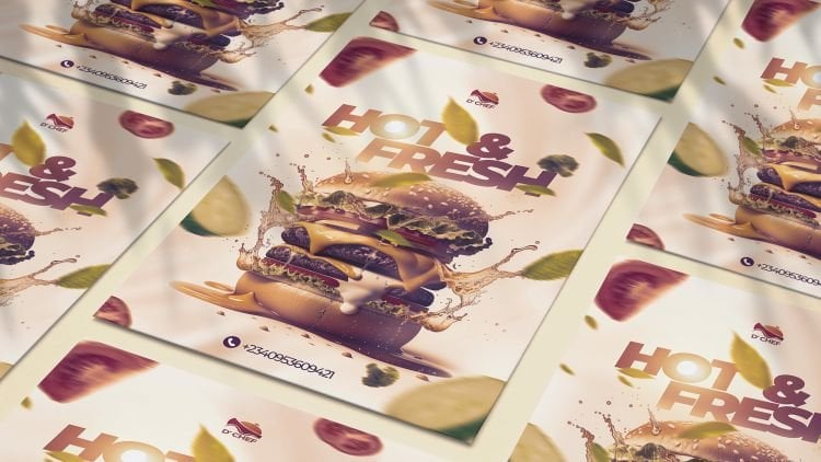
7. Design Layout and Colours: This lecture I'm going to teach you design layouts and colors. Firstly, what is layout? Layout simply layout
simply means arrangements. What arrangement of elements
in a particular design? Arrangement. The structure,
the organization of elements in a particular
design. What are elements? Elements are those things you
see in a particular design. Just like you say everything. We have the text here,
something like this, okay? The text, okay, we have
an image like this, okay? We have icons like this, symbols and some other things
that looks like vector. We have also icons here. Also, everything you see in a particular design
are called elements, text, images, vector designs, vectors, symbols, and the like. Everything you see in
a particular design are called what are
called elements. As I've said, the layout is
what is the arrangement, structure and organization of elements in a particular design. For example, coming down
here, right here, okay? Everything is all clay. When I click on this, you see what happens. It's
thus the background. But there is something,
something actually we don't know yet why like this. It started this way, actually
then moves like this. There it is, well
structured, actually, the textures probably
there is a little bit, you can see opacity increase,
can see nothing showing. But when I reduce it
back to something, seven depends on how
creative you are. It depends on what you
want as a designer. Apart from that,
the next night was what I make sure there
is a plate here. The plate of
plateful of chicken. Okay, let me just
come over here. I can start to put it here. Okay, I can select this, click, drag, and put
it somewhere here. And start designing. Put
around the design, Put design. It depends on how creative you are to
know the structure of the organization
of, of your design. Where to say, put them
at the right time. After we did this, after
the background falls, we put a plate of
chicken. Then what? We put some text. Another
element, then the leaves. Okay. The first leaves
that actually has shadow. The leaves that
actually have shadows. Okay, on the text. Then the tomatoes. Then what? The ribbons. Nice one. Then the price. The
price, the leave. Okay. The brand logo, the social media, and
you can see that. And also the CTA culture action, the first 1, second one, the icons and that is it. Okay. So all these
things I'm going to be teaching you in this course, not only this and
other ones also, okay? But firstly, you can see that is what we
call arrangement. That is the first design layout. You can see that everything, as a creative graphic designer, you need to make sure
that everything, everything you do
actually goes straight. You need to make sure
that everything targets what targets the focal point. We can see, actually
you can see actual A. We have the focal points. Yes, this leaves okay, the text. Okay, the arrows. Okay, Everything are going back to way to the focal points. Okay, So that is the first one. Now, now we know a focal point is one of the
principles of the layout. We focal points, we have
hierarchy, contrast, balance, movements, and so on, which I'm going to
teach you everything in this particular course. And also the way I've actually designed everything like this, how I designed and structured
everything in this course. Also, it is important to
note that what's that? The color used for this design actually depicts
depicts spiciness. That is the red ribbon used
actually depicts spiciness. The green leaves
depicts vegetables. And also the yellow right actually depicts just
something like this. That is it is
correlating together. The red actually depicts this. Actually it is
actually in line with what's being spicy because
we're talking about food. Red is actually one color
that talks about food, talks about being spicy. The next one which
is this, actually you can see very, very perfect. We started with the background, they move towards, move to this. They move, move to this. But actually, as I'm doing this, this is not the way I
actually structured it. Okay? I actually had to rearrange
it for some reasons. Okay? But firstly after that, I actually made the laptop. Okay. Laptop with
the flare light. Then after what happened? Then the rockets. Okay. After the rocket, what happened? Then the team. Okay, Very, very important. Then after that, this one
comes in the social media, and then the icon. Then the ribbon. Nice one. Then the flight. Okay, then then this
very perfect It is. The arrangement. The layouts. The arrangement, the structure. The way you arrange
all your elements in a particular design. The text, the icons, the images, everything you
have in a particular design. Also, you can see the
color being used. Actually, it's a
type of color that booms the type of
color that is shining. In talking about social
media, everything is cool, everything is bobbing red,
yellow, blue everywhere. Just light and light everywhere. Just like light everywhere. Now coming over here, we have
this also strawberry first. Looking at the color, it's
actually depicts strawberry, actually depict chocolate,
something like vanilla. And that's actually depicted what we wanted from this color. Talks about strawberry
in and of itself. This image itself
was not like this, but because I wanted to arrange
it and make sure it goes well and use my creativity
to get a better result, I decided to change it. You can see this is how the
exact image looks like. You can see this is how the
exact image looks like. What happened, I
decided to change it to my own taste because
of the creativity, because being a
creative designer, you can manipulate
things and get the right results even different from any
other persons home. Okay, so this is, this is also what
we call layout. I've been able to lay out it, I've been able to arrange it to, to the right hand side and
put some text around there. And what? Put some
strawberry around there. Okay, so we're going to
learn more about alignment. We're going to learn
more about balancing movements in the next, in subsequent videos
after this video. Also we can see right here
talking about layouts. Actually this is
also well arranged. I use the black background
because black background actually talks about
luxury. Talks about worth. People who are worthy, like black and white.
Something like that. Okay. Is a black background
with a touch of white. Actually, actually it
depicts something very good. Talking about iphone is not
just for average people. For the Eli people, the elites. Okay. Now actually that's
for the color actually. And I actually use Touch
of Pink just to make some things look nice
and people rolling over. You can see the layout, You
can see the arrangements, the image being here, some other symbols around there, and the text around here. Being a creative designer, there is no way you can't
actually design your things. It depends on you. So it's very important. Apart from that, we also this, I decided to make this
word middle aligned. Okay. We're going to
learn about alignment. Okay, Also perfect. I try to arrange it in the best possible way to make
sure it's fits the design, and the design is perfect. Apart from that, we also,
this perfect, perfect. The email for the
shower is slant. I decided to bring about a little bit of
slantnessmus like that to the text and also to the splash and some
other things around there. Also some blow, some fading stuffs and the lights using layer
mask and the legs. Actually these are
another type of layer to have been able to
arrange it perfectly. Well. Perfectly well. This is actually showing to make people this is the price,
the call to action, say order n. Apart from that, we also have this, okay, very perfect and vibrant. This has been structured
very, very well. The elements, the text actually
around here a little bit, one around here also,
and the image easier. Make people see
whatever we've been doing to make people see
what we're doing perfectly, to make people see what
the brand is selling, what they're actually trying
to portray to people. We actually made a
good arrangement. Actually there are two
different chairs actually, I had to cut them
out separately. Then fix the two of them
together is actually one thing. Actually, we're
talking about layout also being able to lay it out, the text in to the left and
the images to the right, actually, giving
some nice shadows. You're going to learn
how to use the shadows. In this class, you're
going to end to give objects images
shadows just like this. I gave them shadows myself
apart from the coming right. So there's a shadow
for the laptop, you can see I gave it myself. As you going to lend that in
the end that in the scores. Also also we have
this very perfect, I was able to manage my canvas
actually using this image. Put something like
three x optical zone arranging perfectly well, middle align, left
right aligned, and well structured, well
structured and well managed. Also have the last
one which is this. Just like a replication. Just like replicating
this, if I could remember. Okay. Yeah, just like
replicating this, but this is a different size. Learning about banner sizes, we lent different banner sizes. We also very much well
arranged, Look at this. And also very much
well arranged. It's very important to
understand layouts. Okay? Design layouts and colors. Okay. Going back to this T, this is actually blue, talking about sometimes water tons blue,
something like that. And not only that, Chen, sometimes anything
you associate with blue is almost always
like 90% being used. Okay. That's why this
brand actually port, that's why I designed this
using the background blue. Also phone using
Blues Royal. Okay. Something like that.
Also concerning this, talking about furniture,
the yellow actually. Furniture more than
this blue, okay? It's portray furniture
more than the blue. Let's decided to use the blue just to bring about
some changes. I was supposed to use green, but I decided to use also for
the pizza at talking about worth and actually for the restricls people in the middle class,
something like that. This red actually talks about being spicy because
we're talking about food also just to trigger
people to order right now. The gold also talking about
people of high class. Apart from that, okay. Okay, this also blue background because what
we're talking about, mostly 90% of anything, anything has to do with
blue, that is very perfect. That is it for design
layouts and colors. I will see you in
the next lectures. We'll be talking about
focal point hierarchy, balance, movement,
contrast, and so on. I will see you in
the next lecture.
8. Focal Point: In this lecture, I'm going
to teach you focal points. Now, what is focal points? Using focal points. Focal points means the
area of dominance. It means the center of interest. It means the points of emphasis. Without a focal
point in the design, the design would be
what's meaningless. Where is the focal points? You can see the
leaves right here. They're all pointing way. They're all pointing
down to somewhere. Everything is all coming
down to way to this place. Very perfect. You can see
this is the focal point. The arrows, cod arrows,
and everything, all talking about the chicken and the vegetables and the like. So even the delicious
package today, everything is all
referring back to the only now at $7.99
or referring back. So this is a focal point. Immediately someone looks at something and what
attracts them. Okay, what brings
in their interest. That's what we call
the focal point. As a designer, it's
very important. It's very important. Without the focal points, the design, what's meaning
less. Let's check this also. Whereas the focal points, this place particularly is
what is the focal points. This is, thank you, 500 followers with a laptop. That is the main focal point. Every other thing
here is what is just like an additional to it, bringing about what's showing the effects of what
we are doing now, the strawberry also,
where is vocal points. This is the focal point. This is what the focal points. Perfect. Okay, and
the other designs are just there to
portray the points. This also we're talking
about what's Max? This is the focal point. Exact focal point. Okay, now we're talking
about this also look fresh. We're talking about what? Laundry, washing
clothes for people. This is the exact focal
point around there. The pizzas is a focal point. This is the focal point. The pizza in another step
is what? The focal point. This, this focal point. Okay, then this actually
can actually attract us. This can attract us
towards the focal points. Also very perfect for
this image, this design. This is the exact focal point, focal point for the last one which we have, the laundry also. This is the main
focal point we have, that it depends on how
you arrange this command, the rights, it can
be at the left, can be at the right, anywhere. Actually, oh, I forgot this. Sorry. This is what? This
is the focal point exactly. This, this mean, the
mad by the left, by the right, by anywhere
you want to put it. Just make sure whenever
someone sees it immediately, it brings to the
attention it shows, it brings their attention
to that particular thing. So I'll see you in
the next lecture. We'll be talking
about white space.
9. White Space (Negative Space): Lecture I'm going to
teach you white space. Firstly, white space is also known as negative
space in design. It shows the
modernity of designs. It shows luxury, it shows well, it's actually the spacing between elements in
a particular design. It's very important that
the elements which actually say the text objects, the symbols you use. Okay? Now we have
different types of things. Okay? We have the leaves, we have the text, we have the food, We
have this grudge. We have a lot of things. Now, a lot of images is not
good in a particular design. A lot of text is not good
in a particular design. But depending on how
you manage things, you can see the leaves, okay? You can see, you can see the
place is right place, okay? You can see all these
going like this. The spaces around,
the spaces around, the spaces around there, all the space, okay? It must not be too
close to the edges. Apart from these other
designs which we actually have as we blow it and
we actually have them, as well as some nice effects. Okay, so the spacing, you can see perfect
spacing. Perfect spacing. Let me look at the next one. That's also, all these
are at the center. At the middle. Okay,
Then there are nice spacing all around. Okay? This as space to breath, as space to breed, space to breathe. You can see
something like this. Also, there is a negative
space around there. Okay. Looking at this, you can see the negative space,
The white space. White space, White space. Okay, so now coming down
here over white space, also white space, you
can see the space. You can have large spaces,
you can have small spaces. That's not a problem. That's
the space around there. Also, you can see, you can see around there also. Very perfect. Also in actually I covered everything here just to be
about some nice effects. Okay. And there are
spaces around there, also see the end. Everything you see
spaces that you can see, the spaces are on the
spaces around there. Okay. It makes your design
look good and nice. You can see perfect the spaces. Let's look at number eight. Yeah, the spaces are, you can see very perfect. Cannot jump pack together.
You can see nice one. You can see the
space app. Perfect. Okay, perfect, very nice. You can see perfect. That is for negative space
and also called white space. In this gives your designs, your elements, space
to breed. I'll see.
10. Alignment: Lecture, I'm going
to put you through what we call alignments. I'm going to teach
you alignment. Alignment is called arrangements that we have the left align, we have the right align,
we have the center align. For example, as we have
this right here is what? Center aligned. Okay, The arrangement center.
But we have this here. Actually, we call
this left align. You can see how it
is left aligned from the left and it moves
like this. Perfect. That is how it is.
That's alignment. Let's check around here.
This is also what? Center aligned. This is
center aligned, okay. And also we have, this
is like left aligned. Okay? But left aligned. It is left aligned but center aligned in the left alignment. You can see perfect
apart from that, we have this all through middle alignment to
the center alignment. This is just the
only left alignment. Okay? We have the
center alignment also. Okay? Coming to the pizza, we have this as a
right alignment. Okay? And the pier
itself is left aligned. Very perfect. This
brings about contrast. Okay. This middle align, this also works, left alignment. Nice. Also, we have this
as middle alignment. Center alignment,
this is left aligned, this is also left aligned. The phone itself is left to the center aligned.
Very perfect. We have furniture, all
these awards left aligned, and this is what? Right aligned. And this is somehow the
center in the center, that is four alignments. It means the arrangements
of your elements. The weight is being
arranged ar design, either the left,
right, or the middle. You can actually mix everything
together using the left, right, and middle center. But actually you should
have some accuracy whereby it actually
will fall all through. Just like this middle align and a little bit of left
or right align, that's Fouse in the T.
11. Hierarchy: In this lecture, I'm going to teach you what hierarchy is. You can say hierarchy
is something like a rank level, okay? It means making one element stand out more than
the other elements. One should be bigger
than the other one. The most important
one that would attract the audience should
be bigger than the other one. For example, for example, you can see this which is
what's delicious package. Yeah, we need to
attract people then. They can simply give a
delicious package today. Then the amount of
money, actually, it's a little bit, it's a little bit smaller to the
delicious package. Why? Because we need to
attract them with that force before telling
them about the price, then for them to words to
be able to order now then this actually a little bit
smaller than the other ones. Hierarchy means making one
element stand out bigger, bolder in height than any other elements because
of their importance. Just like a scale of
preference we have here. Also, I try to say, thank you to our
followers. Thank you. 5,000 followers, 500
followers as a beginner. Actually, it's worth it. Now we have this big
and what's done, the social middle
angle itself, okay? Apart from that,
we have this also, we have this, okay. The hierarchy must be okay. This must be very big.
The product itself then. This one actually, and also
strawberry flavor is bigger. Okay, Than any other than brand, the brand logo, brand
name. And this. Okay. Perfect. So
you can see this is also bigger and this
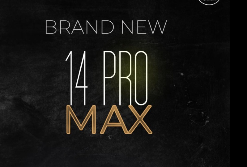
which is word 14. 14 pro max. Bigger than any other thing
apart from this image here. It's very important.
Arch is here, look fresh, then
bring about laundry. Another thing again is the word delicious pigs bigger
than any other thing. Then this comes second. Very important to
understand this. We have also, this
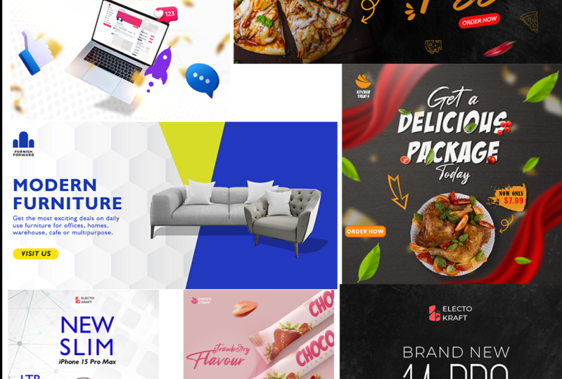
one is bigger. Okay. We have this also. Big new slim phones is new. And Slim people want
something slim, not something big, not like
those old big computers. Okay. So now we have something like this. Modern furniture. We want people to understand, what are we trying to say? Modern furnitures.
Not old furnitures.
12. Balance: Lecture, I'm going to teach
you what we call balance. Balance means weight.
The weight of something, how every something is. You shouldn't put the weight of your particular design
like in just one place. Make sure you
balance everything. The weight right here
is very high, okay? I try as much as possible
to balance something here. Balance around the balance
around the balance. Balance is not that difficult. Just make sure it's well, just like you're bringing
about alignments, okay? Also coming over, the balance
is actually in the middle. Then some nice stuffs
bringing about it, actually compromising and
actually supporting it. At that, we also have, again, here again, we have balancing. Also actually we
have something here. We have, we have this balance. This one is also well balanced. Mid, then a little touch of
this is perfect, balanced. Apart from that, we have this well balanced in the middle. Okay? We have this, it's well balanced
and well arranged. Okay. Very perfect. So, we have this
as well balanced. We have this also well balanced. Okay, Here we have
furniture also. We have here we have here. That is our balance. I'll
see you in the nest.
13. Repetition: In this lecture, I'm going
to teach you repetition. Repetition means what the continuous look and
feel in a color, in a fonts, in an image. How it continues, how it flows. Now, right here we have
the consination of colors. We have this color here, okay. Deep yellow contination. We have green,
green contination. Contination of also gives a and also to the
continationts humanist, okay, is also humanist. Very perfect
contination of color. Also yellow. There is a red. Just
bring about a contrast. The red bring about contrast. The red is also bring
about contrast. Just to put a touch
of difference there. Apart from that, we have
also coming here repetition. Okay, This is just like a pink, reddish red, red,
red, very perfect. And the ballon is white. Also repetition, all full. Now we have this also a pink, even the call action
is also pink. That's repetition. Fights would actually look good and
you can miss colors. Not a problem. Repetitions, pitch color, pink. Okay, strawberry like okay. Repetition also the repetition, yellow, yellow, white, white. Also there is repetition here. The color of this is
also the color for this. The color of the red is
also the color for this. It's been repeated,
yellow then deep yellow. Okay, we have this also
blue all through blue. A little bit of black, all in connection together.
We have the radiate. We have the radiate for
the furniture, also blue. That is a brand color blue also. Okay, The chair is light blue. Okay. That is actually
the repetition. It's been repeated to make
the design look good, that you use yellow, blue, black, red, and lights. Actually, there
are some ways you can use it and it look good. Something like this. Okay,
We have red, we have yellow, we have light blue,
we have little blue, pink, and it looks good. We have yellow also, depending on how you are able to manage, depending on how you're
going to manage it. Okay? Now that is
the repetition. You need to repeat some pattern. You need to repeat some forms. You need to repeat some colors
to bring about repetition. To bring about the design
looking good and nice. Not just dumping
and dumping colors. Sometimes you see some designs dumping and dumping
colors together, which is not supposed to be. I'll see in the next
lecture we talk about.
14. Contrast: In this lecture I'm
going to teach you contrast is just like saying the difference between elements. Now, for example,
we can say colors. Actually, one important
thing is that you may not find all
principles of design. In a particular design. You can find just 123. And that's it goes, okay. It's not comms, find everything.
The contrast we have. Actually the front gift is different from delicious
package, nice. If I had made gift, delicious package today
at all the same point, it would actually look
beautiful and attractive. And the contrast will be there. This is one of the contrasts
getting from the front. Other contrast is this a yellow, solid, and the text
on it is what? Is red contrast? Okay, very perfect. Let's look at the spell. Also, talking about
contrast also. We're going to see this, this
is quite blackish in color, that we have red, red contrast. We have this as being very big and this smaller
to this contrast. Okay, that's perfect. That's one of its.
Apart from that, we also have a contrast there. Okay? We actually, how bigger, how smaller something is
actually one of the contrast, but these are the same forms. Okay? So there's no much
contrast there at all. Okay? Now, the
contrast here also is that this font is
different from the fonts, and these are the same. Okay? So that is the contrast. I had to use it like that
because just to make the 14 come bigger, to look bigger and nice. Apart from that, we also
have, there's a contrast, which is this one being
bigger than what's this one that's under thing.
Apart from the way out. This also, the contrast here actually is like using the red, white and Ws and the yellow
normal contrast here. And using the gold color
and this red color, bringing about contrast coming
over to work in the last. The contrast here is not
really much actually, just using yellow and white
on the blue background. Okay, at that contrast
is also using the red, a touch of red on the blue
and the black making making the cal action look attractive and people seeing it very fast for them
to be able to order. Apart from that, we have
the contrast is using yellow and red contrast,
blue, brown color. This is also contrasting
this yellow, contrasting what's
contrasting this blue? Okay, that's contrast actually
differences between forms. Okay. Another thing is the big forms is still fish
and this one is what human. The contrast between the
modern furniture funds and get the best
comfort is different. That's contrast
coming from funds. Then the contrast
coming from color is this yellow and blue
and the contrast, yeah, actually that is it. I'll see you in
the next we talk.
15. Movement: In this lecture, I'm going
to teach you movements. This is the last principle
here in this course. Now we talked about
repetition, contrast, balancing, hierarchy, alignment,
focal point, and so on. Now we need to know
what movement is. Now there are different
types of movement. It's either vertical,
horizontal, or diagonal, or everything
is being mixed together. For example, in this
particular design, that is why I put this force, you would see this
is horizontal. The design awards the movement of the designs,
awards horizontal, All horizontal, moving to the
left or to the right wave, no vertical, no diagonal. You can actually say
this is vertical, but once it all to what
Horizontal. It's been horizontal. A contrast to it is
when we have this is, this is vertical all
through vertical. Vertical, this can
actually look horizontal. But let's take it,
it's horizontal, fine. But the major thing here is
what, the vertical aspect. Vertical. Now let's go back to the first
one which is this. Okay? This has a lot, actually actually this
is the vertical aspect. Let's say this is horizontal, This also moving horizontal. These are coming
diagonal diagonal. Also common diagonal. Okay. That is a common
diagonal like this diagonal. Actually, we have this also
as what has been vertical. A common, all these
all commuatese being horizontal,
diagonal and diagonal. Okay, is also coming down like
this in the diagonal form. Okay. That is the image itself
but the design is what? It's vertical in nature. We actually made this
actually diagonal to bring about that effects
Also diagonal to bring about that effects
this one going somehow. Diagonal also
floats in diagonal. Okay, so you see all these
in tutorial, actually, when we start designing,
we have that already. We have this also
being vertical, okay? And also you can see
the background kinds, these kinds of what I call it prism or something like that. Or being what? Vertical
with the design. So you have to
know how to manage the designs and make sure
they blend together. Just like blending something. We also have this also, this is quite diagonal. Okay, a little bit diagonal. This also, the pizza
itself is what's diagonal? Okay, Diagonal,
Diagonal and diagonal. You can see this
nice pizza effects also diagonal,
Somewhat horizontal. Diagonal. This diagonal also. Let's look at number nine. Okay? This actually
is horizontal. This actually is vertical. Okay? We can also say it's horizontal,
going vertical here. Okay? This is also what? This is. Vertical
in nature here. Okay? Vertical in
coming down also. Vertical is vertical. Vertical here, right here. But for is what's
diagonal in nature? Okay? So you need just need, just understanding how
to blame the diagonal, the vertical and also the horizontal all through together. So coming over here, we've
done this, we've done this. That it's about the movement. Also, you can go back and actually check the
contrast, The repetition, the balance, the hierarchy, the alignment or
the focal point, the white space,
which we've done. And also going back
straight to the layout, which will help
you to understand more about the
design principles. Now we're moving forward
to the real design, where we're going to
design everything. Everything very
perfect, everything. We're going to design everything from the beginning
to the end with the different design principles, with the different ways of
designing the techniques. Everything from the
beginning to the end. I'll see you in
the next lecture. We're going to start with what? We're going to start with,
this beautiful design. I'll see you in
the next lecture.
16. Food Brand Social Media Banner Ads Design - Part 1: In this lecture, I'm going
to teach you how to design a social media banner ads
for a food brand, okay? A social media banner ads
for a food brand as usual. Actually, we have the ten by ten when you're
talking about inches. And also it can be
1,000 by 1,000 pixels. Okay, we have the two
normally as we all know. It can just be
selecting control, that is you present
control which is like new or you come it over here
to the om selecting this. Then I'm selecting new
file. Okay, we have that. Then communal can Sy
1,000 by 1,000 pixels. Okay, You need to
change anatomy. Everything is okay. Perfect. As I've actually done
before, just grades. Normally it should. I don't want this actually. I just want the first
one, so that's good. Now we have, as I've said, for the food brand, what do we do as usual? Actually, you just go
to file after you've downloaded the resource files, just go to open, then
move towards downloads. The move actually
the extracted file. Just double click,
then come over, come towards the project files. Then what you select
Select, we begin to work. We have different types. We have 121222, very much, 238. It depends on whatever
we're designing right now. What we're designing
right now is for 22. That's two to what? To
the last 22 something. Now, what do we do?
You select on this? I can try to select
this present control. Select the select this 12 and everything that's not
doing well. Okay. Select the present control
and select the spots. I don't want to
be like too much. The best thing for me to do
is just select this two A, then what's open then start
adjusting Leo by two. It goes on and on like
that. Okay. Very perfect. As usual, when we open a new when we open a new type of file or
something, we have this. Okay? This tab over here, we have this and we have this. This is a document, and
this is the document, this is where we
actually want it to be. You just come over
here, select this one. You select, make sure
this is unlocked, okay. That is a perfect way to do it. Okay. You can zoom hours
by pressing on the out, then use minimal
bot and scroll out. You can click this. Just select it already from here,
from the layers. Click on this, click
Odd here, don't drop. Okay, we'll forget.
We'll forget. Let me drop. And contra
let me contrast. Coming back here, you see
we click Old drag here, don't drop, It's there. It has entered into the
food brand document. You can see the food brand then put here, you
can see the plus. You see the icon with a
plus in a, in a square. Then you drop. Very perfect. That's all you can just come by. And just then you, so you don't save.
What do you do? You can press on the use the
minimum potter to zoom out. Then you can see you've
selected layer one. Layer one is selected. Then what do you press? Control contra does, it
selects that particular layer. You can see all the
demarcation there. What do you do if it's nation? You can press anywhere. Can press with your
left mouse button. Then come over here. You can see we just
over around here, it brings out an
arrow, Click, drag. When you drag, just
don't drag like this. You can see, for
example, you drag, pressing on what you can
see. Let me contrast it. Okay, You press this, you can see that you press this, Click Old Drug,
then press on Out. Okay, press on Out, then it goes down. Can zoom in by present on Odds. Then zoom Unimorus button,
you can drop that. Okay, go back there,
Click Old Drug. Click, press on, on down. Okay, that is perfect. Then what? Then check. Good. So you can press control zero. Zooming, you can see very
perfect. That's the beginning. So press on out. Then, you know, zoom out the easier
minimize button scored out. Okay? So that's the first one. What is the next
to the? You should understand that this background is layers of three
backgrounds, okay? Form what we want exactly. It's actually part
of creativity and it's very important we
leave that like that. Come over to five
and open again. Then we have the
second one to be, then set, then it's here, and click and drag like this. Then perfect, perfect, present, and zoom, then control. It's very well, it's
very big, very wide. Click. Click on, press on Odds. Then track down. You can see then
don't select this, Press on Odds, then zoom in. What happens? You can
click on drag this down. Then click, click,
press on on D drop, then come to the middle. Click old and drag again. The roughness should be there. What do we do? Press
on, I've checked it. Check it actually there. Or you can press on enter two. Okay. Then what's control zero? Oh, sorry. Control zero. Then it brings you, what do
you see? What do you see? You can see we can see
the layer underneath. What do we do? We select
this. Don't select this. Okay. You select this. And what? You reduce its opacity
to something very. You can see, you can see, you can see before it was 100, you can see 100. And the background
behind underneath is not showing when we reduce
it to around 70 something. You can see, you can see showing the background
is mixing together. You can see this
roughness around there. It's mixing with what? Let
me increase it a little bit. Shot too much, half. You can see perfect. Now let me set a little
bit the next one which is the open again the net, which is then open. Okay. Click old and drag here. Very perfect. And
zoom out control. You can see again, click Oden, drag down very zoom in
preste, minimal. See this? I don't want those
things to show. Clickdd Don't use O at. You can see the cactus
station and I don't need it. No. Make sure it's not showing The shadow
is to show in some way. So I don't want the
shadow to shot. Then that's perfect. Then control zero, you
can see the video again, will reduce its opacity. Very perfect. You can come in something. Also, you can see everything
is actually blending. The wood is blending with the rough background
in the second layer. Then the third layer,
which is a smooth one, is also blending
with the other one. It's not only one, it's this. And wards end this all
blending together. So actually like a
perfect like you can see, you can see how it
is actually like it. Perfect like this.
So just control zero and you can actually
out and zoom out Eli bits. Yeah, very perfect. That is for the background. What do we do as usual? Click here, present
control, click here. It's a present control
click here, click. But the fastest way to do
that is just click here. Once you don't present
control present shifts, then you click the last one. It selects everything
between the two. Selections can see perfect. What do you can click when you write click,
you see group. From the, when you
select, you can see, you can write it in the words backgrounds,
background, then enter. That is a grouped layer, okay? You can do
it in another way. Controls it. Sometimes
when your desk, you do see group from layers. What do you do when
you do like that? Okay, You just control
on your system. You can see the select press, press on Shapes, select this, you press control, you press, you can see group one. You come up here to
words to double click. I mean, you double click, not double click here, you're
going to double click. Okay. What he? It's going to bring
out a layer style. Okay. You do what? You double click on this group. One double click, you
write, write back, sorry. Writes background. Good, perfect. Now we can close this
part. We don't need this. We don't need this also. This is what we need. Exactly. That's perfect. We have that. That is very simple. Now, what is the
next thing to do? Because it has to be in steps. Okay? It has to be in
steps. What do we do? We'll move to the next image. That is why I've arranged
it in a chronological way. This is the next image
we need. Which is what? The plate of checking and
the nice package open. Now it is open. Click
old and drag down. Perfect too big. Okay. Just to control. Click. Just drag it
somewhere like this. Something like that.
Then you check here, the control, what do we
have to do with this? Actually, let me contrate
and increase it. The exhibit around the check. Actually, what I need
actually is the plate of, the nice plate of rice. Okay. Something like
this. What do we do? I want to remove the plate of
rice from the image itself. And I only need
the plate of rice. How do we go about it? It's very simple. What do you do come? We have different type
of selection tool, but we're going to use actually is a quick selection tool. Very quick, efficient,
and effective. Do you understand, what
do you do when you left click on a two? Here it's select
the particular too. When your right click on it,
it shows the other twos. Okay, probably Young
wasn't showing quick selection to
the quick selection two is the second one. What do you do that
is left right click. And what you select
then what do you do? Make sure this is selected, not the background. The
background selected. You'll be able to select
this, select the background, and you try to
increase the brush. How do you increase the brush? Look at the icon.
Actually, it looks like a plus sign that is on the icon. Okay, the icon for the tool is very small.
How do you increase that? You can see here one,
you can see this. There is a down
area just select, you can see size one pixel ades 100% spacing and the
like, what do you do? You reduce the add
ness to 0% okay, And increase the size
to whatever size. You can see it's now circle. You can see very big. You can see very big.
Well, that's too much. Okay, we have, this
should be fine. Let's select to make it smaller. Okay, that's nice.
What do you do now? You come over here, then click. When you click on,
you see what happens. It's select. It's able
to recognize colors. You're able to
recognize edges. Okay? It's actually, it would understand that we
need the plate itself. You can click old En, Okay? You can click old
click, old rug. You can see it has actually
selected it perfectly. If it's not selected here, it's a compositing. Click Coded. Just click Once. You can see, you can see, you can see. What do you do? Just zooming. Press zoom me box. You
can use the navigation. Just click and drag. Click drag. You can see
actually selected here. And I don't want to select those outer
parts. What do I do? You can see over here we have a property bar. This is a plus. It has been plus in. It has been actually adding.
Adding and adding. We need to Word subtract. You can see subtract
from selection. So select what you do. You can click once, but you can click all. And drag down, it goes down. You can see very perfect. You can control zero. We've selected what we want. Right Then what you do, you need to cut that place out from the main image.
So how do you cut it? Control G. You can see
here in the layers. This is the real layer. We're talking about
the cut out layer. I mean the pit
itself. This is it. You can see when I
make this invisible, you can see it is gone. Very perfect. Actually, I've
selected whatever I want. I can just make this
visible and click, click, and drag it
to the trash can. You can see there was nothing
selected in the trash can. But when you come
over the trash can, you can see there's
like a black eye light somewhere when you drop it. It's deletes is perfect. Another thing you
can do is control, just click Click here
and delete layer. Yes, but I think con, but I think the
fastest is just click and drag it down to
the trash can end. That is all very perfect.
So what do you do? I need to reduce the plates. How do I reduce it? Firstly, go back
to the move to you can't just select using this. Okay. It will affect, just
go back to the move to, when you go back to the move to, don't forget you
shouldn't select this. You should select this
layer, the plate itself. Now the plate is being selected. So what do you do? Present
out, then zoom out. Okay, then control
C. It is showing the selection around
the plate because the plate is selected,
do not forget. So you click hold and
drag without shifts. Okay, bring around. You can see, you can
see the vertical line, cylinder is, it
is in proportion. You can see, you can
see horizontal line. Okay? So just, you
can see horizontal. In what? Vertical? And you
can just bring it down here. Not so much. Okay, perfect. That's perfect. I don't think there's anything else we're
going to add to the plate. Let's just make this one
particular layer five, which is the plate. Let's make it a group layer
to make our work perfect. So you can write, click
and group from layers. You write plate. That is nice. You can see it is opened. When you click on this, it's the layer is the group
layer is now closed. When you open it is
what it is opened. When you close, it is closed. Perfect plates and plate, That is all for the plate. Apart from that, we need to make some nice shadows on the plate. Underneath the plate. How do you make nice shadows? You make sure you open it first. When you open, you
select right click. When you right click
on is what you do, you go to the blending options. Another way you can
do that is what you can just double click,
double click here you win. Double click on the title. Just double click
outside the round here. Just double click, it brings
outwards the layer stop. Same thing as the
blending options. Okay, very perfect.
What do you do? Just come over to Drop Shadow. You can click and drag this so you can see
whatever you're doing. Okay, let's come back with
the drop shot, then select. You can see something
I selected here. We need to, we need to
control whatever we are doing ourselves because
we're in control now. Opacity, I don't want, you know, you can see too dark. I don't want it to
be too dark. Okay. But you know, the
background is dark itself, so it has to be very dark to
see what we're doing. Okay. I think 80, 88. Okay. Fine. If we can reduce
it later but let's continue. The angle should be around. You can see the way
you want it to go. It depends on you. Okay, So I think being
around there should be 137. Okay. Fine. Don't
mind the ones here. Okay. They're just
actually looking that way. Okay. Let me just, you can see her so it's not showing
anything. Just like that. Okay. It's just like, you know, you can put a sport. So we have that from
that angle, 13065. Okay. So let me
reduce it a little to around 132. Okay, good. So now the distance, let's try to know around the distance to be
too bigger thing. Something like this. Okay,
let me see a bigger one. Wow, that's pathetic. That is very, very pathetic. Okay. I think that distance
is okay. They're spread. Spread is not really having any effect. I think that's okay. For the spread then the size
less way than see the size. Wow. That is way, way too much. Way, way too much. I think that is okay. Yeah, perfect. The reflection is
going that way. So this is perfect. Perfect, perfect.
Very, very perfect. That's nice. That's
enough. Then words. Okay. So what do we
do, control zero. I see things are
really changing. Percy Shadow, see how
balanced it is. Very good. Let's continue. What is the next thing to do? We need to write
the words. Okay. From here we need to write the
words. What do you do now? Just come over here, come
over here, close this, okay? Because when you make a
blend option, what happens? It shows down here. Just click here and just
close the plate group layer. What is the next thing to do? The next thing to do
is to write the words. Okay, what are the
words now? Very good. Just come over here,
Come to the text. To the text we selected. Then bring something here. Wow, that's way too big. So how do you reduce this if it is way too big, way too small? Sow reduce. Just come over
to the what the properties. When you select this,
you can see Big 60, 16 is able to big, that's okay. Say 18916, Good. Around ten. Yeah, I think that should do. Let me try to reduce
the word spacing. Okay. Let's say -25 Good. Let me say -100 That's too much. Let say minus five. Let me say 25. Good, Perfect, Let me check it. You can see now, apart from checking it, I
can actually come over to. The move to now, what do we do? I need to change the word. It's all you can actually come back to the text to when
it come back to the text, to then click here. You can click inside, click around here, then
you click and drag this. Then it's what it is,
selected, a highlighting. What do I do? Then
I give it its name. That is gifts. Okay. Actually, that is
what I want to write. There are some other
lines I need to write. But firstly, check this first. Okay, that is gift A. Actually, just try to click
old and drag it would happen actually because you've selected the text to just come
over here to the move to. Fine. Then come over here. You can see to the middle. Perfect. Perfect. Just
click on what control? Click Old and drug. Click old, not drug
first you press on, then you drag because
out would make it in what propulsion you
can see. Perfect. You can click Old Drug, which is still in line. Okay, that's perfect. I think that has to be
clicked and dragged down a little bit. Yeah, nice. Looks good. So what is
the next thing to do? You select the text to
game select around their. What do you do?
You put delicious. Delicious package. Delicious. But I want to
make this capital letter, press on a caps lock
them, make it selected. The press. Enter package. Okay, delicious words. Delicious package. What do you do you
select? What do we do? We need to change its firstly,
it is very important. I'm sorry, the font I used
for the gift is beating mad. Actually, it is in the funds
said earlier that we have filed this open and we have this is the font
is here in the front. Okay. You will find
it here. It's yours. You can you should download it right now if you
want to download it. That is what being this
actually coming over here. This is the delicious package. Okay, for this
delicious package, we change in the font
to make it different. Because when you have
two different fonts in a particular design, and the fonts are different, but actually the rhyme,
they go well together. It's mile I say contrast. Hope you remember contrast. The front shares now is
boom, what do I call it? Boom. You can see, yes. If you've actually
downloaded it, you'd see it there.
Very perfect. What do I do, Spp? The one sense to sense
space is too much. You can see, you can see this, can see this arrow, this arrow going up and down.
You can see good. Just select six. Nice one. That is actually
too much control and increases for us to see. It's better. Okay, so select
this, 16, that's perfect. I should say 72. So that is, let me say like 16. That's, wow, that's okay. 9124 goes. What do you do the paragraph
actually want to make it what center text you
can see very perfect. What do click Old drawn. See? It is in the middle.
You can see very nice. You can press out and you can, you can press on the Space bar. Click select, then
click Odd button. Then for you to see whatever
you're doing perfectly, you can press on the
zoom little bit, then click presses
space by again. Click hold, and drag
the left mouse button. Then you perfect.
Very, very perfect. So I hope it's not to beat. Okay, I select that is
the present control. Select this, then what control? Then click old present out, hold it, then drag
a little bit then. I think that is nice. No, yeah, very
perfect. We have that. What's next to do? Instead
of coming over here to the text to click and us put it some other thing
here, what do I do? I can press because the
last thing I want to write, which is gift a delicious
package today, today itself. I want it to be the
same point as the gift. What do I do outside the gift? That's another nice technique. Gift. It is selected, then what is the next
in to the present O? When you press on, you come
over a click, drag down. You can see the
line, just drop it. Perfect. How do I change it? Then you come to the, the
text to select on this. When you select on this,
go to the first one. Click drag. Perfect. What do you do now? It's time to change today. Okay, I think the capslog
is on already again. There's then the other one, D Y S being what? Small letter. What do we do? We try to make sure it is what? Cents in center. Okay. Press on the move to click den, drag this, make sure
it's also in the center. You can see that show
it is in the center. Yeah, that's perfect.
What do I do? It's getting too much. It's like squeezed together. I don't want to be squeezed. What do I do? I select this. When I select this,
I try to give 50 -50 Okay, let's go to 200. Perfect increase. You can click Drag,
like you can select, can double click once
twice, make it 400. Then Enter. Not too much. Let's make it 600. Not much. Not really much. Let's make it 700 then. Yeah, I think that
should be okay. Thing else, it's actually
touching the C, so what I do, it's not composite, select this, come over, click
wood and drag it. You can use the down arrow. Down arrow on the keyboard. Just one. Just press one, you can see a Press it on. Let me use the upper arrow. You see it's entering. You
can see a use a down arrow. You can see bring it down. Your test then, I think
that is perfect enough. That is seriously perfect. Exactly. This is what we're looking for and actually
we've achieved that. Press on control
zero. Let's see. Okay, let's make this go in. Let's, let's collapse this. Okay, Then press on
a minimal words. In the zoom, you can see
very perfect. What do we do? What is the next thing to do? You select this, press
Shift, then select this. What do you do as
usual? Right click. Then you can see there
is nothing group. Sometimes it happens like that. We don't know why. Just
control the double click, the words, press them. This is the theme. When we have this is actually showing the full white color. It is showing its
full white color. But I wonder that gives a delicious back packet
today to also to also blend. Do you understand? I wanted to blend with the background.
What do we do? You double click here
like this twice. Okay? Or better still, you just want your
right click here. Then what? Blending options. Very perfect. You click
O and drag like this. What do we do? What is the nice, good way of doing such a thing? So it's very, very perfect. So you can just
decide to click old. And drug like this
depend on you, okay? Click the drug des, like this, it depends on you. Okay? You can click the
drug like this, it depends on whatever
you're doing. You can click old
and drug like this, it depends on whatever
you are doing. So you can see, you can see fed. It totally fading is with the
background, very perfect. It depends on you. But I don't want to go too far actually. I just want to make these words blend with
the underlying layer. You can see right in your underlying layer, Current layer. The current layer, Is this
the underlying layer I want, I want the upper layer to blend with the underlying layer. Okay, so what do we do? We actually press on holds. This theme is to, you can see like a middle
demarcation, a white line. Okay, When you press on out, it divides them into two. What happens is
able to move this. You see it's reducing its rast, reducing, blending with that. It's not that it is
reducing its power, but it's worth blending.
What do we do? We try to measure it. Blends to a large extent. You can see it. Splending,
you can see Splendinground. Let's say 90 something. Okay, I think that is enough.
You can see the white. You can see it. Now,
blending, going back, you can see perfect.
That should be okay. If I can just decide, click here and try
to come over here, make sure it is fading. You can see get a free, get a delicious package,
something like that. And we're good to go, but I don't want to use
that right now actually. I can just use a little bit, but I don't think it
should go like that. Let me just put a little bit
of it. No, I don't want to. Let's just leave
it the way it is. You can try that on
your own and use it. That is not a problem at all. Okay. It will actually
make it perfect for you. Okay, Let's continue that. Is that for that we'll
move to the next one. Now, the next one is that
we're moving way to the file, come over to open, then from
there you see the next one. Exactly. Now, this
one is very simple. Why? Because I've
actually cut out the leaves for you can
see the three leaves, even the tomatoes, they
are now cut out for you. What? I have the original image, you can see I got the three leaves from
this particular image. I got this, this one
tomato from here. I got two tomatoes
from here. Okay. So what do we do? I'm
going to teach you, actually I've taught you how to, how, how to copy a
particular image. Just like the plates from
that particular image itself, a particular symbol, objects from a particular
image out to copy. I'm going to show you another. I'm going to show you again, then we're going to use the
cut out once, which is this. I'm just going to show
you how it is cut out for you to be
able to remember. Again, let me delete this. We don't need this anymore.
I can decide to cut it out from here and
bring it over there, but I don't want to do that. Let me click hold and
drag somewhere here. Then you put I drop perfect. What do I do out the zoom
out control is very wide, we just somewhere around here. Then out zoom in on
this, very perfect. What do we do? This is exactly
what we'll be waiting for. The first one is press On Out. Zoom in on See. Try to use the
normally right click, then your left
click on this demo. Try to reduce. You can reduce, another way you can reduce
actually using the short cuts. Very simple, select cillationo, increase or decrease,
or press on out. Don't forget out,
that's the first one. Do not let click your right click but not just
right clicking, still present on Out. Then you word click or
you don't just click. Click and hold. Don't
forget I'm pressing odds. Then I left click, I'm still clicking and
Oding then I move to the right or to the left. Still holding on shifts. Then at the same time, right clicking, then
holding the right click. Then moving your mouse coal
to the right, to the left. When you move to the
left, it decreases. When we move to the
right, it increases the same thing as
what's going over here. Towards. To increase the
size and decrease the size. Ganar, decrease. The foe was 188. Now is 38, very perfect
click present on the out. Click the right mouse button. Old you click hold and drag
it to the left, to the right. Don't forget, not just click, You click hold and drag
to the left or right. Then click hold and drag. You can see perfect. I mean perfect. So you can see that had just contraj we have layer seven.
It's selected already. Just come down again, make
sure this piece is not. Because if this
piece is selected now you do this and
nothing would happen. You can see come
back to layer six. You select the click,
Click old and drive. Okay, this can actually
look tricky in some ways. Okay, it's subtracting, so make sure it is
what it is adding. Click the contrast. Go to Selection, then select Vs at malfunctioning like this. Also make sure you press at the Click Olden
drug like this. You can see A now present
out the use zooming, then what do you do?
You press the minus. Then when you press the minus, actually another short cut
is that if you want to add, you can press on shifts. And when you want to subtract, you can press on the click Old, Subtracting a Present Out click Old Drug, and it's subtract. You can click here. Just
click here just once. You can see actually
this enough, not composite covers everything. Let me try to reduce
this red red. That's perfect. I'm zooming
out today using control. You can see layer eight
is there already. We won the last one. Click here. Olden drug. One word. You select the
layer again. Layer six. Zoom in. What do you do? Click Old Drug. It is actually selecting
more than we need. You press on Out, then
click Olden Drug. It's actually press on
space by click Old Drug. Zoom in, you can see reduce
this by present out. Then you, using the
right right mouse, hold it down, then click hold and drag to
the left. And it reduces it. So let me try to try to decrease
this using the odd sky. You can see I think using the
odd sky is perfect enough. A Yes. Let me just add modes
that should be okay. It's not composite
perfect to that extent. Then control, we have all
these already. What do we do? Use the move to then what? Control? Zero.
What do we select? This click all the
drug Utilit can see, now we have one present shift. Then you can see them. Exactly what we
have here is what? When you come to
five, come to open is exactly what we have is
exactly what we have here. Okay, I decided to use
five as not a problem. Let's use the ones
we have with us, which we've actually
cut out ourselves. What do we do now? Now we came contra, contra, double click and
what puts leaves, you see it is well
arranged chronologically, sorry, not chronologically
well structured. When I say open, you see it
is becoming disorganized, like too much or what is. But when it is being
grouped, you need anything. You open it, you need
this open, open. It will do well. Arranged smooth, you
yourself would like it. Opevisiblevisibleactly.
The first thing I need, make this one invisible. When I select this, I'll
just bring this around here. This looks like a no. Okay, okay, nice one. We have this, what do we do? Control then? Try to bring it down a little bit. Bring
it somewhere here. Okay? Zooming to
make this perfect. So we have this, the image might actually glory. Okay. What exactly do we need? We just, it's going
to be from afar. Let me use the arrow,
arrow down, Stop. To make it more.
Actually, what we need is just that people
should be able to see from country zero and
change from afar. How do make it look realistic? Just like the words
plate of nice chicken. What do we do? We right click
the words blending options. We try as much as possible
to give its words, to give it its shadow. Okay, now what do we do? Drop shadow. Drop drop shadow. So what do we do now?
It's being selected. Okay, Then we try to make the opacity around
59. Around 59. It's not really showing,
but because we've not completed all the
things we need to complete, let's make the angle 132
and let's see what happens. Okay, let's make the
distance around one. It's not so much distance. Okay, let's, let's wait and see actually,
because it's actually, it's whenever you make a
particular layer style, this is a layer stop
blending option. The one you use previously would actually effect the latest. Okay. So it is left to you to know how to
manage it, okay? Just you can see
how is in the site, you can see what's happening. The distance, the size, you can see that is
what is happening. So we have this back
in shape. Okay. Okay? We can make it, we can decide to make it work. We can decide to make it zero. It depends on. Also spread, depression will be too much. Okay? The size rather spread spread doesn't really
have any effect, right? Number. Let's see what happens. Okay? Okay. We don't
want it like that, we want it around 132, just like the last one on 13162. Okay, good. Now, the spread, The size no, the Spes should be zero. Okay. The size two
shouldn't be too much. Let's mean the size five? No, let's make the
size around ten. Okay, For three, wow,
that's too much. Let me get around
five. That's perfect. What do we do? I'll try to reduce distance, a little bits. Perfect. Very, very perfect. Let's increase the
size. Not too much. Very perfect. That should actually do okay. I want to increase the
lightness of that control. You can see, you can see
how it is from afar. You can see that is,
it's showing the shadow, like the leaf itself is
sitting on the word itself. So that's what we
call creativity. Very nice one. Now we have that. That's perfect. That's
perfect enough. So I want to try to increase
the lightness of that Led. Okay, What do I do? I
select on top of this, the first layer is
the layer nine. Then come over to the different adjustment
layers we have. Then what? Select Curves. Okay, different curves. Click. If you drag it
down, it shows what? Sorry. Do you know
what is happening? Comps, you need to write. Click on the curve and tell
it to create a clipping max. To create a clipping mask, only to layer out seven. You can see this Ara, it's telling me it's only going
to affect what only layer seven nemicly couldn't
regularly. What happens? See, it's only affecting that very perfect
whatever contras it. What if I remove the words
release clipping mask? It affects everything
down just like before, just like the initial one. When I write click
Create clipping mask, you can see the arrow shows
that you only affect this. Okay, let me zoom
in a little bit, then we'll try to increase
the brightness. Not too much. That's way too much. That is way too much. Do I really need it? This is what is only do I
really need it. I don't think I need it
for now. Let me did it. I don't need it, actually.
I don't need it. So this is the second one. Okay? The second one. Let's go for the,
let's use this first. Select this, select and
use this first, okay? Yes, good enough. Select this. Then control C. Control C.
Click old and drag down. Then put around here, okay. Zoom in. Okay. Then zoom in. Okay.
Yeah, zoom in. Then select. Click, Click old and works. Click old and drag down. Oh, sorry. So you're
perfect around here. 91. That's what can I do? Actually, let me move this up. Actually, we have this
particular drop shadow here. Okay. And you use it on this layer nine
also. What do I do? You select out, you press out, you click hold, drag
the drop shadow. Then you move it. You can see, you can see X drop shadow. Then you drop it, it's
automatically shows onwards on this
also very perfect. Very, very perfect. That is it. I think I can
actually lighten this. Use what's it called, the curve adjustment layer. Okay, Let me right click then, you know, create clicks. Click then dry. I think that's perfect enough. Okay, let me come
overhead and leave it a little bit also. Sorry. With a little bits and the cups. Different cups then. No. Does control. We have right click, then create click mask, then click the drag. A little bit up.
Yeah, very perfect. So what I do, I close this. I close this also. What is the next thing to do? We have the last
one which is this. Yeah, we select this control, drag up a little bit, try to reduce, reduce, Oi, bring around somewhere. Okay, very, very perfect.
We have that also. Then let's try to use the
cop adjustment layer also. Then you click, click, mask, click, drag a little bit. That's too much. I
don't think I need it, but perfect's not bad. You click here normally,
you open this one. Okay, try to open. Okay.
Then what do you do? You p
17. Food Brand Social Media Banner Ads Design - Part 2: Now let me actually
take this first. Okay, this first, yeah. Click old and drag. Okay? Then drop perfectly. Then press on Zone. Out the control.
Okay? Try to re, then press zone in. Press on space bar. Use the left mouth button. Click, drag like this. Good as you navigate as usual, then you bring it down. Very perfect. Very,
very perfect. Let me try to reduce
it to little bits. Use it to two bits. Okay? Es anything,
it's a bit sick. Okay, very perfect. So we have that like that. That is very perfect. Okay, I think I need
some more tips here. Yeah, good. What do I do? I can actually
blow this and make it perfect before I blow. It's very important not
just going straight to the fu and going to blow, it's very important in photo show that what
right click and what convert to smart objects so that whenever you want
to reduce or increase, it maintains those pictures. It doesn't go blurry or
goes like it fades away. Okay, So the essence
of changing to smart object is when you
increase a decreases. Okay. Actually it's maintains
that image quality. Goes a filter then to blow I don't want motion
blow motion motion blow is actually going
to use that very well in the Sui actually in this video also by very simple. Motion blow is also very simple. It's actually changes
things in motion gan blow. Now for me to use
gushi blow around. Okay, let's make it lurid. Okay, So that's nice. Too much. That is way, way too much. That's four points. I think 6.2 is okay. Control zero. A perfect. Okay. Then apart from that way, I can just a press on O, click O and drag this like this. You can see, you can
see the more do I do I make sure I control C, okay? It tells you transformation
or something, just don't just present, okay? Right click that right,
then flip horizontally. When you flip horizontally,
sorry, control it. You don't flip horizontally,
flip vertically. So when you flip
vertically, then what? You flip horizontally? It depends on anyone
going for first. Actually, the same thing
actually I'm using also here. Perfect. Let me push it in a little bit. Push it in, push it in, I can try to, um, you know, something
like this. Yes. Okay. Okay, we use the arrow, those up and down arrows. Okay. So then just very perfect. That's actually enough.
And that is Okay. That is for the ribbon. Okay. The red nice
looking ribbons. Okay. I use again, I use a let me see
if system would actually go 8.42 point. Maybe 8.4 should go better. Okay, 8.4 then let me go
back to this and use what? 8.48 0.8 0.0 is fine.
It's not composite. Actually, to get to that
extent of let me tell you to around six point
high, 7.0 is better. You need to make sure things are actually going on Perfect. Yes. Good, that is okay.
And that is perfect. Path that we have.
We want to use De. Okay. We don't need anymore
Thank you. Path that we have. We're going to go to open again. Go to this and then. First if I do that, I
want to make sure because whatever I select is
where it is coming to. Okay. When I select this, it is going to open
above the tomatoes. But underneath this, what
do I do? Take this away. Then you close this and
click on the contract. Then go from layers.
What do I do? I used bonds. Good. Now we can go for the
words, the golden ribbons. Them then then open. Very perfect. Actually we can just select
some numbers of ribbons here. It's not composed,
use everything, because I myself
dot use everything. It's not possible.
What do we do? We just come over here, we unlock them, try to use in, then the selection as usual. Drag this down, the present out, then try to select
the space right can actually match with it. It's not composites
in a perfect tool, just make sure it's
selecting something. Okay, Out then. Plus, perfect is also perfect. Perfect is also perfect. Okay. Pluses is also perfect. Okay. Plans to choose
beneficial ones that would actually work perfectly for whatever you
want to use them. Nice composite perfectly because it's still going to blow them, so no one would actually know there's a presence of
something around there. It's very, very important. See, see that also. You can also choose that easily. Yeah, you can select
this again, select this. Certainly certainties. Certainly certainties. Certainties, Okay.
Which one again? That is contra control J. Everything I selected
as copies of control. Click Olden, drag down. You can see everything
is very perfect. Click Olden, have
that control press. Perfect. Click Olden
drug present outs. Okay. Nice. Sklickled and
drag down like this. Good. Ckled, drag
sickled and drag down. Good then nice. So that is perfect. What do we do? We give, firstly we end to convert to smart objects, then the filter. Then we can actually decide to use Gaussian
blow or motion blow. But Gaussian blow
should go better. You can see we have
something like that. But I want to increase it. Very magnificent. Say 90. That's way too for
we're going to show. We want, so we don't want
something like that. We want something
that will show. Okay. But not too much. But not too, not too much. So I think that is
perfect enough. Yeah, yes, Yeah,
it's good enough. So that is the
golden bond control. G, double click,
gold bonds, perfect. What do you do? You close this. There's something that I
want us to do, the plate. And it's controls possibly to increase the plate
itself. Control. Okay, we have that Sam, Sam, then control the leave the tomates on them
altogether to be increased. So click olden drug like this. This is down. Ok.
Then bring it down. Yeah, that's perfect enough. That's perfect enough.
So what do we do? This ribbon Actually
the red ribbon. Okay, the one
underneath this one. Okay, I want to select
this and I want it to be like to the right using
the right mouse button. A little bit to the
right, a little bit dumb. Dump up left, and
that is perfect. Try to close the
red ribbon control. Very perfect. Onwards out. Okay, let's move, now we're
through with the two ribbons. So what else do we need? We need to put the price. That's something very important. That's something we should actually have been waiting for. We need to put the price
when you select here. Whenever I bring in anything,
open a new document, you're going to select above the red ribbon and below
the golden ribbon. So I don't want to let that
select the golden ribbon. Then go to file. Okay, Come
up to open then calm down. What is the next tender? We have this grunch, how do you call it?
Try to delete this. Okay. Yes sake.
Aside the grunch. Pickled and drag and drop down. Yes, try to delete this. Also very, very perfect
side, the grunch. Okay. Then bring around here, control C, bring down. Okay. Somewhere like this on the price you should show to see. Because what we are
selling actually are down, mouse down, arrow on
the keyboard and left. Okay. Perfect. So what
color do we want to use? How do we set a color? When we press when we select the property here. Do
you see a color here? No. Why? Because it's
a PNG file or if it's a PNG or file coming from
outside, we have to what? Right click on it. Then what? Go to blending options. Then from blending options, instead of using
normal drop shadow, we use what, the color
overlay coding drug. We use the color overlay. Select color overlay. You can see it's red. When
you click Try to select blue, you can see I'm using that. I'm using something like
no golding yellow color, golding yellow color, Something like yeah, something like that. Okay. I think yes, I think
that should go then. Okay then. Okay, let me see then. Okay, also MC control zero. Okay. Zoom out, out, out. I want to make it a little bit. Come over here, just
double click on. At double click on its,
It's brings it out, so I'll make it a
Dtroljy mistake. Just click and drag it down. Yes, I think that
should be nice enough. Yes, then okay, then what? Then? Okay, perfect. So what do we write? Write what Went, Write
something on it. It is very, very important because that is where the price, as I've said, should
be or is going to be. So now what do we do?
Select text to out. Okay, Then select, what do
we do? You come over to. Only now you select. Okay. But make sure we
need to change the front. It's very important. So what font we
change to humanist? You'll actually find
that in the front. Stop also, sorry, mine is H U. Why is it happening like this? H U, M A Good. What do you do? You come over here
and what you give it. T woman, but T italic. I so much love Italy. It makes book
perfect. Comp over. Present a control rather
they couldn't drag down. Just put around some way. Then select what do you do? Let's press here minus five. Let's see what happens. -50 Nice one. Select
here for the color. Click old and drag
down, make it black. And that's okay. Very perfect. You try to select more
of it, -75 Okay, good. Very perfect. So we have that. Another thing you can
actually do is that you can actually present,
click, drag down, you've copied, then
you try to change, come by a text,
then select select. You can actually do Cltallyss might not actually work
for you perfectly. To that extent What you do, you click old and
he, and that is it. So you change the money to
what ships then dollars in the nice cold dollar
sign, 7.99 Okay. So what do you do
then? You check. After checking, what do you
do? You come to the move to control. Before control. So sorry, control, this is
minus, fine, you understand, but just come to the with the width of the funds and
give us what's bold, italic? It needs to be bold. People need to set the price boldly for themselves
to buy very, very fast. Okay? It's very, very
simple and very nice. So I can actually make sure I do like this
when I try to check, when I select this one place on controlled the
select this I do. I try to emphatically
arrange them perfectly. I can actually reason tally, but I don't need a reason. Check it. You don't need it. Conflsd. What's wrong
with it? Perfect. I'll try to reduce
these a little bit by 7.99 I'll make it red. Yeah, I'll make it okay. See, the red is perfect. I want to make the
red red setup. Dark can go up. I want to use a complete right. I want to make it like, you know, in an highlighted way. Sorry, in a darcking way. Dark, right color. Okay. Okay, let me leave.
It has been as it is. Okay. That information, but I'm coming. Okay, fine. So just click and click this
then contra try z into bits. Yes, ezri. Then we're going
to select the only now slight right down. That is very perfect. Control. Okay, Control zero. That is perfect. To the extent we actually
want to do what? To be perfect. Do we need
to increase it? Okay, try. Okay, let's click on this, select this present shift. Click on this, then
control, then double click. And what puts price
Very important. That's the price.
What do you do? Control, click the drug. I mean, yes, it
should show better. You see? It's very fast. Oh, that is the price we are
paying for a particular, for a particular product. It's very important, they know about the price they are paying
for a particular product. Very important. Now we have that. What
else do we need now, adding this, we move
to the next one. What is the next thing
we have to do now? I need to give the shadow, need to give the
grunt, not everything. Make sure you open the only
this should be selected. Make sure try close this up on this that is being
selected. What do I do? I right click to the blending
option. What am I doing? The blending option, I need
to make some shadows and give it some drop
shadows opacity. Okay. Firstly, I can actually
try to change the angle. Okay? The angle
is fine. Just try to change the distance. Okay? The distance shouldn't
be too much. Okay. You say that is way too much in san spread,
I don't need anything. Zero spread size, no size. Probably zero size 91. So the opacity should
just be the way it is. Okay. That is, say that's
okay. That's okay. And contra zero. Yeah,
we're good to go. Perfect. What is the next
thing to do after the grutch? Okay, We need to
put some leaves, some nice, cool looking leaves. Where is the leave?
Catch the leaf for me. I need to see the leave. Very nice. Now, coming
over to the leave. Yeah. But first before the leave, let's try to give
it a brand name. Okay, Closes. Now let's go to the open. Okay, let me jump over to the
brand name for the leave, let's give it a nice brand
name coming here to you. Click Add down. Okay, that. Put in, drag this navigation, then control as it is. Just leave it as it is, okay. It depends on you. Okay. What I would like
to leave as it is, try to reuse it. Okay. I'd leave it as
it is now because it's rhyming with the red ribbon. So what do I do? I can
actually write, Click Okay. Blend Option. Okay. When
I say the blend option, okay, what do I do? I come over this and say
this, then that's okay. That's fine. Then probably you don't
understand what I did just then. Okay, this is it. Contrast it. Right click, then go
to Blending Options. Okay, go to Color Overlay. Click on this, not'smple want to use this type of
color color, Gpslick. Just come out to D. Then
select this, Changes to color. Select the radio changes,
color changes color. Okay, so it's very perfect and very around this color,
and that's perfect. Then select. Okay, then select. Okay, perfect. So
what do you need? You can actually do
something like this. I need to give it a brand name. Okay, The brand
name I'm going to give it is very
simple and very easy. So just come over here to what
it got to the price, okay? I need this type of points, okay? I selected this. So after selecting
order, I go to Out, then go to set some points. Only now, only now
the present Out. Click old and dirig
this to the speed. Very, very nice. Very, very. So you can click it. This is, this was
what I just copied. Now, click hold and
drag it outside of this piece because it was
in the group of the price. Okay, But now what's inside
the group of the brand logo. Okay, let me continue first. Okay. Before that, let me
click this. Press conflict. Right clicks brand brand logo. Very, very perfect. So we have that out and zoom in. Now as I'm selecting this, as this is being selected now the copy of only now
just come over to the text to select. Then click and
drag around there. Then change to what
you start to press on, the caps itching, that is
the name of the brand. Select, press on this and
make it center aligned, that's a set centerline. Then we move to click and
drive to work to the middle, very per al, press on the space, bald and dry with the
left mouse button. Then contract and try to reduce
it because we don't want the branden bigger downwards than the logo. Very
important should. The present space
bar, present audit. They use left mouse porting
to try to adjust things. And nice, you are good to go. Just come over to the color
drug to white. This is black. Drug down, that's black. That's very perfect. Control what happens. Very Ppt, we have that now we can
actually see what happens. Control, collapse this. Ok. I think the logo is
actually looking at this, actually, let's try to change
around something like. So that's pathetic. Six, wow, let's take three. Wow. Yeah, that should be okay. Just select the press, close it, then select everything as a brand
wooden control. Then try to red very
important control zero. Let's see what happens. Okay, very perfect. See you can see it is
around at the top. On the top side. Okay, that's perfect enough so you
can collapse it down. Okay, fine. I think
it's blending too much. I mean, the color is blending
too much with the red. Let me try to increase that
white. That's yellow rather. Uh, very perfect. Very, very perfect. So I'm going to use
that particular, that particular yellow color. Okay. For this also. So where is it? The price? Okay. Double click. No, sorry, that's a mistake. Okay. Yeah, that's drop shadow. Sorry, color over. Come over then try
to select this. The reason why it changed was
that the cap stock is one, changed back to the
like something like the ink the eyedropper stock. Okay. When the cap
stock is on again, it turns like a
sniper, you know? Sniper pointer, Something
like that. Very funny. So okay. Okay.
Also control zero, you can see very perfect. So what is the nest
in? The nest is work. Let's try to close this down. Close this case. Well, arranged. What is the next thing?
Let me select that. Whatever you come
above the brand logo, what is the next thing to do? What the leaves one leave, but we use it like that. Okay. Then open very Perfsble. It's very, very simple and very, very easy as usual, the quick selection
to present the mouth and right mouse button and
click and click old and drag this P ground,
very perfect pots. Then you know, pots
then try to reduce, okay, the cup stock is one, that is why else
is it very nice. Okay, that is okay. Good control. Z control. Now, click, drag,
then you did it. So we have this very
puppetry control. Then what's drop it now we have this close, close this also. That is we have control
control, negative. Very small. Control enter, check it
before are on that side. What is, what is it
we are doing now? We need to block, okay, I'm going to use motion block. That's what I'm going to use. So it is very, very simple, just
control. All right. Click and as you know
flip horizontally. The ppprizontallyd
flip vertically, Okay, let me see.
Flip horizontally. Okay. Then flip. No. Okay. Let me
leave it as it is. This is perfect enough, so click and drag around here. So what do we do, convert to smart objects, then to filter. Then what blow, then
what is the blow? Blow? Let's make it Motion
blood this time around. Okay? Motion. Blood
very, very high. Sincerely, very, very high. You can see that's very, very So are you compress on Ols? Drop down Contro C, the next one out. Then click on drag it down here, just like put it in
the somewhere that will actually look
nice, just present. Okay, Then then you can actually on the last one
and bring it around there. Then you can just contract, right click. Then
keep horizontally. Then bring around somewhere. Select very perfect. So what is the next thing to do? Then press on again. Bring it around here.
Demarcate contre. That's Essary. Demarcate a lot of
things with this, make it looks refreshing. Talking about vegetarian or
some sort, things like that. Nice then that is that, let me add like two
more probably. Okay. So much be nice then then try to bring it
down around there, down around here, a little bit. Down, down, down. Good finger. We have this also. Then again, bring around there, Press the left mouse
button on the last leave, then bring around there. Right click control, right click horizontally on the click
over there, click click. Then that's perfect enough. After what is the
next thing to do? We have some other ones. You can see the ones very, very much the post one. Then come down to the last one, then we set the ship. You do control control G, double click and change was flying fly and how you put it, Not browse. Mistake one big
mistake, F, Okay. Now that is we need to then open click
as just drop down. So I will try to reduce control, reduce, try to right
click on right. I will change orizonyrightlk
again and change vertically. Okay. I just need to make
sure I ozonally back again. That is actually because this
is actually what I need. Just try, try to cover it. Yeah. Very nice. Click Ddr, This Amazon
needs to be test to achieve the right results. Okay. I think that's perfect enough. Need more? Okay, that's
good. So let's take on it. It is a Jpeg or PNG, it's a PNG, so we can just select
a color like that, so we see what the color over. So you can see it's after
issuing that particular color, just Okay, it's fine. That's not bad enough. I think I just need to add
some more leaves around here. Okay, just come to
the flying here. Okay, let me see. This is exactly what
I'm looking as. Select this person,
bring around somewhere. Yeah, nice control
C. Then you enter, then select nice one. So we have that. What is the next thing to do? The thin puts. Okay, Closest put open. So let's go down.
We have this open, very, very per click contract. Okay? All right.
Klip, horizontal. And that is a point. The flip, horizontal,
horizontal, vertical, flip. Then we can write kick
on here, write k here. Then what's blend options? It's a color value, it's already recognized
the last color. Just just okay, just contra zero and you see
everything's normal. Everything is just
what's normal? Just select this control, try to each piece, press on this also contra re, very perfect. That is actually what
I want to achieve. Apart from apart from that, we already have all those
ones, now we have another one. But firstly, let's try to group this control, this control G. Then you put, that's a mistake. Yes, that's, I can actually select some other icons I have there just to make it nuc realistic as a social
media banner ads design. Just come back to open. Okay, then what do you do? You select this, okay. Then click old and drag here. Then you drop very
perfect. Just contract. Click old and drag, sorry. Okay, running down, so make
too much outsinzoming. Okay. Click cold and drag. Select Control. Right click Blending
options, Color over select. Kpodendra to white then. Okay then. Okay. Very, very
perfect Control. Zero, apart from the
Wes an orange icon. Open the code and
drug, then drug. Okay. Try to. That's concrete. Yeah. Okay. So we use
it a little bit down. Code and drag is done. Okay. Let's bring around
the on zoom code and drug. You can press Enter or you can come over to press this,
either of the two. Then you can just
what? Press on sheets. Then click and drag. Then bring it here she out, click and drag and bring it, copies it automatically
and control. You can see perfect
we have that. We, the last thing
we're going to do, the last thing we're
going to use is what is the social media? And actually a social social
media banner art design. We need to put the social
media and Acl to action. Which is what city order now, book now, lunch now, blah, blah, blah, blah, blah, blah, blah,
blah, blah, I think. All right. Click go from layers. So let me give the
sons name also on icons that apart from that, the plates at the plate to be
bigger, want it to be big. Click, That is way too big, boy should go back to normal. That's okay. At
least ops to big. Yes. Okay. Okay,
Let me increase it. It increases contrasting,
I'm sure it is moderate. Not to be to that extent. Country. Why is this up? Nato drum up mouth, then click up a little bit. Top up arrow, then
the right arrow also. Okay. P control zero. Yeah, I think that is perfect for the CT, the social media. And I can put it around the,
I can put it around the. Okay. But there's something
actually obstructing the tally to be too small, naturally. Too
small obstruction. So this is the only
free way for me to be Pkt about a lot of things. Ho, I think there's a
perfect piece to put it. What do I do? I put it there. Make sure you come to the
first one around there. Because I'm about to import
some other new things. Let me zoom in, Go put
in some texts also. Now what do we do? We need to import first the icons
to know what to do. Five. Firstly, let's
close the ones. We need to close the ones, we need to close the ones. We don't need them anymore. We don't need them anymore. Just come to five open. When we see five come
down here, go way down. We have the tweet
on the Instagram, Twitter, the latest
Tweeter logo. We have that present control. This present control and you select on this and
that's all you open. The first one is the
Instagram click, drag down here, 91. Try to navigate around
the contrary to reduce, because whenever we make
the first one we're making, right now we're
going to copy it to the other designs
we're going to do. We are not going to create
and create and create a game, probably second create
game for this one. Okay, fine, that's not bad. Okay, let's continue. Let's just continue. So we have that. So then after that we
have, this is gone. Thank you. We have this click hold and
drag air being done. Okay, contro. You can see this is
actually in line together. So in that got, so we move to the next, which is what took, then click and drag
this down. Okay. Then, you know, cat see, okay. Then we have this, say control zero. It's way too big, I want to say it's way too big. So, control then try to
be perfect. Very good. So that's what I actually
want to achieve. Okay. That's, that's
part of liquid and drug, That's very perfect. So what is the next
thing to do right now? That next thing to do right now. It's the next thing to
do right now is for you to this is the first one, which this is the first one. Instagram, second
on Facebook, third, tweeter underneath
this, right actually, above to a perfect put text. Then what I can do is just contra compared
to the kitchen he. What I do actually,
is that come over to the brand logo, okay. Click select this to
open the kitchen treat, is actually a fat I want, which is humanist,
and select it. Then press on, Come over here, click old, and drag it. Do we have a kitchen
treats copy? When we have kitchen
treats copy, you click hold and drag into inside this particular
background. Don't try to make
sure like this. There is a blue light, blue outline highlight
that is large. This is a blue yh
light that is thin. So you drop it in very perfect. What do we do? It's very simple, just
come to the text to select the left bottom to
move to the last one, then try park space. You can see. Then it's very important we're talking
about the etagramowk, about the estara,
we can see kitchen. Now we can make the
estagram phase. We can twitter and
do the same thing. But firstly for this type of
course I make it difference. Then the other mass sm
kitchen kitchen treats, very perfect kitchen
was kitchen treats. How do I know what I read is after the correct
just come over to increase the wall spacing of something like
the kitchen tres. The E isn't there, isn't appearing kitchen treats. I do. Just come over,
click wodlinegethertttr. Increase a little bit, just the right mouse, but strike that is very perfect. The next one should
be also using this, is you select this, then click and drag down. You can use the ships to make
sure is coming down strict. You can see everything
is very strict. The thing I got to put says
was ours are different. So I have to make
sure that everything goes in proper clicks. Shifts can see the arrow, you can see perfect. I can just select
this from here. The present click and drag down the press sheets to
measure it is in line. What is the kitchen? Which is what the itching
The first one kitchen, second one is our patient. The four on the kitchen is
very simple and operate. That is actually for the
social for the social middle, I need to change that particular black color
to the color I prefer. What is the color I prefer
just comp over here. This is just convert
it to blend options. Then the color over
which is for this color, which is then puppets. Present, okay? Okay.
The same thing, just present, drop down, Present, click, drop down. For this, everything is in perfectly, very spot perfect. There is something I
want us to do even if we have something like
this. This is forwards. This is for what you
call for the tweeter. This is also for the tweets
and Present Control Act, then words control,
then click and say, sweeter, understand why
I'm saying right now. Okay, this is for
Facebook and this is forward Facebook
present controleight. Click then from
layers then see face. The next one is the two. This is what tagramtry now we have this one press on control group from layers again, what do you call
in social media? Yes, very perfect. Just close you can save it in. And we talk about what this is. Twitter, you can see
this is Facebook. You can see this
is what Instagram. Very perfect and Sound. It's brings about what
it's Bs about arrangement. The best arrangement we
can ever, we can ever, ever achieve as
graphics designers. Okay. This would actually go a long way in helping
us apart from that. Now what do we do? We
need to make sure, and I think is Social
Andres way to be, for example, tweeting the
Instagram coming down. Okay. You can see her. So try to reduce
concrete to reduce it something like this zone. Then the Facebook
set up this contra select. That's good for. What's it called for? By tweet, we can select this
contract reduce. So that's perfect. I can actually select
the sell the tweeter. Click and drag up the Facebook. First click, drag
up select Tweeter. Click and drag up. That is perfect, or actually a problem with
this for the Facebook, Select this contre, try to
reduce it into piece, okay? Okay, I think that's
Ppt enough control. Okay, That's very nice. So tracing me, okay? The traces down the down
arrow on the keyboard. Just try to go down
with its bits. Just make sure this line is
actually with the plates. And that's okay. That's, that's perfect enough. What is the last thing to do? The last thing to do is the CTA, what we call the call to action. It's a very simple tax. Very simple tax. What do you do? Just come over to the tangle. Select the rectangle, okay? Just click D, it might
be very attractive. Zoom in, zoom in. You'll be able to see
the four circles. One out. You'll be
able to see anything. You don't know it at all. You click would drag it. You're good to go to what's the above that. Now you shelter the
present properties. Then go to the field, chose, come to
colors, go to red, choose the greatest
rate to stroke. And put no, no, stroke, no. Then that is what we're
dealing with right now. We have this very perfect. Let's make sure it's in line. You can see, you
can see the line. Perfect. Good. What else are we doing to
put order people? To order people
to buy our goods. Buy whatever we're selling. How do you put pattern? Do convince the how do we
make them our customers? Just tell them to what to order. Now very important, let's set a point of
the social media. Let's closest click on this, then press out the clickdect. What do you do? You click
above direct tangle. It shows above direct tangle. Just try to collapses,
down, collapses. Press control the control, what happens? Double click here. And what's cap call to action? Good. What do you do? You come over here to action, a kitchen trait
copy for control. Select the text to select
click Drug like this. The right what order now can actually decide
to write the order now, I don't want to like this to calculated springs
about reality. Something like that on control. Then click Old and
click Old and Drug. Then when you click on this, present shifts into correct. You do vertically aligned and horizontally aligned
to wear to the middle. I just select the other, only the present control. Click old and drug using old. Then you are going
to control perfect. Extremely perfect and
simple social media as it's all for this and
we're good to go with this. It's really nice and it
actually looks good. We have these, we did
the ribbon leaves, the tomatoes, the icons, garage. It's a big thing. Surely a big thing. Let's try that's, it's very simple. Everything we need
actually write easier. I'll see you in
the next lecture.
18. Thank you Social Media Banner Ads Design - Part 1: In this lecture, I'm
going to be teaching you how to design a
social media banner, which is actually on
thanking your followers, like thank you 500 followers. Or probably Brady is actually
trying to, you know, congratulate or say thank
you to their followers, for them having
like 500 followers. So it's going to be
very interesting. Now what do we do? Just unlock this then to file as usual, go to open where the files are, which is what we
have the download. Okay, nice. We have here
we have project files. Now we go straight down towards, straight down to where is it? Go straight down to this
over a, just present open. So we click Wooden Drug, like this, then drop.
Okay, nice one. So what we do, you
present in zoom contract, click Oden Drug like this. Okay? Now we have this.
Now look at this, look at this
particular thing here. So this is what I'm
actually targeting. I want to be like
somewhere up here, okay. I want to roundup and look. So makes is that it has
another one down here. Okay? Which we can actually see like that or we
just try to know, rice k, the horizontal. Okay. It shows around the pine. Then what again,
make the article, You can see, we have it around here, exactly what we want. You can see it here, very
perfect, so increasing. But let's just leave
it as it is like this. This is the first one.
Check, it's perfect. The second would actually
include somewhere around there. So go to open, then
move downward, then it is always the open. Now we have this perfect click. Odd, very perfect
control on zoom out. You can see very big click, click odd, present out. Then click around
here on zoom, okay? So click den, drug
like this, okay? Like this, bring this like
this, very, very perfect. Okay, so we have this,
now we have this. Just try to check
this. This is okay. It's perfect. Then as
usual, what do we do? You press the layer
marks, then we have this. Then having layer marks, you go to the brush
to as usual. Okay. Increase the brush
to press on out. Then the right click
on your mouse, press hold out, then the
right click on your mouse. The right click,
click, hold, and drag. To the left or to the
right. Okay. To the left. To reduce the right. To increase what do you do? The floor opacity is very small. Just click and drag.
Make it like 100% So just very, very perfect. Very perfect. We'll try
as much as possible to do to reduce its opacity. Okay. We want to make it clay, at least not Claren. Go to the brochure. What do you do? Try to. Now what do we do? We get
the laptop, come to five, come to open, and go
down to where it is. This is, this is a laptop. Perfect. Very perfect. Click Ode and drug like
this to this case. Then you drop perfect out. That is o middle. Scroll out, con
click odds, Nice. Make it see line left, both left and right, both vertical and zonally.
You understand? Perfect. So another
thing is just that, we don't want to put
it in the middle. Okay. It's not composer. You just bring it
somewhere down. Bring somewhere down. Okay. I think that's perfect. In the click, wooden drag present. Oaks not to be. Okay. Just perfect. Even I don't want to be in the in the middle just a little. Okay, fine. Should
be in the middle. Fine. Okay, that is perfect. Perfect. We have that zoom in. What is the next thing
to do to check this? Firstly, let's go back
to the background click, present control and present
sheet, rather than click. Then right then group from
layers. What happens? You give background
nice, nice and perfect. What is the next thing to do? The next thing to do
is to fix type of Instagram page into this laptop. What do we do? Very simple. Firstly, firstly, just zoom in. Okay, it's blurry because it's a Jpeg format, so
that's not a problem. Just do what you have to
do and what do you do? You select this, which is
a quick selection too. Okay, but don't forget, I'm supposed to select this, has to select that. We have that perfect. You can just zoom in and
try to capture more places. Like make sure it captures the white space
is very well perfect. Okay, zoom out then this co That those edges are
very, very important. The other ones are
important also, but the edges are much
more important. Miss. I think the last one also. The last one also. Okay, that's perfect
enough. So 1000. Okay, then then zoom in. Okay, we have that, the zoom in. Let's try as much as possible. Click on Drug, and yeah, that's my present on
subtract from this. Present on subtract from this, and also press from O. Then subtract from this. Good, very perfect. So that is very perfect. Now, what is the
next thing to do? The next thing to do is
firstly just press on the move to The next thing to
do is select five. Go to the open number place we usually go to to
get our resource. Where is it? We select this, then open you a this
here. What do you do? You control A? You can see
some working working lines. Okay. You control a control by, you can see nothing
is showing here. What do we do now? You
control what's control A. After control A, what do you do? The word control measure is selected or you
write and words, you copy what you copy but
you don't want to take time. Just what control C.
Now when you control, the first thing is what
you press control A, it highlights all the next
thing is what's control C? Okay, then what do you do? You come back to
the first one over. Okay, now when you
come back to it, how do you paste it inside? This is the method of pasting. You come over to edit, come over to edit, then do what you paste, not just paste, Paste special. You see pat special.
What happens? It shows you paste
into, then you select. You can see perfect them out. Use this sat back press ad
click the left mouse portion, then move now it's
inside. What do you do? It's very perfect. So what do you do now when
you click Old and drug? You can see now when
you click old and drug, you can see happens
control, Okay. What do we do now to make sure things goes
on and goes fine? So this is what we do now. We have this. Make sure you selected this and you
press on control. Okay, let me go back again. You select this pre on
control, what do you do? You right click and
you right click. What do you Sky distort? That is the main thing we want
to use. What you distort? You press Distort
and what happens? This happens. So it's very important one
knows how to use this. Okay? Very important. You can see perfect. You can see it works smoothly
and works perfectly. So go to the edges, click, click, drag this. Okay. Now let's move down
this navigation bar. Okay, perfect is out there. Then you can use this or
use the space partly, then zoom in. Yes, we are. That's the new maraging
Cl, put and drag. Then very, very perfect. Control zero. Firstly check this and
what's control zero? You can see very
perfect, very perfect. That is actually what we've
been able to achieve. Now, apart from that,
I want go straight to the point whereby we
actually select itself. You can see visible and
invisible to itself. And what give it a shadow. Right click. Then goes
towards blending options. Okay, Then from blending
options, we go toward, normally what we know is what
the drop shadow perfectly, but the drop shadow won't
give us exactly what we want. Let's wait and see what happens. Try to increase your past. Try to distance and
things like that. Do something like this and
the likes and change things. It won't give us what we want. What exactly are we looking
for? This is what we do. It is very simple. Now you just come over,
select the laptop. And what you do control that is you copy
the laptop, making. This is the exact laptop. This is the copy laptop. This is the exact laptop. This is the copied
laptop. Okay. So. Yeah. This is to copy laptop. Now this copy laptop,
we're going to change it. We're going to make
sure the copy laptop is beneath the real
laptop itself. Let me just click wooden drug
because this is a shadow. So let me just double click
on Give us what shadow. Perfect. Let me say laptop. Let me signify this. Let me name this shadow. That is it. Now we
have the shadow. This is the shadow,
right? All right. Good. Nice. It's underneath. Now, what do we do? What we do is what do we do? We try to make this invisible. Then leave the shadow alone. The shadow remains, okay. When we shadow invisibility, what happens? This remains. When we make this invisible, that also leave the shadow in
the shadow, what do we do? There is something we call
you feeling something which is an image or anything with what's
with black or white. It depends what is the shortcut. The shortcut is the
whats you present. Shifts, deletes, okay? Or sheets back space, depending on what response
responds on your system. Okay? Minus what
ships back space. Sometimes when you ship
deletes, it works, okay? Sometimes you can actually
use control deletes, okay? Something like that. But contra dit is not
appropriate, okay? It is what ships back space
and it does fit with black. Or what other color? Like what? Like gray, white. We don't need that actually.
We need the black. Just rest. Okay. You can
see what is showing. This is what is showing
exactly what it wants. Okay. Control.
That's the shadow. Then we make this
what's visible. Then you can see this is it. When I click on the shadow
and try to move it, you can see the shadow is very simple. What do we do know? How does it work? You contract, which is what you give
it to transform to. Okay. When you try to
click drag like this, it's just becomes small.
It's becomes bigger. But that's not what I want. What I want that I wanted to
go down to sat as a shadow. Okay, To serve as the
shadow of the laptop. So what do I do present? Shift, click, drag down. You can see very
perfect, you can see. Then you know what?
You click here. Present on what? Reduce, Reduce. Click wood, drag down. Okay? Click, drag down. Okay. Then you can actually
present shift again. Try to reduce this
a little bit, okay? Then click drag down. Okay, bring around, zooming. Zooming, okay. So just bring it
around somewhere. Okay. So you can see
that's very, very perfect. So possibly, just just
check it now what do I do? I try as much as possible
to reduce that darkness. Reduce it entirely.
Something like, yeah, something
like that is fine. Okay, another thing I
can do just right click, change it to create, convert to smart objects. Then after come to smart
object, what do I do? I come over to filter. Then from filter to were to blow the motion, blow, motion. Very perfect. Should I use motion, blow, blow, blow, blow. Okay. Let's use something
around, okay? Okay. That's okay. Then I can wait or
control C. Okay. Try to reduce the sheets, then praise and reduce a
little bit a clot in drug. Then select control
zero. Very perfect. Let me try to deal with more
concrete present ships and True, much to that extent. Check that is perfect. Control zero, that
is very perfect. Another thing I need to add, actually let me bring this down. Let me say this, Press on, shift them, them control, then double click. Okay. What's laptop? Nice add actually
we should be on top of this is what
is the flare light, Whatever it is, a flare lights. It's down, down, down, so you can see very
perfectly and what's open. So you click, drag, and drop it. Out. Then one order control,
then old drug. Then you have this. Then check. What do you do? Click, bring around
somewhere there. Okay. Then change it to what? To darken, blah, blah, blah. B, scream, scream is the
most appropriate act. You can actually change
this to whatever you like. Something like boom, boom, boom, boom, boom, boom,
boom, boom, boom. But what do you use?
Scream, Very perfect. Will you screen
around somewhere? Yeah. Okay. Click
drugs, very perfect. And check the control. The very perfect I can out is. Let me go back to the shadow. I think the shadow
needs more control. The needs more ratification. Zoom in the present shifts, then click, drag,
something like this. Then that's packet. Then select the laptop
itself, which is the. Okay. Okay, Let me
The shadow on drive. The shadow of Sip lisp, then the flare lights and drive a Shen contra zero. Perfect. We have so what is the next
thing to do that works? Just save it. Now we have this per what
is the next thing? Next thing is to put
what our rocket. Rocket. Time. Open. Put. Put the
rocket. This is the rocket. Rocket. Rocket, boom. Thank you thing to just close
everything fine, close. We don't need close. We don't need it anymore
anymore. That's enough. Contract. Dd, down, drag more
and drag more down. Nice zone, drag
down, drag the end. You have this, just bring, like we're launching
something like we're happy about everything
that is happening. Just love, just nice. Couldn't drag around around. Control zero. Okay,
save then out. Then zooming a little bit. Nice one. But the next
thing to do is to change the color. The
color we're going to use. Normally, we actually know
that this is not a vector, it is a Jpeg or a PNG. Normally it's a
PNG. What do we do? We need to right click if it's a normal vector
created in portion, we just have to come over
here, then change it. But there's nothing
like color here. Your right click first
collapses. Right click. The move to blending options, they move towards
color over first, let me try to you bring
something around here. We have both rice cake
and blanket options. Okay. Then what do
you do, color over? We have a color over.
Okay. Then this. Then we have color over, some blue color, a nice blue color pop or something like that.
I think that's okay. That's yeah then. Okay then. Okay, fine, nice, good rock
a time. What do you do? Try to reduce your parcity
at least a little bit. Okay? Making nice and look good. Fun, actually fine. What is the next thing to do? The next thing to
do right now is that normally we can
actually change colors. Whatever we want,
something like this, I can change color, whatever I want,
something like this, something like this,
something like this. Depends on whatever I'm doing, but I don't need
any of that now. I feel like it's perfect. Apart from that, I
need a flare light. Once again, just something pump, just like showing the fire
under the rockets itself. What do we do? We go to
the laptop site. Okay. Just come by a post control, That's rocket rocket
collapse, collapse. You can see, just
expand the laptop. You can click this. Then
what do you do? Press on O. Control, you can click, the light is actually S can see, you can see controls. Press on the what's?
Click and drag. It becomes two. Then put behind
this also what do you do? You click and drag this up inside what's
inside the rocket. Press the rocket and make
sure it is up above. For this to be need
to just rocket time. Bom, bom, bom, bom. You register a
little bit to cover. Just cover something like
how the light is cool. Zero, very perfect.
What do you do? You collapse the, so select
this and present control. The select this, you click, drag this to the
or something like that on the middle side
or something like that. Control that put a drug like this or something
like this address. That's perfect is
what it is said. What is the next
thing to do now? Perfect. Almost through. The next thing to do,
N is w. We need to bring in some nice looking text. Add this text. We have
first one, which is this. Thank you. Nice one. Okay, so come over here. What do we pura?
That was rubbish. Okay. Bold. Okay,
want something bold? Okay, try to expand this zero. Good, nice one. Okay, so what do we do? We try
to reduce, make it italic. Italic. Okay. Yeah,
try to reduce. Nice one. This should be
around somewhere here. Okay, so now what do we do? We try to like rotate
it a little bit. Just have some nice
looking effects. Nice looking effect effect. Let's control, let's try to
increase it a little bit. Okay? More. Yeah, I think
that should be okay. That's nice enough.
So now we have this. Let's try to increase
the spacing. 75. Okay. So 100, I think that's okay. 200, Okay. There's way too much.
Let's say 15000, let's say 15150,
then very perfect. So what is the next thing to do? The next thing to
do right now is we try to get another text. That's 500 nice one. What looks perfect And original
sin, regular sin boat. Okay again, black cinzgula is the exact we want to use,
we actually love. Let's look at sensodzboad
is way too much. I prefer this. That's okay, and I'm okay by it. Okay by it. Now, let's slit this zero
-100 Okay, Let's go further. That's minus -200
Let's check for another one, -300 Okay? Okay, Let's say minus, okay. Let's say minus 250, 28. Let's, let's get a 300, 300. Let's, let's get a chance. No sorry. -300 -300, -300 Nice. It's -300 300. So what do we do? You come up by a press contra, right click on your right click. Perfect. Yeah, that's
okay. So what do you do? Click wood and drug. I make
sure everything is proper. Okay. Control,
increase by big way. Big, nicely big alts and try
to reduce this. Okay. So. Okay, so we have. That's okay. What else? Thank you. Bring
about it. Thank you. Bring it somewhere here. No, click Wd drug. Okay. Okay, nice one. What is the
next thing to do? I selected. Thank you. Then what is
the next thing to do? Then press on click
and drag this down. Okay, nice one. The change was followers,
so what follows? Click on click on this. Oh, sorry. It's
not showing that. What do you do? Because
the 500 is very big. So just make the 500 invisible. So what do you do? Come
back to thank you. And you're going
to go followers. When you are followers, what do you try to put
it in capital letter. All caps is all caps. This is all caps. Select all caps, then
you're good to go First, convey the move to then what
do you do apart from that? Now bring about 500 and see what happens to
control country. Very perfect. Very perfect. Now, now probably I forgot to
tell you the color I used, actually. So sorry for that. And this is the color actually. You go something just like something like
this, you go to red. Okay. Last red end. When you have red,
you can just the red itself, real red itself, is going down, going up, okay, up here to the,
going down here. Then the extreme end, okay? You try to come over here, come down here and try to try to bring about
some adjustments. When you write, when you select bring something over here, you can see see the follow
around here is changing. So you can see coding drags on. You can see, you
can see it, okay. So that's where the color
exactly is actually. So what is the next
thing to do now? The next thing to do is
make sure that the text is well aligned together
with whatever I'm doing. The thank you text. I want to make it black. I don't want to make
it right, black color. What do you do? And that's okay. Perfect About than I think
that's perfect enough. So now for the followers. For the followers just
contract and try to increase, try to increase present at, in. Okay, Let's see, 100 for this one. Well, let's say
120, let's say one. Sorry, Let's say one. Okay.
So that should be fine. Then can come to the Sp
on ready and say control. Okay. Press on shakes to
increase it a little bit. White. Nice one. See you have
something like that. Tri bring this
down a little bit. Okay. We have that
select the followers, then click and drag
down a little bit also. Okay. You can see
what is happening. Okay. I'm going to
make changes to that. Okay. So what are we
going to do about this? So what we're going to
do about this is control zero is very, very simple. Click this, then present ships, then control and call
this what theme, Theme. What do you do now?
You make sure that the laptop is what's
above the theme. That's what we do. The laptop
is what's above the theme. Click, drag and bring,
bring around here. And you drop very perfect. That is it. Press then
the theme. Then zoom in. Navigate the click
drug like this, and you can see
what is happening. P zero, perfect. Press on laptop, then zoom in. Click drug. Click drug. Then control zero, perfect me, actually putting the
laptop on top of that, actually shows how perfect
something shows how real, real life, real life. That is it for that. What is the next thing to do? We can actually come over here, down here and put
the social media. Now, what do we need,
the social media? And to be able to arrive at
the answer, what do we do? We come over here, don't forget the strawberry strawberry design we actually did the last time. Actually, this is
it. Okay. It's, it's as the one we actually did
in the horizontal way, not in the vertical way
like the food brand design. Just select the social media
and do then contra as usual. Then come over to thank you, the control, the nice one. What do you do? Click
using the sheets. You can press on the
sheets or you can decide not to present
on the sheet with actually it's the diagonal form you having the
very, very perfect. So what do we do? We
change the colors. The color is actually stressful, but not as stressful as you, just like you start designing
from the beginning zone. What do you do? You select
this, then come over A. Okay, let me cancels. I want to make sure that
the color is very near. This is the color
I need. I don't start creating the colors again, just bring the hydroper to select this,
then what you say. Okay. So out, then zoning. Okay. Then come over
here, click on this, then double click
color over this, no, sorry, has to
show this, Sazon. Click this then. Very perfect. Okay, so you close this down, close Twitter, then open
Facebook. You close down. Double click, we have this. Okay. We have this nice one. Okay. Okay, then close
this and close this. Okay. Moving to Twitter,
Instagram rather. I don't know why I
like that so much. So this, bring down expand,
then what do you do? You double click the color over, then you select this, then
you select this then. Okay. Okay, we are going
to what We're good to go. So what do you do you? Collapses, collapses. Then we contrazy. Perfect. Extremely X. I don't know what's
control zero, we have that perfect,
very perfect. Now, apart from that, what
is the next thing to do? We need the icons, but before the icon increase,
this background, B background increases around perfect, Around 3089 better. Apart from that,
also a flight again, once again, but the F will be on top of every other
thing we have here. Select on laptop, we have flights here before.
What do we do? Select this. After selecting
what we do, we press on out. Then flip, wooden,
drag and drag up. So it's scoping a
new flare lights up. Close this contra, then flip, then wards flare lights. Then you can see close the
expand. What do you do? You click Sc is a click olden
drug, somewhere up here. You can see out to Shine. Shine Bright control. So we have a flat just out
and zoom out the click. Click Present, click Olden D, click Old. Expand very much. Okay, expand, Expand something like around here should be nice
and good enough. A nice one. So just couldn't
drive this down. Asi Pizza can live it like this fine. So
then what do we do? You check it very nice. So what is the next
thing to do now? The icons are coming, the modes love the messages, the likes and the terms
up and everything coming. What is the next thing to do? Just control you save. Now being saved, what is
the next thing to do? Now? Collapse, expand this. Now, just come over to fight, Okay, come out to file
and come out to open. So now we have open. It depends on the one you
would like to choose for. We have we have this, we have we have this,
and we have this. Okay? What do we do? We can actually decide
to choose this first, but we have this are ways
we can actually do it. Instead of opening this, we can go back towards to the food brand design
we did, which is this. Okay, where we add the ribbon. Okay, The golden ribbon. You can see golden ribbon. Select this. Then you
can see this is it. This is the golden
ribbon, you can see, but it was actually
blood so much. So what do we do here? We make sure that we just collapse. Select the golden bond. What contra you copy,
then come over here. When you come over
here, what do you do? Contrave you put around here. But nothing goes over. The flare light, very important, it comes down. What happens? So how do we do it?
This is what we do. We make sure that we make sure that we
select this expand, bring down expands block. The Gaussian blow was too
much for the food brand. Before we make sure that the Gci blow isn't
too much, very small. Hereby, everything
shows perfectly. Everything we do show around something around something
like this is okay. Let me pre is this
not okay enough? Let me say 7.7 0.47 0.4 Okay. Something like that. I
think that is okay enough. And what's okay, so what
did you out contracts. Okay. Contracts. And try to bring
this about this. This. Just trying to
bring it like this. Okay. I think that
should do. Just try. Oh, sorry, what was wrong? Qt trade. Okay. Nice one. Trismus,
possible to bring things around there then this do control zero. Very, very perfect out. Then what's zoom out? This is perfect and nice. Okay, perfect. Can let me say putting something around you or
something like that. Okay, the pop. But just leave it the way it is. Fine, it depends on you. So that is very perfect. So what is the next thing to do? We need to just call up this. Yes. What's the
next thing to do? We bring in the icons. Okay, very, very nice.
19. Thank you Social Media Banner Ads Design - Part 2: Before the icons.
What I want to try, what I want to do right now
is go back to the laptop. I look. Shadows out
can zoom in control, then press Enter.
Press and sheets. Click wooden drag down a little bit of flat click
wooden drag a little bit also. Yeah, that's perfect enough. Just check apart apart from the the Flayelfl be increased. Control then click wooden
Dhow on the laptop. Then control zero. Perfect and nice. What
is the next thing to do? We'll jump to the open. Now we can decide to choose any. Do we have this done already? Four. Okay, Then we
move towards G, H I, J N N K. But in the first thing, she let me use this first. Then pre open. Okay? So click and drag
and drop. Okay. Nice control. C. Okay. Click and drag like this. And check there's
a mistake I did. Which is what? Looking at this, it was not supposed to open. In the laptop group, click and drag up
towards to the flights. Just put around
somewhere you can see underneath the flight
and drop, close this. Then we have, let me say, let me say control. Let me say double click. Let me say icons. Icons, icons. So now we have the select this. What exactly do we
need for this icon? I only need two things. Okay, I only need two things. What are the two things I need? This, is it now exactly? I need this and this. Another one is a
counterfeit, nice one. Now, what do we do as usual? Come over to the
quick selection. To the quick selection, the zooming, then click drug. We have this even you
can see it's rough. It's not choosing
exactly what I want. It isn't composable to choose exactly as it is because
the image itself is works, is blood not perfect. Just happen to be P person. Bring around somewhere else. Try to let you know. You
can leave it as it is. And just work control, you see how we're
going to manipulate things and make
things look nice. Select this, okay, then
zoom in year for this out. Select this again.
Then come very, not only but everything. Control. Just what do you do? You select on what
they move to Click. Click Dr. Click Olden drug. The control Z. Okay, very perfect.
What do we do? You select the lock itself. Click Olden drug break
around somewhere here. Okay. Then control, then try to increase.
So what do we do? Just come over here, the right click, okay. Convert to smart objects,
very, very important. Then come over to
Pu, use the blow. What a blood do you
prefer to use the actual? You can prefer to use
any type of blow. Just anyway. Perfect motion blow
would actually go. And you can see it
has been blood. Any mistake I made,
an imperfect, It made on the icon won't show at all because
it's now being bought, it's now been blood. What do I do? Just destroy that extent or just make
normal as it's meant to be? I think I like it like
this. This is okay. Perfect. So what
is the next thing to use? Let me click it. Just bring something
around here. Let me increase the motion
blow Okay, to be increased. Okay. Control. Then
click present shift. Then try to increase it. Ten, nice one. So let me reduce the motion. Blow like 30. Okay then. Okay, that is perfect. Now, apart from that, we
should, which is this. Okay? Should bring me
somewhere around here. Control, drag. Okay. Okay, nice one check.
So what do we do? Bring the son. I've
got away from here. I don't like you first to
close this. So what do we do? Present out, then bring
about this circle, present, then click,
drag it down here. Okay, it is not a smart
object convert smart object. So what do you do present? Click, drag it down here. Very perfect, but it
looks too blurry. I want people to see
the 123 lights to show. To show up to the. We have
103 lights. Way too smart. Something something
to write on my boat. Okay. Actually that
should be enough. And press okay, that
is it for that. What is the next icon to use? Now, come over to five. Come over to come over to open. Now we have open yet. We have done this already. So what is the next
thing to do gradually? Next thing to do is
this, perfect Click. Click on control. Click control. Then here, what do you do? You try to close this.
So we have this here. Exactly. Bring it up. How nice? What exactly do we need
from this particular image? Complete price increase, enter. What exactly do we
need from this image? Although we only need
something very simple, not something much at all. Okay, we actually, let's
look at it from the side. Let's look at a five. Okay? Now let's,
let's take this 77. We need the 7777. Love. Okay? What do we do?
You come over here, clip this, zoom in the side. It's nice control. I think that's a little
minute from here. Yeah, that's a minute from here. Or is there any other
one? No, not at all. Click, click and drag. And just this, what
do we have here? Right click. Then what? Convert to smart objects. Then words, press on O. Then click and drop this here. Bring around,
brings, select this, bring around, somewhere here. That is it. Then try to
reduce it because our people, to see what is happening, 77% seven love at 91, we have that included. What is the next
thing to do now? The next thing to do is to
come over to file again. Let me close this
first, non come five. Come open, scroll down, there is one, Then you choose from here, you choose from here. Open, click, drag, and drop. You can actually choose
anyone you prefer. The ones I prefer are
the ones I chose one. Oh, you should work perfectly
on whatever I'm doing. That was why I chose
them. It depends. You can try, you can decide
to choose a Facebook. You can decide to choose,
decide to choose that. But actually, this is the one I actually prefer to choose. That's the reason
why I'm using it. Go to this again. Okay, select this now
click Old and Drug. Okay. Then if you decide to just leave it like that
doesn't have a problem. But I want to choose more like the white
stuffs around this. It's really compulsory. Let me just pick it. Okay. So control J. Okay. Yeah, click old
and work and drag down. So I have this control, what do I do? What do I do? Click old and drag this
control. All right? Yes, just bring it around here. Another thing to
understand that I want this golden
ribbon to be above. What's the icons also? Nice, very nice. What you do, it changes smart objects. Covers smart object and you do, You present D and drop here. For this 17, we have this perfect to increase
the motion, blah. Perfect. That's too much weight. Too much, yeah. That's
perfect And okay, contrate zero out me. I think that is majestically
okay and nice. Looks good. Perfect. What do you do? You close the next one again, A the icon on its way. Five, very funny. So much of icons. What
is the next thing to do? You select this, then open
what you do after open, click, then out, then use minimal bolts to
zoom out and concrete. Then click, drag,
perfect, minimal bolts. Zoom in on. What exactly do we need here? What exactly do we need here? Exactly what we need
here is we need this. And icing terms up, terms up, terms up. Everything is going on.
We fine, just comes up. Okay, we need this, exactly. We need this here. Let me now out, zoom in, press on this, okay. Click Olden drug. You see we have
already very power. Just what control and
what is the next thing? Click this, click and
what simple? Very simple. Control zero, okay? Bring this, control this, bring this, okay? Control. Click Old drug. It's quite actually big. So right click, convert
to smart objects, then be converted to smart convert to smart
objects, then out. Then click this. And what? Drop it here. Very perfect. It looks majestically simple. I can just bring this down. The motion blow, okay? Increase it a little bit. Or just something like this. Actually, it's good contrast. Zoom in, zoom, you see
something like this. Okay, perfect. So we have that. What else? The love and
the nice looking sticker. Ebog, Love, love, everything. Love the last one, which is this going
down this then. Okay. This is exactly. We're going to choose
almost everything we need. Everything. Control
them, thank you. Then drop them out of
the control. Then click. Then work very, very
fast and perfect. Nice one. Then enter or
just check it very fast. Let me try to make sure
I close all these ones. I don't need them for anything. I don't need them for anything. Close this also. That is nice. Now, what is the
next thing to do? The next thing to
do now, right now, is that I love the song. I need one soup. Okay, I need what else? 310, very perfect.
Bring this down. Bring this around. What
do I do control J? Immediately. There is no waste of time. What is the next thing? This also not selecting it. I should select this
F then click Drug. Do this. Don't do me like this, President. Outstanding. President, Outstand. Oh, sorry. That's control.
That was a control. What is the next one to
choose? Control zero. The next one to choose right now is the icons like the face, the things like that. Select this, select this. Here you can see, nice one, you can
see, select this. So control out, then
zone in, then what else? Then let this, then no, we have that control J. Then click and click this down. Oh, sorry, I've selected. I select this, click Country non control zero. So what do we do now? We
have everything we need. Just click and drag. Deletes. Very, very perfect. So what do we do? Let's
go to For the Love. Love, Love, love, love,
love, love, love. Select on the love, okay. Pres move to what you do. Click drag these around here. Just put some way here, some imaginary phase where
love is looking at everything. Right Click, Then
convert to smart object, then out, click, drag. Then put somewhere, that's nice. What is the second? 1 second? Love, love, love everything. Love, love, love,
con this click drug. So what is nesting? Right Then works convert
to smart objects. Then then works, bring
this down, perfect. I can actually try to
increase the motion blow. Try to increase the motion blow. Okay? I love to share a
little bit nice one for this. Also, I can try to increase
the motion blow, okay? Nice, love, love, love
in the air. Everything. Love, love, love.
So we have that. We have this blow guy. Nice guy Mr. Nice
guy. Cool, nice guy. Click Oden drug like this. Okay? Then perfect. So read you. Smart come a smart object. Then out the drop down. Nice. Is it perfect enough
for you to blow more? Let me see the blow.
And more could actually more and more. I should reduce this.
No blood. Okay. Okay, nice. It's a nice guy. You've been arrested.
Nice. So just close. So we have this also, then bring this one
of laughing guys. Oh, sorry, confusate, I
never selected before. Sl laughing guys. Laughing, laughing,
laughing girls. It is laughing girls. You press? Yes. What do we do? We bring around here. Thank you, 500. Nice one. I'll just
come over here. Select this right click. Then convert to smart
objects. Then press on O. Click this inwards down,
it shows perfectly. We have this. Make this
invisible visible. It's not. I'm looking for march into this. Make this, make this invisible. Make this visible.
Just drop this down. Expand the double click motion. I think the motion is too much. Let's give it to W.
Yeah, no, no, no. Let's make it like eight. Yes, I think that
is perfect enough. Yeah, I think that
is perfect enough. But another thing is, I want the laptop to be down. Okay. I want the laptop
to be done. Okay. Let me see this part. Yes. Close this. Expand this collapse. Right. Collapse. It's well arranged. So I need a laptop itself. Bring the laptop. Just like saying, bring back your laptop. Okay, bring the laptop. The laptop and also the theme. Okay, let me see what happens. Very perfect. Let me just
bring this down to be. Uh huh. You can see that. So what happens? So just try to, you know. Oh, not so much. Okay.
Click and drag up. I think I don't have
to leave it the way it is. Use the arrow. Button up, up, left,
left, left, left, left, up, up,
right, left, right. I think it's perfect
the way it is. There is no need for me to
go for the adjust anything. It depends. It depends on you. Depends. It's nice, good, beautiful, gorgeous,
splendid, and attractive. As a social media social
media banner design, the icons and everything are there just to make
it look nice and beautiful and gorgeous and
anything you want to call it. That is for the social
media banner design actually for a particular
course in a particular China, on Facebook, Twitter,
Instagram or anything. Trying to say thank
you. So 500 followers, thank you so much
that it's not easy. Having 500 followers is a
lot of work to do, control. Say now I'll see you
in the next lecture. Even case this, your background is not clear enough
for you to see, I mean this one itself. So you can just increase
your capacity sea. I don't want to increase
to that extent. It's not going to look good. Okay. Just leave
it as like this. At least there's
something showing underneath and also
there's something showing, actually that's Nba. I'll see you in
the next lecture. Thank you.
20. Strawberry Brand Social Media Banner Ads Design: In this lecture, I'm
going to teach you how to design for a
strawberry brand, a social media banner
for a strawberry brand. Now, it's very easy. Normally as we all do, you
just come file okay to open then this the downloads. Okay. Apart from the gala, come over here to where you actually downloaded
your resource files. Inside we have
this very perfect. Then it's open as usual. Click old and drag, then you drop it down. Very, very live out. Then zoom out, then control. Okay. Then click,
then press on out. Click the left mouse, press out, then the
middle mouse, Pt. As usual, try to rotate this. We want to give it in a
different shape, okay? It's very important
that's we rotated. So click here to the Oden
drug, like this, okay? Then try to adjust
to your taste. Anyone you prefer actually, but I actually want, I prefer something
like, you know. Okay, you can check
this for now. You try to set it very control. Then click olden drug
like this. Okay, good. Now click Cold and Drug first to cover the white
space Lou a little bit. You can zoom in present
as is the minimum. What into zooming then you know something like this,
that's perfect enough. Then controls, you can press Enter or you come
over to check this, we have that perfect. What is the next thing
to do? It's very simple. Now, the next thing to do
is just come over here. Okay, present this. No this. You select this. Then
what? Come over here. Present what? Solid color. Then using this icon. Just present somewhere. It's covered place.
Then press okay, this is how it is now. I've created a solid shape, a solid color to be
able to close this gap. Because when I select this, when I click this is only the
image and just contra it. I don't want the image
to be too big on, on the canvas, something
like this. What do I do? Select, what do I do? It's here and there
is something, there are spaces here, which
is the white background. What do I do? I came over here, okay, for example, let me do it again. Let me do it. I came over
here, come over here. It's going to create, it's
going to appear on this layer. But I wanted to appear
on this white layer. I come over this way
towards to the solid shape, solid color, select this. When I selected this,
this is the color, the color picker
is what we have, this U, this is the eye dropper. So you can select
this, make it red, select this, make it
a very light pink. What did I do? I selected this work for it
to blend together. Okay, so you can
see very perfect. Select. Okay, now we
have this very perfect. What is the next thing to do? The next thing to
do is just come over to file. Come over to open. Okay. But firstly, I want to
want to open it around here. I want to open it
above this layer. So I have to select
this file open. Then what do I do? Come over
down here. We have this. We select this, perfect, this being selected,
click words, and drag, and drop it. Here we have this. All we do, we control
zoom out, press out. And using minimal was in words, scroll out, click, drag, and press on the words, bring in very perfect. You can zoom in, click, click and drag like this. And that's perfect. That what is the
next thing to do? The next thing to
do is do control. Then after that, I write click. When I what I do, I flip vertically and
also flip horizontally. That is where we're
going to now. I need to reduce the opacity
to something very smoothly. I can be able to word, see, see through what I'm
doing, That's perfect. Now what do I do? Control again. Click, present what you know. Bring somewhere
around somewhere. Then bring it somewhere because within the line
to be like just like an effect to make it look good and different
to other designs. So try like rotate somehow
around somewhere here. Okay, I think that's
perfect enough. May reduce it a little bit. Okay, Yeah, that's
perfectly enough. Now what do we do? We use the layer mask as usual. Yeah, select the layer
mask, it's been selected. That comes to the
brush, to the nice one. Try to erase some
nice parts from here. What I can do, actually,
I try to reduce the flow. To reduce the capacity. It's actually let me reduce it. Reducing it. You can actually
come here to reduce. Okay, but the short cut
for this reduction. To reduce present out as usual. Present halt, then present
out, and hold on the out. Then use the left mouse button. The right mouse button, sorry, the right mouse button. Then click, hold and drag
to the left and right. Okay, When you drag to
the right, it increases. When you drag to the left, it's decreases very, very perfect. So you can actually
erase the side. Okay, Can erase the sides. Okay, Just come in here just to erase
something like this. Let me contra zero and
see what is happening. You can see very perfect. So what I can do
is just like that and try to change
the blend mode. It is normal dissolved, okay? Dark should actually go. We multiplied, Ese, multiplied,
actually looks good. We have normal, okay? We have dark, okay, fine. We multiply, actually,
multiply, looks good and nice. Okay, mix looks okay. Okay. We have color bone, we have linear
bone and the like, just a nice looking
effect, I think. What would do the work
better color linear bond and the likes multiply. Let's look at
multiply and linear bond multiply work better,
multiply. That's okay. Just out and the
minimal putting, okay? I control. Then we'll try to increase this a
little bits, okay? Increasing a little bits, okay? Then you try to like, you know, okay, nice one. Should I increase, increase it to try to like make it bigger so that's perfect. Just a nice looking effect. If we have this like
this, I will have this nice one so you
can try to increase it, making it 100 or try
to decrease it more. Depends. Okay, try to decrease, Let's make it this 20. This part is seven, okay? Now this is 6091. We can actually make
it around 51 is okay. Just some nice can effect, nice one that's
cool and perfect. So what is the next thing to do? The next thing to do,
to do now is to write some text on the design. What text do we write? What logo do we put the
CTA at before that? Just select this, Press
Shift select Control. What do you do? You
double what happens? You write background
as background. Okay, we're good to go. What is the next thing to
I've said the text. Select C. When you select,
we write the text now then select this,
write strawberry. Take them one by one. Then you check now
having strawberry, we need to change
the fund as usual, we need to change funds
and you can actually get the funds from where you can get the funds from the
resource files as usual. Now just come over here, change the funds
towards being B R A. You can see the Select. Perfect. Now we have
this, the strawberry. So we can just try
to click Older drug around here can reduce it. If you feel like
One thing I want to do is you can
actually change, click here and change it
to change it to a smaller. How do you just delete this? What resina actually
perfect like this. That is you take
away the cap lock, we'll make it a smaller. Come over here to select the. Apart from that, we just
actually come over here, we need to change the color
to strawberry like color. What do we do? Selected the color, you
can sees the color is. Then bring the eye dropper to then select
somewhere like this. Very perfect. You can actually increase. So Ppt bit. Make it stronger? Make the color stronger. Yeah, something
like that is okay. So that it won't look exactly like you can just
reduce it a little bit. Good. Now, select,
okay, perfect. So what do we do? Again,
select this, you select this. When you select
this, press on Odds, click here, Old and drag
down. What do we do? We change the strawberry
to what level? Come over to the text to select. Then click around here,
click Flavor Capsule. Then what LFO Flavor. What do you do? Check. After checking,
come over to the Move. To what control?
Try to increase. Okay, this around
here on zoom out. Okay, then try flan. Okay, let's try to check. Okay, use the space by
present space, present wood. Then use left mouse button
to click wood and Dragacy. When you press space
by what happens, it changes to the hand
icon very perfect. So now what do you do?
You select the move, to select this flavored control, then try to move it perfectly. I think that should be
okay. Yeah, this is okay. Perfect enough for us
to use You check it. What is the next
thing to do contra? We get in there, perfect. What is the next
thing to do? You can actually control the side. This what you do contra
then double click, and that is the just. And try to increase
this a little bit, striking your credibility. Has to show very well. What do you do? This
is fine and perfect. So we need a logo
and it's actually normally as usual,
but not really. Every time you need the logo for a particular social
media banner, some don't need the logo,
the product is there. But it's more preferable
to have a logo most of the time. Come over to five. Okay. Sorry. Come over
to five then open now. Open. Come down. Okay, we've
done this, we've done this. What is the next thing to do?
Let's leave this for now. Let's go to logo. For now, let's go to the logo open. So I'll click Old and drag it to wear to
the strawberry brand. Then what do I do? I drop it, very perfect, as usual. Click. What I did just
now was as usual, the Space bar, you press
an older Space bar, they use the left mouse button. Click Olden drug, like this. Zoom in using the O, then press the O. You press an old out, they use the Midimuz button
to zoom in the Z control, then click Olden
Drug, like this, as usual. Okay? Olden drug. Okay, for me, very, very perfect then
this is a vector. Sorry, this is not a vector, this is just a Jpeg or a PNG. This is a PNG, actually. Jpeg and PG when
it's being exported into import it into Photoshop. What do you do when you select this and select the properties? Nothing shows to change
the color. What do you do? Right When you right click, you go to blending options. Getting to blending
options, what do you do? You come over here
to color overlay, then you choose whatever
color you select, change into It depends
on you can depends on what I want to do is as usual use the eye
dropper to to do what? To select this pink. And you're good to go. That is the pink I want then. Okay. Now, apart from that, now we need to give it a particular brand name
called Shoko Strong Name. Actually formed for myself. Very perfect. What
do I do present? So zooming a little bit them, then this, then select
something, okay? Then caps all caps Choco. Then enter straw 91. So what I'm going to do, you just use the normal fonts. I don't want to go too much. Normal font, I usually
use for logos, it's called humanist, it's in
the resource for humanist. Then select this perfect can, very simple coffee, very simple
type of fonts were there. What I can actually
do is just give it italic italic N one. Then I have to
reduce it, Control, then click Code and drug to
reduce and bring around, make sure it is actually
in line in proportion. Nothing to was make
it left aligned. Have to check first. Then
what's make its left aligned? So you can see just
zooming into bit, then click code and
drug like this. We have that control zero
unless what is happening? What would we do
now We select this. And what's control
The control as usual, making my work net. Then
what do you call it? The brand brand logo. Then enter. So what
do I do out then? Try to control, then
try to reduce it. Try to try to reduce it. Then click with and
drag somewhere. Then that is perfect. Perfect, we have that. What is the next thing to do? The next thing to do is force
to get our social media do and what the CCA.
Now what do we do? We can try to create a new one. Fine, I'm going to decide
not to create any more. If you're not creating
any more, what do we do? We go back to the first
social media flyer, which is the one we made for like a delicious
delicious plate. The rice stuff,
the chicken stuff, the chicken nice restaurant. What's it called?
Social media banner. We actually designed
the first one. We can go there and
copy it and paste it into this place and use
it and we rearrange. So I think that's the best
thing to do in order to work, to be able to manage our time to be efficient
enough. What do we do now? We go to the one you
actually designed. First, we try to get
the PSD five open. Its then copy from there, the social media and the CTA. And that's what I'm
going to do now. This is the first
one we did together. Come through zero and
see very perfect. What do we do now?
These are the ones, these are the things
I used before. Just try to close them down. Okay, so what do we do? We come over here to the CA CA, just make visible and
invisible can perfect. Just click here,
press on Control. The click, what do you do? Control C, it is copied. Okay, come over here. When you come over
here, don't select this space, because
when you select it, it is going to paste on top of background and below them
you can say control vacancy. We don't want it like this
to contra come over here. To what? To the brand logo. Then what? Control?
Very perfect. You can see it here.
Then click the drag. This is where we are using
whatever we want to use. Okay, very perfect. So now we have that press
on out, then zooming. Okay, good. So now
what do we need? You can actually select the CTA, which is the call to action. Now the call to
actually been selected. Click on drag down. Okay, I'm coming back to that. Okay. So what do I need now? Now, for the food brand design, we did actually, it's had different names for the Instagram and I
purpose they did that. It had different name
for the Instagram, for the Facebook,
and for the Twitter. But this particular strawberry
brand actually has only Just as we only one name using
it for their social media, using it for the Twitter
instead on, on Facebook. Which is what the Choco
straw, also as it is. What do we do? It's very simple. Come over to the social media
and come over to Twitter. Okay, we have this actually
the way we did it before. So it is package being
packaged for us. So let me put this
up. Coming over here, you can make this invisible. You can see that is the icon. That's what the Twitter
icon select it. When you select it,
we have this arre. Click on the array. Then what color overlay? Then double click on
the color overlay. Then we change what? We change the color to come over here. Then to what you select this, you can see that is perfect. Just okay. So what is
the next thing to do? Come Oz, the Facebook, also bring it down.
Bring this down. Double click on color over. Okay. It shows.
Then select this. Then come over here to
using the dropper to. So then select this. Very perfect, very easy, not creating
something new again. Just go just copy
from the full brand. Copy down here. Then
change things also, sorry there's a mistake also. Double click It shows
the select this, then come over here,
then click this. Very perfect. You can zoom up immediately
just to do the CTA also. This is a rectangle, okay. For the rectangle, you
can just come over here, then come over here
and pick this. Photoshop actually
understands and remembers and recognizes
the last color. You just select this, it changes perfect,
no waste of time. Everything is going on perfectly the way
it's meant to be. Now the Twitter is just try
to close, try to close. This is Twitter,
closes for Facebook, closes for Instagram,
try to close. What do we do now? What we
need to do is just that. It's very simple. I want to make sure that
Instagram comes first. Facebook comes second, then Twitter comes third.
What do I do? Let me go to Instagram first. Okay. This Instagram, the word I wrote there at kitchen
tricks. This is it. So I want to delete it
away. So what do you do? Click Olden dragway to the delete trash
can. It's deleted. It's for the Facebook also. Okay. I'm going to use one for the Instagram,
for the Twitter. Okay? For the Facebook also, you click click Odd and
delete. Very, very perfect. Okay. It is only the one for the tweeter that will be
left. Okay. So what do we do? Not close. Select on Instagram is selected, click old, and drag it up here, somewhere around there. Okay. Then select on Facebook. Also click and drag
somewhere around there. Just you can try to
out and zooming. You can see should be
what's in proportion. You can see very perfect.
Then come over to what? Instagram as Pick it, sorry. Doesn't mistake Twitter as old. And pick. And what?
Come over here. Come over here,
very, very perfect. You can see how I
actually did mine. Yours should go that way. Also out firstly, I should
just come over to Twitter. Twitter only adds this one. Let just come over to the text
to just click on this ad. Click old and drug. Just write what straw? Yeah, Chow. Perfect. Just check this. Now it's been checked. Send the move to then
out the zoom in, click old and drug this. Very perfect. What do I do? I try to close this down. Close down to collapse. Now just select this. Press on control zero.
Let's see what happens. Okay, I think it's hope
it's not too small. Then out and don't forget. Go back to the S and where we have the
word written straw. Then you do what you
press on the properties. Then select then what
changed? The pink. That looks nice. Out the zoom a
little bit. Go back. Collapses, collapses. Then select this as the old
and control we have Quant. Click, hold and drag. Okay. Click old and drag. Then try to click old and
drag this down the CTA. Click, drag this. So what do we do?
We should zoom out. So control zero and see what
is happening. Control zero. Very perfect. It looks nice and simple, okay? Zooming, you can see. Zoom out very, very perfect. Control zero. Now what do we do? It looks like just like
a B, something less. I mean, just empty. So we need to put some nice, nice looking effect just to make our design works
very, very perfect. Just come over to five as usual. Come over to five, open, then you'll go down. Okay, coming back to this
deal with this force. So we have this T
box select open. Good. Now, I don't think this
animal actually I've used what I want to
use then just try to try to close it down. So now we update. What do we
do once to select and cut this 12.3 What do we do? As usual, we using
what we've been using, the quick selection
very, very fast. Try to increase the
quick selection to increase, increase more nice. That's way too big
and drug like this. It's not composite.
The selections are perfect, not compositor. What we need is just the shape. And we're good to go out, press on Out, then click
to minus that place away. So we have this also. We have this also.
Use the space bar. Click and drag down. Okay, thank you. I should have a
little bit of this. As usual, I've
reduced using my out and usually mouse button. The right mouse button. Just press on, try
to reduce this. Also say composite.
It's perfect. Okay, because we
want to blow it. We want to use it and
blow it so it's not composite contra J that is gone. Now see, select this
also in the in, you can try to increase the
brush a little bit, okay? Okay. Okay. Alright, so zero. Oh, okay, nice one. So what do we do? Control J. Okay, so now the third
one, which is this. The third one which
is this. Okay. Then click olden drug like this. Oh, it's not going to
work because I've not selected this nice
one. So what do I do? I select this area,
select this area. Let this area select this area. No present at can try
to subtract like this. Subtract n one, so you
take from O then present. Or subtract, subtract space
also how it's malfunctioning. So contrate, let's see what
apples confatevery perfect. So what do you do this pase
also just try to present, often try to take the basic way. Okay, so now control
J, Very perfect. So click this, click
hold, and drag it down. Just delete it away.
So what do we need? We need only this one. What do we do? Just pick
everything as one at once. Present, click this,
present control, click this and
click, click hold, and drag it away into the space. Nice one, looks good out
very much, the control C. Then try to reduce. Click old and drag this. Then press the odds to make
it proportion, then stop. Then what? Control? Zero. Then check this. Just come
over here. Let me say this. False control six. Just come over
here, down, delete. We don't need this again
to delete this then. Very perfect. What do you do? You select this,
then we are here. This is the Apple
control G, double click. Okay, let me say apple, apple one, because there's
another apple coming up. Nice one, we have that. Expand it I think is
the first apple year. Good. Make all these
ones invisible. Make this invisible. So select
this and bring this up. Control. And try to reduce it. Nice. Try to reduce it. Okay, We have the effect there. We can just make it just
like life like this. Something like that. As usual, what? Just rice cake? What you use as usual. I understand words
convert to smart objects. I want to increase and reduce. It doesn't make it blurry. It doesn't change anything. It remains the pixel. It remains perfect the way it may come over here to filter. Then come over here
to what to blow. Then we have what we have,
the motion blow, perfect. Actually, you can
leave it at 30, but make it clear, 21 should be 24, 20, so. Okay. So that's very, very perfect. And that's all for
the upper one. The low, just try to collapses. Then the lower one
which is this. Okay, Bring it around. Okay, Just select it and
bring it around there. Then control C, okay, Reduce it. Reduce it somewhere around. Okay, very perfect.
So what do we do? We use the same for it. Just select check as you, instead of creating
and creating again, just come over to the
motion, blow present out, then click on and drive
this, then drop it. It's not going to work.
Why is not going to work? Because this is not also a
smart object. Right click. Then what's come
to smart objects, then come over to present. And what? It's now
the same thing. So what is the last one to
do? Let's collapse this. Select this, we have
this, select it here. Also click and drag down. Then trot, ring down somewhere. But what I want to do is
that, check it first. I want to make sure that this
is underneath this one Os, underneath the blood one
click. Drag it down. Yes, it should be underneath. Perfect. Not just
being underneath, but let me try to adjust
some things from here. Good. So what I do again, I write clip convert a smart
object, then what do I do? I can just present present. Then for me to start expanding, just present on pick these
two circles in bring drop. Yeah, and it's of
course it's apples. So click this and present cult. Click this, then try to
adjust this a little bit. Oh, sorry, that's a mistake. I mean this. Oh sorry. Click this and bring it up. I want to, good to be together. So click this and click
this, Present control. Then try to bring it up to be. Then control. You're
going to tell the smart objects
just present, okay? Okay, I just click,
drag down down. Then you can press,
or you check it. Perfect. We are moving
gradually, gradually, gradually, and that is perfect. Now we have this. What
is the next thing to do? The next thing is just the
last apples we there is. Don't forget the CT and the
social media and control the phospho always should
be the last thing itself, but now we have that. What is the next thing to do? The next thing to do is
just come over to 52 open. We have this nice
looking apple here, which is the last thing
we're going to use. Open this. What do we do as usual? What's it called?
The quick selection. To select the quick selection
to remove the background. Then try to increase
the quick selection to something bigger than this. Okay, No, it's okay like
that. So click on Drag. You know, you see very perfect. They select somewhere around
there you can zooming out. Zoom, zoom. Okay. That select this
also Sel, this place also? Yes. Very perfect. So just zoom in. Okay, reduce. Press on out. Then use the right mouse button. Click, hold and
drag to the left. A reducing it. Then press on out again. Then try to reduce
this like this. Okay? Okay, press out. Don't press on out, just
use the left mouse button. That's perfect enough.
It's not composite. It's perfect because we're
going to blow it and no one is going to see any
defect. Very, very perfect. So just contradict that selected press on the
move to click on this, click older and drag down. Then it goes to delete. Then click, Click
old and drag this. Yeah. Oh, sorry. There is a big mistake here. Wow, there's a defect contra I didn't even notice anything like that preys on the
quick selection. To then try to click
older, drag like this. That's a big defect. A big one, tan one. Presuming, Okay. I don't want to
stomach function, just control zero and control J. So what do we do?
Pre click drug. I think it's perfect.
Yeah, that's nice. It's perfect to the
X to a large extent. Just spring over,
then what do you do? You drop, wow. Look,
rubbish control. Then click. Present
something like this. Then control. Perfect. Then
what? You select, this. Nice. We have in this quickly
give it a group contro. Then I call it
Apple app to nice. Looks good as re just write collapse as urea,
select the apple two, then bring it down underneath Apple one control
then bring down. I want to give you
some shadow look, just some nice
effects around here. Just try to change
something like this. Nice one, bring around
somewhere here. They try to check. Nice and cool. What do we do? I need to put a drop shadow now
for this apple, the second apple,
I need to give it a drop shadow. Right
click. Then what? Go to blending opt. Now we have the blending
option to what do we select? We select the drop shadow, just bring me somewhere around. You can see the
distance is too much. Just right to reduce
the distance you can see from here. Okay, nice one. Distance is too. Think that's the only thing I'm going
to change from there. Actually, actually
perfectly where I was actually expecting
it to be five. Make this five. The thing is that you try to
change your own, make it normal, your
pacity, okay? Okay. Let me let me cancel this for us to see
better what I'm doing. You can see this then,
right then go to lending options,
then drop shadow. You can see very
perfect the opacity. You can see, you can increase, decrease the opacity
depends on you. But I think this should be okay. It should be nice enough.
Make this normal. The angle, okay. Were you want the angle to
be like this or like this? But I think the straw
itself, what's it called? The shadows coming
right in the right, right down or
something like that. So just make this also
something around. That also. Yeah, it's
perfect distance. How long, how distance would the shadow be from
the object itself? Okay. How distance will it
be from the object itself? So let me click and drag, like this thing can go away. The distance should be too much and so you
should be too near. Something like this
should be okay. Okay, let me say five. Something like that
should be okay. The speed and the sidednt
bother more about that. Just okay, so we have that and that's very perfect to
just try to collapse that. Now we can actually
make it more. Click on this navigation, you
can actually make it more. This is being selected.
What do you do? You press on out. Make sure you select
this. You press on Out, then bring you press on present. Then click this and
bring away around here. Control. Then just strike what? Try to change it. Bring a but more effects. Click Olden drug down. We make it smaller, at least. Okay, then just bring here. Then select a pattern
that we just select. This also, then present, then click olden drug like this. Okay, then control. Try to reduce. Okay, then select, okay, nice. Apart from that, we can actually
make it one more. Okay? Just one more present
on bring down here. Let me use odds to zoom. Bring down yet.
Okay, then control. Then try to try to rotate. What reduce 91. We have that. So check that the
control zero, perfect. Not to be, not too
small, just appropriate. What do you do? You try to
collapse this second apple. I think we are through with
everything we are doing. And actually it looks perfect
the way we want it to be. But there is one more thing. This thing, I want to give it to give it a nice looking
shadow, something like that. Shadow, shadow, shadow, shadow. Just to make it stand out
better than any other. Just right click here and what blending options can bring the blending options
around here. Come over to drop shadow
that is way, way too big. A very light, very light. Pass, pass, shozero distance
should be like not too much, but your pas should be like, let me say around soup. Okay, let me see. Nice one. Say three, okay, But there's
something showing there. So that's what I actually want. Let's say five. Nice one. You can see the drop shadow. You can see five. Okay, nice one. That's cool
and good enough, I think. Let me say your
pass, something like this and try to draw
something like this. Let's say five. That
is very perfect. Okay. So control zero. That is it for this
is what's it called? Nice looking social
media design. It's perfect. That's it for the.
We'll move to the nest. I'll see you in the
nest lecture by.
21. Tech Brand Social Media Banner Ads Design - Part 1: This lecture, I'm going
to teach you how to design a banner ad. Is like a banner ad for
a particular component, but in a different format. Right now, just
come back to image. If, for example, if you want to the size of a particular canvas, come back to image.
Go to canvas. Can see 1,200 by 2,400 Just like I taught
you earlier that. Let's go to file. You'll see, sorry for that deck. Stop, sorry. Down loads. Okay. When you see
the project files, you see the first
on, second thought. This thud one actually is, I'm going to show
it as an example. So this is very
perfect actually. Like, you know, zooming
in just okay, okay. You can see 1,200 by what's 2,400 and this is exactly
what we want to create. Okay. From that we can let, let me do it that way am we can actually see
there from here also just like in the
number beer format is. Okay. So we can see one
than 1002 by, by 2004. Very, very perfect. So that's the one we're about to create. Now we're going to create
it for what's a tech brand? It's very, very easy. So the first thing we
did just pick the phone, actually I'm going to use N. Let's start making
the move the first, sorry, one or two is words, which is make sure take the background o
come over to file, come over to open, then
you move to where? You move downwards. Okay, Move over six
B, then you drop. Sorry. Sorry. Sorry,
not that far. Sorry as I've said
the background. Sorry. Too fast. So just open. Okay. Come downward to 26. Also as I said then what you
open now that is opened. We have there's a click
Oden drag to foam end. Yes it drops out
the Mon control, then click old and
drug like this. Let's predict them to
clicker drug like this. What is the problem
we're having? The problem we're having is what The real problem we're
having is what is that? We need to rotate
this right click. You don't need to just just bring over a click older
and drug like this. Very perfect. Compress shifts to make it
in a straight line out. Then click odd, like
this. Very perfect. Just check this, Check
that it has been checked. Now what is the next
thing to do now? The next thing to do
is just like what? Country zero. Very perfect out. Zoom out. Now we're going
for the phone file, open, then the phone. Then select this
and what's open? Click and drag, Like
this and down. Perfect. Control the zoom by present out, they need to zoom out. Then click old and drag down. Click, drag down. You can see you can see if
one has its own background, so we have to remove back. You can see that, nice. If one has its own background, so we have to remove that, we have to moove the background. What do we do out? Do we
do that? Very simple. Just old. Follow my processes. Nice. So what do we do? It's very simple and very easy, something we have actually
been doing, which is normal. Okay. Just move to
what's it called, to the layer mask. And try to remove
those black lines, those black images, those black backgrounds
away from what's, from what we have. As the pham, everything
goes well. What do we do? Press the layer. Make
this press the brush. Okay. Before that, let me try
to reduce it a little bit. I reduce it a little bit. Click, drag, like,
cont, drag down. Okay. Something like that. Or click wouldn't
drag up a little bit. Yes, so check. So
now we have this. Okay. They go to
brush the words. Clean up, clean, clean, clean, clean, clean up. Very perfect thing you can try to reduce,
clean everything. Just clean somewhere
around there. Just clean this or try to reduce your opacity and flow so that the cleaning
up won't be too much. There will be some scratches, some areas you can see not
taking all the areas away. Okay. Very, very perfect. Bringing about some, you know,
some nice looking effects, black and some black, and some real colors. So I can try to, you know, changes to white. Okay. Changes to white. Okay. No, sorry,
that's a mistake. So I can try to. This is
I painted black on this. So this time around, I
want to paint white on this very perfect now. I can just change
it here and paint. When I paint white,
it comes back to what to normally
way it was before. Okay, so when I paint black, it goes back to what? To when I paint
black, it disappears. Do you understand the
background surface? When I paint white, the
backgrounds remain. I just, I don't want
this line to reveal. So come over a back
again to shug, toggle, and you can place
on X, which is a shortcut. The X shortcut me,
put it back to black. You can see as I'm toggling, I'm changing black. So nice one. Now we have this
perfect control. What is the next thing to
do? The phone is there. Everything is there
and it's perfect. What is the next thing to do? The next thing to do? Well,
we'll get our flare lights. Flare lights in here. What do we want to use it to do? Right here, we want to use it to do something
very important. Select this, then click
bring it down control. So you just come over here to Words to screen, very perfect. Then click olden drag. Like this. Bring around here on zoom in, Zoom out. So I want to shine on it
like all those apples, all those nice looking
things like that. I look realistic like, wow, I've gotten job from apple, isn't that nice jobs.
Things like that. So, so we have that. I can actually use
layer mask on this. Also like to clear some parts
from here. So what do I do? Select this, then go to brush, then reduce the brush. Okay, as usual as
we do reduce it, so try to clean up this places, try to rub this place. Confsve. So contra zero, you can see very perfect. I can try to reduce it, but there's no
essence of reducing. Just leave it as it is, okay. Shows the real thing. Just nice type of effects that makes it
look nice and good. Just something like
that contra you see, you can see how it is. Let's make it look realistic. So you can try to reduce
it to look more realistic. From this to this very perfect, you can use arrow up
arrow to bring to lets up, lets perfect. What is the next thing to do? Now the next thing to do
is just go select this, press on shift, select this, then contro G. Then
turn it to what? As usual background background. Very nice one. Apart from that, apart from the now what
do we do? We move here. We want to write
something which is what? Select this. What? Brand name? Brand new. Sorry, brand new. I think the color for
the fonts is black. So just come over here,
then select this, then change it to white. Okay, nice one, white. Then press okay. Then select, move to the contre. Increase this, okay.
Encourage this. Then bring around
somewhere in the middle. Uh, what type of
funds do we use? Type of funds we use is one
Sert that's going to use. I want to make it
type of one Sy and make its extra lights, extra lights, extra lights. Just like this. Nice,
nicely, very light. What do you do?
Control then? Try to. Bring around here. So nice. One extra light. Okay, apart from that, we have something else, like you select this,
then what do you select? Present? Then click
Old and Drug. Then you can pres Shapes
to make it straight. Now for this particular one, come over here to
text to select this. Or you can double click Fine, but click old 141491. Then change the front of the
PR. Make something tall. Some nice tall fonts that actually looks
nice. That look nice. C A L, L as name font. Tall film, Tall film, regular. Actually you find it where
in what's it called? In the, in the resource
file. Select this. Now we have that. Then control. Okay? And try to
increase it, nice. Click this, put
it in the middle. Okay. Then what do you
do? Come over here. Zero, Okay. Let's try to bring
to zero -50 okay? I think -50 should do, that is way too much. I think -25 should do. I think it did the work better. Nice one. Okay, so
now what do we do? We need to, now we
have this, okay? We have the 14 pro, okay? It must be in the middle. Why? The brand new also
must be in the middle. Okay? But zoom in control. Click Word and drug like this. Click good and drug like this. Okay, What is the
next thing to do? The next thing to do is
go over to Brand New. Okay, select Brown near, then press on odds with Shapes. Try to make sure it
is in line together. Then what you write,
Max, select this, select the text to
click odd like this. Then that is neither perfect. What do we do? We
select increase this, click Odd, make sure it
is in line together with. Let me click select this, the hold my shape. Select this, then control
to make this easier. Then theme. Yeah, I have this
now. What do I do? I try as much as possible to make sure that
the theme goes up. Good, this is what we're
going to achieve control. Okay, I'd like to change this marks to like
a pinkage color. Let me just come
somewhere over here. Okay. Then make some
move around here. Yeah, I think that
is perfect enough. Yeah, that's perfect enough. What is the next
thing to do now? The next thing to
do, just to make sure that these three
are actually in line together, what do we do? We sell present control,
present control slits. So make sure it is what
in proportion perfect. But actually look some. I'd like to choose the brand and try to make sure it's to me, to me is something like
this or for the max. Also to me it should be
something like this. Okay guys, see it? To be being perfect like this. So nothing I can actually do is just try to expand the max. Okay, good, nice one. So it's plays a nice role. Yeah, control. Then try to match
things together. Then select Control. Perfect everything all together. Let's see if it's
actually in the middle. It's in the middle. It's very much perfect. Very much perfect. What do we do apart from that? So we move on. Let's get the logo for it. Okay, it's logo is right there. Nice one. Okay, let's
put this nice one then. Put here, nice one. Just scroll up. Okay. Now, after
contracting the, try to reduce this
down. Nice one. Logo must not be too big. Okay? Just looks good and nice. What is the brand name? The brand name is
what's the phone shop? I call it the phone shop. Yeah, phone shop.
So what can I do? I can just come over
here to select Max. Okay. Upset Max. Okay. Present the mean about Max. Here we have Max and Control. Try to re use it. Okay. Then bring
around somewhere here. What do I do? This exactly must be brought
outside of the theme. It is different from the theme. Close the theme. This
control and control, okay. Then double click. It
gives you what the brand logo or what
the heck is that? Can I say that brand logo? Yeah, nice. Just come over here. So what we need to do now is this logo itself
must be changed. This exactly must be changed, right click as usual, because it's a
Jpeg, not a Vector. So we need to use
a blending option. Color over, then select. And to be near this nice one, you can see the blood option
boded option, color overlay. Select this, then select this, very, very perfect, perfect. So now I have to select this, close this, collapse this, select this, and make
sure this is white. Nothing else done white. Perfect then. Okay, so put this in.
What do we do now? You select this
word, select this, and as I've said,
the name is worth. So nicely done. Control. Move to the
control then you use down. Okay, nice one. I think that should
be perfect enough. Not too big. Not too small. Should just be perfect. Yes. So what I have
to do is I have to change the front to
something not extra light, but something like regular
that would actually look good. Perfect. So is it too big? Contro. Nice one. So I have to reduce
everything altogether. Contra firstly,
for this nice one. Okay. Then then brand
logo as a old contra. Then try to red, it's
reduced, drastically. Reduce Conte. One nice one. Control zero, very perfect.
Very, very perfect. So now we have that. What
else can we put there? The next thing to
put there is what? Before we forget, actually
because it's normal, we need the social media and we need to go straight to the
last one which we did, which is where is it the social media
and the social media. And it should be always
on top, around here. Okay, Social media. And what's control
C? Then move here. Okay, then drop control
V, very, very nice. Click on drag like this, it's actually around here. The control C, what,
what do you do? You increase, move in. And now you check we need to
change some things there. It's very, very
necessary and important because the colors are different.
So now what do you do? Firstly, change this one
first. Okay, nicely. As usual, just pick
this change, nice one. Okay, so what is the
next thing to change? The next thing to
change is this, is it As usual, as we do it, normally, as we be doing it. Sorry, those blunders. What else? Close
this. What else? Close Twitter. Now
we need Facebook. Okay. Select this. Okay. Then come over
here, then select this. Then nice one, the nice one. We have this closed. Closed please. Then
expand this, please. Yes, now we can
actually select this. Then select this also. Then it's all gone for.
And that's perfect. But we need to change its name. Select phone. So nice one phone shop. Nice one. Then that is
it. That is perfect. Perfect control S, that's cool. That's very perfect too. What else do we need from there? Yes, that is all
for the upper part. Now, what else can we do? We need something here
which is, what's a sac? Right click here. It
brings out the sac. You click, old and
dry. You can see. But when present shifts, what happens in present outs? It brings from the words, from the middle entirely. You present outs and
words and shifts up together and gives
you what you want. Perfect. That is, it
brings out black. But I don't want black. I want nice pink with some
pacity being reduced. You can see very perfect. Let's, let's look at eight. Let's look at, okay, nice one. Come over here and
remove the stroke. No stroke. Nice one. So that is nice. So just come over here now, what else am I going to do? What I'm going to do
right now is very simple. Just come over a close. Twitter. Just close
the Twitter. Close. I'm done with them. Oh no, there is a mistake somewhere. I created this Ellpse inside. No, that's not supposed to be. Just bring the elipse outside. Good, enclose, this encloses. It's very important. Let me just contract, circle, make it easy, circle. Apart from that, we have, I need to get the text,
which is the 14 pro. Now what we're
going to do, go to the theme, the present out, then bring this down, because that is the
type of font I need, Concrete, then try to reduce. What do you do? You check here. Don't close the,
click this and bring it outside and put it
inside the circle. Then close the theme,
or close the theme. That sample is open. This is where it's
meant to be. Hope you understand that
it's very simple. Perfect out the zoom in, then contract, then
try to reduce this. Good, Now we're,
I want to change this towards view, sorry. All changes to view. To view view by something,
to be in capital. What really happened?
I have actually instructed it to be in capital. That was the reason why you just click this and it goes
to the small area. Perfect. I mean,
very, very perfect. So then press on out, then bring this
down using shape. Also nice one, press. Okay. Click, click this,
then caps lock, then wore the word of gamble. Gambumblemb, Sorry for that. Okay. Click on this
end, on zoom in. Click bring this like this, 91 contra zero. Okay. This, sorry,
this is a mid zooming, okay? Okay. Okay, good. So select and select
this, that M them. Like this, you can Ozma get it. Okay. Contra click Dr. Oh, then this very perfect. You can see it from
actually it looks, but it actually looks good. You can see from here, control zero, that it's
perfect about this, the problem that we
can actually see, you can see, you can see, bringing it down, see perfect. But the background
is just very sharp. I'm going to reduce
the background, the sharpness of the background. Don't worry, doesn't
have a problem. What is the next thing to? Next thing to do now
is to Ops gradients. Right? Click here and brings out the rectangle to
just try to click. Click. Oden dug around here, just like the action as
we've been doing the action, the cut action and the call to action actually need a
cult to action here. Also, try to zoom in so that
these points can show where you can actually
close this like this or give it just a little bit of, a little bit of round
around, something like that. Change the color to it is the
pink for 91. Control zero. Now what I need actually now is I'm not supposed to
draw this in the example. It must have its own,
which is what's the CTA? The culture action.
Close this term. Control G, double click
CTA encapsulate the CTA. Then enter very, very perfect. What do we do? What do we do? We make sure that I'm going
to use this phone shop meant, which is the name, the font. Okay. Then I go to
the brand logo. Okay, selected the present out, then bring down like this. Then I have that. What do I do? Click and put into what? Ct. Perfect. Very, very perfect. So what you do, you close
this also on Zoom contra C, then sorry, I need to change it. So we press on C. Click here, click Oden Drug, then
we have order now. So you come over here, try to close things
down. Oh, sorry. It's not actually have
any effect until I check. Let's say minus five. Let's say -75 Check this contra. Okay, nice one. I think that's way too big. Whoa, I say whoa, yeah, yeah, yeah, yeah, yeah. Who is who? So just tangled and try to zoom in it to bit
and try to think. Just bring things like, you
know, something like this. Or I just leave it
the way it please. Sorry. Sorry, that's pathetic. That's like a little bit,
That's something like that. Okay, so just contrate C then this contra very, very per order now. So let me just give the
order a space to breathe, order not the present odds. Just select this
and press control. And select this.
Then make sure this is there vertically aligned and horizontally aligned that we
got to go, that's perfect. What other? Now, how
do I make sure that the background is not too
sharp as it is at the park? It's very simple.
Let's go about it. If it is too sharp, if the background is too sharp, this is how I try as much as possible to reduce
it. Just come over. Because if you select this
and reduce the capacity, see what happens very
bad, this is what you do. Just come over, select
this, Then click on what? Select this, okay? Come to solid color, try to create a color on
it. So what do you do? Try to create a
very black color. And press okay, it's
not showing fine, that's because it's underneath. But when you make
this invisible, what happens? It shows. When I select this
now and when I try to reduce it, it shows. So now it's still is, let's say 100% So let
me try to reduce it. I think o that is no way too
big or way too much. Okay. Okay, let me try to see things. Yes, that's nice
not wash at all. But what I can actually do about this is
select this space. Okay, which is the layer mask. Then use the brush
to use the brush to increase the
brush. Two, okay? Then try to make sure that things oh, sorry,
what's happening? Okay, My cap stock is on. Oh, sorry. My cap stock is on. That reason, on her. So try to make sure I want to paint
black on this place. So like try to paint more black, not to make this place looks on. Oh, sorry. Sorry, I'm
plinting the phone away. That's very pathetic of me. So, like clean this
place of like, you know, clean this place off. Like coming down, cleaning this place off, you know,
something like that. Okay, clean this place
off, something like that. You know, let me increase the opacity
and flow to 100% so that it can actually
capture very fast whatever I want to capture. Even if I capture this and it goes very fast like
a Un Ted phone, you can see, I think this
is much more better, okay? It's much more much,
it looks good. So I can actually decide
to reduce it a little bit. Can decide to reduce
this a little bit. Okay. I think that's okay.
It's okay. It's okay. Just contra sensi, it's very, very perfect and nice. Very just view the word
something like the, just talking about
this iphone Pro Max, be something and enjoy life. Okay, so that is
very, very perfect. So I'll see you in
the next tutorial. We've been able to
finish this lecture. It's a, it's a nice
compliment that. Okay, so I'll see in
the next lecture. But actually, yeah, we can actually reduce a little bit of the flay light M,
Isn't this a spell? Yeah, this is a
fell like, so click on Layer mask over here, Os and try to reduce. Okay, then that is perfect contra zero. And you got, all right,
you got a picture. Nice one that is it. Just come down that is
perfect contra zero, save. So I'll see you in
the next lecture.
22. Laundry Brand Social Media Banner Ads Design - Part 1: Lecture, I'm going
to teach you how to design a banner ad. Okay, for a laundry brand. Okay? This is actually a
different type of size, actually just different from
the one I did for the brand. The last, last video, the last lecture you watched, This is actually 1,000 by 1005. You can come to the image, okay? The canvas size
1,000 by, by 1005. Actually, let's can come
over to open and see. Okay, just you
would see it here. From here you see, you can see this 1,000 by this 1,000 by 1,000 by
1005. Very perfect. So this is what we're doing. Let me check for another one. Again, you can see
this 1,000 1005. And that's what we are doing,
A, that's the size I used. Now firstly, as usual
removed the background. The background is being removed. So what is the next thing to do? Very easy. The background
all just come over here. A very dip, deep back road, you just come over to
solid shape, solid color, just come over to blue,
something like that. Nice one. Something like that. That, okay, fine,
good, that's good. So what I was just come
to find one to open, then go to desktop downloads. Okay, then the good. Go downtown downwards. Okay, you see this, then open. Very perfect. Now, then open, click Dw and drag
open down very, very perp on O control then. Wow, way too big. What the heck, that
is it for that. So how do we go about this? It's very simple and very easy. After you can control
right clip. Then what? Flip horizontally. Vertically, you see as it
moves up and up and up. Nice can actually
try to increase. It depends on like my. Okay, perfect. So you can see there
is a line here. So you just have
to blend the line. That's what the layer
mask select here. Then DP, which is the brush to make sure this
is black as usual. Spy displaced away. Nice one. Okay, so you leave that. So what is the next
thing to do now? Sorry. So what is the
next thing to do? We try to bring about
the washing machine or we can actually reduce
this blue background. Also just for it to blend, okay, reduce your parcityk,
something like this, actually. 'ingbout nice cool
things like that. So just come over here. The move to side, the move to then come to five, come to open, then when you come
to open, the choose was choose the washing machine. Then very, very nice one. You just try to close
this one, okay? Click, hold, and drag this. What drop here? Nice clot outside. Okay. Contra, contra C. Click and dry like this. Okay? Something like this. Perfect enough. Am I right? Yes. Okay, nice one, nice drying, nice, nice sin. So you can actually, yes, that's perfect enough. So what can we do to this
nice washing machine? So let's try to
reduce its opacity. Okay? Just reduce its opacity. Reduce opacity, that's perfect. So just bring about a layer
mask. It's very simple. Bring about a brush to it
and try to try to, you know, area is okay, it's floating or
something like that. Just leave it. It's
the beginning. What is the next
thing to do now? The next thing to do
now is very simple. We try to get another type
of now. Now what do we do? Let's try to reduce
this more and more. Ooma, That's fine. So what can we do now? We try to get what's it called, the foam soap. Stop. See. Okay. Click, then what? Open. Very perfect. You can try to close this down, close click D, and dry this, and drop, very, very perfect. No, you put it on top. On top of this, all
Stenson control, you click, click, order, and drag like this,
Very, very perfect. Then click and bring up 91. Okay, very perfect. So when we have things that
is just come over here, go towards, you can try to
check this first place. Check. Okay, so come towards, come to this place and you know, as usual try to
blend things and see how things goes and
out slows, okay? So normal dissolve, taking
multiply, linear bond, linear color, lighting
screen color, color. Okay. Linear ditch,
lighting color, Overlay, sub light a
light, things like that. Thanks. Kind like this device looks cracky,
something like that. But overlay the best actually. So what I want to do is that I'm going to actually use
the layer mask first, but that's not a problem. But contra then after
control, what happens? Just bring this like this. Okay? No. Okay. Yeah, you try present shifts, then bring this
down a little bit. Okay? Then try to contra
it clear this present out, then try to like increase
something like this. Okay? Then, okay. Okay, something around here. Okay, nice and perfect. Okay, so out then. Okay, so control zero, okay, taking it back to the
normal way it's meant to be. So now we have that. So let's
try to reduce its opacity. The opacity of what's
it called? Let's re. But before that we have to
create the layer must then be, which is a brush to try to that then it's a
gone just, you know. So that's next and perfect. So what's the next
thing to do now? We need to re, reduce. This needs a lot of
red, lot of reduction. So it's mustn't me too much
because it has to show. Nice. Perfect. Now,
come over here. Okay, come over to the machine, the washing machine itself. What do we do on the
washing machine? We try to bring about
a brush to back. Okay, well, some things here. Okay, How do we go about it? You select this first,
forget you select this. I want to reduce your
parity to something like 30 something floating, blending to be, just click cold, dry, something like
this. Nice blending. Just blending something. That's okay. So now just come
over here to this. Come over here to the opacity. Includes the opacity. Okay, this includes the opacity. Okay, another thing
just come to. Okay, try to present ship. Try to, because this has to
look nice and you look good. Okay, so press press.
Okay. I think. Okay, I think
that's nice enough. Okay, I need some
more touching things. Okay. Let me increase like this. No, no, no, no, no, no, yes, that is perfect. So what is the next thing to do? Now, Let's, now, we'll
throw the backgrounds. Okay. Now what else to do? We move into the two select the set on ships, then
select this thing. Then double. We have
both background. Back around. And that's a bad
spelling. United Nations? Yes, good. So, we have that
that is done and done for. What is the next thing to do? The next thing to do is
to get to get nice text. So look fresh for yourself. Nice subcontract. Then try to increase. Nice one, very nice one. What point are to use the point? We actually prefer to
use anyone you prefer. We have, this can show points. The fun. I'm going to
use the words boom, bam, bum, bum, ba, bum, bum, ba, boom, ba, boom. We try to bring over some space. Okay? Some line spacing minus ten -25 Okay, bring put in, make
it centralized. But when you centralize
such a front like this, it doesn't show the centralized. So just give it right alignment. And you see it shows there's
nothing you can do than just use the right alignment
for the centralized. So there's nothing
we can do than that. Come over to yellow,
pure yellow. Very pure yellow. Okay. That is nice enough. Yeah, I think that is. Okay.
Yeah, that is nice enough. So what else do we need? Just press on Out then click bring down Compress on
ships to make it straight. Okay. Do you do Press on
the text. Click Den Drug. Like this and put Laundry's
change the color. Click Den Drug.
Okay. Then control. Try to, never happens like this. Oh, sorry. Check it first
like this, then 200. Wow, that is way too. Nothing. 900 good. Let me say 8100. Okay. Let's say 65091 Oom. 700. Control zero. It's looking
perfect and perfectly well. I think this program
needs to be changed. Needs to be reduced
drastically. N one. Yeah. That's neither perfect. We have that. It's been reduced. Now. Apart from that, we
need what's it called? The call to action,
and also the Twitter and the social media. As usual, we know what we do. We get from the ones
we've done before to make the work efficient for us
without wasting any time. Okay, Now, let's move
here to the phone. Okay. One just recently. Okay. So now we have the CTA. The CTA for this is different. So let's just pick
the social media. We don't need the TA for this. We can actually get another one. Okay, Social media and
control C. Okay, copy then, but we didn't delete this
within it is actually contra C, then control V, just this. Let say select this, control V and it appears here. Let's put it up here. But the thing is
just that it is, select this, then control,
then select this. What do you do? Right click. Okay. Then if the right click is not showing,
just control. Very simple, double click here. Now what do you do them, sorry, thing, That is the thing. Now, going to the social media
and let's go to Twitter. Let's change some stuff, okay, to make things perfect
and look nice, nice. But before we continue,
let me control zero. Okay, then move to
the background. Once again, I think I
really need to reduce this. And that's like 39. This should be reduced
also to a drastic amount. Very, very drastic. Let
me use it like that. Mm hmm is one. Okay. Then the layer should also be reduced
more and more, you know? So make sure things
are going on well. So like 25. That's nice. That's okay. So, uh
huh, we have that. So now you can then
nice, nice one. Just come over to Twitter, then have to change
this to the laundry. Let's see, let's
see our laundry. Okay, our laundry, nice one
we have in our laundry. Then what do I do? I changed it to change the color to this. And that's perfect. Let me say, let
me give it white. Let me get a white.
Then apart from that, we should come over, just right click on this blending
options as usual. Then we move to this, which is color overlay. Then select this. Nice. What do you do? You try to
close the, close this also. Then open Facebook
on double click. Then what's the color
overlay as usual? Then go to yellow, very perfect. Close this, then you
close this again. This double click. Okay, that. Then click on this and
click on this. Then what? You close this, then
close this is nice. Okay, so click D and
drug, bring around. You do move, okay. That's control.
Also select this, then bring them down contra click coding drug. Okay? It's not all a good but looks quite so because sometimes when you says
this doesn't look good, so let me change it from
that, Joe, from that. Yeah, nice. Looks nice right now. What else? The call
to action itself. This is the social
media. And talking about what? The call to action. Now, for the not to have
had the normal cut action, we can look for another one
we actually design before. Use the cut action. Let's check the other
one, another one. Now, now we have this actually, let's use the cut
action for this. Then control C as copy,
then delete this. We don't need anymore. Thank you very well Mr. is where you're
pasting right here. Now you can see concrete C, drug control zero. Perfect and nice. I mean,
very perfect and nice. So what we can do actually, is come over to
the city as usual. Press on the rectangle, okay? Press on what's it called? Dictangle. Also
zoom in better and press make sure the Sac
is well caved, Okay? Contract. Oh, sorry. Sorry. I have to make
Choose them together. That's perfect. Control zero. Now let's move on. And actually, consigning the background. Consigning
the background. I want to make sure that this washing machine actually I paint it better and better. Okay, better, better, Just, oh, sorry, that's
very pathetic of me. I have to click this layer
mask before I continue my work to make it look
ngenanticialistic. Things like that.
Control, you see, it's actually perfect
enough for us to use. And we move to the tutorial. Okay, the next lecture. Tutorial tutorial lecture,
Okay, the next lecture. So we have this very
perfect and lamboyant. Nice one side. Present control elegies. Present control elitist reduced to reduce its students control minus this is okay. Sorry, present this. And this is social perfect. Comprehensive. This is
very, very perfect. So, these shifts using down mouse button to
you down a little bit, then we are good to
go of control, sorry. County Perfect. Very perfect. That is it actually, that is what we want to achieve, and we've been able
to achieve it too. Yes. So that is it. So, I'll see you in
the next lecture.
23. Pizza Brand Social Media Banner Ads Design: In this lecture, I'm going
to be teaching you how to design the size of
social media banner. Okay, social media banner acts. Okay. Now what do we do? Come as usual, just
come to emergency. You see the canvas size 2000, 1,000 as usual, open. Come over here and then you
see, oh, sorry, downloads. Okay, come over here as usual, as usual, 2000 by 2000
by 1,000 Very special. That's enough. So let me
move now. We have this. Designing for a pizza
ground is not difficult, or design using this type
of size is not difficult. At the end, we're going to
show you how to design again, I'm going to show you how
to design this type of size which is actually
related to it. Nice looking size, okay? Okay, nice looking
size, actually related. It's not at all
difficult at all. It's not a difficult.
So what do we do? We'll move contra now. We try to look forward open, okay, try to look
for the police. But the first thing
we're going to use actually is coming down here. We have the very,
very fine. Okay. We have the slick,
also the Zora. Click down, Try to bring
it, put it in the middle. Nice one click. Click and drag. Okay, Senate, soon that is perfect. So what do we do now? We
bring about the lovely peas. Actually, we've done, we've done the nice chicken plate
now talking about the peas, peas, love, love, pea, pea, pea, love, love. Bring it. Just drop out. Then zoom out, control. Then click old and
drug using the out. Okay, zoom in. Nice, you do, you
click drug like this. Just bring it around
here. Okay, we have that. So what do we do? Nice onions and so I'm not going to
really share the onions. Okay, I think being
bins perfect enough. Perfect enough. I can actually try
to use Tizing, try to use the ships, then click around it and
try to increase it. But it's going to
actually spoil the image. So I don't want to
spoil the image. I just prepare the
way it is like this so I can a little bit, little bit out just
a little bit n one. We have this. What is
the next thing to do? Something we call
gradient gradient. Actulyp gradients. It makes actually a side there clay just like the
normal brush to be used. But it actually in a different way,
actually different way. Just select, select this, you can click drug like this. Okay? When you click
on a drug like this, white place, I would actually
show more compared to this. Okay? Or you can click
drug like this anyway. Perfect. So now
let's go over here. Let's bring about what we call the gradient to gradient to helps us fit some part
and make some part clay. Just like we're using
the brush to actually just select this if it's
yours, not black and white. Come over here, you can
see come over here. Now set gradient. Then come over here, then select this, okay. Then click okay.
When you click this, you see color changes. Then select color. Then you pick color. See, okay. Okay, we don't need this color. We need the black color.
Very black color then. Okay, then, okay, perfect. So what is the next thing to do? You don't apply a
layer mask on this. Otherwise the picture goes
away, it disappears contrave. What do you do? You
create a new layer. And this is on this
layer you do you create that type of
gradient to what happens? It's covered. Yeah, you need
to blend them together. It is normal, darken,
multiply B, color, bbb, Everything, Bob, lighting
screen, dodge over this. This, this nice, fresh looking. All I need is what multiply? Just say the multiply when. If you click with
and drag it in, it's hot, what I'm going to do is just
click here like this. This should be
enough. But what is happening? This
is still showing. I don't want this
vertical to shop. You draw, it's nearer. And that is perfect enough. That it's just perfect enough. Okay, so now we have that. Now, what is the
next thing to do? The next thing to do
right now is just that. But another thing I
can actually do is just pick the move to
just come over here. Click and drag up a little bit. Okay, control, then
try to increase. Okay, so we have that,
so that's perfect. So I can just come
over here again. Try to click this and click
Ingredient to click on. And drug like this.
Click a drug like this. Okay. Again, click on
the drug like this. Yes, that is perfect. Well, well, perfect,
we have that. Now, what is the
next thing to do? Control zero, you can
see, can zoom out. Again, pape, that
is the background. What do we do now? I need just to understand, is that I have to make sure that this goes up because
I wanted to show. Yes, I really want to
show. What do we do? We create a clicking mask clips
a layer mask, layer mask. What did I do? Come over to
brush to raise it perfectly? No, make it 100 capacity
under flow on hundred, 100 hundred, very, very
perfect. Try to create. Oh, sorry for that. Let me just, you know. Nice. Okay. So now what do I do? I select this damage is
what? Its opacity. Not too much but nice looking. I can decide to
increase it later, but let's just so
sorry for that. So now we have this. What
is the next thing to do? We need to put some, some
nice effect and some good. But before that,
let's put some text. It's very important.
We'll put some text. Pizza, Delilah blah blah
Ss and press shift. Then what's control?
Then double click, then what do you do? Background, then an perfect. Now what do I do
bring about the text? Text actually would actually let me go back to what pizza. So what exact font is this? This font is what?
Blackwood, Black Sword. When I say black sword, so that's the font I'm using, actually actually the color
of the font actually white. Okay, Probably I actually use this color of the
fort, something like that. So this is the color come over, just come over to down to
yellow around there. Okay. Okay. You can actually be somewhere something
just no blue, blue, blue, blue actually. It's actually around some. Yeah. Actually, this is not just anywhere but
somewhere around there. Okay. So something like this. Okay. This is where I
actually got it from. So then you press words, Okay. Very, very perfect. So now what do we do
and actually, okay. Okay. So let me control
reset settings. Okay. Okay. So definitely the color. Actually the color, this
is the color around here. Even if you don't get
the color, just 37002, smaller 37002 take at two
because that's the code, that's the color code. Actually take you to where the
color exactly, that is it. Now what do we do it? Very simple, select mean this
contra now what do you do? You rotate. Nice one, come over. You can actually put
it somewhere here. Okay, Try to increase a little. But okay, so we have this here. What is the next thing to do? Next thing to do now
is what? Click here. Press on Out, then click
D. What do you do? You press on what is Detect. Click Drug, then what's
delicious, delicious, perfect. So what do you do
contrary to reduce. Bring, now check
Now select this, then change it towards
human, human humanist. Five. B probably board one. The S, let's take this away. Okay, so that's very nice. Let me give it it board Italy. Let's see what happens to the Roman Italy.
Very, very light. Yeah, Let's wait and see. I think that's Ppt. That's Ppt. It's actually Papet for weight, is Paket just oh, so come over -25 so
let's squeeze it in. Exhibit -75 Let's see, 75 minus K, I think that is. -60 -60 then A. Okay. Okay. Tre control zero. Okay. Nice pulse. Okay. I think got a perfectly
looks slant and looks good. Then then shifts the
contrge contract contra, this is a thing I
can call it pizza. Nice. That is not a problem. Control strategies
is not to big. Okay, nice one. What else should be added? The word the social media. As usual, we get a particular, our class, we've done a
particular social media banner. We've done, so we move the. Now, let's come
over to this one. We have this very perfect. So just is okay,
and shine. Okay. Control C. Just copy. We don't need this anymore.
Thank you very much. You're welcome. Contrave
we have this right here. So what do we do? We know what? Okay, so contra, then in. Okay, then contro. Okay, bring this around here. Okay, Control. Then try
to change this nice one. Okay, then. Okay, so what do we do? Select this as usual. Go to Tweeter, Double click. Okay. Then we have this, actually it's toner. No, select this. Select this for this. Okay. Okay. Twitter, our
laundry is there. But I'm not going
to use our laundry. But let me just, let
me change it first. Okay. Then I'll laundry. Actually click, click, wooden
drug and change it to what, you know, something like
the pizza, nice one, the pizza, pizza, nice one, which is what the
heck is around you. So just try to, you know, just in some ways just
try to zooming and Okay. Okay, that's perfect enough
then Just Oh, sorry. Okay, let me continue
for now, contest. Okay. Oh, sorry,
Redo, Redo, nice one. Okay, fine. Zoom. What the heck is wrong with you? So, zoom. Okay, good. So now close
Twitter, open Facebook, double click, double click, select this, then this, then okay, then okay. Then in start ground then we need this, okay. Okay, then control, see. Let's see what happens, okay, So on the contro, then contra, okay? So the CT at now, actually bring it over here. The contra tried tried to make
some nice rotation to it. Okay. I don't want
to make it golden, I just want to make it
different and special in. I think I'm thinking this
rectangle is not coped enough. Okay. Contro. So what exactly is
wrong with this? Can find, Let's
leave it like that. Okay, Let's want to create
another triangle again, but a rectangle rather. So let's leave it the way it is. So let me contro contra zero. Okay, nice one. We have that. So what is the next thing? Now the next thing to do, just have some effect or
something like that. But firstly, come over here, let me see the type of
effect we're going to add first before we
know what needs to do. Okay, let's add this. It's at the sign. It's
nice looking signs. Okay, That looks
like some peppersh, some stuff, some stuffs. Okay. So okay, first let me change
the color right still, then blending options. Then we have, okay, bring it somewhere around
there, Color over. Okay, nice. And that's
what I want then. Okay, so what do we do now? Bring it somewhere around there. And control, right click, then flip horizontally,
then down like this. So bring it around there. Okay, we have that. Then what do we
do? Press on out, then bring it down like this. Also contra sorry, then horizontally flip on. Try to try to change
it like this. Nice. So it's perfect. Then check control
zero, very perfect. Just use arrow, right arrow
two then down down on. That is perfect. I
think it just close. Just the control. Present control G.
Then double click. Let me just say splash, splash. Okay. We have present
control then and this, just try to bring this down. You can see, you
can see the line. You can see the line. It's actually somewhere
around here, so just drop it. And you can see very perfect, well arranged, so
that is very perfect. What is the next thing for us to do now? What is the
next thing to do? Let's take some nice
nice looking icons and use them, okay? Open, then go down downtown. Downtown, down as it is. That is actually one
thing on just here. Something like this. Okay. Yes. Liquid and Brad
there, then Tra pets. Okay. So first let me
change the color overlay. Okay. You can see it to change automatically because
this recognizes what I'm trying to say. That was the last thing I
used control vertically. Then I try to change
it myself and make it horizontal.
Very, very perfect. Okay, let me leave this here because I want to make
a splash around there. Okay, I want to make a splash. Definitely splash
should come first. This is slash one, slash one. We have plash two. Let me just put
this as contragll. Click arrow n one
and close down. Close this. Now what do we do? Let's take the splash. Okay, two open, go down. Okay, then let me close this. Let me close this. Then
click and drag this. Then this close
out of the contra. Then try to reduce present
one around the zoom in. Okay, we have this around the click still bring around the air. Okay, It should, it
should be somewhere here. Okay. The top arrow to go up, to move it to let
right, that's perfect. What do we do? We right click Blending options and change
the words. Change the color. Okay, I'm not to use a
golden color right now. Color overlay. No, not at all. Press the color over layer. Click, Click on, Bring
it on then. Okay. I want it to be the color of
the CT that is very perfect. So what do we put a test on it? Okay, let me say control, double click does work. Splash, splash. So say you. So
let's make a text. Let's say save up
to. Save up to. Okay. I'm going
to make it white. Not got not at all white. Click, yeah. Click drug. Yeah, then
okay, then control. Then click and drug, like this. Okay, then bring it
somewhere around there. Nice. So what is
the next thing to? The next thing is just press on, okay, Press press on Out. Click on this, then
bring it down. This is what, as it
has been selected, the present this put in
take on a drug like this. Then we change it to what? 50% 50% very big book. As this is being
selected, select this, then go to yellow.
Just normal yellow. Let me take this away. You can see that's perfect
enough. That's okay. Before that, select concrete
liquid like this, okay? Okay. What do I want to make? Bold italic. Very bold one. Okay. Nice Italy. Yeah, it's okay. I
love it the way it is. I love it the way it is. We are this now. Selects contra plus
this, then contra. Select this press, then try
to reduce a little bits. Click, bring to the middle. Okay, I can actually
decide to select this. Okay. Has decide to
present control then. Okay, there is a
big mistake here. It should be in the
splash To select this, select control.
Then select this. Then click Odd inside the
splash to there altogether. Now select the splash two as a 'show Then select
this 50% Press control. Select save up to press control, Then select this,
all you do vertical. Me why behave like
this as nonsense. Contrast contrasate, just
leave it the way it is. Actually, just leave
it the way it is. Do you've done it being perfect, what do we do? No control then. No control only for the
50% and present control. Then select Save,
up to the control. Then try, try to change. Try to change. Very perfect. So click 00, then then you check
control zero. Very perfect. So just zooming out control, click order, and drag legs. So contra control,
let's see what happens. I think it's nice enough. That's extremely nice.
So what do we do? The two, opt them out. How to make sure this
and present control. How to make sure that I
give them nice shadow. Okay, so what I can do is
just collapse this back then. Right click, sorry. Let's
stick on this space. Then blending option,
then what do I do? Come over to, what's it called? Come over to drop shadow. Okay. Then you can see the distance should be
much, at least increase. This, what is happening? That is a big mistake. It is meant only for the
50% and the save up to. So we have the two
being selected. The right click downwards. What the heck is wrong with you? Now I'm going to give it a shot. If I try as much as possible to select this and select
control on this, also picking the two of them, the right click, nothing shows up. The best
is form to do. Only select this. When
I select what happens, then right click,
then blending option, I move, what do I do? Drop shadow. Okay. You
can see very perfect, the angle should be
something like this. Nice angle, distance
should be too much. Yes. Nice distance then? Much. I want it to
be much. No. Okay. Looks the press on O, then click and drag one year. And actually this one should be actually
adjust the distance. Should be too much
to that extent. So I should actually bring about something like reduce distance. Five should be okay. Nice one. Then some kind of
reduce your past 23, then after the capacity
of this also to 23, okay? Depends on whatever I want. Okay? I'm in charge,
I'm in control. So nice one. Okay. Then control
zero, very perfect. So what is the next
thing to do now? The I actually created in the
first place, which is this. It has to be like this. Okay. Yeah, I think it
has to be like that. Actually, it's it's well. Okay. So the plash itself. I want to change
the splash itself like contrite then trite. Contrite then tricks,
rotates, the splash itself. Tried to rotate. Okay.
Try to splash itself. Now, routing the splash itself. Now we have this just a
little bit more just to make bring a realistic some
realistic things. What is the text them?
Okay, let me see. Let me close down, close down. Select the outs control
the Select this. Let me zoom in a try too much. That edge, bring
something around there. Okay. Okay. I think that's that's
perfect enough. So now we have the
arrow actually here has been selected then. Use the arrow on the keyboard. The arrow, the pro
on the keyboard. Okay. Let's try to, you know, show some things. Oh, this what we're
talking about, men. Yeah, and that's part. So what is the next
thing to do now? The next thing to do now is that introduce some nice icon, icon five, open. So we have all the nice looking, beautiful, beautiful,
beautiful, nice looking pizza. Okay? So what do we do
is just click on this. Bring this down here.
Nice drop shadow. Okay. Drop shadow.
That was a mysticous. Joking myself. Just joking. Joking, no color. I don't want to write.
I don't want to write, I want to use. Okay then. Okay, see nice one, we have that very perfect. So I can actually reduce the processes so that it can
actually blend Not too much. Blending too much
something like this, too much too g, something like this is quite
okay. It's quite okay. Not too much. So
apart from that, I think just press on out, then try to bring it
like this present. Then control the right click. Then flip horizontally, okay? Right click vertically. And you see it's actually makes sense. That
is it for that. Okay, that's first Pizza. Now select this. Then control and select this. The control, double
click and say Pizzi. Then we have that. Apart from that, what is the
next thing to do? Next thing to do is go
to file and go to open. When we have, this
has been opened, yes, we select, they
are here already. Just delete this. This
is the next one to use. Click and drag, Sorry for that. Click and drag, and what
happens? Right click. Go to blending options, go to Color overlay,
the last low use. This is it, it's
actually understands. And select it for us. We'll click Bend Around here. Concrete C. Okay. Try to reduce this. Bend around there. Try to reduce this, then
check then what do you do? I reduce it to around the same, which is around seven to five. That's in the nerve that's good out the move
it around here. Also control C again, just try to watch
transformable transformation. What do you do? You drop it around the
end, you good to go. Everything is getting c and
c. What is the last one? The last one is last one is
just come over and drop. Okay, nice one. Bring it around here.
Contro. Okay, so just out then click
and just drop it. Very perfect. I mean, sorry, it should be in the pizza control then dropping, dropping the pizza. All pieces. Contro. No, you select all the pizzas. I mean this pizazz
ptclesis, ptclesis control. See then click, order
and drug like this. Then it's actually top. We have that and that's perfect. And don't forget we
need to make it 17. 17. Let's make it 70
something perfect. What is the next thing
we're going to do now? The next thing we are
meant to do that. We're going to do that.
We have to do is what? To bring about some long. Okay, now five, Come
over to what to open, then go the pepper. Select this, then
open, let's d this. So now we have pepe, sweet, sweet peppers, pepper. Okay, so now, very funny. So we have come to the words. So now we have what. We come over to the
quick selection. So try to increase, it's okay. Increase can zoom in.
What the heck is wrong? You can zoom. Okay. Then
click code and drag. Nice control Jka.
Select this again. Just try as much as possible
to select this, okay? Just take this away. That actually does not
just control zero, just control J and you copy it away and
you just delete this. We don't need it, it's
all gone. What do you do? Press control and press the two comes inside and
it's polls inside. Perfect. Just try delete this.
We don't need it at all. Just select this out control, then try to do this Perfect. So what happens? This
is what happens. So what do we do? We try as
much as possible to blow it. So when it's being blowed, then it springs out
nice effects for us. Now I will just select this. Then control, then
control G, a long tomato, the long double click, Ltroow. What do we do? Just
this about this first, but then like this. So now let's bring
this around here. Okay? So contract, okay, nice one. What do you do? You blow
it before you blow, you actually convert
to smart objects. Also blood is also
convert to smart objects. So just select this,
then come avert filter, then blow perfectly to
increase the blood blow. Must be ch nice one. Looks good and great.
Okay, I love it. What else then for this also, I'm going to work out, then try to close this out. Then take this, then
drop very perfect. Bring this one
around, the flush. Okay, bring this
one around there. Yeah, bring around the, then enter very perfect. Then also present the select,
present, select this. Then right click, right control, right click, clip horizontally. And what vertically? Very nice. What happens? Like this, control zero, then. I think that's all
for this perfect, nice looking banner,
ad design, okay? Nice and nice and
nice, lovely looking. So this is very perfect. Okay? This is very
perfect and nice. So I'll see you in
the next lecture. Love you by.
24. Furniture Brand Social Media Banner Ads Design: In this lecture, I'm
going to teach you how to design using this type of horizontally by banner
ads size, okay? Which is 2000 by 1,000 pixels. The size 2000 by 1,000 Actually
come over here to image, then you go to canvas E 2000
by 1,000 pixel. Very simple. What do we do now? What
is the next thing to do? Firstly, we go for our
background as usual. Come to file and come to open. Okay, Then we move to what? We move to download the, then the product files
go down, we are there. The eight. Okay, I think should be this
should be the first time. So just press on open. Now it's opening this. Click Old and drug here. Then drop very perfect. So zoom out on zoom
out Control way to be. Click odd, try to fit in. Yeah, this is okay, perfect. So press phrase to
check, check this. What is the next thing to do?
Now We're going to design. We're going to create
a rectangle or a box or square,
anything from there. We're going to get
out some designs from this press on Osden. What's Minimal Bst? Now we come over to the
rectangle, you can write Click. Then when you write click, you select Rectangle and
click Old. And what? Click Old and drug like
this. Very perfect. So when you click Old
and drug, what happens? This shows up immediately. Let's give it a color, okay? It's very, very important,
Give it a color. So come to feel, come over here, select this, then
what do you do? You select like a
yellowish color. Click and drag up like this. I think that's enough. Downwards then. Okay, what is the next
thing to do after that? What do you do? The
words, you select this. Then after selecting the
outline is to the stroke. Now come back to the stroke. Then no stroke, no color
for the stroke. Very good. Collapse Then what
you press control. Then after pressing
control, what you do, your right then when your right. Okay, good, you right click. So when you right click, what do you do when
you right click? What do you do? You do what you come over to,
What's the thought? Then you click old
drug like this, based on the style
you want to use. Okay, It depends on you as
the designer. What do you do? You check very perfect. What is the next thing to do? Now the next thing to do is
just to click over here. Okay, then press press on Out. Then click Old Drug. Now we select this, also press what's contra j. Now it is copied.
That is, we have to, right now we have
two rectaglescd. Retag to second rectangle. Just come over here
when you come to. Now select this, is this, but we can see the color here. What is happening? Don't worry. Just right click, actually press what's the
blending options? Now we have the blending
options. What do you do? You come over to
what's color over? Then you change the
color from here. Select this and go to blue. Okay, type of blue that is
different from any other? Actually, yeah,
something around that. So then let's press Okay. Then press. Okay. Very perfect. So what
are we trying to do now? So now we're up this,
what do we do now? We can actually
contro, controten'. Right click right. Then
what's distort again? Click, Odd, perfect.
Why is it like this? So just click okay. So click and drag
this like this, it's actually confusing, okay? But just keep on designing the way you want
to design, okay? So you click, click this, like this, very perfect. You click order and drag, okay. Can click this. Just select this, okay. Then actually you can check. Apart from that, we can
actually select this. Then right click, okay, select this, then contra,
then right click. When you right click, what
happens to go to distortion? Then try to increase
this a little bit. Also nice one. What do you do? I can see
this blue. Okay, check this. Can see this blue design
actually actually remains. What do we do about the stroke? Now you come over again. Right click, come
to blend the mode. Okay, then what do you do? You come over to. Actually come down here. Actually come down here
and select this, okay? It's not selecting what
do you just right, also come to the
blending option, Okay, When it comes to the
blending option color. Okay, so I actually
want to use a color. So what do you select
this? Okay, go to yellow. Okay, yellow, like this. Then just come down a little
bit like this. Make it bold. At least, yes. So let's have to select this. Okay. Around, somewhere
around there. Okay. Something like this. Okay, Bring it
down a little bit. Nice one then. Okay, then click
and the perfect. So we have, that's
very, very perfect. So what is the next thing to do? Let's get our here.
Very perfect. Now let's move straight to the. Before we do that,
before we do that, let's select this.
Collapse, then collapse. Select this, then present ****, select this altogether, then
control, then double click. What do you say? Background
as usual, Background. Come over to five,
come over to five, come over to open,
then move downwards. Okay. Then we have, we
have the big chair. The big chair first, then open. Now we have this.
So what do we do? Try to unlock the first. You can actually try to click and drag it to this
furniture over here. But don't do that it from
here, what do we do? You come over to, you,
come over here, right. Click the quick selection
to select you press on Out. Click Olden drug to increase, as I've taught you in
the layer mask section. Okay, That is how this one
can actually increase. Also you press on Out. Okay. Click the
right mouse button. Click the right mouse button. You press on Old Out. Okay. Then you press
right mouse button. Click Old Drug, okay? To the left, to the
right to increase, right to increase the
left to decrease. Then click old drug like this. You can see very perfect. Then it has taken this, actually it is down this place. Particularly reduces
by present old. Then the right mouse bolting
then moves to the left, then it becomes smaller. Then click the drug and perfect. We have control zero, then control very, very perfect. Click, click O, and
drag this, then down. Now what do we do? We have this already, so what do we do? Click and drag this like this. Then drop very perfect out. Zoom out, control,
then click and drag. Then like this, very perfect. You move and try to
set it perfectly. Control zero to zoom in. Then on zoom, very,
very perfect. Let's try to make
it a little bit the crazy also perfect. So I see this as being dark. Okay. So I want to try to, I want to lighten it. I want to just check this first. Then lightening
is just come over here to the adjustment
layers. Then go to what? Go over to Curves. Curves. Then click on, click on the Drag this up. Okay. You can see it's now
lighter than before. Very perfect. That is
all I need about that. What do you do?
You can talism in. Then we have this, we try
to create a shadow to bring about what's it called to bring about something
being real? Something being realistic and way it's meant to
be. What do we do? What do we do now?
We select this, okay, it's very important
to select this. Now, what do you do control J? You copy, the copied one will be this. This
is the copied one. Click and bring it down. Okay, down. Okay, now we have this. So what do we do? We
present what shift? Just press this and present
what shifts back space. Then it shows this that you want to feel
like you want to. That particular copy,
furniture with black. That will serve as words, as a shadow to
whatever we are doing. Okay, now fill it
back and press. Okay, this is selected. When you click and drag down, you can see it's black. Now can just contras it. What do we do? It's very simple. Now what we do now is the word. We select this, okay? As usual, after
selecting the control, okay, then press on ships. When you click and drag
it down like this, it goes down and we
don't want it like this. Press on ships, then click and drag down
something like this. You can see very perfect
when you do that. After doing that, what you do, you try to what you try to right click on it that
is still on control. Then you come over here
and right click on it. After right clicking
on what you do distort now the distortion. We click den drug
here like this. Try to try to bring around here. Click drug also. Try to bring around
here. Okay, perfect. So now we have that.
What do we do? We check. Okay, check. Then what do you do? You reduce
your arcityver very much? Well, due to asit to the last. I think something
like this is perfect. Let's say contra zero. Yeah, something like
that. Is perfect. Perfect. Let me try to
increase it a little bit. Okay, that's a perfect. Let's contra, then click. What do you do? All
right. Click, sorry. Then go to the starts, then click and drag around here. Move it a little
bit to the next. And move a little bit,
this down a little bit. This ing it up it
down, depends on you. Okay, then perfect. So that is what we want
to actually control. S that's is safe, selects
present ship, then select this. What you do then control,
then double click, you write share one. Share one. Okay. Now delete this, then delete this also. Now we have this
come over to file, then what to open, Okay. Then from file to
open and move down. Then select this open. So now we have this, right. Take on this, then
quick selection two. Okay, try to increase it out. Then right mouth
button, increase. Then this very perfect, very fast, no waste of time
out and wet and zooming. Try to reduce this
reduce drastically. Click click day. I think this bottom, okay. This right here has
not been chosen. One click and drag
down to choose it. That's pathetic. Very
pathetic. Control zero. Let me try to increase. Let me try to increase this. Oh, it's okay. Zoom in. Try this very well. The minus present odds. Bring our subtraction
and click in Drug. It's actually bring nice Canon. Click around, okay? Click on this, like this. Select this, N1n1. Okay. Sell this. Okay. The size can drag this, then. This, like this. Okay. Present out. Try to
delete this present. Try delete this. Yes, include this n1n. Then control zero.
Let's see what happens. That is very, very perfect
control. That's nice. Controle. Then come over to move
to click odd like this, the n out zoom control. Then click odd present. On this, select this control. Zero, present, old, perfect. So what do we do? We control, right click the
flip horizontally. Perfect. So we have
this right now. We'll try to reduce, try to reduce Theoden. Try to reduce old zonked. Okay, nice one. What is the next thing to
do? Just like we did that. Just contra copy and paste it. Okay, For this copy which is layer three
copy, what do we do? The present shifts then. Shifts back space then. Okay, Yeah, that's true. For this one, layer three.
We're going to bring it up so it's going to.
Yeah'ing, to cover that. We have this. What do we do present present shifts, the Cd. Perfect. This Tu actually
looks tricky in some ways, but that's not a problem
going to have it solved. Just reduce this to around, around something like that. On not too much, actually. That's perfect. So
just right here on. It's then what? Go to the stout. Then press then zooming because I want to
be seeing what I'm doing perfectly well. Perfect. Perfectly well. That's that's to be yes. Yes, there should be
something underneath it. Perfect. Okay, sorry. So click, hold and drag, ladies. Okay, click and drag. This also click and drag this. Sometimes it gives you
the accurate stop, but sometimes it
just misbehaves. Okay? Just so click
and drag in this. Wow, that's pathetic.
Very, very pathetic. Okay, you get in there, we get in there, okay. I think this one has, there
is now a difference, okay? Liquid and drag a
little piece the wire, adjust one that
affects the other one. We be very careful,
very extraordinary. Then select this, the control,
you can see how it is. Perfect control again, try to make some
little adjustments. Press Shift, then cui I
think that's okay. Enough. Click camaight, click distorts, sorry, that's cell right
clicking distorts. Click Oddraglen. This affects then bring about
this one, this very sorry. And check. Perfect.
Very, very perfect. The right mouse button to
just move it a little bit, then to the right, then move it down a little
bit, something like that. That's perfect. Control
zero. Very good. We have that bright enough
or should I brighten it? Okay. What do I do about this? Okay, Let me select this. What do I do? Come to the curve. To the curve adjustment layer. Select the curve, then try to increase its lightness
a little bit, just to. Oh, so, so sorry. Contra said so, so
sorry for that. It's only up to affect
this layer three. So your right click. And
what creates clipping mask? Only under layer three. So when I try to adjust case, only the chair
adjusts are perfect. So now it's show me too much. Too much. Okay. Something like this.
Okay, very perfect. Share one. Also, I want to make some
little adjustment to you because I didn't
actually put a layer. Like I didn't click it on
layer two after right click. And what clip clipping
mask on only layer. You can see it's now
affecting only layer two. Let me try to reduce it a little bit, little bit too much. Okay, leave that as it is. Then select this,
then press on Sheet. Then control, then
double click the share to share to then
enter, select this. When you select this,
press on the cove. Then you can increase
or decrease. Depends on you. I
think it's okay. Like this. Yeah. Then
control zero, then out, then zoom out a little bit. Perfect. Perfect. We have that. Let me
try to reduce this. Control. Little bit of
reduction should be made. Nice one. I think it's
too light, it's too wide. Let me try to reduce the Cough. Click on it, then reduce the co. Okay, then this perfect we have, that has been perfect. Net zero. Okay. So what is the
next thing to do now? The next thing to
do now is what? Just go over to the modern for ture that we start writing or we need
to write the things. Click on this. Here
we have a caps, the fire, modern furniture. Let's change the color
immediately to this color. Just select this
and change it to this perfect, nice
looking color. What we use, what we use? Steel fish, which is
part of the font I have actually given you guys
over the steel fish board. Nice one, perfect. What do you control?
Click wood, increase. Okay, so now what do you do? You try to spread the words. Okay, What do you do? You put
it in words left aligned. Make it left aligned. Okay, so bring it around here. Okay, so another thing you should do is just bring
it down a little bit. That's pathetic.
Well, let's make it 200, then 200, perfect. So let's say 15160. Okay, Let's say 180. Okay? Okay, Perfect. So let's increase it to
something like ten. No increases, something
like minus ten. Yeah. Perfect. Let's
a little bit more. A little bit more -25 Okay. Yes. Got you. Very perfect. So that's it. So contra again, let's
try to reduce it. Oh, there is a mistake
in the writing. Actually, it is four. Mitch furniture. Yeah, Furniture. Yeah. Perfect nature,
modern furniture. We have that, that's
perfect and perfect. We can select this
and present control. Select the control. Try to reduce this a little bit. Okay, Perfect. Then select what is the next
thing to before do that, let's go straight for the logo, the control, let's
say as it is now. Move over to the file, Open then move down, then straight to this. Then open perfect. Click Olden drug, like this. Then drop perfect out. The zoom out, use
this navigation. Then click Old. Then reduce the way quite tall, so you can press on sheets. The Reduce it. Yeah.
Perfect. Click Old drug. Okay, bring that. We give you the color of the, what's it called of this brand? Which is give me the
color of this color, which is the modern
furniture color. We give you the color. You click oder and bring
around color over. Then select this, come over
here, then select this. Then you're good to go
press Okay. Very perfect. So we need to give it a name. Actually, yes, we
need name for Select. Select this press. And what is the name of
furniture? T's furniture. Let's say for nature. Yeah. Let's say Old Wood Homes. The brand nice one, nice name. I'd like to change
it to humanist. Change the form towards humans. As usual, I so much love
humanist humanist Roman mice. So what do we do now?
Present, Okay, the present. Click old and drug. Okay, bring around here. Okay. In reporting drug, it's actually try, it's
actually pixelated. That's the reason why it's
not supposed to be like this. But actually Photoshop actually made is something like this. It's not supposed to be
like this as we all know. Okay, so check checked,
that's actually improved. So what do we do? Wood.
Okay, let me click. We have this. Okay. We have a modern furniture. Modern furniture is. Let's
control modal furniture. Right? What's the theme on
sorry, sorry, the collapse. Then we have this, select this, then present control the,
select the control G, then double click, go, go then. So now we have that. So what
is the next thing to do now? We can click Order
and drag it down. You can try to
control, then try to increase it a little
bit. Good, Nice. Perfect out zooming. Click and drag,
which is in line. Then perfect control
zero, then we have it. Nice one. Okay, so
that's perfect. That is perfect.
Pathetic. Okay, what is the next thing to do now? Present space, it
shows the and icon. Then click the
left mouse button. Click and drag like
this, then perfect. What is the next
thing to do now? The next thing to do now
is just to come over here, select this, then select this. That is the text to
then write some things. Let's write some information. Gets the best comfort, comfort from the best,
for the best product. Okay, let's try to control
A then come over here, try to reduce the toss. Like 30 perfect, very,
very perfect product. Enter then and pay less to
get the highest value stock. As once they enter, we have the best and give
the, sorry, the best. And give the best
to our customers. That's it. So press Enter, then select this. Okay. Try to make sure this one's, wow, that's way too bad. It's a way too bad. 72. Okay, let's go to 36. Okay. Let's look at 30, okay? Then click and drag
this concrete, okay? Then use the arrow down around the keyboard to
bring it out a little bit. And what you check,
okay, very perfect. So what is the next
thing to do now? Contrary zero, you see
were almost true perfect, almost almost true autism. Out, let me see
what it looks like. Exactly. Perfect. We have that. What is
the next thing to do? Just orders. And the social media had now
we have the order social. We just have to use the
ones we've used before. Just copy and paste it. Let's check from the
strawberry brand over here. We have select on
CTA, then Control. Then select the control, which is copy, then move over
here. Then bring up here. Then control. Very perfect. What do you do? Control,
then click drug, then increases in the out. What do you do? Then
you check very perfect. What do you do? The CTA first, then click Drug Bring down
here in proportion, out, then zoom in, then click Drug Control the. Reduce. Fine, check.
Now what do you do? You select this, CTA, Satan will say. Then zoom in. Then bring about, stand a
mistake nd and drug like this. You have it very, very perfect control zero. Before that actually change the rectangle color
blending options to what? Two yellow color
over Click up here, then we have that yellow. Or actually what we
can do is control 01 uses yellow, okay. Then click okay, mean, click and drag down. Select this, select this,
very perfect, then. Okay then. Okay. Thing we can
now do is what? We select the order now and
change it towards red color. Select the property back, select this and
change it to red. This is red already, the
clickden drug like this then. Okay, perfect. So it's actually tiny, so I want to change it towards
just Italy, Italy, Bold. Very perfect. So let
me zoom in, Sorry, control space, bar coding drug, lemons bot zooming
present and ot, try to squeeze it a little bit, non squeeze a little bits, non select this pres on control, the sell this then vertically aligned together or horizontally
aligned together. The control. Interesting. Now we have that very perfect. So what is the next thing to do? Now we move to do what?
Social media. And do. Click Olden Drug
around here, Control. See. Then try to
re, click Old Drug. Use the arrow up on the
keyboard to press it up. Then check. Very perfect. You can press the zoom in. Okay. Click around here.
Then what do you do? You start changing
it to one by one. Very perfect. What
is this guided them? This is actually
part of the theme. Click, click, and in the theme, usually what's below
the modern furniture. Then select the social
media, Open the sweeter. Firstly, we need to
change this chocal straw. I think it's with sweet. Yeah, good, nice one. Select the text to click
and drag this like this. Then what do we change it to? Change it to Woolger. Perfect. So what do we do? We change the colors to this
particular color then then. Okay, very, very perfect. Okay, very, very perfect. So what is the next thing to do? We try as much as we
just bring this up. Okay. We try as much as possible to make sure that
this itself is being changed. The icon, double click. Okay. Go to Color Overlay, and select Sn Color Over. This is the color then. Okay, then. Okay. Then close this,
then close this. Then come over to Facebook, Open this, then double click. Then then select this. Then open this, select this, then select this very perfect. Close, open and close. Okay, so this double
click, what do you do? And that's all, just
move to collapse, the collapse click,
drag it to the side. Then control very perfect. Okay, now we have that. What
is the last thing to do? Very simple. The
last thing to do is, for example, wait before that. Let me select the collapse, collapse, Let me
select the theme. Press control, the brand logo, the CTA call to action. The click, drag
them using ships. Yes, I think that's
perfect enough. Good, that's perfect enough. That's very perfect. I can just contra, then click
and drag it a little bit, then that is trying
to make sure it is then click and
drag it, it then. Okay. What is the next
thing to that actual? I want to show some
people with the promo. I show the audience, the promo orders a promo going
on there. Is this going? I don't want to
be above the C or the social media and put it
around here to be above them. Come right, click the present, all to then click and drag, you click the Present, Shift, and present, then
you drag it out. Perfect. So that is it. So now what do you do? Come
over to the color side. This color over here,
come over here, give it the color. Nice, one side, the
color then present. Okay, then what do you do? You come over to the stroke. Say the stroke, sorry, the stroke. So what? Select this, drop it
then go to the stroke. Then no stroke, we don't want
any color for the strokes. Say transparency, then select. Then we have this very,
very per, what do we do? We reduce its opacity way down. You can see reduce
the opacity way down. Very, very perfect.
What do we do? 20% Okay, 20% Just
come over pre, do 20 or **** percent. Then enter of 91. Select this, the conflict and drug like this,
bring around here. Okay. Then this.
Then press on white. Okay. Select no, 20% nice white click and drag
this and as the white stop, try to change it to capitalize. Just capitalize
everything by present this perfect, just
try to squeeze it. To be squeezing this
actually would make it look good and perfect. It actually looks good. Sec, control and control. What do you double click
the sales, the sales price. Anyhow you want to
actually, what do you do? You come over, select this present present
control. Select this. The word happens
vertically aligned and horizontally
aligned, very perfect. That is it. Thence,
control, not this. Contrite the eclipse. Me 20% only 20% And
control n. Then zoom in. Clod, presto, click
and drugs down. Also quite sum up the
91, then control. Very perfect. Then
then zoom out. I think it's actually
to big way to be. S select the sales and control
and try to click a drug. Try to reduce the select. Select the control on zoom in. Select this person
out like this, okay? Then check this. Then control Z, very perfect. Then out, zoom out,
that's perfect. So control nothing out, put there is just like one
out, put a glare lights. Okay. I will call
the flare lights. Okay. That would
actually make it look like you couldn't be like, oh, slides there is
light somewhere. The shining, nice one. Select this, then open, okay. Click on, drag this like
this, then drop, okay, out the zoom out
control C, okay? And click and drag
up the zoom in. Clip order, drug,
bring around here. Then what happens to go to what? Goes to screen. Then Then check. Very perfect control. Zero out can very perfect and control the clip drug like this. Very perfect puts. Then zoom in coding
drug like this. Select this. Okay, so now we have this.
Then what do we do? We try to reduce this. We try to reduce this. We can't control C coding drug 5,900 reduce to 30. It should be something perfect to actually show
some nice effect. Like whoa, we're doing
something great, nice one. Okay, That's everything
we need to do from here. Actually, it's somehow
this particular shadow. What's it called for? The first control and
double click and no lights. I then enter. Then
what do you do? Collapse, then come
over to the cheer one. The shadow is the shadow, right? This is the left
out on the mouse. Then just make sure
it's what is happening. Oh, that's a mistake. Just select the shadow
left out on the mouse. You can see on the keyboard, you can see it moves
closer to it perfectly so. Let's look at the
right hand side. Okay, Let's move to be, thus stretch to
balance the control very perfect then
one control is, that is it for this
particular lecture. It's very simple and very easy. I'll see you in
the next lecture.
25. Tech Brand Social Media Banner Ads Design - Part 2: In this lecture, I'm going to
teach you how to design for a tech brand actually just like what we
designed the last time, which is like a vertical
social media banner. But this will be in a Word in
1,000 pixel to 1,000 pixel, the normal format of a
social media banner design. It's actually the
same component, but actually the one
designed for them in different formats,
in different ways. This is part of it and the other vertical one, which
we actually did. You see the brand names are the same thing.
What do we do? We begin with the background, let's move to the fight fight, then to open, organize
one, then move downwards. Okay, Sorry, here it is. Yeah. So open as
click and drag here, then you drop as usual. Okay, then out, then contract. Who is way to be? Wow, okay, click here. Okay, nice. Try
to try to change. Sorry. Sorry. That's okay. Fine, control that. Just flip horizontally,
then flip vertically. Nice. Let me flip
horizontally again. Yeah, so this is actually
what I'm actually after. Click something like this will actually look
good and different. Okay, I think something
like this is okay. Then drop control zero. So what do we do as
usual layer mask. Okay, select this. Select the, the brush
to okay, then out, then reduce as usual. Then I can actually decide
to change it to the around 59 and around 57,
something like that. So something like that.
Let's click and drag, you know, something like that. Then come over to work to reduce D's around something very small, you can see that. 66, 65 or something like that. Yeah, something like that. Perfectly. That's
okay. That's nice. So to the next one, which is this then. Okay, click here, then drop the contra, contra C, okay? Okay, so what do I do? Right click the
horizontal. Right click. Then what's vertical? Make it horizontal again. Good, nice one. Okay, then enter or
you check it, right? So the B, Sorry, I said now the mask, layer mask. Okay, then the B. Okay. Try to raise things now. Hundred hundred, the other side. Okay, then try to try
to blend this down. It's very, very important. Try, let me now
reduce this, 50, 50. Try to, just a little bit
nice one, very perfect. Let me increase it back to
100 in case of increase. Okay, so now we have that. Very perfect. Now, apart from
that, what do we do? We need a country. Okay. We have this right now. What is the next thing to do? Let me try to increase
the video pact. Reduce. Yeah, very perfect. A contract Z, and try
to increase it out. Okay. Yes. Control zero. Very perfect. So
now we have that. So what do we do now? We try as much as possible
to come over to five. Come over to open, Okay. Then when we're open, then we choose the
phone we want to use. Right now, we've used this, this is the next thing to use. Perfect. So click old and words. Click old and drag and zoom out contra click one, contra zero. Okay, we'll check this. Forgotten, Let me
just let me save. Okay, nice one, save. Yeah. Okay there, what do we do? We have to be rank two. Nice one. Nice one.
Then we have that. So let's click over here. Bring this around here
because it's actually, I don't want to put it
inside that exact Apple to show Apple to show control
Z the way up there. Nice one. What do we do? I think that's enough.
Or let me see. Let's go forward a little bit. Perfect. So what do we do now? Come over to the, what's it called,
The quick selection. To then try to select. And it then make sure, oh, sorry, not layer
the turn around. Okay, so clip then
drag around there. Okay, you can see that this must be very careful with this. We can actually come
over a right click. The word right click,
click the last two. What do we do? We press on ships because any place we actually
add something like this, for example, It adds to it straight like you press on ships and click around here. Click around here.
It's adds to it as to what's it called
to the selected layer. Okay, I think that
were appropriate here, we're using need
to be appropriate. Press on sheets,
then click drag. You can see that. Okay, fine. So let me change this back. Okay, then we have
this nice one, very perfect, perfect
control zero. We have control, now
we have country. Then what tried to
make this invisible? You can see the edges
are rough somehow. It needs to be well done. It needs to be straight,
perfect country zero. You can see we have to control and make sure that things are going
well perfectly. What do we do now? We can write, click here and move to
the cation two objects. Okay, let me see the
magnetic lasso two. Okay, present sheets
then try to, you know, because we have to
be very careful, make sure the rough edges
are not part of it, so present outs can try
to subtract this from your eyes. Compress this. Okay. That should
be appropriate. Yeah. Prices supply. Okay. Let's see. Right? Okay, let's wait and see and
see what happens contra j, and let's stop this, okay? I think the edge is still
okay and it looks nice. Somehow edges are actually the image because of the way the image looks like it looks. So let's continue and see
what happens. Pow, continue. Things can be eaten in some ways whereby any defect
won't be seen. That's perfect. What the heck is wrong
with this handal? Now for whatever
we're going to do we, we can actually cut it out. A quick selection
to any other one, but a layer mask actually is a Layermsk would actually
make it very fast for us. So what do we do? We
come to the brush to. That's nice reduce. Okay. I see. Okay. Okay. Oh, this perfect enough. We can actually
just country zero. We can actually do, we, we can actually bring this down. Okay. But it's going to
affect a lot of things. Just leave it the way it is. We can actually
leave it as it is. Okay? Finds the problem
can actually as it is. Now what do we do? We move
straight to the text. We select this and press
on what? Press on sheets. Although we can make things
different whereby we actually put a particular background
by background can actually blend with
this phone itself. But we don't want
to do that for now. Actually, we'll
leave it like this. Okay, so what do we do? We'll move to select this. Present shifts, then
what's control G, then what do you call it? Back ground, way, way, way. Programs control, that
is very nice and cool. Now, at apart from that, we need something, okay? Come inside here, move the file, then open then, sorry, sorry. Okay. Then project files, then move down to the
flare lights. Okay? Then we have this very,
very perfect state. Select this, click and drag down concrete C then, okay. Then contra zero,
okay? Like this. Then screen as usual. Actually, there is no way you
can use out of everything, there isn't the way
you can actually use depending on the
way you see things. Okay. I want to use
what's the screen, Sra? Mostly. Mostly, very good. Okay, I put it around
this light, light area. Light, but let me just drop it. Actually looks good.
So what do we do? We reduce it. We reduce it. That is very perfect. You can actually bring
something around here, and you can see from
year to year to year, Perfect and energetic. Nice, good looking. Now, what is the
next thing to do? The next thing to do
is come over to five. Okay, come over to open. Now you have open then
we don't need that one. Now, we'll go to
what's the text? Select New, New Slim. This is the first thing to
do. Okay, we have that. Perfect. So now let's
change the color. Select select, and
work. Come over here. I want to choose something like blue color that would actually
look, actually look good. And some type of blue that
would actually look nice. Something like this, perfect. What do we do? Just bring it
over here, just make sure. Okay, the point
actually is humanist. Humanist as I've
been using humanist, but I want to make it
what type of italic? Yeah, italic, one that is quite different. Let
me use it like that. Come over here, let me okay, perfect liquid and drag levels. Okay. Minus five,
very, very perfect. So actually it would be like almost in the
same proportion, but not in the same proportion, but almost in the
same proportion. So actually that's it for now. So can become a little
bit very, very perfect. So this one can
increase this 7020. Let's say 100,
okay, Let's say 95. Okay, let's say 98. Yeah. Nice one. Very perfect. So what is the next
thing to do now? The next thing to do is
come to select this, press on, then break this down. You can press sheet, actually, then we have that
what it text to. Can click here and
change things. 15. Wow, that is excellent. That is nice. This is brilliant. That is, whatever you call
it, 1,010 Crease this. Okay, let me down a bit. Perfect. So select this,
select the scantro. Then click Oden drug. Click Dendrgzoan. Nice one. The next thing we're
going to do now is what? We're going to write
another thing there, which is you can check this, check this click, then
drop this down, the ****. Okay, nice one. So now
we have that then. Oh, so sorry for that. Country, select this,
this, understand. Such a mistake. So select this, click this, click, ding, drug, like this then. Right. Okay. Yeah, sure. So right. Okay. Longer battery,
that last 2.5 hours more than the iphone 14 Marx model. Very perfect. So what do you do? You check this and make sure
that this color is not blue. It's black. Just to
being about what? Contrast. As I've said earlier. Okay, contrast. Okay, what do you do? Control, select the reduce, even the reduction of this one font size
bigger than the other. What is, what's
also called what? Contrast is also part of what contrasts it
brings about contrast. And you can see very perfect. Give you some space in
non control controls. What I want to do is select this and make sure
it is not italic. It is just what
the normal Roman. Okay, perfect. Now, what is the
next thing to do? The next thing to do
now is just that. We come over here. Okay? Bring about a circle, right click ellipse. Okay? Click on old shifts and old. Then you see it brings
from the middle. Perfect. Perfect. What do I do? It's recognized last color
I use, which is blue. And I have to use blue as
it's compulsory to me. It is compulsory. I can actually reduce
this a little bit. As usual. I love reduction. I love you. The one. I think it's as an outline. Just press on property. Then come to the stroke. Then what? Remove the outline. Perfect. What is the
next thing to do now? The next thing to do now
is that, what is that? We firstly, don't forget
new slim control, phone 15 prom lasting battery
black control the double. That is the main theme. I like to organize my stops. We have control
G, that's called, so I want to call
it elves, ellipse. I have this. So now, what
is the next thing to do? Now I need this particular
type of new slim font. Okay, so I don't want to
start creating something new. So just select
this, press on Out, then come over a click
and drag very normal, the new slim copy up
above the eclipse one. Then also in the group. In the group, select
the new slim copy. Okay, Change its color to white. That's first process. Click and drag like
this then. Okay. Okay, then control
C, try to reduce. Nice one, very perfect. What do we do now? This is what we do
and we can do it now. What do you do? You press
text to click and drag. That's three X. Okay, the X, I don't know if I should
write them together, but I don't think it
would actually be. Okay. So let me check this. That is it. Then change back to Roman italic.
I don't want Roman. I don't want italic.
I want Roman. Okay. Then click and drag down. Sorry, that's a mistake. This press on, click, drag down, then in. Then click like this and
draws up Cycle capital. Then zoom. How can I is
something like this. Then zoom. Nice. Nice one. What do you do? We have the N press. Move to control, then
click, drag down. Okay, I think that
should be enough. Let's make sure it's in
the middle of this, nice. And pick the X three. Bring it some control. Click, click on the drug. Let's put this out on there, okay. Then select this
contract and drug. Then this. Oh, sorry, she isn't the old circle. That's pathetic. Okay. The control then control. Okay. Try to do this without scouts. Okay. Use the arrow, the down
arrow to go down. Right. I think that's perfect enough. Then what's control? Zero. Wow, that's way too big
to s the sale control. Then click on Watch. Drag. Perfect. What is the next
thing to do now? The next thing to do now
is what is just to come over here to the background,
select the flight. Click, then press on. Then click the flight and bring
it around somewhere here. Perfect. It drops. What happens? It's now initial
and fine, right? Just click here and pulls into the words, into the circle. This open the circle
and we have this. What do we do? We try as much
as possible to increase it. Light contra, okay? Putting it around
somewhere here. Can you show like this? This is the end for, you know, something like that.
Just just joking. So we have something
like pre x optical zoom. Wow, nice light, but look good. Okay. I think contra zero, then zoom out. Is that okay? No, I have to reduce your
capacity. Show me too much. Yeah, that's pet, it
looks perfectly well. What is the next thing to do? We need to talk
about the memory. Another thing is just, okay, fine, that's cool. So
what is the next thing? As I've said, talk
about the memory. So what is the memory?
Just come over. You can select, let's say
can set optical the present. Then click and
bring around here. Okay? Then immediately
click it and break it above the circle because it is
a new group. What is it? Try to change the
front immediately, the front color immediately. So something like if you
only show like this, like like a sniper gun, that means your tab,
your caps lock is on. That's the reason why I've
actually switched my off. So you see, okay,
that is perfect. So what do we do now? We try as much as possible. Select this, select this click
or en dra, that is what? One B, one byte, nice one. Wow, one byte. Say be giving it like that. Okay, so concrete then. Okay, nice one can select this like
this, like this then. 50% 1 terabyte. Nice. Let's change it
to around something like around something
like 25, 75. Yeah. Perfect. What is
the next thing to do? We click this present
on Clear, this down. We can present one shift to make it in proportion,
then eight gigrammory. It's got bits memory, hundreds. Okay, let's say
20. Wow, pathetic. 23. Nice one, nice
one. Control, zero. Okay? Perfect control. That's okay. So what is the next
thing to do now? Actually consigning. Okay,
Select the controls. And select the control, then double click,
call memory, pathetic. Nice one. So what is the next thing to do now
concerning the background? Just come down. We have that. This is the left one. This is the right one, right? So we can actually
select this and try as much as possible
to click on this DB. Try to reduce it, to reduce the divi
and want to like gain some more background back
like we erase it using black, now like a pale, little bit using white. So let's come over it and click. Click, Click,
something like this. You see? Yeah, I think
that's okay for this. Also come down here, it's still white, so just
click, click around. He just click around. Something like
that. Okay. I think I need to increase. Okay. Yeah, it's not increased, It's just Hanna, We're like, we love the way it is.
Thank you very much. So go back to your seat. So now what do we do? We
come over to the logo. To the brand? Logo. Okay. I log, I use then for the phone, the same brand, actually, still the same thing
I'm going to use. Okay, It's very easy
and nice sensation. I know everything. Everything, Everything
the way it's meant to be. What is the next thing? This. Then open, then
click and drag down. Then come over here. Then what do you
do control then? 91, Okay. Okay. Then Emerrits, click Oh, sorry. Meant to be Yes, it
meant to be. Oh, good. Yeah. Emts clip then blending
options, then color over. Then select this. Come over here,
then actually I can come over here to
memory, select this. Click on this, Firstly press, press an old click on, then bring it around here. Okay. Then click this
and bring it up. Nice. Close this one. Okay, Reduce. Then the text to click. Click. Click. Then
what phone shop? So nice one. What do you do? This, bring this
one around here. What happened is center
align, left, align, right Now, nice is the best, it is the bat. Okay. What the heck is contra? Contra, Very, very way to. What do we do? We select this, then control, select this. Then control the brand
words as usual brand logo. Then select the contra. Okay? This is the
middle. Nice one. So check zooming. I think this funds. What the heck is wrong? I think this funds somehow,
somehow scary. So let me change it to one. Yes, I think that's what
you want, your nice one. So that is perfect. Let me, let me space. This one exactly
should be around 16. Perfect. Nice one actually. That is it for the brand logo. Okay, let me read this the bit, select this then that's perfect. What's the next thing to do? I think the culture
action and social media, and you know what we do about
that for the social media. Had CTA, culture action, I've decided to use a
strawberry, normal, normal, normal social media. The control control
then come up a control, what do you do? It's perfect. Just the social media and
just moves around here. Yeah, it's different from
the other ones actually. It's not composite.
Everything just comes down to a
particular place. And that by by, by just select this,
then select this. Okay, come over here as usual. Change, that's sorry, I use
the red this time around. Ping, bring this up.
I don't need to. Just please double click. We have color overlay. No color over. Should be right, right then. Okay, nice one. So I think, let me look at this, let me look at this about red. Did I give it? Okay.
Nice. That's to read. It's normal. Red also. Twitter gun for Facebook next. Next to. Okay. We have. Okay then. Okay. Nice one. Okay. Okay. Okay. So, so Instagram
then double click. Okay. Click then drop then. Okay then. Okay. Then control zero. Can see very perfect. I mean, very, very
an extra perfect. So now they call to action CTA. The CTA actually control
going around the air. Okay? Coding, drag like this. Right click the color overlay. Yes, and that's red as I
want it zoom in. Okay. When you select zoom, just select on this year
as usual, select Can. No, it's a rectangle, pine, but it has done the work. I then try to change the Select. Click, click, I write, okay. So now, nice one. Why did I make it?
Why is it like that? So sorry for the
background voice is actually a
particular type of, you know, I don't, I don't know. So sorry for that,
please. Sorry. I don't know. Sorry.
Okay. So just make it capital letter. Okay, nice one. So it actually, it actually
fits in perfectly. Control control zero. That's perfect enough. Let me try to zoom in
and see what happens. I think I need to just
control Select this then. Particrizonalejteltn click drug like nice. Okay, good. So select this control. That's it actually. That's it. That's the last. I'll see
you in the next lecture.
26. Laundry Brand Social Media Banner Ads Design - Part 2: In this lecture, I'm
going to teach you how to design for a laundry brand. Actually, we've designed
one for a laundry brand, but there's a vertical type of social media design for this one to be actually
an horizontal one, actually the one we're
going to be designing using the 8,000 pixels. By the 2000 pixels, that is horizontally
we have 8,000 and vertically we
have, we have 2000. You can see, let me use
control for example. You just want to
make, you can see, just put 8,000 by 2000, okay? It's actually well
used in talking about different websites
of the world, okay. Apart from that, we
can actually have, let's go for control,
is 8,000 by 2000, okay. So now apart from that, apart from that, we have
the 2000 by 300, okay? 2000 by 300, okay. So that's 200, That's 2000. Then create, You can see it
looks slimmer and longer. Okay. So it depends on the
size I've been told to use. As I've said earlier, depends on the measurements. You can be given
the measurements or you use the normal size. Actually, there's no
actual normal size, but you need to ask
for the measurement. It's something very important. In some ways, I'm
not using this, I have to just do this, okay? I'm just showing you to know
how the size looks like. So now we have
this very perfect. Now, apart from that, now
let's move to the job. We make sure this is unlock. Okay. Now we start designing. As I've said, it's just a design like we did which is for
the laundry brand design. Okay, so we're going to
do like redesign again. Okay, But it's different, This horizontal, last
one was what's vertical? Okay, we're saying
like the same brand, actually telling us
to design for them, two different types
of social media fly and banner in different sizes. Okay, It's depends on
them. Now we go to file. Going to file to open, then we go to our downloads. Okay. You know where it
is in your download, so just as usual to
the project files. Then you go down, which
we actually used before. It's at seven. Yeah, very good. This is perfect. Now, what do we do?
We select this. This is 777, these are
the only things we need. He just seven click on because it's going
to form the background. Just present what's
open, then it's open. Perfect. Now we have this. It's way, way too big. So as usual, just click
Olden drug like this. Then drop very perfect.
What do we do? We zoom out present
On Zoom out, okay. Click on this, click
Old Drug somewhere. But before we
continue, actually, we should try to
create a background. Okay. On top of this background, we need a solid, solid color. Just select this, come
to a solid color, then we try to use
the eyedropper to, to select just a
color like this. You can see it's actually
y. Let me come over here. You see it's actually ran. Okay. Perfect. What do you do this for you? Select this
background, then click here and put somewhere
around here. Okay, then you're putting
that somewhere around here. And what happens?
You would try to, let's select this, then present control, then try to know. Something like this
actually isn't working. We want that present
shift click here. Something like drug like this. Perfect and what authentic.
Now we have that. Apart apart from that,
what do we do next? We try to fade it for
it to be able to work. We try to reduce its opacity. For able to blend with that, work with that background.
What do we do? We try to reduce, that's way too much. Yeah, I think I need to change
this to be lighter like. Okay, that's nice. Very perfect. So we have that. That is exactly
perfect as we want it. So what is the next in now
you take the washing machine, and as usual we're trying to manipulate things from the vertical
to the horizontal, so it's very perfect. Now you move the
washing machine, yes, then you click hold
and drag and drop. Very perfect control. You click Present Shifts, then try to reduce. Click old and drug
like this, okay. Click and drug like
this, try to increase. Click and drug, press.
Try to increase. It shouldn't be too much. That is perfect.
So what do we do? We try to use what we call
the layer mask as usual. Okay, select this, It's white. So what do you do? You come
to the brush to around there, press on the brush to,
then you can press on out. Then press the right. Click the mouse, right click. Okay. Then click Odd, right hand on the mouse. Okay. The right button
on the mouse, click. Drag to the left, to the right, to
the left as usual. Click drug like this side of
fifth out, side of weight. That is actually way too much. Okay. Country, country,
country, contrate. Okay, let me say something
a little bit around. Very perfect. So that is perfect. So now we have that select all you try to
select the move to, okay, we have the move to
selected. So what do we do now? We'll try to reduce
the opacity again. Of what? Of the washing machine. Click and drag down. You can see we wanted to blend, blend perfectly with our design. Okay, so I think that is perfect enough.
That it's okay enough. So that's okay. That's perfect. We have that control zero. You see what is happening
then out, then out. If it's actually to glory, to, to the opacity, to modus, try, try to increase
your capacity. You can see, yeah, we have
that. That's perfect. Apart from that, we want
to add some, some bubbles. Just as usual as we do
now, what do we do? We come over to five, then from five to way
to open the open. Okay, where is it? Is it, where is it? Where is it? We have this very perfect. So that A, okay,
we have this here. Now what do you do? You unlock, You click old and drug. Then then you drop very perfect. But the thing is just
make sure this is above any other one.
What do you do? We have this here, fine. Okay, then control. When you control, you
click old and drag, you click press sheets, old sheets right. Left mouse button. Also come over here in shift, then click the left mouse
button, then perfect. Then Sorin shifts, then,
you know, perfect. Perfect. So what do you do? It's not showing. Okay. Opacity. No, that is
not what we want. Want something cold. Okay, fine. The opacity looks nice, but that's not what we actually what we actually want over
here. What do we want? Give it its full opacity. Then try to try to blend it together with any other thing. There you select this, okay. You see you say dissolve dark, different type of blending mode that would actually
go along together. You can see nice, perfect, but the one I
actually need is word over. I like the overlay. It actually looks good
and it looks perfect. Perfect. I can actually
decide to blow, to blow this, so you can reduce it a
little bit if you wish, but I think it's perfect
enough. Like this. Yes, you can see without this before you can see
how this place looks like. It looks rough, but here
it has actually blended. It's together and it looks like the washing
machine is in an ocean. There's water inside. So you can try to
reduce the opacity, feel like, try to
reduce the capacity. Something like,
this is okay, nice. Or you can try to the
highest, it depends on you. It looks nice and perfect. Apart from that, perfect,
I'll also add more, and more, and more and more, all you do are more and
more bubbles. Okay. Make it look supernatural and powerful.
Something like that. It looks attractive to people. Cont, copy and paste. So we have this right now. We have in this actually, I can decide to control C. Okay. Click hold and drag
down. Oh, sorry. Press on shift, click, order, drag this down. Okay, change it to what normal. So what exactly do I need? So you can click, hold, and
drag somewhere like this. Then what do you do?
Come around here, then try to what, you know,
try to something like this. Nice one. When we have something like
this, what do we do? What's it called? You
check it. What do I do? I press on on this, which is the layer
mask as usual. Then the brush to
select the brush to then what do you
do? You paint over it. You try to do, make it far away, it goes away. Nice one. Let's try to take
a little bit of that type of slant line, right? We'll show that. Okay,
let's take it away. Nice one. Now, what do you do? You said this before, so what Do you
select the old thing now or you select this?
What? Come over here? Let's look overly perfect. Just come to the pick the move to try to drag
it around somewhere. You see. You see how perfect
it is the bubble should be at showing the washing
machining service in the ocean. Going to have a perfection
and something like that. Let me make it back. Okay, looks nice.
This one again. Come back to this and
control J n. For this, I'll go back to
normal. Okay, go back. Coming back to normal, we want to use this particular size. What do we do? We press
control, the press control. Press on ships, then
try to increase, then click and drag up. Then come over it to one. Then you put
something like this. Then nice one. Then come over here also. And this for this actually
and also make a layer mask. Then come to the, the brush to as usual just try
to erase things. Erase this also at the back. Nice. Okay, just a little bit. A little bit. Just a bit. What happens? You go as usual to the words overly very perfect. I think I need to, I don't want to
use word this time around. Let me use
something else. Let me just say normal. Okay?
Then change your capacity. Hope the bubbles are
not even too much. I just hope they
are not too much. Okay, Let me try to, you know, use the brush to, you know, dismount
to some sites here, not contrast, sorry,
that was a mistake. So perfect. So let
me increase it. There's too much. Way
too much. Way too much. We have this. To me, it looks actually perfect. You see, just like you can see that there is a soap inside,
something like that. Perfect. See perfect. What
is the next thing to do? I think we are. Good to go now. We have to put some text on it. Now we begin. Come about, preset, try to increase the text
to a very large 172. Let me see, 150. Then Enter. Okay, that's not big enough, but actually let's manage
it for the meantime. Then one we through. We
know what needs to do. Click D and regulate this. Very perfect. Don't
forget, still pricing. Selected. We still select
text. Now what do we do? Call fresh, nice look. Look fresh. Zooming
out the zooming. Okay. So now what do we do?
We try to check this. In case this has been
checked, then what do we do? We'll come over again. Try to increase it
more f increase less. Try to increase it more to, let me say like
300, for example. 300, not big enough. I'm actually look, let me
try to bring this down. Let me say 150. Wow, way too small, 300, good. Good. So let's say 250. Okay. Good. What about this? Let's say 7651n 1n1n1. This is zero. So much
love this control then. Oh, that was a big mistake. Yeah, so we have that. So going back to this, let me try to, now it's time. Okay, Try to check this first. Coming back to this around 500. Okay, Let's say 550. Okay, that's perfect. So we have that control zero. Okay. So now we're having that. We're having that,
now we need to change somatic little bit just
to see how things looks. Okay, nice one that's fresh. I can try as much
as possible to. Okay, there's something
I've not done. Let me bring this up here. I need to go this background. So I select this, press and ship,
then select this. Then what's control G. Then what do you call it? Background ground, nice. Now this is what look fresh. We can actually try to make it, make it in the center. In the center. Center aligned. This is left aligned. This is center aligned. Okay. But it's really going to center align, this is right. Think the right a line
is going, you can just, it just leave it as
the right al diagonal. You can see the horizontal
line part, the color. Let's just the way it is apart. Let's give it a
free looking color. Yes, no, stand doing exhibits a nice one. I think that should be enough. Apart from that, we should
have what's called oh, laundry. Look fresh laundry. We haven't looked fresh lady. Now look the laundry. Now when we select this
present out, then click drag. What do we do? We
try to select this. Then click down. It's actually embedded
down. What do we do? The Cady. Very perfect. So the first thing you
do is just control C. Reduce, way down. Reduce also then zooming. Okay, bring it around here. Let's bring it around here. Okay. So try to stretch it, the first stretching, okay? First, let me reduce it
a little bit to more. Then you check that.
Then try 7200500. 807,000 1,000 Then select the move to then
click Old and Drug. Like this, okay? Can you seclate center as usual. Normally nice one. Select what. Click Old and Drug to work
to wit the very per down. To bring it down little
bit to the left, left, left, and
right, Very perfect. So control 09. So take this in. Okay, take this in
now select this, then control, then select this. Then what do you do?
Control, then double click. So we have them. Then press Enter. Then that's the,
what do we do now? Just everything. Just click on. Drag up, right? You can see that's very
perfect. So what do we do now? We try to press on, okay, now just bring this around here. Now what do we do?
You try to write. Click okay, press space, back. We try to write. Click
blending options. Blending options. What do we do with the blending options? We make sure we try as much
as possible. To do what? To get a drop shadow. Select the drop
shadow and you see we try to increase drop shadow. Very dark. Try as
much as possible. The distance, it's now
showing the distance. Bring it somewhere around there. You can see how
perfect it is, okay? The distance not too much, but the distance should show the capacities
shouldn't be too much. Should be something too much. The distance shouldn't
be too much. So just try to know
that not too much. Say a little bit. Oh, I wanted to show, at least for people to notice is the pacitylsoacy should be
much, but not too much. I think, I think that should
be okay. Let me click here. You can see, yeah, that should be okay.
That's perfect enough. So what do we do? We now? Okay, perfect. So we have that out now. I try to close the
effect drop shadow. Okay, let's try to click now. As usual, there's only for me to start making the CTA
again from the beginning. This call to action,
where we have shop now, book now, pay now, buying. Going to be using,
using book now. You have to book
something like this book now and also the social media. And I want to go to like I'm going to use the first
one. The one I did first. Okay. Now move up. We have the social media. And what's the
CCA? What do I do? I click here as usual
and control, then click. And what do I do? Control
C, it has copied. Just come over here, then you don't press it. Because if you select
were contrave, you see it's
actually appears in. But it's actually,
you can see it's, you can see, you see
what is happening. So we don't want it
like that. Okay. Control. Okay. We want
it on top of this, contrave, and that's perfect. You select this, okay, But that is like, there
is nothing showing here. There is something showing,
but we don't notice. It's very tiny and very small.
That is the reason why. Because this size is smaller. Compared to what? To this
size. What do we do? Select this, then press on
Control. The select this. What you do control, then
you can see down the click, odd, you can see the. Then you check back to
normal. What do you see? It's back to normal. Now control again, try to
reduce it down a little bit. Should be too much.
Should be way too much. There's no much words here. You can see it's going
to be what book now? Not oder now what the CT.
Change it to book now. Pre text to select. Then click on the
Caps lock on book. Now, nice one. Apart from that, we need to select the
rectangle and make sure we try as much as possible. This is the rectangle
on try to zoom in. You can see, you can
see the try to use. You can see the click, click here and try. It actually makes sense
more than this curve actually makes sense more than using the four
corners control. Perfect. You can see this is
nice and perfect. Very nice and perfect. So just try to close this down. Then the brand Sweeter,
and Facebook and, and the Instagram, or
what I call it and is what is our kitchen,
our laundry. Okay. So as actually the first one actually
has something like this. Okay. But I can actually say it has different types
of social, social media. And I say the laundry, our laundry or
something like that. If paraventure'ss the same. Okay, As we've been doing it, as we've been doing it when
we did the strawberry, before the strawberry brand, when we did the phone
tech tech brand. And the likes, we're going
to put it horizontally, but this one is now vertically. Let me use it like
this the way it is vertically, you know. Oh, sorry for that. Press on the space back again. Click the left mouse button, and then click and drag
the zoe a little bit more. So now what do we do? Just what do we do now? We just change. Okay, It looks blurry
because I imported it. So if it's that it looks
blurry and you don't like it. Okay, you can go
back to the file. Okay, Recreate again. Open then we'll go. Sorry for that. Then, what was the downloads? Okay. Okay. What do you do? You go down to start using them so it
doesn't look glory at all, but it might look glory now. But that doesn't mean,
because I'm actually showing, I actually import
it and I don't want to start creating and
recreating again. That is it. Now what do we do? We just come over
to the text too. Okay. We have what we call, let's just look for the
name for the Instagram. Look fresh. Okay. Then try to remove
the Caps Fresh. Yeah, we have that
in the part from our words I can say. Just
come over here again. Just Okay, just
try to check this. Come over here, click here, click, drag our laundry. Our laundry, our laundry.
The next one is what's? Just try to check this.
Then click again. Click, Click, Odd, look laundry. Very perfect. Just check here. What do we do now? Come over to come over to
the move to what? Do you select this? This is been selected. Then
click Old and drug to the. You can present ****
se present sheet. That's where these
lines are showing. You can leave this
like this, then try to leave for our laden. Click present sheets.
Don't forget. Yes, we have that.
Apart from that, we have look fresh, Select and look fresh. Then click old drug. This, you can see it is in line. Very perfect control zero. Then we have this. Now all we can do
is try to close, close this, then close, then close, then the city. And what we can do is that clip on drag just put
somewhere around there. But it looks not arranged
very well, it looks somehow. Just control it. Just leave it the way it looks
perfect. It looks perfect. You see, everything
goes just like that. The negative space
around there has been able to be is being
covered with what? With the Bob. Okay. The Bob, It actually
looks nice and perfect. That is actually, that is it
for this banner art design. I'll see you in
the next lecture.
27. How to export images for prints and webs: This lecture, I'm
going to put you through how to save and expert images G and Pew. Firstly, actually we have all the layers when you want to save something with
the full layer. But when you come
back to the PS five, you're able to adjust this, you save, it saves to
the layers remain. The layers maintain its
position and it remains. When you come back
into the documents, it's easy, it's easier to edit and do whatever you
want to do with it. Go to five, Okay,
then what do you do? You go to save. I save is actually grade out. Why? Because I've saved
it earlier before. Now, for example,
if I come over, select this and what contras this copy just as an example, okay, Probably is
not going to show. You can see there is no
style, there is nothing here. So for example, paravt, when I select this order, I select this order and I know select an Asteric or something
like that shows here. Okay? That is, it
needs to be said. That is I haven't saved
that's latest move. So look at the star. When I come over here to
fire, what happens? It's normal grade out. It
is now, it is now black. When I save, you see the star, the asteric goes away. You see you write something, here it is in progress. It's saving, present, save. You can see saving 0% 99%
the asteric goes away. Okay. Now, for example, I Sat order now. Okay. Now I want to
click the order now. Onwards, change the
position. See what happens. The steric comes
again. What do I do? I can control S,
which is a shortcut. Come back to fire and
what save it saves. I control and take it back. I don't want it has to be it's
what you have to save it. Taking the steric, then
what goes to fire, What you have to save again, that is it that's out to save. But it doesn't bring
it out like pop it up like save as something. But I've saved it before. That's why it's not
bringing it out like a save as a new document
or something like that. What happens, all we do it
the way we do it now is that it is very easy save, let's say for example, I want to save these documents as I save this document
as food brand. Let's say for example, I
will save this document as another type of name. So now actually I
can save it, okay? When I save As, when
I click Select Save, As you can see, stem
food brand laundry. And these are the
things I've done. Actually, I can actually decide. You see QQ, QW, what happens? It will actually save us
what Photoshop PSD file, you have to save
it as a PSD file. That is the best
which is called PS. If is Photoshop document, you see the layers will be
available for you to use. You can see it is checked, otherwise the layers will be
available for you to use. You can see warning, so you have to save
the layers, okay. Whenever you open the documents, actually the layers
will be there for you to edit and do
whatever you want to do, Okay, So when you say, I don't want to save it li
like this, when you save it, when you open the documents, whatever you saved, it's going to bring the layers available. Everything will be
available for you to use and very perfect. So that is it for for the save, to save and to save us. Apart from that, we also
are what we call as what we call save a copy
and also exports. When you save a copy,
actually you're saving a copy as a Jpeg file or as a PSD. You have to change towards
to Jpeg or as word as NG. Okay, So let me use, I don't want to use save a copy, okay, Because it's also deming. As word exports exports, you export quick
export as PNG fine. You can also do that
as in save a copy. And also you can also do that in Word exports as I export. As very much of export as you
actually exports in coral, draw, in Photoshop,
Inallustrtor, in Caps, in video editing,
software, graphics. You export and export, and
exports everywhere, okay? Is everywhere. So getting us to export would
actually help more. Now we have this, now you
can save any how you prefer, as Jpeg or as PNG, or as what? Give. Now when you save as
PNG, you're saving as PNG. Actually, definitely you
don't need a background. You don't you don't want
the background to appear, but Sophia is the background. There's going to save
with the background, but Peg would at it
with a background. But if they have a PNG for a background and you
save it as a Jpeg, actually, it's going
to automatically give it a what? A background. Yeah. It's everything
we did as a background, so we save as Jpeg. But actually it has
been well noticed, I actually recently in the contemporary
where we are now that even if you
have a background, we save as PNG. Actually it makes the work, it's makes the design more. It makes it clear, being declares, okay,
it makes it clear. Okay, then just saving as what? Jpeg. Okay, now it's
more preferable. Just save as PNG, actually the slight
difference, actually, PNG comes out brighter and
sharper than what's than Jpeg. Let's save as PNG than
what you exports. Going to ask you, where exactly
do you want to save with Us Desktop then what? Just save. Let's
change anything here. It has been changed already. Just when you save it, saves to the desktop. And we go down to the
desktop and double click and we see what it is. Perfect. Very, very perfect. Actually, going online, okay. Going online probably you
want to export something, like you want to upload
something online. Okay? What do you do? Most times, most websites, the request for a Peg not PNG, you need to take note
the request for a GPP NG because Peg would
actually be more lighter than a PNG five. Okay, The request for a Jpeg, not a PNG five, but probably you just decide to upload
something somewhere, using PG will be more
of a very good option. Actually, there's
more edge than Jpeg. It's become more
sharper and brighter, But that is not a problem. There is no one you can't
use. You can use the two. That is not a problem.
That is it for it. So I'll see you in
the next lecture.
28. Where to download Images & Icons from: Lecture. I'm going to put you through where to
download images from. Images are actually
used in the courses. Everything I use
in these courses, actually, I'll show you
where to download them from. Images like this or the
images in the resource file. Okay. The images like
this and the icons also, and also from the exercise
file which we have here. Definitely just come
over here as usual. Firstly, to download icons you want to use in your design. You go to flat icon flaticon.com
We have flat foster. You're good to go, probably. Actually, you could remember
use some leaf icons, some tomato icon, some
arrow and some stuff. Yes, you did not find them
here in this website. Very easy, we have this. So you can see icons,
interface icons, animated icons,
stickers, and electric. Very easy, you can just come
over here, press tomatoes. You see in the end,
that's a mistake. Ss, see, it brings
it out for you. Very, very perfect. You can see, oh, sorry, I used double, which is not supposed to be. Yeah. You can see now
very, very perfect. Bring them now you can see
different type of automatic. I think I choose this
different ones you actually, you can actually
use for your own, for your own design. Okay. Very, very easy, very nice. You can actually search leaves, whatever icon you
want to search. It's actually top swing. It will be, don't worry. So you're going to be able to, you're going to be able
to use it, so you can see leaves anywhere you prefer. You can choose pizza. Okay, cakes, things
like like cakes. Like, let's say,
junks for example. Okay, it's loading. We can see different
types of cakes, different type of
things. Let's say cakes. Okay, cakes. You can see it's very perfect that exists
actually for this website. So apart from that, apart from that,
we have another, we can go to another
website. Okay. Which is, which is splash,
splash, splash, enter. Very perfect in this website. Also you can't get
icons from here. Okay. Like 0.99% but you
can get images from the images you want to use for
your designs and the like. Okay, talking about food, just come down here and do what. Just can see different colors
and the likes. Very simple. Just come down here and
it's a little small. Where you go down,
it's a little small. You can just come over here, the press with the
press food for example of strawberry
or house cars. You can see perfect. Perfect. You see, you can
see this is what this was, the pizza we did
actually we used, you can see the pizza
very, very perfect. So that's very perfect. Apart from that, we also
have another website, another website called
Free Pick.com and actually people who
have been watching my courses and my
different tutorials, I use free Pick very much often. So Enter then what's
present the network. A Good. Now we have free
pick from free pick. Also, you can download
different resources you want, different types of resources
you want the network. You can see PSD videos,
photos, different lots. I use this very much of. You can talk about food,
for example, okay? Just enter, that's
just an example. Or you talk about furnitures
or some other things. You can see the bulger.
Nice bulger actually. Okay. You can see different
things like that. You can see perfect, yummy, yummy, chicky
chick, yummy. So you can see very perfect. Let's look at Funny toes, for example.
Furniture, okay? Okay. You can see, you can
see the cheer here. A nice one. So use it to
your advantage. It's yours. If you mean to use them, it's, it's, it's left to
you to use them. It's yours. So a
patron that we have on our website called Blast. Okay. Blast. Okay. Enter. Blast. Okay. You can see website like this. You need to free pick also. You need to like, you can
get free ones and you can become a premium user also. But for, yeah, you have
to be a premium user. But not everything. Some are, some are free also. Okay? Some are free also. You come over here to search, You can search for
templates, graphics, you see search for graphics
and some other things. Also, you can see
different designs if you feel like any
design you actually want, but not as much as free pick. Okay, There are
fronts here, okay? Fonts you can actually
download and use. Okay, nice ones. Fonts for you to
use, but I think most of them you have
to subscribe to this, so you have to buy
it or subscribe. Apart from that, we also
have what we call okay. We have Pis said we
have different nature, different images of people. These are nice. Select this is strawberry. Okay, let's select
this strawberry. Okay, nice. You
can see nice ones. You can come down
actually also and see some other related free images
to the strawberry on top. So this is very
nice and very Okay. The last one I'm going to be
showing you is what is what I call the call elements. Okay. Let me just say invert
elements and vital elements. Okay. This is a type of
website whereby you subscribe, You don't take anything for
free, you have to subscribe. You get what gets unlimited downloads
of different things. But my number one is alprepymy. Number one is always
prep because there are lots of resources there
for graphic designers. But as a motion graphics design, as a video video
graphic video designer and like you find font, actually have a lot of fonts, free fonts to that extent. Also going to come about graphics these at
different points. Okay, nice looking, nice
looking nice, nice looking for. So there are a lot
of points here for you to use actually
for you to download. Okay, apart from that,
we have graphics. Also different type of graphics can say
background graphics, any type of graphics you want, you actually find in there. You can see, you can see difference backgrounds
for you to, these are website actually you can actually download
backgrounds, images, icons, fonts from. Okay, they are all
there for you to use. They're very, very perfect. That is it for this
tutorial for this lecture. I'll see you in
the next lecture.
29. Conclusion: Now we have come to the end
of this tutorial lecture, actually, of this
tutorial video. And this is the last video I want to remind you
about the assignments. Okay, As usual, there's
always an assignment for you. We have the exercise file. The exercise practice file. This form, I want to design a social media banner ad for
a particular coffee brand. They make coffee. These are the images
you're going to use. Travel much as possible to
make the color brownish stuff. Just like the color of the, what's it called, the
coffee and the like. You're going to design a banner. A banner ads for a
particular coffee brand. Also there is, this
is just an image. Okay, I'm going to design a
banner ad for a watch brand. They make, the manufacture
watches say like that. Let me say if they
don't manufacture watches, they sell watch. Okay? But actually I put just one image there for it
to be able to manage design. Not too much for
the coffee brand. You have too much of images
for it to use to utilize. You have only one year
to come in handy, and actually you
utilize it very well. That is it. Thank you
for taking this course. Okay. So so much.
I love you guys. I say a big thank
you to you guys. My other courses
are available here, which is talking about a
flyer and poster design. Actually you see there, okay. Photoshop Master class C, actually talking about but
flyer and poster design. And also blend and change colors of anything anywhere
in from the shove, you can actually take the other
two courses I have there. I'll see you in the Nests. In my nest, tutorial lectures.
 Quadri Ilebiyi