Transcripts
1. Class Preview: [MUSIC] To understand the
future of graphic design, you must understand
the past and how far we've come over
the last 120 years. This quick class reviews the history of graphic
design as we review seven different style and art movements that changed
our industry forever. These are fun and enjoyable
lessons that are filled with lots of visual examples
from each style movement. In this class, we will be reviewing the following
art movements. Art Nouveau, Bauhaus, Art Deco, Swiss style, Pop Art, Post-modern, and
the Digital Age. In the end, you'll
be tasked to create a poster project that emulates
one of these seven styles. They'll also be helpful
additional research available so you can see modern interpretations
of these styles in action. This course is for anyone
interested in design history or for those who are
passionate about expanding their knowledge
in the field of design. I will be your teacher
for this class. My name is Lindsay Marsh and I've been a
graphic designer for over 20 years and
I have taught over 300,000 design students
over the last five years. Anyone who has taken
my classes has seen my devotion and love for the
graphic design industry, and I'm excited about presenting this history class to you today. I'll see you in the
first lesson. [MUSIC]
2. The History of Style Movements- An Introduction: [MUSIC] We are very lucky
to be in our position and be able to draw
on such a large, wonderful, rich design history. To understand the
future of design, we must understand the past. This class will review
long-lasting style movements of the 20th and 21st century that helped to shape the graphic
design industry today. Style and art movements
happen rarely, sometimes just once in a generation and
they depend heavily on events occurring in global politics,
culture, and history. They are broad sweeping
changes in how artists and designers view and interact with the
world around them. Some movements like Art
Deco which was popular in the 1920s and 1930s are still
relevant today in design. You can see how all of these
style era's have influenced the diversity of current
day design aesthetics. You will notice that
each new art or style movement
builds on the next. When a particular design
style starts to become stale or oversaturated
in a culture, there tends to be a shift
toward an opposing style. Think about the styling of
cars in the last 50 years. In the 1950s and '60s
you'll notice cars had very large fins and really
smooth, rounded body styles. After a few decades of
saturation and overuse, something new and
different was desired. That's when the
more boxy styling of the 1980s came around. Then slowly past the 1990s
and into the mid 2010s, we noticed cars getting
more round and curvy again. Also, the same phenomenon
happens with fashion. Once it was mom jeans
back in the 1980s. Then light-colored torn jeans
in the 1990s, to then in the 2000s shift right back to the darker straight-legged
pants that were popular in the 1950s. To the now, well, we're back to mom jeans. The lighter bleached colors
of the 1990s are in. The pendulum continues
to swing back and forth, not only in the styling of cars but the styling of
just about everything. When something becomes ordinary, we look for direction
on what can we do to now make it something
extraordinary. In graphic design history, we see the same
pendulum swinging every decade or two throughout
the last hundred years. You'll notice as I walk through these seven different
larger style movements that one movement counters
the next and they slowly build on each other
like a multi-level building, allowing all the
styles of the past to influence the
latest movements. I would like to start
off in the late 1800s for our first style movement
and we'll end up talking about the more recent history
of graphic design and events that helped shape our
industry now and beyond. I'll see you in the
next lesson. [MUSIC]
3. Art Nouveau and The Bauhaus Movement : [MUSIC] Our first style
that we're going to talk about is Art Nouveau. This lasted roughly around
the 1880s to the 1910s. I believe that before everything, a painting
must decorate. This is artists Maurice Denis, a French painter and artist. If I could describe this
style in one sentence, it would be curvy, playful, and full
of life, literally. If France had a design
style heritage, it would most likely be
rooted in Art Nouveau. This architectural style
would influence many of Paris's magnificent hotels and buildings and ornament design. Like most design movements, this one transcended
design, architecture, and decorative arts and was dominant during the
Belle Epoque period. This period in the late 1800s and before World
War I was a full of spirited optimism and artistic exploration
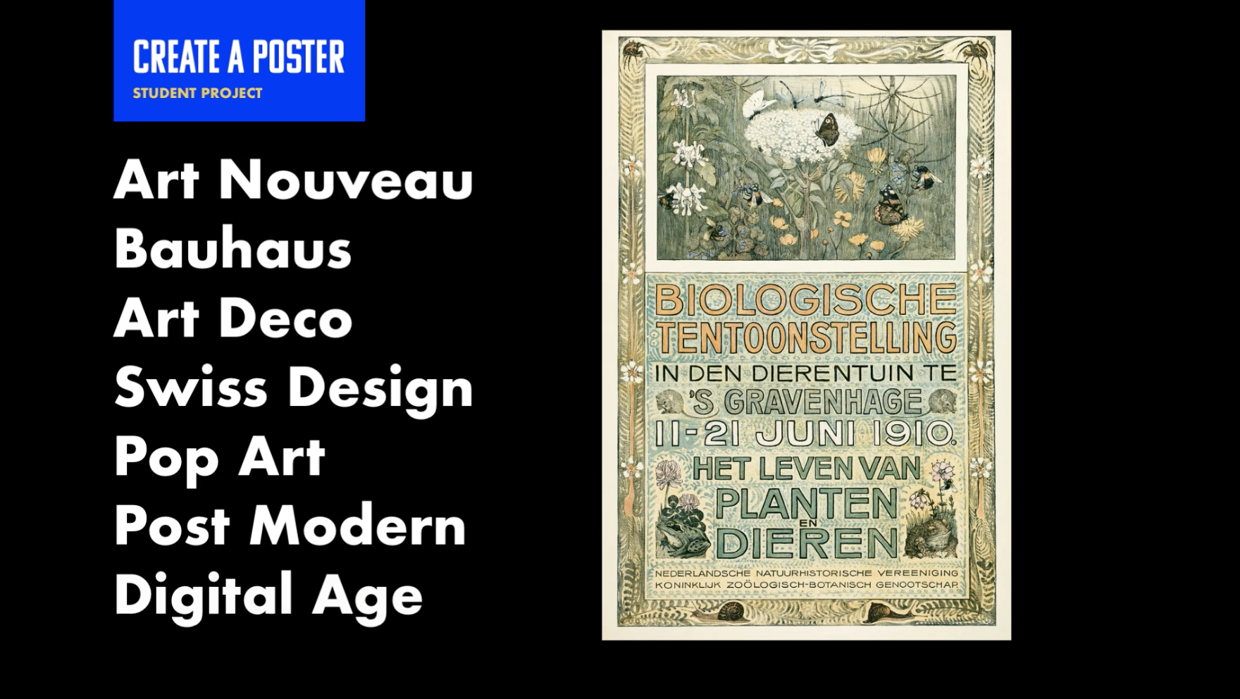
and expression. Art Nouveau is characterized
by the abundance of detailed floral
and plant life, usually displayed in
non-repeating patterns. You'll notice a
lot of the curves that frame photos
and focal points, like in this example. In the two photos below you see various design elements
in the Art Nouveau style. You will find these plentiful as background decor are draped
on the corners of a design. You also see a lot of highly illustrative
main characters would tend to feature a lot
of women more than men. Art Nouveau found
its inspiration from old Japanese
woodblock prints. Many artists from the mid
to late 1800s gravitated toward early 1800s
Japanese art and style, including none other
than Claude Monet. The topography style
would often feature imperfect hand-drawn letters
with a distinct custom look. Most posters use typography that used all caps
in their headlines. Rarely is there any whitespace in an Art Nouveau piece and almost every square
inch has detail and ornamental flourishes
and a sense of richness. The main characters of the
design would most likely be in a very dramatic pose to show as much movement
as possible. The poster to the left
features a headline at different font sizes
tightly packed together. This is a very common
characteristic of Art Nouveau. Color palettes used in this style tended to
favor more saturated, earthy tones with a nice mix of both warm and cool colors, with a warm being more
favorite of the two. You can also see lots of tans, golds, browns, and
natural green tones. One of the interesting
features of the style is the asymmetrical aspects
of most layouts. You will typically see one side more heavily weighted
than the other, with typography balancing out
the imagery and characters. Near the beginning
of World War I, this design style had run its course and
would make way for a similar detailed and
ornamental design style called Art Deco that would
persist into the 1920s. You will later see just
how much the style influences Art Deco's curvy
and maximalist features. Now we move on to the
second art movement. We needed to have
something to counter all that maximalist design from Art Nouveau and that was
going to be Bauhaus. Bauhaus lasted from
roughly 1919-1933. It unified the arts to create aesthetically pleasing
and practical design. Bauhaus was a German school
that was open 1919-1933. The word Bauhaus in German
translates to building house, the school and eventually
an influential movement in art and design,
sought to make everyday objects effective and maintain a sense of
simplicity and beauty. It was born in an era of modernism in Germany
where artists wanted to create new expressions
and forms of art and style and leave the traditional
era of design behind. It focused on producing
well-designed products that can easily be mass-produced for
a larger portion of society. Instead of just
the wealthy elite. There's an industrialized
influence on Bauhaus as it introduces technology
and new materials into its product designs. The Bauhaus school of thought eventually impacted the future
of architectural design, product design and
even typography. Geometric typography
was influenced by the precise but rounded
characteristics of the Bauhaus style. It has a holistic
approach to design and the arts without
distinct borders between different
design and art fields. There is a heavy desire
within Bauhaus style to focus on the more
scientific approach to solving design problems. This paved the way for
grids, the golden ratio, and other more mathematical interpretations being
used in design. The Bauhaus style consists of basic geometric shapes which serve as its main
form of inspiration. There's a distinct
use of rounded edges combined with sharper,
rectangular edges. It's sought to break free from the past artistic
expressions and focused more on the
simplistic nature of clean lines and
less on emotions. It wanted to provide order
to a disordered world. This style frequently overlaps geometric shapes
and makes sure to follow the basic
theories of color, layout, and hierarchy to achieve
a basic balance and flow. Bauhaus design seeks to
make things as simple as possible without the use
of anything unnecessary. Form follows function is the
main tagline of this style. The shape of an object
should relate to its intended
function or purpose. Unlike art movements of the 19th century,
like Art Nouveau, unnecessary or ornate or added decorations in the design
were stripped away. This is because
every element should serve the main purpose
of the design. The chair featured here by
Marcel Breuer seems basic, but each design decision provides value to
the main purpose, which is sitting in comfort. It also makes less
use of materials. It would be easy
to manufacture and produce because of
the simplification. It is easy to see
the influence of Bauhaus style on
current logo design. Most of these examples
continued to use basic geometric forms to
construct their logo marks. The Beats logo by Dr. Dre
is a great representation of the Bauhaus
rounded letter form and surrounding circle. Bauhaus can have sharp angles, but complemented by the
softer rounded edges. All of these marks are
at their simplest form without any unnecessary
design elements. The style of logo works well for the modern-day digital
world because of the simplicity and
back to basics look. This style has been around for almost 100 years and
it's not a style that will be going away
anytime soon and encapsulates clean,
classic design. [MUSIC]
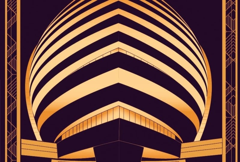
4. Art Deco and The Swiss Design Movement : The next style we're going to discover is Art Deco, which roughly lasted
between 1925-1940. This would be
described as dramatic, opulent detail, and luxurious. The Art Deco movement
was inspired by cubism, a style of painting
pioneered by Pablo Picasso. Cubism was also
heavily influenced by basic 3D geometric shapes like the cone, cylinder and sphere. Art Deco is less of a
specific art style, but more of a collection
of styles of that era. It developed in the
early 20th century, around the period
of World War One. It developed through a desire
to show excitement for the rapidly developing
technology and industries of its time and
the success that followed. It is defined by
extravagant opulence with lots of details, sharp angles, and
modern-day materials like smooth rounded
plastic and glass. The style of Art Deco
movement inspired buildings like the Empire State Building
and the Chrysler Building. You can also see the
details and ornaments in this classic design
for a deck of cards, very much in the Art Deco style. This style heavily influenced
the development of varying typography characteristics
like long, stretched, dramatic letter forms
with both pointed ends but geometric
inspired curves. The current day influence
of art deco can be seen in logo design in a
lot of different ways, you could see it through
the use of typography as the ultra stretch
letter forms you often see used in modern day. You can also see it
in detailed line art, which is popular in
logos for coaching, personal development
and hospitality. Because Art Deco is not just
one single defined style, it's a collection of
styles of that era, you can see different
representations of Art Deco throughout
typography based logos. In this example, you have a
classic stretch letters with the center arm of the E being placed lower
on the letter form, as well as in underlining
characters like the o and this metro example. You also see more
stylized ligatures, you'll notice in this modern day typeface interpretation
the two l's, with the second one
nested in the first one this is very commonly
seen throughout Art Deco. Layout design in Art Deco
style features detailed boxes, line art, and double strokes. I found the perfect
example while dining at a 1920s style restaurant in
Asheville, North Carolina. The menu layout featured
beautifully detailed line art, as well as boxes that feature
those double strokes or lines that cross over each other creating an
elegant feature. You can also see this double
stroke or outline feature in the name of the
restaurant that goes vertically down the left side. Gold, as you might have noticed, gets heavy use in this movement as part
of showing success, wealth, and opulence of the era. Monograms and radio graphics. Another fantastic fine
was this scout guide, found in the lobby of my hotel. This triple monogram features a radial line effect that
emulates the sun's rays. You will see sun rays echoed and lots of Art Deco designs, as well as other features from
nature like plant leaves, shells, and other
natural objects a holdover from Art Nouveau. The next art and style movement we're
going to talk about is probably the most
influential one in modern graphic design. We all are taught this method when we go to design
school or when we're starting to learn design so this one is really
important to pay attention to because it really established the basics for a lot
of things we do today. The next one is Swiss
International Design, also known as the International
Typographic Style. Some people shorten it to
just say Swiss design. Grids, white space and
San-Serif typefaces rule. This form follows
function ethos of the Bauhaus movement
can be clearly seen in the Swiss design
style popularized in the 1950s by designers
in Switzerland. It has heavily influenced modern day design
and can be seen as a continued evolution of the Bauhaus movement with its super simple
geometric shapes. Grids are the mainstay
of Swiss style and that they helped to
logically maintain order, but to also present information in an easily digestible way. This style stands out among
other styles because of its general use of heavy
white space between elements, this ensures the
design maintains readability and has a
simple direct goal. Typography plays a larger role and even starts to become
the design itself. It features mostly
San-Serif typefaces, void of any details or serifs. Typography is usually left aligned with ragged right edges. This is also the style that
birth the typeface Helvetica, the most popular
San-Serif typeface today, even used for the
New York City subway and many other
government institutions. Volkswagen applied
Swiss design to its advertising to create
wide open white space. Before this time, using
too much white space was considered wasteful
of the given space. Swiss design accentuates
the white space and it even becomes part of a
design element on its own. The golden ratio
was important to Swiss design in helping
give structure to design. Any grid created with a structured math equation was now in the Swiss
designer's tool belt, we can see a resurgence and grids being used
in all facets of logo design from
overall layout to the construction
of the logo mark as seen in these examples. The Bauhaus movement,
there is a general focus on simple geometric shapes
and simplification, rarely does one design
movement exist independently without being influenced
by prior design movements. If you can make it more
simple then do it. The main mantra of Swiss design is the process of
simplification. I think the biggest mistake
designers make as being overly ambitious with
visualizing an idea. Complexity can add some
character to a logo or icon or design but we also must ensure our concepts are as
simple as they can be, so they can be effective. Are there any
unnecessary elements or details in your concept? Is there a way to
combine graphics to have one single focal point
instead of multiple things. As we studied earlier, Art Deco and other prior
art movements depended on extra decorations or
detail to wow a viewer. With Swiss design, we wow
with simplicity and clarity. We want them to
see our design as clean and simple
and to the point. It is what you do with the
extra space that matters. What makes this old
physics textbook a classic Swiss design is not what it
does with the design space, but what it does with
the leftover space, most modern designers
struggle with making sure to use all of the
design space given. Swiss design allows
the designer to present less information
at one time, bringing more focus
to what is shown. It would be natural to make
this physics graphic larger. In this case, it is
made smaller so that extra white-space can allow
the design to breathe. There's always tension when
we lay out our designs, make sure to use
whitespace as an element of design and not just
empty nothingness. What you do with the
extra space matters just as much as the other
design elements you show. This is some feature
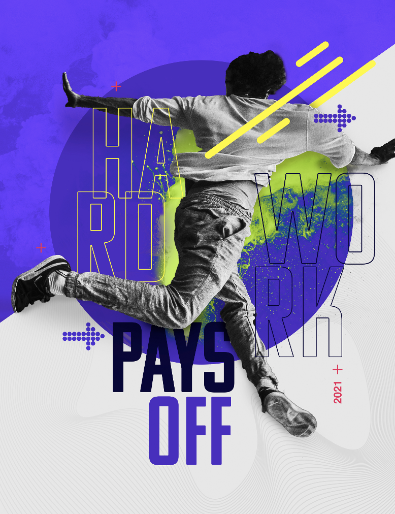
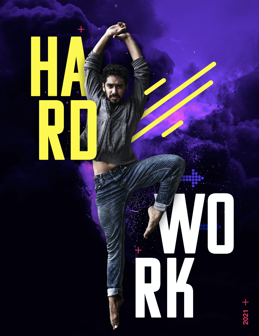
student work. This editorial project completed by a student of
one of my courses, uses typography in graphic
elements that go vertical and center aligned to challenge the typical index page
you normally see. The thin weight
of the type helps to add an elegant,
fragile feeling. The subject matter featured on the cover is stunning on its own so they made sure to keep it free from
distracting objects, patterns, and textures to
create a very Swiss style, clean layout with
lots of great space.
5. Pop Art, The Ad Boom and The Digital Age: Let's continue to move throughout graphic
design history. I'm going to talk about the
pop art movement and this roughly lasted from the
1950s to the 1970s. Everyday things get
exciting, colorful, and bold pop art originated in the United States
and the United Kingdom. One might instantly think
of the famous artist Andy Warhol when viewing
this over-the-top style. Well, pop art challenge was the traditional forms of
fine art by using everyday, mundane objects as
its subject matter, usually in a comic
book type style. A famous example
by Andy Warhol is his painting of a simple
can of Campbell's Soup. These everyday objects became interesting and
resonated with viewers because pop art was
very relatable. A far cry from the delicate
and intricate patterns and pictures of perfection
from the Renaissance era. What defines pop
art is a haphazard, less clean style that
focuses on the subject and less on grids and
precision and being perfect. Rough sketch lines,
torn newspapers, collages were common
elements used in pop art. Pop art define the
1960s advertising style with a colorful, if sometimes sarcastic
sense of humor. It brought a down-to-earth style mainstream
to sell products. The globe witnessed a huge
resurgence of pop art style and the 1990s as well. You've might have
seen this pattern before it's called
a halftone pattern, and it originated in
this time period. If there was a mantra
to this style, it would be do not let
rules limit your style. One of the most well-known
logo designs of our time is the famous red lips of the
band The Rolling Stones. It makes a big statement
with a comical undertone and a slight defiance
of social norms. Most logos that adapt
a pop art style have very expressive typography, like in the pizza head
logo by this designer. It usually consists of custom
handwritten topography or texts characters rather
than follow a straight line, caress each other, and fit together almost
like a puzzle piece. The beginning of
the pop art style naturally gave birth
to another boom, that's the advertising boom. From the 1960s to the 1990s, we were oversaturated
with advertising. "Don't try to be original, just try to be good," famous designer Paul Rand,
who lived 1914-1996. As corporation ad budgets grew larger in the mid-20th century, so did their appetite
for art and design. Graphic designers were no longer relegated to just
placing words on a page or arranging photos
for a newspaper. Now they played a huge role in helping companies
establish visual brands, logos, global
advertising campaigns, and assisting companies in connecting with their
audience visually. Paul Rand, a once humble, self-taught graphic
designer, hint, self-taught, just like myself and many of you turned global art director, developed iconic logos
for Ford, ABC, and IBM. Paul Rand fuse the artistic
side of design with the more practical business side and marketing side of things. He made graphic
design an essential part of the booming
advertising department. Rand was most known for
developing corporate identities. His approach was not
to be bold, acentric, but to be affective in
his design approach making sure to avoid over
complex visual ideas for the sake of just
artistic expression. Drawing inspiration from
style movements before him, he made sure every stroke
and object ha meaning and had a purpose for
being there in context. After the advertising boom, we move into the postmodern
design movement, roughly lasting from
the 1980s to the 1990s. This would be described as
bright and experimental, and let's break some rules. If you like being odd,
fun, quirky, bold, and if you break design
rules often established by the likes of the Swiss
typographic style and Bauhaus movement, you might find yourself in the movement of
postmodern design. It developed in the late
1960s but really became a popular interior design
style in the 1970s and '80s. Deconstructionism was a movement
within postmodern design, which gave buildings
a fragmented look. It uses non-rectangular shapes
and distorted exteriors. This was all to challenge
and push further the rigid classical
architecture of the past. There is a vast perception of movement and postmodern art with rounded corners and
objects that tend to appear in motion with
nonlinear lines. Abstract logos were born out of this movement of
breaking the grid, but also providing
this fluid movement with rounded edges and
overlapping elements. Let's talk about a
real-life example. This is the Parsons logo, and Parson is a design school
that's part of the famed, the New School in New York City. It adapted a random
variable typeface for its branding standards
called new random. It would randomly set different character
width as is user typed, thus creating a totally
rule-breaking look to its topography and its logos. This was controversial
at the time, and most things
that are postmodern try to be controversial, but it decides to be different. The design school has a philosophy of
trying new things and developing the
future of design so it made a lot of
sense for the brand. What movement are
we in right now? I would call that
the digital age. The move to digital merged
style with usability. What has made styles
evolve in the last decade has been an increase in
user experience design. UX or user experience puts the user at the
center of the focus and showing there
is no roadblocks to accomplishing their goals,
wishes, and desires. If it is a food
ordering app then focusing on UX allows
the user to quickly move to checkout and
process the order while also enjoying the
smooth, easy experience. Perhaps the app,
make sure the item was not forgotten
upon checkout with a notification that provides
a very visual experience to flow through the app
quickly and easily. The digital age has brought
us to new territory. Now that digital devices
are super small and mobile, everything we
create as designers must adapt to this new world. Complicated detailed logos are still great for
other brand assets, but for the use of a
main company identifier, you must think about
the small spaces in which it now must exist. Before mobile devices were our main interaction
with the world, we browsed the Internet
using desktop computers. The screens were generous
and allowed the creation of more complicated logo
marks with drop shadows, blurred highlights, and layers. I tend to think of the original
Yahoo and Google logos when I consider the style in the late 1990s
and early 2000s. Apple change the world
with their high gloss, slick-looking iMac
computer with transparent back and individualized
color choices. They're advertising
change too with the added super glossy,
slick-looking effect. This style, you may
refer to as Web 2.0, if you lived back then, this was a move to make
brands look high-tech and ready to help you
move into the future with the latest technology. Other brands followed with this glossy look and
adopted the name Web 2.0, and its reference to
how much the web has evolved since the early 2000s. A lot of tech companies followed suit with these extra details. Popular effects
included fluxions, like the logo was
sitting on top of glass. Others use gradients,
curved highlights, and anything that
can emulate glass, as you can see here. Apple released the iPhone and with it came
these hyper-realistic looking icon designs. This was called
skeuomorphic design where layers and
realism was favored. These icons almost had a
tactile feeling to them with textures, patterns,
and highlights. Popular example is the
Instagram logo from 2015. As we move later into
the digital age, we have the era of flat
design from 2008 to current. If it can be simplified, it was similar to past movements like Bauhaus or Swiss style. As we moved into the second
decade of the 21st century, we experienced a total contrast
to all of the detailed and effective-driven design. The flat design era was upon us. This was a counter
to the Web 2.0 look that almost every company
had embraced at that point, and as we talked about before, once one style movement
has gone too far, a counter-movement ensues and
the future is no different. Flat design has zero effects, drop shadows, and details. Flat design also
became very overused and oversaturated in
the last two decades and especially the last decade where almost every company
had a flat logo design style, and back-and-forth
goes the styles. Now the pendulum is swinging the other way in
the last few years as more hand-drawn elements are sneaking their way
back into logos, but also keeping
it flat and clean unlike the logos of the
early 21st century. This is because we are
making sure our logos remain expressive and unique, but also can adopt to
those smaller screen sizes and be practical for
the sake of the user.
6. Student Project: [MUSIC] Now that we
had a chance to dive into influential style
and art movements of the last 100 years,
it's now time to apply what we've
learned and hopefully, spark some excitement for
trying some new styles. I want you to pick one of the style movements
we discussed, and create a poster that finds inspiration
from that style. We have Art Nouveau, which is detailed, curvy,
natural elements. Bauhaus, which is geometric,
simplified, and purposeful. We have Art Deco,
which is ornamental, detailed line art, gold and dark color palettes. Swiss style, which
is the use of grids, lots of white space,
and structure. Pop Art, which is everyday
objects and bright colors. Post-modern, which
breaks the rules, distorted, unpredictable. Or the digital age,
technology rules, user experience
first, and practical. Feel free to do further research into some of the
influential artists and designers that lived during these dominant art movements to gather some ideas
for your poster. Your poster could be an
advertising for a car from the 1960s or a pop art piece. It could feature
geometric shapes inspired by the
Bauhaus movement, or you want your poster to be a whimsical poster for a
musical from the late 1800s. The choice is all yours. Enjoy the process of
studying other styles that have influenced modern-day
graphic design. I hope you enjoyed this class. I cannot wait to see what
you guys come up with. I love to feature
student work on my Instagram
@lindsaymarshdesign, so make sure to tag me
with your student work, but also post work in the
student project areas to inspire others to take
on the challenge. [MUSIC]
 Lindsay Marsh, Over 600,000 Design Students & Counting!