Transcripts
1. Class Introduction: Have you ever played the
game when you look up at the clouds and you try to find people, animals, or things, your brain is always subconsciously finding
patterns, shapes, and meaning to everything you look at to try to make
sense of the world. This is the basic foundation
of Gestalt theory, which stems from
Gestalt psychology, a theory thought that originated in Germany in the
early 20th century. We will review some of
the laws associated with each stalled psychology and talk about how it
relates to design. When we understand how
the human brain processes and categorizes a
series of elements. We can use that understanding
to help us craft easy to digest visual messages. Each adult theory is
really just trying to explain how we visualize
and organize information. Organizing this information is the very core of what we
do as graphic designers. So there's several
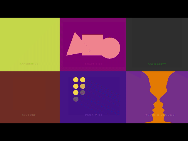
different principles or laws within each stoke theory. And we're gonna go over
these seven today. Similarity, proximity,
symmetry and order, simplicity, closure, continuation, and the
law of experience. After taking this class, you'll be very comfortable identifying several
Gestalt principles. We'll be able to get
a chance to look at tons of real-world examples. You'll even be tasked with a student project
that allows you to discover these design
principles in the wild. My name is Lindsay Marsh and teaching design
theory is my jam. I'd been a graphic designer
for over 20 years and a design instructor to over 350,000 graphic design students. I'm excited to be able to
bring this class to you today. I'll see you in
the first lesson.
2. Similarity, Proximity & Simplicity : Let's first start
with similarity. Our brains like to group objects together regardless of
where they are placed. In this case, we
group these circles based on color, not by location. The human brain loves
to categorize things. When you look at the
following random assortment of squares and triangles, what do you see better yet? How do you see them? There is likely a
chance your brain is deciding to group
together the triangles, like in this example. Or it has decided to group
the squares together, like in this example, your brain is
working hard to make sense of the different
shapes presented. The principle of similarity
also applies to color, texture, shape, position,
orientation, and size. And knowing how the brain works here comes in handy
as a designer, we can use this principle to shape how we develop
our layouts. We can bring attention to the
most important elements in the design by making it
different than the rest. We could do that by making
it a different color. Like this example. We have two layouts. Each shape represents a photo, text or element in the layout. We are using similar
shapes in our layout. This helps everything feel
like it belongs together. This example features
different shapes of photos and content, which does not allow
the brain to categorize all the different information presented, it causing confusion. The next principle
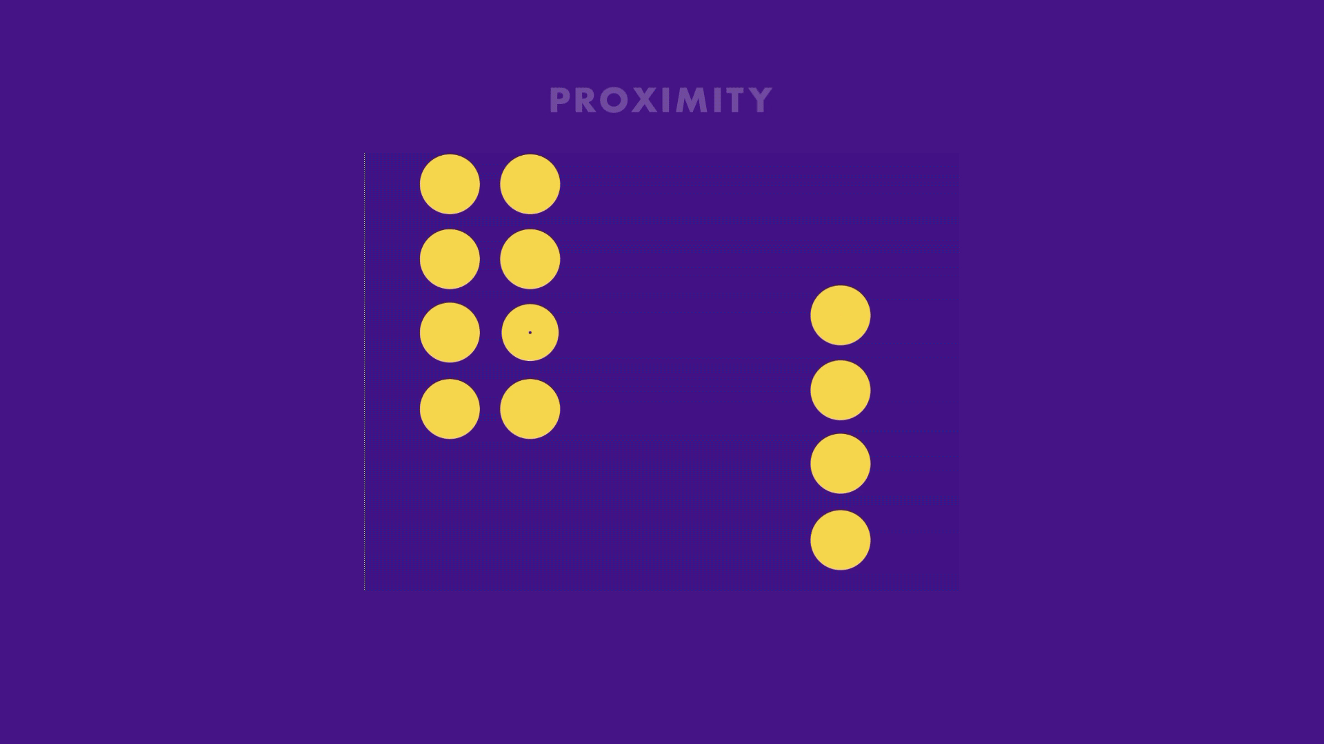
we're going to go over as the principle of proximity. Close objects are
grouped together. Your car console uses the idea of proximity to make it easier for you to find and locate related controls
on the dashboard. You may notice all of the air
conditioning and heat are dials located in close
proximity to each other. You may also see the radio
controls put tightly together in relation to the other unrelated
controls of the car. This is a helpful
concept to keep in mind when doing
layout design. We can group related
items and the layout together so they
feel like a larger, cohesive group that
share a similar goal. This helps the human
brain organized larger amounts of information that would otherwise
be overwhelming. And the logo above, the logo on the top
is a good example of the principle of
proximity and action. The logo on the top
has the words of the company travel and loop spaced rather
closely together. I'm able to read this logo as one company name travel loop. In the logo in the middle, you see a wider gap between the two words and they start
to read a separate words, but also start to feel
disconnected from each other. The event name and the descriptor line are grouped together in the same area. You can also see
related date and location items grouped
close together. This allows the viewer
to group related items together so they can easily
understand the information. Imagine if we placed all
the information into one area without any
sort of separation. It can be really messy and intimidating for the
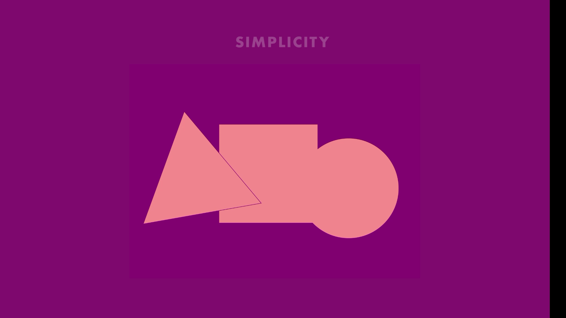
viewer to look at. The next principle is the
principle of simplicity. And we break down elements and to the simplest
forms possible. We see the image on top is one complex shape with
curves and lines. Instead, what our brains
tried to do is break that complex image down into
something easier to handle. And we suddenly see
three simple shapes. Instead of just
one complex shape. We see the principle of simplicity applied
to Icon design. All the time. Icons need to be seen
and very small sizes. If we were to have a
detailed illustration for a small icon, it would not always be
easy to tell what it was. We instead simplified
illustrations down to icons that could be identified
in many different sizes. So when you take this icon, e.g. when reduced down
to smaller sizes, this simplified icon fares much better than the more
complex illustration. One thing to always ask
yourself when creating a design is can I make
this more simple? You could do this by reducing
unnecessary elements, graphics, and even combining texts that are saying
the same thing. Simplification can
make your message appear more clean and concise. Ask yourself another question. Is this graphic or element
adding value to my design? As designers, we typically feel we need to show up
for creativity. But remember, your designs overall message is always
the most important. Make it clear, concise, and rewarding to look at. So take this example. The layout to the
left is busy and complex with many different sized
elements and structures. Simplifying our
layout to focus on our main photo idea
or focal point, can help a viewer cut through
the noise, so to speak. To have an enjoyable experience. Using simplicity makes complex objects
easier to understand. The goal is to reduce it down to the point where
it's still retains its core meaning and use this clock is still
understood as a clock, even though it's just a
circle. And one bit line.
3. Figure & Ground, Closure & Continuation: The next Gestalt principle we're gonna go over is
figure and ground. We instantly try to
figure out what's in the background and what
is in the foreground. This is very important for our
brains to process quickly. And it goes back to our
hunter-gatherer days. We needed to quickly
determine what the animal we were hunting and what was in the background. This could be tough
if you're looking for a brown lizard and a
sea of brown sand, our brain looks at color and contrast differently
to find and assign objects as either either in the foreground or
in the background. This principle is evident with the classic Rubin's
vase experiment. Look at figure a. What do you see? Do you see a vase
first or two faces? What if we switch the colors? Are you now able to see both? Among darker colors,
lighter colors tend to stand out more as foreground
are elements in the front. This is true with this example. The bright orange
vase really stands out compared to the
darker purple faces. The opposite is
true for this one. In this example, if we have
a website landing page, we have a pop-up box where a user can sign up
for a newsletter. You can help the viewer better
maintain the focal point, the most important item by darkening all the
unrelated items. This darkened area now becomes the background and the lighter, higher contrast areas
become the foreground. Without giving the user cues to help determine the foreground
or the background, it can make a viewer
lose focus on what is the most important part of
the design at any given time. Now it's time to talk
about symmetry and order. And your mind tries to
achieve balanced and establish order with
everything it sees. What do you see when you
look at this graphic? In reality, they're
just six brackets, three facing to the left and
three facing to the right. But when you place the left
and right brackets together, the mind naturally tends
to seek completion. In this case, making the
form of a rectangle. When we talk about
balance and design, we're mostly talking about
symmetry and order at work. In this graphic, we have
two uneven triangles. When we make them the same
shape and put them together, it achieves a natural
symmetrical balance. And looking at this example, there's a much
better chance that the two symmetrical halves
on the left will be grouped together as one unit
and our mind as opposed to the asymmetrical
parts to the right. This logo for a sushi
restaurant features letter of equal width on both the left and the
right side of the logo. When you put both letters
together on the left, but do not balance it
out on the other side. The logo looks
really lopsided and unbalanced and it
feels unnatural. You will see magazine
covers use the same tactic, making sure to balance the article titles
on both the left and the right sides instead of listing all of them
down one side. This helps to achieve balance. The principle of closure. We like to fill in the gaps. Take a look at the square
and the circle below. Even though they have
gaps in their strokes, we have no problems filling
in the rest of the shape. To complete it. The circle could just
be two curved lines, but we still like to see it as a complete circle in our brains. In this series of shapes, what do you see? In reality? There are four pies with one slice missing
from its shape. What our minds
like to do is fill in the gaps and view this as four circles and square because it's the
simplest explanation. A practical use of
principle of closure and Design is the use of negative
space and logo design. Below is a classic example of how our brains fill
in negative space. We fill in the
open space between the E and the T to
form the letter a. The letter a is not anywhere in the active
positive space, but only exists in
the negative space that exists between
the positive spaces. The same is true for
the 0 that is formed by the shapes created by the positive space
of the T and the M. The shape below looks
like two opposing arrows, but in fact it forms
a D for direction. The law of experience. We use past experiences to
try to interpret new ones. If you're reading this, then you've learned
how to identify each character in the
English alphabet. The letter a can be presented to us without its distinct
center crossbar. And it's still view to
us as the letter a. Somehow. We are assuming it is
a letter a based on our past knowledge with how
the letter a is formed. Remember our example
of finding animals, people and objects and clouds. The only reason we were
able to do this through our past experience of
observing the world around us. We have certain expectations when we view or interact
with the design. For instance, when
we are on a website and we want to know if
a link is clickable. We know from our
past experience that underlined words typically
tend to be active links. If the text is not underlined, sometimes it's bolder or has a different contrasting
color used for the text. If we decide to make our
active links on our website dramatically
different than what's expected by the viewer. We're, it's confusing them
and confusing the viewer. The same rule applies
to lay out design. Based on past experiences, we typically see company
contact information at the bottom of
an advertisement. Then doing otherwise would
seem really strange. Have you ever seen fine
print of an ad at the top? That would seem
extremely odd and not in sync with our expectations
from past experiences. With magazine articles
we are expected to read from the left
to the right page, not start from the right
and right to the left. And this would just
be an English. There are languages
that do the opposite. But what is really interesting is that we can use
this principle of experience to do something unpredictable to bring more
attention to our design. It could be adjusting our
main headline topography go up and down instead of the predictable going left to right. This could cause
viewers to stop for a moment and pay attention to something that is unexpected. The principle of continuation, we prefer to follow smooth, curved paths over
inconsistent rigid ones. And the example here, you see two intersecting lines. According to the principle
of continuation, your brain will continue
to follow smooth, curved lines even if there is a separation or another
intersecting line. In this case, your eye follows the black line all the way past where the green
line intersects. Following a smooth path. Your eye usually does not tend to fall with
the black line, then veer off in a dramatic
tangent like you see here. Rather it continues on a smooth direct path regardless
of the color change. In this example, you see
two intersecting paths. You will most likely
follow either the green or the black path all the way through
until completion. We can use this principle
of continuity to act as our signposts along the road to guide your viewers eyes
toward the desired message. A very simple illustration. This is displayed in a
magazine spread below. The model is glancing toward
the top right of the page, guiding the user
to the next page with the advertising headline. Once again, the
viewer site is pulled downward toward the photo to
the product of the chair. If we were to tweak
this slightly and have the model's eyes looking
in the opposite direction. The natural smooth flow of
the sign would be broken.
4. Reviewing Strong Gestalt Examples : So these principles
are really need to understand on a
theoretical level. But let's start looking at some real-world
designs to see some of these laws and principles and action of Gestalt theory. So you should all principles are great guides to
follow as designers. And we're going to review
several print advertisements, logos, movie posters, and other projects you
might see in the wild. We can study how
multiple principles are at work in strong design. This logo, you'll
notice the law of continuation used to guide the
viewer's eyes from the top of the F down
through the rest of the word to the tip
of the leg and the K. You'll also notice the law of symmetry in order
used to balance the left and the
right sides with equal weight in the
extended tails. The tails, you see at the
end of the k and at the F. And this logo design example, if you look long enough, you'll start to see
the letters S and R and abbreviation
for the company name, Silk Road, that also forms
the chassis of the bicycle. The law of experience allows us to see
both of the letters, but also discern the shape
of the bicycle tube because we've seen the
same bicycle shape many times in our lifetime. And this logo example, simplicity is at play here. We read this word as
the full word, happy, even though there
is a curved line that is substituted for the age. The law of experience
also indicates that this slightly curved
line represents a smile, which then makes the word have
intended meaning of happy. For this logo closure
allows us to see the a shape created
from the safety pin. There is no crossbar in the a, but we still are able to
see this as the letter a. For this logo. What seems to be a random, messy accident of shapes ends
up representing a cloud. Our brains are marvelous at
locating everyday objects. And a pile of goo. Gish dealt principles never age. That's why it's so important
to really study these. Here we encounter a
series of advertisements, mostly from the
1960s and the 1970s. And it proves that
classic design and layout never gets old. This is largely because
the way our brain organizes and handles
information doesn't change. This advertisement
for Jaguar from 1964 represents a time
in advertising or subtle messages spoke louder
than large headlines. It was an understated
approach and was unique, new way to present products. Figure and ground principle is applied here with a
dark black color, creating an obvious background. While the car and the white text functions
as the foreground. This high contrast
helps the product, the car, to be the
main focus of the ad. The law of simplicity graces itself with a
headline that focuses all of its attention with its small size and
clear background. It is simple, clean, organized, and makes me feel
good when I look at it. The Ford Pinto may have
been an awful car, but the advertisement
does work well to draw your attention through
the use of continuation. The striped lines run
throughout the entire ad, directing the focus
first on the headline, then to the cars, and finally down to
the final ad copy. Everything has an order. And this law helps to bring that order about
through graphics. This tobacco ad, it's an old Russian ad
where we see the legs of the gentlemen create
letters that spill the word. This 1974 Bell Telephone add. We see the headline use continuation to completely
move the viewer's eye from one page to the next with a headline ending with
additional ad copy. This car ad from 1973
we reviewed before. We tend to like to group items together with the
law of similarity. This ad groups like
items by color AT pairs, the red square of
information with the red car and the yellow box of information
with the yellow car. Because of color, we pair the right car with the
right information. Movie posters really have
to grab our attention. This one also uses the law of continuation to move you from the movie title all the way down to different
characters in the movie. This provides the viewer with
an experience that entices them to find out more about the movie and these characters. In this movie poster, which was a creative deviation
from the official one, uses the law of
symmetry to commit to a balanced focus design with equal weight on the left
and right side of the ad. This is a book cover that uses figure and ground,
is a two faces. Who are the smoke
from the rocket ship?
5. Gestalt Theory in the Bookstore & Beyond: Gestalt examples are
everywhere and I love to visit my local
bookstore and look at all the book covers
and really find out what principles are
at play that make these design covers awesome. This book really experiments with figure and ground and that in-between space of trying
to figure out what's the foreground and trying to figure out what's
the background. And this playfulness, if
you will mix it up really, really intriguing book cover. You can tell with
the words that are integrated with the
subject matter. Sometimes the words are on
top and the foreground, and sometimes they're
in the background with the bunny
rabbit popping out, out of certain letters to almost make it look like
it's in the foreground. So this play with the
figure and ground, the background and
the foreground, it makes for a really, really intriguing book cover. This book cover uses
symmetry to create an incredibly strong
focal point at the very center of the book
with the colorful paints. They also put some
very vital texts and the inside of this focal point
so that you read the top, get out of your head and then your eye moves
toward that center. Symmetrical focal point also uses figure and ground to get your eyes to
look at the arrows, but then also invites no pun
intended with the title. So you have this interesting
back-and-forth between what's foreground and
what's background. And it makes for a really interesting
book cover that way. There's also the law
of continuation here. It has this very
strong diagonal. Notice how the arrows
are going from the top right to the top left, and the letters
are going from the top-left to the top right. So it's kinda got this
interesting design tension using these basic law,
laws and principles. This book cover uses
the law of experience. If you were to just look at the center of this book and not focus at all on anything else is stare at
the center of the book, you may see just a collection
of different shapes, maybe some that have right
angles, maybe some circles. But really when you study this, you can absolutely
read this very easily. You can read each
letter in each word. Because of our law
of experience, we know that these are
the very basic shapes of classic English. Characters. Were able to read it, but
it also can be abstract. It can almost look
like art in a way, and our brains can
still make it readable. And this uses the law of continuation because these
are two separate books. It's the first
book in the series and the second book
in the series. And when they're displayed
in the store like this, it creates one single face. And I thought that
was absolutely incredible and what a
great and brilliant idea. This one uses symmetry
in order to create a very wonderfully powerful
center aligned piece where you have the
eyes and the face of the subject matter
right there in the center, as well as the topography. And because of this
amazing symmetry, you can get away with a little bit more spacing
between the title words. Normally you'd want to be
able to keep those together to to maintain readability. And that would be the
law of proximity. When things are close together, we group them together. But because there's such
symmetry with this, we can read the title very easily even though
there's spaces, big spaces between the words. We can see the principle
of continuation here with all the
interconnected lines, everything kind of goes back to that center focal
point in the circle. And instead of being all these random circles
that are unconnected, you have these lines that
allow you to move throughout the whole thing and it draws
your eye towards the center. And you'll notice a lot of times you'll see the law
of continuation use. I'd probably use that more as an example in
design because that is an incredibly powerful
tool and you see it very, very frequently and designs. There are times as a
designer we want to break these laws and break the rules to create positive
design tension. So that means there's tension built up in your design that intrigues the person to want
to continue to study it. And this is a wonderful
example of that. It breaks all sorts of laws. At breaks the symmetry
in order law. There's nothing symmetrical
here with the topography. It also breaks the
continuation rule. There's no continuity or
flow within the topography. It also breaks with proximity. The letters are not together
even though it's the title. But I can still read this, take up and read. I'm able to read it, but it takes a
couple of seconds, but it makes me want
to stop and go. What is this book?
What is this design? It's interesting.
So there are times where we intentionally and meaningfully break some laws to bring attention and a
standout among the crowd. Here's another example to
reiterate what I was saying in my last point is
this example where you have a really low
contrast between the wolf and white van letters and
the background lines, which makes it at first
kind of hard to see. But it was all very intentional. It's to intrigue you to look
at it a few more seconds. It's not super obvious, but it is very, very intriguing. So I picked up this
book out of a sea of other very boring books that
had normal readable titles. So that's another
reason we're okay. How can I break some rules of design to make my book
look interesting? You can see a nice figure
and ground here where we have this very
strong foreground with the black stripe across it. And then you have a higher
contrast white background as the background. So you have a nice figure, nice ground balance so
that the whole book isn't trying to get your
attention using the same color. You have this nice
contrast and balance. And a lot of times when I have
a design that's looking a little busy and
it's got a title. Sometimes they'll put
a very dark or light, whatever the higher
contrast color is. And put that behind the title to cut the design a little bit. So you're not just looking
at one big square, but you kinda have
it chopped up in your brain so that
there's a little bit of help to help you break down the title away
from the background. So here's the law of simplicity. Instead of using complex
cooking utensils and putting a real picture of a spatula and all the knife and
all these other things. They simplified it
into simple icons so that it didn't take away
from the very simple words. So the simple icons paired
with a simple topography mix, a really clean read. That even though this
really strange half circle is between the L and the W, that I read that as
an 0, so 35 below. But there's also this
interesting action that it takes place as it's sinking down below
the other characters and below the baseline. It actually has a sense of
it's sinking and of movement. And it makes it really dynamic, even though all they're doing is lowering the circle
and cutting it in half. But I think the portrayal of movement here is interesting. In this poster I created dance. It looks like it's, you have
the n as the second letter. But because of the
law of experience and because the woman is
actually dancing, I'm able to put together
that this says dance, even though the n and the a look like they
could be out of order. I move from the D to the a, then down to the end,
then the C and the E. And I'm able to,
my brain is able to simultaneously
within a second go. Okay, that's dance.
There's a woman dancing and the word dance. It can be out of order. You can play around with
typography a little bit more because of this
law of experience. I was at Starbucks
this morning and found this nice array of three different package
design for a coffee. And I noticed there's a really strong
symmetry in order here. First of all, you have
nice figure and ground. You have a nice foreground
and a background defined because
of high contrast. But there's also this
beautiful symmetry in order with the white oval, but also the top and the
bottom topography that is also perfectly symmetrical and they end at the same level
with the.in the center. So everything is
perfectly center aligned and it just
really draws my eye there to the name of Coffee is actually a student
project that was submitted, featured it on my Instagram
because I really enjoyed it. But it has a nice
figure and ground, as you can see, there's
this background on the top and the bottom. They put this nice blue
high contrast box. So you almost, when
I look at this, I see this as two
digestible halves. I have this top half
with the product, and they have this bottom half. And I'm also able
to read if this was all and they do this
a lot and package design, if it was all just
one color or all, just that background that you see at the top throughout
the whole thing. I might lose the
cookie or I might lose the title or the
name of the product. And because she was able to use this nice foreground elements, she was able to break
that foreground and the background and make it way more digestible
than it normally would be.
6. Student Project: So as you can see, I love finding
inspiration by going out, taking pictures of designs that I feel like I
connect with and I feel like I have some really good design theory
principles at work. So that's gonna be
your student project. I want you to go out
to the bookstore, to the grocery
store where there's package designs and
there's wine labels, or anywhere out in the mall, even a banner that's
hanging up or a billboard. And I want you to take
pictures of things that you feel like have
strong design principles, especially ones that
exercise Gestalt theory. What I want you to do is almost build a folder of
different items. You can even make this
a journal if you want. However you wanna do this, but I want you to
take each one of the pictures that you take. And I want you to
figure out a couple of the laws or principles
that are applied. So if there's the law of symmetry for a certain
poster design, I want you to make a note of that and go, well,
how does it work? Why did this really speak to me? That's what I
want you to do. Just go out into
the wild and take some pictures and discover some of these principles
at work because these principles are about
how our brain works. It's about human psychology and how we digest information. So if we understand these laws, then we're gonna be
able to understand the human psyche and
we'll be able to know how people look at
things and how you look. It's a random
assortment of letters and shapes and colors and with somehow
make sense of that. And how we can unlock that and how we can
understand that will make us superior designers
because we are not just creating random
shapes and letters. Everything has intentionality. And everything is either
playing with our brain and a good way or helping our brain digest all
this crazy world, all this crazy information. So I hope you got a
lot out of this class. I can't wait to see
kind of some of your ideas and examples. You could just post it in
the student project section. You can just post a few pictures and then
just say underneath, what laws are, what
principles do you think that design or that picture
you took of that design has? Let me know what you
think of the class. Leave a review and I can't wait to see your projects
and see what you discover as you go out and look at the world
in a different way.
 Lindsay Marsh, Over 600,000 Design Students & Counting!