Transcripts
1. Adobe Graphic Design Masterclass: I'm Peter Bone. I've been a freelance graphic web
and motion designer since the late 1990s. Alongside my work as a designer, I've taught thousands of people from organizations like these, both in physical and
online classrooms, how to design with Adobe tools like InDesign, Illustrator
and Photoshop. With the advent of AI, having good taste
is becoming one of the most valued attributes
amongst employees and clients. But how do you go about
acquiring that taste? That's what this
course is about. You can tell from the name
of the course that you will learn how to design things
with Adobe software. You'll learn the essentials
of using in design, Illustrator, Photoshop,
and After Effects. But the specific aim here
is for you to develop your unique eye for
design, your taste. You'll do that by solving real world design problems
using these tools, by trying things, making mistakes, and
learning from them. It's suitable for
anyone taking on design work who's never
been trained to do it, people like marketers
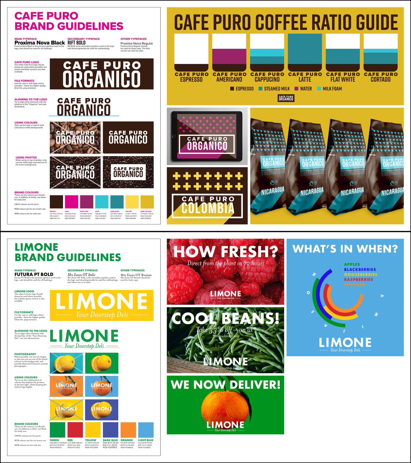
and content creators. As part of the course, you'll get brand assets and guidelines for five organizations that I'll also be designing
for in this course. At the end of every section, you'll get homework
assignments so you can put into practice
what you've learned. So by the end of the course, you'll have built
your own portfolio, grown your design confidence,
and at the same time, learned the essentials of
Adobe's key design tools. I can't wait to see
what you'll create. Let's get started. Here's how to get the most out
of this course. This course is unique and
that it provides you with brand guidelines to work from and homework
assignments to do. You'll get way, way more
out of this course if you follow those guidelines and do as many homeworks as you can. You'll also get the most
out of this course if you complete it in the
order it was created. You'll find everything
you need in the download resources in the projects and
resources section below. And if you want to
post any homework, please use the submit project
button in that area, too. Okay, so to participate
fully in this course, you will need to have access to the Adobe Creative
Cloud software. So in design, Illustrator
Photoshop After Effects. So I recommend you sign up if you're not
signed up already. If you do want to, you
can take a free trial of their software only lasts for seven days though
for each program. So that would be
quite a stretch, but that is an option
if you need it. I wanted to put this course
together in a way that it's as accessible as
possible to that end, I've used things like images from sites like
Unsplash, for example, where you can download any of their images and use them pretty much without restriction for free and also
humans and feather. I'll say more about
these as we go. But just to acknowledge
the generosity of Unsplash and Pablo Stanley, and the person whose name I forgotten that put
the feather site together without which
it would have been much harder to create a course that's got engaging graphics inside it. And the other key ingredient
to design is fonts, and I've made use of a wide array of fonts that are available on the
Adobe Fonts website. So you get access to that if you've got a
creative cloud plan. So it's another
reason for getting at least temporarily a
Creative Cloud account. Now having said that, one of the things you
might have encountered already is the
challenge of opening up a document that uses fonts or
images that you don't have. So it's not the ideal thing
to start this course with, but I want you to get an
understanding of this so that when you open the
documents I've created for you, you won't have any issues. So that's what we'll look at in the final video in this module.
2. Troubleshooting font issues: In this video, we're going
to look at the process of downloading and using the
files that I've made for you. You go to your Downloads folder or wherever you've
set to be download. And when you double
click on the zip, it opens up the folder. Now, this is something
called InDesign package. You learn more about what a package is for later
and you'll create them. But a package, you may have seen this
before that, by the way, a package gives you a PDF of what the finished
document would look like, and that's great
because there may be missing fonts and images
as we'll see in a second. You've got an
InDesign version of the document and an IDML. That's useful if you've
got an older version of InDesign than the one I
recorded this course with. So try opening the design file. So when you open what
might happen is this. So you can see the fonts don't look quite the
same as the PDF. Let me show the PDF again. That information is not there. Now, it's not there
basically because I've switched the fonts off
so you can see what happens. So when the fonts are missing, you get this pink highlight. And if you change
your type tool, you'll learn more
about the type tool soon enough and
you click up here, it shows you the name of the
font, but it's in brackets. So the brackets say that
this font is missing. Now, all the fonts I've used in the Adobe Cloud
creative cloud system. Let's take a look at that. This is a program that
runs in the background, and I've switched the fonts off, which is why it doesn't
look how it normally looks. Normally, you'll see this
you can manage fonts. If you click on that, it shows you the fonts you've got active. I've not got any because
I switched them all off. The way that you'll turn
this on, if it's not on, you go to your account and
then you go to preferences, and then under services, Adobe fonts should
be switched on. So my top tip for you, whether you're on a Mac or a PC, if you open up one of my
documents and fonts are missing, then essentially
the best thing to do is go to Creative Cloud. I'll just finish this off, go back to the beginning again. So go to Creative
Cloud and then to your own account to preferences, to services, switch Adobe font off, switch it back on again. And then when you go back into
the program you're using, in this case, in design,
let's hope it's worked. There you go. That's
exactly what should happen. I notice I say should. Sometimes there's a delay, sometimes for whatever
reason, it doesn't work, but it normally works, and that's the best fix I can offer you if the
fonts don't work. So what's happening now is your computer is connecting
with Adobe's servers, and they're providing
you with the fonts. So that's how you
fix missing fonts.
3. Troubleshooting missing images: In the previous video, we
looked at missing fonts. The other thing
that might happen is that you have missing images. So if you look at in
design on my screen here, these little blue link symbols, this one and this one, tell me that the images
are properly linked. Essentially, when you bring
an image into Indesign, it records where it
is on your hard disk. Now, the problem
can come when you start sharing files around. So obviously, I created this
and I've sent you the files. Now, what hopefully
won't happen, but what might happen is the links are not
in the right place. So let me show you
what would happen if I accidentally on
purpose, move the links. So this is from the package. So the links are all in here. Now, if I just move the
Links folder somewhere else, I E onto the desktop, and I go back into InDesign, instead of that blue ink symbol, you have a red question mark. So this doesn't
stop you working, but you might wonder why the images don't look
quite so good quality, and that's one of
the reasons why. So if that's the case and
the links are missing, if you know where they
are, what you can do is click on the appropriate frame. And you will learn how to
do this properly later. You go to the Links panel and in the drop down menu on the right hand side,
top right hand side, you do relink, then you
locate wherever those images are and you link them back up. That's that one relinked. And then click on this one. Again, relink and then
that all works perfectly. So in one sense,
we're kind of jumping the gun by me showing you this. But I hope that should
you have missing fonts or missing images that won't
throw you for too long.
4. Introduction to print design: We're starting, I look at the world of design
by looking at print. Now, print can be
something really simple, like a simple token, one sided like this, and they gradually get
more complicated. So two sided postcard, and a flyer, in this
case, two sided. This is more of a leaflet, but only four pages. So one, two, three, four. This is a so called
concertina fold. And then brochures, magazines, books, and a art book. Various examples of print. I want to talk about
design because InDesign is the program
used to create these. So I'm going to go back
to this document here. So the way InDesign works, we can talk about it at its most simple with three elements. So the outermost element, if you like, is the documents. So this is clearly a document.
It's got lots of pages. So that's the second
thing is the pages. So document pages. And then on the pages, we have so called frames. So here's a nice simple example. You have frames, and
a frame contains either an image or text. So frame, frame, frame,
frame, frame, frame. So if you weren't
aware of that before, you can start to look at different pages,
different documents, and you'll notice, okay, frames that contain images, frames that contain text. It's almost as simple as that. Key where there is almost. Let's take it a stage further. So there are two kinds of images images like this
that are photographic. We'll get into this
in more detail later. But what's interesting about all these images, these
are made of pixels. If you've ever zoomed
in on an image, you might notice they're made of squares of lots of colors. They're called pixels. So these are photographic
images, made of pixels. But there's another
kind of image as well. That's an image like this. So
this is more illustrative. Another example of
these logos here. So these are not made of pixels. These are kind of more
handmade, if you like. And the two programs used to
produce these Illustrator produces these kind of
graphics, logos, illustrations, infographics, that
kind of thing, whereas Photoshop is the program used to work on images like
this, photographic ones. So what I hope you can
start to see is that InDesign is the program where everything gets
pulled together, but nonetheless images
inside are either bitmap like that or vector Sorry, I'm just
using the jargon. Sorry, I've gone
into the jargon. Bitmap is another word
for photographic image. Vector is another word for
illustrations, et cetera. So much more of
that jargon later. But that's how the
programs fit together, and that in a nutshell, is the world of print.
5. Introduction to the Adobe tools: Let's take a quick look at
InDesign and Photoshop and Illustrator to see how
what we've just been talking about kind of
makes sense on the screen. So very quickly,
this is InDesign, and this is a leaflet that you'll be working with later on. And what I hope you
can see is when I click on these different
elements, these are frames. So a frame that contains text, a frame that contains an image, that's a photo and a frame
that contains a logo. So let's look at the
actually not this image, but a similar image
that's in Photoshop. And what I want you to
notice here is that as I zoom in, eventually, you're going to see that
even though this is a photograph of a leaf,
if you go far enough, you can see it's
literally just a bunch of squares that contain
different colors. So what a digital camera does the moment
you take a photo, whether this is an
iPhone camera or a much more expensive
DSLR camera, it captures what it can see in front of it and breaks it down into thousands or millions of individual squares of
color called pixels. And an image like this is generically known
as a bitmap image, BIT, MAP, bitmap, because there's lots of bits of data all mapped together
in the right order. So what Photoshop does is enables you to work
with those pixels, and a good example
of that is this what you're about to see is
nothing too creative, but this is the photograph having had a bit of work
done on it in Photoshop. Before it looked like this. And you can see it does
look a lot better. So if you're trying to
advertise some flowers, much better if they look a bit more like that
than like that. So you'll be doing
this in due course, learning how to do
that in Photoshop. But Photoshop can
do that because it enables you to edit pickles, which the other programs
don't allow you to do. So that's Photoshop. Illustrator, you'll
notice the image insight here looks very, very different. Notice that if I was to click
on an element like this, if I was to zoom in, you're
going to see no loss in quality because
there's no pixels. So the pixels don't get larger
because there aren't any. So that means that
something like this logo, you can make it
whatever size you like, and the quality doesn't go down. Whereas in Photoshop, what
I didn't mention earlier, but you might have gathered
that as I zoom in, you can increasingly more
easily see the pixels. That means if you were to
blow something up too large, then you might actually see the pixels if you made it too large. Much more about that later
when we look at print. But there's a key
difference then between an image in Photoshop, which is made of those pixels and an image in
Illustrator, which is not. So the one in Illustrator
you're looking at now, much, much simpler, so not appropriate
for everything, but really appropriate
for branding, for example, or infographic,
that kind of thing. So this is known as
a vector graphic, and a vectorgraphic is defined by the so
called anchor points. Which we'll get into when
we look at Illustrator. So that's how those three
programs come together. So in design, you bring all
those elements together. Illustrator is for
the vector graphics, so called Photoshop is for the bitmap graphics
or photographs.
6. Introduction to digital design: We've already looked
at the context of print and how InDesign, Illustrator and Photoshop can work together to produce
printed documents, and we're going to
take a quick look here at how you can do the same
but for digital documents. Now, all these
documents you will be creating through the course. Let's take a look
at some of these. The first one is really
a print document, but we'll just save it as a PDF. That's like a two page
download effectively, you download from a website
or send somebody in an email. Whereas these next few, these are all images to
go on social media sites. Now, if these four. Now, these could
have been created in Illustrator or in design,
or technically Photoshop. But InDesign is
generally speaking, where you'll start because as
you probably know already, InDesign is really
good it's like a kind of repository
where you just put stuff. So in this case,
a frame for text, a frame for the orange image, a frame for this kind of icon, and a frame for the logo. So InDesign is great at that. And then once you've
created your document, you'll save it in a PN format. So you might notice
that as a Ping file. So one of the files that's commonly used
for social media. And the same applies
here. The whole thing is put together in in design in different frames. Save as a pin. But these next two, now, I could have put them
together in in design, but because they feature very Illustrator
specific elements, it kind of made sense to put them together in Illustrator. So in this case, the pattern
and the blend at the bottom, they're both very much Illustrator features,
so I thought, Well, I might as well just put the whole thing together
in Illustrator. So having got the size
right in Illustrator, I just made it an
Illustrator and then again, save that as a pin. Same with this. Illustrator is great for producing
infographics. So that's what I did here. And again, you'll be producing
this during the course. But then the last
couple of things, these are more
Photoshop specific. I maybe should have
warned you about that. It's a little bit vibrant. So this is a frame
by frame animation. Nothing too sophisticated.
But nevertheless, that's the kind of thing
you can do in Photoshop. So only Photoshop can
enable you to do that. And then a mockup. So this is done in Photoshop. The original graphic, I created for the front,
one for the side. I created those in Illustrator, and you'll learn how
you can take that, but make it look
like it's actually on a package of coffee, and most of the work is done by the person that
makes the mockup. Once you found one,
you can use that. So that's something we'll
be looking at later. And then finally, a more
sophisticated animation. Let's look at this
one down here. It's a bit easier to see. So if I play this, so this is created
originally Illustrator, then brought into After
Effects to animate. And then that can be put on a website via Vmeo or YouTube. So that's technically a video, but you can also get them
to play in the background. So it's like a looping video. So that, again, is kind of at the other end of the spectrum
in terms of digital work. So you'll be creating all of these throughout the
span of the course. It gives you a sense of
what you'll be doing and also hopefully a
bit more of a sense of how the programs
will work together. But obviously, we've got
a long way to go yet. So let's keep going.
7. First steps with InDesign (MODULE 3): If you've used any of
the Adobe programs, the chances are you've
used InDesign and you've used it to amend
an existing document. That's probably the
easiest place to start, and that's why we're
going to start there. So here's in design,
and in a minute, we're going to change
this social media advert here for one of our brands, Limone to look like this. So we'll do it in a second.
But before we do that, I want to just talk you
roughly through in design. So there are five areas of in design to be aware of the
area where you're working, number one, the
tools panel where you will use various tools to accomplish what
you need to do. Thirdly, the control panel, fourthly, the different menus, file menu for opening, saving, closing, et cetera, edit for undo, copy paste, and numerous other menus,
which we will get to. And then finally, the
panels over here, panels to change things like
pages, colors, and so on. Now, the only problem is, in design these days, it ships using something called
the Essentials workspace. The idea with this is that
it makes it easy for you to find anything but the thing
you need just appears. In practice, I find it doesn't, it's actually fine to use once you know what you're
doing in design. But my experience of teaching
it to lots of people, they find it a lot
easier to use, at least initially,
a different view called Essentials Classic, or I should say, a
different workspace. So a workspace, one of these, they control the panels. So the essentials view
you see it like this, pretty useful, but I'm going to change to
Essentials Classic, and I suggest you do, as well. Otherwise, you might find
it quite hard to follow, at least in the initial stages. Okay, so that's our
overview of InDesign, and next we're
going to move on to creating a new social
media ad from an old one.
8. Edit a social media image: So as you know, we're
going to create this advert from this one, and we're going to do that so you can understand how to make basic changes to
elements in in design. So firstly, what are these
elements in in design, or I should call frames. You should know about
frames already. So the InDesign works on documents, documents
have got pages. These are things that we
just got one page each, but they've got a
bunch of frames. First frame we're going
to look at is this one. So this one being the one that contains the image that
goes across the whole page. Now, two ways I can tell
that it contains an image. Firstly, I can see
there's an image inside. I guess that's pretty obvious. But the other way is here
in the top left corner. You see a little link symbol, and this link symbol tells
you that the image is linked. Now, much more about that later. It's really important.
But for now, all you need to know is it
means that it's an image. We've got another one down
here, that's the logo. It's come from Illustrator, and then we've got
two text frames. So that's what's
going on on the page. And the tool I'm using the tool you're going to use is
the Selection tool. This is the tool you'll use most of the time in in design. Notice, we can see that tool has been chosen because it's
got a dark background. So if I chose a different tool, you'd see that has
a dark background. So Selection tool, that's
the tool to use by default, and of course, use
it to select things. And you can see they're selected because of the handles
around the edge, the little white squares. So first off, I want to
change the text inside here. So it's all very well to select the frame, but
to change the text, you need to use the
second of our key tools, which is the type tool. So if I click back
inside the frame, then you should see I've got a flashing cursor and that tells you that you're
about to edit text. To be honest, editing text, once you get to this point is very much like any
other program. So like editing an email or
editing something in Word, you can click and
drag to select, you can delete,
you can over type. So I'm going to just select
all of this, press backspace. I'm going to type the
replacement text, so cool beans. Feel free to come up with a
better phrase if you want. But the issue we've got now is, we really want that to
fill the whole width. That's not something
you always want to do, but very often when
you're trying to draw attention to something,
bigger can be better. So to make that happen up
here in the control panel, because we're working with
text, it tells us information. It tells us this is
the font we're using, and this is the
size of the type. So this button we're going
to press a few times. And as I press it, you'll see the text gets
larger and larger. Now, eventually,
we're going to get to the point where the text
is too large to fit. And I want you to see what
happens when that happens. So about now, there we go. So it kind of bursts
its banks, if you like. And look here, we can
see a little plus. That's called an overset mark, and it tells us that
not all the text fits. So in this context, all we do is we just make that a bit smaller. In other contexts,
as you'll see, it gets more complicated. But for now, we know that's as large as it can
get, so that's good. That's the first bit
done. Let's just check how we're doing.
Okay, that's good. So next bit is the text here. So a good practice when you're starting off is just to
manually select the frame. You don't have to do
that later, but for now, it's probably good
just to get used to changing between tools, and then back to the
type tool again. So the easy bit is we
just highlight that, change that 33%,
I think it said, then we can put our cursor here, do an asterisk that's Shift
eight on my keyboard. Now, as you can probably guess, if I want to type below
that, there's not much room. So if I hit Return, we get one of those little
overset marks straight away. Pretty good thing to
do is to undo that. Let's go edit undo or
you'll notice here, it says Command Z,
that's a Mac shortcut. The shortcuts are the same
on the PC except for you have a control key rather
than a command key, that would be Control Z on
the PC. So you can do that. Now I'm going to go back to my selection tool because obviously with a selection tool, we can select things, but we can also do with the handles, we can click and we can drag, so we can make that frame a little bit deeper so
there's a bit more room, and then we can go
back to our type tool, click inside here, do a shift eight for an
asterisk, hit Return. And then I think
it said something like, new customers only. Now, design wise, I'm not sure this bit needs to
be quite so obvious. I'm not thinking
that's really going to attract people particularly. So you can see in
the finished one, I've got one that's
much, much smaller. So I want that to be smaller. So as you can probably guess, we're just
going to select it. And change, firstly, the
font size like that. Now, the other thing I might do is move it up a little bit. The way I'm going to do that
is with this setting here. It's called leading
and the leading is the gap between lines. If I press that down
arrow a few times, you can see that all comes up. I can continue
playing with that. I can adjust the
size a bit more, make it smaller, the
leading a bit more, and so on. That's
something you can try. Finally, all I've got to
do is to change the image. If I go back to the
Selection tool, select the frame with the image
in and do file and place. Now this is probably the command you use
most in in design. It's the card used to bring in images and also
text sometimes. If I do file and place, I've got to just find image, it gets in here, there it is. One of the many unsplash images
we're going to be using. So the image comes in, but you can see it
doesn't quite fit. So the first thing to do pretty
much always here is to go object fitting and fill
frame proportionally. And that either
enlarges or reduces the size of the image to
make it fill the frame, but it does it in
a proportional way so that it doesn't
stretch it at all. And if I wanted to adjust
it from there onwards, what I would do is make
sure the frame is selected. Now this is a bit
tricky, actually. I want to grab that little
circle that keeps appearing. Trouble is this frame is
kind of getting in the way. So I'm going to just make
that a little bit smaller. And then I should be
at to click on there. Now, this is a
little bit subtle, but what I hope
you can see now is this extra brown frame here. Now, the brown frame represents the image that's inside
the blue frame here. So the blue frame is called the container, and
this is the contents. So this extra bit at the
top and this extra bit at the bottom tells me there is more to the image
if I want to see it. So if I decided I wanted more of the sort
of wood at the bottom, I'd click and keep my
mouse down for a second, and then as I drag
up, you can see it shows me the bit
I'm going to bring in. If I wanted more of that, I could do that, or if I
wanted less of that, again, I could click pause
and drag downwards. I probably like somewhere between the two of those things. If you're trying this
and it's not working, it's because you haven't
paused long enough. You have to pause to tell in
design that you want it to actually show you the image
moving while you're dragging. Otherwise, all that will
happen is you don't see it until you let go like happened to me just then, much
better to have it. Displaying as you're
moving it. So there we go. There's our first steps in
the whole world of design. So we've taken an image. Sorry, we've taken
in design document, we've changed the text in a
couple of different ways, and we've also changed an image.
9. Amend a printed postcard : We're going to
continue looking at editing documents in design, and in this case, we're going to change a
pattern from Illustrator, or at least the way it
looks in in design, and we're going to
bring in new colors and a slightly trickier
editing of text. So that's how I look. So another one of our brands, cafe Puro. I believe that's probably
how you pronounce it, a lovely little postcard saying about their
new Peruvian coffee. Well, that was their
new one a while ago. They've got an even newer one
now, which is Nicaraguan. And that's problematic
because the word is, well, harder to type, possibly, but it's also longer, so
we need to deal with that. So firstly, let's look at the
different elements here because this is a
little more confusing, nothing you've seen before. So I'm going to use
my selection tool and just drag that out of
the way so you can see this big X here
resembles an empty frame. So when there's
nothing in a frame, it's got an X in the background. That's useful
because it tells us, okay, that must be the thing
with the background color. So if I click on it,
you'll see over here, the bottom of the tools panel, it tells me that's the color that's being used
for the inside. That's called the fill
color, that bit there. So that's got a fill color of their dark brown color there. Let's move that back again. Let's try that again. Let's
move that back again. Then down here, we've
got another empty frame. But this time, the middle is
empty. It's got no color. That's what the white
with a red line means. That's called a fill of none. But this thing here
is the stroke color. That's the white
around the edge. It's got a thick white
stroke around the edge. That's that element there. This time, I'm going to do
edit undo to move that back. Then we've got, as you can probably see,
this is an image here. This is the logo. This
is another image here. That's the pattern
from Illustrator, and then we've got some text. I know that this
looks like text, but it's in fact a
logo, and again, we can tell that because
the link symbol, that means it comes
from somewhere else. Alright, so firstly, let's
look at changing the text. So that needs to say Nicaraguan.
And that word is longer. So that is challenging
because if we go to our type tool and
start to re type, before too long, we're going
to just run out of room. We're not going to be able
to see what we're doing. So one way we could
fix that would be to make the frame a lot longer, but a nice trick is, if you go edit and
edit in story editor, it brings up this little window and you can see
what you're typing. So I'm going to type in here, and even if I can't
see it in this window, at least I know I've
typed it right. So NIC RAGAN, Nicaraguan Nu. Yeah, so I can see that it's
all there as I want it. Now what I can do here too, is I can highlight it and I can come up here and
make the font smaller. So this is a kind of
editor's trick used when they're resizing articles on
newspapers and magazines. There we go. So I've managed
to do that without having to adjust the frame. So
that's pretty handy. So now I can close that down, go back to my selection tool. I'm just wondering will I need to move that down a little bit? I want that to be a
bit more centered. So the sort of gap at
the top there from the white to the white stroke. I want that to be a bit
more equal at the bottom. So click, pause, just drag
a little bit like that. Something like that look good
to me. Okay, that's good. What about the color of that? As you know, that needs
to be that color. But let's first get
the image in here. So this again, is a frame
that contains an image. This is a pattern
created in Illustrator, so we're going to replace
that by going file and place. And I've got two different
triangular patterns here. I've got that one and that one. I think I'm going to
go with that one. Notice it's at AI file, that means Adobe Illustrator. When I open that, and it comes. Now, this is the
challenging bit. How do I get that to
look more like that? Really, it's a fine tuning
of what we did last time. It's clicking in that middle
circle and this tells us again that even though the whole thing is inside
this blue container, we've got more contents here. I can click and pause and then
start to drag this round. We're trying to lose those half displayed triangles like that. Get something like that. That's not too bad, but I kind of want to have a bit
more of a gap that side. So the way I'm going
to make that smaller. Now, probably the
easy way to do it is up here with these numbers. If I reduce those a
percentage or two, and then try that again. Click and drag. It's a little bit of
a fiddly process. That's not too bad. I'm going to try that
another percentage. Click pause, and drag. Now actually that hasn't helped, so let's try going back up. That might be as close as
I'm going to get it in terms of close to the one I've done. That's quite useful.
That's not too bad. Only problem is these ones
at the bottom are cut off. If I deselect that by clicking
off the edge of the frame, when I click back on it again, notice I'm in charge
of my blue frame, which is the container. I can click and pause
and then drag on there, I was hoping to get
that so that overlap, but that doesn't work, so I'm going to have
to go back that way. I think what I'm going to have to do without
spending hours on this is just to click and drag that whole thing
down a little bit, so it's a bit more centered. That's not quite like the
one that I was going for, but I think without
completely confusing you, I think I'm going to stop there. Now, what I'm not
showing you yet is there is another
way of changing images by clicking and dragging and I will
show you that later, but for now, I think it's
enough to see it this way. Final thing is, what
about the color here? I need to get this
color into here. Now, normally, when you bring
logos and things like that into InDesign from Illustrator, it automatically
creates a swatch for you. That's
what's happened here. But in this case, it hasn't
because it's a pattern. So to get that
color in manually, I'm going to create
a brand new swatch. And to do that,
I'm going to look at the brand guidelines. So I've got them open
here in Acrobat. So you've got access
to these as well. You can see this is Cafe
Puro's brand guidelines, and it's this blue color I want. So I can type in
the CMYK values. That's the values for print or RGB on screen or the web colors. I'm going to go
with the print one. So 660, 15, and zero, okay, 660, 15, zero. Let's see if I can
remember those. So I'm going to do so
in the swatches panel, if it's not open, you just
click it once to open it. And then this little button on the top right that gives
you access to a menu, and nine times out of ten, the most useful
thing in the menu is right at the top, and
that's the case here. So new color swatch. So if I remember rightly, that was 66 Cyan, light blue, no magenta. Was that 15, I think it was? Yeah, that looks
right. 660, 15, zero. It's going to name it
with that color value, so it's going to
name it like that. If I wanted to
override that and call it Cafe Pero light blue, I would undo that and call
it that, but I won't. It's also going to add
it to a CC library. Now, that's another way of using swatches, which
we will talk about. For now, I'm not going
to worry about that. So we're just adding it
in to this document. And now I can use my type tool. I can highlight all my text, and I can apply that colour. Not quite the same as
the one we were copying, but close enough, I
hope you will agree. So we've looked a little bit more at elements in in design. So empty frames, frames
with strokes on them, frames with patterns in them. We've looked a bit more
at tweaking images. We've looked at
resizing text using the using the story Editor, sorry, using the story Editor, it, edit and story Editor. And we've looked at using brand guidelines to
create new swatches. Okay, give that a
try. See how you go.
10. Edit a printed flyer: So we're working our way through some in design documents. And to be honest with you, I'm deliberately throwing
some slightly tricky things at you because as you may
have discovered already, sometimes it's pretty straightforward to
figure out what you're doing. And if it was that
straightforward, you probably wouldn't
be taking this course. So I'm throwing at you some of the kind of
things my students go. Alright, that's why
couldn't I do this? And when I show them why
it's kind of obvious. So a lot of these things
are obvious in retrospect. And here's a couple now. So
layers and preview mode, both of these things
can cause real issues. So let's take a look at this. So in design, again, I've got a before and an after. So we've got this flyer
for another brand. So some flowers,
plant power, sort of, uh, what's the word I'm
looking for house plants. Okay? So that's the start one. But actually, we want
it to look like that. So in a minute, we'll look at changing colors and
that kind of thing. The trouble is, if you were to try and work out
what's going on, can you see that there's
hardly any information there? There's no Xs to show
you the background. It looks quite nice, but it's hard to see
what's going on. And that is because we're in
a mode called preview mode. Now, this throws a lot of people who may have
thrown you already. The idea is that you
get a preview of what the document looks like,
which is wonderful. You don't see all the
kind of extra stuff, the kind of stuff
behind the scenes, but sometimes you do
want to see that. In fact, probably mostly
you want to see it. So in the view menu, under screen mode, by default, you should be working
in normal mode. That's what we've
been in so far. But this document has been
left in preview mode. When I turn it into normal mode, you'll see you get all
that extra information, the X to show you empty frames, the edges of the frames, and
that kind of stuff. Okay. So let's do that here, too. Let's go view screen mode
normal. Okay, that's helpful. Okay, next up. The other thing that you're going to
find challenging, I suspect from time to time might have
happened to you before is so we're going to change
this background color. Now, this is let's look
at the elements here. We've some text there. We know about that. That's fine. We've got a logo here. Now we've got an image here, but you might also see with your growing
knowledge of wind design, we've got this X in the background and
that's going to be that blue the frame of
the blue color. Now, this is a new thing. This is a cutout image. So this plant has been
cut out in Photoshop, maybe not that
well, to be honest. You can see some slightly
dodgy gaps there. But nevertheless, we're seeing through this to the
color underneath. And as you know,
we want to change that color underneath
to a darker color. So the first problem you're
going to have is, well, how do I select that frame, and you can click as many times as you like, but you're not
going to be able to do it. Now, you might have been thinking when we were in
the previous document, with all the different things overlaid one on
top of the other, you might be thinking,
that's really fiddly. Is there a way of
kind of controlling what you can select or what you can see, and
what you can't see? And if you were thinking
that, then the feature that I'm about to show you is
InDesign kind of answer to that. So let me just undo moving the frame there, right?
Let's have a look at this. So this isn't something you
will always come across, but this panel here
called the Layers panel, when you need to know about it, if you don't know about
it, it's challenging. So by default, in design documents only have one layer. It's
called Layer one. So everything we've been
working on so far and most of the things
we'll work on in the future will only
be on one layer. I suppose I should just
show you that if I just pause for a second. There we go. So everything here
is on one layer, and that's fine, but it can get a bit fiddly, whereas here, as you might see, so on this one here that
we're trying to change, we've got the text
layer, the logo layer, the photo layer, and the
background color layer. Now, you wouldn't know that was functional because it's hidden, but when you open it,
what you might be able to tell is that the text
layer is unlocked, which is why I could select it, but these other ones aren't now, the reason for layers
is specifically for that reason so that you can
say, I'm working on the text. I don't want to accidentally select anything else,
so you can lock them. But let's suppose I
was done with editing the text and I wanted to
change the background color, I would unlock the
background color layer. But if I'm not sure
which layers which, I can just click like
that and show and hide. Okay, so that's what we're
going to want to get into. We're going to need to
unlock certain layers. But before we do that,
we're going to need to have the colors to change
the background too. The next thing we're going
to look at once more is the brand guidelines. So here are the brand
guidelines of plant Pow. You've got access to these. And I want these colors
to be able to play with. Now, if I create these
swatches in design, then they will live in
this particular document, but not in any other document. And that can get
annoying after a while. If you're working for
one particular brand, you might wonder if
there's a way of always accessing a
particular color. There is, it's a thing
called a CC library. Stands for Creative Cloud, the application
that kind of runs behind in design,
Illustrator and Photoshop. And if you create a CC library
with things like colors, logos inside them, you can
access them from any in design document and also
Illustrator and also Photoshop. So that's what we're
going to do now. We're going to
create a CC library for this brand plant Power. So under Sushi libraries, go to the drop down menu
and say create new library. So I'm going to
call this. I've got loads of other libraries open, so I'm going to do a couple of underscores to put
it at the beginning. Actually, let me do
that. I'll just type. Oops what's happening there. Sometimes you need to
click actually back in there. There we go. Plant Power. And
then create Now, sometimes there's a
delay here doesn't work 100% of the time because
we are relying on being connected to Adobe server wherever that is in the
world. So here it is. It's open, but it's empty. Firstly, how do I get
colors into this document? Well, you already we can
use the Swatches panel, and we can also use
our brand guidelines. So I'm going to create
this light pink color. Now, I could type
these numbers in, but I'm going to slightly cheat. By clicking this button, this is in Acrobat, which also you can get as part of
the creative cloud. You don't have to do this bit,
but I'm just doing this to save a bit of time to save you watching me do
this for a long time. So I'm going to edit PDF. I'm just going to copy the
web code there. Command C. I'm going back into InDesign. I'm going to create a new I'm not going to create
a new swatch. I'm going to click on this fill color,
double click on there. I'm doing that because
inside that area, I can paste Command V, Control V to paste. That
gives me that color. And when I okay that, then I can add that to my CC library. Now, the only problem
is, I want to be able to view my swatches panel and the CC library
at the same time. As you saw, I just
tore that off. And then if I click on
that color and I make it a new swatch I didn't do this in
the last exercise, but I'm going to do it now. I'm going to say, yes, add this to my plant
Power library. When I press Okay, it appears in my document and
it also appears there. Let me do that a couple more times and you'll get
the sense of this. Back into here, copy the number. Double click on here,
paste the code. Make a new swatch. It remembers to add it to the library.
And I just keep going. Actually, I just saw there's a slightly quicker
way of doing it, which is copy paste. Do you see that add RGB swatch? That seems to do it in one step. That's even better. Although
when it did it, yeah, it didn't give me
the option within that to add it to the library. So the other way of doing it
is that little button down there that adds it to the
currently selected CC library. And I say currently
selected because, again, you might have
several of these. In fact, you will
have several of these for the different brands
that you'll be working on. Okay, I'm going to
do the next couple, but then I'm going to
fast forward this, so you haven't got to watch
me do this at full speed. Alright, so there we go. So
there's my CC libraries. So I can now apply colors directly from
there or from swatches. But what I do want to do
is make sure that I've got swatches back where
they were before. Now, a good way to do
that actually is to go reset Essentials classics. Remember, this is the workspace. If I reset it, it goes back
to how it was by default, which actually has
removed the CC libraries, which wasn't what
I wanted to do. So, okay, I didn't
mean to do that, but seeing as that happen, let's go window and CC libraries just to pull
those back out again. There we go. Then I
drop that down there. There we go. There's
our libraries. Okay, so next up,
we're going to change the background color of this
one to look like that one. So let's do that. So it's
going to be the dark green. So in the layers panel, make sure the background
layer is unlocked. And then with the
Selection tool, we should be able to
select the frame. A good clue that it's
selected is the fact that we can see the
light green color. But as you know, we're
going to change it to the dark green color.
Looking better. Okay. Next thing
we're going to do. We're going to change the
text to the light pink color. So now, earlier I said you should be
selecting the frame first. That's generally a good idea. Let's just unlock all
these layers, actually. But now you know what
you're doing, I'll probably just go straight for the
type tool and select. So let's select all that text. Let's use the light pink. Notice it doesn't look
like it's worked, but that's because the
text is still highlighted. When you stop highlighting it, you'll see that it has worked. Now, also on the text, can you notice the subtle
difference between that one, which I would say
looks much better. And this one. Now, let me show
you what's going on there. A great feature in design, which isn't used by
that many people, is this feature at the bottom of the type menu called
Show Hidden Characters. This shows you what
you've typed in. So it shows you
things like a dot, which means you've hit the space bar or one of these
things called a pill crow, which means you've hit Return. So this is a classic thing here. I've hit Return a couple
of times to get spacing. The trouble is I've got a pretty pretty clunky
bit of spacing there, and I really don't want
as much spacing as that. So the way I can fix that, firstly, it's
helpful to see that. But if I select that character, I can actually use
the leading value that we talked about in
the previous lesson. I can reduce that like that, so I can control much
more finely the spacing. That kind of implies that
these two sentences kind of belong together rather than being miles apart
from each other. So more about that when we
talk about design theory. So there we go. We've changed
the background color, we've changed the
color of the text. The only other thing
we've got to change is the type here. Now, that's text on a path. So we can select it. Again, you do need
to click first and then drag around believe I used the bright pink color there. That's
probably what I did. Let's just double check. No, I use the green color. And also, that's rotated
round to start reading there where it's maybe slightly more natural place
for someone to look. So let's do both those things. So let's drag around
in a circle like that, go for the green color. And then back to
the selection tool. So if you want to
rotate something and you want to rotate it at a
standard 45 or 90 degrees, you've got a button here. That one there will go to the left, rotate
counterclockwise. There we go. And now, finally, so we can see what
that actually looks like. As you know, we can go
back into preview mode, and we can see that it looks pretty close
to the other one. But one final thing, we also
have presentation mode. That gives you, well,
as you can imagine, the idea of the possibility
of doing a presentation, which is useful, but also it
shows you in full quality. So we haven't seen too much
of an issue with that yet, but if you were working you were seeing things
in low quality, when you go to
presentation mode, it shows you in full quality. So quite a lot to take on
there, layers, CC libraries, hidden characters, preview mode, presentation mode, but really, really useful things in design. So have a go at that
one, see how you get on.
11. Edit an A4 information sheet: In the final video
of this module, we're going to look
at another couple of things which can
be a little bit challenging in design when
you're editing documents. The first concerns
something called a master page and the
second concerns getting text to fit when it doesn't
quite fit. Plenty to look at. This is the document
as it will be. It's a double sided
information sheet for yet another company, and this is what people
will get when they book on one of their tours. It tells them what's going on. If we look at that in
presentation mode, you can see there's page one. I'm pressing the down arrow on my keyboard to go to page two, so it fits nicely on two pages. Notice, too, the quality of the map there that's
created in Illustrator. That's a vector graphic. The logo is created in
Illustrator, as well. Now, I realized when I was
recording the last video that I changed my
setting in InDesign, which might be
different from yours. So I've changed
it to normal now. Can you notice the quality
doesn't look great there. It looked fine a minute ago. That was in presentation
mode, which, as I said, previously, gives you full quality. What you might have found
when you were working on this postcard is that the quality of the
logo looked like that. You might have wondered
why mine looked fine. I'll tell you why it
was because I was in I was using what's called
high quality display mode, which looks much
better, doesn't it? So that's the default
mode that I work in, but I realized that's
not the default, so it's most likely you haven't
been working like that, so you might have been
wondering what's going on. So that's what has
been happening. So under display performance, you may well have been
using typical display. I've been using high quality. So high quality is useful in that obviously you can see things that
are high quality. The downside is it takes more
energy from your computer, particularly when
you're working on longer documents with lots of images, it can
really slow it down. So that's why it's not
on there by default. So that explains that bit. Okay, next up. So we want this document here
to look like that one. Now, this time, the only
change we want to make is to change the date and
then to get the text to fit. So notice this
needs to say 2022. Like many things, it's been
put back a couple of years. So how do I do that? Well, let me see if I
can select that frame. And as you can see, I can't select it. You might be thinking,
Okay, that must be a layer then.
Let's look at layers. But no, it's got nothing
to do with layers. This is the default,
everything's on layer one. This is another
thing that again, makes sense in retrospect
once it's been explained. What this is is a thing
called a master page item. Now, we haven't even looked
at the pages panel yet, but when you have
whether it's one page or 64 pages or anything in between
or even more than that, every page is listed
here in the pages panel. Now, every page B default is based on what's
called the Amster page, and that's the page that keeps all the pages again by
default looking the same. So what is possible to do, if I double click on this page, it's possible to put
elements on that page. The beauty of doing
that is that they appear on every single
page in the document. So that means that if I
was to add a third page, then they would
appear automatically. So it's perfect if you
were designing, let's say, a newspaper or a book
where you want to the page number to be on every page or
something like that. That's exactly how
you would do it. So what we need to do then is
change the date 2020-2020. I'll just change it to 2023, just so we can see it's
different from the other one. And when I click, double
click back on page one, it says 2023, page two will
say the same thing as well. Okay, so that is editing
on the master page. So be aware when you do that, it will change all the
pages that are based on it. So by default, that's
just the A master page. It is possible. I don't think we're going to be
looking at in this document. Maybe in this course,
maybe briefly, we'll look at multiple
master pages, but that's getting a
little bit more advanced. But if that is the case, you'll see the letters B or C here, and you'd need to look at
those master pages instead. Anyway, I'm getting away
from myself. Right. That's that bit done.
The next bit is, how do we get the text to fit earlier when we were editing
bits of text like this, we saw that when we make
them a little bit too big, we see that little overset mark. I said, in that context, all you got to do is make
the text a bit smaller. That's fine in that context. But in this context, where this is a piece of design that's been
used over and over again, they wouldn't thank you for just making all the
text smaller here. So the context here is something that the design is already
established and it's agreed, and there's brand guidelines. What needs to change is that
either the text needs to be shorter or maybe we need
to lose an image or two. It's one of those
things, really. So let's look at page one. So double click to
get to page one. I think the problem here is
that we've got two images, and there just isn't
room for those. So if you can see
here we go to day 13. The text really should
go up to day 16. So let's get rid of this image so we can select
it with a selection tool. If I just pull that out
of the way for a second, you can see that the text
kind of pings back again. There's a feature here
called Text Wrap. Which you can apply to an image, and it pushes text
out of the way. Later on in the course,
you'll learn how to create this document and you'll learn how to
create text wrap. But for now, you
can see that it's working because it pushes the text when you make the image occupy
where the text lives. I'll get rid of
that and delete it. Let's see what we got now. Much better. We're going
up to days 14 and 15. We know it goes up to 16, but one way you can view how
much extra text there is, bit like we did before, you can put your cursor near the end and you can go edit
in story Editor. If we scroll down a bit, we can see that's the overset text, day 16, one, two, three, four, five, six lines. We just got a little
bit to get back. Just to keep in mind,
the final word there is for your flight home. That's what we're after.
How to get that back? One way would be to make this image a
little bit less tall. That would certainly
get us a few lines. One way would be to
rewrite the copy. But the truth is sometimes
you'd be allowed to do that. You'd be thanked for
doing that. Other times, they really don't want
you making an image smaller or they don't want
you changing the copy. Sometimes it's really not
appropriate or maybe not even legal to change the copy of
certain types of documents. So there's another approach
that you can sometimes use, which is less obvious, which is what I want to talk
to you about now. It's something called tracking. Now, tracking used
in a design context, the idea of tracking
is to make text more kind of obvious to
stand out at a distance. What I might just do quickly
is go to the master page. And I'll just show you tracking
here if I was to get rid of bit of text,
select that text. And to do tracking, I just increase this number here and you can
see what it does. It puts space in
between the letters, and it really draws attention. There's also a little
blue highlight going on. I'll explain that in due course. I'll just switch that
off for a second. So you might have seen this certain types
of brands use this. Think of the brand Chanel, uses a different typeface, but nevertheless,
uppercase characters with loads of space
in between them. That's tracking. That's
used in a design context. I'm going to just do a
few undos to get that back to where it was before.
Lots of commands Ed. Okay. Now, tracking can also be used in an
editorial context. Because if you look at this paragraph here and
I'm going to do one, two, three, four clicks to
select the whole paragraph. If I was to do a tiny
bit of tracking now, can you see that
it's a little bit shorter if I do a little bit more I was hoping
that would fit. Actually, that
hasn't quite fitted, so I'm going to undo that. You might wonder I'm
not going any further. You don't want to go more than about 15 or 20 at the most, so I was hoping
that would get that back. So I'm going to undo that. Sorry, undo it by
going the other way. What I'm looking
for is a paragraph. I was hoping that would work, but this one should hopefully work where I'll just
zoom in on this for you. I'm doing Command plus,
by the way, to zoom in, Control plus on the
PC. Let's try that. Minus ten. There we go. So with -20, we've
gained one line back. And can you see
that we've now got, if I just undo
that for a second, all that space, because
that has come back, which has pulled this
other line back as well. There we go. So that has fixed a
certain amount of that. Let's have a look on the second page and see
if that's worked. More or less nearly there. But can you see the
next candidate here, one, two, three, four clicks? That to me looks like, it
looks pretty horrible. That should all be
together, I think. If I use tracking again, minus ten -20, 20 has worked, but really, to be
honest with you, I don't want to use any more
tracking than I have to. I don't want it to be
in any way obvious for the reader that the
text is closer together. I'm going to try
doing, let's say, -15. Yeah, that's okay. Let's see if I can get away
with anything less. So -12, for example. Oh, that's fine. -11, maybe. Great. Okay, that's good. We know that minus ten didn't
do it, so that's good. And maybe on the
previous one as well. We did -20 there. Let's see if I could get away with anything less than that. So I'm trying to be as
subtle as possible. Yep, -15, did it? Okay. Just command zero, by the way, command
zero or Control zero. It shows you the whole
page on the screen. Right, so now on
this first page, all these paragraphs
fit in perfectly. On the second page,
in fact, there we go. We've managed to get that
all fitting in perfectly. I can see we've got there
right down to the end. In fact, we got this
special character, this hash tag tells us
that all the text fits. So that is how we can use a couple of tricks to get text to fit where it
doesn't otherwise. Getting rid of images can work, making images smaller can work, although we haven't
really looked at that, rewriting the copy
can sometimes work. But this thing called tracking, when used in an
editorial context can really, really be useful. There's just one thing I
need to say about that. We'll discuss this a lot
more later in the course. But there's a panel here
called Paragraph Styles. Now, this is the way that
all kind of serious text in design is put
together. Excuse me. They use paragraph styles so you can be sure that
the text is consistent. But there's a little button
that comes with it here. This was switched on before and I'm going to switch
it back on again. This shows us if any text has moved away from how
it was originally set up, and you can see that these two paragraphs where I
did the tracking, that one, and that one, they're now highlighted
in that blue color to tell us that it kind of
looks like it did before, but we've moved away from it. So you get that little
plus there as well, and it tells us there
if you hover over it that we've done -11 tracking. So it doesn't stop you doing it, but it's just warning you that you've moved away
from the default. Much more about that later on in the course. But there we go. There's some useful ways you
can change text to get it to fit and also the thing that can trip people
up an awful lot, which is things on master pages. So well done, we've
got to the end of the first module of the course.
12. Edit an SVG with Illustrator (MODULE 4): In this next module
of the course, we're going to be
looking at Illustrator. Now, we haven't looked
at Illustrator before. You know roughly what it does. It creates so called
vector graphics that generally speaking, you'll be bringing
into InDesign. That's what we're going
to be working with here. We've got our logo
here on the screen, the plant Power logo. Now you've seen that
before. You've seen it used in InDesign. We're going to change it
so it looks like this. We're going to do
this so that you get a sense of how you can
work with these elements, but also where you can find
them because you can get certain types of
these things for free without having to
create them yourself. Now later, you will learn how to create vector graphics
from scratch. But for now, we're going to be using on ones that
you can get online. And there's a fabulous
resource online. Created by Pablo Stanley,
who made humans. And there have been other people who have
done similar things, but this is a really
good example of a place to get a mix and
match of illustrations, as you can see, you
can download them, and they're free
for commercial use. So that's what I've done.
I've downloaded them. And from Illustrator,
I'm going to open. So this is what you'll see. You'll see if you
download everything, you'll get the single
pieces and the humans. So inside there, you've
got different people in different positions and
you've also got scenes. And it's one of these that
I'm going to be working with. Now, you might notice that
you've got PNG files, and you've also got SVG files. So PNG files are bitmaps, so they're made of pixels, so they will work fine online, but you can't scale them that much without
a loss in quality. SVG stands for scalable
vector graphic. So it's a vector graphic
and it is scalable. So this is used particularly
in app development, but it also can be used online. But what we're going
to use it for, we're going to open up
the SVG of the one we want because we can edit
that in Illustrator. So let me find the one that I'm after. That's the one there. So I'm going to open up
not the pin version, but the SVG version.
And here it is. So in Illustrator,
much like in design, the tool you're
going to use most often is the Selection tool. Like in design, you
got those same areas. So you've got the area you're
working, the tools panel, the control panel,
menus, and these panels. And again, the panels are
controlled by the workspace. The default workspace that
you'll use will be essentials. That will be absolutely fine. So when I click on this
element that I want, this is often people's first
experience with Illustrator. Something a bit scary
like that happens. You're thinking, Well, what's happening? I just want this bit. I don't want this. So one of the first things
we're going to learn how to do is to ungroup. That's happening
because these are all part of a big group, as you can see in
the top left corner. So if we go object ungroup, and we can deselect. So like in design, click off the edge of the page
like that to deselect. When I click again, now, you might notice that that's quite lucky you might think,
I've got all of that. Now, actually, there's
things called subgroups. So inside a bigger group, you can have other groups
kind of nested inside. And that's a great way
to design something, which is how Pablo
Stanley has done it. And when we look at
creating stuff on our own, I'll teach you to do
that in the same way. So that means that
with a single click with this regular
selection tool, I can select that object,
that group, rather. I'm going to do edit copy, and then I'm going to go into my logo here and do edit paste. Now, I quite like
that, actually. That could work quite well, but it's much, much
bigger than we need. So much like in design,
I can zoom out. I can do Command minus or
Control minus on the PC, just to zoom out a little bit. I'm making sure that
my group is selected. I can scale it down
in various ways. Actually, there's a feature
I should have switched on, so it looks the same as yours, which is the bounding
box. There we go. That's what you would have
seen actually when you were selecting these other
things, this bounding box. By default, I don't have that switched on. More
about that later. With the bounding box showing, as you might imagine,
I can click and drag. What you don't want to
do though, is do this. Hold down the shift
key whilst you're dragging and you can make it
the size and shape you want. Having done that, I'm going
to go and pick up any one of these objects. And I
can make it bigger. I'm going to zoom back in now, so Command or Control plus. And then I can scale that again, holding down the Shift key to make it look however I want. Now you might notice
there's a bit of transparency going on here. This is semi transparent. Now you might like that, in
which case you can keep it. But to show you how
to switch that off up here in this section
where it says opacity, 70%, I'm going to just change
that all the way up to 100. Now we've got all
these elements here, but I want to change them to the colors in the
brand guidelines. You might remember
yesterday, we went through the brand guidelines
and we created within in design CC
library for plant Power. Now, fortunately, the CC
library is also available here. And as you'll see, it's right
there ready for me to use. So this is the beauty
of these CC libraries. They can be used across the programs. So I
got my colors there. The thing is, I want to give these elements different colors. So again, this is where the fact that it's grouped
kind of gets in the way. So again, I could ungroup it, but a trick that not
many people know, at least when they're
starting out in the Illustrator is that
you don't have to do that. You can use a tool that's hidden under this tool called
the group Selection tool. So if you choose
that one instead, deselect, if you need to. But then you can click on
one element at a time. Now, you're not seeing that element actually
when I select it. I think I've turned
off another feature, which is hide edges. Okay, I should have
done that. There we go. So basically, I had previously hidden the edges when I
was last in this document, which is why that was
happening. So there we go. Now I can select
these objects one at a time, much like in design, you have the so called
fill of an object, and then the stroke that's
the line around the edge, so I can see the fill changing. And then I can just choose different colors that line
up with my brown guidelines. Something like that. Maybe
that's better. I'm not sure. I'll leave it up to you
how you want it to. So within a few minutes, you've managed to source a vectorgraphic from
somewhere online. You've downloaded it. You've
opened up the SVG version, the scalable
vectorgraphic version. You've copied it into
Illustrator, having ungrouped it, and then by using the group selection the main selection
tool, you've scaled it. And then with the
group selection tool, you've managed to change the colors to match
the brand guidelines. So that's our first
steps in Illustrator.
13. Edit an SVG icon: Going to continue our look at editing vectorgraphics that
we can download online. As you can see here, I've got another brand you
haven't seen yet, and we're creating a social
media image for them. It starts like this,
but it's going to end up looking like that. So the idea is, rather than
creating this ourselves, we're going to download it
and change it so that it matches the brand colors,
in this case, white. So this has come
from feather icons, which I really like
the style of these. So lots of icons
available online. I've created icons
myself in the past. And what I find
challenging is to get ones that look like
they all belong together. And I think this is a
really good example of a set that work really,
really well together. So I recommend this to you. Since I decided on using these, they've actually allowed you to choose the color you
want as you download, which lightly defeats the purpose of what
I'm about to show you. But anyway, we'll ignore that. And so as you saw, I found an image down here somewhere that looked
a bit like a paper plane, which I thought might
be quite useful. And it's there somewhere.
There we go, that one. So I just clicked that
and I downloaded it, which you can do too, and now I'm going to
open it in Illustrator. Now, very often, these files
are really, really tiny. You might not even see that I've downloaded it or opened it
because it's so small there. So with my Zoom tool, I'm going to just
click a few times. And if we take a look and see
what the file consists of, for clonic, you can see that's one object there, and
there's another one. So I'm going to just click and drag around all those
bits, all two of them. And as you might see here, we've got the fill
color is none. That's white with a
red line through it, so there's nothing there. And the stroke color,
that's the line around the edge is black. So I want to change
that to white. So if I go over here to color, you always get the nun black
and white colors there. So I'm going to go
to white like that. And then I suppose
I could just save it as it is, but I'm
going to save it. Find it's best to save it
with a name that's useful. I'm going to put it in
the right place here. I'm going to call it Limon. We deliver. I could save it as an SVG, but I generally tend to work I generally
tend to send things into Illustrator if I'm
going to be working with Illustrator in design,
which is what I'm doing here. So I'll save that obviously
because it's white, it's hard to see
what's going on, but let's just see if it works. So I go back into in design. Now, actually, I'm
in preview mode, as you might see, we're
going to go into this one. So view screen mode and normal so we can
see all the elements. That's helpful. Now, when you place something
into in design, what we've done before
is we've selected a frame and brought
images in that way. But if you don't select a frame, when you do file and place, then as you will see, it creates a frame for you and it creates
it the size of the image. You notice we've got
this tiny little frame. But if I click and drag, I can make it the size I
want as I'm dragging it. That's a nice little trick
for logos and icons. That's pretty much the
size I want, actually, but if I wanted to resize it, a good trick is up
here, these numbers. If I press up like that, they get bigger,
if I press down, it gets smaller.
So there you go. That's another example of
the kind of thing we can do. We can get an image online. If it's an SVG, it's
in vector format, so we can open it and Illustrator it and we
can change colors.
14. Using your brand colours: For our final look
at editing SVGs, we've got just
another quick example of working again
with the humans, Pablo Stanley as humans, but this time for another brand. So for this brand here, rather than going with
a paper play idea, we're going to go
with some people. Personally, I'm not
convinced that it works, but I like the way
the colors work. So let's look at how
we would do that. So as you know, inside here, we've got all kinds of interesting characters
we can work with. So I've opened up a couple
of SVGs in Illustrator. Here's one, and
here's the other. You might notice also, I got
from the Brown guidelines, I've created a CC library. So there we go. There's
all those colors there. So you can create
yourself a CC library. You can open up one
or two or more of these characters if
you want to and then change the colors to match. So, for example, they're pretty close to
the colors anyway. I could just leave those, but I might, for example, say, Okay, I want her to have a
red top, for example. I notice I'm using, by the way, the group selection
tool as opposed to the main selection tool, as I call it, which would
select the whole group. So let's suppose I do
something like that, and then in fact, it's
the same colors there. Let's say we had a orange skirt maybe something like that. Okay, the other thing you might notice for
the finished one is that I turned around. So the way I did
that was to select everything and then hidden under this rotate tool
is a reflect tool, more about the
rotate tool later. Now if I double click, I
can flip around like that. And then really,
it's just a case of copying and pasting
into in design. Now, often you place into from
Illustrator to in design. It kind of depends if you
want to edit something later. So something like a logo, which you wouldn't
generally want to change. It's a good idea to place it in. But if there's any chance that
you want to paste, sorry, if you want to
work with this and manipulate it one
way or another, like I might do, I
can bring it in. So control C to copy, Control V to paste or
command if you're on a Mac, and I can move her in
like that, for example. I can do the same
with the other. So you get the sense, I hope of how you can
grab assets online. Later in the course,
you learn how to create these kind of
things on your own. But for now, grab them online to have a look at
the different options, bring them in, change them to the brand colors
so that they work, and see what you come up with. So best of luck.
15. Improving image contrast with Photoshop (MODULE 5): In this section of the course, we're going to take our first
look at Adobe Photoshop. So as has already been
explained a little bit, Photoshop is largely the
program you're going to use to edit photographic images or to use the technical
term bitmap images. So those images which
get sent to you as a JPEG or a pin, if you
want to edit those, so you want to make
them lighter or darker or cut somebody out
from a background, that kind of stuff, Photoshop is the default program
used to do that. You can also use it to create
images for social media or that kind of stuff in a similar way that you
can do within design. But primarily, it's used
to edit photographs. So that's what we're
going to start with. We're going to look at
a few techniques you can use to improve photographs. Now the context of this is important because I've
already suggested you use images from
somewhere like splash or it might be you've got your own
sources of images. Now very often images
are absolutely fine. I've had to look quite hard
on on splash for images that fit these brands that also could do with
a bit of improving. Most of them are
going to be fine. But if you know what to look for and also what photoshop
can do for you, you'll be in a much better
position when it comes to bringing in images and
making the most of them. These are normally
pretty subtle changes, but nonetheless
really useful ones. And one more bit of context. The changes we're
going to make here will affect the whole image. So every single pixel, that's quite different from
painting in or selecting, which are different
techniques which we'll look at in
further modules. But for now, we're looking
at improving images, and the changes we make will
affect every single pixel. So here we are in Photoshop, like with in design, like with Illustrator, the
setup is the same, the area working in,
the tools panel, the control panel, the menus, and the other panels over here. So looking at this image, as you know already, this is made of lots and lots of pixels. Let me give you a bit more
technical info on that. If I change to the Zoom
tool and keep zooming in, eventually you're
going to see it's made up of individual
squares of color. What I also want you to
see up here, it says RGB. And what that means
is each pixel contains three units of information or three
channels of information. Firstly, how much red, secondly, how much green,
thirdly, how much blue. And it's an eight bit image, which is technical
jargon for meaning each of these channels
contains 256 shades. So each pixel can
contain up to two, five, six of red or green or blue,
multiply those together, and you've got an awful
lot of potential colors. So let's just zoom out. Actually I'm going to do it
up here by doing Fit screen. I might just zoom out
a tiny bit more by holding down the key clicking
once on my Zoom tool. I'm going to go back
to the move tool now. The first thing we're
going to do is go image adjustments and levels. So we've just talked about RGB and you might
notice we go 0-255. That gives us a total of these 256 shades of red
and green and blue. This thing called a
histogram is showing us how many pixels are using
each level of light. You can see there's
loads of them in this really dark
part of the image, but hardly any in
the light half. This is a way of telling that
the image is overly dark. You might hear a noisy
plane going over my head. Hopefully you can still
hear what I was saying. So the image is overly dark. Now, being Photoshop, we can
do something about that. I'm seeing that all
this area here, we're not really
using any of this. So at the moment, white
is at this point. So if I drag that
all the way back to where we start having
pixels that are being used, then it's going to mean that all the pixels from here
onwards become white, and it brings back a
bit more use down here. Let's look at what that does
to the image on the screen. If I turn the preview
off and back on again, you can see this image is
now much more contrast to. The light pixels are lighter and the dark pixels a
little bit darker. So that alone, if you just
know one thing in Photoshop, that will really
help you when you've got an overly dark image. So if I press Okay
there, if I saved that, if I just did file and save, in fact, I'm going to do that, if I do file and save, saves it as a JPEG. Now, if I was to close this, this is typically
what you might do. And then I go and open it again, which I think I'll
be able to do. Here we go. So this is
I just show you this in a different viewing mode
here if I go into list view. You can see, you can't see that because you don't know when
I'm recording it, but I can tell you, I've just
literally changed it now. What's happening that
might say today, but trust me, I've
just saved it. But when I reopen
it, if I think, actually, I want to go
back to how that was at the beginning, I can't go back. There's no kind of reset because I've already
saved over it. So there's a problem with using the command
I've just shown you. In Photoshop terminology,
what I've just done is what's called
a destructive change. So I've permanently changed the so called background
layer over here. Now, I'm throwing a lot
of jargon at you here. You might be thinking, What on earth are
you talking about? Destructive change on
the background layer. Well, this is useful jargon
because I'm going to go back. I've got another
version of this before. At least I think I've got
another version of this. And I'm going to show you a different way of
working on this, which is non-destructive, which means I can
do the work on it. I can close it, I can save it, and then I can come
back later and I can make additional
changes or go back. So in the next video, I'll show you how
that would work.
16. Non-destructive image editing : In the previous video, we took our first
look at Photoshop, and we discovered how
we can use the levels command to improve the
contrast in an image. But what we also saw is
that if you do it that way, it's to use the
jargon destructive. So I want to show
you a way that's completely non-destructive, which isn't always appropriate, but if you've got both options, you can decide which to use. So here we go. It's
the same image. I've resurrected it back
from my downloads flber. And I'm going to use
levels like last time, but I'm going to do
it a different way. I'm going to come
to the layers panel where you'll spend a lot
of time in Photoshop, and right down the bottom
here is a little button. I'm going to try and
zoom in on it for you. It's this one here. It says, if you hover over it, create a new fill or
adjustment layer. We're going to create a so
called adjustment layer. Click on it, and there's a variety of them here.
We'll look at some of them. We're going to use levels. So it creates effect over the top of our
background layer. When I click on this side, it gives me some
settings I can use. If I zoom out a little bit, you'll recognize there's the
same histogram as before. If I was to drag
this back, remember, as I drag this back, all
the pixels to the right of here become fully white. But by restricting that, it just gives more
tonal range to use the jargon over the
rest of the image. I can do that. In one sense, I get exactly the same
result as before. But if I just save this now, if I go if I just try and do file and save at
the moment, it's a JPEG. But when I save, it's going to offer to do it
in a different way. So you might notice it's going to save it
in Photoshop format. So it's not offering me JPEG, and there's a reason for that. It's saving it in
Photoshop format because Photoshop format supports layers, which is
what I've now got. So I've now got an image with the background layer plus
this other special layer. So, in other words, it needs
to save it as Photoshop. So if I just scoop
that along a bit, you'll see that a Photoshop
document has the PSD suffix. If someone offers
you a PSD document, then you know it's a
Photoshop document, so it's probably got
layers in there. If I save that, that's fine. Now, just so you can
see the difference, if I was to close this down and then reopen it.
Let me just do that here. Looks the same. But notice
with my levels layer, I can hide the layer by
clicking on the eye. So the original information
is still there. So if I needed to say to
my boss or my colleague, Look, this is what I've
done to the image. What do you think? Then
you've got before or after, so they can say,
Yeah, that's great. They might say, Yeah, could
you take that a bit further? In which case, you
could click on here, and you could pull that even further to get yet
more contrast, or they might say, Can
you take it back a bit, so you could take
it back this way. So it remains
infinitely flexible, which isn't always
what you want, but if you do want it,
this is the way to do. Okay, so so far so good, we've got the image,
we've improved it, I would say, considerably
with a bit more contrast, and it's lightened
it at the same time. But there's something else
we're going to do here. Again, with an adjustment layer, we might as well use
these no in about them. Vibrance. Vibrance
is about color. You won't have noticed
any difference yet, but if I increase the vibrance, can you see the greens just
look a bit kind of greener? They look a bit more vibrant. Now, you don't want
to overcook this. You don't want to go so vibrant that they look unrealistic. But if you compare
the before and after, I think you'll start to see that looks just a little bit better. And if you want to compare
the before and after, in other words, hide both
of those things at once, the easiest way to do
that is if you hold down the alt or option key, so t on the PC option on the Mac and click on
the background layer I, it hides all the other layers
except for the background, so you can see the
before and after. So if you're trying to
sell green beans or runner beans or whatever
kind of beans these are, I would be more tempted to buy them if they looked
more like that. If you're looking at
them and thinking, Yeah, they look a bit too much, the vibrance is too much, then you can just
dial it down a notch.
17. Apply colour correction: So far in Photoshop, we found ourselves using
levels and vibrant, and they can very often
be useful in your images. But there's a much more
subtle problem that can occur in images that's really quite hard to fix unless
you know what you're doing. So I'm going to show
you in one sense, it's quite a high end technique, but it's one of those
things that will just make the odd image
look so much better, and this is a good
candidate for that. This is a great
image, but there's something a little bit not
quite right about this. So levels will help a bit, vibrance will help a bit. But to be absolutely
honest with you, the problem with this image is that the white balance
is a little bit wrong. So this is easier to see
kind of after we fixed it. So I'll explain briefly
the theory now, but it will make more sense
at the end, I suspect. So what I'm going to do here is show you
some areas in the image, which I'm guessing should
be white or gray or black. So, in other words, they shouldn't have any color
associated with them, so green or pink or blue. Now, that's a guess.
But I reckon this area here that I'm focusing on
should be sort of grayish. So I'm going to use
this tool here called the color sampler tool and
I'm going to click on there. And this brings out
the info panel, and it shows me the RGB values. 62, 69 and 71. Now, what they're
telling me is that these values are not equal. But if that pixel that I clicked on was completely
neutral, so in other words, grayish or sorry, not
greenish or pinkish or blue, but purely gray, then those
values would be equal. So the fact they're a little bit off tells me there's likely to be an issue
with the color. And what it looks like to me is that the green could
be a bit stronger. So the blue and the red
are relatively close, but the green could be stronger. So this is part kind of data science and part
complete guesswork. So ordinarily, you don't know whether this will
make a difference or not. Obviously, I do know because
I've found an image that this technique will work on and hopefully will help
you to understand. So let's look at how we do it. We create an adjustment
layer like before. We're going to do a
levels adjustment layer. And the way we're
going to do it is, I'm not going to look
at the image too much. I'm going to try and
zoom my screening so you can see this and
you can also see this. We've now got two
sets of numbers. The set on the left
are the original. They won't change,
but the set on the right will change
as we make adjustments. So I want to increase the green. The way I do that is I
go to the green channel. If I click and drag
this middle slider, if I drag it to the right,
the value goes down. If I drag it to the
left, the value goes up. So I'm trying to get it
up to the middle value, which in this case is the red. So when I say middle value, you can see green
was the lowest, red was the middle value, blue was the highest. So
those are now the same. Honestly, you can't
always get them exactly the same,
but that's closer. And then the blue I want to reduce down
a couple of notches, so I drag this to the right. Yeah, I did say you can't
always get it exact. That's about as close
as I'm going to get it. Okay, so I haven't looked at what it actually
looks like on screen, but now if I zoom back out, let's take a look at
the before and after. That's the before,
that's the after. So what's happened here is that I've measured
a pixel down there, which I thought should have looked sort of that looks
more sort of grayish now, whereas before, it
looks a bit pinkish, and pink is one of the causes of pink is
an absence of green. So there we go. I think
that looks much better. It took me a long time
to learn this stuff. When I was into this,
it was pre Internet, and I couldn't find any
books written about it. Fortunately, I was freelancing
on someone's desk one day, and they had this all
written out, and I thought, it's like, This is a gold mine. So having discovered it, I've used it ever since
and taught it ever since. There are other ways of
doing it in Photoshop, which sometimes work, sometimes don't this pretty
much always works. So long as where you click with this color sampler tool is on something that
should be gray. If it isn't, then you'll see pretty quickly that even though the numbers line up,
the color looks worse. If that happens
for goodness sake, just abandon it. There we go. That's how you do
colour correction. We'll do one more in
a subsequent lesson. Now, let's use the other
techniques we know. We'll use levels again but this time to increase the contrast. This is in the RGB.
Let's just drag that slider back like
that, something like that. Then let's also do a bit
of vibrance as well. I'm not going to do this
so much because it's pretty bright, but
I'll do it, let's say, about halfway, and then I find it easiest to turn it off and turn
it back on again. Yeah, it looks a
tiny bit better. Try it a bit further.
Yeah, the greens are just looking a bit
punchier, maybe a bit too much. But let's compare
with the original. So Alt click on the background
layer. Yeah, look at that. That looks much more like it. I think maybe I've overcooked
the vibrant a little bit, so I can just come back. But again, like
with the last one, if I save it as a PSD, I can open it up next week, and I can look at it and go, No, actually, I'm going to dial those down or
dial them further up. So there you go. That's how you perform
colour correction, as well as doing
levels and vibrant. Oh
18. Sharpening an image: For the final lesson
in this module, I'm going to show you before and after so you can see
where we're going. It's pretty similar to
the previous lessons, but here's the before of the
image and here's the after. So most of this
we've done already, but we'll do one extra thing, which will work quite
well on this image. Just before I say anymore, some of these techniques
work well on some images, some work well on others, and really, it's just
a mix and match. You try all the
ones you think will work and you go with
the best results. Don't feel you always have to do levels or vibrant
or whatever. Okay, so here we go. I'm going to go through
this relatively quickly because you know
the theory already. So I'm going to start with the colour correction because
we did that last time. So the color looks wrong here. So the thing is, though, I don't know quite where
to click because you can see that sort of a looks kind of more bluish and some
looks more yellowish. So I've obviously
done this before. And actually, if we
look at the other one, the finished one, you'll
see I sample down there. But I did try some other areas. And if I tried other
ones, basically, what I would have done is I would have gone through and got the pixel measuring
the same values, and then the color wouldn't
have looked right. So if that happens, as I said, last time, just back out
of it and try it again. So this kind of area
seemed to work. So this is saying
that this time, the blue is really strong, so that needs to come down
and the red needs to come up. So again, we do a levels
adjustment layer. I'll zoom in over here for you. So let's start this time
with the blue channel. Bring that down to 127
or closest we can get. You might wonder why I'm doing this without looking
at the screen. I do find it works
better that way. I only look at it
once I've got it as close as I can in
terms of the numbers. Yeah, it's going to
go one way or other. That looks fine. And then
the red needs to come up. It is counterintuitive. You drag the middle slider of levels down to make it
go up and vice versa. That's probably as
close as we'll get. Okay, let's see what
that looks like. Yep, I'm pretty happy with that. The color, it's still
lacking in contrast, but that to me,
looks more natural. Yeah, I'm happy enough
with that, I think. If I wasn't, I would bin that layer and
then do another one. Okay. Let's do
another levels layer. It's time for the contrast,
but you'll see the contrast. Actually, it's already
using the full tonal range. So here, the other thing
we can do here on the RGB, the so called composite channel, I can make the overall
image darker or brighter. So I might just tweak that a little bit and make it
a little bit brighter. Let's try a bit of vibrance. Again, let's try that
before and after. Yeah, I think I like that. Let's compare all those three. Yep, I like that. That's
got a bit more life in it. Okay, but one more
technique for you. Now, this again is subtle. These are all subtle, but hopefully they add up to
something that looks better. What I want to do is make sure I'm viewing
this image at 100%. This is important when you do this next thing
we're going to do, which is called sharpening. So to view at 100%, easiest way to do that
is do the command or Control plus do
that a few times. There we go, 100%. And then I might use
my hand tool just to pull that down a little bit. Now, this image is a tiny bit out of
focus, I would suggest. And whilst there's
nothing you can do in Photoshop to make
something more in focus, that might come in
the future, but currently, that's
still not possible. We can make it look
a bit more in focus. Now, again, take this
with a pinch of salt. This is not a magic bullet, again, this is
relatively complicated. So I will try my best
to make it simple. But if it doesn't
make sense till after the end of this process,
that's absolutely normal. So I'm going to drag the
background layer onto this little new layer button. What that does is it duplicates
the background layer. So we've now got the
original layer and a copy. And on this one, I'm going
to change the blending mode. We haven't seen
blending mode yet, but I'm going to change
it to hard light. Where are we going?
There we go hard light. And we're going to go filter, O and high pass. Now, what I'm trying to do here I'm going to click
up here somewhere. I want to lower this value down. So we just kind of get a little
sense of the edges here. So something like that,
and it's going to accentuate those edges and just make it look a
little bit more in focus. So it's a cheat,
but it often works. So ip can see that. So if I take that
too far to the left, literally nothing's
going to change. If I go too far to the
right, that's too much. So I just want the sort of tiniest sense of the
edges being accentuated. Now, when you're dealing with really tiny values like this, a good trick is you
put your cursor in the area where the numbers are, and then you press the
up or down arrows, and it just goes down
or up in one notch. And then you can keep looking. You can see it's getting
more and more subtle. So that's a pretty
subtle one. I'm going to leave it about
there. Press okay. If I hide and show that layer. Yeah, that's really
subtle, actually. I've gone a bit too
subtle for you. I got to do that one more
time, Bin the layer, duplicate another one,
change it to hard light. Again, filter other high pass. I'm going to go maybe
a bit too strong, just so you can see
the difference. Let's try that. So let's compare that so if you look
at the edge of the leaves, look at the before
and the after, it just looks a
tiny bit crisper, tiny bit less out of focus. It's a kind of cheat. But if you get that radius value right, it can
really, really help. So if you're thinking
that didn't make any difference,
then fair enough. It's very, very subtle. But again, I would
say that adds up to an image that's
kind of just about usable to one that really
looks a whole lot. Better. So there we go. So the same changes
we made before, levels for the tonal range, levels for the colour
correction, bit of vibrance, but also this last one,
it does sharpening, but it's a filter
called high pass, and we made use of
a blending mode, more about those
later and a filter. I know we haven't used
either of those before, but that's something
you can try, and I hope it will
make a difference. One final word of advice
with all these things. Better to undercook them
than overcook them. Don't ruin your images by
going too far with this stuff. Okay, so well done, that's
the end of this module.
19. Basic graphic design theory (MODULE 6): So you might remember from the introduction to this course, I was saying that alongside
doing design work, I've been teaching
adults how to use creative software mainly by
Adobe for many years now. And that kind of goes
into two halves. The first half was pre 2008, so before the crash when essentially I was teaching
professional designers, people who had already
gone through art school, that kind of thing. Whereas now it's hardly ever the case that I'm teaching people who've got any
design background. So having some design
background clearly is important when you are
going to be doing design work. So just to put
that into context, the thing is whether or not you've ever done any
formal training, you will have a sense of design, I would say. I think
everybody does. You know what you think looks good and what
you think looks bad. You might not know why you like things or why you
don't like things. So part of my job here is to educate you in terms of some
of the language of design, some of the concepts
of design so that you can start to name the
things that you like, why you like them, why you
don't like them because that's the start of you
establishing your own style, which is half the battle. So this is not rocket science. But it does get easier
with the experience, and it does get easier
as you can name things. So we're just going to talk
about four concepts here, which are not tricky. I'm sure you'll get them
pretty much straight away. My aim here is to teach you this stuff as quickly
as possible so that you can spend the time
actually looking at this for yourself because that's really
what it's about. It's about developing
your eye for design. So let's look at the
screen here and you can see the first design
term is repetition. So repeating elements. So you can see all
those squares. They are exactly the same size, and they're all the same color. So it kind of feels like
they belong together. You might think,
well, that's obvious. And yeah, it is it is obvious. They belong together.
We can see that. Even when they're maybe seeming a bit more random, they're
still the same color, they're still the same shape, even though they're triangles
now rather than squares, they feel like they
belong together. Furthermore, possibly
what I could have said on the last slide as well, because the font, the
text uses the same color, that feels like that all belongs together
on the same page. You might have felt
that already when you're putting things
together in design. Some things feel like they
work together and some things don't and repetition really
is a key part of that. Now, repetition on its own
will only get you so far. To make things look a
bit more interesting, often a client or
your boss might say, can you make it pop when someone says that or
something like that? That kind of annoys me. I think really what people
mean when they say that is, could it have a bit of contrast? Could there be something
in there that you notice? So I suspect that when this slide came in,
you noticed the circle, not because it's any bigger
than the other element, not because it has
a different color, but in this case, because
it has a different shape. So because it looks different, everything else is repetition, but contrast as well. Draws your eye and makes
it more interesting. These two things seem to be completely opposite
from each other, but they work together, so
repetition and contrast. I know you noticed
that. You're noticing it now not because the
shape is different, but of course, the
color is different. So you might be
thinking, Goodness, really, this is not
rocket science, and you would be right. It really is not rocket science. I did know a rocket
scientist once, actually, but that's maybe
for another day. So there we go. That's contrast this
time to do with color. And now to do with size, your eye is drawn to the
thing that is contrasting. So we have repetition,
we have contrast. Here's repetition and contrast. Of course, because the type is orange, it's the same color. It's the square
that's contrasty, it kind of feels like
they belong together. So your eye connects
those two things. So all this happens
in a split second. You may or may not
realize what's happening, but these are the kind
of things we respond to. So repetition and contrast. Now, alignment. You might think there's nothing
to say about alignment. It's obvious when
things are aligned, but they're aligned
for a reason and they're aligned to make them feel like they belong together. Now, in this case, those blocks, they feel like they
belong together because they're all together, they line up with the text. So, that's all aligned. That's straightforward,
isn't it? However, it's more important when elements are a long
way apart from each other. These two squares would
look completely random. There is repetition, I realize, so that makes them feel
like they belong together. They still look quite
apart from each other, but the fact that they're
aligned together does make them more feel like
they belong together. Might be pushing it slightly, but that's how alignment
can be useful. We'll see some actual examples
of this in due course. Now, when you're aligning
something to text, the important thing is you align your object to the
baseline of the text, the so called baseline, BSE LINE, not baseline, as in heavy, heavy
bass drum and bass, whatever, base as in the base
of a ladder or something. Okay? So that orange line represents the
baseline of the text, and because the bottom of the square lines up with
that, it feels aligned. So rather than the so
called descender of that lowercase Go lining up with the baseline
of the text. And then the last
thing we're looking at is what we call proximity. So you would imagine
that there are two separate elements
there at the bottom. So we just feel like the ones on the right are separate
from the ones on the left. We feel that because there's more space in between
the two units. So automatically, we group them. So I would suggest you'd
see three groups there, the type at the top and the blocks bottom left and
the blocks bottom right. Proximity, that can be really useful as you're putting things together, having an
awareness of that. Now here, it's a
bit more confusing. You can see that these two
elements, I say two elements, the blocks at the bottom are separate from the
blocks at the top, but you might be thinking, well, hang on, the block, what
are we talking about here? The blocks at the top, they
go with the type at the top. I would say you probably see two different
elements there. The word proximity and the topmost blocks and
the bottom blocks. So that's kind of
how proximity works. We just when we quickly
process something, we see things in groups. So depending on how
close they are together. So the previous one
is a bit clearer. The objects, three groups,
whereas there we've got two. So repetition,
contrast, alignment, and proximity, I'm hoping that makes really good sense
as you see it in theory. Next, we're going to
look at a few examples of these things in practice.
20. Applying graphic design theory: Okay, so let's take a look at a few examples and see how
this works in real life. So you've already worked
with these few things. So this first one here, as you can see, well, let's talk about repetition. What can you see there
that's repeated? And obviously, I'm guessing that what
you're thinking is white. And, of course, there's
lots of white there. So even though we've
got different type there, there's lots of white. So that's repeated. So it all feels like it belongs
together. That's the theory. I hope it works. So
that's repetition. And then contrast, of course, the cool beans and lemone type, but that's repeated, but it's very contrasty from
the rest of the text. And of course, that's
all designed that way. So it's designed
within the branding. So more about type
in a future lesson. But in a nutshell, you're trying to get type that feels like it belongs together, even though it's different. So that's where the repetition and contrast thing comes in. So repetition of the fonts, repetition of the color, but the contrast between those two different
typefaces is massive. I would also say there's a deliberate contrast
between the size of, let's say, the
logo at the bottom and the headline at the top. Okay, what about this
one? So repetition, I think is fairly
easy to see here. We've got the same shade of
green bottom left and top right on the logo and
the circular text, which is almost the same green as the color of the background. So not quite the same.
Otherwise, obviously, you wouldn't be able to
read it, but close enough. The jargon there is it's
an analogous color. So more about that when
we look at color theory. Don't want to delve too
deeply into that right now. But again, you can see
this kind of repetition. It feels like it
belongs together. But of course, briefly
in terms of color, we want the headline to be noticed, so
that's quite different. That's quite contrasty
to the green. So repetition, we've
got the greens. And in terms of contrast, well, clearly the font, the big headline font,
staying indoors font, that's very, very different
from the font in the logo and a little bit different
from the circular text. And also what's a bit weird
there is that the alignment is deliberately not consistent. Again, that's part of
the decision that I made when I put it together
to make it look a bit quirky. The text is aligned to
the middle of the page. Those two bits of text in the middle are aligned
to each other, but not to anything
else in particular. Let's look this final one that
you've already worked on. So there's quite a
lot going on here. Not too much in the
way of contrast. It's mainly repetition. So you can see there's
two typefaces here. There's the bold version
and the non bold version. That is essentially the
contrast that exists. And the repetition, of course, it's simply black and white, tiny bit of gray in the map. So there's lots and
lots of repetition. I think the
interesting thing here is partly the alignment
and partly the proximity. Look carefully at the
logo at the top left, and you can see where it says,
Discover cultural tours. The baseline of the text
of the lower line there deliberately lines up with the
Nicaragua highlights line. So that lines up
with that as opposed to the bottom of the black
block, if I can say that. So that's how that works. And you might notice the top of the capital T and I
for tour information, I felt that look
better aligning to the very top of the
black block in the logo. So yeah, spent a bit of time trying to get that aligned
in a way that again, it looks like it
belongs together, talking of which proximity. So you would probably perceive
that block, the logo, and that text as one element, and that's absolutely
what I wanted you to do. And then in terms of alignment, you can see that the top left the logo lines with the whole like a straight line going
straight down the page. Notice the map aligns with
the top section of the text. So there's lots of very solid
alignment going on there. But the main thing I want to talk about here is proximity. The deliberate space that
we've got above day one, day two, day three, day five, et cetera, makes it very obvious to you if you're reading this, of course, you don't need me to tell
you what happens on day one, and you can read it
and you can read it easily because the
extra space around it. In other words, we perceive the stuff to do with Day one
as separate from day two. Again, it's not rocket science, but when you're
designing, try and think about where you're trying to
direct people's attention. For me, having that
extra space around it, that's the proximity thing. So here we've got
a good balance of repetition of the fonts contrasts with the
weight of the fonts. Alignment speaks for
itself, I think, but the proximity is what makes this really
easy to digest. And that's often what
you're trying to do. You're trying to
convey a message. So the proximity there
works pretty well. Let's look at alignment in proximity and the
other examples here. So there's a very strong
central alignment here. Everything lines up to
the center of the page. And, of course, in
terms of proximity, the logo is deliberately
away from the rest. But within the logo, we've got those two very
different elements, so they're very
different fonts again. But again, because they're
really close together, you perceive it as one unit. Okay. And then finally here, again, in terms of proximity, you'll perceive those two bits of the two slightly
separate blocks of type in the middle as one, I would imagine at
a distance, again, because they're relatively
close together, but they're further apart from
the other elements there. And, yeah, I think that's probably all
I've got to say about that. So hopefully, looking
at these things, it just gives you a sense of, Oh, right, this is how we do it. You can design things
differently to me. You certainly will. But if you are aware of
those different elements, the more experience you get, the easier this becomes, you start to do it more
and more intuitively, but you're using those
elements we've looked at, repetition, contrast,
alignment, and proximity. And of course, there are more that we're not
talking about yet, but we will in future videos. So I'm going to give
you some homework to do that will put all of
that into practice for you.
21. Create a flyer from a template (MODULE 7): Your experience of in design
so far in this course, has been opening up
existing documents, making changes and saving them. And don't get me wrong, that's absolutely
fine sometimes. Sometimes that's the most
efficient way of working. But there's a different approach which we're going to
look at on this module, which involves working
from templates, in this case, that someone else has made. So we'll look at that. We'll also look at how to make a template if you feel that's
going to be useful for you. And then we're
also going to look at two things that
are a bit more technical to do with sharing work and to
do with printing, both might be really useful
for you at some stage. So that's what we're
going to cover in this module to start
with templates. So this is where
we're going. This is a company you haven't seen yet, the final one, I think,
probably in the course. You can see it's quite
vibrant color scheme. They use red and yellow, and they're looking really for mainly bluey images
to go with that. Anyway, more of
that in a second. So that's the finished document. When I say finished document, what I want to stress here is you're normally working with these dot INDD
files in InDesign. That stands for InDesign.
Final D stands for document. Whereas what you're about to
see is an ensign template. And when I open one
by doing file open, you're going to see it's
an IND, T for template. So you'll notice it looks pretty similar to
the finished one. There's lots of Xs in here, and there's also you might remember the
hidden character there. That means the end of the
story. So that's that bit. But these Xs, when I crect
templates for people, I try to make it
very, very obvious where you've got generic copy. By putting something like an X in there or something in Latin, as we have down here, just doing Command
plus to zoom in, it hopefully should make it really easy for
the user to spot. Oh, yeah, I need to change that. That's why we're
seeing lots of Xs. Okay, so to make this one look
like this, look like this. You know most of this already. We would select the frame, change the type tool,
click inside there. And then obviously
we start typing. So as we saw before, so Cuba is going to fit
in here perfectly, as you might guess, to
make it nice and easy. But if it was Mexico
or Venezuela or Nicaragua or a longer word, then obviously we'd need to make the text the font size smaller, and then we might close
this up at the bottom. So we might do that later.
We'll see how we go. Okay, so that's the text. Let's select the frame,
bring the image in, so file and place now, let me bring a conventionally
shaped one in first. So this one. This
is portrait shape, and it's a portrait frame, so that's probably
going to work. Object fitting fill
frame proportionally. You know, I quite
like that. I think that works pretty well. I'm tempted to stick with that. I'm going to just bring the
other one in just to give you another example of how you
might resize an image. So again, object fitting,
fill frame proportionally. So you can see this guy's pretty central and the yellow
kind of goes with that. So it's a bit of repetition
going on kind of. But I really probably
want him up a little bit, so he's more we can
see a bit more of him. So to do that, I'm going to
click on the center there. And now, as you might recall, I've got access to
the brown frame. So I can press this up arrow here to
make that a bit bigger, and then I can click
and pause and drag, see if I can do
something like that, I think that looks much better. I can bring him in. I might
even bring him in like that so we get a bit of
yellow off of his foot, which I hadn't quite
realized was there. Again, that kind of links
that pointing towards this. So I'm hoping that feels
like it belongs together. Yeah, I quite like
that, I think, maybe moving back a tiny bit. Okay. Let's try that. Alright, moving on. So now, in terms of the text down here, I'm going to click This is kind of hinting that we've
got three lines of text. So going copying the finish one, the one I did
earlier said cigar, return, central,
return, Adventure. I don't like the way that's
really quite far apart, so I'm going to use
I'm going to reduce the leading like that. Then rather than you watch
me type this text in here, I'm going to just
copy from here. A good trick,
actually. If you do edit copy and then
you're going to paste into something whether there's
already some formatting. If you do edit paste without formatting,
generally speaking, nine times out of ten, it
acquires the formatting of what's in now you
might be wondering, given that you know
a little bit about paragraph styles, why
I wasn't using those, I'm deliberately not using styles here because very often, you're going to encounter pieces of work where styles
weren't created. So this is quite
common. And for me, I always try and create
styles if I can. But if you don't
see them, it's not the end of the world for
something quite small like this because you
can just figure out the text that's being used and
stick with the same style. But it's more problematic with something where the
text needs to be more consistent and we'll look at that in a couple of videos time. There we go. That is a way
you can use a template. Most of the content we've done, you've seen before, but it's another example of how you
might work in InDesign. So finally, we'd save that
as an insign document, and off we go.
22. Alternative flyer from a template: I'm just going to
give you another view on how you might use that with a different image and with a different country
name to type in. So I'm going to open
the same template. Let's do the text first. So up here, type Mexico exclamation mark.
Clearly, that doesn't fit. Good trick here is with
your cursor in there, if you do Edit, select all or command
or Control A, that selects all the text
in that so called story. And that means even the
stuff that you can't see. Now, I don't know what font
size that needs to be. That's currently 213. Certainly needs to be a
bit smaller than that. I'm going to guess, let's
say, 150 hit Return. Actually, that was
a very good guess. I really was a guess. That's about perfect, actually. But let me see if I
can get it any bigger. That's about as good as
I'm going to get it. Okay, so that fits okay. But you can see
it doesn't really fit the shape of the frame. Of course, it's not
tall enough now. So with my selection tool, firstly, I'm going to move the frame that
contains the text. And then the way I've done this, I've done a separate frame. That's the red one
in the background. So I'm going to pull
that up as well. So I'm just doing this visually, just trying to get the
same gap top, bottom, left and right. I think
that's close enough. If I wanted to be
much finer than that, I could zoom in. But one benefit of having them as two separate
frames is that you can mess around with
that you've got total control over the
size of the relative bits. Okay, that's that bit.
In terms of the image, I've got another image here. It's not going to
work perfectly. This is an image from Mexico. And if I was to do,
again, object fitting, fill frame proportionally,
and by the way, while we're here, you're noticing we're using
this command a lot. This keyboard shortcut is well worth learning if you're
into keyboard shortcuts. So command shift and C or control Alt Shift and C on a PC. And if I just do
that command here, you can see it just
fits it straightaway. So worth learning. I thought that would
possibly work. I'm not convinced it does work, but if I now select that, I can make that a bit wider. I reckon if that green sort
of fill the space like that, that might work quite well.
Yeah, that's not too bad. So it needs a pretty vibrant
color to go with that. Probably pull that up a little bit. But I think
you get the idea. Those are the two things
I wanted to show you. So bringing in a different image and how we work
with longer text. I won't bother
fitting in the rest, but you can always try
that yourself later on.
23. Using Layers and editing path text: So we're getting
accustomed to working with templates for brands, and there's another template we're going to work
on for plant power. So you've seen a little bit
of their stuff already. We're going to create
this same flyer, but from a template. And again, just to
remind you, a template is there just so you can create loads of different things for the same brand
nice and easily. So the things that were tricky to set up
maybe at the beginning, they're all there ready to use. So let's take a look. If we open up a template, You can see it looks
pretty familiar. One of the reasons I
want you to look at the skin is to remind
you about layers. So remember the layers panel. If things are separated onto layers as they are
for this brand, a good trick is to click, keep your mouse down and just drag through all the
layers like that, and then just one at a time, turn on these different
elements so you can figure out what goes where. So let's turn them
all back on again. I'm working on the photo layer. I can tell that because
it's highlighted in blue. I can also see that
it's not locked. It's highlighted in blue and it's not locked.
That's fine. I can select the frame and
then do file and place. And I've got an
image I want to try. This is one that we've
worked on ourselves. I don't know if it's
going to work or not. Let's bring it in. Object fitting fill
frame proportionally. Yeah, you know, that might work. Now, because this
image isn't cut out, it doesn't make any difference what the background layer is. But when you do use
a cutout image, and the brand guidelines
do ask for one. But when you do use
one, then of course, the background color
will be important. In this case, I'm going to not worry
about that just so we can use this image that
we've been working with. So that's that bit I might as well lock
that layer for now, Logo we don't need
to worry about. So the text layer,
if we unlock that, then we can just
what does that say, staying indoors, go on
and treat yourself. So you've seen we worked
with text before, so I'm going to just copy that Select this and paste it edit paste or
Command V or Control V. That didn't work, didn't
it? Let's try that again. I'm going to just select or delete that. Let's
try that again. Okay, that really didn't work. So let's try that one more time. You'd imagine I should know
how to copy and paste. There we go. Few. That could have been
embarrassing, couldn't it? Okay, I might try
different color there. I'm going to use
the plant power. I'm kind of thinking, I wonder if that color
would work better. Maybe. Let's just pretend
that it does for a minute. So now up here, this text is tricky to select. I suggest what you do is you use the Selection
tool first, and then with your type tool, try and line it up,
maybe try and click at the top there just so that InDesign knows that's
what you want to do. Then again, you can
go edit, select all, and then you can type that said something like 50% discount for new subscribers,
something like that. I'd carry on typing if I knew what that
was supposed to say. But again, you want to stop
typing before the end. I'm going to just
type apply now. And again, you don't have to
talk whilst you're typing. Now let's suppose that's
what that had to say. I really don't
like the fact that it's kind of an
awkward angle there. I'd really like that to be
to finish at the bottom. So I could retype that. I could try some
slightly different text, or as you might recall
from a previous lesson, I could do a bit more tracking. So -20 I've got there. -30. You wouldn't
ordinarily do -30 tracking, but because it's on a circle, it works slightly differently. So I quite like that, but I am thinking I probably need to be using one of these
different brand colors. I'm going to just, yeah,
great mistake there. I've tried to select the text, and inadvertently, I've
just created a text frame. That might happen
to you if it does, just to undo or Command
ed or Control ed. What I should have done, might just need to do another
one as well, another undo. What I should have done there to select that is click
once in there and then again do Command or Control A or Edit Select and just
try a different color. So I might try that
dark or purple color. Yeah, it doesn't work at all. So I'm going to stop messing
about. But there you go. That's again, a reminder about layers and how to
edit text on a path, again, from a template.
24. Using Paragraph Styles: For our final look at
working from templates, we're going to look again at something else you've
worked with previously, which is the tour
sheet for Discover. So I'm just going to open
up a template for that. But you can see where
we're going here. So you know that we
can import the text. I want to just remind you about that bit and about
the paragraph styles. So this is the template. And what's really nice about this is that everything
we need is built in. So with the type tool, if we click inside
this paragraph, we'll need the
paragraph style panel, so that's window Styles,
Paragraph Styles. So that's kind of you
might notice subtly here, often on a template, there'll be some clue as to which
style you're going to use. So in this case, it
says, introduction for the introduction style, day for the day style, places for the places style, and body for the body style. But then after that,
it's all random Latin, which is a feature, by the way, you can
do by choosing type, fill with placeholder text. Watch this. There you go, fills it with random Latin. Now, clearly, I don't
want to do that. I'm going to just do
Command or Control A, which I showed you
previously means select all in the edit menu
that I can delete. And then that should have taken me back there we go to the right the
beginning there. That hash tag again tells me that that's the
end of the story. In other words, there's
no text in there, so I can do file and place then inside this
folder, here's the text. No, I wasn't expecting that. That's telling me that
there's an override. So I'm going to
select all that text. So one, two, three,
four, five clicks is another way of doing Edit
Select or Command A. And then most of this text is going to
be body text, actually. So as you might recall, you can do Alt and click
on the name of the style. So that does two things at once. It makes all the texts
using the body style, which means we don't have
to do so much later, but it also takes out
all the overrides. If there were overrides, because this button is pressed, we'd see them highlighted. So now all I've got to do is go through introduction
days places. And then the body ones
are taken care of. Let me just do a
couple more for you. Days places. And so the idea is
with Paragraph Styles, really, really worth
its weight and goal once you set these things
up later on in the course, you'll learn how to make
these things yourself, which will help you greatly. But just remember, one of
the other ones we did from a template for go Adventures we didn't have paragraph styles, and then we didn't
really need it. So it's known when you need to use them and when you don't, briefly, with this
frame selected, Oh, actually, I'm trying
to select this frame. Now, if it was selected, I'd see the handles
around the edge here. This is telling me
that what it's doing, actually, it's selecting
this frame in front. Now, I wasn't anticipating this to happen, but
seeing as it's happened, if you want to select something that's underneath
something else, if you right click on it, so that's easy with
a two button mouse, pretty easy on a PC normally. On a MAC, sometimes you might
need to do Control Click. That's the CON TRL key that
you get on a Mac keyboard. Control left click
does a right click. But once you've
done a right click, you can say Select
last object below. And that didn't work either. Why didn't that work? Let's try next object below. That
didn't work either. Goodness. Oh, there we are. I can select it now. Okay, well, that's sometimes a
really useful trick, in this case, didn't
help. Okay, there we go. Let's do file and place. Bring in the Illustrator
file. That's looking good. Okay, so the only other
thing I need to do is edit the text that's
on the Master page. You might remember
this from before. So in the pages panel, double click on the Master Page, and then this is going to be something like that. Let's
just do a little bit of tracking to get that
to fill the space. Yeah, that should do.
And then go back to page one. So that's
pretty much there. If I had more time to fill in all the paragraph styles,
that would be done. So again, master pages, importing text into that frame and using paragraph styles. So all of these documents show us particular
in design features, but they all come
from templates. So if you anticipate doing lots and lots of work
that's quite similar, one way of doing it is
to create a template.
25. How to create a template: You like the idea of templates, then you might be
thinking, Okay, great. I like them, but how
do I create them? So let me show you how
you'd create them. So typically, you create a
finished document first, and then once you know, yes, that's good, I'm going
to keep reusing that. So I'm going to
take this document and turn it into a template. So really, what I
want to do is get rid of any specific content that's about this specific tour and
keep all the generic stuff. So let me do it pretty speedily. I'll go to the master page and then get rid of that
particular bit of content. And I'm going to replace
it with generic text. So type fill with
placeholder text. Actually, sorry, if I delete
that first and then do type, fill with placeh the text. Perfect. Back to page one. Now, I could just strip
out all of this text. In fact, I think I will.
I'll just do Edit, select all and delete. I think what I'm
going to do is just go introduction and
type introduction, hit return, and do days. Now, you really don't
have to do this, but I feel it's kinder
for someone that doesn't really know how the
thing is supposed to look. Just to do that. Maybe even then do fill with placeholder text, then maybe actually
delete most of that. Just dragging back if I can. No, that's
not going to work. I'll drag it back as far
as I can and delete. Just get rid of a
chunk of it like that. So I would hope that if
someone had that template, they'd kind of figure out which bits they
needed to change. And if they know about
paragraph styles, they'll get a sense of how that works. I don't always do that. Sometimes I strip
out all the texts. The main thing is the
paragraph styles are there. The final thing would be to get rid of the
map from this frame. Again, there's an issue
with that. Let's just try selecting the last object below. There we go. So when I
click in the middle there, again, I'm seeing
the brown frame, which means I've got access
to the contents of the frame. I'm just going to
press delete or backspace to get rid of that. So there we go. There's
our empty frame. So now to say that
as a template, I'd simply go file, say that, and I would choose rather
than in design document, I'd choose InDesign template, call it something useful. So discover tour sheet. Template. But the key thing is that I've chosen it to
be in template format, which gives it that NDT. That's what you need to know
about creating templates.
26. Commercial printing: bleed: Early in the course, I
try to set the context of whether your work
will end up on screen, I digital or printed. So it's the printed stuff
we're going to talk about now. So when we talk about print, we're not really talking about the kind of
thing that would come out of your desktop print or ink jet printer,
although it could, but really the process of getting something to
a commercial printer, where they'll print
thousands of copies of your leaflet or your
brochure or whatever. So there's quite a bit of
jargon to learn and a few bits of terminology that will really help kind of smooth
that transition. So if you look at
my screen here, I've just Googled offset
Litho printing press, which is a particular
kind of printing press. And if you look here on
the right, that gives you a sense of the scale of
what we're talking about. So this could be something
that would be the size of a garage or the size of a
room or the size of a van. So we're talking about lots of sheets of paper going
through at high speed. Hence the commercial
nature of it. These things cost a lot of
money to buy and maintain. So I've attempted to simplify this by means of a
little document here. So at a very simplified level, what we've got here on the left, this is a whole bunch
of big sheets of paper. So they come in the
printing press and go through these
rollers where cyan, magenta, yellow and black ink. Those four colors, often
called the four color process, the four process
colors get applied one at a time onto the
sheet of paper, and at the end, you got
your printed document. Not quite document yet,
but still sheets of paper. Moving on from there,
so these sheets of paper will have
several examples, let's say, have a flyer on them. So let's suppose it
was an A five flyer. You might have 16 of those
up on one sheet of paper. That would be called
16 up in the jargon. You might have seen a proof featuring these kind of things, these kind of spidery lines. Now, the idea here is that
once this is printed, it goes through some kind of glotine and the
glatin will chop, and it will line up
with those lines and just cut like that
and like this, and then down and down
and down and down. And you'll end up
with, in this case, six flyers, and this paper around the
edge will be recycled. So that's the kind of process. One of the bits of jargon
you're going to come across is that bleed, BLEED. So a printer might ask you if you want them
to print something, they might ask, does it bleed? So that's the first thing I want to kind of get into
relates to this. So this tour sheet, I'm going
to just look at this in presentation mode for
screen mode presentation. If we look around the
edge of the document, you can see there's nothing that goes anywhere near the edge. Not on page one,
not on page two. Bleeding is something that prints where you've got a color or an image that goes
right up to the edge. So that's not the case here. But if I was to look
at this one, again, in presentation mode, you'll see that we
have got an element, I, a photograph here
that goes all the way. This would have to
bleed off on all sides, so top, bottom, left and right, because we've got an image that goes all the way to the edge. So when this gets finished, when the blade comes
and cuts that off, we need to make sure there
won't be an issue if the blade is slightly
wrong where if it just misses it or
if the paper moves or the blade bends or
something like that. You might be thinking, what on earth are
you talking about? I'll try and tell
you what I mean. So this is what it
might look like. If when the blade comes along,
it's slightly misaligned. It might end up
printing like this. Subtle, but can you see there's
a white gap at the top. So this means the knife
should have come here, but it came down here instead. So we end up with
a bit of extra, it's kind of obvious that
we've got extra paper there. So that's what we're
trying to avoid. So you might wonder what we do about that and
I will show you. So if you've got our
flyer like this, the edge of the document, which you'll see if I move this out of the way,
that really thin line. That's where it's going
to so called trim. That's where the
blade is going to trim after it's cut it. Remember that you have several
of these on one big sheet. So, to make sure that problem doesn't
happen with the bleed, what you do is you go
file document setup. At the bottom here,
we've got a bleed value. The value of 3 millimeters
is normally absolutely adequate unless you're
working with very, very large posters or material that's thicker or
more complex than paper. If I do that, you might notice we get this
red guide around the edge. The blade is going to come here, but what we're going
to do is extend our frame out all
the way to here. Let's try and control that. That just gives a bit
of extra leeway or at least it will in the minute
once I've resized the image. I'm going to pull
that out that side as well and pull that down.
It's in two steps. I've made the frame a bit large so it goes out
to meet the bleed, and now I need to go object fitting fill frame
proportionally one more time. What I hope you can
see when I zoom in. The blade should come
down here and cut there, but we've now got a
bit of extra leeway. If it comes here, you
won't notice much of a difference when it
prints as opposed to seeing a white strip,
as we saw before. So if a printer asks you, does this thing that you want
me to print? Does it bleed? And you have any element like a background color or a photo going all the way to
the edge of the document, then you'll say, Yes, it does. In this case, it bleeds
on all four sides. If the photo just went to
the very top of the page, but not to the sides,
you might say, yes, that bleed at the top. Either way, you'll
need to set up a bleed before you send
it to the printer. So that's one of three things we're going to look at before I show you how to send
things to a printer. O
27. Commercial printing: missing images: So if you're preparing to
have your document printed, there's a couple of bits of
jargon you might come across. We just talked about bleeds. The next one is missing images. Now, when you've
imported an image, let's say like this one. You get this little link symbol. This is really,
really important. It tells you that the
image is properly linked. Now, what does that mean? It means that InDesign
knows where it is. You might wonder why
that's important. But it's important because
when you bring an image in, end design doesn't bring in the full quality of the image, I just brings in enough so you
can see what you're doing. I know that sounds odd because this looks fine on the
screen now, I realize. I'll explain that in a second. But it only brings in the full collar to the image
under certain circumstances, either when you ask for it or when you do something
like create a PDF, which is where we're going next. So this image here looks
fine on the screen, but it's only looking
fine on the screen because I'm using
high quality display. That means that InDesign is pulling all of
that information in. It's kind of displaying it rather than by using
its default approach, which is to use this
typical quality. So normally, it only brings in that amount of information, and it only uses the
full information when you use high quality display or when you create a PDF
or something like that. So that's how it's
designed to work now. Watch what happens
if I accidentally on purpose move this image. InDesign knows that this
is where this image lives. But if I move it, let's say to a different folder, which
I'm going to do here. When I go back into InDesign, can you see that link symbol has gone replaced with a
red question mark, and you might notice
that the quality of the image now looks terrible. That's because it can't source the original so it can't
pull that information in. If this was to go
to print like this, the map could look
as bad as that. Okay. So that's what happens
when you've got a missing image or
a missing link. So if that happens,
you either just move the file back to
where you moved it from. But typically what happens is, well, you don't know
where the original is, but let's suppose you found it and it was in a
different folder, what you would do is
go to the Links panel. And again, this is telling
us that this is missing. It says, double click to
relink, so I'll do that. And if I can find the
folder that it was in, which I think is this one. I think I put it in
the, I move it in that. That will now relink, and now that blue symbol
is there again, so I know the image
is no longer missing. So that's really important
because the quality that is built into the image is not brought in in
design by default, but it's only linked to it. So if that link is maintained, you'll be fine when
you come to print. But if the link is
not maintained, then the quality will be far
lower than it should be. So you can tell if an image is missing because of
the red question mark. You can also look in
the Links panel and you can see the question mark
there if that is the case. So that's missing image. Um,
28. Commercial printing: resolution: Okay, so the third thing
you really need to be looking out for before you send something to a printer, as well as missing images, what a printer might
call a low res image. They mean a low
resolution image. Now, resolution refers to the number of pixels
per inch in an image. As you recall in Photoshop, a digital photograph
is made up of thousands and thousands
or millions of tiny little squares
known as pixels. Trouble is, if there aren't
enough pixels per inch, then the quality won't
look as good as it should. It's kind of hard to know sometimes by
looking on a screen, whether or not the
quality will be alright. Now, if you're
doing something for digital use and the
quality isn't good enough, it's not the end of
the world because if you realize it,
you can change it. But if you sent it to
a printer and paid them thousands of pounds of
dollars to print a poster, for example, and then
you realize later that the quality
wasn't as good as it should have been,
then there's a problem. So we want to know how we want to know if
that's going to happen before we get there. So this image, for
example, if I select it, I want to know what
the resolution is, and it's really easy
when you know how, you select it in
the Links panel, and then in the Link info area, which you might need to press this little button to open up, you might need to
scroll down as well. What we're looking for
here is the effective PPI. So this tells us the
effective resolution at the size that you've
made the image in design. So in this case, it's 633. Now, the magic number you're
looking for is about 300. So so long as it's 300 or more, you shouldn't have
any problem at all in terms of the resolution
of the image. There might be other
problems with the image, like we talked about in
the Photoshop section. But in terms of the resolution, in terms of how many pixels
there are, you'll be fine. So so long as it's
over 300, you're okay. Let me show you what
would happen if I brought in a lower
resolution image. So this is a much older image, which I'm just going
to bring in for you. Let's just fill the
frame proportionally. Now, you can probably
see on the screen already the quality you
can almost see the pixels, but we can tell for sure that the quality
isn't good enough because the effective resolution
is way, way below 300. So you would really notice the quality would be poor if
you sent that to a printer. So we're looking
for a resolution of 300 or more personally, I don't get too worried if
it's a bit lower than 300, but if it's way lower like that, then you will notice the
quality when it prints. If that happens, by the way, I'm not saying you
can't use that image. I'm saying you can't use
it at that size because what happens if I
just made that. Let's just suppose
I put the image in here for a second. It
won't look any good. But I'll bring exactly
the same image in and it'll be
much, much smaller. Now you'll notice the quality
looks much better here. And that's because the
effective resolution, it's 224. That's because the
frame is much smaller. If it was even smaller still, the quality would
be even higher. So an image with
a low resolution, it's not that you can't use it, it's that you can't use
it at a very large size. InDesign will tell you whether at the size
you're using it, whether the resolution
is adequate or not. The larger the stuff
you're producing, posters for example, the more problems you're
likely to have. My advice is check
that early as soon as you bring an image honestly, if you're using images like we've been
using from Unsplash, et cetera, or from a
modern digital camera, you're not likely
to have a problem, but that's how you check
in the Links panel.
29. Create a pdf for commercial print: So you've designed your leaflet, assuming it's got no spelling mistakes or anything like that, you check that all the links
are intact. That's great. You check the photographic
images, the resolutions okay. You put the bleed on
if it's required. Now it's time to send
it to the printer. So I'm going to show you
how I tend to do it. But my advice generally is
that you talk to the printer, you ask them, and if
they tell you anything that contradicts what
I'm saying, great. Go with what they're
going to say because they're the people you're
paying the money to. But this is generally what I do. I haven't gone through those checks and any others that the printers
advised me to look at, I would say file and export, and then I would choose this Adobe PDF brackets
print and then save, and then we get some options. And there's different presets, high quality print, smallest
file size, and so on. The one I generally
go with is this one. Most of these would be fine.
But the reason I go with this one is that if
we look at output, it converts colors to CMYK. And what that means
is very briefly, you might remember in Photoshop, when we looked at the
pixels of the images when we were doing the
colour correction, they were all in RGB. So images generally
come in as RGB, but they need to be
output for print in CMYK. If you remember my
illustration here, Oh. Those are the four
inks that are used. So somehow that needs
to be converted. So if you use this
kind of PDF setting, it translates it
whilst it makes a PDF. So that's the reason
I use that one. There are other more
technical reasons that I won't go into. So that's what I would choose. And then I would also
choose marks and bleeds. Because this has a bleed on it, I need to include that, so I need to press that button. That's important. This other
one, all printers marks. So printers would
like that, some won't I'll show you
what that does. So when I press Export, it makes a PDF, which
I'm just going to open. I'm going to open from Acrobat. There it is. So
we zoom right in. So this is the bleed bit. So this is the actual trim mark. So the printer
once it's printed, will cut on there, cut from there to there
and there to there. So that's the extra
bleed, so that's good. You can see these
are color bars. So this is useful for
the printer to check white and black and yellow and cyan and
magenta and so on. And then at the
bottom, we've got the name of the file and the
time and date it was made. And we know that the
quality is up to it because we checked the resolution
before, and there we go. That's fine for the
printer to use. So that's the process.
So you design your work. You check those things for quality in terms
of missing images, resolution and put bleeds
on if you need to. Ask the printer if
there's anything else that you need
to check or change, and then you send them a PDF. And that's about as much as we can say
about that for now.
30. Packaging your work: The last thing I
want us to think about before we move on from this technical
stuff is what would happen if I sent you
this in design document, the in design document,
nothing else. I think for a second, what would happen
when you opened it. Feel free to pause the video because I'm
not going to make you wait. What would happen? If I literally just sent you the InDesign document,
you would open it up. One thing that would
definitely happen is you'd get a missing link because InDesign is looking
for this file on my computer, which is not your computer. So it wouldn't know
where that was. Similarly, this image
here, this logo, again, it's looking for it
on my machine and not yours. The third option or
the third problem that might happen is that this is using a
font that you don't have or possibly don't have. In which case, there would be an issue with a missing font. So this can cause all
kinds of problems. When you're sharing
files between colleagues or maybe you start the job at work and you
need to finish it at home, you need a way of more
reliably transporting files. So the way that most people tend to do it these
days is this way. Rather than just emailing or we transferring someone
the in design file, which would give you those
kind of problems we've just been talked about,
you do this instead. You'd go file and package
insists on saving it. There's a few dialog
boxes to go through here. But then it would create
a folder for you. It would copy fonts,
copy the links, update the links in the
package so that when you open the file from the
package it knows to connect those links properly, it also includes a PDF, the last kind that you made, and it also includes
something called an IDML, which is a version of
InDesign that works on any previous version of design going back
about ten years or so. So that's really useful. So when I click the
package button, it just gives me a font warning. You want to just read
about how legal or otherwise it is to send fonts
after you've done this, so I'll let you read
that at your leisure. It might take a second or two, depending on how
complex the image is and how large the sorry, how complex the
document is and how many and the size of
the images in there. So let me just look
at this in my finder. So here it is. Here's my folder. So it's just made this for me. So there's the IDML. That's the one that works in an older version of InDesign. That's the InDesign file. That's the PDF, which
is really useful because it means I know what I'm supposed to be looking at. Inside here, there are
links. Those two files. Now the reason it hasn't
copied the fonts is that because these fonts come
from the creative cloud, the Adobe font library, it doesn't need to do
that because that will automatically link, at
least in theory, it will. So if I was using
fonts that were on my machine and not
from the Cloud, then it would have
included those as well. So if you want to
share your work with a colleague or possibly
with the printer, but more likely with yourself, if you're working
from home 1 minute and working in the
office the next, think about using a package. So file and package. Okay.
31. Edit Illustrator's workspace (MODULE 8): In this module of the course, we're going to take a
closer look at Illustrator, and we're going to
edit some stuff. We're not going to create
anything new just yet, but we're going to edit a map, and we're going to edit
some infographics to get us further into our
understanding of Illustrator. So you can see on
my screen here, this is a map produced
for Discover, and we're going to create a slightly different
version of that. As you might recall, in
their brand guidelines, they use a solid blue color. So we're going to recolor
the map using that. But along the way, look at type, look at layers, look at strokes, and various other
things that will be pretty helpful for
you to understand. So let's go. So in Illustrator, we have
got the original map, and then the new ones going to end up looking
something like that. That's more or less
where we're going, but I can't guarantee it'll
look exactly the same. Before that, though,
another word about the kind of
defaults in Illustrator. I possibly made the mistake
of bringing a new version or updating all my Adobe programs since I recorded
the last module, and it's changed the way
it looks a little bit. So it might have been when you're watching the
earlier videos, you thought, hang on, this
doesn't look quite like mine. Now, seeing as that's happened, it gives me the
opportunity to talk about these defaults and
what we can do about them. So this is now the default
setup on my screen, the way that Illustrator looks. And to say more about
that, in the Window menu, we've got a workspace. Now, workspaces, as you know, they control the
look of the panels, and the panels
mainly on the right, sometimes at the top, and occasionally on
the left, as well. So workspace. So this
is now the essentials. This is what it looks
like. You can see it's pretty minimal
on the right there. It's using the properties panel. Now, the idea with the
properties panel is that much like it's
supposed to do in design, it works out what you want and gives
you those properties. And again, it can
be really useful, but sometimes things that
you'll look for won't be there. So for that reason, I would encourage you
to do this change to the essentials
classic workspace. And that still gives you
the properties panel, but it also gives you dedicated
panels for things like swatches, strokes, and layers. So you can use
whichever you like, but my suggestion is
you use this one. The other suggestion
I'm going to make is if you follow
my mouse over here, this is the area for colors
for the fill and the stroke. Now, that's really tiny, especially on a large monitor. So what I suggest you
do is look up here. This is true in all the
Adobe programs, by the way. You can click on
that little Chevron. And it gives you a
double width panel. Now that makes that area larger. I suggest that's quite useful in all the programs if it helps you see what
colors you're applying, and we're going to be doing
a lot with color this time. So I suggest that's something
you think about doing. So there's a couple
of setup things. So in a second, we will go and make
changes to this map.
32. Edit a map: So as promised, here is the
map that we're going to edit. You can probably see that
I've saved it as I copy, so I haven't saved
over the original, and let's get into how it
might work in the Illustrator. So firstly, I'm using
the Selection tool and I'm going to look at the Layers panel, which
is this one here. If you're trying in future to find a panel and
you can't find it, one way is to hover over the little icon, and
it should say layers. The other one is if you
really can't find it, you could come down
here in the Window menu and say layers, for example, and it will
open it out for you. Sometimes you'll need
to expand the panels. This is true for
all the programs, so you can see, in this
case, all the layers. And as explained previously, I think friend design, you
can see different layers. We can turn them on.
We can turn them off. We can lock them,
we can unlock them. So that's exactly the
same, in that sense. Right. So let's first bring
in the color that we need. And that's going to
come from our library. I've got a library I've made. Again, you
know how to do that. We've looked to that previously, and you can refer to the
brand guidelines to get that color. That
color is in there. So first thing I'm
going to do, I think, is to select one of the bits of type and then I'm going to show you loads
of shortcuts here. The first one is select
Object or text objects. So this is perfect
in this example because I know I want
to change all the text. It's not always useful, but perfectly useful now. So it's selected all of them. Now, again, talking
about defaults. You might have
seen earlier I had this bounding box switched off. Personally, I do that. So I'm going to show you
again how to do that. So view hide bounding box. I use that shortcut
an awful lot, so command Shift B or
Control Shift B on the PC. That for me is easier. I can see what's going on. I can see that these text
objects are selected. You just get one
anchor point for those more about anchor
points in a minute. I can also see looking over
here that they are black. You probably don't need
me to tell you that. But the black fill
color is at the front. I could simply click
on this button here and that would give me the blue color and
I might as well do that. Only problem is, when I go
to swatches, it's not there. It is up here, but it's not
actually a permanent swatch, and I'm going to want to make
that a permanent swatch. You'll see that in
a minute. For now I'll leave it as it is. There we go. We've got the blue color in
there, so that's good. In fact, you know what
I'm going to have to just cut straight to
the chase now, so. In the previous one, you can see this is all
shades of black. So this is shades
of gray, basically. The problem we're going
to have as we make our map is that we need
lighter shades of blue. Now, how do you do
that you might think? Now, what we need is to
use the color panel. So we've got swatches
and we've got color, and you might wonder
why you've got two. This is true in
other programs too. Swatches are predetermined color colors that you
have predetermined, whereas the color panel, you can kind of mix up colors really useful if
you're painting, not quite so useful in a graphics program
like Illustrator. So you might wonder why
we're even looking at it. We're looking at it because if I turn this into
an actual swatch, which I'll do as you've seen before by going to
the dropdown menu, new swatch, it names the
swatch with the CMYK values. That's fine, but I think
I'm going to call it Discover blue just so I
know that's my color. The thing I really want
to show is this global. Now, let me make it
not a global color, if I press okay, then it comes. If I want to change the color, maybe to have a lighter
version of that, and I go to the color
panel. Well, I can't do it. First reason I can't do it is because I need to
expand this panel upwards by clicking
on that tiny, tiny, tiny little pair
of Chevrons there. I know they don't
make this easy. So we go. Let's expand that out. So because it's not
a global color, the sliders it gives
me allow me to change the cimagena yellow and
black or RGB sliders, which can be just what you want, but that's really the
last thing I want now. I want to stick with my color, but maybe just have it slightly lighter or slightly darker. So the way I can do that is if my swatch is a global color. So if I had chosen Global, it would have given
me that option. So you might think, great. So we've gone down
the wrong path. What can we do? What we
can do is double click on the swatch and tick
it, then press Okay. And now, when we come
back to the color panel, we have T rather than CMYK, T stands for tint. So we have 100% strength, which is going to work
perfectly for the type. But things like the lakes, I imagine these are going to need to be a
little bit weaker. Now, next shortcut. You can see, I've got
this lake selected, but there's also
another lake here. So I can do Shift click. That would work, but
another trick is select same fill and stroke. That will select any object with exactly the same
fill and stroke. In other words, they
need to match exactly. You can see as they match,
they're both selected. The fill color is at the front over here on the left
where my mouse is. So I'm going to apply
my discover blue color, which of course is
way too strong. But now I can go to my color panel and reduce
that a little bit. I'm thinking about 60%,
something like that. And that's really way
too strong still. I can't read the text
over the top of that. Yes, something like 30%, I reckon should do. Okay. Now, another problem is
when something is selected, because you can see so
clearly the selection. If you're interested in changing something quite subtle like
the stroke around the edge, you can't really see
what you're doing. So another default
I tend to use is this one view, hide edges. So if I turn that off, it's a slightly dangerous one in these two things
are both selected. Obviously can't see
they're selected anymore because the
edges are hidden. But you will see that when I bring the stroke to the front, now, we haven't done this
before, click on here. The stroke is now at the front. So now I can apply my
blue color there we go. I don't see any reason
for that not to be 100%, so I'll
stick that there. But you can see that
I might want to maybe adjust the stroke weight and that's here, that's
the stroke panel. Now again, we've got more options here if we
press that little button. I reckon maybe half a point, maybe three quarters of a point. No, maybe half a point is good. So what we're trying to
get here is clarity. So real clarity for someone who's trying to read this map. So I'm going to keep changing my mind
about this probably, but that'll do for now. So that's much easier to do
with some of these shortcuts. Again, we've done view
hide or show edges. We've done hide or
show bounding box, and we've done Select, Same fill and stroke, and we've also done Select
Object or text objects. So I'm going to continue using those as we continue
editing the map, but we've made a good start with our global color and
with those shortcuts.
33. More complex editing: We're going to keep working
through this map and more shortcuts and more integral
features of Illustrator. So with our Selection tool, I'm going to click on
one of these roads. Now I can't see whether
it's selected or not. So as you know, in the view menu, you can
do hide or show edges, but the shortcut for that
is Command or Control H, you'll be using that a lot. That road is selected. I'm going to do Select
Same fill and stroke. Now, you might notice
I've set a shortcut up for this that you
won't have that shortcut. The way I did that was in the edit menu and
keyboard shortcut. And I searched through
the menu commands and I found a shortcut I could use and I experimented with
different ones. Basically, it allows you to use shortcuts if they're
not already in use. I found a combination with
the F for fill and stroke. I had to hold down the
command option and shift, maybe not for right now, but if you want to do
that in the future, edit keyboard shortcuts. I won't use that shortcut. Select, Same fill and stroke. Look at that. There's
all the roads that are used there,
so that's wonderful. I'm going to change the
color to our blue color. Let's see what that
looks like by doing Command H or Control
Yeah, that's good. I think I might make it
a little bit thicker. Notice where it says
the word lay on there, it runs over that. I'm going to make it.
Did I say thicker? I meant thinner. Yeah, that's
much clearer, I reckon. If I want to do it 1-2,
I could always do 1.5, for example, hit return. Yeah, now that was better, maybe let's throw 1.25. Yeah, let's stick with
that. That's good. That's changed the
colors of all those. But you might be
seeing that some of those bits of text are
quite tricky to read, so I might be tempted
to move one or two now. So when I click on a
text object, again, I can't see it because
I've just done hide edges. You've got to get used
to doing Command or Control H. If that's confusing, you just leave them on, but
occasionally switch them off. I'm going to click on
that object there. I could just try moving that up, for example. I think
that might work. It's all about
making this clear. That seems to be good.
Whilst we're there, San Juan. I'm not
really liking that. I think I might move that
a little bit further away. Oma tepi. Well, let's see what that looks like once we've changed the color of that. Let's just see if
there's anything else we need to
change the color of. Those black circles
will do in a second. Okay, so I can see
we've got that lake. So that's the land, actually. So that wants to be white. To match this. So let's bring the fill
color to the front, which I'm doing over there. We're going to change
the fill color to white. And the stroke color, which I'm clicking on there
to bring to the front, I'm going to make that
blue. That's fine. Wants to be a little
bit narrower. What I forgot to do there,
I could have done Select, see if there was a shortcut there to select all
the other ones. I'm going to try that
up here. I'm going to click on this object here, Select Same fill and stroke. There we go. We get all
these ones over here. So this is some kind of water. So again, same color, but with a really
weak tint, so 30 ish. That's good. Okay, so this one. That didn't get
picked up because it has different stroke on it. So I know this is
a little tedious, but this is the kind of thing that you might
need to do if someone says, Can you edit this?
Can you edit that? So hopefully by going into all these little areas
now, it'll help you later. Now, talking of things
that you might need to do, before I talk about that, let
me just see, that's good. But this fella here that you might see is a kind
of gray color. So let's just do that one. I. It's looking better. What I was about
to say was layers. You might notice that as I select different things,
they've got different colors. That's because they're
on different layers. Layers can be quite useful. It can be quite useful
in all kinds of ways. For now, you'll notice that because the layers aren't locked and because we're using the
select same fill color, we're not needing to use them, but sometimes it would
be really integral to go in and out of layers. The thing that hasn't changed color are these black circles. If I select one, I want you
to notice that you've got this weird kind of cross
hair in the middle. This tells us that
this is a symbol. Now, symbols are quite an
obscure feature in Illustrator, but you'll come across
them occasionally. The beauty of a symbol is that it's kind of like
an external thing, and if you change
that, all the things that are connected to it change. So this symbol, if
I edit this one, all of these will change. So I'm going to do that by pressing this button
here, Edit symbol. And it's just warning us that that's what
it's going to do. Notice that having pressed Okay, the rest of the
screen kind of dims. This is called
symbol editing mode. So now when I click
on this object, I could do anything
I like to that, and whatever I do will be applied to all those other ones. In this case, all I'm going
to do is change the color. But if I did anything else, that would be what would happen. So I'm going to change
that to that color. And then to get out of that, you can either press
this little button here or the escape key top
left of your keyboard. So either way, that would work. And as you can see,
they're all changed. So there we go. They're symbols. And we're nearly there now. Let me make a change
quickly to the C. Again, I quite like that
solid blue, actually. I might keep that. Then we
need a bit of coastline. So again, I'm trying to
stick with the same color. And the reason I'm trying
to stick with it is simply that that's
the brown guidelines. That's probably going to
work, something like that. I tend to try and use
round numbers just to make it easier if
I need to come back and change it later
or match something. Okay, so I could spend a bit longer moving the text around. Quickly, you can see that I
can drag an object like that. I'm just trying
to get it so that these lines don't kind of mess
around with that too much. Okay, so the final thing I
want to do is over here, it says corn Island,
the corn islands. So I figure we might want
to see that on the map, maybe with an arrow
going towards them. So what I'm going to do is
select this long object, so the corn islands
are over there. But I'm going to use
an obscure tool here. It's the scissors tool, usually hidden under
the eraser tool, so you're probably seeing
that. Press and hold down. I'm going to click there, and that cuts this path in
too. Why am I doing that? You might wonder, I'm doing that because in the stroke panel, now normally, when you click on the stroke panel,
it looks like this. I don't see many options, but when I open that up, in
fact, I did that earlier. If I press one of these
arrowheads options, you can see it gives
us an arrowhead. It's absolutely gigantic. Depending on which
of these you do, it does one at the beginning
or one at the end, and you normally or
I normally need to try try both options before
I get the one that I want. I'm just lowing that
down a little bit. Maybe try a couple
of different ones to see which fits the brand best. Maybe that one. So that just kind of says that the
core lines are over there. I think I might make that arrow head a little bit bigger now. I won't spend too long on this.
Yeah, that's not too bad. No, I kind of having put
the arrowhead there, I think I want my text to
kind of line up with it. So what I'm actually going to
do is change the type tool, click just before the
word islands, hit return. And now these are in two separate paragraphs, so
I'm going to select them. I'm going to align
them to the right. And then with my selection tool, bring that back.
That's more like it. It's just it's using that
principle of proximity, saying this is all
connected together. Now again, talking
about proximity. I'd like the word
islands up a little bit, so it's really obvious
that this is one object. So when we're looking at type, we have the character
panel here. If you see it underlined. If you click on it, you've
got that option there, much like we can do in design, we can adjust the leading
for something like that. Okay, so there's quite a
lot we've covered there, more about layers,
more about strokes, more about colors,
about selecting about some of the
preferences that you can use to make it
easier as you edit. So I'm hoping that you
can have a go at this and you find this relatively straightforward and where
it doesn't make sense, you can kind of look and
see what's going on. I know we haven't
created much in Illustrator yet, but we will do, but this will really help you as you continue your discovery
about Illustrator. So on to the next one.
34. Edit a graph's values: So in this section
of the course, we've learned how we can
edit a map in Illustrator, and now we're going to edit
this little graph down here. So, here it is. Now in the last thing you
were changing the map, you didn't need to
worry about groups. We were using pretty much exclusively this selection tool. You could just click, select
the thing you wanted. Sometimes layers
separate things, sometimes groups
separate things. Watch what happens here. If I click on one
of these objects, the whole thing gets selected. This is because it's grouped. Generally speaking, in
the top left corner, it says that it's grouped. In this case, it says graph, but a graph is made of
things called subgroups, much more about
those in a second. So if somebody
says to you, look, we need to change
this, we need to, you know, make these
lines thinner or change the font here
or change the color. It looks pretty
challenging to start with because you could select that and then try and change the color and you've got a load of question marks. The question marks are
there because well, there's different
things, so that line has got a black
fill and no stroke. That sort of square there has got a black
fill and no stroke. Sorry, I said the
wrong way around, Black stroke and no fill, and that's got a black
fill and no stroke. So that's why it's confused. So if we were to try and
change these things, we would need to use the
group selection tool. Now the group selection
tool we've seen already gets you into
things called subgroups, but they really
really do well in a graph because it kind of intelligently puts
these things together. So, for example, you do need to pause a little bit
in between clicks here. But if I was to click on
this thin little line here, and then pause and then click
again, yeah, there you go. Took a while, but
this is a subgroup. So I didn't need to
do shift, click, shift, click, shift, click,
as you might have guessed. Certainly, my first little
while of using Illustrator. I didn't know about this tool, and there was lots
of that going on. Now I can see that's
all selected. So let's suppose I wanted to
make it a different color. There's my Discuba
color, I think. And actually, it's a tiny little that tells me it's a
fill rather than the stroke. It's a tiny little fill. That's okay. I can
work with that. And then when I deselect,
I think it's changed it. Let's try this object. Again, click and then
pause. Again, there we go. So this has got a black
fill and a black stroke. So I'm going to change the fill. I don't see why I want
a stroke on there, so I'm going to
bring the stroke to the front. Now, shortcut time. Hit the X key, on its own. Can you see that? X brings the fill or the
stroke to the front. Then another shortcut for this button here,
that does none, but you might notice in
the little brackets, it gives you the forward slash
key. That's your shortcut. So if I hit the
forward slash key on my keyboard, that's
the shortcut for none. There we go. So that's
going well so far. Let's try clicking
on this object here, pause, click again. I'm hoping that's grouped
with the other objects. No, actually, it's not.
I know maybe it is. Yep, took a while. Let's
try that again then. So let's change that to blue. Great. The only thing left
is the type of the bottom. So again, click once,
pause, click again. No, I didn't like that. Oh, no, it's just
being very slow today. I don't know why
that's taken so long. We're not exactly asking
that much from it, are we? Okay, so let's bring
the fill to the front, so I'm going to use
a shortcut again, X. Make that blue. And then click on one of
these bits of type. Now one of the reasons
I'm emphasizing the pause here is that
if you double click, you're telling Illustrator that you want to edit
the actual text, and that's really not
what you want to do. You want to click, then pause, then click again. There we go. Now, if that doesn't work,
then the option you could do is click and then drag around those objects like that. That would also work. But the double click thing works because they're
so called subgroups. So that means groups
inside a group. So if you're creating
something from scratch, you create something
that belongs together, you group it, and then
you continue doing that. If you group them all
together at the end, you end up with this gigantic
group made up of subgroups. I'm tempted to
show you that now, but as we haven't really made
anything from scratch yet, that would be more
confusing, but trust me, we'll get onto that
later. So there we go. I can do file, save as, let's just call this. Blue. So that's more
about subgroups. But the main important
thing here is that the reason this is
grouped is because it's a special kind of
object, it's a graph. If I select it and go
object, graph data. This is how the graph
was originally made. So this information
is put in here, as you can see, it
turns it into a graph. So just to show you
how this would work, let's suppose we've
got the dates at the dates the
temperatures wrong. And let's suppose that in oh, I don't know, let's look at the smallest one. What's that? 74? So in October,
that's the lowest. Let's imagine October
should actually be 82. So if I change that number and then press this little tick, you can see there's a
little spike there. So if I was to close that
little window and save it, then that would be
my graph changed. So for its own
technical reasons, this only works if the
graph remains a group. The moment you try and change that, that really won't work. So I'm actually going to
take that back to 74. Close that. Whilst it remains
a group, you can do that. Let me show the other
thing you can do. You can go object, graph
with two other things. One is you can change
the type of graph. I quite like the way
this graph looks. But if I wanted it to
look like, let's say, that, there are a few options here that you can experiment
with sadly no preview. Then there you go. That is another way of
looking at the data. Let's try one more.
Object graph, type. I'm not sure how that.
Yeah, might work. Okay. So once the data is in there, you can edit the data. You can change the
type of graph, and that can look pretty good. And then the final
thing you can do. Let's suppose you had
this and you wanted to change a setting, you've got these, but you
also got the value axis, which is up here. Sorry, it's this one here. For example, I
could add a suffix, so I could say, this
is degrees, isn't it? If I did a degree symbol, that's t or option zero, and then the tick marks, I've switched off, actually, let me turn the tick marks on. This isn't going to be
anything terribly exciting. But you can see that sort
of helps a little bit. And then down the other side, we've got the category axis. The other thing you
can do is control things like whether
these things are drawn. But I think you've probably
seen enough about that. So there we go. We can select the whole graph with the
main selection tool, but we can get
inside the subgroups using the group selection tool. Remember, click and pause
and then click again, we can change things like, let's say, the stroke weight. The font, the color, and so on. Again, I might do
one more down here. But you are limited in
terms of what you can do. It's a particular feature. It's a particular quirk of
Illustrator, this feature. It doesn't do
everything you want. But as you can see, if you just need to
change your bit of data, it can work pretty well. So there we go. That's how
we would edit a graph. Some people call it infographic. Technically, it's
called a graph.
35. Edit an infographic: The final example in this
module of something we're going to be editing in the Illustrator
is this infographic. So you'll be creating this
later on from scratch. So there's nothing too detailed. I need to show you now,
but what I do want to show you is how we work
with the grid. So you might notice looking
in the background here, there's these things that look a bit like graph paper squares, which is kind of
exactly what they are. It's a grid that
you can snap to. So the command here
is in the view menu. The grid we can show or hide, and we can also turn
the snapping on or off. So generally speaking,
I don't use the grid, but I use it very specifically
for certain types of work. So, for example, the graph, the map we've edited. The grid would not
help us at all here. But when you're doing
something very linear, very geometric, it can be great. Now here, for this infographic, as you'll see later
when you make it, it's much easier
sometimes to just make infographics up using different
percentages, for example. I researched different
percentages of different coffees, and each percentage,
I used a grid square. So for example, espresso. That's my little
measure down the side. So that's ten but that's 20, and that's 30, and that's 50. So that makes up the
hundred percent of the cup. Okay, so an espresso is just well, it's
entirely espresso. But then a cappuccino
that's that one. Americano is 20%. And then whatever that was
35 or whatever, and so on. So I'm using the brand colors, which is why we've
got some pretty weird colors going on here. So we're going to
just change this. So the cortado should
have a little bit of milk foam there rather than being exactly the same
as the flat white. So when we select things, you can see that we've got
these different elements. Now, I've drawn these on
using this tool here. So the rectangle. If I was to line up
more or less with that, when I click and drag and you'll see this when you
start doing it for yourself, it has to snap to the grid, which is why it will be actually relatively straightforward
to do it like that. So we just snap like that, and that was the
last color I use, and that's absolutely
what I want. But if it wasn't, if I wanted
that to be more than that, rather than do
another one, I would go to my selection tool. And because the
bounding box is on, I can just grab that and
make that bigger or smaller. If the bounding box wasn't on, if I just turn that off, then it's a little
bit more challenging. The tool I would use
would be this one, the free transform tool, which is kind of the same
you might be thinking, Okay, what happens,
though, if you want, 5% rather than 10%, then what you'd have to do is
you'd have to turn off snap the grid and then do
that half the distance. Not forgetting to
turn the grid back on afterwards so you can do the other changes
you want to make. So there you go. That's a few other bits
in Illustrator that should help you navigate when
you need to make changes.
36. Retouch an image with Photoshop (MODULE 9): This module, we're going to continue looking at Photoshop. But unlike what we
did last time when the changes that
we made affected every pixel in the image. This time we're going
to do things that specifically target
individual pixels. So the first thing
we're going to do is look at how you would remove something from a photo that you don't want to be there. So this is a lovely
image of this lemon, and I want to kind of bring
out what I can from that. But if we're going to make
this kind of main image, we want to make sure
there's nothing in there that we don't want to be there. So let's have a look
at what we might do. So firstly, I'm going to use
Command plus to zoom in. And then if you hold
down the space bar, you can click and drag and
drag the screen around. And you can see there's
something there that's kind of caught by the light. And it's not the
end of the world, but I'd like that
to not be there. So the default tool you're
going to use to get rid of that is this tool over here
called the clone stamp, which does, as you might
imagine, it clones things. Now, if I was to
just do that now, as you know, that would change everything on the
background layer, and we call that destructive. So we could do that,
and it would work fine. But just to get us
into a good habit, I'm going to duplicate the background layer
by dragging it down to the little plus button down there. Now
I've got my copy. So they've got the
original one, and this is the one I'm going to work on just in case I need to get back. So I'm going to try and find some that it looks
similar to that. If it wasn't there.
So something with similar sort of
lightness and darkness, I'm thinking over
here somewhere. What I do is I hold down the alter option
key, click once. There's a little
target, which tells me where I'm going
to be sampling from. And then when I move my
cursor back over here, that's going to paint
in over the top. Now, the only
trouble is, firstly, the size of the
brush, that circle. If I want it to be bigger, I can go up here
and make it larger. If I want it to be harder, I E the edge to be completely
solid, I go that way. If I want the edge to be
softer, I go that way. So I think something
reasonably soft, and the preview there shows you that it's slightly
soft around the edge. An easy way to make
it larger is to use the square bracket to the right of the
peki. You've got two. You've got the left
one makes it smaller, the right one makes it larger. Something like that
will work, I think. So I've sampled from here, I'm going to paint over the top. So my mouse is down now. And when I let go, yeah, I don't think you'd
notice that's been faked. Let's look at the before and
after, how it was before, after Clearly, you can see that it's sampled some of the
lighter errors there, but it fits with the
rest of the image, so I'm absolutely
fine with that. So this tool you can use in lots of different
circumstances. It works best when
you have what I call an organic background. So something that
looks naturalistic. So where there's a bit
of variance in it, then it works absolutely fine. I've got two more
examples for you. Here's the next. So again, these are all from unsplash. They're all great images. But let's just imagine
that we were using these raspberries for
our limone brand. You might not want that one there with that
sort of blemish there. So again, if I zoom in, so Command plus and Space
Bar click and drag. So the question is, can I
find something that's similar after that so that when I paint over the
top, it just works. I'm looking for something
the same angle, probably directly above it. Trouble is that's
really close and what you can end up
doing inadvertently, if I click, you end up just painting literally
over the top. Better if possible to move
away a little bit more. I'm going to try sample, let's say from here. Actually from the
line, I'll go from the line, sample on the line, then line it up with
that line and then I should just be able
to paint like that. Yeah, not too bad. Not too bad. Same over here. Trouble is once you start looking
at this stuff, you get carried away and
it's knowing when to stop. Again, I'm looking for something
with a line going like that and I might just about get away with
sampling this side. At click. Try and line it up,
click and drag like that. Doesn't quite match up. But if I was to zoom out, I didn't do my
background copy there. If we look in history, you
can see the before and after. So if we're going to be really picky, that
doesn't quite work. So if I was going
to do that again, I would look a bit harder
for something that works in terms of
where the line is, I could probably do it
with a bit more time, but I'm not going to waste any more of yours at this point. The final limage we're
going to look at here is one that's
much more difficult. You can see this image.
It's a lovely one, but that white area, I'm
finding distracting. Certainly if I'm trying
to sell this lime, I'm not sure I really
want that there. So if I zoom in and I duplicate
the background layer, the problem we're going to see is when I use
my clone stamp, it's just really, really hard to match up the so called
tones of the image. So whatever color that is, I could try sampling
from over here, but you're going
to see I'm afraid, it's just not going
to blend together. It looks really, really obvious. This is a problem that
retouches have had for years. I'm not going to
pretend it's easy. I'm going to just do
command set to undo. But Photoshop have
made it a little bit easier by giving us this tool
called the healing brush. The idea with a healing
brush is that I can sample. Really what it's trying to do is it tries to keep the texture, but it tries to
unify the colors. So if I sample, let's say, from here, and as
I paint over this, it's trying to
blend it together. It's not doing a perfect job. I'm just going to sample
again up here just so I don't accidentally run
into what I'm trying to copy. It's doing its best. I'm
going to try and sample one more time maybe by choosing a different area over here. Now, if I zoom out a little bit. It's not perfect,
but I think you can see that I'm on the
way to doing that. So this is the healing brush. So it works more subtly
than the clone stamp. And if I had a lot more time, I'd spend more time in
the detail of that. But to be honest with you,
when we look at selections, there's another approach
that we'll use that will introduce you to a third tool which is going to work
better than that. So we've seen the
very easy stuff you can use the clone stamp for, which is that one. And for stuff that's
a bit more subtle, you can try using
the healing brush. But there are other
approaches that we will see in a forthcoming module.
37. Use Layer Masks: We're working
through a series of techniques we can
use in Photoshop, which use brushes basically to paint in some kind of effect. So far, we've used
the clone stamp and the healing brush to paint out pixels or paint over pixels. What we're going to do now
is something much more flexible and much
more creative, too. You've seen this image already. This is the one we
worked on last time. We've just taken out a ti dust moat or
whatever that was there. But if you look at the
before and the after, you're going to see quite
a dramatic difference. So again, the context here is that this
is a product shot. Maybe it's going to be a closely cropped image for Limone. So lots of contrasts we want. I'm not saying this is going to work on every image,
but for this, I think it looks quite good. So that's where we're headed. So first thing I
want to do to get that contrast is I want to
do something quite subtle. I want to let people really see the sharpening that I'm going to apply onto the lemon there. So I've got I've already done
a background copy there. Oh, yeah, that's the one
we worked on before. Right. Let me just
hide that one. I'm going to do another
background copy. I'm going to double
click on the text there. I'm going to just
call this sharpen so I don't get confused. And we did this before
in a previous module, we're going to go filter,
other and high pass. As you saw before, we're
going to use the radius. What I'm trying to do here? I'm not worried about the rest of the image because I'm going to paint that
out in a minute. All I'm worried about here
is the detail on the lemon. I don't want to
take that too far. I don't want to
make it too soft, something like that will
bring out the detail. So as you might recall
from the previous lesson, you can change the blending
mode of that to hard light. So there we go.
That's much sharper. Now, I might want that
over the whole image, possibly on that leaf as well, but I don't want it on
the rest of the image. So what I can do is I can add a thing
called a layer mask, which is this button down here. When I click on that, it shows me an extra
white thumbnail. Now, white means it's visible and black means
it's not visible. So if I use a regular brush, I can paint in white,
black or shades of gray. Now, the last time
we used the brush, it's quite large, and it's
got a fairly soft edge. So that's actually that's
pretty much what I want. So I'm going to
click. And as I drag around here, it's subtle, but what I hope you're seeing is that sort of extra
sharpness I've just brought on there
is disappearing. And if you look here,
so the sharpness is showing in the white area
and not in the dark area. And where it's gray,
it's kind of in between. So I'm going to paint into
these corners to make sure that's properly applied. Sort can happen
with a soft brush, you end up missing bits. Now, because this is a
reasonably subtle effect, it doesn't matter greatly
if I miss the old bit. But the main thing I want to keep is the lime the lime,
the lemon. There we go. Okay. So next up, as you saw in the preview,
we want contrast here. I want to darken
this area down here. I'm going to do that by means
of an adjustment layer. So I could do levels. You've seen that
before. I'm going to do it with
exposure this time, and I'm going to bring
the exposure down. And I'm not worried
about the lemon. I'm worried about
the background. I'm just trying to bring that
down, something like that. So now I could paint
that out all over again. But what I could also do
is copy this layer mask. So to do that, I hold down
the altar option key, drag that onto here, and it's asking if I want to replace
the layer mask, which I do. So you can see now I'm darkening just the lemon
and not the background, which is actually the opposite
of what I want to do. So when I click on
the mask there, I can see it selected because of the little
white area around there, and I'm going to go
image adjustments invert or command or control I and
that just flips that round. Now, remember the
exposure has gone down, so it's darkening what is white, and it's not darkening
the area which is dark, as you can see. And then one more
to do the opposite, I'm going to do another
exposure layer. This time, I'm going to brighten and now I
want to make sure, again, it's only applying
to this area here. So I want that in the
middle and not at the back. So I'm going to copy
this one again or drag, replace the layer mask. I kind of feel I might have
gone a bit too far there. Looks to me like so I've brightened the
leaven. Really like that. Sort of feel like I might
have gone a bit too far with the the darker exposure. So what I can do here,
and this is what's so great about the adjustment
layers is I can click on that and I can just bring that back a notch or two. But let's compare
that to the original. So if we Alt click, you can see that's
the original Now, the image was great
to start with, but what I hope you
can see is that I've accentuated the bit that I want us to focus
on, I E the lemon. What I realized actually, is that the bit where
I've lightened it, I actually wanted that to
appear up here as well. I can click on that thumbnail and I that the darkened one? Yeah, that's the darker one. The one where I lightened it, I want to increase that. I want to paint in white now. If I click on this little
button here, the smaller brush. I can paint to bring
that in. There we go. Layer Masks, very, very flexible and adjustment
layers very, very flexible. Once you start to combine them, you can really make great creative decisions for your photos even after
you've taken them.
38. Use Smart Filters: One final example of what we might call
retouching in Photoshop, again, using layer masks. Now, this is quite
an advanced example. It's kind of way beyond basics, but it gives you an idea of the kind of thing you might do. Most of this, you know
already. So here's the before. It's a fine photograph
of some very nice limes. But here's the after.
Remember Alt click. I would say that is a much
better kind of product shot. It makes it far more obvious
what you're supposed to be looking at as opposed
to the background. So these are more
sharp and lighter. And as we go round to the edge, they're a bit darker,
they're a bit less in focus. This is technically
known as a vignette. So it's a really old
photographic technique which we're doing digitally. So most of this, you know, but there's a few
bits you don't. So if I just I'm going to just click
on the topmost layer, press the mouse down,
press the button down, and then just drag all the
way down to hide everything, then just show you
one at a time. So there's the original
background layer. And I've done a sharpened layer using high pass, so
you know that already. Duplicate the background layer and use the high pass filter. So as you can see,
that just gives a bit more texture on the limes, the vibrant adjustment layer. You've seen that before. So I didn't hold back
any subtlety there, so lots of vibrant
and extra saturation. That's possibly too far. If you go too far
with that, you end up kind of making the
colors a bit too gaudy, but I didn't feel
like I needed to be subtle here. So I did that. Okay, but now for the bit
that you haven't seen before, look around the edge
as I turn this on. Can you see it gets
blurry toward the edge. Now, if I show you
that layer on its own, you'll see that we've
got a background copy. We're only seeing the
blurry bit around the edge. So essentially what I did was I duplicated the
background layer, and then I did a
Gaussian blur filter. But what I did first
is that I converted the filter for what
they call smart layers, which means that if I want to, I can go back and I
can double click on Gaussian blur and I
can change my mind. So briefly, this
is how I did it. I duplicated the
background layer. I put it above the
vibrant stuff, and it would help if you
saw it, wouldn't it? So I then right clicked
on the layer and said, Convert to Smart Object. And then in the filter
menu, I did Gaussian blur. Now, when it mentions
the filter at the top, it remembers the exact
settings as last time. I'll do that because I know I want the exact
settings of last time. Normally, though,
you would go down and go through the
regular dialog box. But I know what I want,
so I'll click on that. So that's the bit that is obviously the whole
thing has gone blurry. And then when I add a layer
mask, which you know about, that hides everything
in the middle. So that's how I
got to that point. Okay, so now if we add
all those together, we've got the blur
around the edge. And then once I've
got the layer mask, I've duplicated that firstly
on a hue saturation layer. So hue saturation enables us
to reduce the saturation, so reduce the intensity
of the color. Now, what happens
often when you take a photograph is that you
look through the viewfinder. This is an old fashioned
camera with your eye, and you kind of
see what you see, and you see the background, a bit you're not
interested in you see it as darker and less in focus. But unfortunately, the
camera doesn't see that. So very often, what happens is that the photo
should look a bit more like we're seeing now, but the camera doesn't do that. It's something our brains do.
So we can put that back in. So by using hue saturation, we can make the background
less saturated. We could also do
lightness there as well, but I did that separately
as an exposure layer. Which again, possibly I've
overcooked out a little bit, but you can see by reducing the exposure, then
this background. So in other words, in the front, it's lighter, it's sharper, it's more vibrant,
in the background, it's blurry, it's less
saturated, and it's darker. So do you need to do that on
every photo? Absolutely not. But for the occasional photo, it will look far better.
So there you go. There's some quite
advanced techniques in Photoshop using, again, layer masks and
adjustment layers, but also this time,
smart filters as well.
39. Further graphic design theory (MODULE 10): In this module,
we're going to take a second look at
some design theory. These are things I certainly
didn't know when I started out and really would
have wished to have known. So I really hope
that by knowing some of these aspects of design, it will really strengthen
the work that you do. So firstly, we've talked about contrast and repetition and proximity and alignment.
Those are great. Let's stack a few
more things on there. And the first one is balance. So I hope you can see these are reasonably
balanced, right? So the left and the right
kind of balance out. Whereas now, they'd kind of tip over if they were
on a kind of seesaw. Again, that's balanced. It's aligned in the center. But nevertheless,
it's all balanced. Whereas that isn't, it
kind of feels clunky. So even though we've
got that repetition, lots of repetition, the
balance is kind of off. Now this is a weird one.
Compare that one with this one. Now, I know we don't
have the repetition, but in terms of the balance, I would suggest that this one here appears to be better
balanced than this one, even though the blocks
are the same size. The reason is and this is a really bad analogy, but it's the best one I've got. If you imagine a seesaw with an adult on one end
and a child on the other, then clearly that's
not balanced. So what you need to do is balance it up with
more children on one end or the
adult would need to move nearer the
middle of the seesaw. And that's because the adult
weighs more than the child. So here, what constitutes
weight is contrast. So in this example,
the white block here, the smaller one is
more contrasted with the background than these, so it kind of weighs more. Okay? That's a weird
thing to talk about, I know, but that's the
concept of balance. Now, it's not unconnected with what we're going
to talk about next. Which is focal points. Now you've seen this before and you've seen that
your eye is drawn, in this case, to
the orange square because it's different
from the other one. So it's contrasting. So it's similar to contrast, but it's deliberately making people or encouraging people to look in a particular place. So that speaks for itself. As does that one
as well, I hope. So by surrounding something
with a circle or a square, whether it's dotted
lines or solid lines, that again can provide
a focal point. Arrows can do the same thing, that can be physical
arrows or it can be somebody looking
towards something. All of these things can make people look in a particular way. And what that does, if you like, is it provides more
weight, if you like. So if you are going
to create what we call an asymmetrical design, so one where it's
kind of unbalanced, you'll need to use the weight of the weight of people's
focus, if you like. So by pointing an arrow
at something by something being very contrasty
with the background, that gives it more weight. Obviously, size works as well. So I'm hoping you can see
the connection there, and we'll look at some examples. Hopefully, that will make
that a bit more concrete for you. Okay. Now
here's a weird one. Rhythm. If you were to compare, let's say, punk to country, punk will be a bit
more like this, a bit more jangly, a bit
more all over the place, whereas country would
be at like this, a bit more staid, a bit more consistent. In the same way that
music has a rhythm, design has a rhythm as well, and that conveys something
very different to this. The rhythm is the
feel of the piece. Let's look at a
couple more examples. That's very vertical
as opposed to very horizontal theory
the pincher salt, but the theory is jangly stuff like this constitutes edginess. This Cote, that's a new word, probably not one to remember because I just
accidentally said it. This conveys or evokes, calm, that's the idea. The theory is this conveys
power, vertical conveys power. Again, back to my favorite, which is the
slightly jangly one. Again, a bit edgy,
a bit exciting. That's rhythm. Again, we'll look at some examples of that. But it's subtle, but
it's worth paying attention to because
that can really evoke the mood of a piece. Now, this is something you know, I suspect, possibly
like the other things, but you might not know
that you know it. Ratios, ratios when I
started to really get this, I would say it improved my design work probably
more than anything else. So this is a one to one ratio. You can see there are
the same number of white blocks as there
are to orange blocks. So that's a one to one ratio. It's kind of like cutting
the page in half. So that's a two to three ratio, and that's reasonably pleasing. We see that quite a lot. That's
another example of that. But I suspect you'll
prefer this three to five. Now, you may have heard the term the golden section
or the golden ratio, which a lot of people have expended a
lot of words about this. But essentially, it describes a ratio of objects
that we as humans, we kind of feel is pleasing. Lots of tests have been done on people and they've
been asked to, you know, test, you know,
ratios like this, for example. And this is more or less
what they've come out with. So three to five once
you start using this, you'll just start to
naturally kind of break the page up into ways that are more
harmoniously pleasing. That's the kind of thing I did anyway before I knew about it, but once I knew about it, I could use it more consciously. And that's what
this is all about. The more conscious you are about things in general,
but in our case, design, the more choices you can make and the better
off you're going to be. So that's a nice three to
five ratio. As is that. As we continue in the course, we'll look at how we can use grids to help us create that. That's ratios. Let's take a look at a few
examples of these things to make these concepts a
little bit more concrete.
40. Apply further graphic design theory: So in terms of
this slightly more obscure design theory stuff
we're looking at now, let's look at some examples
of what we've already done and see how they relate to what we've
been talking about. So firstly, this one here
in terms of balance, nice and easy, just couldn't be more symmetrical,
couldn't be more balanced. Next one along. Again, pretty much balanced, nice, aligned in the center,
symmetrical balance. The image itself isn't
hugely balanced. There's more going on
this side than that side. But then again, this kind of
bit of word appears here, which isn't there, so
it kind of balances. And this is a bit less balanced on the right
hand side of that orange, you got the leaf and also that little kind of paper plain symbol is pointing
up to the right. So these things do affect
how we see things. So that's possibly unbalanced. I guess I could have pointed
it the other way, but, you know, and that would have counterbalance. Let me
just do that quickly. I just pressed that
button a couple of times. Oops, not like that. I
line it around the center. Yeah, more balanced, but yeah, it's no longer pointing
at we now deliver, so not so strong. Okay. So this I like because
this is in one sense, well, it's not symmetrical,
but it is balanced. You've got center align text, this up here on the
top right, balances out this at the bottom,
if that wasn't there. I would say that does
really look unbalanced. Okay. Next up. I think this is balanced. So the image here, obviously
the text is balanced. So generally speaking, we're
sort of center aligned. But the kind of church tower there or whatever you call it, there's more kind of
information on the left there. But then again,
we've got this nice contrasty logo bottom right. I would say this
balances out that. So that's I think quite a good example of what I
was trying to say earlier that contrast
constitutes weight. So as that's really contrasty, even though it's small,
it balances out that. If the image was more
kind of over this side, then I think it would
look yeah, already. That looks unbalanced. Okay. And continuing on. Okay, in terms of balance, yeah, you know,
reasonably balanced. We've got a bit more
information going on this side, maybe some more things you might kind of focus on
like this b but then he is looking that
side, so balanced dish. Okay, I got two
versions of this one. This is the one I
did originally. And I would say, Well, there's
a few issues with this, but it's not hugely
balanced in that you can see this arrow is
pointing that way, which kind of directs
our attention off rather than into the image. And again, the car is
pointing out this way. So all our focus is
kind of going this way. So arguably, that's not quite
as balanced as it could be. So I've done another version. I think it's a bit
more balanced. This is pointing
in this direction, that's pointing in
that direction, but very much more
from the left. The overall balance, I think is better if we
compare the two again. This is subtle and
you may disagree, but I do think trying to work out where
things are balanced and also in terms of
where the focal point of the images that really helps. In terms of focal point, I would say these people are the
focal point of this image, partly because the car is pointing towards
them, but, you know, they are kind of on their own, that kind of proximity thing
we were talking about. So that's kind of
what's going on there. Anyway, I want to move back
and talk about rhythm now. So let's go back
to the beginning. So the triangles here, there's a bit of a
contradiction here because you've got the
kind of width there, which kind of is calm. And here you got all
the jangly stuff. So that's kind of
a mixed message, but there's a better example
of that in Illustrator. So this is I think a really nice example of a bit more of an
exciting rhythm because you've got the trigles here and you've also got this
kind of angular blend. Now, you're going to be creating this in a few modules time, so you'll get to
put this together. So you can see that there's a bit of an interesting
energy going on there. Okay, whereas nothing too
exciting really sort of wide. Yeah, nothing too exciting. I suppose here because of
the nature of the plant, it's a little bit
more interesting, a little bit more vibrant, not quite horizontal,
not quite vertical. It's a bit angular. And again, that gives it a slightly
more interesting rhythm. So, you know, something a
bit more going on there. But here, this is
calm calm calm. So we've got all that
nice wide images there. So this is deliberately
evoking calm. Obviously, the image itself, the choice of color is, as
well. More about that later. But that is very much I'm
going for the calm thing, whereas what I'm going for here is something
a bit more edgy. The colors again, we'll
talk more about later. But the logo is
deliberately at an angle, and I'm deliberately using
images with lots going on, lots of texture, lots
of detail, not calming. But I prefer this other image
that you've seen before. If we look at the
one that I prefer. You can see again,
it's on an angle and there's lots
of stuff going on, so it evokes excitement, which of course is what
this is trying to do. There's a few more
examples in terms of, um the balance and in
terms of the rhythm, and I hope you've seen a few examples of the ratio as well, very deliberate use of the ratios that we've
been talking about. For example, that is
pretty much three to five. You'll see kind of
how to do that in due course. What
else have we got? That's not quite that, but you can see that this is kind of
two to three roughly. That's kind of what I
was going to there. So as we go further
into the course, you'll get some more ideas
about how to use those ratios. But I hope seeing these examples just given
you a bit more of a sense of the theory behind some of the things I've
been creating and hopefully give you
a sense of how you might use them as you
create things yourself.
41. Understand social media image sizes (MODULE 11): Section of the course,
we're going to create our first in design
documents from scratch, and the kind of
documents we're going to create are for social media. So the challenging
bit here is twofold. One is that you haven't
created insign docs before, but the second one is, how
big do you make these things? So in the first video, we're going to look at how we
work out the size we want, and the second video,
we'll make it, and then subsequently,
we'll turn that into a PNG file that you can
upload to a browser. So let's have a look. So the first thing I
want you to look at is this really useful
resource from Sprout Social. So there are other
guides available, but this is the
one I tend to use. So as you can see,
it's called the Always up to date guide to
social media image sizes. So if you want to get
that, you can either copy the URL or if you just start to Google Quick Sprout always, then that's going to come up because it's a
pretty popular post. So in here, there's a couple
of reasons you using it. One is that it tells you which particular types
of things to use. But as well as that, if you click on the link here, it takes you to
this document here, which is fabulous
because as you can see, it's got most of the social media platforms you might use, and then it gives
you a list of all of the different things you might create for those and their
recommended dimensions. Again, the keyword
there is recommended, is what they recommend, and
I trust their judgment. So we're going to look at creating a Facebook event image. You can see their
recommended dimensions are 1920 by 1080, so we'll be coming back to that, but it could be
as small as that. But just back to this
guide for a second. If you were to scroll
down and say, well, I do want to create
something for Facebook, you can read their guide. Again, other guides
are available. But if you come down far enough, you'll see that this
is the one they recommend and they say
why they recommend it. So that's where we're going. We know the platform, we know the kind image we're going to create and
we know the size. Let's do that bit in design.
42. Create a Facebook image with InDesign: So here we are in design, and we're going to create
our first document. We're going to go
file new document. And here, I've got recent documents because I've obviously
created some before. You might not have that, but because we're creating
for social media, we're going to choose web. There's some preset sizes, some of which may be useful, but more useful than that is the information that we
got from Sprout Social, which told us that the width of our document was
going to be 1920 pixels and the height was
going to be 1080 pixels. So that's where
we're going. Now, we don't need to worry too much
about the other settings. The only one that I want
to look at is the margins. Now, you might see that
preview is on here. If that isn't showing
for you, feel free to turn it off and
then back on again. Occasionally, in the current
version of InDesign, the preview doesn't update. So if that isn't
happening for you, I would just try
another document. So what I'm trying to imagine
here is what my document is going to look like
in the end and how I can use my margins. So the margins of margins
are the margins are? The margins are this combination of pinky purply lines
around the edge. Now, obviously, I've
done this before, so I know where I'm heading. But really, what I'm
trying to think when I create a document is how can I use the margins best because they
really are very useful, as I hope you'll see
from this exercise. So I'm going to type
in 72 pixels because that's the value I
thought would be useful. I notice having
selected that value, I just clicking one of these
other so called fields. And the moment you do that, they all change to match. And that's because of
this padlock here. So long as you don't
click on the padlock, they will all remain the same. If you did want them
to be different, you could click on a Padlock and make them
whatever you want. So the preview
should have updated. It has, so that's great. So that's the gap I
want around the edge. So simply press Create. And there's our first document.
Okay, so that's good. So in terms of in design, the tools we've used are two of the three
key ones so far. We've used the
Selection tool for selecting stuff,
moving stuff around, et cetera, and we've used the
type tool for editing text. But we haven't used this tool, which is the other
key one called the rectangle Frame tool, and it's used for
creating frames. So all the frames
that you've used, that's where they've come
from, from the frame tool. So let me just close the
links palette down here. Right. Choose the frame tool, line up in the top left corner. You might notice a
little white arrow saying, you're lined up. If I click and drag,
my intention here is to click and drag all the way to the bottom
right and let go. But I'm going to make
a deliberate mistake here because it's one
that you might make. If I stop halfway
because I hadn't quite anticipated how far I
had to drag or something, if I then think, Okay, I'll just continue, if I click and drag, you'll notice that it
doesn't resize my frame, it just creates another frame. What I'm trying to show you
here is that the frame tool is about one thing only and
that is creating frames. So whether you click and
drag or you simply click, it just gives you another
way of creating frames. So if you're thinking, why does this keep creating frames, it's because you're continuing
to use the frame tool. So my top tip is, use the frame tool for that,
not for anything else. So I'm going to go to
my selection tool. That frame selected, press delete or backspace.
Same with that one. And then with this one,
when I click on it, I can grab that corner handle and line that
up in the corner, and it should go white
when it's lined up. Notice also, you might
just about be able to see it says width 1920 height 1080, which is exactly what we're
after. So there we go. There's our new document, and the frame is the right size. I'm going to just zoom
out a little bit using Command or Control minus
so we can see that. Okay, next up, we're going
to put an image in there. So we now have to do
that, file and place. We're going to bring in
the Photoshop image that we worked when we
looked at retouching. So in it comes possibly
a little bit large. So object fitting fill
frame proportionally. We could move that
around if you wanted, but that seems fine for now. So there's our first document, our first frame, and
then image in the frame. Now, I'm going to
bring the logo in now. So you might have the impression that you
always create an empty frame, then bring an image in that's usually true for photographs. But for logos, the problem is, if you create the
wrong size frame, it can be quite awkward to
then adjust it with logos, you obviously want the whole
logo to always appear. So just to kind of show
you the problem here, if I accidentally on purpose, create the wrong shaped
frame and then do file and place to bring in my mone logo, so it
comes in like that. We can't see all of
it. So, I guess I could manipulate that.
I could adjust it. But much easier, and I'm
just going to press delete or backspace to get rid of
the frame and the contents. If you make sure
nothing's selected, so click off the edge of the page and then
do file in place. When you bring an image in, but again, this is
particularly useful for logos, it attaches the logo
to your cursor, and then you simply
click and drag with it. I hope you can see that it's
constraining the shape of the frame so that it's exactly
the same as the image. So then I know I've got the whole logo in and it's
much easier to work with. So then I'm just
simply going to drag that to the middle
of the page and line up the baseline of the
text to the bottom margin. To make another mistake quickly, what you don't do is click on that central circle because that moves the image
around inside the frame. If you realize, hang on,
where's my logo gone? That's what's happened,
you can simply do Edit undo or command
Ed or Control Zed. Try and I can see that
brown is still selected, so I'm going to
deselect Come back. Click Not on the middle. And what I hope you
can see there is that pink so called
margin guide shows us, there we go, that's lined up
in the middle of the page. I'm going to then line up the baseline of my
text on the bottom. You might wonder what
I'm talking about there. That's the line that
the text sits on. The P is called a descender. It goes underneath the baseline. That's where I think I want my text to line up,
my logo to line up. I'm going to do
Command zero to see the whole thing
looking good so far. We just need some text now. With the frame tool, I'm going to create
an empty frame at the top, nice and big. You can see it's empty
because of the X, and then with the type tool, I'm going to click inside it. And the X disappears, and it's replaced by a
tiny, tiny flashing cursor. So I'm going to just type. You know what I'm going
to just cheat and say, What was it I was
going to create? Oh, yeah, how fresh. Okay. Feel free to think of a better headline for our social media post
featuring raspberry. How fresh, you can
barely see that. I know. Same with me. I'm going to select it and
then change to our font. You can refer to the
brand guidelines here. If you cheer a bold. Now, that should be upper case. I should have typed it
with the Caps lock on, but as I didn't can press
that button there or Caps. Then in terms of the
size, obviously, I don't know exactly
what size is going to be, but let me try 72, and I can see that's
roughly a quarter of the way across 47, 28, so roughly 250,
something like that. I'm guessing. Okay, so that's too large to
fit on one line. I'm going to just
press the down arrow a few times. There you go. That's pretty close.
Right, that's as wide as I can get it. Okay, so now that's in. I'm going to just go back
to the Selection tool. In the back up. I realized I should have changed the color
to white rather than black. So let me select the text again. Go to swatches and use the
paper swatch. There we go. There's a nice bit of
repetition. We've got the white. We've got the font. We've got nice contrast against the red. So now we just need the
strap line underneath. You don't have to do this
in two separate frames, but it's really
obviously just much easier in the long run because you can move them
around separately. So again, nice big frame.
Click inside there. I think I type direct from
the plant in 72 hours. Now, the quality of these strap lines probably tell you enough about why you're
in marketing and I'm not. Well, I'm kind of
in marketing, but, you know, perhaps I'll just
stop talking about that. Right. There we go. So
the font here is miss Eves Oops, misses Eaves italic. It's another font from
the Adobe font library. So again, I don't know
exactly what size that is. I'm gonna try 72 and maybe
roughly twice that size. So let's try 140. Now, I want to see what that
looks like in the center. Obviously, everything lines
up in the center so far. So to do that properly, I do that up here in
the control panel. And then, oops, again, let me select it,
change the color. And what I probably
do now is view that in presentation mode. And I quite like that, but direct from the plant
in 72 hours needs to be closer to the
headline because it kind of belongs with that. So it's an answer
to that question. And I think possibly it could
be a bit smaller as well. So I'm going to press escape to get out of
presentation mode. I'm going to go to
my Selection tool, drag that up a little bit. Again, these frames can overlap, but I tend to find
it's clearer if you leave a bit of
space between them, just so you can see
or your colleague can see or whatever else might
use it later what's going on. That looks a bit better. And
I think with the font size, I might just reduce
that a little bit. I'm looking at the letters up here and just seeing if there's a way that I can kind of get some kind of
alignment between them. I suppose I could have it the
length of the whole word. Anyway, I'm kind of
faffing around now, so it's time for me
to stop doing that and time to stop this video. But inevitably, I could
continue to rewrite, move, et cetera, which is one of the reasons why we
create templates to stop that kind
of thing happening. You get something,
you get it working, and then you go,
that will generally do, and we work with that. There we go. There's our
first in design document. We know the size is right
because we referred to the social media
image guidelines, and we've learned how to use the Frame tool and
yeah, that's great. Next up, how on earth we change that into something we can
upload to social media.
43. Adjust margins & scaling: Before we look at
saving this for social media, it just
struck me actually, it might be quite
useful for you to know what you might
do should you change your mind about the margins or indeed about the
size of the logo. So let's suppose I looked at
that and thought, actually, I do want that to be, let's say, to have
a larger margin. What you do is go
to the layout menu, choose margins and columns, and you would just increase the value here and notice
they're all locked. So I could, for example,
increase them like that. Let's make them 100,
say, for example. And you can see it comes out. It increases all the way around, and you can press Okay, and then you just have
to manually adjust. Now you might have
noticed there was an adjust layout button, and that does work sometimes, but it doesn't always work, so best to be able to
do it manually. So let me just show you
just undo what it just. So if I wanted to
make that smaller, the easiest way to do it
is actually to grab that, move it in, and
then to hold down the command and shift key or
control and shift on the PC. Click and pause on
a corner handle, and the pause is
important so that when you drag it knows, okay, to show you what's
happening. So there we go. That's then smaller. I can
do the same again here. Drag that in there
to line it up and then command or
control and shift, click on a caller handle, move it in like that, and I can do the same with the logo. Firstly, I'll just move it
up a little bit so that the baseline of
the text moves in. If I'm happy with the
size, that's fine. But if I wanted that to
be smaller or larger, again, I can do Command Shift. Click pause and drag. I know there's a
lot of steps there. I know that's kind of
painful at the beginning, but notice how lovely that
is that you can kind of see the scale as
you're dragging it. So exactly the same command. Again, the pause is important. If after all that
you're thinking, No, that's too much. I don't like that, or it
just doesn't work for you. Then the other option is up
here in the top left corner, we've got these nine
different points. And if you scale something
using this button here, it scales it from
whichever points. So because I clicked on that's the word the
reference point, it will scale it up
from the bottom center. So watch that. Does
the same thing. So this scales up the
frame and the contents, and that's because the
blue frame is selected. Whereas if the brown
frame was selected, then again, it scales
it from the same point, but just the image
inside the frame. Okay. So there's a few
options for you in terms of making that a slightly
different size. Right. So let's pause there, and then I will show you how to turn it into social
media in the next video.
44. Export an image for upload: Okay, so we created our
first in design document, and let's suppose we're
happy with it and we want to put up on social media.
This is how we do it. Referring again to the
Sprout Social guide, you know that we're
intending and creating something which is 1920 by 1080. And it's saying up here that the image formats are
JPEG or JPEG or Ping. Either would be
fine, to be honest, they're both formats that
you'll be familiar with, I'm sure, they're both
formats that work. They're both bitmap images. They both are made of pixels. I usually use ping because what ping does better
than JPEG is it works with images that
contain solid areas of color. So, for example, the logo and the text in the image
you just created, there's lots of plain white. So that works better
in a ping than a JPEG. So most people, most
of the time use pin. So that's what
we're going to do. We're going to make a ping. So, into end design, we simply do file. Export and I've chosen
the format of Ping. That's the one we
want. I'm going to just call that version four. Obviously, I've done this
before to make sure this works. Then when I do save, then
we get some options. Now, it's the technical
bit, the quality. I don't see any reason why
that shouldn't be maximum, that's what I normally go with. But the resolution, you might
imagine I might be going, yeah, you want to turn that up. But actually, that
wouldn't help. We're actually going to save
it at 72 pixels princh. You'll recall from when
we looked at print, Pixels princh is the quality. It's the number of
pixels every inch, the number of pixels in
every inch of the image. Goodness, that's
a tongue twister. I'm going to just save that
or export that, sorry. That might take a second or two. And now I'm going to
show you the image. Let's first open
it in the browser. So let's just file open. There it is Version four. Deya looks great. Now, I want to show you
this in the finder. If you're a PC person, fine there is the equivalent on the map of Windows Explorer. There's the image I just made. If I go to the file menu or right
click and choose Get Info, I want you to see over here
that the dimensions are exactly as specified,
1920 by 1080. What I'm saying to you is if you have been told by whether
it's Sprout Social or your web designer or the kind of help pages on whatever site you want to upload
your image to, and it says, That's
the size we want. What I'm saying
to you is, if you create a document of exactly
that size in end design, then when you export it, you export it at 72
pixels per inch, you'll get it exactly
the same size. Whereas, if you exported
it more than that, yes, you'll get more pixels, yes
you'll get more quality, but the image will be too big. So that's my point of view. And other people
see it differently. Other people would say, you want as many pixels as possible. And yep, you would
get more pixels. The trouble is, I would say that it would take too long to upload,
download, whatever. So I would say, you want
to trust your source of information and create an
image of exactly that size. Of course, if you do that
and you think, actually, I'm not happy with the quality, then you could go back
and you could export. I'm going to do this at
a higher resolution. So if I exported it, let's say version five, If I export it at, let's say, 300 pixels per inch, that might take a little
bit longer to do. Let's open that in the browser. Notice the file size is much bigger because it's
got more pixels in it. I can't see much of a difference in the
quality there, to be honest. But if we look at the file size, obviously that's bigger, whereas the version four was the exact dimensions
we were advised on. And if I do get
info on that one, you can see that the
dimensions are 8,000 by 4,500. Yes, there are more pixels, so it's going to take a
lot longer to download. But does the quality
look that much better? Well, in my view, no. There you go. That's my opinion
for what it's worth, and that's what I
suggest you do. Refer to a guide
like one of these, create a document of
exactly those dimensions, save it at 72 pixels per inch and you'll get
exactly what you need.
45. Use basic shapes in Illustrator (MODULE 12): In this module,
we're going to start getting creative
with Illustrator. We're going to look at how
we can create basic shapes, how we can create patterns, and how we can use a great Illustrator feature
called blends. So if you look at
the screen here, you can see the
triangles at the top. They're basic shapes, and they
get turned into a pattern. And then underneath the
clever thing that's happening with the
text at the bottom, that's called a blend. And there's two
more examples here, basic shapes or slightly
more complex shapes and a blend, and again, another very basic shape that turns into a pattern and
then a blend at the bottom. So that's where we're going.
And you're going to learn a lot here in terms of the basic building
blocks of Illustrator, not the only ones, but some
key ones to get you started. So let's go. I'm going to just create a brand new
document in Illustrator. I'll just stick
with web arge bit like what we did in InDesign. So let's look at
some basic shapes. So so far, we've
really just used the selection tools
and the type tool. So this is the standard tool really for shape,
the rectangle tool. If I click and drag, then
as you might imagine, I would get a rectangle
of some sort. But if I click and drag with
the shift key held down, I will get a perfect square. Similarly, the ellipse tool. Now, it can be used
for creating ovals, but more likely you'll hold down the Shift key and
create a circle. Going slightly more crazy
than that, the polygon tool. If you were to click and drag, you will create a
polygon like that. Problem with that is, how
do I get the base flat? Because if I just let go and I want that to line up,
how would I do that? The trick is hold down the shift key and then
when you let go the mouse, you get something
with a flat base. But you might be
thinking, that's cool, but what if I want more
sides or fewer sides? One way to do that is
when you click and drag, put your finger on the arrow
keys on your keyboard, the up or down arrows towards the right hand
side of your keyboard, and you'll get triangle,
square, et cetera. So I'm going to go
for a triangle. And again, hold down
the Shift key and then I'll a flat base. There's some really,
really basic shapes, and you can see they're made
up of these anchor points. I'm not going to go too deeply into anchor points
at this point, but we will do a bit more as we go through the
course. But there we go. There's some very basic shapes, but basic shapes will
only take you so far. At some point, you're going
to want to know how you can modify them or combine them. That's where we're
going to go next.
46. Combine shapes: In this video, we're going to take basic shapes we've made and combine them together
in a couple of different ways. So let's
have a look at that. So here are the shapes
that I made earlier. I'm going to select
this square shape. I can see it selected because of the anchor points
around the edge. And I'm going to change the fill color so it's a little bit more clashy
is that a word? No, maybe not. It clashes more with the anchor points
so that orange color. You might notice there's a
little extra line there, that's the black stroke, so we can bring the stroke
to the front like that, click on the nun button, and then bring the fill
back to the front again. That's one way of
changing the color. Another way would be you
would change your color. Let's go for let's
say pink this time. So a quick way of doing that. Press the X key to bring
the strokes to the front, press the forward
slash key to do none, and press the X key again
to bring that back. I'm going to do the
same thing on circle. Let's go with cyan blue
this time or bluish. X, forward slash. X. Okay,
so we got some shapes. Let's look at combining them. So firstly, if I was to Alt
or option drag that shape, like it would do in
design or Photoshop, you can make a copy. Now I'm going to make
that bit smaller. Now the way I'm going to
do that is by turning the bounding box on,
clicking and dragging, holding down the
shift key as I go, making sure the shift key is let go of when I let
go of the mouse, then I can be sure that's
still a perfect square. I'm going to zoom
in a bit on that. And then turn the
bounding box off. Shortcut is Command Shift B or Control Shift
B worth learning. And with the Alt or option key, I'm going to create
one, two, three, four copies to line them up, so they appear square kind of
a square as a plus symbol. I can just do that. Now, what I'm trying to show you here are these pink guidelines. I should have picked a color
that clashed with the pink. But I hope you can see, I'm just going to make them
all green actually, so that's a bit more
obvious to you. Try that midton green. Can you see the pink line? I know it's thin, but the
line between the two shapes connected to two Xs and the word intersect means that the
middles of them intersect. So there you go. There are more accurate
methods that work, but I don't need to get
into that right now. We might get into that later on. That's how we can
make a plus symbol just by simply adding
basic shapes together. They remain separate.
I'm going to undo that. But nevertheless, they line up. I'm going to zoom
back out again. Okay, so now I want
to make a semicircle. So to make a semicircle, I'm going to grab this shape. In fact, let's make copies of these, make a copy of this one. Make a copy of this one. And what I want to
do zoom in here. Zooming in actually helps line the shapes up
because Illustrator, much like in design
looks only at other elements that it
can see on the page. So if you zoom
right in, it won't look to align shapes
with other things. I might zoom a tiny bit just so I can see
what I'm doing there. There. Right. So what I
hope you can see there, when I drag that
kind of halfway up, it's now saying the
middle of that shape is lined up with the top of the rectangle,
which is great. That's exactly what
I want. I'm going to use the rectangle to
cut this shape in half. Now, there's a
command I'm going to use called minus front. Now, that's only going to
work if this is in the front. So I'm going to bring
that to the front and go object arrange,
bring to front. But it's reminded you
that what I meant to do actually is to combine
these together. Let me select all
five of those shapes and using a panel
called Pathfinder, so called because these things are technically called paths, that top left button
will unite them. Can you see that? They
are now one shape. It's not like grouping
where you can ungroup. They are permanently
now one shape. I'm going to do the
same thing here. But rather than
add them together, I'm going to do minus front, which is going to subtract
the pink from the blue. So there you go.
That's how you can create slightly more
interesting shapes. So we're going to use
certainly the plus one. We might see how that works too. In a pattern. That's
where we're going next. But there's plenty
to play with there. This is kind of these are
the kind of building blocks, really, a lot of stuff
in the Illustrator. Certainly if you're
doing graphic work, like I imagined you
might be doing. So plenty to play with there, and then when you're
ready, we'll move on and learn how to make patterns.
47. Create a pattern: You've seen the
patterns we've made for Cafe Piro or Piro or
how you pronounce it, and we're going to
look at how they were made from basic shapes. In this document, I've colored up some of these
basic shapes and the combined shapes using
the cafe Puro colors, which I've created from
the brand guidelines, you've got the brand guidelines. Now, I'm going to need
a bit more space here. There's a feature in
Illustrator called an Artboard, there's a tool called
the Artboard Tool. I'm going to zoom
out we're doing command or control minus. And then I'm going to grab
this handle and drag that up, and that will give me a lot
more space to work with. In fact, while I'm there, I might as well grab
it this way as well. It is possible to
adjust the size of the Artboard very precisely
using width and height, which can be really useful for social media in particular. For now, I'm just
going to use it in a fairly random way so that
when I now do Command zero, I've got a nice, large screen for you to look at and a lot of space to work with. So that's the Artboard back
to the Selection tool. All right. So I'm going
to take my circle, hold down the t or
option key and drag. So I've got a spare one
over here somewhere. I'm going to show you
what happens if I literally drag that
into swatches, it has made a pattern swatch. So let's look at what that does. If I create a rectangle, and I apply that pattern swatch. That's what we get. It literally repeats that circle
over and over again. So that is the simplest
kind of pattern that you might want to make.
But I don't want that. What I want is something
a bit more like actually, these are Artboards.
Not that one. I want something more like that. We'll get there in
a couple of stages. But the first step is I want more space
between these things. So the way you generally
create a pattern is you have a rectangle
around the object. So I'm going to create a rectangle that's a
little bit bigger. Obviously, it's got to be it
doesn't have to be a square, but I'm going to hold down
shift to make it a square. That looks like a terrible
mess, doesn't it? So let's change
the fill color to, let's say, red and do object
arrange, send to back. So in a minute, this red will become the
background color of the pattern. I should be able to
use Smart Guides to line those two shapes up. Yep, that looks good. So if I was to select those
two shapes now, drag that in If I select my kind of test
area and apply this pattern, then you can see now we've got much more space
between the circles, but the space between
them is filled in red, and that might be
what you want, but it might be that you want
something a bit more flexible. Also, what I want actually is for the circles to
be closer together. So I'm going to do both
those things at once. Firstly, I'm going to
make this smaller. And a lovely way of making
something smaller is by double clicking on
a transformation tool. We haven't seen
any of those yet. We have seen the bounding
box, which is fine. But it doesn't necessarily
help you transform things from the center.
I'm going to hide that. I'm going to double
click on the scale tool, and if I press the down arrow, I'm going to reduce
the scale gradually. I don't know roughly
what I want, I think something like
that maybe. Press okay. That would give me less
space between the objects, but I also want a
transparent background. Do that. I'm going to have none on the fill as
well of the object. I use the keyboard shortcut, but I could have pressed
that button too. Now when I select, drag that in there,
apply that fill, that's much more like it. But you might be
thinking, Okay, well, I can see that, but
how do I get that? So there's two differences. One is the background color, and one is the rotation. So if I had a color
underneath this, let's just create a
fill color, a fill. Sorry, with a brown. That's
their corporate brown. Object arranged center
back to go underneath. Okay, so that's that bit. The way I get the pattern to be rotated is I double click, not on the scale tool, this one, I could actually do that to
make the pattern larger, but I'm going to double
click on the rotate tool. If I turn off transform objects, but leave on transform patterns, and I type in 45 degrees, turn the preview off
and back on again. That's how we do it. This
is how polka dresses, et cetera, are made. While we're there, if I was to double click
on the scale tool, I can do a similar thing again, but this time only
transforming the patterns. So this becomes a
really lovely way to create some really
interesting stuff, which is exactly why I wanted to include this because I think you'll find it
really, really interesting. So there we go. That's how
we can create patterns. So you could try the same thing
with any of these shapes. So if you see, for example, so that's probably
the most complex one. That's the plus symbol. You just got to gauge the right amount of
space between each one. Then that's the triangle one. You might see if I zoom in here. These are the swatches
I ended up with. So you can see that I've
created a little bit of space around the edge. That takes a bit of
time to figure out, but once you've done
it, you can use it. But even once you've done
it and you've used it, you can manipulate it further by double clicking on the
rotate or the scale tool. So lots to play with there. In the next video,
I'll show you how we can create these clever
things called blends as well.
48. Create a simple blend: Blends are a fabulous
feature of Illustrator, and I'm sure once you've
seen what they are, you'll recognize them
in all kinds of places. Like everything in design, blends go in and out of fashion, but they're never that far away. So let's take a look at a simple example
first before we do the more complex blend
we're going to end up creating. So here we go. Back in the same file
as I was in before, I'm going to alt or option
drag a copy of that circle, and I'm going to
at or option drag with the shift key as
well to keep it lined up. So I've got two identical
circles aligned. I'm going to select both
shapes. That's important. And then I'm going to choose
object, blend, and make. As you might see, it's created, as well as these
two real objects, they're the ones with
the anchor points, it's created a whole bunch
of these things in between. Now, a good trick here is because once you've
deselected, you can think, which ones are real
and which ones aren't in the view menu, you've got outline mode
or command or control Y. That tells me the
kind of real objects, and you can select them
by their anchor points. So not by the anchor points
by their outlines, like that. You can't select from the
middle but from the edges. That can be really useful
when things get confusing. So that tells me those are the two real objects,
if you like. So you might wonder what
I mean by real objects. Let's go back. If I try and
select just that one shape, when I drag, I drag
the whole lot. This is a little
bit like a graph, even though it doesn't say in the top left corner there,
it doesn't say group. This is an example of a group. And like a graph, it's grouped
for technical reasons. But again, like a graph with
our group selection tool, which is hidden under
the direct select tool, we can drag one of these
elements somewhere else. And as you can see, whoops,
didn't mean to do that, as you can see,
the blend updates. So it updates if I change
the position of one of them, it updates if I
change the scale. I also updates if I
change the color. As you can see, so
really, really flexible. So blends can be kind of quite
kind of gaudy like that, or they can be much more subtle. Let me show you more
subtle version of this. If I select the whole blend again with the Selection tool, notice both ends are selected. If I go object blend
blend options, it's doing a smooth color blend, but I could say I want a
specified number of steps. So I could say I want,
let's say, five steps, for example, or I could say I want ten
steps or whatever it is. But what I could also say is
I want a specified distance. And if you have a really,
really tiny distance, you might notice there's a
tiny bit of what we call stair stepping there where
you can see the gaps. But if I have a
smaller distance, let's say one pixel, what we should end up with is something relatively smooth. Yeah, I can make it even more smooth if I want to by
having a smaller valley. But there we go. We end up with something
really quite interesting, but it's still flexible. I can move the elements around.
I can change the scale. I can change the colors. So what we're going to end up with
is something that goes from a dark color like that
to a light color like that. Sorry, that's the
wrong way around. I meant the other way around. But nevertheless,
that is a blend. That's how they work. In
the next little video, you'll see how we can
use those with text.
49. Create a complex blend: So let's take a look at
the Illustrator file. This is the finished version. If we look at what's happening
on the different layers, we've got a background layer. That's just the brown. We've got the pattern. We've got the blend itself, we've got the text,
and then a frame. That's the finished
one. I've created all these bits for you so you don't need to worry
about anything else. So we've got the background
we've got the pattern. Now, we don't need to
change either of those, so we might as well lock those. The blend we haven't
done anything with yet, so that won't make any difference in terms
of what we can see, but we'll leave that there.
And then we've got the text. So what we're going to
do is we're going to take a copy of this bit of text, and we're going to blend two
versions of that together, going from light to dark, and then that's going to sit
underneath the white text. So a lovely way of copying something from
one layer to another. Let me zoom my screen in here. You might just see
little the light blue, the cine colored underline. That shows that selected. That's also present there. That little dot means
that's selected. Now, if I drag that
onto the blend layer, it would literally move
it onto the blend layer. But if I alt drag, you might notice a little
plus there next to the little finger icon I'm
dragging that copies it. Notice now if I hide
the text layer, it's actually on
the blend layer. So it's on both layers,
which is great. Now that's done, I'm going to lock the text layer so I don't accidentally
change that one. This is where layers are really handy doing this kind of work. So I'm just working
with the one on the blend layer and I'm going to Alt drag somewhere over here, whatever angle I think
I might want to blend. And I'm going to
go from light to dark and I want it
to go light to dark so dark up in this
corner because the white text is going
to be over the top of it. So let's just hide
that text layer as well just so we get this right. So if I select that text there, so that's going to
go the dark color. And this one is going
to go the light color. Now I need to blend them
together. So that's selected. If I shift, click
on the other one, as you know, we can do
Object Blend, make. And that's an interesting blend, but not what we're after. So we need a much
more detailed blend. So Objectlenblend options. And then we're changing
it to specified distance. Now, what's that
This is measured in millimeters
rather than pixels. But I want something
pretty small. I'm going to go 00.5. Let's try that. Turn the preview off, turn it back on again. Yeah. That's pretty
good, actually. Let me just see if I can
make it even smaller. 0.1. Your computer might
struggle with this. We're asking it to
do quite a lot. That looks pretty
good to me. So now let's see what it looks
like with the text on top. Fantastic. There you go. So that's how you
create a blend. So the idea here is that obviously, I'm using
the wrong colour there. I realize I should have
gone for the purple. Let me just change that
then. So let's go. This top one is going
to be the dark purple. It's quite nice going from
blue to purple, isn't it? But bottom one is going
to be the bright. There we go.
50. Export for print or social media: Final word on this. You might be thinking, looking at that. What about all this extra stuff that goes off the
bottom of the page? You can see why we
needed to do that right so we could get
the right angle there. But what happens to this? Does this print? Does
this end up on screen? The answer is it doesn't. What happens is if you were to create a PNG file, for example, it will cut it off at the
edge of the Artboard, or if you were to import
that into InDesign, again, it cuts it off at the edge of the Artboard.
I've done that for you. This is the blend finished file, and I've brought
that into InDesign. You can see in the Links panel, this is the same file. And I'm just showing you
the whole image there. So that's all of it,
the total extent. And I did that by
going, instead of object fitting fill
frame proportionally, I did, which looks quite good. I did object fitting
content proportionally. That's good if you want
to see the whole of the content. So there you go. You can see that even
though it exists, the only bit that
you actually see is the stuff that's inside
the Illustrator Artboard. So what that means is, you can kind of mix and
match between the programs. So as you might be started to imagine,
well, hang on a minute. If I was in Illustrator and
I wanted to keep working, tweaking my patterns,
tweaking the colors here, tweaking the type, and if
this was for social media, you might be thinking, wouldn't it be easier just to do it in Illustrator rather than have
to bring it into InDesign? And of course, that's
exactly what you can do. Now, we haven't looked
at it specifically, but I'm hoping that
you can kind of transpose what you learned
from InDesign to Illustrator. In that, if you created a new
document from Illustrator, and you got those readings from Sprout Social or whatever. So you can see actually there's
a presetting Illustrator, which happens to be the
size we used earlier. You could type those numbers in, and then you create
yourself a document, and then you work from there. It's not quite the
same as in design. Obviously, it's a
different program. But once you know
about the sizing, you can create what you want to create Illustrator as
you're learning to do, and then you would export it. You can do Export as and
you can choose a PNG. So plenty of options
there for you. Once you've created what
you want to create, either in Illustrator
or in InDesign, you can kind of use
the similar idea. Honestly, that works pretty much the same in
Photoshop as well. So if you're starting
to think, actually, I really prefer working in
one program or the other, then you can definitely do that. Okay, on to the next module.
51. About Adobe Bridge (MODULE 13): Congratulations for making it almost halfway
through the course, keep going. The end is in sight. Before we get back
on with Photoshop, I wanted to quickly
introduce Bridge to you. Now, Bridge used to
be a free program. It came when we first bundled together in design, Illustrator
and Photoshop. A lot of designers then
never quite used it. They didn't see the value of it. Somebody showed me a few
things a few years ago, which made me use it a lot and
I feel it's indispensable. Now you've started to
get used to working with the programs and you know that you're working
together with them. Bridge is quite useful because as you can see in
my screen here, I get little thumbnails of
not only things like PDF, which I know you get
thumbnails of on Mac or PCs and JPEGs, which, of course,
you get the same on. But you don't get
that always anyway, on Illustrator files
or in design files, which actually, there
aren't any here, but you might see some
there's one there. Yeah. So you can get little
thumbnails of all of those, which is obviously
really helpful. Furthermore, if you
click the Space bar, having selected an image, you get a full screen preview, and then you can use your
arrows to go through. And whether they're
Photoshop files or JPEGs, it used to be Illustrator
and InDesign files as well. Used to get full
screen previews. So that's not quite
full screen preview from Illustrator. Pretty good. And but in the current version, anyway, in design, suddenly, they've gone back
to tiny thumbnails. Now, I've been digging
around the preferences. It might be something
I'm missing, but I'm not sure that I am. I think they might have
just downgraded it. Anyway, I hope if
they have they bring it back up again because it
was lovely to be able to see just browsing design files, Illustrator files, et cetera. Nevertheless, it's still
useful because you can still kind of get more of a sense of what these files are, even if the thumbnail
is really tiny, and then massive depending
on what kind of file it is. So that's one useful
thing about Bridge. A second useful thing, and I'm pressing Escape to get out. So these are some of
the files I was working on when I was putting some
of these brands together. Let's suppose I'm just trying to find some JPEGs to work on. So on the left
here, I can filter. I could look at, let's say,
all the Illustrator documents only or all the design
documents only, or all the JPEGs. So let's suppose
I'm trying to get a final collection of images
that I might use, obviously, in my case on this course, I can click on the
first thumbnail, hit the space bar for
a full screen preview. And then what I tend
to do is go through them and then give them
a one star rating, and I think, yeah, that's
worth kind of continuing with. So obviously
normally in my case, I'd be thinking about
something quite specific. So I'm thinking, I
might use these, let's say, for a
social media advert. So I'm thinking that one not
sure about that, maybe not. That one, yeah, I like that. So I'm going to do Command one. That would be Control one on the PC. No, I don't
like that one. Not sure about that one, maybe. Oh, yeah, I like that
one. Like that one. And so on. Okay. So Okay, so I'm back to the
beginning again. So if I press Escape to
continue refining my selection, I can go over here now and say just show me
the one star ratings. So now, same process again. If I think, I'm definitely
going to use that, I'm going to give it
a two star rating. So just much quicker this time, that one that one. O. I think we're back.
Let's say we are. Now I've got to be careful here. Show me the two stars
and not the one star. I could continue that depending on how many images I'm
looking to go through. This is great if you're going through this
with a client or with your boss or
your colleague and going, this is what I think. Then ultimately, let's
suppose I want to physically send
them these images or put them in a specific
place to work from. It says you can't do
this in the finder on the Mac or the FleExplorer,
as far as I know, If you select them all
and you right click, and you could move
them to a place, but you could also say copy too. I'm going to copy them
straight to choose my folder and I'm going to go
to a folder on my desktop. I've already pre
made that folder, and then when I okay, there they all are in that
folder, if I just show you. So the origins are
still where they are. I've copied them, so
I can then bring them into InDesign from there,
for example, okay? And of course, if I
wanted to look at them in bridge there,
then I could say, okay, desktop, there's my
folder, and there they are. So that can work
really, really well. So because obviously, you're working as a designer as a creative marketer
in the design world, anyway, visual
stuff is important. So being able to see
things really helps. So that's the first aspect
of bridge that's really, really useful, and
I'll just give you a couple more in
the next video as well.
52. Search inside folders with Bridge: So here's another
aspect of Bridge, which makes it for me, really
indispensable occasionally. What you might have
found already, but certainly I can
guarantee you'll find before so long is
there'll be an image, for example, that you know, I know it's on my
computer somewhere. It might be a logo or it might be, you
know, whatever it is. Um, I know it's somewhere
in that folder, which is inside that folder, which is inside that folder. Of course, as your teacher, I should be saying to you don't put stuff in a way that
you don't understand it, keep things properly organized. If I hadn't said that already on the course, I certainly
should have done. But as you can see,
this is an example of my actual computer where things maybe aren't as organized
as they should be. So I know there's a particular
file I'm looking at and I know it's somewhere in
this flowers brand folder, but it could be in the
kind of outermost folder, or it could be
inside flowers PDF, or it could be inside here. So I could search through
those independently, but what I can also do, this
is a great little trick. You click on this little
Chevron and you say, show items from subfolders. And this gives you
an X ray vision. You can suddenly see
everything at once. What I tend to do
is sort by folder, and then it shows you a folder
and everything inside it. So there's some
PDFs, for example. And there's some unsplash
images. They're all down there. So it really, really helps
you kind of navigate stuff. If you know, you
know, for example, so that might have been
the one I was looking for, or is it the PSD version. So again, using the
trick from before. That's the original
one, that's the PSD. So for me, planning a
course or, you know, creating something for a client, I can see, Oh, yeah, that's
what I was thinking about. And I can just to open the file. And Photoshop, for example, I can see the difference between the Photoshop and the JPEG, it's much, much easier to find. So I know you've got your own filing systems and
your own ways of working, and they're absolutely fine, but this is an extra
little program, which is kind of
like a superpower. It does make things
much much easier. So I encourage you to
try using Adobe Bridge. And yeah, I hope it helps you.
53. Photoshop's Quick Selection tool: So in this module, we're
back looking at Photoshop, just to recap what
we've done so far. The first look at it,
we looked at how you might change every
pixel in an image. That's one approach,
one broad approach. Second time we looked at it, we looked at another
broad approach, which was to use some kind of brush tool to paint something
out or paint something in. We ended up using layer masks, which is the kind
of most advanced thing you can do with brushes. So there's a third
very broad approach, which is to make a selection. And to be honest with you, some of the things
we ended up doing on the last lesson might have been easier with the selection. So it's high time
we looked at those. So if you'd like to
look at my screen, you can see there
are two oranges on the floor of this
shot from Unsplash. Which one do you think is real and which one do you
think is being copied? Have a quick look.
What do you reckon? I'll show you it's this one. So I can move this one around. Now, that's kind of
cunning, isn't it? We haven't seen anything
like that so far. Let me show you how
that is achieved. If you look over here, I haven't
really seen this before. You know about background
layers, you know, you always get those
for free, if you like. But we've also got this layer. And this is an orange. Obviously, you don't
need me to tell you if it's an orange,
but it's an orange, and it's surrounded by what are often called
checkerboard pixels. Basically, they show
transparent pixel. They're all transparent. So as I move the orange around, the only bit you see
moving is the orange, even though there are
other pixels there, there have to be
pixels on a layer. So the key question is, Okay, how do we take something like
that orange and put it on its own transparent
layer so that then we can do
something with it. So we can move it,
we can resize it. We can do all kinds of things. That's the question. And that's
where we're going first. So I'm going to bin that layer. And I'm going to show you the first of several
selection tools. So earlier, we looked at
a variety of brush tools. Basically, most of
these tools around here are brushes, we looked
at some of them. The tool we're going
to look at first is called the Quick Selection tool. The Quick Selection tool, hidden under the relatively
new Object Selection tool. This isn't always
the best choice of tool, but it's pretty good. If I could probably have only two different
selection tools, it would probably
be one of them. So what you can do with
this is click and drag. And if you're lucky
and the contrast, there's plenty of
contrast between the object you're
selecting and it's fairly hard edged and the background,
it will do it pretty well. So obviously, I've chosen
this image because it works, and that's a good example of the Quick Selection
tool working well. So, there it is. So now
what do I do with it? Well, I want to put it on
its own layer, as you know, and the shortcut
for this is Command or Control J for
jump, if you like. But the long way around is
layer new layer via copy. So now we've got layer one,
which is just an orange. We've got the background layer. You can't see any
different at the moment because one on top of the other. But if I use my move tool, I can click and drag and
move that somewhere else. Obviously, depending
on where I move it, it might look more
or less realistic. Now, with the move tool, you got two key options. One is auto select layer. If that's off, you're only going to select
the layer that you physically select over here. So if I'm on the
background layer and I try and move this orange, it won't do anything because it can't move the background layer. Whereas if I choose auto select layer and I
click on this orange, it automatically chooses it. The other one is Show
Transform controls, and this is a little bit like
Illustrator or InDesign. Now, if I want to, I can click Shift and drag and make
that smaller, for example. When I do that, it's a lot more complicated than
changing something in design or Illustrator. We need to approve that transformation by
clicking the tick up here or cancel it by pressing the kind
of no entry site. So it won't let
you do much else. Notice they're all
grade out, most of those unless you do
one or the other. So if you see this coming up, it means you've got
to make a decision. So if I press Tick, there we go. That is now much smaller. The pixels permanently changed, by the way, on that
layer. So there we go. There's our first look
at selections and our first Selection tool and also the move tool
inside Photoshop.
54. Adjust a selection: Okay, so we're working through
Photoshop selection tools. We've seen the Quick
Selection tool already, and that works fine
in some cases. But if I was to try and
select this orange here, it's going to do fine where
there's really good contrast, but there's less good contrast, down here, for example, it starts to go a
little bit wrong. I'm amazed we got
away with that bit. We're going to look at some
approaches that you can use that might work better. Sometimes, we could use this and then modify
the selection. But let me show you
another approach first. I'm going to go to the
Select menu and choose deselect and then go back. I'm going to choose
under the Lasso tool, I'm going to choose one called
the Magnetic Lasso tool. I'm also going to zoom in, and I'm also going to use my
space bar to just scroll up. So now very gently, I'm lining up where that
tiny black arrow is, lining up on the
edge of the orange, and I'm very slowly
going to drag around. I can take my finger
off my mouse. I can raise my mouse
button if I want to. But I just got to be careful when I put it back down again. So this takes a little
bit of patience. The idea here is that I'm not quite on the
edge of the orange, but it's figuring out what I'm trying to do
because it's magnetic, so it tries to
stick to the edge. A good tip here is, you can see I've gone
a bit wrong there, if you change
direction suddenly, it's a good idea to tell it you're about to
change direction. In fact, I'm not about to, so Sorry, I'm just trying to concentrate
to get this right, but this seems to be
working more or less right. It's kind of picking it up. When I get back to the
beginning, I can just stop. So there's my selection,
and it's not too bad. But hopefully we're looking
for something that's a bit better than not too
bad. I'm going to zoom in. Again, use the space bar. So this section down the
bottom didn't really work. So what I could do is
add to that selection. This is the bit that I missed. And what I generally do is
even I could use one of these clever tools
like Quick Selection or magnetic lasso, I tend to prefer
straightforward, the old Lasso tool which relies
on you to work freehand, but it does give you
maximum control. The idea here now that
I've got a selection, let me just make
a mistake or two. If I just clicked and dragged, notice that it just
moves the selection. So you might wonder
what I'm going to do. What I'm going to do is
hold down my shift key. And can you see that
when I do that, I'm doing it again now,
a little plus appears. What I can do is click and drag this is
completely free hand. I'm going to draw like a little loop and let go like that. In other words, I can gradually add the pixels that are missing. So that's another
few down there. Dag. So you can hold down Shift, and that adds pixels. If you've gone too far and
you want to reduce pixels, you can do Alt drag.
So for example. The magneticu did a
really good job here. I was thinking it might kind of do something like this here. In which case, you'd
hold down the Alt key, notice the little minus, and you come in and you just redraw that little
bit like that. I didn't do that great. Let's
try that one more time. W. Okay. Okay, so that's
the magnetic lasso. But the other thing there is, if you want to add bits in, you just choose
another selection tool or could be the same one, you hold down Shift to
add or to subtract. I've just noted
at the top there, it's a tiny little
bit it didn't get. So again, I'm going
to use the lasso, hold down the Shift
key this time to add in and just very, very gently. Okay, so again, I
can do actually, I was about to show you again, just copying it up
onto a new layer. But a good trick
sometimes if you do select Save Selection. If you spent some time
getting a selection, you might want to store
it inside the document. So I'll call this
orange. Press Okay. And it stores it as something called a channel,
an Alpha channel. Notice, though, if I try
and save this document, if I just do Save As, it will prompt me to
save it as a PSD, and that's because it's got
an Alpha channel inside it. So an Alpha channel is just a posh word for
a stored selection. It won't allow me to store it
unless I save it as a PSD. So that's exactly
what I'm going to do. And that means if
I was to deselect, I could close it
and save the file, and then I could re select
it by doing load selection, and it's there
ready for me again. As before, we're going to do
layer new layer via copy. And now we have a spare orange.
55. Use the Magic Wand: I'd like to show you my
favorite selection tool, which isn't the newest one. It's a relatively old one. It's called the Magic Wand tool. It was a source of endless
frustration for me when I was first using Photoshop because I couldn't figure out why it didn't just do what
I wanted to do. I mean, after all, it was
called the Magic Wand tool. Why didn't it just work?
And that was mainly because I didn't realize you should
use it as part of a process. So use it to do what it can do, but you might still
need to add to the selection or subtract from it like we've just
learned how to do. But nevertheless, the Magic Wand now the way this normally works is this button
is on contiguous. If I was selecting, let's say, the orange, I would click. And depending on what's
called the tolerance, some people are more
tolerant than others, the higher the number up to 255, the more pixels
it's going to get. So 150 is somewhere
in the middle, but you can see that
would need to be a little bit lower
to get the orange, but not the leaf, but then a
bit higher to get that bit, which is why I got
this is ridiculous. It doesn't quite work. But it needs a bit more
patience than that. So what I'm going
to do instead is deselect where this is really, really good is for selecting, let's say, it's blue background. If I click on, let's say the blue background, you can see it does
a pretty good job. It stops whenever it hits something where the color values are really
quite different. So for example, here,
notice it doesn't come get the inside
of the leaves. It's gone a little bit too
far on the green there. That probably tells
me that the value is a little bit too high. I'm going to deselect lower
the value to about 100. This is pure guesswork.
Click again. That's much better in terms
of the end of the leaf there. That looks about right to me. But you might be thinking,
yeah, that's great, but it's selected this bit, but what about all
these other bits? So I'm going to deselect again. This is the bit
that I really like. You can turn off this
button called contiguous. It's a word you don't
hear very often. It means neighboring
or bordering. With that switched off,
it's going to search for the same color blue
all the way through the image and
notice how it's got inside all these little bits that would take forever to get, or possibly we might
even miss them. Having done that, I can use my Command J shortcut
or Control J, which will put that
onto a new layer. A, there's a classic mistake.
Look what I've done. I've done the opposite. So if that happens, I was going to show you
this history panel anyway, so we can go back to that point. So go back in time
and then do inverse. This inverse is the selection. It gives you the
opposite selection. Then again, I'm going
to do Command J, or maybe show you one more time. New layer via copy. And there we have it. We have a really nice cut. Now, the only problem with this approach is that selections aren't always perfect and it's a good idea to test them
against a background. Let's find a suitably
horrible background. I drag that layer underneath, and you're going to
see, I'm afraid, some little hair lines here. That little bit of
blue, it didn't quite get and some of these
it didn't get as well. So this is tricky, but this is where
we need to go next. We need to look at what we
can do if the selections, however good they are,
don't go quite far enough. That's the subject
of the next video.
56. Use Select and Mask: We saw in the last video how useful the
Magic Wand can be, particularly in non
contiguous mode, if that's not impossible to say. So that was good, but it didn't get us entirely where we wanted
to go. Let's recap. So with the Magic Wand tool, I think we ended up
with the tolerance of 100 with non
contiguous selective. Click on the background, and it's gone, it's
selected all the blue. And that was not bad. But we found that when we
did a cutout with Command J, now as good as Command J is, it's not the only approach. What I should have
done, actually, is just made a duplication of the background
layer. Let me do that. Okay, so what I want to do now, instead of that, I'm going
to press Select and Mask. Now, I didn't invert it again. Let me just escape or
press cancel down there. Let me invert my selection. Select Inverse. Okay, let's try it
again. Select and Mask. Now, this takes us to kind of
a special bit of Photoshop. It's like a program
inside a program, and it shows us the selection
as it is at the moment. So if we say show original up here, that's what
it looked like. Now, the blue bits you saw, that was the problematic bit. But last time I was in here, I made a few tweaks and
you can see that we've got a slightly better
selection there. What I'm going to show
you is how I did that. Actually, um, when
I came in here, I viewed this on black. So this shows the selection. It kind of gives you a preview of what
that would look like. And basically, I made
some adjustments. So I changed the shift edge from there and that catches up. There we go. So you
got some bits of blue. So I took the shift edge
back this way a little bit, and that just moved the
selection outwards a little bit, or inwards sorry a little bit to get rid of some of those. Then the other thing
I did was I smoothed the selection a little bit now, feather and contrast, if
you use these together, then the feather softens, but the contrast stiffens
it up, for some reason, by using them together, it just gradually makes the
whole selection better. It's not absolutely perfect, but it's a hell of a lot better. So I'm going to press Okay this has given
us a third layer. I didn't actually
need to duplicate the background one. But
notice what it's done. It's turned it
into a layer mask. What we've got now are two of Photoshop's best
features together. We've got a selection,
which is great, but that turns
into a layer mask, which is infinitely flexible. If you need me to remind
you of what I mean by that, if I show you what it looks like on a solid
color background, let's suppose we were
going to put this on a yellowish background,
something like that. It doesn't look
too bad, actually. But in here, for example, there's a little
bit of blue there. So if I want to get rid of that, there's a bit of blue there too, I can go on the
layer mask itself. So yesterday, we did
a bit with that. With the brush, I'm going
to use a small brush. This is really,
really tiny brush. You might remember black
hides and white shows. If I was to paint out there, depending on how accurate I need to be and how patient I am, I can paint out some of
these little bits of blue. So this is the kind
of approach you can use when you're
doing a cutout. So it takes a bit longer than just pressing
a few buttons. But if you've got the
patients and, you know, it matters to get it right, then you can absolutely do that. I'm not going to waste hours of your time by going through
this from beginning to end. But what I hope you can see
is that now it's on a mask. I can come in and I can make adjustments like I am
here, for example. And if I go too far,
like I've done there, I can just swap back
and paint in white, again, with a larger brush.
You've seen that before. This is infinitely flexible. If I save this and close
it and then reopen it, again, all that
information is there. That's a combination of the selection tool or a combination of different
selection tools possibly, and then turning that into
a layer mask in Photoshop.
57. Create a cut out image: For a final look at selection
tools in Photoshop, I'm going to show
you this image here. I got this from raw pixel, which is a competitor
of Unsplash. Again, there's a certain
amount of the stuff you can get for free, so
you can try that. I think this would
go really well with the plant power brand, maybe you zoom right
in close to that. But if we cut this out, so if these white pixels
were transparent, then if we exported
that to InDesign, we can control the
background color as we have done from within the InDesign template
that you worked on. So let's look at that. So I previously used
the Magic Wand tool, and it's remembered
the settings. So if I try clicking you can see it selects really
easily all this white here, but it also selects
the really bright pixels on the top of the leaf. So that's entirely
not what we want. All these tools are
good for some things, but not good for other things. The best approach here is to deselect Command or Control D, to turn off or to turn
back on contiguous. Then now the tolerance
is possibly quite high. Let's find out if that's
going to work or not. What I tend to do with something like this
where there's lots of holes is try clicking on the bits that are
a bit fiddly first. For example, here, and then I'm going to hold
down the Shift key and click inside there, and then just get
all the little gaps. It's looking good so far. No, look. Clicking on here, the tolerance is too high. I'm going to undo. In fact, what I could
do is just go back in history and undo that last one, and then just lower
the tolerance. Let's try 60. So I can shift click.
Yeah, got away with that. Then it's just, I think, that one and that one left. Let me have a
careful look around. Up here, the tolerance
is too high. I'm going to deselect. With the 60 tolerance,
let's try again. Let's start with the most
problematic area there, and then suddenly fiddly bits. A problem I had there was I accidentally clicked on the
green, so let me undo that. If I zoom in a little
bit, that would help. The other thing is, this is
a bit clunky, this icon. If I put my finger
down on Caps Lock, this works for all the
tools in Photoshop, it gives you a much
more precise tool. Clearly not precise enough
for me, though. There we go. I'm sorry this is
taking a while, but this is honestly, this is realistic. This
is kind of how it works. I know that you want
specific instruction, and that's what I'm
endeavoring to give you. But sometimes things just don't work and we just
have to persevere. And this is kind of realistic. It's a bit of back and forth. I reckon that is about right. I've got all the white pixels. Now I'm going to
inverse that selection. Select Inverse. I'm going to do Select and Mask, as you've seen before,
and there we go. That's looking pretty good. The bits that look
light are actually bits of the plant,
it looks like to me. I can't see that I'm
going to need to do much in the way
of retouching there, but it is going to turn it into a layer mark so I can come back in later and fix that if I want to.
I'll just press Okay. And there we have it.
We've got that on a background copy layer. If I was to save this as a PSD, which it will want to do anyway. Then I can bring that
into end design, and it will recognize
those transparent pixels so long as that
background layer is hidden, and we can use that as
we would want to use it. So there we go. That's
the end of this section. So it's using selection tools, but also how they interact
with layer masks.
58. About colour theory (MODULE 14): Building on our knowledge
of design theory, we're going to add on to that
knowledge of color theory, which is, of course, part of what we've been
talking about anyway. Firstly, a bit of
terminology and then a bit of theory followed by a
bit of practical stuff. Okay, so you can
see on my screen here in the top right corner, this is the pure
hue. This is red. And as you add white
to it, increasingly, so that's white there, you
get what we call tints. So these are tints of red. So the saturation is going from nothing all the
way to full red. So tints are another
way of saying that. Whereas if you add black
rather than white, then you get what
we call shades. So again, we go from
pure hue down there. So we're going to talk about hue saturation
and lightness. The hue is the color itself. The saturation is
how full it is, so that being nothing
and that being full, and then lightness in terms of again from here all
the way down to black. So that's a key bit
of terminology. There's lots of different color
theorists over the years. My favorite one is that sounds
really nerdy, doesn't it? My favorite one. But
anyway, my favorite one is Johannes Ittens. He talks about different
ways of achieving contrast. And in my view, this is what we're about when we're
working in design. Generally, it's about creating
contrast that's good. And what he's got here
is his color star. And these colors
are the pure hues. You can see this is before
computers, it's painted on. And then going in
towards the middle, these are tints because
we're adding white, and these are shades,
adding black. So they give you a nice overview of the kind of color spectrum. So as you can read here, we've got what are called
warm or cool colors. All this stuff is subjective, but you can see why the ones on the left are called warm and the ones on the right are called. Did I say it right er The ones on the
left are called warm. The ones on the right
are called cool. Now, there's lots
of jargon here. The first bit of jargon
is complimentary colors. So I'm going to go through in
order of how contrasty they are the different
color harmonies. So complimentary is
the most contrasty. So complimentary doesn't mean complimentary in that they go with each other, although
they kind of do. It means that no part of
one color is in the other. So those two are
complete opposites. So they've got maximum contrast. Slightly down from Oh, no, we'll do that in a minute. Okay, so this here's an example
of complimentary colors, the green and the
red on both sides, two good examples of use
of complimentary colors. So loads of contrast there. Now, next up, triadic colors. So as we'll see when we
look at a color wheel, complementary colors go
directly opposite each other. Triadic colors break
the wheel into three. So these are really
hard to use well. They provide great contrast,
but hard to use well. Here's a couple of examples.
This is one of my designs. I'm pretty happy with that.
That looks pretty vibrant, but that yellow only works against the dark
blue background. But if you're not careful, that can just look a
little bit too much. That's an example where
I think it works. Here's a much better example. This is Leonora Violetta. I believe it's how she
pronounced her name. She's great with color, the
way she does illustration. So that's another example of triadic colors.
Lots of contrasting. Okay, so the next least
contrasty going down from complimentary colors are
split complimentary colors. And as you'll see
on the color wheel, it goes across like
complimentary, but then it goes to the
right or to the left. So that kind of is a bit more usable than what
we've just seen. And then tetradic colors are two pairs of
complimentary colors. Again, that can be
quite hard to use well, but here's a couple of very similar examples
in terms of the colors, although the designs
are quite different. There's two pairs of
complimentary colors there. So the first and the
third block there are complimentary and the second and the fourth are
complimentary, as well. So that's tetradic colors. Okay, so much less contrasty
are analogous colors. Now, analogous colors look
really good together. They don't provide
much contrast, but they can be
very reassuring and very calm and so perfect for one or two of
the brands that we're working with. But
not for everything. If you want edgy, analogous
is not what you want. And then finally, monochromatic. That's the least contrasty. So this is only contrasty in
terms of tints or shades, not in terms of the hue. So there we go from the most contrasty at the top to the least contrasty
at the bottom. That's all going from yellow. So we're going from
complimentary to triadic to split complimentary, tetradic, analogous,
and monochromatic. So there you go. If you wanted
terminology, you got some. The question though is, how on earth you use all this stuff, and that's what we're going
to be getting into shortly. Another bit of theory I found useful when I
stumbled upon this. This came from Gee, the German polymath from
a few hundred years ago. He wanted to know how
bright certain colors were. And he gave a rating 1-9. So nine being white
and one being black. And you can see
that's the ratings he gave the different colors. That's worth knowing
because if you've got, let's say, a white background, and you want a color to
sort of pop away from that, then you don't want to be
using yellow, for example. Whereas, if you've got
a dark background, and you want the
color to pop, then yellow might be perfect. So as with all this stuff, you can take it with
a pinch of salt, but you might find that's worth referring to once in a while. Okay, so that's our starter
to just get us into color. So we've got different bits of theory, different harmonies, and now we're going
to take a look at how are we using them
with our brands and also how you might
use them yourselves.
59. Apply colour theory part 1: Previous video, we looked at a whole bunch of color theory, which is really useful, but you might be wondering
how you can use that. So briefly, whether or not you can use that will depend kind
of on your circumstances. So it might be that you're working for a brand
where you've got a very, very limited set
of colors that you can use and you can't
veer away from them. If that's the case,
this next bit won't be hugely relevant. Still
interesting, I hope. But it might be that you're
working for a brand where you can work with any
colors you like, or it might be even if you're
in the former category, that maybe you're doing
an illustration or something where you can go a bit off piece and
you're thinking, Right, I'm able to
use more colors. How would I do? So what I'm going to show you
is the process I went through on a couple of the
brands that you're becoming familiar with and how I
develop those colors. So this is strictly
more about branding, which is really beyond the
bounds of this course. But nevertheless, it
gives you an insight into how you can use color, how you can discover colors and use some of Illustrator's
best tricks, really. So let's take a look at that. So you can see here we've got several greens and a
color that clashes with that. We've got the purple, but it doesn't clash hugely. They still kind of go together. So I want to take a look at Illustrator and
show you how I kind of made those colors attempt
to make them work together. Now when I was pulling together the colors that
would become plant power, so I started off,
I was thinking, Okay, so what's going to
go with the green color? What should clash
quite nicely with it. I thought a sort of
really pale pink. So I started with that. And
what I did in Illustrator, there's a thing
called color guide. So it's next to color, and you know about
swatches, but color guide, if you click on it, it gives you a whole range of options now. Actually, let me just
show this with Discover. That's what I was
intending to do. Notice it's showing me
different shades there. And that's because
I'm on monochromatic. It's showing me using the
monochromatic harmony rule, so that's the least contrasty. It's giving me options. So if I wanted to, and
this might apply to you if you've got very limited
choices in terms of color, you can literally use this. You can go, Oh, what
about a darker version? You can just click
straight on there. There we go. What I'm just doing What about a
lighter version? If you like the idea of
a monochromatic harmony, that's one way you can do it. You can literally
go to Color Guide. Now that hasn't made
swatches of these things. If you wanted to make swatches, you can either add them into swatches by pressing
buttons like that. You can add them into a library by pressing the
little plus button down here. Or you can just use
it as you wish. So it kind of depends
if you're more in branding mode or in
illustration mode. Okay, so that's that. So with this one, I was hunting around for the
right kind of color scheme. And I wanted to have one
that was complimentary. But you can see it hasn't quite picked up that this
is the color I want to use. It's still going on the
blue, so click back on that little button
there. There we go. So complimentary, you can see, does give me that really
nice light green. So I was thinking, Yeah,
that's going to work. So then I wanted to explore. Okay, so what else we got? Oh, here's some interesting
options, complimentary, too. So I clicked on that. And then I pressed this
little button here. This edits these colors. And this takes us into a really interesting
area of Illustrator. This is more to do with
branding, honestly, right now, but this could be really
useful for you if you've been given something to
work with and you want to develop some colors
that go with it. So I won't go too
deeply into this, but I think enough to
make it useful for you. So if you're going to
edit here, by default, you see this little
button on the left, and it shows you
like a color wheel. So this is what I was
referring to earlier. So complimentary colors
go across the wheel. We'll see about the
other ones later. This is the color
I started with. All these green ones are
complimentary to that. Then we've got slightly
darker one that goes with it. What you can do here is if you
were to move these around, for example, down here, normally, it has
the values in RGB. But what you can also
do is go to HSB, hue, saturation, and brightness. So what I'm going to do and what I like to do is press
that button there, and it shows me all
these different colors because what I want is contrast, even something like this,
which doesn't want to be too or strong. So what I think I did was, I liked some of
these light ones, but then I wanted
a color that was quite different. So I
clicked on this one. I unlocked the padlock, and then I tried messing
around with the hue, thinking, would that color work, that, I think I kind of landed on a purple that I thought
might look quite nice. And then I wanted a
more neutral color. So that was quite
neutral. But I thought, Well, yeah, what else
can we do with that? So I kind of kept messing
around like that, and part of the time
you're in this view, part of the time
you're in this one, and you can drag
these buttons around. And ultimately, when
you press okay, you'll end up creating
some swatches. So I did something
like that. Press Okay. And did that work?
No, it didn't. Let me What I should
have done there is press that button there and
it saves them in swatches. So this is something
I do an awful lot, and I encourage you to try. So that's a complimentary color, but it just veers slightly. So it's not just the
pink and the green. It just goes a little
bit to give you a little bit more a few
more options to work with. Whereas if I had just gone for, let's say this is
another way of doing it. What I was tempted to
do actually was to do monochromatic for this one. I thought that would
look really good and that's really quite
trendy at the moment. You can see lots of
nice contrast there. So I would have just
done that, press Okay. I should I made the same problem again and then add
that in there. And then you can
work from those. Okay, so we're starting to
see a couple of things. We're seeing the color wheel and how just double click on
this to get back into this. So the color wheel,
in this case, we're just going inwards to go lighter or outwards
to go darker. And we've also seen it in
terms of complimentary colors. And next up, we'll look
at it and see how it works with the slightly
more contrasting ones.
60. Apply colour theory part 2: Okay, so continuing
our look at color, we've gone from a
nice subtle brand to something really not
very subtle at all. So entirely deliberate as
a nice contrast for you. So you might love this,
you might hate it, but the idea is
you'll notice it, and you'll notice it partly
because of the colors. So let's look at how I
went about doing that. So I wanted a bright red color, and I went to the color guide, and I went to Tri Addict. So we've looked
at complimentary, which complimentary would go directly across the color wheel. So that's massively
contrasting, the most contrast. But if we go to Triadic, then that's the next contrast. So now, I showed you an example where I just about managed
to make the red, yellow, and blue work together. But generally speaking, you probably will need to if you
are going to use a blue, you'll need to make it less saturated or more or less
bright to make it work. But I decided not to.
I thought I'd just use those two colors and then
realized, of course, I've chosen exactly the
same color as McDonald's, which was not my
plan, necessarily. So that's how I got there. So going for big
contrasts there, so the yellow and the red. Whereas with this one, this is one of the
cafe Puro colors. Let's just look at that
in the brand guidelines. I wanted here to have
several colors that work together and look quite good against the dark
brown background. They need to be
contrasted with that. As you'll see, there's
an interesting thing going on in terms
of the colors here. What I did was went
to high contrast. There's several different
high contrast ones that gives you contrast
in different ways. You'll notice, I
think, how I did this. Can you see that it gives me
two pairs of triadic colors, slightly darker versions of
each, and they work great. That's how they work. Again, if I was going to tweak
those and I probably did, I'd go in here and then go, well, let's suppose I wanted that one to be lighter still. I might click on it, make
sure that's unlinked, and then I could make it even brighter or if I wanted to make it less
saturated, I could do that. That's what I mean about
tweaking these colors. So generally, you're looking for contrast either in
terms of the hue or the saturation
or the brightness. And what I might just do quickly is go back and show you what I meant about the
triadic option. So if I was going to try
and pick a blue for that, it'll probably go
horribly wrong. So if I was going start
with a triadic option here. I'm happy with yellow, but I thought, the blue
is a little bit much. I could say, What about if I unlinked that and
I desaturated it. So you with a paler blue, or what if I went for
a much darker blue? Now, that to me is starting
to get quite exciting. So that's the kind
of thing I mean. So you can keep the
kind of relationship in terms of how they are
and the color wheel, but you can start to mess around with the saturation
and lightness, and that's where it gets
really interesting. Right. That's how we
ended up with that one. This is an interesting
one. This isn't a color scheme I
use much at all, but I wanted to show you
something quite different. I use this one, the pentagram, which as you might imagine from the name is five equally spaced, not three equally spaced, but five equally
spaced going around. Again, if I just cancel out of that and show you the
one we're looking at, we can just compare and
contrast what we've got. So I think some of those I kept, but some of them I didn't like. So yeah, I didn't feel that I wanted the sort of pinky color. So I just tweaked the hue on that one to make
it a bit more like that, for example, that
started to work. And other than I think,
as I was just saying, I think I wanted an
extra color there. So you can do that in here.
You can add another one. And I think I went for a blue but a little bit
lighter, something like that. Often you find, again, this is more in branding
or illustration. You find that once you
start using these colors, you realize, actually we
need more contrast here. We need a darker color,
we need a lighter color. So I want you to be aware of all of that
because it might be that you're working with a brand
where you've got a bit of leeway and you can start to develop some other
colors with it. So what I'm suggesting
you do is you take your existing
color, your base color, and then you look around
in the color guide, try some different options, whichever ones you like. You can directly apply
swatches like that. You can get into this
and make a color group. And then you can press this button and have them
as part of your swatches. So plenty for you
to explore there. Remember, what we're trying to get is some kind of contrast that is good that kind
of enhances the brand. So whether that's
really contrasty, really muted, whatever works. So it has to tell the story of what you're
trying to convey, whether that's really analogous and it's really nice and easy, it just goes smoothly or whether it's really jittery
and contrasting. So plenty for you
to discover there.
61. Create documents for print (MODULE 15): One of the reasons
I like teaching design stuff is that I know how difficult it
is to get started. So when I started with this, I kind of knew what
I wanted to make, but I didn't quite
know how to get there. And it's taken me a while to discover some of
the theories and the tricks and the
tips and a lot of that you really only
learn from experience. And what I'm going to show
you now is a kind of thing that I certainly have to
learn from experience. But by watching someone who's
been doing it for a while, watching kind of
over their shoulder, it will really help you grow in confidence much more quickly. So what you're
looking at here, this is an example of something which uses deliberately some of the theories we've
been talking about. And I want to try and get
it to the point where you can sort of understand it and hopefully use it for yourself. Again, you may or may
not like the design. That's fine. But let me kind of show you the
theory behind it. Now, before I get to this point, the trouble of them with this, if you're copying something,
you don't quite know the process behind it and you're just seeing
the finished one. Let me show you my start point would be
something like this. I just show you, that's
probably enough. So in a sketchbook, I would literally scribble out
something like that. I'd say, right, I want the top half the page to be a picture, then I want the logo down here, and then I want headline here and a bit of
text like that. Now, honestly, it took me several years of
designing stuff before I realized that was
the way you did it. You literally start
on a piece of paper and get out
four or five ideas, and then once you
reckon, oh yeah, that will probably work, then go to InDesign or
Illustrator or whatever. Because otherwise, what
you'll do is you'll start off on a path
that may or may not be a good one and
you'll end up trying to perfect something which is
never going to be any good. So if I can give you one piece of
advice, that would be it. But in terms of this, what I try to do here,
as you can see, in terms of ratios and
breaking the page in half, there's lots of room
for the picture, which is the main cell here. And then you might
notice at the bottom, that's two thirds
of the way across. That's all the way
across, but that's two thirds of the way across. That. And what was
the other thing? Yeah, in terms of
the ratios again, that's roughly if I
just show you that. I've broken the page
up into ten here, so you got five there,
and then two to three. Yes, roughly, very
roughly two to three and very roughly one to two. So using some different ratios, is it all about ratios? Clearly, it's not. But if you got somewhere to start,
that's really going to help. So in the next video, I'll show you how I would
actually put that together.
62. Understand document structure: So I'm going to start this
from scratch in design. So a lot of this
you'll know already because you know about
creating social stuff. The difference really
with print stuff, some of the technical
stuff you've learned about bleeds and so on,
but more than that, it's really about creating
something that's going to be red because typically
for social images, you're looking at something
that makes a big impact, but no one's going
to spend time with, whereas print is different. People are going to pick
it up, I'll take it home, they'll browse it, so it
needs to be readable. So I've just made this, but if I was starting
from scratch, I would start with print. And in the US, you might want to
use letter size. I'm in the UK, so I'm
going to use a four. That's our standard.
That's the size there. Number of pages is one. That's all I need. Columns, I'm not going to worry
about right now. But margins, this is
really quite a big deal, really, when it comes
to stuff in print. Now, the standard margin
is 12.7 millimeters, which might strike you
as a pretty weird size. The reason they're 12.7
millimeters is that this is three times the value of the most commonly
used point size, which is 12 point. And that's a pretty
good place to start. But really, I'm saying
this because it all comes down to the size of the
text you're going to use. So 12 point in Yeah, 12 point is measured
in point sizes. In millimeters, it's equivalent to this value here, 4.233. So assuming you've
got 12 point type, you'll have a column
gutter of that, and the standard margins
will be three times that. So that's how it's
designed to work. You don't really need to know
that stuff, but if you do, it helps because it's really all about the font size
you're going to use. So I'm going to choose a
font size of 14 point, a bit bigger than
normal type because this is designed to be
read at a distance. You'll notice it
converts that into 4.939 millimeters, not
the easiest number. So the margins, I'm going to start with
their default value, which is three times
the point size. The easiest way to do
that is just to type in 14 PT Shift eight, which gives you an asterisk, which means multiplied by three. Then you hit in the
next field like that, you get this very
obscure number, nearly 15, but that's exact. Then I put bleed on now because you know about
that, 3 millimeters. And then I do create. So that's the main area we're
going to work with. But as you know, if we
look at where we're going, we're going to end up
with half of that that's going to be used by the image, and then we're going to use
rough ratios at the bottom. So to do that, the way I normally do it is go in the layout menu and
choose Create guides. It's not very widely
used feature, but it's in my view,
one of the best ones in Illustrator,
Illustrator in design. And I want to have ten rows. I'm going to hit the tab key as a quicker way of just jumping to the next
field like that. And the gutter is the
gap between them. Now, because I'm just using
it for kind of visual guide, I don't really need a
gutter or a gap at all. Could do with a tiny one, maybe I leave it at zero. Okay, that breaks
the area between the margins down into ten, and tens a good number. It could be ten, could
be eight, could be 12, but it needs to
be an even number because I need to be able
to break that in half. I'd also like ten because
that gives me two and three, and as we know, two to three is a ratio that we might use. The more you get into this,
the more you can use these. And then columns, I'm going
to use three columns. And I don't think
I need a gutter. That's the grid I'm
going to work with. It's just a guide,
but having done that with my
rectangle frame tool, I can create a frame that
goes halfway down the page. Then I can create a
frame a little bit of a gap for my text,
roughly that size. Then another frame, this
is where I should have had a little bit of a
gap going downwards, that would have made it more consistent for the
rest of my text, and then the logos going
to go at the bottom. So I'm hoping that you
kind of get how that works because it really gives you a structure to use
and to build on. So rather than bring this
all together from scratch, we'll just go to the finish one because you know how
to do all of this stuff. But that's essentially
how I ended up with it. And I followed the
brand guidelines, and I tried different things, and I don't think there's anything that you need to
know that you don't know. What we're going to look at in the next lesson is how we create paragraph style so that you can quickly create
something and edit it. But right now, I just
want to mainly focus on the structure because I
think if you got that bit, the rest of it will fall nicely
into place. There you go. That's the thought
process that I use when I'm designing
pretty much anything. I try and think of it in
terms of these ratios. I try and use a grid. If you're thinking,
there's no way I do that, that's absolutely fine,
but this is how I do it, and I do recommend it.
63. Create Paragraph Styles: Going to continue
looking at how to create a document like
this from scratch. So everything on this page, you know how to do and, you know, to bring in logos, you know, to bring in images. This is one of my
images, actually, as opposed to one from Unsplash, but I'm sure if you wanted
to create this and you typed in antigua Guatemala, you'd find images like this. So in terms of this text here, this is very much like we've
done with social media. You would create a frame and if you want to
make it larger, you can do that little trick with command shift
or control shift, click on the corner handle pause and make that bigger or smaller. You can do those two bits
of text in separate frames. That's probably easier
than the way I've done it. I've done it in one frame, which I think possibly isn't
the best way of doing it. Now, with these things, because I'm going to
be modifying them, you know, kind of tweaking
them in this way. I'm probably not going to worry about creating a
paragraph style. I'm not worried about
that being consistent, but the rest of the text, I want to be consistent, and that's where
paragraph styles come in, as you will remember
from this document. So this is how you do it. You would create a frame
Again, I'm using the grid. Click inside with
your type tool. As you might recall from
the finished one earlier, it said something like, where, why, when or something. Let's say where question mark. Then rather obviously, if I've got some real text to
type in, I would type it in. But as you might have
seen in the type menu, this wonderful command filled
with placeholder text, just gives you some
random Latin text. I'm going to just cut
that at a certain point. Hit Return, then type. Why return. Then I could cut and
paste that text. I might as well just do some
slightly different ones. Fill with placeholder text. It does it randomly. So just zoom in so you
can see what I'm doing. I'm just put in my cursor
before the U there and doing a backspace to get that
into one paragraph. Get rid of that one,
delete and return. You might be thinking,
all this returning and things. What's going on? This is a time to look again at the type show hidden characters. We can see every
time I hit a return, I get one of these little reversed Ps as you
might remember. That's one paragraph. That's
the second paragraph. I can tell that because it ends with that third paragraph, fourth paragraph, two more. When, clearly, I'm making
this up as I go along. And then one final bit
of placeholder text. The placeholder text is useful because it is more realistic than just typing in this is
random text or something. It reads more like real words. And it's also very obvious
to you later when you come to edit it that
you need to change it. Put some full stops
at the end of that. Okay, so now I'm ready to try and make that
text consistent. So just to be clear, you do not have to
create paragraph styles, but my advice is that you do. The reason why I'm
saying that will become increasingly obvious
once we've made them. So the way we make
them is firstly, we go to the Window menu, and we choose styles
and paragraph styles. By default, you only
get one star for free, if you like, which is
called the basic paragraph. And then you select a
paragraph at a time and you change the so called
character formatting. That's formatting that you could apply to a single
character or letter, soon the size, that
kind of thing. Then you apply the
paragraph formatting. That's the only formatting that affects the whole paragraph, like whether it has
automatic hyphenation, whether it has space before
it, that kind of thing. And then you capture
it as a style. So I'm going to select
this first paragraph, and four clicks is the
best way to do that. And then I'm going to change
the font up here to optima. So referring to the
brand guidelines. Optima bold, I believe
it was, possibly black. I'm not sure. Let's
choose that one. I'm going to make
it a bit bigger, let's say, 18 points. Now, in terms of
paragraph formatting, I'll ignore that on this one. Then I come over here to Paragraph Styles and
the drop down menu, I choose new Paragraph style. I give it a name. I'll just call this let's say subheading. You can apply keyboard shortcut if you've got an
extended keyboard. I'm not going to worry
about that right now. Apply the style to selection. And if you are
using CC libraries and if you feel you're going
to be using this a lot, you can add it to
your current library, or if you've got other
libraries you can choose from whichever ones you want. So I'm not going to
do that right now. And then when I press
Okay, there's my style. So if I check it works, if
I put my cursor anywhere in this paragraph, there you go. So you've got that
instant consistency. Okay, that's good. So next up, let's select this paragraph
again with four clicks. Again, change the character
formatting, so the font. So this is going to
be optima standard. Roman. Roman is often the
word for just a default. Roman or regular is
another word they use. That font size looks
okay, I think. And then what I haven't looked at yet is the
paragraph formatting. So the paragraph
formatting, as I say, formatting that affects
the whole paragraph, so there could be the
alignment, for example. But the thing I'm
going to do is turn off hyphenate up here. So notice that that takes away those automatic
hyphenations. Okay and then I'm
going to turn that into a paragraph style, which I'm going to call body. That's the general term for the main bulk of
text you would read. It remembers your previous
setting so that it'll apply the style and it
won't in this case, put it into a library. So then I can apply
that to these two. Okay, so so far so good, I know that all that text is consistent and it's how I've asked it to be,
so that's great. I'm going to zoom
out. I'm going to do Command or Control Zero. That looks pretty
good to me, actually. I'm pretty happy with that. I'm thinking though
the headings, at least, need to be blue, and I'd also like a bit more
space before the headings. So this is the real
benefit of using styles. Because what I can do, I can right click on
the subheading style. Choose Edit subheading, and then with the preview
here turned on, I can make any changes and I'll see them applied
directly on the screen. For example, character color. I can apply any swatches
that I've got in the document, so
that's that one. Notice they've all changed. And then the spacing
under Idense and spacing, this is one of the most
common ones you'd use. I'm going to say space before. Notice I can do a very
subtle space before there. Again, we talked
about proximity, so that just emphasizes that
this text belongs with why, this text belongs
with where and so on. That helps. Having done that, I want a bit more
contrast between the two. I'd like this text to either be bigger or maybe a bit bolder. I'm going to go to basic
character formats. Instead of bold, I'm
going to try extra black. What do you think? I reckon that's probably a bit too much. I'd like one in between the two, really, but there isn't one, so I'm going to stick with bold, but maybe make it a bit bigger. And also maybe pull the
tracking back a little bit. And we did tracking to
get the text to fit. This is less about that and
more about the style, really. So looking at the text up here, it looks like it's
been negatively tracked negatively tracked
to use the jargon, and that matches
out a bit better. Yeah, I kind of like
that. I think that works. Another text doesn't
fit perfectly, but it's only kind of fake
text anyway, so that's right. So I'm pretty happy with
that. So I will press Okay. Let me zoom out again. I might look at it in
presentation mode. You know, the only thing
that I'm worried about now, I'd like the final line
of the text to line up with the baseline
of cultural tours. So if I was going
to be really picky, which I probably
would be to be fair, I'm going to show you
how we would do that. I selected the frame
before I zoomed in and put the focus on that frame. I'm going to just make
this a bit deeper. What I want is the final line of the text to line up with
the baseline of that. You might think, well, yeah, how are you
going to do that? How you do it is
in the view menu, you say show rulers. These rulers aren't useful for measuring
anything in my view, but what they alloy to do
with your selection tool, you click and drag and you can drag what's
called a ruler guide. And what I'm going to
do is position it on the baseline under
the baseline of that. Oh, look at that. That just
happens to work perfectly, anyway, which is surprising. There we go. That's what I want. Can you see the alignment works? I could bring that down a
tiny bit, but honestly, that's more to do with
where this frame starts. So I could drag it
down a tiny bit. But actually it's already
snapping to the grid there, so I don't really want
to mess with that. If I really did want to
get it absolutely exact, I would adjust the space before this paragraph
a tiny bit, but that's close enough. So all I need to do now is get rid of the last
three lines there. The lines, last three words, and then make sure I
close this back up again. So again, a good
example of alignment. So all kind of fits together. I'm pretty happy with that. So if I save this, then the styles are made, and next time I open it,
they're still there. And if I turn this
into a template or if I was to try and save a
copy of this or something, the styles will be there, so
that gets set as the style. This is quite quite
common really, what I will do if someone
gives me a piece of work to do once I've got the text,
once I've got the images, I'll put together a very
quick style a bit like I did, and then I might spend some time tweaking it
to get it to work. Because once it works, you then use it all the way
through your document, which I know in this
case is just one page, but if it was 100 page document, then obviously has
much more use. There you go. That's how you
create a paragraph style.
64. Understand the Primary Text Frame: Before we get into
creating this, I want to look back at this
document for a second. There's a really, really key difference between these two
documents, and it's this. In this case, the text, we're going to put
in a frame that's made completely manually, right? So I decided for
various design reasons, I wanted the body
text, so called, in a completely manual
frame like that. So I just decided
where on the page? I wanted to put that
and I put it in there. Whereas on the one that
you're about to create, this is a frame that is
called a primary text frame, and it comes in automatically, and the key difference is
that it uses the margins. The area inside the margins in design is assuming that's where the
text is going to go. So that's what will
happen on both pages. But maybe something to
think about here would be if you had to put
a novel together, I imagine you've read novels in the past and pretty much
every page is the same, and the text starts
on page one or page ten or whatever and goes all
the way through to the end. If you had a document like that, the last thing
you'd want would be create all the
pages manually and put all the text
frames on manually. What you want is a
more automated way of doing it and that's what
you're about to learn here. But the key thing is, it's about whether you use
that feature or not. It's perfect for this, but you really wouldn't want
to have that here because it would assume that the
margin area is where the text is going to go and that simply isn't the case on
every document. In fact, on no documents we've
worked on yet, here we go. So we create a new document
and it's print, it's a four. It's two pages. They're not facing pages because
there's no spine. It is going to use the
primary text frame. You'll see what that
is in a minute. It's going to be two columns. Again, notice the gutter
is 4.233 millimeters. That means 12 point. The margins are three
times 12 point, as you might remember. Now I'm happy with that bottom left and right, but on the top, as you might have
clocked a minute ago, that's going to be
a larger value and the value that works for
this is 55 0 millimeters. There's nothing that
goes near the edge, so we don't need to
worry about bleed. The preview should be working. It's not. That's annoying. Hang on a minute,
50, click on there. There we go. I hadn't
clicked somewhere else. I hadn't given it the
chance to write it. There we go. This is what I'm
trying to say that this is where the body text is
going to go, in this area. That doesn't mean we can't use the rest of this,
of course, we will, but this is where it's going to go and where it's going to go is in the primary text frame. What the hell does that
mean? You might think? Well, let's press
the create button. So with my selection tool,
if I was to click here, you'll notice there is
already a text frame there. Notice the input and the output. Notice the output is
linked to the next page. So this means you haven't got to draw it. It's already there. It's assuming that's where
the text is going to go. So that's the first key feature, not for every kind of
document remember, but for some and
certainly for this one. Okay, that's the first
thing I want you to know. Second thing, the Master page. We've been there already. So if you double click
there on the Master page, this is actually where the
primary text frame lives. That's why it's on both pages. So when you create
this from scratch, I want you to have a look at the finished version
that you've got, see if you can put
this together. Of course, if you really
don't want to do that, you can just copy all
those elements and do edit paste in place
on the master page. But a challenge for you is
to try using these guides. So we looked at these
in the previous lesson. When I say guides, I mean the ruler guides, the
ones that you drag down. I dragged down some guides. Can you see that I
drag one down to the base of the arc
there that rainbow. I wanted to get the
baseline of the text, the big text lining
up with that. Then a separate frame, I've got I'm calling the strap
line again using a guide, I wanted to get that lined up. To the cultural tours. So you bring the logo in. And the other thing is,
I wanted there to be a nice kind of square
in the corner. So I wanted to make sure that
when I brought the logo in, it appears in the right place. And as you might recall, the margins there are 12.7. So we'd want a ruler
12.7 from the top. Let me just show you
how I do that bet. So I'm on the master page. If I drag a ruler down, can you see over here, it has the distance
down from the top. If you're not seeing that's
because you've deselected, you just click back on it
and it goes darker blue. And if you change that
to 12.7 hit return, then that's now in
the right place. I can drag a ruler in
from this side too. So that's how I get the
first set of margins. And then if I was to
bring the logo in, I could drag the
other ones down. I hope you can figure that out. So that's how we're going
to use the Master page. That's the primary text frame. So with that in there, you can bring the text,
same text as before. And what I'd like you to do see if you can figure out how to create
these paragraph styles. So you know how to make them. You've made a couple, and you know what these are
supposed to look like. You can refer to the previous
document if you want to. So there's the
introduction style, and then it just goes days, places and body,
those three styles. So then the other thing that you will need to know is how we create this object here
that pushes the text away. So what you'll do is
create an empty frame. Select it and then do
in the window menu, Text Wrap, it's another
one of these panels. Then it's that second
button in from the left and that
pushes the text away. Remember what you're
trying to do. I was lucky that you want to get that day five paragraph
on the first page. If that doesn't spill over, then the text is going to fit. Assuming you make your styles the same way I've made mine, feel free to make it
completely different. So long as you can get the
text to fit on two pages. The other thing then is
the gap underneath there. I would use these buttons
here to get that. Having done that, I can see
that as that goes over, I can just make that
tiny bit smaller. If I zoom out a little bit, I can see how far I need
to pull that. There we go. The new things then in this particular document when
you create a new document by using the primary text frame and deciding where
to put the margin, where the text is going
to go, then the text will automatically come in and flow. Then on the master page,
deliberately using guides. And then also deliberately
creating Text Wrap. So these are
features that you'll need if you're putting
documents together like this and also in the
final in design module, when you look at
longer documents, you're going to
see some of these things coming back again. So it's good
preparation for that. Okay, so you've got
a lot to do here, but I'm really hoping
that it feels doable. And, of course, you can get
in touch if you need a hand.
65. Create a map with Illustrator (MODULE 16): Recently in Illustrator,
you've learnt how to edit a map that's
already been made. Now you're going to learn how
to create it from scratch. So if you look on
my screen here, you'll see the first context
in which you saw this map. It's in the end design document. And even though
we're going to be drawing maybe a little
bit more than this, this is ultimately where
it's going to end up, so it's going to be
that sort of shape. So as you know, there
is a vector graphic that comes from Illustrator. You've already edited a little
bit of that existing map. So to create it from scratch, first thing we've
got to do is get some kind of source
to trace over. Now, let me just say something
before we get into this. You might be thinking, I never ever I am going to
need to create a map, and that may well be true. But what you'll learn here
is applicable for maps, but it's also applicable for a lot of illustration
styles as well. So what I hope
you'll pick up from this are some useful skills, some of which relate to maps, but also relate
much more widely. So firstly, where are we
going to get the map from? Well, in Google, I've got
the openstretmap.org site. Now, I'm recommending
this partly because it's more useful
for our purposes, but also because
this is free to use, whereas you might be
familiar with Google Maps. I'm sure you are. Google
Maps are copyright. So whilst I'm sure nothing would happen
if you were to trace over something and use it, technically, this
is free to use, whereas Google Maps isn't. So we're going to
use this, so I'm drawing a map of Nicaragua, and I would encourage
you to do the same. The first thing you're
going to need to do is create some kind of screenshot of this so
that we can trace over it. So again, for something more illustrative, the same
thing would apply. You'd take some kind of image, whether it's a scan or a photo or a screenshot
and then trace over it. So the same thing would apply. So first up, I'm on a Mac, so to do that, it's
control, sorry, control. It's Command Shift four. So if I hold down those keys, that enables me to just
drag around an area. So I'm thinking, I need
to get this bit in here. So I'm going to go up like that. And nothing happens until
I let go of the mouse, but that looks like
the area I need. So when I let go, that will appear by default on
the desktop, I believe. On a PC, you press the
print screen button. Again, that would give
you a screenshot. You might need to
Google more on that if you've never done
that before on a PC. So if I go to my finder now, I'm going to just do
Command option H to hide. That is my screenshot. Just press the space bar, you'll see that's
what I've captured. So I've already made a copy of that in my folder
I'm going to use. So that's where I'm going. So to illustrate it, here's the finish one I just got there there in case
I need to refer to that one. But I'm going to just go file new to create a new document. Because this will be used
primarily for print, I've chosen print and
then I've chosen A four. That gives me a rough
sense of scale. But honestly, that isn't
crucial which of these you use. I'm going to press Create. Then like an end design, I'm going to do File and Place, and I'm going to find the one that I made, which is this one. When I bring it in,
like an design, it can link, so it
can remain linked. If you don't do that, it
embeds it inside the file, which I tend to do
in Illustrator. But it's not crucial
which one you do. When you bring it in, bit like an end design. You
can click and drag. So I'm going to go
a bit like that. So there's my original that I'm copying from. So
that should do fine. So I'm going to be making
quite a lot of use of layers, but I'm realizing what we've
seen so far in Illustrator. I'm just going to do option click on there just
to make it a bit wider. I want kind of maximum
screen width here. So we've been using the
Essentials Classic workspace. One option you've got, if you
look very carefully here, if I press the little
Chevron there, it collapses that one to icons. As you can see, that
gives me quite a bit of extra screen width. That
can be quite useful. It means that I can do Command plus a few times to zoom in. And I might even be able to
have the layers panel open. Now, you will need the
layers panel open because we're going to be doing
lots with opening, closing opening,
closing, hiding, showing layers of various types. So I'm pretty much set up. So let me just finish
setting this up, and then we'll continue
in another video. So this is currently Layer one. Everything you do in Illustrator by default is on Layer one. I'm going to double click on that and change it to original. This really helps later on down the line
when you realize, Oh, what's on with layer. So if I hit return,
I could do that. And then I can hide
that if I want to. I can also lock it
by clicking there. Locking means if I try and
click and drag, I can't. So that's a good start. And then the next
thing I'm going to do to prevent me drawing
more than I need, what I generally try and
do is create some kind of guide so I know which bits I'm drawing
and which bits I'm not. I usually put that
on a separate layer. So I would go to the
dropdown menu here, so the top right of
your layers panel, do new layer and when
you do it that way, the reason I do it
that way rather than pressing the plus
button at the bottom, is it gives me this
option straightaway so I can name it as I do it. I'm going to call this boundary. And then the color is the color of the anchor
points on that layer. And so it's a good
idea to try and find something that clashes with what you're going
to be working on. So that red is fine. Press okay. So my boundary layer is
there has nothing on it. I'm going to use
my rectangle tool. I'm going to click
up here somewhere. So somewhere up here,
click and drag. And I'm trying to define the
area I'm going to work on. Obviously, the problem is, it's just given me a white area,
which clearly I can't see. So I want that to be none. So you might remember a
shortcut for that is the well, actually, let me do it that way. That's the kind of way of
changing the fill color. But what I recommend you
do instead is you press D, that gives you the
default colors. So black stroke, white fill, and then you press the
keyboard shortcut, which is forward slash. And so long as the
fill is in the front, you've now got, like, a window to see through. So now this is the area
that we're going to draw. If I wanted to edit that, I go back to my selection tool and my bounding box
is switched off, so I could turn that back on again and maybe pull
that up a little bit. If I just refer to the
one that we're creating. You can see we don't
need to go too far below the lake there, and we're going up
to just above stale, yeah, that looks okay. Could pull that in a little
bit. Something like that. Okay, so that's great. So
that's the boundary layer. So if I click on that to lock that because now I
won't want to move that, I'm going to save this, and then I will continue in
the next video.
66. Use the Pencil Tool: Previous video, we set up the creation of this
map from scratch. We've created a
couple of layers. We've got the original
map on one layer. We've got a boundary
we've drawn, so we know where we're
creating. That's all set up. So now let's get drawing. Now, I'm going to create a new layer
and I'm going to call this land because this is going to be the land that
we're going to include. Now, the green color
isn't great because that bright green doesn't
contrast hugely with the blue, some of
which will be on. So I'm going to choose a
colour that clashes with that. So let's say, Oh, I don't know. Let's say orange. Okay,
so it's an empty layer. It's unlocked. So there are basically two ways that you
can draw an Illustrator. One is using the pen
tool, and briefly, the Pentl you draw by going
click click and so on, for straight lines or click
and drag for curved lines. This is wonderful for
really detailed stuff. Where you need to
be super precise. But for the rest of
the time, you can use this tool called
the pencil tool. That might be hidden
under the shaper tool, depending on what you're using. But pencil tool that's
where we're going. First thing to know
about the pencil tool, when you start using it, you get a little
snowflake next to it, and that means that nothing
has been drawn already. So I'm going to
click up here and drag and I'm doing this
with my tablet thing, which may or may not work now. I'm not trying to be too
accurate here. I'll stop there. Now, you might be
quite surprised at how smooth that
line is because you might have seen I really
wasn't drawing it hugely with any kind of great
confidence or anything. Now, let me show
you how that works. If I double click it
gives me options here. The further it is on the left,
the more accurate it is. The further on the right,
the smoother it is. And you can play
around with this. So depending on how
far you zoomed in, depending on the device
you're drawing with, depending on how much coffee you've had and
various other things, you may or may not
get a smooth line. Now, for the purposes of this map, that's
absolutely fine. I don't need it to be kind
of more detailed than that. If you did want it to
be much more detailed, then you would drag
the slide to the left. But I'm okay with that,
so Okay, so that's good. So I've done that bit. Now, to do the rest
of bit round here, because as you might
be able to four S, this is going to be
kind of cut off. We're not going to see this.
We could just do yeah, a very kind of rough line. What we can also do is swap to the pen tool, click once here, and then do a click
one to three, four, and you hopefully can
slip tiny little circle. That means that these
are going to join up. So there we go, the pen tool for the straight lines and the pencil tool for the curly ones. So that is going to be using a fill of white and no stroke. So let's bring the
fillers at the front, so let's make that white. And then the stroke, let's bring that to the front
and make that none. So now the only problem
with doing it white, it probably will end up white, but actually we can't
really see what we've done. So what I'm going
to do instead is just make sure that's selected. I might just use a very,
very tiny tint here, this is a 5% tint of black. So now we can see
that's what we draw. Now, obviously, it's going to be tricky tracing other stuff
with this in the front, but we do need it to be there. So what we can do is lock it and hide it, and then continue. Okay, so next up, I'm going
to do another new layer, which I'm going to
call. Let's say, water. I will stick with dark blue. Hopefully clashes
enough with this. I'm going to use
the same technique, the pencil tool, I'm going
to zoom in a little more. In my case, Command plus
or Control plus on the PC, hold down the space bar
so I can click and drag. So I'm going to just draw
a little section and then stop and then notice it's drawing the
anchor points for me, and so long as I come back and instead of
seeing the asterisk, I see a little diagonal line, it knows that I
want to continue. This is really nice. You
can go pretty free hand. And some of this is
going to be fine. Some of it I'm going to need to come back and tweak later. I'm very conscious of how much time you have to
spend watching me, so I'm not going to get
this super accurate. But clearly, if I needed to, I could change those settings
to make it more accurate. I could zoom in
further. The trick is, I need that circle which
I hope you can see. So when I let go, that's
now what's called a closed path because you can't see where it began or
where it's finished. So I'm going to fill that with let's say that color there, and also give it a color
around the edge, a stroke. So let's go with a black stroke. Let's say, something like
that, maybe a bit thinner. Okay, so I'm going
to just see what that looks like by deselecting. That's not too bad. But what I want to show you, if we look at an area like this, that kind of kink happens quite often when you're
using this tool. And if you want to fix that, just turn the bounding
box off, actually. If you want to fix that,
what you do is you go back to your pencil tool again
and you just redraw. So I'm going to kind
of redraw from here to here, and it works great. There are other tools that are supposed
to help with this. One's called the Smooth tool. In my view, it just
doesn't work as well as doing what we're doing
here, just redrawing it. So just trying to get rid of some of
those telltale kinks. And again, let's
say, for example, I didn't mean to include
that or I don't need it, I could just go back and redraw. So long as you start and
finish on the line again, then it does that for you. Okay, so that's apologies to anybody lving in
Nicaragua watching this. I'm completely destroying the
shape of your lovely lake. So sorry about that. Okay,
let's see what we got. If we hide the original map, you can see we've got some
land and we've got some water. I'm going to just select that, change it to make it a
little bit less full on. So bring the stroke
to the front. Something like that. Okay, so that's the process, really. We'll do a
few more of those. Rather than you having
to watch me do that, what I'm going to do is draw this and yeah, I'll speed it up so you
don't have to watch me do it kind of in real time. So see you on the
other side of that. Okay, now I've drawn
this to give it the same fill and stroke
color as the finished one. I'm going to use this tool here the eyedropper with my
current lake selected. Click on this one,
and it inherits the fill and stroke
from something else. So let's just save that So we've got the land,
and we've got the water. Now I want to do the sea. Now, the sea, really, I can just have a
large area here. So long as it's on a layer
underneath the land, it will be absolutely fine. So I think what I'm going to do is just create a new layer, which I'll call Sea drag that
underneath the land layer. Make sure the sea
layer is selected, and then I might as
well just draw it with a rectangle tool to start
from somewhere like that. Make sure I encompass
the area of the sea. Choose a color. And then when I show
the land layer again, there you go. There's you see. If we look at the boundary layer actually should be above
the sea layer, I think now. So let's bring that above. Yeah, there we go. So that's
how you move the layers. You just drag them up or down. So I notice also actually
the boundary layer really would be better if it was above all these other layers. So I'm going to drag
that right to the top. Try not to let it go like that. That would put it
on the water layer. Drag it where you see a little thin line
there, the thin line. So if I zoom out a little bit, you can hopefully start to
see this is building up now. So if I just hide
all the layers, by clicking and dragging over them, we've got the original. We've got the S. Actually, I noticed that the sea
has got a black stroke. That doesn't really help. So select it, bring the
stroke to the front, make that none.
Okay, that's good. And then the land, and then the water, and
then the boundary. Okay, so so far so good, we're learning a bit
more about layers, and we're learning
about the pencil tool.
67. Use type and Symbols: So we're continuing
creating this map. And this video, we're
going to look at adding type and also a bit
more pencil stuff. So here we go. So firstly, look at the
layers panel again. So we've got land and sea. We don't really need
those for a bit, so I'm going to keep those
hidden and also locked. So we'll do a lot of this with hiding and showing and
unlocking and unlocking. Get used to those symbols. Okay, so firstly, the type. So I'm going to do a new layer, which I'm going to call places. And again, just
change the color so it's a little bit more
contrasty with the rest of it. So let's say teal, for example. And then with my type tool, I simply click once where
I want to put some text. So I'm going to click here and it gives me a
bit of sample text. I'm just going to
type over that. So Mata GalpaGLA you can't
read that, neither can I. But if I go back to
my selection tool, you might see there's just one
single anchor point there. There we go. So that's
that. So that is too large. I'm also using the wrong font. So the font for this brand, as you might remember is optima, so that should
already be loaded up. If you've done that previously. So let's try the optima bold. And font size a
little lower that. Yeah, that looks about right. So I can put that
in place there. So I'm going to make a copy. So all option drag nearby. And then click carefully
to edit the text. So lay on back to
the Selection tool. Hold down the alter option key, Managua, and so on. So you kind of see
how this works, so I won't do it
for all of them. But what the finished
map looks like, if you look at the
finished one again, you can see that I've
got a little dot there. So again, this is an example of a symbol if you want to do it the
most flexible way. So I would create a
little circle with the ellipse and I'd sort of click and drag,
hold down the Shift key. That's really hard to see whether that looks
circular or not, but if you do command
or Control H for hide, yeah, that looks
pretty good to me. So now I'm going
to turn that into a symbol by opening
up the symbols panel, which is here, and then
saying new symbol, and it should take what
I've got selected. I'll call this place
dot. Press Okay. There it is. It's a symbol,
it's marked up there. If I want another one, I can
just drag it out of there. So I can drag as many of
those out as I want to. You might remember from
the previous video, the reason for doing that
is if I change my mind, I can double click on that and
change it for all of them. That might come in useful later once I've drawn the roads. There we go. There's a
little bit about type. Again, with type, we create a type object with a type tool. Which we can move around. And then we're using that
type tool to edit the text. But the selection tool
most of the time just to position the various bits. So what I realize
here is that Managua probably needs to be there. So basically, I'll
move that around. And then really it's
a case of juggling which bits we're going to see
and which bits we're not. So yeah, that kind
of makes sense. So next video, we'll
look at roads.
68. Stroke attributes & Artboards: So we're doing pretty
well with our map now. We've learned the key
skills about layers and pencil tool and type
a bit about symbols. Now a bit more in terms
of drawing again. So let me go back
into where we are. So I'm going to hide the Sorry, I'm going to show
the original layer. So we need a few roads. So technically, you know
what's going on here. So let me just quickly
go through that. So the road layer, roads, again, give it a color that
contrasts, so red. So I know that our trip goes
sort of down here somewhere. So, for example, I
need to draw a road. So let me sort of start. Let's say because all
we're trying to do here is the essence of often what
you're doing in Illustrator, you're trying to
simplify something. You're trying to say, this
is the information you need. In this case, let me press D
to give the default colors. Is saying that the trip
goes down to Rivas and it goes from a NAGua but it also goes from a Naga up to Leon. So depending on the detail here, I'd also be going
up to Mata Galper. So we just need
people to understand, you know, where the trip
goes and where the roads go. So in this case, it doesn't
need to be super accurate. If it does, then of
course, we're zooming in. We're doing a much,
much finer idea. So what I would start
to do now is maybe hide the original and, again, in for clarity purposes, I'm trying to figure out
where that road goes where it stops and whether these little dots are
in the right place. In this case, probably,
I want to just make that road come around
here a little bit, so we can kind see how it all
connects in with Managua, and that looks good. Now to change this one, what you don't do, what
you do not do is this. You don't just start
drawing a new one like that because what you'll end up with is two different
roads that don't join. So instead, you select the
road that you want to extend, and then you use your
pencil tool to do that. Let's suppose I just wanted that to go a little bit further, maybe up to lay on like that. And then I decided, actually
I want to just move the text so I can grab the text. So depending on
what you're doing, you can manipulate
these different bits, so I could close those
gaps if I wanted to. So if I wanted to do that, I might first make the
symbol a bit bigger, so I would Double click
on that, select it. Easiest way to scale it up is to double click
on the scale tool. Let's say we make it 200% size, and then escape
to get out of it. And now I would go in and go, let's just I'm zooming in here, Command plus with my pencil. Do this kind of stuff. Depending on the
order of the layers, let me just put one. Shortcut here. If I want
to select this one, rather than going back
to the Selection tool, if I hold down the command
key or Control key on the PC, I can click. I don't
want to let go. It's selected, but I'm still
using the same tool so I can then come up and just
position that like that. The idea is that this starts to feel like
it belongs together. I quite like that, but if I
wanted Managua to be over here, which it
doesn't really work. But if I did, I would then obviously
do the same thing here, but I quite like the
way I left the gap, so I'm going to undo. Okay, so one final thing is if we look at the
finished map here, you can see we've got a
very, very smooth line here. That's quite hard to
draw with the pencil. So this is where the
pen would come in. So this indicates an airplane
flight to the corn islands, which I think we got on the
finished map that we edited. So if I want a very smooth line, what I would do is with my pentil I click once
at the beginning, I'm going to click once at the end and once in the middle. Start from here, once
at the beginning. In the middle, rather
than clicking, I click and drag and you
get these pair of handles, which are a bit like magnets, and they attract the
line towards them. Then when I do a
fine one over here, you can see I get a
really smooth arc. Unfortunately,
what I also get is a black fill because
that's what I used last. I don't want that. I
want a black stroke, not a black fill and this
button here swaps those over. Now I've got a very
very smooth line, which there's just
no way you could draw that with the pencil tool. I don't want to spend
that much time on the pentil on this course. But if you do feel
that's something you really want to learn about, then get in touch
and I can give you some resources that
might help you on that. What I do want to do here
is make that dotted line. I'll do that in
the stroke panel. Then if I change the
cap to a round cap, and then we play
with this before, let's remember the numbers
here, but something like that. Then if I do select, you can see that's how you
would get a dotted line. If I wanted to manipulate that, I could do that by clicking with the direct selection tool. I could click on
that to make that a little bit less arced. So if we were to continue with that and put all
the roads in and so on, then that would kind
of be finished. I just want to show you how it actually would finish this. I would show all the
layers that I want, so the sea, the land. I can see the land
is problematic. Now, it's hiding some
stuff. So, the roads. So the roads need to
be above the land. So I should have dealt
with that earlier. Let's try that again. The places need to be
above probably the roads. There we go. That's
coming together. The only thing I might
want to do here, you might have seen there was something a bit weird
going on there, that one. So with that one, if
I just select it, that's got a white fill. So this is an open path, so you can see both ends. And if you have a fill color, it kind of weirdly joins them. So I don't want
that. So like that. None, that's good. I'm thinking that's pretty good. The only thing I
might want to do is have some coastline here. So what I think I'm going to do is my land, if I
just select that. That hasn't got a stroke. So if I add now, what color do I want it to be? I'm thinking a
fairly dark stroke. It's hard to see it, so I'm
going to do Command H to hide the edges, make
it a bit thicker. I think I want the sea
to be a bit lighter, so I don't want to
spend too long on this, but I hope you get the idea that we do need to tweak
this a little bit. So kind of play around with those a little
bit just so we can start to get hopefully that's
a little bit clearer. It's still clearly not land, but we want to be able
to see the coastline. So by making that a little
bit light a little bit darker, Yeah,
something like that. Okay, so the final bit,
once you've drawn it all and you've got
everything working, what I would then do is play around with this
boundary because ideally, when I export it,
I want to kind of choose which bits are showing
and which bits aren't. So if I unlock the
boundary layer now, I'm going to lock all
the other layers. Okay, so this is the boundary.
I can see it selected. I forgot to turn on show edges. That's very easily done. So what I'm going to do now is just manipulate
that a little bit. Let's show the bounding box. Let's say that's the bit
that we want to keep, maybe moving a
little bit further. We don't need quite
so much C there. Maybe that comes
down a little bit. What I tend to do
in new versions of Illustrator is actually edit the Artboard, so
it snaps to this. That's what I'm going to do. I'm going to zoom
out a little bit. You can see the Artboard
is A four size. If I use the Artboard
tool, drag that down, set it snaps. This
one in as well? It should snap to
the object there. So the idea now, I can probably
hide the boundary layer. I don't really need it anymore.
I might lock it, as well. When I export that, it's only going to bring in the
stuff inside the boundary. So I find that
works pretty well. So I'm going to save this, and I'll show you what
that looks like when I bring it into in design. If I get rid of that by
selecting the contents, delete. So I'm going to
bring in this map. And let's do object fitting,
fill frame proportionally. I like to click on that,
bring that in a little bit. So as you can see,
not quite finished, but it works exactly
as you wanted. So there we go. That's how
we create a map or any kind of illustration that you can
trace over in Illustrator.
69. Create social images with Illustrator & Photoshop (MODULE 17): In this module of the course, we're going to look
again at web images. So so far, we've only really
created them in InDesign. We haven't really looked
at what Illustrator and Photoshop can offer us. So we're going to take a
quick recap of what we know in InDesign and
then look at how Illustrator and Photoshop do things similarly and differently
and what they offer. So there's plenty here
for you to learn, and you can take from
it what you will. It might be that you
prefer in the end to do it in InDesign or
Illustrator or Photoshop, it's up to you, but you'll
get a sense of that by the end of this section.
So let's start. So in in design, I've gone back to a document that we've created previously. So I don't need to
say much about that, except for we got
the information you remember about the
size to make the document from Quick Sprout and from there obviously from
other places as well, but you can go through
their recommendations. But the main thing is,
you go to their link or whoever can give you
the specifications, which you click in there, you get to this,
and then you can choose whichever
platform you want. So that's the main thing. So remember, in InDesign, we created a new document, and we specified the
pixels involved, and in InDesign, if you want a reminder of the size
of your document, you go file document
setup, and it tells you. So this is 1920 by 1080. And then we saved it,
you remember from InDesign by doing export, and we exported it
as a PNG or pink, which is generally
the way to go. Okay, so let's kind of take what we've
learned from there. Oh, the other one, of course. I don't remember if we put
this together in InDesign, but certainly we could
have done very easily. So we import the photo here. This has had its background removed in Photoshop,
which you know about, we've got the logo imported
there. You can see the links. And then we copied and pasted these elements from Illustrator. So an upside of using
InDesign is that it's very good at handling
all the different file types. So you can copy and
paste from Illustrator, you can place from Photoshop. And, of course, also
we have layers. So it's a really good
way of doing it, but not the only way of
doing it, as we will see. So let's look at a similar
image to this in Illustrator. Actually, we'll do
that in a minute. So in a second,
we'll go to here. But before we do that, just in this is something
you'll be creating later. Towards the end of the course, this is a more
advanced infographic, pretty tricky to create,
but you'll learn how to do this later on. So here, I've sized this up. This is an Instagram
sized document. So if we refer to
Instagram, currently, the photo size, I'm
recording it for the Instagram app
is 1080 by 1080. So in Illustrator, I created a new document which
is 1080 by 1080. Now you might wonder,
well, how would you know what size that is? And the way you would tell
is in the Artboard tool, we have the width and
the height up here. And it's Artboards
we're going to be spending more time
with because Artboards give us the flexibility
of creating multiple different
size documents all in the same document. That's one of the benefits
of working in Illustrator. Right. So I think that's what
I wanted to mention there. So yeah, so you will create
this document later. One more thing before we look
at this other document in the next video is that in
the same way as in design, if you want a quick way
of exporting something, you've made an
Illustrator as a PNG, you would simply go
file export export as, then again, we could
choose PNG, for example. Okay. Now this gets
more complicated when we use Artboards and there
are other ways of doing it, so I'm building on this, but keeping it similar to
what so far in InDesign, essentially, you can
put the same document together in mostly the same way. So copy and paste sometimes, file and place sometimes,
you can use layers. So it's very similar, and then you'll export
it in the same way. But as I'm hinting at,
there are other options which we'll look at
in the next video.
70. Create a social image with Illustrator: So as you'll have gathered
in the last video, there are a couple
of benefits for creating social media
images inside Illustrator. And we'll take a look at
a couple of them now. So this document here looks pretty similar to
the one in InDesign. It's got layers, and it's sized up according
to the guidelines. So this is a Twitter
single image size, which is 1,200 by 675 at
the time of recording. And in terms of Artboards, I've named it that
to help me remember. But really, the
information is up here. So the witch by height, which you see when you
use the art portal. Okay, so so far, so
not very useful. Okay, however, in this
particular advert, as quite a lot of this
stuff is vector, of course, we can select it and we can change it directly
in Illustrator, rather than h to go via a link in design or possibly
copying and pasting. We don't have to do
any of those things. So, for example, one of the
things I really wanted to show you earlier but had to abandon because it was
just too complicated at the time is as you might
have thought earlier, wouldn't it be nice
if, let's say, her hand was
underneath the lemon. So it's really almost like
she's interacting with this, or maybe her head
was behind the line. I'm not sure, but
certainly I'm going to make a hand go
underneath the lemon. So I can't really do that
at the moment because the vector layer that she's
on is above the photo, which is on a separate layer. But what if I
created a new layer? Which I'll call
vector behind photo. Again, at the risk
of repeating myself, it's good idea to
name these things so that you remember when you reopen it in a month's time or your colleague
opens it and goes, What on earth have you done? So if I drag that layer
behind the photo, notice the little
blue line there to tell me it's going
to drop behind it. Then I can select, in
this case, just her hand, and I can drag that
little blue square that represents what
I've got selected, I can drag that onto
the other layer, and then when I deselect it, you'll see her hand
disappears behind there. Okay. I'll do the same
on the other side. And Let me go. Let me zoom out. Yeah, to me, that looks I
was going to say realistic. Obviously, it's not realistic, but it kind of blends
together in a nice way. So that's not impossible
to do inside in design, but it's a lot fiddlier. So that's one nice
benefit in this case, of using Illustrator, but
there are a few more. So let's look at the next one. So I'm not convinced
about the colors there. I think that might look better with possibly a
green background, but I want to be able to
see them side by side. So what you can do
easily in Illustrator, is in your Artboards, so far we've just been working
on one Artboard at a time, but you can duplicate
an Artboard by dragging it onto the
new Artboards button. Oh, yes, it's reminding me that any hidden or locked
objects won't be moved. I'll just show you
what that means. I'm just going to zoom out. So I'm going to
do Command minus. Okay, now, I locked
the photo layer, and so that hasn't come across, so I'm going to just undo that. Unlock the photo layer and
then drop it on there. There we go. Okay. Now, the shortcut I
want to show you now, rather than doing Command
minus minus minus, if you do command or control
Alt or option and zero, that's the shortcut
for showing you all the Artboards, no
matter how many there are. So Command or Control Zero shows you the current Artboard, command or control and or option and zero shows
you all the Artboards. Okay? So we've now got
two identical Artboards. You can see why I locked the
photo layer, aren't you? Because it's a massive photo. We only looking at
that bit of it. It's cut out, so
I'm going to just lock that to save
that happening. Okay, so now on this one, I could say on the
background layer, select it and change the
background color to green. Having done that, I might think, let's maybe incorporate
another color or two. So what about if
her top was orange? And by the way, I've used the group selection
tool rather than the main selection tool
because this is grouped. So if I'm not careful here, I'll end up changing everything. I don't want to
do that. So yeah, I don't completely
buy the colors there, but you get the idea
that I can very easily create just a
second example there. So obviously for social media, when you're going to
be pumping out quite a lot of images, potentially, it's
really nice to be able to see them all in one place. So the next thing
is, Okay, but how do I know which one I'm going to be exporting or what if I want to export
them both at the same time? Well, that's what we'll
look at in the next video.
71. Exporting multiple images: So in this video, we're
going to look at exporting your Artboards either
one or two at a time. So good practice to get into here is to name the
Artboards in a useful way. So this is called
Twitter a single image. I'm going to just double
click on that text there, and I'm going to call it blue. I'm going to double click on
this one, and call it green. Obviously, in your own work, you'd have your own
different examples. Then I'm going to go File. Again, as you know already
in the previous video, we talked about, we can just do Export As, and that
would work fine. There's also one
called Save for Web, which as you see, says legacy, which is an old fashioned
way of doing it, which I'm not going
to worry about, but I'm going to show you this one, which I think is
really interesting. If I do Export for Screens, so let's have a
close look at this. This is telling us that we've got these two
different Artboards, and currently we're
going to export them both at exactly
the same time. If we just wanted the green one, we could uncheck that one. I would say range of two Okay. So we're going to
have both of those. I'm going to put
them on my desktop so I can find them
nice and easily. And notice it's going to scale
it at one times the size. So in other words, the
exact size I made them, and it's going to make it a PNG. Fantastic. But you
could also say, for example, well, I also want one for some reason that
let's say it's a JPEG. So I can say add scale now this does something
slightly different. Let's just go one times. But the format, I want a JPEG and there's different
qualities of JPEG. That would just give
me a pink and a JPEG. There's other things we
can do, for example. What if we wanted one
that was smaller, we could say, I want
a 50% size PNG. So what we're going
to end up with, and I'm afraid there's a bit
of scaling involved here, we've got the Achal so we've got two of the
normal sized pings. We've got two of the
normal sized JPEGs, and we've got two
half size pings. So in other words, you
can do an awful lot very, very quickly, as you might
have been hoping for. So when I do Export Artboard,
as you can see down here, it says we're going
to end up with six files. So let's do that. And here on my desktop, if I click and hit
the space bar, you can see that's
100 quality JPEG. And if I press the down arrow, you can see there's
the next one, the next one, and so on. So notice the smaller ones. In fact, this will
be a lot easier if I showed you the
more individually. So if we compare, let's say, the single Twitter
single image blue at half size, notice
the size of that one. Whereas the single image
blue? Where are we? Yeah, not at half size. It is like. Okay, so we've
got those two, for example. And because we've
named them, it's easier to work out
what's going on. So what I'm trying to say is that there's kind
of three benefits at once here that you can
have more than one image, if you like, in
the same document. Technically, that's an Artboard. You can export them
at the same time, but as well as exporting
them at the same size, you can also export them at higher or lower quality and in different formats,
all at the same time. So that's a fantastic attribute that Illustrator offers you.
72. Combine multiple Artboard sizes: We've been looking at
some of the benefits of creating social media
images in Illustrator, and there's one more
I want to show you, which is how you might have
different size documents inside the same document or really to use the
proper term Artboards, different Artboard sizes
in the same document. So back to the one that
we've been working on. And what I'm going to
do is in Artboards, I'm going to get rid
of this blue one. I'm going to stick
with the green one, so I just delete that. And what happens sometimes
when you delete the Artboard, it doesn't actually delete
the stuff that's on it. So notice there's
only one Artboard left, but this stuff
is still there. So I'm going to just
with my selection tool, select it all and delete. You can see what happened
there, can't you? I hadn't unlocked the photo
layer. So let's do that. Okay, so a good way to check that's the
only Artboard is if you do command option zero. It's only zooming in on one. So that's another way
of telling that, Okay, there's only one Artboard left. Okay, so I've got my Twitter
single image Artboard. Now I'm going to
just get rid of the word green there because now the purpose of this is to show you a Twitter single image one, as opposed to a Facebook one. So going back to my guide here, there's a similar dimension that we might use in Facebook. So a shared image
on either the ti or the news feed is 1,200 by 630, so that's what we're
going to create, okay? So what I'm going to do is again in the
Artboards duplicate. And I'm going to just double
click on this and change it to Facebook. Shared image. I suppose I could write the
size down there as well. That might be useful.
So 1,200 by 630. That's just the name
of it though it doesn't technically
change anything. So let's look at the
size of the Artboard. So with the Artboard tool, it's 1,200 by 675 at the moment, because that's the size
of the previous one. So if I change that to 630, it's a little bit fiddly. You can probably see
the dotted line. So that shows me that's
the edge of the Artboard. So I'm obviously
going to have to adjust some of my artwork. So let's just go to layers. I'm going to leave the photo
alone for the time being. But now with my selection tool, click on that background there. Looking at the size here, so it's 1,200 by 675. What should happen is I snap that to the
bottom and it should, there you go by 630. So that bits good. I'm now going to lock the
background layer. I'm now going to unlock
everything else. Now, because that photos
taken up so much space, I need to just zoom
out so that I can kind of go over here somewhere and click and drag around
all this stuff. Yeah, try not to get
that one as well. So that's my problem. So
let's try and do that a bit more carefully. There we go. And then I'm going to
just use my arrow a few times to get that
a bit more central. Now, I might want to scale that so I can use the
scale tool as you know, and so on and so on and so on. It's not hugely
different, I realize. But nevertheless, it's the
right size for Facebook. As from the previous lesson, what you might find yourself
doing now is create a document and you have a Facebook version and
a Twitter version. Then when you come to
export, this time, let's suppose I'm
just going to save the Facebook version.
I can do it two ways. I can either do Export as
like we did last time. Sorry, we can either export for screens
like we did last time and just uncheck
the Twitter one. Then if I don't want
all these extra ones, I just get rid of them by
pressing a little X there. That would be probably
the easiest way of doing it. So I'll
just do it that way. There's my Facebook
shared image. Lovely. But the
other way you could do would just be export as. And I want to show you
this just so you can see the subtle difference. You'd say use Artboards, but instead of all,
you'd say range two. This is the way it
used to be before they invented the other
way of doing it, which is a bit more
visual gives you a bit more of an idea
of what's going on. But technically, if
I exported that, it would give me exactly
the same result. Okay, so there we go. So there's some really good
reasons to use Illustrator, specifically for social media. In my view, Illustrator
is probably a bit more fiddly to use
for everyday stuff. If you're not using
vectors all the time, you might find that bit a bit
more clunky than in design. But there are some pretty
good reasons to use it. Having said that, Photoshop has some similar
capabilities as well, and that's where
we're going next.
73. Create a social image with Photoshop: Much like we've seen
with Illustrator, Photoshop is also capable of creating social media images. So you're going to use
very similar techniques to what you've used for both
in design and Illustrator. But as you'll see, Photoshop
has got its own twist. So what we're going to do
is take this image here, cut out this slice of orange, and it's going to end up in
a few lessons time being two different sized
social media images. That's kind of where
we're going, right? So to start with this is another unsplash image.
You know about selections. One you haven't done yet is just with just to give
it its proper name, the elliptical Markey tool, the elliptical marquee tool. When you click and drag, you create a selection
from the top left corner, which isn't actually
that helpful. Instead, for something circular, put the cursor right
in the middle, hold down the option or
Alt key, click and drag. Sorry, I should have, sorry, click and drag and then
hold down the option key. Notice, as I drag out, it's creating not a
circle but an oval. If I put down the shift key, I get a perfect circle, which I want, but actually, I'm happy for it
to be oval because it better matches the shape. So you know about adjusting selections and getting
good selections. I'm not worried about that at this point, but I
think that'll do. So there we go.
That's close enough. And then we're going to
go new layer via copy. So we've now got a
layer one. Looks fine. If I double click on that, I'm going to name it Orange. Slice. And that's ready to go. It's like I'm doing
a cookery program. That orange slice is
ready to go into the pot. No, it's ready to go
into my document. So I got to create
that from scratch. So this is going to be
a Facebook event image. And as you know, that's 1920 by 1080. I've got that from the
same place we've been going to previously,
Sprout Social. So that's what I need to create. So new document. So it's got those
settings because they're the last ones I used. But if you started from scratch, you'd say web and you type
those numbers in there. But I'm going to
go back to recent because obviously I've
done this before. The important thing here is
that I've checked Artboards. That means later on I can have multiple Artboards
like in Illustrator. So if I press Create
a blank document, and then as you've done before, go to right click on this layer, I'm going to duplicate it, but not inside I'm going
to call it orange slice, but not inside this document, I'm going to put it
in Untitled one, which is the document
I've just created. So there it is, and it's way bigger
than we need. So as you've already seen, if you right click
on that layer, convert it to a smart object, then that means we
can scale it down. And rescale it up
later if we need to. Show Transform
Controls is on using the move tool that I
can click and drag, keep the shift key down,
keep it in proportion. I'm going to need to do this
a few times, scale it down, drag it back up again, scale it down, drag it back up again. I quite like it large there, but obviously there's no room
for the logo and the text, so I've got to keep it a bit more manageable,
something like that. Then I won't be able
to do anything else in Photoshop until I've pressed
the tick or the cancel. I'm going to press
tick. There it is. There's my orange slice. I'm going to position it
somewhere on the left there. If I wanted to get it
exactly in the middle, by the way, vertically, I would press this button here. For what it's worth,
I'll do that. I'm going to double click on
that and I'm going to rename it orange slice
left or L, I think. Then if I hold down the t key, like in the other programs, I can click and drag
and make a copy. Now, if I wanted that
absolutely in the center, horizontally, I could
press this button up here. Then I'm going to
double click on there. As you can probably guess,
orange slice M for middle and then once more
duplicate of course, what's happening here is we're duplicating the whole layer. But because the layer
just consists of the pixels surrounded by
those transparent ones, as you can see over here, we've got now three of these layers, but it obviously looks
like three objects. So so far so good, I'm
going to just save this. Okay, so next up, let's
bring in the logo. So we can do file and place. Actually, let's not
bring in the logo because we need the
colored background. So as you've seen before, we can do one of these
different adjustment layers, including a solid color layer. Now, because I had
the Limone green selected already,
it's brought that up. But if I didn't
have that selected already, then in libraries, I would double click on
one of those colors, and it should appear in there and then it picks up that color. If all else fails,
if you double click, let's suppose I want
to the orange colors, double click and you can copy you might need to copy
it in your head Fa eight BA, you could double click and
type those numbers in there. Actually, that is what I'm
going to do. I'm going to get the green color. Let me double click
on the green color. In fact, that's
just. That's what it should, so we
just swapped it. Okay, let's bring
that to the bottom. We've got a blank layer one
there, which we don't lead, so we can drag
that into the bin. And then two more things. Firstly, bring the
logo in, file. And we can do Placeinked
so it's like in design and it'll update if the logo updates. I'm
not right about that. I'm going to do Place Embedded, and it puts a
permanent version in. And where's my logo. It's in here somewhere.
There we go. So it comes in. Now, it
comes in as a smart object, anyway, and it's a vector, so I can scale it, if need be. Again, I might as well press this button to make it centered. I quite like the size of that. But if I did want to
change it, again, be shift click, but I'll leave
it pretty much as before. Okay, so far so good. I'm pretty similar to both
in design and Illustrator. So finally, let's put
the type at the top. So with the type
tool when we click, it creates a special
kind of layer for type. Now, this will just say ompsum. We can't read that because
it's picked up the same color. So if I click on
there and I just drag that to the corner
somewhere, it's in gray. To make it white, I drag that right away to the
top and you'll end up with either 2552, four, five, 255 in RGB or 0000 in CMYK or FFF in the web colors. Either way, you get
white, then of course, I'm going to just change
this to we deliver. Now, we'll deliver with
two Rs. Maybe not. So it's remember the
fonta last years, which is their branding. So if you here bold, obviously, if that wasn't there,
you'd just choose it. And the font size is
roughly what I was using before. I'm
happy with that. Again, I'm going to
make that centered. So back to the move tool, make that centered, and then I'm going to just
nudge it down a little bit. Feel free to write anything else that seems more
appropriate. So there we go. That's our starter. And I'm going to save this. And then in the
second video on this, we'll look at how
we might turn this into something for
Twitter as well. So I'm going to just save that and see you
in the next video.
74. Use multiple Artboard sizes: All right, so picking up from
where we were last time, we've created a
Facebook sized image. But now if we want
to Illustrator, we can create another version within the same document
using Artboards. So first thing to do is
to rename this Artboard, and if I right click on that,
sorry, not right click. If I double click,
I can rename it. So I'm going to
call this FB Event. Image. And then I can
just fold that up, right click and choose
Duplicate Artboard. I'm going to call this.
So that was 1920 by 1080. Now, I had in mind a Twitter one which
was pretty similar. Yeah. Um 1,200 by 675.
So that's web again. Okay, so Tweet, single image. So 1,200 by 675. Remember that, if you can. So this is going to be Twitter. Single sharing. So it's in the same document. That's great. So bit like Illustrator, we kind of got two
at the same time. Now, the question is, how do we then adjust? So if we select
this new Artboard and we click on properties, then you can see the
current Artboard size, width and height is
what we've inherited. So instead, we're going to change the width to 1,200
and the height to 675. So the width 1,200 height 675. Notice that it
scales the artboard, but it doesn't
scale the contents. So what we're going to do
is with our selection tool. Sorry, our move tool. I'm going to go back to the layers panel. Make sure this is that looks like that's
come outside there, so I'm going to
just drop that back in again. Select everything. And click and drag with
the shift key heel down, and that should scale up nicely. The only problem is that logo, which got a bit
left out somewhere. So let's just see where
that is. There we go. It looks like it
got accidentally left below one of those oranges. So now I can drag that whoops, make sure I've turned
off auto select layer. Make sure I'm on that logo, drag it back into position. And again, what I can do
is make that centered. Let's just put that
in the correct place. So just below the
oranges like that. And so there we go. Now we have two completely different
size and shaped. In fact, just looking at that, I want to just bring that
all down a little bit, so I'm going to click
and drag through Woops. I'm going to It's
going great, isn't it? So let's click on this layer. Shift click on this one,
shift, click on this one. I'm going to just press
the down arrow a few times just to nudge those
down a little bit. So the logic is really similar as you swap
between the programs, but there are little ways that they work slightly differently
as you are gathering. So let me just
save that. And now let's look at how
we would export. Not too different from what
you see in Illustrator. We do File, Export. Okay, again, we can do
Quick Export as PNG, but if you do export as this should look a
little bit familiar. It's not quite the same,
but it's almost the same. So you can see here that we can choose either one or
both of the Artboards. We can choose the format,
so ping, for example, and we're going to have single
size or double the size. You can also add more. So if I say I want one that's actual side and
also one that's half size. And if I export, I just
put them on my desktop. Ooh. Interesting. D, I've
got an unknown error. I'm going to just see
what's happening. Is there anything
actually on the desktop? That one's worked.
That one's work. So notice the sizing
is different. For some reason, the half
sized ones didn't work. That's never happened before. I'm not going to waste any
time getting into that. But I think you see the idea. So in summary, you're
doing similar things, whether you're using InDesign or Illustrator or Photoshop. For me, Illustrator and Photoshop are more flexible
if you're thinking that you might want to create several different versions of something in the same document. That's one reason to use them. The other reason to use them
is if you're using lots of vector content and you want to be able to edit
the vectors inside, you know, using Illustrator, then Illustrator will
be a better bet. If you're doing lots with photos and you're
thinking, actually, I want to be able to
edit the photos as I go, then Photoshop is
probably a better bet. But honestly, you can
use whatever you like. You know, social media was invented way after all
these other programs. These programs weren't
designed to create stuff in social media or for social media,
but they've adapted. So you can kind of adapt with them. You
can use whatever works. But there's one
final thing we're going to look at in Photoshop, which the other
programs can't do, which is you can do basic
animation inside Photoshop. So that's where we go
finally in this module.
75. Create a GIF animation part 1: As you can see, this is not
subtle. This is an animation. This is a frame by frame
animation, nothing too clever, but this is all done
inside Photoshop using the same far you've
just been working on. I'm going to show
you how you can take a static bunch of layers and turn them
into a fairly crude but nevertheless possibly
effective image that could be uploaded onto a
webpage or to social media. Let's take a look
at how we do that.
76. Create a GIF animation part 2: Okay, so to create a gift
animation in Photoshop, first thing we need to do
is change the workspace. So under Window and workspace, we've been using the
essential so far, but I'd recommend you
change to motion, and that opens up a
little timeline panel along the bottom, which
is going to be useful. We also need quite a
lot of room for layers, so we might want to just
drag that up a little bit. As you can probably
see from down here, I can click on the
different frames. So these are literally it's a bit like a flick book you
might have made as a kid. You're literally
going like this. So it's nothing too smooth. But again, these things
go in and out of fashion. So this is
appropriate, you know, very appropriate
for certain things, really not appropriate
for others. So really, all I did
here was add frames. So basically,
create a new frame. So let me do that
from scratch for you. But you'll see that
essentially it's just a case of turning on different
bits, turning them off. So the way I would do that for us to get rid
of all these frames. So I had a third of a second
there at the beginning, and then another frame. Which is also a
third of a second. And you can change the timing
here, put in what you like. So I thought a third of a
second was about right. I changed, let's say,
the background color, and I had my first orange, and then I added another
frame, third of a second, and I showed my second one, but changed the color
again and so on. Fourth frame one, not that one. I seem to have lost
an orange there. That's nice. I'm going to
just have to duplicate that frame and then
move that along. There we go, and change the background color back to
green just by hiding these. Then I think I had something
left that showing, but also had the logo. Then finally, we deliver, that's somehow moved down. So this is pretty rough, but you can see if I play this, that's essentially what you get, and you can manipulate
that, you can stop it, you can adjust the timings, and then right at the
end, you do File export. But this time, Safer Web Legacy this is how you used to have to save
for web back in the day. If you choose GIF,
then essentially, you can preview it in here. There are different settings you can use, different qualities, different image sizes, and I don't want to go
hugely into that, but if you see vast
differences between these, you could choose one that
looks better than the others, but beware of the file sizes. They might get quite large. I chose that one, press save. There we go. So
that's how we do it. So that's a gift
animation from Photoshop. Very crude, not
always appropriate. But fortunately, we'll
be looking at After Effects towards the
end of the course, which gives us way,
way more options. But this is another example
of what you can do in terms of social media
images or images for the web from Photoshop.
77. Introduction to typography (MODULE 18): When you started this course, it might be that
you didn't know any design theory or
any color theory. But now you've got a little bit of knowledge in
both those areas. So it just helps when you're
thinking about things, describing things,
working things out. And the same is true for type. So the word typography is used to describe kind of the
site of type, if you like. Type is everywhere, and the
more you know about it, the better your work will be. So if you look on
the screen here, you can see a variety
of terminology, some of which you know
already to do with type. So, for example, the baseline, that's the line that
the text sits on. You have the descenders. These are the bits
of the type that go underneath the baseline. The height is the
height of the type. And you have a senders that
go above the X height. You have the height
of the capital, which again, goes
above the X height. And what else have
we got the counter? That's the size of
the area inside type. Aperture, that's the width of the gap between certain
elements in certain letters. Then we've got serifs. So we'll refer to some of
these things later on. Some are more
important than others, but they give us the language really that help us describe
what we're talking about. So that's our first
look at typography. Secondly, we need to look a
little bit at type history. Now, this might
seem a bit archaic, and you might think, why do
we need to look at this? But really, like anything
else fashionable, things go in and out of fashion, and they often refer back to previous sort of times
and previous styles. So it's important that you
know a little bit about this. So very briefly, and you can read through
this at your leisure. This is a humanist
serif, so very, very similar to how type would have been
initially drawn by hand. So notice these
elements like this, they kind of mimic
handwriting a pen with a nib. And what we're talking
about here are things like the serifs, they're organic, so
they're a bit more human like than machine like machine like
we'll see later. The stress is at an angle, so that's kind of the thin parts of the letter O, for example. Then the contrast, there's not a huge amount of contrast
between the strokes, the thick and the thin, and I think that's
enough for now. So next up the
transitional serif. Now, I'm going to skip back
to this one in a minute. But essentially, we're
going from here in the 16th or 17th century to here in the 18th
or 19th century. If I just flip back,
that's really different. If you look at the
O, for example, you're going from one
with an angle to one, which is and also the
contrast isn't huge. The contrast here is huge
between the thick and the thin, and the angle is straight up. So this is almost like it
was designed by a machine. So very, very different
from something hand drawn. So this is where we
get to in the kind of 18th to 19th century
as opposed to that. So in between times
in the 17th 18th, we're heading in that direction. So the stress, as you can see, gets a little bit more vertical, if you look at the
O and things like the seraphs they get a
little bit less humanistic, we might say, so a little bit
more smooth, essentially. So then by the time
we get to the 18th, 19th century, this could have
been created by a machine. So it's very vertical,
huge contrast. That's the main yeah, that's the main thing we
need to talk about there. Okay? So that's where
we get to there. And then another drastic change in the 19th to 20th century. Now, I know that you'll be very familiar with
type like this, but in the late 19th, early 20th century, people
found this almost shocking. They were used to more
type like this and suddenly you had type like
this, no serifs whatsoever. So no contrast at all, kind of come very, very
different from this. And this was known as grotesque type because
people found it grotesque. They found it almost offensive, which seems crazy now, but very, very contrasty to what
people have known before. So that's Sans serif type. And then that became even more
machine like, if you like. So the circles, for example,
became much rounder. So this is geometric, so so shapes type based on
geometric forms like circles. So you can see, we have quite a history we've gone
through all the way from really hand drawn stuff to stuff that really
starts to look a bit more made by a machine
and we end up with that. So that's your sans serif. And then these days, everything has kind
of got mixed up. So we've got different
elements from different periods
all mixed together. So this is quite common now
to find typefaces like this. And one of the
reasons that this is developed is because
now, of course, we're primarily
reading things on screen as opposed to in print. And so the little details
you've got here make it easier to read more about that
in a little while. So that's a little bit
of type history for you.
78. Type legibility & readability: We talked earlier
about X heights and counters and ascenders
and descenders, more about why they're
important now. So I've got two
famous typefaces, two classic ones,
Caslon on the left, and universe on the right. So notice that the X height of Kazlan is much smaller
than that of universe. So we're going to look at
the implications of that. So because the X height is
much higher on universe, it means the counters are
larger. That's one thing. The counters are
larger. It's more of air in the middle there. I know this is theoretical
at this point. Again, notice the E, the counter is much
smaller on Kazlon, much larger on universe. You should see what
that means now. If you compare Kazan on the left and
universe on the right, it's much more likely that you'll find the text on
the right easier to read, particularly at a distance. So this is for that reason, the counters are much larger. So if you read the text, it will say a bit
more about that. But what it also says is that the danger of the counters being large is that the ascenders and descenders might be too short. So if we go back,
notice the descender there in Kazlon much
longer. Than this one. So that's the slight danger with over large counters
or large counters, we have less room here. I should have said at
the beginning, the type is the same size in
both cases, okay? But when we go back here, it's the same size, but it's much more likely you would find the one on the
right, easier to read. And this is particularly
true at a distance. So if you think
about motorway signs or bus numbers or
that kind of thing, this is what we call legibility. It's the ability to recognize
text from a distance. So that can be really important, obviously, to get your
message understood. So the X height is important. And what you might do if
you end up looking for fonts, some of the systems, a bit like Adobe system has
an X height search built in. So you can say, I want type with a larger X
height, for example. So we've just seen that legibility is influenced
by the font that you choose and the X height and the size of the counters and the
ascenders and descenders. But another thing that affects how easy type is to read. Well, there's
a few factors. Some are very obvious
and some less so. So I know that as an adult, assuming you read English, you will be you'll find it very easy to
read all these words. But if you imagine
learning English, in this case, as a child, your experience of it might
have been a bit like this. You'd have been
trying to figure out the shape of words of letters. And if you see the shape of dog is very different
to cat here, whereas the shape of dog and cat here are very very
similar because, of course, they're an uppercase. So the lower case text is generally easier to recognize because it's more distinctive. So again, the overall shape
of the uppercase text, even though you can
clearly read it, if you read English, you can see those words
are different. If you imagine learning
it as a child, it would really,
really help that the text is in lowercase. So whether it's
lowercase or uppercase, that can really influence
how easy it is to read. And as you'll see,
with these examples, and depending on the size of the screen you're
reading this at, you might find it easier to read all three of these or
maybe just the one on the left or just
the two on the left. But what this is saying is
gradually as we grow older, we are better at recognizing
words instead of just shapes and
we're able to cope with smaller and
smaller type sizes. So that's, I guess,
fairly obvious. The other thing I've
spoken about before, and I want to mention again is, again, text is much
easier to read if it's in what we
call a narrow measure. So the text on the left here is exactly the same
as the text on the right, but this is much,
much easier to read. So the choice of
typeface influences how easy it is to
recognize text, whether it's upper
or lowercase makes it greatly influences
how easy it is to read. The size of the
type obviously has a great impact and then
what we call the measure. So the length of the text, the length the width
of a column of text, all these things have a large impact in terms of
how easy type is to read.
79. How to combine typefaces: After this, we've got one
more video where I'll give you some more advice
on choosing fonts. But what I want to talk about first is how you combine fonts. What you can see here are two fonts that are
exactly the same. Over here, I'm listing the
ways that they contrast, and of course,
there's no contrast. They're exactly the same. You know in design
already that you've got contrast and repetition,
and we need both. Here we've got repetition
but no contrast. Here we've got
repetition and contrast, simply the bold and
the regular version. The shapes are the same, but the counters are smaller and
the strokes are thicker. That's contrast and repetition. That I would suggest
is a good combination. It's an easy one,
but it's a good. Here's another
easy but good one. And if I could just
give you one tip, it would probably be
to stick to one of these so called super families. So Tisa Sans Pro
matches with Tisa Pro. So they're designed
to go together, but one is San Serif and
the other one isn't, but they still look similar. So you got a contrast
and repetition. So that's my one
kind of big top tip. But what about combining
different types of fonts? This is where it
gets more tricky and it does take practice. But what I'm going
to tell you now is kind of the summation
of what I've learned over many years of trying
and failing to do this. And essentially,
it comes down to the kind of basic
elements in the typeface. So you can see, and we'll talk more about
the history in a second. But you can see both This
is a classic combination. A lot of type boooks will
talk about Futura and Bodoni. And the reason these
are believed to work together is that
they're both rational, so they're both
machine constructed. So you can see the very
round O in Futura, you know, that's clearly
done by machine. As is the Oh, they
look different, but they kind of go together. This is another example. They're different and
they go together. Again, you can see that the structure of the
fonts is similar, even though they
look very different. Having said that,
this one, well, you got the machine
thing going on here, but this is much more humanist. So I would suggest that this
is contrast that isn't good, that just doesn't really work. So let's talk more about
that as we look back into the history of type and help that inform
what we're going to do. So or coding in orange, firstly to different
ones that go together. So humanist serif. So the very oldest
types of type. As we can see, we've got these so called terminals
that look very hand drawn. Now, a typeface like
Optima is san serif, but it is still
regarded as humanist. So it hasn't got serif, but it has a humanist feel, so it does go you got contrast, but some kind of repetition. And you also have
slab serif versions. So slabs are these much
more clunky serifs. But again, there are
different types of them. There's a humanist version, which is different from other slab serifs that
you'll see later. So these ones tend
to go together, and I say tend to go together because you've got to play with these things.
You've got to give it time. So here you can refer
to these lists. I'm not saying
every one of these goes with every
other one of these, but humanist serifs and
humanist sand serifs. Then the transitional
ones, remember, coming away from humanists not yet fully machine constructed. The transitional serifs, the theory is they go with
what we call grotesque, the earliest SandifsGrotesque,
or Gothic ones. Again, in terms of San Serif, it's the grotesque slab serif. Again, we've got slabs, but they look a little less clunky. And again, some examples of transitional seraps and
grotesque san serifs. So lots of terminology
I know here. But as you start to be able to look and recognize type
in these categories, you can start to go, Okay,
that will probably go. So again, there's
some lists here. And then three out of four, the rational ones we've
already talked about. So this is Dido, again, machine constructed, but
you can see that's going to go with the very geometric
sans like Futura. And then in terms of slabs, we've got very geometric
slabs, which again, are more likely to go with the very geometric shapes
or the machine constructed. Okay, and then finally, so there's some examples you can browse the contemporary serif. So again, this is
kind of a mixture of lots of different attributes
that have come before. And there's a sans
version, so very, very similar similar
shape, similar structure. But without seraph and again,
there's some examples. So I realize that
will take you some time to digest and to look at those different
categories, study them. But the more you start to
get your head around this, the easier it gets to just
start to combine typefaces. Now, this may be
relevant for you. It may not be, but just having an awareness of this
really help get your eye in as you start to play
around and you start to try and create contrast that's
good between typefaces.
80. Useful type resources: Finally, in this section, I'd like to talk about
some resources to do a type that have helped me and that I think might
help you, too. So a lot of the theory that I got from the
previous videos about the type history and how
different categories of type relate from this book, which is the geometry of
type by Steven Coles, which I recommend very highly. He's written several books, I encourage you to
have a look at those. Loads of really, really
good stuff in there. I've talked about Adobe fonts, and if you've got an Adobe account and I imagine you have, you will have access to this, and you can see that
we can search for type in terms of these
different classifications. We can search for properties
like the X height, higher or lower loads of
things you can do there. But what they also have got, and this is a new thing,
you've got these tags. So if you're looking for
friendly type, for example, which of course, this
is very subjective, you could start here. Okay, so that's Adobe fonts. A site that you've
probably come across I recommend very
highly is Type Wolf. Type Wolf is really, really good place to kind of get it's where I go to try and work out what's trending.
That's exactly what it's about. So this is often really quite
cutting edge use of type, but it gives you a sense of kind of where
things are going. A couple of things I'd
like to recommend here. Firstly, these are just
the latest examples just to kind of get your eye in, and you'll start to notice
fonts that people are using. And if you think, Oh, yeah,
I might like to use those, you can click on
one of these and it will take you give
you more information. Also they've got some
free, some paid resources. So this is a good one here, the most popular fonts. And futuro, you've seen
recently in one of my examples, and are there any others there Avenir, I
think we looked at. But this gives you a sense of what's being used currently. So you could say, Okay,
GT America, what's that? So you can click on there, and
it gives you some samples, gives you some more information, gives you some examples of font pairings that you could use if you're
going to use that. And then Tapio I also use
because what I like about this, it shows you fonts in context. So again, duty America,
which it's mentioning. If I look at that it
gives me some examples. You might be like me in the sense that you don't
quite know what something's going
to look like till you've seen some examples. So Ty PO is good for that. Back to Type Wolf again. This is one of his blog posts. Again, you might
need to put an email to get some more PDF
information here, but he's suggesting certain typefaces that are
going to be useful. This is an interesting one.
Leading industry designers share their top three
favorite typefaces. And again, if you start to
read these kind of things, some of these fonts
you recognize, some you won't you can look around, you'll
just start to see, like everything else, trends go in and out of
fashion pretty quickly. But you'll get a sense of what people are using and whether it's appropriate
to you or not. And that's probably where
we should finish this. It's all about whether
this is appropriate. So just because you
like a typeface, it doesn't necessarily
mean it's good to use. It has to go with your brand. It might need to be on
your brand guidelines, and certainly needs to
convey the right kind of feel for what you
are trying to convey. So don't just go with
fonts that you like. Try and work what they're
saying. So fonts. For example, these kind
of fonts have a very, very different feel
to fonts like these, the rhythm is very different. So that is not conveying ese whereas something
like these should be. Okay. There's lots more
we could say about type, but I'm hoping that's
giving you enough of a sense of the whole
subject to be a bit more confident in choosing
type and putting type together in a way that's easy to read and easy to recognize and
that people want to read.
81. Create newsletters & leaflets with InDesign (MODULE 19): This final module where
we'll look at in design. I'd like to show you some
of the things that I wish I knew when I
was starting out. Now in design is a vast program. There's so much you
can do with it. And some of it really is
about learning in design, but some of it is about
learning how it's used, and you've picked
up a great deal already about how it's used. But for slightly more
complex documents, maybe leaflets or brochures, that kind of thing, you might
there's a few things that you don't know yet that would
be really helpful to know. So some of them
have to do with in design and some are
more how you use it. So in this section, we're
going to look at some of those things to
try and empower you so that when you
create stuff from scratch or you're working with things
that people give you, you've got more information that's going to make
it much easier. Let's start off by
talking about stories. I'll mentioned this briefly already and you will
remember possibly that that little hash tag that you see there means the
end of a story. We've got that here because these are separate text frames. They're on the master page. But in this case, the main body copy,
as we call it, it doesn't finish down here, we can see that because
there's no hashtag. But if we get to the
end of the document, we can see there
it is down there. I'll do a shortcut you
haven't learned yet, which is Command or
Control four for 400%. That zooms in nice and quick. Command two, 200%,
Command one, 100%. Command zero. Whole page. Okay, so that is an
example of one story, and five clicks with the
type tool, one, two, three, four, five,
selects the whole story. So this came together
because we used, you may recall the
primary text frame, and the primary
text frame assumed. There's only one story
of text coming in, and it just continues all the
way through the document. So this is a perfect
example of that. But as I think I
mentioned earlier, it's not often that
you'll be using that. Let me look at a couple of
examples that are different. So the social media stuff you've done already
is different. You know, there's
maybe one tiny bit of text, nothing more. So in that case, the last thing you want is the whole story automatically
going in there. But here's a more
common example. So you might well have to create a newsletter or
edit a newsletter. And as I'm trying
to show you here, we've got a story
here on big story. Again, notice the hash
tag there at the bottom. But then we've got room for one, two, three, other stories. So that might be one
way that you do that. Another way that's
pretty similar but slightly different
that you might do it. Again, one big story here, then another one here,
another one there. They could be in
separate frames. But nevertheless,
in these examples, the last thing you'd want is to have a primary text frame where in design assumes everything is going to come in in one go. So in the case of these stories, it's likely that if you're
doing a newsletter, you're chasing somebody up for how many words that you need
for that to go in there and how many words you need there and for the words that
are going to go in here. And in either case, you'd either just to file and place and bring in the document
from word or whatever. Or you do copy and paste, it doesn't matter if it comes in with formatting
because as you know, you can use a paragraph
style from in design and wipe out the formatting. That's the way that would go. I think you know enough
about that already. That's the first thing I want
to just remind you of then, that the primary textrame
as useful as it is, is not that useful
when it comes to creating documents
with multiple stories. We've seen a couple
examples here and we'll see more throughout this module. That's multiple stories as
opposed to a single story.
82. Understand page structure: One of the jobs you might
have to do before too long is designing or redesigning or working with your
staff newsletter. Whether that's going
to be turned into a PDF or be printed, it's the kind of job that
might well be coming your way. So I've got a couple of examples of how
you might do this. This first one is probably how I would have done it when I was fairly new to
the world of design. Maybe I would have
worked out that, Okay, this is where the
body copy is going to go. So I'll do this in two columns, and back at the beginning, I may not have known
about the text wrap, which I did there,
as you can see. But nevertheless, we've got the two columns that work there, and then when it
comes to the bottom where I want that
to be different, well, I kind of might have
done that by eye, I suppose. Whereas, I've got a
better example here that shows you how you can
better use a structure. It looks a bit scary at first, but what you might see here
is that we've got one, two, three, four, five, six,
seven, eight columns. Now, why eight columns? Well, eight columns
because you'll see this if I go into presentation
mode, I hope. We've got three
different stories here. So this is the main story, and then we've got
these two in what's often called a side bar. So if we come back just press the scope to
get our presentation mode, you can see that two of
those eight columns are used by the side bar and the
other six are used by this. So it's still in two
columns because the frames one big frame, but it snaps into two. And the way I did that was
object text frame options. And I made that two columns as opposed to if I
change up to one, turn the preview on, you'll see, that's what it would have
looked like like that. So what I hope you can
see here is that this is really quite flexible. So that's an approach
you can use. So if you use an even
number of columns, it's really nice and easy to break things in half like that. If you use an odd number,
it gives you other options, which we may well look at. If not, just bear that in mind. Mm. Okay, so I got more
complex example coming up. But before we look at that,
you know about grids already, and the one coming up use a
very particular kind of grid, but just in terms of
what you know already, one way that I could have used to line this up,
and in fact, I did. I just switched the feature
off would be to do this. So in layout and create
guides, if you watch this. So this is the area
inside the margins. If I increase I did that up to ten, and I used a gutter
size of 4.233. And as you can
see, that gives me this nice breaks the page down, so it makes it nice and
easy for me to decide, Okay, that's going to go
across three, for example. And that gives me an
ability to line this up. So this and it helps me
keep consistent gap. Now, the logo there would have gone all
the way up to the top, except that would have meant it would have
cut across here, so the gap wouldn't have
been consistent there. So that's how you can
use a standard grid. So let me just throw everything off the page there and you can see
what it looks like. It's a bit scary when
you first see it. You think, What's going on
there? How would I use that? Why would I use that?
Hopefully, you've seen why you might use it. So that's an example of
using a grid as well as the margins and columns in a particular way.
Do you have to do that? No. But knowing this right at the beginning of the
use of Indesign will, I think, really help you do much better work,
much, much quicker. And the next example,
we'll take a look at a very specific kind of grid that's used in certain
types of documents, and it's good that you
know about that, too.
83. What is the Baseline Grid?: Continuing, I look
at more advanced in design features and
particular ones that you might well come across. We're going to be talking
here about the baseline grid, a very particular kind of grid. But just before we do that, I hope you can start to see again, we've got a similar
column structure here, something clever is going
on so that we've got a slightly narrower column
there than we've got there. Have a look at that. You might be able to guess
what's going on, but I'm going to come
out of presentation mode and you should see. Again, two columns there, and then one, two, three, four, five, six, an eight column structure, and we're using there, three there, and two there. This time, though, the frames are individual and
they link together, linked together manually
like you've done before. But what's different here, one of the things that's different is this grid in the background. This is called the Baseline Grid in the view menu under
grids and guides. If I hide the Baseline Grid, that's gone, and then I
can choose to show it. Now, again, this looks mildly confusing or terrifying
when you first see it. But there's something very
specific about this that you need to know about if
you're going to use it. A lot of people's
first experience of the Baseline Grid is this. They will select some text. And if they change
the leading value, suddenly, everything
goes completely weird. Okay. Let me do that again.
They select some text. The moment they change
the leading value, it goes completely weird. So let me explain
what's going on there. The Baseline Grid is a
particular sort of grid, and what it's
designed to do is to keep the text lined up across columns and
across pages as well. So I can guarantee you
that this text here, this line of text will
line up this line of text, which will also line up if we can rely on my eye
with that line of text. And that's because
if we zoom in, do that short you
learned last time, so command or Control four and let's do a few more Command
plus command plus plus plus. You can see the text
sits on this line. And because there's
a consistent line all the way across the document, it all snaps together. So that relies on a
particular feature. It's a paragraph format up here, called a line to baseline grid. You apply that by paragraph or ideally by paragraph style. If I get my paragraph
styles open, so window Paragraph Styles. So this paragraph
style, body indent, if I was to right click
on that and edit it, under indent and
spacing, it says, A line to grid all lines, whereas the default
would be none. This is not something that you would want to use accidentally. This does need to be set up. So it needs to be set up. There's two things
you need to set up. One is in a paragraph
styles as you're seeing, you need to say it
snaps to the grid. But the other thing
is then the grid needs to be the right spacing. So what spacing should it be? Well you can probably guess? It's the leading value. Primarily, it's the leading
value of your body copy. So as the body copy here is set to be size ten
on a leading of 12, then I need to make sure
that my baseline grid is set up as 12 as well. And to show you how I've done
that, it's in preferences. Now, this is preferences in a different location on a
Mac than it is on a PC. So as I'm on a Mac,
preferences is inside, under the in design
menu under preferences, whereas on a PC, it would be under edit and then preferences. So whichever way you get
there, once you get to preferences, you go to grids. And this is the key area here. It's the increment every
value that needs to be the same as the leading
of your body copy. I know that's complicated. I know there's a lot
of terminology there, but that is how it's set up. The other thing that I did
when I set this up was to say the grid starts
at the top margin, so you don't see it from
the top of the page, you just see it in the top
margin, which is whoops. Hang on a minute. Let's
just put that back. So that's why we're seeing the grid just
inside the margin. So that is a wonderful feature if you really want to
get things lined up. So for some kind of documents that you might have to
work on, for example, if you worked on an annual
report, for example, or a magazine, it might well be that the Baseline
Grid is being used. I'm not encouraging you
to use it necessarily, but I think you need
to know it's there. One final thing here is that just because the
Baseline Grid is there, it doesn't mean that all
the text snaps to it. Notice this paragraph, it
snaps on the first line, but it doesn't snap
on the second one, if we edit that style. And go on the
Idense and spacing, you can see that it aligns
on the first line only. If I just turn
that off actually, you'll notice that with it
off, it doesn't snap at all. For first line only, it snapped like that, which
looks great, I think. But if I did all lines, then both lines
would have to snap. And it's with these
paragraphs down here because we're snapping
all the lines there. Show you again. Because
they're all snapping. The moment I change
the leading value, anything above 12 up to 24 basically makes it
go over two lines. So even if I just did 12.1, for example, that has to jump to line because the text
has to snap to the grid. Okay, so that's
the baseline grid. That's how you
might encounter it. In the next video, I'll show
you how this is set up.
84. Setting up the Baseline Grid: So I'm going to show
you how to create this document from scratch.
There's two main things. One is the Baseline Grid.
The other is that it's a facing pages document.
Let's get into that. That's file new document. It's a print
document, obviously. Now in the US, you
might use letter size. I'm going to use I'm in the
UK. I'm going to use A four. We haven't done facing
pages documents yet, but that is what that will be. Number of pages. Well, this
could be, let's say, 12. Now the start number, I'm going to leave that
at one to start with, but normally, I might change that for a document like this. More
about that later. Primary Text Frame, do we want exactly the same text
on all the pages all linked together
for something like a magazine or a more flexible
brochure? Absolutely not. So we don't want that. But
the number of columns, as you've seen, we did eight to keep it
nice and flexible. And the column gutter. So the 4.233 measure here, that's the equivalent
of 12 point, so 12 PT. So that's why that
standard number comes up over and over again. So what we need to think about here is the
font we're using. Are we going to be
using 12 point leading. And if we are and we are,
we'll just keep that. If it was going to
be 15 point leading, inside here, you type 15 PT. I'm going to just do
that for you, 15 PT. And then when you click in
one of the other fields, it converts to millimeters. Now, that's obviously
not what I want, so I'm going to do 12 PT, click in one of
the other fields, and we're back to 12 point. 12 point, 12 point or
4.233 millimeters. Okay, now the margins I figured this out
before what I want. But if you were doing this
for yourself from scratch, then you would use preview. So I'm going to
use 25 at the top. 20 Oh, unlock those, so
they can be different. 20 at the bottom,
15 on the inside. No, you've not seen this yet, and 25 on the outside. Inside and outside, we
haven't talked about yet, but you can see this is roughly what it's
going to look like. So let's press Create. Now, first the problem
we got in pages, you can see it looks a bit
weird on the first page, but that's because if you
imagine this is a brochure, then, in fact, let
me grab a brochure. So this is a standard sort
of magazine document. On the first page is to
the right of the spine. The last page is to
the left of the spine. So you only see single pages
at beginning and the end. In the middle, you see facing pages to the left and
to the right of the spine. So that's what's going on here. First page and the last
page are single pages, but all the other
pages in the middle are what we call
double page spreads. Okay, so that's the
setup to start with. And now the grid, as previously described,
inside preferences. So in design
preferences on the Mc, edit preferences on the
PC, and then grids, and then we'll say
from the top margin, 0 millimeters, the increment
every is 12 point. The view threshold, you
might need to adjust that if you've got a
particularly small screen. So in my case, can you see
up here it's showing me this at 83% size
when I'm zoomed out. Whereas if it said
40 or something, then I reduce that
number down here to make sure that you can
see the grid at all times. So if you can't see the grid, go back into preferences and lower that
number. Press Okay. Now having said that,
I can't see the grid, but that's because I haven't
switched the grid on. So now view grids and guides show Baseline Grid,
and there it is. So there's the grid, and that's the tricky bit
that you saw here. We've got the facing pages set up and we've got
the grid set up. In the next video, I'll show you just briefly a
couple of bits about the text here and also how to create automatic
page numbers. So that's in the next video.
85. Auto page numbering & Drop Caps: Returning to this document that we're setting
up from scratch, I want to show you how to put an automatic page number
on the bottom of the page, which is the kind of thing
that you might have seen here. Okay? So 57 down
here, 56 over here. And if we were to go
to the next page, again, you can see
the same thing. So this is the kind of
thing that you could definitely put on
the master page. So that's what
we're going to do. We're going to go to
the master page by double clicking where
it says Amster, and then we're going
to create a frame I'm going to line it
up with the bottom left of the page like that. Zoom in Command four, my type tool, click
inside the empty frame. Now, whatever I type
here is going to be on every single left
hand side page, all these pages down here. Now, what I don't want
is the same number. What I want is a flexible
number that changes. And to do that, you go type,
insert special character. There's a load of special
characters in in design, including markers, and that's the one we want
the current page number. When I do that, it
just says A and it says A because we're
on the A master page. Whereas on page two,
it'll say two on four, I'll say four and so on. Just in terms of where
that's going to look, I'm going to leave it just
as the basic setup for now. When we've got paragraph
styles in there, I'll show you how
we can do that. That's good there. Now, quick way to
zoom out to see both sides of the
double page spread. I'll show you the long way
around first in the view menu. You can choose, as well
as Fit Page in window, which you know about, you
now need to know about Fit spread in window. Shortcut being command
or control and option or Alt, zero. Okay. Right, so with my
selection tool, hover over my text frame, hold down the alt or option key, drag all the way
to the other side, using the green smart guide and the pink smart guide
to line it up. And so then zoom in on that. So it's exactly in
the right place, but, of course, it's
align to the left. So I want to align
that to the right. So change to the type tool, click inside there, press this button up here
to line to the right. Okay, now the
shortcut to zoom out. So command or control
Alter option zero. And then if we go and
look at, let's say, page two and three, page
four and five, and so on. So that is an
automatic page number. It lives on the master page. Every single newspaper
page you've read, most magazine pages
you'll have read, this is what's going
on in the background. All right. So now I want
to look at a couple of features in terms
of paragraph styles. Now, you know a lot already. First, I want to show you how
we can bring some styles in from this document
into our new document. So I'd like to bring in well, let's say I want to
bring them all in. What I can do is in
Paragraph Styles panel, say, load all text styles, and then you've just got to find the document that you're going
to work on or copy from. That's the one I'm working on. And it lists all the
styles that are there, and you can uncheck
any you don't want. And then when you press
Okay, there they all are. So for example, I could go onto my master page and I can say, you are going to use
the strap line style and you're going to use the
strap line style as well. Although, of course,
that's left the line, so I just need to override that. And then in terms of putting
this document together, let's just remind ourselves
what it's going to look like. We've got a frame here that
ignores that structure, as I was trying to say earlier. So let's just put a six column six going across
the eight there. Let's put one of those in here. So this is where the grid
starts to become really useful. So we just kind of go, right, let's go across six,
something like that, don't exactly how deep
that needs to be. I'm going to go with
the headline style. Did I do that over
two lines? Yeah. Then I can hit Return and
I can do my strap line. Okay, great. That's working brilliantly. That doesn't need to be
any bigger than that. You'll notice that both lines of this line up to the grid and
the first line lines up. If I was creating this
style from scratch, remember, do you remember back when we looked at creating Paragraph Styles?
We did the four stages. We did the First stage was to
select the whole paragraph. Second stage was to select
the character formatting. The third step was the
paragraph formatting, and that's where
you would choose the align to Baseline Grid. Then finally, you turn that into a style by
going up to there. Obviously, we don't
need to do that now because that's
already been premade. So you know most of this. It's just the odd
extra bit that's coming in. So that's one thing. But the other thing I
want to show you is sometimes you might need
to learn a new thing. I want to show you here how
we can create a drop cap. So I'm going to create a text frame here that
goes across three. And I'm just going
to use the body no indens style for a minute and fill that
with placeholder text. Okay, so that's what
that would look like. But you can see, obviously,
to break this text up, I need some indens it just makes it easier
for my readers to focus. They can jump to the next paragraph because
they can see that. What I'm going to
show you at the top is a thing called a Drop Cap. Now, honestly, these things go in and out of fashion
like nobody's business. 1 minute they look
amazing and cutting edge the next minute
the next minute. The next cycle, they look really old fashioned.
But this is what they are. And what they're
designed to do is to attract your attention to
the start of the document. And you can see that it takes
the first letter and it spreads it over three
or four or two lines. So that feature there again, is a paragraph
feature. No, it's not. Sorry. It is a
paragraph feature, but the way you would see it is wait for it,
wait for it here. Drop cap number of lines, Drop cap how many characters. But once you've turned that
into a paragraph style, the way you'll see that
when you edit it is here, drop cap and nested styles. So you can see if I
wanted a four line, drop cap or a five line,
that's how I would do it. But generally, once
you set one up, you leave it the same
for the whole document. So that's a drop cap. What I hope you can
start to see here, this is really what
I'm trying to say. Once you've got all
these bits in place, it's like having a
gigantic lego set. You just go, Okay, well, I'm going to
have an image here, for example, rather
than put an image in, I'm just going to fill it with
black so you can see that. Then I want another
paragraph here. So I just do another
three columns here. And, of course, I
want the text to flow from here to here
so I can do that. And that would have
worked fine if I've got some actual text, but I'm going to just again
fill with placeholder text. And it all fits in nicely. So it becomes this thing you can just really
start to play with. So in my long
experience of this, it's really all
about, in my view, anyway, if you can prepare in advance for what
you think you're going to need the
number of columns, the grid, and all the
rest of it, the styles. Once you've done that,
it's really quick and easy to put even a complex
document like this together. So we've covered quite
a lot in this video. We've discovered multiple pages. Oh, I've done that
on the master page. There's a great classic
mistake for you. I've put all this stuff
on the AmasterPage. So, look, it's on all of
these left hand pages. Didn't want to do
that. So very quickly, I'm going to select all
of that, do edit cut. And then make sure I'm
on page, let's say, two, then do edit
paste in place. If you just about
got away with that. Okay. I was in the middle of
saying something, which was. So we've learned about facing
pages. Really crucial. We've learned about
these page numbers, we've learnt about
the Baseline Grid. We've learned about borrowing paragraph styles from
other documents, and then other things
like Baseline Grid. So plenty to play with. I'm hoping that as you use more and more of
these features in in design, this gets easier and easier, and you can start to
see stuff and go, Oh, yeah, I can see
how they do that. You can work out the
number of columns. You can work out the features
in paragraph styles, and your experience will just
snowball. So best of luck.
86. Create an infographic with Illustrator (MODULE 20): Previously on this course,
you've learned how to edit existing infographics
in Illustrator, but now you'll learn how to
create them from scratch. So this is the first of
several we'll be doing. You know this already. This
looks quite difficult to do, but actually it's
pretty straightforward. All you do is you use the graph tool, which
there are several. I'm going to choose
the line graph because I know that's
the one I want. You click and drag
to create what will become a graph of the
right sort of shape, so you need to think about where this is going to be positioned
normally in in design. So think about the
frame you'll put it in. And then when you
let go of the mouse, you get this data window. And what you can
do is delete and then click back on
that first cell again. And if you know the data you want to type in,
you can type it in, but more likely
you'll have it in a spreadsheet like
Excel, for example. What I've got is
numbers on the Mc, which I've opened here, and this is the
data I want to use. So if you had a
really complex table with loads and loads
of bits of data, you just select the
relevant cells, as I've done here by
clicking and dragging and then do copy
Command or Control C, and then go into Illustrator
and with your cursor in that first cell do Command
or Control V to paste. Then press this little tick, and you will see it
converts it to a graph. So that's the data.
And if you wanted to edit the data, you
could do that. If these are numbers down here, you need to put them in quote
marks so that it knows that that's kind of the legend as
opposed to the actual data. But with that done, we
just press closes button, and then it's a case
of modifying it. So we've done this
kind of stuff already, but it's about selecting
not the whole group, but deselecting choosing
the group selection tool, click once, click again. That gives me all those
lines, and then I could, let's say, reduce the
stroke weight, for example. As you might remember
from before, the main work you do is
you select the whole graph and it's object graph, and type, and you can
choose various things. It's not hugely flexible, but you can change, for
example, the value axis. It could be suffix of
let's say degrees. Actually, it's just in
degrees C, for example. That's how you create a
simple graph Illustrator.
87. Edit graphs & pie charts: Another way of displaying
the same data, as we've seen already
is like this. And really, all you've got to do to make that happen
is make a copy. Well, in fact, you don't even need to make a copy
of your graph, but if I make a
copy of this one, and then you go Object
graph, and type. If I change that let's say
that one there, no preview, sadly, you can see it displays the data
in a different way. So once you've got
the data in there, you can do all kinds
of things with it, and sometimes you'll leave it in the kind of
standard graph format. But sometimes what you might end up doing
is actually getting rid of bits just to keep
the bars, for example. So if I wanted to do
that, so if something a bit more graphic looking
and less like a graph, I'll just move
these out the way. What you could do is ungroup. Now, the moment you ungroup, you lose connection
with the data. That's what that's
warning you about, don't do that unless you've
got a spare copy. But if you have, do
you can ungroup. Then with the group
selection tool, you can select different
bits and delete them. So I could get rid of all
those bars, except those. And then I can move
them around. I can put numbers on them.
I could do whatever. So sometimes these graphs are more useful than
they might first appear. Now, very briefly, the
way to get a pie chart, I was trying to think of
a pie chart that would be relevant for one of our brands, honestly, I couldn't
think of one. You might be able to
think of one. But if you choose the Pie graph tool, hold down the shift key
as you drag a square, and let's suppose
you had 2030 and 50. When you hit the tick, this is what is like to happen. You're going to be
a bit disappointed with that. That's not
really what you wanted. If that happens, this is true for the other graphs
as well, sometimes. You need to press
this little button here and it flips
the data around. And then when you press Tick, you get the pie chart that you
might have been expecting. So sometimes the data is
good to have that way, sometimes it's good
to have that way. The reason why that is good is that if you had circles
representing 20%, 30%, 50%, for example, that is a quick way
of creating them. These features with
the graph tool, they're not the most intuitive, but they can be quite useful. That's a little bit
more about graphs. Next we're going to
look at how we might create things more from scratch.
88. Use shapes & icons for infographics: Infographic is one of those terms that means different things to
different people. Sometimes it's about pure data, sometimes it's pretty picture. In my view, it's something
that tries to make something really clear
by means of a graphic. What you can see here is I
hope a good example of that. For plant power, we
might want, for example, for a particular plant to say it needs a certain
amount of sun, it needs a certain
amount of water, and we don't need to specify millimeters or hours of the day. We just need to specify
one to five, for example. Here's a couple of
ways of doing that. One with circles and
words and one with icons. So nothing too challenging here, but I want to show you a couple
of different approaches. First thing is, I've
used the grid here. So that's one way you can do it. So the way I did it was I simply did view grid and
then snapped a grid. If that is on, when I create, it could be a rectangle,
it could be a circle, made it a circle because I thought it looked a bit better. I would click and drag and it's going to snap to the grid. You'll notice it has
to snap to the grid, so we get a nice circle. I've got that color because
I've used it previously. Give us this one. But I could choose any of the other ones
from the brand guidelines. Let me choose that. What
I've also done is I've chosen a white border
stroke, I should say. Now that's not going to
be visible, I'm assuming, but I've done that just to give a bit more space
around the edge, which is helpful if you're using the grid, if
that's what you want. Without that, there would
be no gap between them. So that's why I've
got a white stroke. So then I could create another one using
exactly the same technique. So I can have three
or five or whatever. So that's nice and easy. If we look at that
without the grid, if I hide the grid, you can see the gap is there
because of the stroke. If I selected all
three of those, and went up to stroke
here and made it smaller, you'll see the gap get smaller. And then when there's
no stroke, they touch. That's what I was
trying to avoid. So that's one way
of doing it, and as you can see, relatively
straightforward. At least, it is
with a shape which is perfectly circular or square. And here, of course,
I just created some texts which I've lined up. The problem with lining up
when you've got snap to grid on is that it wants to snap
to one of these grid lines. So if I try and move that, it's going to go to one
of these positions. As you'll see, that
does not help. So if you are using the grid, you will need to keep going into turning snapping
the grid on or off. And the keyboard shortcut here is worth learning if you're going to be
doing a lot of this. So that's particularly fiddly if you use this approach down here. So you might recognize
these before. I downloaded these from our
old favorite further icons. Other places are available. So I tried various things, so the cloud and the drizzle
and the sun and so on, which is down there somewhere. I almost use that one,
but I think there is a sun right at the
bottom, which I won't. There we go. There it is
there. So I downloaded those. I opened them up in Illustrator, so that one, for example, and I copied, and then I
pasted it if I do that again, I just select it, copy. And paste. So command C to
copy, command V to paste. So the trouble I've got here, if I select it and try to
scale it with snap to grid on, it's just going to be horrible,
as you can probably see. So a better approach is
to not actually do that. So if I turn off snap to grid, just using the shift key to
get the sort of size that I want and get the position that
I want, roughly like that. While I'm there, let
me change the color. Let's say the stroke from
black to that dark green. I quite like it with
the white center. But if you wanted to
change that, you can probably guess you use
the group selection tool, click on it, and then you press this little button here
to flip that round. So what I can then do is select the whole thing and
group it object group. And then hold down the Alt key and the shift key. It
gets a bit awkward. And I do one like that.
I've just made a copy. And then if I do Command D, it repeats the last
thing I've done, I E, move and a copy, so I can create as many
of those as I like. That works downwards as well. So if I wanted to
have, let's say, three downwards, hold
down Alt and Shift. And again, I could
do that. So that's a much easier way of kind of using the grid but
not snapping to the grid. And again, using icons or using circles to create your own
infographics from scratch.
89. Use the grid for infographics: In the previous video, we
looked at the grid briefly, and you might have
got the impression that it wasn't
actually that useful. But I want to kind of contradict that with what you're
about to see now. So this is an example of something which might
end up on social media. Although, to be
honest with you, I didn't side it up properly. I just kind of created it as I was thinking about something
to create for the course. So this isn't exactly
the right side. But what I have done here, which I think you'll find
useful, I've used the grid, and I used some
information I got online about the different ratios
of different coffees, so cappuccino, latte,
flat white, and so on. And I want to show you how
you can turn that kind of data into an infographic that you're making
completely from scratch. So I took the percentages. So, for example, an
espresso is simply coffee. But latte, for example, is 80%. What's that? Steamed
milk and 20% coffee. And I kind of took it from there and worked out these
various things. I want to show you how I
actually created these. So I'm going to just move that out the way and
create this one. So first thing to show
you the background layer. I'm just going to hide
that so you can't see it because that's interrupting
the view of the grid. So now the grid's there.
The way I created this was click and drag to
create my shape like that. And then with the
direct selection tool, if I zoom in a little bit. So the direct selection tool, I haven't done too
much with that, but essentially with that,
you can click and you can drag to move individual points. And in my case, now, because the grid is being snapped to, I have to snap to
a particular point on the grid. So that's
what's happening there. What I want to do, though,
is select this anchor point. Notice the dark blue
means it's selected. And if I hold down
the Shift key, click on this one as well, both of these anchor
points are selected. Not only that, but you
should be able to see there's a little
kind of target that comes with and that is a relatively new feature
in the Illustrator. It's a way of
rounding the corner. So I can make this bit rounded whilst leaving that bit square, which is really nice. So that gives me what I'm
after for the coffee. That's the kind of tricky
bit if I zoom out now. Now it's simply a case of taking the percentages
that I found. So as you can see, we've
got two, three, and a five. So that gives us up to 100%. So the one down here, what was that one, two,
three, that's 40%. Water. Americano, 40%
water, 20% coffee. We just click one, two, three, four, and across, and then we change the
color to be that one there, which is probably uses if I just use the
eyedropper and sample. So it's kind of as
simple as that. And of course, if you realize you want to
change the number, easiest way to do that is to
turn on the bounding box, which I previously switched off, and you'll just snap to
whichever is the nearest. If it's let's say half of that, and obviously, you
wouldn't want it to snap, then you would just
have to turn the snap off and do that kind
of by eye like that. So I'm hoping that you know enough about
Illustrator and you're confident enough to be
able to make this work. Essentially, it's
about using the grid, and I'm just noticed
that my case, the grid. I haven't used it properly. I didn't quite zoom in enough. So that should have
been a bit wider. So I would probably need to
create that from scratch. So the tricky bit is
getting all these, getting the right number of
these and the gaps and so on. That can take a bit of doing. When I say it can
take a bit of doing, what I mean is, you
might create four, then realize they
need to be wider, so you'd end up
for just a Select. Oh, you can see actually
what I needed to do is have another
white one there. So let me just do that ult drag. Make that go up, another
notch, and then sample. I'm going to hit the eye key, shortcut for the eyedropper. Let me go, that kind of thing. But yeah, if I wanted
to, let's say, just have four instead of five, so maybe I'll get
rid of this one. This is the triggi I
hope it works out. I'm going to hide
the grid again. Just make sure, hold down
the Shift key as I drag to get the spacing the same,
get it all lined up. That looks right, I think. Now, I would select all
of these and the text and then shift click to make them go across you can see I inadvertently selected
the text at the top. So that, of course, would
require a major redesign. I'd have to make this smaller. I'd have to move these down. But that's the kind of
fiddly bit in order to make more things fit
or make less things fit. So I'm not going to
waste your time by going into completely finishing that,
but I hope that's enough. I'm just going to undo
that so you can see how the grid can be used in a
much more creative way. In my view, often the
best infographics are made from scratch, using a bit of thought, taking the data and thinking, how
could we represent that? I should have said, these
are supposed to coffee cups, if you didn't figure that
out at the beginning. So there we go. That's another way of
creating infographics, a bit maths, using
numbers, using the grid. But if you can do this, your infographics will
be far more interesting, I would venture than
most off the shelf ones.
90. Create a complex infographic part 1: You look at my screen here, you'll see the final thing we're going to create
in the Illustrator. Now, this honestly
is quite advanced, and it might take you a few goes to start to
get the hang of this. But I wanted to show you
this partly because I think it's a really nice example of the kind of thing you can
create in the Illustrator, but also because it uses a
couple of techniques which, while advanced are really, really good ones
because they open up so many possibilities
that you can use. So I'll start to set
this up in a second. But just to show you
where we're going here, we're going to set up a
document that's Instagram size, then you're going
to learn how to create texts that goes
around in a circle, but in a different way that
opens up lots more options. It's a more advanced
transformation technique, and then you're going
to learn how to combine shapes in different ways, including how to create this. So we'll take a few videos, but hopefully at
the end of this, you'll get a really good
sense of some more advanced, really creative features in the Illustrator that you can use.
91. Create a complex infographic part 2: Okay, so as you know, this is
what we're going to create. So firstly, the way
I got the size for this was once again in my Quick sprout ways
up to date guide to social media image sizes in their Google Doc, that I can do. I'm going to do one.
It's 1080 by 1080. Obviously, it's square, and
it's for the Instagram app. So in Illustrator, I want
to do a new document. I've got various sizes I can
choose, web amongst them. There are some presets here, but I know the size I want, so I'm going to just
type that in here. Turn 80 by 1080. That's all I'm going
to do, press Create. Then I'm going to use my
layers. Got layer one there. I'm going to double
click, change that to BG for background, and I'm going to
create a rectangle, bit like we might in design, goes all the way across, and I'm going to use
that color there, and then I'll use the shortcut. So I'm going to bring the stroke to the front with the X key, the forward slash
key to do none, and then X again to bring
the fill back to the front. I'm just reminding myself
with the finish one. Have I got the right color, yep. Okay. Good start. Right. So there's
some background. That's done, so I'm going
to lock the layer now. Okay, so I think mostly we're going to be fiddling around
with stuff in the middle. So I'm going to put
the other text and the logo on a separate layer so I can lock, get
that out of the way. So I'm going to
do another layer. I'll call this text and logo, which might seem obvious, but it's a good idea, I think, to name these things
so that when you come back and look at them in a few months time
or whatever and go, what's on which layer, you
kind of know what's going on. So if we look at
the finished one, you can see, called
the text here. We've got the logo here, and you know how to
create this stuff, so I'm not going to waste your time going
through that again. What I'm going to do
instead is show you a thing that you might have
guessed is in Illustrator. If I select my logo with the selection tool
and do edit and copy, when I do edit, I can
do paste in place, which I think I've
shown you in InDesign, so that goes into
the right position. Obviously, only if it's
the same size document, but this is, so that's perfect. I'll do the same command C. Command Shift V for
paste in place. There we go. That's
all that set up. Now we're going to
talk about a guide. Lock that layer, create a
new layer called guide. Guides are great
featuring Illustrator. They're not used that often, but when you when you
need them, they're great. I don't imagine you'll see this at the beginning
why we're using it, but hopefully it will become obvious as we get into
what we're creating. So what I want is a circle. I want it to line up with
the middle of the page. One way of doing that
that you don't know already is to use
command or control Y. That takes you into what's
called outline mode. Notice outline up here. What that gives you is this
tiny little thing here, which looks like a bit
of dirt on my screen, but that represents the center of any regular size shapes, so circles, squares, et cetera. So I'm going to
use my Ellips tool hidden under the rectangle tool. I'm going to line my
cursor up with the center there notice it snaps
with smart guides on. Hold down the optional ted key, and then click and drag, and I'm creating now an oval that's lined up and
comes out of the center. If I hold down the
Shift key as well, it makes it into a circle. Going to kind of position
that where I want it roughly. And then when I let
go of the mouse first and then the keys, I've got a perfectly sized
circle the size I want it, and it's also absolutely lined up to the middle of the
page, which is great. When I do Command Y
again to go back to preview mode and just while
we're there in the view menu, you can also go
outline and preview. You'll see actually it's white. Now, that doesn't matter
because I'm going to turn it into this
thing called a guide. So the shortcut is
command or Control five, but the long way around is
view guides, make guides. This is a thing called a
guide which we can use. Thing about guide is that you
can line things up to it, but it won't appear
when you print or when you create
a graphic from it. So really useful
as you will see. Now, thing about guides
is they're either locks or they're not depending
on the setting here. If I do unlock guides, I can now reposition that and
move that wherever I like. But if you find you can't move it, it's
because it's locked. What I prefer to do is if you put them on a separate
layer as I've done, I don't need to
use that command. I can just leave
it unlocked there, but I can just lock
it from the menu and I can see
whether it's locked or not. So now it's locked. I can't select it, but I can
still snap things to it, which you will see will be really useful in
the next lesson.
92. Create a complex infographic part 3: Okay, so we're in the process of creating this infographic, and we've set up the
right size document, and we set up a couple of
layers, and most recently, we've created a guide layer, and now you're going to see one of the ways that's
going to be useful. So, here it is. And we're going to learn another way of putting
text in a circle, but sometimes you want things
to be very, very accurate. So, for example, here, I want to know that
these are exactly going to line up with these. These basically there's 12
months of the year and I need these spaced out in 12th, if that's a word
I can pronounce. The way I'm going to do that is I'm going to use my type tool. Actually, before that,
let's create a new layer. This is going to be I'm
going to call it months. You call it whatever
you like, but months. So we know because they are the months
going around the edge. Now, medium blue isn't that great because it
doesn't clash that well with the background.
So let's go with red. Okay. It's important
it's on a new layer so that we don't accidentally
click on something else. So they're all locked.
That's perfect. This is unlocked. Okay, so I want to
just click once, and then I'm going to type
the letter J for January. I'm going to select it and I'm going to choose the brand font, which is Futura PT bold. Not quite sure the size, but let's try something
like 30 maybe. And then I'm going to
keep that left aligned. The bounding box is on last time I used it, so let's turn it off. Now with the boundary box off, you can see much more clearly, especially if I zoom
in the anchor point. Now the anchor point, I want that to line
up with the middle. If I'm lucky, I
can just click and drag and it will do that, as you can just about see. The Smart guide is linking up with the
center of that guide. That's where the
guide is useful. Now keeping that straight, I can line up with the
outside of the circle. I've got my anchor point is
lined up with the middle. My text is left align, so it kind of isn't
quite lined up. But if I make that centered,
that works perfectly. Although I think later on,
it looks better centered, left align, but we'll see that later. So there we
go. That's that. I wanted to be white, though. So let me just it's
still selected, so let me change
the color to white. Okay, so that's January. But as you know, I want to get all the months of the
year, we don't need them all, but I need to create them
all because I need to get them all in 12th. Now, previously in the course, you've seen me double
click on the scale tool, and you've seen me double
click on the Rotate tool, and you've done this yourself, I imagine when we were
creating patterns. So when you double
click on those tools, they allow you to
rotate or scale things. But what they do is they
rotate or scale things from the so called
point of origin, which by default is, in this
case, on the anchor point. Now, I don't want to
do that. I want to create 12 of these
around the circle. So what I'm going to do
is with my rotate tool, I hold down the t or option key and then click once
on that center guide. And I've done this before, so it's got the right number in, but you might remember
from when you studied geometry at school
that there are 360 degrees in a circle. If you didn't ever study that, let me tell you, there are
360 degrees in a circle. If you press the forward
slash key, that does divide. Then we do 12 because we
want 12 of these things. And then if you
press the preview, it will show you what
it's going to do. So it will rotate
that 30 degrees, which is if you do 30
times 12, you get 360. So you might have
known that already. But that's what we want. But rather than press Okay, if we do copy, we've now
got an identical copy, but it's rotated
around this midpoint, and then we need to do
that 11 more times, which you might
think, that's really tedious, you're
right, it would be. But what you can
do instead is do Command D repeatedly because Command D is the shortcut for object, transform,
transform again. And the last thing that the last kind of
transformation you made, in our case, rotating
around this midpoint, a copy 30 degrees. Obviously, it's quite complex. It just does that for you. So that's all we need to do. Having said that, we now
need to change these to the letters of the months. So that can be a bit fiddly, and this is one of the reasons why it's
good to have this on a separate layer so you don't accidentally select
something else. Because as you might
have discovered already, when you use the type tool, you can use it for
several things. You can click over here
and it will create a brand new type object to use the jargon,
which we don't want. What you want to
try and do is click very carefully on the type. If you get close
enough, it assumes, you want to edit it, which of course is what we want to do. That was January. I now select it and
I'm going to do a capital F for
February and again, click very carefully,
drag for March. So it helps to take your
time here. Don't rush it. Just click carefully, pause, wait till you see
the cursor. Okay. So I'm going to speed this up unless you w. Yeah,
I'm going to speed up. All right. So I've
got all those ones. I didn't change this one because I don't want December anyway, so I'm going to click
on that, delete it, and I'm going to
delete these as well. Because what we're
imagining here is for this particular graphic,
it's What's in season, and we're starting, I think
I was starting in April. Now, again, I just
Googled, you know, what's in season at a
particular time and found the information I'm turning
it into an infographic, which of course is what
infographics are for to present information in a easily digestible,
hopefully interesting way. Alright, so that's perfectly
lined up around the circle. If I hide the guide, you'll
see that that's there, regardless of whether the
guide is there or not. I'm thinking actually
that texts a bit small, so that's easy to do
because as they're all on the same layer and there's
nothing else on the layer, I can just click and drag
around all of these. And then just increase the size. The only thing I'm
thinking now, though, is that logo is either two, needs to be a bit
smaller or maybe that the guide and all this other
stuff needs to be moved up. So what I'm going to do
is move it all up because that's probably the
slightly fiddlier thing that you might have to do. So if I make sure
the month's layer is unlocked and the
guide layer is unlocked, then I can click and drag
through all of that stuff. I'm just going to use the
up arrow key. A few times. Now, if you try and
do this yourself and the guide doesn't move, it's because you remember
in the view men, you can lock it independently. So if that was the case, it would say unlock guide,
and you'd choose that first. Okay, so that's looking better. So now I'm going to lock both of those because I don't
need those anymore. And then the next thing
we're going to learn is how we create this.
93. Create a complex infographic part 4: Okay, before I show you
how to create this, there's a big piece of theory
that underlines all this. So I'm going to just hide all this stuff for
a second and just work on this kind of empty page. I'll just unlock the background
so I can work on it. So if I had, let's say, a circle and I wanted
to cut that in half, one way to do that is you
select another shape as well. So let's say a rectangle. You select both shapes. So first shape is selected. Hold down the shift key,
click on the other one. And then you choose
this amazing tool over here called the
shape builder tool. Now, watch what happens when I go over the different
areas here. It recognizes where
the shapes overlap. So one way of using this tool is if you
hold down the Alt key, just look at my cursor. It changes from a
plus to a minus, and that means that
I can click and drag through both of these shapes
and they will be removed. So it's a really quick
way of creating, let's say, a semicircle. So just to take that further,
if I said, actually, I want a quarter of a circle, I could do the same thing again. I could create this
other shape here, select both the
shapes. Did that work? No, so click on the first one, shift, click on the second one. And again, using
the Shape Builder, hold down the alter
option key and just drag through and get rid of
the ones you don't want. So this is a really
key technique for all kinds of things that
you might want to create. So you know about circles
and triangles and polygons, how you can create
those in Illustrator. What you can try and do now is combine them in different ways. So you can subtract
shapes from each other. You can also add
shapes together, maybe just another
quick example. Let's say we had a polygon. Holding down the Shift key. What might I want
to do with that? Let's suppose I Wow, I guess this is going
to look terrible, but let's imagine
I wanted a shape that was those two things. I could select Shift click
to select them both, and I could use this tool. I could just drag through them. So that's now one shape. So really easy to do. So an extreme example of that is what you see me refer to as this kind of
infographic here. So we're going to look
at how we do that. So let me just
lock these layers. Sorry, let me show these layers, make sure they're all
locked, including the background,
create a new layer. Which I'll call shapes, I think. Make sure the background
color clashes. That's reasonably
clashy, but I might go with gold. I think that
might work better. Okay, make sure the layer
is somewhere useful. I'm gonna put it in front. There we go. Selected.
Okay, the tool we're going to use
is this one. Whoops. The polar grid. Now, this is buried underneath
the line segment tool. Now, last time I used this, I set it up to practice this, so it's remembered my settings. But I'll show you what happens
when you normally click. So I'm going to
click on the center, hold down the alter option
key and drag outwards. And as you can see,
we're going to end up with something that
looks a little bit like, I'll just let go and you'll see. That's kind of what
we're going to create. We're going to fill in
different colors here. But that isn't normally
where you start from. So I'm going to delete
that. Okay, let me just show you off the
edge of the page here. So when you click and drag, now, it remembers the
settings I've used, but it's more likely
when you use it, you get something a
bit more like that. So let me show you
what's going on here. Whilst the mouse is down, every time you click
the right hand arrow, can you see you get
one more slice of pie? Click the left hand
arrow, you get one less. So that's like four sections, five, six, seven, eight, nine, ten, 11, 12. 12, we want because we got
12 months. That's that bit. And then the circles,
the concentric circles, the up and down arrows. I love it the way the ambulances choose to go past when I'm
in the middle of my videos, anyway, you can
probably hear them. Maybe you can't there's five. It doesn't really matter
how many of these I have. So long as I've got
enough to cover the different vegetables,
I think there were five. Something like that
should work. So if I hold down the Shift key now, then I've got the perfectly
sized well, sorry, the size is wrong, but I've got the right number of lines and the right
number of circles. That's what you'll have to do. So what I suggest you
do is get that set up, then let go of the mouse, and
then actually delete that. But using the same tool, it
will remember those settings, and then you can come
into the middle here, line up with your guide, hold down the k key drag out,
hold down the Shift key. And get it so it's
maybe just a little bit smaller than
where the text is. And then you let go the mouse. You've got a perfectly
sized polar grid, which will in the
next video look at how we can apply colors too. So I know this is complicated, but hopefully you're
starting to get that this is really
worth it because of the accuracy and
hopefully beauty of what you're going to
create. You're nearly there.
94. Create a complex infographic part 5: Okay, so to finish with, we're going to build on
everything we've learned, and we're going to
use Shape Builder to make a colored version
of this polar grid. Now, this polar grid currently,
as you might notice, has no fill and no stroke, which means it's easy to lose. And what I'm going to do is just fill the whole thing
with white just for now. I'm also going to hold down the all tour option key and drag a copy off the
edge of the page. This is really useful
because it's very easy for this to
go wrong as well, I might be about to demonstrate. I'm going to select the
one we're going to use. I'm going to fill it
back again with none. So the idea is
we're going to fill certain bits of it
with certain colors. So I'm going to copy the
one that I've made already. And again, as you know, I've got this information
from somewhere, and so, for example, apples will be in season
from July to November. Apples, we're going to
use the green color in our brand guidelines. And you'll see I try to
roughly match the fruits available to the colors we've
got kind of Rhubarb orange. I'm not sure. Anyway, so we're
going to have green apples from July to November. So let's open up
the colors here. Okay, what I'm
going to need to do is unfortunately, I'm afraid, this is the downside
sometimes of using the libraries because
the color isn't actually inside the
swatches, it might not work. So what I'm just
going to do here is create a quick rectangle
and color it in green, and then add the swatch in to this document and then do the
same with all the colors. I know that's
annoying. You probably don't really want
to have to do this. But it's a good thing to know. That'll do fine.
Get rid of that. I'm going to select the grid. We've got green going from July to November.
How do we do it? We use the shape build at all. Now, what you can see here, just above my cursor, you've got three little colors, and these are the colors
that you can apply. This is another way you
can use the shape builder. I didn't show you earlier.
This isn't a default. If I double click on the tool,
you get the preferences, and what we're using here is
the cursor swatch preview. So if that isn't
on, turn that on. Press Okay. What I suggest you do is if you look
at my cursor here, when I go left, I hope you
can see this as I zoom in. Can you see that I
can go left or right, and I actually can access the colors that I've
just brought in. So that's the green
color that I want. Okay, so I'm going to click here and then drag
through to the next one. You can hopefully see that it's highlighting in red
around the outside, the areas it's going to fill. I think that's what
I wanted there. July through November. Yeah, perfect. Okay, so next, we've got blackberries
from August to December. I should have put
December, shouldn't. So this time, I zoom in for you, before I click and drag, I'm using my right arrow. I didn't get the
dark blue color. Oh. No need to panic.
Let me stop there. And There you go. There's the blue color. I've
got them all now, haven't I? Yep. Okay, so let's
try that again. So Shape Builder. So there's the blue. So August. So what I need to do is keep
a steady hand here. There we go. Working
well so far. Okay, and we've got
gooseberz July to September. So left arrow to get
the yellow color. Okay, I'm going to just make a mistake here so you
can see what happens. So if I go here, you can see that looks kind
of interesting, but really not what we want. So if that happens,
don't freak out, do Command Z or Control Z, undo, and do it again. But you can see now I hope
why I've created a spare one. So that's very much worth doing. Right. Let's get with it. So July through September. And so on. I'm going to speed this up just so you can get to the end June. I think that's
pretty much what I wanted except for now let me
just hide the guide layer. So now, actually, I didn't mean to leave a space here,
but I quite like that. But if I didn't like that, then all I would do is
select this and scale it up. So remember, because these
aren't filled with anything, if I did need to
make this bigger, I could just double click on
the scale tool and I could increase the size like
that, for example. And then when I have
nothing selected. You'll see it works. Fine.
So to finish this off, all I needed to do was to get some texts that kind
of lined up with it. And I just adjusted
it to make sure it looked almost like it was a continuation
of the circle. So I don't think I
need to show you that, but you can see that's
kind of how I did that here with the text. So I've got these
different type objects. Or are they one? Yeah,
they're one object. Okay, so the way I did that, was if I drag through all of those, like we can do in design, I controlled the vertical space between them by using
the leading value here, so up or down. All right, so that is a fairly complex thing to be
able to do in Illustrator. I realize that, but I'm hoping that really inspires
you to create some really interesting
infographics and other graphics
that will really, really help you get
your message across.
95. Create a product mockup in Photoshop: This next module is a short one, but it shows you a
couple of ways that you can kind of showcase
what you've been making. So firstly, how in Photoshop, you can create a mockup
of some sort of product, and then we'll look at
in very basic terms, you can create a Squarespace, website, and in particular, how you can host videos and
animations on that site. So that's where
we're heading next. So the first thing
we're going to do is take this artwork
here that I've made, as you can probably
see in Illustrator and turn it into this. So it looks reasonably realistic that it's
actually on a paper bag, but of course, that's all
mocked up in Photoshop. So the good news is
well, two fold, really. One is that you
already know how to create all this stuff
in Illustrator. I might take you a bit of
doing in terms of lining up the patterns and creating the blends, but
you know all that. So then it's really a case of
bringing it into Photoshop. So the hard work will have been done by someone that's
made this mockup. So that's where
we're going next, have a look at how
that would work. So on this website, you can see, actually, this is an example of a different one we'll
look at in a minute. But you can see I've just searched for coffee
packaging mockup, and then I ended up
clicking on this link here, going to this
particular website. As you'll see just
from this site, it gives you 30,000
instant mockups. They're not in short
supply of these things. You will download from
whatever website, and then what I did, I downloaded it here, and then when I opened it up, let me open This
one in Photoshop. This is not the coffee one,
but the paper bag one. So that's what we'll
look at first. So this is exactly what
happened when I opened it up. And as we can see over here, there's actually three things. There's a business card, which I'm not particularly
interested in, and there's the bag, and
then there's the background. So we're going to take
a look at the back. So if I zoom in on this a
little bit and open this up, you're going to see there's
quite a lot going on, and this is pretty technical. The good news is, you don't need to worry
about most of this. All you need to know
is which bit to edit, and this is the one that
we're going to edit. So this is like a separate
file inside this file. It's a bit like
placing something. There's a couple of clues
there. This is the main thing. This is a smart object. So what we're going
to do is edit this. So when I click on this layer, if you've got the
properties panel open, if not Window properties, you can click on Edit Content. So if I do that, so this is essentially what
they've got on the bag. I'm not going to
delete that. I'm going to just hide it for a second. Then I'm going to use a
command you know from InDesign, file and place. But in Photoshop,
you can deliberately choose to embed the image, I E, bring the full
information inside the file, making the file bigger or linking it as you
would in InDesign, keeping it linked
to the original the original changes,
this will change too. So you can choose either. I'm going to go for embedded. And then I've got
this ready to go, and this is an Illustrator file. So when I do place, now what I didn't show you was I've
got actually two things, one for the front and
one for the side. Now, the side isn't going
to be used on this bag, but it will be used
on the coffee. So I'm going to use the
number one of two Artboards. You may remember from
the Illustrator lesson. This might take a second because it's got quite
a lot to do here. Now, a feature I've got on here, the tool I'm using
is the move tool, and a key selection here is
Show Transform Controls. When I turn those on, I can click and drag to make
this bigger or smaller. And in the current
version of Photoshop, you don't need to
hold down the Shift key to keep that in proportion. If you're using a
different one to mine, it might be that you need
to hold down the Shift key. I would try it without
and if that doesn't work, cancel by pressing the escape
key and then try it again, keeping the shift key the opposite of whatever
you did before. So I'm not touching the shift key, and I
think that's what I want. So I'll press this little
tick button up here. And you might expect
something dramatic to happen, but it hasn't tell you why. What we're actually editing
is the file inside the file. So it's not a PSD, as in Photoshop document,
but it's a PSB. So this is the file
inside the file. So when we close
this, we'll then be back when sorry, we
should have saved it. And that little asterisk here tells me that
it wasn't saved. I should have saved it. So it's saying save, which I will, and then we'll be
back, and there it is on the on the back. And if I turn off the
Show Transform Controls, there we are. Looks not too bad. And if I think,
actually, I want to make that bit bigger,
then I would again, click on here,
edit the contents, show the transform controls. Let's make the
height of the bag. And this is the bit that
you'll spend most of the time, to be honest, just trying
out different sizes. Tick, taking a bit
longer to do that, and then I'm going
to save again. I'm going to just do Command
S or Control S on the PC. I might just move that
along a little bit, save it again, and
then close it, and there we go,
much more like it. So that is your
introduction to mockups, and in the next
couple of videos, we'll look at a couple of
other versions of this.
96. Explore Photoshop mockups: I want to show you a couple
of other examples of mockups. One that I think is quite good and one that's not so good. I think this looks great. It's a slightly old
fashioned iPad. But what's really
good about this, if you've ever, as
I have in the past, created something to be viewed on an iPad and try to
take a photograph of it, it can look pretty
terrible because the flash for using
will bounce off and the lights harder work because
of the reflective surface. When I've had to
do product mockups of E books and things like that, I've used a mockup like this. I want you to see here it's really similar to the other one. What's helpful here
is that you've got a layer called
place your screen here. So in other words, it
makes it a bit easier. And again, that
little icon tells us it's the smart object. So again, I just edited the
contents and put that in. But a nice one here is
that you could say, Well, what does this look like on
the other different iPads, so you can see that
built into this, there's other options, and there's also other things,
cross process effects. You just open these up and try turning the eyes on and off. So you can see that in
this particular mockup, there's some lovely things
that you can play around with. Again, you don't really
have to do any work at all. It's all done for you. So mockup Cloud
who made this one. Thank you very much
for making that free. So that's an example of one that works very well
with this product. This one doesn't work so well. As I reckon you
can probably see. I've tried to make it look
like something on his shirt. But in my view, that just
doesn't really work. So some products
will work well on some things and they just
won't work well on others. So pretty much the same
thing here works well there. Sorry, worked well there,
but not well here. Okay, so now onto the
slightly more complex one. This mockup here. Again, this is exactly what happened
when I downloaded it. You can see you can hide
these various ones. So again, thanks to Jefferson
Spaniel, who made this. So I'm going to hide that. And then it's saying edit these. So I'm just going
to just turn these on and off just to see
what's going on here. It looks very much like edit. Yeah, so this is
what we need to do. So all we do to edit the front you click on
there, edit the contents. So I basically hit
all of those letters. I think I hid that one
as well and that one. Then as before, place it's going back to
where we went before. I've got a front and a side, so you'll see the front now
and the side in a minute. Now, the tricky one for
this was that I didn't really know the size
I was aiming for. So it took me a bit
of messing around in Illustrator to get it I
didn't get it quite right, to be honest, but I got
it close enough to work. At least that's what I say now. We'll see what
happens in a second. All right, so I'll tick that. Again, sometimes this might take a little while because it's got quite a lot of work to do. You probably can't
hear but my computer is puffing away as it does this. So I'll save that Command
Control S. Close that down. Yep, that looks pretty
good, doesn't it? So let's do the side as well. So this is the left hand side. So what you haven't seen
is me going through the process of resizing my
artwork in Illustrator, which I can show you
briefly if you want me to. I'll just hide that and
again, file and place. So I'll bring the same one in. But this time, I'm going
to use the side Artboard. What you're seeing
here is how well these programs work together.
This is the whole point. Now, you can see this
doesn't quite work, so the sizing isn't perfect. I'm going to nudge this to
the right hand side because I want this angle here to
line up with the other one. Will it work? Honestly,
I don't know. But when I click
that to save it. And then, sorry,
click to approve it, Command Control S to save
it, close that down. You know, you might be able to see that it doesn't
quite line up. So this is reason to
be realistic here. What I'm going to
have to do is go back and nudge that up. But look at the
clever thing here. You can see how
that kind of curls in and the light goes over it. So some real clever
work going on here that is on behalf of the
person that's done it. So thanks to them. Again, right. So I'm going to go back in here and nudge that up a little bit. So on the left hand side here, click on it, edit the contents. So, literally, I'm
going to click on it and drag it up
a bit like that. Save it and close it. Yeah, that's better.
Maybe not perfect. So that's that process. And in terms of Illustrator, these are two
different artboards, as I said, so the front
and the side one. And I started working on this
and kind of got it working, and then I realized that
what I needed to do was change the size
of my artwork. So basically what I did was
I used the Artboard tool. And you can see up here, we've got the width and the height. So I started off, I
think it was like 100 by 210 or something, and then I realized, Oh, no, I need to change that
to make it taller. So I just went in and then
made it taller like that. For example, makes the
Artboard a bit bigger. I just zoom out a little
bit, com control minus. And then I had to
adjust my artwork. So then that's really
all about the layers. And saying, for example,
the background. I got the bounding
box switched on, so I would just grab that
like that. For example. Then I might think, I want
to move the pattern up, so that's on a different layer. Move that up. I think
you get the idea. This can be quite fiddly. But again, the good news
is the really fiddly stuff someone else has done for you. So do your work in Illustrator and bring it into Photoshop.
97. Showcase your work on Squarespace: Final thing you're
going to make on this course is an animation
in After Effects. So it's one thing to be
able to do an animation. Obviously, you will
learn that later. But you might want
to know how you can then put that on a website. So this is hosted on Vmeo. It could also be
hosted on YouTube. But the trick is, how do
you get that onto website? So I want to show you how
to do that in Squarespace, which is not the only way
of creating a website. And again, this course really
isn't about web design, but if you know just a few
things about Squarespace, it will enable you to take
the work that you've done and put it online
for anybody to see. So let's take a look at that. Let's just quickly
look at the video first so you can see that the text basically comes out at you and then the strap line, and then the logo, and then the little swirly text at the end. So that's the video made. What you can do to put this onto a Squarespace site is
that you click on Embed. And if you click on copy
the responsive embed code, we'll use that in a while. So I'm here at squarespace.com, and I'm going to
click Get Started. And there's a whole bunch of different templates you can
use. That's the way it works. And because we're going
with plant power, I'm clicking on
nature and animals, I'm doing that
because I know that there's a template
down here that's going to work quite well called
Crosby, so you can preview it. You can even look at the
demo site if you want to. But I know this is
what I want to use. So I'm going to say
start with this design. So there's various advice that will give me
to make this work, but I'm going to just skip
that and go to pages. And so what we got here, these are the pages
that are linked in the main navigation notice shop, our story journal contact. So they're all the
kind of main pages. But we've also got
the home page, which you might just
be able to see, try and zoom in on that. That little home icon there, that little gray one, that
means this is the home page. So this is demo content that
basically you can replace. But I'm going to
edit the home page, so make sure we
clicked on there. Click on Edit. Okay. And you can see that there's a button appears here that I can
edit the page with. And if I click on Background, and currently there is an image. So any image that you've made, of course, could upload, but we're here to talk about video. So if we click on
video and add a video, it plays without sound, which is pretty good
idea, I would say. And then add from a Link, so YouTube or Vimeo link. So if we click on
that, notice it says YouTube or Vmeo Links only, and it says, Addink URL. So we go back here. I clicked on Embed before. That's useful if it's playing in a specific frame on the page. That's not
what we want here. I'm going to go back
to the share link, copy that, and then just
paste that in here. Command or Control V.
It's found the video, press Save. That's the one. So you can control
whether it goes full bleed or whether
it's inset slightly. I quite like the full bleed. You can choose playback speed, all kinds of options here. I like that, but
what I don't like is the fact that over the top
of it, we've got the text. So if you click near the
edge of any of these blocks, you can delete those. So, there you go.
That's not subtle. It's not something you
necessarily want to do. But what this means
is that once you can create video animations, then if you want to, they can be at the background
of your website. So that's one option.
The other option is if you wanted it to be something that you could
choose to play or not. That's why I want
to show you next. I'm going to create a
new page, a blank one. And edit it. Add a section. I'm just going to go
with a blank page. That's what I'm after. I'm
going to click on video, and now this is where I'm
going to use the embed link. Copy the embed code. Click on this diddle button
here for Embed data, paste. And what we've now got is video. Now, it doesn't
play automatically, but if you want
someone to be able to play that whenever
they want to see it, then that will work fine. So two ways of using
videos on Squarespace. But this last approach is pretty similar for if you had a gift animation or indeed any photo, basically, you click
on the Plus button. So if you want an
image, you'd oe image, and you'd add your image. So PINs, gifts, they would all work
absolutely fine like that. So videos similar, but again, remember we did the embed data from either Vimeo or YouTube. But what we also saw is that
when you've got a home page, you can edit it and you can have the background
to use a video URL. So several ways to get
your content out there by product mockups
and or on websites.
98. Get started with After Effects (MODULE 22): Right at the beginning
of the course, I was trying to
say how design and marketing used to be
completely separate world, and they've kind
of come together. And so now people, I'm
assuming like you, who don't have a
design background will want to learn
design skills. Now, in the same way, there are other kind of
specialities that used to just be done by professionals that are kind of creeping in as well. So one of those is the use of
the program After Effects. Now, until relatively recently, this really only would
have been used by professional video
editors or animators, and it would have
been a very sort of separate kind of dimension
to what we're talking about. But of course, as you know, things change fast, especially in the
realm of social media. So we've looked previously
at how in Photoshop, you can create
something that looks like sort of a framer animation, which is a bit kind of clunky. It's got a particular style. But also in there, there'll be stuff that looks
far more polished. So what we're going to do in the next few modules is look at how we can use after effect, admittedly on a
very limited basis, but enough to get
you working with it and to give you a
sense of whether you want to learn more about it. So just to show you where
we're going to go first, what you can see on my screen here is a Squarespace website. I'm using one of their
default templates, and I've barely changed it. So all this stuff this
is all their stuff, which happens to fit quite
nicely with one of our brands. So what I've done is I've
renamed it plant Power. The only thing I've
changed is, well, I've got rid of some
of the default stuff, which I'll show you
how to do later. But the main thing I've done is, if you go back to the home page, you'll see I've created this
animation in After Effects. So you can see what I've
done with the text, and then the logo will
come in and then that little sort of bit of circular text comes in and
sort of swirls around. So this is the kind of thing that we're going
to be aiming for. You can't do something
this subtle in Photoshop, but you can do it relatively
easily in After Effects. I say relatively easily. It is a complex program. But this is relatively simple in terms of what you can
do in After Effects. But if you can do this, you can do a fair amount of
other stuff as well. So that's what we'll be working towards in the next few modules.
99. The After Effects Workspace: So we're going to take our
first look at After Effects. And here it is. This is the latest version
of After Effects. And the first thing I should
say is that I'm using the so called default workspace. So workspace as you've
seen in other programs, you've got a little list
of them along here, and I would make sure
you're using default. You can always click on the little Drop down menu there
and reset to save layout, and that will take it
back to the default. That's just what I've
done a second ago. So if you do that, your version of After Effects
should look like this. So like with Photoshop and
Illustrator and InDesign, you've got the main area that you're going
to be working on, and then it's surrounded
by these other panels, and you've also got a
control strip at the top. But there's a lot
more going on in After Effects than there is
in these other programs, which is why it looks a
little bit different. So the main three areas
you're going to look at is obviously the area that gives you a preview
of what you're working on, the so called project panel
about that in a second, and the whole timeline and
layers panel down here. So those are the three areas you'll be working on
most of the time. So the project panel is where
you import assets into, and then you work on so
called compositions. So a composition is a little bit like a
chapter of a book, if you like, and I've got
five different ones here. So this is like five
different versions of what I've been
working through. So the one that you've seen the animation
of is version five. So if I double click on that, you'll notice it
opens up down here. And if I was to play this, so this is the playhead, the current time, or the CTI, the current time indicator, if I bring that right
back to the beginning, then press the space
bar on my keyboard, you will see it goes through and plays the animation
that you've seen already. So this is the Version 51. But as you can see, there
are other compositions here. So I've got Version one open as well. This is what
we're going to start with. So I can actually close Version five here
just by pressing the little X down here. That's still there. I still lives inside
the project panel, but we're not looking
at it at the moment. It's one of the things
that can throw people when they get asked to edit
something in After Effects, which is what I'm going to
ask you to do in a minute, you're going to be
editing this version one, which we've got open here. So the first thing
is to just make sure you're working
on the right one. Okay, so let's look at
what we've got here. This stuff should be relatively
familiar and it's layers. So if I try and zoom in
or zoom out so you can see a bit of what's going
on here and also here, you can see, for
example, if I hide the photo layer, the
photo disappears. If I hide the layer,
the logo disappears. Now, where it's
going to get more complicated is if I hide, let's say, the succulents layer, you'll see that disappears. But if I hide the cacti
or the strap line, you won't see any
difference at all. Now let's talk about
why that's happening. Why that's happening is because unlike the other programs, although I suppose when we made the gift in Photoshop,
it's a bit like this. They haven't had timelines. So what we've got here
this is the timeline, and we're going all the way from zero frames all the way
through to 6 seconds. So this is a six
second composition, and it's measured in frames. Let's just back up
a little bit and talk about that because
that's really quite new. In the composition menu, composition settings or
command or control K is quite a key feature
in After Effects. If we look inside there, this tells us the width and
height of our composition. That's a very familiar HD size. And the frame rate, I've
made 30 frames per second, and the duration is
30 frames per second, the duration is that's hours, minutes, seconds, and frames. This is a six
second composition. And that will go up to 30, it goes 28 29 and then zero,
and that counts up one. In base 30, if that's not terrifying, I
don't know what it is. That's what's happening
here. That translates down here all the
way up to 6 seconds. But if I was to take
the timeline back, sorry the CTI, the
current time indicator, if you look here, watch what happens as I move
this forward slowly, it moves it forward
in terms of frames. So one frame two, three, four, five, and 20 frames, but not at 1 second yet, but the moment we get
past 29, there you go. You're back at 1 second. So this is all about time. So to answer the
question from earlier, the reason that at
this point in time, where I was earlier, it makes
no difference if I show the cacti layer
or not is because the cacti layer isn't showing
it, or the succulent layer. So this layer here, the succulent layer doesn't kick in until this point here. So one frame, sorry, 1 second and 15 frames. And then the next one
doesn't kick in until there. One of the things I'm
going to encourage you to do is put these layers together in the
timeline in a way that makes it quite easy
to see what's going on. I hope that even though you haven't used After
Effects before, you can see how this stacks up. House plants go until
that point in time. There, and then the succulent
text kicks in there, and then it stops and then the
cacti text kicks in there. Then finally, what I'm
calling the strap line. I've just created a new
strap line for them, all the green you need,
which I quite like. Then after that,
the circular text. In fact, I think
in this version, the circular text is there
all the way through. So that's how After Effects works at a very,
very simple level. So we've got the layers panel, and we've got the
timeline panel. We've got the CTI, going
back and forward in time. We've also got the space
bar to start and stop. So in the next video, we're going to look
at how we might make a simple change to this
particular composition.
100. Understand Keyframes: So we've taken our first
look at After Effects, and now we're going
to start using it. I'm going to show
you how you make a relatively simple change to some of the layers in
your After Effects project. So that's how we go. So you're currently looking
at plant Power version one, which currently looks like this. I'm going to just drag this
back to the beginning. So notice the way that
the titles change. It's just literally one stops. The other one starts. So
nothing too clever there. Not that we necessarily
need to be clever, but if we compare that
with the version two, which I've got open here, you
can see that one fades out, and then the other fades in. And you can see how that's
working with the layers. But firstly, let's look at a couple of essential
shortcuts to make this easier. So we've already used the
space bar to start and stop. We're looking at the
house plants layer. So let's just grab this time indicator back so that
it's over the top of that. And I'm going to press
the Uk U on its own. And what the uki does is it reveals the sort of properties
that are on that layer. And what you can see
are three things that look a bit like egg timers. And they're next to a layer a property rather
called opacity. Now, if I drag this
back to the beginning, you can see the opacity is 10%. You might remember
opacity from Photoshop, 100% is fully visible, 10% is only 10% visible. If you look on the screen here, you can see that starts, it's only starting to fade in. But when we get up to here where the next
little egg timer is, it's called a
keyframe, or at 100%. And then when we come back
there to the next keyframe, we're back on 10%. So first shortcut I want to
show you was the space bar, and then we've had the UK. If you double click it, actually it shows
you other options. If that happens, just
quickly click again, that kind of goes
right back down again. So let's do U once more. Okay, that's the UK. Now, the J key can you see
that when I click that, it takes the time indicator back to the previous
keyframe that's visible. J goes backwards,
K goes forwards. Now, that's really
useful because it's important that you line the time indicator up with the keyframe when you
start to change things. So for example, if
I wanted to change the first setting to let's
say zero instead of 10%, I want to line up there
so that when I drag this value back to
zero, it does it there. Whereas if I don't have it lined up and I drag the setting here, can you see it just adds another keyframe and you go maybe up and down
and then up and down. That's really,
really easy to do. I'd be surprised if I don't do it while I'm
demonstrating it. If that happens, just do
Command or Control Z to undo. If I wanted to change
this setting here, the easiest way to do
it is if the layer is selected and you click on
either J or K in my case, K, and then I can go and
grab that and change it. Let's say I wanted
that to be 90%, I could drag slowly. Like that. Then if I wanted to change
this one, let's say to 0%, I would hit the Kiki, and then drag that like that. Now we're going from that
doesn't look quite right. I add it on zero. There we go. So we're going 0-90 back to zero again. Let's
see what that looks like. Almost the sat actually. Okay. Having said that, I'm going to make it look
like all the others. So that was ten. I'm going to double click
this time and just type in ten, hit the K key. Double click, change it to 100, hit return, hit the K key again. Double click, make it ten. Hit return. Okay, now that
looks like all the others. But what I want you to do is take this one and add that in because we don't
have any at the moment. So if any Keyframes,
I should say. So if I click in there and do
U, it doesn't do anything. So we need to add a keyframe. So let's drag that
back to the beginning. Notice that says zero.
And the way to get an opacity keyframe
is you hold down the t key or option key and press T for opacity,
if you like. That's 100% to start with, but we're going to make
that as you've already seen ten and then roughly
in the middle. We're going to make that 100. Then at the end there, we're going to make
that ten again. Now let's see what
that looks like. Sometimes there's a
delay in the preview. Can you notice here
that green line means it knows exactly
what it's going to look like. It's
ready to preview it. But this bit, because we've
only just changed it, it doesn't actually know what
it's going to look like. So when I hit Spacebar, it doesn't necessarily
kick in straight away. You might need to wait till
the second time around. That's what it looks like. Okay, so it was right, but I would suggest
it's not quite as subtle as the other one. And I'll
tell you why that is. This is what's called
a linear keyframe. It literally goes from
one to the next one. It does it in a very
straightforward way. It's like running
in a straight line. Sometimes you want to make the emphasis a little bit
more smooth and subtle. So the way we're
going to do that is click on the first keyframe, Shift click on the last keyframe and
the middle one as well. And then if we right
click on any one of them and change to
keyframe assistant, we're going to choose Easy Ease. Or if you've got a keyboard
with a function key on it, then hit F nine, and
it will do that. What that will do now is it eases it in a much
more gentle way. Okay, so we've gone
from zero 10%, sorry, up to 100 and then
back down again. So the house plants
layer will go to 10%, but then when we go
there, as we move on, the houseplants layer doesn't exist anymore. It stops in time. So we'll look a bit more
of that in a second. But before we do
that, to position these Keyframes on
these other frames. Now, we could create that
over and over again, but it's much, much easier
to select those three, and I'm going to do it
in a better way now. I'm going to click and
drag through those three. And do Command or
Control C to copy. Click on the succulents
layer, again, do optional lt T to put an
opacity keyframe on there. Now, I've just done
what I said I might do accidentally because the current
time indicator is there, it's automatically put
a keyframe on there. Okay, so very easily done. So I'm going to
just delete that. I'm going to press the J key to get me back to that point. Make sure I'm on that
layer, and then of course, I'm going to press
Command or Control V. And it should have copied the same opacity
Keyframes going up, coming down again. Great. Okay, so next up, that layer. We need to do optional OT T
to add the opacity layer. This time the keyframe
goes in the right place, I can delete it and paste. Let's do K a couple of times
to get to the right place. Then again, optionaltT to add an opacity
property on there, and then we can delete
that and paste. So really, a lot of this is about setting this
up to start with. You'll notice that I've got all these layers effectively appearing for exactly
the same length of time, which is why that
is much easier. And certainly, my experience
in After Effects is the more time you spend setting things up, the easier it gets. Part of that is preparation
you might do in Illustrator, as we'll see in a future video. So let's see what
that looks like. Again, the green gaps there show me that it hasn't had a chance to preview
this properly. So if I press space might take a second
to get it working. But there we go. So now we've got much more
subtle fade out and fade in using the opacity properties using Easy Ease Keyframes.
101. Editing an animation: So just to recap before
we go any further, we're still in the
fairly early stages of looking at After Effects, and that's where we're
going in this module, particularly we're
looking at how we can edit something that's
already been made. So just to remind
you, ultimately, where we're going
to end up is here. Putting a video we've
created in After Effects from Illustrator into a Squarespace webpage.
That's the idea. And this looks a bit more advanced than what
we've done so far. I know we haven't created
this from scratch yet. You're watching me edit and hopefully editing the
footage yourself. So that's where we're
going. But let's remind ourselves of
where we got so far. So you started with this
just pressing Space bar. This very very simple animation, almost like the frame animation you saw in Photoshop,
very very simple. If you've been following along, you've made these
changes so far. So there's a more subtle fade. What I'm imagining is if you've been asked to
make a change to this, the things that you might
be asked to change, it might be that
you've been asked to put a fade on
like we've done, but it also might be
given the strap line, at least the strap
line I came up with yesterday for the plant power
is all the green you need, then I think that needs
to be on there a bit longer and I think it also
needs to stay on there. Also, maybe the logo, well, possibly the logo could
be there all the time, but I'm thinking
that could appear at the end or at least with the strap line
that would make sense. Then this thing at the end
that says new customer, maybe that wants to appear
at the end, as well. So we're not doing
anything too clever yet, but we're just making the composition just
to use the jargon, make the composition longer, so all the green
you need can stay there appear with the logo. And then after you've
seen the logo, this will appear at the end. This is all about timing, and so much about creating animations is simply
about timing. So it's a literally
another dimension. So that's where
we're going. So let me show you what
it will look like. At the end of this, you'll have edited it so
it looks like this. So the first bit will
be exactly the same. But then all the green
you need stays on, and then plant power comes on, and then the circular
logo. So here we go. So all the green you need stays, plant power fades in, and then the circular
thing fades in. Okay. So that's where
we go. Okay, so let's get started doing this. I need to make sure I'm
on the right composition. So in my case, it's volume, it's version two because I've got the kind of before
and the after settings. In your case, you'll just
be in the regular one. So under composition settings, I can just check that I'm
on the right one hereby. That's the name of
the composition. So I'm going to change
the six to a nine. So instead of 6 seconds, it's going to be 9 seconds. If I press the minus
key, it zooms out, and we can see we've got
all this extra time to use. So the stuff at the beginning is going to stay
exactly the same. But I want the photo needs to
go all the way to the end. There are shortcuts we can use, but I'm just going to get you to drag the end of the
layer like that. And we'll do the same
with the logo as well. You can't hold down the shift
key, and that lines it up. Okay, so far so good. And then what I'm
interested in now, particularly, is the strap
line, it layer here. So I want that to continue
all the way to the end. So again, I can do
that. I can pull that. All the way to the
end. I'll hold down the Shift key and
the circular text. Now, what we're thinking then is the circular text is going to start around here somewhere. Let's just drag that back so
we can drag it back in time. And then I don't know exactly
when that's going to start, but let's say when
the strap line kind of that's when the logo
is going to kick in. This will be maybe
somewhere around there. The logo, I forgotten, rather than being
at the beginning, let's suppose we
want it to come in exactly when the
strap line shows. Just so you can see
what I mean there, this is the strap line layer, the one that says all
the green you need and this is it fading in. Let's grab the CTI, the current time indicator and remind ourselves of
what's going to happen. All the green you need comes
in, in comes the logo. But unfortunately, all the
green you need fades out. So we don't want that to happen. So what do we do? As you might guess, we select this Keyframe because
this keyframe, you remember controls
the opacity and it takes it back down to 10%. So we can literally
select it and press backspace or delete,
and that goes. So if we just scrub
this forward, that's another bit of jargon, scrubbing going backwards
and forward like that. You can see all the green you need comes in, it stays there, then the logo comes in, and then the circular
text comes in. Okay, let's play that. Let's take the right
the beginning, it Spacebr see if the
timing looks okay. Now, in my view, the logo
comes in a tiny bit too late. Just think of the
rhythm of this. Dumb needs to be a little
earlier, a little later. By the time you can really
see that, it's about there. I would say let's
bring the logo back. Let's bring that in like
that. Let's try that. O. I still on that a little
bit earlier, I think. Now, if you were to just
preview a little bit, what you can do is
grab these tiny, tiny, tiny little blue
things, the work area. I can drag that just before
the bit I'm interested in, and that one at the end is fine. If I put the current time indicated just at
the beginning of that and then press space, it's just going to
preview the tittle bit. In fact, I could pull that
back a little bit, too. Let's put that back
somewhere in that range. Why don't you stud
it play through. I'm pretty happy with that. But as you know, what I want is for the logo and the
circular text to fade in. So we already know that we
can do that with opacity, so we'll do that in
pretty much the same way. Let's start with the logo. We haven't got if we just hit make sure we're
on that layer, hit the UK just to check if there are any properties
there and there aren't if you remember
option or Alt T for opacity, it starts at 100%. That's okay. We do
want it to be 100%. Let's kind of fade it in the same distance as
the other ones roughly. So to get another one there, if you want a keyframe
where one doesn't exist, if you watch where my
cursor is going over here, so on the logo layer opacity, you can just press this
little button here, it adds a keyframe. Okay, so that one is set to 100, so I can press the
J key to go back, press it a couple of times
to make sure I'm lined up with the previous one. You
will get used to this. And now I can take that to, let's say, Well, I think I might take it to 10% because
that matches the other ones. So that goes 10-100. Again, to get a slightly
softer transition there, I'm going to select
both those Keyframes, click and drag through, and I'm going to do right click Keyframes and Easy Ease or F nine if you've
got that keyboard. Let's try previewing that. Just want to pull the work
area back a little bit so we can see how that builds up
and press space bar again. So really, it's kind of up to you what you feel about that, whether it's coming
in too early, coming in too slowly, too fast. It's more subtle
than I was thinking. So let's imagine I want that
to come in a bit quicker. Then I just select that
frame there and bring it back because that's the
point where it becomes 100%. Let's try that again. Yeah, that looks better to me. Okay. And because that's
working there, I'm going to select the
other keyframe as well, so Shift click and like
we did last time, copy, and then just carefully with my K key no there isn't a keyframe
there, so that won't work. I need to line this up carefully with the
circular text layer. If I'm not convinced
that's lined up, I can hold down the
Shift key when I drag. So I need an opacity
layer on that, sorry, an opacity
property on that. So again, optional or T, and then I'll just command
or control V to paste. So that should work fine. Let's see how the
whole thing previews. I'm going to just drag the
work area right back to the beginning right
the way to the end, holding down the shift key just to get it properly lined up. Bring the current time indicator right to the
front, press the space bar. Pretty happy with that. But if I wasn't, obviously, I can adjust the
Keyframes or I can adjust the timing by dragging
the layers back or forward. So at the end of
this little lesson, what I'm hoping you're
starting to get is comfortable with the layers and the timeline
and the Keyframes. I know you've not built on
anything yet in after effect, but that's what we'll
do in the next module. You're going to build
this completely from scratch and put
all this together, and we're going to take it
even further than this. Okay, so that's the next module.
102. Create an animation with Illustrator & After Effects (MODULE 23): In this module, we're going to set something up in Illustrator, and then take it into
After Effects and then apply the animation
techniques that you've seen, but doing it completely
from scratch. So there's a lot to do. So let's start by just having a quick
look in After Effects. So this is what you're
going to end up with. So this is my version one. And what I want you to notice
is how the layers come in. So the photo layer
the logo layer, all the things we've been
working with, succulents, house plants, cacti,
et cetera, et cetera. Now obviously, when I
turn these on and off, you can't see them
because as you know, later on, they'll all be coming
up in different timings. But the important thing is that to make it as easy as
possible in After Effects, you need to try and
imagine what you're going to be doing whilst
you're in Illustrator. So when I put this
together a few days ago, this is my file that I put
together in the Illustrator. The size, it probably won't
surprise you is 1920 by 1080. That's a commonly used size. The Quick Sprout reference that you've seen me use before, they've got a video
version of that. So if you were to type Quick
Sprout video size guide, there's all kinds of
useful sizes there. So I've just gone for the
standard 1920 by 1080. I think that all
worked pretty well on Squarespace as it stands at the moment. So
that's what I did. I made a new file of that size. Then I was playing around with various things to
suit the branding. I had a background color, which I haven't ended up
using because I found an image that didn't
need cutting out. I created a guide. You've seen about guides and I
wanted to create a rectangle lined up to the middle to help me just
position these elements. So there's nice balance.
You remember balance. We looked at that a while
ago. So it's the guide layer. Then I put all the
vectors on there, and then the text. Is
on separate layers. So this is kind of
typical playing around. Trouble is, if you then import
that into After Effects, you'll get text on one layer, vectors on another layer, and I don't really want to be
using them that way. What I want is this. I want a file like this where I can switch on the different bits that I'm going to animate. So the succulents, for example, instead of house
plants and the cacti instead of the succulents,
and then the strap line. So this is much, much easier if you get this
right first in Illustrator. And it also helps
you think about your animation because things
get way more complicated, as you can probably see by the time you get
into After Effects. So what I actually did, there was another stage
here where I used multiple Artboard to kind of guess what this would look like. Probably the best
advice I can give you if you do plan to do more After Effects is before you get anywhere near After
Effects or Illustrator, scribble down on
some pieces of paper and just try and work out
how you want things to work. Because then if you
have a bad idea, you've only wasted
a minute or two, as opposed to wasting
an hour or two, by the time you've animated it. You polished it, but you realize you've
polished something that was never really
going to look any good. Anyway, so I hope you're getting
that that really what we want is to have the layers exactly as we want
them in After Effects. So that's what I've got here. I think you're okay with that. You know, don't you that I
can have a layer like that, and then I can just duplicate it and click on there
and edit the text. So I don't know
what this might be. Let's suppose it was what else might we buy
from a plant shop? Succulent cacti. I don't know. Um I was going
to say Marvelous Monstera, which is the plant that we've got there, but I
don't know if it will fit. Does that fit? And
did I spell it right? No. Okay, so if I wanted
to do that as well, then there's the house
plants copy layer, but I would make it more readable for me or for whoever by double
clicking and rename it. So monstera. Okay, so that's ready to import
into After Effects. The size is right, the
layers are as I want them. And the next video,
we'll look at how we get those into After Effects.
103. From Illustrator to After Effects: Okay, so we're about to take our first steps
in After Effects. So we've done the
preparation Illustrator. If you get After
Effects running, and then if you say, I want a new project. And you got a couple
of options here, a new composition or new
composition from footage. And because we've created
what we want in Illustrator, that's known as footage. So if we click on
this button here, that's going to make life
much more straightforward. So click on that. Now, let's just take
me to the right place. So I've created this. You saw the one in Illustrator
that was kind of well, it looks the same as this, but the one with all the
layers as I want them. So I'll choose that. Then Import as footage, I could do that, but better to say import as a composition. We talked about
compositions briefly. But if you say
retain layer sizes, then it comes in at
exactly the same size. Okay, so let's
choose. Press open. There it is. The final and here we have all
the different layers. But let's go and double click on this
composition to open it. And there we go. So there
is our composition. So what you saw me working with, I had version one, version two, version three, but that's what you're
going to start with. That's your start point.
So we've got it in. So you'll notice that currently
in time, it's filling up. It's actually 9 seconds. It's remembered the
settings from last time. But what you might need to do is comp composition settings,
control or command. Okay? So I've made mine
30 frames per second. There's all different
frame rates you can have. I tend to choose 30 because I find it much
easier to calculate. 24 is one of the standards
that people use. I find 30 easier for
obvious reasons. Then change it to 30 frames per second and change
it to 9 seconds. The background color in
this case, doesn't matter. You can change the
name if you want to, so I'm going to just call this power plant power video
version one. Press Okay. Notice it changes
there. Notice it changes down here as well. And let's just check these
layers have come in. So if we turn off house plants, we can turn on succulents
or cacti, or strapl. Yeah, that's all looking good. All right, so we are ready to start to drag
these layers around, which you've done a
little bit, but let's spend some more time on that and throw in a few more
shortcuts as well. So that will be in
the next video.
104. Animate in After Effects: Alright, so we've
successfully taken our Illustrator composition
into After Effects, and now we're going
to animate it. So let's have a look
at what we got. So in terms of the timings, we've got 9 seconds. But the way I want this to
look, is that house plants, succulents, cacti,
and the strap line. Originally, that was 6 seconds, and I thought 1.5 seconds each will take us
all the way through. So that's that
rolling animation. And that's nice and easy. But what if we had 1.5
seconds for this layer, this layer, and this layer, and then this one until the end. So that's what
we're going to do. So on the house plants layer, that will start right
at the beginning, then it's going to finish at 1 second and 15 because
if you remember, it's 30 frames per second. So that's where
we're going back to. And one way to trim this is
to just drag back like that. Okay, that's good. So then succulents layer is going
to start at that point. If we go 1.5 seconds from there, we end up at three. Notice it's 250 and then three, 250 means two frames
and 15 seconds. We want to get to three,
which is 3 seconds. We're a third of the way
through the animation now, and then repeat. As I said before,
the more you can do to prepare this in advance,
the easier it gets. So that goes to 415, and
then the strap line. We'll kick in then. But we'll continue all the way
through to the end. And as we've decided, we
actually want the logo kicking in a little bit after that.
Don't know quite when yet. Let's keep it with the
same setting so far. So six is the same gap. And then the circular text. Well, by default, let's
just keep that going. Let's do 7.5. So before we put any
more animation in there, let's just get this
back to the beginning, press play and see how
that feels for time. Oh, it would help if
I showed the layers. Let's do that. Okay, back
to the beginning and space. Yeah, great. There we go. That's how we can
change the timing. And my advice is that
you get the timing, roughly right before you
start animating, because, of course, once you
start animating, it gets more complicated. So there we go. That's how
we can tweak the timing. And then the next bit, actually, you know, I'm
going to just remind you. So on the house plants layer,
that's going to fade in. So Alter option T for opacity. So we're going to change
that so it comes in at ten. Hit return, and
then in the middle, roughly, that's going to be 100. Hit return, and then at the end, actually a little shortcut
is you can do copy. And then line that up
and do paste Command C, Command V, making sure that
the time indicator is right, making sure that the
correct layer is selected. Okay, so having done that,
let's select all three, press F nine or right
click on any one of them, choose Keyframes
assistant EZ Es. Let's just check how that looks. Great. Okay, so let's
select all three of those. And each layer in turn, we're going to do all
option, T, a hat. You saw the trapper
fell into you. Alter option tear as I've
just done, and then paste. And then do a couple of K keys. Okay, while we're
talking shortcuts, if you do command or control up, can you see that takes
you to the next layer up control or command or control
down, next layer down. So then again, I can do the
same series of shortcuts. That one didn't quite
line up for some reason. That looks better. There we go. I think it's not
quite lining up, but I'm not going to
waste any of your time because you know
what's going on here. Then with this last one, yeah, the logo is going to fade in, but it's not going
to fade back out again so I can get rid of that one and also on
the strap line layer. Again, it's not going
to fade back out again. Circular text, though,
is going to do that. So again, I put that
in the wrong place. This is kind of how it works. Okay, so let's paste
those three on, but then take that off. Alright, let's see
how that looks. There you go. So from scratch, we built something
in Illustrator. We brought it as a composition
into After Effects, and then we repeated the
same transformations. So that's a really good start. The final thing we're going
to do in After Effects is just something slightly more complicated if
that's of interest. So well done, take a break,
more coming up later.
105. Create an animated social image (MODULE 24): Welcome to our last
module on After Effects. In the first one, you took an animation
and you edited it. In the second one, you started to create that animation
completely from scratch. Now, in the final
one, we're going to just look at a few
finishing touches and look at a few key animation
principles at the same time. You can see here
we've got playing the version of the animation
that you've created so far, you've used the Keyframes
and the timeline to get the timing out and
you've got a bit of a fade going on, and
that's working great. Let me just show you
where we're heading here. We're heading to just zoom
in a little bit to this one. You can see that the text
now zooms out towards you. So it continues doing
what it did before, but it also zooms
out towards you. That's one of the things we do, and then the final
thing we're going to do is if you just wait for the end that little circular bit of text
about to come on here, you can see that does
a little wiggle. We're going to learn
those two things and a bit of theory along the way.
106. Understand Keyframe Velocity: In the previous module, you
learn how to use so called Easy Ease Keyframes to make the transition from one keyframe to another a little smoother. Now, I'd like to explain a little bit more about
what's happening there and how you can further control that to finsce your animations. So as you can see here, we've got a ball
going from left to right over 80 odd frames,
not very exciting. But I want you to
compare that one. So let's say this one. Looks a bit more interesting,
doesn't it? So it's got a bit
more movement in it. It's got a bit more
kind of contrast in it. So I want to try and explain the difference between
some of these. I've got various
different ones that I've pre made and you've
got this file so you can have a look at these. You can see we've
got various numbers here to try and explain
what's happening. Let's stop this playing
and take a look. We go back to the
really dull one. Well, I think it's really dull. If you disagree, that's fine. And what I want to do here, I'll press the J key to
get onto this keyframe and then right click on it and
choose Keyframe Velocity. And you'll see that the
outgoing influence is 1%, okay? And press the key, K key to get this one. And now select it. Now the shortcut for
Keyframe Velocity because you'll be
using this a lot is command shift K or
Control Shift K on the PC. And you can see here that
the incoming velocity is 1%. Now, you can think of the
velocity as a hand brake. Okay. You might wonder where
we're going with this. But as the outgoing velocity of this one is virtually none, and the incoming velocity of the second one
is virtually none, then there's no influence
on those Keyframes, so it just moves in
a very ordinary way. Nothing is influencing it. Whereas, if we look at,
let's say, this one. Now, this takes
the same amount of time to go from one
side to the other. But you can see there's
a dramatic shift. It starts slow, then speeds up, and then finishes slow. So if I just turn them
both on at the same time, you'll see they take exactly
the same length of time, but one of them moves
completely consistently. The other one moves
with a bit more, I would say, interest. So if you can start
to control this, then you can really start to control the look of
your animations. So let's look at the
velocity on the second one. If I can stay playing
while I do this. So if I select the keyframe and do command or control shift K, you will see that the
outgoing velocity is 88. Now this is out of 100,
so this is a percentage. So now we've got an awful lot of handbrake applied
at the beginning, and then you can imagine
it kind of comes off. And then at the end,
it's exactly the same. We've got an 88 on the
incoming actually the 66. That's not what I
was expecting, but you can see, there we go. That's what's influencing that. So you can adjust the influence, and it dramatically affects
the look of something. And this is one of
the frustrating things when you're
starting to animate, you kind of know what you want, until you understand this, it can be pretty challenging. So that is one way of adjusting
the keyframe philosophy. So you've got access
to this file. What I suggest you try is selecting a keyframe and
then just adjusting it. So let's say that was
going to be well, let's say that was
88 instead of 66. Press Okay. Might take a while to adjust, but you
can see, look at that. That looks great
now, doesn't it? So this will
dramatically improve the quality of your anlations. So I really encourage
you to have a play with this
particular file.
107. Use the Graph Editor: When you first learned about
After Effects and Keyframes, you only knew about
linear Keyframes and so your animations would
have been pretty static. You then learned about easy ease and that improved
things a little bit. Now you've learned about
velocity Keyframes velocity. That's going to improve
things a little bit. The final step to go is to learn about the so
called graph editor. Once you can start
to manipulate that, you've got all the control over Keyframes that you
could possibly want. This is a little
bit more advanced, but I really hope you get on with it because
it will really help you improve the quality
of your animated work. So here we are looking at the very ordinary
linear animation. If I click on the position keyframe
and the position layer, I'm going to click on this
thing called the Graph Editor. Now, I've already made this a little bit taller on my screen. If you're working on a
laptop in particular, you might just need to drag
this line up a little bit. What we're seeing
here is this is the position and
this is the time. So as the timeline goes
forward, as you can see, the position remains increases, but it increases in a very
static way, a very linear way. This is literally a line
from one to the other. Whereas, if we were to look at, let's say, this one, I think this one's
probably easier. It's really open. Let's
hide the other one. Just look at that for
a second. You can see the time indicator is going. That's going at a standard rate. But obviously, you
can see the circle is speeding up and
then slowing down, it starts slow and then goes fast and then goes slow again. That's what the
graph is showing us. Notice that when
the graph is flat. When I say flat, I
mean a line like this, the brakes are on and when
the line is going vertical, it's going faster, it
goes slow, fast, slow. And that corresponds to those numbers that we
talked about earlier. So the brakes are
fairly highly on. So the graph editor is a way it's another way of
seeing what's happening. To some of you, this will
really appeal, others less so. But the best thing
is you can actually control things using
the graph editor. So that's what we're going
to have a look at doing now. So I'm going to go
back to the very basic what you might want to do when
you're doing this is leave the basic one there. If you do Command or Control D, you can duplicate it and
then work on the copy. Press the U key to open
the position keyframe. Now, you can only
control things with the graph editor so
well when you're using the position
keyframe because position controls what's called
the X and the Y position. X is going across, Y
is going up and down. So what we need to do
here is right click on the position keyframe and
choose separate dimensions. So we've got the position that goes across and the Y position. But the Y position
isn't changing, so we'll leave that one alone. We'll click on the
position here, and here it is in
the graph editor. You can see that
it's pretty static. But notice little yellow thing, and I click and drag this
and look what I can do. As it's playing
whilst I'm working, it will try and
catch up with me. Take a second or two, but look what's
going to happen now. It's going to go slow
and then get faster. What's lovely about this is that I can really control that. I really pings off
at the beginning, and that's because there's a
really vertical line there. I it like that. But it's
a bit funny at the end, doesn't it because
it slows down, then it suddenly speeds up. I can control that by dragging this one back
here so it goes flat. We're now going really fast and then slowing down gradually. So as I do that, you might
look at that and go, Oh, yeah, that makes
absolute perfect sense. So that's great if it does. If it doesn't I encourage you to do is play with this file. Don't worry about
damaging it or whatever, play with it and
see what happens. So for example, if I
thought, I like that, but I want it to maybe stay
faster for a bit longer, then I could sort of
drag that up like that. Maybe like that, and it stays a bit more
vertical for a bit longer. If I didn't want it to sort
of gradually slow down, well, I could sort of pull
this back down, and then we could do
something like that, and then it would go more
like the other ones, so it goes fast and
slow then fast again. So this is definitely one
to keep playing with. But this is just with
two Keyframes, remember. So just a pair of Keyframes, but now being able to manipulate these
handles on a graph, you can do an awful lot. So the technical term for
what we're manipulating here is what's called the
timing and the spacing. So the length of time
it takes to get from one keyframe to the other is the same as all
these other ones. It's just that the spacing of what you might think
of the cells of the animation are adjusted. So that's something you
can play with there. Now, now that we're looking
at the graph litter, we can do something a bit
more interesting too, and we can add another
bit of animation theory. So that's where
we're going next.
108. About Overshoot & Anticipation: Now that you're hopefully
starting to understand the graph editor as well as everything else
we've been looking at, we can introduce a couple of
bits of animation theory. This is Anticipation
and overshoot. So I'm going to just do a
few undo keys just to get this back to where it was a bit earlier,
yes, something like that. So this is started off fast and ends up slowing
down, which is nice. But the way it stops is maybe
a little bit unrealistic. I'm going to just
tweak something here. Can you see the subtle
difference at the end? It just goes over a little bit
and then comes back again. So a little bit more realistic. When things stop, they
often don't just stop. They just maybe go a little bit further forward and
then a little bit back. That's because zoom in on here, you can see that in terms
of this is the exposition, so it goes a bit further and
then it goes back again. That little extra because
I've pulled this line up, it would rest there, but it goes up and then
back down again. So if I want to tweak
that a little more and make it maybe
a bit more abrupt, then it will go a bit
more abrupt there. Let's have a look at
that. There you go. So you can really start
to control things. Again, this is just
with two Keyframes. So that's overshoot. The other one is anticipation. Will something just go straight out or might it just have
a bit of a run up first. If I want to do that, sometimes you can do it just with
a pair of Keyframes, but sometimes it's good
to add another one. Let's just try see
what I can do here. Currently, I've got
just the two Keyframes. Now, I'm actually going
to add another one. I'm going to shift this
forward a tiny bit. And add another keyframe here. I'll do that by clicking that little button there to get another one on the position. Rather than playing
the play here, I'm going to just drag
that and actually, it is doing a little bit of a wobble and then it goes forward. But now I can actually
control this. If I go to the Graph Editor, click on this layer, go
to the Graph Editor. At the moment, it's going to go back and then it's
going to ping off. Let's play that and
see what happens. Not very dramatic.
I'm going to click on here and try and just drag this handle a little bit like that, and
you should see now. I just it's doing something, but I think it needs
a bit more time. I can go back and just adjust
the timing of this here. You're getting a sense of it, but I think we'd be better
off going back here. It's maybe going a
bit too far now. This is all about the
timing and the spacing. So you can see it has a
run up and then goes. Now, I could spend forever
trying to fix this. It's a cost of how long it needs to do the run up and how far it needs to go back. Let's first look at
how long it takes. I think it possibly doesn't
need to take quite that long. So the other way of adjusting the timing is just dragging
that back in time. Now, because I don't need to see all of this animation here, I'm going to drag this
back and drag the playhead back into that area as well just so I can focus
on this little area. I think that's all right. But I think now that
we've got the run up, it needs to go a bit crazier
when it goes forward, something like that maybe. I hope you're getting the idea, even if I'm not
doing it absolutely perfectly first time around. But this is entirely realistic. You'll just
manipulate the timing here and you'll manipulate
how far you're pulling back. So remember, we've got
three Keyframes now. We've got this one. We've got this one, and we've
got this one. So we've got the
overshoot there. We've got the anticipation here. And it's understanding
the Keyframe Velocity and the graph editor and the anticipation and
the overshoot that will enable us to do our
final animation.
109. Finesse the animation: So we're now going
to take everything you've learned in the
previous couple of lessons and use that to
finis your animation. So currently looks like this. But as you know,
it's going to end up looking like this one. But I've just zoomed
change the play area, so we're just looking
at one of these layers. So this is the first
thing we're going to do. We're going to
make the text come out at us as it disappears. So it's a commonly used effect. So if I just stop that
playing for a second, you can see we've
got two properties. We've got the opacity
property that you've already worked on, and now we've got
the scale property. So there's just a
pair of Keyframes. So this one, the
scale is at 100%. And this one, as you will
see the scale is at 200%. That's obviously much bigger, but the fact that we're seeing the opacity reduced as well, it comes at you and
then disappears. So that's nice and easy. You just add a scale property. The two Keyframes
going 100-200%, and then you just
adjust the Keyframes. I think I had 33%
on each of them. So if I was going to
just do that quickly, let me just go to the same spot. So it was sort of round here somewhere and then we've
got the opacity layer. If I do At or
option S for scale, that gives me a keyframe there. That's 100%. That's great. Then let's scoop that to the end there and then let's
change that up to 200%. I'm going to do
that by dragging. Thinking like that.
That's close enough. Then I'm going to select
the two Keyframes, right click and choose EZ Es. Keyframes assistant
and Easy Ease. Then I'm going to change
to the Keyframe Velocity. Actually, it's 33 either
way, that's fine. That's what I was aiming for. Let's just press the playhead. In fact I'm going to
grab the play area, press the minus key to make my screen a little
bit zoomed out. The timeline bit zoomed
out, grab that back again. Let's just press play
and we'll see what happens. There you go. So that's not happening quite as quickly as
I want it to happen. That means really
what I've got to do. I've got to adjust the timing, so I'm going to grab this
easy mistake to make. I grab them both. Just grab that one. Now it happens much quicker. Maybe that's too quick. But that's pretty
much what I wanted. So if that didn't happen quickly enough, you'd
adjust the timing, but the rest of it, it's all about the velocity
of the Keyframes, which again, you can do
using the graph editor. So that's the same for all
those other text layers. As before, you can copy
and paste those Keyframes, and so long as you
add a scale property to all those other
layers, you can do that. So if I go to the version four, that's effectively
what's happened here I press the U key over here. It's thinking about
it. There we go. So we've got these
scale Keyframes all the way across. Okay,
so that's that one. The slightly trickier one, which I've got here
in this finished one. I've already zoomed
in on this area. If you have a look at
the circular text. So this time it has
that little wiggle. So this is using the
rotation property, but I just wanted
to make this use a little bit of
anticipation and overshoot. I'm not completely convinced that looks great, to be honest, but hopefully you get the idea of what I'm
trying to show you. So let's pause
this for a second. So let's look at
the rotation layer. So at this point, the rotation
is as it wants to be, so that's starting
from that point there. And then it just
has a little wiggle back and then it goes
all the way around to sort of plus 90
degrees and then comes back to a bit past. That's the sort of overshoot
and then back to zero again. So it starts at zero, finishes at zero,
but in the meantime, it pulls back a little way, and then it goes to
that point, et cetera. So let's look at that
in the graph editor. Looks a bit scary I realize. We can see that's zero there. That's where it starts. That's
also where it finishes. But this time the
rotation so down means, as you can see it goes down that way and then it goes
up and then it's virtually still
where it goes flat and then it leaps back down again really fast and
then pings back up again. That's how that looks
in Graph Editor. Again, the way you
just set that up is you add the Keyframes
and then as you've seen, you can go in with your handlers like this and just
manipulate them. So I'm going to just play that. And whilst that's playing, I can just say, Well, what difference
might I want to make? In fact, just that
little tweak there makes it look much better, I think, but maybe
I want it to ping back a little more
at the end there. So that would mean just dragging
that down a little bit. And then if I thought
I wanted to ping back maybe a bit slower, then I just drag this
point up a little bit. So I realize that obviously
I've done this before, so I kind of know what I
want and also how to do it. And I don't suspect you'll
be at that point yet. It also might be that this doesn't really appeal
to you at all, but if it does, the more
time you can spend on this, the better your
animations will be. So that's the Graph Editor, which is a pretty advanced
feature in After Effects. But again, if you like it, I just encourage
you to play with it as much as you can so you can get real finesse on your
animations. So good luck.
110. Export the final animation: Once you finished creating your animation in After Effects, you're probably going to want
to display it somewhere in a presentation or on a
website or whatever. And you've learned in a
previous module how you can do that on a
Squarespace site, but you're going to need
a video to do that. So the way you do it, there
are a couple of ways, but one way you can do
it is go file and then export the alternative way
that I'm not going to show you now is you add it
to something called the Adobe Media Encoder Queue. That's what the professionals do because it's ultimately much quicker and great if you're running lots
of things at once. For us, it's okay just to
add to the render queue, and that opens up the
render queue down here. And then there are lots of
settings, render settings. You've got different
qualities and so on. That's too big a subject
to get into now. For now, what I'm
going to do is show you how you can choose
where to output it. So we're going to
just say output to. I'm going to put it in
the same place as this. But notice it's saving
it as a dot mOV, so it's going to
be a movie file. But let's press Save. And then you press the
render button over here, and it works through
the video Now, one of the reasons
why you've got this separate Adobe
Media encoded queue is that it obviously
takes time to do this. So if you've got lots of other projects going on
at the same time, it's good to add it to a queue, and then that just can't happen whilst you do some other work. In our case, pretty nice and
quick, quick enough anyway. So now we'll go
and find the file, and you'll be able to
see it. So, here it is. It's a movie file, and I can send that
to Vmeo for example, put it up on YouTube,
and there we go.
111. Goodbye and next steps: Huge congratulations
for getting to the end of this really sizable course. It's no small thing to
have learned so much in such a short space
of time, well done. What next you may be thinking. Let me paint out a
couple of possibilities. What I'd like you
to do is look back. Hopefully, you did the homework right at the beginning where you wrote an email to yourself and said where you'd like
to be at the end of it. If you read that,
it might well be that for some people,
maybe this is you, you've learned everything
you needed to learn and maybe even more than you
thought you needed to learn, and that is great
because that leaves you in a really good state
as you come to apply, maybe for other jobs, more creative roles,
that kind of thing. In terms of creative marketing, you'll be well
ahead of the field. I can guarantee you that. However, it might be
that for some of you, you haven't quite learned enough and you might want
to learn a bit more, maybe because you can see
there's a niche that you could fill maybe as a side gig,
something like that. It might be that you want
to learn a bit more. It also might be that
having done this course, you realize actually you want to change direction completely and go far more in
the creative route and less in the marketing route. So if you're in the second or third of those categories
that I just mentioned, it might well be
that I can help. So what I can offer is, if you get in touch with
me via the link below, we can arrange time
for a conversation because I'm well aware of the wide variety of courses and extra training
that you might want. Some of it's really
easily available, some of it's more expensive, but I can definitely guide you. And as you're aware already, there is mentoring
provided on this course, and that can continue if you
would like me to mentor you. So there are lots of options. So the main thing is think about where you want to be if
you're not there yet and work out kind of where you'd like to
get to and talk to me, and I can help map
the route to that. So again, well done. I think it's probably
time you had a good rest now and maybe step
away from the screen. But I hope you can keep
developing your skills, and I really look forward
to you getting in touch if I can help you
further. So all the best.
 Peter Bone, Designer who mentors marketers