Transcripts
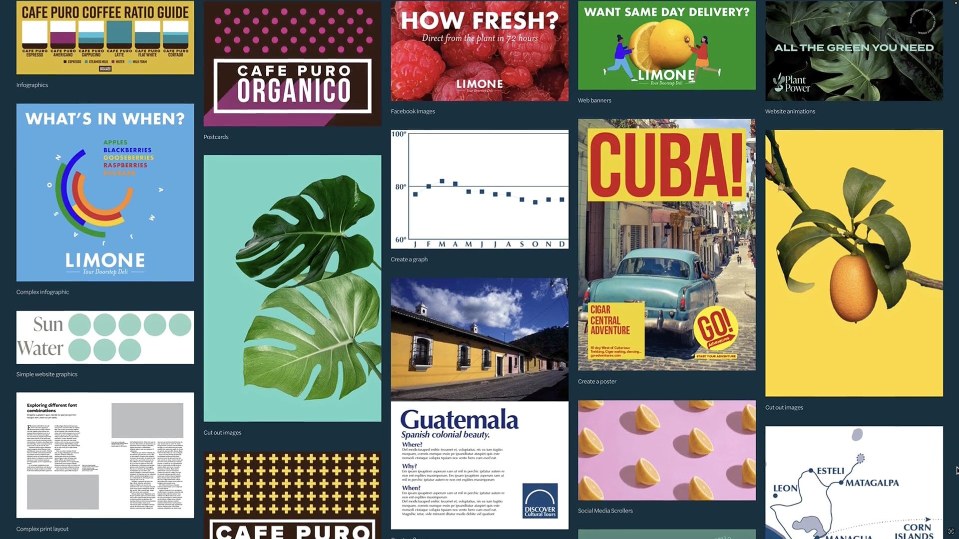
1. Why Design Beginners Bootcamp?: you might be completely new to the world of design, or it might be that, you know, a little bit of in design or a little bit of photo shop. But you want to learn more. If that's the case, you are in exactly the right place. My name's Peter Bone. I'm a graphic designer. For 25 years now, I've been teaching graphic design subjects for over 20 years. For most of that time, I've been working with professionals. They already knew their design stuff. They just wanted to know the software. But the last five years or so, I've mainly been teaching people complete beginners. It's been lovely for me because I've kind of had to reinvent how I teach beginners. I'm assuming this is you are in a kind of difficult position because what you need essentially to get good at design is experience. Now that comes obviously with experience. You gotta put the time. But how do you do it? How do you get that experience? How do you like to see as a designer sees things how you know, illustrated Photoshopped in design. How'd you learn more about typography? How'd you learn basic design theory? So what I wanted to do for a while now is put together. A course that teaches you as much of that stuff is possible without being overwhelming without it taking weeks and weeks and weeks. So this is my course. It's called Design Begins Boot camp. It seems no knowledge whatsoever, but he got some that's fine on through a series of 12 many courses or build one on the other, you'll learn a tremendous amount. You'll learn how to create infographics on logo's posters and flying and all kinds of things that you'd be expected to train. As a designer, you learn how to use the programs that designers use. You learn the theory, but really, the main thing you'll get is experienced because I'm gonna put you through your paces, you'll be creating a load of things, and you just get used to working. It's a long course, but it covers a lot of ground on. I hope you will enroll in that because you've got absolute ton. You're coming out of it with confidence. That's what it's about. If that sounds like what you want, please do join in
2. How Design Beginners Bootcamp works: a warm welcome to the design Beginners boot camp. I really hope this is a really good experience for you. And you learn an awful lot. Certainly the course is packed full information, so I hope you can hang in there and learn everything that you want to learn. My name is Peter Bone. For the last 20 something years, I've worked as a freelancer in graphic design. I've designed things and still do, and I teach Ray off. And typically these days I'm teaching beginners, marketers, people, incomes, that kind of thing. But for many years before that, I've taught professional designers in pretty much every field you can imagine and for lots of companies that you know about. So I've got lots to cover just to give you a quick heads up as to what you can expect. So each course will build on what you've already learned, so you'll get the most out of this course if you do it in order on, you just kind of keep working through. Now, if your schedule gets busy and you have to miss out the Obama, that's not the end of the world. But say, for example, you're doing the illustrated calls for one of them, and you start with the second course. It's not gonna make that much sense because it's based on a lot of stuff. You delight in the 1st 1 so you will need to have done the previous courses, particularly in in that piece of software, if that makes sense. But even more than that, in general, the courses are designed to build one on the other. So as best you can start the beginning on work through first course that's coming up is creating icons and logos and illustrator, even if you're thinking, actually, I don't want to learn how to do that. Certainly. What's the first video? Because that will give you some context of where illustrative fits in with the other programs that you're gonna be learning about in design and photo shop. So that's where we'll start off. So best of luck on that I look for to getting to know you and your course
3. CREATING ICONS & LOGOS WITH ILLUSTRATOR: Illustrator in Context: Hello, I'm Peter Bone on. Welcome to creating icons and logos with Illustrator, so we're gonna get into creating those things shortly. But before we do just a word or two about how illustrated fits in with the other programs commonly used for graphic design. So that's in design. The photo shop, the publications. You can see me leafing through here. We're all created in in design. So any magazine or newspaper Brophy, you might read is most likely created. Using that program in design is primarily used to create commercially printed documents such as these, as well as posters, flyers on books and, in design document a certain number of pages on each page. There will be one or more frames. Now, if I look at this document here in in design, he will start to see how it's made up. So here we have some pages. If we start to look more closely at what happens on the pages, here's a frame that this frame contains text. But this one here contains an image, and it's for these images that photo shop or illustrator I used. So as you can see this image is a photograph originally taken with additional camera. If that image needs to be processed in any way, the program a professional would most likely use would be Photoshopped. So here's the original image in front of shop. If I zoom in really closely on this image, you'll see it's made up of these tiny squares of color cool pixels. So each of these pixels can have its own unique color, and it's photo shops ability to manipulate them in different ways. That gives you such a huge creative talk it. So an image like this that's made up of pixels is known as a bit mapped image. If you come across file types like J Pegs Gifts, PNG's these are all examples of bit map images, but it's not the only kind of image the other kind is known as a vector. This book cover, also made in in design, features several vector graphics on its cover like this one. Let's take a look at that one in illustrator instead of working with 20 pixels, vectors work with shapes of solid colors like these. So what you end up with an illustrator is something less subtle, more graphic and hopefully more noticeable. So this is what illustrated us to look at it briefly in an online context. This is one of my websites put together in squarespace, so the any programs, our views are the ones to create the graphics. So here you can see this is a bit map image. There's the original image, and you can see that what I've done with it in photo shop is to change the color blur. Some sections crop it to make it a bit more useful for that context. But if you look down here, you can see these a graphics that were created using Illustrator. If I was to zoom in a little bit here, you can see the clarity and the colors and the Christmas and someone. So that's again Illustrator. So now you got a sense of how these programs can fit together. We'll move our focus back onto illustrator and get started creating icons on then Logo's
4. Before you start: There's just a few things you need to know before we get started. I'm using Illustrator CC 2017 on a Mac, but whichever version of illustrating a using it should look pretty similar to this. If he's not got access to Illustrator, you can try the latest version for free for seven days. Direct from a Diaby is the website and goatee for that. Now you learn a lot just by watching the course, but it's highly recommended that you work through the exercises along with me. Now you're gonna create everything in this course from scratch. But there are one or two things that you'll need for some of the exercises. So, firstly, the funds I've used deliberately used from a place called type kit. So that's a website where you get free access to thousands of funds and you get access to that. If you've got one of the recent cc versions of Illustrator, another fantastic website, it unspool ash, which gives you access to thousands of high quality royalty free photographs. Now I mentioned the sights again when it's time to download things from that illustrate to conceal a bit intimidating when you first look at it. So before we start using it, let's take a look at the different sections. So this large section in the middle is called the art board, where you'll be doing your work. The tool panel on the left is the tools panel wail access to tools you need. The white panel above it is the control panel. This is context, sensitive and change according to what you doing at the time. And then above that are illustrators, men, NIS file at it and so on. Now there's a familiar logic to them, so you won't be too surprised to learn that commands like open and print are in the file menu on Undue Isn't Lee Edit money? You might notice the shortcuts to look a bit familiar to more than a second. The final section is these other panels on the right of the screen. Clicking on any of these buttons reveals more ways to work with things like colors. For example, there are only a couple of differences between the Mac and PC versions of Illustrator. The first is that the MCA version has a so called illustrator menu where the PC does not. So there are two commands that live elsewhere on the PC Quit is located in the PC's file menu, and Preferences is located in the PC's edit money. Then the other difference is in the shortcut Keys on a Mac. The shortcut for, say, undo is command said. Where is on a PC? It'll be controls it, so that's what you need to get started, So let's get started.
5. About Illustrator CC 2018 [onwards]: since this course was recorded, a newer version of Illustrator has become available on. It's likely that he might be using it now. This is different in one significant way, and that is that the panels that you saw me referring to in the previous video are not here now. What I didn't mention in the last video is that the everything on the screen is organized by a thing here called a workspace. And if he using the 2018 version of Illustrator, then the Essentials workspace is the default. What I recommend you do is you simply change that toe essentials classic. So click on where it says essentials changed essentials classic, and you'll see then that you get these panels that I was referring to previously. Have you changed essentials? Classic mode. If you are using Illustrator CC 2018 on a pretty confident, you'll get on absolutely fine
6. Illustrator Essentials 1: Selections, Fills, Strokes and Swatches: the most commonly used tool in all of illustrator is probably the selection tool it's found here in the top left of the tools panel. So if I was toe click on different areas on the page, this tool fairly, obviously is used to select, um, now the first thing you're gonna learn how today is toe change colors. So, for example, if I click on this subject here, you can see it's got. It's like a block of color. It's a block of purple. The area I want you to focus on is here, so this describes the colors of what is currently selected, and you can see the purple color that's one is the fill color that's the inside of the shape and the color around the edge border, if you like or so called stroke. And that's when you see white with a red line threat that means none. So in other words, it hasn't got any color around the edge. That might be clear if you look at this one. So this time this object has got no Phil. There's nothing in the middle. It's transparent, but it has got a white stroke around the edge which you can see is displayed there. The type, for example. Again, that's a white Phil, but no stroke. So if I wanted to change the color, let's say of this background block, I would go over here. This is the so called swatches panel, and when you click on that, you got access to a lot manner of Carlos and things much more about that as we kind of change away through the course. But if I was to click on let's say a green color here, you can see that changes now. The reason where the Phil has changed and not the stroke is that the fill you might notice is in the front. Okay, whereas when I want to, let's say change the color of this stroke. I gotta be careful here because the stroke is not in the front. So to make it in the front, you simply click on it. Once like that, it comes to the front, and then any time I click on one of these colors, you can see that adjusts to give me that different color. But I'm gonna go back toe white, so there are three different types of colors there's first kind like this is just a regular solid color, so to speak. The second type is like this is called a pattern and then the third type for just apply this a so called radiant, which is a transition from one color to the other. And on our course for creating social media and Web graphics, you learn how to create all three of those kind of swatches.
7. Illustrator Essentials 2: Zooming in and out, editing objects: There's one aspect of illustrated that can be particularly challenging when you're starting . And that's how to select things that are inside things called groups to get into. Looking at that, we're gonna firstly show you how to zoom in. So I'm going to click on this. Look out here. I'm gonna do command. Plus, because I'm on a Mac or a PC that will be control. Plus, So I zoomed in. You consider bit more clearly you might notice, too, that the whole thing is selected. So just to show you what I mean by that, if I was to drag that, you'll see the whole thing moves. Gonna just do at it, undo to take that back to where it waas So the whole thing is selected. The reason for that is if you look in the top left corner here it says the wood group, so that's been deliberately group. So it stays together. But how do you get inside it if I want to change? Let's say different elements. So we do is you click on the outside of the art board to de select. The object is I've just done and then you click Hold down on this tool here. More about what? This is in a minute, and you choose the group selection to. Then you can simply click on any of those elements. Notice. I can select them independently. So for wanted, say, to change the color. I feel kind of there with E. Let us. I could do that and it still remains grouped. So if I was to go back to my selection to click on it, you can see it's still grouped. It still moves together. So zoom in. You might have noticed. I did command. Plus, if I do command zero or control zero on the PC, that brings me back so I can see the whole page again. So that's how you get inside a group Final thing to show you. Is this third selection to the direct selection tool. So if I click, let's say on this object here noticed that in every corner there's a little anchor point, so called their little square. The same is true here, too. The squares notice that the squares by default are blue. That means this selected if I did this a bit more carefully there, if I just click on that anchor point on its own, you might notice that one is blue, but notice how the other ones are white. So blue means that particular anchor point is selected so I can click and drag just that anchor point. So that's how you can start to manipulate things. So that applies to these regular objects like this applies to this one because this is made of uncle Points, but it doesn't apply to the text. The text is just might have one point, and that's because it's inevitable. They're more this later. But if I was to go to the type toe, I can edit that text, and I can, in a change the letters or whatever. Where is this type here that's no longer type has been turned into a graphic. So now you've learned these key essentials. Administrator. You really ready to get on and start creating things with it? So that's what you'll do in the second module
8. Creating Artboards & a "Play" icon: So our first steps in illustrator are going to be creating some icons that are going to be used by this brand that we're gonna create later on. Expresso Union. These are the things that we're gonna create. So let's get started. Firstly, we're gonna create a document like this where you can see the slots for all six of those icons. So let's go file on new and you should see something like this. If you got a slightly older version of illustrate, you might get a slightly different layout, but essentially the things you're gonna put in, they're gonna be the same. So gonna choose web, and then when you're working with websites, is your working in pixels and I'm gonna type in 100 by 100. But if you were creating this yourself, if you got a Web designer to work with, asked them what signs they would recommend or if you've got a website hosted by companies like square space, say looking their documentation and they should give you a sense of what size you should be making something that's gonna end up on a website and then in terms of art board you saw had six icon's next to each other, so we're gonna do six as well. So that's the essential bit. But you also might do more settings and then reduce the space here. That's the space between the art boards back to zero on. This is gonna do it in three columns and they're just press that button. So Aled just comes in one long line as you've seen a second ago. So when I press great document, that's my kind of blank template. So the 1st 1 we're gonna cry Is this one like this? Like a play like him Now? Currently, I'm seeing all those are bored at the same time. But in the view menu, I can choose fit our boarding window. And that just shows me that 1st 1 night in large that's as opposed to fit all in window. So that's a good one, too, Not just Okay, So how do we draw that triangle shape? So which used the polygon to and we simply click once and you choose the number of sites. So I've done this before, so it says three. But you might need to change that to three. Now. We don't really know what size the radius is gonna be. But measuring in Pixar saying 24 I'm guessing it's gonna reporting like about 50. Then when I press OK, you can see I've got something. It's a start anyway, but it's around the wrong way. It needs to be around the other way. So get back to my selection tool, and I should have these sort of handles around the edge, which shows, you know, means they're selected. If you put pressure Custer just outside, can you see that you get these kind of curved handles? That means you're gonna be rotating something if you click and drag around when you get it pretty much like that, but should be square on if you If you not sure it's quite straight or not, you can put your finger on the shift key and hold that. Then when you let go, there's the shape. So that's a tiny bit large, so you can click on the corner handle, and as you draggin, you can change the shape. Now I am slightly distorting. This is going slightly less than sort of uniform. So again, if I put my shift key down, I can keep that completely uniform. Actually, in this case, you might choose to want it a bit more, you know, kind of NARAL wider or whatever. So you could have just that to be whatever size you want. And finally, we're gonna adjust the weight of the stroke. So if you notice up here, it says the stroke is 0.7. Whatever point size that gets adjusted as we scale it, let's try making that four point and you can see we could have pretty chunky play head there, so that looks pretty good. So let's save that. Let's just do file safe. I'm gonna just call this my comes because a few options here, Nothing to worry about. Just press. OK, we're often running.
9. Create an “Email” icon: So we're continuing to draw icons. This is the one we're gonna work on next sort of envelope. First we need to do is scold the screen along a little bit one way today, that is toe. Choose this Still here called the hand tool. You simply click and drive along. It doesn't change. Anything on the page just moves up so long. So to create a rectangle, we're gonna use the rectangle tool, which is here, although previously you'd use the polygon tool so it might be any to press and hold down on that. And then when you click and drag, I will simply give you a rectangle on notice that you get the same options as you had previously. So we've got a four point stroke which matches this one, which is really helpful. Now, you may recall, if we use the direct selection tool, you can see the anchor points that make this shape up. And what we're gonna do is to create another shape kind of triangle shape. On top of that, that lines up and these were to do that is actually using this tool called the pen tal, because what the Pentagon does is gives you a directly immediate way off creating anchor points. Now. It's often good to de select what you're working on previously, so we'll use the selection tool will de select by clicking on a bit of empty page. Then choose the Pento. Now we're gonna line this up with, Can you see? It says, hey, intersect. So I'm lining up my new path on the asterisk, By the way, all snowflake, if you like, that means I'm about to draw a new path. So that's my first anchor point on notice. It's trying to help me line up with center, but the rectangle, So that's fine. I'll just click to make a second point. We're gonna go up here again. I'm gonna line up with this one here, then, Flynn, they'll go back to the beginning. Now, we've got something a little bit strange that we're gonna do is look a bit more carefully here at this Strunk panel. You know, the stroke panel at first glance has only got one element in it. The weight. But if you press on this tiny button here, it opens up more options and I want you to notice the corner let us. You've got something called a miter joint. We changed that toe side around join you could say there's two things. Firstly, it takes off these kind of extended miters, and it also gives us a nice corner there. So that guy, that's how we do that. So that's just the rectangle tool, and then the pento.
10. Create a “Share” icon: So we're continuing to draw icons. This is the one we're doing next. One way to do this is toe take a rectangle and cut the top off. And this bit is gonna be a square cutting off Certainly. Come on, a teacher here. So let's go back to the rectangle tool contract to draw rectangle, You might notice the corners are rounded because that's where we were previously using the stroke panel. So let's just make that square corn. So the two we're gonna use is thesis is tool hidden under the A razor toe? So this is this tool is used to deliberately cut a shape. If I hover over the anchor point there, click once. Come with this anchor point click a second time, that is no, effectively cut this shape in two. I've got back to my selection tool and then just carefully click if I can. On this shape, you know, I can't quite get it. So, actually, what I'm gonna do is click outside click, hold my mouse down in drag and drag through like that, and that should have just selected this line. Then press backspace. Okay, so that's dragging through a shape is sometimes better. Okay, so there's the first bit of our share. I can't. I'm gonna just do command minus or control minus on the PC. Zoom out a little bit. Okay. Next up, this time, I'm gonna create a perfect square. Now, in recent version, Administrator, you should get that kind of pink colored line like that to make it perfectly square as you're dragging. But you can always hold down the shift key. If you're not sure whether something is perfectly square or not, it is something like that. So the trick is keep your finger on the shift key as you let go. The mouse, that's now square. That's important. Because now when I rotated round, I'm gonna then cut off the bottom half. So we know one way of rotating is to go to the selection tool and rotate with eyes kind of curved handles. But another way of doing it when you want to be very accurate is to use this tool here. The rotate tool, it's the one they're double click on it. But that and it brings up a dialog box. As you can see here, it says 45 degrees that it would normally say that if we didn't say that, you just type that in on. You can see the preview there tells me what I'm gonna get. So 45 is exactly what you want. Press OK? And there we go. So that's great for a nice, accurate transformation. So I'm gonna use the scissors toe once more this time clicking on that anchor point and then on this anchor point, get back to my selection tool, make sure I've clicked on the bottom again. That doesn't look quite right, sending a click away, Then click back on that one and press the backspace key. There we go. So that's doing pretty well. So it's not lined up. So to drag that to the left a little bit, what I'm looking for is that can you do that pink line? That tells me that the two shapes are lined up that season, the coolest, smart kind. So if we look at the kind of finished one doesn't quite the same. But we now I just want a line going from top the bottom there. So one way to do that is to use the pen Tal. Another way is to use the line toe the line segment till Sorry, I'm gonna choose that click and keep my mouse down and keep dragging till I get roughly the length I want again. Notice the smart guy there. The pink thing is showing me that that's straight again. If it's not, hold down the shift key. So that kind of logic that works across all of these tools, so I'm pretty happy with that. But But if I wasn't, I would just go back to the direct selection tool. And as you might remember from earlier video, the color of these anchor points is important. If they're both selective, it's right there. Both Blue means they're both selected. If I d select, click just on the one of them like that. Notice. This one is hollow, not selected. This one is selected, so I could just drag down a little bit further or I could drug it up, whichever I wanted to do. So there we go. There's all share. Michael
11. Brief Intermission: Hello, this is Peter. Just wanted to give you a little bit of encouragement partly for getting started, which is often the hardest thing on, of course like that. And secondly, just to say that we start with Illustrator now you might know that illustrator is regarded by designers is the hardest of three programs that use I've taught many designers over the Greater Photoshopped greater in design but other structures that when they struggle with So I wanted to start with it because I figured if you can get good with that, then you're going to find the rest of it really easy. So if you are finding a little bit challenging, please, do you hang in there because the rewards are gonna be well worth it.
12. Create a "Search" icon: before we continue with the next icon. I'm just looking at this and thinking. Actually, I want to move that arrow down a little bit. And as you might remember, this is made of two separate shapes. So if I want to select them both, as you can already click, keep the mouse down, drag through like that that both selected that the easiest way to move something just straight up, straight down or left or right is just to look at your keyboard. You should see this. Four arrows. They're towards the bottom right of the keyboard. Michael PC, And just press in this case, the down our okay, the case so moving on, we are going to create this really elegant little search icon. And you know, you can probably see how it's gonna work now. So I'm hoping that you can start to see how you can combine different shapes. So triangles, circles, squares do different things with them, so rotate cut bits out and so on. So that's this is really how you gonna learn, illustrator. So that's the way we're gonna do it. So, as you can probably imagine, we're gonna use this tool here the lips tool hidden underneath the rectangle toe. When I click and drag, I couldn't create something that's oval. But if I'm a bit more careful, I can get it to be perfectly circular or again in an older version. Hold down the shift key. Keep that down as I let go of the mouse. So we got. We've got a nice round shape that then let's use online segmental to create this shape here . Now I'm gonna hold down the shift key on that will constrain it. So it's perfectly horizontal, vertical or diagonal like that. Let go the mouse when I'm happy on a while ago. Today is Lina, unless you can see that it's a center, so that's lined up. But it looks like a any elongated que, which is quite nice, but it's not really what we want. There's two reasons for that. Firstly, the thing I've drawn that I've just drawn will always be in front of the previous things. So this segment, this this line segment, is in front of the circle, so first thing we need to do is go object, arrange and send to back. So when I do that, your margin is gonna fix it, but I'm afraid it hasn't fixed it. And the reason for that is this is in the back. But this object in the front, as you may recall, what this thing he means, right? This means no Phil and that Phil wants to be white. So fill it in the front, go over to swatches she's white. And then because that's now white bad and that's in the front. You're quite what's going on underneath. So that guy, that's all search Michael.
13. Create a "Chat" icon: Okay, So what? Powering through these icons. Now, this is the next one we're gonna dio so mostly on the lips. But this extra little bit here is gonna be a bit interesting. So that's use the hand to move the screen along a little bit. Use the Ellipse tool, click and drag to create the lip shape. And then to the Pento Critic New Path. So one to 33 clicks so far. Now that's currently called an open path. Want to click back there? You might know. Still circle there. Next, the pen. That means we're about to get a closed path. So they began. There's are closed path. The problem is, we got to separate shapes. We really wanted to be one shape, so they looked like that. So we select in both. So with the selection tool track through them both, and then we need an extra panel we haven't seen before. So we've seen some of these panels, but other panels live in the window menu. The one we want is called Pathfinder and Pathfinder gives you various ways off combining shapes, adding them together, subtracting all kinds of stuff to discover here, we're gonna just use this one here, Unite and, as you can see, haven't done that. We get this extraordinary shape, so it's made them in tow. One shape we could then just use the direct selection tool. Maybe just click just a little bit. But, you know, if I needed to adjust it a bit more than that, I could always do edit, undo, go back so just quickly. If I do undo, undo, undo, keep going back. And then I could manipulate that a bit more that will redraw it and then replace it by doing again. So that began. That's how we use part find.
14. Create a "Like" icon: So what? Until I find like on this will be using the round rectangle tool rotates Reflect And Paul Finder So let's move that along We're gonna use the round rectangle, toe rounded rectangle toe So when I click and drag and noticed I get a rounded shape Yeah, something like that should do it And then I'm gonna write tight that round I'm gonna double click on the right Take tool to do it and 45 Yet that's pretty much what I want. So press OK now, hidden under the rotator is the reflective I'm gonna double click on that. And if I turn preview on off, you might notice that what it's gonna do is reflected, like in a mirror. Now, I sort of want that, but I don't want to reflect this one. I want a copy. That's reflected. So I simply press the copy button. Now let's move that part for from the panel out away and you may be a to see this. You may not yet, but when I go back to my selection tool, I'm gonna just nudge this further to the right. Can you kind of imagine how we might get a heart shape if we could combine this in some way . So this is a key approach, using illustrated to create all kinds of things icons, logo's illustrations, finding out cunning ways to combine shapes. So we're gonna keep this section and lose these sections different ways of doing this in illustrator. But the way we're gonna do it builds on what you already know. So with the selection tool, select both shapes on. Then we're gonna use apart find a tool called Divide, and this divides all the shapes up where they overlap. So when I press the button like that and come back out, it doesn't like it done on the thing. But when I say select, if I choose the group selection tool, I can click on these individual bits now. The reason I've had to do that is that this is an example of illustrated grouping something . You remember this from the essentials lessons that's regarded as a group as you can see up group up here. So we didn't ask for it to be grouped, but that's how illustrators done so To get inside the group, you may recall, we need to choose the group selection tool. And then we can click on these shapes one other time. I want to say Click on them. You actually have to click on the stroke because the middle there's there's nothing there. In fact, another is. Sorry is white. That's fine, right? That's just delete that shape. Delete that shape. So, Erica, these three shapes we can now select them all, and we can use the United option in part fund their become one shape. And there they are, beautifully drawn heart. So next time you're looking at something that looks really difficult to draw, think about how you could combine shapes together circles, squares, triangles or even rounding rectangles. So we've come a fair distance here. Let's look at all of these. You can see we've credit all of those using basic shapes on some of the key tools on essential approaches in Illustrator
15. Export all your icons to go on a web page: so if work through treading all these icons. But you might have been wondering. OK, so what are we going to do with how we're gonna put them on a website? That's what we're gonna learn now. But we're going to just step back before we step forward. So remember writing beginning the course I looked in design on, I looked at the images that go inside in design on we talked about how there were two kinds of images bit map images like this one made of pixels on, then vector graphics. We looked at this as an example, not made of pixels. And of course, you become well acquainted with them that because u being creating, we've also I looked at my website and we saw again this is a bit map image so edited in photo shop and these instead of created an illustrator. But notice what happens here when I zoom in. If we get closer, we can see actually, this is made of pixels. If I was toe right, click on there Indu save image as it saves it, he might see as a PNG it is. It's a PNG now a PNG which one that is it wants to open in photo shop is a bit map file format, so it's like this is made of pixels. So what's going on with that which created this lovely vector graphic and then it ends up being made of pixels. So if that's a little bit confusing, let me try and explain what happens. So to get something onto a website, you need to create the kind of file that readily goes into a Web browser. On until very recently, the only file formats that have worked have bean bit map fire formats. Typically, J pegs gifts on more recently P and G's. So now most people, most the time if they're going to create any kind of graphic whether it starts off life as a vector, like what you're creating now or it starts off life of the photograph. Most graphics these days will be saved as PNG formats, so you can save PNG from illustrator. You can save it from Photoshopped in design and various other places. Now I should mention there is another format called S V G stands for skate herbal vector graphics. It's possible to export those administrator the reason we're not doing that right now is that it's a bit more technical on. There's no guarantee will necessarily work. You need a bit more technical savvy to do that. So if that's something you particularly want to do and particularly its relevant, if you're gonna be creating icons for APS, you might want to do a bit more research on saving as an S v. G. But what we're gonna do is what most people do most the time, which is Take your illustrator graphic and save it like this. We're gonna choose export. We're going to go export as we will look at this other one later, which gives us more options. But for now, we'll keep it simple. File export export as on. Then you'll notice it's going to save it. As a PNG, the clever bit is weaken. Say, use art boards on. What that will do is it will save each one of those as an individual graphic. So let me do that. We get some other options there, like the choice of the background color. I'm going to make the background color white. I could make it transparent gonna make it white so you can see that more clearly. And then that's working away in the background. Some of that every guy. So there's number 123 and so said they're the ones that were just created, so they will be at the size that we made them remember, right the beginning. But as I was hinting at earlier, there are other options, and later in the course, you'll learn a more flexible way of exporting those.
16. Create the "Hub" logo [1/3]: having spent some time looking at designing icons. We're not gonna move on to designing logos logo designed like I can't. Design is an entire discipline within the world of graphic design, and we'll see you then be learning some really key techniques. An illustrator that's really only one part of it. I be misleading. If I was suggesting that then of these few videos, you'll be able to go away and create fantastic logos certain you'll be a crate logo. But it's one of those things that it does take time to get good at. I'm not suggesting, by the way, that this logo is a great logo. Azul. See, I've put it together pretty quickly. If I was gonna give you some advice in terms of designing logos which have done for many years now on I I think my logo these days are better than the ones I started with. The more time you spend getting the type right on the color right, the better they're gonna be to get those two things right, your most of the way there. So let's say a little about type. I've designed this. Look out here using a classic typeface let me show you where I found it. So in Illustrator, I went to the type menu and I chose add fronts from type kit. So as I mentioned briefly at the start of this course, if you have got a creative cloud subscription, you get access to the type kit website which I've done here. I just I've been up for you and you can see that this is the type get website on. I've typed in the brandy hub and you can see I've made this nice and large. I want to say this because this shows you different classifications of type so you can see we've got serif typefaces sans serif. They haven't come across that before. Notice these little bits here that the edges of the M So there's a called serifis. That's how type started. But in the early 20th century, we started gets on serif and then slab serif. So there's a variety of different classifications and we could take a quick look at some of these. So type kid is useful for helping you find different types of tight, if you like. On the one that I settled on, just search for here is if you cheer, so this is a classic. It was invented in the 19 twenties by a German called Poor Runner on. It's a so called geometric sans serif, so the shapes of the letters are geometric on. There's no Serifis, so type goes in that fashion. Like everything else. This is currently in fashion, even though it's goodness getting on for 100 years since it was invented. So if you find a typeface you want, you can sink and then you can just use it inside illustrator and other adobe programs. So that's what I've done here. In the next video, you'll see how I used it to create the logo.
17. Create the "Hub" logo [2/3]: So we're in the presence of creating this hub logo. We've been to type kit where we found the future of fund, and we sink that toe illustrator. So inside, illustrator, we're gonna create the logo. So let's go file. And you That doesn't really matter which what size you make the local because it's gonna be a vector graphic. We can make it larger. We can make it smaller. So we might as well start with a print document. And let's go with a four. Let's go with, uh, landscape orientation. Okay, so there are empty page. We use the type tool click once on the page, you get a bit of dummy text there in new versions of illustrator are ones you might know. That's just type h e B in capitals. It's so small, I can barely see it, and problem same applies to you. So then dragged back over that text and then notice at the top Here. We've got the character panel. I call that first people change the fund. So type start typing. Few Thira. You can see that's someone I'm gonna go with each era. PT heavy notice. It comes from time kit work, and then it has the font size. We get a variety of font size, the largest of which there is 72. So choose that. You'll see. Never let it still quite small. So I don't just over write that I'm gonna go with, Let's say, 300 point talk to 100 return. Okay, so that's started to get there. Now I want to move that back onto the page. So go back to my selection tool. You can drag. Okay, now let's look back at the character panel. So there's a couple other things I want to show you here. So, font size, who talked about the way to the fund notice forgot different ones. So book Demi and heavy There are others that I could have chosen. Noticed that the weight gets heavier so the air inside here gets smaller. No, I'm not quite sure which one I want to go with. I'm gonna go with heavy. The next thing on a shame is this thing here called tracking. You see, if I choose, let's say my as 100. Notice how close that gets together. If I cheese plus 200 you can see it goes out that way. So that's a key, I think to look out, I think I'm gonna go with minus 25. Just zoom out a little bit so we can see what that looks like. I think I'm pretty happy with that. So as I was hinting at earlier on, an awful lot of logo design is about choosing the right typeface here. I've just gone for one. In reality, you're gonna probably look at thousands and thousands if you're gonna end up doing this seriously. So we skipped right to have nearly the end of the process. But once you settled on your time, you've settled on things like the tracking that we've just been looking at. What you'll do right at the end of the process is to convert this toe outlines. So as we talked about already, this has just got one anchor point with the finished version Notice. Look at it. Using the direct selection to is made off these uncle points. And that means basically that it is no longer connected to a typeface. So it means that you can send to anybody they don't need the typeface installed on their computer toe work. So, as you say, with the text selected, I go to the type menu and choose create outlines. And now, as you can see, it's made of these anchor points, which if I wanted to, I could distort in any way I like. But really, the main reason we do it is partly so that when you create the identity, you send it to your client on Ben. That's fixed. It also means that you can send it to anybody. And they don't have tohave about typeface installed on their computer for it to work. So when really they're in, the final video will finish the logo.
18. Create the "Hub" logo [3/3]: Okay, so we're working through creating this logo. Andi, ultimately, it's gonna look like this one here with this little symbol here on the right. So if you conceive from the skills you know, already the illustrator to create that, then great, I would suggest that part of the best thing you can do is to try and figure it out from what you know already. But you need some guidance. I'm gonna go through it now, so I'm going to use my line, too, on toe. Before I start working with that, I need to make sure I've got a black stroke. So if you haven't, let's say your stroke looks like this. That's the shortcut button, by the way, for none. So if it looked like that, you'd make sure that stroke was in the front, eager to swatches on like that black and then with your lines, all click and drag, hold down the shift key to constrain that to 45 degrees and then looking a stroke panel on , I'm gonna increase the stroke. Wait a little bit, but what I'm also gonna do is do command plus a few times to zoom in on that notice The end is sort of squared off, but they look a bit friendlier. I'm gonna use around, cap. It's subtle, but I hope you consider difference. Okay, that's great. So now to the rotate toe said double click on the rotate till you know already that you can make a rotated copy of something like we did with a reflective and then with the selection tool de select, that's something you'll get used to doing automatically in time. So now with the Ellipse till we want a perfect circle. We also want is for the circle to be lined up with the center here. So you might notice that I can line it up on the center on, did that before I start during. And then I'm gonna hold down the old key on what this does is it means when I draw outwards , I draw out from the center like that. So my finger stays on the okay. It also needs to go down on the shift key. Then I keep dragging until it looks sort of about right. I don't know, quite one going for here, but let's try that. And then I might do command minus a few times to see what that looks like. Well, it's not exactly what I wanted. So this is where we start to sort of play with it. So back to the selection tool. I'm gonna select all of those at once, increased the stroke, Wait a little bit. And now I'm thinking this needs to be small of this central section, so select zoom in a little bit. So this time I've got one of those bits selected. I'm gonna do shift, click, select the other one. And until we haven't looked at yet, is this one here? It's next to the rotate tool is called the scale tool. And like that, told on, like the red, the reflector weaken simply. Just double click the double click on it. Try like, double click on it. This and I'm gonna try, Let's say 80% size. Turn the preview off, turn it back on again. You can see that as I do that it makes it smaller on notice. It also scales the strokes and effects, so I don't actually want that to be smaller, so I just want to make the so I dont destructively thinner. I think something like that looks great. So it was good to see you Want to change your mind further? I could play with the numbers, but that looks fine. Finally, I'm gonna do command zero to see the whole thing and then with my selection tool, select all of that and then just adjust it till it sort of looks about right. So the final process is to save this, these two for months, you use a print either the dot ai format, which is the default. So notice this one that's been saying before, don't I? I or E p s either work fine for print and only my processes. If I'm creating a logo that's gonna be super print and online or do a print version first. So I'm going to file, say lies on. Then we'll just call this hub logo. I'm gonna call this black because later on, I might be other versions of that. So I wanted to savers and GPS. So if he had been told by whoever that that's what they want you to just choose that instead, I'm gonna just stick with the illustrated version and then save. Okay, there it is.
19. Create the Espresso Union logo [1/2]: in this video we're gonna build. We look when we created the Hub Lago, particularly going to learn more about text, more about aligning more about anchor points and more about transforming objects. So go through this pretty quickly, so we'll start again from scratch. So a new document, I'm gonna stick with a four landscape orientation and they're gonna go to my type, too, on click One somewhere near the middle of page. And we're using the default font merit for a regular 12 point. So I'm gonna just type I put my caps lock key on that. We got E S P R E list. Oh, espresso union. So that's my pretend copy shop board coffee roastery, select all the text on. I'm gonna use thes two typefaces. Approximate Nova and Pepe's noi. Okay, so I've sink those up in time kit. So here's the 1st 1 on because I've recently used it, by the way, it's near the top of the list. So if you recently used to fund find at the top or else it'll be enough alphabetical order , it would have a few of the right one there. So again, so that's annoying. Okay, let's start with 72 point science. That looks pretty good to start with. Okay, now we're gonna get this centered. Now. We didn't do last time. Is pressing this button here paragraph we're going to send to the paragraph. Firstly, but pressing that button, that sort of centered on the screen. But let's look up more about that now. So going back to the selection tool, if I can try and drank that and get that center, that's probably gonna work. But another little button up here notice is the online button. So if I press that notice down here, you've got different options. The default wanted a line toe art board. So that's like the page, if you like. So that press that button and then that button. When I zoom out, you'll see that is now aligned to the central screen to the object. If you like it. Aligned on because of the paragraph is aligned that is aligned perfectly. So that's great. Okay. So I could make that front larger or smaller. Leave that for now. I'm gonna worry about the text above it. So as you can see this one here, we've got Crean quality coffee always sourced direct. So click with the type tool again, it's going to stay in upper case I leave the caps lock on. Okay, Now drag back through that to select it. And then front I've used here is Proxima Nova. At first glance, they don't appear to go together at all. But when I make that much, much smaller, firstly, I'm gonna just start to align these. So notice it's kept the sent it alignment there. So what I'm gonna do here? That's what I'm looking for. Let me come in a bit close to that for you by doing Come on. Plus, so grabbing on that handle there, I think a point. Rather, when I see the little pink line I know that's lined up with this object. So now I can start to play with it. So what was he telling you? Which typefaces? Amusing. But my belief is that these go together quite well. Now there's various things you can read online about how to find typefaces that go together . I recommend you do as much study as you can when you start to combine typefaces. So it is a bit of a challenge, but my hope is that if you compare what you're doing to other stuff that you can see around , you'll start to get a sense of what works on what doesn't work. Um, yes, that's what I say. That on that for now. Right? So I'm gonna choose a slightly heavier weight. That's a semi bold, and I gotta pay attention to the trucking. I'm gonna push that right up to 200. The idea here is that this this Texas A bit bolder, But you don't really You only notice it after you've noticed the name with a brand here. So that's the idea. We want to make that noticed, but without sort of screaming. So this is what people want a notice first. So I'm gonna start to play this a little bit on. Just adjust tracking a little bit. Pushed that a bit more something like that. I really you know, you would spend a lot of time on this on back and forward and spend a lawful lot of time just getting that s o you really happy with it. So you're playing with the tracking you're playing with the font. The way to the fund s so I think I'm gonna just tweet this just a little bit. Here, pull that back a little bit like that. I'm gonna go into this one on having played with us before. What I was wanted to do is to get the e that lined up with something solid. Likely the right inside of that. I so says, Well, I can try experience with the front sight that looks a bit too large to me. So then it's gonna be trying to tracking. You can see I just use this IRA to carbon down on the other. Option is well, you know does not look good or what? It looked better toe If it was bolder. That makes quite a difference on one. The reasons of using Proxim Nova is that there are so many waits eso looking away from thin that away the black And you can see how you know what a different emphasis that it So I would say semi bold, bold, probably gonna work quite well. Try extra ball. You get the idea
20. Create the Espresso Union logo [2/2]: a quick trick for you if I want to make a quick copy of that. If I simply, with my selection tool, hold on the altar key and direct that straight down while I'm dragging, Try and keep that lined up with the little pink line like that. And when I let go, I've got a copy. What I've got to do is change the text and you can see it's going to say Always source direct back to my type, too. Select the text and just over type. Now you might let us hear. This doesn't line up with the I. So if that doesn't necessarily matter, But in the process of creating a logo or creating and branding or packaging whatever, you're going to spend time in this. So one thing that you might try is increase that, for example, Now I'm going to say with the you know, Mr looks better or worse that you know what's better, I would say, is that that lines up visually with their That's good. But what's not quite so good is it that isn't consistent. So you know you can choose, Um, but inevitably, this would take quite some time to do this kind of from scratch. Okay, so I'm gonna zoom out a little bit. So command minus on create these little sections here for you. So using the rectangle toe click and drag something like that. Now, I switched a feature off. Actually, let me just show you what I've switched off. Up until now, you've seen the bounding box. Whenever you have you been using the selection toe on. That's great. It gives you these handles and someone which is wonderful. But what the bounding box obscures This is what I'm gonna go view high bounding box. It doesn't enable you to see the actual anchor points whilst you're working with him unless you get to this tool. So I tend to work with that off. So I've switched that off just for now. I'm gonna go object cough. Add uncle points. This is great. You can just about see it added extra anchor points in the middle of every side. As you can probably guess, we're gonna move these ones in to create that sort of type of effect if you like. So I'm gonna do come on, zero seem back out with my direct selection tool de Select. I think so. That just that anchor point, as you can see, that selected the other ones out. So then I could press my left are okay. That would go to the left in very small increments. What I'm gonna do instead, though, his whole downshift and they want to do left arrow. You can see a niche to that Once twice. That's, like, three times. That looks great. Okay, so now I want exactly the same. The other side, you may recall, we've used the reflect to already, but we're gonna do this in a more accurate way this time. So with the selection tool, we clicked back to select the whole shape. Okay, Role than just the Uncle Point. We choose the reflector. But this time, rather than double clicking on it, we're gonna just move it toe roughly there or exactly there where the center of that object is Okay, where it says anchor. So that means that is basically the center of the page. Hold on the old key Notice the cursor changes slightly when the orchids held down and then click once I'm going to zoom out steak and see what that's doing so by doing all click on a particular place. Your son you want toe make a transformation. But around that particular place so irritating it round the centre, useful in or cut? Sorry, reflecting it around the center. But yes, you could also use it for rotations or whatever You definitely want to explore in more detail so that we gotta to his press copy. And then we have an exact copy exactly lined up. So in real life, if you're doing this from scratch, you probably start with this gets you probably start, you know, with all kinds of ideas. Before you got to this stage, some kind of cutting that out if I was doing this for real has been probably quite a bit more time trying different front combinations, different sizes in someone on then credit like this, and then pools come back to in a day or to have a look at it printed out before you make your final decision. But that's what we're going to go with now. I won't show you saving it in illustrated for might again because you've seen that. But that's essentially what we would do. So there we go. That is how we create logos in illustrator
21. Your next steps: So that concludes our first course in this design. Beginners Boot camp. There's two more courses in Illustrator one on creating images for websites and social media, another one for creating infographics and then later on in the course using all those different skills, you're gonna combine those. And if you want to, you can learn to critic logo feel brand. So we are still scratching the surface of the whole logo thing. But there is more to come, so look forward to seeing it on the next course and on this one later on in the series.
22. TEN STEPS TO BETTER GRAPHIC DESIGN: Start to notice what you like: Hello. I'm Peter Bone. Welcome to 10 steps to better graphic design. First step is to notice. So first thing I'd like to do is go to Pinterest dot com. You've got an account. You should be logged in automatically or if you have log in if you need to. If you haven't credit in your account like I'm just in the process of doing here. Same. I have to go through a few additional questions. Once you're in. This is a new account off just created. Then type in something like graphic design, inspiration or something like that. And when you find something you like, just stop took add it to a new board. So, for example, if I like this, click on it and it gives me the option of saving so I'll just save that No, se? Yep. And I'm gonna create a board. So I'm just gonna call this design. I like to call it whatever you like. So having done that is going to start to suggest things, So feel free to just go through. And if you find other things you like just Adam in if you start to think naturally, I want toe look at things that are more like posters or flyers or logos. Icons just type that bear in the search bar on, basically, keep going. So what's really, really important here is that you don't think about it too much. You just find something you're drawn to in whatever way. I don't think about why. Just added in and keep having in and stay on it for a little while on if you can keep doing it for a few days. What I'd really like you to do is increasingly might start to notice y like things. That's fine. We'll go through that at the end of the course, but right now I just add things in Atmore things in. It's more about kind of quantity than quality, but don't put anything that you don't like. Obviously on. Keep adding to it will review this at the end, of course. So that's step one
23. Deliberately use repeating elements: Step two. Improving our graphic design skills is to use repetition. So what's repetition? Repetition is deliberately repeating something in a design, so let's just have a red color and the black are repeated a way through typefaces are repeated. That's not to say that everything is the same, but things are repeated clearly. Fanta the orange color is repeated for obvious reasons. Again, the orange color partly in the recipe photo is repeated. Are the things repeated? Like the fund here? Even though there's a variety of different colors, those colors are repeated, the front itself is repeated, and so on a green patterns. And here something really a pretty complicated, complicated design. Lots of cyclists, but you can see essentially, it's the same cyclists just in different colors. So again, color very deliberately repeated. So they on a date with all these things, if that's something is deliberately repeated toe make things feel like they belong together on the page. So complex illustration like this could be all over the place. But it's brought together but deliberate repetition mainly of color but also other things as well. So I noticed the font is repeated again. The colors, typefaces again colors the way to the lines. It's all repeated now. Here we got loads of different colors, but you can see the loud is repeated. So the line and then the number and then the heading and someone and again it's repetition brings along these things together. So this isn't rocket science, but it'll helps. So here you can see really different patterns on each one. But that's consistent on the typefaces. Consistent and the colors are consistent. So that's repetition. That's step two.
24. Deliberately use contrasting elements: in Step two. We looked at repetition, and this was one of the examples, this lovely poster. We saw how things were repeated, like the color and the typeface. And so so that's the repetition bit. But Step three is about contrast. So you'll notice, of course, that the tune yards text is much bigger, so that contrast it with the rest of it. So, yes, the color pulls it together in the typeface, pulls it together with the rest. But it stands out because of contrast. Repetition hold things together. Contrast brings your attention to a particular area on makes it much more interesting. So here's a board images featuring contrast, So your eyes will be drawn toe taxi, black keys, colors Oh, me, oh my, the iPod And someone and that because of the contrast that deliberately being used. So as I scroll through these, if you're thinking OK, my designs and lacks a little bit of something, think about how you can use contrast, so that could be contrast in terms of color. But this or size like this texture, like this, all manner of things. So some of this is more illustrative. Some of it is more kind of graphic design. But in a simple thing like just changing the color change, the size contrast will liven up your designs. So that's step three contrast.
25. Learn about type and start to experiment: when you start working with text, should you just pick funds randomly feel designs? Well, as you might guess, I'm going to say no. You shouldn't do that. Depending on your context. You may well have Brandon guidelines and all that on your fonts may be completely nailed down already, but even so, it's good to learn about them. So Step four is about learning about type a massive subject I can't do justice to in a few minutes. But let me just get started with a few key steps, so I'm gonna get five little steps for you. So first thing you do is learn some classic type faces in the same way. If you didn't know about music on you or somebody you know, where should I start? They say, Okay, Beethoven or Mozart? Hendrix or the Beatles Open. Whatever. So I I've got some web pages open here and is the 1st 1 So this is my fonts. Great place to buy fonts. And these are the ones that people are currently buying. You can see Helvetica Avenir approximate over. Didn't Brandon grotesque? So these names gonna come up again again again Because they are being used currently. Okay, so that's a good place to start. Next up, there's a great website type wolf, where this guy German chef goes through on DA lists, type on the Web. He likes one of the things that I said just you did look in his list of designers who share their favorite type fated, and there are many others online. But you'll notice some of these things come up again again. So avenue, for example. So I'm not saying you should just go with, you know, whatever people using necessarily, but have a look at what people are using. So there's two we just saw on. The more you get a sense of that, they're easier that becomes okay. So if you want to learn more about type by reading a book is a fantastic book. Just my type really readable, really informative on duh Yeah, I can't recommend that high enough, So secondly, you want to know what kind of typefaces you're looking at, So if you go to type kit and type get, you get access to for free. If you've got a creative cloud subscription, you can start browsing by type of font. So, for example, sans serif has no serifis. Sarah has seriously Aziz 20 bits here on there are many other types of typefaces like script, for example said this will give you a sense off different types of type. The third thing I suggest you do is to start look at looking at text in context on this is a fantastic site for that, and it's called type Pierre. That's t y p dot io And I just pressed on the search button and you can search for popular funds so you might find those ones. You sort ready and thought, Yeah, I can like those. So maybe I like few cheer er So if I click on few tear here, this will give me some examples of websites where future has been used, and you can also start to see other funds that use with them. So I find this really useful because often I can't really tell if I like something before I see it on. Uh, this is a good way of getting around that. So I can't recommend that hardly enough that type of guy And then, of course, you should really start using them. And this is where it might problematic, so it depends if you got the budget or not. But before we talk about budget, if we go back to type kit so type kit, you can see I search for future Andi. It's here, and it's available to sink. So if you got a creative cloud membership, it gives you access to thousands of typefaces that otherwise you might need to pay quite a lot of money for. So that's one example off typeface, which is on type kit. So before you buy anything, see if it or something similar is there. If you do need toe by type, this is the place I go to buy type and again you can see you concert. You can look at best sellers. What's new Special offers on DSO on on again, listed in categories. So that's a great place toe by funds if you want to, and you've got the budget to do it. But finally, what? You know what? If you haven't got the budget, what you would eat it? How do you get around that and again, Type wolf is a good place to go, so you shows you that the most popular ones but it also gives us guy to free funds on recommended things. Some of this you gotta pay for some of its free, but it's certainly a good place to start on a couple of other resources. Font squirrel. They have combined a whole bunch of free fonts that are there future. Download to the some really good stuff there on a couple of specific foundries that give away or pretty much give away funds. So League of movable type lovely fonts in there and the lost type cop recommend them really high. But before you start randomly downloading front, you want to get more of a sense of what kind of type you're looking for, which is why I started where I started. So that's our fourth step, then learning about type and getting to use it.
26. Learn about colour theory and apply it: So Step four. Improving your graphic design skills was learning more about type Step five little anymore about color. If you're like most people, when you start off working the color and say Illustrator, you'll start off and you're just use one of these watches and that's absolutely fine. But I want to give you the tools to start to take down a bit further. And to do that, we're gonna look at color theory. So put this together. You can see I'm using this blue color, and I found the complementary color to that. The where did that was. I went to the collar guide, and then I chose complimentary, and it shows me the complementary color. And then if I press this little button down here, it adds it into my swatches. So I end up with a so called color group like that one, and I repeated this process to go through the other ones so I'll speed up so you don't have to wait too long. But secondly, is split complimentary. So again I went in and I chose split complimentary press that button, but just so you can see what's happening if I press this one here and press edit. We can look at the relationship so strict complementary is just going straight across the color wheel, whereas complementary to will spread complementary, it just gives you It's going slight variation. So you get sort of analogy ist colors near the the color and its complementary. So that works great and a couple of real life examples here of complementary colors, said blues and oranges and purples and grains. These kind of colors, complementary cars, a knowledge is colors. So this time having showing you that a couple of times, I'm gonna just double click here, just say could see get straight in here. So these are analogous comments there close together on the color wheel they worked together on. You're going to get something very harmonious. So if we look some examples on Pinterest, you can see there that they just did not to striking, but they that the colors blend really nicely. So these are now just comes monochromatic. That's just tints or shades, the same kind of adding white, adding black again not to striking tried it cloud. This is much more striking. Can I just have a look at how that's done. As you can see, it gives you three equally spaced colors, so use with caution. But if you do want to make an impact, that's certainly one way of doing it. So is tragic colors to change. It makes up slightly. Try attic to you can see we can go from. Try Elektronik to this other variations here that just add in a few so analogies colors. And it's, um, some slightly lighter, slightly darker ones. So the last couple compound colors you can see here. This is really mixing up anymore. You got you got covered Metro ones, and then you got ones that are sort of analogy ist but lighter and darker. So you end up with a really nice sort of color scheme. They're so much more used, I would suggest, in many ways and high contrast against similar again, we're going across with splitting slightly so analogue, just lighter, darker and so on. And then with any of these, What you can do is inside edit. You convey drag these round to adjust the colors, and then if you press OK, it saves the group, so that's now different so I can reapply that or better still, if if the art world was selected when I was working on it, it would automatically adjust that. So there's plenty you can do toe discover some colors within in design. There's a nice little trick that's the finished one. Let me get back. So if I wanted to sample some colors from this image to go inside this frame here, I can either. I can use this color theme toe hidden under Lee. I drop it toe, and I can either click once on the image and its samples also massively colored inside it or, better still, holding down the or key. I could just sort of sample over an area, and you can see it gives me some colors. And again if I press on this little button here, adds them into my swatches, which I contend years. So if you're after something reasonably analogy ist, that's gonna work well for in design. So there's some ways of describing color analogies, monochromatic, complimentary. Having an understanding of that big, gonna recognize them work that you're looking at is really, really helpful
27. Deliberately create a focal point in your design: the next that that you might want to take to improve your graphic design is to think about incorporating a focal point. I want us don't mean by if you look at some of the designs on this Pinterest page. What I'm hoping is you are particularly drawn to particular areas. Now, this is partly to do with contrast. But a focal point is like a kind of super power in something contrast. So notice how, for example, your eyes are drawn to there. Well, here. Well, here. I'm hoping they are. If they're not, just bear with me. The theory here is that particular things really get our interest. So eyes, if you see an I as a human, you're a drawn toe on I. What you're also possibly drawn to is where somebody's looking at. So this figure here looking up here No, I might be pushing my like slightly on this, but this can really have an effect also where an arrow is pointing to. So it's pointing to there. I don't see because when you got like a concentric circles again, it's kind of pointing towards something again, a frame like this, or like this again it really direct your attention somewhere. It is not always appropriate to use, but it's worth thinking about because it does often unconsciously, really get somebody's attention. So there's a few other examples here, so you can see that people are looking in particular places. There's eyes. There's things like hands or heading towards something. Use of circles with something is in the middle things, pointing in a particular direction. Again, things highlighted also things going in a particular direction. So a car, for example, headlights, for example. So these are all examples off using a focal point, so really trying to grab someone's attention. So using concentric things, using eyes using arrows, those kind of techniques so noise appropriate but come work really, really well. So that's Step six use a focal point.
28. Deliberately create balance in your design: Step seven is to use balance Now. What do I mean by that? Everything on this page, all these adverts, posters, but covers and so on. These are all symmetrical. So if you look to any one of these and you drew a line coming down the middle, then you could see that they are pretty much symmetrical. Okay, so it's almost like 1/2 is a mirror image of the other. So these up in design, toe balanced. So maybe to use a pretty dreadful analogy, but the best one I can think off if you got to. Let's say you got to two kids. They're twins. That the same age and height, you can put them either side of a seesaw on that worked perfectly that balanced. Okay, so this, you know, this is a good example of perfect balance, but these are all balanced. Okay, now, this is an example of something which I would say is also balanced, but this is not a symmetrical design. This is an asymmetric design, and this is harder to get your head round. And certainly for people who were starting off a design, this is much more challenging. But you don't actually know most of what you need to know here, because really, if you look at this design, which I think is it is a really nice one, I would suggest this is balanced because even though we've got a much larger area there, it's promised out by this. And why does this balance it out? This is kind of smaller than that. Well, it balances out because it's more contrast. E. So all the things we love about focal points, on contrast, can come into play now because you can start to use them creatively. So it's almost like this is heavier or as heavy as this because it's got more contrast. Okay, so it's a little bit like Teoh. Extend the dreadful analogy. If you've got the heaviest child on a neglected child than the heavy, one needs to move a bit near the middle. Okay, if that works for you, great. If it doesn't sorry about that. So let's look at some other examples. So this one I don't think, works quite as well, is it? Could rationing adjust the mountains? I don't think this works quite as well as it could have done. I think there's a this is a little bit unbalanced. So personally, I want to move that a bit further down here. One of the reasons for that is that like we talk about in focal point, that's looking off the page. It's almost like it's got extra weight there, so I don't think that works too well. Whereas this one just see if we can zoom in on that. Yeah, look at that. That works really nicely because we got this extra white text here balances this text here . We just flip through these. This, I think, is extraordinarily well done so you can see she's looking up here. That adds extra weight here. Which counter acts the extra stuff going down here. It was a few more of these two, so this is really nicely balanced. No easy to do, but you can start to get a sense of how it's done. This one is almost symmetrical. Actually, you'll notice that this doesn't have much weight because it's not that contrast E. So it doesn't really matter too much. This, I think, could have been done better. I feel noticing this. So this is on this side. This is on this side as well. Personally, I want the coffee cup to be on the other side or the text to be on the other side. Same here and thinking, OK, I'd like something else to be here to balance that out. Just seem out of that. Say, conceal a bit more clearly. Hopefully where is it going? Yes, sir. You sort of mean said that isn't is lacking something. Whereas here you can see this is balanced out by this. This is a tricky one, but you can see the dark there. It's kind of mirrored by the airplane there, but again, they kind of balance each other out. That's a hard one to get, right. But look, a couple of really good examples, this one, I would say This is really nicely balanced. You can see that these are equal size. That's a huge thing. But without this white text on this other side, it would kind of tip over, and we got a little bit of extra text there just to kind of anchor it down a little bit as well again. Here you can see this illustration is more on the right hand side, but it's a balanced out by this so one of things. I hope you start to notice that this doesn't shout. It doesn't scream. So this is not too heavy. If it did, then that might ever balance.
29. Use a deliberate rhythm in your design: The eighth step we're going to look at is to incorporate rhythm. Now. I hope as you look at this nice brochure, you're feeling nice and calm and relaxed. That's entirely the point. We're supposed to feel calm and relaxed when you look at this now. Partly it's the subject matter. It's partly just the way the design is laying out is supposed to kind of make you feel calm . That's an example of a rhythm. Look, a couple of other ones again, the same thing again. It's part of subject matter, but it's also the way that images it is wide okay, so that just sort of just conveys the impression that we're doing something kind of still uncommon on this is similar. It's not quite. It's a little bit edgy, and I'll explain what I mean by that in a minute. But you can see again. It's so it's wide, and it's trying to cannot convey a relaxed sort of rhythm. Okay, just look up. One very different example. We saw this previously. Now this isn't trying to convey relaxed Miss. I quite like the sound of it. I don't know what Indal Adji is, but I'm thinking that conference looks quite exciting. I'm thinking it's exciting because of, well, all of this stuff going on. Look at all this kind of war. Crazy texture. I like that. So I'm drawn to the excitement of that that's in eggs, another example off rhythm. So let's look at a few more so most of these other ones are kind of edgier. So look at that voodoo rhythm dance night, and I'm guessing you would have you got the impression that that Waas notes sort of edgy. But you can see here, and you almost don't need me to explain it. But the fact that allow these letters are angle it kind of it's off kilter. So it's the kind of rhythm that's in the same way that music has a rhythm. You know, it's more Ramones than Stravinsky or whatever her tonight pick a better example again here , the guardians of the galaxy we've got that out of the angle would allow this texture going on. So again, I've picked things here deliberately with texture, with angle, with in a hand written text like here, too, this is all conveying edginess, excitement, that's all. Think so. If you want more example that if you look at cycling magazines, rock climbing magazines, those kind of things, they are going to be using angles. They're gonna be using textures as word is obviously the colors that are being years and all that kind of stuff that we talked about already. So here's some other examples. I like this one, particularly because it just gives you a subtle impression that this is maybe not just a love story of something that's something else going on there partakes of the texture partly because of the hand written stuff. So these are all examples off rhythm, either Very calm with, um, like here by some wide or edgy rhythm. You may be thinking of better term than that, but but that's how it works. That's rhythm.
30. Learn how to combine typefaces in your design: 1/9 step is to learn to combine typefaces. Now. I can't do justice to this. In a few minutes, I am working on a course which will go into this in much more detail, but just to get you started. So here's a couple of ways that you can combine typefaces in a way that looks good. So you know about contrast. You know about repetition. So both those things are important in design, and they're particularly important when you're working with type. So on the left here you can see this is an example of two fonts that are in the same family . So this is Helvetica annoy, and it's the light version for the body text of the bottom, and it's the bold version for the heading at the top. So there's some contrast, but also some repetition going on. And, of course, the contrast is exaggerated because I'm using upper case text for the heading. So that's one way of combining type to give you contrast and repetition another way on the right is to use a so called super family. So this is Tisa pro on. This has got a serif version on a sans serif Erxi. So the serif I think you know about this already. But the serif is this kind of little thing here. So you can see body text, circle, body text That's the main body Attacks often has serous. You can see here on the s here it does not, but this is designed toe work together specifically. So this comes on type kit. There are other ones listed here that are also on type kit. So that's a good way to start. Also, this requires a bit more study, but often typefaces that made by the same designer can work well. So Eric Gill designed Gill sans the heading here on also perpetua the body. And then on the right hand side here, we've got a tried and tested combination which is to have a sans serif for the heading on a serif for the body text. But this time, two completely different faces. But once that I hope you can see work together really well, now there's loads of places online. You can just google compilations of typefaces and you'll you'll find all sorts of ones that work and hopefully we'll get a sense. Oh, yeah, That looks good and just go with something that you like the course. I'm coming up with hope to explain in a bit more detail why something works or doesn't work , but a little bit of theory for you. So three options there Concord that's going from the same family. That's a pretty safe bet. Easy to do. Conflict is where you got ones that are similar, but not that contrast, so that's best avoided. But what we're after is contrasts of where things are pleasingly different in the elements that could help to contribute toe. Whether they match or not, is the relative X height, and you can see the little line I've drawn here that lines up with the top of the X. That's the almost like that of the top of the X. That's the X height of a front, so trying to find from the different whether X height is similar, that can work quite well on the weight. So the thickness of the strokes but should be similar. The forms of the shape of the letters are also the relative light or dark. So whether Texas so this is very, very light tech. This is very dark text, so these are the sort of factors to consider. But I'm where there's more to say about this, and there will be more coming in due course. But if you remember those kind of factors on in particular, if you think about using either from the same designer or a tried and tested combination you might find listed online somewhere a super family or the same family thing, that's a good way start.
31. Analyse why you like what you like – and use it: a lot of designers, particularly people starting design, certainly like I was when I was starting is you just kind of blindly create the same kind of stuff over and over again without really thinking about it without really working out what you're trying to do. So what I asked you on Step One was to notice what you like, and I hope that you've done that and you've got a whole bunch of stuff to look at. So a final step is to analyze that and really look at what it is you like and try and work out Why? So when I first did this, I realized how much I liked white type on a colored background. How much might certain colors were drawn to like orange, for example? Certain types of typefaces get a sense of what it is, and then you can choose whether it's useful to use it on our and also gives you a sense of what you want to work on. So I want to keep coming back and doing that first step and doing that this final step of analyzing analyze what it is you like now. So is it you like things that are particularly contrast or you like symmetrical design or you like certain types of fonts. You like certain types of color. Once you know that you can choose to use it, The question is, is it appropriate? So for certain types of work, maybe your corporate work, it's not appropriate to use these colors you like because they don't fit in with the brand . But for your own work, it might be entirely appropriate or fuel creating your own brand. You might choose exactly to use those kind of things. So the more sense you have, what you like, what you're drawn to, the kind of things you want to be added to, that really will propel you forward. That's our final step. Combine it with all the others on your design. Work will improve and improve and improve. So best of luck so well
32. WORKING WITH INDESIGN PACKAGES & TEMPLATES: What is an InDesign Package?: in this course, we're gonna look in design packages and in design templates. So the first thing is a package. So if you've been sent a package either from a colleague or from a design agency or external designer, you might wonder what on earth that is. So let's explain that, first of all, so here's an example of an in design package, and when I opened it up, you can see that it contains several things. So these are the fonts that were used by the designer on their machine when they designed they document These are the images that have been brought in that again lived on their machine when they created it. This is the in design file that created this is an older version of an in design file. So if you've got a really old version of in design, you would use that is the pdf sake, and so what it looks like, and this is ah so instructions. There's probably nothing in there, but they they may be useful. So that's what you've been sent. The reason you've been sent it is that if I was to open this up, which all day, despite double clicking. All right, you'll notice that what we won't notice you actually don't know about in design, I'm assuming. But everything here is working. Fine. Now that's pretty easy to see if you see one that isn't working fine. So I've got another example here off something that's been sent but not as a package. So when I open that up, first thing you can see is it says the document contains two links to sources that are missing more about that in a second, and also we're seeing that there are missing fronts. So when I click on the missing front button, it tells me that there's a function called lobster too bold, which is missing. So these are the two things that will crop up or may crop up if someone just send you an in design file that doesn't send you the other things a long time with it. So, as in this case, the designer has just sent the in design file on its own, the things that belong inside that file. So images that have been brought in fonts that have been used, they they reside on that designers Mac or PC. They haven't sent those so in design doesn't know where they are. So that's why at the top left of both of these images, we get a little question mark, and that's for the images, whereas on the one sent the package, you can see instead you get that little link to say the link is intact and also in terms of the funds, we can see that they have you been using a fund that we haven't got, which is why it's highlighted in pink, whereas in this case it's absolutely fine. So a package is designed to get around those problems. It sends, you know, only the in design file, other things that you might need in orderto work with it.
33. What to do with an InDesign Package: Okay, so you've been sent a package. What do you do with it so briefly? You open up a zai have by clicking on it, you might look at the pdf. So if I click on that, I wanna Mac so I can just press the space bar to get a preview of that. But I could also open it without a battle preview by double clicking. So I know that's what the things should look like. So then I would open it up open the in design fired up by double clicking on it A Z. You know, we can check if there are front problems, but first you bother there, highlighted in pink. Another way of checking is in the type many you can choose find font. And if there are any issues with the front, you see little yellow triangle here, but we don't, so that's fine. If there was a missing fund, what you could do because they sent your package, is that you could double click on here and double click on each of those funds. In turn on it would give you the option of installing them, so I don't need to do that because the front is already installed. But that is one of the reasons why you'll be sent a package so that you can install those funds for yourself. Also, you check the links to make sure they're intact, But they should be because they came with the package. So once you've done that you've made those checks, you can continue to work. Now, I know you know, you don't know what to do yet within design, because again, I'm assuming your brand new to it. But that's what we do in the rest of the course. Well, that will be working from templates rather than from a finished document. But once you've gone through a few exercises, you'll figure out what to do. So, for example, you'll discover the type tool. So all we might want to do is just change the word here, let's say from Japan, Kyoto, for example, and then just save that. So we just do file. Uh, it's light eyes. Call it something else. Okay? So you can work as normal from your package
34. How to work with an InDesign Template: So one thing that you might get from a design agency or an external designer isn't in design package. But the other thing that might get is an in design template. So a template is normally specifically created so that you can create multiple documents come from the same source. So, for example, this is the finished version of an advert you've seen previously. But the context here would be this particular company does lots of different tours on they create adverts for different ones. So Japan on, uh, Cambodia and Laos and someone is all. So the idea is you put the template and create very quickly something because most of the assets that are already in there are ready to go, I said, That's the finish one. We're gonna look at how he worked from the in design template that we've been provided with so into in design. I'm assuming you don't know anything about in design. That's fine. We're going to start from scratch. So final open. And then I'm gonna open my template like I know it's a template because it's got i n d t in design, t for template. So when I open it up. You can see some bits of their in some, but armed. So starting completely from scratch. In in design, you create a document. A document has a certain number of pages, and on the page or page, is there a certain number of frames I'm using this tool, the selection tool to click on these frames So some you can see I've got things inside them . Some haven't. The empty ones have gone X the big blue X there in the background. So this is an empty frame and as you know, that is gonna have that image inside it. So we're gonna learn kind of in design from scratch here. So all we're gonna do to start with with our selection tool, click on the frame to select it and then use file in place on Then we're gonna bring in. Everything comes from here. So in the images folder, that's the one we want. So I'm assuming that when in your work, you know where the images that you have been given are located. So here this is a J pic image. Bring that in now. Keeping this nice and simple. This is designed exactly to fit a thick point. It will get more complicated later. But there we go. So most the time in design you'll be using the selection tool. A commodity use prim or any other is fire in place on the second tour you might use is the type tool. So the type told you use this one here toe edit text and you can see x x X is here. This is often put something like that is often put in the template to just give a clue to the person using it that that has to be edited. So this is going to say Japan, so I can type, just like in any other word processing type document. Then here, I'm gonna zoom in. I'm gonna do command, Plus zoom in on a PC that would be controlled. Plus, And then I can highlight that by dragging through it again. That's gonna say Japan, and then I'm gonna do command zero took the whole page on. That's pretty much done. So what I need to do is to file and safe, and I'm gonna put that on my desktop. Got it. Japan, that
35. How to create a poster from an InDesign template: we're gonna continue working through in design documents. Crazy them from templates that gradually get more complicated. And by so doing, you're gonna learn more about in design. So this is where we're going next. So I'm gonna do finally open to open up template. Okay, so let's see what we know already. We know that we can use this selection tool on using that. We can select an empty frame. We can see it selected because they get the little squares on the corner called handles. And we know that we can do file in place to bring in an image. So someone we're gonna bring in. Great. Okay, so now it gets a bit more complicated in terms of this image down here, you can see it's red. What I I hope you remember from earlier, is that when you see a link there, that means in design knows where it is. That means it's gonna print, find if you package it, will, it will work fine. So in design knows where that is. But that needs to be yellow that you can't change that in in design. That's a job for illustrator. But if you've been given different logos to work from you just substitute it for free. Different. So your organization, you may have a logo. That black and logo That's white. And someone. So we're gonna swap this red one for a yellow one that's previously been made. So we do that by going up here to the links panel on then so drop down many. If you click on that and choose re link, then you can re link. So inside the images folder, that's the image we want there E p s violence, A so called vector graphic created an illustrator. And there we go, that comes in like that. So that's the yellow color. Okay, So in terms of the text we know about the type tool we know we can highlight that we can type in what we need. So the i n a l e s comma, but when we highlight it to make it larger notice the finished one goes the full wits. We use a part of the program we haven't used yet. Which is over here. This is the control panel, and we can use the up arrow. It's the power there next to the font size make its largest possible. He go too far. You get that little symbol there means there isn't room through all the texts. They just come back. That fits perfectly. Okay, so the size is OK, but now the color highlighted on we go in swatches. So these are one of the panels over here. Links Panel reviews that swatches panel. This is another part of in design. We're going to go with yellow. So I deliberately used a yellow color, which is always in the in design documents. This is one of these of the default colors you get. Not for exciting, but that's why we using them. Because they are there by default. All right, lovely. So that is yellow. And that's 148 point side. So we're gonna do is select this text. Make it yellow. Make the font size 148. I'm gonna do that by highlighting it. Type in 48 hit return. And there we go. That's done. So let's save it done.
36. How to create an advert from an InDesign template: here is an advert that we're gonna create again from an in design template. So I'm gonna do command O which the shortcut for open got to control a on the PC and you'll notice the moment I do that it comes up with a missing fonts dialogue. So this is a front that won't be installed by the fault on your machine font of you so far should be. So when you get this one option is toe look for on type kit. But it says type kid is on in this case, though, this front is not on time, kid. So I thought more information. If I type click on find fonts, you can see it saying this is missing. I was describing this earlier. If I say sink, it says not available. So it knows it's not available on type, kid. Okay, so what I did if he saw our recent course on design skills, you'll know that I talked a little bit about fonts and way you could get them on free funds . You can get from front squirrel and lobster or looks or two is one of those fronts. So I've gone to the website I've typed in lobster. Here it is. And then you can download it. Okay, so once you've downloaded it, if you double click, open it up, you can install it so effectively, That's what I'm gonna do. Now I'll be back in a second. So having installed it, you can see there's no longer a missing front. No triangle, no pink highlighting. So that's great. So let's change the text. Pacific Coast of Mexico. Okay, So the idea again, if this just used on a variety of ads and then with the selection tool select empty frame. So, like commando does open shortcut for open command day is the shortcut for place will control the on the PC. So there we go, and that comes Okay, So one thing left to do again on that design course, we talked about repetition, and you can see that there is a repetition here on the blue, and it kind of goes with the chair, but you can see the finish one I used red. So the very bold red color in the image and I want to use the actual color. So a way you can do that is to use this tool here, the color theme tool to relatively neutral in much older versions. You only have the eyedropper, but we're gonna use a color theme toe on what you do. I've used it before, so it's It's got some colors there already, but essentially what you do is you either click once on the image like that, and it's samples. Colors across the image so far wanted agreed in that blue. That's lovely, but we can also do is hold on the or key and click and drag over an area. And that will give me several shades of red, which is what I wanted there. And then you press this, but in here adds the whole theme to the swatches. As you can see down here. Once you've done that, go back to your selection toe click on this frame. This is a bit of a weird frame here. You can probably just about see these are the corners. It's using an effect that basically makes the color get more more transparent was the right hand side. But if I choose one of these red colors because he straight away how that blends in really nicely. So there we go. That's sampling colors and are saying stolen funds
37. Creating a more complex poster [1/2]: As you can see from the design of this post, it's got a few more elements in it than what we worked on previously. So there's a few more things you're gonna learn here. So let's take a look at the template. So here it is, on much of it, as is as you're expecting, I'm sure. So let's do the easy bits first. So with selection tool, select the big empty frame. Do command de control de to place? Bring in the image. Now This is a bit more realistic. Images don't always work first time. Often they're too small or too large. So far, I've made it nice and easy, but this is a site a bit more realistic. So if it doesn't quite fit, or even if it does a good first step within images to go object fitting and filled frame proportionately as he might be, Honestly, it's resized image, so it fits in the frame. But maybe to help you see that a little bit more clearly, click in the center here. We're gonna zoom out by doing command miners. It's a bit subtle, but can you see now how the edge of the frame is around rather than blue. That basically means that I've got hold of the image inside the frame and not just the frame, because normally when you click, you just get the blue frame that represents the the frame itself, not the contents. Where did he click there? If I click, hold the mouse downpours when I drag, can you see at the top and at the bottom you getting a sense of the It's sort of ghosts, the the bit of the image that your moving so you can see what you're doing. You could say I could move up or down what I could also dio hold down the shift key. Click and pause on it handles. Then when I drag, can you see I'm making that bigger or smaller could make that a bit larger. So when you try this on your own, the trick is when you click you then pause. Cause then when you drag it, the pausing telling design to redraw the screen as you are working. So again, hold down the shift key click on, then pause. The shift key, by the way, is important because if you don't hold it down like I'm not doing here. You can see you end up stretching the image, so the undue I'm gonna do? Command said that'll be controls it on a PC. Right? So I do come on. Zero doesn't back out because of that. Takes a bit of practice, but well worth you spending time. So that's how you can manipulate an image inside a frame, All set of images, but again, new so far when we brought in. Imagine, we've always selected a frame first, but it's a trick here if you've got a whole bunch of images to bring it at once, if you make sure nothing is selected by clicking off the edge of the page when you do find in place or control command D got a whole bunch of images like ALS. These ones click on dry ground, all of them when you hit, return or open that all attached to your cursor. Can you see that? It says six. There, these six images are ready to drop in. No, only that, if I press my up or down arrow, you can see I can cycle through the images so I could put them in any way I like. Okay, so that's still fine in place, but with nothing selected beforehand,
38. Creating a more complex poster [2/2]: next up text. There's a feature you haven't seen before, which is this hashtag on some of the little symbols down here. Now this is switched off by default, but I've turned it on in this document that's in the type menu, and it's called hidden characters. Either you have to hide them or you show them I'm gonna show them again on then that's firstly just change the text. So discover Europe, select all the text and make it white, so there's no whites watch. But there is paper which covers the text basically the color of the piper. So getting that. But just to compare this to the finished one, you can see we've got some editing of some texting and some whole bunch of text to put in somehow. So if I click down here and then do come on plus zoom in a little bit. So that's going to say Europe. But this text here can while I'm there. That's going to say Europe, too. But this text let me zoom in even further when you got this. This is the sort of the designer saying, OK, you're gonna have three lines of text going in there on this little symbol here, like a reversed P called a pill crow that tells you that's the end of a paragraph. Where's these? Tell you that's the end of a line and the doctors air space. So it's kind of a sort of clue that basically three lines of text gonna come in there. So if we highlight all of that, I'm gonna just do command zero there's in back out. And then when I do find in place with so far just used place to bring images in. But we can also use it to bring text. Just gonna find the text folder, which is in here. There we go. Discover your poster, doctor. This is a plain text. Violent. It could easily be a word file tube. Just gonna come in like that on when it comes in. You can see it comes in, doesn't quite match the text down here. If I click on there and look up in the control panel, you can see that this text beneath uses myriad pro regular 12 point size on what's called 17 point leading. That's the gap vertically between the lines. So if I select a lot that text there and change that to myriad pro. So that's N why are I a D? If I can find it and it remembers the rest of the settings, then you can see that matches. That's not the only way of getting texting. Match will look at other ways later, but that's a good start. Okay, now I'm gonna look at this in presentation mode, So view screen, mode presentation. I want you to compare this with that one. The color looks slightly different, but other than that, there is another difference near the bottom. Can you see what the images are? Slightly different, but that's not really what I'm after. Is this gap here? Can you see the cap? Clare? I would suggest the finished one looks much better this white space here, designers often talk about whitespace. It's a space between elements, and this is useful because it kind of encourages to think that this is one chunk of information designers often talk about proximity. Thistle's kind of regarded as one thing because it's all together in the same place. So we're gonna have reinforce that by making this gap here so we'll do that. But going to the selection tool, clicking on this frame and then clicking and dragging to make that frame a little bit less wide. Simply, let's look at that again in presentation mode, and you could see that looks a lot better. So that's manipulating images, bringing in lots of media that once placing text on a little bit about white space and proximity.
39. Create a text-based info sheet with InDesign [1/2]: This is a double sided information sheet, so it's got a lot more text. It's unlike anything else you've done before, so you're gonna learn how text flows from one column on one page to another. How toe accurately get text styling to repeat how to edit a master page on how toe get text to be pushed away by an image So several really important things you'll learn in this particular document. So I opened up the template and in design. Uh, you can see when I select this big frame here. You haven't seen this before. This is a large frame which contains a whole lot of text. When we do know is that the top left this thing is called the import. This describes whether text comes from because it's empty. It shows you that that, for sure, is the start of the text. This thing down here is the out port, saying that that the text doesn't finish there, but we'll continue if we look at the second page. The import you might see says the text will continue. Then finally, the out port at the end that empty square says that is going to the end of the text. So basically, the text is gonna come in one chunk, and it's gonna replace this text here. And it's gonna be one so called story. Now, before I bring them in with my type tool. If I click on this text here, does he mean by doing Come on. Plus, this little pill crow character I mentioned earlier is very significant because it tells you this is the end of a paragraph. And the way that text is sort of properly designed in in design is used by using things called paragraph styles. Now, you don't get paragraph styles here on the right, but you will need them. I suspect so in the window menu. This is where all these panels live under styles. You can put out paragraph styles, appears here on the page, but you can click on the wood programs, styles, drug it, drop it in there and then it becomes part of. This is a section of pounds like everything else. What clothes? Character styles down. So in this paragraph, I'm using a starkwood introduction. This one I'm using days places on body. So the way this template has been put together the designer is suggesting these are the styles you'll use in that order on just giving you a clue. That's what's going on. I'm not suggesting this will be in every template, but I'm trying to introduce you this important concept of paragraph styles. So now we know what that's about. Weaken, select all that text deleted and then do fine in place. Commander Control Day. This is the one. We're gonna bring it again. It's a plain text file. So when it comes, it doesn't look very interesting. But, uh, each paragraph very did. A change will you have to do is put your cursor in the first paragraph. We're not the first program because it ends here. That's gonna be using introduction. So if we click when introduction, that's that one. Next paragraph days. Next paragraph places Next paragraph, body, then it just repeats days places fully. If you want to, you can select the whole paragraph, but it doesn't make any difference. You might as well just put your cursor in. So I'm gonna work through and do this. You don't really need to watch me, so I'll speed this up. Ones have recorded it dumb
40. Create a text-based info sheet with InDesign [2/2]: what you're seeing there is how quickly and accurately paragraph styles enable you to style up text in a consistent manner. So that's most the text. But up here, you'll notice the X is telling us that we need toe change the name of the tour. But unfortunately, when you click on there, you can't seem to get out it. So this might happen to you at some point. I wanted to introduce this toe to teach you this. This is this text here. All this stuff lives on something called the master page. So if you're trying to access something that you can't get it, what you want to do is go to the pages panel and look at your a master page. If you double click, you might well find out what you're trying to access is there. It's there because this thing that's on this, a master page gets applied not only on Page one, but also on page two. And it's consistent, as you can see, because we can't edit it here. So when I go to here and then with my type tool type in turns on him when I go to page one , there it is gonna page into their readies to Okay, so that's master pages. Next up for the selection tool. No, I got an empty frame and I'm gonna bring in an image. So let's do Come on, Day Control Day, This is an illustrator file a vector graphic, and there it is. Now you haven't learned how this works yet, but there's a really clever feature called Text Rap, which isn't on by default. But this is part of the template. Noticed that when I move that back, the text gets pushed away. So it's what's used for after newspapers and magazines and so on means you can move images around on the text automatically re flows. Okay, so we're nearly done. That's all of that and all of that. In fact, we are done. So there you go. There's master pages, text flow, paragraph styles and text rap
41. Create a 4 page A5 leaflet with InDesign [1/2]: so the text mostly fits, but we got to paragraph styles there. The body style is used at the beginning of each of these, so maybe just so you can see the finished one. Here we look at can see the text continues down like that. So let's look at that 1st 1 This needs to use the body style on the same with all of these . So Santiago again uses the body style Vignali's body and then Havana that just takes the in dense off. On the next stop. That word there needs to be different like that. So a paragraph style affect the whole paragraph. He also have something called a character style. And you get that from windows styles, character styles. And there's one there called Poplar. So I'm gonna apply that to each of those words. So you notice it changes the font. Impossible. The size It doesn't change the color because that's gonna be applied manually. Okay, I think whether great, I guess a train of that needs to be read. So we're using these same switches we use before. So it's red Santiago double clicking here for speed blue in Yala's DoubleClick, Yellow Havana, double click read. Okay. And then similarly person caps lock. True that Santiago, click on the final page. Havana. Okay, so next up the immediate. So with the selection tool, click on each frame. Camano Control Day. True that Santiago Piniella's on Havana and you can see starts to come to life. These images. Okay, so now to get the text lining up properly, double clicking here, zooming in a little bit. And I'm putting my cursor just before the return there, hitting a couple of returns. Try to get that tow line up. But I'm also looking. What happens to the text going on a little bit sore about zooming in and out? Yeah, I'm after that. Finishing their because then what? Vignali's to start there. Then I want that to finish there so that Havana starts there. So obviously I'm doing something which is more or less finished. But in real life, what you'd be doing is trying to get the text. If it so, one way of doing that is to rewrite the text. Another way that you might need to do it is to use your frame toe your selection toe on just edit the frame So maybe make the friend come up a bit. Was down a bit on, uh, make a bit more room for the text. So I think we are about their Let's just check that in presentation mode. Cry. So again, most of this is done from the template. All that design work is done. All you gotta do is know how to use in design, use the adjustment, bringing in the images, know how to find character styles, paragraph styles and maybe get into it a little bit intimidating. Other than that, that's pretty good. From a standing start, you've got an awful lot about in design.
42. Create a 4 page A5 leaflet with InDesign [2/2]: The final document we're gonna create from a template gives you a real sense of what can be achieved if a template is set up. Well, so here we can see this is the front cover inside pages on the final page. So this is known as a four page a five leaflet. So let's look at how it's done. So I've got the template here and you know, the first bit. You know, that with nothing selected with our selection tool, we can do find in place, and we can bring in whole bunch of images at once. Help if I went to the right folded. But there it is. Obviously, if you're doing this for yourself from scratch, you might spend a bit of time finding images that work together, experimenting with different ones, going in different places. But they're bigger. That's how that works. Okay, so that's the first page and talking of pages. This is the pages panel. You can see this line here represents the spine, So this is the first pages to the right of the spine. Where is the second or third have the spine between them? The final pages, despite on the right, like any book or magazine you have read in your life. So double click on Page two and you can see we have an empty frame of text. There's an import. There's an outpour that's linked to this one, which is also linked to one on the final page. So let's do it again. File in place. Command Control Day on, Find the text folder, bring in the text. And sometimes when you do that and the text doesn't come in automatically, it's because something called the primary text frame is used. This is a friend that lives really on the master page, where automatically links up between pages. So that's what's happening here. So when I click, once text comes in on every guy, so that's looking reasonably good. To start with, I'm gonna show a couple shortcuts with text. If you do two clicks that zoom in a bit two clicks, you select a word. Three clicks. Get a line four clicks. You get a paragraph five clicks gives you the whole so called story. So all those linkages of text all come together. That's one story, So that's one way of selecting ALS. That text in one. Go on, then. I'm gonna just look at my paragraph Styles panel. Okay, so I'm gonna show you what happens here. So when you got a plus of the end here, it tells you that something is not quite right with styles. So let me future in design is if you hold on the altar key and click on the name of the style, it automatically makes the whole paragraph go back to what it should have been. So that's a lovely feature of in design again, that's all to click on the name of the style. So I now know that the text absolutely is in accordance with the style. And you might notice this is a font of Bunty. This is another free fund that I got from front squirrel just so that I could be sure that everybody does. This course could have access to it. So this is one you'd have to download and install
43. How to create a package from your InDesign document: so just a couple of remarks to close. So you look a lot of that in design. From a standing start, you've learned about packages and working from templates. The next step is for you to learn how to correct some of these documents completely from scratch. So there'll be another course coming along in due course. That will show you that. Now, finally, we're gonna look at how to create a package so that you know how to create the kind of thing we started with. So it's simply go file on a package, gives you a little summary of what's in the document. Now. One issue that may crop up is there may be quality issues. This again isn't something I can go to right now in this course. But I will include a pdf but chapter of a book that I wrote that covers that kind of stuff . So have a look at that. If you are about to send some to a printer and you wanna make some checks before you do that. But just for now, read a pdf rather than me talking about it now. So you press the package button, gets imprinting instructions child ignore it, then says where it's gonna put it. It's gonna put it in a folder on my desktop is gonna copy funds copy graphics I've used update them so that whoever opens the package, the links Airil there properly includes an idea, Mel. So that's the older version of it in design file on a pdf. So when I pressed the package button, it's just giving us some legal restrictions about fonts. Just have a look at that before you proceed. But I'm gonna press, OK, It creates the package. So when I gotta look at it so they're ready to that. But when we started, we got the in design file, got the pdf got the old version. We got the fonts used, We got the links so ready for somebody else a printer, a colleague, or even yourself if you're sending it home to work on to continue to work on it. So there we go. That's in design packages on in design templates
44. IMPROVING IMAGES WITH ADOBE PHOTOSHOP: About Pixels, Bitmap Images & Photoshop: Welcome to improving images with Toby Photo Shop. My assumption is your completely new to photo shop. If you're not, that's fine. We'll get through the preliminary stuff fairly quickly. As you might see up here. I'm using Thievery latest version of the time recording a photo shop, which is C C 2000 and 18 but we're not covering anything that hasn't been in the last quite a few versions. So if using an older version, that's gonna be fine. So, firstly, what is Photoshopped? Essentially, whether you're producing photographs to go online or to get in print, it's the program that works with so called a bit mapped images. So what is a bit map image? I'm going to zoom in on this image using this tool here called the Zoom Tool. It's a fairly low resolution image more about that shortly. But as I zoom in, what I hope you're noticing starting tonight is that the image is in fact simply made up of a whole bunch of squares known as pixels. So you can see that this is the boy sitting in the car when we zoom out. That's exactly what it looks like. But as you zoom in, you can see that, Really, What's happened is when the camera took the image, it's broken it down into a series of squares. Each of those squares can have their own unique color that can convey the detail in the photograph. So the photograph might have started off as a conventional image that was scanned in. That's the case with this. Or it may have been taken with a mobile phone or in high end digital camera. Either way, it ends up as a so called bit mapped image other directly from a phone or from additional camera or brother Tommy's scanned it. If you started with a traditional image, so they were getting the images is inside photo shop, and now we're gonna look at what we can start to do with it.
45. Checking the size of an image (for online use): In the previous video, we discovered about what bit map images are essentially images made out of pixels. And because Photoshopped can manipulate individual pixels, you could do all kinds of greatest stuff with images. Now, this course isn't particularly creative stuff. It's about making images look better. And when I teach further shop, I took about three broad approaches. The first of these three approaches is what we're gonna be looking at on this course, which is that you'll do something that changes every pixel. So that would make more sense as we go. But just to give you the other two approaches I teach about one is we would just change selected pixels than the third approaches. You deliberately paint, and we're not doing either of those things ready with doing something that changes every pixel in the image. Right? So what are we gonna do? One of the first things you should check before you do anything much within images. Is it gonna be large enough toe work either online or in print? Let's first talk about for online work. So what I've got open here is really useful website. This is, uh you get here by going to sprout social. You can look at the you're over and then inside There he cook on the up to date Google Doc . Here's a reference that they claim is kept up to date, and I've got no reason to not believe them. And you can look at the particular platform you want to create your image. Four. So, for example, I've got Twitter open. And if I wanted an in stream photo, it says 506 by 253 Now you might know that that measurement is in pixels. So if I wanted that image to go onto Twitter, I want an image which is 506 by 253 pixels that see if we can remember that. So when we get back to photo shop and we can image image size, we look this number is it bigger than five or six by 253? Yes, it is. So we know that this is large enough for Twitter, but actually, we got more pickled than we need so we can make it smaller. Now, the easy way to make that smaller is not to do it in this image size dialog box so I'm gonna cancel out of that. But to use this tool here called the crop tool on what you do now, there may be some numbers in there, but because I've just put them in, but you pretty well have them. So you type the numbers in here. This is where we get on numbers from somewhere like this guide, or maybe from Twitter or from squarespace or your Web design or whatever. So five or six wide by 243 tools. So we type five or six p X for pixels with 253 p x tool, and then the resolution, so called should be 72 pixels per inch. So let's look at those numbers clearly. So this section here says, which by fight for resolution, you choose that if there wasn't there already, then you specify the pixel width and the height on the resolution, so the resolution is a number of pixels per inch. So if that number is higher, there's more detail was more quality in one sense, but the foul sizes larger. So the tunnel recording, if you're going by one of those settings on a website or from Twitter or whatever. And they mentioned particular size of an image. That's what they mean, whatever size they mentioned in pixels, at 72 picks per inch. So once we put those numbers in, as I say amount, you can see we get this kind of grid toe work with and the next video, we'll look at what we do with that.
46. How to resize and crop an image (for Twitter): So we got our image. We check. There's enough pixel in there. We type the value that we want in this case for an in stream religion Twitter and with the crop tool. If I click on one of these handles on the edge that starts a drag are essentially saying which bits of image I'm gonna keep and which bits I'm gonna get rid off so I can move in and noted, As I move it in, it constrained it to that shape. So if you're producing images to go on websites, that all social media, this is a really help, so you can make thes creative decisions as you drag. So if I drag this in like that, for example, you can see I've got more emphasis on the car, less of the crowd. I can click in the center and I can drag up and down. You can see that as I do that it's sort of hiding the rest of the image press the H key that troubled the view on and off, and thats useful on a bit of photographic theory now takes with a pinch of salt. But in theory you should either put areas of interest, either right in the middle of the photograph or on these intersecting lines. So, in my view, the kind of main areas of interest the boy in the car there is is of interest, maybe the headlight, their faces and also things that look a bit like faces 10 to grab people's attention. So that's that could be conquered. So fact that though they're quite near those points looks pretty good. So I'm happy with that. So I press the tick up here to prove the crop where if not just canceled, say, continue to move that around on only when you're happy. Press tick notice. When I press it, the image now get smaller because it has made exactly the size will want to. So if I have to go back to image and image size, you'll now see that is actually five or six by 25 threes, exactly what we wanted
47. How to crop & straighten an image, check its size (for print use): as we've seen, the amount of pixels could be important for images that are going to go online. But it's even more important when they're gonna get into print, because there's nothing worse than getting a job back from the printers with the image that you thought was gonna look great. Looks terrible because the images to lower resolution. So let's quickly look at how we check that again. We go to image image size this time were less worried about the pixel dimensions, but the size you get at a particular resolution. So in this case, it says 300 pixels per inch and 152 millimeters by 114. And actually this 300 number is helpful because if in image needs to be 72 pictures prints to look okay online, it needs to be roughly 300 pics of prince to look OK in print. So if when you look at your dialog box, if it doesn't say 300 what you do is you turn off free sample and you type 300 in there and then you can tell how large you can have it on. It will look reasonably good. So in my case, I can see I can have it at 150 old millimeters. That would be right. Another way of doing is if I won't let suppose I wanted it. But let's say 210 millimeters the width of a four. It tells me Yes, you can do that, but the resolution will only be 217. So 300 easy guide. I'm not saying for a minute that you can't have it less than that. But I should be aware that if I do want to printed out a four size, the resolution is less than my deal. So if I wanted it, let's say a five, which so far was on four. Right. I can see you. Actually, that will be OK, so it gives me a sense of how that works. So that's how you checking print, going to image size Turn off. For example, put in 300 resolution all your required size so we can still use the crop tool because I just used it for Web stuff. You can see I've still got these numbers up here, so I'll press the clear button next to it is the straighten button. I want to show you that if you click on there, that's like a tool. This is useful if you've got an image like this where the horizon isn't straight. So what I do is I click keep the mouse down and drag along the horizon, which isn't straight, but should be. I want to let go the mouse, as he might see, It's strained it so that looks great. On the next up, I'm gonna choose how I'm gonna crop this. So gonna press the HQ just to look at the whole thing on? Uh, this pink background is there cause I use that color recently, so that's just showing with the edge of the image. So what I might do now is deliberately drag in here and kind of unconsciously, I'm using the rule of thirds cause I'm kind used to using it. I'm thinking the foreground on brothers a useful and and also should have left mounted in the background or whatever that one is in Brazil. In Rio's you might get. That looks pretty good. So I'm not constrained now, particularly by any shape. So, Aiken, do what I like in this case, press the H Key, so I'm liking how that's looking. So finally, opera stick because I didn't do any number's up. It's not going to re sample it. It went throwaway pixels, other than the ones I've chosen to crop out. So when I tick there, there we go, there's our image. So that's another example of Image site on another example of cropping and also using the straighten to.
48. How to maximize the Tonal Range of an image: Once you check the side of your image, what, you have rotated it. Maybe once you cropped it, you're ready to start improving it. So the first thing you might do is to improve the so called tonal range. So what do I mean by that? Let's take a look. There's a command called image adjustments and levels. So I'm gonna zoom in on this second seat nice and clearly so this shows the levels of a light in that image. This black triangle down here represent no light, as in zero. This white triangle represents absolute bright white. So if this is a photograph, it will be you be seeing the photographic paper. That's 255 So there's 256 total shades of light on the history. Graham here shows which ones were using. So the higher it goes, the more pixels that are off given Titan. So there's virtually no pictures, a tool beyond about this point. I was only a few above this point. So looking at something like this, this is another way of sort of saying visually that this image is lacking in contrast. So what you can do in photo shop is you can move the goal posts, so to speak, so you can move the blacks lighter, say saying. But moving that I'm saying, What if absolute darkness wasn't down here where there are no pixels but here where they start again? What if absolute bright white wasn't here, but it was roughly here where they start. So let's see what that's done to the image. I move that away turned the preview off. Back on again. You can see the images much more contrast. So the dark pixels like here we've got much darker on the bright pixels, so here go much brighter. So more contrast is generally a good thing. But just to say it's not necessarily true. Look that it's now I'm completely losing all the detail here. That's because every pixel to the right of this point has gone completely white. So, yes, you do want more contrast, but it's knowing how far to push it. So let's take a look at the same image in color again, image adjustments levels. So again I can pull the black slider and you can see now it's intensifying the colors as well. Again, I can push it further, but notice started getting very dark there. So it's knowing how far you want to push it, really? On the same on this side too. So, really, in one sense, you're using your eye. But maybe to take it a little bit further to go back to this one, I'm impressing in here in history. This allows me to go back, so I took before I did. Levels would do that one more time. This doesn't work quite so well in a colorist, but grace can image if you hold down the altar key as you drag. It makes the string go completely black. And it only shows you little pinpricks of light there where the pictures are going completely white. I was just seem out so they could see what happens on the black end of things. So again, with the old key held down only seeing like there, the pixels, they're gonna go completely black, so you can tell where you're gonna lose detail. So it's knowing how far? Appreciate. If you would be really clear, that is a web to me.
49. How to colour correct an image [1/2]: as well as improving the total range of an image. If it's in color, you might want toe check its color and maybe tweak a little bit. This is known as color correction. So to try and explain how you do that we look at this image here, which clearly is not in car. If I click on the little I there to show the info panel, if you can't see that, go window in five. As I move my cursor around, you might see some numbers over here changing. I can't point him with my curse because they disappear. But essentially the K value, the one of the top left there is the one of interest. It measures the level of black and image. And it does not because this is a grayscale image. Notice each pixel that is a shade of gray. Where is this next one we're gonna look at? Each pixel has got three bits of information rather than one, which is how much red and green and blue. So let's take a look at that. So try zoom in a bit for you. So as I move over different pixels, noticed that we got the different red, green and blue values are all changing. Absolutely. That's exactly what you might expect now if I was to go Image adjustments, de saturate and effectively take out all the color. What I'd like you to notice here with these numbers, Look at the RGB values. Other got over a lighter area. You see, the numbers are like 165 cover a darker area, the numbers of like 46. So this is about light again. So the higher the number, the brighter the dark of the area. Lower the number now. The other thing you might notice is that allow these numbers are the same, so the trick to understanding color correction is if you got something where there is effectively no color, like it's a shade of gray, the red green and believe values should be the same. So how do we use that when we look at an image like this? If you're not quite sure about the color, what you can do, you can put the cursor over something which you think should be grave like this road, for example, that if you didn't read those numbers, but in my case, it says red is 132 Green is 118 on blue is 116 So the green and the blue are pretty close, but the red is much higher. So probably this image is a bit red to test it for sure. What you dio is you choose this tool called the color sample. It'll hidden under the eyedropper and you click once somewhere in a kind of mid tone gray. So I'm saying that probably should be gray in his mid toe in that it's not too light, not too dark. What's good about that? Is that what I now move my mouse? Those numbers stay the same and you can see the pixel have clicked on. The green and blue are exactly the same, but the red is higher. So what I'm gonna do is make an adjustment using cynical curves to bring this red down to match those two. And then we'll look at it and see if the image the color image does look better. Says do that. We simply go image adjustments and curves, and we choose not the RGB channels, but the just the Red Channel. We click on this little tool down here and then try to move the curve dollar box out of the way. I just want to look at these numbers here. Click and drag the curve down. As I'm doing that, I'm looking at the numbers here, and he may not get a sin. So which is even you can see that the number waas 1 30 have now dragged it down to 115 And at this point, I look at the preview, turn it off and turn it on again. What I could hope you can see is now that grade does look gray and the rest of the image to looks about right, whereas before it did look a little bit pink. So that's in a nutshell. How you do color correction. Use the number in the in for panel and with the color sample it'll hidden under here and you use curves. There are other ways to do it, but that is the most precise
50. How to colour correct an image [1/2]: In the previous video, we started color Correction. So I put one more video in there just to give you a bit more experience because it is a little bit complicated. So in the previous video, But just look in the history panel again. You can see we started off with this. We put a color sampler here which we assumed should have been gray on Wednesday abusing curves, and that's a subtle but significant change to improve that image. So let's take a look at another couple of examples. So this image here, I'm looking for some gray. Now, this war here possibly should be great because it allows a different color in there. So I'm guessing that the road here is probably about right again. There's gray here on the car, but because that is reflective surface again, you might kind of pick up colors from elsewhere. So I'm gonna go down here somewhere, not to like about two dark. Look at the numbers here. You can see that 99 91 to 4. So the blue is definitely about high, but also the green is maybe a bit weak. So say those numbers there. So what we're aiming to do here is bringing the green up to the middle values and 99 reduce the blue down. So we use the color sample. It'll we've got that. So image adjustments curves. Firstly, I gotta go to the Green Channel. Click on the little button down here to move out the way so I can click directly on that sample point. Gonna increase the up to 99. Look at these numbers here. That seems to make us some improvement. So now get the Blue Channel click. Try down this time getting it down to 99 and then let's look at the pretty Turn it on, Turn it off So that definitely looks better. It's lost the kind of pinky color, but I'm not quite sure about that. I think it looks a bit yellow now. Yellow is connected with blue, so I think that blue is gonna be too far, so I'll just grab drank it up a little bit. And that's a my looks about right. So is part of using numbers. It is partly using your eyes so numbers aren't quite balanced, but they helped us get there, so let's look at that again. So we opened it and you can see the difference. Okay, here's another example. This is more challenging because there's not really any gray. There's no road there. But if there's no absolute kind of mid tone grain and look for something either black or white or somewhere in between, so you can see we got black hair here. So I'm gonna put my sample kind of on the greatest bit of hair. I can see this or something like Blair. We look at the numbers. You can see the red and the green of relatively balance. It's just the blue is a bit high, so we'll go Image, image, adjustments and curves. She's the blue child. Choose it'll there, These numbers click and drag down. Try and get that toe hit. 59 What you might be noticing now, as I do that with the blue reduces, it gets yellow. If you look at the preview, you can see their wars of kind of blue tint there, which has disappeared. So if I really want to, I can increase the red as well. I might make a tiny difference, but essentially I fixed the problem. Its not necessarily about getting the numbers to line up. It's about using the numbers to guide you in the right direction. That makes it a bit woman. Yeah, that's fantastic.
51. How to improve shadows, highlights & sharpen an image: Most of the techniques we looked at so far are applicable on most images that you're gonna come across. But there are some images that will benefit from other particular techniques on to finish with. We're going to look a couple of them. So here's an example of a before and after. So some of these things you've done already but are two new features to look at, once called shadow highlights on the other is called unsure. AARP Mask. So, firstly, shadow highlights image adjustments. Shadow highlights. The idea here is that it brings out detail in either the shadows, dark areas or highlights lighter areas. Now, by default, you get a large shadow sort of boost, and you might think that looks better. It certainly lightens the image, but the danger is the contrast gets a bit suffered. So good idea to not do any more of this than you want. In my case, I'm just trying to bring out the detail in the car. So that's what I'm focusing rather than anything else. So, yes, something like that might be enough. Among the highlights. If you look at some of these white areas here notices, I drag that Ford a little bit. You just get a little bit more detail there. So as with everything else, preview Comptel an on off you can see that the car certainly looks better against the background. I want to reduce that a little bit. I can take that. Okay, so that's shadow highlights. And then the other one is for Shark Ling. So this is filter and sharpened. There's ledger, different options, that one. I'm gonna show you his unsure AARP mask with an chart mask. It always recommends that you look at the image but 100% size. And if you move your cursor outside the window, you can click on an area that's pretty contrast. E like the tail fin of this car. No, I was playing with us before, and this is the amount that I ended up at. That's roughly what I'm aiming for. You can see that before the after you can see this car looks a bit sharper, and some of these sort of background pillars look a bit sharper as well. That's kind of where we're going. But let me explain how it got there. So to start with, set the radius to zero the threshold to zero and the amount all the way up to 500. So 500 is the maximum zero on threshold is also the maximum. The tricky one is the radius trying to find their that you can see here, right? So can you see that there's like a black and white kind of the darker loaded pixels of in a lighter load of pixels have been thrown in front. You can already see that when I turn the radio off. Now that is governed the contrast, although it is governed by the amount. But the radius is the size of those black and white, so halo, so to speak. So notice. When I get down to about two, they start to kind of fade away. I don't want to fade away completely, but I don't want it too high. So I haven't got that about right. Notice that as one of that appearing sharp and you'll see it as we zoom in and out, it's sharpened. The whole of the background to that is suffering by threshold. So basically, it's not only sharking pixels that are more than 14 levels apart, so that's why that as a bit of shopping. But this doesn't so I could tweak that. I could make the contrast in the shopping less I could make the radius even smaller. But I'm gonna keep it up just so you can see it. I think the press OK. If I look back in history, you can see the shadow highlight. And then the sharpening their sharpening, that is, just brings a bit of detail in the car on also on things like the signs there. So definitely gonna do this. Don't over sharpened. Is she gonna go? One more, the other under shopping, But again, do it. Put the amount to 500. Threshold zero. Get the radius right that increase the threshold, possibly lower the amount.
52. How to use Adjustment Layers for more flexibility: So we're almost at the end of all the features. We're looking at a photo shop. We can improve. Our image is so you got loads techniques. That's the good news. Bad news is the way we've learned. Um, they work in a kind of linear fashion, so you do something and it's fine you move on there. The problem is, if you wanted to go back and change what you did later, you're out of luck, I'm afraid, because, as useful is, our history panel is up here as we've seen the only works while the images open. If you close the image, even if you save it, the history of lost so there's no way back to your original. So if you're thinking you want a bit more flexibility, you might want to look at the approach I've got open here. So this is a bit more complicated, but it gives us way more flexibility. So essentially what we have is a whole bunch of things on different so called layers that you can turn off on. You can save it, you can reopen it. It's entirely flexible. So how do we do it? We start with our original. This is our so called background layer. That's what we've been working on so far. But to get that flexibility first thing we're gonna do is drag the background layer onto this so called new layer icon the duplicate it and then we're gonna right click on it and say, Convert to smart object. That is just flexibility with things like filters on things like Shadow Highlight. So I'm gonna go image adjustments. Shadow highlights. Now, I know you know how this stuff works, so I'm gonna be just very quickly pulling the kind of numbers I used last time just to get it working. So notice what's happening here. Shadow highlights is there. I can turn it off and I can turn it back on again. If I double clicked on there, I would get back into the dialog box and I could adjust it so really flexible. Okay, so same with filter. Sharpen on sharp mask. That is. It Adds it down here on gonna dio. Yeah, that's the same settings Aziz before. So that's fine. I'll click OK again. I can hide that. I can show it if I double click that come back. OK, so loads of flexibility on. And finally, if I want to do a levels adjustment as well as doing it from the image money, I could do it down here. This little button here, I could do levels on like it. Bring the contrast in a little bit again. This is entirely flexible because when I click on a different layout that goes on a click back on here, this is here. Liken. Tweak any of those settings. Okay, that's levels. Then finally, I do color correction. So use my color sop It'll down here somewhere we can see here that we need to reduce the blue, possibly. So again, I can do it as an adjustment layer. So I'm gonna do curves. So you get the same controls here, but in this sort of floating panel, So get the Blue Channel a little too click and drag down. It's looking pretty good. Now, these two, they almost look, workers lights over the top and they kind of go down on affect everything underneath so you can Sercan turn them off, turn it on again, choose what I want. But basically, if I want to see this, compare the original with what I've now got for hold down the altar key and click on the background layer hides everything, and you can see what's dramatic improvement that is. But if there's any elements I'm thinking, not sure about the color, for example, I could hide the curbs. Laugh well for one to tweak it, click on there, double click, actually, and then just go in and maybe just tweet. That blew a little bit. I think I may have gone a bit far without just put it back up a little bit, that kind of thing so eminently flexible and just say, Consider it if I do save as just put Sun here. So it's a school this que the car save as a PSD file for the shop file. That's because it includes the layers a case If I close it, I do file open recent Debbie Guy. So that's how to improve images with Photoshopped
53. CREATING WEBSITE & SOCIAL MEDIA GRAPHICS WITH ILLUSTRATOR: Introduction: welcome to this course on creating images for websites and social media, with Illustrator just a few brief things to mention before we get started. Firstly, this course was originally recorded as part of a broader course, and so you may hear a couple of references toe early. You've done this on essentially what that means is you would have done this, but on the other course, this one here creating logos and icons with illustrator. So it refers to that. So it's important that you have taken that course otherwise a list will be assuming things that you clearly may not know. So my advice strongly is to go back and revisit that course if you haven't already taken it . And thirdly, one of the things that's mentioned right at the beginning off that course is that the CC 2018 version of Illustrator, which is the current one as I'm recording this now, was not being used when I recorded a previous one. So when I when you see me using panels that are here, you would need to be using the essentials classic work spice. So again that's mentioned in the previous course. So if you haven't seen that. Go back and hear that one before this one. Okay, that's another lap. So let's get going. Creating, actually, let's look at the graphic. Let's get going. Creating images for websites and social media with illustrator.
54. Create a "Sign Up!" graphic for Hub [1/3]: one of the reasons I created this course is that not so long ago, I was designing website for a client. I asked them if they want to me to create graphics, kind of like these ones on it wasn't within their budget to bear to do that. So they were kind of restricted to just using photographs for some of the things they were trying to convey. I thought, actually, it's it's real problem, actually, Trying toe conveys some more abstract stuff, just using pictures that have to the photographs. So that's where this idea for this course came from. So we looked at these graphics, right? The beginning. And what I'm hoping is, at this point in the course, you should be a look at those instead of start to see ways of doing them. You may not know everything you need to know to create them, but you should be able to see some ways of creating something like that. So as we continue building your skills, hopefully you'll start to see more and more and more. So this is what we're gonna do next. We're gonna create this graphic here, and you're gonna learn how to use the startle. You got a little bit more about branding guidelines, color groups, letting and exporting for screens. So this graphic is gonna be like the ones you just saw to go in a specific place on a website. So for that reason, will start with a new document, Web again. Consult with your Web designer or whoever is hosting the site. Squarespace, for example. I'm gonna go to 50 by 2 50 pixels. Until now. Many years. Is this one to startle hidden under the rectangle talk. So I viewed most of these. Now with startle. Start the center of the page, click and drag and you'll see you get something. Looks absolutely nothing like what we want. But be patient. The trick is here. Keep the mouse button down. Right? So with a mouse button still down, I'm gonna press the up arrow repeatedly. So notice. Every time I press up, I get an extra point on the star. So that's a load of those. Problem is, though they look a bit kind of spiky, so noted as I move the mouse in and out toward the center of the page. It changes, but not in the way. I want to make that work on the Mac. Hold down the command key on the PC. This would be the control key on a few drawing outwards. Can you see that? The kind of what's called the inner Radius gets larger, and then that looks kind of what I want. So now I take my finger off the command key? No, I come back in, I get something pretty much what I want to know. I could just had more points, but going up or reduce them by pressing down so this might take a few goes to get right. But once you start to get the idea so you're using the command or control key. Michael, PC the up and down arrows on the keyboard. Don't let go the mouse till right at the end of the process. I should say that next time you create this, you will get the same result. That might be good. That might be bad. So I'll just say what you'll need to do next time you create something the next time you use this, when you click and drag, you're gonna get exactly that result. So my suggestion is you delete that. Just click once and then type in here. Let's say points six and then a smaller number than a larger number there and did that a few times, and you should be to get a sense of how you fix that. Anyway, that's, uh, got us a lot of the way there. So the one you saw me crack was black. So let's just fill that in black for now. So Phil is in the front so we can make that black. The stroke is also black. Now you might think that doesn't really matter. We could just leave that home. But generally it's a good idea. Just toe. Get rid of that and we'll just use the none, Yeah.
55. Create a "Sign Up!" graphic for Hub [2/3]: Okay, So in terms of the text, where craziness for hub. And you know that the font, the reason there is future a pt another typeface. Another type kit typeface. So with a type tool Ochlik somewhere over here. Andi. Okay, let's just get caps. Look on! Yes, I g trying to get as i g in return have done that yet You pay exclamation mark. Just take the capital cough now, So I'm gonna select That changed the typeface. So again, I go to the top of the menu because recently I've been using, uh, no future and no, that's not there. Okay, so just type it up here. If you tol together, it is you cheer a PT Heavy That's gonna be scented. It's making a bit larger. Let's try 72 to start with. Wait a big list. Try 48. It's different now, so go back to my selection tool. I'll make the time White drug it in here, that is that's lining up. That's good. But notice the large gap between this line and this line. This isn't the cold letting look at that in the character Panelists click on that. So French assuming you can see that we've got the font size. I mean about the trucking this is leading here. That's the space between the lines. So as I press this down arrow, you see what comes together. So tracking and letting both really key kind of indicators and how easily that type will be to read. So again, we can play around with that, get the result that you want. So that's starting to look good. I think I might want to make a larger and so you know how to do that. So you can You can try that. I want to talk more about color, though, so here we can see we're using purple. But no, just record these other colors. He and a group. So this is sort of half of this is sort of illustrated stuff. Half of this is more branding guidelines. If someone has designed a logo for you, that pretty credit branding guidelines and they suggested other colors that you might use when you design, they might suggest usage of fonts. And so so if you were designing a logo for somebody else, you certainly want to include a document that told them the front they used colors and someone, so we haven't got time to go into a lot of that. But what I'm suggesting is if you are producing something you're gonna be using over and over again. So whether it's for social media or for whatever you're gonna want to choose colors that you might keep referring to, ideally credits off a little document that rights out for yourself. But just that the kind of key thing in each of them in illustrator is you can create this thing called a color group that keeps all those colors together. So that's what I'm gonna do here. So rather than using this in black, I'm going to use the pink color that was in that color group, which I find just seeming here. That's this color here. So that's that one color. But there's a really cunning little feature here in Illustrator called Color Guide. I've done this before, so this is why this is showing like this. But this is the color that I'm currently using, its suggesting other colors to go with it now. These are the ones that we ended up with. But just to show you how we get there. You click on here. This shows you there's different color theories. You may have seen something like this before. There's a website called Cooler Kul ER, which is made by Adobe so that technology came out of this particular bit of illustrator. So there's a different different color theories, so complementary colors, monochromatic colors, all relating to the original one. So there's loads online if you want to the research on how these things work. But what I hope is that you'll be drawn to a particular group of colors here that you might think yet they're the ones I want. So you know, maybe those or in my case here. So you just click on the one that you want. Then you press this little button here on watch. What happens? There's your color group down here, so that's all ready for me to use it. Any time I open up this document, those colors will be there for me to use, so I could easily critic Purple version and so on. So so far, when I've been designing these logos and things, I've just been sticking toe black. But what you might likely Dio is say OK Well, I want a pink version of this and want to purple version, and I want a green version. So that's what I'm gonna do here. I'm gonna do file save as when I got a cool this hub sewing up, I think. And there's my in a straighter final there.
56. Create a "Sign Up!" graphic for Hub [3/3]: So we've created an illustrated version of Sign Up Graphic so that could be used in print. We know one is to better get it online, so we know already about exporting as a PNG. But here's a more flexible way of day. This panel here, Asset export. Try clicking on that. Now. This is relatively new, so if you've got a non cc version of illustrating, you won't have seen this. But this is a lovely new feature, so you drag your artwork in there. I've done that already, but you drug it in. And then by default you see something like this, which says that you will export a one times version in PNG format. So that means you'll export something exactly the same size as you've created it, which might be fine. But what you can also do you say, Well, let's have one that's 1.5 times the size or one that's gonna just seem a bit say conceded. So half the size double the size four time decide. I think you get the idea, and then finally you press export and you choose where to put it. I'm going to just put it in Model three, and it's created 1234 PNG, four different sized PNG's. And that's great because you don't necessarily know what is going to look like until you put it on your website. And if you put it on your website and you feel the resolution isn't enough, so women about resolution is it's not made of enough pixels, so the quality looks a bit jacket. Then you can use the larger setting. So just to show you that his the fires have just exported and that is the size, so there's the actual size one. That's no sorry. That's half the size that's four K. That's the actual size seven K one the halftime 11 and seven seconds, bigger and bigger. And this is a Little Mac trick here. You don't that you could do this on a PC for just click on there. Once press the space bar, you can just see that's the actual size. So that's the regular size half the size 1.5 and three times so that gives you an idea of how large they would be. So you don't need to be any larger than what you imagine people will use them on. So just stop website or whatever, but that is a lovely way of doing it. So you create your single graphic in illustrator, you drag it into asset export credits many versions as you want, simple as that.
57. Create a map pin graphic for Espresso Union: So we're continuing working away in this module through creating elements that might go on websites, what possibly even into real stores. So, as you can see, this is like a map pin so that again could got a website or could even go on a bit of packaging or something. So this is what we're going for on we're gonna create and you document it's gonna go would remain for this to go on the website as before to 50 40 50 cools. And you know how to do most of this. But the main thing you're gonna learn this lesson is that a little bit more That anchor points so away we start. This is with the Ellipse tal hidden under the rectangle toe clicking dry. Holding down the shift key to keep that perfectly circular has something like that. Okay, so the Phil wants to be black on the stroke, wants to be known. If that happens like that, you want to kind of flip those over the little button here. As you can see, the white has gone to the black and vice versa. That's sorted out the fill the stroke that can come to the front and be made white. We're just bringing up back to the front again, cause the next thing we're gonna change it the fill again. So if that's confused, you do it another way. But that can be useful in terms of stopping the filling, the stroke colors over. Okay, so that's the first circle. We have a white circle inside that. So same to line it up in the center, hold down the old key. Click and drag are now that hasn't worked. Just undo that. It's worth kidneys. Mistaken doesn't work because I didn't decent like that. First illustrator thought I wanted to do something with this circle. So now if he selected, it would be fine. So there we gets lined up in the middle. The pink smart guy tells me that hold on. Dragons, you know, hold down the shift key to keep that circular, let go of the mouse with both keys down and never get that's perfectly lined up. Now, every time I've been filling in the color, I've been using swatches. But as you might have gathered every time you do something with this, the color panel opens in relatively recent versions of illustrator. Now, that's fine for applying these colors here. None black and white. But these this is great for sort of random stuff. Sort of more illustrative stuff. But for the kind of work I imagine you'll be doing, you want specific colors, which is West watches come in. So I don't use that when I would suggest and, you know, just for testing things out, that's fine. But let me use this now. So I want the film to be white, which is that one there. So that's fine. Okay, So how do we get from here to here now? You know already that a regular shaped like a rectangle or whatever is made of anchor points, But that's true of a circle as well. It's just the anchor points for a little bit different. You got these handles? These things here are attached to the uncle points. So you haven't seen it yet? And handles cannot define how things a curved so more about that in a second. For now, this bottom handle, I'm gonna click on it. Well, I'm gonna drag down like that to create shape. That kind of gives us sort of what we want but really want something a bit slimmer at the bottom so we can do. We're gonna zoom and say can see as clearly as possible with my direct selection tool. So this is the not the main silicon told the direct one. I can click and drag on that handle on notice as I pull it in. The closer it gets to the anchor point for less curve that gets not gonna go away into the edge like that and do the same on the other side. If you're trying this and it goes a bit wrong, just undo do controls ed or commands out on the Mac toe under, so that will then look like that. So I got a very sharp point, which might be exactly what you want. Let's see how that's formed like that. You can see these have got handles, this one that hasn't any handles. They've both been retracted, but what we can now do again, this is only in relatively recent versions of Illustrator this little button here. If you click and drag upwards on there, can you see how it makes a point that isn't curved curved? The further we drive it up more curve that gets, you can see it's it's cleverly adjusting where these anchor points go, but also the handles go. So in the old days, you have to kind of figure this out for yourself. Now it's much easier in a straight will do most of that work for you. So, really, all I've got to do is go in on a decide how much to curve that point the case again. If I was saving this for Web, I could do file export export for screens or export hours. Or, as we learned in the previous lesson we could use as it export. Or if it was just print, we could just say that as an AI file.
58. Create an "Always 100% Organic" graphic for Espresso Union: as we get further through this course and every three things will get more challenging. At first glance, you might look at that and think that that's tricky. But actually you already know everything you need to know to create this one according a store graphic. So this could end up being a sticker that goes on a window or something that goes on the packaging for the coffee or even gets turned into something that Google website. So you get the idea that now so you know the type that type is created using the same type faces before. So you don't need me to explain that. But when you look at this, but I wonder if you can see where we might have started to create that. So if you think you're kind of halfway there, I would suggest you pause the video going, try it yourself on, then UNP calls it and see how I did it. But I'm gonna keep going. So I'm going to use what might not be a great surprise that startle on, as you know, click and drag in the middle, just done is recently to prepare. So it's got that familiar sort of shape. So remember I was using the up and down arrows, but also the command key to make that less that appointed. So something like that on then, as we know, we can press this little button here to swap the film to stroke over. So that gives us a black stroke. And no, Phil, we can go have been up here yet, but there's a quick way of changing the stroke up there as well as over here. So you can take your pick there, but nice. Too thick, you know, like and then this clearly needs to be around it now, in the previous exercise, you one way of rounding things which was to use your direct selection tool on that little widget we used before. Notice how many of them there are. You might notice that they're all selected like all the anchor points are selected by default. The last time we selected just that one anchor point and adjusted its roundness. But now these are all selected. So if I grab that one and put it down like that, as you can see, he gets around it so it doesn't look quite the same as that because I've really got more points. But if I redid that with fewer points, that would be exactly what we get. And then it says, getting a smaller one inside. You know already that we could do that again. But you might remember also that we use thescore a little before double click, and we could I'm gonna guess 90% to in preview off from back on again. Press copy, then rotate that round little bit so we can do that using the protect a lot. That or maybe just to remind you, back at the beginning, we used the just the general selection, too. So that might work so clearly it doesn't look exactly the same as that one, but that's the tools I used to make it.
59. Create a "New Store Opening" graphic for Espresso Union [1/2]: So this is part of the most complicated graphic we're gonna be creating illustrator some of this, you know? So, you know, to create this bit already, this type shouldn't be too tricky. This is a bit different, so type kind of curving. How do we create this shape? So you gonna learn about all those things, So I'm gonna see him out because he's all in one big page. So this is the logo that we created earlier, So you'll should look pretty similar to this. So I touched on groups One of the very first lessons in the essentials in the first module . And that's important for lots of reasons. But you're about to see one reason. Now, once you start combining things together, you're gonna want to be in a move, things that belong together. And you can see there that those 1st 2 things were designed to me on their own. But this one this should have stayed put with all this stuff. I'm gonna just dio command said a couple times to get that back where it was. That happened then because these weren't all grouped together. So I need to select them all on notice with my selection tool time dragging around all of them. Notice in the top left there, says a mixed objects that should say, group if we wanted to be grouped, So we'll go to the object Many and shoes group, then just de select and then notice that when you click back on anyone object, they are all selected. So that's why one of the reasons why you would group something, so let's move that off to one side for now. So creating this shape here again if you think you can work out how to do that cause the video going, give it a try. But as with most other things in this course, we're often looking over here. We're looking for these tools on this polygon till here's what we're gonna use click and drag like with startle. That's the triangle That's the last thing we created. Seems like a long time ago. Now doesn't so with the keys. Sorry. With the mouse still down, press the up arrow a few times until we get six sides. 12346 There we go. There's a hexagon, so keep the shift key down as you'd let go the mouse on. You've got that sort of makes it flat, if you like, Makes this base square. Okay, so that's a good start. Now, this button here to swap the filling the stroke. Nice, thick stroke. Now we do want to rotate that round. So this fella here wants to be over there, so that's 90 degrees. So if you know that you know that you just double click on here 90 degrees, you're not quite sure You can always rotate it around with the selection tool and see where you get so double click. Yeah, that's looking good. That's exactly what we want. So to get from this shape to this shape, well, there's different ways we could do it. But what I would do is double click on the scale tool, and so far we've done a uniforms scale. But if we do non uniform and we just make it wider, so that's horizontal bit. So if you make that, let's try 200% say to improve you off and back on again, and you can see by messing around with that because Trump won 50. Eventually, we'll get something that's more or less right so I'm not gonna get this perfect. Just want to give you a sense of it. So I'm going to stick with that press, OK? You know already how to make things around it. So the direct selection tool, grab any one of those. That's pretty good.
60. Create a "New Store Opening" graphic for Espresso Union [2/2]: Let's bring this elements in here. So that's group now, so we can make that smaller. So I would suggest we can line that up, hopefully for the pink smart guides. And no, they're not quite kicking in. But let's hold down the shift key that keeps it away constrained. That's pretty good, I think. Yeah, that's what I was looking for. I can either text above there. This is using another typeface from type kit way Go Voltage light noticed there TK from type kit. So this is what's known what's known as a script typeface. Clearly very, very different from the other text on often in design, you're looking Teoh have real contrast. Sometimes you want things that are similar, but sometimes you want real wild contracts. This is wildly different, and of course it's noticeable, and its more hand drawn on it feels a bit more human. So it's exactly what you want. Sometimes that combination the rial kind of hard geometric or condensed typefaces that these are on the sort of more hand drawn effect. OK, so that's that typeface there. Finally we go here is text that is something clever going on there. Now it's Ah, Shay, what is going on? So with my group selection tool, I'm gonna do that just to get inside this group. My click there, you can see that there's the rial type is here, but it's kind of got a weird effect on it. So I'm gonna just kind of create that for you, So just look at what size type that it's so that's the best noi 30.5 point. Okay, so let's just do that up here. My mind. 14 load of tracking on there as he saw. Let's make that centered then with the selection tool trying to line that up with the metal cats looking good. Now to get the curl on it, we go somewhere. Am Binya, which is effect style eyes. Sorry. Effect. Walk on arc on every guy A preview there. Now, this is an effect, as you can see on the idea is that this is something that's flexible so I can try that on I compress Okay, but the real text actually is still there. So if I want to come back and change it, you'd imagine I go back to the same place, but actually what you do is you go to this one, hit his court appearance, and you can see that the war has been put on there. So you can hide the warp like that, or you can click on there. It opens up and you can play around with So they got. That's how we've created this down here. The Hexagon isn't a polygon tool Using groups to move things around more easily are lining up using smart guides, a script typeface and then finally, an effect or appearance.
61. Create an Instagram thumbnail image [1/2]: as we start to look at how to create things for social media in Illustrator The good news is, you know a lot of what you need to know already. This is gonna be an image that will end up on Instagram. We're gonna look how you take what you created already and turn it into something like that first thing Any Tonight is the size. The A graphic should be on instagram on what I recommend you do. Is this you Google for this particular article? So if you Google for sprout social always up to date guide to social media image sizes there's a whole post here. But the most significant bit is this bit here because this is a link to their what they claim And I think it's right there always up to date size Google Doc. So I've clicked on their open that here and you can see you got the different platforms like Pinterest, LinkedIn and so on. So I've clicked on Instagram and you can see that it tells me that a photo thumbnail needs to be 161 by 161 So what does that mean? Well, as you probably know that means 161 pixels by 161 pixels. I'm, we already know added to the an illustrator. So the way I started this, then was I did a new document. Now I've been recording this course over the last week or so. On this morning, I discovered that illustrator had changed. Now, this does change from time to time. The CC version, it gets updated. And what you can see here is a different interface. Now, personally, I prefer that it's a lot clearer, but it's different to what you may have seen. The details are essentially the same. So you start with print where but whatever. So I've come for Web and then the size here I just refer toa that document. So 161 by 16 one. There are other things weaken talk about, but that's the most important thing. So that's press. OK, so there's our start off document. So what? We're gonna learn this knee? First thing we're gonna learn is about layers. So this is the layers panel down here. We haven't used it yet, but when I open it up, you can see that they're two different. So called layers. Once cooled, Layer one was called Bijie that they're like that because I have named them. But the museum out so you can see the difference the eye next. Each leg means you can turn the light on or off so I can hide. The background will show it. I can hide everything else will show it. So that's useful for tweaking and testing and keeping things separate when you need to. So that's the first thing you gotta learn, and everything you're gonna learn is how toe cut that whole out of there probably.
62. Create an Instagram thumbnail image [2/2]: right. So let's don't. So we've got our new document and we're gonna go to the last panel. By the fourth. You have a lack would lie. One. I'm gonna double click on there and just type BG for background. Call it background. You call it whatever you like and then gonna use the rectangle tool using the smart guides to line it up to the edge. Critical that covers the whole like that. And then for this color here, this is just one of the default colors in illustrator again, if you got branding guidelines and so on, use that if you created your own brand and you haven't done that yet, I recommend you do that before you get too much further. It prevents you just creating this stuff over and over again. Just create cells and guidelines to follow. Okay, so that's the background layer. And now I don't want anything else on that land. So I press here. That letter is now locked, so if I try and work on it, I get that little pencil with a line threat saying you can't work on there. So now what A credit new layer. But I'm gonna do that here. Top right corner. She was new Layer. I'll call that laugh one. So because the background has locked on layer one isn't. When I copy something in or create something, it goes on lower one. So, like me, you have created these other elements. So unless so, like this one say notice that's grouped. How do you edit copy? And then it it priced. So when it comes nice and big wanna make that smaller, Holding down the shift key. Dragging that down at that shift is important to keep it all in proportion. Okay. Looks all right. And then the other one. Well, I was. And that's the one, sir. Again at it. A copy. Can it placed? So again, shift, click and drag down a little bit Like that shift drag. If you're trying this and you let go of the shifty accidentally, it doesn't quite work. Then you can do at eight under. Okay, So first problem here is that that white background We couldn't see that before because we were on a white background. But when you got something on a different color background as we have here, then really what you want is for that to be transparent, a cheat estimate that the same color as the background. But you'll get found out if you accidentally change the background cover. So good thing to do is to cut that out. So we know how to do that. Already. We select that object and shift click to select that one. Because they're two separate things. We would use Pathfinder. So he's part find already. The one we're gonna use this time is this one minus front. It takes away the thing in the front and notice that has now disappeared. So that's now like a hole in there. And so we see through it. Good. So now we just gotta put the text on the bottom so you can see the sort of finish one. I did saying the news stories and Seventh Avenue, Brooklyn. Now, I don't know anything about Brooklyn. I have been there many years ago, but eso I just looked at where some coffee shops were on. I've gone for something nice and small, so we can put the text vice and big. So that's my little confession there. I To save time, I'm gonna just copy that and put that in place. But you know that way. So when I say put in place in edit, weaken, say, paste in place and it puts it in the same position only if the up what is the same size. So there you go. But that's using again that the typeface we've used already Voltage light, which is again in the brain and guidelines again refer to lows said. In terms of layers, everything is on my one, except for the background. The nice thing about that is you compare what is that better black and white, Or if you then wanted to quickly change the background color, you unlock the layer. You'd select that object there, and you could just play around with different colors and, you know, see what works but again refer to branding guidelines. So finally, we would just export that as a PNG, and then we could uploaded to Instagram
63. Create a Facebook Event image [1/2]: what you can see here is a graphic that's going to go on Facebook. Onda Uh, let's take a look that's brought social. You can see this whole that a guidance about Facebook, and this is what they recommend for a single event image. So you can see there the size 1920 by 10 80 which you can also see here se to start with credit new document that it's remember the size because life just done it. So that's the starting point. But then the image here now I'm actually right, beginning of the course that everything here you're going to create from scratch. So this image is one that comes from this fantastic website called Unspool Ash. And as you can see in unspool ash dot com, I've searched for coffee beans and you can see there's a whole bunch of images are coming which one I use now. But let's I wanted that one. You just press download. It's high resolution. You can use it any way you like, So it's a it's a fantastic resource. Andi, I encourage you to check that out. So that's the image I've used one of those any way you could search carefully or find a better one. So the way I brought that in was having downloaded it. I did file and place on. Uh, here's the original image hands you can see and it touches to my cursor. I'm gonna click and drag the only thing about this images. It's not quite the right shape, but I'm gonna make it kind of snapped like that. So it goes to the wit to the page. Let go. You can see there's a bit extra there now, depending on which version of illustrate you've got in this nearest one that I've got. You got this button called Crop Image that allows you to get rid of any extra. But to be honest, it doesn't really matter. Because when we save this, as I think you know already, the only what's inside the art board is maintained. In fact, we haven't really talked about that yet, but that's how it works. So if there's extra stuff around the edge, it doesn't really matter. But it is easier to see what's going on if you do crop the image. So I'm gonna do that. I'm gonna press the crop image button. It's a bit of subtle to see it here, but there's a black line just there. That's the edge of the art board. So I'm gonna just bring this up. It basically masks off that edge there or just press the apply button up here. So every guy
64. Create a Facebook Event image [2/2]: Now on my last panel, I'm gonna rename that. So double click on writers layer one. I'm gonna call that photo and then look, that layer, I'm not gonna create a new layer. I call this, um, union branding, and I'm gonna grab everything from here, So I'm gonna look the background layer. Everything else should be on this last. I'm gonna copy it'll and a copy going here and do it paste. And you can see now that the difference in size between a tiny instagram image on Facebook event image so much, much bigger. So let's, firstly, just generically make it a bit larger. So I'm gonna double click on the scale tool, I guess. About 400%. Um, pretty often back on again. No. Let's try 600. Making sure scale strokes and effects is on. That's pretty good. Actually, I might just say 700 and press OK, Okay, so that's some of the way that but you can see the problem possible. You can't see the problem because it's hard to see. So the problem is all that stuff is black and it's on top off a very dark background. So this is where layers of useful because I could just hide that liar. Now, as you can see from the finished one, that's all gonna be white. So what I wanna do is select everything here that's got a black fill and make it white. Now, a good way to do that is just de select everything. Go with your group selection tool. Click on something that is what you want to change. So in other words, black fill no stroke and do in the select menu choose same Phil and stroke. Now that's got everything inside there. That's fine. Change that white. Let's try the same here. Not quite sure that hasn't worked well aware Cross doesn't work every time, but same Phil and stroke. And as we can see, there's now nothing left on the page that's effectively what we're after. So now if we look at this, I took the photo. You can see we are now most of the way there. So two things today. Firstly, we were gonna tweak and scale and so on. I really worry. Worry about that too much because you know about that. But he compare the one I've got here to this finished one. I'm hoping you're seeing that the Texas easier to read over the top of this one. And thats well, actually, maybe it's not true. But anyway, what I want to show you is, I can notice make the image look well, either black and white or just slightly different color. Now, normally, you do this inside Photoshopped. And certainly if I had access to photo shop, I would probably do that in photo shop. But this course is strictly about illustrator. So we're gonna do it using illustrated command. So I'm gonna look that layer great. The third layer on a call, just black and white. I'm gonna put it in between these two. So it's gonna go just dragged it in between the two. They'll on that layer when a crater rectangle that's the size of the whole art board. And to start with, I'm gonna just fill it with a kind of mid tone grey which, as you can see, because that between there and the photo, that's what you see. You don't see any of the photo, but with this still selected, if we can't hear, we've got this thing called a passivity. So capacity on its own is how visible something is so noticed that as I bring that down becomes less, becomes kind of more transparent, and you can see some of the image underneath, so that's what that side does. But if you click on the word a pass ity, you've got different so called blending modes. Now these come from photo shop. Let me show you one of them if I was to go for color. What I hope you can see that is that image you know, effectively black and white, because the only color that's getting through has to be filtered by this gray color so effectively we're seeing if you see me turn this on and off, you can see the difference. So that's how you would make it black and white. What actually settled on was making it one of these colors, and you can see that just gives you a hint of that color coming through so you can play around with different colors, and you can also play room with these different settings. So, for example, darkened is quite a coupon, he said, is if you choose something relatively subtle now. Personally, I prefer the black and white, so I'm gonna go back to that Andi color
65. Create a Pinterest Board image [1/4]: in this final look creating social media graphics, we're gonna look at how we could create something like this, which, as you can see, uses patterns. It uses layers extensively. Ultimately, you're gonna look at how you can combine it so that you can create something like that which can quickly turn into something like that. I lost the cover grade Ian's patterns and someone. So let's get started. Firstly, back in our quick sprout, always up to date social media, image sizes, cheat sheet. We can see that for Pinterest. You might have a large thumbnail on your pin board. So if you use Pinterest, you know you can have different boards and you can have a graphic that described what's on the board. So what we're imagining for this imaginary company called Hard, we've got one which is work one, which is rest on one, which is play. So we're gonna make use of layers inal to do that quickly and efficiently. So, firstly, as you might have seen the size groups, the size of that is to to to buy 1 50 So let's do a new document. You can see I've just been playing with this so it remembers that that's a calling pixels. You know about that on, Firstly, we're gonna get lace or rename that layer background on. We will create a rectangle the size of that, our board no stroke. And then, in terms of the colors, let's just go through this color group thing again. So choosing this pink color as the base color using color guide remember the settings we had last time? That's exactly what we want. So we'll press that and then in else watches, we've got that now troubling. You don't want to be doing it every single time. You working for Hub? Let's say right, so you got your client with this year or someone else. You want to access those quickly. So let's look at how we can do that. In this thing here called CC libraries. You only get this with the the creative cloud version. The idea is that you can store stuff in the cloud that you can access. So here is one of my brands accidental designer. You can see I've got color than here that I can use any time I want them. What I'm gonna do, though, is to create a new library, which I'm gonna call Hub for obvious reasons. Every gun. And then when I click on that object that my press plus, I don't want the graphic. But I do want the fill color in case that's the first color. I could just go through these. So change it to that color, have that end and so on. So you might wonder why I'm doing this. The reason is, next time I need to create something for Hubble I'm gonna do is open that up. From which ever document on. That'll work. Fine. Okay. Right said that. Let's go back to the other color, which I can do here for wanting, right?
66. Create a Pinterest Board image [2/4]: the finished one here, you can see we've got. So there's the background layer. We've also got a line Liar, Patton, logo and text. So some of this, you know, today some you don't. So let's look at the line layer Quick 22 that is to go. Object path offset path turn. Pretty one you might notice is gonna make a copy that's larger than that. The trick here is that if you put your cursor inside that box there and then you just press the down arrive right now is the amount you'll see might go down. You can see this is gonna offset a copy of the path and make it a bit smaller. It's a good way of getting a border around the edge of something. So I think something like that will work. So press OK. And now I've got something that smaller that's equal distance on all sides. And I want that toe. Have a fill of none on a stroke. What nice and thick. It's a bit to think something on that. Okay, so if we go to the one that we're copying, we're gradually getting those bits in place. So we've got the line there, but it's on the background layer. So if we hide the background and the whole lot goes, what I want is for that to be on its own layer for the way that is like retinue layer, which, of course, local line and then with my selection tool. If I can select that object, this is a really subtle, featureless, but notice now that selected. There's a little blue square here and it's blue because that's the color of the layer. When will I drag that onto the line layer? Notice it's gone. Red basically gets moved onto that way. You can see that if I hide, we'll show. That's great. I cannot look both of those last and now move on to the person Liar.
67. Create a Pinterest Board image [3/4]: that's creating New Layer, which will call Patton. And then let's just create on object on there somewhere. So just with the rectangle tool, something like that, that's exactly what it should look like it, But something like that. Of course, it doesn't want to have that Phil and Stroke. So let's just make first rate. None For now. Let's just give it any old Phil color, which we can change later on. So now we have to create the Patton. So this is I'm gonna do it. I'm gonna use my rectangle tool and just create something off the edge. The page Find that. And then with my selection tool, this is where it might be useful, actually turning the bounding box off. Also gonna zoom in. So with its selected commander control plus hold down the or key and make a copy exactly lined up with it. Has to exactly line up with it on. Then make the fill color of that second object. None. Yes, we got two identical size objects lined up, and then this one on the left is gonna be the color where the pattern's gonna bay. So I chose. I think this blue color. And then I want to select both of those objects and dragged him into the swatches panel. No, it seems a bit random. I do command zero to come back and then select my currently green object. And then when I click on there, you can see I've got a pattern. So this goes from blue to none, which is why it then looks like it's purple. So that's a good start to make it look like this one. You see, that needs to be a diagonal. You might imagine that's really difficult to create. But actually, all you do is you double click on the rotate tool Onda and we unchecked transform objects. And you can see that instead it transforms the Patton. So if that was a different angle like that, you can see that is treatable. Tweak a ball kind of say that. Well, just did they go? So that's how you rotate something and also to scale it double click on the scale to you can see again with transform objects off. So if I change up to 200% for example, you can see we get a much thicker Patton. So I'm gonna guess, Let's say 150 something like that. Now, what I've just realised is of course, the other one goes the other way, which I think is much better. So I will double click on the Retake Tal and I'm gonna say minus 45 seems a bit counterintuitive. Sorry. Minus 90 from that position. So if you don't like mass, I'm sorry, but it's worth the pain of that. Just to be a great great things like this. So that again, that's how we create the pattern.
68. Create a Pinterest Board image [4/4]: you can see now we've got these three last so patently can switch on or off. Got a line we can switch on off. Got the background. We can switch off now to finish this. You know really about how to create these other things. So, rodent, waste your time going through those. What I'm gonna do is copy them, but a useful trick here. This is when you're not like to use to be honest, but in the layers panel we've got Where is it? Paste? Remember layers. Okay, so I'm gonna select firstly the logo. So I know you already created this city Concoct listen from somewhere else by only edit a copy and then when I do edit paste in place notice it creates the layer. That's what paste remember layers does not one you're like to use, to be honest, but you never know. So again, edit copy at it, placed in place. So then all I need to do is tweak the size of this graphic here, turn on the burn books again. Well, I can drag that. Any trouble with that is it's actually making the passing a little bit distorted. So what? I might do after I finish. That is, just choose a regular Phil and then get back to the pattern, then rework those settings. So minus 45 just check the preview there and double click on the scale. Yeah, something like that. Just get rid of these and with them.
69. Create an alternative pattern & a gradient: in this video. We're gonna look at how to create this pattern here on this radiant. So I just filled this with her solid color. But let's make a pattern. So you've made one. So the pattern already this one, as you might guess, is gonna use a circle So that CIA lipsky cook and dry cold down the shift key on because they're gonna be okay. It's gonna be that dark purple color. That's the thing with many years. So let me just make sure this background color is different. We'll make the grade him for that one in a minute. But let's just make that that colorful now, OK? So if I drag this in here to make the pattern and apply the pattern, you'll see that it kind of works. But we can't want a bit more space between the way we do. That is, if we created a punt with an extra kind of square around it, that would work. So that's when I got today. I'm gonna use the rectangle to line it up with center. As you may remember from before, hold on the old on shift case drying out like that. I think I'll just fill that with none. I could fill it with different color, actually, if I wanted to, always have, Ah, a solid color background. But I want a nun background are the object arranges center back to send it to the back, back to the selection tool, select both objects and throw that in there because he might be to see their. The pattern is gonna be a little bit more spacious. So select the object. Click on the pattern on that looks, That's pretty good. But then, as you know, we can double click on the scale to to make that larger or smaller, transform the patent, robbing the object. And then the other thing we can do, as you know, is double click on the rotate tool. Let's make that 45 degrees. Is that what the other one has? No. Uh, all right, I'll undo that. But the other thing you can do is if you go object, transform and move, then Ah, wanna move that just along a little bit on? The easiest way to do that is with the arrow keys. So with your arrow key, and they're just nudge to get that kind of line up presently on vertically. You can see if I was really going to tweet this side, then go back and adjust the horrors but the scale with scale to. But I gotta leave it there because I want to move on to the radiant. So currently we have a solid color now to apply grading. Easiest way to It's just to choose a straightforward black and white gray didn't like that and then go to the Grady into and then double click on the so called radiant Stop we're going to go from purple to it was that pink was now? Yep, Looks about right. So there you go. It's kind of a simple as that if you want to adjust the angle you can in various ways. My last. It's quite nice, doesn't it? Um, on. The other thing you can do is you can change the band's Let me just make that zero again. So currently it's going from purple to pink, equal of both. But if I want that same or purple, I dragged that whips. I drag of that diamond there to the right hand side. If you want more pink, I drag it the way like that. Okay, so you can apply that you can just the angle and you can adjust the colors by double clicking. So that's how you dig radiance. And that's how you do slightly more complex patterns.
70. How to create multiple social media graphics quickly: you'll know as well as I do that creating multiple graphics for social media can be time consuming. So anything you can do to make the process easier has gotta be welcome. So this is one approaching might choose to take. So the idea here is that in this document I've got several different options, all stacked up on different layers. Sever Example. The text might say work or rest or play So you can see that I've got ah, work layer arrest layer on a play layer so I could pick which one I wanted and then do export as a PNG, and it would export it as exceed it. So that's one option. Or I could say right, Well, I don't want the purple dots. I want the pink dots or the purple stripe or the blue stripe, or even the blue stripe with her purple square underneath. So this is how we do it. The one that you've got. You've just got one layer. They're called text. If I unlock the locked these actually, so I just unlocked. That's how you looking. Unlock. I'm gonna rename lap work because that's what's on it. As you can see on. I'm going toe duplicate the lab by drugging it onto the new layer icon like that. Rename it the rest. And I just I don't get these confuse. I'm gonna hide the work. Liar on with my type tool Change the text on there to say rest. I just did that one more time. Duplicate the rest layer Hi. The other one rename it Play in the last panel and then with the type tool. Really, I'm not play, so I've never play option on arrest option at a work option. I choose the one I want when I export. Similarly, if we look at my pattern layer here, if I duplicate of that one hide the original actually just might call the original won by double clicking purple dot Obviously if you are you unless you gotta name them. Otherwise you're gonna get really lost. So on the pattern copy layer making sure I'm using my selection tool. I just make that Let's say the blue stripe just very quickly rotate that scared up a bit. Okay, so that's my it's rename it and then you simply export whichever ones you want says before choose whichever combination of layers on file export as to save your PNG
71. You're half way through...: well done. You're halfway there. So you've learned a tremendous amount already. And I hope that you're starting to see things come together. So the design theory, the in design, the illustrator, the photo shop. So that will only continue as you continue working. One thing to keep an eye on is the kind of work you like. What you're drawn to doing the skills uniting using that will be useful as you continue your to develop your skills as a designer, so keep coming.
72. TEN STEPS TO BETTER TYPOGRAPHY: Understand Type Terminology: I guess it probably goes without saying that type is an essential part of design. So the more you understand type that better your design is gonna bay. So someone who's studied topography on been someone who uses type for many years, what I've done in this course is to collect together. The most useful things I can think about that will hopefully really change the way you see type on the way that you can use type so you can end up creating better designs with type. So firstly, just some key terminology. So have a look at this. Hopefully most these things you'll know. I will be referring to most of these things later on. So I'm not just showing you these things as a way of giving you knowledge you won't be using so later on. For example, we will be talking about will be describing type in terms of the aperture and it X height on the descendants and the ascendance and someone. So if you have a look at these things, if there's any of these things you don't know, you don't quite understand, hopefully this diagram will explain a little bit about some of the terminology that we apply to type
73. Understand Type History: If we're going to understand more about type, we need to know a little bit about where it comes from. So this is a very potted history. It's gonna leave lots out. But this should give you a little bit of a sense of how types developed over the centuries says you can see we're starting in the 16th and 17th century on the key word here is humanist, so this is type that looked somewhat like the type that would have been drawn by hand. So if you look here, you can see this looks kala graphics. That's a little bit like if you doing calligraphy, same here. So this is humanist and it's serif true. You know what a serif is? Is these little adornments here That's we'll talk about later can kind of make it a bit easier to read in a long passage of text. So that's humanist. Talk about the stress here, so noticed the line there is showing that there's a kind of angle going on. We talk about the contrast. The strokes were saying that it goes from thick too thin. Okay, so that's very early type. So this is how it develops next, But really to understand that if we go to the next one, I'll come back to this. So by the 19th century type, look pretty different. Let's just compare that back. I go back to looks really different so you can see now it's completely vertical, this huge contrast between the thick on the thin. But the main thing is, this is no longer humanist. So, of course, and he still looks like an A and an O looks like an O, but it doesn't look like it was drawn by hand on as we will see, that could become really important when you're choosing typefaces. So let's just go back. So we started there with Humanist, said the second kind of development. Yes, you can see it's moving away from humanist, but it hasn't gone completely rational. So this is the transitional, so it's still serif type. It still looks part in a kind of humanist, but you can see it's lost some of the kala graphic elements. He compared the A there, for example, but it's getting more contrast. So then, as we've seen, we get rational. So 18th 19th centuries, you can see how different serfs are here again. The vertical stress high contrast on. Then it'll changes. So 19th 20th century we lose the serifis altogether so you can see this is a dramatic departure on a lot of type of use nowadays uses this Andi Often, as you know, you'll be combining serif typefaces and san serif typefaces. But as you can see, they are really quite different when you look at them again. No serious, virtually no contrast. And so so another key development was the geometric sans serif. As the name implies, there's no surface on. The shapes are constructed from geometric or very near geometric forms like the almost circular Oh, there. So again, this is rushing list. This is no based on anything humanly draw. So finally, this is typical of the kind of typefaces that are being created now, very often, the very large X height up here. So the letters are large. The circle counters a large that means that easier to read at small sizes. So reading on a mobile phone, for example, that this kind of typefaces gonna work really well so as you might seeing this borrows from several of the traditions, mixes them up But that's very from where we are now. So, as I say, very potted history of type. There's lots of other types of typefaces were quite a few, but to get a sense of where type has come from, that should really help.
74. Improve Legibility: There's two terms that often get mixed up when when talking about type one is ledge ability and what is readability. So we'll come onto readability in a minute. Ledge ability is really about how easy is to recognize individual letters in type. And I've got these two examples here because I would imagine that it's very likely that the text on the right is much easier for you to distinguished those letters rather than the ones on the left. And if you re detects your kind of get a sense of why that is so, the Texas essentially the same size but the one on the right is much more legible, and it's much more legible books of the size of the counters. So that's three air inside. So let's take a closer look. So the counters are larger because the X height is larger so you can see this Red Line here measures the x height of castle on, which is great for body text, so to speak. You can see the Excite of universe is much larger, so that influences the counters and will concede that more closely here. So again the same size of type counter there that large counter there much, much larger. So again here. Absolutely massive. So the overall impact is get back beginning when you're looking at text from a distance. So I think about looking at the name on a on a bus, for example, or the name of a cheap station or something like that. You're after text, which is a little, and a generous X height influences that. One downside of the larger counters, as you might read down here, is that the Ascender on dis enders might be too short. So let's go back here. You can see how tiny that Why is there the descend er competitive? And again, you can see the Ascender here much smaller, but that's the trade off. Smaller ascended and descended larger counters, but overall it contributes to something being much more legible.
75. Improve Readability: being an adult, you can quite easily read the text there, whether it's an upper case or lower case. But what I want you to imagine is, well, maybe remember when you were learning to read as a child how much harder it would be if the text you were learning was in upper case, because there's just less information there. So as well as the extra sort of loop of the G, for example, the lower case G, um, as well as that the shape of the overall word is exactly the same off of for dog and cat in upper case as opposed to a lower case. You might wonder what I mean by that. But look at this. If you're just comparing the shapes of words, and this is really what we're talking about with readability is not about the letters. It's about the words dog and cat of both rectangular, whereas dog and cat here there is on the left, it's it's more different. So ledge ability. We've talked about allege ability, influences, readability. How easy is to read. The upper and lower case is one thing, and then another one is the length of the line the typeface. You use the size of the type, and as we get older, I realize it looks a bit like going to an opticians. I'm sorry about that, but this is an entirely realistic in terms of how large you're reading it. But you can see that to start with a child age seven 24 point Texas is typical. 30 characters online on Weaken gradually cope with smaller typefaces on longer lines as we get older, having said that, notice how much easier is to read. The text on the left is exactly the same as the text on the right, but you have to work pretty hard to read that one of the right. So don't just think about the size of the text in the typeface. Think about the length of the line and then slightly more subtly. This is the same type face the same size. But this is using universe again, which has got a large X height. So with a typeface with large excite, it benefits from extra leading. That's the gap between the baselines of the text
76. Setting out a "Measure" in InDesign: so I'd like to get a bit practical on this lesson on Look at kind of how you might create something from scratch. I can't go into every detail, obviously, but a few things should help you think about how to use text. So, in a document like this, the way I would start with this I've been given a page size of experiment with a certain number of columns. So you might see here that I've got these economist here. They're breaking over three. So three there, three there and then another two there, which I'm using for sort of pull quite it'll captured or whatever down there. Okay, so I've decided that's the width of the column. I'll bring some dummy text in wants a dummy text time filled with placeholder attacks. That's the way you would start because you let in Tax released. I believe it. Let it on. Then what I would do is try a different sizes. So under the four clicks to select the paragraph and you can see that I've ended up with 10 on 12. So 10 point size 12 leading now you might think that 10 is quite small and for some people it would be, but actually what I would then do to sort of see how that looks like. Get a window and they get the info panel. And you can see here that if I just select one of these lines, maybe a longer one like this one, you can see there's only 44 characters there. So the kind of general guidelines is that took to make text relatively easy to read. Ally's for adults. It could be somewhere between 54 characters on 80 so it could be shorter. I'm not saying that you know that that the text is too large, but it wouldn't do any harm if that was more so. That's that's one. Expected is the point size. So if you know about in design, you should know that you can create paragraph styles. Paragraph stars a really key here, So if I do window styles, paragraph styles, you can see this is using the drop cap style. And if I right click on it to choose edit drop gap, you can see it's actually based on this style here body in Dent. And this is typical that everything wants to start kind of from the same point. I guess what I'm saying. In a very long, hoarded way, you start with the point side of the body copy. That's what I would do anyway. So if I right click on that style, air the body in dense style, you can see that this is using 10 on 12. So if I was to take that down to nine, you can see not only does that effect that paragraph, but effects all of these, so it affects all the paragraph that are based on it. So if I click OK, there, let's just take another long line. You can see that's, uh, no, actually, the company more characters. Uh, let's try that one. Holy seven. So you can see that it's getting a bit more, but it does. Look, it does look quite different, and I dont know facts unnecessary and easy to read, So I'm gonna get back. Really. It's a combination of the font size on the width and also, of course, the leading. Now, something quite clever here is having with a leading. You might notice that we've got this grid here. Now if you haven't seen this before this is knows the baseline grid. You'll find that in view, grids and guides show baseline grid again. My cases where he's showing states has hide. And the idea with that is that if you show the grid in preferences in design preferences grids or edit preferences grids on the PC, you can set up the value of the grid case. In this case, it's 12 point and then in your paragraph style, watch carefully under intense and spicing. You can make it snap to the grid. So if I turn it off, noticed the text no longer snaps the grid. So this is a really useful feature, particularly for magazines and newspapers, where you need things toe lineup that it's that lines up across the columns that works really well for all kinds of years. So I'm not saying you have to use the grid. I'm not saying you have to use a certain size essentially putting something together. If you start from the side of the body copy, start from there and then once you start to feel year, that right, what you then might do is decide on the leading, and then that has to be the same as the grid. So if I decided I wanted the leading to be 13 or 11 or something, I would set the grid to be that. Then finally, what I hope you're noticing here is that we've got a nice Indian there that makes it nice and easy for the really to tell. It's the next paragraph we've got there. I've got a four millimeter indent. Now that's fine. It's saying four millimeters, But what I tend to like to do is to make sure there's a consistency between the leading that. I'm using Andi in dense, so the leading is 12 point. So how do we get that we do is we type in here 12 p t and then click in one of the other fields or hit the tab key either way, and it converted to millimeters, so you've got what you might recognize. You might recognize that number 4.233 That's basically 12 point, but measured in millimeters. So there's a consistency that that the cap here is the same as the gap. Here again, I'm not saying you have to do it, but it's a good starting place, So again, start with the body, copy the size of the copy, sort out your columns and go from there
77. Use Alternate Characters: we're gonna take a quick look at some things you might choose Tow, avoid. And some things you might choose toe include. So, firstly, notice BBC, CNN I m f October the first 2010. Those numbers there's let us tend to jump out quite a bit. So one option is to do that and to use small caps the way to do it. Issue a highlight the letters on, then a little. Oh, appears that means there are open type options you can use. You click on it and click or small caps. So I would do the same there. And there on just a shade, this one as well. On the in this case I was today, it might give me 11 option. You can see this other thing. So discretion, Lee ligatures notice that give that fancy flourish there. That particular that's all. Turn that off slash zero. So you might want that. So in other words, it gives us options that are we can choose between. Basically, if you got an early version of in design, you may find the detail of that up here somewhere. Okay, so that's small caps, Onda. Similarly, I guess if you thought the BBC and CNN that was shouting Look at the size of these fractions. So five and three eights, What's going on without whereas they could look like that? And again, it's a case off this case, Aiken, select all of those again. We got the open type option on which is fractions here. We just choose it for the individual ones like that. Okay, so that's some good ones with fractions. Okay. And then finally, we've got three compared the dashes between 10 to 4 May to September and so on with days. So we look at the top off the screen to start with. So these air regular dashes. So you get that just by hitting a regular dash that's the key Next to the zero K, whereas we could do is get rid of that type. Insert special character hyphens and dashes n dash. So e n, that's the width of a lower case n. So I could do that. That rather doing that again, I'm gonna just copy that. Select and paste in there. That's an en dash. And then down here, when you got a change of emphasis, it's worth trying. Oops, an em dash e m. That's the wit off on em. That's the theory, anyway. So once you get your I'm with those, you will notice who's just needs to be a bit wider. You'll notice. Sometimes a regular dash isn't enough on either an end born in it is worth doing.
78. Combining Typefaces – Introduction: so there's one aspect of topography in particular. I would suggest that is a challenge for anybody, particularly if you're beginning. And that is how toe combine typefaces. What we're looking for, as I'm sure you're aware, is to get contrast. But contrast, which is good. If you avoid contrast, you end up with what we got here. These two examples. They're exactly the same. Okay, so there's no contrast. There's no danger of anything conflicting, but then it's never gonna look that exciting because there's no contrast. So I'm listing here. On the right are the various ways in which the typefaces could contrast with each other. But there's simply no in this case, whereas if we see this one, there's not much of a contrast. But you can see the weight is contrast, so the front is essentially the same. But the heavier strokes means smaller counters on the greater curve. Emphasis. Okay, so that's if you want to kind of play it safe. That is the way to do it, another way of playing it relatively safe. I'm probably the one piece of advice if I could only give you one is to find a so called super family like teaser Pro, which, as you can see, has got a regular San's version on a regular serif version. So these so called super families really great for that. Hardly any difference notice, but just the lack of Serifis in one case. But to get a bit more Govett further so you might, if you google suggestions of typefaces that go together, you know that would get you so far. The problem is, though, how do you understand why things work? And that's really what I want to try and teach you here. So it's taken a long time toe, understand this property for myself, and I hope that I can give you the essence of from something that will help you. So here, I think, is quite a good example where you can see the letter shapes are similar, and yet it really is quite different. So we've got contrast in terms of the thickness and thinness of the strokes, whether got surface or not, and it's a bit heavier, but there is a similarity which I would suggest make these go together. And that's because in this case these are both created by Eric Gill, the same the same typographer. But that's not to say that, you know, pick it, pick a type designer and allow their you know funds are gonna get with each other. But that is an example. Here's another one which I think works, and this kind of gets to the essence of it. So, as you might remember from earlier on, we talked about rationalist as opposed to humanist and both future era on. But Doni, even though they're very different, that both examples of funds that are kind of constructed, that they're rational. So even though there's a great difference here, I was suggested the contrast here come work quite well. Now, if you're not getting that, let's compare that tow this because back and forwards here I would suggest that this one works much better than this one on. The problem here is that we're mixing up a rational one with a humanist one. So Gammerman Pro is humanist. And so the emphasis here of the stroke, for example, just is no, not there and the other one So this is better in that case. So what I'm trying to find a way to saying here is that as it happens, certain types of type will go better with others. And this is where we need to refer to the history. So get back. We know in brief we got certain types of typefaces rationalist, humanist and someone on what I've got. Now I'm gonna go through, uh, even more of these, but notice on coloring them up. So first we got humanist ones in orange, and then we got transitional ones in gold, rational ones blue on contemporary ones in green. Some noticed that this is a song serif, but its humanist. This is on Sarah, but it's it's not transitional, but it's ah, it's grotesque or Gothic. These tend to be quite similar to transitional ones since geometric again, rational, contemporary and so on. So I'm gonna go through this in a bit more detail in the next couple of videos. And what I hope you'll start to see is that if you can start to get a sense of what types of typefaces are going to go with other types of typefaces, then you'll be doing better than the vast majority of people who are attempting to combine typefaces
79. Combining Typefaces – Humanists: So before I start to go through these different categories, I should mention I did a lot of research on this. On the one of the best books I've come across is called The Geometry of Type. That's by Stephen Coles. He's also written the anatomy of type, and, um, they go into great detail about different types of type. And so I would recommend those really, really highly. And this place is online that you might find good information to type. Wolf is a is a particularly good one toe to look for. All right, so it took about humanist serifis Already. We know about those they mimic the way the hand would have worked with a pen humanist ones . Humanise, son. Sorry. Even though they don't have serious, they are coming from a similar kind of place. So as you can see on the list there open apertures, calligraphic strokes, so that makes them possibly go well together. And then we also have a humanist slab. Cyrus. We haven't talked about slab service yet, but this thing up here, this is a serif, but it doesn't almost look like a surf because it's the same size. It kind of comes out in a rectangle. So again, a slab serif is God is similarly constructed. So am I saying that all of these will every humanist surf will go with every humanist sounds or every humanist lab? No, I know, but you try fighting out these look for type in these categories. There will be a pdf at the end feet have a closer look out.
80. Combining Typefaces – Transitionals & Grotesques: So as we continue looking at different categories of type and how they might work with other categories of type, we'll get back to the transitional serif. So you remember this is pre rational. So it's starting to get a bit more mechanical as it moves away from the humanistic approach and these kind of typefaces. There's two types of grotesque and the Gothic. These are the earliest types of san serif. So in the early days of sun serif typefaces, people called, um grotesque because they looked just so strikingly different from anything they'd seen before. But these early forms of that are similarly constructed to transitional serif. So try combining grotesque Gothic sewn Sarris with Transitional Sarris. And, of course, in terms of slaps tariffs, there are ones known as grotesque slab Sarris, which, as you can see, of share similar characteristics.
81. Combining Typefaces – Rationals & Geometrics: all right, so it talks already about rational Sarah's and how we're different from humanistic approach . They are constructed, and similarly geometrics on serves are constructed. This time they're constructed from geometric shapes like circles on someone. We also have geometric slams again, Um, almost perfect circles, and you can just see that the shapes are similar here. The shapes aren't similar, but again, the construction of it on the non human aspect of it makes it more likely that these will work together. And then finally, the contemporary Sarris go with a contemporary, so on, Sarah. So a lot of these you'll find in so called super families, as has been mentioned before, and I think I mentioned much earlier in the course. The very large X height here makes these very, very readable again. Things look quite different in one sense, but not in another. So again, this is all about contrast. Finding good contrast, so you have to have any contrast. It'll you can play it safe by sticking with the same family. But if you want to start combining them, find categories of time that work well with other categories of time on, uh, you'll be really ahead of the game. So that finishes this course on topography. If you keep studying it, there's lots and lots of books out there. Let me mention a couple. So Stephen Coles have mentioned Type Wolf is great. Just my type is really good. David. Juries about Face is really good. Nigel French is in design Topography book. That's also really good. I'm anymore. Any other questions about books? Very happy for you to email me and ask me I can send you a list through.
82. CREATE FLYERS, POSTERS & MORE FROM SCRATCH WITH INDESIGN: Welcome: this course is all about creating documents from scratch and in design. So I'm presuming that you taken our previous course on creating documents from in design templates. If you haven't taken that course, I'd recommend very strongly that you do take it. Otherwise, they'll be things that I won't cover here because I'm assuming you've already covered them . Okay, so I'm using the time recording the latest version of in design. So that CC 2018 I'm starting using the essentials workspace. If you don't know anything about that, then your machine should look pretty much the same as this. But I've just gone toe essentials from up here and done reset just to get it absolutely the same as I hope yours will be. The only thing I'm going to do to change from the default is to slightly change the dialogue box that comes up when you create a new document. So let's look at that now, when you create a new document in in design, so file new document. This is the dialog box. You get up and it's a fine dialog box that gives you lots of information. But what it doesn't give you which the previous version did is a preview. So what I'm gonna do is close that and get the preferences. Now. Preferences on a Mac is under the in design, many in on the PC. It would be in the edit money. So either way, go to preferences and general on, if you can uncheck. Sorry. Check the use legacy, new document dialog. And then when you press OK, then when you start creating a new document, you'll have the old one back on. This is useful because it gives you all the settings in one neat little place on the preview.
83. How to create a flyer from scratch [1/2]: So this course is all about creating new documents from scratch. So as we've done, we've gone file new document. And this is the dialog box that you should say. So if you see anything other than default, just change it up here to default. The other things, we are gonna change, weaken eternal facing pages. We're going to change a letter by four, and then we're gonna reduce the margins down to five millimeters. If you're not seeing that changing, that's because preview isn't switched on. Sometimes it doesn't work. If that's the case, if you put these numbers in any way, this will work. But the other thing you might try to turn pretty often, then back on again. Either way, create a document with those settings and then press. OK, so what I hope you can start to see is a connection between where we are and where we're going, essentially, to skills you need that you don't have already to create this are written the new document with the margins in the right place I thought you've done, and then how to create these frames to put either the images or the texting. So that's the next thing, Ella. So you know already about the selection tool about the type two, but you don't yet know about this tool. The rectangle frame tall. I sometimes call it the frame tool for speed. But if I do that, it means the same thing. So this is the third really key tool in in design. So let's click on it. And then as you position this tool over the page, you get a plane cross there. But if you move it next toe a margin guide like this, you get a little white arrow that tells you that you will snap when you create it. So we're gonna line up with the corner like that. No need to zoom out in order to create this, but press down and in one, go dry ankle the way to the opposite corner, and then you should see nice round numbers there, So 200 millimeters wide by 287 tool. If you see number that aren't quite round, just make sure it's snaps there. So that tiny white arrow I hope you can see will you let go. There we go. There is are perfectly aligned frame that's online to the margins. What's important now is that you move away from using the frame tool because if you don't with you, click or click and drag your accidentally creating new frame. So just to show you that if I was to click and drag, there's a frame. If I click, there's a frame. So either way, if that happens just to edit, undo a couple of times, so commands Adul controls it and then back to the selection tool, the frame is selected so we can go file in place. So let's do that. Se gonna bring in the image that didn't quite fit. So we'll go object fitting Phil frame proportionally. Okay, so that's the image tightened, Carol.
84. How to create a flyer from scratch [2/2]: in terms of the text here, you can see these air in two separate frames on the way we're gonna do this is to create one frame, even the same too. Going that up near the corner there, make it a bit deeper than you think. You might need a noticed that, like the previous one, an empty frame has got that X in the background. So we're gonna do now is put text into it. Do that. We simply use the type tool click Once I noticed. When you do that that the frame from the X disappears from the frame so it's no longer regarded as empty. You could also hopefully see you got a flashing cursor. That means it's expecting you to type. So what you gonna do now is type Vignali's so the i n a l E s coma. Now that clearly doesn't look very striking. So let's select that text with the title and then change the front toe popular standard. Now, I haven't used it recently, so I'll just need toe type it in up here. He out for standard. There we go. And then the font size. Well, let me just see how big that needs to be. Let's try 72 to start with. I'm just gonna do command zero to fit the whole page in there, and you can see it needs to be much, much bigger than that. So about three times bigger than that. So let's try about 200. So just highlight that type in 200. That's getting there. So now I'm gonna just press the up arrow. So you should have seen this on previous course, but just the up arrow press that a few times and keep going until I kind of go too far and then come back on. Okay, so that's my Piniella's text. It's already highlighted. So, as you know, already, we're gonna go to swatches willing goto a yellow swatch and then back to the selection tool . Okay, So already I've said a few times, as you know already. If you think I don't know this already, then this was in the previous course about creating from in design templates. So again, go back and read and read that read. Watch it if if you need to. Okay, so that's how we're gonna create that frame. Now, a nice little tip for you. A quick way to shrink this frame down. If I double click on this handle, notice how it shrinks back to the so called baseline of the text. Notice that the comma goes underneath it. But the baseline of the text, that's where that shrinks too. So that's great. Okay, So if I was took click and drag with my selection tool, I would simply move that frame. Or just under that. Whereas if I hold down the old key, I move a copy. So now I've got to exactly the same frames attempted to create them again today to remember what I did before. All I need to do is with my type tool. Select this text and change the word Kiva I'm gonna do. Come on. Zero. Okay, so now we're nearly there. Back to my selection tool. What we gotta do is create a logo at the bottom. So you might imagine we're gonna create a frame to do that. And that would work. But a good trick for you, Even though mostly you'll create a frame by default first and then bring something in with a logo. The frame needs to be exactly the same size of the logo. So good trick is if you click off the edge of the page to de select, then do file in place when you bring in the logo. In this case, the Yellow Visit Cuba logo. When you click and drag as you can see Robin click, you click and drag, and it makes the logo exactly the same. So it makes the frame exactly the same shape as the logo, so there's no danger in making it not fit. Later on. In the course, we'll look at how he might make that logo bigger or smaller. But for now, just do undoing do that one more time. So with your logo attached to your cursor, you click and drag, and it keeps the same shape as the like. So there we go. That's how we create a new document from scratch, how we use the margin guides, how we create frames, how would duplicate frames and how we can bring in a logo in a slightly, By the way,
85. How to create a postcard from scratch [1/2]: having created a flyer from scratch, we're now gonna move on to a postcard, So this is gonna be double sided. So this is the first page. And then looking at the pages panel here, the booklet compared to you can see that it's gonna have a second page or back if you like . And the key thing you learn here is how tow line up things like get the space around the edge accurate. Get the space between these objects accurate on get a line straight, get the line right in the middle. So all kinds of things that are gonna be hand the for different types of work whether or no view ever created, you end up creating postcards. So we're gonna start by doing a new document. This won't be facing pages. This will have it two pages size isn't gonna be any of these preset sizes. It's gonna be a six. And that is 148 millimeters by 105 We'll leave the rest of it. Except for the margins. Let's make that four millimeters. So this is gonna basically with the space around the edge. Okay, so we're often running, so you know, to do the first bit, which is to create a frame, snap to the guides back to the selection tool. Define in place. Bring in the pre sized image de select because we're not gonna bring the logo so again, fire in place. It's the local. We're gonna bring it again, having no selected a frame. First, it's lines, loads up with the cursor. I said last time I would show you how to make this bigger. It's a little tricky, but we're gonna do it is so there's not a Mac. It's command shift. Hold those two keys down. First, that would be control shift on a PC, click on the corner handle and pause. And then when you drag, you can see that you're scaring both the frame on the contents of the same time. So it's not for every occasion, but certainly from logo. It's fantastic. So that's on a Mac control shift. Click and drag the corner handle or nice sort of the PC version PC control shift Drug Mac Command shift track. Okay, great. So let's page One. Let's move on to page two. So go to the pages panel. Double click on page two. Close the pages panel by clicking on the word pages
86. How to create a postcard from scratch [2/2]: right. So we've got to get all this stuff to be so earlier on. They're in lined up, too. First in the line, we can use this still here called the line Tool. She is that now I'm not gonna put it in the middle for now. That will show you that in a second. Firstly, they used to line up at the top, and you can see by that little white era that is gonna line up. So that's the first of four ways it needs to line up. Secondly, click and drag down to the bottom again. You might just about see the white arrow. That means it's lined up on the bottom. Thirdly, hold down the shift key on that will go completely straight. So keep the shift. Key town as you let go of the mouse. And then you got a perfectly lined up on properly sized line. Problem is what I can see from something I'm looking at over here that this line has no Phil on no stroke. That's what the red line means. So I'm gonna press this button here, and that gives the default Phil and stroke, which you might see that's the stroke, which is the line, basically, and that's black, So that should fix that. If I want to make the stroke thicker, I could go to the stroke panel here, increase the white, But actually, I'm fine with one point. Okay, so let's close that back down. Right? So we've lined up at the top. We line up on the bottom. It's straight now when I click with my selection tool and start to drag. What you should see is there is a magenta college or pink line pretty much in the middle of the page. That's saying that this is lined up vertically on the page. When I get to there, he might be called out to see this, but hopefully can just about see. It's like there's a kind of plus there in the middle the page. So I've got a pair of these magenta guides. That means that this line is line up exactly perfectly in the center of the page. So there's a called smart guys and we'll see other smart guides in a minute. Okay, Next time, let's use the frame to line up at the corner, so I'm not sure exactly what size of stamp is in whatever country we're in. You might want to measure one first if you're gonna create. Create this. So this is a regular frame on every frame we've created so far has bean empty deliberately . But this time the frame wants to look like this one. It wants to actually have a black stroke on it. So again, the way we do that without selection to click on the same little button down here on that gives us the black stroke. If, by the way you did want to give it a very specific size, you could adjust the numbers here. So if you knew that a stamp was, let's say, 15 by 20 you could adjust these arrows here. The case the next up back to the line to line up with right inside. Hold down the shift key before you let go again. Pressed that button there together a black stroke and then back to the selection to There's a variety of ways of getting a series of line that accurately kind of spaced but away that I often do is in the edit menu something called Step and Repeat. So these are the numbers you want? Firstly, turn the preview off. Turn the vertical offset. About 12. Something like that. Horizontal offsets should be zero Repeat count should be about four. And then when I turn the preview, when I can show you what that means. So the original object here, we've then got an extra four. If he wanted more than four. We know Goto five well down to three or whatever you want on, then. If you want to, Just the spacing, Just do that. If you're doing this and it doesn't work, it might be because these values are too high. Which is why it's good to turn the preview off first before you put these numbers in. So then, finally when you press OK, that's that. And then supposing you accidentally move one of these. If you try to move it back again, you might notice, is you got these green guides. So these green ones, what that's telling me there is that the space between this line and the one above it is the same as the one I love it. So it's really easy toe put things back. So that's the green. Smart guides line you up with other objects. The pink smart guide line you up on the page so that we get That's how we create a postcard from scratch, using margin guides and using various other techniques. Tow line things up, and also that's how we apply strokes.
87. How to create a Facebook cover photo image from scratch [1/2]: they used to be that you don't use in design for documents that we're gonna be commercially printed. But these days, you can also use it to create assets for social media. So, for example, this is a Facebook cover photo, and, uh, this is how we're gonna do it. So you may have seen before. I have referred to this amazing always up to date social media, image sizes, cheat sheet. That's not the same. Trust me. You can get there from sprout social If you Google sprout social Onda, we could just copy this. You are? L down. Basically, you click on there. Get this up. You choose your platform. So we're going to go with a Facebook cover photo. So that's a 20 by 3 12 But this isn't MILLIMETERS. This is for online. You. So this is pixels. So let's create some scotch. So file new document so it doesn't print anymore. This is web. So there's your default where? Page size, But this is gonna be 3 20 pixels by 3 12 on the margins. Well, let's have a look and see. So really, what I'm after is something is we're gonna put the logo at the bottom. It's whether top of the kind of bounding box around the text is gonna go. So I just use my eye something like that, I think somewhere around there. Okay, so you know the next bit. Used the frame tool rectangle frame, toe line up with corners. Create first frame back to the selection tool. Commander Control de or fireplace. Bring in this image here on then. Object fitting Phil friend proportionally good in the finance again The select final place . Come on, control D Bring in the logos. This is go. Adventures are white. So again, click and drag. Now what I should have mentioned in the last exercise is sometimes what you might find is your display performance is like this. You see a terrible logo if you changed a high quality display that may slow your machine down isn't always recommended. But for this kind of work definitely recommended. If your machine can do it, some lining up the bottom there, the text and I'm using the smart guy to be learned about a previous lesson. There we go. That pink one tells me that's right. Limit of the page and then command or control shift click. Just like that. Much gonna see if I could make it half the height, the page every day. Alright, lovey. So it tells of the text. Create a regular frame, click inside with the type tool. So so far, you know all this stuff, So I'm gonna type in Peter. Got some. Ah, Exclamation mark. Select it on up here. So this is where you'd refer to Brown guidelines. I'm just gonna use a fairly default fairly ordinary myriad pro bold font size. Let's try 72 on. Let's try up a case and then trucking. We haven't looked at tracking in in design. We've looked at it in illustrator, but but a positive tracking something like that. Close enough. Okay, like that Centered. That's a paragraph format rather than a character format side with that button, I could make that center. So what that's doing is this text is now centered within this frame on. Obviously, the frame is centered on the page, and that's fine.
88. How to create a Facebook cover photo image from scratch [2/2]: now to get the board around the edge. Now, in the old days, until about month ago, you'd have to create a separate frame on when he would. Basically, you have to put the information on the edge of the frame, and that's fine. But eso you could do that with the frame tool, separate frame, put a stroke around it. But I want to show a new feature, which is just come along. So firstly, I'll just select my text and change the color to paper on. Then, with its selected there's an option up here called Border, this is me. And if you all click option click on there, it brings up some options. So let's take a look at these. So with preview, um, I'm gonna just leave that as a this slightly thicker border. Can you see it starting to appear here? Then basically, I'm gonna tweak these offsets, so I'm gonna have a bit more at the top, uncheck the padlock there and have a bit more of a top offset. What I hope you can see is liken. I got a tweet that till it looks right. It was balanced, liken controlled stroke. I could control the color. Now, I don't really know what that looks like. I'm gonna press OK to get back to my selection to Yes, that's actually not too bad. Just adjust it so that those line up with the guides I previously created. Now I want to say it doesn't look too bad. Let's compare this one with this one, and you might be able to see that this previously created one is easy to read now. Part of that might be where the images, but there's also something very subtle going on here. There's a thing called a drop shadow, so drop shadows go in and out of fashion like nobody's business. One minute they're really fashionable. Next minute. Not so So I'm not really recommending. This is a stylistic thing, but it's really good if you wanna get text noticed over a background so long as use it subtly. So we select our frame here, and then there's a little button up here called Effects on. Let's try drop shadow and there, you know, they there's a drop shadow. So at the moment time recording that super out of fashion. But who knows may come back. You never know. So what I'm gonna do there? Is it just this to make it much, much more subtle. So change the opacity, so about zooming in and out. Try to make it easy to sit. Capacity of right down should do that at the end so you can see what these other settings are. So the distance I want to be really, really small, really, really small and in the size really, really small as well. Then lower the capacity I want to make it said, virtually invisible, but that you can still see. It makes a difference. They could just hopefully see. That just takes the edge off it. So possibly I might want to increase the capacity a little bit. I'm I removed the distance at a distance of bits more so something like that, so you can play around with it so that they can play around with it if you press OK and then you adjust if you want to get back into it again. But simply click on that button, click on drop shadow on your back in
89. How to create a print advert from scratch [1/2]: have you taken our previous course on creating documents from templates? You should recognize this. This looks similar to the Japan outward. Now, what you gonna learn here? Many is about guides. So if you look at the text, the idea is the text lines up to some significant things. So notably it lines up along the bottom here on this also lines up with this. Let me share this with the guides on Just changed from pretty motor nor mode, using this little button down here so that the guide that I placed on tow line up the so called X height of the text with pretty much the center of that arc and then here were lining up with the baseline. So the idea is that these are useful visual things tow line up with It's a less credit from scratch. So file new document or the shortcut command or control N. And then this is gonna be print. Not gonna be facing pages. This is an advert. So seeing this is for print, So you get you just type in the size that you're over you're sending it to is requested. So in this case, it's 70 by 70 millimeters in the margins. I'm gonna be pretty small. Something like that. Now, if what I'm assuming here is this is going to get in the center of somebody's page center of their Albert Perry. So we bought a little spit page so it doesn't require any bleed. Bleed is something you'll learn about later. Bright press. OK, so you know the first bit. We're gonna use the frame tool, click and drag change back to the selection tool. Command Control Day the place. Bring in the image object fitting feel from proportionately. Okay. So far, so good. And now de select place again. Bring in logo. So I'm gonna just click and drag place it roughly here. Notice that I'm lining it up with the guides at the bottom. Least I'm trying to now. Next, it is a bit fiddly. He's the same trick we just learned. So command or control, shift, click and then drag and I'm dragging up. Can you see? At that point, my cursor is right in the middle. The page. So she's saying this is exactly half the page. So if I wanted no gap between that and the block on the right. I will leave it there. But I want to just bring that back just a little bit. Something like that. Okay, so next up on a crate a block of color on this side. So the rectangle frame till start in the corner. There, you can see I have causes lineup start to drag. I'm gonna hold down shift at this point. What I'm trying to do here notice I could move my cursor all over the place. I'm trying to keep it on the top. Left corner of the frame was only if I do that cannot be sure that this next bit will work , which is and I know it's really hard to see here, but there's a green line couple of green light arrows and green lines basically saying this is the same size and shape as the other one. So so long as I leave my finger on the shift key after I've let gather mouse, I know those are both the same height, so that's great. Just taken. See that Just gonna change that scion. And you should be to say that that lines up with that. Okay, lovely. But what about the round corners, you might think so. The way we do that is object corner options, and then make sure the padlock is on turn on preview. Change the shape of the corners to around it. Then just to just any one of these, I rise to get it pretty much the same somewhere between three and four millimeters, I'm gonna type 3.5, cause that's gonna be close enough. I hope that's not exactly right, but you get the idea.
90. How to create a print advert from scratch [2/2]: okay. Se now did. She is a color. We're gonna use the kind of theme toe I've done this before, as you can see. So I'm gonna click and drag around this area here. It's one of these colors I want. I think that's that What I'm gonna go with, but I add them all in, go to swatches, and then with my selection tool, select my empty frame and then put that on like that. Okay, so we're nearly there We're gonna do, is at the text. And this is where I'm gonna use a guide. So two years a guy used the selection tool and you click on the ruler here. The root isn't shoving. You choose Show rulers from here they are showing. So I simply click my drag down. I'm lining that up with at the top somewhere around the top of the ark. I'm doing the same there on the baseline. So as you can see, when I then create this frame and put the text in here, I'm lining it up. So rather than you watch me create framed because you know about that, I'm gonna just do copy going to hear and do paste. So essentially, I would be lining up the so called X height. That's the height of uppercase X with that one. And when it you come on, see, Come on, They I'm gonna line up the baseline with that died there. When you're doing subtle stuff like this, you might find it easier to use the up and down left and right arrows. Anything I should say here that that I used you can see this negative. You might be to see those negative trucking here as opposed to zero tracking. So that's the stylistic thing. And then also, I've adjusted the leading to get that to look right again. You can refer to brand guidelines, or you can go by I depending on what your position is. So there we go. There's a bit of typographical stuff. So the x height, the baseline using guides from the rulers using letting using trucking
91. How to create a poster from scratch: we're gonna look at creating this poster from scratch, which again you should recognize aversion off in the packages and templates document. I'm not gonna show you everything. I'm gonna treat the bits that you don't know notably this bleed guide around the edge aware structuring the page to get a good kind of ratio on how to get the's Siris of picture frames. So firstly would do a new document again, not facing pages. Poster ready is pretty more like a three size, But this is I for I could use columns were not going to stick with standard margins. We're gonna do a three minute me to bleed, so I'll explain what that is in a second. But that three millimeters is the standard that you would normally use. Okay. Now, in terms of the ratios, a common way you might break up page up is into thirds. So if I was to go lay out and Craig guides, I could say I want three rows that breaks the page up into three. Now there's a gutter there of five millimeters. I'm gonna just reduce that back to zero. There we go. There's a nice, simple guide for me so you can use different ratios. But that's a pretty good one to start with. So when I press, OK, now when I create my frame, I'm gonna line it up. No, With the edge of the page, that's fine. But as you'll know, if you've taken our course on prefix apprint, if you're gonna get something that prints right to the edge of, actually needs to extend out over the edge. So when the knife comes toe, drop it down after it's been printed commercially. If the knife was to come here, that's that's fine if you gotta bleed. If you haven't, you're gonna get a bit of a white cap here. So we're gonna line up with that. So start from their line up across the bleed and across toe there. So in case you didn't quite say that, but you can see that I didn't quite see that. Just move the end line up that we can write. All right, So let's bring in an image that one there not kind pilfer. Fortunately. Yeah, it sure is. All right. Okay, Now, what about these images down here? There's a lovely little trick here. Grid. If I This is one thing you can do it. So with the regular frame toe, I'm gonna click and drag get a where cross without letting go The mouse press the right arrow. 123 45 times. And that will give me a total of six frames. Can you compress the minus arrow? So they left IRA to get less her to get more. And at this point, I hold down the shift key and that should make alot frames square. So when I let go the mouse there we go. There's my equally sized equally spaced frames. So if he's taken the previous course, you'll know that you can load up the cursor and put those in so I won't go into that. Nor will I go into everything that I've done on the bottom here because we're gonna go more into text in the next one. But essentially, this was created using some pretty standard branding guidelines similar to what you know already, in the next document we're gonna look at, we're gonna look much more seriously at text
92. How to create a double sided Information Sheet from scratch [1/3]: the final document. We're gonna look at here. Creating from scratch is this tour sheet and this features of hope into things like paragraph styles, text wrap, the primary text rain again. I'll just go through the things that you don't currently no se firstly to a new document. So, Commander control And so this is not gonna be facing pages. It's gonna be two pages. Gonna be a four. It will use the primary text, right? More without a minute is gonna have to columns. The margins are gonna be unequal. Gonna unlock the padlock, Gonna leave the standard margins there. But the top margin it's gonna be 55 0 preview hopefully will kick in and show us that looks great. Say, press I k or 10. What? I hope you can see there is a connection between to that. You can see that what we've just done is you created effectively the space for that. What's often called body Copy. Now, this is getting a bit more serious now than the kind of doctrines we've done so far. But certainly if in your work you need to do reports, magazines, brochures with lots of texts what you should be thinking about is using the margins like I've done just now. So think about putting them where the body copies going to go. That doesn't mean you can't have things outside the body. Copy. So, for example, if we look at this one here, um, you might remember it from previous document. This stuff up here was on the master page. So if I go to the master page, you can see that I've got all this extra stuff of the top. The problem is, it's really hard toe line this stuff up. Which is why I grabbed some guides in. I grabbed guides from the left ruler and so on. And you can see from what we did out there on the advert stuff could see again what I'm doing here. So I'm lining up putting guides Aiken like a baseline on the baseline. The text with that and so on said that there's a different ways of doing it. But that's essentially How did that? I did that on the master page. Did that in the master page. So it appears automatically on a web pages. I pages 12 Okay, so I won't say that But I will show you the primary text Rain. You get special symbol here to tell you that's the primary text, right? And when we do find in place can bring in, bring in the text and then click on that wall comes in. So I'm gonna change the type tool. Zoom in a little bit Now this should be reminiscent. So I'm expecting you to have done the previous course. See, now that paragraph styles, You know how they get quickly applied to bring in the formatting that you want. Now the only problem here on this is true For every document you create from scratch, you don't have any paragraph styles to start with. So if if I was to go window styles, paragraph styles, you just get this one for free. So key skill when you get to a certain point in design is to learn how to create your own styles. Another thing that will be useful here is known whether paragraphs and so you may recall in the type many show hidden characters. If you think at this point I've got no idea what you're talking about. Do you want to get back on? Look are in design templates. Course
93. How to create a double sided Information Sheet from scratch [2/3]: we want to create these styles here. Sigh this introductory style days, places and body. So we're gonna just create the 1st 2 So there's four steps required to create a style. Firstly, you select a paragraph. Secondly, you apply character formatting. Thirdly, you apply paragraph formatting, and fourthly, you take what you've done and capture it as a style. So let's do that. So Step one, select a paragraph. Quickest way to do that is with four clicks with a type two. There you go. That's the paragraph. Selected that Step one. The second step is to apply so called character formatting. If I hover over this button, it should say character formatting. It's not saying it right now, but anyway, let's meet. So that is the kind of formatting you could if you wanted to apply to a single letter or character. Not the way Gator. We're gonna apply to the whole paragraph. So we're gonna choose a front we've used before for this brand. Myriad pro. We're gonna go white of bold on the front size is gonna be 14. The leading That's the space between the baselines. That's gonna be 16. It's not Step two. That's the paragraph form. So that's the character formatting, Then to the airbag air. There, er paragraph formatting controls. There we go. That's why I was looking for So this one, the only thing we're gonna change here is this one over here, hyphenate notice when I turned that off, How it affects the first line. See that? So with hyphenate on it automatically high for late to the text by turning off, it doesn't automatically get broken. Okay, so that's the 1st 3 steps. So, like the paragraph applied character formatting apply paragraph formatting. And now we get to capture as a style on the way I would do that is in paragraph styles with a little button here. Top right. Choose new paragraph style. You get this huge dialog box here, all you gotta do notice it gives you the information you just typed in. Basically on. We're going to say introduction. We're gonna apply the style toe selection. If you wanted to add it to a C C library, you may recall we looked at that in one of the illustrated courses. You could You could do that. I'm not gonna do that now when I press OK, though. There it is. There's my style. OK, let's do the 2nd 1 So again, four clicks and then character formatting. So again, this is gonna be myriad pro again. It's gonna be bold this time. The font size is gonna be 20. The leading is gonna be 23 on in terms of the paragraph formatting, we're getting you something you haven't seen before, which is space before again. That should come up with that if I highlight it. 12345 See, I'm putting in these values because I know these work because that's kind of what I'm doing . But intimate. We'll look at how we might edit it. So that's the three steps. The final step again Person this button here, new paragraph style and we'll call this days days style press. OK, so there we go. So if I continued, I would do the other two styles as well. On duh, you get some revision on that, but essentially the process is the same. So I'm gonna stop there. I'm gonna work through the document and get it or what will start stuff finished. And then we look at editing the styles
94. How to create a double sided Information Sheet from scratch [3/3]: Okay, so I've gone through and changed all of these. So I've created these other styles se places, body, then gone through an applied it. So you've done the application thing before, So combine what we just learned with what you did in the other course on you and you're good to go now. In real life, of course, you'll be probably messing around with styles and trying to get them, tweet them to get them just right. So let me show you how you do that. That suppose I was querying whether actually wanted that much space between the paragraphs here. So if I wanted to edit the day style, I would right click on it and choose edit, and then I could go to whichever section down here was appropriate. So, for example, in dense and spacing is where I could control the space before value. So if I click on Previ, I can tweak it like that. So certainly if you're designing something from scratch, as you're learning to do now, this is a key part of it, because you might start off just doing some almost random styles and then you'll start to edit them to see how much text you need, whether you need more text with the need to cut some text, or, depending on how many images come in, you may need to make the text longer or shorter, so this is the kind of approach you can use. So, for example, if I wanted to look at changing the font from bold, let's say toe bold italic, you can see I could do that. Well, whatever it is, I want to try. I can mess around with that and I can see what it looks like in context. Other stuff you can see. We got some tracking options here. So again we could choose toe. He's from trucking. We could change the case to be upper case again. You can. Basically, this is a whole treasure trove of really useful stuff, so I'm not going to go through It will now, But I encourage you to credit style, go in, edited and play around with these options. So a couple of useful things here in dense and spacing we've got, we can control the alignment, the space before you got bullets and numbering. So a bullet, for example, because a club stuff so highly recommended that you look into this, but that's enough fun out. So that's how we work with paragraph styles. So the final thing I'd like to see is the text rap. So you noticed on this document we've got this much space on, We're gonna fill that with an image. And you've seen in the previous example that we've got this object here which, if I move it away, the text moves back. So let's look at how that's done. So you just create a regular frame. Notice how the regular frame doesn't affect the text tool 45 placed on bringing an image notice It doesn't affect it either, To the texts still sits happily underneath there To make that change. You go window and text rap. You get a variety of options here. The fault is this one, which is no textract, but the one you'd mostly uses this one wrapped around bounding box, and the moment I pressed that you can see the text automatically wraps around it. Then we can control the distance. Under native, we turn the public off. We can just increase that little value there toe move the text away just a little bit or more than that if you want to. So it's entirely up to you how far you guy with it. So that's the kind of thing you can do with text rap. So there we go. So there's the things that you didn't know about creating this document the primary text rain, which allows the text to flow properly, creating styles using the paragraph styles panel and creating the text rap using the text wrap panel. Steger, You've come a long way now in your journey with in design. Did I really just say that your journey within design? Well, anyway you have. So there's mortar. Learn longer documents that can become more demanding. But you got plenty to work on for the time being. So happy. Have a lot of fun creating your own documents, flyers, posters, postcards, social media stuff, whatever it is you want to do. So good luck with you.
95. CREATE SOCIAL MEDIA IMAGES WITH PHOTOSHOP: Introduction, Overview, Cropping & Image Sizing: welcome to creating social media images with photo shop. If you taken any of the other courses, you'll know it's entirely possible to create images for social media using in design or illustrator on. Both of those programs have their strength. Fellowship, of course, has its own strengths and notably, they are the ability to actually edit the pixels inside a photograph. So we're gonna be doing a lot more things with the images thing we could do with those other programs. So to start with, we're gonna work on this fairly simple image. We're gonna cop it, we're gonna put some text on it, sample some colors and save it. So this image comes from unspool ash. They will do so you can go toe unspool ash dot com and search for coffee, and you'll find the images that we're using here. So we're gonna open it now. We can do fire on opening Photoshopped, but I wanted to see bridge so file browsing bridge. So the bridge is a free program that comes as part of Creative Cloud on one of the benefits is you can see things like illustrated files and in design files. You also get a nice big preview if you want. If you click on image, impress the space ball, then you get a full screen pretty. So I come out really well. So let's click on this one and then sometimes double clicking will work, but you can also right click and shoes open with and then, in this case, 30 shop. Okay, so there's the original image. Next we need to do is get the right size and shape for a particular social media platform. So he taken our other courses. You'll be aware that I've made good use of the quick sprouts, always up to date image size guide on when I click on here. Once it's loaded up, there's a good article clear to read. But the most useful thing here, in my opinion, is they're always up to date Google doc. So we're gonna go for Twitter, and we're gonna create an in stream photo maximum dimensions. There is 10 24 pixels by 5 12 pixels, so that's the number to remember. So back in the photo shop, So here's the image in photo shop. We're going to use the crop tool just one hand and then at the top. Whatever you're setting here is choose width by height by resolution, and that's what we're gonna type in those numbers. So 10 24 p x for pixels with width 5 12 p X pixels, the height and then 72 pixels per inch. I'll explain more about that later on. When you do that, notice that the image there, it's showing us how it is gonna be copping it. So if we do choose to crop it, it's a little bit like that, effectively choosing the pixels we're gonna keep. And if you want to, you can hide the crop area like that so you can turn that on and off. That's using this gear icon here, so that could be quite useful. So essentially crop it, and then when you're happy with your result, press tick. When you do that, you will notice the image gets much smaller because it is recycling at the same time as copping it. So that's why this is so useful. In one step, we've got exactly the right size and shape and kept the pixels we want
96. Adding Text, Exporting for Social Media: Now we crop the image. Let's put some type on there. So what? You've typed ill. We'll click once over here somewhere. Got pretty much default type here. So let's just start typing. So, uh, best Kofi return you had something like that is this is gonna be dreadful, but just hang in there so will then select it. And firstly, change the font c might recall, if you've done are other courses that bear bass, Illinois, which is a type type face you could get from type kit that someone were using. So that starts to look a bit more like it. Let's make that a little bit bigger, maybe 100 and return on. I want to close it up a bit. So to get that you go here, click there to get the panels and they appear over here. Andi, that's the leading there. We want to change the leading. So 100. So let's just try typing in 100 as well to make that a bit small. I'm gonna just press the down arrow with that highlighted. And that's really the best way to do it, because you can really start to play with it. So I'm gonna just put that on some different lines. So the best return coffee you ever had something like that. So I went to been too long messing around with this. But again, I can tweet trucking, take the size, you get the idea. So back to the selection tool. Oh, no. Before I do that, it shows the color. So when you click on here, you can change the color. But a nice feature is notice. When you bring this outside the dialog box, you get a little sampler. So, having played with us before, I've discovered that as well. It's something the gray color there that might work quite nicely, actually. But it's an orange reflection here. That could work quite well. So that's the kind of thing you can try. I might go with the dollar one. Okay, so that's great press. Okay. And then, basically, it's the selection tool to move this around on. Then it would be the type tool to change anything else. So again, if I decided to change the the font size, the color, whatever I would just highlighted again and then pick up here. Don't do that. Okay? So finally, when I'm happy I want to export it. I would save the Photoshopped file. So let's just file same eyes. Just put this on my desktop. Just cool. This, um, this and one that's the PSD file. That's important because it included layers which included the type, but then to export it to use on Twitter file export various options. But the one I would recommend you generally is his quick export as PNG, and it just does it without any dialogue box. What I've just done there, I've just gone to my desktop and I've done command I that's a Mac command to just give me the info on that file and noticed that the dimensions are exactly as we wanted. So 10 24 by 5 12 on That's because we did. We re sized at 72 pixels per inch, so it doesn't really say that in the documentation, but that's what they're expecting you today. So there we go. There's our first image for social media, so we're up and running
97. Placing and Re-colouring an Illustrator Graphic: you're going to get a real sense of what Photoshopped could do with an image when we create this next social media image, particularly when you see that the start off point is here. So we're gonna do quite a lot toe. We're gonna bring a logo in, we're gonna blow the background. We're gonna put a color overlay. We're gonna do all kinds of things that's going to really transform the image, as you will see. So this is the image of working with so again, Brown's from bridge opening up and then with a cop tool, referring again, If you need t to the quicks prop guide, this is gonna be ah highlighted image for Facebook's A 1200 by 717 So I need to adjust these numbers up here 400 717 and then choose the area. So again, weaken, show the cop terrier choose a slightly different bit. But actually that looks fine. So we'll just press tick and again that's resized. It made it smaller. So command plus or control Plus on the PC. Does he mean so we'll get little blurry, but that's that's fine. Okay, that's the next up we're gonna bring in the logo so we can do that. But doing file and place, you can either place embedded, which physically puts it in the file or linked, which links it toe somewhere on your computer. So I generally prefer linked Onda uh, in here. We've got it. So this is the one we're gonna go with. We could also do that from Bridge, by the way. But it's the one, so I need to make a little bit bigger. So I'm gonna click and drag holding down the shift key as I do. This isn't gonna look exactly the same as the one on copying, but it will look kind of reasonable artfully, I can't say reasonable, but clearly you can't really see that on this is one of the main problems you gonna have and said, What photo shop is gonna help us sold? So if I just press the tick toe, approve that crop and then to change the color of that now, it didn't used to be. You could do this, but clearly we might have a white version of this administrator or a black one on. I'm assuming, by the way you've created this yourselves previously using are illustrated course, But once you've got that in there, so lovely little thing you can do, make sure that layer is selected. And then down here, we pressed the FX button on which is color overlay. So this is a so called layer effect, and we can choose a color. No, I've done this before, so I've chosen the color of white on the blend mode have changed a screen. So that way, the lightens things so normal would probably work too. But it's a blend mode, so normal is probably fine, but screen is the last one. I used to leave that on that. So then, as you can see, that's much more readable. Well, it is readable, but not quite so good over some of these areas here. So we're gonna deal with that in different ways, like before, Any further. I want this to be centered, so I'm gonna use my selection tool. Having selected this layer, I'm gonna command click on this layer as well to still, like in both and then at the top, we should get these little buttons to enable us to send two things. So under the press, that button, and then that button on that will mean this is now centred
98. Adding a Colour Overlay, Blurring and Darkening a Background: So the main way that what we've got now is gonna look like this. It's clearly the color has shifted, so this is obviously useful for branding as well. So we're gonna be bringing in a color that this brand uses. So we're gonna do that by means of another layer thing down here. So we're gonna press this button here and choose a solid color layer. Sorry about all the zooming in and out, but these are little buttons that I'm tryingto make it easy for you to see. So again, you could just type in any RGB values here and see him like a values use the sliders here. But typically, this might be way you've got a color from your branding guidelines that this may be a hex reference. So that's what I'm gonna use here. We're gonna type in 663 300. So use the reference from your branding guidelines. And then again, there's a solid color day, which, as you can see, it's very solid. And to make that kind of cast the color over it rather than it being completely solid, we're gonna change the blending mode here. So from normal, which completely hides everything underneath toe color so other options are available. But that is a pretty good one, as you can see, and it starts to make the whole thing come to life. So now a couple of things that might do to make this kind of blend in a little bit better One of them is so with the background Liar to make that a little bit darker again. To do this in a very flexible way, like all these other things so far are flexible. We can do a so called adjustment layer. So that is another button down here. So so far, we pressed this one for effects, this one for the color overlay. We're not gonna go with the levels. So I'm dragging this middle slider to the right and you can see as I do it. I make the image darker. So I'm trying to do that because, of course, we've got the white logo over the top and I want to basically get a little bit more contrast away from that second. That's really flexible. If later on a change of mind, I can come back to the layer here, I'm just a just there. Okay, so that's not. And then, finally, if we compare this one and the other one, you might notice that this image is a bit blurrier here in the background that again can help when you're trying to read, find text over the top of it. I don't know if we necessarily need it here because of the placement of the graphic, but the way I'm going to do that is this background lab Now I could just blur that layer on that would work fine. But the trouble with that is there's no way back from that if I change my mind. So if you right click on the background layer and say convert to smart object, that means that when you use a filter so the fields where I'm gonna uses Well, uh, and gals Ian DLA I can mess around with these settings. And then if later on I changed my mind, I can double click or firstly, I can hide the blur. See that? See the difference it makes if I feel I've gone too far or not far enough, I just double click on the word ghazi and blur, and I can adjust it So what we got there is something that I think looks pretty good, but it's whether you like it or not. What I hope you can see is how flexible it is so I can hide the color overlay. I can stop the blaring. I can take the levels off. It's all entirely flexible. And again, I'm gonna say this is a photo shop document. So that means next time I open it, it's available to edit and change. And, of course, to finish, I would save as before as a P N J.
99. Adding a Vignette to enhance an image: So this is where we're going next. And we're going that from this photo. So we're doing quite a lot here, so most would be done before, but there's a thing at the end which we haven't done before. So again we're opening the photo coping. So it remembers the same number. So this is again gonna be for Facebook. So that's final cheese that exactly as before. So just hit Return to crop seemed back in. I'm gonna place in show for a bridge of sanity browsing bridge. So I select my illustrator graphic right click on it on DCI's place in further shop. So let us you can place in design in the stretch as well, so it's really good if you use bridge to do that. So when it comes and again, I'm gonna size it up, holding down the shift key again, hit the tick or return to prove the size I can command click to select the background as well. Um, on if I go back to the selection toe, I compress these buttons to get it lined up in the middle and what I didn't do last time, What I might do now is say. Actually, I want this to be a bit bigger so I can just click back on there on click and drag. So hold down the shift key that works. Click on the handle down the key as well. You. You're skating it from the center, so that's on again just to return all the tick to prove it. Okay, so clearly you can't see any of that because it's it's black on brown. So again, this little effects button with cheese color overlay remembers what we had last time. So suddenly this starts to look a bit better, so this is starting to get that. But if we compare it to this one quite there yet, so one of the things I did clicking on the background left first again. It's an adjustment, but it's black and white that this could help. It doesn't always help. What's nice here is if you press this little button here, you can just click and drag in the image, so that could help bring the contrast out. So I'm trying that just bring it, bring more contrast against the the White said. Something like that is helping. I think so. If you wanted black and white. That's a good way of doing it. So going click this button and dragging the image. But I want the color overlay, so I'm gonna go back and do that as well. So they solid color 663 300. This is the Brown guidelines were following and again we can choose the color option. So the combination of the black and white on the color there start to make that look good. But there's one thing that makes this one. I would say much better. And that is Kanae noticed. It gets darker towards the edge, so this is called a vignette. So it's an old photographic turn, but it can just make the difference between so it looks okay and something looks much, much better. So that way we're gonna do that is again. It's another adjustment layer looking at it. So it's over the background. There's different ways you could. You could use levels you could use curves. In this case, I'm gonna use brightness contrast to reduce the brightness. So this is what it's gonna look like at the edges. And now I'm gonna paint back in the the light a bit in the middle. So the way I'm doing that I have explained this yet. But to the right of all of these things, there's a little white some. Now this is called a layer mask. This describes what is showing in the image in what is hidden. So where the mask is white, you can see the pixels where it's black. You can't so that this is currently or white. It's affecting all the pickles on the image. But with that selected and want to say that you can see these little this kind of border on the edge, that means it's selected. If I go to my brush tool, it's from here. Brush to notice. Down here, I can paint in black or white. That's the default colors on. Then I'm gonna paint in black Now. The brush size is important, as if the hardness the hardest wants to be zero and then the size. You can make whatever you like. I might make that bit bigger. What? What happens now? So when I paint in the middle, I'm effectively taking away the darkness that I brought in earlier. So I'm gonna leave that on the edges so I think it looks great. It just gives me a really subtle effect there. So there we go. That's the brightness and contrast and every hide that we can see The looked OK, but now we've got that. And again, it's super flexible. If I come in and realize that I want more darkness than I could just paint in white. But I don't like that. So cut back and paint in. Look again. So there we go. So that's all everything we did before, plus lion masks. And again we would save the Photoshopped version. So that's just a slight eyes to keep all the layers and then again file export quick export as PNG.
100. Creating Multiple Images for Multiple Social Media Platforms: one of the benefits of setting up something quite complex like we've got over here in the layers panel is that once you've used it once, you can reuse it in a different way. So what I'm gonna do is click on my top most layer shift, click on the bottom one that's select all of them and then go to the drop down menu here to do with layers and shoes our board from layers. So as you can see, it picks up the side of the document. That's what we wanted. So let's just call this F B one. So she's for Facebook on. There it is. So that's one social media image. As you might guess, What we're gonna do now is drag this onto the new was no only friend, you layer, but it just basically duplicates the outboard. And as you can see now, we've got another one called F B one. I'm gonna just double click on that and call it f B to. So now I can hide the other one if I want to show it doesn't really matter. But when I open this up, I can work on. This is before so that kind of thing that you might want to do here is like bringing another image. So, for example, if we were to browsing bridge, right click place in photo shop and it comes, just hold down the key and the shift key as I'm dragging that, get that kind of what I want. You can see I'm trying to get with this. Not sure whether work press the return key. So basically, we've inherited all these other settings. So the white overlay and everything else so I'm gonna just turn a few of these off. So, uh, broadness black and white, The overlay that's actually looking a bit better except for the color of the graphic. So I don't want that to be white now, so I can double click on where it says color overlay we're gonna try is using the same brand color. So 663 300. Now it's using screen that you want to change that normal so you can see this is gonna need a bit of a tweak. So maybe bring it but more in the center maybe recited. I won't spend time doing that, but what I hope you can see here is that you can combine things, they can do the work ones and then you can reuse. So, for example, if I wanted to see what they look like darkening the edges Yeah, I like that If I want to try and making it black and white really don't like that if I want to use the color fell again, Don't like that. But you know, those are some options. So most of that's already done. You just bring in another image and then when you want to save, you can do export. Now, this time, if we go export, As you can see, we've got these two different options and we get get more options in terms of sizes and so on. But basically, if I just choose that one and keep it as a PNG export, I could export, or I could just export one of them. We can get them working pretty quickly. So another option then if I duplicated that kulic instagram that I have to recite it so I choose my art portal. Haven't seen that one before. Hidden under the move to that would have to do that in pixels. So instagram So turn 80 by 10. 80. So this might take a bit of tweaking. So with my move tool, just make sure all my layers are selected on track the morning to place. I'm gonna have to scale this up again, which I don't really want today. But I'll do it anyway. So click, hold down. Old and shift. This isn't ideal making something larger world and smaller. But nevertheless, you can see it's entirely possible to do that. So I've now got and instagram on a couple of different Facebook as on again. I just export whichever one I want. So there we got a whole bunch of ways that further shop can work really well for you if you want to create images different times for different social media platforms.
101. CREATE BASIC INFOGRAPHICS WITH ILLUSTRATOR: Introduction: welcome to creating basic infographics with illustrator. That infographics means slightly different things to different people. But essentially, whatever the kind of infographic is it some sort of visual representation of some sort of data. Now, if you look at my screen, this is exactly what we're gonna be creating. So I hope that Terry's up with what you want to be in a do, so something's look more like graphs or charts. Some things are starting to look more like conventional infographics, but whatever the level of skill you've gotten, wherever you want to go, you learn plenty on this course, and there may be more units around later. But this will certainly give you a really good start. So just a couple things to get out of the way. I'm using illustrator on A Mac rather than a PC. I'm using the 2018 cc version, so if he using an older version, it will look slightly different. But if you are using the 2018 version, I am using the default workspace, which is known as essentials. So I'm gonna try working through the course of using that. If I find I need a bit more information, I might switch to the essentials Classic. And just so you can see that one that looks much more familiar. Toe users of older versions of illustrator. Okay, so I'm using essentials. Roland Essentials Classic. And I imagine everything you're gonna need is gonna be pretty clear even if he using an older version. So let's get started.
102. Creating a simple Bar Graph: we're gonna create a document with 15 art boards for our 15 infographics. So we'll start by going file new, and then we're gonna go for print would be predicted the same for Web. But we've covered that before in, uh, the illustrative for creative entrepreneurs so you can go back and review that kind of stuff if you need to. So, in the print dialog box, we're going to say in a measure in millimeters, I'm gonna go with 100 by 100 a total of 15 art boards. And they also like to specify the spacing between them so and advanced options. We seem more settings in an older version of illustrated. You'd see this without needed to present the button. But either way, same thing on Don't adjust the spacing. 2 25 millimeters on while we're there. Let's do five columns that gives us three rows. That last couple of it doesn't really matter, but it looked nice. So So here are our boards, as you can see, like phase. But in both these documents, this is the finish one. I'm gonna click firstly on first our board and then in the view menu, say fit our boarding window. So I've done that. You haven't got that. Want to copy? But in your case again, view fit our boarding window. But from now on, I'm gonna use the command zero short cut up controls here on the pc to get back out to sea . All of them. You would give you fit all in window or command old zero or control zero on the PC, so fit up one window, and now we can create off first graph. To do that. The tool we're gonna use is this one. Here. Call the column graft to choose it, and then click and drag in roughly a square shape. And when you let go, you'll have the so called data window. So this is where all of the action happens in terms of these kind of graphs or infographics . So the data we type here will be turned into a graph. So we simply gonna put some numbers. We're gonna start type two and then three five than eight and then 13. Press tick. As you can see, that is ah fest graph. So he finished with the data now. So let's close the data window by pressing the red corner bun some a graph is selected, I'm gonna just de select it and then to apply color, I'm realizing. Actually, it's easy if I goto essentials classic that gives me easier access to the swatches panel swatches panel. I'm going to choose one of these purple colors and then I'm gonna go to color guide on Then I'm gonna choose compound to harmony rule. But I could have chosen any of these other ones and then press this little button here to save those into my swatches. So now I've got this color group. I'm gonna use this to color up the graph, so the graph is automatically grouped. So if you've seen our earlier courses on Illustrator, you'll know about groups and how to get inside them. So the black selection tools, like the whole group. So we d selected by clicking on the edge of the page use group selection tool. And then I can now just select one of these sections at a time and change the fill car. So if you don't know what I'm talking about here, go back and review the essentials section in the illustrative for creative entrepreneurs Course so I'm applying those Phil colors. Actually, I'm realizing I don't want to stroke color, so I'll bring the stroke to the front and do none to the on all of these, and there's a first rough.
103. Editing a Bar Graph: Hopefully, you've created your first graph without incident. So let's kick going. So, firstly, let's save what we've done. So, foil save as just put it on your desktop. Let's call it infographics or something like that. It's an air I file. It's ah, illustrators, native file flints. Stick with the default options. Okay, so there we go. Now, the next graph is gonna look similar, but like this with the percentages on these full with lines. So, firstly, with the selection tool, click somewhere to select the whole Graf and then do edit a copy. And then right down here, you can see his numbers. This is the first our border. But if I click this button, I go to the second dart board. There we go. I'm on second our borders, and now I can do at it paste in place when I should get it doesn't always work. 90% of the time it works. You can get exactly the same position of what you're pasting. So now I've got the same thing on up with one on our board to just to check that I'm gonna do commander zero. Yep, that's great. And then come on, zero to go back, right? I've done that because I don't wanna have to go through the data window typing in the data again. But of course, very often you'll start with the data, But we covered that. So now we're gonna modify the graph. So he's made a copy on a one of the commands again. He's a lot when working with graphs is object graph and type as inside that dialogue box. We've got the so called value access and that's what we're gonna work on now. So first I'm gonna do is make the tick marks rolled. In short, we're gonna make him for with you don't get a preview, sadly, but full width is one option. None is the other option. We're also gonna do a suffix. So at the moment, it just says 369 12 whatever. But let's imagine that this information was percentages. Say so you just type of percent symbol in there and then we press OK, so we got our full width tick marks and we got our suffix of percent in the value axis The ball graph
104. Creating a Stacked Column Graph: Here's the graph we're gonna create next. It looks a bit more complicated than the previous one, but it really is absolutely fine. So let's take a look. So as with the previous exercise, we'll copy the previous graph. So can edit Copy Commander Control. See, go to the next dartboard. So it's good just to click on it just so that Illustrated knows that's the up. Or do you want to work on again? Edit placed in place and then the graph is selected so ago object, growth and type. And you might see here there are different types off growth. So stacked column, bar, stacked bar and someone and still, when we're gonna try, see, that would go that side. But the one we want. I'm gonna pretend that's what I wanted to do. But really, you know, I meant to press that button every guy. So it's the same data, but represented in a different way. As you can see, it's possible to change your graph. Data from all sorts of things took all sorts of other things. So there we go
105. Creating an Infographic from a Stacked Column Graph: this is where we're going next. It looks less like a graph and more like an infographic. So at last you might be saying so Let's see how we did that. So, as before, copy the previous graph. Go to the next dartboard, click on it at it, paste in place. So, as you might imagine, we want to get rid of all these lines and numbers and so on Have to do that. We need toe ungroomed the graph because, as you know, already, it's a group so treated object on group. We'll get a warning, which basically warns us that if we ungroomed pit, we will lose access to things like the data, which is important because you might want to go back and change the vato later on that we haven't done that yet. We'll see that later, but that's what is warning us. So that's fine. If you've got a copy of the graph now, we've got a copy of the graph right next door with next door aren't bored, so that's fine. But if you're doing this for yourself, make sure you've got a copy somewhere, either in this file starting the fire. Working in or another one so you can go back. So I will say Yep, one on gripping. And then I can diesel ect and I can choose my group selection tool. I'm gonna drag ground as many elements as I can. And when I've selected them, I'm gonna press the backspace with delete key. As you can see, that gets rid of all but this little one here. So click on that. Take that too. Okay, so that's got rid of all that. So now I want to put the text kind of labels on here. And to do that, I'm going to use the type tool, and we're going to do here is just show you a mistake that you might fall into. If I go down to the bottom there, you might see, I'm It's showing me this with smart guides on the anchor point. That's kind of what I want to click on, but also that little symbol there that the kind of dotted line around the cursor It means that when I click can you see it's kind of turned the object into something that contains text. I've lost the color, so I'm gonna undo that I don't want to do that. So instead, just click nearby. Now, this data this was to, as you might remember, so let's put that one there and then to get out of that and go back to the selection toe, a little shortcut is the escape key. So you might notice. I'm now back at the selection tool. So now I'm gonna click on that like a line that anchor point up with this one. Okay. And now again, Click, Click to select. And then I'm gonna change the size of that on. I'm gonna do that up here. You're familiar with this? The size of the front. That all said I might change the way to the front. This style, What kinds of things I could do. I think the other thing is gonna change the color. What could do that up here? I can make it white. We'll see. You might want to spend a bit more time than I am doing here, but that's the first step identifies him in. So that's command. Plus does seem in control. Plus on the PC grab the anchor point there with selection to hold down the old key on line up with the next one. Change with the type toe. So you might remember that was three. When I go back to the selection tool again now is keyboard shortcut I'm gonna use which is command shift and then the full stop. But if you look at your keyboard, it looks a bit like a It's the greater than symbol. So that will get me most of the way there. And then I can tweak a tiny bit with that. And I can also just nudge it back to the left with my arrows so you don't have to use all the shortcuts you can. Just all up here. That's fine. So again, selection, tool, drag, command shift full stop or greater than help. If I change the remember the fire so I can see that I've chosen as mirror approach isn't working river because it's a bit too curved, so something a bit square would be good. Yes, you can probably see. Basically, I'm changing between the selection tool and the type talks of the types one only using for changing the actual type. The arrest, the time I'm just using this election, too. I think you get the idea. So this is typically what you do when you're creating an infographic. You'd use the graft or which have a combination of graphs to get you most of the way there , and then you don't group it, and then you play around with it. So some of time we're gonna be still using the graph tools. Some of the time, we're gonna be sorry. Some of them would be sticking with the graft. All some of the time will be converting them like now. But look at that. Look at that gigantic space between the one on the three. You could drive a large vehicle through there, so we're gonna just select those two letters and click on the word character here, and we're gonna just trucking. It's trying minus 100. No, enough. Let's try minus 1 50 That's looking a bit better. Okay, so that's one way of putting numbers onto an infographic
106. Creating a Line Graph: before we Only further. Let's just save what we've done. So file and save because we saved it already. And then look at where we're going next. So this one. And as you can probably guess, we're copying the same original graph using the same data. So if I was to do command or zero, I can use my black selection tool to click on any of these real graphs. And not this one, because this is on grouped. But this one say, still got the data again. Copy. Click on here again. Paste in place can command zero. Just check down here that I am working on our board five, which I am. So that's great. Okay, so object growth on type and then the one we're gonna use is this one the line growth. So this graph does not look like this one, but the data is right on. The graph type is actually right. I haven't made a mistake, So you might wonder what's going on there. This is all about the data. So if we go object graph and data, it does depend which way the data was typed in. So you may remember when you type this in with two, then top three time and so on. But another way we could have done it. We could have type two, then hit return than three and someone. So if we had done it the other way, the data would have come in a different way. So this little button here allows you to transpose the data that transpose it round. So the old days you had to re type it. But now press that button, and when you press tick, you'll see the data comes in, as you would have wanted it. The cases so far, so good. Now I want to change the colors of various things here on this graph, and you know that with the Black Select until selected, you get the whole Graf. You know also that if you d select and use the group selection tool, you can select individual bits like that doctor, for example. But what I haven't said yet and what is a lovely feature once you know about the group selection tool anyway, if you click again on the same object notice you get other things that are in the same so called subgroup. So there's a kind of logic. How illustrated creates this. So once you know about this tool, you can much more easily select certain bits like that, for example, and we commend, give it whatever kind. It failed, for example, maybe take a stroke off, So same with these. So click on the first line, click again and we can adjust. Let's say the stroke Wait. We could also adjust the color, which is gonna look terrible, I think. But I think you get the idea. So click on that one click. Once Mawr, you deport, need to pour sometimes when you're working for the type, because if you double click, it thinks you want to edit the text. Okay, so again, there's a logic here. Now, this one actually isn't linked with anything useful, So I might need to change that one independently imported. The more I do hear, the worst is looking. So I should have quit while I was ahead. But I think you get the idea. So I finally click on that one pause click again. I can change although it if I want to. Uh, one option is to make the film the stroke none, and that just makes him invisible. But you can get them back later. Should you want to. Quite. He'd read the data now. Anyway, you get the idea. So the group selection tool allows you to select so called subgroups.
107. Creating an Area Graph: by now. You can probably see how we're gonna get to this one. But let's do it anyway. So gonna go, you know, file. Come on. See? To cover the graph the next night board The shortcut for paste in place is Commander Shift the come on shift fee. So that's based in place. And then, as well as going object graph and type in the 2018 version of illustrating, you could do that here. Let his graph type and you got data there as well. So both of those useful. So let's try graph type. Um, you can pretty much. And it's gonna be another one of these and it's gonna be this one area graph. And then again, I could just very settings by going to the graph type again or equally if Ivan grouped it. Children. Now, previous caveat applies about losing connection of the data, but you know about that. So now you know, I could just get rid of the bits, but it won't so delete all the various bits that I don't particularly interest me. OK, so that's a fairly minimal graph, but I think you get the idea said that is another option. The area graph
108. Creating an Infographic from a Bar Chart: So this next one is looking a bit more began like an infographic. So to start with of copied and pasted. Previous graph to slave. He happened to see that again then obviously object graph type. Change it back to the 1st 1 that we looked at right at the beginning. And then I'm gonna un group again. Same caveat applies. Get rid of everything I don't want. I'm double clicking here with the group selection tool that works pretty quickly, actually. Now, if you're not sure that you got rid of everything, you could go view outline that shows you the basic shapes and that can work a bit better. Thank. Got rid of that one. What is that one and then back in took Previ. That's command. Why, By the way, Control? Why? Okay, that's great. So now I just need to change the colors of these things. So I'm gonna bring the fill to the front, and then I use my colors here. It's gonna use kind of random ones, but you might wanna take a bit more care than one day. It looks pretty dreadful, isn't it? Let's just try getting a bit more okay. How about right? Notice how? Using a more kind of dominant color at the end kind of works more logically than the way I had it first. Okay, so now I need to bring them together on the way I'm gonna do that is by when I select them again with the selection tool. They're still grouped. Well, I may have hungry once, but sometimes you have to under group more than ones. These are more complex group. So if I try again, testifies, worked or not De select, try clicking again. No. Minus two. That a few times, Surely it's worked? Yes. Okay, right. Finally got separate objects. Now what? I didn't say earlier that I really should have said this before in the view menu. By default. The bounding box is on with the bounding box on. That gives us these little handles. So if you've seen the essentials course you would have known this. I should have explains before, But if that is on has been on. You need to switch that off because only with it switched off. Do you get the ability? I'm just going to show you now to select un object by its corner anchor point like that. So not just the smart guys telling. I've got it on the anchor point and also the White Square to the bottom right? The selection tool again is saying I've definitely picking up by the anchor point. With that in place, I could just drag it to the next one and again the Intersect there. The pink line going up says, that's lined up on. Also, the white selection to again tells me that they're lined up. So basically, if I keep doing that, I'll end up with again the basis off a really nice Infographic again afforded the numbers. I could do that in exactly the same way because we did earlier. But I think that's there. So we got So that is how we can again take the data. We want to get rid of what we don't want and make a nice infographic
109. Creating a Pie Chart: it will, Putting not surprise you greatly that credit pie chart. It's simply a repetition of what we done before. So I will go to our document. Got new outboard. I'm gonna paste in place. Even a short cut. I'm pacing. Place that one because that's got some data attached on. Then I'm gonna go objects, graph and type. Choose the pie chart option and you might have expected that. But the reason for that and we will make use of it later, is that the data is the wrong way around. So I'm gonna flip that round in a minute, But before I do, I want to click on the 1st 1 shift click on the last one and do command X for cut clicking here on do command V for paste. Now, this has got nothing to do with flipping the data. But this has got to do with adding labels Now. I could have done this right at the beginning, but I wanted to keep it simple. So we haven't got any labels attached to any of the grass. We haven't had that so far. But if I want to add a label, let's suppose, for example, these were people's favorite days of the week, for example, To put a label in, you need to put it in quote marks. So as you can see our types of Monday month in quotes, that I will do the same thing here and then we get rights. And when I pressed the tick mark, notice that this is one way of representing the data like that. But if I flip the date around as we've seen before and it comes like this, and as we can see this is connected on, you can probably guess that using the group selection till I could click once, let's say on the green one click again on I get both those green ones. If I wanted to change the colors, I could do it that way. So sometimes you want that data in. Sometimes you won't. So it really depends on what you're trying to achieve now. In this case, I don't particularly want to have the labels, but I mean, if I did want them just briefly, I could still, um, moved him around at least within kind of reason. So I could sort of stick that one there. And so on, but you're limited in terms of what you can do and not on group the graph. So I think you know enough about moving type around and I'm working with type toe try that you might find if you were trying to do anything more complicated that you might need to UN group make a copy. And so Okay, so I just want to throw in labels there, so that is option that you could use. So we'll quickly add some labels. I'm gonna click once on one of the bitter text click again to get all the bits of text, and I'm gonna just adjust this slightly. So let's have a look at the character. Yeah, let's remember the tracking body. I wonder what was going on there. But then let's go with myriad pro bold, maybe semi bold. And then, if I click once and then click once again just to make sure that all selected I'm gonna just change the fill color. No, I'm gonna make it white and a bit, but I'll just make it red set clashes with all of the colors there. So this one's for Friday. So let's put that say on here, sons for Thursday. I would say she doesn't a smaller one first, really, But I got away with it. So if I click once and then click again, get them all changing color, toe white. There we go. So I could select all these and move them off the art border for wanted to. Or I could make the color none. So they don't print. And that was a way of doing it. And yet keeping the data. So just so you can see that does work. That was just select the whole Graf, and to object graph and data. I can adjust it. What you might see happens, which is why it's worth making a copy. If I edit the data, it might recall autograph. But let's suppose that actually Monday instead of two should have been 41 Update the graph . Yeah, you can see it's updated it, but we have lost the formatting. So again, this is one of the reasons why people generally under group first, having made a copy
110. Creating a "donut" Pie Chart: we're starting to see now the implications of ungroomed Ping. So they give you more creative options. But they do detach you from the data. So hopefully you've got a sense of that now. So I've just come back to the point before I redid the data and you can see I've got everything here. So I'm going out ungroomed that so that I've lost connection now with a graph, but it does mean that the labels stay intact. What is also gonna mean? If I keep on grouping it, I can get rid of these bits that I don't want. And then hopefully this next little work I'm going to now a doughnut graph with a transparent hole in the middle. So I'm gonna line up my curse right in the middle there. Noticed the ankle there. That's smart guys air on. If they're not on view. Smart guides tournament. We're going to start clicking and dragging, so I'm using my lips tool, hold down the okay and notice. I'm not drawing from the center. I said drag out was I'm trying to drag out and keep that more or less circular. And then what? I'm sort of happy with size a press the shift key and then let go of the mouse. That's a bit complicated. Or do that one more time. So with the Ellipse tal, click and start dragging. Hold down the old key. That means I'm drawing from the center. Hold down the shift key, and that should keep it perfectly circular. Finally, when I'm happy with size, let go my mouse. But leave the keys down on the keyboard and now I can let them go. So there we go. There is a kind of doughnut graph. Honestly, that's fine if this is going to go on a white background. But if I wanted a background, if I wanted this t literally cut through here so that we could put on any color background . What would have to do is select this object and site object path. Divide objects below on that should have cut through everything. You can see the extra anchor points here. I hope so. Again, it's formed into a group that's the way Illustrated behaves with things. So I need to de select back to my group selection tool. That should be a click on each of these little wedge is one of the time and delete them. So now this is a transparent hole. And just so you can see that really is the case. If I was to create a large rectangle, change the fill color scientists sort of beige color and say object. Arrange center back. You will see. We can see straight through that. Okay, so that's another example of why you might group something so you get yet more creative options.
111. Highlighting a wedge of the “donut”: if you're creating an infographic to try and highlight a particular piece of data, these are some sneaky tricks you can use that you can make something a brighter color than the other colors. You can sort of make it appear slightly larger or more significant. Certain companies do this when they're releasing your product to try make new ones seem far more exciting than the other ones. Carefully mentioning no names when I talk about that practice, right? So how do I How do I do it? So I've gone back of copied a graph with some data in it. I've gone object graph on type. I'm gonna make it a pie chart gonna flip the date around. So object graph and data on closed the data window and then I'm going toe ungroomed rights said Now, as with the previous video, I'm goingto draw in the lips from the center, pulling down the old and shift case, and then I'm gonna change the color toe white and then this we didn't do before. I'm gonna hold down the key with my selection tool are making a spare of this is gonna be very useful in a minute and Then again, I should be added. Select that on do object puff divide objects below de select group selection tool. So I know I'm going through this quickly, but you've learned this and this is a good stage to be out to be. Just do this, understand it. At least I hope your understanding, if not, go back. Right. So now I'm going toe select these individually, make them different shades of gray except for one of them, which I'm gonna highlight. Okay, so this one I'm gonna make green, so it's often good toe. Rotate it. So it's a bit more prominent position. So I'm gonna select all of those and double click on the right type. Tool is one way of doing it. Notice it's selected, so I can just press my up arrow. Something like that. Okay, now. So how do I then, like this guy? Come back out. I need to scale him from the center. Trouble is, how do we know where the center is? That's where this object comes in. Really useful, because I can grab the objects I should with a bit of care being with the bring him back in . Just change the color say can see more clearly what's happening. So with my scale tool, I lined up in the centre over the orange one. Right? So that's the center of the circle. Hold down the altar key. Click once and basically what that means is I'm scaling mathematically now this green object. But from the middle again it's selected stuff. I just press the our power you can see liken, nudge that out. So it's a cunning but really, really useful trick. So finally, when I'm happy, press OK and then I can make that white Oh drank it away. If you know about layers, I could put it on a separate looked hidden layer in case I need it later on.
112. Creating an Infographic of circles: we've already seen how we can get an arrangement of circles like this from a pie chart, but we haven't done is spend any time with circles like this. So that's what we're gonna do in this video. So to start that I've made a copy of the previous pie chart with the data still intact. So if you do the same and then selective and go object Croft data, flip the date around, as you can see. There it is. It's all grouped. Now we need to upgrade this several times. Better do the next step. So I'm gonna go object One group. But then I'm going to use the keyboard shortcut, which is command shift G, the Mac control shift key on the PC. So I'm gonna do that couple more times. Can I think that some group I'm gonna just try? Yeah, Okay, that's great. So now I'm going to select all these objects. Click back on the 1st 1 and I want you to notice how it's got a heavier border. If that means it's something called key object and that makes the next step much more straightforward. The next step is to go window on a line to bring up the align panel. I've done this previously, so I've changed it from a line to selection or align to our board, aligned to key object. That's only possible if you do that previous step and then I can put in that spacing I want between these objects. And then when I press button that you can see the spacing becomes equal distance so I could have that more, well, less to put the number in and then press the button. So that's a kind of hidden feature inside illustrator. So that's what we're gonna do to get the spacing. So I think I'm happy without spacing. So now I going toe de select, change the colors And now, to make this larger, I'm going to select everything and actually I'm gonna group again. So now I can go to my scale too. And we know already about clicking. So if I thought click from here, I can use my up arrow to scale up and then hit OK, when I'm happy with that. So that's a way of taking the data and started to manipulator now course like in the early example here we could put the numbers in, Andi. In fact, I'm gonna just If I can do this, I'm gonna just click on that one on then. Do Come on. Seat copy. Back in here on command V to paste. So again, I could do that. So, shifting to the type tool, the selection tool, I have to do better. Tracking their in. As you could see, it was using up and down arrows, but nothing you haven't seen before again, you could start toe, make the data a bit more interesting by again building on the various graphs.
113. Creating an Infographic from circles and numbers: illustrators. Many graph tools are often a really good way to start an infographic. But it's not the only way on. Here's a nice, simple way that you can take your data and put it in in a slightly alternative way. So hey, big guy, we're going to start simply by choosing the Ellipse it'll and clicking once and notice we get just the last the size of the last of lips that somebody created. So I'm gonna click on that button there on that locks the width and the height Gonna change the width simply toe eight millimeters. You remember that? We've got the data that came in. We had 2358 13 I'm gonna go to represent eight and 30 just those two bits of data. So when I press OK, there's my not very exciting circle I'm gonna choose my green color They're gonna click once more with the ellipse toe changed 13 press OK, change to the purple color I'm gonna select them both on I'm goingto go window a line, align them horizontally. I'm also gonna align them to the art board. Essentially, I'm also gonna click back on one of them. Elias as a key object this time press the vertical one. Actually, I'm gonna have a minus number here to get them aligned. Something like that is not the only way of doing it better, son. That kind of build on what we've seen before. That what I'm that if I select them both and group thumb, I could now a line to the art board right in the middle. So now, when I kind of grow them out to make them larger, they go out from the center. To do that, I'm going to double click on the scale toe. And then now I'm pressing my up arrow having to do that quite a lot. Hold down the shift key and press the umpire. It happens a lot quicker, so you can see this is representing 8 to 30 same representation of the data, but in a much more free form way. Then finally, when I'm happy with the size, I just go back to my selection tool when de select, I want this object to be in the front of this one. So what? The green one in front of the purple one do that I selected I go object a range bring to front. Now that didn't appear the work that they were both selected because I group them. It's ungroomed them groups. No, let's not do lock. Oh goodness, it's all going horribly wrong. Let's try that again. I'm gonna the object on group object. Arrange. Bring to front. There we go. OK, now up here, you might notice there's a pass ity sign. Click on there, and there's various different circled blending modes. There's normal, which just obscure something. But if I change that to multiply, you can see there that we get a kind of combination of. The two gets darker, so it multiplies one way of doing it. See, that's the one we were looking at before so I could make that stronger if I wanted to. Oh, sorry. Less strong by reducing capacity like that, or I could choose another option, let's say darken caliber gun. I think I, like, multiply the best again. I could put eight like put 13 in their factor Well, and I'll show you the cable chocolate. I used to make the text larger, so I got back. She's both those numbers. I'm shift clicking copy placed. I'm gonna make that a lot? Not I'm gonna change them both with this button here, toe a line, centrally shipping a line them up using the smart kinds And then, if only used the keyboard shortcuts. I like them bigger. It's what I was doing the last exercise, when I speak to sped up command shift and then they full stop. Well, the comma. So you get kind of greater than or less than and in the upper right? There we go.
114. Creating an Infographic from triangles with numbers: similar to the previous video. We're gonna look at a way of using basic shapes to represent data without starting off for the graph. So this is how this is done and you can see it's using triangles. But actually, they're specific kind of triangle. You might imagine that this is actually a square that's cutting half. So we're gonna start with some squares, So gonna use my rectangle to that's in the same group is the Ellipse still? So you may need to go and find that by pressing and holding down on that and again, like the previous exercise, click once and then we're gonna put in some numbers. So that say, Well, no. 40 notice that's not locked. I'm gonna just type the number in twice here. So that's 40. That might be a bit large. Actually, I just delete that. Let's try 20 by 20. Just give a color quickly. That's to another one. Let's do 30 by 30. Okay, so we got two squares. It's something both on the object and transform. We can rotate scale what? Have ability Transform each. And that's an interesting one because we could rotate both of them at the same time, 45 degrees kind of looks good press, OK? And then we're gonna use the pen Tal, we're gonna choose the delete anchor point toe. Delete that anchor point on that anchor point, so that gives us all objects there. So if it was going from, So what was this one? This is some 20 toe 30 so we could put the number in there, but supposing one of them is negative. That supposedly went from negative to positive. So way to flip that round that you don't know yet is hidden under the rotate towards the reflect toe. And if we all to click on the anchor point there, weaken reflect it like that. And finally, we just have to use our selection toe tow line. Those up the game. We could put the numbers on there in a way that would look really good, but you know how to do it already. So onto the next video
115. Creating an Infographic from “squircles" with numbers: So in our panel to my lesson, we're gonna look at how we can create this shape here, which does start from a basic shape, although you may not recognize what shape that is just yet, and then another way of using the numbers, but this time somewhat retrospectively. So I've created a new art board against that use. My rectangle told this time, just sort of click and drag hold down the shift key to make it perfectly square. That's important. Keep my shift key down as I look out the mouse going to change the color, and then I gotta change to my direct selection tool. This is hidden under the group selection toe noticed that allow the anchor points are selected. They're all solid blue, which means they're selected. I'm gonna shift click on that anchor point notice. Now. It's not solid blue. It's hollow, which means it's not selected now. That means that when I click and drag on one of these this little circles, this is a relatively new feature. Notice that as I drag that one, they all move on. All those three anchor points become circular, but not this one. So that's how we get that shape, which is one of those shapes that goes in and out of fashion. But it's a good one anyway, for an infographic, so back to my selection to select the whole thing. And then if I double click on the scale tool that gives me a new miracle way of scaling. The last time is that I talked in 60%. If I talk pretty on and off that you can see how small that's going to go now that's what I want. But I don't want to scale that object on the scale the copy of an object. So if I press copy there, we have that are gonna make that white and then with my regular selection tool, select both shapes and the object on group so they now get selected together and would move together. I could put some type inside there for wanted to, but you know about that, So I believe that. But I want to show you over here. So this is in the 2018 version of Illustrator you can see in the Properties panel. We've got the width and height there. In previous versions. It would be in the transform panel. So window transform. Basically, by changing these numbers, I could use that to represent the data. So, for example, if this 1st 1 was, let's say, Oh, I don't know eight for example, 13 or something. I just type in the number there now that sometimes on that, sometimes off from switching on, I'm gonna make this, Let's say, 13. Click in there. It should ping into play them when they zoom back out. Should see that's changed it. Return every guy. So that's not one I'm doing my selection to or drag to make a copy. So this would be, let's say 21 again. It returned. Now, if that isn't working properly, the thing to check is under here. That scale strokes in effect and scale. Corners of both switched on and, uh, they got So if I made a little does notice have a smart guy to getting the spacing equal for me Last lovely. If that was gonna be that's a 34 that's gonna look really nice. So all I need to do is line those up. Just the colors, maybe scale them. I think you get the idea. Uh, okay. so long as I make sure that when I change the color, I'm changing the color of that bit on. Not all of it. Great. So you can see how that really nicely ripped reflects growth for something like that, with the numbers that would be perfect, so we'll figure out without.
116. Creating an Infographic using hexagons: for our final lesson on creating basic infographics with illustrator. We're going to use your another shape and yet another way off measuring numbers. So this is what we're gonna end up with and you might see that is some sort of hexagon. So that's where we're going. So again, in our same document, when I final outboard, we're gonna use this still here, the polygon toe. I would like you to just click and drag with that. Now you should get a hexagon by default. But if you don't, when your mouth is still down you personally up or down Arrow. Either one will either add or remove aside. Trick with this is keep the shift key down light with a square to, um, kind of make it perfectly online when you let go of the mouth. So when you let go the mouse keep the shift, keep down, and then you've got your shape. Any problem is, it's the wrong way around. It needs to be rotated 90 degrees, so we know about that. We know how to use the rotate tool, so we choose the rotate till here. Double click type in 90. If you're not sure about the angle. Just turn the Prix de Rome. But yet that's perfect on click. OK, so that's the basic shape we're gonna use. But work out the height of these little bars. We're going to go view on a show grid and also view snap to grid. So where those features air on everything is kind of governed by this grid here. Now, this is the default grid that you get administrator, and it just so happens that the shape I've drawn fits perfectly to that. If it didn't, I might just adjust by my shape. You can also adjust the grating preferences. So that's illustrator preferences, guides and grid. Or that would be on the PC, edit preferences, guides and grid. You can go in there and you can specify how often you have a grid line and how often it's subdivided. So if you were doing more serious work, you might want to go in and change those numbers. For now, I'm gonna leave them as they are, and then I'm gonna just kind of just this a little bit notices. I drag it. It kind of snaps. So I'm gonna make a couple of copies of these. And then literally, if I make another copy down here, I'm gonna count the number. So 12345678 case that I ate automate this 18 tool. Problem is, I don't want to move these anchor points. So why do that? Is with the direct selection to so click to de select, then carefully drag ground. Just those anchor points again. You might notice the blue ones are selected. The white ones are not. If I click carefully on that as I drag up, can you see how it's just putting that shape up? This is a really useful way off adjusting. So if I just that one, that's gonna be eight. I'm gonna use the same numbers as before. Let's move these out the way. So it's gonna be 13. So eight, 9 10 11 12 13 like another one. Some post three, 14 15 16 17 18 19. Let's make it. Let's stop at 19 rather than 21 on. Then to move them all next to each other, you might find the grid starts to not quite work for you, in which case you can snap to grid. But I think this isn't almost working. So then I would just change the colors and so on. So you know how the rest of it works. I hope you can kind of see that this might really work nicely for you. So if we line these up, we can put a legend on the top. Describe what they are, helps you get in the same color If we just do view hide grid. Also, when you stop using the great, it's worth turning off, turning off, snap to grid as well. Otherwise, you wonder later on why everything seems to be out of control. So you can see that's the idea. So we got the letters in there and again, it can really represent the data really nicely. So again, just to finish then as well as using the regular graphs, pie charts, bar graphs and so on, we can use regular shapes transformed in different ways, using numbers using the grid. And there is other things. So keep trying things. Keep your eyes open. Look that there is infographics. Look at ways of representing data on Just try, you know plenty enough about illustrating outer. Have a good gathered it. Well, the best
117. CREATE A LOGO FOR YOUR BRAND: Introduction: I've just looked at Wikipedia. If the definition of a brand here it is a brand is defined in the toolbox of marketing and communication methods that help to distinguish a company from competitors and create a lasting impression in the minds of customers. So that's what we're in the process of creating the key with his process. So have you go about creating a brand? It is a process. In other words, it takes a little bit of time. So this course that you're watching won't take you that long tow watch, but it will take time to go through the process yourself. So a couple of assumptions I'm assuming that you take in some of our other courses so you'll know a little bit about type already a little about design on a little bit about illustrator as well. This course really is how you can combine all that knowledge and use it to create a brand. Essentially, what I'm trying to do is in some way replicate what would happen if I, or some of the designer was developing your branding with you. So whether you do it yourself or with you, pay thousands of dollars of branding agency. The process actually will be pretty similar. Will have similar components or any right essentially the processes about distilling what your brand is than turning into a graphic form. I was recently working with a very large company. We're going through a major rebrand, and this is how it worked out for that. So for them, by the end of the process, once the branding have been finalized, that was after spending many months and meeting many thousands, many, many thousands of dollars. Every employee had been trained how to use the brand on the Brown was now being enforced by so called brand guardians. So that's kind of one end of the spectrum, really serious stuff. On the other hand, it might be something that you choose to do for yourself. So either way, the process has similar component. So the process essentially is about distilling the essence of the company and expressing it in a visual way. And that's regardless of how much time it takes on how much money it costs. So that would mean going through a variety of exercise or conversations to get sense of what you're trying to express. I think the designer. Well, that's you or me or somebody else will attempt to express that in a visual way. Of course, that's fed back to the client and refined and refined until the process is finished. What the client will end up with will be a logo or maybe a selection of logos to be used in different contexts in different ways, which would be credited illustrator Andi. This will also usually be presented in some sort of brand guidelines, which will tell them or might tell yourself how to use the logo, which typefaces using which colors. And so so what? We go through a similar process through the next few videos. Now the choice you've got is that, firstly, you could just watch it and learn in theory. Secondly, you could work with your own brand, or you could follow the fictitious one that I'm going to create elements off jury Nichols
118. Writing a Creative Brief: I will be honest with you. Some of the branding I've done for clients has worked really well. Some of what I've done for clients has really not work well, too. Over the years, I've got better at making a success of it than a failure of it on. One of the main things I've learned is how you need to be really, really clear right from the beginning about what the client wants so that you are in a better position to give it to them. It's far too easy for assumptions to be made about things that don't really get properly uncovered until later on in the process. So what I've learned to do from many pipes office takes actually is to try and clarify things as much as possible right at the beginning. So what we're going to talk about is creating something called a creative brief, which kind of acts as a kind of blueprint to make sure that me as a designer and you or somebody else as the client, if you like that, we're we're seeing it the same way that we're on the same page. If you like that, any assumptions that might be there on one or other parts kind of written down on a grade on. So the first thing I would do if somebody says they want to create some branding is it's a workout, Artemus. Here's a question. So so here the question so on. And they will be different according to the kind of organization. But essentially something like this. So firstly, no, What is your organization? You know, what's his name? What message You trying to communicate? Who is your ideal audience? What your organization's keep values, what makes your organization unique? Do you have competition competitors? If so, what's their message? Those are the kind of questions that I would ask. There may well be more, but they are some of the key ones. So let's ah. So, as I said, we've got a couple imaginary client, so I'm gonna just go through some of the things that would work for them. So this this imaginary client is called Limone E l I m i N e Andi. They, uh, what is their message? It's were here when you were exciting. Who's their ideal audience? 20 to 35 year olds in a particular city. What are their organizations key values? Okay, actually, maybe let me dio what makes them unique first. So they do local organic Mediterranean food in a cool environment. What their key values So real food Organic. It's fresh, is healthy. It's cool. So that's kind of their tryingto get across on their competitors. What would their competitors say? That they that they have low competitors who their position is, were established on where traditional. So I haven't got those sort of things out of them. I'm getting a sense of what I want. What I would then do is try and feed that back to them in a way that I can get him to agree on. So I would write it down in a kind of paragraph or two. So something like this Lemoni is an exciting new organic Mediterranean restaurant. Now the process of that they come back gonna actually. But if we do fast food now, I didn't know that. So I'm learning actually are that doesn't make them more competitive. We make contemporary organic dishes with healthy traditional ingredients. And I realized, actually that what they didn't say is that they do them a great prices, so that kind of the back and forth that gets me in there as well. We always use riel. Organic fresh ingredients to make healthy dishes on were unique in that with the only the only fast food restaurant in town that does our kind of food. And then, in terms of their audience audience are 20 to 35 year old groups of working colleagues, couples and groups of friends. So I know this is a bit kind of fictitious going back and forth. But really, what I'm trying to get from that and what I'm trying to teach you is that the more you can tease out what the client is after, and if you're doing this on your own behalf, you got to do this kind of with yourself. What is it that makes this organization you need? What are they trying to communicate? If you could get that agreed right up front, it makes life a lot easier. If I didn't know they were fast food, I didn't know that they want to make healthy dishes. Well, that kind of effects, what I might do, said a summarize. This first phase is asking them questions, getting those answers, feeding it back to them and then making sure you get agreement on what you're gonna do for them before you do any more work.
119. Creating a Moodboard: So we're supposing that we've reached an agreement on the creative brief with clients, So we've kind of got on paper what what they want. So I know they're about fresh and healthy and fast food and local and that kind of stuff. So now I know what they want. Now I'm gonna try and get some ideas together visually to show them kind of where that takes me on what I'm hoping is the ideas I come up with their will say, Oh, yeah, that's exactly yeah, you've kind of hit the sort of feel that we're after because again, if then not gonna like the director I'm going with, then it's good to know that the earliest possible. So let's imagine I spent some time on Pinterest, So I'm looking for healthy organic fresh food and I'll go through and I'll find some some examples and I'll take some screenshots or I'll make a Pinterest board also maybe look for some stock photos and basically try and get things that just give a sense off. What those kind of things invoke for me as a creative person on that I can say to them, right, this is the direction. I think I'm going. So this is kind of what I came up with. Let's say I know this is fictitious, but this does give a good sense honestly of that work. So I've got some nice images and some some things I grabbed from print dress and so on. I to this I might send this to them Blair email. I might put it to them in a meeting. A lot depends on the context, but essentially, you know, these kind of things I'm thinking about on what I realized from doing that is what what they were assuming what they were thinking, because you never really know what someone's thinking they might. So here we want this. But often my experience is the design that you design something with someone, and you give them what they say they want only to realize that actually know what they meant something else or they thought they wanted that. But actually they want something else. So the more you can show them without having to put too much time and effort into it. I think the better. So let's let so I show them all this stuff and they go That's interesting. We love some. We love the bright colors, but that kind of really clever topography, the sort of script pity stuff don't really like that. I don't really like the sort of hand drawn stuff, you know. That's a bit too sort of cute. Sui want something a bit kind of boulder on? I would say, Would you mean by that fact? Toomey in lots of different things. So eso, for example, they say, Yeah, well, I like that kind of typeface. That's really nice. I hope you can see my mouth there. We really like the white against the color there, for example, on we really like this kind of bold colors and we and wouldn't know that's interesting. I like that. So let's give me a sense of cable. Those may be the kind of typefaces I might deep might use. I might look for White against a strong color. They might say. Well, you know, we like some of this, but we don't like that That typeface that's a bit to hand drawn. So you know that. Kiss me more percent, so let's suppose I then take another look at it and come back with something like this, which has got the elements that like and again get a bit of agreement. So I know this bit of the bottom that don't really like that typeface, but they like the multiple colors. But again see that back and get some kind of agreement, you know, after about getting agreement of every single aspect at this point. But it's kind of a clear sense of direction, So I'm getting from that that, you know, the kind of typeface they might like. It's something like this, the upper case sans serif, bold colors. That's really helpful, because that gives me a sense of where they might want to go on what I'm gonna do next. So the next processes, having agreed all that, I'm not gonna get toe work on work on the type.
120. Choosing a Typeface: definitely my favorite part of design and branding for someone is choosing the type face. Now that does take time, and it does take a bit of experience. But what I hope you learn from this lesson is a sense of how to do it. So essentially what you want to do is look at the brand name in as many typefaces as you can to get a sense of what kind of matches what they're after. So in our case, as you can see, the Boston riel organic, fresh, healthy and cool, whatever that means. So that's what we're looking for. So I'm hoping that as we look through these, some of these will kind of strike you as matching that. So, for example, this one here you might think, you know, that's kind of got a kind of quirkiness to it. Um, but you might remember on the one that the typeface they said they looked like actually looked a bit like this one with the uppercase version of that. But we'll see that later. So notice how, as you just take the time to look at some of these, some of these sort of scream some of these values of the bottom. Some of them don't. So, for example, this one here that to me looks kind of organic e interesting. And it is a bit similar to what they said they liked. Although it is a bit more hand drawn. So maybe not so much, this one I'm really liking. But just notice how some might evoke that others really not. So this one might work. I'm guessing something like this one. Maybe not so much. Maybe this one. Not so much, you know, kind of organic, maybe, but fresh. So this is where it's very subjective. And who's to say which of these type faces captures this in which, which doesn't. But I'm sure you will agree. Some work better than others, but essentially, this is where you just have toe go with what kind of strikes you on. Uh, now you can do this, as I have done it in in design. So I created a document in design of, as you can see, got lots of slots there. Andi thes award got different funds. I start with lower case ones and then I look at them in upper case because you want to be a to see them in both. So if I just wish through, you'll see. Eventually we get toe up a case, so there's some good examples there that one's might work, and gradually I'll go through and settle on the ones that I'm gonna narrow it down to. So that's one way of doing it. Another way would be to look at my fonts or preferably type kit to start it, because these are available for free for you. If you've got a creative cloud subscription, as you can see, I've typed into the Mona here on. You can see there's a whole bunch of typefaces that we can start to look at. You can narrow them down into San serif, serif, slab, serif and so on. So whether you start with the funds you've got already will start with other fonts, of course you can look online for fonso of particular things. But you will need to narrow it down to fonts that you can actually work with, whether the ones they're gonna buy ones you're gonna rent from type kit Or once that you've got already. So I just show you the ones I settled on so these Samy work kind of nicely feel free to disagree. But if you're gonna disagree, think about why you disagree. Or if you're agreeing, why your green why, you know, why does that? For example, why does that evoke that? That does to me. It doesn't have to for you, But be aware that of course, you've got your own opinion. Your subjective That doesn't mean that someone else is gonna agree. But you need to be out of kind of fighting your corner for the ones that you go with. So these the kind ones I've come with that. So these to me evoke that kind of thing. So let me show you what I then did. I've created a document for them and said, OK, lemoni And this is their kind what they're trying to evoke. And I've picked these typefaces notice. I'm not saying to them which ones they are. I just want them to look on, but look and sees a cell number in lower case somewhere in upper case on. I'm hoping that of these hammer got their 18 they might plumped for one, so I'm not saying you have to show them at this point, you might want to take it further yourself and develop it. But this is sort of process. You go through to start to narrow down what type you're gonna be using. So a couple of quick considerations one is Are you going to buy the time face? Another one is, Does the typeface come in different weights? Thirdly, does it come in upper and lower case. So for example, this one here, this is the upper case on lower case off the same font. So that works great on this one here. This is the upper case version on. That's the lower case version. So those two examples of of type that works in both upper and lower this one, for example, doesn't that only has an uppercase version. So you do need to be aware of their limitations. You don't want your client to approve it and then say, Oh, no. But we want the lower case version to put on our website and also in terms of website. You might want to be mindful at some point of what system they're using, because it might be that they can use a type get typeface for free or they can't. Those kind of budgetary considerations should be born in mind when you choose a typeface to Hopefully they're not the main considerations, but those practical things might come into consideration. So again, check that out before you go too far for May. I'm liking a few of these on. I'm hoping to develop them further.
121. Recap: Okay, Just a recap before we go any further. So with this imaginary client lemoni, we have an original conversation with, um which we distilled down into a creative brief. With that agreement, we created a mood board with agreement from that we went on and started to work with the type. So now we've got down toe the handful of typefaces toe work toe work on. So if you're following along again, you can do this for the same brand. If you're doing this for yourself, you kind of gotta play the client on one hand and the designer on the other. So you need to hold fast or what? He wants a client and then try and do it from the design perspective. So this is the point that on that now then, I've just settled on those three typefaces, these two. It's the lower and upper case version of those. This one is only in one. So I'm gonna settle on one of those. So, um, I'm gonna show my client this stage while I might I might not. It really all depends on the relationship with them. Whether I worked with him before. You know how easily. It's going and so on, so I might show them at this stage I might wait, so that's up for grabs. The other thing is colors. We're gonna be able to color shortly before we get there. What we need to decide it is our logo just going to be text, which a lot of logo's are, Or will it have other elements as well? So if you've taken one of our other courses, you may well have created the logo for the Hub brand. And you might remember that features the lettering for Hub, and it also contained another element as well. So in many cases you this point, start to combine ideas you've had for those elements and ideas you've had for the type. So let's say, for example, I've got three ideas for little adornments. Let's a tree or tomato or a lemon or something like that. I might try each one of those with each the typefaces. I just combine them and try and get a sense of what works on again. Send that to the client. Maybe, maybe no. So I'm not gonna do that for this for speed, because we got enough processes going on already, but that's something you might wish to do. So again, if you want to do that again, go back to your mood board. Think about what would be appropriate and try and come up with some devices you create. There's an illustrator. So depending on your level of illustrator skill, you might be okay to do that. You might not. You look a lot of skills in infrastructure if you taken our other courses. So I'm hoping you know enough to be get going. If not, then there are plenty of places online you could look to buy those elements or contact a designer and get them to maybe work one or two up for you. Okay, but on this case, we're just gonna go with a logo that features text. So next up, we're gonna add color
122. Choosing Colours: So we're working through our branding process. We are assuming that we're happy with how the type looks, and now we're gonna work on some colors. Now, this decision you need to make now is Are you starting with print or with Web? For a lot of people, particularly I'm receiving. People are taking this course. It's more likely that you're creating a brand toe. Just go online. If that's the case, you might as well just start with colors that you sample from the screen somewhere. But if you are, if you know you're gonna be producing stuff to go in print, it's pretty better to start with a Pantone color. So I would advise you try and get access to a Pantone book and you would buy one of these things. They're not cheap, I'm afraid. But once you've got one, you can see what colors would actually look like in print. So if you know you're gonna be printing things, this is a good way to do it. If it's just a one off just for your company, you might want to get a print shop and ask if you can look at, but they're Pantone Book they might be kind they might let you. Otherwise it's gonna cost you fuckwit. Anyway, start with a Pantone color from print or for everything else. You would just start from illustrator with any old color So I'm gonna just goto illustrator . So I've got my text. So in this case, I've just started with a lime color which is one of these sort of default ones. But if I did wanna Pantone color is how I would get it would refer to my Pantone book and then I go swatches, opens, watch library, color books. Then I'd choose one of the Pantone books. So there's different ones on. I'd advise you to look at the Pantone website to tell you which one you'd start with, depending on your use. But it could be that you go for a solid one. We go for C m y que It's too complicated to get into right now. If you want to know that right now, drop many Manuel born happily tell you. But essentially you pick let's say this one and then the fun isn't over yet. You need toe, then say sort by list view and then you need to find the one that you've picked, so they are listed like this. But you can also type the number in here that you found. So this is highly recommended. If you getting a color right for print is really important, So if you're predominately going in print, that's a good place to start. But if not, but I'm suggesting that probably I'm guessing rather than that's not hugely relevant for you right now. Then you'll just go to any old swatch to start with on. You can then go toe the color guide and cheese on a regime to color. So high contrast and so on. I'm guessing you've seen this before, so do it really quickly. But let's supposing I like the idea of a knowledge ists. And then I would press this little button here, and when I do that, it adds it to my swatches. What I've done is I've done that a few times, so that's just a repeat of what I did before you conserve. Got these colors to choose from when I've then done. I started with one sort of art board, and I just used the art board tool here toe tweet that to make that a sort of suitable size on. Then what I did is I went to the art board panel on just press this new button hole bunch of times just to get a whole lot of new ones. And then I selected my text, did edit and cut and then edit paste on all our boards. And then I I had a whole load of art boards, and I'm using this little button down here. Sorry, these buttons are so small, but just going through them essentially now you can see I have colored up each one's. I've got a whole bunch of colors. This is a kind of good way to start. But then I went to this process here. One of things I've discovered over many years of doing this is that it's fine to look at colors kind of out of context. But looking at them in context really help so putting overlaying colors over the top of other ones to see which ones are likely to be able to be read over the top of white and black and on top of each other color come work quite well so you can see I've picked these four colors, and I'm trying to see which ones work. But I think these 1st 3 off the black is not really a color, but they work together quite well. I'm not sure about his last one, So I'm not convinced it's gonna be readable on some of these other ones. I'm not sure about that one. So that point what I'm gonna do and what I would normally do this study before I go back to the client is that an in design? I'll start to mock up some dummy pages so this could be pages for parental pages for Web. So, as you can see, this is kind of what they like to ride. In the beginning, they liked the kind of bold, uppercase type without too much kind of clever stuff going on. And they like these kind of pictures. So this is kind of what I'm gonna show them. So it got a bit of that going on, and you can see so far the white works really well, I'm hoping they like that, cause I think that that works on, does the job, but then you can see doesn't really work so well with that. So he might need to look at some other colors for the logo. And then this is what really starts to get it to come together. It started to use those colors. I developed an illustrator, so I can see we got the dark green. And we've got the kind of more military green that works over a white background. Not quite so good on the yellow background. But the yellow works quite well on the green. And the white works quite well in the green again. That works with that kind of image. So what are hoping things had ties together? So you can see here? I experimented with an extra collar and I got that one again from Illustrator. I thought, Well, I think we might need something to make it look a bit more Italian, So But have red in there, so I'm not suggesting this process is is necessarily finished. So at this point, the likelihood is you might decide. Okay, We need to work again. Try some more colors that you might like them, but the climb might say it. No, actually, we don't want to work with red. We want a different color, so you would keep this going back and forth. But by now, you've got to the point where you can develop your colors an illustrator and you can develop your mock up pages in in design. And hopefully, both you and the client at this stage are getting quite excited about what you produced. And you both should be. Because if you're following the creative brief that's been agreed, if you're following the the Mood Board, which has been agreed on, the client has kind of been in some way involved, uh, in between times, hopefully you're working together on it. So if it's not working at this stage, you might need to just step back and think, OK, what's what we're missing is, you know, something not been explained properly or something been misunderstood. But anyway, I'm hoping that we're in the final stages on in terms of this process, I'm this even we pretty much are. So I'm gonna wrap it up in the next video
123. Creating Final Brand Guidelines: So once you on the client are in agreement on the branding, you then have to produce the files. Fordham. So these Air Illustrated files, so you'll start with, let's say, a black version of the logo. Notice that this is still made out of a real font so we could use the type tool we could come and we could edit it so you would get that exactly as you want. It changed the tracking, the current, whatever it is you want to do. Once you're happy you were then maybe save a copy, but then do type on a crate outlines. So, as you may know already, that then turns this into something which is no longer type. So that means it's much harder for anybody to change it for good or bad. So keep a copy of the original before you do that, and then you simply save either an illustrated version and I at work finding in design. But some people prefer E. P s, which can work better in other programs, but most people, most the time will use an AI file for print. If you did want to say that the GPS you would do actually, Just do say that and you can pick E. P. S. Okay, so that is another option. Personally, these days I get within II and then if you want to export it, As for something that's gonna go online, that's just gonna be filed. Export export as. And you could export that as a PNG, that would be my recommendation. But essentially, you want to create one of those for each of the colors you're going to use. So essentially you'll take these colors that you've finalized and create one of each. So I've got a yellow one here. I've got a black one. Keep it nice and simple. Then finally, when you credible listings for your client, whether you or someone else is the client, the final thing is to present them with branding guidelines. Now, different people do this in different ways, some of far more elaborate than others. The company I was describing earlier where they had spent six months just getting to the point of almost finishing the branding. They ended up with these beautiful hardback books printed. So that's kind of one extreme to the other extremist. Something like this, which is just a non screen Pdf Nice and simple, so it shows them the typefaces. So, Brendan grotesque black Brandon grotesque regular. And the colors that breaks down those colors that we've decided on it breaks them down in different ways. So these with C m y que colors to use to produce the green, These the RGB You could also include the web values as well. If you wanted to Onda uh and they just go through and say, Well, look, this is the black version, the dark green. Let's make it really clear for someone that you know, these things of the files. Maybe this is where they live. These are the ones to use their maybe finish up with some examples of things that work. So just to kind of give them good ideas, whether this for social media or for print, Utkan, you know, go into more detail depending on what's required. But if this is for you, the more time you spend now just figuring out how this is gonna work. So how you gonna set this up for creating tweets? How you gonna set up for Facebook out the more you make those decisions now, the easier a year later on so more examples. So we got the white on the yellow looking nicely. So the other is that your shanks example of best practice on, then a few more than one seconds could be footprint of From what? For a website. It may be that more details are required Depends on the context. But essentially give your client something useful so they could take away what you given them and go off and create really lovely things with it. So there you go that, sir, that's the end of this particular course. And I hope that you condone barely used this, combining the knowledge of graphic design that you've got topography, you've got on your illustrated skills and other things besides toe be a crate, logos for yourself and possibly for other people to
124. GET YOUR WORK COMMERCIALLY PRINTED FROM INDESIGN: Overview of the design / print process: welcome to our course on getting your work printed. My assumption is your starting from this point here and that you created a finished document in design that you want to get commercially printed. So but that I mean, we're talking toe a commercial print organization. His job is to print, ah, load of your brochures or leaflets or whatever they are, rather than you just sending something after your desktop printer. That would be much more straightforward. So if that's what you want to do, first thing you'll do, I'm all look at in the next video is the kind of are working or pre press checks that you want to make its, in other words, finding out what problems might arrive and trying to stop them happening. Once you've done that, you'll learn how to create the right kind of PdF or a package that the printer can print successfully form. You'll then send the job to the printer. The printer will print it, but then there will finish it. Now you'll understand, in a little while kind of what that means. But if you get this stuff right at the beginning, the chance of anything going wrong are far, far less than they might be otherwise, so there's a lot of terminology in this course. There's a lot of technical stuff to take on board, but once you know it, you'll be in a much better position to send your work successfully to a commercial printer .
125. Dealing with Missing Images: to get a started, We're going to look at an in design document that you put together on the in design templates course this Europe poster. So when I open it up, you'll notice. It says it contains links to seven sources that are missing. And when I press OK, you can see that virtually all of these images I've got a red question mark by saying that they are missing. That's in the links panel, which opened by the fault for us if there are missing images. So that's problematic, because if we can't link them up properly when we go to create a pdf, you've only got half the information to send to the printer because when you do, violin place, as you probably remember in design, just brings in enough of the image so you can see it okay on screen. But it links to somewhere on your computer or on a server somewhere, so that when you need it either to go into presentation mode was a print off credit. Pdf it couldn't find the rest of it without slowing the workflow down. Problem is, at this point, we don't have all the information, so the way we get it. We click on one of these images. We go to the drop down menu next to links and shoes. Real ink. So it's saying Okay, well, it doesn't know where it is, so I know that the images are inside this forward here. So the Discover poster images It's in this folder here. So if I choose the one that we're looking for, which is Number one notice, it says it's going to search for missing links in this folder as well, which is lovely. So it now says it's found an extra five. So if I was toe do command zero here, you can see now all those images down here that were in that folder have been found. So that's great. This one here hasn't been yet, So let's try that one using the same method. Real ink not just have to look there it is that so, as I probably gone on far too greater length before, it's really important that you know where your images are. So as you start to do your own projects, think of a good way to categorise how you're gonna file them by client by date, By job number, whatever it is so that you don't lose them. So that again, that's how we fix missing images.
126. Fix Modified Images: another thing. You should be aware of his images that have been modified notice here, this symbol comes up. Sometimes if the image has been opened and re saved either by someone working, let's say Photoshopped or possibly sometimes if images location has moved, the folders name has changed so normally doesn't mean that you've got a problem necessarily what I recommend. If if this comes up when you update the image which were about to do, you just look carefully and see if it changes. When you when you fix that, so keep it right on this image as I cheese Update link. And as you can see, the link is updated and it isn't any different. But if the image had changed side or change color, you might want to just take a look at that and see if you need toe talk to the photographer again or reimported or whatever. So that's modified images
127. Dealing with Low Resolution Images: as I'm sure you know, an image like this. A bit mapped image is made out of pixels. So if I was to zoom in, which I'm doing using command plus control plus on the PC and doing this and Photoshopped, we can start to literally see the pixels that make the image up. Now, a big deal in sending something to print is known whether you've gone adequate resolution, which is an adequate number of pixels per inch. So this is often talked about by printers using the term D. P I, which is the old way of saying it dots per inch in the adobe programs they took about PP I , the number of pixels parent. Either way, it's important that when you send some to print, you know there's an adequate number of pixels with which the print from se. Fortunately, it's easy in in design, so we go into in design and we look at the image here in the links panel, the information of the bottom. We look at this number here the effective PP I the effective number of pixels per inch. Now the number there is very, very low. It's 63. Let me put that in context for something to look reasonably good on a sort of average computer screen, you need 72 pixels per inch to look good in print. It needs more like 300 pixels per inch. So seeing this number is 63 tells me for sure that this image will look very poor quality when it's printed. Now it's really important. You know that because if you don't know that up front, you sense him to the printer. It doesn't get picked up in the quality will be really bad. So does that mean that this image is really terrible quality? Well, no, it doesn't. It just means that there aren't enough pixels to print it at the size that I want it. So to put that in context, let me select this frame here. I'm gonna bring in finding place. That's exactly the same image you might notice. When we look at it, it looks better. And if we look at it down here, you're noticed that the effective PP I is 547 so many, many times bigger, simply because the image is in a smaller space. So in terms of the numbers of pixels per inch is larger. That's not that you have good and bad images work, although I suppose you do. But really, in terms of the resolution, it's about the appropriate size. So this image is fine to have this side, but it's not fine to have it this size. So in summary, when you bring an image in, particularly if it's an important image, maybe to go on the cover of your magazine or something like that, then make sure very early on you check the effective PP I at the bottom of your links paddle. And if you check it early, then you've got the chance toe. Get it re shot or by a higher resolution version image or choose a different image. Re scale the image or at the very last resort. Tweak in photo shop, but check in early and you got time to do something about it. So that's low resolution, sometimes called low res images
128. Adding Bleeds to a Document: If you've ever seen something like this, it's Ah, it's a proof or a form of a proof to give you an idea of what the document should look like when it prints. Now, these little things on the edge and trim marks, and these were used as part of the finishing process. So once the printer has printed the job, it gets finished on one of the things that means is gets trimmed. So basically what happens is you could a stack of these things come off the press and somebody lines them up? Put them in a giant guillotine like a machine that cuts thumb. Line the blade up with that line on this line here. So if I zoom in a little bit, it's a very fine thing to see. But the blade lines up with that line and that line, and then chops and then, along this information around the edges thrown away, leaving the final leaflet. So that's very different. From what? Just printing something out of your desktop printer. Now the problem is, let's suppose if the blade is supposed to come here, that zoom in for you, so the blade is supposed to line up here, but let's imagine that it goes here instead. What you can end up with is a white gap. Now I've tried Assimilate that and in design, she would look a bit like this. So this clearly is something you want to try and avoid. So what we look at in a second is how we can mitigate that by use with think or to bleed. Now, the way this document is set up, what I've just been describing could easily happen. Because this doesn't This document does not have this thing called a bleed on it. So these waiter, to show you what it is used to put one on. So, in the file menu, we can choose document set up, and then this value down here we have a bleed value on the standard Valley imprint is three millimeters, and that's the same all the way around. So having chosen that value clicking one of the other fields, that should say three all the way across impress. Okay, Now you get this dialog box when you create a new document. So if in future, you know you need a bleed, then do this. At the time when you create it, but in this case, it wasn't done. So we need to retrospectively again using file document set up. So now if I zoom in on the top of this image, you can see there's a red line there. So that's the bleed guide on. What I need to do is make sure that my image then extends out from the edge here. This is where it would trim out to here, so basically we get a bit extra space. It's a bit of leeway now. In this case, the image only bleeds on the left, the right and the top. It doesn't really at the bottom lettuce. There's nothing that comes anywhere near the bottom, so that's absolutely fine. So we at the bleed on there on then, as we'll see when we create a pdf, so long as we create a pdf in the right way. Then that bleed gets exported, ready to go to the printers
129. Dealing with Missing Fonts: before we look a type, which is the main reason we're looking at this image just to talk again about bleeds. The context of an advert very often is that it's gonna go in the center of a page, somebody else's page or it's gonna go online. In both of those cases, you don't need to worry about bleeds only when it goes right to the edge of the printed document. So I'm not gonna worry about bleeds here. But I'm gonna worry about the time we can see Uggla Pink. Highlight here. Also, when you open a a document where there's a front missing, you get a warning and also invite you to open find fund. So if I do that, you'll see that this particular fund here looks to too bold isn't available, which is why there's a warning symbol. If that happens first and you should try is pressed the sync button. But what I hover over that it says This is not available on type kid. So, as mentioned previously in the other in design course, the packages one type kit is a wonderful resource that you get access to as a creative cloud subscriber on many funds are available in their but, sadly, lots to isn't one of them. If it waas, I would press sink and it would sink up within hopefully in a minute or two, and then I could use it in this case, it isn't there. So basically, I've got two options. One is to say, Okay, well, this isn't important, is not part of my branding, so I don't need toe. I don't need to worry about it, and I can replace it. So if I was gonna do that, I would click on here and replace it basically with another front that I've got and like like, fine change. I would say find first instance on, then change and go through. And that's fine. Except for when paragraph styles have been defined that used that fund. So I would suggest, if that's the case, you might think Hang on a minute. This'll front is actually quite important to my branding. So what I need to do is go and get it or install it. Well, something like that. So you talk to whoever designed the document. Previously, you might get a gun by the front. Now, in my case, I have got the fund. I just haven't got it installed at the moment. So I'm gonna I use a particular fund management program, which I'm not expecting you to have, but I'm just gonna open that. You can see that I can open that here. I've got it selected. So when I go back to in design, that's disappeared already. I compressed. Done on that is there. So you can tell if a front is missing. It's highlighted in pink. In addition, in type find font, you'll see a yellow warning triangle there again, if it's important to your branding, you need to have that fancy. Either need to buy it will get it from whoever designed your document in the first place. If not, you can replace it by doing replace with one of the front you've got using these buttons here.
130. What you need to know about Colour: before we credit. Pdf. There's a couple of things I wanted to be aware off in terms of color. Firstly, in the window menu under output, there's this interesting thing called separations preview. This shows us the four inks that are gonna be used to print. So basically everything's in Sam like a So that means, therefore, inks that he used to print assign magenta, yellow and black. Now, if I change two separations when I hover over a particular area, it tells me the percentage of the ink. So this brown area, as you can see, uses 82% yellow, 67 per cent magenta and someone. And if you want to, you can see that's what the Black would look like. That's what Black and yellow together. Magenta, Cyan. Basically, the whole thing comes together, so that's separations. Pretty now this is 99 times 100. That's what you gonna see. It's gonna be seeing like a but occasionally something called a spot color may have inadvertently being brought in. So this is an example of an advert within. Logo has the spot version. The logo has been brought in. Now that's the sort of techie print term. But a spot version is the kind of thing that you might print using rather than see him like a using a specific in think that the printer mix it up kind of just before printing. So that kind of thing that's usedto print like a sticker that's gonna go on a window or something like that. So you'll notice here as well as the four thinks we got this extra one here. So if we want to make sure that Prince without batting, which is here, you can see what you can do is in the drop down menu next to Separations Preview. You can choose Inc manager and you can say all spots to process. And when you press OK, that is now converted so that it's made out of those seem like a car. That's unlikely to happen. But if it does, that's something you want to be aware of. Okay, Another thing to do with color is that you should be aware that what you're seeing on your screen is not necessarily the color that you're gonna see when it's printed. Now I've turned up my monitor nice and bright here, in my case, It's a nice Mac laptop. The cutters look incredible, but that's could be an issue when you're sending to print, because what I'm seeing and what you're seeing is you look at your screen, the screens, a light source. So you got a lot of rule brightness coming at you from the screen. It's not true in print because in print you see light hit the printed document and reflect back at you, so it's never gonna look as bright, so couple things today. Firstly, just adjust your brightness that's gonna vary. And a good trick is. Once you've had something printed, look at it back on your machine and just the brightness so that it kind of looks right. That would be a good thing to do. But the other thing is, in terms of the colors in the View menu, you've got on option called Proof Colors, and that shows you what the image is likely to look like in C N. Y que. Now, if you rewind the video about a minute, you'll you'll notice that this looks a lot dollar and far less interesting than the previous one. But that is the reality of print. I'm afraid so. The more you're aware of this, the more you can kind of prepare yourself for your client to your boss rather than showing it in a nice, bright Chinese green. We just got back to bright, shiny screen mode. Takeoff. Prove colors. Bring the up there. Yeah, looks better, but I'm afraid it won't look like that when it prints.
131. How to create a print ready PDF: so if we could just refer back to the overall process. We had our finished in design document, and then we spent the last of the world going through the kind of checks you'll make before sending it to a printer. So now we need to learn how to create a PdF or package to send to the printer. So let's first look at creating a PdF of this document here, as previously described, It's gonna be going kind of like in the middle of a page, so it doesn't need any blade on it. So we took to go file export on which use Adobe pdf print only once we saved it. Do we get the dialog box on the main thing I want to draw attention to here is the pdf preset? So these a rule the presets. You get a smallest file size perfect for really small, low quality but very quick, high quality print good for kind of everyday work for So if I'm setting proofs declines invoices, that's perfect. But these are the more serious ones. So if work is gonna be printed commercially and here if you're printed or whoever your son in the pdf, too asked for a specific setting than just go with whatever they say. But in my case, the one I would generally used is this one here. This is basically a bunch of settings which are really old now, but they have been proven to be reliable, so I would choose that on then. There are various options. Will look at some more when we do the poster, but essentially, that would be ready to go. One of the thing I might just say is the under output. You might notice that you got ink manager there, So if you wanted toe change the spot color, ter process color there, then we could have done that. That too. Okay. So if I press export, when in general, if I just shoot view Pdf, after exporting in a second is gonna open it up in AC about. There we go. So there's the pdf and that would be ready to send to a magazine or somewhere for them to put in their document. Two sent the print. Okay, so that's one example. Now we're gonna go back to the poster. We're gonna set this up so we would give the printer, the kind of things they would like. So again, with checked her again, we do file export again. We save it before we get the options. So again, I would use the same pdf preset, but under marks and bleeds. I'm gonna turn on all the printers marks which include these crop marks we saw earlier. But also, I'm going to say, use the document bleed settings. So, having set those up, I also make sure that it's gonna open once we've seen it. Obliques wanted purse export. Okay, you can see the difference here that this time we got to such these trim marks. Notice this one on the inside. It's got some extra blue outside, so that's the bleed. So let me just the knife should trim here, but it trims here. You don't notice it. Okay, so that's the trims and then these all these color blocks here and these such circle registration marks. This is all useful for the printer so that when it's coming off the press, they can check that all those color plates are aligned and that the yellow is the right shade and someone. So all that information is there waiting for them, and they would open it in something like baccarat to various settings in there they can use to check things you might not. Just the resolution of the image is poor, but we knew that. Anyway, Onda, uh, everything else come through fine. And there's also the name of the job on the date when it was created. So that means that is how we create pdf to send the printer.
132. How to set up your own Preflight system: So in terms of our overall process, we've gone through the design checks. Credit a pdf in terms of a package. You have seen how to do that in the creating, with packages in templates. In design course I go back and have a look at that. That's so another way of getting what you need to the printer now was the printer gets it. They printed on a seem like a printing press. Normally on then part of the finishing process is that trimming, but also for certain kinds of jobs. It might be the need folding they need stitching together in some way or binding. You might have extra inks or glass or varnish, all kinds of things that might yet happen on The more you learn about the process, the more you can kind of understand possibilities that you've got in terms of what the printer might do for you. So the best thing you can do is find a decent printer, find one that someone recommends work with them on. Uh, listen to them, learn a few things wrong them and you'll be outta get far better printed documents. Okay, now just going back to the checking, You might be thinking goodness is a lot of things to check. Now. I'm not saying you always have to check most things. I'm also not saying that if you don't check him, it's gonna go wrong. But the more you know about it, the better position you're in. That being said about you might have been thinking. Well, surely there must be a way for in designed to check this stuff for you. And there is, but there isn't. Let me show you what there is. So I've gone back in time to before I put the bleeds on before I replaced the images on you know, their you know, their errors here. But according to this green light down here, you can see it says there are no errors. So what's going on with that? It's no errors according to this basic working profile, but according to a profile I created previously, there are seven errors. In other words, it's possible to create your own system so that you can see if the kind of things you worry about have cropped up. So I'm gonna show you how I did that. I'm gonna go to define profiles I'm gonna set up a new one. Churches, school, new preface. I'm afraid there's lots of very small bits of texture. So notice I want to know if there are links that are missing or modified loads weapons here . I'm not gonna go through everyone I want tonight. If I've accidentally used a thing called registration, I want to know if the resolution is less than say to 50. So I could turn these things on that I'm concerned about through many of us. But I'm going to just go with that press save press, OK? Just choose my new profile I've just made. And again it says that I got seven errors. So if I then went in, designed to show me where they are, I would keep prison room button press on this button. Andi, say okay, Preflight panel. And then I can open it up so many triangles there. And now we know where these images are. But if I didn't, I would just click on each one at a time, and it will tell me on the info yet of the triangle. The images must be at least 250 pixels per inch on the effective resolution is 91. So it's saying, basically scale it to make it smaller. So in other words, there is a built in pre flight system. But when used the basic one, it doesn't do any of the things we've looked at. It checks some useful things, but not what we've been looking at. So if you feel actually now you know what you're doing. You want to set one of these things up yourselves, then I would highly recommend it. So again, that's the preflight panel. So then we get this, um, things to check when you want to send your work to printer. Best of luck with.
133. HOW TO CUT PEOPLE OUT WITH PHOTOSHOP: Introduction: if you've been working through the design Beginners boot camp course than you are pretty much at the end. So what I'm for getting this far, Andi, I hope you learn lots of really useful things so far. Now, this final course is kind of one of the reasons I wanted to make this longer syriza courses because I realized a while ago that a lot of the people who are coming to my courses who are beginners want to do. Things were quite advanced on what you can learn on this video on the syriza, but it is quite advanced. So you're gonna learn how to cut people out from backgrounds. So I got four examples here. So this is this is May on. That's the pre cut out on the post cut out. So this one is relatively simple in that I don't have a great deal of hair to cut out. Where is this woman here? As you can see, with sort of wildly flying hair, that's much more challenging, but it nonetheless it's possible today. So to be able to do this, you're gonna need to learn to a photo shops kind of most advanced features one is how to do so called hard edged cut outs with mental that will work for May. So that's a hard edge. And you're gonna need to learn how to do soft edge cut out with a layer mask, which would work for her. So these are two extremes. You're gonna learn how to do both of these. I'm not suggesting that in every circumstances, one or rather, that these techniques are gonna work. But these are the best that we've got. So before we get to looking at the pentacle on layer masks, we're gonna talk a bit about selections in case you don't know about those and they're going to get straight to the tricky stuff after that.
134. Creating Basic Selections: if you're doing any creative work in further shop, one of the key skills to learn about is making selections on this course. Our focus isn't really on the broad range of selection tools. We're going to cut pretty quickly to the chase and go to the most challenging one to use, but also the most accurate. So just briefly, a couple of quick selection techniques. So, firstly, this tool here, the rectangular Marquet, I'm gonna show you how we could use that to take an image like this and turn into images like this. You can see I've taken the color out from everywhere except on this mural here. So that's by simple use off this rectangular Marquis tools is the first of many selection tools, so you would simply click and drag around the area that you want to change. So if I did a command now, it would affect a one pixel inside that so called selection so that I actually want toe affect the opposite pixels. So I'd say select in verse that select although pixels except for that one fighting out of it, you'll see. That's how it shows you that. So these are the pixel selected. And I would use a commander like, for example, the challenges I could you. But I'm gonna go image adjustments, de saturate, and that takes the color out of a well, these pixels. They're selected. Like I said, that how that's how that was done. Another simple selection tools. Simple selection technique would be to remove that boat so I would use the lasso tool clicking, drag draw around the selection I want to make like that. And then I would use image and it. Sorry, Phil. Content aware. As you can see, the boats disappeared. I'm not gonna pretend that always works in every context, but honest kind of organic background, like water that can work. Great. So to really simple selection tools, really simple selection techniques. And they will get you a long way, but then not going to get you as far as you need. If you're gonna cut people out necessarily
135. Creating more complex selections: the selections you've seen so far been very simple ones. To do this. This is also using de saturate. It's a more complex election, so there's two key things I want to show you in terms of making more complex selections before we move on to using the Penta, which is the kind of best approach in many cases. So we'll look at this image here. So if order to select the coffee cup, the first tool that most people would use when faced with something like that, is this still here? Called the Quick selection toe? The quick selection tool is sort of semi intelligent, and what you do is you click and you pause for a second. And then when you start to drag, Feder shop looks for contrast, and you might be a to see. It's figured out that I want to select the brown desk table and not where it gets contrast it with a cup, and I just drag around the edge like that, and in this example, it works really well. So with that selection like it, take the color away. What I'm actually going to do is show you how toe removed the image from his background. You simply do this. You say Select the inverse because we want to select the cup rather in the background and then in the layer menu, we would say new layout like Copy or the shortcut is Command J or controlled J on the PC. And if you look at our last panel, if I fight the background layer, you can see the coffee cup is now surrounded by these so called checkerboard pixels, so they simulate transparency. So when we get to put another image or solid color behind there than thus what we're off the so the quick selection tool does a pretty good job. That's what I used here. But let's take a look and see if it works on may click and pause and drag, and it's sort of figuring out or the boundaries are. But you can see it's got a bit confused there with my green top on, the more I go around, you'll see that some bits. It's fine. Some bits, not so much. So what I'm trying to show you here is that the quick selection tool, like all the selection tools, have their limitations. So if we weren't gonna look at the pentacle. What I would say to you is that you would need to then learn how to combine selections. You need to go to the last suitable, for example gonna just semen. And I would need to add these pixels in on the way you do that, you hold down the shift key and then you would have areas like that in little loops and you gradually work your way around. No, this is fine folk. Many examples on actually for the Erica Red Car image. That's pretty much what I did. I should just say that you hold down shift ad and if you want to subtract here, hold down the or key and you would subtract like this. But as you can probably guess, this is time consuming, and it also isn't terribly accurate. Was if you want a really accurate cut out like you saw earlier. Then again, you're gonna need to go to the more advanced tools. So just in passing them for everyday selections for easiest selections for images on contrast in backgrounds, you might better do all you need to do with the quick select Trento possibly augmented with adding or subtracting a selection with one of the other tools. So do try that, but we can move on to something more advanced.
136. Introduction to the Pen Tool: So we've spoken already about the difference between the kind of soft edges and so called hard edges on on this image, which has been cut out. These are their so called hard edges, and these have been defined using the Pimental, So the pencil is the most kind of complex way off making a selection, but it's the most accurate way of getting a selection. At least it is when it's a hard edge. So this is perfect for the woman's body. But it's not gonna be a tool useful for our hair. So different technique required for that. So in the cut up that you saw me, the whole thing was simply done using the pen. This is a better image to work on my one, which is why we're going to focus on this one. So this is using the pen on. As you concede, there are some areas which occurred in some which are straight, so let's just talk about that Firstly, So one way to approach this and I have worked at newspapers where people haven't known had a drawn curves with the pen, so they would literally do lots of little dots a little dot dot, dot dot, dot, dot dot It is possible to do cut out just with straight lines, but you'll only go so far, so I want to teach you how to draw curves with the pen. So here's a bit of curve theory for you. If I was just to do simple click, click and click no curves at all, we get liquor and inverted V. But if I did click, click and drag and Clegg, this second shape his own is using the same so called anchor points. These are called anchor points there exactly in the same place. Pretty much differences. This is curved, and this is curved because of this handle. The tool I should maybe use here is the the direct selection tool, just so you can see that that's that one there. Direct selection tool lets you select these so called anchor points. So there we go. Here's all the anchor points, so these ones are straight ones. He's a curved. That's the only difference. These so called handles think of these as magnets, so if they're not there, you simply get that inverted V shape. Whereas if I all that you get something curved. The white works is they always want to marry each other. So if I just continue and do another example two. So what I tend to do is see things as a serial of arches. It could be an arched like that, or an arch like that, but nevertheless, that's how they kind of work. So what? I'm trying to do a cut out. I will try and look for those shapes. So really, what this is about is learning how toe look at the shape and look at how to define it with the pen. So using anchor points on these so called handles, which you can think of with magnets.
137. Using the Pen Tool: to put that theory into practice about looking for arches. Here's some good examples. What? This? So you click here, click and drag and click kicking, drag, click, click and drag. And so so that's no exactly how I'd do it. But that gives you a sense of the kind of what you're looking for, shapes where this gets more difficult on where this will take time and we'll take practice and we'll take a process of you discover in your own way of doing it. I'm gonna now go through and just do it. How would ordinarily do it and try and explain what I'm doing as I'm doing it on. You just have to kind of trust me that when you if you keep practicing this for yourself, you'll get a sense of it. But essentially, you know the theory. There's one more bit that you don't know yet, and I'll throw that in as we go. So So I'm gonna start the beginning on. The tool that I'm using is simply this one. The pen tal. I'm making use of the space bar as a short cut move the image round, and I'm also making use of command Plus to zoom in minus to zoom out and commands ed to undo. So start here and a click and drag to get a little curve on the space bar notice I can also use whilst I'm drawing. So that helps. Now, this is the other. But you didn't know that curve has been useful. But I don't want this handle any more because it's gonna pull next point that way, whereas I want to back up and go here. So if I hold on the altar key, I can use that to what? I can grab that back in that handled back in like that. So that's pretty much what you need to know. Now I'm gonna try and do this next arch in one go. So when I click here, click and drag like that and then see if I can click here and that's probably OK, so I'm gonna continue to work around on. The choice is really whether we want to do every single kind of kink. The more time you got, the more you would do that sort of thing. So I'm just clicking and dragging. So the most useful key here is the space bar because you can see if I don't quite get it right. I can not yet. It's just a straight point, as I could do a few straight points up around here because it's such a fine detail. When I want a little curve, I just click and drag a little bit. I'm thinking that maybe it because zoom in a bit more, so just do. That thing is knowing how far is far enough. So click and drag that. So sometimes I'm just clicking. Other times I'm clicking and dragging. So again curve here. So there's the apex of the curve, So that's my handles. Go. So again, it's about try to find these curves, shapes, arches if you like, and just do them one at a time. So the further you zoom in, the more archers you do, the longer it's gonna take. But the more accurate it'll bay. So here I need toe pull that handle back in. So that's again Olt and dragged back because we've got an abrupt change. So now this is more complicated because we got kind of goes in, goes out, goes in again. I could choose to just kind of override it and just kind of do one there, get inside the government a little bit on ground to their or I could have chosen toe do lots of individual on. So I'm hoping that that is helpful for you. Essentially, if I keep working around clicking, clicking and dragging, we'll get there. So I just do a little bit more. So the space bar again ready, is full. Lots of little clicks and drags They particularly useful because it keeps it nice and smooth because he has a zoom out. We're kind of halfway there. So later we're gonna do the hair. So for now, we've pretty much reached the end off the first half the body, so I would just click. I can get as much of this as I can. How then get serious back down here again. So I'll stop talking. I'm gonna keep going on DA I'll then speed it up so you can see me finish the process. But you don't need toe here. Me go through in detail any further having gone around that if I wanted to check it, I would zoom in and use this tool. The direct selection tool. If I wanted to move any of those points. I can click and I just in like that. And finally, when I'm happy, I got to the Paul's panel. Click on the so called work path that's like a temporary that path path is the name of what you've just drawn. Click on that and say Save path and give it a name, sir. Path ones fine. So there's the pencil that's drawing curves with the pen. Complicated. Yes, Difficult, Yes, Challenging, yes, but ultimately, as I hope you can see, it does give you the control for a really complex and realistic selection.
138. An introduction to Masking: we've seen then already on this course that some of the edges we need to work with our hard edges and with use the pen tool to work with those. Some are soft edges, which, as I've mentioned already, we're gonna use layer masks toe work with. So I'd like to introduce you to layer masks. So this image here you saw we made a selection of the cup earlier on. We did layer new layer of our copy. That's what we did earlier. But this time I've done it in a slightly different way. I've added a so called layer mosque. Now what this means is that the white areas are showing the black areas all hidden that that might look like you've got exactly the same result, and in one sense you have. What's different is that if I shift click here, you can see that all that's happened is that these pictures are hidden. They're not permanently deleted, which means it's a bit more flexible and thats useful because for something a bit more advanced like this, for example, so there's no hard edges here. Pretty much is all soft edges. That's where we need a mask so towards the end of this course, we're gonna look back at this image, and we're gonna mask her hair. But that is quite an advanced one. So this is an example where we'd use a mask, But it's not quite so complicated now, this is what you're gonna see. Here is a kind of clever trick from Adobe. I'd be lying if I said this always worked. This is an example where it does work. So as you can see, we can cuss him out and put him against a different background. So this is worth trying first before you get into the complexity of what we did earlier on . But this shows you how the masking thing works. So, firstly, I'm going to duplicate the background layer by drugging onto the new layer icon down there , just hide the original, and then just a really rough selection of the llama. So with the last brutal click, keep the mouse boned out. I'm just trying so so very, very rough. So get the edges of the load longhairs. Nothing much more than that, says the site of a very kind of rough selection like that on then. This is how you credit mosque. You press on this button down here. It adds a so called layer mask again. You can see the white showing the black is hidden, but you would be surprised to know that it's a pretty rubbish mask. But a fairly recent addition to photo shop is the ability to when you click on the mask, noticed the white edges to say that you are clicked on it as opposed to the layer. So with that selected, if you go to this panel here, the properties panel, you can see it's showing us that we're on the lam. Ask and we're gonna press, select and mask. So the idea here is that photo shop. Try and guess what you want to mask on what you don't want to ask. There's a whole bunch of tools over here, and this is the one we're gonna use. Uh, I should say yet refined edge. So basically, you just paint over on a In theory, Photoshopped. Well, guess what you want on. Refine the edge and you can see around the ears, for example. It's doing a pretty good job now. This is working because we've got a brown Lama against the blue sky and a very complementary colors, so it's much easier than it would be for everyday stuff. But, you know, you can see that's really not a bad result talk. But we can also do Just to check with that really looks like we can save you. We could say, Let's look at that on white That's not bad. Let's look at it on black. You can see there's a hint of blue around the edge, but on white, it's almost okay. But yeah, the problem there is, the Blue said. Doesn't doesn't look so bad against on a white background. But let's suppose we wanted to put this on a different color background. Then we'd have a problem. So there's a feature which enables you to so called decontaminate the colors. What it does. Is it basically where it's he's blew. It fills them in in brown. Can you see the difference as I talk about that fallen off so notice it fills them in in brown. But what it does it actually adds in color and that it hides the rest of it with a with a layer mask. So when I press OK, we've basically got there is the original original and then the one that we made and then an extra one. And this extra one is basically filled with brown pixels that get masked off. But as you can see, I mean, certainly if I was to put that against the color background, I'll do that by pressing solid color down here. Just tcisa. Kind of like, uh, say Bring that lap underneath the llamas. Look at that brilliance. A couple of there's a hint of blue there because its a mask it could be paid tonight could be edited. I won't get into that now, but I just wanted to say that for some images, you don't need to do more than that rough selection out of the mosque. Go to the lame ass panel and selecting mask. But when that doesn't work and that would be much of the time, you'll need to know the most complex Web during which is where we're going next.
139. Advanced Masking [1/2]: you can see the result here is not great. Basically, I've done the approach we used on the llama. Although I loaded up the selection of the body we made earlier with a pen and you can see it's not great. It's not too bad in some areas, but not so good in other areas. So in this case, what you might want to do is actually build up your own mask. Now this is complicated, but let's let's take a look. So, firstly, I'm gonna just e file and revert to get me back to where I was before in case we got a background lair and we've got the path. So we look at the Channels panel to try and find the greatest contrast between the foreground and background. That's that one. The blue. And then we go image calculations on the different ways we can combine channels. So we're trying to get again in the heart is contrast. So let's try blue, subtract the opposite of blue now, kind of done this before, so I I know kind of what I'm doing, but really, the ones that are gonna be the most useful are add and subtract sometimes inverting and you can see you've also got this offset here. This starts at zero. Such to the but I'm concerned about is here. I want to get more contrast against their so keep my own that hold down the shift key, and it's like I downwards. This is the clever bit about the calculations. It's increasing the contrast now between the hair and the background. So that's kind of what I want. I could try it pushing it even further. We're doing the same thing this time. I might add the two together, so shifting up and down the backgrounds getting darker. But I'm not convinced it's helping much with the hairs or something like that. Maybe it's a little bit better, something I love. So that's our start point. So again we're tryingto initiate Is process that refined mosque help with later. So we've gone from the Blue Channel Tau Alpha one Alfa two were getting a bit more contrast , so the tools available to US toe increase the contrast our levels and then also painting and also the dodge on the burn tools. So, firstly, let's go to the PATH panel. We created the path earlier if we press this little button down here, this adds that as a selection. So that's actually the wrong way around. That's the selection of the background. But while we're there using a brush to, we're gonna paint in black in so called normal mode 100%. So this is gonna make along this area around here completely black? No, I don't need to worry about painting over a hand or whatever, because that's, Ah, that's not selected. So that's no problem where I've gotta be Careful is any areas around the hair. That's fine there. Okay. And then I'll select the inverse, which is the body selection we made earlier on. I will press this button here on Do at it, Phil. I don't feel that with white and then de select
140. Advanced Masking [2/2]: So we're getting there. We got the black background. We got the white of her body. Now we need to make her hair as white as possible, but without losing too much of the detail. That's the tricky bit. So what I'm gonna dio as a kind of back up make a copy of Alfa too, So we know go out for three that working. So if if this goes wrong, we can always go back. Okay, So now if I zoom in a little bit, try to get more contrast on the hair. So firstly, still well, I've got my white brush tool where I know it's gonna be absolutely sorted. I can paint that fully and white. That's fine. But where it starts to mingle with the background, I can change to a mode called overlay. Now, I might just soften this a little bit again. More time you've got, the more you can be a bit, you can do this very, very gradually and again create more steps down here in channels so I can go back. I'm gonna much time. Well, I have, but I don't want to take up too much of your time, so I want to show you the essence of it without taking too long. So as you can see I'm painting there and because we're in overlay mode, it's only applying the light weathers already light. So the more I paint the heftier it gets, and that's not necessarily gonna help. So this is really where I would have wanted to tell us a bit more slowly, I press this button there to paint in black and again. I can now paint over some of these so you can see it. It's kind of figuring out what we're trying to do, and it's sometimes it's getting it right sometimes getting girl her to help a little bit and again I could make another copy. I could go toe levels, so image adjustments levels. This is gonna change the overall light and dark balance. So it's great slider here in the middle and see. I can push it either way. And if I go gradually to the left, you can see those pixels getting whiter and whiter and whiter. Get the dangerous. If you do this to quickly, you might end up losing all of the nice soft edges, so I just do a little bit cheap yet again and do it again. So in other words, build this up. So I think you're impatient enough now on. I'm gonna just take that maybe a little bit further. Well, I would. So if I was the amount again, there's effectively our mask so the white areas will be showing the black will be hidden, So we get back to make sure we're looking at the RGB Channel. We go to our last panel, duplicate the background layer high the original on then command, click or control, click on the PC on our final channel that we made and then press the landmass button and use that as the basis of our mask. And there we go. This year she's cut out, but you might be a to see that some of the area have faced there. That's really sort of Lee showing the other areas with for a bit lighter aren't quite so good. So then one option is we can go. We can all to click on the mask, and we can make that lighter or darker, and we can do that using the Dodge Tool that lightens or the burn tool that darkens. But what we can also do is what with the llama, we can go to select a mask. So you know about decontaminating colors so we can ask for that. That should help a little bit. And then the other thing we can do is use this tool here to paint over and let Photoshopped kind of look at it there for the shop is going to give you really good results if you can point in the right direction, so you'll notice we already got a better selection than it managed on it, Joan. But hopefully by doing some of the hard work for it in advance, the combination of its efforts now on our efforts before should hopefully get us a much better result. So let's press the okay button. Let's look at this against a background solid color and there we go. That's pretty good. One final trick is if I show the original air underneath and set that samo tickle multiply that could just be fit all up a little bit. So there we go. We've come a long way in this course. We've looked at how you can use selections. Generally, you can use some useful tricks the fellowships got. But essentially, if you want to get a really good result, you need a combination of the pen tal for the hard edges. A lion mask for the soft edges Refined mosque could do a lot of the clever stuff for you, but you might need to get into the channels. So we've got into a what kind of tricky areas of Photoshopped. This is not really beginning stuff, but as I said before, it's one of those things that is often needed by beginners. So depending on the level of complexity, you can spend more time. You can create more channels to back up and you can look online and you can search for more information about calculations. There's plenty of people talking about it. You'll find plenty more online, but anyway, there we go. You have emerged from this long course with a lot of skill that a lot of people don't have , because clearly it's quite tricky. But on you go on and good luck with that
141. Goodbye and Next Steps: huge. Congratulations for getting to the end of the course. You must have worked really hard to get here. And you must be pretty fed up with the sound of my voice. So I'll keep this short before you wrap up this course. Have a quick think about what you particularly liked. The work you like doing the skills you've like using the kind of things as you looked on Pinterest that you're drawn to on my suggestion would be You keep focusing on those developed your skills develop yet I keep putting all that together and hopefully in time, not only we have we have a good port. Funny of work, but you'll have a good sense of the kind of work that you can do which is unique to you. So keep doing that and you won't go far wrong. As part of that, I would love to see what you've made. So please do upload any projects you'd like to in the project area. That would be great to see and look at what your fellow students are doing to. And then as you want to keep developing your skills off CEO here on skill show so There's dozens, of course, is there's loads of great teachers here on. Of course, I've created quite a few other courses, then more for intermediate level students, which you certainly are now. So have a look at those. And maybe I'll see on one of them too. But the main thing is well done. Have a rest and then get back on it later. Keep developing those skills. All the best. No. What?
 Peter Bone, Designer who mentors marketers