Transcripts
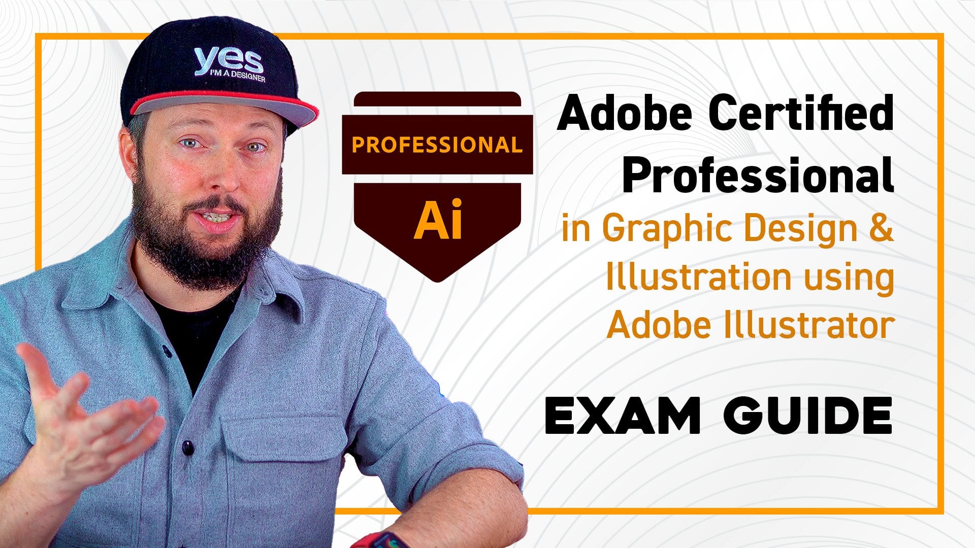
1. Introduction: Are you ready to become a
certified Photoshop expert and take your creative
career to the next level? Hi. Hi. My name is
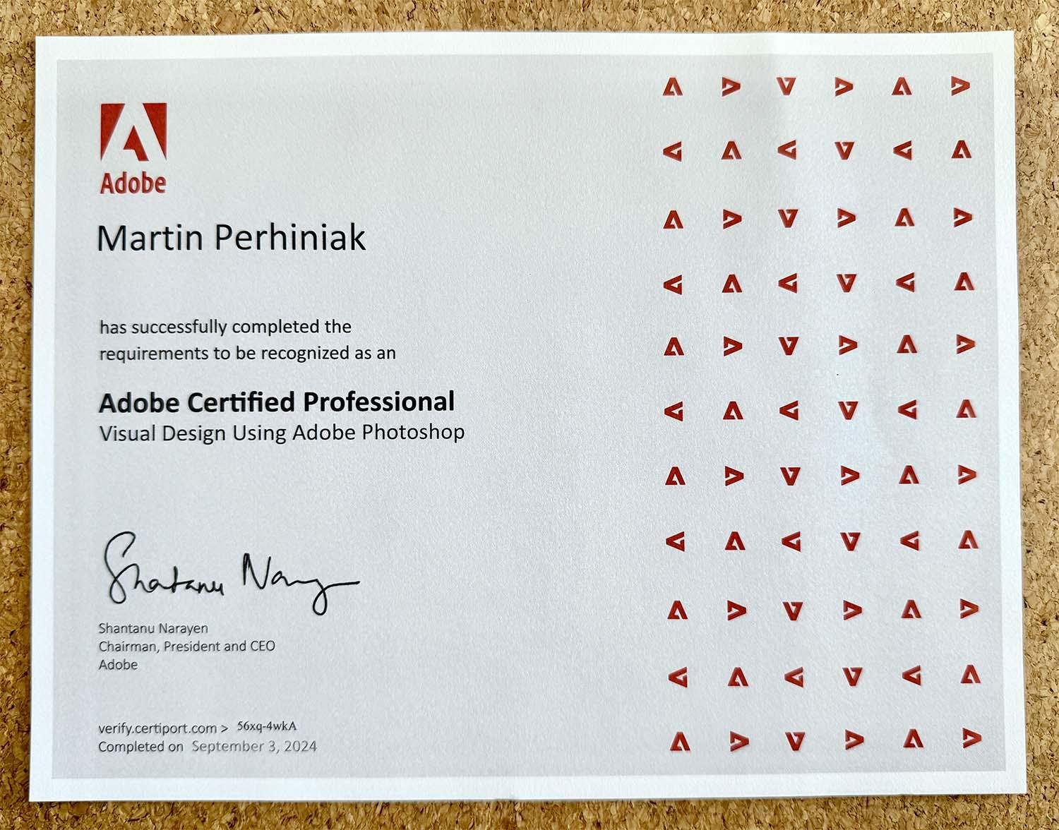
Martin Perhiak, Adobe certified instructor with over 20 years of experience teaching Adobe design tools and working as a creative
for brands like Disney, BBC, Unilever, and Nickelodeon. I am excited to introduce you to the Adobe Certified
Professional in Visual Design using Photoshop exam Guide. I know it's a mouthful, but this course is your
complete companion to prepare you for the official
Adobe certification exam. The highest industry recognized credential for Photoshop users. You will get in
depth video training about all the topics
practice exams, exercise files, and detailed
downloadable guides to help you review
every important topic. And the best part,
you can now take the exam from the
comfort of your home. No need to travel to an
exam center anymore. Why should you consider
taking this exam? Well, because becoming an Adobe certified professional
proves to employers, clients, and peers that you have real world job ready
photoshop skills. It's an incredible way
to boost your resume, your confidence, and stand out in a competitive,
creative market. It also opens doors to
freelance opportunities, career advancements, or
even higher salaries. Whether you are just
starting out or looking to solidify
your expertise, this certification
gives you a powerful, recognized credential
that will set you apart. Whether you are
already comfortable in Photoshop or starting fresh, this course will help you build the skills you need to pass the 50 minute live in the
app exam with confidence. Even if you're brand
new to Photoshop, you can be exam ready in less than a week by following
this course carefully. It's important to mention that the certification exam isn't included and needs to
be booked separately. But don't worry, I will walk you through everything you
need to know to succeed. If you are serious
about becoming a recognized Photoshop pro, this is your first step. I can't wait to guide
you on this journey, so it's time to get started.
2. How to prepare for the exam: In this video, I'm going
to show you how to best prepare for the
exam using this course. First of all, the exam is
divided into five main topics. You can see these on my screen. And for each of these topics, I prepared a study guide, which you can download from the resources here
on Skillshare. Once you download these PDFs, you will be able to open them on your desktop computer or
even on mobile devices. And I recommend using
this throughout your entire preparation process to keep track of your progress. You can also search
within the document. So if I just type
something like scope, I will be able to quickly
find all the matches, and I can jump over them. I can also highlight
them if I need to. And, of course, you
can also select any text from these guides, and you can copy and paste
them somewhere else. I wouldn't recommend printing all these guides out because
it's a lot of paper. So just one topic. This first one
would be 18 pages, but altogether, the five topics, so if it's all the guides, probably would be close to
200 pages. Don't worry. You don't actually have to
read through all these guides. That's why we have video
lessons for every topic. So I actually cover everything that's written down here
in each of these videos. And you will also
see the numbering at the beginning of
each video title, like 1.1 point A, which means it's from the first main topic working
in the design industry. And within that, it would
be the first subtopic. And then the A is an additional
subtopic inside there. So if we look at the guide,
it will make more sense. So that's the main topic. Then 1.1 is the
identified purpose, audience and audience needs
for preparing images. And then 1.1 point A is that first subcategory within this subtopic for the
first main topic. So we can see that's determine whether content is
relevant to the purpose, audience, audience
needs, user experience, and design for devices. It sounds a mouthful. These are always quite long. But all you have to remember
is that the video lessons in the course are all recorded
according to this guide, and it goes through everything
in the right order. So we will see 1.1 point A, then there will be 1.1 point B. And if we scroll further down, we can find that here
in the guide as well. Then if I go further down, we will find the next subtopic, which is 1.2,
starting with 1.2 A. So once again, that's the
next one we can see here. Besides the study
guides that you can find in the resources
here on Skillshare, you can also find
a link to access all additional resources
like exercise files, project files, quizzes,
and the final test. Now, once you click
on this link, it's going to take you
to this platform which we are hosting onsmdsigner.com. The reason why we did this is because it allows us to include quizzes and practice tests that currently is not
available on Skillshare. It's important to mention that all the video lessons are
hosted on Skillshare. So you only have to
come here to access these additional
useful resources, but you can complete the class without
leaving Skillshare. Once you reach this
welcome screen, all you have to do is to create a new account by clicking on
the icon here at the bottom, and this is going to set up a new student account on
our learning platform. Yes, I'm at designer.com. All we need is your
first name, last name, your email address, and a
password that you can set up. Alternatively, you can also sign up with any
of these options. So LinkedIn, Facebook,
Google, or Apple. Once you created your
student account, you will be able to access all these additional resources, starting with the projects
and exercise files. So you can download
these from here. Then you can find the quizzes for each of the main
topics from the exam. And at the bottom, you will
also find the final test, which covers all the topics. But I will come back
and talk a bit more in detail about this
later in this video. First, I wanted to
talk a bit more about the quizzes that we created
for each of the topics. What I suggest is to do
these quizzes once you completed all the video
lessons for a specific topic, and then come over here and start the quiz for
that particular topic to test your knowledge
and to see how much you understood of all the
things that we covered. And it is important to
mention that there are a lot more questions for each of these
tests than just 20. So each time you
are going to take this is going to be
different because it's going to randomize
the questions from the available pool of questions. And when you are
taking these exams, if you are choosing
the correct answer, once you confirm, it's going
to verify that it's correct. Or if you do the
incorrect question, it's going to tell you
that it's not correct. Once you finish all
the 20 questions, at the end, you will
get your results, and we set the
passing rate to 70%, which would be the same for
the real Photoshop exam. So until you reach the 70%, I would recommend
to retake the quiz. But the best thing is
that you can actually see a list of your wrong
and correct answers. So it just gives you a summary of everything that you covered. To summarize, what I
would recommend to do for each main topic is to go
through the video lessons. First, use the exercise files to practice everything that
we cover in these videos. Then go through or skim through the study guide afterwards just to remind yourself of all the important things that
we discussed in that topic. And then when you feel ready, then you can take that quiz
at the end of the topic and wet it until you pass
the 70% passing rate. In the real exam, besides
multiple choice questions, you will also be tested using Adobe Photoshop and
performing tasks. And to be able to
help you prepare for this particular part of the
exam, I created projects. And you can access these
projects from this area, which I mentioned already
earlier in this video. And once you download the
projects dot zip file, which is a compressed file, you will get a lot of
Photoshop documents. Each project will have two
Photoshop file versions, one that is supposed to be your starting point and one that is showing you the
completed version. So what you should do is always open the one that
doesn't say completed. So this is where you
are supposed to start. So once you completed that, you can come back here
and watch my solution or explanation of how best to
do this particular project. And there is no right or wrong
order to go through this, so you can pick whichever
you want to start with. Just make sure you go
through all of them. Now, it's important
to mention that some of these projects
will be slightly more complex and more difficult
to solve than others. And it's also important to mention that these are way more complex than what
you would actually have in the real Photoshop exam. While in this course,
for each project, you have several tasks
that you have to complete. In the actual exam, you
will have individual tasks. So for each project file, you will have to normally
just do one single task. So in case of this
particular example that we can see on my screen, there's five tasks that
we have to do here. That would be five separate
tasks in the real exam, out of all the 17 that is
usually included in the exam. Now, once you completed all of these projects and you also
watched my solution videos, and you feel like you are
ready to try a final test, you can come here
at the bottom and choose all topics final test. Instead of 20 questions, here you will get 30 questions, which again is aligned
to the real exam, where you will have 30
questions in total, out of which normally there's 13 that are more multiple
choice questions like these, and 17 of them
would be more task based that you have to
do within Photoshop. Although, technically, we can't recreate exactly how
the test is running. If you complete all of
these projects and then you go through this final
test at least once, it should give you
a very good idea of how the exam
is going to work. And once again,
most of the things that I'm asking here
in this course is slightly more complex
and harder than you will end up having to
answer in the real exam.
3. What to expect during the exam: In this video, I would like
to show you the tutorials that you will be greeted with when you are taking the exam. So these won't
actually be taking up the time allocated for your exam when you're
doing it live. So you get 50 minutes to complete 13 questions
and 17 tasks. But before even
getting to those, you will need to go through
a couple of slides, which just simply explains how
the exam is going to work. And the reason I included this video is just so
you can familiarize yourself with these already even before actually taking the exam. And I will walk you
through these quickly. First, you will have a couple of things that they
will ask about you. It's more about your background and while you are
taking the exam. But then this is the slide
that explains it well that you will have this first
initial tutorial with a couple of slides. Then the first main segment of the exam starts where you
will be asked questions. So this segment will
include 13 questions. They are all multiple
choice questions. If they want you to have multiple answers selected
within a question, that would usually be mentioned. But most of the
time you would just need to choose one answer. Then once you are done
with that section, you will be moving into
another short tutorial, a couple of slides
about the next segment, which is going to run
directly within Photoshop. So that's the more exciting
and interesting part where you actually
have to perform tasks, and there will be 17 tasks. And once you are
done with those, you will still have
the option to go and revisit any of those tasks that you
are not sure about. But once you're ready,
you can just submit your answers and you will get the score report straightaway. That's a great thing. You
don't have to wait around. You will know exactly
what your scores are. Now, on this next slide, we can see that you will
be able to track how many questions
you've answered so far out of all the questions
that are coming up, you will be able to keep
an eye on your time, the remaining time
that's available. And any question can
easily be reset. So if you quickly just want
to go back to how it was before you made changes
to it, you can reset it. This applies to both the
questions and the tasks. And probably the most
important option here is the mark for review checkbox that you can check at
any time whether you already completed the
question or task or not. Checking this option is
going to add a little flag, and it will make it
easier to come back to that particular question
or task at a later time. This is how it would
look like when you get to the end of a section. Let's say the section
about questions, and there's the little
flags showing or indicating which questions
were marked for review later. And by clicking on the
questions here in the summary, you will be able to
quickly jump back to them. And once you finish
reviewing that question and you make sure that
your answer is final, then you can just go
back to the summary, which will take you
back to this page. And when all of your
questions are done, you can just say submit section. That's going to finalize that first stage
about the questions, and you will move to the
second segment or second part, which is going to
be about the tasks. But first, for the
tasks as well, it will give you a short
tutorial, a couple of slides, and again, explain
where you can find the important elements
within the user interface. And for this part, the exam will actually open up
Photoshop first. And of course,
Photoshop has to be installed on your computer
for this to work. And the exam will set the interface up in a
way that you will see the certification questions
on the right side in a dedicated panel So
that's what we can see here. And it will always give
you the task there, explaining what you need to do. And on the left side, you will have your document
where you can work. And the great thing
about this part of the exam is that you are completely free to use
whatever you want. As long as you complete the
task that they ask you, you will get points for it. I mentions that a few features will be blocked during the exam, which is listed
here at the bottom, like the help option
because they don't want you to learn about the
features during the exam. But you don't have to worry
about these missing features because they won't be necessary
to complete the exam. Now, you are actually
also free to move panels around and
change the interface. But if you ever want to reset
it back to the way it was, just go to the window
menu choose workspace and then reset the certification
test workspace. I recommend to dock the
layers and the properties panels right next to the
certification test panel, and to keep these two
always visible because these will mainly be needed to complete all of these tasks. So this is my
recommended layout. Then similarly to the questions
during this task segment, you will also be able to
reset the tasks at any time. You will also be able to
track how many tasks you already went through and how
much of them we still left. You will also be able to mark any of the tasks
for review later. You will be able to see
your summary as well. And in case you wanted to leave feedback about a
particular task, you can also leave
feedback here. Now, feedback that
you give won't be considered for
your final result. It's more of a feedback
that they can use to improve the exam if you
have the time for that, but I wouldn't worry about
that most of the time. It's important to mention
that during the tasks, there will be a couple of them where you will also be able to click on Exhibit to
see the final result. And that's always useful to check first
before you even read the question because
sometimes it just makes more sense what
you need to create. On the left, you will
see your document. On the right, you can
check your exhibit. And then once you see
the before and after, you will know
already what to do. After that, reading the question will make much more sense. Whenever you see something underlined and set
in bold and italic, that means simply just
by clicking on it, you will be able
to copy that text. They just want to make
sure that you can quickly put in any text that
they ask you to use, for instance, for a layer
or a layer group or some other things like saving a file with a
particular file name. Now there is an important thing mentioned here on
this slide that you should always only do the things that they ask you to
do and nothing else. So, for instance, if there is a dialogue box where
there's a lot of options and they only ask you to change maybe two
or three of those, then all the others should
always stay the default value. So don't mess around
with anything else. Always only pay attention
to what they ask you to do, and you don't have
to do anything else. Once you get to the end
of the task segment, and you also make sure that you reviewed everything that
you marked earlier on, then you can just click on
finish that section as well. And with that, you will
be done with the exam, and you will be getting
your score report, which will tell you
whether you passed or not. So the required score is 700, which essentially means 70%, and out of the 1,000 points, you will see your
score just below that, and on the bottom right corner, you will see either
a pass or a fail. But most likely you
will get a pass if you complete the entire course and
you go through everything. Personally, I've done
many photoshop exams, and I started off with
the expert exams, and I had to re
certify every year. So I've been doing these exams for over 15 years or maybe more. But this is my most
recent score report. I just wanted to
share this as well. And you can see,
even though I've done so many exams,
and obviously, I've been teaching this
application for so long, I still sometimes get things wrong and that's
perfectly normal. So in this case, I got
979 points out of 1,000. I can actually see
that wrong answer was something about
publishing digital media, so something to do with
exporting a file and. Most likely, it was about using the export files to layers, which I actually talk more
about in the projects chapter. But that is all you need to know about how the exam works. So now hopefully you are
eager to get started. So move on to the first topic, and I wish you good luck
preparing for the exam. I am confident that if you go through everything that
we cover in this course, you will nail it and you won't
have any trouble passing.
4. 1.1.a Identify the purpose, audience: For every design project,
in the beginning, it's very important to clarify
a couple of things like the purpose of the design and
also the target audience. Now for the purpose of an
image or design, first of all, you need to talk to the client
and find out more about their business goals
and what they want to achieve with that image that
you are creating for them. Here is one of our recent design contest
briefs, for example, for a charity called Amazon Aid, and they required a
series of posters created for the river
of Gold curriculum. And this is intended
for college students. And here are the topics, the impact of gold mining, rainforest ecology, and
so on and so forth. And each of these topics
will have a focus, objectives and key activities. So as a designer,
the more you know about the intent and
purpose of a design, the easier it is going to
be for you to understand what elements you
should use or how you should frame everything
in a composition. And if the brief is
not detailed enough, you should always ask additional questions from the client. You can ask questions
like, what is the main message that you are trying to convey
with this design? Or what action do you want the viewer to take after
seeing the design? And also importantly, how is
this image going to be used? Is it going to be printed? Is it going to be a small print that people will
hold in their hand? Is it going to be a
larger print that is going to be on the
wall of a classroom? And in case of this brief, we can find that information
here in the size. So we know exactly the print
size and the color mode, which is intended for print, the resolution that
is 300 pixel range. But like always, if there is something not clear
in a design brief, you should always
consult the client. Now, the target
audience of a design or image is just as important as
the purpose of the design. And again, that's
something that is very clear here in this brief. So we are creating this for high school students aged 15-17. In case of this project, it's very important to know because older kids
obviously will be able to understand more
complex graphics and designs. So things that we can see
here like this infographic would be hard to understand for younger kids
younger audience. Maybe for younger kids, something like this
would work better, which has a little
bit more color and a bit more vibrant and
more characters on it. While for a more mature
or adult audience, we can have more statistics and information that they will be
more interested in seeing.
5. 1.1.b Requirements based on video, print, and web: Another important aspect of the design brief is
the deliverables. And that means what are
the actual files that you will need to supply to your client at the
end of the project? And the type of files
or deliverables really depend on the output. So whether the image or
design that you're working on is intended for
print, web, or video, and the easiest way to
compare these and to see the differences is by going to the New Document dialog
box in Photoshop. So this is something you can
find by going to File New. And then here on the top, you will be able to choose
these different categories. So when you choose print, you will see the preferred or
suggested settings for it. And most importantly, here, the resolution should be set to 300 PPI or pixel
Pyrne by default. Now, the color mode
is set to RGB because Photoshop is best to be
used in this color mode. Most of the features
will be available here. While if you choose CMYK, it will be slightly limited. Some features might
not be available. However, this is the file format that is best suited for print, where the four
color channels are the four inks that we
use for print cyan, magenta, yellow and black. K stands for key
color in printing. The best file formats to
save into when it comes to print would be PDF, TIF or EPS. And there's one additional
thing to remember when it comes to saving for
print from Photoshop, and that's how to
set up the bleed. It's very rare that they
would ask you to do this, but you would have to go to the print options.
So the file menu and then choose print. And only here you
will be able to find the option for the bleed for which you need
to scroll down. And on the printing marks, you will be able to
choose corner crop marks and then go into functions
as well and choose bleed. And normally we would use 3 millimeters bleed,
once we click Okay, this should be all
that you need to do to have those
crop marks showing up with the right bleed settings when the image is going
to be printed out. Now coming back to the new
document dialogue box, when it comes to creating
images for the web, you would want to use
72 PPI resolutions through a lower resolution
and RGB color mode. But besides that, you have to also remember that
these files should be saved by using the exports or save for web options from the
file menu export dropdown. And the most commonly used
three image file formats for the web would be
JPAG PNG, and GIF. And we will be discussing
these options and all the exporting options in a later topic in this course. For now, is just
enough to remember these three options and perhaps one additional
file format, which you would be able to
find if you go to the file, save a copy option, and then just choose
on your computer. And here you will be able to
find the web P image format. This is starting to be used
more and more on websites, and it's a more
modern file format compared to the other three
that we mentioned before. And last but not least, from the new document
dialogue book, let's just take a look at
the film and video category. So here you will see
a couple of presets, like the 1080 P or 720 P. These all refer to the size or dimensions of the
images that we create. We can see that there are
different abbreviation used like HDV, HDTV. This would be considered
the full HD format. The 920 pixels by 1080 pixels. But if we click on
view all presets, we can also find the four
K standards like UHDTV, which would be four times
as large as a HD image. So here we can see 3,840
pixels by 2160 pixels. Additionally, it's
also important to mention that under
the advanced options, you will be able to change
the pixel aspect ratio. Most modern video file formats
would use square pixels, but some other file formats
like NTSC would require a 0.91 ratio between the width
and height of a pixel. And we can see these
ratios varying here, even having a two to one ratio, which is called the
anamorphic format. Just so you can see what
this actually means, if I create this document
and then click Okay, once I zoom closer
in this document, and we start to see
the pixel grid, we can actually see
that individual pixels are rectangular instead
of being squared. So here's a good comparison of the three different outputs that normally we work with
in design projects. So whether it's
video, print or web, the following considerations
you have to keep in mind. First of all, the type of image, whether it's a roster or pixel
image or a vector image, which would be resolution
independent and can be scaled up and down
without losing quality. And that's very
useful Fool print because sometimes
you need to print in a very large format and you still don't want
to lose quality. For color mode, it would
be either RGB or CMYK. Resolution would depend on
the screen size for video. For print, we would
normally want to stick to the 300 dots per inch
or DPI resolution. While for web, we
normally work with 72 PPI or Pixel per
inch resolution. The most commonly
used file formats, you can see here for web, print and video, and
the key adjustments would be the pixel aspect
ratio for video that's unique. For print, it would
be whether we want to use or utilize
scalable vectors. These file formats like EPS
and PDF will support that. And for web, the crucial
thing is to think about the compression because we want the images to load faster. So the smaller file
size possible is always ideal without
obviously compromising on the quality of the images.
6. 1.2.a Key Components of Project Communication: There will be a couple
of questions in the exam was about
project management, and you have to be familiar with a couple of
important terms. So let's just discuss these. First of all, you need to know the three key components
of project communication. The first is the project scope, then the due dates,
and then the third one is the possible
impacts of delays. Already mentioned having
a brief for a project. That's essentially what
you need for getting the project scope documented
and make sure that everyone agrees what are
the deliverables that the designer has to produce and what are the expectations
from the client? Now, when it comes
to this topic, one, I know it will always
come up in the exam, and that is the scope creep. So scope creep in
graphic design refers to the gradual and often
unapproved expansion of a project's goals, deliverables or requirements beyond the original agreement. It usually happens
when clients request additional revisions assets or features that weren't part
of the initial brief. And it happens more
often than not that the client would do these things without
adjusting the timeline, the budget, or contract. So obviously, scope creep is
something you want to avoid, and that is why
documentation and clear communication between
all the team members and the client is crucial. It applies to pretty much any
type of project management, but it's true also
for graphic design. A very typical scenario for scope creep is when
an individual, a freelancer working
remotely for a client, and they agree on
the initial terms, but maybe the brief is a
bit vague on some aspects. And then after the
designer delivering the work that they were
expected to create, the client would request
repeated rounds of minor tweaks that will turn into hours or maybe even days or
weeks of unpaid work. Unfortunately, this
can happen to anyone, even if you're familiar
with the term and even if you know how you
should manage a project, if you are on your own and if you have a new
client that you don't know how to
work with or how to manage a project
together with, then you can also easily end up suffering from scope creep. The main problem
is not just that you will be overworked
and you will be frustrated
because you will be working on things that were
not agreed in the beginning. But it can also strain the relationship between
you and your client, mainly because anything that wasn't discussed or agreed on in the beginning will
lead to lots of question marks and
unclear expectations, and it just makes
things confusing. So the way we prevent this
to happen is that we always set clear project scope and
deliverables in writing. It's highly recommended
to always have signed contracts
between the parties. And in case the client wants to have a couple of
rounds of revisions, that should also be agreed
on in the beginning, like limit the amount of
revisions that you will allow, and that should be already
considered when you set your rate or the
price for the project. So if you allow the client two or three rounds
of revisions, you should consider how much
time that is going to take, and if you get
compensated for it, then there won't be
any frustration. There's also another term called change order, which again, another signed document that you can have between you and
the client whenever they request additional changes that were not agreed on
in the beginning or maybe if they change their mind about a crucial
part of the project, like the direction
they want to change. For these, again, it's
good to have documentation you can easily refer
back at any time. I Bush comes to shove and the client is not
happy with something, these things like
the change order will always support
and protect you. Now for toDates, there's lots of different tools that you can use like Google Spreadsheets. You can use Notion, Monday, and there's so many
other tools out there, especially if you have a team, it's even more important
to keep track of everyone's work and what and when they are
supposed to deliver. So here's a simple
example from our team, the way we manage
the publication and advertisement of video tutorials that we publish on YouTube. It has a simple weekly timeline. It also has the tasks broken down and assigned
to team members, and there's a clear
indication of the status of each
of those tasks. For the exam, it's important to also know the term Gang chart, and that is simply just another visual
representational method for tracking the tasks
and also the deadlines. And you can also be asked
a question about what's a critical path analysis
or critical path method. This is another visual
planning technique which can identify the sequence of dependent tasks that directly impact the
project's completion. Both of these
methods are useful. Like with the Gen charts,
just coming back to them, it's easy to visualize
the timelines and how the tasks overlap and again,
depend on each other. And there is no
right or wrong way to manage the due dates
as long as there is some kind of tracking
method you are using and you are sharing with everyone
involved in the project. Last but not least the
third key component of project communication would be the possible impacts of delays. So it's very important to recognize any
potential bottlenecks, such as limited resources, like a single graphic
designer working on multiple projects and also client availability
for approvals. So even if you are the designer and you deliver
your work on time, but you obviously need
to get feedback on it, and based on that feedback, you have to progress further. If you don't check the client's
availability in advance and maybe the client won't be available to look at the
work for a week or two, then of course, that is
going to delay everything. And you might not feel
like it's your fault that the client wasn't
available to get feedback. But usually what this
leads to is that, again, you will have limited time for the revision
that you have to do. And there is another term for
this called feedback loop, which means the entire
process of you the designer, sending your work for review the client looking at the work, reviewing it, and sending
the feedback back to you. And then you, again,
the designer looking at that feedback and trying to address it and
make the changes. So that would be considered
one feedback cycle. And each of these
cycles, for instance, could have a separate version
name like version one, version two, version three. And it's best to also maybe create separate
subfolders within your main project
folder where you're storing all the deliverables
and files for the project.
7. 1.2.b Basic project management concepts: You also have to
be familiar with the five key stages of
project management, starting with planning
and analysis. Now, we already covered most of the key actions that's
required for this stage, like identifying the
target audience, finding out the demographics, the preferences and behaviors, also identifying
the client's goals, like what is the
purpose of the design? What's the main thing that they want to achieve
with this design? And the most important documents for this stage would be to get the contract agreement and also the design
brief, of course. If you're interested
to learn more about the stages of design project, I actually covered this in much more detail in my
graphic design theory series. But for the exam, don't worry, you don't have to
have an in depth knowledge about this topic. You just have to know the
individual stages and what's the order because you might need to put them in
the correct order. After planning and analysis, we move on to scheduling. Here, the main objective
is to establish a realistic timeline based on the deliverables
and the project scope. And we already talked
about the different ways we can do the planning, like using a gain
chart or timeline. And most importantly,
we need to set the due dates or deadlines
for all the deliverables. Third stage would be
the building part when we begin creating the
assets and starting the initial concepts
and working our way to fully detailed prototypes
or the final designs. And usually the beginning of the building stage
would be considered the ideation stage where
we come up with concepts, and there's many different
techniques that you can use, like mind mapping is a common
one where you map out and connect all the important words that you can associate
with the brief. And, of course,
sketching is something that most designers
would utilize, whether it's very simple
or more detailed sketches when it comes to web design
or user interface design, you would be using
wireframes, sketches. And the main purpose of
all of these techniques is to save time and
to make sure again that you are on the
right track so you can check with your
client before you invest too much time into
producing final artwork that you both agree on what's the best
direction moving forward. Here's another nice
timeline showing how an idea can start with
a simple rough sketch, which then is turned into
a more refined sketch with more details than later to include the color
palette as well. And only once the
composition and visual direction is
clear and agreed on, the designers can
start working on the final output for
which in this case, a three D model was necessary. And from that three D model, once all the lighting and
materials are applied, a nice fully rendered
image can be created or even a nice
animation like this one. After the building stage, we move on to the review
and evaluation stage. Here, we first
usually would have an internal review to check if we manage to meet the original brief and all
the requirements are met. In case a freelancer is
working on their own, it's worth asking
someone else's opinion before we send the work that
we created for the client. So if you have
another visual artist or designer that you know, it's always worth to
ask for their opinion because they will be looking
at things with a fresh eye, and they might notice things
that you've overlooked. When you feel confident
that everything is ready and you want to
show it to the client, you have to make sure
that your presentation is going to be top notch. So it's very important to impress the client not
just with the work, but also the way you present it, whether that's just a
PDF or a PowerPoint. And also, in case you
are presenting life, whether it's online or in
the same room as the client, it's also important to
prepare and rehearse how you are going to talk
about the project and what you've created. Once the client is happy
and approves the work, then we move on to
the last stage, the implementation
and publication, where the main objective
would be to deliver the final product
in the format and medium for which
it was designed.
8. 1.3 Copyright, permissions, licensing and how use specific content: During the exam, you will
also be asked a few questions about the legal aspects
of graphic design work, which mainly focuses
on the type of copyright permissions
and licensing required to use
specific content. Not only, you don't have to be a lawyer to understand
these terms. They are fairly simple
and straightforward. And there's only a couple of key terms that you need to be familiar with which keeps
coming up in the exam. First, let's just clarify
what is copyright. It is a legal
protection that gives creators ownership over
their original work, including designs, illustrations,
logos, and layouts. As soon as you create a design, you automatically own
the rights to it, and others can't copy, use or modify it without
your permission. So why does this matter? Because your work is
protected from being stolen or reused without
credit or payment? It also means that you
as a designer will need permission or a license
to use other people's work. So, for instance, if you
want to include a photo, use a font or an icon or a template for a project
that you're working on, you always have to make
sure that you have the rights or the
permission to use them. So in a nutshell, if you
made it, you own it. If someone else made it,
you need permission. Now when it comes to
generative AI, right now, there is no clear protection for the copyrighted work that is shared online because for these generative
AI models to work, they have to scrape the Internet and devour anything
that they can find. So we are talking about
billions of images. And most of the
big companies like Mid Journey or Open
AI, created Chet GPT, will either ignore or try
to hide the fact that they included millions
of copyrighted work in their training data. The reason why they
can get away with this or still continue
to do this is because it is very
hard to trace back the original copyrighted work because they are not sharing or being transparent about what was used in the training data. Don't worry in the
exam. They won't ask you questions about
generative AI. It's just something that I
am quite passionate about, and it's a gray area really when it comes to
how copyright is handled. Let's move on and talk about the next important
term public domain. So this refers to
creative materials not protected by
intellectual property laws, such as copyright,
trademark or patent. And in this case, the
public owns the work, not an individual
author or artist. And compared to
copyrighted work, anyone can use a
public domain work without obtaining permission. Derivative work would be
considered something that was altered or was based on
some other original work. So that means that you've taken an existing piece
like a logo, artwork, photo, or layout, and you
modified it in some way, like change the colors. You addit some elements, or you combine it with
lots of other elements to create something new.
But here's the catch. Even if you change something, the original creator
still owns the copyright. What that means is that you need permission to
legally use or share the new version unless that original work is
already in public domain, or you own a license that
allows you modifications. So again, to put it simply, changing a design
doesn't make it yours. If it's based on
someone else's work, it is still protected. Now, fair use, another important term to
be familiar with, is a legal rule that allows limited use of copyrighted
material without permission. But only in specific
situations like for education, commentary, news
reporting or parody. But fair use is
not a free pass to any image or design just because you are not
making money from it. And courts would usually look
at four different things to decide if something
is fair use or not. They would look at the purpose, so what it is intended
for, the nature, so is the original work
factual or creative, the amount or how much of the original work is being used? And most importantly,
the effect, whether you work will affect the original creator in any way, but most importantly
negatively, like, financial so fair
use is limited. It's case by case, and it's also not guaranteed. So the best thing to do to
avoid any complications is to get permission or a license
to use someone else's work. Now, I mentioned licensing
a couple of times. This is another term you
should be familiar with. So it is a way you can legally use copyrighted
material by paying a fee established by the copyright holder or
stock image provider, for instance, you can use the copyrighted material
or stock image for a specific time and in a certain way as outlined
in the terms of conditions. Might also be asked
about creative commons or CC for short, which is a system that
lets creators share their work with the public
while keeping some rights. So instead of saying
all rights reserved, a designer can use a Creative
Commons license to say, you can use this,
but here's how. So this is a way to
make sharing easier, but you still need to follow
the rules of each license. Similarly to licensing, you
might also need to get signed release forms if you want to use a person's likeness or a
landmark in your composition. You will also need a
release form if you want to include a brand name
in your project, especially if that brand is not owned by the client that
you are working for. And there's two types of specific releases that usually they ask about in the exam. One is the model release, which you need if a person is recognizable in your work
and the location release, which is required
for landmarks or private properties
like Disneyland.
9. 1.4.a File formats: It's also important to know
the differences between the file formats that we normally would use in a
print design project. Now, it might be a bit tricky to categorize the file formats, but essentially they would be falling into three main groups. First is the working
or project files that allows you to go back
and make changes to a design. So for Photoshop, it would be the PSD or Photoshop document. For Illustrator, it would
be AI, and for in design, it would be a DI
and D D file format or in design document. Next category are the assets that you would use
in a design project. And these would be predominantly
image file formats, including both pixel or
roster and vector images. But there can be
also text files or Excel files in case of
a catalog, for example. And last but not least,
the final category would be the print ready files. And most of the time, these
would be PDFs or EPS files. Now, I'm not going to
spend too much time comparing these to each other because you can just use this chart from the
Milanotbard for that. So instead, I'm just
going to highlight a few important things or tips that you should
keep in mind. When it comes to
Image five formats, you have to be aware of compression and the
loss in quality. So that is especially important when you work with JPEG images. And it is something that you can best understand when you're using the Export as
feature in Photoshop. So in this case, we
can see a detail from a design on the
left and the right side. And at the moment, I am
using the same settings, but I'm just going to switch
to JPEG for both of these, and I'm going to
change the quality. So here on the right size, I'm going to set
it to very poor, while on the left side,
I'll make sure it is set to the highest quality
option, which is great. If I zoom even closer, you will be able to see
the artifacts even better. So I'm sure you can spot all of these messy pixels here
on the right side. So that is due to the
JPEG compression, and this is what we would
call a compression artifact. Advantage of using
lower quality JPEGs is that their file
size will be lower. So while this one
here on the left side is around 350 kilobytes, the one on the right with the
lowest quality setting is only around 50 kilobytes,
so considerably smaller. Most image file formats, including JPEG, also supports
embedding color profiles, and this is something that you
should always make sure to include for a correctly
color managed workflow. And color management is actually our next topic that we will
be covering in more detail. Besides JPEG, another
very commonly used image file
format would be PNG, which has the advantage
compared to JPEG that it can also hold
transparency detail. So this is something that
you can again disable or keep it turned on here
on the top right corner. And the bit depth of PNG
files by default is 24 bits. But you can always
reduce the file size if you choose the
eight bit version PNG. Bit depth is a way of measuring the amount of colors that you
can use in a five format. So eight bit, for instance, means two on the power of eight, which is 256 colors. Compared to that,
the other format, 24 bit would actually
mean eight bit for each of the color
channels RG and B, and that also applies
to JPEG images. But there is also
another five format, GIF which can also
include animation. But the main limitation of
this five format is that it cannot go beyond
eight bit depth. So the maximum amount
of colors is 256. To better see what that means, instead of using the
Export as command, I'm going to choose Export, save for web, where for
the GIF file format, we also get the color table. And here, we can actually
reduce the amount of colors. And if I go down
maybe to four colors, in case of this design, it wouldn't make much
difference because it uses already a very
limited color palette. But by using less
colors in a GIF file, of course, you will have
a smaller file size. And file size in general, doesn't make much difference
in print projects. It's more important for
web and mobile design. In case you are
wondering, where can you find the other type
of file formats? You will find these
under File Save as in most of the
design applications. And in the latest version
of Photoshop, for instance, it will only show you a
very limited list at first, and you can only see the additional Five formats if you choose to save
a copy option. Once you do this, you will
see a much larger list. And here you can actually find all the formats that you
would normally be able to save from the export or
save for web features, but accompanied by a lot of additional specialized
file formats, which most of the time you
won't require in your work. Another common way
we can categorize image file formats is whether they are roster or vector based. So JPECPNG and Gift files
are all roster based, while the most common
vector file formats would be EPS and SVG. Out of these two, EPS is
mainly used in print, while SVG is a
vector file format that is designed to
be used on the web, and it's an abbreviation for
scalable vector graphics. Now, there's one other
important file format that is worth mentioning. And even though as
a graphic designer, you most of the time won't be
required to work with this, but it's still good
to be aware of, and it is the camera raw format. Now, this is something that most photographers will
be familiar with. And the name Row comes
from the fact that this is the unprocessed information
that the camera records. And this simple comparison
shows really well how it can be different or
better than a JPEG image. So if you have your camera
set to record JPEGs, that means that the camera will automatically compress and process the information and
turn it into a flat image. Compared to that, a afile will record and keep all
these layers of raw data and will allow
you to access all of those layers later on when you
are developing the images. And this is why a
camera file will always be much larger in size
compared to a JPEG, but it's going to give
you a lot more freedom when it comes to editing images. The biggest difference you will notice in the tonal range, which is the range between the darkest and lightest
details in an image. In case of a raw file, you would have a much
wider tonal range, allowing more details
to be captured in the brightest areas and also in the darkest
areas of the image. In case of a JPEC file, these brightest or
darkest details will be completely washed
out or burnt out, so they will become completely
white or completely black, which means that there won't be any useful color
information recorded. So when you are trying
to make adjustments, you are going to start
introducing a lot more noise into your images compared to
developing a raw photograph. And in case you are wondering, the best way to display
the tonal range of an image is by
using a histogram, which lists the
number of pixels in each tonal region from the darkest blacks to
the brightest whites, and reading a histogram
is actually very easy. When you look at these three
examples at the bottom, you can see an under
exposed image would have most of the values
closer to the left, while an overexposed
image would have most of the details in the
histogram on the right side. If you see a peak on
the far right edge, that means you
will have clipping in the brightest details. And the same can happen
with the darkest details. Once again, if you
see a peak there, that's also not a good thing. And in general, the
easiest type of images to work with
and that will provide the most information are these neutral
exposures where you have most of the details
in the mid tones range. And just so you can see and appreciate the difference that you can achieve by
developing a raw photo. Here is the original one, and here is the refined
and developed version. And you can really
see the amount of details we managed to recover in both the darker
and brighter areas. Once again, that's before, and this is after.
10. 1.4.a Resolution: Every print designer
has to be familiar with image resolution
because this is one of the most important
limiting factors when it comes to deciding the size
and the quality of a print. And essentially what
it means is that how much detail an
image can hold. When we refer to higher
resolution images, it means that there
is more detail in them compared to
low resolution images. And it's important to
differentiate already in the beginning when it
comes to digital images, we divide them into
two main categories pixel or roster images, and photographs
would also fall in this category and
vector graphics, which most of the time would
be illustration or type. Now, generally, in
graphic design projects, you would be using
a combination of pixel images and
vector graphics. But the weakest link in terms of resolution and
print quality will always be Pixel roster or sometimes also referred
to as bitmap images. Better understand the difference between pixels and rosters, here is a very close up look of a photograph
showing an eye and magnifying a roster
image this much will reveal the actual
building blocks, the pixels or rosters, which looking this closely, makes it look like
it's a mosaic. But zooming way back, we
will start to see this as a continuous image
without any pixelation. Good thing about pixels, especially when you
have a lot of them, is that you can capture really complex
visual information, and it also allows
a lot of subtlety that you might not be able
to recreate with vectors. Now, the biggest
advantage of vectors is that they are
resolution independent, meaning that they can be
any size you want them to be without
losing any quality. To demonstrate this to you, here we are in Illustrator with a simple illustration and no matter how much
I zoom into it, we will never see pixelation. So these curves that are used
as the building blocks in a vector graphic compared to a pixel image are all made
up small anchor points. Everything is
mathematically described instead of relying on that roster that we've seen earlier or the columns
and rows of pixels. If I move one of these
anchor points around, all that has to be
registered or recorded is the actual new location
of this anchor point. That's simply just these two coordinates that
we can see here. The computer will very
easily be able to connect two anchor points with
a linear straight line, but it can also connect anchor points like
these two with a curve, and to be able to describe
the curve itself, all that is necessary is this handle that I'm
dragging around, and it's relative distance from the original anchor point. This method of visualizing
vector graphics and shapes in general is what we
refer to as Bezier curves. It's named after
the mathematician who invented this method. Another important advantage
of vector graphics, apart from them being
resolution independent, is that their file size is also smaller compared
to roster images. But what's clearly a
downside with them is that it's very hard to make
things look photorealistic, and that is why we're
still relying on both pixels and
vectors in our work. So as you can see, they both
have their strengths and weaknesses and their use in
a graphic design project. There's a couple of ways that
you can measure resolution, and you may have heard of
some of these units like DPI, as we can see it
in this example, 300 DPI would be like a
standard that we would be considering a high
resolution image or a high resolution print. And DPI actually stands
for dots per inch, which refers to
the number of dots of ink on the printed image. But when it comes to
the design phase, so even before we end up creating something
that's ready for print, we would normally
measure roster of pixel images in PPI
or pixel per inch. And what's great about this
comparison is how it shows that resolution on its own
doesn't really matter. What matters is the amount of pixels in combination
with resolution. So when you have a lot
of pixel information recorded in your digital image, you will be able to print and
keep high resolution image, even in a large
format like a zero. We can see the size of
this in millimeters here. So this is a fairly
large sized poster. Compared to that, when you
have less pixels to work with, you can still have a
high quality print, but you will only be able to use a much smaller print size. So pixel print, again, just simply means how much of those pixels of the image will be printed on
an inch distance. And the higher the resolution, the more compressed those pixels will get on the printed image, which will result in a
higher quality print.
11. 1.4.a Image Size: The best way to understand the relationship between
the amount of pixels, the resolution and
the print size is to use the image size
feature within Photoshop. So in this case, we
can see that this is the original amount of pixels
that we are working with. So around 3,000 pixels width
and 4,000 pixels height, which is roughly around 12
million pixels or megapixels. I don't want to confuse you, but in case you want
to be specific, a megapixel is actually slightly more than
1 million pixels. It is actually two on
the power of 20 pixels, which is 1 million,
48,576 pixels. But to keep things simple, one megapixel you can think
of as 1 million pixels. I took this photo
with an iPhone, which has 12 megapixels roughly, and that's why we
get this image size. Notice how the pixel dimensions automatically paired
with the resolution, which is by default, set to
300 PPI or pixel per inch. But what if I change? And to be able to
see the print size, all I have to do is
to switch the pixels to either inches or one of
these other measurement units. But let's just go
with inches first. So you can see that
it can be printed in the high resolution standard 300 PPI with a size of
roughly ten by 13 ". And that, in case you
are wondering is between an A four and an A
three paper size. So even though it's a
12 megapixel image, it still won't give us a huge size when it comes to
printing it with 300 PPI. But what's also very
important to understand, and this is actually very
rarely discussed is that the quality requirement of a print also depends on
the viewing distance. So strictly speaking, 300 PPI or DPI is something that you require when you are
producing a print that is going to be held
by people like brochures, magazines, books, business
cards, so on and so forth. But compared to that, a large banner where people
will be just walking by or maybe even seeing it
from much further away. When they are
displayed on top of a building or by the
side of a motorway, the required printing
resolution will be much, much lower than 300 PPI. And here is a great
comparison where we can see the viewing
distance on the left. And the required resolution
for it on the right. And you can see that
even when a print is displayed 1 meter
away from the viewer, it already can drop
down to 180 PPI, which is almost half of
the original requirement. But as you are getting
further away from the viewer, like five meter away, that already results in the requirement going down
all the way to 35 PPI, which is around ten times
lower than what we started. I don't think you would ever
have to design something that will be displayed 200
meters away from people, apart from if you are
doing exhibition design, and it's a huge exhibition hall. But in those cases, the resolution could even be
all the way down to one PPI. Now, of course, that is a
fairly extreme scenario. But don't forget that the
minimum required resolution always depends on the
viewing distance. And in case you ever need it, there is also a
formula to calculate the minimum resolution based
on the viewing distance. To make sure that the
relationship between print size and
resolution makes sense. Coming back to our previous
example in Photoshop, when I turn off resampling, meaning that we are not planning to change the size of the image, so we are not introducing
new pixels at all. I I now start lowering
the resolution, at the same time,
as you can see, the print size is increasing. So what this means
is that we are just distributing the original
pixel information, and it will be printed
less densely on the paper. And, for instance, if I go
down to 150 PPI resolution, that will give us exactly
twice the size of a print compared to when we were about to print
this with 300 PPI. Of course, similarly, if we
were to go above 300 PPI, which most of the time
wouldn't be necessary. But just for the
sake of argument, if I go higher and
we check, again, the size either in centimeters
or inches, of course, it's going to keep dropping
because once again, all we are doing is condensing all that original pixel
dimensions into a smaller space. Besides PPI and DPI, you may have also
heard of SPI and LPI, out of which SPI
mainly refers to scanners and how high resolution
they can scan images. And it stands for the samples
taken in one linear inch, while LPI or lines per inch is used mainly in
commercial printing, which describe the
distance between the printed lines of dots. To keep things simple, as a graphic designer, you mainly have to worry
about PPI or pixel per inch, because that's something
that you will be working with in most of the
design applications.
12. 1.4.a Aliasing: Now another term which you most likely will come
across is aliasing, which is most noticeable on type when the
resolution is too low. We will start to see
these hard edges on the curved details on type, which is also referred
to as stair stepping. And the method of antialiasing
is what can help us to improve this by averaging the colors on the edges
and smoothing them out. Here is another
close up look which shows this stair
stepping perfectly. It even looks like a
stair in this case, and the result of
anti aliasing and how it can smooth it out
even at this close up view. When you are working with type in Photoshop, for instance, you will see that antialiasing
is automatically applied. But of course, it's something
that you can take off. If I select this text here and change the type of anti aliasing from the default sharp to no we can see the
result immediately, and even from a distance, this will be noticeable. But if I zoom a
little bit closer, we can probably see
it even better. So this is without and with anti aliasing, without and with. You probably notice
that there is actually no aliasing going on on
the horizontal line. And in some cases, it would also not show
on the vertical lines. And that is because
these details can perfectly align themselves
to the pixel grid. So for them, there
is no need for anti aliasing. And I
can just show you this. If I zoom closer, eventually, we will start
to see the pixel grid, and we can tell that this
sharp horizontal edge doesn't need any smoothing. It already looks
perfect the way it is. Last but not least, I just
want to mention that there is a very interesting new
area in digital imaging where artificial
intelligence is used or utilized to increase the
resolution of raster images. And Photoshop has its
own neural filter called Super Zoom, which is powered by the Adobe Sensei
Artificial Intelligence. And with this, you can
increase the size of an image, I think, up to nine times as
large as it is originally. At the same time,
you can enhance image details, remove
JPEG artifacts, introduce noise reduction
and shopening and even enhance specifically
phase details. And to give you an example, even a four times increase
in size would mean this much difference between the original image and the one that went through
the neuro filter. And to see the details, I'm just going to zoom a
little bit closer. So around 100% view or actual pixel size view would show the original
image quality. And if we jump to
the resize version with the same Zoom ratio, this is what we will see. This technology essentially is guessing the information that is missing in the original and tries to make up new pixels. Out of all the AI tools
used for resizing images, the most effective
one, in my opinion, is Let's enhance, for which the link you can
find on the board. And here you can
see a comparison of the original
image on the left, the result of neuro filter, we've seen in Photoshop
in the middle, and the result of the Let's
enhance AI on the right. You can see how much better the clarity is on
that version and how much details
were recovered or added to areas like
the eyes and the lips. I predict that these type of technologies in a couple
of years will make roster images also feel resolution independent
like vector graphics. But until then, keep
checking the resolution of every image that you're using in your graphic
design project.
13. 1.4.b Color spaces: The ultimate goal
of color management is to match the colors that you can see
on your screen to the colors on the
final printed product. In an ideal color
management workflow, you would have all the
devices that take part in the design and printing process to speak the same language, which will result in predictable and
accurate color results. One of the most
important components of a color managed workflow is
the use of ICC color profile. We can see, everything starts off with the designer having a color profile created for the monitor that
they are using. And later on, we will talk about the calibration of the monitor as well because that's
also important. But then for the
rest of the process, there is always going to be a color profile attached
to the designer's files. So no matter where they show up, the original color
information should be carried along avoiding any
unwanted transitions and shifts in the colors. A color profile is essentially the description of
the color space, gameut and behavior of
a calibrated device. Printers will have both their offset and digital
presses calibrated, and they will be
able to supply you the graphic designer with
their ICC color profile. ICC actually stands for
International color consortium. It was established in 1993, and it's the internationally accepted cross
platform architecture and system for color management. The color topic, we already talked about the
differences between RGB and CMYK color modes
and mentioned that the main difference
between the two is how the colors are combined. So while in CMIK that
we use for print, we are working in a
subtractive color model, which means black is the
most intensive color. In case of RGB or on screen, we are using the additive model where white is the
most intense color. So with CMYK, when
you're combining colors, they are getting darker. It's the opposite with RGB. As you are combining the colors, they are getting brighter. But the main reason why you will see a shift in the colors from RGB to CN YK is not because they describe
colors in a different way. It's because they have a
different color gameut. So each color space, and in this case, we can see four of them here
on the top right, will have their own color
gameut which is essentially the subset of colors that can be represented
by that color space. As you can see, SRGB, represented with
the green triangle has the smallest area covered, which means that it offers
the smallest color gamut. Compared to it, the
standard CNK color space is slightly larger, and it is this
polygon that we can see here with a pink outline. So even though these two
colour gamets overlap, there is still quite a lot
of difference between them, especially as you
are getting into these more vivid and
saturated colors. These cannot be translated
into CNK correctly. But SRGB color space is
actually more designed for b. While Adobe RGB, which is a much wider color gamet is the standard that we would
use for print design. You can see it here in
the diagram that it is a much larger
triangle than SRGB, meaning it covers
a lot more colors. And the largest color gamet in this chart is the P photo RGB, which is mainly used in professional
photography workflows. You may have noticed
that when you're using the color
picker in Photoshop, sometimes when you
select a color, you get a warning
here on the right. Now, this actually means
out of gamut for printing. We can see that the color that I selected is described
in many different ways, including RGB and C and K, and also LAB, which we
will discuss shortly. But in order to see
the closest color to this that can actually be printed with the four
colors, C and K, we can just click
on this little war the color picker immediately jumps to the actual color that was described
with the CNK values. So once again, if I
click somewhere up here, we can see that these are the
values, 430 hundred zero. And if I click on
the warning icon, even though the color
sample shifted quite a lot, the CNK values didn't change. That is because
essentially all of these very vibrant colors
cannot be represented with ink, and that, of course, not only
applies to the green hues, you would have the same issue with most of the other hues. So for example, if I
come up somewhere, let's say, here, again, moving to the top right corner where we have the
most intense colors, I can click on the warning, and once again, we will
have a huge shift, which shows the
nearest possible color that can be achieved
in printing. Once again, from here, all the way down there. Unfortunately, there is no magic formula or
feature that will save you from dealing with this difference
between RGB and CMYK. But by following a
color managed workflow, you can be best equipped and work and see
the right colors throughout the
whole process that eventually will be
possible to be printed.
14. 1.4.b LAB color space and synchronizing Color Settings: Already mentioned that ICC profiles are important for this, but we also have to have color
calibration and proofing, which I'm going to cover
in the next video. But before we do that, just one final thing I
wanted to mention, and that is the LAB color
mode or lab color mode, which you might have
heard of or maybe just wondering how that is
different from RGB and CMYK. So the advantage of
this color mode is that it's completely
device independent, and it is the closest
representation of human vision. To better understand
how it works, it's best to imagine this
color model as a sphere. So it's a three dimensional representation of all the colors that can be described where L stands for luminosity
or lightness, which is measured on
a scale of zero to 100 which is from
black to white. And this can be imagined
as the vertical axis or Z axis in this color
coordinate system, while the other two
axes are A and B on which A ranges
from green to red, red being the positive value and green being the negative. And the B axis goes
from blue to yellow. Again, blue being the negative and yellow being
the positive value. Now jumping back to Photoshop, I have one of my
photographs open, and you can see within
the channels panel, when we look at RchB color mode, it's going to consist of
these three color channels, red, green, and blue. And each of these are
eight bit grayscale images with 256 variations
of tonal values, referring to the intensity of each of these
individual colors. So in case of the blue channel, the reason why we see the
flower being completely black because there's no
blue component in it at all. Instead, it is made of green and red resulting in this
yellow color in the end. And if you concentrate
on the grass, you can see that it is
brightest on the green channel, while it is much darker on
the red and the blue channel. Now, let's see what happens if I switch to LAB color mode. First of all, I just go back to the composite RGB
channel and then switching to the LAB color
option from image mode. You'll see that there is nothing actually
changing on the image. I can just undo this
change, go back and forth. And as you can see, even though the channels are
changing on the right, nothing is going to be
affected in the image itself. But when we look
at these channels, we can see that we have the L or lightness channel and then
the A and the B channels. You might recall that the
B channel was actually the difference between
blue and yellow colors, and that is why we are
seeing brighter details here for this channel because of all the yellow
flowers in the image. The main reason I mentioned the lab color mode because
there are a lot of professionals who would work in this instead of using RGB. And even though it is
definitely worth exploring it and being aware
of its advantages, using RGB color mode instead, as long as you pay attention
to color management, you can still work in RGB, especially when it comes
to editing images. Now, even though you are using
RGB images in Photoshop, Illustrator, and in
design, in the end, when you are creating PDFs, most of these applications
would automatically convert these colors
to CMYK for printing. Before we discuss the rest of the components of a
color managed workflow, I just wanted to show you
one more important thing that you need to set up in
the Adobe applications, and that is something
you can find in the color settings option. This is something you can
find in the edit menu in most of the Adobe
design applications. In this case, we
are in Photoshop, and you can see that
my settings for color management policies are to preserve embedded color profiles for all of the color models. This is definitely a
good policy to use. And one thing that I
have different from the default settings
is that I use Adobe RGB instead of SRGB
for the RGB working space. Notice that there is a little
warning here saying that my Creative Cloud applications are not synchronized
to each other. So this is actually
something you can do from another application, Adobe Bridge, which you can quickly access from most
of the Adobe applications. Just go to the file menu and
choose Browse in bridge. And then once the
application opens up, just go to the edit menu again
and choose color settings. And here you will
be able to find all the settings used by the
other Adobe applications. And notice that there's one here on the top called Custom. Now that is because I did not save my settings from Photoshop. So it just says custom
here on the top. But as soon as I click Save, I'm just going to call it
Martin. And then save it. I could add some
comments on it as well, but click Okay and Okay again. Now scrolling down, I will
be able to see the settings. And if I click Apply, it's now going to
be synchronized between all the
Adobe applications. So for instance, if I come to Illustrator and check the
color settings option, I will be able to see
exactly the same settings applied thanks to
that synchronization that we achieved using bridge.
15. 1.5.a Design elements and principles: The basic elements of design are fundamental visual
building blocks used to create any composition. Designers use these elements to construct and communicate
ideas visually, just like a writer
uses words to build sentences and sentences
to build stories. Each element has its own role. Lines guide the eye,
shape, creates structure, color, evokes emotion, texture, adds depth, and so on. The principles of design
on the other hand, are the rules or
guidelines for how to organize and arrange
those elements effectively. The elements are what you use, the principles are
how to use them. For example, you
might use color, which is an element
to create contrast, which is a principle
or arrange shapes the element to achieve balance, which is another principle. In short, elements are the tools and principles
are the blueprint. Luckily, for this exam, you don't have to have
an in depth knowledge of design elements
and principles. However, if you're interested to find out more about
these things, I have an entire training
series dedicated to this topic, covering all of these
terms in great detail. Just as an example, for balance, we talk about the visual
weight of design, and we look at lots of
different examples and also the types of
balance that you can see in compositions
like symmetrical, asymmetrical, radial
and mosaic balance. We look at examples
of alignment. Can be vertical, horizontal, diagonal or following
a custom grid. We also look at lots of
examples specifically on how grids can be utilized
in visual communication. And for every term and topic, we look at hundreds
of amazing examples, and we discuss them
in great detail.
16. 1.5.a Gestalt principles: I like to think of the
Gestalt principles as the grammar of
visual communication. Every language around the world relies on grammar
which sets the rules, creates consistency, and make sure that everyone can
understand each other. It's interesting, but
if you think about it, we don't actually
learn in school how to understand things
when we look at them. Visual perception is
almost instinctive. It's something that we
learn as we grow up. And even as a newborn, we already start to process our environment
by looking at it. Of course, at the
beginning of our life, we use our other senses more like touching and
tasting things. But as we grow older, we end
up relying more and more on our eyes to understand our environment and to be
able to interact with it. Apparently, almost 50% of our brain is dedicated purely to process the visual
stimuli that we are constantly bombarded
with during daytime. And even while we are a
our brain projects images, which we understand as dreams. And I like to think of dreams being some kind of
exercise for the brain. So even when we are
looking at things, it is trying to flex those
muscles that we are using when we are again looking at things and trying to
understand what we are seeing. So coming back to the
guesto principles and why it is important
to learn about it, remember, I said
that we don't have to learn how to see things.
That's completely true. However, as a designer
or graphic designer, we need a better
understanding how people will perceive the
designs that we create, to be able to effectively communicate the message
that the project is about. In this video, I'm
going to give you a brief background where the Gestal principles
are coming from. And we will briefly analyze this Unilever logo
on the board just to see how the gesto principles can be applied to
any kind of design. So first of all, guest all
principles are actually coming from the
area of psychology. It started by three
psychologists in Austria and Germany in
the early 20th century. Most important quote that
sums up really well, the whole idea behind
guest Autism is by Kurt Kovka who said the whole is other than
the sum of its parts. And the word other
is very important. So it's not more
like Aristotle said, but it is something else
or something different. Can see the example
of the bicycle. When we have all
of its parts laid out and when we have
it all put together, even though it's the
same exact components with the right
configuration or assembly, it will be able to
carry us from A to B. It becomes a vehicle. And that is something
we definitely can't say about all of its parts separately or
just laid out like this, only once they are put
together in the right way. And this is a great analogy to think about design as well, where you have
typography, images, shapes, colors, contrast,
so on and so forth. You can use all of these things, but if you're not putting them together correctly
or effectively, then your design won't look good or won't get the
attention of viewers. Only when you put everything together in the right balance, the right order or
right hierarchy, that's when you will create
an effective design. Another important
underlying term used in the Gestalt principles
called emergence. And essentially what this means is that we tend to look at the entire object before
seeing its individual parts. So again, thinking as
a graphic designer, that means that if you create
a poster, for instance, people will look
at the poster in its entirety before
they start to look at smaller details like people in the poster or the title or
subtitle, and so on so forth. Why is it important?
Because for us designers, we have to always create a pleasing composition or
overall look of our design. But we also have to make sure that people will be able to find all the relevant
information once they spend a bit more time looking
at what we created. So looking at the current
design of the Unilever logo, we can immediately
pick up a couple of the gestal principles
that are applied here, like simplicity, which is also referred to as law of pregnans, which we can see in all of
these little icons here. They are all simplified
almost to abstraction. But if we pay attention, we can still make out and recognize a couple
of things here, like there is a little bee here. We also have a bird. There is a pepper. There is a palm tree. There is a symbol,
which is for recycling. There's another
symbol, the heart, which can be
interpreted as love. But in this context,
it's more likely to indicate healthy products. So why do you think it
was important to apply the rule of simplicity to all of these
icons in this logo. Well, if you think about it, if they were too complex and there were too
much details on them, it would end up becoming too
complex and distracting, and definitely it
wouldn't work as a logo. Unilever is a massive company with so many brands inside it, and to be able to
communicate that complexity, the designer decided to
highlight many aspects of these brands without
them becoming too overwhelming
or overpowering. And this takes us to the other
rule that's applied here, which is called figure ground, which means that we can look
at something like this shape here as a unified
outline of the letter U. So that is something
that we would understand as the ground or background. And all of the little
icons inside it are the figures or the
foreground elements. The figure ground rule is a little bit more
tricky to understand, so you will understand
it much more once we look at more
examples about it. Since there's so
many little icons packed into this shape of the there's also a couple
of additional rules applied to make it
aesthetically pleasing. One of which, which is quite
obvious is similarity. So basically, that
means that all of these icons feel
similar to each other. So they all use the same color. They all have round edges, so there's no sharp
corners in either of them. And if you pay
attention to the icons, they all seem to be
following the shape of the So that is something
that we call common fate. They all feel like going or flowing in the same direction. And another interesting
thing that we can see here that it wasn't necessary to create a solid outline for the letter U for it to
look like it's closed. So we perceive it
as a closed shape, even though it has
gaps around it, and that is a
perfect example and use of the gestal
principle called closure. Symmetry is another rule
that we can see here. So if we have this line
here in the middle, you can see that
not only the letter U is aligned to that, but even the text at the bottom, is symmetrically aligned
to the letter above it. This helps to create a pleasing balance in
this composition. And if you're looking at the text itself
here at the bottom, there's also another
rule applied there, which is called continuation
or continuity, where, again, our brain can easily connect this and understand
it as a single word, even though there are gaps
in between the letters. And this works well
mainly because this looks like a handwritten
text or manuscript. While if this text was set
in different typeface, like a Serif or
Sunserif then it would already cause issues if we had these big gaps
between those letters, especially if these
gaps are uneven. And finally, one other
rule that we can see being used here is proximity,
which in this case, connects the letter mark
which we have here on the top and the word mark
that we have underneath it. So the closeness of these two elements and the fact that they are stacked
on top of each other, we'll have to always see this
as a single unit, a logo, even when it's
placed on an advert, for instance, together with
the logos of other brands. So to summarize
the importance of guest principles is
that as a designer, you need to be able to
emphasize visual relationships, and you can only do
this effectively by understanding
how your viewers will interpret or perceive the visual information that
you are presenting to them.
17. 1.5.b Typographic hierarchy, readability and legibility: Typography is the art of
arranging letters and text in a way that makes it easy to read and visually appealing. Good typography helps
guide the reader's eye, sets the tone of the message, and makes the overall design feel more professional
and balanced. When looking at a
poster or design, we immediately get an impression whether it's been done by
a professional or not, and that's mainly to do
with the composition, of course, but also
the typography. During the exam, you will
be asked questions about a couple of key terms when
it comes to typography. Like visual hierarchy, which is a type of
grouping and arranging the elements within
the composition that will help the reader or the viewer to easily understand the message
of the design. You can emphasize
hierarchy between the typographic elements
in many different ways. You can use skill, for instance, to emphasize the title or the most important and
highest priority detail, or you can use color
to differentiate important details and
put them in focus. Readability should always be a priority whenever you
place text in a design, even when it comes
to hand lettering or more decorative uses of text. Let me demonstrate
in this example, a couple of the most
important typographic terms that they might ask
you about in the exam. So as you can see, we have a title and the
body copy under it. On both sides, it's exactly
the same format for now. But I'm going to refine
the version on the right. First, I'm going to apply
kerning to improve the title. Right now, it just feels like there's a little
bit too much space between certain characters
like the W and O. If I click there
in Photoshop and use option or old left arrow, I can reduce the space
between those two letters. I can do the same
thing between O and R, and probably I can do the
same next to O and S, and then L and O as well
can go a little bit closer. So that's already
looking better. And if I just place this here above the other
version of the text, can see it's very
subtle these changes, but it does matter. So if we move this a
little bit higher, you can feel that this is
feeling a little bit more balanced and more professional
than the other one. Now, let me just
drop that back here. And then for the body copy, what I'm going to do is to first increase the leading or line spacing that I can do by holding down alter
option key again. But now I press the down
arrow on the keyboard, so I increase the leading. Then I will also
increase the tracking, which is the character spacing. So that's alter option
key right arrow a couple of times until I feel like
it feels more balanced. And now, if we compare the text on the
left and the right, we can tell that the
one on the right feels much more
comfortable to read, that's essentially what
readability means. You might be thinking,
what does legibility mean? Well, that just simply
means whether it is physically easy
to read text or not. So for instance, if I reduce the opacity of this text layer, it is starting to be
difficult to read it. So the legibility
is getting worse. Similarly, if I made the text size smaller
to something like that, the text on the left,
compared to the one on the right is definitely
more legible. Even though the readability
is not as good, legibility is probably always your first priority when
setting text in a design. You might also be
asked about the four main categories of typefaces, and you just have to know
that they are Serif, sanserif script, and display. And to better understand
each of these categories, here's a couple of slides. Serifs are fonts with decorative strokes at
the end of the letters. So we are talking about
these little details that would be
considered the Serif. This is also a Serif. These details here are also serifs and so
on and so forth. These types of fonts are
usually associated with tradition, sophistication,
or professionalism. But San Serif category derives from the French word
sun, which means without. So without serifs, we
get these clean, modern, simple looking fonts with
no decorative flourishes. They have more clarity. They are more minimal, and
usually they come across more contemporary
compared to Serif fonts. Then there are the
script type faces which try to emulate
handwriting. Of these fonts, legibility
and readability won't be as good as the
other two main categories, mainly because of the fact
that these fonts won't connect the characters as well as if someone is actually
writing things by hand. So the continuity
or flow between the characters is
usually interrupted. And it is definitely not
recommended to use these for longer amount of
texts like body copy, but perhaps they can work well
for certain cases where we would like to draw attention
to a specific part of text, and we want to make it feel
more natural or organic. And last but not least, we
have the display type faces, which are highly stylized and the main purpose of them
to really be eye catching and draw attention to certain
details or to try to inject personality and
capture the essence of the topic of a design.
18. 1.5.c Photographic and cinematic composition terms: For the exam, you also have to be familiar with a couple of photographic compositional
techniques and terms. So we will be covering
these in this lesson. First of all, you need to
know what aspect ratio means. Essentially, it means the
orientation of the image, whether it's
landscape, portrait, or square, and also
the proportions or relation between the height
and the width of the image. When I look at this image, I can tell that it's
a landscape format. But more specifically,
I feel like it's close to a 16 by
nine aspec ratio, which is widely used on computer screens,
TVs, and smartphones. Now, how can we tell
the actual aspec ratio? By using the crop tool, we can select the image, and we can type in the ratio up here or even use
the drop down menu. So for instance, if
I choose 16 by nine, we can actually tell that it
is exactly that aspec ratio. We can compare that to these other aspect ratios like two to three
or four by six, and we can even swap
these two numbers around. So this actually is a narrower aspect ratio
than the previous one. And that's why the
previous one sometimes we refer to as white screen format. And if we wanted to
go even further, we could go to one to one, which would be a square format. Another common one
would be four by three, and I'm just going to type these two values in
here on the top. This was an older video
format and was used by previous generations
of TVs and monitors. Now, you might have
noticed that whenever you use the crop
tool in Photoshop, you also get this grid on it, which is actually
the rule of thirds. So it's a guide that
can help you to compose your image according
to the rule of thirds. Essentially, what that
means is that it's best to keep the focal point or the interesting
detail of your image, not in the center, but slightly off center
and more aligned to the thirds of
the image frame. So, for instance, in the
original composition, the astronaut is placed
according to the rule of thirds and also the
mountain on the right side. If I wanted to utilize the
rule of thirds even more, maybe I can move the crop
in a little bit even more, and perhaps we can move it down just a little
bit more like that. So not only the vertical lines are going to be aligned to the interesting
details in the image, but also the horizontal
third lines will point and lead the viewer's eye towards those
interesting details. So we can see this is after
the crop and this is before. It's a subtle change, but these things can help to improve the composition overall. In the exam, you might be asked about what's a foreground, midground, and background
in a composition. And in case of this image, the foreground
would be considered the astronaut and the flowers. So roughly around
this space here. Then the midground,
I would consider these hills and the valley in the center and
everything else, the sky and the mountain would be considered
the background. So all of these details
here on the top. Another photographic term they might ask about is
depth of field. And that's essentially means how much of the image is in focus. So in case of this image, we have a wide depth of field because
everything is in focus. Everything in the background and the foreground is all in focus. While in comparison here, we have shallow depth of field because everything
in the background is completely blurred out. And also notice in
the foreground, these details are out of focus. So only, I would say from
roughly around here to there, this part of the
image is in focus. And of course, the
mushroom is in focus, and some of those leaves nearby, but everything else
is out of focus. And in general, using
shallow depth of field can really help
to draw attention to certain details without
any distractions that might be happening
in the background. Foreground. Contrast is another important
compositional technique, and that's, again, beautifully visible in
this composition where we have both color and
tonal contrast. So on a very dark background, we have a bright and vivid, warm tone on the mushroom. So it really jumps
off from the screen because it utilizes all those different
types of contrast. White balance is another term that you might be asked about, and we will be using this
example later in the course, but I'm just going to
show this quickly. If I choose auto color, it will improve
the white balance, which basically means
that whatever is supposed to be white in the
image is going to be white. So gray color should
stay neutral gray. So if I go back, I can see the original colors were
more greenish, yellowish. Now they feel more
natural and gray. Once again, from a
distance before and after. And that's just simply by using the image auto color
feature in Photoshop. But if we want it to
be more specific, we could use the camera raw
filter from the filter menu. And here under color, we would be able to improve the wide balance either
automatically by choosing auto or manually by adjusting the temperature
and the tint sliders.
19. 2.1.a Set appropriate document settings for printed and onscreen images: First of all, you will have to know how to open Photoshop, although most likely
during the exam, the application will
already be open for you. But it's good to know that
the Creative Cloud icon is what allows you to find
all the Adobe applications. And then from here you
will be able to choose all the installed
applications like Photoshop, and also you can update them
if they are not up to date. If I go to the updates, I can see that the beta
version of Photoshop, for instance, could be
updated at the moment, but that's not the version we will be using for this course. So I will just open the
normal Photoshop version, and we will see
the splash screen, which changes with each version. So your one might be slightly different depending
on which version of Photoshop you are using. But you should see something
similar welcome screen, where you will be able to choose from the following
options here on the left. Home, learn your files, share with you light room
photos and deleted files. Now, if you are on the home tab, there's a couple of ways of
starting a new document. You can click on Landscape or social story template files, or you can drag and drop an image here to open
it in Photoshop. But most of the time, if you wanted to create a new document, you would just go to
the new file option. So it's a big blue
button here on the left. You can also find this
option under the file menu. So choosing new here will
lead to the same result. Or you can also press
Commando Control and on the keyboard
to get the same menu. The New Document dialog box
has a lot of options on it. And if you want to have a
full screen view of this, just double click on the top. That way you will be able
to see all these presets, which are organized into
different categories. So we have recent, we
have photo, print, art and Illustration, web, mobile, and film and video. In each of these categories, you will be able to start
with a blank document preset, and the information is
always displayed here. When you hover over them, you can also see the information
displayed under them. But there's also these
additional templates that are most of the
time free to use. They just need to be downloaded. So if you want to start
out with any of these, you can also click on them. For instance, if you want a phone mockup for a social story design
that you're working on, once you click on it,
on the right side, you will be able
to see the name of the template and all the
additional information. And it's a quite big file, so it will take a
while to download. But if we just want to
see a larger preview, we can just click on that and then we can see it right here. We can scroll down and up. And if we like it, we can
just click on Download. Instead of using this,
I'm just going to go back and choose print
as my category. And from here, I'm going to
go with A four as the size, which will automatically set not only the width
and the height, but also the resolution
required for print. Orientation can be
changed with these icons. So landscape or portray. You can also have
multiple artboards within a Photoshop document, which you can turn on here. But compared to
Illustrator, in Photoshop, you will only be able to create additional artboards
once you are actually in the document view, not from the new document menu. I'm going to turn this off now, and I just wanted to
make sure that you remember the two values that you would normally see here that's important in the exam because
these can be questions. So 300 pixels per inch is
the required size for print. While for screen, normally this would be 72 pixels per inch. Now, setting up the resolution
in Photoshop, of course, is very important
because it affects the total amount of
pixels in your document. So even though the
width and the height of the document stays the same, the amount of pixels will
depend on the resolution. So just to demonstrate
this to you, I can show the width and
the height maybe in inches, and we can set this
up to eight by ten, just to keep it simple. With this print size, with the current resolution, Photoshop would give us
this amount of pixels. So this is a very low
resolution image, only 720 pixels in height
for this portrait format. But if I change back to inches and I set the
resolution to 300, notice that, again, the width and the height didn't change, but if I switch to pixels, now we have a lot more
pixels in this document. So it will be a much
higher resolution image. Essentially, resolution
means that for every inch, we will have 300 pixels. And because the inches are
set to be ten for the height, that means ten times 300, which is 3,000, as we've seen. Color mode can be adjusted here, and that's by
default set to RGB. But for print, this again, normally should be set to CMYK, although this is something
that can be adjusted later within the document or even when we are
exporting the file. But it's important to
learn and remember all the available options from here and also to understand
what they are used for. So in a nutshell, CMYK is for print. RGB normally is for screen. And then gray scale is
for monochromatic images with 256 shades of gray, while bitmap is literally
just limited to having white and
black pixels in them. When I choose this color mode, you can see that the bit depth
reduces down to one bit, and the single bit
can have two values, either black or white. While if I go up to grayscale, this changes to eight bit. However, we can also
increase the bit depth, which will give us even more
variation or tonal range. And that, of course,
also applies to RGB. Once again, can
go up to 32 bits. Or CM VC images can
go up to 16 bit. In the exam, they most likely won't ask you more
about bit depth, but it's worth knowing
that eight bit basically means two on
the power of eight, which is 256 shades for
each color channel. In this case, that's for Sion, magenta, yellow and black. And in case of RGB color space, for instance, that means two on the power of
eight for each channel. And because we have
three channels, it leads to around 16.5
million color variation. Even though this drop down
doesn't say it's bit depth or bit depth per channel,
that's what it means. So it's worth just
remembering that. Last but not least, we also have the background contents
that can be set to white, black, background color,
transparent or custom. If you choose
custom, you will get the color picker and you can
pick any color from here. You can set the hue
on the right side and the saturation and
brightness on the left side. So if I choose any
of these colors, we can see that showing
up there on the right. But I'm just going to go
back and set this to white, which is the default setting. There's an additional section here called Advanced Options, which might be close for you. If you want to see,
just open it up, and it holds the color profile and Pixel aspect ratio options. In the exam, most likely they
won't ask you about these. Again, worth just having a look at this list
that by default, I believe it's going to
be set to working RGB, or it can be set to don't
color manage the document. And again, the
default setting for the Pixel aspec ratio
would be square pixels. But for certain video formats, this would already change to one of these
other options here. Once you have everything set up, the last thing to do is
simply click on Create, and that should open up this
new document in Photoshop. I'm just getting a
default message here. I'm going to turn that off. And yeah, so this is our new
document that we created. We can see that it is RGB
color mode, eight bit depth. And the bottom left, which
is called the status bar, we can also see the pixel
size and the resolution. This, by the way, can be changed to any
other options here. I'm just going to keep it
on document dimensions, and then the 25% in this document tab
means the Zoom ratio. If I want to zoom
in all the way, I can press Command
one on the keyboard. You can see now
it's set to 100%, or if I press Command
zero or Control zero, that's going to fit the
document to the screen, which in my case, leads
to 31% Zoom ratio. There's one last thing
worth mentioning, and that is in Photoshop, you can still access the
legacy New Window menu. And to be able to get to this, you would have to go
to the preferences, which you will find under the Photoshop menu on a Mac
or the edit menu on PC. And then once you
go to settings, you just have to choose general. You can also remember
the shortcut for the settings or preferences, it's Command or Control K. So once we go there, we
will be able to find the use legacy New document
interface option here. So once that is selected, we can click Okay, and we
can try File New to open it. And so this is how it looks. It's much simpler,
but essentially has the same settings that we've
seen in the newer interface. Instead of seeing all the
presets on the left side, we can still choose the
document type to be, for instance, film and video, and then the presets that
we've seen again before on the left side in
thumbnails or icon format. Are still available
to choose from, but in this case, it will be listed in this drop down menu. So I can choose
maybe one of these, and then obviously
all the settings will update according to this. If I click Okay, this new
document is created for us, but let's not forget
that from the settings, as long as we have
this option turned on, we will be using the
legacy interface. I'm going to take that off. And if I create a
new document now, we are back to the
new interface with the previews here
on the left side and the settings on the right.
20. 2.1.b Create a new document preset to reuse for specific project needs: Another thing they might ask you about creating new documents in the exam is how
to set up a preset, so a document preset. Now, you might
remember seeing a name up here whenever you
create a new document, and where it says
preset details, it has that untitled name. Now, if you just type
in a name there, let's just say new document. This is just simply giving a
title for this new document. So when you will be saving it, it's going to be the
file name by default. And this is also going to
show up in the document tab. However, if you want
to save a document preset with the settings
that you already chose, you will have to click on
this icon here on the right. So once you click
on that, it's going to let you choose a
name for your preset. I'm just going to call
it my preset for now. And then once I click
on Save Preset, it's going to show up here
under the saved category. It's handy that it highlights the document dimensions
and the resolution, and it also lets you to
delete a preset that you don't need anymore by clicking
on the trashcan icon. In case they ask you what can be stored in a document preset, essentially, it's everything
that we already discussed. So all the settings
here on the right side will be captured in
the document preset.
21. 2.2.ab Identify and manipulate elements of interface & Organize and customize the workspace: Most of the things
that we have to cover in this topic
might sound obvious, especially I've been using
Photoshop for a while, but you have to be very familiar with all the terms that are used to refer to certain
parts within the interface. So I'm going to walk you
through these terms, and we will look at
in more detail how to customize the workspace and also how to change
the preferences. So first of all, I'm going
to show you the menu bar, which you can find
up here on the top. So this is what we
refer to as menu bar. In these menus, you
will find pretty much all the options
available in Photoshop. Some of these drop
downs will have extensive additional options
like on the filters. We can find many of them. The image menu has a
lot of adjustments, for instance, and of course, file menu would hold all
the options for saving, exporting, importing,
and so on and so forth. Now, you don't have
to memorize where things are because
during the exam, you will be able
to use Photoshop, so it's going to let you
explore and look for things. However, it's worth remembering
roughly where things are. So you won't waste time on
looking for a specific option. Right under the menu bar, we find the Options bar. So this is the section that is changing depending on
what tool is selected. From the tool bar that we can
find here on the left side. So I'm just going to
also highlight that. So this is the tool bar, and this actually can be sent to single column or
two column layout. And the whole tool
bar itself can be dragged and moved to
be a floating toolbar, again, both in two column
and single column layout. Or it can also be docked
here on the right side, even between panels or all the way on the
right side as well. So this is called docking. Whenever you have that
blue line appearing, it lets you dock
it and then again, move it where it was
originally on the left side. So depending on the
tool that I select, notice how the options bar
on the top is changing. So it's going to always give us additional settings and options. And some of the tools have additional dropdowns Wever
there's a lot of features, like for the crop
tool, we can choose the layout instead
of rule of thirds. It can show us a grid, which will start showing
once we adjust this. So if I change this to grid, we can see a more finer grid or we can have different
compositional settings here. That is why we have
the options bar to have easy access to these settings associated with all the tools from the toolbar. And since we are talking
about the toolbar, it's also worth mentioning
that wherever you see a little arrow
next to a tool, that means there's more
tools grouped together. So they are tool groups. So, for instance, with
the healing brush, we have the
additional retouching tools that we can find here. With the selection tools, there's multiple options
for different type of marquees and so
on and so forth. And also worth
mentioning that there is this little icon
here at the bottom, which if you click on
or click and hold, you can choose the
Edit tool bar, and this is where
you can actually customize the tool bar. So if there are certain
tools that you never use, you can remove them. So for instance, if
I just go down here and let's say the frame tool is something that I don't need, I can move it in the
extra tools section. So that will reduce the
clutter within the toolbar. And I can do the same thing maybe with these tools as well, and you can see it is removing those tools straight
away from the toolbar. And of course, we can save
this toolbar as a preset. We can even disable all the shortcuts that are associated with the
hidden toolbar extras. So anything that
we placed in here, we can just simply
disable all of those shortcuts by using
this feature at the bottom. We can also toggle
the visibility of some additional things like the foreground
background swatches. Just remove if you
don't want to see it, or there is a
fairly recent icon, the generate image icon. That's all the way
here at the bottom. Again, that's something that
we can hide or show again. This could also be useful just
to tidy up the interface. And if I just say done, the good thing is that
all of these hidden tools can still be found from
this section here. So these are the extras, the things that we hid. And we can choose
edit toolbar again, go back and even
restore the default. So if I do that and say done, then all the icons are back
the way they another fairly recent feature is the
contextual task bar that you can see up here. This is mainly changing based
on what type of layer you have selected or what kind of selection you currently have. So just to show you, if
I create a text layer, for instance, I press T on the keyboard and I start typing, you can see the contextual
task bar is updating and now showing some options for this particular text
layer or type layer. So we can change the font, the size, the alignment, and some additional options. In a way, the
contextual task bar is similar to the options bar, but the main difference is
that it can appear always directly where your selection is within the document window. By default, this contextual
task bar is not pinned. You can see I actually
use it as a pinned bar. But if I take that option off, now if I click back to
my background layer, the contextual taskbar jumps directly under the selection, which in this case,
is the whole window. So I'm just going to zoom
out and you can see how that contextual taskbar
is following the image. But if I click on
the text layer, it will jump up and get closer to the currently
selected layer. Once again, if I zoom closer, see how it is changing its
position automatically. If you don't like menus to show up on top
of your document, you can always choose to pin the contextual task bar and then choose a
location for it. So for instance, I can place
it up here on the top. And that way, no
matter what I select, it will always stay there. But it's still going to update based on what type of
layer I am working. Just going to change this
text for now and put it down here just so we have
a different composition. But it's also important
to mention that in case you don't see the
contextual task bar, it's something that you can
find from the Window menu. You just have to scroll down and you will find it right here. And by the way, you can
actually hide the options bar, even the tool bar,
and you can also find the entire list of
all the available panels. So we have some of these
panels currently visible, but there are many other
panels available to work with. And the panels are all
here on the right side. So these are the panels, and some of the
panels currently are showing in iconic format, which means that we can click on them to see what's inside. Once we click on it again, it will be hidden away. There are also panel groups like these ones here on the top. There's actually
four panels here. So if I click between them, I can switch to each
of these panels, and any of the panels
can be dragged out to be moved into
a different position. Right now, this is called a floating state for this panel. We can drag it here and drop it into the iconic panels,
if I wanted to. So now I can access
it like that, or I can create even a
new group or column, which is going to
allow me again to have it in another iconic state, or I can open it
up or extend it, and that way we will see a much bigger view for the
gradient panel in this case. So those double arrows are
to expand or collapse. The panel groups or columns. And if I drag this panel, I can also put it back
here into this group. I just have to make
sure the highlight shows up so I can dock
it back the way it was. I can even change the order between them if I
wanted to like that, simply dragging
it left or right. And of course, we can decide how much space we need
for each of these panels, so we can drag the division line between them up and down. And if I double click
on the name of a panel, it's going to collapse
the entire group. We can do the same thing
with the properties panel, double click, it will
collapse the whole thing. A single click on it again
we'll expand it once more. It's worth mentioning that
similarly to the toolbar, the panels can also be
docked on the left side. These are called docking zones. I can just drag it and put
it here and again expand it. So that's the history panel. We can keep here on the
left side, for instance, or if I want to revert back
to the original settings, so the essentials
workspace the way it was, I can just go up here
to this drop down. So that's the
workspace switcher. You can find the
essentials options there. And if I want to reset it, I just have to click
on Reset Essentials. So everything goes back
to the way it was saved. Now, it's worth remembering that there's a couple of options here that they might
ask you to switch to like painting or photography. And once I select
this, obviously, it's going to change
the panels that are set up by default for
these workspaces. And we can also create
our own custom workspace all you have to
do is to click on New Workspace, give it a name, and you can decide
whether you want to capture the keyboard shortcuts, menus, and the toolbar settings as well within the
workspace setup. Because by default,
the workspace will capture the
panel locations, but these additional
settings are optional. I'm just going to
cancel out of this because I already
saved a workspace. I use my name, Martin. If I click on that,
you can see it is going to show us a
very different layout. And this layout is
actually working better on a higher resolution when I set my screen to a
higher resolution, right now, it feels like it takes up too much of the screen. But again, I am going to switch back to the essentials option, which is the default
for Photoshop. And most likely, that's the one that you will be seeing
during the exam. Last but not least,
we also have to remember that this is
our document window. So this whole section here
is the document window, which of course, where most of the important
actions will happen. And within the document window, we have the tabs or document
tabs here on the top. So right now, you can see I
have three documents open, and we already mentioned this
part here at the bottom, which is called the status bar. These are all parts
of the document area or document window. And switching between the
document is just as simple as clicking on these
document tabs. Or you can also go to
the Window menu and find all the currently
open documents here at the bottom
of the drop down, and you can easily switch between them from there as well. If you want to see multiple
documents at the same time, you can go to the Window
menu and choose a range, and then you can choose
your preferred layout. For instance, we can choose
the three up stacked. And this way, we
can see multiple documents at the same time. I can also zoom in and out on them by using
Command or Control minus or Command or Control zero to fit to the
available screen space. I will do the same on
all of these documents. And by the way,
zooming in and out in a document window is
Command or Control plus, and zooming out would be
Command or Control minus. Or, of course, you can also
use the Zoom tool either by selecting it from the toolbar or by pressing Z on the keyboard. And the good thing about
this tool is that you can just click and drag left and right and zoom exactly into the area of the image
that you're interested in. So for instance, here,
I can zoom right onto the part where we can
see the motorbike or again, on the volcano, we can zoom closer to the gold
that is erupting here. I want to pen within
a document for that, I would use the space bar, which is the hand tool or
shortcut for the hand tool and then click and
drag to pen around. And if I want to see
the actual pixel size or 100% Zoom ratio, that is, again, Commando
control one on the keyboard. So this is where we can really see the amount of
detail in an image. And I can do the same
thing here with the zebra. That's the actual pixel
size or 100% Zoom ratio. These are all high
resolution generated images, so there's a lot
of detail in them. Finally, it's worth mentioning
that you can also choose to have a document
window to be floating, so you can drag it out and just keep it
floating like this. This can be useful if you have multiple screens
and you want to move one of the document windows on your secondary screen. But if you then
want to consolidate all the documents back into the tabbed format that
we had originally, we can go to the window menu, arrange and then choose
consolidate all two tabs. So now we are back to seeing
the documents individually, and we can again switch between them using
the tabs on the top.
22. 2.2.c Configure application preferences: Luckily, you don't have
to remember and memorize all the settings and preferences
available in Photoshop. But during the exam, they might ask you to change
some of these settings. So it's worth remembering roughly where you can find them. I've already showed
this earlier, but I'm going to show it again. If you are on a Mac, you
can go to the Photoshop, drop down, choose settings
and then general. Or if you are on PC, go to the edit menu and
somewhere here at the bottom, you will find the same option. It might be called preferences or settings depending on
the version you are using. And once you go into that menu, you will have all of these categories here on the
left, starting with general. I highly recommend
to go through all of these categories and
read all of the settings just so you familiarize yourself with all the available
options but I'm going to highlight some of
them that can be useful and also some things that they might ask you during the exam. So, for instance, under General, you will be able to
choose the reset all warning dialogues and
reset all preferences on quit. So these are both quite useful. If you want to find them, they are here in the
general category. On the interface, we can choose the color theme
of the interface. So we can make it much brighter or go back to the dark
mode that I prefer. We can also change the highlight
color to be different. I'm just going to
keep it the default. And there's actually an option
called neutral color mode, which is going to eliminate
any color that would appear on the interface like
this blue share button. So if I click Okay now, you can see that
it is neutralized. So now it's all gray scale. Another important setting is the user interface font size, which is still under
the interface category. So this can be changed to large, medium, small, or tiny. But these changes will only take effect the next time
you start a Photoshop, so you don't expect to see
things changing dynamically. Very important category for
settings is the performance, where you can, first of all, allocate how much memory you allow Photoshop
to have access to. I have quite a lot of
RAM in my computer, and I allow Photoshop to use or have access to 70% of that. Here, you can also decide on how many history states
you want to capture. So the changes that
you make in Photoshop, in my case, 50 of those
will be captured. So if I did more than 50
changes in the document, I will only have access
to revert back to the last 50 steps or the
most recent 50 steps. But I can increase this up to all the way to 1,000
if I wanted to. I'm just going to
keep it maybe at 100. I feel like that's
an ideal setting. Another important setting
is on the scratch disks, if you have external drives, you can allow Photoshop to
have access to those as well. This is mainly important
if you don't have enough free space on
your main hard drive. Now, in case you can't
remember where to find the setting amongst all of
these different categories, you can just use the search preferences option
here on the top right. And for instance, I'm looking
for the cache levels. I can just start typing that in and then choose cache levels, and it jumps straight
there and it even highlighted it for me. Let me show this again. Maybe I want to
change a setting for glyphs or enable missing
glyph protection. Once I click on that, it's quickly highlighting
it for me there. Using this search option is also useful just to get familiar
with where things are. So you can type in common
things like layer, and then you can see a list of all the available options or preferences that will affect
how you work with layers.
23. 2.3.ab Navigate a document: This segment, we'll be
talking about navigation. And even though this
is something that we briefly touched on
in previous videos, here we will go into
much more detail. And I'm going to mention all the different ways we
can navigate a document. So we've already seen Command
or Control plus to zoom in. Command or Control minus to Zoom out is one of the
many ways to do this. And we can also always see the Zoom ratio here
at the bottom, and you can actually
type in anything there. So if I type in 15%, it will zoom to
that actual ratio. This section at the bottom is
referred to as status bar. Within this section is
called the Zoom box. We can also change the
Zoom from the view menu. So if we go there, we
will be able to find the actual pixel size of
100% Zoom ratio, 200%. We also have print size, which should simulate how big this image would be
once it's printed. This is not always
accurate because it really depends on the
resolution of your screen. But just remember that
under the view menu, you have lots of these navigational options that
you can choose from. And since we are talking
about navigation, it's also worth mentioning
that under the window menu, you actually have a
panel called Navigator, which is going to give you a full screen version of your currently selected
document at all times. And here we can zoom in
and out very easily with this slider and then use that little red
rectangle to reposition. R view within the document. And if this is something
that you find useful, instead of relying on
the navigator panel, you can also just use a shortcut called
the bird's eye view shortcut by pressing and holding the H key
on the keyboard, which gives you the hand tool, and then click and
holding onto the screen. You also get this
temporary navigator view where you can choose which
section to focus on. And when you let go
the mouse button, it will zoom and snap back to the original Zoom ratio
that you were in. So for instance, if I zoom
in even closer to 200%, I can go to a different
part of this image, and then I press and hold ge, click and hold the mouse, and then I can go to a
different part of the image. And then again, you can
see it jumps back to 200%. Can also zoom in and out
with the mouse scroll. Just remember to hold down the old or option key if you want to use it for that
because by default, without holding down the
old or option modifier, you will be just scrolling
up and down vertically. If you select the Zoom tool, either by pressing
Z on the keyboard or selecting it from
the toolbar, with this, you can activate the
scrubby Zoom feature, which essentially
means we can click and drag right and left
to zoom in and out. And by the way, this also is available on the Zoom box
here on the bottom left. By holding down the
Commando Control key, you can also use
the scrubby zoom, drag left and right, and similarly get that
sliding effect in the Zoom. Now, we already talked
about the hand tool. This is something you
can again select from the toolbar or press
H on the keyboard. And with this, we can pan
around within the document. And notice that if I
just drag and let go, it still keeps moving. So it's almost like, again, a sliding effect or
tossing a paper on a very smooth surface.
It's the same effect. This is actually
something that you can disable if you
don't like it. You will find this
under the preferences, tools, flick panning. So if I turn off flick panning, you'll see that it's going
to be stopping straightaway, so there is no movement
after I let go the mouse. Also a quite
interesting setting. I'm just going to
turn it back on because I got used to
working with this. And since we are talking
about preferences in the same tools category, notice that there is actually an option for zooming
with the scroll wheel. If you turn this on, you
won't even have to hold down the Alt or option key to
allow that to happen. But there's also a
feature that can be turned off called animated Zoom. So if I use this, when I use Commando
Control plus or minus, instead of having
an animated zoom, so like a transition between
the different zoom ratios, it just quickly snaps
to the new Zoom ratio. While, if I go back
and turn that back on, we will be able to see
the animated zoom. So it's smoother because it transitions from one
view to the next. Another useful feature,
especially when you are making precise selections is
the Rotate view tool, which you can find group
together with the hand tool. So you have to right click on that tool and then
choose Rotate view tool. Once this is selected, you can click and drag to rotate the whole
document window, and we can set it to
whatever angle we want. And this little compass
that's showing up just shows us the original direction. That's obviously is when the red arrow is pointing
to the top like north. But the good thing is whenever
you change the rotation, all you have to do
to reset it back is to simply press
escape on the keyboard. If you are using this tool in combination with the shift
key on the keyboard, you will be able
to restrict it to rotate with 15
degrees increments. And by the way,
whenever this tool is selected in the options bar, you will also be able to see the actual angle
that you are using. So you will be able to
use this dial as well for rotating it or typing the actual value that
you wish to work with. And we also have a button to quickly reset the
view if we want to.
24. 2.3.c Use guides and grids: The rulers can help you to
see the actual dimensions of your document or to
set up something in a specific location
inside the document. And you can either turn
them on with a shortcut that's Command or
Control R or you can go to the View menu
and turn on rulers from here or you can also
use the properties panel. There is an icon, which you can use to
turn it on and off. Now, since we are here
in the properties panel, there is also a
drop down to switch between the available
measurements or units. So by default, mine
is set to pixels, but I can change the 2 " and notice how both the
horizontal ruler, which is up here on
the top so that's the horizontal ruler and the
vertical ruler on the left, we both update according
to these changes. So if I change again from
inches to centimeters, for instance, we can
see they both update. Or again, if we go
back to pixels, once again, they both update. Also change the measurements
by right clicking on them. And if I change it to inches, once again, it
updates accordingly. And it's worth mentioning
that the origin or the zero point of
your document can be updated by dragging this
little intersection point here to wherever you
want to set it up. So for instance, if
I want it to be on the I of the zebra in this
document, I can let go. And now we can see
that the zero value is aligned both on the horizontal and the
vertical ruler to that specific point in
the document that we chose. If you want to quickly
reset this back to the original point,
just double click. Now one of the main functions of the rulers is to set
up guides from them. You can drag from the ruler onto the document
to create a guide. The horizontal ruler will
give you a horizontal guide, and the vertical ruler will
give you a vertical guide. However, you can
change the angle by holding down Alt or option key while you
are dragging a guide. So if you started dragging
it from the left side, giving you a vertical guide, you can hold down
Alt or option key to turn it into a
horizontal guide. These guides can,
of course, be moved around unless they are locked. Which is something that you
can do from the view menu. So if we go in here
on the guides, we can choose o guides. That way we won't be able
to select them anymore. We can still create new guides, but they are all
going to be locked in place until we decide to
change that setting again. So if I turn of the Lo
guides option, now, again, I will be able to adjust and move
them around easily. By default, most tools will
interact with the guides. So for instance, if I use the rectangular
marquee selection, I can just start
my selection and notice how it's going
to snap to the guides. I can go further up, again, I can snap there,
I can snap there, and so on and so forth. But if you don't
like this behavior, you can change this
from the view menu. So there's the Snap option. You can just disable
it or you can decide what you want
Photoshop to snap to. And if guides is
something that you don't want to use for this,
you can just take it off, or you can even choose none or all to quickly adjust and
change this preference. Under the guides drop down, we have a lot of
additional options. Like we can quickly clear selected guides or
clear all guides, which will quickly
reset the document. By the way, to be
able to move a guide, as long as they are not logged, you will have to
use the move tool. So that's the first
tool in the tool bar. So if you have a
different tool selected, you won't be able to
interact with the guides. But with the move tool,
we can move it around. And when a guide is highlighted, which you can see by
this darker blue color, you can also just
press backspace on the keyboard to delete it. It's also worth mentioning
that from the drop down, you have the guide
new guide option. Which allows you to create
a guide instead of dragging it out from the rulers to
actually type in a value. So we can say we want
the vertical guide to be exactly on 2 " distance. And we can even change the
color if we wanted to. And once we click Okay, it's
generated or created for us. Or if we want the whole
layout of guides, we can also access that
option from this drop down. New guide layout. Here we have a lot more options. But essentially,
this can be useful if you have a more
complex layout, especially if you are planning
to add a lot of text. You can have these editorial
layouts or web page layouts created with multiple columns and gutter or space
between the columns. So in this case, we
have eight columns with this particular gutter
distance between them. But if this is for print, we could also set up a margin
and we can control this. Maybe I will set it to 2 "
on all the sides and we can even create multiple rows so let's just say we
wanted four rows here, that really creates
a grid for us. And if there is a guide layout
that you want to reuse, you can even save
it as a preset, or you can also choose
these default presets, like 12 column layout, even 24 column layout. And it's quite useful
that within this menu, we even have the option
to clear existing guides. So if you already
had some guides that you forgot to delete, you can do that at
the same time as creating this new layout.
So I'm going to click Okay. And it's important to point out that from the
properties panel, you can also access some important features
for guides like showing and hiding
the guides with this icon, locking the guides. Again, it's a toggle.
So when it's pressed, that means it's locked. When it looks like this, that means it's unlocked. And then there's also a
feature called Smart Guides, which can be disabled
or enabled from here. By default, it
should be turned on. And what that means is that if we have a shape
layer, for instance, I'm just going to
create this layer, and I will just change the field color just so
we can see it better. If I move this around, notice at certain points
within the document, those purple guides
will show up. They are the smart guides. So they can help me
to align this shape, for instance, to the
center of the document. But it works even
better if we have multiple layers or objects. So I'm just going to
duplicate this one. Holding down older option key, I will create a duplicate and notice that even while I'm
doing this duplication, the smart guides are showing me the distance
between these objects. And when I move it around, now you can see I can align
it to the previous one, both horizontally or vertically. The Smart Guides
can be found also under the view menu under Show. That's where you
can turn it off. Or remember the shortcut is
Command or Control Shift R. It's also worth mentioning that in the settings
or preferences, there's a separate
section dedicated to guides, grid and slices. It's mainly to do with the
visibility of the guides. The colors and style. These are things you
can adjust here. And importantly, the grid
settings you can find here. You can customize how the grid
should work in Photoshop. And by the way, the grid
is again something you can turn on from
the show options. So there is grid, or you can also find the icon for it
here in the properties panel, which we can turn on and off. And this basically is
going to again help you to work more precisely
on certain documents.
25. 2.4.a Open or import images from various devices: There are many ways to open images or import
them into Photoshop. And in the exam, they might ask you a
very specific scenario. So I want to make
sure that we cover all the available
options that you have. First of all, when you have
Photoshop open, of course, you can just choose
open from here or open any of
your recent files. And these recent
documents, by the way, down here can be sorted
by different options by their name or by their size
or even by their type. And if you are looking for
a specific file, let's say, the volcano, I can just start typing it in here
on the right as well. And you can also change the view how these
documents are displayed, whether you want to
see them in a list or in that thumbnail grid
that we've seen before. If you want to see more
of your recent documents, you can also just hide
these suggestions here on the top that way the full
screen can be utilized. And it's important
to mention that the Photoshop Cloud
documents would be found under the
your files section. So this is slightly
different than the home tab where you see all
recently opened documents. The files section leads to the
Photoshop Cloud documents. Of course, we can also
use the file menu and find the open recent option. And here's a list
of all these files. And by the way,
here, we can also clear the recent file list. If you ever want to start from scratch and have
nothing visible here, you can just clear that cache. And above this option, we have, of course, file open. Commando Control O is
the shortcut for it. Or we can also browse and bridge or open an image
as Smart Object. So let's go through these. First, I'm just going
to do the file open, and I can select any
image from my computer. Most image file formats are
supported in Photoshop. And if I click Open, it will open this
single document. But when I go back to
the File Open menu, of course, we can
select multiple images. In this case, I just held down
the Commando Control key, selected two of them, or maybe
let's just select three, and then I click Open. Now, they will all be opened
as separate documents. So I can switch between them easily here on the Document tab, and I can close them with that little icon next
to the document name, or I can go to the
file menu and even choose close all
or close others, if I want to only keep the currently selected
document open. Now if you have a
Finder Window or Windows Explorer
open, of course, you can also open files
from that as long as Photoshop is the dedicated application to open these files. But what you can also
do is to drag and drop an image onto
Photoshop directly. And that will also
open the file. Now, if there is an active
document already open, if you do the same
dragon drop technique, it's going to do
something different. It's going to place
the image in on top of the existing document
as a smart object. I'm just going to press Enter
to accept displacement, and we can see this new layer
has that smart object icon. We will talk more about
smart objects later. For now, I just wanted
to mention that this is the behavior you can expect
when you do drag and drop. And again, this
could be a question. They will ask you what
happens if you drag and drop an image onto an existing
document in Photoshop. Now, you know that
the default behavior would be a smart object. And if we look at
the preferences, this is actually
something that you can find under the general category. The always creates smart
objects when placing. So that's the feature that
we've just seen in action. If we turn this off,
then every time you drag and drop an image
onto an existing document, it won't become a
smart objective, just become a normal layer. Now in the exam, they
might also ask you additional ways that you can import images into Photoshop. These are the options that you can find here in the file menu. First of all, you
have this category to import images from a particular device or video frames to layers and
some additional options. Don't worry, you don't have
to remember all of these. One thing that I've seen coming
up in exam is whether you can import directly
from an iPad or iPhone. That's actually an option
that you can find here, and you can use this for
certain things like editing a sketch or scan a document
or just simply take a photo. And I'm going to use my phone now because I am using a mac, it automatically
connected to my phone. I'm just going to take a
picture of an apple on my desk, and it should automatically
open it up here in Photoshop. So this is a very
convenient way of utilizing your smartphone and quickly take a picture of something
that you might want to use in a composition. Now, so far, we mainly talked
about opening documents, but it is also
important to talk a bit about saving
documents because whenever you see a little
asterisk or star next to the document name and information here in
the document tab, that means currently there are unsaved changes
to a document. And most of the time, if
you see untitled here, that means the document
hasn't been saved at all. So you can press Command
or Control as to save or go to File
Save or Save As. And this is going to
give you an option, whether you want to save it as a cloud document or you want
to save it on your computer. So a Cloud document is going
to be saved in the Cloud, which allows you
to access it from any other computer or device. While if you save it
on your computer, that will be stored locally. There's lots of advantages of saving something
in the cloud, which we might be talking
about later in this course. But for now, I'm just going
to save it on my computer, and when I do this, I can choose from the
following file format. Now, normally, I would
recommend saving anything in a Photoshop
file format if it has multiple layers or
save it as a JPEG or PNG, if it's just a
single layer image. I will use the PSD file format
and I am going to save it. So now in the document tab, we can see the name
has been updated, and you may notice that there is another little icon showing up here since I recorded
this image from my phone, it automatically dit something called
content credentials. So that CR means that it
already uses this feature. And if I go to the Window menu under content credentials beta, which will open up
this specific panel, I will be able to
see the information for this particular image. So you can see it already edded
my social media accounts. It also shows that
what app was used to create this and who's the
producer or the creator. Content credentials is
something that you can apply to anything that
you do within Photoshop. And it's currently
still in Beta, but it's expected to
come out of Beta soon. And one of the
many advantages of content credentials is
that it's going to help to define whether a project was utilizing
generative AI or not. So I can also demonstrate
this quickly if I go to the generate an image option here at the bottom
of the toolbar. We can just type in
Apple on a desk. And I want this to be a photo, and I won't change
anything else for now. I'm just going to hit generate. And here we have the
new generative layer, which has three different
options we can choose from, let's just say we go
with this first one. But more importantly, if we open up the content credentials, now we can see the content
summary stating that at least one was generated
with an AI tool. So multiple pieces of the content out of which at
least one was generated. And if we scroll down, we can even see that
the AI tools that were used included
Adobe Firefly. That's the engine
that is used to generate layers or
images in Photoshop. Although I haven't
seen this question coming up yet in the exam, but I'm pretty sure they will start asking questions
about this in the future. So it's good to remember
the generate image option, which is here in the
toolbar is in a way, similar to opening an image. In this case, of
course, it's not an actual file that exists
on your hard drive. It's something that the AI or Adobe Firefly is generating
for you based on your prompt. And in case you are looking for this feature in the file menu, I feel like it would make
more sense to place it here. They actually chose to place
it under the edit menu, and there you will
find generate image, which will lead to
the same dialog box that we've seen before.
26. 2.4.b Place assets in a Photoshop document: We've already seen how
we can place images into existing documents by dragging and dropping them
into Photoshop. But of course, there's other
ways of doing this, as well. If I go back to this
previous document, we can just go to the file
menu and we can actually choose place embedded
or place linked. Now, these are both
useful, and in the exam, it's important to know
the difference between them and the implications
of using either of them. So if I choose place
embedded first, for instance, and I choose one of these images
that we've seen before, when I choose Place, it's
going to be placing it into the existing document as
a new smart object layer. I just have to accept
the placement by either clicking on Comt here on the top or pressing
Enter on the keyboard, and now it's a separate layer which we can easily move around, as we've seen it already before. But the most important
thing is that whenever you use
the place embedded feature this new layer will be stored within
this document. So if this is saved as a
Photoshop file or as a T file, which supports
layers, it's going to encapsulate the information
required for this layer. That results in an
increased file size, but it also makes it easier
to transfer that file, so the actual Photoshop
file to another computer without losing any information
of this particular layer. Now, on the other
hand, if I go to file and choose Place Linked, that's going to give
me a similar option. But this time, when
I place the image in and press Enter
or commit this. The icon that's showing up here in the layers panel
is slightly different. So you can see a
little chain icon. And if I right click here and change this to large thumbnails, we can probably see it better. I can also right click on the actual thumbnail icon and choose clip thumbnails
to layer bounds. That way, we can see better what's on each
of these layers. And by the way, when I hover
over each of these layers, they get highlighted in
the document window. But you can see
that this icon is what I'm talking about
the little chain icon, that means a linked image
compared to an embedded image. These are both smart objects, which means that we can access the source by double
clicking on the thumbnail. So if I double click on
the zebra layer thumbnail, it's going to tell me that it's going to open it in
a separate document. So that's the source
of this smart object, but this is embedded
in the main document. While if I double click
on this other image, this is going to target the actual physical file
that is on my hard drive. Called jump P and G. So just to demonstrate
the main difference here, if I close these
two documents and I come back here and I
go back to Finder, I can rename the file Zebra, maybe add Z there and put maybe a number
as well at the end. When I return back to
Photoshop, nothing happens. It doesn't affect it because it's not relying on
that source file. However, if I do the same
with this other image, jump, I'm just going
to rename it again. Then I come back to Photoshop. Notice that immediately
it's having a problem. There's a question
mark on this layer. Something is missing. So if I double click on the thumbnail, it actually asks me to locate the missing file that was
originally called jump dot png. If you are using Adobe in
design or Illustrator, you most likely are familiar
with how linking works. And that's exactly what you have to do in
Photoshop as well, whenever you use
the linked feature. Now, the main advantage of
this is that you can have a source file that is used in multiple
Photoshop documents. And if you quickly want to update all the instances
at the same time, all you have to do
is to just update the source file which is then linked to all the
other Photoshop documents. And when you open
those other files, you just have to update or refresh the linked
smart object layer. So I'm just going to
update this file here. And when we go back
to this document, now we can see that
there is no warning. And there's just one final
thing worth mentioning about using linked assets in
a Photoshop document. And that is, if you ever want to export not only
the main document, but also all the
linked assets together and maybe move it to another computer or
upload it to a server, what you should do is to
go to the file menu first save your document as a
Photoshop file locally, and then go to File package. So this is going to allow you to put not only
the main document, but also all the linked
assets into a single folder, wherever you choose
to have them. So I'm just going to
call this package, just so you can
see what happens. And once I set that
as the destination, now, if we look at Finder
under the package, we will see not only the
main Photoshop file, but also all the linked assets. Like in this case,
the jump PNG file. The exam, most of the
time they just ask about the main differences
between using place linked and place
embedded options. So the main considerations
between the two, of course, always comes down to file size, portability
and flexibility.
27. 2.4.c Use the Adobe Camera Raw interface to import images: You might also be asked about Adobe Camera rule and working with camera rule
files in Photoshop. So I'm going to demonstrate
how this works. If I go to the file
menu and choose Open, you can find this DNG file or Adobe Digital
negative file format amongst the exercise files. Once you click on Open, this is going to open this separate editor
called Adobe Camera Raw. And if you are familiar
with Adobe Lightroom, it's essentially the same settings that you can find here. And in a nutshell,
a raw file contains uncompressed data directly
from the cameras sensor, allowing greater flexibility
for post processing, compared to other
compressed file formats like JPEGs or PNGs. In case you are using
a smartphone like an iPhone and you want
to assure that you capture the most
available options when you are taking a picture, you might want to change
the settings to use the DNG file format
or Adobe Camera row. Now, luckily, you won't have to remember all the settings and options that you can access
here in Adobe Camera Row. It would be a whole
entire course just explaining how
everything works. Most important thing to remember for the exam and things
that they might ask is that all the
changes that you do here are saved non
destructively. And the way it works is that all the changes are saved into a side card file with X and P file extension or in case of a DNG
file like this one, is directly embedded
into the file itself. And we can actually see that
there's already a couple of adjustments that I
applied to this image, and it automatically came up and recognized those changes
when I opened it. But by toggling this icon here, we can see the original image and the changes
that I apply to it. Now I can choose to
simply just open this in Photoshop by clicking
on this icon here, or if I click on the dropdown, I can open it as a smart
object or open it as a copy. If you choose to
simply just open it, it will open without linking
to the original camera file. So it's going to be a
simple background layer. However, if we go back
and open that file again, but this time we choose the open object option
from this drop down or use the shift key
on the keyboard to toggle that option to show up
here in the bottom format. This is going to create a new document with a
smart object layer, and that is working similarly to when we use the place
embedded option. So now I can just double
click on the thumbnail of this layer to have access
to the camera a editor. So I can easily go back and forth and adjust settings here. Whenever I'm ready,
I can click Okay, and the changes will be updated here in the Photoshop document. Working with camera files are mainly important
for photographers, but it can be useful for all kinds of other
workforce as well, where having access
to the original uncompressed image
information is crucial.
28. 2.5.a Set the active foreground and background color.mp4: The default foreground and background colors in Photoshop
are black and white, black being the
foreground color, which we can see here in the toolbar and white being
the background color. You can see the
watches better if you use the two column
toolbar layout. So now we can see
if the black and white swatch is a
little bit better. And there is a way to
switch between these two, so I can change them quickly. So now the foreground
color turned white and the background
color turned black. But you can also press X on the keyboard to do this quickly. And essentially what this
means is that most tools will interact with these two
pre selected colors, like the brush tool. If I start painting, it's going to paint with the
foreground color. Well if I use the eraser tool that's E on the
keyboard to access it, it's going to paint with
the background color. That is you are on a
locked background layer. Of course, if you
have multiple layers, this behavior might
be different. Now, of course, you can
change these colors. So I'm just going to switch
back to my brush tool, which by default works
with the foreground color. So if I click on this icon, I can get to the
color picker option to change the foreground color. And if I set this to
maybe red or purple, once it's assigned, I will
see it here in the toolbar, but I can also see it here in the color panel on
the right side. And of course, if I now
use the brush tool, that's the color that
I am painting with. A fast way to
sample a color from an image would be to use
the eyedropper tool, which you can access
always by press and holding the alter option
key on the keyboard. And if I sample this image, let's say that yellow color, then now we are
painting with that. Can again, sample here
on the right side, and I can paint with this
pink or magenta color. Now notice that my cursor might look slightly
different to yours. It's like a cross hair instead of an actual
eyedropper icon. That is a preference
that you can change. So press Command or Control
K and then go to cursors. And here you will
be able to change the other cursors to precise
instead of standard. So instead of seeing
the eyedropper, I prefer to see this
precise cursor, and I'm just going to click Okay to come back to the document. It's worth mentioning
that instead of relying on this shortcut, you can also use the
eyedropper tool, which you can find
here in the toolbar. I'm actually going
to switch back to a single column version, so you can also see
where you can find it. So once this tool is selected, you will be able to
sample just like before. You can even drag
across the image, and that way you
can even compare the previously selected color on the bottom and the currently pre selected
color on the top. But it's also important to
mention that by default, the eyedropper is
going to sample an individual pixel however, you can also set an
average sampling area. So maybe a five by five will
sample 25 pixels at a time. So if I click
somewhere around here, I will get more of an average color instead of
a specific pixels color. So if we zoom closer
to this image, of course, we will be able to see those individual pixels, and we will be able to tell that if I use
the eye dropper now, sampling one of these colors, they don't really change
much when I move between them because it's
sampling an average. So if I go closer
here, even here, it's not actually sampling the exact color I'm pointing at, it's sampling an average
around that pixel. I normally prefer to use an
average like three by three, and I like to see
this sampling ring. But if it distracts you, you can also turn it off
from the options bar. So now you can see we are still adjusting the
color or dragging over the image and continuously sampling but without
the sampling ring, it is a little bit hard
to see what's happening. So that's why I prefer
to keep that turned on. It's also important to
mention that there is yet another way of
changing the color. It's called the heads up
display for the colors. And the way you access
it is by holding down Command Option Control and click on Mac or old
shift right click on PC, and this is basically giving you a quick access to the
hues on this wheel. So all the hues, and then the brightness and
saturation in the center. So we can very quickly select a color and then start using it. And if we go back to the
preferences, once again, it's Command or Control K.
This is the actual option, the HUD or hot color picker, which by default
is set to hue Val, but it can also be
set to a strip, and you can even decide on the size that you want
to use with this. So you can adjust it to
make it smaller or bigger. Depending on the
resolution of your screen, you might want to adjust this. We already discussed
that we can change both the foreground and
background colors in Photoshop, and we remember the
last used colors. Now, in case you already changed both your foreground
and background colors, if you quickly
want to reset them to the original black and white, you can either use this
little icon here in the toolbar or press
D on the keyboard, D for default colors. And another useful
keyboard shortcut that they might ask about
in the exam is, how can you quickly fill in an area with either your
foreground or background colors? So I just made a quick
marquee selection with the rectangular marquee
tool and I'm going to press Option or Old
backspace that fills in that selected area with
the foreground color. And if I use command
or control backspace, that's going to fill in with the background color,
the same selection. In case you have no
active selection, then these same
shortcuts will fill the whole available layer
with the selected colors. So old or option backspace fills the entire layer with black or the foreground
color in this case, and then Commando
Control backspace will fill the entire layer with
the background color, which by default is white. And also worth mentioning that the shift backspace
keyboard shortcut will give you the field command. And here you will be able to choose from even more options, you can choose a specific
color if you want, a pattern, even a history state from previous states of the document, or you can use 50% gray, and you can even
adjust the opacity of the selected color.
29. 2.5.b Create, customize, and organize gradients: For this particular topic, you might be asked
about gradients and how to work with
gradients in Photoshop. For this, you will need to
know a couple of things. First of all, you need to know where you can find
the gradient tool. The shortcut for it
is G. And whenever this tool is selected in the
newer versions of Photoshop, it will automatically create
a gradient fill layer. So you can see that showing
up here in the document. Is essentially a non destructive
way of using this tool. So instead of drawing directly
on an existing layer, it creates it as an individual
layer that can also be edited later on with
the gradient annotator. So we can move the start and
end points easily around. We can also move the midpoint and adjust the transition
between these two colors. And of course, we can change
the color stops as well. So if we double click
on either of these, we can adjust the color, and it's great that the colors are changing live
in the background. So whenever I move
my cursor around, can see an immediate
and live feedback in the background,
which is quite nice. Now we can also add
additional color stops by clicking below the annotator
and then double click again. We can pick yet
another color like so. And now we can move the position of this
color stop and again, the midpoint between
the two as well, which affects the transition. Can quickly reverse
the gradient by clicking on this icon in
the contextual task bar. We can also access this option up here
in the options bar, and we can easily adjust
the type of gradient from the default linear option
to these other ones like radio or angle,
reflected and diamond. So let me just show
you each of these. And if I go to radio, we can also see that, of course, we can adjust the
size of this easily and even the shape
of it to turn it more into an elliptical
gradient like that. Now, since this is on a
separate layer, of course, we can always adjust
the blend mode and create a blend between this layer and the
layer underneath it, which can result in interesting
effects like this one. Of course, we can also
reduce the intensity of this effect
maybe down to 40%, and then we can move this down to be more on the
bottom left side, or we can keep it more here on the right
side of the image, and we have full creative
control and once again, completely non destructive
editing capabilities. Now, if you double click on the thumbnail of
this gradient layer, you can also access some
of the options here. But more importantly, you
can go to this drop down and save the current
gradient as a preset. We can give it a name
as well, call it test. And we can see it showing
up here in the swatches, and that means we can easily reuse it in other
documents as well. Also worth mentioning
that there are lots of nice gradient presets
that you can choose from, and we can see now with the
blending option enabled, they can actually interact with the image in
the background. So again, if we choose
different ones, they will give
this filtered look on the image in the background. Anytime we want, of course, we can go back and adjust
the blend mode and also the opacity to see the full solid view of the
gradient that we created. And, of course, you
can also access this gradient drop down from both the
contextual task bar and also from the options bar, and you can very
easily go back to any safe settings
that you created. Also worth mentioning that
within the properties panel, whenever a gradient is selected, you will have an even
better overview of all the available settings
where you can even control the opacity
of these color stops, or you can interact with
your existing color stops, locations, colors, or even add additional color
stops if you need one. It's worth mentioning
that you can also delete a color stop
simply by dragging it downwards or by having it selected clicking
on the Bin icon.
30. 2.5.c Create, edit, and organize swatches: Similarly to saving
gradient presets, of course, you can
also save swatches, which will help you to access
the same colors later on, whether in the same
document or other documents and stay consistent in
using the same colors. For instance, in this case, if I select a color from this image and I would like
to save it as a swatch, what I would use normally is
to go to the Swatches panel. And if this is something you
can't see at the moment, just go to the window menu and choose swatches from there. So once you are here, you
can just simply click on the plus icon and you
can give this a name. I'm just going to
call it swatch one. And I'm going to turn off the ad to my current
library option. This would save it
into a CC library, which I don't want
to do at this point. So I'm just going to click Okay, and we can see this
is showing up here. And in case I want to create multiple color swatches
and while I want to keep things organized
in my swatches panel, I could even create
a folder or group, and I can just easily drag
this swatch inside that group. Good that we can search
amongst the swatches. So if you are not lazy like myself and you actually give useful names
to the swatches, you will be able to find
them based on their names. So if I type in red, it will find anything that has some red in them or
significant amount of red. And from the Swatch panel menu, which is this icon here, we can also access
additional options, like we can change the view
of the Swatches panel. We can have maybe a small list, which lists them like this. And there's our group that we created with the
color swatch that we and if I don't need a
color swatch anymore, I can just use the
trashcan icon, which is going to delete the
whole group in this case. It's worth mentioning
that if you are in the color picker menu, you can also add a swatch
directly from here. So if I pick a color like this, I can just say add
to Swatches, again, give it a name, and again, it's going to show up there
in the Swatches panel.
31. 2.6.a Open, browse, and search libraries of included brushes, styles, and patterns: Photoshop includes
a lot of assets and libraries that you can
access from various panels. You can find all of these
in the window menu, and one of the most
robust panels out of all of them is the
brushes panel, which we will be looking
at in more detail later. I'm just going to
keep it open up here. So that is brushes, and I'm just going to drag this out so we can see
their names as well. And now I'm going to close the
history and comments panel so we can see the brushes
and brush settings. Then we have the patterns panel, which we will be
talking about as well, swatches and gradients we've already seen in a
previous topic. But then we also have shapes which we can open
up from the window menu. And finally, we
also have styles. So let's just open
that one up as well. And one additional panel, which we will be talking
about is called libraries. This I'm going to place here
in this category as well. So all of these panels are
used in a similar fashion. You can find some default
assets that you can work with, like, for instance,
with the patterns, we can find trees, grass, water, and some
additional other categories. So, for instance, from the panel menu or
this drop down here, we could choose legacy
patterns and more. This is going to add
additional categories at the bottom. Like this one. There's the 2019 patterns, including dirt, stone,
wood, gravel, and rust. And we also have even
more legacy patterns that we can still
have access to, like color paper category,
and so on and so forth. What can we do with
these patterns? If I drag and drop any of
these onto the document, it's going to create
a pattern layer. And if I double click
on the pattern layer, I can adjust the
scale of the pattern, so I can increase or
decrease the tile size. I can also adjust the angle. In this case, that's going
to be fairly noticeable. And as long as you have
a seamless pattern, you won't really be able to
tell where the tile ends. So for instance, again, if we choose another
one of these, it will feel seamless, or here is another
one and another one. These are all for
interior design projects. I created these patterns myself. You can find the
recently used patterns up here in this
little line or row, and you can of course search patterns based on their names. So if I type in
wood, for instance, we can find these or stone. Again, we can find
many other ones. And to be honest, most
of these panels that I edit here would work
in a similar fashion. So while with patterns, we create pattern
layer with shapes, we would create shape layers. So if I just drag and drop any of these onto the document, it will create a shape layer, and this is vector based. So it is completely
resolution independent. We can double click on the
thumbnail to change the color, and we can increase
and decrease the size by using the free transform tool that's Command or Control T, and we can drag it up and down. And like I said, it
can be changed without losing quality because
it's all vector based. Like with patterns,
we again have different categories
for the shapes which we can find here. And if we go to the drop down, we once again have the option to open the legacy
shapes and more, and then now we can
scroll down and we will be able to find that
additional category there. Styles in Photoshop
applied to layer styles. So for instance,
if I go to Basic, there is a basic drop shadow
style which I can assign, and it will be applied to the
currently selected layer, this shape can turn off those effects or turn
them back on again. And if I double click
on the word effects, it will take us to the
layer style dialogue box where we can take
a closer look at all the settings that
were applied here with that default
style that was saved. Brushes is another big category of presets that you can
work with in Photoshop. And there's actually two
panels, the brushes, which withhold the presets and the brush settings
where you can further refine a particular brush and you can adjust a
lot of other settings. We will talk a little bit
more about this later. Before we go into more
detail on brushes, I wanted to mention this
last panel called Libraries, which is a very important one. So this is also referred to as CC or Creative Cloud libraries. This is essentially a
place where you can store presets and assets that can be utilized not only
directly in Photoshop, but also in other creative
cloud applications like Adobe Illustrator, Adobe in Design, or even Adobe Premiere
and after effects. So for instance,
if I go to, yes, I'm a designer, we have a CC library that is shared with all of the members
in our company. This has a lot of
commonly used assets like the Adobe icons, and it's a very quick
and easy way to reuse them in all
kinds of projects. So when I drag and drop
it into this document, it already shows up
and I can adjust its size and decide
where it needs to go. Now the main thing
that you will have to remember in the exam is that compared to
these other panels that we talked about earlier, the library's panel
is the only one that has a cross app access. So you can utilize anything
that's saved in here, not only in Photoshop, but also in the other Adobe applications. And also, remember that this is the only place where you
will be able to invite collaborators to work
on the same library as so you can invite them as long as they have creative
cloud subscription, they will be able to access
the library that you created or even add new assets
to it if you allow them.
32. 2.6.b Create, use, edit, and organize brushes, styles, and patterns: Let's focus on brushes. There's a lot of
options when it comes to customizing brushes
in photoshops, so we won't have to cover
all of that because it's not necessary or
required for the exam. There's a couple of
things that they might ask you to change or work with, but these are usually
the most basic things. So first of all, you just have
to remember that there are two panels brushes for selecting brushes or for
importing brush sets. And that's actually
something you can do from the drop down. You can say import brushes
or also get more brushes, which will take you
to the website, where once you scroll
a bit further down, you will be able to
find these brush packs, most of which was created
by Kyle T Webster, who is an amazing artist, and he created these
amazing collections. So you can just download these. They are completely free to use, and then you will have access to them directly within Photoshop. Normally say that
these custom brushes are especially useful if
you are using Photoshop on the iPad or if you have a pen tablet that you are using
on your desktop computer, but they can also be
used in Adobe Fresco, another drawing app that
you can have on your iPad. But I'm just going to
demonstrate that brushes can come in all
shapes and sizes. So you can have bird
brushes like these. For instance, you
can see a couple of different bird brush
shapes that I can use. And instead of drawing
them like this when you draw a single
line with that brush tip, we can go into the
brush settings and then start changing things around to make the brush a
bit more interesting. So one thing, for instance, is the scattering that will make it already a bit
more interesting. So when I start painting now, I'm drawing a whole
flock of birds. But what we can also
do is to increase the count that will have
even more birds added. Of course, that's a little
bit too dense at the moment. But we can also vary the shape of each of
these birds that we draw. So we can add a size jitter. So that's going to
randomize the size of them. Now we can specify a
minimum diameter as well. We can also add angle jitter, so that way they will
be slightly randomized. They will still feel like
they are flying towards the same direction but
slightly randomized. I'm just going to reduce the count maybe down to
one and the scatter, I'm going to increase both axis. So something like that. Now, let's try drawing again. Yeah, it's starting to
look a little bit better. But if we go back
to brush tip shape, we can actually increase
the spacing here as well. And that way, we will
have a little bit more spaced out drawing
for the birds. We can also control
the transfer, which can mean the opacity of them is going
to be randomized. It is quite nice. We can
also randomize the color. So we can randomize
the foreground and background colors
for drawing them. So for instance, if I set red on the foreground
color and I change the background color
to blue or cyan, we can now see that when I draw, it's going to be a mixture
of those two colors. But if that's not enough, we can go back and
further increase the randomized effect and
have a huge ter applied. That way we will
have all kinds of different rainbow colors now on the birds and so
on and so forth. Once you have a brush
that you set up, which uses a specific
brush tip shape, in this case, it's this bird. But you wish to use
the same settings with another brush tip shape, all you have to do is to simply lock the settings
that you set up. So all of these settings
I'm going to lock. And now if I go back to brushes
and choose another bird, all I have to do is
simply draw with it. And you can see the
settings carried over, and I can use it on these other
brush tip shapes as well. If you come back to brush
settings under the panel menu, we can reset all
logged settings, which basically
resets everything. And then maybe we
can just choose a default round brush and concentrate on the
default settings, out of which probably one of the most important
one is the size. So I can increase the size of
my brush and start drawing. But then we can also adjust
the hardness of the brush, which will make it
softer around the edges. And we can also
adjust the spacing. I'm just going to increase
the hardness back. Then we can see how the brush tip shapes are
edded next to each other. So it's almost like
using a stamp with that shape that we use
whenever we work with a brush, and the spacing really
is the one that decides how frequently they are
stamped next to each other. So when it's set to 1%, they are completely seamless and create this
nice smooth line. While when you
increase the spacing, it turns into something
like a pattern. Now, roundness is something
that we can either control with this little
icon here on the right, or we can type in the
value that we want. And the angle is
something again, we can control here, and we can easily create a more caligraphic brush with which we can draw like this. So I just created, let's say, something
like a H here. And again, if hand lettering or calligraphy is
something you're into, you can find lots of
presets for this online, both free and paid. Or you can experiment with
all of these settings here and create your own preset
that you can then save. Now, of course, once you created something that you want
to use in the future, just don't forget to
save it as a new brush. Once you click on that,
I'm just going to keep the name as is and we can choose these additional
options to capture the brush size in the preset and even the
color if I wanted to. Then when I click Okay,
now it's showing up here. And of course, within the brushes panel, it
will also show up. And if you want, you can
drag this to the bottom or to the top to easily
have access to it. And you can also change the way that these
brushes are previewed. So if you go to the panel menu, you can see that we can include the brush tip icon as well. We can also see them
without the brush stroke, and we can increase or decrease
the size of the previews, so we can have a better look
at them when we look at this also from the
same panel menu, you can choose to export
selected brushes. And in this case, that's the only brush
that was selected. I can save it into the
exercise files folder, and you'll notice
that the file format is ABR Adobe brush. So once I save it, it will make it easy
to move this to another computer or
share it with someone, and all you have to do with this file is to double click on it or dragon drop it onto Photoshop and it's
going to be imported. Because we already have it here, of course, it's not going
to make any difference. Again, there's a lot more you can do with
photoshop brushes, but luckily for the Adobe
certified professional exam, this is all that
you need to know. And I feel like we
went way more in depth than what normally
is required for the exam. Having said that, I highly recommend to play around
with the brushes, experiment with a bit more, see all the settings
that you can utilize, and also don't forget to
try out some of these awesome brush packs that
I mentioned earlier.
33. 3.1.a Layers panel to manage visual content: In this topic, we will
be talking about layers and why is it important to learn to work with
them in Photoshop. So if you want to
follow along and practice the things that we
will be discussing here, I highly recommend to open
up the same file that you can see on my screen
called Castle PSD. So this was originally
a generated image. I generated this in mid journey, but then I broke it up
into separate layers. If you click and drag over the icons of the
top three layers, you will be able to reveal
the background layer. And then we can see
on top of this, we have the hill
in the foreground, then the castle
in the midground, and then we also have
this text layer, which I turned into
a smart object because first I rassorized it, and then I created a
smart object from it. This just makes it easier
for everyone to be able to use it without having access
to the original font. And the fact that
it's a smart object, it's going to allow us
to resize it to make it bigger and smaller
without losing resolution. We will be discussing
how smart objects work soon in case you are not
familiar with it already. Now, there's one
thing I wanted to discuss already
at the beginning, and there is a fairly new
feature which helps you to see a preview of which layer you are
currently hovering over. There is a bounding
box appearing temporarily over
the layer content that you're currently
hovering over. Like, right now,
I'm over Castle, and I can see the
bounding box around the castle can see the hell. I can see the text
being highlighted. So this is something
that is happening automatically as I'm
hovering over the layers. And in case you don't
see your layers panel, you can obviously find
it in the window menu. So just go there, open it up. And then if you want to
change this behavior of layers getting
automatically highlighted, is something you will
find in the Options bar. Just make sure you
have your move tool selected for these
options to show up. And then there's two
important options here. The show hover bounds
from layers layers, meaning the layers panel. So if I turn that off, now when I'm hovering over
the layers here in the panel, I'm not getting any preview
of them or bounding boxes. But if I hover over the actual layer contents
within the document area, I can still see
those bounding boxes showing up and also a highlight showing up
in the layers panel. So you might find this useful, but I actually find
it quite distracting. So I normally also
turn this off. So once this is turned off, now we are not
getting any feedback. We are just simply
moving around both on the document area and
also in the layers area, and we won't get any
previews anymore. We just simply can select the layers that we
want to work with. But then there is one last thing that I normally
like to turn off, and that's a feature
that's turned on by default for the move tool, that's the auto select option. So just to show you
how this works, even though I have the Ravens
nest text layer selected, if I click on the Castle, I will start moving that around. If I click carefully on the
text, I can move that around. So it automatically
switches between layers. Again, this is
something that I prefer not to have enabled
because accidentally, you can select things
and move them around. So it is better to turn off
the auto select option, and I'm going to undo
these last steps, that's Command Z
on the keyboard. And now that we change
these settings, maybe one last thing
worth mentioning to be able to see the
layers the way I see them, in case you haven't watched
the previous videos where I discussed this already. You can right click here underneath the layers
in the layers panel, and the preferences
that I'm using are medium thumbnails and clip
thumbnails to layer bounds. That's just simply the way
I prefer to see thumbnails, because if we have
the other setting, the clip thumbnails
to document bounds, some layers might be very
hard to notice if they are quite small compared to
the whole document area. Like the Ravens nest, I can't even make
it out what it is. While if I set it to clip
thumbnails to layer bounds, it's a little bit more clear
that's the text there. Especially if it
was set to black, it would even be easier to
see it in the thumbnail. In case you are not familiar
with how layers work, this file is going to
help you to understand. So we are going to select
the text layer first, and by moving it around, you will notice how it goes behind the castle and the hill. So that is because of the
stacking order of the layers. So we have the castle
and the hill in front or on top of this layer. And that's why when I'm
moving this around, it will be hidden
behind those details. And I will also turn off
the Smart Guides for now. Again, something that we already talked about in the
previous lessons. I will find this under the Show Smart Guides
options from the view menu, or Command or Control Shift
R is the shortcut for it. So that's not necessary now. It's just gets in the way
when I'm moving this around. But yeah, so you can see that's basically how this
layer appears. It's hidden behind the
content sitting on top of it, which in this case,
are these two layers, the castle and the hill. Now if I select the castle
layer, I can move that around. And again, if I move it down, it would disappear
behind the hill. But when I move it
up, it will cover up the text because
it is on top of that. Of course, we can change the
stacking order of layers. So if I drag the text layer and move it
all the way to the top, notice how now it will always
be visible because it is sitting right at the top of
this document stacking order. Similarly, if I select the castle layer and move
it down at the moment, it's hidden behind the hill. But if I drag it
above the hill layer, I can actually position it in different parts of this hill and see where it would look the best because now it's
sitting again above it, so it's closer to us in a way. Can think of layers as
sheets stacked up on top of each other or cutouts in a
montage that you put together. That's exactly how layers
work in Photoshop. Now, apart from the
background layer, none of the other layers fill
in the document completely. So if I turn off the visibility
of the background layer, simply by clicking
on the icon next to now you can see if I
move the castle around, there is transparency
on these layers. So the hill has
transparent area above it. The castle has transparency
around it, and, of course, the text also
has transparency around it. Now, if I turn the
background layer back on, that one is completely
filled with information. So if I turn off all
the other layers, that's how that looks like. I'm going to reset all
the layers back by using Command Z or undo
a couple of times. And I want to walk you
through a couple of important things that they
normally ask in the exam. Of the thing is locking layers that you have
to be familiar with. This is a useful
feature if you want to prevent accidentally
moving things around. So, for instance, we can
lock the layer's position. If I want to make sure that the castle layer is
not moving around, I can just simply
lock its position. So this is to prevent
it being moved around. So once we click on that, now I won't be able to
move it around. I'll get the warning that can't move it because
it's being locked. However, this is just a
partial lock because I can still paint over this
layer if I wanted to. So, for instance,
using the brush tool, I can paint over it,
paint around it. That is not locked. So it's not completely locked. Just the movement or position
of it is locked currently. Again, I'm going to just
undo these last two steps. And instead partially
locking it, we can also choose to
completely lock the layer. So that's going to be a
slightly different lock icon. Just once again, let
me turn this off. Right now, we see a
semi transparent lock, and this one is like
a white filled lock. Now I won't even be able to
draw directly on this layer. Automatically, a new layer is created when I'm
using the brush tool. And similarly to before, if I use the move tool, again, I won't be able to
move that layer around. And finally, there's
also another commonly asked
question in the exam, and that is how to lock only the transparent pixels of a layer. For this, I'm going to turn
off all the other layers, just keep the castle turned on, and I'm going to turn on
the lock transparency. So that's that icon there. And if I use the brush tool, notice how I won't be able
to paint around the castle, so I won't be able
to paint here, but I will still be
able to paint over it. So this way, I can turn this into like a silhouette
if I wanted to. But what's important to remember is that I won't be able to paint over any of the transparent
pixels on this layer. So that's lock transparency. And the opposite of this is the brush icon amongst
the lock icons. So this is going to
the image detail. So I won't be able
to paint over it. It automatically creates
a separate layer, but I still will be able
to move the layer around. So if I use the move tool,
I can move it around. It just simply prevented me
to paint over the layer. Now, let me turn
the layers back on. I will take off the
locks from them, and I wanted to show
you how to rename a layer because that's also something that
you might be asked. Simply double click on the name will allow
you to rename it, so I can call this fortress, for instance, and perhaps enter to accept the
change on the name. Might also be asked how to turn a background layer
to a normal layer. Probably quickest way is to simply just click
on this icon here. That's already turned
it into a normal layer, which means that now we can move it around if we wanted to, or we could transform it, make it bigger or smaller, or make adjustments to it. But I'm going to undo this and go back to having it set as a background layer and
just show you that you can also access this feature
from the layer menu, new layer from background. And here you can
even give it a name. I can just call it
mountains, for instance. Now it's good to know that
every image that you open in Photoshop will start as a background layer that's
automatically logged, but it doesn't prevent you
from drawing over the layer. So it's a partial lock again, which only locks its position. So if I just undo
this last step, just wanted to
demonstrate this to you, if I use the move tool, will tell me that
that layer is locked. But if I use the brush tool, I can still paint over it. And that is going
to be considered a destructive change on the layer because
these brush strokes are directly painted on
that background layer. And that's also a
very important term that you have to be familiar with destructive and non
destructive editing. In Photoshop, these
are key terms, and in the exam as well, it will be used many times. So obviously, we will be
covering this in more detail, but that's essentially
what you have to remember whenever something is
not editable anymore, or later on, you won't be
able to make changes too, that is a destructive editing. And the most important
thing to avoid destructive changes is usually to work on independent
or separate layers. So anything that you
want to change in the future should always
be on a separate layer. It's important also
to know how to create an empty new layer. You can either use this
little plus sign here at the bottom of the
layer panel that will create that empty
new layer always directly above your
currently selected layer. I'm going to press
backspace to delete this. The other option is to use Command or Control
Shift N shortcut. And here you can even assign
a name to your new layer. I'm just going to
call it new for now, and we can see right there. It's a completely empty layer. And the other technique that you can do is to go to
the layer menu, choose new and layer. Once again, we can
give it a name. I'll just call it empty. Of course, any layer you create, you will be able to move up and down in the stacking order. And in case of an empty layer, we could start
painting over this, for instance, with
the brush tool, and then we can see the
thumbnail updating as well. And this layer can
be moved around, it can be transformed in size. And if we don't need it anymore, we can just press backspace or the trash icon here at
the bottom and just say, delete the layer if you
want to get rid of it. Now, of course, you can
also duplicate layers. So if I want to instances of this text
in this composition. We can duplicate a layer
again in many different ways. We can use the move
tool and hold down Alt or option key and
then click and drag. That's probably the quickest
and easiest way to do it. And notice how now we have two instances of the same layer. I'm going to delete this copy, just to show you that
you can also alt or drag a layer in
the layers panel. This is going to create
the second instance, but without moving it
within the document. So when you use your move tool, you can now move it apart, and you can see them
now side by side. Because when you
use this technique, they are just placed directly
on top of each other. Again, I'm going to delete this instance to show you
one other way of doing it. That's by right
clicking on the layer and then choose duplicate layer. You can give it a
different name. You can even choose
to put it into a new document if you want it to but you can also access the same option
from the layer menu. So duplicate layer. Once again, we can give it a name and even decide the
destination for it. Now, there are many
tools in Photoshop that will automatically create
new layers for you. One of these is the type tool. If you press T on the keyboard, you will have that
tool selected. And then just simply
click anywhere on the Canvas or documentaria and
then you can start typing. I'm just going to say new layer. And then to accept the
changes or stop typing, click on the Commit
icon here on the top, or you can press Command
or Control Enter, or you can also use the
escape key on the keyboard. If you use that for
the first time, it might ask you whether
you want to cancel typing or you just want to use escape keyboard for
committing the changes. We can see that
that's automatically a new type layer on top
of everything else, and it has a unique thumbnail
that's easy to identify. Similarly to this, if we
are using shape tools like the rectangle or
ellipse or triangle tools, these will automatically
create a shape layer, as long as in the options bar, you have the shape
option selected. So I'm just going to
keep that selected, maybe use a different color. I'm going to just remove
the stroke from it. And then when I draw this
shape, once I let go, notice how it created that
new rectangle shape layer. Another important
thing you have to be familiar with is layer styles. This is something
you can access, again, in multiple ways. Probably the easiest
way to do it is to double click on the layer, not on the name, not
on the thumbnail, but somewhere around
the right side. So next to where the name is. And this will open up the
layer style dialogue box. And here we can assign
all kinds of effects or layer styles like
dropshadow for instance, and we can see on the image if I start
dragging this around, as the drop shadow, we can
increase the size of it, which will make
it a bit blurred. We can increase the opacity
to make it more visible, and maybe we can increase
the spread as well. And of course, when
I click and drag, it makes it easier to change
the distance and the angle. But these are also
options that you can control from the
layer styles panel. So I can move it up and down. I can adjust the angle
and so on and so forth. Now, once I accept the
layer style changes, it's going to be visible
here in the layers panel, and the effects can be
turned off or back on. And if you double click on, let's say, the drop
shadow, in this case, we can go back and make changes to the
attributes that we used. So these are also
completely non destructive. Any layer styles that you apply will be editable later on. Now, it's worth
mentioning that with this FX icon at the bottom
of the layers panel, you will also have
access to that list of layer styles that you can assign to your currently
selected layer.
34. 3.1.b Manage and organize layers in a complex project: Next thing we have
to talk about is how to group and organize layers. This, of course, is very
important and useful, especially for complex
photoshop documents, but they always like to ask
about this in the exam. So you would have to know
how to do this properly. So let's just say, in this case, we need to have
these two layers, the Ravens nest
and the new layer, so both text layers in a group, and we want to be able to
move them together easily. What you need to do is to select both layers from
the layer s panel. Now, you can use
Commando Control key to add layers to your selection, and these can be
nonconsecutive layers as well. So I can skip the
heel, for instance, and add fortress and with the same shortcut, I
can also remove it. While if, let's say, select the fortress layer, and I want to select all the
other layers on top of it, I can just shift click
on the layer on the top, so that will select everything
in between the two layers. But for now, I wanted to
select these two layers. However, if you have
lots of layers and you quickly want to find
only the text layers, you can also use layer
filtering options. Here on the top, you
can find these icons. And if you click
on the type icon, that will reveal only
the text layers. Now notice how we don't see
the Ravens nest in this case, because remember
I mentioned that was turned into a smart object. So if I want to also
see smart objects, I can just turn on
this icon as well. And now I revealed both categories or
both types of layers. And we only have
these two instances. So if I select these two, I can now obviously
easily find them. But in case of this document, there's not that many layers. So we can turn off the filtering by clicking
on this red icon. That will reveal all
the layers once again. And to group these
two layers together, all you have to do is
to press Command or Control G on the keyboard, and we can see now it
turned into a group. I'm just going to
undo this last step just so I can show you
from the layer panel, you can also find this option
right here in the middle, group layer and once it's
turned into a group, by using the move tool, they will automatically be moving together
at the same time. So if I select another layer, let's just say the
fortress, of course, that moves on its own, while if I come
back to this group, it will move together. Now here's a very
useful feature, and this is again
another shortcut. So instead of using Autoselect feature with the move tool, I prefer to use the
command or Control key in combination with simply
clicking with the move tool, and this will allow you to
quickly jump between layers. So if I command, click
on the rectangle layer, now I can move that around. If I command, click on
the castle or fortress, I can move that around. However, if I command click
on the text here on the top, notice how it opened up automatically the
group that we created, and it only highlighted
the larger text. So if I start
moving that around, even though it's in a group
with the other layer, I can still move them
independently from each other. Now, if you want to
avoid this happening, whenever you use this shortcut, the Command or Control
click with the move tool, you just want to
change this setting here on the options
bar to group. So in this case, whenever you hold down the command
or control key, you will be able to
select an entire group. So notice I'm moving the
caso or the rectangle. But now, if I command,
click on the text, it's not going to move
them independently. I will move the whole
group together. Of course, when
you have a group, it's worth giving it a name, so we can call this one
text and just press Enter. So that just makes it easier to identify what we
put in this group. Now, if you want to remove
a layer from a group, you can just simply drag it
above it or underneath it, and now only this
slightly indented layer is what's sitting
inside that group. So that indentation is the way Photoshop user interface is hinting that this
is inside a group. There is another
technique that's similar to grouping layers. It's a way to connect
them together, which is called linking. I'm going to remove
this group now. We can right click on it and
choose ungroup layers or use the keyboard shortcut
Commando Control Shift G. That will simply
just remove the group, but the layers will still
be in the document. So for instance, if I wanted the main text and this shape to move
together at the same time, I will be able to
link them together. But when would you use
this instead of group? Well, in case you
want to have them in a completely different place
within your stacking order. So for instance, the text might need to be
behind everything, so behind the hill and
the castle and the shape, this one here on the
right, will need to be sitting on top
of everything else. But I want to make sure
that they are linked and they move together
at the same time. So in this case, I would
select the rectangle first and then Commando Control click on the other layer in
the layers panel. And now that they
are both selected, we can either click on
this little chain icon here at the bottom
of the layers panel. Or we can right click
and choose link layers. Once that's chosen, we will see the little ink icons there
in the layers panel, and they will only show up whenever one of these
layers is selected. So if I click away,
the chains are gone. But once I select this one, I can see which layer it is connected so if I now
use the move tool, even though I only have
the text layer selected, the other layer, the rectangle will also
move at the same time. Linking and grouping
layers are two ways to organize and connect layers to each other. They
are both useful. It just really depends
on your layer structure, which one makes
more sense to you. Of course, you can
take off the linking by clicking on the same icon. Now they become independent
again from each other. It is also important
to know how to merge layers and
flatten an image. These are destructive
changes, again, because we are reducing the
layer count in our document. So for instance, if I go to the layer menu and I
choose flatten image, this is going to flatten all the layers into a
single background layer, which means that I
won't be able to make changes to these
independently anymore. So everything is baked
into a single layer. That's obviously a
very destructive step. But in some cases, you
might need to do this. And in the exam, they also might ask you
to do that exact step. You can also find that option when you right click on a layer, so you will be able to
find flattened image here, or you can also use
the merge visible, which means everything that is currently visible will
be merged together. So if I just turn
off maybe two layers and I choose merge visible, it's going to merge everything apart from the hidden layers. Let me just undo this
last step again. Then what we can also do is to merge individual
layers together. So, for instance, the hell and the castle could
be merged together by right clicking
on the layer on top and then choose merge down. So this is going to merge
the currently selected layer with the layer directly
underneath it. So now they are baked
together into a single layer. Again, I'm going
to undo this last.
35. 3.1.c Recognize the different types of layers in the Layers panel: Exam, you might be asked
about the different type of layers that you can
come across in Photoshop. And we've already
seen some of these. So we've seen shape layers
like this one here. We've seen text layers. We've seen image layers that just simply has image
information in them, background layers that are by default logged and at the
bottom of the stacking order. We've also seen a
smart object layer, which we will be
talking about later. The only other category of layers that we
haven't seen so far, which you will be working
with on a regular basis, are the adjustment layers. Now, these you can find from the layers panel at the bottom, that little circle icon, and you can choose the
options from here. I am just going to choose maybe the black
and white option, and notice how this
is going to affect only the layers
directly underneath it, so not the ones above it. Now, for instance, if I move this rectangle layer
at the bottom, it will also automatically be affected by that black
and white adjustment. So that layer can be
also moved up and down. And as I'm moving
it up and down, notice how it's affecting immediately the layers
underneath or above. If an adjustment
layer is sitting on top of the stacking order, of course, it's going
to automatically affect everything underneath it. Adjustment layers are also important aspects of non
destructive editing workflow, and apart from the
fact that they can be easily turned off or turned back on or moved around within
the stacking order, you can also adjust
their settings by double clicking on the
icon in the layer, and then the settings will show up here in the property s panel. So we can change, for instance, how this black and
white conversion affects individual
colors in the image. So we have quite a
lot of reds in it. We can decide the
brightness tonal value that is used for the
reds in the image. But in case of another
adjustment layer, I'm just going to delete
this current one. We will see different options. So once again, I come down here, and this time, I'm going to
use maybe hue saturation. Again, that will show up at
the top of the layer panel. Which means it's going to affect all the layers underneath it. And now I can control
the saturation. In a way, this is similar to the black and
white conversion. If I drag it all the
way to the left, it desaturates the
image completely, turning it into
monochromatic image. But I can also go the
other way and I can increase the intensity of
the colors if I wanted to. So oversaturating them. And of course, we can
also adjust the hue of the image and
even the lightness, so we can make it
darker or brighter. So once again, this is
an adjustment layer, which means we can easily
turn it on and off. We can also move it up and
down in the stacking order. And if we don't need it anymore, we can just press backspace. Now, if a layer has a mask, you might need to
press backspace again because the first time
you press backspace, it will only remove
the layer mask. Again, we will talk more about masks in an upcoming lesson. For now, I'm just going
to press backspace again. By the way, when it comes to filtering layer
types in a document, remember we can use these options here on the
top of the layers panel. Here we also have an option to quickly filter for
adjustment layers. This is a good way of remembering
the main layer types. So we have image layers,
adjustment layers, type layers, shape layers,
and smart objects. That's the five icons
that you can see there, the different kinds of layers. Of course, there are even
more filtering options, not just based on
the kind of layers. We can also search for
specific layers by their name, and then we can just
type it in here. So if I type in here, I can quickly find the
one that I'm looking for. Whenever you use filtering, just don't forget to turn it off to reveal all
your layers again. One other important thing
I need to keep mentioning, whenever you use
multiple layers, you have to make sure always to save it as a Photoshop document. So the native PSD file format is the best whenever
you work in Photoshop. It will record everything
including smart objects, masks, all the different
layers, layer groups, and everything that you did
to organize your layers.
36. 3.2.a Adjust a layer's opacity, blending mode, and fill opacity: So far, we only
talked about turning the visibility of
layers on and off, which we can do with these
e icons next to them. But of course, we can also
adjust their opacity, and that is something
you can do with this slider up here
in the layers panel. So if I start dragging
them to the left, you can see how it's starting to become see through
or semi transparent. And I can even drag
it all the way down, which is, in a way,
similar to hiding it. But I'm going to drag
it back to 100%. And instead of always going to the drop down and
then start dragging, what I prefer to do is to use this scrubby slider technique of hovering over the word opacity and then start dragging
left and right. And if you wait a little bit, you will get a feedback of the changes that
you are making. So there's a slight
delay sometimes, but you should be able to get
the result fairly quickly. I'm going to just set
the opacity back to 100% and maybe select the
text on the top again. We can try it out how it's going to start disappearing
into the background. And it's a great
technique to make things a little bit more
soft or more subtle. So we can still read that text compared
to the other texts. It just faded more
into the background. Now, besides using opacity, we can also create interesting mixing between
layers by using blend modes. Now, I'm going to use
the rectangle layer for this demonstration, and by default, all layers are created in normal blend mode. But if I go to any of these
other blend modes here, you can see how
the blue color is starting to mix with the
colors underneath it. So each of these blend modes will create a different result. And sometimes it's hard to tell which result is
going to work well. Like, in this case, Divide
created a very cool, almost see through effect, but it works really
well in this case. And we can move this
layer behind the castle, for instance, and maybe
we can make it bigger. I'm going to use
Command or Control T. That's for free transform. And with this, we can change
the size of this shape. If I hold down the Shift key, I can just drag it
sideways so we can create something like
a frame behind it, and then if I double click
on the drop shadow effect, we can also move this slightly around by
dragging it here and maybe make this a little
bit bigger the size of the shadow effect and maybe
reduce the intensity of it. So you can see that it creates that very
interesting result. And this is just one
of the many examples that blend molds
can be used for. But just for better visibility, I'm going to keep this
shape right here. And once again, go back to
the blend modes drop down. And as we hover
over each of these, we will see immediately the effect these blend
modes will create. And don't worry,
you don't have to remember all of these blend
modes and what they do. The most important
thing to notice is that there are
groups of blend modes, and they are doing slightly
different effects. So this first group from
darken to darker color will always create
a darker result than the original image. In this case, that
blue shape is getting darker and the image underneath it is also getting darker. While the next category
will always create a brighter result than the
original two layers were. And then the third category is somewhere in between the two. So it's not necessarily going to make things
brighter or darker. It usually creates a
similar tonal result. So the brightness
is not going to be affected as much by these. And then the other two
categories at the bottom are more specialist blend modes
for very specific tasks. But to be honest, the
most important ones and the ones that we use
most of the time would be multiply screen and overlay besides the normal blend mode, of course, which means that
the currently selected layer is not blended into the
layers underneath it. In case this question comes up, whether blending
affects any layers above a currently
selected layer, you should say no because
we've seen this already. Once again, if I set this
to multiply, for instance, and I move it around, of course, it will only affect the
layers underneath it. But if this layer is moved
above these other layers, then again, anything that's underneath it will be affected. Of course, you can use
blending and opacity changes at the same time
on the same layer. So we can reduce the opacity and also use the blending
at the same time. But then there is also one
other important feature called fill opacity, or it just simply says fill
here in the layer s panel. Now, that is going to be
important because again, it's something they
frequently ask in exams. For this, I'm going to increase the drop shadows visibility. Maybe even the spread around
it, something like that. Maybe we can also add an inner glow just to
have another effect. I'm going to increase the
intensity of that and the visibility and
maybe just set this to a different color
like yellow, like that. Let's just make it even bigger and more visible
and maybe just set this to normal so we can see that shape better,
something like this. So we have two effects, so you have to know here, you don't really have to apply the same effects that I'm using. Using inner glow
and drop shadow, which is obviously going to show up here in the
layer panel as well. And these can be individually
turned off or back on. But what I wanted
to show you is if I adjust the opacity
of the layer, is going to reduce the
opacity of the layer and also the effects that
are applied on the layer. However, if you
use 100% opacity, but starting to reduce
the fill opacity, that's going to only make the fill of the layer,
which in this case, is just that fill color, the cyan color become transparent or even
go completely away. But all the effects
that are applied on the layer will still be visible. So fill opacity set to zero
with opacity set to 100% means we are only seeing the layer styles or the effects that were
used on this layer. And this is very important. Like I said, they like
to ask this in the exam, so you should really
remember how to do this. So whenever they ask
you to only show layer styles without the
layer content being visible, remember that's 100%
opacity, 0% fill opacity.
37. 3.2.b Create and edit masks: One of the most
important concepts to wrap your head
around in Photoshop is how masks work or how to
use masking efficiently. So the first and
most important thing to understand is that masking is a unique way of controlling the visibility
of your layers. So we've already seen the
opacity, field opacity, blend modes, or simply just
hiding and showing layers. These were all
steps that we could use for controlling
the visibility. While masks or layer
masks can be used in a more specific way of
hiding parts of layers. So to understand how this works, if you've never
used layers before, I'm going to demonstrate it by maybe hiding parts
of this fortress. So I'm going to select the
fortress layer, first of all, and then we can go to the
bottom of the layers panel and find this rectangle
with a circle inside it. That's the mask icon. I like to call it
the Japanese flag. So if we click on that,
it's going to add this empty layer mask on the
currently selected layer. This empty mask is
completely white. White shows black heights. That's how layer masks work. So if I use the brush
tool, for instance, and I switch to black, having black being
the foreground, that is something you
can do quickly by passing X on the keyboard or click on this little arrow here until you see black as
your foreground color. Now, if you start
painting with this, notice what happens, we can, in a way, erase details. So I can just maybe get rid of that tower completely
on the left side. But the good thing is, this
is not completely gone, so we didn't lose it forever. It is just temporarily hidden
away by the layer mask. So if I want to see what
happened in the mask itself, I can hold down the
alter option key and click on the mask and it
will reveal the mask itself. So black hides white shows. So everything else is visible from the original
layer contents, apart from that section where
I created this black blob, which is hiding those details. Now, I can alter option, click on the mask again
and to demonstrate the non destructive aspect
of using layer masks, I am going to press X
on the keyboard to now draw with white white
revealing details. I can paint over it and
notice how it can reappear. So it was never completely
gone to begin with. It was just hidden away. Let's do this again,
maybe on the right side. I press X on the keyboard
to hide details. And once again, I'm just going to hide some of these parts. Maybe I want to
remove all of this, so I can paint over it, and that way, we
have a nice result. Maybe we can also
remove all of this. If I use the square
brackets on the keyboard, I can make my brush
a bit smaller. So I can just paint over
these details here, maybe make the brush
a little bit even smaller and notice
how I accidentally painted over that part of
the tower this is when I would just press X on the keyboard and remember
drawing with white, you can reveal details. Once again, I press X
to go back to black, and with a smaller brush, I can just remove
those details there. And if I zoom back out now, we can actually see
before and after. So without the mask,
how it looked like, with a clever shortcut Shift clicking on the layer
mask thumbnail, I can reveal what's there. So this is the layer
without the layer mask, and then with the layer mask applied, this is
how it looks like. So it's a clever way of non destructively hiding
certain parts of the image. And of course, we
can be much more precise whenever we zoom closer. If you have a pen tablet, like a acum stylus, you can use the brush more precisely and paint over
details even better. But for now, I feel like
we created a nice result. So if we wanted to make the castle a little
bit less symmetrical, this was a quick and
easy way to do it. Last but not least, there's also one other shortcut
which can reveal the areas that are currently hidden away while still
seeing the image. That's option or old Shift click on the layer
mask thumbnail. So this is going to
reveal the areas or regions that we
painted over with black. So those are the hidden
details within this layer. I'm going to use
the same shortcut just to hide these details. Of course, if you
decide that you don't need a layer mask anymore, you can just right click and
choose delete layer mask, or if you want to
make it permanent, meaning you want
it to be used to actually delete those
details from the layer, which would be again considered
a destructive editing. But in some cases, you
might want to do this. You can just say
apply layer mask. So what actually
happened is that we use the mask to permanently
delete those details. I'm going to undo this
because I would like to keep the mask
still accessible. Another interesting thing
worth remembering is that you can invert the colors
of your layer mask, which in turn will invert the visibility of the
hidden and visible parts. And the easiest way to do this
is by pressing Command or Control I while the layer
mask is highlighted. So when I press Command I, it inverts the colors. So whatever was white is now turned black,
and vice versa, Black's turned white, and we can actually see this if I ter
option, click on the mask. So what this means is that only those parts that we originally were hiding are now visible and everything
else is hidden away. Again, this is completely
non destructive technique. So you can press Command
or Control I again, and you can flip the visibility around as
many times as you want. Now, of course, masking is not restricted to be used
with the brush tool. You can also use it in
combination with selections. So for instance, if we
select the hell layer, which once again is that
detail at the bottom, let's just say we want to only see this portion of the image. So I'm using the
rectangular market tool. I highlighted those parts, and then I go to the contextual taskbar and I can click on the
mask icon there, or I can also use
the same mask icon from the layers panel and notice how it automatically turn my
selection into a layer mask. So kept everything that was
inside the selection visible. So that's white in
the layer mask, and everything else outside
of it turned black, which means they
are hidden away. And the beauty of
photoshop, of course, is that we combine multiple
tools and techniques. So maybe I just started with a rough selection like but
then I can use the brush tool, and with white being
my foreground color, I can paint around the edges, and I can create a little
bit more realistic edge for this hill or cliff, just to make it a
bit more organic. I just paint around the edges, like sew on one side, and I can do the same
thing on this side, and I can achieve different result
instead of it being completely filling the
foreground from left to right. Now we have a much
steeper side on the left and the right side
of this cliff or hill. And if I select both of
these layers together, the hill and the fortress
and using the move tool, we can move it around
just to see how it looks. So once again, this is a
great technique to experiment with different compositions and doing that completely
non destructively. So we can again shift click on this layer mask to reveal
all the details that we had originally and then
hide them again just to test whether we
prefer it like this or not. The same thing with the castle, we can reveal or hide
those details again, and then we have complete creative control over what's visible and what's hidden away. So, in a way, masking is really the ultimate control that
you can have when it comes to controlling
and refining how layers should interact
in your compositions. Last but not least,
we should also talk about clipping masks. Even though they
are called masks, they behave a little bit
differently from layer masks. So for instance, we can
have this text right here, come on top of all
of these layers. But let's say we only
want to see this text inside the silhouette
of the castle. So if I wanted to do that, I can actually put it right on top of the castle layer and then hold down the
alter option key and click between
these two layers. So the text layer and
the fortress layer. When I do that, notice now if I move this
text layer around, it will only be visible
inside the castle layer. So that's what we
call a clipping mask. The text is clipped onto the fortress
layer underneath it. And I can do the same thing
with the other layer. So if I drag this
layer above the hill, then I can again
alter option click between the two layers,
create the clipping, and then I can move it down
and notice how it will only be visible inside that heel. Another good way to
demonstrate how clipping musk work is to have
this shape brought back. I just turned off
all the effects and also set the fill
opacity up to 100%. I'm just going to put it right
above the fortress layer. And I'm going to do
the same technique. Alt or Option click
between the two layers. We'll create the clipping mask. Or you can also use the
shortcut Command Option G or Control Alt G on PC. Well again, create a clipping
mask and notice how it's a quick way of turning the
console completely blue. So that blue shape layer
will only be visible inside the boundaries or silhouette of the layer directly
underneath it. And if I wanted to make it
completely blue, of course, I could increase the
size of this shape, and maybe we could even change the blend mode to
something like multiply. And as you can see, the
possibilities are endless once you start combining all these things that
we learned so far.
38. 3.3.a Nondestructive editing: Smart Objects, Smart Filters, and adjustment layers: We already covered most of the important aspects of working non destructively
in Photoshop, apart from one key
element or key component, which is the smart object. So we actually have
already a smart object in this document that I created and prepared
for this example. But I want to demonstrate how they actually work and
how they are created. I still have these two layers, the hill and the castle
in this composition, but I deleted all
the other layers, and I actually also disabled
or hid the layer masks that we used in the previous lessons just to keep things easier. I didn't delete them in case
we want to use them again, so they won't cause any trouble. We can
keep them like that. In case you want to do this, it's the shift key, the one that you can use to hide or disable temporarily
layer masks. And what I wanted to demonstrate here to you is that whenever you want to resize a layer
without loss of quality, that's when you should
use a smart object. So what happens if I
select these two layers, for instance, and I
make them smaller. So I'm just going to make
them much smaller like this. And maybe I decide that this should be somewhere
here in the background. But then I changed my
mind and I decide, actually, it was better bigger. So I'm going to use Command or Control T for free transform. And by the way, this
is something you can find in the edit menu. So free transform
is right there. I'm just going to make
this one bigger again and notice how everything
got really pixelated. So we lost a lot of
the original details. If I press Enter, Photoshop will try its best to estimate what
those details were, but it's not going to be
as great as it was before. So if I zoom closer, it's going to be very blurred and just really low resolution compared to how
it looked before. So we can see the detail level in the mountains
in the background, and we can also compare this
to how this looked before. If I just undo a
couple of steps. So that was before,
and this is after. So this is definitely
something you want to avoid happening whenever you
resize image layers. So the best thing to do is to turn both of these layers
into smart objects. And ideally, you want
to do this before you started changing the
size of an image layer. So the highest
available resolution is the one that
should be recorded. So at this point, this is the highest available
resolution for me. I'm going to right
click on the Hill layer first and choose Convert
to Smart Object. And then I will
do the same thing with the fortress layer, Convert to Smart
Object, as well. Now we have two independent
smart object layers that I can still move around. But the good thing
about this is that now if I make changes
in their size, let's just say I want to make
this castle look smaller, but maybe I want to keep
the hill the same size. I can easily do that.
And if I change my mind, I can press Commando Control T again on the fortress layer, and I can even see here
on the Options bar. The percentage of
the size compared to the original size whenever
the smart object was created. So if I just type in 100 and I make sure that the
chain icon is turned on, meaning that both the
width and the height is increased back to
100% at the same time, I can just press Enter, and now I know exactly that this is recovered to
its original size. And if I zoom closer, we can see that we didn't lose any of the
original details. So using smart
objects is a way to prevent loss of quality when
it comes to transforming, especially scaling
layers up and down. But you would be surprised
even rotating layers with the free transform tool can also result in loss of quality, especially when it's
repeated multiple times. So in case of any type of transformations to image layers, you should always consider
saving them first as a smart object and only after that, apply the transformations. One important thing to remember is that whenever you
create a smart object, you might increase
the file size of your document slightly
because each of these smart object
layers can be considered embedded documents within
your main Photoshop document. And to demonstrate this to you, what we have to do is
to double click on the thumbnail of the
smart object layer, and that is going to open
a separate document. In this case, it's
called fortress dot psB. PSB is slightly
different from PSD. While PSD stands for
Photoshop document. PSB is the Photoshop
big file format. It is used whenever a file gets bigger than 2 gigabytes
in file size, but it's also used for
smart object files that are all embedded inside the
main Photoshop document. And you can have as
many smart objects as you want within
Photoshop file, and you can even have
nested smart objects, meaning you can have smart
objects inside smart objects. Luckily in the exam,
they won't ask you complicated questions
about smart objects. Most of the time,
it's just simply to create a smart
object, how you do that, or maybe they might ask you to merge two layers
into a smart object, which I'm going to
just show you quickly. So I'm going to close
that source document, and I'm going to select
these two layers, the hill and the fortress
layers together, and I can right click and
choose Convert to Smart Object. Again, even though they
are already smart objects, they can be converted into
a single smart object. Which is similar again
to grouping layers. Now they are combined
into a single layer. However, remember, if we
double click on the thumbnail, we will be able to
access the source, and within the source, I can still move
these layers around. So I can maybe move
the fortress on top of the heel layer and I can
maybe move it down here. And probably it will still look realistic
somewhere there. And then if I want to
update these changes, because it's a
separate document, what we have to do is to go to the file menu and choose Save. That's going to
update this document. And when I close this, we will see it also updating
here in the main document. Now, the good thing
is that even though we've done the changes
inside the Smart Object, we can still go back to
the previous state by just simply pressing undo here
within the main document. And, of course, we can go
all the way back to having them separate smart objects as well with another undo step. One additional thing
to remember about Smart Object layers is that
you can also apply filters on them non destructively because any filter
that you use on a smart object layer will automatically become
a smart filter. So for instance, if I go to the filter menu and
choose Distort, maybe wave, which is great for creating
reflections of images, for instance, we can
just click Okay. And we can see how that looks. But most importantly, this is
completely non destructive, so we can easily turn
it off or turn it back on similarly to layer
styles or effects. And we can also double
click on the wave filter, and we can adjust the
settings if we wanted to. And in case we decide we
don't need the smart filter, we can also just right click and choose Delete smart filter. Like I said, it's
completely non destructive. Compared to this, if I apply a filter on the
background layer, which is not a smart object, it's going to become
a destructive change, which we won't be able to
make changes to later on. So, for instance, if I go to blur and choose Gas and blur, and maybe increase the radius. We can blur out
the background to create this shallow
depth of field effect. I click okay. And
it looks great. We have more focus on
the foreground details. But unfortunately, this was done completely
destructively. So if I ever change
my mind and I want to have a little bit more
focus on the background, I can't really do that anymore unless I undo this last step. But what's important
to remember is that even though
Photoshop has a history, you might recall seeing this history panel
in an earlier video, which can record all the steps that you do while
having a file open, this history or
the ability to go and undo steps that
you didn't want to do, especially
destructive steps. This won't be available once
you save and close a file. And this is why
it's so important to work non destructively, to have that flexibility to
be able to go back anytime, make all the changes to all the aspects of the
composition that you created. So to fix what I've done here, I would go back before
applying that effect. So at this point, and if I wanted to use that
blur on the background, I would right click on
the background layer and then choose Convert
to Smart Object. Maybe we can rename
it to mountains and then go back to the filter
menu and choose Gaussian Blur. If you use the one on the top, that's just going
to simply repeat the same settings that
were applied last time. But because it's
now a smart object, it's going to record
this as a smart filter. So that allows me to
turn it on and off, and I can also double click
on it to amend the amount. Maybe if it was a bit too much, I can reduce it and get
the result that I wanted. Just to make this composition a little bit more interesting, I'm going to move this text behind the castle
and I'm going to use the free transform tool to make it bigger, something like that. I feel like that
is still legible, maybe move it a little bit
higher, something like that. Maybe we can make it
a little bit smaller. Yeah, something like that. Now, you can see that I was changing the
size of this layer. Now, again, thanks to this
layer being a smart object, it was recorded with a much
higher resolution layer. So I could easily go
up and down in size. However, it is important
to mention that text and shape layers are all vector based by
default in Photoshop, so they can be scaled up and down without losing
quality on them, so you don't have to turn text
layers into smart objects. And now let's just summarize the key components of working non destructively
in Photoshop. So we already seen
smart objects. That's mainly what we talked
about in this lesson. But we've also seen before adjustment layers which are also very important layer masks. Again, we've seen before,
and just in general, using the layers for every independent component
of your composition. So whenever they
ask you in the exam about non destructive editing, these are the things you
have to keep in mind. Layers, in general,
smart objects, adjustment layers, and masking, which includes layer
masks and clipping masks.
39. 3.3.b Destructive editing: painting, adjustments, erasing, and rasterizing: Although we talked
a great deal about non destructive
editing, in the exam, they might also ask you about
the opposite of how can you do destructive editing
or what would be considered destructive
editing methods. So I'm going to just quickly
go through these even though they might sound obvious
and self explanatory. I wanted to show you again. So one of the most
destructive changes you can do is to merge
all your layers together, which is also called
flattening your document. So if I right click on the
layers panel anywhere, I can just choose
flatten image and that basically bakes or merges
all the layers together. You won't have access
to anything anymore. The main advantage
of this is that you will reduce the file size drastically because now you have only a single layer compared to all the additional layers
that we had there. But I'm just going to undo this. So this is definitely
a destructive change. Another thing would be
to rasterize a layer. So something that's already
set up as a smart object. Can be rasterized. So I'm just going to do
this on this text layer. I will right click on it
and choose rasterize layer. And again, what that
means if I reduce this in size and then
make it large again, see how pixelated it
will get because it will only have the remaining
pixel details available, and it will have to try to
emulate the original details, but it lost the
original quality. So whenever you
rasterize a layer, whether it's a smart object or a vector layer or a text layer, they will all become
resolution independent. And then one other major
destructive change would be to directly affect
pixels of an image layer. This is, again,
something that can happen if I work
on a normal layer, not on a smart object, because in case of
a smart object, if I wanted to use
my brush tool, Photoshop will
automatically create an additional layer for me. But if I rasterize
this smart object, then this turns back into
a normal image layer. Now I can start painting
over it and notice how these changes are happening
directly on the layer. So if I ever need to reveal
what was there before, it will be very tricky. Luckily, I still have the history state where I can
just undo this last step, and I can also undo the
rasterization to go back to my nice and safe smart
object that I had there before. And maybe I will rasterize the hill layer as well
just temporarily, just to show you
one other thing. You can also apply
adjustments directly on image layers instead of using them as
adjustment layers. So having this layer selected, I can go to the image menu
and find adjustments here, and maybe I can just
use hue saturation. And I am going to
adjust the colors, maybe the saturation, do something crazy with
this foreground detail. Maybe we make it darker,
something like that. Once I click Okay,
all these changes are now baked into
that layer on the top, and that is because it
was a regular layer, so just a normal layer,
not a smart object. And the adjustments were applied not as an
adjustment layer, but directly on
the layer itself. So this is again,
something I won't be able to go back and
make changes to. And if I save this
file, close it. The next time I open it, I completely lost
the original details of that particular layer. So this is again something
you want to avoid doing. Either you want to keep your
layer as a smart object, and then even if you use an adjustment from
the image menu, which normally would be
considered destructive, because it's a smart object, the changes that
I'm going to do now will be saved as a smart filter. So the hue saturation adjustment
became a smart filter. I can easily turn it on and off or go back and
make amends to it, and if I don't want
to use it anymore, I can just clear the smart filter from this
layer or the other option to use the adjustment non destructively would be to add
it as an adjustment layer. Once again, hue saturation, and then I can again
make some changes here. And if I only want this to be applied onto the heel layer, I can use a clipping mask option click between the adjustment
and the layer underneath it, and then it is only going to be affecting that
foreground detail here. So I can turn it on and off
and we can see the changes, and I can always keep
going back and adjusting the values and achieve something similar to what
we had there originally, but now it's completely
non destructive. And I'm just going to
show you one last thing. Maybe I'm going to turn
the fortress layer into a normal layer
by rasterizing it. And instead of masking, if I use the eraser tool, I can do something similar
to what we've done before removing
parts of the castle. And, of course, this
is also considered destructive changes because it's not just hiding those details, but it's actually deleting them. So again, if I don't have the history states
to fall back on, those details that I removed would just completely be lost. Luckily, I can just
undo these changes, go back to this being
a smart object, and the smart or non
destructive way of doing the same thing would be to add the layer mask first
on that layer, and then use the brush tool and paint with black being
the foregram color. So black hides, so I can
achieve the same result. But now it's non destructive, meaning I can just shift click on the mask to
reveal this again, if I wanted to, or I can use the brush tool with white
being my foregram color, and I can just reveal parts
of it again if I wanted to. And it's still not
showing everything, but I just revealed a bit more that I felt like is useful
for the composition. So before you take the exam, make sure you really
get familiar with all of these non destructive
editing methods, smart objects and smart filters, adjustment layers, and masking. I will have more multi
layered compositions and files available from the
exercise files folder for you, just to experiment and play around with all
of these features, just to get the grips
of using them and also combining them
in your workflow.
40. 4.1.a 1 Crop Tool Group: This topic, we will be covering all the important and
essential tools that we use for editing roster
or pixel images. So first of all, let's
talk about the crop tool. This is something that they
like to ask in the exam, and for sure, you should
be familiar in using it. So if you write
on the crop tool, you will see that it's
part of a group of tools. The most common one
out of these is the crop tool that
you would work with. But it's also good to be
familiar with the other ones. We will talk about
those briefly. When you first start
using the crop tool, it's going to have a selection
of the entire canvas. However, you will be able to make changes to this quickly, either by click and
dragging over the image on the desired new
selection for your crop, or you can also drag
these corner points in so to have a tighter
crop on an image. One of the most
important settings you have to pay
attention to is in the options bar called
delete cropped pixels. If this is turned on, that means whatever
is outside of the crop zone will be deleted.
So you will lose that. This would be considered
a destructive editing, which we talked about
in the previous topic. So if I press Enter, we can see here in
the layer spanel that the thumbnail is not
showing the original details. And also, if I press C on the keyboard and click
on the image again. That's for the crop
tool shortcut, it won't allow us to reveal
the original details. So they are completely gone now. However, if I undo this crop, the original crop
that I had and I go back to the initial
state of the image. When I use the crop
tool again and I turn off delete crop pixels, now if I make a crop, let's just make a
very drastic crop, like a portray
format for a phone, for instance, you can
just accept this crop. But notice how the
thumbnail is still showing the entire
original image. And if I use the
crop tool again, I can easily extend
it again or focus on another part of
this image and save out multiple versions
of it if it's needed. Another important thing to
mention, and this is again, something that in
the exam can come up often that you can actually set your crop to specific
ratios or APAC ratios. So for instance, we
can find square here, and we can, of course, still change the size of
this and move it around. But this is going to constrain the crop to one to
one or square size. We can also find these
other standard apec ratios like four to five
or eight to ten. Then we have five to seven, two to three, 16 to nine. And in case you want to
change the orientation. So instead of using 16 to nine
in this landscape format, you can also just click on these arrows here
in the Options bar, and that will set it
to a portrait mode. So the same aspect ratio
just in portrait mode now. Now, of course, you can
also rotate your crop, so just drag around the corners, and then you can create angle
like this, for instance. And if I accept that by
pressing Enter on the keyboard, now we can see the
result of this crop. I'm going to go back to the
original crop, however, and I'm going to
reset my crop as well by clicking on
clear here on the top, and also click on Reset
on this icon here. I wanted to show
you that you can also use the crop tool to expand the image using the
generative expand feature. I'm going to just increase the height of this image to
maybe something like that, and then I can click
on Generative Expand, and I can even describe what I want to have in that empty part, what I want Photoshop
to fill it in with. But most of the time, I prefer
not to specify anything because Photoshop
is very good at guessing what it should be. I'm just going to press Enter and then this relies
on Adobe Firefly, the generative AI engine
within Photoshop, and it's going to cost
generative credits, which you have at the
moment around, I think, 1,000 each month, as long as you have a creative
cloud subscription, and it takes a while, especially if you have a high
resolution image. And once you see the result, in the properties panel, you can switch between
three options. And I actually like
this third option, which is the least busiest one. I feel like that is
a good way to keep the interest on the
center of the image. Yeah, probably that
one is the best. And if we want to see
the original image and how much we edit to it, we can just turn on and off this new generative
expand layer. I feel like Photoshop did a really good job
on this expansion. Now, there's one
additional thing they might ask about
the crop tool, and that's how you can use it
for straightening an image. So you can see that
there is an icon here. With this, I can just
drag over the landscape. Like so, and then it's going to straighten the
image based on that. I can press Enter, and we can see now the landscape
feels more straight, although this is an
imaginary scene, so I actually prefer the
original slightly angled view. And there's one additional
thing worth mentioning that from the Options bar
when you use the crop tool, you can also change between
these different overlays, so you can have a grid, or you can have
the golden ratio. You can also have
the golden spiral, and you can even rotate
these by pressing the shift or keyboard shortcut or clicking on
cycle orientation. And this is going to turn the currently selected overlay
around within the image. So for us, I think it
makes more sense to have this aligned to the astronaut. Something like that
would be a good use of the golden spiral
compositional method. So let's just see how
this crop looks like. Yeah, that is actually
quite similar to the original crop before
we extended it on the top. The only thing you
have to know about the other tools grouped together with the
crop tool is that the slice tools are
mainly used for web design where you can
create segments of an image, and it allows you to export individual zones or areas of your composition
as separate files. While the other tool called Perspective Crop Tool
is a special version of the crop where you can specify an area which
is in perspective. So you want select that
area and you would like to crop that out and remove
the perspective distortion. So normally we would
use it for things like this where you highlighted
the section you need, and then once you press Enter, it's going to straighten that detail and make it
completely straight, so with no distortions on it. So once again, this was before, and this is after.
41. 4.1.a 2 Brush Tool Group: Another important category
of tools that we use for editing raster images would
be the brush tool group, starting with the brush tool. The shortcut is B. And we already seen this
tool being used before, and I mentioned that
we can use X on the keyboard to switch between foreground and
background colors. We also looked at
the brush settings and the brush presets. So I'm not going to spend
too much time on this. If you haven't seen it, it's covered in the
second major topic, the project setup and interface. So brush tool, we've already talked about,
but most importantly, what we need to always
mention is that this is a destructive tool if you're using it directly
on an image layer. So, for instance, in this case, we use it on the background. Notice how the brush is going to appear on
the thumbnail as well. So I'm painting
directly on the image. If you want to use it
non destructively, you should always create
an empty new layer, and then you can paint on. During the exam, most likely, if they ask you to do
something with the brush tool, they will tell you exactly what settings they
want you to use. And the easiest place to
change these or access these would be through the Options
bar drop down right here. So if they tell you,
let's just say, you need to use a 50 pixel
brush with 100% hardness, that's where you can set it up. And if they need you to
use a specific color, you would just click here
on the foreground swatch, and they will probably tell
you the code for this color, the hex code, which you can
type in here at the bottom, or they might tell you
just to use red color, and you can just double
check the HSB or RGB values, whether it's going to match what they are asking you to use. And then once you click Okay, this brush is ready to be
used. So I can start painting. There's also a couple
of additional settings like blend mode for the brush, opacity, flow and smoothing. These are all here
in the options bar. If they ask you to change them, you will know where
to find them. Now, they might test you
whether you know what's the main difference between the brush and the pencil tool. And the easiest way
to explain is that the pencil tool is
also a drawing tool, but it has no anti
aliasing applied to it, so the edges will
be more pixelated. So there's no smoothing
on the edges. And I can demonstrate
this easily. I'm just going to
create a new layer, maybe set it to white. And then first, I'm going
to use the brush tool. So I will use a 200 pixel size, and I'm just going
to make a blob here. Then I'm going to change
to the pencil tool, and I will use the same size
just for the comparison, 100% hardness, and then we will create
another circle next to this. So you will see that the one on the left was
the brush tool, which has this nice smooth edge, and I'm zoomed really close here just to be able to
see the pixelation. But we can see that there are some gray pixels here that's
called anti aliasing. And it's a method
that is used to make curved lines more smooth. And it's a common
practice that we see in Photoshop also used for
text layers and so on. But on the pencil tool, we can see that it doesn't
have anti aliasing. So the edges are more jagged or it's also
called stair stepping. This problem that
we can see here. And of course, if I
zoom further out, it will be harder to see it. But even from a distance, we can tell that
the one on the left is smoother and feels rounder. The next tool in the
brush tool category is called color
replacement tool. Here, you can select
any color from your foreground color picker and paint over the image
to change the colors. Now, this is also a
destructive tool because it can only be used directly
on a raster image layer. So I would very rarely use this. Instead, I would rely
on adjustment layers. By the way, if you have a
generative expand layer in this document and you try to use this tool
on top of that, it will ask you to first
rasterize that layer, which is another
destructive change that I would try to
avoid most of the time. But I just show you
if I click Okay. Now it's not a generative
layer anymore. It doesn't have that little
spark or magic icon on it. So now I can draw over it. But again, this is a tool that I would highly
recommend to avoid. And the last tool in this
category is called mixer brush. Now this actually can be
used non destructively, and it can be useful sometimes. If you turn on sample all
layers in the options bar, that's when you can create a new layer and start
painting there. Now, if I zoom a
little bit closer, I can maybe show
this on the clouds, maybe on some parts where it's
a little bit too detailed. Again, this image was generated. So there's some
strange details here. This looks more like a mountain somewhere in the
sky, just floating. First, I will normally say clean brush here
in the settings. And then I also
want to make sure that this option is turned off. So you can just toggle
that icon there. That means that the
mixer brush is not going to blend a color into the image. It's just simply going to sample the colors in the image
and blend those together. So you can paint over the image, and especially on soft details
like the sky and clouds. This can be a very
nice way to quickly blend details together and
to create nicer result. So I'm painting over this
a couple of times until it created like a perfect blend
in the image like that. And if you feel like it's
still not looking perfect, what you can do is also go to the brush settings
and maybe reduce the spacing on this a bit and then paint
over these details, and it gives you an
even smoother result. You can just drag details up and down a bit until you are
happy with the result. So the mixer brush can be used for a lot of
different things. It can be used to create
more painterly results, but it can also be used for
smoothing some details out, a bit similar to what the blur or smudge tool
would but generally, the mixer brush is
quite versatile, so you can do quite a lot of
different things with it, and there's lots of settings
for it here on the top. Luckily, if they ever ask you to do something
with this tool, they will be very
specific in the exam explain how you
need to set it up. Just remember to use the
options bar and make sure to turn on sample
all layers if they ask you to use it
non destructively.
42. 4.1.a 3 Clone Stamp Tool and History Brush: Another important tool in
Photoshop that's considered a roster editing tool would
be the clone stamp tool, and the shortcut for it is S, and this works like
a brush again. So you have a brush size
that you can change. I normally use the square
brackets on the keyboard or hold down Control
option and click and drag left and right on a Mac computer or use
Control Alt and I believe, right click and drag on a
PC to get the same result. So with this, you can decrease the brush size by
dragging left and right, and dragging up and down
will change the hardness. Most of the time with
the Clone Stamp tool, it is recommended to use
a completely soft brush, so hardness set to 0%. And I'm just going to demonstrate
how to work with this. The first thing you need
to check is the sampling. This should be set to all layers if you have multiple
layers in a document. And if you want to use the clone stamp tool
non destructively, again, you know the drill, you have to have a new
layer created for it. Since I already have an empty
layer that I just use for that tiny little improvement
there with the mixer brush, I'm going to use the same layer. For the Clone SM tool, and I am going to hold down the alter option
key and click on maybe the astronaut's head or maybe the legs might be
a good reference point. And then when I move my
brush to the right side, notice how I can draw
another astronaut. Maybe I can just draw
another one here. So essentially, it's
a copy paste tool or copy paste brush, we can even call it
because it's going to paint over the image and
copy whatever we referenced. So in this case, we were
sampling from the leg. But if I keep painting, it's just going to remember all the other details that are there in the
original reference point. And that is thanks to the
option called aligned. So if aligned is turned off, I'm just going to
go back a couple of steps just so you can
see what happens. Now, if I sample
with alter option, click in this case, let's say, the helmet
and I start drawing. Each time I start
drawing with this, it's going to start
from the same point, but it won't continue it. So if I wanted to continue this, it will just repeat the same
section again and again. So it's not aligned. It's more like creating a pattern of the
same detail, right? So I'm just going to
undo these changes. And maybe one last thing
I wanted to mention about the Clone Stamp tool is that if you go to the Window menu, this tool actually has its own
panel called clone source, and this can be used for
more advanced settings. Like, for instance,
you can even make the sampled area smaller. So when you are using
the clone stamp, it will actually create a smaller version of
the sampled area. If we want an astronaut
further in the background, for instance, what we could
do is to reduce the size. So here, if I change
the percentage to 25%, that would be a quarter
of the original size. And we can already see how much smaller the astronaut got. I'm just going to sample again and also make
my brush smaller, something like that. Looks good. We could even flip
the sample details. So if I click on this icon, we can have an astronaut
looking the other direction. So maybe he can look in
the opposite direction, and I'm just going
to paint him here. Maybe let's just sample
again from the legs. I think it's easier to
align it like that. So we have one astronaut
looking towards the left. The other one is looking
towards the right. And if we wanted to
reset these settings, we can just click
on this icon here. So now we should be able to draw the astronaut in the
original size again. And I'm not going to undo
these changes because I want to also show you
another tool that, in some cases can be useful, especially if you
work destructively instead of using individual
layers for all the changes. So this is called
History Brush Tool. Once you select this,
you have to also make sure that you use
the history panel. And in the History panel, you will have to
choose which state of these changes you
want to revert back to. I'm just going to have it set to the original version when
the document was opened. So that's the sampling point, but this can be moved to any of these other available
history states. But if I keep it up there, that means it's going to revert back to the original details. However, in that state, there was only a single layer, so it won't allow me to use it. So it doesn't match
that history state. So we actually have
to go down a bit and probably go here before the
Clone Stamp tool was used. So I selected that option there, or maybe it can even go back
to the mixer brush state. And now it should allow
us to use this tool. And this is also a brush. So you can increase the size, and even the hardness. And if I start
painting over here, notice how it will go back to how the image was before
I made those changes. So I can easily remove all of
these mistakes that I made. Instead of undoing,
I brush them back. So it reveals that
specific state that we chose from
the history panel. Once again, this
tool is something that you very rarely will have to rely on as long as
you work non destructively, and you do everything
on separate layers, and you utilize all
the techniques that we already discussed
in the previous topic.
43. 4.1.a 4 Eraser, Gradient and Paint Bucket Tools: Another set of tools
that I very rarely use is the eraser tool group. There's three types of erasers. Again, these are all
destructive tools. That's why I would very
rarely rely on them, but I'm just going
to show you how they work on the original
layer here at the bottom. So if I just use
the eraser tool, it's going to delete. Like a brush, but it deletes, then you can use the background eraser tool to
remove background details. So this is going to try to
find and identify edges. So when I paint around the
astronaut, for example, it tries to find the edges, and it does a fairly good job. Mostly, although it starts deleting some parts
from it as well. Again, it's a destructive chain, so I would never use
this tool to be honest. And then we also have
the magic eraser tool, which works a bit similar to the magic one that we will
be discussing once we get to the selection
tools that can take out certain areas
based on their colors. So probably a good section for this would be
the mountain, maybe. So yeah, it just removes
big chunks of the mountain. So it relies on similar colors
being next to each other. And yeah, it found
those quite well. But once again, I wouldn't
rely on this tool because it literally just deletes details instead of making a selection, for instance, and
masking it out, which would be the
more professional, non destructive way
of doing things. So whenever they ask you
about the eraser tools, you have to remember
they permanently delete pixels from
raster layers. And last but not least, we also have the gradient
and paint bucket tools, which would also be considered
roster editing tools. The gradient tool we've already
seen in a previous topic, this actually creates
an individual layer, so it is a non destructive tool or considered non destructive. So that is something
that we already covered. I'm not going to go into detail. However, in the options bar, you will find the
classic gradient option. And this actually
is going to create a gradient directly on your
currently selected layer. So this way, it actually
becomes destructive. So that's something
that you want to double check here on the top. It's a fairly recent feature. So in all the versions
of Photoshop, you wouldn't have the option
to switch between these two. But having it set to gradient, it will always
automatically create an separate layer
for your gradient. If we switch to the
paint bucket tool, I can also show you
how that works. This is probably better to
be used on a separate layer. So it can either be used
within a selection. So, for instance, if I
make a selection here, I can use the paint bucket tool. Shortcut is G, by the way, to fill this selection in
with my foreground color, or I can also choose to
fill it in with a pattern, and the pattern can be
selected from here. We talked about patterns
again in a previous topic. Going to pick one
of these patterns and click inside my selection. If there is no selection, the paint bucket will fill
in the entire canvas. Once again, I very rarely
use this tool because there is a handy shortcut
to quickly fill in areas. Without having the
tool selected. And again, this is
something I mentioned earlier. You make a selection. If you press Alter
option backspace, that fills in with
your foreground color, and if you press Command
or Control backspace, you can fill your selection
in with the background color. And shift backspace
would get you to fill dialog box where you
have even more options. So in a way, if you
know these shortcuts, most of the time you won't have to rely on the
paint bucket tool.
44. 4.1.a 5 Shape and Selection Tools: Even though Photoshop
is mainly known for its roster or pixel
editing capabilities, there are also
vector based tools. And in this topic,
we will need to cover these because in the exam, they might ask you about them. First of all, you have to
know where to find them and what's considered
vector based tools. So the Pen tool category will have all of
these tools here, mainly for drawing,
and I'm going to walk you through the
differences between them. But that's one of
the categories, and the other major category
is this one with the shapes. So these will create
vector shapes. And additionally, you also
have these selection tools, Path and direct selection tools, which is for making changes or edits of your existing
vector parts. Now, the type tool, category or group is also vector based, but this is something
that we will discuss in a separate topic. So we will come
back to this soon. For now, let's just focus
on the drawing tools and probably easiest to
start with the shapes. So I'm going to use the
rectangle tool first. And here in the options bar, you will have three modes, shape, path, and pixels. So if you use it in shape mode, that's the easiest
one to understand, and this is something
actually we've seen before in other topics. So this is going to create
a vector shape layer. And this is completely
non destructive, so it's not affecting
the image underneath it. We can move this around
with the move tool. Or if we use the
path selection tool, we can also easily
adjust its size, so we can extend it. We can rotate it around. We can even make the corners round with these corner widgets. So we can increase the
roundness on the corners, and of course, we can
change the fill color. We can add a stroke
color if we wanted to, and we can increase
the stroke size by dragging this to
the right or left. That's again, the scrubby change on the word
itself stroke, but you can also do
the same thing by clicking here and dragging
this up and down. That is a vector shape. And remember, we also had
the direct selection tool. With that one, you can select individual anchor points and
start moving them around. But you will get a warning
that if you do this, you won't be able to use the live shape features like the roundness that
we edited earlier. But if I say yes, now I
can move these points around freely and I
can make amends to it. The biggest difference
between a vector shape and a roster layer is that vector shapes are
resolution independent. So we can easily resize
these up and down without losing resolution on them
because instead of pixels, these shapes rely on
these anchor points. And that will apply to all
of the vector editing tools, so we will be working with anchor points instead of pixels. Having said that,
if you want to, you can actually draw pixels
with the shape tools. So instead of
setting it to shape, you can set them to
pixel and in this case, if I draw something, it will actually be
drawn directly onto your currently selected
roster image layer, and that by now you
probably know would be considered a
destructive change. So I would recommend
not to do this. However, it's good to
know that is possible. And perhaps in the exam, they might ask you to
do something like this. So now you know where
to find this feature. Let's look at the
third option path. Again, this is a mode or
drawing mode for the shapes. With this, you can draw a path without having any fill
or stroke around it. And this can be used for many different things, but mainly, it is usually used for turning
this into a selection. So I can right click
on this and say, I want this to be turned
into a selection. I can also decide whether I want feathering or entire
a sing on this. But once I click Okay, you can see it turned
into a selection. Might be wondering
why is this different from using the
rectangular Marque tool? Well, in a way, it's
exactly the same thing. However, there are obviously
different types of shape. So for instance, there's the polygon tool
or triangle tool. So these obviously wouldn't be available from
the marque tools. So if I wanted to make
a triangular selection, I could use the triangle tool, draw the shape that I need
maybe around this mushroom. Maybe something like this. I wanted to create
a selection there, and then I could just right
click Choose Make Selection, click Okay, and now we
have that selection ready. Or perhaps I wanted to create
a stroke around this area. So I can just undo this, go back to the path that
we created earlier, and maybe we can even add a bit of roundness
on it like that. And then I right click and say stroke path with the brush tool. And then if I click Okay,
it's going to create that stroke based on my currently selected
brush tool settings. So that was the thickness of my brush, and
that was the color. Again, I've done this
in a destructive way because I edit it on the
currently selected layer. But if I go back one step and
create an empty new layer, of course, I can
also do it there. And maybe if I just reduce
my brush size a bit, then go back to the settings that we've seen here before with the shape tools and choose stroke path. Can just say, Okay. And now you can see
that the triangle was created on this
empty new layer, so it became non destructive. Now one thing you have
to remember about pots is that although they are not visible in the layers panel, they actually will be stored
in your Photoshop document, and you can find them
under the pots panel. So if I switch over here, we can see that there
is a work path here. Now, if I want to make
sure that this one get deleted after I make some additional changes
to the document, I can double click on this
and just call it triangle. And now for sure, it's
going to be saved. So I can come back
to my layers panel. And even if I delete this
stroke that we created here, I will always be
able to go back to the paths and find
that triangle. If you don't need
a path anymore, you can either click
on the trash icon in the paths panel or you can press Backspace
while it's selected. Now one question that
might come up in the exam is to create a star, for instance, or you have to create an octagon or pentagon. So both stars and polygons can be accessed from
the polygon tool. Once you select that,
before you start drawing, you probably want
to choose the mode. In this case, I'm going
to use the shape mode. And then here on
the options bar, we can decide how
many corners we want. So let's just say an octagon
would have eight corners, and then I can
click and drag and there we have our octagon shape. If I wanted to
create a star with, let's just say five corners, that would be in the
additional settings here, and I can change the
star ratio to maybe 50%. Now if I start drawing, you will see it creates
a perfect star. It's worth holding down
the Shift key if you want to keep the shape
perfectly proportioned. Thing like that. Otherwise, you create these distorted shapes. But yeah, so that's how it
looks when it's set to 50%. And then there's also an
additional setting for creating a smooth star index. So if I draw another one, that's how it's
going to look like. And by the way, these
options you can also find here in the
contextual ts baar. So you can click on
the number of sides, which you can amend, and the lowest amount
would be three. And by the way, you can see that a currently
selected shape layer we'll update based on the
changes that I'm doing here. So you don't have to draw a new shape if you
made a mistake. You can also just select
any of these shapes. Maybe I go back to the polygon, and then I can amend
the amount of sides or corners and then maybe
go down to a hexagon, which would be six. And then I can turn
this into a star easily by just amending this
option, the star ratio. And there's also an option
to amend the corner radius. So this is going to make
the corners rounded. It's important to
mention that we also have the custom shape tool, which would work with
the preset shapes that we can find here
from the Options bar. So we have a couple of
them available here, but there's also more options we can find in these
additional categories. And the same techniques
apply to these. If you want to make sure
they don't get distorted, just hold down the Shift key, and then we will
be able to change their color at the
stroke on them, and resize them up and down without losing resolution
because once again, they are vector based. Worth mentioning that
whenever you have multiple shape layers created
and you select all of them, I just held down the shift key, clicked on top and
the bottom layers. If you use Commando Control E, that's to merge these layers, it's actually going to
keep them vector based. You can see that little
icon here in the thumbnail refers to the fact that this
is a vector shape layer. So they are still vector based, but now they are merged
into a single layer. This can be useful
if you want to change quickly the color
of all of these shapes. So we can just double click on the thumbnail of this layer, and then we can change it to a different color, for instance. But by using the
selection tools, like the past selection tool, I can still move these
shapes around easily. And if I use the direct
selection tool, the white arrow, I can just select
individual points like this point
here on the star. Again, I'm going to get
this warning that is going to affect how I use
this shape in the future. I'm just going to say,
don't show this again. And then, yeah, you
can see I can move these points around easily
individually as well. Now, it's worth mentioning
that once you have multiple shapes on
the same layer, they can also interact
with each other. That's called Path operations. So for instance, if I
wanted this small star to be taken out of that
bigger star under it, we can change the
path operation for it from combined shapes to
subtract front shape. And once we do that, we
can see it turns into like a cookie cutter that we can use on any of
these other shapes. However, notice that this shape doesn't seem to be
affected by the star, and that is because of
the stacking order. So even though it's a
single shape layer, there is still a stacking
order between these parts. And unfortunately, that's not something that we
can see anywhere. We just have to remember that once we have
a shape selected, it probably will
have to be moved to the front by clicking
here and say, bring shape to front. So this is for the
stacking order of the shapes within
this vector shape layer. And now that it's set
to be in the front, wherever I move it, I just
move it maybe on the tiger. It works as well. Here,
it works as well. Now it works everywhere because this path is set to
be in the front. Similarly to most
of the settings that you have for vector shapes, this is also non destructive. So you can always come back and reset it to combine shapes, which is going to set
it the way it was. However, there is
one exception which could be considered
slightly destructive. And that is if I combine
two shapes together, let's just say I put
this star here on top of the tiger. Maybe
something like that. Now, you can see
if I zoom closer, these are still two
separate shapes. So I can still select the
tiger and move it around. I can also select the
star and move it around. But if I select both of these parts together
and I come to the path operations and choose
merge shape components, then it's going to turn it
into an individual path. So now I won't be able to
move them apart separately. And even though it's
still a vector shape, you can see why this can
be considered slightly destructive because
we don't have access to the original
two shapes anymore. Never come across
a question about this particular path operation, but it's still worth remembering what's the
difference between this one and the other ones that would be considered non destructive and keeping the individual parts separate without merging them. One additional thing worth mentioning is that
you can also use a shortcut to access these path operations when you're drawing multiple shapes. So for instance,
if I wanted to use the ellipse to cut out
from another shape, I could just hold down
the old key and notice how my cursor is changing
from a plus to minus. So holding down
Alt or option key, I can draw this new shape, and it's going to automatically subtract from the other shapes. Remember, if you made
this by a mistake, you can always
come back here and set it back to combine shapes, which will have it filled instead of subtracting
from the other shapes. But it is also worth mentioning
that if you ever want to draw a shape from its
center point outwards, which could be useful
when you want to position it in a specific spot, you want to use the same
shortcut that I just showed you but after you
start drawing the shape. So if I start drawing a shape
here and let's just say I wanted to align it to this circle here
in the background, I start drawing from its center point but then while I'm dragging
this shape around, I can hold down the alter
option key and notice how it now starts drawing from the
center point of that circle. And if I add the
shift key as well, I can also keep it
perfectly symmetrical or essentially create a perfect circle,
which I can align. Another useful
shortcut when you are drawing shapes is the space bar. If you press and
hold the space bar, you can reposition a shape while you are still drawing it. So don't let go the mouse. Just hold the space bar,
reposition the shape, and you can continue
drawing it again once it's set in the right
place where you wanted it.
45. 4.1.a 6 Pen Tool Group: Now it's time to move on to talk about the pent tool group, starting with the pentol itself. This will again have two modes, shape and path, just like
with the shape tools. However, the pentol can't
be used in pixels mode. That could also be
a question that is just simply something
that is not available. Even though it's there,
it's just grade out. It means that you can't
use it in that mode. Let's just use it in
shape mode for now, and the Pen tool can be a slightly tricky
tool to get used to because of its behavior when it comes to
creating curves. So if you just click and create new anchor points, it's
fairly straightforward. It creates these straight lines. However, if you want to
create a curve line, you can click and drag, and then it's going
to create a curve. But then the next segment, even if I just click normal also still be curved
because Photoshop by default would prefer to create these smooth transitions
between the curve segments. And that is thanks to
these symmetrical handles that are created each time you click and drag
with the Pentool. For the exam, it's important
to remember these terms. So anchor points and handles. This is a handle that I can move around and adjust
the curve itself. But these are all anchor
points that we created. The main difference is that
when you have curve segments, it would be considered
a smooth anchor point. While these would be
corner anchor points when they are in between
straight path segments. Now, if you ever want to convert a smooth point into a
corner point or vice versa, for that, there is
a dedicated tool called Convert Point tool. Once you select this, with this, I can click on the smooth
point simply and turn it into a straight point
or click and drag again to turn it back
into a smooth point. So we can do the same again, and one more time here again. And then we can also turn
this into a smooth point. And once again, if I
just click on these, I can turn them back
into corner points. There is also a
shortcut to access this particular behavior
with the Pen tool. So when the Pen
tool is selected, you can just hold down
the Old or option key, and you can do the same thing. Click on Smooth Point or click and drag to turn it back
into a smooth point. Now, there's also the
Ed anchor point tool and the delete ancho point tool. This can also be accessed
directly from the pen tool. You don't actually need
those tools to be selected. So simply just hover over a
point, and automatically, you can see that the pen tool
changes to the minus pen, which removes that anchor point. Or if I go over the
edge of this shape, I can just add a
new anchor point. And if I want, I
can also click and drag to automatically create
a smooth point there. Don't forget that
you can also move these anchor points
around easily at any time with the white arrow
or direct selection tool. So if I just click on
that point, for instance, I can move it up, or if you
have the pento selected, you can also use the
Command or Control key to temporarily change the position of your existing anchor points. I like to say that
the pentol gives you the most control over
what you are drawing. However, there's two alternative vector drawing tools here, one called free form pentol
and the curvature pentol. So let me just show
you how this work. I'm going to delete
this shape and switch first to the
free form Pentool. With this one, you
can essentially draw freely as the name states. And when you let
go, it's going to assign the anchor
points automatically. So instead of you drawing the
anchor points individually, it will follow the
path that you created and try to assign the anchor points based
on what you drew. I feel like the name freeform
Pentool is very fitting, easy to remember the main
difference between the two. And then there is
this other version called curvature Pentool, which has a slightly
different behavior. It still requires you to draw the anchor
points individually. However, this by default
will create smooth points. So if I just simply
click, click, click, notice that everything
is automatically turned into smooth
curve segments. So no matter what I do, it's always going
to try to create the smoothest result possible. Even though it works
similarly to the pen tool in that aspect that you have to manually create
each anchor point, the result or how the created shape will look like is going
to be the opposite. So instead of having
those sharp corners, this is going to have
smooth points all around. And that is why it's
called curvature Pentool. However, as long as you have
the same tool selected, there's also additional
advantages to using this tool. You can easily move
these points around on the path without creating any sharp transitions
between the points. So not only drawing
the anchor points is going to allow you to make
them very nice and smooth, but even repositioning
the points will affect not only the
currently selected anchor, but also the surrounding parts. You can see how they are
changing or distorting slightly because of the way I'm moving these points around. It's a really cool
alternative to the pen tool when it's important to create smooth or more organic shapes. And it's worth mentioning
that if you double click on any of these anchor points
with the curvature pen tool, it's going to turn it
into a corner point. So you can still
create corner points, but it's an additional
step that you have to do. So you just have to double
click on the anchor points. And by the way, double
clicking on any of these corner points will turn them back into
smooth points once more. Now, whichever alternative of the pen tool you want to use, they all can be used
for selections, but I would normally use the pentol and the
curvature tool for this. So if I switch to path mode, this is actually going to help
us to draw around shapes. For instance, here, we can
draw around the castle. So I'm just going to follow
the edges and draw around it. Maybe I just wanted to make a very accurate selection of
this castle or the tower. So I'm just going to draw
around these points. And I'm just going to simplify
it a bit here like that. And I come down. Also, I'm
going to keep it straight here and maybe also come down
all the way here for now, and I'm just going to
close these shapes. So you can see I made this path around that particular tower. But then if I wanted to turn
this into a selection and maybe use this detail somewhere
else in the composition, I would just have to right
click and say make selection. And then click Okay, and then use the shortcut
Command or Control J, which is the feature from the
layer menu, layer via copy. So it creates a duplicate
based on that selection. If I use the move tool, we can see how this turned out. So you can see that
the pen tool can be actually very useful for creating these precise
selections with small details. And although we will
be covering most of the smart and automated selection techniques
in Photoshop, the Pen tool is still
something that I often rely on when it comes to creating these precise and
detailed selections. Yes, it can be more
time consuming, but it is still a tool I like to rely on for
professional results.
46. 4.2.a Type tools to add typography to a design: This topic, we will be talking
about the type tool and all the different things
that they might ask you in the exam about
working with type. So the type tool is
here in the toolbar. You just press T on the
keyboard to select it. And there are a couple of other options here which
we will come back to. But first, let's just
focus on this one. Now, the most important thing
to remember in Photoshop, if you just click
with the Type tool, that's going to create a single
line or point type layer, and I'm just going to
accept this as it is for now because I want to show you that if I go
to the type menu, it will tell me the
alternative option which is called paragraph text. So we can actually convert this already to a
paragraph text. However, I want to show you
that you can create that by default with the type tool
if you click and drag. So this area is going to be the bounding
box for your text. And the main advantage of this
is that we can, of course, increase or decrease that size, and the text will automatically
reflow in that area. Now, let me change
the text size down to maybe 100 points just to
keep it a bit smaller, and I'm going to reduce the
size of the paragraph text. And there is one
more thing worth mentioning that might
come up in the exam. If you have a work
with paragraph text, if you see a little plus sign
on the bottom right corner, that means that there
is overset text, meaning there's too much text that just doesn't fit
in this bounding box. So as soon as I make
the bounding box bigger or make the
text size smaller, it's going to disappear. So that means that there is
no overset text anymore. I'm going to finish editing this text by pressing
Command or Control Enter. And then if I use
my type tool to click on this
initial type layer, the point text object, you'll notice that it doesn't have a bounding box around it. It's just text in a single line. However, if I want, of course, I can press Enter to divide
this into multiple lines, but there won't be any automatic
arrangement of the text or alignment to the bounding box like
we've seen it before. So you can probably tell
that point text could be useful for a couple of
words like a title, while paragraph text layers are better for longer
amount of copy. So in this case, for instance, if this was a
promotion for a book, I can call this the
forbidden forest. That could be the title.
And I already have some copy that I
prepared in chat GPT, which could be the
synopsis for this story. I am just going to
reduce the text size. Notice how I can use this scrubby change
here on the type icon, and I can make the
text fit better the paragraph or the bounding
box of this text layer. And then I can move this around a bit, align
them to each other. And then we can already
see the advantage of using the point text for the
smaller amount of words, while with this paragraph text, we have the option
to go back and maybe increase the width of our copy. That's the measure in
typographic terms, so the length of the line and perhaps we can also
increase the leading, which would be the space
between the lines. Now, that is something
that you will find here in the
properties panel. So if I just make a
little bit more space, we will find this right here next to the
size of the text. So this is leading by
default, it's set to auto. But if I start increasing that, we can space out the
lines a bit more and maybe even increase
the bounding box a bit. Now, having more leading
or more space between the lines usually makes
the text easier to read, so it improves readability. Alignment of the text can also easily be changed here
in the properties panel. Just make sure you select
both of the paragraphs. So we can have left, center or right align text. We can also have justification with the last lines
aligned to the left, center or right, and we can also have fully justified
text if we wanted to. Just going to do last
line align to left. I think that makes
the most sense. And we can again just adjust
this a little bit and align maybe the text to the
width of the title text. Because the text currently
is in two separate layers, it's also worth putting
these two in a group. So I just selected them both and press Command or Control J. So now it's in a group, it's easier to move it around and find the best
location for it. We can, of course, change the font at any time,
so we can come back, double click on a
word to select it, triple click on a
line to select it. Or if you have more lines, you can click four times
to select a paragraph. And click five times to select the entire copy
within that textbox. Instead of clicking
five times, of course, you can also just press
Commando Control A to select all the text. But coming back to the title, I'm just going to change the
font to something like this. I think that works quite
well with this title, and I'm just going to make
this slightly bigger. But instead of changing
the font size, what you can also do is to use free transform on text layers. So Commando Control
T just simply drag it out until it matches
the size that you need. The good thing about
working with text layers is that because they are
completely vector based, you can easily change
the size up and down and you won't lose quality. So we can see that is 217 points roughly
the font size now, although we could have
done this by selecting all these texts and then increasing the point
size up and down, I just find it sometimes easier to use the
free transform mode, especially when it comes to these point text layers that we normally use for
titles or subtitles. Remember, we also have
the vertical type tool, which essentially
works similarly to the horizontal type tool. It simply just starts
writing text vertically. So if I click anywhere
here on the left side, maybe we can just
type in part one. And then let's just see also how these type mask tools work. I'm going to use the
horizontal type mask tool, and let's just click
somewhere here on the image. I'm going to increase the
text size to much bigger, and maybe we can just
put one character here. Like F. And when I accept this, it's going to turn
it into a selection. Now, if I want to
move this selection, I can just use any of the selection tools
like the Marquee tool, and I can move that
F anywhere here. And why is this useful? Well, if I create a new
layer, an empty layer. I can just use the brush tool, maybe have a soft edge brush, and I reduce the opacity of
the brush down to maybe 9%, and then I can just sample
a color from this image by holding down the option key and then start
painting over this. Notice how it's going
to create this nice, faded effect on that text. So I used only the silhouette of the character that I needed, but I actually painted inside it instead of relying
on writing the text, as we've seen here
on the left side. To be honest, I wouldn't
recommend using these tools, but for the exam, you
have to know about it because they might ask you
to do something with them. But I'm just going to show you a better alternative to
achieve the same result. So instead of using
the type mask, I'm going to use the
horizontal type tool, do F and I'm just going to make this bigger with the free transform tool. Let's just say I
need a big A there, and I want to make it showing up in the background somewhere. So instead of showing it
fully like right now, I'm going to reduce
the fill opacity to 0% and then double click on the layer to
get to the layer style. And turn off the blend
clip layers as group. This is a special option that
can be useful sometimes. If I click Okay, I can create a new layer,
an empty layer, and then alter
option click between these two layers to
create a clipping mask. And then using the brush
tool like I've done before, I can just paint on
that new layer to start revealing the shape or
the font underneath it. And the advantage
of doing it this way is that I can
easily come back to that text layer underneath and I can change this character
to anything I need. So if I change my mind, I can R or G, or I don't know, X
there if I wanted to. And of course, we could
also change the font. So it's fully editable. I can do whatever I want
there in the background. And yeah, this is a much better and more non destructive way of
doing the same thing. I just have to
make sure we cover all the tools that they
might ask about in the exam, but I can't resist
myself showing you the better and more non
destructive ways of doing things.
47. 4.2.b Character and paragraph settings: Although we already
covered a couple of essential text formatting
options, in the exam, there might be more
questions about this, and I want to make sure that we cover everything
that might come up. So one of the other
things besides letting that they might ask you to change
could be tracking, and tracking is the spacing
between characters. So character spacing
is also called. This is what you can find here. So we can just click and drag
to the right or to the left and then the spacing between the characters will
increase or decrease. The same feature if you
use it individually between characters would
be considered cerning. And Curning can be
something that can improve the look of text, especially for fully
capitalized texts like this. In case of this font, I don't really feel
like the need for it. I think it's very
nicely aligned. Just going to show
you if I hold down alter option key and press
right or left arrows, I can individually the distance
between the characters. And in this case, here
in the properties panel, we actually see these values
changing here on the left. So this is kerning
and this is tracking. You are using the
properties panel, you will notice
that there's also these dot dot dot icons, which would lead to even more options that
you can find here. But these next two
options are rarely used, and I wouldn't
recommend using them. They are for
stretching the text. So for instance, we can select the word D and I can increase the vertical stretch on and this is definitely not something I would
recommend to you. So just wanted to show
you that you can do that. You can, of course, also
do a horizontal stretch. But yeah, like I said, I would normally keep
this set to 100%. And then the next option would
be called baseline shift. With this one, you
can lift up or down the selected text from
its original baseline. That line there would be
considered the baseline. So I'm just going to set
this back to zero as well. And then moving down to the other text layer
that we have here with the paragraph here I'm going to select both of the
paragraphs and again, use that.dot.in the
paragraph section within the properties panel. And I want to show you the additional options
that we have here. So we can have the entire text indented
with this first option. It creates a margin on the
left side, full indent. I'm going to set
that back to zero. We can also do
first line indent, only the first
lines are indented. Can also be useful,
and we can also control the space
between the paragraphs. So as you can see right now, there is actually an empty
line between the paragraphs. That's normally not something
I would advise to have. Instead, I would select
these paragraphs and I would just add more space
between the paragraphs. So I can control exactly how
much space I want there to. So worth mentioning hyphenation is something you can find here. If you turn it off, the
text won't be hyphenated. If you turn it on,
the text might be hyphenated depending on
the alignment of the text. But if you wish to
avoid seeing hyphens, just simply turn this off. But just so we can see
how hyphenation works, I am going to just adjust
the text frame a little bit, and then eventually we will start to see hyphens like here. This text is now
hyphenated or that word, and there's also
another word here. So just to save time for
yourself during the exam, you just have to remember
where to find these options. So kerning, tracking, text size, and scaling of the text
and baseline shift. This is all in the character
formatting options, while alignment of the text, indentation, space
between paragraphs, hyphenation will all be under the paragraph
formatting options. And there's one last thing I
need to mention because I've seen this coming up in
the exam a few times. So where can you turn
on ligatures for text? This is something that you
can find in the type options, and there's actually
two types of ligatures, standard ligatures and also
discretionary ligatures. So these are the two icons
that you can find here. These are both open
type features, and they won't be
available or even noticeable for most of
the fonts or typefaces. However, for certain typefaces, it's going to make
a big difference. So if we go in here, there is actually a font
I know called Alegreya. We select this one,
it actually looks much better for
this copy already. But when I have
this text selected and I turn off the ligatures, there is going to be
a very subtle change that you probably won't even
notice from this distance, but I'm going to zoom
a little bit closer. So let's just zoom
closer to this part here and I'm going to
select all the text again. So see when I turn this on, the T and the H will be joined together
into a single glyph. Lip is called a character or special character
in this type set, and that's something that normally would be two
separate characters like H and T. But if I allow
these ligatures to be used, then it's going to use
that special version. And ligatures, in general, are used to improve legibility
and readability of text. So it's definitely
something that I would utilize if I
have them available. And we can also turn on these
discretionary ligatures. This is going to add connection between certain pairs of
characters like S and T, C, and H, and we can see this actually being used quite a lot
throughout this text. So that is without these extra set of ligatures,
and this is after. So once again before and after. And if we zoom out a
little bit even more, we can see how the text
looks like having turned on. Once again, you don't actually
have to be worried about learning all the typographic
formatting options. As long as you
familiarize yourself with the property s panel
and know where to look for certain
set of options, you will be fine and you will be able to answer the
questions in the exam. Most of them are fairly straightforward
and easy to solve.
48. 4.2.c Rasterise text: Another common
question in the exam could be how to rosterize text. Again, this is a
destructive method, and I wouldn't
normally use this. However, we need to know
how to do it for the exam. So for instance,
this part one text, let's say we need to turn this
into a roster image layer. Way we do that is by having
that layer selected, right click on the layer and
then choose roast rice type. It's as simple as that. And now it is an image layer. And the main reason why
we would normally do this is not to have issues
with missing fonts. So if we know that we won't have to edit this text anymore, but maybe someone else
needs to work with this photoshop file
who won't have access to that particular
font that we used, instead of having the
missing font error, this way, they
definitely won't have any issues because it's
just a normal image layer. Besides this scenario,
why would we ever want the text to be turned into
pixels or roster details? Well, maybe you would
want to use tools like the smudge
tool with which you can smudge details out a bit
to create this hazy effect, which could be interesting
in some cases. Or perhaps you want this text to be a little bit more faded, but instead of controlling the entire opacity of the layer, just want parts of
it to disappear. So maybe using the
eraser tool with a soft edge and maybe set the opacity of
the eraser down a bit, we can just remove bits
of the text a bit, again, making a
slightly ghostly effect on certain parts of it. Once again, all of these
changes are destructive, so you don't have control over
really what you're doing. Or once you've done it, if you don't like
it, you will have to recreate the whole
thing from scratch. And like always, I like to show you the proper way of
doing things like this, even though in the exam, they will ask you sometimes
to rasterize text. What I would normally do, and I'm just going to undo a couple of steps here until we get back to the text
being still editable. So what I normally like to do
to keep this text editable, but still allow us to
do some changes to it to start with maybe we want to create that
ghosted effect. Instead of using
the eraser tool, I will just add a layer
mask on this layer, and then I will use the brush
tool with the color set to black and maybe the opacity
to something like 20%, and then I can paint around
the edges a couple of times, and you can see I can
create that effect easily. And if I made some
parts to faded, I can just switch back
to drawing with white, and I can paint over
parts of the text again. So that's completely
non destructive. I can turn the mask on and
off by shift clicking on it. And then if I wanted to create that more fluid or liquid result that we had where the
text was a bit smudged, I could right click on this tax layer and choose
Convert to Smart Object. And then we can go to the
filter menu and choose liquefy. Once liquefy is enabled, it's a filter, we
will be able to zoom closer on the text, and then just use this forward warp option,
the first tool, maybe make the brush
a little bit bigger, and then we can create the
effect that we've seen before. Something like that, and
then we can click Okay. And the good thing about
using it as a smart object is that the liquify filter
will become a smart filter, which can be turned
off or turned back on. And if I double click
on the liquefy, I can go back and
make changes to it. I can recover it if I need to. And if I double click on the
Smart Objects thumbnail, I can also go back and find
the layer mask in there, so everything is fully editable. If I want to keep
things even simpler, I could even just delete that
sk inside the smart object, and I am going to apply it directly here on
the Smart Object, and that way, it's even
easier to control it. So everything is fully editable and completely
non destructive.
49. 4.3.a Selections using a variety of tools: Knowing how to make
selections effectively is one of the key
concepts in Photoshop, and it's really an essential
skill to work effectively. Now in this topic, we
will be covering most of the selection tools that you will be asked
about in the exam. But this is a big topic, and there's so many advanced
ways of making selections. So we will really just go through the most
important ones. Now, first of all, there
is a shortcut to select everything in your document
that's Command or Control A, to remove a selection, that's called D select. I would be Commando
Control D. We can also find these options
in the select menu, select A and D select. There's also re select, selecting what was selected before and we can also
invert a selection. So for instance, if we make a selection of this
part in the image, I'm just using the
rectangular Marquee tool, which is here in the toolbar. We can also invert this
selection by using inverse. So that would be Commando
Control, Shift I. So right now it is
selecting the elephant. But if I invert the selection, now it will select
everything but the elephant. And there's actually a very
useful shortcut to be able to preview what is selected
and what is not selected. And that's called Quick Mask. If you press Q on the keyboard, you will be able to see
your active selection in full color and the
parts that are not selected in
this red overlay. So if I go back, once again, that's
the selection. Now I can tell that everything selected but that initial
selection that we created. I'm going to switch to another selection tool
called the LessoTol. I'm just going to make
a quick selection around the head
of this elephant, and I'm just going
to press Q again, just so you can
see how it works. Once again, it's a different
view of a selection, and this special view can be used for a couple of
different reasons. But for now, I am just
pressing Q again to go back to the normal
marching ends view. It's important to
mention already in the beginning that
most selections can easily be moved
around simply just by clicking on them and
dragging them around. That is if you are using one of the selection tools
because, for instance, if you use the move tool
with an active selection, that is actually going to cut that section out and move it within the same
layer somewhere else. I'm just going to
undo this last step. Now, another thing
we can do with a selection is to transform it. So if I go to the select menu and choose transform selection, this actually is going to only transform the selection
without affecting the image. So if we made our
selection too big, for instance, we
can transform it. If I hold down the Shift key, I can even change the proportions or aspect
ratio of this selection, so I can stretch it out. I can rotate it around
and so on and so forth. And once I press Enter, it will go back to seeing
the selection once more. Now, no matter which
selection tool you are using, if you want to
hide certain parts of a layer and only show
the current selection, then instead of
doing anything else, you should always rely on masks. So remember, the layer
mask option is here in the contextual task bar or at the bottom of
the layers panel. That's the right or
non destructive way of working with selections. I'm just going to
undo this last step and remove my selection. And since we already talked about some of these
selection tools, let's take a closer
look at them. So first, we have
the market tools, the rectangular marquee tool with which we can
draw rectangles. Or if we hold down the Shift
key, we can draw squares. While with the
elliptical marquee tool, we can draw ellipses or
holding down the Shift key. We can draw perfect circles. And by the way, while you are drawing a marquee selection, holding down the space bar, you can reposition it anywhere, and you can, of course, also draw from the center
point of an object, holding down the
old or option key. So I can start drawing
from the center point out that can also be
useful sometimes. Besides these two marquee tools, we also have the single row
and single column marquees, which literally just select a single row or single
column of pixels. Once again, these two tools in the 20 plus years
of me using Photoshop, I don't think I ever needed. And moving on to
the other category where we saw the lesser tool, we also have additional tools. Again, most of these
I very rarely use. The lasso tool can be
useful in some cases, and it has a couple of
options here on the top, like anti aliasing is
by default turned on. It can also have a feather, so softer edge whenever
you make a selection. So for instance, if I
type in 50 pixels for the feather and I draw a
selection around this elephant. When I press Q on the keyboard, we can see that this
is a softer selection, so not a hard edge selection. Going to press Q
again and go back and reset the feathering on
the Lasso tool to zero. And I want to show you the polygonal lasso tool is similar to drawing
with the pen tool, but this already will
create a selection. So when we let go, we
can create a selection, so it creates these
straight lines. When we just press Enter, we will get our selection. And last but not least, we have the magnetic so tool. This is supposed to be able
to find the edges of objects, and we have a brush. We can make the
brush size bigger, and then we can just start drawing around the
edges of objects. And it's trying its best to find the outline on the details
that I'm drawing over. But of course, it's never going to be as
effective as some of the other selection methods
like the select subject, which is here in the
contextual task bar. So if I click on that,
will actually do a really good job identifying
the elephants in this case. So, of course, this
is something that relies on generative AI, and Photoshop improved a lot in that area in recent years. So many of these old
school selection tools like the magnetic lasso tool is almost completely
irrelevant now. But for the exam, they might
still ask you about it, where you can find it, and
roughly why would you use it. The selection Brush tool
is a fairly new addition. And essentially this
is like the brush, but instead of painting, it is used to create selections. And it's by default, giving you a different
preview of the section. So it creates this overlay. If I press Q on the keyboard, we can see that that segment is the one that's
currently selected wherever I paint it over. And everything outside of it
is currently not selected. So that's how this tool works. You can, of course, make the
brush smaller or bigger. If you hold down the old key, you can also take away
from your selection, and it's in a way, similar to using a mask when we are painting
over the mask, and it could be useful
to create a selection even before you turn
it into a mask. But to be honest,
there's not much else to be discussed
about this tool, so I'm just going
to press Command or Control D. Remove
that selection. And instead, I'm
going to move on to this next category
of selections. These I would call the
Smart selection tools, which will identify
things in the image. For instance, the magic One, which is probably one of the
oldest smart selection tools available in Photoshop, would be able to select similar colors next to each other or even
throughout the image. So if I click on the
sky, for instance, we can see it will find all similar colors
in the vicinity. That is because of the
default behavior of this tool is set to
contiguous pixels only. However, if I turn that off, I will be able to click maybe on one of these yellow flowers, and it will find all the
similar looking yellow flowers throughout the whole image, even on the bottom here. I'm going to turn
this back on again, set it to contiguous, and I'm going to change the tolerance from
the default 32. So once again, this
is, for instance, the sky selection with
32 as the tolerance. But if I increase the tolerance, maybe to 80, and I
click on the sky again. Notice how it now select a
broader range of colors, and it even went
into selecting parts here on the elephant's head
where the flowers are, which are similar in
colors to the sky. I like to keep this on
the D 432 tolerance, and most of the time,
I like this tool to be able to sample all layers, not just the current layer. In this case, that
doesn't really make much difference because we
have only one layer so far. But that's essentially
in a nutshell, how to use the magic one tool. And then the quick
selection tool is slightly similar to how the
selection brush tool works. Again, this has a brush size that we can control with
the square brackets. But the way this works is actually a bit different
because here you can start drawing over an object and let Photoshop try
to find the edges. So you start drawing normally
around the center of an and it will try to
snap onto the edges. So expand the selection
and snap onto the edges. So that's basically
what I achieved here. We can continue drawing here
on the right side as well, and you will see how it tries to find the edges of that
selection as well. It's doing a fairly decent job, but sometimes if it goes
a little bit too far, we can just hold down
the alter option key and then subtract
from the selection. We can do the same
thing here as well, subtract from the selection, and now it's looking
much better. Is a very useful tool, and I still rely
on it sometimes, especially if you turn
on the enhanced edge, you will get quite good
results in most cases, at least to get started with a selection that you
can refine later. But there is also another
tool which is even more improved or more smarter
called Object Selection Tool. When you use this, you can just hover over objects in the image, and it will recognize them. It will even recognize
that there's two separate elephants here. So we can see that one and
that one or the background, or maybe here at the bottom, it can't really
recognize anything. But perhaps if we go
to this other image, here it will recognize
the astronaut, the backpack, it will
recognize the sky. And again, that's all
it could recognize. But in this image, for instance, it will recognize the
mushroom really well. And for most of these
selection tools, you will find lots of
additional options up here in the options bar. I'm not going to go through
these in detail because most of the time the questions in the exam will be quite basic. Now, coming back to
the elephants image, there's one last
thing that you will actually find in the edit menu, which is considered a selection
called sky replacement. And once I use this, we will be able to choose
a new sky for our image. So I'm just going to use
maybe this nice sunset image. Or we can find
spectacular images here, maybe go a bit further down. Like that one would work
quite nicely with this image. And we can see before by
turning of preview and after is doing a really good job maintaining the
original subjects, the elephants, and even those mountains
in the background, and trying to make everything
quite nice and realistic. So it blends the
original details with this new sky really well. Of course, we can go back
and find other images here, maybe this one this looks
really nice, as well. And we can even control
the color temperature. So if we wanted the
sky to be a bit more bluish or we wanted it a bit more yellowish,
we can do that. And once again, we can
see before and after. And the good thing about
this feature is that it can output the results
onto new layer. So if I click Okay, it's going to create a completely
non destructive change. So it's a sky replacement group that can be turned
off or turned back on and notice how it's using adjustment layers
and layer masks. So it's set up in a
very professional way.
50. 4.3.b Modifying and refining selections: Now, although we talked about
these quick selection or smart selection techniques that we've seen in this
previous group, the smartest selection has to be the AI powered select subject or remove background options. These are both options
that you will always see. Whenever you have an image layer selected and you have your
contextual task bar open. So I'm just going to click
on select subject for now, and it should find the two elephants really
well in this composition. We can see in quick mask mode, the selection. It's not perfect. We can see around the edges it kept some of the
original sky in there, but it is very close to having everything selected that we need for both elephants in this case. And if I click on the
mask icon in here, it's going to turn
that into a mask. And if I alter option, click on the mask icon, we can see how the edge of
this selection looks like. So it's not bad but not perfect, still better than all the other selection techniques
that we've seen so far. And by the way, if we go
back a couple of steps, if we know that we want to turn our selection
into a mosque, we can also just go straight
to remove background. So it's going to
save us one step, not only select a subject, but we'll also turn
it into a mask. And as the result, it's
essentially the same thing, but skipping one step now, although this feature is already extremely useful as it is, I have to mention that in
the current Photoshop Beta, they improved it a lot. So it got so much better, and it is expected to become
part of the main build. So by the time you are
watching this course, it might actually
be already using that new version
of subject select. But right now, I'm just going to switch over to Photoshop Beta, and I'm going to
show you that if I use subject select or
remove background, it's going to give an
even better result. And we will be able to see
side by side comparison, especially if I add a new solid color layer from the adjustments and maybe
just set it to white. So if I put this on the
elephants and we zoom closer, we will be able to see the
details around the edges will almost completely eliminate
the original sky colors. So if I go back to the other version and
I do the same thing, put this solid color white
background underneath. Now if we zoom closer, we can see there's actually quite a lot of the original
sky details here still. So that's the Bita version, and that is the current
main build. Of Photoshop. So there is a significant
improvement, as you can see. And if I went further down
around the trunks as well, there's lots of
little leaf details that are selected perfectly. And again, if you compare
this to the current version, it did a fairly good job, but still kept some of the
sky details there or here. And again, around the head, it has even more
of those remnants. Compared to that, the
beta version is doing just an excellent job at eliminating all
of those details. So if you like the way
subject select works now, it's just going
to get better and better in future versions. Now as we go along, I'm
going to switch back to the original main built
version of Photoshop. And I want to show you
another important thing that you can do to
improve selections. So in case you are left with some imperfections
in a selection, whether it's already in a mask or just still in a selection, you can use the refine option. Now, if you double
click on a mask, you will be able to get to this select and mask workspace. And within this, you will have several refinement options. But first of all,
you would want to change your view usually to on layers or on white
could also be useful. But since we already set
up a white background, the on layers is
going to work well. And I'm just going to increase
the edge detection and notice how it's
going to start to eliminate some of those
blue details there. We can also turn
on smart radius, which can help to improve
the results even further. Like this is actually doing a really good job
with a higher radius. For this selection,
it looks quite good. We can increase the contrast perhaps because it's getting
a little bit too soft. And now, if I want to see
the original selection, I just press P on
the keyboard and then press P again to see
the updated selection. So even though I'm not
using the beta version, with a bit of refinement
using these features, I actually got a much
better selection result. And if I click Okay, I can accept this change, and now my mask is
updated accordingly. Just so you can
see this feature, I am going to delete this layer mask to go back
to the original image. And if I go to Select
Subject again, I can also go to this
little brush icon here in the contextual
taskbar and choose Select and Msk which will
take us to the same editor. Or if you have one of
the selection tools highlighted like Market tool, for instance, you can also
choose Select and Msk up here. So they will both take you into the same editor where you have the refinement
options on the right. Now, there's a lot of
additional options here, we won't be covering these
because in the exam, they won't really ask
about any of them.
51. 4.3.c Save and load selections as channels: Finally, you should
also know about how to save and load selections. Now, even though again, this
is something that you can replace by using layer
masks because in a way, layer mask are save selections, there is another way of saving
selections in Photoshop, and that is by using
the channels panel. So if I just use the Object
Selection tool in this case, and maybe select the
elephant on the left. So I just clicked on that
to create a selection. Instead of saving
this as a mask, I can just go to the select menu and choose Save Selection. We get a dialogue box
where you can rename it. I'm just going to call it
elephant one and click Okay. Then I'm going to click
on the elephant here on the right side and then go to the select menu again and
choose Save Selection. And I will call that
one elephant two. So notice that here
in the Channel panel, now we have two selections. And even if I remove
my current selection, so I press Command or
Control D to deselect it, I will be able to go back to these selections at any time. So in the channels panel, normally you would want to
stay on the RGB channel, which is the composite
color channel. But if you command
or control click on the thumbnails of
these safe selections, you can reload them at any time. You can even combine
selections by pressing Command or Control
Shift on a thumbnail. So you can see how I managed
to add both elephants to selections from those two individual
selections that we saved. Besides the channel spanel, you can also go to the select menu and
choose load selection, and there you will be
able to use this channel dropdown to select either
elephant one or two, and then we can say it's
going to be a new selection. So there's elephant two.
And if I go back again and perhaps I want to add elephant one to this existing selection, I can choose elephant one
and say add to selection. Then I can click Okay. And now, once again, we have
both of them selected. Now, you might be wondering
why would you ever need this option when you
can just use layer masks? Well, in some cases, you might want to use a
selection on multiple layers or you want to reuse that
selection for multiple layers. So instead of having
just a single layer mask that is tied to a
layer or layer group, this way, you have
easy access to recall those particular
selections that you will need throughout
your workflow.
52. 4.4.a 1 Modifying the canvas or image: Before we can talk about the
transformational features of Photoshop that can affect single layers or
individual objects, we have to look at the global transformations
that we can do. And the two most significant features we have to talk about are the canvas size and
image size options, both available from
the image menu. Now, let's start
with image size. Once you select this,
you will be able to change the pixel dimensions
of your document. I can just click
on this image and see a detail like this one here. And within the image
size dialogue box, we will see an actual
pixel size view of that, which will really help us
to determine the amount of detail in this image
and the resolution of it. So we can see it's a very
high resolution image, close to 6,000 pixels in width and 3,200
pixels in height. Two main ways of using the
image size dialog box, you can either use it
to resample the image, which can be used to increase its size
or make it smaller. So as long as resampling
is turned on, that's going to be the
result of this feature. However, if you turn this off, there's an additional
way of using it, and that is to define the desired resolution
for the image. So if I change the
resolution here, to a higher amount, let's say, 300 pixel per inch, which would be
required for print, we will be able to see
the actual print size. So with a good quality print, this image can
print to around 50 by roughly 28
centimeters in size. The same thing we can
see in inches as well, so close to 20 by 11 ". When you use the image
size dialogue box without having the
resampling turn on, it's not going to affect any
of the pixels of your image. So if I click Okay, it's not going to make any
visible changes. It just simply defines the output resolution
of this image. So it's important when it
comes to printing it out. However, if we go back to
the image size dialogue box, and now we turn on resampling, then we will be able
to choose the type of resampling
interpolation or method. And I normally
would keep this on automatic because
Photoshop is good at choosing the best or the most
suitable option from here. Some of them are better
for enlargement, some of them are
better for reduction, and I'm just going
to change the size. In this case, maybe
we can go back to pixel count to 2000. So this is going to make the
image significantly smaller. And if I click Okay, we will
get a much smaller image. So that was before and after. It's a little bit
hard to preview this because the
size keeps changing. But maybe if we zoom out, and then we move the image here. So this was before,
and that is after. So there is a better
way of seeing the change in size
that we achieved here. But most of the
time we would use the image size dialogue box to increase the size of an image. So if I go back here and
maybe choose inches, let's just say we need to
print this out in 25 " width. That will require
7,500 pixels width. So that's obviously much more than what we had here.
So we can click Okay. And again, that was
before, and that is after. Now, Photoshop is really good. At increasing the pixel count without changing the
details in an image. Of course, there is
a limit to this. And usually, if you make an image twice as
big as what it was, you will start to
see some pixelation and loss in quality. But generally, Photoshop
is quite good at guessing that additional
amount of details required for a
higher sized image. Now, by the way, in
case you are wondering, this is also a generated image, which I did in mid journey, and I used magnific which is another amazing
tool for upscaling. Now the other important
option that we mentioned is the
canvas size feature. With this, we can increase the active area of this document
or decrease it as well. But first, let's just
try to increase it. So let's just say
maybe we needed 2.5 " extra space around the
edges in this document, so we could just
increase the width up to 30 and the
height up to 19. And I want the canvas to
be extended with white, which is my background color, and I want it to be
extended from the center, and then I can just
click on Okay. Now, if we jump back to the
image size dialogue box, we can actually see that
the amount of pixels also increased with the
canvas size extension. However, in this case, the original image
was not transformed, so it wasn't scaled up. It just simply added these
white pixels around the edges. So the overall pixel
count still increase. However, the image
itself was not resize. There's actually
an even better way of expanding an image
with canvas size, and that is when you use
the relative feature. So I'm just going to
undo this last step, go back to Canvas size. And if we turn on relative, it can be even easier to specify exactly how much space we
want around the edges. Let's just say we put 3 " now both for the
width and the height, and then we can just click Okay, and then it just simply extends the canvas with the
required amount. That would be 1.5 inch
on the right and left, and also 1.5 on the
top and the bottom. Besides expanding the canvas, we can also use the same feature to subtract from the canvas, and we can again use the
relative option if we wanted to, and maybe we can type in
minus two and minus one, for instance, and notice how the arrows change pointing
towards the center now. So it's indicating that it's going to crop
into the image. And if I click Okay,
it will also warn us that this is going to lead
to clipping or cropping. And if I say proceed, then we will see the result. So that was before,
and that is after. And it's a destructive
technique, so you will lose all
those details that were cropped or clipped
using this feature. So if you ever need
to crop an image, I would recommend to use
the crop tool instead and making sure that the delete
cropped pixels is turned off. We already discussed this in a previous topic that
if you are using the crop tool with
this feature disabled, it's going to be considered a non destructive
editing method. And while we are looking
at the crop tool, I also wanted to mention that similarly to the
canvas size feature, you can actually
use the crop tool also to expand an image. So if I wanted to have
more space in the canvas, I could just do this with
the crop tool extend it, and then I can decide
what I want to do, whether I want to keep these
new empty areas transparent, or I want them to be filled by using the generative
expand feature, which will rely on
generative AI or Adobe firefly to come up with details
to fill in those areas. For now, I'm just
going to choose transparency and then
accept this change. It's also worth
mentioning if you have any areas that are transparent, are the edges in a document, and you want to
quickly remove them, you can use the
image trim option and keep it with the default settings and just click Okay. It's going to eliminate
all of those empty areas. Similarly, if you
cropped an image and you want to quickly reveal
all the hidden details. Remember, again, I was using the crop tool without
deleting those details. I will be able to go to the image menu and
choose reveal all. So this will quickly
reset and show all those hidden
details in one step. There's maybe one
last thing worth mentioning for canvas size, and that's the fact that you
can change the anchor point. So instead of having
it set to the center, we can set it maybe
here on the left side. So if I say, I want to
add 5 " to the width, if the anchor point
is set on the left, the new addition or this empty part of the canvas will be added
on the right side. So all 5 " of width was added on the right side because we changed
the anchor point.
53. 4.4.a 2 Artboards Feature: It is also important
to mention that Photoshop has a feature
called artboards, which allows you to
have multiple canvases in the same Photoshop document. When would this be useful? Well, for instance, here's an example from our graphic
design boot camp course, where we created
these web banners, and instead of having three
separate Photoshop files, we can have them all
in the same file, but still having the
ability to quickly export them in their designated
aspect ratios. So this is the landscape format, the square format, and
the portrait format. Thing about using artboards
in Photoshop is that you can easily move objects from
one artboard to the next. So for instance, if I'm missing the shoe from this artboard, I can just select the
one from this one, and holding that
Alt or option key, I can just drag it over to this artboard and then find
the best placement for it. Once it's there, it moves it in the right place within
the layer structure. I can just move it down a bit to have the
text more visible. I haven't actually showed
you how to create artboards. So you can find this tool called Artboard Tool connected or
combined with the MV tool. And once that one is selected, you can either click and drag
to create a new artboard, or you can also create the
artboard with this icon here, or whenever an
artboard is selected, you can also just
click on the plus sign to duplicate it
in any direction. And whenever an
artboard is selected, you can also change
its orientation with this icon up here. Click on that to switch between
portray and tscapeFmat. So that's how you
can change that. You can just press
backspace on the keyboard to delete unnecessary artboards. Also, you may have
noticed that each of these artboards have a name
on them here on the top left. That's actually
something that you can easily change here
in the layers panel. So you can just double click on portray in this case,
and we can rename it. I'm just going to type in new. So you can see how
that's updated already. Like I mentioned,
the biggest benefit of having multiple artboards in a document is that you can easily export them individually. And you can do this
easiest if you go to the file menu and choose
Export Export As, where it will
automatically show you your three artboards and you can decide which ones
you want to export. And, of course, also you can adjust the settings
used for them. So if you all need them to be in JPEG with a specific quality, you can quickly update
all three of them, and it's essentially
going to give you a Batch Export option.
54. 4.4.b Rotate, flip, and modify layers and objects: Now we will discuss all the additional transformation
options that can be applied to either layers or groups of layers or even to
the entire document, starting with some
options that we haven't seen yet
from the image menu, like the image rotation. This is something that will
apply to the entire document. So for instance, we can rotate
it 90 degrees clockwise, or we can go back and rotate it 90 degrees counterclockwise. And also, there is this
additional options of flipping the canvas
horizontally or vertically. This can be very useful for checking your composition
with a fresh eye. So normally we get
used to seeing our composition a
certain way and flipping it horizontally is a great way of testing if
everything is working fine. I'm going to just undo this last step and keep it as
it was originally. And now that we discuss
these global changes, let's concentrate on
things that we can do with individual layers
or groups of layers. For this segment,
I'm going to use the astronaut PSD
file, not the image. So if you open up this file, you will notice that I already separated the astronaut
on a separate layer. So I use the
generative field layer to just hide where the
astronaut was standing. And then I have the astronaut
saved as a separate layer, which first I mass out, and then I turned
into a smart object. Just to make it easier to
scale it and move it around. Now, undoubtedly, the
free transform feature is the most useful and
versatile way of making transformations and
distortions to layers. And this is actually
something you can find from the edit menu, and we've already seen it
before used for other examples. The shortcut is
Commando Control T. But if this is a
feature that you use often you can even turn on the show transform controls
for the move tool, and then by default, no matter what you select, you will always see this
transformation box, and that will allow you to immediately access the
free transform feature. Most of the time, I prefer
not to have this turned on. I like to have as
less distraction as possible on my document. Instead, I just rely on
the keyboard shortcut, Commando Control T
or you can also use the contextual task bar because
there is an icon there, which quickly leads you to
the free transform feature. Now notice that the
contextual taskbar quickly gives us the option to rotate the selected layer 90 degrees clockwise
or counterclockwise. We can also flip it
horizontally and vertically. It's very handy and quick
access to these common options. But of course, we
can then manually increase or decrease the
size of our selection, and we can also
rotate it easily. If we hold down the Shift key, we can constrain the rotation
to 15 degrees increments. And it's worth
mentioning that if you drag an object onto
its opposite side, it's going to automatically
flip it around. So the same thing here, if I start dragging
it to the left side, it will automatically
flip it if I go beyond its
original boundaries. Notice how the options
bar will tell us whether the current selection is
bigger than the original size. So it's 129%, so roughly 30% extra compared
to the original size. And because I'm using
a Smart Object, even if I accept
this transformation, next time when I go back to
the free transform mode, Photoshop will still remember
what was the original size. So I can easily reset this
back to 100% if I wanted to. Now, this will only work once again if you didn't forget to turn the layer into a smart
object in the first place. In case you don't
know how to do that, simply right click
on a layer and then choose Convert to Smart Object. I highly recommend to always turn your layer
or layer group into a smart object before doing any transformations to make all these changes
non destructive. Now, if you go to the edit menu, there's actually a whole group of transform options like scale, rotate, skewed, distort
and perspective. These would be focusing on
these particular changes. So for instance,
if I choose skew, if I start moving
one of these points, it's going to create
that skewed effect. You can see, or
if I press escape and go back to
transform and say, I want to distort the image. Now again, it's going to
behave slightly differently. Now, even though
these options are available from the menu, I still prefer to use the
free transform tool and just hold down the command
or control key instead. This way, I can access
the distort option. Or if I hold down Command or
Control and Shift together, I can use the skew option. And also, if I use all
three modifiers together, so command option shift
or control all shift, then I could also do perspective distortions
on my selection in all angles, of course. Another thing that they
might ask you in the exam is how to access
the warp option. Now, this is also
something you can find in the options bar
whenever you have the free transform active. So up here, we can
enter the warp mode. And with this, we
can bend the image, so we can create these
cool results by dragging points around and
restructuring our character. So this was before
and this is after. This can look
realistic or it can look a bit wonky depending
on how you use it. And if you need
even more control over how to distort certain
parts of the object, you can use either
the Puppet Warp, which is a very useful option, especially in combination
with a smart object. Here, you can place down pinpoints on your
character in this case, and maybe the arm as well, can have a pinpoint, and I
can move these points around. And it almost feels like we are changing the posture
of the astronaut. Maybe I want the astronaut
to look up to the sky, and this is going to
help me to achieve that. So this was before, and this is after. That's amazing, isn't
it? Why it's called Puppet work because it's almost like as if
you are a puppeteer. Also, don't forget about the
liquify filter, which again, will turn into a smart filter, so it will be completely non destructive as long as
you have a smart object. And with this, you
will be able to apply, again, very refined
changes to your object. So for instance, if we wanted to change slightly the
shape of the helmet, maybe we can go down here in
the settings and just say, I don't want to see a backdrop just simply the object itself. We will be able to
move things around. So maybe we want to make it slightly elongated,
something like that. Or maybe we wanted
to keep it straight here instead of being
more like a sphere. I want to create a
more unique helmet, and perhaps this side
here can come up a bit. So this is almost like
sculpting, in a way. If you are careful enough, you can achieve
really great results. And I can see before and after. Yeah, it looks good. If I click Okay, now
that's also applied. Notice how both of the changes
that we've done recently can be turned off from the smart filters or
turned back on again. So we can see before and after, but we can also see just before the liquefy and then
before the puppet verb. So we can individually
turn these on and off and also go back and make amends to them by double
clicking on them.
55. 4.5.a Basic auto-correction tools: We will be looking at three
automated adjustment options, which you can find
under the image menu. So autoton autocontrast,
and auto color. These can all be applied directly on an image
layer or raster layer. So you won't be
able to find these as adjustment layers,
unfortunately. However, if you ever use this, I would recommend to
duplicate your layer first, just so you do everything
in a way non destructively, so you still have the original
layer to fall back on. So if you press
Command or Control J, that's going to
create the duplicate. And I'm just going to call
this one auto adjusted. And then we can first
try with auto color. Now this is probably the most significant change in this case, because it's going to try to eliminate all unnatural colors. So it tries to make a
balanced color result, and it does a really
good job recovering all the different colors
here in the flowers. So if you look at this
very strong filtered look that we had it's hard to
differentiate the colors, but Photoshop could
still tell what the original colors were
intended to be there, and also it recovered
all the colors from these more greener
parts in the image, and the snow will look
more neutralized, as well. So really, it just remove
that strong filtered look. It's not completely gone, but it's definitely
more realistic. And then if we go
to image, again, we can also do autocontrast, which in this case,
is just going to increase the contrast
a little bit more. Yeah, that definitely
got a little bit better, but the image itself already had a good amount of
contrast to begin with. And then if we go to auto tone, that's just going to improve the tonal values in the image. So once again, before and after. Again, it was a little
bit washed out before. Now it got even better. And if I turn off this layer, that was before the original
version, and this is after. So certainly the
original one was more painterly and more surrealistic. While this new one looks
slightly more realistic. But we can test this out on
some other images as well. Here, once again,
I'm going to start by creating a duplicate layer, and I'm just going
to call it auto. And then let's start
with the auto color. I like to start with
that most of the time. Once again, you can see how this mysterious
magical color palette that we had originally
here is now neutralized, then we get a bit more
realistic version. And then we can go to auto
contrast and then auto tone. So once again, this was before, and this is after using the
three auto adjustments. And then last but not least, here's one more image. Let's just create once
again a duplicate layer, and then let's try
first auto color. It's going to neutralize
that green haze or greenish, yellowish haze that we had. Then by using auto contrast, we have a bit better
contrast edit, and autoton is also going to improve the overall
look in the image. So you can zoom a bit closer
and see before and after. Once again, the original green, hazy look could be a stylistic choice that you are after or a while this one, after all the auto settings, looks a bit more
natural or realistic. For all of the examples that
you see here, I used AI, so they are generated images with a couple of
adjustments and editing, but they are not
real photographs. But it's interesting to see
how the AI images can be made more realistic as well with a couple of automatic
adjustments in Photoshop.
56. 4.5.b Tools to repair and reconstruct images: In this segment,
we will be talking about the retouching tools. So this is the category, and you can see we have
quite a lot of tools here. And perhaps additionally, we also consider the
clone stamp tool, a retouching tool, so we will
also briefly mention that. We actually already seen how that works in a previous lesson. I can just show this
quickly here again. If I sample from somewhere
in the image, like, let's just say sample from the head by using the
alter option key, I've done the sampling, and then I can just paint over the image to paste
in those details. So it's a copy paste brush. It's the easiest way to
explain how it works. Compared to this, we have
these other features like the healing brush tool, for instance, which works in a very similar way to
the clone stem tool. However, this one will
not only copy paste, but also blend details together. I always recommend to use these tools on a separate layer. Notice how I already created that empty new layer
called retouch. And always make sure the
sampling is set to all layers. So I can sample from
the background layer, but I will be able to paint
on this new empty layer. And I'm just going to
make my edges softer, so I can paint over
here and notice how the result is
automatically blended. So if I paint over in
this section, again, it's going to blend the colors together and not just simply
copy and paste the results. This tool can be very useful
when you are trying to remove blemishes from skin or
smaller details like that. So in this case, for instance, we want to remove maybe
this jewelry detail here, both on the left
and the right side. It looks a little bit strange, especially this one
on the left side. So if I sample from
the skin, right there, and then I start painting
over these details, see how nicely it starts
blending things together. So it's definitely a more
effective way of removing these details than
just simply using the clone stem tool because
if I relied on that, just going to switch
quickly to that tool, make my brush smaller and
sample on the skin here. Although it feels like the
skin tones should be similar, it will really stand
out because that part there at the bottom is
darker in tonal values. So the healing brush can blend the colors and tonal values to the underlying image while still maintaining the details
of the sampled image. Now, there is also another
fairly recent addition to the retouching tools
called remove tool. And this is relying on generative AI or may
rely on generative AI. It's actually a mode
that you can change. So if you don't want it
to use generative credit, you can turn this off or
you can set it to auto. And if you want to insist
on using generative AI, then you can just set it
to be on at all times. This tool also have the
sample all layers option, which I recommend to keep on and also use it on
a separate layer. And I also like to use the remove after
each stroke option. So that will allow
us to just simply draw a single line
over this detail here. And when I let go, it will
automatically remove that. This is definitely the
most effective tool for removing blemishes. It might be a little bit
heavy handed sometimes. Like here, it created a
little bit strange result. But if you paint over
it a couple of times, it probably will improve. We can do the same thing
here on the right side. Just going to paint
over all of that. And, yeah, it did
a brilliant job. So we can see before
and after looks great. And we could continue
to paint over details and maybe use it on this
head piece as well. Maybe it's a little bit over
the top, this detail here, so I'm just going to paint over that to see how it
looks without it, maybe just draw over this
part here a little bit more. But in some cases, like here, we can see that the shadow
doesn't want to go away. So even though we
remove that jewelry, the shadow is still there. And notice also that if you keep painting
with the same tool, it actually starts to cause
this pixelation problem. So it's not something that you want to
see in your images. So what I recommend
normally to do is to switch over to the
healing brush tool. And maybe sample a nice
clean skin detail and just paint over the part that
just doesn't want to work, maybe something like that. And it's already starting to
look a little bit better, not perfect, but slightly
better than before. So we can see before and after. With a little bit of more
work and refinement, I think it could look
quite realistic. So one of the best advice is not to rely on a single tool, try to combine them together
and see what works best. Now when it comes to
removing details, of course, there's also the
generative fill option. So if there is a bigger detail, let's just say this flower here, we could try to use
the remove tool. It's a fairly big detail. So I'm just going to paint
over the whole thing, and let's see what happens. It might take a
little bit longer. So usually bigger
details take longer. And yeah, as I expected,
it's not great. And also, it doesn't really
give us any options. It just gives us a final result. Instead of this, we could
just use, for instance, the lasso tool and paint around the flower that
we wish to remove. Like, so I'm just going
to paint around it, and then use generative fill, and we can just say, I want to see hair instead of that flower. So now if I hit
generate this again, relies on Adobe firefly, so it will use
generative credits to create the result
that we get here, but it's worth testing it out
because for bigger details, I normally find this to be the most effective way of
removing unwanted details. And then we can see the
three options that we get. There is a funny one
here with a little cat. I don't know where
that came from, but probably this one is the
best out of all of them. Let's just see the flower is not bad either because there's
a couple of flowers there. So if I zoom out a bit, doesn't look that bad, but because we
wanted to see hair, I feel like that's probably
still the best option. However, now that we did
the generative fill layer, we could create one
more layer here and then just use the remove
tool again on top of this. So if I use the remove tool, maybe just paint over
that little part there, and let's see what happens. Yeah, that's a
little bit better. And probably, if we zoom out, that looks quite realistic now. So that was before
and that is after. Now, generative fill can be used for quite
a lot of things, and in some cases, it could work well for refining details that
you already retouch. So for instance, this area
here that we worked on, if you feel like it's
still not perfect, you could just make
a selection of it. Generative feel. And
without typing in anything, just press generate. And most of the time, it's going to give you a good result. Like here as well,
that was before. This is after might look
a little bit budged, so slightly strange
skin details, but it's still
better than before. Before it was obvious
that it was retouched. While here, the shape
of the nose and how the eyebrows look
is much more realistic. So yeah, if we look at this from a distance, definitely
looks better. I still looks retouched
and a bit fake, but I feel like it improved it. And then we have another
version here as well. We can see that's also a little bit more subtle
in the changes. But yeah, I still like
this one the most. So that was before,
and this is after. Now we also have the
spot healing brush tool, which can be used for
even smaller blemishes, like tiny little details
that we wish to remove. They should also
be set to sample all layers to be able to
use it on a separate layer. And the best way of using it is to have it set to content aware. And then if we zoom a
little bit closer here, and then maybe we can
paint over this part here, which looks a little
bit pixelated, and it does quite a good
job. So that was before. This is after. We can also maybe try to remove a bigger
detail like this one. And let's see what happens. Yeah, I mean, it's not perfect. It's not as good as
generative fill. But maybe after a couple of
times painting over an area, it will understand
what we wish to remove and it will improve it. But to be honest, since we have the remove tool and
generative fill, I very rarely would rely on this tool because it
still most of the time leaves a bit like blood result that is
quite easy to spot. So like I mentioned, most of these retouch tools are not that relevant
anymore since we have these new generative AI features like the remove tool
and generative field. Luckily, in the exam,
they won't go into very complex
questions or ask you to do complex
retouching workflows. So it's enough to
just roughly know what's the difference between these tools that we covered. And I won't even talk
about the patch tool and the content aware move tool and the red eye tool because I've never seen any questions
asked about these. It's just worth maybe reading about them and maybe
testing them out. But honestly those are really
not relevant for the exam.
57. 4.5.c Adjusting the appearance of objects, selections, or layers: When it comes to improving or adjusting the
appearance of images, we categorize these adjustments into two large categories. The first one being
tonal adjustments, and the second one is to
do with color adjustments. Now, first, let's talk
about tonal adjustments. No matter which feature
you want to work with, it's always recommended to
have the histogram panel open because that's going
to help you to evaluate the tonal
makeup of your image, going to make this slightly bigger by going to the
panel menu and choosing expanded view and then
here I will switch to RGB. It just makes it a little bit easier to understand
what's happening. And I will also refresh this. So when we look at this AI
generated image of a wise man, we can see that it is a
very under exposed image. So it's very dark. But that is an artistic
choice in this case. It was intentionally prompted
to be this low lit scene. However, in the histogram, we can see that the highlight section is
almost completely empty. So there are no details in the image that would
fall in this section. The midtones are also very flat, so hardly any information there, and mainly the information is here in the shadows section. That's the three main regions we normally talk about shadows,
midtones, highlights. Now, if we use an
adjustment like levels, which you can get to bypassing
command or Control L, we see the histogram
there as well. And one quick method of fixing an underexposed
image is to drag the highlight or white point all the way to the bottom
of this little hill. So where the tonal
values start, roughly, it would be around
there, and that basically will
brighten up the image. So we can see before and after, if I press the preview, turn it off, that was
before, and this is after. So with a single adjustment, we increased the
brightness of the image, but also added more
contrast by reducing the tonal width and eliminating that big empty section
here on the right side. So once again, that was before. And this is after. This is
a very effective technique. However, remember, we also
had the Auto Contrast option, which is going to give us
a slightly similar result, especially maybe if you use
it together with auto tone. Maybe it's not as drastic
as what I've done, but it's going in a
similar direction. Now, besides levels adjustment, we could also use the
curves adjustment, which would be Command or
Control M on the keyboard. With this, we could
increase the brightness, the overall brightness of the image by dragging this curve up then if we didn't want to make the brightest
details already brighter, we could just maybe drag
this down a bit here, so the highlights don't
have to get too bright, and perhaps we could move the black point a little bit
higher, something like that. Perhaps the darker
details can be increased a little bit
even more just like that. Now if we are concerned that
we are losing contrast, we could also drag this white
point in maybe around here and then just readjust this slightly and also bring that
down to somewhere there. Now we can check
before and after. That's also a way of correcting
this underexposed image. But it's also worth
mentioning that if an image doesn't have enough information
in certain areas like the darkest or
brightest areas, normally, we'll
refer to those as clipped highlights
or clipped shadows. And I can easily
demonstrate this by dragging this
white point even further to the right and then creating these
clipped highlights here. So if I just drag this up, and then click Okay, you
will see that some of these details here are
turning completely white. So that's something
that you want to avoid. So this was before
and this is after. It's definitely got brighter, but we also clip some of the
highlights in the process. It's important to mention
that both levels and curves can be found in the
image adjustments area. So they are both here. They are the most common
adjustments we would use for fixing tonal issues with images. However, it's always
best to use them non destructively from the
adjustments section. So here we can find
levels and curves, and each of these will then be applied as adjustment layers, which will allow you to
make changes to them later. There's even an auto
option in evos, which sometimes can help you
to get a really good result, so we can see before and after. So this is already
doing a good job, but I can just drag this a little bit further to the left, and maybe the midpoint, we can drag a little bit to the right, somewhere
around there. So once again, that was
before, and this is after. Besides curves and levels, there is also the brightness
and contrast adjustment and also exposure. It's just worth mentioning that you can find these here as well. However, these are less useful as the other two that
I already mentioned before, but these are also
adjustments for fixing tonal problems
with your images. Now moving on to the
second category, we have the color adjustments
like hue saturation. Once again, I prefer to use
these as adjustment layers. This is something
that we already seen before in a couple of examples but I'm just going to repeat quickly what we
can achieve with this. We can adjust the hues of
the images in the image. And if we want to just
quickly reset a value, just double click on the slider. We'll go back to zero. We can increase the intensity of the colors by
increasing saturation, and we can also increase the lightness or reducing it
will make the image darker. Another useful adjustment
is called color balance, which is closest to
doing color grading, if you're familiar
with video editing. So here we have the
different tonal range, shadows, midtones
and highlights. And for instance, if we
start with the shadows, we can make the shadows look cooler by adding
more blues in them, and then we can make
the highlights warmer, which is going to create
an interesting result. Yeah. So that was
before and after. So a more cinematic look
we can achieve with this. Maybe we can make the
shadows even cooler like that and slightly purple. Yeah. And then we can
go back to mid tones, and the mid tones can maybe
a little bit warmer as well. And we can check the changes. So that was before,
and this is after. Once again, we are clipping
quite a lot of details. We can see it in the
histogram as well. It's getting more fragmented, meaning that we are
losing some details. Because we are
doing everything on a separate adjustment layer. It's not a destructive chain, so we can always go back
and refine our settings. Once again, don't
worry about learning all the adjustments
available in Photoshop. Mainly, what you have to
remember is that there's these two categories or
most important categories. The first one to improve
the tonal values, so that's the brightness, contrast levels,
curves, and exposure. And then the one from
vibrance to color lookup is for color adjustments or changes to the colors
in your images.
58. 4.5.d Photographic changes to images using tools and adjustments: There are also a
couple of tools in Photoshop that can be used for affecting tonal values and even colors or
details in an image. And these you will find
here in the tool bar. There's one group that holds the Dodge burn and sponge tools, and then there's
the other category, blur, sharpen, and smudge. And also a fairly recent tool called Adjustment Brush Tool. So we will talk about all
of these in this lesson. First, I'm going to
start with this group, the Dodge, burn and sponge. Dodge and burn are
used to brighten or darken details in a
specific area of the image, and they are all
brush based tools, so you can paint with them. And one of the biggest
problems and reasons why I don't use them often is
that they are destructive. So you have to apply them
directly on the image. So I'm going to
start by creating a duplicate layer and I'm
going to call this one edited. And I'm just going
to zoom a little bit closer here on this phase. And by using the Dutch tool, by default, it's
set to mid tones. I will be able to
brighten up details. So if I want really more
focus on this phase, I want it to really stand
out in this composition. I can just add a little
bit more brightness there. But if I want to also
have even more contrast, I can also switch
to the burn tool, which again, is a
brush based tool, so I can make the brush bigger. It will again, by default, affect the mid tones, but I can just paint
under the chin a bit, maybe a bit under the hair, something like that, and perhaps also a little bit more
here under the hair. So with these few
changes, if zoom out. We can see before and after, we really exaggerated
the lights on the face, maybe feel more
three dimensional, but also really help to increase
the focus on that phase. And if we feel like it's a bit too much because it's
on a separate layer, we can just reduce
the opacity that way we reduce the intensity
of the changes that we made. So that's a non destructive
way of using dodge and burn. And of course, you can
do a lot with them. You can reduce the intensity
if you reduce the exposure, so you can build up the effect a little bit in a
more subtle steps. And also, of course, you can
switch the range to affect more the shadows
or the highlights for both of these tools. The third tool here called
sponge tool is going to affect the colors instead
of the tonal values, and it can either saturate
or desaturate the image. So if I use it in the
default desaturate, I will be able to
just paint over this section here
a couple of times, a few brushstrokes, maybe a bit more around
here on the top. Desaturating these details, it will completely
eliminate all colors, and it's hard to
see it like this. But if I turn it on and off, you will be able to
tell a little bit more the changes
that we made there. And perhaps there's a little bit more colors further down. So I can also apply this so desaturate and then we will be eliminating more
colors there as well. So that brownish warmer
tone can be eliminated. Or if I switch to saturate
and I paint over details, I'm just going to undo
these last couple of steps. So we go back to how the image was before
I use these settings, and I paint over
these areas here. You will see how
those brown tones are really starting to pop. So that was before,
and this is after. Once again, even on the face, I feel like or on the hair, or maybe these other
characters in the background, we can bring out
the colors a bit more and we can see
before and after. Now the other set of tools are more for adjusting the details. So it's not about tonal
values or colors. It's simply the details. So we can make things
look more sharp. I'm going to use
the sharpen tool, and I'm going to zoom closer and paint over
this section here. I'm going to make sure sample
all layers is turned on. So that way, I will be able to sample from the layer below and still see the
result on the top, maybe paint over the
eyes a bit, the nose. Just paint over it
a couple of times. And then if we see
before and after, we can see how the
sharpening looks like. But it's important to
mention that if you want to sharpen
the overall image, not just certain parts of it, it's probably better
to use the filters. So on the filter menu sharpen, you will find things like
smart sharpen or unsharp mask. These are both extremely
useful features. So maybe selecting one of these, increasing the
amount even higher, you will be able to see the difference that this can make. So that was before,
and this is after. Before and after. Let me just go even higher, maybe increase the radius
a little bit as well. That obviously starts
to get overcooked, but we can see the result
a little bit even better. And if we click Okay,
we can zoom out. And I feel like even
from a distance, we will be able to tell the sharpening effect
on the overall image. So once again, here, we
can see before and after. So certainly, the
details that are in focus got much sharper. But coming back to
this group of tools, we have the opposite of sharpen, the blur tool, which works
exactly the same way. You just have to make sure
sample all layers turn on. And for instance, if you want to exaggerate the shallow
depth of field in images, you can just paint over
details that are already out of focus and just maybe blur them out a
little bit even more. Or you can use this third
tool called Smudge tool, if there are certain
details that maybe you want to
blend together. So with this, you
will be able to just stretch out
some details and blend them together or make more smoother transitions
between things. Really, this is a tool
I very rarely use, but I just want to
demonstrate to you that we can smooth out surfaces, for instance, in this case, like that, maybe also
smooth out this part here. And in a way, it
can be considered the retouching tool
because we can create these very
smooth surfaces. So that was before,
and this is after, but it's not really the most effective tool
for achieving that result. I would probably rely more on the retouching tools when it comes to refining
details like that. It's also important
to talk about the new adjustment
brush tool because I expect there will
be some questions asked about this in the exam. This essentially
can apply all of the adjustments that we've
seen before used as layers. And this tool will
automatically create the adjustment layers
based on our selection. But not only that, it will also automatically create a mask. So, for instance, if I use the hue saturation
adjustment and I start painting over
the gold in this image, can see that it applied already a plus 30 saturation value, and it created the adjustment
layer with that mask. And I can just continue
painting over the gold if I wanted to really emphasize
that in this image. So this was before and after. So I could very quickly locally apply the adjustment
wherever I wanted to. And because it's an
adjustment layer, I can increase that value or
decrease it if I wanted to. And, of course, I can
do further adjustments. Since we are looking at the hue saturation
adjustment layer, there is also an option here
called on Image Editing, that little hand icon. If I select that, I
can click and drag over any color in the
image to target that. So in this case, I
can just click here, and immediately, we get a filtering in the
adjustment layer. So now all the changes that we are doing will be only applied to that certain range of
colors around the yellows. And that's the range there. We can always adjust
that further, make it even smaller if
we want it to or wider. And what this means
is that we still have our global adjustments we've
done in the master channel. So we can see that
it's still there. But now we switched
over to the yellows. And here, for instance, if
I started changing the hue, I can adjust all the colors
where I painted over. Maybe I can make this
blue, for instance. And if I continue to use
the adjustment brush, of course, I can quickly
paint over any other details, even the explosion up here on the top or
these colors here, and I can very quickly fill in all these
details if I wanted to. At this point, I also
just want to quickly switch over to the
beta version of Photoshop because their
hue saturation adjustment has been slightly changed. So the interface is a
little bit different. And you can see here it's faster and easier
to switch over to, let's just say,
affecting the yellows. I can very quickly
adjust the hue, so I could make these
maybe pink in this case, because I didn't use the
adjustment brush, in this case, there is no mask, so it affects the entire image, and it did a really
good job at identifying all those details without affecting any of the other
details in the image. You can expect the hue
saturation adjustment layer to update soon to
this interface. But for now in the
current build, you just have to use this drop down that we've seen earlier.
59. 4.6.a Using filters to modify images: We already talked about
filters in previous sections, and we also talked
about smart filters, which can be applied whenever you turn a layer
into a smart object, and it's the feature that
keeps filters non destructive. But in this segment, we will go a little bit deeper and also cover a couple of filters
that we haven't used so far. And these are
filters that most of the time they would
ask about in the exam. So I am going to first
turn this layer into a smart object and maybe increase my thumbnail size
just so we can see it better. And the filter that
I would like to show you and which is actually
my favorite filter, it is the most robust and
versatile filter in Photoshop, the camera raw filter. Once we apply this
on the smart object, it's going to be a smart filter, which will be completely
non destructive. And first of all, here
we have the auto option, which we have to very quickly improve the tono
values in this image. So this was before. I'm just pressing
P on the keyboard, and this is after definitely a lot better. But besides the tonal values, we could also go into
the color options, and we could improve the white
balance by going to auto. So we can see once
again before and after, or we can just turn off
the color changes with this eye icon that was
before. This is after. And then there's a
lot of additional options we can do here. Like by going into detail, we can increase the sharpening or sharpness of this image, and by zooming closer, we can see once again the effect of sharpening
that's before. And of the can see this on the beard and maybe on the
texture of the clothes. And after applying
all of these changes, I can just click Okay, and then we will see the
smart filter under the layer. You can turn it off,
turn it back on, or double click on it here
to go back to the settings. And there's also an interesting
option for smart filters, which you can find under
this little icon here. You just have to
double click on it. This actually gives you a way of fading out a smart filter. So reducing its intensity, you can reduce the opacity or visibility of
the smart filter. I've seen this maybe once
coming up in the exam, so it's just important
to remember that the blending options for
smart filters can be used for both reducing
their intensity or even to apply them
together with a blend mode. That's very rarely
something that I would use, but that's also something
that you can find here. I'm just going to
go back, set it to normal, and then click Okay. Of course, you can stack multiple filters onto the
same smart object layer. So we could find
additional filters here if we wanted to
and then apply them. Another filter that
they often ask about in the exam would be
the filter gallery. I'm going to just add
this on the same layer. I will press Command, the
Control Zero to zoom out. And we can see this
stained glass effect. But of course, we
can change this to all of these
other options here. Maybe mosaics, tiles. We can zoom closer and
see how that looks like. Or we can go into artistic and maybe use the cutout
filter on this, which creates this
more graphic look and of course, here
on the right side, we have the options to
increase the number of levels, for instance, or increase
the edge simplicity, making it even more abstract. And because we use this filter
also on a smart object, anything that we do here will be completely non destructive, so we can just click
Okay, and at any time, we can just turn off the filter gallery if we want to see the
original results.
60. 4.6.bc Layer Styles: We also already talked about layer styles in previous topics. So I'm just going to
go through quickly the things that they might
ask about in the exam. So first of all, in this file, I already put the mushroom
on a separate layer, which allows me to apply layer styles or
layer effects on it. I will double click
on the layer. Within the layer style panel, I can choose something
like outer glow, and I'm just going to
increase the opacity and probably the size and
also maybe the spread. Yes, something like that
will work quite nicely. And I will change the color to something like this blue
that we have in the image, or it could also be this purple
or magenta or pink color, and then I can click Okay. Now, as you can see, this effect is going to show up here
in the layers panel. We can easily turn
off, turn it back on. If I double click on it, I can go back and refine
it further if I wanted to. But there is one additional
important feature they might ask
about in the exam, and that is, how can you
rasterize layer style? Now, the way you do this is
by right clicking on it and then choosing the
create layer option. It's not obvious what
this is going to do. Essentially, it will turn that editable style into
a new roster layer. So it won't be editable anymore, but it's still non destructive because I can
control its opacity. I can also just turn it
off if I don't need it. But the biggest advantage
of doing this is that now we will be able to hide parts of it
that we don't need. Like here at the bottom, I don't want to see that glue. So I'm going to
add a layer mask, and then using my brush tool, I will set the opacity to
100% and increase the size. I can just paint over the
bottom section like that. So the glow will only
appear on the top, so we can see without
it and with it. Now, if you want to
change the color of this, you can either select
the thumbnail and use Commando Control U to then use the hue and adjust
the color quickly. Or you can also apply another
layer style on this layer. We can double click here and
maybe use the color overlay. And if this effect fills
in the transparent parts, you just have to go back to the blending options
and make sure that the blend interior effects
as group is enabled. So now we can go back
to color overlay. And instead of using gray, maybe we can use a
different color. Like we can change
it to blue or teal. Something like that
actually works better in my opinion. So
let's just click Okay. And again, this is
completely non destructive. We can go back and forth
and apply the changes. Sometimes in the
exam, they might ask you that you need to copy a layer style from one layer to another.
That's very simple. All you have to do is to hold down the old or option key and drag the effect and move
it onto the other layer. Or if you don't hold
down the shortcut, you can just move the effect. So you take it off
from one layer and place it on the
other and finally, you also need to know how to save a style that you created. So in this case, for instance, this color overlay
effect that we created. If we want to reuse it, all we have to do is within
the layer style panel, we just have to
click on New style. So once we click on that, we can give it a name for this one, I'm just going to keep it as is, but I don't want
this to be added to my creative cloud libraries. So I take that option off. The rest of the
options can be on, and then once I
click Okay again, now if I want to reuse this, all I have to do is
to double click on the layer and then
go to styles here, and I will be able to find
that style right there. Which will immediately assign the same color overlay
that we used earlier. And if you want to manage
the styles that you created, just go to the window
menu and choose styles. So within this panel,
you will be able to find some default styles like
these natural ones or fabric, and obviously there's
our save one as well. Again, the Styles panel
is something that we talked about in
an earlier topic.
61. 5.1 Prepare images for export to web, print, and video: Most of the things
that might come up for this topic in the exam, we actually already covered
in previous topics. However, we will go through
everything once again, and I might also
show a couple of additional things that
we haven't seen before. So first of all,
whenever you have to prepare a file for output, photoshop document,
you have to make sure that it's set to
the correct color mode, which you can do
from the image menu. So you can find the mode here. Right now, I have
this set to RGB. But if the intent is
to have this printed, I would change this to CMYK. In the exam, they might also ask you that the image needs to be set to gray scale color
mode for some reason. That's also, of
course, something that you can find up here. It's also worth mentioning that the bit depth can also be changed from the
same drop down. So eight bit, 16
bits or 32 bits, but channel options you
can find here as well. Again, in the exam, they might ask you
to change these. Now next, we have to check if the image size and
resolution is correct. So we again, do that
from the image menu, but this time we
go to image size. And then here, most importantly, we will have to make sure that the resolution is set correctly. So in the exam, if they
ask you that you need to have your document
prepared for print, they might not tell you
that it needs to be set to 300 pixels
per inch resolution. That's something that
you have to know. So this is something
you have to check. And for instance,
if it's set to 72, then what you want
to do is to turn off the resampling and change
the resolution to 300. This won't affect the
pixel count in the image, so it's not going to
change the dimensions. It's just simply
sets it up ready for a high resolution
and good quality print. Now we can check that the
percentage didn't change, so it's still the same size. It's just changing
the resolution. So resampling whenever
it's turned off, the resolution
change won't affect the pixel size or
dimensions of the image. Now, they might actually
specify in the exam in a question that they actually want you to
resample the image, and in that case, they
will probably tell you which resampling
method they want, which you can find
from this drop down. So I'm just going to turn
this off now and click Okay. And then next thing
that we have to look at is the file info, which you can find
from the file menu. So when you go down here, you will be able to get to
the metadata of this file. Most of the time in the exam, they would ask about
things that you will find in the basic category. So if you click on Basic, here you will find the author, the description of this
project, the keywords, perhaps. But most of the
time they would ask to set the copyright status, to copyright it,
and then perhaps just put some copyright
notice text in here. If this ever comes
up in the exam, once you've done these changes, just click Okay, and it's going to update the file and you can move on
to the next question. Now that we've done
all these steps, the final important step would
be to export the document. And again, they might ask you a couple of
different things. First of all, you have to
know that saving the file as a photoshop document is probably the first step
that you want to do, especially if you
have multiple layers. But then if you need to
export the file for print, you would want to
go to File Save As, and then you can choose
the Photoshop PDF. That's probably the best option. And then if I click Save, it's going to just
give us a warning that the new dialogue box might override some
of the settings, but we can just click Okay. And if they ever ask you
to do this, most likely, they would tell you
to use a preset, which you can choose from here. Usually they would
ask you to do one of these PDF X presets. So maybe X one A or X four. And once you select
this, this should update all the settings that you will find here in the
additional menus. And then all you have to
do is just to save a PDF. By the way, here at the
bottom, in the status bar, we can always see
whether we have the resolution set to 300 PPI or not as long as the document
dimensions is selected. Now, of course, we also
have to know how to export our work for the b. This is something we can
do from the file menu, export and either use the safe for web or export as options. Safe for web is still something that they sometimes
ask in the exam. So it's worth knowing how
this dialog box works. Most important thing is that you can find the presets
here on the right, and the additional
options will be below. So they would normally tell
you exactly what they want. So you might need to save out a specific percentage in
terms of the image size. So if they say 75%, just type it in here. They might tell you the
quality that they want, again, that you can
choose from here, and then depending
on the preset, you will get all the options
prepared for you here. However, they might ask you
to do a custom setup here. So maybe they want
a low JP quality with some other settings. Again, it's usually very simple. As long as you
know where to look for the settings,
you should be fine. Then just don't forget to click on Save here
at the bottom, because if you just press done, it will just remember
the settings, but it won't actually
export the file. Now the other way to
save this document for web was the Export as option, and this is a better and easier dialog box
to use normally. It also has the different
formats here, PNG, JPEG, and GIF and you can actually
export multiple versions, and perhaps sometimes they
might ask you to do this. So for instance, right now, it is saving this
image as a JPEG but perhaps I want it to be saved
as an additional version, which is only half the
size as the original. I can just say add this
to the export options. So it's going to now save a full size JPEG
and another JPEG, which is half the
size of the original. Also, it's important to
mention that if they ask you to include the
metadata information, the one that we said earlier
about the copyright, that's actually
something you have to also make sure is
turned on here. And once you are ready,
you can just hit Export and choose the
destination on the computer. Last but not least,
in some cases, if there is a video
layer in a document, you have to also know how
to export a video file. That's again from the
file export drop down, and you will find
here all the way at the bottom the
render video option. Once you go into this, it's going to give you all
the necessary options. And again, they will specify in the exam what
you need to choose. You just simply have to find it. Now, because I don't
have a video layer, it only gives me the option to save this as a Photoshop
image sequence. But if there is a video layer, you would be able to choose
Adobe Media Encoder. Most of the time they
would ask you to save the video as an MP
four file format.
62. 5.2 Export or save digital images to various file formats: You might also be asked during
the exam about differences between the available
file formats that you can choose
in Photoshop. So let's talk a little
bit more about this. I wanted to also mention
that if you go to the file menu and
they tell you to save into a different file format
and you can't find it in either the Save as or
under the export options. Most likely you will be able to access it if you
choose Save a copy. So just to demonstrate
this to you, if I choose Save as, I currently have
a PDF open here, I will be able to only choose these couple of options here. Let's just say they
all you to save into an EPS file format. So if you can't find that here, then we can go back and
choose File, Save a copy. Then now we should
be able to find the Photoshop EPS or all these
other file formats here. So this is where we can see the full list of
supported file formats. And don't worry, you don't have to know about all of these. You just have to know the most important ones that we
already talked about. The way, you can also save
into a Photoshop rule format. So if you select that, it
will just simply be dot RAW. But you might recall us talking about the DNG file
format as well. That is the Adobe Digital negative camera
Rule file format, which is the most
commonly supported one. That's actually not
something you can choose to export to or save a file to. That's usually a file
format that you can set up your camera to save images
to or your smartphone. They might ask you in
the exam to save to a file format that is best for
sharing images on the web. For that you
probably want to use JPAGO if it's for the web, but it also needs to
include transparency, then you want to
use PNG instead. Again, these options are
best to be saved from the file menu by
choosing export exports. However, it's also worth
mentioning there is a quick Exports PNG option here, which will just immediately
save the file onto the desktop or other location on the computer that you choose. It's also important to remember that if they ask you to export each individual layer from your document to
individual files, this is actually
something you can do from the layers menu drop down, so you can go here
and then just choose. But the option won't
be visible unless you actually select the
layers you want to export. So in this case, I can
select all three layers, go back to the drop
down and notice how we immediately have more
options available. Including the quick
export as PNG, like we've seen before,
or the export as. I'm just going to choose this because here I will
be able to specify exactly the format and settings that I want to use for
these individual exports. So the astronaut layer
I can maybe set to PNG to include the
transparency details. The generative field
layer maybe I want to save as GIF, for instance. Now, GIF is usually the file format that
we want to use for anything that is animated,
frame animation usually. But the only problem
is that the export as Dialog Box actually doesn't
allow us to do that. So even though we can
choose this format, we won't be able to
include multiple frames. That's something that
you can only access from the legacy save for web option. I'm going to show you
that in a second. Going to switch
to background and maybe change the
size here to 50%. And yeah, let's just say this is what we
needed to set up. So on the left, we have
a good overview of each of the layers and how they are going to be saved or exported. So this one is PNG, GIF and JPAG and there's the estimated
file sizes on the right, and obviously, also the pixel
dimensions in the middle. Now, I'm just going
to click Cancel and go into the file menu
and choose Save for web legacy because I
mentioned that this is the only way you can
export animated gifs. So if we go up here
and just say GIF 128 did this is normally
the option I would go for to maintain
the best quality. But right now the animation
section is grade out, and that is because we
haven't set up any frames. I'm going to show you this quickly using the
timeline panel. So we go to the window
menu and choose timeline. And then instead of
creating a video timeline, I'm going to create
a frame animation. Click on that button. So we have a single
frame right now, but if I click on Plus, I can add another frame and maybe just move the
astronaut down a bit, and then maybe let's just
create one more frame where we move the
astronaut a little bit even further,
something like that. So now if I play this back, just moves very quickly. But we can select all
these three frames and change their duration
to maybe 0.5 seconds. So if I play it now, that we see the
astronaut moving slowly, and here at the bottom, we can also change how many
times we want this to loop. So we can set it to
forever or just once, play it back once or
maybe three times. But once we have the setup, now we can go back to the same
setting we've seen before. So save for web legacy. And then from here, if we
choose one of the gift options, maybe this one on the top, notice how the animation
is now available, and we can still preview
this if we wanted to. So I'm just going to zoom out, fit in view, and then
let's play it back. Of course, the
gift image quality is much lower than
JPEGs or PNGs, because we only have
128 colors available. But it's worth mentioning
that that's not the maximum. That's just simply the
highest preset option here. But we can actually
increase that to 256. It's worth mentioning, though, that by increasing
the color amount, the file size will
also increase. So right now, it's
5.8 megabytes. But if I change
this to 256 colors, it will be a smoother image, but the file size
will also go up. However, when it comes to
saving animated gifts, which is intended
usually for a website, we would keep the
image size much lower. So maybe 600 pixels width instead of the
original 5,000 pixels. And that is going to drastically
reduce the file size. So now it's only 155 K.
So we can zoom closer. Let's just see that's
the actual pixel size, and we can play it back. Yeah, I mean, it looks
already much better. So this could work
as an animated web banner, for instance. That's what we
needed to do here. We could even save this as
a new preset, by the way. That's something you can do from this drop down, save settings. Not going to do that,
and I'm also just going to close the
timeline panel. We won't need that anymore. Before we move on, it's
important to also talk about a term that they will
often ask in the exam, and that is to do
with compression. The image compression is for
reducing the file size of your output and it can be
either lossy or lossless. Now, we've already seen
many file formats here, and the most important
thing to remember is that JPAG is a lossy compression. By PNGs, DNGs, EPS, and a few other file formats
all offer compression, but compression
that is lossless, so it won't affect the
quality of the image. So just as an example, if I go to File Export S and
we choose the JPEG option, we will see that there
is a quality slider. And even if we set
this to seven, it's still going to result
in loss of quality. That is why it's called
a lossy compression. While, if we go to
the PNG option, we don't actually see a slider. Here only these two options, whether we want transparency or a smaller file with
reduced bit depth. But in case you are wondering
about the compression, that's actually something
that you can see if you choose to
save a copy option, and there you choose
the PNG file format. So once I click Save, it's actually going to ask
me about the file size. So do I prefer a
large file size, which is going to be
faster to save or I want a medium file size or
smallest file size? This is when compression is going to be used,
but once again, this is loss less compression, so it's not going to
affect the image quality.
63. 5.3 Export to Creative Cloud Library: Last but not least
in this topic, you might also be
asked to save an asset like this astronaut image into
a Creative Cloud library, which will make
it easy to use in other food shop project or even in other
Adobe applications. Now, if you need to do this, just go to the Window menu
and choose libraries. So that's the panel
that we need. I'm just going to extend it
so we can see it better. And the first thing
that you will need to do is to create a new library. They most likely will tell
you what it should be called. I will just call this
exam and create. And then all I need to do now is to drag the layer in here, and we can see it
already showing up here. And just to test this out, if I create a new
document that's Command or Control
N on the keyboard, let's just create this. I can just drag and drop this
in here and easily reuse. Anything that you place into a CC library will be
stored in the Cloud, so you can easily access it from any other computers
as long as you are using the same
Creative Cloud account. And by the way, if we click on the Creative Cloud application, these are all
things you can find under the files, your libraries. And since I have a
lot of libraries, I can just type in Exam. So that the library that
we created earlier, and then we can just
jump into it and then even organize
the assets that are here or share this entire library with
another collaborator. So if we click on
this, we can put in the emails associated
with Adobe IDs here, and we can also decide whether we want to allow them to ed the assets in this
library and also add additional
assets if required, or we just allow them
to view the library. Which still means that
they will be able to place these assets into their
projects if they want to. They just won't be able to make changes to the library itself. There might be one
last question about saving assets into a CC library. They might ask you,
how do you know whether something's
already been saved? You can see this
from this little Cloud icon when you click on it, within the Creative Cloud
desktop application, it should tell you
that the libraries are sync or up to date. Right now, it says upto date. And within Photoshop, at the bottom of the
library's panel, you also see that
little Cloud icon. And if you have a over it, it should say all upto date.
64. Projects - Nike: This test project, first we have to flip the layer around. Now, you can do this in a
couple of different ways. Probably easiest is go to the edit menu and then
choose Transform, flip horizontal, which is going to keep it in the same
place, just flips it around. Or alternatively, you can use the Commando Control T
shortcut for free transform. And then up here in
the options bar, just put a minus in front of
the Walu which stands for width and this also is going to reflect it or flip
it horizontally, and just don't forget to press Enter to accept the
transformation. You might need to press
Enter again because the first Enter is just going to confirm the change in the text, and then once you
press Enter again, it confirms the
transformation itself. Now, the easiest way to turn the background black
and white would be to first select the
subject of the image, which you should
be able to choose from the contextual task bar. If you don't see
this, just go to the window menu and choose
the option from there. So once I click on
Select Subject, it's going to make a
selection of the trainer, and then we want to change
the background color. So right now the shoe is
selected and not the background. So the best thing to do is
to invert the selection. Just click on this icon here or press Command or
Control Shift I, and then go to the
adjustments area and then choose black and white. This way, the change
will be non destructive, and that was specified
in the tasks. So we can turn this off
or turn it back on. Now, we have to change the
color of the Nike logo. The easiest way to
select this would be by using the Quick Selection
tool. So this is a brush. You can decrease the brush size with the square bracket
keys on the keyboard. And let's just try to
stay in the center of this selection and let
Photoshop find the edges. I'm just reducing the
brush size as I go along. And if you end up having selections of parts that you didn't want to include
in the selection, just hold down the
Alter option key, paint over it, and it should
reduce back the selection. It's definitely worth
zooming in closer just so you can see better the details
that you're working with. And I feel like that looks good. We can always press
Q on the keyboard to check how it looks
as a quick mask, then press Q again to
go back to normal view. And now that we
have this selected, we need to change the color
to red non destructively. For this, I would use
another adjustment layer. I would use the hue saturation. And the selection
that we created is added as a layer
mask automatically, which keeps everything
non destructive, and then we can start
moving the slider around. Now, we can see that red
is probably around here. If it's not strong enough, maybe you can add
a little bit of saturation on it as well. That will make it pop even more. Yeah, something like
that looks good, let's see before and after, yeah, I'm happy
with that result. And now we just have
to add a text layer. I press T on the keyboard. That's the type tool, and I'm just going to click
maybe up here, and I will type in just do
it with an exclamation mark. And notice that I'm already
using the impact font. So that was already selected. From the context of Dos
Bar, you can search for it, or you can also just type
in Impact here on the top, and you should be
able to get to. Size should be set
to 200 points. So either use the Options bar or the contextual
task bar for this. Then we just have to make
sure it's set to white. I can see it's
already set to white, but if I click on this watch, I would be able to
choose the white color. Now, all the letters
need to be capitalized. Again, that's something that's
already turned on for me. Easiest to find this option in the properties panel
on the type options. So that's the icon, make
sure you turn that on. And then the tracking is something that
you can find here. So you can change this to 25. So this is how it would
look with zero tracking. The characters will get
closer to each other, and this is with 25. And then the rotation is
actually something you can only change if you first commit the changes that
you've done so far. So accept these changes. And while the text layer
is still highlighted, you can go into the
transform options in the properties panel, and we can type in
-35 for the angle. And that's how we needed
this to be set up. I think we can take
off everything that we have here in the tasks, and now we just have to
place it under the shoe. So, and we are done. So if we want to have a quick
look at the layer s panel, we needed two adjustment layers, and we needed a type layer
to complete this project.
65. Projects - Statues: This project, we will be
using the Cam u filter, and it's important that we have to use it non destructively. So the first step should be to turn this layer into
a smart object. So right click and then choose
Convert to Smart Object. Once you see the
little icon there, you know that it's
going to be safe to use any filters because they will
all become smart filters. And we can go to filter
camera raw filter. Now, once the camera
raw editor opens up, you won't be able to see the instructions on the right side. So what you can do is to just reduce the size of
the editor like this. So you can still keep
an eye on the tasks. And if you want, you can also
zoom closer to the image. I probably set this to 50%. Yeah, something like that or maybe a bit further
out, like 33%. That's going to allow me to
see better what's happening. First up, we need to change
the white balance to auto. This is actually
something you can find in the color options. So here's white balance. Instead of a shot, we change it to auto. This is going to do
a subtle adjustment on the temperature
and the tin sliders. And you can easily
see before and after by press and
holding the icon. When you let go, it goes
back to the updated version. Then we can close the color area and let's go into detail. That's where sharpening is. So this one needs
to be set to 100. Once again, we can
use the little icon, turn it off, turn it on. We can't really see it
from this distance, but if we go closer, maybe to 100% and holding
down the space bar, we just reposition the image. We can now see
before. And after. So obviously, close up, we will see a big
difference there. Again, let me just go
back to 33% Zoom ratio. And then we need to also go into the effects area where we need to increase
the texture to 100. So that's just simply
dragging it all the way up. And we can see without this and with so it really adds a
lot of contrast and detail, especially to the
imperfections or details in these marble statues. And then we just have to
change the clarity to 25. That again, just makes
them pop even more. So this is without clarity and texture and with
clarity and texture. Now we can click Okay to
accept these changes, and we can just turn
off the filter to see before and after all
of these changes. And now the last step is to export this image as a JP with a quality set to four and the
width set to 1,000 pixels. So for this, I would
recommend to use the export as option from
the file menu export. And once the dialog
box opens up, you just have to remember
that it needs to be JPEG, quality set to four, and the width will have
to be 1,000 pixels. But it's also
important to mention that because we have two
artboards in this document, one for the instructions and
one for the test project, you actually have
to make sure that first you select
the test project. So you can even turn off the instructions because we
don't need to save that. So having the test project
selected, let's do this again, quality set to four and
then width set to 1,000 pixels like that so the Canvas size should
update to 1,000 by 561, and then we can see
that the file size will be around 100 kilobytes. So all you have to do
after this is to click Export and then choose where
you want to save the file.
66. Projects - Poster: This project, you will have two layers on top of each other. So we have the bus stop image, and on top of it, we
have this poster image. The first task, again, is to use the Adobe
Camera Raw filter non destructively on
the poster layer. And notice that although the bus stop is already
set as a smart object, the poster layer is not
a smart object yet, so we have to make sure
that this first is converted to a smart object by right clicking on the layer. And then once we have
that, we can go up to the filter menu and
choose Cameo filter. Once this comes up, we can make it slightly
smaller like that, and perhaps we can zoom
a little bit further in, maybe to 50%, hold down the space bar on the keyboard to reposition the
image if needed. And first, we need to go
to the light section. We need to change
the exposure to 0.5. Then we need to reduce
the highlights by -30 and the shadows to 100. That's the maximum amount. So we can see before and after. This is improving the overall
details in the image, so we can see a lot more
detail compared to before. Then we can switch to
the color section. And here we want to change
the temperature to -15. So cooling down the image a bit and then the tint to be 25, which reduces that green haze
that we had on the image, and this is before and after. So a little bit more
realistic colors. And that's all we needed to do here, so we can
just click Okay. And thanks to the fact that this was set up as a smart object, it can easily be
turned off and back on all the changes that we've done in the camera raw filter. And last but not least,
we have to distort this poster layer until it fits perfectly into that
frame in the background. So if we are using
free transform now, we know that it's going
to be non destructive automatically on
this smart object. So we can press
Command or Control T and first, I'm just going
to reduce the size a bit, get it closer to
where it needs to go. I prefer to make it usually smaller than the area
that I need to cover. That way, I can easily
distort the corners in place, and we can even
zoom a little bit closer just so we can
see what we are doing. So the shortcut you will need
to use here is the command or Control key and drag the
corner points in place. So this is the same thing
that you can access from the distort option
in the edit menu. I'm just going to do
it quickly here first, and then press Enter
to accept the changes. But the same thing you can
access from the edit menu, transform and choose Distort. When you do this, you don't even have to hold down the shortcuts. You can just simply
click and drag the corners and put
them in their place. So now if we zoom back, that's the result exactly how it looks here in the instructions.
67. Projects - Matriarch: The first thing we have to do on this image is to
change the background. So we have to select the matriarch layer and then
choose remove background. This is similar to
using select subject, but it automatically will turn that selection into a mask. So essentially, keeping the subject in the image visible and everything else is
going to be hidden. And in case you don't have
your contextual task bar, you can find it from
the Window menu, and that's the
probably easiest way to access this option. But once you've done this,
the next option you will find here is to generate a background. And
that's perfect. That's exactly what we
need to add a lush jungle. That's exactly how it's
described in the task, so I'm going to use
that as my prompt. And the Adobe Firefly
generative AI engine is going to calculate what
is needed for us here. We will get three options to choose from in the
properties panel. So let me just move
a bit to the left. So that's one, two, and three. Um, I actually like
this one the most. Of course, because
it's generative AI, it will always look
slightly different. The one I have here
is slightly better. So if you don't like
the results you get, you can hit generate
again and keep generating until you are
happy with the results. But we can move on
to the next task, which is to retouch
the facial decorations from under the woman's
eyes non destructively. So I zoom closer. So we are talking about this
detail here and that one. So I am going to click
on the woman's layer, and I will create a
new layer above it. And I am just going to
call this one retouch. This is necessary
to be able to use the retouching tools
non destructively. And then the best tool
I would recommend to use for this would
be the remove tool, and the mode I would
normally keep in auto. So it might use generative
AI for the retouching or may not depending on the
areas that you paint over. But what you definitely want
to make sure is turned on, that's the sample all
layers that's again, necessary to work
non destructively. And this is a brush
so you can use the square brackets
on the keyboard to increase, decrease the size. And if you want to remove both of these details
at the same time, you probably want to
remove this option. So to remove after each stroke, I'm going to disable. And this way, I can
just paint over this side and also the
other side, like so, and then either press Enter or click on the
tick here on the top, and it's going to start
generating those details. Most likely, it's going
to require generative AI, and again, most likely, it's going to give
you a nice result. If it's not perfect,
you can just paint over any smaller areas
that you don't like. I'm just going to run this
again. It's a small area. For this, we could even use
the spot healing brush tool. But yeah, I think this is great. The remove tool works
really, really well. There is no visible edges
at all, so it's perfect. Now, let's look at the tasks. The next step would be to place the tattoo layer on the chin. And we need to flip
it vertically, resize it to fit
between the bottom of the chin and lips
without distorting it. So first of all,
the tattoo layer is currently not visible, so we have to make it visible. Then I'm going to use the free transform tool and I'm going to drag
the corner points. Now, this is a
vector smart object, so we can easily
resize it and we don't have to worry
about losing quality. So if we make it too small, then we can make it
bigger again, easily. But once we have it set
roughly to the right size, Remember to flip it vertically. For that, there is
this convenient icon here in the contextual taskbar, so I'm just going
to click on that, and then I press Enter
to accept these changes. And now let's just
take a quick look at the last couple of steps. We have to change
the blend mode to soft light for the tattoo
layer. That's easy. From this drop down, I'm just
going to choose soft light. And if we zoom closer, this is how it looked
in normal mode. This is how it looks
in soft light. So it looks a bit
more like a tattoo. Now we just need to
make it a little bit blurred because
it's too sharp. So we will use a 0.5 pixel Gaussian blur,
non destructively, because this is already
a smart object, it automatically will become a smart filter when we apply it. So let's go to blur from the filter menu and then
choose Gaussian blur. And the amount was 0.5. So just a very subtle one. That's before, and this
is after once again. This is before,
and this is after. Looks more natural
now. Let's click Okay. And if you're not happy
with the placement, you can keep moving
it around still. You can resize it if you want. But I am happy with
how this looks, and we completed
another project.
68. Projects - Castle: The first task here is to
scale the fortress down and place it somewhere
here in the middle of the image to make it look
like it's in the background, but we have to do this
non destructively. So first, we need to convert this layer to a smart object. Let's just right click on it, choose Convert to Smart Object. Now I'm going to use
Commando Control T for free transform and
let's resize it down. I think it will be
roughly around here. Maybe it can be slightly
bigger, something like that. So just for your reference, if you do maybe 40%
width and height, that's roughly the size
that I am using here, and I am going to press Enter to accept this transformation
then Zoom closer. And next, we will have to hide some of the details
from the left side of the fortress because
it doesn't feel like it's following the
angle of the mountain. Now, to do this
non destructively, I would use a mask. So I will click on the mask
icon in the layers panel, and then I will be using
the brush tool set to black the fogan
color is black, and the hardness is set to 100%. I'm using roughly around
40 pixel size on my brush, and I'm just going to
paint over this part here. I feel like all of this can go, maybe something like that. If you feel like you
deleted a bit too much, you can always press
X on the keyboard and reveal a bit more of the
original details. Like that. I just again, remove
it with black, a bit more here on this side, maybe a bit more on the bottom. And then I think the
rest looks good. Maybe just a little
bit more here on the right side I'm going
to remove like that. Again, just trying to follow
the angle of the mountain. Yeah. I feel like that's
looking quite realistic now. Now, we need to apply a
Gaussian blur filter. But before we do that,
it's useful to select the image thumbnail to make sure that the blur is
not applied to the mask. So we can go to the
filter menu and then go to Gauss and blur. And then we have to
choose a value that will match the sharpness of the
image in the background. I am just going to reduce
it maybe down to one pile. Yeah, I think that's good. And by the way, if you really pay attention
to this image, some parts have
more sharp details like the mountain here, also that mountain there, while this central
part here looks more lower resolution
or more blurred out. And that is because a lot of pieces were put together
using generative AI. Using generative fill
in particular in Photoshop can cause
this type of problem. So you will have
different resolutions or different detail levels but
in the same composition. And that's why it's very
important to always zoom closer and take a
good look at everything. But I don't really have
to worry about the rest. All I needed to do
is to match roughly the environment in
which the castle is. And last but not least, we
also have to brighten up the fortress to again
match the background. And for this, you can use the image adjustments
curves or levels. And this is going to end
up being a smart filter. So we don't have to use them
as an adjustment layer, but I will show you both ways. So we can just drag the
curves up a little bit, and that already looks better closer to how the
background looks like. So if I just turn this last
adjustment off and back on, yeah, that looks
already much better. But the other option would be, instead of applying it
as a smart filter to add the curves as an adjustment
layer from this dropdown, I'm just going to choose curves, and then I'm going
to drag it up a bit. The center, but notice how
it affects the entire image, and that is because we haven't set up a clipping
mask on it yet. I'm just going to hold down
the alter option key and click between this
adjustment layer and the fortress layer. So that way, now the effect of the curves adjustment is restricted to the layer
directly underneath it. So this is before
and this is after. So either way is good. Of course, you don't
have to do it twice. So either use a clipped
curves adjustment layer or curves as a smart filter, which you could set up from
the image adjustments menu. For many of these projects, you can achieve the same
result in multiple ways. And that applies
also to the exam. So whenever they
ask you a question, most of the times there's multiple ways to get
to the end result. And in exam, they
will accept either of those options as long as they
give you the same result.
69. Projects - Astronaut: This project, we will have
to correct the colors, the tone, and the
contrast automatically. And to do this non
destructively, the best thing to do is
to duplicate the layer. If you press Command
or Control J, that's a quick way to do it. And we can just rename this
layer to be color corrected. Just so we remember, and then we can go
to the image menu, choose auto color first, then autoton and
then autocontrast. To be honest, you can do these three steps in
any order you wish. But if you want to see the
difference before and after, you can just turn on and off
this new duplicate layer. And next, we will have
to copy the astronaut onto a separate layer and we have to move
it to the right side. So I'm going to use the
select subject option, and then I'm going to press
Command or Control J. Which is the same
shortcut that we used to duplicate
the original layer. But when you have a selection, it will copy that selected
detail onto a new layer. So in this case, it's not going
to copy the entire layer. We can use the
move tool and just drag the astronaut on
the right side for now. I'm going to name
this layer astronaut. Before I forget.
Now, we have to hide the original astronaut here on the left side with
generative fill layer. So I'm just going to turn off the new astronaut layer
temporarily just to make sure that I don't confuse Photoshop and I have the color
corrected layer selected. And then with my
rectangular marquee tool, which is M on the keyboard, I can make a selection around
that part of the image, and then we can just click on generative fill from the
contextual task bar. And I'm not going to
write anything here. Normally, if you
don't write anything, Photoshop will just try
to imagine what could be in that area if the main thing that is currently
there would be removed. So it's simply remove technique. And most of the time, Photoshop
will do a good job on this selection or to
replace this selection. And we will get three
options to choose from in the property panel. So once we see that
three options, I also recommend to
zoom closer just to really be able to tell the difference
between the results. And this first one looks
already quite nice. So let's just take a
look before and after. Yeah, it looks really nice. But let's take a look at
the other ones as well. That looks good, too, and
this looks very nice, too. Actually, probably I like
this third one the most. The mountains look
best in that one. Although this is quite nice, too, I like the contrast here. Each of these could work. But I feel like this one suits
the composition the most. So I'm going to
stick to this one, and now we can turn back
the astronaut layer, and we will need to
flip it horizontally. So let's go to the edit menu, choose Transform,
flip horizontal, and then we will have to adjust the pose non destructively, having the hand pointing more towards the
center of the image. So for this first, I will convert this layer
to a smart object that will allow to use the
puppet work non destructively. But before we use that, I'm just going to move
the character in place. Yeah, somewhere around there,
I feel like it looks good. Now we can go to the edit menu and then choose Pop at warp. Then we click here, click here, and by the way, you can turn off the mesh if
you don't want to see that. In some cases, that makes it harder to see
what we are doing. So I think that is
enough pins to have the hand pointing in the
direction we need it, and maybe we can
position the body as well slightly differently just to make this look more natural. Yeah, something like that. I feel like it looks good. Okay, so let's take a
look before and after. You can also turn off the
Puppet Warp, turn it back on. And in case you
want to change it, you can just double click on Puppet Warp and then get back to the pins and you can move them around if you're not
happy with the result. I feel like this
looks quite nice, and that is all we needed
to do in this project.
70. Projects - Banners: In this project, you will have three artboards that you
have to work with landscape, square and portrait format
for the same banner. And the first task is to change the big sale copy to the same color as
the trainer's text. Now, to find the big sale copy, the easiest thing for you to do instead of opening these
artboards and trying to look for them is to go to the filtering options in the
layer panel and choose name, and then you can
just type in Big. So this is going to quickly find all of these
layers to make sure that you can open
these files without any warnings or
missing font errors. I already rasterize
these text layers and turn them into
smart objects. So the easiest way to change their color instead of using
the type tool would be to double click on them and then use the color
overlay layer style. Now, this already has
that yellow color, but to make sure it's
the correct one, I can click on it and then click on the text
in the background. And then I can click
Okay and Okay again. So this is the portrait
version here on the right. We can see without the color overlay and
with the color overlay. And then we can just hold down the older option key and drag that color overlay layer style
onto the other instances. Quickly. So filtering for
the layers is especially useful when you work
with artboards or lots of layers and
lots of layer groups, especially when you
have multiple levels of nested layer groups because it will be much
harder to find them. I always use the filtering
for this type of thing. And then we can also use the filtering to find
quickly all the trainers, which I actually
called converse. So if I just type in converse, we will find them easily. And their color will have
to change to purple. Again, because these
are all smart objects, I know that if I
use an adjustment, it will automatically
become a smart filter. So I can just press
Command or Control U, which is the hue
saturation adjustment. And I'm just going
to type in -90. I think that's going to be
close to what color I wanted. That's that purple color.
It looks quite nice. So this was before,
that's after, and we can click Okay. And then just like the way we
duplicated the layer style, we can also just hold down old or option key and
drag Hue saturation onto these other layers. You just zoom down again, Hue saturation onto that layer, and now it's applied on
all three instances. Now we just have to export
all three of these artboards, which is best done from the file export export as command because we have
a fourth artboard. Or the instructions, I'm
going to first disable that. And then I'm going to select the landscape artboard and then Shift click on portrait to make sure that all
three are highlighted. Now we can assign the settings
that we were asked to use. So JPEG is the format. We have to make sure that the colors are
converted to SRGB, which is the best option when you want to use
images on the web. And then we have to make sure
that the output file size for each of these will be
not more than 100 kilobytes. We can see the current
size is there. So the way we can reduce the
file size without affecting the pixel dimensions is
by reducing the quality. So we can go down one by one. I went down to five from six. This largest image, the landscape is still
above 100 kilobytes. But if I go down to four, now it is much closer. Let's just go down
all the way to three. Now it's perfect. So with three, it's going to work perfectly. However, in the
scale all option, you have to make sure
the scale is set to one. So times one, you don't want to increase the scale on them. And then once you choose Export, it should be able to export
all of these on the desktop. It will place them into a
separate folder called images, but that's all we have
to do for this project.
71. Projects - Elephants: This project, you will see
a slightly different setup. Instead of having two artboards, we have the tasks
written down within the same canvas area as the main project
that we're working on. The reason I had to set it up this way is
because we will be using features like
the expand Canvas, and that wouldn't work
well if we have artboards, or it would be a little
bit complicated to use. So as the first step, we'll
have to expand the canvas by 500 pixels to the top and
500 pixels to the bottom. So if I go to the image menu
and choose Canvas size, if I type in 1,000 pixels for the height and have the relative option turned on and the anchor
set in the middle, it's going to expand it by
1,000 pixel altogether, but it's going to divide it between the top and
the bottom equally. So we can click Okay, and
we can see that happening. Now we will have to fill in these empty areas on
the top and the bottom. And for this, I'm going to use the rectangular market tool. So let me just make
a selection up here. I always like to overlap my selection a bit
onto the image, and I will do the
same at the bottom. But before I make my selection, I will hold down the Shift key to add to my existing selection, and we only have to go up to the guide in the composition, like so, and then we can
just click Generative Fill. And I would normally turn off anything else that's
in the composition. Like, in this case, I
would just turn off the instructions
while I'm using this. And I'm not going
to say anything. I will let Photoshop fill in
the details automatically. Again, this is using the Adobe Firefly generative AI engine. And as long as you are using an up to date version
of what shop, this should work really well. So that's the first option we got in the Properties panel. This is the second one.
This is the third one. I feel like the first
one is perfect. I like this little grass
section here in the foreground. Okay, so we will go with this. I will just bring
back my instructions, and then we have to replace the sky with clouds
and the rainbow. So for this, I am going to go to the edit menu and
choose sky replacement. This is going to bring up this dialogue box here on the right, and the option that you can use for this is under
the special category, and I feel like it's all the way at the
bottom of that category. So there it is. Now, if you want to keep your
composition symmetrical, you can just move this
rainbow in the middle. Like that. So as long as you are still in this dialogue box, you can easily reposition the replaced details,
so the new sky. Feel like that looks quite nice. And then we can just click Okay, the sky replacement will be
added as a new layer group. And next, we will
have to place in that small heart shape that we can see here
in the final result. So it's a useful thing to zoom
into this final result if you ever in doubt what
is the required step. So that is a custom vector shape that you can find from
the custom shape tool. Once you select that,
from this drop down, you should be able
to find the heart. And then we need to
make sure that this is set up as 100 pixel size. So instead of click
and dragging, you can just click
once on the screen, and then you can set up the width and the
height to 100 pixels. And then we can just say preserve the
proportions as well. And because it's not
a perfect square, the height is actually going to be smaller than 100 pixels. Now, the width is exactly 100 pixels.
That's what we needed. So we can just click Okay, and I forgot to change
the color to white, but we can do that from
the contextual task bar. I'll just set it to white, and we need to make
sure that this is placed on top of
everything else. So once it's placed on the top, it's not going to be affected by the sky replacement
group and to set its position you can use the property spanel
transform area. So here we have the X value, which should be 1750 pixels. The Y value wasn't specified, so we can just keep
it roughly around there in between
the two elephants, and that should be fine. And the last step that
was required here is to add vibrance and saturation
changes non destructively. This can be achieved
best by using the adjustment layer
called vibrance. Once we add that, we can type in the exact
values that we need. So the vibrant should
be increased by 50 and the saturation should
be increased by ten. So once we do that, we can
check before and after. So it just makes the colors even more intense and vibrant. And because it's sitting
on top of all the layers, it's going to affect everything, including the sky
replacement and the generative field layer that we created for the
top and the bottom. And also, of course,
the original details, the elephants in the middle.
72. Projects - Runes: For this project,
first, we have to make a selection of the
people and the boulder. So it is best to turn off
the text layer temporarily. And having the image
layer selected, we can use the select
subject option from the contextual task bar. Once we click on that, it should make a good
selection of the people. And to add the boulder
to the selection, you can just come to
the Quick Selection tool and you can use the square brackets on
the keyboard to increase the brush size and then
just brush over it. This should automatically
add to the selection. And maybe you just have to press a couple of times to
make that selection. And this looks good to me. Yeah. Let's just press Q on the keyboard for Quick
Mask just to double check. Yeah, I like it.
Can press Q again. And now we have to save
this selection first. That's a useful feature
if you want to reuse this selection a couple of
times throughout your project. So go to Select Menu,
choose Save Selection, and we can just
call it subject or maybe Druid and run stone. Let's just click Okay. And this, by the way, will be added in the Channels panel right there. And in case I wanted to reload this selection
in the future, I could either hold down Command or Control
key and click on this thumbnail or I
could just go back to the select menu and
choose Load selection, and then we can just find the Druid and Runestone
selection and we can click Okay. We will need to go back
to the layers panel, turn back the text layer, and also select it, and then let's apply this
selection as a mask. So if we click on
the layer mask icon in the Layers panel, it's going to only show the text within that
selection received. However, we want to achieve
the opposite of this. So we will invert the
colors of the mask by pressing Commando
Control I on the keyboard. Now we have to con the
text to make sure that we can see all the letters I
will use the type tool, so press T on the keyboard
and then click in the text just right
after the N character, and then hold down the alter
option key and press right arrow until you can
see the E properly. You don't want to move
it too far like this. I think it's nice when it overlaps it a bit.
Something like that. So it's still legible, but I like the interaction between the boulder and
the text like this. So I will press
Commando Control Enter to accept these changes. And then let's add the outer
glow effect on this layer. We just double click on the layer and then
choose outer glow. And then the settings
that we needed to use here is 65% opacity, 50% size, 0% spread. And for the color,
we have to use this hex code that is
written in the instructions. And we can click OK again. And then finally,
we have to change the blend mode of this
text layer to screen, and that's going to create a
really nice glowing result. I especially like how
the glow looks around the heads of these characters here and also around the stone. So if we turn off the glow, without it, and that's
with the glow together. So it creates a really
nice interaction between the text and the image.
73. Projects - Volcano: First step for this
project is to add a vertical guide at the
specific point in the canvas, and this can be
achieved by going to the view menu and
then from guides, choose new guide that make sure that vertical
is selected and then you type in the required
2000 pixels position. So once we click Okay, this is going to be placed 2000 pixels from the left
edge of the Canvas. And if I press
Commando Control R, which is going to
show the rulers, I can see exactly that's what we got as long as this
is set to pixels. If you right click
on the rulers, you can change the units there. Now the next step is
that we have to distort the image non
destructively and make sure that it's squeezed
into the left side of the canvas and align it to
the guide that we created. So we know that for any non
destructive transformation, we need to first convert the
layer into a smart object, and then we can use
Commando Control T for free transform. And then if we just
start dragging the edge, is going to try to keep
the proportions the same. But if you hold
down the Shift key, you can access the
distort option. It should snap to the guide. Once you are ready,
just press Enter, and distorting image is normally you would
want to stay away from unless there is
nothing in an image that would give it away
that's being distorted. Like here, you
wouldn't really be able to tell that this
image was distorted. So originally, it
looked like this. Now simply the volcano
just looks more steep. But that's basically
all we can see on it. Next, we have to add
a solid color layer. This is something that we can do from the adjustments drop down. Let's choose that
solid color option, and we need to use
a yellow color. I'm just going to
set it to this. Or we can actually use the hex code that was
specified in the instructions. So it's F 22 D. And then we can just click Okay. So this layer should be placed
underneath the volcano, and then now we have to change
the colors of the volcano. So all the lava that
currently looks like gold will need
to turn green. If we go to the image menu
and choose adjustments, hue saturation,
and here we switch to yellows and then
start adjusting the hue. It's going to give us the
result that we needed. Maybe you can just
increase the tolerance and have more of the
original yellows included in this
adjustment like that. So if I click Okay,
this is going to become a smart filter because the
layer was a smart object. Or alternatively, if you prefer
to use adjustment layers, you can also access this from
the adjustments drop down. We just choose hue saturation, and then we choose yellows. Again, we can adjust the
hue until this turns green. But notice how the
color fill layer is also turning green, and that is because the
hue saturation right now is affecting everything
that's underneath it, and we just have to
make sure that is avoided by using a clipping
mask between the two. So I'm just going to
adjust this a little bit like that and
then hold down do option key and click between the adjustment layer and the image directly
underneath it. So this way, that yellow color fill at the bottom is now not
affected anymore. So this is before the
adjustment layer, and this is after. We will need the timeline panel, which we can find from the
window menu for the next step, and we have to create
a frame animation. So let's click on that. We have to change the
duration to 1 second. That would be 1.0, the
loop to be set to forever. So I'm going to keep it on that. And then I'm going to
create a new frame. And in the second frame, all we have to do
is to just move the volcano image
to the right side. If you hold down the Shift key, you can make sure that it's
not moving up and down, and it should snap to the
right edge of the canvas. Now, if you press
space on the keyboard, since we have the
timeline panel open, it's going to start
playing this animation. And our task is to export
this as an animated gift. However, to be able to do that, first, we have to also
use the slice tool, which you will find group
together with the crop to and we just have to make a
slice on this area here. So click and drag
over this hardboard. And if you zoom closer, you can check if you aligned
it correctly or not. But this seems to be fine. And the next, we
will have to go to the file menu and choose Export, save for web legacy. Is required because
this is the only place we can export animated GIF. So we just zoom out
a little bit here. We have to turn
off transparency. And here, you should choose
the gift 128 did preset, then change the image
size percentage to 25. And then once you click Save, you will have to make
sure that you choose all user slices instead of all
slices or selected slices. So the only user slice that we have here is the one
that we created. All the other slices around
it were automatically created by Photoshop but
once you save this file, it's going to save that specific area
that we highlighted, and it's going to include those two frames that we created using the
timeline panel.
74. Projects - Mushroom: The first thing we have to do in this project is to set up the butterfly layer for
non destructive editing. So this would be right click and then convert to Smart Object. Then we need to flip
this horizontally, which we can do from the
edit menu, transform, flip horizontal, and then we can change
the blend mode to screen, and then we need to move
it closer to the mushroom. Again, we look at the reference image that's close enough. Now, next, we need
to duplicate this, which we can do
with the move tool, hold down old or option
key and click and drag. And we are asked to
reduce this down to 50% of its original size, which we can do with Command or Control T and then type in 50% for the wvalu and if you
remove the minus in there, it will automatically
flip it around as well because it was
initially already flipped. But you can also use this horizontal flip icon in the contextual task
bar if you need to. It's good as long as you have the two butterflies facing
the opposite directions, and we can just say done, and then we can start
moving it down here. We have to change the
color of this butterfly, which I'm going to do with the hue saturation adjustment that's command or Control U. And because it's
already a smart object, this will become a smart filter. So let's just change it
to something like that. I feel like that's close to what we have in the reference image. And now we have to
move on and work on the second mushroom
that we have to create. For this first,
we have to select the background layer and then choose Select Subject
from the contextual task bar. Once we click on that, it should make a good selection
of the mushroom. And then to separate this and
to put it on a new layer, we can just press Command or Control J as to
duplicate a layer, and we can just rename
this to mushroom. That's our new layer,
and we can use the move tool to move it here
on the right side for now. We will have to do non destructive transformations
on this layer. So first of all, I will convert
this to a smart object, and then I press
Commando Control T to access the free
transform tool, and we were asked to reduce
the size of this to 40%. As long as you have the
little chain content on, it's going to keep the
proportions the same. And then we also have to flip this horizontally. Like that. And then let's just accept
this transformation and place it somewhere around
here on the right side. Then we have to straighten
this mushroom just to make it look slightly different
to the original shape. And this can be achieved easily with the Puppet Warp feature, which luckily will also be non destructive because we are
working on a smart object. By default, this
tool would show you a mesh on the selected object. But if you turn that off, it will always be easier
to see what you're doing. Going to click here
at the bottom, then maybe here one more time, then maybe here, and then there and there and perhaps
maybe at the top as well. So now we can start
moving things around. Let's just move this
top part up a bit. And these as well. A little bit higher. I want to make sure it doesn't
look too distorted. So I might need to use a couple of extra points like that. And this one here, by the way, if you hold down the
alt or option key, you can also drag
these pins around or adjust the rotation on them that can be
useful sometimes. And if you hold down
the alt or option key, you can also remove a pin. If it wasn't placed correctly, you can maybe create a new pin and then move it around
until you are happy. Like here, maybe we can
just drag this up a bit. This one can be
rotated slightly. And this is looking
already much better, so much straighter and definitely different
from the original shape. So if I see before and after, we made quite a big
change on this mushroom. And now we just have
to blur this out because we want to
make it look like it's in the background. That's why it's smaller. So in order to achieve that shallow depth of field effect, we will go to the filter menu, and from the blur gallery, we will choose field blur, and the amount should
be set to 15 pixels. So that's how it looks.
That looks good. However, it can be
made even better if we turn on the high
quality option. And then we can click Okay. So we can see without the
changes and with the changes, or we can just turn off
the blur gallery and turn it back on and we
can zoom out a bit, and we can check if we achieved a similar result to what we
have in the reference image. And I feel like we
did a good job again.
75. Projects - Parkour: There might be a
task in the exam where they will be
testing whether you are familiar with the
content aware scale feature. And this is actually
a feature that I haven't even discussed in the main topics because
it's a bit outdated. It's not something that I would recommend for anyone to use, mainly because
it's not utilizing the modern AI that is
built into Photoshop. It relies on the older
Adobe Sensei AI, which is very outdated. And I'm not sure
whether they are planning to improve
this or update this, but it's clear that it is not working as
well as it should be. So in the exam, whenever you see a similar composition
where you need to stretch an image to
fill in the empty area, most likely, it is about
the content aware scale. So you will be seeing
something similar to this. And I think everyone
who is familiar with Photoshop's latest
features would immediately think about just making a
selection here and then using generative fill
because they will be asking you to fill that
area with some detail. But actually, in
the current exam, they would want you to use
the content aware scale. Now, if I select the layer that I prepared here and I
go to the edit menu, the option will be grade out, and that's also intentional. I wanted to make sure that
you're familiar with this, so it can't be used
non destructively. That's also one of
the reasons that I don't like to recommend
this feature at all. So it has to be
used destructively. So you will have to either
duplicate this layer and then rasterize it if you want to keep a backup smart object
version of it. But I'm just going to
click Rasterize Layer, and now the option
will become available. So once I choose I will be able to start
stretching this image. But there's also another
important thing to notice. When I stretch this image, it actually also
stretches it sideways. So Photoshop tries
to use this content aware scale feature
proportionally by default. If you hold down the Shift key, you can override
this and you can restrict it to literally just distort the
image vertically. And that's what is
asked in this question. And most of the
time in the exam, they will also ask you
to do it this way. So just remember to hold down the Shift key while you
are dragging this up. What you will notice
is when I do this, eventually, the person in the image will start
to get distorted. And it's specified in the task that we
have to avoid that. Now, there is an option here in the options bar to
protect skin tones. So this automatically supposed
to detect skin tones, and it will make sure that
they are not being distorted. So if I turn that on, it
will protect the skin tones, but because the
legs are covered, so there's a trouser
that this guy is wearing that is still
getting distorted. So it's clear that the legs
are stretched vertically. Now, this luckily is not something that you have
to do usually in the exam, but I wanted to just show you how you can improve
even further than this. But most of the
time for the exam, it would be just enough to have the skin tones option turned on, and then that would be enough. But for now, I'm just
going to press Cancel. And first, I will
use the layer and the move tool to have the select subject option show up in the contextual task bar. And once I choose that, it should make a really good
selection of the person, and then I'm going to
save this selection. So I go to select
Save Selection. I'm going to call this one guy. Now that it's saved, I
can remove my selection. Command or Control D, go back to as it was. I'm just double checking the
layer is rasterize steel, so I can now go to edit
content a Vare scale. I will hold down the Shift key, drag this one up until
it fills in the canvas, and then the skin tones option
can be still turned on, but now we can also add the selection that
we created earlier. I can just choose to protect
the guy in the image, and now we can see that
that worked really well. There's only a little bit on the head that is
being distorted, and if we zoom closer, you can probably
see that better. So that could have been
avoided if I first expanded my selection by ten
pixels before saving it. But I'm not going
to go back now. I'm happy with this result. I'm just going to click On Done. And then now that we
have the image stretched out without affecting
too much of the person, so we can see before and after. I just stretched the sky. It did stretch the
building a bit as well. And once again, this
is the reason I don't recommend anyone
using this feature. It's just really outdated compared to generative field
and generative expand. But there's another task
here that we have to export this layer with
the following settings. Now, this is also
a tricky question, and I've seen this
coming up in the exam. So they mentioned
that you need to include a prefix when exporting. Now, prefix can only
be included when you use this feature from
the file menu export, called layers to files. So if I click on this one, notice it has file name prefix. So you can put whatever
you want here, but at the end, it will have
the layer's name as well. So in this case, this
layer is called Parkor. We can just put final here, like it's specified
in the tasks, and then we have to make
sure it's set to JPEG, and then we have to
also make sure it includes the ICC profile. And we want the quality
to be set to six. So now that we have
all of this setup, we should be able to run this. This is like an
action because it can batch process
multiple layers. But notice that there is also an important option called
visible layers only. And in the task, it says we have to export only the Parke layer. Because there's also
additional layers in the other artboard, those should be first turned
off before you run this. But I'm just going
to show you if that option is not
turned on, what happens. So I want to export
this on my desktop, maybe export it in here. So let me run this. If
I go to that folder, I can actually see that there
are four images exported. So each layer was exported,
like I explained. So if I come back and turn off the instructions
layer group, now, really the parco layer is the only visible layer
currently in this document. Now if I go to file
export layers to files, I can make sure that besides
all the other settings, I will also turn on the
visible layers only. And then let me just call
this final and then run it. Now we can see it's just
that one single image. However, because we
are using artboards, it still has a big empty
space on the right side. So this is, again, a
bit outdated feature and something that I would
normally recommend to use, but they might still ask you
to use this in the exam. So instead of using this, whenever I want
to export layers, I would just use
the layers panel drop down and choose exports. Will then allow me to select the layers that
I want to export, and it will work perfectly even if you have multiple artboards, and you can do a lot
of settings here, like we've seen this already
throughout this course. But the main difference
here is that instead of a prefix that you can
add to the fine name, you can only add a suffix. So that's something
that's going to go after the layer name. So it could be
something like final, and in that case, it would
be parorFinal dot JPAC. But the main advantage of using exportez is
that we can even export multiple versions
of the same files. So we can not only batch
export all the layers, but also have
multiple versions of them saved in different sizes. So we could create double
the original size, half the original size or the actual size all
at the same time. But I'm just going to cancel
out of this and show what happens if I have the
instructions artboard turned on. So I just come back here
and go again to Export As. Notice how, even though
it was turned back on, it's still not showing up here, and that is because this
is in a separate artboard. If I come to this and even
though it's still logged, I can just go to exports, and now it's going to show it. So the separate Rboards won't show up here unless you
have them all selected. So we can just go back here, Command or Control
click to select multiple arboards and then
if I go back to Exports, now I will be able to see them
both in this dialogue box. To summarize for this
particular project, I wanted to make sure
that we cover these two, in a way, outdated
features of Photoshop. But it was important
to cover this because they might still ask you
questions about this. And hopefully now it will make sense and you will
know what to do.
76. Conclusion: Congratulations on
completing this course. You've put in the time, the
effort, and the practice, and you are now one
big step closer to earning your official
Adobe certification. Remember, during the exam, you will have 50
minutes to answer 13 questions and
complete 17 tasks. So keep practicing with the exercise files and test exams included
in this course. When you feel ready,
book your exam, stay calm, trust your skills, and show what you can do. If you are looking to build even more creative superpowers, don't forget we also have exam preparation courses for Adobe Illustrator and in design. These certifications can
make your resume even stronger and open even more
doors in the design industry. If you manage to pass
the Photoshop and either the Illustrator
or in design exam, you will automatically get an
additional Adobe certified professional in visual design specialty credential and badge. Even more reasons to do
more than one Adobe exam. Once you pass your exam, and I'm sure you will, we would love to celebrate
your success with you. So tag us on your
social media posts. We are always excited to see our students achieve
amazing things. Thank you for joining
me on this journey. Stay creative, stay curious, and I will see you
in the next course.
 Martin Perhiniak, Graphic Designer, Illustrator & Educator