Transcripts
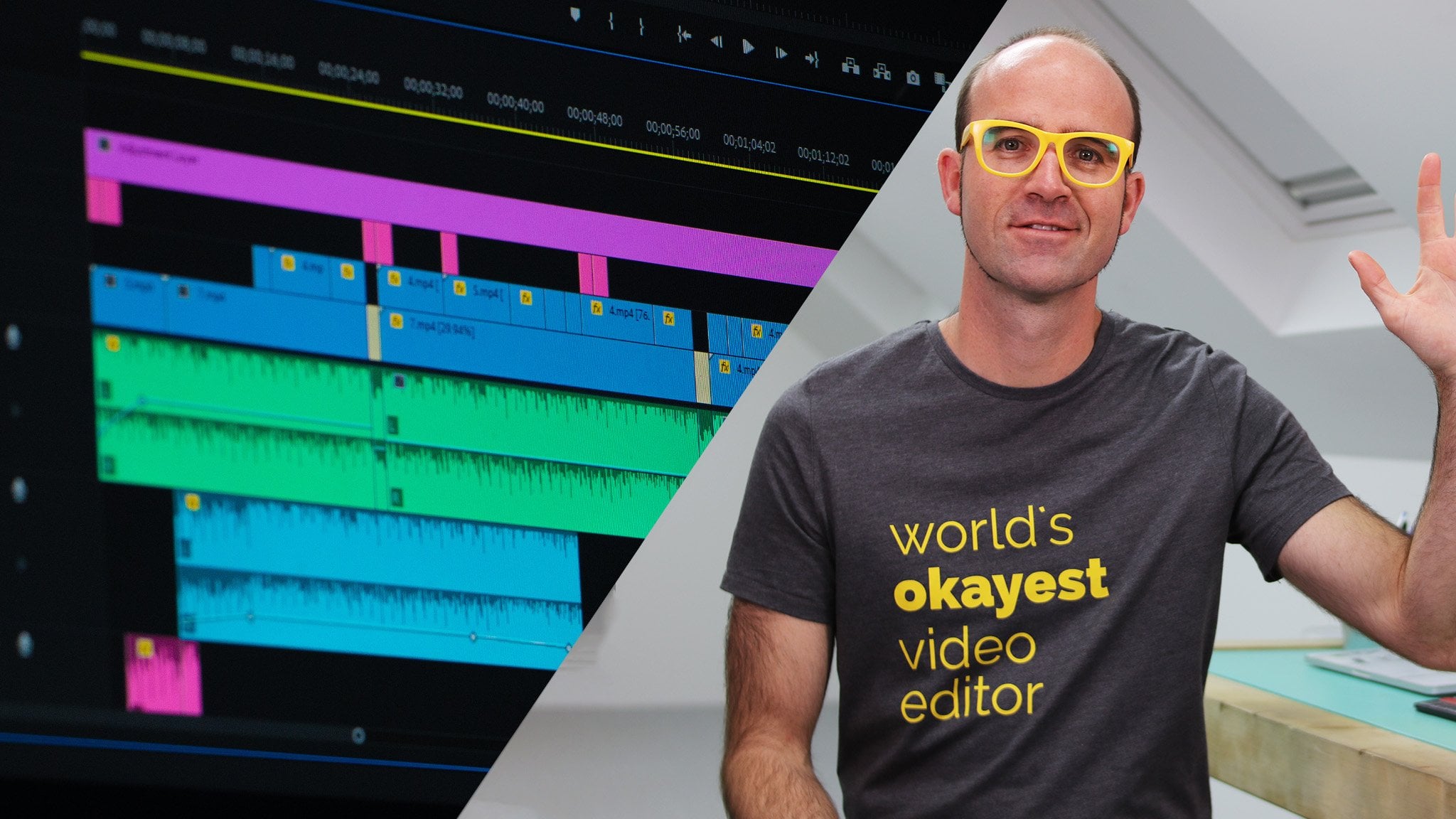
1. Introduction: Hi, my name is Dan. And I love animating Infographics... and bringing potentially
boring data to life using After Effects. I've made this course
for complete beginners. There is no need to have
any previous knowledge... of After Effects or
Motion Graphic Design. We'll start at the super basics. We'll bring in a couple of icons. We'll add Easing. We'll add some Motion Blur. We'll add some very cool Overshoot. We'll also look at Anticipation. And then, my favorite
is to Offset them. We'll work through real life projects. Connecting Excel into After Effects... to transform your boring
Spreadsheet data... into approachable, visible awesomeness. We'll experiment with writing in Canvas. We'll do some fun things with masking. All the way through to exporting... for YouTube, PowerPoint,
and all sorts of social media. Including making some animated GIFs. I've got projects for you to complete. So you can practice your skills... and have some things ready for
your portfolio at the end. There's also exercise files,
so you can play along. There's also a cheat sheet,
both video and a PDF version. Do you know what the best part
of this whole entire course is? It's learning how to track
handsome individuals from New Zealand. Very, very accurate data. It's true, I say 'awesome' a lot.
2. Exercise files: All right, first things first,
is to download the exercise files. There'll be a link just here,
go and download those. Also know that there's
something called the completed files. All they are is, at the end
of every video... I'll save my After Effects file
to where I'm at. And you can download it. There'll be a link on every
video screen for that. And it's just, if you
get a little lost... you can check mine and see
how yours is different. The other thing is that there is
a cheat sheet at the end of this... end of this video. And there's also a PDF
you can print off... and stick next to your computer,
and use as well. There is also a project at the end. So we're going to
work through together. I'm going to set you some tasks... and you can use that
stuff in your portfolio... along with anything else
you make in this course. You're totally allowed to use it. And the last thing is reviews. It's a bit early for me to be asking you
for reviews for this site... but as soon as you get to
a point in this course... when you're like,
"That's a pretty good course"... I'd love you to leave a review. It's the kind of stuff that's... what drives my business
and pays my income... as other people come into the courses. So, reviews are really helpful. Likes, shares, those types of things. All right, let's get into building... our Motion Graphics
and Visualized Data.
3. Inspiration for your animated infographics: Hey there, in this video
we're going to look at Inspiration. So when you're starting your project... you're going to need places
to go and get ideas for your projects. Now this site here,
informationisbeautiful.net remember the .net,
the .com is a weird site. You're going to go and check it now,
I bet you. But informationisbeautiful.net is... this is more of the
Data Visualization site. There's some really beautiful stuff
going on here. Kind of pushing the boundaries... of how to communicate
really complex data. If you're dealing more with the generic
kind of Infographic Bar charts... you're just looking
for ideas of animation... then something like this,
so this is videohive.net videohive.net sell these. So these here, you can buy. This one here is $19,
and you can get this... as an After Effects file,
and start updating it. The only trouble with some
of these templates... is that they're pretty complex. If you're brand new, these are
not useful at all... because you're going to get a file... that's going to be too
hard to work with. Once you get into the kind of
Intermediate level stage... these become really useful
because you can open them up... make the changes necessary... and save yourself a lot of time. So you hover above them,
some of them are pretty cheesy... but some of them
are pretty cool as well. So you can just work
your way through them... and just get an idea of
how you might do it. One of the competitors
for videohive is pond5. Same sort of thing,
hover above them, you'll see... Infographics, interesting kind of
text treatments. Lots in here just to give you
kind of ideas flying. One of the last places I'll show you is
Art Of the Title. Well, not Infographics. It's really cool for just
beautiful uses of mainly Type... and live action footage. I get great ideas from here for... even just simple Motion Graphics... just the way Type is being
treated and animated. So I like to go,
choose just the Home page. If you go down to 'All Features'... and then you end up looking at these. These are the Top 10 from 2016. And you just go through. I've got a couple of them primed
and ready to go in here... somewhere, like this one here. Just interesting how you're
going to deal with the Type... this kind of big thing
moving in the background. All stuff that can be done
in After Effects. I'm not saying
they're exactly right, but... What are the other ones that I liked? Make sure I stop in here. This is great, this real big
slabby use of Color and Type. Anyway, I'm rambling. So, those are some good places
to go and get... some ideas before you get started
on your next project. All right, let's get into the videos.
4. Setting up your software & video for data visualisation projects: So we're going to begin
our first project. So I am going to hit
Play on this project... and we're going to listen to it... and watch it all the way through. This is what we're going to be making
for the first part of this course. Icon animations, all sorts of
amazing Infographic type things. Let's give it a watch,
and at the end we'll hit Stop... and we'll go off and create
our new document, and get started. 'The Value of Sleep for Creatives'. Now there is an ongoing
debate in our household... about the value of sleep. My wife, a solid 8-hour night lady... is forever reminding me
to get more sleep. I on the other hand, I'm certain,
all I need to perform at my best... is just 5-6 hours. So as long as I'm in bed by 1 a.m.
I'm good to go by 06.30. Now my problem is that I love to work
in the quiet of the night. When the whole world is asleep,
when nobody can get me. For me there's something about
that slight hint of exhaustion... feel by with a bit of caffeine
that makes me... excited and creative
at that time of the night. So what is it about sleep deprivation... or insomnia that appears
to aid my creativity? Okay, simple enough, but
some cool techniques... we're going to learn in here. So let's now jump in,
and make our first document. So we've opened up After Effects. Now it's time to create
our first file. They call them Projects. And inside of these Projects,
we have something called a Composition... or referred to as Comps. The project really doesn't do anything. Click 'New Project', and you get
this kind of blank window. So think of a Project as just
like an empty place holder. Comps that you put inside of it... think of them as pages
in a document. You can have a document... but without any pages,
it's not really helpful. So a Project is not very much
without any Comps. So we're going to
create our first Comp. You think you'll go to
'File', 'New', bragh, no. Under 'Composition',
'New Composition'. There's two ways of creating a Comp. You go 'Composition',
'New Composition'... like we are here, you
give your Comp a name. This is going to be 'My First Comp'. In here, there's a lot of settings... but pretty much all you need to do is,
go down to these presets... and pick 'HDTV 1080 25'. That's going to be HD resolution,
at 25 frames per second. That does most of the work
most of the time. Occasionally if you need to go to TV,
and you're in the US... you got to use '29.97'. It doesn't really matter,
especially if you're going out... to say social media, YouTube, Vimeo,
your website... it doesn't matter, these two here,
there are negligible differences. It goes up to '24', but nobody
picks that, just pick this one here. 'HDTV 1080' 1080 is the pixel height of your video. And the width is 920. When somebody says 1080p,
they mean the height of the video. 720p is standard definition. And that is the pixel height of
the video we're making, 4K. Down here, you could be working on 4K
if you've got the footage for it. The only problem with 4K is that
the file sizes are quite big. YouTube accepts it, you might do it,
no problems with that... but it gets pretty hard on your system
when we start animating things. I've got a pretty good MacBook Pro,
it's only a few months old... and I got all the optional extras,
and working in 4K just kills it. So I don't work in 4K because
it's just too hard now. And people watching it... I don't know who's going to see... my Web Animation Infographics
on a 4K monitor. 'Square Pixels' perfect,
'Frame Rate', don't change. This, 'Resolution',
stick it up to 'Full'. All that means is that... this can change occasionally... in case you're going
to export a video... and it's going to export
a 'Quarter' quality. So I change the Resolution way down,
let the Quality be at 'Full'. The 'Duration', it's up to you. I think the default, I can't
remember, 10 secs, I think. And this is, how many Frames? So, 10 secs is this second one here,
that's the one you need to remember. So, how long is this going to be? It's hard at the beginning... especially if you're not
working on live action. Live action is going to
have a Start and an End... so you know how long it is. But if you're working
in your own kind of time... you're like, "How long
should this thing be?"... take a guess. It's easy to shorten it up
than to extend it. We're going to start with 10 seconds. Background color here,
I wouldn't change it here because... it doesn't really matter
what you change the color to... when you export, it's going to be black. Weird, huh? So if I go
like this, and say... "Actually I'm going to use one
of these colors over here"... you think the background color
is going to be, yes, red... but when it renders it goes out black. It's just kind of a place holder color. You actually have to draw a big
red box in the background... for that to actually export. So now we can start working. The other way to create a Comp... and this happens a lot, especially if
you've got footage you're working to. In my case, we're working
to a pre-existing mp3... with some dialogue on it... but we're going to be animating
our infographics too. So it's a set piece, it's a certain
amount of seconds long. We could open the mp3, work out
how long it is, and try match the Comp. There's an easier way,
so I'm going to bin this thing here. And what I'm going to do,
in my project window here... this is where all my files go
for my project... anything that we import... videos, sound effects,
shades from Illustrator... anything goes in here. So we're going to 'File', 'Import',
go to 'File'. If you haven't already,
download the exercise files. Mine is here, on my Desktop. We looked at how to download those
in the previous video. Go check that out. So in here, I'm going to go into it. Our first project is going to be... there's one called 'Icon Pop',
open it up. And we're working through this... 'Value of Sleep mp3'. So I'm going to bring that in,
we're going to use that. And because that has a certain time... it's 29 seconds, and 7 frames long. So what we can do is,
just right click it... and say 'Make Comp from Selection'. The cool thing about it is that... it's matched my 1080p, you can
kind of see, it's at the top here. The right Frame Rate, but it's
matched the link with it, perfect... because there's no need
for it to be any longer. So the big things when you
are getting started-- if you are good at After Effects,
you can skip through the next video... but let's go look at little things here. That's the mp3 we brought through... and now magically, this is the Comp,
it's using the same name as this. So what we're going to do is,
let's rename it to say... we're going to add Comp to the end,
we'll do this while we're learning... just so that we know
that's a Composition. The reason we know it's a Composition
is mainly because of this icon here. See this little film reel
with some bits on it... that is the Comp, and these are
the important things. These are the things
we'll export at the end. They're the pages in my document. Remember, project is this
overall empty space. These are the things that you need,
you need at least one. You can have multiple pages,
lots of different animations... lots of separate animated Infographics,
or Data Visualizations in here... but we're just going to have
one for the moment. Your Comp appears down here
in the Timeline. There it is, 'Value of Sleep' Comp. And it's automatically put
my mp3 on the Timeline. So there's my little Playhead,
I can drag that back and forth, my CTI. If I hit Space bar on my keyboard... It's me talking to myself. So that's the mp3 playing. It's going to be along the bottom there,
just doing its thing. We're going to lock it,
see this little locking icon here. And you'll notice that
these little tags in here. I added these when I was first
putting together these project photos. I did these with something
called Markers... we'll look at them later on... but it's just going to help us know... when these Infographics
are meant to appear. Now one thing we'll do
just before we move on... go up to 'Window', go to 'Workspace',
and click on 'Default'. And then, go back
into there, 'Workspace'... and then go to 'Reset Default', just to
get everything looking the same as me. If you do find, during the class
you end up dragging that over there... and that becomes there,
and it's all mixed up... just go back to 'Window', 'Workspace'. It's still on 'Default', but we're
going to 'Reset Default'. Go back. It's a good way to get yourself unlost. All right, let's go to the next video.
5. Adding audio music to a infographic in After Effects: Hi there, in this video
we're going to bring in some audio. We're going to put it
into some folder. We're going to bring in some music... and look at where to get
some of that for free. And then we're going to balance it
so that my voice isn't so low... and the music is down a bit... so you can hear underneath me,
let's hit it. The Value of Sleep for Creatives. It's made me sound a little more
like I know what I'm doing. Anyway let's get on with the chorus... so I know what I'm dealing with,
most of the time. Okay, let's deal with audio
properly in this video. So we're dealing with
a voice over, that's me. Obviously, if you're doing
your own voice over... it makes it easy, if you've
got a half decent mike... it's pretty easy to do... but probably you're going to be
like most people... and hate the sound of your own voice,
me included... but it was cheaper to do
my own voice over... than paying somebody else
for this exercise... so you got stuck with me. If you're doing a higher talent... what I do is I go out
to a site like Fiverr. Fiverr is a site, you're meant
to pay $5 or Euros. And it's what people will do for $5. This guy will do a voice
over here for US $5. That's the Euro translation,
or the currency exchange. And if you click play,
you can listen to Todd. Hello Todd. Great! So he'll do that, for $5,
a certain amount of words. It seems cheap, but bank on it
being about $25-$50 depending. Because he might say he'll do
the first 50 words for $5... or the first 10 words,
whatever his rates are. And you might have to go
further than that. And if you want it done,
like he'll say it's $5... but I'll do it when I
get around to it... maybe a week, or if you want
it done straight away... you might have to pay another $10. It kind of adds up. And by adding up, 25 bucks
is pretty cheap for a voice over. So just have a go through, and decide,
do I need a Caribbean voice over... or do I need this guy, or that guy? He has a great, like normal voice. If you need somebody who's Irish... if you need somebody
who's Australian... or English, just type it in up here. I just typed in 'voice over'
to get these guys. It's amazing what you can get done,
quite quickly, and cheaply. So we've got our voice over,
back to After Effects. So when you are working with audio... especially a voice over,
often you need to time things to it. You can see, I've added
little markers down here. We'll look at these markers
a little bit later on. I've added them here,
so at this early stage... we can add our Infographics
at different timing points. But if you need to edit audio... what you really need to do is,
something on Audition, it's down here. So I've recorded into Audition,
and did any edits... so I cut out all the ums and ahs,
and made it sound half decent. In Audition, if you need,
you remove background noises. The air conditioning noise,
something like that... that's the job for Audition. And I'll do a course
about that real soon. And we've got our mp3s,
it's come through. One of the things you
might want to do is... see I can twirl down this little
arrow here, and go to Waveform. Waveform is really handy, you can
start to see where the breaks... in the language are, you can see
the pause there for a little bit. So you can start timing things, like... I'm probably starting to
say something about here. I'm going to hit space bar. You can see I've got the
beginning of the conversation there. I often have this open
when I'm trying to... time Infographics to an
audio file like this. So I'm going to twirl it up
at the moment. Now one of the big things is... you wouldn’t have seen,
I had that open already but... when I hit Play for this,
it's quite quiet. You won't really notice it
when you're working on your projects. You need to check, whenever
you bring in audio... to check whether it's
at the right level. You don't want to send
your Infographics somewhere... and people be listening to it... and it either blow their
ear drums out... or just be really, really low,
and they raise the volume... and in the next video,
it blows their ear drums out. So you want to get consistent,
there's a world of consistency sound. And it's between -6 and -12. Minus is weird, huh? Just about it works from
0 being the highest... and we work down from that. How to check?
It's quite easy. Go to 'Window', down to 'Audio'. Or in my case, there's that
little gap there. And this little guy is what
we're going to be watching for. And see the gap between
-6 and about -12. If I hit space bar, watch it. See it bouncing down here. It's bouncing too low. You want that little line
to be bouncing anywhere... between here and here,
is a good kind of general range. And you kind of see red, but... yellow, just okay,
but in here is the sweet zone. All you need to do is,
have it selected. And what I might have to do is... if you've got it locked,
like the last video... unlock it, select it,
and just yank it up a little bit. And then see how it goes.
Hit space bar. Not bad, I'm going to get it
a little bit higher. It's bouncing in that right kind
of sweet zone, you can see there. It's a little perfect. But that's going to be great for me. Next thing is, let's bring in
the rest of the audio. We can go to 'File', 'Import', 'File'. It's a long way, there's a shortcut. 'Command I' on a Mac,
or 'Control I' on a PC. We use that loads. To be honest, I never use it. I just double click in this big
gray area here in my Project window. So just double click,
that's the shortcut to it. I find it quite quick anyway. So these two files,
go to your exercise files. And under 'Icon Pop', '01 Icon Pop',
bring in 'Blip.mp3'. And double click it again,
let's bring in a second file. It's just under the root,
'Infographic Exercise Files'. It's called 'Background Music'. We're going to use these on... all the different exercises that we do. It's on its own folder,
and all these files here... they're next to all free... because somebody like Wistia
have given them out to us. So Wistia is W-I-S-T-I-A. Go check out them, they've got
some free background music... that I saw they were there... and I appropriated it for
some of my projects. The other ones in here,
I found Shutterstock. It's a stock music site. And I've paid for them. Actually these ones are
the preview versions... so what you'll notice is that,
you'll play it for a little while... and it all plays happy music, but then,
part of the way through... it says "Shutterstock music'. Kind of ruins the mp3 for you,
so that you go off, and pay for it. You're not allowed to use
these commercially... any of the Shutterstock ones. But you can kind of see here... this one here is the
Wistia Learning Gallery. They allow you to use it
for commercial purposes. I'm going to use Interlaken Crossroad. At this stage follow me,
you can pick a different one, of course. But I've done this project obviously... and tried to find something appropriate. So what I'm going to do is
I'm going to add it to my Comp. You can do it a couple of ways,
you can drag it down here. The only problem is,
if you drag it down here... see that little Playhead there,
the blue thing... if you drag it there... it kind of starts way out here. So it doesn't start till I get... So you've either got to
drag it down here... just make sure it's at the beginning... or just drag it into
the center bit here... and it just goes in
right at the beginning. So couple of things I would like to do. I would like to create a folder in here,
put in my audio in. Often, if I'm doing Infographic... there will be a files folder, an
audio folder, a video folder... and I leave the Comps
just out of there... so I'm going to create this one here,
this one's going to be audio. I'm going to stick you,
you, and you in there. And we'll make 'Files'. Files is just like any static images,
and any other weird stuff I get. And you notice
when you create a new one... let's put it inside the file,
so we can fix that. This one's going to be any video. This project's not going to
actually hit somebody... but let's get something
good going early on. So, that's my files. One of the other things is,
if I hit Play now... you can see, they're all kind of
battling it out. The voice over here, Value of Sleep,
is at the same level as the music... but they kind of fight it out
when I start talking... so I'm going to lower the volume
of this music. So with it selected here,
I'm going to do... the opposite of what I did
with the voice over... and lower it down.
How low? Just keep dropping it down. That feels good. So just keep lowering it down
until you feel like... That works for me. So, low as you go, it's really
just the balance with that... whatever has to be the highest,
which is going to be our dialogue. So I'm going to lock these two here... so we don't mess around with them... and we're going to move
on to the next video.
6. Add a solid background or image backgrounds: In this video we're going to bring in
a background image, and lock it. It's going to be easy,
let's go do it. It's a weird feature of After Effects,
we talked about it before. If I make a new Comp,
and I pick a color... doesn't really matter,
when I export it, it goes black. It's just, there is a background color. So, we're going to turn
ours back to black. I'm going to click on
it, go back to black. So that's most of the Comp
start life like. And if I want to put in
a colored background... we put in just a big rectangle. Now, we could draw it,
but it's easy just to go to... 'Layer', 'New',
and there's one called 'Solid'. Click on 'Solid'. I'm going to call this
my 'Background Color'. And it's going to match
the height and width of my video. Great! Everything's perfect,
pick a color, any color. Any color that you like. Click OK, now when I export it... it's going to be green
in the background. What I want to do is, not move it around
so I'm going to lock it. Awesome! That's how to put
a background color in. So I'm going to bin that color. Sorry, we just made it... but we're going to bring in an image. So I'm going to double click
anywhere in this gray area. And I'm going to go to
'Infographic Exercise Files'. I'm going to go to 'Icon
Pop', the first one. Let's go to the one called 'Background'. We'll bring it in,
put it into my Files. Then I'm going to drag him
onto here, and he's too big. You can, like a lot of programs
you can kind of zoom out. I'm using the wheel of my mouse... but you can use 'Command + or -'
if you're on a Mac... or 'Control + and -' on a PC. What you'll find though is... you can grab the edges,
and it's fine, but... weirdly, that's true of lots of
Adobe products, but down here... there's one in here called
Transform and Scale. You can just drag it down. I don't know why, but it is easier... to use these controls
down the bottom here... especially when you
get multiple layers. So I'm going to twirl that back up.
It's up to you. So I'm going to lock that layer,
boom, background image. I'll just drop the lightness of this
in Photoshop. We'll do it later on in an exercise
using one of the effects. Easy, so we got our background in. Next video please.
7. Adding text Adobe Typekit in After Effects: Hi there, in this tutorial
we're going to look at Type. And then we'll look at bringing in
new fonts from Typekit... which is free as part of
your Creative Cloud license. Let's go and do that now
in After Effects. So let's put in our text,
grab the 'Type' tool, the capital 'T'. You can click and drag
to get a box with boundaries. So it gets to the edge
of the body text... if you got a lot of text to go in. I'm going to actually-- See down here, this layer here,
I'm going to click on it. Hit 'delete' on my keyboard. If I just click once, and you get
a Type box that goes on forever. Mine is Aligned Center at the moment. So I'm going to go... over here, we've got Character,
and there's Paragraph. If you can't see either of these... they're under 'Window', and there's
'Character', and there's 'Paragraph'. You need both of them working with Type. I'm on 'Paragraph'. And I'm going to
make mine 'Left Aligned'... and I'm going to put in some 'Type'. 'The Value of Sleep for Creatives'. I'm going to put a 'return' in
just to break this up a little bit. I'm going to 'select' it all,
do some typey things. Mine's on 'Arial' at the moment,
I'm going to make mine 'all caps'. And I'm going to go pick a 'font'. Under 'Character' here, we got
all the fonts that are on your machine. So you can pick one of those obviously. But if you've got a Creative
Cloud subscription... you can go off to Typekit... and get a whole bunch of new fonts. They're really good, and they're free. They're part of your paid subscription. So let's go check that out now. This is Typekit, it might
ask you to log in. That's me, Hi Daniel. What we can do is, go through,
and just pick a font. There's lots of them,
go through the 'Fonts' drop down. And you'll get lots of
examples of stuff. Go through and just
pick the one you want. Over here, are some helpful bits. Let's say I want stuff
that's good for Headings. And it will sort it out from there. Let's say I want to turn that off. I want ones that are Serif fonts... which means they got that little feet. I'll fold the edges. So you can go and hunt these down... and switch on to hand fonts,
it's hard to go and find. There's lots of other things you can
go and do in here as well. One of the things you
might consider is the width. Sometimes it's nice to be working
with a skinny font... because... especially if you got lots of copy
to go into Infographic... it's just easier, with lots of numbers
to go into your graphs. It's easier to fit in skinny type. You'll fit a lot more digits in. Now the one I'm going to
use for this class is Roboto. I'm going to bring in both
Roboto and Roboto Slab. Click on one of them... and then click this button over here,
where it says 'Sync'. I've already synced
mine, and that's it. Just click on 'Sync', I'll do it
for Roboto and Roboto Slab. And they just appear in After Effects,
you don't have to do anything. Right, back over there. So with it selected, I'm going to go... you my friend, are
going to be a Roboto. I'll use the Slab version for this. And there's some different widths... but that's fine for me. I'll change my mind,
don't like the Slab. And, still Bold, there's even a black version So back to this arrow here,
'Section' tool... to move stuff around. I'm going to still use
my Left Aligned... it could be centered, but
we'll leave it there. What I might do is-- There'll be times in this course
where you're like... "Can you just move on?" And this is one of those times... when I start messing
around with fonts... for no reason other than
my own pleasure. So that is going to be it
for Type and Typekit... because it's not that hard. Let's go and start bringing in... the icons that we'll use
in our Infographic.
8. Where to get free Icons for your Infographics: Okay, so you need to find some icons,
and you don't want to pay for them. There's a couple of cool sites. iconfinder.com is a great one. They have a mixture
of paid and unpaid. So let's say we need
a picture of a woman. An icon of a woman. Now by default yours will be set to
'Any', 'Any', 'No License Filtering'. And you'll start with these ones here,
you can see, they're not expensive. So 1 USD for some of them. And what we want do though is,
I want vector ones... because I want them to be scalable. In After Effects, you don't want 'Any',
most of them are all Vector. Then I want to go for 'Free',
because I want it cheap. And I want to go down to 'Licensing'. I want the ones that
say 'For Commercial Use'... but I don't need to
put a link anywhere. You can go to this one here. 'For Commercial Use', but you
have to add a link somewhere... to explain where you got it from. I'm going to go through
the full cheap way. And you can see, there's quite
a few here I can pick from. So when you are picking some of these,
say you decide that... this is the one for you... and when you are downloading it,
download the SVG version. The PNG is a pixel version,
so, not Vector... and when you scale it up,
it won't be great. It will pixelate,
whereas this one won't. So, download this version. Because it's a SVG,
you might have to open it up. Depending on the version of SVG... you might have to open
up in Illustrator... and copy it, and do a re-save. And save it as an Illustrator file
to use it in After Effects. We'll do that in the next video... showing how to make
icons in Illustrator... to use in After Effects, we'll do that. So that's Iconfinder, I use this,
it's quite a big resource. I love it. The other great place
is actually from Adobe itself. And it's their Creative Cloud app. On a Mac, it's up here,
this Creative Cloud. Cloudy looking icon. And you've got these options
along the top. On a PC, I'm pretty sure
it's down the bottom right. You'll find the same icon. And you'll be at 'Home',
go to 'Assets', to 'Market'. And in here, at the top
is the search icon. We're going to put in 'woman'. The cool thing about this is
all of this is for commercial use. You don't have to add links. Just the quality and quantity
aren't as much. But this can be
super useful and helpful. What's really cool about it is--
have a look at here first... and then jump out to maybe Iconfinder,
that's what I do at least. Say you decide--
let's bring in another one. Say you decide to use this one. See this little button here?
We can bring it into my library. The cool thing about it is,
that's it... if you jump into After Effects now... you can see, it's downloading
in the background there... into my Infographics animation. And there's that lovely
lady, ready to go. We'll use this a lot during the class,
this 'Assets', 'Market'. It's really good for icons,
it doesn't have many images in there... so it's mainly for icons. All right, let's get on
to the next video. One thing before we go,
actually, say in Iconfinder... the cool thing about here, is that
often it's part of a bigger group. So you might pick this one, but you'll
also need a man, or a Ninja. So Iconfinder has some really
good groups, and things to go. If you get into kind of super icon
downloading mode... you can see here, there's
a per month cost. You can get, like 25 a month. Or unlimited for $29. All right, now let's get on
to animating them.
9. Animating an infographic icon in Adobe After Effects: Hi there, in this video
we're going to do this... where it fades in, and then,
goes for a little bit. And then, this guy appears. We'll play with the Scale. We're just going to do
some basic animation... it's quick, it's easy,
let's make it happen in After Effects. So I'm in my 'Value of Sleep' Comp. Double click it there. I've got my two audio files locked. And I'm going to lock
the background layer. And what we'll do is we'll
get this text to fade in... then we'll get our Icons to pop out. So, make sure your Play Head
is right at the beginning. And what we're going to do is
twirl down this arrow here... I'm going to twirl down 'Transform'. And what we're going to do
is play with the Opacity. At the beginning of my Time Line,
I'm going to click this stopwatch. And what happens with that is... it sets a Key Frame here
at whatever setting this is. So I've set the Key Frame
at 100% Opacity. I can adjust it by clicking,
holding, and dragging across... or you can just click it once,
and type it in. So I want it to be at 0 here... and after a bit of time, how far? Generally what I do is
I just hold down the space bar... or click the space bar once. And then turn it off again
when I feel it's been long enough. That feels long enough,
it's been about one second. And all I'm going to do is
click, hold, and drag that up. You'll see that, as I drag it up,
it's created a second Key Frame. So first Key Frame is at 0... next Key Frame is at 100,
so now, hopefully-- And what we'll do is, after some time,
I want it to then fade out. Now one of the problems
that happens with... everybody that's new in my classes... is that they'll now go
and turn this down to 0... to fade out. But they don't add any pause... because what happens now,
watch this, it goes up... and then just instantly starts
coming back down again. Think of it as a ramp,
starts at 0, gets to 100%... and then starts
coming down straight away. What I'd like to do is have a
little bit of a flat area... where it stays at a 100 for a
while before it fades out. So I'm going to undo
to get rid of that Key Frame. To do that is about
2 seconds and 21 frames. What I'm going to do is, see this
little diamond here, click on him. That forces in a Key Frame
without you having to adjust first. So it means that, that is 100... now that is a 100, now if we move
along a little bit further... I'm going to set it down to 0. So, ramp goes up. 0 to 100, stays at 100 for a while,
and the ramp comes down back to 0. "The Value of Sleep for Creatives". So next bit of animation is going to be
when this house appears. You can kind of--
that's where I say it. You can't hear the audio very well
through my microphone... but that's when the house
kind of appears... so what we're going to do is, twirl
up this, get it nice and clean. I'm going to drag in my
house, where's the house? He's down the bottom here
of my Libraries panel. I'm going to put him
over here somewhere. I'm going to zoom out,
just keep him in the top corner. This one here, 'Fit',
we'll make sure... the Comp is perfectly
centered in the center there. With these icons, you can re-size him
by grabbing the corners. Now, a little bit weird
in After Effects... if you know some of
the Adobe products... you want to make sure the height
and width doesn't change. And you want to drag
these corners here... because without holding anything down,
they scale weirdly. So what you do is
you start dragging... so it's going weirdly,
then hold Shift. And I'm holding down my mouse key,
and my Shift key. And you can adjust the sizes. We're not going to, because
after I made them... all pretty good in Illustrator
in the last course... they're at the right size,
so I'm going to leave those. So what we're going to do now is... at the moment it starts
right at the beginning... I'd like it to start just before
I said the word 'House'. I want to click, hold, and drag
this colored part. Drag it, drag it, you see
the beginning comes along, so now... you can see, it kind of starts
a little bit later on. Household. So we'll get the timing right
in a second, but yes, it's about right. So, what I'd like to do is... I'd like to put my Play Head
at the beginning of this layer here. Now I can kind of zoom in
and make sure it's perfect... but our first little shortcut is going
to be holding down the Shift key... while you're dragging your Play Head,
near the current time indicator. So hold down the Shift key. And what happens is it will jump
to significant parts in your Time Line. You can see, it jumps
to the beginning of this. It also jumps to those markers,
can you see? Jumps to the beginning,
so just a really good thing... to hold down, holding Shift
whenever you're dragging your Time Line. So first thing I want to do is... I want to twirl this down and
I want to find this Scale. So I'm going to set
the stopwatch going on Scale. So we've got a Key Frame... and this guy's at 100,
I'm going to turn it down to 0. I'm just going to drag it. Too far. Now we'll just type in '0'. So it's at 0, then a bit further along. I'm going to drag it up to 100. So now, starts there. And very slowly, it appears. So what I'm going to do is
zoom in a little bit on my Time Line. To zoom in, just type
the '+' button on your keyboard. Just '+', nothing else,
'-' zooms out. What I want to do is maybe just bring
this inserts, happening a bit faster. It's about right. We'll play around with Easings,
and a few other things... but it's kind of there. So, I'm going to twirl this in,
so it's nice and tidy. And now we can start bringing
in all the rest of them. You can see, the wife, okay. And I'm going to bring in... kind of my wife. And I'm going to drag it along,
and start this. A bit further along,
so it starts here. Holding Shift to get it to the front. I'm going to twirl
this down, 'Transform'... turn this guy along, set it to '0'. Move it along a little bit. And then drag it up to 100. You can drag it past 100,
it's times of 100. I can keep going through... and doing this for all
the different Icon appearances... but what's going to happen is,
I'm going to do it for all of these... and then the next thing I
want to do is Easing... so I'm going to have to go and do that
to all of them separately. Then I'm going to have
to add some sounds... I'll have to do all of them separately. So what I intend to do is,
I'm going to delete the Girl... and just going to work on the Home. Get it perfect, get it popping
and bouncing, a little star burst. And then we'll duplicate it,
and just switch it out, the Icon. That's a lot easier
than trying to do it... repetitively for all the separate Icons. So let's work on Home,
and then later on... we'll go and switch them out
for all the different Icons. All right, let's get on
to the next video... where we get rid of this... kind of lame, Powepointy zooming thing
when I add a little bit of life to it. And that is called Easing.
10. How to ease animation in After Effects to make them look slick: Hi there, in this video
we're going to look at Easing. Basically it's going to
turn boring animation... into something a little bit more
lifelike, and interesting. So the bottom one
is going to be boring... the top one is going
to be nice, with Easing. Boring, nice. Boring, nice. See? Easing just adds a little bit of life... to pretty much any animation
in After Effects. Let's go and do that now. So to work on Easing, we're going to
click on our 'Icon1 House'. And what we're going to do
is twirl this down... so we can see the Keyframes
that we're working on. Now, this can be quite complicated,
as in, we've got... we can see, Anchor Point,
and Position... it's quite messy, especially when
you start twirling down a few of these. Gets all kind of ugly looking. To make it a little nicer, is
have this layer selected... have it completely twirled up... and click the 'U' key on your keyboard. All that does is that it brings down... only the attributes that have
Keyframes applied to them. So the stuff you're probably
going to work with. So it's hiding Anchor Point
and Position, they're still there. You can close it up, open them back up. But just type 'U'. Keeps everything nice and clean
while you're working. I'm going to get my Play Head close,
hit the '+' key to zoom in. Now at the moment,
it's doing this kind of like... it's not very nice,
I'm going to turn off the sound. See these here, I turn these off... just so that I can't hear the music. The problem is, if we export it... it will have no music and voice over,
so make sure you turn them back on. Yes, they're a bit Powerpointy. Just kind of like appears a bit lame. So what I want to do is apply Easing. Now what a lot of people do,
is they'll select this Keyframe... and this Keyframe,
so I'm holding down 'Shift'... and click both of them, they go blue. Right click any one of them. Actually you can click 'F9'
if you're on a PC. And that applies 'Easy Ease'. If you're like me, on a Mac... and F9 opens up
a bunch of other things... like iTunes, or something... you can't use that shortcut. But if you right click any of them... go to 'Keyframe Assistant',
and there's 'Easy Ease'. That there changes them from diamonds
to these little hourglasses. And it gives it a little bit of Easing.
Watch this. It's better, a little hard to see... but it gives it a little bit... of resistance at the
beginning and the end. Gives it a little bit of life. And that's going to be
a huge part of this class. We're going to look at Easing,
plus a bunch of other tricks... to give our Icons
a bit of anthropomorphism. So what we're going to is-- So Easy Ease is great,
I never use it... because I like to crank
it up even higher. So to do that you can
manually type it in. So I'm going to right click it,
and we're going to go to this one. Instead of 'Assistant',
go to 'Keyframe Velocity'. So what Easy Ease does is
it changes it from 0 to 33.3%. And that's kind of like, gives
it a little bit of influence... but I like to crank it right up to 75. 75 for both of these. Both the in and out points. Works fine, click OK. So it's kind of like an Easy Ease,
but it's like an extreme version. Now click back, and watch.
I like it lots more anyway. Just got a better flow to it. If it's going a little fast,
like mine is, I'm just going to... click on one of these icons
and separate them out. That's got a nicer feeling to it. That my friends is considered Ease. We're actually using Velocity... but you can use those terms
in this case interchangeably. Now we could do it to the Fade In. So I'm going to zoom out, go back,
I'm going to minus out a little bit. See my whole animation. Remember, this Text fades in. So to see, click on the Text Layer. How do I see just the Keyframes
we made for this, remember the Fade In. That's right, clicking
'U' on the keyboard. So here's my Keyframes. Now I could do Easing for this... but for Opacity,
I can't see the difference. You might decide that
you play around with it... and you're like you can see
the difference in Easing and Opacity... and that's totally fine. Doesn't really matter what Velocity
you play around with it... there's not a whole
lot of difference... when you're playing with
Transparency or Opacity. So I'm just going to leave those... and get on to the next video.
11. If you get lost in AFX and can’t find your animation any more: Okay, I'm going to
show you this one now... because you probably,
if you haven't got lost already... you're going to get lost at some stage,
especially if you're new. And the main culprit is this. So I'm looking my Comp here,
'Value of Sleep'. And then I click on this,
and I'm a double clicker. And I double click it by accident. And I end up in here, and I'm like,
"Where has everything gone?" It might be blank, you might have... clicked on something else,
like the background... If I unlock that, and double click it... You've gone inside of it,
and you're like... "I'm sure there was some text here,"
but it's all gone. All that's happened is
you've gone inside the layer. Here's my Comp back here,
with all my lovely stuff on it. But you can dive inside any of
these objects by double clicking on it. Problem is, the Time Line
doesn't change. So all you need to do is close it down,
or just jump back over here... where it says 'Composition'. Nothing's been lost. You'll find, that will happen
to everybody eventually. All right, next video.
12. Adding free sounds little pop noise: Hi there, in this video
we're going to add... little noises behind our animations... to make them feel more real,
like this guy. Creatives. Now there is an ongoing debate
in our household-- There he is. See that little blop noise? Let's go figure out where we can
find them, and how to implement them. So let's first of all find our sound. So if you need sounds
for interface kind of things... like we're going to do for this pop... you need some clicks, some
bumps, some groans... just like little noises. Often the term to look for
is Interface Noises. And there's no real one place. I use freesound.org quite a bit... because their licensing
allows me to use them for free. But double check the licenses
before you go and use them. And the weird thing is looking for them. Like, say you want a noise,
and you can hear it in your head... I'm not sure if I'm
explaining that right... but you know what that noise is... but how do you describe it in words?
So you might go 'zap'. Like in, this bit of noise. Boom, wow... Or bloop, is the one I want. That's the one I wanted. Not advisable. You can download them easy,
by clicking on them, and downloading. I've got one ready for us
in this animation. So let's jump into After Effects. What I did was, in your audio files
that we brought in earlier... I've made this 'Blop'. And actually just recorded it myself,
I made a noise. I made a noise
on my microphone like this. Or... Any sorts of those noises,
I use quite a bit for my animations... because I get the
exact noise that I want. And I can use them commercially
because I made them. You're allowed to use my Blop
whenever you like. You have my full rights. So what I'd like to do
is just time it right. So my house appears,
and I'm going to bring in this Blop. Nice. Now what I might have to do as well... is turn my audio back on
just to get the timing right. 'The Value of Sleep',
turn that sound on. Now, trying to time it all together. Probably needs to
come along a little bit. It's not bad. Everyone's is going to be
slightly different... because you're working
on your own file. Maybe a little bit further on. Then it comes down to-- It's a little bit of art, trying to get
everything timed nicely. That feels okay. It's maybe going a bit slow,
my little Pop as well. Anyway, we've looked at
where to get sounds from. We've made our own,
and we've applied it. These are one of the things that get
often overlooked... when you're watching somebody
else's Infographic... and you're like, "Ah, that's cool." And you don't notice all the
little noises in the background... that kind of add the life
to the little animations. So just keep an ear out
for those sorts of noises... and see if you can find similar ones. End of it, you get to add it
to your own work. All right, let's get on
to the next video.
13. Creating a circle pop or circle burst in After Effects: Hello world, in this video
we're going to... look at doing a little Star Burst. Watch this, icon up here,
watch the little Star Burst. It's this little effect we see... that little star bursty
ray thing that appears... at the same time as the Icon. We're going to make that in this video. So the first thing we need to do
is draw a shape. Now you can't just go
and draw a rectangle, and use this. We need a rectangle... but we need the center of the world
in the middle of the rectangle... and it's a lot easier to do that
if we just double click up here. I'm going to use the
rounded rectangle tool... just looks kind of cool,
with that being a little bit blobby. And just double click the Icon. It throws in a rectangle
right in the center of that space. It's far too big, we can re-size it,
it's no problem. There's a few different ways
of re-sizing things. If I grab the edge,
I'm actually scaling it. I want to actually change
its physical size. And we do it by, down here
on my Shape Layer... under 'Rectangle1'... in here there is 'Rectangle Path'. That's its core, 'Size', 'Position',
and 'Rounded Edges'. So what I'd like to do is,
I'd like it to be a size of about... I want it to start at a width
of about 30, and a height of 0. And what you'll notice is... it gets down to 0
if you don't unlink this. So I want the width to be 30,
and the height to be 0... to make sure that chain link is broken,
otherwise they're connected. And what you'll see is--
I'm going to zoom in a bit. You can see it's 30 pixels wide,
and 0 high. That's how it's going to start. What I'm going to do is bring my
Play Head back to the beginning here. So what I want to do is animate this,
so I'm going to turn on my Keyframe. So at Frame 1, the size
is going to be 30x0. And then after about a second... it's going to be 0... so it's going to be very thin,
but very tall. How tall? I'm going to
make it about 60. It really depends on
what you want to do... and watch, can you see the
difference between the two? Kind of goes bloop. I'm going to go back to 'Fit'. I find this is good because I can see it
in proportion to everything else. Especially because now
I want to move it. So we're going to set
a Keyframe for Position. Make sure your Play Head is here at 0. Move along to this one. Remember to hold 'Shift'
on your keyboard... and it will lock onto the exact
same position as this Keyframe... so that line up. And where do I want it to go? X and Y, Y is the second one. And I want to drag it to
kind of to the negative... which means they go up, weird, huh? So it's going to start down there... and then move up there afterwards,
sort of 2 Keyframes. I'm going to preview it. If you're like me,
while you're previewing... it's a little hard when... there's all this sort of music playing... and everything animating behind it. So what we're going to do is... on our 'Shape Layer' here,
just twirl it down so we can't see it. And what I'd like to do is... just turn off the Eyeball
on these other layers... and the sounds off this layers,
we'll turn that back on in a second. Just so that we can see
this guy in isolation. So we've got this little guy,
he's doing his little thing. The animation is not very nice. So we're going to use the 'U' key... that will show us
the Keyframes for this. I'm going to select all these guys... and I'm going to right click
one of them... and go to 'Keyframe Velocity' and change
to my famous 75%. Click 'OK'. One thing you'll notice is that,
I tried to do them all at one go... but I only did one set. I hadn't done these guys... because Size changes X and Y. So there's two options in here... but Position only has--
we're only adjusting Y. So, it can't do both of them
at the same time. So you just have to do these separately. Sometimes you can change them all
in one big go, by selecting them all. Sometimes though,
you do them separately. Hopefully it will look nicer now. The edge around the blob, nice. The next thing I need to do
is kind of repeat it round in a circle. So I'm going to put my Play Head
half way between these two... just so I can see it. And what we need to do is
add what's called a Repeater. You do it, I'm going to have to
twirl it up, twirl it back up... to see everything in here. Make sure you've got 'Layer1' selected. 'Shape Layer1'. Click this word 'Add'. And add this one called 'Repeater'. Repeater is an effect, what we can
do here, let's have a little look. Goes three of them, here you go. Have it back in the middle here. What we want to do is
open up Repeater... and we want to change a few things. One is, how many copies?
I'm going to have 13. It doesn't really matter
how many you have. You can experiment
with what looks good. And you can see now,
it's got 13 of them. By default what it does,
is that it repeats its position. 100 pixels to the right. So what we want to do is,
go to 'Transform Repeater'. And where it says 'Position'... we want to say, actually we
don't want to repeat it. Do that 0, so there's 13 of them
all stacked on top of each other now. What I want to do though is... I want to play around
with the rotation. Now, divide 360° by 13 little copies,
I have no idea. So what you do is, you go
360 divided by how many copies you have. You can do Math
in any of these little fields. If you're terrible with Math like me... let the machine do it, 27.7 Awesome, huh. Now if yours isn't looking
good like mine... and it's going to maybe
spiraling off... this happens in my class quite a bit... is that you'll not change positions... and it does this, it's kind of cool... otherwise it's kind of weird,
so just make sure Position is set to 0. And, there we go. That's our little Star Burst. Now we're going to
turn on our Layers... and move it, so it's in the right spot. So what we'll do is... collapse that one,
turn the Eyeballs all on. Turn the sound on for the Blop,
the music in the background. And what we'll do is
we'll reposition this Shape Layer. Problem is, it's quite hard to do. Where is he? There he is. Quite hard to get your fingers on him. So it's a lot easier to actually
twirl this down... and I'm going to twirl that right up,
and use this one that says Transform. I'm going to play around
with the Position. And I often use Position... to drag things around
rather than using the cursor... like we do in lots of
other Adobe programs... just because it's so hard to do
when it's so small... or the Opacity is down at 0. So what I want to do
is play my Play head until... our little pop up guy appears,
there he is there. This little Star Burst
needs to start along... at about the same sort of time. Now it's kind of close. What we also want to do
is play around with the Position... so you go... over there. And you go down a bit,
and you go there. Now we're going to play it, and... How good is that? It's kind of cool. So if yours is doing something weird,
and you're like... "I still can't do it"... you then have to go back
to this tutorial... and do it exactly step by step. What you'll find is,
say here, in the Shape Layers... there's lots of it,
there's 'Transform', 'Position' here. There's also 'Transform', 'Position',
and the 'Repeater'. There's also, in the rectangle here,
there's 'Position'. So you just got to make sure you
follow me exactly to make this one work. The cool thing about it though is,
once you've done it once... and you want to use it
for another job... just go and copy and paste
this Shape Layer... to any new Comp, or any new Project
you're working on. Or even better, just steal my one. My one definitely works. I'll save that now... and it will be part of what's
called the completed files. You'll see a link to it
on the screen somewhere. All right, that's our little Circle Pop.
14. Animation TIP Motion Blur: In this video we're going to
look at Motion Blur. Motion Blur makes everything look
more awesome when it's moving. See the top one, Motion Blur,
bottom one, boring, no Motion Blur. Let's go and learn how to do that
in After Effects. To add Motion Blur,
I'm just going to get my Play Head... so it's kind of around
the Icon exploding part of my Time Line. I'm going to zoom in a little bit. Move along, I want to get him
close enough, there we go. And I'm going to play it. At the moment it's quite vectory. We want to add some Motion Blur. And you're going to remember
the first part, which is... see this little icon here, this
little worm looking thing... that's the Motion Blur column. Within that column, I'm going to
turn on this layer here. So we'll work on the house first. What we might do is turn the Eyeball off
on this Circle Burst. You'll notice that it's
not Shape Layer 1 anymore. I renamed it Circle Burst... in between videos, just because... To rename, you right click it,
and say 'Rename'. So, Icon1, and what I'm going to do,
you turn it on... and nothing changes. What you need to do is turn on
the Master Switch, which is this one. So what you can do is,
you have the Master Switch turned on... and then you can decide... each layer that you would
like to have Motion Blur... which ones you don't. Just remember to turn them both on. Let's have a preview. I guess it's a little hard to see,
but when I slow it down, can you see... it's blurring when it's moving fast. Like it would do in your video
with a regular camera. Adds a bit of life to it,
so I turn it off, sharp. That, blurry. That's one of the
big difference between... using something like this
to do your animation... and Adobe Animate. Adobe Animate doesn't allow you
to do Blur very well. This Motion Blur is a really nice way
to add life to Icons. That's good for that one,
let's turn it off... and turn the Eyeball on
for the Star Burst. And do the same thing,
turn the Blur on. Give it a preview,
let's give it a look. Just looks good while it's
moving fast, being blurry. So let's do them both on,
Combination, Motion Blur. Awesome. So pretty much, any time
I animate anything... I might try to turn
the Master Switch on... and then turn on the specific Layers. And that my friends is Motion Blur. The first of our animation tips. Let's go and look at some more.
15. Animation TIP Over shoot: In this tutorial we're going to look at
Overshooting the mark. You can see this one gets bigger... but then needs to get a little smaller,
and bigger again, a little bounciness. We need to do it to this, to learn... then we're going to jump
to our 'Value of Sleep'. And we're going to do it
to our Icon there as well. All right, let's go and learn
how to Overshoot. Let's get something to Overshoot. First of all, we're going to
not work on this project, okay? We're going to actually work on
a separate little job. And we can do it
in its own little Comp. You know we have one Composition,
that little Icon here. And it's our Comp that we see
down the bottom here. You can have more that one Comp,
more than one page in a document. So 'New Composition'. 'Composition', 'New Composition'. Give it a name, this one's
going to be called Overshoot. It's going to be great,
and we're going to make it... 5 seconds long. Background color is going to be black.
Click 'OK'. I show you this because
I want you to know... you can have more than
one Comp in a project. So here's my handy dandy main Comp. But I'm going to work on
this other project in here. It's like a separate little group. That's where we're going to
do our project. So what I'd like to do is,
let's jump into Illustrator. In Illustrator, let's go to 'Open'... and in your Project Exercise Files... there's one called Icon Pop. And let's grab 'Animation Overshoot',
not Offset. What are we doing in here?
We're just practicing... because I want this thing, I want to
drag it into My Library. If you can't see your Libraries,
go to 'Window', ' Libraries'. Drag it in, it's that part. There's that part I want
to use in my Animation. You can draw all of these
in After Effects. It's just that the tools
aren't very good to do it. So everybody draws in Illustrator,
not everyone, but most people. Now I don't want this big box,
I just want the color from it. So with it selected... hit the '+' button, 'Fill Color'.
Thank you very much. Let's rebuild you now in After Effects. So that credit card is kind of
like a separate little exercise. So what we're going to do is
we're going to show you... how to build another Comp
inside your project. Think of a Comp as a little group. You can see it down here,
Google group of Layers. But you can have more than one Comp. So I'm going to go
'Composition', 'New Composition'. I'm going to call this one Overshoot. Make it about 5 seconds long,
works for me. Background color, I'm not worried about. And what we're going to do is... put in a background color. Remember, it has to be
'Layer', 'New', 'Solid'. Color wise, you might
have to scroll up... in your Libraries to be able
to see the colors at the top. Click the little 'Eyedropper' tool,
click the 'Blue'. Click 'OK'. We've got a Layer there,
I'm going to right click it. Give it a name, call it 'Background'. We'll lock it, so we don't wreck it. We'll zoom out a little bit,
actually I'm going to go to 'Fit'. So we can see everything.
I'm going to build... little Compositions, the credit card
thing goes there. The actual green credit card
thing goes there. What we'll do is we'll do
a little Scale Overshoot. But you can do a Slide-in Overshoot,
anything you like. Now there's two ways of doing it. We'll do it manually first,
it's not that hard. But there's an automatic way afterwards. The only trouble is the automatic way
doesn't work every time. So let's do it the manual way first,
then we'll look at automatic. So here we'll Twirl down,
we'll find 'Transform'. We'll do 'Scale',
turn the stopwatch on. Make sure the Play Head's
at the beginning. And we're going to set
the Scale down to 0. And then, after some time... about that time. Mines at 14 frames. I'm going to Scale it up to just past
where we need it to be. So 120, maybe. Maybe a little bit less, we may
have to play around with it. It really depends on your Artwork. Then I want it to go back,
kind of bounce back. Not to 100% but maybe 90. That password should be-- You can kind of see what
we're doing here. We're going Overshoot. Back, but we're
Overshooting back pass... where we need it to be, which is 100%. And then now, I'm going to go up to 105. And then, one last one,
which is going to be 100. Now we got to play around
with the timings... I'm going to have to add Easing,
because at the moment-- You get a kind of a sense of
what we're going to do, right? It's not that hard to do. We're going to select them all,
and go to 'Keyframe Velocity'. 75. 75. The only trouble with that
is that it's quite intense. So what I might do is,
undo, and I say-- Remember, I never used Easy Ease. It's going to work in this case. It's quite a bit with Overshoot. Now timing wise, I'm
selecting all these guys. I'm just kind of creeping this in. Time to get my kind of... idea of how the timing's going to work. You're going to have to play around
with it yourself. What you can do though,
say it's all happening too slowly. You can select all the Keyframes... instead of trying to
move them all along... you can select all the Keyframes... grab the last one, well, not yet... holding 'Option' key on a Mac,
or 'Alt' key on a PC... and grab the last Keyframe,
and just drag it to the left. You can see they're kind of compressed. And it makes it heaps easier
to reset the timing... rather than trying to
move them individually. So now, goes in... Hold the last one. Now it's going to go... I'm not sure why I add
the sound effects. Anyway, that is a manual way
of doing Overshoot. Same principle for moving it forward. Go past where you want it to be,
back a little bit, a little bit... Eventually it rests in the middle. We'll hit 'Save'. And this Artwork here, I'm going
to right click it, give it a name. I'm going to call this one
Manual Overshoot. I'm going to do an automatic one
with an Expression. So, what I'd like to do is
just turn the Eyeball off on it. And bring in Artwork1 again. I could drag it in from here,
or it's already over here, in my files. Artwork1, here we go. It's not in the exact same position,
I know, I'm not worried. So to automatically do it... Keyframe at the beginning,
Play head at the beginning. I'm still going to have to set
the basic Keyframes for this to work. So we're going to Twirl this down,
and we're going to go to 'Transform'. We're going to go to 'Scale'. I'm going to start it at 0,
and then after some time, like this... we're going to--
mine's at 16 frames. Scale it up to 100%. So we have to do that,
but that's all we have to do. No Easing, no extra bumps. Now we need to add
what's called an Expression. Expression is what
After Effects calls Coding. We're not going to get into
too many Expressions in this course. Just the handy ones. And to set Expressions... first of all we need to grab the code... I've already got it,
it's in your exercise files. I didn't write it,
I borrowed it from someone. And when I said borrowed it, I stole it. But it's okay, they said
it's okay to steal. They put it up on the internet
for people to share. So in your Exercises Files,
there's one in here called Expressions. And there's one in here called
Expression - Overshoot, open it up. Select all of the stuff
that's in here, copy it. I've left all the credit
for the people that did make it. And it's an edit of an edit
of somebody else's edit. And I've got it pretty sweet now. So what you do is, over here,
see the little stopwatch here? To get an Expression applied
to the Scale here... you hold down the 'Alt' key on a PC,
or the 'Option' key on a Mac. Click it once, it then goes red. And that isn't the Expression in here,
so I want to delete what's in there. And paste that random stuff
that we found. And just click out anywhere else. There's this big Expression
applied to this Scale. Go back, [be embed]. Okay, not that great,
but if you tidy these up a little bit... it start to look pretty sweet, right? Now we're good. So that saves us having to try
and time the Bounce in and out. We don't have to play around
with how far these are apart. We don't have to play around
with Easing, it's really handy. The only trouble is that
it doesn't work every time. It works if you have two Keyframes... but if you have to have
a few different Keyframes... say this credit card kind of moves up,
then left and right... and you want it to bounce... it's not going to work. It only works if there
are only two Keyframes. So we're going to
close this one down now... and apply this to
our original animations. It's just a little test case. So we're in this Overshoot Comp. I'm going to close it down,
back to my main Comp. And what we're going to is... we're going to apply it
to this little Bounce. It was looking cool without Easing,
but we're going to go and replace it. Now the one thing we need to do is... first of all let's look
at the Icons for Scaling. Remember, with the
Layer selected, to view... it's going to show me my Icons. It's not going to work because
we've applied Easing to it. So we need to remove this Easing... because it messes with
our Script or our Expression. To get rid of them,
the easiest way is to... hold down 'Command' key
on a Mac, and click them. Or 'Control' key on a PC. Just gets it back to diamonds. Now we're going to insert
our Expression. Remember, we hold down a key
and click the stopwatch. And that key is called, that's right... Alt on a PC, Option on a Mac. Give it a click. In here, I'm going to replace this,
delete it. Paste in our lovely Expression. And then drag our Time Line back. And prepare ourselves for... A little bit slow. Can you see, it's going really slow. So we're just going to bring
these two together. Select just one of them,
bring them together. Nice. You can decide on how far
apart these are. Awesome. Now in this case
it's probably not appropriate... to do it to the Star Burst... because we don't want
that to bounce back. We like it to kind of just
continue on and then stop. That my friends is Overshoot. But before we go,
this has been annoying me. These need to be in there,
you need to be in there. When you drag them out
from the Libraries-- Libraries is messy, just kind of
dumps them into your Project window. Now it's tidy, and I'm happy. 'Save'. And let's move on to the next video.
16. Animation TIP Vignette: Hi there, in this video we're
going to apply a Vignette. A Vignette looks like this,
around the outside. Turn it off, boring Vignette. Awesome. Let's go and do that now. It's not really an animation trick. Just looks cool when you're dealing with
Motion Graphics and Infographics. So Vignette, it's easy to apply. The first thing we need to do is... create what's called
an 'Adjustment Layer'. Adjustment Layer is an invisible layer
that we can apply effects to. And we're going to apply
a Vignette to this one. So, to find it, we're going to go
to our 'Effects & Presets'. And in here, we're going to type in
something called 'Lumetri'. If you start spelling it,
you'll get there. Lumetri Color is the thing we want. And click, hold, and drag it. It's probably best to drag it
to the actual layer itself... so you know you got it
on the right spot. And one of the options in here,
under 'Vignette', is the 'Amount'. We're going to drag it to the left... and you'll notice
in the background there... I'm at -1.7... and we've got a kind of a Vignette. Whether you like this or not, I love it. I love it, gives it that
kind of film quality look. So to turn it on and off, you see,
where it says 'fx', turn it on and off. You can have a white one. If you drag it to the right hand side,
it's going to be a little slow. Not sure when--
it's like the heavenly glow. Never used that one. -1.7. That looks good to me. That is how you apply a Vignette. If you're sitting there thinking... "Why did we make it dark
around the outside?".. you're probably not a Vignette person,
I'm a Vignette person. Watch any of my videos. Everywhere, I overcook it,
and overdo it. One day I'll get it out of my system. Before we go, let's rename
this Adjustment Layer. I'm going to call this one 'Viginitte'. I can never spell Vignette. Is that close?
I don't know. That's close enough. Now the only problem
with the Vignette... it needs to be at the top,
the whole time. But as you keep adding things... you'll potentially add stuff above it. And what happens is, say that
I get this underneath the Icon... you'll see, the Icon
is not affected by the Vignette. This Adjustment Layer affects
everything underneath it... but not anything above it. So just be careful of that. All right, let's get our next tip.
17. Animation TIP Anticipation Up before down Graph editor: In this tutorial we're going to
look at Anticipation. When things go up before they go down,
or left before they go right... or they get big before
they get smaller. We're going to learn it,
and we're going to... learn how to use this Graph Editor
down the bottom here. All right, let's go and do it
with this Type. To make it work, what we need to do-- At the moment we've got
beginnings and starts playing. Fades in, and it's running
a little bit slow. So I was going to save this
for a tutorial later on... but my machine is having a bad day. It's trying to record
the screen for you... and do this HD animation
at the same time. So what I'm going to have to do is,
see where it says 'Full'... Yours might be set to 'Auto',
so it's in brackets. What we're going to do is
set it to 'Quarter', so... just means the resolution
and preview is going to be a bit... you can see, it's gone a little
pixelated there. So that versus 'Full'. Doesn't actually change your output. Just means previewing within
After Effects is a little nicer. I'm going to zoom out so
I can see the edges. Now, what I want to do is,
remember, down here, you see this Type. Remember, 'U' shows me the Keyframes. Now I've got this first Keyframe where
it fades in, I'm going to keep that. These last two Keyframes I don't want. I'm going to get it to
Transition out for the jump. It's going to stay for a while. Now what I want to do is
I want to put in a Position. So we're going to open up Position. Now, a cool little shortcut
is I can just type 'P' on my keyboard. And what it means is, instead of
having to open all of this up... and find Position,
I just tap 'P' on my keyboard. So it's the first letter. S is for Scale, R is for Rotation. It just saves you time
jumping around... trying to twirl these down
and figure them all out. Plus it's a lot tidier. The only one thing a bit weird
is you don't use 'O' for Opacity... Use 'T' for Transparency. O does something really weird. If you do hit 'O',
it ends up way out here. It just means, the Play Head
has ended up past the screen... in no man's land, you've got to
kind of drag it back. Don't click O, you will though. So where were we, about there,
about 3 seconds in. I want it to get it to jump down,
so remember, 'P' for Position. And I want to set a Keyframe,
and a little bit later-- It's hard to know beforehand... how far to keep these apart
to make this look real. You have to really play
with them afterwards. It's because it really depends on
the size of the object you're moving... and how much you move it,
and how fast you move it. So what we want to do is,
we've got our first Keyframe there. Our second Keyframe,
I want it to go up a little bit. Not that way, I want it
to get up a little bit. Get it to go up high enough. I find, if you do it too low,
it becomes really hard to work with. How high is that? Too high. There is a limit to the height. So it's going to go up a bit... and then after a little chunk
it's going to go completely down. So I'm going to move it down
to the bottom here, so it starts up. Starts down. You saw, I used Position
instead of dragging out. It's just easier, I often
use the Position Slider. Now by default, looks pretty grabby. So what we want to do is... we want to add some Easing. Now if I right click
all of these guys... and we're going to use
Easy Ease in this case. What happens... It's not great. So we're going to have to get to using
something called the Graph Editor. Up until now, and pretty
much after this... you get away with just using Velocity... and picking Influence,
or using Easy Ease... but now we're going to
have to use the Graph Editor. And if you find it a little bit tough,
it kind of is for new people... and if I was truly honest with you,
I find that little bit tough as well. So, to switch to the Graph Editor... it's this little icon here. I've got these icons selected first. So I selected these Keyframes,
click on Graph Editor. And that's what's happening. That's why it's looking
a little bit weird. Just that kind of weird little jump
doesn't quite work. It's because this flow is not very nice. At the moment though... the X and Y co-ordinates
are stitched together... and you can't adjust
these little handles. So what we have to do is
we need to break them apart. This little X and Y. You'll notice, when you break it apart,
it actually changes. It's one of the quirks for it. Now what we want to do
to make this thing look nice... is we want-- So this is the two Keyframes. See my Play Head,
that's when it's normal. That's when it's up high,
and that's when it's down low. So what we want to do is,
it looks really good... if this is a nice smooth kind of line
at the top here. And these ones here,
I'm going to kind of adjust. You get to play around with them... but this one here is going
to come up a little bit. This nice bend often looks good. Let's give it a go. It's got the right kind of rhythm,
it's just maybe not fast enough. So we're going to jump back
from the Graph Editor. You'll notice that it split them. When we did that in
the Graph Editor we say... separate the X and Y. So now we got two of them.
We don't really need X or Y. Which is the other one?
I can never remember. I’m going to leave them
both here because-- So what we're going to do is
play around with the timings. So I might just grab this,
tighten this one up. This one, tighten it up. Just so that it happens a bit faster. Maybe not quite enough. It's working, it's definitely looking-- I'm going to turn the mute on these two,
they're driving me bananas. So it's getting there, right? Switch back to the Graph Editor
to make sure we haven's wrecked in here. Switch back, and start
playing around with this. You can kind of start to see. I might go a little higher,
so I might get to here. And I'm going to work out
if it's X or Y. It's Y, the whole time. So we don't need X,
you can just bin X. Just start to clean it up,
now I'm going to go zoop. I kind of wrecked it even more,
so it's getting higher. Then it's faster, and there's
speed in there... so you end up playing a lot with this
to see if you can make it work. Now before you leave,
I have to make it look nice. It's getting there. Let's have a look at
the Graph Editor... just to make sure, before we go
we haven't wrecked it. There, I think, that feels good. When I said before it needs
to be this perfect curve... actually it will look nice with
a little double bend here. So bending kind of out and up. So it kind of starts slow... goes faster in the middle, gets slow
again, and goes faster at the end. I'd like to save that to last... a little bit for the end,
to make sure you're still watching. Let's spread it out a little bit. It's been ages kind of
making this look great. I'm happy with that. Now to make it look even nicer is to
turn the Motion Blur on. Make sure it's on for the
actual project, as well as the layer. Let's give it a little go. Looks nicer when it's moving,
can you see? I don't know why I add
my own sound effects... but I do that throughout this course. It took a little while but
there's a lot of finesse... when it comes to getting
things to feel... the right kind of feeling, the right
kind of white when it's moving. It's called Anticipation. And it makes inanimate objects
look a little more real. Let's get on to
the next animation tip.
18. Animating TIP Off set two objects moving just after each other in After Effects: Hi there, in this video we're going
to look at Offsetting our Animation... so that two separate guys
can follow each other in. And they kind of look like they have
a cool little relationship. Super easy to do. Let's go and do that
now in After Effects. So to make the Offset happen... what we're going to do is
we're going to make a new Comp. But it's going to keep
a separate form of animation here. It doesn't make much sense, this part. We've got one kind of animation
technique going, our little Overshoot. Let's go 'Composition',
'New Composition'. This one's going to be called... 'Offset'. And I'm going to make sure
the back end color is black. Duration's only 5 seconds, that's fine.
Let's click 'OK'. Let's bring in our Icon... so I'm going to double click
in the area down here. I'm going to skip using
Libraries at the moment. I've got them here, they're called
Offset1 and Offset2. So then I bring in Offset1 first. It's this little clock in Offset2. I'm going to put them so
they're overlapping a little bit. Using my arrow keys just to
bunch them around because... it is difficult dragging them
with the arrow. So I want them to be there,
any means necessary. I'm going to drag it down a little bit,
actually it's going to be over there. So, bit of overlapping going. And if the overlap is wrong... and you got the other one
on top of the other guy... what you can do is
just make sure, here... Offset1 is at the bottom,
you can drag them around. Now he's on top,
now he's at the bottom. We need to put in our two Keyframes
on Position. What we're going to do is
do some awesomeness... where we do two at a time... because they are two separate objects,
we want them moving separately. We're going to hit 'P' on our keyboard. We're going to set Keyframes for them. And we’re going to pull them off screen. I'm going to zoom out a little bit
so I can see off screen. Then we might drag this. Just to make it a little bit easier. And after about-- the timing's
hard to do at this stage. Drag him on. So they kind of move on. Not very exciting. And we're not going to do the Easing,
we could. Because I'm going to use
the Expression that we had before. There it is there.
I'm going to copy it. I can't apply the Expression
to both of these at the same time. So I need to hold down the 'Alt' key. Click on the stopwatch for Position. Paste it in there. Do the same for this guy,
paste it in there. Now there's this
cool little thing going... where it bounces around. I'm going to play
around with these guys. Bring him in a little bit,
a bit faster. I don't know why I'm that far out. And we're going to do the Overshoot... by just playing around
with the timing here. So that this one starts first... and this one comes along
just afterwards. They kind of look like they're... kind of buddies,
doing stuff together. Just a little offset, it can be
really good, just subtle stuff. We're doing a big obvious Offset here... but it can be great where
say you got a character... and they kind of jump
into the screen, they're here. Could be separate
on a separate layer... and they just got like a little bubble. Or any sort of loose clothing
or anything. Just Offset it, and stuff starts
looking quite cool. Other things to remember. Turn Motion Blur on,
everything looks nice with Motion Blur. And that is Offset. On to the next video.
19. Animation TIP Vector Redraw: In this tutorial we're going
to look at what happens... when we scale something up
nice and big. It rushes towards the screen,
and it gets all pixelated. I'm going to show you
how to make it like this. All vector and clean. And basically we just
turn that button on. But, let's do it in our little tutorial. It seriously is, just doing that button. So we're going to do this
with a little example file. So we're going to a 'New Composition'. We're going to call this one
'Vector Redraw'. And we'll leave it all like this,
5 seconds... we're going to change
the background color too... I'm going to click on it,
change it to white. Just to save time,
we should put a solid in... because what's going to happen if we
change the background color to white... when we export,
it's going to go black. So we're just cheating now. So 'Vector Redraw',
and what I'm going to do... is I'm going to double click. Remember that's the shortcut to import. We're going to bring in the
Bring Your Own Laptop logo. There it is there,
I'll put it in my Files folder. These Offset guys, get in there. And in here, Bring Your Own Laptop,
bring it in. So that's cool,
and I want to Scale it up. So what I'll do is... up here, I'm going to hit
'S' for Scale. So the time they're going... and when it gets bigger,
maybe about half a second... I'd like to Scale it right up,
just going to go... Kind of like it's flying
towards the camera. I don't know why I do these
sound effects, I don't have to really. But the problem is,
can you see? A, it's ugly because we
haven't added Easing yet... but you see, when it gets
really close to the screen... it has pixelated, looks really crappy. It's Vector, so it should be fine. All you need to do when
this happens is... this little check box here... see this little sparkle... you can see there, it says
'Continuously Rasterize'. It's going to redraw it every time,
on every frame. Why wouldn't that be on by default?
It's quite system demanding. So if you've got lots of Vector shapes,
all flying around... and there's no need to
redraw them every single time... it doesn't, unless you force it to,
by clicking this little gap in here. And it goes nicely. Couple of things we're going to do
to finish this off. You can skip now. We're just going to sex it up
a little bit I guess... and practice our use
of the Graph Editor. And what I'm going to do is... maybe just apply Easing
to both sides of this. I like to apply Ease even if I'm
going to use the Graph Editor... because what happens is,
once you jump in to the Graph Editor... got them both selected... it kind of gives you
some handles to work with. If you don't, and I undo,
it's just a flat line. And you got to click on these points,
and then go in here, and say... I'd like to create an Easy Ease
in this one. Create an Easy Ease in this,
and that's fine. Do it either side, I don't mind. Now the cool thing about this is that... because we're only doing one thing... these guys are tied together... we don't have to split them. Remember, in an earlier tutorial... we had to split the X and
Y, which is down there... but it's grayed out at the moment... because these guys don't need splitting. And all we want to do is
play around with these handles. And whenever it comes to like-- So what we've done up until now... we've kind of made it slow at the start,
the beginning, and fast in the middle. What I'd like to do in this case is,
I want it to be slow at the beginning. And go slow, and as it goes along,
it's going to get faster and faster. So, let's have a look at this now. I'll bring my Play Head here. So it just kind of starts, and then
gets faster as it comes towards you. Is it brilliant?
I'm not liking it at the moment. I'll play around with it. Now it's getting better. Go back to the Graph Editor. It's kind of doing what I want. Now he's messing about. Yes, it's cool. Turn the Motion Blur on, it's up there,
turn it down here. So when it starts really moving... it starts doing the
whole blurring motion... but it's actually a nice blur,
rather than just pixelating. And there's a lot of time
when it's down here... it's actually redrawing nicely as well. So that is Vector Redrawing. Making sure that your graphics,
any graphics in Illustrator... don't become blurry
when they get scaled.
20. Animating TIP Puppet tool: Hi there, in this tutorial
we're going to... make things all floppy
and real like this... using the Puppet Tool. Let's go in there. So we're going to do
this in a separate Comp. So up here, 'New Composition'. We're going to call this one... 'Puppet Tool'. Everything's going to be the same. I'm going to use some off gray,
don't know why. And we're going to bring in some files. I'm going to show you different ways
of bringing them in. Here's my exercise files here,
Puppet1 and Puppet2. We've been bringing them in,
in a kind of official way. You can actually just drag them
on to the page there. You can see, they've come through,
I'm going to put them in my files. If you're on a PC, works the same way. You just need to have the window
open in front of it, just drag it in. Off you go. So what I've got is Puppet1. We're going to put them
right in this space. Puppet1's at the bottom,
we're going to lock it... because it's the cogs, we're not
actually going to turn those. You can easily turn those
into animated cogs. What we're going to do is... our example, where we get this to fly
and be a bit bendy. We'll zoom out a little bit,
so we can see everything. So, first of all we're going to
add our little bit of animation. So, on this we're going to hit
'P' for Position. And we're going to start the stopwatch,
and we'll start them over here. And after about... that much, 10 frames. He's going to be,
maybe a little bit longer. 14 frames. I'm going to drag him
in, holding 'Shift'... so it goes perfectly straight.
It's up to you. So you can start dragging first,
and then hold 'Shift'. So we got the first bits. And what we might do is... we might add some Easing now. We've added Easing
to the beginning and end. The whole way through this. So what we're going to do
in this case... is we're actually going to
add Easing to this last one... because I want it to start fast... and slow down here at the end. So I'm going to add 'Velocity'. And I'm going to get it
to slow down to '75'... because that's my favorite. So now, it's going to zoom along... then kind of slow down, and stop there. If it doesn't... if I click it again,
go to 'Keyframe Velocity'... and we're going to change
the speed here to '0'. And now it should do it. Great! Awesome! So, what we're going to do is
get that little tail and the bend. So it's going to zoom along,
come around, stop... and we want it kind of bending out. To do it we need to add
some Puppet Points. And it's hard to do
when it's off screen... so we're going to move it,
so it's kind of half way there. Grab the Puppet Tool,
which is this guy there. Click on that, and we need
three in this case. We need one there, one in the middle,
and one at the end. You can have as many as you want... depending on much control
you want over it. The less pins, the easier it is,
and more natural it looks. Now these are actually adding
Keyframes at the same time. So if I click on the Puppet Tool,
and hit you... Here are my secret shortcuts
showing me all the Keyframes... if I move this all the way. Here's all the Keyframes
that have been made. I kind of made them at the wrong stage. I want them to be all the way
over here at the beginning. It's just easier to do... obviously on its own screen,
than it's off screen. So, first up, I want to grab this guy,
stroke up my Puppet tool. I'm going to drag this one,
and kind of drag-- Oops, undo. I've got them all selected down here,
so I'm going to click off. I'm going to grab this guy. And I grab this guy. And then, if you slide along,
it's kind of what's happening. It's kind of zooming across,
so let's hit 'space bar'. So now what we need to do is... when it gets close to
this end part here... we need to just move
the Keyframes around. So I'm going to grab this one,
straighten it back up. To be honest, I probably should
have left one more Keyframe... in the head there to
stop it bending, but, hey ho... We're getting there. You can see, it's not doing
the flippity flop that I want. So I'm going to line it back up here. And actually what I wanted to do is go
a little bit past where I wanted it. So it's going to go like that. And after a couple of more frames,
it's going to kind of flop back. Here we go, floppity flop. Not too far. And another couple of frames... we're going to get it
go just a bit back further. We're getting close to
its kind of final rest. And we go there. Now, the timing is all going to be
a bit mixed up when you first do it. So we're going to have
to play around with it. So let's not get too excited. Let's click off. And space. It's not our best... but you get the idea, right?
That's what we're going to do. So what do I need it to do? We're going to have to play around
with the timing of these. So I'm going to select them all,
hold down 'Alt'. And just drag them out, because
it feels like it needs more. What does it need less? I'm holding 'Alt', and it kind of
compresses them while I'm dragging them. And that might be it, so... Cool. There... It's getting there,
maybe just these three out. Now I'm just playing
around with timing. This is what will happen
to all your projects. You'll spend ages with
this kind of last part... where you're just 'finesse'ing it. There's no exact rules... because it depends
on the shape of the object. How fast it's moving, and what
you kind of want it to feel like. I think, probably I need to
bring this whole thing across... because it's taking
too long to slide across. Maybe too far. It's a little bit painful to watch,
I know. Maybe this one I need.
Needs to be longer. Just having it a bit too fast. Yes, I'm liking it. Now I'm just wiggling around,
and playing. I guess I can edit it, and make it
perfect on the first time... and you'd be doing, and going,
"Mine doesn't look that good." I'm doing it for you, my people. There's a lot of playing around
with this type of stuff. Especially with Puppet tool,
because you want to-- We're kind of faking real life. And there's a lot of wiggling around. It's quite cool if you get like... say it's a glass of water,
and it's flopping in... you can get that water
to flop back and forth... as you'd imagine it would. If you've got a person,
say this little icon here... it's kind of pop in,
sliding in, over here. It could kind of bend as it comes in. And that is going to be it
for the Puppet Tool. Let's get on to the next tutorial.
21. Grouping in After Effects is called precomping: Hi there, in this video
we're going to... look at something called Precomping. It's not part of the animation tips... but we need to do it about now... before we can carry on
with the rest of them. We're going to do it
because we're going to... start bringing in
all of our Icons. Can you see that
all start appearing now? They all do the little animations. But what we don't want to do is
have a big messy Time Line. We just want every Icon
to be on there by itself... including the little noises... and the Pops, and the Circle Burst,
all together. Let's go and learn
what a Precomp is. To create a Precomp... we're going to select the three layers
that we want to be part of it. Why are we going to do it? It's just because we're
going to duplicate this. It's about 10 different Icons
we're going to use. And our Time Line's going to turn to
mud when we have 10 times 3. That's 30, I can do basic Math. But it's going to be near impossible
to work with in the future. So what we want to do is
just group them together. So they're locked into a nice
little unit that we can use. So select all three of them. So at the top one, hold 'Shift'... select the last of
them, so these three. There's 'Bloop', 'Icon1-House',
and 'Circle Burst'. Right click one of them
and go to 'Pre-compose'. We need to give it a name,
we're going to call this one 'Icon 1'. Then click 'OK'. Nothing really changes. You can still see,
it's all still there on the Time Line. If I drag back and forth... it still does its little thing. But what's happening now is that... they're all just tied into this one little layer. And all that a Precomp is... Remember, earlier on, we did
this one called Overshoot? We created a New Composition... and went in here, and started
dragging it, and building it manually. All that's happened, if I go back to
'Value of Sleep'... is that Dreamweaver has done
that function for us automatically... and built that Comp
out of those layers we had selected. There’s no physical difference between
the Comp that we may call Overshoot... and this new one called Icon 1. That's the Precomp. But really just a Comp,
if that makes sense. To edit it, I can go inside of it,
double click. Go inside, and I'm seeing my Comp... just by itself,
on its own little Time Line. So I can work on it,
nice and separately. They're three little layers. Then I can go back to my main Comp. And it's nicely tied together here. I can double click it down here as well,
to get into it. And I can switch between it
using these little tabs. These are the three Comps
that I've got. So it's inevitable you'll end up
with more than one Comp. Especially if you're opening up
somebody else's work... or working with a Template. This gets even better if we want to
say, adjust this thing. And we'll switch it out
for the different Icons. Let's look at doing it. First of all, I want to adjust... because for some reason my Star Burst
starts far too early now... but it's because we're playing around
with that Expression... and the timing's are all off now. So what I want to do is,
go inside of it, double click it. And I'm going to zoom in a little bit. And down here... I want the Star Burst
just to start earlier. So, Star Burst... to start earlier. Actually I need these two
to move further away... because I'm stuck at the front here. Still not enough time. So it starts, there, it looks better. So now I can go back to
'Value of Sleep', check this out. Mine's running a bit slow at the moment. You can turn
your resolution down to Quarter. So it's not stressing
your machine out so much. There we go, and I'm just
going to get my timing right. So we can see the value of Precomps. All these Compositions
made for us. Now, it gets even better
when we use these Comps. But switch out the Icon. So what we need to do is,
don't copy it down here. You need to copy it in
your Project window. Down here it's just going to
make two versions of the same Icon. And if we change one,
it will change both of them. But if you duplicate it up here... The easiest way to duplicate it... is to select it up here
in your Project window... go 'Command C', 'Command V' on a Mac... or 'Command C', 'Command V' on a PC. It even names it, 'Icon 2' for me. So I've got two versions. They look the same but
they're actually disconnected... so I'm going to
double click 'Icon 2'... and on the inside of here,
there's Icon 1, Icon 2. And what I need to do is
I need to update this Icon here. So it's this thing here, 'Icon 1-House',
I'd like to switch it out. I could manually... just delete it, and drag it in... but I'd lose all of that
lovely Easing that we've done... and the Expression that we've applied. To make this a little bit
more automatic... I'm going to open up my Files panel. I'm going to bring in some of the Icons. So the next one is Icon 2- Girl. I can just drag it to my Files here. Doesn't go in the right place.
Get in there. And there's Icon 2-Girl,
I already had one, from earlier on. But that's how you drag them out... and get them as part
of your Project file. Then what you can do is... you can have this guy
selected down here. This is the one we were on,
remember, we were on Icon 2. Hold down the 'Alt' key on a PC,
or the 'Option' key on a Mac. And just click, hold,
and drag our 'Girl'... on top of this guy, and it switches out. Too easy. Let's go back to 'Value of Sleep',
our main Comp. You'll see, we've still only got
Icon 1 over here... so let's grab Icon 2, there it is there. Drag out Icon 2. There it is, in the top corner there. Where am I going to put it? There'll be a little room issues
with all these icons. So we're going to have to position it... using the Black Arrow... and we're also going to play
around with the timing... because it appears right at the start. So just drag him along
to after, first... and where does it go? So, my wife is there. She'll be able to kind of
appear around this. We'll play with the timing. That's not bad. So you can see,
once you've done it once... and done all your Easing,
and got things going... you can repeat this process... by duplicating your Comp... and just switching out the image inside. It means that,
if you've got something... that needs to be done every month. Say some sort of emailer, publication,
presentation thing... things that get rolled out
every week or month... you can use the same animations
but with different graphics. We'll do one more together,
and then we'll speed up the process. So you, copy and paste. Double click to open it. Find this. Select it. Here's my files. Actually I don't even remember
what we're doing next. Let's zoom out. Okay, Megaphone. Then 'Sleep'. So back into my 'Icon 3'. Where's Megaphone? There you are. Instead of dragging it across,
and adding it to the project... it doesn't really matter. There you are, get into my
special folder. I have to drag you across. Back to my Comp. Click 'Icon 3', on there, somewhere. Here you go, get the timing right. Come here, come here... To Megaphone, about there. So I'm going to kind of
both do this now. I'm going to duplicate all of these,
and replace all of these in one go. But we're going to do it in fast mode... because you don't want to
watch me do every single one. All right, engage Fast mode. Okay, come back in. Now, even though it got spread up... you probably noticed that it was not
the smoothest of my operations. I don't know why, Brain Fog. But you should be able to get
into a little bit of rhythm with that. One of the things
I want to show you is... first of all, I forgot
to make a sleepy Icon... so just ignore that, goes from Monster,
all the way down to Coffee. You can make your own
sleepy Icon in there. And one of the things
I want to show you... you probably left this up,
see this little bar here? It's a little bit hard to get
between these two panels here. You can kind of make it
bigger and smaller. I did that because I didn't want
to show you my super shortcut until now. So what I want to do is,
I want to show you the super shortcut. Because we're not with
quite a big panel... you can see down here,
my Time Line's quite complicated. So what I want to do is, two things. So this Vignette, it's down the bottom,
get him all the way to the top. It happens all the time. And let's say I want to make this
a lot bigger. What I can do is, wherever
your mouse is hovering above... you can hit the apostrophe key. Often it's tied together
with the tilde '~' key. On my keyboards in front of me,
I got two of them. It's underneath the Esc key. Often though, it can be over
next to your L or P key... depending on the type of
keyboards you've got. It's a little squiggly line
with the apostrophe... you might have to hit
a few other buttons. And wherever your mouse
is above, watch... it makes that whole Panel really big. So if you've got
your Panel really small... you just want to tap it over it,
goes really big. It's wherever your mouse is hovering. So this, makes that screen bigger. If you want to go into your Library... hover above it, tap it,
big giant Library. Your Effects & Presets,
hover above it. Giant effects in Presets,
you're getting the picture. It can be handy in this Project window
wherein you've got lots of files. So wherever your mouse is... tap it on and off,
to jump back and forth. There we have mine up like that... and hit 'Save'... because that is it
for Precomping and Grouping. Let's hit 'Save', and get on
to small animation tips.
22. Camera 1 Node: Hi there, in this tutorial
we're going to look at cameras... where things start moving
around, and zooming in... we can make it look cool... I don't know. Cameras, let's go
and look at how to do those. The first thing we want to do
is to add a camera. We do that under 'Layer',
'New', 'Camera'. By default it's probably set
to a 2-Node camera. Switch it to a 1-Node camera,
it's just simpler. And make sure that
the Field is turned off. Give it a name, well, just leave it
as Camera1. Let's click 'OK'. Now depending on where
your camera ends up... you might want to drag it to the top,
it doesn't really matter. Just really common to
drag your cameras to the top. Kind of battled it out
for this Vignette. Now, you would have got
an error message on yours, saying... "Hey, you created a camera that none
of the layers can be seen yet." Mine's been disabled. All that means is that... the camera can't see any layers
in my Comp until I turn these on. Watch this, I'm just dragging
across these all. I'm going to say, I want all these on. The background layer needs
to be unlocked, and turned on. I want to turn all these on,
maybe not the Vignette. I don't want that seen by the camera. It can just stay around the edges there. What that means is... let's look at our before, and after. So my camera here,
I'm going to twirl it down. Now we're looking at this '1 view',
you can see it down here. And that, most of the times
is where you want to be. In this case we're going to go to
'2 Views - Horizontal'... to have a separate view, to actually
see my camera, there he is there. It's my little camera
pointing at my plain. So looking down on the top,
and that's this. We're looking down at the
razor edge of it, right there. Now this view's not handy
for me at the moment. I find the best view is... let's click on the side, you can see... these blue dots in the corner,
means I got this side selected. And it means that I can say 'Top'... I'm going to go to this 'Custom View 1'. It gives you a kind
of a good look at it. I'm going to zoom in a little bit. So that's what's happening, right? Now this camera over here... and he is pointing and shooting at this. You can see even my text off-screen. Watch this, my Play Head, watch him. Actually, there he is.
He appears there, and disappears down. So this is what ends up
getting exported... but this is a handy view just to see
what's going on. So what I want to do is
I want to show you... if I have these off,
look what happens. Get rid of all of these,
get rid of that. You can see, the camera can't see them
unless this is on. So all on, save for the Vignette. And what we're going to do is... we're going to play it
till it gets to about maybe-- I want that to appear
on the regular screen. And then just before
this second one appears... my wife... I'm going to get the camera to move. So let's get our Keyframe at about 706. Yours is going to be slightly different. And what we're going to do is... we're going to twirl down the camera,
we're going to open up Transform. We're going to set the stopwatch
going for Position. So we want it to stick there and then just before this one opens... or maybe just when you
start seeing the circle... I would like to change the position. The first one, is I'm going to zoom in. So, grabbing this last... X, Y, and Z is the last one,
Z is in and out. X and Y is left and right. I'm going to zoom in quite a bit. And then, dragging these-- it's heaps easier to drag these two
and then to use-- There's some camera tools up here,
but when you're new, hear me. I use it lots but I prefer
doing it this way. Everyone has their own style. So what's going to happen now is... Cool, so it's kind of
in the middle there. And I come back a little bit... and maybe just holding 'Shift'
to snap it to it. Maybe just down a little bit,
so it's right in the center. Couple of things
I'm going to need to do. My computer's struggling a little bit,
so I'm down at 'Quarter'. So at Low Res resolution,
I'm going to turn off the sound... because that slows things down as well. And, What did I just turn off? Didn't even right click. I'm going to turn these off. Here we go, so hopefully now
it will render a bit quickly. Nice. It's going along, it's doing its thing. And then zooms in. The camera is a little bit
on the crappy side in terms of-- We want to kind of grab these two guys
and add some Easing. So I right click them,
just like we did everything else. '75', '75'. Let's have a little look. It's got a nicer kind of motion to it.
Goes on. So what we're going to do now is... put in two little Keyframes
every time we want to move it. So I'm going to scrub along. And I can only just see it... but you can see in this View here. The other thing is--
you can see, this guy zooming in. It's when we do
the Z position over time... so it's my little camera,
I'm moving him. So when I get to just before
this appears, I may be just a bit there. I'm going to set a Keyframe. So I'm going to set on manual Keyframe. Say between this one and this one,
don't change. And then, a little bit longer... I'm going to,
maybe a little bit earlier... I'm going to start messing with this. I'm not going to play
with the Z any more. I'm going to play with
just the X and the Y. And get all these guys
to line up in the middle now... every time when your Icon appears. It's remembered the... It's remembered the Easing
from the last time I did it... which is quite cool. Here you go. Next one. We're just going to do that
as this thing builds. And keep doing it for the next one. It's a couple of things,
we've done the Easing... the other one is Motion Blur. Motion Blur is on for
the whole document... because we did it in
an earlier tutorial... but at the moment, only thing
being accepted is this... we've only turned it on
for the Text Layer... because remember, it slid down
off the screen, we turned it on. I'm going to turn it on
for the rest of these, why? Because let's have a little look.
I find that before-- Great. So when it starts moving-- So it's moving, right?
There's no Motion Blur. I'm going to keep it here. I'm going to turn it to full resolution
so I can show you properly. So it's in super crystal clear... but it's kind of moving quite fast. So what I want to do is actually
turn the Motion Blur on... on all these layers. Watch it, I'm going to let it go. You see, it's blurring now. So it just means that
when it's moving... it's getting all zoomy and blurry. So we'll do it to the Icons... and we even do it to
the image in the background. Get down the bottom here,
the image background. Turn it off for that one as well, watch. So it's kind of ??
so when it's moving quite fast... it's hard to preview because
my machine's running a little bit slow. Give it a second. Fans are on. Hopefully if you're down
with the same problem... it's not particularly
complex animation. It's because I'm trying
to do it all with... while doing screen capture recording. Here we go, kind of get it right,
so it's moving and blurring. You get the point. So what I'm going to do now
is just work my way around the document. Keeping an eye on this,
and moving this around. So maybe we'll speed this up,
and I'll see you at the end. Let's jump back in quickly here,
and you'll notice that I kind of-- so if I want to get this
in the dead center... I might have to see it better than red. So if you don't want to do that... what you might have to do... is either move the Icon down, or... down here, for the background layer... we're going to have to
open up the Scale. So we're going to open 'Transform'... I'm going to go to 'Scale', and we're
just going to make it a bit bigger. So that there's not as much edge to see. It does have some ramifications
when I zoomed all the way out... I'm copying a bit off. You can see, in the edges here,
but it means, when I zoom in... there's a bit more kind of like
flaff around the outside, or Bleed. Bleed's probably a better word. So back to going fast. So we're back, and probably for this
last one, I'm just going to kind of... get it here, instead of
doing just over... I'm actually going to zoom back out
to what it was in the beginning. What was it in the beginning?
I'm going to hover above this. And what's this Z?
It's -2666. So I'm going back to here,
just afterwards... instead of just moving it,
I'm going to type it out to this. And actually I want all
of the settings there. So I'm going to actually
just go and steal the Keyframe. It's a cool trick. If I want to be exactly
where that is now... where it's Full view, and I can
see everything, just actually copy it. And go over here. I'm going to delete this
one, and just hit 'Paste'. You can paste Keyframes like that. Cool. So, the last one. Nice. I'm just going to scrub through,
it kind of moves around... and picks up all the different Icons. You can see the path
of the camera there. That moves around. And then zooms all the way
on the last one, my finale. All right, that is how to use
a 1-Node camera. We've used it quite extensively,
we've moved around quite a bit. You might just have
a couple of other things... we just move it around a little bit. All right, let's get on
to the next tutorial.
23. Speeding up After Effects Playback & preview: In this tutorial
we're going to look at... Playback in After Effects
for previewing. I'm going to hit 'space bar'. And you might find that
with all the stuff we've done so far... it's done the Playback pretty slowly. You can see, it's trying to keep up,
and trying to redraw... but it just can't keep up anymore. So, the easy things to do is... in the previous tutorial
I changed to this. I have a habit of doing it. Don't do this. This changes the output of
the actual Comp when you export. In some instances,
most of the time it doesn't. So, we were set to 'Auto'. And what we're going to do is
open up the Preview window. 'Window', 'Preview',
if you can't find it... And what we want to do is
change the resolution of the preview. Not the exported Comp. Down to 'Quarter',
and what you'll find is. I hit 'space bar'. And it does a really good job
of really kind of like... not of Resolution, so it's not pretty. So you might find our Resolution
that works for Half... or Third or Quarter. But it plays back nice and fast. Yes, it's working good. So that's the big one to get you going. The other thing you can do
is you'll Disk Cache. So under 'After Effects', 'Preferences'... 'Media and Disk Cache' on a Mac. If you're on PC, it's under 'Edit'... and it's down the bottom here,
under 'Preferences'. I'm looking for the same one called
'Media and Disk Cache'. And in here, what ends up
happening is... when you're previewing... what happens is After Effects
stores that Preview somewhere... and it stores it in the Disk Cache. My Settings here are set to 93GB. So I'm telling After Effects... take 93GB of my hard drive... to store all of your Previews. Now, if you're working on a computer
that has very limited storage... what you'll find is... After Effects is filling up
your hard drive... with this kind of temporary files. And what you can do is
'Empty Disk Cache'. Mine's only got 2.2GB in here... because I cleaned it up
about five minutes ago. I'm going to click 'OK'... and go to the one that says
'Clean Database & Cache' as well. Now hopefully you'll notice
a difference in playback. Especially if your hard drive
is nearly full. It will clear off loads of room. And what you might say is, actually,
you kind of have 93GB... and what have you got left? If you've got 10MB left
on your hard drive, get it to 5. The only problem is the Preview's
are not going to be very long. It's going to have to redraw
every time you hit space bar. So what causes the
really bad playback? You noticed, at the beginning of this
course it was running super smooth. But what's happened now is,
probably the biggest thing for us... is we've added a camera, and we've
made all these objects 3D. There's a lot of calculations that
have to go into it now. The other thing is Motion Blur. I've added to all the Layers that takes
lots of memory to get going. If you've enabled any
of this Vector redrawing... that can take a lot of memory... if you're using live action video. We're just using static stuff here. It all takes a toll on
the poor old machine. Another easy one is to close down
any other programs. We've been using Illustrator
quite a bit through this course. So close that down, and just
open it up when you need to. So go through and close down
anything non-essential. The other things you can do is,
over here, in our Preview panel... this one here, probably
the next best one here is, 'Skip'. At the moment, it's trying to
render every frame for you. So I'm going to stick it up to... not 'Quarter' maybe, but 'Half'. So it's going to render, watch. It's not quite keeping up.
It's a bit too slow. So what we can say is,
skip every second frame, please. And what it's going to do is,
it's going to be a little bit jumpier. But it's going to do it's best
to kind of render every second one. So it's going to be
a little bit jumpy, tiny bit. I find it's hard to notice. Let's skip out '5' so we
can exaggerate this a bit. I may be able to go to 5,
but what I want to show you... Can you see, it's keeping up
a lot better. It's actually keeping up fine now. So it's just rendering every fifth frame
instead of every frame. It's not going to affect the output. So I'm going to turn mine
back to '0'. It's going to look fine. The problem is, if you change it here... every time you come back in here,
it's going to be this crappy resolution. And you might be like,
"Oh, what's wrong?" And you start playing around
with the Vector Redraw... and it's actually just turned
the resolution down here to 'Half'. So remember what you've done. Okay, two more items to cover. One is what you can do... if you got a laptop, and it's just not
running very well... is, if you just want to
upgrade your machine... often, the easiest, and cheapest,
and best thing you can do is RAM. If you got a machine,
and it's got 4GB of RAM... After Effects is pretty much
not going to work. But check, often laptops
can be upgraded, especially PCs. And you can install more RAM. It's really cheap, it's easy to do. Lots of centers will do it,
I've done it myself. And I'm not much of a computer nerd
when it comes to hardware. You can check how much you've got
by going up to 'Preferences'. Remember, on a PC, it's under
'Edit', 'Preferences'. Then go into 'Media & Disk Cache'. Actually no, you want
to go the other way. It's under 'Memory'. In here, I have 16GB of RAM
on my MacBook Pro. And I'm allowing After Effects
to use 11 of it. If yours, say it's got
installed RAM of 8... you are at the bare minimum. If you've got 4, life's going
to be tough for doing animation. And if you've got a bigger computer,
and got 32 or 64... or any sort of chunky number,
I envy you. 16 is the biggest I could get
in this Macbook Pro that I just bought. Let's click 'OK'. The last thing we're going to look at
is doing our little Preview. Say, we're going to preview it. This is more of just general previewing. I'm going to turn it down
from 'Half' down to 'Quarter'... so it actually previews. So when it starts playing... Actually I'm just playing
with that Transition there. I want to go back, play it. Go back, play it. So instead of doing it,
what you can do is... this little bar along the top,
it's called the Work Area. The beginning of it, and the end of it. You can't see them,
we're going to zoom all the way up... by hitting the colon key
on your keyboard. It's next to L. Tap it once, you go all the way in. Tap it again, and it
comes all the way out. It's zoomed all the way out. So I can see the beginning and the end. What I'm going to do is,
I'm going to say... Say I want to look at
this Transition here. I'm going to bring this to there. And as long as my Play Head starts
anywhere inside of here... watch what happens
when I hit space bar... I got nothing on the keyboard now. This loops in there. So that's really handy, instead of
having to go back to the beginning... loop it all the way through... or be dragging the Play Head
back and forth. This little Work Area can be useful. It can be a bit of a pain now as well. If you want to get rid of it,
just double click in the middle. Work Area expands out. And we're back to normal. All right, that is how
to try and speed... poor old After Effects
up if it's struggling.
24. Animate the lines of an icon in After Effects: Hi there, in this tutorial
we're going to look at... actually animating the Icon itself. Like, you can see here,
we're animating the lines. Up until now we've
just been animating... the Icon's Position and Scale. So let's go and learn how
to do that now in this video. The first thing we're going to do
is we're going to create a new Project. So 'File', 'New', 'Project'. Close any ones you have open. And we'll end up here. So second thing we need to do is
create a 'Composition', 'New'. I'm going to make sure
it's 'HDTV 1080p'. '25 frames per second'. How long is it going to be?
I'm going to make mine... instead of trying to type it all in
and fill out all the columns... I'm just going to make mine
about '5 seconds'. '500' And if I 'Tab' out,
it's made it 5 seconds. Background color, we're going to
leave it as black. And add our 'Fill', a 'Solid',
like we should. So we got this,
I'm going to 'Save' it. And this one here, I'm going to put
on my 'Desktop'. I'm going to create a folder,
and this is going to be my 'AFX Files'. I'm going to give this one a name,
this one's going to be... 'Animated Lines'. Let's add a 'Solid' to the background. 'Layer', 'New', 'Solid',
we've done this. Pick a color, I can see these guys
over here, I'm picking this one. I'm going to lock it,
actually going to rename it. 'Background'. And let's lock it so I don't move it. Next up we need to draw
some stuff here in After Effects. So we're going to draw in After Effects
to get started... because it's easy enough to do
basic things like that clock. But you could bring it in
from Illustrator. I'll show you how to do that
a little later. There's a couple of extra steps... but I'm going to hold
down the Rectangle tool. Grab the Ellipse tool. I'm going to click on the 'Fill'. Where it says the word 'Fill',
I'm going to say 'No Fill'. And where it says 'Stroke',
I'm going to click on the 'Color'. And I'm going to pick a Stroke Color,
maybe just off-white... or I'll fill this kind of off-white,
that I'm using over here. It's actually gray, it's not off-white. Now, I'm going to start dragging. And while I'm dragging, hold 'Shift',
it's going to be a perfect circle. So mine's going to be about that size. I'm going to go back to Selection tool,
grab it, and kind of stick it there. We're going to draw the hands
of the Clock. Now, to make this
a little easier for us... if I start drawing
with the Pen tool now... while I had that Layer selected,
what ends up happening is... this Ellipse... which is the Circle around the outside... and this Line now become
part of the same Shape Layer. That can work out for you... but it's a little complicated
to get started with. So, to get around that,
just have nothing selected. Click in this dark area down the bottom. Then grab the Pen tool. And I'm going to click up here. Hold 'Shift', click once again,
straight line. And you can see, it's the second Layer. Now, in this case, the Stroke Width... we're going to leave it at '5'. Yes, '5 pixels'. Up to you. And we're going to draw the next part. The hands for the hours,
so I'm going to click off. And I'm going to click once. Hold down 'Shift',
I'm going to 3 o'clock. I'm not sure why. And I'm just going to rename these
to make life easier. The Face. This one here is going
to be the 'Minute'. This one here is going to be the Hours. The Hours. So, we've got our clock. What we got to do is get it to animate. So first thing we need to do
is something called Trim Paths. Trim Paths help us animate lines. So we'll do it to the Face first. Twirl this down, and you add it... by clicking this little
'Add' button here. There's one in here called Trim Paths. We used Repeater earlier
on in the tutorial... now it's Trim Paths time. So we have our Play Head
at the beginning. Open up Trim Paths, and you got
the Start and the End. So I wanted to start,
actually completely finished. To do that... we're going to turn the stopwatch on. To make my Keyframe to start,
I'm going to crank it up to 100%. Can you see, if I drag it to 100. So I'm going to go all the way,
so it's completely finished, a 100%. Then after some time,
I'm going for half a second. '13 frames'. And I'm going to go down to '0'. So I've got two Keyframes. One when it's 100, and
one when it's down to 0. I'm going to hit 'space bar'. And we've got a Line. I'm going to select them both,
and add some Velocity to them. '75', '75'. I'm going to add Motion Blur to them
to make them look a bit prettier. And that's all we’re going to do. So we're going to go through and do
that for all of the different paths. It's not super hard,
you can skip on now... because it's pretty much repeat. So the minute's hand here, I'm going
to get it to appear at the same time. Maybe kind of partially,
so it's kind of started here. And you can see, it's kind of wispy bit,
that's because of the Motion Blur. If I turn that off, Hard Line. Wispy bit. So it's going to start here,
hold 'Shift' to get to the front of it. I'm going to twirl it down, and say
'Add', 'Trim Paths'. Open up Trim Paths. Start, make sure it's at 100%... after some time... so just a bit further along than this. And I'm going to turn this to '0'. I have no idea about this timing. I'm just going to wing it,
and then adjust it as I go. Twirl it down, you are going to start
still further over. Hold you down, add 'Trim Paths'. Open this up. Set the Keyframes going,
go to 100. And then, after some time... maybe not as long, because it's
a bit of a shorter line. I'm going to go down to '0'. Kick back, relax, is this
going to look awesome, or... I'd say, or. I'm going to right click it. Go to 'Keyframe Velocity'. And change these to something
a little bit more exciting. These lines are taking
far too long to come on... so I'm going to time them together. Twirl on this one, click on this select you, just to see
those guys a bit tidier. And grab these two. 'Keyframe Velocity'. '75' and '75'. Let's see what it looks like now. Too fast now. Cut one. And I might stagger them out
a little bit more. Now I'm just messing about. They go away, it takes way too long. The only problem with this one
is that it comes from the other side. If you're finding that, it's because
I drew it from this way in. So it will be where we started
drawing a line. So I can fix that by going in to here. And we're going to be still using
Start and End. I'm going to turn that off. Go back to the beginning. I'm going to turn that back to
where it was, at 0. No, it was at 100 to start with,
no, it was at 0. Cool, so we're going to use the End. We're going to work from
the other side, so turn this on. We're going to start it at 0. And go along for some time... and then crank this up. So you can see it
getting on the other way. All right, you, you, done, done. You can spend ages messing around
with these lines... to figure out what
it's going to look like. Awesome, we're going to hit 'Save'. So that's drawing from inside
of After Effects. Say we've already got some Icons drawn. So what we're going to do is... we're going to--
let's name this Comp. We'll name it, I'm going
to call this one 'Clock'. We're going to make a 'New Composition'. It's going to be all the same
as the last one. And what I'm going to do is go back,
rename it actually. This one's going to be the 'Lock'. I'm going to go back to the Clock,
then I grab the background. Unlock it. Copy it, go to the Lock, paste it. Lock it. Right click it. We'll call it 'Background',
I'm not going to even bother. So what I want to do is
I want to bring in... something that's made in Illustrator. The problem with that is-- I'll double click, let's bring in-- Go to '02 Icon Grow',
and bring in 'Trim Paths 1'. I'm going to bring it in,
and I dump it in here. It's something I drew in Illustrator. Nothing super fancy. But the problem is,
Trim Path's not going to work... because it's actually just one object... it's not actually lots of
separate little parts. But it's easy in a fixed. You can go up to 'Layer'... and go to this one that says--
you have this Layer selected... so here's my Trim Paths, and say
"Create Shapes from Vector Layer'. And it goes and redraws it. Weird thing is, it kind of
leaves the original there... and turns the Eyeball off,
here it is. I don't need it, so I'm going to bin it. And this is the one I'm going to use. We don't need this either anymore,
we could delete it. We're just going to
leave it there though. There's no reason to delete it. And we're going to go down here. And we're going to go down to
'Add', 'Trim Paths'. It got all these different groups... but here's the Trim Path,
it's controlling them all. And it's the same, Start and Finish,
so I'm going to... Keyframe at the beginning. Start it at 100%... and then after some time,
I'm going to get it to come down to 0. Add some Easing... and some Motion Blur. And we'll be there. And you can play around with the timing,
how long this thing takes. Awesome, so that's how to get
these kind of Logos to grow. Now this one was
a particularly easy one... because it was actually just lines
out of Illustrator. Not all Icons will animate the same. Especially when this fills in it,
so let's look at doing that now. First thing is to go up to
'Composition', 'New Composition'. And we're going to call this one 'Girl'. And we're going to paste
in the background. Lock it again. We're going to try and bring it in... so I'm going to double click
the background and hit 'Import'. And I'm going to try and bring in
this other thing. I've downloaded it from
the Adobe Market, right? And it's comes down as this SVG. At the moment, After Effects
won't deal with SVGs. They're awesome Vector files... but After Effects can't
use them at the moment... but Illustrator can. So what I'm going to do is
jump into my Exercise Files. Open up '02 Icon Grow. And open this up in Illustrator. So in Illustrator, all I need to do is
go to 'File', 'Save As'. And instead of SVG,
save it as an 'ai' file. Click 'Save', click 'OK'. And I can close it down now. Now, in After Effects,
I'll double click in here. And here she is,
I can bring it in, fine. Same problem as before though... it's kind of this object
I can't add Trim Paths to. So I need to go to 'Layer',
and go to 'Create Shapes from Layer'. Nothing really changes, except
remember, this thing I don't need. And that's the bit. The Shape Layer here,
I'm going to add 'Trim Layer'. And it's going to be
a little bit different. It's a little hard to control,
Trim Paths. So don't get too caught up... if you want it perfect,
it's going to be... a little hard to do
when you haven't built it... and it's got lots of fills
instead of lines. This is meant to be Trim Paths,
the edges. So we're going to start it off at '0'. And after some time,
it's going to be down. Where is it going to track? Actually we've got to
set the Keyframes first. So, at '0'... after some time, back down to '100'. Got that backwards, but anyway,
we got it right. So it's kind of an easy cheap way,
Trim Paths... to actually build a little
animated Logo nice and easy. One of the last little things. I'll jump back to the Clock,
remember, this animation? Is that when they actually appear in,
the lines draw on. It looks good if they're kind of
falling a little bit. So let's do that little trick. And at the same time we're going
to learn what a Null Object is... because at the moment,
these are on three lines... so I can animate them all separately... and just try and get them
to come down together... by lining up the Keyframes,
and that would work. But a nice a little trick is... I'm going to create this thing
called a Null Object. And it's an empty layer. All that means is, I'm going to say,
you guys follow this Null Object. And then I'll move the Null Object
down a little bit. And because these guys are all
tagged to it, and not following it... they will move down as well. The Null Object is something
we're going to use... quite a few times in this course... especially when we get into
Camera Tracking. So we're going to use
a nice, easy version here. To create a Null Object,
we're going up to 'Layer'... we're going to 'New', 'Null Object'. And what we're going to say is,
we're going to touch all these guys... so you guys are Parenting to this. We do it by saying-- Okay, they got no Parents at the moment. You guys are Parenting
to the Null Object. So we're going to follow him around. If you can't see this one here,
where it says Parenting... you probably--
this Toggle switches the Modes. So switch to this one here... where we can see the Parenting. All we need to do is
move the Null Object. Cautious, if I move the Null Object,
if I go to 'P' for Position... I just move it around,
see if it comes with me. But I'll turn that off, and I say... the Clock face is not going to follow... everything but him. They come along, so watch,
see, just the inside guys come along. So I'm going to 'undo' that. And let's get them all to Parent. So, back here at the beginning,
I'm going to turn on my Position. And then after some time,
as it's coming down... maybe like that... we're just going to get it to... actually at the beginning here,
we'll get it to start up a bit higher. Not super high, not like a full descent,
like we did earlier on. Just a nice little subtle one. So, first Keyframe, he's up
a little higher, and then... kind of half way through this... I'm going to get it to
move down into the center. About there. And let's turn the Easing on. And let's try to impress you
with it looking marginally better. So look. Too fast. But you get the idea. It just adds an extra dimension... when you are doing these drawing lines. All right, that's it for animating lines
for an Infographic. Let's move on to the next video.
25. Colours: Hey, there, in this video we're going to look at color. Color is obviously important in any creative project. Just using little tips to help you out,. Go to color.adobe.com, sign-in with your Adobe password and go to Explore, by default, it's at My Themes, but I find you get the best stuff from Most Popular. It's just here to give you some colors that you might choose to work from. I find I end up leaning on the same colors, so I like to jump in here and pick some new, fresh stuff. What we're going to do is we're going to use the CSO4, for some of our data visualization later on in the course. Say you like it, I'm going to click this option that says Save. Where am I going to put it? I'm going to give it another name. I'm going to call it Data Vis, and I'm going to publish this theme to Explore. It means that you'll be able to search for this and actually just download it. If you put in BYOL data, I bet you'll be able to find it. I'm going to put it into one of my libraries, it's going to be this infographic, one click Save. If i jump into After Effects now. Give it a second. If I click that icon and there it is, there. I've got those color swatches. What I like to do is actually jump back into adobe.color. What I like to do is make a light and a dark version and you can do that by clicking Edit Copy. All you need to do is, see these little sliders here, there's this one here I'm going to slide it darker. There's this one here, I'm going to make a little bit darker. This one a little darker. I just find you can get some cool results. We've got five colors we don't need anymore, but just this slightly darker version, as there's some wiggle room when we're using flat vector graphics. I've done that, I'm going to click Save. It's going say replace it, I say no, I'm going to save a copy of this. It's going to be the same except I'm going to call it the dark version. Save it to the same library, click Save, jump into After Effects. You can see there it is over here. I've got a light and a dark version. Light's on the bottom, dark's on the top, very similar colors, but I find it useful. Let's do something simple here, I'm going to put that little slash in the background. First of all, I'm going to delete this background layer. I realize our red's are very similar to the last red. Actually all the colors are very similar. It's the mood then at the moment. What I want to do is I'm going to go to Layer, New. I'm going to go to Solid. I've got my eye dropper and I'm going to pick; we'll start with the light version, which is the bottom one here. Click Okay. I'll put it at the background, I'm going to look it. There's my background. Now I'm going to zoom out even further, grab the rectangle tool, pick the fill color, correct the eyedropper, I'm going to pick the darker version. You can see this is just a slight change. Click Okay and I'm going to draw a nice big rectangle. Here I'm going to go down to the Shape Layer here. I have to rotate, rotate it around. What are we doing? I don't know, just style points. I'm going to drag this down to the bottom here. Now I'm going to preview it. Let's go to Fit. Let's have a little look. Just this little slash here. Google does it lots. I liked it, so I stole that idea and I use it quite a bit from my work. Steal is not the word; appropriate. I like it. That's how to go and get colors from Adobe Color and maybe to create a second set of swatches, some slightly darker ones to start using. Trust me, it's going to be helpful when we start doing bar graphs and line graphs we'll get lot of data to show. Let's get on to the next video.
26. Video Backgrounds: In this video, we're going to look at
adding Video Backgrounds... but also, watch, he faded out
a little bit. And the Icon's along the top. Even better, this video
is not long enough... so we're going to extend it at the end
so it covers... the whole video
by freezing the last frame. All right, let's go and do that now
in After Effects. So what I'm doing is
I'm starting with an old project. This is kind of the end,
we go out with this Icon. Remember, this is kind of moving around... and zooming in a bit,
with these Icons popping up. So I'm going to get back there,
I'm doing a 'File', 'Save As'... just so I don't wreck it. I'll call this one-- I'm going to put it in my Desktop... under 'AFX Files', I'm going to
call this one 'Video Background'. Hit 'Save'. And what I want to do is... I don't want to do this camera work
where it moves around. So I'm going to click on the camera,
delete it. And because the camera's gone,
I don't need these 3D shapes now. If you're just working without-- I'll turn the Motion Blur off as well. Turn it off for the Project. Just to make sure I made things
running nice and smoothly. And now hopefully... maybe in my Preview, I'm going to
turn the Resolution to 'Third'. Hopefully now, when I preview... the camera's not moving around,
I can see the whole thing again. I'm going to go even lower. Also, I'm going to go
from '2-Views' to '1-View'. Now, if you are just
starting this video... you don't want to start
with any of that... you can just start afresh, that's fine. What I'd like to do
is put a video in the background. Doesn't sound that hard,
we're just going to import a video. Now if you don't have access
to Adobe Stock... you can just go into
the 'Exercise Files'. And under '01 Icon Pop'... there's this one, 'Sleeping man turns
slightly towards...'. You can bring him in. What we're going to do though,
is we're going to export Adobe Stock. And how it's built into After Effects. And we're going to
show you some tricks... on how to kind of make it work
without animation here. So what I'd like to do,
is over here... see this little search bar here,
it's quite small. I can type in 'Sleep'. What it's going to do is it's going to
go check out Adobe Stock. Now Adobe Stock charges
for its videos and images. So go check it out. If you get a subscription with it... you get something like
10 images a month... or 20 images, I can't remember. It's not that bad,
I pay for it anyway. And I can't remember off the top
of my head what it is. Now by default it's going to
give you both video and images. Probably a lot more images. And if you want to
use any of these images... watch this, I just kind of drag this in. Give it a second, the lower res
is because of the watermark. So you can actually just work with these
until the client signs them off. And then, back in my Libraries,
if I delete that... there's a cool option in here
that says... right click and say, 'License Image'. Because I am a paid subscriber... it's going to actually license it. And it's going to become high res... and the watermark's going to disappear. It's quite a handy
little inter-connection. So that's one way of doing it. I don't want this image,
and I don't want you, gone. You, gone. So I'm going to use that same thing. I want that to disappear, go away. There he is there. So in Search, I'm going to
type in 'Sleep' And what I'm going to do is... this one, where it says Results... I'm going to click on just 'Videos'. I'm going to decide which one... is going to work for this thing. I feel like this one-- Can you see, I'm not holding anything. I'm just moving my mouse back and forth,
and it kind of previews it for me. So what I want to say is---
drag it in. Great! It's not slightly big enough. You can download 4K versions
if you need to. I'm going to make it just
slightly bit bigger. Move him down. That's perfect. Hit 'space bar'. I'm going to right at the beginning,
hit 'space bar'. And there's this guy. So you might just leave it here... and that's how to get images
in from Adobe Stock. And just put them in the background. Now, in the background means,
to be all the way in the background. We're going to do a couple of things. Couple of little tricks,
just so that you know. So back there. So I've got my Text to start
appearing at the top. It's a little bit hard because of this
Adobe Stock watermark. But we have to live with that. So what I'd like to do,
is to start up... and after some time I'd like it... to actually blur out
in the background... so that it's not taking away
from my Icon. It might get blurry the whole time,
I'm going to have mine kind of a nice... start focusing, and then blur out... as it gets to getting
into these Icons here. So, what I'll do is, about here... after the Text kind of disappears... I'm going to add an Effect. So over here--
I'll close down Preview. 'Effects & Presets'. In here, I'm going to grab
the world famous 'Gaussian Blur. Everyone uses it. And I'm going to drag it onto what? It's hard to work it out. So I'm going to drag it
into the Layers down here. The sleeping man. And you can Keyframe effects... just as well as you can Keyframe
any of the things down here. So this is my Effects Controls. It's very similar, you can see
the little stopwatch. It's the stuff down here. So what I'd like to do, at about here... I'd like to turn on the stopwatch. I'm going to move along a little bit. How far? We'll practice. And I'm going to crank up the Blur. How far does this go up? You can just click and drag it. Just kind of keep an eye on it. I want to get my Blur,
so it's kind of in the background. Sleeping Dan. That looks good. So that when my Icon start going... I guess you're not going to be
distracted by the video. So let's preview it,
let's see if it works. Preview. Yes. And watch the background. Here you go. You kind of may get an
abstract kind of background thing. That could be the whole time. You wouldn't have to put Keyframes in. Just make it blurry the whole time. One of the next problems
when dealing with videos... it might not be long enough. So, like this video here,
it gets to a bit... plays along, but then
watch what happens. Disappears, and we can see
the background again. So a cool little trick
you can do with videos... is you can right click them,
go to 'Time'. There's one in here that says
'Freeze On Last Frame'. It kind of extends itself
all the way along. And look what happens now,
it goes past there. And watch him, he's moving. He stops moving, and just... freezes for the rest of the video. So he's animated up here,
doing his little roll over thing. But later on, he just freezes and pauses
for the rest of that video. Cool. So we learned some new things,
we learned Adobe Stock. And we looked at how to Fade it out... and add Keyframes to Effects. And then treat that video
all the way along to the end... and hold that last frame. All right, that's going to be it
for this one.
27. Bar Graph Method 1 Manually in AFX: Hi there, it is time to visualize data. We're going to start with Bar Graphs. We'll start with this one where we
manually do it in After Effects. Then we're going to switch out
and do it from Illustrator... using its graphing tool,
making it a little more accurate. And then going out to Excel
for the Excel people... who want to animate charts
directly from Excel in After Effects. All right, let's go and make
these beautiful graphs. The first thing we're going
to show you is... we're going to manually do
the Bar Graph in After Effects. Actually we're going to get it started. Why? Because there's times
when we just need to do that. And you might find that
that's the nicest way for you. So let's go to 'File'.
Let's go to 'Open'. I have kind of done some basic stuff
to get us going. So go to the 'Exercise Files',
'03 Bar Graphs'. And there's this one called
'Bar Graph - Start', open that up. And I want you to be on this one. There's the finished version,
and the start version. So the finished version is what
we're going to be working towards. But we want to go to the start version. And I've just kind of laid out
the title, and these axis in here. We're not going to go through
how to add these. It's just the Pen tool,
and the Type tool. But it can take a little while
to get going. So I'm going to make sure
I can see the whole thing under Fit. So the first thing I'd like to say is... that this way can feel
a little bit long. And I don't like it mainly because
I find it very hard to calculate... percentages, and do the Math myself. We're going to look in the next one
how to use something like... Adobe Illustrator or use Excel itself
to generate the graph. All of them take a little bit of work. So have a look at all three, and go,
"That's the one I feel like." So what I want to do is
put our Play Head at the beginning here. And I've locked all these layers,
so we can't mess with them. Let's grab the rectangle tool. In terms of Fill, I'm going to
use my Eyedropper... and pick one of the colors
that we did in the last tutorial. I'll go for the lighter version. In terms of the Stroke... hit the word 'Stroke',
and let's set it to 'None'. Up to you. When you first start
setting up your Axis... what I did is, when I drew
these lines here... I actually matched them to the Grid. So if you go to 'View', 'Show Grid'... you can actually draw lines... and then get them to line up
to this grid in the background. It helps us a little bit when we're
drawing out the Bar Graphs. So I've got it on now. I'm just going to make sure
'Snap to Grid's on as well. So I'm going to try my best,
because this is going to be my 100%. Now it is a little funny
in terms of drawing. That's close enough to me. Grab the Selection Tool. I'm going to drag it down
so it's on the right kind of cubes. We have to zoom a little bit
just to make sure. Snap to the bottom, snap to the top. Next one, I'm just going to
kind of line it up here. So, the first thing
we're going to do is. It's going to be quite easy,
we're just going to animate it up. Now, the problem is the Scale Position. If I can click on my Layer here... actually 'Rename', 'Shape Layer 1',
let's call this one 'Bar 1'. And I'm going to hit 'S' for Scale. And if I start scaling it... it's doing it from
its center anchor point... which is in the middle of the screen. We've run into that problem a few times. What we're going to do
is actually adjust the center. Grab this one here,
the 'Pan Behind' tool... or the 'Anchor' tool. And grab this. Now if you can't see it,
sometimes you have to... click off, click back on, and grab this. Now, we want it to be perfectly
down the bottom here. So what key do we hold down? It's the 'Command' key on a Mac... or the 'Control' key on a PC. And that should snap to the center,
down the bottom here. Now when I start doing Scale... it's going to do it from
the center of this. Awesome, so I'm going to turn
the Grid off, because it hits my eyes. And what we're going to do is
make sure our Play Head's at '1'. Hit the 'Scale'. We're going to break this link. So that we can separate
the height and width. And we're going to play around with♪...♪
which one? It's this one here, we're going to
set the second to '0'. Come along a little bit. I'm at 7 frames. And I'm going to set it up to 100. So we've got our first little
Bar Graph animation. I know that that's correct
because I set this axis. This is my highest milligram value. So this is going to match it... and everything else is going
to be a percentage of this. That's where I run into trouble myself,
and I'm like... "All right, Maths, not good." So I'm going to use some
of the other tools to do it... but you might be totally fine in here. So we're not going to
carry on too much... and do every single one of them... because it's step and repeat. But what you do is... you copy Bar 1, you got Bar 2. And I'm going to make sure
I've got my right tool. Selections tool, I'm going
to step along a little bit. So that it starts a little bit off,
or after this one here. And then I'm going to
grab my Selection-- actually I'm going to
use this one here. Use Position, and just slide it along. The wrong way, this way here,
to the above filter. And in here... we need to go to our Scale. And we need to calculate
what this 'Filter' is... compared to 'Brewed' being 100%... and 'Filter' is--
I've got some data here for us. So Filter is-- If that's our main 100%,
we need to calculate that. You can use this data here to go off
and finish completing the Bar Graph. Couple of little just tidy up things
we do before we go. I'm going to bin Bar 2. Here would be a good time
to go through. Select these two guys here. We're on Scale, remember,
hold 'Alt' on a Mac... or 'Option' on a PC. Okay, it's the opposite of
what I just said. It is Alt on a PC. And grab, remember, our Expression. Come to here, delete him, paste it. And we'll get just a nicer
Bar Graph going up. And also you can turn on
the Motion Blur. And make sure the Motion Blur
is on this layer. And things start looking a little nicer. Nice. So, it's not all lost... because that same technique... of putting the anchor point
down the bottom here... I'm getting him to bounce. It's going to be what
we need to do still... when we're using either
Excel or Illustrator. So let's go and learn those
other options in the next video.
28. Bar Graph Method 2 Illustrator graphing tool: Hi there, in this tutorial
we're going to... use Illustrator's graphing tool... to build our Excel
spreadsheet out, in here. Style it, then switch
it out to After Effects. And animate it. I find this is the easiest
way to get data... any sort of data into After Effects
and animate it. Let's go and learn how to do that now. So the first thing we need to do is... make a new document
in Adobe Illustrator. So go to 'File', 'New'.
We'll use the little button there. We can use 'Film & Video',
and pick 'HDTV'. That's the one we want, '920x1080'. Reason I don't like to use
these in the templates... is because you get all of the Bars... in a transparent background,
and all these [title safe]. We don't need any of this,
and it's a pain to go turn it off. So what I just do, is I fake it... by going to 'New', pick 'Web'
because its going to set it to pixels. And then we do the
exact same measurements. So we go to '920x1080'. And make sure it's set to 'RGB'. And click 'Create'. You end up in the same position,
it's the same size... but it's got a nice white background... without all the guides everywhere.
We're going to save this one. We're going to save it to our AFX files. And we'll call this one
our 'Coffee Bar Chart'. We're going to use
Illustrator's graphing tool. It's kind of down here. Hod it down, there's a bunch of
different options you can choose from. Doesn't matter which one. Technically a Bar Graph
goes left to right... we're going to use Column Graph. And draw it out to the
rough sort of size... you want it to appear in After Effects. Because we've made the size
same as After Effects... you can kind of work proportionately. What happens is it opens up
this little mini Excel spreadsheet. We can manually type things in here. What I'm going to do is
go through from Excel. Grab all these parts, copy it,
back into Illustrator. Click in this first field here,
and just hit 'Paste'. Then click this little tick. And it's going to go and create
all the graphs for us. I love doing it this way. It even puts the measurements
along the top here... and calculate all the sizes. Now at the moment this Bar Graph
is actually tied to this Excel sheet. Even if you close it down, it's actually
kind of still connected to it. So, you've got it here,
and say you want to make an update... you have the object selected,
'Object', go to 'Graph', 'Data'. And you can see in here, I can go
and make changes, I can make this '100'. 'Update' it, and it updates the graph. I'm going to undo that. Close this down. The problem now is that After Effects
needs to smash this into lots of pieces. At the moment it's this editable graph. What we need to do is
kind of pick it apart. And to do that-- You might want to save
a version of this... so it's nice, and still
a graph, and editable... but what we're going to do is
have it selected with my Black arrow... go up to 'Object', 'Ungroup'. It's going to warn you, saying
it's not going to be... a graph anymore, we can't edit it.
You got to click 'Yes'. And now it's going to smash to pieces.
It's under 'Object'. If you go to 'Graph' now,
and click on 'Data'... it doesn't know what
you're talking about. So we need to do that, and it's
ungrouped it into little pieces. And while we're here, we are
going to Style it. I'm just going to go through
and pick some colors. So this stuff here, I'm going to go
pick a new Fill color. Unfortunately, if I go into here,
I don't have the Swatches. For some reason at the moment... the Library Swatches and the
Swatches built into Illustrator... aren't particularly great
connecting to each other. So what we're going to do is... it's easier to just go over here... right click it, and say,
'Add to Swatches'. I'm going to add both sets to Swatches. Then, on the top here... give it a second, here they are there. We got one line dark version. I'm going to pick that for the Fill. The text here, I'm going
to select both of these... and we're going to adjust
the Type before we leave. It's best doing it in here,
rather than in After Effects. Selecting on you,
grab my Type tool window. 'Type', and go to 'Character'. And in here, I'm going to go through,
and you can make adjustments. I'm picking 'Roboto Slab'. Yours is probably going to start off
with a different font. Can't remember what it is
off the top of my head. So I've made these adjustments,
it's going to work for me. Actually I need this to be
that off-white color because... I am putting it on to-- One last thing I'm going to do
is I'm going to get rid of this. So these guys are all stuck together. Instead of ungrouping them - you can
do that - is grab the White arrow... and select it around this stuff. Delete it, back to the Black arrow. So we've got kind of the basics. Now we need to make this ready
for After Effects. And the main thing we need to do is,
under Layers panel. Every bit we want to update differently
needs to be on its own Layer. So I'm on my Layers panel here. If you can't find it, go to
'Window', 'Layers'. And we want one for all
the background stuff. 2, 3, 4, 5, 6, so 6 in total. Here we go. And what we're going to do
is twirl down 'Layer 1'. Actually I'm going to tear this off,
make it nice and big. So I can see the whole thing. And all of these guys are on their own... they're all this one chunk,
so I'm going to twirl this down. Inside of here, inside of this group.
Here we go. So that's my-- I'm going to turn
the Eyeball off, that's the first one. So that's my-- actually this is
my last one, this is my first one. So I want you to go up to 'Layer 2'. Renaming these guys, double click it.
It's going to be called 'Bar 1'. This is going to be 'Bar 5'. I don't know why I
want to start at the top. 'Bar 4'. 'Bar 3'. I'm naming them just to impress you,
I never name them. And you are going to go onto this one,
and this one. And this one, and this one. So 'Layer 1' now is going to be... I'll call it the 'Axis'. So all of you on one layer,
all of you guys on separate layers. The one thing I don't like is... all these guys have a
stroke around the outside. Selecting them all, the Stroke at the
top here, I'm going to set to '0'. Goodbye Stroke. Awesome. Hitting 'Save'. And that's how you get
data ready in Illustrator. Basically you do your Styling in here. And you just separate
the bits you want to... animate separately on
to different layers. You could just get all of these guys
to animate the same. So you only need two Layers,
the Axis, and all the charts together... but we can't animate them separately. Let's jump into After Effects,
so here in After Effects... I've still got that project
we were working on before. when we did our Manual Bars,
it doesn't really matter. Grab a new project. So what we're going to do is
we're going to 'File', 'Import'. We're going to just skimp up,
click the gray area. And we're going to bring in the file
we were just working on in Illustrator. It's called 'Coffee Bar Chart',
I'm going to click 'Open'. And because we're using Layers-- We've been importing lots of
Illustrator files before... and we haven't got this little window. This appears only because
we've got Layers set up. If you don't want to separate them
into Layers, like we want to do... you can just switch it to 'Footage'. And it would just merge the Layers,
that's great. What we want to use is this
special feature called 'Composition'. So it's going to make a Comp for us,
we don't have to make it. And the cool thing about it is... it's closed out Illustrator files
the right size. It's going to be the right dimensions. And also, down here where it says
Footage Dimensions... we want to make sure
it's set to 'Layer Size'. Otherwise it's pretty hard to animate.
Let's click 'OK'. So it's created a Comp, and these are
all the Layers that have come through. Remember, Axis Bar 1, 2, 3, 4, 5. Let's open up this Comp that it's made,
double click it. It's gray, except the
background is black. So what we're going to do is
go to 'Layer', 'New', 'Solid'. I'm going to pick a color of white. Just a little bit of off-white. And everything else is perfect.
Click 'OK'. I'm going to name it 'Background'. Let's stick it at the back. And lock it. So there's my stuff in from Illustrator. What I'd like to do now is animate it... and we're kind of at that
exact same point we were before. Remember, on this guy when we started. So we've drawn the Bar. What we want to do now
is start animating it. The first thing we need to do
is adjust the Anchor Point. So it needs to be in the center. So we're going to hold down
'Command' on a Mac, or 'Control' on a PC. We'll do it for all these guys
while we're here. And we're going to start animating it. So we're up to where we were before,
we're going to do some animating. If you feel like skipping ahead, don't. There's one last little thing I want to
show you once we've got it animated. I might do the first one together... then we'll zoom through... and then we'll jump to that cool bit
where we stagger them all. So 'Bar 1' selected, 'Scale',
'Timeline' at the beginning. I'm going to start the stopwatch. I'm going to break the link between
the two, set the first one to '0'. Then after about 7 frames,
I'm going to get it up to 100. I am then going to... click 'Option' on my Mac,
or click 'Alt' on a PC, this stop watch. And we're going to use that--
here you are. My expression for overshoot. Totally overusing this. And what I'll do is
I'll set the Motion Blur for them all. And what I want to do is copy this. Get my Playhead back to the beginning,
click on 'Bar 2', hit 'Paste'. And now we've got both of them going.
You can see, it's kind of equipped now. 'Paste', 'Paste', 'Paste'. And if I hit 'S', you'll see... the Keyframes will come along,
along with the Expression. So do the first one, get it looking how
you want, and then they all come along. Now I want to stagger them,
so I'm going to close all of these. And I just click 'U' there.
'U' opens and closes. Like a little toggle switch. Now, you can just go
through now, and say... actually I want you to be this,
and this, and that's fine. But say you want to be perfect,
and you got lots to do... so we're going to use this little trick,
called Sequence Layers. Select 'Bar 1',
hold all of them to 'Bar 5'. Make sure your Playhead's
at the beginning. Go to 'Animation',
let's go to 'Keyframe Assistant'. There's one called 'Sequence Layers',
it's just going to stagger them for us. Now, if you don't click 'Overlap'... they're going to sequence in
one after each other. The problem is, see how long they are. They're actually 5 seconds
long each, that solid bar. So actually, instead of coming in
after each other... well they work, let's click 'OK',
but this Timeline, let's zoom out. So this one goes for this... and this one doesn't start
till right at the end of my animation. That's not what I want to do. I want to go to 'Animation',
'Keyframe Assistant', 'Sequence Layers'. So you want a bit of an overlap. This could be a little bit confusing. How much of an overlap?
Mine needs to be about 4. It's coming up backwards overlap. How far? That was 0, so I
want to come back this way. How far do I want to come back this way? I want to come back about
4 seconds, 20 frames. That gets it kind of
really close to the end here. So we're kind of almost 5 seconds
with overlap back on top of each other. You're going to have to mess around
with this, I do it every single time. Let's click 'OK', and we've got
a nice stagger going. That's how to move from Illustrator
into After Effects. So that's kind of like our option 2. Let's look at option 3 now
where we use Excel to build a graph... and we deconstruct it and use it
in After Effects. All right, let's go and do that now.
29. Bar Graph Method 3 Excel graphing tool: Hey there, in this tutorial... we're going to take
this data over here. We're going to turn it into a Graph. Then we'll do some basic Styling,
then fire it into After Effects. And make it look like this. And it looks amazing.
You're impressed, huh? Let's go and look at how
to do that in After Effects now. So first up, we need to open up... in our 'Exercise Files',
under '03 Bar Graph'... open up the one that says
'Caffeine Data Excel'. If we don't have a copy in Excel,
we're kind of stuck. Skip on to the next version. But in Excel,
whatever version opens up-- I'm on an old version of a Mac Excel. All I need to do is
select all the Data... and we're going to go to 'Charts'. You'll find the Charts a little bit
different in the newer versions. Not much different.
Click on 'Charts'. And kind of somewhere in the middle... on my one, it's at this end here,
I'm going to pick on 'Column'. And pick any of these ones. The 3D ones become very hard
to animate convincingly... so stick to the 2D ones for me. I'm going to click
this 'Clustered Column'. And that my friends,
is an Excel spreadsheet. Grab the edges of it,
drag it right out. And we're going to do
our adjustments in here. Why do we do it this way? I'll do it this way if I'm
already given a Graph. Say that I'm handed a Graph,
and it's done in Excel... there's no point trying to recreate it
in Illustrator... because somebody's put the time
and effort into it here. So things that I might change in this... is I'm going to go through
and change the fonts that would be used. So I can go through now, go to 'Home',
and pick a 'Font'. Now I definitely need
to change all of this. Actually I'm going to just click off,
click on the edge of it. We can change kind of Global changes. So I'm going to click on here,
and pick 'Arial' for all of mine. Why? Because, if I use Calibri... I don't why, my computer... makes a mess of it
when it goes into Illustrator. Yours might do the same. So you might have to change your Font,
I'm going to pick 'Roboto Black'. And in here, we can go change colors. There's lots you can do in Excel. So if you're confident in Excel... go and make this thing look
as good as you want. The one thing you might do is... the colors here,
so I'm going to select on these... go to this one that says 'Format'. And in here, I'm going to go to 'Fill'. And what colors?
You can pick any color. And if you've got a corporate color
you need to click on 'More Colors'. And in here you can go
to the 'RGB Sliders'. And type in your RGB
or your Hexadecimal code. We're going to use this color,
because I like it. Now how do we get it into After Effects
to start animating? We need to do a bit of hop in
through Illustrator. So lot of what we did in the
last tutorial is going to apply here. So we're going to copy it,
so select the outside. Just go 'Edit', 'Copy'. And then open up Illustrator. We're going to make a 'New' document. And it's going to hopefully
remember my last dimensions. Click 'Create'. Then all I do is hit 'Paste'. And that brings in
a Vector version of Excel. That's really cool. I know we're doing Infographic here,
and animating them... but this can be really cool
if you're just doing print stuff. You want to be able
to edit it from Excel... rather than just relying on sometimes
the questionable styles from Excel. You can go and edit it now
in Illustrator... and stick it into a print document. We're going to animate ours,
I'm going to make mine a bit bigger. And what I want to do now,
it's a couple of things. There's a little bit different. It's kind of made up of
all sorts of weird parts now... so I'm going to select
on this guy here... and we need to get these guys
on their own layer. I also need to get rid
of the stuff in the background. There's some weird drop shadows
that I need to get rid of. Let's get these guys on to
their own layer first. Let's open the layers panel,
'Window', 'Layers'. This is exactly like
we did a second ago. And have them selected... and you'll see in here,
they're actually called a Clip Group. So I'm going to right
click it, and say... 'Release from this Clipping Mask'. And then I click on one of them. They're actually still part
of a compound group. I can tell which one they are,
because, watch this... if I select on them, can you see... this little thing highlights,
makes it easy to find. Right click them,
'Release from Compound Path'. And there are all of our groups. Here we are. Cool, so what I want to do is
get them on their own layers. I have layers already. That's because I was cheating... and playing around with this before,
and practicing. So what you need to do is,
create Layers, 1-6... for the different Bar Charts. I'm going to come down here... and I need to drag them
off, this can be painful... because you'll have to go up here. What you can do is have them
all selected, holding 'Shift'. I'm grabbing all of these guys,
right click them. Say 'Arrange', 'Bring to Front'. And they end up at the top
of this list here... making it a little bit easier. So here's this one. I should name these layers... but like I said before, if I'm honest,
I never do it. All these guys are on their own layers. What I might do is turn these guys off,
and get rid of this amazing thing. You can animate these together... if you want to bring them through
on to those layers. I just want to get rid of them
because I don't like them. Turn these layers back 'on', hit 'Save'. I'm going to call this one
'Coffee Chart'... but I'm going to call this one
my 'Excel' version. Click 'OK', let's jump
into After Effects. So just like we did
in the previous tutorial... I'm going to 'Import'. And I'm going to go, this Excel. It's going to say 'Composition',
I'm going to say 'Yes'. I'm going to say, Layer Size, 'Yes'. I'm going to click 'OK'. I'm going to open up 'Bar Chart'. So where is it?
'Coffee Bar Chart - Excel'. Here he is. This little white box has come through. It's up to you, you could
delete that in Illustrator... but I'm just going to match
the background colors. So I'm going to go
'Layer', 'New', 'Solid'. You my friend are going to be... it can't be off-white, because I need
to match the white from Excel. Click 'OK'. I'm going to right click it,
call it 'Background'. I'll send it to the back, lock it. And now we've got
our paths to start animating. So let's do it. 'Layer 1' is actually
going to be called-- I'm just going to call it 'Axis'. I say I never rename them... I just want to make it
easy for you to follow. So Layer 2, I'm going to
grab my Anchor tool. I'm going to hold down
my 'Command' key on a Mac... or 'Control' key on a PC. I'll drag the center points
through the middle bottom. Make sure they lock in. Now this first one here... I'm going to open up my Scale,
'S' for Scale. Start the stopwatch. And I'm going to break the link. Go down to '0'. Come along, about 7 frames. And go up to 100%. I'm going to select
both of these Keyframes. Hold down 'Option' on a Mac,
or 'Alt' on a PC. And I'm going to paste in
my Overshoot Code. Here we are. Remember, like before, we're going to
grab these two Keyframes. I'm going to select this, paste you. Now, what I didn't do is I didn't move
my Play Head to the beginning. So if I look at this--
can you see? It didn't work at all anyway. But watch this, if I click 'Copy'... and I click on this one,
and go 'Paste'... it pastes wherever my Play Head is. It's going to make sure
your Play Head's back at the beginning. Then click on it, go 'Paste' you. Does it have anything? 'Paste' you. All right, select them all, you, you. Collapse them all
just to make them look pretty. Select all the Layers. And we're going to go up to... 'Animation', 'Keyframe Assistance',
'Sequence Layers'. I'm overshooting mine by 420. If you're unsure what I'm doing here... because you've just
jumped into this video... watch the previous one... where we go through a bit
more detail on these things. Nice, I might add a Vignette,
I might do the Motion Blur. But for the moment, that is how to
animate an Excel document. You still need Illustrator
to break it up into its own layers. But it's not too much of a big step. So that's going to be it
for our Bar Charts. Let's go and look at Line Charts now. Exciting.
30. Line Graphs: Hello everyone,
we are going to make this. A nice little Line Chart. We’re going to use Illustrator
to get the bits going... then we're going to animate it
in After Effects. Let's go and learn
how to make this. The first thing we need to do,
just like our Bar Graph... we're going to create a new document
in Illustrator. We're going to make sure
it's '920px x 1080px'. We're going to click 'Create'. Now I'm going to grab my 'Graph' tool. And I'm going to hold it down,
grab the 'Bar Graph' tool... the 'Column Graph' tool... and then go down to here
where it says 'Line Graph'. Click and drag out to that
kind of size you're looking for. Go to 'Excel'. In your '04 Line Graph' file,
open up 'YouTube Subscribers'. I'm going to grab everything
except the word YouTube subscribers. There's all the column headings,
grab all these, copy it. Back over to Illustrator. In Illustrator, I'm just
going to paste it into here. Click the little tick button. And we've got our Line Graph. This one here, because of the names
of the columns here... the text doesn't quite fit,
so we're going to address that. You might not have this problem. Now close that down. And the first thing we're going
to do is break it apart. So we're going to ungroup it,
'Object', 'Ungroup'. We're going to break this data,
we know that already, it's okay. So a couple of things,
first of all, I want you guys gone. That's still grouped,
so I'll right click, 'Ungroup'. You two guys are still connected,
you're still connected. And 'Ungroup', so there's a bit of
ungrouping to go in, still ungrouping. If you're getting lost in the
ungrouping land, grab the White arrow. It's easier to select everything,
then just go, bye. So the text down here,
they're all grouped. So we're going to right click
them and ungroup it. Now they're all individual bits. I'm going to select them all. I'm going to move him down just to
make it a little easier to work with. I'm going to rotate them. You can use 'Window', 'Transform' panel. But I'm just using the shortcuts. I'm moving it down here, because
what I want you do is grab you, you. I need to go out there. Grab the last one. He's meant to go in there. Then select them all, let's zoom out
a little bit so I can see everything. Select them all, open up Align panel,
'Window', 'Align'. And I'm going to get them
to align horizontally, and vertically. And then distribute the centers. That means they're all going
to kind of align up together. While I'm here I'm going to
make it look a bit prettier. So I'm going to change all the fonts. I'm going to select all
of you, and all of you. Go to 'Window',
'Type', 'Character'. In here, pick a font, any font. I'm using the 'Roboto'
that we've used all the way through. But he's condensed in this case... just so that everything
fits in a little nicer. What I also might do is play around
with these lines here. So with the Line selected... I'm going to bring
the Stroke to the front. And what color is this Line
going to be? Actually let's do the size first. So with it selected, I'm going
to open up my 'Stroke' panel. And increase it up
to something a bit thicker. And what I'd like to do
is change everything to be white... because I'm just sick of doing it
on a white background. So I'm going to make
a colored background. To do that what we're going to do is
select any one of these lines. Then go to 'Select'
the same 'Stroke Color'. So everything with the same
Stroke color is going to be selected. I'm going to say,
be this kind of off-white. And then I'm going to grab all the text,
and do the same. Usually I only click on the text. Now those guys are joined. So all I need to do is, select them,
'Ungroup' them. Lot of ungrouping. Now if I click on this... let's bring a Stroke around the outside. So what I need to do is
make sure the Fill is in the front. And click that same color. I'm going to leave the black dots
because I don't really care. I'm going to go and change those out
in After Effects. So we need to do our Layers thing. Where everything's on one layer,
what I need to do is get... especially this Line
on to its own Layer. You can see there, it's selected.
We're going to have three in this case. We're going to have
the axis, the line, and the dots. So, this one here... breaking my own rules,
I'm actually naming these. This one here is going to be the 'Line'. This top one here is going to be 'Dots'. The Layer order is kind of important,
we can change it in After Effects... but I want this at the bottom,
Line, and the dots on top. So you, line, need to go
to that Line. And the dots, I don't know
where the dots are. I'll turn the Line off.
Where are you, dots? You are these guys,
you go up to the top there. And him, back on. So now we've got them all
on their own Layers. The one thing we need to do
for a Line Graph is that... we're going to use
the Trim Paths method... we used earlier for
some of the Infographics... to get the Line to draw,
remember that? But at the moment,
I'll use the White arrow. You can see, they're
actually separate pieces. They're easy to join, select them all. Go to 'Object', down to 'Path',
and click 'Join'. Now, they're just one solid object,
it's going to make it easier. Let's hit 'Save'. I'm going to put mine on my 'Desktop',
in our 'After Effects' files. I'm going to call this one 'Line Chart'. Click 'OK'. Now let's jump over to After Effects. So I've got a 'File', 'New',
'New Project' open. And I'm going to make
a 'New Composition'. Actually I'm not, I'm going to
bring in my Illustrator file... and let that create it. So I'm going to double click
the 'Project Window' to import. And I go to my 'Desktop',
find my 'After Effects' files... and there's the Illustrator file,
where are you? 'Line Chart'. It's going to bring it as a Comp,
make sure it's Layer size. I'm going to double click the 'Comp',
zoom out, and there's my Graph. What I'd like to do is
put a Background Layer in. So 'Layer', 'New', 'Solid'. Pick a color, I'm going to pick,
don't even know, that color, click 'OK'. We're into the bottom,
right click it, give it a name. Breaking all my rules. That's 'Background'. Let's lock it so we
can't mess with it... and that is going to be actually
the beginnings of my Chart. So there's three Layers,
these three. The axis, we can lock,
we don't want to move that around. Actually, do we want to
move them all at the moment? That's looking quite centered on my page,
needs space for title. So I'm going to lock the axis,
because I don't need to change that. The lines-- we're going to turn
the dots off for the moment... because you might not
want to animate the dots. The line is pretty easy. The first thing we need to do is... at the moment we want
to add Trim Paths... you notice we can't
add it at the moment... because it's still an Illustrator Layer. What we need to do is... with it selected, go to
'Layer', go to this one... that says 'Create Shapes
from Vector Layer'. It turns this one off... and creates this other line
that looks exactly the same... but that's usable as a Shape Layer
in After Effects. I'm going to bin this guy here
to make it nice and clean. This one here, all we're going
to do is twirl it down... and we're going to say
'Add', 'Trim Paths'. We did this in an earlier tutorial,
I'm going to twirl this down. Start position is going to be set to 100. So my Playhead's right here
at the beginning, it's important. It's a little hard to see, because
that's like a preview of your line... even though, if I click off, it's gone. So 100%, you can kind of see
it growing there... if I zoom in a little bit better. You can kind of see it growing
across that line. So I've got it at 0 at the beginning,
I'm going to start my Keyframes. I'm going to move it along some time. I'm going to drag it down to 0. And now, if I click off, we got a line. We're going to add some Easing to it,
we'll actually add our Expression. And then we're going to go
and add the little bursts... where it comes along,
when it hits the different quarters. This is totally up to you, if
you want to continue on... but that's basically a Line Chart. Same thing as a Bar Graph, separates it
on its own Layers in Illustrator. And the difference now,
instead of Scaling up the Bar Graph... we've used Trim Lines
to get it to grow. In Illustrator you can create
more than one line in one Graph. Just join the lines up... and make them on their
own separate layers. You can have lots of
little lines doing their thing. So we're going to add our Expression
to these two Keyframes. So I'm going to hold down
the 'Option' key on my Mac... or 'Alt' key on a PC. Click the stop watch, grab my Expression. Click in here, paste it, click off. That's not what I want,
I don't want to use an Expression... because it's going to bounce at the end. So what I want to do is,
I'm going to undo that... until I get rid of those, and actually
I just put 'Keyframe Velocity'. Now I'm on auto pilot. How good is it? I'm actually
going to slow it down a bit... so we got time for the balls to appear. How long? It's up to you how you want to
kind of present the data... how much time you've got
to present it. Let's go and do a PowerPoint presentation
where there's lots of time... or whether it's an animation,
like an intro for a website. Just wanted to fire around there. But anyway, we've got
our Easing done now. The next thing we're going to do is
we're going to get the little markers... where they kind of cross
the Q1, Q3, Q4 to kind of... just pop up and do
a little cool animation. You might be looking, and going,
"Man, this is going to take forever." What happens is, once you've set this up,
and you've got your Styles going... what you do in Illustrator is go back
to your original Illustrator file... that still has the data
sheet added to it... add your new details... do a 'Save As', break it apart... join the lines, and just
bring the Line through. And you'll leave the Axis,
and you'll leave the Dots. And you'll just play around
with these lines here... and just add your Trim Paths. You can even copy and
paste this Trim Paths... from this one to the next one... so it does get a little quicker
once you've set up your first version. What we're going to do now is... I'm going to put a little bit
of extra love into this one... by getting the little things to explode
as they go past the line there. So to do it, with this 'Dots' layer... the same thing as we did with the lines,
I can't use it as is. I'm going to have to go to
'Create Shapes from Vector Layer'. You can see the little dots there. I'm going to bin
the existing Illustrator file... we don't need him anymore. And if we twirl this down, we've got
one Layer with the contents... and these are all
the different holes. Now the first one is actually
this, 'Group 10'. Can you kind of see there? Actually if I click off,
see the little dots there. The 'Group 1' is the end there. You can kind of see them
turning on and off. So we got where the dots are,
I'm going to start with this first one. And I'm going to twirl it down. And what I'm going to do in here is-- Weirdly, at the moment we've got
kind of this square thing. I don't want to use it, you could just
use a bit of size and scale... to exploit this out, it's in Easing,
and make it look kind of cool... but it's a square,
and squares are dumb. So what I'm going to do is... actually with Group 9 selected,
I'm going to add to it an Ellipse. Kind of goes inside this group. Ellipse, you can do with a star,
you can do with anything. So now that we've got
this big giant Ellipse... I can get rid of that square,
which is this thing called Path here. The square's gone. Cool thing about it, it's bang on
where that square was. Now what I want to do is
open up Ellipse... and in here, go to 'Size',
I'm going to start it off at 0. I get my Playhead back here,
right at the beginning. I'm going to set my Keyframes going. For size, I'm going to go along. I'm not sure how long, and now
I'm going to get it to go up to a size. You can have--
that's probably too big. You can decide on how big
these circles are. So we've got this
little growing circle now. Other thing I want to get rid of,
there's a Stroke around the outside. So all you need to do is,
in here, under Ellipse... there's one in here, Stroke. You can just delete the whole thing. Stroke's gone, now we've got
this little board that appears. What I also want to do is
give it a Fill color. Use the Eyedropper tool,
and pick the off-white that I'm using. And the animation is not
particularly exciting. So I'm going to use my trick,
where, under Ellipse path... on my two Keyframes here... I'm going to hit
the 'Option' key on my Mac... or 'Alt' on a PC, to add my script. This time, I'm actually
going to need it. Hit 'Return', and in here... now I've got like a little bouncing ball. Now you can play with your
timing between these two... to decide on how well it appears. It looks a bit nicer. So I've got this. Now, you're like, "Holy Moly... I'm going to do that for
every single one?" And you say, 'No." Luckily, all you need to do is,
under Group 9, grab-- Make sure your Playhead's at
the beginning, that's the first thing. Grab 'Ellipse' and 'Fill',
holding 'Shift' to grab both of them. Hit 'Copy', I'm using 'Command C',
or 'Control C' on a PC. And go to 'Group A'. There's some stuff we don't need,
we don't need you. Actually we don't need anything
except for this Transform. This Transform actually gives it
its X and Y co-ordinates. We want to keep that,
because that's going to make... the dots appear in the right position... but I don't need any of this junk,
that's the Square... that's the Line around
the outside of the Square... and that's the Fill of the Square,
I don't need any of that. Click on 'Group A', and use 'Paste'. I'm using 'Command V' on my Mac,
or 'Control V' on a PC. And now, the cool thing about it is,
watch what happens. So they're both going. Now what we're going to do is,
just play with the Timing. To play with the Timing,
we're going to figure out where this-- We'll keep the Line in the background.
Can you see my line? There he is. And when he gets to about there... I want this other little
circle to explode. So I'm going to drop down Ellipse. Grab this guy, just drag him along
to somewhere close to that. Now.... So, we're going to just do that
over and over again. Do the next one together? Actually no, let's just
fast forward it... because it's that same thing,
you can rewind if you don't get it. But, get rid of you guys. Big thing, make sure the Playhead's
back at the beginning. Click on '7', 'Paste'. Then open up 'Ellipse Path'. Find these two Keyframes, and figure out
in your Timeline when it hits Q3. Because we were Easing on this,
it's not going to be evenly spaced. Now let's go and speed it up. All right, we're back. So that probably took me--
it was on fast forward... it probably took me two minutes
to go through all of that. So, it is long, it's not like, make a
Line Chart, and make it beautiful. There's a bit of jumping, and... say these dots,
you might decide, actually-- I've done it before, I've put
loads of effort into one of these... and there's lots of intricate stuff,
and it does look really beautiful... but the problem is, it's turned
into a nightmare for me... because I'm like,
"Oh Geez, it's week 2"... and I've got to go and put
that quarterly sales report together." And I've kind of designed something
that they've expected... and they're like,
"Why is it taking so long?" And I'm like... "Because I've set up this monster sort
of things, so many bits going on." You might just decide,
"Actually this is not worth." Because it's going to be so repetitive... let's keep it nice and simple. So, dots might not be cool. Let's have a little look. Awesome. I like that last one,
it's kind of cool... kind of zooms along in
the middle there... And then this last little one,
kind of like gives it that finale. This is my actual
YouTube subscribers per month. It's not my total, but it's like
how many I get per month. You can see here, I'm just starting to
get some big growth. Thanks to Tayla and Jason,
good work, boys. That's our little launcher. Let's save it, and let's look at
going on to Pie Charts.
31. Pie Charts: Hi there, in this tutorial
we're going to make this... where Pie Charts kind of spin around,
and pop out a little bit. All right, now let's go and learn
how to do this in After Effects. So, Pie Chart making. Now we don't need Illustrator
for this one, which is cool. We're going to make a new project,
click on 'File', 'New Project'. And in here, I'm going to go to
'New Composition'. 'HDTV 1080 25', all the same,
'5 secs' long. Background color, doesn't matter. And I'm going to click 'OK'. I should have actually named it. I'm going to rename this one,
this is going to be called 'Pie Chart 1'. We're going to look at some other things
later on when we get into Masking. It's all appended with '1'. First thing we want to do is
put a background in, 'Layer'. If nothing's opening,
double click it. Make sure you go to 'Layer', 'New'... 'Solid'. Pick a background color,
Eyedropper tool... I'm going to pick on gray color. I'm going to rename this one 'Background'. I'm going to lock it. Awesome. Now for this one we're dealing with
the data from here. It's the device type for my website,
bringyourownlaptop.com 80% of people are using it
on their computer. And 14 on Mobile phone,
and 6% on Tablet. Obviously our data for our Pie Chart
needs to all equal up to 100. First thing we're going to do
is put in our Base Slice. It's going to be the kind of bottom
background main chunk. And that's going to represent
in our case, the 80%. So let's go and do that. Now I could grab
the Ellipse tool up here... and draw it. The problem is, the Effect
we're going to use... requires this Anchor Point
to be in the center. And it's a little hard to do with circles. So what we're going to do--
you notice, when I do draw a circle... it actually creates a Shape Layer,
and puts an Ellipse inside of it. So, what we're going to do is--
I've just deleted that. I'm going to create manually
a Shape Layer. So 'Layer', 'New', 'Shape Layer'. It's actually nothing yet... but if I twirl it down, and I can say,
"I'd like to add an Ellipse." It's kind of like
exactly what we just did... by drawing it, but at least
directly in the center now. The other thing we need to add is... this Ellipse has no Fill, no Stroke... I'm going to add our 'Fill'. You can add a Stroke as well,
Gradient Fill, Gradient Stroke. I'm just going to have
a Fill at the moment. Twirl it down.
What color is it going to be? I'm going to pick my light red here. How big is this going to be? Where it says Ellipse Path,
open it up. Do Size, this is totally up to you
how big you want this to be. You can't move it on the screen yet,
we can do that later on. But at the moment, don't move it,
needs to be directly in the center. So this is going to be my Base Size. I'm going to rename this Layer.
I'm going to call this one 'Desktop'. And that's the bottom part done. What I'm going to do is
twirl it up... select it, copy, paste it. Right click this one, and this is
my next set, which is Mobile. The first thing we're going to do
is change the color. So open up 'Mobile', go to 'Contents',
open up 'Fill'. Grab the 'Eyedropper',
pick another color. We'll pick this lighter one, actually. Close it back up. And all that's happening at the moment,
is there's one over the top. Leave it in the center,
we're going to add an Effect. So 'Effects & Presets',
type in 'Clock Wipe'. Click, hold, and drag it on to it. And, kind of just disappears. What we can do is,
see this Transition Completion? Make sure your Playhead is back
at the beginning here. And watch this, if I drag it down... hey left, and right, that is
what we're going to be animating. It's pretty easy to do. The Keyframe's actually started already. So I want to start it at 0... or 100%, so it's completely finished,
it's a bit weird, I know. And then after some time-- Now, because I have my Playhead
somewhere different... when I first applied this Effect... you might not have this problem. Is if I hit 'U', there's this
brand new Keyframe over here. This is just a bye-product,
this Effect comes with the Keyframing. Ready to go, so wherever your CTI is... it starts our first Keyframe,
so we're going to delete that. At the beginning here,
I've got it set to 100. I've got no other Keyframes. How do I get this up? Remember,
with it selected, I can click 'U'. And it will pop up any Keyframes
that have been made. After some time, not sure
how long a time... I'm going to set the Transition.
You can do it up here, go up here. I'm going to work out my-- This is my Mobile one,
so this needs to be 14%. Easiest way to do it, is do
100 minus your percentage, which is 14... and click 'Enter'. It gives you the right amount,
using this Effect. It's not meant to be
used for Pie Charts. We're just kind of using and abusing it. But that is our 14%,
so it's going to do that. Nice! Before I move on to the next Slice,
I'm just going to spice this up. We're using that Expression. We've used it loads
in this tutorial already. So it is here. It's in my Exercise Files,
under Expression. And I'm going to delete all that,
just so it gets a little bounce. And then play around with the Timing,
to make it look nice. Now it's time for the next Slice. And all I'm going to do is,
select 'Mobile', copy and paste it. So I'm using 'Command C' and 'Command V'. If you're on a PC,
it's 'Control C', 'Control V'. I'll rename this one,
and this is 'Tablet'. And what I want to do is
a couple of things. I want to change the color of it... so I'm going to move this along,
so I can see it. So go to 'Contents', 'Fill', pick
the 'Eyedropper', I'll pick a new color. Now it's right on top of the Mobile,
happening at the exact same time. So the first thing we need
to do is change-- We want to kind of pop down here,
so you're on the first example. So it's considered the Start Angle. Watch this, if I click, and drag it... I could drag it,
and manually line it up... and that would kind of work. I find the easiest way is,
go 360 divided by 100... times whatever this one was,
which was 14. That's going to give me the exact
movement around. I'm terrible with Maths, but somehow
those sort of things stick with me. All we want to do now is, it's playing. So this one is at
the wrong percentage. So, check Excel, this one's
going to be 6%. So what I need to do is, go into... Transition Completion. Now I need to make sure my Keyframe
is at the end of this animation. So 'Tablet' selected, click 'U'. Have my Playhead just above it. Holding 'Shift' while I'm dragging
to snap to the top. Instead of 86,
remember our little trick... 100 minus, I can't even remember now.
I think it was 6, gives me 94. So that's going to give me
my little Slice here. Let's go have a look. Now the Timing, I'm going to twirl it up. I'm just going to move
my Timing so that... may be a little bit more. Maybe just a little bit more, so when it
stops bouncing, this one comes out nice. So when it's all finished, I'll probably
need to add some Labels. But at the moment, that chunk there
is what's left over. So 14 plus 6 leaves me my 80%. So that's Desktop, that's Mobile,
that's Tablet. What I want to do is, actually, probably
this base is a bit boring at the moment. Doesn't do anything,
just kind of there. So what I'd like to do
is animate that as well. So what I might do is just
move these guys along. Back to here. And I'm going to add
the exact same thing. So I'm going to grab 'Clock Wipe',
add it to 'Desktop'. I'm going to start it at 0. Great. My Playhead was already
at the beginning. Remember, click 'U' to see
where the Keyframes are. And there's mine out there,
it's already applied them all. So I'm going to get rid of you. How far along? So it starts here,
and maybe about that far. And I'm going to get it to go
all the way around to 0... before this other one starts
all the way around. I'll group it further apart, actually
I'm going to add the Easing first. Now, I don't want this one to bounce. Only because I practiced
and it looked a bit weird... with the Base bouncing back and forth. Kind of opens back up like Pacman. So what I'm going to do
is select both of these. And go 'Keyframe Velocity'. I'm using my old trick. And now... Why do I add sound effects? I bet you, you will too. Awesome! So we've got our basic Pie Chart. The cool thing about it is,
wherever usable... we can use these Slices... and just go through and change
the percentages, and the Start Angles... for every next month, for whatever. You might have 50 of these things,
the migration won't take you too long. But we're going to add a little bit
of extra dimension. What I'd like to do is
I'd like one of these Slices to pop out. And maybe that's the most important one. We can pop them out at different times,
and kind of explain what they are. So I'm going to get this one to pop up. This last Slice for Tablet. And to do it I'm going to
get my Playhead down... before it stops bouncing, about there. And I'm just going to play with Size. So I'm going to have
'Tablet' selected, click 'S'. I'm going to start the stopwatch
for Scale, it slides. It's going to do the same thing. And further along, I'm going to
get it to pop out. So it's going to come along, and then
that's going to come out. Now the only trouble is I can't
use my Expression in this one. There's just too many things going on. There's two Keyframes, but there's also
some Effects going on... and my Expression
doesn't work on this one. So we're going to have
to do it old school. But luckily we know how
to do it old school, right? So I'm going to first add some Easing. Select both of these guys,
move your Velocity at '75'. I'm just tabbing across those
to make it quicker. So it looks nicer,
but I want to go kind of like... this bit here, I want to go,
say it's going to be... 125, that's going to be its finished,
kind of like jumping out spot. So what I'd like you to do actually
is to go past that little bit, to 130. And then come back, below 125. 122, I'm just guessing here. It might look horrible. And then eventually,
rest back at 125. You could put more and more in these... to get it to go really slick and smooth.
Let's give it a test. It's not bad. Let's zoom in.
A bit quite far out. ?? this whole tutorial. Not as nice, but you can play around
with the timing of these. The last thing you might do is... we're going to make it
like a doughnut shape. And I am embarrassed to show you... the method for turning
into that doughnut... it looked like from the beginning. All we're going to do is grab
the 'Desktop', copy and paste it. We're going to call this one the 'Center'. You're going to guess
what we're going to do. With the center selected, I'm going
to get rid of Radial Wipe... because I don't want
the Radial wiping in. Now all the center is,
it's just a copy of it. I'm just going to change the color of it. And move it to the top. Actually let's stick it to the top now
so you can see what I'm doing. It's pretty cheap tricks. Let's go you, pick it back on color. And let's go into 'Ellipse Path',
the 'Size'. And how big do you want your doughnut? But it works. Looks like a doughnut,
just a little cool pop out thing. Say you got a colored image background,
and say this is not going to work... we will address this a little bit later
in the course when we look at Masks. But for the moment, most of the time,
especially for this stuff... big circle in the center, pops out,
looks awesome. What you should do now is go through
and just add some Type obviously... the percentages, we'll do a
Percentage Counter in the next video... so it kind of creeps up
at the right dimensions. But you want to add
some Labels and stuff to it. Now, last thing we're going to do
before we go is that... to move this thing is a bit weird,
and you're like... "Oh great, I'm just going to
grab all of these guys... and I'm just going to move it over." That Wipe effect... it's actually a Transition effect,
so it does it to the whole Scene. You can fix that by Pre-Composing it,
it's pretty easy. So I've got all these selected,
right click it. Pre-Compose puts it into
its own little Comp. And I'll call mine 'Pie Chart'. Actually what did we call the first thing? We don't want another one
called Pie Chart. We're going to call this one 'Doughnut'. And back to my Project Files here. So 'Pie Chart 1', and there's this
little doughnut that goes inside of it. Now what happens is, it's just
all grouped inside that Comp. Now we can move it around
as we need to. And that Wipe effect
kind of stays with it. So we can kind of animate it on,
slide it on as well, you might go... Slide it on, make it look cool. All right, that's going to be the end
of this Pie Chart one. We're going to look at adding
some Counting Numbers in the next bit. Also, later in the course,
if you're a Pie Charts fan... we're going to do something
called Masking Stuff with Pie Chart. So check that one out as well. All right, let's move on.
32. Number counter ticker thing: Hello, welcome to the
Number Counting thing... where it goes up from 0,
in this case it goes to 53%. All right, let's look at
how to make that now. So first up, I've got a project
I kind of started for us. You can obviously use your own,
go to your Desktop... find your Exercise Files,
there's one in... called 'Pie Charts', and it's
called 'Number Counter'. Now what I've done for you
is I've created just... exactly what we did in the last exercise,
instead of having two of them... where we had Tablet and Mobile,
I've just done one. The percentage is going to be 83%. And I've just calculated that already. It's just a silly disc in the middle,
making it look like a doughnut. Now what we want to do is
add the Number Counter. First up, we need the Text. So we're going to grab the 'Type' tool,
clicking it right in the middle. And I'm going to type out my numbers. I'm using this font here called Lust. It's a free one, it's from TypeKit,
we looked at TypeKit earlier. Now what we want to do is
we don't want to have the percentage... in the same text box, so he's 50,
actually it's 53%. It's my top one. And I want to have it
in a separate box... because the Number Counter
can work here... but it can't append
the percentage there. So, I'm going to select it down here,
copy and paste. And it's made it to 54, it's cool. Double click it, and change it
to percentage. Now it's kind of in the way now,
just grabbing the tool. Sliding it across, I'm holding
'Shift' while I'm dragging. So now we've got these two little units. So we don't need percentage anymore. It's just this 53 that we're
going to be working on. If you are trying to edit other bits... I have locked together all the
Layers so you don't wreck it. But if you want to wreck it, unlock them. The first thing we need to do
is create something called a Slider. And it's going to control
the up and down of this... and allow us to Keyframe it. So what we're going to do is go to... 'Effects & Presets',
and type in 'Slider'. And in here, there's one
called 'Slider Control'. Click and drag it to either here... or it's easier to drag it to
the number down here on the layers. Now, this is what
we're going to connect to. So I've applied this effect
called Slider... and the Slider just allows you
to crank it up and down. It's not connected yet. We need it to connect to one of
the attributes inside of here. And actually what's going to be good
for us is the Source Text. And the way you connect
these two together... it's the same as when
we add an Expression. Remember, we hold down the 'Alt' key
on a PC, or 'Option' key on a Mac. Click the little stopwatch. And we've started a bit of Expression. Now what we've done previously
is deleted it, and replaced it. Now what we're going to do is
use this thing called the Pickwhip. And his job is to click, hold, drag... and he's kind of this
little weird thing... so I want you to connect too,
and let go on Slider. Click 'return' on your keyboard, click
anywhere else in the document. And now, if we put our Playhead
back at the beginning... this Slider is connected. Cool, huh! So we still to need to
animate the Keyframes... with this little stopwatch here. So at the beginning,
I'm going to set it to '0'. You can go negative, so set it to '0'. Let's start the stopwatch
to put in a Keyframe. It's up to you.
We're in this 'Effects Controls'... you will actually find the stuff
down here, there's the Effects. This is the Slider control. And if you prefer using it down here... like we have in the
rest of the tutorial... you can see the Keyframe there, or use
the one up there, it doesn't matter. So how far along we're going to go? What I'm probably going to do is
I'm going to get it to start... about there, so I want this
first Keyframe to be 0... at about there.
It's this bar here we're kind of... getting it to be associated with,
and when it's finished... I'd like to lift it up to 53%. Awesome! Problem is, it has fractions,
or decimal points by default. It's pretty easy to remove. It is actually counting up fine. What we want to do now
is find that Expression... that we worked on. It's under 'Text',
'Source Text', there it is there. Now what we're going to do
to fix it up... is we need to put it
inside a parentheses... inside a set of brackets,
so there's a bracket at the end. Bracket at the beginning,
so wrap it up. At the beginning here we use
Capital M for Math.round No spaces. Click anywhere else out,
and hopefully now... goes up without all the
extra decimal points. And that my friends is it. All right, we've got our
little percentage going... in our cool little graph. That's it, I will see you
in the next tutorial. I'm back for a second. I was just closing the
file, and was like... "That might kick them up." See over here, in my Panels,
we're in this kind of other mode here. So you can bring in Switches,
actually we're in Modes. Now if I click on this, that's back to
how we've been for most of the course. Click on this again.
It's kind of a weird button to find. You can search up here, high and low,
but look at this guy, transforms from-- We're going to look at these more,
as we go through Masks... but most of the time we're going
to be here with our lovely... Motion Blurs and our 3D. So make sure you set it back after-- The reason it's switched over
is because... we were messing around with
the Expressions earlier. All right, as you were.
33. Process Relationship Infographics: Hi there, in this video
we're going to use Excel... to build this kind of
relationship model here... plus look at the hundreds of
other ones it does really amazingly... and then look to animate it
in After Effects, like this. Look at us. And they pop up. Still going. Wait for the last bit,
because it's good, watch. And watch him go. So that's going to be it. Let's go and make that
now in After Effects. So the first thing we need to do is... we need to create our
Art work in Excel. So we're going to be
working with this stuff... in '06 Process & Relationship'. There's one called 'UX Workflow'. Now a really cool feature in Excel-- By the by, I've got a course on Excel
if you really want to get into Excel. But it's really simple obviously,
what we're doing right now. I've got kind of five things that's
going to match my UX Process Dialogue. I've selected it all, and it's
very similar on Mac and PC. Things are a little bit
different at places. So select all of these,
and let's go to 'Insert'. We're looking for this one
called 'SmartArt', here it is there. Now there's lots of different
options in here. And it's really great, like to
have to recreate any of these... in Illustrator, or in After Effects... which would take forever. These things here, they might
not be styled to your liking... but we can make that happen,
there's really good stuff in here. So, up to you which one
you want to work through. You can see, there's lots in this. So where you're going to work through
is the 'Relationship' one. And in this particular case,
it's going to be-- And when I say Relationship,
I mean Process. We're going to use this
little arrow one here. Lots of different options,
we'll use this one. Cool thing about this-- And if you click this side here,
you can enter our Data in. When I said select that stuff
at the beginning, it does nothing. So we're going to use it
to copy and paste from. Copy you, click on this,
click on this guy, '1'. This guy, copy, and you get the idea. Here we go with the third one. The problem is we've only got three... but it's really easy obviously
to add one of these '+' buttons here. So you, 'Test'. You can see it's kind of
shrinking to fit in here. We'll adjust that in a second as well... as we get all of our bits in here. Quick thing is you can move them
up and down, they're in the wrong place. And what we want to do... because we want this
quite big in Illustrator... we are going to turn that back in there. And then drag it over here,
and make it nice and big. If you're happy with the Styling,
you can go ahead and do this now... but just re-size the box,
nice and big. I'm going to go through
and actually Style it a little bit. What I want to do
is play around with the colors. So, with SmartArt,
along the top here... you've got these extra features
that appear when you got it selected. So make sure you got any
part of it selected... you go to 'SmartArt Design'. You can pick some of the other
defaults for Relationship. And the colors along the top,
I just want this first one. It's kind of like flat with a
white Stroke around the outside. 'Colors'. It's actually not so bad, there's not
too big ones here in Excel. You can go and change these if you like,
by selecting one of them, change colors. And you can 'Recolor Picture in Graphics'. You can spend a bit more time Styling it,
I'm happy with this little mock up. One thing I'm not happy with
is the Fonts. So I'm going to click off,
click on this. And I've got like nothing selected,
just clicked on the edge here. And I'm going to go back to Home,
and pick a Font. In my case I'm using 'Roboto Slab'. Cool, they all kind of fit in there. And I think that is it,
you can do some adjustments. It doesn't really matter if you
do it here, or in Illustrator. Do it in whatever
you're most comfortable with. If you're an Excel whiz, do it here... if you're not, you can do it
in the next step in Illustrator. To get into Illustrator, just click
anywhere around the edge, hit 'Copy'. And then open up Illustrator,
make a 'New File'. Let's make it our HD size, so 920 x 1080. Everything's going to be great. Make sure it's 'RGB Color',
click 'Create'. Hit 'Paste'. And the cool thing about it is,
it's kind of Vector. What we'll need to do is-- I'm going to
zoom out so I can see the whole page. So it's better to get it
positioned in here... before we Reposition in After Effects. So that's kind of it, I might
want to make it a bit bigger. So, what I need to do is,
right click, and 'Release Clipping Mask'. Some of the other ones we did earlier... was we right clicked it, and went 'Group'. And what we want to do is, now that it's-- Just check that it's all
kind of in pieces. Couple of things I want to do,
there's like a line around the outside... I want to get rid of all those. It can be hard to select, go away,
just the white Stroke, you might like it. So, what I need to do is... move all of these on to
their own Layers, like before. 'Layers' Panel, I'm going
to have 1, 2, 3, 4, 5. The number we've got,
'1' Layer here. This first Layer, always never use it. There's always junk on
there we don't need... when you're copying and
pasting from Excel. So it's best to like, grab this guy,
make sure you've got it all. And remember, twirl him down. And this guy here, I'm going to just
drag it to this Layer1, Layer2, sorry. Did I get everything? Turn it on, and off, we didn't.
Put it in this. I'm undoing. So I've got everything selected here. Actually I'm just clicking over here,
so got everything? Yes. So it's these two I need,
you, on to that Layer. Now that looks good. And I'm just going to work
my way through these two. I'm selecting them so I can
see them in the Paths here. There they are there. And you, and you. ?? Can you see, I've got everything I need,
but what is this stuff left over? Who knows, junk,
so I'm going to bin that Layer. Now I should go through
and rename all these... to match them as
one Object to one Research. That would be clever. I am lazy. One thing I will do though is... I've used the Font,
I've used Roboto Slab. Now, if you're passing this
on to other people to use... or you know it's going to be used
amongst a bigger group of people... and you know they're probably
not going to have the Font... I tend to select them all, go to Object,
no, go to 'Type'. And go to the one that says
'Create Outlines'. At the moment it's editable Type. And people need the Font
for that to work. I'm just going to go to 'Create Outlines'. All it does is, that's not
an editable Font anymore. You can't spell check it,
you can't do anything. So be careful, you might
do a 'Save As'. I'm doing it for this,
so that you can cheat... and maybe jump the
Excel part of this course. And you'll be able to just
download the ai file. Because you probably
won't have Roboto Slab... these are just few shapes
you can start using. So I'm going to 'Save' it. I'm going to put it into my
'Desktop', 'AFX Files'. You my friend can go in there. I'm going to call this 'UX Relationship'. Here we go. They're all on their own Layers,
Illustrator file. Now we can jump into After Effects
and animate it. So we're in After Effects,
and we're just going to animate it. Like you've downloads
of things so far... if you've been following
through this tutorial. So pick whatever you like. I'm going to do a little method
that you saw at the beginning there. And I'll show you some kind of tricks
for copying and pasting Keyframes. So, it's worthwhile watching it. But you might have been in this,
and just go like... "Damn you, Dan, I'm going to do Scale,
or Overshoot, or something like that." So I've got a New Project open. I'm going to bring in my Illustrator file. It's on my 'Desktop', 'AFX Files',
'UX Relationship'. Remember, 'Composition',
yours is probably set to 'Footage'. Go to 'Layer Size', click 'OK'. So it's made a Comp for me. How long is that Comp? Whatever the last thing I did,
it's matched that. These are all my Illustrator files. So I'm going to
double click it to open it. So here they all are,
lined up nicely. I'm going to turn my Preview
back to 'Full'. So it previews nicely for you. The next thing we want to do
is add our Audio. Because we're going to be timing
it to a voice over. So there's no point trying
to do it without it. So let's bring it in. It's in our 'Exercise Files'... it's in '06 Process & Relationships'. There's an Audio file
that I've made for you. You can listen to more of me. I'm going to add it to my Timeline. Now the thing is... is that your Timeline's probably
only like, maybe 5 seconds... because it was probably
based on the last thing you did. Whenever you're making a new Comp... it just remembers
the last thing you've done. Because I was practicing
this exercise for you guys before this... I set it to the exact time I need. So, let's say that hasn't happened. We need to make sure
the Comp is long enough... to be able to hear all the Audio. And the way to do it is to
click on this, and say it's '20:12'. 20 seconds and 12 frames. So what we do is
we click on 'UX Relationship'... or to click down here, and go to
'Composition', 'Comp Settings'... and make it the right link there,
can you see, '20:12'. So just make sure it's the longest... so you can hear everything,
including the last bit. So now we need to animate it. And this is the thing where we're
going to learn a few little tricks. So now we need to-- actually let's
put in our music as well. I find adding music earlier on
is really important... because often you can
keep pace with it. You're kind of like
timing it to the music... so don't underestimate having music in... it's not just for the end,
so pick something. What did I decide on? I can't remember. I can't remember. All right, so that one's going in,
checking at the bottom there. So couple of things we need to do. We need to figure out how loud
the music is versus the voice over. So first thing, I'm going to
mute the background music. Go to my voice over. And I'm going to open up 'Audio',
hit 'Play'. So I can only hear this. It's clearly bouncing way too low,
I need it to be up a bit higher. Well, clearly. It's clearly because
I've looked at it before. So remember, -6 and -12
bouncing in there. It's a little high, but mainly
bouncing between these two. That looks about right,
so kind of nailed it. You know why, because I've already
played around with this one. But you might have to raise yours
and lower it to get it between those two. In terms of the music now,
I'm going to turn the volume back on. Hit the mute button there, hit 'Play'. You can't really hear it because
you're hearing it through my mic. But it's competing, so it's quite loud.
I'm going to lower it down. Too low. Too loud. Why am I doing it down there,
and not up here? I don't know, kind of weird. It doesn't really matter
if you do it there... or, can you see, that we
lowered this guy here by 3.3 There he is there. And we raised it by 3.3,
and we minused this one here. I don't know why, that's weird. It's good to show you two ways
of doing the same thing. Maybe just a little bit lower. Yes, that feels about right. Save it, and before we do animations,
what we're going to do is... we're going to mark our Sound thing. We did this, you saw it probably... a file that we imported way back
earlier on in the tutorial series. There were markers along, so let's
look at doing that for ourselves now. So what I'm going to do is,
to make it easier for ourselves... I'm going to open up this 'Layer' here,
'Audio', I'm going to go to 'Waveform'. And go along to-- What I'm looking for is to where 1, 2, 3,
because if you listen... you'll probably, when
you're doing a tutorial... have a listen to the audio first,
so it makes sense. That's me saying
"One, we start with an objective"... and then a little further along,
it says "Two, start the research." So I'm going to add little markers here,
on a Mac, it's 'Control 8'. I'm assuming it's something like Option,
or Control, or Alt on a PC. I don't know off the top of my head,
so you might have to guess it. You might have to work it out... it is under Markers, where is it?
'Add Markers', there. So go to 'Layer', and go
down to 'Add Marker'... and work out what the shortcut is. It's really handy to know
the shortcut for this one. We just put it in manually,
not the long way. So there's my first Marker,
I'm going to double click it. And this going to be '1'. And I click 'Enter', you can see,
a little '1' appears there. Kind of handy.
Then I came along to... "Two, you do your research." So that little hump there,
that's why I have the waveforms down... because you can actually start
to see like there's a break 2. So I'm guessing probably that is 3,
that's probably 4... maybe that's 3. But it does help you any way.
So, shortcut... on a Mac, 'Control 8'. Double click it, you are no. 2. There it is there, 3. 'Control 8', double click it. This is just so I can play with my--
save some time with my animation. 4, and this one here looks like 5. Oh, it's not in, finally... 5 there. And last one, and you... 5. Awesome! Okay, so that's that... Now we need to do the animation,
so I'm going to twirl him up. And we'll start with Layer2. Even though it's our first one, we should
have named them better in Illustrator. Now I've made my bed, and I'm going to
have to live with weird naming. So what I want to do is, first of all
is get them all to appear. Remember, they all slide in
at the beginning there... just to kind of settle themselves. It's called the Build, when they
kind of get together at the beginning. So what I'm going to do is
do it to the first one... and then hopefully
you can do some shortcuts. Actually what we're going to do
is we're going to select them all. And we're going to click 'P'. Because we got them all selected... and we've used our shortcut 'P',
we got Position. I'm going to start the stopwatch
on one of them. And they all start, we get
a Keyframe from all... so we can do some of this. So after about half a second,
there's one second there. And what you might have
noticed in this tutorial... if you're using them,
and start to go from seconds... where I can see seconds to frames. So it's 25 frames in a second... so it goes 15, 20, 1 second. It's just showing like millimeters. If that was centimeters, or feet,
or inches instead of feet. So, about half a second,
I'm going to put in a manual Keyframe... because that's where I want them
to end after half a second. At the beginning here,
I want them all off screen. Now, we're going to have
to do this all separately. You could just drag them all. ?? All of them come off screen. You guys get off screen. I'm dragging, and after
I start dragging... hold down 'Shift',
it locks it into its place. It kind of works all right. What I want to do is this though. So I'm at the beginning here,
and I'm going to get you. Start dragging, hold 'Shift'. Click on this one, start dragging,
where it's going all wiggly, hold 'Shift'. I'm going to kind of power them up
so they start off screen. Just gives them a different pace
when they come in. So now they all kind of fly in,
they're different, slightly offset, see. And we're going to get them to stagger in. So I want them all to kind of just
be a little bit after each other. Now you could go through, and just
manually stagger these things. That would work totally. I'm going to select them all, and be
a bit more professional about things. And right click one of them, go to
'Keyframe Assistant, 'Sequence Layers'. And I'll get them to overlap. Now it needs to be--
we know this thing was 20 and 12. So it will overlap back
on itself completely. So we want to be maybe
a few frames different. It seems all weird, I know,
so it's that, minus the difference. You'll work it out. Have a little play around with it. Here you go, you can see,
we're staggering them now... and it's feeling a little bit better. What I might also do is,
select them all, do my Easing. And... that's a little nicer. I probably want them to do a little bit-- I'm changing my mind and going back. And you're like, "Geez, get on
with the tutorial, Dan." Sorry. So instead of 5, this one is 12. 5, maybe 8, it's a little,
just a little stagger there. One thing it's missing is Motion Blur,
so I'm going to turn it on for the Comp. And I'm going to turn it on
for all the Layers here. How am I liking that? Yes, it's good. Probably the thing annoying me
the most is, no Easing. And I want to select you,
hold 'Shift'... click all of these guys,
and adjust a bit. Taking too long. That's good now. So, Easing as well, select them all. 'Keyframe Velocity'. Now it's too fast. I'll move on, I promise. Okay, so they build in. Next thing I want to do is,
when I start talking... I want, when I say... "One, you start setting your
own objectives"... I know it's there,
so what I want to do is-- We're going to look at something kind of,
well, it's definitely new. So we're going to click off them all,
no we'll turn them all on. So, actually this has got one first. So, Layer1 is my first, one objective. Now, when we were working before,
we added a camera. And when we added a camera,
we had to turn this little 3D thing on... otherwise it can't be seen by the camera. And the camera freaks out a little bit. You can kind of use it
without a camera as well. So what happens is,
if I click the little cube here... the big difference is, watch this,
so I'll twirl down this guy. He has a few settings,
especially Position. He has just X and Y, he can go that way. And he can go that way. And that's it. But if you turn this on,
he gets an extra dimension. He gets this,
he has to forward back. Which is really cool because that's what
we really want to do. We could use Scale, but Scale
just doesn't work, watch this. Let's grab Scale for this guy,
Scale him. And I can say, number 3, you're mock up,
and bring it nice and forward. Problem is the Layer order. He's like-- the Layer order happens. that guy's always in front of him,
and that guy's always behind him. If you want this guy behind him now,
that's great... until, you need now this guy
to Scale up. You can't animate changing Layers. Because I want this guy
to get bigger now... but this guy is always
going to be in front of him. So Scale doesn't work. If that was a terrible explanation,
just know that Scale doesn't work. But this little forward and back does,
because, if I grab him... and I turn this 3D on... and I say, you my friend
have a position... you my friend, can go forward... but it's not going in front,
it's because this guy-- They all need to be 3D. They want to be playing by the same rules
like this guy here. He needs ?? So then he can go forward, and he
gets behind them, and back of them. So I'm going to undo until
I didn't wreck this thing. I'm going to make sure 3D is on
for all of them. So, just the little Layers there. And what we'll do,
is this first Layer here... come along. And just before it says 1,
I'm going to get it to pop out. So I want Layer 2 selected,
hit 'P' for Position. I'm going to-- he's coming along there,
I want it to stay there. Because what people tend to do is... they start doing this now,
this one, bring it forward. The problem is that... from this Keyframe to this Keyframe,
he just slowly creeps forward... and it looks a bit weird. So what I want to do is... put in a blank Keyframe, so between
here and here, he does nothing. And then, when it gets to 1... I'm holding 'Shift' to lock
to that Marker, which is handy. I'm going to get it to go forward a bit. Forward a bit, forward a lot. You can hold 'Shift' while
you drag these things. Just makes them move in bigger chunks. And then you decide where you want it. I'm going to probably put all of mine
in here in the middle... quite close to the camera. So it kind of does this. Here you go. That's all we're going to do. You can kind of hear
in the background, I think. So we can do a little more of that. We're going to look at copying
and pasting Keyframes... that's worth sticking around for. But the main thing of this one is... getting stuff of that Excel,
but then using this 3D without a camera. Just so you can get that extra dimension,
push things in front of each other. So what are we going to do now? We're going to try and speed things up... because putting a Keyframe
every time is going to be a bit hard. So what we want to do is,
just before 2 appears... when I start saying, when I want
this 2 to appear, I want it to disappear. So, it's not about there. What I can do is I can
put in a manual Keyframe. So that this pretty much picks up
that one, copies it, sticks it there. So it goes nowhere. And then after a little bit of time,
he's going to go back to its home base. Now to try and calculate that
is impossible. So all you do is grab that Keyframe,
because right there, remember... he was back at home. Then we made him big,
moved him around here. But right there, he was
where we wanted him. So, with it selected
with my Selection tool... click 'Copy'. So just 'Command C' on a Mac,
or 'Control C' on a PC. Just the simple Copy. And then move along
before we want him back. Make sure you got that Layer selected. And let's go 'Command V',
or 'Control V' on a PC. He goes back to where he was,
that's a really handy thing to know... that you can copy and paste
these Keyframes. So we're going to use that
to our advantage even more. So, where I want 2 to appear... so let's click on this guy,
make sure he's all 3D. Hit 'P'. And what we'll do is
we'll set a Keyframe. Because 2 is where I
want it to appear... so I want it to be a
little bit back like this. And then, if you're
finding it really hard... just maybe move that back there. I'll find the window overlapping,
especially when you're new. It's just a bit weird that
that's happening at the same time. So, you there, Keyframe,
is exactly where I need him to be. But then, when I said it were 2,
I like him to be in the middle there. Now, I like him to be
in the exact same position. And I can do that,
and I can do that. And I can move him across. And to get him in the right spot
again though could be tough. Exact same trick as before,
you can copy off different Layers. So I know, when my Playhead
is right there... that's when this guy
was in the right spot. I want that guy to be there,
we just click on the Keyframe, copy it. I'm going to move over there, make sure
you click on this Layer, and hit Paste. Awesome! This goes there, you go there. Go along, and now it's going to be
a bit of stepping and repeating. So I'm going to grab you. And then, before 3 appears... this can go back to its home base,
which is that one. Copy and paste him. Pops up. And then, I'm going to
twirl this Layer close... just so-- We can just use Layer2
as our reference... to steal that thing
in the middle there. We're just going to try and keep it
as tidy as we can. Layer4 selected, 'P', about there. I would to like to set a Keyframe. And then, definitely... hit 3. I would like to copy this guy. Make sure you got
the right Layer selected. And move along, about there. Put in our manual Keyframe. And this guy, copy him. Move him to up there, 'Paste'. You can get a bit of rhythm going. Copying and pasting stuff,
at least everything lines up. You don't have to start... copying and pasting these
dimensions down here. I used to do it, it takes forever. So, 4 is this last Layer here. And I want to put a Keyframe
in 4 position. Now you can skip, there's not going
to be anything extra and nice. I'm just going to finish it off. You can hang around if you want. You, copy, paste,
make sure your Layer's selected, paste. Come along before 5 appears. Put in a manual Keyframe,
so between here and here it does nothing. Then, I get him to go back
to where it started from, go home. You, 'P'. Switches before 5. You can start there, there at 5. I'm going to get him to go to there. Click on the Layer this time, paste. And then it's up to you,
I guess, till the end. Guess I can see when it finishes. So we were at the right spot. Put in a Keyframe, go. What I might do here actually is... they're all going to zip off,
so I might get this guy to zip off first. Now I'm just messing about. Adding my own sound effects. Gets there. I might get them all
to now zap off, so you... Position. I'll get you to-- So what I need is-- I'm going to do all of this in one go. Trying to be all clever, really. 'P', so I can save them all. I'm going to put a Keyframe in
for them all. I'm going to select them all first. So I've already got the first one,
so I'm going to ignore him. I'm going to put a Keyframe in
for them all. And then, I'm going to go,
and get them all off screen. With this ??. So they are all there, and now
they're all going to be off screen. Kind of like what I did in the beginning,
or slightly different. We're going to the same place. And then... I can't offset these.
Can I offset these? Can't think of a way anyway,
so I'm just going to have them. So who goes first, you go,
then you go. Here you go. I talk to myself a lot. You can add your own
UX rules at the end there. I've got a UX course as well,
of course, I do. I love UX, UX Designer at least. Go check that out as well if you can. I love it. It's kind of cool,
I've got a nice little... kind of run off at the end there,
like a little fish. Now you should totally leave now... and I'm just going to add
the text at the beginning. Just to fancy this up. So when they're all on,
I'm going to add some Type. Click once. I'm going to call this one
'5 rules of UX Design'. It's one of the courses,
or one of the videos in my course. Sales, Dan, sales. ...of a UX Designer. What am I going to do with this Type?
First of all we need to select the top. I'll select all of these guys,
get rid of them, click 'U'. 'U' opens them all up better,
also closes them... just to tidy them all up. And I'm going to get this guy to kind of
come in once these guys have loaded. So what I'll do is,
I'll start on him a bit later. At the beginning here,
I'll just Scale him in, because... can't think of anything better. And after half a second,
we'll get him to go to 100. And it goes... It's not very nice. That's all right, make sure
that Motion Blur is on for it. And I will use my Expression,
let's go find him. Found my Expression, hold down 'Alt',
click him, or 'Option' on a Mac. Paste it in, see how we go
for our little rebound. A little tighter. It's weird, once you
add that Expression... it needs a little bit of
tightening up every time. Now when I said there was no other thing,
I'm going to do one other thing. It's that, this is too tight now,
I need to lower this all down. Now if I move the Position... if I try to move the Position of any
of these, I'm adding Keyframes, right? So things are going to do
some weird stuff. And you're like,
"How do I move them all down in one go?" You could Pre-comp them. Select them all, Pre-comp them,
and then just lower the Pre-comp down. Or you can select all of these guys,
and click 'A'. One of the options in there,
so I twirl it down... is Anchor Point,
so 'Transform', 'Anchor Point'. Anchor Point, we don't use very much. We've reset it to get
the rotation in the right place. So to make sure things are Scaling
from the same throughout the bottom... is if I click 'A' now, it's kind of
like a separate position. It's kind of weird. I use this quite a bit. When I get to this point, I'm like,
"Man, I don't need all of this moving"... but I've used Position so many times,
just use this. Like it's still... still thinks it's there... but you've moved the Anchor point,
kind of tricking it, so it's a bit lower. And this one here, click over there. So Anchor point can be a cool little,
get all your job free card. You want to just make sure
everything lines up. With a slight problem. Anchor point, move it up. Because it's using a 3D camera... it kind of gets skewed,
it's a bit different. So when I said this is a great... you know, all this is potentially
a work around to save the day... I didn't quite wreck it. Better. Yes, better. So what you do is, don't listen to me about an Anchor point. That's still handy though, actually. We can right click it,
and go to 'Pre-comp'. I'm going to call this one my 'Arrows'. And then the whole Pre-comp can come down. get inside of it,
double click it. And they're all kind of still
where they are. they should still do their thing. Let's go back, close down the Arrow. Now, let's have a little look. You see, it didn't mess around
with the 3D camera... because they're all grouped inside
of the other camera, still works. All right buddies, that's going to be
the end of this very long tutorial. Lots of just watching me work. But I hope you picked up
a few things in that one. Especially because Excel's so awesome... and making those, like Relationship models
super quick, and super easy. And then you just got to
animate them in After Effects... by jumping through Illustrator. Bit of a hassle, I know,
but that's the way we get it done. Let's go on to the next video.
34. Camera 2 Node: Hi there, in this video we're going
to look at 2-Node cameras... where we get this kind of like pan in,
and zoomy, turny thing. We will also look at
adding backgrounds... but now that I've
finished this tutorial... actually I don't like
the video background. We can do away with the
playing background as well. All right, let's go and do it. So first up, I've got a file
that you can start with. It's under '07 Camera',
it's called 'YouTube Line Chart'. Or you can use the Line Graph
you made in an earlier tutorial. Here it is here. It's a little bit different. I just added some text for
the Top and the YouTube logo. And they're just timed separately. And they're all using that Expression
we've been using over and over again. So what we want to do now is,
we want to use our Camera. Let's have a little look first
at the difference... between a Single-node camera
and a 2-Node camera. So, we're going to go
'Layer', 'New', 'Camera'. We'll put in a 1-Node Camera. We'll call this 'Camera 1 - 1Node'. And we'll put in another one. This is the one we're going to use,
I'm going to delete this first one. So you might just kick back, relax,
and just make this Camera. This one's going to be
'Camera - 2Node'. Then we're going to go over here
and pick '2-Nodes'. Click 'OK'. That's the Camera you want. This one we're going
to bin in a second... because what I want to do
is show you the difference. First of all, I want to be able to see
my two different views. At the moment, we got '1 View',
switch it to '2 Views - Horizontal'. This is the Top view,
it's not very exciting. You go click over here, remember that
little blue wedges in the corner... indicates which side you've got selected. So I've got this side clicked, and here
from 'Top', choose 'Custom View 1'. You might have got an error saying... "Hey, remember you got to
turn things on to be 3D." So you just got to remember
to do that afterwards. What do I want to be included in 3D? I want YouTube logo, I want the text... the dots, the lines,
everything but the background. We're going to leave that off. So you can see, they can all be
seen by the camera now... depending on where your Playhead is. If your Playhead is
right at the beginning... you can see, you can't see anything,
and you'll be like, "Oh, no." But move it along, you'll see,
they can all be seen by this camera. What you can do is,
click on the different cameras. And it will kind of highlight
which one we're working on. Now I'm going to zoom out
a little bit over here... and show you the difference. I'm going to turn off Camera 1. Great naming, Dan. The 2-Node one, I'm going to turn
the Eyeball off, so we can't see it. So, the difference between the two,
it really comes down to, under Transform. We can change the Position... the Orientation, and the Rotation. Whereas the 2-Node Camera,
we Transform that down... we've got this extra one
called Point of Interest. So let's look at the difference. Camera 1-Node,
I can adjust this. And I can move it around,
I can even rotate it. It should look up and down. The only trouble with that, it's created
this kind of new parallel movement. It's like we did in
an earlier tutorial. I'm going to delete that one now. Goodbye 1-Node, let's
look at the 2-Node. So we got this thing called
the Point of Interest. It's just like an anchor in the ground. So now, when I turn the Eyeball on,
come back to life. Watch this up here, so,
the Position now, if I move it... can you see, the Camera moves... but it's still pointing at
that Point of Interest. It's like its little
home in the ground... and the Camera will
keep pointing at that... no matter where you move this. And that's really handy,
you can see on the side here... kind of what we're going to do,
we're going to animate that movement. And that's really handy. If you have to use a 1-Node... and try and keep rotating it
to get that in the middle... it's impossible. The other thing you could do
is you could zoom in on this camera. And see this Point of Interest,
you can animate that. We're not going to do in this exercise,
but watch this, I can-- See this little target in the middle... I can start kind of dragging this around. And looking at-- The camera's not moving, you can see,
the base of it is still the same. Just kind of like pairing around. Having a look at different parts. Look at the bottom there,
you can Keyframe that... then look over here, this part. So that is it. We're going to delete this camera
because I've broken it. And I'm going to go back to
'Layer', 'New', 'Camera'. '2-Node Camera'. And leave the name now. Awesome! So, all these guys are made 3D. We are going to now Keyframe
the Position. So open up 'Transform',
be right back at the beginning. Click on 'Position'. And what we're going to do is,
over here, we can't see anything... let's go to 'Fit'. The reason we still can't see anything
is just because we're not-- Oops, undo. Is we can't see the whole animation yet. So let's just move it along a little bit,
so we can actually see it. See this Keyframe here? Let's move it along to where we are... because it's just too hard at the
beginning, because nothing can be seen. So we're going to put it here. Then we're going to adjust the Position.
I'm going to drag mine-- Now, it drags pretty slow.
I'm going to click, hold, and drag it. Can you see, my camera is moving this way. If you hold 'Shift' while
you're dragging... any of these blue numbers
in After Effects... you can see it kind of multiplies it
by 10, so we move it a lot faster. I'm holding 'Shift', and dragging it. And what I want to do? I don't know. We're going to go over to this side. That's actually the beginning Keyframes,
I want you to be over there. If you hold 'Shift' it will
bang up against the edge. So it's going to start over here,
and as it slides in... I'm going to actually go
all the way to the end. If yours is like mine,
this here is the Work Frame area. We looked at this in an earlier tutorial,
just double click the center of it. Stretch it all the way out. All the way down to 5 seconds. And we are going to grab this... and drag it the other way. Holding 'Shift', you can see it
going past it. Awesome! How awesome?
It's not that awesome. Let's give it a go, preview. Now, see this little green bar? This is our previewing,
it's kind of not keeping up. It's like previewing, playing... previewing, it's buffering,
it's not working. So what I might do is,
go back here, and watch this. The green bar still continues out,
and just catches up. So, we're going to go to 'Preview'. We're going to go, 'Resolution'
to 'Quarter', just to go faster. That previews nice and quick now. Awesome! So that's what we're doing. Just the slow kind of motions... these slow pans, just
to get a kind of-- Add a bit of life to our data. So it looks like it's doing something. We haven't done much in this case. And what we'll do is,
before we go, we'll add a Vignette. So a little bit of star pointing,
now get into some other stuff... we'll do a video background,
so don't go away just yet. You can skip this if you're
sick of seeing me... put on Vignettes on things. So 'Layer', 'New', 'Adjustment Layer'. That 'Adjustment Layer' at the top... I'm going to rename,
call it 'Vignette'. I can never spell Vignette. That's not even close. Anyway, let's go over
to 'Effects & Presets'. Over here, we're going to do this one. We're going to do, what was it? Lumetri? Lumetri Color. Drag it on to this. Over here, go to Vignette,
just drag it a little bit to the left. And what's happening is, it's just
going to add that to it, probably. Probably, it's a little bit much. I totally overcook Vignettes
whenever I do them. Go up a little bit higher. Maybe '-0.0' Here you go, something a little bit
more subtle, Dan, come on. Gives it that kind of
a film effect, nice. Next thing we're going to do is,
I'll hit 'Save'. And we're going to back-- we're in
Effects Controls, go back to Projects. Line Chart is our first example,
let's just select in here. Go 'Command C', 'Command V'
to copy and paste it. Or 'Control C', 'Control V' on a PC. Right click it, rename it. This one's going to be
'Line Chart with Video Background'. I show you this because it's kind of
a cool way of adding video backgrounds. Up here, in Adobe search,
I'm going to do-- Now, what am I going to
stick in the background? Often I like the word Abstract,
just put the word 'Abstract' in. And by default, remember, it won't... it will just be everything,
so we want to drop that down. We want to go to Videos. And go through this, and decide
what's going on in the background. Some of them are appropriate... some of them are pretty
hard core for the background of this. All of them probably need
to be washed out. So, pick one. This one looks kind of cool. Let's add it to my Library, I'm going to
drag it across, add it to my Video. It's going to take a second. It's at the top, so I'm going to
put it just above my background. I'm going to play this back. Now what you'll notice is that,
when I'm at the beginning here-- Actually, at the moment,
it depends on what you want to do. I've left that just playing
in the background. It's not being tracked by the camera. And that's okay for this
abstract background... but say there's some things in there... you might want to keep it
moving with the camera... so just turn the 3D on it. And what you'll notice
with the 3D on it... it can be seen by the camera now... but it's actually not wide enough. Can you see, it's the
size of the original... but because we've moved
the camera to the side... we're kind of seeing the edges, so what
you might have to do with this one... let's go to 'Scale', and just crank it up
until you can't see the sides. The only trouble with this is that you
might have to download the 4K version. Which is a lot bigger than HD. Not sure this version has it. Now it's moving along with it. I think I liked it being not 3D. I think I'd like it just
sitting in the background there. And now it doesn't have to be so big.
I'll put it back to 100%. What I'll also do is I'm going to
knock back the color... because it's just too bright,
and nobody can see the data here. And that Adobe Stock obviously has
to go, I'll have to pay for it... because it's really interrupting
the background there. And we do that with the 'Hue/Saturation'. And drag it on to this Layer here. Over here, drag
the Master Lightness down. So we can see our Data. Kick back. 2-Node Cameras. Got a bit of a video background going. I think it's not any better than it was
when I had a flat background. Up to you. Giving you options here, people. All right, so let's move on
to the next video tutorial.
35. Masking Version 1 Mask the centre of the donut properly: Hi there, in this tutorial
we're going to look at Masking. We're going to cut a hole
in our doughnut. Hey, we've already done that before
with the big circle. But this time, look... it's an actual hole in there... not just a red circle that
matches the background. So let's go and learn how to do that
in After Effects. To get started, go to
'Exercise files', open up '08 Masking'. There's one called 'Pie Chart Image Mask',
open it up. And I've just made this really basic,
a pie chart, like we did before. But it's got that secret trick where
it looks like a doughnut... really, it's just a regular
old pie chart... with a colored circle in the middle,
so I'm going to undo that, put it back. We need to do it the proper way. Why? Because if I turn off
my background... it's actually just a red dot. So you might have a video
in the background, or some images... all moving across the screen in front
of other objects, lots of reasons. So what I want to do is,
we need to keep it. So I'm going to rename mine,
I'm going to call it my 'Mask'. And what I'd like to do is, we're going
to use something called a Track Matte. What that means is
we're going to use this layer... to mask the layers underneath it. Now the problem is, the Track Matte... can only do the one
directly underneath. So I can't mask this one as well. I couldn't mask the Layer above it either. It has to be wherever your Mask is,
so I'm going to use this as my Mask. It has to be directly underneath. So, to get around that,
I can either have... two of these masks and do
these two separately... or I can just select these,
and group them by Pre-Composing. So right click 'Pre-Compose',
and I call this my 'Pie Chart'. Now this Mask Layer can mask
this Pie Chart underneath. To do it, select 'Pie Chart'... and you might be on 'Switches',
toggle this button here. So you can see Track Mattes,
and say, I'd like to track... this first one here,
'Track Matte Mask'. It's doing the opposite of what I want... but there's an option in there,
that says 'Alpha Inverted'. It's going to play, looks exactly
the same as what it was before... except now, when I turn that background
layer off, it's an actual hole. If I need to go in and edit
this Pie Chart here now... all I got to do is double click here,
or up here where I called it Pie Chart. Double click, go inside. These are my two layers,
I can make my adjustments... and play around with it. When I'm finished, go back
to my simple Pie Chart. We're back to where we were before. Nice little hole. Turn that back on. So that is masking one on one,
just using a Track Matte. Just make sure it's directly above
the Layer you want to mask... and if you want to mask lots of layers,
group them together using Pre-Compose. All right, let's get into
some more masking.
36. Masking Version 2 Pie chart to mask an image: All right, we are going to do this... where our Pie Chart masks out
our Images underneath. And it all looks very cool. Let's go and do that now in After Effects. First thing you need to do is... in the Exercise Files, open up
'Pie Chart Image Mask 2'. Great naming, Dan. Basically we're back
to where we were before. The difference is, we have just got
the circle in the center here. Why? I just want to keep
this tutorial as simple as I can. Masks inside other masks... until you get a little bit more
experience can blow your mind. We don't want that. So what I want to do is... first up, we're going to
bring in our Image. So just double click over here
in our Project window. And inside here, this one called
'Mask Image - Gardening Tools'... bring him in. You remember from the last tutorial... a Track Matte can only work with
the thing directly underneath it. So we're going to need two of these. I'm going to put this one here,
you might have to re-size yours... to make sure it's covering completely
our Pie Chart. And it needs to be directly underneath. 'Tool Sales', it's this one... which is that gray bar. If you're not sure, it's that one there. And we want another version of it... so I'm going to select my
'Jpeg', copy and paste it. And I want another one just
underneath my base. So let's turn off
the base for the moment... just to make life easy, we’re going to
work with these two... the Tool Sales, which is the gray bar,
and this box. And all we need to do is select
on the 'Jpeg', go to 'Alpha Matte'. Tool Sales, which is the guy
directly above him, he has to be there. And he will mask just fine. So that's the first bit. And the second bit, the same,
very similar actually. Is I'm going to turn
the Eyeball on these two. And all I need to do is say you, the last Jpeg here,
I want it to be the Pie Chart Base... I would like you to use
as an Alpha Matte. And it kind of works, watch. But the problem is that
they’re same Opacity, so-- This one is working but it's matching
perfectly with this one. So what we'll do for this
bottom Jpeg is we'll add... under 'Effects & Presets', go to 'Hue'... grab 'Hue/Saturation', add to
this one here, this Jpeg. And lower it down until
you're kind of happy with... there's a good clear enough
difference between the two. That is how to mask Images
using After Effects. What we might do now is,
remember we talked about-- we hit that center, it's just kind
of this dumb thing in the middle here. I could use that as an Alpha Mask. Now I could leave it here,
because the background's the same... but say I need to slice this out. So what we're going to do now is
blow your mind with masks inside masks. Remember, this guy can
be used as a Mask... but only for the thing
directly underneath it. And we want to do it to all of the stuff. So what we do is we right click him... and we say 'Pre-Compose', and we've
grouped them all together. So we're going to call this
my 'Pie Group'. And now, you can reach up
to the guy just above him. And, you know it was inverted. It's the opposite of
what we wanted before. Difference now is that
it has a big hole in the middle. And if I need to edit the Pie Chart... I need to double click the group,
go inside of it... there are the layers
that I just put there. Have I blown your mind, I hope not. Maybe I have, does get like that. You might forget that last little bit... and just carry on with
a big circle in the middle. All right, let's get on
to the next tutorial.
37. Masking Version 3 Opacity percentage slider: Hi there, in this tutorial
we're going to do this... where this kind of image
wipe thing goes. And we've even brought
the percentage counter back. It's an easy one, let's go and
do that now in After Effects. First thing is, we're going to
make a New Project. Then we're going to
make a New Composition. And I'll call this one 'Color Bomb'. And 'HDTV'. We're going to make it 5 seconds long. Make sure the background color
is black, click 'OK'. Going to bring in an Image. So 'File', 'Import', I'm going to bring
in this Jpeg called 'Color Bomb'. And I'll drag it on to my Stage. Then I'm going to lock it
so it doesn't move. And we're going to draw our little
Transparent box that slides across it. It's like that, remember that
color circle that we used... to create the doughnut in the Pie Chart? It's not that fancy, it's easy to do,
and the effect is pretty cool. So we're going to go to 'Layer', 'New',
we're going to make a new 'Solid'. Make sure it is black. And give it a name, this one's
going to be called 'Transparent Box'. And we're just going to slide it across. But first of all let's change
the transparency of it. So down here, click on 'Transparent Box'. Click 'T' for Transparency, or Opacity. And get it down to something
that looks good. You can kind of slide it across,
mine's at 65. It's a clear kind of definition
of that line now. I'll put it back to where it was.
Go back there. So, we just need to add some Keyframes. So my Playhead's right at the beginning. I'm going to click on the Layer,
'P' for Position. Start the stopwatch,
and after some time... I'm going to get it, and click, hold,
and drag it holding 'Shift'. Just to get it going across. If you're finding that hard just
drag this little Slider as well. Now, this is going to be 90%. It's 90% of people of Creatives... who use Photoshop as part
of their creative work. Now, 90% of this Color Burst. Not sure how you calculate it,
so I'm just going to guess it. If you're a data scientist,
and you're watching me... probably this whole tutorial series
you're cringing when I'm just going... "That will be fine." Probably you want to
calculate it properly. I'm not, in this case, so... So, that's it, moves across. When you do a few things,
we're going to do some Parenting. First of all, I need to add the Easing. First thing we always do,
it's getting to look nice. And then we'll get some stuff
to Parent to it. So carry on, because there are a few
extra little tips we're going to learn. So we have used the Easing
to get it to look nice. And I twirl it back up now. I want to add a line,
so it's a little bit clearer. It's fine, but I like
a little line across there. Move your Playhead along,
so it's completely stopped. Grab your 'Pen' tool. Pick a Stroke color
by clicking this box here. I've picked kind of an off-gray. The size of this, maybe '3 pixels'. And I click once up. I'm going to make sure it's
just high enough to cover that... part of Color Burst. Holding down 'Shift'... so I just click once, then holding down
'Shift', click once again. And now I'm going to have to
zoom in a little bit. Just to see--
space bar to move across. It's kind of there,
just going to move it across. Move it across a little bit. Just so it's around the edge of that. Kind of transparent box there. Now, trouble is, it does this. Not connected. So what we can do is... make sure your Playhead is
all the way at the end... so they're both lined up,
then all you do is Parent them. Let's actually rename this one here,
so this is going to be my 'Line'. Parent them, I would like my Line
to follow my Transparent box, please. You guys be buddies. That's Parenting. A few other things, so we're
going to do a Text Box... and at the end, we'll bring in
our Percentage Timer again... and the cool thing about that
is we can just cheat. Not sure it's a cool way of cheating. So, you... And, when it gets to the end here,
I'm going to grab my Rectangle tool. Make sure you have nothing selected. If you do have something selected... like if I have my
Transparent Box selected... and I start drawing out objects,
it becomes Masks. And I don't want to do that,
I'm going to undo. Just make sure you got
nothing selected down here. Then grab your Rectangle tool. And draw out a rectangle for my Type. Now, mine's really preset because
I was playing around with this... practicing this tutorial for you. So what you might have to do now,
is go up here. Click on the 'Color', pick black. Click the word 'Fill', and 'Transparency'
down to something else. I've got mine at 65. Stroke around the outside, I don't want,
so I click on 'Stroke', click 'None'. So I've got my little box,
my Type to go into. Now we're going to put our text in there. I've got some text
in the exercise files... but it's not that much, but I'm
going to go out and grab it. It's in the 08 Mask file... and it's called Photoshop,
I want to grab this text here... and grab my 'Type' tool,
click once, paste. Messing around with the Type. I'm going to maybe
adjust that a bit. Stick together to fit in there. Yes, it's looking okay. So, problem again,
it's not playing along. Eventually the Playhead is along
where it's all stopped... and then say you two... Parent, this, Transparent Box... everybody's following
the Transparent Box. Nice! The next thing we're going to do
is put on our percentage counter. We don't have to do it again... so we're going to cheat,
and steal it from another project. So once you've downloaded
all these things... you do a lot of copying and pasting... or stealing, or File Save As,
and just adjusting it... because this one here would be
particularly easy to adjust... for lots of different data points... because you just changed out
the Image in the back... change the Text, and you're away. So what we're going to do is,
double click in here to Import. We can actually import
other After Effects files. So, in your '08 Masking', I've put one
in here called 'Number counter'. You can go and find the one that
you've made in the previous tutorial... if you've got that around. But I've got this nice simple one here
called Number counter. What happens is it brings it in. So, here's the Number counter
into this little group. That's everything that was
in that project. Inside of here, there's the Comp we made. And what we can do is,
double click it... There he is there, tha's the thing I made We might have some font problems
because I adjusted this middle one here. This 'Lust', I like it, it's free,
well it's part of Typekit. So all we need to do is,
here, I want that and that. I want the 53%... and the percentage sign, they're on
two different layers, just hit 'Copy'. I'm going to close down this Comp. Now I'm on my Color Bomb,
just going to 'Paste'. I'm going to move it along... to about there. We need to adjust the numbers now... because at the moment,
it's kind of working... 'Space bar' So, it's the Keyframe on '53'... that are our most important,
so just have that selected, hit 'U'... There's those Keyframes. So what I want to do first of all... is probably drag this one
back to the beginning... because that's the one at 0. Then this next one, I want it to be
wherever this thing finishes. It kind of finishes about there,
so you come along. And the other thing is that
the data is wrong. So it's 53. So with it selected, click on this one
called 'Effect Controls'. If you can't find it, go to 'Window',
go to 'Effect Controls'. Oh, I can't even find it,
in there somewhere. And what I want to do is
change it from here... and I want to change it to 90. Okay, I know where it is now,
there it is, 'Effect Controls'. So that's it. We've borrowed it... it's working, now we need to Parent it. Do the exact same thing, just make sure-- If you Parent it back here,
it's at the beginning here. And I Parented too early. Transparent Box, it works, but... that's just kind of a reference point,
watch.... bye. So I'm going to undo... and then before I Parented
both of these... I make sure my Playhead is
where everything stopped... and then go 'Parent'... to the 'Transparent Box',
it's the Pied Piper box. Everybody follows him. That's kind of going to be it. I'm going to add Motion Blur,
because it looks cool. So I'm going to close all these down. I'm going to add-- it's easy just to drag across them all. Make sure it's on the whole project. It's going to take a little bit longer
to Preview. You might not like it, I do like this. And that my friends is a cool little
transparent white... to show our Data... and we learned a few things,
we're Parenting... and how to steal from other Comps. Let's get on to the next tutorial.
These are fun!
38. Masking Version 4 Filling up a pint glass with a mask: Hi there, in this tutorial we're going to
look at masking that inner liquid. We're also going to try and do that... little liquidy bounce thing
that's part of that as well. So let's go and do that now
in this tutorial. The first thing we need to do
is open up this exercise file. So go to your 'Exercise Files',
open up '08 Masking' there's one in there
called 'Pint Glass.aep'. That's the After Effects project. I've got him open. And I've just added some stuff
to get us going, some Illustrator icons. And what have we got?
We've got the middle of our glass. We've got the outside of our glass,
and a couple of text layers. So to get started though, we're not
going to need any of those layers. What we're going to do is
grab the rectangle tool. Make sure you've got nothing selected. And pick a Fill color of anything. It can be anything because it's going
to be transformed into a Mask later on. So it doesn't really matter. Green is just good because
it's nice and clear, and obvious. The Stroke is going to be down to '0'. And what we need to do is
draw a square or a rectangle... that is exactly the same height
as this inside liquid here. It needs to be over the edges
a little bit as well. You might have to practice
a couple of times. It needs to be kind of like this. So it's the same height,
so I know that's my 100%. Makes it easy to work out my 53%. And I'll need a little bit more of edges on here. Why? Because I need to use
one of my effects... in a second, called Pucker & Bloat. And it needs a little bit
of extra stuff on the side. So maybe not perfectly square
like my first one... but maybe something like this,
a little bit taller than it is skinny. Let's rename this Layer. I'm going to call this
one 'Liquid Mask'. Next thing we need to do is,
when we draw a rectangle freehand... you can see, the anchor point here... has not ended up in the
center of the rectangle. It's ended up in the center of the Comp. So what we need to do
is grab the 'Pan Behind' tool. And we're going to hold
down 'Command' on a Mac... or 'Control' on a PC. Click, hold, and drag this guy here... and try to get him to
the center of this rectangle. Now with 'Liquid Mask' selected,
we're going to adjust this scale. We need to work out what 53% is. So I'm going to click 'S' for Scale. And Playhead's back at 0. We're going to start the Keyframes
by clicking on this stopwatch. We're going to break the link
between the height and width. I just want to work with the height,
and I'm going to make it 53%. So that's 53% of my glass. Now to make this effect work,
we need to drag this a little bit lower. So we're going to go back
to my Selection tool. This needs to be a bit lower. So, what I need to do is,
actually mark where the 53% is. And it's easily done through 'View',
we're going to go to 'Show Guides'. And up here, in these guides,
in this black area here... click, hold, and drag anywhere
in this black area. And line it up to the top of your box. Now when we move it, at least
we'll always know where the 53% is. So what we need to do... 'Selection' tool, bring
it down a little bit. We just need a bit to cover the bottom. This effect needs a little bit of
extra room around the outside. So the next thing we need to do is... we need to get this back
up to that line there. So, where it says Scale,
I'm just going to drag it up. And I know, 61% is kind of
where it needs to be. So, Frame 1, I've got my
Keyframes going already. I'm going to start it at 0,
then after some time... 7 frames, we're guessing now,
I'm going to put it back up to 61. So now I know, 0 to 61... is going to give me my 53%. And it's animated. And this could be--
actually you could just decide... that's perfect, that's what
you need to do. Click on 'Middle Outlines',
switch it to 'Modes'. And go to 'Track Matte', I'd like
to use the thing above it. And that's it. That's basically what we're doing, right? But I want to add that kind of
flippity floppity liquid stuff. So, I'm going to undo that, go back. First of all let's add some Easing. Actually no, let's add the Easing later. We're going to have
to get it so it's kind of... maybe just hitting up
the glass a little bit. And then click on 'Liquid Mask',
twirl it up. Twirl it back down to get the full set,
and we're going to click 'Add'. Now in here, we're going to use
this one called 'Pucker & Bloat'. We've used Repeater,
we've used Trim Paths... we're going to use
'Pucker & Bloat' now. Here it is, twirl that down. By default it's bloated up a little bit. So anything that is positive... if it's negative, it's going to be Pucker. So it's going to get down like that. That's what we kind of want
to get started. And we'll set a Keyframe. Actually let's get it going along
so it's just about to get to the top. And you can see here,
my Pucker's a bit too much... because actually I'm starting
to see the bottom here. So I'm going to have
to make it a little less. That's it, just so it covers
the whole base. So what I'm going to do
is set the Keyframe for Pucker & Bloat. And then, maybe just-- so where does it go?
It goes along there. So this one needs to be
a little bit further. Closer to where it kind of
stops in terms of Scale. Maybe just before it. Then just after, we need to go a bit past. So we're going to go to 'Bloat'. How far we're going to bloat? Eventually go too far, and it
starts going back on itself... and does some weird stuff. It's like a shamrock. But I'm going to get it
so it goes that far. And then... So what's that? That is positive 46. So I'm going to go a few more
frames along, then go backwards. So I go back again, not fully back. It's going to go back a little less
every single time. So we're going to go back,
maybe a bit more. And back this way. We're going to have to play
with the timing loads... eventually it's going to look
a little naff when I'm finished. And maybe back to eventually 0,
where it's flat. We're going to give this a test run,
don't laugh, let's see how it goes. It's not my worst, not my best either. If you're finding yours is terrible... I've taught this exercise loads... often, if you have a
really big first gap... it does look a little funny. So I'm going to separate these all out. Remember, if you want to
expand or contract these... you can select them all... hold down the 'Alt' key on a PC,
or 'Option' key on a Mac. And they all expand and contract. Just play around until you
get a feeling of it. And what I do find as well,
just this first Keyframe needs Easing. Why? Just because I've played
around with it lots. And I feel like, if you ease them all,
they don't look as good... but if you ease this first one... 75 and 75. And it does makes it, I feel it does. Next thing we need to do is
apply it as a Mask. So let's twirl this up,
and the guy underneath... he needs to be directly underneath
this Middle Outlines of our Mask. So click on this guy, make sure
we're on Modes, and not Switches... and on the Track Matte. Who we're going to say? We're going to say,
the guy just above him... called Liquid Mask
is going to be my Mask. Kick back, and... Ah, it could be better. It's okay. So that is the Pucker & Bloat. So we've used the mask,
which is kind of cool... and we also used that Pucker & Bloat. I now probably, if I was
going to do it again... I might make the Pucker and the Bloat... maybe a bit more. Doesn't kind of go
enough for me, it's okay. What we also might do is,
just check to see. Let's go back to 'Modes'. Turn on 'Motion Blur'. Let's just check to see
if it's any good... with that Motion Blur. It does look better, my timing's
not quite there though. All right, that is going to be it
for this exercise. Let's get on to the next tutorial.
39. Real Life action infographics 1 Line follows video content: Hi there, in this tutorial
we're going to get aligned... to follow the building here. And we get that Text
to type on as well, look at that. So, nice and easy one,
let's get into the tutorial. So first thing we're going to do
is bring in our video. So I've got a New Project open. I'm going to double click
the Project window. I'll try and double click it. And we're going to bring in
'Aerial Moving Dolly'. Now this particular technique -
I'm going to make a Comp from it - this particular technique
works really good... if the Artwork is just
moving in a straight line. Up, down, left, right, diagonally... as long as it's going straight,
this technique is super easy, and quick. We're going to work on something... a little bit more complicated
in the next video... but let's get this one out of the way. What I'm going to do is
rename my Comp... because it's got the same name as
the video, and that makes it confusing. I'm going to call this one 'Pointy Line'. So I've got this video here. And what I want to do is, kind of maybe
point to one of these windows. I'm going to start at the beginning,
I'm going to put in some Text. The Text is going to go
on a bit of a black background. So we're going to grab
the Rectangle tool. And one thing to do is, remember -
I'm going to start drawing now - if I use my Rectangle tool,
and I have my Layer selected... it's going to create a Mask,
that's not what I want. So I'm going to click off,
so I have nothing selected. I'm going to draw a little box down here. So it's on its own Layer,
let me give it a Fill color of Black. Down here I'm going to hit
'T' for Transparency. Lower the Opacity of it. So it's going to allow my text to be seen. But not be too big. Not big enough. That will do. So, it's got a Stroke
around the outside, go away. And we're going to add our Type,
it's in our Exercise Files... called 'Night Fact'. This Night Fact does not exist. I couldn't find a really
good one online... I was trying to find
something interesting. but couldn't, so I made one up. We're going to grab the Type tool,
make sure nothing's selected here. Click once, paste. I'm going to break it into two lines. I'm going to move it down here,
make it a bit smaller. It's the wrong one,
that's the font size. Nice! All right, that's our Factoid. So now we're going to do a Line. We're going to grab the 'Pen' tool. And like before,
if I had this Text selected... and I start drawing on it,
it actually creates a Mask on that Text. You see, no new Line appeared. So I'm going to undo,
just have nothing selected. Grab the 'Pen' tool,
and the 'Stroke' here... I'm going to make this
kind of gray white. Make it 5 pixels wide. And I am going to... have the Line going from here... and I'm going to pick a Window up here. I don't even know which one,
I kind of picked one. That one. I'm going to pick that
bottom left corner. Cool! So I'm going to click off,
Play it through. You'll notice, obviously it's
not attached yet. So, back to the beginning here. To get it to animate,
we're going to open up this. So 'Shape Layer 1' is our Line,
I'll rename it, call this one 'Line'. And twirl it down. And inside of here, we're looking
for Contents, we're looking for Shape. Looking for the Path,
and this is the Path... we're going to set
the Keyframes for it. So, we got a Keyframe at the beginning. Then, all the way along-- Now, my Window actually
disappears off screen, about there. So I'll show you how to fix that up. So I'm going to get to about there. Where is he? Come on, window. Here he is there, before it disappears. Now, to move it, what I need--
it can be a little fiddly. We still need the Pen tool. What I find is--
I'm going to close all this up. And I'm going to click down here,
into no man's land... so I've nothing selected,
and I click back on it. With my Pen tool, I'm going to
click the Line that I want to change. Make sure your Playhead's
back at the beginning here. No it's not, back there. Click once. And you can kind of see
the difference between these two Lines. One's selected, one's not. You'll know, by dragging it... if they both come with you,
you've done it wrong. Click off, click back on,
it's a little fiddly. So now I'm going to move it over here. So, Frame 1, it starts there. And it just follows along... and because it's a nice straight line,
we're going to preview it. It's going to follow along nicely. If you got any sort of bend in it,
it's going to be a little bit tougher. And we'll do that in the next tutorial. That's how to get Lines going. Now, ours is going pretty slow. It looks quite cool, when, let's say... We do it to that, remember that pint glass
kind of comes up nice and fast. Looks quite cool. You can point at things... like a Pie Chart that's coming out,
and get it to move around. So if you only came for the Line,
that's it. I'm going to do a couple of
other things with the Type... just because we're here... and it feels like it needs to be done. First of all, I'm going
to trim up the video... because it gets to here,
and the Line disappears off... and it's kind of hard to do. So I'm going to kind of get it
to about there, before the Line. So, it finishes at about 12:04. So I could go to 'Composition Settings'... and just change it from 12:04. I could type it in there,
but what most people do... is they'll use this thing here,
the Work Space area. We've used it before,
where we kind of tied this in. Remember, we just want to
preview it in a little loop. What we're going to use it for-- I'm going to hold 'Shift',
grabbing this end, this big gray box. Hold 'Shift', it's going to
lock it into my Playhead. And now I can see up here,
under my 'Composition'... is just please trim it to the Work Area. So now it's kind of lobbed this end off. It hasn't changed the movie. Your video hasn't changed,
or been edited. Just the Comp has. So your video just runs the edge here,
and doesn't get played. So now, just getting
to this end bit, and stop. So that's how to trim up a video. The other thing we’re going to do
is this Text here. I want it to kind of type on
like a typewriter. It's a nice, easy, quick trick. Under 'Effects & Presets',
type in 'Typewriter'. So 'Typewriter', click,
hold, and drag it. Add it to the 40% Text Layer. And it's pretty much ready to go. Typity, type, type, type. There are adjustments you can go and do. So under here, you can twirl down,
look for the Transform. Nope, look under Text. And this is Animator,
that's been applied. Twirl it down, and these are the
two Keyframes that are being applied. I find actually,
just clicking on it, hitting 'U'... give me the two Keyframes that I need. And you can speed it up
by bringing them closer together. Or slow it down by spreading them apart. Somewhere in the middle. Feel like saying, Jason bourne
in some country doing some special stuff. But anyway, that's our little Line thing. We're going to Save it there... and work on something more complicated
in the next video. I'll see you over there.
40. Real Life action infographics 2 Camera tracking: Hey there, in this video we're
going to do some Tracking Motion. And I'm going to track
part of my glasses here... and get some Text to attach to it. You can see, little dots, likely,
we don't have to do them manually. So what happens when I preview it,
let's go to full screen. Look at us. Hey, it attaches to my face... and moves around,
and it's pretty automatic. All right, let's go and do that now
in After Effects. So first thing we're going to do,
is we've got a New Project open. In my 'Project Window', I'm going to
double click in here to Import. I'm going to bring this one
called 'Track Motion.mp4'. All pictures of me talking. Let's make a Comp from it. Either right click it, and go to
'New Comp' from 'Selection'... or you can click and hold, and drag
it down to this little Icon here. Makes a New Comp. So here's my Comp down here called
Track Motion, there's my mp4 on it. Now I'm going to zoom out,
so you can see the whole thing. More pictures of me, exciting. And I've kind of wiggled around
while I'm talking this. You have a preview and listen to it,
but it's me rambling on. I moved around kind of like an idiot,
so that there's something to track... otherwise if I just keep talking,
it's not going to be very exciting. So let's have our Playhead
right at the beginning. The first thing we need to do
is open up our Tracker Window. If you can't see it, it's over here. We go to 'Window', and go to 'Tracker'. Open it up, and this Layer down here,
select it. And click on the one that says
'Track Motion', not Camera. 'Track Motion'. You get this little target
in the center here. Now one thing before we move on,
is that we've actually dived. That's our Composition that we were
looking at a second ago. It's actually opened up a Layer. We've dived inside of it. Remember, at the beginning
we showed you how to double click... and you get lost inside of here. We're actually inside of here now,
so if you lose this Tracking Point... you're like, "Huh, where did they all go?" Just click on this option over here. This little target here is what
we're going to use to Track. So what I'm going to do is... at the moment it's quite small. So I'm going to zoom in,
and just make it a bit bigger. To make it bigger,
we got our Selection tool... just kind of going to make that bigger. It's the two squares bigger. I'm going to zoom out again. And if you want to move it... you have to click anywhere
inside of the Main square... but not on the Line,
or the Targeted Center. So just drag it,
and it kind of aligns here. You can drag them, it's easy to drag. So I'm going to zoom in... and what we're going to do
is pick our Targeting Point. It's really easy on mine because
I've got my glasses here... there's like this little square. Cool thing about that square is that... it appears the whole way
through the video. I don't turn around, or anything,
so it's a nice easy Target. If you don't have anything
easy like that, maybe the Pupil-- My one's not so good because there's
a bit of reflection on my glasses. It doesn't have a
very good contrast there. You might use the edge
of the mouth or a nostril... something that appears
the whole way through. Remember, I'm just going to drag along
until we find this thing to hold that. So we've got two Squares and a Target. What do they mean? This outside square is like
a general search area. This, I say, have a look in this area,
you can see it moves around. So I'm just kind of giving
some boundaries to say... "Look inside this kind
of area for this guy." If it ends up jumping outside of here,
it's going to lose the Track Point. The reason we have
this outside square is that... it's quite system demanding
for After Effects... to go through and start tracking Data. So if we have this, like massive,
covering up the whole thing... it's going to take forever to look
inside of this in every frame. So just keep it as small as you can,
you might have to trial and error. I can see that kind of--
does it dive out? Nearly. So I might just move it so it's
somewhere across there. So that's my Tracking Area,
back to the beginning here. This inside area here is... what you put around the unique object. So in my case, I'm going to
put it around these glasses here. I'm going to make it a bit bigger. So this lens here is a nice easy thing
for After Effects to track. It's got a top, and a bottom,
and a middle inside, and some corners. So it's just really easy
for After Effects to say... "I can follow that." It might be around the whole Eyeball... say you're tracking
the Pupil with the Target... and just put it around the Eyeball here. Because I've got glasses on,
they make a nice easy thing to Track. If you're checking a car, you might
put it around the number plate... but Track a certain letter. Or you're going to have to
work it out for your specific need. Now this Target thing here
is the important bit... that's the thing we're going to Target. I want to Track that guy there. So, outside bit, general area,
inside bit, the specific thing... to make it easy for After Effects
to not lose this Target. And this Target should be on
something unique as well... that appears through the whole Scene. To get it going, make sure
your Playhead is at the beginning... so we can see everything. And we're going to click this one,
there he is there. There's two options,
there's 'Analyze forward at 1 Frame'... or there's, let it go automatically. So One Frame just does one frame. We'll just have a look at it,
because it's interesting. You can see, it's moved along
to the next Frame. Don't worry that the dots end up here. As long as they end up smooth... as long as this thing keeps on
targeting its little part... we just got one Frame of my Video
over and over again. Now if yours keep losing it,
there's a problem. It could be that the
thing's moving too fast... so it gets all streaky and blurry. And you might have to go through and
readjust this thing, every single Frame. And that will drive you mad. But be aware that not everything
can be Tracked. So, play around with this,
go forward a few Frames... and just see if it does keep Tracking. If it does, great, we can hit the
Automatic one and see how well it does. If it doesn't, what you might do is,
decide that's not working... tracking this thing here. You might Track the other side... you might Track my ear,
my mouth, try different things. So I'm going to hit this middle 'Play',
this 'Analyze Forward'. And we're going to kick back... and hopefully it's going to
do it automatically for us. It's going reasonably fast,
Frame by Frame. You see it Tracking through there. Oh, it's almost lost the Tracking Point. Oh, it's lost it. It's back. So we're watching that Tracking Point... and you've got to decide--
it went down a little bit... but because this thing is a bit more
of a generic follower... as long as it's following
the motion of my head... I'm not worried that it got off the center,
and got into the corner. So you've got to decide on how
Pixel Perfect you need this thing to be. So what we'll do is zoom this up
to the end and see how it goes. If it does lose the Target... you might have to stop and try
find another Tracking Point. Let's zoom along now. Has it Tracked?
I looked away. I wasn't really following it
because it took a while. I'm watching the little dots. I'm just watching this Target here,
and you can see... followed it. Even when I went all the way out here,
it followed it nicely. Now if you find yours doesn't,
you're using the exact same file as me... couple of things to check. You might have to play around,
and maybe expand this outside box. Maybe readjust this middle box,
and maybe pick a different Target. It should work though. Also if you get lost, remember,
you're back here, and you're like... "Oh no, what happened to all the dots,
they were there, now they're gone." Is just go back into here,
and there they are. So we've got this file,
what do we do with this Tracking Data? Weirdly we can't just attach Text to it... like we want to, like I want to
bring in that Speech Bubble. So what we need to do is, we need to
do one little trick for After Effects. So let's go back to the beginning here. A little trick we need to do. We need to create something
called a Null Object. Remember, a Null Object
is just an empty layer. Think about it as just a completely
blank empty layer. That Null can follow
these Tracking Points... but that Null doesn't do anything. But what you then can do is you can
get your Speech Bubble to track the Null. So it's a bit of a way to make it work. So, you say, 'Layer',
I want a 'Null', please. Little empty nothingness. Down here, in your Track Panel... you can say I would
like to 'Edit Target'. Yes, I'd like that Target
to be that Null, click 'OK'. And the last thing you need to do
is click 'Apply'. Would you like to track X and Y?
Say, yes please. So now we've come out of
that Tracking Layer... we've come back into my Comp. But now my Comp, whereas before,
it was completely blank... now it's got this red dot
all the way across it. That's my Null following around,
look at it go. The Null doesn't do anything
if I hit Play. So there's nothing there... but now I can bring in anything
and get it to Parent to that Null. So you grab the Type tool,
and start typing. What we're going to do is... over here, I'm going to
my 'Project Window'... I'm going to bring in
my 'Speech Bubble.ai'. I just made this in Illustrator,
very special, I'm going to drag it in. It's got a nice big long shadow,
I don't know why I did that. It's just one of the cast
in the background here. And where do I want it to go?
It's up to you, just put it somewhere. And what we'll do is,
we'll Parent it... just so you can skip ahead
if you want to. So, this Speech Bubble,
I'd like it to follow the Null. Remember, the Null follows
those Tracking Points. Cool, huh! It's not bad. So, that's it, you Tracked the Motion. Then you get a Null to follow that,
then you Parent something to that Null. And what we're going to do is... I'm going to Unparent it,
I'm going right at the beginning. Unparent it, because I want
the Speech Bubble to pop out as well. So we're getting into some
generic animation now. So you can skip here if you like. So what I'd like to do is,
at the beginning here... I'm going to hit 'S' for Scale. I'm going to get it to come along to... maybe this far into it,
a second and a half. And I'm going to hit 'Scale',
start the stopwatch, set it to '0'. And after just a little bit of time,
I'm going to get it to go up to 100. So what I want to do is-- Actually, what I'm going to do is
do something different. So I'm going to undo,
and show you what I did wrong. So that's great, I want to do this... but I don't want it
Scaling from the bottom. See that there, the Center of Rotation,
or the Anchor Point... I want to adjust that first. So I'm going to grab
the Anchor Point tool. Grab it, I'm going to put it
at the end, or tip of this... because that's where I want to
kind of expanding out of. Now I'm going to hit 'Scale',
now I'm going to hit '0'. Come along for just a little bit,
then I'm going to pop it up to 100. And it's just going to look a bit cool,
coming out of there. Does it look cooler?
Yes, it does. I'm going to add my-- instead of Easing,
I'm going to use my Expression. I'm going to paste it in there. That's not what I want, I want
this thing, copy it, click it in there. Paste it in. Hopefully now, it's going to
do a little bouncy thing. Cool. Now it depends on where
you have your Playhead. Because if I play it here,
and now Parent it... it's going to follow it
from this point on. So it's going to be kind of
coming out of my Eyeball. Watch, it's kind of weird. So what I'm going to do,
before I Parent it... is just get my Playhead
right back at the beginning. And I'm going to say,
"You, Parent to the Null from here." Only that much, stop. So that brings out a really good point. How much does Motion Tracking
work for me every single time? I've given you an example
that totally works. Are there times where it's just really
hard to do Motion Tracking? Yes, it is. So the only way around that really,
is to manually move it every Keyframe. And we kind of did this earlier on. Remember, in here, we said,
'Frame', one frame forward. And then we kind of had to move it
one frame forward, move it. And you have to do that. Sometimes it will track for
half of that, and then lose it. So you can go back, you have to... manually move it around for just
parts of your video, potentially. This one worked out really well. So half the time it works,
half the time it doesn't. It's a really cool effect, anyway. All right, that's going
to be it for this one. Let's look at the next video where we
do some Manual Tracking madness.
41. Real Life action infographics 3 Manual madness: Hey there, in this video
we're going to do... the last one of this kind of Tracking. This one, we're going to do it manually,
frame by frame. It's going to be monotonous. I'm going to show you
some tricks to speed it up. But there are just
times when you just... manually need to Track
things in After Effects... rather than try to rely on things
like Motion Tracking. They work some of the times,
but not all the time. We'll also do, see the red box there,
we're going to do that... where we're going to use
Layer Modes instead of Opacity... and of course, we'll use
the Typewriter effect. All right, let's get in there,
and start making. We're going to continue on
with the same Project. You can open up a new one
if you like, doesn't matter. I'm going to make a 'New Composition'. We're going to call this one
'Line Madness'. It does get a bit maddening. We're going to have it '5 seconds',
Color background, black. And we're going to bring in a File. Let's go to 'Adobe Stock',
it's in ' 09 Real Life'. I'm going to put it in here. And it plays, it's got
this cool Letterpress. Old school, like hand powered. Foot's pushing down this thing,
old school Letterpress. So we want to follow some bits and pieces. Now, it looks like it kind of
goes up and down, but it doesn't. It goes around in a circle
because of all the gearing. So we can't just use
our technique from earlier. Remember, when the yoke
just kind of slipped past nicely... it's not going to work, so we have
to do it manually, Keyframe by Keyframe. And this is true of lots of
real life action stuff. The Camera Tracker-- The Motion Tracker thing
works occasionally. And you end up just kind of manually
going and fixing it anyway. So in this case, we're just going to
manually do these little lines. So what we're going to do is
have nothing selected. Because remember, if we have
our Pen tool... and this Layer selected,
it doesn't create a new Layer... just makes a Mask on top of the video. So, Pen tool, nothing selected... I am going to select about there. And I'm going to pick,
I'm going to zoom in... and I'm going to probably use-- What are we going to use? Probably going
to use the top of this bolt here. Maybe this bit, maybe just the center. Center's always there,
kind of already set. So that's my first part. So now what I want to do, I'm going
to zoom out so I can see everything. I'm going to click off. Make sure your Playhead's
at the beginning. I'm going to open this up,
and we need to get the Keyframes going. So I'm opening the 'Shape Layer 1'. I'm going to rename it,
I'm going to call this one ' My Line'. We're finding this one called 'Path',
and set the Timer going for Path. And now we get to work. Basically, we're going to frame by frame
move this thing. Let's get in there. One thing to do,
remember, is to click off... click back on with the Pen tool.
Where is he? My Line. And then click on this end point once. And you'll notice
they're different colors. And if I give it a wiggle, it's attached. So what I'm going to do now,
is show you how I do it. I'm going to zoom in,
I'm doing it manually. What I actually might do
is follow this thing here. It's a little bit clearer to follow. And yes, you can move the Timeline along. And you move it up,
and you move the Timeline along. And you move it up,
and you go bananas. Now you might think,
"Man, there's going to be an easy way." Camera Tracking, or Motion Tracking
works some of the time... but I often find, especially short clips,
like 5 seconds long... it's going to be fine, it will take me
maybe 4-5 minutes. But you can spend half an hour
trying to get Camera Tracking working. So, my advice is to get on,
just get into the rhythm, and just start. Moving along a few Keyframes,
using a few shortcuts... I'm not showing you those now. So instead off moving the Timeline along,
and then try to adjust it... it can take forever... so what you do is, hold down
'Command' on a Mac... or 'Control' on a PC. And can you see down, your cursors,
the arrow keys, up, down, left, right.... just tap the 'Right' arrow. You can see, my Timeline just moved
along one Frame, go forward and back. So I am zooming in, and then... next Frame, along, next Frame,
and you do get into a bit of a rhythm. You can get even more shortcuts going... because if I go,
'Command', to the right... and I just use my cursors
without Command... so just my cursors,
nothing else holding down... can you see, I can kind of
just tap this thing around. If I hold 'Shift' while I move,
it kind of moves in big chunks. We're getting a little bit
of shortcuty now, but-- So, 'Command Right' to go along the Frame. And then, 'Shift'... using my arrow keys,
to move it around in big chunks. And then I can let go of 'Shift'... and just tap these,
these little bits of pieces. So 'Command', big pieces. And there are pieces. 'Command +', big pieces. Pieces. 'Command Right', 'Shift',
up, down, left, right. So what we're going to do now
is speed this up... because you're like,
"Man, I've got the hang of it." How long can this take? I'll time myself and see
how long it takes. We've been kind of
messing around a bit... and it's been nearly kind ⅕
of like the way through. You've got a 25 minute video
to try and track something... No, you spend half an hour
trying to get Motion Tracking going. All right, let's go through Fast Mode. All right, I'm back. How good does it look?
Let's have a look. I was out there for about,
I don't know. 7 minutes, 6 minutes,
something like that. And it follows pretty
perfect, frame by frame. Problem, I guess is that... you can barely tell, it's so perfect... so you could have maybe skipped
every second Frame and done it. I thought I was doing a live action,
like the last tutorial. Totally need-- because it's so long. You're going to need to try and get
Tracking going... but just know that lot of the time... poor old grunts are lining
Pixels up, frame by frame. That's going to be kind of
end of the tutorial. We're going to finish it off,
like we saw in the Intro... with a bit of a box, and some Type. So, you can hang around. I'm going to make sure nothing
is selected, grab my big Rectangle tool. Give it a Fill color of red,
I'm going to give it no Stroke. I'm going to draw a box, like this. And we've been lowering the Opacity
up until now. I'm going to call this one,
giving it a name, 'Red Box'. Great, Dan. So we're within Transparency. I'll close it a bit down,
and lowering it down. And that looks okay, this faded box. Looks good in black, but for colors,
it just kind of washes out. I feel it does anyway. So we're going to look
at something called Layer Modes. So with it selected, instead of
using Opacity, we're going to go from-- You might have to toggle
from 'Switches' to 'Modes'. Remember, Track Mattes from earlier on,
and Parenting. So we want 'Modes',
and I want to switch from 'Normal'. If you're from Photoshop, or any other
design program that uses Layer Modes... it's the same here in After Effects. It will really depend on which option--
like, different one to use. 'Multiply' is pretty consistent. You can see there, it's kind of cool. You can see, it just interacts
with the background differently. So go through, of course, you have
to click all of these to figure out... do I like 'Latin',
or do I like 'Soft Light'. They all have really kind of
slightly different effects. Especially if you're using
a different color on the top... and a different color
on the background. They have different effects. I've had a little play around
with this one, and I liked-- No, I like Multiply, I think. Multiply, it's kind of dark... but it kind of mixes with
the background a lot nicer. And we'll add some Type,
so in your Exercise Files... there's one called 'Letterpress Fact',
we'll copy that. And in here, grab the Type tool. We've been clicking once a lot of times,
and just typing it in... and manually putting in 'returns'... so I'm going to click, hold,
and drag, so it's a box... and it's got kind of an edge on it. Now I'm going to paste the Text in. I have to lower the Font, so it fits in. Cool. Let's go to 'Fit'. My problem with that Type is... it's probably not going to
be readable, maybe, it's a bit small. And we're going to add
that Type effect. I've picked 'Courier'
just because it looks like a Typewriter. So let's add that Type effect. Select Typewriter, turning it on. And hopefully, it's going to go
along there, and then start typing. Awesome! One last time through, we can watch
our little line go up and down... and little Type come in. That's it for this tutorial,
I will see you in the next video.
42. Exporting for TV Websites Youtube and most other social media: Hey guys, this video is going to be
about exporting mp4s, in particular. The universal sharing video file. We're going to do a really super-duper
high quality version... and then we're going to do one
that is really low in file size... but still really good quality. All right, let's go
and do it in this video. So, first up, go to '10 Exporting',
and open up 'Export Line Graph'. And this is the thing
we're going to be working with. We've made most of this earlier on,
I've added on a few extra bits. So to export it, you got to make sure
you export the Comp. You don't export the Project. For some times, you go up to here... and we're going to go to this one
that says "Add to Adobe Media Encoder'. If that's grayed out, it just means
you've got no Comp selected. So you got to say I want this one,
the Line Chart one. Select it down here in my Timeline,
I want you... to go to Adobe Media Encoder,
click on that. Now in the background,
Adobe Media Encoder is going to open up. It's a separate program. And there he is there,
there's my Line Chart. And hopefully by default,
it might not... but we're going to pick 'H.264'. This is the really common Codec. It's going to give you the most
common play on all devices at the moment. It's going to create a mp4. Everything else, to be honest, isn't used. We're using mp4s, it's the main
'go to' thing at the moment. And by default it's just going to work,
we're going to hit 'Play'. And that's going to start the Render,
you're going to watch it down here. My one's belting along because
it's not that complicated animation. Now you might have an animation
that's got a bit of camera work... and Motion Blurs, and Blurs going,
Gaussian Blurs going on, effects. And that exact same animation
might take 10 minutes. Because there's so much to do. So, if you are doing something like... "Man, Dan's been quick,
why is mine taking so long?" It might just be that actually
there's lots to do. I've got lots of animations on here
that are really short... and I'm doing for my own personal work,
and they just take a long time. It's go off, get a coffee time. It can take 30 minutes,
if it's really long, it can take hours. It's an overnight job. But to be honest I've got nothing now
that goes overnight. They're all kind of short little things
for the internet. So, let's go figure out
where to put it. So in my Exercise Files, this didn't
exist a second ago. That's the thing we opened up,
and this thing's being created. It's the same name as my Project... but it's added this
'ame' extension at the end of it. It's Adobe Media Encoder. I don't like it,
it does it anyway though. I'm going to open it up,
and there's my mp4. So generates that folder,
and puts it inside of here. It's really small in terms of file size. Mainly because it's only a few colors,
and not much is happening. And it's only 5 seconds. So I'm going to preview it. And that is a HD quality, ready for
the internet, awesome video thing. That's the quick way, and 99% of
your work is going to be exporting mp4... uploading it to YouTube, Vimeo,
your website, or to your WordPress site... or whatever. It can go to TV, there's no reason
it can't go to TV, it's HD. So that was nice and simple.. And pretty much, that's what's
going to work most of the time. I'm going to show you
a couple of little things... you can do to get the file size down. Let's say yours is quite big,
mine is 1.5MB... I'm going to open up another file... and see if I can do
something a little bigger. So I've found this one,
one we did earlier. We've got a camera going now,
things are moving around... there's a video background. Let's have a little look
at the difference, same length. Basically the same animation. Let's have a look at exporting it. So we're going to go to 'Composition',
'Adobe Media Encoder'. And I'm going to have to switch
to Media Encoder, here it is. So this is the first one it's done. It's kind of darkened out,
and it's ticked, it's finished. So this one here is going to
go into the same place. We're going to do two Renders,
we'll do one at High Res. We'll see what the file size is,
and see how long it takes. And we'll do another one, and try
and get the file size super small... because we might be using it
on our website, that needs to load fast... or you're emailing it to someone... let's click 'Play'. How much longer is this
one going to take? It's not going to take
a huge amount longer. It's estimating around, it started
at 2 minutes, it's dropping down quickly. What you'll find is, as long
as something is moving... it kind of guesses wrong,
as soon as the thing stops... this line's going to
start moving again. And it's going to go back up. So you might have pauses in it,
and it speeds along for chunks. And then it kind of slows down for any
bit of animation, or Star Burst we made. So I'm kind of just filling now
while it goes along. You get the idea. Or get the editor to speed it up, go. So it's done, and guess,
it took a long time. That little seconds counter
meant nothing. Kind of took about double that. I went and got a glass
of water, I'm back. Let's go and check out the file size. So back to my Exercise Files,
under 'Exporting', 'Big Files. ame'. In here, can you see is--
and now it's only 6.7MB... but it is like a lot bigger than the 1.5. So a good few multiples bigger. So let's go and look--
let's say we need to get this-- It's going to be on our website, and we
want to keep the file size really low. Let's look at a little bit of that. So what we can do is, instead of
having to go back into After Effects... and re-export it, we can actually
just grab this one, and say make a Copy. And the cool thing about using
Media Encoder... is that After Effects
doesn't really do anything. You can just go back in here
and start working... and you can close it down... and Media Encoder doesn't
need it to be open. So what we're going to do is
we’re going to use 'H.264'. And where it says 'Match Source',
I'm going to click on this. And what we're going to do is... we're going to look at
how to get the file size smaller. We can untick 'Export Audio'
because there's no audio in this one. I got no audio going on. So the main thing you can do is... actually reduce the
actual physical size of the file. You can see here, on the Video tab... at the moment, it's full HD,
I'm going to untick that. And I might put it down
to 'Standard' definition, '720'. It's not kind of half the size,
but it's going to be a lot smaller... but let's say I can't do that. It needs to stay the same size. So what I'm going to do is,
I'm going to come down... and the main thing you can do... is I'm scrolling down here... this Bitrate settings,
this is the magic potion. So the way to think about this is... if you know sort of
other design products... this is the Quality Slider. And you can actually go
particularly low. And you got two options here,
you got the Target Rate... and that's just saying that,
when it goes through every frame... it's going to try and make it about 10... but if there's complex work going on... you're allowed to go to a
maximum Bitrate of 12. So you're giving it some boundaries... you say, try 10, but go up
to 12 if you need to. What we can do is we can get it quite low. So we're going to go down to 2,
maybe at a height, maybe at 5. So you can go low... on to Target around '2' quality... but actually you can go up
to '5' if you have to. And the other thing up here
is Bitrate Encoding. This is going to go through it once... and try and work out what needs
to be 2, what needs to be 5... even do it twice. And the file size goes down,
and the quality goes up. But the processing of the rendering
takes longer. It's up to you whether
you've got the time to do it. If I'm honest, I just
leave it at one pass... because I can't see the difference,
that's not the word. What I mean to say is... that these Infographics
are not going to be-- Nobody’s going to go... "Oh, that was pretty bad because
that little bit of quality wasn't there." You might disagree. Let's click 'OK'. So we got a custom one now, so it's
going to go into a similar sort of place. But I'm going to call this one... at the end here, I'm going
to call this one 'Low Res'. Click 'Save', kick back, hit 'Play'. It's going to take a little
longer in the encoding... because I've gone into two parts. And yes, we'll speed
this one up properly now, let's go. So that one took forever. Let's go and check out. Bigger files, there's two in here,
Low Res one. You can see the Low Res one is a lot
low in size, let's check the quality. It's going to be a little hard to do... because you're probably
watching it somewhere where-- All places kind of have
their different quality options. I'll be your eyes and ears. So Low Res at the bottom,
this one at the top. I'm getting him real close, wait there. They are exactly the same. I can't see the difference. So you can save a lot of file size... by going in, and playing
with the Bitrate... and that's the main thing I do if I
need the file size to be nice and small. If you're going up to
something like YouTube... you probably want to keep it
as high quality as you can. And if you're going out to Social Media,
and you're not too worried about... like, they're going to see it
on a phone, or something quite small... and you got to dump
loads of them up there... you probably want it
as small as you can... so that it's not taking
forever to upload. More than anything,
guess I'm just giving you... skills to go on and be
awesome in After Effects. All right, that's going to be
the end of exporting mp4s. Let's get on to a couple of
the other export options before the end.
43. Exporting for Microsoft Powerpoint: Hi there, in this video we're going to
put our Line Chart into PowerPoint... and when we go to the next slide,
prepare yourself. All right, auto plays, cool. Kind of blends in with the background,
and looks all nice. All right, let's go and do that now. So we're going to export
our little Infographic here. And get it out to PowerPoint. There's not much we need to do. So we're going to go to 'Composition',
add to 'Adobe Media Encoder'. And probably the biggest thing
for PowerPoint - I'm going to jump to the Media Encoder. - is the file size, I've got
this one here, I'm going to bin that. Not sure where he came from. But this is my Export. It's the actual physical size,
you do not need it to be full HD... because often it's going to be
re-sized inside of PowerPoint. And the problem with using
a really big high quality file... is that if you add one, or two,
or three of them... the PowerPoint file gets really big,
and doesn't play back really well. Poor person that's presenting
might not be using a super laptop... and things just can go awry. So my advice is, H.264 Click where it says 'Match Source'. We do our little trick, where we
go to 'Video', and down to 'Encoding'. So we're going to make it nice and small. '2x5', it's my one. I'm going to leave the video at '1'. And this physical size here,
doesn't need to be as big as it is. I'm going to make it
'Standard' definition. Regular old TV, which is
'720' pixels high. I'm going to give it a name,
instead of calling it Line Chart 2. I'm going to put in the same folder
we did, under 'Exporting'. It's going to go into
that same 'ame' file. I'm going to call this one
'Line Chart - PowerPoint'. Let's click 'Save' let's click 'OK'. Let's click 'Go and do it'. One thing, while it's doing it... we're going to jump,
and be super efficient. And keep working while it's going. I'm going to export
what's called a Poster Image. Because at the moment, the beginning
of my video is blank. And that's what's going
to appear in PowerPoint. It's going to just look like nothing. So what we want to do,
is a Poster Image... so get your Timeline along until
you get a nice good view of everything. Go to 'Composition', there's one
that says 'Save Frame As'. It's not going to export
the whole movie... it's just going to export
just this one Frame. And we're going to go to 'File'. It ends up down the bottom here. Yours might look a little different. Trying to get rid of that one.
Yours look like this. Where is it going to go?
Just click 'Render'. Makes a happy little noise. I'm going to close down that Render queue. Go back to my 'Comp', and let's
go check out the files that are created. So two of them, that's my Poster Image... I'm going to rename this one,
and call it 'Line Chart Poster Image'. And there's one in here called
Export Line Graph. And there's my PowerPoint version. It's very small,
I've got it down to 0.7MB. Even down from the other one we did... it's because we changed
the physical size of it. So let's go and look at
how to put it in PowerPoint. I've got PowerPoint on a Mac,
it's almost exactly the same on a PC. There's just a few little buttons
less on a Mac. You got more control on a PC. So what we're going to do is go to 'New',
use 'New from Template'. Why? I don't know why. I'm going to find one that I like. Do I like it?
I'm going to use this one, 'Facet'. So couple of things, I'm going to insert-- I'm going to undo that.
I'm going to insert a 'Title Slide'. And this is going to be--
there's already a Title Slide. So I'm going to adjust this one here. This one is going to be
my 'Social Media Report'. I'm going to add a 'New Slide'. Just a regular old blank slide,
there it goes there. And what I want to do is,
I want to put in my video. So I'm going to do that
by going to 'Insert'. One of the options along here is 'Video'. On a PC, you'll find it's a smaller Icon. I click on this, 'Movie from File'. Easy, let's go and find
'Export Line Graph'. That's my PPT one, click 'Insert'. Now even the Standard definition
is quite big. So I might even go back
and make it a little smaller. Say where I'm doing something,
and it's actually just-- we're going to have a lot of
different Infographics in here. What you need to do is go and test it
on the kind of presenting laptop. And realize it's probably
going to go horribly wrong... and work towards that,
make the videos really small. Make sure the quality is there,
if I click on this one, it looks good. But you just also want to make sure
they're physically a little bit smaller. So I might make this maybe 500 high... because I've got it quite
small in here now. A couple of little adjustments
we're going to do. When this thing is playing,
I want it to auto play. At the moment, when this things loads,
this thing auto plays. So what I want to do is... when we get to the slide here,
I want it to auto play... then we'll update the Poster Image. So auto play just means-- because at the moment, by default... if I click on my video,
up here where it says Playback... it's when it's clicked, so the presenter
has to go and click it. That's often not what we want to do. We want the person to move to
the slide and just start playing... and stop at the end. So with it selected, I want Playback... start when clicked,
or start automatically. Now let's go into presentation mode,
let's have a little look. If I go to 'View', 'Presentation View'... can you see, it just started
playing all by itself. Lovely. So that's auto play done,
and it just pauses at the end. I'm going to hit 'Esc',
get out of my preview. The other thing I'm going to do is,
you can see here... if you have it-- when it's clicked,
the other way of playing it... nothing appears, so I'm going to
add that Poster Image. The other thing with it... is that, let's say I want
to match the background color... because I want this to,
instead of looking... like it's just kind of hanging,
doing its own thing... want to match the background color. And the Poster Image
is going to help with that as well... because there's big color change,
watch this, it's kind of this color. And I hit Play, and watch, it gets
a lot darker when it starts playing. Just to do with the video codecs. There's some strange things
that go on in the compression. But the cool thing is that
my Poster Image is the same color. So, what we're going to do is,
click in the background... go along to 'Design',
find your 'Format Background'. Actually we're not ready for that yet,
we need to do the Poster Image first. So select on the video,
go to Playback. And we're looking for 'Video Format'... and we want this one
called 'Poster Frame'. And we're going to
go to 'Image' from 'File'. We've created that one, it's in
'10 Exporting', there it is there. Our Poster Image, 'Line Chart
Poster Image', click 'Insert'. You can see, it's the right color now,
so it matches it. And when it's not playing,
it's actually looking good. But when I play, it looks nice as well. So we're going to match
the background now. We have to do once
the Poster Image is up... because we're going to steal the color
from it to match the background. If we did it while it was
still that light color... nothing's going to match up. So background selected,
let's go to 'Design'. Let's go along to 'Format Background'. Where it says 'Solid Fill' here, 'Color'... I'm going to drop this down,
get more colors... grab the 'Eyedropper' tool,
steal this color, click 'OK'. And now our little video... is just a little bit more integrated
into my PowerPoint presentation. Let's go back to the 'Title Slide',
let's go to 'View'. Let's go to 'Presenter View',
and there's my Title. And I use my Arrow key to go along, and... look at that, pretty. So that's it for this video. The big things to remember is this thing
doesn't need to come in at Full HD. Especially when you're Scaling it down. Play around with how big it can come in,
and how good it's going to look... through the projector,
through the laptop... and more importantly,
the projector it's getting used on. It's going to be a presentation. And if you go into your Video Bitrate... make sure it's nice and low,
2 and 5 seems to work nicely. And export that mp4,
then make it auto play. All right, that is the end of this video.
44. Animated GIF: Hi there, in this video
we're going to look at creating this. This is an animated GIF
that can go out via Social Media... and be shared by
Facebook and Instagram. It's not a video, so it just
plays by itself. We love them. This is the way to do it
to keep the file size nice and small. We're going to look at
the way to do it. And you don't want bending
like this, the file size is huge. Let's go and look at all the tricks
and tips to make a GIF. And to make it super small... where you're sharing social goodness. First thing we'll do is open up something
to export as a GIF. Under '10 Exporting', let's open up
this one that says 'Pie Chart GIF'. Open that up. It's an After Effects project. So what we're going to do is
go through the process. We'll show you the do's and don'ts
for animated GIFs. The actual physical process
is not that hard. But there's a few things you
need to take into account... because file size can blow GIFs
out of the water... and there's things you can do
to minimize that. So, we're going to
export this one as is. It's like that little
thing going on here. How long is it going to be? The length is quite important,
5 seconds is quite long for a GIF. 20 seconds is really long. Anything more than that is probably
not going to work. So the shorter it is
the better it is. So that's one of the things
we need to do. So all I've done is, in my Work Area,
I've dragged the end of it... because that's kind of
where it finishes... I'm happy for that to
lift it from there on. So I'm going to 'Composition', let's go
to 'Add to Adobe Media Encoder'. And in here, all we need to do is
make sure it's mp4... which is this drop down here, 'H264'. Leave everything pre-set. What you'll notice is,
I'll just show you in here. You don't have to go in. You'll notice it is clipped to my
Work Space area automatically. You can see down here,
it's already clipped... and it's clipped to my Work Area. If you want the whole thing,
you can switch it there. So that's the only thing
we need to do. Where are we going to put it? I'm going to put mine on
my 'Desktop', in our 'AFX Files'. This is going to be
'Pie Chart Full Color'. I'm going to 'Save' this one here. And we're going to do another version,
or get him to render at the same time. So jump back into After Effects... because some of the problems with
this one is that we added a Vignette. You can see at the top here,
I'm going to unlock it. And it's added this Gradient effect
all the way through. So if I delete that, it's going to
reduce the colors a lot. Looks like just one or two colors... but there's actually thousands of colors
that make up this gray blend. So I'm going to get rid
of the Vignette. Try not to use any Gradients. Some of the other things you can do is
get rid of things like Motion Blur... because watch this,
when these things are moving... can you see, it's actually generating
a whole bunch of other colors... it's not just that kind of
purple that we're using. There's a bunch of mixtures of that in
the background to make this Blur happen. See this major switch here
for Motion Blur? It cuts down the colors to just this,
plus the background... plus a little bit of in between colors,
but not as many as this. So Motion Blur off can save
file size as well. So it's up to you whether you can live
without having Motion Blur. Animated GIFs, you just
have to, really. The smaller the file size,
the faster it loads. And the better it does
in Social Media. So I'm going to export
this one as well. Let's go to that 'Media Encoder'. That's why I love the
Adobe Media Encoder, you see... we don't have to-- You can render from After Effects,
the option just underneath. You can go to there. And that will stop After Effects
working while it's rendering... whereas this, you can
queue more up here... and when you're ready, hit Play and go
back to After Effects and start working. I'm going to save them on
to my Desktop again. And what will I call this one?
I'll call this one 'Simple Colors'. Click 'Save'. And we're going to hit 'Play',
and we'll just render them both out. The one thing you'll notice down here,
can you notice, it's playing through? It's rendering this one,
and it's taking a while, why? Because it has to render Motion Blur,
and all these extra colors. Mainly the Motion Blur. So it chugs along doing it,
we'll speed it up now. We're back, and I just want to show you... can you see how fast
the second one goes? That's because there's no
Motion Blur and no Gradient. So After Effects likes it more as well. So let's go now and convert
them into a GIF. To do it, the best way
is to use Photoshop. So I've got Photoshop open here. This can be a bit stressful
on your machine. You'll notice I've closed down
After Effects and Media Encoder. The less open, the better for this. It depends on how hard core your GIF is. So we're going to 'File', 'Open'. And on our Desktop, we have 'AFX Files'. In here there's the two, so there's
'Simple Color', and the 'Full Color'. Let's look at doing
the Full Color one first. First of all, look at the file size,
it's for the mp4. They're exactly the same files... but this one has Vignette
and Motion Blur on it... so it's physically nearly twice the size. But let's open it in Photoshop,
all we're going to do is click 'Open'. And then go to 'File', 'Export',
and go to this one here. You have to use 'Save for Web'. If you're using the new fancy one,
'Export As', you're not allowed to. So 'Save for Web (Legacy)'. So that took ages to open. If you find yours takes long to open,
don't worry, it does. So let's first of all
just export it as is... just to see some comparable sizes. So what we want to do is... stick it on a Preset, let's start
with the top here, the GIF. 128 colors did it. So at least we know we're all
on kind of the same page. It's going to take a little while
to readjust this whole thing. And what we can do, you can have
a maximum of 256 colors in a GIF. That's why you get that kind of like
weird grainy look from a GIF. The lower you go, the smaller
the file size, the quicker it will play. So 128, in this case, I'm going to go
all the way to the maximum, 256. So this square here is all
the colors that it can use. And let's just click 'Save'. Put mine on my 'Desktop',
'After Effects Files'... and let's click 'Save'. This can take a little while as well
depending on how big your GIF is. Let's do the second version,
so 'File', 'Open', there's another mp4. And that is the 'Simple Color' version. And let's go to 'File', 'Export',
'Save for Web'. Everything with this runs fast,
because everything's easier. Pick everything... it's going to use the
same as last time... so I don't need to change anything. It's going to wait for it to stop. I need it to stop having the beach ball of doom. All right, let's hit 'Save'. Same thing, 'Save'. Kick back, relax. So let's go and check the file sizes. So on my 'Desktop', 'AFX Files'. Here is my two GIFs, there's one,
and there's the other one. And you can see the difference in size. So still quite a simple animation... but without the Motion Blur
and the Vignette... it's a lot smaller.
So, what is it? So it's about a third the size. In terms of file sizes... if you get near 2MB,
you're getting too big. So this one, I can live with this. The only trouble with it,
I guess, is that... it will take longer to load. Say you're putting up
for Facebook or Instagram... it just won't load very quickly
because the file size is so big. So the lower the better. I think there are some restrictions
on file size for Instagram. That's a double check. But they both look good. I'm previewing mine on a Mac
by hitting 'Space bar'. If you're on a PC, not sure... maybe right click and
open it up in Internet Explorer. That will be able to preview it for you. But this is good, it's an animated GIF,
I can share it around. Let's look at some of the other things
you can do to get the file size down. In here, in Photoshop, I'm going to
close down the Full colored one. Using my Simple colored version,
I'm going to go to 'File', 'Export'. 'Save for Web'. And what you want to do is
play around with the Image Size. Mine's at full HD, there's never a need
for full HD animated GIFs. So I'm going to have to wait for this
thing to stop spinning. And now I'm going to put it down
to a better size. You might also play around
with the Format. We know that Instagram and Facebook
like a more of a square format. So you might design it
in After Effects... because this one here would do
really well as a square one... because there is nothing really
going on in the sides here. So I can adjust that. It's probably easiest to do it
in After Effects before you come in here. So in here, what size
does it need to be? I don't know. Have a look at recommended sizes for
your specific Social Media application. But let's say I want mine to be
500 pixels high. The other thing we need to double check
down the bottom here is looping. Now mine looped once,
that's by default. If you want yours to keep looping... that's pretty much how
everyone wants their GIFs... if you tick this one here, it will just
keep playing, and playing, and playing. The other thing we might do is
that we're using 256 colors... but we just don't really need it,
because it's not that big a deal... or not a lot going on. So I get to 128, that generally
does exactly what I needed to. Looks fine, that keeps
the file size down. Once this is finished
we'll click 'Save'. I'm going to save it out here. This is going to be my 128 colors,
let's just see the difference. In here, my 'Exercise Files', '128',
you can see it's a lot smaller. So it's about half the size,
a little less. And it's still looking pretty good,
there's enough colors making it happen. And it now loops. Awesome! So that's how to make
an animated GIF. Let's look at things you can't do. Our little Bar Graph was perfect... but if you use one of
the Exercise Files in here... so I'm going to do this in Photoshop. I've made a little live action version. So this, in your Export Files,
see this one called 'Large GIF.mp4'... so I've made this little video. It's only 1 second long. I just wanted to show you
the difference between simple stuff. Like our lovely Bar Graph which just
have simple colors, even with a Vignette. And then this thing here,
which is live action... which has got millions of colors. Let's see what happens. In Photoshop, 'File', 'Open',
let's find him. He is in my 'Exercise Files 10'. 'Large GIF'. First of all, it might not open. It will definitely open here, sorry. It might not open in
'Export', 'Save for Web'. You might be sitting here for
a million years for this thing to load... especially if it's more than
a couple of seconds long. I've done things with
longer stuff, with full action... and my Photoshop just won't do it. So this is fine. We're going to do the exact
same settings as we had before. We'll leave that at 'HD'. Colors wise, we'll put it to as many
as we can use. You might not be able to hear it... but my poor little laptop, the fans have
come on, and the machine's cooking... trying to do this whole stuff.
Let's hit 'Save'. I'm going to call it 'Large GIF'... and stick it in here
in my 'Exercise Files'. Doubly fast than I expected. Let's have a little look
at how big it is. 'Desktop', 'After Effects Files'. And in here is my animated GIF. Hey, it's only 17 whole Megabytes. So our early one,
what did we get it down to? Our smallest one was 0.1MB... and this is up to 17,
and it's only 1 second. This one here is about 5 seconds long. So there's just some things
you can't do. Live action's not good,
simple colors are great. Now let's have a little look at one
last thing, two last things before we go. One is that, we went through Photoshop... remember, we did 'File', 'Open'... and we did 'Export',
'Save for Web' to get our GIF. In a previous version
of Adobe Media Encoder... remember, we used it for After Effects,
we say... 'Send to Media Encoder',
it opens up in here, we pick mp4. And then we pass it on
to Photoshop to make. There was actually an option here
that said 'Export as animated GIF'. Animated GIFs became super lame,
and nobody wanted to do them... because video was cool and new. So they've removed it from this. Double check that on your version
of Media Encoder. This was made in 2017. So check that when you got
the new versions... that they haven't put it back in here. I imagine they will because
it is becoming popular again. So just check, you might
be able to skip that step. I said there were two more things,
that was one of them. The last one is to check out this man. His name is James Curran. I love his-- He does animated GIFs, period. So, he has-- we'll have
a look at some of his stuff. The cool thing about his is that
they loop perfectly forever. They've got some sort
of like hypnotic... I don't know what's about them,
but I can watch them for hours. Maybe not hours, but you can
just look at his... to get an idea of pure animated graphics. And that loop perfectly. There's just some brilliant loops
that he's come up with. It's only a few seconds long,
but you can just keep on going. There's lots of stuff in here,
so have a quick little look. I love the stuff he did. So go and check out his
for ideas of how... especially how he gets his looping. If you want to actually see
his technique... on YouTube, there is... 'How to Create GIFs,
Adobe Creative Cloud'. This one here is the 13th of April, 2016. And that's got him
with an interview, it's quite long... but it's really cool.
I found that he's cool anyway. All right, my friends, that is
the low-down on animated GIFs. Let's get on to our class project next. Exciting.
45. Class Project: All right, so it's Class Project time. What I've done is,
in you Exercise Files... there's one called '11 Class Exercise',
and there is a mp3 in here. It is a voice over for a company
named Craft Espresso. It's a fictional company. I'd like you to create an Infographic
for that. So have a listen through,
there's no rules, no restrictions. I'd just like to see it at the end. So go through, build an animation. If you run into any problems... or if there's things, and you're like,
"I wish I could do that though"... drop me a comment,
I'd love to help you out. When you're finished, upload
it to either YouTube or Vimeo... and send me a link,
I want to see it. And know from me... that people that actually bother
going and doing these little exercises... are the people that really
remember the course. It's not until you actually
have to do stuff on your own... before you're like,
"Huh, I thought I knew that"... and go through and figure it out,
go back to the videos... it creates real learning. So, send me your files,
I'd love to see it. No restrictions on what you can do,
it can be simple, it can be amazing. You can spend 10 minutes on it,
you can spend an hour. If you think it's lame, don't worry. Everybody's going to start somewhere,
still send it to me, I'd like to see it. Remember, you can also use this
in your own portfolio. So stick it up on your site,
you can use it as an animated GIF. Or put it up as a YouTube link. You have total rights
to use my voice over. And Craft Espresso
doesn't actually exist... but you can create a logo for
that if you choose. All right, let's get on to
the last of the video series.
46. What next: So we're at the end,
and what do we do next? My advice is don't forget
to do that Class Project. It's amazing what you'll
learn by doing that. You'll learn more doing
that Class Project on your own... than following another 50 kind of
course led videos, I promise you. And drop me your results,
see what you do. I'd love for you to post them
on something like YouTube or Vimeo... and share the link with me,
I'd love to see what you're up to. The other thing you might do is... I've got another After Effects course,
it's for Motion Graphics. It's a bit of more generic
Motion Graphics... than it is like this specific course. And there's a lot of
other things that we cover. So that will help you
boost your After Effects skills. It's pretty fancy, all of the stuff
we do in there too. We covered a little bit of Excel
and Illustrator... to kind of supplement this course. I've got full courses on both of those
bits of softwares. So if you want to become more awesome
at both of those, go check them out. Other than that, this is the end,
I've got a Cheat Sheet next. But that's a Cheat Sheet, this is my
last leg, me talking to you. So, thank you so much for being
part of this course. Last thing is, leave me a review. Remember, reviews are super awesome
for me, and my course, and my career. I'll see you in
the next tutorial hopefully. All right, bye.
47. 2021 After Effects New Features : All right, the very first feature that I want to show you is Roto Brush 2 and this distracting text. Roto brushing if you don't know, it's a way of masking things out so that we can get wiggly text. That's super distracting, bouncing around in between me and the background. Roto brushing 1 has been around for a while now and it was okay. Roto Brush 2 is pretty amazing. It's using machine learning, which Adobe calls Adobe Sensei. It just stops from that frame-by-frame, either dragging your pin tool anchor points around or cursing Roto Brush 1. It's pretty amazing. It's just come out of beta so everyone should have it now. Let's jump in and I'll show you how it does and we'll do wiggly text because it looks cool. All right, Roto Brush 2, we are going to go to New composition from footage. I've got a new project open. If you want to play around with the exact same example, there will be a link for this file below this video, download that and you can import it, turn it into a comp, here it is on the layer. To use Roto Brush is this option here. Roto Brush has been around for a little while, Roto Brush 2 is what we are using. So it works the same way. It's just way better. If you've never used Roto Brush before, double-click on the layer you want to mask out. You'll notice you go from being in the comp where we just were inside the layer. That's important if you're doing Roto brushing you get lost otherwise. All we need to do is click hold and draw a really bad version of me. So just like the outline go on the inside, you don't even have to get close to edge. Just somehow magically goes, do you mean this person? It got close. It's moved a chunk here, so you've got to be a little bit better. All right, do you see the purple magenta line? But look at that. Scrubbed the edges. It's perfect. Okay, I've picked an example that is not absolutely perfect because I want to show you our real-world. So I'm going to zoom in a little bit, command plus spacebar, for the hand tool. You can see my ear here. If I want to add the ear, what I got to do is just not holding anything down, just paint over the ear and say actually get this for me. It depends on how much detail you want and how much time you want to spend painting things in. But these bits are probably useful. My glasses, people need ears. You can remove bits, let's say it's got a bit that you don't want holding the option key on a Mac, Alt on a PC and you can stop painting around. We are going to keep this quick, so I'm going to zoom out. Actually, it's got a fit and what I want to do next is just make sure my planes right at the beginning here, and I'm just going to click Freeze. I'm not even going to do a full Roto Brush, I'm just going to see how it works and get click Freeze, kick back, relax and you can join me in a little bit, we'll speed it up. Now this is going to be pretty good for. It's not a high-quality video. It was shot in HD at the lowest quality setting I've got on my camera and then compressed to be used in this exercise file but you'll notice that. See all these little purple lines, they're falling pretty good. If you've used Roto Brush 1, you'll notice that about the stage, it's starts creeping into the background and then grabbing the window, and then grabbing everything and losing half your head. But look at it. I did nothing, you paint in the ear and it's doing a pretty amazing job. So I'll speed it up and I will see you in a second. All right, it's done. So mask is made, you just got to come out of your layer into your composition and there's my mask. Against black there is some bits we need to touch up. We can either fix it with the reduced cheddar, it's a good start and feathering just a little bit. It's coming together and we shift the edge in just a little. You can shift it negatively or positively. Okay, I want to shift it a little bit. Nice, feel like little bulb on the top of my head. The trouble is that bulb is, there's like a tiny little bit of hair lift. So it's accurate. It doesn't look very good. So what we'll do is we'll add some text behind it, and we'll do that thing like you see at the beginning. So I'm going to add some text, and this is going to be capital secret. Okay, move to, put it in here, turn Caps lock off otherwise nothing appears, down here in your layers, put it behind. But yeah, that's Roto Brush 2. Now I'm just going to add foreground and background color to cut me out. Please do it, just because, I'm going to have one in front and I'm going to fill the background with the rest of the background. I'm going to copy and paste this layer so there is two of them, one of them get behind, the one behind with it selected, a fixed control. I'm going to turn the Roto Brush off. Going to fill the background out and look at this. Hey everyone, I've got some exciting news. If you want to mute that guy, he's over here. Look at that. Let's print this out real quick. All right, so now my computer is stressed out. It's reasonably good it's just recording video whilst doing it. It doesn't like it. Look at that. It's perfectly in the background. Obviously you can spend a lot more time doing it frame by frame to get it going a little bit better. More traditional Roto Brush techniques. But again, we could be spending the whole half an hour learning how to Roto Brush. Other things you can do with Roto Brush 2 is you can send it from standard to high-quality, which you probably should if you've got the time. Here version 2, you can set it back to version 1, if that's what you want to do. Also decontaminate colors is great when you've got the opposite. So I'm contaminating the background with my big orange hoodie. But if you had a big orange background and a white hoodie, it would be contaminating me. So you can turn this on, and it will stretch the edges and you can play around with decontaminating the edges and moving in and out to try and get that color cast to stop prepping around. One thing before we go, let's look at a fix, is that a wiggle. Wigglerama because that's cool. Crank up the positioning to 500-ish. It's given a little bit of nervousness. Now back to the beginning and preview. That is Roto Brushing 2 and Wigglerama is not new, but hilarious. If you've never done Roto brushing before, get my after fixed course, if you know how roto brushing works and you stop using it because it wasn't very good, give it a go now, you'll find it gets a lot closer and a lot quickly using the Pinto and moving anchor points around. You know what I mean. Before we move on, this is where I set your homework. You are like, homework? I didn't sign up for any homework. You don't have to do it. But if you do and you want to practice because that's how you remember things, I want you to do a couple things. The prerequisites is you need another head shot, like my version. Okay, but find either a vision of yourself. Find something from a stock Library site, like Adobe stock or Shutterstock or whatever stock you use or Pexels. Okay, there's lots of free stuff on their video. Take that, do your masking with Roto Brush 2, and then the word that goes behind them, I want you to do something with it. Might slide it, you might wigglerama it. You might find some of the other effects, but I want the word to be something positive. Beautiful, happy, joy, wonder, something like that behind it. I want you to share it with me. So upload it to Vimeo or YouTube and share on Twitter, Instagram or in the Facebook group. I'd love to see what you do and how you practice with Roto Brush 2. If you've never done it before, it's a good place to practice. If you use Roto Brush 1 before, I would like to hear your experiences of how good Roto Brush 2 is in comparison or bad, depending on what you're working with. Let's move onto the next new feature. All right, and this is the next feature, the features are called taper and waves. It's things you can do to struck, gets this blue thing spinning around my body here. Basically, it means that we can, now without using fancy plug-ins and stuff, we can play around with taper on strokes. You can see thick at one end, skinny at the other, that's taper and wave, as you imagine, it's the wavy stuff, so non-wavy, wavy, and put it all together and it looks like this. The actual animation is called Tapered, which will do just because you really need those to really get that good feeling of this new feature. Let me jump in now and let's show you how to make it. Tapered wave strokes. What we need to do is first create a stroke. So what I'm going to do is I'm going to grab my pin tool. Hey, that is one of the new features for 2021, can you see the pin tool. Has that little white square with a circle in it. It is suggesting that we had about to or make a mask, doesn't know what I want. I want to make an actual shape. So these have nothing selected down the layers panel, just clicked off. You see that little symbol change to a star. That's like after fix symbol for I'm a shape layer. I don't want to mask stuff, I want to draw our shape. I'm going to have no fill by clicking in here, click on the word fill, click None. Pick a stroke color, anything you like. The width you can change later on, but however big you want it now, is going to be the maximum width the stroke can be. I'm going to start drawing, actually undo that. I'm going to make sure I'm way back at the beginning. I'm going to draw something that gets down there and goes along here. See the stroke there, [inaudible] like 91. Okay, that's as wide as it's going be. It's going to taper at the end, like you saw at the beginning there. But something like this. All right? So in front and back. All right, and the taper is actually just straight up in my Shape layer. If I got my Shape layer, and find the contents, and I find my shape line, and I find my stroke, down here, these are new, taper and wave. So I open up taper. It's like the width to an Illustrator which I love. Grab the start length and drag it up, and [inaudible] up here. Hey, look at that. It's nice. You can animate that over time. Okay. So let's do that. Let's go full start length. You can do the end length as well, so get it skinny at both sides. Okay, I can see some cool animations happening in here. I'm going to have it at zero. Okay. Zero even. The other options it's got is the width. Let's look at the start width here. You can actually start it to be a certain size, rather than [inaudible] at the end. What I find it's quite nice is this easing. You can make it a little bit more blubby. Okay, can you see that? [inaudible] Is it uniform? Okay, in terms of the way it goes from skinny to thick at the end here, easing gets it a bit more, I don't know, organic. That's all we're going to call it. So that's taper. Let's have a look at wave. Crank up the amount. It'll depend on the size of your line as well before whether you get really scrunchy ones or really tight ones, but crank up the amounts and then go and play around with the wavelength. You can see, look at that. Okay, so you could do these through plugins and expressions and stuff, but now it's just the nice animatable feature within strokes. The taper one has been, I don't know, something that people have been wanting to do for a very long time, and now it's here, 2021 we're here. Obviously you can animate these, this go from for a bit, let's crank it up and have a look at the phasing. Look at it. It's great. Now, tapering is nice, and wave I guess is not nice, but it's there. But it probably only really becomes something really cool until we use something called a trim path animator. So let's have a little look at that. Actually before we move on, you can see the end here, it's a little bit hard to see. It's got a really flat end. The unfortunately named butt cap. We don't want you, butt cap, we want a nice round cap. So before we move on, let's go butt cap, lets go to round cap, and you can see a little bit more bulbous end, and let's close all this up. Under your shape layer, contents, add, let's find a trim paths. This is where this tapered thing becomes really nice. So close the let down again. Under trim paths, I'm going to have a look at the start and the end. Trim paths really, often you start with the end. Okay, so I'll make sure my play is big at the beginning and drag this down to get it back to zero. This is what we want to animate over time. So you might want to go from zero, start a little stopwatch, move along some time, and then get it to go all the way out to a 100%. That might be what you're looking to do. You could animate that wave along so it keeps wiggling. That's not exactly what I want, so I want it to do that, but maybe just after decide on how long you want it to be by dragging your CTI, drag this little play hit along. So you get it to be how long you want your blob to be. Okay, then you start messing with the start. I'm going to grab the start. It's going to start at zero, and then move along to just after this key frame. Okay, so just after the end finishes, I'm going to drag this up and get it down to that smaller size there. All right, so let's have a little look. Bloop. Yeah, trim paths is what we want to do. What else do we want to do? We're totally off script in terms of new features, but [inaudible] showing you them in isolation isn't what I'm about. Let's actually get them working. What I want to do is I just want it to disappear after this one. Shortcut, you may know it or not, hold shift, it will snap to the key frames. So I want to get to that key frame, and actually want to grab this layer and actually say you, my friend, I'm going to, holding shift again, it will snap to the play-head. Okay. I just wanted to finish there so that the bubble disappears after that second goes away. Let's add some easing just to make it look nice, and before we move on, select them all, right-click them. Go to keyframe assistant, easy ease, looking nicer. What you want to do is we're going to get it to go behind my head. Again. If you want to move on to just the new features, you can skip along, check out the timelines below. But let's get it to go in front and behind my head here, and the trick is, before you start doing that, we need duplicates of it. So it's best to get all your animation tweaked first before you duplicate it. Okay, so I want to add some motion blur, so turn it on for the actual composition, turn it on for the layer. You see it gets a little bit blurry. You'll have a bit of motion blur. How fast do you want it to go? It's up to you and your timing. I'm happy with that. If you want to adjust that afterwards, select all the keyframes, and my shortcut is the hold down the Option key on a Mac, Alt on a PC, and you can drag either of them, if they're selected and can you see it proportionately scales them up, rather than just moving one of them. They all stretch in a proportional manner. There you go, that's [inaudible]. That's good enough. All right, so now we've got two of them. We need to do that behind and front thing again. That's what we did with the roto brush. With the secret in the middle. I've got a shape layer above, which is what I want. I want it to be above here, but I do want it to be behind at the top there, so we need two of them. So I'm going to copy and paste it. So we've got one above my, let's turn the back off as well, so I've got one above and one below my cutout version of myself. So the one behind we don't need to do anything else because it's running behind. Let's turn an eyeball on the top one off. It's doing exactly what we want it to do. Because the one at the front only needs to appear here. So we need to make a mask. So click the top one, put an eyeball on it. I'm going to turn the one behind it off. Let's give ti a name. Click on it, hit return on the keyboard. This one can be Blob top, and this one here it can be Return Blob Bottom. Okay, so let's turn Return Blob Bottom off because he's all good. Blob, top. Blob, top. All I need to do is get him to where I want them to be. So here I want him to be visible, but not when he's across my forehead. So what we need to do is put a little window in, so we'll use the Rectangle tool. It's pretty easy. Make sure that top layer is selected, and just draw you in. Actually, can you see the shortcut, well, the little star next to me? What does it mean? Is it going to make a mask? No, it's going to make a shape. That's what that little star thing means. I am a Shape layer. You need to make sure. I don't know. I thought that seems like a really simple upgrade, and then I'm like, I've only been using this beta version for a couple of weeks now. Does everybody do it? I don't know. Masks when they should be shapes, shapes when they should be masks. So click on the masks, and actually just make a little window on top of me. Actually over the edges here. Undo. Okay, so I wanted to just cover this whole bit. So he's only visible here and he can't be seen at the top. That's where this guy takes over. So this is lovely transition between the front one disappearing here and the back one filling it in. Let's turn the background layer on, and ready, steady, go. Well, look at that, looks good as a loop. Let's get the workspace down here. Space bar. Look at how cool it is. What is it? I don't know, I think it's just social media stuff. You can just do anything. I feel like TikTok and Instagram stories have allowed you to go, I don't know, as a designer suddenly you don't have to worry about it anymore, you can just put stickers on everything and things can blob around. Let's do stuff. Anyway. So there is the new taper and wave, but of course we've had to use trim paths to make it, I don't know, make it exciting. This is what a concentric shape repeater looks like. This is the stars, there is a ride of things going on here, but it's the stars expanding out with its lines. If you're thinking, hey, can we do this with a regular repeater? You could but we had scale problems and yes, there's always a plug-in, but now you can do it built in to After Effects. Don't go looking for concentric shape repeater, it's kind of like the result that you make. All that's really happened is offset paths, which is not new, but then copies to so yeah, that is the upgrade. You can do these cool mesmerizing star things plus look, you can do it with your name as well. We'll do both of these now, there are slightly different techniques, but really offset paths has copies. Let's draw a little shape. Let's close down all the layers. Type U on your keyboard. Type it again a second time to close it all down, a nice little shortcut. Now this applies to shapes. You have to use one of these guys, polygon, ellipse, rectangle, star. We'll use star. You could draw it with a pen tool, copy and paste it from Illustrator, get an SVG from somewhere. Make sure you have No Layer selected and you can see the little star next to your icon. If you're not in your Mask, click on this option here. I've got No Fill, works better with No Fill, Stroke Color, Stroke Width we can adjust afterwards. Draw yourself a star. I'm at the beginning of my play head here, sorry, my timeline, drawing out star on random angle. You can adjust the width afterwards, something like that. Now where it is, under your shape layer, toil it down and have a look at contents. We are going to add a, where are we? Can't see it, brain not working, come on brain. Offset Paths, that's what we want. This is not new, it's been here a while. What's new about it, I've kind of introduced it and Adobe's introduced it as Concentric Shape Repeater. Don't look for that, that's just the fancy name they've given. We've added Copies to Offset Paths, but the nice thing about it though is we can do those concentric shapes. I'm going to set Copies, Amount, and Offset if you're going to animate that, we might as well. At the beginning here I've got my little key frames go out some distance and let's have a look. Amount will depend, you need to drag out this enough so that there's a gap between it. If you're finding it's just repeating as a solid shape, it means your amount is not enough, then grab Copies and it should spiral out. That's what I mean, if you're amounts are not enough you'll end up doing this and spending ages like I did when it came out, trying to work out what's going on. You just need enough of a space between it. It's either lower the stroke, remove the fill, or adjust the amount up high. I'm going to have enough copies that it blows out the screen, no, something like that. Offset is, you'll see the offset, you can get it to explode out or back in on itself, is pretty cool. It's up to you. I'm going to leave mine set to No Offset. It starts from the original shape and goes out, and then I'm going to get it to go back in. To get it go back in, I could reset all these or a nice little shortcut is just actually just grab these ones that are all set to zero, copy them, wherever your play head is, just hit paste. I'm just doing command v on a Mac, Control v on a PC to gather them all up and ready, steady, look at that little pulsing star liney thing. I think I want to go back to the center ones and do a bit more of the amount. Make sure you get it right on the key frame, not everyone makes those tiny extra key frames hold Shift while you're dragging the CTI or the play head so it snaps in. Actually, the amount needs to be bigger, I want more exciting, explosiony stuff. That's it, that is the Concentric Shape Repeater, but really it's just copies that we can animate. Let's fancy it up a little bit, select them all, right click one, just add an Easy Ease, makes things a little bit nicer. Let's maybe add, we've already got the motion blur on the layer, let's turn it on. On this, if you can't see these little icons, Toggle Switches to Modes so you can see that little box, turn that on, and let's get that to render Motion blur. It's good. Man, stresses things out. A couple other little things we'll do is just because, I'm going to stick it underneath, maybe there. I'm going to duplicate it, copy paste so that two of these layers start at different times, grab my move tool, my selection tool, and just do another version of it. At different times, sparkly star stuff, I'll wait for it to render. It is a riot of things going on. This is what happens when you show all the tools in one video and don't bother making lots of separate videos for it. It's working, it works perfect for this. You can do something similar with a repeater, but what ends up happening with strokes is they end up scaling up and that kind of works. It's new, new-ish, came out in May. You need to know it's there, there it is. Where it actually starts being used quite a bit at the moment is retro fonts and I'll show you that now as well. Plus it'll set me up for what I want to do for the new 3D tools in a second, so play along. What we might do is, this is actually getting to be too much of a riot of stuff going on. What we'll do is we'll make a new comp, just a stock standard one. I'm going to use the Create New Composition button. I'm going to leave everything to the default. This is going to be my 3D text one, and we're going start fresh. To do our retro font thing, we need to pick a font. After Effects is one of those programs that is still lacking behind in terms of font and all the awesome things that Adobe have done with it. Grab the type tool, you've got your fonts over here, but they don't have all the niceties that some of the other Adobe programs have. As part of your license, you probably already know, but you can go to fonts at Adobe.com, they use a robust fonts with lots of all the good stuff that you need for a commercial font. Got lovely groups, we're looking for a retro font. There's no retro option so I just spend some time looking through Comic and at College and Futuristic and Horror, and I found one that I liked. You can change the sample text. We're going to use our first name for this little exercise, so type in Dan, you can go through and decide what you want. I ended up finding this one here called Flegrei, it's part of this series called the Tipoteca, whatever that one is. Once you've got it, all the fonts on here active. You can make them active by clicking it, or activate just them singularly. This is the one that I wanted to use. After Effects at the moment, maybe this is a bug on my pre-released version, but you still need to restart After Effects. That's not true of all programs for Adobe, and it might not be true of After Effects but restart it and it should appear. I'm going to click once, I'm going to type my name, I'm going to move it into the center. I'm going to turn caps lock off and I'm going to find my Flegrei, I can't remember what it's called. There it is. Type it in, here it is there. Go and pick a color. I'm just going to go for an off white. I want to do some colors around the outside. Once you've got your font, you can't actually apply this effect straight to it, you need to convert this into a shape. To do that, you have to have the layer selected, go to Layer and there is in here that says Convert To. I can never remember where it is. No, it's moved, it's under here. In the older version it was just sitting in the Layers panel, now it's under Create, Create Shapes From Text. What you'll notice is that you're hooked up with a duplicate, so they've left the editable text here. This now, Dan outlines, I can't change it to an E or an F, so they've left that version there but turned the I off. With this top layer selected, now what I'm going to do is I'm going to get rid of the Fill by clicking on the word Fill and say No Fill please. In terms of the stroke, I'm going to click on the colored box here, and I'm going to do that anaglyphic effect where it's kind of 3D, fake 3D from the 80s. I'm going to go for a light blue. Stroke wise I want it to be a tiny bit thicker, three pixels. Just like we did earlier with the star, that's where we're up to now, you just need to do that process first if you want to start using type. I'm going to toil it down and I'm going to say in Contents, actually I'm going to add the Offset Paths and do the same thing. Let's grab the amount, drag it up somewhere that you like, and it's good. For a tron, maybe it's the font, the font and the lines and copies I'm going to actually start the amount at one. Actually I'll start it at zero, and set Key Frames for Amount and Copies. Move along about a second and crank it up to so it looks nice. Amount of copies again, don't hit reset. Copies Yeah. I don't want it to be too crazy. It gets pretty overlappy. That's a technical word. I want it to pulse like this, and get it to go back to zero again. We'll do that. Always from my timing, I never do the exact same amount out. I always find it looks nicer half the distance that you've come up to come out again. All right. There's our little pulse there, and in times of timing, let's do the easing on first; "Easy ease", and let's have a little look. That's cool. Let's loop it. What we'll do is play here just a bit further out, type "In" on the keyboard to get the work area to trim up, and then we'll loop through that work area. I'm happy with that. It looks pretty cool. Remember if you want to change the timing, have them all selected, hold down the Option key and a Mac, the Alt key on a PC, and you can drag any of them and it will adjust them all proportionately. Nice. We might add a motion blur. I'm not. I'm liking the retro vibe of that one. What I'm going to do, I'll also it just turn the actual text layer on, turn the eyeball on so it fills the middle. You don't need it, but I do. I want it. That kind of anaglyphic effect, what we might do is actually with it selected, let's crank this up to six pixels. Let's duplicate the top one. I'm just going to hit Return. This is going to be "Dan Cyan", or close to "Cyan" or just "Cya", and this one's going to be "Red". With this one selected, I'm going to change the stroke to not quite red; nuclear red, I like to call it. With that one, they are just overlapping at the moment, so I'm going to play with the timing. You can either just drag it out a tiny bit so it doesn't do it at the same time. So this one here, just change the timing, or you can play around with the amounts inside of here. A little shortcut with the layer selected. You guys mostly know these shortcuts, you do, but I like to throw them in. With the layer selected, just type "U" and it will actually only twirl down the things that have been animated with keyframes, so that's these. You might decide to play with the timing of these. I don't want to. That's the right kinds of colors. But for the top one here, I've got it selected, I want to go into here and actually I want to play around with the layer mode. In here, I want to change the D, the A, and the N to, I don't know, multiply or something that ends up, let's zoom in, so that you can see the overlap between that and the things beneath it. Actually, instead of doing it individually, you can switch from layers to modes and actually just do them all the same time, and which one? This is the pain where you work your way through it and see what the kind of layer mode, this top layer, how it affects the layer underneath and what you want to do, what kind of look you want. Hey, you have no idea. I've done that, I've practiced. It got me but I picked. I'm going to go for overlay. Let's have a little look. It's going to do this as it moves through this, some interaction. Probably not a lot. Let's have a look. Cool. I like it. What I might do as well is "DAN" on top. Yeah. I'm so heavy with myself. Anyway, it looks cool. I like it. Guess what? I've sent some homework. I want you to practice this exact same technique. This is going to be homework. What you have to do, three things you have to do, and you get bonus points for two more. You need to find a new font from fonts.adobe.com or [inaudible] 2001. Is 1001 free fonts? Wherever you get your [inaudible] fonts from, get them, pick one that's retro. I want you to find music, anyway you like. A great place to get it is youtube.com/audiolibrary/music. You will have to sign in with your Google or Gmail or YouTube login, whatever you've got. But you end up here, and it's pretty amazing the stuff they give away that you're allowed to use commercially free on YouTube. What you might do is play through them all. You can order by genre, mood. In terms of search, you might things like "Synth" to get retro vibe, and there's just lots. You can't really hear that but there's some cool stuff in here, and I want you to time it to music because that's going to be the real big thing. This is all good and well but it's when it has to actually happen to the pulse of the beach. You don't have to do a long version, just a few seconds, just to prove that you can do it and I want you to send it to me at the regular places. Upload it to YouTube or Vimeo and then send it over to me. Tag me in it and say, ''Here you go, Dan. Here's my homework.'' [inaudible] use your first name as the little letters; you don't have to but send it to me at Twitter @danlovesadobe, Instagram it's bringingyourownlaptop, Facebook group is Bring Your Own Laptop Online; if you want to join that and share it in there, it's free. Yeah, I'd love to see what you make. You get bonus points for sound effects that are outside of the music, and you also get bonus points if there's some background image or background video playing. I'm not sure what you're going to do here but I'm looking forward to seeing what you do. Let's get down to the next feature. Actually, to make the next feature a little bit more exciting, we just need a few extra explosions of lines, so I'm just going to quickly drag out my wick area, select down my Dan Red and Cyan or Cya, type "U" to give me all the keyframes that have been made, and I'm just going to select these, copy it, move my timeline along, paste, random timing, paste. I'm looking for this random timing paste thing, or I'm lazy. One in there, one a bit further. That's one a bit more. Excitement going on. I'm moving to 3D. Another little shortcut that you might not know is, well, not really shortcut, if you go to your Preview panel and turn on full screen, when you hit Spacebar to preview instead of it just doing it down here like that, which is just fine, turn it on to full screen and when you hit Spacebar, it just switches to full-screen and gets rid of all the junk. Yeah. We'll leave that one for the rest of the tutorial. This is what we are going to be making, this 3D spinny thing. Now, 3D isn't new to After Effects but if you've used it before, you know the controls for it are ancient. I think they said 20 years old, the controls for 3D in After Effects, so the update is super nice. Checkout to see the gizmo here, unified one looks better, way easy to control. See up here, the unified camera, the tool that we like to hate has gone and is all being replaced with more industry standard tools, plus there is shortcuts. So if you're from something on 3D Studio Max land or My Arrow, or Cinema 4D, or SketchUp, anything, you're going to be happy that it's a lot more industry standard and just a lot nicer to work with. It's definitely going to make my tutorials for newbies so much easier. Let me show you what's changed. Let's turn on 3D for all of these layers. Let's make sure we can see how switches turn 3D on for these, and what you'll notice, first of all, is it doesn't need a camera. In the old version of After Effects I got open here, it's the old version, is the unified camera tool. You couldn't do any 3D or 2.5D motion without a camera first. That is new, which is pretty cool. This is the old version. Now I've got a camera. Now I can start doing my 3D with the unified camera tool, which it's a friend of me. We need it. It doesn't work very well. The new version, first of all, don't need a camera, which is awesome. Also, can you see the unified camera tool is no longer exists? Sorry buddy. Now it's more standardized. We've got an Orbit, we've got a Pan, and we've got a Dolly. They've got cool shortcuts as well. Yeah, 1, 2, 3 will get you from Orbit to Pan to Dolly and we didn't need a camera. I'm not sure why that's so important to me. The shortcuts are super important. I'm not exactly sure if they are on by default. In this pre-release version they are, but if you go to "After Effects", "Preferences", and this is new, there's a new "3D" preference. If you're on a PC, go to ''Edit'' and ''Preferences,'' and turn and jump to "3D". You just got to make sure that that's on. So 1, 2, 3, and 4, 5, 6. We'll do our gizmos. We'll do that in a sec. Plus turn that on as well, if it is not. I'll show you what those are in a sec. So yeah, that is pretty nice. What you'll also notice different about it is that the initial use of it is Orbit Around Cursor, whereas before, our unified camera thing only ever orbited around the scene. So with cursor, it means that I can click on my object. Can you see that little tag that appears? Can you see it's orbiting around the top left of the D? It doesn't work over here. It defaults to the center, so you've got to actually click on the object or, I don't know, make a precomposit so it's a nice, big, solid object. But can you see? I can actually click and drag around the thing that I want rather than the default. This is the old version, where it doesn't matter where you clicked, it did it around the center. So click on D, it doesn't matter, it likes the center regardless. It's just a bit more intuitive, and if you are using 3D, you'll notice it's a bit different. Another thing new is that, because we don't have a camera now, but let's say we do need to animate our camera over time, we can go to view and we can create a camera from the view that we've got now. It'll just create a camera based on here, which is really nice. Make sure your play here is at the beginning, if you want it to start at the beginning. I'm holding Shift so it snaps to there. What I want to do is I want to transform this one over time, and so with the layer selected at P to jump straight to position. I'm going to set a keyframe on it. Then after some time, wherever I run out of sparkles coming out of my name, I'm going to use my orbit tool 1, and just click and drag it to what I want to do. I want to do this slow, moody. Look at that. Looking good. Those are some of the 3D updates. Let's look at the gizmo. We're using the 3D camera. Let's look at an actual 3D on the object. I'm going to select all three of these guys because I wanted to work on them all at the same time. What you'll notice is, by default, these are much more useful gizmo, this little wireframe tripod thing in the old version of After Effects. Let's quickly turn on these guys as well. Roll on now, and you can see the wireframe there. It was always troublesome. You'd switch and you'd try and click on them, you'd try and grab them, and they were okay, but I don't know. These things here, look how good it is. To be honest, this is cam code unified gizmo. I've got my layers selected, they're all 3D. Move back to our selection tool, and you'll have these appear. These are the new gizmo controls, and the original one there, though, the first one, is actually, I don't know. I'm just using the universal one because it's got your X, Y, and Z, it's got your rotation, and it's just really nicely done. You can see there's scale in there as well. They've done a good job. There are shortcuts for those, 4, 5, and 6. We'll toggle through all of those. If you want to get to the first one, or I guess the universal one, you type V on the keyboard. It can get you back to the universal version. I'm going to do the same thing here. I'm just going to do a little bit of animation. They're all selected. R for rotation. I'm going to sit a keyframe here. Then I'm holding Shift so it snaps, and then I'll do some rotation-y thing. Actually, we'll go both ways. So one there, and then we'll go back to zero. We should add some easing. Actually, we'll fast forward this so it renders. All right. We are rotating and panning. It's not as spectacular as I'd hoped. It looked better when I demoed it. It looked very dramatic. Actually, get them all selected. Hold down the option key. Does that make me them any better? Kind of does. I had MTV in my head, I don't know. There we go. The gizmo is better. One other shortcut which will be super handy, especially in 3D a lot, is to use mouse shortcuts rather than the 1, 2, 3. I have started using my track pad on my MacBook Pro so much now, and I don't do enough hardcore 3D stuff that I end up with a mouse. So I had to go to my drawer, pull out of mouse that had three clicks. So in front of me I've got a mouse that has,
48. 2022 After Effects New Features : Next up is the upgrades for After Effects 2022. Let me jump in and show you them. The first feature is something called multi-frame rendering. Basically a way of speeding up rendering plus some other stuff I'll explain. But it's different from the old render multiple frames simultaneously. That's a different technology. This one here, super-fast. I've done some tests. My computer is being about 32 percent faster, so there's my basic testing. Definitely not scientific, but a huge jump in the render times between this version and the last version. Now probably by the time this comes out, it'll be on by default, if it's not just double-check, go to After Effects, preferences and go down to memory and performance. If you're on a PC, go to edit preferences, memory and performance, and just turn on enable multi-frame rendering. Basically what happens is when you add it to your render queue and you hit "Render", it goes faster like this particular one here I did two test, so in the old version it took a minute, 55 seconds to render, and in this newer version it took one minute 27 so a huge jump, and this is really short like the little intro thing. There's not a lot of going on, a bit of 3D, a bit of motion blur over larger jobs men, this is going to be life-changing like not a creative too, it's not a new effect of preset, but it does allow for a lot more creativity when, I don't know things render hold on faster. You're not worried about like do I really want to do that because I don't have time for that to render. That rendering upgrade works both with your rendering in the queue here, in After Effects or in media encoder, so it doesn't matter. Another cool upgrade for After Effects is this option. Notify me when the queue completes, so let's give it a go and hit "Render." [NOISE] Let me show you on the big camera, but there you go, I got a notification on my phone. You need to have the Creative Cloud app installed on your phone. If you don't have it, it's free and you just sign in with your Adobe ID and password, and amongst other things it does, look like a little notification saying that my render queue is done. How cool is that. For those big long renders or when you're going for a walk and you're like, I'll come back when it's finished. Or that freedom, sense of achievement when you wake up in the morning and your renders have all [LAUGHTER] gone through and completed nicely without any errors. Thank you notifications, and thank you for the new upgrade Adobe. The last but not least, update for After Effects is something called speculative preview, and let's open up an indent. Make sure it's unfolds. Have a little look at it, so we all know that little green box there is a little cached preview, and if I hit "Space Bar", it's going to check its way through it all, and we all know that when we're going for a break, going to the toilet, get a cup of tea, we really want to remember to hit "Space Bar" or our little preview, just that when we come back, we've got a full beautiful preview. But now speculative preview will do it automatically so you don't have to remember, or get annoyed that you forgot. What you can do, watch this. I'm going to move it there where there's no renders being or no previews made and let's just wait. Do nothing. It's the do nothing upgrade, watch it. Look how it go. It does it without asking. Speculative preview makes sense now. Basically, whenever you just leave premium pro alone, go and do something, forget about it. Go check your emails, it's going to to go and start caching all these previews for you so that when you come back, it'll stop playing super smoothly. To make sure it's on or at least turn it off if you don't want it, using the system resources. You can go to composition under preview. There is the cache frames when idle. This name might change. I know they're calling it speculative preview at the moment, but that's it there, you can turn on and off. You can get a bit fancier with it if you go to your After Effects preferences and go to preview, there it is there. On a PC, remember it's under edit, preferences preview and you can see it down here cache frames will not only decide how long it takes, and frames, and caches and the work with the whole duration, just the work area up to you. But I love it like look at that, I was doing nothing and it was caching in the background. That is it, that's the updates for After Effects 2022 onto the next video.
49. Cheat sheet: Hey, welcome to this Motion Graphics
Cheat Sheet for After Effects. We're going to go through
some tips and tricks, and cheats. We'll be getting started with
Motion Graphics. All right, let's go. Tip no. 1 is Easing. Easing is when things
look pretty when they're new. I've made a little animation,
it kind of slides in from the side there. Mine's very Power Pointy. What we need to do is
sex it up with some Easing... to make it slide in really pretty. What we do is, we select both of
these Keyframes, right click one of them. Go down to 'Keyframe Velocity'. And I'm going to put Influence,
'75' on this side, '75' on that side. Click 'OK'. And there, it changed to
the little hourglasses... but watch this when I preview it. See, looks pretty when it slides in. That is tip no. 1, Easing. Tip no. 2 is Motion Blur. If anything is moving, make it blurry. Watch this, this is the Easing we
did before, it moves in, it's nice. But we turn this on, Motion Blur,
this is for the whole Composition... and you need to turn it on
for each Layer that's moving. And we've only got one Layer. Watch this, when it moves, can you see,
it's kind of blurry when it moves. Looks nice, it looks a bit better. Let's have a look at this other
Comp here with the Swinging Text. This is one of the classes
that we do in my course. Watch this, if I-- Can you see, things are good
when they're blurry, if I turn it off... they look fine. Not as pretty. It's been that blurry. Now tip no. 3, Snap. When you're dragging this
little Playhead along... officially called the CTI... if I drag it along, and I want to align
it up with this Keyframe here... it can be very difficult. But if I hold down 'Shift'
on my keyboard... holding down, still dragging
this guy here, look... he snaps to all the little Keyframes. Makes it super easy to get
your Playhead in the perfect spot. And that is Snap. Ready for tip no. 4? Super zoom. It means that when you
are looking at stuff... you can use these little
mountains to go in and out. But say you're kind of stuck here,
and want to go all the way up... I hit 'colon ;' on my keyboard,
next to the L key. Just tap it once, zooms all the way in. I'm at super mega zoom now,
tap it again... it goes all the way out. Tap it again, all the way in. Tap it, all the way out. You can see my whole Comp, that's a
really handy one. Just tap 'colon ;'. Tip no. 5, Time Travel. Instead of going in here... and saying I want to go to
2 seconds, and colon... now I want to go to maybe 10 frames... and you jump to it, what you can do
is Time Travel much quicker. Click on this, I want to go to 4 secs,
type in '400'. And it jumps to 4 secs. But now I need to go to Frame 15. Click in here, just type in '15'. All over the top,
it all rearranges it for you. So you can jump to any time... 2 secs and 10 frames,
it will jump along. That is Time Travel. Tip no. 6, you've got a
really crappy laptop... and it runs really slow
when you're working on jobs. To fix that, couple of things you can do. This one here, under 'Full',
or it might be on 'Auto'... force it down to 'Quarter', watch the
quality of the text in that window... See, you got that blurry. Now it previews
nice and fast, or faster. And will still render a perfectly
high quality one. The other thing you can do is... in your Preview window here, you might
have to tear it off a little bit. I want to make mine a bit bigger. You want to go to this one here,
and say Skip. Instead of trying to
render every frame... you can say skip every '1',
and read every second frame. That just means that, it's going to
be a little bit jumpy in your preview... but it will render a whole lot quicker. That's what to do if you got
a really slow, crappy laptop. Tip no. 8, what size should my Comp be? Pretty much always, go to
'Composition', 'New Composition'... and you can't go wrong if you go
to 'Preset', and pick 'HDTV 1080 25'. All the other ones,
our special use cases... pretty much every single time,
go to this one here, you can't go wrong. Our last super awesome shortcut tip
cheat sheet thing is this key here. What it does is, if you have
your mouse hovering above here... and you tap it,
it makes that screen full. If I hover above the-- you got lots of work going around
down here in your Timeline... click it, makes it full screen. Great for the project window,
you got lots of files, tap it... goes full screen, tap it again,
it goes away. Also, as part of this course, go to... bringyourownlaptop.com and go to the resources tab... and there will be
a downloadable PDF version. All right, that's our quick
cheat sheet awesomeness... for Motion Graphics,
for getting started. Remember, if you want
to do a full course... if you're just getting into it... is to check out my website here. How to become a Motion Graphic Designer
in 3 hours in After Effects. That's at bringyourownlaptop.com All right, I'll see you over there.
 Daniel Scott, Designer & Teacher