Transcripts
1. Intro to Adjustment Layers Easily Explained: Hi guys and welcome. My name is Dillard's nascar engine. I'm coming to you from sunny, Manitoba, Canada. So creative today's class to help demystify adjustments on layers. Layer adjustments are a fantastic way to add effects to your photos or your artworks and to make corrections on those. Now, I had always been making adjustments on my artwork, but it took me a while to really adopt adjustment layers. I guess I kind of avoided it because I thought that there was so much to learn. But at some point, I found out that the adjustment layers are really fantastic because they help you to make changes non-destructively. So if you've heard that term and don't really know what that means, It's just simply that your main image remains untouched. So you could add a whole bunch of adjustments, really change your image. But these changes remains separate from the original image. So you can turn them off or remove them. And your image is exactly as it was when you started. So that's the real advantage of using them. There are several categories that I'm going to be going through with you. One of them is filled. The next one is luminosity. The third one, which is one where I really live, is adjustment to colors. And then the last one is special effects. So I'm going to be going through each of these categories with you and giving you some real-world examples. So I'm going to be applying them to photographs. So if you're a photographer, this might be really interesting to you and I'm also going to be applying them to artwork. So of course that's for me the most important thing because that's what I do. I'm an illustrator and I produce all kinds of different artwork. And I find that the adjustment layers are really fantastic for experimenting and getting new look. And a little bit more mileage out of the artwork that you produce. That sound good to you. Great. Now before we started, I wanna make sure that you hit that follow button up there. That way you'll be informed of any new classes as I post them. And also you'll be getting any of the emails that I send out and it's not that many. I'd also like to invite you at this point to check out my website at sharp ductile. Ours aren't got CA when you get there, add yourself to my mailing list. That's where I often post freebies or any sort of supplementary material that you may need. So make sure you check that out. I also want to remind you that I teach many, many courses here. So check those all out as well. I cover everything from soup to nuts. So you're ready to get started learning about adjustment layers. Awesome. I'll meet you in lesson 1.
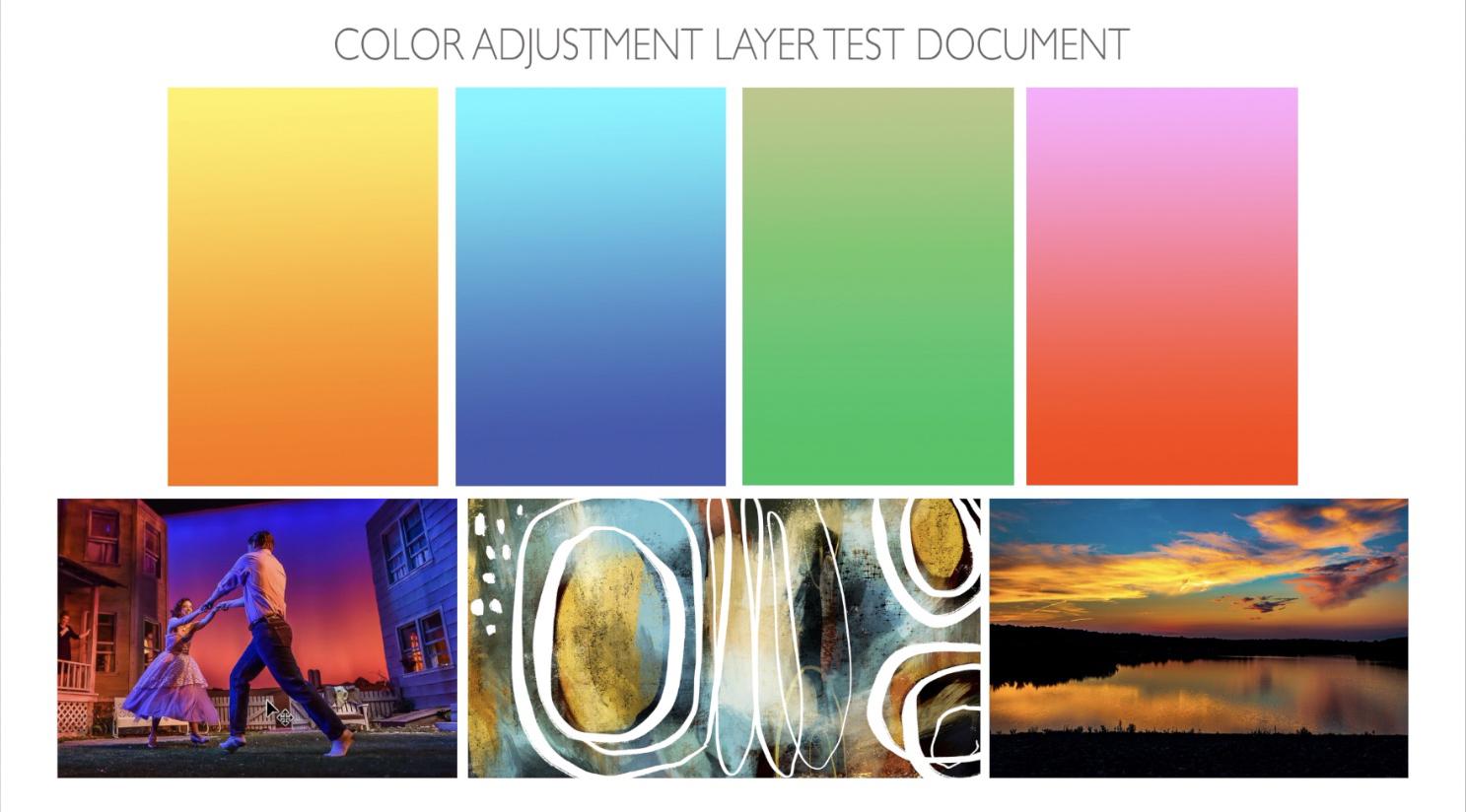
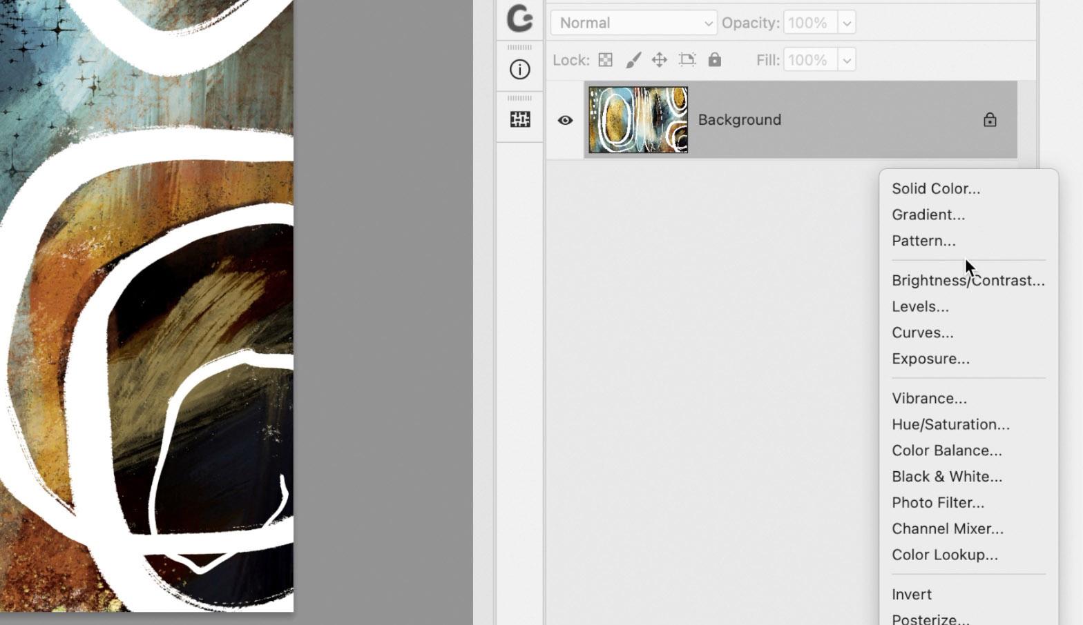
2. Overview and Explaining the Fills Category: Hi guys, welcome to Lesson 1. So we've got those four categories that I talked to you about at the beginning. And what I wanna do is cover each of them separately. I want to leave the color category for laughs because that's going to be the longest one and it may last more than one lesson. So let's just check out this first one fulfills. All right, I've opened up this document that we're going to use for some of this kind of exploration. I thought this one was a decent one to use because it's got a lot of different colors going on. And I think we can really see the effects that we add. Let's look at these adjustment layers and you can see the different categories that I mentioned. So this first section here, It's fills that is divided and the next section is luminosity. So that would be anything that kind of affects the light that's in the image. The third category here is the cover one, which is really the one that I find I use the most, I do use some of these at times. And selective color is the kind of thing that I would use when I am doing, for example, different color ways for a pattern. So adjustment layers, like I said, are found here, are layer adjustments, but you'll probably have heard both the term layer adjustments and adjustment layers used. This is what I consider the layer adjustments. And if you go up to the Layer menu here, you can see that there are adjustment layers you can add. They really are exactly the same categories as you would find in the layer adjustments. So I really don't know if there's any difference and why they're found in two places. If you do hit one of these lake, let's say hue and saturation and say, Okay, then it shows up here in exactly the same way as the layer adjustment woods. So I'm a little confused as to why Photoshop has these two different methods to add these adjustments. But nevertheless, here we are. And I think what I wanna do is show you how exactly the fill adjustments work. Let's first add a solid color adjustment here. So when we click on that, our color picker comes up and we can pick any color that we'd like to fill that layer with. So let's just pick a sort of bright blue, kind of a cyan. And you can see that at the moment it's solid so it can't show anything through from our actual artwork. So I wanted to point this out to you because all of these settings that you have four layers normally you can still apply. So for example, I could reduce the opacity of it. And then you can see the layer through. You can use any of the blending modes, and that will affect that layer below it. Now I mentioned the term non-destructive at the beginning. And what I wanted to show you here is that if I turn off this layer adjustment, My background has not been affected at all. So my actual artwork has not been altered. So that's a beautiful thing because you want to keep that completely untouched. Now I could go through here and I could continue to add layer adjustments. And they are added along with the original one that was there. And now with any of these gradients for color feels, you have all the regular controls that you had for these adjustments. So for example, I can click on this gradient and get the sliders here that I can use to make changes. For example, I could select and just change one part of the gradient. I could add additional colors here. And this works exactly the same way as your gradient always works. There are also a lot of presets. And this is kinda thing you can actually find online is presets for gradients. I've seen a lot and yeah, I've used a few. So that's something to keep in mind as well. If you click OK here and get right out of the properties, again, you can go through and use blending modes or affect the opacity. And again, if I turn these off, you'll see that this layer has not been affected. Now if I had multiple layers, I might want to create these as a clipping mask. So the way I would do that would be to pull down my option key and click on the adjoining line there. So what that does is it ensures that that gradient or that color fill is only affecting that one layer. I'll try to show you an example of that later when we have a document with multiple layers, again, you can turn off and turn on at will. So you can have them in combination or you can have them singularly. The last one in this category that I do want to show you here is the addition of a pattern layer. So you may wonder why on earth you would want to add a pattern. And let's say something like this. Obviously, that's not going to be anything and I'll be doing, however, I have found it very useful for adding textures like paper texture. So let's just add this one here. When I say okay to that fill, then I can also change the scale a bit here. So let's say I want it to be really noticeable, evergreen, let's say 300 percent. So three times the size. You can clearly see that I can click OK here, and I can go in and make adjustments in the same way that I showed you before as well. We could say reduce the opacity a little bit and then also go in here and use a different blending mode. So a lot of times for paper texture, I use something in this section here. Quite often it's soft lights, but of course you can go through and experiment with all of these to decide on which one looks the best for your application. And then remember that you can have that on top. You can have it in addition to these other adjustments that you made. So that's kind of a nice thing too, and it's just so much faster having it this way where you can instantly add the adjustment, but then also have it working in conjunction with something else. So that kinda covers the fills category down here. And the next one we're going to do is the luminosity categories. So let's do that in the next lesson. I'll meet you there.
3. Learning Luminosity Adjustments: Hi guys, welcome to Lesson 2. In Lesson 2 here, and we're going to cover the luminosity category. Let's get started. Okay, so I'm going to actually toss these adjustments that we made in the last lesson. I want to talk to you about this next category, which is the luminosity. So in luminosity we've got brightness, contrast, levels, curves, and exposure. You've seen these before, you've probably worked with them before. Or here within the menu, you can go to adjustments and you could adjust any of those things. So hue and saturation is very common as a change or an adjustment. And you can see here that I can do all kinds of cool things by just moving these sliders along and click OK here. But the problem is, as you can see here in my layers palette, I've now destroyed that original image. So that's something that I like to avoid at all costs. So I'm just going to undo that adjustments and I'm going to actually make a couple of these adjustments in the luminosity category. And you'll see that it's a lot more powerful than making the adjustments from under the menu. So let's, for example, start with brightness and contrast. Now in that first category that we looked at, the fills, when we did go to make a change here, there was nothing that came up in the properties panel. So you'll see with this next section here and its luminosity that you do have controls here. So it's not just a matter of making changes. Here in the Layers palette. You've got these controls up here. For example, here, I could brighten, I could increase the contrast. I could make those changes. And I could also go in and make adjustments. Here. That's one of the things I wanted to point out how it is that these are doubly powerful because you can affect them as you would an actual layer. You fed in mind when you're making changes. And I know right now I'm showing you all of these kind of individually and not showing you how powerful that could be altogether. And I promise you will get to that at some point in this class. So let's just take a quick look at levels. Again, you've probably seen levels control. I'll just turn that brightness and contrast off for the levels control is something that I use. I'm sure on every single artwork that I do, I always go in at the end and make adjustments. So that is another one of the luminosity settings. I'll turn that one off, less checkout curves. And now this one is probably amongst the most powerful when you are affecting the curves, what you're doing is affecting the channels in the image. I won't go into great detail at this point about how these work, because I'm just kinda taking you through the actual categories quickly. And as we work our way through the class, I'll give you more details about these adjustments. And of course, it depends on the kind of image that you're adjusting. So this might be completely different for this type of image as opposed to an image like this of my adorable little grandson. So I have converted this into an artwork and this would be one where I might want to affect the curves to improve the image. So you can see here as I move my curves around and right now I'm on the red, green, and blue. How was it? I could go in and affect each of the different colors individually. So if I wanted to reduce or increase the amount of red in the image, I would be in the red category. Same with green. So I'm actually going in, and what's happening is these channels are being affected. So that could be completely different for photograph as opposed to an artwork. So our last one here is exposure. And again, this is one that I often find that I am just slightly fiddling around with to make adjustments. And like I said, this is something you should experiment with depending on the type of image that you are working with. A photograph will respond completely differently than some kind of graphic art work. Now the other thing I should point out, since I've got two images open here, one of the things that's really cool is to group a bunch of changes. And this works really great if you've got, let's say, a series of photographs or a series of artwork. And you want to apply the same settings to both. You can put these into a group just by simply clicking this group folder icon down at the bottom of the Layers palette. And you can actually grab and drag that into another document. And now all of those settings, Let's turn off the ones that I had here. All of those settings that we had done on this one are now applied to this one. So again, like I said, if you had say you took ten pictures at the beach or something like that, and there was specifically one exposure adjustment that seemed to work for all of them, then you could apply it very, very easily to numerous photos by just grabbing all of those adjustments and dragging them over onto another document. So that's another level tidbit that's very interesting to note. Let's move on to the Effects category of the adjustments down here, and we'll do a couple of things in the next lesson to take a look at that. And probably as we near the end of that lesson, I want to show you using combinations from each of the different categories and applying them to either a photograph or your artwork that you're trying to effect. All right, So let's meet in the next lesson.
4. Special Effect Adjustment Layers: Hi guys, welcome to lesson 3. So if you've been in a lot of my courses, you've probably seen me use these special effects more than once. I'm going to go through them with you and we'll try to cover as much as we can. Let's get started. So before we start looking at color down here, so this whole section here, I want to show you a couple of the effects that you can apply using a layer adjustment. Now something like Posterize or threshold, these things are available here as well under the image adjustments. The problem is if you do go in and make changes here, your destructively affecting your original layer. So I always recommend that you use the adjustment layer method of making these changes. So for example, here you could invert your documents, post her eyes, and note that as I'm applying these, the properties panel shows the different sort of adjustments that you can make with that particular layer. This gradient map is different than the gradient that you find up here. So with the gradient map, what this does is the color will replace, if you add a color here, it will replace a specific tonal level. So the tones, light, medium, and dark, those are replaced by whatever color you choose. In other words, what it does is the gradient map allows you to map different colors to different tones in the photo. So the darkest areas of the gradient replaced the shadows and the middle replaces the general exposure and the end replaces your highlights. So this is currently replacing the darkest areas of the image. Let's just go back to Kind of a teal. The mid-tones would be replaced by whatever color I put in here. So let's try really hideous green. Let's try it. I don't know some what could look at with this. Let's try a purplish color and the highlights, let's replace with FEB reddish yellow. Okay. Not my best work, but what I just wanted to show you is that this would be a really cool way to create something like none of the AutoZone. But I don't know, it's almost like the effect that you get with screen printing or something like that. So I've used this more than once to create a series that have the same kind of or specific sort of a color range. So that can be a really cool effect. Now, Selective Color is one that I use a lot when I'm doing pattern design and I want to create different color ways for the same pattern. For example, here you can see that I can affect any of the different tones in the image. So if I wanted to create a different colorway that had instead of blues, maybe something completely different. Then this would be how I go about changing those. Now if you want to see a more detailed description of how I use this for changing by a pattern color ways. Then check out my class on the pattern preview tool. The second class, I've done a series of three. And in the second one, I cover this particular adjustment layer for producing different color ways. And really, in a way you can get the same sort of effect as I just showed you the gradient map by going through and adjusting using these controls. Now the last one in this category that is pretty cool to look at is threshold. And this is a really great way to posterize something or to take away a lot of the light or the dark. And this I've used often for creating specific sort of masks, affecting masks on particular layer and doing some really neat sort of modern art effects. These are things that you can use in combination with other effects here. So for example, if we were on this layer, we might Use the threshold to add more depth and affect the light in a particular type of image that we're trying to produce. I can't tell you exactly how you would go about using these, but as with every class that I teach, I wanted to really encourage you to do a bunch of experimentation to see how these different things can work together to create something that's really uniquely you. And remember the cool part about this is that you can always start over. You can always turn it off and you can always go back to the image as it was when you first started whatever experiment it is that you're doing. Now in the next lesson, we're going to really start taking a look at color. And these are the ones that I find myself using the most often. So I definitely want to share some of my knowledge about these color adjustment layers. All right, so I will see you in that next lesson.
5. A Look at the Color Layer Adjustments: Hi guys. Welcome to lesson 4. So unless than 4 here we're going to take a look at the color category. Now there's lots to cover here. So this may take more than one lesson. Let's get out. So when it comes to the adjustment layers that affect color, there are really just a few of them that I use on a regular basis. I will touch on all of them. But the two that I use most often are human saturation and color balance. So I've got another picture here. This one is my other adorable grandson, got three grandsons. And I'll just quickly show you each of the different adjustments for color. I'm going to explain these a little bit more thoroughly, but we'll start with Channel Mixer, and that's probably the one I use the least with channel mixer, you can see the controls that have come up here. The properties. What you're doing with Channel Mixer is working with the channels which you see here, red, green, and blue. And what you're doing is adding more light to each of the colors that are in the image. And when you use one of these specific colors, red, green, or blue, these sliders indicate how much more red you are adding to the red pixels in the image, or how the green looks good from red is the light that's added and same with blue. When you add the red light, blue, how that blue changes. Okay, so that's something I'm going to explain a little bit more thoroughly, but basically that's what it is. We'll go into that in a bit. Now the second one is the Color Lookup. There are some presets here. This is something I rarely use, but I did experiment with a little bit. You can quickly change a photograph with presets, and that would be something probably worth having you look at an experiment with a little bit. Now these adjustments are going to be quite different. Whether you're working on photographs or working on artwork. And I'm going to be going into a little bit more detail on these using this other documents. I know we've kind of covered the gradient map a little bit and I just want to show you how useful that could be for recoloring a photograph. It gives a completely different effect on a photograph as it does a piece of artwork. So this end of the slider is for the dark tones of the image. This end, the other extreme is for the light tones of the image. And then in the middle are the mid-tones. Okay, So if I had black replacing the mid tones, obviously that would not work. So I would choose another color that would replace those midtones. And a midtone kind of a color usually works the best. So for the dark, I would go for a very dark and for the light, I would go for something really light. So this is one that's great for doing something like creating a dual tone. I don't really use this one very much either. I've used it for some really specific things. We'll talk a little bit more about that one later. Now he was saturation is the one that I use the most. And we'll go into quite a bit of detail for that one. I'm going to take off colorized here just for a sec so you can see, but of course in here, this works very much like you would expect with hue and saturation. If it's something you've used a lot before, then you'll find this quite a bit more easy to understand than the other settings here. Levels actually do use this one quite a bit. You know, a lot of times has to adjust the contrast in the image. So this is something that I would use in conjunction with another one of the adjustments. So I'll show you that in a practical way when we take a look at that other document and vibrance, I mean, I do majestic vibrance, but I often do it using levels and the hue and saturation more than I would a separate sort of adjustment layer here for vibrance because I feel like I can achieve that without the use of adjustment layer of fat makes sense. The thing to note about the use of these adjustment layers is you can use them together. So I might use something like levels and hue and saturation and perhaps even Channel Mixer to go in, let's say on Channel Mixer. And if I wanted this picture to have a little bit more blue, that kinda cools it off a little bit. I would adjust one of the other ones a little bit. Now if I want to have the same amount of light in the image, I'd be looking at this spot here to try to keep it close to a 100 percent. So maybe a little bit less here and a little bit less here. And we're at exactly a 100 percent. And I think that looks quite nice. Now with the hue and saturation here, I might adjust the hue slightly. And with levels, I would go in and perhaps give it more contrast. So that's how they work together. Now in this image, I might cut down that yellow a little bit. So I go back to the channel mixer, add more blue light, and work on that skin tone together a little bit more realistic. So that's kind of a little bit of an overview of each of these. And so in the next lesson, I'm going to give you some more detailed information about a couple of those. Alright, so I'll see you in that next lesson.
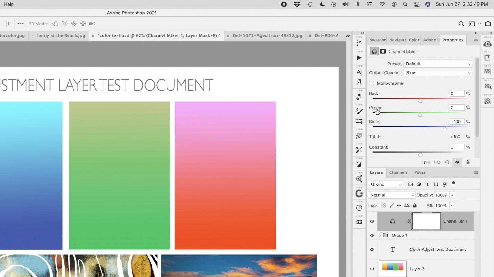
6. My Practical Application of Adjustments: Welcome to lesson 5. So in Lesson 5 here we're going to apply a few of my favorite adjustments or the most common ones I use. I thought that this document would be a better way to illustrate the changes that were happening because I've got a photograph that has extreme kind of lighting. I've got one of my regular artworks, the one we've been working with. And then another photograph that could have colors really changed and could look really cool. And then also of course, just a few of the, just kind of solid colors, or I should say gradients, but with a yellow to orange, cyan to the blue, green with kind of a golden tone at the top and then the red. And so you'll see in a more practical way how the different adjustments work. So first one I want to show you is the channel mixer because we were talking about this to do with lighting. Now these panels are taking up a lot of screen real estate, so I'm just going to compress them a little bit and I think I can enlarge my document. I don't know if you ever do this, but down in this left-hand corner, you can have a new measurement in and have a little bit more control over the size of it. So let's take a look at these channels again. Now, did you see that as I clicked onto the math, if this was the properties that came up and I'm not actually using the mouse, but I want to work with the channels. So I'd have to click right on the layer icon for channel to get these controls. Remember we talked about the channel mixer controlling the light in the document. So if I use the blue channel, I'm adding a blue light to whichever set of pixels I select here. So I would be adding blue light to the red pixels. Keep a close eye on those images over here, and you'll see how adding blue light to those images really affects the way they look. If I go with way less than, of course, it's going to affect all of the red pixels in this image because this is what I'm on right now I'm on the red pixels and a lot less blue light then makes it quite yellow rate. And if I were to change to green light by that, go into the blue pixels here, any of them, the blue pixels then change to have more of a green tinge. If I go to the right and if I go to the left, you can see what happens. A lot of the green in those different images just disappears. So let's go into the red and look at the red pixels and you can see how that adjustment affects the red pixels. And then remember what I mentioned about keeping an eye on this number over here so that you're not affecting the amount of light that is actually in this image. So if we want it to stay at approximately the same lighting than we want this to equal close to a 100 percent. A 100 percent would be the ideal. So another way to look at this is to imagine this as the light, red light. And if we were to remove all of the red light from the red pixels, so we really put 0 here. You can see that I have completely eliminated read on any of these images. Now interestingly enough, you can go through and use this to create an opposite color scheme than what you started with originally. So you can also do this to additionally remove. So let's go to 0 with us again. And additionally it remove all of the green from the green layer. So here we would also put 0. And you can see now we've got just the blue left. And of course you could manipulate that if you wanted to. Now the next thing I want to show you is kind of a cool application of the use of this particular layer adjustment. Let's reset. So down here on the bottom of the properties panel, we can just click this reverse arrow and it goes back to our original settings. And let's go through and remove from each of the channels all of the color from green. I'm going to take that away, but I'm going to add it to both of these. And I'm gonna go to the red, take it away from the red, and add 50 and 50 to this channel. So this is what I'm always keep an eye on, is this here. And then the blue take away all the blue light. And, and 50, and 50. And what we've done here is we have created the absolute opposite of what we had originally. So if you were to look back at what that setting was before, so that's what it was before, and that's what it is after. So this is a very powerful feature that you could use to your advantage. Like I'm looking at my artwork here in the middle and thinking about how cool this would be as another collection that I submit for art licensing. I'm going to take this back to the original and explain to you in another way. Sometimes it just takes several different ways of looking at something to fully grasp it. So remember that what we're looking at up here is the light. And when the light is added, if it's the same color as the channel, it will brighten that particular colors. So blue, add it to the blue channel. As I increase this, it makes everything bluer right along. Do that. If I add red and as I'm increasing here, you can see that the reds all get richer here. And then the same thing with the green. If we go into green, marine light added to green will make the green more intense. Now, the offset, once you get past the zero-point here, what's happening is that we're reducing or removing the green light from the green pixels. So if we go right down to 0, we don't see any green at all. That's because without light, without the green light, you can't see any of the green pixels, so they just disappear. So you have to be above 0 to continue to see the green. And then depending on how you adjust this, you can manipulate the amount of green in the image. And then of course remember to keep track of that number there too. Know that you have the same amount of light as you originally started with. Only one I haven't mentioned here is this constant slider. And what this does is it makes sure that whatever light we're adding is being added to all of the different pixels. So if we were to add green to all of the pixels, then this is what would happen, okay? Same thing with the red. If we go to read than red will be added to all of the different pixels. So I hope that's going to help you a little bit in understanding the color adjustments. And sometimes you really don't need to know all of this theoretical stuff about it, but just experiment with the use of it. And especially creating artwork. Sounds like you're touching a photograph when you're creating artwork view are using your intuition to enhance it and you are the judge of what's happening here. You don't have to know exactly what's happening by just taking a look at the artwork there can tell you or show you something different and maybe something that enhances the artwork in your eyes, right? You are the artist. Okay, So let's end this lesson now and we'll move into another one of these different color layer adjustments in the next lesson.
7. Lesson 6 How I Use the Adjustments Day to Day: So for this lesson, I thought it would be interesting for me to just open up a bunch of my art work together here that kinda have different things going on with the color. So when I am submitting art for art licensing, let's say this top one here, I would probably produce at least five to six artworks that are completely unrelated and have the same coloration. This is just one of the tricks with art licensing. You definitely need to produce art in collections so that they're a little bit more flexible for the use of the, either the POD site or for the person who's buying a license from you to use and whatever application. And I always kinda give that example. Let's say a hotel buys this artwork. They're not going to use this artwork on every floor, in every room, but they want to have the same look. So they might buy all of the licenses for all of those artworks that are related. And then they can mix and match and use throughout their hotel. So that might help you make a little bit more sense of it. So I'm going to grab all of these here. I've got them on separate layers at the moment, and I'm going to put them in a group and then I'm going to add the layer adjustments to the group just to show you real quick that you could do, let's say hue and saturation blanket adjustment to the whole group. So you can see as I'm sliding along here, changing the hue, slider, the hue, the changes that are going on over here. And just like we did with the channel mixer in the last lesson, you can see that the adjustments affect everything accordingly. Now, that's if I apply to the whole group, I'm going to undo that and show you that if I were to add that adjustments at the top here without it being grouped. And I make the same kind of a change. It works in exactly the same way. So that's because I haven't got that hue and saturation adjustment clipped to any specific layer. I've got it affecting all of the layers underneath. So if I wanted this to just be affecting this layer than I would hover over the line connecting the two layers and click and it's only affecting this particular layer. So you can only see the changes here. If I wanted both of those to be affected. That's where I would probably put them into a group and how the adjustments and clip it to the group. And then you can see both of these images are now affected. I've had occasion in the past to do this where I would have someone interested in that particular combination or this combination here. They really need a specific color that they are working with. So their interiors all have purple in them for some mysterious reason. And they want, all of the artworks in this series are in all of, let's say, a series of ten that is currently oranges and feels like this one up above, but they need to have purples instead. So that's where I would go ahead and use this kind of technique to change all of the artworks at the same time. And the other cool thing is that once you make question adjustments, so let's say we're gonna go back here. I'm going to add a couple of other adjustments here. So let's add a levels adjustment. So we're going to adjust, change everything here now, right now it's still clipping as you can see here. So I'm going to unclip these so that they're affecting everything on the page. And I'm going to go back to my hue and saturation because I don't like that original combination that let's do something maybe a little bit different here. Let's try this one and let's see one more. Let's add something else here. The pattern overlay and just keep it at that same paper that I had before. Work with the opacity and the blending mode. Now, this is interesting. I think, that we are creating a really cool set of parameters that applied to all of the artwork that we've got on this document. So that's pretty cool. But the one thing is I may not I'm actually going to turn that one off, actually delete it completely. I may not have all of these on one document. I mean, chances are that would not happen. I would have specificly separate documents for each of the different artworks. Okay. So let me take all of these off this one so I can use this as an example. So we'll go back to this one here. And so those two settings that I have here, if I were to group them, I'm going to select them both will have down my shift key. I'm going to put them in a group is to make it easier to transfer and I'm going to grab that and drag it over to this documents. And you'll see that instantly those changes that are made are applied. So that's a really important thing that I wanted to show you. And I actually don't even mind this color scheme. If it was something current are trending, then that would be something I might consider doing. I'll tell you when I produce a bunch of artworks in a collection, I might produce Tanner, I mean, sometimes it's five, sometimes it's 10, sometimes it's 20. A lot of times it's just to catch the locker, get the feel for what I wanna do and I may not use them all. I mean, not submit them all. Does it mean I still don't have those documents? I can go back six months later and grab the ones that I haven't used, and then go in and do all kinds of cool stuff with color to, let's say, come up with as newest colors with the most recent colors or Something that happens to be trending at that moment. And, you know, I, for example, love this. This is what I think it would be so cool. So this is something that is really important. Addition to your skill sets. Being able to do this easily, use no way that you could go back to a document like this and be able to really figure out what you did or how to change it not nearly as easily as being able to just apply these layer adjustments. So that is the number one, most important and most powerful thing to know about these skills that you're picking up here. Okay? So that's my $0.02 worth about adjustment layers, words of wisdom. And before we end this class, I just thought that I would give you another quick look at using the adjustment layers on a photograph. Even though I'm not really a photographer, I would never call myself one. I have worked with photographs for people when I'm doing custom plaques or artwork that they might want for a special occasion or whatever. And so I do have to manipulate or choose to manipulate things like the color and the tone in an image. So I'll give you an example of some of the things that I've done. So I might do something like this where I take all of the green out or as much of the green out as possible, or affect the green to be slightly different. So if I'm on the greens here, every change I made down here affects the green in the picture. So that might be something that I do to customize artwork for a client. Curves I often use and apply to photographs of course, is to correct your curves here, you can grab the nodes and move them around to affect different parts of the image. Right now I'm on RGB, but I could go into the green and only affects the green in the image by dragging it and moving it around. Exposures, something else that you can use for just correcting CMYK color balance and good old channel mixer. And then something like the gradient map can give you some really cool effects. So here I've replaced or put kind of a Navy in for the dark tones, mid blue for the mid-range, and then kind of a cream color. And having made those changes, I may also have to do something like adjustments on the levels to make it work properly. So again, I encourage you to experiment a little bit like I have done. I'm going to give you this document here because that's a really good one for doing some experiments. Like we just did, all the different things that we tested and went through and tried. And you can turn on and off different combinations in this document so that you can know, really test out how that might work for yours. And, you know, by all means, replace these photos or artworks with some of your own so that you can really get a feel for what those adjustments will do. So I'm going to take this rent, this channel mixer right off, and you can go in and make adjustments to just get comfortable with the use of the adjustment layers. Alright, so, yeah, I guess that's it. Let's meet in that last lesson just for a quick wrap up, I'll see you there.
8. Outro: Hi guys, Welcome to the wrap-up. This is one of the very few classes I've had that I don't have some kind of a mock-up or something to show you at the end. This has been more of an exercise in creativity. And what I really wanted to impart here was that sense of adventure in discovering new things. Learning to use these adjustment layers is just so important to your advancement as a graphic designer and artist. And it can be just so useful in helping you to really expand the kind of stuff that you do. And really you can go back to any of your old artworks and apply this kind of new technique and come up with even more. So, I would suggest that you try that out with a few of the artworks that you already have. And maybe photos, whatever you'd like, and just enjoy the whole process of learning these new techniques. Now, if you haven't done so already, make sure you hit that follow button up there. That way you'll be informed of empathy. Knew that I do. I really appreciate the fact that so many of you are jumping on board. Also, if you have a minute, can you rate my chorus and maybe leave a review that really helps for other students who are looking to gain some of the experience or skills. And I feel that when they read the review and they hear your personal anecdote about it, they're more likely to find something that's really suitable for what they need to know or what they're looking for. If you're looking for anything else you want to know about me, make sure you check out my stores. I've got one on docile.com and in Canada I've got wanted art of where. Now if you're looking for resources of any kind, checkup, my two Pinterest sites, I've got one called the Lord's art dealers, Nas cringe, and another one called teacher Dolores now script. So there's a lot to be discovered in those resources, so feel free to check those out as well. And yeah, take a look at all the other courses I offer. I've got many, many, many, many courses here for you to check out. Thanks so much for hanging out with me today and I will see you next time. Bye for now.
 Delores Naskrent, Creative Explorer