Transcripts
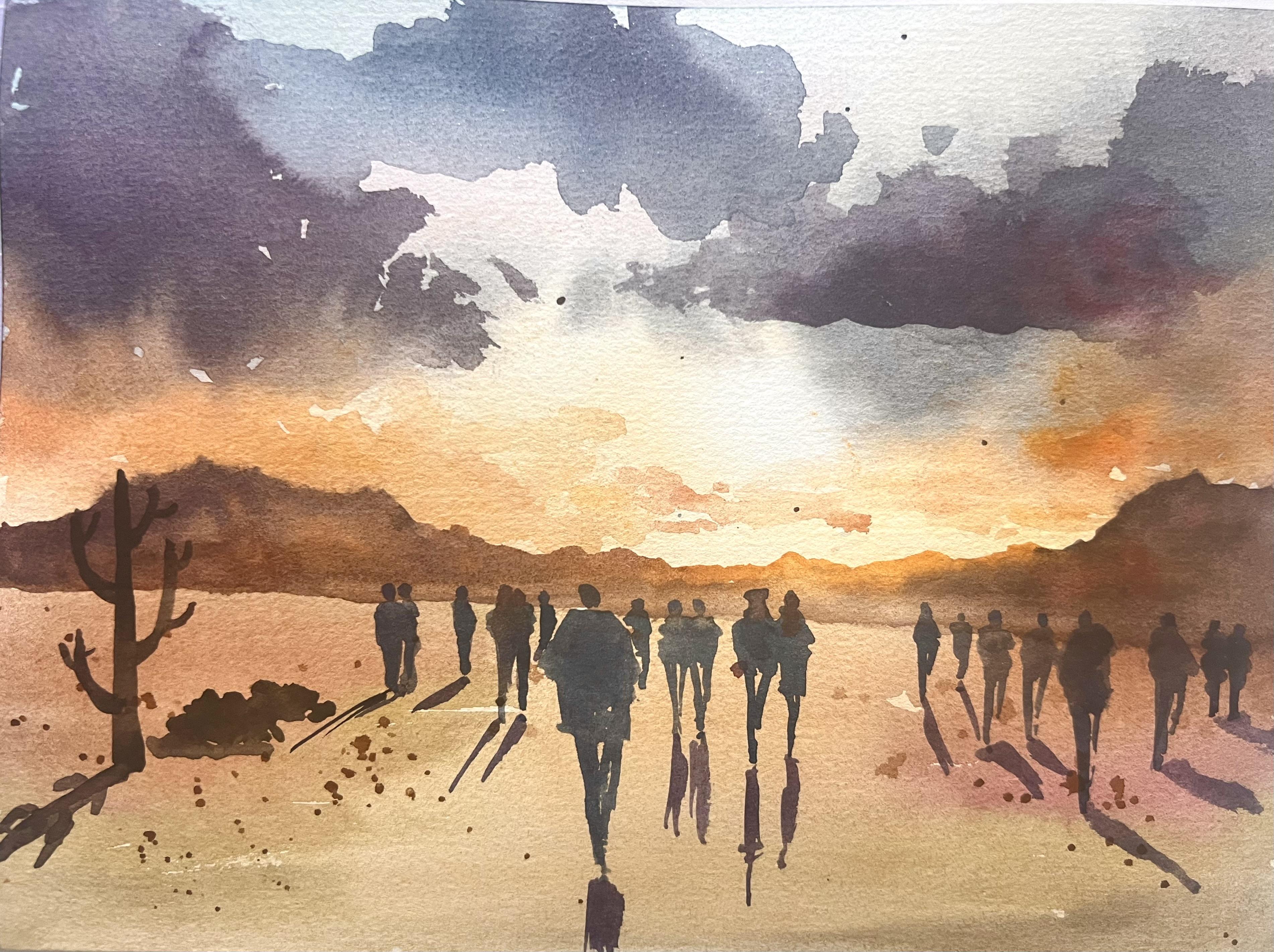
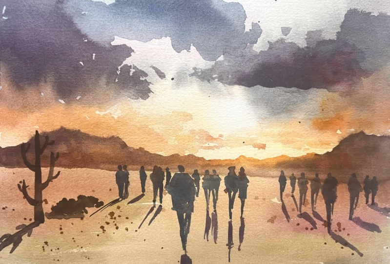
1. Introduction: You Can Paint This!: Hi, Today, I have a
new class for you, and it's going to be
a very fun class, very easy to follow
step by step, but with great results. Guess what? We're going to
learn how to sketch people. We're going to sketch
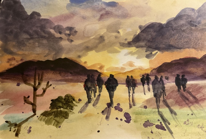
together this scene in the sunset with people
walking across the desert. It seems difficult,
but it isn't if you just break down
the process steps. Learning different
skills in this class to create a deep background
with different layers, background, middle ground, and foreground through layering. We're going to add color
variation to give interest. We are going to add people in an easy way that
are realistic, proportionate, but
also easy and sketchy. We are learning how to
paint a sunset sky. We are going how to paint
shadows, shadows specifically. We're going to learn
plenty of skills that you can use in your daily
practice because of course, the best advice that I can give you is daily
practice for people. That's what I do. And you can just practice every day
and you see that you will soon master people that maybe you find
daunting today. Hi, I'm Elizabeth. Maybe you know me
already because I have over 20 classes on sketcher. My style is easy. Sketching, painting,
drawing up for everyone. They are learn skills
and enjoy the process, and just don't look
for the result, and the result will automatically
come once you practice. I started painting
later in life myself, but now for me, it's my true passion, and also I love teaching. This class is maybe more for intermediate students
than for beginners. But beginners can have a try
because it's not difficult. It just requires some
experience, but very, very limited experience with watercolor can be
your first class. I have other classes that are easier for introduction
with a color. But if you have just a minimum
knowledge of watercolor, you will find this class very interesting and
suitable for you. So for advanced beginner
and intermediate students. Now, grab your brushes, take your supplies and come
sketch people with me. You see, it's much
easier than you think, and results will amaze you.
2. Project & Supplies: Your project will be to
paint a sunset like this, but not identical
because first of all, water color is highly
unpredictable, especially when you
work a lot wet and wet and we are painting wet
and wet in these classes. You have just to
follow my steps, but you will see
that what you will get will be your own painting, your own sunset,
your own people. Doesn't have to be like mine, will not be like mine. Your project is to make your own sunset with
your choice of people, your choice of composition, your choice of colors, and that's completely possible. Feel completely free to
personalize it in this class. Just practice until you achieve a result that
makes you happy. Remember to enjoy
the process and your sunset that
will be amazing. Let's go and have a
look to supplies. Let's now talk about supply
is the very minimal, but the most important piece
of supply is paper because for this painting that
requires a lot of wet and wet, it's better to use cotton paper. I'm using this paper by Paul
Rubens, which is cotton. Although it is in Chinese. I can read some important things like this symbol means
that it is cotton. This is 100% cotton. Here, it says 300.
Can you read it? It means it is 300 GSM. This is 300 GSM is the thickness that you need
to paint in watercolor. No less than that.
For this painting, I'm using 100% cotton. It's not compulsory, but
it's better if you do so. Also, to practice
to paint people. I'm using this cellulose
paper by Cason. It's called Montvale. I buy it in bulk because
they use it a lot. This is no cotton, doesn't have any cotton content. It's cellulose, but
still it is 300 GSM. It also says cold pressed. I suggest you to use cold
press paper, not hot pressed, both for the practice and the main painting because hot press is much more
difficult to handle. So stick to cold press. Then of course, We
need some colors. I'm using this
basic palette with the standard colors that
you all are going to have. The colors I'm using
are yellow poke, warm yellow, lemon yellow, if you have it, not compulsory, purple, Alizarin
crimson, silo blue, paints gray, and sup green
or any green that you have. These colors are just indication but use any blue that you have, A red mother permanent
or alizarin crimson, cooler red, a yellow, purple, if you don't have
it, you just mix the als and crimson with blue. I have used a sello blue, but you can use cerulan. Really, you don't have to stick
to my colors and Burcena. I don't know if I
said it, Bncena is an important color to
have or iron oxide, but yellow ocher and Burena are two colors that is
very important to have that we are going to
use a lot in this painting. Basic colors. Don't worry. I'm sure you have these colors. Then I'm using some brushes. Brushes are also
very important for a good result in watercolor. You will need larger brush. This is a brush that
I only use for water. I never used paint on this
so we can wait our paper. Then I have a big flat brush to paint the sky and this
I'm using with paint. Then I have round brushes
of different sizes. Use whatever you prefer, it's very much a matter of personal taste,
personal preference. But remember that we're
going to use a thinner one, a smaller one, like this one, if you prefer or
maybe like this one. And Larger ones, use what you have and what you
think it's easier for you. But remember that for ta, we don't have many details, but to paint smaller people, we need a smaller inner Brush. Then we need water. I like to use two jars of water. One, we only rinse
my brushes that is becoming d and one that I only
used to apply clean water, one for dirty water and
one for clean water. I think it's very helpful. Of course, you need
a mixing space. I use the one that
comes with my palette. If you don't have it, just use any plastic or porcelain
ceramic palette, or even a white dish. The important thing is that
the background is white. That's it for supplies. Let's start painting. I can't wait.
3. Prep Paper and Paint Background: For this in, the only drawing
we need is horizon line, and we Just put two dots
at the same height. So I'm sure that it's
perfectly horizontal, 3 " from bottom. Do not draw the line exactly
in the middle of paper, but at a one third
or as I'm doing 40%. And then I will use my
shoulder to draw a line. You can draw it lighter, I just maybe slightly heavier
so you can see in camera. Then I will take a
large brush line and I will wet my paper. And now the trick,
you can put of course some tape so you can
have some crisp line. But if you don't have some
tape or maybe it's hot like today and you want more
time for your paper, you can wet it on both sides. Actually, I think this
is the right side. If you wet it on side, you want warp and you have
more time to paint wet wet. Now, fairly quickly because
today it's very hot and we don't want to
give time to dry. I will take some colors
that you all have. I take a large flat brush
I will take yellow. I'm using some basic color. Here it's mixed with some orange that I
had on my palette, and some lemon yellow. You can take some
Rosana if you have it, and I will start painting
towards the horizon line. And then I must
remember that here, I will put the sun, so it's going to be light. So yellow or here. Leave it white. I also rewet. I have already
rewetted my colors, but I will re wet
them even more now. On this side, I will
put some yellow. I'll go with some yellow ocher, all the way down my painting. I must be quick
before this dries. T. And then we also will grab some seran or silo blue and put some here some blue. But I don't want this
to become green. So I will put some as crimson or rose mud and I
will just here. Paint a transition
with this color. Now, I will take some burn ciena and
mix it with this with this yellow ochre,
always very quick. And I will darken the areas that are slightly away from the light
from the sun. Now, I take the same pale
blue and mix it with a burn. So that I get a darker blue. I will add some alizarin
crimson a rose mother to counterbalance a possible green so that I get a dark cloud. We make round movements just to indicate some
clouds. Same here. Okay. Now, I take the der. Now it. Drop it here and there. The Editor and
Crimson or the rose. And let.
4. Add Depth through Layering: Now before it's completely dry, I would love to
add some contrast. I take a larger round brush. Then I will add some tax some yellow and some of my aids are
in crimson, making orange. Let's imagine that
clouds are going slightly towards the
center of the sea. Keep your brush strokes
round and lose. Some clouds that are
going just to the center. I will add I will drop in
some Eliza and crimson just to give some color of aviation
here and there. Same here. I will create some orange here. Drop in some yellow. Like this. Watercolor
is transparent cell. They will create new shades overlapping with the colors
that are underneath. Now, some wispy cloud. Take a thin brush because
clouds that are far away, they closer to the horizon
and they are in like this. Okay. Now, I would like
to put a darker cloud. We are creating depth by adding
further layers of clouds. I take my bigger brush. I take the sailor blue. And maybe some indigo. And I will also add some of my zering crimson
more indigo and alizarin crimson to create a very intense dark
and void any green. Always loose round
brush strokes. Now you can add some
sailor blue to color. A Remember that in clouds, the side facing the sun is lighter and the one
on top is darker. Now I will blend the downward side to make
it lighter like this. Now there is enough movement
and depth in the sky and we can start painting
the fields of the desert. For the desert, I take my warm color with my
larger flat brush and I start far away with some yellow k mixed
with a touch of purple. We will put mountains
here when it's and I will go towards the light. We will leave a road in
in the central part. Just the hint of the
road like this, Bancena. Somers and crimson, just to
give some color variation. So green. It takes up green and you mix it with and
crimson to mute it down. And you leave the central
part lighter below the light so that we make
people walk along this road, and you take some yellow
ocher if you like. And you can just mark this
part with some yellow och. And once again, go here. And here. And you
see that you have a lovely color variation
with some zing crimson, some green, and you leave
the central part lighter. Now I will fix this bottom. I don't like the very much. I also take some paper
and near the light, and will lift some color. Okay. So that we have this impression of light. And we let this then we are just row matins and people
finally walking. It's going to be a
dream like scene. A.
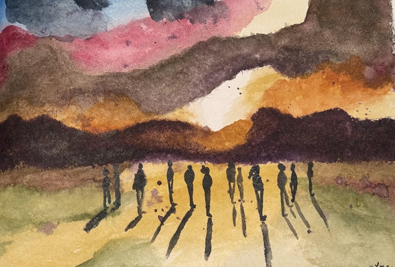
5. Finish Landscape: You can use a hair dryer or a heating tool to
speed up the process. Okay. Now, I I don't like this. We add a darker cloud ham, and I will add this
row of mantas. You see that watercolor
is unpredictable, and you need to adapt your
painting along the way. For the row mantas, I take a medium brush. This is a medium brush
with a very pointy tip. It's pointy, which I like. And I start with
some bons and I will draw I will draw some irregular
lines going quite thick, actually, not too that
goes up and down, regular, like this,
not too high. Here, I switch to a warm
yellow, just below the light, and I go back to my bars
and I will just feel it. Up to the desert. Now I take some purple and I will darken the what is
away from the light. I can use this wet
technique to a texture, you see, and here too Okay. Here was slightly wet. But it is far away, Mountain. So very important. Dry your brush and refine this. Now you can use the same
purple to splatter. I add some texture to your
landscape here and there. And we need to make everything
dry before we add people. So as I said, I don't
particularly like the shape. So we'll take some
blue, some indigo. I can add some purple. I can add some crimson, and I will make a cloud here. Now that clouds are usually
more fluffy on top and flatter on the bottom. So give some
irregular shape here. Okay. Well drop some
at some crimson here. Color valuation is
always great idea, not just in clouds. Okay. So look at the depth that it adds
these rows of clouds. And. Also, I can take some concentrate purple
and refine this head. Must be very
concentrated. Same here. And then you go down. Blend it. Just tick
some clean water. Before it dries too much. Okay. Here also you can drop some. At cle some give some. Now, don't touch it any longer. And we'll let this because
I can't wait to add people.
6. Practice Sketching People: Now, while we wait for
this to completely dry, and if it warps at just
apply on the opposite side, and I just show you how
I draw little people. I take a thin ruh. I can take it even thinner
for people that are smaller. I take my darks. For instance, I add some paints gray to this already
dark mixture. What I do, I draw a
dot for the head. An v irregular v for the body. Then one leg and the
other one shorter. So that we give the impression
of someone walking. Here you have arms that
are usually in pockets, so they fold it. Once more, like this. He's bigger, he's thinner, practice this
movement, like this. The important thing
is that you put your head all at the height, which is the horizon line. I can put a closer person to us, but the head will
always be at the level, and like this. You see that the top of the head is always
at the same level. But the feet will
be closer to us, the feet would be
at a lower level, but the head always
at the same level. If you vary the
position of the feet, you vary the perspective. Always remember, always place the heads always
at the same level. Even closer. You put the head. Shoulders. I need a
larger brush here. Okay. Let's pretend it's a
woman with longer hair. But you see the head
is the same leg. She's just closer to us. Now, once again, just
keep practicing. If you think that the body is not proportion
like in this case, you can always make a bigger
head to make him closer. She's wearing a
jacket, maybe a woman. You can always make
it slanted like this, like a, talking to her, between them. Even further. But always remember heads
are the same level. Once we have learned
this, keep practicing. Fill a whole sheet of paper with your small
people and then we get a.
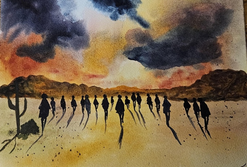
7. Add People to Background: Now, to make sure
that it is dry, you touch it with the back of your fingers because if you
touch it with the other side, you might leave a mark if
we don't want to do so. It isn't completely as usual, you can speed up
the process with your heating tool or your head. The important thing
is this aside because here we're not touching
the sky at least not yet. I take this medium sized
brush or even a smaller one, and I start adding people. First of all, I will paints. I will place people
with some purple. I will place people that
are They are bigger, they're closer to us
so that I have space, and I put the head just
above the horizon line. A dot for a dot for the head, and then like this, a potato, and then one
leg and the second leg. One more next to him
or her, one more dot. They're touching
there maybe a couple, so she will give
her a skirt, this. Now you put someone walking
here bigger this time. And just draw some
line like this. You put hands in your
pocket. Give him a jacket. You see the head is
at the same level, but the feet are down. Now we can still add many dots, and then we add people. Remember, to make sure
that you add dots. As at the same level, you can just put them before. I don't usually do it, but it's a trick to make sure that to these two
close together. Just remember to give the
idea of people walking, putting one leg shorter
than the other. Now, because he behind this
person, some white space. It's nice because
we'll give the idea of some highlight. Same here. They are together, maybe. I want to see one for these smaller people.
This is too big. Many couples. Body, a line for legs. This is small, so maybe just a hand. I go to make this. Mm. Now you can add, for instance, a hat
on someone's head. He can add a head. You can go on as
much as you want. Remember to leave
a small highlight. Between two people if
they are overlapping. Here, we need to put it. Otherwise, we don't see them. If two people are working
together, of course, you need to put feet
at the same level. Now I think this is enough
people because light is here, we can shadow and shadow their belet is going to have this direction
like perspective lines. So we start with the people that are on the left hand side
because I am right handed, so we not the color, and will just draw some purple, some lines in purple. This Here, a way out of
the direction is this one. Here is behind him, like this straight,
purple always. The are long shadows, slightly slanted, this way. That way. That's it. Absolutely. That's it. Now, I suggest that you don't
retouch anything. You just leave it like this. You can darken some
people if you like. Here you have some more color. The last trick, if
you want people to walk away from you, you
can leave like this. But if you want to represent some people maybe
walking towards you, you can take some red or cadmium red or
maybe some orange, a warm color, that is maybe
opaque, so it goes on. I will show you maybe some people that are
walking towards us. Let's pretend this couple
is working towards us. We put the red and we can also add some red for
hands like here. Let they walking towards us. Maybe these twos. But I wouldn't insist on this because
being in the sunset, they are just silhouettes. I'm teaching you this trick. But for this purpose, I prefer to have them all darker because they are
silhouettes in the darks. But remember that if you have a a situation
different from sunset. You can add some red to indicate people
walking towards us. You can darken see lights. Okay. That's it. We have easily add people, and I wouldn't touch any longer. And this is our people
working in the sunset.
8. Last Touches: Now that I watch this scene, I might add more people
on the left hand side. But also what I could
do is maybe fill this empty space with a cactus because we
are in the desert. I will take the same dark
color but I will use bien. And some green, S green with
some burn and some purple. So to have a warm, darker. I will make a Of course, this is completely dry. I will make a thick
line like this. Then I will add the branches. Feel free to I'm drawing
from imagination, feel free to make
the make it taller. Like this near the trunk. And then I will add in purple some shadow that goes this way, obviously, obviously
and maybe we can. Draw the shapes of the branches. And I might also add bush. So I will add some green
to the stack purple. And I will draw some very shallow like this bushes and always remember. The shadow. Okay. Now it's full and
now it's really finished. Just watch if there is some
detail that you want to fix. But I don't want to
touch it any longer sometimes less is
better than more, and this is especially true for watercolor. Okay. I like the elongated
chandels that stem from the people and decile even longer this one
goes outside the sea. Now it's really
over, and enjoy. X.
9. Thank You & Congratulations!: This is fantastic. You have finished your people
in the sunset with me, and I bet that you found it
much easier than you thought. Now what you have to do
really is keep practicing, keep practicing and you see that sketching people will
become a second nature. Thanks a lot for having
watched the class with me. Now what I'm asking you
is upload your project. That's really useful
for other students, so they can understand
what kind of result they can achieve
with this class. Also, don't forget
to leave a review. It's also very useful for me to understand what I did right, what I can improve next time. So thanks a lot. You can follow me on Instagram, you can follow me on YouTube. You will find all the
links in my bio in my profile on YouTube, I speak more about pigments and art supplies on Instagram, you'll see I sketch
a lot of people. You'll see many
examples of my art, and thank you with all my heart for having
taken this class. To, I see you next class. To.
 Elisabetta Furcht, Anyone can paint!