Transcripts
1. Intro to Noel Placement Print in AD2: Hi guys and welcome. My name is Dolores now, it's
great and I'm coming to you from sunny,
Manitoba, Canada. Class I'm bringing
you today is entirely filmed in Affinity
Designer to I've created a Christmas placement
print and I'm going to take you through all the steps because I'm gonna do that
whole project over again. The first one I created
entirely in landscape format. This one I'm going to create in a vertical format so that it
can be used for something like a flag flights or something that I create
a lot for art licensing. So I just wanted to convert to this Affinity Designer to see what all the hype was about. I've learned quite a few things that I'm going to
pass on to you. There are some tips and
tricks using the program. So we're gonna go through the entire design process
all in Affinity Designer. I'm even going to
show you my steps for creating the initial
sketch for the project. As we go through the class, you'll be using things like the asset gallery,
effects, adjustments, and anything else
that I can throw in there that shows you the new interface and how to deal with any little
issues that might come up. This project really put me
into the mood for Christmas. Now if you haven't
done so already and you're watching this
class on Skillshare, please hit that follow
button up there. That way you'll get any
class announcements that I send out and also any
of my discussion posts. I really look forward to engaging with you
here on Skillshare. I would also suggest
that you get your name on my mailing
list of my website. That's at Dolores art.ca. I have a ton of artists
resources there. I give away a lot so you
can go and take a look. You might find some stuff
right now that you can use. So are you ready to
dig into this project? Alright, let's get to it. I'll
meet you in less than one.
2. Lesson 1 Setting Up and Project Overview: Hi guys, welcome to lesson one. Lesson one here, I'm gonna be doing all of the setup
for this project. Let's get started.
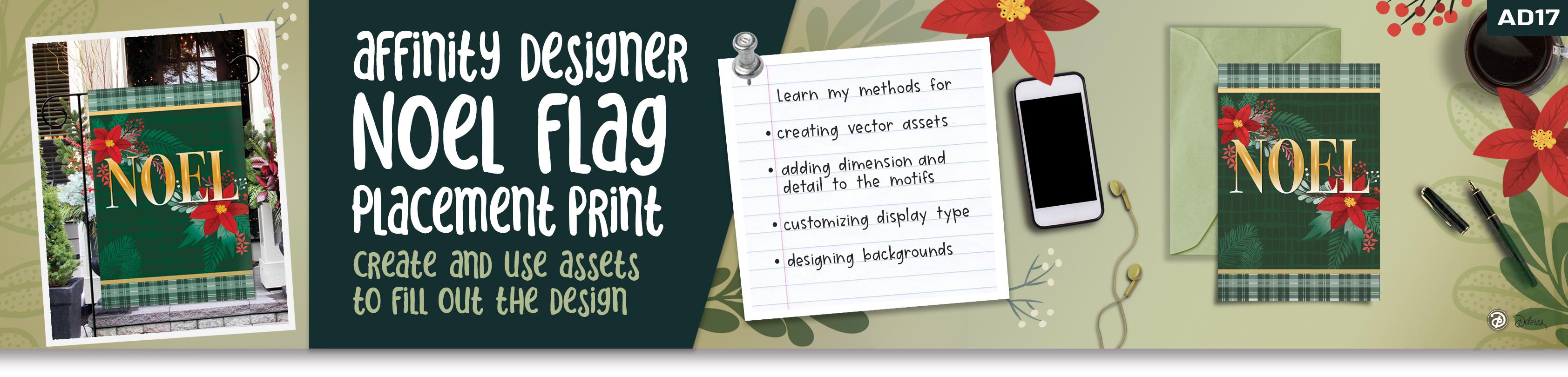
Placement print is a way to describe
it here is that it's the controlled position
of an art work within a product is
different from a repeat because it isn't tiling
to fill up the space. A placement print relies
on the artwork done to scale for the size of the product or for whatever
product you're working on. And that it's cut in a particular position to control the placement
of a print. So e.g. if you had motif on
the middle of a T-shirt, that would be
considered a placement. Or if it's a one of like this where there is no
repeat pattern here, the artwork would be set up
to the exact size so that the positioning of that
image is done perfectly. I want to also take you into
Pinterest where I'm going to show you my board
for Christmas ideas. I'll go into my saved and
I've been putting a lot of Christmas stuff just
so that there'll be a lot of stuff
for you to see here. So I've got the board
called Christmas ideas, and you're going to see a ton of different artworks that I would consider, mostly
placement prints. So if they were created for a greeting card or if they
were created for a t-shirt, they are positioned exactly
the way they should be on the finished product
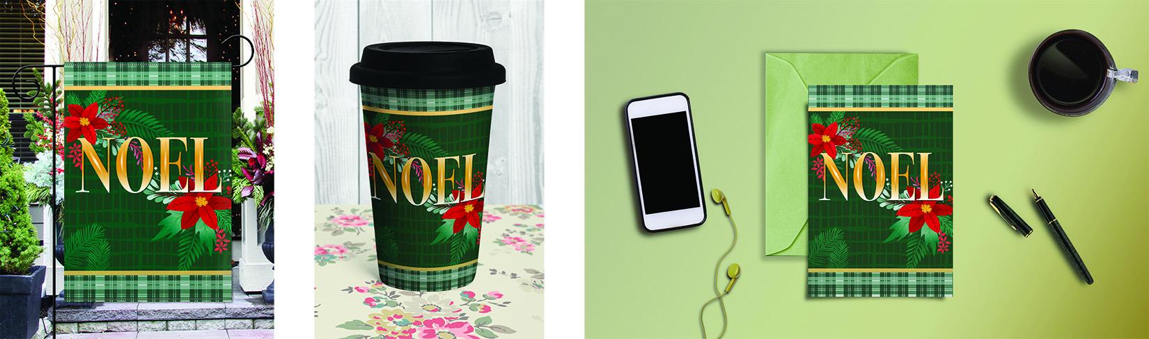
or for the finished product. I wanted to create some kind of print that I would either be able to use for greeting
cards or possibly for a flag. So that's what I'm
working on right now. And there was a lot of really
good inspiration here. And I think my favorites and the ones that
I'm kinda basically what I'm doing on are
these two right here. I really like the
dark, dark background. So the one I did was
a really deep green. And of course it's
the point set is, and then all of the extra little shrubbery or leaves and things
that are in behind. Once you click on the image, you're gonna get a lot
more related ones here. So there's some really great
ideas you can glean from. I would definitely suggest
that you be original with it. Try not to copy another
artist here directly. But I mean, there's nothing that says you can't get ideas from this looking at all of
these and Christmas, it's been done a
bajillion times, but you can still find so really original
things being done. And that's kinda what
you're aiming for yourself. You're trying to figure out
how can I make peace assets and then use these assets
in a way that is unique. This one is really pretty too like as far as lettering goals, it's not the way I did it, but I think that would be
a really fun alternative is adding the motifs that you create right
onto your lettering. This navy one here is great. I love the idea, first of all, that its navy and not green. I do like the laddering
except for the fact that I don't really like
that change in scale. I personally don't
do that at all. I feel that it just doesn't
look right in my opinion, but as far as the artwork and it being
on Navy, it's great. And I do like the effect on the lettering and that's a
little bit of what I went for. I wanted to make
mine look metallic. I liked this one here, so I kind of used
some aspects of that for putting some
detail on my lettering, but I do prefer the metallic look at that
I came up with in the end. This was just a way to just get my mind going and
get me started. I also had all those
assets I've used or created for when I was doing my pattern
design months ago. So I thought, well, if I can use a lot of the assets
that I already have, that would make this
job a lot easier. So I just wanted to start out by giving you this information. I'm recording this
Affinity Designer class in the new version, affinity to, I know my voice is going to sound a bit weird because
I've got a bad cold, so my nose is kinda plugged. I apologize. So honestly, this
version didn't have for this particular document any major changes
that affected me. I just wanted to
put that out there. I'm getting much more used to
the location of everything. And there are a
couple of things in here that made my job easier. But as we go through this, I will point out anything
that is of any significance. So what I did with this
particular project is I started by
doing my pencils, catching some of the assets
that I wanted to create. I did figure out how to import assets from
the other programs. So during the course
of today's class, I will be showing
you how to do that. But this whole
section from here up, these are things that I created for this particular assignment. And I did it right here. I didn't go into Procreate to do any of my sketching. So e.g. this is one of these leaves and this little pine branches, one of them is this
one down here. So I have made All of these things right from the get-go in this program. So I'm going to just kinda
show you the sketching process because I don't know
if we've ever really covered that in
Affinity Designer. So it's a good
opportunity to do it. What I did is to switch
to the pixel persona. So instead of them being
in a row at the top here and now they're hidden
underneath this menu. We go to the pixel persona, and you'll notice all of the
tools and things change. I grab the brush tool and
went into the brushes here. And this has not
changed really at all. So you can just go to the
pencils in the brush studio. And I grabbed six B pencil. I like six P because
it's the real-world. A really nice sort
of greasy pencil, so it goes down really nicely. Now, one of the things
I did notice is that when I go to paint that often, nothing comes up on my screen. And I believe that this
is the culprit here, is locking the Alpha or
protecting the Alpha. I'm going to actually
drag that out. That's the pixel layer
that was created. And you can see here now
that it's working just fine, I will switch to black. So it looks like if it's
nested within a vector group, it won't show up. Okay, So that's just one
thing for you to note. Let me get these
two off of here. I'll go back a couple
of steps and then I'll add a new pixel layer. So here's where you add the pixel layer if you don't
want to do it automatically. So when I initially
started drawing, it, created a pixel layer and it was destined within this group because I had been
in this group. So if you want to
just add it yourself, go to this plus sign and you'll see that
these are a little bit different than they
were in version one, e.g. the layer options was right beside this plus
sign in version one. I'm not quite sure
why they changed it, but there's all these
other little things here. And this is the one where
you would create a group. This is where you would
eliminate something. So this is kind of
where the garbage can or trash can is now hidden. But anyways, I just
went through and I just drew kinda rough sketches
of what I wanted. Now, in this case, I had
no stabilizer on it. You can add a stabilizer. If you use the Rope Stabilizer, these controls come up
and you can make changes. This one is the
thickness of the brush. So it's almost imperceptible
if I do it too small, you can adjust it to be nice
and thick if you'd like. This is the float. And so if we put the flow
really low for the pencil, you'll see that
it is very light, but if you put it up higher, you'll get a nice
deep dark line. And this one is the
opacity so you can adjust and have it more transparent or have it
nice and thick and black. So I'll erase those lines off. And I find that sometimes I want to use the stabilizer
and sometimes they don't. So there's two choices. You can have a window
stabilizer or you can have the rope stabilizer, or you can have no stabilizer. And you can see
with no stabilizer how much more accurate it is. And you need that
when you're drawing something that has that say
these little jogs in it, because it's really
hard to do that with the stabilizer set really high. Okay, so I'm just going to
draw a simple leaf here. And this is without
a stabilizer. I mean, it's not bad. I think this would be
adequate enough for me to use as a basis to do my tracing. Once I had all of these drawn, then I had to figure out
the best way to ink them. I switched the course back
to the designer persona. And in most cases, I use the pencil tool
to do the tracing. And again, you can stabilize
it if you want to. And you'll see
that when you have a new layer here and
you do your drawing, I'm tracing along the
outside edge here. I've now drawn a vector path. So this little
control its top here. If you click it, will close your path so that you
have a complete shape. Okay, so then I've
my shape here. I can go and do everything
that I used to and the other program fill at will. And that issue is still persists even though I updated to version 2.2 or whatever the new new
version wines like within a few days they had a
new version out that probably solve some
other glitches, but it did not
solve the clutches of the swatches disappearing. So I have a whole bunch of swatches here
and sometimes they just disappear when you go into the color wheel and
actually get rid of this. I was trying to add colors
here or this palette, and it was not working the
way it did in version one. So e.g. I. Would go in
here and mix a color. So let's say I want you to mid-tone grayish looking green. I should be able to go to
the Swatches palette here and then add current
fill to palette. And you see that all of
the swatches here change. So that doesn't
make sense to me. So there's something
definitely wrong here. Eliminate this. See how it just doesn't
seem to be working. I should be able to press
on that and delete it, and it's not allowing me to. So there are some kinks to be worked out in their
color palette here. So if I go back and
let's say I mix another color and
then I want to add this and I go to
the swatches back to normal so it makes
no sense to me. And then when I tried to
add the fill to the palate, it switches to a completely
different colors. So that was a little bit
of work to get used to. So it almost makes me
want to go back to version one to work on a project
like this, but I shan't. I will stick with it
and just learn it better and hopefully the
patch will come soon. I want to show you how I
did this sort of a branch. For this, I took a
first things first, first I would draw the
path and I'm going to go in here and change
it to a green color, but not the fill. I want just the line to be in
green and then here, Okay, So if something's happening
there now to my goodness, this is so frustrating
to try to teach from because of these glitches. So I'm making just
a single line, see from start to
finish one single line. And yet it's closing
this automatically, so it's making it into a complete shapes so that
when I put an outline on it, it's going around
the whole outside. So let's try that again. And before I start, I'm going to take
the auto close off. That didn't use to be an issue. So now I've got
just a single line. I can color it. And you can see right
now the thickness and the profile of the line
that is controlled here. So to make it at both ends, I need to bring these two
down right to the bottom. And then this would
be what would control the thickness somewhat. You can also control it here. I just want to get it to
about the same shape. And then now I can go through
and draw all of my leaves. Are these called petals? I don't even know for any bits. Let's just call
them for any bits. So now I can also use
the controls here to reduce the thickness as I'm getting up
here towards the end. And I've got this pin to open. So if you don't want
it to stay open, you would control
it by that pin. But when I'm doing
something like this, I do like to have it open. So that's how I went through and did this type of plant form. That same method
could be used here. And in this case, what
I would do is just reduce or change the shape of it by controlling those endpoints and which he'd go a tiny
bit wider, I think. And that's how I did these two. The last thing about
this is that when I have the entire plant
drawings that I need to expand the strokes and then make them into a single shapes. So in the next lesson,
we'll start with that. And meantime, I'm
going to turn off my palm rejection or turn
on my palm rejection. And I'll meet you
in the next lesson.
3. Lesson 2 Sketching and Drawing Motifs: Hi guys, welcome to lesson two. Lesson two here we're going to start drawing some
of the motifs. Let's get started. So I went looking for where
to do the palm rejection. And it's exactly, I
think this is what, how it was in AD1 as well. So you go to your preferences
here and you go to the tools and the setting
that you're looking for is this one here
touched for gestures only. So I think that's all
I'm not going to change anything else and we'll
see, hopefully that works. So the next thing I want
to show you here was the expanding of the strokes
to make a single shape, what you call a
Boolean operation. And I'm going to show
you where to find those. I think these need
to be a bit thicker. I love that we can do this
with the strokes that we don't have to go and individually
draw each of these shapes. What do you think about that? Now I'm going to do the spine
here and it's going to not be exactly what I want
because it doesn't look bad, honestly, I could
leave it at that, but I think I want
to just grab these and make them a little
bit thicker on the ends. And then the center just
a tiny bit smaller. So not too much of a variety
from the top to the bottom. And I think the
thickness has good. One thing I would do is
double-check here that all of my little leaves. I can't even think of
what you would call that. I think I'm going to
look that up later on, but I'm making sure
that they all overlap. And then the next
thing I would do is go into my layers palette. I find that the easiest
way to select it and I'm going to go
to the very top one. And let me just eliminate
this one doesn't look like it belongs
and what that was. And I'm going to just
get rid of these three here because I've
already got this plant. Now here's an example. I'm going here for
the garbage can. When I'm using the Node tool, it does show up at the top here. So that's one good thing. But if you can't access it here, because you see how
now it's grayed out. Even though this is selected, I'd have to go to the
move tool and I'm just going to use the garbage
can in the layers palette, finding that I'm leaving
the layers palette open a little bit more so
that I can access that. And the problem with
it is it reduces down the amount of
working space I have. But anyhow, I'll
select that very top one and scroll down
to the bottom and use my two-finger tap to select everything in-between
and then group it. So that's in this
middle little icon here, and I hit group. So everything is now together. And what I need to
do here is go to Expand stroke that's in
the Operations menu. And I don't know if you
remember, but they used to have the Boolean operations
right within this menu and it's
not there anymore. So I'm going to go back to
the top or to the bottom, from the bottom to the top. Now they're all
actually selected. I know it's kinda hard to see the spine going through
there from the selection. And let's see if we can
now expand the stroke. And now you can see that
these are all shapes. They've got the outline. So in this program there called curves in Illustrator,
they're called shapes. I can now do the
Boolean operation, and those are now
listed at the top here. So here I want to add, and now this is one
complete shape. One thing I did
really like now about this new asked bar at the top is that our flipping is
actually right here, so that's super handy. So I'm liking that. There are few things
that I've found that I am really liking, but there's still quite
a few things here. I think that needs to be
improved in an update. Now what I did after
I got these drawn is I immediately added them
into my asset panel here. So just like before
your assets come up, I would have made a new
category for this and added it, except this is the ones that are imported from the
other programs. So I'm going to show you
how to do that in a second. So here you just hit
those three lines and Asset From Selection. And now I've got that
little fern you plant. So that's an additional
plant that I now have. No as far as importing, what I did was go
into Affinity one. Doesn't matter what I open here. I can now go into the
Assets panel here and export any of the
ones that I want to, let's say fillers here, I want to export this fillers. So I would go to this menu
here and export category, I've created a folder
called Affinity assets. There I would hit Save, so it's called fillers. That's all you need
to remember when you go to the new version. Here, you would hit that same menu and this time you would import category and
fillers was the one. These are all the ones
from the other program or the other version
that I saved. And now fillers are there. It's like magic, so exactly like they were in
the other program. Okay, So then my next thing here was to draw
the points status. And basically it was
just again, a tracing. In this case, I wanted
to use my pen tool because there's just
really simple curves here. So why do it with a pencil
and have 1 million points? I start at the bottom of the petal and then go
right to the top and pull, then click in that dot or tap into it and
come down and pull. And that gives me such
a clean looking pedal, which of course we don't have to have this kind of a line on. So to eliminate the
setting that is here. You need to tap on the
square where the guides are, are the controls are
a hit reset pressure. And of course we do not need any thickness on
this at the moment. I'll leave it on so you can
see it as I'm drawing it. But now with the Pen
tool still selected, I can click or tap into that
node and then come down to the end to pull and back
down again and pull. And you can see that that is a much faster way of drawing
something like this. Now, to connect completely
to that dot there, to that node there, make sure you click into this
one here and connect to it. And then what we'll
do is just use the node control tool here, grab that and then
put one finger down and you can then
straighten it out. This one here needs to
be pulled down a little bit and I can readjust it here. And I ended up
actually making two of these flowers with one with, I think just kinda wider petals. So here now I want to fill
with one of my red colors. If ever you accidentally
do this where you put the stroke
on right here, you can just switch
it up by just dragging more
flicking to the left. So I did a duplicate
of this one, so I'm going to
select it of course, and I can duplicate here
or the other control. That's really nice
now, just hold down your finger and you'll
also get some controls. And with that one, you
can make the duplicates. So then I rotated and that gave me my two levels
for the points that out. So then I just
lightened this one. Again, you can go to
your color palette. And I did have lighter
color that I mixed here. Or you could, if you've got
the fill they're showing, let's take that stroke off. When you have it here,
you can lighten or darken it just like
you did in AD one. And that's just by
dragging up and down. So that gave me the main part. Now the spine and the little veins that
you see on the leaf. I did in the exact same way as I did little plants
that I showed you. I drew the line, I stroked it with a
slightly darker color, went into the Stroke
Controls here. And in this case I added a
node in the middle so that I could make the line a little
bit thicker in the middle. And you can bring these
write down if you want them to come to an actual point. A lot of times I'll take
out any extra points that are in there so that I can control the line a
little bit better. And then again, you can use your pencil to draw your veins. So I would maybe change
the way this one is shaped so that it's thick at the bottom and
pointy at the top. And then go through
and add the details. If you want to look like it's indented in
the middle there, just bring your line
kinda like this. And again, I went through
and did the whole thing. I think this is a lot thicker
than I did on the ones that I created for my artwork. I'm going to go to my
Christmas category and bring out one
for you to see. But yeah, basically
the same idea. You see how I drew
everything there. And then the next thing
will be to show you how to draw this little bad boy. And that one I will show
you in the next lesson. I will see you there.
4. Lesson 3 Adding Detail to Layered Motifs: Hi guys, welcome
to lesson three. Less than three, I'm
gonna be showing you the topography interfaces
that we deal with here. And if it needs to designer, and we're also going
to start adding some detail to our motifs. Let's get to it. So for this center section
that I drew here, basically it follows the
exact same points as I just went through
with the other items. It's just a matter of drawing
a line than stroking it. So get the color that you want
for the stroke going into your lines control here and shaping it the
way that you want. Enlarging it to be the size that you really want that whole
background to be. If your line has this
v thing happening, usually it's because
they're too extreme of change in the profile there. So you can also take and put a point in the middle to
get more of that shape. Once you draw all of these, you pretty much do all the exact same steps
where you're going to get the whole thing
drawn when their use your move tool to
select all of them. Go to Expand stroke over here, boolean operations and hit Add, then you've got
your single shape, make any corrections necessary. So here I would just delete those points and make any adjustments as far
as the shape goes. Then use your pencil tool, draw another line and I'm going from the middle to the outside. And in this case, I am changing
the color to be lighter. And I need to also
reduce the thickness of the line so that I can
get that inner shape and go through and
draw all of those. Now here I'm just going to use the brush almost like the
blob brush and Illustrator. I'm just filling
in the space here. I'm going to select it
all with my Move tool, but I don't want to
select that background, so I think I've
missed it and I have. So I'm gonna go here
to expand stroke. And you're going
to see that when I do that Boolean operation, it becomes one solid shape. So it's okay if you
want your second level, so overlapping pieces
from the center out, this one would be
a darker yellow and it would be a
tiny bit bigger. So I might do two or
three of these to show that second level and
select all of those. And you see that the reason
that all of the rest isn't selecting is because I'm not dragging over
the whole shape. If I drag over the whole shape, then yes, I am selecting everything and that's
not going to work. So I'm making sure
that I stopped short as soon as I see
that that one selected, I can stop and I
can go to Expand stroke together and basically
repeat this process. So you're doing this
three or four times and changing the color each time and making the brush or the stroke a little
bit smaller each time. So you're going to get all of your different levels there. Then for making the black dots, there's two methods
that you could use. One of them is of course, just drawing with your
pen tool or pencil tool, stroking it with black, and of course, reducing
down the side. So we need those thoughts
to be nice and small. If you don't like that
point, that's on them. You know that it's
kind of off-putting. It's not really round. As you can see. I personally would
expand that stroke, just fix it up,
maybe take that out. And that would give me my
little dot that I need. Or 0 to your ellipse shape here. And just draw yourself
a little circle, make sure you take
your stroke off. So you've got your little circle and then what you wanna do is duplicate it and position
it around everywhere. So to duplicate, tap and
hold and you can duplicate. And I would switch to
the move tool again, tap and hold, duplicate. And if you don't like
the tap and hold, then you can go up into
this menu to duplicate. I wish there was a step, like a duplicate
just out here or someplace so that you don't
have to do two steps. Because with any of
these processes here, this is two steps,
in my opinion. And this in my opinion, it would be great if it
was just like boiling and you've got your
one-step duplication. So as I finish each of
these things, of course, I added them to my Asset panel. And you see here they've changed the look of
the asset panel. I liked the old squares. So this is again, something I'm going to
have to get used to, but oh, well, I mean, it's a thing, it's done. And yeah, that's
basically all of the steps for creating
all of this stuff. So at this point, I know I've added what I need
to the Asset panel. I'm just going to get rid of it. This is the pixel layer
for that drawing. I can get rid of that. And I know that this
is the layer for all of my initial sketching, which I don't need
anymore either. So I'm getting rid of
all of that stuff. And I don't know why this
leaf is way out here. I'm going to eliminate
it because I don't need it must be something
else here too. I'm going to turn
my artwork back on so you can see
what I have done. At this point. It
was just a matter of using all of my assets to
meet this arrangement. I think it would be fun
for me to do this again. And one of the things
that I'd like to do is one that's more vertical. So this would be great
for greeting card. I've left lots of space
around the outside. The position of the
feature image is. Nicely centered in
the middle here. This would be absolutely
perfect for a card or for any number
of other surfaces. But I want to also make one
that's vertical so that it would be easy for me
to use it for flags. So I'm gonna go out of that document and I'm going
to make a new document. And I'm going to
shape it differently. Now. I want mine to be in
inches and I'm going to switch it to be 12 "
wide by 18 " high. And I bought the DPI at 300. So that will allow me to do a really good quality use of any of the pixel
brushes if necessary. Keep the color set
to what it is. I don't need to
create an art board, but I can buy just toggling that switch
on and now I can hit, Okay, and I'll have what
I need for my flag shape. So I'm going to start by filling this background with that dark green and it's
not here anymore. So I'm actually going to take
this green and darken it. I want to really deep green. And then I'm going to add this
to the palate and you see, add it to the palette and
they all disappeared. I really hope that
gets cleared up soon. The next thing I want
to do is the lettering. So what I did there is the Artistic Text
tool and pulled out, I thought would be
approximately the size that I need and then typed in my word, I guess I'll do it all caps. And of course, what
I wanna do is choose a style and compress it so that it fits
in the middle here. So select it all. And now I'm gonna get
rid of this keyboard and let's go into our
type of studio here. So here you can choose a font. And depending on what look
you're trying to achieve, I'm personally wanting to get something kind of
tall and narrow, but I think I used Bodoni, which I really liked
for things like this. And I just need to
change its proportion. I don't need that. I think that I can choose
a bold face for Bodoni. Let's just see here, if ever you see this
little arrow on the side, it means that there are
other weights or styles of that and there's that nice
thick font that I like. So I'm going to position it, got halfway, it's above half. And then I want to
change the color of that to kind of a yellow
or golden yellow, which I did have here. But this glitchy interface
is causing the issues. I'm picking kind of
bright gold color here because I'm going to
make this look more metallic. I want to fill these
letters with gradients. So I'm going to drag my
gradients from top to bottom. Then I'm going to put a node in the very middle
of the line here. That's gonna be the one
that stays that pure color than the top is going to
be almost pure white, like very, very light yellow, and same with the bottom. So when you get
that sort of a look happening in immediately
looks metallic. You can add additional
nodes here. You could put a darker goal
of going through parts of it. You can control where
that gradient falls. Sometimes what I
do is these two, I leave fairly dark and then in the middle I run
another lighter color. So I'm lightening it here to get another band of gold in there. I think I liked it better
when it was just one, and that's how I made that
lettering look metallic. Now I also added a kind
of an accent line. And with that, you can
just use your pen tool. Click at the
approximate location that you want it,
top and bottom. And here what we
wanna do is also make our line thicker in the middle and
pointed at the ends. Let me make this bigger so you can actually see
what's happening. Let's try five points. And this one, I want it to do a lighter gold
color with no fill. So that's kind of a look. I want it to be actually
super pointy on both sides. And on this one I also want
to fill it with a gradient. And in this case, I'm going to make the
middle part lightest. So that's gonna be
the lightest yellow and then the top will
be the dark yellow. And I think that
middle part could be even lighter. Oh, I see. I was doing it on the fill. So I see that it's not
applying the gradient. And I know that's because of one critical step that
I just forgot here. And that's, first of all, let me make this a
little bit thicker. I need to make this into a curve so I want to
expand the stroke. And then you'll see in the layers palette here
that it's changed. A curve may end up
being too thick. I may end up changing
it, but now I'll be able to fill it
with a gradient. And like I said, the middle one, middle part is what I want
to have the lightest and the tips are what I want
to have, the darkest. So I'll go to that dark yellow, maybe even a bit darker. And that gives me that look. So off-camera, I'll
do the rest of these here and come back to you with that completely
ready so we can start placing all of our
beautiful motifs. And you can see here that the Asset panel has
the assets in it. Now that we're in
a new document, they came in seamlessly. So I'll meet you
in the next one.
5. Lesson 4 Placing and Positioning Assets: Hi guys, welcome to lesson four. In lesson four here
we're going to be placing host of our assets
for filling out the design. And I also want to add some trim strips at the top and
the bottom of the flag. I'm gonna be using
a plot that I've already got in my asset gallery. Let's get to it. Okay, so now the fun begins. Now we can start
placing our assets. So you can see I
went through and added highlight details
on the lettering. So the ends are the dark color here you
can see on both ends. And then in the middle,
just kind of really, really light almost white color. And that has really done
a lot for my lettering. I think. Now with the assets, I'm going to take me awhile
to get used to that icon for the assets panel,
honestly. Okay. Anyways, to position them then I would just first of all,
places a bunch of them. So I start with points, that is because they
are the feature. So I'm going to
place both of them and you'll see that they're
slightly different. I mean, not, not
majorly different, but different enough
to take a look as we import these, how they look. I just want to show you
that what I did is I created that little asset
for the center part, but then I put the
whole flower together. So both of those layers of petals and then all of
the highlights and that, and I put them into
a group before I made them into an asset. And then you can
see that everything here is grouped or we
can use it, position it. I like also varying the
sizes of some of my things. So I'm going to make
some of these bigger and I am pretty sure that I'm
going to talk these in behind. So I'm going to take
these highlights and the word noel and also put those in a group because
that way it'll make it easier for doing things like this where I'm just
going to move them. And I guess because this
is a whole layer here, now I can just move
the whole layer underneath the Noel layer and what's happening
here and now my art board has this
rectangle on it. And I want to put the
rectangle as its own layer. So I'm going to cut it. And then I'm going to go back into my layers here
and make a new layer. So add a layer and
it's a vector layer. And then I could paste. And again, you can do
the long tap there to paste and make sure that
you've selected that layer. I'm going to actually
move it below. And then I'm gonna do
the long tap and paste. And now I've got the
order the way I want it. So that works out a
little bit better. And I'm just going to
add a bunch of these and they're just going
to randomly drop wherever and then I'll
start moving them around. So just a long hold on
your asset and hit Insert. And I want a good variety, but these pine little
branch things, I did a couple of
different versions. So I'll insert a few of those. And I'm kind of first of all, going to be placing all
of the bigger pieces. And I didn't even really look at these that were
from the other set. I think I'll just
focus on the ones that I drew specifically for this. Once you've got a few and you think you've got
enough and you want to actually start moving things around before you get confused than stop what you're doing
and start just moving, literally moving things around. So I am going to start putting the leaves and
things underneath. So I'll grab all of these
little things that I've just drawn and group them and
then put them underneath. This whole art board thing is what's causing the issues here. I think that I shouldn't have drawn that
art board because now it's always on the top
and I don't want that. Okay, so I've dragged
it to the bottom. Hopefully it will
stay there now. And let's open that
group so we can see the individual items and we can start moving things around. So something like this, it might be a nice thing
to have in two spots. So this one I could see that's super annoying to
me that I have to do this. So I don't know, I might
end up using duplicate more from here than
doing that single hold. And here I could turn it and tuck it in behind my flowers. I'm going to actually grab
those flowers again and bring them up to be within
this group so that they're actually
above those things, but still below the lettering. And let's just proceed here
with some positioning. So as I'm doing this, I'm thinking about composition and I position them
and then ask myself, is that making a nice grouping? I'm liking how even already how nice this
is starting to look. Now, Flag Art, I find to
be a challenging kind of a layout to work with
because simply because of this, you've got so much
space here and then everything gets
squished into the middle. So I've got some tricks up my sleeve for
dealing with that. And I will be showing you that I'm going to
lock this layer here, so I'm highlighted
on the lettering. And here you can go
to the three dots and lock it just
like you did before. In the other version. I can go back to my layers here and I'm starting to try to
build up depth and height. So that I can fill up as
much space as possible. You can see with these motifs that I did a gradient
within them as well. So that kinda makes them
really interesting. And this little guy maybe I can take and
positioning him up here. And so it's really
starting to come together. I feel like it's
looking really good. And now I think I can start with some of the smaller fillers. So for something like this too, you could consider putting it in front of your
lettering if it doesn't impede the reading
of whatever the message is, or you could consider
having even another one. I'm going to leave it for now. We'll see how it works
out with everything. I think I'm going to change
the colors on some of these. So this particular fern branch, I think that I could go
to a different green and that's the actual color
of the background there. I could enlighten
just slightly so that that firm is fairly dark in comparison to
the other leaves there. And I think that that
would allow me to make it a little bit bigger and
same with this one here. So it helped me fill
out some of my space. I'm just gonna go with darker by dragging downwards
on the color swatch. So already, I'm liking
the look of this, but I want to fill with a
bunch of other little details. So I'm going to add
some of these and I'm enlarging them here a
little bit because I think scale wise
it works better. And remember that as vectors, these things can be scaled indefinitely and they
won't lose quality. So I'm adding that. I liked this little grouping missing a couple of petals
because this came from another set that had
something different going on. And I think I want
to add a couple of these Barry groupings
and these are from an actually a completely
different project. I also like this motif
because it's got some really nice
variety in its colors and with more than one,
yes, Here's another one. Same idea, but the composition
is a little bit different. So now I've got all these
other little things to place and just check and see if
there's anything else. And what I'm gonna do, this is something that for
some reason is a thing, is a plaid strip on the
top and the bottom. So I have a plaid somewhere. I remember making
applied here it is here. And that is totally not the
right color or anything, but I think that this would make a nice border along the bottom. So I'm hoping that we can
get in here and change it, change the colors a little bit. Now, there's an overlay on
it, which I didn't know, but that's something
that I must have done to change the
color at some point. Maybe we can even just
change it to green. And I mean, it almost works. We would have to
change the under, underneath plot as well. Let me just move this
With the way and see if this would be
editable. No, it isn't. So we're going to have
to make some changes to the color on that. And then once we
have that all done, we'll duplicate it and put
it along the top as well. That's like I said, it's just a thing with flags. I don't know why and
probably just to help fill in these
areas and also to have that sewn seam that allows a poll
to go through it. So we've got a lot of
things going on here, a lot of things to adjust
in the next lesson. So I think I'm going
to take a little break now and I'll see you there.
6. Lesson 5 Details for the Plaid Strips: Hi guys, welcome to lesson five. In less than five
here we're gonna be adding detail to
our applied strips. So I'm gonna be showing
you methods to do things like change the color
and add overlays. Let's get started.
Okay, So Plaid strip, totally the wrong colors. My way of dealing
with it is to go into the adjustments here and we're
gonna go into the Recolor. And here we can
change the hue of it. So for this little circle, you can drag upwards
to change the hue. And I think I want to
go to a nice green, maybe bordering on teal. I think I'm going to
desaturate it quite a lot. Some of these common
dragging down and you don't want
that works perfectly. That actually was
easier than I thought. I thought we might have
to do another step, but I think that has
worked out great. And this little
rectangle here is unnecessary for changing
the color here, but I think that
we can use it to make a nice little
accent strip here. So not really sure of what color that should
be at this moment. I think I'm going
to take that plot and move it up a little bit. So we get a more
interesting area of the plot showing here. You could put your snapping
on so that you could get it lined up perfectly
from side-to-side. So I like that. I'm thinking that
we're going to have to put a mask on that so that
we can cut off the top, get that positioning just right. Or let's just look
back at this again. What I like is this part of the plot to be
what's visible. So let's go back into our layers here and let's add a mask. And here I think what we need to do is draw the rectangles. So I'm gonna go to my
rectangle tool here and draw the approximate size
that I want this to be. Then I'm going to clip it. So I'm going to
take that and drag it right into the center of the lettering
there and let go. And you'll see that
the plaid now is only showing within
that rectangle. Now this little strip here, I'm going to actually put it to the outside or above and
you don't want for now, let's just change it to yellow. We can change everything
about it later on. I'm going to go into the layer palette here
and check my opacity. And it was not only
reduce in opacity, but it's on-screen
blending modes. So I'm going to
make that normal. And we can think
about this later on. I think I would just
kinda get it right now to a tone that matches that. We can think about it once we have everything else positioned. Pretty simple grouping here. So all of this stuff I want
to actually put into a group. I'm going to just grab all of these and let's see
if that groups it. Oh yeah, it does. Okay, so now I can just duplicate this group. So replicate and take this. And of course we can now use these handy-dandy flipping
tools at the top. And I know that I'm going
to end up repositioning my plaid so that it is
centered more pattern wise. I'll work on that later. But now you can see that as
I have added these things, I felt a lot less space here, which is great because
it actually helps me so that I'm not struggling
to fill up the space. So now I can just continue with my positioning of
all of these items. These two, I think, would go away down
below everything. So I'm just going to drag
them down here to start. And they would be the kind of thing that would be peeking out underneath everything else. And don't ask me what these
plants are possibly made up. I don't necessarily exist, but I'm at this point just
sort of perfecting the layout. And I had to enlarge
some of these things. And now I'm feeling like some of them need to be reduced in size. It's nice that they're
grouped already and I can also bring them down as far
as the layer order here. I think I do want them
above these leaves though. There's one leaf that is above. So I'm going to
take that one and grab it and drag it down. And you could also just take all of your leaves
and group them. And you can take all of
these guys and group them. I really recommend that you stay organized with all
this stuff because you eventually get such
a large stack here of items that it becomes
really unwieldy. This little grouping is really nice for maybe
something like that. And this could be tucked
in behind everything. And a lot of these are
just little fillers and you may not need
them all you made. Take a look at this
and think, okay, now it's getting
just a way to busy. But really it takes just
that at this point, just a lot of
adjusting this thing. I think I want to
move way down again. So it's behind and something like that
because it's so subtle, could be larger and could help fill out the space
a little bit more. I think this is going to
make my agent really happy. She's been wanting more
Christmas stuff and we're already working for next year's Christmas,
believe it or not. So this one I think I
might consider trying above the lettering just
to see if that might work. Here's another little glitch. So I'm moving it out of
the group and above. And as soon as I tried to do anything to do
with positioning, it pops back underneath. I don't know what's
up with that. I'm going to put that
back up there and see if it stays.
I won't touch it. So it stays. If I don't touch it. It's another one of those
goofy little glitches that software has when
it first comes out. And eventually everybody
reports these things and the software
manufacturer will go through and that's why
you end up with updates. I haven't really
done anything in the way of color changes here. So that's kinda nice, I
guess, because christmas, these colors are so universal that I had
prepared them for that other project
and they still seem to work color
wise for this project. So that's kinda good. Track down underneath. With this one needs
to be above leaves. And so it's nice to have
this organized that made that little move
just so much easier. If there's too much in here, take it out here. I'm voting for that
garbage can again. That's why I have this open
so I can grab up here. So it's just the
getting used to it. I'm going to move behind
a little bit and I had some little flowers
that were redder. It's going to Christmas here. And I had like these
little flowers here. Let's insert one of these
and see how it might work. So that's nice. Got some texture on the leaves, which is kinda interesting. But remember even
making this one. So this would be like
maybe abide like that. And I really liked that
this whole grouping just seems so strong. You know, you've got all of
this put together and it's made a really interesting
overall layout. Because as you're overlapping these things and
putting them together, you're creating another
kind of a big shape. Still have a lot of framing
here going on, which is nice. And you could definitely consider doing
things like putting a background pattern
on this so that the green isn't just
one solid, dark green. Maybe I'll check out
one of my own patterns. What I'll do is set up for that. And then in the next lesson, we'll add an overall texture
to the background here. Okay? I'll see you there.
7. Lesson 6 Working with a Background Vector: Hi guys, welcome to lesson six. Less than six here I want
to show you how to add a vector pattern into the
background of our artwork. Let's get started. I am back after a
one-week break. So I was filming this and I was literally losing my voice. So I had to take a break
and I've been sick. I'm just getting better now. So I think my voice
will hold out for recording these
last couple of lessons. And sometimes the break is good because I've come
back to this and I'm thinking it looks a
little bit top-heavy and I want to make a
couple of changes here. So what I did or
want to do here is take and group all
of these items. I'm not including
the plaid there, so I'm going to group it
and that will allow me to move these independently. And my lettering, I
can move down just a tad and you can see that the guides come up to
help me center it. And then this flower I had separated just simply
because I wanted to experiment with these
different settings that we've never had before
here in Affinity Designer, what I ended up
using was a mesh. There's a lot of different
ones you can use. Whichever one you specified. You will have these sort
of controls that you can use to alter what your
teeth looks like. So that's really cool, especially if you're
using the same motif. So if I had actually
use this one over here, I could be making it
look quite different by using these mesh tools
or distortion tools. So I actually, you can see here that I do
have a mesh on it. And with the mesh, you can make little adjustments to make it look a
little bit different. And so I really did just that I didn't do
anything more than that. And I know that I will be covering these tools
in another class, probably when we do something to do with
lettering or something. I have been practicing
and using it and I've actually gone through
and finish this project, but I want to show you
the steps that I took. And the first thing I
wanted to talk about, which I mentioned was
in adding a background. So a vector background
is what I'm choosing. I'm going to grab this one here, so I'm going to insert it. It's very big and I'm going
to put it in position. I still have my
snapping on here, which is great because
I can use it to help guide me to that center line. And I'm going to
color this in green. I think I'll go
fairly dark with it. So it doesn't interfere
with those things. And I'm going to duplicate it so that
I can double up here. Everything is lining
up quite nicely. And then I'm going
to select both of these together and duplicate them to bring them down here. And these are seamless
repeats that I've made, so they work quite
well for this. Now I can grab all of these
and put them into a group. And I think I'm
just going to fudge a little bit and change
the proportion of that. I don't think that's
going to be an issue. So you can decide
on how you want your background texture
to look where you want. Let's say the lines,
you can see that there's vertical
line on this side. So I might want to, um, maybe turn this snapping
off for a second here and make sure that I have a
vertical line on both sides. The snapping back on
so that I can snap it. And I think that looks
good up a little bit. If ever you're having trouble
because of this now paying, you're trying to position
something really finally, if that's a word,
so really tight, you're snapping is
giving you an issue. You can always go
into the transform here and you can just drag up or down on whichever control that you need to have
working for you. In this case, I'm
just dragging up and down on the Y positioning. And that gives me
that perfect fit. And I see that I've got that line on both
sides, so I'm happy. So that's that. And obviously it's
in the wrong order. So I would want to take that and slip it underneath
all of my motifs. And I like it. I mean, it's cool, it's busy. I like it. I can also make changes as we move along with blending
modes and that sort of thing. So just keep that
in mind that you could always go in
here and reduce the opacity or make a
different blending mode here. I might want to go
to something like multiply or linear burn. These are things that I would
probably experiment with and perfect as I'm going along. That's how I put
the background in. And then the only other
thing I did was go in on each of these and individually
do some shading on them. So what I did there was to
shape a little bit different. I don't know what
was happening there. I want to use my pixel
shaders for this. So I would go into the pixel persona and go
into the brushes here. And the ones I just really
like these pixel shaders. I'm using them more and more. And I have even been creating some of these for Procreate because I
liked them so much. So you can just grab any
brush that you want. As far you're going
to have to experiment to figure out which ones you like the best and then
go into your swatches. And I gotta go into my Christmas
sit here and let me just grab this darker shade of red. And you can see here that it
has added a new layer and my shading is happening right within the
area that I want it. So let's go back to
the layers here. And you can see that
as I start to paint, the layer is added
in position right above the layer
that I had chosen. I was on, I had selected that
shape there, so this shape. And so now when I am shading, It's actually clipping
it right to that shape. So you can see it's
not going past the edge of it, which
is really great. So I would go with
a larger brush. And what I did, maybe a little too large, is I added the shading just in and around where I wanted it
to look like it was deeper. And this is a separate
layer, don't forget. So you can still afterwards
go in and affect the opacity. So basically that's
what I did is I went through and I'm
going to go just a little bit bigger and just added some really nice texture to
each of my petal shapes. I went through and did
a whole bunch of that. And then of course
I did things like adjusting the colors and so on. And I'm going to show you
the actual finished one. And I think it's this one here. So you can see that shading that I've put in and you know, it's not law, but
it has definitely added to the depth I think. And then also I went
in and did some on these little fern
kind of pieces. I think I probably even still
go back and do some more because I had added these
two in this corner. I thought that that really did a nice job of balancing
my whole design. I did some shading on that, so I'll probably go through
and do that again on these other leaves
and things and some of these other motifs. But basically, the method is to select whatever shape
you want to work on. Make sure you switch
to the pixel persona, choose a brush, go to your pixel shaders, and then you're going to have to experiment with the size. But you know that as soon
as you start painting, so I'm gonna go into a
really deep green here. As soon as you
start painting, it, clips it to the shape
that you had selected. So that's why you see it
kind of indented here. So it is only painting where that vector ends,
if that makes sense. So I'm going to grab maybe a lighter one here and
a little bit bigger. And you can see that I'm adding just enough texture
and light there to make that leaf stand out on that background that I
had in position there. I personally think
that the more of that you add, the better. I mean, you don't
want to go crazy and you don't want to do too
many different things. But the cool thing about
it is that you can always dial it back because it's on its own separate layer. So something like this, I would have sampled the color. And you can do that by
grabbing this eyedropper and dragging it to whatever color you
are trying to sample, make sure you click on this
and that pops out color over there that shows you where it
is here on the color wheel. And you could just drag to make a lighter color
if you wanted. So I forgot that this is
another one of the glitches. You can't really just drag. You have to click on
it and then drag. I don't know, There's a few
little things here that I've been noticing
that are still needing to be worked
out by the good folks who have created this
software for us. So you can see here
I'm adding highlights. If I want to go even lighter, I can drag up on here. I don't have to move it here. You can keep this
completely closed. You don't even have
to have your color showing here because
you can control it quite easily here so you can see the texture that I'm
adding and that really, really makes a difference. I think that was it pretty much. And I then took this design
and I put it on a sell sheet. I actually put it on the
flag mockup and then put it onto a sell sheet with
a couple of patterns, which is the way that I usually
submit them to my agents. So you'll see that, I'll show you that in the
last lesson. Alright. I will see you there.
8. Lesson 7 Closing Thoughts and Mockup: Hey guys, welcome
to the wrap-up. So I hope that using
Affinity Designer to doesn't seem quite as scary now that we've gone
through this class. There's tons of stuff I'm
sure we're still to discover. And of course I'm
going to continue on this series of teaching
you all of the basics. I really liked the way this flag turned out and I love how it looks once I position
it on a flag mock-up. If you don't have this
flag mock-up yet, I'm gonna be giving you a
promo code to get it for free. At this point. Now that you've
learned this much about Affinity Designer to, I think it's time for you to
do a bunch of experimenting. Take the time to work with the program on a
day-to-day basis. And that's the best way for you to really get
comfortable using it. I know for myself, there were a lot of little
things that were different. And yet, after producing
a few documents in it, I was feeling like how
his back home again. When I first use the
software, I was thinking, no, I think I'm going to have
to use this old version for a long time before I
switch to the new version. But now that I've been using it, I can see that I can do absolutely everything
that I could before. And more. There are certain things
in this interface, but I really love, so I just encourage you to use it as much as
you possibly can. Of course, I'm
still going to come up with some classes for you. So without further ado, I
guess the class is over and I'll see you with my
next Christmas class. Bye for now.
 Delores Naskrent, Creative Explorer