Transcripts
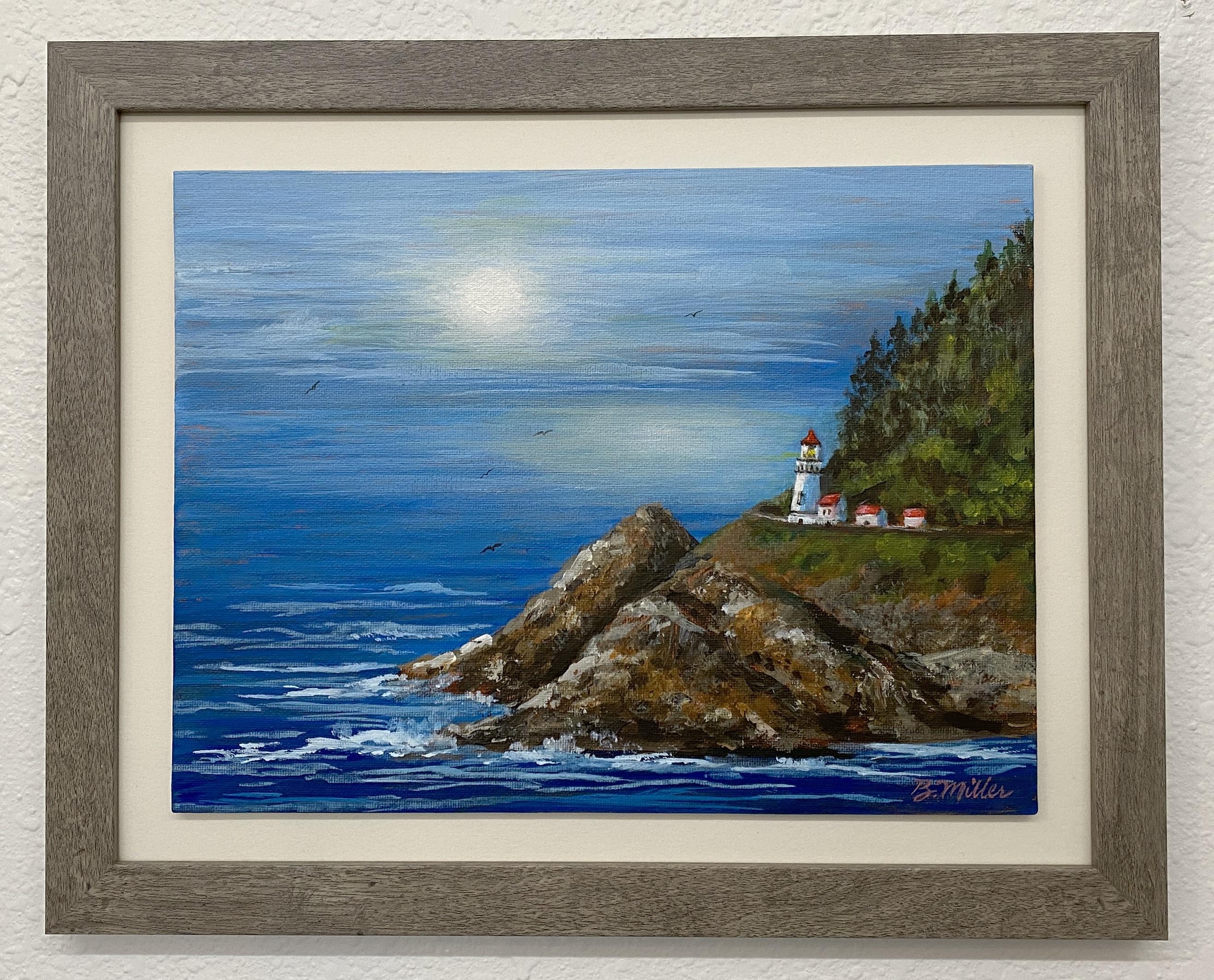
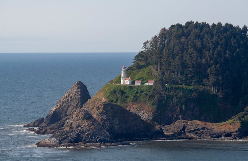
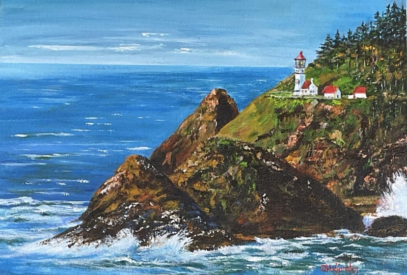
1. Welcome!: Hasta head Light house is located in the USA in
the town of Yohats, Oregon and has been in
operation for 132 years. It is now a bed and breakfast where you can stay in the
light keeper's house. One of these days,
I may do that. But for today, I plan to
do the next best thing, which is paint this
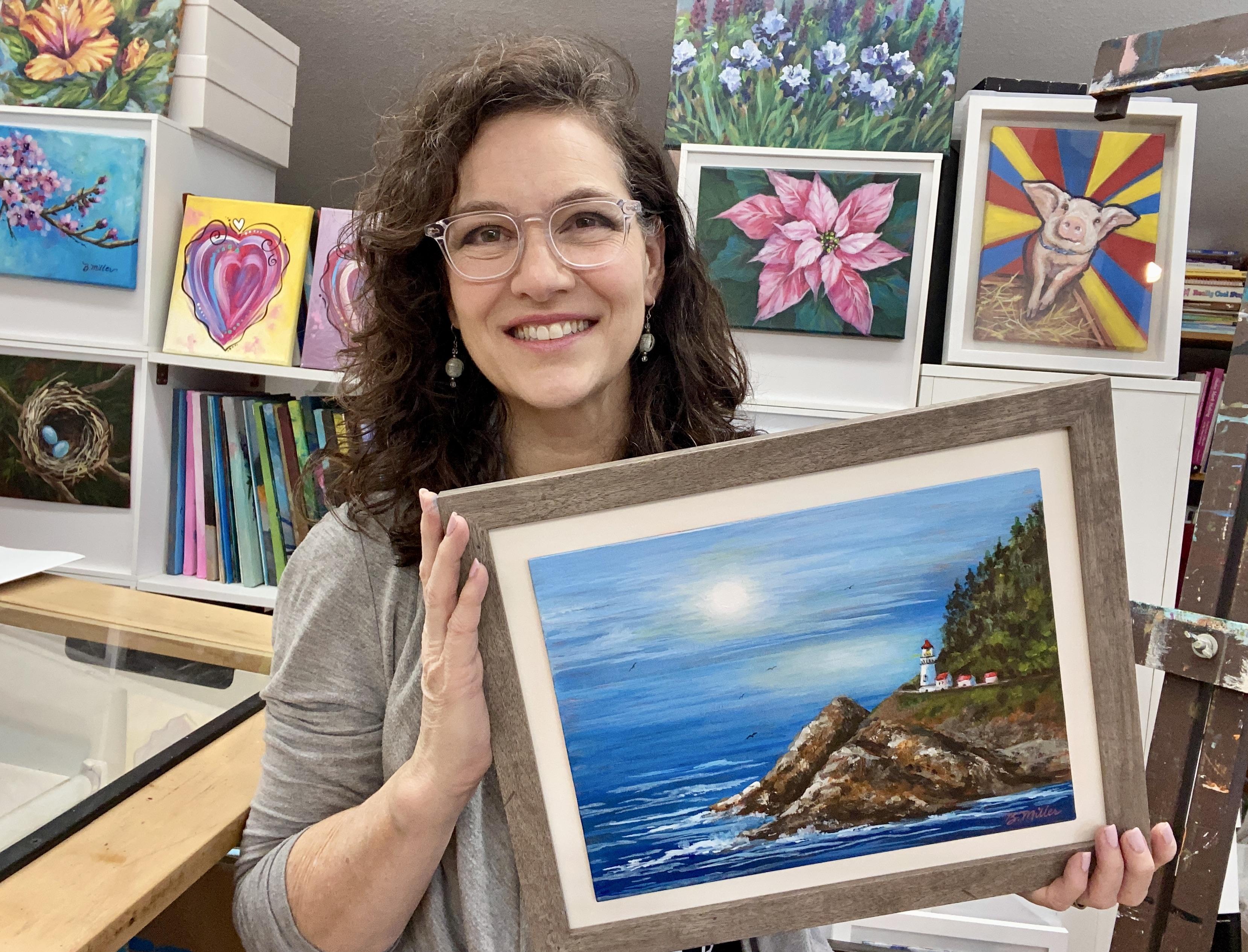
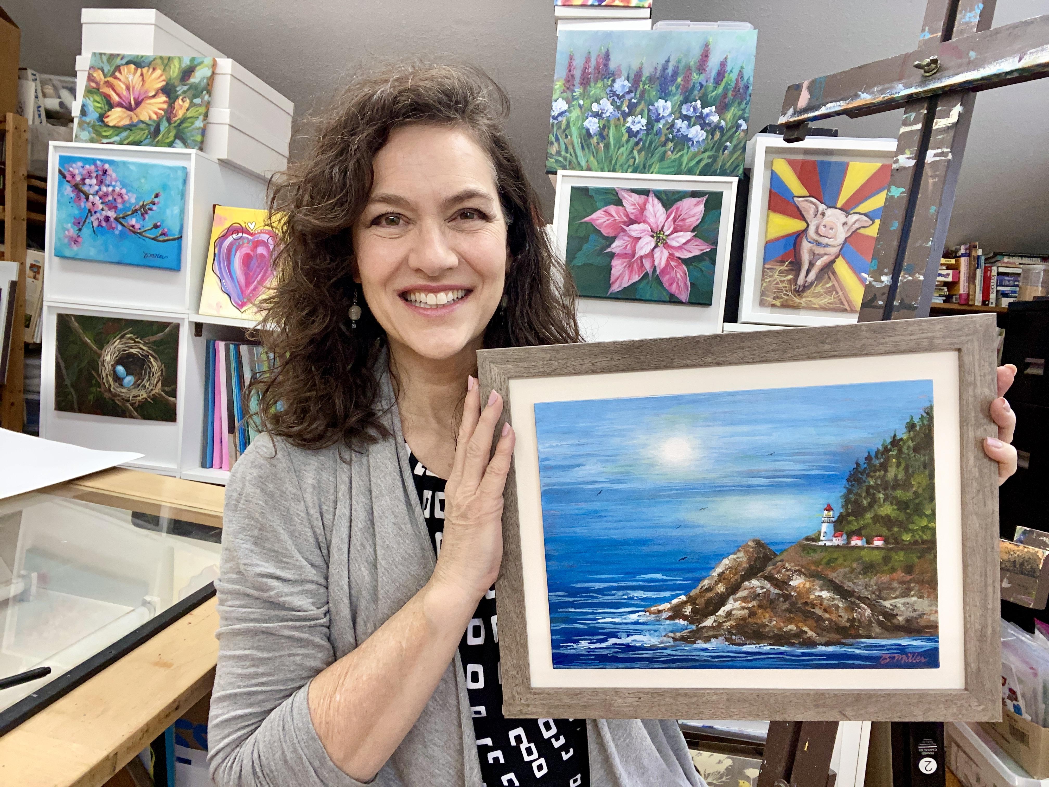
iconic place with you. Hello, I'm Bridget Miller. I'm a decorative painter, and I've been in the trade
for over 30 years now. Welcome to my acrylic
painting series. In this series, I'll show you the ins and outs of
painting with acrylics, one project at a time, so you
can start your journey and hone your skills as
a beginner painter with regular practice. Each class will be a painting
study of one subject. The painting you create in class is your assignment
or class project, and I'll ask you to submit it
to the student gallery for evaluation or just for your
own record of achievement. Each study in this series
will go over my process, color mixing, techniques,
painting theory, and all the tips and tricks that I've
learned over the years. We'll complete a study in each
class as a class project, so you'll learn
hands on and build your skills as well as
create a body of work. The more you paint, the
more you grow and develop as an artist with a style
and look all of your own. If you feel like you'd
like to learn more of the basics before diving into
this practice study series, I recommend taking
my introduction to acrylics and the
painting process class. You can click on that link
under the About section, located in the tab
below this video, or go to my profile
page and find it there. In this class, I'm going
to demonstrate step by step how to paint this
seascape lighthouse. With acrylic paint and
a reference photo. If I piqued your interest
in painting with me, jump to the next lesson, and I'll go over
the class project with you in more detail. I look forward to meeting you
and helping you learn this fun, versatile medium. M
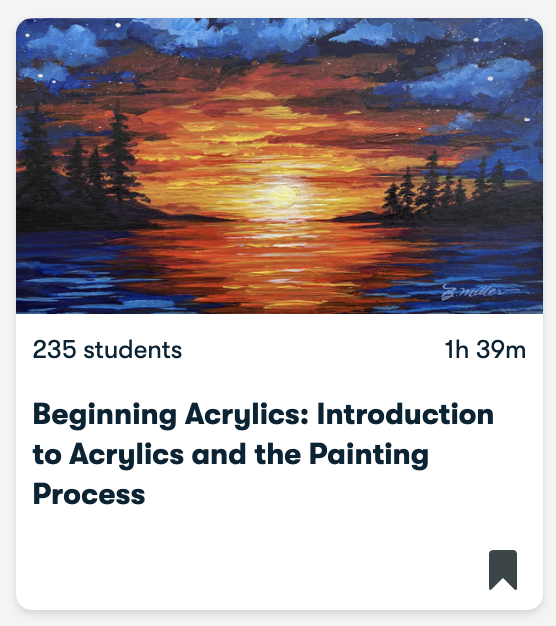
2. Class Project: The best way to learn how
to paint is hands on. And each of my classes here on Scale share will have
a class project, and I'll encourage you
to paint each one, and you'll soon see progress, which will in turn
spur you on to continue learning even
more about painting. So for this class, follow along and paint alongside
me virtually as I paint this study of Hasta
Head Lighthouse step by step. When you're finished, take
a photo and upload it to the project gallery found under the projects and resources
tab below this video. Once your project is uploaded, everyone on SkillShare
will be able to view it, and you'll be inspired
and encouraged by the feedback you receive each and every time
you take a class. If you have any
questions for me, feel free to ask
in that projects area or under the discussions
tab below this video. I check my correspondence daily, and I'll get back
to you right away. Each project you
complete will help you build your skills
as an acrylic painter, and uploading them
to the gallery will also help you see
your progress over time. I'm thrilled to have
you here and I'm excited to get you started
in painting with acrylics. Without further ado, meet
me in the next lesson, or I'll go over the supplies you'll need for
the class project.
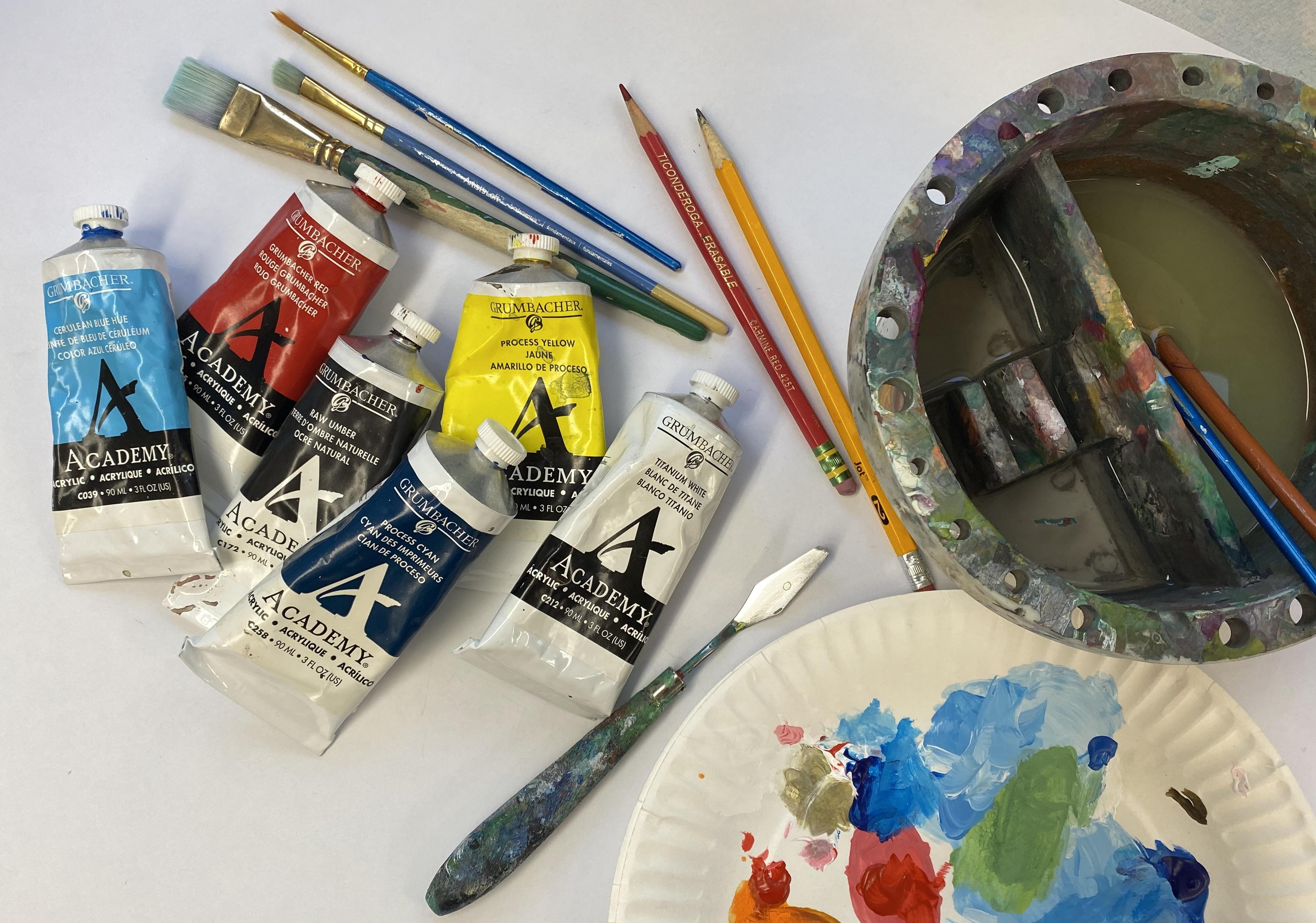
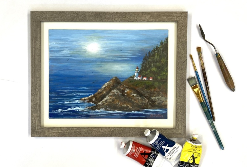
3. Materials: In this section, I'll go over the supplies that I'll
be using in this class. As usual, I've created a downloadable sketch and a supply checklist
for your convenience, and you can find those under the Projects and Resources
tab below this video. It's there that you'll find the full color reference
photo, as well. In addition to those items, you'll need a
surface to paint on. I'll be using a pre
primed canvas board. You could also use 140 pound or greater heavyweight
watercolor paper, canvas paper, or acrylic paper. Just know that when
you're using paper, because acrylics are
a water based medium, there will be some
buckling as it dries. So make sure to minimize that by taping down your
paper before starting. You'll also need some paint. I recommend heavy body acrylics. I'll be using the
Grumbacher brand. However, I equally
use golden brand, Liquitex, and Windsor
Newton, as well. You could even use craft paints. They just won't cover the same, and the colors are
not as vibrant. They're also not as durable. To get your paint
onto the surface, you're going to
need some brushes. I'm keeping this simple and will only be using
three brushes, a three quarter inch flat brush, a quarter inch or number
four Filbert brush, and a number three round brush. These are all synthetic
brushes made for water medium. For a palette, I'll be
using paper plates. Other supplies to have handy would be a water
container with water. I use a two compartment
water container. One side I use for
cleaning the brush. That's my dirty water. And the other side, I keep
the water clean. So if I need to thin
my paint a little, I can dip it into that side. You'll also need paper
towels or a washable cloth, a spray bottle to keep
your paints moist. Some low tech masking
tape, a palette knife. I use this metal one,
a number two pencil or a red pencil and some old fashioned carbon paper for tracing the
downloadable design. If you don't want to purchase
an entire hundred sheets, you could make your own transfer paper with tracing vapor. So you may want to
have that handy. If you're comfortable
sketching the design, you won't need either
the transfer papers or the sketch that I've
provided as a download. I also use a hair dryer to speed up the
paint's drying time. It's not absolutely necessary. But to me, it makes the process easier by making it
less time consuming. I use mine all the time. I also use a regular ruler
to steady my hand at times. If you choose to
frame your work, I recommend purchasing an
11 by 14 ready made frame that includes a mat if you're using a nine by 12 canvas board. If you're using
watercolor paper, make sure to purchase
a frame with a nine by 12 rather than
eight by ten mat opening. As in that case, the mat
will go over the top of your artwork
and you don't want to have to crop too
much of your painting. For framing your art, you'll need a screwdriver,
glass cleaner, and a cloth, and something to affix your art into the frame. Temporary use, you can use double sided tape
or gallery putty. And for a more
permanent solution, you could use E 6,000
glue or a hot glue gun. If you're concerned
about it being archival, make sure you use a
product that advertises that quality to ensure the
longevity of your piece. Now, once you've gathered
all your supplies, meet me in the next
lesson to start the first step in your class
project. See you soon.
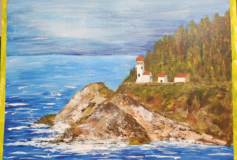
4. Underpainting: In this first step, I paint my entire canvas board
with a mid tone color. In this case, I'll
be using orange. Using a color that's not
too dark or too light, a mid tone will help
me gauge my values, how light or dark a
color is as I paint. I start with red and yellow
and mix these together. You'll need a lot more
yellow than you will red. And using a three
quarter inch flat brush, I then paint the orange onto my canvas, covering
all the white. I don't fuss about
brushstrokes showing, but I do try to paint it
thinner rather than heavy. That way, when I do
paint the next layers, I won't have to
paint on something that's highly textured. A textured surface makes it more difficult
to make details. Another reason to paint
my entire canvas at the start is to cover the white of the gesso
on the blank canvas. This gets me off and
running straight away, leaving no white that will
show through at the finish. Having an underpainting
lets this color peek through in areas that
are not covered completely. In the end, this will
give my painting more dimension and color harmony throughout the finished piece. Orange will balance the cool
blues of the ocean and sky, as well as the green trees. Sometimes I let a lot of the underpainting
color show through, and sometimes not so much. It depends on the mood I'm
in and the look I want. If my subject is
predominantly cool colors, I usually do choose
a warm color for my underpainting or a
complimentary color. Complimentary colors are opposite colors on
the color wheel. Once you've completely
covered the canvas, dry it thoroughly and meet
me in the next section, where I'll demonstrate
transferring the design.
5. Transferring Sketch: For this step, you'll
need a sheet of carbon paper and the sketch that I provided in
the resources section found below this video. You'll also need a pencil. I like using a red pencil and
some low tech masking tape. I tape the copy of the
design onto the canvas with the carbon black side facing the canvas and
sandwiched in between. Then I trace the design, making sure I use ample
pressure to transfer the image. You can use a regular pencil, but using red will enable me
to see where I've traced. Periodically, I check to see if I'm using
enough pressure. You only need the basic outline, not a lot of the fine details. It's just a guide for getting
everything proportional. If you're comfortable
with sketching, feel free to use your method. These are just for those
that want to focus more on the painting
rather than the sketching. If you'd like to learn
more about sketching, there's many great classes
here on skill share. Just type sketching
in the search bar, and a lot of classes
will come up. For an alternate
way to transfer if perhaps you don't have carbon
paper available to you, is to trace the photo
with tracing paper and then use that tracing by covering the black with
charcoal or graphite and then turning it back over and using that to
transfer your design. Whatever method you choose, once you have your
design on your canvas, meet me in the next lesson, where I'll demonstrate how to paint the sky and the water. See you soon. And
6. Skies and Water: For this step, you'll need to load your palette
with your two blues, process can and Cerlean
blue and white. Remember, you can use
other blues if you'd like, cobalt blue, ultramarine,
and Prussian blue. Those would also
be very beautiful. Starting with a three
quarter inch flat brush, mix cerrillon with white, and with broad strokes, brush that onto your board, working from the top down
to the horizon line. The horizon line is where
the sky meets the water. Now, if you want to make certain that you keep this
line straight, you can add tape and then pull it off before
it dries completely. As you get closer to
the horizon line, you'll want to add more
serelim and less white, so it will become a gradient, which is a blend
from light to dark. When we do the water,
we'll do the same thing. If you like it softly blended, keep working the
paint while it's wet until it's blended fully. If you want a more
painterly look, brush it on and leave it. I don't blend it fully because
I like it to be painterly, but I also like a little bit of blending just to give it
a very realistic look. Once you have it the
way you like it, you can then pull the tape. After the tape is removed, dry it thoroughly
with a hair dryer or allow it to dry for
about half an hour. For the water, you can tape
a line again if you'd like, or just paint up to
the painted area. I'll leave that up
to you. We'll paint another gradient light to dark, starting with the
sky blue color. Now I have dipped into straight cerrillan
and I'm continuing to move down the canvas in horizontal strokes,
blending as I go. Now I'm switching
to process blue, and I'm going to paint the
remainder of the water. I'm still painting in
horizontal strokes, and I'm avoiding
the land masses. Once all the sky and water is painted, dry it completely,
and meet me in the next lesson to paint
the land and the trees. See you there.
7. Land and Trees: For the land masses, I've loaded the palette with
raw umber burnt sienna, Grumbacher, red,
and process yellow. And starting with raw umber, I loosely block in all the
darkest areas I see in my reference photo using my quarter inch or number
four fill rot brush. To help you see
the darkest areas, sometimes making a
black and white copy of the reference photo helps. Once I have the darks, I
mix a little yellow with burnt sienna and a little
red to create a warm brown. This becomes my
first medium value. In each step, I'll
get lighter in value. This will create dimension, making my rock
formations look three D. I place this color everywhere I see medium brown in
the reference photo. I dab it on in short, painterly strokes to emulate
the rocky uneven surface. Here's where you can be more
liberal with your paint, as the impasto technique will add more texture
to your art piece. The Filbert brush allows
me to dab paint onto the canvas to mimic the
rough rocky surface. And then when I use
the edge of it, I can get into
those tighter spots like between the buildings. It's a very handy brush. Here I'm mixing another
lighter brown mixture. By adding a little
white and raw umber to the medium brown I
already had in my brush. As you can see,
I'm not following my reference photo exactly. I'm just using it to guide my color choices and the general
placement of the colors. It isn't meant to be a
photographic replica, although that's a formidable
style of painting. It's just not what I'm
going for in this piece. Here I'm mixing a
medium brown again because it seems like there's
some reddish dirt here. For the trees, I'll mix processed yellow
with processed cyan, which makes a beautiful green. If the green seems a
little too bright, just add a little
tiny bit of red. For the first pass, I also want to make
it pretty dark, so I'll add a little
bit of the raw umber. At the top of this hill, I'm going to taper the stroke to mimic the top of the trees. I've now added a little yellow to lighten
my green mixture, and I'll add this to
give my tree dimension. I'll also add this same color to the cliff below the
lighthouse and the buildings. Switching to my number
three round brush, I'll add some more yellow to my green mixture and add that
to the tree area as well. This brush will
allow me to define more precisely the shape of the trees at the
top of the hill. For the last step in this lesson, I'm going to use my
palette knife to give me a very textured rough
look to the rocks. All load it with a very
light brown mixture, and then gently scrape off
the paint onto the canvas. I tap my palette knife
onto the color mixture on my palette and then rub over the area gently on the canvas where I'd like to add a little of that color onto the rocks. It gives me the textured look that from far away looks like barnacles and maybe even
seagull droppings on the rocks. Okay, this concludes
this lesson. Remember to clean your
tools and dry your painting thoroughly and meet me in the next lesson to
paint the focal point, the lighthouse,
and the buildings.
8. Lighthouse and Buildings: For the lighthouse and the
surrounding buildings, I'll use the number
three round brush, and I'll start with red
to paint the roofs. I refer to the reference photo, and I can still see my
transferred sketch. So it's really like filling in the color on a coloring book. I then rinse out the red and going into some of
the sky blue mixture, which is serlean
mixed with white. This I'll dab onto the shadow
side of all the structures. Then I'll add white to the opposite side where the light would be
highlighting the buildings. With this smaller brush, I can now go in and
add the details around the buildings like the foliage behind them and the cliff ledge. A Without even cleaning my brush, I'll also load with the
dark green and add a little more of the greenery that's growing on the
side of the cliff. To highlight this, I add
yellow to the green to make a brighter green and add this
for that three D effect. I'm being careful not to cover all the areas in the
previous layers. I also add some of this color to the area
near the buildings, as I believe there are deciduous
trees that grow there. And they have brighter
green foliage. Then I'll rinse that color
and grab some very light brown and add a few
more highlights to the rock formations
on the left side. You may not need
this. Just add it if you think that it needs
to appear more pronounced. Then with straight white, I add another layer to the left side of the
buildings to brighten them. I'll also add a little fence
here at the clips edge using the very tip of
my number three brush. Rinse your brush again and
then load with process blue and add the detail at the top of the lighthouse
where the glass is. After that, load the brush
with raw umber and add all the buildings windows and other details that you can see
using the reference photo. And Once again, rinse your brush and
then add the light in the lighthouse with
a little dot of white. Now this is the end
of this lesson. Dry it thoroughly and meet me in the next lesson where I'll show you how to add
waves in the water.
9. Waves: For the waves, you'll need your three quarter inch
flat to start, and for the details, you'll need to switch to your number
three round later. I use the same blue
I used for the sky, which was serlean
mixed with white, and I add this to
the canvas using the edge of my three
quarter inch brush. I make uneven horizontal lines starting in the front
area of the seascape. And as I move up towards
the horizon area, I make my lines straighter and shorter and closer together. This will give the appearance
that they are farther away. For the waves that are hitting into the
rocks and or breaking, I add straight white to make it appear like the water is
splashing dramatically. I dab and tap this color on with the three quarter inch
flat brush on its edge. Then I switch to my number
three round and add more splashy details
closer to where the waves would be breaking
as they hit the rocks. Splashing upwards dramatically. After you're finished with
the waves, dry it completely, and in the next lesson, I'll go over some details and
options you can do.
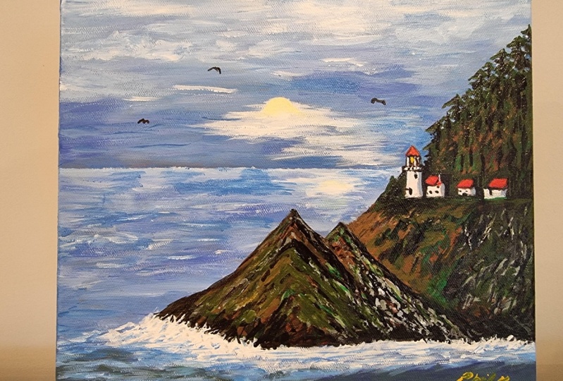
10. Details and Options: The painting is
complete as it is, but I'd like to give
you some options to creatively make your painting unique to the way you like it. I thought the sky
seemed lack luster. So I'm going to add
a little sunshine trying to break
through a cloudy sky, like I've seen so many times
when visiting my coastline. If you'd like to do the same, load your palette with serlean and white and paint
along with me. First, lighten the sky and
add the sky's reflection in the ocean with the same color using your three quarter
inch flat brush. I'm going to add a
little more white in this area to make it
look like the sun's trying to break
through a cloudy sky. I'll also add some
cloud formations, long, cirrus clouds in the distance, just to get the sky a
little more interest. I'll also lighten up the ocean a little bit
as it reflects the sky. Now I can leave it like this, or if you want a softer look, use a moist towel and just rub gently and it'll
soften the strokes. Now that my sky is
lighter and brighter, I'm going to make a little
lighter green and add that to the hillside as if they're
highlighted by the sky. You can get that
green mix by just adding a little yellow
to your sky blue. Then using my
number three brush, I'll also add a little
bit more of the darks. I lost a little of them as I
put in some of that green. But also, as the sky gets
lighter and brighter, the contrast will be greater. So I'm going to add a little
more darks to reflect that. Another option to
give your painting a little more punch is
to add birds in the sky. When you do this, it adds to the action of the
piece, the movement. Just like the waves add
movement to the water. It'll help the viewer
feel the wind and hear the sounds of the
coast when they look at it. To make birds, use your number three round
brush on the very tip. I will use raw umber,
then a little, so it moves very easily off
my brush and onto the canvas. You'll want to make a
stroke that looks like the letter M that's
been stretched out. Practice these on a paper
plate or extra canvas, and when you're ready, add
them to your painting. Make certain that your
painting is completely dry and have a
moist cloth handle. Just in case you're
not satisfied, then you can wipe
it off and give it another go until you're
happy with your results. I usually add several
in different sizes, so some appear closer
and farther away. Here, I still feel like the
sun needs to be brighter, so I'm going to
add a little more white to make it appear
more pronounced. Again, I'll repeat that
reflection in the ocean. Okay, now I'm ready
to call it done, and I'm ready to sign it. For signing your
work, like the birds, use a paint that's
thin so it'll glide easier off your brush
and onto the surface. Choose a color that
doesn't steal the show, but still stands out a bit. And using the number three
perpendicular to the surface, write with your brush slowly, reloading your brush as needed. Again, like the birds, have
a moist cloth handy and redo as many times as needed
to get it like you desire. I like to use a ruler to steady my hand when trying to
write with a brush. This gives me a smoother line as it stabilizes my
hand as I paint. If painting with a
brush doesn't suit you, they make acrylic paint markers that we great for signing. Okay, now we're finished. Or are we? Meet me
in the next section, and I'll show you how to
make changes if needed.
11. Making a Change: After I was finished, I
compared my painting to the reference photo and
realized that I got a bit carried away with the
land near the lighthouse, and even the lighthouse itself doesn't look as accurate
to the photo as I'd like. So I'm going to show you
how to make a change. Acrylics are very forgiving in that when you want to erase, you can just paint over an area and then repaint over the top. It may take a couple
coats, though. Here I'm erasing some of the
trees with the sky color, and then I'll add
a few more trees to make the hill more accurate. I'm using the round
brush and just very lightly scumbling the
paint onto the surface. I can always do more coats if
it doesn't cover that well. This will help me blend it
into the background better. Now I'm also erasing
the lighthouse, and I'm going to make
it a bit taller. I think that will make it
more accurate to Hasta head. All right, now I'm satisfied. And I hope this will
help you see how easy it is to make changes
if you ever need to. In the next lesson,
I'll show you a very affordable framing
idea. See you there.
12. Framing Option: For framing, I like to use ready made frames
by studio decor. They're affordable,
fairly sturdy, come in a variety
of wood tones and colors and they're easy to take apart and
put back together. I use a flat head
screw diver to bend up the metal ties gently and remove the backing,
mat, and glass. I then clean the glass with
Windex glass cleaner and a lint free cloth and
set all that aside. Then I place double sided
tape or gallery putty onto the mat and press my finished artwork onto
it, centering it by eye. The tape and the
putty are temporary, so I can change it
later if I choose. If you want it to
be more permanent, use adhesive E 6,000
or a hot glue gun. After the painting is
firmly down on the mat. Then I put it all
back together again, making sure that the
comb for hanging is at the top. That's all
there is to it. This will protect your
art from dust and scratches while looking very
polished and professional. Plus, it'll save you time
and money not having to have it custom assembled
by a professional art framer. This concludes all the
lessons for this class. Now, I hope you are finished, too, and are planning
to submit your project. I'd love to see it.
In the next section, I'll wrap up a few things in the conclusion. See you there.
13. Wrap-Up!: Congratulations.
You're finished. I hope you got a lot out of this class and enjoyed
our time together. Feel free to leave
a review and let me know what helps
as I always try to improve the
learning process for you and your feedback
will help immensely. Also, if you'd like
to see more of my classes and be notified
every time I add another one, be sure to follow me here
on Skill Share by clicking the Green follow next to
my name below this video. I'd love to see your artwork. So if you're
comfortable sharing, upload a photo to
the photo gallery, and I'll be able to view it as will everyone on Skillshare. But don't let that
intimidate you. You'll get encouragement
and feedback that I'm sure will inspire you to press
on in this amazing medium. I hope to see you and your
art in more of my classes. Until we meet again,
enjoy painting.
 Brigitte Miller, Artist | Creatively B