Transcripts
1. Joan Class Trailer: Hello, my name is Joan Margaret nickels and
welcome to my studio. Today I'm going to be teaching
you how to paint with acrylic paints using
a four-step method that I had developed. There is so much to learn
about art and painting. If you are interested in
learning how to paint, join my class and I will
teach you how to paint brightly and expressively
using acrylic paints. I'll look forward to
seeing you in class.
2. Introduction: Hello, my name is Joan Margaret nickels and
welcome to my studio. Today I'm going to be teaching
you how to paint with acrylic paints using
a four-step method that I had developed. First, you're going to start
with gestural drawings using charcoal on your
painting surface. Second, you're going to be doing the underpainting using
transparent paint. Only. Third, you will re-establish
your lines, and then fourth, you will finish the painting
with a combination of transparent and opaque paints. I have been an artist all of my life and for the
past few years, I have been adding
painting to that practice. It has helped me manage
my stress and my anxiety, and as a result, has increased my joy in my life. This is what I am
hoping to bring to my students
through this lesson. I am so glad you're here.
3. Tip 1: Still Life Composition: So this lesson is about
composition and inspiration. Inspiration can
come from anything. For me. I get the most
inspiration from nature, either being out in it or playing with it as I
will be doing right now. Things that inspire me,
our color, texture. Sometimes it's eating
even a song or a cent that will take
me back into something. And it is at that moment
that I find inspiration. So what I'm doing right now is I'm just
playing around with some colors as I'm
getting ready to paint. And I'm playing around
with some textures. I really liked this jar, so I'm going to use
that are based. I'm just going to play
around with it until I actually get it to a place. And I'm like, Who, compositionally I like it. Walking around the
piece or turning. It will also help. Sometimes even just
taking fallen petals. Maybe inspiring to you. And as I had
mentioned before me, it's just simply a
song that there. But whatever it is
that inspires you, lean into it and you will find, your compositions
will jump to life. A couple of things in
terms of composition, we have what's called
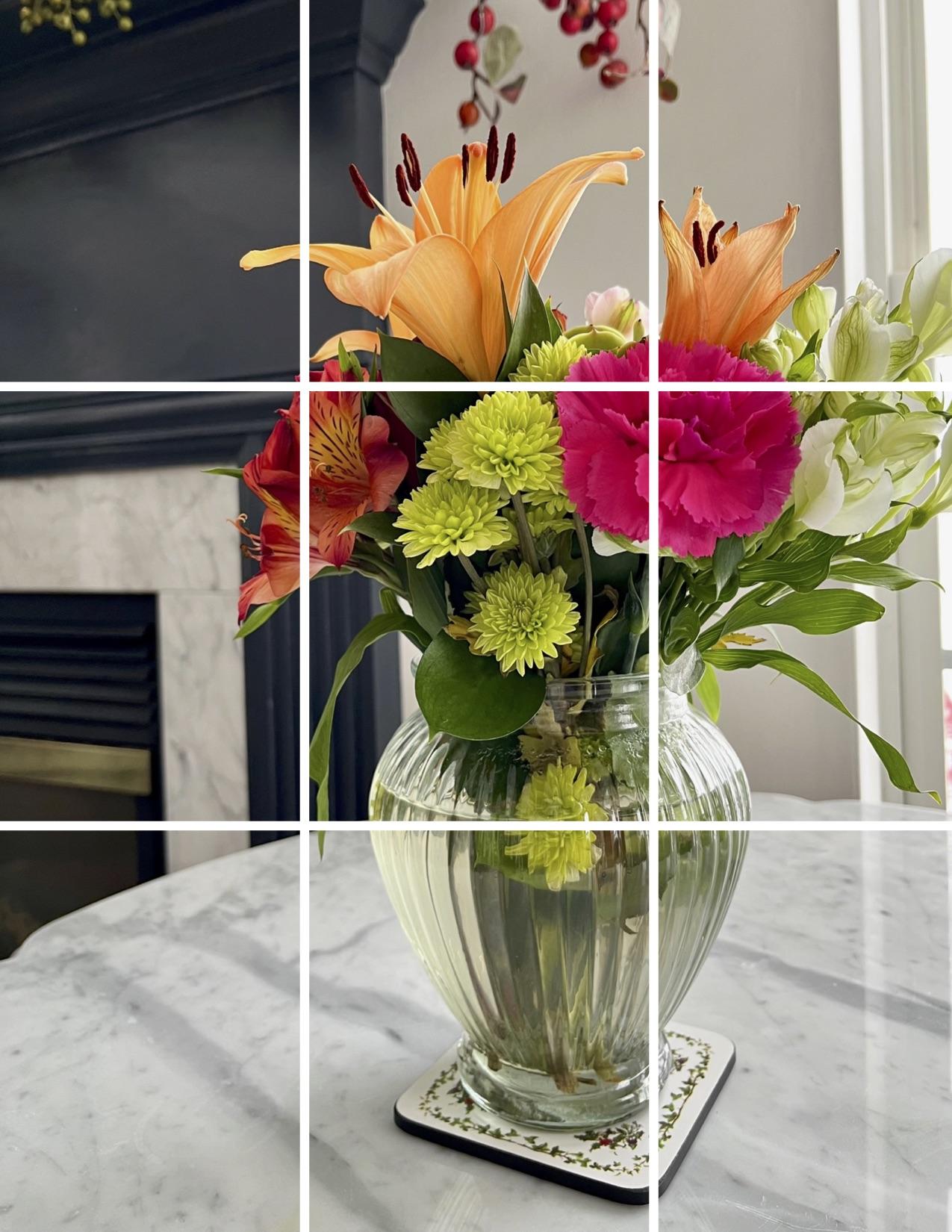
the rule of thirds. The best way I know how to help myself as it comes to
the rule of thirds, is to actually use my phone. I will be putting
this as a PDF in the class notes so that you
can do this with your phone. But basically you will go
to your iPhone to settings, settings, scroll
down to your camera. And under camera, there's a subheading called composition. Under composition,
there is grids. You can turn them on or off. I'd like to keep mine on so
that when I'm photographing, I can use the guides to help
set the shot up for me. When I go into my phone and
I'm ready to photograph, everything is all set. I allow where I want
my eyes to focus. First, to line up the grid so that they were at the
crosshairs of the grid. Match up. That is where I want
the eye to go first. So get outside,
have fun in nature. Find what inspires you. Write it down. So you're keeping a
journal and then use your phone to help you lay out your things
compositionally. And it will make
your painting more interesting and easier
to get started. Have a good day.
4. Tip 2: Supplies You Will Need: So for the project
we're gonna be working on today in this lesson, we're gonna be using 140
pound watercolor paper. I like the cold press because it has a little
bit more tooth to it. But if you have hot press, which is a smoother surface, that is totally cool, Awesome. In addition to that, you're going to
need white gesso. And you use a white
gesso to seal off the paper and to
prepare it for your paints. You will also need a metal ruler and a pencil
to make your lines. Or you can use painter's
tape if you'd prefer. I have everything set up on
my easel with a board that has these clips on it for
easy placement of the paper. In addition to that, I have clips on the bottom to secure the paper so that
it does not move around. So that's the first
part that I use. The second thing I start
working on is I will use vine charcoal and I
use the Winsor Newton. And that is when I
will start doing the gestural work on
the watercolor paper. Once that is completed, I will start then into
the transparent colors. So I have my metal palette. You could also use
a piece of glass painted on the underside
with a mid gray. Again, that'll help
you judge collar best. In addition to that, you are going to
need a water bottle. You will need razors and
there's method to my madness. In addition to that, you will need a retired with the returner down
and the water down. You will start working
into your paint palette, which will go in-depth. In the next lesson. You will also need
either a black sharpie or you could also use
a black Posca pen. You will need paper towels. I use three jars of water
to keep my brushes clean. And again, I'm all about
keeping pure color. So managing my palette, along with the cleanliness
of my brushes, keeps me able to keep
that bright color. Two types of brushes
I use are a filbert, which just means it
has a rounded edge, or a flat, which just means
it is a chiseled edge. I use two different sizes, an eight and attend for
both styles of brush. The brush that I use is
the catalyst by Princeton.
5. Tip 3: How to Manage Your Palette: So for our next lesson, we're going to be
preparing the palette. The first thing we wanna do
is take the palette that we've chosen to use and
take our water bottle. And all we're gonna do
is missed the palette. The second step that I do
is I use the retarded her. I use Golden brand for all of my paint and a retard
or helps to slow down the drying process of the acrylic paint since
they drive very rapidly. As you can see here, all you do is you
take it and you just draw a few lines
in each direction. The next step is, I will take what I have
laid out in terms of the paints that I choose to use on this particular project, which I've used the same colors on across all of my paintings. And very rarely
will I change that. I have all of my
transparent colors setup and I will now go ahead
and put them on there. The last thing I will do is once I get to the stage
of opaque paints, then that is when I will
add them to the palette, but not until then.
6. Tip 4: Brush care: This quick lesson is rush care, as we had talked about
during the painting process, and how to keep color
really bright and vibrant, which is a combination
of keeping your colors from getting
contaminated on your palate. So a lot of pallet management, but also you want to really
manage your brushes. And we talked about using
the three jars to clean it. So you're going from really, when your brushes really dirty to Washington
it out initially go into your medium and then your final one should
be fairly clear. Then you're also, once you
get done so you're going through that three step process. Then you're using your paper
towel to lightly pinch. And as you pull your reshaping the brush and you're double-checking to make
sure the paint is out. One of the tips that I
want to leave you with is how to position your brush. Once you've got
that mean you want to make sure that
you do not stick it in a jar like so until
it is completely dry. What I do is after I've
cleaned my brushes, I will literally leave
them on their side with the bristles
off of a table. And again, I will just
show that one more time. I'm gonna go ahead and clean
the brush using the three, the three Java method. Okay. I'm gonna go ahead and
use my paper towel to dry and reshape the brush. And then I lay it on its side so that the
bristles hanging off. That way. You'll
keep your brushes in really good condition
for a long time.
7. Tip 5: Understanding the Difference Between Transparent and Opaque Paint: This is going to be
a quick lesson and the difference between opaque
and transparent color. So what you will need for this little project
is a Sharpie, a piece of prepared paper. So in other words,
something that you've already just sewed. Two colors of paint. One opaque, one transparent. And again, you will
recognize which is which one will have the opaque. You will not be able to
see the lines through. The transparent, you will be able to
see the lines through. And again, this is the
packaging of golden brands. In addition to that, you will need a paintbrush
any size you want. Take your marker and write a positive
affirmation on this. Alright, so my
positive affirmation today is I'm going to
do good work today. And so I'm just writing
this good work going to do. You can put a hard
or happy face, whatever makes you happy. Okay? So that's the first thing. Then you can just put
your market to the side. And then I'm gonna do, is I'm going to put
a little bit of the transparent on my paper. Then take my brush. So as you're taking the brush, you're gonna do is
you're just going to slide it across your words. You may want to kinda do
little designs with it. Use it as a little practice, using even as a warm-up
for your painting. Always good to have
moments where you are just warming
up your hand and this is a nice one
because you're setting an intention to do
good work, right? Or whatever positive
affirmation you want to use. And you're also learning
about the difference between opaque and
transparent color. With a transparent color, you will be able to see
whatever is underneath it. Okay. So I'm just going to
rinse that brush out again using my three jar method. Taking my paper towel
and reshaping it. And then I'm going to
take the phthalo blue. The fallow blue is an opaque. And I thought it might
look nice with this. Maybe I'll put some
white with it too. But let's start with the 0. I'm just going to cap it. And then I'm going
to take my brush. And what you're gonna notice is, as I move go over this. It covers up completely. So I'm going to cover up that
heart a little bit more. But now you start to see
the difference between opaque paint and transparent. So again, it's a lovely
way to warm up your hand. It's a great little exercise to use when you are getting ready. And when you are really tuning into the difference between your transparent
and opaque colors. Also, if you're working with
a brand other than golden, kind of tune into how they
have their packaging. And it should always
tell you if it's opaque or transparent
on the package. If you're using old paint
that you may not be able to see where the packaging
information is. Then what do this exercise with all of your colors
and you will learn. All right, hope that helped you.
8. Step 1 of the Painting Method: Charcoal Drawing: We are on step one
of the method. So what we first wanna
do is we want to make sure that we have a photo. I have included a still life floral that I took using
the rule of thirds. So I have selected the photo, I have placed a grid on my computer and then
printed it out. You can simply place a photo and gridded out yourself using
a ruler and a marker. From here, I want to now
take this grid that is nine sections and transfer
it onto my paper. So I always use my Indian
yellow to create my grid. So I'm just gonna quickly
and I don't measure it. I just start the process. And you'll notice too, I keep things very loose. That's what we want with
this style of painting. We're not looking to create
a photograph rendering. We are looking to create
something that is expressive on how we're
feeling in a given moment. Once I have the grid set, I'm going to now
take my charcoal. I'm going to start to
look for lines of value. So when you're looking at
this particular photograph, you will see lines of value next to where the fireplace was, where it is separating the
tabletop from the fireplace. And then also when
you squint down, you're going to see lines of separation between the flowers. For instance, the pink one, which is where I want the, I to go to. It's a very richly
colored painting, but also there is
a strong line of value separation between the white on the right and the
light green on the left. So those are your
value separations. In addition to that, you want to get that gesture, that kind of blossoming, that explosion of color, that energy into your painting. So it starts here. So I'm going to take my charcoal and I'm just going to
start to make a few marks. Their gesture, they're gonna
be quick and I can always dust a month if they're
not where I want them. So I'm going to start here. And I'm just starting to create where I want
some of my lines. And the other thing is to, when you are creating, you can delete anything you
want, anytime you want. So there may be certain
things that you're like, whew, I really liked that. And then you might be like, yeah, I really don't like that. So you don't have to put it in a lot of attention
in this area. This is where my heavy orange got some other things
coming off of there. Some more orange over here. So again, what I'm
basically doing is just mapping things out. I got some green things
going on in here. I've got some
darkness goes here. Then I'm going to draw
my lines of separation. Use the line of my scene. It's okay. All right. And then this is where I strongly strongly and they're
somewhat strong line there. Have a very strong line here. I have another one here, another one here, this
area and this area. And that is my gesture drawing. From here, I will
take a piece of paper towel and if I want, I can dust off some
of the other lines, especially the lines
that are going to be closer to the lighter areas. Okay. And that is your step. One.
9. Step 2 of the Painting Method: Transparent Underpainting #2: Now we're going to
enter into step two of the four step process. Once I have established
the gesture drawing, now I'm taking the
transparent colors. And now I'm going to start to map out where I
want certain color. I'm gonna use my flat brush, size eight for this next step. Because of the
size of the piece, if it was a larger piece, I would use my larger brush. But for this one we're
going to stick with that. I'm going to go in and establish where I
want certain color. Keeping clean color is
really important to me. Seem to have a little bit of
pinks and reds in this area. And I'm going to take it into
a little bit of yellowy. Now I'm gonna put some
red in there too. Okay, well, I still
have this on the brush. Just gonna kinda pop this here. A little bit of
yellow in that too. Because I'm seeing some
of the light coming through here because I
don't want to go too heavy. No, go a little heavier. Down in here where it's
going behind the pink. Again, you're starting
to work with values. You're starting to establish where you want certain colors. And always remember
to as the artist. You can limit things, increase things, do
whatever you would like to do based on what you want
to sing in the world. Okay? You'll see that I'm cleaning off my brush pretty regularly again, I'm trying to keep
the color as light as possible initially and then I'm going to start going darker. Take the greens. I'm going to start these
little spaces of green. If you do mix color
a little bit, can always just take
your paper towel. That's why we have it. Go a little darker
here because it's going into a little
bit of shadow. Then it's coming back out. Right here. I'm going a little bit
lighter under here. Okay. Still working with
that lighter green. Again, all I'm doing this mapping and gotten the one that's
actually in the jar. Okay? Now I'm going to
take the sap green, which is the darker
green on my palette. And now I'm going to start
putting in some darker tones. And the cool thing about
when you're working with a glass jar, what you'll notice is it starts to become an abstract painting. Then I'm going to
take my turquoise and I'm going to start to
blend it with the grains. So it'll still be on
that fairly dark side. But it's going to
give a little bit of brightness to certain areas. So now as it starts to come out, the green start
to come out over. And what is behind
it is sunlight on this dark to let that start to go a little
bit brighter. A little bit of
yellow in with that. Get some again, I'm staying
very loose with my brush. Okay. That's pretty much
where I want to see some green at this point. I'm going to start
with the blues. So I'm going to let the
canvas, or in this case, the paper helped me out in these different areas of the reference photo
are very light. So I'm going to keep them
white for right now. I'm going to actually
take my phthalo blue. And I'm going to
now start making a few marks so that I know
where I want my blue. So again, just mark-making,
nothing fancy. Leave this session open because that's where I'm going to
want to place some red. What you'll also notice is that I'm not blending
color into color. I'm actually just
budding them right up next to each other. And again, this is
going to help me keep that desired clean color. As I paint. Now, going to think what
am I gonna do next? I'm going to actually
take that blue. I'm going to add a little
bit of the purple dioxide. And I'm gonna put some
raw umber and I wanna get really dark colored
action matching, put some sap, green, and now I'm actually making
a very dark, dark color. It's not necessarily black. It is a warmer black. But it's going to give me this darkened area
in that again, sue me a little bit
of variety of color, a little bit more
on the green side than what I had
originally wanted. But that's okay because this
is just a transparent layer. Also, you'll notice that I will need to add in
that brass bar there. Okay. So I'm going to just put some lines of
separation where I'm seeing them to remind me that they have to stay
while I'm doing that. I've gotten them very dark
section underneath that. We've got some spaces in this area and then I got
some darkness there. Okay, so now what I'm gonna do next is I'm going to add a little bit
of a red pencil down, just building into these spots. Little bit deeper tones
in terms of the red. And I get some red tips here. Like I said, I'm going to
leave those areas light. And I know I've got
another separation line. So I'm going to thin out that really dark tone again with three charter. Okay. And then we can also do, if you're like me and
sometimes drawing a line, you want to make sure you're
getting the right angle. You can take your
other paintbrush, kind of line it up
with the painting, and then you can go ahead
and just draw what you want. So on this side, I just want to have
it a little bit. It's gonna be a little bit rare because it's a big shadow. The bidding shadows down here. Okay? Then I'm just going to
take that here and there. So the retarded becomes
a great tool to help you manage where you want
certain colors to go. I'm going to start
to work a little bit into this jar area. So again, I'm going to
take that very thinned out because it's dark kinda
goes, comes up here. It comes out, and it
kinda goes out back here. So again, this is something
I will continue to work on. As I'm moving through. I'm going to not
put the coaster and because it doesn't really
add anything for me. So then I'm just going to put a little
bit of tone in here. But I'm going to vary
it in terms of color. So now since this side
is a little bit darker, the sides a little bit lighter. So I'm just going to
vary accordingly. This is a little bit cooler. That's a little bit warmer
is how my eyes Santa. So as I'm doing this, I'm going to put a little
bit of the Indian yellow. And on this side, again, just to remind me that I want that sign to be a
little bit warmer. As I'm moving through. I'm not doing a ton
of work on that. The next part of it
I'm just going to do is I'm going to add a little, a few more colors that I can
play off of in this area. So I'm going to put some orange. Okay. I also, because my secret
sauce is my fluorescent. I caught fluorescent pink, but really it's
fluorescent magenta. Put some color in here. Then I can play
off of it and laid in the following layers. And I want some purple. Again, this is my cooler
side of the, of the jar. Keep working on this shape in the next, in the next layer. So now I'm going to take the
lighter of the two blues. And I'm just going to
make my water line. Water line is really
goes right over that. And I'm going to put
some blue in here. And notice how I'm putting some blue right next to orange. Again, they're complimentary
colors just like I have the very warm pink next to the light green
are complimentary colors. Are pretty careful about that. Because again, it gives you
that additional interests. So what I'm gonna do now is
I'm just going to put it a little bit more pink in because pink is
my favorite colors, so I'm going to use it. Okay. I'm going to take a moment
and I'm going to put a very strong line
here of purple, again as a line of separation. And then I just wanted to
take that purple dioxide with some sap green
so that it's leaning, even though it's going to be
more on the browner side. I definitely want to get some deeper tones
right in this area. So now I'm ready to
re-establish my line.
10. Step 3 of the Painting Method: Re-establishing Your Line: The third step in the process is to take your chalk pastel. I use white for this. If I need to do a little
bit deeper lines, I will go back to the charcoal, but for right now, I just
want to draw some few lines. I want to remind myself that
I want to keep this line fairly strong in that line. In addition, I want to I'm not going to say clean up
the line because again, I want it to be a more of
an impressionistic style. So you'll start to
see where all be blending in colors
to achieve that. But right now, again, I'm just re-establishing that
action that I want to see. If I go outside the lines, I'm fine with that. The great thing about using the white chalk pastel is
that it covers really easy. So you don't, you can
literally draw right over it. And it's totally fine. Again, I'm going to make
this a little bit bigger. I'm going to I think I want to make this a little
bit bigger too. So I'll probably take out that blue area and they
make it more orangey. I want to make this
more pronounced. Feel like that's getting lost. Okay, now I'm going to
start working on my, making my lines for my jar. So let me think I'm going to want the kind of
come out like this. So it's going to
come out over that. It's going to kinda
come out like that. And so the leaves are going to actually cascade over that. And I definitely want cascading. Then I'm going to want
to bring that jar. So again, what I'm doing
is I'm just mapping. I'm not drawing, just kinda mapping again where I
want the energy to go. So what I'm gonna do before I start to clean
up my palette is I'm going to actually
just deepen a couple of areas that I really
want to seek, go deeper. So all I'm gonna do
is I'm going to take the magenta, solid magenta. I'm going to pop it right here. I really want that
section to go. So I want to show you how
messy my palette is right now. Now I'm going to take that razor blade and
I'm going to clean everything off and I'm
going to put on my opaque. So that's another reason why I like having
the retired around. It makes this part
of the process in terms of cleaning
up quick and easy. Now my palette is all
set for the next stage. Again, I'm going to take my
messy paper towel when I can. I tried to just pop things around and they'll dry and
then I can use them again.
11. Step 4 of the Painting Method: Adding Opaque layers: Now we are at the fourth stage. So now we're going to add
our opaque to our palette. Today I'm gonna be adding
obviously why I use a tremendous amount of white in my product, in my paintings. I'm going to use a
light phthalo blue, and I'm going to use
the neutral gray. What I want to show you
before I go on any further, I want to show you the
difference between the packaging when you are
shopping for your color. To identify what's our
transparent and what's an opaque. I'm going to show you what to
look for on your packaging. Golden actually has the stripes in block printed on their tubes. Then they take a color, the color of what's in the tube, and they left and they
put it over the stripes. If you can see the stripes, that means it's a
transparent color. If you cannot see the
stripes like phthalo blue, you know that it is an opaque. So that's how you
tell the difference. So what I've put on
the palette up to this point have been
just the transparent. Now I'm gonna be
putting on the opaque. So the white is also an opaque. So as I'm putting on
the colors, again, I'm going to keep
in line with I have my warm colors on one side and my cool colors on the other. I'm going to add that there. And now as I do my white, I'm going to show you a trick. You're going to take your white. And this is why I
always buy white and the big tubes so
that I can actually draw with the two
a line of white. That way as I'm working, I can go into it a different sections and
keep the color code. The last one I'm going
to put on my palette for today is the neutral gray. Number eight. Again, all the colors that
I'm using are from golden. So one of the things I wanted to talk to you a
little bit about is now where we go into the opaque is what
you're seeing here. These three jars
of water is a tip that I have used since
I was actually little. And that is when
the brushes super dirty go to the first one. Then as it does to claim, you go to the second and then your final job will
probably be pretty clear. You're fine. I'll check. Is take your paper
towel and wipe. Two things are
happening as I'm doing this is I'm reshaping my brush. I'm removing the water, and then I can check to make sure I got all the color out. And again, because
I want to keep this as bright as I can, and
these are just some tips. So now what I'm gonna be doing, and I wanted to state this
now what I should have stated earlier is you want to continue to work
around the painting. You ever want to get to finished in any particular section. Because then it's
gonna be hard to go back to as you're
developing the painting. And you'll have, it'll, it'll look like two
different paintings. So I'm just going to start, but it take that
light phthalo blue. Okay. I'm going to add to
it, they fallow blue. Okay. I'm just gonna make a few marks. You'll also notice that
how I hold the brush. So I'm trying to remember to
hold it back very loosely. If I start with gripping
it like this, like a pen, my strokes get very
short and very harsh. If I want to keep
them nice and loose, which is how I like to paint, you'll see me further
up the brush. I'm gonna go back to
just the pure yellow because I want to add some
depth to certain areas. Okay. I think that's what I'm
going to pause there for. And then while I still have some of this tone on my brush, just going to take it and make it a little bit deeper
lines there. Okay. The brush for right now. Now you can start to see how the opioids
are going to affect. If you can see this white
line here as I take the paint that I have now made into an opaque by
adding white to white. You can see how it
covers up the line. But I want to keep that. Okay, there are certain
parts that I want to keep in terms of very light. So it may not be putting
opaque to over everything. And there's a
reason behind that. I want to be able to have the luminosity of the
transparent color come through. Again, that's gonna give me a little bit more
bounce with the light. Then I'm going to now take my turquoise and I'm going
to take my gold green, making it into a Kelly green. Ms. Gonna put a few strokes
here and there. I'm going to rinse it off. All right, the next
part I'm going to go into is I'm going to shape a little bit
more into the orange. So I'm going to
take some orange, some Indian yellow, and I'm going to put some
Kettering yellow in them. Alright? And then I put some
red in that area. I'm going to mix the red
with a little bit of weight. So I'm getting more
of a pink tone. But they still have
a little bit of the orange on the brush
which I did on purpose. So it's a little bit warmer. I don't want to get
you strokes here. So again, I'm just
bouncing around. Now I'm going to take my
magenta with a little bit of white, my magenta. And I'm going to now
just kinda put a here. And I'm not going completely
over the entire space. If you look at it,
you're going to start to see where I've got light coming through the spaces. So what I'm gonna
do now is I'm going to take a lot of weight. And I'm actually going to go for the Indian
yellow on this. Indian yellow and a
little bit in a lot of white makes a
beautiful cream color. So this is a little bit darker
than what I'm good I want. And the final. And again, I'm just going
to do some strikes up here. Now that I have this
fairly established, numb the ribs, the blush brush, and now I'm going to put some
blue tones into that area. The blue fallow, blue, lightest blue on my palette with a tremendous
amount of weight. Just ever so slightly tinted. You'll also notice that at this point in the
painting stage, I don't want really
thick coverage. The paper. I don't
really want to be able to see the brush stroke. Now I'm going to work a
little bit on the jar. So I think what I'm
gonna do is I'm going to take some a very light
blue that I made. I'm going to put some
more phthalo blue and just a touch of the
purple dye accident. Again, if there's a stroke
that I don't really care for, I can just take a damp
brush and pull it back. So what I'm going
to start working on right now that I've changed, my position is I'm going to
start working in the pinks, a pink made with white and
the fluorescent magenta. I'm going to start creating an uneven line around
the green moms. And this is where
you'll start to notice that I am going to have a little bit more gesture
and depth of the stroke. So now you'll be able to start
to read the strokes there before I just wanted
to really map out color where I wanted
certain things. Now I'm going to
get more specific. Like I said, down here, it's going to look
like an abstract painting if you were to just, you know, kinda block that out. So what I've been doing
pretty much so far with this entire painting
is I've been using my number eight flat. And pretty soon I'm gonna be changing into the next brush. Now you'll see the opaque
really worked for me. So I have a very lightly
tinted, some bluish green. I'm going to do a job right now, back into it from time to time. And I've tinted this blue
with purple as I butted up against because I want to start having it play
off each other. So I'm going to take
that bluish purple, add a little bit more
phthalo blue to it. And I have a little
bit wider than this, believe it or not, I'm going
to close up the shape here. So read more like berries. That's a cool thing with opaque is that you
can start to close different shapes up or open them up depending on what
you're looking for. So it's just a dance just
going back and forth. That's the great thing
is if you don't like something, try it again. The other thing you're
gonna notice is that not every painting is going to
turn out the way you like. And that's okay. The process. It's like, did you have
a good time doing it? The questions we need
to be asking ourselves. So I'm going to let
that go for right now. I'll probably still
use the flat brush, but now we're going to
be going back-and-forth. Okay, this is a filbert brush, so I'm going to start
working with that. It's just a rounded brush. And again, I've got my size
ten and my size eight. The thing, the reason why I like working with this
particular brush is it gives a really
great brush stroke. So I'm going to actually take the raw umber I haven't
used in awhile. And I'm going to mix
it with the ray. Okay. I'm going to start to just do a couple strikes where I
think I'm going to want these to some more and I'm just going to now put in so deepness, given just a little bit
different tone here and there. I'm going to go right
into just the magenta, but I'm gonna do it dark. You see, as you layer over
the darker tones beneath it, you get different
expressions of color. Go back to the flat brush. You can kinda see other
transparent as laying over this. Then I do have to. That's the
reason why you want to use opaque is that as you're
working it over other colors, there's gonna be some times
you want it to almost be like a glaze effect. And then there's other
times where you want the color to be stronger. So that's when you're going to really work with the opaque. And the transparent color
together has better coverage, especially when it's
going over darker values. I'm just going to start
to fill in the table. So when you get to this stage
in the painting that king, you have to be really
careful about to not rush it when it's better to
really slow down a lot. Because if you're like me, you'll start to get impatient. You want it to be done. And that's when you
can start to make choices that maybe aren't what
you really want it to do. Actually, that's where
I think some tone. Now I'm going to
start any more gray. Wait. A couple more areas. Right up in here. From this combination
of grays and whites to kind of mimic what's
going on in the fireplace. Fade into the background. He's still tell that
there is an edge there. But if you squint,
it's really soft. Because now I'm going to
start working into Movement, adding some bits of tone
and different colors. Right now, I'm at the, the end of what I like
to call the ugly phase. This is when I know I
need to step away from the painting to re-evaluate
different things. Make a couple of
strokes here and there, and grab myself a cup of tea. So I'll see you in a
couple of minutes.
12. Conclusion: We are back from our break. And I went ahead and as I
looked at the painting, I realized that it needed
a little bit more life. So I took that
opportunity to use my complimentary colors
of orange and blue, yellow and purple, and reds and greens placing them
strategically next, one another to give it
a little bit more pop. After which I just had fun using my brush
expressively and just allowing some additional
strokes just to really bring a little bit
more joy to the piece. This is a wrap on this
particular painting. So one of the things that
I wanted to tell you about is what I call a
complimentary sandwich. And I do this at the
end of every painting. What it is, is I will
stand back and observe, not asked myself, what is it that I love
about the painting? Where are the areas that I
can improve for my next time? And then again, going back to another thing that I
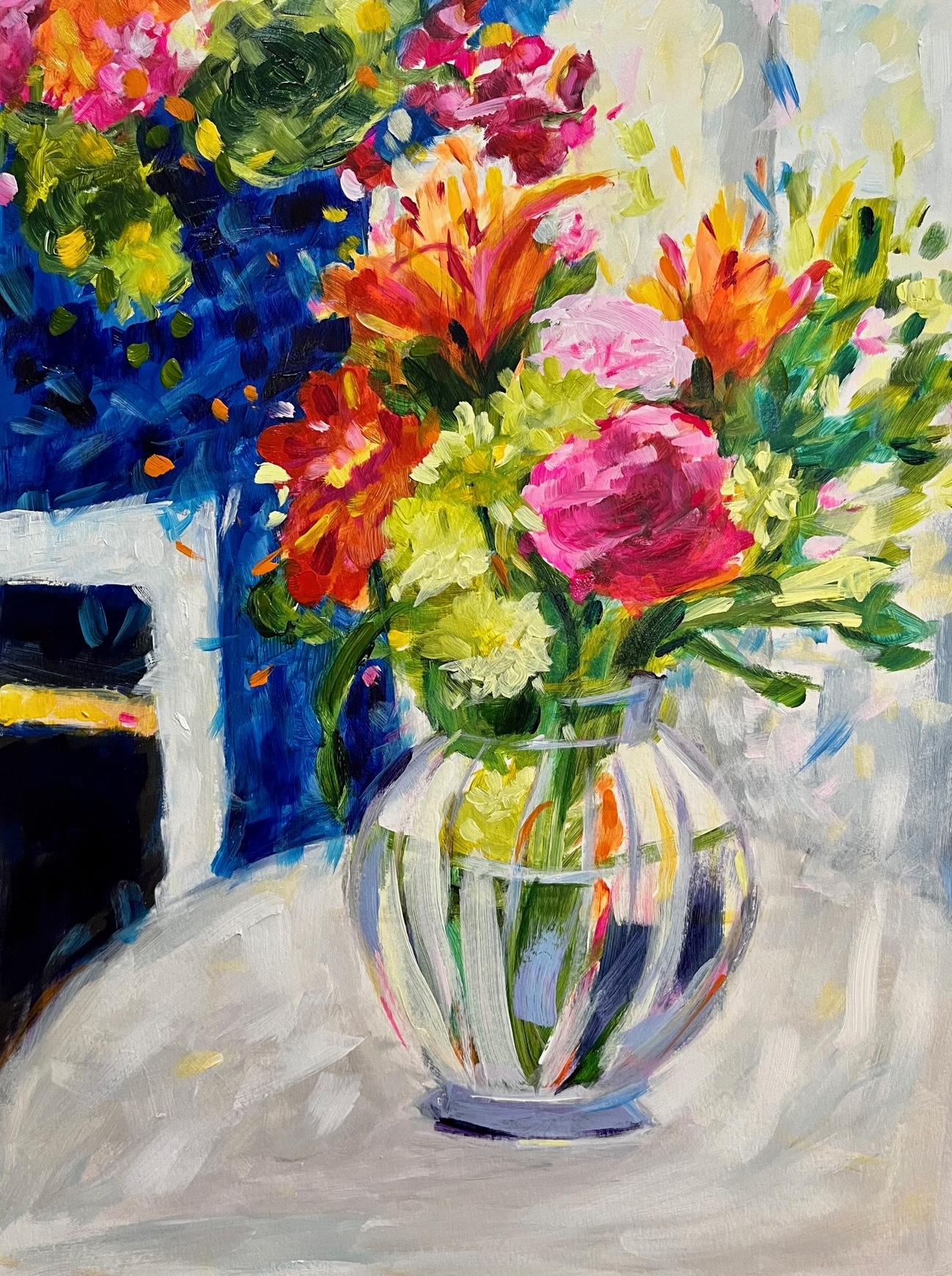
love about the painting. So for me, looking at this, I really loved the colors
that I used in the jar. The area that I can improve on is the shape of the
jar the next time. The other thing
that I really loved about this painting is that the colors really make me happy when you get done
with the painting, regardless of how it turned out, find something you love, where you can improve and again, something that you love. So as a wrap, you have now learned how to paint using a four-step
method with acrylic paints. I hope you had a great time and thank you so
much for being here. See you later.
 Joan Margaret Nichols, Wife, Mom, Artist & Yogini