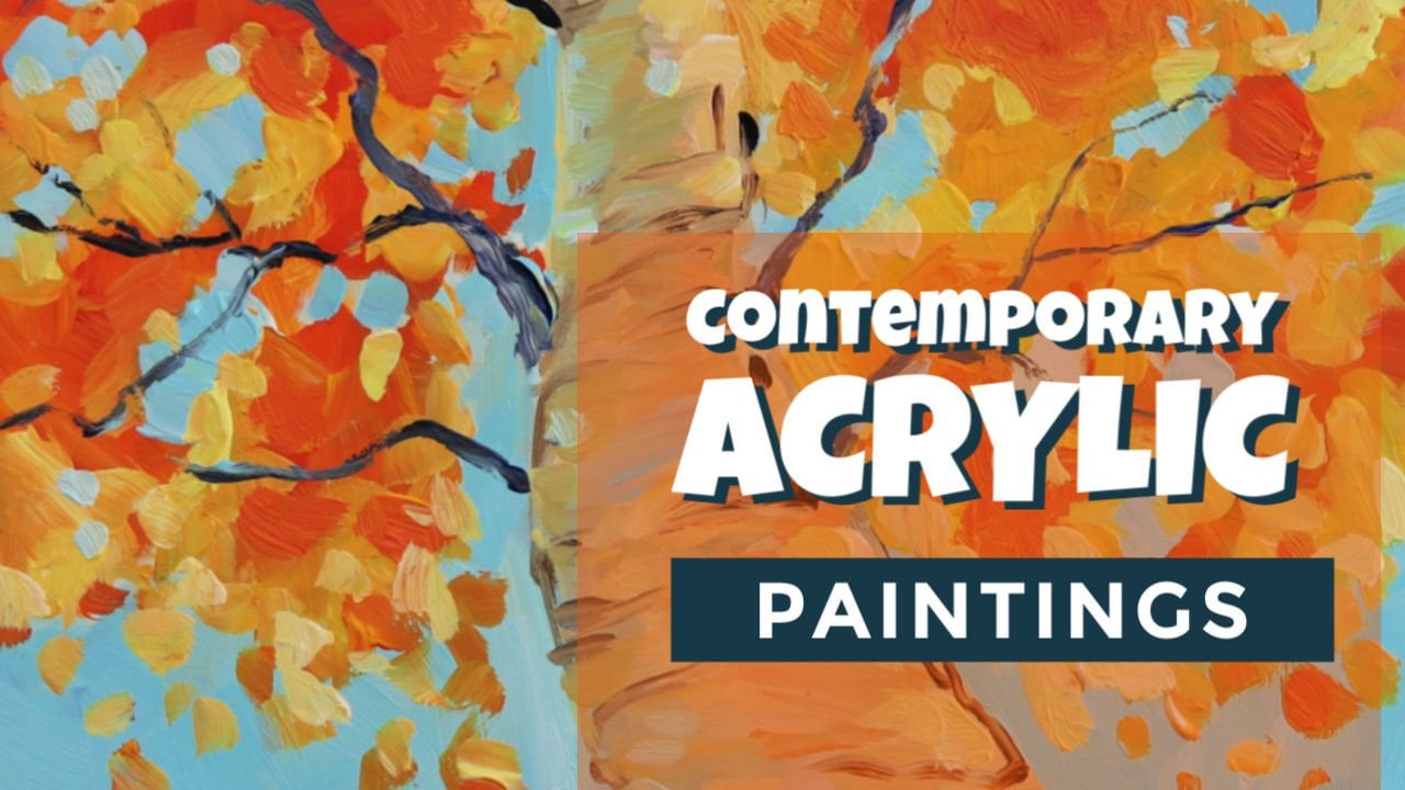
Transcripts
1. Introduction: Psychedelic art can be a meditative way in order to express your
thoughts and emotions. It can transcend you
to higher dimensions and help you experience
a different reality. In this culture course, you can experience this
alternative art and learn how to make
psychedelic neon paintings. I'm a visual artist
from Mumbai, India. India is a very vibrant country with contrasting colors and a lot of intricate and
repetitive patterns were first experience
cyclic card. I found similar colors and patterns to that with
surrounded Be in India as well. While growing up, I was immediately intrigued by
this style of art form. What is cyclic card? It's an art style that spans a variety of themes related to the human experience through the use of
kaleidoscopic patterns, contrasting colors,
illusion effects, and a lot of extremely
fine detailing. When I added neon blue
paint to my faces, I realized that I had found a combination which
was truly special, whether it's working on personal projects or
commissioned art. I love of freedom. Psychedelic art
gives me to create something new and exciting
every single time. In this class, I will teach
you what a psychedelic art, what are the materials you
will be needing in order to create the style of artwork
and how to work with them. How to brainstorm a concept
for a psychedelic art piece. How to bring your ideas to
life and sketcher of design. How to create the
final detailed design. How to create a
neon color palette and paint using neon colors. In additional, there will be a bonus video with tips about working with custom clients pho those of you who
need that as well. At the end of this class, you will have completed your project using your
own emotions and visions, which expresses your concept
and psychedelic art style. Whether you are a big ner entrusted to learn
on your art style, or a professional artist aiming to learn a
different art style, there is something for everyone
to learn in this course. I can't wait to share this process with you
all. Linn gets started.
2. What is Psychedelic Art?: The project for this class is to create your own
psychedelic art piece. This piece can be
completed on a number of different mediums
using neon glow, pines or any other
pigments you prefer. Upload a photo of
your final project to the project gallery to get inputs and celebrate your
work for this class. In reviewing your final
projects for the class, I will be looking for the
use of vibrant colors, repeating patterns, detailing, and your use of other
conventions of psychedelic art. I chose this project because
I think psychedelic art is a great form for exploring and discovering your
artistic voice. And venturing into new
creative horizons, which is what I will
be needing you through with exercises that help you
complete the final project. By the end of this course, you will have the skills to
craft your own visual stories with each stroke adding to
your personal expression. Now you might be wondering, what exactly is psychedelic art? Well, psychedelic
art is art style. We emerged during the 1960s
counterculture movement. It's an art style which often
uses emotions in a visions, spiritual and
mystical concepts and intuitions through
animated animate objects and expressing stem using vivid colors and
abstract patterns. Cyclic art often involves a
lot of themes on mysticism, fantasy world,
imaginative realities, seeking higher dimensions
of one's self, seeking and finding unveiling hidden thoughts and revealing
mysteries of the cosmos. Thus, cyclic art is
sometimes associated with visionary art where
a similar array of subjects are explored. Some artists in this genre
have spiritual and nitti of practices in order to seek internal messages in the
form of divine figures. While some artists use
external world objects and subjects in order to portray
concepts on humanity, sacredness of the nature, and oneness of earth. It's a free canvas to explore a wide range of themes and create your own
psychedelic world. I get inspired by many artists
in this genre of painting. Years of you are really
like in Alice Ray's Polk I love have explores concepts of higher dimensions
and trans states. Using his expertise in real anatomical skeletal
structures of the human body. His works often contain a lot of views of
sacred geometry, po, geometric patterns
found in nature, as well as the ones used
in spiritual symbolism. Another artist which I
really admire is Autumn Sky, where she loses her
subtle palettes of gray and black tones, along with gold expressing concepts of old peace,
ancestral healing, promoting womanhood,
awakening of the soul, which deeply fascinates
me about her work. Her work takes you to a
utter state of calmness. Yet the messages involved in the art piece can bring in a
collective transformation. When we look into
Christa's work, I love how he uses
inspiration from his Perun tribal influences and combines them in a
graffiti style and creates his really vibrant
psychedelic artworks. I also admire the way
he uses skateboards and other utility items as
a sanos and his works. In my work, I'm
deeply fascinated to portray spiritual symbolism
and divine figures, especially from Hinduism,
as it is one of the largest religions of the world and has a huge
following in India. I'm interested in
how the objects and symbolisms have a certain
meaning attached to it. And it can bring in a collective transformation in the consciousness of the people. And I also like to add
a lot of folk art, India inspired designs
into my art pieces. And cyclic art fits perfectly when you
want to have a lot of multiple ideas and
want to portray a singular story
from one art piece. Overall, cyclic art is a unique
art form because it uses intense and vibrant colors along with distorted abstract
and illusion patterns, and can bring in a collective change in the way people see
the world around us. I'll see you in the
next lesson where I'll be giving you a
detailed description of all the art
supplies you will be needing in order to
create the painting.
3. Materials: A project for this class is
to create a cyclic artwork. At the most basic level, you can do with some sort of inspiration through laptop
books or magazines. Pencils, erasers, sharp
pains of your choosing, meat acrylics, posters,
quash oil paints. Anything of your choosing. Black acrylic paint, tracing
paper, paper or canvas, flat or arm rushes, water some tissue papers
and wet cloth and a ruler. I'll also be using materials used by professional artists, such as acrylic primer varnish, for acrylics, dotting tools. And if you want to take your
piece to the next level, you can go for neon colors to enhance your
cyclic art piece. I love using neon colors
because they are so print in Intels and they give a really high contrast and
depth to the cyclic art style. As usually in cyclic art style, vibrant and contrasting colors are a major theme in
all the artworks. If you want to add
the neon paints, there are some properties
you need to keep in mind and additional materials
which will be required in order to
complete the project. Firstly, how is it Neon? Well, there is a
substance called as phosphorus in
the Neon paints, which gets activated
in UV radiation, commonly known as plaque light. You may find this light in your local electrical stores or you can even buy them online. These are some of them
which I have used in the past and are known
to give best results. Secondly, you will
eat glow colors, which are also known as
neon or fluorescent colors. Some good brands to look out for our Brust, Liquitex, and Posca. Also another important
disclaimer is to wear UV protective
sunglasses, as well as apply
good sunscreen in order to protect yourself
from extreme UV rays. As long exposure to UV radiations can cause
eye or skin damage. But don't worry, this is
only needed when you're creating art under ubilite
of high intensity. When it comes to displaying
the painting on the wall, a minimum intensity of
ubilite is enough to make a colors glow without causing
damage to anyone around. So grab your materials and let's head on to
the next lesson, where we will be brainstorming
ideas for the art piece.
4. Brainstorming: In this video, we are
going to learn how to ideate your concept for
psychedelic art piece. Now, ideation work for psychedelic art is a bit
different from other art styles. As you work with your own inner
emotions and memories and come up with a visual story to portray your message,
not just that, you visually try to show
each and every detail of your story with the help of relevant colors and
repetitive patterns, which is a major theme
of psychedelic artworks. While brainstorming for
psychotic art style, I've found journaling one of the best ways in
order to low down your emotions and memories and come up with a visual
story for the same. In my years of practice, one thing I've realized
for sure that inspiration doesn't come up on a
fixed time or schedule. You can be literally
inspired anywhere. You can be inspired while
talking to a friend, while watching a movie, while taking a
shower in the gym, or even while having food. In simple terms, it's an idea or concept
which you have been fascinated deeply and you want to explore
furthermore into it. It could be anything, right, from an animate object
to an animate object. Or even a fictional
character from a movie, or even a character
from a novel. The world has endless
possibilities. Here a few tips on creating
concepts for psychedelic art. Look around you, go
to your neighborhood, take a walk in the park
and look for things which inspire you and things which you want to
know further about. Look for other artists whose work you have
been really inspired by and save the ones which you like also in psychedelic art, the aim is to bring
a deeper meaning into the object or the subject through the use of spirituality and having a deeper
human connection. For example, when Chiva
was commissioned to me, I was really fascinated
to know more about him. Objects and the symbolism used along with Chiva
deeply fascinated me. Along with his bold
yet calm nature and the five elements
which he's represented by, namely the threshold,
the third eye, the snake, the crescent
mound, and the dumb. Similarly, since
the past few weeks, I have been really
fascinated and reading a lot on masculine and
feminine energies. I'm interested in exploring how the masculine
feminine energies are not synonymous of
the male or female, but are present in
all individuals, irrespective of the
sex and genders. In this class, I'm entrusted
to create a piece on Masculine feminine energies and what emotions come up to me
when I think about them. And as well as integrating inspirations from
Shiva and Shakti, I would be calling
my concept merge machine because it's about
combining these two energies. I have within me a merging
of both of these energies. So I will be making two columns, one for masculine and
one for feminine energy. Once I have chosen a topic and I sit down
to brainstorm it, I'm just dumping out all my
thoughts and associations. I might include
colors or images, but I'm not trying to get to
representing the concepts. Instead I am trying to
understand what I think and feel about them, young and survival. These are few examples
of masculine energies usually portrayed in
many individuals. For feminine energies,
there are qualities such as nurturing, showing
compassion, love, being a good
listener, intuitive, going with the flow,
kindness, and being creative. Now it's your turn
to create a concept. For a cyclic card piece. Find out three different
concepts or objects connect with the memories and emotions and what they make you feel. Write about them for at least
5 minutes on each subject. Maybe you feel happy, and joy is remembering a joke about a banana
you had with a friend. Or maybe that one time
when you slipped over a banana and it was a very
embarrassing situation to you. Explore those emotions
in your writing. This is a safe place to
explore any kind of emotions, whether happy or sad,
into the art piece. Doing that will help
you to understand your inner reality and how you can connect with it and then translate it
onto a piece of art. So go find out three
objects or subjects. I'll see you in the next lesson where we will be mapping out ideas in order to come up with the first version
of the art piece.
5. Initial Sketching: In this lesson, we
would be creating sketches based on
an art concept. As far as sketching
is concerned, there are two ways where
you can go about it. First is sketching intuitively, and second is sketching
with references. Now, sketching intuitively is a far advanced concept as it takes years of
observation and practice. Because intuition
is something which comes to you without
any reasoning or logic. One way to go about it is
engage yourself into movies, books, novels, and whatever
things which inspire you. And then start sketching from
what all you have consumed. Though this technique
is a bit advanced, it takes years and practice
to sketch in this manner. Another way is to
pin down images of things and objects
which inspire you and then use your references in order to
create your art concept. For this method, you can either gather photos or
magazine cutouts and then use them as reference points in order
to create your art concept. Or you can even use
a computer laptop, in order to pin
down your images, which inspire you a lot. I like to use Pinterest in
order to browse my ideas. Here are some images which I have saved which I really like. I'm interested in portraying both energies and
the facial forms as these are some
references which I have saved whose facial forms
I have really liked. I love how there is a
three of life shown in between along with
a couple portrayal. I love how these
tendrils are going in very psychedelic
spiral directions. This particular image combines both elements of
Shiva and Shakti. I love how they've used
symbolism from each of them and portrayed it into
a single facial manner. Then I really like
this image as well, where there are these two
masculine feminine faces showed and the contrasting
colors used in order to express
both the energies. I also like the
symbolism of the sun and the moon showed in order
to express the dichotomy. And also sun and moon
is very spiritually used to portray the masculine
feminine energies as well. I also like how they
have used your Ying and yang concept and embodied it with a very
minimal illustration. I would be using these
references and try to create something which can resonate my experience of masculine
and feminine energies. Now let's tie out some
rough compositions. When I go to sketch, I try to get out all the ideas
I had from the references. I start with an image from the references that stood
out to me the most, this one being the two faces. And then I try and
portray them in ways that represent the concept of the piece and what
that means to me. I'm not worried about
getting it perfect, I'm just trying to see what
I like drawing and putting down as many ideas that
trust me as possible. So the idea is maybe show
like two faces together. There were these
two opposite faces. So I'll be trying to use something like
that for my sketch. So maybe we can have
some element in the middle to show a
combination of both energies. And then maybe we can add
like a third eye structure. Then I also like the painting where there was a three shoal, maybe we can try using a
tree in the middle section. Then I also like the Ying
and Yang inspiration. Maybe I can show like
upside down two faces. Then I would also like to try
out some third eye designs. We can even make it a
bit more cosmic feel. We can also add vivid colors
later in the painting. We can also using one brain and two faces
emerging out of it, like the one which we had seen in the Shiva
art inspiration, where those structures had each of the elements combined
into one single phase. Here I am looking at the main structures of what
I have drawn so far and seeing how I can use them to add other elements I like
from my sketches, such as incorporating
the I's into the tree and also the Ying Yang symbol
into the tree structure. Also I like to keep eyes shut because I feel it gives
a very mystical feeling, you know, when eyes are shut. So I would be using closed
eyes for both of the faces. Then maybe we can later
add some like elements of trees and leaves in the
feminine side in the retailing. And some structures of branch and similar sharp leaf or dental structures
for the masculine. I think I like to add a symbolism of the sun
and moon portrayal, which is shown usually
in spiritual concepts, as moon is considered to
be a feminine energy. So maybe we can add moon in this part and color
this part as sun. This is what I would like
my basic structure to be. At the next lesson, we'll
be using elements of both energies I have within me and then add in
these compartments. It's very important to establish the basic outline
of the art first. Even if you have ideas of the details to be
used in the artwork, note it aside and
use them later. But see to it that you complete your basic
structure first. Also, don't worry if you cannot make a certain shape accurate. Many great artists of all time have not been
anatomically correct, but what the message they portrays matters the
most in the art piece. Remember, there's no
one way to create art. You're free to use any number of tools and methods which can
help you in your art process. Tracing, paper,
projections, or even printouts of references which you would like to include
in your art piece. Or best let the art be in your own unique style
without worrying too much about the accuracy of the structure
and other shapes. Your student exercise for
this lesson is to create your own basic outline structure using the references which you have listed in the
previous lesson. Or even create a new one and
express your ideas onto it. Find the relevant reference
images which can help you to portray the style
in much enhanced way. And add it all together in order to create
a beautiful piece. For example, if you
choose a banana, maybe use a silhoette
of the banana and add elements of the experience
you had with the object. If you want to
explore nostalgia, maybe try to create the scenic view where you and your friend were
having the bananas. And try to put that in
your painting as well. It need not be an
accurate drawing. You can always browse images from the references and then try to make it as close
as possible to the scenic view which you
experienced with your friend. I'll see you in the
next list syllable. We will be finalizing
the design.
6. Finalizing a Sketch: In this lesson,
we will be adding the final elements in order
to express your concept. Furthermore, keep your
elements list handy, add or subject elements which
you want in the design. Remember, you only want to
add elements which truly portray your story and remove
the advance which don't. And also it's very important
to have negative space in your painting as it helps to enhance the actual
elements more. You can also create your old, stylized version of the elements in your own artistic style. Now that we've established
a design structure, we will be adding the finer
elements to the design. Keep your elements
list handy in order to add it to your basic
layout of the design. Start placing them at
different positions and try and see which compositions
fit best for the design. Okay, so now I would be using the masculine and
feminine energies I have within me and start adding them into
the design stock shop. At this stage, my
focus is to add as many detailed components to the design in specific sections, leaving blank space in others. I've chosen the section at
the top of the tree because I know my tree will be having the most patterning
and detailing, with the faces, sun and moon and background
being less detailed. Choosing elements to add, I'm thinking about my own
connection to these themes, adding my own personal
relationship to the elements and how I
represent them visually. I'm also thinking about how
these elements look together, trying to make them fit
together seamlessly, but also stand out from one
another in their content. Since we are still
finalizing the design, now, it's okay to change different elements
after you add them. Maybe moving where
they are placed or totally switching them out
for different elements. Then I like to think
that I'm confident. Maybe a symbolism of
Mic depicts confidence. So maybe something like this. As you don't have to be
perfect in your elements, you can always use
references from the net and try out examples of which you think fits
perfectly into your design. I feel I've recently
strive to be consistent. Maybe something like a ladder along with a symbolism of a right thick will
do the trick for me. Maybe we can add a symbolism. Similarly for feminine energies, I would like to create something on the
symbolism of nurturing. For me, I think plants
denote nurturing to me. Maybe a hand holding plants,
something like this. You can also create your
own artistic variations. It gives a more unique
feel to your paintings. Maybe I can show like
a plant like this. Then for me, going with the
floor represents a river. So maybe I can show like a river sway and maybe some
mountains around with a son. I also tend to believe, actually I have been told
I'm a good listener, so maybe I can create
a site potrait part where I show last years in order to focus on
the hearing part. Also, I would like to add something on love and
compassion For me, I think a mother and child
love denotes that emotion. We like a face of a mother. We can do like a
stylized version. We don't have to make it
very accurate that way. Maybe like a sweet
child here along with the mother and then some
patterns around it. I also feel I'm very
intuitive at times. I would like to use a
symbolism of intuition. Now, intuition doesn't
really have a symbolism, but I would like to add something of an aura,
energy like this. To give a very spiritual and
cosmic feel to intuition. So maybe we can do
this in this spot. Okay, so now we have five elements of each
qualities which within me. So our basic structure of
the art is established. You can enhance this
art piece, furthermore, by sketching it on a
proper piece of paper and make it more enhanced in the structures
and everything. Here is the final version of what my painting
would look like. This would be the final
design of the art, then it would be painted
in the next lesson. This stage is a very
important one as it helps to build deeper
connection with the art. Thus, it's important
that you take your time and add the final
details to the design. Sometimes you might feel
an art or creative block. At such times, it's best that
you leave the design for a DO two and engage
in other activities, such as running, walking sports, or even socializing
with friends. What it does is when you
come back to your painting, you can get a fresher perspective
on the concept and it can help to finish any unfinished
elements of the design. Your student exercise
for this class is to add the final elements
to your designs, which help to narrate the story in the best
possible manner. For example, describe visually what time of the day it was, maybe what was your
friend wearing. Or maybe some gifts
which she gave you on that day or something which
reminds you of that incident. Maybe a flower in the park, or even a car which
you saw passing by. All these elements will help
to improvise the design and create more depth in
expressing your story.
7. Creating a Neon Color Palette: So here comes the cool part. I'm sure many of you are waiting for this
particular video. In this video, we
would be assigning neon pains to the design
which we have created. I like to use neon colors because they are so
vibrant and intense. And when used with black color, it gives a really good
depth of the artwork, focusing on only
the elements which I want the viewer to
see in the artwork. Nevertheless, you can also use any other non glue colors and they would be
good to go as well. The first step is to create
a neon color palette. Since here we are
dealing with on colors, there are only
limited shades which are available in
the neon colors. Namely, bright sheets
of yellow, orange, red, pink, blue, purple, and
green are available as well. As you can also obtain two or three more shades by mixing two neon
colors together, which I will be
showing you when I'll actually painting on the
canvas along with it. As I said, black is a major
part of my art style because it gives a very serious power and mysterious feel
to the painting. At the same time, it gives a very good depth to
me On paints as well, you can go for any kind of colors depending on the
base you want to paint on. For example, acrylics
are ideal for using on stretch
canvases or canvas pots, or even on papers
of 220 or higher. Gsm non color pencils are ideal for papers ranging
from 180 GSM to above. And your markers of good
qualities can be used on papers, canvas, boots, or
stretched canvas, or even on fabrics. In some cases, make
sure to choose the right kind of base
size for art layout. There are many
different shapes of canvases available as
well in the market. Namely, triangles,
circulars, pentagon, and the usual
rectangles and squares. If you're choosing
canvas as a base, make sure to prime the canvas
using a primo or a Esso or even you can buy
readily primed canvases available in the market. I like to prime my canvas at least two to three
coats because it really makes the surface very smooth and helps to
paint with ease. I would be using neon acrylics, so I would be using a woods stretched canvas
for the purpose. Here is my 16 24 in size canvas, which I have already primed and outlined in order
to start painting. Once your sketch is ready, you can either draw
it on actual paper, which is the size
of your canvas, or you can even
enlarge your sketch, get it printed, and trace
it onto the canvas. But make sure that you
don't directly sketch on the canvas as neon colors
are transclusi in nature. So it can show the sketch marks very easily onto the canvas. So it's advisable that
you trace designs either by enlarging it or you get
it printed and then preset. Now that a sketch is ready, let's decide on what colors would be using for the artwork. As I told earlier, these are the available
shades of neon colors. You're free to choose colors
depending on how they make you feel and how you want to portray them
in the painting. In this piece, I want to give
a cosmic feel to the faces, along with showing that the two energies are emerging
to become one entity, a particularly feel purple
gives a very cosmic feel. So I would be using it
around here in the center. An ingredient of pink to
purple on the masculine side. Because I also want to break the stereotype associated with
pink as a feminine color. Similarly, I want to add blue to purple gradient
over the right side. On the feminine side. You can even decide
your color palette on the rough sketches as well. For the elements, I want to
keep a piece of mixed colors, blue and pink, and show it mixing to create
purple in between. It represents booth energies
serging as a whole. So I'm interested
in adding black, bold outlines to the
elements in order to showcase the emotions in a much enhanced way
in the painting. Now for the Moon, we
don't have a white color. We would be using yellow. We would be using a non glue
gray color along with it, which will give a similar
feel of the moon. The sun can be a usual yellow and orange color
for the background. I want to make this space them
as it will help to balance the neon colors as well as it will give a
really mysterious, yet powerful
expression to the art. I would be adding
black as a base, and then maybe add some neon galaxies and stars
around it for the trees. I want to keep it simple, since we have already portrayed the aspects of Masculine
feminine through the shapes. We don't have a reddy
brown color in neon. But there is one way to make it, which is by mixing
pink and green color. These are the colors we would be using in the artwork so far. Also your rough sketch colors, be it on photo shop or even
on your actual s of design. Don't have to be perfect
and within the lines. This is just a representation of how you want it on
the actual artwork, that you are confident
and free when it comes to creating it on
the actual piece of canvas. Use neon sheets only
at those areas where you want to draw the most
attention amongst neon shades. See which colors are
brighter than the others, so you can place
it in the design accordingly in order to
complement the overall design. I also recommend using a non glow color,
like black, maroon, or dark blue in order to
complement the design by providing a good contrast
and depth to the painting, as neon colors can
get too intense at times filed all
over the canvas. Try and test the colors on
the rough sketches first. So in order to see what exactly you will be
creating on the canvas, you still an exercise
for this is to create your own color palette and try placing it
onto the painting. And see which colors portray which emotions to your
painting in stu sense. And I will see you
in the next lesson, where we will be learning the painting techniques
to do the artwork.
8. Neon Color Painting Techniques: In this lesson, we
would be learning the different techniques used
to paint using neon colors. There are three ways
to go about it. First is applying two to
three layers of neon colors, but only after one layer
is completely dried and then apply the second
layer on top of it in one go. The second technique is
to use a similar shade of non glow acrylic color
as a base paint. And then add neon colors of
similar shades on top of it. Note that acrylic colors
dry pretty quickly. So I would recommend
using water or maybe an acrylic medium to help the acrylics dry. But slower. I would be using the forced
art technique as it's the easiest one if you are a
beginner in the neon art world. So grab you supplies and
let's start painting. So let's take some
acrylic pink first. Now, in order to
create a purple color, you need to mix blue
and pink together, so you'll get a purple
shade of the color. I'll also take some blue, add some water to it, because we want to create
a ingredient effect. So we will be using all these three colors on both sides to portray
the different energies. Paint in wind direction because neon colors are a
bit translucent. So you want to keep sure that all the patterns are accurate, unless you want to try adding some abstract textures
to your painting, then you're free to
do that as well. Also, once you apply the color, make sure to turn off the
UP light and check for any remaining ****** where the color is to
be still painted. Also, sometimes you have tendency to not be
visible in blue light. I'm showing you the
demo using blu light. The blue might come a bit faded, but in the proper UV light it will look like an
actual blue color. Now that my first face is done, I would be doing the
same on the right side using blue, purple, neon color. In combination, as
you can see here, the blue is clearly visible. It will give the same
effect under UV light. I'm trying to watch
these both energies. I will be trying to
create grading defect. You can also use a dry brush, but I will be using
the same brush since the colors are still
wet and you can still mix it. Also make sure when you're working with neon
colors that not put too much pressure on the brush because these colors
are transcluent. The bottom of the
base can be seen. Now let's paint the face in places where
there is a curve. You can move the brush accordingly so as to get
a smooth transition. Again, you can dim
your ambience light and check how the gradients
are looking in UV light. I think this one looks
absolutely stunning. I would like to use opposite
colors for the lips. I would be adding blue
on the masculine side. Now let's add some
pink over here. Also, make sure to immediately wash your
brushes with water. Because when acrylics
get dried on a brush, the brushes can become bristle and you won't be able
to use it again. It is also a good
idea to invest in good quality brush cleaners or even a local turpentine
oil would do the trick. I want to keep the base
of the trees same, so I would just be
using a shade of brown. As I said, you can obtain
a shade of light brown with the help of pink
and green acral color. Mix them well, so I've got
a really nice brown Sadio, I would like to keep
this stroke patterns in the trees because I think it gives a very Y tone
to the painting. So I don't want to really
flatten the strokes so much. I want to keep it
raw and natural. You can even place like large
chunks of paint because some artists do have the specialty of creating
textures using paints as well. At the bottom, I want to
keep it free flowing, so I would be using these kind
of patterns for the sake. So now I would be
adding black color. This is my favorite
part because I feel black real balances out
the entire non paint. Now let's add the
sun and moon colors. For the moon, we would be
using the yellow neon color as well as some non
blue gray color. How I will be using orange and mixing some yellow to it in
order to paint the side. Our base coloring is done now. Only the outline part is remained color with
precision using colors and let it spread
to other parts of the painting as it will
still leave a mark even after applying
the another color on the same color paint strokes in one direction in order to maintain uniformity
of the painting. If that is the aim, though, some artists are also known
to use abstract strokes, which gives them a unique touch to their painting
and artistic style. When applying multiple layers, let each layer dry before applying the second
coat of the layer. Your student exercise
for this lesson is to paint Using these tips and
techniques for the artworks, you're free to use
any kind of color, which helps you to express
your emotions of the painting, irrespective of the stereotypes attached to the
colors in the world. For example, you need not use
yellow color for a banana. You can even choose a pink color if nostalgia is something
you want to portray, and pink helps you to portray
the feeling of nostalgia. And I will see you
in the next lesson, where we will be adding the final details into the design in order
to complete it.
9. Adding Details, Patterns, & Varnish: This is the final stage of
your art process where you will be adding details onto
your psychedelic art piece. I let my painting dry
for at least 30 minutes, depending on the temperature
and the place I live. Check that your painting
is dry before you do the final outlining
work on the design. Also, I would be using
a black color to outline the painting because
I love the color black. And also it gives a
lot of good contrast and highlights the elements which I want to
portray in the story. Cyclic cart consist of
repetitive patterns which emerges from one or
many focal points at a given time in a painting. It can be any sort of repetitive patterns such
as circles, spirals, or even rectangles,
Concentric circles, pentagons or even waves
and leafy patterns. I also like to add a
lot of tendrils and leafy structures inspired
from Indian folk patterns. Now we will be adding the stars and galaxy effect with the help of
some neon colors. I would be doing some stars with a brush and some with the
help of the dotting tool. Either use acrylic colors to do outlining of the painting, or if you're using
a pen or a marker, make sure that those
are waterproof as well. I will be using
thicker strokes for the areas where I want to
draw the main focus on, and I will be using thinner strokes for the
other areas of the painting. The faces will have
thicker strokes and the elements inside
will have thinner strokes. Accordingly, always
remember that when you're working
with strokes, try to do it from top to bottom. Because if you start from water, then you might smudge the paint in between
while it's still drying. Always start from the top. As you can see some of the areas I can still
see of the elements. I would be just using those references and
adding my outlines. So you can add a
stylized element to it by mixing the thickness of the lines And maybe you can add some patterns along with it to give a more
cyclic effect to it. And for the semi part, I will be adding a lot
more flowing lines as detailing inspirations
from Indian folk designs, as well as something to do
with leaves and tendrils. On the masculine part, I would like to show structured
tree trunk elements, so I would be using geometric
patterns for the same. Some patterns we can
pad on the face. On the masculine face,
Amos structure patterns. So right now I'm applying white color again
on the eye part. So make sure that you put similar colors which
can give a third shade. Avoid like if you use
maybe pink and green, then the shade will
look very dull. So try mixing similar colors. Now that your artwork is ready, don't forget to give
the final autograph onto the painting that is
your artist's signature. So I will be using a
yellow neon color for that because I will be throwing signature
on the black area. So now that our
painting is ready, it's time to add varnish. I will be using the Galleria acrylic medium
varnish for this. Also, this is closed varnish. This is a very thick
consistency varnish. We can use it in bits in order to paint it all
over the surface. Now, as you can see,
when you apply varnish, immediately the painting
gets a class and a shine. You need to do even strokes
when you're varnishing, or you can even use a sponge
brush to do the same. Usually it's recommended to do at least two coats of varnish, but you can do the
second coat after drying it for at
least two to 3 hours. Or if a 24 hours is
recommended on the bottle cap. But I think three to 4
hours are enough as well. The second coat varnish
helps the painting to remain preserved and not get discolored in extreme
weather and temperatures. This is a very crucial step, so take your time to varnish properly and do the strokes in one single direction to get a
uniformity once it's dried. You can also varnish at the sides of the
painting as well. Now, our painting is finally completed with varnishing
and everything is done, and this is how it looks when you add patterns to your piece, remember patterns
are used in order to accentuate the
symbolism of the painting. So try to focus your patterns in areas
where you want to bring a focus towards the element of the painting or away
from the painting, depending on whichever
is your preference. The trick is not to just
create mindless patterns, but really focus on
exactly you want to bring in the focus in the
painting using patterns. Before you start patterning, try out some sketches of
patterns in your rough book and then select which
patterns you want to use it in your
actual art piece. Common mistake people tend to make is that they zone out or rush into the last process that is outlining
of the patterns. But you don't want to rush
because you have been working on this painting since
so many hours or days. So you want to do
the patterning work with a very fresh perspective. In such cases,
maybe you can take a day or two off and
then come up with a fresher perspective
in order to add patterns to the painting
and complete your artwork. Now it's your turn to outline your design elements and
make them stand out. Well, practice patterns
you might want to add into your painting into a
separate sheet of paper. And then decide
which patterns you want to add into
the actual artwork. And also check for any left
corners to be painting. And after all that is done and Rider tarnish your
painting as well. Don't forget to add
your trademark, which is your art signature, to let the world know
about the person behind the beautiful masterpiece
and be sure to add your final projects to
the project gallery below.
10. Final Thoughts: Being an artist, a creator, is a dynamic journey. There are endless
ways to create art using different techniques,
mediums, and tools. Everything around you is inspired by something
or the other. But when it comes to
expressing yourself into art, it matters that you
use your emotions and life experiences and portray them onto the canvas
for the world to see, relate, feel, or even
aesthetically get pleased by. Thank you for joining
me in this course and seeing where your
inspirations took you. I hope you guys had
a fun time working with neon colors and
psychedelic elements. I can't wait to see how you all create psychedelic art in
your own unique style. Please share your work below and feel free to leave a
note for feedback. I would love to connect with
you all over social media. You can check my work at
Arange artist on Instagram. Hope to see you all again soon. Happy creating. Bye bye.
11. Bonus - Working With Commissioned Art Clients: When I started my art journey, it took me literally
two years before I got my first
commissioned artwork. I was lucky enough because the client knew exactly
what he wanted. It was a corner character from the epic tale of
Barata in India. Working with clients can
be a bit tricky sometimes. Here are some tips
which I have learned over the years in working
with custom clients. Firstly, ask the client
if they already have an or narration of an
idea in their mind. Most of the times I've found
that a client already has a certain reference
image in mind or probably idea narration
which they want to tell you. At such times, gather reference images from
your own work or from the Internet and share
it with the client and see what they feel
inclined towards. If they are not really sure
what they are looking for, you can try asking them where they are entrusted to
display the painting, whether it's in the bedroom, whether it's in the living room, or maybe a study desk, or a commercial space, or a cafe, or even on
a personal work desk. Accordingly, you can get an
idea of what the client is entrusted to portray in that particular place
of their space. Depending on the
gathered information, you can share a few
rough sketches with the client and see which
they feel inclined towards, and then accordingly suggest a canvas size for that
particular rough sketch. After the client chooses
the size of the painting, you can calculate
the number of hours and effort it will take you
to create the painting, as well as add the
material cost for the painting and give an estimation of the
budget to the client. Sometimes the client also
have a budget in mind. So in that case, you can work
backwards for the process. Apart from the above parameters, it is very important that you
first build a connection, a creative connection,
with the client. A good artist is not someone
who just paints well, but helps others to portray their visuals and ideas
through their artwork. Having said that, every
artist's journey is different. What work for me might
not work for you. You're free to come up with more efficient ways in order to communicate
with the customers. It's all about crafting
your own path. There is no one right way to go about anything in
the creative world. And that what makes everyone so specialized in
their own graft up.
 Hiral Sumra, Atrangi Artist