Transcripts
1. Introduction: Hey there, my name
is Christina Moir and I bet you're wondering
if this class is for you. Well, let me give
you a little intro to help you decide
whether it is because I know how it is trying to find the right class and the right
teacher and you know what, I might not be it, but I hope
I am and I hope I can help you improve your art skills so you can have more competence. This class is going
to help build your confidence by kinda pushing it in the
ground a little bit, by going outside
your comfort zone. If you're an acrylic painter and you're kind of
an intermediate. You're ready to push outside of what you'd
normally even doing, or you're just
feeling maybe stuck somewhere and you want
to branch out a bit. This is the class for you. By example, i2. I'm going to step out
of my comfort zone by using tools that I
rarely have used, and also by using subject
matter that is not my forte. And I'm going to combine
those two things with a medium that I love,
acrylic paint. And we're going to find new
problems and new solutions. And it's gonna be a lot of fun. And hopefully we'll create a
piece that we really love. But you know what, in
the learning process, sometimes we make things that we don't love and that's okay too. But this class is going to push you outside of
that comfort zone. That's where you learn
the fastest and that's I think where you're going to learn to propel
yourself forward. So if you're ready,
let's get started.
2. The Project: Okay, Let's talk
about the project. So in today's class,
we're going to take a photo of a genre that
we're not familiar with, but in picture that's
still engaging. So let's say you're normally
a landscape artist. For me, I've painted
a lot of landscapes, I paint a lot of animals and I really feel
pretty comfortable there. Portraits would be a
little bit outside of my comfort zone for sure I
have done some portraits, but I do, I don't feel
as confident in them. So take a subject matter that's maybe you're
least competent with. So I found a photo that I
thought that would be hard. I really liked the photo and I can see how it'd be fun to do. Take something like that so
you can keep that interest. And then we're going to take a tool that we're
not familiar with. So if you normally use a
palette knife to paint, I want you to grab
a brush instead or grab some brushes. If
you're the opposite. If you're like me and I
usually like, always, use brushes to paint, you're going to grab
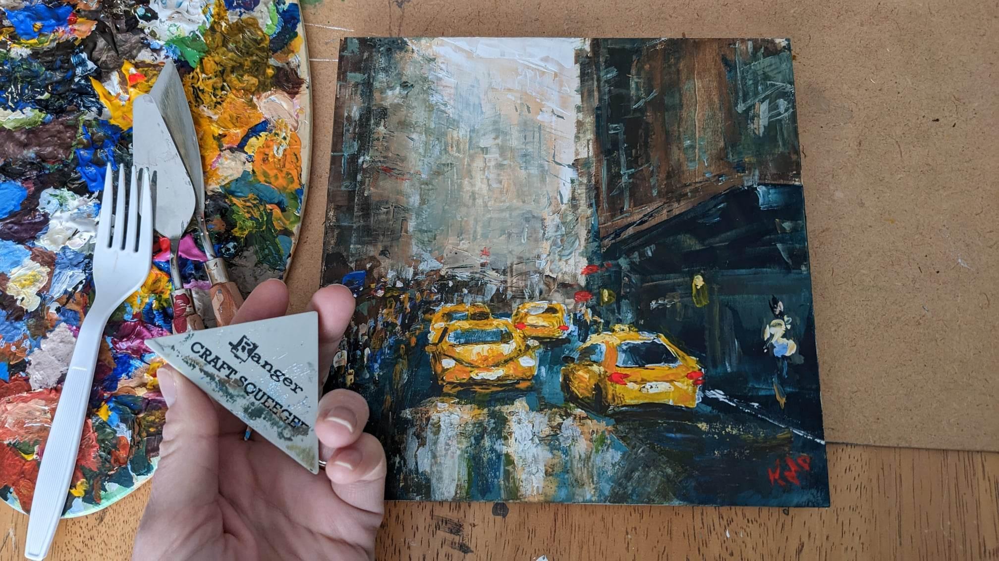
some other tools. So use what you can find. I have a plastic fork. You can use a plastic fork, you can use a craft, a squeegee. This is actually
really fun to use. I've used a couple of
times before this project, but definitely not
comfortable with it. And this palette knife
and another polynomial. So I have a couple different
tools that you can use. I have a list of materials
and things that you need to make this
project happen. So take a look at that
list, you can print it off, take it with you to the
store if you really want to follow to the t exactly along, if that's your preference, if that's where you're
at, That's cool. No worries. But if you're ready to branch
off and you're like, You know what, I've done
a lot of cityscapes. I'm ready to try something
totally different. Go for it. Just make sure it's not where
you're comfortable. That's the key thing. If you're feeling
comfortable with the piece, I think you need to pick
something different.
3. Materials: Okay, Are you ready to
push yourself out of your comfort zone and really
explore something new? That's what today is all about. We're going to try
something different. So if your comfort
level is brushes. Brushes today, bye, bye. Hello. Less familiar tools. Hey, there's some brushes
that snuck in there. What are they trying
to get into there? I've got everything
from a craft squeegee, like a three-inch
craft squeegee. I've got plastic
forks, plastic knives. You can even get
a plastic spoon. I've got palette knives. Note some of you might be
familiar with palette knives. I never use them. So this is all out
of my comfort zone. I'm going out of
my comfort zone. I invite you to do the same. Because what it's going
to do is not only am I going out of comfort zone
with the tools I'm using, but I'm also going out of my comfort zone with
the subject matter. So these are ways to
help push your style, push your skills, and
learn something new. Because if we just stay
in the same place, It's not very exciting
either and we want to really push our
mind or creativity. So this is an eight by
eight board, wooden board. You don't have to
buy the same thing. You could be using
a different size, you could be using
a different shape. I will include the square
image that I'll be using if you want to
follow along exactly. But I do encourage you to
take it to your own place. Like if you normally paint
streets and buildings, then this won't be out
of your comfort zone. So choose a picture that is
out of your comfort zone. This is an intermediate class. If you're a beginner and you
want to try it, go for it. Maybe follow along
with what I'm doing. Maybe that will be a
little bit easier for you. But if you're an intermediate
or maybe advanced, I encourage you to
do subject matter. You never do something
totally different. So for me, I'm doing something really out
of my comfort zone. And that is not only buildings which I don't feel
very comfortable with, but also cars, streets, I never paint that. So that is really out
of my comfort zone. Plus we're gonna be using tools that are out of my
comfort zone as well. And that's really going
to push my skills. It's going to push my creativity to figure out the problems. Because when you're painting, you're figuring out problems. You're creating solutions
and finding what works. So that's where
we're going to do. I'm working on a square image. Just makes sure that if
your image is not a square, that you edit it to create a square and also make sure if you're planning to
sell it in the future, that it's an image that you're allowed to use commercially. So I like to use
pixels for that. Like I said, the tools
that we'll be using, I want you to find tools that you never use
to paint with. I've only painted with
these once or twice. I'm not really comfortable
with these tools. Palette knives,
something different. Maybe if you're a
palette knife artists, you're going to try a brush or maybe if you don't want to
push yourself too hard, you're still new to painting. Use brushes but try
a different brush or maybe at one point try
the palette knife. So that might be a way
to make it a bit easier. If you're a beginner
intermediate, you want to still follow
along and try this out. So get your image, have it nearby so you can
reference to it frequently. I'm always looking at
my reference image. I have that nearby. I'm constantly looking at it, finding where I'm making decisions of where
I'm placing my piece. It's not just
memorized in my brain. If you can do that,
great works for you. I also have a couple
of jars of water. The water is not
very deep because my brushes I'm not using
brushes. So there you go. I guess that doesn't matter, but we don't want to be
washing in-between colors. Also have a rag or something. These are nice. They're kind of like in-between
a rag and a paper towel. And I'm not sure
where I got them, but they work really nicely. You're wanting to paint palette, painting clothes if
you're getting messy. I also like to have a
little dropper with water. This isn't necessary,
but I like to have it. I'm acrylic paint is
what I'll be using and demonstrating with acrylic
paint dries quickly. So if I've mixed a color
and I need to order, I just need to add
a bit of water to my paint mixture instead of dipping my brush into
water into the jar, and then that dirty Is the
jar and contaminates it. I could just take this dropper and drop some one or two drops. Usually you just one drop is enough depending on the size. Look weird. You got to draw on the board. Perfect. So I like to work from
backwards, forwards, and sometimes lighter, darker or darker or lighter
depending on the image. I'm gonna be working
from this image if you want to follow along, I do need to find edit it
first to make sure that, oh, there it is, square now, I had already done
that previously. So you just edit. Make sure it's square
and then have it nearby so that you can work it. So in here we have
this lighter section. I think that's where
I want to start, get that in place and then
start building around there. Maybe structurally. If you think about someone
like building a house, there are going to
create the foundation, then they're going to build the, um, I don't build
houses, you guys, I don't all the terminology, but they're going
to frame it before they put in the Electrical
and all those things, right? So don't fixate on
details at this point. And also just be free. Like let yourself tell yourself just right now,
hey, you know what? I'm going to have fun and
I'm not going to freak out. I'm just going to have fun with this and give it my best shot and try to create solutions if something's bothering
you in the image, either you need to
trust in that moment that it's gonna get
better, just keep going. Or you need to reevaluate, maybe make some changes. Because I'm using
a paint palette, things might go on thicker than what I would
normally do with a brush. I paint quite thin with a brush. Then let's say I put a blob on and I don't
really like it. I'm going to probably scrape that paint off so I don't
create texture in a place. I don't want texture. Okay. I think we have all we need. We do need paint as well. So as we go along, I will show you
what paint we need, and I will have a list of materials I'll be using as well. I think we have everything
we need to get started. So let's get this going. In my image. I'm seeing some cream tones in this section I
want to start with, so I'm going to grab some white. I'm going to grab some
yellow tones in there too. So raw sienna might
be sufficient. But if I want to amp up the yellow and maybe make
it a little more bold, I can throw in
some yellow ocher. I'm also going to want some darker tones in there
that I can throw in. So I'm going to put in some raw umber on my palette and I'm just going
to start there. You know what, I see a little
bit of blues in there too. So I might just grab
one of my blues, Prussian blue,
something around there. Let's just have those
on hand ready to go, just to have some blues. I've got ultramarine blue, I've got cobalt blue. I might end up using
these throughout. So just have some of
your blues out there. You don't have to have
the exact colors I use. And if you're using
a different image, obviously, you might have a totally different
color scheme. But if you're following along
with this particular image, this is what I'm starting with, and then we'll figure
out the blues as we go. But let's get this base going.
4. Squeegee, start us off!: This part I'm probably
speeding up a bit. Get my colors. I actually don't put mine in
the same spot. Each time. I kinda like to have a pilot
that's all over the place. Just a little bit. Remember our palatal, this
section is only this big. Sometimes they go
a little bit crazy with how much color I'm
using and all that. So I'm going to let myself not go too crazy for
details right now. And I want to leave it loose.
Want to leave it loose. And this is gonna be, it's
not gonna be easy for me. This is not my typical
way of doing things. So really push yourself, use a squeegee that is really unusual type
of thing to use. And also because I
haven't just sold this, there will be soaking in. So I might have to do more
larynx or it might just be kinda fun to see what happens
with not using adjust. So if you really want the
colors to come forward, just so this first and
then do your layers. But let's just go ahead. I'm gonna take my
squeegee and get some different colors
on it a little bit. Mostly want white, you can
even mix it right here. And then I'm just going
to kind of map out, this is kinda going
to help me map out the beginning
of my painting. So I'm just going to drag
the paint onto the canvas. I just had a cool idea. Sometimes when you're
actually doing the work, you have ideas and whether
you want to go for it or not, that's totally up
to you, but I'm actually right now
it's going opposite. This would be kind of cool. I wonder if I make it look more like a landscape
than a cityscape, just because that's my style. So you will encounter various
moments in this process. I need more white already. Where you're going to need. You're going to make decisions whether you stick with your
plan in the beginning. Okay, come on paint. I
need to grab a new white. Want to make sure I get
oh, yeah, there we go. There's the white. Okay. You're gonna make
decisions along the way. This is your work,
so you decide, but I do think that what makes things work
is when you make a decision and you stick to it so you make your own rules and
then you stick to it. If you keep just flip
flopping all over the place, It's not going to
function as well. Let's see if we use
a palette knife. What kind of we're just we're
testing the waters here. I'm trying to kind of I know that these are
buildings here, so I want to make it
the correct angle. I'm not too worried about
detailing right now. I'm just thinking, okay. The tone, like the hue. Hue, tone and printing of good base because I could
add some detail after. So I'm just figuring out my
tools. It's part of the fun. As we come down here
gets a bit darker. So I'm going to throw
in some down here. And maybe it's just gonna be
really abstract and maybe we do something abstract
and just shocking. Don't really usually
do anything abstract. Very kind of a
rare thing for me. Tend to like to paint with
more precision. When moving. I wouldn't say precision, but just more realistic work. So now I kinda like this idea of trying to get these
building lines. That's the one thing. I mean, I guess in nature you
do see strong lines, but I just feel like the
lines in cityscapes, there's a big difference
to them, right? So there's all these windows and the architecture has
all these neat things. This is a wild, you
guys, this is wild. This is so out of
my comfort zone. But, um, there's, there's
things I'm learning right now. I'm learning how this
tool is working, what, what's really
important in an image? What's important
to me in an image? What are my what needs to be there and maybe
what I'm adding there that doesn't need to
be there at times. So I'm just going
with the colors here. I'm adding in this raw sienna because it's gonna get darker
or this way as we move. Towards the session,
I'm actually loving this squeegee.
That's kinda cool. You know, our paintbrush won't make those kinds
of lines, right? I do need to blend this more and watch my angles
a little bit more. Oh, look how that
pulled the paint to. Want to pull it in that
direction a little bit, maybe it gets more white. Pull me in the right direction. I mean, it's, it's neat. It's neat to see what comes of certain actions that we
take and where our mind is going to create this outcome. So I really find that it's
quite an interesting exercise. So here I see more
flat building. So I'm just going to kind of
establish this top section. And then I have
no idea you guys, when I get to the cars, I never do cars. I don't know if I've ever
done a car in a piece. So that will be
interesting for sure. But that's part of the
growth that you want. If you want to
grow as an artist, experimenting
different styles and methods and pushing yourself
out of the comfort zone, it's really going to teach you something quicker than
staying in your zone. Now, of course, if you want
to be a portrait artist, that kind of thing,
you're going to have to practice a lot of portraits, but need this out of my way. I don't seem to be
needing my water much. So I'm gonna see if I
can get the right angle. It's kinda neat to just
drag paint instead of, I guess a brush drags paint too. It definitely has
a different feel, a different a different
mentality going on right now. I don't feel the need to add
in the blue at this time. You certainly can take a look at your own image or see how
maybe for you it would work. I might soon need something
a bit darker just to match the depth of the tonalities
in this painting. I'm, I'm kinda gearing
towards this one here. This is a Prussian blue phthalo. Now, you don't have to
use this exact blue. Like I said, if you're
following along, it almost has it has
that deep almost teal like quite but
almost a teal like feel to it or something about it that
makes me think of that. So I'm going to throw
in that was lovely. And I want to make sure
that my angles are correct. So I think I'm not going on
a strong enough angle for this image up a bit higher. So mix that in with the brown. And if it's not dark enough, we can grab some other
colors to mix width, but just depends how much
of the blue you want, kinda visible,
throwing more brown. And I'm quite happy
to see some of these things that are slightly
unintentional that happen. Okay, so if I want to make
certain things happen, I need to plan it. So there's a little bit of lighter tones of this
blue popping through. So I'm gonna kinda
grab hold of this and I kinda like how some of
this is showing underneath. This would if you're working with wood or you haven't yet
and you're thinking of it, it might be worth trying. Okay, that was a
little too much. So Kate will go in with
some more blue and brown and the blue a little
bit less green. Like if I just take a bit
of the brown that will help to dull down that blue if we don't
want it to be too bright, I want the cars to
really stand out. Because when I look
at this image, I see these cars
really stand out. But you see this
angle right here. You can see that I've
taken at like this, even though you can
see it's like this. So if I want to match it, I need to do
something about that. That's better actually. And then maybe some of the blue in these apartments or whatever's going on up here. I don't want it to be
that white, blue mix. I think I might need
some more brown hitting the bottom
of the barrel. Let's get some more brown on their raw umber is
what I'm using. But again, I just like to
take a little bit out at a time, An up to mix. And depending on the size of
the piece I'm working on, but you don't want to waste. I'm assuming you don't. These water jars are
actually just in my way. Normally I'm going write
in for the water a lot. But what I'm gonna do here is
I'm going to bring this in. And I know it's reddish brick kind of thing
going on here. So what I'm gonna do is see how that's given
me a nice red tone. I'm going to go in
with some raw sienna. I know it's not the same tone
is what I have in my image, but you don't have to
follow my image exactly. These are moments
so you can choose. Or if I want to make it a
little more red, grab a red. Make it a little more red. So I think I took
the red too far. So what I wanna do is maybe
draw a line all look, that's really cool
how it pulls off the paint and maybe
bring some over here. There's a bit of action
happening over here. There's people walking.
It's gonna be kind of.
5. Completing the base layer: So I'm just taking
that Prussian blue and putting it on
the street now. And I'm going to want to mix
it with some white looks like I'm just going
to kind of yeah, I'm going to want to
mix with some white to lighten it up. Why, Please? And I don't want
it to be too bold, so I can take a bit of
brown in there too. I want it in. This is maybe where I need
to wipe off a bit. So what I'm gonna do actually, so I've got too much
product, product, got too much paint, which is the product I
guess on this little thing. Maybe just wipe off
my squeegee a bit. There we go. Then I can go in here and get right because it doesn't
blend the same as a brush. This is giving me
some cool vibes. I'm kind of digging the vibes. It's given me here. So you
have cars in the way of the area where everything disappears now I do want
the buildings I think, to come down to about here. So from there, we'll have angle of street
starting this way. It's over this way as well. It looks like it's
raining or something. It's kinda cool. It's kinda cool. Getting more blue does look
like it's lifting of it. So if a paint hasn't set, it will it can lift. And that's the same as a brush. I'm working with a brush.
So I should know better. No excuses there. And I do need to make this
building area stronger. So I think there are
some people there too, so couldn't make it a
bit messy. Looking. I mean, just not worry too much about making it
look like a structure. But I think I'm
going to try and get that bit of a stronger line. Mostly just using
this as like swiping. And then we just move the paint, add more paint as needed, blend in a new tone as needed. So if your intermediate, you've tried some
of this before, but maybe not with this tool or maybe not the subject matter. Maybe you're pushing
your boundaries a bit and I hope you are because
that's the whole point of this lesson is to get
outside that comfort zone and find out maybe you have a passion
for using a squeegee. Maybe you have a passion
for using a palette knife. You didn't know you had
before and now you do. Maybe it will help
your brush technique. Maybe when you're trying
to create a new look, you'll know how to
go about doing that. It's all kinds of
things happening. I guess that's where my
street line is going to end. So I'm just gonna
kinda of people, there's buildings that have their little
canopies and things. So I wonder if Bork
would be better. I'm just trying to
using instead of the whole edge because
it's quite a long one. Just the short end. To create these marks that
show us where that is. So interesting to see how using a different
tool can really change a style of a piece. You take your piece and really
do something different. There's a sidewalk. It kinda comes there. And we just take a
little bit of brown on the tip and just
scrape it in a bit. I want to add in more detailing
up in this section here, if you'll look at supposed
to come out more. Haven't been true to that. I wanted to kind of
match these two sides, showing that they're at
the same level in depth. And just the way
the lighting is, I really want that light
to really pop in the back. Give us some
interesting features. Now I'm looking at the angle
on my image holding it. This is the angle marking like
that and then bringing it to my image and using
that as my guide. It's kinda like
creating your own ruler to measure something. I do those go up. You can
use your own measurement. Create your own little
measuring tool. Right? Pulling some whites, pull in some darker tones. See what happens. We need some more like window
like things up in here. And I just don't want to mess
too much with it either. So I'm just going to
make a few marks. I think it's kinda
darker down here. It's, the light
really pops up here. That's where I really
want my light. So look at your tonal values. Throughout your
image. See where, where the lightest part is. What, what do you think emphasizes what is
emphasized in your image? We can brighten up that
white area back there. So it's coming along. It's coming along. It's good to take a little break
once and awhile. Once you've finished
certain areas to you don't want
to go necessarily too far unless
you're in some kind of speed painting contest. Which case, Pink quickly. If you're not, you're
just painting leisure. Without any time constraints. Then to take breaks,
to re-evaluate, to evaluate where you're
going with your piece, to make sure that it's in the correct direction,
that you're enjoying it. And let's just take a quick lift that because you're
on a bit of an angle. So there we go. It's pretty, pretty cool
so far. It's kind of neat. Working with the squishy. It's totally different. I'm feeling a little
uncomfortable. This point in your
piece, you should feel a little uncomfortable, but there should be parts
that you're starting to feel that you're
starting to like, okay, this is working
or find areas. And let's let things kind
of sit a little bit. And then when we come back with fresh eyes to take a look
at it and see where we want to touch up and figure out like I'm
already seeing some things, but if you want to
take a quick break, you're just watching at a
time you don't have to. You can, you can pause at any moment. That's
the beauty of it. Pause at any moment. Mix some with white. You can make some color on your palate to with these tools. A bit of a grayish tone here. In this building. The one next to the
orange is kinda agree. I don't know if I want to
indicate the windows are not. These are questions you ask yourself while you're painting. Kind of questions. Do you ask yourself? Do I start putting people in it? Figure out what moments, right for doing those
types of actions. Just gonna kinda indicate these, indicate where the people are, just using the corner
to give a little more, a little more control. And then you can use a tool to scrape to create some detail. That's cool. Showing here and
I don't know why. Okay, cool. I'm going to brighten
up this section now, so I'm gonna kinda clean off my squeegee and then
brighten that up.
6. Background - second layer: Hey, I've cleaned it off a bit. There's still some
stuff going on there, but it's further up, so I think it'll be okay. And then I'm just going to
grab some of this white. Really brighten this up here. Maybe try and get a semblance of some semblance of building tops. So strong edge, maybe there. Strong agile on here. Okay. And then throughout
their own little bit of a more of an angle than
I've indicated still up here. Okay. These ones come on more of
an angle and then these ones are this is a stronger
angle up here. Then as it goes further away, the angle changes because
it comes in this curve. So I'm just trying to
mimic that a little bit. It's like I want to
control the paint like the way I'm used to. And that's what
pushes you outside into a new realm of learning. Maybe having a shorter
one would work too, or I could try the palette
knife a little bit to see how that would. I still prefer. I'm
preferring this one. Right now. Maybe now we need to bring in
some of the windows. Just by taking a little
bit of blue, some white. Let's mix it up a bit. And let's see how that's
a little too bold. We're going to take some
brown to Dolan it a bit, and that's giving me
that greeny blue. Then I'm gonna go in
and make a few windows. Maybe this way it would help you make the windows more properly. It's too much. I
have some white on there that's too bold. There we go. Even some of that blue, make sure it's mixed well, otherwise you're going to get
what just happened to me. So I'm a little too
bright, pops out. The brown is not
gonna be too bold, so I'm not too
afraid of the brown. But the question is the
what method works best? When I make a line like that
doesn't seem very strong. But when I do these, will stamps does seem to
work a bit better. And to me that does indicate
kind of buildings more so that to me already kinda looks more like a building even though
I'm just kinda stamping. Just kinda weird, but
I'm gonna go with it. Works. It works. Might need a little water
on the color I mixed. So take a water
dropper, drop one, drop their stood, move the
paint a little bit more. The first bit of water we're
using on here, isn't it? The fork? Let's try the fork. See what the four
could do for us. Oh, you guys? Check it out. Hold. It's our window maker. What's a three times altogether
that works pretty well. Can even kinda do
some lines like that. Window maker. We got a window maker. It's scratchy sounding. Morning. Or those who
hate that scratchy sound. I want to plug your ears. Okay, I don't want to
go out of control, so I'm going to mix a
little white in here. I guess having none on the
right angle would be correct better if you hold
it on this angle. So we know it's we're doing
perspective correctly. So for instance, right here is going
to look a little off. So I could take my
finger finger painting. Finger-painting. Oh dear. We've made a little mess
there. That's okay. You can scrape it off. Hopefully. If not, we can
just paint over with some of that brown there. Maybe. We'll just do a new thing here. Just do things correctly
so that it actually works. Yeah. So if I go over this here, so I can fix my, now that I know that fork
works pretty well to do that. And take a little more of
this raw sienna, mix it in. Here. Don't wanna brighten
that up too much in that area. We go some of this bluey tone in here. So you can kinda just fix things like this by creating layers. Brushing over. Actually what I'm
liking about what's happening right now
is I'm kinda blurring out some of those windows so that it's more
in the distance. And there's still
the underneath layer indicating the windows
still might be hard to see. Can you see there's still this underlayer and I'm liking that. Happy accidents right
there. Thank you, Bob. Okay, Excellent. Let's leave it there for
the moment and continue on.
7. Taxis - base layer: Okay. I had to take a little break so I made sure that my paints, if you have a lot of paint,
that's what wrap it in. Plastic. You can lay the
plastic to reuse again. My dog thinks I'm
talking to him. Okay. So this is dry. I'm ready to work
another layer on it. So make sure when you're working your layers that if there's
anything you want to blend, that you blend
those things right away and then go from there. So what I'd like
to do is set some, use the white because
I've got a lot of white. This is sometimes
how we plan things. Okay. If I have wet paint
in a certain color than I like to use that
until not wasted. So that's kinda my
idea right here. And I think for the car, so when you're putting
a light color, the cars are yellow
because their taxes. When we're working with that, we want to make sure
that the taxis, the yellow, doesn't just
sit right on top of this blue because it's not
going to pop in front of it. So if I take some
white first and then do an outline where
the yellow is gonna go. That's going to
help me put yellow. It's like a primer, right? So we're priming the cars and
then we'll go from there. So because this is where
I want to make sure that it flows from where
I've started my road. So I'm gonna go in
and make sure that I get really look at
my reference image. This, especially because
this tool is not going to lend itself super well for me to do what I
would normally do. So I'm gonna kinda get
the shape of it going. Can try a different tool, see if the forks
nicer or make sure I'm getting the
correct length of this vector might need
to be a bit higher. I'm going to bring it up a bit higher because I don't
want the road to be in line with with that. I want this to be
higher than the road. This is gonna be a
bit abstract, right? This is almost like it's
raining or something. We've got these kind
of blurred effect. So now this is kind of
building up paint here. And then the next
car is overlapping. So I kinda like to
start with putting some things in place
to give me some idea. So actually this car next to it, we could put it in first. And that will help
us set kind of a measurement for the next
cars that we're putting in. So you can kind of gauge
where those should be. And it's really pushing me. Because if you are
usually working like realism and you
have to use a tool that's kind of pushing
you away from that. You're going to grow. You're
going to grow as an artist. It's, it's exciting. So what we wanna do. So I just want to make
sure that my proportions are pretty accurate here. Hey, right now just kinda
looks like a white blobs. Maybe you're I don't know. Maybe you see something else. So this one is overlapping and it touches all the way
to the edge of this. I'm going to this next one. Bring it down. Pull some
of the paint downward. Try to get this shape accurate. How far does it go down? So comparison to work
with this person, it does end above that. So see how I make little
markers in my brain. I'm like, okay,
this, as long as you said other things in
place accurately, and then you use them
as a measurement. Sometimes using this
edge and sliding. It kinda works. That worked on that end. So I wonder if I should try
and do that on that and I'd not straight across the top. So that's going to be a problem
if I leave it like that. And on this side it's
actually more of an angle. So I wonder if I
can scrape a little bit right here. Different tool. Go. Think of it as
an exploration. We're exploring the
tools and everything. So that's why we should have fun with it. Dry and have fun. Don't get too frustrated
with yourself. I think I took out
too much white. I think that's okay. And then this guy here
doesn't come to the top of the car but close
and it's further away. Here. Also has to make
sense with the whole image. What's your angles? I said you can use your
tool to measure the angle, keep yourself in that same
position and pull it over. And because the windows
you could actually, you could try to just paint
where the yellow is gonna be, but I didn't really
do that there. So although I could
scrape actually. So if we scrape
those areas where the windows might think
I want this rounded one. Scrape a little bit.
Got too much paint on. There. We go. This way worked a bit better. Let's try that one has a
little window showing. Not used to scraping
on my canvas, you know, my art piece. It's not typical for me. Okay, and then this one here, sliding around a bit. Be creative with how
you use your tools, can create all kinds of things. It's helping maintain
the theme too. Why, why I'm thinking does scrape instead of
paint over top is it's going to keep the color that I've used underneath rather than building
on top of it, it's going to have a
bit of a different feel if I just build on top. So I'm trying to scrape
that off instead. Scrape that line down there. That's the front of the car? No, but I'm having
fun with scraping. You just never know what
kind of fun you're going to find with experiment
Dean, things. Should we even do that bit? Why not giving it
a go? There we go. Okay. Let's continue over here. Can do it this way as
long as I don't have any paint to a point
where I don't want it. Watch my angles. These angles can be so tricky. Do you think it's
supposed to be one way, but you've got to trust. What really is trust? What really is not
what you think it is. Break this rounded a bit top, a little bit rounded
according to my image. And then we're gonna be
able to, once this dries, we'll do our other colors on top and the yellow will really pop and we won't have to do, like we might have
still have to do a second layer just but, you know, we could have
done yellow right there, but it would show up a
little bit more green like working out my angles, making sure I'm hitting that rides. Watching more things. There is a nice
golden glow here too, that I would really like to add. It's going to be a
little tricky now that we didn't blend it
in with the blue, but we're gonna give it a go once we get
into our yellows, I think Kim feeling pretty good about those.
8. More background refinement: And let's see if we want to highlight any other
people at this point. I know that there's
this walkway here. Great to kind of pull that in. I kinda like that. It
created that kinda dry line. Can do that over here
too if we want or just leave it there
to be its own. See if this person over here, and I kinda want
to take some blue, some brown mix, like
what we had done before, kinda create like a muted tone that's not going
to look too bold. There's a person
walking right here. It's going to help
give us a little bit of perspective as to how big everything is. Right? So mostly we're in dark pants, will just think, going hard to see really kinda abstract looking. Figure. They there. They moving, is
everybody moving fast? Brown in this one? Different colors because
people are wearing all kinds of different things. So make sure we kind of indicate that there's some
differences happening. Interesting. They'll keep
it. I don't know why. I think there's even like a
street sign, windows signs. I wanted to keep those
with just a little smear. Maybe there's some doors like we're just making indications. Things. Probably think of what do you what
did you just do? Why don't you explain yourself? I like to listen
to my piece too. So maybe maybe I'm
not following a rule. Maybe I'm just feeling
something and go on with it. It's kinda like play
playing around. Can always over the sections. Not really been
worked out too much. I mean, I don't love
what I did just now, but I can play around a little
more and see what's up. We can do here. I really loved
this section here, actually, I don't want
to mess with that, but I would like to do a little
bit of markings in here, kind of windows and things like are
indications of Windows, you know, little bit of overlapping to give
it a little interest. That's pretty cool. When you do that.
That's a little fun. One to the next
whole signage there. We'll do the same up here
just a little tad bit. Like in this little mixture
of we're kind of creating patterns with our lines. We want a bit of that, but also leaving it. I feel like I want to leave
it a little bit random just because of the nature of this piece being a little
bit driven in chaos. It's almost like
I'm changing it up. So you can't really say it's one particular thing or another. It's creating nice
layers to when there's anything that's sticking out to you as kind of standing out. That's maybe something
to look into. Maybe you need to
work on that section. When things are standing out, it could be a bad thing. Could mean there's
something that needs to be fixed in there. I'm going to bring some
of this into here. So it's not just
the stark change that might have been a
bit much little white. Mix it up. Maybe we'll bring some of
this into that section. No windows, balconies, You got all kinds of
things going on. So create all kinds of lines that especially if it turns out that we're kind of creating
some kind of rainy scene. Alright, well, but
all the depth that it creates and kind of
mystery and intrigue. I'm actually really
enjoying this. It's so funny because
you spend so much time making things look realistic
and fixate on that. And then you do something like
this where you're kind of throwing some of those rules out the window and it's quite fun. And also quite like, Oh, maybe I shouldn't
spend so much time getting fixated on
certain things. I'm adding a little
bit of water just by tapping into my water corner
of it and then mixing. Just to get a little bit more
movement in my fluidity. I do like that. It's a bit mysterious. Not like I said, I do like to to do
realistic things. Oh, this is, I guess
it's abstract, but it's not like it is
going to look like a thing, but we're taking it
into a different way, but I'm starting to feel
it starts to come to life. And then you have to
listen to your piece. I wanted you to start to figure out what your
piece is saying to you. Where it feels problematic, where it feels
like it's working, where you might need to create
more depth or something. And that's one
reason I think it's great to make sure that you are sharing your projects
in the gallery here. Because if you share, then I have a chance to
give you some feedback. I think that's a wonderful
tool when you can get feedback from another artist, from someone you trust. It's, it can be really
helpful in moving forward with your
piece and everything. So I'm quite happy with
how this is going. This is pretty much dry
so I could on my yellow but I think for now I'm just
going to call it a day. But for you guys, you'll just keep carrying on
with the lesson. And moving forward. Again. We'll take a look. If there's anything standing
out in some negative way. We will fix it up for me
before I put this away, I feel like this is kind of standing out to me and
I'm just going to kind of see if I can do
something with it. Peeled off a little
paint or something. I think the boldness of the read is throwing me off a bit. I don't want to
mess it up too much sometimes when you get when you're ready
to call it quits, but then you keep going. Sometimes you can
mess things up. So just think we need
to bring some of this brown into our blend. There we go. Wet it a bit so I can maneuver. Could be good, kind of like
a wash over top of it. Scrape over, see what
happens. Be brave. It's kinda neat. I'm just never know
what's going to happen until you try it. Give it a go. Maybe we need to make this side. Later. My water jars
keep getting in my way. Beautiful. Okay, well, I'm
feeling pretty good about it. I'm going to leave it right now. And the next step is
we're gonna get our yellow and go yellow over top, create some shadows and then see what details
we need to finish. So already quite a, quite a good level of progress, but I do think it's good to
not do it all in one day to give yourself some time
in between to refresh. And after we sleep, our brain kind of resets. And then we can see it from
a new, fresh set of eyes. Maybe hold it up on the wall, see if there's anything
that sticks out to you in a bad way and move forward
from there. Awesome.
9. Taxis - yellow base: Alright, let's continue
on and get started with the yellow on these fun taxicab. It's going to really make
this painting really pop. It's going to really
put that icing on it. Because we have all these blues and browns and having a pop of yellow, it's
gonna be amazing. So I've got here this
cadmium yellow deep hue. And as you can see, the lid broke off.
But you know what? We're inventive. We're going to see
if this one works. I can get to any of the paint because this would be a great
color to use for the taxis. If you are ever stuck
where your paint is not coming out
because it's dried up to here we can actually
use can use some tools. And so we'll see if that
works and get back to that. After using a screwdriver, I was able to manage to get
some of the dry paint out. And we'll see if that works
because that's not ideal, but I think I'll put
a better the tape is not going to be a
cover enough for this. So be sure to maybe squeeze the rest out into a container
if it's worth it, it might not last. So we'll see. Okay, I've also put some
medium yellow, cadmium yellow. We have the deep
and the medium hue. And so we're ready with that. And I've put some raw umber
as well on my palette. Also just be sure to have
that reference image again close by so we can see what colors we've
got going in here. So we've got some reds, but these details don't
worry about those right now. Even though a bit of white,
we can add that on top. What we want to focus on
is getting a nice base. And maybe we'll bring
in some white to, or just see if we
can work that in. So we leave that bit
lighter where there's highlighting on
the top that car. So let's play around with
that and see where we go. Alright, let's go. Okay, so hopefully your
deep hue is not like mine, where mine is kinda well, you can see how I
make things work too. So I'm mixing just a bit
of water in with it. And since acrylics
are water-based, should be able to revive
it now if it's dry, you can't revive it, but if it's still has
some wetness to it, you can play around with
it with a bit of water, just don't oversaturated because then it loses its strength. The acrylic polymers break
down and then it doesn't hold up and you might end up with cracking years down the road, but haven't really
seen that with any of my work and I often I have watered them down decently. So who knows who knows
the truth of that? I'm going to take some of this that I've just mixed
up and I'm going to there's not a huge area
actually of this yellow. So I'm just using
this rounded tip. You can see already actually do see almost a green underneath. So we might have to
do multiple layers. We'll just see I've got a little something
hanging off of it, grab a cloth and just
clean off the knife. So make sure your tools are cleaning. They
don't have little. Sometimes they can get
dented and then they're pulling they won't
pull a straight line. So that's something to
keep in mind because I'm just going to kind of cover the area going with right now. Then we can add details on top. Let's give ourselves
a little base. Sometimes it's just
easier to create a base and then work from that. And we will add in are the yet the lighter yellow to help like while
this is still wet. And it's up to you
if you want to make sure you go right to the edge. If you want to overlap
into the gray. We're dealing with small spaces, we have to be very cautious with our attack. Bit shaky. That's okay. It's still work it out. Or if you're trying to do a line sometimes just stabilizing, using your other hand, stable onto something that's. Not moving. And then you can use this to kind
of give yourself some more stability rather than just holding your
wrist in the air. You'll see some artists
using a tool that they're actually there when they're
getting the fine detail and they're working on
the larger painting. They have this stick
like tool that helps hold in place and they just
rest their hand and yeah, anyways, we got to keep working
while this is still wet. Stop the yak and lady. And right now it doesn't
look like much just because the one block of color
just takes it into a very unrealistic place. But maybe that's what
you're going for to it. Maybe that's the style
you like and maybe you're discovering that
that's something you want to explore some more. So that's one of the
great things about trying something new or out
of your comfort zone. You're going to discover
things you didn't know before. And that's always exciting. Catalysed growth propel
you forward more quickly. I just said yes this morning
to speaking at an event. And honestly, I'm pretty
nervous about it. It is going out of
my comfort zone, but public speaking is something I would
like to do more of. So kinda need to get
over it, right? Alright. So it's funny how we might
want to do something, but also feel like
nervous to do it. I always used to do
a lot of dancing and even dance teaching and their nerves before
going on stage. And I think that's
pretty normal. I don't know if you should
lose that because it's kind of the excitement of it. There's it shows you
care to rate comes down here that we're going to
have to work a bit quicker. So we can blend in those colors because especially
when you're using an older paint that
was kinda drying up, it's going to probably
not blend as well. So maybe yours is going
to be better than mine, but that's okay. We'll just work
with what we have. We want to try and
scrape that bit off that's getting into his own.
I didn't want it to go. There we go. Let's get
some of that lighter tone and bring it in places where
you feel it needs light. Give it some little
something dynamic. Maybe you were going a little
chunkier on the surface, you know, more texture. It's more yellow. This kind of medium yellow on the back of this where
it's closer to us.
10. Taxis - adding dimension: Feel so weird to put like
a chunk of paint for me. So maybe if you're used to
putting a lot of paint, maybe try doing a
really thin amount. See how that challenges
and opens up the mind. Now that one's quite orangey, this one's quite more yellowy, so I'm gonna kinda
leave it like that. Now we need to start getting
a little bit of this mixed. And now palette knives
are great for mixing. So we're already using
a tool that mixes well. So that's wonderful. And we will go in to
areas where we need to blend in some. I'm just kind of
mixing it in with the existing trying to create
the shape that I want. This kinda comes to a halt. That darker in the
front, on the sides. Try mixing in that section. It's kinda creating stripes
that I don't really want. So I'm going to take
this other knife and try to scrape some of that. Oh, where's my spatula? This might be the
job for the spatula. Actually are a couple
of streaks in here too. That might be a good time
to little highlights where other cars and
shine are reflecting. I feel like it's not, you know, when you're used to a brush, it's so different to try
to do this with a knife. And the way you blend is
certainly a different story. Like I can get some wheels
right at the frontier. But it should be on an angle. So I want to go too far, scrape some of that off. Maybe even just like Yeah. We're just hadn't brought it
down low enough. Actually. It has some shadow underneath. So I'm just going to
take my knife and ring that shadow under the car. We have to make sure it blends well with
the rest of the scene too. So we might bring in
some blue to help with this or will scrape
to see how that can blend in a different way. I was kinda cool. It has
some yellow in there, so that's going to leave an
interesting kind of streak. Let's do some browns
with these sides. For their already kinda setting. It's not simple to be blending
with these tones together. So I'm just going to mix it, maybe premix it a little
bit more and put it on top. It might be the best way. Learning as I go as well. Going out of my comfort zone. And it gets kinda fitting that this whole class is about that. And I too am doing that. So I'm not asking you to do
something and I'm not willing to try. Why not? Going for it? A little bit of
darkness in the window there underneath the vehicle. I think this brown
because we've used it before and the other
bits of the image. It seems to be working
for my purposes. Bringing this up, but don't really love those
stripes that are in there. That's more of that
deep hue in there. I don't want it to look cheesy and this wheel
is barely visible. So I'm going to
make sure that I'm. I see now correctly, this right here is
not the wheel is. Sometimes our brains
want to tell us, Oh, this is how it should look. Then in reality it's
not quite like that. So you can have to fight the one side of your
brain that says, logically, it should
be like this. But then in reality, it looks like this. I'm so tempted to use my finger, but I know I want to
maintain the integrity of this of this whole exercise. So do your best to find ways to make
the tool work for you. Oh hello, that added water on, onto my palette, onto my page. So don't mind dabbing
off some water. That's okay. Because the knife is not going to be able
to soak up any of that. Maybe let's get a
little more yellow in there to help it along. I think we're getting somewhere. We're just going to keep
going to add more depth. So there are certain
areas where you might see some stronger lines. So kind of try to pinpoint
those where they're placed. And placement means
a lot when it comes to what we're doing here. Because we're kind of creating an abstract composition with something that's not abstract. So it's, it's kind of
an interesting game. I hope you're
having fun with it. Now. One thing you can do as well, the paint is still wet. You can add some of these lines and details where if we wait until after they
might be too strong. So like here for instance, maybe we want to add in carefully these kind
of lines, right? Sometimes it's those
little details that become visible that really make a piece
identify the object. Really helped to identify it. So once I add, I mean, you might be able to see
that there are cars. I mean, you already know that. So it's kind of hard for
you to be the judge. But someone that
might look at this, you might already guess,
okay, this is what this is. But by adding in, when we add in the lights, that kind of thing,
it's going to make it even more obvious. Or if we add in sorry, if we add in these
little lights here, if we add in a license plate, those little details
really identify an object. So I'm just making a shadow. If an object is inner
space and it doesn't, if there's a light, there
should be shadow somewhere. So if we're not
including the shadow, it's not going to
be sitting right. I just want to wipe that. Was a bit wet when I wiped it. So again, make sure
your tool is clean. Don't really want
yellow down there. Okay. To make sure my shadows are matching the other
shadows as well. So what we're gonna do
a light section there. So I'm not too worried
about that at the moment. I'm continuing to work in
some of these little details. If they're visible lines, Let's add those in. If this starts to
get a bit gummy, I'll just take some of my
water from eye dropper. Drop it in there. Just help to mix it. It'll be more, a
lot more runny too. So if you're trying
to do fine line, sometimes it's nicer to
have oh, thinner paint. Like there's a line here. There's a line for the trunk here that I want to get right. I kinda did not get
it quite right. I wanted to go up. I think adding those dots of
the red will be fantastic. When I add these
little dots of red, I'm really, I'm feeling that I think it's gonna be pretty
awesome when we do that. I want to get little lines to, for the windows right here, kind of ground them in place with the shadow that
it's giving me. It seems like it needs it. Do want to kind of
get it on its edge. Can be tricky. Little mirror right here.
11. Taxis - details & surroundings: Okay. Don't forget these
little details like the side mirrors. Those little details. I love them. Want a tiny tiny little. The paint is not picking up. There we go. Let's too far away. Learning, learning the ins
and outs of your tool. 0 and the top. I'm trying to go to zoom in
to see, alright, alright, so this one here, you've got a little topper. Just noticing this now getting those details and
you'll notice things. Maybe you didn't notice before. It's the top bit where the classic top bit of
the taxi, taxi on it. We can't forget that.
Don't forget that. Iconic can forget that. You're dealing with
something iconic. You gotta make sure
there's certain details that are not missed. A taxi. That would
be one of them. This one up here. This is kind of dark inside. It. Might have to do it on top after I was able to kinda do it. Let's
just fix it up. Square root off. Oh, my word. My tool just fell out of
my hands. That was funny. So might've been better
to do that after. So trying to mix because
they're both wet. But you could figure it out. You can work it out. This has some lettering
in it so I could kind of mess around with it a bit. So see this yellow light, kind of a street light going on. And I just wanted to
throw that in there. There's some reds, there's some all kinds of things going on. I just want to draw that in. Adding my own in there too. Just wanted us a
second one in there. Maybe there's some
yellow signs so we can throw in yellow
here and there. Maybe there's some
yellow on the people. Maybe on these various areas. You can kinda see that it
looks a little green when I when there's showing some yellow underneath the blue
underneath the yellow. Okay, So I think we're
almost ready for our whites. And I'm going to get some
white so that we can start mixing in some of these
white tones that we need. Clean this up so that's nice
and ready to first use. Let's go. Okay, now that these tools
about a bit of a wipe down, let's get some white clicking. Getting more white out of this. Yep, good. I think
that's all we'll need. Some white. We have some yellows, perfect for doing this below. Let's add a little white
into the cars though, while we've still
got some wet paint. Now what I'm gonna do is
take I'm going to mix, learned my lesson before it
and just mix some of that. Maybe this deep hue sometimes we think makes the lighter yellow with the white. But actually sometimes
it's better to mix the deeper hues because
then we kinda keep, like try it out, you'll
see how it's different. Okay, So now we're just going
to add in some highlights. The biggest highlight
for me is right in here. Now, you can also move your painting so it's
more comfortable for you. It's going to add some
good highlighting in here. So good detailing. Some random there. In this one, it's a
little bit of white. You can see when I
add a bit of white, it can really bring
it forward to. So for one, I want That's going to be almost pure white
that I want there. So let's just start
with those lights. Let's get those lights and
just watch your positioning. It's going to make a difference. Don't make or break it. We don't want to break
it at this point, so let's make it and
it's happened in, Let's get back into this
mixed color. Check. You can always check
your tool to see what's actually on it that can help. Up here has some highlighting. I want to include. It's almost white
so I can almost go more white than yellow. So listen to the image. What's your reference
image telling you? Not what your brain
necessarily is telling you. It's being an observer, an interpreter, I think too. Some ways I'm I'd say
I'm pretty observant. And then another ways I'd say, I can be very non observance. It's the opposite. Aloof. Just trying to make it look like a nice blend isn't
always easy to achieve, but we're working on it. Maybe if I swipe
it a little more. Because if you do dabbing, that's going to create little
stippling type effect. If you want it to be smoother, you need to kind of
scrape a little more, some strength and I'll
swipe it down a little bit. Okay, this is gonna be
a bit scary. Going in. Going in here. That's gonna be what? Scary. Okay, let's
not go there yet. Let's finish some of
these card details. See if there's any anymore
lightest color needed. Head. I would definitely need our little license plate in there. So I think it's maybe a square tool is a bit
better for that application. Man, how I would love my
angle brush right now. That's not the point. Find solutions. The tool that I have. There are some highlights
on the side of this car. To kind of get those in there. Let's get this license plate on. Hey, we got a license
plate on this guy, too. Good, good. They're all in
good citizenships. Good. They're good
citizens, I should say. Okay, Wonderful. Okay, Okay, here we go. I think I want this
a bit lighter. Let's also check
for any like this needs a little bit of
something in there. See how that brighten it up, just a little bit of that
white and then you kinda have that fanning out effects. So there are some fancy things. With these tools I'm loving. This guy should be
wearing different color. Do you see how I'm
avoiding this part? Can make or break us,
can make or break us. People still want this person to be pretty honest, very abstract, like there's something there but you
almost don't know what. I love. These. They're
kinda like ghost-like people having fun with that. Maybe some brown. Like Kristina do it. I know I know. There's some like words
on these buildings. Okay. Just literally like this is what's great about
a palette knife. Just scrape across and
sometimes it works like magic. I love that. I can just magic right there. You know, even some of
the lettering on here, you can just kinda tap. And it almost gives an
illusion of lettering. Some paint on there. Cool. It's coming together. It's coming. Should come in. Okay. This one's a lighter
side window.
12. Street details: Side mirror. You can see the correct
words. It always helps. So I'm going to use
what I did here as an example of what
we can do down here. So see you when I first started, just use the yellow and it
showed a lot underneath. And then I waited and
added some pop of color to where the areas and
we're going to need that. So when I look at my picture, I see this kinda fed out colors. So that would be really
good to be blended. But what I'm going to try, that method I used on that light. So I'm going to prep my naive. I kinda just been using a cloth and wiping the excess off. Can also often peel off. It's kinda nice
thing about metal. Even glass. You don t have
glass knives that I know of, but glass containers but easier to clean
than plastic often. Okay. This is kind of a rubbery tool, so it comes off pretty
easy off this too. I'm just kinda
scrape it off. Okay. Question is which tool? And I'm enjoying
this tool right now. It's rounded. So that's
good for created around, for creating rounded things. So what I'm going to have
these other ones ready, and we're going to start
with this yellow. It's okay. I'm gonna go in the
brightest sections and then kind of scrape down or whatever
direction seems fitting. I think down was the
right way to go. I didn't need to kinda
pull it this way too. I think that gives it an
interesting almost like rainy do has almost a brown
tone to it too. I think I almost need
some raw sienna. Put that on my palette
just a tiny bit. And again, kinda have any cohesive color palette really helps for
the overall image. So I'm just going to tap
on some of that too. Okay, my trust scraping
with another thing, maybe this guy here will
scrape the whole thing. Well, that's pretty
cool. I mean, I don't know if
that's what I wanted, but I mean, it's kinda cool. One's a little bit
more pancake flat. And this one here
is more lengthened. And this one has a sharp
top to it, then blends out. So let's get this cut. Remember this guy
has wet paint on it, so make sure you wipe it first. And then we'll go in and
try to blur it out in other ways and maybe even turn turn your palate so it's
whatever is comfortable. I just want to blur the
lines out a little bit. Alice doesn't have much room left on and I'm painting
on missile hills. Oh, the messages that you
make. A new one of these. One of these. Okay. Cut that in
pieces can help do. That's what I just did and
that seems to be good idea. Okay. This has a bit of yellow
on it and just wipe that off. Grab some. I think I do still want a
little yellow in there. I mean, there is
some yellow here. Not when they're just you really want it to look like it's those lights
that are causing this kind of effect. Okay. When I scrape, it's just pulling that off because it's wet paint. I think I just
need to kinda dab. Maybe try dabbing more. I think it seems too bright. I'm going to try and make
some little bit of brown. Brought up just a
little bit more. So mixing, sometimes you
can mix on the board. Sometimes it doesn't
work out the best. There times does the trick. Oh, yellow in there. I almost feel like I
could have left it as it was in the
beginning when I first scraped it and it
was like, really great. Let's let's work it
out. We'll fix it. So this one here. Oh, wow. Okay. I want to really scraped quite a bit right in here. It looks like it needs
to be blended more. So what I'm gonna
do is add some. Because he's too, when
I'm looking at my image, looks kinda like these two kind of almost forged together. Mix off the palette. That seems to do better for me than have yellow or white. Okay, let's try that. I think if we kinda
pull it across a little more like this intention, then sometimes you
can have, you, sometimes you need to
give her away from your reference image just a
little bit to make it work. Let's kinda help. I feel like I need to kind of try new method if
it's not working, what you're doing, try
something different. So working in these blends here, I'm kinda digging it. I think I'd like to kind
of fix up some in here. I'm not sure for
what kinda wanna scrape across to do that. So let's let's try it out. I don't really want yellow. I couldn't make some
more blue potentially. Or just kind of graze across with this
color we've created. That's kinda cool. Creating a funky texture there. Don't like how that white
got there at all because that's not where I want
the highlight to be. So, but it's really fun to do
this kind of light grazing. The kinda figure out what's depending on the ground there. Some textures. It's kinda funky, funky, fresh. Play around a little bit. See what happens when you try different methods
of using your tool. Just like that, dabbing
kinda did some cool stuff. So I think next I'm going to add in the Reds, see where I'm at. Evaluate. Oh, wait, you
know what the lights on. Let's just brighten
those up just a tad bit. Touch. Okay, so now I'm going to let this do its thing when a dry. And then I'm going
to add in the reds and then evaluate
the whole piece, kinda see if there's
anything missing. But I think I'm going
to add in some reds here and there, like in signage. You know, that kind
of thing to have these pops of red that
are almost unnatural. We've got lots of
natural colors. These yellows even
have a lot of, I mean, I guess it's not natural, but you do see those
yellows in nature a lot. But once we pop in those reds, it's just hopefully going
to really come together. Really pop and then,
yeah, just evaluate. Just really evaluate if there's anything else we need to add. If there's anything that's
looking not quite right. Like maybe we just
need more colors for the people that are
walking around. I think with the red, it's
going to help to do that. Maybe I'll get into some
more blues, will see. Let it dry. Rest your brain
for a minute and see, and come back to
it and reevaluate.
13. Pop of red!: Alright, now things are dry. I'm ready to get back into it. So let's grab some red. I'm going to grab
a cadmium red hue. And I want this warmish red because I want it to really pop. And I think that's just going, that route is going to
pop more because I have a lot of these cool
tones going on. So I'm also not going
to mix it with white. Normally I would put
white below or mixed with white so that it pops forward just like we
did with the yellow. But I think for this one
would really like to just let see what happens and see if it's better
to do it that way. So now the question is, which tool I want to use? Don't want to use this guy? Or do I want to use this guy? And you decide what
you want to use. I think I'm going to continue
with this one for now. I guess I'm just in
that kind of mood. I've got just the solid red, no other color getting mixed in. And I'm just going to find those brilliant spots in the piece where
there's pops of red. So I guess if I just
zoom in to this image, you'll be able to
see the tail lights. There's some signage that's fluorescent really popping out. So we've got some
more tail lights. We've got little bits
of red throughout. So think I'm just going to have pops of red here in there. Ok, keep my reference
image open and available. So I think I would like to
start with the tail light. And it's not just a regular
shaped tail light either. So that's going to make
it more interesting. Someone who's blob it on first. I'm trying to make that the
shape that I'm seeing within. Yeah. I'm already feeling
like if I had gone with a cooler red, it'd be too cool. Like, You know what I mean? Even this almost feels too cool. And if that's the case, I'll
have to add some yellow. But I think for now I'm just
going to stick with the red because I wanted to have
that intensity as well. Okay, so over here I actually,
when they touched it, there must have been two
sides that touched and made a bit of a what I
would call a mistake. However, I'm kinda dig in it. So I'm going to actually
leave it like that. Not even try and connect
it because I kinda, I'm digging this like blurry
vibe that's going on. You can zoom in on your
image if you need to get to the spots that
need for painting. Not just two little
red eyes, almost. Sure you don't take too
much paint on there. You might get a big blob
where you don't want one. You guys digging it. Okay, now to play with reds in signage and
that kind of thing. So let's see where
this takes us. I mean, I could mix it
with some yellow to see if I can lighten it up. Or I actually, you can
grab a fluorescent red. I think I might want to do that, so let's grab that. Okay, So if you don't have
fluorescent red and you don't want to invest in all,
just get a small one. This one's quite large unless
you're really into it. But I have this fluorescent red, compare it to this now, it's not the best for
mixing, I would say. But if you need like pops of fluorescent in your piece,
that I want to give this a go. So I wanna do it. I
want to go for it. I want that element of that. Now if you don't want
to go that route, maybe either just
stick to the red, get a lighter red, get an orangey or read, or maybe mixing a tiny bit of yellow and see what happens. I would really like to
try this fluorescence. For me. It looks a little more
fluorescent than just read. I think it's gonna give
me that bright neon light that I'm yeah,
that's what I want. That's what I want. I always love when I do something
that works out. I like it. It's kinda odd and I love it. There's a sign in here that
has fluorescent light that I want to bring in. Another unlike up here. Now, you can kind
of play around like maybe you want to add in more. I would like to add some red on the other side too
for some balance. Plus I do see some in some
of the signage and stuff. So you can just kinda now before when we were
kinda blogging around with that gray tone, that one you can do a
little more freely. I feel like this
is you got to be a little bit more intentional. But who might've say that? Give it a go, break the rules. But some of those rules
that we say do this, if I still have some yellow
available to sign has like yellow and red, then we might want to get
more color into the people. I see something like light blue. So I may grab like a
cobalt blue or just mix whatever blue you have with a bit of white if you
want it to be a bit lighter. This one's a nice one for a
lot of different purposes, but it almost has
that denim look. So you can see we did
really didn't use much of that fluorescent and
I might use a bit more. But for now I'm just trying
to play balanced game. So bounce a bit of the reds, balance a bit of the Blues. Okay, so let's get into
some of those blues.
14. More surrounding details: Alright, so I'm gonna
grab this blue. And I don't want, I guess
I want some bold blues, but if I don't want
it to be too bold, it take this blue
and mix it with a brown or even little word. It's going to take some
of that intensity away. When you mix, anytime
you mix a color, it takes away a little
bit of intensity. Maybe makes it a bit with white. You still have
weighed available or get some white on your palate. Makes it in lots of
people were blue. It seems to be popular. Says a bit of blue in it. There's even some people can hear maybe somebody's
getting into the taxi. Maybe get some darker
blue in there. Maybe there's a sign with
blue. That was cool. Just do a little Blache, give it a go, see if it works, if not trying to
scrape it off or, you know, figure out
another solution. Okay, Let's see, Let's
mix a little bit of, Let's just see what
happens when you mix a little fluorescent
and liveness. Just makes a different
kind of like purple. I want them much kind
of read with people. I think I want it to
be a bit more purple. I'll just go over top. Because they want those special
read moments to be more about where the car lights are. I think I don't want to overdo it by putting
it just everywhere. Just going to scratch
this out a bit. I think what I'd like
to do is make a bit of a skin tone like some flesh. Various flesh tones. Maybe grab a little bit
more of this number. We can maybe a bit
of raw sienna, if you oh, actually, I think I still have some what? Yeah, I do. You can mix that
with a bit of white if you want a lighter tone. Just depends on make some variety variety of
skin tones going on. A person? Yeah. Okay. Almost looks like there's
just a lot of chaos going on. And what I think is
neat is it just lens lets the viewer
create more stories. So what might be going on? Why things look a certain
way and all of that. So I mean, it creates a
little level of intrigue. Let's just say that's
what I'm going with. What's working for me. I'm good. I want to take away some of
this red over here because I want this to dominate the red, even these streetlights there. I think I want to
just take the dark red and go like that. I don't know. That's
for you to decide. Which I'm kinda thinking I did like I think I don't like that There's
two so close together. But I was just kinda
following the guide. I think there's like
this flag up in here. Some things that
are up and kind of great little indications of a variety of things going on. I would like to, I feel like this is not
dimensional enough. These lights here. So I think I would like to
work on that a little bit, but let's just finish up
in here what we're doing. Let me get a little bit of
the purple in with that sign, maybe a little bit of weight. So I'm just, I'm not
adding any color. I'm just trying to create war stories by moving
the knife around, maybe scratching the
surface here and there. Just having fun with it. Maybe we'll mix some
blue with this brown. Maybe even some red. For this bit under here. Because I'm not feeling
that right now. Even this one over here, it's needs a little
more blue in it. Even if I just scrape over
a little bit of blue. Just means something different. Just feeling flat. Again, just mixing some
of the burnt umber with that cobalt blue
and some of the red. You can see my thing's
not totally flood. Can see how that could become
irritating. My apologies. Grab more paint. There. Maybe. Add a little depth
here in there. Don't really want it to get
into my highlighted zone. Don't want that to look
like a wheel either. So I want to try to squeegee
that off right there. There. That's better. I would also like to get
a little more detailing, so I'm going to put
this away for a moment, grab the squeegee and see if I can get some
detail work with the squeegee better than that. So just putting the droplet drop of water so I can use
this almost like a pen. I don't know if that's
cheating, but we'll go with it. And then I'm gonna go into
an area where I feel more competent and adding color. So I like that this
is a bit more bluish. So different working
with like a squeegee instead because it doesn't
hold paint the same way. That approached us.
Slides the paint around, so it's a different experience. One side using to
erase whatever works. Really like the
front of this card, like to fix up a bit. Just looks something
looks a bit off to me. And so wherever your
eye is looking towards, like what what's going on there? Something look off. The probably you're probably write
something probably is off. You need to check in trying to lift some of that. It's kinda dirty,
clean up my yellow. They're not love him. We can bring more
yellow on top. Fix it. It's too much. The Brown has
gotten a bit money, so lets just grab a
little more yellow. So I'm guessing
with my guessing, I'm going to say
using a palette knife with this kind of rough surface, probably not the best idea. If you have a better surface. That might be the way to go. Just going to try to
sharpen up this line here. I know this isn't
the darker yellow, but no, that one has a
few issues in itself. Okay. So for me right here, should be not white. I think that might be
what's throwing me off the location of this white spot
there? Not right. Get the white backlog in there. I know there's some
blue in there, but there is a lettering too, so should be able
to make it work. I would see how far I can
go before having to add more paint from the tube. Like that splotch on there
that looks a bit better. Let's add, let's, let's
let that sit for a bit. We'll add some red
to some yellow to kind of maybe do a bit of an orangey tone instead of the brown and see if
that works a bit better.
15. Taxi - refinement: So let's mix some
red, some yellow. You won't need much red. With yellow. Red is super powerful. Start with your yellow
and add Red Sea. So still it's getting there. We could see I didn't need
much red at all. There we go. So if you were struggling because you didn't
have that deep yellow, you can make a deep yellow. Just add a little. Let's wipe the knife so that we have a clean
knife to work with. Okay. I didn't really
wait for this to dry, so I'm just going to
go over top of it. I just and I get sometimes quiet when
I'm working on my art. I don't know about you. If you get pretty focused,
It's good to be focused. I guess. I think this
is getting there. And you know, what I
just noticed is there's this there's a stripe
at the bottom. I don't currently have in the image like that
I haven't put in. So I think that will make
a big difference too. I had a little bit to these two. I'm liking this tone that I created and I like to
use is a tone that I find that I like in all
areas that might work for it. The other thing, there's
kind of a haze around that. So I don't know if
I'm going to try and figure that out or just that kind of worked. There we go. Then align across a little bit stronger. Just trying to guide
the paint knife. If there's any moment you're
struggling with your piece.
16. Finishing touches: If there's anything
you're struggling with your piece, then
please reach out. Share your piece in the gallery. Even if it's not finished. And I will, I'm always
checking to make sure I respond to any comments
and things like that. So keep that in mind. Happy to connect with you. Let's put a bit of orange, the orange in the
scene over here. There's gonna be some
orange going on. In fact, there are these kind of pylon type of structures here. They are different than
the pylons, I know, but they kinda just protect people from cars from going onto the sidewalk
or something like that. Orange. Don't want
that to look like. Same thing though. To some swiping. This, this bit is pretty
fun to kinda just give some semblance of things that are
happening over here. Some blue, I don't think we
have any greens going on. We could add some greens. I don't want to
veer off the path too much with our color scheme. But getting close, I mean, close to that edge. Finished. You get to decide. So it can be hard sometimes to figure out if a
piece is finished, but you kinda just have
to go with your gut. Something within practice. You kind of learn what you feel. If I go further with the piece, will it improve it? Or what will I be diminishing? Like to take some
of this darker. And here we're starting
to lose depth. I don't want to lose depth. Yeah, I think it's pretty interesting
What's going on here. I don't know if it's not sure
if I love it or hate it. There's these dark. It's actually
actually have these. I should have done dark first
and then the yellow over. In fact, if that happens, sometimes it's worth it
to just go over top of it with the color that
is in the background. If there's a stripe like this has a strip of yellow
on a block structure. You're going to have
an easier time doing the stripe of yellow
after you've done. I can try to just
because it's not the most vital
part of the piece. There's kind of a
line in the road. Going to add in a little
bit of more interest here. Scrape some of the door. It's kinda nice because
it's pulling into some of the crevasses and maybe giving us this
illusion of a street. With that. I guess
that's pretty cool. If you say it as I guess it is. Alright. I think I need it to
be a little more blue. Lives that blue affect. Take this other one and just
kinda blurry it almost. I've got a bit more
blurred out with this. Do like the squeegee is
pretty pretty awesome. Side to side. Do think I don't want to
lose that white there. So let me add in a
little bit more. Let's squeegee it again. See what happens. Squeegee madness. It's a bit of blue in there
to bring more of a gray, which is great for
this roadway actually. That did more of a smooth and a little more smooth
than I wanted just because it's smooth section rather than it being textured. Once he started creating layers, like in here, I've
started to create layers. And so I have kind of my own texture that I've
created just with the paint. Cool. I think gone digging it. Sure about this section
here and kinda wanna darken or take off the white. Just take some blue and brown. Go in there. And now let's
take the squeegee madness. Like the squeegee
is good at getting things kind of blurred. A bit. Cool, cool. Okay, so once
you feel like it's finished, we give it a moment
to look over it, see if there's
anything you want to change, then we can sign it. Now it's up to you
if you want to sign with your tool that
you've been using, one of the tools
you've been using. I'm open to that
and I think sign-in with one of these roads
would be pretty cool. I mean, if you want it
to stand out or not, depends what you want to do. So I'm going to take it's
kinda fluorescent color and I just do Okay. Did I do my initials? So I'm going to leave
that up to you to decide. Okay. I'm kind of looks like an adult. I think it kind of
goes with the flow. Usually do KM and then 0. 0. Okay guys, what do you think
of your result?
17. Conclusion: You made it to the finish line. Congratulations, you
have a finished piece. Whether you like it or not, whether it's going
up on the front, in the front for everyone to see whether it's
gonna be gifted. That's up to you to decide now. But thank you for joining
me in this lesson. I really appreciate it. And if there's any value
you found in this class, could you please let
me know in the review? Did it meet your expectations? Did it exceed your expectation? I want to exceed
your expectations. So tell me what it is
that I can do to do that. So if you're like, Yeah, this met my expectations
but it didn't quite exceed what could
make it better. I want to know, So thank you so much for creating that review. Well, that's all we'll see
you in the next class. Thank you again for joining
me. See you next time. Bye. Now.
 Kristina (Moyor) Choy, fine artist