Transcripts
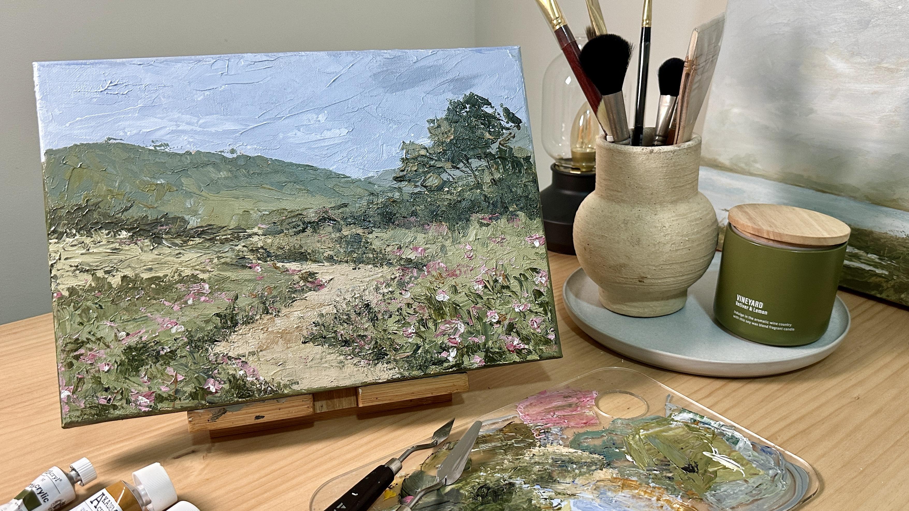
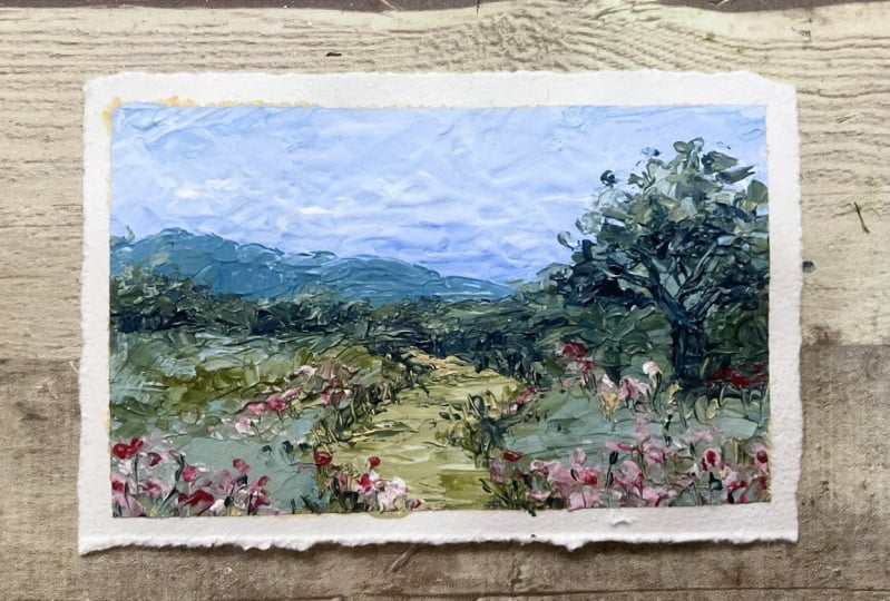
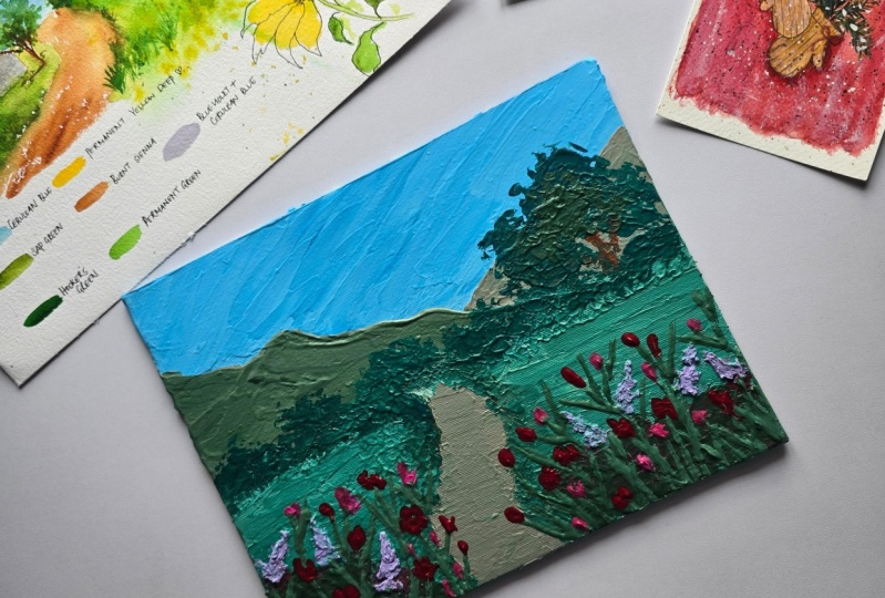
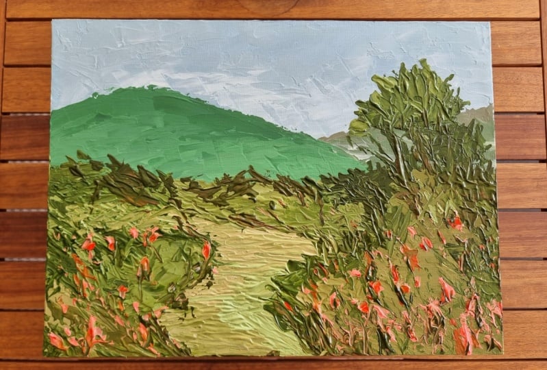
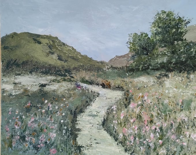
1. About the Class: Welcome to my acrylic
for beginners, painting textured upstra
landscape using palette knife. I'm Bianca Ariela. I'm a watercolor, acrylic, and gouache artist and educator. I'm also a skill
share top teacher. I work with brands
like Eter Studio, Silver Brush Limited,
Schminka and Arkanans. I truly believe that
painting is for everyone. I'm thrilled to
guide you through this exciting journey into the
world of acrylic painting. In today's class, we'll be diving into the
basics of acrylics and exploring the
dynamic techniques of painting with
a palette knife. Whether you're completely new to painting or looking to
expand your skills, this class is designed
to help you un your creativity and discover the joy of working with texture. Here's what we'll
cover in the class. First is the
materials and tools. We'll start with an overview
of the essential materials, including acrylic paints, palette knives, and
other tools you need. Next, we'll understand
the acrylic paints. We'll discuss the characteristics
of acrylic how to mix colors and the importance of consistency and drying time. Then, we'll see the basics
of palette knife techniques. I'll demonstrate the basic
paletteknife techniques such as spreading, smearing, scraping and layering to create different
textures and patterns. We'll also do planning
your abstract landscape. We'll go over choosing
a color palette, creating a simple composition, and planning textures
for abstract landscape. And then we will
paint the background. We'll apply base layers to create a smooth or
texture background, and then we will follow it with building the
abstract landscape. This is where the fun
begins as we will build up our landscape using various palette knife
techniques to add texture and. Lastly, we will add final
touches and finishing details. We'll evaluate the painting, make final adjustments, add small details and highlights,
and sign your work. By the end of this
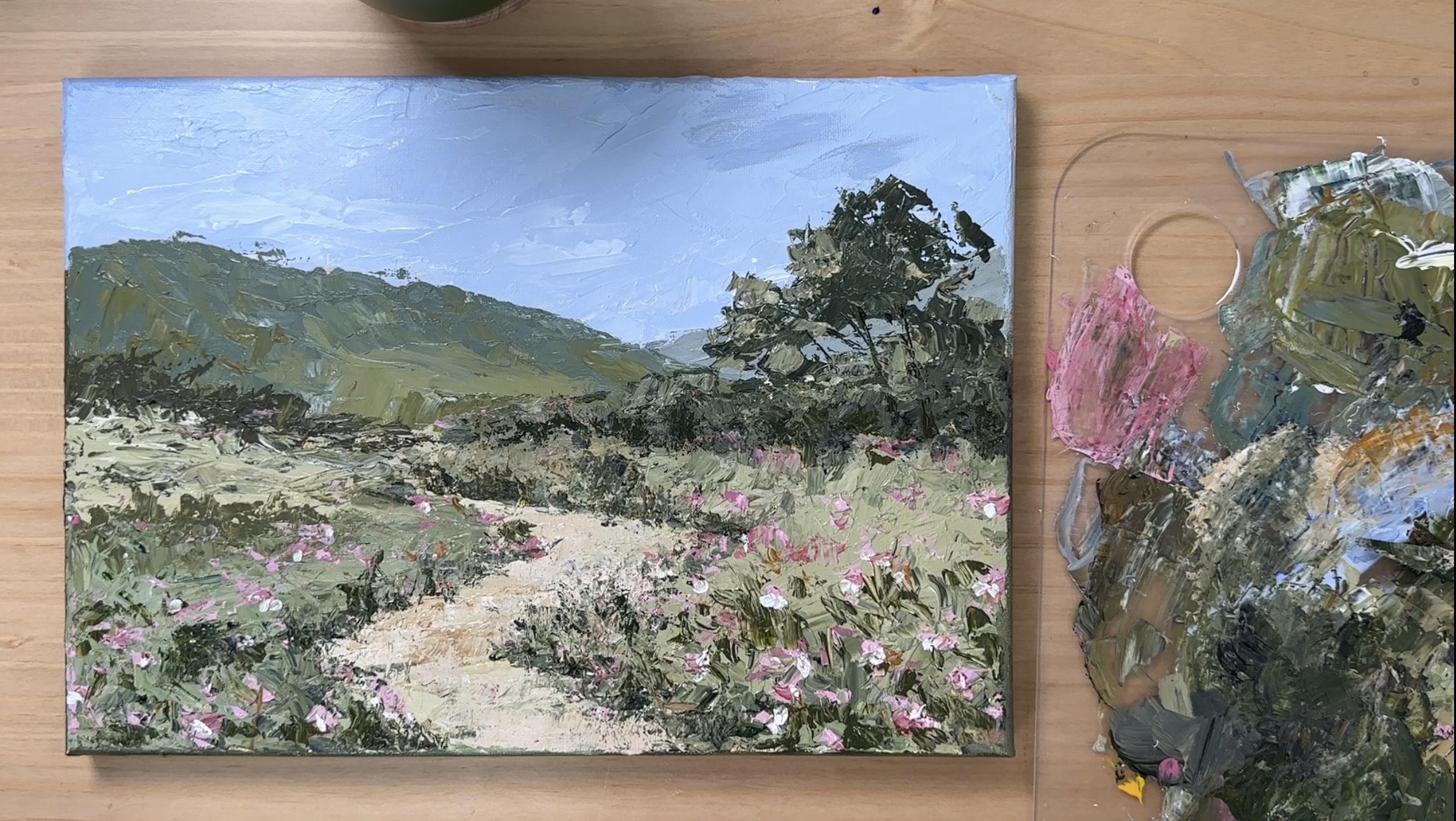
class, you'll have a completed textured abstract
landscape painting and a solid foundation in palette knife
techniques that you can apply to future projects. I'm excited to see the unique and vibrant
pieces you create. So grab your material. Set up your workspace,
and let's get started on this creative
adventure together.
2. Materials: Let's go over the materials
we'll be using for the class. First, we'll need a canvas. The one I'm using is a cotton
canvas size ten by 14 ", which you can easily
find in most art stores. When painting with
a palette knife, working on a larger canvas
can feel more liberating, allowing it to be
expressive in your strokes. If you don't have a canvas, you can always use acrylic
paper or wood panels. However, regardless
of the surface, it's important to prime it with gesso for better paint adhesion. Using Schminka's semi
transparent gesso, which provides a
nice base without completely covering the
texture of the canvas. Next, we have acrylic paints. I love using the Sminka
acrylics because of their creamy consistency
and vibrant colors. We'll be working with a small
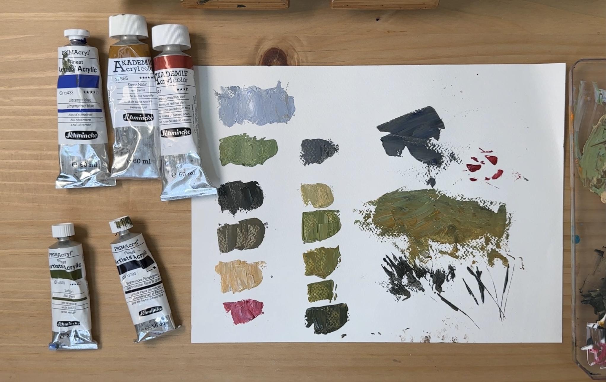
but effective color palette consisting of titanium white, ultramarine blue, raw Senna, cadmium red hue, dark, sap green, and paints gray. This will allow us to
create a wide range of tones while keeping our
palette simple and cohesive. Even though our main
tool is a palette knife, I have a few brushes prepared. First is a large flat
brush for applying gesso and prepping the
canvas with a base color. I also prepared a filbert
or a round brush. These are optional, but can be useful for painting the sides of the canvas and adding final
details if necessary. Now, the star of this
class, the palette knives, the ones I'm using
are from Arteza, a medium plane knife, size 7-1. This is great for
broad strokes and layering and this
small detailing knife, size one, which is perfect for
fineer textures and edges. Other essential
materials include a mixing palette
for mixing colors. I'm using a regular
acrylic board. This old rug or cloth for
wiping off excess paint from the palette knife and a
cup of water mainly for rinsing brushes and
knives when needed. This everything we
need. Let's get started with our class.
3. Color Mixing and Palette knives: Now, let's talk about mixing colors for this textured
painting style. We'll use a limited palette to create a harmonious landscape, and instead of using colors
straight from the tube, we'll mix our own shades for a more natural and
painterly effect. Also to maintain the thick, buttery texture, I don't
dilute my paints with water. This keeps the strokes
bold and textured. Now, to create a soft
muted blue for the sky, we will mix titanium white, ultramarine blue, and racena. We use rawcena to neutralize the blue and make it
look more natural. This gives us a gentle atmospheric blue perfect
for a realistic sky. For the background mountain, we use the same mix as the sky, but add sap green to introduce
a subtle earthy tone, titanium white plus
ultramarine blue, plus racena plus sap green. And this one creates
a cool distant tone, making the mountains blend
softly into the background. Now, to create different
greens for trees, grass and foliage, we mix ultramarine and racena to
create a dark green color. We can also mix dark green
plus more Shenna and white for a warmer or softer green color
for mid tone olive green. The grayish blue green color
for the distant hills, we can use the dark
green plus more ultramarine blue for a
cooler and more muted color. These variations help add depth and dimension
to our landscapes. Now for the pathway, we mix achenna and white, which creates a
soft light brown, perfect for natural
looking earthy tones. For the meadow greens,
grass and fields, using the light
brown mix as a base, we can add sap green in different amounts to
create shades of green, ranging from mid tones to dark. If you want a darker,
deeper greens, just add more sap green. Now, if you want softer, more muted meadow tones, just lessen the
amount of sap green. This method ensures color harmony throughout
the painting. And lastly, to create the
delicate soft pink flowers, we mix white and
cadmium red hue dark. This one creates
a soft muted pink that stands out
against the greens. By adjusting the
proportions of each mix, you can create
endless variations while keeping your
colors unified. Next, let's take a look at how to use these two types
of palette knives, a medium plain knife
for broader strokes and a small detailing
knife for finer details. First is to hold the knife
at a slight angle and use the flat side to scoop a generous amount of
paint from the palate. Then gently press and
spread the paint onto the surface using
a sweeping motion. Adjust the pressure to create thicker or thinner textures. Not to blend lightly drag the knife over
existing layers to mix colors directly
on the canvas for a natural and painterly effect. We do the same thing using
the medium plain knife. By varying pressure and angles, we can achieve a
rich textured look with expressive strokes
and refined details. When layering paints, layer them gently to avoid scraping
the initial layer. Now, to use the small
detailing knife for precise details, use the tip to add finer
lines, edges, and highlights, especially in small areas
like pathway edges, tree trunks or flower details. You can also use it for scraping technique like to add texture, lightly scrape off
some paint to reveal underlying layers and
adding depth and contrast.
4. Understanding the Composition: Before we start painting, let's establish first
a strong composition using a simple two
point perspective. This will help us create
depth and dimension, making the pathway look more natural as it recedes
into the distance. The first thing we need to do is to identify the horizon line. The horizon line represents
the viewer's eye level. It is where the sky
meets the land. We'll lightly mark this line
to guide our perspective. Second, on both sides
of the horizon line, you need to place two
vanishing points, one on the left and
one on the right. These points will
help us draw objects that appear to recede
in the distance. Not to sketch the pathway
using perspective, you need to start with a
point below the horizon line. This is where the foreground
of the pathway begins. Draw the diagonal
lines extending from this point toward
each vanishing point. To create a zig zag effect, mark a turning point
along the path and extend new diagonal lines back toward the opposite
vanishing point. Repeat this step, creating alternating turns so the path appears to wind naturally
into the distance. Now, the pathway should be
wider in the foreground and narrower as it recedes,
following perspective rules. Keep the angle sharp and
varied to enhance the zig zag composition leading the viewer's eye
into the painting. By setting up this
structured foundation, we ensure that our landscape has a natural sense of depth. Now let's do a quick thumbnail
sketch of the composition. Draw the horizon line, then the distant mountains. Next, I draw the trees and
bushes here on the right. Now, let's draw the
pathway following the rule of two
point perspective. Y Let's analyze the tonal value to create atmospheric
perspective, wherein the sky should
have a gradient tone. Then a slightly darker tone
for the distant mountains. Next, assign an even darker tone for the elements in
the middle ground. As you paint the pathway, the area in the foreground
should have a dark tone, then gradually transitions
to a lighter tone. We apply the same principle in painting the
fields and meadow, dark tone in the foreground, middle tone in the midground, and light tone in
the background. A
5. Preparing the Canvas: Before we start painting, we need to prime the
surface with gesso. This helps the paint
adhere better, enhances texture and prevents the surface from
absorbing too much paint. To do this, prepare
the surface by ensuring your canvas wood
or paper is clean and dry. Apply the gesso evenly
using a large flat brush, applying criss cross
strokes for full coverage. Add layers for a smoother
or more textured finish. Let it dry with maybe
15 to 30 minutes before painting or applying second
coat of gesso if needed. Once the canvas is dry, now we will tone the canvas with a light wash of Rochena
diluted with water. This helps create a warm
base and unifies the colors. First is to mix the paint by diluting rosena with a bit
of water to create a thin, translucent wash. Next,
using a large flat brush, cover the canvas with
broad even strokes. And then, lastly, let's wait
for a few minutes until it's fully dry before starting
the sketch and the painting. This tone base reduces the darkness of white and
adds depth to our colors. Now that the canvas is dry, we can now draw a tonal
sketch using raw Shenna. Basically, we will
copy what we did on the thumbnail sketch
a while ago here, starting with the horizon line, then next the trees, the pathway, and the mountains. There is no need to add a
lot of details in this step. Just focus on the tonal values that will serve as your
guide when painting. Let's dry this and we can start painting with
our palette knives.
6. Painting the Sky and Mountains: In this section,
we'll paint the sky, setting the tone
of our landscape. The sky creates the
mood of the painting, so we want to get a
nice soft gradient. The colors I prepared
are titanium white, ultramarine blue, and raw Senna. This will help us achieve a
muted, natural looking blue. Using my medium plain knife, I mix the colors
directly on the palette. I start with titanium white, then add a little bit
of ultramarine blue for ibancy and a touch of
rocena to neutralize it. The rocena softens the
intensity of the blue, making it feel more
organic and natural. I also take my time mixing, making sure that the
paint is evenly blended. If the color looks too cool, I add a bit more of rocena. If it feels too dark, I adjust with more white. The goal is a soft
muted blue that will look harmonious with the
rest of our landscape. One important tip
is that to make sure to mix a generous
amount of paint, running out of color midway
can make it difficult to keep a smooth,
consistent sky. Now, let's apply the paint. I scoop up a good amount
with my medium plain knife. And spread it across
the canvas using light side stroke motions. The key here is to keep the
strokes gentle and relaxed. Pressing too hard can scrape off the pain instead of layering it. If you're new to painting
with a palette knife, don't rush the process. Let the knife glide
smoothly over the surface, and it's okay to go over
an area more than once, but avoid overworking it to keep a natural, effortless blend. As I move closer to
the horizon line, I gradually mix in
more titanium white. This lightens the tone of blue and creates a
soft natural gradient, darker at the top and
lighter near the horizon. This simple transition
helps create depth and atmosphere
in our painting. If blending feels tricky, take a step back and observe. You can always soften transitions
by adding a little more white directly onto the canvas
and blending it gently. The key is to layer with a light touch rather
than dragging too much. One of the great things about acrylic and palette
knife painting is that you can build up layers for added depth and texture. But when working on the sky, we want the strokes to
feel soft and airy. A tip to remember could be less pressure, better blending. Let the knife do the work. Don't force the paint. If needed, you can
use the very edge of the knife for subtle blending
without harsh lines. Also, don't worry about
making it look perfect. The beauty of this style is
in the expressive strokes, so take your time and
enjoy the process. I continue refining the edges, making sure there's a smooth
transition of colors. If I see any harsh lines, I use my knife to gently
feather them out. A final check ensures the sky
looks natural and balanced. Now that we have
our sky in place, let's move on to painting
the distant mountains. This will add depth and
structure to our landscape. We'll start with the
mountain on the right, as it is behind
the other mountain helping us create a
natural sense of layering. For the base color, I
mix ultramarine blue, asena and a touch
of white to create a soft grayish blue shade. This muted tone will help the mountain recede
in the background, making it look farther away. With my medium plain knife, I scoop up the mix and gently
apply it to the canvas, following the general
shape of the mountain. I use diagonal strokes
moving in the direction of the slopes to create
a natural flow. To add texture and dimension, I mix a lighter version
of the same color by adding more titanium white
and layer it on top. This creates subtle
highlights and variations mimicking how light touches
the mountains surface. Next, I add a hint
of sack grain to the mix and apply soft
strokes across certain areas. This introduces a slight
color shift at him feel more organic and connected to the greenery we'll
be adding later. Now that the right
mountain is in place, I move on to the
mountain on the left, which should have a slightly cooler green tone
to create contrast. For this, I mix
ultramarine blue, acena, white, and a bit of sap green to achieve a
soft bluish green shade. This cooler hue
makes the mountain feel distinct from
the one behind it. Using the same
medium play knife, I gently apply the paint
in diagonal strokes. Following the natural
slope of the mountain, I also add strokes
that help define the shape while keeping the
edges soft and natural. Now, to make the
mountain more dynamic, I mix a lighter shade by adding more white to
the existing mix, then I softly blend this
lighter color onto the surface, focusing on the areas where
light would naturally heat. To create even more interest, I add a small amount of
rocena into the mix, resulting in a warm
olive green color. I lightly blend this into the existing paint to
introduce variation in color, making the mountain feel
more alive and textured. The key here is to let
the layers naturally blend while keeping some
rough textures visible. This adds character and
realism to the mountains. Before wrapping up, I step back and assess the
balance of colors. If any areas feel too flat, I refine them by lightly layering more
highlights or deepening shadows as needed.
And that's it. Our distant mountains
are now complete. And the next step,
we'll work on painting the greenery in the foreground.
So let's keep going.
7. Painting the Greeneries: Let's move on to painting the
greenery in the foreground. We'll start with a field
closest to the mountains and gradually add depth and variety using different
shades of green. First, I mix a light
green using sap green, raw chenna and white. This will be the base
color for the field. I start applying the paint just below the
mountain on the left. Holding the medium
plane knife sideways, I use downward strokes to create rough texture defect for the impression of
bushes and foliage. The key here is to keep the
strokes loose and natural. Next, I make a lighter
shade by adding more white and rajena to
the existing green. This time, I slide the knife sideways to paint
the open field, following the
direction of the land. Keeping the strokes
aligned with the plane of the ground helps create
a sense of perspective. Now, to introduce deep, I mix a dark green color using ultramarine
blue and achena. Using my detailing knife, I lightly tap and layer
this darker shade in the middle ground
creating the illusion of background trees
and shadowed areas. When adding layers, remember
to keep a light touch. We don't want to scrape
off the paint underneath. Just take it slow
gently dabbing and blending until you get
a nice depth effect. If at any point you feel like a layer isn't
working, don't worry. You can gently cover and
blend it with another layer. The beauty of acrylics is that they allow for easy adjustments. To make the field more dynamic, I introduce darker tones by
adding subtle patches of green and softly blending
them into the existing layer. A few light strokes help
everything merge naturally. Now, let's move on to
painting the pathway. I mix racenna white, and a touch of leftover green to create a soft, earthy tone. I continue using side
strokes following the perspective of the ground to ensure the path looks natural. A little bit of acena is added
to enhance the warm tones, making the pathway blend
seamlessly with the landscape. Be mindful not to alter
the sketch of the path, as keeping its
perspective intact is crucial for maintaining
depth in the composition. Now, let's add grass
along the path. I take my dark green mix, a blend of ultramarine
blue and raw chena and using the tip of
the medium plane knife, I carefully dab and outline
the edges of the path. This helps define the road while integrating it naturally
into the landscape. As I work, I dab and
lift the knife to create un even texture defect. This helps suggest small tubs
of grass along the road. To make the effect more organic, I vary the height and spacing of the strokes so that it
doesn't look too uniform. Next, I also use
gentle upward strokes to create an impression of grass sprouting along the road. Keep the movements light
and don't press too hard, as we want to build
layers rather than scrape off the paint underneath. To transition from the
path to the field, I begin shifting my strokes from small upward dabs to
broader sideways strokes. This helps merge the element seamlessly while maintaining
the illusion of depth. Now on the right
side of the field, I continue with sideway strokes using the detailing knife. This creates a transition
into the open field. I make a few horizontal strokes, then switch to downward strokes to evoke the movement
of the grass. By changing the
direction of my strokes, I can create a sense of
rhythm and natural growth. Now I take a lighter green mix, adding more oceana and white
to my previous mix and start painting areas in the
middle ground to create the effect of sunlight
hitting parts of the fields, making the landscape
more dynamic. I take my dark
green mix again and begin building up depth
and tonal variation. I do this by gradually increasing the
intensity of the green, making it slightly darker as I move toward the foreground. I still vary my
strokes, some downhard, some sideways to avoid making the painting look too
patterned or repetitive. In impressionistic painting, we want to suggest
the essence of the subject rather than painting each blade of grass
individually. Now, to further enhance
the middle ground, I add some darker green strokes toward the base of the field. This makes the
lighter areas pop and gives the illusion of
layers in the grass. Okay. Now for the foreground, I will mix white,
ultramarine blue, and Russia adding a touch
of paints gray for depth. This mix gives us a cool muted tone that contrasts beautifully
with the greens. With my detailing knife, I start creating dynamic strokes varying between diagonal, downward and layered strokes. This technique also helps add energy and movement
to the painting. One thing to keep in mind is
not to overwork the layers. If I see an area where the paint isn't
blending as expected, I simply add another stroke rather than trying to
fix it immediately. Sometimes letting
the paint settle first makes it easier
to adjust later. I also make sure to fully cover the canvas so that
the underpainting is no longer visible. This ensures a rich, full bodied look to
the composition. As I continue working, I go back to the outline
of the path and add more upward strokes to refine the transition between
the road and the field. At this point, the
painting might not look exactly as you imagine, and that's completely normal. Painting is a process, and sometimes the magic
happens in the later stages. The key is to keep going and trust that each
layer adds value. If at any point you feel unsure about how
it's turning out, take a step back, relax your
mind and enjoy the process. The more you let yourself enjoy
the strokes and layering, the more natural and expressive your painting will become. Remember, your motions
influence your work. If you paint with
confidence and joy, that energy will be
reflected in your piece. Now let's move on to the
right side of the foreground. I mix sap green,
ultramarine blue, white, and rosena to
create a soft green tone. I start painting
from the bottom, moving apart, gradually blending it with the previous layers. I continue varying my strokes, sometimes pressing lightly, sometimes lifting the knife at an angle to create
a natural feel. For the grass along the path, I go back to using the tip
of the detailing knife. I also add fine upward strokes reinforcing the impression of
taller grass near the road. Now, let's introduce some
darker tones in the foreground. I take my dark red
mix this time, adding a little more
ultramarine and paints gray and begin layering it
into the shadowed areas. These darker accents help create contras and make
the foreground pop. Don't be afraid to experiment
with your layering. The beauty of the palette
knife painting is that every stroke adds movement
and texture to your work. Even if a stroke doesn't
turn out as expected, simply layer another color
over it and blend it lightly. From this time, I step back and take a moment to
assess the composition. I check if any areas need
more balance in tone or texture and make small
adjustments where necessary. Remember, painting is not
just about the final outcome. It's about the experience. So take your time,
trust your instincts, and most of all,
enjoy the process. Now let's add some trees
on the right side to bring more depth and
life to our landscape. Trees are a great way to frame the composition and create a natural balance in the scene. To start, I mix sap
green and painspry to get a really deep
rich green color. This creates a strong
base for trees, giving them a sense
of weight and depth. I add a touch of rochenaT
lightly desaturate the color. This helps make the
green look more natural rather than overly
bright and artificial. Using my detailing knife, I begin shaping the trees
with organic loose strokes. Oh I avoid making
them too uniform. Trees have irregular form, so I let my strokes
flow naturally. I also use the same
deep green mix to add bushes beside the trees, keeping my strokes short and textured to create
a sense of foliage. If you feel unsure about
the shape, don't overthink. Just focus on capturing
the overall form rather than painting
every individual leaf. Now, to make the trees
look dimensional, I mix a lighter green by
adding white to my base color. This will be used for the
lighted portions of the trees. With my detailing knife, I lightly tap and layer
the lighter shade over the parts of the trees where the light would naturally hit. This contrast between
dark and light areas makes the trees look more
fuller and more realistic. As I work, I step
back for a moment to check the overall shape
and balance of the trees. I also make smaller refinements, adding a few extra
strokes to make them look fuller and well integrated
into the composition. Remember, the key to painting trees is to keep it
loose and expressive. Don't stress over perfection. The natural variation in
your strokes will bring out more organic
and lively feel.
8. Painting the Flowers: Now that we are done with
the field and the pathway, it's time to bring
the scene to life with flowers and final details. These small yet vibrant
accents will add warmth, movement, and depth
to our painting. I start by mixing cadmium red and white to get a
nice pink shade. I want the paint to be
thick and creamy so it retains texture
on the canvas. Using the tip of my
detailing knife, I gently dab the
paint onto the field, creating an impression
of flowers. The key here is to keep
the dabbing strokes dynamic and random so they
don't look like pattern dots. Remember the rule
of perspective, flowers closer to us
should appear larger, while those farther away should become smaller to create depth. I follow this
principle as I spread the flowers across the
foreground and middle ground. I repeat the same process on
the left side of the field, making sure that the flowers blend naturally
with the landscape. Now, to create the dimension, I mix a darker shade of pink by reducing the amount
of white in my mix. Then I layer this darker pink on top of some of
the light flowers. This subtle contrast
makes the flowers look more vibrant and
alive rather than flat. For variation, I also
place a few flowers along the sides of the path and some tiny ones in
the middle ground, adding more detail
to the hum position. Now I want to introduce a warm contrast to
balance the pink tones. I take some rachenna
and lightly add strokes around certain
areas of the field. This helps blend the
flowers into the landscape, making them feel more natural. La Next, I add dark green strokes
between some of the flowers to create contrast and make
them stand out even more. I mix sap green, pain spray, and canna to get a
deep, earthy green. Instead of overwhelming the
entire field with dark tones, I place a few random
strokes near some of the flowers to suggest
shadows and depth. This also gives
the impression of grasses and foliage
without over detailing. As a final touch, I refine the pathway by adding a few dark strokes
along its edges. This helps define its shape, but I don't outline
the entire path. Just a few suggestive
strokes are enough. Lastly, I check the
background and add small dark accents to separate the trees and bushes
from the field. This extra layer of contras helps bring out the
depth in the painting. And with that, our
painting is complete. This final step of
adding flowers and contrast really ties
everything together, making the scene feel
rich and expressive. Remember, the key is
to trust the process, and even at times it doesn't look exactly
how you imagine. Keep going, layering
and adjusting. The beauty of painting
is in the journey, so take your time and
enjoy every stroke. I hope you had fun creating this landscape with
me, happy painting.
9. Final Thoughts: Thank you for joining me today for this acrylic painting class. I hope you enjoyed
learning how to create a textured abstract landscape
using palette knives. Throughout this class, we
covered essential materials, the characteristics
of acrylic paints and various palette
knife techniques. You have experimented with
spreading, scraping, layering, and creating different textures, all of which culminated in your unique abstract
landscape painting. I'd love to see your creations and hear about your experiences. Share your paintings with me on Instagram or in the
class project section. I'm excited to see
how you interpret and apply these techniques
in your own art. If you enjoy the class, please
consider leaving a review. Your feedback is so
valuable to me as it helps me better understand your needs and continue to
improve my teaching. It also serves as a
wonderful encouragement, inspiring me to create even more engaging and
helpful content for you. Don't forget to check
out the next series of the class for more exciting
projects and techniques. Keep experimenting with your palette knives
and acrylic paints, and most importantly, have fun with your creative journey. Thank you once again for
being a part of this glass, happy painting, and I look forward to seeing
your amazing artwork.
 Bianca Rayala, Top Teacher | Watercolor Artist