Transcripts
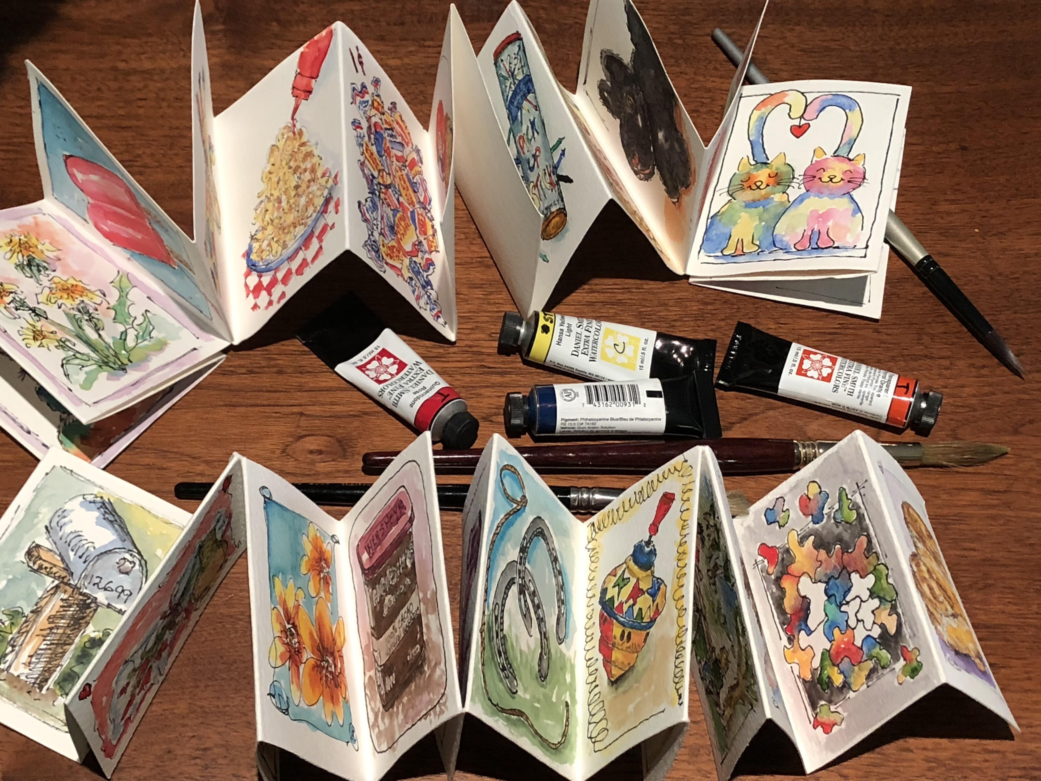
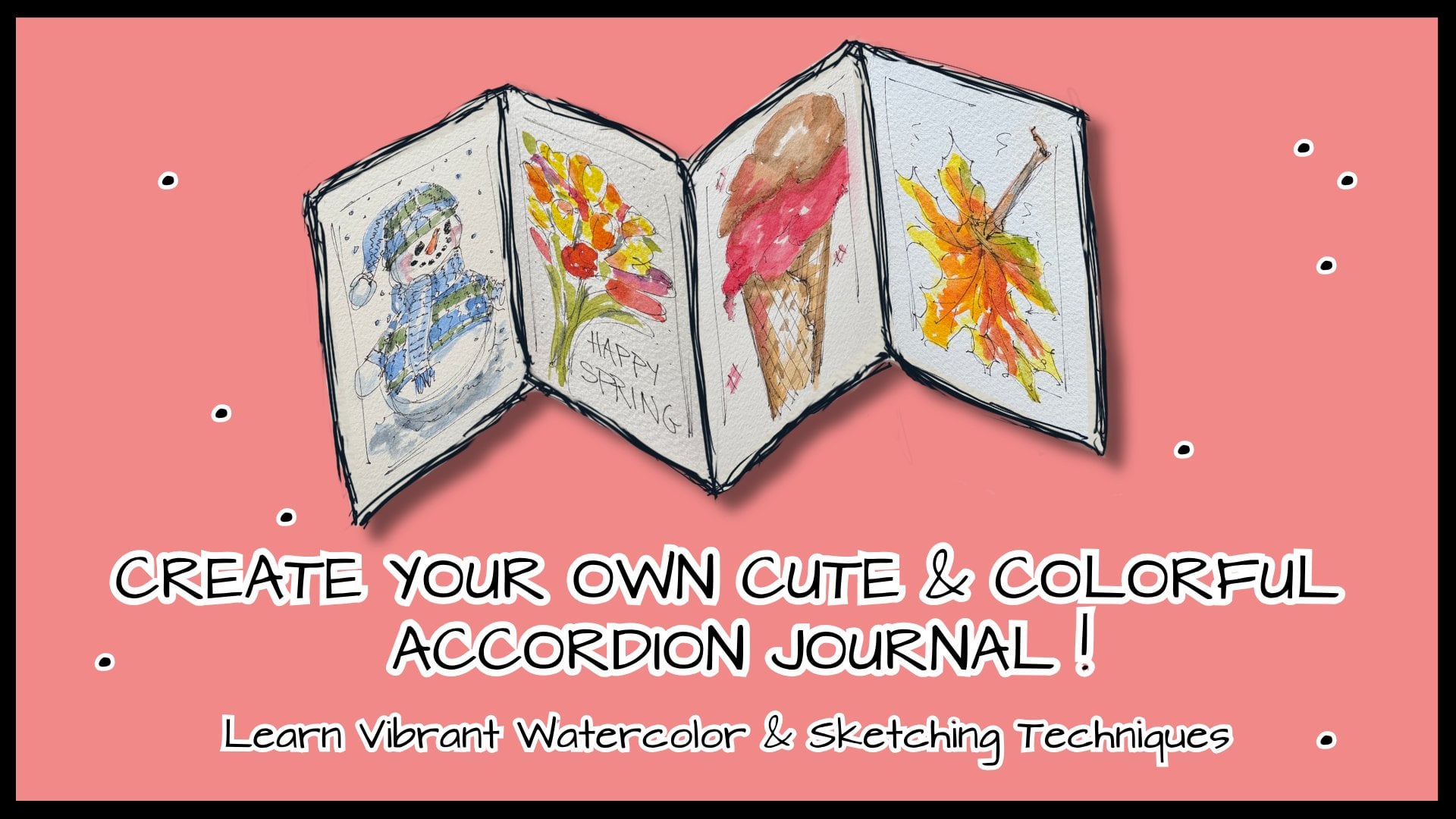
1. INTRODUCING FUN ACCORDION JOURNALS: Are you an artist who says, I don't have time to paint. My life is busy. Well, yes, I was
that artist, too. And what I found was I really
missed the joy of painting. And to give you a
flavor of that joy. Remember back when we were
in first or second grade, and the teacher
said, "Let's paint," and we got excited, ran home with a painting, and our mom put it up
on the refrigerator. And all week we
glanced up at it. We weren't judgmental it wasn't good or bad. We just remembered how
much fun we had painting, and we couldn't wait
to paint again. We don't have that
teacher saying, "Let's paint again," but you have that opportunity in
an accordion journal. Because they're small.
They're inexpensive. I'll teach you how to make them. And the prompts have
you know what to paint. You don't have to think, what
am I going to paint today? No, no, no. It's fun. It's fast. And it just gives you that same joy that
you had as a child. It's playful. So go along
on the adventure with me. Let me teach you in this
fundamental class how to make them and get you started, and then I'll have other
classes that will give you other prompts and
ideas for yourself, for anytime you
want to have that, hopefully, it'll be every day. So let's go on this
adventure together. Can't wait to see you in class.
2. SHARING MY WHO: Hi. I'm Barbara Worth. I'm an artist just like you who loves the feeling of putting a paintbrush to the
paint and putting it on paper and seeing something
wonderful. We created. I live on five acres
of beautiful land, often standing here painting
and seeing a turkey go by, a fox, coyote, a deer. That feeds my soul
in a certain way, but not like art does. The art part is a creativity
that I've had all my life. Came out as an interior
designer for 2008, economy said, That isn't
going to be happening now. So after a short
time and feeling that creativity bubbling
up and having no outlet, I met a woman who added
watercolor to her sketches. And I said, I want to do that. And she said, Come
paint with me. Very much like I'm
saying to you today. Come paint with me. And one of my beliefs in life
is pay it forward. So not remembering even how accordion journals
came into my life, I simply thank God they did, and I'm passing that on to
you to explore the fun of it. It's small. Tiny. You
can't expect perfection. There's a playfulness
to it. It's quick. I just hope that you will
give it a try like I did and find the joy that I
did in Accordion journals. We as artists just need that. And the Accordion journal for me gives a purpose so
that a page a day calls me to paint versus canvas that would just sit
there and maybe someday. No, there's a magic in the
Accordion Journal saying, There's a page waiting
for you today, Bar. It's quick. Take a few
minutes. Have fun. So join me on the adventure. Join me in the class, and let's have fun together, because it's so much more fun to paint with a friend.
I'll see you there.
3. PRIMING THE PROJECT: Let's have fun with our project. Let's do it as though we're
all painting together. So after you've made the
journal in that lesson, start painting on
it, watch my demos. Definitely go to
the resources and print off the PDF that
gives you the prompts. That will make it so easy, and you'll feel like we're
all doing it together. Then, I'd love to see each one of your pages snap a picture, upload it, so we can
all see each other's. It's amazing how a prompt of
bird can be so different. And we can absolutely
applaud each other. And then also include your
first page, your title page. So let's just have fun. It's like sitting next to
somebody who's painting, and you go, Oh, wow. Yes. Oh, cool. Well, here's mine.
And somebody says, Oh, that bird's great. Are those are fantastic. Doesn't mean they're perfect. We're not going for perfect. We're going for quick and fun. So we share. Thanks.
4. GATHERING SUPPLIES & SETTING UP: Let's talk about the supplies
it will take to create this Accordion journal
that you're gonna fill page by page and
have such a great time. Opening and closing
and enjoying your art. To create this, we will
start with a blank paper. There's a nine by
12 that I'm using. A 140 pound paper. You can go 90 pound. I wouldn't suggest
going less than that. And really beyond the 140, it gets a little
too stiff to fold. So 140 is pretty ideal. This is watercolor paper. So we will start with a full
sheet of paper like that. We will need pencil, ruler, this is screw drive. I chose it out of a
drawer that I have. Comdered it, really. It has a fairly narrow point. It's somewhat sharp, but
it's not gonna cut you. So that will help us score, which will mean that
we can fold it easier. Okay. This is a bone
folder. Never had used it. A couple of months
ago, someone said, Why don't why aren't you using? So it's inexpensive. What it does is help
crease the edges. So much easier so that your fingernails not
trying to do it, and you're not roughing up
that edge of your paper. So bone folder if you have it. I've also tried the side of a scissor or something
like a ruler. That can also work. Pencil sharpener. This is an eraser that is called
a kneaded eraser. And the magical part of
this is that it simply lifts up graphite or you can rub it and it does
not hurt your paper. So this is great. Otherwise, there
will be an eraser on the end of your
pencil that can work. Okay, so those are
the things that we will use to actually
create the journal. So I'm going to put those aside. And Hey, let's talk
about the fun. Well, this is fun. However, we know sketching and
painting is even more fun. So for your supplies a pallet. It's any palette that you have. It could even be your
child's watercolor tray that they take to grade school. Whatever you have, that
will work as well. I do have a spritzing bottle
because watercolors dry, but they are
reactivated with water. So it's simply going and
spritzing to reactivate. Let's talk brushes. This is a brush that has
the point on it. It's called a rounded brush. And that's an advantage when you have a small part to paint on. If you're familiar with
flat and you like that, no problem using that. An alternative to this brush, which needs the water to
then wipe is a water brush, and it simply has
water in it already. Take top off, put it on there, that balance the paint brush. And then you simply
will be squeezing water out into your paints
and then painting, then you squeeze water out again and wipe until you
don't have paint in it. So I love these. Handy. Wonderful. And sometimes that's just my brush
of choice that day. A paper I love to wipe on
is made by Viva, VIVA. Reason I love it is that it's smooth on one side, it's
rough on the other, but always using the
smooth side protects that brush so that you're not
working down that brush tip. So Viva, for that, the pin I love is by
micron. It is indelible. That simply means that
when your water from the paints touches
that sketch line, it's not going to bleed. Any indelible pin that
you enjoy that works. My favorite size is 05. Sometimes I'll use a 08, which means it's a
little bit bigger. But going down lower than that, for the cording journals and
my style, I like this best. It does have a point. It is not a brush. Any pen you have that is
indelible, go for it. So, these are the supplies
we're going to be using, and we quickly will get into the fun of
sketching and painting. So I'll see you in
the next lesson.
5. MARKING, FOLDING, & CUTTING: Let's get our hands
into making a journal. How in the world can you do it? I'm gonna make it
simple for you. So let's get going on it. We're going to start
with one single piece paper nine by 12. Mine is a watercolor paper. The one I'm using is Strathmore
watercolor, 140 pound. And it's the 300 series. So that's what we're
going to use for me, but you can use anything
that you have that would be 140 pound down to 90. Above that, gets too
thick, really to fold, and below 90, it gets a little
flimsy to fold, unfold. But try what you have.
So let's go with this. Here I have my ruler, my pencil. I'm going to sharpen
it a little bit. So that's there. I have a little screwdriver that I commandaed
from one of those, you know, the drawer
that has everything. So I did it because
it's small, it's short. It's a little sharp. Not really. But, you
know, I did that. A bone folder. We
will be using that. I'm gonna be telling you about that because I love, love, love, this bone folder,
and didn't know about it till about a
couple of months ago. Also, scissors that
we're gonna be using. So what we're gonna do is mark this paper off,
and I'll tell you, at this moment, the
marking needs to be more precise than what
I did like on this one. I've marked this one boo boo because I enthusiastically
folded it, marked it, cut it. And when I ended up folding it, you can see it didn't
come out very evenly. Not evenly enough that
I would do anything but to just practice
on it, play on it. So I'm going to say, let's be a little more precise
than I was on that one. On a paper, we're going to take our ruler and on
the 12 inch side, we're going to mark
it at four and eight. I'm now going to mark it
a little more precisely. Coming down on this end, I'm going to do the very same, and this is where I would have gotten off on that other one. So four and eight. On the short side,
the nine inch side, we're going to go three and six. So three and six. On the other one I
was probably talking and not paying
attention or maybe my kitty cat jumped up on the painting table and
distracted me. Who knows? And with according to journals, I always say, Let's be
casual and it's okay. But that one kind of showed me. I was not paying attention. So now I'm going to line up
my marks top and bottom. And instead of marking
it with pencil, I'm now going to take
the little screwdriver and use the narrow end, and I'm going to indent. I'm not trying to cut, and I have to hold Whoops. I kind of veered off on
it, but that's fine. Coming over to this one, I'm going to do that
identical and be precise and press hard on the
ruler so it doesn't move. And come straight down. Now, what I have are
two indentations. The backside, it does
not cut through. We don't want to cut through. So on this, let's do
that very same thing. And press E. I did get a scoring board thinking that that
would make this easier, but actually in the
140 pound paper, it didn't work out as magically
as I thought it would. So I ended up with
this idea instead. I can set those
two things aside. Now, every one of those
has made an indentation. The one thing I need
to know is that when I break this that
this area is level. Let's get that little
piece off there. So, if it goes off, then that's where it starts
being whopper jaw at the end. So what I'm going to
do is break this, and with the bone folder, I'm gonna press and I
have used other things. I've used the back of
the scissor to do this. I've used a ruler to do this. But the bone folder magic, is that it doesn't rough up the paper as you were pressing. So I've done it
this way, this way, I am now going to
fold it backward and go and do the very
same there and there. Now I'm going to
go to my next one, and I'm checking
my lines are good. Press, press. You might be listening to music as you're doing
this, which is fun. I just can't do that because
I have a microphone for you. I'm gonna press these. And again, I am seeing that my lineup is good. Press, press. Go backwards on it. Yeah. One more to go. Let's go here, and I see
my lineup it's good. When I go inside of that. And one last. And we
are through with that. So all we're needing
now is the scissor and let's bring a good over
here, and let's just see. It's how we cut it as far as how many pages
and how it lays out. So you can see on this one, we're going to use
this as the front. This is going to
be the next page. Then this will be the
first one we paint on. So to get it to go this
way, we'd cut it this way. However, in another class, I'll show you all
different ways to cut to make different
number of pages. And it's at this point, Okay. How crazy is this, huh? You're gonna go, Oh, my gosh. She's nuts. Well, the
play part of this. It's just life, okay? On this, I've chosen to have
in this foundation class, the starter class that
it will go horizontal. It's called landscape. But in another way of cutting, I'll show you how it can
actually be portrait. In other words, up and down. So on this one, we know this is what we're
wanting for the class. And we're going to cut it here and we're going
to cut it here. So I'm going to
turn it this way, just to follow it. Have you see how
I'm gonna cut it. I'm going to turn it. What am I gonna do? No, I'm
going to do it. I'm going to somewhat carefully
cut on that little line, and I'm going to
stop right there. Then I'm going to flip my paper, and I'm going to do the same
cut Up to that other mark. There we go. So now I'm gonna
fold fold, fold fold, fold. Yes, yes, yes. And I can see not perfect. But certainly better than the one that I
totally goofed on. So I kind of just tweak on it. And I like to take the
bone folder again at this point and just
double up on pressing because what I have found
is that it just makes the whole Accordion journal
little bit flatter. You know, I am a
recovering perfectionist. However, there's nothing perfect about accordion journals. Yay. So look what you have
magically created with folding and cutting. You have an Accordion journal, and it now is waiting. It has your name on
it and my name on it so that we can sketch
together and paint together. And you can just realize
how much fun it is to paint one page at a time and how those accumulate into
showing you your style. It's just like a magnet every day to let that
creativity get out and dance. So I'll see you in
the next lesson, and we'll start getting
6. PROMPTING & RESOURCING: Okay, so we're excited. Wait, that you've accomplished
folding and cutting this, and you have an
Accordion journal, and you're ready to go. And what are you
gonna paint, you say? How am I going to get an Accordion journal
that fill like this? Well, I don't know
what I'm gonna paint. Do I have to figure
that out on my own? No, no, no, no. What you'll end up finding
is that you think, Oh, there's 16 pages, and I don't know. Paint. So I just
won't paint today, nor tomorrow, nor the next day. So let's get that
out of the way. That is not the fun way to have art in your
life every day, giving you that little spark. You're not talking about
doing a whole canvas. You're doing a few
minutes every day. And in the end, you will end up with an Accordion
journal that you will just have the
best time opening and looking at and going, Oh. Oh, yeah, that was fun. Oh, my gosh, yes. Prompts.
Prompts are the way to do it. I found long time ago, it just was my answer. To make it fun and easy. And I want it to be
your answer, too. I know your brush is ready, your pins ready, you are ready. But let's just first go find prompts and references
so that it'll be easy. Really easy. At the moment, we're
going to put this aside, and I'm going to
pause the video. I want you to pause
it and then go to the resources category
underneath the video. And print off that PDF that shows the 16 prompts
that we're going to use. Right now, I'm going to just
wait. You take your time. You come back, restart the
video when you're ready, and we'll go forward. I'll walk you through how to use those prompts in
an easy way. Okay. So going to pause the
video, right now. Alright. You have printed off the PDF that lists
the 16 prompts, and this is how we're
going to be doing it. First page, second page, third page, fourth page. So you don't even have to guess unless you want
to scramble this up. And do it your own way. That's okay, too. I have
chosen the different prompt with the idea that some of these will actually
be in your home, and you can take a photograph
of them or use them live. I've also selected some for rounded lines and some
for straight line, just so you can get the feel
of that pen on the paper. And well, let's just
look. You'll have a book. If you have parakeet,
you'll have that bird. You'll have an apple, lemon. You might have cupcake. Yum, yum. You certainly
have it, hair. You'll have a lab.
Let's look at it. If you don't have
those, then what do I do to be able to get
a reference point? What I do is I go to my
iPad and I open a browser. And in that browser, then I'm going to go to a photo source that
is called free stock. In other words, it is legal to use their images
for anything, including if you make
a profit on them. So now in Pixabay, I have found bluebirds that I'm liking the softness
of the images. And I'm going to scroll
down and see what I see. Oh, he is adorable.
He would be great. So I'm going to pull him up. And on my iPad, I just pull up from
the left corner and bring in the edges
for a screenshot, and I'm going to save
him to my photos. Then I can go to my I
photos and pull him up, and he will now be what I will watch as I sketch and I paint. I'll use him as a
reference. So let's see. On the books, I am going to draw from the books
that I have at my house. And I'll look for something that is colorful and interesting. Might even be a cookbook, because you know
how on the front of those and on the edge, they'll have some color and some images that would be fun. The beach chair, I will go to Pixabay and just look for
probably a striped beach chair, one that's colorful and has
some curve lines to it. The art supply one, which
will be our fourth one we do, and I will demonstrate all
four of these first ones. I'll go into my supplies, and I will pull three
tubes of watercolor. Probably a blue, a yellow, and a red, and I
will arrange them. I will simply place them here on my painting table and just
look at them as I paint. So that's how I'll do that. But from then on, you'll
see you have all your proms and you can just go
page by page by page, pulling the references from
wherever you see them. You might have a duck in
a child's book that is absolutely adorable and
you want to paint that. So let's have fun with it. It is just your easy way. And it's not cheating. I promise you, it's not. It's just a way to drop in that inspiration
and make it easy. So that what you do is make sure that you do get to
that paint brush, that pen for sketching, and that you have that in your life all the time
to bring you that joy. And then then you'll have
an Accordion journal. Alright. I'll see you in the sketching of the
bird. See you there.
7. WARMING UP: [No Speech]
8. SKETCHING THE BIRD: Okay, we've come to the exciting part
where we actually can. Create our art. On this. Yes, you did a great job taking this flat
piece of paper and putting it into this amazing magnetic
little Accordion journal. So let's review this
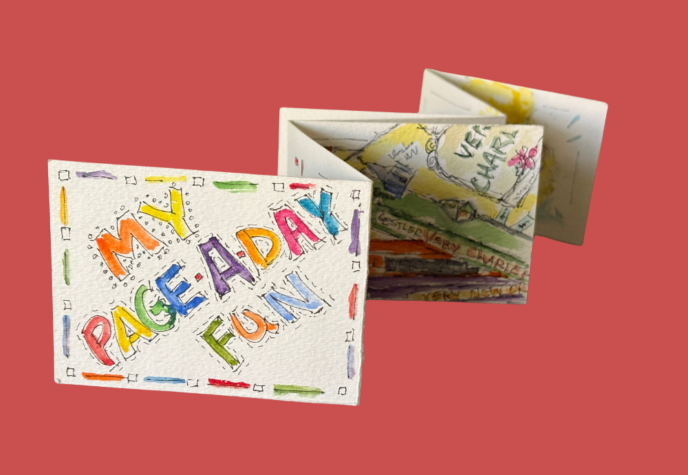
will be the title page. And I go in both directions. Sometimes I'll title it if it is on this particular theme. But in ours, we're doing
one prompt at a time, and maybe you want to wait and actually do the title
page in a little bit. Your choice, you know, the fun about the
cord and journal says that whatever
your impulse is, go for it. Have fun. So in this case, I'm going to
leave this blank right now. I will also leave this blank, and we will actually sketch
and then paint on this one. Let me show you what I have gathered around here.
I have a pencil. I will go ahead and sharpen it so that it comes
to a nice point. And then I have two pens, and I'll show you when
we're ready to pin it, that I will just sketch and see which pen I really want
because I use my pens a lot, and I know there's more ink
in one now than in another. So I'll make that choice.
I have an eraser, the needed eraser,
KNEADDNed eraser. Which is great in the fact that the graphite
will be on here, and I can press to lift that graphite or I
actually can gently rub. And this eraser will not destroy any part of that
surface on the paper. If you don't have
the Nded eraser, you might want to get one
because it is really handy or just gently use the eraser
from the end of the pencil. Also, I have my iPad, and on it, I have
the prompt bird. I've chosen a bluebird
from that Pixbay site, and so I have it here. I position it so that I can
glance up to see the shapes, and that's my position. You can put it wherever
works best for you. Also on my table
is a glass of tea. I am a tea drinker, for sure. Ooh, don't give me coffee. And so I have handy, a mason jar of tea. So I'll maybe sip into
that one with you. Let's go ahead and start. I do like to flatten this out unless I'm
sitting somewhere. And let's say I'm watching
a movie or something, and it doesn't interest me much. May go ahead and actually sit and hold accordion
journal this way. But right now I'm standing at my painting table at a window. I do paint standing up. I love the flow of
the arm being freer. But then, do it where
you want to do it. Try at different places. I'm going to flatten this
back out so that it can lay flatter right
now. That's my setup. So let's get sketching. Again, blank, blank, and this is where
we're going to sketch. So I'm going to look
at the bluebird. I'm just going to
start with the head, and it could be the
bluebird will end up coming off of the
page, which is fine. I'm never quite sure what
that's going to end up, but he does have a long tail. Or maybe it's a she. What do
you think? Is this a girl? A girl bluebird, or a boy flue. You know, sometimes I tease and name them as
I'm painting them. But you'll see I'm just lightly sketching
to get the shape. Let's get a beak in here, angle and do it this way. And none of these
are final finished. You know, I'm not pressing hard. Let's go with an. And I'll come back in a minute and take the extra
strokes out of that. So the bluebird is positioned a little differently
than my example. So let's see if I want to change the angle
Just a little bit. However, my Bluebird turns
out will be absolutely fine. We're not going for perfection. We're not going for anything
beyond having fun with it. I'm going to sketch
here for the blue comes down a little bit and
go up under the beak. Let's bring that
little shoulder of the wing up a little higher. So I'm gonna stop for a
second here and glance, am I happy with what I'm
creating or I'm not. I'm gonna shorten up that wing, and this is where I'm going
to take the needed eraser. And I'm gonna go ahead and
pull off little extra strokes. Well, I see that the eye on the example is a
little further back, so I'm gonna pick that up and move the eye back
just a little bit. Make it a little bit bigger. Yeah, I like that
better. Let's go in. Must have a heavier feathers
right under the beak. So let's let's do that. And those feet around. You know, I'd like to make that breast a little bit
prouder. There we go. There we go. And then
there are going to be some strokes that indicate
wings wing feathers. And let's come back here. These simply are suggestions for what I will go
over with my pin. Let's put a little foot in there and a little
foot in there, and birds on something. Let's pretend that
is a birdhouse. Just a suggestion of something. So, let's lift the extra strokes
and see if we're liking. Oh, I think I'm
back there we go. Now the breast is fuller, so I'm liking I'm liking that. And what's happening here? There's a little bit of a
Let's call this a girl. L let's say on her back. There was a little bit of Okay. So at this point, I am happy with the suggestion
of the strokes. I'm going to put my pencil away. And now, let's test
out the ink pen. I have two of them. I'm gonna test this one. Oh, that's feeling a little dry. And let's test out this one. Yeah, much better. So, this is the pen I'll be
using, not the other one. And in my ink. In a pen and ink. In this, I'm going to use the same stroking that
I did with pencil. You're going to see me not
have just a single line. My style is to have
several lines. And what I can do
after I've painted an object is I can go in and
darken lines if I want to. Whoops. Okay, that beak a
little extra stroke on it. We'll just work with that because perfection
isn't what we're after. And I'm gonna turn my paper
because Ashley coming up toward me is gonna be
a little easier for that. Rounded breast part. And I'm
going to just indicate where the blue and the
rusty orange change. And let's see what's happening down here with tail feathers. Do you think we ought to
name this little girl? What should we name her?
You have a good one? All right. So we're
gonna see her leg go up into her
body a little bit. And the second one
is doing the same. Her little Are they claws or paws or what are
they on the bird? Their little feet. What
should we call them? I'm sure there's some
scientific on a little bird, it doesn't seem right
to call it talon, but maybe that's legitimately what their little
feet are called. Okay, let's get the
lines going here. I'm going to put in
just a suggestion of feathers because that's
what I'm seeing on my example. And there's kind
of a level there. There's here. I'm just going to do
that because this would typically
be an area that I would go back after I painted
and add stronger lines. I'm gonna go up into
here where the white and that rusty orange have
a pattern pretty high. Oh, but and her big as
tooks quite a bit up, and it comes down. So, right, what do we think
I can do an extra line, which will help me remember to leave white area behind her eye. And let's say that. Let's indicate or
that comes around. Goes around. Okay. So at this point, I am going to stop the sketching
part, put my pen down. Although, oh, goodness, I am one of those that I say I'm
gonna put my pen down, and then you'll see
me go ahead and, you know, put another
pin line in there. That's fine. You know, opportunity now or
after we've painted. So at this moment,
I'm going to stop. Actually with the bird. However, I am going to go ahead and put a
mark and a border. So a border, I just free
hand and I love it when the item that I'm painting kind of goes
interrupts that line. I never I say I
shouldn't say never. I usually don't have all
four lines connected. And so, like on this one, I'm just going to
leave it without a bottom come across
and go that way. Now, the marks end up
helping fill and give an interest in that open space because the illustration
itself is pretty singular. That's what we're going for. And if you want to fill in
much more, that's fine. But otherwise, and you think, Okay, the mark would
easily be other birds. So that's just an easy
down up where it's a bird, a bird, a bird. And the eye loves odd numbers. So we're going to
do three, five. We're going to do in numbers
that end up as odd numbers. So I'm going to do
five right now. Again, that's something
I can add more later. But it has just set a
mood for the object. So we're going to say
right now our sketch, both pencil and then
pen are complete. Now, do understand
that pencil lines will remain there because
when watercolor goes over it, the graphite just
stays that way. So if you are somebody
who wants to really, let's call it, clean it up, this is the time to
do that and just lightly go over
your pencil lines, and just clean it to that point. Otherwise, do know that
those pencil lines will stay there in something like the Accordion journal,
you see them? Fine. And it may be your
style, that that's what you. In this case, like, on the eye pull the
pencil lines out, and you can see it just sort
of cleans up that eye area. So at this moment, we're
through with the sketching, and next we can put our
paints to bring it to life.
9. PAINTING THE BIRD: I have spritz my watercolor palette with water to
activate the paint. And sometimes I have to actually re spritz
it during the time. I have the journal
that I've sketched on. I have my bluebird, which is the image
from Pixabe and he's on my iPad tilted here
so I can refer to him. And paper, water, let's go. I'm gonna flatten this out
because well, you know what? Let me just tilt it. Handheld. Let's
see how that goes. I can always flatten it as
I get going if I'd rather. So, you know, it's
called being casual. On this bird, I am wanting
to do the blue first. I have cleaned my palette
over here for you. And one of the tips I'd
like to give you is that when your palette is full
of paint and you clean it, and there's still some
stain on the palette area, to clean that off, use the magic
eraser by Mr. Plan. It is pretty magical. I'm picking up blue
paint on my paint brush, and I'm just going
to start down here and see how much paint I
actually have on my brush. I am going to leave white areas. In other words,
no paint on it to symbolize the reflection,
light hitting it. So I'm going to go
lightly around. Sometimes I layer afterwards
to increase the intensity. Sometimes I don't. You know, every day, when you paint, your method may be a little different simply
by what you've done, how rush you are, how much you sprit water on that palette. So there are always
variables, and that's fine. Absolutely expected. I'll take some paint off of
my brush to lighten it up. And by the minute, I'm just going to
go ahead and say, I'm going to move on
to that rusty color. So let's see what I get here. I'm going to start with a
little bit lighter paint, and I typically go into an area that has a defining line
to it and then fill in. So let's just go
in here and leave that little breast of
his lighter coming down. I'm referring to my reference, and I just glance
up as I do this to see where do I see darker
areas on the exam? And then I go into
altering what I have. So I'm just
indicating some areas I see a shadowed line
underneath his wing, which makes this orange a little bit stronger
right there. And where it goes down below, I'll use light strokes to
add some feather look. Okay. I'm going to
use a burnt sienna now to go a little stronger
underneath that wing. And underneath this area, chin. And just like there, where I got a little
bit more than I want, I just cleaned off my brush, have fresh water on it, and I just go back into it. It dilutes the water color
and lets you lift some of it. Let's just see what else. Where the white is on this bird, you can see appears
as a grayish point. So I'm gonna pick up
some pains gray and careful on my brush
that it's not much. Just stroke in where the endingtation is that there's a shadow,
very light strokes. And while I have
the pains gray out, I'm gonna pick up a
little bit more of it in a concentrated way and just have the tip of
my brush very pointed. And I'm gonna come down. And fill in those
feet a little bit, pick up a little bit more just to add a little bit of
intensity in there. His little foot leg goes
quite back in there, so I'm just going to leave the indication that
that's where he is. Again, pain's gray. Let's go in for his beak. And there's white on
the top of his beak. So I'm right then. I put some pines gray
and didn't want to. So I'm just lifting it
because there is a gray cast. It's also a highlight. Using black is
certainly permissible. Black is dense, more dense. So it's S. And I'm
going to go in, again, with Payne's gray first, and let's do that I. And as you can see
on my example, it has a white area
of its I hind. So I'm going to attempt to
leave that as a line behind. Okay, I'm going to
turn my paper so that I can draw that black line. I'm now going to take my
paper and literally dab it because I'm not happy with
how that was happening. And I'm now gonna put
it back on again. So I watered it to pick it up, daubed it with my
cloth, and then it. Okay. No. There is a darkened area, pains grayish color area that goes from the eye
over to the beak. So I'm gonna do that and
go back a second time. Connected. And as I'm painting
this, would I say, Oh, I'm the most thrilled I've ever been with painting a bluebird? No. But in the
Accordion journals, the whole thing is that we
can just having a good time. And in the end, it's gonna
look like a bluebird, and the fact that it's not gonna look identical to that bluebird. That's okay. So my
head, you can see, is the bird's head is
getting more defiant. I did not stroke over all of it. And what I'm gonna do on the wing because it's
easier to stroke up tort. I'm going to doing it this way. And let's see. He a bit, so you can see we're
getting personality. I'm going to stroke as though there are feathers
that are specific. And again, not being detailed and giving the indication
that there are feathers. I'm gonna stroke stroke. Individually with the
point of my brush, and let's do a few more. The strokes. The feathers at the tail have an area of shadow
right down here. So I'm going to take my
paints gray again and go right under to indicate
that. And it's a shadow. That's what it is. I love that the tail feathers
go off of the page. It just adds fun. Okay, so now, let's look at bird and go. Okay, what else? I'm feeling as though
the rough color needs a little bit more
contrast within it, a little bit like I see. On the example, gonna add
some shadows in there. The feathers are just more
full at that chin area. And let's do some tiny strokes that would indicate feathers. Just light. You'll have your own style, and you'll find what
feels good to you. And what you want to duplicate
again in your paintings. A lot of times it's, you know, What's happening in this one? Mr. Bluebird. I'm
feeling like his head needs a little bit
more pop of blue. You can see on this the
pop of blue here and here. So I'm gonna turn him and
bring it from the nose. The beak up and see
what that does. I like that. And then I'm
going to do it touch more. Literally right here, 'cause that's what I'm
liking on the bird. Is there another place
stroke stroke a few places. And I want to touch
back to the back of the head because I did
originally get that who. And I'm gonna call
this bird Blue Boy. So I'm now also going to say, I think there's some other
bluebirds coming in. So I am going to
add blue to these just to make it more
fun, not precise. And oh, he is on top. I love a piece of wood. So I'm going gather a brown. Even though this is reddish, I'm just going to
indicate a brown surface that's giving nothing more than simply color to say
he's on something. Don't know what. Think
it's a bird house. Okay, so let me see. What do you think? What
do you think, Barb? I'm gonna add a touch
more definition. I'm gonna use that pains
gray for my palette. Gonna give a touch more. Huh? Is another area? Is, you know, if you
got enough time, go ahead and tweak it some more. If you're busy, you need
to do something else, go do it because there'll
be another page tomorrow. You will have fun with it, too. Okay, let's touch
more. Pains, Cray. And I just darken that
bottom part of that. See how that just popped it, and I'm gonna give. Bottom my beak I'm
lifting what I don't want and saying,
Enough is enough. You know, I'm gonna
call it quits. And at this point, let's let it dry for a minute. And then I will go back with any pin lines that I feel will help accent it
a little bit more. For the moment, you can see, it's cute as can be. Okay. Now, I'm just gonna
lightly use my pen. You have to be careful
that it is dry. Otherwise, your
pen's gonna drag. And I just no I don't
make strong lines. I much more into
giving me suggestion. And if some lines turn out stronger with the
ink, that's fine. But go underneath this one
and see what it's doing. It's just defining it
a little bit stronger. My choice, if you want
to leave it less, fine. Is gonna turn it, so it's easier to
stroke toward me, and I'm gonna come up
on that breast again. And the fact that it goes out beyond the
paint, fine with me. It suggestions. See. I always say,
Okay, I'm finished. And then I find that pin play a little bit
more. But let me see. Put a couple scratch
marks up here. And a Dan. This was kind of a downward. Okay, I am closing my
pen, putting it down. I'm going to say that bluebird is going to be that
page complete. I won't go back to it. Again, what I do in each day
to it is what I do in it. I do not go back and tweak
and tweak and tweak. Your choice, if you
want to do that, that works as well. You can see the bluebird looks somewhat
like the bluebird. Isn't exact, doesn't have to be. Easy. Fun. You don't have to think about
it just in your mind. Oh, what does a blue
bird look like? No, no, no, no, no. We use references. Hope you had fun with that. Let's do the next prompt. We'll sketch first, and then we'll paint. So, see you there.
10. INKING THE BOOK: Let's paint the propped books. You can see that the bird is already sketched and painted, so we're ready for
the next page. For books, I thought
it might be an easy. Hopefully, it's easy if you're a book reader to find some interesting books
at your own house. If not, find an image
online that you like and go from there,
however you do it. Mine happened to be I picked three colorful
books that I have and arrange them so that I
am seeing some good lines, some good color, and I'm
going to sketch from there. Because this is straight lines, I'm going to not use my
pencil to do it first, but I'll use just straight
going into it with pen. Again, 05. That one's actually 08. But let's go for 05 and
test out how much ink. Oh, that's good. So
let's just go into it. And what I'm doing is looking at the image that is in front of me and just getting
a sense of it. The easiest way to do an illustration like
this is starting with something that is complete first versus the partial
ones underneath. So I'm going to
end up sketching. I'm going to move this over. And you know me on
one of those with several lines and you know, I actually think on this one, I'm going to take
it off the page. So it curves down a
little bit coming here. And then I'm going to do this
line that goes straight. And this one actually goes off the page that
way, pretty straight. And the other one. And, you know, who
would have known when I started that it was going
to be quite this way? I wanted more of that purple, but that's not what's happening. So when I go this way, the purple will be there. I'm going to pretend that there are some pages that I'd see, although there's really not. And I'm going to go. Again, this does not
have to be accurate. It's just an illustration. So, in doing that, you can see there's a mark of green that goes along there, so I'm going to put that in. And there's that center that had an image that comes
up it curves, although it goes around and the title of Very this
is Very Charleston. This author Illustrator has a style that's much like mine, and I just enjoyed it. So when I was in Charlson and I saw her book, I said, Yes. And then I realized
when I looked her up to understand her whys that she
had some other other books, one is very California and
this one is very New Orleans. So I said, I want more of
her books, and I love it. And, you know, I'm
fudging on this one, because I pulled that in. There's a flower and a leaf, and there is illustration of
a What is this goes higher. Goes to a point. So I'm just giving the English
and there's some writing. I'm gonna do that.
There's something else. So I'm just giving the
example of what would it be? And then I sit there. These are palm leaves. I'm gonna do that. This
is calls her name. Very Charles. Okay, that's just
the example of it. Oh, I see something
that's interesting here, which is a light Street light. Okay, so I'm going to call
it enough on that one. And then this one. Very. And she used a
different font style on this one, California. And because I live
in California. You can imagine that was an interesting one for me for
what she covered in there. Very very interesting. And this is very so this is becoming much
more complicated. Busy than I had
thought it would be. And there's an
orange on this one. So actually, I
think it's going to become more interesting
when I actually paint. So let's stop at this point, put a pen away, and let's
paint. See you there.
11. COLORING THE BOOK: I'm ready to paint, are you? Let's get our brush wet. Let's say, Oh, let's go
for that purple first. Yeah. Let's move on to the orange and see what
we need to do for that. Oh, that's very fun. I love to leave just some line just shadow
under there a little bit. Darker edge to the end. Oh, I forgot. There is a
orange corner over here. My brush was bit
too wet on that, so I'm gonna let that dry. And let's go to green. What do we want to do? Where is that green? It's coming down. The nose. Shows up there. Let's do that. It comes down. Let's see. Where else is it that
we're seeing it Tiny bit of something green or here
and some orange speckle. I'm gonna exaggerate on that. And you know what
I'm seeing is that this yellow part is it's
a very faint yellow. Let me see what yellow Ooh. That's too bright.
Let's see what we have. Maybe that one's better. And let's go into
it very faintly to see I may be wiping that
off pretty quickly. Gonna blot it. Let's put it. I'm just gonna let
it go with that. The middle title,
I'm not gonna take us essentially that
has been the yellow, and this has been the. This is a lighter yellow. I'm going to use
buff color that I have just to make a
contrast in that. There are a couple taht else. Let's go for a pink flower. You can see I am
being very imprecise. That title was green. Is it green? It's
kind of dark green? I see what God could do. And I'm just gonna go over. Charleston was such a
fun place to visit. I have a friend who lives there, and she showed me the
real Charleston Wow. What a delightful
place we're doing. I need an edge that's
a little darker here. I those palm trees. Palm leaves to be a little dark. Let's see how daring
I can get with that. Indication. So, I'm
liking it so far. Let's do just a touch of
orange in that light, 'cause that's what it's showing. It has a touch of green in it. Let's go down pole
with Paine's gray, and let's outline it. Okay. Let me go in with fff pages that we played as though there
were pages there. Alright. Pick it and just add
middle darkness. Yeah. These had a little
bit of orange colors. I'm gonna take a
little license to do. And those were red.
Yes, they were. So let me see. What to do with Her name
actually not have orange. I'm gonna lift
that out of there. Okay, I'm gonna say
enough on the paint. I'm putting the paintbrush away. However, I want to
define the border. These books absolutely
went beyond. Typically, I would
to off shadow. So let's just do the shadow under the one we know
would be sitting down. I may turn for a second. Sometimes just going
over at the end with indicate those were
paint a few details. Again to emphasize
a few major lines. Alright. I am calling it good. Done. Done. So this would end up going off on three sides of
the page, which was fine. That's just how it worked out. Just be spontaneous with your
sketching and from that, have fun with painting
what you've sketched. I'll see you in the next lesson.
12. PENNING THE BEACH CHAIR: Let's have fun with
sketching this beach chair. I have found the
image from Pixabay, and I choose it because it has rounded lines.
It's colorful. It just that has a
ease to the lines. And you're going to see
with my pin that I am sketching downward and across. With the pin, I am never
just one hard straight line. I'll sketch down with
a loose feeling to it. And I am not going
for the identical. Does it have to, in other words, match what I'm seeing on the
illustration on the prompt? No, no. And you'll see me
hesitate, right now, I'm hesitating because I'm
looking at the example, and I'm just seeing where
would that line come up for that brace and
that leg support. So I'm glancing up at the prompt from the Internet
and I'm looking down. I'm going to switch my
paper right now because coming upward with a rounded
line frequently is easier. So I'm gonna go down looking. I'm going, Okay,
how does that work? And coming down, you're
gonna see me go over lines. And part of this is just my
brain is It's not working. But my brain is just going over it as though I would kind of be going over
it actually on that picture. So I'm sketching. I am wanting that one
leg to come down, and then I need to line up where that leg comes down and
the support goes back. And. I I never I may
have in the past, and who knows I
may in the future. Actually, it's a
sketch by putting, like a picture on it and
then pressing through it. But that's just not my style. If it's yours and you're more comfortable
doing that, fine. What I want to do in this class is really have you
become comfortable. With using that pin loosely and not thinking that it
has to be perfect. As you're watching me use this pen and sketch
this beach chair, you will see that it is starting to look
like the beach chair. And it's simply one
stroke at a time, reinforcing that, okay, there are stripes on
this chair and giving the the indication to somebody else's mind
or to yours when you open this Accordion
journal over time. I'm going to tell
you, I'm going to guarantee that once you
do an Accordion journal, you're going to find yourself being drawn to walk over to it and unfold it and look at it
and fold it and unfold it. Didn't we do this as children? Didn't we have something that folded and opened and
folded and opened. And there's just I don't
know what it is about it, but there is something that it's sort of like a jack in the box
where you crank it, and then it pops up. Well, kind of that
same fun when you are using an Accordion journal in your hands and your
opening and closing. There's just a
surprise. Fun is, yeah. Here I am making marks, and a mark is anything that's not part of
that illustration. So I'm putting a border. I do not necessarily have
it on all four sides. This one, I'm gonna bring
those wooden pieces above it, and I'm going to go over several more times on
some that I want to, and it'll just make
it more defined, a little bit stronger. And you're going to see
I come down come down and I'm going to
turn so that I can go with more of firm
stroke going across. Now, isn't the
chair just sort of magically being built
built with a pen, and it's simply giving your mind the idea that there's sports, there's fabric, there's stripes. So I'm gonna go and turn it
again because it's easier, and I'm straighten this
line up a little bit. Not absolutely sorry that I didn't do it perfectly
the first time. I'm gonna add birds and sand. Again, these are
considered marks. So I'm going to do because
our eye likes odd numbers. I'm gonna leave it
as odd numbers. And then I'm just gonna put dots and scratches
in there for sand. Nothing. You know, who can
draw sand, right? So we're just getting the
idea that there's texture. And let's go let's go paint it. Yeah. Well, get your palette
out. Let's go paint.
13. PAINTBRUSHING THE BEACH CHAIR: Okay. You can see I'm
I am ready to paint. I hope you are, too. Getting that red ready, I've sprit the watercolors, and I am ready. I'm going to make a
confession right here. I love red. So for me to be painting
with this color, it's like big smiles on my face. And I bet you have a
favorite color, too. So maybe your beach chair is going to be some other color. And that's what's fun. Just do it the color you love. But red is one color
that just Boy, if I didn't have
red on my palette, I'd probably be pouting. So as I'm doing this, I have come down once, and now to just make
it more intense, I have picked up a
little bit more paint, and I'm coming upward toward
myself because that's easier to go ahead and bring and leave a bigger dose of the
red at the lowest area. So I kind of play with that and I'll see kind of just intensify. I'm leaving the middle
area that would be the most bulbed out area toward us as a
little bit lighter. I might even end up cleaning my brush and
picking up some of that red right in the middle to give it the illusion of being rounded and going a little
bit little stronger. So the wood on this chair, I am using a yellow okra as a beginning color,
starting with light. And with watercolor,
you start with light, and then you darken it. So I'm just going in, and you can see I'm not
being picky or precise. I'm just stroking it. But I am not filling it in like you might think with a
crayon or something. No. And I picked up
a little bit darker. Brown and I'm just stroking. You can see that with
the pin lines and with the difference
of the two colors, it's going to give
a wood effect on that a little bit
more interesting. And I'll just lightly stroke. Again, not strong, not anything. On that stroke, you can see I went out of the
lines a little bit, and I'm going to
be fine with that. It might just we'll
pretend it would be a shadow in the sand. So I'm going to fill
in the sand with that same brownish color just
using the side of my brush. I am just filling in, but again, not solid, not solid. And I'm going to pick up some color here and
use a Paine's gray. I might be going
back for some black. Just touch. Just touch like there are
birds out there. No detail. Absolutely no detail. So picking up a
little bit more I will go in and turn my paper so that I can
shadow that white, just a light light touch
of Pain's gray again, to give that volume of it
being disappearing, you know, like the seat of the beach chair is literally a canvas
that just drapes. So I'm doing that
as a suggestion. I'm now looking at
my illustration and going, Okay. Where else? Uh, okay, there's
a piece of wood I've kind of not filled in
enough, and I'm looking. In the painting
and the sketching, I glance up at my
example. I just do. Number one, it, um I am not
a solid fill in painter. I am more in strokes,
light strokes. And here we go. We
have painted that, and we're off to another lesson.
14. POSING THE ART SUPPY: It's it's catching
our art supplies. I pulled out three tubes
of watercolor paint, and I have arranged
them on my art table. So I'm looking at them almost in the same way that you're
seeing on that top left area. But I'm just interpreting
what I'm seeing. So I'm glancing at the tubes. I am turning my paper because sometimes that
works or, you know, sometimes just a detail, like the screw lines
of the top just are a nice place to kind of stop and hesitate and then I'm looking back
up and I'm saying, Well, how about that red? And, you know, yes, I didn't angle that
top line exactly, right, but that's okay. It's all I'm after is that it
looks like a tube of paint. And I'm even
extending it out just a little bit beyond what
you're gonna be seeing. And again, I'm going to put
in that lid on that red one. I just kind of Is
that a accurate size? No. And it doesn't look
like a tube of paint? Well, it's beginning to. So I'm pulling the lines. I am looking up. I am angling putting that in. So I'm just getting
some details. And here I am going to put in
that yellow tube. And going for approximately
what it looks like to me, and it's gonna end up. Did you hear my kitty cat? Yeah. Well, she's watching, and she's giving us advice. Um, so I am going
for some soft line. And just he, you know, okay, there's an angle. And there's that lid. Yes, sapphire. Help us here. Uh huh. What do you
think? Sapphire. Yeah. So, how far
do I put it back? Yeah, let's see. And I am
turning my paper a lot. It just is the way I like to get an angle and see it maybe a little
bit more straight on. You know, so you're
gonna see me turning that paper and
hesitating, looking. Okay. Yeah. Getting a detail. And sometimes when I put
one line in on one tube, I'll go do it on all of them just because my eye
is seeing that. So I'm going now to the reflection on the
bottom of the blue tube. And it's a reflection that's
a little tough to show. But when we paint this, we'll see what we can do
with that reflection. I'm just giving the indication. And as I always say,
let's sketch lightly. We can always go back and
make the lines heavier. This is to give us the
idea when we paint. Where is that? Okay, there's a flower
in there of some sort. And there would be that
same on the yellow one. So let me put that in right now. And we're on the red one. Here we go on the red one. It's a little bit harder. The nice part is that little square gives
us another little pop of color, which is neat. You know me. I love color. These tubes are full
of some details, but I am not going to go
with that many details. As far as all the writing, maybe in the end
after I paint it, I will say, Okay, I need to add some printing. But I'm not I'm going after
more the shape than I am, the extra details because your mind is gonna see
them as tubes of paint. You won't care if
they're watercolor or oil paints, what they are. But they are tubes of paint. So here we go to the
lid on the yellow, and details for the lids on
blue one and the red one. Those are fun, aren't they? Yeah. Yeah. Let's do some. And when I put those in, doesn't your mind actually
have your mentally, your fingers feeling
those grooves? That's what art does. Art through the
lines and colors, have your mind experience it as though you are
physically touching that. So here's a little bit of
an indication of writing. Nothing specific. Those are scratch lines. Okay. Just working that a little bit. Well, this is a fun one. What do you think?
You can't be perfect. But you can sure
have fun with it, and I tell you, lines create the illusion. Yeah. Let's put a border on it. One side, two sides, three sides, four sides is time. And let's put our pen down. Paintbrush, here we come, and there is sapphire.
15. PAINTING THE ART SUPPLY: Let's have fun
painting these tubes. And, oh, you have just caught me with red
on my paintbrush. But I told you, I
love red, red, red, so it doesn't surprise me
that I picked up red first. Now, you're getting to
know me, aren't you? Yeah. And I'm I filled in that red a little bit more strongly than
I typically do, but that's because who knows? I was just excited about
getting into the painting. I'm looking at my
paint illustrations, and seeing just Okay,
where are the shadows? What do I want to do? I'm gonna
pick up blue on this one. And you can see I don't have as thick a dose of
the blue paint. And so the middle, I want to have a
little bit more of a reflection as
though it's round. I'm going to pick
up some of that, but add some extra on the sides as though it would be shading as though the tube is bigger. And rounded. So right now, and watercolors dry lighter so I can go back
easily and paint. But as long as I've got
blue on my paintbrush, I'm going to just touch in
that little area around those flour and
have a pop of blue. So but looking, looking and picking up some paint so I can
go to the yellow. Oh, this is fun. Absolutely fun. So we got our three colors
going there, and Alright. And now for that, um let's see. What do we want? Let's
go for that black. This is gonna be a tougher. I have picked up black, but I have not picked
up a huge dose of it. I'm just gonna fill in. I want this to look metallic. And as though it has
some reflection on it. So Black is the toughest of these colors
that we're using. And it just you know,
you play with it. That's all you're doing is
you're playing with it. And the lines from our
sketches are helping to add that interest in a division of where does that black
start stop or bend? So I'm gonna lift some of this
to go for that reflection. I told you this is not
an it's not a slam dunk. But let's just go for it. As long as the rest
of our painting is a strong indication of
these are tubes of paint, we'll be fine if the black is
not as perfect as we want, because we know perfect is
not is not what we get. It's not what we're after. And, literally, 15, 20 minutes on a page
to sketch and paint, you're not going to
get the realistic. Oh, this is a perfect
painting. No, no, no, no. This is a relaxed fun
illustration that when you fold and unfold your Accordion
journal in the future. Or somebody else does? Oh, I ought to tell
you right now. We, to watch somebody
else fold and unfold your Accordion
journal and watch their eyes
and their eyebrows, they'll be going, Whoa. Yeah. Hmm. This is fun. How did you do this? What? Oh, my gosh. And all the time, they are literally folding it, unfolding it, looking
at it, holding it. I I can't wait till you have yours ready to put in
somebody else's hand and I'm adding a
little bit more black now to add some details where that ends they're
crimped is what they are. So I just want to give the
illusion of it being crimped. You can see from the
illustration of the tubes, they're just, you know, they're there going in for
a little darker behind there and not giving
it too much concern. It's the blue, the red, and the yellow that really draw your attention to for seeing. What are these? What What
have you painted here? Oh, oh, tubes of. Od. Going in with some black to just draw lines with the point, keeping my brush pointed. And I'm just lightly
going in stronger on the right and the left side to give it that rounded feeling. I'm going to put
in some little bit darker underneath where
the shadow would be. And I'm just gonna shade the neck then on
the tube of paint, it's a silver color, so I'm just to admit
a shadow because that helps the eye just put it in place and take
it away from floating. So I've just used Pain's
gray or you could use black really watered
down and doing it. You can see that the
tube would touch, the lid would touch,
but the neck would not. So I'm gonna go over a few more lines to make a few stronger
lines with my pin, and just see where I'm
drawn to define it. You can see what's the effect. Now I have waited for
the watercolor to dry, so I'm not going
over wet watercolor. And this these are kind of magical in the end of the painting lines
because they just pom it. The lines help your colors, the colors help your lines. It's a pretty neat partnership. I put in dot dot dot
dots as the marks, and then I'm going to just circle some
of them with my pen. Not all of them. But again, it just makes a few
of those dots pop. You can just watch to see
what is happening with that.
16. POKING ANY PAUSES: Okay. You saw that I
titled this project Poke. And it simply is, I want to make
sure that you have the confidence that
you've made the journal, that you have the proms and you have your hair
brush and your paints. You're ready. So take one page at a time. When you do it, take
a photo, upload it. Let us cheer you on. Have fun. There will be more accordion journals in
your life if you do one. It's contagious. It's magic. So I'm so thrilled that
we're painting together, and I'll be looking
for your project down.
17. SHARING MY APPLAUSE: I think it's V for victory. You've created a journal, you've sketched in
it, painted in it. You've had the fun. Um just feeling that
joy page by page. Words can't tell you ahead of
time what that's gonna be. But wasn't it great? I hope this is the first of many adventures
we take together. I will create other courses to keep you inspired,
give you prompts, just the inspiration to being active with
Accordion journals, giving yourself that page
by page pop of art joy. Thanks for being here. Ask any questions you
want. Do, though. What worked, what didn't next? Let's stay in touch. Thank
 Barbara Wirth, Artist, Illustrator, Educator