Transcripts
1. Introduction: Hi, I'm Alexandra read or Lexi for short, I'm a mixed media artist and jewelry designer. I love teaching hands on learning both here my studio and on Skillshare. So welcome to my class abstraction to a one, design principles. So this class is meant to be a follow on to my abstraction 101 design elements class on Skillshare. The elements of design are building blocks used to create a work of art. So if you haven't had a chance yet to take that class, I would highly recommend you watch it first because this class is meant to build on the experiences from abstraction 101. So this class series is intended for beginners who are new to abstract painting or experienced artists who are looking to loosen up and find some new avenues for inspiration. So we're going to start with an overview to the seven principles of design and how they work with the elements of design. After that, we're going to dive into learning about each of the principles. We'll be looking at pattern, rhythm, movement, contrast, emphasis, balance, and unity. So this is going to be a combination of learning about the role of each principle and then a hands-on activity because floor that principle in greater depth. So what you're going to learn in this class will give you the skills and confidence to paint unique and intuitive abstract art. You'll learn to critique your art and ask simple questions to determine if your work is finished. Can't wait to see your projects. We've got a lot to cover. So let's jump straight into the class and start playing with design principles and create some fun abstract art. See you in the class.
2. Overview: In abstraction, one-to-one design elements, we explored line, value, shape, space, and color. Form is usually a more of a three-dimensional element seen in sculpture, but you can consider shadows giving form to shapes. We will be looking at textures part of pattern in this class. I find it helpful to think of the elements and principles of art and design as the ingredients and method of a food recipe. For a successful painting, you don't need to include every single spice from your cupboard, your elements, and you don't need to based Baker flam Bay your principles all the time either. You can think about designing a painting like the choices you make during your daily activities. It might be considering what you already have in your closet while shopping for a new outfit. Planning a meal at the grocery store, or coaching strategies based upon player abilities and position. Understanding how the elements and principles work together will allow you to make thoughtful choices throughout your painting process. So next, we're going to be exploring texture.
3. Texture: Texture refers the distinctive surface quality is found in all things as well as the overall visual patterns and tactile feel of objects and their surroundings, both simulated and actual. Texture can be smooth, bumpy, rough, hard, visual, and tactile. It is an element that adds interest to your work. Repeating lines will create patterns that can resemble hair or blades of grass. The nodded strands of yarn in a sweater can form visual texture as well. Visual texture is often to be thought of as a pattern, which is why I like to include it with the principals. Techniques used in painting serve to show texture, IE, the dry brush technique produces a rough simulated quality and a heavy application of pigment with a brush or other implant produces a rough actual quality. This is called impasto. Physical texture can also be included with natural or found objects for real tactile effects. There are some artists using texture for maximum effect. It's difficult to say what's the best way to approach it. As with the other basic elements, there's usually a mixture that may have color, line, shape, partnering with the textural qualities of the artwork. So next we'll be exploring both real and visual textures.
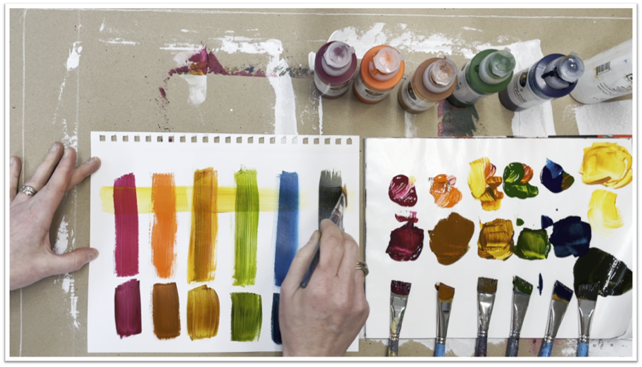
4. Texture Demo 1: In this demo, we'll be exploring different types of acrylic mediums and gels. Here you can see the different types of mediums and gels I have in my studio from Golden Liquitex and other brands. Different brands of the same medium may behave slightly differently. So here we're going to explore their qualities and make some texture sheets for future reference. First, we'll prep some watercolor paper with Jessup. This will give the paper some tooth for the medium to stick to give the paper somebody to stand up to the wetter mediums and gels. I'm using a silicon catalyst wedge to spread the Jess around on the paper. But you could also use a palette knife for hotel key. To do this. Let these papers dry thoroughly. Next in the class applies there is a handout called the texture mediums template. You can print this out as a guide to divide up your Jessup paper using a ruler. Divide up your paper into eight sections. Next, write your four headings. Capacity plane, a pasty tint, absorbency and drawing. And on this sheet will be exploring two different mediums out of brushstroke of acrylic paint in the first four sections, followed by a line drawn with a Sharpie or paint marker. Let the paint dry. Next, choose your first acrylic medium. I'm using a heavy gloss gel by Liquitex spread a thin layer in the first section. In the second section makes a bit of a different color acrylic paint with the gel to tint it. Scratch through the gel in the first panel to see the paint color and line underneath. In the third, fourth sections, spread a thin layer of gel at the tinted gel to the second panel and scrape through it to see the paint color and line underneath. Set the jello side and select your next acrylic medium to use. For my next one, I'm using a fiber pace by Golden. Repeat the same steps as before spreading a thin layer of the medium in the first, third, fourth panels. Depending on how thick the medium is, you may have to spread it a few times to get an even coat on the paper. As before, you can now add paint to the medium to tint it and spread it. In the second section, scrape through the medium to see the paint color in line underneath. Let the gel and medium dry for a few hours to overnight. The thickness will slow the drying time. Now that the heavy gloss gel and fiber paste are completely dry, you can see how transparent or opaque they are when dry. The gel is clear and the paste is opaque. Next, add a brushstroke of paint over the script areas. And the first two section, this lets you see the transparency or opaqueness of the gel medium when painted over. Next, we'll be looking at how absorbent the gel or paste is. Pick two other paint colors. I'm using liquid acrylic paint and add water to them to make them more dilute at a brushstroke of each paint next to each other. In the third sections, spray a bit of water on them to see how the, how they mix or bleed into the gel or paste. You can see how the paint just beads up on the gel, but spreads and thinks it sinks into the paste. Lastly, in the fourth panel, select some different drawing materials. Make sure the surface of the gel or paste is completely dry. I'm using a Blacks to be laid. All pencil, an orange colored pencil. Agree neo color to crayon, a black micron brush tip pen, and a red oil pastel. The gloss gel does not grip the drawing materials very well. It's a bit slippery and the fiber paste texture is enhanced by the drawing materials. So using this approach, you can create a library of texture sheets to use as reference guides for your future paintings.
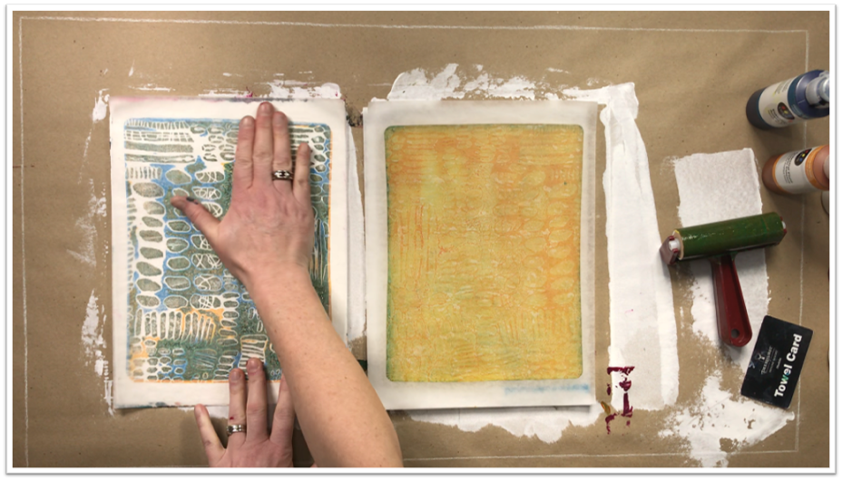
5. Texture Demo 2: In this demo, we'll be exploring both real and visual texture. You'll need a JSR piece of watercolor paper and a light or flexible molding paste. You'll also need a stencil with a variety of spacing cutouts. Here you can see how I organize my stencils. This is a 12 by 12 inch scrapbook binder with plastic scrapbook protector sheets and a piece of scrapbook paper added between them. I would recommend using scrap paper that was colored on both sides and that's easier to see your stencils unless your stencils are well loved and covered in paint. Once you have your stencil selected using painter's tape, secure it and the watercolor paper to your table together. I'd selected a flexible molding paste from Liquitex, but when I opened it, it was dried solid. So make sure you're her lid is closed properly. So instead now I'm using a light molding paste by Golden, using a palette knife or hotel key spread and even layer of the paste over the stencil onto the paper. Scrape the excess paste off the stencil. And when finished covering the paper, remove the stencil carefully and put it in a tray of water right away for cleaning. You don't want to have Paste or gel stuck in the holes. Your stencil. Set aside your pasted paper for a few hours to overnight to dry thoroughly. Now I'm going to show you a few ways to use this textured paper. First is a paint scraping technique using sketchbook paper, using different colors of liquid acrylic paint. You can use a hotel's key to scrape the paint over the textured paper. This will capture the stencil pattern and paint, giving visual texture. Repeat those scraping technique using deli paper, which is also called dry wax paper. This paper is thin but very strong, so you can scrape a bit harder to pick up more of the pattern. Now you can see we're visual texture becomes pattern. Next we're gonna do some mono printing with the jelly plate. This one's eight by 10 inches and I've placed it on top of a disposable paint palette. Or you can use white freezer paper. I'm using liquid acrylic paints and a satin glazing liquid from Golden. This helps the paint stay wetter longer, which is necessary when doing Delhi printing. I've added the paint mixture to the jelly plate and then used a rubber brayer to spread the paint out very thinly and evenly. Then I'm using are textured paste paper to act as a stamp onto the jelly plate. You can see that paint transfer onto the texture clearly. Now there's pattern on the jelly plate. I'm using sketchbook paper on both the painted surfaces to pick up the patterns. You can see the jelly print on the paper and then a faint ghost print from the textured paper. This is a good step to clean up your plate or textured paper. I'm also cleaning the paint off my brayer onto my ghost print sheet. You can directly mix the paint and liaising liquid on the jelly plate with your prayer. This speeds up the paint printing process, same as before. Use your textured paper as a stamp on the jelly plate. You can see how your stamp becomes visually more interesting as each layer paint is added to it. This time I'm using the deli paper to pull prints off the plate and Dell and textured paper. And then I clean my jelly plate with the ghost print paper. You can use this combination of paste and stencils to create both real and visual texture is by collaging these printed papers into your paintings.
6. Pattern & Repetition: Pattern is the planned or random repetitions of colors, lines, values, and textures to create patterns and enhance surfaces of paintings. Patterns often occur in nature and artists use similar repeated motifs to create pattern in their work. Pattern increases visual excitement by enriching surface interest. You can have regular patterns, a drop pattern often seen in fabrics and in a regular pattern which can read as visual texture. Repetition of line, color value or shape reinforces whatever your idea you're trying to communicate with that design element. Your viewer often singles at a certain color or shape and falls it through the composition. Use good judgment in your repetitions and avoid random placement. Plan carefully in place repeats where they'll enhance rhythm, movement, and pattern, and help the viewers journey throughout the composition. Userid with repetition to prevent boredom. Consider repetition or device to be used carefully in mindfully, what are you repeating? A shape, align a color, or a pattern. What counts is repetition? Can you make your peace with no repetition at all? How a little repetition can you get away with how much repetition and what elements can you use and still have stuff now Friday to make the piece interesting, this line of questioning comes down to how much or how little contrast you want, in what areas. There's no rule or solution that works for every painting, nor there any particular guidelines. Repetition of some elements is just one aspect to consider in composition. So next we'll be exploring pattern and repetition.
7. Pattern Demo 1: One of the easiest ways to create patterns is by using line and shape. Here I'm showing you my pattern sketchbook, which is nine by 12 inches and a variety of sizes, a black sharpie markers in the handouts I've included a pattern card template which I print out and use underneath my sketch book page for two things. One, it stops the Sharpie ink from bleeding on to the next page underneath. And 2. Then you can then scan your sketch book page of patterns and print it on a white card stock to cut it up as pattern cards for future reference. So you use painter's tape to secure the pattern card template to the back of your sketch book page. Next, using a different combination of marker sizes make repeating lines or shapes and each of the eight templates sections, you can make them as simple or complex patterns as you like. If he gets stuck for ideas, go to Pinterest or Google Images and search for Zen tangle. This is a doodling art form based on black and white hand-drawn patterns. It's a good idea to mix up the size your patterns as well. It's good to have a variety of patterns in your paintings to create interest for the viewer. So once you have your deck a pattern cards, you can use this tool for when you get stuck in your painting and need something to jump start you out of a block. You can study the existing patterns in your painting and shuffled through the deck, define a new pattern to add to it. You can also reverse the pattern in your painting. If your card shows dark spots on a light background to light spots on a dark background. These pattern cards are great resource to have on hand as an abstract painter.
8. Pattern Demo 2: In this next demo, I'm going to show you how to create your own custom stamps to create patterns. The first technique is to carve a stamp using the speed ball, easy carved block. This is almost like a giant pink eraser, and it is really easy to carve using lineup cutters. I find it easiest to have to carvers on the go. One with a larger cutting blade for removing bulk and one with a smaller cutting blade. For the detailed work, I used a Blacks to below all pencil to draw my design onto the block. Once you've finished carving your design, you can use either acrylic painting or printing ink on your stamp. I'm using black acrylic paint on disposable palette and sketch book, paper to print on. You can change the direction of the stamp to create a variety in your pattern. The next tab we're going to make is using craft foam sheets, gator board, which is plastic corrugated board, and double-sided carpet tape. You can find these last two items in a big box hardware store. You can also use acrylic gel medium as the adhesive for the foam. If you can't find carpet tape and use thick cardboard as the base, you may want to coat both sides of the cardboard to make it more durable for printing. I've cut a series of strips of film and place them into the gel. This will need to dry for several hours or overnight. Next, I'm cutting a variety of circles in different sizes and placing them on to the sticky carpet tape. You can also create patterns are lines in the foam using the tip of the pencil. Again, I'm using black acrylic paint to stamp onto my sketchbook paper. Putting the stamp directly in the paint sometimes gives an uneven coating of paint. So for the next print, I'm actually painting the paint onto the stamp with a brush. You can also create individual stamps. Here I have foam attached to corks of different sizes to make individual stamps. You don't need to stamp with the whole stamp either. You can have part of it going off the page as well. You can fill in the blank spaces on the paper with a smaller cork stamps. It's up to you to how you want to create your stamp patterns. Again, consider having a regular pattern, drop patterns or irregular patterns.
9. Rhythm: Rhythm is the repetition of visual movement, colors, shapes, or lines. Variety is essential to keep rhythms exciting and active, and to avoid monotony movement and rhythm work together to create the visual equivalent of a musical beat. It creates a visual tempo in artworks and provides a path for the viewers eye to follow further into painting is defined as creating certain marks, colors, lines, or shapes in it, continuous and repeating manner. In other words, a pattern. You're going to have regular progressive or flowing rhythm. Repetition and pattern help move the viewers eye around a painting in an easy and fluid fashion. They act as facilitators to guide the eye to components you want to emphasize and to encourage movement, interests, flow, and overall unity. Established rhythm by varying the spaces between related elements in a composition. You can use line and color to aid the rhythm, such as having a staccato, hot pink zigzag or centrist elegant blue flow. Avoid interrupting arithmetic progression unless you intentionally wish to stop the movement. Be consistent with the sequence of shapes and colors, but provide for IT. Conflicting rhythms disturb unity. So don't try to tangle in the middle of a waltz. Can you sense how your eye moves quickly over close verticals? The best place for a focal point is where the eye is moving at a leisurely pace. Rhythm causes your item move quickly through closely spaced elements and more slowly across larger intervals. So vary your spaces in your intervals throughout your composition to keep the eye moving. Next, we'll be exploring rhythm.
10. Rhythm Demo: In this demo, will you be using a sheet of white Bristol paper and different values of card stock and light and dark gray and black will be cutting these colored papers into simple shapes, either with paper punches or with scissors. The goals diver variety of shapes, sizes, and values. Once you have your shapes cut out, you can start moving them around on the white background to get an intuitive feel for rhythm makes up the sizes and spacing of these shapes. You can choose to glue down the shapes of the glue stick if you want to keep the arrangements. Or you can do as I'm doing and just take photos with your smartphone or digital camera to look at for reference later. Play with arranging the shapes at different angles to each other and mixing up the darks and lights or sizes. It's almost like you're trying to write a piece of music visually, getting a sense of the beats and the pace. Is it going too fast or slow? Is it a steady beat? Study your rhythm photos and see what arrangements appeal to you more.
11. Design Questions Check-In: Design question, check-in, repetition, rhythm, and pattern. So your visual beat that helps or hinders the viewing of the image. And if so, what role does it play in creating movement, mood or structure? Is the use of pattern, decorative, or supportive? How is pattern being used to create scale or space? Is there a visual echo or repetition of elements that supports the theme of the piece?
12. Movement & Gradation: Movement and rhythm. They are closely related to pattern and repetition. The difference is the space between the repeated shapes, lines, color. By placing things in different sizes around the composition, you form a wonderful dance of elements that gives off an illusionary sense of music. You create a rhythm inside your composition. Evenly spaced objects are sedentary, while irregular object placements on an angle create excitement and rhythm depending on the mood you want to express. Understand these principles can determine a slow dance to a hip-hop where your eye moves in a painting has a lot to do with visual weight. And visual weight refers to how much attention the various parts of your piece command. Where does your eye go first and where does it go to next? Movement is used by artists to direct viewers through their work, often to a focal area. Such movement can be directed along lines, edges, shapes, colors within the work, but moves the eye most easily on paths of equal value. Diagonal lines seem dynamic and vertical and horizontal lines are stable and calming. Curved lines create flowing movement while progressive changes in value can lead the eye into or away from center points. Gradual changes in design elements indicate movement, providing a graceful transition from one color area to another. For example, you can change color temperature gradually from warm to cool, or change color values from light to dark. As shapes change, alter the colors to gradation supports Unity better than abrupt change. So unless you want to express a concept like violence or angry, consider how you can use gradation with elements of design to create change and movement. Gradual changes in design elements can be executed in numerous ways contributing to rhythmic movement across a piece or in the background space. How could you some of the gradation shown with your subject matter. Next, we'll be exploring movement.
13. Movement Demo: In this demo, you will need sketchbook paper, drawing materials. I'm using a graphite crayon and your cut-out shapes from the previous exercise. First warm up with drawing lines in different orientations. And you can vary the pressure of the line on the paper. You can do a few of these drawings express different types of promotions or listening music and try to draw what you hear. Next, experiment drawing lines and have them interact with the paper shapes. Again, if you want to keep these studies even glue the shapes down with a glue stick or take digital photos to refer to later. The idea here is to move your eye around the paper and whether you want to use line to lead your eye to a particular shape or away from it.
14. Design Questions Check-In: Design question, check-in, movement and direction. How is the viewer's eye led through the composition? Where or why does or I leave the image. Is there anything that impedes or distracts I've movement? And if so, is it intentional? Are their angles, curves, arrows, or implied movements are undercurrents that prevent the viewer from exploring the entire piece.
15. Contrast & Variety: Contrast refers to the arrangement of opposite elements and effects. For example, lightened dark colors, smooth and rough textures, large and small shapes. Contrast can be used to create variety, visual interest in drama in an artwork. Dynamic contrast attracts attention to the most important area. Use value contrast for visual sensation and color contrast for emotional expression. Contrast edges, lines and shapes, changing colors to generate activity and movement. To Donna, her horizontals add gentle obliques to analogous colors. A flicker complimentary contrast to a high key color, more value contrast. Make your piece vibrate with contrasting energy to color by using color schemes based on differences rather than similarities. Exaggerate color and value contrasts for impact. You can look at many aspects of a painting through the lens of how much or how little contrast you have. And that considers options and moving forward. I don't mean you need to have lots of high contrast and make a good composition. But if you pay attention to the degree of contrast in a number of aspects, you can greatly increase your idea and understanding of composition. How much or how little contrast you injection in your painting, in what aspects of it is up to you and which sameness and where, how much difference depends on what feels right to you as the artist for any particular painting. One person's boring could be another person's meditative. For example, one person's exciting and compelling can be an accidental jumble to another. Very low contrast in one aspect and high contrast in another might be appropriate for one painting while a different painting, my call for subtly all over. Variety refers the elements of composition that differ from one another. Variety creates visual interest in energy. A lot of variety can make an artwork look busy or overwhelming when paired with unity, variety offers the viewer points of interest. Next, we'll be exploring contrast.
16. Contrast Demo: For this activity, I want you to brainstorm a series of opposites using a design elements for your inspiration. As a reminder, the design elements are lined, value space, shape, and color. And you can consider texture as well. So for line, you can have thick versus thin for shape, organic versus geometric. For value, light versus dark for color. And you can have soft and muted versus bold. For shape, pen could be sized, small enlarge, and for texture none versus lots. I'm sure you can come up with lots of examples, such as hard edges versus jagged edges and so on. You can either use this brainstorm sheet as is, or use the card template and write or type your contrasts of opposites into the cards. Now you have a reference to guide you as you create your painting and you're thinking how to move forward with it. Check for good mix of contrasts. Wrote your piece for IT creates interests for the viewer.
17. Design Questions Check-In: Design question, check-in, variety and contrast. Is there enough or too much variation among the elements to keep the viewer's attention? Or does there seem to be an overall sameness that makes things boring? Do the elements relate to each other in a way that makes things to even are predictable. Do I have enough variation of sizes, small, medium, and large? Does any element stand out by being unique or different from those around it?
18. Emphasis: Emphasis is used by artists create dominance and focus in their work. Artists can emphasize color, value, shapes, or other art elements to achieve dominance. Various kinds of contrast can be used to emphasize a center of interest. A focal point is the center of the action. There are three primary tools the designer painter uses to emphasize dominance. Our contrast, placement, and isolation. Emphasis has to do with finding your focal point or what you wish to have the viewer most drawn to about what element you choose to be dominant. You can create emphasis in a variety ways. Increasing an object's color intensity, darkening or lightening contrast through the use of converging lines or even isolate the object he'd like to carry the most visual weight. The focal area is the place in your painting when your eye is naturally drawn to first glance, you're painting for just a second. And what do you see is sometimes challenging to get this perspective on your own work. So I find it helpful to step back from it about 10 feet or else take a photo and viewed on a screen, then Glance for just a second. Be honest about what you see. You may have intended for one area to be your focal point, but the piece may not agree with you. Seeing a focal point is about senior work. It is about observation. When you look at a painting or painting and progress, what do you see first? That's your focal point or area greatest visual weight. Next we will be exploring emphasis.
19. Emphasis Demo: In my previous class, abstraction, one-to-one design elements, we talked about the rule of thirds and how centers of interest or focal points fall on the intersection points of these dividing lines. In that class, we applied a grid over R value studies to enhance the contrast of those points. Not every intersection point needs to be a focal point. In fact, there should only be one star of the show, with the other areas being supporting players to help move the eye around the painting. Another very useful compositional tool that's used throughout history to lead the eye around the painting to your focal point is called the golden ratio. It appears as a spiral, spiraling inwards like a seashell. The golden ratio is derived from a mathematical series called the Fibonacci series, where each successive number is added to the one before it. Or if you look at the line segments of a plus b, it gives you a numerical value of 1.618. If you Google the golden ratio and you can see it applied throughout history to architecture, paintings, or even modern day fractal designs. You can experiment using this ratio to create a focal point in your painting.
20. Design Questions Check-In: Design question, check-in, dominance in emphasis. What grabs my attention first? And why is that where I want the viewer's eye to go? Is there a visual hierarchy that makes it clear when one thing is more important than something else. Is there an element that is the star of the show and it's being supported by the other elements.
21. Balance & Proportion: Bounce an art refers to using symmetrical elements, forms of equal weight on either side of a central point, or asymmetrical elements, shapes and forms are uneven, but still balanced in terms of their visual weight. Finding this balance can be a challenge when painting, but the more you experiment and practice, the easier it'll be to get the feel of what balance means. And our work with symmetrical balance is well balanced and looks even in stable when one side of the artwork mirrors the other has absolute symmetry. When the symmetrical balance is not exact, it's called bilateral symmetry. An artwork with asymmetrical balance is heavier or lighter in some areas, it can look unstable and makes the viewer uncomfortable. Asymmetric balance as a dynamic look to artworks and often draws attention to the focal points in the composition. And artwork with radial balance is arranged around a central component, forms and objects in a radial balance composition appear to radiate out of a circular focal point of the artwork. Asymmetrical designs are generally more complex than symmetrical ones, but often hold your interest longer because they require extra attention to identify their balance. Consider combining, unlike elements like feathers and lead, you might balance it very dense, visually heavy area wouldn't expansive open space. This piece would not be symmetrical, but it may feel balanced. Proportionate has to do with the size and scale of various elements in a painting. Each element is in relation to the other and also with the whole. These different elements should not fight each other for importance if they are, the overall message and composition of a piece will be confusing and unclear. Artists can use scale and proportion of Crete. Sensations such as depth, realism, disorientation and drama. Scale on ART describes the size of one object in relation to another, and also refers to our perception of perspective and proportion. Artworks that look realistic or scaled similarly to real-world objects. Scale in art can also refer to the overall size of the work. Hierarchal scale is a technique used in art, often used in sculpture and painting, in which the artist depicts objects within a natural scale to show their importance or lack thereof. This size manipulation draws the viewer's eye where the artist wants attention. Next, we'll be exploring balance.
22. Balance Demo: In this activity, we'll be exploring radial balance by drawing mandalas I Mandela, which means circle and Sanskrit, is a circular geometric pattern that is meant to be an object of meditation in order to aid one spiritual development, I provided three different templates to assist you and starting to draw your Mandela, each divided into eight sections. I'm using sketchbook paper and a black sharpie to draw my designs. Again, looking at Zen tangle patterns can be great inspiration to designing your Mandela. In the interest of time, I'm only drawing in one segment of the circle. Normally you would complete each ring of the circle starting in the center and working your way to the outside of the circle to your Mandela. You can add color to your Mandela when complete, or leave it in black and white. When complete, you can admire the radial symmetry you created like a sunflower or snowflake.
23. Design Questions Check-In: Design question, check-in, proportion and balance. Looking at scale and proportion. Third way to tell how large or small, distant or close the images. What is the eye level of the viewer and how does this affect of response we have to the image? Do we feel the relationship of the parts of the image to the whole? How does the format of the work help or hinder the image? Balance? Is there a sense of visual weight that makes the composition feel lopsided? Is there any element which can be eliminated without affecting the composition to any other areas seem unnecessarily cluttered. Do other areas feel empty to any areas seem to cause tension because of proximity to an edge of an overall shape of the work.
24. Unity & Harmony: Unity is one of the most important aspects of well-designed art and is planned by the artist. Unity provides the cohesive quality that makes an artwork field complete and finished. When all the elements in a work look as they belong together, the artist has achieved unity. Unity, also known as harmony, is a sign principle that fors the cohesiveness of an artwork. How whole, consistent and complete. It appears. Unity in art. It's not necessarily just a repetition of the same element over and over again, but as the pleasing combination of elements to create a harmonious composition. Harmony results from relationships of similar elements and design such as restful lines, monochromatic or analogous color, serine movement, close values or comparable shapes and sizes. All of these contribute to a sense of unity, that guiding principle design. Some of the ways a designer or artist achieves unity include use of similar shapes, use a similar patterns, harmonizing colors, use of space, use of a single background. Creating unity and art is often based more in a sense than a strict sense of rules. It has two other resolving any conflicting elements and making the overall work come together in harmony. Unity happens when the work has a sense of completion and every element serves its purpose in relation to all the others. So next we'll be exploring unity.
25. Unity Demo: In this activity, we'll be looking at creating unity by harmonizing paint colors. You'll need a variety of fluid acrylic paint colors and also the SAT and glazing medium. Here I'm painting a series of colored brushstrokes on mixed media paper. You can see how vibrant saturated the colors are, which makes them contrast strongly to each other. If I mix up a little bit of each color into one mixture, it creates a neutral mother color, which now contains all the colors in it. Next, if I add a bit of this Mother color back to each of the original paint colors. It will help to harmonize or have the paints colors relate to each other. The new colors are a little bit muted, but read now as a family of related colors. Another way to eat, to unite or harmonized paint colors is to paint a colored glaze over top of them. Here I'm using quinacridone, gold makes with the glazing liquid to create a colored glaze. Glaze needs to be transparent in order to work for harmonizing as if you're looking through stained glass. Now all the paint colors under the glaze have been shifted slightly together towards a more golden color.
26. Design Questions Check-In: Design question, check-in, unity and harmony. Does the work seen complete? Do the elements seem to be working well together to support the main character? Are they fighting with each other? Are vying for attention? Does the work feeling the same person made it? Or does some parts seem out of character to certain areas seem unresolved or tentative.
27. Critique Questions: Why should you critique your work? The main purpose of a critique is to help you resolve issues that are causing problems in a work of art and to help you decide if something is done. The goal is to identify problem areas and then determine options to resolve it. There are seven steps to self critique your work. First, take a photo of your image, so you're forced to objectify the work. Second, inventory, how each element is working. Third, identify what the problems are. Four, consider the options for changes. Fifth, make one change at a time. Six, evaluate how the principles are working. And seventh, repeat the process until you feel that you have arrived at a good solution. In the handouts, I provided a design matrix template that you can use when performing your self critique. You may not have all the elements are principles in your painting. But now you can ask yourself questions as you review your painting. In summary, make a checklist and study your recent artwork to see how you use these important design tools, which ones appear most frequently your work, which are the most effective, where your weak spots. The elements and principles of design are meant to be guidelines, memorize them, use them consciously and eventually they become second nature to you.
28. Conclusion: Thank you for taking my class abstraction to one design principles. We covered a lot of exercises in a short amount of time to explore these seven design principles. We learned how to use these principles to strengthen our artwork and critique what might be missing and how to fix it. My next class will be all about color. So I've touched a bit on color during abstraction 101 and 21. But abstraction three-to-one, exploring color will be focused on mixing colors and looking at color relationships. So whoever you use your skills and techniques, I'd love to see what you make. So please upload to the project section and connect with me on Instagram at Lexi reads studio. And if you've enjoyed this class, please don't forget to leave a positive review. And I hope you'll learn again with me soon. Thank you, and have a great day.
 Alexandra Reid, Mixed-Media Artist