Transcripts
1. Intro to Abstract Watercolor Planner/Journal: Even as an artist, it can be challenging to find time to pay. I have to be intentional
and creative, been getting it off my schedule. On the other hand,
it rarely find a planner that is customized
for everything I need. I'm crispy and I've discovered
a bit of a hack to include boat creating my own abstract
watercolor planners. I haven't designated planner for all my appointments and
other business stuff. I wanted a non-digital planner that I could put
my own stamp on. I find it helps me get inspired when I have
creative block. It allows me to create
custom planning pages. Plus it relaxes me when
I'm feeling stressed. If you've been following my other abstract watercolor
painting classes, you'll know how relaxing
and meditative HBT. It may sound
complicated to create an abstract watercolor planner, but it doesn't have to be. I'll show you my
process from start to finish, including
art supplies. I use storyboarding types
of planner pages you can include how to make your own watercolor
stickers and more. I'll even show you
how to deal with those occasional
watercolor mishaps. This class is for beginning to intermediate watercolor
painters looking to get away from the grind, get inspired and get
organized. You're ready. I'll see you in the next
video to get started.
2. Your Project: In this class, your
project will be to get inspired to do
some planning and, or create your very own
abstract journal pages. You can create your project in a sketchbook or you can do
it on loose leaf paper. Either way, I look forward
to see your vision for your journal and the pages
you want to include in it. Nothing helps you go quite as
much as sharing your work. That's why I'd love for you
to post your project in the Projects and Resources
page under the class videos. Just click the green
button to start. At the top, you'll
see a checkmark in case you want to keep
your project private. I usually keep mine unchecked
so I can get feedback. Then you'll want to
add a cover image, click Upload Image
and add yours. You can use the slider to
make it larger or smaller, or drag it around to move it. Then hit submit. From there, you can add your project title. You can make it clever
or descriptive. The next field you can add any comments about your project. Below that field,
you'll see three icons. The first is the image icon for you to upload
your project images. If you like, you can use the
same image as the cover. There are also icons
to add a video. And when you're all done adding your content and click the green Publish
button at the top of the page and you're all done. Feel free to add additional
images and notes to your project as you add pages
to your journal or planner. The following videos I'll
show you my process for creating abstract watercolor
planner journal pages. No matter what I'm doing though, I want to invite you to
incorporate your own style, favorite colors,
planner formats. Whether you're going
to make a full blown out planner journal or just storyboard your project. I cannot wait to see
what you create. Let's get started.
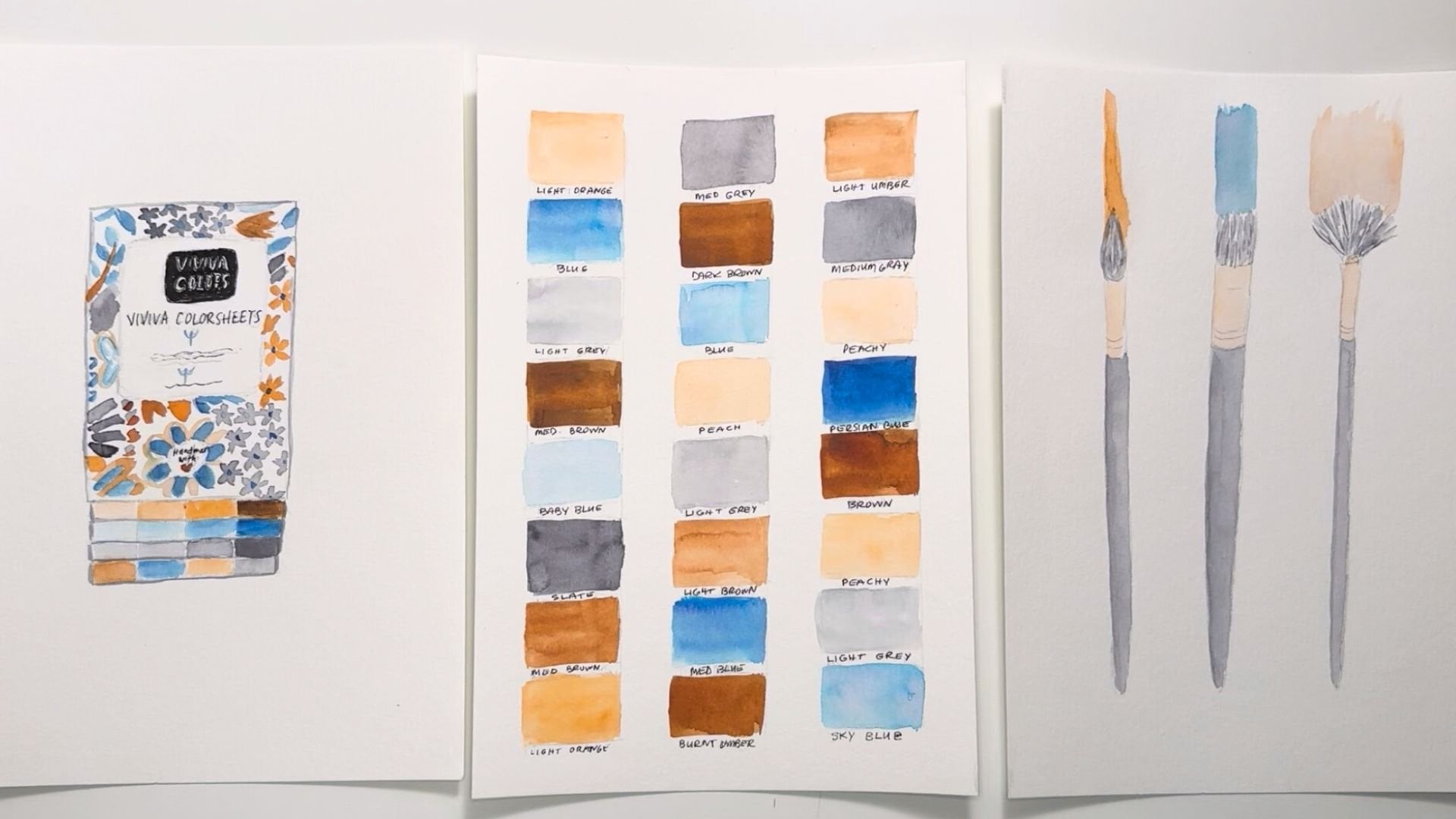
3. Tools & Materials: Here's what you're going
to need for this project. I'm going to keep
it pretty simple, but I'm using a lot of different things just to keep it fun. First of all, my Winsor and Newton Cotman student grade
tube watercolor paints set is great for mixing colors. Some of the already colors
that come with it are great to add an extra pallet
for extra mixing. I'm also going to
be using my very vibrant, the viva colors. This is a collaboration
said I did with them. It comes with 16 colors and they hold as much
pain as a pan set. So it's very practical and
the colors are beautiful. There's a fold-out
palate at the back, so you can mix the
colors as well. A cup for water and paper towels and rags to sop up messes. I use a combination of
both as I'm trying to phase out the paper towels. Then regarding other stuff, just basic pencil eraser that
won't mark up your paper and a ruler to make
some good lines for your planning pages. Regarding brushes. This first one is a jumbo Royal and laying
nickel size 30 flat brush, which covers a nice large area. The next one is an aqua
like Princeton brush. That's a mop style
brush, a one inch, and it also is great
for large areas. Then my wondering Weiss brushes, I have to round ones here once a size seven
and once a size five and a size eight flat
brush in that same line, which are great for
all kinds of projects. Just to go over some of the
journaling books you can use. I have a whole
collection of them. I'm a little crazy that way. This is a handmade paper book that would make an
amazing journal. Plus it has a built in Twine and wooden bead bookmark that can help keep your place really easily in a really fun cover. This is another one. You know, the paper quality
in this one isn't great. It's just very
regular sketch paper, but it's got such a
lovely cover on it. And I loved this rope that
kind of wraps around and it's like golden thread
and it's just lovely. And you can do a
lot of really fun, fun stuff in here. I use all kinds of
paper for my planners. I don't necessarily
use watercolor paper. But if you're gonna be
using a planner like that, you're gonna have to use very little water or
watercolor pencils, watercolor markers, something
like that to keep it, keep the water
very, very minimal. Here's another handmade paper. Journal, potential
planners, potential with a fabric cover and this
fun elastic closure. This is a basic
hardcover sketchbook. Again, the paper
isn't super thick, but it will hold some water and I don't mind
my water buckling. This is a fun one,
but you can find these that have
watercolor paper inside. So that's a great option. Now the book I chose
made by studio. Oh, and it has some nice thick paper and it's not technically
watercolor paper, but I like the texture. I like the natural color of it, and I loved the fact
that when it dries, it looks sort of vintage. I also loved the cover. It's really durable. I can cover it if I want to, and I can bring it around. It's very sturdy. Now this Canson watercolor
sketch book is my go-to. It has a, a 140 pound
cold press paper, which is really thick, can take a lot of water. If you put this
beautiful cover on this, this would make an
excellent planner. It has 30 pages. So you could maybe
do ten pages per month and have one per quarter. It's really handy. Like I said, if you
paint the cover, it would be gorgeous. I also use this threat Strathmore 300 series sketchpad for ideas and just
jotting down notes. I have a tiny version of
that same sketch, bad, to just make random brushstrokes of experiments with patterns. Just put my ideas down so I
don't mess up my final paper. Other supplies you could
use are metallic paints. I have these arches up,
watercolor brush markers, which are genius and I will be using them
in this project. You'll be able to
see them in action. But you just
literally just paint on the paper with it and then add the water
and it will spread beautifully just like any
other watercolor paint. I have 48 colors in this set, so it keeps me pretty busy. I also have a set
of 20 Pilot pens. So there are a lot of colors including a gold and
a silver metallic. Here's the gold and
here's the silver. Lots of great colors
in this as well. So it's fun to write. On top of my pages. I have a black size eight micron archival ink pen that won't
smear when I paint over it. That's a great tool. I also use keep a candle on hand for some occasional
rough resist techniques. It's really practical to
have a square to keep your lines from getting
crooked on your page. Then we'll need
some kind of glue, either a glue stick or
some good old fashion. Elmer's school always,
always does the trick. I have more sophisticated ones, but this is just
keeps it simple. And also a binder clip. So as you notice, as
I'm painting my pages, they don't stay open. So a binder clip, we'll keep those pages from turning on you
when you're painting. That's it. I look forward to see you in the next video to get started.
4. Getting Inspired: And we're gonna talk about how to get inspired
for your project. What I want to get inspired, I turned to Pinterest first. I just find so many
beautiful things and there's just so
many great images. I have a board here
called color palettes. I'm going to link to the
project page where you can scroll through here
and easily find a combination of colors
that you like working with. I don't think it out too much. Just be intuitive with it. If you like something,
go with it, you can always change it on another month or down the line. I also have a board in my art
board called abstract art, which I will also link
to you because there are so many examples in there of some beautiful
background ideas. Textures, patterns, lines,
line quality and thicknesses. Different combinations of
textures is just a goldmine for wonderful ideas
for this planner. Just moving on. I'm just looking at random images in my
feed that catch my eye. Again, just browse and see if anything randomly catches
your eye as well. For example, this quote, image, I love including
quotes in my planners. Going to go ahead and
save that one right here. That's really pretty. Here's a really nice
planner spread. So that's another
thing that you can search is planner images. You can just click
the search and go ahead and type in planner
and see what pops up. You can see there's
ideas, templates, stickers, papers,
all kinds of things. I'm gonna go ahead and
click on planner ideas. You can see right away, this is a really
great spread to, with this clock stamp up
here and this color block. It's pretty fun. But you'll see tons of things that will
inspire you in here. Here's a nice border idea. I probably won't be doing
this in my planner, but you might want
to include it. Abstract paintings
are perfect for overlaying illustrations. Here's another really
great planner spread, but there are a
million of them here. So I would scroll around and
see what jumps out at you. Here's another lovely one. This is a bullet journal spread, and that just means the dots keep your lines
straight and neat. And you can actually
create one of these in this planner you with
the same types of dots and a ruler. Here's
another great one. This is a habit tracker. I love habit trackers. This is a really creative one. I've never seen one
like that before. Now I'm going to
look for journal because you'll find
slightly different things. Now, journaling and
planning can be different, but I like to combine them. So I can create a
blank page that I can just write my little
heart out on. Here's a great cover page, some great planning ideas. The journal search will also produce a lot of
planning ideas as well. Bullet journal ideas. I'm actually getting inspired
from my own, my own ideas. This is a great journaling page with some lovely
illustration on it. Again, you can paint
illustrations. I actually include a page
where I can just paint randomly and you never know what I'm going
to end up with. Of course, your
favorite browser. We'll also be a great source of inspiration for
this same search. You can see lots of great
ideas here as well. I also have some quotes laying around on
this little banner. This is from a meditation
cards that I have. I loved this quote. It's so great. And here's a bunch of
meditative words or inspiring motivational wherever
you want to call them, they really helped me get
inspired in my journal, this calendar I got as a
gift and it's loaded a width quotes from every single month and they're all
kind of unique and not quite a different spin
from what I normally hear. So I really kept this
to use as a resource. If you have something
laying around at home that you can pull
a book or again, meditation cards or anything. You can use that as
a source as well.
5. Color Palette: It's time to choose a color
palette for your project. I told you I would
share this color palettes board with
you on Pinterest. I'll give you the link in the project section
and you can just go through here and select a
template already made for you. Or you can put your
own colors together. The idea is to blend a mix
of warm, cool, and neutrals. I'm going to be using
my viva colors, paint it because I love
the colors in here. They're so vibrant. They really, really inspire me a lot. So I'm going to
go with some CNS. I think some. Let's see what this looks like. An orange. This is perfect. I love that color. I'm gonna go ahead and put this CNS down. I haven't actually
a burnt umber. Burnt sienna. Burnt umber
is great, very rich. And I love that color as well. Really compliments
the other two. Let's try this yellow ocher. Lovely, absolutely lovely. This is a nice mix of
Brown's that I can really use with each, along with each other. For blue, I have decided to
use a blue as my cool color. I'm going to use
this peacock blue. Nice, That's just beautiful. I'm going to enjoy that. And then a lighter
version as well. When I need to go light. Then as a neutral, I'm gonna go ahead
and use a gray. Go ahead and pause this video, choose your colors
and I'll see you in the next video to
go to the next step.
6. Planner Ideas: I just wanted to take you
on a little tour of some of my past journals to
give you some ideas. This is a lovely cover
page I made for 2020. And the Pantone color of
the year was classic blue. So I really started
with a blue and January and carried it through. And you can see I
made a calendar spread with some metallic ink, that was my silver Pilot pen. I made some stripes with
some of my flat brushes. I made stickers out of
regular the laser copy paper. I used a regular blue ink pen. I mean, I just used what
I had in front of me. I made a list page. I love to make lists of
things and cross them off. And habit trackers are my go-to. I really thrive on
those nowadays to keep me on track with
everything I need to accomplish and they
really motivate me. And these are pretty
easy to make. So I'll be showing
you one of those. This is just a page I made to just be pretty
and just look at, and it's very, very simple and yet I can stare at
it and get inspired. The next month I did it
in a different color way. So you can see I've done
some pinks and purples. I made a bookmark calendar
spread with a special heart. I really enjoyed this. I use some really creamy
colors on the cover page. Here's the list page
in the habit tracker. I had a nice little
template for myself. The bookmark works really well. I didn't end up continuing that, but it was fun for a little bit. You can continue with what works and try new things
when they don't work. So there's no pressure here. Here's another style
of cover page I made and some background pages. Here's what I made
with a sky and grass. And even though it was abstract, it's still a landscape. This was following month. You can get an idea of
some of the things I used shapes on this one and stripes. I made a plot on that
other page and I can write right over it because
it is light enough. You can change your
colors every month. You can leave them the same. Here's another one
that I could make a journal page very easily. Some more ideas. You can make a shape on the
right and just continue the shape with more
than one color. Then write right on top of it. Here's some light stripes I made on this page and kept the middle pretty light so that
I use my detail brush. And that's another thing you can do is do some fine detail. This is an abstract
painting I created. That was another page I wanted
to just have to look at. It was a fun doodle, very free-flowing, no pressure piece that I
really enjoyed making. I hope you have gotten some
ideas and I will see you in the next video to get
some paintings started.
7. Storyboarding: Let's go over storyboarding, which is a great way to make a strategy for your
planner pages. Now I'm gonna get out my
big Strathmore sketch pad that I showed you
in the Tools video. And I'm going to do
some storyboarding that's going to allow
me to see what kind of page options I have to add to my planner journal and what I want to include
and what kinds I don't. First of all, I'd like to
start off with a month spread. In this first one's going
to be a month at a glance. You can just quickly see
where you are in the month. Next, I'm going to think about considering a month with
a month spread with all of the squares included in the
calendar so I can write notes and plan things. So that's the full month spread. Next one, he's gonna
be week at a glance. There are several ways
you can do a week spread. There's actually limitless
ways you can do a week spread. But I like mine with three sections on one side and four sections on the other. That way I can leave
some room for notes or some kind of mini habit
tracker of some kind, something, something small and easy to include in your week. Something maybe you might think of something
you might actually need to include in that one. This next one is a day
spread and this is again, the sky is the limit here. I like to include a list view, the hours in the day,
place for notes. Next, I'm going to add
the habit tracker option. I definitely always
include one of these in mind and it's
generally a full-page. So I have room to really see
because I really use these, I want it to be able to see
it clearly on the list page. I literally cannot live
with that one of these because I write
down everything on here that I might lose
sight of everything I need to do for the month goes on this page and I can add or take away or
cross off as I go. So it's invaluable to me
to keep track of things. Some things you can
keep track of here are even shopping things, things you need to purchase for your business or your home. Goals that you have. You want to keep
writing the forefront. Errands that you might
need to run that are super important
appointments you have. Even projects that
you need to complete. That leads into the next one, which is a project planner. These are so great because especially
in a custom journal, you can add any kind of options. If you are a quilter,
you can add quilting, things that you need to do
for your quilting projects. If you're a painter,
you need to, you can add lists of things that you need to
do for your paintings. You can really
customize these to work for you and
whatever your craft is, whatever your creative
outlet or for your for other kinds of work. Some things I might include
here is like client name, a mood board for the project
to keep it on track. Some project notes, perhaps some supplies
you need to make, and even a progress tracker right here so you can keep
track quickly and easily. I also love to include
plan journal pages, pages, pages I can just be
creative on anytime I want. So it'll be blank with a beautiful background
that's going to inspire me. I can put anything down on them. They'd like some poetry, some brain dumping, whatever
helps me to move forward. I also love a
beautiful cover page. So I'm inspired to go into the month and
continue my planning. As I mentioned in
inspiration video, you can also make your own
bullet journal tracker. And you literally just get
a ruler out and just make rows of dots across
and down your page. Make them exactly lined up. And you can do some really
beautiful work with those. You can also create a page
just for your brain dump with a lovely background and just put all your
thoughts down on it. Then you can always do some more targeted pages
like a self-care tracker. If you're really concerned
about self-care, you want to keep track
of your yoga practice, or how many steps you OCT, or how many glasses
of water you drink, you can really make that
a focus in your journal. Sleep is also a great thing to include. There are
lots of things. I didn't include a sticker page or a quarterly or yearly page. But you can go through this, put down all the
options you like and circle the ones
you want to use, leave out the ones you don't. Come back to this, maybe change it up next month. I'll add some options on the following page that you
hadn't considered before. So you can really use this
storyboarding as a tool to continually
update your planner. I hope you got some tons
of ideas from this, and I look forward
to see what you've chosen to include
in your planner. I'll see you in the next video.
8. Abstract Backgrounds: And I'm going to show you a few ways I make quick and easy backgrounds
for my planners. Just as a note, if you've been following
me for a while, you'll know I have four other
abstract painting classes and each one of them can really help you create some beautiful backgrounds
using different techniques. So you're welcome
to pop into those. For now, I'm going
to start out with some practice paper
that I can play with and explore some ideas without ruining my
actual planner pages. Going to load my brush
up with simply paint. And I'm just going to
make some very random stripy strokes up
and down the paper. I'm not getting
this paper to read. It's not the best quality, so I'm not going
to tape it down. I'm not going to get
it so wet because I'm going to be
changing papers a lot. In this video. You can see very quickly
how I could create a lovely background
that's very engaging. Roll my paper up a little bit just so it stays
a little flatter. Add a little bit more detail. Now as you go as
your paint dries, you can add some darker strokes, but you don't want it too dark if you're gonna be
writing over it. And this is just about right. Now, I could take
this a step further. I can actually do stripes
going the other direction. You can have one or
the other or both. I do love a grid. Even if it's painted, I think it's really lovely. But again, very quickly you
have a really nice page, but you can do a number of different types of
planner pages on. Now we're going to use my
brown small round brush. This is my number seven. I'm going to just
make a very loose, very random pattern
by just doing some quick short strokes
across the page. I want to keep them
pretty light and I don't need them to be
all the same intensity. I'm just going to
speed this up for you so that you can see the final result and see if something like
this appeals to you. You can use, you
can do triangles, you could do circles this way. You can do sideways marks. I mean, there's sky
is the limit on this kind of a pattern. And it's, it makes
a great background because it's not busy. It's just nice. Pretty way to add color
but not a lot of detail. So it doesn't take away from
what you're writing over it. Now I'm going to use my mop
brush to do a wet on wet. So I'm going to quickly what this paper try not to get too
awfully wet, but we'll see. That's great. It's just enough. And with this brush, I wasn't intending
to use this brush to paint, but why not? It's nice and wet. I'm just going to swirl some
color around the paper. And I loved that my
strokes are uneven. In fact, I'm going
to purposefully add some some uneven Strokes. Got a little bit of water here. I need to pick up. I'm just going to dab the
brush, rub the brush. I'm just, I'm literally playing. And this is the whole
point of this project, is to give yourself
some time to play. Now I can add a second color. I can leave it alone. It can add a third color. Just paint until you're happy and move on to the next one. I did get some of these
colors a little bit to mix, so I'm just going to dab
and pick up some of that. But there's no
pressure to do that. Now on this one, I'm going to do a
layered painting. This is a technique from my abstract watercolor
painting layers class. And so using my
entire color palette, I'm going to start
with one color. I believe that was burnt sienna. I'm adding some yellow ocher. I can just blend these and we have ourselves a lovely
background for something. I hope this has given
you some ideas. And once again, you're
welcome to pop into my other abstract classes to give you some
more inspiration. There's tons of
projects in them. I can't wait to see
what you do and I'll see you in the next
video to keep it going.
9. Painting Spread 1: And I'm going to dive into my first spread. You can see I have
my binder clip on the book and I'm loading
my brush with paint. This one's gonna be just a
swirly mess of random color. I'm going to start out with my Sienna pregnant to have most of my most of my
colors on this page. This will probably end
up being my cover page. In fact, I know this
will be my cover page. So I want to make sure I have
my entire color palette. This one. It just kind of
represents the colors I chose and is a fun way to tie all the rest of
the pages together. Now you can see this paper
is thin, it's buckling. It's there, the typing paper. But it's still too
thin for watercolors, but I don't really,
I don't really mind. I like the way the paper looks, aged when I'm done and
it's it makes me happy. So as long as you
are working with something that inspires
you, that's the main thing. You can see. I've moved on to a darker
shade of this color, just to give it some contrast. I'm going to start in with my round brush and do some
darker marks throughout. This is gonna be the
star of the show page. I want it to really stand out. I'm really being random and
just creative right now. And this is again
my time to play, so there's no rhyme or reason
to it I'm doing right now. I have spent some of this
painting up for you so you can, you won't be bored
to tears while I'm painting out every single page, you can see I'm adding
some blue strokes to this background. Again very randomly,
but here and there. Making sure I get a little
bit all over the page. Now that that's dry. Now I'm going to start
on the opposite page. And I've decided to go
with some random stripes. First I'm going to go
down the page all the way across making my stripes
as random as I can. And then going up the page, I'll add at least another color, maybe a couple of more colors, but this is a great start. While I waited for this to dry, I went on the opposite
page and I painted a very irregular circle using
my chrome yellow in my set. So this is a dark yellow. I mean, it can be brighter, but I have paint underneath it. In the meantime, added
some chrome yellow stripes to this side as well, to kind of bring in
the same colors. Then I've added some gray. You can see gray
stripes and you can see some gray marks on
the other side. You can see how I
work these pages. You don't have to
do it this way, but I like that cohesive
look that even though it's a different painting
and a different look in a different shape
or a different, you'll have stripes on one side and craziness on the other. That it works. Now I'll see you
in the next video to start the second spread.
10. Painting Spread 2: It pro tip for you if it's not completely dry and you don't want these
pages mixing together. You can put a paper
towel in-between them and go ahead and
paint your next pages. This is like 95% dry, so it's not going to be
devastating to the painting. So that's just a
thought for you. I'm gonna go ahead and start
in on the second spread. And I want to, I want
to use the blue. I'm going to keep
it really light because blue can
be a darker color. I'm going to do something a little bit like what we
did on the practice page. Some very random strokes
with my wide flat brush. Wet on wet. Not getting my pages to
wait because they're not really designed for that, but wet enough that this
paint will spread nicely. Making some nice
random flowy lines that will be
interesting to look at. While that is drying,
I'm just deciding what color I wanted
the opposite page. I think I'm gonna
go with this chrome yellow because we haven't highlighted that one much. Just wetting my paper and I'm
gonna go ahead and go with this yellow ocher
because that'll make a lovely compliment to
the blue across the page. Needed a little bit
more water on that. If I end up getting too
much water on the page, I'll let it dry completely. And then what I'll do is close the book and put
something heavy on it. That will help to
flatten them out some. But I like my journals
funky and messy and random and very artsy. You can see I can put a
lot more color down then I could on the blue page because this yellow
is such a light, much lighter color, it's
going to read more lightly. I'll be able to write
over really easily. I want to keep the
spread very basic, so I'm all done. I'm going to let this
dry and I will see you in the next video
for the next spread.
11. Painting Spread 3: And now let's paint
another spread. I'm gonna go ahead
and start with some burnt umber on a
wet-on-wet background. Again, very random. This tends to be my style when I'm
painting abstract a lot, especially if I'm playing around like I am now enjoying myself. I'm just going to fill the
background with this color, since I haven't really
used this color too much yet on any of these pages. And much like the
first painting, we're going to add
a tad of blue. I think I want this one pretty saturated
because the other, the rest of them have
been pretty tame mostly. So I might go a little bit
really colorful on this. Adding some gray. I'll be adding all the
colors on this one. Most likely probably more more charcoal than
I really wanted, but that's okay, I can
take and spread it. I've decided that this painting needed some more blue.
Just need some pop. Now while that's drying, I'm going to go over
to the other side and get some color down over here. And I'm gonna go with some
horizontal marks this time. I'm going to go ahead and
wet the top of my paper. I live in the desert and the pages here dry really
fast because it's so dry. The air is so arid and I just
wet partial bit at a time. Playing around with these
browns and yellows. Gonna go ahead and create
some fun play over here. And I really liked the
way this is coming out, but I think it needs a
little something more. I'm going to take my gray. I'm just going to outline
the whole page in gray and create a sort of rough frame. Then whatever I put on this
page can go right inside. That's different
from anything I've ever done. I really like this. It's funny how ideals will start flowing once you start playing. Now I have two more pages that I can do something
really fun with. I haven't decided what yet, but we'll see when we
get towards the end, I'll see you in the next video to paint another
couple of pages. See you there.
12. Painting Spread 4: And we have a cover spread. I have a second spread
and a third spread. Now I want to create
a fourth one, just so I have plenty
of pages to work with. I'm going to go ahead
and do an orange, a wet on wet orange background. Or it's going to look
more like light peach. By the time it's diluted. Just going to cover
the whole page with my random strokes. As you can see, I've
sped this up for you since this is the
same technique I've been, I've been doing on
the other pages. But after it dried, I added some burnt sienna dots which I thought would complement the orange really nicely. And it has, it
looks really great. Now I'm just adding a
second layer of paint. So there's some interesting
lights and darks going on. Now. On the other side, I'm going to do something a
little bit more unique with the candle that I
told you about at the beginning of the class
and the tools video. I am going to Go ahead and press firmly with the bottom of the candle and create some stripes across the
page all the way down. And you know, you're
pressing hard enough when you can lift your paper and look at it in the light and you can see the shiny
parts of the wax. You know, you have enough
candle on there just like this. With my blue paint, I'm going to create some nice wide but light strokes going down the paper and you can just barely see now
the paint resisting where the candle wax has
touched the paper. It creates a nice
striped effect. You can do all kinds of fun
things with this technique. You can make lines, you can make curves, you can make shapes. Of course, the proper way to do that is with resist fluid, but in the desert mine
dries out so quickly, I haven't found a good
solution to that yet, so I'm going to stick
with my candle for now. I've decided I'm going to add a little bit of orange
to this painting. And since it's
looking very stripy, I'm gonna go ahead and go
horizontal with the orange. You can see how
randomly I just lay these stripes down
and I'm aiming for right in-between the
candle wax where the white stripe is and now it looks sort of like a cool plaid. I'm really happy with the
way the spread turned out. We have a polka dot and a plan. I'll see you in the next video to move onto the next step.
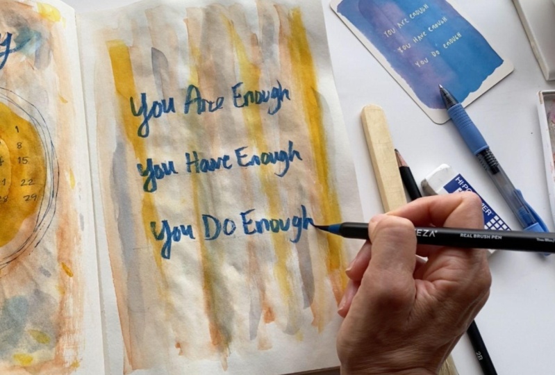
13. Cover Page: And cover page sets the tone for your
whole monthly planner. Let me show you how I do mine. I want to create a
month at a glance in the middle of this
circle here on the left page, on my cover page. With my square, I'm going
to share my triangle. I should say. I going to figure out, just going to take me
a minute to figure out the placement right now. I'm just going to
figure out how to place seven marks
across this evenly. I'm making seven
even marks across. But this looks a bit
too exact to me. I don't like that, like a more organic look. So I'm gonna go ahead
and start over. Honestly, when looking
at how this came out, it just looks too
wide across a circle. I think I want it a
little more condensed, so I'm going to erase
those pencil marks. I'm going to do this a different way and then to find
the center point. And then I'm going to evenly spaced my
marks out from there. I liked that placement
so much better. I'm gonna go ahead and figure
out the spacing up above, up and down rather, which I will keep similar to the spacing I already created. So that works. Now I can start penciling in all my numbers, then inking them. So I'm gonna go with a blue, since that'll be a really
lovely contrast for this yellow ocher circle. Bring out the blue and
the rest of the painting as well and make
it more cohesive. So I'm just going
to speed this up. Since this is just
basic numbering and I'm not being really
precious about it. I'm trying to stay
somewhat straight, but again, I like that
organic look and feel. Just as a creative
way of framing this and giving it
a little more pop. I'm gonna go ahead and this is a technique that I use
in my other class, abstract watercolor
painting making marks, is that you can take
an ink pen and just do some concentric circles. Just do one inside the other. And it makes it just a
really nice subtle frame. A circle shape, or any
kind of shape you like. Now I need to
pencil in my title. This is going to be
a January spread. I'm just going to list
some cursive pencil out and make sure it's in
the center before I ink it. And I'm going to use
this watercolor marker. This is my Artesia for my RTs, a set of 48 colors and this
is a great color to just compliment the blue. Great. It's not exactly in the middle, it's not exactly space,
but it looks nice. I love the way it came out. That's my first page
of the cover spread. I hope that gives you some ideas and I'll see you
in the next video.
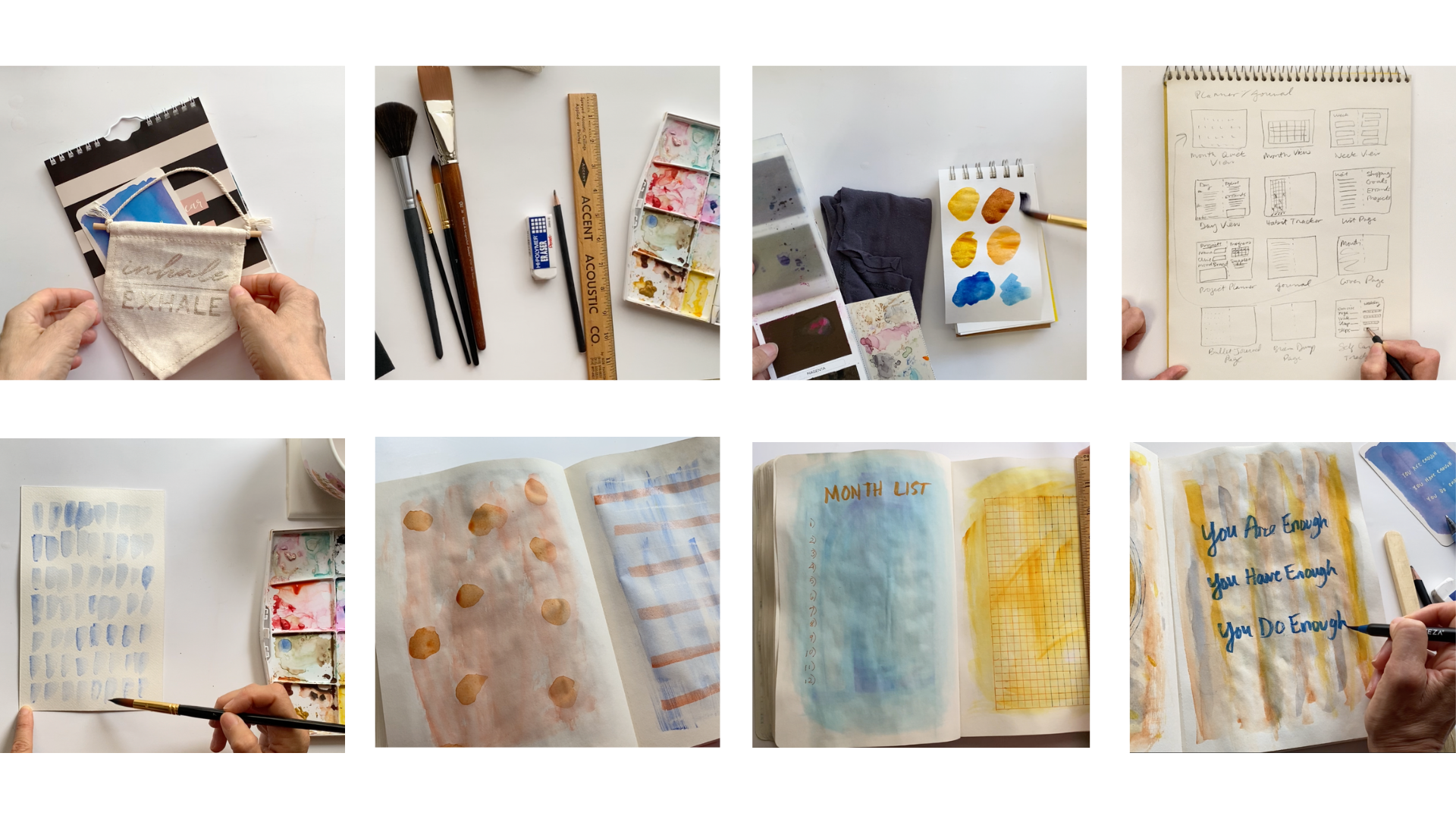
14. Quote Page: And now that the cover page is finished, I want to do something not
too serious on the next page. So I've decided to put
this lovely quote. It's one of my favorites. Fill the page with that. So when I look at this
month at a glance, I have something inspiring
to look at as well. With my triangle. I'm going to figure out
where to put my lines. It might take me
a few tries like the calendar spread.
That's okay. This is part of the discovery. Don't worry if it's not
perfect the first time at all. That's just too far
up on the page. That that brush I just removed
the eraser dust width was a house painting brush like just a wall painting brush
for latex paint that high. I took from my
household supplies. And it's a great tool to
remove some eraser dust. And when you don't want to risk getting your finished painting
dirty or oily or whatnot. Now that I'm happy
with the placement of my lines for my text, I am going to go ahead and use that same cursive I used
on the previous page. And I'm going to
write out this quote. Probably going to use the
same color brush marker to keep this spread
looking cohesive. Now I'm just going to
carefully take one letter at a time and enjoy
writing out my quote. I don't consider
myself a letter or so. This is something I'm trying to get out of my comfort zone and my abstract journal
is my perfect place to experiment with lettering. I've been doing
better and better. So there's been a
lot of improvement. Great. I love how that looks. I think both pages look
really nice together. We're ready to move
on to the next.
15. List Page: In this next spread, I've decided I want to put a habit tracker and a list page. I'm going to choose
some inking colors. And I'm pretty sure I want an
orange color on this blue. You'll notice I'm using my
handy-dandy little sketchbook that I painted my colors on. And I can just put my ink right over that to see what
it's gonna look like. And I think it looks great. Now for the orange,
I'm thinking of blue, but I have three of them. So that one seems a bit dark. That is perfect. So much more bright and vivid. I've got my two ink
colors now I need to choose a watercolor
brush pen color. I'm probably going to stick
with the same colors as this. I need to also practice
writing out my titles. So I'm gonna take a
handful of these and pick an orange at random. That's the perfect color. Yeah, I'm just gonna do some
block lettering this time. So I'll use, I'll hold
this and use this while I'm actually
doing my final title. It will act as a guide. And that will be
for the other page. I'll put all the rest
of these colors away. And I've got my
four colors I'll be using for the detail
on this page. And now it's time to
pencil in my lettering. I've decided to write out the words month list
because I do like to see at a glance
everything that I really need to accomplish
in that within that month. But that just seems
to be taking up too much of the page,
too much width. I'm just going to erase
that and start over. It's okay. If you have to start over
and do things a few times, That's actually part of the
journey of this. Great. That's much more like
what I wanted to see. Now I'm ready to ink
this and width my, I'm saying EEG, but it's
actually watercolor paint. I never actually tested
this on the blue. So I want to make sure
it's gonna be what I want, wanted to look like. And I and I'm happy with that. So I'm gonna go ahead and let her this out in
the the brush pen. I'm going to speed
this up because it's perfectly imperfect. I'm very happy with it. Now I'm ready for the list part. I can square this up
and draw some lines. I'm trying to decide
what I'm gonna do. I generally don't like lines
because then it constricts. I feel like it constricts
how much stuff I can put next to that number. So I think I'm going
to not put lines, but that's something
you can certainly do with my orange pen. I'm just going to casually
number it down the page. Just like that. I'll see
you in the next video. To start the next page.
16. Habit Tracker: And I wasn't a big fan
of habit trackers, but now I include them in all
of my planners because they really keep me on track with the things I
am challenged with. I think that's what they were designed for and they
work great that way. Now I'm starting my
habit tracker and on my little tiny sketchpad, I'm just going to write out the title that I
want to put on the top. That will be perfect. I'm probably gonna do
these words side-by-side. I like the way they're
blocked out and they'll match the list page next to it. I'm going gonna put that
aside for now and I've got to place my tracker first. So I'm going to measure the
very top and the very bottom. How far down I want to go. Then I'm going to measure
out 30 actual spaces. These are about a quarter
of an inch apart, depending on what
size your journal is gonna be, your planner. It's going to depend
on the paper size, is going to depend
on the measurements. So please stop the video and if you're doing
one of these, measure it out according
to what you need. And now with my square, I'm going to start
just penciling out the sides and how
wide it's going to be. I am ready to ink that top line. I've decided I'm going
to use orange and blue. So this is gonna be a little bit different than I've
done in the past. As far as using two colors, because I wanted to
divide this tracker into two sections. I'm gonna make sure I have this line down the left
so I can stay on track. It's nice and straight. Great. Now the other side, after trying that, I decided I need the
clear triangle so I can see the other lines in relationship to what I'm doing. There we go. I've got this
squared up to the side. I'm gonna go ahead and draw my lines going all the way down. So I have 30 sections
that I can track. And of course on the months
I probably should have done 31 because it's January. There are 31 days, so you'll have to adjust
your tracker depending on what month it is and how many days in the
month there are. So now I'm going to create my same separations up at
the top so I can create my vertical lines with the same measurement
I'm just going to go across and pencil and all
of those little increments. So I can go and create
those lines next. This ruler is much longer, so I'm gonna go ahead
and use that to ink in my horizontal
lines all the way across. I'm just going to speed
this up now for you. I'm going to go halfway
across with the orange, which looks really great on this yellow, this chrome yellow. And then the other half is
going to be the blue ink. Because I want half of this
from my creative projects and half of this for
my health habits. I'm going to put
a dark blue line, a blue line at the top. To create some separation. I'm going to go ahead
and number these all the way down now, but that is done. I have just one more step to do. That is to create kind
of an angled line. That's what most of these
habit trackers have. The least the ones
that I originally saw. They have these horizontal
lines so you can place a title above each section
that you're tracking. Going to finish the
other half in blue. I'm so glad I didn't
put my title. I really didn't have room and
I don't actually need it. So my habit tracker is done and functional
and ready to go. And it looks great
with my month list. I'll see you in the next
video for the next spread.
17. Designing Stickers: In this spread, this left
page is so colorful, I wasn't even going to
attempt to write on it. I thought it might be just a cool abstract piece
for me to enjoy, but I've decided to do
something a little bit more. That means it's time
to make some stickers. So I usually grab a piece of scrap watercolor paper
or cut a piece off. I'm going to start
inking in some stuff. I know I want it to
be motivational, so relax is a good word. My word of the year is space because I tend to cram
too many things in a small, small time-space or timeframe. So I'm gonna make that word really big and I'm
gonna make a little phrase, time for space,
which will be fun. I want to change
up those letters. That's nice and it's gonna pop. I don't want them the same
letters I've done before. Maybe I want to do a little
different style of writing. So I'm gonna start over on that. Funny as I was writing
those letters, they made me feel squished in. They were so compact
in that space. I've decided to make my letters really thin and put some space in between them to give me the feeling of space
as I'm reading this, I think I'll take this area at the end of that and make
some small stickers. I'm trying to think of
what reminds me of space. So that's a little mini Saturn. I think I'll do some clouds
on that one at the end. Now on this one I think I'm
gonna do a flower because I love looking at flowers. Doting over them. Definitely give me space. For this one. I'm going
to do a clock to remind myself that time is limited and aid to
make the most of it. Just going to erase
some of these lines so they're not too dark. When I paint. I'm just going to put some paper under this
and paper towels under this so I can absorb
any paint that my fall. And I'm going to keep this background much lighter than the page that is going on. It'll be a nice contrast. But I want them to be cohesive. So I'm going to use
the same colors, starting with chrome yellow. I'm just going to paint the background of the
lettering portion. I started in the middle so I
can work on the outsides and allow these areas to dry. Before I ended up painting the smaller
stickers on the inside. If that makes sense, The
Saturn and the flower. For the clouds, I'm
going to just do a negative space painting. So I'm just painting
the blue of the sky. I'm going to leave
the clouds white. I'll do a blue background
on this one as well. I don't want to do black. I don't do anything too heavy because the page already
has so much color on it. Let's see what's next. I think I'll do maybe do a blue flower for the clock. I really wanted to change it up with some orange and whoops, I have run right into
my wet flower paint. Everything else was dry. I've got to wait
for that to dry. So I'll see you in the
next video to continue.
18. Stickers Details: And now that my flowers dry, I can safely paint the
orange onto my clock face. Going to make it nice and orangey because it'll
be a nice pop of color. Among the other stickers
and other that's dry. I'm going to take a
archival ink pen. So that's that is a PSA Cora
brand Micron made in Japan. It's archival ink
so it won't smear if I need to
watercolor it again. You never know if I might decide to add some more saturation. I'm just making these
clouds nice and fluffy with some little curvy lines. For this Saturn, I'm going
to use my dark blue, my darker blue pen,
Pilot pen ballpoint. Looking at this dark color. For the rings, I think I'd
like to go with silver. Nice touch. Shimmer in the light
and we find great. Now I'm going to
outline my flower with some micron pen as well. Draw a center and
a stem as well. Maybe a leaf or two. I'm not going to outline
it perfectly just enough to give it
some definition. And a little whimsy.
For the clock face. I'm gonna go ahead
and put the numbers in all around and
then the hands. For the outside. I think I'd like some more
concentric circles. Time. It seems like, I mean,
tight clocks are generally, the old clocks are
generally round. It just always seemed like
time moved in circles to me, like the sun moves
around the earth. Now I'm just getting
philosophical. Now. I'm ready to cut these out. I'm being very careful to follow the line I created
with with my scissors. I have those nice
and accurately cut. I'm really happy with
the way this came out. I think there'll be fun
and cute and they'll remind me of things to
make space for myself. Now this quote, I want
to cut in half because I want some stacked
on my paper space. I want to make, purposefully
make these letters skinny. So I'm going to use
the Micron pen. It's the number eight,
as I mentioned before. So a nice thickness
for a micron, but it keeps the letters nice and spacious
from each other. Great, I love that. I'm just going to cut a
little bit off the end. It's a little more centered. I'm just going to erase any unwanted pencil lines
that are showing. I'll complete the other
word in the next video for you with a thicker
watercolor marker. I'll see you there.
19. Finishing Stickers: And I have inked in the top part of the quote with a brush marker in black. And now I'm going to place
these stickers to see how I want to glue
them to my paper. Yeah, that's working
like that. Great. I'm just gonna get
my glue stick and paper towel so I don't get
glue on my finished paintings. I'm just going to
take each sticker and cover the back
of them with glue. Especially the edges. These pages will be curling, so it's going to have to be
good and stuck on there. Of course, this paper is very stiff because it's
watercolor paper. I'm gonna go ahead
and center these and press down hard as I can. Go ahead, include
the rest of these. You can see they're all
sticking up around the edges. Then I'm going to close
this book and see if I can give it a good amount of weight. I'm going to leave
that alone a bit and come back to it and honest, full disclosure, I
had to come back with some liquid Elmer's glue
because it didn't quite hold. Because of the way the pages
curve as we turn them. It was just too stiff. So you might want to go
with a stronger glue than a glue stick for
your own project. Now in retrospect,
I wanted to add some color to this flower. I'm keeping the same
color, so orange. I'm going to add a
different color, blue to this, more blue to this Saturn
background as well. Just want them to have a
little bit more color. Now we have a really nice
finished sticker page. We can get motivated by. And I can't wait
to see what you do with this this option. I'll see you in the next video.
20. The Recap: And we have done a lot
of good work here. Let's recap. First thing you'll need
to do is get inspired. Then choose your tools. From there. You'll want to pick your
color palette, storyboard, your ideas, your techniques, the heights of planner pages. You'll want to paint beautiful backgrounds
that are inspiring her. Customize just for your needs. And don't forget to
have some fun along the way with some
playful elements. Wait to see what you've created. I'll see you next
video to finish up.
21. Thank You!: And thanks for spending some time with me in
the studio today. I hope you're super inspired to get your
art supplies out and make some abstract
watercolor planner and Work journal pages. I've been doing this for
a couple of years now and it's just so therapeutic
and relaxing. I encourage you to follow
along with requests videos. But I also want to get creative and ask yourself
some questions like, what colors consistently
make you happiest? What type of organization
works best for you? What types of planning
pages do you wish were in your current
or past planners? I hope that you'll take
info and tips I've shared with you today
and make them your own. And I cannot wait to
see what you create. You can share your project
by uploading it to the Projects and Resources
page under the class videos. If you have any
questions about that, you can refer back to video number two
calls your project, where I show you
step-by-step how to upload your
work to the class. I'd also be super grateful
for your review so I can keep improving the classes and information I
share with you. Well, that's it for today, but I'll be back with another
class soon Until next time.
 Chris V, Artist, Designer, Maker