Transcripts
1. 01 Introduction: You're in the right place because today we are working on abstract composition on procreate. My name is Bree and I'm a professional artist and teacher based on a tiny town in Colorado. I create a lot of different styles of Art and I have both a finer and a commercial art practice. I've been an artists all of my life and I currently specialize in creating original pieces for gallery walls. I mostly work with mixed media, including Vintage Book pages, acrylic, wash, metal, 0V, and pastels. In addition to commercial work, most of my clients are private collectors from all over the world. Abstract art is my favorite thing to create. And I used to think I could only create the depth of color and texture if I use traditional mediums, we are going to use procreate and a photo of a landscape and a conc, as a concrete starting place. Throughout this course, I am going to be showing you how to pick a photo, use procreate to create color palette, created depth of colour, and create the appearance of texture. This class will be great for licensing artists and artists looking to break out their representational practice. Or absolutely anyone looking to try something new and procreate. This is a workshop style course. So you will be creating your own work of our, alongside me as I guide you on how to create an abstract painting step-by-step and procreate. When we are finished, you will have your own abstract painting to share on social media or to print and hang. Get excited. This is going to be so much fun.
2. 02 Choosing a Color Palette: So the first thing we're gonna do in creating our abstract art on procreate is to find our color scheme. One of my favorite places to find our color schemas on Anthropologies website. I always am drawn to colors such as that. So we're going to just go ahead and look for that on our iPad. There's lots of places we could look on anthropology for color inspiration, but I'm going to look under addresses today. I'm really drawn to this stress. So we're going to just click on that. I'm gonna base my landscape on this dress today. So I'm going to go up, I'm going to take a screenshot. And then I'm just going to bring it down to size and this isn't going to be perfect. I just want to be able to zoom in on the pictures. So I'm going to be done with that. Save it to my photos. Okay. Then I'm gonna go ahead and go to my procreate app. And I'm going to open a new file. And I am going to choose the 5 thousand by 4 thousand. This means I'm not going to have a ton of layers, but I'm okay with that. So the first thing I wanna do is add an image. So insert a photo. And then I'm just going to zoom in on it so I can make sure I get all of my colors. Then under here I'm going to create a new palette. And I'm going to call this, I'm abstract. And we'll say label it cheetah because I like to get thin. I'm with my index finger, I'm going to just click on the colors and add all of the different colors that are used in AES. Especially going to focus on the neutrals. Because they're going to be what I want to cover most of that I got most of the colors that are covered. I'm not going to choose this chartreuse color. They just really hit it like this one either. Okay. Screaming to just kind of rearrange these a little bit so that my brighter colors are here. And the browns are organized. Neutrals, I feel like I need one more neutral, so I'm gonna just make sure that I have plenty to work with. Kate. I have my neutral selected and I have my color palette. So next we're going to choose our source image.
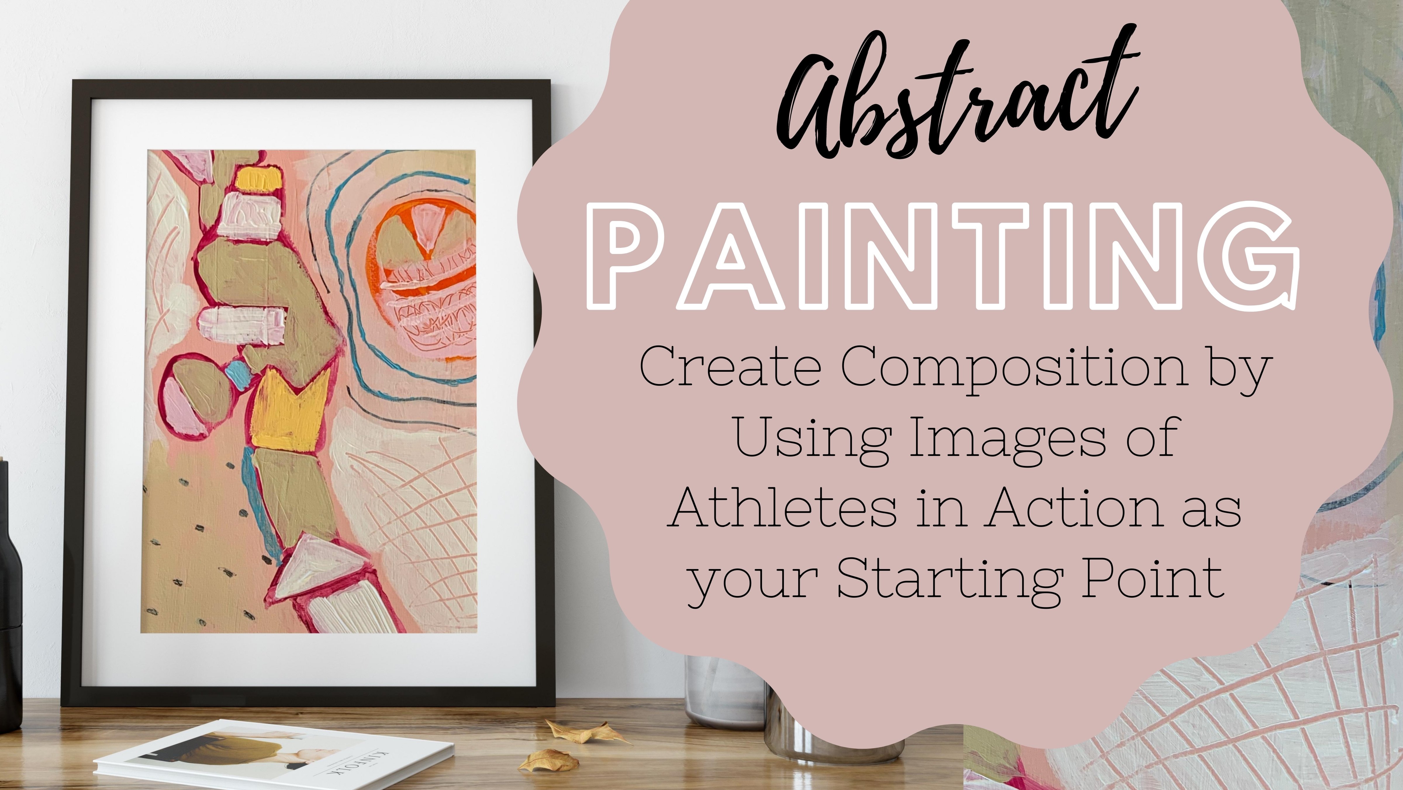
3. 03 Finding Our Source Image: One of the hardest things about abstract art is coming up with a composition because you wanted to be working for you. You want it to still be a compelling piece, but you don't always know where to start. So one way that you can star is just by Googling good photographs that go by the rule of thirds because we know that the rule of thirds is a great place to start to find good composition. So all we're gonna do is just Google photographs that follow the rule of thirds. K. I am wanting one that does not include a person in it. So I am going to be looking for composition, landscapes. Hey, the one that really caught my eye was this boat picture. So I'm just going to save that. So now we found our source image and now we're going to outline the basic shapes.
4. 04 Breaking Down Source Image into Basic Shapes: So for this part, we're going to insert the photo that we found that was following the rule of thirds into procreate so that we can outline our basic composition. We're going to open this backup and just delete the picture that we used for source photo for our colors. And I'm going to add my boat photo. Sometimes it's happens. And I want to make sure that I'm putting it so that this interesting part over here by the, where you can see the deck is able to show getting when I have that, where I want it, then I'm going to reduce the opacity of that layer. And I'm going to add another layer. I'm going to choose a pen, like a technical pen or something with, that's going to just be a simple line. And the color, but I'm gonna choose is going to be out of art color scheme for this project. So what I'm wanting to do is to make sure that all of these things fall into a section on a shape. And what I mean by that is you want to be able to fill each one of these things with color. So you're going to, even if you don't see a clear distinct line, you want you want to be able to tell where the one-color ends and the next is going to begin. So you're going to just want to make sure that you section off everything you can. If you like more organic lines, then feel free to make things more curvy. If you want things to be more straight and geometric, do that too. So don't feel like you have to stick with one way. Even though we're doing an organic, an image of something organic, you don't have to stick with that if that's not something that you like. So even the water is a color change, so I'm going to section that off as well. Yes. What online. So the ripples in the water are also changes in the color. So my goal when this is done is not for someone to look at it and say, oh, this is a scene of a boat on water. I want it to maybe give a nod to that but not be screening that that's what this is. So I'm going to turn this one off. Oops. I'm going to make NC how we see it. And yes, this is looking really good. I like the different sections. So what I'm going to do is I want more of this boat. So I'm going to highlight this. Whoops. Then, then the elected, and now I'm going to move it and I'm going to rotate it. So I'm kind of making this point the hinge. And I'm gonna do this on another layer just in case I don't like it. And I'm going to outline, sometimes I'm accidentally. Now I'm going to turn that off again and see if I like that. And I do. But What I'm sad about is that it covered up those other lines. So I'm gonna go back into this first image, turn this one off. I'm going to select it free hand. And then I'm gonna move it somewhere else. So I can still use that. And then I'm going to turn that back on and that's still there. And I think I'm gonna do one more boat, but it's going to be going this direction. So I'm going to select my layer again, rotate the vote again, and select it. And I'm gonna do this again on another layer because just in case I don't like it. And this time I'm skipping over the other sections that I have. Because I want it to be something that's like gives the illusion that it's behind it. I'm gonna take that away. And the way that I can see if I liked the composition or not is by rotating a. So I'll look at it like this. And I'll look at it like this. Then I'll look at it like this. Because a good composition could be hung and lots of different ways when it comes to abstract.
5. 05 Underpainting: Now that we have all of our lines sketched, let's fill it in with color. Now I'm going to merge these layers together. I can get rid of my source image. I'm going to duplicate this layer is only going to work with it. And the reason why I am duplicating it as because I don't wanna do anything to it that I will mess up, maybe getting things. So we're going to start doing under painting. And the reason why I like to do under painting is because I like the effect that it gives my, my overall work. So I'm looking to make sure that all of my things are made into sections so that I can quickly do this with my fill. So I'm going to use my color palettes that we decided. And I'm going to start filling it in with the right colors. So I'm gonna select that. And now I'm going to start filling this in, in different places that I like. And this is ok with me. The way that that did that because I this is how it's going to be at the end. So I want to prevent that as much as possible, but I'm not going to spend a terrible amount of time on it. That's too much. Okay, then I'm gonna change my colors default. And the goal here is to just make sure your final work. Let's just make sure that every part of this is covered. Now I'm going to pick a neutral for the last little parts. It might be easier if I just set my background color to that neutron.
6. 06 Choosing a Brush: We've done our underpinning and now it's time to pick a textured brush and do our next layer of paint. So I'm gonna go ahead and turn that off. Everything else off. And I'm going to make a new layer. And i'm going to just make it white where this color. Because I'm wanting to test out some different types of brushes. I like a painterly style. So the brushes that I like to use are highly textured. So I'm gonna start off with some of the basic ones that I like to use. I have used this goal before. Let me change my color. And it gives sort of like a watercolor look to it. I really like that one, but that might be too big for what I'm looking today. The other thing is when you change directions with this, we might choose that for today. I'm going to write to cool k. Then I also like to use on under painting, I like to use the turpentine. Turpentine. And once in a while I will use the old brush. Or you could check out the dry brush to not what I'm looking for today. I'm looking for something that's going to give it a painterly touch. The other one that I sometimes use. So once in a while I'll use oil pastel. So I think based on these, I'm gonna go ahead and go with the quote.
7. 07 Adding Neutrals and Texture: Now that we've picked our brunch, we're going to go in with our next layer of paints and add some neutrals on top of our bright colors. So now we have shows in what brush we want to use, and we have our under painting all done. So what we're going to do now is in, within each of these sections, we're going to color a neutral over top of the bright color. So I'm going to be, I'm going to delete that because we don't need that brush page anymore. So I'm going to add another layer. I am going to select a neutral color, which is going to be one of these over here. So the brush is pretty fat. So we're not going to get a lot of little crazy detail. We can shrink it down. But if you lift up your pencil, it's going to overlap. Which can be kinda cool. But you just have to be careful. Then I'm going to use that same color. Now. I'm going to change my brush to oil pastel. I'm going to start a new layer so that I can keep track of where I'm using my different brushes. And I'll keep a rush, but I need to change up my color. Haven't used this one. And the reason why I like to do this under meaning and then the neutrals over top is because I like to use these really bright colors. But to add them or artistic elements to it, it needs to have some texture on it. And neutrals are more friendly for my clients to be able to incorporate into their debt core. And so having a pop of color is way more appealing than having. So for this piece, I like that it is this color, but I want to add some texture to it. So what I'm gonna do is go to this color, select it. Then I'm gonna go to the wheel and choose something a little bit darker. And I'm going to increase my brush size, decreases capacity. And let's see how that works. A little bit too big. Hey, I'm liking the way this is I want to look at I want to add this brown, so I'm gonna do it on different layer because when I don't know what I want, then I want to be able to get rid of it. Don't like it. So let's reduce the opacity of that layer C. What it would be like if we just knew that yellow a bit. So that I really like for our texture layer. And we're going to come back now with some other fun elements.
8. 08 Adding Whimsical Details: So we have our textured layer of paint on and now we're going to add some fun elements like stripes and scribbles. And maybe some cheetah will see, let's see, we feel like, okay, so we have our textures on here and we can go in and we can add some more graphic details. So I'm definitely going to be adding more layers here because sometimes I do things that I don't like and I want to be able to delete them. So I want to look at all of the space that I have. And I want to do something with this space. Because I just think that that could be a really interesting pattern. And so that's where we're going to start. So let's look at what pencil we want to use. I want this to be a pretty solid line. So I think I'm gonna do streaks and choose a color. That's a dark version of this. So I'm going to darken that EPA smudge. And again, make sure I'm on the right layer. And I'm going to choose to go this direction. And I'm choosing to do my stripes in this direction because this is all going that way. And so I'm kind of gonna create a little bit of tension between those lines. Let's do it in a whole section and I do like it, but I think it's a little bit too dark. So let's change the opacity and just bring that down, make it a little more subtle. Okay, so next section that I want to do something with is going to be this section. And for this pen I want it to be super thin as though we are sketching something like maybe a 6B pencil. And I want to use the next layer. And for this one I want to use something brighter. And I want to do scribbles. And I like the way that is, but I wanna see what it would look like if I would have done it in a darker like a black. So let's see if I can. Yeah, I kinda like that. So we're gonna need to add some more black elements over here. So I'm gonna leave that there, add another layer. And then I'm going to decide what I want to do in black over here. So I have this pink that I can play with and it doesn't have any texture on it right now. This is kinda gonna look like a watermelon with seeds in it. So that adds a little bit of fun texture. Now I need to look at it from different angles and see you how I feel like the overall composition is. I feel as though and need more of the scribbles. And so we're going to try them out over here, making it on another layer because sometimes they do things that I don't want. Sometimes when I do scribbles, I like to spell things out and keep going over it so people can't read it. That's a little bit cathartic. And I'm going to space these out as I get over here. And I'm gonna make him really concentrated here. Change that value of a bit. I'm going to look at it from a distance of it and see what I think about that. And I'm really liking the overall composition. I think that I am going to add one more layer and I'm going to go over and outline some things in black. And not everything. I'm going to be really careful about what I choose to do with this is we just want to draw the eye to a different place a little bit with that shadow there. Ok. So I'm pretty happy with this overall composition. And so that's where I'm going to leave it today.
9. 09 Conclusion: Thanks so much for making art with me today. If you enjoyed this class or even if you didn't, please leave a review so I can make my class better or hear how you liked it. Also, please share with me what you worked on below. I would love to see how your project turned out. Also, I have a few other classes on skill share that are upcoming, so make sure you check those out as well.
 Bri Hill, Hey! I am a commercial and fine artist.