Transcripts
1. Introduction : Hey, you're in the right place because today we're working on an abstract composition based on a landscape photo for reference. Hi there. My name is Brie, and I'm a professional artist and teacher based in a tiny town in the flat part of Colorado . I create a lot of different styles of R, and I have both a finer and a commercial art practice. I've been an artist all of my life and creating as a part of my DNA. I mostly work with mixed media, including vintage books, pages, acrylic gua sh, metal leaf and pastels. In addition to commercial work, most of my clients are private collectors from all over the world. Abstract art is my favorite thing to create, but I remember how daunting it was. At first I didn't know where to start. I'm going to show you how to get past the blank canvas to create your very own abstract art . Throughout this course, I'm going to be showing you how to find color inspiration, how to pick a landscape photo, how to break that landscape photo into manageable pieces, how to paint it and how to add your own flair. This class will be great for licensing artists, artists looking to break out of their representational practice or absolutely anyone looking to get past the blank canvas. This is a workshop style course, so you will be creating your own painting right alongside me as I guide you on how to create an abstract painting step by step, using a landscape photo as your concrete starting point. Supplies are minimal, so let's get started with your
2. Finding your color pallet : So in this lesson, we're going to talk about how to pick a color scheme. And color schemes could be inspired from lots of Denver area. But I challenge you to try not to do traditional landscape colors. I want to break out from that. I don't want this to be something that you see of a fully landscape piece was using landscape photography to help us inspire us. But I want the colors to be a whole different story. One of my favorite ways that I like to find color inspiration is by looking at current fashion trends. One of my favorites is Gucci, So I'm going to look up Gucci Runway 20 honey, and I'm gonna look under images and see what we find. I see a lot of green in this. This is not usually my go to color, but I do like it. I like Gucci because right now, at least there nixing patterns and textures so much which I love to bring into my work. Um, I really like this. This is a really cool by. Lisa Condon is one of my favorite artists. I love her color palette. Look at these like vintage rides on this. Let's go to her portfolio and see what else she has. I love how vibrant everything is that she does. She just has such a beautiful balance. I just love the vintage vibe so much who? This one might be my favorite. Also, Lisa has a still share class, so you should go check that out after you watch mine. Anthropologie is another one of my favorite places to get inspiration. Um, I like to shop here. I like to find inspiration here. As you can see, it's always have something in my car. But I'm thinking about buying but haven't totally committed to that yet. Let's check out dresses and see if there are some that have some cool patterns and colors. So this actually reminds really sick Hunk Din's Guys, look at this. What I love about this dress is that it has all of these beautiful neutrals and these pops of this super vivid colors I don't necessarily always use, but I like it and it's super inspiring. And you guys, this is what I really like about finding color inspiration this way. I would not have thought of this color palette today had I not ventured onto this website and try to adjust. Um, approach this with an open mind. So this is the palate that I have decided I would use for this project. As you can see, this have nothing to do with landscape. It is kind of the opposite of it. And that's what I like about it, because again, we're not doing represent representational. And the next lesson I'm going to show you how to choose landscape photos for your inspiration. So the supplies you're going to need for this is ah, source photo of a landscape. Some basic painting supplies either Grosh or acrylic, some pains. And if you have them some Posca markers, you're also going to need watercolor paper or art board, which is what I recommend, and I like this brand.
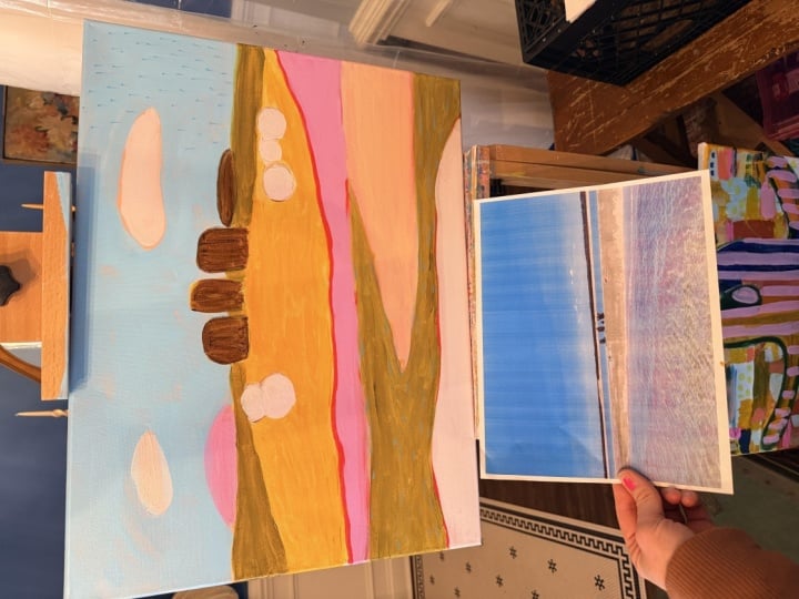
3. Finding a source photo: So for choosing your landscape source image. I want you to think about something. Where do you live? What is beautiful, where you live. I live in a really flat, agriculture dense part of the country. Some people would say it's like a fly over state. But I find great beauty in this because this is where I was born and raised. Maybe you live in a city, and then there's a city escape. That's fine, too. I also want you to think about places that you've been the inspire. You think about trips that you've taken. Think about when you see that photo, What emotions are evoked. Those are going to come through in your work. Also. Think about maybe not even a place to do Ben, but a place you want to go that has a certain vibe. Maybe it's a ocean and you want to be on a beach right now. That could also be something. Think outside of the box of what sort of images you want. They could be things that you've pictures you've taken. They could be pictures of other people have taken. They could be famous images. So the same rules that applied a good composition are going to apply toe abstracts to. And so we're going to get into how that works. Let's walk through some pictures that I have of landscapes. That means something to me. So the 1st 1 I have is one that I took when I was out working house. And I like that it is open. And I also like that there's a lot of negative space. The animals are not clearly animals. They're more like blobs or blocks. So what I'm going to do is I'm going to use this chance parents a sheet and I just drew grid lines on it because I want to check its rule of thirds since we're going to be painting a little bit bigger than this. Square square is fine to check this. So I'm going to leave this transparency over top of the image, and I really like how this is using the rule of thirds. I took this photo so maybe I'm biased, but I think this is a nice con, um, proposition looking at this photo, this is a picture of something that I had a friend on Instagram take a picture up and I really like this composition. It just to me was striking. For one thing, I don't necessarily want my abstract paintings toe look like mountains or like planes or like the ocean. I wanted Teoh give a nod to that, or you feel something about that, but not be like, Oh, it's clearly mountains because of the ridges. And what I like about her image is that it's not bridges, it's curved lines and things are broken into sections. So let's check out the rule of thirds with this one. So when I laid this over here, it's got a very nice composition with the rule of thirds. So this is a one space. This is another space. This is another space. What I really want to emphasize when I start breaking this down is this space, because I think that we could be more intentional with this image if way had a more clear focal point. And so this is the image that I like a lot, but let's look at one more So my dad is a rancher and he has zero are sick ability, but he often send me pictures throughout his day of things that he sees and I love when he sends a me these pictures and they mean a lot to me and I try to incorporate them as often as I can in my work. So this picture that he sent me was at sunrise. So I'm going toe, look at how this follows the rule of thirds. And don't tell my dad this isn't super great composition. But if I wanted Teoh, I could crop this down and create a more compelling composition by maybe including only parts like this. That could potentially be a more compelling composition, especially if you like negative space. Um, this could be something a different composition. But overall, looking at these three images, the one that I feel most compelled toward is this one. I live in Colorado. I'll be at the flat part, but I just love this composition. I love the Rolling Hills. I also like that things were pretty well sectioned off. We're gonna be talking more about what that means and why that's important. In the next video
4. Breaking source photo into manageable pieces: So for the last video, we talked about how to choose your landscape image. Now we're going to go over how to break it into shapes. So what you're going to need is your image. Two pieces of tracing neighbor, you don't have tracing labor. That's now the deal. Use wax paper or just use a regular piece of printer paper, but you might need to head to a window or use a light box. Then, if you have it and you want to use this transparency, then you could use that for this as well. I'm gonna be using a light box. But if you don't have a light box, don't stress because you could use the window or you're probably gonna be able to see through it better than better than the video will show. You're also going to need a piece of charcoal or a marker or eight generating device you want, so first you're going to lay down your image. Then you could lay down your transparency, and I'm doing this because I want to be clear of where I want my focal point to be. And I want my focal point to be right in this area and then I'm going to lay down my transparency. So for this first time that we're going to be tracing over these shapes, you're going to be doing this pretty accurately. It should not take you more than five minutes to Dio. Don't be too precise. Give yourself a lot of grace with this. I just want you to get a pretty well overview of what these shapes are. One thing that I really want you to be paying attention to is how you can break this into sections on What I mean by that is that they come to a close. So I'm not leaving open ends. I'm taking the lines from edge to edge. And the reason that we're doing that is because we were painting. We're going to be doing collar blocking, and it's really hard to know where one color ends and the other starts. If we're not using complete sections so again to end the section, I'm going to go all the way over here. And that doesn't mean that lines can intersect. I just want to make sure that I'm creating whole sections. - Okay , so this is the first draft that I have going to take my source image and just said it to the side because what I want to do is like focus on this. So this is what I have for my composition right now. And when I go back to this, which I can still use, I can see where I want this focal point which right now that isn't Where is so? I'm going to now get my other piece of transparency paper and I'm going to start this over this. Now, would I really want to dio, as I want to set my mind that I am preparing to depart from my original image. So I want to make things into more shapes and leave the fluffy nous of the clouds aside. I want to make sure that I am starting to really simplify the shapes. So let's look at what we can do here. I'm gonna take the transparency out for now. We'll talk about the focal point in just a second, so I'm actually going to use a different color to go over it. Just see, you guys can see what the difference is. Just agent. All right? I found a green oil pastel and I'm going to use this instead so that you guys can see this . But I really like this triangle shape here, and I like this shape here, and I kind of like how these air two different shapes. I'm also going to vary my lines. So these were a lot of Kirby lions, and towards the end, I decided that I wanted to add a straight line just to give some line variants throughout the piece. I really like this triangle. So I want to make sure that I repeat at some form of triangles. I'm going to create a triangle from that and again, I'm gonna look at this story. Want my focal point on? I really think I need to have a distinct a round shape that kind of comes through this. So what I'm going to do is I'm gonna take a creative liberty and I'm going to go through this shape and I'm gonna just kind of make some really clear round orbs that fit within that. Then again, I'm gonna just follow these lines, combining curved and straight lines. I don't know if I like that line. He may be going away, and I love these. They were treated before, but now they're going to be trying girls. They don't have a lot of negative space in this. So I really want to just leave this the way it is. No, there some jaggery lines. Love that. All right. So what do we think of this? This is not you would not say. Oh, my gosh. That pictures taken from such and such mountain You would never say that. But this is a great starting point point. This is a concrete starting point for us to go abstract in the next video, we're going to talk about transferring this onto our working surface and then getting ready to paint. So now that we have this sketched out and have our composition the week that we wanted Teoh , I'm going to put this onto the board. Another option that you could use is a sketchbook. If you are wanting to do some art journaling, um just use something with a little bit more sturdiness to it, because we are going to be using acrylic paint. This sketchbook, um I get on, etc. From yellow paper house, and they produce really good things. And the reason why I like it is because it comes with all these different types of paper. So it's a challenge to kind of fill all of those up. I really recommend those, but the pain, the type, the upward that I'm going to be using today is, um, watercolor art boards. And the reason why I really like these are because they're small and sturdy and relatively inexpensive. And so for my licensing, I like to ski on this in on, and these air these sites fits into my scanner. So I'm going to sketch that out if you like. If you want it to be more precise and you want to do a grid, that's fine. But it's really since it's abstract, you're just kind of copying the same composition. And so it doesn't have to be perfect. It just needs to be a similar composition. And if you look at those, those are pretty similar. I made sure that I included some negative space down here, and the most important thing is that I finished all of my sections. So if you look at all of these, everything has, ah, full section. What I mean by that is I want you to be able to know where one collar starts and another begins. So if we don't have those sections out, it's gonna be really hard for you to decide where that iss So right now we're going to get ready to do under painting.
5. Underpainting: I love toe under paint whenever I am able Teoh, and what that does is I'm going to paint first on my canvas, a color that is not what the top color is going to be on. The reason why I like doing this is because it gives a lot of deaths to my death to my painting. Here is one of the original paintings and this is actually of my grandma when she was a kid , and some people notice right away that the horses pink and others don't see it. And that's because the horses under painted with pink I first laid this down and I under painted the sky with yellow and you could see the pops of yellow around her. Then I can see. And then I under painted the ground in blue so you can see little pops of blue. And then obviously I under painted the horse and pink, and I just think that that gives this so much more depth rather than had I painted everything just a solid blue and not taking the time to do the under painting first. So what we're going to be doing is under painting, all right, So now we're ready to start doing our underpinning. So I have theme paper that I found, um, I printed off a little clip of the dress that I want to use for my color inspiration. So I'm going to use that kind of match. My colors and I have kind of picked my colors and I love these bright ones. I don't normally use this at all in any of my work. And so these are going to be fun. I've had these for a while and I haven't gotten used. It'll be fun. Also, I'm gonna have to mix these two together to kind of create this peachy color, but it's really subtle, so I want to make sure that I can mix those together. I have a just a regular paintbrush. I don't spend a lot of money on paint brushes at all. It's not something that I choose to get a higher end of. I have a jar of water. I have a palate that's kind of clean and some paper towels. Normally, I would like to have like, a more absorbent paper towel, but this is what I have today. So this is what you need, and then you also need your board with its sketched on it. And this is the most fun part guy. So let's get started. So this brown is a little bit darker than I want it to be, So I'm going to put it in here. I'm gonna mix a lighter, neutral with that and then I want another control. So I have my paints in my pilot and I'm going Teoh. Now start filling this in and how I'm going to decide where to put colors is I'm want there to be a very instant tones. But this isn't what the tops going to look like because we are under painting right now, So don't stress too much about where you're putting colored. Most important thing right now is that you're feeling the whole board with color. I'm going to start with this pink because it is the what I'm the most excited to get to use for this. So I'm trying to decide which color now to fill in this because this color, they're all going to touch. So I'm kind of trying to balance to see what I'm have the least of It would be like this pink, and so that's what I'm going to choose to do. But it does touch this. And so I might put a, uh, barrier between the two. I think that I used to think that starting off like this with an abstract with cheating for some reason, you think it's important for us to get past those ideas of rules and art because there are rules. And so just let yourself do what you want. If you want to use a projector toe outline line, do it. Do you want to tree do it? The idea is that you're creating art and it's yours. So do what you want. He was gonna put some usual. They're just so that this is covered because again, my whole objective with underpinning is to cover the whole campus. It doesn't have to be perfect, but it has to be covered. All right, so we have our under painting done, and so we're going to go ahead and let that dry. Um, where I live, it is super dry, so it doesn't take long at all for ehrlich paint to dry. So I'm gonna go get some water, and then that will come back here and then start our next layer
6. Top Layer of acrylic: Okay, so we're back. We're going to start doing our next layer of painting. Um, eso have touched up my paints and using the same color problem that I used before, and I have this and then I have everything here. It's almost all dry. I get really impatient, especially when the black doesn't dry, so it kind adapt it. But everything else should be completely dry. And I'm also referencing this color piece that I had before. And I really like this piece, our color inspiration, because it just has thes pops of bright color. But mostly it's neutrals. So I want to make sure that I'm focusing on that. So I'm going to create a couple of more colors that are a bit more neutral. So there are some light blues and I use the blue before, but now I want to lighten it up a bit, so I'm going to start adding some weight. So again, how I'm making these choices is I want this to be a neutral peace with pops of color. So that is how I'm going to decide what colors to put where I read this light blue that I'm going to start with putting over the Brown. Now some places I'm going all the way to the edge with my paint of the section and then other places. I'm not because I do want like that. That's love. Reason I under pain is because I want there to be death. So I don't want there to be weight canvas showing through. So as I'm doing this, I think that my this is looking a little bit more blue than I had hoped. So I'm still going to be keep going over these with different colors, trying to kind of neutralize the blue. Um, but I am liking the way it's looking, and just even if you're like this is not looking good. I challenge you to finish it because I think you'll be surprised with how it turns out. So right now this is the way it's looking, and I really, really like this, but I'm going to give it a little bit of space. I'm gonna clean out my brush, and I'm going to look at it from across the room to see how the balance of colors and tones are. I had a PE instructor tell me once that toe look at your work. You need to be across the room. You need to stare something, right? And then you need to look at the the piece of work to see how it is in the overall perception and what you feel right away and whatever you think right away is what you should make changes on or leave alone. So if you look right away and you see something you don't like, that's probably a good thing. But if you stand and you look at it for 15 minutes, those maybe aren't something that you should change. So here it is from across the room, and I really don't see anything that I would want to change right now, Um, I'm going to go back in with some other little details, and I do think I want to add a little bit more black. So that's my perception from the back. Um, so I'm going to see what I can find that has Black
7. Adding flair: This is my favorite and most scary part of the process. And that is going to be adding some lines and some dots to this, just to give it a little bit more movement and to have a little bit more fun. I'm also really wanting to highlight um, my focal point, which is right here. So I'm going to be using these markers, these colors, and then I'm also going to be using a little bit of black paint. So where I'm going to start IHS, this always makes me nervous, but it's gonna be so, um I want Teoh exaggerate this. So I'm going Teoh, start here, and I'm kind of just going to mimic the lines around it. So I'm creating a little bit, uh, repetition here, - and that's kind of looking like the sea and the Colorado flag, and I don't want it to, so I'm gonna add another line or couple lines. Okay, so I think I like that. I'm gonna make sure this is coming out. And this is the section that I want to make sure that I'm looking at. And so I need to decide if I want to dio stripes work dots. And I think it's going to be dots because I have these strips here and I just do these little just a little bit sinner paint that I like, So I might have to dio, um, another coat. But I don't mind. I had a client call these speckles recently, and I think that that's a great name. So I think I'm going to keep calling them speckles. And then now this orange And I think I want to be orange to be in this section. Oh, that's a little less my change them if I wanted to be in this one. Hey, guys, I think that I might be done. I think I'm gonna add just a touch of black. Alright, guys, I'm gonna give it some space and see if I like it. But I think that I might be done. Thanks so much for making art with me today. If you enjoyed this class or even if you didn't, please leave a review so I could make my class better Or hear how you liked it also, Please share with me what you worked on below. I would love to see how your product turned out Also, I have a few other classes on skill share that our upcoming, so make sure you check those out as well.
 Bri Hill, Hey! I am a commercial and fine artist.