Transcripts
1. Welcome: [MUSIC] Hey, I'm Denise Love and I want to welcome
you to class. I am a full-time working artist. My main business is
2lilow Art Studio where I make workshops and digital art tools
for photographers. The art workshops are
something new for me. I wanted to add a new
creative outlet for myself. I love the art just as much
as I love the photography. This gives me a way to get a
break from one to the other. I really hope you're
going to enjoy this. I can't wait to
see you in class, so let me show you
what we'll be doing. In this class, we're
going to be making some yummy abstract art. In this time, I did
pieces that were a little bit larger than some of the
other classes I've done. We've included new elements here that we've not done before. This project, I have included doing some collage
work underneath and some stencil work on the top
in addition to playing with some new art supplies that maybe I haven't
played with before. I love doing this project because then I can experiment
with those supplies. I can add different layers. I can just keep on going
until I get to the point of, what have I created? Then I cut out a couple of
pieces that I love as a set. I hope you love all
the techniques and the different
elements that we're using in this
particular workshop. I can't wait to see
you experiment with the collage and possibly
some stencils on top. Let's get started. [MUSIC]
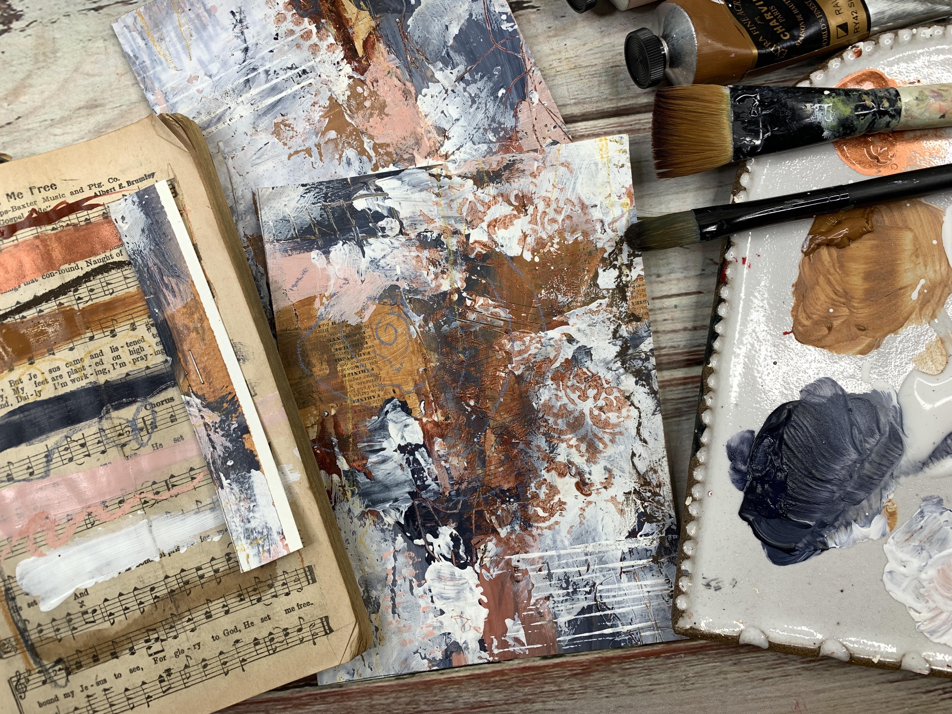
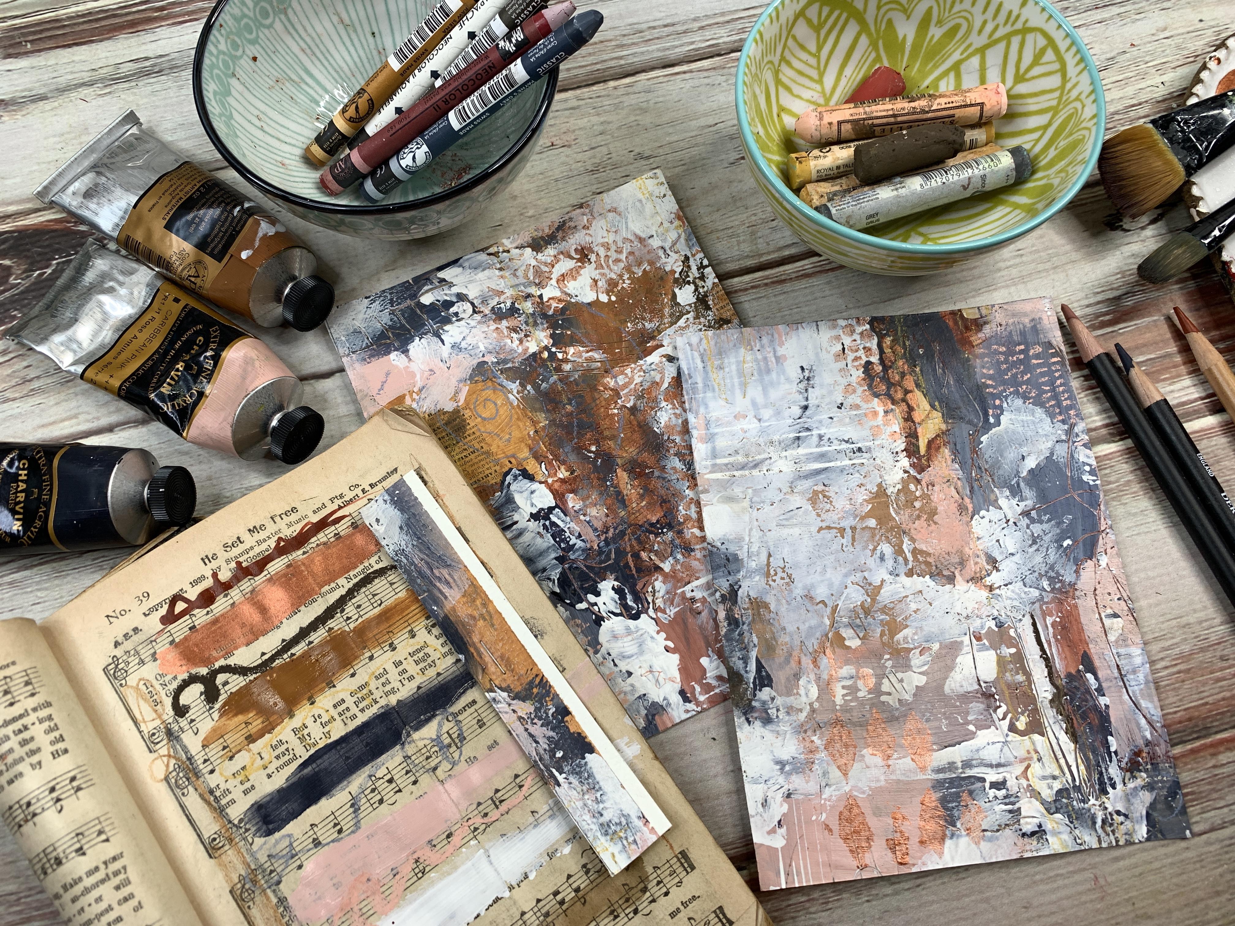
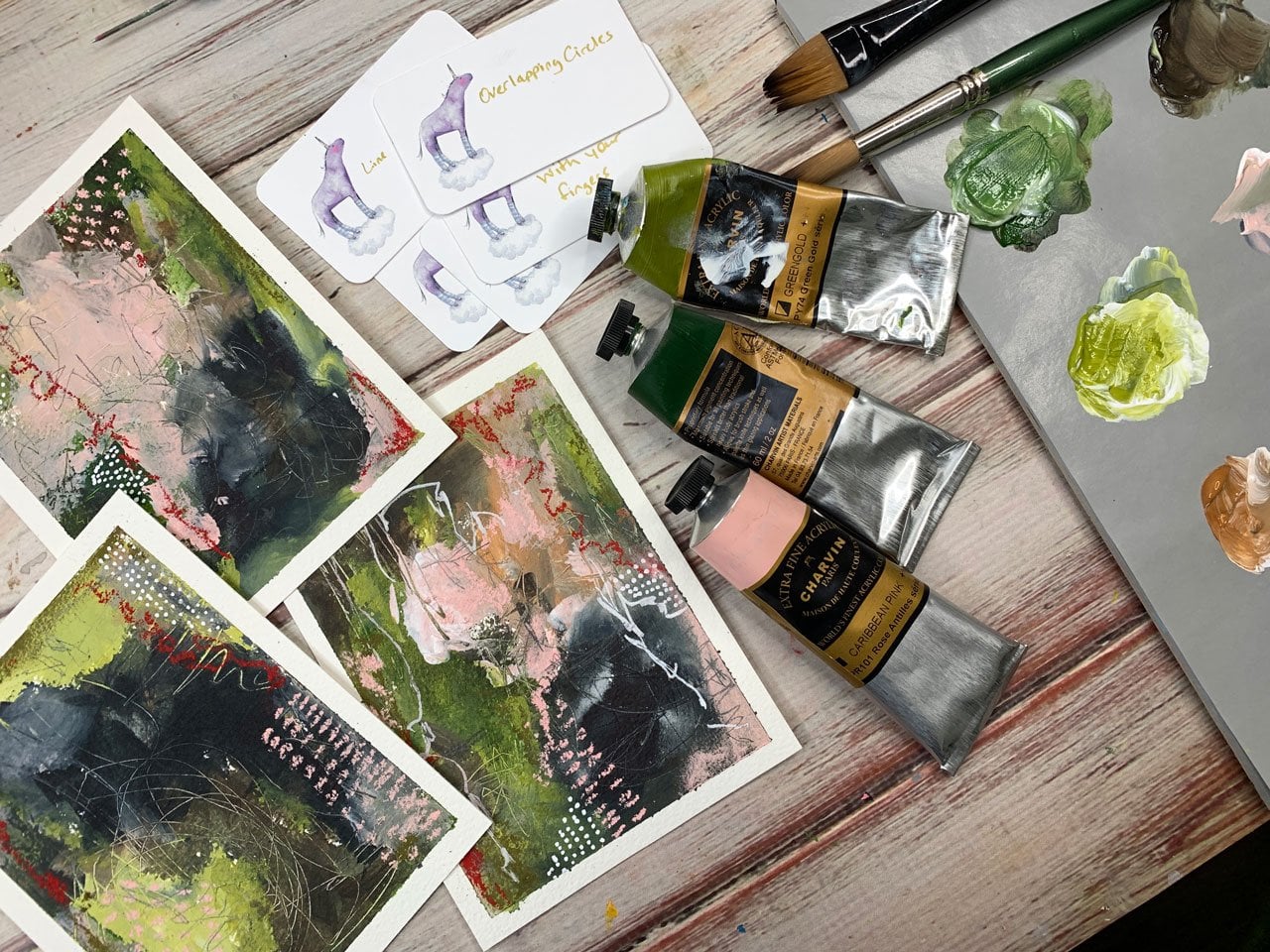
2. Supplies I'll be using in class: [MUSIC] Let's talk
about the supplies that I've ended up
using in this project. I'll film this backwards
and I'll do the project and then tell you
what I ended up using after I have actually used them so that [LAUGHTER] I
don't get confused and talk about stuff
I didn't really use. In these pieces, we created some lovely 5 by
7 abstracts in this class and I experimented
with things that I've put on the lower
layer with collage. I used quite a few
random collage papers, just old book pages, and I just glued them
rather randomly down. You want to gather some
of your collage bits and the first layer of these
pieces, I did collage, and had a lot of fun
experimenting with that because some of my
collage elements do end up coming through
on these pieces. Right over here you can
see some of my collage and right over here
some of my collage and I'm sure if I looked
around good enough, I'd find more places where the collage was showing through. On this other one, we
have some elements down here that are
still showing. I can see through the
paint or some right here, some of the marks underneath
are showing through. It just depends
on how much paint you put on top of
those collage elements as to what's going to be
left when you're done. I've used collage elements. I also used a few
stencils on the very top, which came to me as
I was sitting here looking at it as it was drawing, trying to decide what
my next step be. These are some random stencils that I got at the craft store and some of these are
the Tim Holtz collection that you could look at. One of these, this is punchella, and the punchella
was my favorite and this is the stuff
that the leftover paper when they make sequins. That's called punchella
and so I love that. We used some stencil
bits on the top, but also in the
underneath layers use a few Neo color crayons. I picked a few of those in the color palette
that I picked out today. I used a very few soft pastels and then when I stopped to
let this dry and eat lunch, I actually had some
hard pastels come that I had ordered in the mail and these are the Charvin
artist's palettes, water-soluble pastel sticks. This might be a new favorite
element to do on top because the line is
so nice and crisp and the colors are so vivid that they very easily showed up in the areas that I wanted
to do mark-making on top. These were not very expensive compared to the soft pastels. This was a very nice option
to play with on these, and I'm definitely going to
be using those over and over. I was also playing with some
Derwent tinted charcoal. Well, like about the
tinted charcoal, I pulled out just the colors
that I wanted to use. But this is a Derwent
tinted charcoal set of 24. They come in lots
of muted colors that are really beautiful and I just pulled out a couple
of colors I wanted to use. You certainly don't
need the whole box if you just want to
purchase a few colors that you might like to use, that you think you'd
use all the time. If you have a set color palette that you like to work in, get a couple of
colors of charcoal and then these were
really fun to work with. I also have a mechanical pencil that I just used to mark
make and do stuff there. I also pulled out my
oil-based pencil, my Pitt oil base pencil, and it's in the sienna color. I wish this came in a
whole line of colors, but it doesn't. It comes in the one color but I did not actually
end up using it. But it is one of my favorite
art supply, this one pencil, so I'll throw it out
there that I like it and it really makes
beautiful marks and really, even though
I didn't use it, I could come back and use it now and add marks and stuff and it just makes
the prettiest mark like these hard pastels did. I may go back and I could add
some more details on there, but I really loved that pencil. I also, on the bottom layer underneath where we
did collage work, used some walnut ink, which is water-soluble
brown ink. That's just fun to
experiment with. I just was getting supplies out to play on that bottom layer to see what I could come up with and I also used
acrylic ink in brown and I've got some Payne's gray, this is red Earth. I did use a little of that. It actually made it look
like blood on newspapers when I got to that
bottom collage parts. I didn't think I was
going to love that, but that is this part right here shining through the
underneath layers. I do like the tiny bit of areas
where that shines through, it gives that nice little extra bit of pop of color in there. I was questioning my
choice when I used it, thinking, "Oh my goodness," but now with the other
layers on top of it, I do like those little
punches that come through. That was a really nice choice even though I doubted
it while I was using it and then this is Payne's gray. This was a yummy rich copper
iridescent ink by Liquitex and so this I actually used to do a little bit of
the stencil work on top. That was fun to experiment with and my favorite stencils
that I ended up with was the punchella. Here's the diamond's
not my favorite. The punchella is my favorite and that pretty damask look
turned out really nice also. I played with that. It was just an opportunity to
play underneath the layers to see if I was
going to like stuff and then I use the little
iridescent on the top, which I really like doing that. These are the Charvin brand,
but any brand is fine, Caribbean pink, Payne's gray, I put a little bit of
Titanium white out, some raw sienna, and then I
did have some white gesso and some clear gesso that I was mixing with
those on my color palette. I also used a variety
of paint brushes and a catalyst tool, which is just a
catalyst silicone tool to mark make and to spread paint and I also used a palette knife. Even though I've now shown
you tons of new things, if something really grabbed you, definitely try it out, but start with all the
supplies you have. I encourage you not
to run out and buy tons and tons of new things
if you don't have to play, tear up some book pages for collage work and then
play with some of your own materials to see
how are these working and what did they do and what layer do
I like them on? When you're done,
you can evaluate what was your favorite and
what did you not love. I don't want you to
go buy lots of stuff. I want you to start
with what you have and then if any of these looked really cool
and interesting, then give those a tryout. I can't wait to do
this project with you. Let's get started. [MUSIC]
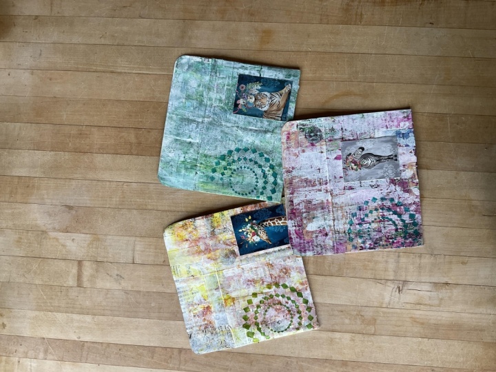
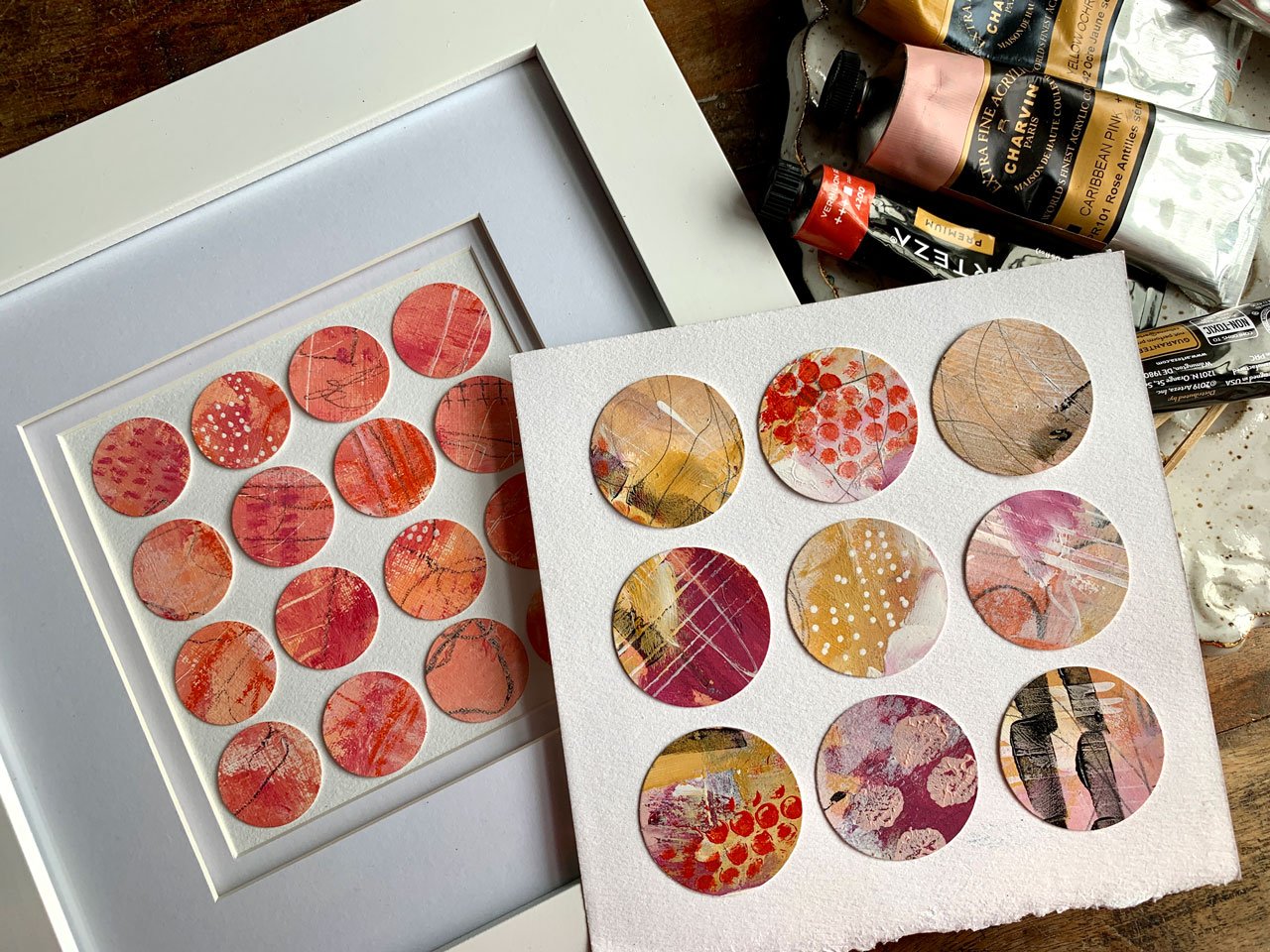
3. Project - adding collage pieces: [MUSIC] In this project, I'm going to do one of
those great big sheets and then cut out pieces that I love because it is my
favorite technique on creating abstract pieces. But today I'm going to
add another element on there that we've not done
in the past projects and I'm going to glue down
pieces of a filmer, old papers, collage bits and I'm going to do a
little bit of collage on here before I start
painting on here. I've just limited myself on colors that I want
to use and try out. I have just pulled out
a stack of papers out of my plastic bin that I
have that's full of papers. I'm not going to think
too hard about this. I just want to have
some collage elements to give me some textures. They may show through to the
top image and they may not, but it will definitely give me some different elements in height-wise because this will
add another layer in there. Then I have decided, sometimes I'll pick a color
palette that is existing, I'll find a color palette
on Etsy, I mean Pinterest. Or I will pick a color
palette from my color wheels. I have several and
you can determine, do I want to do complimentary, split complimentary, triad, tetrad, different
color options here. Say for instance,
if I wanted to do a tetrad and I wanted to combine yellow and red-orange, and blue-green,
and, blue-violet. Those four colors would
be a tetrad and I could pull paint colors
in those shades and create something that
would be dynamic and complement each other because you've got some complimentary
colors in there. You've got the blue orange,
and the yellow-purple. Which if you move
this little color thing around, tells
us complimentary. It's basically two
complimentary sets of colors, complimentary that we're
using in one piece. But that's not what
I'm doing today, but when I'm choosing colors, I might decide to pick a color palette off of my wheel
and then pick colors that match and I could
pick shades and tint. This is shades and tints. I could pick any in that whole range that would fit into that
particular color way. Or I could pick out
maybe a color over here and a pop of color that's supposed to complement
it really fine. There's different ways
to use color wheels. I also use Pinterest because you can search
out color palettes on Pinterest and you'll
find photos with dots of color underneath
them. Sometimes too. I've got these fun
color flow books that I got from Ivy Newport, which is another artist
that I like to follow. She actually has some
color flow decks of cards that she has put out
also that I don't have. But how fun would
that be if I took my own photographs and
created my own deck of cards with colors underneath
them and then printed them? Say like on a little move cards, I could have a whole little
set of my own color cards. But this is fun. This is a nice,
beautiful photo that compliments itself and if
you pull colors out of that, then your painting is going to have this colorway and be really beautiful when it's done because you can see it's
really beautiful here. I do like visually
sometimes to be able to see what is my
overall look going to be. Let me try those colors. Look how pretty that is. Now that I'm looking at this, I didn't actually pick
this in particular, but these are the colors
that I'm going to go with. I've got this darker
shade and this pink and I could mix white into that darker shade
to get that lighter shade. I can see that my colors are
going to be similar to this, but then I'll have a pop of
red that I've put over here, which I may or may not use, but there are little pops in here of an orange or something. But it's fun. You
can look through Pinterest and find interesting
color palettes like this. You could get some books
like I've gotten from Ivy and just have it handy on your desk to
be able to play with. You can take some of your own photos if
you're a photographer and you want to put together some of your
favorite photos, create a little color palette underneath it and
print those out. That would be super fun. To say I haven't really
done any of that, but I'm just trying to
give you some ideas on how you might pick a
color palette today. I thought I really
love raw sienna. I love this Caribbean pink. This might be my
favorite one to use. I've pulled out titanium white. Now these happened to be
in the Charvin paints, but you don't have to
use Shaven you can get most of these colors
or mix most of these colors in
any of the paints, like the RTs or any paint
that you happen to have. You can really take this
raw sienna and mix it with a lighter color and come
up with a pretty pink too. I've also picked
this papa crimson, which I may or may not use. I've also picked
out Payne's gray. Most of these colors you
can get in any brand. But I may not use
the pop of crimson. Now that we're looking
at these colors, I've just pulled them
out to think about, now that one's think about. I also thought maybe I would
play in some acrylic inks. I have one that's in a
copper color and one that's in that sienna color. Again, this is red earth, but it's very close
to the sienna family. Then this is Rich copper. Fun to maybe experiment with maybe a little
bit of that coppery. I've also pulled out acrylic
ink in Payne's gray. Then this is fun. The here, this is
walnut ink and it's, I had to order it, but
it's fun to play with. It's like a raw umber,
burnt umber color. It's a brown and it's an ink. I just thought, have
these supplies. I want to play with
these supplies. I want to get used to them and figure out what do these do. This project is perfect for
experimenting with those. I've pulled just a few that are in my colorway that
I've picked out. Now that I'm looking around, I think I'm going to
not use that red. We might pull it back out, but I think I want to stick
to this color palette. Those stick in there and
then adds the brown. I also thought it might
be fun to play with some tinted charcoal
pencils for mark-making. I've pulled out sunset
pink, burnt orange, and bill berry, which are in
my same color range here. I also pulled out my pit oil-based pencil
by fabric Estelle because I just love this
pencil is perfect for mark-making and it draws on
top of things really nicely. I may or may not use it, but it is in my colorway. I pulled out some soft pastels in my colors just in case
I want to play with those. I've pulled out
some neo color to crayons in my colors
just in case. I've got this colorway. I'm limiting myself
to these colors. I have gone through my
art supplies and said, here's the colors
I'm going to play in today just to make it easier. We're going to
start this project doing some collage work. I'm using regular gel
medium by golden, you can use Mod Podge if
that's what you've got. If you use the matte medium, you need the heavy matte medium. If it comes in a jar like
this, it's pretty liquidy. If it comes in a jar like
this, it's pretty thick. It's the way I'm
thinking of this and to glue down different
weights of papers, I may want this a little
bit thicker stuff and I'm probably going to
put that all in with a brush or a palette knife, so I've got that right there. I'm just going to dig through, I want different shades of paper and I'm going to
be very random about where I put these and just start gluing
some of these down. I've got some pieces that
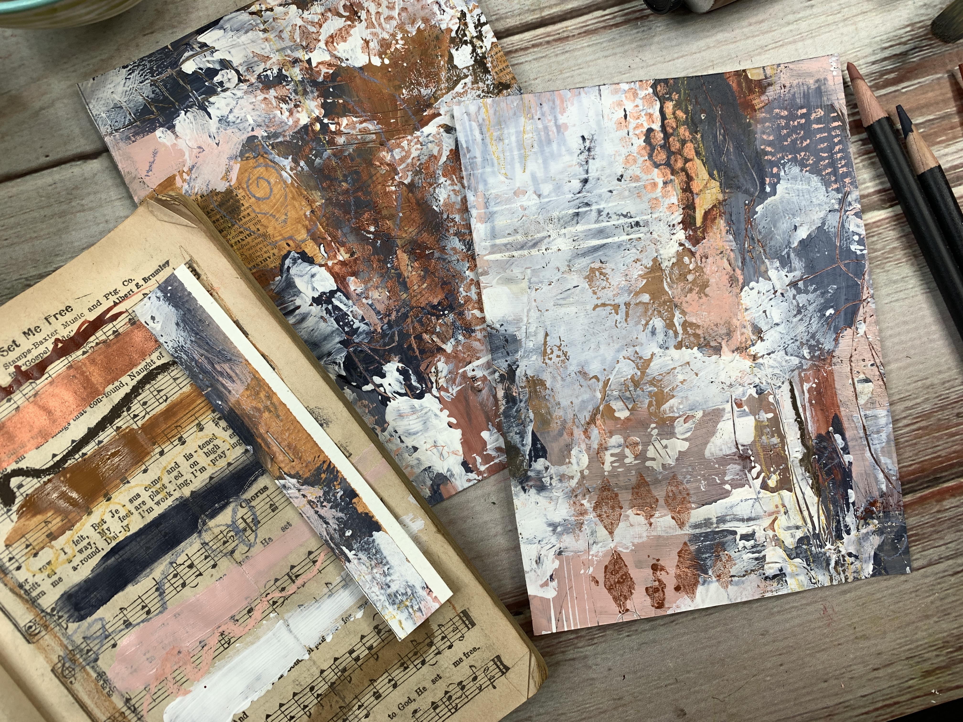
I've drawn on myself. We've got a little bit
of music in here maybe. I like the ones that have
stuff that I did to it. I'm pulling some of those
out of my little pile here. I have tissue paper, that's fun. I'm not going to use the
tissue paper today though. This is fun with a photo on it. It's really dark. Might be something fun
to show from underneath. Let's just start with those. We're going to start this
piece with collage elements. You can do any collage elements that you think you'd like. I've got some water
over here on the side. I'm going to get
my brush wet here. You could do magazine
papers for collage. You could do
interesting words and things that you
find for collage, there's different
things that you can do. I'm just going to
separate these out, just tear different size pieces, and [NOISE] you don't have
to be real exact here, this is underneath most
of what we'll be doing, but I just want these
elements in there. We could start off [NOISE] by drawing on
the white page if we want through my
paintbrush on the floor. [LAUGHTER] If we want to start
off with some mark-making, that's nice too, maybe the collage elements
and mark-making on top of it. I'm brainstorming here,
giving you some ideas. I like these dictionary pages that have the really
little writing. I like the edges
to be real organic so I'm tearing the edges. I like this old notebook, ledger papers too I
think those are pretty cool. Let's start gluing. This is rural thick stuff. Once we glue these down, we're not going to be
able to do anything else to this until it dries. I'm gluing it on the bottom
and then on the top. This is a really nice way too
to see whatever you used. Is it going to run? Did you pick a marker
that was smudge-friendly? [LAUGHTER] I guess it's
a good way to say that. Whenever I use to create that
was not smudge-friendly. Good lesson to learn. Especially if we're
doing this on a piece like this where it's
underneath stuff. Now we know and it's turning
things muddy for us. Look at this, this side is
actually in my color way. Maybe we'll just go
ahead and use that. You'll notice because I'm doing this underneath stuff I'm not putting a lot of thought
into where these are going. I want to work a little
more organically. I want to think a little bit
less about it in this piece. I want it to be a little
more serendipity for this. These collage pieces, I like them so much because I'm not stopping and thinking super hard like I don't want this here, I
don't want that there. What's my composition doing? Where am I going with this? I don't want to think
about all of that. When I'm doing this, I want to just let
go with abandon and not thinking about what
are we going to end up with. Not thinking about
my composition, not thinking too
hard about where I lay each color down when
we get to the colors. I do want the colors to be
harmonious when we're done. But I want it to be in
such a way that I've picked up the colors beforehand. Not in such a way that I've thought too
hard as I was going. I decided that color
palette ahead of time so we don't have to
think too hard about it. You can have these
more spread out, I've got them in here pretty good and
bunched in together. You might just want one
or two collage elements. I'm thinking too, I
don't want to be too precious about it so that's why I like working fast and off the hip here rather
than thinking too hard because you're not
maybe going to see any of these or maybe we will. It just really depends on in the end what we've
laid on top of here. Let's go ahead with maybe
[NOISE] a dictionary page here. Because once we start painting
and stuff on top of it, we may or may not
see any of this. But it will give us different elements
underneath our painting to give us interest, which is my goal, that interest. I like interesting things
on the different layers. Then if something peaks through, it's like a nice
pleasant surprise. Like, what is that
peeking through here? This stuff is really
thick, so it's going to take a little bit to dry. If you've got a heat gun, you can use a heat gun, but you just gotta
be careful that you don't make your
paper whole ripple, but the ripple could be
an interesting texture, so getting into choices
and preferences. [LAUGHTER] I've got
one here [NOISE] where I've got a little
bit of paint on it, or I've painted a piece
of a collage element. Let's put this one here. I've painted some
interesting collage on here that I like. I may use a piece of this. [NOISE] Save all the little pieces
that you're tearing off. These little pieces are
good for something later. We've laid that on pretty good. Now, before I can do
anything else to this, I'm going to have to let that
dry because it's not going to let stuff stick on it really well while it's
saturated and wet like this. It's not going to take
a long time like some of this is already dry. Just make sure all my pieces
are stuck down really good. Then we might just
take a heat gun possibly and hit this
with a heat gun. If you've got a heat gun, you can dry it a little
faster with a heat gun, and then once this is dry, I will be back to start
adding paints and marks. [MUSIC]
4. Project - adding paint and marks: [MUSIC] This is dry-ish. It's been sitting for a while. I heat it with a heat gun
for just a little bit to get a little bit drier than it was. What I might do now is just do some scribble and some
mark-making right on top of that. This is my neo color to crayons and this is in a
sepia color and I thought, well, that's nice with these color palette
that I've picked. It's a color I've
never used before. I'm using my non-dominant
hands so that these marks can be a little bit less rigid
and less sure that self, so that we really get that
organicky look to it. I might come in here
with neo color. This is raw sienna and just
do some marking up here. These are water-soluble so if I put something wet on top of it, that might blend these
colors a little bit for us. If I take some wet paint brush, I can work with this a little
bit and smudge those out, just see what we get. I like that raw sienna smudged around right
there, that's real pretty. Really nice way to just
add bits of color in here. Then we've got some white which may or may not show up if
we use it on top of stuff, but maybe it will. The darker the color,
the better it shows up. We've also got these
charcoal pieces. We can see what they do. Charcoal is also water-soluble
so if I want to do a whole little piece here and then see what the water can do with it they're
water-soluble. Look how soft and pretty
this color is when we add it to the water and if
we draw on top of it wet, we do get a heavier
line and dry. Very fun experimenting
with charcoal colors. You can get charcoal colors as a whole little pencil
set like this. These came out of a
little collection of colors called tinted
charcoal and its got 24 just muted shades that I think all the colors in there are really beautiful. But for this project, I wanted to limit my
shades that I was using to just something
that really worked within the color
palette that I chose. Even if you get a whole
set of something, pull out colors that
you like the most. I love this color, this sunset pink really reminds me of the Caribbean
pink and all of that. That might be something
I use on top of that. That's a lot of color
we've got going on here. Maybe we could do some stuff
with the walnut ink here. This is a good product to
create drips and things. If I wanted to lift my
whole board up here, I could create yummy drips. I'd have to move all
my little art supplies here and I might do
that in a minute, but just fun to play again with another medium that maybe you've not
played with before. I want this underlayer
to be a little more chaotic and I think
for the upper layer, I'm going to try to play with larger color blocking
like I did with our larger color block
abstract class that we did. The Number 3, I think it was. I do like those larger, blocked pieces that I have. This is the acrylic ink and I'm using that
red earth color. Look how yummy that color is. I can use it with
a brush if I want. These have this stopper
or soak stuff up into it and I can
really do something interesting with some
of these, like this. Look at that. That's super fun and I can smear it around
if I want to take a palette knife or maybe one
of my catalyst spreaders, I can spread this out a
little bit because that's going to definitely take
some extra time to dry. Now it almost reminds me of
newspaper with blood on it. [LAUGHTER] That's true.
That was quite the look I was going for.
How funny is that? I like to read murder mysteries. That's, of course, instantly what I think of when I think of stuff like that, I think of, how did that
go into that mystery? [LAUGHTER] Leave
that splat there. That's going to take
a while to dry. Now that I have spread all this stuff on
this underlayer, I'm going to have to let
that dry a bit before I can move to the next layer and
hopefully when I'm all done, I don't end up with
a dark, muddy mess. I want it to be a little different than
what I'm seeing here, but these are the initial layers and even if you don't
like where it starts, you add more layers
on top of it till you get to a point of,
I think I'm there. Let's this dry and
I'll be right back. This is about 80 percent dry, so we'll call that dry enough. I've gone ahead and
put out my raw sienna, my Payne's gray,
my Caribbean pink. I've put out a little bit
of my titanium white, may or may not use
that, but it is there, and then a little
bit of my gesso in the white and the clear
to mix those in with my paint brush to mix those in with my acrylic
paints so that I can draw on top of that later. Let's just start off with
this Caribbean pink. I might put a little
white in it and I'm going to do the
great big color blocking like we did before because I tend to
work tight and small. I do the same thing
in my photography. I tend to just get real close
into things and see now, here's the part that didn't dry, but I do like mixing that color a little
bit on the pallet, so we get some
interesting variations so I'm okay with that. But I have a hard time
even with my photography, getting real tight
in on things and not pulling back to the bigger
picture and with my painting, I almost consider big
blocking is the pull back because I tend to get real tight in and make
everything very chaotic, just like I did on
that underlayer. But let's get a little
more this pink on here. I want big swaths of color
on some of this I believe. I don't want it to all be
really tight in there. Trying to paint larger
on my sample things so I get those other
touches of not too big. It's okay too if you don't cover all the
background in this. There's some that's
wet too I just blend it a little bit with this. You don't have to fully cover
it we're doing big blocks. A big block could
be that underneath collage part if you like a particular like this
right here, I love that. Maybe I don't want
to cover that. I don't want to get too
precious about any area, I don't want it to prevent me from moving forward in
my paint or whatever. But like this little area
right here, I'm digging that. The next time I do this, I may or may not
use red underneath. But this very
interesting figuring out what goes on the
different layers to give you a finished
piece that you love. I am just mixing the paints together
here on my paint brush. I'm not trying to be really
careful or anything. I like that little stroke
of O's that are in there. Yes, I'm just using
the same brush. I'm okay mixing some of these colors as we go
just to see what we get. This almost reminds me of
an urban graffiti wall. That's fun. Not necessarily the look
I intended for this, but definitely
interesting an outcome that we're getting with that. You can see those up underneath that collage element
showing through that pink. Do I love it, do I not love it? I don't know I
just got to decide as I'm going where do I
want to touch more of something and where do I
need to maybe bring in some darker color and where maybe do I want
to bring in some white. Because sometimes
this Payne's gray is not as dark as I actually think. It looks like it's a super dark, almost black-blue,
but it's really not. That's fun. Maybe I will start. Maybe I'll bring
in a little bit of something bigger so I'm going to use my catalyst I think. I could do some of this with
the palette knife actually. I'm going to mix the
white with some Gesso, just so that I can still draw on top of it
even though it's white and white [LAUGHTER] I
may come in and just see if I smear white in here. Look at this, I just
love the texture that we get when we do a palette
knife smear like this. Look at that, oh my
goodness, that right there. A lot of times I'll be painting and I know you're
going to do this too and I'll be doubting myself thinking what was I
thinking with this? Then I'll do something like that and I'll get excited again, it's gets me all excited. Let's put some whiteout [LAUGHTER] I can do this
with the Gesso too, I could do it all Gesso, but sometimes I like to use
the white paint just to see how does that
white paint react rather than everything
being the Gesso. The Gesso was technically
acrylic paint also. Look at that. If you do this while
the paint is still wet, then you get some
interesting colors that'll blend in with
your smudges like this, I love that too. If you do it all when
the paint is dry, then you'll just
have clean white with no other colors in there. Before I forget and get too far, I may come back and
add more of these, but while some of this
paint is still wet, I want to do some
fun mark-making. I'm going to start off with just my mechanical
pencil then start doing some marks in here just to give me another
element of interest. If you're getting
things that are too uniform or too exact, switch to your
non-dominant hand, and then you'll get some more of that messiness that we tend to like when we're
looking at different marks. You might do some lines and
you might do some circles, and we could do some hashes
and we can make a ladder. I like the little ladder [NOISE] Sometimes
that's a fun element, little dashes, and marks. You want to remember
to do some of this before you get too far and everything's dry and you miss the opportunity to dig
through some of these layers. I do like how some of that collage element is
still popping through here, I haven't completely covered
it up like sometimes I do [LAUGHTER] I'm using the mechanical pencil to do this but you
could also use one of these clay tools that has a sharp edge on it
like an ice pick. I also like this end. It's slightly curved
with a point on it. You can do some of these also if you don't want to use
a little mechanical pencil, but I do love the
mechanical pencil. I like this little
tiny area right here. The color showing through
is just so amazing. It's burnt orange,
blue in there. That's a little bit of the
reason why I went with Payne's gray and this raw sienna or a little bit working with the complimentary colors on each side of the scale with
the blue and the orange. This burnt orange
showing through, look how beautiful that
one little area is, I loved that right there,
totally made me happy. Let's go through with a little
more maybe of the white. With my fun palette knife here, just getting some more yummy
texture and stuff going. You don't have to do
white, you can do whatever color appeals to you. I just happened to
want this to be a little bit lighter on the top. Almost want it to
be like darker bits showing through and
lightness on the top. That's fun. [NOISE] I'm just throwing
my paint brushes in the water there so
that I'm not really holding myself up
and I'm allowing them to not dry out because so easy to ruin
your paint brushes. I'm going to just
paint some of this, give me some texture with the paint brush
that's different than the knife and I'm
going to have to let this dry before I can
add anything on top of that. I think I'm going to let
it dry for a moment and I'll be right back [MUSIC]
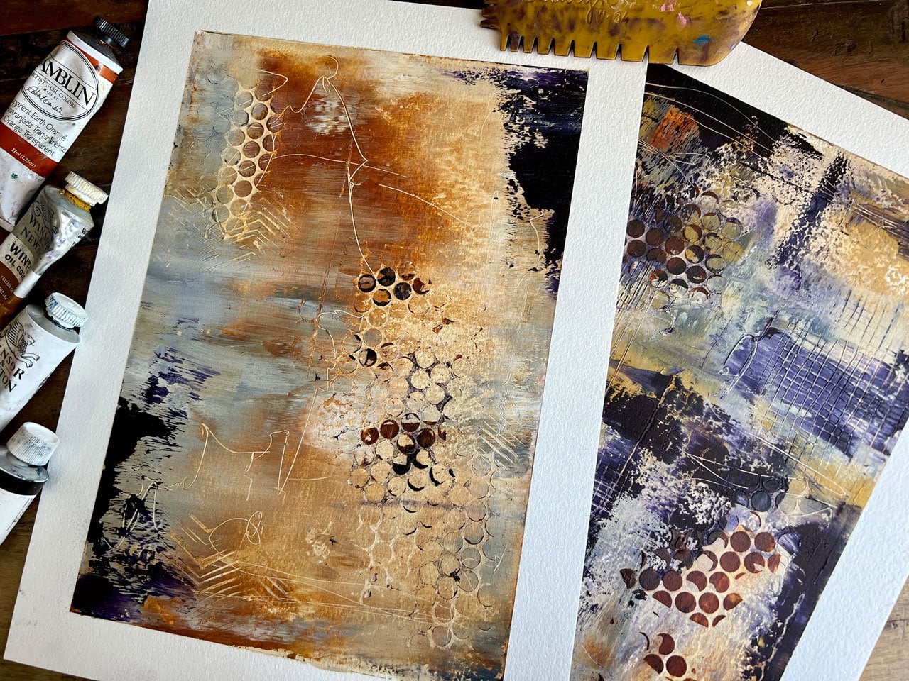
5. Project - refining paint and marks: I've gone ahead and let
this dry some and I thought as I was sitting here looking at it before I turned the
camera back on. I was just looking
around to see, is there anything that I love? I love this area right here. I thought it might be fun for this next layer to add
some stencil work on top of a little bit of this just for an extra layer of
excitement really. I have several of these Tim Holtz collection
stencils that I had gotten at
Michael's and I think you can probably find
some online possibly, or find whatever
the new stencils are available out there now. Because I've had
these for a while, but I really like
this floral pattern. I love this diamond pattern and I have that in a couple
of different stencils. I've got some big circles
that I think is fun. I've got some punchella
which always fun. It's punchella, this is that stuff they make
sequence out of. I have different ones of those. Just thought it
would be fun to just add a little bit of
stencil work perhaps. I'm thinking, I like
the flower work, I like this floral pattern too, it's more of a damask pattern. Maybe I'll use that because it'll dress
it up a little bit. We can come back in
with different stencils in different places. But I think I'm going
to go for this. My paint has started
to dry because I really have left this
for a very long time. I decided to go eat lunch
to give it enough time to dry completely so that I wasn't coming back working
wet-on-wet again. But I think maybe this
might be a fun time to test out this metallic
ink that we have here. I might just put some of
this down on my palette and it's got a little dropper that you can squeeze
a little bit out. I can either do this
with a paintbrush, I can do it with
a stencil dauber, if you've got any of those, I could do it with a little
piece of rag if I wanted to, maybe put that on with the rag. But I think for the moment
I'm going to try it with a paintbrush and just see if I can dab some
of this in there. I really want it to
just be a sparkle like a hint and it may not turn
out the way I want it all, but let's just see. [NOISE] I don't want this too wet because
I don't want the pattern going up
under the stencil, which is why a lot
of times you'll find stencil paints are dry while
you using that dauber. I'm using it like I would a stencil brush,
daubing it down. Then we'll see when
I pick it up if I was successful or not. If we don't like
the way it looks, then I'll just continue
layering on top of it. I don't want it
to be real square I don't want to just
see that square there, so I'm working a little
more organically. That's very interesting. It's not as defined as I
was thinking it would be, but it's still very interesting. Maybe in another area, I can just take this
diamond one and see if we can add a little bit
of diamond shine out here. [LAUGHTER] If we
don't love it, we can just paint on top of it. It's not a big deal. That's fun too. I don't know that
it's my favorite, but it is interesting. See what the punchella does. Let's just throw it a little
with the kitchen sink. I do love the punchella one. Few dots here and
there, I do love that. Especially on top of
the pink, that's fun. We'll go ahead and
leave that there. I think I'm going to start
making a little bit on top. I wasn't, in my mind, as successful with big color blocking that I had
intended, but that's okay. It's all about going
with the moment, going with the flow, just seeing where that
moment takes you. Let me put some more, I've let all my stuff dry. When I get to making
my color palette, I'm probably going to have
to put a little more paint out, but that's okay. I like lines, occasionally having spots
with the lines like that, that's probably one of my little go-to marks is creating some of these [NOISE] sets of lines. I like that. When I'm done, it's always pretty in my piece. When I can include
a little of that, so I'm doing a few lines in
here because I like them. That could be what I consider one of my
signature marks, probably. It's fun when you can get
to the point where you have what you consider
signature things, this might be a
signature thing for me. I like little lines. Most of my pieces might have some little lines
running throughout it. I'm just taking a baby wipe
to clean my tools as I go. [NOISE] I broke my tip on there when I threw it down
on the floor accidentally. [NOISE] Pencil sharpener handy. We'll just tighten that backup. I can also do some line of botanicals or some
lines of different stuff. I could go ahead now too
and play in the pastels and the oil paint and these
little pastels just to make some color
pops somewhere, so let's go ahead and
do some color pop here. That's red. Now that I did a little tiny
mark of this color, I don't think I want to go
any further with that color. It's much redder than
what I have in here, so let's come back
in with some other. I like brown. Brown's pretty. I'm just doing some marks, maybe some areas of color. I could even take my
finger and rub some of the color into the area
that I'm working in. If you're using any
pastels on your piece, and I do want to spread
it around a little, I don't want to just
use it in one spot. If you're using it once, use it in a couple
of different places. If you're using pastels, then you're definitely going
to have to use some type of finishing spray on
your piece because the pastel is a chalky product
that you're putting on there and you're going to
be able to continue to smear it and do other
things to it later. This is a pink
little pastel here. I want to be careful on
the fingers I'm using, I don't want to stick my brown
finger in my pink pastel, that would look terrible. But you want to
be really careful with the piece at the end. We'll definitely have to do
a finishing spray on here. Will just take my wet wipe and clean those
colors off of there. How about that? Let's just
start making some marks. Maybe some little hash
lines would be nice. I did in one of
our other classes, I do collage and mark-making, and I made a nice fun little cheat sheet that I keep up here on my idea board of
different types of hash marks in lines
and circles and different things that I might
like to use in my works. It's really handy because when you're sitting
here and you're like, what marks can I make? Your mind might go blank. If you put a little
cheater sheet of lines and marks that you like up on your board that sits in front of you when
you're at your art table. Then when you're drawing stuff, you can look up
and be like, yes, I like that mark,
let me try that one. Let's go ahead and put some
little hash lines over here. Maybe I'll do it one
more time. Let's see. Well, maybe I'll
just use some of this color over here. [NOISE] I also got some hard pastels. These are soft pastels, but I did get a thing
of hard pastels. These are Charvin and
they're water-soluble. What I like about them is they're hard and
are not nearly so chalky as these really soft ones and these were not
very expensive, I got these off of Amazon. But what I like about
them is they're hard instead of as soft as those. If I were to come through
here and do a little drawing, I get a much clearer, tighter, line that I got with the big
fat chalky soft pastels. This just came today [LAUGHTER] and look
how pretty they are, it's a little pack of 48 colors. It wasn't very expensive
compared to what I've paid for the soft pastels
there by Sennelier. Look at all the yummy
colors that this comes in. As soon as I got the
UPS thing at the door, I was like, oh goodness, I can't wait to try these out. I think collecting art
supplies is just as much a hobby as doing
art with the supplies, which is why I have as
many supplies as I have, I use each new thing
that I jump into as an excuse to go get
some new art supplies. [LAUGHTER] I actually really love this hard pastel
for line-making, a little bit of extra decoration here, these are amazing. We still have to finish these just like we do those soft ones though and it does
much tighter, little, dash if we do that
little dash mark, much tighter mark
there, I love that. These could definitely jump right into maybe being
some of my favorite. Now we've got some pretty
blues and gray blues in here, so if I'm looking at that and I'm thinking maybe I want to use something in here to go
along with the Payne's gray, this one is a real
pretty color in here and they don't have the
color snapped on it, this was just a pack of 48, so the color is probably
on the bottom of this box. But I just like having
a variety play with. Oh my goodness, look at that. New favorite tool right
here, little hard pastels. Then as I'm going, I could still bring
my little piece that I've cut out just to gauge. I was over here liking what I had and then
I might just see, is there anything in there that I'm loving that I'm definitely going to want to perhaps
add some details to, or decide whether I've added enough details and I
should stop detail adding. I also made a bigger one. This one's five by five, which tends to be my
very favorite size, this is like five by seven. We could go through and find pieces that we like that
are a little bit larger, five by seven is a nice size. Earlier when I didn't have all
these extra marks on here, I actually did not like any of these areas in the
five by seven, but now that we've got all
this extra yummy detail on it, this right here is
speaking to me. Try to make some of these in
different sizes and this is just a piece of
watercolor paper that I've cut into strips, no specific size, that's probably an inch
and a half that I've used. Well, this is almost two inches. You can make them smaller. I just like that
this thicker edge really helps me mentally get rid of the rest
of the painting. I just cut these into strips
and then I taped them together in the size that
I thought I might like, so I took my ruler
and I was like, I think I want these
five by seven. This is slightly larger
than a five by seven, it's like five and an eighth
by seven and an eight. But then that's good, because that gives you
a tiny bit of room for framing if you decide
to frame your piece. This was one that I
made in a five by five. Do several of these,
make five by five, six by six, five by
seven, six by nine, some standard sizes there, four by four, I've done
some in that size before. Then when you're
playing, you can pick out some bigger sizes
and have bigger finished pieces if you see something
bigger in there that you are really loving and I love all these details
right in here. We may have a bigger
piece come out of this and we may not,
we'll just see. I think for now, I'm going to call this good, I'm not going to continue
adding more paint and stuff, I like everything I have going. Once I cut out the little
pieces out that I want to use, I could continue
to embellish that, but for the moment, I
think we're going to go ahead and pull
the tape on this. When you're pulling your
tape on a piece like this, it comes off pretty easy, I didn't have very much done, but pull it close and slow and you'll be less likely
to rip your paper, because if it's a
piece where you need that white edge on
there to look nice, you don't want to rip the paper, so keep it pretty close
when you're pulling and go slow and you'll be less
likely to tear the paper, especially if the paper
is still wet in any way. This is dry and it's
coming off pretty quick. This piece of paper
that I'm working on, I don't know if I told
you at the beginning, this is just a
piece of Strathmore cold press watercolor paper in an 11 by 15 size, which may be slightly larger than what I was
using the other day. But look at that, that's
super fun just like that. If you like your big piece, don't feel like you
have to cut it out, you don't have to,if you end
up loving what you've got. What I'm going to do here, I actually did like
this piece right here in the larger size. I also like it in
the smaller size. I think it's fun to have an
occasional bigger piece. I like it right here
with the lines in it. Let's take a bigger
piece out of this one. What we can do,
because I don't have a five by seven wood
board like I have used to cut around in some
of the other classes, I'm just going to take my
pencil and really lightly, draw just right around here and because I made this slightly larger than
my finished size, then I can still frame it, I can still muse it
and then leave that, I can even leave the pencil mark just outside the ruler to make sure that I don't have
pencil mark left on my piece. Then you can take a pair
of scissors and cut this. I'm going to use
an exacto knife, because I have several of them. I've got the pencil line
right outside the ruler here and everything's got to be dry when you
get to this point, so I'm pretty good
with the dryness. I'm going to hold the ruler
down and just cut that line.
6. Project - cutting out abstracts: [MUSIC] Again, I'm putting
that little pencil line just outside so that
it doesn't end up being part of my artwork. This paper is so nice and thick, when I just moved it around
it was so yummy feeling. I love all the layers. Oh, yeah. Look how
beautiful that is. Do I like it better that way? Let's see if I can move
this out from our view. Or do we like it
better that way? I'm loving this. Oh my goodness. I think I might like it this
way. That's pretty cool. I love the big splashes of white with the other colors
showing through. Then you can see
our collage element showing right through to the top there because I didn't
actually cover that. I've got some collage element
here showing through. I really love that. I love how thick it is. I'm loving that one right there. Let's go ahead and
determine out of here. I love these little
pieces over here and we can cut these
into two-by-two squares if we want to have some
little micro pieces. I can use them as part
of my color swatching. I can go ahead and see do I want another one in this
size so that I have a pair. It's a pretty cool pair
right there actually, I like to look up. You want to stand up and get away from your piece
a little bit if you can. Let's go ahead and do
another five-by-seven. I'm loving that right there. You want to step
back a little bit because being so
close to your piece, sometimes you can't really see the bigger picture basically. With abstract, if you'll
stand back a little bit to look and judge, you can see it better. Like when I'm doing
this right here, if I look up into my
camera viewfinder, it's almost like I can see
the piece of art more so than as close as I am. Let's do another five-by-seven. Then I can already see that
most of what's leftover would be little
micro pieces of art, maybe a bookmark
or collage papers. I definitely just want
to be real careful and get that line right outside because I like to frame
stuff and hang it up. I don't really sell a lot of art because most of the
stuff I do is for myself or for teaching purposes or I love my art so much that I just want to
keep it all myself. [LAUGHTER] I might
change my mind once I have absolutely
no wall space, but I like to make gallery walls where I can hang like 20
pieces art on the same wall. I feel like there's still
some wall space left if I make pieces that I love. Sometimes I give
stuff away for gifts. My goal in making art isn't
necessarily to sell it all. Lot of times, it's to
use it as marketing for things that I
do on my website. Look how beautiful that is. See, every time I
do one of these, I just surprise myself
in what I end up with. I love that. I don't want to necessarily
flip it because I don't want these lines
to be in the same place. I do like one being
opposite the other but these turned
out so beautiful. Then the rest of these, I might make some
little pieces out of or use them as collage elements. I'm just going to
cut up more of this and see what we can end up with. I'm going to get my really
sharp pair of scissors. I need another pair of this. This are the greatest scissors. Precision tip is sharp
and they're Cutter Bee, is what they are. I got this years ago when
I did sewing and stuff. It's not like I've had this. It's not like this
are brand new, I've had this for
years and years. But the tip on this are so
sharp and so wonderful. You can't use the
same pair of scissors for paper and fabric. You need to have a
fabric pair of scissors and you need to have a
paper pair of scissors. I've been cutting
paper with this pair, so this is now paper scissors. I don't do stuff with fabric like I did when I was younger. I thought when I was younger I wanted to go to school
for fashion design and I thought I wanted to sew. Let me tell you, I
actually hate to sew. I'll make fur blankets for
myself or to give away. Did lots of fur blankets for
Christmas gifts one year. I liked fur blankets, but other than that,
I just hate to sew. My grandmother was a tailor. Basically, she did amazing
things for the family because she sewed for everybody. Look how pretty
these pieces are. I don't know how
she sewed that much because let me tell
you, it's just no fun. If you look at some of
these and you think, I like a little bit out of here, like this piece right
here is really pretty. These would make really
good collage elements. I really like this section
right here, that's pretty. I think I'm going to
save these for collage. I'm not going to cut them into
small micro pieces of art. I'm going to let these
be yummy collage pieces and stick with my two
that I really love. Then I'm going to show you
how we'll finish these, how we could finish
them in the next video, just to talk a little
bit about that. I hope you enjoyed this. I always loved watching people and the art supplies that
they introduce me to, and the collage, and the stencil, and
the different things. I hope you enjoy experimenting with some of these
techniques on a big piece and then hunting out little
elements that you love. I could do this over
and over and over with different supplies and
different colors every day and get nothing that matched
what I did the day before. That's how different
every piece ends up, and that's really why
I love doing this. I hope you enjoy these things
that we played with today. I can't wait to see
what you come up with, so I will see you back
in class. [MUSIC]
7. Finishing your piece for display: Let's talk about
what you need to do as you're working
through your piece. Depending on what you
put on what layer, if I put soft pastels on
the very first layer, I would have needed
to go ahead and fix that layer before I put other
materials on top of it. I would use a fixative spray. There are several different
brands of fixative spray so you just want to experiment
with the different ones. I happen to like the Sennelier fixative for soft pastels, they also have a fixative
for the oil pastels which is the really creamy
oily sticks that they sell. What I like about
this particular brand is I feel it doesn't change the color of my material
when I spray it on. I do like using the
fixative spray, a couple of coats on whichever layer you've
used the pastel, if you're going to continue
adding stuff on top of it, you need to fix that layer before you continue
on or you'll smear all your pastels in a way
that you don't intend. Now if we use it
at the very end, then a couple of layers of fixative spray you
want to put that on the top so that you
don't continue to smudge your artwork as you go. I love the fixative spray. Also a lot of people finish their pieces in some
type of varnish. I like this UV archival
varnish by Krylon. This is a nicer varnish made for art and I think I may have
got this at the art store, could probably get
it online but it is archival, it won't yellow. It's a really nice
finish for the top. Comes in matte and
probably several other finishes like gloss and
things but I like matte. I don't like the artwork
itself to be super shiny because if you're going to frame it and put a
piece of glass on it, the glass is shiny, so
I want the piece of art not to be shiny on top
of that personally. I do use the matte UV finish
to spray on top of that. These stinks so you want
to take them outside, spray your piece, do
a coat, let that dry. Couple of coats is what you're going to
want to do for that. There are several too that
I've gotten at the art store. I've gotten Krylon
Kamar varnish which is the same company that
makes the archival one. But this is non yellowing, perfect for oil,
acrylic, watercolor. I may have gotten this one at the art store also,
I'm not positive. But it's acid free, it doesn't yellow and a
couple of coats on top. Again, I get them out or certainly I don't
like it to be shiny. I think I got this one
at the hardware store, so you can get some of
these at the hardware store but the thing about them is
they're not usually made for nicer artworks. The polyacrylic is more
of a urethane rather than a varnish and I
like clear satin. I wanted to say
crystal-clear finish when I'm doing stuff like that but the longer
I've done this, I have these just because
I've had it for years. The longer I do this, my pieces of art, they get better as you work
on any skill you improve. I do tend to like nicer art
grade quality finishes. Just something to
keep in mind as how you're going to finish the
top to keep it from smudging. Then there's a couple of
different things that you can do with pieces like this. You can mount it to
a board and I've got several examples of pieces mounted board just to show you pieces I've
done in the past. You've got these artists panels that are different thicknesses. You can paint the sides or not. These come with a
hanging spot on the back and then you
could glue this down. I use YES paste because
I like how thick it is. I use a piece of deli paper to then smooth it
out once I get the paste and the paper on there
and the YES paste is a really nice super
thick paste that glues down this nice
heavier watercolor paper. If you are going to use a
matte medium or gel medium then the heavy gel medium from Liquitex or this regular
gel medium from Golden, these are a nice alternative to the YES paste and they
do the same thing. You'd spread it on and then put your piece of work
and then piece of deli paper to smooth
that out so you don't ruin any finish
on top of your piece. This has some things. If you get one that's got
double things on here, make sure you know which way is up so that when you put
your piece on there, you don't mount it
upside down and think, oops, now I can't hang it. Just something to keep in mind. I also like cradle boards
and with a cradle board, you can paint the sides, YES paste or glue on the top, smooth your piece down
and then now these can be hang in any direction and
with the finished side, they're ready to be hang
on the wall like they are. You don't have to frame them. Then of course another
way that you can do is just a nice frame and matte
of your piece which I do. I can do this with cheap frames from the craft store
which I've done plenty of those or a nice frame from the framer and let them frame them up so I've done that too. These are the nicest
looking ones that I've done that the custom framer
did because I can really get exciting with my frame color and what the frame
itself look like. It's not a standard just flat
gallery frame. I love that. Then she color
coordinated there, my matting rather, than it
just being a white matte. That's super fun also. I will say if you
get them framed, tell the framer which
way is up because these are on there
permanently and in my mind, this was up when I got it. This is how it was
framed so I was like, "That's a good lesson to know." Tell the framer if you love your piece enough to take it
to get it framed, tell her which way is up
because I might think this is up and they may mount it like this and then every
time I look at that, I'm going to be bugged
because it was mounted differently than I had decided
in my mind I wanted it. That's just some different options for framing and finishing I thought
I'd share with you. I hope some of these
ideas really help you out and I will see
you back in class.
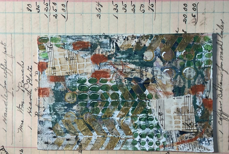
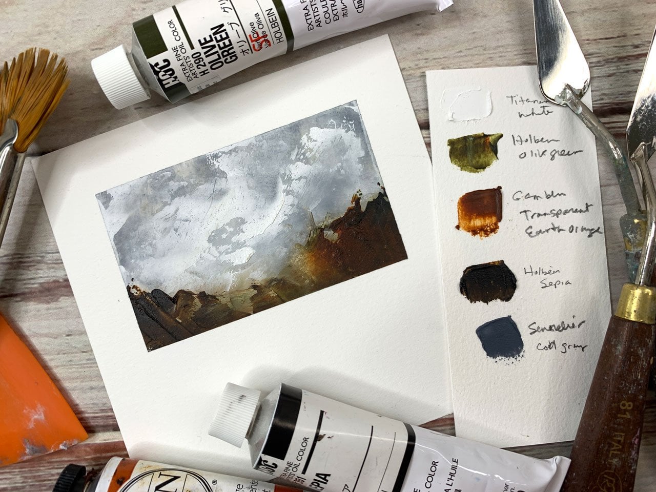
8. Saving our color palette: [MUSIC] I always like to do a color palette page for all of these
projects that I do. You'll notice that I'm
getting pretty far along here in my
yummy vintage book, that I'm using for this project. But I want to be able
to come back to these, and revisit color palettes that were surprising that
I really, really loved. Like this one,
really loved that. Pink, and red, and orange those colors, those pieces are
just so fantastic. I actually hung the
finished art pieces that I created in a gallery wall
in my bedroom downstairs. I really love how bright and fun and yummy this turns
out so love that. Some of the other color
palettes I thought, I'm not going to love
this when I began and when I ended I'm
like, I really love that. Here's another one
I really love, pink and ocher kind
of those tones. That's really pretty. This one I have hanging up behind me it's like
this color palette, but look how fun and
beautiful that is. The ones that I
really love I hang up on the wall in front of me for awhile or I frame them and hang them around the house. But I do like having this
color palette books. Because I'm using an old book, you can use a art
journal if you want. I'm just going to take
a little tiny bit of clear gesso on this page. Because you want to have the paint sit on the page
not soak down into it, clear gesso will prime
the page for us. Love it. All of these
are starting to dry. Hopefully I can get
enough of these colors to just spread right on top, and normally I let the
gesso completely dry. It may not be completely dry, but you get the point. Then here's this yummy ocher, see if I can get this blue out. Yes, got this yummy blue. Then if you really want to know exactly what
those colors were, definitely write under
the colors what they were if you want to keep
really good track of it. I just want an approximation
because even if I pull these exact same colors out
again and use them again, I'm not going to
get the same thing. With these little
abstract things, everything I do the
next time is so different from when
I did the last time, that there's just no
way to duplicate it. Then I also want to take
some of the tools that I used and just draw in
here with those also. I just want to remember
everything that I did. I used a couple of
these hard pastels. Then let me tell you for making this definitely is one of my favorite new going to
be going to tools, because it has such
a nice crisp look to it compared to a soft pastel. I did use a few of
the soft pastels, and you can see that it's not
nearly as crisp and clear. It's a little more smudgy and a completely different
feel than the hard pastel. I like those differences. I did use a little bit of brown. I did not use the rest of those. I was drawing on the
underneath with some of these neocolor crayons. [NOISE] Maybe I'll
do that on there. I also experimented a little
bit with the charcoal. I may just put that over here. If this is something
where you don't want the stuff to ruin basically, when you go looking in it later, then you can take
the finishing spray that I talked about in the
finishing your pieces. You can coat that page
with finishing spray too, and that'll lock all
those pastels down. Another thing that I did
was use a little bit of this walnut ink. I might just go ahead and spread a little bit
of that on there. I used a little bit of
this and that underneath. I just go ahead, a little
bit of that on there , and there we go. Now I have a little
catalog of stuff. I shouldn't have drawn
on that side because the one thing I really
like to do with this is put a sample in here. This sample could be my
little sample piece. Let's just look. I like this sample piece. That's pretty. Does that
got everything in it? That's got a lot in it. Let's
just use that as a sample. I want a little bit
of everything though. That's okay, we'll
just use this. Usually what I'll do is just
staple this right in here, and if your pages are real thin like you're using
an old book like I am, then staple two pages together. Some of these if I thought
it was real delicate, I stapled two pages together
and it works just fine. Then I will let this
dry because this is the color palette
that I use today. I will let this dry
and now I'll have a color palette page to add
to my color palette book. I hope you love that, and I will see you
back in class. [MUSIC]
 DENISE LOVE, Artist & Creative Educator