Transcripts
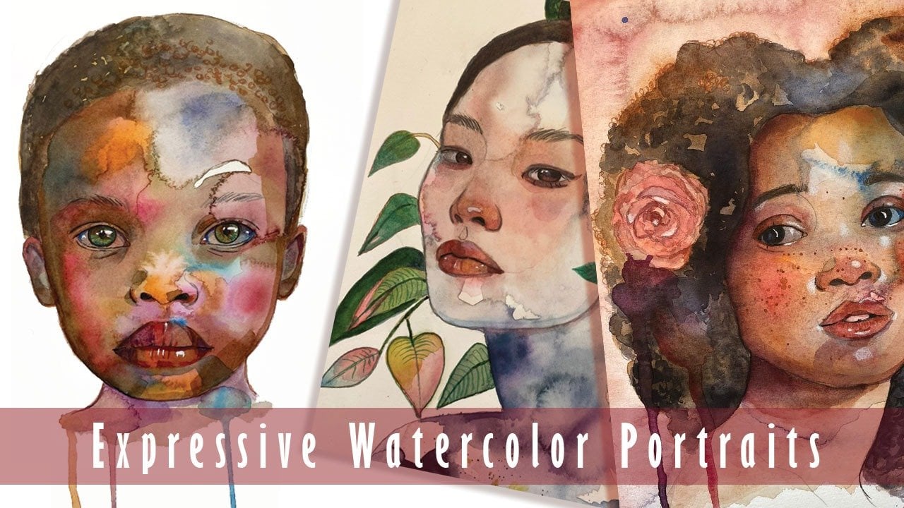
1. Introduction To The Course: Hello. My name is Fiona
Di Pinto and I am a Scottish Italian
watercolor artist, also known as drawings in
a drawer on Instagram, and on my YouTube channel, drawings in a drawer
by Fiona Di Pinto. I absolutely love working in
my watercolor sketchbooks. And in this set of lessons, we are going to be
doing exactly that. Creating a beautiful
expressive spread, using just three primary colors. Don't let the limited
palette put you off. It will teach you so
much about color theory, and you will be impressed by all the colors you can mix
using just these three. By the end of the course, you will have painted
several subjects from animals to a
portrait to fruit, using primary colors alone. You will have gained
confidence in your use of this particularly unforgiving
medium because I will be walking you through all the
tips and tricks I have picked up over my many years
as a watercolor artist. So that it won't feel
intimidating anymore, and you will truly discover the joy of this
beautiful medium. I'm very excited to be teaching this watercolor lesson because
I think it brings us back to the basics while
moving us forward in our artistic journey at the same time and helping
us to hone our skills. So let's dive right into it.
2. Materials We Will Use: Now let's take a look
at the materials. In this course, I will
be using primary colors, a blue, a red, and a yellow. The colors I will be
using are Prussian blue. Chinese red and lemon yellow. However, you don't have to
use the same exact colors. I am using. You can use
any blue, red or yellow. For example, you could use an ultramarine blue
or a palo blue. You could use cadmium
yellow or for example, a vermilion or a cadmium red. So you can switch
it up in many ways. Or you could even choose not to paint with primary
colors at all. That's totally up to
you. You will still be able to follow
along with this class. Will be painting in this
sketchbook by Kaval. It is 300 GSM, cold pressed paper, and
it's a natural shade. This is what it looks like. So it has quite a bit of a
texture to it, as you can see. You can use any paper, but I would suggest trying
to use paper that's 100% cotton and is
at least 200 GSM. The brand of your brushes
is really not important, but I do suggest you
have a smaller brush for details and a larger
brush for larger areas. And also round brushes
are good idea, especially brushes that
come to a nice, fine tip. I like having a small heat tool, but a hair dryer will
work fine because I don't like to have to
wait for the paint to dry. So maybe you would like to
keep that handy as well. For my highlights, I really love this bleed proof white
by doctor PH Martin. But if you don't have
this no worries, you can use white
gouache, white acrylic. A white gelpenO you can
leave out the white of the paper like a
proper watercolor purist. Good mixing trays
are usually white. They allow you to see
the colors properly. But if you don't have a
por serine mixing tray, you can just pick up a plate, a regular ceramic
plate and use that. Just be sure to not
use it for eating in afterwards as some
watercolors can be toxic. Kitchen paper or paper towels are the eraser of watercolor. They allow you to lift out mistakes or sop up extra water. You can reuse them
quite a few times. You can see this has
already been used, or you can use a rag or a cloth. So make sure to have one
at your working space. And, of course, a
large jar of water. I think you know what
that looks like, and be prepared to refresh that water throughout
the course. There. You're all set to go.
3. The Colour Wheel - A Simple and Fun Exercise: So here we are starting
with a color wheel, just to get an idea of
how many colors we can mix just by using
the primary colors. In this case, you will
see me use Chinese red, lemon yellow, and Prussian blue. But you don't have to use the same exact colors I'm using, so don't worry if
you don't have them. It's enough to
understand what you can achieve by mixing
the primary colors. Creating a color wheel
or color square, as I do here is easy enough. You simply put down your
three primary colors so that they are
sitting opposite to each other on the wheel and you start mixing a bit
of one into the other. The color wheel I drew
is a little bit wonky, but I'm more for play than for precision in this case.
Let's put it that way. So I mix a pinprick of Prussian
blue in my Chinese red, and then I keep adding more of that Prussian blue to
each slice I paint. And you can see how
that Chinese red is getting more desaturated, more dusky sultry as we
add that Prussian blue. And let's kind of
make a mental note of these mixes because these
are going to serve as our darkest value or darkest tone in
several of our pieces, probably in all of them. We can also achieve some very pretty purples with
this kind of mix. Admittedly, I'm not the
best at color wheels. I made that last blue, a little bit too pigment heavy, a little bit too thick, so it's darker than the original blue. But anyway, you get my point. This is what the color
wheel teaches us. And yeah, let's move on. Once I've worked my way
up to the Prussian blue, I will start adding a little
bit of lemon yellow to the mix and increase it as
I move on in the sections. And you will see that
the blue will gradually start turning warmer
until we get a sap green, which is that light green that is very useful for
so many things. And when I get to lemon yellow, I will start adding some of
the red to the lemon yellow, some of that Chinese
red to the mix, and I will inch my way towards those beautiful orange
and warm pinks that we get working our way up back
towards that Chinese red. So that gives us an idea of what the color wheel
can look like and see how many different
colors we can just get by using those
three primary colors. Just think the more sections
you have in your wheel, the more shades you'll be
able to achieve and create. This is a spread in one
of my sketchbooks that I did by using the three
colors I mentioned above, and you can see again
here how you can get a perfectly beautiful
and completed painting just by using these
three colors, and that is what we
are going to do today. I'm so excited for it. So let's step into the
next part of the lesson.
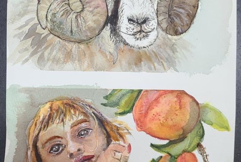
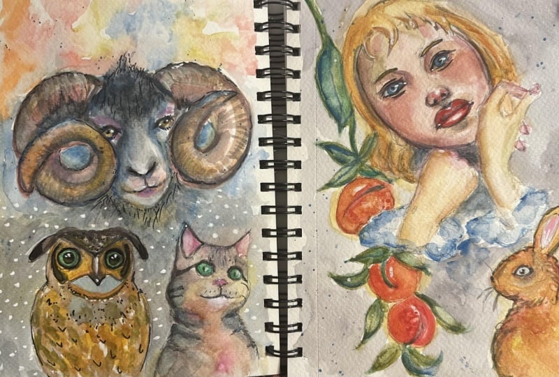
4. Painting 1 The Ram: I have mixed some of that Chinese red with
the lemon yellow, and I am just bringing
it into the horns. I hope I'm saying that right. And they're not antlers, but I mean, that's
not important here. And I'm just bringing some of that yellow tinted
with some of that red. So we're getting this kind of
rich kind of orange color. And I clean my brush
in between every step. And maybe I want to
pick up a little bit more a little bit more red that I can
place in my bowl here, and then I can start, you know, kind of placing it
somewhere else on the horn. I like working in separate
areas of a drawing and just that will give time for the other areas to start drying
in the meanwhile, and it will give us a
little bit more control. So I want a little bit more
of pink up here towards the root or the base
of the horns, and, um, I want to kind of have a variety
of colors going on here, just like we experimented with the colors over to this side. We can kind of look at them and see what we'd like to
see in our drawing. I really love some of the range of pinks
that we have up here. I love some of
these sultry blues. So that's definitely
something we'll know how to recreate because we know
that our blue is here, and then going from
here downwards, we just added a
little bit of yellow. So that's how we get the blues, and so that is what
I am going to do. I'm just picking
up some blue from a little mixing tray
that I have over here, and I'm going to start
dropping that into the other side of my into
the other antler or horn. Again, I should look that up. And also, on the
other side as well. So that is just some
blue, and it has a little bit possibly
a little bit of contamination with
yellow or with red, but something literally minimal. So I want you to always
be very aware of the amount of water you are using and the amount of paint. That is crucial in watercolor. It's the never ending dance that lasts until your watercolor. But you cannot get
frustrated with it because if you get
frustrated with it, you're just giving up on
something that is not a battle, but it's a beautiful
interaction and something that really
can give you pure joy. So always be aware of how
wet your bristles are, how wet the paint
in your palette is. And you can easily
do that by tilting your palette slightly and seeing how fast your
paint drips down. You can see it's slowly
dripping because it's created a slight
pool of color here, but at the same time, it's not
dripping all the way down, so it's not as watery
as it could be, and that is good because
the more water we have, the less control we have, even though we can get some
beautiful effects with that. And the less water we have, the more pigment we have,
the more control we have. And I can also
start pushing this out with my clean damp brush. So my bristles are clean, and I can start pushing
this color out. You know, that watercolor will reactivate once we dry
wet it with water, even once it's
dried on the paper, it will always reactivate. So it's not permanent. That is why we have to preserve it behind glass, for example. Which is something
that we don't have to do with acrylics and that we don't have to do with
oils, for example. And over here, I
might take a little bit more of a little
bit more pink and start positioning it in the base of the horn
over to this side. And when you want
a little bit more of a cool pink, like a cool red, which I call pinks, you just add a pinprick
of blue into that red. So, for example, I have some
of that Chinese red here. And by adding just a little
pinprick of blue to it, I am going to obtain something. I always advise you
to try your colors first on a scrap piece
of watercolor paper. So we've definitely
got something that looks a little bit
like potter pinks to me. I don't know if you
know this color. So I'm going to rinse my brush, pick up a bit more
of that Chinese red, which I am going to mix
right here for you to see. Add a little pinprick
of that blue. That helps us to
desaturate the colors. So anything that's on
the opposite side of the color wheel is going
to desaturate the color, which means it's going
to make it less vibrant, more sultry, more misty, which is something that I love. And let's see what we have now. So it's definitely more pink, more on the pink side. And then if we add water, it's going to become
even lighter. Of course, like this, as
we pull it out and it gets diluted with water,
it becomes lighter. I'm going to use this mixture at the base of the horn over here and maybe some here
at the front in the nose. I can drop some of that pink into the red just to create
a variation of color, and that is just a
tap, tap, tap emotion. I very often notice a
lot of my students hold their brush and press
on it really hard. We have to be aware of
the pressure we put on our bristles because
it's quite fundamental. And very often to get, for
example, a precise line, one that's not too squiggly, we really have to
pay attention to not put too much pressure
on our brushes. I'm also bringing this
pink in to that end part. Of the horn. And I'm just being kind of I'm not picking it up anymore water. So again, it's all a
matter of learning to control the amount of water you have against the
amount of pigment. That's all watercolor is, and it is hard, but it's
also extremely satisfying. I've mixed some
blue with some red, and I'm just positioning it between these two
colors to create again, kind of interesting
variation of colors. And then we can also get
some granulation here, which also always adds interest. And if you don't know
what granulation is, it's just when the pigment
starts to divide to separate, and it creates these
interesting patterns. You can kind of get a bit of
a sneak peek of them here, and some of them will stay
till the end of the painting, and some of them will disappear. That is a part of the
unpredictability of watercolor. I'm gently outlining the horn with what I have on my brush. And I really like to play about when it comes to the horns, because I just think it's, you know, it's just
something that you can have so much fun with and, you know, explore with,
use unusual colors. I always encourage
my students to use unusual colors
because it's really something that cracks
open our imagination, our creativity, and
numerous possibilities. So it's something that
I really like to do. For example, now,
I am going to mix some of my Prussian blue
with a little bit of red. In the hopes of obtaining
a kind of violet that's not too dark, maybe it leaves a little
bit more blue in it. So playing back and forward
with colors is crucial. I mean, you will make mistakes. You will make some
colors that look like there's nothing
to them to you, but at the same time,
they might actually end up being interesting
to work as dark values. So here we have a darker
kind of more purple color, and I'm going to
place that there. So we all know that
in every painting, we need a mid tone, a light tone, and a dark value. We can also call them values. That is nothing
complicated to understand. It's just how dark or how light a value needs to be or
a tone needs to be. So if we have three, then of course, our image is going to look
three dimensional. If we only have two,
it's going to flat. So that is something that
you always look out for, whether you're
drawing in pencil, whether you're using watercolors
or any other medium, you should always look
to have three values. I highlight, a mid
tone and a dark value. And then you can have
more in between. Of course, that's
completely up to you. But it's a value that matters
in paintings and drawings. So the three dimensionality we obtain rather than
the colors we use. I've added a little bit of
blue to that mixture that I had of blue and red, and I'm just bringing it up to that area where we
have that black patch. And when you're working
with primary colors, which as I said, I hope I've said already is not obligatory. You don't have to work with primary colors if that is something that doesn't
make you feel comfortable. But when you're working
with primary colors, sometimes you get a softer
effect because, um, you can go pretty dark with your values by mixing the
blue and the red, admittedly, and sometimes also
adding some yellow into that mixture can really
bring you this dark hue, if you see here at the
end by adding the red, to the yellow, to the blue. In the end, at the
end of the day, you will get a pretty dark value as you see me getting here. But, yeah, um, You have to kind of play
around with it a little bit, and it's actually so
much fun for you to do, and it makes you
understand so much about color theory in general. So this is what I'm using.
It's a little bit brown. So I'm going to add a
little bit of blue to it just to give it that
pop of intensity. As you can see,
it's quite thick. It's a consistency of cream. Uh, yeah, I would say it's
exactly the consistency of cream because it's a little
bit thicker than milk. I like to roll my brush in it in all directions so I get what I call the fully loaded brush, which means that if I
put it down on one side, I'm going to get the same
amount of mixture on my paper than if I accidentally put it
down on the other side. So I'm going to go in and
dab it onto that paint. That I already placed down, which means that I am at the
moment working wet and wet because I am positioning wet paint on an
already wet surface, which is made by the
paint that I put down, which is still damp. And then I'm bringing it
up to the horn or antler, and I'm making sure if
my horns still wet, to not touch the dark color
with it completely otherwise, it will start seeping through, and you will see
that happening here, you kind of get this
snowflake effect, which can be really
interesting and you might want to keep something
like that in your painting. But at the same time, it
might not be your cup of tea. It might be distracting, which means you can
feel free to remove it by just using some
kitchen paper, tapping it down and lifting. And, of course, always be
sure to clean your brushes, while you were painting, so I've just cleaned mine because I didn't want to be
dragging that same color all around my piece,
as you can see. And here, every time I go in, I give my brush a good swirl and sometimes I just tap it on the edge of my jar or on
some rag or kitchen paper. Again, I don't want
to be dragging the swim value
around my drawing, so I am just kind of pulling
it around like that, trying to break things
down into shapes, you know, we can think of
geometric shapes when we paint, and I can kind of imagine seeing like a square at the
top of that head in that in that patch that he has it has on
the top of the head. And then I'm going
in with some blue, and it's like,
completely undiluted. I just picked it up
from the pan like this with a brush that's just barely barely damp,
hardly at all. And I'm just positioning
into the top of the head and it being on a surface
that's already slightly wet, it will automatically bleed out on its own, but
at the same time, it will create
that pop of color, that variation of
color in the head. Then with some red with a little bit of that
blue in and again, just the pinprick of it, and I'm using it
very watered down. And yet, if I haven't yet, I would like to remind
you that with watercolor, we start usually with more watery layers where we have a little
bit less control. So we have to be accepting
of the fact that things are going to kind
of go where they want to, and anyway, they
will dry lighter, much lighter because that's
just the way of watercolor, and you just have to be very accepting and very
open, very free, and very forgiving
with yourself in ways, because that's just the way it is with watercolor
and what I love about it because it reflects so many things about human life. And then we build up to
less water in our mixtures. So as we build up
to the details, we decrease the amount of
water in our mixtures and we increase the amount of
the amount of pigment. I'm also going to go
in to the other horn. On the other side, I
might decide to go in and add a little bit of
yellow later just to give it. Variety, again, I really
like having variety, even though I am using
a limited palette. I still think that you
can obtain a lot of variety through that
because there are really literally
immense possibilities with the colors you can
get just by mixing these. So now I'm adding a
little bit of yellow. And a little bit of
blue just to kind of veer more towards a little
bit of red back again, back and forth with these,
just playing with these, you will kind of eventually
end up getting a brown, which is what I wanted. And then I'm just going
behind this part of the horn and just kind of it's
playing around with colors, positioning one color
next to the other and seeing how it bleeds into the next one if
that one's still wet, seeing how they work together. Usually, when colors are
from a limited palette, so in this case, from the
three primary colors, it is very hard
that anything you will mix from these
will not look nice. That is a sure to go
trick if you want to look cohesive and harmonious
in your painting, yeah. I'm also going to bring
in some of that brown up here into the
top of the horn. And maybe down here
just to suggest, at the wool on the fur. Yellowish kind of ocherish
color should work well. And again, here I'm
using the tip of my brush because another
important thing is learn what part of
your brush you're using familiarize
yourself with your brush. Are you using the side
of your bristles? Are you using the tip
of your bristles? These are all things you
should know when you're working towards the
center of your sketch, then you're free to use a side. It gives you the
chance to spread your color in a more
uniform mather manner. But if you're working close
to the edge of your sketch, be sure to use the
tip of your brush because that will help
you have more control. And then want to define
the sides of the face, I go in with a darker value
that I can see in my palette, and with a small
number two brush, I just gently using the tip of my bristles outline that area, even when I go into
the side of the eye, making sure I don't
go over the horn and, um, just outlining the eye a little bit just to bring the focus where we want it to be, of course, which actually, for me, is not even the eyes. It's these beautiful
horns or anthers again. I will make sure to look it up. Now, now and then,
you will have to sure that your piece
is completely dry. Why do you have to dry your piece in watercolor
now and then? Well, because you need to
freeze it, so to speak. Once you reach a level where you're happy
with what you've done and you don't want the paint to move around
on your paper anymore, all you need is a
heat tool like this. But if you don't have
anything like this, a regular hair dryer is fine. This is just more portable, and you will dry your piece just by turning on that switch, and that will give
you kind of like a clean canvas concept to start on again
because at this stage, we're done with the wet and yet, at least for now, and we're moving on to working
wet and dry, which means using wet
paint on a dry surface, and that offers more control. So let's look at what
we'll be diving into next. Just by looking at
the reference photo, I noticed that he has the
Ram has certain little, um, Strands of fur that kind of protrude out of the edges where the patch
or the darker patch ends. So using a very small
brush and putting hardly any pressure at all
on my brush, of course, I am just trying to get
a few of those strands in just to add that little touch of realism that will make everything look. I don't know, just give
everything a little bit more crispness and interest, I think, because it's
beautiful when we have these delicate balances
between lost and found edges. So, for example,
sharp and soft edges and kind of more
imagination and realism. At the same time, it
almost confuses the mind, but I think the integration
of these two elements, so to speak, is
extremely interesting. And I'm also going
in to all the areas, using the starker value and my small number
two brush to kind of enhance certain areas that I feel need to be
sharper and more in focused. And, of course, some of
them are in the antlers. By the way, apparently, you can call them both
antlers and horns, but apparently antlers seems
to be the most correct. So we will proceed with
antlers and maybe darkening up the nostrils if they need to be darkened up, always delicate, always making sure not to put too much pressure
on your brush, always making sure
you don't have too much water or
too little water. On your brush. And then, again, I'm using my little brush to go in and add just
a little bit of a tiny lash just kind of protruding over
to the side there, which I think looks really nice. And then, of course,
we will have to go inside the iris
and color that, and it's kind of ambery
color. So let's see. Okay, I've got this color for mixing all of the
primary colors. It's not very ambery, but I think I will
do some lifting. And this will give
me the opportunity to show you what
lifting is all about. So I am putting my
color down in the iris, again, very small brush
and a lot of control. So I'm just filling
up the whole iris. Usually in animals, you cannot
see the white of the ball, so it's a safe bet to
save the whole of just, you know, cover it completely. And then what I
will do is I will rinse my brush in
water completely, and if you give it
a double rinse, even better, and I will tap
it on my kitchen paper, And then when it's,
like, almost dry, you can test it against your
fingers. It's almost dry. You just go in,
press those bristles down delicately within
the iris and lift. And you will see that the color indeed looks so much lighter. And that is one of the two
ways to correct in watercolor. We can either use
a dry and clean, of course, piece of
kitchen paper or rag. Or we can use our paint brushes, just by rinsing them, and making them perfectly clean, and then by drying them so
that they're almost dry, just a tiny trace of damp, but almost dry, then
we can use them to press down and lift
whatever we've put down. So I'm just going to do the
same on the other side. I'm going to repeat this so you will be able to see
what I'm doing. Well, I am just filling in the iris with that
color I mixed, which is basically a brown, rinsing my brush and drying it. And then pressing it down, just giving it a little bit of those kind of little
circular motions, very small, very tiny, very little pressure,
and there you have it. It's much lighter. And then you can play
around with that. You can drop in some darker, less diluted colors, which means they will
spread out on their own. You can wait for it to dry
or use your heat tool to dry it and then add more details
once you have more control, because at that point, you
will be working wet on dry, which, as I said,
offers more control. And then I'm going
to use any brown or any reddish brown
that I've mixed from those three primary colors
that I've showed you. And again, using a small brush, making sure that
everything's dry, just go into the antlers
and start adding those beautiful ridges that
rams have in their antlers. You will have to keep up. Keep picking up mixture
with your brush because you will
soon run out of it when you're working with
a very small brush. So that is to be expected, and though it can be a
little bit of a nuisance, I mean, I don't think it's
too much to complain about, let's put it that
way and be sure that the ridges in your antlers are always kind of angled inside, inside and under, kind of
like they're going under. So don't have them
going straight down. Of course, make sure
you're observing the photograph and you're not painting or drawing what
you think you know, but what you are
actually seeing. So these ridges are definitely
rounded, and you should, again, not be putting a lot of pressure at
all on your brush. And I think they're
more evident and more outlined up here at the top. And maybe down here, I could just go in
and with my brush with these vertical strokes just give kind of like
a little bit of shadow, even though it's not
exactly a shadow color, but I can see that in there. And then as we go further down, I would see the ridges get
a little bit further apart, further down in the antler, and we just need to kind of get the idea of them in there. And now that the ram is dry, we can go into the
background with colors that we used
in the am as well. So again, we're going
in with primary colors, and this is just to create
a kind of soft background. As you can see, I've
picked up a larger brush. This is just a no brand brush, but it holds a lot of water. You can tell just by looking
at the belly of this brush. There, it's extremely thirsty. That's what they call
a thirsty brush. And then I'm just going
to pick up colors like blues that will go well. You know, they will
all go well with each other when you're working
with primary colors. And even if you do create mud, I would say that
very often it ends up looking like transparent mud. So I just think that it
still looks beautiful and bringing in
some of that red, which water down turns into
a beautiful cool pink. So this is a Chinese
red I mentioned. And basically, we just create
a background for our ram. Maybe we can pick up some
of the darker values we created with the
mixtures which usually, I repeat, are created by
mixing at least in my case, I don't claim to be an expert, but are mixed in my experience
by mixing all three of the primary colors together
in different ratios, let's say, at the
end of the day, you will end up with
what you're looking for, you will end up with a
reasonably dark color. And yeah, you can see that
even though, you know, within there was no
rhyme or reason to this, we're still obtaining
a cohesive background that works well with
our main piece. And I think this
is a huge thing to take away from watercolor, from art in general. I just think that it's the number one thing people
should learn about art, and I'm happy to be here today. To talk about this and tackle
this subject with you. So here's a ram, and let's move on to the rest of our spread in primary colors, and let's see where this
adventure will take us. Oh, and, of course,
as is my whim, I am adding a little bit of bleed proof white by
doctor PH Martin, so doctor PH Martin. But you can use white gouache, white acrylic, quite Galpin, and I just add these
little drops of light into the eyes but sometimes
not only into the eyes, I just think they
add that little bit of extra I don't know what. Just by adding one tendril
of curly fur here, it will help you to
make the viewer read the whole fur as white or white maybe just,
you know, a couple of them. And then maybe going into the horns and add a
little bit of dots, even though why? I don't know. I don't care why. It
could be snowing. It could be that. You know, I am just thinking
of something magical, and I want those white starlight little fire light
things, insects. Fireflies are not fire lights. Fireflies in here. So there doesn't
have to be a reason, okay, why you do something. If you like it and if you
like the way it looks, then it's 100% up to you. I mean, don't make anyone stop you or don't make
anyone as in don't make yourself stop you
because very often it is ourselves telling ourselves that we
shouldn't do that, that looks stupid,
that looks odd, that it won't look good,
that it looks not nice. That is the first
negative self talk we have to eliminate when we are making art
because we're just getting in the way of
a beautiful process. And so I'm just finishing adding these little bits of
dots of white in there, which I just think
add a little bit of extra life and
roundness to my piece. And then I would say
that we are definitely, most definitely onto our Nexton.
5. Painting 2 Portrait of Girl: Now have my sketchbook
up on an easel. As you can see, this
is a tabletop easel, and we are moving
onto our portrait. We are still going
to be working, of course, with our
three primary colors. At one point, we will be
adding something more, but we're going to
be starting off with this very cohesive foundation
for the whole spread. And what I'm going
to do here is I have just mixed all three
colors together. So I have obtained this
very unpleasant looking mud that you can see here
over to this side. So it's literally just mud. So for some watercolor artists, this is a big, no, no, you don't use mud. Mud is opaque. Mud makes you lose the
transparency of watercolor. In my case, sometimes mud is absolutely the best
possible thing you can break in
a painting with, especially if you're using single pigment colors like I am, which makes them
more transparent, so they mix well
with one another. And what I do is I just
go into the shadow area, so going into the
area under the eyes, and I am using number
four round brush, so you don't need anything
special for this. And then I'm going
above the eye. The consistency of
the mixture I am using is, again, quite watery. So we have more
water than pigment. And this is something that
you're going to have to get used to when painting
with watercolor. You're constantly
going to have to adapt the amount of water and pigment that you have in your mixtures till it
becomes second nature. And that will take a while, so they'll get frustrated
if that is not happening. Just as you start your
watercolor journey, or even if it's not happening
after a year or two, that's still completely normal. I'm going into the lips still using this
number four brush, and I'm going into the
corners of the lips. I just kind of like to break the ice with the
painting this way, just getting all
the shadow areas in and this is a technique I
have been using for years. So it's definitely
something that I feel very comfortable with. So when you find a
technique that you like that has effective results, I would advise you
to stick with it as long as possible without ever forgetting to experiment, of course, which is fundamental. And I'm going into
the chin area and I'm adding some
shadow into the chin. I want you to have
some control as well. So the mixture is
not tea consistency. So we're not talking
about a mixture that is like a puddle that
is, like, tinted water. It has a little bit more
pigment in it than that, so it's not just pure water. But again, be careful
not to go completely in the other direction and reduce the amount of water too much. That is something else
that you don't want, okay? So I've gone in and I've filled those shadow areas, and
I think at this point, it would be a
really good idea to also get the hands
in at the same time. Otherwise, you will have to
go in and do them later, and you will have
lost the same mixture you were using in the face, so they might look a
little bit different. And also, maybe
the null might be the most interesting part
of the painting to tackle. So the sooner we get rid
of them, the better. Not to say that hands are not an interesting
thing to paint, but might not be the most appealing part of this painting. And I'm going into the
knuckle over to this hand here on the right
side and always going around the edges of the
sketch within the limits of the pencil lines because that's often where the subject
we're painting, whether it's a face
or it's the hands are turning back away
from the viewer. So there will definitely
be a shadow there. So let's also bring that shadow into the sides of the face. Just using delicate touches with my brush. That's
another thing. Don't put too much
pressure on your brush, and I'm sorry if I repeat
myself during this course, but it really takes a lot to get certain concepts to stick when you're working
with not watercolor. So the more you repeat them
in certain cases, the better. So I'm just with my
clean damp brush, smoothing out that paint, I lay down around the
eyes, and as you can see, that will kind of pull it out and just create this mid value, this mid tone, which, again, is something that we
always need a mid tone, high tone or high value, like a high white or a
highlight and a dark value, which will surely be
in a shadow area. And, of course, so many
other different values and tones in between the
highlight and the darkest tone. So again, I'm just smoothing out that paint just by picking up more water with my brush
so my brush is clean. There is absolutely
nothing on it. I'm just reactivating the
paint that I put down. And I'm pulling it around
the face just so that I kind of feel it all in almost as if I were working
in a coloring book. I'm bringing some
warmth and bringing some redness into a complexion by adding some Chinese red. And again, I'm going towards the edge and the
corner of those lips, and I'm kind of working my way in following the
opening of the mouth, which is rarely a straight line. In this case, it's kind of slightly turned downwards
on either side. And one thing that I wanted
to say about working on an easel or on a tabletop easel when
working with watercolor, it is really useful because one, you are seeing, and I think this applies to other
mediums as well. But one, you are actually seeing the image in
the right perspective, so it's not flattened down and you don't have
this elongating of the face that happens when you're holding
something like this. And you're looking at it, it puts less strain on your back because you're
painting with a straight back, and also the paint
and water will drip downwards and will pull
over at the bottom, and you can easily soak
them up with a clean brush, and that will help you
have a more even wash, as all the paint and
pigment will be flowing downwards evenly, then
you can lift it out. So going back to
the warmth we're slightly adding here, gradually, we're adding some of
that warmth to the lips, and then we can definitely bring some around the nostrils, just dabbing very delicately, just really not putting
much pressure at all on your brush, cleaning it, remembering to clean it to tap
it off your kitchen paper, and then to go in and start moving that
paint around the lip, so again, we get that mid value. You will need those three
values within the lip, as well. So we've already created a
darker value in the corners, and a kind of mid tone in
the center of the lips. And then I'm also
smoothing out the paint that I positioned on the
sides of the nostrils. And again, I'm still using
that number four brush. I'm still treading
very carefully, moving the brush just moving the paint around
with my bristles. And you can sometimes
connect the redness on the nose to the cupid's bow. Just by doing vertical motions with your paintbrush
and bringing it down. And that always somehow
tends to look right. I don't know exactly why. Still picking up mixture that is dominated
by Chinese red. Allow me to go into the eyelids here and allow yourself to
go into the eyelids here. I'm just again just filling them in with that Chinese red, which obviously has come into contact with the
blue and the yellow, so it's a bit murkier. It's not a pure red. It's a little bit more
brown, let's see. And then into the bottom lid, as well, just in the
center under the irises. I think that just really
adds this beautiful touch. It just makes the whole
gaze more intense. So when you're
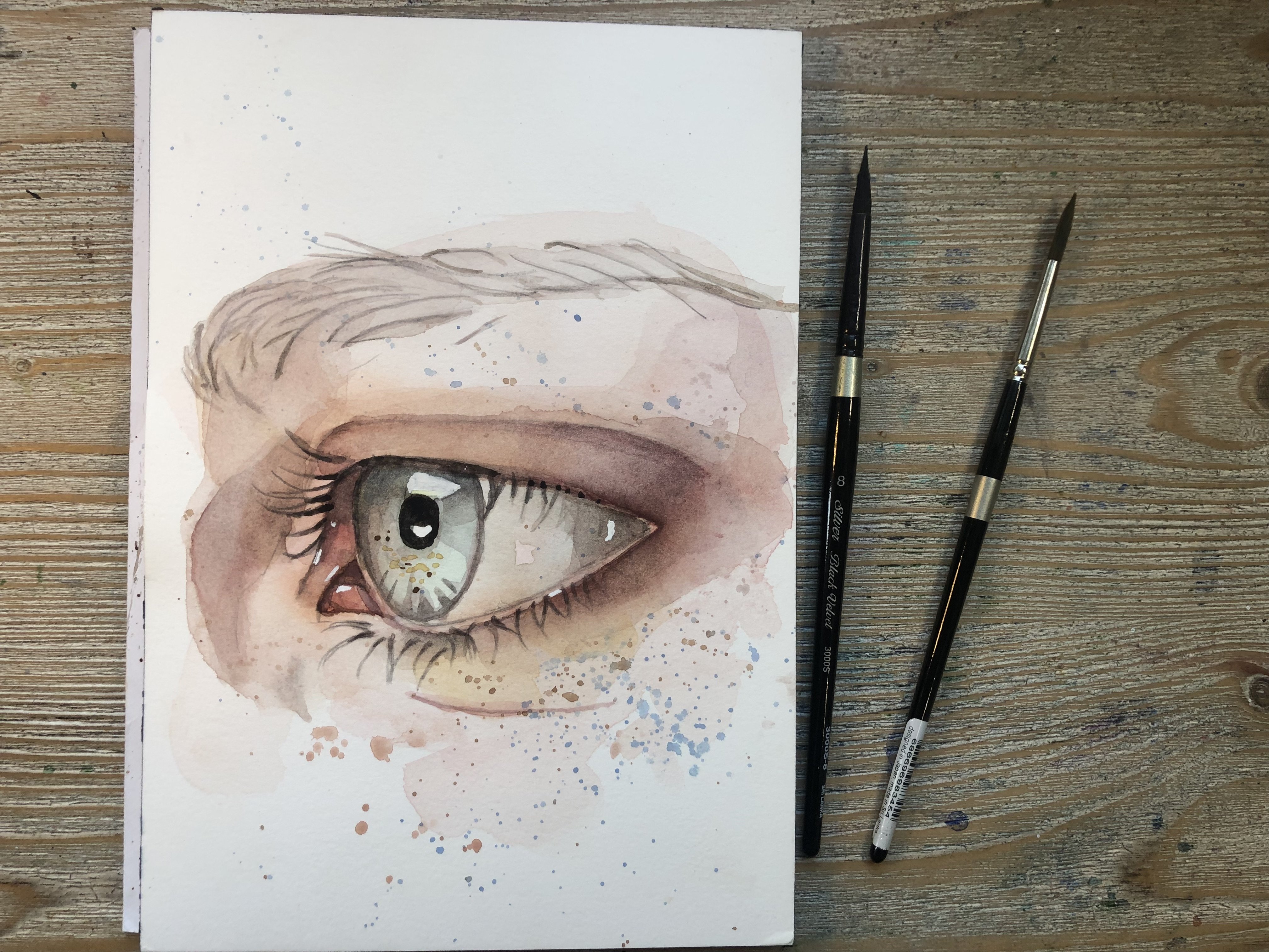
working on the eyes, and I believe there's a class here on Skillshare
that I've done. In fact, I'm sure of it about the expressive watercolor eye. So if you haven't
taken that, one, be sure to go and take that
one, too, after this one. I can also use this color. I have my brush to
create some shadows, and I'm bringing it out into the let's say into the cheek
bone and into the temple, kind of creating this
triangular shape that is something that
you can do with shadows. You can create the outline
of the shadow very often by breaking it down
into simple geometric shapes. And in this case, for
me, it's a triangle, and then you can fill it
in with your watercolor. And that just simplifies things. And you can do the
same thing over here. Look at that shadow
at the top of the bridge of the nose
going towards the eye. Again, very often they resemble the shapes of
triangles or commas. So look at them that way, trace the outline of them,
and then fill them in. And that is definitely
an easy way to get the shadow work
in without having to, uh, fuss around too much. And again, I'm still
picking up this mixture, bringing it over
to the other side and doing the same exact
thing with that shadow, checking around the
painting for more shadows, and there's definitely
one under the chin here, so I'm just going to go in there and position that one there. There's definitely
one under the lip here and just try to step
away from what you think, you know, and just try and see what you're
actually looking at. Again, this is so important
in any form of art. Just try and see with your
eyes what you are looking at. And even if it's
an unusual color, like something you wouldn't
usually use in the face, like a blue or a
green or a purple, by all means, feel
free to use it. In fact, do because
using unusual colors and exploring will
definitely help you find your style much faster. And now I am going to I would like to obtain
a green color. I definitely see some green, and that is easily
done because you have to mix the
yellow and the blue. We are mixing the yellow and the Prussian blue and we're
obtaining this green, which is a bit too dark for
what I was looking for. So going to clean my brush and just pick up a little
bit more yellow. So when you're working
with primary colors, I've said this before in the
previous section, I believe, I said it's a delicate
dance between pigment and water and also between kind of going back and forwards
between colors, add less, take away more, add more yellow, add more red till you've achieved
the color that you want. I'm going to add a little
pinprick of red to my green that will help to desaturate
it just a pinprick. I don't want it to
look too bright. That's why I don't want.
And then I'm bringing it into the face because
I can see some greens. There's certainly some very yellowy greenish
tones to the skin. So I'm dropping some
of that green within that shadow at the top of
the bridge of the nose in, like, the corner of the
inner corner of the eye. I'm bringing some of that shadow here at
the top of the temple. I can also seen it going like, kind of out into the face. It's very right. So I'm going to clean
my brush and tap it on the kitchen paper
and just kind of smooth that green out
just so that it's a little bit less bright
than it was looking. I don't want it to
be in your face. You don't want it to be
distracting, of course. Anything that is distracting will take away from
the focal point. So make sure that Things that you're putting down are not stealing the
show, so to speak. And anytime you need
to blend anything, of course, just use your
clean damp brush, go in, pass it over, pass
your bristles, sweep your bristles over
the edges of the area of the hard edge you want
softened and just blend. It's as easy as that. Okay, I'm bringing some of this
green also under the lip, just to reinforce that shadow that we'd already
positioned there. Between the hands at the bottom, maybe at the top here as well. The almost always is a bit
of green in the hands. I'm just placing
it over the thumb here where I see
this shadow area. At the root of the thumb
and then going upward. And I'm still using the
small brush because it really does offer me
so much more control. For the hair, I'm
just going to use a mix of the yellow and the red. I know the hair is a different color in the reference image, but I kind of just going to
use this as a shadow value. And the paint is very
thick, almost buttery, not quite as thick as butter, but I would definitely I define it tooth pasty,
to say the least. And I'm just going into the
shadow areas of the hair. The hair is very very choppy. So it's kind of easy
when you're painting hair to think of it as sections. So break it down into sections. Don't think of it
as a whole mass. That will make you, um, it will make the whole
experience more daunting. So just kind of break
it down into sections, get working on those, and don't really think
about the rest. I've just cleaned my brush here. And again, I'm just sweeping that paint out a
little bit just to, you know, move it
around a little bit, start getting that shape
filled in in areas, not even all over
the place because it might go in and actually
add some green. I'm not sure about that,
but green is a color that always looks
good in blonde hair. As it is light that is often
reflected of blonde hair, as is blue, for example. Blues and greens, that kind of color always look
good in blonde hair. We can also do some lifting, so I will clean my brush, dry it on my kitchen paper, and then I can go in
and just by pressing it down and moving
my bristles around, I will be able to
lift some paint out and hence make
things lighter. You can do this as a
lifting technique, which is the only kind of
eraser we have in watercolor. Or you can use a
kitchen towel, again, by pressing down
by dabbing down, not by swiping
across your paper, but by dabbing down by blotting your watercolor
paper with kitchen paper, you can easily lift some paint
that's gone down too dark. So that is something to
always keep in mind, of course, and always to have handyche when you are painting. So I might want to go
into the eyebrows here, and for now, I'm just using the same color I
used for the hair. Again, just holding the brush at the back, kind of,
you know, at the back, not right at the front does offer incredibly more
control than you would expect because it kind of gives you a firmer
grasp on your brush. I feel, so try and do that
if you aren't doing it yet. I know it's something that
they teach in art school. So some of you might
already know it, some of you might not, but it definitely is
something that you should be practicing if you aren't yet. They've created
quite a dark value. Let me show you just by mixing our primary colors together, I've got this very dark value, and I am going to use it to go into the opening of her lips. Again, I'm just tap tapping with the very
tip of my brush. You don't want to put much
pressure on your brush at all. Because the last
thing you want is that harsh line right
across the lips, it's just going to take away from how delicate
the painting is. You can use the same colour
to go into the nostrils. And again, being very gentle, being very delicate
with your brush, tap, tap it so you have control, of course, and the paint at this stage should
be pretty thick. Be sure to have
that kitchen paper handy in case you
need to blot up anything because
it's very easy for your dark paint to bleed
beyond the nostril, especially if you haven't been careful and dried your piece, which I didn't need to
because mine was already dry. I'm also using this color to go above the eyelid into the
root of the eyelashes. And again, without
putting any definition, without putting any
pressure on my brush, I am just basically hovering with my bristles
above the paper. You don't want to get any thick, ugly looking lines here. So we've just defined
her top lashes, and that automatically brings a whole new defined
look to her eyes. I can also go in to that line
on the bottom of the eye. That is just something
that happens because of the underlying structure
of our skull our eyeball. That is just the shape of the
eyeball within the socket. It is normal to have this line below your eye
and it should be in there. Try to remember to
get that in there. Then I'm just going
into the tear duct. It's very easy to place
the tear duct in there. All you have to do is
a little round shape, a little drop shape, and there you've
got your tear duct. I can also use this color to create the illusion
of an eyelash just kind of bringing it
down a little bit and creating that little
line that goes down. We might add a little bit of a darker value there because
she is wearing makeup, and if we want to convey that, we might need to add
a darker value there. I'm just going back into
the nostril to reinforce what I'd lost when
I went in to blot up the paint with
my kitchen paper. And yeah, she's starting to look a little bit more three
dimensional, let's say, and I'm going back into the
hair with that dark mixture and just popping in some
darker values here and there. Again, just like
little segments. You don't want to go in and create long lines or
anything like that. Just try and follow what
you see in the picture, so we have this darker
value close to the temple. Again, my paint is quite
buttery, or at least, again, more like
the consistency of toothpaste or cream,
definitely not watering. That's not what you want at
this stage of your painting, and I'm also going
into the other temple. So hair is always
going to look darker, closer to the face, and it's always a good
trick to make it darker so that you can frame the face better and draw attention to it. I am then going into the eyes with the green that
we mixed earlier, just kind of going
in the whole eye. I'm even covering up the
white of the eyeball because white of the eyeball is never white in case
you didn't know that. There is something,
please don't forget it. Please, I don't want to
see any white eyeballs. The eyeball is not white. It captures shadows. It turns back into the head, so it's got shadows
at the corners. I'm using the blue, the Prussian blue to
create that shadow. It's got shadows in
the inner corners because it's a ball.
It's a sphere. It turns back into
the eye socket. There is no way that an eyeball is ever going
to be completely white. It will look flat if
you painted white. And also, we very often
capture highlights. And if you make it white, you will not be able to add a highlight to the eyeball
because it won't be visible. And believe me, adding a
highlight to the eyeball sometimes can really
make a painting pop. I have mixed some of that
Chinese red with a yellow, and I'm bringing
it into the lip, and it's definitely looking a little bit too vibrant for me. But I have my trustworthy
kitchen paper close by. I do not want her lips
look this bright, like, she's wearing
so much makeup. But yeah, you can
do what you want. If you want to make
them look this bright, then that's totally up to you. And I might change
my mind because I very often start with, you know, one idea in my head, and then I completely
change my mind. So I might change my
mind here as well. It depends on how
this ends up looking. But I'm definitely going
to clean my brush. And tap it on my kitchen paper, and then I'm going
to kind of move some paint around that lower lip because if you look at
the reference image, you will easily be
able to see that the lower lip is lighter
than the top lip, so we don't want to
make them the same. So yeah, actually, of course, I'm kind of rethinking
what I just said. It looks a bit too bright,
but at the same time, we do know watercolor does dry lighter almost in 100% of cases, differently from
gouache, for example, which tends to dry darker. Watercolor dries
lighter, which can be a little bit frustrating because we end up putting
down the washes, and then we have to go over them because they have lighter. But still, it's something
that we can play with and something that we have to keep in mind when painting. So I might leave it like this. I might clean my brush, just go in and do
a little bit of lifting just so
it's not so harsh. There, you can see that lifted out beautifully and
the lips looks. The lip looks a little
bit less aggressive, so to speak, now. Again, mixing that dark value using that dark value that I had for the line, the
opening of the lips. I'm going to go into the eye
and always remember to have your reference image nearby because you really need
to look at it closely. So I'm kind of fixing
that line that runs under the eye because I
can see it goes up almost towards a tear duct. And then, of course, I'm
reinforcing the line where the lower eyelashes would
be because it looks more kind of like
what she looks like. And also going over the
eyeliner at the top. Again, remember, do not have too much water
in your brush. Do not use a brush that's
too big and also do not use a brush whose
bristles are ruined. Otherwise, you'll
have a hard time getting the definition in here. Then I'm just going over the
top area of the iris, again, pushing this buttery consistency around the top of the iris, but not the bottom
of the iris and you'll be wondering why not
the bottom of the iris. Because the bottom
of the iris is the area which usually
catches the light more. Because there is
no shadow cast by the eyelashes or by the
eyelid and brow bone, which usually sits at the
top of the iris, the shadow. Even though there's no light
in this reference image, I want to keep it in
just to show you and teach you that you will obtain some more beautiful
effects if you leave the lower part of the iris
lighter than the top part. You can easily do that just by lifting or by leaving it out as in just not going too dark with it.
Let's put it that way. So I'm just picking up
more of that mixture, and I'm almost running
out of it, actually. It's become a little bit
more watery over here, and I can tell I have less control because
my mixers less watery, less thick over here. And on this side, I could
also just leave a little bit of light shining through.
Like a highlight. I think this iris might
be bigger than this one. Now that I'm looking
at it, let me see. Very often, you underestimate the power of the
crease of the eyelid, but the shape and the
direction of the crease of the eyelid are crucial
in portraiture. They define where the
eyes are looking. They define whether you're
going to get symmetry between the eyes because if you have
one thicker and one thinner, it's going to look off, it's going to look upward. So always pay attention to the position and the shape
of the crease of the eyelid. Okay, I think that
looks quite nice. It's always handy as well to
step away from your work, take a picture of it, and then go back to it, or, you know, just take a picture of it and
look at the picture. It just helps you detach
from your work of art or step away from it for a
couple of hours for a day, and then go back to it and see if you think that
everything looks right, or if there are some adjustments
that you need to do. For example, right now, I can't tell whether
the eyes are symmetric. So I'm going to kind of step
away from it from a minute, take a picture of it, and
check how things are going. So this is a picture
that I took. It's picked up a lot of
the texture in the paper, but I get what I want, which is I can tell that it also looks a little bit darker than it actually is in real life, but I can tell that the eyes
are as I want them to be. I definitely want them to
pop a little bit more, but I can do that later with my white gase or white
bleed proof ink, which is what I like to use. And I'm just checking around the reference image
whether I need to add something I think there's a little bit
of red above the eyes. She does definitely need
a bit more pop of color. So I'm just putting
that Chinese red and it's basically undiluted, like on the inner part of the eyelid and on the
outer part of the eye, again, I have not switched
up from my number four. And you can tell that
that was a good idea because my paper was wet, so the paint bled out. And, you know, that is, again, why you should always have
that kitchen paper handy because you need it there
to correct these mistakes. I've added some red to the hair, just wet and wet to
add some warmth. And again, with that dark value, the same kind of really buttery dark value I obtained by mixing
the primary colors. I'm just going to go in and add some definition again,
around the mouth area. I want to get some of those
little lines in that she has. Now, this is an area where you will want to trade carefully because if you get
them too thick, they're just going to look awful because that's not what they
look like in real life. I've already got one too thick, so have that kitchen paper handy to blot them up if you need to. Just go with a very, very light touch and remember they don't
go straight down. They are curved, maybe just a central one and lower
lip goes straight down. The other ones are
curved like commas. Don't exaggerate,
don't go over the top. Don't put too many in. Leave the lip as
loose as possible, but just get a couple
in two or three to give the impression that there's that texture to the
lip, which there is. Because there's no denying that we do want to
get that in there. If you need to define those
nostrils a little bit more, maybe if their shape
is a little bit wonky, now's the time to
go in and define them because you've
got the right kind of mixture on your brush. Again, into the eyes, I'm kind of outlining
the iris on this side. It's important also to get the iris in the right position. The eyes is the eyes
are something that I absolutely love working
on in watercolor, probably one of my
favorite things to work on in watercolor. So I'm very happy with exploring and playing around with eyes,
even, you know, using different colors and having the eyes, you
know, one brighter, one lighter because they are being hit by the light
in different ways. So Again, look at the
eyelids because it's very easy to the shape of the eyelid will make
your eye look wonky, which if you want
to make your eye look wonky, then that's fine. But if you don't want to
make your eye look wonky, if that's not your purpose, then get those eyelids
in the right shape. And the pressure has
got to be barely there, like a feather
touching the paper. Getting a little bit
carried away here, and I am adding a little
bit of rainbow here. I'm going to add a little bit of yellow just kind of over here. Which, you know, is
already in our hair, so that won't make
much difference. You could dilute it
a little bit more. When you see that
you're starting to drag your paint brush
across the paper, then that means that you need to add a
little bit more water. And then I'm going to add, just a very light blue one here. And by light blue, I mean that brush and blue with a
lot of water in it, but on a small brush, which will offer some control, and let's see how that turns out one strand of that blue hair. And this is not something
that you have to do if you don't want to
just thought I'd do it. For that extra bit
of fun, actually. And you can kind of go around and add these reflections
around her hair, not all over the place again, just kind of in small sections. Something important we
can also do is glazing. Glazing is when we
use a puddle of water and we just barely
tint it with some color. In my case, I'm
using that yellow, and it's barely any color there. And then we use this to
warm up the complexion, for example, in this case. And you just glaze
it over the skin. You can use this technique
for several things. For example, if you're
painting flowers, you can use it to make them look cooler to make
a petal look cooler. If you use a color like
blue, for example, you'll make a pink petal
look cooler or you can use warm colors to warm
underlying tones up. This is something
that I like doing in portraits a lot
because sometimes I feel that they're
looking a little bit too cold for my liking. And just by adding this step, it immediately
brings them to life. And we get this effect of
a much more glowing skin. And we can obviously bring this down into
the hands as well, because even though
very often the hands in the face are slightly
different in coloration, we want to be cohesive when
we're painting and not make anything stand out that we really don't
want to stand out. And once we've done the glazing
since the paint is wet, it's also good time to go into the blush areas like the cheek, for example, and I can pick
up a little bit of that red, just not very much of it at all, really, and place
it on the cheek. And by doing that,
you will see this will spread out automatically on its own and create a very natural effect
and a very natural. Look. So I'm doing
this on both sides, just dropping the paint
into that wet surface. And you can see how
beautifully this spreads out to create this
really beautiful, glowing, kind of red apple
cheek or rosy cheek effect. And something else
that you can do is that if this gets a bit
too bright for you, you can clean your brush off, of course, as always, as I've taught you, and just kind of clean
up the edges of it. Like you see me doing here. And if you feel
that's necessary, you can also bring
that into the nose. If you like a particularly
pink or red nose, you can bring it into the nose, and it's really completely up to you how much you want
this to show up, how much you want this to
be evident in your piece. So you can play around
with this and make the cheeks and lips
and nose brighter, or you can, you know, keep them more subtle if
that's your cup of tea. This stage, I feel it's
right moment to go in and dry my painting
with my heat tool. This is the heat
tool that I use, but you can use a
hair dryer, as well. Something that is
very often lacking in paintings is contrast and depth. How do we achieve more
depth? It's very simple. We just add darker values. So for example, here, I could add, like one
or a few darker values. I've just mixed, again, my red with my blue, and I am going to just add a few strands into
the fringe or banks. It depends where you're from. Uh, what you call the bangs. You know, I think in
America, we call them bangs. They call them bangs in the UK. We call them fringe. We call the hair coming over
the forehead fringe. So I'm just going to add
a few strands just to, you know, get that
contrast, get that depth. Also, again, because
as I said earlier, watercolor does dry
so much lighter. That sometimes towards
the end of the painting, we see that we have to go in and maybe darken some shadows, dark in some areas. And this will just really allow your painting to
pop so much more. So it's definitely
something that I would advise you keep
your eye out for, but always make sure that
your paper is completely dry before you go in with your darker values because
if they spread out, then of course, that can
be a bit of a problem. The last touch when I'm painting a portrait are
definitely highlights. Recently, I've discovered
doctor PH Martin, which is blade proof white, and I think it works
wonderfully for highlights. It's kind of like
a paste inside, so it looks very thick. But all you have to do is pick up your smallest
brush that you have, you know, your detail brush. A number zero or, you know, a number one at the
most, I would say. Wet that brush slightly, and you just have to
kind of dig that into your mixture into your
doctor PH Martin, and then go in and check where the highlights
are in your reference image. I don't really see
many in her eyes. I do see some like on the lower rim of her
eye on this side, but that doesn't mean we have to faithfully stick to the
photograph we are looking at. We can switch
things up a little, and I am going to play
some highlights in her eyes because it's something
that I just love to do. And I just very
delicately, again, without really
touching the paper, but barely touching it, like feather touches, I just go in and add
the highlights, and to me, almost always, they immediately make
the eyes really pop. They just add that
extra let's say, life to the eyes. And you can have one
highlight. You can have two. You can also leave the white
of the paper as a highlight, which means you
will paint around it instead of painting
on top of it, of course, instead of
covering up the whole paper. She also has a little
bit of a highlight in the white of the eye
over to this side, and again, in the lower rim, so we can just add a few dots. I also always like adding
highlights in the lips. Sometimes I tend to get carried away a little bit and overdo it. Very often, the
Cupid's boat will catch a bit of light
because it's protruding. So sometimes I will have
a highlight up there, and I will have a highlight maybe in the center
of the lower lip. But I always am very careful when applying these
highlights because I do not want to have a big thick blob of paint where the
highlights supposed to be. That is not going
to be a good look. And also the tip of the nose is a good area where you
might want to have a highlight and sometimes
something that I also like doing is adding maybe a
strand of white to the hair, and that is because the
hair sometimes catches the light and especially
flyaway strands like this one, could end up looking
like almost white or much lighter than the rest of the hair because
they're on their own. They're not part of
the mass of the hair. So obviously,
they're much finer, and they will catch
the light more easily. So you can see that just
by adding this strand, this flyaway strand of
hair, in front of her face, I've added three
dimensionality because I have pushed her face backwards
by placing this strand, this flyaway strand
of hair kind of in the forefront of the painting. So that really helps kind of
make things more realistic. And then, of course,
it's up to you always check with your reference photo where there are highlights, where you want to put them. Maybe don't exaggerate,
but I notice that rarely you exaggerate. Rarely do my
students exaggerate. I'm the one who exaggerates. And there, I think I will stop myself here with the highlights. Oh, wait, maybe not. I always love to add a
highlight in the tear duct. I just think it adds
that I don't know. If you know what I mean, it just looks more beautiful to me. I am quickly going to add just these I think it's
peaches or apples, whatever. It really does not matter. I just thought the
composition looked cuter with these three apples or peaches or whatever
they are here. So I'm quickly going
to add those in. And after, we're going to
move on to the next one. As you can see, these
are very basic. I am not going to spend
much time on them. And I'm just using that red, the Chinese red again, and I'm moving it
around the paper. And then I will add
maybe a little bit of yellow and a little bit of green Just make your mixture quite
watery because you want it to flow smoothly. Of course, that also depends on the kind of
paper you're using. This paper, which is
Saunders Waterford. This paper which I
am using does absorb a lot of water and tends
to dry really fast. So I have to use more water than I use with
other kinds of paper. So that's also something
that you have to keep in mind when
painting with watercolor. What kind of art
supplies are you using? What paper are you using? How does it work? What is the
climate you are living in? Is it dry? Is it humid? So these are all factors that you have to
take into consideration. I'm now picking up some
more of that Chinese red, and this time, maybe it's
slightly more concentrated, which means I have a little
bit less water in it, and I'm just going over certain
areas, not all the areas. I'm not going to go, as I said, super into detail about what I'm doing with this
because we're going to be painting fruit over to
this side in a minute. So this is just a very basic
breakdown of what I'm doing. If I need to smooth out
any edges as usual, I will go in with my
clean damp brush. And do so, I will
then go in and add a little pop of yellow
just to bring some warmth. And after I've done that, I can add a little bit of green, and you can either mix
your yellow and your blue, or you can pick a
pre mixed green. What suits you better? And that's that. Just let
the paint do the work. Just let the paint
flow, work wet and wet,
6. Painting 3 Peaches: At my reference for the peaches, I have mixed this quite watery, but not too watery mix of bread and yellow to
create a sort of orange. It doesn't have to
match what we see in the photograph
100%, remember? You don't have to stick
to that completely. And I have a number 12 brush, and I am just spreading the paint making sure that
when I get close to the edges, I am shifting my bristle
so that, you know, I get more precision and I don't risk going beyond
the sketch outlines, which in this case, wouldn't
be the best of looks. So I'm kind of creating
a base, let's say, and I will be picking up more
paint whenever I need it, which is basically now. Again, this paper absorbs
so much water so fast. So for me, it's necessary to
pick up paint more often. It might be that
I have to pick up paint mixture more
often than you have. So what you can do here
is rinse your brush. Tap it off your kitchen
paper or off the side of your jar and do a little
bit of lifting like this. You see how well it works
just to press those clean, almost dry bristles to
your paper and just lift out a highlight because that is what it is at
the end of the day. We can also lift out a
highlight at the back here. And the peaches seem to have a kind of mottled appearance, so we'll try and
obtain that with some texture that
we will create. There's also a bit of a
highlight at the top, remember to clean and rinse your brush every
time you do this. Otherwise, you will just
be bringing, you know, more paint to an
area where you're actually intending to
lift the paint out. So I am going to lift some paint out from
the top of the peach, as well, just like this. I just work my way around
the peach and see where I, where I need to lift
and where I don't. I hope these are
peaches. I hope I'm not, you know, mixing them
up with something else. And you can see that that is working really
well, you know, the effects that we
wanted to get are, you know, that of
roundness and luminosity. And then we can start dropping
a little bit of, you know, just the red or just the
mixture that I have here. It's the same one I started off with in this
little ceramic plt. And you can just kind of
drop pinpricks of that around your peach to start creating that
mottled appearance. And I definitely think
it's going to need, in my case, at least a little
bit more yellow in there. So I'm going to proceed and add some more yellow
to my mixture. As you can see here, I
have something that's much more leaning towards orange now. Again, I always make sure
to roll your brush on all sides so that you get
a fully loaded brush. And I'm going back into
my painting, and again, I'm just dropping that
paint around the peach, and the surface of my
paper is still wet, so it is going to spread out. Not too much. As you can
see, it's not going too far. It's not going to the areas
where I lifted the paint out, and that is because the
paper is drier there. So, as always, watercolor
won't flow where paper is dry. And that is something
that you can always use to your advantage. I'm also going to
drop of that color, some of that mixture
down at the bottom, and I will let it sit there and will let the paper absorb that. And then I might go in
and do some lifting or just do some blending
with a clean damp brush. If they look too stark, I don't like things to look
too stark in my paintings. I like things to look soft. Again, that is something
that's up to you. I can add a little
more dots up here. So we just want
to see, you know, we want to see that this peach
is not completely smooth. We want to see, you know, that it's real, that it's
organic, that it's natural. So play around with it. Like, really try and have fun. Don't think you have to create
anything perfect because that is not the purpose
of our painting. The purpose is the process. It's having fun, it's learning, and it's taking your
mind off other stuff. I'm just going to add
some more here up at the top and using a
nice, large brush, especially if the size of your peaches is kind
of similar to mine, you will definitely
need a larger brush. And while this one dries, I will go down
into the next one, and I'm still using that
same exact mixture. And I'm going to
work my way around that peach leaf I just
bringing it down. I can even go for a completely
smooth finish on this one, just to give it that
kind of foundation, the basis, and then
work on top of that. So I'm just making sure I
fill in the whole area. Working with the
tip of the bristles when I move closer to
the edge of the sketch. And then, of course,
I can just pick up something like red, of course, because that's
what we're working with. Again, I added some
red to my mixture. As you can see here. And then I'm going to drop that into the top of that peach, just to start adding
that pop of color, start bringing it to life. I can add some streaks here. Of course, the paper
is still slightly wet, so it's kind of spreading
out very nicely. And maybe a little bit
over here as well, and down to this side
and just let it be. And then I can rinse
my brush and maybe add a little bit more
yellow to that mixture, so we have a variation in color. So what I do sometimes
is I just kind of add it to the side
of the well here, and I use that and I'm
going to drop it in here. So we have this much more
orangy tone on this side. I'm going to rinse
my brush and pick up just a little bit
of yellow on its own, and I'm going to drop it in
over to this other side. This is quite bright, but I think it
works really well. Painting fruit,
painting botanicals is a good time to allow to really let
it do what it wants. So painting wet and wet is
absolutely the best technique, and also blending the watercolor directly on the paper instead of blending it
in your mixing tray, which is another
way we can blend watercolor and sometimes obtain
really beautiful effects. Of course, practice and
exploration are key. And I'm just working my
way around that leaf. Again, remembering to
switch the direction of my bristles according to which area of my
subject I am painting. And then I can go back
up into the one at the top with what's on my brush and kind of brings some color into the
bottom of that peach. You're probably working
in different areas, compared to me because
obviously paint moves in a different way for everyone
for a number of reasons, of course, because
watercolor is unpredictable. So you might not have to work on the same exact areas as me, but just learn to appreciate
what you see, what you have. Look, I have these
nice hard edges here, and that is something that
I really want to keep in the peach because
it kind of resembles, again, that mottled effect I can see in the
reference image. And again, I'm going
to keep on popping some brighter colors here and there where I
think I need them. You don't want to make
it like all one colour. That is the main thing. I am rinsing my brush and
picking up some more of that yellow and where I
lifted that paint out, I'm just going in and getting
that yellow in there. And I'm ready to lift that back out in case it looks too dark, and it's making it
all the same color, which is something
that I wouldn't want. It always will leave some
of that yellow behind, so I won't lose it completely, can go in and add
a little bit more. And just keep looking at
that reference image, keep looking at
things you notice. I think my peach is a bit
kind of a little oval, so I might to fix that, I might bring this bottom leaf over the bottom of the
peach to detract from that. My peaches are now dry, so I've picked up
my smaller brush again and I'm just
going into that red, and I'm going to start
adding some definition. So we know that the
peach has this kind of slit running through
the center of it, and I'm just going to
get that in with a clean and steady and very slow, as you can tell, brush stroke, and that is already
allowing us to start seeing the shape of
the peach a little bit more. And I'm kind of good
to bring that down. Again, make sure you don't put too much pressure on your brush. That is super important. And I want to add this little I'm not a
massive fruit eater, I will have to admit,
and that is probably why I, you know, don't really
recognize the shapes, the exact shape of the peach, but it looks like it appears
to me like this one has this kind of little pointy
area at the bottom. So I'm going to have this one in there. I'm going to
have that in there. And it definitely does
look a little bit more like a peach now
after I've done that switching to my larger
brush and cleaning it off in my water and just
smoothing that out. And again, I do feel like
I have to bring some more yellow into
it, quite diluted. And I'm going to bring it
up into the top area here, down again into the bottom here. I've been to this area. I want
to make sure I'm not going to go into any of these hard
edges because as I said, I really think that helps
us get that appearance of that kind of organic
effect of the fruit in. And it's very important if you want to get these cauliflowers. They're called cauliflowers or blooms or hard edges
in watercolor. Then it's very important
to know that if you are having a hard
time obtaining these, then probably it's
because you're working on paper
that's very smooth. And so the water will just flow right back into the position. It was in previously, while
here basically spreading out and kind of sitting in the little grooves of
the paper's texture, and that is why it's
easier to get hard edges, cauliflowers and blooms
on cold pressed paper. So paper that has more
texture to it to it and which is also sometimes
called not NOT. So learn to know your paper
it's super important because different papers from
different brands will behave extremely
differently, believe me, and
you will probably already know this yourselves. So I'm still spreading that yellow orange
mix around my peach. And it's a little bit of a back and forth thing, let's see. You have to kind of
learn with watercolor, what works, what doesn't work. And mistakes are so important. They're not important
because, you know, it's like you've got to
blame yourself for them or think that you're not
good because you've done them or they teach you that
you've got to give up. They teach you what not to do, and they teach you to grow. So please learn to
embrace your mistakes. It is so important. I cannot stress that enough. I'm also bringing some
of that into this area, again, without disturbing
those hard edges. And at this point, let's say, our peach is kind of done, but we can add a little bit
more details if we want to, maybe a little bit more
red in this area up here. My paper is still slightly wet. Just, you know, those
little dots again, to add texture just to make
it look so much more natural. And it's strange for
me, I don't paint fruit that often at all, admittedly, but every time I paint something that I'm not used to painting, something new opens up for me. So it's so important to
explore with watercolor, probably with every
art medium, I'm sure. But since I paint
with watercolor, I can only talk for
watercolor, let's say. It's so important
because experimenting, exploring, making mistakes,
that is what pushes you on. That is what makes you
discover your style. And that is what makes
it so exciting and fun. I have now mixed this green with the blue and the yellow
to get into the leaves. Again, I'm still using a
number 12 round brush, making sure I get a
fully loaded brush by turning the bristles
in every direction. And I will start by
going into this leaf, and just by pressing
my brush down, I can get the shape of that
leaf in there quite easily. As you can see by looking
at the reference image, the leaves are all
different colors, as in they're not
different colors, but they're different
values because, of course, there are areas that are in light and there are areas of the leaves that
are in shadow. But to begin with, I'm just
going to paint these with that same mixture of
green and yellow, of blue and yellow to
create the green, sorry. And then I'm going to work
on top of that to create the sharp shadows we can see
in certain areas that will, of course, create the
three dimensionality along with the midtones. So that is exactly
what I am doing now. I'm just filling in all
the leads with that green. I did go in and add a
few leaves that did not have a sketch like
this one and this one. Did I show that this one and
this one here at the top. But yes, I think that really looks nice as it is already.
I'm quite happy with it. I wasn't expecting
that, so quite chuffed. But what we're going to do now
is into that mix of green, we're just going to add
a little bit more of blue so that we can start
getting the shadow in. I don't want to create anything
too harsh because, again, I don't want to detract from the softness of the painting. So yeah, that is what
I'm going to do now. For having mixed the green with a little bit more of blue. I'm going to add a
pinprick of red. And the reason why I'm
doing this is because it desaturates the
color a little bit. I always love even adding
a pinprick of red to blue because it just makes everything a little
bit more dusky. And also, I think that
more than a shadow tone, I've mixed like a mid tone here, but that is fine
because, you know, we need three values or
tones in every painting. So that is fine. And I'm
good to go into the areas of the leaves where I
see the mid tones. For example, where do
you see a mid tone. I see a mid tone in this
leaf here in this area. And again, you don't
have to be too precise because
otherwise it can get very fastidious and painstaking, so you don't want to
make it too precise. Just try and remember that
this is also about having fun. It's not just, uh, work. I'm sure most of you are not here to think of this as work. So remember to have
fun and to have that kitchen paper handy in case you need to lift anything out. Kitchen paper is our eraser in watercolor or our clean
damp brush, of course. So I went in and
added, you know, this kind of mid tone here, and then I can work my way
around the other leaves, just adding that
slightly darker value. It does look much darker now
because it's wet, of course. And it's like with the hair, our hair looks much
darker when it's wet, and then when it dries,
it looks much lighter, and the same applies
to watercolor. And I'm just working
my way around the leaves where I
see the mid tones, and it doesn't have to replicate exactly what you see in the
photo, again, I've said that. I don't know how
many times by now, but you can kind
of play it by ear. You know, that the areas
that are closest to the peach in general
will be more in shadow. And but the ones
above the peach, the shadow area is more up
at the top for some reason. Probably there's
another peach on top of them that we
can't we can't see. So I'm just going to go in there and add that darker color. And I'm also going to add that darker color completely to cover up this leaf
at the top here. Just because I think it
would be it's a nice way to point the eye in the right direction, if
you know what I mean, I always I very often like using triangular shapes
that can be leaves or strands of hair to kind
of like arrows to direct the gaze where I
wanted to go towards the focal points
of my paintings. And this leaf isn't even
in the reference image. So I'm completely
playing it by ear. I just trace that
line down the middle. I'm adding some of that paint mixture to this one down at the bottom,
just at the top of it. I'm doing the same thing over
here with this other leaf. And then the leaf that's
going on top of the um, peach here, of course, I'm going to darken up this
area right at the top. Trying to get a nice
sharp definition in that leaf over there. And this one I'm imagining that the shadow would
be on this side. I'm probably coming down almost
to the tip, I would say. Just imagine where you
think the light would be coming from and
take it from there. And then I'm going in here. And I think that is
it for the midtones, and I might be doing some smoothing out with
my clean damp brush. Just in certain areas, maybe here where the cut off between the two tones is
a little bit too sharp. Shadows are usually sharp. They can be soft as well,
but the transition between mid tones and louder tones
is usually more subtle. And you can clearly and easily solve that by smoothing things
out with your clean brush. After you've done this step, you will let this
dry or you will dry it with your heat
tool or your hair dryer, or you will let
it dry naturally. Okay, and now let's just add a little bit
of blue in there. Usually what you want to do
is when you're mixing a mix, you want to use a larger brush, and then if you need to
go into any detail areas, it just makes it quicker to mix the mixture with a
larger brush like this, and then move to a
smaller brush like this. This is a number four. Just making sure I am
picking up enough paint. Rolling it on all sides. And then I'm going to go in, if you're wondering why my sketchbook looks
slightly tilted, is that I always like to keep it a little bit tilted even
when it's not on my easel, because it just helps the
paint to flow better. And going into the areas where
I see the darkest shadows. So when I see the
darkest shadows, I'm just going to think of
them as geometric shapes. And here I am going to go in to this leaf
and I'm just going to add this sliver of a
shadow down the center of it. My paint is a little
bit too watery. Maybe it shouldn't be as watery, but I can make it work
and then maybe add some more paint to make it
thicker for the next leaf, but you don't want
your paint to be too watery for this
stage because you want that control
to get those nice sharp shadows in there, and a little bit on the
tip of that leaf, as well. Again, as I said, I'm going to add a little bit of paint in there just to make it
a little bit darker. You can also add a
little bit of red again. To give that dusky
look to your mixture. And I'm going in and going
into another shadow. And this time, it's going
to be on this leaf, and I'm just going to
trace it along that side, kind of almost dividing
the leaf in half, but the top half, let's say, smaller, as you can see
than the bottom half. And then maybe I'll
pull out a little kind of line here. Okay. And then in this leaf, again, they're not exactly the same as they are in in
the photograph. I just kind of place them a
little bit more randomly. So again, plate by ear, just imagine where those
shadows are going to be and have fun with that. Adding more shadows
up at the top here, one here, one close to
the peach over here. Then again, of
course, on this one, I'm going to reinforce
the shadow closest to the fruit in one
smooth brush stroke. Maybe bring some of
that into the tip. At the top, I could add
a little stem here. Again, I'm sorry if my names not exactly are not
precise are not correct. But again, I don't
know too much about the scientific names of
parts of leaves and fruits. Just adding a little
bit of shudder there. And you just keep on working, bouncing from one
leaf to the other till you feel that you've
got that intensity, that you've got that depth, that you've got
those three values, that midtone, that highlight, and that or highlight. More than highlight, it's
like your light is value. We don't really have a
proper highlight here. We could add it, but I'm
not sure that I want to add any gas or bleed proof white
to this part of the spread. I think it could end up making it look a
little bit too stiff, so I might leave it very soft and natural with no highlights. And as I said earlier, sometimes the green
from the leaves will be reflected on the on
the fruit itself. And I can see that here. So let's give that a try. It also is a shadow, of course, but there quite well might be
some green in that shadow. So there I have it in there. I might bring it
just a little pop of that same color here
just to be cohesive. And I think after
we've done this step, we can start working on the stem on the
branch, on the twig, which is really going to be a matter of a very short time. Work on the leaves
how much you want. Just be sure not to overwork
them. They don't need that. It's better for a watercolor
painting to look loose and almost underworked
than to look overworked, because that will
really take away from the transparency of
watercolor if you overwork it. So I'm just going to
move on to the twig now. I have mixed a brown by mixing the three primary colors again, and I'm going to pick up that smaller brush I
was working with earlier, digging into my well
in every direction, making sure I have a lot
of paint on my brush. And again, it's the same thing. We have three values
in the branch as well. We don't really have to
worry about it too much. But of course, if
you're going to be, you know, I'm teaching here, so I have to tell you that there are at least three
values on everything, and that applies to
the branch, too. If you want to get
that in there, then, of course, do it. But it's certainly
not the part of the painting that is
going to be the focus, but it definitely does
add a nice touch. There are also little kind of sprigs coming out, little tiny. They're not thorns,
of course, but, you know, like, the branch
is not completely smooth. And here, I've just darkened up that mixture by adding more
blue to it and more red. And I'm adding in some shadows here and there just
to make, you know, the branch pop a
little bit more, and I am going to leave it at that once I've
completed this step. Just place little, you know, horizontal lines on the side of your branch like you
see me doing here. And assess, of
course, if there's any areas if there are any
areas that need more shadow, if there are any areas that need a little
bit more blending, you can always if you
need to blend something, even if the paint is dried, you can always go in and
be a little bit rougher, put a little bit more
pressure on your brush, and it should still be
able to lift and blend. It's not something I
advise you to do often. Try to avoid it. But if there's something that
really annoys you, that is something that
you can try doing. Okay, and that is
that for our peaches.
7. Painting 4 The Rabbit: And now we're moving on to
this cute little rabbit. As usual, you will find the reference image and the
sketch out line for you to trace in as part
of this course. And always refer back to
your color wheel and, for example, in this
reference image, we do see a lot of
pinks in the ears, and I think we could also
get away with using kind of pink and blue variation
of colors in there. So the color I want to mix
is more or less up here. So it's a sort of pinky color,
maybe one of these, too. So I know that I
will have to mix something that's going
from yellow towards red, and I think it's always
really useful to have somewhere you can swatch your colors
before you use them. Just to make sure
that you've got the right amount of color, the right shade you
want. This is a pink. I might add a little
bit more yellow to it, and then use it on your
painting. Don't dive right in. Swatch it beforehand. And another important thing is make sure to change your water. You do not want to start a
new painting with a jug or a jar of dirty water and
pollute your whole mixtures, which in this case,
since we're working with only three colors
is very, very pure. Let's put it that
way. So let's start painting a cute little rabbit. So I think I've more
or less got the pink that I want to use
in the rabbit. What I would like
to say is, again, always refer back to your color wheel and choose which colors
you'd like to mix. And looking at the position
within the color wheel, you should get quite good idea of the colors of
these three colors. There's only three that
you need to mix to get more or less the same shade
you have in your color wheel. So I am just starting
again, very watery. Almost with a tea
like consistency, and I will be going into
the ear of that rabbit, which for me is always the cutest thing when I'm
drawing a rabbit or a bunny, having that pop of
pink in the ears, I think, is something
that's so cute. And as well, the ears
tend to be translucent, so the light will
shine through them, and that will make the pink
in the ear pop even more. And you can exaggerate
that as much as you want. Exaggerating certain things can also help you bring
out your style and discover new
things you like to do when painting
with watercolor. I will also bring this
pink around the eye area, maybe a little bit
into the nose. You can't really see
the nose properly here. It looks almost white because
it's caught in the light. We can bring it at the back. We're almost using an underpainting
technique with this pink. But then we will be
overlaying it with some kind of yellow
browny colors. And we know that we get
those brown colors by mixing the three primary
colors together. You just push it one
way a little bit more or push it the
other way a little bit more by adding blue or adding red or if you've gone
too much in one direction, then maybe you can
add more yellow, and you will eventually
end up getting a brown, trust me, different kinds
of browns, as well. And we will be
overlaying some of that brown onto a rabbit. Also going into the back of the rabbit with a
bit of that pink. And up here, let's say, in the forehead of the rabbit. And at the back of the head, I'm just checking around
my reference image to see areas where
this might go. Partially, it's going
to disappear before the following layers
that we will put down. As we get closer to the lower
part of the rabbit's back, we can see that things
get a little bit more out of focus
in the photograph. So we can go a little bit
looser and just kind of move our bristles in a
zigzaggy kind of fashion and not worry
about it too much, or we could even drop some water into it to get that
nice smooth outline. That kind of reminds one of the out of focus look, as well. Yes, so I think we
should let this dry and then start
going over it with maybe I'll add a
little bit of pink here just because I feel
that there would be some continuity in the
distribution of color. Almost like the skin
is going through, though I'm not sure that rabbits have pink
skin, but they might. I think they probably
do, especially bunnies. Okay, and we can dry
that with our heat tool, let it air dry, and
then go back to it. Usually, when I'm
mixing a brown, I will start off with a red, and then I'll go in with a
yellow and try to achieve some sort of orange like
you see me achieve here, maybe put a bit more
yellow into it. And then what I do is I
clean my brush off really well and I go in with a pin prick of that Bussian
blue that I'm using. And this will start
verging towards a brown. And I think just
with that pin prick of blue that we added, we can test it on
our paper and make sure that we've got a
brown that's the right, kind of beige
brown, I would say. I think this is
perfect for that. So we can start going into our little rabbit with
some of that brown. And what I will do, I'll just go into the back of the head and use the bristles
of my brush to start creating that
kind of fur effect. Which means, again,
you can use a zig zag motion or you
can use the bristles to create little commas
when you see the fur changing direction like
at the base of the ear. For example, you can
use it above the eye. And again, the consistency of
the paint is quite watery, maybe slightly less than
tea like consistency. So more towards milk or
milk mixed with water. I don't know if that's
making things too complicated. Milk
with tea in it. Tea with milk in it
as we do in Britain, and just bring those
brush strokes down, try to follow the direction the fur goes in in
your reference image. So keep a careful eye on
your reference image. And I think I will try
to go over the body, the rabbit's body as quick
as possible because ideally, I would not want this to
dry before I go in with some darker values
so that they will spread in a more organic manner. I'm not sure whether I'm going to be able
to do that because this paper absorbs the paint
and water rather quickly. And I'm also running
out of my mixture, which is something
that happens so often. So be sure to mix
large quantities of a mixture if you need
it to last a long time. Otherwise, you'll find yourself
having to keep going back into that mixture and
mixing new wells of it, which can be really
annoying and get in the way of your
painting process. I'm just adding some
water to it just to have that wet effect last a little bit longer
going up into the ears, around the ears, around that
area where we put the pink, and I think I have the
rabbit all covered. What I can do now is mix
just with the same idea. So in with a yellow, again, in with a yellow, in with a red, and then in with the blue and see if we can
get a darker brown. This time, I'm going to
try and mix a little bit more so we don't run
out of it too fast. I can definitely tell
already that we're getting that darker brown that I need for the let's
say shadow areas. If I test this on my
watercolor paper, I will see that it's surely darker than the one next
to it, which it is. And we can start going
in to the rabbit in the shadow areas
here at the base of the ears and the
back of the head. Also, there's a kind of
shadow here at the front. Okay. Getting some shadow in
at the base of the ear. We've got some lines. Now, it's very wet because
I added that water to it. When it's slightly drier, we can get more of those brush
strokes in that resemble the movement and the
texture of animal hair. We can dot the paint around with our bristles as well that will also give the
effective movement, which will look like
animal fur, as mentioned. But you can see it's already coming alive because we've got those three dimensions in
it that those three values, three tones, mid tone
highlight and darker values. So we've got three
values in here. And the minute you
have free values, really just everything
starts coming alive. Everything starts popping and looking more like
you want it to look. And then the more you go
into the darker details, the tighter the work becomes
and the more things kind of get into into focus. And that's what I'm going to do. I'm going to again
mix up darker brown. So I will probably
have more red and more blue in it and a little
bit less yellow. And even if by any chance your dark brown tends diverge
more towards the blue, it doesn't matter
because the fur will reflect colors around it. And one of the typical
colors that fur or anyone, objects, people outdoors reflect
is the color of the sky. Mine's looking a
little bit green. Adding a little
bit of blue to it, testing it on my paper. I've definitely got
a much darker color here. It's almost a black. Let's see how this works. I'm going to go into
the neck area just like dropping the paint
in very delicately, not putting much pressure
on my brush at all so that I don't get
any harsh effects, which is definitely
something I don't want to. But you will see that as you
put this darker value in, that three dimensionality of your subject really
will begin to pop. And these are some
rules in watercolor. I'm speaking for
watercolor because I don't really paint that much
in other mediums, is one of those rule of thumbs
that you have to remember. Every time you are
painting with this medium. It's one of the important
things to remember. Also kind of dragging
and pin pricking the bristles around
the rabbit's body, just to create that
idea of movement. Maybe we can have some longer, slightly longer brushstrokes not too long because the
fur is not long. But I really like the fact
that I got by pain pricking that paint into the wet
surface so working wet in wet. It's spread out really nicely, really evenly, and I think that looks very natural,
which is what I want. I'm cleaning my brush, I'm tapping it on
my crypten paper. I'm just smoothing out these darker areas
that we just put down. There's a bit of a darker
area here at the very back of the rabbit bunny rabbit. I think it's a rabbit, but
I'm not sure or a hair. Getting that darkness
in at the back here. And then maybe smoothing it out just a little bit here
with a clean brush. Remember, I know
I say this a lot, but remember to clean your
brush every step of the way. I'm not adverse to leaving
some of this kind of, again, mottle defect here. I think it really helps with the expressiveness of the piece. So it's something I am
totally happy with. And for now, I'm going to
leave the fur like this. I'm going to re enhance the pinks because that's
something that I said. I really love
looking at the pink in the inside of
the rabbit's ear. So again, I'm going to mix a
pink with that red and that yellow making it
quite a bright pink. Let's see what it looks like. I think that's quite good. And this should be dry. So I'm going in and just
popping that pink into the ear. Okay, so I popped
in some at the top, some at the bottom,
cleaning my brush, drying it on my
kitchen paper or by just kind of swiping it on the edge of my jar water jar and then I'm going to kind
of with a pulling method, I'm going to pull
some of that paint into the central part
of the inside of the rabbit's ear so that we get a bit more of a
transition of values. And then I'm just
smoothing out the edge of that pink on the
other ear as well. Kind of using the
side of the bristles. I'm not using the very
tip of my bristles, but I'm using the side, the tip and part of the side to it to explain it as
clearly as I possibly can. We could also drop
that pink around other areas just in a playful manner if you want to get this really
expressive, which I do. I love painting expressive, so that's my thing. I think it just adds so much
more interest to a piece. And I'm going in with
this darker value that we mixed earlier. And I'm just using this with
a small numbered zero brush, making sure that I roll
my brush in it well so that I get a
fully loaded brush. And I'm going to
enhance the outline of the ears because I want
to separate the two ears. Make sure that your painting is dry before you take
this step, otherwise, the dark paint will
spread everywhere, and I assure you that is something that you
don't want to happen. Outlining the ear
in the background. Then I'm going to go
into the eye and just outline the eye as we're at it. Okay. And I will have to
dry this because then I will have to go into the iris and create the
color for the iris, which we're going to
play around with a lot. It's amber here, but
I very often like doing having blue or
pink eye, so we'll see. I have mixed my blue with
a little bit of red, and I'm not sure whether Wait, that's gone a
little bit too far. I want to show the
mistakes, too. So more blue. This is Prussian blue again. And a pin prick of red helps to desaturate that blue and make it a color that
personally I prefer. And I'm going to go into
the eye of the rabbit. And I'm not sure whether
I'm going to leave it blue or have it as
an underpainting, which means that watercolor
being transparent, that blue is going
to shine through whatever I put on top of it unless it's a really
thick, buttery black. In that case, it
wouldn't shine through. But I always like starting the
eye with an underpainting. It's very difficult that
I will go in and just use the white of the paper and have the eye be
like all one color. That is something I never do. I'm going to dry this off. Indeed, another
thing you could do is just do some lifting, dry your brush, do some lifting on the bottom part of the eye. That always looks
good so that it becomes lighter on
the bottom part. You just kind of push your brush back and
forth, turn it over. If it's not picking up anything, it means that it's too wet, so dry a little bit more. Okay. And there you have it. And let's try it. I'm also
going around the painting, adding some darker values where I feel that
they are needed. And this is just that mix of the one that I
accidentally got wrong but used anyway. Or did they not? Maybe
they didn't use it. But anyway, just mix
a darker value by mixing your red and your blue and maybe
add a little bit of yellow to it and just go in to any areas that you see in the reference image
that are darker. But by any means,
but by no means, don't overdo it, because
that will take away from the expressiveness
of your piece. And if that is a
look that you like, then now is the time
to trade carefully. Otherwise, you'll
overwork your piece. I'm just going to do a
little bit more work, I think on the eye. You can get some of
those little veins in the ears if you wanted to. You would have to go
in so delicately, hardly touching the
paper with your brush. You can see some eye as
the ears are translucent. Then I will go into the eye just to make the pupil
a little bit larger. Again, I'll be mixing my
three colors to get something that is as close to
a black as possible. So definitely starting
with the red and the blue, I'm getting very
dark, very fast. I think this will be
enough. It doesn't matter. Maybe if I had a
little bit of yellow, it will tone things down from blue but end up going
more towards the green. So it's kind of a
little bit of a dance, let's say, between the colors. And I'm going to go
into the eye and make that pupil slightly bigger as you see in the
reference image. You could also use
a horseshoe shape because we have that
highlight at the top. And also, there's
a bit of darkness around the outer
ring of the iris. So I'm going to have
that in as well. And up at the top. That will also help us make the highlight pop more because it will be
surrounded by darker values, so the white will end up
showing up much more. Maybe just give a little bit of definition to that face because that's where we
want our focal point to be. The noses are kind of a bit you can see it and
you can't see it, so we'll just hint
at the shape of it. Add a little bit of
darkness under the chin, at the back of the
ear to balance out. So the eye is going to go
where the dark values are. So if you put them somewhere and you want the eye to
travel around your piece, then you also have
to position them in other strategic areas as well, which is usually where you
see them in the photographs. And yes, maybe I'll
outline the base of this ear as well,
but not too much. We don't want to
make this too harsh. We just don't want
to make it look like there's nothing in it that
captures the attension. That's what we want to
avoid, and I'm drying it, and then I'm going to go in with my highlight with my
bleedproof white. And carefully looking
at the outline of that highlight in the eye, I don't think I'm
going to go all the way into the details because it's not a if you look
at the reference image, which you should be looking
at the reference image, you can see it's
not an even shape, and we don't have much room. If I had painted this larger, then maybe we would
have had more room to get that highlight
in that kind of shape, but as you can see,
it's not necessary. I'm adding a little kind
of pin prick at the top, and then a smaller one
here over to the side. And you can see that
that really helps as it is to make the eye pop. You can even add more kind
of like in the tear duct, and that really makes the
eye nice and, um, shiny. If you wanted to, you could
go in very delicately at the base of the ear
here, add some fur. So tufts of fur just to
get the idea of whiting, maybe some up here. You can use gas. You can
use acrylic for this. You can use basically
what you want, as long as it's not too thick and that it's properly diluted. And maybe just add a
little bit where the nose, because if you look at
the reference image of the nose, it's kind of white. You didn't know like
to think that it would be pink because
it makes it look. It probably is pink, but it's a light bouncing off it
and makes it look white. And you could add
a dark background to this if you wanted
to once it's dried, like a kind of just a very
painterly background, maybe drop some salt into it, get that really nice
texture in the background, and then you could paint
the whiskers white, and that would make
them stand out really nicely on that
dark background. But for the sake of this lesson, I'm actually moving on
to our next subject, which is the owl.
8. Painting 5 The Owl: I tried the best I could
to make some sort of gray with our three
primary colors. And I did this by again, mixing all three colors and maybe leaning more
towards the blue. Let's see what we have here. If it's satisfactory. I think that is
the best I can do. And this owl looks a little bit tricky.
Don't be intimidated. We are going to use the power of the brush to get those
little patterns in. So just start dotting your
brush around the owl, and this means that basically
you have to kind of.it around by using the
tip of your brush and the beginning of the
side of the bristles. Just avoiding filling in
every white space you see. Just use this kind of dot, dot, dot, kind of again, with the tip of your bristles, but also with a bit of the side. And then we can go
down and get this shapen and then we can go up and get this
shape in as well. And I think we can also
do that for the ears. Just get that out of the way
because it's nice and easy, definitely easier than
creating that pattern. You just lay your brush down and create the
shape with your brush. And then there's also
that area around the eye where we can kind of just go and get
that circle in, try and have a confident
non shaky brushstroke. When you do this. I know it
sounds easier than it is, but you've just got
to try and go for it. Eventually, you will see it will become almost
second nature. The more you practice,
the more it will become easier to get these non
shaky brush strokes in, which will also help
you define your work and they will become
incorporated into your style. It will become your
own unique signature. I'm going down into this
area and kind of creating this zig zag motion
with my bristles to create that kind of
moustache effect that the owl has and again, it has a mottled kind of effect over to the
side here so we can just go in the side
and repeat what we did at the top of the head, and the same applies
to the other side. And another way
you can do this is going with paint
that is quite thick, and then quite thick, as in buttery thick, and then go in with a
little bit of water and reactivate that paint
and have it spread around. And that should also create a really lovely
kind of splotchy, mottled effect that
will resemble. The feathers of this
owl I'm just again, dotting my way around that owl's head and then
bringing my brush down to create those semicircular
darker areas around the eye. And again, we have to
kind of do the same down in the chest and
in the body of the owl, kind of just tap, tap tapping our brush around the area without really
pressing down hard on our paper because that
will allow us to create the most random effects which resemble what we
see in nature more than if we try to control them
or try to replicate them. There's no way we
can try to replicate that unless we go into a technique that's more
similar to photorealism. So that would mean spending
way longer on that, which is fine that
is your thing, if that is what you like. But otherwise, it's
much easier to kind of just let the brush and the watercolor do its thing
and create that illusion. Let's leave this area
whiter down at the bottom because there's a sort of beard there. Let's call it that. And maybe some brush
strokes going upwards around the nose between the eyes just to create the
effect of those feathers. My brush is quite dry here. My bristles are quite dry here. And using the dry bristle, using the dry brush
stroke effect is really helpful when you are painting animals because especially when you
have cold press paper, the texture of the paper will show through will peek
through that paint, and you will automatically
get that feather effect, for example, in this case. So again, maybe here, just try working
with very little close to no water on your brush. I think we can go
in and maybe add a little bit more of a darker value there
just in certain areas. Again, I'm mixing a
blue, I'm mixing a red. I'm mixing a blue again
to make it darker. I'm adding a little
bit of yellow. And again, it's a song
and dance between these colors to get the closest we possibly can
to a really dark value, which believe me,
you can get close to a really dark value or to a black by mixing
the primary colors. This will teach you so much
about color theory. Okay. So now we have
this darker value, and I'm going to dot
that around less areas. Compared to where
we position that previous color and
just to create this variation where we have some darker areas and
some lighter areas, we might want to go
into the ear, again, not the whole ear, but partially, maybe
just a top of it. You can't really see
it on this side, but I put it in anyway. And maybe like the
top of this stripe, this kind of C shaped
stripe that comes down and also on the other side, here in above the beak, also working our way
around the beak. The beak of the barnal is
almost like an upside down, triangular shape. You
can see that very well. If I go in here, that is just an upside
down triangle with this kind of shaft
in the middle, which again, resembles it's just the top part of
the beak I think. It's just an unusual way. Usually owls have
this kind of, like, very narrow nose coming down. But this one seems
to have again, excuse and forgive my
ignorance when it comes to the certain aspects of
the animal kingdom. Just dry my brush off here, but this one seems to have a larger beak here or
I don't know if it's just an optical illusion
or it's just a shadow. I think it might be the back of a shadow and then the
beak is narrower. But anyway, I paint what
I see, I draw what I see. I'm not going to make up
anything because I don't know enough about the anatomy of owls to be able to do that. I'll just paint what I see. Keep tap, tap, tapping that darker value
around certain areas. Maybe have some larger
ones down here. Again, we want to get at least three values in every piece we do in
every painting we make, mid tone, highlight, which
might not be white again. It might be just lightest
color and a dark value. And actually, many
more in between those I'm cleaning my brush and I'm just going to splatter
some water on the owl's head, see if that will make
anything happen. Definitely, it should reactivate
some of the watercolor, which is what watercolor does. It does reactivate
even when it's dry if you wet it and
see if we can get some cool effects just by moving the paint around with our
bristles on our paper. I detect slightly some
yellow in this area, but I'm going to be careful
to lift it quite fast because it is not
as bright as this. And, okay, watercolor does dry lighter, but I
don't want to risk it. So I'm cleaning my brush. It's almost dry, and I am beginning to smooth that out and do a bit of
lifting with my clean, damp brush, almost dry brush. Lifting is better when done almost with a brush
that's almost dry. Moving that around so that the yellow doesn't
stand out too much, but I could definitely detect
some yellow down there, and definitely the
eyes are super yellow. I've added a little bit
of yellow to that blue. Sorry, blue to that yellow. So I have more of a
green eye effect. You don't have to do the same
thing if you don't want to. Maybe the yellow would
have popped more. I'm not quite sure, but I like playing around with colors. So I just thought. Maybe you could
do one yellow and one green and see
which one I prefer. There is still some blue
lift in this one because it's not quite the yellow
lemon yellow that I have. Okay, maybe you could
bring some very buttery yellow into
that other eye and kind of make them more even. Bring some green into this one. I like playing with,
like, eye color. Even in human portraits, I like sometimes having one
color light one eye lighter, one eye darker or
different colors. So I'm doing that
in animals as well. Yeah, and it's got quite
the impressive pupil, so we're going to have to
go in dark quite soon. And I'm going to dry this off. And now grab your darkest
value and your smallest brush, and let's get into that
circle around the eyes owl. Make sure you don't
have a big blob of paint on your brush. It's really hard to go
in there with a lot of precision because you're trying to get that perfect circle. And at the same time,
you get that urge to wobble because you know that you're under pressure to
get that perfect circle. I'm going over to
the other side. We might have to make that
darker, but in the meanwhile, let's get the circle
in on both sides. Keep looking at your
reference image. Okay. And we could also
go into the eyeball, of course, and get that
eyeball in there as well. Just using this, let's
say, creamy consistency. Fill in the whole
of the eyeball, excuse me, the pupil. You could also attempt to leave some of the white of the paper showing through to get
that highlight in there, or you could go in and add it later with white gas, gelpen, acrylic or white
bled proof paint, if you have it or bleedproof
white, excuse me. I don't want to get
my names wrong. Then going over to the
other side, same thing. Let's get that pupil filled in. You want to leave out the white of the paper to get
those highlights in, which means you paint
around them and you don't allow any water to
go on over them. Otherwise, the minute
you put the paint down, it will just flow into the
area where the paper is wet. Let's get that right. Nice brown pupil in there. Okay. So going back around
the circle around the eye, I think there's a
little triangular shape almost here on the upper
left side of the eye. Soy you want to try
and get that in, always be very delicate. And just going around the eye, barely pressing the
bristles down to the paper. Otherwise, you'll get one of those thick lines which
just takes away from how soft and
beautiful the pieces. I think we could actually go with exaggerating that kind of triangular shape at the upper
left corner of the eye. And I think that makes that eye look much better than this one. Maybe I can round it
off a little bit here. In my case, because I thought it was looking kind
of odd as a shape. Pick up more of that
paint and do the same. Around the other eye, again, make sure you are not putting too much pressure on your brush. You don't want any thick,
thick, thick lines. That will take away
from your work. Then again, we have this
more triangular shape at the upper right corner of the
eye, again, very lightly. Then we can go into the eye and maybe get
part of the pupil darker, maybe the top part, and
leave the lower part lighter and do that
on both sides. That will help the highlights
to stand out more. As you can see, just cleaning up a
triangular shape there. I think this makes the
eye look much nicer. If you want to
enhance this effect, you can clean your
brush in your water, tap it on your kitchen paper or make it as dry
as you possibly can and no water dripping
off the bristles, and you can go
into the bottom of the pupil and just
kind of clean it up, just rub back and forth with
the side of your bristles, and you will see it will
lift out some of that paint. That's. Don't do that much
here, admittedly. It must be a very staining
mix that we've created. But usually, if you go
at it for long enough, you will see that
result. There it is. We've definitely got more of it on this side
than we had before. I think we've got more
of our natural effect of that on that side because it just happened to go in
with a lighter value, but I'm going to give it
another try on this one, and my brush is truly dry, and you see that's when
it really works its best. And then go over
onto the other side again with a brush that's clean. You don't want any
pigment on it, a brush that's clean and dry, and then you go in and you work uplifting some of that paint out to get the idea
of a bit of light, maybe moonlight shining
into the owl's eye. Turn it over as well
to get a clean slate on my wristles Okay, and I think we've kind of more or less achieved that effect. It really does make
the owl's eyes look more alive and vibrant, which is something that
I love and that I carry across eye painting
in every subject. This is the technique I use, and to me, it's foolproof, and it's the one
that makes the eyes look the most beautiful,
in my opinion. And even though I cannot
detect any pink in the um, Bak, I have seen pink in
banal beaks in the past. I just feel the need to go
in and add a touch of it. I'm going to lift
some of this out. So it's not in your face,
if you know what I mean. I think that brings it
together quite nicely. I's got quite a funny face.
It's quite a character. I have to say. And I would say that's done. You can add some highlights
to the eyes with white. Let's see how that
goes for the sake of experimenting. I
hope I don't ruin it. So this is my la proof. This is what I use, and you
can drop a little bit into the eye just to reinforce that highlight or add
one if you wanted to, like I did over here, go over the ones you have
if maybe the paper wasn't like completely
white or if it's off white. You could also add
a little bit of a highlight lengthwise
in the beak and some little splotches
of white around the owl. By doing this, we're
technically turning this into a mixed media piece because we haven't
just used watercolor. We've used something
to add highlights. We've not used the white of
the paper as highlights. But to be quite honest, I feel that one should
do what they love doing. Isn't that, you know,
what life is all about. So if we restrict
ourselves in art, too, then yeah, I don't think
that's a very good idea. So just do what makes
you feel better, what gives you
more satisfaction, and just what works for you. And there is our
cute little owl. I've mixed some of that, Prussian blue with some of that. Chinese red, and
I've got this color, which is not exactly
what it was after actually because it looks
more like an aubergine color. So I'm just going
to go in and add. That's what happens when you
don't test your watercolor, mix on a scrap piece of
paper. So let's do that. Okay, so it's a nice blue. Quite dark blue, and I'm not bothered by the fact that
there's this other color here. I like variation of
colors in the same wash. And I'm just going to go in, just like we did for the Ram, I am going to kind of create this painterly background
like a night sky. And then if you want to,
you could go in and add stars either by leading them out by drawing
them in advance, or you could go in and, yeah, add them with your
white gouache or your white gelpin
or whatever you have or you're using
for your white. So again, very painterly, we've not got a defined border. I would say all around the owl, make sure not to
reactivate any of the areas that have dried by going them with
a very diluted wash. If you go over them with a
wash with a mixture that doesn't have much water in
it, nothing should happen, but if you go in with a
tea like consistency, you might reactivate
the underlying layers, so be mindful about that. I think mixing the
colors you get in these painterly backgrounds
is something that I really love because it just creates so much
interest in your piece. I usually use vertical
brush strokes for this. I hope I'm not
contradicting myself in any way with what
I've said up till now, but there's been some time
between me doing the top part and me doing the bottom
part of the spread. So I can't exactly remember
everything I said, so I might be repeating myself. Or contradicting myself, which is something that
I sometimes do, admittedly, because I changed my mind during the
course of the painting, and, you know, that's
something that happens. I think it's part of creativity, and it's perfectly okay
to change your mind. So again, vertical
brush strokes. And I think this is a nice
little frame for this ow. We can dry and go in with
some stars if you want to. You don't need to
go in with stars. I'm going in with my ble
proof white and just make sure it's not too watery because that might
spread things. And what I would
advise is to have some stars on the smaller
side and some larger. Because if you
look at the sky at a starry sky on a
beautiful night, that is the way it is. They're not all. So are
further away, some are closer, some are more some are brighter, some are, you know, larger. So by adding some larger
and some smaller, you're kind of
getting that effect. Or you could be
getting the effect of snow, whichever you prefer. If you want the effect of snow, maybe you would want to go over the owl with these little dots. But I'm going for stars here. You can also add a little moon in the background
if you wanted to, but I'm not going to, and
I think my owl is done.
9. Painting 6 The Cat: And we are on our final session of this lesson of this course, and we are going to
paint this little cat as our last element in this spread, which we completed using
only three primary colors. I have gone ahead and
mixed some yellow and some red in
this little bowl. If it's verging too
much on the orange, add a pin prick of
that prussian blue and that will
desaturate it and bring it towards more dusky,
let's say, orange. As usual, make sure to get a fully loaded brush by
turning your bristles, rolling them in your well or your mixing tray or
whatever you are using, make sure your bristles are damp because we're
going to start off with quite a
watery consistency and let's go in and
start painting our cat. We will start getting the impression of furin by
going in with our bristles. And again, I'm using the
tip of the bristles, especially when I get close to the edge of our sketch outline. And I'm using more of the body of the bristles or the side of the bristles where I'm working more central to our sketch. And I'm just working my
way around the eyes, making sure I don't get any
paint on the eyes because if we want to make
those eyes that nice blue green that we see
in the photograph, then we have to we really
have to make sure that we're keeping out of the paper clean. And when we go in with
our paint in that area, it won't be polluted
by what's around it. I'm wetting my brush again. I'm picking up more
of this mixture, and I'm dropping it in, trying to create some
cauliflower effects or hard edges that
might be interesting. You will not always
get a cauliflower or hard edge when and
where you want it. That is the beauty and
the nature of watercolor. Accidents can create
beautiful effects. But you can't always
recreate them. But by dropping in
different consistencies, you are more likely to get that effect than if you
weren't put it very simply. So that is what I am doing here. And I might go in and add
some more prussian blue to this mixture just to make
it a little bit darker. And again, making sure I roll my brush in it so that I
get a fully loaded brush, I'm going to go down
into this corner. I think I'm going to need some
more of that blue in here, and it doesn't matter even
if it looks two blue. Remember, colors are
not what matters, but it's the values, so how dark or how
light they are. It's not going to look crazy or this cat is not going to stop looking like cat just
because you use, let's say, a green or a blue, which is a color that you
usually wouldn't see in a cat. Though you might see it
reflected off their fur, and I'm now working wet and
wet because I'm placing the paint over an
already wet surface. And that is when all
the paint spreads out. So it's a fun and scary
moment at the same time. I'm bringing the tip
of that brush up into the ear so that I can
get that outlined, and I'm doing the same on the
other side and down again. Cleaning my brush. I've
just got wet bristles here, slight lame, polluted by the color I had the mix
I had on it previously. And I'm just kind of doing
that pulling method again, where I'm pulling the paint downwards and
creating this effect, which was quite accidental, but I have to admit,
I do like it. So we have these two colors blending together on the paper. And I pull pulling this mix up, this color up into the
back fold of the ear. I've mixed quite a day, dark orange, and I'm going to use it to go into some of the shadow areas. My paper is still wet, so I'm just going to
drop it in and hope that that snuff lake effect that you get in these cases
as you see here, will kind of resemble fur, which is something that you can do to replicate the look of fur, use this kind of wet and wet technique where
the paint kind of spreads out like fluff and that does end up resembling fur. And start placing it where you
see that the darker areas, where you see that movement in the fur and just pinprick
it and drop it down. Then go up the top across
the top of the head. We could also use the blue
to go into the side here. Let's see if I place
it in this mixture, and then I go into the
side here where we have more of a shadow area
because of the fact that the body is turning
backwards away from us. So that is where we have the shadow under the chin
here or the face here. We have a darker color
in the tip of the ear. I think it's a tuft
of hair, actually. I won't go into the nose area. There is some dark around
the nose area as well, but I need more control in that area because
it's so small, so I can't work
while it's this wet. So I will wait to do that. I'll keep going in this
area below the face, which is the area where we
have more of that shadow. And you can even pick up
a small brush like a zero and flick some of
that paint outwards just with the very
tip of your brush. If you look at the photo,
there is some fur kind of very lightly sticking out
and you can barely see it. So that is effect I'm creating over there
to get that idea, that impression of fur. Some interesting effects, again, can also be achieved
by dropping salt into your paint and
letting it dry. You get some really interesting
granulating effects. And if there's any areas that are starting
to dry and there's any hard edges or things that you don't like in that
specific position, then use your clean
damp brush to go in and kind of blend them out
and make them more even. If instead, you've
got some snowflake, cauliflower or hard edge
effects that you like, be sure not to go over
them with your brush or you will erase them. You will lose them. So when you get
something you like, be sure to let it dry, and then don't go over it
with your brush again. I'm now going in with
the darkest mixture that I created also previously
for the owl over here. I'm just going to go
into certain areas. My paper is still wet, but it's not sopping wet. So I have a certain level of control, not
complete control. Do we ever have that in
watercolor? Not really. But anyway, I'm going
into just these areas. One is kind of here at the bottom of the
face to the left. Then one is kind of
up where the eye is. We could also kind of
draw a little line coming in towards the eye because we do have
that in the cat. And if you do it
at the right time, when the paper is just a
right level of dampness, then it will spread out
but just a little bit, and you will get
that lovely effect that will help it look like fur. We also have that same
line on the other side. Be very delicate again. Don't put too much
pressure on your brush. Subtle tea is, yeah,
the best thing to do. And we can start going
around the top of the eye just with what's
left on my brush, not much water in
those bristles at all. Trying to mix a pink, not dissimilar to the one we
used in the rabbit's ears, but it's looking a little
bit too orange to me. So I'm just going to kind of add a little bit
more red to it, and you just play back and forth as usual with the two colors. And if you feel daring, you can even add a
little bit of blue, and that will cool down
the pink that you get. If you get one
that's two towards verging two towards the, let's say, a warm color, then you can cool it down by
adding a little bit of blue, which is what I'm doing here as I keep on ending
up with an orange, which is something
that can happen. Okay, I think I've
managed to achieve more or less a pink
that I want to use, which is this one over here. Any of these would
be okay as well, leaving us the verge
more towards the orange, and I'm going to go into the
cat's ear with that pink. I know we don't exactly see a pink in the cat's ear
in the reference image, but we can take reference images with some poetic
license, I would say. So we have that fur. I might just fill in the
whole ear and then use the white bleed
proof bleed proof white to create those
tufts of white hair, and it would make sense to have the pink of the ear
showing through. I'm going into the nose as well, using that same pink, and I'm going to
fill the nose up. I think it looks
like really cute. This pink nose on the cat
is definitely something we want to be able to draw
attention to even though, of course, again, it's eyes
that are the focal point, but you can again, allow find a way for eye, the viewer's eye to travel
across or your own eye to travel across
the piece by adding pinpricks of color and of contrast and colors that
are slightly brighter. That is why I've just kind of put a bit more of that red on the corner of the nose there so that it just kind of
pops a little bit more. I'm just using the palette that I've been using for the cat. And you know what's
going to happen when you mix the three colors
together randomly, you're probably going to
end up with something like a brown and hence, I'm going to use what I have on my brush and what
was in the palette, and I'm going to get those
kind of squiggly lines in the fur here just
to add a bit of detail and make it a little
bit more interesting. And I'm using my brush in a zigzag motion to make
it more realistic. And don't make the lines,
like, straight across. Give them a little bit
of a curve downwards, that will make them look
again, more realistic. There's some lines coming
down from the forehead. Or you can use just dotting
technique where you dot your bristles down randomly just to give an idea of
movement within the fur. And then we do have a bit of a darker area just above
the nose on the so called, let's say, bridge of the nose, and you can place some
of that darker color. And there, clean your brush, tap it on your kitchen paper or what have you?
You can use a rag. You can even use a sponge
like this, for example, I use whatever is close to me
at the moment of painting, which is usually kitchen paper, rag or a sponge. And I just kind of ease it up. So with a clean damp brush, you ease that up so
it's not too dark and doesn't draw attention away from those areas that we want
the attention to go to. I think I am going to use some of the mixture
as well to go into the corner of the ear
to get that shadow in. Because now that I
look at it carefully, there is definitely a shadow
in the first section of the ear on this side a
little bit at the top, I would say on this side. And again, if we want
to clean that edge up, I'm reaching for a larger brush here and it's wet it's
damp, not wet, but damp. And I'm just cleaning
up that edge so that it's a
softer transition. And remember that anything
that you want to lift up, clean your brush or just
use a kitchen paper, blot it down and lift it. This is a green I mixed with the lemon yellow and a little
bit of that prussian blue, and it's what I am going to
attempt to use in the eye. I think I better move
on to smaller brush. You definitely want a
little bit more control when you're going
into areas like the eyes or smaller areas if you're painting
a smaller portrait, and I'm just going to get
that foundational uh, wash that initial wash
down in the whole eye. I have too much wash
on my brush finger to get rid of it by tapping it
on that sponge over there, and I'm just
spreading this first quite watery wash all
around the eye area. In animals, you cannot
see the white of the eye. In most cases, you can't
see the white of the eye, so it's always a
good idea to go in and fill the whole area. And I'm then just picking
up some blue and adding it to that wash just to get
a bit of a brighter color. Okay. There's almost a turquoise
looking blue in the cat's eye. So that's what a pressure
blue looks like on its own. And I think if I just try and add a little bit
of yellow to it, I might get something
similar to that. But it is an extremely bright
turquoise looking color, which I don't seem to be able to match
perfectly with this. Let's have a look
on my swatching. Area. It's quite bright, but
definitely not as turquoisish as you see in the in
the reference image, of course, I'm going to drop
some over here to the side, and going to drop some
over to this other side. And then in the inner
corner of the eye, of course, I haven't
dried the eye, so it's still wet,
but the amount of paint and water that a small brush can
pick up is minimal. So there's not as much spreading of water and paint as there would be if I were
using a larger brush that holds more water
in its bristles. And I'm going to dry this now. Now with a small brush
that's hardly wet with your darkest value that you can obtain mixing your
three primary colors, just go around the eye and with a very light touch
outline the top of it, around it, and the bottom of it, as you see in the
reference image, this will really help
the eyes stand out. I have now dried
my cat completely, and I would like you to
pick up some of your blue And in my case, what I'm going to do is
I'm going to mix some of this Prussian blue
with some of the red, just because again,
it's too bright. A again, adding more
blue to that because it went in the opposite
direction too fast. And I think that is
the color I'm going for kind of like a gray
almost, a purply gray. And keeping on that song
and dance between the two. Colors because if you look
at the iris in the cat, the top of the iris is pretty dark where let's say
the upper eyelid, if you want to call it that way, casts a shadow on it. So we need a dark
value. There we go. We need a dark value
to get that in. Don't get too much
on your brush. Don't get a buttery consistency, get something that's creamy. You don't want to overpower that eye and go in very
gently and just get that shadow at the
top of the iris in like you see me do here, it's kind of a half moon shape. It goes all the way down to the tear duct and do the
same on the other side, just following the shape
of the eye up at the top of the eye like this, and then we have
a bit of a shadow in the inner corner as well. And then you can add the pupils. And these are just
two vertical stripes. It's very easy to position them, position them in the
middle of the iris and move your bristles up and
down to get that shape. While you're at it and
you've got that color, you can also go into the
nostrils of our cat, assuming that your nose. The cat's nose is dry. You don't want that dark color spreading all over
your painting, and we can also go in to
the bottom of the nose or some darkness there as well and reinforce the shape
of the mouth. But again, just barely touching our bristles
to the paper. We don't want any thick lines to detract from the
softness of the piece. And you can also go into certain areas in the
stripes and the fur. You can make some areas darker just again so we get
that variation of value. You can add some in
if you feel like it. Like, for example,
over here, again, use that zigzaggy, slightly
zigzaggy brushstroke. And just check around to see
if there's anything that you believe you've missed
and that you need to add. We can also add the little dots where the whiskers come out of Once we are satisfied with the
positioning of the darkest colors in our cat, so we're sure that
we have the shadows and we can start going
in with our white, which in my case,
again, is this one. Um, and we can start going
in placing a highlight in the eye at just at the top of the pupil so that it kind
of goes over the dark area, which makes it stand out more. We can position
some on the nose. And you can see how that really brings this little portrait
of the cat to life. And then with some diluted
paint, and, you know, very, very delicately, let's
go in and get some of the tufts of fur inside the ear. Again, try to barely touch
your paper and use a kind of curved brushstroke almost
like a C on its side, like the letter C, of course, and get those tufts of hair in the inner corner of
the ear going upwards. And then we can do the same
thing on the other side. Again, and this is
something that again, I would not overdo. I would kind of step back from the work and see if you
think that it's enough. I had the tendency to
exaggerate with the highlights. I really love highlights. But at the same time,
if you're using white on top of
watercolor painting, you can very easily detract
from the transparency and the luminosity of the painting because you're using
an opaque medium. Well, they're a transparent one. So always be mindful of
how much you use this. And I would always
say less is more. As I said, I've been
guilty of using too much white as
highlights in my paintings, and that is why I know
that less is more. You can go in and add a few
whiskers, using your white. Again, try and just add
a few, not all of them. The eye is not going to go
there and count them anyway. It's just going to be
like it's going to pick up on the fact that
the whiskers are there. Again, if you allow one of the whiskers to go on top of
one of the darkest areas, it will show up more. I could also just use
what's left on my brush to enhance that white area
that's around the mouth. And then I think it's
basically up to you if you want to go in with
a painterly background, as we did on the other ones, I would always use one of the three colors or a
blend of the three colors, look at your color wheel
that we created at the beginning of the
class and decide whether you want to have
a painterly kind of vertical brush stroke
background behind the cat. Be sure that your painting is 100% dry if you
decide to do that. I think I'm going to
leave mine blank. And at this point,
our lesson is over. I hope you enjoyed it. I hope you were able to
take away from it a lot of information that
will be useful to you in your
watercolor journey. And now, I would
like you to create a project where you
create your own spread, if you have a watercolor
sketchbook that's perfect. Otherwise, any sheet
of watercolor paper will do using the
primary colors.
10. Sketchbook Spread Complete! ( Conclusions): And here we are.
Congratulations. You have completed this
beautiful sketchbook spread with just three colors. I'm excited to see
what you will share in the project section and
to give you my feedback. I hope this class
has taught you that watercolor can be
fun and expressive, and that sometimes limiting your palette is a
really good idea. Don't forget to leave
a review and to check out my other classes
here on Skillshare. Will also be able to
find me on YouTube at drawings in a drawer
by Fiona Di Pinto, Instagram, at the handle
drawings in a drawer, and on my patron, where the teaching
continues every month. I hope you never give up on
painting with watercolor. It keeps you creative, and I believe it's
also a great form of active meditation that
will soothe your soul. See you in the next
one. Bye for now.
 Fiona Di Pinto, Watercolour and more