Transcripts
1. Introduction: Wash, a wash is 0. What are these opaque medium which dates back to
the 18th century. Many honest instructors, illustrators have
used over the years, create their own magic. Today, we are going to
explore the medium and create beautiful and
magical flora meters. We are going to stock
from our basics. And this is about discussing
all the techniques with you. The fastest young mixing
then is you're blending. And the third would
be your lettering. There are three different
ways in which I have practically broken
the subject of mixing. There are five different
ways of planning and there are two different
ways of learning. We will go in depth
into each one of them. Once we have good idea
about all the techniques, we will move on to other
tips and tricks which I have learned over
these years for working with quash and then creating four different
floral meadows. Each of these floral
MS-DOS argue in itself, as each of them have
different kinds of techniques which we have
applied along with it, I would be even
discussing what kind of brush marks can be
used for planning, for learning, as
well as to create or total magic to your flora. In case you are a
beginner and want to explore this beautiful
medium. Wash. This is your opportunity. So let's grab our
supplies as I will be discussing each and
every material in detail and then
create our own magic. One people with quash.
2. Materials Required: Let's just walk through
the medial stack we need for completing
the painting. This is Arches, watercolor
hot pressed paper. And I would be dividing
all of this paper into four smaller box for each
of my smaller paintings. As your soap me to wiggle
when you are hot press means that there are no greens and because it has
absolutist mold, it allows my colors to stay
for a longer period of time. This is basically the size of
the papal on which we will be painting 26 into
36 centimeters, then you can tactically divided. So it would be
somewhere for drown. 18 and 213 centimeter. Okay. These are the smallest set
of brushes that you need. One is your angular
brush. That has happened. Then angular brush one
by orange to crash time, done one liner brush. You can keep also signed
some six SCADA brush. Now that is more for more brush. That's one of the reasons I'm not showing you over the world. But if you have any of your favorite brushes
which you want to include, 10 new can surely go
ahead and include it. If you are not using
your angular brush, go ahead and use a
filbert brush like this for applying your colors. So fat is also a good way
to any of your colors. Keeping a ceramic palette handy. As I like to use simple
ceramic palettes for adding. Though goulash colors, always
pleasing up my colors. So whenever it is necessary
compared to storing it, two jars of water
keeping in handy, one for taking all the
extra colors and another for just meeting anytime no
fresh supply when needed. Routes to wash. This is an absolute
normal kind of wash that is available
in the market. You can also go ahead with
our diesel Gua Sha any kind of Jamie cup wash that history
available in your country? It's an hour, $10 that I
have spent to buy this. So I think that whosoever is looking
forward to buying a wash, go for an absolute
stolen quality. Or you can even go
paired with simple and not anything which is more high-end like your
Winsor and Newton. Or if you are looking forward to actually having something
like well-being. So these are two of the high-end brands which many of you might
like to have it. But I think this for bigness
is perfectly fine and you'll figure it out a lot
of techniques by using this. I would be using a post to Carlo for everyone who
is struggling with the postal columns and would
like to give it a try as an opaque medium who
do not want to spend even this much for your wash,
that's absolutely fine. Us who are beginners and we want to first understand the
medium and fan normally go head and intervention
to move around either with the brushes that we buy or eat or even with a
wash that the pile. So I would be telling you about the difference
between the postal Carlo. What shall we will have
a bonus lesson on it. Hence, I think this is a greater possibility
for anyone who wants to give opaque
medium or tribe, basically, which is
what a base status. So your post two
fellows oil wash. You can use any offered. Keeping our tissue
handy for yourself. This discourse that
fellow citizens, lemon yellow, white,
light green brown, blue promotion or teal or para, purple, yellow ocher,
red, black line. You can also keep our
cobalt blue for your use. These are the major
Carlos and dress. Whatever is available in your
wash set has good to go.
3. Techniques Mixing: Let's discuss how we are going
to mix the colors in cosh, one is a blinding water. How you step by
supplying the water to wash and mix the color. The second is applying the white to get different kinds of texture and mixing of colors to told us how to mix
two different colors. These are the three
ways in which we will be doing the mixing
with Porsche. I've already taped on
my paper and I'm going ahead with my first technique that is squashed plus water. I am taking out some data
color onto my palette. And slowly I would
be applying water. I have about eight blocks
that I need to go ahead and paint and have some tissue and water handy with an Anglo brush. If I go ahead and mix more
and more water with wash, you can understand how my quash wouldn't react
on top of my paper. If I'm using really thin
layer on top of my Paypal, it would get absorbed
very well by my paper. But in case you are working with quash and you want
a better outcome, then you might have to go
width of greeny color, creamy color is exactly
how you observe me. I think this color
on top of my paper. And I will continue our ending it towards the bottom area. Once I'm done with this part, I would have some amount
of water into this creamy. Make sure, and then
go one layer lighter. This is mainly for your own experience to try
out and understand what is the best mix that you should apply for
working with quash. It's always an experience. One can practically
teach you what amount of water shouldn't be used for wash or any other
water-based media. It's more to experiment
and understand. That's one of the reason
I have included it. If you closely
watch on my brush, my paint is not
tripping form my brush. Which means that this is
the perfect remain may show which we would need for
painting with gouache. As we go lighter in value by
adding more and more water, you can see the opacity of the color would reduce
and it would act more like watercolor.
I am going ahead. I'm fast-forwarding
my video a bit so that you can understand how I am going
ahead and applying water into my squash and
then keep on painting. But this would be an
experiment that I want all of you guys to try out before you go ahead with
the final painting, it is really important
for you to understand how much squash you should pick up on your synthetic brush. I'm using an angular brush, as I have told you earlier, and how the opacity of the color behaves when you dilute it further and
further with water. Anytime you want to. Take care of lots basis, always use more wash and
have an equal amount of water added to it so
that you can cover the entire part rather
than going in small bits. That would be one of the important of major
techniques that you can always follow at each
and every step right now, you can observe that I am
adding more and more water. Therefore, wash is
becoming more and more ten and it is losing
lot more capacity. With that, it is becoming
more and more transparent. Again, as I say,
it's an experience. You need to try this out and
understand for yourself, What does the right mix? What is the right
amount of water, how much water should be added, and how you can control
the water for your quash. This has been one of the ways in which I have
learned how to work with quash and Picasso
effectively increased a lot in terms of how I should
apply it on the papal. How should be the first
layer for the wash? And how I can move ahead with the second
and the third layer. Once I have completed this first period of
mixing wash plus water, I would go ahead with my second
technique and the mixing, which is Major League
wash plus white. I have taken out the color as you have seen along with it. I'm going ahead and
adding some white. Now. White is just to let you
know how I mix my colors, making it lighter and lighter. One value change can be done with the help
of adding water. That is what we have done
in our first scenario. But when you're
working with quash, the most important
aspect of using cosh is going ahead with your white. Now, white is usually used for making it lighter
in value compared to. When you are going ahead and
using water in watercolors. The one important component of quash and watercolor is
that the import of what, a base medium, but they have to be applied in a
different perspective. Why do I see in a
different perspective, both of them happen to fringe requirement and both
of them work differently when it comes to painting wet wash or painting
with watercolors. Watercolors are transparent, whereas wash is not
at all transparent. It is opaque and nature, the opacity of the nature
actually is very forgiving. And hence you can
apply layer on layers. If you're walking and bears, you have to add some amount
of your lighter value, which is majorly
lighter amount of guage or less opaque washed
in your fourth year and then go over in
the second mentor. As you see me adding
more and more white. As I progress to the last
part of this technique, you can observe the
lightest value that I create is almost close
to white and the color which is
similar to the one that you see with
quash and water park. It is opaque and nature. Over here, I create two wells. One is absolutely of the
teal color and slowly I add my white dwarf and then keep adding more white into paint. If you observe the first
color that I added, what is absolutely close
to the teal color. The second one is a
bit of white in it. And as we progress
towards the right side, you would see more
of white coming off and less of the existing. I would take another
pinch of white into my teal and then again
painted with the color. I am creating an even
mix before I apply it so that when I
mix my second part, white and do it, I can
again create an even mix. And you can practically see
the difference between each and every shade of color which
we are applying right now. It's quite an experience. And every time I add the white, I learned so much more
about the wash. How I can create different set
of colors even by using only t and with white. That's the beauty of
working with gouache. As I say, only
using a few colors, you can practically
paint a lot more. You can create the
optimal gradients, you can create dark smoke guys. So go ahead and try
this out on your own. I haven't fastforward
or any house. So take your time and just keep adding more and more
white and create these mixes. I'm on the last block of
this part or coercion white. Once I'm done with this, we will mix two colors, can create different sheets. I would be taking my sap green
or any dark green shade. Along with that, I would be mixing some amount of my yellow. We have tried for us
to squash with border. The second is Guassian white, and the third one is mixing
two different colors. These are the three basic
techniques of mixing, which I have learned
over these years. And I would like all
of you to try these out before you go ahead
with your final painting. This can be really
a big break too, for each one of you who has
been trying lot with quash, but haven't been able to
understand much about this part. So these techniques can really, really help you to sail through even in your own projects. Going ahead and taking some of my sapling onto my palette
and then some of my yellow. You can go with any
colors of your choice. You can go ahead with red
and yellow so that you get create some orange
in your process. That's absolutely fine. You can pick up your own colors. That's up to you, what you choose, and how
you want to paint with it. I'm mixing some my darker value first over in wash. You can always move from darker
value to the lighter value. There is no need of going from lighter value to
the darker violet. That's the rule, but we have learnt over in our
watercolor lessons. Whenever you are
going ahead go with lighter value and then go
with the darker value. The opacity of the
squash literally permits us to move from the darker
value to the lighter value. Whereas the watercolors
are really transparent because of which we do not get
an opportunity to do that. I always try to go over
on my layer so that I do not get any kind of marks. If you want to try this out, go ahead and always do a
swatch from top to bottom and from left to right or
from right to left so that there are no lines
of the brushes that you, also, once you are done
with the first part, go ahead and apply
some amount of your lemon color
into your screen, and then you can create a wash. This way you are absolving
right now on the paper. It is somewhat closer to
the allopreening which you'll usually so
from the palette. So I think these kinds of mixes can all
these pre-created, going ahead and picking
up a bit more of my lemon yellow into the green and then
applying it on the paper. Every time I only
take a bit of my yellow and mix it with my
green to create a column. While I go from
left to the right, you will see how I have
created the darker values. And then while you
go on the right, you will see how I have
created the lightest value. The lightest value and the
green would be somewhere between the yellow as well as the green sheet that you
have already applied. If you are taking
some different color, you will get a collar
on the lighter value. On the right-hand
side, depending on the colors that you choose. In case you are taking your
yellow and blue or red, you will get a
vaguely like peach or orange kind of Apollo, why you go towards the right? So everything depends
upon the kind of selection that you do
for the final outcome. Now this process is
really important for you. In case you are even having less number of colors,
it's perfectly fine. You can mix your colors to create different
shades that you need. You can create
differentiates with white, a particular color you can treat differentiates by mixing
two different columns. This is one of the
major learning Stan, I have in goulash and I wanted
to share it all with you. This process is really important and is one of the bridging
gaps, I would say, between how you start your journey and wash.
And for every beginner, this is really an
eye opening pot. As you do get to understand
how wash behaves, I cannot practically just show you everything it is to
be experienced by you. It's an experience,
it's a learning path. It has to be done. When you start
applying the colors on the paper without
mixing the colors, tell you apply on the paper. You can't practically know how your colors are
going to behave. I kept two of these
paths real-time, as I really wanted to tell you, how exactly the time you might need to practice
through all these exercises. Either be mixing,
wash and white, either a day mixing
two different colors. Now this part is
so much important, so I wanted to stay focused
on it and I wanted you guys to really know how you
can treat these swatches, how you can actually
create different colors, how you get walk
around with white. You can even mix three
different colors. To start with. You can mix your green, yellow, and white to
create differentiates. I would ask you to go
ahead with white initially saw that there are no
muddy mixes, rest. You might even mix other three colors to create
pigments of your choice. Do make sure that
you are not going ahead with a lot of
colors together. That might give you muddy mixes, which we really want to
avoid in this whole process. Limited politics sizes. One of the good exercises
that you can always follow for any kind
of a painting, whether it be watercolors, whether it big wash, whether people's two colors. Wash is one of the most beautiful mediums
that you can come across. Once you start working with it, you can understand it even more. Through this
particular exercise, you do get to understand how the behavior of
the wash happens, how exactly look and feel
of wash is on the papal, as well as how much opaque you might need to
apply your wash. A washes really running, then it is more behaving
like a watercolor. Whereas if your wash is only
sticking to your brush, it might be very tick. In case it is creamy texture. That's when it's
the perfect kind of look and feel on your
synthetic brush, which can be applied on people and you can get
a perfect outcome. These are some of the important
tips and tricks which I would be even sharing
later on in the process. But do keep this in mind while
you are working with wash, it can give you a
beautiful outcome. Let you wash, dry
out completely. I'm using a 300 GSM
arches hot press paper. You can go ahead with either a cold press
photo, hot press paper. Hot press paper allows your collar to stay on top of it for a longer
period of time. That's one of the reasons
I'm using hot pressed paper. You might like to use
a cold press paper, which is equally good for wash. And as well
as you can even use any kind of awful lot GSM
people, like Kraft paper. That's also fine if
you are trying out, wash up those two colors. Actually, to be frank, 300 GSM is well suited
for watercolors. Wash, post two colors. That's one of the reasons
I do stick to 300 GSM, 100 percent cotton, and
even applying any kind of a masking auto washi
tape works well adapted. In case you are going
for a larger sandpaper. You are taped might
peel off your people. That's one of the reason I
always prefer using 300 years. Some. I'm very happy with how this whole
of the painting, or I would say the
different kinds of swatches that I wondered
has turned out. You can also really go
head and try it out. It would be great for you
to understand the texture, opacity, how much water
content that should be there, as well as the light fastness than other different kind of, I should say, properties
that wash has. You can even understand how
you should apply your brush on paper so that you do not
get any unwanted lines. Hence, I think that we
would proceed on to the next exercise where we
learn how to blend our colors.
4. Techniques Blending: There are five different ways in which you will be
exploring blending. This one also very exhaustive. Have intuited would
be you're diluting. The second would be
mixin your people. The third would be your plan. So what would be water? Would be adding white. For this lightening effect? I have prepared my Paypal. This is again a hard pressed
Arches 300 GSM paper that I've taken and I
did take down my Paypal. We'll go ahead with two colors. One is my dark green color. You can go with any
color of your choice. I am even taking
on lemon with me, keeping or tissue handling
with myself and I have already taken some of
my color on my palette. I'm using a square
ceramic palette for doing this exercise. You can go ahead with even a glass palette
if you have it. Anything is good to go. This is a tile effect, which means that I
would be applying one small bracket of
color onto my paper. And then I would
mix some amount of yellow in my green and again, apply it on the paper. So the mixing would
happen on the ballot. And story. I would go ahead and apply it on the papal cure. I would say the
blending will not be in a manner that would make
it look very smooth. But if you go over your
paints again and again, book might get us move the effect the way
exactly I am doing. I will again add some
amount of my yellow into my green and then proceed
with this Time effect. It is slow, but if you
go over your paints, you can get a very
pretty and nice color. And the shades will
also not be distinct. But if you follow a
complete Tile effect, they will not be
smooth blending. So make sure that you go over the space where you have already applied the second
Terrell effect with the toward color that
we're applying drive. Now, once you have
applied the total effect, we would go ahead with another
layer of lighter value. As we move from the
left towards the right, we keep on applying
lighter and lighter value, which means that we
add more and more yellow into our green and then prepare or shade as you observe me doing it right now and
then adding onto the paper. This is a very simple
and easy exercise, only to have to go slow in it. You have to observe, you have to experience it. There are five different
ways in which I will be showing you how to
blend your colors. You might choose any one
that works best for you. That's one of the reason
of explaining all of these five different
ways of blending to you. You can always choose
the best out of it. But to choose the best, you have to practically experience it on
your own every time. I'm stressing on to try
these each and every effect, it can practically act like a
base for your wash studies. Once I tried my quash, initially, I was not
happy with the effects. One of the reasons was I
did not know the mixing, blending other
techniques as well as the tips that we usually
have Getting Bosch. Once I have applied
all these colors, I would go ahead and chose
to wash my brush a bit more. Takeoff most of the green, as I am only left
with yellow now. And I would love to add the yellow and blend it well
with my background. Once I have applied yellow, you can see how the calories are transforming from the doctest
to the lightest value. I have kept the complete process real-time so that
you can understand how slowly you go about mixing
and working on the colors. This one is going to
be way more simple. We are going to make two different blocks
to half of the people. You will have green block
and on the right side, you will have clicked
yellow block. Once you have applied the colors evenly for the queen
and for the yellow, we will mix on paper. This is one of the
beautiful ways of mixing. I must say the blending
effect that you get with this is amazing. But you need to know
that there will be some overlap between the colors
when you are blending it. One KVL or one portion of movement from your
green to yellow will become more lighter or
the color that you will have and will not be very gradual like you had
intertidal effect. It is mostly just a mix where you get the blending
in the middle and your colors do not look very evenly being moved from the
Docker to the lighter value. So you can either choose
to tile effect in case you want of movement from the
darkest to the lightest value. Orals. If you were just mixing two colors anywhere for your sky or for your grants,
for your mountains. You can choose to mix on paper. That's again, a great way to go ahead and mix your colors. I always try to wash my
brush beforehand and then only apply colors on the paper for the lighter value. But there will be
times where you can observe that I have
some streaks of green. It's absolutely okay to have it when you aren't doing any
kind of practice session. Whereas if you are going ahead
with your final painting, make sure either you have two brushes handy
with you or else you may have to go over in layers to make it
more lemon in color. I always to do Swatches. One is top to bottom and another is left to right
and right to left. So that there are
no lines which you cannot solve once you
complete this block. I think now we have
two distinct blocks that is physically needle
go head, wash our brush, and then just take
a very damp brush, which will actually mix our
colors evenly on paper. If you see the blending that we aren't doing in the middle is really even the colors are
coming out pretty evenly. They are already dried up. So I am not going to go
over it more and more. That would really hamper
the whole of the colors. Taking my damp brush again to just go over a few area
wherever I think it is necessary and then removing any extra color on with
the help of my tissue. I was not really happy
with how it turned out. So I'm adding a bit of yellow to make them mix look more even. You can also avoid this step. As you might choose. To go ahead with
the tile effect, you might not like to
mix it on the paper. I would leave that up to you. It also depends upon the type of quash
that you are using. If you are using an absolute
professional high-end quash, this might look way
more easier to you. But I was not looking forward to actually using a very
high-end course for all my paintings as this losses major
refocus for beginners or for artists who are in the
intermediate level orals, The artist who wants
to give washer try. Hence, I went ahead
with the wash, which is easily
available in the market, and there's about $10. So I would leave that up to you. Which ones you want to select. The better wash you choose. Of course, your
paintings would be better as your pigments
will be Premium. And the better you are, pigments are better your binders and additives on the better
would be your outcome. That has all base
being the case, get each and every painting and across various
mediums start. I have tried going ahead with a clean blend of
one single taller. It is evenly spread over the
entire area that I have that I would go ahead with my yellow pig column from the right and
move towards the left. This was not a very
good way of mixing. I must say. Why as I had a very, very dark shade in
the base layer, and when I tried applying
a lighter shade over it, it did not work really well. So always use white of the
paper to your advantage. I must say that
so great to play, to go ahead with your paintings. You can observe how I
am adding my yellow. I am not going over
it again and again. If you go over it again and
again to might even lose the color or the opacity
that you get right now. Keep adding the yellow
to the middle almost. Then start blending it. This is not one of the bad
ways of adding the color, but it might not be the best way of adding
and mixing the colors. I might not be very
willing to work this way. So this is again, an experience that I would
say it's only a blend. You have Vardy, a
100, one layer, and you are going ahead with the second layer
for your blending. So whenever it's a layer blend, you might need to only
work with time and professional grade wash to
get the perfect outcome. We're on to our
fourth technique. And the fourth
technique is similar to the second technique
that we turn. We will apply again two blocks. Both are clean and
on the whole yellow. On the left I would
be applying the green and on the right I would
be applying the yellow. It would be an even coat
of my green as well as an even coat of my yellow that you need to add
onto your paper. Once you have entered this, even caught off your
colors onto your people, we would try to
blend it with water. It was not the best way, I must say to work with the
waterfront and blending. It gives you different kinds
of patches and Tech Show. Once you had to walk up, you will actually feel it
once you try it on your own. I have already
applied and even core of my lemon yellow on the right. And you can see that there is an even go
to green on the left. Now, once this is being done, I would wash my
brush completely, take off any extra color
that I have on my brush, and then start adding water. This was not one of the best way as I have
told you earlier, but again, it all
depends on you. You must experiences
how it works. It might be a mistake that you might have
done in the past, trying to blend it with water. If you try to blend
it with water, what happens is it
becomes really patchy. I'm adding some more water
again and trying to blend it. Water is not the best
medium for wash for blending that you can seriously feeling once you had
it on the people. And then you try to mix
it with your brush. You can see how patchy
you'd become sand. It is not what we really
want in any of our painting. I did give it intentionally to many of
you so that you guys can understand that is not the best tree and
you must try this. Many of us have
made this mistake. We have taken water
and tried to blend it, and it did not
work out the best. Working with a damp
brush is something else. And working with water for your blending
is something else. Damn brush hardly has
any water content in it. It is just to mix the column. Whereas if you are
absorbing right now, whole of this area that I
did show you has become so much patchy and so much
texture is dead batteries. So I do not want this kind of a textural when it
comes to goulash. Let's move on to the last part of this
blending technique. I am taking some more colors, so bringing us villas
of lemon yellow. Before I go ahead and
add this block, again, I'm writing on block on
the left for the green and a block of my
yellow on the right. So you add this block, and when you come
to the middle part, we would add some amount
of our white to blend it. That's the intent over your in. But for our painting, The only thing that
I want to tell you in the spot is that do go with your pure
white quash for the blending and you can see it would give you
a good outcome. But the middle part will
become the more lighter compared to what you
really want when you go from green to yellow. If you are going with Docker, do a lighter effect, Tile effect as one of the
best ways to go ahead with. In case you are going
with a small space where you want to show distinct colors and you
want a quick blending. Damp brush is one of the best
ways to go ahead with it. The last one would be adding
the white way you want. There are two distinct colors to get a blended with the white. I would not say this is one
of my go-to techniques, but again, it needs
to be experienced. You must try the white on the
middle part of the paper. I'm taking my pure
white goulash and then I'm trying to
blend it in the middle. This might not be one of the best options
for many of you. That's absolutely good. But do do try Give it a try. That's one of my request so that you exactly know what
you are looking forward to, what you really want
to do with wash and what you would not
like to do with gosh, we should always know
what is the best way, but along with it, we should also know
where we might go wrong. It's important before we try out any of our final projects. This technique will
really help you to Ace through your
wash techniques so quickly and understand this medium way better
as well as work through any of your projects. I did phosphor frontal
process of bit more so that we don't lose
out on any further time. And then go ahead and work on the last few tips and tricks, as well as the last technique
that I want to show you. Along with it. Let the paper dry off before you
peel off the tape. That's really important and go through each one of this
technique in detail. It's easy. I just try to work it out on
a bigger piece of paper so that you guys know exactly what we are dealing
with in future, as well as you can learn
so much more through this and it can be applied into any of your
future paintings. This is one of the base and I will ask each one of you to
go through where catalyst. Just understand a bit
more before you proceed with any of your
future techniques. Let's go ahead and move on to the last part
of the techniques.
5. Techniques Layering: We can explore learning
in two different ways. First, by applying
our posterior, which would be going
from your dilute, the opaque medium and then
applying the next layer of your OB wash on top of it to understand when exactly
the wash activity, the second week would be applying one single layer
was the big medium, that is your wash. And then going over
it with your plan, you know, opaque washed medium. We can understand again when
your column G activities. I didn't fast-forward
this video of good file. I go ahead and add my
colors on Sharpies boxes. The first color that I'm adding is having a
lot of water on it. And you can see you see
also that person is okay. While I go from the
left towards the right, I would make the colors
more and more topic for my first year in this case. And while I go to the other
part of the painting or in, I can see the other part
of this techniques. You will see the layering of the first one is
completely opaque time, then we will change the
intensity of it in the second, I did fast-forward
this process to the two week speech so that you do not lose out
much on your time. You can adjust the speed of which you're in
case through bond. Then again, shift back to your time so that
you can go head and understand how exactly or
how much time I exactly me to finish off these kinds of exercises and try
it on your own. Trying all these
exercises is very important because still
you try it on your own. You will not get how you can
understand the consistency as well as the opacity of the
smooth consistency is very, very important in
port this medium has well as to control the
opacity of the medium, you have to experience
everything on your own. You can directly space out, wash from your tube and
apply it on the paper. But is that the best
way to work it out? You have to try on your own. The kind of wash that you use
also actually gives a lot of insight into what the
final outcome you get. If you use a real premium quash, your outcome may
be way different than if you use
cheaper or a student. Great quality quash,
as they might not have the best pigments are the best binders and
additives to it. So these all things does
matter even and wash just a way to matters in
watercolors or any other medium. Going ahead, um, I am
adding some amount of my opaque color on top of each and every
layer that you absorb. On top of my second box, I'm going ahead and applying it. I just wanted to see how
the lettering will be one of the best when we keep
adding more and more colors, when we keep adding an opaque medium on top
of a lighter value, does that give for
best stocked up? Or if we are going ahead and applying lesser
intensity color, then build that coupon
better outcome. So everything that
you observe right now is the third box. If you see sometimes the
base color is getting, getting activated because of the opaque medium
which are applied. Whereas when I apply it
on the first small box, the whole of the paints have
got absorbed by the paper. One of the reasons
of going ahead with the second mirror and
this box helps me to get a better outcome as
my first year is completely absorbed and
barriers know the activation. Things that happens
in this case. If you go on to the
fourth box that's similar to the third box hand. If I go over it again and again, you can see that there is some amount of
blending which happens in respective of the kind of darker values that
I go ahead with. The paints that is
underneath does get reactivated when I start
applying the balance. Going ahead with my fifth box right now and then
with my sixth. This whole part that you
have done is mostly to check what is the best intensity of what is the best
color opacity, how much water, how
much smoothness, what kind of creamy mixture you should use to get
a better outcome. And at what point in time, your second layer doesn't get reactivated or you're layering
doesn't get reactivity. And that's the only thing. We will move on
to the next spot. Now, we have already applied them opaque layer
of our lighter value, which is majorly my opera. And once I've applied that, I am going ahead
with more offline. Blue color over it. Now this is again an
experience that I always say you need to
came while you paint it, you have to start with a
lighter value on the top layer. And like a value, I mean, the color that you have taken, it is to be more water
and less with the column. Once I go head on the right, I would keep adding
more and more. Wash it, do it. By this, you can actually
understand which lead and how much water
should be applied on your second layer if you have already applied
and opaque layer, I'm adding some more colors to my watery mixture and then
I am adding it on though. Wash that is already opaque. If you see you can
really absorbed that. This has pretty much
come out way better than what we did apply
in the first two layers. We will add some more
wash and then go over in the fourth quadrant. Once we are done with
the fourth quadrant, you can understand it better than what we did in
our third quadrant. And in the third
box that we added. Once we are done
with our fourth box, we will add some more
quash and then start applying it on top
of your paper. On top of the fifth box
wherever apply this. A creamy mix show better spent. I'm going ahead on
the absolute right? I'm going but an opaque medium and then I'm applying it
on top of the column. So that's not, again, the best way I must go head, but that's my take. But you can see the CC at
how your Bosch behaves. Each and every aspect of
this painting is different. You might have to
experience it on your own before you think that, okay, this is the perfect
thing that we have done on. This is the perfect
match for this painting. That's my requests that
do try it out and to understand what's the best or how your washes behaving
in the best way. We can also see one of the last bonus lessons
where we move along, walk with our post two colors. Now, boast to Carlos, might not be the best available alternative
for you, Bush. But it is when more cheaper
than your quash can only do three aspects of your posture colors that
I need to highlight. The center light fastness, which we will discuss. Ben me do it with postal colors. And the second bothers
that kind of greens or the kind of course material that you usually
get in your jars, as well as the kind of
pigments that you get it, the additives that binders, etc. So all of this put
together might not be the best-case to use
opposed to color. But if you want to give
it a try, of course, it's an option and that's
one of the reasons I've included a bonus lesson for everyone who wants to give this a try as I want
each one of you to understand this aspect
of opaque medium, which is water-based
in a better way, whether it be post, regardless
whether it be quash two, we are mostly working with
Bosch as it gets more premium, as it has the better outcome. But you can still use
anything to your advantage which serves you well and you can create
magic of your own. I am now removing the tape
at an angle as you absorb. And then once I'm done
with removing my tip, just check how we have gone
through each one of these. Initially when we
did our first block, Let's just go through
it again once more. We started with
like a washes but back down and once we
went to the right, we needed more opaque, whereas my second
layer remain the same. That is, it's simple, creamy mixture and
we just had to experience how it works on
top of the opaque medium and how the intensity
of the first year practically impacts
the overall outcome of your second bear. That's what it was all about. Whereas in the second case, we had one single color that
was applied at the base, which is absolutely
opaque in nature. And we kept on changing
the intensity of the second period to understand what would
be the best outcome. According to me, the I would say the last two boxes are I would say even the last three boxes came out pretty well
and they can be easily used for any of
your own final outcome. Let's just name it. Then. You can go ahead and just jump
on to your pro techniques. Now, pro tips and
techniques are always sees very important steps will
really help you too. Actually happened Edge on your painting,
understand it better. Create magic with Porsche and
you can have the best job every day so that you can see received a four door in
your future projects. And it can really help you to H2 all your projects
in a better way. And even it can
act as a base for all the current projects that
we are doing in this class.
6. 8 Pro Gouache Tips: I'm going to highlight about and discuss each
one of them in detail with you so that you can use to your advantage
when you are doing any project within this class or any other
project of your own? I have already, they've
gone my paper and in total I have about five small boxes. So where we will work on. The first one is
always squeeze out the brain freshly
from your tubes. If you are using
all things which are already some stored, you might not get
the same vibrancy and Booleans which you
need for your painting. This can be often seen when
you are working with quash. So try to often used so fresh, squeezed out of a Duke. And then I want to talk
about the consistency. Now, the current rule of
opacity and consistency is only possible when you squeeze out the paint
from your tube. And then exactly understand how much water you
need to add onto it. If you see most of
the wash should be 90% and then you should have only 10 percent
of your water. You see that from my
brush, what cohort? Your wash bottle non-profit. First of all, they
are mixed and then it would become something like a small droplet
for the wash, but it will not
report from my brush. If your wash is dripping, then it's not the best
case to walk around with. I only use synthetic brushes if you see all of them
are synthetic brushes. None of them have natural hair. If he were not going ahead
with your synthetic brushes, then it might be tough for you
to walk around with quash. Synthetic brushes
hold less amount of water compared to any kind of your natural or mop brush which holds a lot of water and wash doesn't need
a lot of mortar. It needs to be opaque, so that's how we will
go ahead and use it. I would be using two colors. One is my operand, another would be
my bright violet. For this painting. You can choose any
two color of your own from our darker value and
one from a lighter value, so that we can
show the contrast. That's very important when you
have to show the contrast. I'm using a very simple
brutes through Bosch. It is less than $10, are somewhere around $10
that you get in India. You can also purchase and go for cheaper
gosh, if possible. Of course, the pigment
binders and additives or pay different and cheaper
gouache compared to any other quash that is available or high-end wash that is available in the market, whether it be whole thing, whether it be Wilson and Newton, really high-end and
the pigments flow. Amazingly, the
vibrancy is amazing. So if you are starting
out, you can, of course try with even
a student, great quash, that's absolutely fine to
go ahead and try it on. I will show you later
on the difference between your student grade. Don't go hush, or you can say the washer that is pretty
much cheaper in value, around 10, $15 for about, I think go to a 24
tubes that you get. So 1012 tube. So you get to a
query for QB center. And that looks really amazing. Whereas you can go ahead
with even lower than that. I have shown one painting
with post two column, which is around the $5. So that's absolutely fine. The first one is where I have applied lot of water in my paint and then I'm adding on top
of my Paypal as up to you. If you go head with a less opaque medium and you
have more water into it, it would absorb poorly on the first surface or on the surface of the
paper that you apply. As a first-year, it's always a good habit to go head
with a lighter version. Then you can see this they
see and observe the contrast. When I apply my second layer, even with the similar color
and the fruit opacity. And in case you are walking
around with a larger area, always take can't even make Sophia Bush and then apply
the quash on a larger ATM. Once you are done
with the larger ADR, go to smaller parts
of it and applied. You will see how I would add
detail on top of this layer. So detailing can
always be done later, whereas the first year
needs to be even opaque, width consistency for your Bush. I would leave that up to you. You want to go ahead with
layers for your drum. Larger area or you want to go ahead with only one
single opaque layer. Everything that
you want to apply in quash will have an impact. If you are going with
lighter band, you, you can go over it again
and again inverse, if you're going ahead
with JOCO values, you might have to work very diligently in the second
and the third layer. You cannot go over
it again and again. Then it would reactivate the pink which you
have already applied. Going ahead. But the third block,
in the third block, I will go ahead and apply
my half of the eighth year, My Opera and half of the area
in my photo, latter half. Once I'm done with it, I will blend in the middle. The blending would be
done with the help of either you can do word
in on layered manner that I did tell you that as wager leader Tile effect
that you have seen or else you can also mix it and blend it with the help
of your blending brush. I would say mixing and dining with their pour
fuel blending brush would be easier and you
can do it very quickly. I have been using my angular
brush for most of this. I want you guys to know
that this holds water. And that's one of the reason it has become my go-to brush. Of course, you can go ahead with any other fluid pressure or any other brush
that is available with you which is
synthetic in nature. If you see in this case, I have gone from lighter
to darker value. Though it is a choice that you
can always make going from darker to lighter value or
lighter to darker value. It is opposite. Or you can go from
Docker to light. That's up to you, of course. But one thing that
you need to keep in mind is that your
brush should be completely over with your
darker values score. It should not hold any kind of cocoa value when you are
applying your lightest value. Or else you might
get some streets. You have already
seen that happening in our blending exercises. So, yeah, I would say that you should always go ahead
and see how you go Heck, going with the lighter and
darker value would be great. Go with light and then dark. But there is no rule as such in, I would say Gosh, that you have to move
from light or too dark or from dark to light. I would, of course, lead the choice up to you. Then I would say that you can see how I have added this mondo details
for the second block. As I did the audio, we would always go head and just work on the
broader surface first, then move to smaller areas. I'm applying an even
coat of wash right now. Or you could say, I am applying an even coat
of wash on top of my paper. Once I'm done with this, I would go ahead and start that. And in some random brushstrokes, this is just to show you how exactly you shouldn't
make the brush strokes. Once your paper is dry, then only apply
these brushstrokes. Do not just go ahead and apply the brush strokes even
before your P4 has dried up. Or else it would be
very difficult for you as it might
reactivate the paint, which is all good
there on the paper. That's one single from
that I did tell you. I am again going ahead
and applying some more. Gosh, this is basically to show you how your paints usually get reactivated if you go over and over it in
your second year. Once you have applied
or opaque layer, then if you start making
simple and small lines, simple and small strokes, it's not a problem. But if you keep working on DHAP offered again
and again and again, it would be very tough for
you to manage the opacity and other colors or the color that you have applied in the beginning might
also get reactivated. And other thing is to go ahead
with your limited palette. Limited palette really
helps you to actually avoid any muddy mixes when you are beginning your painting journey, I would tell you to go ahead with three to four
colors initially, if you were trying
out stories, tell me, of course you can
increase your colors. You just know which
of the colors will mix or make you more green
or give you more greens. So yeah, those things, you can always go
ahead and understand. If you see on the right when
I drink my brush strokes, Hi, I'm trying to not go
over it again and again. Whereas in my second mark, you will see that if I tried to go over on any
place called Canaan, again, the Palo, which
is measured in my photo, will become a bit. And it might even cause unwanted lines which
we do not want. If we have already
applied or base there, which is quite
complicated nature. Once you are done with this, collect everything dry off and then they will just
name each one of them. I would like to label it because that really
helps me to get back to these kind of
theoretical substance that we have discussed. As well as you can always get back and
understand where you are going wrong or where and what improvements can be done. So this is first one which
is basically your dilute or earlier compared to what you usually do when you
add an opaque layer. So that's how we go about it. Second would be all about adding these smaller details
that we have done, covering the larger
area for stem, then moving on to
smaller details. The third, were they moving
from your lighter value to their data value
and then blending with the help of
your blending brush, which has, I mean, which is basically
on damp brush, rather than employing
any further colors, are adding more colors into it. The fourth would be all about handing some
quick brushstrokes. This is how you
can create clouds. This is how you can go about your painting in case
you are going in layers. We will walk upon
layers further. So yeah, we will be discussing
more and more Wendy, get onto the projects. The last one would be how you
apply your brush strokes. What are some best practice?
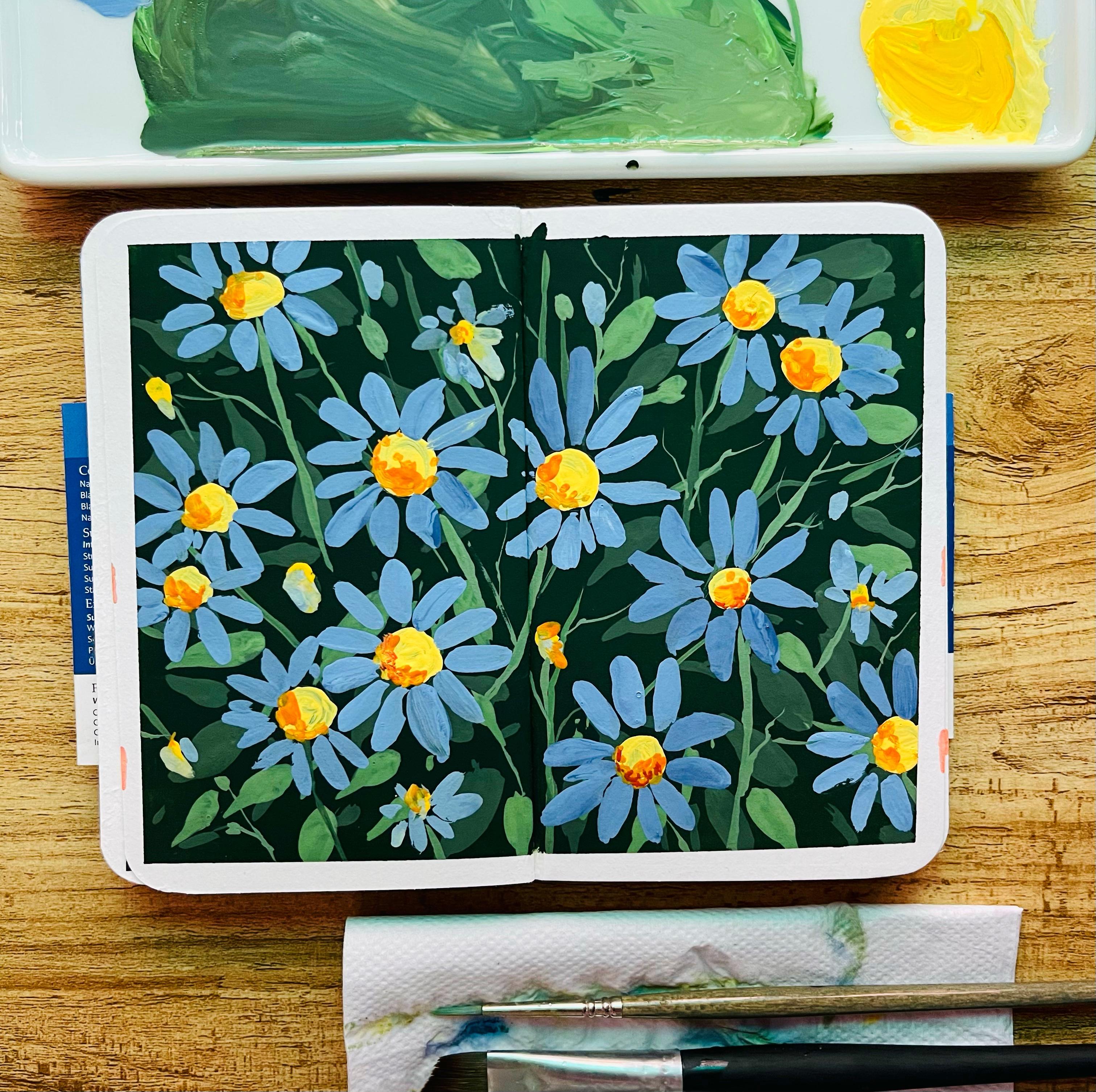
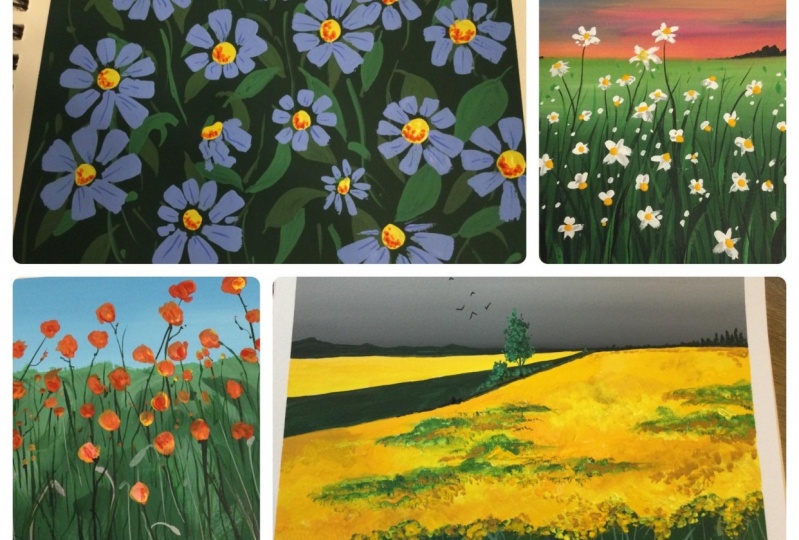
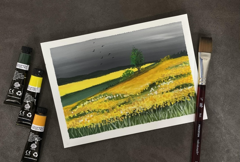
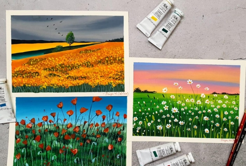
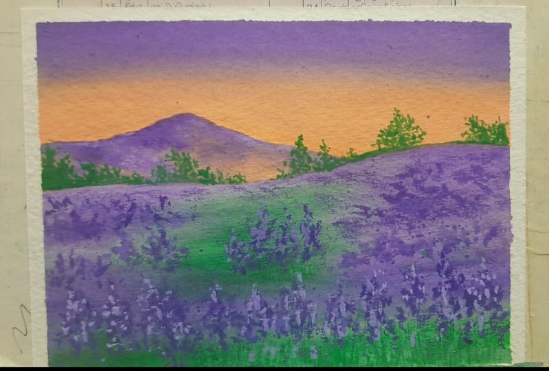
7. Project 1 Mustard Fields: Happy to have you
all in our painting. And that is going to be
the mustard fields of Fe, exciting journey that
we are going to start. There would be four main
paintings and then we would be working on one bonus lesson, which I will demonstrate
saying posture colors. Yes, I have added everything
possible in this class. Hopefully you guys all, they have taken the blending, then the mixing and loading
parts of the techniques. Well, then this part would
be really easy for you guys. Starting with the mics off a bit of black and
white for the sky. Once I have added the black
and white for this guy, I would go ahead and
pick up some more white and blended with
the lighter value. To watch that dog, I'm adding some more of lighter value while I
go towards the bottom. It's more of the darker value. And that's how I am
going to even manage it better as we progress. Right now, you might also that
the color is not liked to watch setup by either pick up some more white wash and
then add it on the top KVM. This is my, but Prussia and I would be using this even for my other paintings and future. Right now I'm just
blending the top, which is majorly the white
that you need for the guy. I think that's it. Once I have that done
everything possible, then I would go ahead
and make it more darker. While you go to
watch the bottom. Any of this kind of blending
in some major important part for the sky as I've kept
this guy really simple. If you walk on each and
every of your wash painting, then practically You will not be left with
much of highlights, which should not be the
case at any point in time. You should always
preserved some parts of your painting that you
want to show later on. And that's what I think goes, even for this
particular painting, I have kept this
guy really simple. We would be working on the
fields as the fields have quite some amount of
detail that neither had. I have taken very
simple yellow colors, whatever was available
on my palette. I did not think much
while I added the colors, it was majorly my lemon
yellow then some amount of my the yellow which is more of in India law and it
has a bit of orange in it. And the last one was my yellow or all of these colors
put together I will be using for my mustard fields as well as I would mix and match my white wash to
create more value. So each and every column, I have always told you
that we can create more values while you
are working with white. And that's how we
are going to create. Even in this case, if you haven't taken the
technique spot, I would emphasize on it to
go back and take in fact, technique spot as we are
going to use very often in each and every painting that you proceed on
that you walk around. Keep adding some
darker values of the green as you
observe me doing it, I'm using my size to escort us synthetic por la brush
to work on this, you can go with any synthetic
brush of your choice. Just go with a
smaller size brush has been working on a
smaller sized paper. Hence, you can always improvise on the brush, size, etcetera. Depending on the people side
is which you are working on. Except a few brushes that
filbert brush or any kind of round brush anytime
of flood brush. So all of these different kinds of brushes that
we're going to use, those can be changed. Of course, the nature
of them can be changed. You can go ahead with any
kind of synthetic brush that is available in your
country, in your place. Because we are not planning to go with any kind of
high-end brushes. It's just simple brushes. Whatever is available with you, you start to work it out. Okay, going with some
gusto value of the green and then just typing
some lighter value or green. I do call total shades of green, but they head off my
white or the black. Amazing way to
alter your values. And I think you guys will
really find it though well, to walk around with this, as this medium is so much more forgiving compared to any other medium
that I have worked. 30. So I must say that
this is a must, must try. And I know right now there are so many kinds of wash that
is available in the market. Very good price,
which is really, really Pocket friendly to you. You do not need to
go head width or professional quality
paints to get the great outcome
that you have already desired for and still
create something back. So close to your Haagen-Dazs, Dan make your field or Manchus. These fluorophores are
any kind of fighting allowed Congress
you want to have on any of your own projects. I know the colors that
I've applied for the sky, that has applied for
the background as well as for I'm applying
now is pretty opaque, can ensure us we are
not going to walk around a lot on the
sky after this, nor even on the background
hands going ahead with the opaque values
doesn't matter much. I could have gone better lightened value on
the plural fields. But then again, the idea was
to make it more fine print. And otherwise I have
to go add with many, many layers which I really
wanted to avoid us. There's a lot of
reactivation of wash which happens once you start
working on the next year. Keeping everything in mind, I'm just leaving
some white spaces in between where I would like to apply the green wash that you have on the palette. Now this is the dark or
light green or any kind of a sap green
that is available. Now, holocrine is a bit lighter compared to the color
that I'm using. As well as you can
change the green color depending on the black
that you'll use. All of this put together. I think you are going to have an amazing time as
I think this was one of the most
beautiful paintings that are created in
the whole series. There were so many, I think, different kinds of fields that I rejected and I came
up with these. Some of them very
really complex, which I did not want to include
in this particular class. There are always a lot
of failures as always, coming ahead and then going back that I hadn't
going forward and going into all of this
back and thought and then stepping back every point in time is one aspect
that I always, always to, to understand
this medium better and how things can work for you in
a simple and easy manner. That's the whole intent. Can feed them Wendy work, we have to meet things
look more simple. And simplicity can
really help you to walk around with
any kind of medium. You are working with any medium, whether big wash, whether it be watercolors, whether
it be acrylics, whether it be any
other medium like oil, which you think you want
to complicate a lot, please, please do not do that. Keeping it simple,
we'll help you to walk around with this medium, to understand the
medium initially, so much better and slowly, steadily as you progress, you will get to
understand all the rules and regulations are MSA, all the rules and tips,
tricks, shortcuts, everything. Other particular medium
where you have to be added. Cans, I would ask you are to
be hanging around right now. We are almost to 50
percent being done. Yeah. I think we haven't
added anything in terms of different kinds of
details on this painting. And still we are almost 50 percent done
with the painting. So yeah, it's going to be more and more
fun as we progress. Once done, then mix some amount of your
white into the green that you already have
and then you search tip of your brush
status my size two, and keep adding smaller
and smaller lines, like the way I am
doing right now. Keep adding these monoline side. You have boiled be actually mix some amount of your
white into your towel, clean quash, you will
get a color like this. You can even make some
other green color and get lighter values of bringing
as such the way you want. There is no particular
shape that I am going ahead with its gesture lighter
value of King green shade, which would look
a contrast manner on top of the dark green
that we have applied. More and more contrast to you add to a particular painting. It would leave you with more
depth into the painting. Contrast to sell
only be of light and dark for the opaque
medium like your wash, you can show the
depth, etcetera. See in watercolors It's
way more different. And in Guassian, it
acts really different. Wash is in-between, I would say some amount of your acrylics
and watercolors too. It is forgiving too when extend. But if you have a very, very dark value in
the initial layer, it become really difficult
for you to walk around. And then next two years, I'm going ahead
with simple dots. I am taking three different
kind of yellow color. This one is my lemon yellow
one is the Indian yellow or any other bit of darker value of yellow that you
have in your palate. And the third one
is yellow ocher. At least months more
dots to show that they are small, small
mustard flowers. Most shock these
dots will happen in the initial part or you can
say towards the bottom, where you have these crosses. I wanted to show it over
here as it is really, really important for
us to walk around. When we are working
with perspective, the things which are closer to us will
appear bigger to us, which means more details
have to happen on that. Compared to things which
are far away from us, Sandel would be
really less scope in terms of what we
can work on them. I'm using a fan brush
to add smaller lines, but practically You will not get any kind of marks on
this as I'm using are darker value and darker
value will not give you any lines if you try to
work on our data value, which is already
existing studies and I wanted to show that how of Dakpo value might not create
the exact depth and contrast which you really
need floor of the oral thing. I will continue working
on my foreground and darker mix my colors. Some can be very variable, it is necessary and then
work on my few areas. I'm not trying to select
each and every area. I would keep some
of the white of the initial layer
intact and then go over the lifetime value of the
yellow with darker values as I'm doing with the
yellow ocher right now. So yes, I have told
you about that. I have told you about one
brush marks you can add. It is a very, very
simple access to. It might become a
bit too long ago. Initially, that's one of the reasons I've
told you to hang in there and just try
to add these smart, smart God, it's simple, but it takes time. So that's the only thing I think that human might
find the big picture. But with your concentration, I would say that the smaller
paper that we have selected, you can sail through it easily. And I'm here to guide you
through the entire process. Each and every step
vegetable you think that is an NES city of understanding
and better yet. So we can work on
it more and more. Let's add more and more
smaller values or PLO, smart, smart gods, even on a few green areas as being one. Our drum. Funerals to be more visible. So yes, some in the initial
called ground paths and some of the area of the background parts also
it should be visible in Let's keep adding
the darker value of our followed that this
majorly my yellow or purple. And once I have added
the yellow ocher, I would go ahead and just
make the brush marks and no better way if you
absorb these brush marks. They are simple, as
I told you earlier, but I do know the shape and
size of this brush mark. And some of them I do either smaller and some of
them I'll do address bigger ones because some
of the flowers will not completely were rescued the flowers to close
some completely. These are small, small aspects of nature that
I keep in mind while I paint the whole lot
of chlorophyll b, we're going to weigh more
detail as we progress, so do not worry at all. There's a lot that
is awaiting you. There's lot more magic that
we are going to create. I am pretty happy with
how this has turned out. Ten know there was some kind
of textures that I wanted to still add on the background,
gulf Florida things. Let's go on adding
some contrasts to it. So going ahead with my
yellow ocher to add those colors on the
contrasting side and then blending it with a bit of green that
is already there, which we have applied. Once this part is done, we have to move on to
painting some trees. Now, small trees and bushes, which I want to add to this part that would make it look
even more realistic. And that's the idea,
not that realism, but to make it more natural, make it more close to nature. I'm adding some white
now into these areas. If you see the greenness now, pretty much subsided,
there is lot of blending that we have
done with the yellow. Because of that, you can see some parts of premium few areas, whereas the rainbow
visible brush marks. And that's what It's the most
important aspect of quash. You should not go make
your brush marks visible. It should become
just like textures, where you find that you are unable to Blender
tend to be more. Use your angular brush
or use any kind of bought or anytime of your
flat brush to walk around. I think that's it. And then you keep painting this. But I would meet him where we have to
paint our trees now. I'm going to shade so plain. I have picked up my
liner brush bar, sub d says minerals
making liner brush. Now this rash might get just case where the brainstem
line no crash as to S1. Suffered some damage. I
don't know how it happened, but the front part of this brush after one or two sentence I had
to switch on, don't mind. Princeton liner brush. I keep lot of
smaller brushes with me that really helped me
in many of my paintings. I am a person who actually
works a lot with the details and details really make my painting look
gay more amazing, as well as the painting
come to life completely. Once I have added a
smaller brush marks, Let's go ahead and
think that bushes. You see how these bushes, luke, Ethan, veteran data. As we go about that once we
have added these bushes, but then the word just blended with a bit
of darker value of Brown. After adding the darker value
of brown go head and again, blanket of it with the darker color of
green that is existing. Hello. Hello. I did blend my P are good with the background
and then adding some of my brush months for my
beautiful mustard field. Once I'm done with
this brush mark, I would again blended of
good with the background. Every time I have
stressed a lot on blending and mixing your colors. Mostly I do the mixing on my
founded tendon handed tone. The people didn't
know few small, small birds in the
background sky. One, some of the, some small boats on
the background sky. We'll go ahead and
just start moving. My paper has painting
is completely dry. That's one of the best things. Of course, it dries up so quick and do will be so happy
to walk around with it. That's something
I've always enjoyed and I love to tell the same to anyone who wants to
put this beautiful mean. Can you move the
defect in mango? Do not rip it off and just
try to make it you see? You? Yeah. I know It becomes
very difficult, so go slow. Had to again, I'm just picking up my brush
to blend it down. From the top side of the
floral middle. Yeah. Yeah. It's it's it's okay. It's done. Absolutely done.
8. Project 2 Wild Poppies: So here we are on to
our second painting, as I've already told you, is going to be a simple P50. So let's start by marking
our horizon line. And I would take any new
column which is available. Do not go ahead with
any particular blue. Go ahead with cobalt, turquoise, teal, whatever blue is
available with you. And then add some
white into it to make it lighter in value. I love to add my white
to make it light written value rather than water. That's one of the rule of
wash that we have learned. A new technique section,
mixing and blending. Of course, all these are very, very important technique
and as I progress, you will see me using more of angular brush for these areas. It helps me to pick
up less colors and it also sticks
less water into it. That's the best part. It's synthetic, angular brush
and that's really nice. Some menu have to walk around with something
that is quick, easy, and yet you do not want to hold a lot of
water on your brush, like a mop brush are like
any other flat brush. So those all things mine
hold a lot of water which we do not want him
this case saddened done. That's why choosing
a good brush goods, synthetic brushes,
very important. Again, now you don't need create synthetic brushes
for these paintings, whatever is available. I think that is good to go since all of these very
reliable with me. So I have used my old brushes. I haven't I haven't gone
ahead and what anything new for this particular class
except go wash back, which I wanted to use
pretty much Bruce tool, which is available pretty
much globally in India. You can go ahead with Kenny. I would say, gosh, that is available
locally in your country. You don't need to go
ahead with the high-end. Gosh, for this painting, I have taken out P dollars. One is main.main,
all of peanut, sap, green, these kinds of
colors on my palette. And I am adding some amount of my way along the horizon line. Once I am done with my horizon, But I would go ahead
and start adding colors towards the bottom media. Again. I would like to quickly hide them
more and more colors. Sometimes I can go ahead and use a round brush or you can say this is the kind of
brush shop which is not exactly drawn but
it's not even flat. So the upside of it is of
bute, rounded in shape. And it is mostly plaque. It would give you some kind
of strokes like these. And so every time
mind you go ahead, I would like to show you the exact strokes that
works the best for you. And it can create strokes
like this wherever you feel. It doesn't necessarily go ahead and use those kinds of pressures that would give you
great blending. And since I wanted some
textures for this spot, so I went ahead with
this brush in GIS. I did not want any kind of extra I would have
continued with my angular brush
that I already have. So it all depends on the kind
of work that you create. It all depends on the kind of things that you
want to paint on, etc. I think this is good done. I would start adding some
of my lighter green few of the areas wherever I feel it as necessary, make
some, some white. And you can see we will create a nice-looking different laws and different parts
of the field. This is one aspect
of painting fields. Why I say mix different
kinds of colors for your field that
would make it really look more and more natural. And it would be more like you are painting inspired
absolutely from nature. You bring the randomness
that's there in nature. You bring the uncertainty
that's there in nature. All of this put together you can practically hard something really amazing to
your collection. Go ahead and add these
kinds of brushstrokes. Keep adding until you
are happy and satisfied. I have added pretty
opaque color and disgust, fear itself, as I would go
head with only one more layer. So I'm not working with
many layers for this quash, but mostly you will
observe me working with two layers maximum
and one or two paintings who might resolve
me working on three layers. So when you are working with
lesser number of layers, you can go ahead
with Pixlr aims. But when you're working
with more number of years. I do go with lighter
values initially. I mean more watery values initially because that word absorbed really
well on your paper. And then you can start adding more and more opaque
medium onto your paper. I think that's what I wanted
to convey to all of you. Once this is done, then let want to
creating some grasses. Keep creating some
more tech Chauvet, a vertical tenseness city. Then you can of course, go ahead and hide the grasses. As I told you, I would
be using my size two, brush status, my
synthetic fresh DO create the Ross's some. And practically, if
you are even a Wagner, do give this a try
because it is simple, easy, only a few brush
movements. Urine there. It might look like an
exercise of 30 minutes, but it would not take you
even told him and that's mostly it's just that I wanted to explain
to you in detail. So I went ahead with
absolute real-time video, which can help you to
understand how Hi, I'm working with all of this. I'm using a very taking
tip of my brush, either an besides to as
column Vashti daughter be my size six scholar optimal
brush I used to profit. This is sixes caught up brush optimal and it
holds a lot of water. But sometimes I do
use the tip of it to make some thinner lines
than I do, again, not switch on it on my, um, one of the most favorite
brushes that as a SCADA size to synthetic
Poor Law series. This is absolute
synthetic one study you can always use for yourself. So go ahead and do work to your advantage and go with any other brushes
of your choice. I would leave that up to you. I have been hydrating it
pretty much throughout. My whole of the CDS. Do not allocate that
whatever you absorbed from your instructors using
go ahead and buy that. That's not the best outcome
that you can always get. A P was stopping off whatever you have
available with you. Use those brushes for
creating your own magic. Go ahead and add
these smaller lines. These smaller lines
are basically small, small areas which I am creating with the
help of my fan brush. Not again, this is just check texture that I
wanted to show you. You don't need to go ahead and drop this heavy
dive. Are everywhere. One-off that I wanted to
create and help you understand how it usually looks in case you are using or you have
these kinds of brushes, like a score of anything anytime local fan
brush or any kind of other brushes that can
create more texture into your painting that this always
works to your advantage. So that was the major idea
of telling you all of this. Now, I am mixing some
amount of my white into color that is green
and then applying it. If you absorb, I go really slow. Some places I go on the top, some places I leave
it like that. I create a lot of
gaps in between. Now creating gaps is
also very important. And that really helps
us to work through the entire Roslin in a bit. Okay. It looks way
more original. It looks as if you
have just done this. 10 some, I think these
are few aspects which you can keep in mind while you think any of your
future projects, it might really help you
to get through your RAM. Any future projects,
some even pretty easily going ahead and adding some more of my thinner lines
for a few of the poppies which DO look longer and they have this long lines
that you'll need to add. Once you have added
these longer lines, you need to think the poppies, we will be painting
it really loose. You will observe how
loose it is still. It would act like a poppy and it will look like a puppy m, That's the beauty of
working with quash. You do not need to
be always accurate. You can be a bit abstract and knew our
imagination and still create versions of
beautiful flowers, some on your own. And in case you're looking for any floral class which
you want to attend, go head and try out. Two of the floral classes, which is already available
with watercolors. If you are a watercolor out a star you want to
give watercolors, try with Pluralsight,
take income. Those are two of the best classes that
you can look forward to. One is more detail than
one is for bigness where you are going
to paint watercolor, florals, and seven different
styles over seven days. You can choose your projects, you can choose d1, d2, d3, and almost sold on bases are in the same order
of difficulty level. I have already spoken about. My other washed us earlier. So if you are looking
forward to create things, wash landscape, I have a class about washed
landscape two. So go ahead and
give that a try go it is a bit older
class from 2019, I must say, but soon it is very much relevant
to their day. And I've been using professional wrong
Porsche would there. So you might not find so much of theory that you
find a way where you can carry a learnings from
whatever you have learned over in this class and then
you can take that class. I think it would be of
real help for anyone who wants to give this beautiful
and amazing medium or tribe. I have make stars some
more amount of my white and total green
that I already had. And now I am going ahead with
some of my smaller bugs, which are all the blossom them. You are just adding them
for the background. These flowers are already
whether they are done, but still they remain not. So remains will always Peter. And to make it more original, as I've always told you, you have to add these, somehow, adding these
Stoli to your painting. Once you have added this
and other aspects of working with florals
of this nature would be to go ahead
and keep adding some smaller and loose
lines of similar pallor. We have been not
changing the colors for our grassland and for the background which
we are creating. Grassland fields,
whatever you see, every time you will
find different kinds of colors for the
spiel, for the spot. And we have to go by that. If you are going by that, you can see to secrete
some real magic. If you are adding all of these longer, shorter,
smaller lines, you can see DCC, so much randomness, so much on crosses and the
background foreground. Everything has been
treated and so much looks more and more
original as we proceed. This has been a victim
longer compared to adorn. Different florals which
we are going to create. I know there will be one or two projects
which might look longer, but they can add so much value
and everything so simple. It is they simply broken. They are just spending
time creating these lines. That's it. It is just that
we have kept it real time. That's one of the reasons you might feel it more elongated. Otherwise, I don't think that
there's any reason you're not attempting a small project like this that has so much intent and there's
so much that you Laurie, you have seen me using very
opaque base there over that. I am going ahead and
painting some lines still. You can observe these
lines in a better way. We tried some amount of our fan brush technique
for creating textures. So that's also done
data so much of learning that we had throughout
the entire process only. As we restricted ourselves
to convey few techniques. We are not getting overboard with the number of
techniques we have learned. That's one aspect or you should
always note that don't go overboard and try to add every technique which you
have learned in the process. It's a learning process. It's a learning curve. It would take some time and
you need to get that time. I have mixed some
amount of my red into the orange or
the flesh color, and I'm going absolutely random
violently these poppies. You see how I am I adding
these small, small poppies. One of the petals, I'm just jotting glues one of the petals I am adding together. That's how I go about. A few of them will be smaller, few of them will be big
goal, as always, nature. And we have to add all
of this in a very, very simple and
beautiful manner. Keep adding it till you
are satisfied, I must say. And then once you
plan to leave it, I think that's where the whole of the painting
will come together. Get along, hang in there. I can then you can very last. 15 minutes are 14 minutes
of the painting and left. And that would really put together everything that
we have done till now. Most of the difficult
work has been done. It's just the easier
part and some detailing which is left dressed. I don't think that you are going to change a lot from here. Hello. Let's add some more general
collosum as you also of me and now I'm even mixing
some way in-between. It's absolutely fine to do
these kinds of experiments. The more you experiment, the more you learn,
the more you learn, the more you understand the
medium and the more you understand the main
him the better would be your future outcomes. Every time I have
tried to tell you that everything which you see
God practically teach you, you have to go pick
up your brush. Things. People who
start what you want to make and what you want to do out of this creative thought. Most of you like to
be more creative. Many of you want to
approach this medium. I'm here to guide you
through the entire process, but major push lies within you. If you want to give this a try, just go ahead, take out half
an hour from me, should you? And whether it be
the morning coffee, whether it be the evening time. I think you can just make
it even not on our D, which is really busy and you
are busy with so much work, this can really act as
stress buster for you. Creativity on an
overall basis not only helps us to move
through the difficult times, I have seen that,
and it has really happy to be what I am today. It not only works as
the best for you, but it is one of the places where I
find so much of peace. And whenever I am trying to
be more happy or whenever I feel that I am just not
going up to my potential, I take off my paints and brushes and just talk
painting that sit. I do. Sometimes I do create good paintings and sometimes I do make
my own mistakes. Everyone does that. It's absolutely fine. You will make your mistakes. You make your own mistakes, you will never understand. By the way, I am adding details
right now. Where are we? I love to talk along
when you are painting. Has I want to just
give away my thoughts. I want to share
all my knowledge. I wanted to share my
experiences with you guys. So many of you might find
some value and at time, DOM may like to even
think that way. It has been one of
the most amazing, amazing ways in which I think
I have grown as a person. There's so much of patients that are learned through this medium. Whether big wash water
color, any other medium, you need to have
follow-up patients to work with each one of them. I'll add some small, small dots for the
background flowers. In the meanwhile, you
can see I'm using my rosemary liner brush. You can use any liner brush
that is available with you. This is majorly to get those thinner lines
and those details to create those details which we usually cannot create our
smaller People like this. And you need a ton of dash. In this case, I am,
I like to go ahead with the liner brush
for this painting. Hopefully, when you are happy and when you know that you are going to
get a good outcome, these kind of things just flow. Yeah, I think creativity
flows from these small, small things that I do
for any kind of painting. It just flows from within. It just shows I just
see some photos. I just see your some of my other videos of these beautiful floral fields and then I want to print them. If I want to paint them, what all I can do, I just try it out on people. And it's all creativity. When you start painting, you understand what
you want to do and what you do not want to do. There will be some few
things that you may create as not a good fight portion
and that's absolutely fine. There will be mistakes, there will be positive impacts, sand, there would
be some amount of positivity that you create
with these floral fields. I must say, they are flopped. Flowers are always
liked, love, empathy. Then they create so much
of positivity with you. And you can give these kind of smaller paintings during
your neuron, dear ones. They all put together, make everything
looks so beautiful. You can keep it for yourself. You can decorate your art space, you can decorate your homes, can make prints out of these. Whatever you want to try it out. I think this one medium can
become your go-to medium. It is less often
hustle, I must say. It's not like watercolors. It takes a long time to dry out, so the drying time is very less, the working time is very less, as well as the final outcome
is really brilliant. Wash one aspect is that
whatever be the outcome, you will see a very
beautiful vibrant painting. Okay, So guys, I have
explained everything that is possible to now
regarding the details, but you have to paint
for these poppy flowers. So go ahead and
act those details. Once you have added
those details, it's just better off your smart dots here and
there some more details with you continue working
on but involved we do not want to go overboard with the
whole of the painting. So don't try to just make the
sky full of your poppies. That's one thing you
have to keep in mind why we'll paint the sponge
solo cups in that set. And once you're done with that, let's have a look at a pacman angle bisector of a
porous completely dried off. I would go ahead and remove
the tape back and mangoes. See how I'm going ahead and removing my kids can't
call Bay and Benny, so Mano, I do not. Why are people you
need to keep that in mind in case you are not
using 300 GSM paper. You might have to look
into that if you give me, give him feel off the table, I want to be really
sure about this. That's one of the
reasons I do not suggest unique craft
paper to any one of you. Though, you can go ahead with Kraft paper trial with
300 GSM plus orals. If you are using
lesser than 300 GSM, then don't apply what she did. Or it might be off your paper
when you are taking it off, That's still meeting,
which I want to tell you. Let's move on to
the next project now way we get to experience more magic in terms of
painting our lavender fields.
9. Project 3 Lavendar Field: Let's make the
lavender fields this time and choosing my colors, I would like to go ahead with
the two beautiful shapes. One is the flesh color
that you usually absorbed. It's kind of a peach shape. You can make the shape the case. It is not available with you. It's with some amount of urine, red, yellow, and white. You can make a shape like
this one and gives it. Okay. Now this is not
exactly a flat brush. I really wanted to show you the difference between incase, you are using a flat brush
or round brush like this. And if you have an angled brush, if you are having
an angular brush, the amount of wash that
you'll pick up on your brush, his lesser compared to what I am picking up right
now on this brush. That's one of the reasons
I would really love each one of you to switch to either
a flat brush completely, which is absolutely
synthetic in nature. Orders go ahead with
an angular brush, and that should be synthetics so that it doesn't hold a
lot of water then it, I know that I am representing
this on a regular basis about the water
content because that's when as bigness we
tend to go wrong. And that spread the
whole wash painting, we'll go for it. Does that the reason I'm trying to emphasize
on it more and more. Okay, blending it with the
help of my angular brush. Then just adding a bit of my other color that is flesh and then
blending it again. In the meantime, I must tell you that I have
mixed some amount of my white with my purple
that I had, or bright violet. And then I have added that color on the
top part of my sky. Once I have added this color, I would go ahead and start
painting my mountains. Now the mountain area needs to be in two different sheets. That is, you are flesh color as well
as your purple color. As I want to show the
lavender fields which are extended even to
the back mountains. And this is basically
fields over fields of Lepanto that
you usually observe. So I continue to add those
same colors which I have. Going ahead. And
adding the colors. With that, I keep ordering
the value of my violet shade. Why? Although the value of
the balance sheet, it gives me way more depth
to bene, alter this value. And some of the
areas I try to add the darker value and some of the areas I tried to
add the lighter value. That's the only
change which I do, along with their time
keeping some whitespace. Now that whitespace,
I'm going up with the flesh color which I
have already shown you. The whole of the mountain
space that I have in this painting is going to be
simple, easy, interesting. We are just going to change
the values of the color. Values of the column means
we are going to blend the colors along
with the change to a value of only
one single color, that is your bright
violet or purple, whatever is available
on your palate. That's it. And you will see that a background
London has done. It's a very, very small
area which we are covering. That's one of the reason I do not want to complicated much. Always whether a big wash, whether it be watercolors, whether it be any other medium. If you complicate
the subject lot, then it would be difficult for you to concentrate on it more. Whereas if you keep it simple, it would be easier for you
to walk along with it. Okay, I'm going ahead
and adding some of my lighter value
of my pulpit. How do I add this slider
value for snowfall? I did add some
amount of my wife do the poeple that have
already had along with it. I have mixed quite a good
amount of this white thing to do before I add to the fields. Secondly, I'm leaving
some white spaces in between where I'm
going to add some of my green wash. Now whether it
be any kind of left no fee, you will observe
that there will be some amount of greens
that you will observe. And I want to show that dreams. If you are not using your
angular brush one by four and you can go ahead
with a round brush like this, not, this is not
exactly a round brush. It had. He does find o for
round shape on the top, but it is more on the flat side. So you can use a
brush like this, you can use so anytime
of angular brush, orals, even a flat brush and C, using the brushes to your
advantage is always good. But along with it, you should remember that you
are not going to complicate the subject much as well as
you have to go step-by-step. If we are starting from the sky, we will proceed towards
the bottom step, vise. We're not going to leave
any space empty in our first year and come
back in our secondly, that's one thing which I
have lot over the years, King's wash, that you should
not leave any spaces empty. Going ahead and adding some more greens wherever
it is necessary. Once I have handed this green, I would start blending it. How do I blend it? I would use again my angular
brush, brush blending it. You can use your one by
foreign triangular brush. This is the best brush
by which you can practically and the colors
and blend the colors. Yeah, I might be
saying this very often that there is lot of stress
on synthetic brushes. And I'm not putting much stress on the kind of wash
that you can use. But practically I
have used 200 quash. I have used pretty
much cheaper wash and according to my experience, all of them give you
similar kinds of effects. Only one thing on
that for students, great quash, you might have
to go more over in layers. Whereas in case you are using or artist grade gouache or wash from Winsor and
Newton professional grade. And hoping you will get o pigment grade
which is way better. That's the only
difference what I have observed from my hand much. And of course, if there is a change in the
pigment quality, then you might fake, find more vibrancy as
well as you might find the paintings looking
more beautiful when you were using absolute
artist grade wash. But as a beginner, I would
never suggest you to start working with everything which
is very, very expensive. Go head and try out with the simpler paintings as well as go ahead and
try out with the wash, which is way more cheaper. If you see I'm slowly blending
it with my purple color. And this purple color is basically the bright
violet which I have. I am mixing some amount
of white in it and few of those spaces wherever
I feel it is necessary. These are small, small
things that you can also do and blend your
colors in a better way. We will keep some part as green as you have
already absorbed. And while I go
towards the bottom, I would love to blend it
even better with the help of my angular brush and I
have picked up some color. It is basically kind of sap
green which I am using. You can go with olive green, you can go with any debris that is available
on your palette. You can even prepare
the colors on your own. That's always a great idea. You get to load so much more. In color theory if you are adding your colors and making
your colors on your own. So again, that's an
ideal which you can always go ahead and
explore for painting, even as bigness,
you get to learn so much more in that aspect. Okay, I guess I'm pretty much happy with
my blending part. I might add some trees
for my horizon line, or just before I paint
my background mountains, I would go ahead and
paint some trees. Many of you might think, okay, if had been watercolors and it would have been so
difficult to add trees now. And it would be my second layer, how the other colors
will react, etc. But believe me, Vestas quash. You go ahead with
the second layer and there is no problem at all. Whenever you are going ahead
with the second layer, just make sure that
you're not going over on the layers
that you were adding. In the second very few
are adding some Carlos. You shall not go over
it again and again and again to reactivate the paint, which you have added audio. That's the only key that
you need to follow. Rest everything will
fall in place. Okay? Again, I am changing
the value of the colors that I'm adding
for my background tree. Once I have changed
the value of my color, which I'm adding for
the background tree. You can also see that
there is a small, small dots that I add. Again, background trees are like anything that you want to
add. Go ahead and added. There is no rule of
adding a background or three ingredient one
too complicated, right? So mu-s you want do whatever you want to make
small dots makes more lines. Anyway, you want to
add it downward. And that randomness
that you want in your bathing and that kind of beauty and magic
which you want to add. This is the time to experiment, so picks betterment, change
your values of that. That would be lord
of a backpack. You can consult
with your painting. Okay. To add some depth
to the painting, I need to make some lines. Now, these lines will be
possible with the green start, I need to act on my
green needs to be a dark green direct goal Read
Archive for my painting. I foreground flowers. I would add the screen, whereas for my
background flowers, I'm not going to add
so much on bringing in terms of the detail
entire am going to do. Even if they're using a
liner brush like this, I'm able to complete
this painting within 23 to 24 minutes. And that's practically the
beauty of working with quash. Your paper dries up immediately once you have
applied your colors. It really means is very, very less time to complete and you are practically
done within a half an R. If you have during
the morning coffee or during the evening breaks are before you go back to sleep. You will have that
much amount of time to practice the wash.
And there is so much more that you can add on in case you are looking
for a side hustle. This I think is the medium
that you should watch out for. It has been in practice
from the last 600 years. And there are so
many opaque mediums which has come and gone. But this one has stayed
with the designers, the state with many artist. And now it's being used
very extensively with, I think of it has
been one of the go-to mediums for
each and every one. And most of the
experiments that you do in Gua Sha comes on very well as it has the nature of being very, very forgiving. Now why I say forgiving? If you have added one layer, It's not that you cannot add. I'll go over it in
the second year. Your first layer is less opaque, then it becomes even more easier to go ahead with
your second layer. While I am my second layer, you will see that
I use my lifetime. Why use a light hand? I do not go over one
area again and again so that I do not reactivate the paint status there
in my first year. So these are a few aspects on which I do follow for
my gouache painting. And practically
that really helps me to see you
through this course. She easily, okay, going ahead
with some darker values, some lighter values, you have to alter the values of the green. You can add some black. You can go ahead and
add some yellow in the dark green that
you already have to make it lighter in value. That's how we are going
to change the values. That's how we are going
to create the depth. That's how we are
going to war-torn. Everything that is
possible for don't grasp. Now this grasses practically in the green start you get
from your lavender fields. Once we are done
with the string, we would go ahead
and start adding some darker values for
our Lebanon fields. I would use my size two, brush font, 11 0 ones. Okay, I have added some
of my darker value it as my violet or you can take any kind of pride phyla
that is available with you. This is so Washoe
from close show us have told you and I'm adding
some simple, simple dots. Again, I would argue the colors. Fascia would go ahead and
add some darker values, and then I would go ahead
and add some lighter values. That's how I would keep
altering the colors and that's how you will get a
viewer with lavender field. I'm looking on the
foregrounds right now. As we have already worked
on the background, it's time to first had a lot of texture and duty
to the foreground. And then we can of
course go back to a background and
again work on it. Okay, let's keep adding
these smog, smog dots. If you see towards the top I'm adding lesser dots
compared to, well, I go to which the bottom, the bottom media
will have of course, more number of dots on it
could be more broader. It would be more like a
cone shape that you can observe while you paint
this window field. Okay, Now it's time to add
some more broader strokes. I would say that while you work on the foregrounds
towards the right, that would go head with some of the florals which
are more broader, which are more thicker, and they are more closer to us, so they would be more detailed. These are small, small aspects. Again, these as one small
clients that I always tell you, it has to be like a cone shape. It cannot be like all
the flowers together. If you see there is some
gap that we need to maintain while we add this
kind of a conical structure. Again, the coin should
not be really wide. Well, you come towards
the bottom area. They should be balanced towards
the left-hand two widths, the right, only towards the top, it should be 10,
like a triangle. While you go towards the bottom, if you observe this
particular flower that I'm painting right now, it is just starting small, small dots to Woodstock talk, Hi, I am making it
like a triangle. And then while I go
towards the bottom, I'm just adding
some random dots. That's what you need to
also do for this painting. I have tried to keep it
as simple as possible. I can tell you, once you complete the painting, you would be super
proud of yourself. What you have done in the
painting is very amazing. How this whole painting has
turned out would be, again, something that you
need to look forward to angle would be
really happy with it. So B along with me, I can tell you, you can literally create
munching on paper. So just keep adding the gallows as I am doing
right now on the people. Once you add these colors, you can also follow
so that how easily the colors are going to blend with each other beautifully. We are going to add more
and more darker values to the background that
how we are going to actually manage the
whole of the feet. Again, I'm altering the
values for my Bagram. This is a simple blending
exercise which I am doing. Now. Altering the values will give me more room
to play with it. And that's a thing that
I always follow for my paintings that
I like to order the values for the background or whether it be for
the foregrounds. Foregrounds, of course,
majorly I'll work on it as that is more visible
to the spectators, that is more clear. And working more on
the foregrounds, which had a lot more to your painting and
it would look a lot more original, I would say. So again, changing some
values for the background to just adding small smart dots with your purple shade
or your violet color. And once you were
mad at these small, small dots, I would blend
it with my blending brush. I'm keeping my angular brush that is one by
four-inch for blending. Again. Now this is a
purines or add the, I would say this is a purine. So for live endothelium, which is far off, so you do not need
to add a lot in the background that would pretty much create like
a lot more messy, I would say compared to
what it can add our two. Hence, for the background,
keeping it simple, be more intelligent
way of handling it. And I have always
done dot-dot-dot even in my previous videos. If you see only for
the foregrounds, we complicated more and keep
adding more and more dots. That's what you have to do. Hi. In case you have a
closer look at my brush. You can understand that
I've mixed some amount of my white to the purples
that I already had. And then now I am applying some lighter values to
my lab and no flowers. I am just altering the values of the lavender
flowers over here. I'm not trying to
get an exact match. Our Exactly. I'm not trying to recreate
the 11 DO flowers. That's how I always
go about in anything. Take time not trying to practically take
over the flowers or I'm not trying to
imitate and try to create something which
is very, very realistic. I only try to stick to my basic sun creates
something which looks more appealing and which can practically give you a sense of living new fields existing. That's what is most important. And once you are done with this, try adding some of the
lighter values of your green. Pick up some light green on your brush and then
add smaller lines. Once you have added
the smaller lines, you can have a look at it and understand that there's so
much Jeff data you have already created in
this painting that the whole painting tactically
comes to life now. And once you are done
with this lecture, paper dry off, usually dries
off with very, very quickly. As I'm using pretty
much opaque colors over here, retouching
some areas. So for my background
mountain and then blending it with the help of my angular brush that
is one by four inch. Pretty happy with how the whole of the painting has turned up. Hence, I am just
removing the tip at an angle and have long a
final look at the painting. I'm very sure about
it that you will be also amazed with the kind of outcome that you can kit in case you are
working with Galatia. So go ahead, give it a try. I'm pretty sure about it. You will fall in
love with it and you would also like to paint something more with quash nowadays for she's available
at a cheaper rate. So look if this medium a try, I will meet you next with
those fought project.
10. Project 4 Daisy Field: This is our fourth painting and the last project
from the series. It is going to be ODC feet. I'm just marking my horizon line with the help of my pencil. It's a very simple, 20 to 25 minutes, six size. Going ahead with
the flesh color, you can also prepare this color. I'm mixing some of
your red, yellow, and white in case you do
not have this column. I bought though bruce dog wash. It had the scholar
available in it already. And I'm using it to the full
potential to make my sky. Now this guy will be more of a blending exercise
for each one of us. Now, this blending
is really important as we do not want
any colors to get activated as well as we want the colors to blend well and not give us any kind of green. That's really important
to go ahead with lesser colors if you do
want to avoid the greens. And in case you want to go
ahead with more colors, pick colors like
high-end doing hi, prefer using some
of the flesh color. While Hi, I'm closer
to my sky Hadean. Or else go ahead with your pink. Pink. Reacting with glue will kick you out Gallo that is
somewhat like buffer. Buffer usually looks nice when you are working
on this guy. I like to use my
small angular brush for my blending area. Now, I have usually asked
you to use an angular brush. Now I'm going to
have brushes really handy when you have
to blend your colors. Whereas you can go ahead with any other brush of your choice. There is no best brush. I would say that you
can go ahead and use. So cool with any flat
brush or any other brush, preferably flat brush or
angular brush because they both will keep blending
your colors better. Secondly, try to use synthetic brushes rather than going ahead with more brushes. More brushes hold
a lot of water, as I've already told you. So I love to go ahead
with this angular brush. As angular brush picks up
really less water compared to any other brush that you
can think of where you can go ahead and use
for your painting. I know that I have been asking you for
many of these brushes. I'm telling you about the best
parts of each one of them. As I want to leave you with
lots of opportunities to select which brushed his best for you and which
color is best for you. I'm using pretty much very easy and simple
wash from Bruce show. It's hardly about $10 and you can purchase
it in India or rolls. You can go ahead with any other cheaper quash that is available. Student growth, that's
perfectly fine. And you can also go ahead with the higher-end wash
like Winsor and Newton. Or roles even go head with
some other like well-being. And they are excellent with their pigment quality and you can surely find a difference. But as we are big news, I can tell you that
you can go ahead with any brush of your choice
that is good to go, as well as any color
of your choice that is really cheap
and you can use it to your advantage so that
you don't end up spending a lot as philos UK
are great outcome. Okay, I'm using a
light green color. Now, each of these squash set will have the column
names differently. Now, this is a light
green color as well as an olive green on a sap green that you see I'm applying towards the bottom
area of the painting. Both of these colors have to
blend well with each other. I keep blending these fonts. You might think that I'm going pretty fast, but believe me, it's just fuel wash that
I'm applying and I don't want to leave any
spaces, has white. That's the reason
I'm going ahead with the most opaque
and thick medium. You can also add a bit of water while you want
to add these colors. Now, the wash that
I have is a not having a lot of room
for adding water. And that's one of the
reasons we should always go ahead and check out the exercises and to less we should try out the
techniques that I have discussed in the initial part
that would really help you to actually accelerate
your process to discover this new medium, how to paint with gouache. I would be giving you
a bonus lesson next. Where you can show
you understand that posture colors can
also be used in case you want to go ahead
and paint with some of the opaque medium
which has water as the base. So what happens
with your posture, Carlos's it's more coarse and greens are stored
in the jar usually, I mean to say the pigment grains are more course and they're stored in a jar rather
than coming in a tube. So that's the only difference. Auntie are good enough. I use hello, which
is less than $5, and still it gives
me great outcomes. So I really would
love to show you that in the bonus lesson and
it is really detailed. You will see how even using or very low quality or I would
say not about the quality. The quality is good, but it's more about the
price that you pay. So the price is really less. And greens are quartz, that's one of the reasons
they installed and chars for your post to color. Whereas when it comes to quash, it has been stored in tubes
as they are more fine. And you can get a better
outcome with quash. But believe me, you will
see how much magic, even simple post two colors
can actually get to you. So, yeah, Stay with me
for the ruinous less than next is we're going
ahead and adding these small, small lines, but they had
both gone liner brush. Do have to go really
quick in this one. Roc you can go vase
slow in this one. That's absolutely fine. There is no best way
of going about it. Keats, simply just
adding some lines. I went holy bit slow. But if you are more
of a GUA shadows, you can even go faster
and this aspect, but do make sure that your
phosphorus tri enough. It is completely dry
before you aren't the second layer morals
your phosphate will get activated and the second layer will not stay on top
of your first year. The second rule that
I have told you again and again while we were
painting with the cautious, not to go ahead with Bush on one single layer or you
have to add layers, then you cannot go over it
again and again and again. It keeps reactivating
the pins that you have applied asset and smaller
for water-based medium. So be sure while you are
adding any kind of lines, etc. So as always, you can go with the layers on at
a picture faces, make sure that you
add these lines. So with very light hands do not try to go over it
again and again and again. Having some background trees. These are the three so
which usually at the Earth, around the horizon line. Now this horizon line
graded all the mock initially with our pencil. And now you can
distinguish it because you have the sky above
the ground area. So these trees would be dead and you have to blend it with the help of
your blending brush. My blending brush is the
angular one by four inch brush. This is very handy and it
helps me to blend really well. When I had any kind of
colors to my background, I would do a mix and match of my green values for my
branches of the daisy flower. You will see that either
alter these values. Sometimes I would go with
the lighter green value, and sometimes I would go
with the darker green value. It might look a bit difficult initially because
there are a lot of strokes that I am
adding right now. So you have to keep a bit
of patients along with me. And then let the magic happen. When I add these flowers, I tried to Walter
kinds of brushstrokes. I'm adding some of them, I would add smaller, and some of them I
would hide larger. You see how beautifully I keep ordering it so that
you can always get more naturally looking
flowers and its nature. And I always say nature,
this very phantom. If you want to earn that
randomness even to your flowers, go head and had strokes in
many different directions. As well as you have to make
sure some of them are bigger, some of them are smaller, and some loose strokes here
and there should be left out. I'm leaving the middle space of the flower to add the yellow. If you see Daisy has a yellow in the middle and the
rest of it is white. We are not going ahead
and adding any kind of masking fluid to preserve the white because
it doesn't wash printing. When it is a wash painting, I like to use my white
quash to Woburn layers. Now when I add the flowers
for my foreground, you will see the bigger
and broader compared to flowers which I am adding format background
for my background, they would be simple dots. You have to see this difference while
you paint the flowers. Anything which is appearing
in the foreground will be more bigger and they are
closer to your eyes. Whereas painting, which is in the background, is part of it. Hence, as for perspective, it would appear more blood or they would appear
more smaller. We are not going to
complicate the subject. Hence, we are going
to keep it simple and painted as simple
dots for the background. Flowers. Whereas the
foreground flowers, of course, I would be
adding more details. I would be adding
more yellow into it. And there will be a
lot more detail part included in each one of them. Going ahead, if you see
just hiding some small, small dots can also help
you to depict the flowers. Everytime. It's not a necessity to go head and think
everything in detail. And that's what we will follow as a rule
for this painting. Going ahead in the second
layer for our wash painting. Again, even for your wash, You can go ahead with layers. Now the first few that
you need to apply should be always in lighter, or you can say would like the consistency compared to what you apply in
the second layer. Where does so? Since we are not going to add
a lot in the second year, I went ahead with quite an opaque medium
for my first layer. And then I'm only adding
detail for my second layer. So I would leave it up to
you how you want to go ahead and add our
workout on these layers. Taking some lemon
yellow and adding a bit of flesh color into it, and then adding some
small, small dots. This is my size two brush which I'm using to
add these colors. I would show you a variety of
brushes which you can use. I have already shown you there, find B flat brush. There might be round brush, there might be angled brush. Anything that you are using. I have told you earlier also, it should be synthetic. It should not hold a
lot of water or else That's where the wash
medium will go for a toss. Washes a medium where
you need to apply the colors which are
more creamy in nature. Whereas if you are going
ahead with the first year, I would say that the LEA
needs to get absorbed. So you can always go ahead with more of water-based
and the less creamy. Whereas when you are going to
head with your second year, it shouldn't be 90
to 95 percent wash and only five to
10 percent water, then you will get the exact
effect ritual right now. And so Fondo people. Next we'll head with light green that we have on this
slide clean now, when you give you practically
very exact contrast of your depth in the painting, we always need to add contrast. Now, this is one important
aspect of your wash painting. If you aren't the contrast and only you will get the
depth in the painting, and then only it
would look more here. We have already added
the darker values. Now it's time for
the lighter value. In our water color painting, you will always see
that we have to add a lighter value and then on
LIGO headquartered up or bad. Whereas for wash painting, it is a bit different. We go ahead with
the lighter value even after we have our
dental darker value. One simple reasoners,
the opacity with which you are working
washes completely opaque. That's one of the reason
you can walk as you want. I think some smart,
smart dots here and there as you observe me. Right now, this will give you a look which is
more loose and nice. Kimmy kind off or DC field. Once I've highlighted
these small, small dots, but the lighter
value of the green, I will go ahead again
with my dark green. It can be sapling, it can be any auto green that is available
on your palette. You can also add a bit of
black into your grade that you have and then keep adding
it onto the floor or thin. Again, the whole idea is to
create depth and that set. And these are the last 2.52 minutes which is
left for our painting. We are not going to add anything more into the daisy flower area. I would go head and
only add a bit of your grade in
Buddha floral area. Now, this green would
really give you an effect which looks like that. There are some shadows
also in the flowers, which you usually observed in
field or in o fluoro field. There will be some of the
flowers where there will be like and some parts will
have these kinds of shadows. Skier time, I think
right now foretold EVA, vacuum of so again, we do not need to
overdo any part of it. Hence, just touch it
in few of the areas. This is like a
medallion touch or you can say the touch that has to be clearly daily
optical to your high. And it has to be
really, really optimum, optimum in a way that you
are not going to get a lot, whereas you're not
going to hide it less. If you aren't really
less new will not absorb the shadows in this whole
of the fluorophore. And if you were a lot more, it would actually overdose. Whole of the white that you have added
for the floral area. So just touching it a bit more here and that wherever I
feel that is necessary. But the green, and once
I have a 100 degree, I would go ahead and let the
paper dry out completely. Once this paper dries out, then only I would
remove my tape. That is again, a very, very important aspect
of your brush. I'm using a 100
percent quadruplets, four arches as always. And this is a smooth surface, which is basically my
hard-pressed paper. Many of you might have even cold press, that's
absolutely fine. Go ahead, use your cold
press paper in case you want to work with wash.
That's not a problem. I'm using hot press because the wash stays on it for
a longer period of time. Hence, it becomes easier for
me to walk around with it. But I would leave that
choice up to you. What kind of paper
you want to use. A rough grain would not
be a very suitable one. So I'll try to go ahead
with cold pressed or a simple hard pressed
one for this painting.
11. Bonus Lesson with Poster Color: This is the last bonus lesson. And over here, I want to talk to you about
post two colors. Now why I want to talk to
you about coastal follows, as many of us do not want to spend a good amount
of money on quash. And we would like to try
out the opaque medium, which can be even done with
the help of bringing him go, or else it can be even gone with the help
of post two columns. Now post two colors is a bit
different than wash time. I would tell you
all the differences between opposed to follow
as well as a wash. But before I go ahead with it, I'm using or gums premium
post to Carlo and there are 12 different colors in it. Along with it, I must tell
you that this is condo $5. So if you looking forward to purchasing or trying out
something like opaque medium, then this is a good
thing for you. You can always trying
to solve before you finally try out
your poster colors. I'm using my dark green
color and along with it I am mixing some amount of my black to get a darker value, which I would apply
on my people. I have picked up some water from my glass jar
and added to the wrinkled that I did all the meat or the
mix on my palette. Once I have had a tad, follow, I would go ahead
and start adding on my small little
paper that I have. Now, this is a small-sized paper which I'm using this for me. I do not want to get overboard
with lot size people. And then thinking why I'm using this kind of
paper, et cetera. So that's one of the reasons and this is a 270 GSM
people that I'm using. It is cold pressed, 100 percent cotton you might
use, you might not use. So your post to Carlos
asked for last year of Joash can be used to on
any kind of surface. It can be even a lower GSM than 300 GSM far I always preferable if you
go ahead with what, 300 GSM paper or 250 GSM, 270 GSM paper, from which you can tactically remove your
tape points, you apply it. While we keep adding the
colors for our first year. The second difference that
I want to tell you a start, the pigment for goulash
mostly comes in your tubes, whereas your post two colors
usually comes in jars. Now, why this whole difference? Figments of the posture
colors are usually more coarse and nature and
they are bigger in size compared to what you
usually get ink wash. If you are using wash
like what sort of Newton or you are
using whole being which are like completely
professional grade. You can see that the fronts
of pigments for sure. But I still would insist in
case you want to start out in case you are looking forward to working with
some opaque medium, then I'll post two colors can be a good option as
it is available. Very cheaper rate,
you can use any kind of paper for this. And secondly, even synthetic
brushes are perfectly fine. So all of the colors, paper, et cetera, are
available at a much, much lower rate compared to
any other watercolor set. Or if you want to go ahead
with event, oh gosh, set, which is good inequality and which would give
you a good outcome. So that's the second difference that I want to tell you about. George Washington
Post two colors. The tone differences about the pigment binders
and additives. So pigment binders and additives are absolutely different
or for wash and for your posture colors for wash since you are buying it at a higher quality and as
well as higher price, The Colby that you get
would be of course, higher compared to what you
get for your post two colors, the wash, as well as
your posture color. Both of them sit on top of your paper for a
longer period of time, as well as the dry
off pretty quickly. Therefore, they're not so
transparent in nature. They're more chalky compared to when you are working
with watercolors. Okay, now post two colors, may not be as
vibrant as you find your wash. That's
another aspect though, which I want to highlight. In this case, the pigments might become more LDL
and they might not be as vibrant as you
usually find in any of your Gua Sha medium. The second important
aspect is you opposed to colors might
create muddy effect pretty quickly compared to if you are going ahead and using your drum wash. Now why opposed to Kahlo's will
create more muddy effect, are made out of
multiple pigments, each and every color. That's one of the reasons
whenever you are trying to mix more colors to
your post to color, they might have more muddy and you might not get the
exact effect which you want. So if you want to walk
with post to Carlos, try to keep it simple. Try to work out with only few basic colors or you can even go
ahead and work with limited palette that can give you a good sense of how you
go about your painting, as well as it can help you to
even try out a medium like Bush and stood to do something like first two
colors for voting it out. So it can it is not a
replica of quash for sure. It can only help you
to give an effect of an opaque medium which
looks a bit like quash, but it's not exactly Joash. Can still do something
which is closer to wash. Okay, That's the other effect. Now, I have mixed some
Ahmad off my green as well as some of my
black to get the Scholar. And I'm going with very, very random strokes
to add some leaves. Now the background I did painted with her dark green
color as you have seen, I have added black. I use black and many
of my things over your because black can go
wealth in this case, there is no problem of coming
back has it is opaque. Hence, I can even add white, even if I have applied among any amount of black
for my background. Today, rotate my
paper whenever it is necessary and keep
adding these small, small dots, the
small small lines so it is using my
size six brush. You can go ahead with any size six round brush
to work this out. That's absolutely fine with me. You can go ahead
with any kind of synthetic brushes
status available. Okay. It should not hold
a lot of water. It should be more
of an opaque medium that you should
have on the brush. It should be more creamy so
that it is so good to apply. And we can even go here to width our toddler for the painting. I did apply to set
off my colors. I did prepare basically to
set up my colors before I go ahead and apply for
my bank round area. One was for the lighter green and one was but
the darker green. So that's how I always cool
about mixing my colors. I usually prepare my
colors beforehand. And then once I have
added the studio, I would allow my whole
painting to dry off. Before we go further. In this, let's just
understand a bit more above quash and
about postcards. Okay, So you can of course, go ahead and sell your artwork in case you
are working with wash. Whereas for scanning and production usually post
two colors are used. And since that is a problem
that light fast names, so they do become
worse over the years. Hence, it becomes really tough for a fire to keep it intact. If you are selling
any of your work in post to follow compared to if you were selling it in goulash. While I have told you everything
about Washington Post, staccato switches
important, that you should basically know when
you are working with both of these mediums. The rest, I would leave it
up to you to discover it's not that you should not cry
on both the medium time. You should stick
to any one medium. In case you are looking
out for cheaper option, you can of course try
anything with post to Carlos and in case
you are looking out for our premium range, you should go ahead and
try out with gouache. I would leave it up to you what you want to go head and try out. I have completely in
some amount of blue and mix some amount of
my paint into wet. And then I am mixing
this color alone, but some white to actually
paint my blue daisies. So this is a wild flower
which you usually find. There are so many fields that
you can create with this. And I did create a lot
of fields beforehand, but I wanted to show something
which is more closer. And that's one of the reasons of doing this
painting altogether. And on a different surface. As I want to try out different
surface for you guys, you should get to know
that you can even work with a cheaper
paper if you were looking out for working with wash. You do not need to
only stick to papers, dike Arches, Fabriano, you can go ahead and use
even trough papers. Any kind of card stock. Most of them can work for you. Okay, along with it. Now let's get back to
some painting hand. You can observe me actually
adding some small, small round
structures over here. They are basically
the middle part of the blue daisy flower. This is something which
looks a bit more blue, but it has a bit of pink in it. So yeah, we would do that. I did alter the shape and size of their rounds
which I have created. So you can also order
it accordingly. I'm going with a very
bright yellow color. I have added some amount of
my white cane to this yellow. It is closer to something like an Indian yellow or
Sennelier yellow, which we usually
get in watercolors. You can find this kind of
a yellow even in wash. So whatever is available
with you use that yellow for creating
this whole small, small gods that I'm adding. There is lot of randomness
or where you are, which you can observe
as it is nature and nature has got
its own randomness. I would really like
to stick to that and keep working towards it so that it can really create
the beauty that is needed. Going ahead and adding
some more small, small, round structures so
wherever it is necessary. And then we would let this paper dry off quarrels so we can
also start painting over it. That's not a problem
as we are not going to go over
this yellow part. Anyway. We ongoing only extend
the on the petals sides, so it's absolutely
fine for this there. But you can seriously
absorbed that. I did paint the yellow part over the screen as well as
the light green part, which is all the existing. Hence, you can always see that quash has a medium
which can be more and more forgiving compared to
watercolors or else even post two colors are a
medium which is way more forgiving compared
to watercolors. And you can go over
and over on midi, on each and every layer. Keeping in mind that you are not reactivating the paint switches, they're already as posture
Carlos Bosch or watercolors, any medium that you are using. These other three
basic mediums which always use water as
they're activating agent. And wherever water is,
they're activating agent. Your color that is given
below might also get reactivated if you are working over and over a particular
place again and again. To my flowers has
always been one of the most interesting and the
most beautiful parts. I'm using my size two. Brush again to add these petals. It is a light blue color. If you can see there are
different kinds of colors. Flowers, everything which
is there in nature. You campaign so many wild
flowers inspired from nature. This is really one of them. I have already shown you
how to paint the fields, how to paint the poppy
flowers, lavender fields. If you go ahead and try ys
and mustard fields, you will. One of each and every
painting is so inspiring. It takes me so much
closer to nature. That really helps me
to be more friendly as an artist as
well as it helps me to evolve as an artist
who can practice. Relate so much more to
nature and it's beautiful. Flowers are just a way to
express it in a meaningful way, I would say by nature and
a weekend practically get everything when it
is about floral stuff. You are observing me. Well, then you can see the CC that I have two shades of blue. One is a bit darker value
and one is a bit of light. The darker value
sometimes I'm using and sometimes I'm ordering it
with the lighter value. This is very important
when you are working with an opaque medium. It helps to create a lot of
depth into your painting that I've explained
for the wash from das also applying even
for post two column, they are almost same. Everything that I've explained in terms of the techniques, in terms of blending, mixing, et cetera, layering
will remain the same. Theorists know practically,
hardly any difference. Men we're working with post to Carlos and B are
working with Porsche. Only important
aspect which I did find a venue or
working in layers. It takes a while for
posture colors to dry off compared to if you
were working with quash, he just tries way more faster
compared to your Bush. The second important
aspect, of course, I've already told you about the light fastening
part in case you are going ahead with
professional painting and you want to sell your art. Do try to work with quash. It has great pigments to walk around with and
that you can easily sell handle carlos
will not fade out over the years and it would remain
intact as you get absorbed. So this is one important
thing to keep in mind. If you observe closely, I keep rotating my
paper to my advantage. Sometimes I'm painting on the right side when I'm turning my paper
towards the right. And sometimes I am again
moving my paper to get the perfect lines as well
as the perfect strokes. It's absolutely good to alter your strokes
smaller, larger. Just to show that in some places your drum petals
are a bit tilted compared to other places where the petals are not
tilted enough. That's the bark which you can of course
follow and work along. Once this part is done, I got asked you to go a bit
more detail and go a bit more in depth where we will work on the middle
part of the flower, and that would be
Poland's, et cetera. I want to add some more
darker and lighter values. Again, the depth part
would add onto it. You can always see
that some parts are of darker values or it is for your darker colors compared to if you are
going ahead, don't wait. Any other shapes. So yeah, if you are
making it more flat, then you can go ahead with
only one single shape. But when I'm painting, I like to add more texture. I like to add more value into
what I'm adding some smart, smart dots right now and
then extending it with the help of my blue
posture color. Once I've added
disposed to Kahlo, I would call in and around a
wash my brush stamp and had some smallest shops to show
those smaller flowers. That's it. I think I'm pretty good with how this
painting is turning out. There are just taught last
45 minutes or seven minutes, which is left in the
whole of the painting. And I need to go slow
at this point in time. I have to build a truly aware of how I worked
through this painting. Now, I do not want to
commit any mistake. As I know, the whole of
the painting can stick in a shape and there is
only less which is left. I would say in terms
of the painting part, we are practically done. It's just few details of lines that I want
to paint along. That I can show the scam and show basically alerts
chimps in this park. And I guess that's it. I do not want anything
further. Okay. Yeah. Let's keep adding
some more small, small blue dots here and there. Once I'm done with it, Let's start adding
this bird off red, mixed in yellow, you
get a color like this, which will practically create that light and shadow effect in the middle part of the flower that has the blue
Daisy which we are painting, or any blue wildflower
that you want to think. Blue and yellow are absolutely great combination and I love to walk with
both of them Fe, often. By not creating any Getting
that you need to keep in mind technique not
creating green by mixing the yellow and topple. Hi Bo, keep adding these small, small lines now in green and I would use my liner
brush to add it. I would keep it really
simple as of now and I want to leave
it all up to you. I'm not going to explain
anything more over here, some small dots,
some small lines. And that's it. It would create the
whole of the magic. We have already practically
created matching on people by painting
called these flowers. In case you want to
hard or go head with more than you can
further retailer. But I would leave that
up to you. For me. This is where I would
love to stop in terms of the flowers
that I did, pink. I don't like to get overboard with this painting any further. I know there can be
a lot. Thank you. Cannot do any post Chicago
or a wash painting. There can be when more
detail you can spend way more time on it and you can
get away more better outcome. The whole intent of
this painting will be lost if I continue
working on it. It is focused on
beginners like come has. And as a beginner, I have always struggled
to paint with post to Carlos or
whether it be quash. I practically included
both of these in this whole of the class so that all of you can get the stuff, both of these sets in case any
of you want to try it out, go ahead and try out, even post to Carlos
to your advantage. They can be less by bit, but they are way more cheaper. They can give you
similar outcomes like Bosch but of Berkeley
lesser compared to wash. So that's absolutely fine. We don't need to always spend a lot and be
heavy on our pockets. I think I have said that enough has this very cheap
and I loved that fact. I can experiment so
much with these jars. I have baited 45 paintings already and only a bit
of my jar is empty. Don't know. That's the best feeling which I get when I'm using my Payne's. Most of the pain
survey expensive, whether it be watercolors,
whether it be quash, whether dung can be any
other medium like acrylics, if you are going ahead with your professional grade things. So always trying out new
options or base trying out different possibilities
is a good thing to do. Removing the tape at an angle so that my paper doesn't rip off. That's very important. I always use washi tape. Washi tapes actually helps me preserve my paper
to a large extent. And this is my whole
chart that you can solve. It is completely
soaked in quash hand. I just wonder show
you that color, which I get after
whole of my painting. You can ofcourse the two
jars to your advantage. I did change my water
once in between. So either you can do that
or either you can leave it. I might add one or two
details here and there. Even after I have 30,
that's absolutely fine. Oral. So writing code, you can
even leave it at this stage. So it's just an option that you have few
can work further. You can leave it here, whatever it is, so
it would be good. It is a great outcome. One thing that I
wanted to tell you why I work term again on it does adding a bit more
red in few of the places. So I did take some of my red on my brush and then added
on the middle part of the flowers wherever I
did think it is necessary and do let the paper dry off
for a longer period of time. It is a possibility
that your pins will take longer Peter to dry
off compared to quash. For me it happened and I want to even highlighted to you so that you don't make any mistakes while the whole of the painting gets dried off. Okay, guys, let's move on
to the conclusion part.
12. Conclusion: I hope you have enjoyed painting all these four beautiful floral
meadows along with me in case you have liked anything about this
class to relieve me of feedback has it as not only a great source
of motivation, but also it helps
me to reach out to many more new students who are looking out for similar
classes like these. Do not forget to upload your class projects in the
project gallery as I would love to see all of them and add on my valuable feedback
on each one of them. See you very soon with the
new class on the New Year.
 Dhritikana Nath, Watercolor Artist and Instructor