Transcripts
1. Introduction: What's up, guys? My
name is bouba and I'd like to welcome you
all as my best kosher. This a little bit about myself. I'm an artist, working as a professional for the
past couple of years. I worked mostly dry media and unfortunate
ambiguous in particular, my goal with this class is to get you all to making better, more realistic
drawings by analyzing the foundational elements
of religion and putting that knowledge into practice
and fully realized. We'll begin by looking
at the materials, the tools you'll need
to actually make these joints
happened from there, we'll expand on through some
best practices when identify an excellent
reference photographs and good lighting settings. Next, I'll go over
with you the mirrors wasting proportion of paper
as efficiently as possible, as well as the breakdown. This will all culminates in a fully realized figure
drawing where you have the chance to put
your knowledge to the test and then the
process possibly, but it's something magical. I'm very confident that
by the end of this class, you all will have the knowledge
of what it takes me to grid point and the
skills to execute. Hopefully in the process, they're all one step
closer to artistic goals. That's all for now. And I'll see you
in the next one.
2. Materials for the class: Alright, so these are the materials are going to
be using for the class. It's pretty uncomplicated. We only have a few different
things you need to use. So I'm just going to begin
by talking about the pencil. So most of the time I use these pencils by fabric Estelle, the 9 thousand series, I find it to be very
effective in the past. It lays down the
graphite very evenly. It's not grainy at all. He holds a good tapers, so this is one I
definitely recommend. Alternatively, I like to use
these pencils by Staedtler. I think that's how
it's pronounced. It works in a similar
along a similar vein. Very holds very good. Taper lays the graph. I done well, never had any issues with the
lead breaking off. So long as you're
shopping in it, right? So I'm sure the other equally
effective alternatives that might be a bit cheaper. You can go with
whatever you feel works for you with pencils in general. It's pretty straightforward. It's hard to go wrong. Just wanna make sure you're using something that's going to make your life easier. Next, I'm going to talk
about the races that I use. I use this clicker
eraser by Pentel. It's called the Z22. It's
what it sounds like. It's a clicker, so you click
and you can use it to erase. With this one, you
can kinda sharpen it to whatever you like, whatever points you like. So in that sense it hasn't been more versatility works
kind of like this, pushing back or shut down. I only saw it using this, but I find it to be very useful. Next, I'm going to talk about the fabric Estelle
perfection 1056, or suddenly revive six. It's a pencil eraser similar
to the clicker Raisa, me, that it's in the shape of a
pencil, much like that one. You can also sharpen it to
whatever point that you like. It's very good for making
very specific erasers. So it's one that I'm using for several years and I plan
on continuing to do so. Next, we're going to talk
about this blending stump. I'm sure most of you are
familiar with blending stumps. Useful tool for blending,
blending graphite, charcoal and whatever
dry media you're using. It's something that
has some user with some degree of caution
in that it's very easy to get carried away
and just kinda make everything look smoky so I
don't use it all that much. But from time to time, I get in there with it, moving on to some mechanical pencils. These are some mechanical
pencils from Pentel, I believe they are
called the 123 dx. This is the 0.3 millimeters. This is the 0.9 millimeters. Moving on to a blending tool
that I almost never use. But every now and then,
it makes a cameo. This is a soft blender. I can't remember
where I got it from, but it's it's a fairly
generic instruments. You can find it in
most online art stores or even in local stores
near you perhaps. And it just helps
to blend graphite, charcoal similar to a piece of tissue paper or a
blending stump. Only that it's a
bit more aggressive in just how much it
blends things out. Alright, so when it comes
to sharpening pencils, there are a few different ways
you can go about doing it. For me. I found that using an exacto knife and a shortening block is
the most effective. It has a very long
shelf life, unlike say, a sharp node where
you could use it for a month and then
it gets damaged, you have to get a new one. With this, I can kinda just sharpening
things indefinitely. Every now and then I have to replace the sharpening block, but that's every
couple of years. So it's amazing.
The exacto knife, I would use it to just sharpen the pencil to get off the wood. Once enough of the
letters exposed. Then I would use the
sharpening block and then just sharpened away. I mean, it helps you
get a very fine taper, which is very
important when you're making highly finished
graphite drawings. The sharpening book is by
nature and by the way, they saw charcoal
is fixed as well. And the exacto knife is, you can get in a
hardware store and an art store. Many places. Next, I'm going to talk
about graphite powder. This is by creating color. It is fairly useful tool. I don't use it too much, but I use it every now and then. And it just helps to cover broad areas of
graphite very quickly. I use it in conjunction
with the brush, like this one, going to talk
about this in a second. And it just helps cover
large areas very quickly. It's useful for getting
certain kinds of effects. So you want to use acetates
along here, graphites. It's lot easier to
do that with this than graphite from the pencil. We takes a long time to develop. Over here we've got some
charcoal sticks by Grumbacher. These are just vine
charcoal sticks, fairly easy to find. I don't think it matters too
much what brand you use, but I use Grunt backers. This is very useful in the same way that the
graphite graphite powder is useful in that I can add larger as a
value fairly quickly. This has a little bit
more texture to it. You can sharpen it
in different ways to get different effects. That you want to use it
in a more linear fashion or you want to use it in
a more tonal fashion. It also has a slightly different temperature
to the graphites. So if you're looking to add
variety to your drawings, It's a great way to do so. Over here, I just have some of the legs for the
mechanical pencils. We've got a variety of them. Some from Staedtler, some from a company that has no name. These are just two
BHB H, pencil lead. So obviously if you're gonna use mechanical pencils, you
need some pencil lines. I got these off of Amazon. So if you have access to Amazon wherever you are,
That's what you can get them. And just really nice to have, especially when you have
different grades of them. That way, you can use the mechanical pencils
to do a bit more. Always make sure you're
getting the right size when you bind the leds. Last thing I wanna do is gets one that's too big or too small. Over here I got a proportional
divider and a compass. I'm going to talk about
these two at the same time because they serve
very similar function. So the proportional divider, I use it in the early stages of, early stages of a drone when I'm trying to find my proportions, you can use it on a
one-to-one basis, like inside size or you can use it for comparative measurements. So you just measure
whatever you want to measure your reference
while to graph, and then you transfer it
over to your drawing. It's extremely useful in
getting good proportions, the distance between the
features, things of that nature. And it's definitely
helped me get better at seeing correctly. And so the compass, I use this more when
I'm working with grids. So it just helps you make
sure that your dimensions for the grid boxes are
completely accurate. Moving on to some more erasers, I go here, regular
rubber eraser. I think we all know what
that is and what it does. Let me talk too much about that. And I've got over
here kneaded rubber, which is a malleable
form of eraser. It's extremely useful
because you can morph into different shapes
and sizes and you can get very different
kinds of mark-making, whether that be in the hair or you're trying to
even out a value, you can roll it
into a fine points, which is extremely useful when you're making
graphite drawings. So definitely love this. Over here we got an old
painting, hog hair, bristle round brush, intended
originally for painting. I use it for drawing. I like this because
it can help me smooth our values
pretty quickly. I use it much like I use
the blending stumps, just even our values and get things to look
a little bit softer. And it does a great
job of doing that. So as you can see by the look of it, I've used it quite a bit. It's pretty beat up. So grab yourself one, it'll make your
life a lot easier. So that's all the supplies are going to be using
for this class. As you can see, it's
pretty straightforward. You don't have to have
every single one of these things or the exact
same brands that I do, make the best of what you have, just make sure you're
using high-quality materials and they will make the process of creating
a good drawing a lot easier. Trust me. Hopefully I've explained
it well enough that you understand and we can move on to actually
making some art. See you guys in the next one.
3. Sharpening pencils: In this video, I'm
gonna be going over how I sharpen my pencils. I know some of you
might be thinking, what's the point of
the video like this? We all know how to
sharpen pencils. But I think it's worth going
over in class such as this because it is at such an important thing
to the drawing process. The materials we need are
pretty straightforward. You're going to need
a sharpening block or a piece of sandpaper. Of course, the pencil itself. Optionally, some tissue paper
to wipe off the width of the pencil and the container to store some of the
excess graphite. So if you're ready, let's begin. All right guys, so here
I have a blunt pencil. This is a perfect example of
what you don't want to use. My exacto knife. Good to go. So the technique,
as you see here, is easy enough to understand. What I'm doing is I'm
applying pressure with my right hand through the exact dough knife on
the wood of the pencil. And I'm pushing through
Nick controlled manner with my left thumb and scraping
off the wood that way. I'm not concerned at all at this point with the LED itself. It's all about exposing
the lead through getting rid of the wood
and just putting pressure, pushing through,
putting pressure, pushing through something that we will take a bit of practice. You might break a few pencils in the process. That's okay. Just keep practicing and eventually you'll
become intuitive. My goal is to get three-quarters
of an inch of Z exposed. A little bit more,
little bit less is okay. But that's kinda
what I'm going for. Just the ballpark
estimates are that length. I don't have to be too close
to my drawing surface. And it's not so long that the slightest bit of pressure
breaks off the lead. Here. I think I got it
to the correct length. But it's still blends. So we gotta get to
the sharpening block. So why now I have the
pencil parallel to the chopping block and I'm
just moving side to side, rotating the pencil with my
index finger as I move it. Here, it's important
to be firm but gentle, moving side to side. As the tip gets finer, you want to release
some of the pressure. Just back-and-forth,
back-and-forth. Simple motion could results.
We're getting closer. I can tell. You can tell just
by looking at it. Right now I'm just
blowing off for some of the excess graphite on surface. And I think I'm happy
with the results. It's pretty sharp. That's a good length or
too long and two shorts. I'm just trying to get into
focus for you guys to see. We got it down.
Sharpening pencils. The first step. That's it for now. I'll see
you guys in the next one.
4. • Linear map-in: Freehand, grid, tracing.: Alright, so in this portion
of the class and then me going over the different ways to get your drawing on paper. Everything from free
handing to tracing. It's using a grid. Each of the different methods
can be valuable depending on where you're
at in your development. Ultimately, the choice is up to you which method
you want to use. In addition, and as
some of you might be wondering why we draw in the pair shouldn't
be drawn a figure in this class, fare points. I've chosen a pair because
the forms are simple, it's easier to draw
and allows me to communicate the process
of free handing, tracing and using a grid. Just as well. Moving on to the grid itself, I'm establishing my
vertical lines and demarcating those lines
with one inch segments. Next I'm putting in
my horizontal lines, establishing the
remaining borders. The grid. Going in with my compassion
pencil and marking the same one inch increments
and horizontal lines. It's very important that
you work on a flat surface, on a very stable surface. Because if you are straight
lines are not straight, it's going to affect the proportions of what
you're drawing. Now I'm just going
in and connecting all the different markers I've put along the vertical
and horizontal axes. If you did your job well
of making those marks, the markers on the
opposite sides shoe line up perfectly, or at least close, but it's also helpful to number the grids
alpha numerically. So I choose to use numbers
on the vertical axis. And let's us on the
horizontal axis. My reference
photograph, I get it graded at ScroogeCoin tools.com. Websites, you have a variety of different options in
how you good, whatever. Now's a good time
to talk about what makes for a great
reference photograph. There are a number
of different things. I believe a good separation
of light and shadow, a single dominant light source, high resolution and
minimal detail. The last one is kind of optional and depends on what
your goals are. But if you're a
beginner, you definitely want to work in
your preferences. They don't have too much detail. So you don't get overwhelmed.
Now beginning to scratch.
5. Straight Line Block In: To begin in this block,
and I'm going to start by identifying the top and
the bottom or to join. That is the entire length. Just to make sure I understand the parameters
within which I'll be working. Once I have the
borders established, I'm going to move
on to the head, trying to indicate
the total shape of the hand does few
lines as possible. Focusing on the
major angle breaks. For our friends, I'm using
it to transform and I find it useful to use lights and fans who is in this stage. So you can erase my username. Now I'm just working my
way through the portraits. Stick into Sri lines. Simplest possible
expression on the subject. As you can see the eyes
just a single line, the nose, couple
of lines shining. Make sure things are
in the right place before elaborating
on those lines. It's very important
at this point to not be to attach the lines are making most likely
they're going to be inaccurate to some degree. But I'm just making sure
that hopefully you are too. But I'm thinking abstractly, looking at those
negative shapes, making sure that
the positive and the negative shapes are
working well together. In here I'm trying to
identify some of the major halftone shapes connecting
that to the hair. So the head is very important here to
avoid unnecessary detail. If you feel like you
can use something else. If it out. You just want enough information
that once you join it looks like what it's
supposed to look like. In this case, a human
figure To love to me as a physical copy of the photograph or
the reference photo. And I have it outlines
with straight lines, much like I'm doing
with my pencil. And just make the
job a lot easier. I'll verifying the measurements comparing between the two UCS. The video progresses,
I use my divider quite a bit just to make sure that I'm moving the right
direction accuracy wise. So those are some examples
of an angle break. That's basically where there's a change in direction of a form. Then you can see
where the head needs the shoulders and on the other side of where
the neck, the shoulders. Good anchor points to
assess where you are. But if those angle breaks
are looking rights, they probably heading
the right direction. They can also be very useful
to utilize on plumb lines. And we'll see some formulas and action later in this video. I'm just making my
way down the torso. Still working on identifying those abstract shapes utilizing plumb lines such as you see
on the screen right now. Making sure things
line up correctly. As you can see, one of
the palm lines connects the bottom of the chin
to the outer Variola. The other one helps you identify the negative shapes on the left-hand side of
the shoulder bit better. You can use these
anyhow you want. It's a great way to
verify proportions. Part of how I get
the drawing down is lies in my use
of the divider. And try to use it maybe
at most 20% of the time, ten to 20% of the time. You still want to use
your eyes and try to make you the best
guess possible. But it's very useful in
ensuring that you never gets. We of course, don't
be shy about it. And we're getting there
Looking really supposed to be. And it's okay if the drawing
looks ugly at this point. Hopefully you're
not that far into it as far as time goes, and it's only gonna
get better from here. So focus on the essentials and you've got something
marvelous. Adults. It can be helpful as well while you work in these smaller shapes to use something like the head
has units of measurements. So we can measure the
length of the head and then take that across the
entire length of the figure. My way to verify
proportional accuracy. Maybe the tortious too long
in the lecture two shorts. Sometimes it can be
hard identifying what exactly is going wrong. Something like that can
reveal to you troubles, potential issues in the drawing. Right now at this
point, things are moving along fairly smooth. No major hiccups. But one thing I'm
making sure to do is stepping back
as often as I can, darting my eyes back
and forth between my reference and
my actual drawing, making sure I don't
get caught up in identifying every
single little shape. But staying focused
on the essential. Right now I'm gradually making
my way down to the hands. Hands in general can
be pretty tricky, especially on the
join of this size. This one is about three-quarters
the size of my palm. And I have regular size hands. It's pretty small and the
hands are especially small. So I'm trying to get to in general impression
or the hands look like I don't want to get caught
up in the weeds of trying to draw the fingers perfectly
or anything like that. You want to just try and
identify the mutual planes, get the lordships correctly and the fingers will
sort themselves out. Particularly as we move on
to more refined stages. I think hands maybe fields are being are many drafts person. It's always tricky no matter
how long you do this, but just keep drawing. If you got to drive
200 times, keep at it. Pays off to have
a look at hands. If you're struggling still
with drawing the handout suggests maybe not taking the exact approach.
I'm taking my hair. I want to start by simplifying
the hands even more, maybe drawing the envelope
shape of the hand. If I four lines
going from there, breaking that down
into a few more lines, and then indicating
your fingers. One thing I always try to do
is use those plumb lines. Thumb stops somewhere, put
up a horizontal plumb line, and look where that shows up on the other
side of the hand. The thumb supposed to be halfway down the other
side of the hand, and it's not zombies
in the wrong place. So you always want to make those comparisons because
things only accurate contexts. So useful to keep in mind. So we're getting to the end, or actually the end of the
SRE line blocking stage. I'm fairly happy with
I have here really our goal is just to have
simplified contours, fair degree of accuracy, and a framework to build upon. In the next stages. This point, it's
helpful to step back, assess everything you've done, look at what calls your
attention has been off and sitting down and when you're trying to
make those adjustments, it pays off in the
end to pay attention. So take your time here and
I'll see you in the next one.
6. Curvilinear blockin: So in this stage, we're
just going to further elaborate on the contour is
made in the previous stage. So moving from just pure
streets to introducing curves. Right now I'm just working
my way through the hair, trying to improve the
accuracy of the shapes. Not being afraid to erase my previous lines and correct proportions
wherever I see fit. Particularly in this stage, I try to spend more time
looking vs. drawing. It's very easy to miss certain details or see
things incorrectly. So I tried to take as
much time as necessary. Along those lines. It's important
to think about rhythms. See curves, esco, streets, making elegant marks, having some flow to the
gesture of the shapes. And that's what I'm
also thinking about. While we're trying to get an accurate representation
of all subjects. You also want to pay attention to the nature of our
lines. Light bulb. This is something that
will become increasingly important as the
term progresses. So moving on, I'm
trying to identify the value shapes of the hair. I'm not thinking at all about individual hair
strands at this point. Just the value shapes
and suggesting here. I don't think it's
necessary to have the hair look exactly like your
senior or friends, but something close
should suffice. Now I'm just trying
to make the shapes of the lips wanted to find more true to
what I'm seeing. Just introducing those curves
where they need to be. So the search for accuracy, even in this stage
now continues. So having lines like
that's a good alignments, can do this with your
pencil yourself. Make sure the angle
of the shoulders, the direction of the features is all accurate.
Nothing is off kilter. So it's important to use tools such as this
in addition to plumb lines to ensure that
everything is copacetic. Now I'm just working my
way through the shoulder, looking at those
shapes carefully, raising the previous lines. Taken as much time as possible
to verify the angles. Try not to push too
hard on my pencil. Is moving around the
drawing a little bit, trying to work out the shapes
that are easiest to make. A useful trick. If you find it a bit stocks on the drawing, move somewhere else
when you feel like you can better approximates
what you've seen. And in there we have
some geometric shapes. That's a helpful way to
think about your drawing. In total. Just to break things
down without being two rectangles,
triangles, cylinders. Thinking in this way
allows you to better gauge when you proportions are looking like your
shapes make sense. If you've done your
job correctly, the incidence of
inaccuracy shouldn't be very higher this point, you should be making adjustments in millimeters
versus centimeters. But if you realize there's
some major structural issue, don't be afraid to wasting significantly and go back
to the previous stage. It's going to be
worth it in the end. Back to the hands. Just want the same. Trying to build
up those straits, mixing it all and still
not getting too crazy. Like I mentioned,
very small drawing. We don't want to overdo
things that this points, but I'm trying to get it as
close to reality as I can. And the key here, like we'd
all have joined his patients. Just keep reassessing. Understand that if something bugging you just because
something is off. So keep working until
once you see Nikki happy. I tell myself and alerts. In this part of the hand, trying to utilize native shapes. Can the space between the fingers mostly paying
attention to the joints. So where there's an angle
break because I changing direction of the
angle of the fingers. Not at all concerned right now about the nails or the knuckles. Those things are
ancillary I'd best to the overall
structure of the hand. I'm really thinking about are
the gesture of the shapes, the curves, the line quality, overall gesture of the piece. And my shapes look inaccurate. And they look elegant.
Have all the curves. In the right places. They Two flats,
they exaggerated. And to a lesser
degree, line quality. Most of the lines of the same. But this particular points, but I'm trying to see if
something is a bit too harsh. Dark lines on the dark things. I have double lines of triple
lines where they just have one little things
like this Minitab. As far as the aesthetic quality of what you're looking at. In this moment, I reached
my desired end points. My goals for this
stage of the drawing, which were good flowing gesture, more definite shapes and good balance of C curves,
Tesco's and streets. And most importantly, in
our search for accuracy, we have in more nuanced
representation. While subjects, if you can
say the same for yourself, doing something like that'd
being said, it's all for now. See you guys in the next one.
7. Values Block in: Okay, Now on to the fun
stuff. We can start fine. You're trying to
make this joint look somewhat three-dimensional. So what I'm doing now we're
just applying a light layer of graphite to my
painting brush. And the purpose of doing
this is to eliminate the white of the paper
on the figure itself. It's easier to judge values
against the midtone light, against the stark
white background. So that's why I'm doing that. What I'm doing
blocking like this. I tried to limit the number
of pencils that I use. So for the purpose
of this drawing, I'm only going to be
using a 3D pencil, an HB pencil, and E to H pencil. I find that this is enough for me to get the results
that I'm looking for and use the 3D
for the shadows, the two each for
the lights and the HP as a transitionary value. As always, I'm starting with
the hair using my TB pencil. I'm trying to get the
entire value of the hair, of the entire shape of
the hair in one value. Keeping things very
simple at this point, it's trying to suggest the hair strands with I'm
making it unrealistic. To do that. I simply just
focus on value shapes. Squint your eyes down and tried to get the general
impression of your subject. Moving on now to the eyebrows, making them a tad bit
lighter than the hair, but not much different. Try and keep all the values
compressed at this stage. Into the ear now, just indicating
the value shapes, the shadow shapes around the
antihelix and the conquer. Going in with my HB pencil, trying to fill in that dark halftone shape and
by the cheek, on the face. More of the same. Now
moving into the shoulder, I'm just trying to get
a unified shadow value similar to what I
have in the hair. Ignoring reflected lights,
the occlusion shadows. All of that is going to come in subsequent stages right now, you just want a
simple expression. We want something that
we can do it upon. You want to get
the shapes right? So in here I'm also paying very close attention to the
actual shape of the shadow. I'm going to work
on the edges later, but right now I just want to get the drawing to look
more accurate. And so not having to worry
about reflected light or cast shadows allows me to focus on the drawing
aspect a little bit better. If you're struggling to
get the values to look, even, helps to
keep a light hand. Move with your arm
versus your wrist. And try to keep your pressure
as constant as possible. Now this points, patients
is your best friend. It takes time to
build our values, particularly in the shadows. So try not to rush. Keep your pencils sharp as
you can see the course. It's worth it to take your
time on these values. They look at it in
the end. So don't be fooled by the time lapses. Definitely took me
a little longer than ten minutes
to get this done. I can see there's some
slight variations in the shadow values across
the entire drawing. But for now, I think it's
best to keep it all the same. And so that's what I'm doing. Although as you see here in the shadow underneath the bus, I make it slightly lighter. And because there's
such a huge discrepancy between that particular
shadow on the other shadows. And I want to make sure that I include that difference now. Because if I were to make
it too dark at this point, I'd have to erase it later on. Now be counterproductive. So what I'm telling
myself at this point, it's just careful observation. Squint your eyes, step back, make sure that
you've seen all the shadows and the figure. It's easy to forget something
or no recognized that a certain part of the figure is actually a shadow versus
the dark half tone. So I'm just trying
to pay attention. Keep things simple. Just keep drawing. Going in with my HB pencil and soften that transition between
the shadows and lights. Once your edges
along the shadow. To be soft and transitional. You're gonna do that
by using a pencil that's not as dark
as the shadow, known as lightest lights. And applying those same
principles of even pressure, gradually building
up the values. And eventually that will
lead to a good transition. You can see on the screen here. This is how I break
down the values in relation to the form. Three before the shadows, HP for the transitionary tones, and two each for the
broad light shape. Our goal here is to verify that we have a class separation
of light and shadow. Soft edges along the terminator, that is where the shadow
meets the light shape. And we have that very graphic, two toned while it's
something that we can build upon as we start to
reveal the full more clearly. That's it for this stage. I'll catch you guys
in the next one.
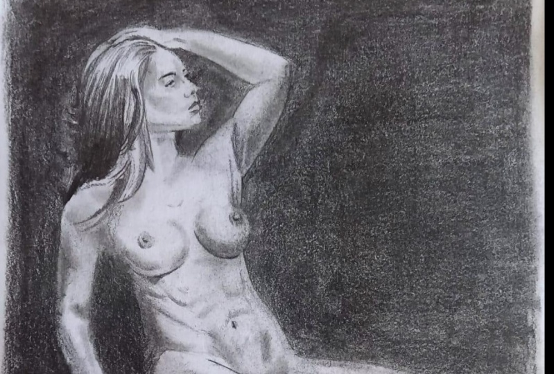
8. Shading the figure Pt.1: 50 at the start of the shading
slash rendering stage. Right now I'm just working
my way through here. It's a pretty simple flat shape. So I'm just getting
the shape right, getting the value
sufficiently dark. And then working on the
flyaway hairs and softening the edges around the contours
on the outside of the hair. Beyond that point and
moving into the half-tones, starting with the darkest
tones in the face, which on the side
plane of the cheek. Making sure to keep it soft
as the values transition from the side plane of
the cheek into the ear. Because of the
direction the airspace. And it's actually fairly light in comparison to the
rest of the portraits. So I'm doing my best to not get it too dark and also to keep the shadow shapes soft
but not too soft. Consider that more of a
medium edge and a soft edge. So something to
pay attention to. Now I'm working my
way through the nose, thinking about it primarily
as two major planes. Beside plane, which
is fairly dark, and the bottom plane,
which is fairly light. Then you've got the nostrils, which are pretty dark. But nostrils you want to
keep the shape soft around. You want to get it too dark. Moving on from the nose now into the upper left-hand
corner of the head. Trying to connect the values, connect the valley shapes. Then of course
you've got the band of light value above the eyelid. I'm constantly squinting my
eyes, taking steps back, trying to see what the
mean value shapes are, trying to look at the big forms. And then going from there. You also want to avoid hard
edges around the island. And the outline of the eye. My look hard when
you stare at it, but in contexts
it's pretty soft. Those are just the main,
the four main values I see in the face,
the hair mass, cycling of the cheek, upper left-hand corner
of the forehead, and then the center
lights on the face. So everything else connects those four main values together. And that's
what I'm trying to see. It's often a beginner mistake I see, especially around the hair is having the transition
be too hard. The edges aren't
sufficiently softened. You want to make
sure the hair kinda gray dates into the skin. And you're gonna do
that by putting in intermediate values
to Harrisburg, dark the skin is
lightened comparison. So you want to use
intermediary values to soften that transition. Remember to keep your
pencils sharp as possible. It will make applying
the value easier. Hey, it also mean
that you don't have to be two inches away from the surface of your
paper, which is nice. So still just trying
to round out the form, trying to establish those value shapes kinda portrait correctly. Little bit of
background in that. It's useful to begin to add the background as the
drawing progresses. You don't want to
wait till the end. It's difficult to have
the patients to put it in properly when you're done with the most
interesting part. So I tried to add it, developed the background
as I go along. Non-discretionary, making
my way down the neck. And a light source is coming from the top writes something you want to keep
in the back of your mind as you go along in your drawing. God, Generally, the
top right is going to be much lighter than
the bottom left. It's useful to remember the
neck is a cylindrical shape. A few important
muscles in there, just the sternocleidomastoid
and trapezius. Know that is particularly
visible in this reference. So I'm thinking
more pure cylinder. And it's also one of the best lifts portions
of the figure. So I'm trying to be
sparing with my graphite. Moving on, working on that transition between
the jaw and the neck. Trying to keep the edge soft, but also improve on
the Shape Design. Gradually beginning
to build up my value in the shadow along the torso. Keeping my pencil
as sharp as I can, lean on one flat value. I'm going to start with the
base value before I begin to indicates the variations
within the shadow. In general, we want
to keep things fairly compressing the
shadow because it's not the focal point of the
figure. On the screen. Now are the different kinds of edges we have in a drawing. Of course it's a broad spectrum. But for the case of simplicity, we have medium edges around the shadow shape and
the ear. Soft edges. As the values transition from the cycling of the
cheek to the front of the face and hard edges along the outside
contours of the neck. And that's kinda how you want to think about things is
where are the edges, software or the hardware
they kinda in-between. And that's allows you
to better describe the tactile quality is of the form and make things
look more realistic. Okay. At this point, I'm continuing to work my way through the shadow, trying to make the values
even by pulling out the darker spots with
my kneaded eraser, I'm filling in the lighter
spots with a dark pencil. Then after that I'm
indicating the core shadow. And eventually I'll go
into the shadow and begin to pull out some
of the reflected lights. I'm around the arm and the back, pulling out some reflected
light in my pencil eraser, trying to pay very
close attention to the shape of the arm as I do so I'm very aware of how easy it is to make
reflected lights to light. So do my best to screen my
eyes. Try to get carried away. So now's a good time
to take a break. Take a step back,
reevaluate your efforts, give you isomerase, and come back with
renewed enthusiasm. So far, things are going
according to plan. We want to keep
pushing that illusion of three dimensionality. And as you progress
with the drawing, more things will
reveal themselves to us that I need or attention.
9. Shading the figure Pt.2: Now moving on to the
middle of the torso, my procedure here is to get an average local
value for that area. And I go into that local
value by finding the parts that are darker and erasing all the parts
that are lighter. After that, I take a look
at all the edges around it, left, right, and bottom, making sure they are relating
to one another very well. Moving on now to the light
shape on the thighs, I can see the entire
region of the legs is a value step lighter
than the torso itself. So I'm making sure that
even the darkest aspects of the legs still slightly lighter
than most of the torso. Just putting up the values
gradually in my life, pencils using mostly my two HA and HB
pencils at this point. Every now and then use my
kneaded eraser to pull out dark spots and keep
things consistent. Okay. Why now I'm just thinking
about establishing that darkest band of
value in the legs. And then from there working
on the transitions into the center lights and
then into the highlights. Shaped soft and specific. It's always good practice
to try to identify the values that you
can best guess. That's what I'm
always thinking like, what value is the easiest
to discern going from that first and then keen everything else to
that particular value. Now I'm just pulling
out the center light to my eraser, knowing fully well, I'm gonna go back over that and work on those transitions. Generally you want to work
on the highlight lasts. It's not as important in
describing the form itself. Now I'm just working
my way up the arm. Paying close attention
to the value. I can see that the average
value of the arm is slightly lighter than the light shape towards the left-hand
side of the torso. But it's slightly darker than the half-tones in the upper
left-hand corner of the face. So I'm always looking at the different
areas of the picture. I'm trying to guess. Like, what is the average
value of this place, of this particular
part of the figure? And then whatever
else I add to that, to subtract, it's going to
be within that framework. And so along those
lines, it's helpful to think about the arm as a cylinder with
the center lights and highlights a core shadow, reflected light,
and cast shadow. If you can simplify the
army to this shape, it becomes easier to
apply a value and bring out 3D quality
that we all looking for. Every part of the figure in some sense can be broken
down into planes. And that's foremost on
my mind at this moment. Where the planes of the arm are those planes sitting in
relation to the light source. All of this we're determining the lightness and the darkness. Whatever part of the form. We are rendering. The top of the shoulder
slightly lighter than the middle portion
because it's facing more towards the light.
And on and on. Such as the nature of the thoughts that are
going through my mind. Which then serve as the road-map to my application of value. At this juncture.
I think this is a good time to take a break. Brainstorm the
drawing a little bit, identify areas of
visual dissonance, recognize the parts
of the drawing that I currently going well and
try to do more of it. Or your shapes looking accurate? Are the edges software?
They should be soft-hearted, it should be hard. Are you creating a convincing
impression on the subject? If your answers to those
questions and good family to keep moving forward. That's it for this video.
See you at the next one.
10. Shading the figure Pt.3: At this point in the drawing, we should have our
shadows from the established the company and parts of the shadow
are the core shadow, reflected light,
and a cast shadow. Want to make sure you have
all these different parts and completing your shadow, that the difference in
values between all three of them is minimal. Now I'm working my way
through the shoulder, making sure to organize my
value sheets correctly. Paying attention to the shadows, ancestral to the lights on, paying attention fixed
transition between the shadow into the lights. Working first on the form before including the highlights
or the dark accents. In order to connect the
shadow to the lights, you have to model the form. Ideally, you want
to use a midtone, such as UV pencil, HB pencil. Sometimes you need pencil
and get that transition. Soft. And specific. Always makes sure it's endorse
your eyes back and forth between the reference
and you're drawing. That way when things are off, they reveal themselves
to you more readily. Now we're going into the arm. You can see there's the lights value chain
right around where the practical radialis is starting to make sure
you indicate that on the screen now is a drawing from Johnson and sergeants. And I use it to illustrate
the points of edge work and how important it is to creating a visually
appealing image. In the drawing, you can see some more studies around the hair, some hard edges around the
outside contours of the neck, and some soft edges
right around her chest. And the ability to vary up your edges, manipulate
them effectively, make them shorter nature
allows the richness of the form a to be
felt by the viewer. And so I'm always thinking
once I get my value is established and move into the edges and see the resonating the way
that they should. Now as I move on to the hand, pretty much the same way, get an even value. Flats and the tone
of the angle of a pencil to fill in the white spots and dark spots
with the kneaded eraser. Carefully other planes
and how they are oriented to the light source. Just working in that manner. Typically I start from the
darkest parts and then I moved gradually into the highlights around lines and
the lines planes. And then eventually It's anonymous contains
one over hand. Trying to make sure that the values are I've
heard as possible. Very important and
looks bizarre. I mean, I was about peptides when I was
done at some points, but you just have
to stay the course. Okay. The arm in this case is
basically a modified silica, something you always want to keep in the back of your mind when you are drawing on that. So that's what I'm
thinking as well. I'm also paying attention to the mean value shapes
can about that. As I add value, I'm
referencing other parts of the picture to make sure that the values
thing up correctly. Careful observation
is your best friend. Want to look, look,
look some more. Every area matters. Every portion of the drawing
like a mass chase away, it all comes together. You will have
something beautiful. Good. The same thought process
goes from the hands here. Establish a local
value or the shadows, we're going to talk
half-tones, center lights. Always trying to improve the design of your
shapes of ankles. Attention to the edges
around those shapes. I try also as I get closer
to the end of withdrawal my face to think about
the contrast hierarchy. So what things are grabbing
our attention the most? Yeah. Hopefully your drawing is
coming along just fine. And you gradually beginning to reveal the beauty of a
form that is this figure. We're three-quarters
of the way there. And it's easy to
get comfortable and began to just functional
and autopilots. But I urge you at this point to really take a step back,
analyze IT decisions. I'm trying to improve on
what you've done so far and make sure to finish
this drawing off strong. That's it for now. See
you guys in the next one.
11. Shading the figure Pt.4: So now I'm finally making
my way into the chest. Beginning with the dog has
half-tones along the sense of the lower arm. And since they transition from shadow to light on the bus, do my best to preserve shape integrity while
eliminating the hard edges. That's very important as well to keep your pencil very sharp. I think getting when
you're working with really light values, I'm mostly using my two each on Forge pencils at this point. Trying to follow the
format as our random that is hatching in the direction
that the form is turning. The chest and the neck represents the lightest
values in the figure, with the exception of
those three accidents that are outlined in my drawing. So because of that,
you know that your dark is half-tones
in the chest and neck. I still got to be lighter than all the values just about
everywhere else in the figure. That's an important
thing to keep in mind. So that as you're modeling, you don't get carried away
and begin to exaggerate darks around the
chest and the neck. Subtlety is your best friend and transitions in value around
the lightest planes. Going to be very careful
of exaggerating them. Keep the large forms in mind. When I'm working in parts
of the figure such as this, I tried to keep Lambert
submission my mind. And it saves the value
change very slowly, near the lightest
lights and dark and more dramatically as you
approach the terminator, the terminator bean,
where lights meet shadow. So put simply, the
differences in value in the lightest planes
aren't going to be testing that can
be very gradual. Variety and edge work
is so important. It's like I've alluded
to in previous lessons. And as I work my way
through the chest, I'm thinking about the
social changes and edges, even in small areas. As you can see on the screen, right by the clavicle
near the highlights, the edges fairly hard. And as you move down the
figure begins to soften. Same thing happens
in the armpit area. The edges are much harder
around the under arm as you move down into the
bus, begins to soften. The little transitions like
this all over the figure. And the closer you look, the more questions you ask yourself, the better your chances of
making these adjustments. And I can really representing
what you're seeing. Moving on to the table, It's essentially
an elongated cube, but a fifth of it is in shadow, the rest of it is in lights. It's fairly straightforward
and it's formed. That is to say, towards
the left-hand side, you've got the cast
shadow, just a little bit lighter than the
shadow along the back. And the rest of it is in lights. The top plane of the table
is the lightest thing. And this entire picture,
accepting some highlights along the chest and the front line of the table is a little
bit lighter than that. So all fairly straightforward. Just make sure that
you're relating those values in the cubes
still to the figure. And you're paying close
attention to those edges. Just a visual reminder to continuously make
those comparisons. The only way you know
if your values are looking rights is we
compare them to what's around it's accurate values only exist in context
of what's around them. So do your best to be diligence. It's like your eyes
back and forth between the referencing
your drawing. Do you feel like something is not quite writing and drawing, then you can figure it out. It's helpful to ask these
questions for yourself. One is the same value
problem, a joint problem? Or is this an edge problem? Most likely it's a value
problem or joint problem to draw a problem and
go in and recheck your proportions
using Tom lines. Usually divided if you need to, checking the lens
against one another. Congrats. Alternatively,
if it's a value issue, could ask yourself, is there a clear separation
between light and shadow? Do I have values and
the shadow that I liked and the values of
lights. What do I have values? Lights that are
dark in the shadow. If it's not that you're
modeling problem using staying true
to light effects. Meaning you have to go comb through the different
value shapes and see where things are too light
to dark and adjusting. And that's going to require
patients stepping back, squinting your eyes,
thinking about a sphere and how light
moves across the sphere. And then looking at your drawing and analyzing whether
the same things are happening more into the hands. Now, I'm working on the cast
shadow by the left hand. In general, with cast shadows, the further the shadow is on the form that's
originating it, the sharpen the edges will be. So as the cast shadow
gets closer to the hand, it gets softer, just gets
further away, it gets sharper. I'm also using this
as an opportunity to create one last edges. The value between cast shadow and a form shadow
is pretty close, so I just made it the same. Just increase. That is variety. Walking into the background. Now I'm using my pencil to make mostly horizontal
and vertical marks. Gradually building up
the values are pushing hard on my pencil,
applying even pressure. And also making sure to work on those edges between the
background and the figure itself. Softening them where
they should be soft. Here are my visiting the face, fine-tuning some other
value transitions, eliminating any graininess. My kneaded eraser, do my best, lots of sets all making the adjustments I feel
like needs to be made. Alright guys, finally, we've gotten to the end
of this lesson. Hopefully you enjoyed
these videos. I learned a thing or
two in the process. I know I've had a good
time making them. Now's a great time to step back, review the entire joint, cut the areas that
were successful. Here's the one successful. What would you do differently? What technical challenges
that you have? And charting a course of action towards making
those adjustments. Ultimately, the path to
mastery is a long one. On that I'm still on myself. But if you're able to
gain some ideas and techniques and furthering
your abilities. And I would consider this
class successful one. That's all for now. Mr. Watts, you guys out there, and I'll
see you in the next one.
12. Class project: Finally, we're at the
end of this class where before I let you go, we
have a class project. Your first assignment
will be to draw and shade simple three-dimensional
geometric objects consisting of a cube, a cone, a sphere,
and a cylinder. The idea of being by working on this simple two-dimensional
geometric objects, you can improve the ability
to sculpt the form and value without the added
complexity of a human figure. The second assignments
will be to draw and shade a part of the human
figure to completion. This could be any
parts, the torso, the legs, the arms,
or the portraits. The goal here is accuracy in your shape design and a clear
sense of light and shadow. Ideally, you want to
build upon what you learned in the first
assignment is to draw it from the first assignment
you serve as a proxy for what the overall lights
effect should look like. And the smaller forms being secondary to the larger forms. Finally me, your last
projects will be to integrate your
knowledge or drawing and modeling the individual
body parts into a fully actual lines figure
drawing patients is key here, or the right level
of commitments and repetition every day. You can get through
to the other side, making bigger, better, more
amazing works in Lawrence. Finally, we've gone to
the end of this class. I truly hope you're
all able to enjoy these lessons and learned the thing that's
doing the process. It's been a real
pleasure for me. Hopefully I will see you
all in future lessons, but until then, bye.
 Terence Zulu, Fine Artist & Teacher