Transcripts
1. Introduction: [MUSIC] Whenever I think
of illustration, I think of it as storytelling. I love getting lost in all
of the littlest things, come out inspired, and take everyone back on a ride
to my illustrations. [MUSIC] Hi. I'm Chaitanya Limaye. I'm an illustrator and
visual storyteller. I've been working as an
independent illustrator for close to six years now. I love bringing stories to life and evoking emotions
through my art. Earlier, I worked as a
3D character animator. I got a chance to work on
films like The Jungle Book, Guardians of the Galaxy,
Cinderella, and many more. I tried to bring this experience to my illustrations
when I'm creating my characters and
environments that feel believable and beautiful. In this class, I'll be taking
you through my process of creating a [inaudible]
illustrations in Procreate. The key to making things believable it is ground
them into reality. To observe the
things that we are going to draw very closely, so even though they might
not look realistic, they still are believable, and then that allows us this
creative freedom to add our own imagination to it and bring our viewers into an
entirely different world. I'll be showing you how to
get inspired from the world around us that have most
out of that inspiration, and then start with
the actual process of creating thumbnails, then getting into the sketching, and then creating the
full illustration that includes the painting of the characters and
the environment. I'm super excited to get started on this class. So let's go. [MUSIC]
2. Examining Your Process: [MUSIC] Even while working as
an animator professionally, I kept drawing on
the side though it was not a
requirement of the job, and I really enjoyed
doing that a lot. Eventually, I started
posting them on Instagram and it was
amazing to discover that there's a
place in this world for my own personal work and that's how I got started in this journey of being an
independent Illustrator. When starting out a
new piece of work, I tried to find the most
fresh and new idea I can, but finding some original idea can feel extremely
tiresome and daunting. Now I think I have
the solution to that, remembering that
nothing is original. Everything is a mix-and-match of the stuff that we see
around in the world, all we have to do is focus on the things that we observe in the world and try
and present them in the most personal
perspective as possible. What I mean by that is an idea that has been presented
a lot of times before, can still be done
with a unique touch that is very personal
to you, for example, if you and a bunch of friends visit a place and
watch the sunset, what elements you might
pick around the sunset, would be very
personal to you and will be different than what your friends might be noticing. I believe that style
is an amalgamation of those little choices that we do when we are expressing
ourselves visually. As a kid, I also was fascinated by comic books and
animated TV shows and movies and they really informed the sense of
visual storytelling for me. Even now, I think my style keeps evolving little by
little and that happens because I want to
experiment with things and that just gets added to what
style I have built so far. To give you an overview
of my process, I start with a bunch
of observations, then I single them out to
a few things that will make a fresh point of
view for the audience. This is where I start with
doing a lot of thumbnails. Now, these are very quick
sketches or doodles, where I experiment with thought, all is possible in this drawing. Once I have this thumbnail, I get into making the drawing
very tight and clean. While I'm working on this, I tried to add as many
details as possible so that it feels like a world that
exists beyond this drawing. Now moving on to the color, I tried to bring in the lighting and make it
as believable as possible, but elements that
people might have seen here or there like in
real-world or in say even photographs and
all of these elements come together to create
immersive illustrations. I believe that style
is super subjective and what works for you
might not work for me. So as you follow
along on this class, you need not draw things like
say the eyes and the hands, exactly like I do, if you have a way that you
enjoy doing it already, I would suggest that you
stick to it and mix that with the new things that
you're learning from my class to make your
own unique work. For most of my sketching, I generally use a few
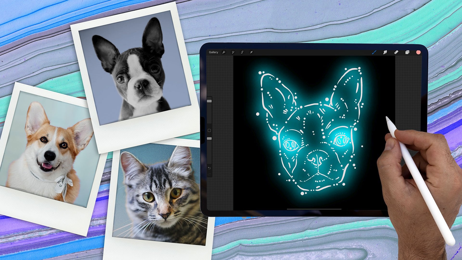
brush pens a few pencils, and just plain paper. For my digital
illustration work though, I tend to stick only to the
iPad Pro and Apple pencil, and my favorite app to
use on it is Procreate. The thing I love about this hardware and software
combination of the iPad Pro and Procreate is that it feels super responsive, it almost feels like drawing directly on paper like
with traditional medium. I value that a lot
because the last thing I want while drawing is any lag. Now, this is what
I use personally, but regardless of
what software or hardware you're using for your
own digital illustrations, you can still follow along this lesson and see
what works for you. In fact, a lot of these techniques that
I'll be showing in the class will apply equally well to traditional
media as well. Now beyond digital illustration, I love to experiment
with other media, like watercolors, acrylic
paints, and pencil colors. What I've learned so far is that there's always
something to learn from different techniques and there's a finality to the
statistician media that we can't find in digital illustration because
there's an infinite number of undoes and redo's that we can do while working digitally, but that is entirely missing in traditional media and
that really helps us plan for things
better and execute our digital illustrations
better as well. The student project for
this class is going to be you making your own
illustration and you can follow along my process and
pick and choose what you enjoy and like and add it to your process and
make it your own. Let's go ahead and
figure out how we can derive the most out
of our observations, we'll be learning how to
pick on those little things that bring specificity
to our illustrations. [MUSIC]
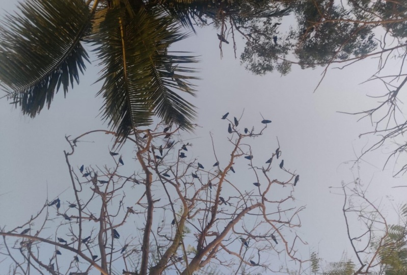
3. Honing Your Observations: I constantly get inspired heavily by a lot of
things that I see around. It might be just people,
their facial expressions, their posture, how they
do things very uniquely, and also by the environment. Things like light, the shadows that are cast by different
trees and leaves. I would suggest that always stay on the lookout for things that might spontaneously
click with you or stand out in
a different way. Let me show you a few examples
of my illustrations and tell you about how
some observations spontaneously inspired them. A couple of years ago, Ruja and I traveled to the Andamans and we
went on this very special night cartoon
where we are going to see bioluminescent
algae in the water. Now, these algae
are extremely tiny. They are very transient and
they have very light glow, something that cannot
be photographed at all with any camera. That was an amazing
experience and I had to bring it to my canvas, especially because it cannot
be told in any other way. I enjoy going out on long
walks whenever it is possible. On one such long walk, I happen to come across
this old gentleman who had, out of all things possible, a headlamp that bicyclist
might wear on his head. This old man wearing
this awesome headlamp on his head was a very unique thing and it stood out
very immediately. But then not all things are
very obvious right away. We have a lot of these plants
at home in our balcony, and one such plant
is the cotton plant. Now, this might not be very
scientifically accurate, but what I've observed is that there's always a
leaf that pops up every time there's a cotton boll trying to protect it from
the Sun and elements. I felt that this
is too much like a person would take care of someone like their sibling
or like their child. That's what inspired me to draw this illustration where
a leaf is taking care of the fresh new cotton boll and the cotton boll is looking
up in a very cute way, very affectionately at the leaf, like what a child would
look at his or her mom. It is important to look at everyday things in
different ways and think about them
slightly more so that we can come to the
unobvious parts of it. Personally, I love looking for symmetry and patterns
in things like trees, flowers, other things in nature. I think it is important
to have a lot of these observations such
that they form a memory bank. Once we have this huge
repository of visuals, we can always pull from them
whenever we are working on something and we are in need of something that fits
in just perfectly. When you're observing
the world around you, look for things that
are very specific to how people are doing things. Say, you see some
people who are sitting, first thing that will come up in our mind is that
they're sitting. Now, we need to ask ourselves what are they feeling like? Everyone has a unique way of expressing physically
how they are feeling. Someone might be
feeling a bit sad. You can see that
from their posture. Once you have this habit
of looking at nuances, you'll start noticing
these things more obviously as well. When I'm out doing some errands or sitting
at a cafe or restaurant, I tend to look at people around me and observe
these things. Now, to share those observations
with you wouldn't be possible since I don't have
any photographs of that. But what I do have
is a frame from one of my favorite TV
shows, Breaking Bad. Here we have these two
characters sitting on a sofa and both of them look pretty
relaxed at first glance. They seem very friendly. If you look closely, you'll notice that the
person on the right is more relaxed while the person
on the left seems stiff, and we see that from
their body posture. The person on the right has this nice curve that I guess is going through
his body that tells us that he's feeling more free while the other person
is looking very stiff. You can notice that his
shoulders are also quite stiff, and that tells us that
probably the person on the left is not very
comfortable in this scenario. These nuances we can pick up on when we are looking
things very closely. For this next example, let's do a fun little exercise. I'm going to leave this image on screen for a few moments. Let us have a look
at it closely and see what nuances are
we noticing in this. Then let's see what are those
observations that were in common and what are
the things that you might have picked on and
I might have missed. When I look at this frame, the very first thing that
I notice is that both of them seem quite interested
in this conversation. That is evident from the fact that both of them are
inclined towards each other, but when you start
looking closely, you'll notice that the woman on the left has her
fingers tied together, and that gives her
a tensed feeling. At the same time, the
person on the right, though he's inclined inward, you can see a certain amount of stiffness and straightness
in his posture, which gives a feel that he's trying to dominate
this conversation. If you look even
closer at their faces, then you'll notice that her face seems quite shocked like
her eyes are wide open, her eyebrows are also tensed. His face, you'll notice that his jawline is quite tight and he wants to say
something maybe mean, and his eyebrows
are also tensed up. Those are some of the
observations that I had and I'm curious to know what
you might have found. A great way to build your
memory bank and record your inspiration is to do
a lot of live sketching. I would try to record
people as they are moving. That is the key
to capturing them in motion because that
happens in a split second, and more you do of this, more your eye will get sharper
to capturing movement. I feel that now
that I have a lot of experience with
live sketching, I don't necessarily do
a lot of it anymore. I generally rely on taking
quick notes and also snapping quick
photos of something that I might find
very remarkable, and I can always return to it if I'm going to draw
something based off it. It is important to just gather and capture
this idea first, and you can always go back and draw the characters
whichever way you feel like eventually
when you get down to actually doing
the illustration. At times it can
happen that you see a very interesting moment but you don't know what to
do with it immediately. It is best to save this for later because you never
know you can always revisit it and probably discover a story around it, or even, in fact, add some characters
and create some chemistry to add some spice and develop it into something you have
never thought of earlier. A lot of my ideas I have come to notice are very
visual in nature, and it can happen a
lot of times that I don't have a sketchbook
and a pen on me. What I generally do is make a
quick scribble on my phone. It may not be pretty and I definitely don't fuss
over how good it looks. I generally use Procreate
Pocket on my iPhone, but if you prefer Android, you can always use
Autodesk Sketchbook for the exactly same thing. I found that light is a useful source of
inspiration for me. I keep noticing light streaking
through trees, branches, or even bouncing
off the floor of my home and casting out
interesting glow on the wall. All of these things can help in placing our illustrations
in different ways possible. One day I was trying to think of an idea for an
illustration and I just happened to remember
this cobbler lady's shop that I have passed
by a lot of times. I remembered her sitting
down with her dog, petting it and having a
really wonderful time. I drew it and I realized that
it is missing something, something that could add a bit of magic to that illustration. I quickly realized
it is looking pretty flat and light would
do that trick. I thought that light filtering through leaves would be
the perfect thing for this setting because
that cobbler lady's shop is right underneath a big tree. I added this light
wherein we can see the shadows of the leaves
and it just fit perfectly. I absolutely love
watching films and I've noticed that a lot of them
have brilliant cinematography. Things like camera
angles, color palettes, or just the way a particular
thing is framed can be inspiring and we can always bring that to our illustrations. Even with photographs that you might come across while, say, you're scrolling on Instagram, might have some elements that you might want to pick up on. For this lesson exercise, you can go to your
favorite place, notice things that
you enjoy or you might want to draw
and make notes of it. Then these notes can be in form of a text or just a photograph, or even if you don't want
to step out of your home, you can always find
inspiration anywhere. Just watch your
favorite film and start looking for things
that really interest you. It could be the
actor's performance or the way the lighting is done, or the color palette of the
art direction and such. You can make notes
of them as well and derive some inspiration
for your next work. Now let's talk about how to turn your inspiration and
ideas into sketches.
4. Creating Thumbnails: What is the first step I do when I get to actually
starting my illustration? I think of the ideas that I have and then I firstly
do the thumbnail. Now, what is a thumbnail? Thumbnail is a
tiny little sketch that is a place where I can explore the idea in detail in terms of the
composition, the angle, the perspective, the placement
of different elements, the posing of the character
and the story will be highly informed by
these tiny decisions, all of them coming together. I can just make a lot of
thumbnails if I want to and explore BCL camera angles or different ways of placements of different elements
and then it will be much easier for me to redo over stuff if
something is not working. I have a couple of
illustrations to show and describe
what I've done here. Let's have a look at them. In this first illustration, I wanted to communicate a very horror mood because this was the cover
for a horror book. I tried to minimize the
space for this character, try to make it look
claustrophobic, and try to hide the face of this character so that it
feels very mysterious. Another thing that I
did was played around with as many creepy
elements as possible, crazy long hair and a semi-transparent body
for this character. In the next illustration
that I have here, we have an abundance of space because there
are a couple of characters that are
flying over the city in a paper plane and it makes
for quite a cute mood. I wanted to make
sure that everything looks bright and
cheerful and that is how I thought of
adding the satellites below and then have some wispy clouds go over them to make it feel
even more magical. Now when we look at
both of them together, we notice that both of them have the exact same
color palette, and that is gold and black, or say yellow and black, but yet they say completely
different things. Now, this is because
of the choices that we have made when thumbnailing
it right from the get-go. This is why we have to
pay more attention to the thumbnails even though it might seem like
a throwaway thing. We can use different
composition elements like shapes, sizes, contrast, leading lines to inform
the viewer's attention and lead them literally to where you want them to look at. I have a picture here
that I have drawn where a father is introducing his
little kid to spring flowers. I want the viewer's
attention to get to the point where the little
baby is plucking the flowers, so I'm using different
composition elements like these lines of the fence next to them and then they merge
into this tree and then they raise the baby and
then bend into the flowers. Similarly, the other
elements as well, like the top of the
fence also does that. The dad's hands also lead
exactly to the same thing, including his eyes
and the other side of the footpath will also lead
to the exact same point. In this way, you
can have all sorts of different lines
which are hidden in the place that lead to exactly where you want
the viewer to look at. I have another
example here where the comparison is
pretty interesting. I wanted to draw this
character cooking in the kitchen and the space that I wanted to show
was pretty small. Now what I thought of here is I can probably use
a fish-eye view. Now fish eye are a
particular lens in cameras, wherein you can compress a space and show it even in
a tighter framing. I wanted to give
this sense of space even with a very close view, and this view really helped and made a very
interesting composition. Another important factor
to consider when composing images is to think of the angle we're looking
at the scene from. If we want to make someone or
something look small we can compose it from a
top angle or if we want something to
look quite grand, pretty big then we can compose it from a Moses point of view, looking from the bottom up. You can always think of
how you want the viewer to perceive things and then
place the camera accordingly. Another thing to
remember when working on our thumbnails is
scale and proportion. A scale and proportion can
be used in multiple ways, one of which is adding depth
to a scene or we can also use to add different levels of importance to
different characters or elements in a scene. Here, I have a couple of couples carrying kayaks and I decided to have one of them
be in front and be big so that the audience
attention firstly goes to them, but I also wanted to give a feeling that there are
more people like them. Another usually important
thing that I learned while working as a professional
animator is character posing. Now, there are two
aspects to this. One of them is clarity and communication and the
other is body mechanics. I have a clip here
which I have animated earlier which I'm going to
use to explain this to you, I have this character
starting out really aggravated and
angrier about something. I've posed him in such a way that he's flailing his arms in the air and he's stomping
around and such. Later, he moves
on to phase where he's pleading and his spine is bent over and his shoulders
are leaning as well, everything trying to tell that he's just not
having a good day. Towards the end of the
show, I've made him look very cool in the
way that he moves. All the shapes are
certainly simplified, like this very curved
shape in his spine tells that he feels
completely relaxed, but he's covering up for
something and that is clear because in the end he
again goes back to pleading. The other aspect to character posing is the body mechanics. There are a lot of
tiny little things that happen in the body, in the hips when
we're walking without stumbling and that is the
area of body mechanics. When we are posing a character, it is very important
to think of where the center of gravity
of a character is so that it feels believable that this character is actually
standing and is not falling. I have this character
in the beginning where he's standing and most of his weight is on his left hip
and later on as he moves, the weight shifts to his
right hip and that is how he can actually move his left leg and then get into this pose. Then again, when he's
doing this big move, his weight suddenly shifts
to his left hip again. These little things, however
small they might look, are very crucial to
posing a character. That's why it is
highly important to employ both of these aspects of character posing to make our characters
feel believable, and you can make sure
that the next time you set to draw a character, you are thinking about
these aspects as well. As I mentioned earlier, a lot of my ideas are
initially recorded as a quick note or something or a photograph so when I'm
starting to thumbnail, I look at those and then
start off from there. There are also times when I just start drawing
from my memory. In today's class,
I'll be drawing something based on
a recent memory. A few days ago I went to a hill nearby and I noticed a
very fascinating thing. There were a lot of pet
dogs and a lot of them were super happy to be outdoors and they were pulling
their owners by the leash. I thought of capturing that for today's class so
let's get started. The key here is to
not get married to the first visual
idea that pops up in your mind but to explore options and see what
would work best for it. I'm thinking of making a
couple of options before I can actually start
with the main drawing. I want to explore what it will look like from a couple
of different angles. One angle I was thinking
of is from the front where the dog is
probably leading. I'm trying to make a
forced perspective and making the owner
really small to give a feeling that the dog is really pulling extremely hard
on the leash and also create these lines that also lead attention of the
viewer from the owner to the dog and then I
can probably fill it up with a lot of grass leading to the direction of these lines that I have. For the next thumbnail, I'm thinking of keeping
things more simple. Let's see how it will work
to bring the humor across. In this example,
I'm trying to stage everything very
flat to the viewer, and I can already sense
that if I'm going for even a slightly
humorous way, this version is
going to work much better compared to
this one because in this one everything starts to
look super dramatic and it can be very useful for something where I want to make
it very action-heavy. Maybe it's a plot of a
detective comic or something, but I guess this is what I'm going to stick
with for this one. A very crucial part of
the creative process is to gather feedback
and then apply it. The best way to start, I think, is to get feedback right
from the thumbnails. When we do thumbnails,
we don't really invest too much of
our time doing those, and if there are any mistakes or some things are
not clear enough, we can easily scrap
them and start over. By taking this feedback
in and applying it, you can always make adjustment
and changes to make sure that the story you're telling is told in the best possible way. You can also post on Skillshare's
discussion boards and get feedback from
other students. In this lesson exercise, you can take the
observation from earlier and then draw
thumbnails based off-head. While drawing these thumbnails, you can make sure that
the composition is doing the best it can to tell the story
that you want to tell. You can redo these thumbnails over and over until you
are happy with them, and they tell the story
most clearly as possible. Once you land on a thumbnail that you are really happy about, you can take a photograph and then continue this
process digitally.
5. Detailing Your Sketch: [MUSIC] A lot of
times when I have a thumbnail that I'm really
happy about and almost everything has been worked
out detail-wise within that. I'll just take a snap
of that thumbnail using my iPad or phone and
then put a layer on top of it and then
lower the opacity of this sketch layer and then start drawing my actual
drawing on top of it. But there are some cases where the thumbnails are
not very clear. In those cases, I use
those thumbnails just as a reference and then
start off drawing afresh. As you must have seen in the
thumbnails for this drawing. I didn't have much
details for the character here and now as I'm doing
the actual drawing, I'm going to flesh out those
details especially the shapes for the torso
and the legs so that they create very clear
graphic shapes which can just make the drawing very pleasing and
fun to look at. So with these graphic shapes, I'm trying to create
visual harmony as in there are some lines that are very long and straight and then there are
some curved lines, all of them coming together make an appealing
image to look at. It's really important to play
with the expressions for characters and just make sure that they are
super-expressive. So in this case, I'm drawing this character. This girl's face is showing
a really wide smile. She obviously loves
her pet dog but she's also annoyed that he's
pulling her all the way around and I really want to highlight this
contradiction with her eyebrows getting
too tight and tense while she's still
has a really wide smile. Here, I'm just playing around with the shape
of her ponytail. I want to make
sure that it looks super kinetic and
right in the middle of motion just to enhance the nature of this scene
that she's getting dry. So as I'm working on the dog
here I'm just working out the mechanics and the
anatomy of the legs as well. So sometimes it might happen
that I might not know what muscles would a
dog use and how would their bone structure look like and how can I
make it believable. In such cases, it is best
to look up for references. With references,
I generally tend to start with an idea first, so the trap with starting to look for references
before having a clear idea of
your illustration is that we can end up being
slave to these references. They can certainly limit our
creativity and imagination very heavily and that's the last thing we
want as illustrators. Sometimes when I
want to hone in on the accuracy of a
character's anatomy, the best way is to just
set up a tripod and set up my phone camera on a
self-timer and then just be my own model
and shoot myself. That way I can have exact references of
what I'm looking for. It also helps for discovering
poses that I might not have imagined but feel
really good for the drawing. Now I'm going to go ahead and detail the rest
of the sketch. [MUSIC] A very cool feature of Procreate I love
is quick shape. If I'm planning to draw very straight line typically
it has to be drawn freehand but as you're noticing
sometimes it can happen that it's coming
out curved slightly. But if I want to have it
precisely straight then what I can do is draw a line and then hold the tip of the
pencil on the screen and then it gets converted to a quick shape that
is a straight line. Then once I leave it there, it becomes a part of the sketch. Similarly, if I were
to draw an ellipse, I can just draw an ellipse and then just hold it so that I get a perfect ellipse using this feature and
again, similarly, if I want to draw
a circle without having to draw a
perfect circle myself, I can do ellipse like that
just hold with the pencil on the screen and with my finger place my hand on the screen and then
it becomes a circle. I can scale it however
I want and then leave the pencil off the screen so I can get
the circle on the screen. So this is super useful for especially
technical drawings. When we're working
on the drawing part, we have to make sure that it
looks anatomically correct. One way to check that is to
take a break and look at the image after a while and then you'll start realizing
mistakes very quickly. Another way to do it
more quickly is to go to the "Canvas" option here and then use the "Flip
Horizontal" option. So if I do that, it
flips the Canvas and suddenly I'll start noticing things that I might not
have noticed earlier. It's just something to do with our brains that if we start looking at mistakes for a really long time they
start to look correct, but if we certainly
look at them from a different angle,
different perspective, or just flip the image then you can start seeing
issues with it. So if I feel like the eyes are not exactly
looking at the character, maybe I just tweak the eyeline slightly and then I think
we'll be good to go. So once I've done
the adjustments, I'll just flip horizontally
back again and I'm back where I started with
the correct eyeline now. What I'll be doing
next is taking all my drawing layers
and combining them into a single layer and then I'll be putting a layer beneath it and lowering
the opacity of this drawing layer to about 30 percent so that I can begin the coloring
process on the layer below. For this lesson exercise, you can do the actual drawing based on the thumbnail
that you have chosen. Also, you can add a lot of details based on
your observation. [MUSIC]
6. Exploring the Color Panel: [MUSIC] Before I start
the coloring process, I will love to take you through the Procreate color panel and show you how
I choose colors. When we go to this corner and tap on that
color panel button, we can see this disc view, wherein we can see the full
range of all sorts of use, and then we can choose the exact shade of
that particular hue, depending on the
lightness or darkness and as well as the
saturation or desaturation. Then there's also this
classic view where you can be more precise about
your choices and decisions. What we have here is a slider to select a
hue in particular, and then we also have
this slider wherein I can select and choose the amount of saturation or
desaturation I want, and then I have this
place to choose the tone. Now tone or value is
just another word for the amount of darkness or lightness in a particular image. These sliders combine to give us the exact color
that we're looking for, so we can either choose it
directly like that or we can specifically tune
it to what we want. Sometimes we want to make
something just slightly darker and also slightly
more saturated, say, to create a particular
shadow of object. So in that case, what I'll
be doing is taking in the saturation slightly more and adding a bit of
more darkness to it. More of a shadow
I want sometimes I can do more of the darkness, and also change the saturation depending on the lighting
that I want in the scene. Here we have this Harmony
tab inside the color panel, which is excellent and a very
cool feature of Procreate, where we can select and create different color combinations immediately right
from this panel. This is something that one would need to plan for and
do traditionally, looking at different
colors swatches, but the awesome feature
of Procreate is that it's built-in and it helps make
this process much faster. If I'm looking for the complimentary shade for
particular shade of green, then I can just go
using this method and get the exact
opposite shade of red. We can also check out other colors schemes like
split complementary, wherein we have
one color and then two colors just besides the exact opposite
color of this one. Here I have orange,
then I'm getting cyan like color and then blue, and these together will make a really awesome
color combination. Then to experiment with
the darkness of it, I can also pick, say, this bright orange and
then go darker and then use that bright orange along
with this cyan and blue, which are darker versions of themselves to create
something interesting. Similarly, we also have the analogous color
scheme, in this scheme, we can select any a color and then it gives us colors
that I just send to it, and waiting in just tiny amounts so that we can get
a slight gradation. Then there is triadic
color scheme, which is like a triangle
on the color wheel, which is also a cool way
to color your drawings. Apart from these color
schemes that we discussed, the very most important
thing that I believe in choosing colors is
warm and cool colors. All the colors that are
adjacent to orange, so that would be red, orange, yellow are known as warm colors because they exude
heat, and similarly, all the colors
that are adjoining blue are known as cool colors because they have
this cooling effect that we see in nature. It might sound very
simplistic that particular colors are
warm and particular set of colors are cool. But even within a cool color, we can always have
warmer colors as well. Say I'm going to do
a big section of my illustration in blue color, but even within that, I can have this nuance of having few parts of the
illustration be warmer, so I can just go
more towards yellow, and then those parts of blue
will start looking warmer, and then even more bluer parts
can look even more cooler. We can mix and match
warms and cools to create these interesting
color combinations, and also give a
sense of daylight or different types of lighting
in our illustrations. [MUSIC]
7. Coloring Your Background : For my illustrations, I generally tend to pick
more of naturalistic colors. I believe that they work best with the kind of
illustrations that I do. A lot of colors are
already known to have a certain effect
on the viewer. Say it's something like red. Red is the color of passion, of danger and blue can give a certain amount of
coolness to a picture, so we can choose colors
in order to create an exact mood that we want
to pass on to the viewer. Apart from mood, another important thing is
the lighting of the scene. Keep in mind, is the time of the day that we are
choosing for our drawing. It also tells us about
the source of light. Typically, there are two
different sources of light. One is the direct source and the other is diffused
source of light. A direct source of
light is the sun. You'll notice that
the shadows cast by the Sun are very
specific and very sharp, whereas with an overcast day, you'll notice that all the
shadows that are getting cast are quite
diffused and soft. We have to make a choice
with what kind of lighting and shadow scenario we want to have in a picture. In this first example, I have chosen the time of the
day to be morning sunrise. In this example, you'll notice
that the shadows cast by the Sun in the back
are extremely sharp, and they are also highly contrasting with
the sunlight that is getting spread on the
grass leaves around it. In the next example, you'll notice that it is
another similar scenario. We have sunlight
streaking in during a sunrise from a
window in an airplane. What is different here is that since it is an indoor scenario, the same sunlight is
not bouncing off of different surfaces
and that causes the shadows to be
much more diffused. You'll notice that
the light that is bouncing of different
surfaces is also lighting up the shadows and making
this choice early on will inform how we do the shadows and the rest
of the lighting as well. If you look at the
shadows and compare them, you'll notice that the shadows, in a scenario where
the light is diffused, are not that contrasty
and they also inform how we choose the hue saturation and the brightness of these shadows. Using light is a
great way to direct attention towards the characters that
we want to highlight. In both of these examples, I'm using sunlight in that way. You can notice that the farmer here and his dog at the
back are also getting lit by the sun that is
coming from the back and that helps them stand out from the rest of
the scene on the left. Similarly, in the other example, I have the character's faces getting lit by the
sunlight streaking in. In this picture, the faces are the most important
part that I want to highlight and the light
helps in that way. I think when we are
painting from imagination, lighting is one of those things that can be very hard
in the beginning, because our mind doesn't have enough of a resource
pool to pull from. Once we have a practice
of looking at a lot of images or observing light
in our surroundings, I think it will come
much more naturally and we can create
lighting on the fly. Like I initially mentioned, I tend to go with
naturalistic colors, but it is also important
to remember for me that I had this
creative license to pick and choose these
other colors that can make and give this exact mood
that I want to go for. Let's begin with the
actual coloring process for this illustration. One of the most frequently
asked questions on my Instagram is, what brushes do I use? I have a bunch of these MaxPacks
brushes that I got from this website called
MaxPacks and I also use a bunch of default brushes that
come with Procreate. I would like to highlight
that the brushes are not the most important thing
in the creative process. You can pick and choose any kind of a brush, what works for you. The first thing I stress on is coloring the background
because all the other choices, say the characters, the other
objects within the scene, are heavily informed
by the lighting that is created already
in the background. Early on I used to do
the characters first, because I used to feel
that comes more naturally to me but then I always ended up getting in a spot where the background
is not matching with the character and then I had to do over the character again. In the beginning, I
generally start by blocking in the bigger
shapes for the background. I'll be using this brush
called Nikko Rull, which comes default
in Procreate. But you'll notice this
little one at the end and that is because I have
duplicated this brush. I tend to customize my brushes slightly so that they gave me
that exact way of working, which I prefer, as compared to how the brush
comes as a default. I generally start by
picking one dominant color, and then I look for other colors that can work well with it. To start off, I want a muddy kind of look
for the background. I'm going to fill it up with a brownish tan kind
of a color and then I generally go for these big brushes so that
I can do this faster. Because I'm going with
a muddy background, the rest of the colors I'm going for are also going to be muddy. I'm going to create
another layer. I tend to do this so that all
these separate layers have different colors and
it is much easier to go back and tweak some
things if I don't like them. It really helps a lot if you can keep things more
organized in layers. Do not go overboard with layers because the more
layers you have, things just get too
complicated and we don't need that unnecessary
complexity while working on our pictures. Once I've locked in the big
shapes in the background, I start with adding
a bit of shadows and highlights to start
adding dimensions to it. In the beginning,
I'm going to choose a bluish kind of a shade here
and using the same brush, probably reduce the size and
also reduce the opacity. I have this reference photo that I click at that location. I wanted to capture that light
at that particular time, and it was a golden R,
just before sunset. It had this beautiful
orangeish light that was bouncing off the wall. I wanted to bring that kind of a feel
to this illustration. I'm going to start by
adding some dimension ready to it by using
these few strokes. These strokes, I'm
not being very precise with them
initially because all I want to do is give a feel that this surface is
not super smooth or clean. The vertical nature of these
brushstrokes will also tell the viewer that these
are very rocky patches. One of the very cool
things that I like about Procreate is
the fact that it has a very minimalistic UI and
this panel on the side is so easy to manipulate and just changes the size of the
brush or the opacity. Once I'm done with making the rock wall at the back texture
and not so clean, I'm going to start
using the gouache smooth 1 brush here, which I can use to add a lot
of details very quickly and create smaller shapes
that will resemble rocks. I also happen to notice that, there were these small little
changes in the colors of the rocks and I want to bring that look to this
picture as well. I went with dull green, which is very boring green. I'm adding random strokes
here and there to make it feel more like the
underside of a huge rock. I'm pretty happy with what I have now for the base
of the rock structure. Now I'm going to add a
lot of sunlight to it. For that, I'm going to
create another layer and I'm going to go with an orangey
kind of color here. I don't want it to be super saturated because the sunlight that I'm showing here right now is not super sharp at that time. It is less bright
and it has a more of a red and orangey
tone than yellow. I'm going to go for something in between those and something that is not over the top saturated, but somewhere
in the middle. Maybe I can go for this
earlier brush again, so I can do these bigger
patches with a better speed. What I'm looking
for is the surfaces that are looking
towards the Sun. I'm leaving out areas which
I want to have shadows in. This immediately starts to
give a level of contrast to the picture and then starts
making it also dimensional. I make sure that the entire color palette does
not look super saturated because that
can look very amateurish. Another thing is
that if everything is the same level of saturation, the viewer's eye cannot
be really directed. Having certain parts that are desaturated can really
help in that case. Once I'm done with the dominant
part of the background, I start with the
other smaller parts. I'm working on the
grass at the back here, just adding some
kind of a texture to give that dried grass look. Depending on the
nature of the light, I choose the colors that I go for for the highlights
and shadows. As you must have noticed here, we are using a big bright
sunlight source here, which is near the golden r.
It's going to have a lot of yellow influence on
all the highlights off of the objects. For these warm highlights, I'm taking in that local
color of the object. Local color is the true color of an object without much of interference from
external lights. I take that color, which is olive green, and then I'm adding more
brightness and saturation. If I'm moving the
picker to the right, it's adding
saturation and if I'm moving my picker to the top, it's adding the brightness. I'm adding a bit
of both and also probably shift the use
slightly more towards yellow. That is how I'm getting the bright vibrant highlights
for my foliage at the back. I generally just do
them very quickly. Now that I have this big bush
done at the back, I'm just adding a
bit of reflection because this is a little
pond that I wanted to show. I'll only use the colors
from the bush above. One important thing to
remember is that we have to focus on what we want our
audience to focus on. If you want the character to be the main focus of
an illustration, then the background should
have lesser details. The amount of detail is a
big differentiating factor among things that the audience
will carefully look at, and will not look at. The more the detail, more it is going to attract
the viewer's attention. In the case of
this illustration, I want this character that
is getting dragged by this pet dog to be
the main focus of it. I'm going to keep the
background super simple, as simple as possible. I'm adding this texture or just like a variation of colors for the grass
in the foreground. Earlier we learned that
if every single color also has its cool and warm side. If I've wanted to
do something warm, I will pick something like this, which will be closer to yellow, but I want this part of the
scene to be in the shadows. This shadow is getting cast by another such wall at
the other side and that is why most of the light
that is hitting in this part is going to
be coming from the sky, which is heavily
influenced by blue. That is why I'm going to go for a slightly cooler green and also desaturated it's almost looking gray so I guess this
will work best for me. I like the color that
I have found here. I'm going to start working
on the entire grass and make sure that the background looks
cohesive together. I remember that this hill
had a lot of trees at its top so I'm going to
quickly draw some of them. I'm going to start with the same sub-green
kind of a color, again going with
the smaller brush. Now that I'm done
with the trees, I'm pretty happy with the
background that I have here, but I would love to show you a tool which is very valuable. This is something that
I don't constantly use, but I do definitely use it
if I want to tweak, say, the darkness of pairs of colors or the hue
or the saturation. You can start by making a selection on a
part of a layer, or you can choose that entire layer to
make that adjustment. You can go to this menu, that is Adjustments, and then use saturation and brightness. You'll get this
panel where you can adjust all these three things. If I were to make these trees at that the top all
kind of cool-looking, then I'll make this
slider go to the right, and now they appear more cooler. If I want to make them
look more warmer, I'll move that slider to
the left and similarly. If I want to make it more dark, I can just use this tool. If I want to make it pop out
with a lot of saturation, I can just add a bunch
of it in this way. But in this case, I'm pretty happy
with what I've got, so I'm going to not
use these adjustments. I'm just going to undo them
by using a single tap of two fingers so it quickly
gets it back to where I was. Your exercise for this lesson is to now paint your background and think about the
concepts that we just discussed about color and light. Remember that this background is going to be in the service of the story of the characters and should not overpower them.
8. Coloring Your Character: [MUSIC] Now that I have
the background ready, I want to start working on
coloring my characters. The first step for
me is to go into the layers and then select
all of them together. What I'm going to do
is select them by swiping with the pencil and
then grouping them together. Once I have that, I can
easily hide them and all I get is the character
to work on with full focus. The first thing I'm going
to do is block out shapes. I'm going to just fill them
in with a very flat color. Now, this color need not be the final color that you might want for that particular shape
or part of the character. It's just something
that will help you in there for the process. I'm just going to select skin tone and then using
this smaller brush, I'm going to mark
out the shapes. Now, this process might feel a lot taxing because
you have to get the edges to look
crisp and clean and you have to use the same
brush to fill everything in. What you can alternately
do is just mark out the outline using the even
sharper shape of the brush. Just using the
size of the brush. Just drag the color in the
middle and just hold it down. Make sure that the
upper pencil does not leave the surface and get it just right so that it fills in without
flooding the entire Canvas. You'll notice that it
has filled in properly, but it still has
some sections left. That happens because
there's a lot of changes in the opacity as
we're using the brush. We can just fill it
in and make sure that it looks crisp and clean. [MUSIC] I've now completed blocking
in the entire character. This is the perfect time to start working on
the facial details. I'm going to just zoom in and then using the
small brush again, I'm going to draw the
details of the expression. This is the final stage for
getting the details right. If you're not very happy
with what you have, just erase and then draw those
details over because once we complete the characters we'll mostly be finishing with
the illustration entirely. I have now completed all the details of
their facial features. The next stage would be turning
the background group on. You can see this contradiction of the character looking super flat and the background looking pretty detailed
compared to that. The next step would
be to go in on the character and then starting to add light and
shadows to them. How I go about it is, I generally just select particular layers that
I want to work on, just tap on it, and then say "Alpha Lock". The same thing can
also be done by just swiping across that layer
using two fingers at a time. Doing this can also turn
on the alpha channel lock. Basically, every single pixel
is made of four channels. That is the R, G, B, and E. R stands for red, G for green, and B for blue, and A for alpha. So alpha is a channel
that controls the opacity of
every single pixel. When we switch on
the Alpha Lock, we are limiting all of our actions when
we are painting over it to the area that we
have a shape already on. If I were to paint
something on top of this using this
bright red color, you'll notice that it paints only within the bounds
of what I already have. This is a great way to
save a lot of time. Now that we know
what Alpha Lock is, I can start showing you
how I light the character. The first thing I do is go over every single layer where I have any kind of bits
of the character, and then just turn
that Alpha Lock on, so I don't have to worry
about it later on. Now if you look at this scene
that we have constructed, is that the sunlight is coming
from behind the viewer, and it's just casting light on her head and maybe
just her upper torso, but most of this
other section is going to be in the shadows. Being in the shadows, that will only have that new skylight
lighting it up while this part will have a lot more warmth and
brightness to it. This is the part where
I go have a lot of fun and add a lot of dimensionality
to these characters. What I'm going to do is just
pick the local color that I have created for the character, I feel that everything is
looking too cool and too blue, I think I can add a bit more
shine and darkness to it. I'm just going to take this
bigger brush and fill her in. I'm going for a slightly
subdued and darker color so that when I add the light it will make those
parts shined out. The next step is to adjust
the local color that I have. I'm just picking that
color that I have. I'm moving towards yellows and I'm also adding a lot
more brightness to it. Let's try this out. Yeah,
I think this looks nice. It gives a feeling of
light falling on her. Typically, when we are
dealing with shops inlet, we have to have
very sharp shadows. But then in this case the
light is not that sharp. Okay, now that I have
these highlights up, I'll pick the local color and
then add a bit of shadows. Now, there is this
oversimplification that sometimes people do, that shadows always
have to be cool and the highlights
always have to be warm, but that's not really true. It entirely depends
on the colors that are in the lighting
at that very moment. In this context, the shadows are going to be getting only light from the
skylight above. I'm still going to go
with blue shadows. I'm going to move
it slightly towards blue and then add
some darkness to it, probably even some saturation. Then I'm going to start
almost sculpting around the character so that it starts getting a feeling of
having a third dimension. I might just switch over to the smaller brush in
order to do some details. You can also work on
any kind of falls in the clothing and such so that it starts feeling
even more tactile. Sometimes I want to
make this transition from bright highlight
to the mid-tone. In those cases, I can only
use this smart tool with this wet acrylic brush
or you can choose any other brush and see what
would work best for you. I have a lot of experience
working with acrylics, and I get that texture. I really love it, but it
is a very personal choice. I would highly recommend
you trying out different brushes and see
what speaks best for you. [MUSIC] Now that I've completed the main
character that is, the pet owner, I'm going
to work on the dog here. I'm going to start by selecting the local color that
I've selected earlier. Make sure that the
alpha channel lock is on and then start
painting on top. [MUSIC] Now that I have rest of the
character's lighting ready, I know what exactly
I can focus on. I want to make sure
that her face gets a lot of that sunlight
that I've been working on, around her upper body. To give that feeling, I'm going to start
by painting it in a more warm and
saturated color. It might look slightly
unnatural, to begin with, because no one looks
a bright shade of pale yellow-red but once
I put in the shadows, it will be pretty clear what
I'm trying to achieve here. Now I'm going to go for a
darker and more reddish hue. Then I'm going to turn on
my drawing layer against just at a very low opacity so it can guide me
through the rest of it. I'm going to work on adding
those mid-tones and shadows. Now I'm going to add some shadows so I can
show where the nose is. But we also show the
details of the ear a bit. You'll now suddenly notice
that the character does feel a bit more dimensional because the face was
missing that earlier. Now I'm just going to add some black to the
middle of the eyes. What you can do
to make this much easier is that you can create just like white eye shapes
and then create the eyes. But while doing that, just turn on the clipping mask. When you turn on the
clipping mask on the layer, the layer on top of that
big broad shape that you have limits it and locks everything within
that lower shape. This is a very nice tip to use when you want to do
things more quickly. Now at this stage, I feel that the background is already
80 percent complete, but I still look for
things that I can plus and improve on once I
have the character in place. I just noticed that the
highlights on the rocks at the back don't feel bright
and saturated enough. What I'm going to do is go back into the background
group of layers, look for the highlights. Fortunately, I had kept
them at a separate layer. This is where separate
layers come in really handy. What I'm going to do
is just duplicate it and immediately deep pop now. I'll have them slightly transparent so that they
don't look too bright. I think that looks much
better than before, right? I just noticed that I had
completely forgotten about adding the shadows
underneath the characters. What I'm going to do now is just put additional layer on top of the grass layer and then quickly go over them
with a darker color. Now let me tell you
something about digital drawings office that we don't get international
media for painting, and that is layer blend modes. If you create a new layer, if you tap on "N", you'll notice that
"N" was for normal. There are a lot of different
layer blend modes. Let me quickly show you one and then you can
experiment with the others. I'm going to show
you overlay today. This is the one that I
use quite frequently. If I turn that on
for this layer, I'm going to go and pick
some color that is bright, mostly something around yellow. Then using this small brush, I'm going to add some
highlights to her hair. But it is important to not overdo it and overuse it
because it is something that has to be used
extremely sparingly so not everything starts to look
super bright and vibrant. Now that I've done
everything that I wanted to do in
this illustration, I'm going to add a bit of a point shooters abiding
a bit more contrast. The way I approach
it is I generally take all the layers and then merge them together using this gesture into one
single flat layer. But be very careful, make sure that you have a
duplicate copy of your file so that you can always go back to your file and make any
tweaks if you want to. I go to the adjustments
panel and then use curves. Within curves, you'll see this histogram and you can make adjustments to the shadows and highlights,
and the mid-tones. This is just a
graph, you can plot any point and then tweak
and move things around. If I want to bump
up the highlights, I might just plot a point
here and increase them. But that's not what I want because it will start
looking very washed out. I'll just delete it. I'll make a point near the shadows and then
slightly lower it. I think I love what
I am getting here, it's important to remember that you shouldn't be
overdoing this as well. I think I'm done with this illustration and I'm
pretty happy about it. Your exercise for this
lesson is to not paint your characters and make them fit cohesively into
the background. Remember that you can always go back into the background if you feel that it lacks
certain amount of detail and then just add it in, you will have a much
better picture that way. [MUSIC]
9. Final Thoughts: [MUSIC] Congratulations. Thank you for taking
this class with me. I really hope that you
got to learn a few things that you might want to
apply to your next project. Definitely do share
your project in the project gallery and I would love to have
a look at them. You can find me on Instagram on [inaudible] and
you can also check out [inaudible] Row and Jack. Thanks a lot for being
a part of this journey.
 Chaitanya Limaye, Illustrator, serial chai drinker ✏️☕️