Transcripts
1. Intro: if you've taken any other, my fashion illustration courses. You'll know I worked in the fashion industry for over 15 years for some fabulous brands like Chanel, Marnie and Saint John. Despite my lip of styling, buying, managing and designing my own pieces, fashion illustration is still my favorite aspect of fashion. Hi, I'm crispy and I'm back in the studio once again for a very different sort of experience. This time I'm showing you how I do. Fashion illustration on the iPad, using the procreate app and apple pencil. I'll start with the initial sketch. Then I'll show you how I use color layers shading, adding fine detail and how I correct mistakes because we all know that's gonna happen if you're appropriate. Beginner. I've included a short tour of the AP and the tools I'll be using. Just keep in mind. I am not appropriate expert on Justin artist who's been using appropriate for the last few years and loving it, and I really hope you did, too. This classes for beginners and procreate with a bit of fashion illustration experience for procreate users who have never done fashion illustration, or for those of you who want to try something new. Either way, I used this artwork on my social networks on my blawg for art prints. But really, there are lots of positive possibilities. For example, your project in this class is to create a time lapse video of your own process. And it's way easier than you might think. So join me in appropriate fashion illustration. And just remember, you've got this. See you in the next video to get started.
2. Tools & Materials: okay. Tools and materials couldn't be much simpler. I am using my iPad pro. I have the small size, but you can also use the large size, and I'm using my apple pencil. But you can follow along with any stylists that you prefer. I will be using the procreate app. It's about a free version, or you can use the paid version. It's not that much, Uh, next up will be inspiration for your project.
3. Inspiration: Okay, so I wanted to show you a few examples of how I get inspired for my fashion illustrations, and one of them is the Vogue runway app. There is both an IOS and an android version for this app. Um, you can go through each one of these designers by alphabetical order if you want to find a particular one, or you can just scroll through the home page, which was the previous screen that you just saw, and then just click on one and you could see all of the shows they've done currently and in the past. And then just click on one, and then you can see all the looks within each show at a glance. But then you can click on them individually and scroll through to see them in a larger form . So it's quite fun. Teoh play around with this ab vogue dot com is also a wonderful resource. There are many stories. There's just tons of images on here and super interesting news about the fashion industry. If you click on the fashion tab, you can go right into some really cool images in there, Um, or you could go into designers and find some really fantastic images in that tab. So I use this resource a lot and find a lot of source of inspiration. Street style is another wonderful source of inspiration where you can see people coming in and out of the runway shows celebrities, um, socialites. Ah, just really, really cool people so very well dressed and wearing the trends of the season and, of course, fashion magazines. I'm using fashion magazines all the time. I do enjoy turning pages on on books and magazines and and eso. I love seeing the latest latest trends and colors and see who's wearing them. And, ah, and of course, there's always designer news in there as well, so I look forward to see you in the next video procreate tour.
4. Procreate Tour: Okay, so we're gonna dive right in by pressing the plus at the top right hitting screen size, which will open a new document that will be a basic size with lots of layers we can work with. And from here you'll see that there's a menu at the top, and there's also a menu on the side, so the side consists of a couple of sliders. This is the slider that will adjust your brush size up and down. And the bottom is the transparency. So you can go from transparent to opaque, and then you have a forward and back button right here where you can fix errors. And so forth from there I'm gonna open up the color pop over. Uh, this shows a lot of pellets that I've created. Ah, years will be blank if you're just starting out, but we'll be going over that later. Ah, on the bottom, you'll see there are four selections. The left one is called the disc, which is essentially your color wheel. So from here, you can make any color imaginable, and it just so much fun to play around the outside dot moves you two different colors on the spectrum and the inside dot music moves you two different tones and hues within that color. And that's the car that will appear in your color swatch at the top circle on the right that is called your color swatch. So the two color swatches that are showing at the top of the color window here are the previous color and the current color. The second window is your classic color picker, so within the color, it will allow you to get a lot closer and select your tones and hues within that color so you can do it for I like this a lot. If you go to the extreme corner of the white and extreme corner of the black, you could have a true color there. Or if you double click in each areas, you will get a true black and white. Ah, and then, of course, the gray scale is a lot of fun to play with. You could move it all the way to the left, and you can kind of play around with different colors moving over to the right until you get an intense, saturated color at the top, right? So it's a really fun. Little section to play with. The third section called Value is so Much Fun because you can enter a specific color. Ah, from Pantone or other bloggers sharing colors. From here, you can hit the plus sign at the top of the pallets window and create your own custom palette by just dropping the color you have in your color swatch. Then you can go through and change the color hit pallets and dropped that and to just by tapping the next square over and you can really see the squares. But if you tap the next little area, you'll see it pop up. There is a square. Um, so this is super fun. You just create a pallet out of nothing, or you can go and create a specific palette. On pantone dot com, we have some fun palace that you can drag and drop in. If you swiped your pellet to the left, then you can just delete it. Or you can actually share this pal if you want to share it to another device or another person is working on a project with you but for now gonna delete it. Since I don't want this palette in my pellets window. Another quick way to select a color is that that is already in your artwork is too press and hold on the color. Let me just paint a few colors in this canvas and I'll show you what I mean. Okay, so you'll see. I just used pink and in the color swatch of here you see its peak. But let's say I want to change to another color I'm working on. So I present holding. You'll see a circle when you release the color swatches change to that color. Now it's changed a teal, so this is a really great tool on really easy, and it will save you a lot of time. Another real time saver is redo with three fingers and undo with two finger taps that will save you a ton of time as well. Now we're gonna move on two layers. Layers are, ah, whole ah array of options that you can. This is what makes procreate so unique from traditional art is that you can layer your artwork to create special effects and then do certain things like drag them across to make them act is one you can compress them into one layer. Ah, we'll be going over more things. But if you tap a lair, you'll see a whole menu of options. Here you can rename your layer so that you can keep them organized. Ah, which will be doing later on as well. Um, but if you want to make sure that you know what layer that is, sometimes they can get a bit confusing when you get several of them going. Sometimes I have 10 to 12 layers, and it can get a little bit dicey on what players what you swipe to the left. You can have a non option like duplicating, like I just duplicated that layer. You can lock them to do certain things with just within that layer, and then you can delete if you no longer need them. Um, so that's a fantastic little section, and you have your eraser, which will pull up. You will erase with the pattern of the exact brushy use last, So if you want to change that, you can hit the brush library and change what your racer looks like. The smudge tool does exactly the same thing, so it will smudged with the same exact brush pattern that you have. And then, of course, your brush library, um, is vast. It has a lot of different procreate, um, standard brushes that they have added for you with options. And if you click on the brush itself, you'll see all different things. You can change the way the brush behaves, I can add Taper, Aiken crease size I can Oh my gosh, there's, ah, a limitless amount of things not limitless But it's pretty, pretty exciting what you can do with with a brush by just changing its behavior. So if you hit the wrench, you'll see a whole another menu pop up here. Ah, if you hit the plus sign, you will be able to add a photo, take a photo and text. Um, like, if you want to do it on instagram, you know our blog's sort of text over on your image. You can certainly do that here. Um, you can. In the next section under canvas, you can see there's a drawing guide that will keep you on track by adding lines to your illustration. If you hit the share button, you can see all these different formats of documents and you can even do some fun gifts and so forth. Video is really cool. It will play back everything that you've done in any given documents and will be exporting a time lapse video at the end of this class. Ah, preferences is a much more technical. You can change your interface. I have a light interface, but you can change it too dark. So everything's contrast it against your canvas. Um, your right hand interface if you're right handed. If you're left handed, you might want to change your interface toe left handed, so it's easier for you to access your tools. The brush cursor. If you toggle it on it will show a trail of your brush stroke. You typically have to in larger brush a lot more, and then you can play around with that. I don't find it really distracting, so I shut it off. Project Canvas will allow you to sell Connect a second display, so that's a whole nother sort of ball of wax. I don't ever use that, but I think I might try that in the future. So again, something you can play around with so down below there's a few more things you can do, including connect to 1/3 party stylists. So that's where you'll connect a different styles in the apple pencil. The gesture controls. There's a whole nother menu to explore and see if you'd like to change the way procreate behaves for you, this will create gestures for the smudge tool, the erase tool and all the things you see there. This is the edit pressure curve where you can edit how the curve behaves and procreate. So again, this is really technical. I don't ever really mess with this because I find it behaves just fine for me in the adjustments. There's really a lot of cool features here, and I'm gonna do a little short demo because I find this really fun. Besides the opacity, the blur options are super cool. I'm just gonna paint some large blocks of color on my canvas just really quickly for you because this is pretty amazing stuff. I was gonna try to drop some color and so make this kind of quick for you. I feel that all the way in and then gonna lighten my color a little bit, just picking around him. Color here, make it has to go all the way to the end in order to drop a color. If there's any space at all, it's that's going to fill your entire canvas, and I'm gonna lighten it again and again. Just make sure that's a complete block, so I could just drop the color in. So if you take your finger and you start moving it across the campus, you'll see this blue line at the top, starting to blur the contents. It's sort of blended. If you do it all the way across, it will blur into basically one Grady Int, which is super cool to use in projects As a fashion illustrator. This is great for creating garment design. And, my gosh, it's It's an amazing tool. From here you can have different source of blur. Um, there are, and I'm gonna just just go through all of them with you. That was the Gaussian Blur. The motion blur allows you to make it look like something's moving or something's disappearing off into the distance. So this is great to use with different layers, just pulls. Looks like motion just pulls it across, makes it like something's moving perspective, blur is another one that's great to use, while Teoh kind of make things like like it's moving off, moving back into the distance because it's blurring out of your directive vision. Sharpen will do just that. It will sharpen whatever's on the canvas. This is great for making things sort of pop in the foreground. And this will add a lot of as you see noises just gonna add a lot of visual like old time eighties effect, which is cool as well. So that liquefy Oh my goodness, that's a whole nother story. It hasn't pulls up its own menu down below where you could do a lot of special effects. But in essence, it's like making your illustration look like a lava lamp. It's just so much fun. Sometimes I turn this on and I just play. It is just way cool, but you can actually twirl in the right and left direction vice by hitting the twirl buttons down here. The first effect was the push, but you can see there so many different things you can do down there, and that's just a whole nother thing to play with. The hue, saturation and brightness will allow you to take a one work and change the entire color spectrum so you can just a few clicks. Ah, if you want to create a series of illustrations, this is a fantastic way to just change the color. Um, color interface is another way that you can go in directly and change presets that way, so it gives you another option of how to change your highlights or mid tones shadows and do some more detailed at its and you can see there's a whole undo button there that you can. You can do a preview so you don't actually change your work. But you can see it before you change it so that lots of stuff to to discover their curves allows you to change color just by curving this line, and you can do it in a lot of different all the way from black and white, all the way to supersaturated anywhere in between. You can change the curve at different points, can undo it quickly, and then re color again allows you to see your canvas in different colors without actually changing it. So that is another really great option. If you want to see what? Your image is gonna look like her. Your painting is gonna look like in different color ways. This is fantastic. So now we're gonna go to the selection tool so I can go ahead and draw around a selected item. Click the little arrow next to it, Move it, blow it up, rotate it. This is really fun when you're working with patterns. Ah, but even in an illustration, if you wanna work something all on its own, you can separate it from the illustration or you can go to that layer. And the pointer tool that is called the transform tool will allow you to move these things on their own again. Rotate it different directions. So this is a wonderful, wonderful tool. I really recommend you go in and just play with this. Um, this This allows you to blow it up, uh, fitted to the canvas. So it's touching all sides of the canvas from the whitest point, and if it just used to transform tool by itself, it will move anything on that layer. So that's a bit of a tour for you. I did not touch on everything procreate. So please, I encourage you to play on your own. Next up is making a guide for your fashion illustration. I'll see you there
5. Making a Guide: so making a guide is a simple as opening the app going to plus sign, create new canvas on screen size and then from there from there, you're going to hit the little wrench and then hit canvas, which is the second button over click drawing guide at it drawing guide. And then, from there I'm gonna adjust the grid size, which is at the bottom, and you can kind of see you make it tiny, or you can make it huge. Um, I'm gonna adjust it to. So it's about 11 lines, top and bottom to make 10 equal parts. And I could just count down to five, and I can see there's a nice space between the top and the bottom, and I love how that spaced, but you can play around until you get it the way you want it from here. I'm going to go ahead and select a brush, and I like to use the inking brushes because they're nice and clean. They live clean lines, but you can also go to this sketching brushes and select a pencil if you prefer. I just like the cleanest of the inking. It kind of keeps me focused and undistracted by any, um, textured lines. I don't want texture at this point, but that's just me. So my lines going to go from that top line to this bottom point at the bottom, right? This center and I'm gonna show you a trick. Now you can see as I'm drawing the slide, it's a little wobbly. But if I hold my pencil straight at the bottom, you can see the lines just straightens right out automatically. And it goes with me anywhere so I could place it. And I'm just gonna put it right at that bottom point that little dot a t end of the grid and I have my first line. So that's gonna be our baseline for our guide. Now I'm going to draw all of the's lines across. I don't need him to be very long. Um, and again, I'm gonna hold them so they straighten up. And that one isn't as long as I wanted to be. So with two taps, two taps will be the same as undue. And thats better. It's a lot more even, and I'm just gonna very carefully just keep my pencil across each line and draw short line on each one of them, all the way down. Now, this guide is going to be for a 10 part two taps again. Just to undo that, uh, this guy's gonna be for a 10 part fashion figure. Um, I'm actually going to be doing in the class a nine part fashion figure. But I want for those of you that, like the taller figure, I wanted you to see how to make both kind of guides. So after this, I will show you how to make the nine part guide very, very easily. So I don't like how these lines are all different with. So I'm just gonna, with my racer, just knock off some of the ends of these and that size pretty good. I like the top one being a little longer for the head. That was a little long. That was a long and I need to just draw my bottom line and that is it. Clean that up a little bit. Okay. And now I'm gonna go to might wrench and click the drawing guide button, and you can see it's now disappeared. And we just have this clean 10 part guide now So what I'm going to do now is is duplicate my layer. So now we have the same exact thing on both layers. Um, and at this point, I'm going to rename my layers. Uh, this one is going to be called the nine part guide. Okay, maybe the 10 part guide and then this other one will be called the nine part Guide since I use it the most I wanted on the top. So now if you ever wanted this transparent, you can always just click the background color little check box off. That's another little tip. And if you want to rearrange your layers, you just drag and drop them. That way, you can even add color to your background. If you wanted to, you can play around with it. If you want to have some inspiration in some color inspiration in the background. I like mine plain. It's like to really focus on the illustration itself, but you might be a little different, and then once I, uh, you can click the night the 10 part guide off and just have access to the one showing Ah, which is now going to be the nine part guides. So I can literally flip these on and off and switch back and forth, which is why I made them in the same, uh, document. And now we're going to select the eraser. We're gonna zoom in and very carefully you may have to make your racer a little smaller. When you get close to the other line, I'm just gonna erase that bottom section, and we automatically have a nine part guide. But just so it fits in your paper, better select that arrow thing, which is the select Ah, the selection tool. Um, you want to be able to see your whole campus so you can move it properly. Uh, And then, uh, now you have a whole menu down down below. Um, you want it on uniform and you want it on magnetic. So it doesn't change the shape because you can work the shape and just very carefully with those dots, pull it down. So it's nice. It's centered a little, a little bit more space on the top to the bottom, But I think I like it. So I'm going to just hit that selection tool again, and we're done. So now we have my nine part guide and my 10 part guide and I could just literally toggle back and forth. So now you can do this for yourself and have, um, these guides available to you Anytime you want to do fashion illustration, I'm going to just title the artwork. And just by clicking on the title back in the gallery fashion illustration guide and we're done, I'm gonna go ahead and select it, share select J pay save image. And now I have it available in my photo so I can pull it into a document from my photos onto my procreate Candice later on. If you want to skip this step, I have put a copy of this guide in the resource is for the class underneath the class videos. Next up. How? Use a reference image on my iPad. See, there
6. Reference Image: Okay, There is a super clever way at to put a split screen reference image right on your iPad. And I'm gonna take you to my Pinterest page, which is also a huge source of inspiration for me, and I'm going to take you to my fashion is an art form board. I will actually add a link to this, uh, board for you in the project section and you can see there's a lot of images as you go through there says that I've really posted a lot of images in this. Um, in this board, you can see images that will be perfect for this class people, you know, runway images, models standing like that. And I kind of like that one image. So I'm going to go with that, and you can see how you can just place your screen right next to your project and procreate . So it's really a seamless workflow, and, um, you can see with procreate. You can't really make your image much larger than the image that's posted on Pinterest. Um, so I really want a much larger image. So I'm gonna go ahead and take a screenshot by pressing the very bottom button and the very top button on the right hand side of the the iPad at the same time. And it creates a screenshot for you that you can automatically resize. So I'm gonna go ahead and make it the size that I want and click done and click Save to my photos, and we're gonna be lifting this bottom tray to add the photo. But we have to open. Uh, you could see the image AP is. The photo app is not on that bottom trace. We have to open. It has to be newly opened, and you could see there's our image right there. So I'm going to go ahead, open procreate first lift up the tray and then click holding drag the photos app up, and now you can see I have a full scale image that will be great to work off. I hope you enjoyed that little tip and next will be actually starting our sketch. So I'll see you there.
7. Note: just a quick note. Before you start any work, please click the wrench icon at the top left of your screen and go to video under actions. I'd like you to toggle the time lapse video button so that it's blue. I will explain in more detail in a later video. All about this for now, let's get our sketch started.
8. The Sketch: So starting right in, I'm going to go ahead and sketching this figure. Place an oval in the first section. Um, that's a little thick. Someone no, take that line thickness down. And I'm not gonna get fancy here and just want to place my body parts into these sections. And this next section is going to consist of the neck and the shoulders. I'm just gonna place my shoulder area and leave there's neck. And then in the following, I wouldn't pull the waist all the way down into the following line. So you have a torso area, so you have shoulders and then the waste, and then the next section is the hips. From there, we're going to do the legs. Now I'm going to just draw some sweeping, long, sort of triangular shapes with need just below two lines down. And I want the legs to appear nice and long, so I want that need just a little below that line and then draw very long calf position and you'll see with two taps of my fingers, I am erasing. Um, any unwanted lines and starting over. I'm just gonna erase that one leg. Turned out a little longer than the other. So I'm just gonna erase and go back to my 10 and then in that last section, finished the foot. And because with the foot is a foreshortened view, I'm only making it about half of that last line, and you could see him going past the bottom line just a little bit. This is not an exact science thes lines or just a guide. So keep that in mind. Um, play around a little bit with proportions to Maybe your style wants the light, the arms and legs longer. Maybe your style wants the head smaller and the feet smaller in the hands smaller. I mean, everyone's got a style. So, um, it's perfectly fine to learn this way first, but definitely use some artistic license. You see, I filled in the left arm, making the elbow just about in line with the waste. That left arm might be a little short on the elbow, so I'm making a little longer on the right hand side and the wrist stops at about the middle of the the foreleg. But because the arms are bent their up a little bit higher than that holding the handbag so that hands are twisted and you could see I'm making sort of trapezoid shapes for the hands . Ah, and then sort of placing the handbags so that the handle looks like it's being held inside the hands and drawing that trap is oid shaped handbag.
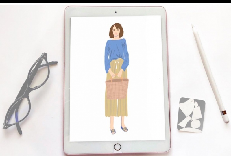
9. Using Color: Okay, so at this point, I'm going to select the layers icon at the top and hit the plus sign to start a new layer. Because I don't want to do any of this over my initial sketch from here, I'm going to select the color like a flesh tone color. It's like like a light peach Looks good. Um, and I'm going to go ahead and start sketching her head in a nice oval shape just right on top of the sketch I've made previously. And I want a color drop or fill color, fill the head. Um, just like that, I'll show you how I did that. I'll do that again for you with the neck. So I'm just gonna again draw my lines right over my sketch. And this is a good opportunity. Correct. Anything that you think might not have been quite done as well the first time. And let me show you what happens when you could try to color drop. And there's a space right there. It's not completely closed in. It's gonna fill the hole canvas. So I'm gonna tap with two fingers to undo. That's the gesture. Control for undue and go ahead and fill that and leaving a little bit of space so I can see the difference between the neck and head, and you can see it dropped right in there perfectly. Uh, and I think I want a little more skin showing that she's got a boat neck, so it's gonna show a little more skin. Here we go. Okay, that's a good start. A lot of this can be adjusted, leader. So I just want to get a nice basic shape going everywhere in color. So now I'm going to start with her top. And I've chosen to use blue and cream for this because it's a color story I'm working with this month and change it every month. And you can see that on my instagram will leave you a link later on so you can see Ah, this illustration actually posted there. And I'm going to start another new layer because I do not want to start the the next part of her body on the same layer, and you'll see why later, Um, every different part of the body I'm gonna do or every color difference, and I'm going t to do on this project I'm going to start a new layer for It's just so much easier to edit later. So we'll be working on that. And I'm just gonna do these bunch e sort of wrinkles under her arm. Um, and the fabrics gonna lay right along the top of her arm. But it's gonna hang along the bottom of her arm so following the illustration, following the image rather and taking care that all of these lines are connecting so that I can color drop when I'm all finished with this. And I'm gonna leave some white just like I did between the head and the neck so I can do some shading later, and it will be really easy to do that. And you can see I tapped with two fingers to undo that last line. It's just a little easier than trying to find that back button every time I want to erase something again, Bunches under the arm hanging fabric. They're on the side of her body again, making sure that all these lines are touching so that I could just color drop. This just makes the process so much quicker and easier. Have this hanging down a little further on this side and touching the sides of her arm on the inside. Here we go. That should be just about perfect. Awesome. So you can see how that's all filled in. I can see the white areas are where the wrinkles go, and I could start in the next part of my project. So selecting my flesh tone again and I don't know if you noticed, but I went back to the layer where I did the flesh tone for the head. I want all the flush tones on the same layer, and I actually forgot to go to that layer. So there you go. I'm going to start over and make sure that all the flesh tones are on the same layer. Color dropped that in, and you can see how the initial sketch makes this process so much easier is just basically following along and just improving lines as I go. It's who just filled that up, and next I'm going to do the pants. So I'm going Teoh quite like that line. Too much those hands or just looking a little big, her body. So it's good to zoom out every so often and get a little perspective on the size of different parts. It really kind of keeps you on track. Okay, so with my color picker, I'm gonna select that nice, creamy yellow for her pants. Start a new layer by hitting the plus sign, and I want it under her top so that the pants look like they're layered underneath the way her top is sort of billowing and hanging. It's gonna just kind of hang right over her pants and do the tie on the pants right there and some wrinkles along where her race band is sides, and you could see how it doesn't show. I could just continue that line right over her arm, but because the layer is is located behind the blue top layer, it's not going to show makes it so easy. Just make the roughly sort of billowy bottoms of her pants. Make sure that line is connecting second color, drop and come right up the top and connect that line there. So now I can just color drop the pants, but if you notice it covered over the hands, I don't want the hands to be covered over, and I can't move the layer in front because then the head layer would look funny. I knew the top two to kind of be over the head layer and this is on the same layer is the head. So I'm just going to carefully go around my hands, okay? With this creamy yellow so that I can just complete my color drop properly again. I can just put my line right over the shirt. Since it's not going to show it all Justus, long as those lines are connecting, I am safe around the other hand and up over her wrist under the top. This shows lines at all. I think enough to connect and tried this color drop again. Well, perfect. So now I'm going to move on to her feet. That's the last thing I need to actually color on her body. So going back to the flush tone layer selecting the peach, I'm gonna go ahead and follow the outline of her legs and feet again. This is a great time to do some correcting and you can see once again I went and completed my line right underneath where the pants are. It's not gonna show because this layer is underneath the clothing. That's why we had to keep it that way and and do a little extra work to put the hands under that color drop for the pants earlier. Okay, Right now, I just need to start a new layer for the shoes and was a blue. I'm gonna make the hell blue to match the top. And I want that layer under the flesh tone actually over the flesh tone so that it will show nicely. So now I have to really be careful. Since this layer is over the flesh tone, I have to watch that I don't cover the foot area that was so carefully painted and color dropped the hell even know that line. Just show a little bit around the front of the foot to show the soul There's the upper of sandal right there. I'd like to make some stripes, this one so you can see I'm changing what's in the photo just a little bit just to make it my own. And you definitely want to use artistic license on a lot of this. So you don't copying too closely. Sometimes I do like to copy closely when I'm just studying a figure and I want to see how close I can get. Other times I want to change it up a lot just to keep it original. You and I want to fix some of these. Eraser is way too big of a brush size. I'm gonna take that down so I can just you just correct these little tiny pinpoint marks that are showing. And I have a little bit of black showing through this or a little bit of I didn't quite feel in the flesh tone against her shoes. So just fix that and they go back. Teoh sort of preparing the lines on these shoe. Go back to my shoe earlier first, like, kind of clean that up. That's a pretty good start. It's I don't want to just make that he'll just a little smoother. So now I'm going to move on to the left foot. Eso everything on the left side. It tends to be more difficult for me since I'm right handed and it has to be a mirror image , but just from the other direction. So it's a little tricky, so it usually takes me a few more tries on this side. So That's one of my one of my tough spots, but it's okay. I just keep practicing. And that's what it's all about until I master this and it will happen one day. So I'm just going to complete this little shape here so I can now select the creamy yellow and color. Drop it in. You can go back to my blue and complete this stripes zoom out just so I can make them close to the scene with us, the other shoe. So again, zoom out to keep perspective on your drawing so you don't end up having to read you a lot of stuff over and over. And now just fixing some of those little lines that have gone over looks a lot cleaner. So now I'm going to go ahead and creative soul. It's a little bit less of the hell showing on this side. So I'm going to I got a little bit too much on the on the side that it's supposed to be not showing. So I'm gonna go ahead and erase some of that Go, starting to look pretty good. Who, maybe, just Oops, I'm going to add I am gonna change shape without just a little bit. Take away. Here we go. So this is really easy to make corrections. If you just have a little bit of patients kind of go back in and you'll see me do this several times throughout the illustration. I'm gonna go ahead and toggle my sketch layer off by just pressing that little check mark. And now I don't I don't need that layer anymore. Everything's been colored in as faras in all the main stuff. Next we're going to add detail. I'll see you there.
10. Adding Details: okay, and I'm going to start right in. Now that we've added color, we're gonna add some details. So about halfway down the head are the eyes. So just above that, I'm just gonna place the eyebrows. So I have a reference point and about 1/3 of the way down the nose and then 1/3 of the way down after that is the mouth. So I'm just gonna add a line for the mouth to nostrils for a nose and going to start in on the eyes, half oval, a pupil and a little bit of eyelash and trying to mirror the same thing on the other side trying to keep the pupil in the same position. Um, that is a good start. Zooming in. I'm going to just put an upper lip still curved oval shave for top and lower lip. And now that we have the face place, I'm gonna go ahead and start with hair. So choosing a brown color, I'm going to create some wavy lies to show this curly here that the model has, and to sort of randomly placing it and going very carefully around the neck because the hair is going to go over the neck, so it's gonna have to look realistic and making sure all my lines are touching. I'm gonna go ahead and color drop this once. I know all the lines are There's no open lines. Anywhere is going to colorize the entire work. And there we go. And it looks a little making sure all those areas air filled in it looks a little flat to me. So I'm just gonna build it up a little more so it looks a little fuller. Curly hair tends to be full, and that looks away better. Just filling in those extra lines. And now with a lighter brown that looks a little flat, this color. So I'm just gonna draw some random wavy lines all throughout her hair area and with the sheeting tool sort of blend them in groups. I need to make that much smaller and blended into the brown so it doesn't look like, you know, no one's hair is just one tone, and that's already looking better to see to it. Just that brush to a and thinking brush. So I have more of a queen. Look, here we go. That's that's better. So it blends in a little more evenly. Wonderful. Just completing the other side. Lending if in. And I have this on a little bit of a speedy a little bit a speedier setting. So I don't for you with this video, it's gonna be waiting long. Otherwise. So, um, I'm just going through and making sure my layers or organized and I'm going to create a shadow under her face on to her neck because now you can't see the difference between can't tell where her her neck ends and her face starts. So I'm just gonna just lightly draw with a very light gray draw shadow and blended in carefully with the sheeting tool. So it just looks sort of soft and natural. And now you can see moves. Don't want them shudder to go into her hair. You can kind of see the difference between her face and her neck. It looks away better softening that up a little bit. Cool. Moving on, zooming out to see what I need to do next. I noticed this foot is little a little crooked. Um, just drawing some toes on here to give myself some perspective. And I really want to fix that foot. It just looks like it's just curving all in the wrong directions. So I'm going to with the S selection tool at the top under the modified tab. I am going to with the free hand selection, But I'm gonna erase this first before I do that and redraw, you draw that shoe. And that's a way that occur for her foot. I want to be racist flesh tone now and add in the flushed on the other side okay? And getting on the correct the correct layer adjusting my toe lines from here. I'm going to hit the modify at the top and select the S tool so I can draw around those toes. And now I'm gonna just draw around those toes trying to just the entire foot. Actually, that tire part of the foot, uh, hitting the direction tool. Now that have it selected, I can enlarge that One side of the foot just looks off to me. And now that I'm on the correct layer, just re just the way the foot is the sorry, The way the shoe is looking at according to the new size of the foot and now adjusting the flush tone on the current layer just filling in that shoe so you can see I have a weird line on my layer there. But it's not in the currently I'm working on, so I will find that a bit later. Once I am finished with this part of the foot here and that left side is just a little too full. So I'm going to go ahead and knocked down the shoe size a little bit there, and now I can go through my layers and boom Oh, it's it's on the shadow layer. You can see I shut it on and off and it disappeared so I can go onto my shadow layer a race it and that's problem solved now going to go ahead and sketch the bag, so creating with a light peach color, I'm going to sort of mimic the colors in the image minus all the rainbow stuff. So I'm going to start with an orange handle and it's gonna have to look like it's going behind her hands. So I wanted to make sure your race that, um, that line that's going over her hands, you can zoom in really closely and just make sure you're getting that accurately. And now it's coming out the other side of her hands, and there are a total of two straps, so I want to make sure mimic that on this one side on. I want to choose a light brown to paint the rest of the bag with, so it has a natural woven look. And right away I see a problem. So I'm gonna have to create another layer so that one strap looks like it's in front and one strap looks like it's in back and you'll see how I'm going to do that here. So on the new layer, and I've noticed that thes straps are just way too wide, so I'm just going to thin them out a little bit more, making them closer together in the image they don't get to large. You can see in the image or quite the actual, um, model image there quite small. So again, making sure I'm not going over my flesh tone layer. This layer has to be in front of the flesh tone and with a lighter color, just going around to show the top and making sure I'm on Oops, I've lost my extra layer. I hit the back button too many times, so creating my extra layer. I'm going to go ahead and do the top of the bag again. And I could have hit the forward button a few times and gotten that layer back, but I wanted to redo it. I just wasn't happy with it. So color filling the guy and now going back to this straps, making sure that using color filter pulling that orange, I'm going to draw the front straps so they're reaching the front of the bag and going back to my oops. I did not do the straps on the correct layer. They've got to be on the correct layer, or there's not gonna be a three dimensional look and using my light color a little bit darker color. This time, this will be for the inside of the bag, and this is the problem. Once I color fill that it's going to cover the straps, so I'm going to put that underneath the layer with the straps, and now you can see why I used to layers. There's got to be a strap in the front of the dark part of that bag that's showing the inside for the shadow. Um, and once I have this all done, I converge those layers to be one. But for now, while I'm creating that effect, it had to be two separate layers. The bag strap in front of the bag shadow. So I'm going to create another layer again for this woven detail on top of the bag and you'll see why again, I'm creating another new layer. Seems like a lot for just one handbag. But you'll see, um, it's going to save us a lot of time on this woven effect. So just quickly drawing some some lines, and I think I'm going to stay with the straight lines, it's gonna have enough of a cool effect. It'll still look woven, even though it's very simply done. I don't want to spend a lot of time on the bag in this illustration. I don't want them perfect, but I want them to be to walk, either. I want them to be at least spaced nicely, and now that we're done, we can zoom in and I can go ahead and just erase all the overhanging lines without disturbing any thing below it because I created an extra layer for these lines. So now I don't have to worry about disturbing anything underneath, and I can quickly edit that. All right, all done with that groups. I want it. Pull in the color of the shadow of the bag and just fixem. You can see there's a um I missed Mr Area there. What? Showing through the bottom layer. We don't want to show the bottom layer at all. So I'm gonna take my time and just evenly fill in the bag shadow. So it looks like it was always there was a little bit there as well. Here we go. Do not want to see the layer beneath. I was a little bit of a spot there. Here we go. Just making sure my lines are nice and clean and that's looking good. Bag finished. So going back toothy face area, I'm going to click on the head and face and the skin tone. So it all works together when I select them hitting the direction tool in selecting uniforms and Magnetics and that head was just looking way too small for the rest of the body, so I can just in that way in large it make sure she's sitting down the net correctly, and I think that looks good. I just want to make sure that that line between the neck and the shoulders is nice and even and looking way more in proportion. Next up, I will show you how it did some of the shading you saw throughout this video. See you there.
11. Shading: Okay, so I'm going to go ahead and choose a very light gray and take the opacity slider down a little below half and start right in with some lines coming down from the waist. Um, the flesh tone is above this so I can go ahead and feel free to just keep the lines going. Oh, and just making sure that they sort of correspond with the fulls of the scallops I have in the ham down below those lines will start making some sense as they correspond with those scallop. You can see how the folds now makes sense with how the hem goes up and down at the bottom. And now with the shading tool, I'm just softening. Ah, because I took the opacity down. You can kind of see the color through the shading a little bit, so it's not so harsh and the shading Tulis softening it even more, spreading them out, making them look more realistic and taking them right down to those scalloped hem lines. Great. Just enough detail to show Cem light and dark. And now I'm going to move on to the top and choosing a darker color than the color of the top. I'm gonna go ahead and show. Ah, it's a little bit dark on the inside of her of her sleeve being is there's no light getting in there. Um and I want to take that original color and complete the hem line, so there's no skin showing under that and just a hint of a shadow in there. That's so much better. Just bring it right up to her Frist right there and the same on this side. Just a hint of a shadow on the inside of her sleeve. Great. Now filling in, um, bringing in that color with the color picker. I'm going to continue on up above, uh, covering over these white areas that I've left. And this is why I've left them s so that I could paint right over them with this shadowy color. Um, and I left those white lines there to guide me when I made the original markings with the top and thes lines will show how this fabric is sort of folding around her arm and her body . How it's the top is being compressed into her pant waist right here. You can see I'm changing them. A little bit, but the basic idea is there. I just want to make sure I cover over all the white spaces and I don't go too far down over her pants. And now starting in on the other side lines are gonna be slightly different. Another scrunching up under her arm and this sleeve well, just bend and flow with the movement of her arm as it's holding the handbag. I'm just going back in and making sure all those white spaces air covered over I'm just gonna add some more lines that I missed in the first round. And I just wanted Teoh. Just have a little bit of, ah, detailed line at the top of the sweater. Just a show, a little detail with the stitching that's looking good. Okay, so now just using my smudge told a soften these I'm just going to go over them so they're not so harsh. Just like on the pants and just one by one, just sort of blending them right into the rest of the sweater color. I can't go ahead. Here we go looking way better. So now, going back to the original sweater, color and layer. I'm going to go ahead and fill in the rest of these groups. That is not the right color going back to the original color. Actually, I'm just gonna pull it right from the sweater because I don't have it in my palette. Oh, there it is. Just go and fill in these white lines. I don't want to make any more shadow, so that will fix any lines showing through to the bottom layer. I want to take them with that top out just a little bit as it is in the image. And that top hangs down quite a lot. So I'm just gonna gonna show a little bit more of that on the left side as well, and just want to take a moment to stand back and just sort of see if you need to do any more detail. Oh, yeah. I missed a little bit of a bump right here on her shoulder. Clean that up a little bit and one over here too. Clean that up a little bit. Pays to just stand back and look at your illustration. Every few minutes is make sure you're not missing anything weird. Gonna make your illustration look off And then I just want to add onto the shadow layer a little bit of shut on her legs. Who is the light sources on the right hand side? So on the left, I want to just put a little bit of a great line on each each leg and with a smudge tool. Come back and soften that so that it's not super, a super harsh line. And when I do that, I can pull the line up and I can pull it down because that paint will just keep on spreading. The more I I don't want to do it over her pants. Oops, I want to try that again quite like that effect. Gonna try smudging that again, happy with the way that turned out so a little more carefully, well, more softly spreading that paint and pulling it up and pulling it down, being careful not to go over the flesh tone line that's still looking a little too dark. So I want to spread that out a lot more, and the more you play with it, the more it spreads with the color beneath enlightens so you can just keep working it. If you want Teoh and then again on this side, making sure I'm not going down into her shoe much. I'm pulling that back up onto her foot because I'm on the separate layer. It's not disturbing the paint below. It's just pulling away from it, making my line a little cleaner. I want to really lighten it on the right side. So it shows the light source pulling into it and again getting that off of the blue. It's a lot more Chris, Andi, a little bit of blush tone. I'm just gonna lighten that up a little more. I find it just a little dark and going back in and smudging. So it's a lot more subtle. Next up are finishing touches. Let's do this.
12. Finishing Touches: Okay, so now that I'm all finished, I want to do some finishing touches on some things that are bothering me. And the first thing is, her jaw line seems to be a little crooked off balance. That's really bothering me. So I want to just go in and even that out by extending the shadows. First of all, all the way to the end on one side, which wasn't done before, and then just kind of evening out the shape of her jaw from one side to the other. Think it's gonna make her look a little more believable on lovely. So with my round brush, it's a soft, obsessed way too big. I don't wanna I don't want to overdo it. I just wanna just correct those shadows a little bit. And I've gotten right into her hair, so I don't want I don't want to do that. I am on the layer with the shadows, and, um, I want to make sure that I don't overshoot the runway into her hair. It's gonna look weird, so that's that's looking a lot better now. And I want to add some cheek color, which I I usually add some cheek color because I really like makeup. So since I'm drawing a fashion look, I'm gonna just a little blush, just a soft airbrush And then I'm going to just soften it with this smudge tool so it blends in. It's not too harsh looking, just a little hint of color, and that's looking better. Ah, I'm gonna go to the layer with, um, the details for her fingers and just to be sure, it's that layer, I just turn it on and off and you can see it disappears and reappears, But they just sort of look like claws, and I can't handle it. So I'm just gonna erase that and I'm gonna try again within inking brush. It's nice and clean on the line, Egx Oops, too many fingers. And I've really, really struggle with hands. Um, once again, too many fingers and I'm just not liking the way this looks. I don't want it to look like a Children's book illustration. I want it to look a little more riel. That's better. Somehow I just don't love the the weights coming out. I'm going to just leave the hands by the just alone and this left foot it's still curving to the left, which is the wrong side. The the longer toes should be on the inside of the foot, not the outside. And the foot is just got a weird curves. I'm just gonna build up the foot on that left side. Um and I don't like how much flesh tone I took away. I'm just gonna re paint that in. It looks a lot better. I'm gonna go to the shoe layer and now repaint the shoe, starting with this soul, careful not to not to go over my foot. New flesh tone extension there going to go ahead and extend the shoe, and that's looking better already. But the toes air still longer on the left than they are on the right. The big toe should be longer than the small toes, and right now it looks like the small toes airway longer. So I'm going to go ahead and erase, you know, choosing the correct layers erased a shoe and that the flesh tone there and go ahead and repaint the shoe so that it's a little more even had too much soul going back there. It's going right up the back of the hell, which is not gonna look realistic and go ahead and read. Draw the toes in the toes are a little less noticeable since on the bottom, and I can do a lot better job with those for some reason. On just toe. Fix the angle. Now it's a little off on the inside of the shoe and the foot is looking a little too round on the inside. Should be a little tiny bit thinner right there. So I'm gonna build up the shoe so it sort of hides that and you can see there's all kinds of things you can do to correct errors and mistakes. Things that are bothering you. You don't get too crazy, and I do get a little detailed. But I really want to show you all the things that you can do to go back and correct things . And in looking at this left shoe, I think I want to build up the hell a little bit more. Just looks a little empty right there. Um, this ankles a little too wide as well. So just knocking that down a little bit make her ankle more slender like the other. The other foot. They match a lot better now and, uh, making her foot a little more slender. Here we go. Snuck that down just a little bit and knocked the sheet on just a little bit as well. And that shape is looking much nicer. Okay, And now getting to this hell, just adding a little bit more just to make it look a little more realistic, even though that's not the way it is in the image. I prefer that from my own, my own work for it to look a little more cohesive on and just going over all of my parts. Uh, just going back and fixing that this toe making a little more around, and it's just really great to go in. Zoom in, zoom out. I've decided just to give the hands just a little bit of detail. I'm gonna put the shadow of the wrist bone in there and just smudge it out, so it's not super noticed A little bit, at least there's some detail there that shows it's not just a flat, two dimensional pair of hands, and I like that a lot better and maybe make her hatches to Tad larger. Should sits on top of the shadow correctly and just looks too big to me. So by tapping my two fingers, I'm just gonna take it back to where it waas. I think it looks way better that way. Next up, guys. The moment of truth. The culmination of all your work. The time lapse video. See you there.
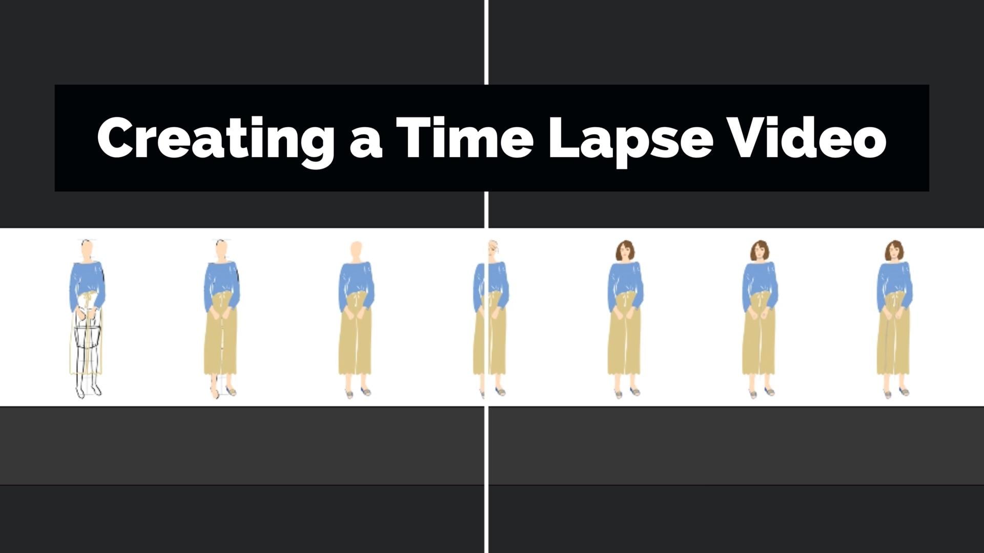
13. Time Lapse: Okay, so I want to show you something really cool. That sort of happens while you are painting and procreate, and you have to set this up in your settings, which I'm going to show you how? In just a moment. Ah, but I just wanted Teoh um, give you an example of this time lapse video and how appropriate. Just sort of records. Every move you make, um, to create this for yourself, you're going to go into your illustration. So open it up in procreate and you're going to go to the little wrench at the top left and select the video icon, which is four icons over. And you can see this time Lex recording button, which you're going Teoh toggle If it's not on, toggle it on. So it's blue and then hit the time lapse replay. But, uh, tab just before it just on top of it. And it's going to go ahead and play back everything you've done and whatever illustration you happen to be in, it's super fascinating and so much fun to see all your progress in a short ah, few seconds. If it's a like a culmination of all your work and it's just a cool, cool video. I post these on my social networks and there's so much fun. They're also great for other types of content, like blogging or, you know, anything else that you have going on posting on her skill share page. Ah, when you think about video is is really popular right now. So this is a great ah type of video. You can post that you don't even have to spend an extra moment on. So now that this time left has run, you're going to go through to the export time lapse video tab underneath, and you can select full length or 30 seconds. Full length would be the full 45 seconds, but I like the shortest options. I think they're a lot more fun to watch and they're not. Didn't they? Don't lose people's attention. Even another 15 seconds could lose someone's, uh, attention span. So ah, you just let it export. And once it's complete, it's going to give you some options of where you can place it so you can see you can post it directly to your social networks right from procreate, which is super handy. You see Pinterest you can put your Dropbox. Um, so I'm just going to save the video in my images, so I'm free to post it wherever, any time. And now I can go into my photos, and I can see it's right there. So, um, I'm just gonna give you an example. This is my instagram page And you I post time lapse videos for most of my illustrations here. And I'm just going to show you an example of when I did very recently. Um, they could see there's a lot of fashion in here because that's really one of my favorite favorite mediums. Favorite subject matters, rather. Ah, but this one is an illustration I did recently of my new favorite fashion brand called Plan C. And, um, I could see my fashion guide, my sketch and then my color starting to build right over that. And, uh, you can just see this fashion illustration just sort of coming together, but it really catches Ah, good amount of attention because of the moving the movement and the progression. And just seeing this illustration just come together. So and then it just repeats after that. So I hope you've enjoyed that little tidbit, and I hope you'll post one in your project gallery. I'll see in the next video
14. Procreate FI Outro: thank you so much for joining me in my studio today and for joining me in my love of fashion illustration. I really enjoyed sharing my process in the procreate ab from using color brushes, blending and, of course, fixing mistakes so that you end up with a project that you're proud of. This is a project that you can use for your blawg social media, art prints and lots of other things. But now it's your turn. You can upload your time lapse video to YouTube or vimeo than add the link to the video field in the project section or you're welcome to post an image. Instead, you are also welcome to post multiple images of your progress as you work. All you have to do is go to the Project page under the class videos and hit create project , then follow the prompts. If you need any help, it all you can reach out to me in a community section, and I would be so grateful for your review so I can continue improving my classes. Just remember, you got this. See you next time
15. Bonus Video 2:
 Chris V, Artist, Designer, Maker