Transcripts
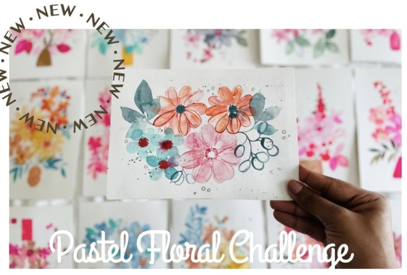
1. Introduction: Hi everyone, Welcome to
the piece of Florals, 15 Day at Challenge. So during the struggle, I was struggling to
find inspiration and I actually stopped
painting for quite awhile. I couldn't get any ideas and I wasn't happy with
what I was painting. And randomly, one day I decided to pick some
floral piece of Sheets. Sorry. I was
immediately inspired. I was so excited by the colors that I started
painting piece after keys. And that's what brought
together this challenge. So the inspiration
is pastel shades. We're going to learn how
to mix these colors, how to place them in
different color schemes, and then create some
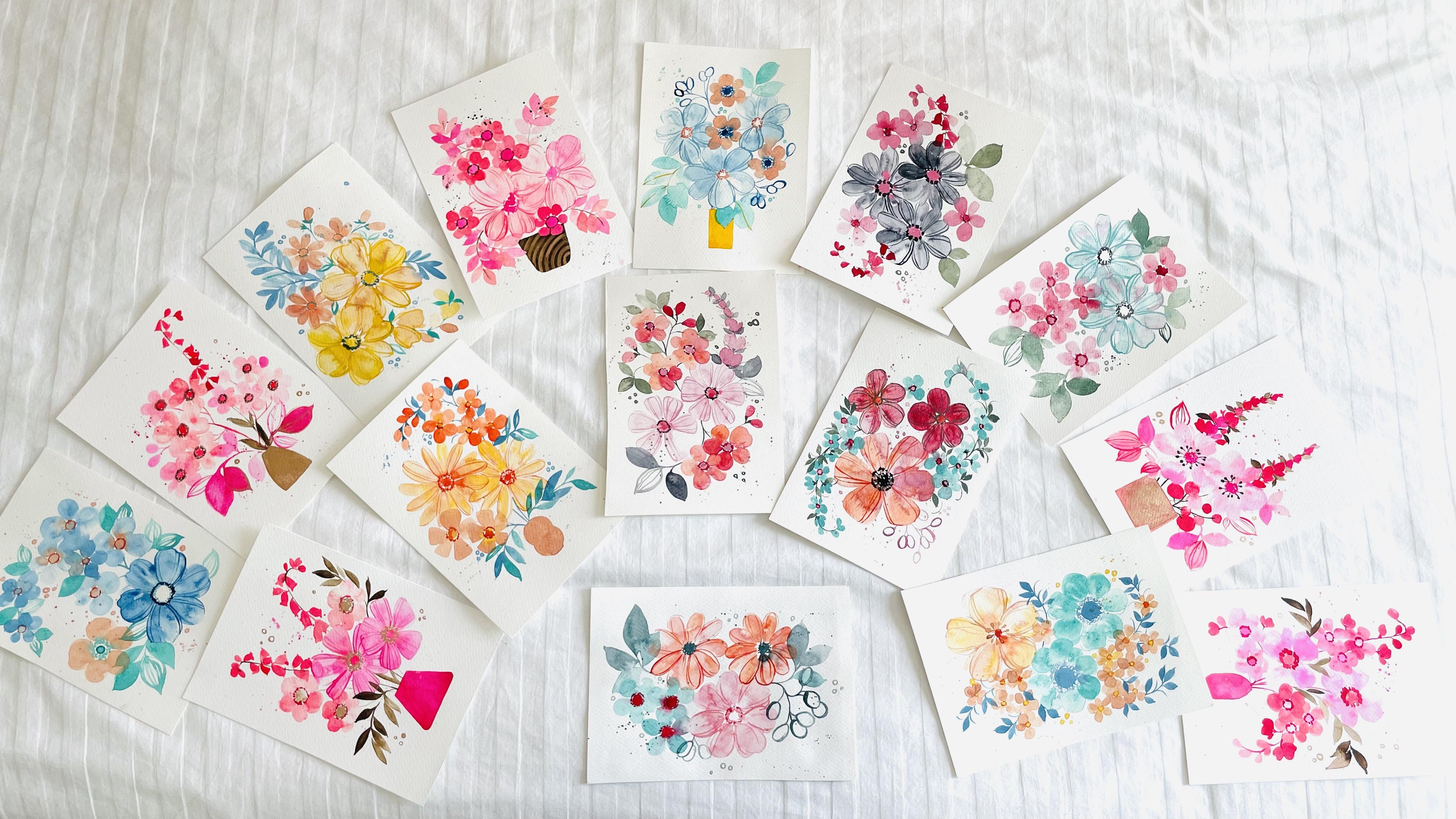
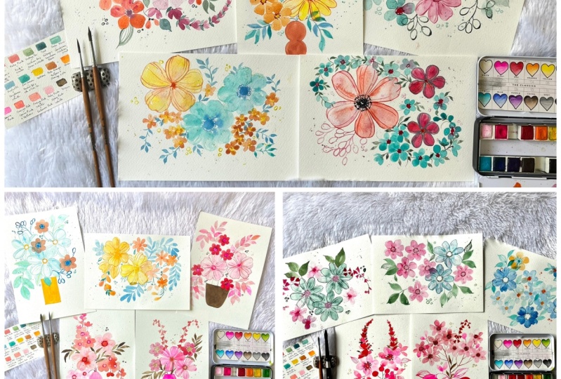
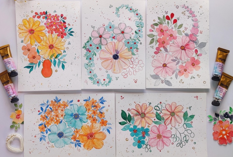
stunning artwork. In total, there are 15 projects that is spread
across three weeks. So it is up to you to follow along as per your convenience. So there are five projects
for the first week, five for the second, and five for the last week. If you want, you can
paint along every day or get all of the projects and
painted on one single day. The projects are
about 15 to 20 min. Some of them go a
little bit higher and some of them go
a little bit lower. But they are very quick. They are simple and there's
really usually FUN. You can either paint
along with me or you can watch the intro video and
then being the piece. Either ways, I would love
to see your projects. So feel free to share them in the projects tab on Instagram using the
hashtag paste till width, femvisionary can also tag me in it so I can
have a look and give any comments or feedback and share it on my stories as well. I am so excited about
this challenge. I think we're going
to have a lot of PFK-1 exploring
different colors. And I call wait to get started.
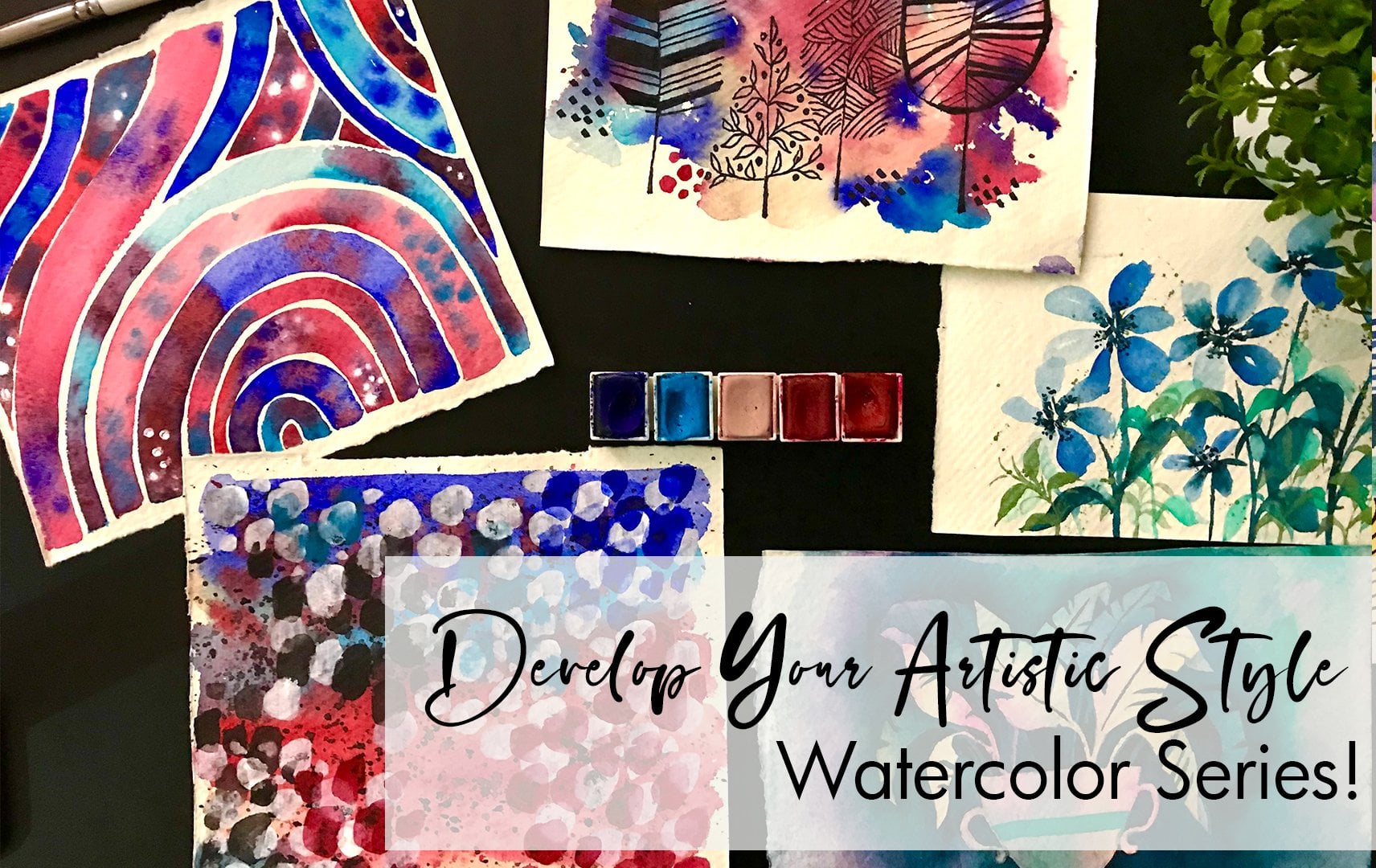
2. Materials List: Time to discuss our
materials for the project. The first thing is
the paper itself. We will need a Watercolor
cold press paper, 300 GSM, or about
one-twenty LPS in total. Because of 15 projects, we will need 15 a5 Sheets. You can have couple of
more Practice Sheets for trying out the technique, as well as the color mixing. If you don't have a a5 sheet, you can take an A4 and divide
it by two to get your a5. So for a four, you would need about
seven or eight. That would then become your
sorry, it would be eight. Math, isn't that great? So H sheets that went
divided would give you 16. For our project. Along with that, we would
need Watercolor paints. Be would need a
basic Orange color. As you can see, if you have a pen or a
tube, it doesn't matter. Either ways will need a
crimson, White, Viridian Green. Cerulean, blue, I've mentioned crushing,
but it's Cerulean, Yellow, opera,
pink, and a Brown. Finally, a gold color. You can use either
Watercolors, that's fine. And two types of precious. We need a Round brush
that's a size four as well at certain
Detailer brush, which is about a size 000. These two brushes will be
convenient for us to paint our paint all of our projects. These are our mean materials. Along with that,
we'll need a glass of water, some Tissues, Pencil, scale, eraser, couple of other items I'm sure you
already have at home
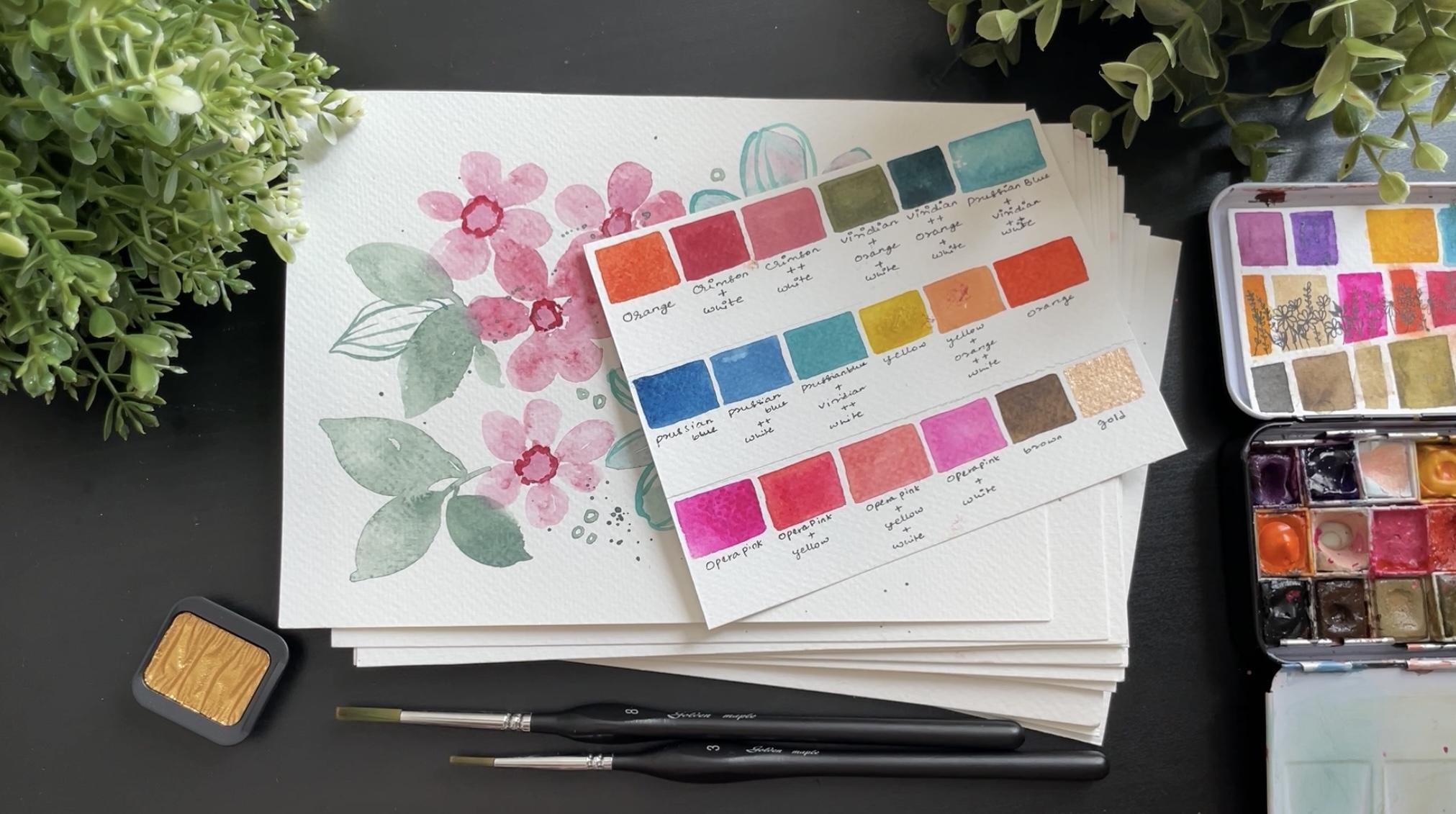
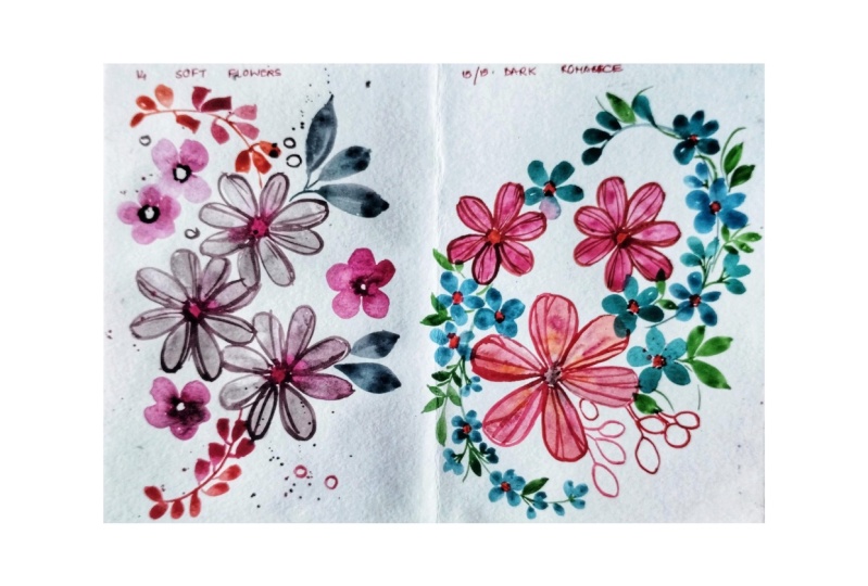
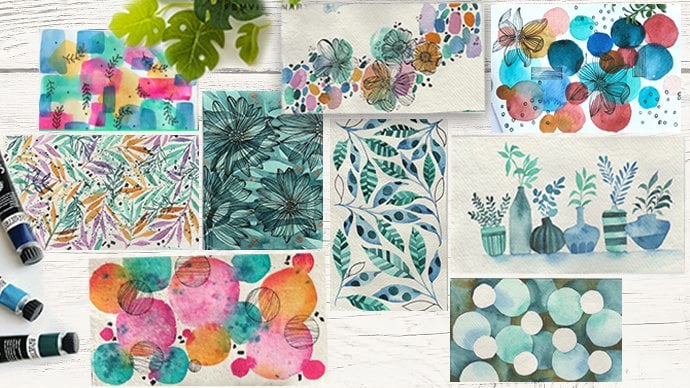
3. Color Schemes and Mixing: Now that we have gone over
the different materials, Let's dive into the color mixing and creating color schemes. So in total, you can see here, it's not as clear, but you will see it in an upcoming videos. We have three main color schemes that we're going
to be working on. The first one has a mix of
blues and greens and Orange. The next is a little
bit more pasted. You have this bright yellow that changes the color
scheme a bit more. And then finally, a pink
one where there's shades of pink and a little bit
of brown and gold. So we are going to
play around with this. In each piece that we
paint right on top, on the upper corner, you will see the color
scheme that is going to be used in that piece. So you can accordingly
and mix it and keep it ready for you to
begin the project. So initially, I want to do every week to
have one colors key. But I realize I was
getting a bit boring. So I've mixed out the pieces. In the first piece, maybe we'll do the first color scheme. The second project might
have the third, and so on. So just so you
don't get confused, make sure to always check up the corner where the color
scheme will be mentioned. Now, let's get started
with Mixing out the right Sheets and
playing around with color. Let's start by mixing
our first color scheme. The first color in the
color scheme is Orange, a basic Orange color. No edits. Just as it is. Creating this color guide
at the beginning is going to be very useful
as you paint along. The next color we are going
to use is our crimson. Crimson is a little
bit of a red tinge. And along with that red, we're going to add
some orange and white. We don't want it
to be this light. So let's go ahead and add more Crimson to deepen up color. And that becomes
our second color. Moving on, taking
a little Crimson, but a lot of white. So basically are
already created mix, adding more white to it to
make it even more pastel. We've got a pale pink color. Moving on to the next color, Let's take our Viridian
Green and add a little bit of orange to this green mixed until you get this
vintage shade. We can add a little Y2. It To make it a little
bit more pastel. And that becomes
our fourth color. The same mixture of Viridian
Green and white and orange. And adding Cerulean blue. Adding more of the
Cerulean blue, deepening up the color to get the teal blue that we are
going to use for our painting. You might have to go back
and forth with Mixing this, Adding a little bit
of Viridian Green, little bit of the Cerulean blue, until you're happy
with the color. Now, let's take a little bit of the Cerulean, blue and white. So a lot of white and little
bit of the blue can take a little bit of
the Viridian Green to make the shade more of
a turquoise blue color. Give it that greenish
sea green look. For the final color. I'll be labeling
this as a pale blue, just so you don't get confused. This is the color scheme
for our first first set. So I'm just going to
write it down the mixes. So when I go along
and I'm painting, in case I forget, I can always refer back to this. And this is a good
card for you to keep with you through
the challenge. It's now time for the
second color scheme. I'm starting off with
the Cerulean blue, just as it is for
the first color. Let us now makes a little
bit of this Cerulean blue with white to get a
lighter blue shade. Finally, to this blue mix, Adding Viridian Green to give
you the sea green color. For our third mix. The sea green is a
mix of Cerulean blue, viridian green, and white. The proportions or something you will have to test and try a bit. Start with a small quantity
and keep adding in the color to get the shape
that we are looking for. The next color that we're
going to use is a Yellow. Just as it is. For our pale orange, Let's mix a little bit of this. Yellow with Orange, give
a pale yellow color, followed by white to
make the color pastel. Finally, to end of
the color scheme, Let's use orange, just as it is. Let's now move on to our
final color combination bank. So for this, we
are going to just play around with a
beautiful color scheme. The first cut a form, this is going to be Oprah pink. We can also use a
bright pink because Oprah pink isn't that
easily available and sets. But I still absolutely
love this color. The next color would
be Orange, pink. So we're going to mix
our Oprah pink with yellow to get a more warm shade. And this is gonna be kinda
like a deep pink color. As you can see, it's beautiful. And that becomes
our second color. Now, to this mix, let's add a lot of white
to really pale it down. And that's going to
become our pale pink. I'm going to add a little
bit more of yellow just to make it more warm to give
it that salmon color. So we generally in the pantone shades
call it a salmon pink. I don't know why. I think anyways. So you can call it a
pale pink as well, because I think this is
we have another pink, which is why I didn't
want to mix up the two. So this is gonna be
our salmon pink. Don't worry if you don't
have the exact names. The point is that
you have the color. This is not a challenge about getting the names of
the color, right. It's about getting the tone and the sheet and the actual codon. So for our pink, we're going to take
out all prop Pink at a lot of white and
get a beautiful mix. To complete the color scheme, we're going to have Brown coming in and then finally cooled. Now I understand
that gold is not easily available in
basic Watercolors sets. So if you have a
gold acrylic paint, you can use that. Or you can go ahead and skip the gold and we don't
have to add gold to the piece. I think it's beautiful, but an acrylic or
gouache mix as well. We work well, just remember
to use a different brush so your current brush does not get damaged when you're
using another medium. These are our three
different colors schemes. We'll be playing around with them as each project goes along. And you can try it out the mixes accordingly so
you do not get confused. Some of the things that
I've written are wrong. If you're trying to read it
and you see Prussian blue. Whereas I said Cerulean blue. So do not get confused. I've written it in White
specifically because of that
4. Practice Techniques: This is a really
important section and I'm going to answer a lot of common questions that
people ask about Florals. So first thing,
let's just do couple of practice exercises,
couple of tips. So whenever we're doing thin lines using a
thinner Detailer brush, as mentioned in the materials,
works really create. Try to keep your brush
perpendicular to your sheet so you end
up with thin lines. That's the best way
to go about it. And you can see how
create that turned out. The next is when we
switched to doing petals, I always move to my
bigger round brush and always do the petals
in the form of a teardrop. The center, that is, although start that is
touching the center of the flower is generally
smaller and it becomes wider, forming a teardrop shape. If you can do this
in a couple of strokes, it looks better. Switches practice that as well. The next thing is just going into couple of Flower sheets. These are the common ones
that we'll be using. There'll be a couple
of other ones, but they're all
derived from here. You can see how I do a
five petaled flower. So doing this center, and then you can see
how I'm just doing a planning out the
petals one at a time. Having those gaps in the
middle looks really create. And so pay attention to that. And now we go into painting
a flower for the center. Mostly I end up doing
either a circle, but dotted lines
or dashed lines. You will see me doing
a textured center. So just keep that in mind. Something like what you can see I'm doing right
now with the problem. Making sure it's slightly,
slightly textured. When we go into
painting the flower, just let this dry a bit. You can see I'm
lifting up the pain. So if you end up putting too
much paint in your center, the color is going
to bleed through too quickly and probably
join your petals. So just let it dry a
bit so it's not as wet. And then you can go into
painting out your petals. Next week, go into Adding the drops of paint that
you will see me do. Most of the flowers. I do this by adding
drops of water. You can see me
doing this here on the palate to the paint. So when you move around,
you're being too, you will see the
brush really lose its shape because it's
so full of water, then you can actually
tapped on your brush and create bubbles of paint. If it's very light at more
of the pigment to you water, that is going to just
build up the color more. Let me switch the angle. You can see how it's bubbled up. In case you are in a dry
country, very humid. Maybe it's very Wendy, these droplets my
try very quickly. So love yourself either to work one flower at a time
so it doesn't dry up. Another thing to do
is make sure you add a lot of water to the mixture so your bubble is even more
rounded right here. You can see it's not
too much of water, but you can add more water
to Jolie fill it up. That way you avoid ending
up with dried spots. Another tip to remember is we're not adding too many spots. I've added just two rows. So even if these dry, they're still going to look
create with the Flower. It's not going to
join up painting. And that's super important. So if you add too many
dots and they all dry up, you're going to
end up with a very not create looking Flower. We want to make sure
that just enough. So just one line. In some cases you'll
see me use two lines, like the one you're seeing now, and that is more than enough. Use your Round brush and
paint out your Flower The next thing to practice
because before we dive into all our fair paintings
is adding the lines of outlines for the flower. I'm using my thinner brush
to add couple of dots and details around the
center of the flower. And you can see how
it's completely dry. Before I do this, this is very important
because we don't want this color to flow
around too much. Now using my orange
are the deeper color. I'm gently doing an outline. Notice how my outline doesn't
go all the way around. I have gaps in-between. You can see it here. There's a gap in-between. And that is what makes
it look a lot nicer. So I'm naturally outlining it. I would say I'm just
giving it a controller. And the inner lines
are always in a curve. They're not straight lines. You can see that gently curved. Other thing to practice. And sometimes you can have these outlines going a
little bit of a form, the petal in case your pets or did not turn
out the right shape. You can just do your
outline properly. Okay, So you see how
amazing that plot looks. Similarly the next one
just showing you again, just practice a couple
of times because I want you to have beautiful
15 paintings. And that's really
important to me. So just try it out. It's a FUN new technique. It's completely different from what is usually shown out there. I want you to enjoy this. In this case, you can
see it's very flat, but when we add to
three different colors, these flowers are going
to look stunning. So just do a little
bit more of trials. And there you go.
So these are some of the techniques
we'll be using, will be doing leaves, we will be doing
different things. But I'm sure you guys
can figure that out. These were the most
important elements. And now that we have this, we can go ahead and start
with our paintings. Oh sorry, splatter. So venue Adding a splatter, just hold your brush stiff and gently tap
it with two fingers. You will see this
plateau fall in. We want to make
sure your brush is filled with pain
so it's not dry. So we're adding water, adding paint and
then splattering it. If it's dry, there's not
gonna be any splatter. Just loaded up
5. Tips for the challenge: I touched it poem there's a bit before in the introduction, but basically this is a
15 project challenge. It really is up
to you on how you want to actually work on it. If you want to do one
piece or one project at D, you can do that for 15 days. Or if you want to
take a little bit of gap during the weekend, you can go ahead and stretch it into a three-week project. You can also work on
two projects at a time. So it really depends on your timeline and your
flexibility to work with them and effect you will have 15th stunning different
projects that really explore florals
and various variety. I've really played around with the different Placement as well. So you create something
new every time
6. Day 1 - Candy Florals: Welcome to day one of
the 15 Day challenge. Since we have already gone
through our color schemes. I hope you have
your colors ready for this incredible piece. Before I begin, I also
wanted to quickly go into how I personally
come up with placements. And this is a FUN exercise that you can do
when you're free, when you just want to
start a new project. So I take a sheet of paper and I divide it into
multiple rectangles, and each represents a
different painting. I use big circles to
represent the main element, which is the biggest Flower. And smaller circle to represent
the smaller elements. Because of this, playing
around with placements, I get a bunch of
ideas very quickly. It also becomes my go-to reference whenever I'm
planning a painting. Now when I go through
this process theme, there may be some
placements. I don't like. That way I can quickly remove them from
my list and stuff. Painting out a beautiful
piece and then seeing it just not
come out, right? So this is a great free for you to ensure that your piece, your painting is going to look
amazing at the end of it. So here you can
see the first one. It's basically a copy
of what is their right above our completed piece. The second one is just an idea. I'm playing around with
adding some longer elements. You can see how I
just let it flow. I am not going too much into the details of exactly
how the flower looks. It's just a representation. Now that I have this rough idea, Let's begin with our painting. So I'm starting off
with a rectangle paper. This is half of an A4 sheet. So basically it's
an a5 sized paper. I'm starting with the
first big flower, a little to the left. Sorry, a little to the
right on the top corner. I am bad with my left and right. Just to be honest, I struggled with that. And it takes me awhile, so I might mix them up. So I'm starting off
with the darkest color that I had in that color scheme, which is basically
this dark green color. And using dots, I'm adding
a center for the flowers. I like to do about 23 lines, so it really fills
up that space. Now, taking my brush
loaded with paint, I'm dropping in the
light blue color. We've done this in our
technique practice. If you have any questions, feel free to refer to that. Or if you have
additional questions, please leave them in the discussion tab so
I can answer them. Now. Along with the light blue, I'm adding the
light pink as well. Which means that our
flower is going to have this mix of blue and pink, which I think is
absolutely stunning and it's going to create
a beautiful effect. Now, washing out my
brush completely, I'm taking a clean
brush that has water and just pulling
the paint from the center all the way
through these drops of paint to create my petals. I'm not overworking
on these pieces. If you notice, it's just
a couple of brushstrokes. I'm now going back and forth. If you go through
it back and forth, you're gonna end up
with a mix of colors. And so the effect
that I'm getting here where you can see the
individual colors, pink and blue separate
will not come through. So make sure you
just try to drag them in a couple of strokes. While this is drying, let's move on to our
smaller flowers. Some starting off with doing the center with a light pink. I'm just keeping enough
of space between the centers so that it's the
size of a, of two petals. So that's a good
way to remember it. Whatever size your petal is, you're going to keep
to battle space and then paint out another center. I'm really filling
up that space. Now I can dive into
adding some dots with dread or the crimson color. The reason I like
doing this is in the next step when I
use my clean water. I don't have just flat color. There's a beautiful
watercolor effect that comes through
where you can see the clear of the paper as well as that red or crimson color. So I think that looks
really, really great. So I'm painting each
petal one at a time. In some cases, as you'll notice, color is Depot, which is great, whereas in some, it's a lot more blended out,
which is great. So we want to have
those mix of shades showing through
the flower because it really looks fantastic. Once it's done. Moving on to another
flower on the right side. Following the exact
same technique, I've made sure to keep
it slightly closer to our first set of flowers so
that I can overlap them. As I see my piece, I realized that there is a lot of gap between
the flowers. I'm just adding one more
flower that is going to be on top of already
what has been painted. I'm making sure that the
bottom previous flowers are dried out so that the colors
don't blend out too much. And that'll be it still stays
on top and is supposed. Before we move on to the O2, Adding smaller details,
let's do our leaves. So I'm doing big bold
leaves without green color. What I like to do, It's a really good tip, is to make sure that the
leaves are clumped together. You have two of
the leaves coming together or three of them. So it's always in sets. We're not doing individual
leaves separated, all kinda connected
to the same stem. You can see how that
looks a lot better. Fills up the space and brings
together the Painting. Looking at the Bs and then
adding in the final pets, sorry, I keep mixing
up petal and leave. But yeah, the final leaf. Let's add some splatters, gently tapping a brush
with paint so you add these cute textures. I love adding circles. You can add stars. Always gives a little bit of
interest to the painting. But wait up, we
still aren't done. We're going to add a couple of more elements to
brighten up the piece. So I've switched to my smaller
brush, the thinner one. And I'm going into Adding
red lines to my small Lars. And you can see how that automatically makes
the flower pop. Once that is done, we also can use a thin brush and add some
outlines to our Flower. What we're going to do is
just keep them very light. I'm not doing the whole outline. Very important to notice that there are gaps between them. And that's what gives it a
little bit more of a FUN look. Once you have that, you can do some thin lines
along the petal as well. As we add in the
final lines, Flower. We're also giving
it a little bit more of just symmetricity. Now, I like to look
around my piece and see if I need to add
any more elements. In this case, I realized
that I'd like to add couple of these
outlined leaves. So not filling them up, but just adding thin lines to represent the center or
the middle of the leaf. I think this kind of blends
in with the entire thing. I love the final look. Congratulations on
completing day one. Looking forward to
seeing you on T, two
7. Day 2 - Playing with Placement : We are starting with
day to day two. I am following the similar
Placement planning that I hit done from yesterday. So I'm starting with three
main flowers in the center, in the form of a triangle, followed by smaller
flowers along the sides, as well as a line of blue belts. So this line is going to give it movement as well as
a whimsical look. Overall, I like the Placement and let get started
with our piece. The colors we're using are the colors from
the color scheme. One would be used
from yesterday. If you have all your
materials ready. Let's dive right in. Let us begin by painting the
center of the main flowers. Start off with a
light pink circle, followed by dots are rounded to give it
more of a texture. The size of the center is about one-and-a-half
centimetre, about three-fourths of an inch. So now that we have that, I'm painting the center for
all the three main flowers. The distance between each is
about a petal and a half. I hope that makes it clear. So once we have the centers, we can then move into
painting up petals. Going to start with
the one right on top, adding dots of the dark green, ish Blue that we had. Just adding equidistant dots. We don't need too many. Just a simple line of
dots is more than enough. Now using our brush that is
filled with clean water, Let's pull the paint
from the center all the way to form a
nice rounded petals. One at a time. You can gently fix the edge of the curve by just going over it. Let us now move on to
the second Flower. Starting off with clear water and pulling through the paint. Now, in case this layer falls on top of the
previous Flower, I'm allowing that
happen because we want all the flowers to overlap each other as much as possible. We want to avoid any
spaces between them. The other thing to note is I'm following elongated tear
drop shape for the petals. Now that this is done, let's add our petals
for the final Flower. Overall, this forms
a really nice base. Can see the shades
of colors blending, mixing through, just giving
it a fairly nice luck. Now we can go in And add some smaller flowers. For the smaller flowers, I'm going to actually
take my Crimson. And I'm going to use
that to do the centers. The center is fairly small, maybe half a centimeter
or about half an inch. Let's use our light
pink and blue together. The paint from the center
to form our flowers. Making the petals for
this more rounded. So it isn't as elongated
as our main flower. The size of each petal
goes up about 1 cm. So it's quite tiny. Now in case a blend into the
main Flower, well and good. We want those colors
to bleed through. If it overlaps on
existing flowers. That's amazing. It's we usually want to
get those looks where the color is kind
of bleeding through and that happens
when it's still wet. Now at this point, it's good to add
in some Wolf met. And to do that we are going
to use our ten brush to add in some lines for us
to hang our blue belt on. In this case, they're
naturally blue collar belts. So let's say bell flowers. I'm just making a
very crazy curve. So it's not a perfect curve, it's more like a very
rounded C-shape. And I've kept gaps
between it to fill it up with our bell flowers. The butterfly is fairly easy, so we have a U shape and then just a line that
goes through the edge. Do you see what I'm doing there? I hope it's clear. So it's a very,
very simple flower. I like to add some
of them coming from the middle of the stem. Not always hanging on the sides, just some of them
coming to the central. Using crimson for this. You can see how it's
really building up. Now as we go higher, we can make the size of these slightly smaller if possible. And as we go on top, we can add some buds, flowers that are ready to Blue. Now, instead of having the
buds on both sides of, just kept them along one side. That is the auto
section of the stem. And I love how this turned out. Let's repeat the same
on the other side. Just follow along as
I paint each Flower. Now that we've completed
our main elements, Let's go into painting
out our leaves. So let's use a set of leaves, just bold, big leaves
along the edges. So I noticed with my please, the top half is looking really full compared to the bottom. So that's why I'm
adding more leaves at the bottom just to
balance out the piece Let us now mix a little
bit more of the green. And then we can add
so-called around the piece with the
same green color. I've switched into
my thinner brush because we are now getting
ready for details. Taking the darkest
color on my thin brush, I'm going to add outlines, broken outlines to the flowers. This is gonna give
it a little bit more of structure because right now they are just
kinda all over the place. So this is going to control it. Now I'm not adding these outlines to every
better as you guys know, we can skip some of them. If the edge needs
to be corrected. We can do that with this. Even if whitespaces
as seen, it's fine. Once you've completed the
two floors, the bottom, the one that is underneath, we just use thin lines. We're not going to try to outline it out
because then again, it's going to ***** the
look that we're going for. Just use thin lines for
the center and then continue on adding
broken outlines through the remaining
of the Flower. We're almost done. I'm gonna use the
dark color to add dots along the center
of the flower. Finished the entire piece
with some light pink splatters to give it
a more fancy code.
8. Day 3 - Pink Florals: For D3, we are
going to switch up our color scheme by going to
use the third color scheme. Form our color mixing. It is more of the things
inspired by Barbie. And you can see the piece
super FUN, super colorful. And we're going to
play around with how to balance out these colors. I'm using my a5 sheet. Please sing it horizontally. And I'm going to
start by drawing out the vars for the flowers. So simply just divide
your sheet by two and then you can take a
couple of centimeters. I've taken, I think
two centimeter, one-and-a-half centimeters
on both sides, giving the vase a little bit of a height and then
just drawing it out. So this is going to be a
very simple rectangle. Vos, nothing too complicated. Once we have our
rectangle ready, Let's draw out the
curve. For the vars. It's going to be, I don't know how to
describe the shape of it. But you can see
it on the screen. Basically an inverted triangle. No actual triangle,
but more curved. So once you have that, just areas out all
the extra lines. So we have something
really nice. And the boss is gonna
be very symmetrical. So we're just making
sure that is fine. Before we dive into our flowers. To begin, let's
start with our stem. And I'm just basically doing
a curved stem with a brunch. So we'll have one
set of flowers on the left side and one set
of flowers on the right. Once we have that, let's start by painting
are smaller flowers. I'm just going to
do the center of the flowers using
maybe keeping it about a centimeter
and Adding the dots. So overall it comes
up to a centimeter, so not too big. The dots add textures, so I loved doing them. The next Flower, we're going
to keep it assuming to petal sizes of petals are
going to be quite small. Doing another dodge. So we're going to
have a clump or cluster of flowers altogether. Using our deeper pink. Let's add some dots
around the centers. We're gonna do
these three flowers and then we're
going to add more. I'm going to use clean water to then just paint
out each petal, just dragging across the pigment through the entire petal. As we mentioned before, we don't want to overwork
this suggests try to two quick long lines and then just correct the edge
to get a nice curve. In case the petals
overlap, that's fine. We wanted to kind of
overlap as well to give it a little bit
more of a closer look. Now that we are happy with this, Let's add some more
crimson, red centers. On the top. We can add one maybe
along the side, assuming that these are gonna
be much smaller flowers I'm keeping them much closer to what has already
been painted. Adding are dots. For the flowers. To put through the color. Gently using a damp brush. We can add in spots of the bright Barbie
pink color as well. Once you're happy with
this set of colors, again, notice we're not doing too many dots because
that defeats the purpose, which is doing enough to pull
through enough of color to give it that mix to
just one set of dots. Looks really great. It also adds a little share of a brighter pink to
our set of flowers. So it gives a little
difference, right? And I'm sure you can
see it all ready to. I need to explain it, but it's a nice shade
that comes through. Once we have that. So we've got a nice
set of flowers. We can just quickly finish
off the side Flower. We're going to add more. What I'm trying to do is just
work on to three floors at a time so I can see how
they are working together. If I painted all of my flowers, it is possible that
one side might have to merge or the other side
might not have enough. Just to avoid that, I am just adding flowers. As I go along layer by layer, gently, dragging the paint, dragging the water
to form each petal, one at a time. To finish off our look, let's add some buds. All I'm doing is
painting one petal and that is going to form a bud. Using the bright pink. For this purpose. Generally like doing
buds on top so that it looks like it's going to
bloom and come together. And you can see, I'm very
happy with the overall look. I think it's come together. Great. I was thinking if I
need to add another flower, but I think overall, it looks, it's come out fine and it's
just the perfect amount. I switched over to
my thin brush and using the deep Pink going
into Adding crunches. Now remember to see how
I add the branches. We just not doing
straight lines, gently curved and they form together a branch that then
connects to the center stem. This surely brings
together the piece. So kind of learning how to
connect your flowers together, make them look better. Just to complete the look It is now time to add
in some bold leaves. So I'm starting off with the bright opera
pink set of leaves. These ones are
dropping downward. As we add in some FUN leaves. Let's also add some leaves
that are just outlines. So they give a little
bit more of a artistic. No, actually, I don't
know how to describe, but I think overall,
it looks great. Adding those leaves that
don't have a center, right? Just adding lines. I'm using my thin crunch, sorry, thin brush. To achieve this. It's a lot more easier to
control as we move along, adding some bigger leaves. And then as that's done, we can move into our flowers. So I'm using dark Brown
form the color scheme to add couple of dots for
those smaller flowers. These dots are actually
going to complete the look and bring it together. Because as we had
done our water, blending, some of the
colors may have mixed up. So this inner wages
brings it all together. Let us now add in
some bell flowers to add some height to the piece. Gonna be using Brown in a thin line all the way
from top to bottom, keeping spaces so
that it all connects. You can see I made a slight
mistake when I did the line. I didn't aim it to the
opening portion of the wires. Just keep that in mind
when you're coding ahead. But I can quickly
fix it by adding some long leaves with the brown. Time to add in the blue belts. So simple U-shape downward you and then a thin
line to form the bell. I've got three of them
connected to the center stem. As we move up, we can have some of
the bells on top of the stem line and
then go to the side. And so on. Just follow along. As I paint each
Flower at a time. Once I completed this, I was wondering if I
wanted to add another bell Flower on a set of bell
flowers on the left side. But I think when I look at it, I liked the proportion. So give yourself the chance to decide if you want to add more. I think overall the piece
looks very balanced. The way we went into
painting a set of flowers at a time has really made
sure that the piece is more aesthetically pleasing. Since that is completed, we can take our gold
to paint out the vase. If you don't have gold, feel free to use any
of the colors that we already have in our mix. Brown would be a
good alternative. But I wanted to give a
little bit of shine. I'm using cold to
paint out the bus. It's gonna give slight
change in color. That's going to really
complement our piece. Use the gold to
also add some dots to the center of the
smaller flowers as well. And that is gonna give it a
little bit more of a shine. We're almost done
with our painting. We can now also add
some splatters to it. To complete the look. For the splatters, we
can use the darker pink, so it really uplifts
the painting. Just gently tap your brush to get the color
to splatter out. I like that cool touch. I would have alternative suggested adding
splatters with a gold. I think that would also
look really, really great. Really depends. I ended up going
for the dark pink, but I don't think there's
a wrong option here. Once that's platters done, we can then also add
in some circles and other details for the painting. I like to look at the
piece a couple of times. Step back, Common front. Just make sure that I'm happy
with the overall finish. We're now done with D3
of how Florals Challenge
9. Day 4 - Adding Shimmers: Day four is amazing. We're going to use the same bright pink team and we're going to really play around with
it and create something FUN. So I've done my boss is just a U shaped
bars, very simple. And we're going to start
right into the painting. So doing the center of
the main big flowers, using bright opera
pink for the same. I'm just doing dotted lines, dotted dashes, dots, sorry. Dots. For the center. Again to give it texture. I always loved this low competitors painting
it as a circa. Again, Nora wrong. There's no mistakes per say. So you can do it
however you like. But I love doing DOD, just adding that
little bit of texture. Now using the drops, I'm going to start with
the light pink color. I'm going to play around with at least
two different sheets. As I explained in the technique. Guide. If you're,
droplets are drying out, then tried to one
flower at a time. Generally what helps it is
by adding a lot of moisture, a lot of water to your brush. So making sure that mix is
really filled in with water. And so you actually
see a bubble, okay, the bigger the bubble, that means that it's
not going to blend in so quickly, right? It's not going to
absorb so quickly. Once that's done, let's take our brush with clear water and then just paint out
each petal at a time. So I'm making the petals
a little bit asymmetrical so they're not a
perfect curved edge like our previous projects. So they are more rounded. In some cases, they even have a little bit of scallop going, a little bit of a wave. So whenever you have a lot
of paint on your brush, just make sure to
wash your brush and then continue on
with the next battle. Slowly building up the Flower. Once we're happy with this, we can then move on. It is now time to
add in some berries, some taking the
deep up pink shade. You can see right on top, on the left side, we have the color scheme
that we're using. So you can pick up
colors from there. For the berries, I'm
using the pigment. And then you can see
right here I just use clear water and that color
is just blending into it. Can have some smaller berries. To just balance out. Let us know and love the
lower portion to dry. Meanwhile, we can work
on our upper Florals. For that purpose, I'm
starting off using my thin brush and I'm going
to do a stem with it. Going to pick my stinky, fishy do the Brown. But I might actually just
pick one of the deeper pinks. And just to a dashed
line on both sides of The painting. Now, let
us do our flowers. You can see how I'm doing this. Basically, I have a heart shape. One of my students called
that and I thought that was a brilliant
way to explain it. So a heart-shaped
petal and then you have two thin lines
along the site. And as you go higher and higher, we make that heart-shaped
smaller to the point that it represents kind of teardrop. Smaller and smaller
as you go Ohio. So that's a great way to
kinda get that proportion. We can always add in more. I'm width if you feel like
it is not actually working. So in this case I'm
adding a little bit more, just making sure that the side lines are
more formed into a better once we have that
doing the other side. Now while I'm painting, I switch around my color, so it's not just the deep pink. I move into the
Oprah pink as well. And that's why you
have a dual shades of colors that is going on. Finally, let's add in our big pink bright
leaves for our piece. And then we can move into just completing any
other detailed. Just I'm just making it more
Adding more depth to it. Sorry. I was trying to
figure out what the word is. So we've got our light pink
leaves on either side. It's now time to complete
the inner details. So starting with
our big flowers, Let's add some filaments. So I'm gonna use a deeper Brown. And this is using my thin brush, adding some rounded, oval. It's basically all those
shapes around the center. Once that does done, we're going to use thin lines to connect them to the middle Now that we have completed this, Let's do the stem
for the berries. And for that purpose, which is going to connect them using gentle curves together. You can see how I do this. Alright, gentle curves. Connecting it to
the center stem. After we've completed this. We can then move on and do
the details for the flowers. The flowers specifically. Now using the brown, Let's go ahead and connect. Those petals are basically smaller flowers
to a center stem. By using the shapes. We can then add in
some simple leaves. And that is just going
to fill up the spaces. Just add simple smaller leaves. Generally I start from bigger on the bottom and
as I move upward, I go smaller and smaller. Next, let's add in an Oprah
pink to outline the leaves. And you can start
with our main flower. Just gentle lines. And we have that at couple of more leaves
around the piece. Like to step back for my
piece a bit and just check if it needs more or
I'm happy with it. These small lines I
think adds a little bit of interest to the P. So people, if you're looking at a unit
just kind of washed over your kinda curious
to see more details, to see what's happening
with the leaf. And it just looks great. Let's paint out
the bus with pink. And we're almost
done with our piece. After we finish off the bus, all we need to do is add our splatters and
the smaller circles, and the piece is completed. So we're just getting there. I think adding gold for the
circles is a nice touch. And once we're done, congratulations on
completing day for. Tomorrow's gonna be
a really FUN one. And I can't wait to
share that with you.
10. Day 5 - Summer Florals: Let us now dive into the fifth painting and also the final
painting for the week, depending on how you are
pacing your Challenge. So we are using
the color scheme. The second one, you
can see right on top, there's the blue,
the beautiful green, and then the Orange. This is actually one of my favorite pieces
from the challenge. I also love this
color combination and I've been painting
with it on and off. And this challenge, I
took it as an opportunity to actually bring
together this piece. So let's start with painting out the Center for the
focal flowers. I'm going to be using that greenish, beautiful blue color. I think it's also one
of my favorite colors. Maybe that's why this color
scheme is my favorite. Just doing this center with
this beautiful greenish blue. And now we can add dots
with our light blue. I'm not adding too many dots. Just a circle of them
is more than enough. If you feel like some places you want the
blue to show up more, we can add a second line, but I'm not really filling up the space with it because
in case it dries, you're going to end
up with more spots. The next, I'm going to take my blue and add couple
of dots with that. So we have this
beautiful sheets. So excited to paint this
with my damp brush. I'm going to start
pulling the paint from the center to build my petals. You can see I've
done the petal in the shape of a heart almost. So it's got this M bump on top. So it's not a perfect curve. And I like how this is looking, how it's turning out. Now, let's start with
our next flowers. This one, I am starting
off with the orange color. For the center. It's the lighter orange shade, which is mixed in with white. So I'm going to use
that to add my center. Just doing a simple circle because the flower
is quite small. Now, the gap between
the flowers, I'm keeping about
a better length. I do know if this is a new
way to measure distances, but I like it because
it does make sense. Instead of saying two
centimeter, three centimeter, I think measuring it
based on what size your petal is going to be is
a good way to go about it. So using my light blue, I am going to add in the dots. This is really dilutes
out the paint, honestly, competitors using
your paint as it is, like we would do
in Loose florals. I've noticed that Adding
the dots actually makes the colors really blend out and gives it a
really nice look. So that's why I'm really
enjoying this way of painting. My Florals also encase
the dot, do dry up. They add a little
bit of texture, which is why I said, Let's not add too many dots on this is just gonna do
one flower at a time. Because if it's too many, then it's going to
look like a mess. But if it's just one
line and it dries up, it gives us underneath layer of filaments in the flower
when you look at it. So it gives you those details which looks really
great as well. So I'm adding in my
leaves and you can see I'm making sure that
they overlap each other. I'm just doing jolly
nice rounded petals. Sorry. I said leaves Don't know what's happening. Today's then a very
interesting day. But I am honestly enjoying everyone's paintings and it's just so great to share
this with you guys. So just adding one
petal at a time. I've done a couple of
the flowers and now I'm going to go ahead
and then add more. This was a good base for me
to see how these are looking. And areas that are empty. I can go ahead and add
more flowers, right? So this really, really built up the space and we
really filling it up, Adding couple of more of these. And if you notice, I've actually done it in
the shape of a curve. And it's very full. More flowers towards the
big main Flower and lesser. As I moved upwards. We're doing a green
center as well. For our third Flower. Going back to our Orange, I feel like it's still too wet. So I might wait a bit
for it to dry so that the center really
doesn't flow too much. Or we can just make sure
we a little bit careful. Now I'm directly painting out my blue and you can
see the difference. Don't know if you can notice
that I feel like it's so obvious to directly painting it, to actually Adding the dots. We need directly painted, you end up with more
flat looking flaws. Which yeah, it's
a beautiful look. So going ahead and then
just doing each petal at a time and finishing off
this set of flowers. Taking our light orange, Let's add titles to
this flower center. Just a simple curved
line through. And just building it up. Stepping back from our painting, Let's just have a look
at the full picture. I can see that you need
to add in some stems. So let's take our light
green and then just add in the stem connecting
the flowers to it. You can see how I'm trying
to gently add in the line. So it forms a nice have. Based on this, we can
add in some leaves. When I added leaves obnoxious,
Adding them randomly. I'm actually adding them in a way that it looks like
it's connected to the stem. We can do some of our
outline skeleton leaves. I think that's a great
way to phrase it. Skeleton leaves because it's not actually painting inside. And you know exactly
what I mean? Yes, I think I found the
perfect word to describe it. I'm adding more and more leaves, filling up any of the
empty spaces that I feel. Kinda just don't
balance out the piece. Leaves on top anything
that's coming to this side. I'll be adding couple of
more skeleton leaves us well I'm really loving how
this is coming together. It's just, it looks
so pretty and that's skeleton leaves or
create because you can also see that underneath, which is so interesting. Now I'm going to take the
Orange and I'm going to just outline the centers
of the blue flowers. Because now you can
see they all mishmash. Adding that Orange is just
going to make it a little bit more solid in a way. And finally, we tackle
our first flower. The blue is dried
up, which is Create. And now we can switch to add thin brush to do
all the outlines. Now, in this case, I was
thinking if I want to do the lighter blue or the
darker blue for the outline. In the end, I ended up
going with a darker blue. I think it just
works really well. And you know how to
do the outlines, you can just follow through, see what I'm doing. Adding thin outlines, Adding couple of
lines in the middle. Notice I'm not doing
the entire thing, just doing two on the sides and maybe one in the
middle, if Needed. As you complete this, Let's do the blue in the middle portion of
the flower as well. The next step we're going to
splatter out up painting, just adding some nice
textures, adding some circles. We are almost done. For the splatters. Let's use our light orange. I think it will
work a lot nicer. I feel like the painting
has a lot of Blue going on. The orange isn't enough. So these platters being
Orange is gonna be really great to
add in that color. Can also add those
curves with that Orange. All of this using my thin brush. So I can actually
do thin circles. As I mentioned, you can do
stars are even mini flowers. There's just so much
that you can do to give it that vesicle nature. And we are done. This is whole crazy. I love the colors. I'd love to hear what you think. You can drop in
your review below. If you have any questions, There's always Discussion
tab to ask me anything. Any questions, any doubts? Any comments? Yes
11. Day 6 - Pink-tastic: We are starting with
this lovely piece. It is from our
pink color scheme, the third one on
the list I've had, it's right on top, so
you can refer to it. Keep your color mixes ready
before we begin so it's a faster process and you don't
have to mix on the spot. Now I'm going to do
the as for the piece, just making sure that
it's equal distance from the edge of the page
as I've done before just to make sure
there's a little bit of cohesiveness. Yeah. Basically, so that it
all just looks balanced, I decided to do a more of
a rounded oval shape for the vase to complement
our painting. Let us now begin
with our painting. Just erase out any pencil
marks before you begin, I'm starting off with the
deeper red pink color. I'm going to be using it to paint the center
for our flowers. Now, just follow along
the placements of these so that it comes together when you
complete the piece. After I have done this, I take bright pink, bright oprah pink, and add
in dots along the center. In some areas, I'm adding two dots so that
there'll be more color. In some I'm adding just one that way when we
go into painting, it's going to give
you a nice look. Adding the next set of
dots using our light pink, it's your salmon pink color. Now I'm using my round
brush and just pulling across the paint to form each. You can see how I'm
making the petal happi. They have a little bit
of a rounded shape. They're not perfect circles. There's a little bit of a bump
and we wanted to do that. You'll also notice that in
case I don't have space, sometimes I just the
petal very small, it balances out and we end up
with five different petals. The next flower as well. Following the same process for the next set of flowers, I wanted to add a cluster of
flowers that come together. For that, we're going to do centers just keeping
them close together. Maybe just a petal
and a half gap. It's not too spaced out. You can see I've done the
three of them together. For this, I'm using
our light pink, making sure that it is
filling up the space. The other thing to remember
is you're keeping it close to our two main florals as well. It's clustered as well. We can now take our deep reddish pink and
paint each petal at a time. This time around, the
petal is going to be more rounded and you can see how it is overlapping with
the other flowers. Don't worry if all the colors at this point are
collapsing into each other because
there's not much of a difference in the
shade of pinks. If you feel like they look
too similar, that's fine. Also, make sure that you go
through the color mixing video so that you have
different shades of pink. It is very tricky to paint
something that is monotone, where it's just one color
in different tones. And it takes a little
bit of skill as well to make sure that the piece doesn't look boring right. Once that's done,
we can use our red, reddish pink and add some
petals or half flowers. Can see how I'm doing this. I'm adding some
heart shapes as well as some rounded buds in
the form of a curve. At this point, I would
suggest you pause for a bit. Just see me complete the piece so you see
where I'm going with the placement of these
half flowers and buds. So it gives you an overall idea. And then you can follow
along and recreate your own 0 as done previously. Let's add in some half flowers. You can see how I basically do a heart shape and add
in one more petal. In some cases I'm just doing
buds that are rounded. Let's do this for the top set
of cluster flowers as well. Half flowers and buds that
are formed in one direction, pay attention closely
to our stems. I have switched to
my thinner brush, loaded it up with the opera pink and then going
to use it to do my stems. In the bottom one, you
can see fairly simple, just connecting it to
an assumed center stem. Just make sure that you have a nice mean line.
You can see here. I'm just making sure that it
connects each flower with a small curve and then going down so that
it touches all the buds. This is why I wanted you to wait and see what I'm
doing with the stem, so it gives you more idea
of where to place the buds. The stem on top doing
the same thing, so that the bus,
the half flowers, everything can
connect to it easily. Using our bank leads to the center of our
cluster flowers. Since we have completed
the cluster flowers, let's use our stem. Let's use our thinner
brush to paint out the stem for the big flowers. We can also then add
a stem for leaves. I'm going to look at
my piece at this point and think about where I'd
like to add the leaves. Would I like it to be
more at the bottom? Would I like it to come
more to the sides? And also deciding what
kind of leaf I want, I finally decided I
want long leaves. I think that connects
and looks really nice. That's what
I'm going to do. Since I've done the
broken line for the stem, Let's switch to our bigger our. Take a little bit of that
beautiful brown and paint out the leaves 0. Now that that is done, we can go ahead and add a couple of more
leaves if we want to, in the middle of in the
middle of the plant. We can then move on to painting the center
for the main florals. Just make sure that everything is dry before you
proceed with that, making that center a lot
more and more obvious. We are happy with
that overall look. I was initially
thinking of doing thin lines for the main flowers, but I think without it,
it looks really great. So we can leave it as it is. Let's finish off our
vase for the flowers, add our splatters and circles 0 for the circles I like doing
groups of two or three. Use either gold or brown and add it in sections
closer to the plant. There you go. This is a
completed painting for the day.
12. Day 7 - Potted Plant: Time to dive into this
absolutely stunning piece. You can see the color scheme
we are using right up. It's the second one on our list. So make sure you have your
colors ready, prepared. Before we dive right in. I am enjoying mixing
around the color schemes, so we're not tied to one. At the same time,
we're exploring three different color schemes
and playing with them. I think that's
really working out. Am enjoying seeing you guys
create your own variations. Yeah, it's been amazing. Anyways, starting
off with this piece, we are doing our vase, following what we took as
measurements from before, keeping that same
space from the bottom, making sure our vase
is the same height. And then playing around
with the shape of the vase. In this case, we can
keep it really simple, just keep it as a rectangle. Once we have that decided, we can now move on to painting. I'm picking up my light orange, the orange mixed with white. I'm going to do the
center for my flowers, in this case just adding simple dots around in
the form of a circle. The size of the circle is
about a centimeter and a half, so maybe half an inch. I'm actually not
making it too big. The distance is how big
our petal is going to be, maybe slightly lesser than that. This gives us an idea of how big these main flowers
are going to be. Now taking our light blue color, let's add some dots. Remember, there was a section that we had at the beginning
called techniques. If you are seeing
your drops dry out, make sure to look through
that for the tips and tricks to avoid, um, these issues. Now just in few areas, you can see just at the bottom, I've added drops of the
blue, the iulium blue. That way it's going to be some petals having
the Patel blue, While some will have
a mix of blues. Let's see how that turns out. I'm actually excited to bring it together for our petal
just using clear water. Let's drag through the
petal one at time, gently letting those bursts
of paint into each petal. I've tried to do about, in this case, six petals, if there's not much space. Your sixth can be a
very small petal. That's okay. Once we are done with this, let's move on to the
other two flowers, 0. We are now done with the
important part of our painting. We can now move on to
doing our smaller flowers. There is a little bit of gap, so we're going to
add small flowers in various sections for
the small flower, for the middle of it, using the. Serum blue. Just doing a simple circle and
then adding dots. Overall, it should
come up to about 34 of an inch, about 2.2 centimetres. When you're happy with that, use light pale orange
to do the petals. So go ahead and just add in rounded petals
through each flower. We're now going to go
into some berry elements. We can use our indico, I'm switching over
to my thin brush. And then I'm just going to
do some rounded oval shapes. You can see the way
I'm clustering them. So they're either
connected at the bottom, trying to make it more
in the shape of a curve. It's not in a straight line. You can see in this case, I'm making sure that the berry
is below the previous one. I could have painted it out, but I felt like the silhouette
of this looked really interesting when you're happy with that or you feel
like you're good. Let's add more. Here, I'm
adding in another berry. This one is coming underneath
an existing flower. Let's do the same thing on top, following the same steps, adding our oval in clusters, and then using thin lines
to connect them, 0. Now time to add in our outlines for our major or big flowers. I'm using light blue
to do the same, in case you did your base. And the light blue
was very visible. It's fine if your outline isn't as visible in some places. It depends, but that's okay
if it's not that visible. All we're doing
with the outlines is trying to just control, give it a little bit
more of texture 0. 0, 0. It is now time to add in our pistol green
color for the leaves to start off with a big
leaf at the bottom and then move upwards 0. As we complete this, let's add in some
splatters with the green. Just gently tapping them on top. Time to use our bright yellow to paint out the
As for the peace. Now this is a bonus
where you can use your yellow to also add some stem lines to
the main leaves. We are basically done with
our P. This was just an add. I like it at the same
time, I don't love it. If I could do the piece again, I may not have added it. But it does give a nice
yellow shade to the leaves. Are you happy with
your completed piece? I'm so thrilled, and I can't
wait to see you tomorrow.
13. Day 8 - Watermelon Pink: Let's now dive into a pink
themed flower set with a vase. So I've done a
simple rounded vase. At the bottom. I
haven't gone into the details of how
to plan it out. I'm sure you guys
already know that. So let's skip ahead
to the painting. For the center, I am
doing opera pink dot, and it's about, I would say, a centimeter and a half, so about three
quarter inch in size. Once I have done two of them
quite close to each other. So they are about
a petal distance. So there is going
to be overlapping that is going to happen here. I'm loading up my brush
with our salon pink. And then I'm adding dots. Again, remember, we
don't want too many dots just enough because
even if these dry up, they are still going
to look amazing. When you add too many dots, it may not look as great. Now, taking our light pale pink, just adding a couple of
more along the same line. This way, we have a mix of
these two beautiful colors. Let's use our pink and start
building up our petals. For the petals, I'm going
for a scallop edge, so it's not perfectly in a curve has a little
bit of a pump. Make sure your brush
has clear water so that you can really
pull through the pins. Gently pulling through the
paint one petal at a time. When we're done
with the first one, let's move to the second
following the same process, just pulling together the paint. If your brush fills
up with one color, wash off the paint and start
again with clear water. Now notice I'm also doing the petals that are overlapping, even though you can see that it's lost its form, that's fine. We still want to
have it present. Following this, we can move
into our smaller flowers. These are going to be
absolutely adorable. We're again using our opera
pink for the centers, a simple curve, slightly bigger. Again, this is going
to be a centimeter. In our previous paintings, the center for the
smaller flowers have generally been
much smaller as well. So keep that in mind. Here, the center is
about a centimeter, so it is fairly bigger. And the petals we do are accordingly going to
be the same size. So they're going
to be a centimeter for the petals as well. So I've done three on top
and then one on either side. Taking in my reddish pink, building up the
petal one at a time. Now, you could notice the shape. It is basically a
tear drop shape, actually, not a tear drop. It would be more of a I'm trying to think of
what we could call it. But basically, imagine you're
painting out a circle and just the tip of the circle is touching the center
of the flower, right? So your petal is in the
form of a proper circle. Now that we have completed this, let's shift to our
thin detailer brush to complete our flower details. I'm using the same reddish
pink to just do the lines, and you can see how I do
the edges for these petals. They have a nice
curved scallop edge. And then thin lines. I'm adding much more than
what I previously have done to build up that color and to give
it more definition. Once you're happy with
the overall look, let's use our darker
brown color to paint around the center of
the smaller flowers. We have just a couple of steps. We're going to do
some leaves and then paint out our
v and we're done. For the leaf, I'm going to
play around with colors, not just keeping the same shade. We're going to mix it around
to get a nice variation. We can play around
with our pale pink, as well as as well
as our salmon pink. Two of the lighter shades, we're going to use
them to do our leaves. Initially, as you can see, I'm painting out the stem with my thin detailer brush
using the brown. I like having leaves that fall down whenever I'm doing a vase because it
gives it a nice look. Now, painting out my
leaves one at a time. I Notice how I switch around my colors. So I take my bright pale pink. Okay, that makes sense. I take my pale pink
and I do my petal. Then for the next
when I feel like my brush is kind
of losing color, I take the salmon pink. And so that's why I have the variation through
my leaf set, right? So I keep switching
around the colors back and forth to create
a nice variation. We can also add some
of our leaves with a lot more water to give it
more of a transducent effect. I'm following a basic
shape pattern where there are leaves on both
the right and left side. So there's no up
and down happening. It's a basic shape. Make sure that you point your
petals away from the stem. It forms a nice shape. You're not doing it
perpendicular to the stem. Notice that it is at maybe a 60 degree
angle pointing away. I hope that makes a
little bit of sense. But you can see what I'm
painting and just notice the direction in which
my leaves are moving. So now I've used a lot
of water and adding a very transucent mix of
leaves to fill up the spaces. We are almost done. I want to do the vase next. So initially, I decided to
do the vase in brown color. But once I completed the piece, I felt like the
brown was too much. So I added some gold details. I think the brown was
a good idea just to lift up the painting. And once it tries, you can add some gold details, just give it a little
bit of a shine. Whenever I do the, I actually switch to my thinner. That way, when I have
elements, as you can see, like the leaf poking through, I can easily outline it
and paint around it. With the bigger brush, I might find it a
little bit difficult, so the thin one helps
me control that. And then you can gently just
paint through the vase. Finally, done with that. Let's now add some splatters with brown through the painting. Gently tapping your brush can see how beautiful
that looks, surely makes the
painting come together. If needed, you can
add some circles around some of the areas to
give it more of a whimsical. There you go, this is our
completed painting for the day.
14. Day 9 - Yellow Blooms: We are finally at day
nine of the challenge. We're more than
halfway through it, so congratulations for really
sticking to the challenge, and I hope you're
learning so much. So we are using our
second color scheme. Make sure you have your
colors mixed up and ready. Remember in case your
color dries out, you can just activate it
again with clear water. You don't have to always, every single time a batch
you can just a mixed color, simply activating it with water. For this one, I'm going
to start with the center. As always, we are
going to do a yellow, bright yellow center for the petals. We are going to do the pale
orange as well as the yellow. Our focus for this
piece is yellow color. Through the different
color combinations, what I've done is picked out one color to be the focal
point of the piece, and that's what you'd notice. In this case, we're going to try doing yellow as our focal, and then use the other colors
to complement the piece. I have taken a little bit
of the orange and more of the yellow for the
spots, for the dots. I'm building up each
petal at a time. Remember, if you are unsure
on how to do your flowers, refer back to the
technique section. If you have any questions, leave them in the
discussion tab. I'm always happy to
answer questions. Or you might have
other people who are in the challenge who
can answer it for you. This is going to be really
great in terms of you also communicating with other artists who are learning along with you. Likewise, if you are present and you see someone's question that
you know the answer to, please go ahead
and do answer it. Yeah. Let's build
that community. We've got our yellow
orange flower. I think that looks
absolutely stunning. I love how the colors
have come together, with that yellow being
such a strong focal point. It's such a happy color and
it's perfect for this summer. Now that we have that, let's do another one, similar right on top
to the left side. Following the same steps
of adding dots with yellow and couple of
them with the orange, and then building up each petal at a time 0, we can let this dry. Meanwhile, we can paint other
flowers and other elements. And then we can come back to it and add some
finishing touches. Now I want to add
in a half flower. I'm adding yellow dots. I added the pale orange dots. Now I'll be adding yellow dots. You can see I'm just doing it in the form of a semi circle. In the next step,
using clear water, I'm going to drag
out these panes. And form two different petals. This automatically
gives the impression of a flower that is sideways. That's why I call
it a half flower. Technically, it's
not a half flower, it's a side view of a flower. We can add in some
buds to show a line of like a stem with different buds to
show a growing plant. For the buds, I'm painting
out a teardrop shape, just assuming that there's an imaginary line in the
middle to connect them. I might add another one
on the left because it's looking fairly
empty. There you go. We've got this yellow with a branch of buds going through. Let's add some elements, smaller flowers using
red as the center, followed by pale orange, red orange for the center, and then using pale
orange for the petals. I like how this is going. Let's add a couple of
buds of orange for that. I'm just going to add
tear drop shapes. I'm doing two together just because I think
it'll look really nice if you do a
split branch effect. If you don't understand
what's happening right now, I would suggest watching
the entire video and then trying to paint it on your own instead of painting
along with me. Sometimes it can be confusing because I know the
direction my piece is going to go because I've done the placement planning
of it before. But as someone who's
following along, you may be unsure. You can simply
pause your artwork, Just look at me, watch her, what I'm going to do next, and then do it yourself. That way. You also end up with a beautiful painting and your proportions
turns out great, using my light blue. And I've switched to
thinner detailer, adding some branches for leaves. The reason I did
this is because I want to see a little bit of
the blue coming through. Because right now the piece
looks very yellow and orange. This pastel blue color is just going to lift up
the piece a bit more, doing simple long
leaves for the same. Now we move into the
finishing details, our pieces so we can
go in with our detail. Lets add some center
for the flowers. Adding those detailed lines, remember we're just doing it in the shape that we had planned, which is a scallop edged look, adding more lines and
completing the flowers. 0. Since we've done the mean ones for
the side flowers, following along the same step
of just doing an outline, very rough outline,
and then adding some thin lines to give
it an overall look. All of this using yellow so that the also brightens up more. I can now switch to my pale
green and add in the stem. We're doing the stem so that
it connects to our buds, quickly adding in
some leaves as well. In between just smaller leaves, We don't want something too big, something cute and small
that can balance out this branch for the butts. On the right side, as I mentioned, we're
doing a branched effect. So you can see how
I'm doing this, just splitting up
the branch into two, So it goes in two
different directions. Now instead of
doing full leaves, let's just do some outline of leaves because we already
have so much going on. You can see just the
outline is so pretty. Gives it a really
nice friendly look. Adding some of
those ad the piece, we're basically at the
final step where we just need to do the splatters. Add some dots and we're almost
done for the splatters. Picking up blue
and gently tapping your brush and using the same
blue to add some circles. A quick tip, if you notice, this piece is very
busy on the left side. To balance it out, you can add a small circle on
the right bottom, and now you see how the piece
looks a little bit more, u.
15. Day 10 - Coral Magic: We are now on our final
painting of The Weak. It's based on our
third color scheme, the pinks, starting
with the vase. This is going to be
a triangle shape, cut triangle shape,
like a basic vase. You can follow along
and see what I'm doing. Just planning it out so that
it's equal distance from the edge as all my other
paintings that have vases, just when I put it together, it's going to look a lot nicer than having
them up and down. Or the vase shape alternating. It's just going to give
a much more cohesive 0. Let us now begin
with our flowers. For the flower,
we're going to have two main flowers
in the opera pink. For that, the center, we can use our orange pink. We're just going to make it less than 1 centimeter,
quite small. The focus is going to be
the petals themselves. To begin with that, just take Opera pink on your brush
and add some dots. I'm actually doing
them in pairs of two because the petals are
going to be triangle shaped. For that placement is going to look nice using clear water. Let's drag our paint
and form our triangle. A very crisp edge for the petal. There is no fixed number of petals that you
need to paint out. How many ever you can fit in, that is a good enough number. Don't worry too much, just go ahead and with your
pastel and Oprah pink mix, paint out each petal. Now that we have done this one, let's add another little
bit to the bottom. On the right side, following the exact
same steps 0, we can now move into some
smaller flowers For this, I decided to actually use my
gold for the center still. Now we've just been
using it along the sides or just
in small areas. So let's do a gold center. You can use gold colors in case you don't have
gold water colors. You can use gold gah
or gold acrylic paint. If you're using
gold acrylic paint, make sure that you
use a completely different so that it doesn't get ruined Doing these
beautiful gold circles really like the shimmery touch, just having three of them
just around the piece. I added in some
thoughts with salmon. And now use clear water and
add the petals one by one. Continue adding the petals for each of the
flowers one by one. Just doing some simple
rounded petals, just letting it blend
into our main flow. This is just going
to bring together our piece and just
make it really subtle. Once you have that, we're going to add in some of the flowers to add some
height to the piece. And then you can use the thin detail brush and add in the stem
for the bell flower. For the stem, I
decided to do lines on either side doing broken lines, like we did before when we
paint out our bell flowers. We can have some of them
going along the middle. Let' s now use our red orange to add our bell flowers similar
to what we did before. So an inverted U
shape and then just adding in a line to
give it the bell look. This is fairly simple
way of doing it. Obviously if you are planning
to go into much detail, there's so many more
elements that you can add in or add another
shadow of a line. But in this case,
looking at our piece, I wanted to keep
it as simple and as interesting as possible. This is where we play around with the placement
of the bell petal. It gives it a musical,
very whimsical look. Rather than going into the
details of the actual flower, you can see how I'm doing, some of them falling downwards, maybe some of them that are connected together
and moving around. The end of the stem
is always with buds. It gives it a completed look. Once we finish
this set of stems, sorry, this set of pl, flaws. Let's do the other side. We are now at the finishing
line of this piece. Use your reddish pink to do
the center of the flowers. We can also go ahead
and add in the lines for the first main
flow using Oprah pink. Then we just have
to do our leaves splatters pretty much done. So this is a fairly, I think, simple piece. And I also think that now that you've done
so many pieces, you're going to find it easier compared to
when we first started. I'm sure when you did
your first flower, you had a little bit practice or it took you a
little bit of time to see the placement or you weren't too happy with
the overall look. But as pieces go along, you are going to find it
easier and much more fun. And also, you kind of trust the process that it is
going to turn out great. So even if the start of your
flower looks kind of messy, doesn't look so great. Some dots going on when
you complete the piece. Overall, it gives
a beautiful look. Trust the process and
just enjoy each step. The next five pieces
that are coming along are going to be
slightly more tougher. I'm going to add a
lot more elements and spruce it up a bit. Now going back to our piece, I've added in long
leaves with the brown. Just adding some
along the side of the flower to balance
out the color variation. I thought that
looked really nice. It's not fully pink and there's a little bit of
that brown going upwards. When you're happy with
the overall look, just make sure you
do those lines for the center flower, 0, 0, 0. We can now paint out the, the bars with the
bright opera pink, opera pink dots
through the piece. And let's use gold with our detailer brush
to add some circles. This is now a completed piece like the shimmery gold and
what it adds to a piece, I think it's the best
thing to add in with watercolors just gives
it a nice effect.
16. Day 11 - Summer Vibes: Let's now move on to
week three or day 11 of our 15 day chal***ge. I can't believe we've
gotten this far. And I love every piece this week or the
next five pieces are going to be a
lot more complex. So take your time. Slow down. Get a cup of tea or
coffee or water. And just sit down with your
art and relax into it, so you can see the color scheme we are using for this project. You know what to do, so go
ahead, prepare your colors. We're starting off
with our serum, with our teal blue for the
center of the flowers. I'm getting them right
on top at the middle. Now adding in some
pale pink dots, we can add in also an
orange set of dots. And the orange and
pink are going to mix together to really
subtle down our flower. Wash your brush completely
and using a damp brush pulled through the paint to
form simple rounded petals. These are tear drop shape where the point touching the
center of the circle, center of the flower is smaller. And then it creates
a rounded shape. Just go ahead and
pull the paint. There's no fixed number of
petals on these flowers, which is really great. So you can just keep going ahead until you
fill up the space. Now that we have
finished this flow, let's move on to the next. Going through adding the
orange followed by the light, the pale pink, and using a
damp brush to pull the paint. Now at the bottom
of our two flowers, we're going to do
another main flower. We have three flowers that
are going to be main flowers. The last one is going
to be different. It's going to be more
of the pale pink color, starting with adding that pink dotted center in the
form of a circle. Try to get it about
34 of an inch. About 2 centimeters. Load your brush up with pale pink paint and
add in some dots. I actually decided to
do the crimson dots, which anyways,
when we use water, will become lighter in shade. But I wanted it to give a
little change of color. It's not just one color. That subtle difference in shades of pink is going
to be very interesting. We are gonna let
the main flowers, meanwhile, let's go into
some smaller elements. Starting off, we can do a set of three mini flowers for that. I'm starting with
a crimson center. Just doing a basic
circle and then adding our color for I am trying to figure
out if I had added dots to it, but I
don't think I did. Okay, little bit of a mix up
when I did the voiceover. We can move into
our teal blue and start with doing one
petal at a time. Remember, in this case, in case the color flows through, because they are very
contrasting colors, this beautiful crimson,
red, and the blue. Make sure you lift up any
excess color with a dry brush. Additionally, make sure
that the center has dried a bit so that the color doesn't
rush through as much. You can see as I took my time
to paint out the petals, the center had dried up. So now I'm not
having the problem of the red paint going all over. But in case that happens, just make sure to wash
your brush and take a dry and just gently lift
up that excess of color. Now moving on to some berries, using our teal blue. I'm just creating branches
for the berries to be on, using rounded berry shapes and using my thin brush
for this process. It's now time to add
in some quick leaves. We're just going to have a few because there's already
so much going on. So you can just do some
gentle leaves with our blow. I really love that
teal blue color, so I end up using it a lot and it's one of
my favorite mixes. Now that our pieces have tried, sorry, our florals have tried, let's take our detail
brush and then just detail out the flowers. You can see in this case, the spread of color just led to a lot of these fun
cloud formations. The flower itself
doesn't look as great, which is why these detailed
lines are really going to complete them gently. Add in these lines throughout. For the bottom pink flower, we can use pink itself
for the outline. Now you might be wondering, since we already
have a base of pink, if the pink would be
visible as an outline. And you can see in some
places it is not visible. But that's great. We want it to be seen
through only the areas that have a lot more
translucency In a way, when you look at the piece, you don't see the
entire pink outlined. It gives it a really nice look. I also, in this case, did not want to
use a contrast or a brighter color because then it would take away from
the pastel shade, keeping in line with
that pale pink. This is the best way to go
about outlining the flower. This is the part I
was a bit confused. But anyway, taking my
detail and crimson, I'm just adding dots
around my flowers. The other reason I did this
is because some of the, obviously crimson had spread through and it didn't
look as great. Using these dots,
I'm able to make it look a little
bit more controlled as we complete our P. Let's look and see if there's any more
elements we want to add. I felt like at the bottom, I would like to balance out
the berries just because there is so much happening
on the right side. So just adding a small
set on the left. It's okay if it is on top, but I think it just
completes the work. Now let's use our and
using the vintage screen, I'm just adding some splatters and some circles to give
it a whimsical look. And this is a completed
piece for day 11.
17. Day 12 - Adding Small Florals: We're starting off
with my favorite, my next favorite painting form our entire project chal***ge. It's so pretty. I love the colors and I can't get enough with
how beautiful it is. Look up, that's the color
scheme we're going for. Have it prepared, and
let's dive right in. I'm starting off with doing
the center for the flowers, just doing a big
circle for the center. This is about an inch quite big. And around that I'm
doing two lines of dots. It's going to be quite massive, which means that our
petals are going to be the same size or smaller. And this is going to change
the proportions of our piece. Doing one, this is going
to be on the right side, on the top part, really filling in the teal color because I really want
it to be visible. It is already a lighter
shade when I paint it out. I don't want it to
become even more lighter using my
clear water damp, pulling the paint to form a
rounded petal one at a time. When your brush is too
filled with paint, make sure you wash it out
and then start again. I am so excited by this flower. It is so beautiful. Color is my favorite. The Sea Green. Such a pretty color. Now we're going to repeat the same flower,
slightly downwards. This is going to be the bottom
flower and we're going to follow the same combination
of a center being the blue, and going ahead with the
sea green for the petals. Now, time to move into
our other flower. This is going to
be a big flower. We're doing the orange for the
center and surrounding it, we're going to do our
pale orange dots. We're going to add some
yellow dots a bit further away so we can really pull
through the color from there. Using a damp brush, Let's paint out some
triangular petals. You can see how
beautiful that looks, where you have the
orange in the middle, the yellow at the bottom, that center reddish orange also being pulled
into the flower, just giving it a
beautiful mix of colors. We're now going to
do some flowers. These are going to be a lot, so we're going to
do many of them. They're going to be quite
small in yellow color. So I'm doing a lot
of the centers, You can see I've kept just
an inch gap between them. Just really bringing
them together. Most of them are towards
the main flowers, right? You can just have one a
little bit further away, but you want to
cluster as much as possible towards
the main flowers. We're going to let this
dry for a bit just because I don't want the colors
to really flood through. Yellow is already a
very light color. The minute you use an orange, it's going to just
flow everywhere. Let's let it dry, and then we can proceed to add
in our petals with orange. The other thing is we're going to really combine everything, so just keep that in mind. Meanwhile, let's see if any of our other
flowers have dried out, just because we're not waiting. I think our big
flower has dried out. Let's do the lines for it. I'm taking my pail orange
and adding some filaments. These are going to be quite so you really can see
the details of it. Then we're also going to
add in some outlines. Just finish up that
center of the flower. Just really make it
a lot more complete. Our yellow centers have tried a bit. Let's start off, I'm going
to use my pale yellow. I'm actually using
my smaller brush, my detail brush
for this purpose. So I can just do small petals. If I use the bigger brush, it might lead to bigger petals. Let's use a small one and just add in petals one at a time. You can add some of the petals, leaving more of a
gap between them, because that also will
look good since they are. So we do want the white of
the paper to show through. You can see the
flower that I did. There was quite a lot of
gap between the 23 petals. Just go on, complete the flower. Just adding your petals. It's okay if they overlap. It's okay if they don't be a is going to continue
filling up all of them. Yeah, we are done with our major part which
was the smaller flowers. Now let's add some orange just to outline the center
yellows because they did go missing in the process using your
thin detail for this. Now let's move on to adding some blue leaves to
connect all these flowers. For the leaves, I'm
doing a little bit of a curve and then
I'm going to add in small leaves more towards the end of the stem using
the pale blue color. I'm also going to just add in
some of the other details, just see what I'm doing
and then follow through, especially with this step. Because if you're just
going to do it with me, you might miss some
of the key points. Just watch what I'm
doing and then you can always stop and follow along. The trick here is to
do at least three of the pet of leaves
at the same point, especially at the top of a stem. See how great that looks? Just gives it a
really nice look. Then you can have leaves a long, the stem added some
quick thin lines to give the effect
of a leaf present, but that's not been
completely painted out. Gives it a little
bit of movement and makes it look
very interesting. Go on, and then you can continue doing this throughout the piece. We are almost done
with our peace. Let's add some splatters with
yellow, add some circles, and this is a completed project.
18. Day 13 - Potted Sunshine: It's really interesting to see how we just have three more days left before the
chal***ge ends for, I think third last piece, let's do a vase. The shape of the vase, if you
saw in the initial picture, is basically two round
bumps on top of each. I don't know how to describe it, but let's say two circular
vase on top of each other. You can follow along
again, as always, making sure I keep the
same distance from the edge as I did with
the previous paintings. And making sure it
all comes together. Once I do the vase, we can start with our painting, keep the colors ready. As you can see on top, we are using the second
color combination, if I'm not mistaken, with the beautiful
sea green color. Let's begin with the center
circles for the flowers. I'm using the bright orange, just doing a basic circle. And then continuing it with
some dots to give it texture. Now let us add in dots of the pale orange and
some of the yellow. I would say we can go
more with the yellow. Just add a lot more of the yellow color
around the flower. Now just pull through the paint so that we can
form each petal at a time. This is going to be long
and elongated petals, so about 2 " in ***gth. Just pull them. To create this, I like adding some quick lines so they give the
illusion of a petal, but not having to paint it out. Once we've completed with this, let's do another flower
of the same right on top. Just a bit to the left side, so it gives us enough of
space to add other elements. I absolutely love how this
flower has turned out. We can now go on to adding some smaller flowers
on the left side, bottom, just doing
a simple circle. And now we can let
it dry for a bit. Let's move upward and add
a set of smaller flowers. I'm going to add
yellow for the center, Just adding a few of them
to our main flowers. And then we can have one
that's a little bit away. We're going to add some buds and other elements to bring
together the piece. So now that we have done this, let's take a pastel
orange and paint out some triangular petals
for each of the centers. For the bottom corner. I'm trying not to
touch the center, because if I do, the yellow is going to immediately spread. I'm being a little bit
careful about that. Now that we have done
our down flowers, let's move upward
and do a cluster. The cluster is going to
look absolutely fun. We are going to do just
basic rounded flowers and paint out each for this, I'm using the bright orange just directly and going
right into it. Continue on adding
petal at a time. Just moving from one flower
and we're almost done. We have one more flower and then we're going
to add some butts. For the buds. Similar to
what we have done before. I'm going to do them
along a central line. Just adding, but after, but along the same line
when we fill up the line. Let's add a couple of more to the right side just to
fill up that space. While this is trying moving
back to our first flower, use your thin detailer
brush to add in the lines for each
petal one at a time. Since you guys have
already done this, there's really not much
for me to explain here. It's seeing what I'm doing
and following along. We've done a lot of
different flowers like this, so it should be very easy for you to get through
at this point. You can go ahead and also add in the orange for the
center of the flower, just to deepen up the
color a bit more. Now doing the circle, we now have to do our
leaves and stems, connecting everything with
the thin detailer brush. Let's use our bloom. Just add in the
stem all we want. One, singular stem curves
all the way through. And then we can add some branches that go
along at some leaves, some quick line elements,
and other details. Follow long. Let's add some leaves to
the sides of the flower. We can play around
with the colors. So instead of just using a, let's use blue and
then green as well. And just paint them through. Just making the leaves a little bit more, just
following through. They're going to be
long girl leaves. And going ahead with that, we're almost done. We have otters and then
we have our circles to give us our whimsical look. I also forgot the
vase for the vase. Once I look to the piece, I realized I'd like to just
go with a pale orange. Keep it simple so we
can just paint out our vase with the
pale orange itself. This is now our final artwork.
19. Day 14 - Soft Flowers: Time for our 14th day, our second last day. I actually like
this piece as well. The colors are very pretty. I'm also beginning to notice that I like the pieces
that are most subtle. This definitely is one of those, even though we're
using our center a bright red for the flowers, we're going to use
our pale pink color. And that's going to make our
piece a lot more subtle. Want to quickly mention, if you've gotten this far with your chal***ge,
congratulations, I'm so proud of you and
I'm hoping that you also enjoy the process of just
seeing your work evolve. Maybe not every piece
turned out great, Maybe you didn't have to have the time to do it
on some days and you had to maybe do two pieces on another day, but that's okay. The fact that you're
putting yourself through this is amazing, and giving yourself
the time to your art, giving yourself the
time to learn something different is always
such a benefit. When I got into art, I really saw my life change in the sense of prioritizing
time for myself. Life can get really
busy and it can take so much of time and it really takes a little of dedication to really put
aside time for yourself. I have seen people in the past who made it an activity
with their friends. They would paint
with their friends, or they would paint
with their children and make it part of
a family activity. Either way, however you do it, I think painting is just such a great way
to relieve stress. It's such a great way
to let yourself be. Now that I've gone through that little talk,
let's continue. I'm adding the flowers. We have a triangle petal
shape that's going on, keeping a distance between
them and just finishing it up. Now that I'm happy
with the flowers, let's add some smaller flowers. We're going to do
smaller clusters, two flowers at the
bottom, three on the top. Then we can take in some orange paint and
start painting it out. Now I wanted the center
to be a little irregular, it's not a perfect circle, really like how that texture looks in the overall painting. Such a small detail, but seeing those
white ****** come through really makes
it look amazing. For the dots we're
using our orange, We can just add multiple dots. Now let's pull through
his paint with clear water and add in
one petal at a time. I dipped my brush in a little
bit of that crimson color. We get a switch in color. It's just not orange. We have that red as
well in the flower, giving it multiple shades. Going to continue doing that
in the next flower as well, following through adding red, then adding orange, and switching around the
colors from the brush. Let's use our pull to the paint and continue with
our flowers one at a time. Now it is great to also do puts. We have right on top, You're going to add two puts, that it's split on either side. We can do a couple
of puts towards the middle and then
some at the bottom. Let's add in another
set of flowers. This is similar to one of the previous paintings
we did before. If you can recall, it's the one that is elongated, doing those heart
shaped flowers, and then just
making them smaller and smaller as we move upwards. Now in retrospect,
when I look at it, it looks like a tail. Overall, it looks nice, but when I look at it now, I can see how it does
look like a tail. Unfortunately, that's how it is. Maybe I shouldn't have
told you guys this, but I feel like sometimes you do need to look at your art. And even though an individual
piece or element might look weird or odd or doesn't look great together as a whole, it's going to look phenomenal. We just look at the big picture. As artist, if you have any
form of perfectionism, even if you don't,
I feel like all of us have that little. When we're painting
with watercolors, every element becomes our focus. It's only when we step back
and look at the entire piece, you can appreciate
how all the elements come together and work so well. This is something I learned as an artist and it has helped
me as a person as well to just sometimes
step back and look at my creation or my
life or my problems. Today is going a
bit philosophical. I'm sorry about that, but I guess I'm in that. Going back to our painting, we are doing our lines, we're just adding the
outline for our main flower. We can also add in the red dots around
our smaller flowers. Then we finally just have to add in our stems for the stem. Notice how I create the branch. They're gentle curves and
I split them up to create, to create a whole
set of flowers. Taking the opportunity to
add in some green leaves. This is with the vintage Green adding in sets of three leaves to fill up the ******. A. To our long flower, let's use the teal blue and just adding the
central stem line. Go ahead and add the leaves on either
side, along with thin, curved lines to create some details to create some
movement within the piece. It's now time for some bigger
leaves using our teal blue. Let's add in leaves
at the bottom. We can do one along the left side as well to
balance out the piece. I might look around my painting and check if
there are other sections. I'd like to add leaves, just areas that I feel are looking, just bringing together. See now you don't actually
notice the tail like effect. This is the best part
about stepping back, we can add in our circles. You can see initially I had this red mark that
was on the paper. I'm going to make
sure I also add in the circles on that mark to move it away from focus in case you do have
marks on your paper. There are a couple of
ways of handling them. This is a good way
where you don't really put in the effort of
actually clearing it out. You just make it part
of the painting, gently tap and add some splatters to create
our whimsical artwork.
20. Day 15 - Dark Romance: Now to finish off our 15 days, we're going to paint
this stunning piece. I've actually gone a little bit more darker with this piece, so it's not really pastel
and flowery and happy. By using different shades of colors and by using them
in a different way, I've made sure to make the
piece a little bit more. I'm trying to figure out
what the word would be, but more like grunge, just basically
making it more like a dark romance be rather than
like super happy colorful. Going into that, we've
done the center, you can see how I've just
done dots with black, adding some dots with orange and the pink
to our pale pink. And then using our clear water, dragging out our petals in the form of a triangle,
one at a time. The ***gth of the
petals is about 2.5 ". So it's fairly big.
You can do 2 ". I think it's quite big, and this is going to be
our focal central flower. I will never tire from seeing these colors bloom, just seeing the paint
just flow through. It's so pretty, always
love doing this. I think this technique is beautiful because
of this as well. Because for you to do this
normally would be much harder. When you add the dots, you guarantee the
flow of colors. Let's now add two
smaller flowers. These are going to
be deeper in color. I'm using a center in
orange for the flower. I'm going to paint it with red, using those crimson dots
around one at a time, then using clear water, and painting out
circular petals. Having gone through this piece, let's move on to smaller
cluster flowers. These are going to be
really cute, really small, about an inch and a half, and maybe lesser as
we move upwards. I start off with doing
a broken stem with a, with my thin detail brush
using the vintage Green. Just doing a very broken line. I now know on top
how the flowers are going to move and
similarly at the bottom. Using a curved dashed line. How it's going to move
following that leads to the center of the flowers
using our pale pink. Once we're happy
with the overall, let's move on and add
our sea green flowers. Just adding in the
curve one at a time. Now, in case the color is
flowing through too much, just use a dry brush and lift
up the paint a lot more. A little tip. As I move forward, I'm going to make the
flowers smaller in size to also show the proportion
of the stem we have, the smaller in size, and then the next final one is going to also be quite small. Let's also add in
some half flowers. You can see how I did that. I basically added three
petals together to give you effect of a half turned
flower on either side, on the right and the left, adding a similar one on top, doing completing
out that flower. And then we'll be adding some buds as well
along the stem. I always add in buds at the end of the stem
moving downwards. Let's switch to our detailer
brush and complete this, Taking our green, our
vintage green color. Let's complete the stem. Let's add some leaves as
well and add other details. Just have a quick look
on how I'm doing this. We don't want too much, but we're just trying
to add some of them to really fill up the ****** and to give
this beautiful look. Now using our crimson red, let's paint around the
center of these flowers. Now that we finish this cluster, we can then move on
to the one on top. You can quickly have a look at how I do this and then paint it yourself because it might
be a bit harder for you to follow along
and paint with me. Just have a look. And then continue. I'm
doing the similar effect of full flowers and then some half flowers and buds
to finish up the look. Let's now use our red around the center to give
it more depth. We then are going to move
to our green and add some cluster of leaves
in between our flowers. While I'm doing this, lets also add in some quick lines from the center of the
stem moving outward. You can see how I'm
doing this here. It gives it more of
a whimsical look and really just gives a lot
more play into the piece. A lot of movement as well. We really like doing that. You can either do it
upwards or downwards, but gently do it
in the form of a, a C curve, just so it doesn't
look like straight lines. That's not the effect
we're going for. We're assuming that
those are actually leaves that are not
fully painted out. It gives you that illusion. Just go ahead and do the lines. It's now time to finish
up our remaining flowers. I'm using the teal blue to add in the outlines
for the red flowers. This is actually going
to pull up the color more and make it
even more deeper, which is what they're going for. For the biggest flow, we can just simply use
orange and add in our lines. Finally, looking at the piece
on the left side corner, you can see that there's
a lot of empty space. It's time to add in some berries or silhouette of
berries using a pale pink. We've done this before, so I'm not going to
go into too much of detail but just paint out oval shapes and then
connect them with a stem. Let's finish off the piece by adding some splatters and dots. And I love the
whimsical playful look that this final
piece has created. So happy with the entire set, I felt like the piece was
missing a small element. I decided to add more to the
center for the big flower. Now just have a quick
look of how I'm doing it. This is with my detail brush. I'm doing clusters of dots, just keeping a little
bit space between them. And these are going to
form our filaments. Just doing this dashed spaced out groups of dots and then quickly connecting
them with thin lines. I think also add volume to the center because before
it looked quite empty. So now it looks a
lot more fuller, which really balances
out our piece. And now we are done with
our last 15th piece.
21. Conclusion: I am so excited that we have completed all
the 15 projects. I hope you had a lot
of fun in trying out these different placements and playing around with these
different color combinations. I would love to hear your
reviews and testimonials. Please feel free to drop
them on Skillshare. You can also share any
questions, any doubts, any tips or tricks that
you learned during the class that might
help other people in the discussions tab. So that way they might also
read and learn from it. There might be things
that I have gone through but you found a
different way of doing it. So please do share that. It's always nice to
hear from students. If you have any questions, you can feel free to again, add it in the discussion tab or you can DM me on Instagram. My Instagram is Ben Visionary. Finally, I would love
to see your projects. Even if you tried just one, I'd love to see
you post about it. And for me to just, um, also see other people
inspired by your work. If you finished
all 15, obviously, I would love to see a
picture with all 15. And you can share it in
the Project tab or on Instagram under the hashtag
Pastels with Visionary. I have it written here, so yes. Thank you so much for watching and I'm so glad that
you enjoyed it. And if you do or would like
more chal***ges like this, please again mention it in the discussion stab or
you can send me a DM. Just so I know that
this is something you're interested
in and you enjoy. And I can plan something
like this in the future. Thank you so much.
 Femvisionary, Watercolor Artist and Instructor