Transcripts
1. Intro: Hi, my name is Maria Samovar and I'm an
illustrator and animator. And I'm here to teach you
how to draw a SeaWorld. But we're not only going
to draw a silhouette, we're going to draw characters,
cartoony characters. And we're going to do that
by drawing and painting. Why fish? Well, if you're a beginner, it can be a little
bit overwhelming to draw very complex human bodies. They have legs that have arms that have to stand properly. They have to have
right proportions. You don't have that
problem with fish. Creating cartoony
characters is about giving personality to
whatever you are drawing, giving human
personality because we recognize ourselves in the
characters that we watch. So skipping all the anatomy and all the physicality is
that you have to learn. We are only going to focus
on drawing characters. We're going to have fun. And we're going to learn
very simple ground rules of how to create great
country characters and how to draw fish. We're also going to paint a complete illustration
of a SeaWorld. So by the end of this lecture, you will enjoy having
a good time learning how to draw characters that
also have an illustration, a complete illustration that you can on the wall and
you can say, I did it. So I hope to see you
inside the lecture and unwrap the nice features
that I've designed for you. I'll see you there and
we're going to have fun.
2. Basics: Hello there and welcome to
yet another lecture for girls who know me and those who don't welcome to this lecture. So the aim of this lecture is not only to
teach you how to draw fish, but to free you to
draw characters. And drawing fish which doesn't have legs or arms
or human anatomy, which can be very challenging. It's actually a very easy
way to draw character. Now, there are a lot
of different fish. We're going to start
with just basic fish. And I'm not going to give you any references because I don't want to go and pick details
of color and shape of fish. There's so many fishes that as long as you have the
intention to draw fish, you will draw something
that exist out there. So here we are going to learn
to draw character. Again. I have a blue pencil
and a black pencil. Because drawing with blue
pencil to start with is three new mind and telling to it that this is some sketchy, this is something temporary. So I can play around. I can just draw a
rough drawing which I later we'll refine
with a black pencil. Let's start and draw some
spheres and draw them roughly. Heavier arm move freely
on the paper like that. And draw some spheres. They don't have to be, even. They can be wraps fears. Don't think too much about it. And you see how we will
create a really nice, funny characters out
of this basic shapes. Let's have a loan
gated shape like that. And let's do
something unexpected. Let's do a long one, long one. And then just for
your imagination, let your arm drove freely. Don't be afraid if this one
shape here and one there. This is just temporary. And this is your drawing kit. So it's like for every kitchen, you don't keep your
kitchen tidy, right? You have bills of anion here, you have messiness there. And this is equivalent
of that kitchen. Before you make a nice, nice dish, you
need to get messy. You need to draw around
them without being afraid. So let's start with
this simple five sets. That one's easy right? Now. Here we're going to
focus on volume. Volume for fish. Fishes are flat, they're not completely spheres. Most of them, there are some
patients that are round. Like, I don't even
know the name of this Blowfish that
explodes like a balloon. We can have that fish be this one actually because
it's kind of route. So what do we want
this fish to be? We need to find the
middle line from which the face splits in two equal parts,
symmetrical parts. And let's take this shape, e.g. let's split it into the fish. Looks exactly straight to us. We imagine that this fear is transparent so we can see
through how would the line go. We will not have the fish
being too much stress. So it will have just this line. If this fish is transplant, go around the whole shape as a, as a bowl, as a
transparent sphere. And we will see if that side
is transparent on the back. The line will be
approximately like that. But this fish is
not transparent, so we will ignore
this line and we will only focus on this line
as split is a middle, which splits the fish
into equal parts. Let's discover the middle
line of this fish. This is kind of elongated
fish and let's have the fish have the
middle part over here. This time. The line that splits it, we'll be more equal
to the line here. Because as the
sphere girls around, the lines become more and more straight until it comes to
this kind of straightness. So let's put a line here. The fish will look somewhere
in this direction. Let's do that with this one. Let's have the fish almost. Being in profile. This fish will not
have the middle. Why we will only see
one of these fish. This one, what can
we do with them? Let's do something funny. Let's have this
visual be more Laika, flat fish from the bottom. And let's have the
line being on. Always. Also here in
three-quarters trick, that's called
three-quarters pose, where we see the fish
turned in this direction as if you turn your face a profile to take
a selfie, right? You have, you look nicer. If you look at the
site and look back at the camera, you look nicer. So that's the same
for characters. Let's find this line
here. This line. Let's do it in the
other direction so you don't get used to draw officials just
from this side. Let's turn it three-quarters. And this side, the
line is over here. So this is our first
lecture was difficult. I hope not. And I hope
you find it meaningful, but that will happen
in the next lecture. Right now, you've drawn nothing as you
think in your mind. That's not nothing. That's a very, very
important lecture. Now, let's continue with
the shape of the fishes. In the next lecture. See you there.
3. A Female Fish: Alright, welcome back. Now we have drawn the
shape of our officials. And now let's start with the first one and find
the character here. So first we need
to draw the phase from the face can be anything. And before we start
drawing the face, Let's name of personality. What kind of personality do
you want this fish to have? Let's have a lady fish. What else can you think
of a later phase? That is, she loves makeup and kind of a
contemporary go really. So with this intention, let's design the eyes. What does the lady fish has? If she is? She likes her looks
and she likes how? How she can apply makeup even. So, we'll draw one sphere here. For one, I am one sphere here. Now this is going to
be smaller and more squashed because as we
go with the perspective, and the perspective changes
the way a sphere looks like. So it's going to be a little
bit more like an ellipse. What else can we have as a lady? So let's design a
lead, draw her eyes. And when we draw cartoony eyes, what makes them cuter is
bringing them closer together, a little bit like a cross eyes. But they are not Cross died. They just look cute. That's how babies do look. That's why cartoony characters are very similar to babies. So now the fish
doesn't have a nose. We have one thing
excluded here to draw. What else can you do? We can have some lips, lips that are very
ladylike lips. And maybe some thickness. Who sells the fish
can have lips. That is the thing
where you can combine a certain species of fish, combining it with
human features. All characters, cartoony
characters that you find appealing do
have human features. Basically, designing
human, designing controlling
characters means that whatever character you take, you apply human features
to it to make it look realistic or to make
it look like a character. Otherwise is just a fish. You can apply anything you want. Let's shape now this fish. What else can we do now? Because Fisher's Hess have fins and this is
a lady like fish. Let's give her some
gentle, nice fins here. You can design maybe
like they will. They will symbolize
chunk of hair, e.g. for a lady fish. And let's give her a similar
themes on the sides. So just draw a wavy line, wavy line to find the shape of this hair like in the same
here, again, still lose. And we have to imagine
where this thing, the other thing of this doublet appears
on the other side. And I'm not going to be two. I'm not going to talk too
much about perspective, but you can find that by drawing similar
horizontal spheres, approximately that you can
find the perspective here. And I'm going to keep it simple. So obviously appears
somewhere over here. So imagine the fin
from behind it. If this theory is, this body is transparent. So you will see just a part
of it like maybe this one. You can draw it like that because this is
still our kitchen. And you can draw
another line that connects with this
chunk of hair to connect and to have this
thing look like a female, like a chunk of hair. What else do we have? Let's make this lady dish
a little bit thinner. Still using this shape here. But we want to minimize it
to have it look more gentle. And let's design similar fence. So what can you do? I mean, you can add another
line over here like that and you can connect it with
this corner on this site. Still keeping it loose. We will refine that
later and connect the end of this line
with this corner with a similar soft and curved line that simulates this curve here. So following that, this is
basically or a lady fish, what else does she mean? Shin she Mrs. the
laziness in it. So let's add some lashes and
some logs data a little bit. Close down as very self-aware and
knowing that she's beautiful lady fish like that. And, and let's add some
cheeks, make her cute. She's not an evil lady. She's very sweet. A little bit rounded,
young lady fish. And this is the character
we have discovered. Now, let's go with a black
pencil and refine these fish. Make it concrete, and
find the character in it. Just go over those lines. And now I can be all dark. Maybe you can leave
a little bit of white spot here that is like the the glands on the sparkle on her eyes to make it
look even more alive. Let's draw this chick on
top of the eye like that. So she looks even cuter. And go ahead and refined
even the other lines. You see that you don't need
to delete so far or delete. I mean, erase. I'm talking digital
language here. You see what technology
has done to us. I draw very rarely
on paper these days, but I do believe that
training yourself to draw on paper gives you
this feeling, this texture, and gives you the possibility
to have this, this small, small shapes and lines
that are so very important for you to get lost in the drawing and don't
get lost in the details. And what is the
difference with that? Because you see, if you go into the details and you don't
discover this shape, you don't ask those questions that I have now
presented to you. It will be very hard
for you and very discouraging when you start
drawing your characters. What you want is to Jane courage to have pleasure by drawing. Because if you have, if you feel pleasure, when you draw, you will
continue doing it. And it is the main thing
to be good at drawing is actually repeating the
process over and over again. And also being free
to experiment. Drawing is about
experimentation. And it's about discovering
a form and shape. It's not something that you
draw and you are done with. It's something that you continue
to over and over again. Do you know e.g. I. Design characters
for my new movies? I used to draw maybe 50, 60 characters of
the same character. I have his or hers
personality in mind. And then I design different
shapes just to find the right character for
this kind of personality. So this is very important
also for you to know that draw it roughly first
discovered the character. And then if you want to draw a book or if you want
to make a movie, you can always choose
one of those character, of those characters that you've
drawn and evolve it to a really nice, thoroughly
drawn character. But the first thing, the first step is discovered
the character this way. You see or shape or fish
has doubts shaping. And now we can just go with a comment or on
top of the lines. And just completed like that. And we can add details later on. Graphic details. This is now
black and white drawing. So what else can we draw? We can draw e.g. symbolically graphic
elements like fins, e.g. like the texture of her skin. We don't have to do we don't have to do that
all over her body. We can do that
just a little bit. On some places that will signify what kind of
texture is this fish with? Just a few lines here and there are actually enough to give our viewers a sense of
texture for this character. And now we can draw
something like that here, maybe smaller things
underneath her body. And later on, if we want
to color this fish, then we can add even
more details and color and different shading. But here we'll just do
this simple lines that go along this line here. And they get, they turn in the opposite
direction for matching. This line here signifies that these things go
along this shape. And we can do the same here. Just match the
shape of this line here and draw some lines. Dots get together here. Now we don't have such a precise pencil when you draw with pencils
and we can't erase. So just signify that these
themes continue here. And we can even shade
this part on top just to have a better sense of this
character that she is. These chunks of fins are serving for our character
as a symbolic hair. Maybe we can shade her eyelids. So it looks as if she
has make-up like that. And that is our first character. Basically. Congratulations
if you've come here. And now that is very
easy to achieve. You see that with
this character, you can do a lot. You can have a story. And it is a very simple method because it doesn't
have human anatomy, which is a really difficult if you are
a beginner to grasp. So starting without is great. Now let's go ahead and
draw our next fish. We're gonna do that
in the next lecture.
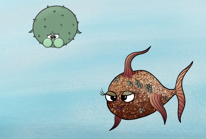
4. A Blowfish: Welcome back. I hope you had coffee or
tea or juice or water. But anyway, let's start with
our next character here. And that is going
to be the Blowfish, the one that blows off or becomes really
around fish, one is angry. So we're going to draw this
fish in its angry state. And we've decided to have
the patient look towards us to make these fish a
really chunky and big. We are going to have the face. They really, really small. So let's do this. Cute little fish. It's like innocence. Cute baby fish that
explodes like that. And just being this round
gives more funny look. So this fish we're going to do childish funny fish
to enter. Do that. We're going to make a really
tiny face within this area. This is also another
thing that if you want to make something
look really big, draw the elements of its
body a really, really small. And let's experiment with that. Child has very round eyes. And also, let's have doubt and another eye here because
this is a line of symmetry. And let's have this giant pupils like a baby has like that. And let's shade
them a little bit. So again, drawing with the
blue pencil, experimenting. Now in this fish, Let's have the
effect of the fish blowing up like that with
having its mouth closed. And it's chicks really clumpy
as if it's holding its air. So let's draw two other
spheres on both sides. Let's make it funny. We're out to have fun here. And a very tiny
mouth trying to hold his breath as this fish
blows around like that. Because it's holding his breath. Use the elements of your character or of the
species that you're drawing. Make your character
more interesting to add it as a trait to that character. It's going to add even more fun and extra feature
to this character. And now we're not going
to see any mouth. It doesn't have any nodes that frees us from drawing extra. Now what we need to
do is draw a very, very tiny things here and here. And Let's draw maybe
some eyebrows or the flesh coming on
top of the eyes here, just with a small line. And just give the
impression that this fish is trying to hold his breath
because it's scared. So make the fence tense. Again. One line
here and one that builds a triangle and
make the line curvier. The more curvier
your line become, the better your
character will look. Because nothing in
nature has draped lines. Especially organic forms. Organic forms like trees and flowers and humans
and everything. They don't have
straight lines in them. Everything is curvy
lines, soft lines. So use that to draw an appealing characters
in the character. Appeal is one of the
most important things. So let's draw this cheeks
and some of these tags. Spikes this Blowfish as having
when it's in this state. And so this is the only
thing we need to know. Now, let's go with
a black pencil and refined are these features. First, let's concentrate on shapes that are
above other shapes. In this case, the chicks
are above the eyes, so let's draw them first and the chicks are
not transparent. Even though we've
drawn these lines with the width for the eyes, we know that the eye
as under the chick. And you see the importance of sketching and drawing
with blue lines because you know the order of words
before something else. If you draw digitally, That's of course very much easy. You can delete. But I would like you not to use an eraser here. Because using an eraser, it keeps your lines stiff. It tells your brain
that you can fail anytime that and that
it is not okay to fail. I want you to train yourself
to do exactly the opposite. I want you to train yourself to say that this
is not a failure, but it is an experimentation. I'm looking for my
character here. And the only way to find it is by doing it as if
it's in my kitchen, being messier about it. Trying out different
lines, experimenting. If you absolutely do not like you're drawing and
it makes you feel angry. Just go ahead than the paper and start
over, draw another one. So here I'm going to
make a little bit of the worried line here on this character
holding its breath. And let's refine this here. And now you can
draw several lines. On top of that. You can see that these multiple
lines that you have already drawn gives
you a suggestion. Which line is actually describing around
space, around shape. So it's easy to just go
ahead and draw on top of it. So I'm drawing with you. I'm not fast-forwarding
this video because I want you to take
time and draw with me and to see how easy it is to do. So, we're actually almost done because that
was an easy shape. Let's give some texture to
the fence or the color. So to separate them
from the rest. And let's define the
eyes more and this area. And we already have a little
baby fish that is trying to hold its breath and
shade it a little bit. So we know that
this is his cheeks. And we're basically
done for this drawing. That's how easy it was. And it's a completely
new character than this one, the lady fish. And we started
with just spheres. This is when you have an
intention to draw something, you start seeing the features. And now let's experiment
with this little guy. Why do we, what do we get here? And we will do that
in the next lecture. See you there.
5. A fish Captain: Hello and welcome back. Let's draw this little guy here. And we said, we're going
to have him in profile. And let's have
another character. Let's call him a sailor, e.g. and have a male character that is a serious guy, a sailor. And when we have
something in profile, then we have only one eye. So let's draw a small
i and cereals eyebrow. And let's have his mouth
a little bit lower down using this line to signify where the
mouth is going to be. A sailor is a serious
business makes, let's make him serious. What can make a
character cereals is having the lower part of
the mouth a little bit, a bit, a bit inside, a little bit further in. So here looks as if he's biting his lips out
of seriousness. And just go ahead of defining this shape and make him even a little smaller
as he's bulky Gaia, just a guy who is doing his job. Another thing we can do
to add more characters to personality like that is
keeping the lines sharp, keeping them a rather
strict in on the sailor. They have this suit. They have everything in place. All the buttons are fixed
and so strict lines for this character will be, we'll give him a
little bit more of this strict sale and look, let's have his eyes
straight ahead. And let's have his themes also, sharp and straight
in this direction. And another thing over
here, sharp and straight. And he's probably having a second one a little
bit further in. What else can we give him? Let's give him some
mustaches like a sailor. And there are a lot of fishes
with mustaches like that. And we don't see
the other mustache. So let's make the
eyebrow, or really thick. Like an old sailor garb. And some of the lips
a little bit lower. Here is serious business. He's not playing around. So that's basically
the, the basic shapes. Now let's refine it
with a black pencil and then we will add more details while drawing with a black pen. So you can think about what kind of details you want to add more. And even if you draw
with me these drawings, you can, in your head, think of personalities that
you want to draw as fishes. I mean, think about
your relatives. Would you like to
draw your brother or your sister like
a fish character? How would they look like? Or is it easier to have a
general generalized character? In generalized
characters, usually you see one personality traits. And it is easier to do because you can
stick with these traits. You can use the
attributes of a fish, like the simple shape, elongated shape or round shape. And you can stick these personality traits either it's something to do with the costume or
with the demeanor. And it's easy to get. A personality is nice. It's easy to be recognized
by your viewers. While maybe if you have
a family member, I mean, they are not they have
such a variety of traits. I mean, we all do. We're not just good or bad. We have a personality
traits that cover a lot of big
range of emotions. So if you draw your
brother and sister, think of maybe their style
is your brother or sister. Like a rock guy or girl, or someone that you know, think of something
that is more general. And it has this typical
dress go to dress style that you can bring forward or that will follow with
the demeanor of the fish. And not only you
can draw a fish, maybe you can draw some. Some hat on top just to signify
that this is the captain. So within this fish, we're just going to draw
a second ball that will give us the placeholder
for the hat. And a little line that
signifies the front of the hat. And with this, we can just
refine it right away. And you know that the
hats of the sailor, They're not round like we did, but they have this shape a little bit with
something on top. Seller fish,
Something like that. So this gives this character even more personality because here we are to draw personalities and not only just fish and give the
texture to the fence, as well as here. And more straight lines, even if it is an organic form, you see I still keep
the lines a little bit bended because
it's an organic form. But I still, I want to have I'm straight to signify
this guy's personality. And if you want, you can make his mouth
here a little open, is an angry salesman. The C is not responding
to his command, right? And let's have maybe
texture that is also sharp. If you add sharp elements
to your character, this signifies danger, strength. It signifies something strict. A personality that is
not to be played with. And the softer lines of software fence that signifies
the softer personality. So if you just want to have your character
look more dangerous, you can add this kind of traits. You can even add a head to him. You know, some patients
that have defined head. So you can add that
tooth for this guy and have two different shapes. One of his costume, this can give you even
more feeling that this guy has a costume and even shaded because we are
drawing in black and white. I'm just going to
shade it by linking my hand side and width. And very, very easy
for strokes of the pencil shaded making
it a different color. And given that the impression
that this is now a costume, that is a sailor's suits
or costume, has all. This is our next fish. Now, let's go ahead and
draw the other shapes and see what kind of
fishes to reject their personalities.
I'll see you there.
6. Old guy Fish: Okay, people, welcome back
to our next character. And I hope by this time
he already getting excited to see what you're
going to draw here. So let's start with this fish
and having a little flat. Let's go crazy on
this character and draw our little old
guy and old fish guys. So we will have his own flesh just sinking
down as an old people. And we will just use this shape to define the
upper part of his body. And we will have his
face looking at up here. So we will draw the
eyes a little lower to give suggestion that this guy is everything and his face
is just dragged down. Because we can't do
hunting or rehab. We can't give any sign of age
here because it's the fish. So we're going to use all the significant traits that we can signify
an old person to describe this
character and where the gels to a body and the head
and making him a fish. And that is placing
everything face and shrinking the body
for this area and give him a big part of his back
being his body like that, and having the eyes like that, having the eyebrows as
an old guy would have. And you see just
with few strokes, just bringing the facedown, having the body hanging here. And we already feel
like this character, no matter if you
don't see a fish yet, is actually an aging persons,
older, older character. What else can we give? Let's give him some
bags under his eyes. Just expand the spheres around his eyes on
the lower part. Let's make the mouth
sinking down like that. And let's bring this side of the body with two ellipsis down. And let's make the lower part just following this curvy line. Going down, what
else are we have? Maybe how old people just get more of the traits
that they have. Young people, if you have big T, the chief goals all
over the place, the nulls go all over the place. It's not the way we used to be, the symmetrical as
when we are young. So let's have something
like that on this guy. Let's have tiff in this array
from this place like that. And let's give him
immediately the pupils. So we know it's an old guy and
we'll bring the pupils up. He's trying to keep his face up, but everything is
just going down. Dragged by the gravity. And of course, we know
that the fish don't. That doesn't happen to fishes. But again, we're designing
cartoony characters here using these shapes
because it's so easy. It's easy for you to be
satisfied with the character. You have to design
something that looks good. So left give him fins. They are kind of curled and
just one so it looks like just one piece of hair on
a bolt health like that. What else can we give him a
big bushy eyebrows as well? Bushy eyebrows. We know that the fish don't have eyebrows. Let's experiment
and give him that. Now that we see
him from the side, we'll give him some kind of software fence that are
losing their shape. And now we want to
have a nice silver. They want this to be
obviously a fish. So we need to show a
little bit of his theme. And we just pretend that
he's famous actually curl as if he's swimming and we can see a part of this fin. Otherwise, it will be covered up there will
not be able to see it. So we're going to just, she's a little bit just to
create a nice silhouette. And half can be more
recognizable as a fish. That's what you can
do because I mean, you are the artist here. You can change the
shape and form, whatever you like it. And what else we
can give him on. We can give him
this path here like old people and some kind of different skin abnormalities. Like an old guy and then probably there
is a fish like that. Does not surprise me. There are all kinds
of fishes out there. If you want, you can just grab some images that
you want as a help. But what I'm doing here is I'm
drawing that without using any references because
I don't want you to get stuck in specific
fields, specific detail. I want it to be able to shape
the character at anytime. The way you feel fits just to
create the right character. And now let's redefine
it with a black pencil. Now, our job is easy
and fun when we have all the shapes in place
and we know what to do. It's the blue line suggests
where the right line is. Which line to make thicker, which one of the blue
lines to actually ignore to create this
great character. And we'll have the eyes here. Everything is lower, the shapes, the skin is dragged
down by the gravity. And such way you can make
later on All person. These exercises is not to teach us how to
draw exactly fish. This exercise, how to teach you how to
draw cartoony characters. And if you know how to add
an expression to that fish, what, how can you look for a
character and in anything? This will help you later on. When you have one, you'll learn about anatomy
and when you'll learn about Human Anatomy
or animal anatomy, very easily to draw a character. That is what this
exercise is about. But now it's fishes because they are going
to look like fish. And there will be funny. You can have your story. If you have a story
about fishes, it's easily to use such
characters that you have designed here and
the chunk of the mouth, it's going on top of this tiff. And the same thing here. And let's give him
the mouth here. It's sagging down, maybe
add some wrinkles here. And you can have this character
and draw him later on. In your computer, colored
the way you want it. Maybe we'll have some
skin here above. Just to complete this shape. You see I feel like
this shape is going to quickly in the blue line. So I want to extend it. And there is no rule
that say you shouldn't. And that's why I want you
to experiment and see how does the shape
better fits your needs. And now we add a little
bit of stomach here. You see that often
the older people has, I mean, I'm not going
to prejudice here. And the thing is that generalizing in character
design is something that we do because we
also frame people in different, in different pockets. So really this
person is like that. This person is like that
if you just describe them, someone, you would have
an image in your mind. But when you break the rules, when you break this prejudice, you create a surprise in your
story, in your animation. So it is actually to prefer
we break the prejudiced by showing what the prejudice is and then break
it like saying no, but this is not person,
it doesn't matter. All person can be
bulky, can be young. I mean, now. When we know how to
take care of ourselves, All people do not look
the way they did before. And hopefully that is
changing the image of how, how we age and how
it look like, right? We're all in this together. That's a little bit of
existential questions here while we're drawing
these old fish, right? Well, I am not fast-forwarding this video again because I want you
to draw with me, this process should be a
little bit meditative process. Usually like to draw it
because when you like it, your continued doing it,
you're releasing dopamine. While you learn, you
release dopamine. And dopamine is the
hormone of happiness, hormone of interests,
of being, of curiosity. The more dopamine you have, the more curious or you're
going to be and say, well, I did that. Let me see what else can I do? So I want you to succeed. If you're a beginner,
I want you to succeed in creating these characters. Now I'm adding more of these graphic elements
and maybe you can add some wrinkles
that fish, John have. Both an old person, like dots and we have so
much character in this fish. And I'm going to shade
it a little bit. Rough lines because all
people have this rough lines, lines of life on them. So I can use this kind of
graphic elements to design that even anything that will
serve me to enhance, to enhance my character. And just draw the themes
darker here just to make sure they look as if
they're things and they're separate from the body. It gives us more contrast. Contrast in graphics and in drawing is go
to pick up because it very easy elements you can show your viewers that this
is different from your body. It has different color by using these graphic elements and these strokes you said this part is in shade, it goes below. This other part. This is on top. So it is easy to do. Use these strokes and elements to shape up and give a better suggestion
to your viewers. What are they
they're looking at? Without them having to guess. So I'm shading a little bit here behind the teeth that we can do because that's how the
Tiv comes out better. They bring them up front. Because every time
you have something white and you add
contrast just behind it, you say that this place is before some other
parts, some other area. Now, let's have some
graphic elements to cause the same element here just a little bit as skin abnormalities of
this old, old fish guy. And maybe you want to
make, I don't know, some kind of lines of the eyes. If you're too extreme, we'll look a little scary. But whatever helps you to
say this is an old guy fish, and that is it for
this character. Now you have a fourth character. Easy and nice. And now let's go for last character and see
what we can find there. I'll see you in
the next lecture.
7. Happy Fish: Welcome back here guys. And let's get excited about this and see what kind of character
do we have here. And let's make this fish a
little bit more triangular, like dots does go
from this shape. You still want to
use the sphere and go down to this
part of the fish. Just to have another kind of crazy fish here amongst
square kind of fish. And we will, we will connect this area with a theme
that goes this way. So curve and curve it up. And we, as you see, we're still using this
sphere to create the fish. And let's have seen
that goes into, that's a splits into
one thing here. And one here being a lower, they're just do the curve
here, another curve here. Then connect. Connect this curve
here with the body. And what kind of
fish we want to do. I started we just
changing the shape and I didn't know what kind
of fish we do here. So let's create a
fish that is happy. Happy go lucky fish. We will define the face
a little smaller here, and we'll have the mouth being
this big, happy go lucky. So let's focus on happy
and have the cheek. Here. This is the middle
line, as we said. So let's have the
eyes on each side. And this, I will stick out
from the fish like that. Let's have the other
side of the mouth. Follow this form
as the happy fish. And it ends here. But it does connect to the
other part of the mouth. So follow this shape, but bring it a little
bit further in like that to create
this shape of the mouth as if there is flesh in-between like that and
that is a fin over here. Let's connect it to
them, Vardy, like dots. And let's make this part
of the fish maybe like a theme that goes this way
and have some tags here. You see that some fishes have tags coming out of the
themes, like a doubt. Now, this is a new
model of fish. Let's have this fish
looking at us happily. And It's a happy go lucky girl. So let's give her some
eyebrows like that. She's not the same girl
like we did before. She's more like a free spirit. She doesn't have
makeup or anything, just a free, free spirits. And let's have some teeth on
this fish because after all, it is a cartoon character and
the teeth are not going to be sharp because we remember that sharp
tip signify danger. So we're going to make her teeth being a
little bit around it. And that's it. Now, let's go ahead with a black pencil and
refined or a fine. And I would like you to take the same shapes or
make other shapes, but I would like you to
experiment with more characters. You see the way I decided how the characters
are going to be are so simple that you can take this fishes and
decide like okay, I want this piece to be
female punk character. I want this fish to be
female astronaut character. Or I want it to be
superhero or whatever, whatever you decide to be, or maybe train conductor. And a guy with a baby
and experiment and see, what are you going to get? I'm going to refine the mouth. And when you draw
with black pencil, all the lines that you've
already drew with a blue band, so they kind of disappear
out of your site. You don't see them anymore. You'll see that when you, when you see the image, you just see the fish
and not the mouth. Now I'm going to shade this inner part to
signify that, well, this is a shape that is
inside and we'll continue some teeth inside
here like that. So now we already have
nice Smiley these. And what else? Let's continue these things
and make them more defined. They're not really texture here. They're not graphic element. They're more like skeletons. Skeletons for this scheme. So let's connect them between them to make
the specifics of these things like dots
and shade this part. Even shade this part, continue the lines. Over here. It's easy, easy work
when we're done, when we've done or Groundwork is just very easy to
shape after that. So I would like that you tell me what you think
in the comments, right? Me. Give me a
review that really, really helped me to make more
lectures if you liked them. Because there's so
many different ways in approaching drawing and learning how to draw without having to feel fear
that you're going to fail. That is such a big
misconception. There is so much more to learn and teach
and to break your free from this kind of
whatever old teachings. I mean, I see it everywhere. People saying, as soon
as they are going to start with drawing
in a film or somewhere. I mean, every time the
character says, Oh, I was good at drawing in school, but I'm not good at drawing. Now, why would you, why would you say that? Keeps people who likes
drawing and who want to draw in in shock because
they will not even try. The same with me. I'm in, I feel the same, but drawing is really not
about starting and drawing. The first thing you do is
making perfect drawing. No. Now you open your kitchen, your opening drawing kitchen, and you start drawing me. You wouldn't say
for the same thing for surgeons are all well, I want it to be
served on boards, starts operating on one person, he or she died. So I'm not a surgeon anymore. Right? You, you want
to have training, you want to have to
draw more and more and in the process you'll
be better and better. The more you draw, the more
you will want to get better. And e.g. even for me, I don't consider
myself done drawing. I, I tried to improve myself, to teach myself new techniques, to open up for new approaches, new way of doing things and
being better in what I do is, but what I am now
on what I do now, I can do as good as doubt. And it has got me here for
a lot of hours of practice. And breaking this
stupid convictions that someone has stopped you, that you need to
have talent to draw. Now, you need to
have persistence. You need to have
desire to draw dots. That's what you desire
is the main thing. If you have the desire to drop, nothing can stop you on. But if you tell yourself, Oh, that's, that's
a lot of work. I'm not gonna do it. Well, then maybe you
won't do it now, but you never know one day
you will wake up that well, maybe pick up drawing again. So here, there are all five fish characters that were drawn just by
drawing simple spheres. By a leading or imagination to a specific trait or
character we want to draw. I would encourage
you, as I said, to start drawing the
shapes like that and come up with all kinds of characters that inspire you
to start cartoony drawing. I hope to see you
around commands, review, and see you here. Have a creative day guys. Bye.
8. Drawing a Sea World: Hello dear friends and welcome back to the second
part of this lecture. Here we're going to practice
what we've learned from the previous chapter
and become more bold, become mon brave, and have fun. Because now we are
going to design a whole SeaWorld and later
on we're going to color it. So how do you start designing? Seaworld doesn't have
precise structure. You don't see the bottom
part of the zeros. You can just do
anything you want. Because stones and
seagrass and fishes and all kinds of elements
there are in disarray. That's why it's a
perfect thing to draw. When you start drawing, when you are a beginner. Let's start composing
or stuff here. We're going to start
with some stones. And the same, the same way, the blue pencil and
a black pencil. So we're going to
start by designing some stones and again
start with spheres. Maybe how spheres,
because the stone just disappear somewhere
there that we don't see. And we're not going
to draw the ground. Because that's why we're free from having
to do perspective. Isn't that nice? You can do whatever you want. Now, you do another
stone over here. And to frame the composition, to have this stuff
in the middle. We're going to do
another part here. Let's do a borough, the stone just with
spheres, with loose lines. You see, I don't even
press upon the paper here. Last two. Another stone over here. And let's break it down into smaller parts so we
can have chunks of stone sticking out from
this term very loosely. Just with a few
brushstrokes, don't press, I don't really think
too much about it. This is kind of nice for
starting or a composition. Now, what we're
going to have here, we're going to have
some seagrass. And the seagrass, we're going to use the curves
that we used to do in the previous
lecture to define the fishes, fins and Jack. So just make loose
curves like that. One, maybe make
another one because there's a lot of seagrass. Another one is just
like chunks of hair. You can use maybe a
piece of your hair. I mean, don't don't tear
of Harris from your hair. You just need to know that it is something like a
chunk of your hair here. And let's do some other
parts of the seagrass. We will stop for now and
complete it later on when we know where our
officials are going to be. Now, let's design
of fish over here. Let's do us here like that. And let's have another fish as smaller one like
this vicious child. Be over here. And let's very early on decided that they're going
to look at each other. So one of these curves
that you already did loosely can be used as a part of the line that
separates the face into two and finding the
perspective of this character. Let's do the same for the
little fish like that. And what else can we do here? We're going to do a
little even a crap. Now, let's have the crop
sticking out here on this. Don't start with again, a sphere, a little bit. Elongated sphere like an L it. And this is going
to be the face, the front of our crab. And the middle line of a crop is going to be
approximately here. And he's going to
slightly look at us. So how do we design
the legs of the crowd? Let's start very easily with skeleton that looks
like stick figure. So you design one
leg here, one here. And One here and one here. And you do that are
a little bit back. And this leg is placed
slightly behind the other leg. You don't need to
draw all the legs. It's enough that you
draw some clause here. You draw one stick
here and one in front. And the same thing here. One line here, and one upfront. And this one, you, we're going to cover
with a sphere. Just a chunky sphere. These are the close of
the crop like that. And this one, because the other the other bone here is
thinner on the crowd. If you see a crab, you can, you can use that as a
reference, is slightly thinner. And here we're going
to use this line to separate the
crabs claws into. So you have a line that goes
from here, separate into. One from here, separate into, and this is just a sketch of
our crab almost done there. Now let's do philip or
world with more stuff. Let's have a
jellyfish over here. How do you do jellyfish? Of course, you start
with a sphere. Everything you want to do, you can start with a sphere. And we can have the face of origin fish be
approximately here. So you split that spirit into, and maybe even if you
want to decide that the face will be lower
here, down here. And you find the space, the spot where if
the jellyfish head or nose is going
to be over here. But luckily for us, jelly fishes don't have noses. So less for us to draw to accomplish a nice
line character. And what does jellyfish
has really has this, something like a
dress over here. So let's design the
dress kind of thing. Those that stick out
from the jellyfish. And they're just same
way like the seagrass, like big chunk of hair. You design it with curvy lines. Does the curve, if you draw on a separate sheet of
paper, these curves, that will give you all some more freedom to design
it when you are done or when you design stuff
right, on your illustration. So we have two fissures. One grab, one jellyfish. What else can we do that? Let's do. What else? I mean, a long fish over
there in the distance, some kind of a long fish. Just design it again
with a sphere. And let's have this
fish wanting to join this little gathering
we have over here. So that is done. I mean, let's start with that. To create our CEO
world later on. When you do your own
SeaWorld, I mean, you can feel this up
with different fishes, with a jellyfish, with
grabs, whatever you want. But during this process, we can come up with
other stuff to fill it. What I want you to
draw this with me. So you see a part of
the creative process is just going along and relying on your intuition and your sense of your creative sense to draw
whatever comes to your mind. Now the sketch is ready. Let's go ahead in
the next lecture and refine these characters and find who these characters are. I'll see you there.
9. Drawing the Dad: So I hope you're ready
to create some fun, nice characters using the
previous part of this lecture. And knowing that
this is not really about just fish or
crabs or whatever, this is about character. Now, we started with this fish saying this is like a father. I just like finding
new more or something, but we're not going
to draw find anymore. We will let our imagination lead us to whatever character
we want to draw here. So let's design this
male character, fatherly figure with
some, some cartoony eyes. Even if you want to have
an angry character, all the character,
because we are doing cartoony characters here. The blobby eyes are very common in courtrooms because cartoons should look like small children. And that's why they have
designed this wide puppy eyes. Even though the character
should be cute. Let's have this dads. I have big mustaches. So let's design even
some mustaches here. And then we can bring
his mouth over here. Why not? So I'm going to draw another sphere as a
helpline for the mustaches. Mustaches comes from
this part down here. So now let's connect. If we say one
mustaches finishing here and one more
stars over here, just connect this part
of the sphere with a curvy line with this
part of the mustache. And maybe even use this line That's
separate the face into, to be as a starting
point for one of them, stash with a curvy
line connected with a sphere and do the same for the other part of them stash. It starts over here, connect this part of the mustache with a
little chunk here. And now we have the
dads must stop. Now. We're going to make his
mouth just being over here. Why not like that? Have his thing being lower down. Now, we established that
his budget is over here, so it will be nice if his
fin is kind of on this side. So he has this big body. And that creates a little older
aspect of this character, like a dads character. So we will put the
thing over here. Now, let's have
another curvy line here to establish the fin. Now connect this part of the father's body with
that part of the thing. Repeating the curvy line here and connecting
it with the body. And do the same
for the next part. Now, this thing is
kind of shorter. Just connect this part of
the body with this theme. And let's have another
thing over here on top of the data using
these curve that we did that splits the
face into helps and use it as a base
of the upper thing. Look how easy it becomes when we actually find the
middle of the body. And every element will be designed according
to that middle, middle line over here. And it will be
perspectively correct. And now let's have his
things on both sides. Like we did in the
previous lecture. And one in here. One thing here, again, use the curvy lines and
connect them as a triangle. Assuming that one of
these things is on the opposite side
of the body and we see just a part of it here. And if the body was transparent, what else can we do? We can do some worried eyebrows for the father. This time. Maybe we can just make
them as a chunk of flesh from this fish like
that and then saying, some, do not go
deep into the sea. I'm worried about you. And you see that you can draw, you can create a father
that is different from the character in Finding
Nemo and still be a fish, you can create any
kind of characters. So the data is kind of done. Let's go ahead and
design the little kid. In the next lecture.
10. Drawing the Kid: Welcome back people. I hope you're having fun. Because now we are going to draw a very cute little fishy
baby or young, young kid. Again, we establish that we
are talking to each other and you see you vary slightly the line here that
I've designed, I have drawn, and I
hope you've drawn in the previous lecture
that we'll find the symmetry and the
perspective of our character. And the kids. Whatever, even if the
fishes or babies, they have very large eyes, which makes their heads and
bodies look very small, tiny. So we're going to
draw two large eyes. And you see that this is kind of squashed in comparison
to this eye. That's what, that is. Why, because there is a
perspective change for this. So we don't see the whole eye. If you drew a full sphere here, the eyes will look as if
they're sticking out as if the eye is not correctly
placed, the body. But just squash this theory a little bit to give
it a perspective. Change in three-quarters. This is again, a
three-quarter position. And we'll have the pupil of
the kid looking at his dad. Another two spheres and having them have been a
little bit cross-side. Again because that gives cute look up or characters
like babies do. And now let's design
a small little mouth. And some chicks on this link. Like a little kids. And let's have this part. The mouth having, being a
little opened in a smile. Following this structure,
these lines on the sphere. So we have the chicks here and we have the
perspective change. Me have the little mouth
of this little fish. And now this is the face
that we get for little kids. Let's design the body. And we assume that this fish
will look like his dad. And now I'm doing some
corrections as you see, because the sphere that
I had as a guideline didn't give me a complete
shape for the fish I design. And this is very easy to correct if you do it with a
blue line and later on, this will be repeated with the black line and it
will look even better. So we assume that
this species of fish, it looks like his dad. So we're going to have its
fins looking like that. I'm going to have a fin
like that and much smaller. And you see that this
line is helping us find where the fin is
standing here on the body. Because it's the middle
line and the fin. It's going to be placed exactly in the middle
of both sides. And now we have the kid
maybe explaining to his dad with small things that
I will not get lost. So you can even design
a gesture where the fence and just using
them as hands. And we'll have a
much larger thing because this is a baby. As if you know, the babies have large feet in
comparison to their bodies, will have the thing
being slightly larger. Kinda similar to the
dots, fin, curvy lines, curvy lines and
very loose lines. Here is our baby fish. Now, let's go ahead in the
next lecture and actually draw this characters before
we continue with the other characters and
finding out who they are. I'll see you in
the next lecture.
11. Refining the Characters: Welcome back. Now, let's go ahead and decide. Define the character's
shapes with a black pencil. Like that. It is now the good part that can depart when we have the
characters designed. And now you can just at details, see how they come
to live freely. Where the black pencil, they get more and more defined. The little blue lines, they kind of merge behind. And we don't really see them
even though they're there. You see how our
attention goes to whatever is more
concrete and defined. And you should use that
in your creative process. And not be afraid to make mistakes and to draw
with a different pencil. Just for the purpose, to give yourself the freedom
to discover your characters and later on to have a certain definition
of your characters. And that's why there will be
more appealing, more alive. Because you've done your
homework, you have discovered, you have drawn them in disarray and you have discovered
who they really are. So I'm going to make a mouth
here a little bit open. The dad is saying some, I'm worried about you, just like in the
film Finding Nemo, but you can stop the
little ones in the water. They want to discover
they want to play. So I'm again drawing along,
not fast-forwarding. So you can be a part
of the whole process and you can see that
you can do it too. It's not that
difficult if you split all the creative
process in such chunks. Until you come to the
refining of characters, you see how easy it becomes. One. You've already done
characters that I'll lose that are just
shapes in disarray. And this is the dad. We can add some
graphic elements on top of his body just to make sure he is fish and he's getting better
and better shape. And I hope you are
having fun here. In the same goal,
we will adjust, even do the little
character here, and start shaping his eyes. You see, I'm drawing the chick on top of
the shape of the eyes because while doing on our homework and discovering this chick shape
that wasn't there. We know that the chicks
push the eyes usually upwards and we can use that
for or fish character. Of course, you will not
see that in nature. There are no fishes that
pushes their chicks up and smile like humans. But again, cartoony
characters are cartoony because they
look like humans. And that what makes
them appealing to us. So we will continue refining
even the fins of the little fishy and the eyebrows
a little bit. It starts to look cute. And I hope your fish
is also looking cute, which I know it does. Because now you have
found the freedom to create and not be afraid
of your mistakes. There are no mistakes
in drawings. It's just trying out
different approaches. So I hope you've
learned now that this is so and crashed
your disbelief of your cells saying
that you can't draw or misconception that has been taught to you from a
young age that you can't draw. Because that is not true. And every Illustrator,
every cartoonist, no doubt, already has
gone through that phase. And now that this is just a process of
discovering your characters. Now this little fish is done. Let's go ahead now and
draw another character, and let's do the crab
in the next lecture. See you there.
12. Drawing a Crab: Okay, so now we're going to
do something that we haven't done on previous chapter
and drawing a crab. But the thing that
is the crop is no different than
any other character. Now because this character is
going to be from the side, the eyes will be over here. And let's start
withdrawing two spheres, each on each side of this curve. And this crab is
facing towards us. So the both eyes can be spheres. Because everything
that is facing in front towards us is kind of coming to a straight line and the eyes are kind of
similar to each other. Let's have the funny
cross eyes look. And one, what else
can we use from the crab that has
this funny look. Let's have him have this
sulking, soaking mouth, the crop and another mouth here and some kind of a eyebrows
that is sticking out. These are angry, angry,
little crab character. And let's refined, refine
this clause like that. We have already drawn them. It's a matter just
of a refining them. Now, the stick things
that we did over here, let's add some flesh to it. So the body here is
going to be on front. We have just discovered
how long these legs are. If the crab was
transparent, which is not. So let's add another line on top of this one and
make or stick figure. Thicker. And another one here, and another one in this
part and around it up here. So it's not straight, it's a little bit of rounded because this
is an organic form. So if the lines can be soft, they can be uneven even. And they are not robots around them up a little
bit where they connect. And even here and there is, because we see this
part of the crop, there is even one small
leg that crabs like that. And same here, but now
this leg goes behind. So we will do that in one
little leg over here. That's basically it. What else does the crops or has it has this big mustaches. I get that. So just make a curvy
line the same as the seagrass in the
round that up in the end like a little
curl over here. And that's it. Now, let's go with
the black pencil and define aural
level crab here. So we have the eyes, the googly eyes, as the same
as the other characters. Also, because you're drawing the same eyes on
all the characters, they're fitting into
the same style. And if you draw illustrations or draw characters for
your animated movie or whatever you use it, you want all the character, all the characters in there
to be within the same style, to have something
that connects them. So this is the next step
of your development that when you learn how to
design these characters, you need to actually
learn how to make characters that are similar in design, something
combining them. And this googly eyes are now combining or characters that they look similar to each other, which kind of fits within
this illustration. And it seems like they're
coming from the same world. Because if you have gone, even, even if you have taken my other lectures like how
to draw cartoony characters, I'm talking about
how you can design so many different styles and characters that are fitting
within the same world. And the possibilities
are really endless. So this is your next
step of development. But here I'm designing
all these characters to fit within the same style
with this googly eyes. And so we have this illustration
summarizing the SeaWorld. That appears to be from the same style,
the same illustration. You have enormous freedom to create in different
styles, really. If, if this seems
difficult to you, there are so many other
possibilities which I'm going to talk about and I'm talking
about in my other lectures. But I think cartoony SeaWorld
is very nice to design. And now you are following, following me along this cartoony world
that we've designing. And I hope you're releasing
a lot of dopamine and having fun while learning this cute
little characters. Or crab is ready. Now, let's go ahead
and finish up. Or other two characters. I see. I'll see you
in the next lecture.
13. Drawing a Jellyfish: So welcome back. I hope I hope that
you've had a nice rest. And now we will continue with
this jellyfish character. We haven't practiced on that. So now it's going to be a new thing that you can
add to your knowledge. But this is no different than the other fish
that we already did. So we have the character
over here and we decided we're going to do
the face over here. A nice lady, jellyfish
way, the blue pencil, I'm going to shape
her face around eyes. They are rather
round because she is almost looking at us. And the perspective
is over here. So GIs, don't have so
much perspective change. Let's make the eyes
crossed eyes again because that's how
cartoony characters are. And let's have the
eyebrows, eyelashes. The way we did. The other female fish just have a curvy
line that represents one eyelash and another one that represents
the other eyelash. And that's kind of enough. You don't have to do
all the eyelashes. Now, let's have the mouth. Being cute little
mouth for that reason. Just make one elliptical
sphere, kind of squashed, elongated sphere like
that and split it into just like
that way the line. And this is going to be
the holder of the mouth. Now, let's shape the
whole jellyfish. Just follow the sphere that looks more like a round
shape to you because you're, I will guide you to see the perfect line of the sphere when you
drew so many lines. And you can still
have a thick line to suggest which line do
you want to choose. And you bring your
eye will lead you to the one that is
good for that place. And now we are going to have this part of the
jellyfish just do a curvy line that is approximately the same
curve as the whole sphere. So it's kind of like
repeating this curve here. And now let's have a like a, like a dress, kind of
an ornament like that. We don't have to draw a
photorealistic and jellyfish. And we don't even need to know
exactly how it looks like. If you use that as a user, a jellyfish photograph
as a reference. It's good. It's very good actually. But as a beginner, we tend to go into too many details to do
it, to do it justice. And because you want to have a jellyfish look exactly
like a jellyfish. And that's not how it works with character design and especially cartoony
character design. You have, you can be more free. And now we can just enhance these curves
that we already did, make them a little bit
thicker, stronger, like that. So we can see them clearly. And we can see how our
jellyfish shapes up. And that's it. We're done with
the first sketch. Now, let's go ahead and draw
it with the black pencil. Draw on top of the blue lines. And you see, even though I'm drawing with
several blue lines, I don't draw a continuous below one black line over
the blue line. I kind of see where the shape is and how I can
improve at how I can choose one line before the other to make the character
or better and better. And we already have a
character over here. This is just details
that we are adding. Now let's draw the eyes with a black pencil
and the eyelashes. And the eyes here, the pupils. And the other one. You'll see when you
draw with spheres, because it is very hard
to actually failed. Draw a sphere. If you draw many lines, you can keep the
shape symmetrical. You can keep the shapes solid. And this is very important. And when you draw
character design, and this is what the beginner
is struggling to keep. The same kind of eyes, the same shape, the same form. This mattered. It is really easy. Now let's shape their mouth. Let's take part of
this curve like that. And let's add a little bit of curvature on
the upper part of this sphere and connected
with the curve as it is, and just continue the curve on the lower part
of the jellyfish. Like that. I mean, she became serious. Let's give her some smiles, so just enhance some cheeks
like adults very slightly. She's a lady, jellyfish. Maybe we will shade the
curve a little bit. And here is our jellyfish. Now, let's explore
this curves over here and maybe add a
similar curve on top. It can be thicker
on the upper part. And as we go down to connect it with the edge,
it gets smaller. And this one as well. If you want, you can make
one of these curves. Just the other part. You can just curve it a
little bit to add a texture, a different kind of texture
of the jellyfish curve. Let's make this one too. Just a wavy line like that. And this one, don't
sweat it too much. If you don't have a perfect
way, you will live. I mean, you cannot
fail with a wavy line. That's for sure. And let's leave that straight. Just to have something
similar as this one. There is a variation
of the jellyfish. I don't know what, what do
you call those ornaments? And this one and let's
have this one being a curvy one with
another wavy curve. The last one, and add another curve like
that, and that's it. Now we're done even
with the jellyfish. Now, let's go ahead and design
this love fish and then fill up the rest of the shapes here until we finished or image. So I'll see you in
the next lecture.
14. Adding another female fish: Welcome back again. Now, we have another fish here. And what can we do with it? And just decided
that the fish will look and three-quarters
over here. So let's try to find
the character for it. Maybe this is going to
be also a lady fish. So we're going to
do maybe this time, the eyes are going
to be on this curve. You see that I can split the
sphere even on this side to find better where the eyes are going to be
located on that curve. So I can have the perspective
change correctly. That is all that
you need to know. If you followed my
other lectures before, you already know the methods. If you are new to my lectures, just follow my
instructions here and you will never go wrong, right? So these eyes are going
to be slightly elongated. And I'm going to do again some curves for the
eyelashes and even this one. And we already
have this almonds, sophisticated eyes of this fish. And we'll do the irises Here. We have another kind of character already with
just a few strokes. So what else can
we have this fish? Let's have her fins being also curve like a lady like
we did in the first lecture. And maybe we'll have something like that
to look like a hair, like a hair cut. And let's have her fins also be kind of a gentle and curvy. Same thing with the curves that we did in the
previous lecture. And if we imagine
that this body is transparent and this curve continues and lives
in a perfect ellipse. Then the other things
are going to be approximately over here
on the other side. But because we don't
see on the other side, we'll just add this thing over here as if it continues
on the backside there. And we're going to do again
another curve like that and another curve on the
lower part and connect this curve like
about with this one. So we have oral lady fish. Now, let's add her mouth. This time maybe we'll
just add a little mouth, a little cute mouth like that. And we are going to
around that shape here. And that's it. Now, let's continue with a black pencil to work
on our lady fish. And it's pretty clear
adjusted refine the eyes and the eyebrows. Those eyes. And you see how this
almond eyes are shaping a completely new
character like that. And the lower part, if the almond-shaped eyes
and the cute little smile of this fish and her
body and the brain, you see everything is so easy if you tell yourself
that it is easy. If you relax, if you let
your mind guide you, and if you have fun, drawing should not
be a struggle. It should be fun. And only for fun, from having fun, you can
get better at drawing. There's nothing scary in drawing
something the wrong way. As I've dealt million times, but I'll never stop saying it. The way you learn drawing is by deleting this false beliefs
that you've been thought. That drawing, that you need
to have specific talent. And to draw. Now, you need to have
a desire to draw and to improve to do it. So we're basically done with all the creatures
for or see image. Let's refine a little
bit of stones and seaweed and go ahead
and color the image. And I'm going to do that
in the next lecture. See you there.
15. Drawing the Background: Hello again and welcome back. Now, let's go ahead and
refine a little bit the environment or fish. And we have the
environment already there. We're just going to
enhance it a little bit. So I'm going over the
spheres that I drew. Now, this one here, I will not draw
the whole sphere. I'll just keep it as
part of this stone, a chunk of stone, and I'm going to
continue with that. And another chunk of the stone, you can design a
different kind of stone. Some dots are harder
or more sharp. There are all kinds of
stones on in the sea. But because the
shapes of the spheres are so nice to start
with when you draw. I'm going to keep this
time for you to just learn to free yourself and start drawing your
own designs later on. And say, well, those
are not only round, they're also different shapes
that you can do later, but now, let's keep the
simplicity of this. As simple as you
try to make things, the better you will become
because you will see that you can do it. Now, I've, I've inserted another curved line here as if it's a stone in some bulge
from the stone here. Because I needed somewhere
to put those seaweeds. And sea width is usually
starting from somewhere. They have a connection. Jewel stone or the
bottom of the sea. So I'm just having
this curvature signifying that the
stone is split into separate parts and
their different shapes of this down just
for the sake of it. So this one is done and we have one curve over here of seaweed. Let's add another one. You see that I keep my hand almost lose like that. Drawing freely. So this is all SeaWorld. I mean, we don't have a place. We need to have some space there where the
drawing can breathe, so to say, so we will not
fill up with more stuff. Now, let's go ahead
and color or an image. For that sake, I have
used a very thin paper. I've used such paper
because the blue lines and experimentation is
better on a thin paper. If you go and do that in, on a watercolor paper which
is thicker than your tire, the paper and you will not be able to do those many lines. So this is for the
purpose of this exercise. But if you want to do the same drawing and
watercolor paper, you should use a thicker
watercolor paper. But you will have to train
first on paper like that. So you know that you can do it and you can play
around with the shapes. And don't be scared to renew expensive watercolor
paper because watercolor paper
is more expensive. So for this purpose, I'm going to tape this
paper on the table. So while the paper dries out, I want it to be straight and I want I don't
want the paper to bulge. So I'm going to do that and
see you in the next lecture.
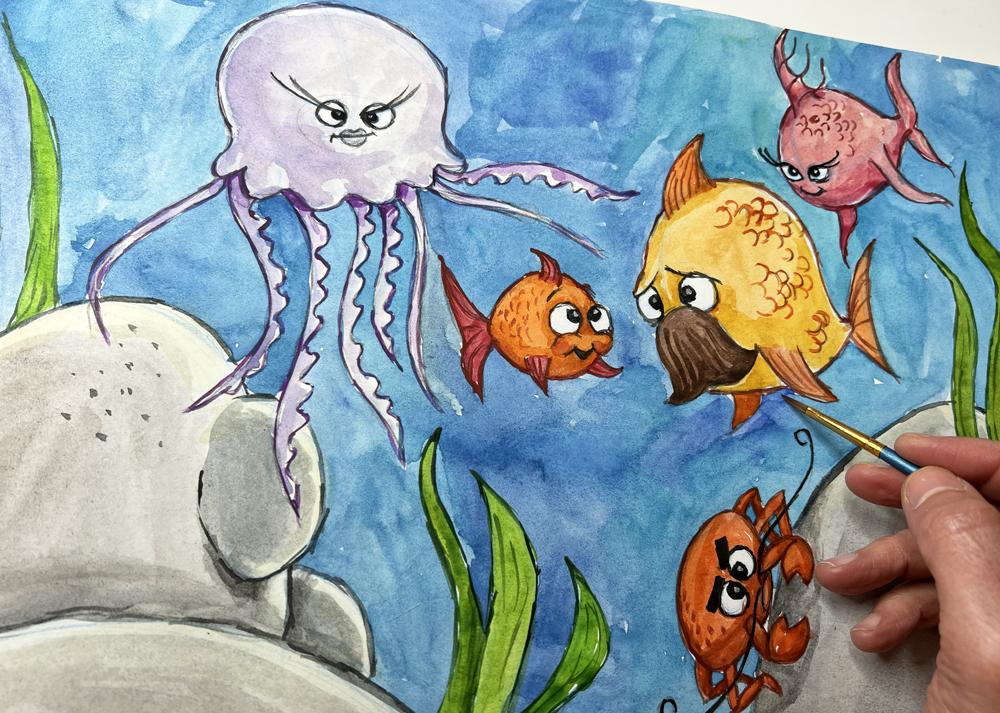
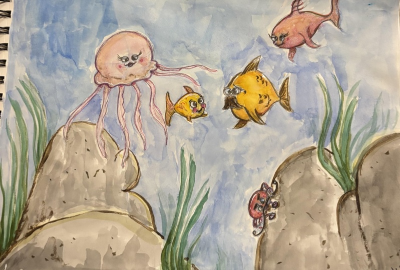
16. Painting the sea: Hello there and welcome back. So I have prepared here
for water coloring. You can also use
pencils, crayons, or whatever you actually like. I'm going to use watercolors. I'm using just a jar from
jam jar that is empty. And I have these watercolors. I really am a big fan
of Russian watercolors. They have really nice coloring. I mean, you can use
whatever you want. But I'm a big fan. I'm not Russians though. I don't promote anything. Just whatever pigments I
find are, give fresher look. And these are different colors that I've bought separately. I don't know which brand it is, but you can also use
your kid's watercolor. It doesn't matter for this exercise because you're
gonna get better, young god, you're gonna get more picky
on for your watercolor, whatever materials you use. But for a beginner, everything is actually good. I have all these brushes here, but what we end up using is basically
just one big brush and then maybe just this
middle brush and one thin brush for the details. So we end up using
just three brushes. And the thing is that
brushes for watercolors, they are really expensive. So if you're a beginner, don't stress out if you
don't have this fancy, fancy brushes, It's
most important that you color it and
that you have fun. So use what you have. And I have also this
little palette, which I end up not use it eventually
because the best way to test your color is to have
a separate sheet of paper that is similar
to this one at a site. And just try your color to see that this color is
good and it's ready to go. So I'm going to start with the background and
I'm going to color the C. I'm going to just blue color. Going to show you here
how I tried it out. I'm trying out this one. And as I well, that's good. Maybe I'll mix up another
darker blue color. Just go ahead and pick
whatever color you want and start coloring. You'll see that
I've already taped the corners of the painting. With this taper, you see that the colors are
being drying very, very quickly and they're not
spreading around too much. If you have a specific
watercolor paper, then your colors are
making these big spots. And I'm not drawing as quick, not absorbing the
color as quick. Which gives this nice
watercolor look. When it, when I was a kid, we were told or we're scared
to color outside the lines. But the thing is that with watercolor techniques and
the real watercolor artist, they actually prefer to have
this effect where the column merges with another color and it spills into another area. And this is actually a
good thing for watercolor. Watercolor is one of the most difficult
techniques to master. Just because of that, because you need to, you can add more
color to one area. At some point, your image
will get you paper, not your image but you paper. We'll get tired of. More collide, will not
absorb more color. Watercolor is where
you are supposed to see the whiteness
of the paper beneath. And you want to have these
spots looking unfinished, looking in this array. And that keeps your drawing
look like hand drawing. Because you know, in this
age of digital drawing, we are trying to simulate
painting and drawing by hand. That's why we invent. We download brushes
that simulate painting, even when we draw digitally. So before, when we were trying not to color outside the lines. This time, it's
actually something good to have an evenness to have different shades
of the same color and to look that it's
done by a human hand. This is authentic. So don't be afraid. But as you see, I'm actually in trying not to go within the lines
that I already drew. I want this drawing
to be cartoony. And four cartoon drawing, I am aiming to have
just clean shapes. So I'm trying to color around
this edge is that I drew. And as you see, I
actually don't. I didn't go with the black pen cell
protists stones because there were so simple. So I thought maybe it's good that just lets start
coloring and let's start outlining them later
on with a color right away. You see that all
methods are good. And the thing is that I'm painting all this
in front of your eyes. I haven't prepared a clean
painting, so to say. But I'm painting along with you and I hope
you're painting with me. Something like a
meditative process. So I want you to see that
this is a relaxing process. And even the
mistakes that we do. And I do and I hope not. I hope, but I think you're doing with me with
a set of like, wow, I drew this line here and now you're showing
me something else. I want you to get used
to the process being a discovery rather than a set
in stone kind of process. Because along the way, when you have done this footsteps and
you have drawn them, painting your own
cartoony characters and you've learned how to do it. You will understand why I
have taught you that way. When I was a beginner, I wanted to be certain that I
would never make a mistake. I wanted to have a method
that to me that doesn't that doesn't waste my
time that I knew for certain that if I do
this and this and this, I will never fail. But the thing is that
the more I learned, the more I realized that
actually the whole failing is a part of the creative process and a part of me actually
getting better. And that's what will
happen also with you. The more you paint and draw and follow me with
my mistakes here. And the way I do things, the more you will learn that this is a process and
it is not set in stone. So now I'm going to be quiet because it has a
lot of blue to fill in and put on some
music for now. And I'm going to
speed this video up. Have some meditative
filling up off the blue, the blue area of the sea. And I'm going to just notoriously fill in the
blue part of the sea. And I'll see you
when you're done. We are done with the sea. And you see that we have
very nice tones here merging with one another using
different shades of blue. And actually having
it a little bit in this array gave us this feeling of watercolor of C
actually at SeaWorld. Use the advantages of whatever
medium you're using to convey that feeling that you
want, like SeaWorld, e.g. and actually so-called
happy mistakes are happening here with these spots here that are in a little bit in disarray and these are
not really planned. We've just tried to cover
the area with blue color. And the medium gave us
this really nice spots. So we're done with C.
Let's now go ahead and paint the elements of this
drawing in this painting, I'll see you in
the next lecture.
17. Painting the stones: Welcome back. Now, let's go ahead
and do an paint. The other background stuff that are the stones
and the seaweed. I hope you have
waited a little bit until you background is dry. So we want the color to be actually separated
from one another because we are doing a cartoony
painting for the Stones. I'm going to choose I kind of yellowish
gray brown colors and I'm going to mix them up. Yes, I'm taking a
little bit brown, a little bit black. And because of watercolor
has this transparency, black never gets really black. It gets a little bit gray. So I'm going to
use that to paint the stones and I'm going
to paint the darker area. Where is the shading first? I'm going to paint a light
layer of this grayish area. Just leave a little bit on
top of the stone, white. Because later on when I do another layer of those
of the gray color, this area that is white. Now it's going to look
a little bit like a light falling on
top of the stones. And now I go and paint the
other stone that is on top of this one and just follow the contour of this
previous tone. And use that shape
to form the stone. Still, leaving some white
area on top of that here. Because the color dries really fast on that piece of paper. It is also an advantage that
we can continue painting. You see also, I can actually
hear on paper mix the blue and the black to give a
slight different shading, e.g. on this stone. That's the advantage
of watercolor. That is a little bit behind. And still without watercolor, this color on my brush, I won't do even this one. And I'll spread a
slight piece of this color a little bit
outside as if it's a shape, a shadow falling from this
stone on the part of this, don't use this small accidents, so to say, to make your
painting look better. And now I'm just going to repeat even this one here to add more shading and more contour and combine it with this one. Now we're done. So let's do the same
for this down here. And I'm going to use again a little bit of the
blue from my color. And let's paint. The stones. Come to ring around the area of our elements because we want
them to be clean actually. And you see how little you
need to design to paint this grayish color and
contour on the past. And sometimes if you
want to have it more, if you want to have a
color on your brush, you just take some
color from the paper. You don't take of
color from the color just from the paper and you'll get some more color
to work with. Like adults around or crab. Here. Now we are going to
be free to working, to work with our elements. And now that we have
left this white area, we need I'm going to pick up a little bit of
a yellowish color. Just very slightly. Yellow, orange. Very slightly. And I'm going to just
see how slight it is. Yes, it is a very slight
color and I'm going to go over these white areas. It leaves a little
bit of a contrast and signifies that there is a bouncing light
falling on that stone. Given it a three-dimension. The same here, the
same thing here. And when I'm going
with a wet brush on top of this already
grayish color. The yellow color picks up
of this grayish color, merges it with the same
element, the same stone. And you see the good
part with this, with the outlines that
we painted and we drew is that it gives us
this very nice lines here. It looks like a cartoony,
cartoony painting. So that's it for the
coloring of the stones. Now, let's leave that to dry. Before we go ahead and do the other elements
and take a break, get some coffee or
whatever you need, and then come back
to complete the rest of the painting with
the other elements. I'll see you then.
18. Painting the seagrass: Hello there and welcome back. Now, let's continue with the other elements
or painting is dry. I hope yours too. So let's do another, another background element,
and it is the secret sauce. It is much easier to start from the background elements
and have them dry and have some basis to work both with the elements
on the foreground. So again, I'm going to choose a couple of green
colors and I'm going to try them out to see how
how they merge together. This is kind of
more softer green. It is not like the screaming green color
and I'm going to try it out. It's good. So I'm going to mix it
with some other colors to see can I get a better
green color on the paper? And this is good. I'm just going to start
outlining this green color here. And later on, we're
going to outline the elements to get even more solid and nice
look on the watercolor. On this painting. There are so many ways to
paint with watercolor. Multiple ways to paint really. And when you become
good with it, you can choose your
own style and you can experiment with, with
watercolor styles. But watercolor is maybe the
fastest and easiest way to, to color a painting. Of course, besides digitally. If you're uncomfortable to do with digital drawing, go ahead. But there is something
meditative that is happening when you paint
and draw on paper. And the feeling that you
cannot undo keeps you sharp, keeps you alert to
what you need to do. And as you see, I haven't used any eraser here. And there are two ways, two reasons why I don't do that. It's, the first one is that when I draw with the blue lines, I tell my brain myself that
this is just a sketch, this is temporary and I'm
allowed to make mistakes, I'm allowed to explore. And if I erase, that means that I have made a mistake and my brain is like, wait, I have to be I have to be careful here not
to make another mistake. I have to see that
this doesn't happen. And then you get very rigid
in your creative thinking. You get scared that
you're going to make a mistake and you will
never, ever alone drawing. This is of course not true. So not erasing is a good
way to train your mind. To say that I'm allowed
to make mistakes. And this is the way I
actually learn how to paint. So I'm just going to speed up and finished these elements. And you do that on
your own as well. And I'll see you back here. When that is done. We are done with the silhouette. Let it dry, and let's
go ahead and color. The main thing here
is over characters. So I'll see you in
the next lecture.
19. Painting the base color of the Fish: Welcome back. Now, let's go ahead and
color or characters. And I'm going to start from this one because
then it is easier. Or if I have some white spots here not to bother with them, not to destroy the painting. I'm going to start
with this one and just hold my finger like dot and tried to color. So I don't destroy what
colors on this side. And one thing is
that when you have a background that is
rather cold colors, cool colors are blue and green. And this shade, this
side of the palette, to have stuff appearing upfront in front of us is rather
using warm colors. I'm going to start by making
these fish yellowish. Using yellow or red colors, warm colors basically, I will, I'll make it pink maybe. Let's have if there is a pink
here or use orange, red. Let's try this color. You can use your own colors. This is good because this fish is a little
bit farther away. So I'm going to use the yellowish color for
these characters in front. So I'm going to use the pink
color to color this fish. And at first, I'm going
to color all the details with much more water
and less color. And I'm going to repeat some of the areas with another shade, with another pass
of the same color. To also give it some shading as if it
is three-dimensional, using the same color, but just repeating it
on top of this color. It's that easy. Now, that is very
easy way to make your painting and your characters
look three-dimensional. There is, of course, a lot about shading. To learn about shading. If you want to learn about it, you can go to my course, the fundamentals of drawing. And there you will learn how to the principles of shading. And it's not with color
pencils to see how the shape, how the shadow behaves, and the light behaves depending on where the
light is coming from. But for this one, I'm not going to go in depth with these principles
because here we are. Learning to draw character is very basic and it's
further became beginners. So it's the, one thing I will tell you is just like
the way you say it. Simple shapes here using
this character was all. Now I will let this character dry before I apply
another layer. And I'm starting with
this character here. So I'm just going to use my yellowish color
here for the father. Maybe a little darker,
yellowish color. I'm happy with. And paint the dad that texture. You can use more water again to have an initial ground color. And later on we will
add another layer, even to say this one. And just add another, just add more volume to
the guy in the diet. So if you use more water
when you have your colors, it will be rather pale color. It will be absorbed by the
paper and it will pay out. I'm going to leave the
fence white for now because I'm going to color them differently just to have
more fun with this fish. So now let's paint the
ground color of the kid. Let's have him be more
orange like that. Just to have different colors
and just have fun with it. Orange little guy, something
like Finding Nemo, but not quite. This is good. I would like you to find
your own characters, not just the characters
that you already know. And if you, if you are free
to design whatever you want, well then you will not be scared to go ahead and
play with the features. Instead of trying to simulate
exactly one character. Again, I'm talking about
this over and over again. The freedom to create. Not only the freedom to draw, but the freedom to create. Because you can
redraw one character. But if you're scared, you will not be able
to actually go ahead and draw your own
characters later on. And that's what you want, right? You want to be able to
draw your own characters and whatever you want
to use them for. So I'm also going to
add different colors for the fence, the tail. So now let's go and color disk grab more,
even more orange. You see that we covered all of our patients with warm colors. And I'm going to mix red
and brown and orange. Mix it up here, see, while it's in my scholar even pick up some yellow
from my palate. That's it. Watercolor is a very cheap way of coloring because there are a lot of
watercolors out there. Okay, I guess this
was a course that I have are a little bit more
expensive, but not much. This brand is not as
expensive and you can use any other watercolors
that you want. I mean, because I
have I'm used to learn to use colors and I'm
getting a little picky, which you will also be when
you become better and better. So for now, you can use anything you
want until you get picky. Then you go into
the store and say, it's going to be
like candy shop. You to discover what kind of pigments the other colors have. Some water colors pale out very quickly and the color is not
as fresh as the applied. But again, that's for you
for the latest stage. And now I'm painting on top of this mustache here
because I'm going to draw with black and
that color will not interfere with the
orange I just painted. And the black color is dominant
on top of all the colors. I'm just going to paint on top of that and
make my life easier. And it is such a nice process. Putting on some music, painting, whatever you want. And now SeaWorld, I hope that
you can take this exercise and just create your own
characters, your own fishers. See what you can come up
with and enjoy the process. Getting better and better at drawing and painting
and character design. And I hope you will be very
surprised what you can do. This very, very
simple technique. You'll see that you're always been able
to draw and paint. You've just been told a lie and you've been sticking
to it and you haven't been able to even try because of this paralyzing stupid lie that the society is telling us. I mean, in all the films
there is someone that says, oh, I can't even
draw a stick figure, but that is not true. So we have our crab ready. And now let's go ahead and color even the ground
color of this lady here. And jelly fishes, they
are usually blue. So we're going to try to seek
to paint a different blue, maybe some violet and blue
here for the jellyfish. And the little blue dots to make it different from the seat. Use more color. So a little bit violating. There is violet is a little
red and blue colors. So we're going to
paint or jellyfish, and they are also rather white with some kind of a
bluish tone to it. So we are not going to even
paint the whole jellyfish. We will leave some areas here
that are completely white. Or a jellyfish can look really
like this, transparent. To find the texture
of the jellyfish, we just dealt with mostly
water on your brush. And now I'm going
to even complete these elements of
the jellyfish with just a little bit of this color. And leave even a
lot of white spots. On purpose. Have these happy accidents. To signify that the
jellyfish is transparent. It's not completely this color, but just the shades of
it as is bluish violet. And now you see that
I just dotted with another brush here
and immediately I'm getting some volume of the
jellyfish or don't even need to have a dried yet because
I can use this very, very light jellyfish color
that I've put to signify that this jellyfish is
not quite actually round. It has volume to it like that. And this one just
started a little bit, so it is merging
within our picture. Now the one we are almost done with
the main coloring of the objects and
the jellyfish. And I'm just dotting a
little bit underneath of these elements here of the jellyfish to
create more shading. You see that now it looks
like if they're coming from underneath the jellyfish. It's another trick. And like that. And this one here a little bit, and I'm happy with it. And so let the image try and let's go ahead and finish up the elements of
the characters. Take some break and come back here in the next
lecture. See you then.
20. Adding elements: Hello there and welcome back to this session of
coloring or designs. So everything is dried. Let's go ahead and even add this small details that we
have been waiting for to do. So, I'm going to start and add some details
on this one on now, first I'm going to fill
up all the empty spaces. So they are done
and I'm going to do the mustaches of the DAT kind of brownish and Brian,
brownish red. Let's keep it colorful. The way we've done so far. Trying it out that scan them good and fill out this mustache. Make him like a dad with
them and stuff like that. And you see that? I'm just drawing with this
pointy part of the brush. The best thing to use with the brushes is when
they have this point. You can work easily
around the edges, the contours of the objects. And usually you end up using just this one brush
the whole time. Besides this larger areas
where you need a larger, thicker brush, you
can save time. So the mustaches, Let's find a different color for the fence. And I'm going to give him, again a warmer color, orange but just slightly darker. So I'm going to mix
this orange and this. I'm just trying it out. I don't really know what color do I want
and then mix it with this orange here to
see what do I get? I'm going to start with that. It's going to be different
than the orange color, but not so much different. So it sticks out from the
character and it feels natural, feels like as if it is
a different character. The things I don't want that, I just want to
have it feel as is a part of the guy's body. So I'm going to fill this up. And until I do the
other characters this, hopefully it's going to dry. And I want to have a little bit more color
for the fin on the back. When you have an element that is behind some
other elements, darkening it is going to create the illusion that this object
is behind something else, that it's not upfront. So the same way I
did this spots here, to add some shading. I gave the illusion
that this path here are on the backside
of this area here. So this is another trick
because what we do here is we just draw a
two-dimensional image. This is a flat image. And we as artists, to create the
illusion of space and the illusion of volume of
three-dimensional objects. And that's where the
learning comes in. You can create this
characters easily, but then you'll have to train yourself to be able to create the illusion
of three-dimensional. But you don't always have to do that because
sometimes you would like to have a two-dimensional
object and that's okay. There are so many
different styles. And now I'm going
to get the fence of the kids being red or reddish. So it is like while
kid gets older, you get paler colors,
like his dad. When he is young. It has this nice bright colors, orange and red, and so on. And I'm going to add, while I have more color, a color on this
thing that is behind the body to give it the
illusion that it is behind. And now I'm going to wash
out the color a little bit too thin to the other
things that are on front. So they feel paler and they
feel as if they're upfront. This body, now here it
feels like it is the same, but that's because
I have more water. I'm going to wait until
it dries a little bit and I'm going to erase or absorb some water with my
brush when I clean it up so it doesn't get too messy. Yes, you can do that. This
water is going to absorb. So you see I'm just going
to dot a little bit on this spot and absorb some
water and wash it off. Keep my brush rather dry here. I can just leave some water on this test piece of paper that I already
have there like that. And these things skills
already more brighter. And when they dry out and it's
going to look even better. And now I'm going to wait
for this stuff to dry. And I'm going to go ahead
and do some details or some shading on
this woman here. As always, I'm going to
get again this pink color. But now because I'm going
to put it another layer on this lady is going to feel immediately as the darker areas. So I don't even need to
have a darker color. I can just have the
same color and just go over the lower part of her body to bring the illusion that there is
a light coming from above, from the sky on top
of the fishers. And I'm going to even darken
this thing even more. So I can bring the
illusion that it is behind her body like that. And some shading here around this thing to give
it a more true than men. And some shading behind
this thing to make it look as if it's sticking
out from the body. Like that. Small, small details really is enough to give the feeling
of three-dimension. And here also on one side of the thin contour and
a little bit here. And that's enough to have the fish feels
three-dimensional. Now let's go ahead
and do that for the crop which is now dry. We're going to live
this elements to dry. I mean, not going
to touch it yet. So I'm going to go for the crab. The crab is pretty dark, so I'm going to get another, a darker color, brownish color. And I'm going to try and out and murdered here with other colors. That's nice. Let's see. Start from some small
elements to try out the color before I
applied on the body. That feels good. And
now I'm going to leave this part of the crabs leg here and just enhance the color of the leg that
is behind the front legs. Again, for the purpose
of three-dimensionality, giving the illusion that
something has depth. And I'm going to just share lift by the
lower part of the crab. That's because this
part is the crabs face. I'm going to be rather gentle
here because here we have some space on the fishes
that are not their faces. But here we have
crabs mouth and face and we want to have clarity
here. What is what? So I'm just going to be more
gentle around this area where the flesh or the bodies
meeting the crabs face. What we need to
convey is actually the most important thing is
the face of your character. And that's why films, they are so thorough with
lighting the face of the actors and actually
cheating the lights. So we have more light on
their faces, on their eyes, even though sometimes the
face maybe in shading shadow. Because the face and the
eyes of the character is what connects your
character to your audience. And that's what is going to make them feel for your characters. So that's why I always, this area are so important
where the face is. We're done with that
and we're going to leave these elements to dry a little bit and
come back to now, paint the eyes and face
whatever shading we have left and continue from there one layer at a time.
I'll see you then.
21. Painting the Facial features: So most of our colors are dry. Now let's give some volume
to these characters here. The yellow, which I'm going to take some more orange
here for the dad. Tried out like that. And I'm going to just go
over with another layer, even the mustaches over this is body to give it an extra layer to make
volume like that. And now I'm going
to even all I'm here counter and give some
depth around the eyes, the flesh around the eyes. Whenever you have your
brush with that color. You can use it to add shading, whatever you have
done because this is a part of the dad's body. I can give him
some more flesh to enhance these eyebrows here. That three-dimensionality,
the eyebrow, such a small, small dotting shading
is just enough. And around the fence, again, like we did here to connect
this thing to the body. And that's enough. I'm going to leave
that to dry and continue with the sun here. So I'm going to get some more orange brown,
some epsilon brownish. And I want to make sure it's
not too strong like that. And let's go ahead and
add another layer here. Make sure your brush is wet. So you don't color wet to dry brushes because
if the brush is too dry, it's going to absorb some of the color that
you have already put. The secrets of the watercolor. If you have dry brush, you can erase stuff
that is already there, but there is still a limit to how much
you can erase until that paper tires out and it's
actually started looking ugly then rather than giving you the effect
you are willing for. And again, we're painting
on a non watercolor paper. So it is, it doesn't
tolerate too much. But that's enough guide. We have actually gone
through all the elements. Now, let's go ahead and paint
the most important ones, the eyes and the
other small elements. Now, we're going to
do actually when the volume for
affordable stashes, after that, they are now dry. And I'm going to get some
more brownish and put some red by picking up some
of this color on my palette. And go on top of
the brownish color. And each color has a
different pigmentation. Pigmentation is the pigment is what elements and the
color is made by. And they react even them
differently on the brush. So it's just not one
thing to think about. So if you have decided to make these things in watercolor, you will have an extra challenge that you've accomplished. Where this painting, I'm also doing some elements of
them will start off the dads and giving them this graphic element of
chunks of hair that's almost starts to enhance the feeling of mustaches and they
kind of look like fins themselves that
enhance the thing that he is actually
a fish like that. Now, now let's go ahead
and work on the eyes, those elements and I'm going
to get a thinner brush. Let's see which one is working. Well, I'm going to try this
out on this piece of paper. And my black color is
already almost gone. Because I'm using it a lot. But this color is really good. It's really black. Black colors. Or rather grayish when
you put them on paper. This one is nice and
I'm going to use that as a contour for the eyes. Now because I work
a lot digitally, I would like to zoom in, but yeah, I can zoom in. That feels awkward
to me even about. It's a good exercise. Sometimes to work with manual elements and actually
remember how it used to be. To work manually. We're so spoiled. Now with digital tools to undo, I mean, it's good to be spout. It's nice to be able to
go back and undo stuff. But when you're learning, again, I'm going to repeat it. What you train here is not only the way that you can draw. To be able to draw, you're also trained
how you can be braver. Allow yourself to make mistakes. This is very
important for you to actually be able to free
yourself and draw and paint. And now I'm going
to even counter her mouth with the same color because the color
is now washed away, so it's not too black like that. And I'm going to continue
with the other fishes. I'm going to wait for the dad dad's mustaches to
dry out and I'm going to go, We'll work on this graph. Now I have too much water. I don't want that
for such elements. In here, you can actually
go ahead and even use pencils, colored pencils. You can mix media. It doesn't have to
be. Just one thing. When I was in school, the teachers were so
precise and there were so strict of what kind of medium we should
and should not use. Now was this snapback way of thinking that a true
artist should it is. And that while I grew up
and tried so many things, I've learned at all. This is just someone's opinion. It's not true.
There is no a must watch you can use
and how you can use it to create what
you want to create. And you'll see I'm just
leaving one white spot to give the eyes more life
as if there is a twinkle in the
character's eyes. And do this nice
cartoony eyes like that. And I'm even going
to go ahead and paint and draw his most dashes
that are black like that. So if you want to try to
do that with crayons, you will not have the problem of your color having too much
water or too little water. But also the watercolor
feeling to it. It's kind of nice. It gives you this artistic look that I still like very much. I mean, that's why if you
see children's books, even though we have
digital tools, most of children's books illustrators choose
to work manually, and they chose to work with either watercolor or acrylic colors to
create this feeling of, okay, here we are done. Let's do that for all
other characters. Let's paint the little kid. Now. While we are waiting. Not, Let's let's do the dad because this spot
here still not dry. So I'm kind of worried
not to touch the spot on the dad's mustaches and
destroy his mustache. I'm going to work with
his eyes like that. And he's worried little
Dad fish like my son Don't go in there in the deep
waters like Finding Nemo. And this one. You see this black colors
will dry out later too. You can still enhance the
eyes with with a pencil. And if you want to fast-forward
this lesson to the end, but I'm just using
dots that time to tell you small secrets and insights of the drawing and painting world that
you might use later on. Because sometimes the
most important lessons I got from my teachers, or are we, we're not talking about exactly this
particular lesson. But when they have been, they have prepared me
for how to think as an artist and what to do when I'm discouraged or when
something is wrong because I wanted to have
rules set in stone. I wanted to know
that this and this, and this is the
right way to do it. And my teacher has helped me to free myself from these
misconceptions and actually give me more tools to be able to draw
whatever I want it. That was a good thing, even though I was a little disappointed that they
were not strict rules. Eventually, that was
a good thing for me. And now I'm going to
paint even the mouth for the little fish here
black because this is dark spot when our
mouth is kind of like a small hole that is darker. And if we have it
with the black color, it creates also depth. And I'm going to even
paints the eyebrows, the little fishy
black and contour, even his cheeks here
with black like that. And now it's or jellyfish left to
have contours on. Let's do that. Well,
let's wait for the color to dry before we continue because I see a lot
of spots that are not dry. And take a little break and come back here
for the next lecture.
22. Adding more details: Okay, Now we have everything
hopefully dried out. Dry it. It's difficult with
propositions and English. Well, actually, I
speak five languages, so as thick none
of them perfectly. But as long as I convey
what I need to convey, that's not a problem, right? So let's continue with
our Lady jellyfish. Paint her eyes. I'm trying to support my hand with the fingers so I can
be very gentle or the eyes. And I'm still doing
more lines so I can be precise and I don't
need to draw just one line. So if you're trying to be perfect without Don't
worry about it. I mean, that's that's
the way I do it too. Now. I had very little water
on this one and my other, I became too dark, so I'm adding more color
even on the other eye. After a while you'll get a feeling of what
you have to do. And the thing is that when you're done
with this painting, you can photograph it, scan it, put it in Photoshop and origination and
readjust whatever is. You can get wrong, enhance the colors.
You can use that. But if you don't
have Photoshop or you're not knowledgeable
and that's fine too. Again, most of the artists
that are illustrators, they, they paint on paper. And publishing houses
actually prefer that because of the field. This paint, painted feel to it. So they're more successful. I managed to shake the
picture a little bit. That's not a problem. Now, let's start countering
the rest of the stuff. And I'm going to use a brownish, reddish color for the
others counter and try to keep the colors closer to this, the colors of the fish. So I'm going to counter
first dislike fish and I'm going to choose a
brownish, reddish color. Because I want to have a counter that is not
a disturbing too much. The color of the fish itself, just something that is keeping the shape contained
within this form. It enhances the
shape of the fish. At the same time. It is not disturbing. You see that we have painted, we've drawn with blue
lines, with black lines. And still, they are
not disturbing to us. And even though I like
to leave them there, because it enhances the feel of this this image
being painted. As you've already understood. I really liked old school stuff. Now that we have
artificial intelligence coming in and doing
paintings, doing stuff. And you can order. A watercolor painting is
still cannot replace. The feeling is
just a job for me. I mean, everything that is just a tool that we
can use to paint. It doesn't mean that learning to paint
is a waste of time. Know, whatever on artificial
intelligence can do. It can not replace
your imagination. It's just giving you
a different image. But sometimes you don't want
the image to be that way. You want it to paint it
the way you want it. And you have to do it yourself. And the meditative
part of doing it. Painting, it's so nice. I'm just countering this
fish and it's just a nice, tedious job to do. Sometimes I enhance some
part of it like that. And the fin, you see the drawing and painting getting
better and better. And I hope you are
enjoying this process. With me. It is a nice thing to do. On a Sunday morning
or afternoon. If you are a grown up. It can take a glass
of wine or anything, just disappear from
the everyday life. In this painting process. If you were a kid, you're done, you
can skip the wine. I guess for now. I don't guess. I know it can skip the wine. This fish is done. Now we can also add
some elements to it, like have these fins
with watercolor. Her skin just to give an
extra texture to her. And it's going to look
better and better. Signify what kind of
texture there is on her. And now, let's go
ahead and do the diet with some brownish red color, some brownish gear. Like about counter
the body of the dead. Now, I'm going to fast-forward. I'm going to stop talking and leave you to
the nice process of contouring like that. Now, let's also color
the little guy here, where it's slightly
darker, darker, brownish because it's darker so we need stronger
color here to be able to differentiate it from his body and have
a nice contour. Going to use this
brownish color. Dots and counter, even hear whatever you
want to ask me. You can ask me in the Q&A section or in
the project section. But I hope it is
politically pretty clear to you why I'm doing the process is pretty,
pretty straight up. And the more you do it, the better you will become. You should not worry if you cannot do things the
way you want them. Because I know in your head you can see
clearly how you can do it. But for some reason your hand is not following the things
that you've seen you had. That's totally normal. You will you will
get there as long as you continue painting,
continue having fun. And now I'm going to even add some color on the chicks to
give takes even more volume. That's too much.
Something is tomato, just add more water to it. And even though it
looks darker now, it's going to fail out and the water will disappear and you just have enough color to give this volume to the chicks and even hear some more volume. So I'm painting on
top of this line using a slight little bit
of the lines scholar. In these volumes section that I was talking about like that. And I'm going to give
the things maybe a little small dots like
that for these fish. Slightly different from his dad, but still some
texture on the body. So now let's do the crab. Even darker. Maybe some brownish
gain some reddish. To have our painting
crispy and nice. And not too dark now to
black because I don't want, I don't want it to
contrast too much with the eyes and the face. It gives a nice definition
to the character. You see that it is, it is a long process. Not the creation
of the character, but the completion
of a full painting. Everything takes his time. And that's how which, even if you do it digitally, it will take its time. Every little detail
needs attention. And that's the love we
put empty or paintings. When the character is
complete with pencil. The tedious job of putting in the time and the love
into the painting starts. But when you have
your character down, this is just a pleasure. I think what the most, the biggest struggle as a beginner you'll
find is to create, just start creating
these characters, and to convince yourself
that you can do it. And I hope with this easy
lectures that you will understand that you can do it and you have created
pretty nice characters. Just post them on
the Q&A section. Comments and review the
class if you like it. That's what helped me create
more classes for you. Because there's so
much more to learn. I mean, even meet with the
experience that I have. I never stop learning. That's the best part. So I'm going to have some slight small dots on
the crop here to make him, to give him some
texture and have him look like this
other characters. Now, let's counter or a last
director, the jellyfish. And because it is blue, I'm going to counter it with
similar color but dark. So I'm going to get
this violet color, makes it maybe with
some Lewis dried out. Just the fact that
I have the number as well give more strength. This color. And the counters will look nice. We do have the counters already there with or from
our pencil drawing. So this is just an extra
to have the painting, the character merge into
these watercolors style. Differentiated from
the background. I have it more clear as a
character on the foreground. Just have it look better. With that counter. Contrast is something that makes the characters
come to life. Because, I mean, if
you think about it, you can even leave it like that, but it will not look as good. There is always another
level to go to to make the painting
better and better. And you will learn dots. The more you draw, you
will find your own style. And you'll see how vast this creativity pool
is and how much you can do. So I'll be excited about it. Because there is
much more to come. It's just such a nice
journey to take. And these are tedious, small elements to do. So, I'm going to fast forward and go ahead
and contract out. And you do that
on your own time. So we are done with
all our characters. And whites are not
yet another time. Let's let it dry and finish up. Or backgrounds Before we are. Before we can finalize
this painting. I'll see you in
the next lecture.
23. Finalizing the Painting: I'm back. And I'm glad to see you here. Now. Let's finish up. The contours are four elements. And I'm going to
counter the sea grass with some dark green. And I'm going to check out
which green actually is working because the greens have different pigments as well. Now my brush is too dry, have to keep it not too
dry and not too wet. So this one is good. Let's counter even the grass. And you see how the painting
comes to life bit by bit. And now you can even
paint for those of you who are here with me
for a previous lectures. I'm glad to see you here again. And thank you for signing
up to my courses. And you know, the
methods I work with from designing characters
to finalizing an image. I have a digital course
as well here of how to create cartoony
characters in Procreate, and how to easily use shapes, and how to use contours to create your
cartoony characters. There are so many different
ways that you can do this. And I guess the
biggest discovery of you who have thought up till now that you can't
even do one character. Is that how many other
characters you can do? Now, using this new matter
methods that I have here, you can even create fish characters that
have personalities. And the most important here is using the traits of the fish, like fins and shape and everything to create
a cartoony character. Because cartoons,
there are humans. That's how we create
cartoony characters. Using any kinds of animal or
even in animated objects. You can go to that
course and see how you can turn cups and glass and fork and spoon into
cartoony character. Another way to learn how to use shape and form and add
personality to it. And I hope you'll stick around for some other
lectures that I'm preparing of how to actually
get used to design forums. How to figure draw. Because humans are one of the most difficult creatures
to paint and draw. We have so many elements
that have to fit together. Balance and we have
legs and arms, spine. All these things
need to fit together to create a believable
human being. And it's much easier to
do that with fish, e.g. so I hope you have
enjoyed this lecture. Now I'm going to even give some graphic elements of
the grass with small lines within the grass as if it's
structure of the seagrass. And you see that I'm
now only working with the seagrass because I
have the green color in my brush and I'm trying
to keep the rest clean. I could work with
stones as well, but I'm going to leave
that for the last one. I have the other
color on my brush. And you see now that I also
use some darker spots. The color to convey even
volume on the grass. And it takes very
little to do that. So now this grass and the grass drop
from the sea grass. And I would suggest,
to start with, I would suggest that
you keep it simple and draw simple shapes
until confident. Because you will, you will be, it will be easier for you
to see the results and the results you see
with your painting. The more confidence you will become and you will
continue drawing. It's not that you can't
draw a difficult drawings, but I just want you to get too, don't get discouraged if something is too
overwhelming for you. But if you are ready, if you want to have the complicated
paintings and drawings, There's nothing that can stop. You. Just go ahead and have fun. Now I'm going to contour even stones like
some black color, but I'm going to keep more water on my brush that will keep the
color being more brown. And I'm going to use
this palette to pick up some of this green and
some of these blue color. And go over and just
counter even the stones. The green color has now dried. And I'm going to counter
the stones here. And I hope that you have had a lot of fun. And basically, if you learn
to draw and paint a SeaWorld, you can paint and
draw anything else. That's why I've made this
lecture to be so simple. Just to see work that he
can open the door for you to paint and draw
anything that you want. It is exactly the same
principles. No difference. So I'm even going
to extend this line here and just draw out
a little bit to create more volume around
the stone like that. And now I have two
more stones to counter before we can call ourselves
done with this painting. Or counter, or those that are closer to me so
they can manage to dry while I'll counter stuff
behind one bit at a time. And you see now the
point of leaving the upper part of the
stones rather white. You'll see what kind of
volume we get with that. You can see the fruits of our efforts and
our thinking process, why we do some certain things. Always ask yourself
when you paint. Why I do that? It is the questions that are
teaching you what to do. Really talk to
yourself while you're painting your drawing to
know why you do stuff. That's why I'm talking
to you all the time and I'm not just
showing things to you, how how to paint or how to
counter, but trying to, to get your attention into
the questions that you need to constantly ask yourself to be able to understand
why you do things. Because later on,
when you paint, even though you don't have my lecture and from
the view all the time, you will know why you
do these things and what is the purpose and what
kind of effects you get. Because you to come to this, do the ending of this
lecture and this results, you will have to prepare. Strong nag me did prepare
like why we did this darker areas to have the volume and one did we
accomplish with that? So it's very, very useful. That's why I'm painting and
sometimes I'm just fast forwarding, forwarding
the lecture. But most of the times I
just want you to, while we, while you paint
your own painting, I can talk to you
about this stuff. So you can use it later on. When you paint and
draw on your own. I'm going to give some
texture on the stones with some dots to complete
the painting. And here below the crab, because the crab has a
contact with the stone, I'm going to give some shading. So it feels like this
graft is standing here. So I'm going to
have a darker area underneath the crab
with some color. Black, rather slightly grayish, with more water, less color. And just have it as
another layer here. To have the crab merge
in its environment. It's not swimming one
the other fishes. So we are done
with our painting. Now before you detach
it from the tape, just wait until it's dry
and it will be smooth, so it will not be
wrinkly like that. That's the whole
purpose of taping it. Then you either can
remove the tape carefully or you can
cut it like that with a knife and have it on
your wall as an illustration, as a reminder of your
forest painting, SeaWorld. And I'm glad that you're here for The second part
of this lecture. And I hope you feel more
confident now or during your own cartoony characters by just painting
cartoony dishes. I hope to see you around review and like or on discourse, comments and the common field. And I hope to see you around. Now, have a nice break
and see you next time. Bye from me.
 Maria Avramova, Illustrator/Animator/Filmmaker