Transcripts
1. Intro: Hi, I'm me LA and welcome
to my Skillshare class. I was born in the US race
in Japan since I was four until 26 and ever since I've been
living in Hong Kong, China, and now in Singapore. As you can imagine,
I've been much immersed in Asian
culture and recently I went to the Asian
civilization museum to see the exhibition
of Oak Hill. It was an, all of the Japanese
patterns was amazed at how many cats were depicted in the paintings than any other
animals. And I love cats. Gotten us Seljuk of the calligraphy Shushi classes I took back in secondary school. After this visit,
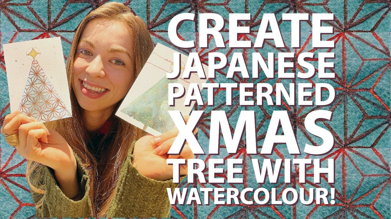
I thought I'll go home to create an art
combining all these elements. In this class, you
will learn how to draw a few Japanese traditional
patterns called the walkout up, like these. This is one of them
called a CMO hub. They're very beautiful. And this one is pulsatile. And we'll also be looking
at these tips on how to drug Japanese characters
using watercolor brushes. And finally, we will
paint the money chemical, also called the beckoning
cap in watercolor. If you've never heard
of money chemical. Like these beckoning
cats are lucky cat's. Then there are
Basically when you pop into a store in Japan
or any Japanese stores, then you will see
them typically near the cashier or just on
some shelf at the shop. And basically means if
it's a cat beckon ink, like they're aligned like this. If you see those kind of cats, then if it's the right
pole and it means that they're trying
to bring in money. And if it's left pod, they're trying to
bring in customers. Usually the one for the right
hand is I'm at home and left one would be for a shops because you
don't want to be like, Oh, I want the money and then put a cat who's beckoning
on the right at shops. And that's not the Japanese way. But anyhow, if you want to
know more details about them, this is the description and the Wiki or
you can also check the link and Wiki for our money clinical
or beckoning tax, and you'll see the
description of it if you've never seen my
previous watercolor classes, I've also covered Japanese
ornamental stones, which explains in
depth of a lot of the things that I
explained in this class. But I go in depth with watercolor theory,
watercolor control. You will learn quite a lot. So if you want to create
something like this, I highly recommend to go
over into that class. We will be covering quite
a variety of things. But if you want to find specifically certain areas
you want to learn about, I have a detailed explanation
in the description section. This class will help those
that would like to add some new elements and to stir things up for your
creative art pool. Let's get started.
2. Materials: Okay, so first we will look into the materials that you
would definitely need, followed by the ones that you might want for your convenience. So first of all, I'll be
using watercolor paints. You could use any
brand that you have. Next you'll need an eraser. I'll be using a kneaded
eraser because this way it would damage
the watercolor paper. You'll need a pencil, a ruler. You could also use just your
hand, like freehand it, but I would be using a
ruler for precision and some kitchen paper that he could wipe your
paint brush with. Paint brushes. I'll be using
relatively small sizes here, but you'll want maybe
a mop if you're covering a very large
surface and a round brush. Next, watercolor paper. Now this, for this project I would be using a bigger size. But if you want to send some postcards to somebody
with the mannequin Nicole, then this would be
a great option. It's Holbein postcard pack and it was pretty
nice I used this, but I really like it. This, I'll be using for the
final project, the arches. It's better to use
100% pure cotton, which I highly recommend. And then pretty thick. This is a 300 GSM
watercolor paper, so it's pretty thick
for the sketches. I will be using this for
quick sketches to check the color combinations
because I don't want to use a nice watercolor
paper for that. Too. Jars or a glass of
water to clean. One would be the one that
I would directly put my paintbrush first and then the other one to clean it up. And then from here
on I'll talk about the materials that
you might want. For convenience. It
looks a bit weird dish, but it's actually
my brush holders. I made it myself by Clay. It's really nice because
it keeps things. It's not messy. If you have gouache,
it'll be nice. I'll be using this
zinc white wash because it's more opaque. It'll be great to
use at the end. If you have a waterproof pen, that would be great as well. I'll be using these
masking tapes to mask around the edges. You have a clean
finish off an edge. And these would come
in handy to check precise angles
because we'll need a 60 degrees and angle,
but you don't have to. You can just go by
your intuition. And it'll be great if you have some kind of gold
watercolor paints to basically paint the coin
of the money clinical. And if you have a tracing paper, that would be great too. I have one and I'll
definitely be using these. Finally, it's great
if you have swatches of all the watercolor
paints study have, you can look at them and select the color combinations that you would prefer for
the final project. Okay, let's hop into
the first warm-up.
3. Warm Up: For the first warm-up, I have already got into a
lot of more detail with the watercolor warm-ups
in my previous class. So please check out the watercolor course that I did for Japanese style
ornamental stones. You would really be learning
more of this in depth. But I would do a quick warm-up just so I can
get things started. Here. First of all, we'll be looking at the
pigment to water ratio. So watercolor Is a lot about the ratio between
the pigment and the water. The more water you have, like lighter color and the
more you get the pigment, the more darker it's gonna be. So I am going to choose this
red color for an exercise. First, I would like to
start really light. I'm putting a lot
of water there. Then I would add
some more pigment and I'm only having this
eight circles to work on, so I would have to keep that in mind. As I go. I'm adding more and more pigment to this water mixture. Could've put up a bit pigment. And when the watercolor
paper is not pure cotton, you can't really lift up the pigment once
you lay it down. So that's a bit of a tricky part using paper that's
not 100% cotton. As you use more pigment. Applying the brush on the
paper should be not as smooth. Obviously, it's really
thick and peak. This is what you'll
be going after. I think I'm done with
the warm up first, warm up next we're going
to be doing flat washes. I'm going to use a bit bigger. First we're going to
go really light and gradually work on
making it thicker. Split. More thing out. That's a flat wash
will be using this for maybe the background
of the money clinical. So it's good if you get
used to doing flat washes. Next, we're looking
at wet-on-wet. For my final project
I'll be using, I'll get into the
details later on. But for the money kinetic goal. It's going to be it's going to have
spots that are going to have this Naples yellow and also the English
Venetian red. First of all, I want it
to blend out so I'm going to lay down a wash
of Naples yellow. Then I'm going to add this
English Venetian red. It's also going to be what? I'm going to add
it in the middle. That's a wet-on-wet technique. It does look like cats spot. That's the whole
idea of doing this. You could also try just
using different colors. Let's see. What colors would I use? Some colors, that would
be a cool combination. I'll use this turquoise
color just for fun. And then I'll use this cerulean blue to add a bit more. Explaining basically, if there's more or less water for
this second pigment, then what happens is that the
brush is going to soak up the water that's already
laid out on the first layer. You have to keep in
mind that it has to be the same wetness as your first layer of
pigment that you pigment and water that you
laid out first. Okay, so next we're going
to whitespace know this is the I don't know
how you call it, but let me show you like a monoclinic or would
have on his color. So, you know where the
cat is near neighborhood. I drew this and the color, and this is the bit of the color that's
underneath the neck color, but we're going to create whitespace in-between
all of these. And I want to actually use the colors that I think
I would be using. First of all, always remember
to use the brush size that actually fits
into this space. This one would fit. I'm going to use this red color. First, just lay down the red. But I drew the line of the color for so I
could create a whitespace. So here I've created a bit of
distance between the color. And this is the bill. Basically. Later on, there's like a
whitespace in-between. You don't have to create this, but it's actually a
quite a nice effect. Later on to see you've created
that whitespace there, so it's your choice, but it's good to kind of
have this as an exercise. Then here I laid down the whitespace and
then work my way down. Add this green because word only warming up here doesn't
really matter too much. I barely made a whitespace here, so I don't touch that bill. The space between the color. Could have used a bigger
brush for this I suppose, but adding some color. Then finally, I'll
be using some goal. For the middle. I'm done with the whitespace. Next we're going to
look at strokes. Now. These strokes would be used for mainly the purpose
of these warm-up of the strokes is for the calligraphy side of the Japanese characters
that you'll be drawing. Just going to practice
with the few characters. When you do Japanese characters, you really need to
not really painting, but rather just try to make
it in with each stroke. If in your water mean
so that's one stroke. Then the next word
would be one stroke. One stroke. Then again, next drug. Again a stroke. I'll try to upload some
resources where he can look at how to do each
of these strokes, but try not to overthink because these are going
to be quite small. I believe it's inside the bill. So that's one stroke and
then one another stroke. And try to move your brush. Like there has to be strength
when you push it down, lift it up softly. It's hard to explain
but pushed down. That's one stroke. Pushed down, one
stroke to stroke. Pushed down, one stroke, pushed down, one stroke, push down, one stroke. That's one character that
will be inside the belt. It'll be great if you
really want to learn more on these calligraphy
in Japanese, then please leave me a review. It'll be great to
know if there are other people who want
to really learn this. Okay, so now we're
going to the next one. The next character OP 123. Next we're gonna
be doing shadows. So it's really more like
practicing strokes, like just try out
different strokes. Even these dry brush strokes
are quite nice at times. But I would concentrate on pushing it in and
then letting it go, pushing it in, letting it go, even twisting a bit, pushing in, letting go, pushing it, sliding, even to the other side. Then we do the clause, we put shadows in the clause. It could be like down, go down, go down, go down, go, slide it, slide it. This try practicing. These kind of powerful
yet light smooth strokes. Pushed down and then of course slightly pushed down
and let go slightly. I think we're done
with this section. I would like to go
to the next lesson where we learn about Japanese traditional
patterns and how to draw them by hand.
4. Japanese Patterns: We'll be looking
into how to draw these drip nice
traditional patterns. Now, you can use rulers or
whatever comes in handy. But at the end of the day, I quite like how organic things can look when you draw
them by just your hand. For this practice warm-up sake, we're going to just
draw them by hand. Let's try. I'll be explaining
how to do each pattern, but I'll also explain what these are in different
patterns mean. First of all, let's
try it. Three of them. Let's make a flat wash of
any color that you like. So I would choose this blue. This blue right now. Just create a flat wash. This could be a great exercise. It doesn't have to be perfect. Gradient or anything. We're going to be
drawing on top of these just to give
it a bit of color rather than just working on them on with just lines
because that's no fun. It has to dry while we're working on the
other ones. Thanks. So cadmium, I think this one has dried salt. Like to work on this. We're first going
to make a line. I would use to civilian blue. Hopefully it's dry. Make it a bit thicker. And then just draw
a vertical line. Having a bit of
space in-between. And try to work on your precision here
as much as possible. It'll be a good warm up. Maybe even trying to, rather than painting
it like this way, try to work your hand so
it's vertical, like that. Like that, rather than
this way sideways. Okay, so I drew vertical lines. Now next, choose a
different color. I'll use this red. Make it thinner, and try to make the vertical line in-between those,
these thick lines. Don't worry if it's not
perfectly in between. But just make sure
that it's thinner. Dairy habit. This is one
Japanese traditional pattern. You'll be like What?
That's super easy. It is, this is called
either Comaneci Jima or I'll just write let me write it in
pen so it's easier for you to see where
I'll write it here. Basically, it's
literally means parent, the child, the child in-between in the
parent on the slide, it means protection
and so forth. So, see this quite
a lot on tomatoes. Let me try to like so you can have a visual sense
of what needs to be done. Just imagine there's like
vertical lines again, but I'm just going to
draw it a bit lighter so you can't really see, but try to draw a vertical line just
like you did over here, but without the
small vertical line. Then once you draw it, we would have like
horizontal lines. I think it's a bit
difficult for you to see, so let me draw it over here. So you know what I'm doing. There are lines. You basically draw
a horizontal line and make sure that you draw another horizontal line in between these horizontal lines. Like that. To give you a clearer picture. What you do next is
you basically create a wave that goes around
those lines you've created. So they don't, they don't touch these if you
know what I mean. So this basically
these wavy lines is what you want and you don't want to show much of those vertical nor
horizontal lines that you drew. I'm trying not to
show much of it. It's just a guideline for
you to be able to draw it better than just
free hand drawing it. I think this brush
would be good. Or maybe I should go
for a thinner brush. I think this should be okay. I am going to use this purple free handing. Do you call it free handing
in Japanese, we do, but not using anything like
rulers or any measurements, those gave you that
organic feel to it? I do quite like it. This in itself is called today. What? Good? I'm gonna write
that work good. Basically, it's just symbolizing
steam, steam rising. And basically in Japan, steam raising is it
means good luck. So they have this on a
lot of clothes as well. If you add one thing
to this which I am going to maybe in
a different color. Maybe not. I'm just going to
use the same red I used to do the background. So if you add to this, basically this flowers that in itself is one traditional
Japanese pattern. You can just keep on,
you get the idea. Just keep on going with this. I do believe it was 34567888. Petals normally put
1234567812345678. And you just keep on going. 12345678. You get the idea, you
can go on and on this. I forgot to put you on it. Once you've added the flowers
would be key could walk. So basically just adding a
type of Florida called to it. Okay, so the next
one we would be making something that
I quite like next, for this one, we're gonna be, I'm gonna draw it next to it so you can see what I'll be doing. The idea would be
creating lines, horizontal lines, and
basically creating bricks. Bricks should be like that. Like that. Wherever the bricks
vertical line hits the horizontal line would be would have a
circle in the middle. Wherever the horizontal line, the vertical line, and the in the middle of
the vertical line. We're going to have dots. Once you've created
these thoughts. Next we're going to create like a semicircle that connects
from the first dot to the top, to the bottom dot. First thought, top, bottom dot. And then you just
connect all of them. I'm just going to draw vertical, the horizontal line. Lightly. Bricks, image of bricks. Image of bricks, but try to
make them spaced out evenly. Bricks, bricks, bricks. Then in the middle of
the vertical lines. Dots. Then connect these dots. Connect these dots,
connect these dots, then connect these dots,
connect these dots. Then it can kind of
imagine how it will be connecting them to
the side as well. Connect these dots,
connect these dots. Now I can get the idea
of how to connect them. So I will go over them
with gouache, white color. Once you connect them. It's better if you
do have a compass. If he really wanted to
make it crisp and perfect. But again, sometimes
just this organic look. Doing it by hand is quite nice. Working on this quite fast. Then once you've created
that first-line, then you go for the second line, third line, second,
third, second, third. Third. So keeping in mind, tried to distribute
them similar sizes, but again, I'm not
doing it perfectly. Either, but you get the idea. 121212. That's one style of
Japanese pattern which is called liked the
characters save, I see a guy. It means let me write it. They say, it literally
means blue sea wave. So this has a meaning of infinite ways with the meaning of basically infinite hope, enjoy, and peaceful living. It's like one of the beautiful patterns
that I really love. Would like to paint. These two. We can do the next one. I'll paint one of them purple. For the next two of these. Basically you want
to create like a 60 degree slanted
lines that go both ways. So how I would do that is first draw slanted line
this way, this way. And then horizontal line. And then connect the
horizontal and the slanted with another slanted
from the other side. I think I'll just directly
draw these lines. Thank all. Use the same purple but just darker slanted lines. Then next, what I'll be doing, basically coloring
from here on it's more kind of additional
week got the base of it. Does coloring them. Making triangles. You could use different colors. I'm just using these
for an example. You could even create
bigger triangle. Because this is what those actually happen here and there
with the patterns stages like create bigger triangles within one, trying
small triangles. Not there online here. Then you can use white. Even tried to create different
try and laws within. There. Different rows. It's pretty much endless. You can just go on
and on and on. This. I think you get the idea. Now, so forth. So I think I'll just stop here because it's
pretty much endless. So this one is called
UDL, got me right. It means fish scales. But actually it's
not related to fish, but butterflies and moths. And it has the meaning
of shedding the skin. So it's supposed to be
like rebirth of something, transformation and so forth. Okay, so next last one, before we enter the flowers, this is my favorite one. And I'll be definitely using
this for the final project. First, it's kind of the same
stages of doing things, but think all draw this. What we're trying to draw here, let me draw it over here. It's the same thing we
did with the utricle. So 60 degrees, then
vertical lines, horizontal lines, and then
another 60 degrees connecting. What do you do next is literally for each
of these triangles, say this is the triangle. What we're doing is we're
putting the dot in the middle. From the top, we put
a vertical line and then a slanted line from the middle to the corners
at the bottom, like this. And literally we're
gonna be doing this for each triangle. I think. For this one actually
I'm thinking I'll just draw with
a pencil first. Horizontal line,
horizontal line. I think I'll be using
the gouache later. Then slant it. Then I'm going to put
another slanted line. This trying to go through. So there it's not perfect, but let's see how it goes. And then I put small dots in the middle
of these triangles. First, when I learned
how to do these, somehow, it didn't look right. What helped me? Well, I'll show you how
to oh, it didn't help me, but what helped me
was to basically draw like a thicker middle dots. It looks like a flower. Now that I had drawn everything, I'm going to use the
white wash Again. Literally, I'm just going to connect them for the ones
that are looking down, the triangles that are
looking down basically like, how would I say down like that? You have to draw the line from the middle
down and then up. And try to connect the
pencil lines as well. That middle. Like that. It's beginning to look
like a geometrical. Flower, more like
triangles first, but I'm literally just connecting all of them
with this white ink wash. If you do this and you're like, oh, it doesn't look right. I think the triangle
being upside down. Like this one is upside down. You have to make sure
the middle goes, the vertical line goes down, then the sides come down
as well to the middle. Just takes practice. If you don't get it too thick, it's going to not show as much, but I quite like that effect
of not being too perfect. I'm definitely going to use that effect of some parts being very white and some parts
being kind of faded out. When it doesn't quite like you
can't really visualize it. And you're like, it
doesn't look right. Then here's the trick. You just use more white and
basically just be like, okay, this is the
middle of the flower. Now I'm going to work around it. So here I'm going to try using
lot of paint for this one. Only kind of work around
this middle petal. Use a lot of paint. You kinda get the idea, like it's when the middle
bit pedal is more kind of like strong and opaque. You can kind of
visualize it more. So right there, you see it more. Now. I'm not gonna do
the whole thing, but I think you get the idea. Next. I would like to go
to the flowers. The flowers are pretty
straightforward, but I'm going to use
this red right here. Literally. You just
create five circles. Does give you the abstract
idea that it's a flower. Actually a lot of japanese
patterns that have like flowers actually
do just look like this. They just be like,
Okay, that's a flower. But to go into more different
patterns of flowers, Let's just color all these in. Think they've dried. So let's start using white wash paint over them. So the first one, just going to come over. You could basically create white-space without doing
this for this bit, but For explanation purposes,
I've just colored them all in so you could get a sense of what I'll be doing
and how much variation. So you could try out. Here. I'm just, I just created this kind of almost
like a V-shape and pulling out some
of these paints. Then I think a bit of
a small dot there. So that's one kind. The next one would be painting almost like a compass. Then putting a dot
around like that. The next one is basically like putting opposite see in the middle, you can turn your let me wash my brush
before it goes bad. You can basically turn your
paper around so it's easier. But we're basically
creating opposite C, C. And it's better if you can
connect them inside C. C. That's one style of flower. The next style, it would be
very small and intricate. Basically it's like
drawing diagonal. You might need a smaller brush and this is extremely small. So I might have some hard time basically
drawing diagonal. Diagonal. Then placing a dot
in the triangles. One style. The last one is the same
thing as this first. Please sing like that. Then you additionally like white columns across, like a bit of circled
columns across of a circle here that goes
in a bit of both circle, that goes in a bit of a circle. It goes in. That is, the four different styles
of drawing the flowers. Forgot to write this down. So this is for, this. This one is, I did forget to mention
what this meant. This is a character for cannabis and it's the
leaf of candidates. It used to be worn by babies. And because the clothing
didn't get repelled the bugs, this patterns were known to have the power of getting
rid of the evil spirits. It was often worn by babies and children
back in the days. Also in a Kabuki, it often symbolizes
woman and worn by the ladies in a
couple of key which are acted out by
men traditionally. I hope you enjoyed this bit of the class and please share
what you've created. You could also add so many
bunch of stuff to this. I mean, these triangles
don't have to be like this. It could be different colors. You could also add a bit of
flowers on the side here. There's tons of things, variations you can do. So just play around, see what works and
what looks beautiful. And please upload even this warm up to the project
section of the class. Okay, so see you
in the next class.
5. Sketching: Now in this class
we'll be drawing this money clinical
and sketching it so you can then trace it and then trace it onto
your watercolor paper. To be honest with you, I've
done this many times before. I actually kind of
organized this class. I'm not going to be using this because I've already selected what I'll be using because
clearly I've done it anytime. I know which one looks
the best. But who knows? This might look
better than the one I have on it in case you
don't like drawing, I do have the version that I'll be using in the
resources section, which you can then just trace
it directly from there. But I'll just be
explaining all go loosely. First. Then kind of
loosely sketch the cat. I'll show you later on home
much sketches I already done. Knowing where each P, I really quite like
this money clinical because it's got pretty curvy. Somehow it looks really soft. The cobalt coin would be here. This would be here. The hands. It doesn't have to exactly
be the same because sometimes having it a bit different does create a unique unique style to it. But for this one, I quite like it to be
quite close because I just love exactly how this cat looks. I think I got fairly close
to what it looks like. Now I'm going to go
in a bit darker. Almost looks a bit like
a rabbit with big ears. Gonna make this bit. The actual pattern that has the face. The color. Pause. Try to also draw the
nails and the Neil's. If you look closely, they're almost like a triangle. And I quite like them
to look like triangles. The shadows of the in-between the claws are very
important later on, so make sure to draw that too. You don't have to
draw the inside of the pattern the cat has, but it kind of makes it easier if basically the costs would be for here in the
shadows would be three. And then this would
be the cobalt. Somehow I quite liked how I had a shadow
for the cobalt. I'll draw that later. Should be seen, but let
me extend this a bit. This should be around
the same place. Then again, the
claws on the foot. Then the shadows to shadows more around her like that. Draw this again. Green to draw close
first clause. Clause and the shadows, shadows. The bill goes up a
bit, touches the coin. Let's make it. A banker. I actually liked them to
not touch each other, Considering they're going
to be the same color. Just a bit of space. Let me try to get the bottom. First. I think
that should do it. Be a pattern here and a slight pattern here
which I like to include. Here. I don't like
to include it, so I'm just gonna
leave it as it is. Then. It's really
not too difficult, but I mean, it's kind
of difficult to draw. Like shade for the characters
that would go into here. It's basically four boxes and
another box here like that. But you don't have to
get it to closest Just, I think the characters, you should just basically deal with it with
a brush later on, but it's a good start. I'm redrawing this bit. Again. Finally, I'm going
to go inside the eyes. Gonna be roundish. Let me just draw a line to
make them equal as possible. They're kind of roundish
and then have a curve. In this original one, they have it a bit yellow, but I don't quite like that. I'm not going to use yellow
necessarily for the eyes. I think the eyes are okay. And then nose. The nose has a bit of
opposite slanted triangle. Then also like a moon,
crescent, almost. These don't have to
be perfect Really Because at the end will be kind of just going with the
very organic like strokes. I wouldn't worry
about it too much. Then we got a bit of
dots for the whiskers. And then finally the characters. I think the eyes look a bit
like they're going down. I think I'll change that a bit. I don't quite like how
they look right now. Kind of going down. That's better. Then. Then the characters will
be something like that. This makes it a bit harder to imitate because it's done
with calligraphy brushes. So don't mind it too much, but basically just
follow what I write. Big rectangle with
one square and then draw another square
with four squares inside. And that's, it means luck. Now we'll be drawing the characters right here,
which rescind mondo. It means 600 billion will be going over
the strokes later on. But just try to imitate
how it's drawn. How it looks like. Because drawing itself is
more like calligraphy work, which will, we will, which we will be
practicing later on. This will be more like
a guideline for you. Later on. That's pretty much it. I think this is okay. It's a bit slanted, but I hope you get the idea. It could be always
shifted a bit, I guess. Maybe all extend extend
the arms up more, so it's more around it. You could make a bit of tweaks here and there even
after you're finished. I think this they think it looks less slanted. Now. Also, I still
don't like the eyes. I think I'll draw them again. I think it's a bit curved. On a downside. The highest point is right here with the
lowest point there. Indent it down. Finally, I forgot
about the clause here. Again, going to create four for clause with some
shadows, three shadows. I'm done. I think I'm done with this. I am not going over what
I do with the tracings, but I'll basically, once you're done with this and you're
happy with the sketch, then you can trace over it. And you can then use
the tracing paper to trace onto your
final project paper, which I'll be doing
onto mine here. I'm not going into details about how to trace
because I think that's fairly simple or you
can always look it up online. I have done a Mandela class where I explained how I do it. So you can go ahead and
check how to do it on there. Just to let you know about
which sketch I have done. I've already sketched out my few different money clinical. First, I did this. I made a few sketches sexually. This was one of them. My husband said it
looks too scary. So then I created another one. And this relatively
looks quite nice. The one thing I would add is I added a bit of a
shadow layer right here. I kind of forgot about that, which created a better
effect to it overall. So you can create that
as well if you want. But this is the final
mechanical that I'll be using. I'll post a copy of this so you can just print it off from the
resources section. And then I finally trace it onto here on the tracing paper. The reason why I cut this
out is because I'm gonna be using this as the actual
size of my final project. And by cutting it out, it's going to be
easier for you later on because what's
going to happen is that I think I'll work on it more
vertically like this. I can draw the outline of the
cat and then I could draw the patterns in the
back that would help me as a guideline for whichever
pattern that I'll be using. As you can see here, this is a card
that I've created. And you could see that I masked it and I made it a bit
slanted on the sites. I've put a shadow at the end, near the pole, which kind of makes a bit of a 3D
effect but inhale. So I made the outline of the cat and then I've
drew the background. So this is exactly what
I'll be doing for this. Then it makes it easier. You don't have to draw
inside of the cat because I'll be using white. When I say white in watercolor, it means like blank whitespace. So I don't want any kind
of geometrical lines in the back where I
have to basically go over it with a kneaded
eraser to erase it. I don't want to do that. So
this is how I'm gonna do it. I'm going to outline it on my paper and then I'm
going to draw the outside. And then finally I'm going to draw the inside of
the money chemical. And then I'm going
to go over with a wash at the end
for the background. So that's the steps
that we're gonna be doing just to give you an idea. In the next lesson,
we'll go over these Japanese
kanji characters in calligraphy to just give
you a bit of an idea of how to paint them
with watercolor brushes.
6. Calligraphy: First we'll be
looking at Foucault, which would be the one that's written inside the bill
of the color of the cap. This Fukuda means blessing, fortune, luck and wealth. There's a specific way
of drawing the strokes. When you write this
character solo, be practicing with it
with just a regular pen. And the next one will
be the same mondo. Now this mondo, as I mentioned, means 600 billion
in money basically. But this could change with
different money chemicals, but this is the
typical one that I see now will be practicing
how to draw these. And then finally at the end, we'll be using
watercolor brushes to actually draw it in
calligraphy style. So first I'll just be
using these thicker pen so you could see we'll just
practice the first stroke. I'll also leave a site that would be helpful
for you to look at. It's called judicial. It's basically tells you how
the stroke order happens. So for Foucault, it'll be one. And then 12. Then one, then one, then 1112. Then close it. Then
one, then one again. Then 123, and closing it. I'm sorry, this should
have been a bit smaller, so let's do it again. 123456789101112. I don't know if it's
actually 12 strokes, but anyhow, that's the order. I guess it's 13 strokes. So 12345678989101112. That's 12 I'm getting confused. 12345678910111213. That's right. That's 13 strokes. Just practice this. It means a lot to
make sure which strokes come first to
make it look beautiful. It's actually really quite true. Make sure the top box is smaller than the
one on the bottom. You've got a bit
smaller but okay, so next one, SIM MON guilt. The strokes would be 12
from the left, then three. The next one would be 123. The next one will be 123456. That would be 123456. Oops, make sure this doesn't
stick out like I did. Then the next 112. Oh, no, I made a
mistake there. Oops. 12. And then three. That was complete disaster. It takes to practice
even for me, One, 23 and then 456789101112, and then 13. That's it. I'm going upwards but practice this one more time,
maybe over here. 1234567891011. That's basically
total of 11 strokes. Let's do it again. 12, three, for a bit shorter. Then long. Then 12345. Okay, so let's get into some calligraphy
style watercolor. So I love these colors. It's called the Japanese
desk colors that I bought on Amazon. Actually it's called
Japanese color is the meat. I'm gonna be using this. Let's go with the Fukuda. So just placing it, then 123, adding a bit of paint. Then 123. Then the next one would
be bigger. Didn't 123? That would be Fugu. It's better to not kind of makes sure the
spaces right here. So let's try that again. 123 for adding smaller here, 123456. Try to make sure that
it fits inside a box. So let me just draw an
imaginary box here. This could help you if you keep on doing it
and it doesn't work. A lot of Japanese
calligraphy books, like when I went to
school would show you how to draw it
inside the box first. 1234512345345. That's how it works. Then you can add more styles
with certain brushstrokes. So when he get a bit used to it, like even a dry brush
effect could be quite cool. Actually. Connecting them could look cool. And that's exactly what
the original looks like. It's being connected,
being a smooth transition. Okay, let's try the same module. Next. I'm going to use a
different color. 123. It already looks quite cool than the one we drew
with the pen. One. Shorter. Then connect. And then just add up more. Next. 12. That's sim Monday. Let's try that again. One 234 month bit of dry brush there. Monday till it already
looks quite nice. I'm going to just
practice it another time. Making it a bit smaller. It still makes mistakes
sometimes sim, with the brush strokes. That's it. But for the actual
final version, somehow like using the same, we're going to go into
the color combinations, but I quite like using the
same color as the background. First layering it with
a lighter color of it, and then adding a black
watercolor paint. So it has a bit of
vibrancy in the back, but still like black color
that kind of covers it. Will be practicing this. I'm going to get this, maybe this cerulean blue first. And try to work with
the first 12345. Same thing. One, then smaller square, and then bigger square. Then this is not quite a
good watercolor papers, so they might not do
the job too well. But I'm going to add a bit of this is not bleeding inside. Make sure to add quite
a lot of watercolor. I mean water to the pigment. Make sure it's still wet. When you apply the black layer. Adding a bit of black hair. A bit of luck here. They're black inside. Just like that. Quite looks nice and cool
with a bit of vibrancy, but a bit of block inside. I'm going to try sim
Mundell and making sure it's quite watered down. I'm just gonna stop here
and add a bit of black. This was too slow. Let's just add. It depends on really
the paper that you're using and the
environment you are in. I'm in Singapore. So it gets it is more about
the paper in my case though, because it's humid here. I'm just using the back
of watercolor paper because I don't feel like
this really needs to be a nice quality paper to do. But we're going to add, this didn't really do its job, but you get the idea. Let's try a different blue. Again, just practice. It's great to just
practice these as many times because you'll literally see how better you
get every time you practice. We are going to get
inside the color theory, color combinations of which combinations it would be
great for you to use, and I'll give you the
idea that I use in the next, the next class. A bit more water here. Oops, I made a mistake with
the brushstrokes tear, but so just try out different colors just to see what kind of
works better with the black. You have to use
something by Brent. Maybe I'll use the red here. If it doesn't bleed as much, it really doesn't
look that nice. Make sure use quite a lot
of water for this one. Keep on not using enough. This even looks a bit eerie now. Kanji, then with red and black, almost looks like it's hunted. Think I'll try some green
mixed little green, which is always quite
vibrant as well. I'm going to use
black for this one. Just to kind of see. It does a nice job compared to the phthalo
green that I was using. Wasn't dry enough. I mean, that was too dry. Was in wet enough. I think I'm done with
practicing the calligraphy bit. I think we're ready, So I definitely like
the blue somehow, so I'll be using that
for my background and the Kanji's
that I'll be using. Next, go to the next lesson.
7. Color Theory: In this class we'll
be looking at how I approach color combinations
because at the end of the day you do want to create something that you like most but with tons of pigments,
colors study happy. You might be wondering, well, what would be the
best color to use? I go in depth about
color theory in the Japanese ornamental
stones class that I have linked to
this class as well. You could go check that
out before you do this, but I would give a general
idea of what I do. Here are some swatches
that I've made. These are all the colors
that is in this palette. Now you really need
the primary colors. And when I say primary, it's red, yellow, and blue. With these colors,
you can create the secondary colors like
purple, orange, and green. So you really want to stick to these primary colors and create the other colors like
the secondary colors because you don't
want to go to off from the pigments that he used to have more sense of like it's not all over the place basically, if you
know what I mean. Here. I chose these
colors to try out here. I might change this color
to this Fred that I have. It's not perylene read. I'm not really sure because
I just got that as a gift. But let's just say I'm using, Let's just say this is this, but anyhow I'm
using these colors. I just lay out my swatches
and see like, okay, that is pretty I would
go with this one. Or you can lay out like other swatches and just
choose first choose the blue and the yellow and
the red that you'll be using. This is actually pigment green. It's PG is pigment green. But I think it somehow really wanted
to use this as a blue. I'm just going to
forget about that green that it actually is. But you get the
general idea when mixing if you know
that this is green, I'll explain about it in
detail later on what happens. But anyhow, like
you have to keep in mind that this is actually
green and not blue. But anyway, so I
have to get a read, so I'll use that a yellow. I'm going to use yellow
ocher for the brown. I'm going to use
English, Venetian red. This is for the patterns
of the cat that I'm going to be putting
into these round bits. But I just put brown
at the bottom, yellow because these two
have to kind of go together. You have to pick a
yellow and a brown that actually looks pretty together. Then blue, which I'm
actually using green, but try not to look
at that but blue. Then for black, I'm
gonna be using ivory, black and then green. So this is a secondary color. I'll be using this one, green, but it doesn't
really look green. I think I'm gonna be
mixing it with the yellow to make it a
bit more greener. And for the gray, how you create a gray is by mixing the opposites
in the color wheel. For red, it would be a green. Then this works
because I just have to use this green rather than using a blue and a yellow
mixed together and mix with red to create neutral
color, the gray color. I'll just be mixing these tubes so it's gonna be easier
for me for that. The reason for the red will
be using it for the ears. I'm going to use
it for the color. You can always try
different combinations. It doesn't have to
be necessarily this, but I'm going for the
traditional look. Then the blue we're
gonna be using it. I'm gonna be using it
for the background and also the for the Kanji's here. And the black would be for
the countries, for the eyes. I think I'll stick with
that for the characters in the countries and the eyes. And for the gold, it'll
be the bill and the coin. For green. It's more to kind of, I use it for the cloth, a bit of the color. And then the gray
would be the shadows including a bit
of the nose area, the baseline, the shadows
of the coin and so forth. Let's just get on with
the color combinations. This is really, I use, actually already practiced doing these color combinations
beforehand. So I kind of have a general
idea of what I want to do. But you can create more to
see what works out the best, because I surely did create
more to see what I like. So I'm going with this red. Looking at. All a bit all look together. That would be Naples yellow. And when you put down the Naples yellow try to mix it or I put
yellow try to mix it with the brown that
you think you'll be using just to see
how they match. I quite like how
they mix together. They're then put the
blue black depth, you'll be using the gold. Now there are really
different types of gold. It closely like this looks more redder than this one which looks more like a
beige brown site. And for this combination, I thought it should have a
bit of a warm tint to it, but I liked the champagne goals, so I'll be using that. Then the green. I'll be using this mixed
with a bit of Naples. Yellow invention because this is actually not blue
but a green pigment. I'm just gonna directly mix it with a bit of branding which
I went to strong there. So it looks a bit purplish. I'm just going to add a
bit of Naples yellow. That's a bit stole yellow, but actually I did
have to add a bit of yellow to get neutral. And I still quite like it. Okay, so now that I
got all these colors, I would like to color in the mechanical to see how it
all combines together. I'll be coloring in the money, Kimiko, the colors of my choice just to see
how it looks like. I'll be starting. It wouldn't be perfect. But I just want to get the idea of how the colors
Well look like. Since this book is not
a watercolor paper, It's not gonna react as
a watercolor paper wood. Having that in mind. Still kinda see what it might
look like for the final. All, use the same
red. The color. As I mentioned, I'm
going to create like a whitespace around
certain areas. Just to give it an
interesting look. A bit more red for
different places, for some depth book. And then I will be using
green for this area. Naples, yellow, blue. Also minding some
whitespace here. More. So that's done. And then next, cool, all the patterns
that this cat has. One here, This English niche and read. Next, I'm going to
add some blocked. I assign me using ivory black. And then next be going
over the nose bit. The same red, very light. Then the same black. The holes of the whiskers. Where did they grow up? Next? I want to go over the gold first because coals tend
to be really light in color and if they smudge with the black later on with the characters
that we'll be working on, it's going to look a bit not
as nice in terms of order. I would like to go with
this one and then kinda cover around the characters. The Kanji's kind of outlining. Try applying it and then
working the outside of it. Some golds tend to
not be as thick. Most likely it's more kind
of very light in color, so you may want to darken them, but adding a few layers. That's why it's good to just
outline the characters. Before. Actually the
strokes that we used. As a guideline. This doesn't need to
be perfectly covered. You're just getting
like the idea of how the color combinations
look overall. So don't be too fussy about making it
perfect at this point. I pretty much covered
most of the areas. So I think I'm done. Next we'll be going
over all the nails of the cap because
they aren't gold. Normally. Next we would be, I would add a bit of black, more book in the middle just
to give it a bit of depth. Then next we're going to, I'm going to create a darker
color of green for that. Cannot go over it to
outline it a bit more. I'm going forward,
the co-morbidity, the pattern that we've learnt. Make the bigger, thicker
stroke. The first one. For the next one, again, select a different color. Very light dinner. Then I think for this color, I'm going to add
very simple flowers. Really, it's just
like five dots. Flower. Then next we'll be creating
the neutral color, mixing green and
then green and red. Here I'm creating some green. I'm just going to
mix this red to it. There you have it spit
on the purple slide, but I think it
should do its job. Now, I'm going over the
bit that there's shadows. So that'll be between the claws. Give it a thicker stroke at
the top and let it go down. It's a good practice. Then there's like a shadow here. Then normally a
shadow right here. The nerve first and then darker. Dinner here and a bit thicker. Then the mouth, usually
something like that. That's a mark. There's usually a shadow here. Shadow under the chin area. And then contour
of the face area. Thicker contour here. And then a bit of shadow. This area. And then for the coin, I'm gonna go pretty
thick at the bottom. Lighter at the top. I think I like how it looks. I think I'm pretty
happy with that. Then for the final
touch-up, it's, it'll be the two
characters here. So as I mentioned, I'll be using the same blue I'll be using for the background. It's good if you get ready with the first layer
and also the black. That we'll be using. You can quickly add
the colors into it. Again, this is not gonna be
perfect because of the paper. It's a normal sketchbook
I'm using 123123. Let the water paint, watercolor paint
do its job a bit. But yeah, come out
and looks nice. Then going 123. Probably need a thicker
brush for that button. Add some black to it. Going to the next bit. 123. Again, adding black to it. The final characters. It's very important to use the perfect slaves brush for it, but sketch purposes,
it's fine for now. Okay. Then finally, I like to a bit of a shine to the
eyes using wash white. Then we're going to
use the same red. And put in the clause. It usually happens to
the money clinical. They usually have like
red bit the shadows. That kind of makes sure to press it really hard
first and then lightly, gently go down with a stroke
that kind of lifts up, making sure they're
the right direction. Wherever there's like the
shadows between the claws, you put the red and it should be a bit less than the
shadows itself, which I should have
been careful here, but anyhow, then next, before you do the
final whiskers, I will be using the
background color. It wouldn't be much. But to get the idea, you're gonna be doing much
more to the background later. But just for now, we're just looking at the color combinations to
see if they work or not. It's totally up to you to choose which japanese patterns
you'll be using. For the back. I'm going
to be using the mono, which is the one that looks like stars bunch of
stores or flowers. I totally forgot. There was another
place that you need. The final red here, the side of the nose and
then also the mouth. Finally, we are going
into the whiskers. I would normally use a bit of gray mixed with
white gouache. It could be blocked. It's totally up to you, but I just think like
the gray looks better. That's pretty much it. I think I totally like this
color choice that I've used, so I'm probably going
to go for that. But just for war purposes, I'll like to try another one. So next I'm going to be using this red right
here, which is cadmium. Red light. For the yellow. Would just try using maybe actually I'll
use a warmer yellow. I forgot which one this was. Hold on. Let me check what I'll be using. I think this was the
cadmium yellow light. Cadmium yellow light there. And for the brown I'll
be using, Let's see. This burnt sienna. I'll try burnt sienna. Burnt sienna for the blue. I'm going to use
ultramarine for the black. Ivory black again. For the gold. I'll be using this one called the red gold because
it's stronger. Thank get on, match
the other colors because they're very
strong looking. Basically the green note, the unmixed of ultramarine with the cadmium yellow gray color would be this mixed with the red that I'm using. A bit too much red, they're going to add a bit too green mix hint bit on the green side, but I think that will do. I'll try using all
these colors to see what it would look like. I'm going to be mainly
focusing on coloring this and then talk a bit and then
wrap up this class. I'm pretty much done here. I did two practices. You can do as many
as you'd like until I get the one that
I liked the most. But I think I really
like this one. So I think I'm going
to stick with this and try this for
my final project. Please upload all these
exercises that you've done because it's great
to kind of look at what kind of variations
you can come up with. And there'll be
lovely to see how far you can gotten better
at this as well. Okay, so let's go to
the final project.
8. Final Project: Lesson 1: Okay. So this would be
the final project. I put a masking tape
that I had gotten Japan. And because I like
the clean edged look, you don't have to do it, but it looks nice. So I would be doing that. And I'll also measured the
middle point right down here. And also the middle
point of the cat. I'm going to put this
cut out cat shape, try to make it fairly
in the middle. I think that's about right. Then I'm gonna mark very
lightly the outline of the cat. The reason why I'm doing
this is because I'll be drawing the pattern
in the back first. I don't want to cover up the whole area with my patterns because then later on I'll have to erase them. I don't want to damage the
paper as much as possible. Once you have made the outline
of the monarchy nickel, then choose the one of the Japanese traditional
parents for the background. I'm gonna be using this one. I really like this. I'll be using this
as my background. What I would do first
is basically mark 11 cm markings every
one centimeters. You can also choose knee
measurements you like, I'm just gonna go with one seat. Making a light marking here. I'll be making it
right here as well. We'll be drawing the
horizontal line first and then the 60 degree
slanted blinds. Well, kind of put these aside for SAP
a bit of space. Very likely. Making sure you
don't draw the cat. Now that I've drawn the slanted 60 degrees
from this side, I like to go over it. That's for this. It's gonna be a bit just get these lines
more in calligraphy. It's gonna be a bit more easier because now you just
need to connect these sites where it intersects with a slanted
in the horizontal. In my case, I'll be going over all these lines with
actually a waterproof pen. Just because I like to
have that effect of the geometry of pumping out after I've laid
down my watercolor. So I'll be going over
it first before hand. If you still because
the pencil mark shows, even if you tap it out and
with the kneaded eraser, I mean, that might be
an option for you. It to kind of like market, relatively light so it doesn't really stick
the watercolors, but I quite like just using these lines to pop
out of the watercolors. I'll be using this, be working on this pretty quiet. Just fast-forward. This bit. First horizontal lines and then the 60
degrees slanted lines. Then for the other 60
degrees slanted lines, I just go ahead and use my
water waterproof pen to kind of go through the bit that crosses the horizontal
and the slanted lines. And then I went over the rest of the penciled bit with
this waterproof pen. And the reason why I'm doing this is because
you could kind of erase the pencil marks
as much as you want. But I just don't like a bit of them like seeping through the watercolor that
I'll be using. The watercolor that
I'll be using for the background is gonna
be fairly transparent. So I don't want any pencil marks to show and I do like how the water proof pen is going to be seeping through
the watercolor paint. And I like the
geometry look of it. So I'm going to go with this. So if you don't like it, then you can just erase them so you don't like you
barely see them. That I've covered all
of it with my pen. I like to erase whatever pencil
marks that I've got underneath with my
kneaded eraser. Finally, what I'll be
doing is I'll place this money kinetochore
back to where it belongs. I think that's right. And you could use masking tape. Then once you've done that, once I erase everything, I was going to put my tracing paper over. Then I'll go over my pencil
to trace everything. Check to see if you've
missed anything. Most likely. I do miss things. I think I'm done. I don't know if he
could see it closely. I would like to start
with first the ears. I'd like to go
quite light first. Since if I'm using really
nice watercolor paper, It's going to be quite easier for me to work on it. Rather than the non cotton
paper that we were using. The initial stages
of this class. Be adding a triangular
shape here. The middle, just to
get it a bit darker. A wet on wet technique
that we've worked. Next, I'd like to go
over the patterns. Cap quite thick. It here. Here as well. Next, we'll be working on like to go. First case. I made him It's thick. I can always go
back and rework it. Happy with that overall. Is this bit a bit more? Because doesn't
quite have enough. The brown here. I think I'm going to wait on the rest to work on it on another day because I
want it completely dry, but go over the eyes. Again, make it darker. I don't quite like
the paint here, so I don't smudge. All solve this. I'm quite like how it turned out. I'm trying to rework it a bit. When you want to rework an area, you would definitely
want a bit of synthetic brush rather than
using natural brushes. So it's harder and it's, It's much easier to
rework an area like I am. I'm going to let this
dry a bit and then to trace out the area that I
have it with just the color. Now that it's the
paint has dried and I didn't include
the color a bit. I'm going to go over
the cat once more. Leave a trace mark
for the color. Maybe several bits
because I can't really see where things
are supposed to go. Making sure that I clean my hands after
I've traced these. Finally, I'll be picking up from where I finished last time. Now the eyes look not as dark, so I'm going to
go over it again. Like one side looks darker
than the other, which I like. My black to that.
Then doing the color a bit can't really see. I'm going to try and create that white space in
between the bill. The color. I'll be using the wet in wet technique to
create some depth. Near the neck line. You've been a bit
of blue balloon putting some water
where it's almost dry. I could add to the
upcoming on the painting. And then next, I'll be working on that pencil mark there. And then I'll be working
on the green here. Getting Naples yellow, blue. Thank using a lighter green
here for me at least. Looks nicer because
it will be adding darker green value later on. Pattern. I'm also trying to create the whitespace here. Between this green and the
middle. I mean the bill. And eventually between the coin.
9. Final Project: Lesson 2: I'll be working on the
gold bit in the middle. First, working around their characters. Me. Later on when I draw it. You don't have to go really
dark in the first layer. You could always add the gold separately a few times
because gold's tend to be not as vibrant
for the first layer. Next characters. Now this may be a bit off later, but again, doesn't
really matter. We're just trying to kind
of define the shapes. It doesn't have to be strictly
what you defined here. Because when he
use your brushes, this width like to hear strokes
and not really painting. I think it looks way better. Done that point. Try it to define the lines outside here of the middle because
then because white, the white bit here would
be the shape of the cat. And since we're not
going to be coloring it, or you might choose
to color your cap, but me at least I'm going to be using the white and the background as the
color of the cap. It's good to define the
shapes on this side. Bottom. I'm going for a
second layer here. Just to make it
thick as possible. Thank looks funny. Next, I'll go over the nails
of the cap from the top so you don't smudge them. Them in a triangle shape. The top being the narrowest
and the bottom wider. Again, and doesn't
have to be perfect. Just like whoa. That's perfect. Our okay. I'm going to skip it
a bit of time for the goals to try for now before I get into
the calligraphy. But now what I'm going to
be doing is I'm going to create the lines right
here on the color a bit. I'm gonna create a darker color and I think I'll burn paper. It's dirty this bit right here. I like it to be a bit
darker than that. And that could be curvy a bit. Curvy here. Shutting down my brush. Okay. Then I'll use a thinner brush. I'm going to use blue for this. Needed water. I'm done. But the color that the red bit, I think I'll work on
it more at the end once it's much drier
than it is right now. Next, I think I'll work on the clicker that
I tried to check which watercolor paintbrush is quaintly to fit
the area the best. I think for this bit, I think I'll be using
a thicker a brush, a bigger size brush
for it. First. I'll be using blue. Then quickly I'll be
answering the prologue. So using this black, I was just thinking
maybe I'll use the granulating block because it creates more fun by granulation, but like separating
the pigments. But I think I'll just
use a regular black. It is here. I can go. Remember the strokes. If you can't remember
the strokes, tried to go back to the lesson. For you. Don't really want the goal
to mix and blend into it, but if it does a bit, It's fine. Not the end of the world. Then I'm going to add a
bit more blue inside. Not to change the
color of this strokes, but rather to add
a bit of water so the black cannot blends in. It is a wet and wet technique. Try not to do it on the
whole area or LCL just like mixed totally with the
first layer that he did. It kind of don't want that because I think a
bit of blending just makes it a really pretty and just letting
the watercolor do its job. So maybe I'll let
that dry a bit. Because I think it might. That's enough. For this one. I'll be using a bigger brush. So let me get I don't quite
have a size that fits. I think they have
to use this brush. You can shift the papers so
it's straight towards you. So be going with the blue first. So one stroke. Then one stroke. The brushes, not quite
the correct brush. Then one stroke. I think all cannot
add more water, so then I can add and try
not to change their shapes. The outer line of the strokes. Think that's enough. The next stroke looks a bit better. I'm going to wet. Inside of that is
a smaller brush. That's enough. The last one. Now, this is gonna
be a bit trickier. More strokes. One, gonna fill up my
brush and do that again. 2346. I'm going to wet areas more. Did I really need that
stroke there that was I think I'm happy with that. Gonna leave it. Let it dry and then I'll go over once his trial go over it with a bit of gold in the bit
stuff's kinda just white. Next, we'll be making
in grey water. I can always help out on clearing some space this later with white
gouache if you need me. Okay, so we're going
to create green. I'm just going to use this. As I mentioned in
previous classes. This pigment is actually
pigment green rather than blue. I'll try mixing it, but it's got a time purpley. Then I'm going to add
a bit of the yellow than April sale that I use. It's become to help
keep on trying to mix and get the correct color. Just take this case, it looks great enough, so I'll use that. First. I'll go for an
in-between the claws. And I'm going to push
the biggest struck at the top and let it
go as I slide it down. That was pretty quick. And then again, I'll go over
these clauses right here. Then again, these ones, there are two bits
here and not there. Right here. Finally,
can not work on certain areas
that need shadows. Here I'm gonna go pressing lighter at the
top and going really dark. If you'd like to try. Effect. You can't just
leave it as it is. I quite like how it
looks like there, so I'm just gonna leave it. I might work a bit
more inside here. This dark. Then. I am going to work on this corner to
contour the face a bit. And then pressing the bit, the baseline of the cap. There's a shadow right here
to make it up it lighter. I personally like better phone liked her grief for here. Press, press, press. Then I'm going to go
over the cat's nose, the sides, the mouth as well. With this neutral color. There's going to
be chin down here. And then there's also like a grayish marking here, usually. Also right here. Press a bit. It's like the legs
shadows of the legs. Shadow there. And also
right here a bit. You don't have to overdo it, but I do quite like just the look of it
when I do all these, I've tried many different ways, but think I like how it looks. One, small shadows inside. Leave this neutral color
for a later will be stink, a bit of wash to it at the end, and then make some whiskers. Because once we're just going
to color the background, and then we're going
to make the whiskers. So then the whiskers
actually kind of pop out on to the final background as well. Then we're going to create the bits where the
whiskers actually, I think we're pretty much done. We're almost there. We're gonna get the
gold color again. Then work the inside. It's where we didn't quite cover trying not it to like change the strokes because
that's the beauty of it. You want to keep those
strokes visible. Sometimes you do want to
erase some bits, maybe. Like I don't quite like how
this truck came in here. So I'm just going
to cut it out with the kind of reshape it. Because they've got
connected drink, They're think that looks better. I think I'm pretty much done. I'm almost there. So next I'm going to get the white wash
bit is right here, but more onto my client to put a bit of squash
onto the ice cap. I quite like that book. I think it makes it quite cute. But you don't have to
if you don't want to. And then I found my
pattern of the color. I'm gonna make it into a
very simplified flower. So you can move the
paper around if it makes it easier.
I'll do that. I think that's enough. Then next we're
finally going to get this red and make it quite dark. We are going over some few places for the
final it touched to the cap. So try to leave a bit of shadow. But going over some bits
of the shadows with red. It's totally up to you
to do this or not, but quit like it. So I'm going from the top down. I think I should've a
bit down, a bit down. It just gives a bit more depth. Then also the nose, but we're going to go
light and then thicker. And then push a bit. Also the mouth strokes. Then also these claws. Think we're pretty much
done with the cat. Only the final
whiskers that is left. Now we're getting into
the exhibit which is working on the background. This will take a bit
of time and then the whiskers in this class, we'll be trying to
finish the background of the painting with my kneaded
eraser of the deleting. I mean, erasing all
the pencil marks that is around the cap. Because my cat is white, I'm not going to be painting and I wouldn't need
those marks anymore. I'm also erasing some parts
of the cat where I actually didn't really paint in anything that I don't need
the pencil marks off. If it's not underneath
any kind of pigment, then you should be
able to erase it. Won't be working on
the background first, I'll be going over
it with a wash. It depends really
what you selected for the background pattern
of your painting. Because if it's just lines, then of course it would
be a bit different. But I'm sure you'll be going
over it with one color, like a wash off a certain color. I'll be using this big brush
so I can easily do the wash. And then as I get closer to the outline of the
cat, I'll be using this. I might even use the smaller brush so I can
get inside the details. Once we do one wash.
We'll let it dry and I might go for go
over like a darker wash. I do want it to have a feel of think I like sunsets better. So I might go over a darker, wash out the top and make it
quite light at the bottom. I might do the other way around. We'll see. I'll be getting this cobalt
and try to cobalt turquoise. I'll be painting with this
cobalt turquoise blue and tried to get as much pigment as possible that could
cover the whole area. I'll start with my
wash. At this point. I don't really mind if it
goes over my masking tape, but just making sure that I keep it quite wet. So I totally forgot to tap on the record both tin when they started doing
the background. So sorry for that. I'm just going to
explain what I did. It's fairly simple. I kind of made a lot of pigment, watercolor on my
palette enough to cover at least half because I
don't have much space here. I can leave a certain one-color. I should just clean it up, I suppose, but anyhow, so I worked on it
and I made sure I use a big brush for this wash. You can cover up most
of the areas for the certain areas of
the outline of the cat. I thought I'll use
the small brushes. Whereas like I was able to
just go over it with this like the tip of the
mop brush that I have. So it kind of worked. I would recommend that. And then there are some
parts that I kinda went over the
outline of the cat, which then later on redefine it maybe
with a darker blue up outside and then use a white gouache to kind of make it crispy around the edge. But we'll see what happens. So I've done my first layer. I like to make this bottom
bit darker than the top. So I'm going to go over
it with another wash. Going to create color here. I'm going to flip
my paper so I can work the other way around
so I don't have to smudge anything and get paint. And I work the other way. Fairly dark wash here. Then trying to be mindful. Outline the cat as
much as possible. I went over that area, I can scoop it up with a brush. I'm sorry. Basically, when I
did the background, the recording stopped at some point and I
didn't realize it. So I'll be explaining how I did the wash for
the background. In another piece. I would like to show
you how I did the wash. I don't have the lines
in the background with a waterproof pen, but I think you'll get the idea. So I've carved out with pencil of where the cat will be placed and then I'll work
with the same color. Stick with it, and
I'll do my first wash. I've only actually use
this brush the biggest. Because I was able to go in the small details of the
outline of the cat with this, just this one brush. This paper is quite different
from the one I use. Like I mentioned before, if you use a 100% cotton, not pulp paper like this one is, I think this was a pulp paper. It doesn't react like, similar to that of 100%
quality watercolor paper. So it would be easier for you to manipulate the watercolor pain. First. These, but I'll
try my best here. It's better to keep
the edges wet. Work your way in. If he did get a bit of the paint inside
the areas that you didn't really want the
blue paint to go or to paint the pink color that
you are using to code on. You could still use the
white gouache at the end. Or if it's not a
staining pigment, you can always use a clean brush to take as much as
possible away from it. I use I think I
painted this wash. It was a total before I bought the final look that I wanted. I did think that I was calling to have a darker
blue at the bottom, but actually I like
the look of having the blue different values
and different areas. I kind of dropped in this blue tank over some areas here and
there to make it darker. For the first layer, I didn't really go over the areas where I drop more
paint and make it thicker. Just concentrating on
creating first layer wash. So that's my first layer. I would go in with
my second layer. This time around,
I'll be focusing on dropping darker values
here and there. Dark, dark. Area again, when using such a big brush. So easy to lay up, like to just continue
laying out the water. It's nicer to work with. I'm going to make this darker. So what I did was quite
random for the background. This is adding in dark pigments, certain areas. This area. And also at the same time
making sure that you don't don't try to go over places that are still
wet and also a bit going dry. Because what happens
is that you'll get a background or
cauliflower effect, which kind of
happened here a bit. We'll leave this to dry
and then come back to work on maybe the final layer. I'll see how this
looks later on. Okay, so now the
paint has dried. So I'd like to
work over it again since this bit is it
looks like a background. Again, the paper is
not the best quality, so it's gonna be a bit hard to manipulate the
water and pigment. I'm going to create tons here. Again, I liked the effects that there's darker areas
at the bottom. Not canal to too much here. I like to keep certain
areas flux right now. Thank this area could
be a bit darker. This area as well. Maybe this finally think'll bit even add a bit of water area. That part. I don't think I'm pretty happy. So this would be the
explanation for the wash. It background. And what we're gonna
be doing is I got out some gouache white
paint right here. You can use like ink,
white opaque ink. If you have that around and I'll be using this very thin brush. So depending on
which pattern you did for the background,
it'll be different. But I'll be doing the asana, which is basically
like a star shape. And here I have a fabric
that exactly is that. It's a triangle with
a dot in the middle, then a line from the top
to the bottom sites. So this is what I'll be like, basically doing the same thing over and over for the rest. We've done this practice. I'm sure you'll be
okay doing it again. But if you haven't, please go back to that list
and where I explain about japanese patterns and
how to draw them by hand. Okay, So I'll be in
also one more note is that I'm gonna be using
this opaque white. But of course, while
I kind of use it, it's going to get less of the gouache on my
paintbrush and that's fine. I like that effect
of like, Okay, here is opaque, more thicker, but here it's lighter and you
barely could see the white is what kind of
look I'm going for. I'll be starting from here. I'm not gonna be using any
sort of like a ruler for this. I don't mind a bit
of messed up look, because I want it to be kind
of organic as possible. I'll pretty much be quite
quiet and working with this. Kind of follow me, enjoy, relax. I'll have a bit of music
on probably while I do it, I might speed it up. But just on a note when
they are doing this, I'm also going over the
pen marks that I have because it's not going
to be perfectly covered. That's why using
a water proof pen is quite nice because he's still see that blind
here and there. And I just like the
effect of that. Then as you can see, some bits are more opaque than others and
that's totally fine. That's the look I'm going for. If you want it to be perfect, you just have to keep
on adding that paint. As you go. These lines don't have to be straight. Some could be like dots just to give it a bit of variation. But at least for me, I'm going to be
doing the same thing over and over and over again. As variations go, there are
so many things you can do. You can kind of do a bit of
Asana Aha here, here, here. Not do the whole thing, but just do like a bit
of area in the painting. But since I'm not quite
doing it perfectly, some bits will be more
opaque than the other. It'll naturally give
that look of variations, which I quite like. So That's fine by me. I'm finished. Patterns of the assignment. Part of this painting. Quite relaxing. It did take quite odd time. But at the end of the day, I think it looks really nice. Some parts are more
opaque than the others, unlike the variation in that, by drawing by hand, it creates that organic that it's not perfect
in precision. Now that we've completed this
going over the whiskers, I still have the neutral
I've created with mixing the red and the
green that I've used. But I will be adding
some light to this. And I don't want it
to be very dark, but I think that color
is not gonna be in. I'm awesome. I'm going to make the mixture the color
again with thread. Bit of the green. Adding the yellow
that you've chosen. Still exhibit purplish, but you could also go with black if you want, but I just like it
to not be as dark. Habit. Finish this piece. But once the background is dry, I can take off the masking tape. Although I do although I do
like how it looks on here. When you take it off. And people like to use
a hairdryer just to make sure that it's completely dry and it will not
rip off the paper. When you do use a 100% cotton
in a high-quality paper, that doesn't really
tend to happen, but you do want to take
off the masking tape. It's like completely flat towards the direction
that you're pulling it just so you don't
rip off the paper. I think this tends to
help it a bit more. I completely forgot about
this section right here. I said I'll go over with
quash just to kind of redo cobalt turquoise
color that I got there. By accident. I would be trying to put
a bit of white gouache just to redefine the
outline of the cat. Since like, if you do
look at it close enough, you would realize that there's
like gouache layer there. So I minus will make a bit of brushstroke that kinda
looks nice as well. I think I'm done. It's complete. It, no, I think I'm
done with this piece. So once you've created your own, please share the final
projects that you've created. I love to see what kind of variations you could come up with and it's always fun to
see what you've created. Also, if you have some
comments as in like, you wanted to see more of the Japanese calligraphy slide or the Japanese pattern-making. I would love to hear your comments on that
in the review section. So then I can it'll
help me to know what, if you would like to see for the next class that I'll be
making, it's very helpful. So please do that. Okay. Thanks, everybody.
10. Thank You!!: Made it this far. Congratulations,
please leave yourself a pat on the back for taking the time to learn something new. And hopefully it was also leaves offload the Japanese
patterns, sketches, colored theory, calligraphy,
and the final project, anything that you've created that you feel happy to share it. It's so much fun to see
what you all create. Please also leave comments
as to what you would like to see more
often in the future. This will help me to focus. I want to bring to the table
and assign. Thank you.
 Miwa Gardner, Watercolorist- Watercolor for Relaxation