Transcripts
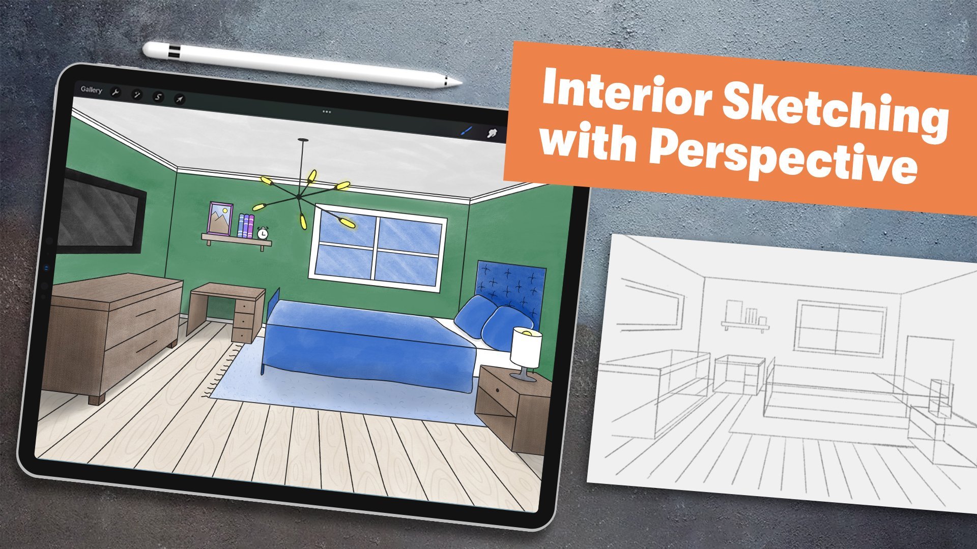
1. Intro: [MUSIC] Ever wanted to visually bring to life
your interior design ideas like those home
renovation shows do with those cool
illustrated floor plans? If the answer is yes, then this class
is right for you. Hi, I'm Isaiah Cardona, and I'm a designer with experience in
property management. I work with a lot of different
kinds of properties, ranging from luxury apartments to homes and high-rise lofts. Being able to illustrate a
floor plan has helped me redesign spaces and
sell it to residents, which is why this class
is all about drawing a stylized floor plan of your dream bedroom
in five easy steps. Throughout this class, I walk students through
drawing techniques to speed up the drawing process and elevate your illustration, including color
blocking and line work, and how to visually communicate different textures
and materials. This class is perfect for beginners that want
to learn how they can use Procreate to illustrate
their own floor plan ideas. Let's get started.
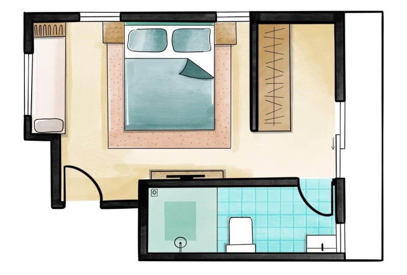
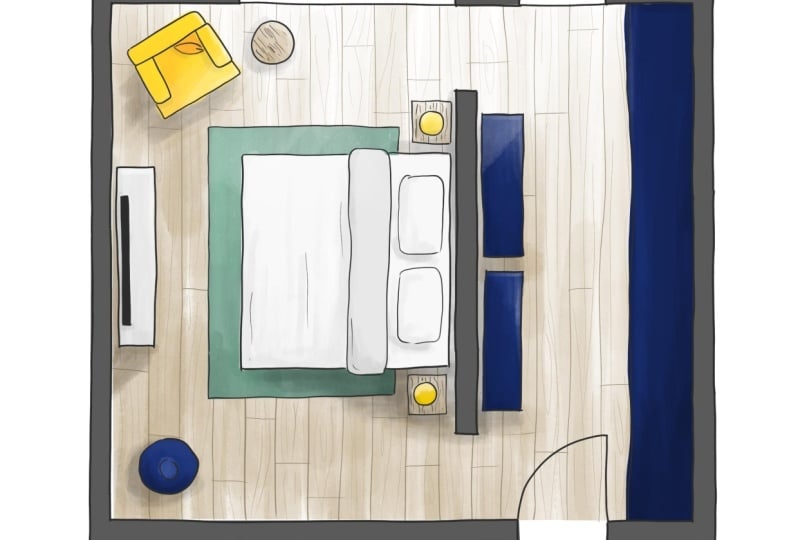
2. Project Overview: [MUSIC] Your class project is to create an illustrated floor
plan of your ideal bedroom. This can be in any
style you like, so make sure to have fun. We will accomplish this
in five easy steps, beginning with sketching
a contour drawing, adding color, adding line work, and adding highlights
and shadows. Then we will make our
final refinements to our illustration. I will be demonstrating the
techniques using an iPad, with an Apple pencil
in Procreate 5.2 app. If you'd like to
follow along with me, you can download the
brush that I use in my demonstrations in the
resources section of this class. But feel free to use whatever materials or
software you like. Whatever you feel most
comfortable drawing with is perfect, whether that's digital
or traditional. Once you're finished
with your illustration, make sure to share
your final floor plan drawing with the class by uploading to the
project gallery. To do so, you will go to the Project section and click
"Create Project" button. Then you will upload
a cover image, then you'll add
your project title, and then your
project description, and then you'll click the
Image icon under "Add More Contents" to
upload a full image. If you have any questions
or need more tips, please feel free to post them in the discussion forum and
I'll be happy to help. In the next lesson, I will walk you through setting up your
file in Procreate.
3. Setting Up File: In this lesson, I will walk you through getting
started with Procreate. To get started, you will start out by tapping the
Procreate app, and then you'll click the
plus icon at the top right, and then you'll click the
New Canvas icon here. When it comes to canvas size, I recommend going with a size that fits
your final output. If you plan to print your
drawing, for instance, you might want to go with
a standard paper size. Or if you play to
post on Instagram, you might want to
go with a 1080 by 1080 as that's standard
for Instagram. I'm personally going to go
with 1600 by 1200 pixels, and now your file
is ready to go. Now it's your turn to set up your file and in
the next lesson, I will walk you through
drawing your contour sketch.
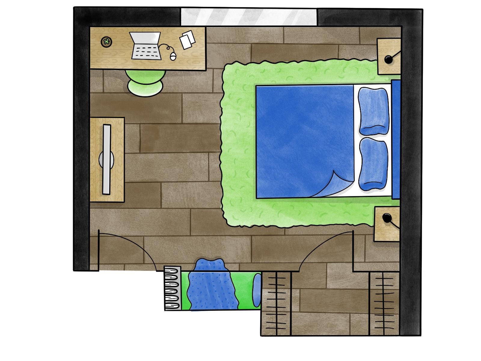
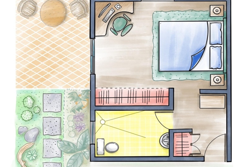
4. Drawing Contour Sketch: In this lesson, I will walk
you through contour drawing and demonstrate a sketch for
one for the class project. Contour line art is a
method of drawing where you draw only the outline of an
object without any shading. I use the contour
drawing as a guide to plan out the layout
and placement of furniture in a room
and to help start thinking about some of
those design details. To start out, I'm going
to get a monoline brush, since I like to draw the
outline using a brush with no tapering so I get a
consistent line throughout. If you're drawing with paper, you can use a fine liner pen
to draw your contour sketch. Next, I'm going to pick
a really light color. This is especially
helpful practice if you're drawing by hand as you'll be able to easily draw over it without
showings through. To start my floor plan, I'm going to focus on drawing
the walls and creating a rectangular shape similar
to my personal room. Feel free to alter your shape to fit the space you
wanted to pick. And remember you can
always start out with a simple rectangle and then make adjustments
to it as you go. One reason I love drawing and procreate is that
after you draw a line, you can hold at the endpoint to straighten out
the line and you can click Edit Shape to make
adjustments to the line. Along with drawing the walls, I like to draw any
windows and doors. This is very important as
it will help you situate all your interior items
around those elements. For example, you
wouldn't want to draw a chair in front of a door. Next, I'm going to draw the walk-in closet
accents outside of the room, and that is why I drew this left exterior wall going beyond the
shape of the room. A pro tip it's important
to add details throughout to help make different areas and
furniture identifiable. For example, here I'm adding the closet rod hangers
on both sides. Next I'll start drawing the furniture starting
with the bed, since it's the biggest
piece of furniture, and I'll need to situate all the other furniture and
design elements around it. And I'm going to start
defining some of the design choices for the
bedding and headboard. Next I'll draw the end tables
and I've decided that I want the lights
to be attached to a wall and have them go
over the end tables. Now I have space between the
closet and bedroom door, which in a dream scenario
would be cool to turn into a little reading note that would face the window. So I'm going to draw out my nook and add a bookshelf
on the other side, and then I'm going to add
some details including a pillow and blanket and we'll add some books to the bookshelf. Adding details isn't
just a great opportunity to design elements of a space, but also brings personality
to your floor plans sketch, which is helpful
when you want to use your illustration to sell your design ideas or cell potential residents on how they can make the
space their home. Next I'm going to add an
area rug under the bed. I'm going to add marks to indicate the texture
of the carpet. And sometimes it helps to review different inspiration
examples to help you identify texture so I'm wanting to add these
little stringy marks throughout the rug so it
looks like a shag carpet. I always love having a
desk facing the window, so I'm going to draw
the desk on the wall of the window and add some
items on the desk. Lastly what I'm going to add is a
dresser with a TV, and then I'm going to
rename this layer contour. During this lesson, I'll walk you through my
thinking process behind creating a line drawing of
a layout of my floor plan, which started with defining the external structure and
then thinking through ideas for furniture and
ending with adding some preliminary design details. And we discussed how defining those design details
help elevate your floor plan
illustration which helps viewers better envision
the space you're creating. Now it's your turn to draw a contour drawing of
your dream space. Make sure to have fun with it. In the next lesson, I
will walk you through my thought process for
adding color to drawings.
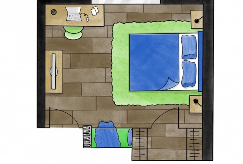
5. Adding Color: [MUSIC] In this lesson, I will walk you through
strategies and tips for adding color to your floor plan that brings personality
to your drawing. So why is color blocking the first step in the
final illustration? I have found from
personal experience that it helps to lay down blocks of color
first and then go over with line work in details. This is especially
true if you're using traditional drawing as you want your paint work to
be nice and crisp, so it has to be done on the
top of the color layer. The first thing I'm going to
do is create a new layer by going to Layers panel and
tapping the Plus icon. A helpful tip when you
have multiple layers, is you make sure
you have selected the layer that you
want to draw on. If you don't, you may
end up drawing on the wrong layer and might
have to redo multiple times, which I had definitely
done in the past. Next, I'm going to select the contoured layer
and reposition it so it's centered on my canvas and then I'll re-select
the new layer. Next, I'll tap the
selection tool icon and select the areas
of my external walls. By selecting the areas
I want to apply color, I'll be able to go in with my
marker or gouache brush to fill the space with color while keeping it nice and clean edges. Before we start coloring
our interior space, I wanted to share how I
approach coloring objects. Here's a real image example. As you can see that the
chair and footstool, are not a solid color, but have different shades of orange depending on
how the light hits them and that is going to be an important thing to do
when coloring our objects. It's also important to
color objects based on large light
sources like windows. As you can see in this picture, there's a shadow and darker color on the
floor and objects, the light from the
window is on them. Next, I'm going to
change the color to a grayish brown as I want
to show wood floors. Once again, I will use the selection tool to select the area of the
floor can then we'll draw in a linear stroke manner across the area to match the
direction of the planks. Next, I'm going to
start building up the color in areas that
will have a shadow. To make it realistic, I try to consider
where the light would come from the
window and let that guide my placement of the
shadows which connects back to the real-world example
that I showed earlier. I'm also going to
create shadows around the desk and bed as those
items will cast a shadow. Then next I'll start
coloring in some of the other elements and then
as I get to the pillow, I'm going to build up the
edges of the pillow that are away from the light of the
window to create a shadow. Since I have a corner on
the blanket flipped over, I want it to be a darker
color to show that it's at the bottom side of the blanket
and to give some depth, I'm going to create a shadow by building up the color
around the flip. Next, I'm going to create a new layer and
select the shape of the area rug and fill it in with a green color to
complement the headboard. [MUSIC] As you can see here, if you need to fix or
expand your selection, you can create a selection
around the area and then I recommend applying
your color very lightly until you
get a close match. If you're not light, you can get a darker
color that will be very uneven with the rest. Then I'll color in some
of the other elements. Another example of how
I like to build a color and have it varied is my
chair next to my desk. To color the chair, I'm going to first select
the chair as I did before and then I'm going to cut out the selection to remove
the brown color. This is really helpful so that my chair color
doesn't get muddy. To add color for the chair, I'm first going to select the
shape of the chair and then cut out the selection to
remove the brown color. This is helpful for my chair
color as it will prevent it from getting muddy as it'll be applied on top
of the brown color. Then with the chair
selection, re-select it, I'm going to fill
it the green color which will complement my rug. I'm going to build
up the color so only the top part of
the chair is light green as that's going to
be the part that will catch the light and that
will help elevate my sketch. I want to make sure that the
color isn't just flat but depicts how the lighting will interact with
those objects. Then I'll apply the
same techniques to the objects on the
top of my desk by selecting and removing
the original color and then applying
my desired colors. But what do you do when you
need to change a color? Well, Procreate makes it super easy as all you have to do is choose the new color and holding on the color
selector at the top, drag it to the object you want to change and it
will recolor it. Next I will recolor the pillow and blanket on reading and then make a bookshelf a
light gray color and delete the color
where the books will be. [MUSIC] Last thing I do is
color in the area that will be a window
with a light gray color. I do this on purpose as I
don't want it to all be black. I want to make sure that
the viewer is able to understand that this is a window and not
part of the wall. To recap, I just walked through several strategies and tips for coloring in
your illustrations. A key takeaway is that for
more dynamic illustrations, you will want to
apply color with varied degrees of
thickness to create depth and show how lighting
would realistically interact with objects and
show where shadows are cast. Now it's your turn. Using the strategies
from this lesson take some time to add in your
color and in the next class, I will walk you through adding the line work to your
floor plan illustration.
6. Adding Line Work: [MUSIC] In this lesson, I will walk you through
the line work and how to apply it to your
floor plan illustration. Line work is all the lines
that make up your drawing and help define the shapes
of your illustration. When drawing using a
traditional method, I have found from experience, that you have to add your line
work after you have added color so it can sit on top of the color
and remain crisp, which is why this is the second step in the
final drawing process. To get started,
I'm going to move my contour layer above
the color layer, and then I will add a new layer
that I'll call Line Work. If you're working with
traditional methods, you can place your contour
drawing under your paper with the colors and use
a light tablet to show the lines
through the paper. Now, I will change my color to black and select
the technical pen. I try to choose a brush size that will
give me a fine stroke. If you're drawing traditionally, you can use a fine liner
pen for your line work. My main goal with line
work is to draw over the lines of the contour drawing with clean refined lines. During this stage, I try to be purposeful with the
thickness of the lines. I like to use a thicker line for the outlines of
furniture in big shapes, and use a thinner line for the smaller objects and
to define the details. Speaking of defining details, I like to go in and add some
additional lines like here, I'm adding a thin line to
show the edge of the pillow. It also helps it headlines
to give objects texture. A couple of helpful tips. The first one, when adding
a texture like wood grain, I always draw it on a separate layer and
reduce the opacity and set the blend mode to multiple so it looks
more realistic. Another tip I use when I'm drawing the texture is I like to reference real images of the textures that
I want to mimic. To recap, in this lesson
I walked you through my thought process of
adding a refined linework to my illustrations and how the linework in details
like rug and wood texture helps elevate the
drawing and give more personality to a floor
plan so it doesn't look flat. Now it's your turn to add
linework to your drawing. Then the next lesson, I will walk you through adding highlights and shadows
to your drawing.
7. Adding Highlights & Shadows: [MUSIC] In this lesson, I will walk you through
my strategies for adding highlights and shadows
to your illustration. What are highlights and shadows? Here's a great example. On the right chair you can see a highlight where the light from the window hits directly. It looks so bright and it looks almost white on the
edge of the chair. In this part of the chair, you can also see darker areas of a chair where
the shadow is cast. When you look at the
chairs as a whole, you can see how there were actually multiple shades
of yellow depending on how much light the
chair is receiving and that is what we want
to bring to our drawing. For the shadows, I
have already been addressing some of the shading
when I was adding color, but it's important to
add cast shadows from different objects in
the room to help give depth and separate
them from the floor. Looking at our example, you can see how the chairs and table are giving off shadows. In a new layer, I'm going to use a
selection technique that I've been using with
the coloring to select the areas around pieces of
furniture and go in with my gouache brush with a gray
color to create a shadow. Make sure the layers blend mode is set to multiply and has a lower opacity to
the shadows blend in with the surrounding colors like a realistic shadow would. Going back to the example, you can see how the cast shadows just make
the floor look darker, but you can still see the texture and color
of the wood floor. Next, I will refine
the shadows to make sure they are being cast
from the right direction, which is a great example of why I like to use
different layers so I can go back later and easily make any adjustments if needed. Last thing to do is add some additional
shadows around some of the smaller objects
like the pillow, blankets, and the wall lights. Adding these shadows
really helps add some dimension to my drawing so everything doesn't look flat. I just walked you through how highlights and shadows work in real life and demonstrate how to add them to your
drawings in Procreate. Now, it's your turn to add some highlights and shadows
to your illustration. In the next class, I will walk you
through my process for making final refinements
to your drawings.
8. Making Refinements: [MUSIC] The last step in the drawing
process is to make any refinements that are needed. In this lesson, I
will walk you through my thought process for
refining my illustration. The level of refinements
is going to vary widely per person and
per individual style. A good tip for
getting started is to zoom out and look at
your full drawing and see if there's any
additional details that are needed or any areas
that you want to fix. For me, I realized that the blanket on the reading
bench and the carpet in the closet feel
pretty flat so I'm going to add some
texture to them. [MUSIC] I also realized that
the back of the closet is crooked compared to the
rest of the floor plan. To fix that, I'm
going to first draw new black line where I want the back of
the closet to be, then I'm going to select the unwanted area of each of the color layers
and then delete it, and now, I'm done. To recap, I walked you
through my process for making my vinyl refinements
to my floor plan. Each person's refinements
will be different. This step is just about
taking a step back to look at your illustration
and see if there are any elements you want
to refine or add, but it's completely
okay if you're satisfied with your illustration when you get to the stage. Just remember to have fun, not spend too much time
refining your illustration. The goal of drawing floor plans
is to help you sketch out your ideas quickly so
you can explore a lot of different interior
design options. Now it's your turn to review your drawing and see if there
are any refinements needed. In the next lesson, I will show you how to export
your drawing in Procreate.
9. Exporting: In this lesson, I will walk you through exporting your floor
plan as an image. To start out, I'm going to click the wrench icon at the top left. Then I'll tap Share, and then click JPEG. I like saving as
a JPEG as this is a universal format that I can use for digital or print uses. Now you're ready to export your floor plan and upload
it to the class project. If you run into any problems exporting an image or
uploading your project, please reach out to me through the discussion forum and I'll
be happy to help you out. In the final lesson, we'll wrap up the
class. See you there.
10. Final Thoughts: Congratulations on
completing your project. I appreciate you taking
the time to take my class. Throughout the class, we
walked through strategies for approaching drawing and giving personality to your floor
plan illustrations, including adding dimension with dynamic coloring and shading, bringing out details
with line work, and how to visually communicate various materials and textures. All of these skills, not only help elevate your floor plans, but are practical drawing
skills that you can apply to any illustration
you're drawing. To continue expanding
your skills, I recommend that you take a moment to upload
your project to the class gallery as
sharing with the community is a great way to help
inspire each other. If you're interested in
taking more classes from me, then please follow me
on Skillshare as I have other classes in Procreate and Illustration
that you can take. I look forward to seeing
you in a future class. Bye for now.
 Isaiah Creates, Art Director & Motion Designer