Transcripts
1. Welcome!: Hey everyone, I'm Silvio spina. Everyone calls me CLV, and I am an artist and designer based in
Barcelona, Spain. I have a passion for blending botanical illustrations
with graphic design. There is something
truly special about combining nature's beauty
with well-crafted funds. Images become
beautiful, elegant, modern, and yet timeless. In this class, we'll combine
procreate and Canva. And you will experience
the magic of blending the art
and design world, mixing hand painted
illustrations with well-crafted bonds, we'll open a whole new world
of exciting possibilities, allowing you to create any type of design for any occasion. And the best part is that you don't need any prior experience. This class has two phases. In the initial section, our focus will be on painting, standing botanical
illustrations using Procreate. I will guide you through
the exact tools and brushes that are used to
shape an enhanced my artwork. And you will master
the art of adding textures and depth to
flat illustrations, make up a system in place. In the second part of the class, we'll focus on using Canva. You will be amazed at
how easy is to craft any type of design that can fit every imaginable occasion. Think gifts for friends, design social media posts to
engage with your followers. Decorate your home with
cute motivational quotes. Print custom planners at home, or even work on professional
client's requests. Anything is possible
in the world of Canva. This class is the perfect
blend of art and design. So whether you're a
designer who wants to acquire illustration skills, or you are an
artist who wants to enjoy the curating
design pieces with your illustrations
without spending too much time on learning
our design program. This class is
tailor-made for you, even though all
levels are welcomed, this class assumes that
you're already familiar with Procreate's interface
if you're new to it. No worries. I got you covered. Begin with my first
Skillshare class, digital illustration or beginner guides the mastering
Procreate for you again that solid foundation and
create your first set of botanicals ready to be
incorporated into designs. So are you ready to
dive into the world of Procreate and Canva to
design stunning images. If so, get your iPad ready
and see you in class.
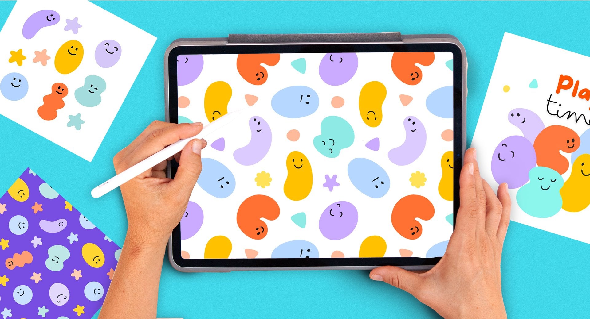
2. Your Project: Since there is no
better way to learn and truly internalize
the gained knowledge. And by doing, Let's talk about your project
for this class. Your project is divided
into two parts. The first part is to create a collection of botanical
illustrations in Procreate, full of texture, volume and
should include the following. A big flower, which we
will call the hero flower, a medium flower as small one, some flower buds and a few
different lives unfold it. You might be wondering
why so many elements, well, you don't have
to make them all, but having diverse elements in various sizes will help you to achieve well balanced
compositions. During this part of the class, you will master the
precise techniques and tools needed to create
any type of flowers. And after creating a few, you will notice
that their approach remains quite consistent
across different ones. So as the class moves along, I will be encouraging you to
start infusing your flowers with your own touch so that they look slightly different to mine. Feel free to play with
different colors. Vary the size of your petals, adjust proportions, or even
reshape them entirely. Once you complete your
botanical illustrations, you can upload them
to the project and resources gallery
of this class. The second part of the
project is to incorporate your illustrations into various design
pieces using Canva. For this part of the class, you should download the app
and create a free account, which is very easy. Whilst introducing you
to the interface and showing you canvas
amazing design tools. We will create three items. An Instagram post with
a motivational quote. We will decorate
a weekly planner that you can print at home. Just so you know, I
have been printing mine during the past month and it has been working like a treat. I love looking at it
because it's beautiful and it keeps me motivated
and organized. And finally, I will
show you how to craft a dreamy floral crown using all of your
flowers and foliage. You can turn it into
a greeting card or print it and use it
to decorate your space. I've assembled a PDF packed with valuable resources to enhance your learning in this class. Inside you will discover lots of photos that I have been
capturing over the years. Some inspiring
quotes that you can use to create designs and various concepts on how to seamlessly blend your
flora creations with text. You can of course, bury your designs and
even make new ones. And just think, whose
birthday is next. You want to say thank
you to someone? Is it Mother's Day yet? Just saying, the
possibilities are endless. So let your
imagination run wild. If you decide to share your
project in social media, please tag me at Socrative art so I can share it with
my followers as well. And just a quick note, I am a working artist and
I make my living from freelancing and licensing
or selling my designs. I would love you to use
the methods that I show in the class to make
your unique artworks. But if your illustrations or final designs look
too similar to mine, please do not sell them
or use them commercially. You're welcome to post
them on social media. But do tag me and make
clear that it's something that you have done as a
result of taking this class. There are so many
flowers, words, and fonts out there that I'm sure that
you are going to be able to modify them in some
way to make them yours. If you need any extra
guidance along the way, reach out to me using
the discussion panel of this class and I will make my best to guide you along the way. One last thing before moving on with the
rest of the class. If after seeing the clouds, you found it useful, there's something
new or enjoyed it. Please review it. Reviews play a crucial role
in promoting my class. And your valuable feedback will inspire me to keep
creating new ones. I'm very excited
to have you here and I can't wait to
see what you create
3. Gathering Inspiration: As we dive into the world
of botanical illustration, it is important to talk about finding inspiration
and how reuse it. And let me tell you, when
working with botanical, inspiration can come from
all sorts of places. Everyone has a phone these days and it's easy to stop and take a picture of a beautiful flower or plant whenever you see one. When appreciating the beauty
of nature in real life, you can start to notice the details and nuances
of botanical elements, which can be very useful
in your illustrations. All the videos you will see at the beginning and end of
each lesson in this class, we're taking during
walks in the mountains, visit to garden centers, or strolls through the series
of London and Barcelona. Feel free to pause the video when you
spot a flower that you like and take a screenshot to inspire your
future creations. Okay, but what happens when
there is no time for a walk? Well, of course, we can't forget about the endless
possibilities of the internet. Sites like Flickr,
Google Images, Pexels, and Pinterest have a
vast collection of stunning botanical images
taken by other people. For this class, we're mainly
going to be using Pinterest, and I advise you to download
the app into your iPad. Before we start drawing, we're going to use
a board that I made for my first ever
Skillshare class, and it's called
gathering inspiration. It is filled with
botanical references that I have been
curating for years. You can easily
access this board by following the link in
the class description. Now let's talk about how
to use the inspiration, or at least how I use it. There are three things
that I pay attention when seeing a photo of a flower
or when in real life, and that is color,
shape, and texture. So let's have a look at
this flower in terms of color is white and it
has a yellow center. These can serve as inspiration to inform our future flower
that you're going to paint. In terms of shapes. It has these beautiful
irregular petals that I really like. And they have some
vertical lines going from the center of
the flower until the edge. So by starting to paying
attention to these details, you can start having ideas on how to represent
your own flower. And you can look for
these three qualities in different parts of
the flower or plant. In terms of the center, this flower is composed by little almost yellow
stars in the center, and then the pollen which
is on the border is larger. Let's have a look at one more before moving on with
the rest of the lesson. This flower, for example, has a higher number of petals. They are pointy, not irregular. They have a gradient
that goes from yellow to orange and towards
the center they have this really
cool black squares, the grading the flower center, and having mind that
you don't have to copy these things exactly
as they are, but you can interpret
them in your own way. As you can see when
you tap on a flower, Pinterest starts showing you similar images to the
ones that you tap on. If I tap on this flower
just on the screen, I have four absolutely
stunning flowers full of different colors, different textures and details, and a mug that reminds me that I probably need another coffee. To get inspired. Throughout the class,
you will hear me encouraging you to
create your own flowers, make different color choices, try out different textures. Of course, you first need to learn and understand
the tools and methods. But these tools that I'm
going to teach you are transferable into any other
flower of your choice. In the upcoming lesson, I'll talk about the
joy and benefits of creating your own
botanical image library.
4. The Joy of Having a Library: Having a library of images can be a complete game changer, especially when
you're looking to explore the world of design. Library is basically a
folder that contains images which can be reused across
various designs and projects. You can store your
library on your computer, on a hard drive or on the Cloud. I only understood the
importance of having a well curated
image library after working for years in the world
of surface pattern design, when I need to create or
complement our design. And I can't spend the time painting
everything from scratch. I can reuse images
which I've made in the past and are already
within my library. So it's not only very practical, but it can also be a
complete lifesaver. Yes, there are certainly times when starting from
scratch is essential, especially when
you're looking to achieve a specific aesthetic. Or sometimes an artwork needs a fresh approach
and originality. But even then there
are elements or paintings that can
be re-used and think the same
botanical illustrations can be used to create patterns, decorate greeting cards,
enhance flyers, you name it. Now let's talk about
convenience and accessibility. Ideally, a well-organized
library should be easy to access no matter which
device you're using. Personally, I am a fan of
keeping mine in Dropbox or in the Cloud as it allows me to open it from my computer, my phone, or even
someone else's computer. And here's an important thing to keep in mind when
saving your images. Preserving the quality
of your assets is key so that you can
use them in the future. It is important to
use lossless formats, such as PNG or tiff format. These type of images
remains sharp over time. Unlike the compressed
JPEG format, which is great for uploading to websites or sharing
on social media. But that tends to deteriorate. I got a surprise for you. Was this class of moves along, you're going to start creating
your own image library. Isn't that exciting? If you're serious
about getting into the design world or just enjoy it and you haven't got one yet. Your future self will
thank me for this. I'm kidding, but I'm not. In the second part of the class, you will upload your
library to Canva. And when we start decorating our designs with your
beautiful illustrations, you're going to understand
better what I'm talking about. In the next lesson.
I'll talk about the Procreate setup and tools that we're going
to use in this class. So get your iPad ready and
see you in the next lesson.
5. Tools & Setup: In this lesson, we're
going to see the tools and setup that we're going
to use in this class. Let's start by saving all the brushes
that we're going to use in the recent tab. So for this class, we're gonna be using
the following brushes. Whilst I show you the brushes, we're going to make
a few marks in here and you will
see why in a minute. To sketch our drawings, we're going to use
the six B pencil, which is under the
sketching collection. You can select any
color that you want. Just make a mark on
one side of the paper. To create the silhouette
of our assets. We're going to use the
studio pen which is under the inking collection,
going to make a line. You will see that this brush
has a very defined border. To give volume to our assets. We're going to use
the soft airbrush, which is under the
airbrushing collection. These brush has very
smooth borders, so it's great to give
shadows and volume. And occasionally
we're gonna give texture to some of our items with either the noise
brush or the flakes brushes which are under the
spray paints collection. This is the noise brush, and this is the flicks. Now, instead of
having to search for these brushes every time
that I mentioned them, since we have done five marks up here under the recent stuff, you will have all the
brushes that we just saw. So very easy to
keep these brushes. Of course, you're welcome
to create a new collection. But if not, just
use them in here and you will have them ready
to use in the recent step. In some lessons, we're
going to be using transforming tools when
transforming assets in Procreate. Unfortunately, they do tend
to lose their quality a bit. I'm going to show
you a few tricks to bring the quality back, but to prevent this
from happening or reducing the
loss of definition, you can tap on the move tool. By the way, you do need
to have some sort of drawing in your Canvas for
this option to be active. And in this bottom central menu, you're going to
tap on this icon, which is the icon
before the last one. You're going to select by cubic. With this option,
we will be able to prevent the loss of
quality in a better way. As this class moves along, we're gonna be creating
a color palette, and this is optional. I'm going to tap on
the active color, which is this circle up here
on the top right corner, tap on the pallets icon. And I'm going to tap
on this plus icon up here and create new palette. This palette now
appears up here. And when I go to the disk
or the classic mode, you will see that these
empty pallet is now here. You will see me selecting colors intuitively based on the
reference image that I see. But every time that I
choose a main color, I'm going to be saving
these swatches in here. And I will see what color palette I am left with towards the
end of the class. As we saw in the
previous lesson, I'm going to be using a
Pinterest board to get inspired. And I'm going to be constantly splitting my screen
into two parts. If you don't know
how to do this, let me show you how
you have to have both Pinterest and
procreate open. So you select one
of the two apps, Pinterest in this case, swipe up a finger from the
bottom of your screen, tap on the other app and slide it to one
side of the screen. So very easy. If you
are left-handed, you might want to send
Procreate to the left. As we won't be covering the inspirational
photos with your hand. If you're right-handed, just
sent Procreate to the right. And lastly, we're
going to go ahead and create a photo album within our iPad that will be the start of your
botanical library. Open the photo gallery on
your iPad and scroll down on the vertical left menu until you find these new album
word at the bottom, you can give it a name in there. I have already created a
folder for this class. I'm not going to create any, but you can name it for example, botanical library or a
name of your choice. And this is the folder where
we're going to start adding all of the PNG images that
we create in this class. And that's it for the tools and setup that we're going
to need for this class
6. Creating a Document: Let's start our creative journey by opening a new document. Tap on the plus icon on the top right corner
of the screen, and then tap on the
black rectangle with a plus icon to create
a customized document. I'm used to thinking
in centimeters, and that's why I like keeping our ruler or measuring
tape on my desk. It helps me to understand the size of document
that I'm working with as pixels are still a
little bit abstract for me. So I have this ruler
in here, and sorry, this one is a bit covered in old paint and it looks dirty, but it does the job. I'm going to create
a document of 20 per 20 cm and 300 DPI. This is a large document
that will allow me to use my flowers in things like
tuba covers or wallpapers. But it will also
allow me to downscale them to use in greeting
cards or smaller designs. So I'm going to select
centimeters from these bottom menu
and tap on width, 20 cm, height 20 cm. And where it says DPI, I'm going to write 300, which is the best
resolution for printing. This gives me a
total of 116 layers, which is more than
enough to work with. But it might change for you depending on the size and
capacity of your iPad. If you see that you get access
to less than 25 layers, you can either make the
documents mother or set the DPI 200 or 150, which will still allow you to print your assets
in a good-quality. I'm going to keep the
color profile on RGB. This will keep my
colors looking bright, and I can always
convert the colors to CMYK if I want to
print them later. I'm going to tap on Create. And there you go, we
have our document. In the next lesson
we're going to start illustrating our hero flower, which will be the
biggest of them all
7. Sketching the Hero Flower: Sketching before painting can be great for several reasons. It allows you to
experiment and get familiarized with
various flower types and closely analyze
their main features without investing way
too much time on them. This way, when it comes
to painting them, your focus can shift towards picking colors that
you like and learning the tools and techniques
to represent volume and texture rather than
achieving accurate shapes. Let's start by
splitting our screen so that we can look at the
Pinterest board comfortably. I'm going to start
scrolling down until I see a
flower that I like. I think that this one is beautiful and it
has a good number of petals to work with
to sketch our flower, we're going to be using
the six B pencil, which is on the
sketching collection and the symmetry tool. I'm going to pick
a nice gray and make a mark on my paper.
Yeah, That's good. Now I'm going to activate
the symmetry tool. So I'm gonna go to
the Actions panel, which is under the wrench icon. Tap on Canvas. I'm going to turn on the
Drawing Guide switch. And then I'm going to tap
on Edit Drawing Guide. On this bottom central menu. I'm going to tap on Symmetry, Then on Options, and then radio. When this option is sine, you can turn the rotational
symmetry on or off. And I'm going to explain
what is the difference. I'm going to tap on Done, and let's see the difference in between these two options. I'm going to start by drawing a circle which will
be the center of our flower with their
rotational symmetry option of, I'm gonna go ahead and
start drawing the petals. When this option
is the activated, the symmetry option
is only active on the horizontal
and vertical lines. Now let's see what happens with the rotational symmetry on joke. Now whatever I draw on one of these lines is affecting
all the lines at once. Whilst this can be
very practical, I rather create my
flower in batches of four petals as
this will allow me to create more
depth in my flower. So throughout the
class, I'm going to be working with this option off. I'm gonna go ahead and
start drawing the petals. I'm going to start
decorating these petals. I can see that they have these
lines coming from the top and then they have these smaller darker red texture
near the center. Now that I have the
petals than I'm going to pay attention
to the center, which has lots of
pollen that it can represent by using these dots. I'm going to open the move
tool and rotate my petals 45 degrees to draw the
other ones comfortably. See how by drawing my
petals in batches of four. The ones that I'm
drawing later can appear below the ones
that I have already done. I'll start doing some details
and shadow in the center. And let's see what
else can I draw? I really liked these
pointy petals. So I'm going to draw these
little points towards the end. And I will create a bit more of texture towards the center. Great sketch, number one, done. See how easy is to
paint flowers or draw flowers when using
the rotational symmetry. In the next lesson,
we're going to go ahead and draw the medium flower
8. Sketching the Medium Flower: After spending some time
scrolling on my Pinterest board, I found this flower,
which I really like. So I'm gonna go ahead and
create a new layer to draw it. I'm going to turn on the
drawing guides to see them. And I'm going to tap
on top of my layer to activate the drawing
assist the option. You can now see the
word assisted there. This is another way to
activate the symmetry option. Since the center isn't
as big in this flower, I'm going to start by
drawing the petals and I'm not going to rotate
my paper 45 degrees. I'm just going to draw
the petals like this. Now I'm going to make
these irregular circle in the center and start
drawing the pollen. This time, it looks
like ovals which are connected to the center
through very thin lines. I'm going to turn the
assisted drawing off because this will help me draw my polling in a more
comfortable way. And it won't look
so symmetrical. This is a sketch and
it doesn't need to be perfect at this point. Whilst making my sketch, I'm mostly understanding
how to represent a flower. Things that I like to do and things that I'm
not so sure about. For example, drawing
these big pollen with the drawing assist option. Lastly, I will start creating all these dots in the
center to resemble pollen. Medium flowers done. But before moving on
to the small flower, I want to show you
a trick that makes representing this flower from different angles super easy
using transforming tools. I'm going to start by
closing Pinterest by tapping on the line and dragging it to the
side of the screen. I'm also going to turn off
the drawing guides for a moment and duplicate the
layer that contains my flower. I'm going to make the
bottom one invisible. And I'm going to transform
these top one tab on the ribbon icon to display the selection tools using the rectangle option
from down here. Select the bottom
part of the flower. Three fingers down, and select cut and paste
from this menu. If you open the Layers panel, you will see your
flower has been separated into two layers, making sure that you
are in the layer which contains the bottom
part of the flower. Tap on the Move tool. Select free-form from
the bottom menu, and drag the bottom part to
shorten its vertical scale. See how suddenly the flower starts looking from
a different angle, SAP it was facing away from you. You can accentuate these
effects by shortening the top petals a bit so that they look as
if they were further. And lastly, you can
merge these two layers. And using the crop tool, which is down here, you can
move the center down a bit. See how from one
flower we have made to one completely frontal where all the petals are facing
the same position. And the other one
is facing a way where the hospitals
are a bit flattened. In the next lesson,
we're going to start creating the small flower. You can spend some
time scrolling on Pinterest to see if
you like one or if not, just joined me on
the next lesson and copy exactly the one
that I'm going to do.
9. Sketching the Small Flower: I've chosen these
flowers because they are adorable and they will help me introduce you to a new
way of drawing botanicals. This flower has an uneven
number of five petals, and I can't really use the
symmetry option this time. I'm going to create a new layer, and this time I'm not going to turn the drawing assist on. And I'm going to turn
off the drawing guides, check out this trait to draw flowers that have five petals, I'm going to start
copying this petal, which I can see
that looks a little bit like an elongated hearts. This time, I will
create the rest of my flower
duplicating this petal. So I will swipe
three fingers down, tap on duplicate,
and start moving and rotating it to one side so that the center is aligned
with the other ones. Once more, swipe three fingers
down, tap on duplicate, and rotate it until this center is aligned
with the other two. You'll basically have to repeat this process until you
complete the flower. As you can see, this is
another very easy way to draw flowers in Procreate. And depending on the number of petals that your flower has, you can start deciding which
method to use if using the symmetry option or join one petal and then
duplicating it five times. I will now merge
all of my petals and I will start
erasing the lines to simulate that some petals are on top and some
are on the bottom. Lastly, I will erase the center area to draw the center as it
is in the flower. And since this is only a sketch, I'm not going to
be too precious, but rather trying to understand
the flower structure. I'm going to zoom on
the flower center to try to understand it better. And I can see that it's
almost like if there is a yellow circle in the
middle of each petal. So I'm going to start
drawing a circle and see if I can
represent it this way. That looks okay to me. So I'm going to draw a
circle in the middle and make some little dots that
will resemble the pollen. Lastly, I'm going to make
some marks in the middle of each petal as a way of representing this white
area that they have. I really like these white
area is very delicate. And this is just a detail that will resemble a little
bit of texture in my flower. To add depth and variety
to our composition, it is good to have a wide
variety of elements. So let's go ahead and create
some charming flower buds. These smaller elements will enhance your designs
and patterns. I'm going to start by
moving my flower to one corner of the canvas
to have more space. This flower buds are
curvy. Towards the end. I'm going to do these curvy line then without spending
too much time on it, because I'm only analyzing
the shape of the flower buds. I'm going to start drawing these circles on this
side of the curve. And draw these five lines
towards the center. That will help me represent the petals which are
blooming from the top. I'm going to make
a good number of flower buds on each side of
the line and in the center. Awesome. Now we're done
with our sketches. In the next lesson, we're
going to start giving color to this absolutely
stunning flowers. See you in the next lesson.
10. Hero Flower: Blocking Colors: Now we're going to start turning our simple sketches
into styling bars. In this lesson, we will start by blocking the main
colors of our flower. And in the next one, we'll focus on creating
the volume and texture. This will help you dissect the process and it will be easier to control
and understand. As you know when working
in Procreate the number of layers that you get
access to a limited. And that is why we're going to create a new
document per flower. So go back to the main gallery. Swipe our finger to the left, on top of the sketches
file on tap on duplicate. For every flower, we will duplicate the initial
sketches file, since this is a copy
of the sketches file and we're only going to work
with the keyword flower. We can go ahead and erase
all of the other flowers. The flowers to the right. And then tap on delete. I will lower the opacity
of this layer and lock it. To make this flower,
we're going to use the symmetry tool as we
did with initial sketch. I will go to the
Actions panel and turn on the drawing
guides to see them. We're going to
create a new layer. If you haven't done so. Tap on it to display
the drop-down menu and tap on Drawing
Assist to activate it. You will see that now the word assisted appears below
the layers name. To draw my flower, I'm going
to use the studio pen, which is on the inking collection
to draw the silhouette. This brush has a
very defined border. I have already selected a nice pink that I
want to work with. So I will draw my petals first and fill them up
with a solid color. I want my second set of petals
to be behind these ones. So I will create a new layer, put it below this
initial petals, and activate the drawing,
assist the function. Again. Using various
layers for my petals will also give me more freedom when it comes to painting
lights and shadows. I will use a
slightly darker pink as this will help me to
create the illusion. These petals are below it. Since I want to see
what I'm drawing, I will keep the top
layer invisible, draw them and fill them up. Now that we have
our petals blocked, we're going to move on to
the center of the flower. I could jump straight into painting a flower
center by memory. But since I want to show you their organic process that I go through when
creating my flowers. I'm going to display Pinterest again and look for inspiration. This is the initial
flower reference, but I want to see if there's
anything that I like more. This one here, for example, a darker center with
loads of pollen inside. A look at this flower center, I think I'm going to save it to my Pinterest board and I'm going to probably end up using
it because it's beautiful. I love to work in
this organic way and take decisions as
I work on my flowers, as the creative process becomes more spontaneous and playful, without getting into
too much detail, I'm going to choose to make
my flower center yellow. If you have something
that you like more, go for it and try
to represent it. Let's start by creating
a perfect circle using a solid yellow and
using the studio pen, which has a defined border. If you're struggling
to make a good circle, remember that you
can leave your pen down after drawing it and touch the screen with a finger from your other hand to make it
perfect and adjust the size. I will drag the color to
its center to fill it up. And there you go. We have now created the building block for
our flower center.
11. Hero Flower: Texture & Details: Now that we have blocked the
main colors of a flower, we're going to go ahead and turn this flat illustration
into a beautiful, stunning flower full
of volume and texture. Let's start by making the
sketch layer invisible, as we're not going
to need it anymore. To add volume and
texture to our flowers. We're going to be using the Alpha Lock and clipping
mask options a lot. I assume that you are already familiarized with
these two options, but just in case here's
a quick explanation. When working with the
Alpha Lock option, you create all the
volume and shadows or details or texture
in the same layer. This means that
you can't discard them at the changes
are permanent. To work in a
non-destructive way, you should use layers set as
clipping, mask, painting, details and textures on separate layers means that you can always discard them later, make them invisible,
or try out new things without damaging
the initial element that you had in the first place. I use these two options in
distinctively and intuitively. When things are simple, I usually go for alpha lock, but when I'm working on
a complex item and I am not sure of what
result I'm looking for. I usually go for clipping mask for this lesson and
for my hero flower, I'm going to use the
Alpha Lock option to give shadows and
volume to my petals. And I will start
with the top ones. You can activate this option by simply swiping two
fingers to the right. Or you can tap on top
of the layer and select the Alpha Lock option
from the drop-down menu. This will block the
transparent areas so that you can't paint on them, making drawing details on top
of your petals much easier. Since that drawing assist
is active on the layer. All the details that
I do on top of one of these petals will instantly
be reflected on the others. I will start giving some
light areas to my petals, selecting a lighter pink. And using the soft airbrush, which is on the
airbrushing collection. I'm going to decrease the size of my brush and start drawing some curvy lines on
one side of the petal. Starting softly and then applying more pressure
as I go down. The central area
is quite tricky, so I will make the brush
smaller to be able to draw it. You can experiment with
different brushes or levels of pressure to
create this texture. Now I will show you how to
use this match tool to solve these lines using the same soft airbrush
from the library. I will start passing my brush over the lines that
I have already drawn to soften the edges and create a more
realistic look. Try to move the pen in the
same direction of the petal. See how these light areas have instantly made my flower
more interesting. Let's move onto
the bottom petals. As I did with the top ones, I'm going to select
a lighter pink, adjust the size of my brush
and start drawing some lines. And lastly, using
this much tool, I will solve them
them a little bit. This is basically the method
that we're gonna be using along the class to give texture
and volume to our petals. Drawing some texture with
the soft air brush pen, which is already a soft
and delicate brush, and then smudging it
with the smudge tool. It's key to start
varying the opacity and scale of the brush and smudge tool to
understand the results. The more you do it, the
more you will feel that you understand and
control these tools. The most important thing here
is to enjoy the process of building up the volume and
texture of your petals. I want to create some contrast in-between the top and
the bottom petals. So I'm going to add some light areas on the
border of each one. And as you can see, I'm slowly working on the light and dark
zones of my petals. I'm going to leave
the petals for now and move on to the
center of the flower. Although I decided
to make it yellow, I'm not really sure about
what texture to use yet. So I'm going to
go ahead and open my Pinterest board and look
for some photo references. Let's dive into the
mesmerizing details of this flower center. I absolutely love it. If I zoom in, I can see some
ocher Palin added score surrounded by some larger and more saturated and bright pollen towards the edges. Now, here's the exciting part. We want simply
replicate what we see Instead, we'll use
this information to let our creativity
take part in it. It's a good practice
to CF photo, analyze it and close it, allowing the details to inspire your unique
interpretation. This is how you can infuse your personal touch
into any illustration. This time, I'm going
to be working in a non-destructive way and use layers to
decorate my center. I'm going to tap on my layer, activate Drawing Assist so that the pollen is
quicker to draw. And I'm going to activate
the drawing guides, lowering the opacity so that I can see where the center is, but not necessarily
have them so visible. There you go. Here's
a little reminder that you don't
have to search for your brushes in
different collections. Because if you have
used them recently, they will all be stored under the recent collection.
So very easy. Since I want my pollen to
be noticeable, undefined, I'm going to go ahead and
select the studio pen brush. Lower its size and
with a darker ocher, start drawing these
dots in the center. I remember that Pauling
being smaller in the center. And I also remember that it has the lighter doughnut shape
towards the outer part. So I will, they'll imitate where these small
pollen should go to. Fill it up with dots. See how easy it is to fill up this area when the
symmetry option is on. I'm going to move to
the outer part of the center and work
with a new layer. I'm going to tap it, activating the drawing
assist options so that the symmetry option is available and choose a
lighter tone of yellow. Save it on my
palette because I'm creating a palette as
I work in this class, I actually forgot
to save the ocher, so I'm going to save it here. Select the yellow and start
painting some bigger dots. I'm going to surpass
the border to make my flower center less rigid
and a bit more organic. This texture looks very
nice on this flower center, but I think that is lacking a little bit of
volume and depth. So I'm going to show you
some tricks to do so. I will create a layer
that will go on top of the circle but
below the pollen and activate the
Clipping Mask option so that anything
that I drew appears inside the circle using the
airbrush and a darker tone, I will start darkening
the outer area that the lighter polling that is on top gains contrast and pops up. Same with the center. By adding a bit of a
lighter area in the middle. I cannot volume and make the
center pollen gain contrast. I'm always excited
to continue adding more and more
details and refining the flour to make it
even more stunning. I do remember the reference having more details
in the center. So I will go ahead and using the studio pen and a new layer, I will start drawing
some details on top of the bigger pollen with a
darker shade of yellow. I remember looking
at something like this in one of the
reference flowers. And now I can interpret the information in
a different way. The process of
refining flowers is addictive and it's
very enjoyable for me. After looking at our reference, I can work more
intuitively using layers to work in a
non-destructive way. I don't like something,
I can just discard it, lower the opacity to make the detailed software
or keep it for later. I really love experimenting
constantly with different color combinations,
brushes, techniques. And it is through
these weight that I have been building my
own personal style. The flower is looking
stunning already, but I can't help but adding a little bit more volume and
depth into these petals. I want some of them to
look below the others. And at the moment
they are looking a bit flat in that sense. I'm going to create a
new layer in-between the top and bottom petals to work in a
non-destructive way, just in case it doesn't work, I can discard it using
a darker shade of pink. I'm going to lower the
size and opacity of my brush and start painting some shadows below
some of the petals. You will see that by doing so, the bottom petals are actually going to look below
the top ones, not on the same level. If you have ever painted
a painting in real life, you know how important is to
step away from the easel to gain some perspective over how the painting is
looking overall, that is why I tend to zoom in
and out my painting loads. But here's a trick
which is very useful. You can display a
reference image that will instantly give you an idea of
how your flower is looking. Here's how go to the
wrench icon and display the actions panel and switch
on these reference switch. And from these bottom
options, choose Canvas. You can move this
window to wherever you want and even change the size. This will allow you to work on the details of your flower, but always have an idea of how the general illustration
is looking. And it will make it easier to spot things like
where the flower is lacking avid of volume or a
bit of brightness and such. Nice, I think my flower is done. So I'm going to
close a reference. And I'm going to group all my layers to maintain
my file organised. Remember that you select them
by swiping to the right. And straight away,
I'm going to export this flower as a PNG file with
a transparent background. This will be the first image
of your botanical library. Isn't that exciting? Make the background
layer invisible. Go to the wrench icon
and tap on Share. And this time we're going
to export our image S, P, and G, which maintains the
transparency of your image. You can save your image
in various places. And I like to keep my
botanical library on Dropbox. But for the purpose
of this class, we're going to be saving our
images in our photo gallery. Tap on, Save image,
export, successful. Now go to the photo gallery on your iPads and your
flower is there. How exciting is that? And how beautiful
is that flower? If you haven't done so, create a new album on your iPad to start putting
all these flowers in it. And this will be the start of your library. I already did. Mine is called botanical
library Skillshare class. So I'm gonna go ahead and
put my flower in there. I'm going to hold my finger
on top of it and drag it to my botanical library Skillshare class album. And there you go. That's how you add images
to your photo album. In the next lesson, we're going to start
our medium flower. And I hope that you are
as excited as I am. See you in the next lesson.
12. Painting the Medium Flower: In this lesson, we're going
to start the medium flower. And you will see that the method remains quite
consistent and similar. Since you have already
learned the tools, I want to encourage
you to start picking slightly different
colors to mind are completely different to
the ones that I pick. Pick ones that you
really like and just in case you're up for it. Here's a trick that will guide you and help you in the process. Start by picking immediate tone. It can still be
saturated and break when painting shadows pick a darker
shade of that same color. And when painting light areas, pick a lighter one,
see how it goes. Let's start by heading back to the main gallery and
duplicating our sketch file. Now we're going to turn our simple sketch into a
stunning medium flower. As we did with the hero flower, we will select the
sketch we want to work with and erase the rest. Since my previous flower
has rounded petals, I'm going to experiment
with pointed edges to create a different look
to help us along the way, Let's activate the drawing assist and bring up
the Canvas guides. As always, I will
duplicate my layer first just in case
I don't like it. I will pick my pencil and start making these
petals look pointy. Sketching before
applying color to your artworks has
lots of benefits. As you can see, it allows
you to experiment with different shapes and details before committing
to a final version. It also allows you to make
changes and adjustments without having to redo the entire piece once
you've finished. Ultimately sketching how
to refine your ideas. I, for example, definitely
like this flower much more with these pointy petals.
I really like it. Now, let's lower the
opacity of this sketch. I'm going to lock it. I will create a new layer on top and activate drawing assist. With this flower. I really want to
encourage you to start exploring and using
your own colors. Of course, you can use exactly
the same colors as I do, but this method works
with any color. So let's go ahead and search
for some inspiration. Look, for example, in
this photography there are three beautiful
tones that you can use. Yellow, orange, or red. I'm going to keep going back. And here's my reference photo. The flower that inspired
my drawing is purple. But that doesn't
necessarily mean that I have to choose the
same color to paint it. This pink is really nice, but it would look too
similar to my hero flower. So I'm going to
keep on scrolling. This bright deep
breath is really nice. I really like it.
So you know what? I'm going to go ahead
and paint my flower red. Having a predefined color
palette can be very beneficial. But you know what? I personally enjoy the freedom of
choosing colors as I work. Looking at reference
photos and selecting colors as I paint allows me to develop my intuition and explore endless
creative possibilities. So I invite you to embrace
your intuition and unleash your creativity when
it comes to choosing colors. By the way, I'm using
the studio pen here. When redrawing your flower, you can always amend the shapes a little
bit if you need to. I'm using a slightly
different rate for these back petals. And now I'm going to start giving shadows and
volume to them. For this flower, I'm going to use the clipping mask option. So I'm going to create a new layer and turn on
the clipping mask and the Drawing Assist option
so that whatever I do in one petal is repeated
across the four of them. I'm also going to
display the reference as this will give me perspective
along the process. With a soft airbrush, a darker shade of red, a smaller scale of brush. I'm going to start
drawing these lines from the center
towards the edges, applying more pressure
at the beginning and lifting my pen as I
move through the petal. As you can see, I'm
constantly switching in-between the brush
and the smudge tool. This top petals
are looking good. So I'm going to start
the bottom ones. I'm going to start by
creating a layer on top, activating, clipping
mask and drawing assist, and basically repeating
the same process with a soft airbrush in
a smaller scale and using a darker shade of red, I'm going to go ahead and
draw these vertical lines. They're pretty
strong. So I'm going to go ahead and smash them. As you can see, is always
a very similar process. It works with any
color that you want. If, for instance you're
using a blue color, then you can create these
top lines with either a darker or lighter blue
and then smudge them. This will instantly start
giving volume to your petals. You can also experiment with different brushes to
create this same effect. Don't be afraid to
experiment with different tools as it is by playing that you will
start developing your own personal visual style. I feel like the first set of petals now is
looking a bit flat. So I'm gonna go ahead and
draw some thinner lines on top so that they work
better with the second set. As you can see, I am
discovering things. As I work on my illustrations. Suddenly I liked more
the second petals than the first ones I did. And that's basically
me discovering things as I work on
my illustrations. You'll learn by doing. I really hope that you are
creating this project at home, having fun and discovering
things along the way. These petals are
looking beautiful, but I'm going to teach you
how to bring them even further by giving
some light to it. For that, we're going to use a lighter shade of
the initial rate. To start, I will create
a new layer and activate the drawing assist and
clipping mask options. Using a lighter shade of red, I will start drawing some lines, applying more pressure at the beginning and lifting
my pen as I move down. See how this instantly
is starting to give a lot of volume and
interests to this petal. Gently, I will keep drawing light areas to give
some brightness to the colors and constantly
switching the pen for this much tool to soften
the edges of these lines. You can see my eyes, but I am constantly looking
at this small reference to see how these light areas are affecting all of the petals. You can also zooming in your reference image
just so you know. Now let's move onto
the layer below. I'm going to create
a new layer and activate the clipping mask and Drawing Assist option again, I'll repeat the process. If you struggle to know where
to add light or dark areas, you can observe different
photographs to get an idea or use the trick of
using the brighter area towards the outer part
of the petals and darken the center a bit so that it creates the sensation of depth. Now let's move on to the center. I'm going to create a layer
below and with a darker red. I'm going to fill this area up so that it's
not so noticeable. And I'm going to
create a layer on top and use the
same red too much or fade these lines a little bit and create more shadows
towards the center. I'm going to smash them so
that they are not so strong. And you can see that creating a darker area on the
center of the flower and leaving the
light areas towards the outer parts of the
petals work really well. Okay, now that my petals
are looking very beautiful, I'm going to go ahead and
start with the pollen. You remember that
I decided not to activate the Drawing
Assist option when creating these part of the flower because I didn't want the pollen to
be so symmetrical. I'm going to start randomly
placing these ovals in different parts of the flower and rotating it once in a while. So it's easier to have a better
look of how it's looking. By the way, I'm using
the studio pen, which has a very defined border. And I'm constantly looking at
this small flower up on the top-left as it helps me to have a better understanding of
the things that I'm doing. I'm going to pick
on ocher color, which is a darker yellow, and decrease the size of
my brush to join all of these ovals to the
center of the flower. I have been observing
flowers for years. And at this point, I
understand them pretty well. Flowers are everywhere and
it's a really good practice to start observing
them mindfully, to understand how they look. Now, I'm going to start giving some shadows and light
areas to my stems, activating the
Alpha Lock option. C, you how I swipe two fingers on top of the layer to activate it using the soft airbrush
and a lighter yellow, increasing the size of my brush. I'm going to start
painting a little bit of a light area where they
connect to the pollen. As I did with the petals, I am making the outer parts
of these little stems lighter and leaving the darker
part towards the center. You can see that this trick
helps me to create volume. The flower is looking stunning, but it could do with
a bit more of depth. So I'm going to
create a layer on top of all these
petals and to create an even darker area using the soft air brush pen
and add darker shade of red, I'm going to draw this circle, lower its opacity so
that it isn't as strong. And you know what? I'm
also going to grab this much tool and start
drawing these lines towards the outer part of the
flower to create volume and integrate this dark
area into the petals. These beautiful medium
flower is done. So we're gonna go
ahead and export it as a PNG image and put it straight away into our botanical
library album. As always, remember to make the background
layer invisible. Go ahead and save
this image as PNG. And if you go to
a photo gallery, your flower should
be stored in there. Look how beautiful these flowers are starting to look together. Remember to put your
flower on your album, on your botanical library
album so that you can keep all these flowers that
you're making organised. So just tap and hold on it and
drag it to the photo album
13. Flower into Multiple Elements: In this lesson, I'm going
to show you how to make the most out of your
existing flowers. We're going to turn a few
petals into flower buds. And we're going to
make this flower up here from a different angle. We will start by going
to the main gallery and duplicate this file so that we make sure that our existing
flower is kept intact. So I'm going to open one
of the two documents and start merging
some of the layers. I'm going to start by erasing the sketches as I no
longer need them. I'm also going to get rid of this bottom layer which
contains this red shadow. And I'm going to merge these three layers which
compose the bottom petals. I'm also going to merge these other layers which
compose the top petals. Get rid of these
two shadow layers because I don't
need them either. Make the pollen and
center invisible. I'm going to turn on the
background because he's nice to work on a
white background. Tap on the Selection tool, which is the ribbon icon, and making sure that
freehand is selected from the bottom menu
and close my top petal, three fingers down
and tap Duplicate. Now, if I open my layer panel, this petal has been isolated
into its own layer. I'm gonna do the
same and isolate one of the petals from
the top batch. So I'm going to enclose
one with my pen. Make sure I'm standing
on the right layer. Three fingers down, tap on
duplicate, and that's it. Now I have two petals, one from each set. I'm going to tap
on the move tool, rotate my petal
and make sure that the bottom is below
the top petal. I'm going to duplicate my petal, flip it horizontally, and
moving to the other side. And look how suddenly
with three petals, I have something which
resembles our flower bud, which is blooming from the top. I'm going to export this
image straightaway. First, I need to tidy up
these two stains and PNG, so straight into my
botanical library. And here it is. This method will work
with any other flower. So I hope to see different color of a flower
buds in your final projects. Now, we're going to
make this flower up here from a different angle. So let's start by
duplicating our flower again and opening one
of the two files. This time, we're
actually going to go ahead and merge
all of the petals. I'm gonna go ahead and get
rid of these two sketches and put my flower
center in a group. You already know this trick, so you should be able
to do it on your own. I'm going to select the rectangular
selection tool and close the bottom
part of my flower. Tap on the move tool and
select freehand from the bottom menu and shorten
its vertical scale. I'm going to activate the Pauline group and move it to the center
of the flower. And how easy and beautiful is that we have our flower
from a different position. And also modify the
vertical scale. I'm going to make my background
invisible and export this image as a PNG with
a transparent background. Export successful. And there you go. There's my beautiful flower
from a different angle. So I'm going to add it to my botanical Skillshare
class library album, sorry. And in the next lesson, we're gonna go ahead and start
painting our small flower
14. Painting the Small Flower : Okay, In this lesson, we're going to go ahead and
paint the small flower. So we're going to
start by duplicating our main file and erasing all the layers that
we're not going to use. You can lower the opacity of
your sketch to have it as reference and lock
the layer once more. Feel free to use any color
that you want for your flower. I'm going to split
my screen into two parts and start
searching for it. The reference that I
chose initially to see if there's anything
else that I can discover. These flowers are very cute
and they vary in color. This one has a lie lactone, whilst this one
has a blue color. And look at this one,
it has pink flowers and blue flowers in the same
plant. Isn't that cute? In this photo you can
see these white areas, very contrasted and light areas in the petal
which I really like and I'm going to try to represent in these last photo, I can see clearly
how the center is. It looks like it
has some circles, some yellow circles in
the middle of each petal. And lastly, you can see
that in the black center, there are some
little dots that are probably the pollen
of this flower. So lots of incredibly
cute and pretty details that I'm going to have in mind when it comes to
painting my flower. I'm going to start by
selecting a light blue and saving this color
into my palette. I'm going to turn on the
reference image again in Procreate to understand
what I'm doing better. As I have done with
my previous flowers, I will create a new
layer and draw my petal, which has the shape of
an elongated heart. This time, I will use the Alpha Lock option to
create some volume on it. I will swipe the layer with
two fingers to the right, grab a soft airbrush, select a lighter blue and
start painting these soft, lighter area in the center was I'm drawing
this lighter area. I'm constantly looking
at the reference up here to gain some perspective
over what I'm doing. Even if I remember liking the light area in
the reference image, I'm not really sure I
like what I'm doing. I'm going to display the
Pinterest board again and see how the flowers
look in real life. I can see that the petals
in this photo are much softer and the white
area isn't as contained. So I will subtend my petal
using the initial blue. Later on, I will add some white details
using a separate layer. Once my petal is done, I will start swiping three
fingers on my screen, tap on duplicate,
and start moving each copy of the petal until
it's aligned in the center. This flower has a darker
area in the center. So I will open the
layer panel and start repositioning each petal, living a balanced central space. To be able to
recognize the center. I will create a layer below the petals and paint
it with a black color. Now I can actually see what I'm doing and I can place
the petals properly. I want the central
area to look balanced. You can see a little star
starts appearing in the center. Now I'm going to move on to the yellow center area and see which is the best
way to represent it. Using the studio pen
and a bright yellow, I will draw a perfect circle and aligned it to the
center of the petal. See how I chose the same yellow
that I had in my palette. This will make my
small flower and my hero flower look well together because they
share the same color. I'm going to duplicate
the circle five times and try to put it in the
middle of each petal. Have in mind that if you change the size of these
circles too often, you will end up losing
too much quality and they will become blurry. If this happens, I advise you to erase them and start again, adjusting the size of the
circles from the beginning. You might have to try this a few times until you get it right. And just so you know, I had
to do it a few times myself. I tried with ovals, smaller circles, and I
finally got it right. I will pass the
layer which contains the dark area below
the yellow circles. This will help me see if the
circles are well-positioned or if I have to
start moving them a little bit until
they look balanced. This bottom one, for example, can go up a little bit. And this one can go out as well. And the center is
looking great for now. I rather have the
center in one piece. So I will merge all the
layers into a single one, since I'm not sure on which is the best way to add volume
to the central area. I'm going to work in
a non-destructive way using the clipping mask option. Using a layer on top, I'm going to select
the soft air brush pen and a darker yellow, which has a hint of orange. I'm going to enlarge
my brush and start making the
central area darker. This will give the sensation that there is a
hole in the middle. Lastly, I will grab the
smudge tool and soft and this area a little bit
following the circle, curved lines on each section. And I'm constantly
looking at the reference up here as it helps
me gain perspective. Now that the center is finished, I'm going to try and
make the white areas. Again. I'm going to create a layer on top of
all the petals, select a white color and
with a soft airbrush, I'm going to start painting some white areas surrounding
these yellow circles. Lastly, I will add some ovals in the center below
the yellow circles, which will resemble the pollen. Then I'm going to
go ahead and group all my layers so that
these file remains organized and export
this flower straightaway as a PNG file with a
transparent background. As always make the
background invisible. Tap on PNG from the
actions panel. Save Image. You can also add a
photo or a flower to your album by
tapping on this plus icon and selecting your flower from there at these
might be easier. In the next lesson, we're
going to paint the flower buds
15. Painting the Flower Buds: So in this lesson, we're gonna go ahead and create the flower buds just in case you don't have enough
layers to work with. We're going to go ahead
and duplicate this file. In one of the two files. We can go ahead and
flatten our flower, knowing that it's still in
layers in the other file. As always, let's start by
lowering the opacity of this bottom sketch and
logging this layer. It's always the same process. Now we're going to
start the flower buds. This is a very simple method. And just so you know, you
can adapt the flower buds to any type of flower just
by varying the colors. So in this case, I'm going
to make my flower buds blue. But if I was to
make flower buds, pour my hero flower, for example, I would
make them pink. I'm going to create a new layer. And with the studio
pen and a light blue. I'm going to start
by drawing a circle. I'm going to leave
my pen down and tap the screen with a
finger from the other hand. To make that circle perfect, I'm going to add a
solid color to it, create a new layer on top. And I'm going to
set it as clipping mask using the studio pen still and as slightly
darker blue. I'm going to divide this
circle into five sections. So it doesn't have
to be perfect. As long as it's divided in five, those will be the five petals that are opening from the top. Now on a layer on top set
as clipping mask as well. I'm going to use the airbrush and a lighter blue to create some light areas on the center of each of
those five triangles. With the smudge tool, I'm going to start
softening these lines. I'm actually going to pass
this layer to the top, softening these lines a bit. And I'm going to also soften
these bottom areas a bit. Great. Now, if I zoom out, you can see that this
kinda looks like a flower bud that is
opening from the top, that is blooming from the top. If you want to bring
it at step further, you can add a
slightly darker area on the top with the pencil, which is a bit textured to
give it a bit of depth. Great, that is flower
bud number one finished. And I'm going to show
you how to create another one that is
blooming from the top, but it's a little bit angled. So I'm going to create
a new layer with this studio pen and a slightly darker blue to create some variety
within the flower, I'm going to draw a circle, make it perfect by tapping the screen with a finger
from my other hand. Tap on the circle
word up here and edited with this not to
make it look like an oval. And lastly, fill it up with the solid color and the same
as I did with the first one, I'm going to create
a layer on top, set it as clipping mask. And basically I'm going to create the same method all over again with a
slightly darker blue and a smaller size of brush. This time, I'm going to start these lines somewhere
in the top of the circle so that the angle
is not completely frontal, but is slightly angled. And from there I'm going to
create divisions. So 1,234.5. Now I'm going to create
a layer in the middle. Grab a lighter blue
with the color picker. And with the soft airbrush. Paint, a light area in the middle of each
of these triangles. As always, I'm going
to grab this much tool and pass it over
these light areas. And I'm also going
to pass it over the lines so that they look
softer and more integrated. See how it's always
the same process. First, silhouette
with the studio pen, then light areas with
a soft airbrush. And lastly, passing
this much tool over the areas that you think
that could be software. Lastly, with the six B pencil, I'm going to darken
this top area to give a bit more of depth
to my flower buds. Nice. I feel that this
angled flower bed could have a bit more of volume. So I'm going to grab
the soft airbrush and with a lighter blue, I'm going to add a bit of light areas into the flower bud. And that has instantly make the flower bud more interesting
and has more volume. I'm going to merge the layers of my second flower
buds and basically start duplicating this flower
buds across the whole stem. The flower beds, which
opened from the top are always going to be placed
on top of the stem. And the ones which
are angled are going to be placed on each side of it. Since we are going
to be transforming this flower buds a few times, we're going to go ahead and
group them and duplicate this group just in case they lose the
resolution to match. We always have the
original ones stored. Make one of the two groups
invisible and start duplicating each flower bud and placing it in different
parts of the stem. We're gonna be doing this
until we fill the whole plant. Since I did this
sketch really quickly, I'm not going to really take
it in account as reference. And instead, I'm going
to go ahead and draw a stem so that it holds
my flower buds together. I'm going to select
an ice cream color, save it into my color palette
if it's not already there. And with the studio pen, draw a curvy line. This is a stem that will hold
my flower buds together. Now it's so much easier
to start placing each flower bud on
the side of the stem. Some will go on the top barring their sizes and having a better idea of how the
actual plant is going to look. At this point. I
don't need my sketch. I'm going to make this
layer invisible as it's making my plant
look a bit dirty. See how I'm varying the
size of the flower buds, making this smaller as they
reach the end of the stem. You down here. Always mean to check if the loss of
quality is too noticeable. In this case, for example, you can see the
difference in between this line and this blurry line. So I'm going to show
you two tricks to bring the quality of your assets pack when they're not
extremely damaged. If you go to the
adjustments panel, you will find this
sharpened option down here. To use it, you have to tap the left side of your
screen with your pen. Leave it down and start moving the pen to the right
and just check how there is a
percentage of their, if you say, for example, now is almost 50 and I have
reached the side of my iPad. I can always tap the
other side again and key pansharpening until
they look better. Since with smudge, the details
of our flower bud inside, the difference is
not too noticeable, but let's zoom in and go back a step so that you
can see the difference. This is before and
this is after. So not a lot of difference,
but it does help. Now let me show you
the second trick. Using the studio
brush as an eraser. I'm going to carve a
new flower bud out of these ones and tidy
these blurry outlines. You can do this to
all the flower bats that have lost their quality and even start refining the outlines so that they look a
bit more organic. When I don't want my assets
to lose our quality, I tend to transform
them in Photoshop. But this is a good trick that
has helped me a lot so far. I really like polishing
my illustrations as with a few tweaks. Everything looks sharp
and incredibly beautiful. Now I'm going to group
all the flower buds and send the flower to the top. I think it would be
lovely if the stem has a bit of shadows as well. So this time using the Alpha Lock option and
selecting the same green, I'm going to use a soft airbrush and a darker shade of green to add some shades where
certain flower buds are. These will help giving
volume to my plants. And that's it for
the flower buds. So go ahead, make your
background invisible and export this beautiful
flower buds as a PNG image. Attempt to your folder. And you can also export your flower buds with
the flower altogether. And remember that you
can adapt the color of your flower buds to any
other flower of your choice. Flower bats are really good, believed me to embellish compositions and make
them more varied. In the next lesson, we're
going to go ahead and create some leaves and foliage
16. Painting Leaves: So I'm going to
create a new file of 20 per 20 cm and 300 DPI. This is basically the same
size as the other acids. I'm going to show you how
to create a basic one. And then I'm going
to show you how to carve different leaves
out of that one. This time we're going
to create our live without any sketch and we're going to be using
the symmetry option again. So in the Actions panel, you tap on Drawing Guide
symmetry down here. And this time I'm going to use the vertical symmetry
up and down. Remember that you need
to check that the word assisted is below
your layers name. I'm going to select
the studio pen from my recent brushes and a nice green and create
a curve on the side. Lift my pen down
because that will make it easier to
modify this line and decide where and the how small or big
I want it to be. You can always edit your arc, which will allow you to create
lots of different leaves. There are leaves that look
like inverted hearts. There are leaves that
are rounded on the top and pointy on the bottom. For the shape of my leaf, I'm going to use just
this curve as having these will allow me to then carve new leaves
out of this one. I'm going to fill it
up with a solid color. And on a new layer, I'm going to create a central
vein with a lighter green. To turn on Drawing Assist. Draw a line, lift my pen down so then I can edit this
line if I want to. You can make your central
vein very thin or make it so that it's a
bit wider on the bottom. That's it for our leaf. If you wish, you can
create a third layer. Tap on Drawing Assist and
draw some curvy lines. That will be the lateral veins. As we did with our flowers, we're going to give some shadows
and volume to this leaf. What I'm going to
create a new layer and set it up as clipping mask. As always, using
my soft airbrush. With a darker green
and a bigger size, I'm going to start giving some shadows towards the
outer part of the leaf. You can also add some shadows
below the lateral veins, below the central vein. And then with the smudge tool, you can always start smudging these areas so that they
are a little bit softer. So this is a very basic
way of doing a leaf. But now I'm going to
show you how to create different leaves out
of this same one. So first of all, I'm going
to group my layers and duplicate my group so that I don't lose these initial leaf. I'm going to merge. These layers are flattened
the group and with the eraser tool and
the studio pen, I'm going to start carving a
new shape out of this leaf. You can do this a few times. And if you see that you're
struggling using the eraser, as I am struggling, you can always go to the preferences and
tap on pressure and smoothing and turn these three
sliders up a little bit. So these will help you
create smoother lines. There you go. That's a second
leaf that you can make. Went to duplicate my
group again and flatten it and show you other
shapes that you can use. You can be really creative when carving leaps out
of a single one. This one is looking more
like a Christmas tree leaf. To duplicate this for a moment, I'm going to also
erase the shades, create a new layer
on top of the base, set it to clipping mask, deactivate the central
vein for a moment. And with the soft air brush pen, a slightly different green, and start drawing
some vertical lines. I'm going to smudge
them a little bit so that they're softer. And there you go, you have
another type of leaf. I'm going to flatten
this leaf and you can also elongate
this leaf a bit more. And instantly you have a
third leaf or a fourth lift. Last one, I'm going to make
the central vein invisible, unmerged the bottom layers. If you start by making this leaf look as an inverted heart, just by erasing the bottom beat. You could have a
different type of leaf. And to take this even further, you can start erasing some elongated areas
that look like use from each side of the leaf. And you have a monstera leaf. I'm going to deactivate the
drawing assist and erase some holes in the
middle and see how beautiful that leaf
looks already. So as you can see, you can really get creative carving many leaves
out of a single one. And remember that you can
always vary the color of your leaves a
little bit by using the hue saturation and
brightness function, which is under the
adjustment step. If you move the hue
slider a little bit, you can make leaves look
more yellow and dry, or a bit more aquamarine. And of course, you
can always vary the color of the
central vein as well, checking that you're
in the correct layer. So make the background
invisible and start saving all of your leaves. Go to your gallery and add
all your leaves to it. Tap on the plus icon. And I'm going to leave
my finger down on top of one lift
and tap on Select. And this will allow me to select all the leaves that I want to add to my botanical library. Look at how many leaves I was able to carve out
of just this one. Please do share your leaves in the project and
resources gallery. And in the next lesson, we're gonna go ahead and create a foliage out of one
of these leaves.
17. From Leaves to Foliage: In this lesson, we're going
to go ahead and create some foliage out of
one of these leaves. I'm going to start by
duplicating my file. I'm going to choose
a leaf to work with. I'm going to choose this
one because I really like it and it doesn't
have a central vein, is a bit simpler and yet it has a beautiful
texture and volume. I'm going to delete
all the other layers. Duplicate this one just in case I damaged it
when transforming it. So the first thing I'm going
to do is to make my leaf smaller and check that I haven't lost the
quality too much, which at the moment
it looks fine. Now with a studio pen and a slightly more desaturated green. Going to make my leaf
layer invisible. And I'm going to turn off the drawing guides in Canvas as I'm not
going to use them. On a new layer, I'm
going to start drawing some very simple strokes. So nothing too complicated. You can start by painting one, and then from there you can start painting the other ones. I'm going to send this
layer to the bottom. And now we're going
to do something similar to what we did
with the flower buds. And that is duplicating
this leaves many times and start placing
it on top of these branches. You can vary the
size of your leaves. If you decide that you
want to put new leaves, you can start placing
them wherever you want. And when you're done, go to the layer that contains a stem and some other lines to connect those
leaves to the branch. Extremely easy, right? Because it's super
easy and super fun to elongate a bit more at
the bottom of the branch. And I'm going to export
this as a PNG file. You can do this with all
the leaves if you want. You can always start by
duplicating your leaf file. Opening your file, and then
choosing us a different leaf. I'm going to use
this one this time. Erase the rest. Make a copy of this layer, lock and make the
bottom one invisible. Lower the size of the top one. This time, I'm going to
choose the same color as the central vein
to make it easier. I'm going to make this
layer invisible and create, again, create some lines. And if you see that this
area is bothering you, you can always erase it and start placing your leaf wherever you
see that it looks nice. And here's a trick to give
more volume to your foliage. When you have two
overlapping leaves, It's good to give some shadow to the bottom one so that
the top one looks on top. So I'm going to create a layer
on top of the bottom leaf, set it as clipping mask. And with a larger scale of this soft airbrush
and a darker green, I'm going to give some shadows. See how I'm using
quite a large brush. Then you can go ahead and
either lower the opacity. You think it's too strong, or set this layer to multiply and see how instantly that leaves. Looks. So much nicer. I'm going to
do the same on these stones. I'll create a layer on top, set it to clipping mask. With this brush. Start creating some shadows
on the bottom layer. And lower the opacity
of this layer and set the blending
mode to multiply. Now, I'm going to show
you how to give volume to your stem when you
have a leaf on top. So I'm gonna go ahead
and duplicate our leaf. Make sure that he is placed
somewhere on top of the stem. Always go to the stem
and connect that leaf. I'm going to create a
layer on top of the stem, make it a clipping mask. And with the soft air brush pen, I'm using a darker and
desaturated green. I'm going to make
my brush smaller and dark in that leaf.
Green a bit more. You can give a bit of shadow in those areas where there's
a leaf on top of the stem. And that will also help you create the sensation of volume. I think this foliage
is looking beautiful. So I'm going to group my layers. I'm going to duplicate my group, merge one of the two groups
and make the foliage smaller. If you don't have enough layers
to duplicate your group, you can always
duplicate the file and merge your layers in
one of the two files. And I'm going to elongate this
stem as this will allow me to play a bit more when placing
it within a composition. So I'm going to export
my foliage as PNG. And before ending,
I'm actually going to create a super simple foliage. These two voltages
are beautiful, but they have too many leaves. I'm going to go
back to this one. And I'm going to make a very, very simple foliage with
just two or three leaves. I'm trying to achieve
variety in-between my items and add this
foliage to the collection. I would advise that you create different size of voltages. Make one which is simpler
and has few leaves. And if you want to make other ones which are
a bit more complex, this will help you create variety within your composition. Once we import all of
our items into Canva
18. Making Your Flowers Trully Yours!: I have unexciting
challenge for you. Would you be up for painting at least one more flower different to all the ones
that we have painted already. Here's your chance to put all
the learning into action. So just to show you a few
that I have done myself, and they might look
appear more complex, but just so you know, I haven't used any other tools than the ones that I
have used in this class. As we saw in the
Inspiration lesson, there is an incredibly vast
collection of flowers on Pinterest ready to use as
references and get ideas. Remember that you can
make sperm cells from one flower with the
center of another one. Or different details
of textures and stuff. Change the colors,
or come up with details that are
originally yours. Embrace the freedom to
experiment and have fun with it. The most important thing
is always to have fun. I can't wait to see
what it creates. In the next lesson,
we will start the second part of the
class where I will introduce you to the
marvelous world of Canva. If you haven't
downloaded the app, please go ahead and
do so and create a free account before
starting the next lesson.
19. Introduction to Canva: Welcome to the second
part of the class where we're diving
into Canva and use it to crop these ions with our standing botanical
collection. Quick tip. You can work with
Canvas on your phone, on your iPad, or on a
computer. It's your choice. I personally often go for my computer because it
keeps me a bigger screen. And using a keyboard
can be super handy. Hey, for this class, we're using an iPad. So let's get started right here. So when you open Canva, this is where you're
going to enter. This is the homepage. Your account settings
will be stored under this icon on the top right
and on the top left, you will have these
vertical menu where the first icon
is the home one. So you can tap on home. Anytime that you want to
come back to this screen. You can also tap the word Canva and you will return
into this area. If you don't see this left menu is because you have to
tap on these three lines, icon on the top
left of the screen. And then you will get access
to these vertical left menu. If you tap on the Projects tab, you will get access to this page that we're going
to be using quite a lot. The second tab is Folders. And here is where you
will be able to store all your purchased images or
fonts, your Start templates. On the uploads folder, you will have all the images
that you upload to Canvas. We're going to be uploading all of our flowers in a minute. And you can create
folders to maintain your designs organized
in a few lessons. Once we have made a few designs, we're going to
create a new folder and put them all in there. You have designs. Here is where all your recent
designs will be stored. You can see them as icons or as a list using these
four squares in here, images is basically
the same folder as uploads just
with another name. And in videos, well, you will be able to store
all your videos in there. If I go back home, you will see that
under Projects, you have a templates folder. Just so you know, one of the most amazing features
of Canva is that it has an endless library of templates that you
can use for free, or some of them are paid. For example, I was using
these weekly planner last week to design my
own weekly planner. And in a few lessons, I'm going to show you
how to create your own. These are the areas
of Canva that we're going to be
using in this class. But of course, you're welcome to spend some time exploring the rest of the website before moving on to the next lesson, where we will start
our first design
20. Instagram Post with Flowers & Text: Cool. Now we're going to
start our first design. So all you have to do is tap on these big purple button here
that says Create a design. And when you tap on it, you will see that this
drop-down menu displays, and it's full of
ready-made templates. You can find stuff
for social media. You can find poster templates, flier templates,
invitation templates, and all sorts of things. And if there is something
that you can't find, you can also tap on it. And let's say that you want
to create a post for Twitter, then you can just write sweeter. And you will have loads
of templates specially made for Twitter,
equally A4 templates. I know that in that list
you find out vertical A4. But if you want to do a landscape
A4 and you can find it, just type a four there, and here you have it
as the first option. Let's start designing a
very simple Instagram post. This one here. It's
a squared post. And we're going to keep
it really simple here, because I'm going to start
by showing you how to upload your images and how
to add an edit text. So I'm going to start by
showing you this interface. You have this left
menu full of icon's. We're mainly going to be
using the Text option. As you can see when
I tap on this icon, all of these templates appear. They have incredibly cool and professional font combinations
that you can use. Some of them are only
for pro accounts, and you will recognize
those because you have this icon in here. Or you can stick to
the three things which are also amazing. Then we have this Upload icon, which we're going
to be using a lot. As you can see, I have
been uploading loads of PNG images with a
transparent background that I have been
using loads lately. This one, these ones in here, if you took my first class, you will recognize them. I have been using them. So we're gonna go ahead and upload our images
into this library. If you tap on upload files, you will tap on Photo Library. And in here, I did create my botanical library
Skillshare class, sorry. So I'm going to select all of
the images and tap on, Add. This might take a while depending
on your Internet speed, mine, and that's it. Now your images have been uploaded into your
Canva account, which means that
you can use it in any design that you
want from now on. That is just amazing
and you will see how practical this
way of working is. Let's go to the text icon and choose some first
templates for our design. These templates not only have a lot of amazing
font combinations, but they also cover a
lot of different events. You will find things to
welcome someone to the world. Welcome little one.
That's really cute. You will find stuff to
celebrate, a birthday, wedding. You have a lot, a lot of really
cool fonts in here. So choose one that you want. I'm going to use
this steak night, not because of the texts, but because I liked the
layout and the font. And because I want to show
you how to change the text, anything that is selected
on your Canvas will be surrounded by a
purple bounding box. If I tap on steak night, you will see that these
bounding box is now surrounding only this technique
word Fridays, or join us every
end of the week. I'm going to start by modifying the state night and change the text to something
like you got this. A motivational quote
that I printed for myself last week on
our weekly organizer. And it has actually helped
me to stay motivated. When I get a little
bit stressed, I just look at the weekly
agenda full of things, but then on top of it
there's like a hey, you got this is fine. So I quite like that. Now I'm going to
change the top text saying maybe just a little
reminder, coma, you got this. And lastly, I am going
to get rid of this. Friday's 06:00 P.M. peak because I don't want
that piece of text. So when you do want to
erase a piece of text, you just have to tap on it. And you tap on the
trash bin icon. As you can see, when
I touch my texts, these two fonts are grouped. I can go ahead and ungroup them and modify them separately. If you want to go back, you have these arrows up here. So you can go back a few steps or go forward.
I'm going to go back. And if you want to select both when you're on a
computer is just really easy because you can tap on the Shift key and
select the other one. But when you are on an iPad, you have to tap on
these three dots. Tap on, select multiple, tap on, both, tap on, done. And then if you want
to group them again, you have these
group word in here Now let's see the top
menu that appears every time that you have
a block of text selected. On this first menu, you'll have a ton of
incredibly amazing fonts. Lots of them are free, some of them are paid. And if you tap on
the search box, you will see that these
categories appear. You have the
handwriting category, you have the corporate category. Serif, sans serif,
modern elegance. I'm going to tap an elegant
and see what I find in here. When you want to
change your font, you just have to tap on each of this side fonts and preview your design
with that new font. So it makes it really
easy to choose professional fonts
without having to download them
to your computer, or without being an
expert on graphic design. I'm going to go for
this dream Avenue, which is pretty nice. And for this top one, I am going to choose a handwriting font is
really nice to be able to mix fonts on a design
because it makes it really varied and it just
looks really, really nice. Okay, That's it. That's nice. I want this just a little
reminder to be bigger for this. I have these numbers. So I'm just going to
increase the size a bit by tapping on the
plus icon a few times. You can change the
color of your font. You can change where
you want to justify it, even the center, the
right, or the left. And this one here
is really cool, is the three dots
with the arrow here. You can modify the spacing of
your letters of your line, which in this case,
you won't see it because we only have one
line of texts in there. And that's, that's
pretty much it for the menus which are
specific to the texts. Let's go to the Uploads section. The same way we tap on that
text to add it to our Canvas. We can just stop on the images that we want
to add to our Canvas. So I'm going to add this flower, going to position
it around here. And I'm going to add a foliage. So these foliage is
really, really nice. I'm going to keep
it very simple. You might be thinking
that these foliage has to actually be
under this flower. I think you're right. There is one tab
that appears both in text and uploads,
which is position. If you tap on it, you
will access this menu where you can arrange
your elements. For example, place them on the exact center of your image. And then you have, I'm going
to place this back here. And then you have this tab where you will find your layers. This is incredibly
helpful because it helps you to
very easily change the position of your
layers and start experimenting with how the text would look under the flower, on top of the flower
and those things. These will also
allow you to select the element and then
move it or modify it. When you have lots
of layers, these, believe me, it can
be very, very handy. Okay, there is something
that I want to show you and that's why I'm going to
put my text up here. And I'm going to put my
flower in the center. When you add an image, you can rotate your image by tapping on these curvy
arrows down here. So you can rotate your image. You can scale your image with the bounding box by moving
any of the corners. And you'll see
these rounded lines that are on each
side of the square. With this, you can
reset the bounding box, which is very useful when we export our images from
Procreate to PNG. The canvas area is what is being taken in account to create
the size of the file. And it is really useful to reset the bounding
box to the image. So I'm going to place
the flower in here. I'm going to place
this foliage here. And my text, I'm going
to make a bit bigger. From here. You can
also duplicate these images with these
two overlapping squares. As you can see, I'm not using
all of my images in here, I'm just using a few. And only by using two of
our botanical elements, we suddenly have an
absolutely stunning design. And that's, it's beautiful. It's so easy. In your Canvas. You can add a second page or you can duplicate your
design and for example, test it on a
different background. To change the background
of your image. You just have to tap on top of the Canvas and tap
on this square. Here you will get
access to solid colors. You'll get access to gradients. Or you can choose your own color by tapping
on the first icon. I'm going to tap
on Solid Color and choose a color that looks nice. That's it for this first design. I'm going to show you how
to export these images straightaway for if
you want to save your designs as
you work on them. To download a design, you have to tap on
this arrow looking up on the top right side
corner of your screen. And you have to tap on Download. On the File tab menu. You have all these options
with this texts on the bottom, and it gives you an idea
on which format to choose. So jpeg is best for sharing. And since I'm going
to encourage you to share these designs on the project and resources
gallery of this class or on your own Instagram
tagging this glass. Select JPEG for now. The size and quality you can change only if you
have a Pro account. So we're going to leave
it for now. Select pages. You can select if you want to export all of your pages
or just one of them. And you can tap on download. You will see this
beautiful bar in here. I'm going to tap
on Save to images. And when it says completed, you can go to your gallery and your designs will
be saved in here. It is amazing the quality of
design that you can do with this botanical assets and these beautiful
combination of texts. It would be amazing if you
can start sharing your images on your project gallery so
I can start seeing them, giving you some
feedback and getting excited worth seeing all the beautiful
things that you're doing. In the next lesson, we're
going to go ahead and do a more complex
design with all of our botanical assets. See
you in the next lesson.
21. Design Your Weekly Planner: For our next design, we're going to create
a weekly planner. I have found this
really useful myself. So last year I bought a weekly planner on
a block of paper that I lost and I couldn't
find it anywhere. So, you know what I did, I decided to create my
own on Canva and it has been tremendously helpful
to keep my month organized. So I made all of
these templates. Here are the lines from
my previous class. I tried different flowers. This is, you've
got this which I, I don't know why I
like it so much. As you can see with
a regular printer, you can achieve these
beautiful custom made by herself weekly planner. So with that said, let's go ahead and create one. Let's start by tapping on Create a design and search for an
A4 horizontal templates, which there isn't in this menu. So we're going to write
here a4, a4 landscape. This time we're going to
tap on the first icon which says Design tab
on the search bar. And let's search
for weekly planner. This is a weekly planner. You have a monthly planner here and you have loads of Pro, templates which you
can also buy and you will be supporting a
designer this way as well. But let's choose the
first one for now, which is very simple. I'm going to just tap on it. And now your weekly planner
is going to appear in here. The same way in which we modified the previous
font combination. We can go ahead and modify
this by tapping on this word. You can write the month, weekly planner or a quote. You can write whatever
you want in there. You can change the font. Now you know how to do it. It is very, very easy. I'm going to go for
something simpler like this. I'm going to turn
this all into cups. And I'm going to increase
that letter spacing. Now I'm gonna go to
uploads and I'm going to start adding the elements
that I want to use. As you can see, if I tap
on position this time, I have lots of layers. All of these lines are layers. One of the reasons
why I like to work on my laptop is that I
can select many items of my canvas in an easy
way just by clicking and dragging my mouse to enclose the items that
I want to select. When you work in an
iPad is not that easy. You always have to tap
on 33 dots and select multiple and start selecting
all of these items, which can be extremely
time-consuming. So in this case, I'm just
going to go and search for my leaf and put
it below the flower. And down here, I'm going to place this beautiful
flower here. You can create as many
weekly planners as you want. And if you want to add
more flowers to it, you can also lower the
opacity of the flowers. And that way you
will still be able to place your flowers without affecting the space where you want to write your weekly tasks. So you can really play with all of these techniques
and elements when composing your weekly
planner. And that's it. I'm going to download my
design as PDF because this time I'm actually
going to print my design and tap on, Download. This time, I'm going to save
it onto files. Here it is. I'm planning to
print this page for the month of August and use
it to organize my week. I'm going to add a page
and show you that. You can also add habit
trackers, monthly calendars. You can choose any
template that you like. This is for August, for
example, is very cute. And again, you can just go to your flowers and start
decorating your templates. Great. In the next lesson, we're going to create a
third and final design, which is going to be a poster
22. Dreamy Floral Crown Design: Right now we're going to go
ahead and create a poster. And with this design, I'm going to show
you how to create a more complex design with all of your
botanical elements. So let's start by
tapping on Create, design and searching for
the poster template here. So tap on it and it
will appear in here. This time, our format
is a vertical. So for this design, we're going to create
our floral crown. These crowns are
beautiful and are great for decorating
many occasions. We're going to start
this time by tapping on the elements icon and searching
in here for a circle. So we're going to tap on circle and we're going to
add that shape. I'm going to adjust my circle
so that is not too big, but it's still covers a
good amount of my poster. I don't really need my
circle to be colored. So I'm going to tap on the active color icon
and tap on this line, which means that it
doesn't have any color. I'm going to give it a stroke. I'm going to select a very light gray circle is only going to serve me as
a guide to put my flowers. I don't want to have this
circle moving around. So I'm going to tap on these
three dots on top one lock. And now I can't modify, move, or do anything
to my circle. So now we're gonna go
to uploads and we're going to start
adding our elements. I'm going to tap on my
small flower and instantly, you can see that
the bounding box of this image is huge
for the small flower. This is because when I
exported my PNG image, the Canvas was taken in account. Thankfully, Canva
makes it extremely easy to adjust the bounding box. And this will be great
because when it comes to selecting the different images that we have in our Canvas, they're transparent, bounding
box aren't going to be overlaying and it's going to be much easier to select them. I'm going to also start making my item smaller so that they
fit nicely into this circle. I'm going to add a foliage, adjust the bounding box. And this time I want to show you something really, really cool. When you tap on an image, you have access to this top menu here
that says Edit Image. So let's tap on it for a moment. And I'm going to
zoom into my design. These menu of edit image
has a lot of things. Let's start with the
basics and tap on, adjust. In here, you can adjust the
brightness of your image, the contrast, the saturation. You can change the tint of your leaf here,
which is amazing. You're not changing
the saturation, but just varying
your color slightly. This is showing me
the old photo editor, but since things will probably change quite a lot
moving forward, I'm going to tap on
this new editor. What it says. A powerful new way to
edit photos is here. So I'm just going to
tap on, check it out. And I'm going to enter all
of these menus which will probably be installed
in the future. If we go to filters in here, you will be able to
change the color of your leaf just by tapping
on all of these options. You can tap on the intensity of how you want that
filter to be applied. You have warm filters, you have cool filters. Look at that
beautiful blue there. You can even change your color completely and overlay all
these color pop filters, which is just amazing. I mean, you can really,
from one asset, you have a ton Basically,
without any efforts. I'm going to add
that tundra filter. And I'm going to increase
the brightness of the leaf a little bit
by tapping on adjust, which is the second
icon on the top menu. So let's go back. I'm going to keep on
placing my flowers, adjusting them a little bit, but not losing too much time. Because you can only judge
the composition once you have all the elements
placed in your Canvas. You can also flip
your image here, flip horizontally
or flip vertically. I'm going to flip horizontally. Yeah, that's that
looks fine to me. I have this flower button here
which I saved separately. The bounding box is huge, so I'm going to adjust it. I do want to change the color of this flower buds because I
have this flower buds in here. So I'm gonna go ahead
and tap on, Edit photo I'm going to tap
on C, All Filters. I'm going to see what
can I find on color pop. I really like these purple, but let's see if I can find any other variation to
modify this flower buds. If your image doesn't
change with one-click, just double tap on it. I'm going to select this purple flower buds
because I really liked them and the tone fits
with my other assets. Okay, that is looking
beautiful. For now. I'm going to tap on
position and I'm going to start sending all the
flowers to the top. Look how easy it was to have an absolutely
stunning design. In no time. I'm going to tap on position
and I'm going to erase this back circle by unlocking
it and tapping on the pin. And lastly, we're
going to add a text. I'm just going to choose
this James and Katie, because this could very well be a wedding invitation
card or I love card. So if I ungroup this text, I can always send
this to the bottom. And I could even
add a third text. Change the position,
make it smaller. I'm going to change
the wording to say, hope to see you there. And change the font
to a handwriting one. There you go. I love it. How easy I'm beautiful. Was that so easy? And it looks really,
really stunning. You can make all
sorts of things for personal locations,
for selling online. Remember that your
designs should be unique and if they look
too similar to mine, you shouldn't sell
them. Okay, That's it. Lastly, I'm going to
duplicate this design to try this out on a black background
because I'm curious. So if I change my text to white, of course I cannot see the bottom texts by
can always go to position and select it in here to change
the color to white. So beautiful as well. I'm going to
download my designs. I'm going to tap on P&G. These type of file
is good both for printing and for sharing
on social media. To tap on download,
save to images. And there you go. More beautiful designs on my library using my
botanical assets. So super, super easy. In the next lesson, I'm
going to show you how to organize your
files in folders
23. Staying Organized with Folders: In this lesson, we're gonna
go ahead and organize our files because this will
save you time in the future. When you go back
to the homepage, you will be able to see all the recent designs
that you have in making. After making loads of designs, which I hope you do after getting excited
with this class, they will start piling
up on the homepage. And in the future, you might have to
spend some time searching for all the designs. Why is great to organize
them from now in folders? Believed me, folders can be
time-saver in the future. Having said this, let's create a folder to organize
our designs. Tap on the All Projects tab. We already saw this page
on the interface lesson. Tap on folders here on
the top horizontal menu, you can tap on the Add New
button here on the top, right, top on folder. And you will be prompt
to give it a name. So I'm gonna give it a name and call it botanical designs. You can share the folder with anyone that has Canva account. Tap on, Continue. And now you will have this
folder in here. We can start adding to these folder that designs
made in this class. And this of course, is optional. Let's go back to the homepage. In every design that you create, you will see these three dots on the top right of the thumbnail. And when tapping on them, this drop-down menu will appear. The second option
is moved to folder. And in here you will see the folder that you
have just made. So tap on it and you will see these purple button
saying move to folder down here, tap on it. And that's how you add
your designs to folders. You can repeat the process with all the designs
that you have made in this class.
In the future. After making a
myriad of designs, they will no longer appear
under the recent stuff, or they will be all mixed
up and you'll have to spend some time searching for them unless you were good
and you organize them. If so, you'll just have to go
to Projects and then tap on the folder that you made containing the designs
that you're looking for. Before ending this class, I'm going to show
you how to visualize your designs in
real life products. So once you've organized
your designs in folders, go and meet me in
the next lesson.
24. Visualize Your Designs on Mockups: Senior own designs come to
life can be so exciting. Whenever I see one of my clients prints or
patterns in a shop, or I print my own
designs by heart, fills with joy when I
hold them is really nice. But you know what's even cooler? Visualizing your designs in real life products without
even having to print them. It isn't just joyful, it's incredibly useful
for a bunch of reasons. And here are just a
few first proportions tic symptoms when you're
in the design zone, getting a true sense of the proportions that you're
using can be tricky. And placing your design on an actual product can reveal all the elements,
features, right? Maybe that border
needs to be a bit wider or the text
bigger or smaller. Second, product planning, before you hit the print button, thinking about where your
design will shine best matters. Finding the perfect
supply for your mug. T-shirt, or even a stunning
poster isn't always easy. And just printing samples, you can spend a good
amount of money. So visualizing your creation
on a product beforehand helps you make smarter
choices. Building bus. If you dream of
selling your designs, it is wise to test what is popular before printing
loads of copies. By using mockups, you can measure reactions
from your clients and followers to see which designs
or products they prefer, and even ask for feedback. This way, you can
confidently invest in printing items that you
know, people will love. For. Now, let's just
keep having fun and explore our designs
across various markets. To visualize your designs
in real life products, you have to upload the final
images back into Canva. If you haven't downloaded, you're designing my just
remember that you do it by tapping on this arrow, looking up top on Download. And then you have to select either a PNG or JPEG
from these menu. Then tap on Download and your images should appear
on your photo gallery. Go back to the homepage and
tap on the Projects folder. Tap on the uploads
folder down here. Tap on Upload and select the images that you want to
see on real life products. I already uploaded
my designs into my Canvas gallery
and here they are. Once you have uploaded your designs into
your Canva gallery, you will have to go
back to the homepage. Tap on apps, which
is the last icon, and tap on Smartmockups. Canva has more
than 8,000 mockups of different categories that you can use to visualize
your design, which is just incredible. I'm going to start by visualizing the poster
that I designed, which really looks more
like a greeting card. I'm going to tap on the print category and look
for a mockup that I like. All the first small
cups in here are free. And then if you scroll down, you will find more
which are paid. I'm going to select this
image with the two hands. Once you select the mockup
that you want to use, you should tap on this Select button and pick the design that you want to visualize into the product. In my case, I'm going to tap on this James and Katie
design and tap on the Select button down
here. And that's it. That's how easy it is to visualize your
designs in products. If you want to save the
image onto your computer, you have to tap on Save mockup. You can use this
image on a design or tap on download to save it
onto your photo gallery. So download, save image. And now if I go to
my photo gallery, my image now appears in here. So super easy. Now I'm gonna go ahead and select a mock-up for
my weekly planner. Let's go back to the
homepage, ups, Smartmockups. And I'm going to tap again
on the print category. This time, I'm going
to tap on books and see what I can find
under this category. You can find loads of
horizontal A4 images. I think this one is super cozy. I'm going to tap on Select and pique my weekly planner design. Tap on select. Down
here. There you go. How easy I'm beautiful. Is that safe mock-up download. And now I have
this image which I can upload to my
website to start selling these designs or make an Instagram post to get
my followers excited. Lastly, I'm going to go to the technology
category and select smartphones and select an image that I like to test
my Instagram post. I'm going to tap on this one. I select my design. As you can see,
this design doesn't cover the whole area
because he's squared. But you can easily go ahead
and create a new design, selecting the Instagram
story as a template. I have already done this one
which has another quote. So I'm going to select
it. And there you go. Now it's covering the whole
area and it looks better. So I'm going to go ahead and download this image
into my iPad. All of these images have
been made using Canva, and as you can see,
they look very real, professional and beautiful
25. Publish Your Project: There is no better way to
learn that by actually doing. And I hope that you have
been able to create your project whilst following
along with this class. So now is the time to
upload it to this class, projects and resources gallery. I have a great tip for you since your images are
already in Canva, why not design your final
project in there too? The presentation templates and start by designing
and eye-catching cover that will
make your project standout in this class gallery. Organize your Flora collection and use more than one slide. If you have made more
of your own flowers, I would love to see them. You can upload your final Canva
designs and mock-ups into your image folder and organize them using
different slides. And finally go to share, tap on Download and select the JPEG format from
the drop-down menu. This format is the best
one for sharing images on websites like Skillshare
or across social media. Once your images
have been downloaded to computer, publish
your project. Following this, on this Class
Projects and Resources tab, you will find a button
that says Create Project. Tap on it and you will
enter these window. You can add a title to
your project in this box, it is important to add a cover image because
if you don't, your project will appear with a gray cover in the
gallery of this class. And we want to be drawn
into senior project. Tap on the button
that says image and start selecting them
from your computer. I would love if you could share your initial collections of
botanical illustrations. I want to see the way
that you interpret the flowers if you
chose different colors, so the ones that are used
or change the shapes. But even if they're
identical to mine, I would love to see them to. Below you can add some texts
and share some thoughts. You can tell me
about your process. It is really nice to read my students thoughts
as it helps me to know them better and have a more human approach
to them or to you. Also upload your designs waiting kinda feel free to share
everything that you've done. If you decide to print
posters or a weekly planner, you can take a photo with your phone and
upload it as well. I went to see everything
that you have done. You can make your
project private. And lastly, add some tags,
botanical illustrations, graphic designs, or botanical art would
work Greg, for this class. Once you're ready, you can heat that grid
button up there that says Publish and your project will appear on the
gallery of this class. Checking out on other
students projects might inspire you
with new ideas. Leave them alike, and share some love with them if
you like their projects. If you post your project
on social media, I would love if you can
tag me at so creative that are too so I can share it
with my followers as well. Finally, we're reaching
the end of this class. So in the upcoming lesson, I will share some final thoughts
and say goodbye to you.
26. Final Thoughts: Hey, you made it. I am so happy and
grateful to all of you who got until the
very end of this class, I really hope that you have had as much fun as I
have had creating. I'm filming this class
and that you are excited and feeling empowered to keep creating more and
more and more designs with your illustrations. There are so many
things that you can do by combining
procreate and Canva that I hope that you
explore it beyond this class. If you want to stay
in touch with me, which I hope you do, you can
press that follow button. It's somewhere
around the screen. And once in a while, when I say giveaways, exciting news or a little
message to my followers, you will get notified as well. Also when I publish a new class, you will receive a
notification, which is great. I will also love to invite you to join my email newsletter, and I promise not to spam
you with too many messages. By staying in the loop, you will be among the first to receive updates on
my upcoming classes. Plus I frequently
send messages to my followers sharing valuable
links to new tutorials, previous and art resources. When I launched a Skillshare
membership give away, you will be the
first one to know. Occasionally, I'd
like to showcase remarkable projects
created by my students. And your project might
earn a spot in there to this exclusive products
are reserved for my Skillshare followers and
newsletter subscribers. If you want to follow
me on Instagram, you can do it at
so creative art, where I like to
publish tutorials and content made for
creatives like cute. If you're curious to
see other types of artworks or projects
that I'm working on. You can connect with me at Sylvia's pinna that
art even better. You can connect with me at both. Everywhere. I want to
connect with you everywhere. I am growing a
YouTube channel where I regularly upload
engaging tutorials are blocks and paint
with me sessions. If you're a YouTube lover, I'd be thrilled to have
you join me in there too. In the description
of this class, you will find all the things
to my YouTube channel, newsletter, and
Instagram, making it easy to explore the areas
that you're interested in. And just in case
you're interested in, keep on expanding
your design skills whilst building a library
of botanical assets. This class is inspired by my
first ever Skillshare class, where I teach how to
incorporate watercolor into digital design to
make botanical scenes. After painting a set of petals
and leaves in watercolor, I teach how to digitize these
elements using Photoshop to erase their backgrounds and turn them into leaves and foliage. And as a result, the
students finished the class without collection of stunning watercolor,
modern florals. In this class, I
teach how to use Photoshop to create
a thank you card. But since you already
know how to use Canva, you can just create all
those beautiful flowers in Portland interior Canva account and start making fun
designs with them. I hope that you
have understood how useful it can be to
have an image library. How practical is
that being able to decorate any type of design
with a click in Canva. I mean, you can keep
on adding new images, subjects, or mediums
to your library. So if there is anything specific that you
want me to teach, call it birds, fruits, people are not textures. You can leave me a comment
on the discussion or better, or review in this
class and just name it because this will give
me ideas for new classes. I got a favor to ask you. Please review this class. Reviews are incredibly
helpful for me as a teacher, as they give me a
better understanding of what can be improved, what I'm doing well, and who my students are. It also helps the
class gain visibility, which ultimately helps me
to create more classes. So if you found
this class helpful, enjoyed watching it and
learned something new, Please, Please review it. Anyway, we have reached
the end of this class. I hope to see you soon and keep exploring your creativity. Always keep exploring it by tau
 Silvia Ospina, Artist and Graphic Designer