Transcripts
1. Intro: [MUSIC] Are you looking for a fun relaxing activity where you can practice
your composition skills? Hi, my name is Connie, and I'm a designer, and
artist from Austria. I've been working
in the field of graphic design for
almost 20 years now. While working on the
computer, has its benefits, it is really the act of
making something with my hands that I find
most satisfying. When you paint abstract art, making a good composition
is really key. I work quite intuitively. But however free and relaxed
I start, after a while, the fear of making a mark that I can't undo starts to sneak in. Does this sound familiar? Collage is a great way
to battle this fear because as long as you haven't
glued anything down yet, it's not final and it gives you all the opportunities to
play with your composition. In this class, we
are going to work with collage and
paper cut to create three beautiful
handmade cards and experiment with composition in a fun and approachable way. We'll start by making our
own shiny collage papers with a variation on a printing
technique called monotype. Then, after getting
familiar with materials and basic cutting, scoring
and gluing techniques, we'll dive right into
our design lessons. Composition is not all about
gut feeling and intuition. There are principles
in design that can help you engage your
viewer purposefully. My favorite three are
contrast, balance, and rhythm and they'll be the
focus of our class project. For each principle, I will cover a bit of
theory and give you a practical exercise so
you can experiment with it before applying it to
your final card design. For the first card, we'll talk about different
kinds of contrast and practice playful compositions by using a variety of cut out shapes. Then we'll explore size
and value contrast by creating a stencil card
in the following lesson. For a second card, you will learn about ways
to balance the composition. Symmetry is one option and we'll practice it by
cutting a snowflake, then we'll create a perfectly
balanced kirigami or paper cut card. For our final card,
we will use rhythm. As a practical exercise, you'll create an
organic flowing pattern and in the next lesson,
a pattern card. This class is great
for beginners who are interested in
collage and composition, but also for people who are just looking for a crafty project. Working with collage
and paper cut is interesting because
it's accessible, inexpensive, and you don't need previous
knowledge to do it. By the end of this class, you will not only have three very personal
greeting cards and a stack of beautiful
collage papers but also an understanding of basic composition principles
that will help you make more informed decisions with any design project
moving forward. What are you waiting for? Let's make some beautiful cards. See you in class. [MUSIC]
2. Class Project: Your Greeting Card: [MUSIC] Welcome back. I'm so glad you've joined me. Let me give you an overview of this class and the
class project. To create our greeting cards, we will first make our
own collage papers using a fun and easy printing
technique called monotype. Monotype is very
versatile, painterly, and in my opinion, quite meditative and
addicting to make. Throughout the class, we will explore different ways to work, making a sketch
versus improvising, cutting with scissors
versus using a hobby knife, using the textured paper as a
base versus as a top layer. For each card, we'll use a different
design approach and design principle. Each of those principles, contrast, balance, and rhythm, will come with a
practical exercise and will help you to make
better design decisions. After you have gone through the theory and
done the exercise, you will work on a
greeting card design where you can practice
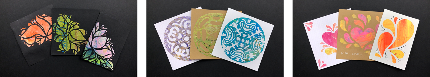
that principle. As your class project, you will create
three final cards, a stencil card, a symmetry card, and a pattern card. For a more comprehensive
learning experience, I encourage you to do the practical exercises
and upload them as well. However, please don't
feel pressured. Upload whatever
you managed to do. If it's just the collage
papers, that's completely fine. I would love to
see them as well. You can always add more pictures to your class project later on. The main objective is to
have fun and to get started. To sum this up, these
are the steps you need to take to finish
your class project, create your collage papers, learn the basic techniques, watch the design principle
lessons and do the exercises, create your own handmade
cards, and finally, create a class project and upload pictures of your
cards and exercises. Now that you know
what to expect, let's have a look
at the materials you need to get started. See you in the next lesson. [MUSIC]
3. Essential Materials & More Options: [MUSIC] Hi, you definitely don't need
any fancy art materials. Making do with what you have
can often spark new ideas. Let's have a look at what
you need for this class. First of all, you
need tissue paper to create your textured
collage paper. I've tried different tissue
papers from those sold as art supplies to those found in shoe boxes and all
of them worked. As you substrate paper, you need heavy paper that can handle a bit of wetness like watercolor paper or
mixed media paper. But you can also try thick
kraft paper or cardstock. To create our textured paper, we will need to smooth water resistance surface
as our printing plate. For that, I like to use L-shaped plastic
document folders as they are pretty sturdy. They sometimes come
with a texture, but I like to use
the smooth ones because any texture will
transfer to your paper. You can also use binder
document holders or any other non-absorbing
surface like plastic bags or acrylic glass. Just be aware that
any texture of the surface will transfer
on your monoprint. As for brushes, I like to use flat brushes
to apply the paint, but use whatever you have
and feel comfortable with. For the gluing, I have
an old one because matte medium will
eventually ruin it. The best paint for this
technique is acrylic paint. It is water-resistant
and will not reactivate when brushing over it with matte medium or glue. It is also pretty elastic, which comes in handy when
folding the textured paper. But since I also have a few inexpensive
tempera paints at home, I tried them and they
worked fine as well. Just keep in mind
that tempera is not completely
waterproof when dry. The paint could be reactivated. Also, tempera has a
tendency to crack when bending the paper if you
applied it in thick layers. To mix your colors, you might want to use a
palette of some kind, and you will also need a water jar and some
small containers. You need a pair of scissors and basic paper
scissors are fine, but if you have silhouette
scissors, that's great too. Then you need an X-Acto
blade or a hobby knife. When using those, you want
to have a cutting mat or use a thick piece of cardboard as a base so you
don't ruin your table. Also, a ruler comes in handy, and a pencil to make
measurements or sketches. For collage, I like to
use acrylic medium, strictly speaking, matte medium. But you can also use PVA
glue or a glue stick. I will go into more details
about the differences in lesson six: "techniques
to score cut and glue". Have a look around your home and gather what you can find, and hopefully, you have most of the materials already at hand. I will see you in the
next lesson to learn some basics about
monotype printing. [MUSIC]
4. Monotype: The Painterly Print: [MUSIC] Welcome back. I love to create texture
in my art because it makes a two-dimensional work so much more tactile
and interesting. As you will see, monotype printing is an
excellent method to do that. Monotype is referred to as the most painterly method among the printmaking
techniques, and often called the
painterly print. It is extremely versatile and depending on how
you apply your paint, you can get very
different results. For example, if you
use thick paint, you will be able to see your
brushstrokes in your print. That way, you can get
some very cool textures. Monotype dates back
to the 17th century. The surface was historically
a copper etching plate, but in contemporary work, it can vary from zinc
to acrylic glass. The terms monotype
and monoprint are often used interchangeably, but there's actually
a difference. A monoprint is part of a series. It can be thought of as
a variation on a theme. There are permanent features on the plate that persist
from print to print, like etched lines, but there are also things changing
from print to print, the inking, for example. Printmaking techniques
which can be used to create monoprints include: linocut,
woodcut, and etching. A monotype is a one
of a kind print. You start with a clean
featureless plate and your image is gone
after just one print. Gelli plate printing
is a popular kind of monotype printing and
a gelatin or gelatin-like plate is used to transfer painted images or textures
to a sheet of paper. This technique is
great when using stencils and several layers
of color and texture. In the next lesson, I won't to show you the classical
process of a monoprint, but a very similar one. We're just adding one
ingredient to the mix, and that is time. Instead of pulling the
print immediately, after putting down our paper, we leave the paper
on the surface until the paint has dried. That way you get a very
shiny, smooth surface, which you wouldn't
achieve if you pulled the print straight away. Because of the involved
drying time and the fact that I
want to make lots of prints during one session, I use plastic sleeves. They are flexible, cheap, re-usable, and easy
to store away. Monotype is such a cool
printing technique and we are only going to
scratch the surface here when it comes to
its possibilities. But anyhow, I will show you
how this variation works in detail so that you can create your own shiny monotype
collage papers. [MUSIC]
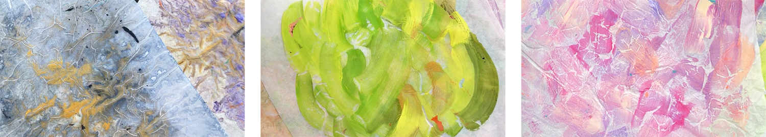
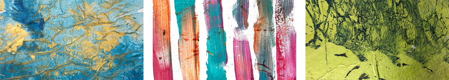
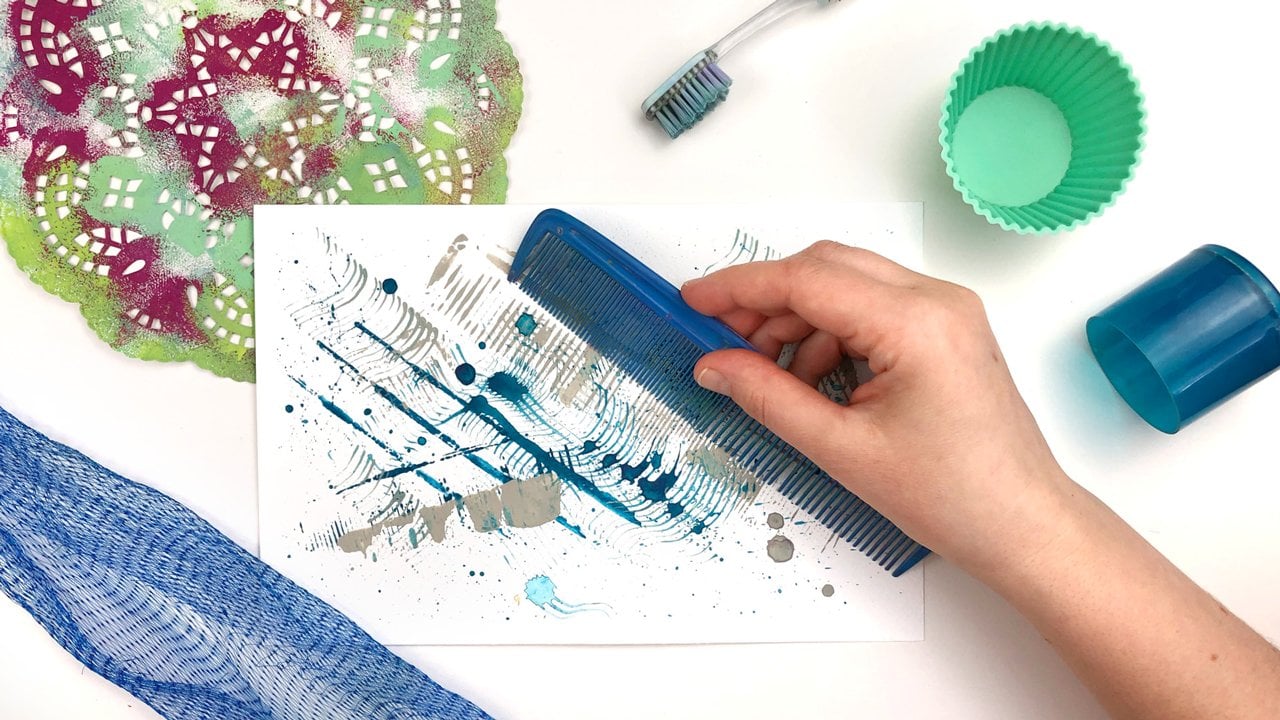
5. Texture & Flow: The Collage Papers: Making collage papers is such an enjoyable process for me and what fascinates me
about this technique is the shiny finish of
the paper that you will get when paints dry
on a smooth surface. It also creates a
very neat contrast to the mat surface of
your card base, so that your design looks
partially varnished. Let's get started and create some beautiful collage papers! To create your papers, you need tissue paper, acrylic and / or temporary paints, plastic sleeves, small
containers to dilute the paint in, brushes, a water jar,
and a palette. There are two approaches
concerning paints, you can either use them straight out of the tube
to create texture with your brush or you
can dilute and pour them for a flowing
texture and blends. Regardless of the
technique you use, make sure to let the shiny side of the tissue
paper touch the paint. If you use your paints
straight out of the tube, you will be able to transfer the texture made by
your brushstrokes. When working with undiluted
paint and very thin layers, keep in mind though, to work very fast. Otherwise, the paints might dry before you have
the chance to put the tissue paper on top and you won't be able to
transfer all of it. For this, you need
some small containers. First, squeeze out
some paint and then slowly add water so that
you get a smooth mix. The paint is thin enough when
it drips from your brush. Then you just pour or
drip it onto your plastic and move it around before you place the tissue paper on top. Depending on the
pigments you use and how they react
with each other, the colors will make very cool blends and
blooming effects. If you have a particular
design in mind, the first step is to think
of the colors you want to use and the papers you will
therefore need to create. I recommend focusing
on a small group of matching colors for each
single sheet of collage paper. That way, you have
larger areas of similar color mixes
and textures to choose from when
cutting the shapes. On the other hand, if you have only little spots
of a color that you need, it can be a limiting
factor in your design. Using analogous colors, which are colors next
to each other on the color wheel, will help to avoid grayish or
brownish blends. At the same time using complementary colors
will result in gray. That is something
to be aware of. You want to aim
for cohesiveness not only concerning color, but also texture and blends. For example, if you are
making straight brushstrokes, make your whole sheet like that. If you make curvy ones, do the same thing
over the whole page. If you are blending
the colors in a certain way, keep doing that. I usually make several papers with the same color palette, but with varying textures that I have a lot to choose
from later on, but very often I end up using
just one sheet of paper for a project because that
creates the most cohesiveness. There will always
be residues from the last print and that is
actually a very cool effect. Paints tend to stick to
the document folders, mainly where the wrinkles
of the tissue paper were. Those residues are picked up on the next print and create
additional texture. This is a bit unpredictable but makes your prints
even more unique. The question is if the residues are fitting your color
scheme, that is, if you make a really dark
print and then the next time a very light one on the
same side of the plastic, you will transfer dark residues
onto your bright colors. That might be an effect you're going for but if you're looking for a rather harmonious
color scheme with little contrast, you will most likely
not be so happy. Have a look at the residues on your plastic and try to
match them with your colors, or just use a clean sheet. If you're using a thin layer of pure undiluted paint an hour
might be enough for it to dry but I usually leave the soaked papers to dry overnight just to be
on the safe side. Before pulling a print, make sure the backside
has a whitish surface and feels dry because if there are spots where the paint is
showing through very much, it means that the paper is still wet and the paint has not dried, and then it will stick to the plastic foil and tear
if you pull too hard. When it is almost dry, you might be able to
carefully peel it off starting from different
edges, but the best option is to be patient and wait
until it's 100 percent dry because then you can
pull it off very fast. Now it's time for you to create
your own collage papers. Try to have fun while
applying the paint. Experiment with different
pink viscosities, mix colors, and just immerse
yourself in the process. I can easily get into
the flow state while doing this and I usually run out of plastic
sleeves because it is much fun and quite addictive. While your papers are drying, you can familiarize
yourself with some basic techniques
that will help you later on when
creating your cards. Scoring, cutting, and gluing. See you in the next lesson.
6. Techniques to Score, Cut and Glue: In this lesson, we're going to cut
our card bases and learn some basic skills. I encourage you to practice these because that way
you will get to know your materials and be able to concentrate on your
card design later on. You could, of course,
go and buy blank cards. But I like to make
them myself because then I can make them
in the size I want. What's even more important, I can use paper that can
handle some wetness. For this, I like to use inexpensive watercolor
paper with 200 GSM. While using heavier paper
is good for your collage, you will get a pretty ugly fold. If I'm folding it like that, I do have a hard
time. It looks awful. I will show you a
simple trick to achieve a very crisp neat fold, which will make your card
look even more professional. Scoring means cutting or scratching a notch or
line on the surface. There are two different
ways to score, from the outside and also from a side that's going to be the
inside of your card. I like to score from the
outside by using a hobby knife, which I slide very
lightly over the paper. You don't want to go too deep, just scratch the surface
and don't cut through. Now, you can easily
fold the paper. The advantage of this method
is that you don't need any additional tools and
you can be very precise. The downside is that you
are actually damaging the paper surface and it takes some practice to apply the
right pressure to your knife. The other way to score is from the future
inside of the card. You can use different
items that you find around your home,
like butter knife, an empty pen, a skewer, or a bland stitching
needle, you get the idea. Basically, anything that
has a rounded point. You use one of those tools
and slide it over the paper 2-3 times, pressing
down moderately hard to make a notch in the paper. It works pretty well
and you fold it like that over the notch. But you have to go over
the fold a few times now with your fingernail
so that it stays shut. The advantage of this method is that the paper surface stays
intact on the outside. But depending on the tool used, I find it a bit harder to be
precise with this method. Here you have an overview
of the different methods. First of all, you see the
band without scoring, then the hobby knife, which is the most exact, the precise one, then a needle, the skewer, pen, and knife which look
almost the same and have been scored from the
inside, which is below. Now, let's make a base card. I want to have a square
card with a closed format of 14 centimeters on the side. I will need a piece of
paper double the size, that is 28 times 14. My watercolor paper is
even larger than that. I have a cutting mat that
has the measurements on it. That's pretty useful. I align it on the
bottom at zero, and then I align my ruler at 14 centimeters.
Then I cut through. Now I need to score
it in the middle. I turn it around. Again, I align it. I have to be pretty
exact with that. Otherwise, my scoring
will be lopsided. I use my hobby knife because
that is what I like best to score the paper. Now I can fold the card. I've worked really exact. It doesn't always happen
that these align so nicely. Now I cut off the excess. Here I have my
finished card base. You can use whatever
scissors you have, but you might find
it easier to use silhouette scissors if you are cutting something
very small. Silhouette scissors have a
very straight cutting edge and very pointed tip. When cutting with scissors, you probably know that
you shouldn't cut right up to the top because then we'll get this ugly tear where the paper gets broken. It's better to use
silhouette scissors, because you can cut
right up to the tip, because they have
such a pointed tip, you won't have that. Whatever scissors you use, just don't close
them completely, but just cut to the middle and then you
won't have that problem. Another thing I want to
cover is that it's easy to use big scissors for big cuts and small
scissors for small cuts. Makes sense. I do use my big
scissors to cut out a small piece
because cutting with this whole sheet is really hard. One thing you want to
consider when cutting is that you don't hold your
scissors completely upright, but you tilt them slightly
away from the paper. You can make better curves. Then you want to have your
right hand rather stationary. The cutting hand is stationary and the paper hand
is moving the paper. This way, you will get
a much smoother curve. Matte medium is a very widely
used glue for collage, and it is usually applied below, as well as on top of the paper. I'm only doing that on
half of it because one of the specialties of our prints is that they are shiny
and that will be lost when putting the
matte medium on top. You can see that here, there's no matte medium and on this side, there's matte medium. There's also PVA glue, and it's made of
polyvinyl acetate, and you can look for
that ingredient, but it's also referred
to as wood glue, white glue, a school glue, because actually it's white. I'll show you here and
it's pretty thick. You might want to dilute it. Normally I do that in
a small container. But you don't want to have
it so thin that it runs off. Then you just apply to the page. The difference to matte medium
is that it dries shiny, so we will have a
shiny surface here. You can also see that
on this piece of paper where I've applied
it on the brown paper. Here you can see
the example from before where I have applied the PVA glue on top of this
half and another this half. It's hardly any difference,
but what you can see is that the paper
gets shinier too. You have to keep that in mind, and apply the glue over the whole page to
cover up the edges. A glue stick is my
least preferred option, but I've often seen people
use that for collage. It really depends on
the paper you use. If you use regular copy
paper is pretty cool. But if you have very
delicate forms and shapes, it is hard to apply
without ripping the paper. But once you have it on, it's a great way to
stick things down. Also when using thicker paper, you have to take care not to
shave off some of the glue. That's hard to apply. You're more like, only
partly applying it. That's a bit tricky. If it's the only thing
you have at home, just use it, make it work for you. Now it's time for you to cut some card bases and try the
glue that you are going to use with some scrap papers to
see how materials interact. In the next six lessons, there will ultimately
be a lesson that covers a design principle
and an exercise to practice it and a
lesson that walks you through a greeting
card design step-by-step. We'll start with the design
principle of contrast. See you in the next lesson.
7. CONTRAST: Make Your Design "Pop": [MUSIC] We have already taken a lot of preparatory stat
and we're getting really close to bringing all of this together to create
some wonderful cards. But before we start
with our first card, let's have a look at
the design principle of contrast and do a little
warm-up exercise. When people say
that a design pops, they often talk about contrast. Contrast refers to a difference between two or more
elements in a composition. Basically, you have to
think of opposites. There is contrast
in value, color, saturation, temperature,
size, shape, and texture. Apart from those more physical characteristics
of elements, you can also create contrast
by space or position. That is, if you have several elements that
are all in one location, placing something far away, grossly attention of the viewer. I have added an
overview for you to print out in the
resource section of this class where you can find a few more opposite words to
help you with your contrast. Contrast is used to create variety and visual
interest in your design, and it also helps to
convey importance. Context is vital to
contrast because a visual element is only given meaning by those
elements around it. Although both dots
are of the same size, they are either seen as a
big dot or as a small dot. A circle by itself
is just a circle. But if you add a
second smaller circle, it defines the first
circle as a big circle. If I made the small
circle lighter, you would then think
that the big dark one is closer and the small light
one is further away. How much contrast is
needed in a design? That's really hard to say. It depends on what you want
to convey with your piece. As with everything in life, try not to overdo it. But as a rule of thumb, I'd say create contrast
in 3-5 different aspects. While two little
contrasts can make your design look monotonous
or uninteresting, too many elements buying
for your attention, make it look cluttered
and confusing. It is super-useful to create contrast in a couple of points. Maybe you go for subtle colors but work
with size contrast. If you consider the background, you also have texture contrast
or do it the other way round and have the same size as bad work with color contrast. Here we have color contrast, size contrast,
textural contrast, and contrast in shape. For this exercise, you need
different kinds of paper, colored monochrome
papers, textured ones, or even pages from magazines, scissors and a pencil. If you have a printer, you can also use the
templates I have provided in the resources
section of this class. In the PDF file, you will find
different shapes in a variety of sizes
in black and white. You can print and cut them
out to use them as they are. Or you can use them
as a template to transfer the shapes to
your textured paper. But you might get even more creative if you just
created your own shapes. You can use your textured paper, magazines or any paper
you have lying around. Try to find different colors,
values, and textures. As templates to trace you can use things from
around your home like yogurt cups or other round
and oval containers. Cookie cutters are also a great source for
different shapes. Once you have your
elements ready, choose three different
contract types and try to make a composition
with that in mind. For your inspiration, I will
give you three prompts. Prompt 1, value, shape and size. Use differently
sized black shapes on white or bright background. [MUSIC] Prompt 2, texture, saturation and size. Use circles of different sizes
and textures or patterns, and focus on combining saturated and muted
neutral colors. [MUSIC] Prompt 3, temperature, shape, and size. Combine two
contrasting shapes in different sizes using
warm and cool colors. [MUSIC] If you want you can glue
down your creations. But you could also keep them separate for a future
compositional exercises. But whatever you choose, take care to snap a photo first and upload it
to the class project. That way I can give you
feedback and you can also have upcoming
questions answered. Now come and join me
in the next lesson, where we will take our knowledge about contrast into practice. See you there. [MUSIC]
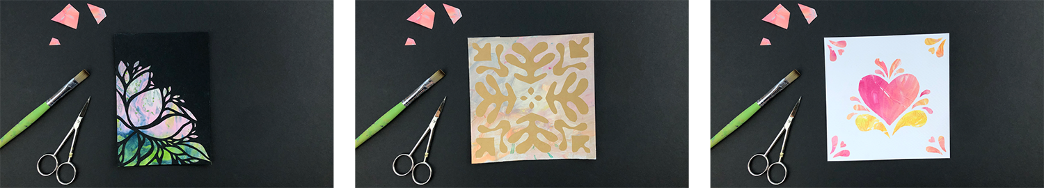
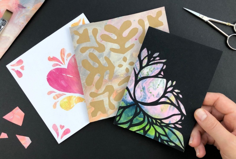
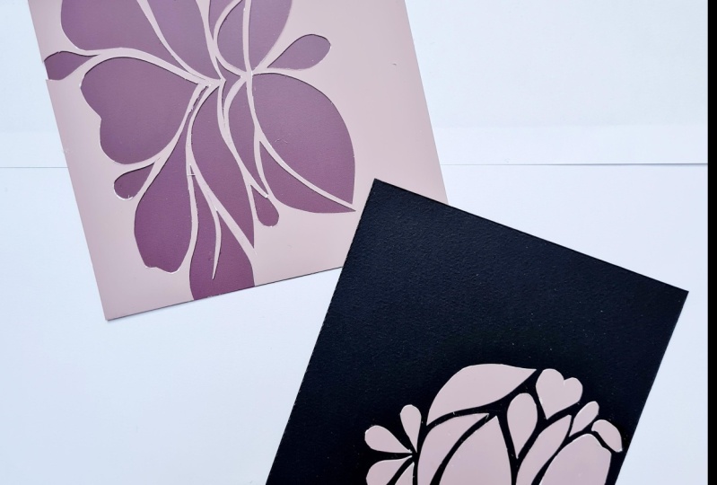
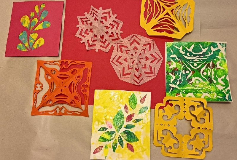
8. Stencil Card: Cutting Forms: [MUSIC] Welcome back. Now we're finally going to make our first card and we will focus on contrast in size,
color, and value. You will make a paper card stencil to put on top
of the textured paper. Let's get started. During this project, I
will use a viewfinder. I will shortly explain what
it is and how to make one. The idea of a viewfinder
is that it works like a picture frame and
you are looking for sections in your artwork
that appeal to you. In the class resources, I have added some
templates so that you can easily make
your own viewfinders. I have two different ones
in the standard sizes for cards in
centimeters and inches. You can absolutely
use them like that. But since printer paper
is a bit see-through, I like to use heavier paper. The good thing about
using heavier paper is that it blocks out
everything from underneath. You should use rather
neutral colors like black, white, brown, or gray, so that they are not competing with what you're
looking at through the window. It also helps to use a color
that is not dominant in your artwork to see more clearly how the final card
would look like. For this project,
you need a piece of heavy paper for the
stencil, a card base, a sheet of textured paper, matte medium or the
glue of your choice, an old brush, and an x-acto knife. For paper cutting, regular printer paper that
usually weighs around 80-90 gsm is too thin and is likely to tear when you
cut it with an x-acto blade. However, the heavier
the paper the more strenuous the
cutting will be. I have read that
120-160 gsm is ideal, but I have colored
paper with 120 gsm. For my purpose, I find
it a bit too thin. When I'm cutting,
I'm looking for a bit more stiffness in the
paper because, otherwise, I have to be really careful
to put it down with my finger so it doesn't
bend like that. For me, heavier paper works better and I use
mixed media paper, but you could also use
watercolor paper or card stock. You can see that the mixed
media paper is really sturdy and you can concentrate on cutting because
it won't bend. I can't even make it
bend if I want to. I don't force myself to
follow a predefined pattern, but rather, I like
to go with the flow. For this, I have
some leaves here for inspiration and
I will keep this a relaxing and
intuitive practice and just see what forms
I can easily cut. What I keep in mind though, is contrast in size. I start in the middle because then I have a lot
of space around, and I can later on
use my viewfinder to find the best
composition for my card. You can begin with
a rather big shape and then continue
with smaller ones. I imagine some leaves starting from a point
and then branching out, and I tried to keep a similar
distance between them. It often helps to turn
your paper around so that you can have the best cutting
position for your hand. What I'm looking for
while cutting is different sizes and
good contrast in size, because that makes the
design interesting. If you like, you can already put some textured paper below
to get a feeling for the final result and to better see where elements are
missing in your design. You can also try to incorporate
contrast in numbers by having one big shape next
to several small shapes. Another thing that
looks pretty neat is, if you make shapes aligned so that they create a visual unity, so these two shapes come together to form a
leaf or a flower. But I really come
to think of this as a flower with a bunch of leaves that are
already coming off. When you're done, you
could use a viewfinder and because I didn't
like this section, I could cut it off. You can also try with a
different viewfinder format, but I like the rectangle better. Since we're making
a greeting card, this would also be a great
place to add some text. To remember this position, I make some gentle
markings with my pencil. Now I will try a few
different textured papers. What I like about
this paper is that it forms a good contrast
with the black paper. You could argue
that most scholars have a good contrast with black. But it really depends
on the value, that is the lightness
or darkness of a color. In my opinion, the white
looks a bit out of place and isn't matching so
well with the black card. I will try to find a paper with some darker spots to
create a better unity. I have a similar paper
with darker elements, and you can immediately
see that it's too dark. The value is not
really different here. That doesn't work for me because
I want my design to pop. If you're not sure about
the color's value, you can take a picture with your smartphone and turn it
to black and white mode. I like this one in
a way and you can see all of the elements,
but it's boring. This metallic violet really
makes the design stand out. But there's not enough
texture in this piece, so let's continue looking. That would pop as well, but I don't think
it's a perfect fit. I like this one a lot
because it emphasizes the idea that this could
be a flower with leaves. I can even use the darker area here
as a shadow to further define my flower shape and
give this some more dimension. Here I have another
example and I start by marking the
corners of my card. Then I put the card base
below and use my thumb and my index finger to align the card base with
much viewfinder. Now that I have aligned them, I trace the outline
of my card onto the tissue paper to know
where to stick them together. Here I have both
papers before me. The tissue paper
is lying face down so that I can see the
marks I have made. I will apply the matte
medium to my card base because it holds up better against whiteness
than a tissue paper. When mounting the
tissue paper to a whole card as a background, you have to cover a large area. As I don't want them
at medium to dry before I managed to place
a tissue paper on top, I'm doing this bit by bit. Make sure that the edges
are covered very well and then flip it over and
put it on the tissue paper. Now you can turn it back
and smooth down the paper. Then alternately add
more matte medium and press down the tissue paper. Slide your finger over
the edges to make sure the paper is stuck down. When applying the matte medium, work towards the side of
the curve so that you don't get so much of
it on the inside. Then clean up excess
matte medium that is squeezing out before you put it in a heavy catalog
to drive flat. You can use a document
sleeve to cover it up so that it doesn't
get stuck on the paper. Check after a few
minutes to reposition it and see if it's
not getting stuck. Another important thing is, don't forget to put
your brush into water after using matte
medium or glue and to rinse it out thoroughly
because the medium or glue will wreck your
brushes after a short time. I have also mounted paper on my rectangle card and it
has already dried a bit. But it doesn't hurt to have
a look in between while it's still humid to see if
something got stuck. That is not supposed
to get stuck like the side of my card here. Now you can trim off
the tissue paper, but you have to be really
careful that it doesn't rip. You can cut off a little of your card base to prevent that. But obviously, you can't
do that at the fold, so just make sure to press
down your ruler very hard, be cautious, and use
a very sharp knife. What I like to do
with stencil is to cut out just two sides of it. That gives me some
little room when aligning and gluing
into the base card. Now I know how to
align it and I have to work fast because matte
medium dries pretty quickly. Unfortunately, I have made quite a mess of it
on the front side, but it's not so bad because
as long as it's not dry, you can remove the excess and press it down while doing that, it also helps to use a
plastic sleeve to press it down because that won't
get stuck so easily. Then you can cut
off the overlaps. Again, be careful not
to cut into the fold. Here we go. This
is the final card. I think it turned
out really pretty. If you're using a heavy
stable paper like me, and you don't have elements of your design going
over the edges, you can just glue down your
stencil on the four sides. Congrats, you have
made your first card. Please, don't forget to create a class project in the project and resources section
of this class. Upload your work and
maybe add some comments, so that we can all
learn from each other. In the next lesson, you will learn about
visual weight and balance. See you there. [MUSIC]
9. BALANCE: Master Visual Weight: [MUSIC] Welcome back. I hope you have enjoyed
the first project and are ready to
learn something new. In this lesson, we
are going to study the design principle of balance. To balance the composition, you need to arrange
positive elements and negative space in a
way that no part of the design becomes a really
important and every part of your design hold
some interests. Balance makes a composition feel stable and
visually pleasing. We experienced dance all the
time in the physical world, and from years of learning, we know intuitively when
something is unbalanced. With visual balance, you just replace physical weight
by visual weight. Visual weight does not refer to the real
weight of an object, but to how much
attention it draws. The more attention
an object attracts, the greater its visual weight. It is often created through the use of contrast and color. For example, a big shape draws more attention to itself
compared to a smaller one, and a bright colored one more
compared to a muted one. There are three types of
balance: symmetrical balance, asymmetrical balance,
and radial balance. Symmetry is part of the
world around us and we humans are naturally
attracted to it. We are symmetrical ourselves and so are other
mammals and insects. Biologists believe
that symmetry is an indicator of natural
fitness that is good genes. That might be an explanation
why we relate to it so much. Coming back to design. With symmetrical balance, the visual weight is
distributed evenly on both sides of an
imaginary line that goes through the middle of
the design in any direction. Symmetrical layouts are
naturally stable and orderly and draw attention to all areas of the piece equally. With asymmetrical balance, you still balance your elements on both sides of an
imaginary central line that you don't
mirror the elements. Think of a seesaw. An adult can be balanced out by two children or by moving
more to the center. Similarly, in design, you can visually
balance elements by considering their visual
weight, position, and number. For example, you can balance out one visually heavy element by several small, lighter elements. Asymmetrical balance
is dynamic and it creates a sense of
modernism and movement. But it can be hard to
achieve because of the complex relationships
between elements. Instead of balancing the both
sides of the centered line, elements balanced around a
single point in the middle. Radial balance is found
everywhere around us in nature. Think of snowflakes,
starfish, flowers, or fruit. Radial symmetry creates
a sense of harmony, and because you have
to be very present and concentrate on
the task at hand, you can even get into
the flow state while cutting those
Mandela-like patterns. Let's get a bit nostalgic
now and practice radial symmetry by cutting
some paper snowflakes. For me, this evokes some childhood memories
because I used to make them all the time
before Christmas in kindergarten and
primary school. For this exercise, you need
a sheet of thin paper, a pair of scissors, and maybe a pencil. Printer paper works okay, but if you want to make
smallest snowflakes, you might want to
use thinner paper, like origami folding paper or even newspaper
or tissue paper. There are different folding
techniques to create a different number of segments
or points in your pattern. I will show you an
easy technique to create a snowflake
with eight points. In the resources, I have added the corresponding
folding instruction. First of all, you need a
square piece of paper and then you fold it in half to
come up with a triangle. Crease each fold very
well because having everything flood makes it
easier to fold and cut, then folding in half once more to get a smaller triangle, and fold it in half
one last time. Now you have a triangle with
an open side on the top, a closed side, and a half closed side. You could totally
stop here to cut out your pattern and we will do
that in the next lesson. But then your
snowflake will most likely be square or irregular. What we need to do to create an even snowflake is to cut
off part of the open side. My closed side is
10 centimeters, so I mark 10 centimeters on
my half open side as well, and then I connect the points. Now both sides have the same length and I can
cut away the top part. I like to make a rough sketch of my snowflake pattern as a
guideline before cutting, but I don't adhere
to it very strictly. When cutting your pattern, take care to leave at least
one connecting point on the closed and
half-closed side because otherwise your snowflake will fall apart when you open it. Now comes the best
part, the unfolding. You have to be a bit careful, especially if the paper
is thin. Here we go. A beautiful paper snowflake. Wow, you have learned about
balance and symmetry. I say you're ready for
your next card project. But before that, I would
love to see your snowflake, so please consider sharing it with us in the projects gallery. In the next lesson, we
are going to create a symmetrical card using the folding technique
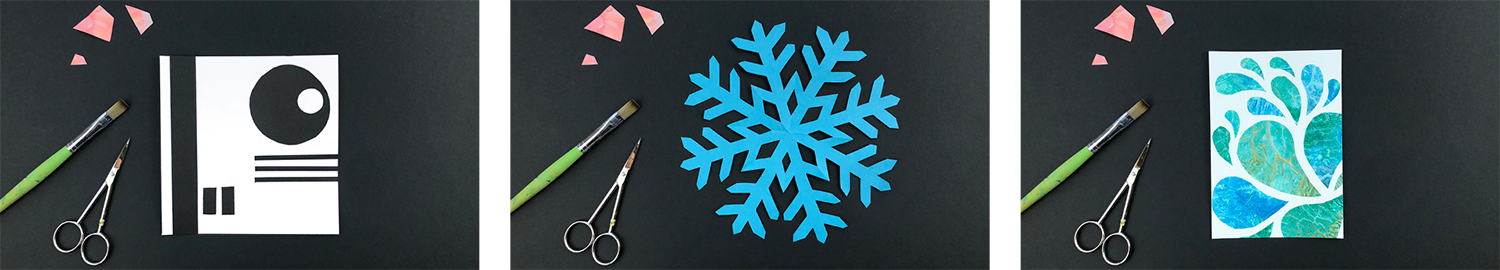
you've just learned. See you there. [MUSIC]
10. Symmetry Card: The Art of Kirigami: [MUSIC] Hi, and welcome back. Before I made this class, I knew what origami was, namely the art of paper folding. But I only stumbled
about the word kirigami when looking for folding instructions
for paper snowflakes. Kirigami's actually
a combination of two Japanese words
for cut and paper. In this lesson we
are going to create a symmetrical kirigami design
out of our textured paper. Let's get started. Simple kirigami are
usually symmetrical, such as snowflakes,
stars, and blossoms. Advanced kirigami
designs involve both folding and cutting. That way you end up with
three-dimensional structures. But for this project, we will create an easy
two-dimensional paper cut with the folding technique I have shown in the last lesson. For this project you need
textured paper, a card base, matte medium or the
glue of your choice, a brush, and scissors. The first step is to look
through your papers and select some that have a
decent layer of paint. You don't want too
many large white spots where the pure tissue
paper shows through, because on the white card, these spots blend into the
background of your card and it might look as if part
of your design is missing. On a dark card base, they tend to look a bit ugly. The second step is to find the best combination of
paper and card base color. If your paper only has
a thin layer of paint, the color of the
background affects the overall color appearance. A black card base will
subdue your colors while a white card base adds contrast and makes the
colors more vibrant. A white card base is the safe
choice most of the time. But sometimes the color
of the card base can actually enhance the
appearance of the paper, as in this example. The brown paper actually
really plays into the warm color theme of the textured paper and makes
it look more saturated. If you choose to work with
a black or colored base, keep a few things in mind. First, if your
textured tissue paper has some paper white
still showing through, the white will not blend into
the background completely, but it will not also look white. That can make it
look a bit out of place and not so pretty. Second, using a little bit of a dark color or even black
in your textured paper, helps to create a unity between foreground
and background. Third, if you want to go for
a color that is completely different to your background
color and doesn't blend in, make sure to use a generous amount of paint
on your textured paper, so that it is fairly opaque. There are tons of patterns for symmetrical kirigami to
be found on the Internet, and you can type in kirigami snowflake pattern
or kirigami blossom pattern, or visit my Pinterest board
if you need some inspiration. I enjoyed more to just invent my own patterns
while cutting. That way I have that surprise effect when
unfolding the paper. There are two options. You can either make a square stencil
that will bleed off, that means go over the
edge of your card base, or you make a round
paper cut mandala. Let's begin with a square one. Because I want my textured
paper to bleed off, I need to have a piece
of paper that is a bit larger than my card base. That way I have some wiggle room when
mounting it to the card base. I use a viewfinder that is
one centimeter larger than my card base as a template to trace and then I
cut out my paper. I fold the paper in
the same way I did in the last lesson but I stop before I cut off the top part, because I actually
want to end up with a square pattern this time. What I keep in mind though
is that I want to keep clear of the open side of my folded paper while
cutting my pattern, because that will
be the part that will later on go over
the edge of my card. Then I start to cut
out random shapes. With symmetry, it is
easy to create balance. But some might say that
symmetry is a bit boring. It doesn't have to be. Building on what
you have learned in the lessons about contrast, you can apply shape and size contrast to make your
design symmetrical, as well as exciting. Wow, here we go, my
finished kirigami. Once you're done, you can put your finished piece
under something heavy for a couple of minutes
to flatten it out a bit. For the round mandala kirigami, you need a piece
of paper that has the same size as your card base. After cutting, you will have a small margin
around your mandala. This time we need to cut
off the open side of the folded paper like we did for the snowflake in the
previous lesson. Additionally, we need
to cut a slide curve. It really doesn't have to be
perfect at the first try. Start with a rather small cut and then check by
unfolding the paper, where you need to refine it. You might have to repeat
that process a few times, but you will soon
get a feeling for the right curve to
create a circular paper. Within one piece, I usually use similar shapes to create
the sense of unity. If I work with rounded
organic forms, I stick to that theme. If you choose to work with
pointed shapes, keep at it. But maybe you like to work with shape contrast even more and make vastly different shapes. Now comes the best
part, the unfolding. A beautiful paper cut mandala. For this step,
preparation is key. So before you start gluing, get some kind of clean
plastic sheet ready. You will need it when pressing
the paper into the glue, so that it won't stick
to your fingers. Also have a sheet of kitchen
paper to wipe off the glue. First, I center my paper cut on the card base and hold it down, lift up just one side of it, and apply the matte
medium below. Then I carefully folded back, put the plastic on top and
smooth it down shortly. I lifted it up and wipe
off the plastic sheet and then I flip the tissue
paper backwards more. Quickly, apply the matte
medium to the rest of the card and flip it
back into the glue, and then you put down
on the plastic on top and smooth it
down once again. Pull away the plastic and
wipe it off immediately. Then add matte medium
on the corners of the card so that you
have the even coverage. Because otherwise you might see a difference in the paper color depending on whether it's covered with matte
medium or not. When the surface of
the card is dry, you can put the plastic
on top again and place it under something
heavy to dry flat. I was a bit impatient and
didn't heed my own advice. So I ended up with
the shiny spots where the matte medium
hadn't dried enough before I put it in
my heavy catalog. The carded pieces of
nerve amazing shapes and I like to use them
to create a second card. One option is to arrange them
on your card in the same, or in a similar position
as on your first card. That way you create a corresponding
positive version of it. But you could also leave out some of the shapes
to create space for lettering and arrange
them completely differently. Sometimes you can
press your piece because it's too wet or the
pressing didn't help enough, as in this case, and you need to
straighten it out. What you can do is to dampen the backside with a
brush or a sponge, and again, leave it
to dry overnight in a heavy catalog or
under stack of books. Well done. You have just
finished your second card. I have developed
quite a liking for these kinds of paper cuts
because I find it so fascinating to see
the final result after unfolding the paper. They also look really cool, if you put them on your windows or as well as to
decorate your home. Please don't forget to
share your finished card in the projects gallery because
we would all love to see it. In the next lesson, you are going to learn
about rhythm and how it can be used to
create movement. Come see me there. [MUSIC]
11. RHYTHM: Create a Sense of Movement: Before we start working
on our next card, let's learn a bit about the
design principle of rhythm. Visual rhythm is about placing elements in a way that
creates an underlying beat. It's similar to music, but instead of sounds, we use colors and shapes. When talking about rhythm, we also have to talk
about repetition and pattern because
they're connected. To illustrate these concepts, I will show you a few of
my mixed media pieces, where I have worked a
lot with repetition, pattern, and rhythm. Repetition focuses on an
element that is being repeated. You can repeat any design
element like line, shape, color, or texture. Repetition creates
continuity and flow, and it unifies your design. A pattern involves
elements that are being repeated in a recurring
and predictable manner. A pattern can be regular as in a checkerboard or irregular
as in a leopard skin. A pattern has rhythm, but not all rhythm is patterned. Rhythm has some repetition
and it can have some pattern, but it is not that predictable. There's variation in
the design elements like the space between them, the size, or the shape. Rhythm is important to create an interesting
composition that leads the eye in and around the page. Rhythm refers to the visual
flow within a piece. It creates a sense of movement in an
otherwise static work. The rhythm of a piece
can be controlled by everything from color and shape to technique
and brushstroke. There are three main types
of rhythm: regular rhythm, flowing rhythm, and
progressive rhythm. Here I have the artwork that we're going to create
in this lesson, and I will use it to explain
the three types of rhythm. Regular rhythm uses similar
or identical elements that are repeating in regular
intervals like a steady beat. In this example, I created
a regular rhythm by having the same space
between the elements. Another example would be evenly
spaced windows or tiles. Flowing rhythm is when organic looking elements follow bends and curves like waves, swimming fish, or
branches and leaves, and give the artwork movement. Progressive rhythm happens
when we are changing one characteristic of an
element as it repeats, for example, its size. For this exercise, you
need textured paper, a sheet of watercolor paper, glue, scissors,
and an old brush. To get started, we will cut
some organic drop shapes. First I make sure I have a good variety
from big to small. I like to restrict myself to
4-6 different sizes because having sizes that repeat within a piece makes it
more consistent. If you cut out several
pieces at once, you have to take care not to let the paint sides of
the paper touch each other because papers
sometimes tend to stick together and will
not come apart again. I also try to make
sure I have enough of each size facing right and left so that I have
something to choose from. Now we have several groups of
shape sizes ready for use. I'm pouring a little bit of matte medium onto
my paper palette. You only need a thin
layer of matte medium, and then you put a
tissue paper on top. I like to use the backside of
my brush to push the edges of the tissue paper down
on my substrate paper. You could also use
your finger for that, but you will get
sticky soon enough, so the backside of the brush
is really a good option. I only glue down my first
element because I like to be able to change things around while working rather
intuitive way. With the elements
we have cut out, we already have repetition
in size, shape, and texture, so you can focus on creating a nice pattern
and rhythm in your design. It helps to leave a
bit of whitespace around your composition
so if you want to use parts of this as a card or frame it as a
piece of wall art, you have some flexibility. You can think of leaves and
branches, flower petals, flowing waves, or swimming
fish if that helps you. I find this exercise to be
very relaxing and meditative. Now it's time to glue
everything down. I like to hold big
shapes down with a finger and lift up
only half of them. Then apply the matte medium here and only then
below the other half. With the small shapes, you obviously cannot do that, so you have to make sure
that if you put them down, it is the place where
you want them to be. But it happens that
you put them down and it is not exactly what
you intended it to be. Then you really have
to live with it and improvise because when
it sticks, it sticks. Now everything is taking place, and you can see how the
paper has this shiny finish. I really love that effect. If you're not content
with your composition, you can consider cropping it. For this, if you find, it comes in really handy. I slide it over my art work and try to find the
section where I would like to cut it out
and where I could add further elements like text. That was a very relaxing
exercise for me, and I really hope that you
enjoyed the process too. Remember that there is no right or wrong when it comes
to exercises like this. Please don't forget to share your piece in your
class project. I can't wait to see it. See you in the next lesson.
12. Pattern Card: Organic Shapes: In the last lesson, we have worked rather
intuitive way and concentrated on creating rhythm in
our practical exercise. Now, I will show you the more planned approach
that I would use as a graphic designer if I were commissioned to create
a greeting card. We will create a card that
will work for any love related theme like Mother's
Day or Valentine's day. To give you an overview
of this process, these are the steps we're
going to walk through. First, we will quickly
brainstorm some ideas, then we will choose one idea to create a full-size
layered sketch. We will trace the design and use that as a template
to cut our shapes, then we will arrange and collage
them onto our card base. Finally, and this is
totally optional, we will finish our card by adding some type and line work. For this project, you need
tissue paper, sketch paper, one or more sheets of
textured paper, a card base, matte medium or the
glue of your choice, scissors, and an old brush. Fitting the love theme, I think of terms like growing
love and growing fund off. So I want to convey
growth and love. So building on last
lesson's exercise, I will again use the drop shapes or you could also call
them like leaf shapes, and in addition, I
will use hearts. With that in mind, I start to brainstorm
a few ideas and draw some rough
thumbnail sketches. I try to go for quantity over quality and I challenge myself
to fill the whole page, taking less than a
minute per thumbnail. Speed and rough sketching
are important at this stage because that prevents you
from judging your ideas yet. I use my viewfinder to trace the outline of the
final size of my card. I've chosen to work with the symmetrical sketch with
the big heart in the middle. I think it needs a
few more elements that I have not had in the thumbnail and
I also tried to determine the best
size of each element. I think the drop shape below the heart needs to
be a bit larger, but I don't have to redraw
all the elements since it is a symmetrical design and I only need one side to
create my template. As I don't want to
cut up the sketch, I will trace the elements
with my tissue paper. For the heart, I just
need half of it. Then I fold my tissue
paper and cut it out now. I have a symmetrical
heart template. Then I go on to trace the rest. But I don't trace
every single element because I want to restrict myself to just a few sizes that will repeat throughout
the whole piece. The trace elements
are now put over the textured paper and
use this template to cut. Then I arrange the
shapes on my card base. I have all the elements
arranged on my sketch, and now it is time
to stick them onto the card with matte
medium piece by piece. You can totally leave
your card as it is. But if you want, you can add further details like
line work or tight. To be honest, I've
tried everything on transparency paper before
working on my finished cards. That takes off some pressure because you can try how things look and change things before you go onto your final card. Now it's time for you to
create your own card. You are, of course, not limited to the
shapes that I have used. Maybe you enjoy to create a more geometrical design
or a more figurative one. You could use dots, circles, lines,
rectangles, flowers, leaves, balloons,
hearts, whatever comes to your mind and fits
the theme of your card. Whatever you choose though, please don't forget to post your progress in
your class project. I would love to
see your creation.
13. Take It Further: Final Thoughts: [MUSIC] That's already the
end of this class. Congratulations,
you have made it. I hope you have liked it and enjoyed making those
greeting cards. We have covered so much. At first, we looked
at everything from materials to basic
card-making techniques. Then you learned about monotype and made your own
collage papers. Going into the main lessons, we covered some theory on the three design principles of contrast, balance, and rhythm. In order to have a toolkit to
help us compose our cards, we explored how differences
between elements, add visual interest, and applied size and value contrast in the
stencil card design. Then we find out how to arrange the elements of our
composition so that it felt well balanced and used symmetrical balance to
create a paper cut card. Finally, we went on to repeatedly arrange
those elements in our composition to
create rhythm and use that to design
a pattern card. If you enjoyed creating
textured paper and are looking for easy and
relaxed art projects, you can also check out
my other classes on mark-making with everyday
objects and materials. They are a great source for
more texture inspiration, and you could use many
of these techniques to create textured papers for
further handmade cards. Working with simple
materials that only keeps the barrier
of entry lobe, but it also gives you the opportunity to create
like a child again, because when using
everyday materials, you are not so stuck to
rules that seemingly come with holding your
pink brush or a pencil. Carving ads themselves time to create art is soothing
for the soul and also a great way to slow down and get away from
life's challenges. All of the projects I
show can be done in small doses that fit
even a busy lifestyle. Would I would really like
you to take away from this class is that
collage is a great way to casually level up your
composition skills while having your fan relaxed and
pressure-free art practice. Trick yourself out
of the fear of the white page or of
making something wrong. Clashes are not final
until you stick it done, so have fun creating. To be more up to date concerning my
personal art journey, you can follow me on Instagram. But even battery hit that "Follow" button
here on Skillshare if you want to get
notified about further classes that I publish. If you liked this class, please consider having a look at my other classes
here on Skillshare. I would really
appreciate it if you left a review and uploaded a class project
because that would give me feedback and I
could give you feedback, and it will also
make this class more discoverable for other
Skillshare students as well. That said, thank you for taking the class and I hope
to see you soon. Bye. [MUSIC]
 Cornelia Zelinka-Bodis, Mixed Media Artist