Transcripts
1. 2 Intro: And welcome back to another awesome Wordpress
web design class with me, Ken Messa. If it's your first
time seeing me, I've been teaching
people how to build beautiful landing
pages and fully working websites with Wordpress and free
Wordpress plugins. And in this class, I'll be
showing you how to build a fully working
restaurant website from scratch using
Wordpress Elementor and other free plug ins. You won't need to pay anything to have your
website up and running. By the time we
finish this class, you will have a website
that you can start using immediately to receive orders and reservations for
your restaurant. And the whole ordering and
reservation system will be integrated with a free mobile phone app that
you can download from the app store or the
playstore and start receiving orders when customers place their orders on the website
you're building right now. But before we go far, I want to tell you a
little bit about myself. About five years ago, I found myself in
need of a website to showcase and sell my
graphic design services. I had been working as a graphic
designer for a few years, but I wanted to
be self employed. So I wanted to build a website
through which I could sell my graphic design templates and services like on free
peek or shadow stock. That's when I stumbled upon
Elementor and were press I realized I could
build my own website and so I decided
to give it a try. But little did I know that this discovery would not
only fill my personal needs, but also kick start a whole
new chapter in my career. After watching a few
elemento tutorials and creating my own website,
something magical happened. Requests started pouring in from people asking me to
build websites for them. And so I spent a few years working for web design clients, building several websites
for several companies. Fast forward to
today, and here I am, I'm no longer taking
on client projects, but instead
dedicating my time to sharing my elementary
expertise with all of you. And as I've mentioned,
once again, we'll be covering everything
you need to know To build a comprehensive
website with Wordpress. From creating a
welcoming home page, to showcasing your menu, to sharing your
restaurants story. And even incorporating a fully functioning ordering
and reservation system so you can start taking orders. Immediately, we'll
be diving into the practical aspects of
Wordpress and Elementor. And I'll guide you
step by step as we bring your restaurant's
online presence to life. By the end of this course, you will have the skills to not only build a
restaurant website, but also the skills
to use web press to build a wide array of websites. Because I know some of
you might be exactly where I was before I knew
how to build websites. You want to know how to build websites for yourself instead of paying people
hundreds or thousands of dollars to do that. Because you probably have several ideas for different websites
and online platforms, but you don't know how
to do it yourself. Some of you might
even want to get into the web design business and get paid to build
websites for clients. So by the time we
finish this class, you will have a proper
firm foundation on how to build whatever
website you want. This class is for you. And by the way, this
class is a fulfillment to a request made by one of
my students, Bridget Xi. Shout out to Bridget for
making that request. If anyone else has an idea for a website that would like us
to build in the next class, go ahead and drop it in the discussion tab below
this video player. I can't wait to see
what you will create. So if you're as excited as I am, I'll see you in the next lesson.
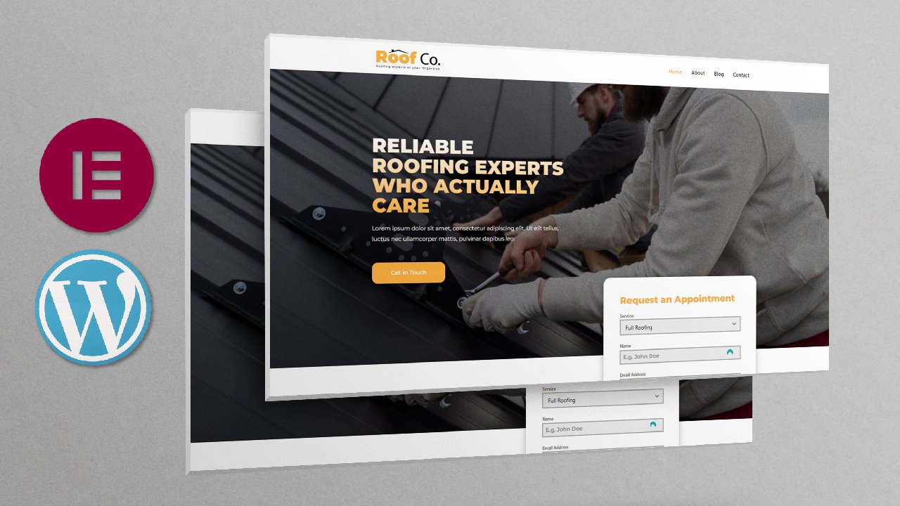
2. Project Demo: Now we want to have a look
at our class project. One of the best ways to learn a skill is by
building something. This is what we're
going to be building, this website right here. I just want to take you on a
short tour of the website. While I was preparing
this class, I went ahead and built
this website in advance. I built it for one reason so
that we have something to look at as we build when we're building the
hero section right here, we can have a look
at this and then go over to Wordpress and
start building it. As we look at what
we're building, we have a point of reference. Other courses or classes might have an approach where
you're just winging it. You're just building
something out of the blue. You don't know
exactly what you're building in this class. We'll have a chance to come back to this reference website, have a look at the
section we're building, how it's styled, and
switch back to our editor. This is the hero section, and if I reload it, you will notice how it's well animated. Every element is animated
including the background image. And when we start scrolling, you will notice we have a
sticky header that remains at the top regardless of where
we're at on the website, which is a cool feature. You don't want
your Nab bar to be hidden when you're scrolling. Every element here is animated. If I reload it once again, let's scroll to the bottom, all the way to the bottom. We're going to see
how to do all that. I think it adds life
to your website so that it's not just
a static website. The other thing I
want to show you is these buttons right here open up the ordering
and reservation system. If we click this
open menu and order, it'll open up the menu and I'll show you how
to build this system. A customer can come
here and choose, maybe they just
want some coffee. They'll select the coffee and they can share some
special instructions. I want it had. Maybe I'm coming with two guests,
will be three of us. We can add that to the cart. And I was already doing
some tests with it. That's why I have two
items on my card. Let me remove this pizza. The customer can provide
all these details here. Ordering method, pick
up, that's okay. Save that available time
as soon as possible. We can edit that. I had already set these while testing
it out and that's why they're already saved
our payment method. Here, it'll be cash or card at pick up
counter, Save that. And now we're ready
to place our order. If I click, please
pick up a order. I'm placing my order now
on my phone, right here. This is the app I was
telling you about. You're going to have
this app if you're operating the
restaurant website. Here's the pending order. And I have a green button
here to accept the order. But I should also
be able to call the person and
confirm with them. Maybe if I want them to pay before we accept the
order, we can do that. If I accept here, I'm required to provide the delivery time or wait
time maybe 30 minutes, pick up time, That
means they should come for it after 30 minutes. Now, because I've
accepted that order, this is what the customer
will see on the platform. Order confirmed pick up in 30
minutes. Let me close that. We also have the
table reservations, number of people, maybe three
persons date tomorrow time. Let's say we're
coming at 10:30 A.M. we have a meeting, maybe we
have some special comments. Then next, would you like to order ahead and have your favorite food ready on arrival? Yes, order now, so I
can place my order. Maybe coffee, special
instructions. We're going to be three
of us add to cart, and then we can go
to the cart and repeat the same
instructions right here. Table reservation. Save that. No, wait. Table
reservation and order. Table size three persons, 1030. Save that payment method cash. Now we can place our order. There's a message on
the app once again. And remember this
app is 100% free. I'll go back and see the pending order and I can press accept
here, the green button. I can go ahead and accept that. Now, here on the screen, the customer will see
that their order, their reservation
has been confirmed. Let's close that. Now
as we scroll here, of course, we'll
see how to build every single section
on this page. We have a small menu here, We're displaying some
of the food we have. And I'll show you how to build this menu using a
very awesome plug in. This is the same button to load that menu to allow the
customer to place an order. This is the same
reservation button to place a reservation. Now these are called
call to actions. Every landing page needs
to have calls to action, because that's the purpose
of a landing page. To get the user to
take an action. In this case it's placing an order or making
a reservation. And here we have a gallery. We can click Open Gallery. It'll open up in a new tab, and I'll show you
how to do that. We'll be redirected to
the gallery page here. We'll have images of
different activities. We can view them in
different categories, staff, kitchen tables, or all. There we go. We have
the about page, Basically, this is
all about layout. We'll see how to build
this page as well. It has the same call to action buttons because
they're important. We have a newsletter sign
up form here if they want to keep up with what's happening
with the restaurant. Of course, let me switch to
the Contact contact page. They can get in touch with the management or
admin of the website. This is just a basic website, but it has everything
you need on a restaurant website to run
your business successfully. I have two goals with this. I want to help you
build an actual website that you can use
for your restaurant if this is your goal. But it's also going
to equip you with the skills to build
Wordpress websites. You're going to understand
the Wordpress and elementary workflow
to build websites. That's just a quick overview of the project we'll
be working on. And once you've
completed your project, don't forget to take
a screenshot of your landing page and share it with the rest of the
community right here. Just go straight below
this video player to the Projects
and Resources tab. Here's an example on one
of my previous classes. This is the Projects
and Resources tab. And here are examples of some of the projects that the
students posted right here. So feel free to take
a screenshot of your landing page and share
it with the community. Get some feedback from fellow
students and your teacher. And I believe by doing that we will all be able
to grow together. So if you're ready and
excited to get started, let's move on to
talk about buying a domain and hosting
for your website, because your website needs
to reside somewhere online. I'll see you shortly.
3. Buy Hosting and Domain Name: Welcome back. Now you've seen
what we're going to build. It's time to talk about where your website is
going to be hosted. Every website that
you visit or see online is stored
somewhere on a server. That's why the website is available to people from
anywhere in the world. If I click a link that leads
me to your restaurant, the restaurant web pages
are going to be loaded from that server that is
provided by your web host. It's the home of your website. I'm right here on the
Wordpress.org website, and I'm specifically
on the hosting page. Wordpress has its
recommended web hosts. Go ahead and read this page. It's Wordpress.org
slash hosting. As you can see, we have
three recommended webhost by Wordpress.org We have
Bluehost, we have Dream Host, and we have Wordpress.com If we open up Bluehost,
here we are. Bluehost has Wordpress hosting. Let me just click that,
or maybe go up here. Wordpress, Wordpress hosting. Here's the pricing for the different plans
that Blue Host has. This is 5.4 $5. Per month provides you with 40 GB SSD storage and you
can host three websites. Under this hosting plan, you can have three
different websites under the same hosting plan. Let's go ahead and
look at Dream Host. Let's go to the
Wordpress hosting, unbeatable Wordpress Hosting. Let's look at the pricing, 2.95 jump to more
features and text specs. Number of websites
here you can get one for 8.95 you can
get unlimited websites. You can have
unlimited websites on that hosting service for
these others, it's just one. Just go ahead and go
through all these next. Let's have a look
at the third option they give is Wordpress.com
Now don't confuse Wordpress.com with
Wordpress.org Wordpress.com is a platform that allows you to build a website on top of it, and it takes care
of your hosting. It hosts your websites for you. Wordpress.org is the
organization that provides the Wordpress that you
download to your web host. For example, if you're building
a website on Bluehost, you have to download
and install Wordpress. You get it from Wordpress.org
If we go to the home page, you can see get Wordpress. Now if I wanted to build
Wordpress on my local host that is right here in my machine just for
development purposes, to experiment, before
I find a web host, I can download
Wordpress right here. But if I want to build a
website and launch it online, I have to have a web host. And when I buy a plan, the web host will give
me access to the panel. Every web host provides
you with a panel. And it's inside the panel that you will install Wordpress, and I'll show you
how to do that. We also have a service
that's not listed by Werepress.org
because remember these are just recommendations. But there are many other web
hosts who are very awesome. Personally, I have a few
websites hosted with name Chip. Now let's go to shared hosting. All right, so if you are just beginning and you're just
testing out your website, this is the plan I use
when I'm just starting out a business idea and I
want to test the waters. Stella plus 2.98 per month. First of all, you get
a free domain name, unlimited website. So that means you can have
Mike.com You can have Ferguson.com New gym website.com You can have several websites
hosted under this plan. Let's assume those are just
websites you're testing out. You don't need to have
separate hosting plans to test out ideas. You can just test
them out all under one hosting plan that you're
paying 2.98 per month for. Then. Once one of
them really kicks off and it starts
performing very well, you can now get a dedicated
hosting for it separately. That's what I do. This is what I would
recommend personally. But you're free to choose any other web host you
want from these others. That's all about web hosting. I would have had a separate
lesson on buying a domain. But buying a domain is
pretty straightforward. You just come to Name Chip. And I don't have any
affiliation with Name Chip. I'm not getting any
money from them. It's just the service
that I use personally. You can come to domains, domain name search, and
search for your name. Let's say Bebistra.com If I hit Enter, it'll give me different
options and their prices. And I can add to cart and
buy whichever domain I want. You can get very
cheap domains here. Just be creative with your domain names if the one
you want is too expensive, like Betbstra.com
as you can see, it's a premium domain
name and it costs 34, 99. That's a lot of money. But let's say, as you can see, this is not a premium domain. It's only 10.28 Be creative and look for ways to get a cheap domain name
that you can live with. Basically, that's
all about buying web hosting and a domain
name for your website. In the next lesson, let's talk about how to install Wordpress inside your panel once you buy your web hosting
and a domain name. I'll see you shortly.
4. Install WordPress: Welcome. Now it's time to install Wordpress
inside our panel. Now, regardless of what web
post you decided to use, if you're not using name chip, the installation of Wordpress
is pretty much the same. We have to access the
panel and then log into our panel and install Wordpress in there for
me to access my panel. Inside name chip, I
need to first of all, log into my name chip, sign in. Now just log into your web post. I need to verify this. Let me just verify very quickly. All right. Submit that. Here we are. I'll go
directly to my hosting list. That's a list of the
different hosting packages. As you can see, I
bought only one. I'll go to panel of. The reason I signed into my
name chip account was so that I can be able to log into
my panel by clicking this. Your web host might provide
you with a way to go to the login page of your
C panel so that you don't have to go through
your web host account. But this is how I've done it. Now going back inside my panel, regardless of your web host, your C panel will have most
of these features right here. And one of those features
is this Wordpress. It's going to be under
Sftaculus Apps installer. I'll click Wordpress and will be redirected to
the Softaculus service. As you can see, this
is softaculus will be taken directly to the
Wordpress overview page. Now these are my
current installations. As you can see, I have one Wordpress
installation under this domain. We can install a new one. I'll go ahead and install. Now I have a couple
of domain names, one of them being VFX
Port.com and this is the one I'm going to use
from the dropdown menu. If you have an SSL certificate, you can choose HTTPS and I like having this
prefix of WWW. Click outside, it will check and confirm that you have
an SSL certificate. As you can see, this
is the version of Wordpress that we
have currently. Of course, I'm going
to leave this space blank because I don't
want my domain name to have an extension of
wwwfport.com slash anything. It's just going to
be vifport.com Next, let's give our website a name. I'll give it restaurant. Let's give it a short
slogan or description. Best meals in town. These are the login
credentials you will be using to log in directly to your Wordpress dashboard if you don't want to go
through the C panel. So all you need to do is go to your domain login and you'll
be taken to the login page. And then that's a
default admin e mail generated by spectaculars. In this admin e mail, you will be receiving any alerts or notifications
from the system, from your web host
regarding your website, maybe security alerts or
anything of that sort. I will leave everything
else intact, but we can open up the
advanced tab and if you want to back up your website from time to time, leave that. At default, you can
say maybe once a week, back up rotation,
maybe two copies. That means at any
given time you will always have two copies
of your website, an older version and the most previously
backed up version. With that, I also
want to check these. These are plug ins that will be pre installed with
your Wordpress. I don't need any of
them because there are better alternatives
once we start installing plug ins and
then you can provide an E mail to receive a notification once your
installation is over. But this is not a mass
it's optional install. There we have it, Now we
have Wordpress installed. As you can see,
this is our domain, this is our administrative URL. This will take us to the
Wordpress dashboard. If I click that,
there we have it. Now we've successfully
installed Wordpress. As you can see,
this is version 6.4 0.2 and now we're ready to
get started with the website. I'll see you in the next lesson.
5. Install Elementor: Now it's time to install Elementor because we're
building the website with it. Let's go directly
to the plug ins. I'll begin by clicking
plugins so we can be redirected to the list of
already installed plugins. I want to select both of them
by checking that box here. Delete Apply. We
don't need them. Now we have a blank slate. I'll go ahead and add. We'll be redirected
to the Wordpress. Plug in directory in here, I'll search for element, of course, it's the first
one by elemento.com with more than 5 million active
installations installed. Now if you're brand new to
Elementor, as you can see, we have other plugins that are created to extend the
power of Elementor. These are third
party companies like WP Developer
Unlimited, WP Royal. These are third party
developers who have created more elements to add to your
Elementor plugin for free. And we're going to be using
a number of these plugins as we progress with
elementor installed. I'll go ahead and hit Activate and will be redirected to
the elementor setup wizard. Now if you want to enjoy
some of these benefits, you can go ahead and create
an account with elemento.com But you don't need to create
an account to use elementor, I'll just go ahead
and skip that. You can choose to continue
with the hello theme, which was created
specifically by element, by the elemento team to
work with elementor. But we're going to be using a much better Wordpress
theme called astra. And we'll be installing
it in the next lesson. I'll go ahead and skip that. This is the name we
gave our website when we were creating it. We don't need to change
it, but if you want, you can change it right now. I'll just hit next. You can add a logo
right now if you want, but we'll do that later. I'll skip now. We've finished. You can edit a blank canvas
with the elementary editor, or you can choose
a professionally designed template
or import templates you've already created
in a different project. But we can also hit Skip
or close this window. Let me just hit Skip, but we'll still be redirected
to a blank elementor page. Its editor, as you can see,
elementary is loading. Now this is a blank page.
We're going to delete it. But for now, let's have a
look at what we have here. Unlock the power of element I. This provides us
with AI features. As we build our website, we can take advantage
of AI features. Let's go ahead and say
continue. Here we go. As I mentioned, this
is just a blank page. Let's go here and say exit. If we say exit because we
haven't published this page, we might be told, we might be asked if we
really want to exit. Now, right here, we can
choose where we want to be redirected every time we
click this exit button. And I like being redirected to the WP dashboard because that's the only place
I would want to go. Yeah, let's leave it, because we don't want
to save changes. We've been redirected to
the Wordpress dashboard every time from now when
we hit the exit button in, our editor will be redirected to the dashboard, which
is what we want. Now as you can see, we have
Elementor and templates. These two were added to this list after
installing Elementor. If we go to elementor here we have integrations,
advanced features. You don't really need to
touch any of these settings. Personally, I don't make changes to any of
these settings. I just go ahead and
get started directly. That's how to install element. In the next lesson, let's see how to install
the Astra theme. I'll see you shortly.
6. Install a WordPress Theme: Now it's time to install
a Wordpress theme. Every time you want to work
on any Wordpress project, you need to have a
theme installed. Now we do that by going
inside appearance themes. By default, every time
you install Wordpress, it will have a pre installed
theme and the theme will have the name of the year in which you
installed Wordpress. This year we have 2024
as the active theme. Last year we had 2023, and the year before
that we had 2022. But these are not the
ones we're going to use. We go inside add new theme and we'll be taken
to the theme directory. Just like we were taken
to the plug in directory. As I mentioned, Astra
theme is our go to theme. It just comes with some
very nice features that I really enjoy using. And you'll see why
Astra is now installed, but it's not active yet. Click activate. There we go. As is now activated. Get started with ready made
template, blah, blah, blah. No, let's close
that because we're going to build
everything from scratch. We're not going to use
pre made templates. All right, now as you can see, Active is the Astra theme. Basically, that's how to
install a Wordpress theme. In the next lesson, let's start
working on the home page. I'll see you shortly.
7. Elementor Workspace Overview: Now that we've installed our theme and we've
installed Elementor, let's have a quick overview
of the Elementor workspace. Let's go directly inside Pages. This is the list of
all web pages we have. Now, when we
installed Wordpress, it came with two pre
installed web pages. The privacy policy
draft, as you can see, it's a draft and
a sample web page going to select those two, go to this drop down
and move to trash. In other words, delete them. Now we're left with a
sample element page that was generated during the
Elementa setup wizard. This is a good page
to use to look at the overview of the
elemental workspace. Now to go to the Element
Editor, we have two options. We can click Edit with
Elementa right here, or we can go to Edit in here. You'll find the same edit
with elementor option. I'll just click this,
will be redirected to the front end where
we can now have a look at the elementary
workspace right here. This is where our website is. Whatever we're building
will be right here. This is like our toolbox. It has everything we need. These are elements
that we can drag into our website to use them. That's why it's
called Elementor. It provides us with elements. Now we have panels containing
different elements. If I collapse all of them,
let me just close that. These are all the panels that
Elemento provides us with. If we expand them, this is a container
element because element last year switched to a container based system of
building your web pages. And we'll see how to
use these containers. If I collapse that, we
have the basic panel. This has the most
commonly used elements you can find on any website. We have a heading element. If we drag it right
there, as you can see, that's a heading and we can
double click and edit it. Let me close that down. We have a text editor, a button, a divider, we have a spacer. We'll see how to
use most of these. If we collapse the basic panel
and expand the pro panel, you'll notice that
these elements have a small lock on the
top right corner. That basically means
these are not free. You cannot drag it
and put it in here. When you try to drag it, it brings up this pop up
to tell you to upgrade. Now the good thing about elementor is remember when we
were installing elementor, we saw other third
party plug ins that provide extra elements. You don't have to worry
that you don't have access to these pro elements. You can still access
elements that can do most of these things by installing the
third party element related add ons we saw when
we were installing elementor. And we'll see how to do that because we said we're going to use a few of those
third party plug ins. If I collapse the pro panel, we have the general panel. This here has free stuff, can drag and drop stuff here. Let me collapse that,
Let me go back here. Of course, we're going to
have a look at all these and you're going to see
how we use them. Now you've noticed if, for example, I
drag this in here, this changes to the settings of the specific element you've just dropped or the
element you currently have selected on your workspace. If we select, this is still edit heading because
this is a heading. If I select this, remember
this was an image carousel, this changes to edit
image carousel. That means these settings are for this specific
image carousel. If I duplicate this by right
clicking and duplicating and select these settings are for this specific
image carousel. If I select, these settings are for this specific
image carousel. Now when we have these settings displayed here and we want
to add more elements, we can just click this icon and that will bring up the
elements list once again. And you can drag whatever
you want to drag in there. Notice this has changed to Edit button because we've
just dropped the button. It's the active
element right now, another thing I want us to
look at is a Navigator. If I hit control, we have a Navigator right here. This is basically an overview of what we have right
here in this space. As you can see, we
have three containers. We have this container, here's another container, and
here's another container. These are three containers. In the third container, we have an image
carousel and a button. As you can see, the image
carousel and the button. In this second container, we have only an
image carro cell. If I collapse that
and expand that, we have an image carro cell. Here we have two
heading elements. If I collapse that and
expand that container, we have two heading elements.
That's the Navigator. And you can just, you
can close that control. You can it anywhere
on the screen. And it will float throughout your screen so
you can view other parts. Here, let me just put it right
there and close that down. Here we have the
responsive mode icon. This is the button
where we're used to make our website responsive
on different device sizes. Here we have a history, a list of changes we've
made to our website. And we can select a point in
time and go back to that. That changes the
state of your website to the state it was at when
you had made that change. It removes all the changes
that came after that. That's a way to be able to undo many changes you've done that you're
not pleased with. We can go back to the editing started moment and
the website is empty because that's how it looked at that time and we'll see what
all these others are for. Basically, that's just
a quick overview of the elemental workspace
as we progress, as we work on the different web pages,
different sections, you will get used to using all these tools in
the next lesson. Now let's get started with the hero section.
I'll see you shortly.
8. Hero Section - Background Image: Now we've just had
a quick overview of the elemental workspace, but we don't need
this page anymore. I'll just go ahead and hit that burger menu and then exit. We will say leave because we don't need
to save the changes. There will be redirected to the dashboard as we
said it earlier. Now let's go back to pages now. We can delete this
because we don't need it. Now let's add a new page
by clicking that button. And let's give it a name. Let's call that the home page. Now let's go to the template and choose elementor full Width. Let's go inside Astra Settings, because we're setting up the
page and the appearance of the page is determined by
the theme you're using. Let's go to the Astra settings. These are the
Wordpress settings, but these are the
Astra settings. What we want is full
width right here. Don't worry about
these settings. They only apply when layout is set to either normal or narrow. We don't care about these because we've set
it to full width. The same case applies
to the side bar. We don't want our web
page to have a side bar, we set it to no side bar. Then let's go inside
disabled elements. We don't want the Astra
header or footer, we're going to build
our own headers and footers disable that. And that we can just leave that intact or we
can just disable it, but it doesn't really matter. Here, he published, Published. Now the page is ready. Now we can go ahead and hit
Edit with Elementor and will be redirected to the front end where we can now
start building it. Now remember one thing you
said is that elementor now uses a container based
system of web design. We're going to be
using containers to build our different sections. If you hit this plus icon here, it will have some pre made
structures that you can use. We're going to go with this
one for the hero section, if I switch here, this is what I build yesterday
as I was preparing this. This here is the hero section. Every landing page must have an eye catching hero section
with three main elements. A heading summarizing
what the web page is all about and
what your website or business is all about. A short description
expounding on the heading, call to action buttons. Those are the three
things you need to have on your hero section. What we want to do
is first of all have this background image on our hero section and then add a heading with that
text and the buttons. Let's begin with the background
image in this lesson. Switching back here,
this is what we have. And if I selected this
says edit container, that means we're editing
this entire container. We'll go inside style, background type, select that. And under image, we're going to upload an image to use
as our background image. I'll say upload files, Select files will be redirected to this folder called
Website Assets. I'll provide this as a zip
folder so you can follow along with these images I prepared specifically
for this class. Look right below
this video player in the Projects
and Resources tab. Double click that and I want to use this hero section image. It's 1920 by 108
pixels, that's full HD. I'll double click that,
and now it's active. I'll say select. Now it's added. While we still have the
container selected, we need to come and say repeat. No repeat, so that this
image is not repeated. We also want to make it cover. To fill up the entire container, we need to go back
inside layout, change this height
to VH and say 100. Now it fills up the entire
space just like this. Second thing we
want to do is add this dark overlay because
ours is very bright. While this is still selected,
let's coincide style, collapse background and
then expand background, overlay, Background
type, select color. This time we want to drag
this to the darkest corner. We can increase the intensity of the black to the
extent that we want. I'll leave it at that 0.77 But feel free to play around with the darkness and say update. Now this gives us an opportunity to learn
about these preview changes. If we want to see what we have, we can preview changes
and that will open up a new tab we can see. We now have a very
nice background image on our hero section. That's how to add a
background image. In the next lesson, let's
see how to add this text. I'll see you shortly.
9. Hero Section - Text: Now it's time to add
the hero section text. Let's begin with the
heading, Tasty Meals. And I'm just going to copy all these because I just
like the wording we used. If I go back in here, let's go back to our editor. Now remember to
add more elements. All we have to do is click that icon up there and it
will reveal the panels. And we want to add a heading. I'll drag and drop a
heading right there. As you can see, it's
left aligned by default, so we can align it in the
middle, just like that. Now we can change this text. I want to use the tasty meals. I'll copy that. Tasty Meals, Double click here and
paste it in there. Now the reason I've not double click this and
pasted it in here is because it will
come with whatever formatting it had in the
place you copied it from. You don't want that?
Let me just undo that. Because as you can see, look at all the formatting, This is all CSS and
you don't want this. If I do this, if you
paste it in here, it doesn't come with
the formatting it had. All right, the next thing
we want to do is add a text editor which is
basically a paragraph. As you can see,
this has changed to text editor because that's
the active element. First of all, we
can go inside style and align it to the
center, just like that. Now you will notice it's gray. While we're still under style, we can say text color white. Let me switch here.
World Class tasty meal. Let me just copy that control C, and I can just duplicate this. While this is still selected, I can right click Duplicate. And now we have two. I can select this, go in here, and paste that
in there, update that. Now of course, you will notice here on the final hero section, everything is aligned in
the middle vertically. The distance between
here and here is similar to the distance
between here and the bottom. We want that in this
container based system. When we select the container
itself and go to layout, we can now justify the content. We can say we want
it in the center. As you can see, this line
cuts across in the middle. Currently, by default
this is set to the top. As you can see, the long
line cuts at the top. We can set it to the
bottom, middle, or top. We want it in the
middle, just like that. The next thing we want to
do is now style our text. First of all, let's start with world class, go inside style. Let's go to typography. First of all, let's
go to text color, change that to white. Expand that typography. By the way, if you want to get rid of any pop up like this, click anywhere in here, typography, we want
to switch this. I don't remember the
name of that front. Let me just scrawl
downwards. Is this. That's not it, but
we can use that now. We can increase the size
to maybe that point. Let's do some changes
on tasty meals. Select that style, change this to whatever
color you want. I'm going to change
that golden color, that's yellow somewhere
there. That's the code. Now remember, once
you set this code, it's always good to
remain consistent. Anywhere you use this
yellowish color, you simply copy this code and paste it in
that other setting. Now that we've decided this is our font color for the heading, maybe something less
screamy somewhere there. Now let's go back
to typography size. We also want to change
the font family to Montserrat, my favorite font. Let's change the font
weights to black. That's a very bold bold. Now let's increase
the size further, maybe up to that point. Now you will notice here
we have too much space. While this is still selected, we can go to advanced
break the margin. And then at the top, let's reduce the margin
up to somewhere there. Let's also do the
same for the bottom, so we can bring the description
closer, update that. Let's review the changes
now. That's what we have. Let's look at our reference. I think we're pretty
close to the reference. In fact, I like
this even better. Now that's how to add the
text in the next lesson. Let's see how to add
and style buttons. I'll see you shortly.
10. Hero Section - Buttons: Now it's time to add the buttons going back
inside our editor. Let's go in here and select a button and drop
it right there. Now you will notice, of
course in our reference they are in the middle and side
by side. How do we do that? Because if we just
simply duplicate this, it'll be below that button. Remember, this is a
container based system, we can use a container. The good thing about containers
is that we can choose the direction of the elements
inside the container. If I go in here and select a container and put it right below that text
in the container, we can now these
two elements now they let me just drag this and put it both
inside this container. If I select that, as you can see this is Ed container,
they're both inside. Now, since we have the container active here under direction, we can say we don't
want them to go downwards the directions
to be from left to right. Voila. And remember, we
can also justify content. Now we can put them on the left, the right, or the center. Look at the long line
striking right in the middle. If we select that, we've
put them in the middle. Now let's go ahead
and style them. If I select this first button, we can first of
all change what it says. What does it say? Open menu and order. Let's go ahead and say
open menu and order. Let's select the second one. Table reservations. Table reservations. There we go. Selecting this first button, you can go to style. We want to give it
the golden color. Remember we want to
remain consistent. We'll pick this golden color here by selecting
that text style. Then copy this control or
just right click and copy. Then select this Go
inside style and the button color control V. Paste it in there.
And there we go. For this one, I
think it's white, black with a black font. I'll select this style
button color white. And the font is black. Text color black,
just like that. For this one, the text
color is also black. Now you will notice
we have quite some spacing here from the
edge to the text. We also have those rounded
corners for the border radius. For the rounded corners, we can just give
it a border radius of 50, just like that. Let's do the same for this 50. Now let's increase that spacing. And that's all about padding. Let's break that
link on the left, We can give it let's
say 60 on the right. 60, bottom 20, and top 20. Let's repeat the same for this. Let's break that. First of all, let's give it 602,060.20 update that preview the
changes and there we go. The hero section is now
starting to take shape. In the next lesson, let's add a header. This is the header. It's made up of the logo and the navigation bar,
or the nav bar. I'll see you in the next lesson.
11. Header - Adding the Logo: Now it's time to add the
header or the nav section. The first thing we
want to do is add the logo going back
to our workstation. Let's go ahead and
exit from here. Now, we're not adding
the header right here inside the home page
that we were editing. We're going to exit from
here because we're going to be using a different plug
in to build the header. All right, now let's exit. And now we're inside
the dashboard. Let's go inside plug ins, add new, let's just
say Elementor. Remember we say we have third party developers
who have created awesome Elementor addons
that will allow us to use some awesome features that are not available with a
free version of element. One of them is
element Element adds. As you can see, it has more than 1 million
active installations, a testament to how
popular it is. We're also going to use sticky header effects for
element, but we'll get to that. First of all, let's
go ahead and activate element Skit element Add that adds this
menu to this list. We can go ahead and say
header, footer select. That will be redirected
to this set up wizard. What we want is to select
the advanced settings here, because it adds a
few more widgets that are currently set off. If we go with Basic, I'll say Advanced if I choose, as you can see this off, I say Advanced, this
is automatically on. And so are other more
settings down here. Advanced. Next,
let's say next step, next step you can share non
sensitive diagnostic data. Next, next step,
save those changes. Now we're good. Now let's
go inside header footer. Now as you can
see, we don't have any headers or footers created. I'll say add new, I'll call this, You can just give it
any name and you don't have to type it
the way I've typed it. You can just say my header. It doesn't really matter. I just like this camel case. It's a header. When
we're building the footer will choose footer. But right now it's
a header and we want it visible on
the entire site. These other options are only available in
the premium version. Let's say we want it active when you're doing
some maintenance. And you want your menu
not to be visible. You can set it off, but right now we want
it to be available, visible on the website. Once we've done that, we can go directly to
start editing it. But I just want to
save it first of all, so you can see it right here. When we build another
foot or header, there'll be a list here. Now we can go ahead
and say Edit. The same pop up will come up. Edit content. Here we are. Of course, because this is
the elementary builder, it still has the same builder, but now we're in a
completely different area of the website. We're not on the home page, we're on the header editor. Now let's go ahead and add section and this
time we want to add this structure that has
two containers inside of it. This is an outer container with two containers inside because of course as you can see we have the Loco on the left and
the nav bar on the right. Those are two containers. First of all, we can select
this container and say 50% we wanted to
occupy maybe 30% Make sure this is set to
percentage not pixels or Ms percentage 30% That means they should be 70%
select this percentage, 70% they occupy 100% of
the space they have. With that, let me select
that sign or just click this to bring up the
elements and image. I'll go ahead and upload
from our Assets folder. Here's the logo I prepared. Open Select, and there we go. You don't have to set
these settings of the with manually by selecting
that, inputting them here. You can also just come here and drag and resize to your liking. Update that. Let's
review the changes. There's our logo, of course, it looks weird because right here it's on
a dark background, but here it's on a white
background basically. That's how to add your
logo to your website. But before we go, let's
go back in here and select the image element
that is the logo here. We want to make it a link, custom URL, and I'll make
it the link of my website. Now, of course, you
will copy your URL. Copy that and paste it in here. Update that, preview
the changes. There we go. Now when you
hove over it, it's clickable. When someone clicks it, they'll be taken to the home page. But we've not set our home page. We've been redirected to the default home page
provided by Wordpress, which brings me to the
realization that we forgot to set that home page very quickly. Let's switch to this
preview page and let's go to dashboard Tools. No settings Reading home page displays a static page which is the home page we
created, save changes. Now if I go back in
here and refresh with control R and then
preview the changes. If we hover over
this and click it, because we've said
our home page will be redirected to the home
page we've built. And that's what we
want. Basically, that's how to add the logo
and make it clickable. It redirects someone back home. In the next lesson, let's
see how to add the nav bar. I'll see you shortly.
12. Header - Adding a Navbar: It's time now to
add the nav bar. Going back to our editor, let me just close
this nav bar and this part, now we're
left with this. This is the preview page. Going back in here,
let's go ahead and say in here, let's type nav. You will notice here
we have nav menu, but it has a lock because this comes with the pro
panel of element. But now one of the
reasons we added elements kit light was because
it has a free nav menu. That's why I mentioned that the third party plug ins created for elementor
are very awesome. They allow you to
have free access to features that you
would otherwise have to pay for to use with element. I'll drag this elements
nav menu right there and as you
can see there is nothing showing up here because
it's the active element. This changes to
Edit elements kit nav menu because we're
editing that element. But one thing you will notice on the content select menu is we don't have any
menu listed here. Which means we have to
go and create a menu. Let me just update that. Now I want to come here
to this preview page. However, that right leak open link in new tab
because I want to leave this intact and go to the dashboard so we
can create a menu. And then we will come and
display that menu here. Going back to the dashboard
appearance menus, we can give it a name, my menu, just like that. Let's make it the primary
menu, Create menu. Basically, the menu is a list of the items you want to
display as the A bar. These are the menu items, the home about,
gallery, and contact. In essence, these are web pages
which tells us we need to create a couple of pages as you can see right here,
let me just close this. Password manager, as you can see right here, add menu items. Menu items can be web pages, I collapse that they
can also be posts. For example, if you have a
blog post or an article, you can make it a menu item. They can be custom links. They can be categories,
whatever you want, but we want to use pages
as the menu items. Let me select that
for now. Add to menu. Now as you can see, we've added it to the menu. Let
me save the menu. Now if we go back in here
and right click reload. Reload this page, this editor. If I select the nav element, once again go open
this dropdown menu. Now we have my menu. Because we have a menu created. Now it's displaying
only the home page, because we only have one menu
item. Let's update that. Going back in here, we need
to add more menu items. I'll go inside pages, hover over that, and
then add new page. I'll just right click
Open link in new tab. Open link in new tab. Open link in new tab. These are three tabs
of the page creator. I'll call that about page. For now, let's just go ahead and publish without making
any configurations. This is the gallery ph. Let's go in here and
say contacts publish. Now if I close all these new pages and
come here and refresh. Now we have three more
elements we can view all. I'll add these three. Add to menu. Now we have three, you can drag elements
like that and save menu. Let me say that
menu, close that. Now if we go back to the
editor and control R, as you can see, now we
have all these menu items. Now, they need to
be on the right. While this is selected, we can say horizontal
menu position, right? Update that. Let's review
the changes. There we go. Now one thing you will notice about this is that
these are very spaced out and they seem
to be closer to the edges. Going back in here, what we can do is, remember we're dealing
with containers. Now if we select this outer container that's
holding them and say full width or make
it percentage, 80% of course, let's also give the right percentages
to these two containers. Selecting this,
let's give it maybe 25% You should occupy
25% of the space, and this should occupy the remaining 75% that pushes
the menu to the very end. But now this is too big. I'll select the image
element itself, select that. This changes to Edit Image, and now under style, we can give this maybe a
width of 50% of that space, 50% Going back inside content, let's give it a left
alignment update that. Let's review the
changes. There we go. All right, now going
back inside pages, we just want to see how
the home page looks. So I'll select View, and
that's what we have. Now of course, you will notice here in our
reference website, we don't have that
white ugly background. How do we achieve this
transparent background? When you scroll, it turns black. How do we achieve that? That's what we'll be
doing in the next lesson. I'll see you shortly.
13. Transparent Sticky Header: Now it's time to make our header sticky and transparent.
Just like here. Right now, it looks
awesome without that white ugly background.
Let's see how to do that. Going back to our
workspace right here, let's go to the dashboard
we want to install. Just close down
all the All right, let me just now in here, let me just go to the dashboard. Add new plug in plugins, add new we want to install. Once again just type Elementor. It will bring all the
Elementor related adds. The one we need is the sticky header
effects for elementor. As the name suggests, it provides sticky
header effects for your headers activate
that, now it's active. Now going back to Elements
kit header footer, we have our header
edit with Elementor. If I select the container that's holding the header
selected, go to Advanced. If you're unable to
select anything here, remember you can always
hit control to bring up the navigator and you
can now select it here. I can select this container
just by selecting this. This changes to edit container. Let's go to sticky
header effects. Let's enable that. Let's close this
navigator, update that. All right, let's
just review the, but not the changes on this. I want to select. First of all, you would notice these have
been pushed to the very edge. We're going to sort that out. I knew it was going to happen. Now if we choose this, if we click that,
as you can see, we've still not sorted this out. If I go back in here, we want to say
transparent header update that preview the changes. Now the changes are effected. If we go to the home
page once again, now we have our header without
that white background, but we have a few problems here. First of all, these have been
pushed to the very edge. Another thing, if we
reload this page, you will notice some
ugly white background before these beautiful
background loads. Once again, let's select that. I hope you've seen that
we don't want that, we want something like this. Let's go to our reference. If I reload this page, very nice, subtle
reloading of the page. Once again, exactly that's
what we're looking for. Going back in here,
the first thing we want to do is sort out
this problem here. Let's go in here,
select this menu, This nava go to style. We first of all want to give these menu items
the right color. They need to go to menu
item style, collapse, menu wrapper, Expand
menu item style item. Text color should be white. We can't see it because of the
white background on hover. We want it to be
golden. I hope we can. If we want to edit
this page right now, we can just go up here. Any page you've created
with elementor can be edited by going up here. If it's the page editing, click Edit with Elementor. If it's the header or footer, click my header or footer
edit with Elementor. The reason we're opening
this is because we want to grab this golden color. I'll select that text style copy that can even close that. Now going back in here, remember we had
selected the nav bar. We went to menu
item style normal. It's white on hover. It needs to be golden
color on hover. Now is that golden
color when it's active? Whenever the page is active, it needs to be that golden
color as well. Update that. Now if we preview that, of course we don't want
to preview the menu bar, we want to go to the home
page to see it like that. Now this looks good. The other thing is we need
to push them inwards. Now remember when we set
the transparency to. Active. When we enable
the transparency, these were automatically
pushed to the side. Now what we can do, let's try and selecting. This going to lay
out as you can see, it's at 80% but it's still
touching 100% of the screen. What we can do is we can
add a new container, add a container
here on the side. Now we have three containers
aligned side by side, but we want to drag these two containers into
this other container, to that new container. Now both of them are inside the new container
we've just added. Now let's select
the new container and change the direction
to left to right. Now it's left to right, but now it's at 100%
We want to make it 80% percentage, 80% width. First of all, let's
say full width, then percentage 80% As you can see now it's occupying
80% of the width. Of course, now we can align it within this outer
container by selecting the outer container
and going here and aligning whatever is inside to the center,
just like that. Now this is in the center
of the outer container. I hope you understand
containers by now, these are still occupying the
percentages we gave them. And that's exactly
what we needed. Updating that
preview, the changes. Now you can see well situated, going to the home page, precisely what we need it. But now one more problem. Reload this page. There's still that problem
with that white background. What we can do is edit
this background edit with elementor the home page
itself, not the header. All right, let's select
this outer container. And as you can see, I'm
unable to select it. If I hit control, I, I'll bring up the Navigator. And now I can select the
container. Now it's selected. Go to Advanced Motion Effects. We want it to fade in. Just like that. Update that. Now let's review the changes. That's exactly what
we needed once again. Now let's load this. Exactly. That brings
us to the end of the sticky head of
effects of the navbar. We're done with
the hero section. The next thing we want to do is start working on
the body section. I'll see you shortly.
14. Sticky Header Background: Now it's time to work
on the body section, switching to our reference
website here as you can see, we have this nice image, some heading text, some
description button. This three column section. Basically what we want
to do is first of all, create these basic areas. Then in the next lesson, we'll be working on this menu. In the lesson that follows, we'll create the gallery. Let's go ahead and start with the basic parts,
like this section. Switching back to our work area, we're done with a header. But before we go, remember
if you look at this, it has a black background. When we start scrolling, look at the logo, it shrinks. That's something I
forgot to show you. If we select the container
here and go inside Advanced. If we select the container
here and go inside Advanced, let's go to Sticky
header Effects, background color, the color
we want to switch to. Once we start scrolling, we want it to be black. We want to shrink the logo. Let's also shrink the
header to 70% of its size, because looking at our
reference here, it's shrinking. Let's shrink it
to 70% And we can shrink the logo to maybe, let's say 60% update that. Let's see if what we have
here, let's load that. Okay, now we don't have
enough content down here to scroll any
further than that. Let's go ahead and
edit this page with elementor so we can see
if we can scroll further. Scrolling downwards,
let's go ahead and add a double column container
while it's still selected. Let's go inside Advanced. Let's break this
margin up here and give it a top margin of 100. So we can create some space between this section and
the hero section 100. Now we have that
space, update that. Now if we preview
this, we can scroll. As you can see,
that's what we have. Now this is not
properly aligned. Let's go back to the
header settings. Let's select the
container that's holding the logo, this container here. Let's align it to the center vertically as you've
seen it move. Let's do the same
for the navbar. Let's align in the
center, like that update. Now if we load the
home page and scroll. As you can see, we have a
nice looking sticky header. Now with that done, I think we can call this a lesson and move on
to the next lesson, where we will now
continue working on the basic sections. I'll see.
15. Body Section - Basic 1: You will remember in
the previous lesson, we added a section and
gave it a margin of 100. That's where we're
continuing from. I'll say edit with Elementor, but before we edit
with Elementor, I just want to
close this header. Let me just exit
to the dashboard. Let's leave it right there. Now, let's switch to this tab. Close this one. Edit
with Elementor. Here we go. Here is the
section we added on the left. I want to get rid
of this navigator. There's one handy tool I
forgot to enable that I always find very useful
clicking that burger menu. Let's go to User Preferences
Editing Handles. Now, when I hover
over these corners, you will notice nothing changes. But if we enable that
editing handles, it brings up some
very handy tools that make your work much faster. Instead of right clicking
this and going to delete, I can just hover over it
and delete it immediately. And do that, it might
not look like much, but once you start using
element over and over, you will realize it's very helpful with that
out of the way, I'll click here and say I want to drag an image element
right here in here. We want to we're healthy eating. Instead of adding a
new heading element, I can just duplicate this by hovering over
that. And then that. Then drag this and
drop it in there. Let me just copy this. Of course, you will
be typing because you don't have anywhere
to copy paste that. Now, of course, this is too big. While it's still selected,
I'll go to style. First of all, change it to
whatever dark color you want. Let's say 111, that's okay. Click in there to get rid
of that, Then, typography. Let's use our somewhere there. Let's go to content left, align it, go to
style typography. Reduce the line height, It's not too spaced out. Now you will notice this one has the margin settings
we had on this. Remember, we reduced the
margin on the top and bottom while it's
still selected. Let's go to advanced. Let's turn those to
zero, just like that. Another thing we
want to do is select this container for
the justification. Let's put it in the
center vertically. Let's go ahead and select
that image element. Let's put a nice image in there. We used a vertical image. This is it. Yeah, I'll
double click image two. Of course you can use
whichever image you want to use. Select that. There we go. Now this has sharp corners and this
has rounded corners. While this is still selected, I'll go to style border
radius 20, just like that. Let's also click this and drag a text editor or a paragraph
below the heading. Of course, remember we
need a button right here. Instead of redoing a
button and styling it, instead of adding a button right here and styling it again, we can just come
here and duplicate this and drag it in here. Then while it's still selected, we can change that to
read more, update that. Now if you want some more spacing between the
image and the text, you just select the
container that's holding the two containers that are holding the
different content, this container and gaps, we can say 50, That's a gap of 50 between
these two containers. Update that. Let's
review the changes. There we go. It's
starting to take shape. The next part we're
creating is this Y S. This is something we can do very quickly. Let's go in here. Of course, we can
just duplicate that because it already has a
nice margin at the top. We don't want to
start setting again. Element allows you to
not repeat yourself. Once you create one element, you can just keep
duplicating and changing it. Now that we've duplicated
this, it has that margin. But we get, let's get rid
of this image container. Now we're left with just this. Of course, we can
make it 100% and the layout 100% As you
can see, it's smaller. Selecting this
heading, first of all, let's put it in the center. Let's go to typography. Let's give it maybe
something like 50. Then go back to content. Why? Let's select
this text editor. Go to style middle align. That same case applies
to the button, select it and the
content alignment. Wait, we don't have
a button here. We have the three
column section. Close that. First of
all, let's update that. In here. We can add a container right
below the text editor. That's a container
inside the container. We can add three
more containers, That's one container
inside the container. We can add an icon
box just like that. Now, before we style it, I just want to show
you why we added that hovering over the
container that's containing the
container, the icon box. Let's duplicate that once again. Now we have three containers
inside this container. All we need to do is select the container that's
holding them and change the direction to
left to right like that. But now what we want is to
select this and style it. Go inside style. First of all, we want
the color to be, I don't have that
yellow selected. I'll go to select this
button style copy. Select this style
icon, Paste on hover. We want it to be black. So let's say it was 111, just like that. We can also now go to the
typography title color, Let's keep it that color. We can also add the
spacing between the two. And there we go. Now it's up to you to change the
content of this. We can change this icon by going to Content,
selecting this. Then maybe choosing
what shall we choose? Insert. Now we can
delete these two, then duplicate this
twice, update that. Now you can now come to this and change this icon to maybe
something else like pepper and save money or
something of that sort. Update. Preview the changes. There we have it. I think we'll stop right there for this lesson just so we
don't make it too long. And we'll continue
in the next lesson. I'll see you shortly.
16. Body Section - Basic 2: Welcome back. Now it's time to continue from
where we left off. Remember if we switch to here, now we're creating this section. This is very easy. By now you must be
able to create it, but let's go ahead and do that. Going back to our editor of, let's duplicate this
section just to make sure we have some
uniform margin at the top. You will notice here we have some nice padding at the
top and at the bottom. Let's add some
padding right here, selecting this
container advanced. Let's break this default
padding at the top. Let's give it 50, Now let's give it
100, of course. Let's first of all remove that, going back and
selecting this section, once again for the bottom. Let's also give it 100 while it's still selected,
let's go to style, background type,
give it a color, maybe gray like that. What else do we have?
We also have that text. Remember we don't want
to repeat ourselves. We can just duplicate this, drag it down, and put it right above Y S. Now, while it's still selected, I'll go to advanced margin. Reduce the bottom
margin just like that. This say is delicious. Copy that while it's
still selected. Content, paste that delicious. Let's also copy this. Yellow color or
golden color control C. Select that style text color, paste that in there. This says healthy
meals for everyone. Copy that, Select this
Y S. Paste it in there. This is lorem ipsum.
So that's okay. I think our headings
are a bit too big. If I'm not mistaken, let's reduce them to
something like 40. Now let's say 45. 45 is okay. Select this as well. Go back to 45, I think. Now we're good. Update that now in the lesson after next we're going to
be working on the menu. We can display like this, but before we get there, let's create this section because it looks very
similar to this. The only thing we
need to do is add this background image
going back in here. Let's duplicate that. Let's go ahead and select while it's still
selected, Go to style. This time it's not color, it's the image we're adding the spaghetti image
upload files. Let's see, where is that image? We can add any image. I think this is it, image 35. There we go. Select that. Awesome. Now we can come here to position and say top center. We can say no repeat. And we can make it
cover just like that. But another thing I've not shown you is when
you're scrolling, you can fix it in one place so that when someone is scrolling, they're scrolling
through the image. That's a nice effect. I forgot to put in this
reference website. Let's also change this to white, this text to white as well. Update that. Let's also finally select the outer
container once again, and let's go to
background overlay and change the color to black. Let's increase the intensity
to make the text pop. Update that. Now we can add
another call to action. Duplicate that copy, drag it. Let's drop it right
there, aligned center. This says table reservations, update that. Let's review the changes. Scrolling downwards.
There we go. As you can see, it has this nice scroll that displays the entire image
as you scroll through it. Which I really like now
going back to our reference, as I mentioned in the next, we're going to be creating this. In the lesson. After that,
we're going to be creating the gallery before we
move on to other parts. I'll see you in the next
lesson. Don't go anywhere.
17. Global Fonts: Now in this lesson, we were supposed to work on this menu. But I remember we did not
set the global fonts. Now look at what we have
here on our website. This is what we look at, the font we have on
the reference website. This is a Montserrat, which is the font I
prefer for websites. Now for the one we're creating, it has the default Roboto
font that comes with element. We want to change
that to Montserrat. Going back in here, we can
go to every single element. Changing the font to Monterat. By selecting the element, going to style typography, now typing monat, and that
has changed to Montserrat. But that would be too
tedious because it involves going and
repeating the same thing. But luckily, Elementor
provides a way to set global fonts that
once you set them, anytime you add any
text based element, it will have the font you've set going in this burger
menu site settings. As you can see, we have global
colors and global fonts. I can set the primary font
to be whatever font I want. This has changed to Montserrat.
Click anywhere in there. I'll do the same for
all of them because I like them being Montserrat. Click in there, finally, Montserrat. Let's update that. Let's
go back to the editor. Now, every fund is Montserrat, except these stylish
funds we set explicitly. As you can see, all our
funds are now monerat. If we add a text editor
for example down here, it will still be Montserrat. Let me delete that. That was just setting the global funds and now you know how to do that. I'll see you in the next
lesson when we're creating that menu. See you shortly.
18. Food Menu: Now it's time to
create a food menu, just like we have here. This food menu is only serving the purpose of displaying some of
the foods you have. Because remember,
when a customer is on your restaurant and
they actually want to order, they will click this button
and see the actual menu. Let's wait and see, here we go. This is the actual
menu that they can click and place their order. This is for display purposes, it's for aesthetics
on your website. Let's go ahead and do that. What we need to do is
install a plug in. Let's go to Plugins. Add new. I'll look for food menu. Food menu. Here we
go by Radius Theme. It has 3,000 active
installations now. There are many options here and you can play around
with all of them. But the one I liked
is this Radius theme. For the specific purpose
I've just described, displaying a nice
menu of four items. Let's go ahead and install. Now as you can see, it's compatible with
this version of press. Some of them are untested. I'll go ahead and activated. Here we go, some descriptions. But what we want to do
is go to all foods. Of course, we don't
have any food, so we can add food or meal. Let's go back to the site here. I'll say grilled chicken. And you can give it a
long description here, but we don't need to put this long description
here because we're not going to use this
plug in to place our orders. We're going to use
a different plug in for the ordering and
actual menu system. What we can do here is provide a short description that
is this chicken enough for two people. Place that here. The reason we're not
using this plug in for the ordering system
and all that is because, for example, on this
reference website, if we click this grilled chicken to be redirected to
the page where we're supposed to place our
order, it's ugly. Look at this, I don't even
know how to edit this, because it's not
created with Elementor. We need to edit it with
Wordpress, Gutenberg. And we don't want to do that. We want this menu that's
loading right here, wherever the button is. We don't need that description, but we need this short
description for visual purposes. Let's go ahead and
put it in a category. Add new category. We can call this lunch or whatever category
you want it to be. Once you've typed
that, press Enter, we can add a feature. This image right here, grilled chicken. I
think that's it. Set featured image. Now let's publish that. I'll go ahead and create
three more foods. I'll fast forward this
section, add more food. As you can see, I've created three sample meals and now we want to display them
on our page right here. We're displaying them right
below this gray section. Let me up, let me duplicate
this one, just like that. And then drag and put
it right below there. As you can see, it has
some text description, our menu, I'll copy that. These changes to our menu, then I'll delete these. In fact, just like that. Now we're going to leave
this container here. Now, back here, let's go to short code generator,
add new post. Now let's give it a name
home page menu that. Let's also give it
a layout select layout type we want to give it. Let's go with that. Let's go
with category by category. Yeah, let's go with
that Mason grid now. You can go and play around
with all these settings, but the most important thing is for you to know
how to display it. Then once you've displayed it, you can come back and
change a few things here. Go back to the page, reload it, and see how it's
been affected by the changes with those
layout settings. Let's go ahead and publish. Now that it's published, let's pick this short code copy. Let's go to the front end. In here, I'm going to
select a short code, short code element, and
drag it in the container. In here I'll paste
the short code we just copied. Update that. Let's apply scrolling downwards. Let's preview the changes. Scrolling downwards,
that's how our menu looks. As you can see,
it's different from what I have here because of I selected a different
layout. Let me select that. Update that. If you want to update this
page, select this. Then apply whatever changes
we made here in the back end, scrolling downwards, Now it
looks like what we have. It will continue
looking like it's loading when you're
in this editing page. But when you preview
the changes, they will have taken effect. All right, so there we go. Now, of course you
will notice here on our reference website
we have this menu. We can just duplicate this. Let's go down and put
that right below. Now we want it right below. All right, let's scroll upwards. Let's put it here for now. Then I want to carry this container and put
it above the button. Sometimes it's a bit tricky to place elements wherever
you want to put them. Selecting this button,
I can put it in the center of the distance
here is too small. While it's selected,
go to Advanced margin, top. Let's say 50. Then let's also change
open menu content. Open menu, don't worry
about these buttons, we're going to replace them. These are just placeholders
because we're going to get these buttons from
the actual plugging that we're going to use for
the actual menu system. These are just placeholders, preview the changes scrolling
downwards. There we go. We have a nice menu. Let's also say, as you
can see right here, this canyon dish is a, is a bit shorter
than this other one. I think that has to do
with the image we used. Let's change that image. If you use images that are
exactly the same size, they're going to be same
size like I did here. All these images are squared. I prepare them as squared
images of the same size. If one of the images you upload is shorter than the other one, that's when you're going to have these artifacts like this. Let me replace this image with a different type of image
that is of the same size. As you can see, 1234. These are the images I used. Let me select that set
featured image, update that. Let's just refresh this page. Refresh it. There we go. Now it's the same, make
sure your images are of the same exact size
so they can be displayed without
that size difference. That's how to create
this display menu. But one more thing I
want to do is disable this link. I think I saw, I think it's somewhere in here. Detail link to detail page. Disable that. Let's
update that. Now. If we reload this page, it doesn't have a link. This is good just for
display purposes because the actual functionality
will be on this button. That's how to create that menu. It was a bit longer than
the rest of the lessons, but it was a good challenge
for us In the next lesson, let's create this gallery right here before we move
on to the next part. I'll see you shortly.
19. Gallery: Now let's see how to create
this gallery right here. If you've taken any of
my previous classes, of course you know how
to create this gallery. But if you're looking
for a refresher, let's go ahead and do that. Moving on to our
page, here we are. We want to go back
to the editor. Let's go ahead and
duplicate this section. Let's drag and put it below this image background section. Of course, let's get
rid of this menu. Let's leave that
button right there, because here we have a
button to open gallery. Let's just say gallery. Now here we're
adding the gallery. To do that, we need to add one more elementor
related plug in. Let's go back in here and say
plugins, add new elementor. It's called essential
Adds for element. As you can see, it has 2
million active installations. Let's activate that. Let's
go with Advanced next. Advanced basically
just means more of these widgets will be available
to us in the front end. Next, the one we're looking for is this filterable gallery. Next we can say next. Here. Next. No thanks. Now we're done with
the installation. Now going back to the
front end right here and refreshing the
page with control R. Whenever you add an extra elemental
related add plug in, it's added right here. If we collapse all these panels, remember we added
element K, elements kit. Here are the panels
for elements kit and now we've added
essential add ons. This is just to show you
where you can find them all. These are free
elements you can add, but of course they have
premium elements as well. But the filterable gallery we're looking for is right here. If we scroll downwards, we can drag this and
drop it in there. There we go, while
it's still selected. Now this changes to Edit
Filterable Gallery. First of all, six items
to show are enough. Let's see what else
Filterable controls, those are these items
up here as you can see, we have tables, staff, kitchen. These are like categories
of images that you have. Categories of photos,
maybe staff photos, maybe the different
types of food you have. Maybe a trip. Whatever category you want your photos
to be placed in. Going back in here, we can create
filterable controls. I'll just use the ones
I had used tables. We're telling element,
categorize these images by this. The second one here can be
staff and the third one here can be what
was this premises. Update that what's
wrong with this? All right, while this
is still selected. Now we can create the
gallery items and those are the individual images
as you can see here, we have gallery item one. If I select that, I can give it the control. The control name here is the name of the
category up here. If we say this is tables, this image will only be shown when we select the
tables control. Let me get rid of that text because I don't like the text, but you can keep it if you want. I also remove the link button. Just like that, we're left
with a light box button. This just brings it up so you can view it in an isolated mode. We get rid of that. Now let's go ahead and select an
image for that section. You can choose any. This is table two, for example. Select that. There we go. Now that's gallery item one. We can call it maybe table one. Get creative with these items. Maybe, oh wait, this
should be staff, this is maybe the chef.
Let's get rid of that. Let's get rid of
the link button, and let's select the chef. Okay, Let's select this guy. Select that, and there we go. I'll open up gallery item three. First of all, let's select, maybe we're talking
about the premises. So let's go to the kitchen open, That's an image of the kitchen. Let's remove these texts. Remove the link, say this is
controlled by the premises. It should only be
shown when it's the premises control
that's active premises. Let's call this kitchen update. I'll go ahead and repeat
the same for these three, but I'll fast forward
this section. I've just finished creating
all the remaining three. If we preview the page, let's go down to the section. Here we are. If
we select tables, it shows table one
and table ten. If we show staff going
to have the chef Kate, the waitress, and
Alex the bartender, of course, for
example, for Alex, the item name is Alex, and the bartender falls under this text
editor right here. Now you will notice here in our reference we have
rounded corners. So let's go ahead
and style this. While it's still selected, I'll go inside style, I'll go to item border radius. Let's give it 20 now
they're rounded. Update that. If we go to the preview page,
now they're rounded. There we go. You can go ahead and play around with
all these other settings. Now that you know how to add
this filterable gallery, we want to keep
this lesson short. But we've really covered
the most important bits, the most important parts. Go ahead and play around
with all these settings and see if you can improve
your filter gallery. That's all for this lesson. In the next lesson, let's see
how to create this footer. I'll see you shortly.
20. The Footer: Now we're about to create this footer without
wasting any more time. Let's get down to it
switching to our website. Now, of course, just
the way we created the header separately
from the home page, we're going to build the footer separately using
element ski light. It's time to exit from here, but before we exit, let's
go ahead and say update. Now we can exit. All right, let's go to
element skit header footer. Now let's say add new, you know the drill my foot. Of course this changes
to footer should be active and let's go
ahead and edit content. Here we are. Now of
course we're going to add three column section. Let's go ahead and
add that in here. I want to add an image element. We can put the logo here. I'll select that logo in here. We're going to add social icons. And I like these ones
by Elements Kit. These others are from
the Element team, but these are from Elements Kit. I'll drop them right there. As you can see, they are
positioned at the top. If I select the
container holding them, I can change the justification
to center like that. I can do the same
here for the logo, but that's not even visible. Now, as you can see right here, we have a background image, we already know how to do that. Select the container,
let's go to style, background type, then
let's select an image. We want to make sure we
select a big, A large image. Yeah, 19 1920 by 1080. All right, select
that. There we go. As usual, understa position, maybe center or
maybe top center. Let's say attachment
default, Repeat, Repeat. Let's say cover for the
background overlay. Let's give it that black color. Let's make it darker,
just like that. Now of course, that means we
can't see the social icons, selecting the elements, these changes to
edit social icons. And we have Facebook,
Twitter, and Linked in. You can add another
one if you want, but we're going to stick
to three Facebook. Now let's go to color in normal
circumstances, the color. So we want to pick
that golden color. I want to edit page
with elementor, Select these texts, Go to style, select that yellow control
C to copy close that. Come in here, paste it. Now it's yellow, but in
fact that's the text color. I want it white
background color. This is what we want to have that yellow background
exactly on hover. In fact, in normal, I want the text to
be black like that. On hover, we want
the background to be white, just like that. Let's repeat the
same for Twitter. It's black by default, but the background is golden. And hover, the background
needs to be white. Now let's also do linked
in the should be black, should be golden on hold, white. Update that, of course, this is where you'll
put the links to the different social
platforms directly to your profile on that
platform. Paste it in here. For Linked in for Twitter, you paste it right here. And for Facebook,
let's go to style. You can also align them
to the very right. You can also select the logo on the footer and reduce its size, maybe up to that point. And align it on the
left. Now right here. Let's go ahead and add
a text heading Meals, Like no other copy that. Paste it in there. Let's change
the front color to white. Let's go to typography. Let's make it black. Let's align it in the middle. And I think we're good now. Then we also need to add a
text paragraph or text editor. Let's place it
right there, style, center color,
white. Update that. Now of course we have some
padding up and down here. Padding here and
padding down there, selecting the footer
itself, advanced padding. Let's give it maybe 100 and
here, 100. Update that. Let's also select this
container holding the text. Let's align everything in
the center vertically. Let's reduce this. Select this text, advanced a margin bottom so that everything
is properly aligned. Selecting this
container, once again, we can set a gap, maybe 40, that's 440. Update that, Let's preview it. Awesome, That's our footer. We can make this a bit
darker, going back in here, background overlay,
darker like that. Let's also make this logo, a link, link to custom URL. Copy that, Let's paste it
in there, update that. Awesome. And now
when we click this, logo will be redirected
to the home page. There's one thing I
need you to notice as we get closer to
the bottom page, scrolling all the
way to them Exactly, it looks very nice. But what I wanted
you to notice is we did not set margin for the bottom of this section to
have some separation here. Now we need to edit this home
page, edit with elementor. Now, scrolling all the
way to the bottom, this section right
here that's holding all the select that advanced, It has a top margin of 100. Let's also give it a
bottom margin of 100. Update that preview that
everything is evenly spaced out. All right, scrolling
downwards, exactly. Now we have some nice
spacing right there. That's how to create the
footer with elements kit. I hope you enjoy that lesson. In the next lesson, let's
set the featured image. I'll see you shortly.
21. Set Featured Image: We want to do something
very quickly, and that's setting a featured
image for our landing page. This is all part of SEO. For Wordpress, which is
something very important. You can have a website
that's very beautiful. But if you don't
do the right SEO, the website will not even be visible to Google and
other search engines. You need to set a
featured image. Going back in here, all we need to do
is go to pages. You select the page,
we want to set a featured image for edit. And right here you
will notice we have featured image set, featured image we want to be, this can be a nice
featured image by the way. Set that as the featured
image and update that. Now when someone Googles
our restaurant by its name, if it shows up in the
Google search results or being search results, it will show this
featured image. Of course, that's better
than just showing a brief text describing what
our restaurant is all about. Now if you want to learn more about why featured images are important and how to set up and optimize your
website for SEO. I have a full class right
here on skill share, showing you everything
you need to know about Wordpress SEO. Check out my profile
and look for a class regarding Wordpress SEO. But basically, that's how
to set your featured image. In the next lesson,
let's see how to create the About page. I'll see you shortly.
22. About Page: Now it's time to
create the About page. Going back in our dashboard. First of all, let
me just close down all these other things
we were working on. Now here we are and
this is the about page. I want to go inside. Notice when you hover over home, it has edit with elementor, but these others don't
edit with elementor. And that's because we haven't yet started
editing them with element. We just created them and did not go to the front
end to edit them, But once we start editing
them with elementor, when you come back there, it will have that option. We're here, we're editing it. Remember we did not set the basic settings here that
we set for the home page. Let's go to the default. Let's go to the template and
say elementor full width. Let's also go into
the astra settings. Say full width,
sidebar, no sidebar. Let's disable these others. Update that, awesome. Now let's edit with elementor. What we want to do is
if I can preview that, then go to the home page. I want us to edit
with Elementor. We want to reuse some of these parts that
are in the home page. For example, if I scroll,
we can pick this. I can just come and
say right click copy. If I go back in here
inside this box, I can say Paste. That's one way to
re, use elements. Another way to reuse elements is to select this right click
and say save as templates. If I save as a template, I can call it image background
section, for example. Now it's saved
inside my templates. Now if I come here, let
me just delete that. If I come here to add template and I go
inside my templates, I can say insert. It will tell me that it will override anything I
had created here. I'll say apply. There we go. The reason I wanted
us to pick this is so we can create
something like this. First of all, I'll select
this and as you can see, I'm unable to control container. And remember it had
a top margin of 100, of 100 from where we picked
it in the home page. We want to remove this
margin so that it goes up. Notice we also don't
have all these things. Let me just get rid of that, that, but I want to retain
this short description. I think it looks better. In let me select the container itself and add some
padding at the top. Let's make it 200. All right, let's first
of all make it zero, then remove the link. So we're able to edit
just one cell at a time. I want this to be 200, let's say 180, that's
1,800 at the bottom. Let's say 50. All right, about select
that text, Paste that. And then we can have maybe
just a short description here, just like that. Update that. Next,
let's pick our story. Let's add this section. Let's add a margin of 100. Duplicate that. Let's drag
and put that in there. Change it to that black
color, 111 for consistency. Let's also pick this text. Go back in here. Text editor. Let's paste that in there. While pasting it, use control shift V instead of control V. If you paste
it with control V, it will have whatever
formatting it had previously. Then while it's still selected. Let's align it in the middle.
What else do we have? We have two images
right below this, but still inside
that container we can add a container and then two containers
inside duplicate. Now they're going
from top to bottom. Let's select the outer one. Let's make sure
it's left to right. Just like that. Now in here we can add an image, select an image here
of your history. May select that. Let's give it those
rounded corners inside style border radius 20. Now let's duplicate that. Let's get rid of this.
Let's change this. I'll just go ahead and
use one of these images, but you need to
upload a nice one. There we go, Update. Let's review the changes. Awesome. Now of course you will notice if we refresh this page, it has that jump when reloading. And we want it to have that gradual load control select the container
advanced motion effects, let's say fade in, update that. Let's preview the
changes just like that. Next we're going to add this section as
you've already guessed. We can pick it
from the home page because we created something
that looks like that. We already saved
it as a template. Going in here, this is it. Insert, Apply. If we scroll, there we go. All right, so family
matters, copy that, select that, paste it, run by Olivia and Lucas. Paste that in there. Copy that, select this, paste
that in there. And of course, this
is a placeholder, we're going to have
the actual buttons we'll use here. Let's
leave that there. Awesome. Let's go ahead
and create this section. We want a double column section. While this is still selected, I'll go to advanced
margin 100 at the top. Let's add an image
right here. All right. It's on the right. On the left, we can
have that text. And the text editor, this is Lucas, this is just some placeholder
text, Lucas 111. The font is black and
it's probably 45 in size. Now of course, I'll select this container
that's holding it, and then I'll align everything
vertically in the center. Select an image of Lucas. Here we are, open. Let's go. Awesome. Let's go to style border radius 20 to give it that
rounded corner. Then let's select this
container here in the layout. Let's give it some column
spacing of maybe 40. Awesome. Now let's
duplicate that. Now it's duplicated. We can drag that and put
it on the other side. Let's change this
to our right here, where is a good image? Meet Olivia, because
this servant is run by Lucas and
Olivia. Select that. There we go, This is Olivia. Update that preview the changes. There we go. Super awesome. We're almost done
with the about page. Of course, we need to create this newsletter sign up section, but this should be a
lesson on its own. Let's do that in the next
lesson. I'll see you shortly.
23. Newsletter Signup Form: Now it's time to create
this news letter sign up form going back
inside our editor. For now we're going to
exit from this place. So we can go to the back
end the dashboard and install my favorite form
plugin for Wordpress, which is called Forminator. Let's go to the dashboard exit. Let's go to Plugins
Add new in here. Let's type Forminator. There we go, by WP MU dev with 500,000 installations
install that. This is one of the
best form plugins on the Wordpress plug
in Reposit Activate. Now here we are. You'll find it located almost
at the bottom of this menu. If I click Forminator
will be taken to the dashboard of the
plug in. Here we are. As you can see, we
can create a form, create any type of form, or you can create poles, opinion polls or something. Let's, I want us to
create a newsletter. Sign up form, Continue. That's a template we've used. Sign up form, create that. Now, of course, as you can see right here in our reference, these are side by side. First name and email
can pick this and drag it and put it right
next to the first name. If we preview it,
that's how it looks. Here is the Subscribe button. Here we go. You can change what it says by
clicking it and say maybe join us or
something, Apply. Now it says join us. Join us. All right, now it's time to style the form. If I hit Publish, we have a short code. And remember how to display a short code in the front end. If I come to this page
here and say edit with elementor scrolling
downwards right below this, Let's
duplicate this. In fact, we need
the two of them. Let me just get
rid of the image. We need the two containers, and let me get rid of all that. Now we have these two
containers In this container, let's put a short code element, let's drop it in there. Now, going back
to the dashboard, copy this short code and paste. Select this, then
paste it in here. There we go. Update that. Let's review the changes. Scrolling, there we go. Let's also get the latest
copy that going in here. Let me duplicate this.
Drop that there. What did I do controls to undo? Let's take that and
I'll paste that. Let me also pick the text, text editor in there. I'll paste that, update that. Let's review the changes. Awesome. Now let's also
add some margin below here on this container advanced
bottom 100 update that. Let's review the changes
scrolling downwards. Some nice padding right there. Now let's go ahead and
style this so that it looks better like this
inside our dashboard. If we close that, we
have after fields, we have appearance here. You can choose different
appearances for your form. I like the bold one, but I want to change
these colors, colors. Let's use custom instead
of default custom. The first thing I want to
change is the Submit button. I want it to be this golden
color going back in here. Let me select that
style, copy that code. Going back in here,
select paste it in there. Now it's that color on hover, I want it to be 111 on focus, although this is
not very important. 111 view, there we go. Now let's make these
corners less screamy. Dark input and text area for the border color, I want to change it to
this light gray on, I want to change it to this slightly dark gray On
Focus that slightly dark gray. That's okay. Preview,
There we go. Awesome. But now we want to give them some rounded corners.
They're too sharp. First of all, let's update that. Now formintor provides
us with a way to add more custom CSS to our forms if we don't
have the ability to make those changes using these features
right here in here, we can use custom CSS
to further edits. For example, you noticed
this is an input field. We can define how we
want our input fields to behave in their appearance
in the CSS setting. We can go in here and say for
the inputs select inputs. Now this is the selector
for all the inputs. We want the border radius five. We want the border radius of the input fields to have a
rounded corner of five pixels. If we preview this now, they have a rounded corner of five picelsf we say,
for example 50. As you can see, it's now pretty much rounded. Let's update that. Let's review the changes. We want that to be 550
is too much update that. Now we also want to do
the same for the button, but if you look here, we don't have a button select. These are called selectors. We don't have a button select. What we can do is go
to the front end. First of all, let me select this short code and click Apply. Just to apply what we did in the dashboard in the back
end, scrolling down. Now as you can see, the
changes have taken effect. If we preview that, scrolling downwards,
there we go. Now I can come right click
this button, and then inspect. In any browser, you will
find an inspect element. Now as you can see, when we click Inspect, it basically brought
up all the code including the selector
given to the button. Now if you look here, you can see the
button is yellow. It's very easy to tell
that this is the button. It has a background
color of yellow and it's called the
formintor button Submit. If we select that with the dot control C
and go back in here, we can use it as our selector. Paste, opening and
closing bracket. Now we can say border
radius five pixels. Now if we preview that, now it has those pixels. Update that. Now of course, it looks a bit ugly with
all this space left here. Why don't we stretch it all the way to the end and
put it in the middle. Now that we already
have it selected, we can add 100% That's not the
spelling of width. If we preview it now, it has that width of
100% Update that. All right, so now
if we go back to this page and while
this is still selected, we can apply what we've
just done in the back end. Now if we preview the
changes, let me close that. Let's crawl down
and there we go. That's how to build the formintor newsletter
sign up form. In the next lesson, we want to work on
the gallery page. I'll see you shortly.
Don't go too far.
24. Gallery Page: Now it's time to create
the gallery page. Let's just open it up before
we create the gallery page. Here it is. I just noticed we did not create
this icon right here, above here in the about page. Let me look for, let's
drag an icon right there. This is very easy,
these two glasses, Or we can have these
two darker ones. Insert. And of course
let's change the color to, let me just pick that
color from this button. Copy that and paste it in there. On hover, we can make
it 111 for consistency. Just like that. Update that. Let's review the
changes. There we go. Of course, if I
reload this page, this is animated but this
just loads very stiffly. Don't worry, we're
going to work on the animations for the rest of the elements on the website. Because if you look
at our page here, reload the reference website,
Everything is animated. We're going to work on that, don't worry, going back in here. Now we have our icon and we're ready to
work on the gallery. Let me switch to the gallery. As you can see, we
have this name gallery here that looks
ugly on the header. That's because this is
the raw page we created, just like the about page. We've not yet edited it
with elementor and we've not set those basic
configurations in the back end. That's why it's just the
default Astra Wordpress page. If we say edit page will be taken directly back to
the back end where we can set basic settings like
the template elementor. Full width can go inside
the Astra settings. We can say full
width, no side bar. And of course let's
disable these. Update that. All right, now if we say edit
with elementor, now it's an elementor page. Let's go ahead and
let's get rid of that. Because we want to use
this top page section, We can make it a
template or just copy it any other page
we want to use it. I'll write click and copy. Going inside our gallery, I can say paste, but I'll just also say
save as templates so we can page to save that because we're also going to use it in the contact page. We don't want to have
to copy it once again. There we go. Change this
to gallery Awesome. The next thing we want to do
is let me just update that. Preview, the changes,
there we go. Next thing we want to do
is go to the home page, because we want to copy that
Gallery edit with elementor. We can scroll all the
way to the bottom here. We want to copy this entire
section, right click copy. Go back in here,
right click paste. There we go, because we
had already designed it. It looks good already. But now this is a
unique gallery. Whatever we do here will not affect the gallery
on the home page. Let me close the home page. Go back in here now. To save time, I'm not going
to add any more images here. But if we collapse the settings
page in gallery items, you can add more images here by duplicating this going inside. And maybe labeling
it as table eight, selecting a different image. Let me just pick up
a random image here. All right, let me select that. And now to save time, I'm just going to duplicate and, and, and then randomize them. Key chain right there, table ten, Alex update that. Now, we had added a separate button right here
to open this gallery page. I'll close that and
update the page. In fact, let me first
of all go back to the home page and
edit with elementor. Let's go scroll all
the way to the bottom. Now this button right here
does not have a link, and we want it to be redirected
to the gallery page. I'll copy that. Go here
while this is selected, I'll paste that in there. And of course, the gallery
page has the extension of gallery gallery update
that I know that. Because if you go here to the dashboard and
go to the pages, if you look at the
gallery quick edit, the slug is gallery, that means the
domain, this slug. You can also have
a quick look at that by let me say counsel edit. If you go to the URL, you will notice here it's VF
export.com slash gallery. That's how this is gallery. If you want to open it
up in a separate tab, open this cogwheel open in
new window, Update that. If I preview the home page now and scroll all the
way to the bottom. If I click open Gallery, it'll open the gallery
page we're working on now. Let me close that
because we want to go back to the gallery
page we're working on Now we need to remove this button because it was
meant for the home page. The gallery itself comes
with a Load more button. If I collapse the settings
Load more button, it will load right there. If you click load, it will show whatever
more images you have. I think we had more images. Oh, let me close that version of that we're
supposed to be here. If I go to the collapse gallery, items load more button,
it'll show up here. And if we click Load More, it'll load the rest
of the images. But now we need to style
it going inside style. First of all, let's update that. Let's refresh this page
control R so we can see it. All right, now select this gallery and let's go
to style load more button. First of all, the top
spacing, let's give it 50. Let's give it that padding.
Let's release that. 60 left, 60 right to 20 bottom. Let's also give it that
border radius of 50 update that we also want to give
it that golden color. If we go back in here, we can select copy,
paste it in there. And on hover we want
it to be on one. For consistency update that, Let's review the changes. Awesome. Because we copied the gallery itself
from the home page. It has the margin we had
set in the home page. That's why we don't
need to add anymore. If we load more, we
can see more images. That's weight. We need
to change these texts. Let's just say our story in pictures update that. This is how it looks. As I mentioned, we're going to work on the motion effects. That's how to create
the gallery page. In the next lesson, we're going to be working
on the contact page. We're almost at the end, guys. Congratulations on the far that you've come. I'll
see you shortly.
25. Contact Page: Now it's time to create
the contact page. Switching to the contact page, we're going to repeat
the same steps we took on the gallery
page edit page. If I can go back very quickly. Right now, as you can
see we have this is the default header by. This is the default by now going inside these
settings right here, if we go to the Astra settings, that's why we were disabling
the header and the footer. Now if we disable those
two and update the page, if we view page, all right, now we still have this
contact heading which I think is a Wordpress heading. Not at all. Right. Anyway, let's go and change the template to
elementor full width astra we want it to be full
width here, no side bar. Let's also disabled
banner area and update. All right, edit with
elementor, of course. Now let's go ahead and add
that template we created, the page top, insert, Apply. You can change this
background image here and this won't affect
the other pages that we've used this template
on control container, I like this floating
around container style. Let's select that. Let me
select this, close that. This is the contact. Contact Us, update that now, because we're creating
a form. Let's go here. Contact to the
reference website. Awesome. Because we're
creating this form, of course we need to use format. Going back in here
inside the dashboard. Let's go back, let's go
to Formulator Forms. Let's say Create a
Contact Us form. Continue for create that. It has some default fields here. Preview, This is an input
field. Input field. Input field, and
this is a text area. Remember when we came here to the appearance when
to enable CSS? We had the selector
for text area, but we only worked with input when we were creating
the newsletter sign up. We will also use
this if we need to. Going back to Fields Preview, in fact, we're supposed
to go back to appearance. Let's go to Bold. Let's go to Colors
Submit button, We're supposed to
give it that yellow. Once again, copy that.
Let's paste it in. There supposed to be 11111. There we go. For the
input text area, we want to have that
light gray border on. We want to have this
slightly darker color. The same case applies to
then the error is okay. Preview now that's much better. Close that, of course. Remember we said you can
rearrange this if you want, for example, the first name and e mail to be
in the same line. You can always do that. You have a lot of flexibility. Now we have our short code. I'll copy that short code, then I'll go back to, this is the about page and
we're done with it. I'll go back to the
contact page, say add. And I want us to add
a double column. Section, I select that, let's add that top
margin of 100. Then in here, let's add a short
code, short code element. Let's paste that short code
right there, Update that. Let's review the
changes. There we go. Now let's add that
margin at the bottom, selecting this
container, update that, Let's preview the changes. Yeah, some nice spacing there. Now we also need
to be consistent and give it those
rounded corners. So going back in here, of course, now as
you would guess, we're going inside
appearance custom CSS. Let's select the text area, border radius five pixels. Let me copy that. Say the input as well needs to have a border
radius of five peak sills. Preview that. Awesome.
And now the button, I don't remember the
name of the button, the selected name, it was
Forminator Submit Button. Copy that five X. Remember we should
also give this a width of 100% preview that. There we go, update that. Done. Now if we go here and select this short
code and apply what we just did in the back
end, now it's visible. Let's preview that
and close this. There's our form
looking very awesome. Now of course, the only thing remaining is we'd
love to hear from you text heading paste that, that's a lowering sum. Let's just take a text editor. Let's select this
container that's holding them and justify
them in the center. They should be 40. Yeah, that's Monserrat, but
we want it to be black. The color should also be 111 A. And now you will notice we
have this accordion here. So let's add an accordion and I think I'll use
this by elements kit. Precisely. It has three fields. By default, I'll
expand that and say e mail me at restaurant.com Inquiries, inquires at restaurant.com This
separation is too big, so I'll hold down shift and hit Enter just to push it
to the very next line. Select the two of them. Expand this and let's
give them some bullets. That becomes one bullet. No, I want them to
be two bullets. All right, collapse that. Expand the second one phone. Plus 254-12-3458 plus 1008002373. Now we can make
these maybe bold. Now let's collapse that
and remove this one. Accept, Just like that. I put this back
here and held down shift to push it to the very
next line, Just like that. Now you can make them bigger
or smaller if you want. Let's expand this. You can change the
color here if you want. Let's see, heading three,
that's a good size. Let's also select this
container and set the gap 40. Update that. Let's review
the changes. There we go. Our contact page is now ready. We can collapse this accordion. Now we're ready to move
on to the next step, which is we want to add the motion effects on
the different pages and then make the pages
responsive on different device sizes,
Smartphones, tablets. It already looks
good on a desktop, so we're working on
those two devices. So I'll see you in
the next lesson.
26. Adding Motion Effects: Now it's time to add motion effects to
all these elements. If I reload this page, as you can see this header is animated while this just
loads in a very stiff way. Let's see that again. As you can see,
what we want to do is animate these so
they can look artistic. Let's begin with this page, actually going back all the
way to the home page edit. While we're still here,
we can say, in fact, let's select this
container that has the text go to Advanced
motion effects. Let's say fading. I like
bouncing left, just like that. This other one bouncing right. Advanced motion effects,
bouncing right, update that. Let's review the changes. That's much better
as you can see. All right, now let's go
back to the gallery page. This one here. Let's say
edit with Elementor. All right, if we select
this first element, we can go to Advanced
Motion Effects. We can say, you can play
around with all the others, but I like bouncing up, followed by this other
one also bouncing up. Let's try something
else. Zooming left. No, I don't like zooming
left, sliding right. This other one sliding left. And then this one
will bounce up. Let's update that and see. Yeah, I like that. Of course, this is not visible and this is
part of the gallery. It will just bounce in up
together with the gallery. Let's go to the about page. Let me close down about. These headings should be yellow. I think they're better yellow. If I open the tabs
I've just closed, if I select this gold copy that I think it looks
better that way. The same case applies to
this update that now back to the contact page
update that I close that. And now we have the
about page select. This Can advanced. Let's go to motion effects. Bouncing, all right.
Just like that. Basically, I'm just going to continue playing around
with the motion effects. I think now you've
got the drill. I'll just fast forward
this place while I'm just getting creative
with the motion effects, but get creative, try all these motion
effects that we have here and see what you
can come up with. You don't necessarily have
to do what I'm doing. Sliding up. Finally guys, I've finished
adding my own motion effects. I hope you've taken
some time and you've creatively added
some nice motion effects. As you can see mine once
again, let me refresh this. There we go. That's
how we're going. Exactly. I've done that
across all the pages. That's how to add motion
effects to your website. Now, in the next lesson, before we make the website responsive on different devices, let's go ahead and add the menu feature. I'll
see you shortly.
27. Ordering System Setup: Now it's time to add
the ordering system, the menu ordering system. We're going to be using an awesome plugin from
Oracle called Gloria Food. Now this plugin is awesome
because it even provides you with an app
through which you can receive orders from clients. Let's just see the
power of this plugging. Let's go, going back in here, I want to go to plugins. Add in here, I'm going to search for menu ordering. We're looking for Gloria Food. Here we go. This Gloria Food
plug in is what we want. He's told that, let's
activate it. Awesome. So here we have it, and here it is, Clicking here. Glad we're taking to the different steps we
need to take to set it up. You will need to create
a Gloria Food account. As this suggests, I
had already created a Gloria Food account while working on this sample website. If I can just log
in to Gloria Food, let me just drag this
and put it here. This is how your
interface will look. You can create whatever
foods you want. As I showed you in
the project overview, you can create whatever
foods you want, but you have to go through
these steps first, you have to, you have to
provide the restaurant basics, services and opening hours. Payment and tax payment, taxes and legal taking orders, menu, all these details. And then you can enjoy
this automated system. This will also help
the app that you're going to download
from the playstore or the app store to know who this is and what
orders are happening. Let me log out from
this profile sign out because I'm going to be redirected to
create a new account. Because this is a
different domain name. What I want to do is
connect to Gloria Food. Let's start by creating
a Gloria Food account. My restaurant Money. Initially I call it Mr. Money
Food. Let's call it. Now let's go. I'll use one of my e mails. Maybe this first name, let's say of course
I'll create a password. I'm using a password manager, I'll use that password. I'm not setting it
up for clients. Create account, you can share nonsensitive plug in data or you can
decide not to share. Then select what options
you want to set up. As you can see, you
have all these options except just one option here. This is not really, really
important or necessary, but you can also decide
to pay for that continue. I want to show you why this
plug in is just amazing. I discovered it recently and
I think it's just awesome. It has more than you need. You will now need to go to Gloria Food admin in order to set up your
restaurant profile. After finishing the set up, you can come back and add
the widgets on your website. Now we're redirected to
the Gloria Food account. As I mentioned, it's
an Oracle company. It's owned by Oracle. We already have some of
the details pre loaded. Now I'll change my country to
Kenya because that's where I'm based D Nairobi. Provide accurate details
because that's important. This is a business
you're setting up. I also need to provide
the telephone number, street name and number. Let's say Moy Avenue. As you can see, it's
automatically going to Moy Avenue in Nairobi
in real time. There we go next. No thanks. Don't
say these details. Let customers know
your exact location. I can now show on the map precisely where I
am in Moy Avenue. Let's say house
right there next. Restaurant website. Do you have a real website? Yes, we're going to use VFX port.com Let's
provide that next. Now, the cuisine I'm going
to be offering show more. Of course, you can
choose from all the. You can always edit all these. You can even actually delete any that you picked
here and add your own. I'll just add Mexican
Breakfast, American. We have Chinese show more
Chinese, Indian, Kb Sushi. All right, next, most successful restaurants select
one to three cuisines. Oh wait, Let me remove kebab. Let me remove Indian and sushi. Let me also remove breakfast. Now let's say Mexican
American and Chinese. Next, please validate
your e mail address. I have to open up my e mail, Go here and validate. Validate email address. I'm on my other screen now. All right. So when
I'm back here, it's automatically validated it. Next, do you offer pick
up at your location? Yes, my restaurant
offers pick up. Yes or no. Do we offer
delivery? We do. Next, start adding
delivery zones. Got it. Add another delivery zone. When you click that, you can now resize this to
expand your radius. Got it. Let's just expand the radius to most of the
Nairobi CBD. All right. Let's say that CBD minimum amount of the
order you want to make. Maybe 2000 delivery fee,
maybe 100 shillings. We need to make
these into shilling. We're going to
change the currency. Close that. Table reservation? Yes, we offer table
reservations. I'll go with the
default settings here. Dine in ordering? Yes. When
someone gets to the place, they can order immediately. Do you offer ordering? Yes. Next, how it works
for your clients, allow clients to order
food and drinks when they are in your
location. All right. Next, when are you
open, add hours. I'll just go with the default, but make sure you set
your working hours. Let's see exceptions. If you have holidays
and all that allow clients to request a specific fulfillment
time, Yes, you can say minimum
time in advance, 1 hour, maximum time
in advance, four days. They cannot expect to
get a delivery before 1 hour is over and they cannot expect to get their
order if they want it after four days and all that. I think this is
self explanatory. I'll just continue next. Now you can apply taxes. I'll say menu prices
already include taxes because I'll charge my
menu prices with the taxes. Pre loaded sales taxation
for delivery fee. If you want to add tax
to the delivery fee, maybe 16% or something
of that sort. Payment methods, yes, I accept
delivery dine in pick up. You can also accept
cards if you want, but I think cash is awesome. Next company name, enter your official details so your client knows where
they are buying from. My bistro company registration. Let me just add those details. 00200 Country, Kenya. All right. Next my general terms and conditions we can
create from the template. Create, that's pre loaded. We can also create the privacy policy create from
this template. Next, now it's time
to install an app.
28. Ordering System Mobile App: App installation.
Next smartphone. If you have a tablet,
select tablet, I'll input my number next. Awesome. Now they've sent me an SMS with a link
to download this. Let me just wait for it. I've just received the message. Now I can click on that link
to go and download the app. I've been redirected
to the app store. Now of course, this is
what you're seeing. If you're following along, you've received an SMS and
you can go ahead and download it now because I had already
downloaded an app before. I'll just go ahead
and open it up next. Now, I don't know what it's
going to tell me because I had I downloaded this using a different telephone
number. All right. So I need to log out so I can log in with
a different e mail. All right, so now it says I have successfully
connected the app. The moment you open the app, it'll automatically
connect so I can hit next. Awesome. That's just the
app making all that noise. And you can provide
this number of the ordering supervisor
in the restaurant net. As you can see, it will send
you a test order so you can see what you will be receiving when customers
order through your service. All right. This is optional
so I can just hit next. So now that we have that, you have your restaurant set up. Now going back to our home
page, let's see what we have. If I go back to the
dashboard here and refresh now this is the set up wizard we
were supposed to follow. If I say set up
restaurant profile, of course, we already did that. This will open up that. Yeah, everything
is already set up. Why is it repeating this? And we've already done that. Let's just move
through the steps. No, I don't need
to provide that. Let's go to menu set up. I'll just go directly
to menu set up here. You can configure the
restaurant menu in the future. You can change it next, everything you enter or
change is saved in real time. Yep. Next of course, you can find all
customize your burger. You can add different
different items. You can add extra choices to all these different foods and the different sizes
of foods you have. Okay. Skip this next. All right. So now
if we go back here, are we done? No, not yet. So going back in here, Yes, we already have a website. All right. So let's just go through these
steps once again. Yes, we offer ordering. We'll now have to go through
all these steps once again, I think we're just
cross checking them. Yes. All the settings we
set initially are okay. Payment methods. That's okay. As you can see, we
have these ticks confirming everything. Next, Taking orders. Do you want us to
insert your menu? No, this is optional
because you'll be charged when you
decide to upload it. Here you can create
manually, no files uploaded. This is optional. Let's
leave it at that. Publishing, mobile
sales, payments, online payment, that's
a paid service. Let's reload this page. Set up restaurant. Let's dismiss all these others. Now, this is a little
bit weird because when I was setting up the
reference website, I went through the same steps inside the Gloria
Food dashboard. And this got checked after I went through all those steps. But right now, it
seems I'm missing one or two details in the
set up, But to save time, I don't think I'm going to spend more time trying to figure
out which detail I've missed, but for now we have all
the details we need to add an ordering
button on our web page. As part of your homework, go to Youtube and look for the Gloria
Food official channel. And find out how to set
up every single detail on your Gloria Food account
Gloria Food dashboard in order for you to
have this checked. But as I mentioned, we have
all the details we need. And in the next lesson, we're going to be adding
the ordering buttons and the reservations
buttons on our pages. So I'll see you in
the next lesson.
29. Ordering System Buttons: Now we're almost done with this. Let's go to settings. Now we have these two buttons. If I copy this, let's see if we can display somewhere
here in the front end. This is the about page.
Let me close that. Let's go to the home
page right here. Edit with elementor, let me do the Gloria. Here we are. Let's add a short code right there. I'll paste that short
code right there. This is the short
code we received from Gloria Food. There it is. Now, if we update that
page and click Preview. If we click it, are we
able to load the menu? Yami Bistro? Of course, these are the foods we selected. Remember, you can always go
back and create those foods. You can place an
order for broccoli. You can select whatever you want here, Mayo,
garlic, mustard. If you have special
instructions, I'm really hungry. And you can select the quantity. Then add to cart. Now once it's added to card, you can go to the card and
provide your details here. If you follow these steps here, you will receive the
order in your phone. You will have the option
to accept immediately. Now the thing is, once you receive an order, you will also see an alert right there saying first time order. You may want to confirm
with this client by calling before you accept
that order on your phone. By clicking Accept, you can call the client because their telephone number
will be right there, displayed on their order. Of course, as you can see
on your phone right now, you can see the phone number
once you call them and confirm if you want to tell them to pay before
they place an order, you can tell them
on your phone call. And then if they pay 50% or 100% you can now accept
the order on your app. I hope that makes sense. Just because you can't accept online payments doesn't mean
you can't call a client who has placed an order
and ask them to pay before you can accept
their order on your app. I think that's a
very good system. If you were to pay
a web developer to create a system like this, it would be very expensive. But here you have
a website that's fully working and you
also have an app, a mobile phone app
that's fully working. That's an excellent
system to have for your restaurant website.
Let me close this. Basically. That's
how to do that. Oh wait. Before we go, I want us to style this. First of all, I'll select
this, go to style, copy this code, then
go back to this place. Customize. We'll be able to customize this button now for the color we can select this and change this to X and then paste
our code right there. Okay, we can't paste
it. I don't know why. E09 hundred 48 948 exactly. Now we can, we can also add
some of that border radius. It was 50, as you can
see. Now it's rounded. We can give it that padding
of let's say 20, let's say. You can also change the text. What the text says, set, menu and order. Now if we refresh this page. There we go. Now remember I mentioned
that these are placeholders, so these are the actual
buttons we will use here. Now one thing you will
notice is that we also have these element elements
from Gloria Food. Instead of using this
back end button, we can just drag this
ordering button right here. We select that copy,
select paste style. Now let's delete that. Now here we have our
button open update. If we preview the changes, if we now use this button, it's fully working because it's an elemental button
from Gloria Food. Going back in here, we can also select a reservation
table. Reservation. Select that copy, select
that, right click, Paste style, delete that update. Let's preview the changes. Now let's look at the
reservations now. Here we are. We can just follow through
and place our order. Now these buttons are the same buttons I've
used right here. This is table reservations. We can duplicate this. I don't know what I put here in the original website.
Let me go home. Right here, we had
table reservations. Yeah, I'll go here
and duplicate this. Carry it, drop it right there. Select that copy, select that, right click, Paste style, Then I'll delete the lower one. Let's review the changes. You can repeat these Call to
Action buttons throughout the website because it's always very important
to have call to action. Now for the open menu, I think here I had
this one here, duplicate on a landing page. You need to call
people to action, and you call them
to action by adding buttons in strategic places. I'll select this copy, select this paste style,
then I'll delete this. Someone will view
these few meals here. And then they'll
click Menu and order. Update that. Let's go here and see that in action menu and order.
There we go again. Now one more thing
I've just remembered. This button should lead
to the About page. If I select that, can say your URL About. Then we can open
it in a new tab, update that let's
review the changes. All right, if someone
wants to read more about why you're
healthy eating, they can click that and
go to the About page. Whatever you want
to put in there. Remember here we're
supposed to have that Table Reservations button. Just go ahead and
edit this page. You can just simply copy. You can come here and say copy and then go and
paste that button right here. That's a quick exercise for you, it's not very difficult, so just go ahead
and try that out. And I think that's all I had
for the ordering system now. I think it's time to make the website responsive
on different devices. In the next lesson, let's see how to do that.
30. Responsive Header: Now we're just about
to finish the class. The website is already
looking awesome. We finished working on
the ordering system, the reservation
system, but we need to make the website look awesome
on different devices. It already looks
good on desktops, but we need to make
sure it looks good on mobile phones and tablets. To get started, let's
hit Control Shift. Control Shift on your keyboard. Just to bring up the dev
tools of your browser. I'm using Chrome now. This is how it looks
on Samsung Galaxy. Now looking at this, as you
can see here is our menu. If I click, it looks very ugly. All right, it's a bit tricky
here to work with this. Let me just turn to responsive so we can
expand this and go back. Basically, that's how it
looks, as you can see. Here's my menu, Togo,
here's my logo. The website doesn't
look very awesome. The first thing we want to do is make the header responsive, the Nap bar and the
logo switching here. I want to hover over
this and say my header. That will take us to the place where we can edit the header. Here we are now, first of all, I'll hit this
responsive mode icon and then I'll switch
to mobile phones. As you can see, remember they
are inside this container, that's inside this
other container. In this container, they're both occupying 100% of the width. If you look at this small
container holding the logo, it's 100% and this 100%
What if we pick the logo, go back inside layout and
say percentage and let it occupy 30% Let's also
select this now, it should occupy the
remaining space. I think 70% pick cells percent. As you can see, 70%
is not feeding. If I make it smaller, it'll push it up
to where it fits. Think 60 something.
Let's select this. First of all, that should occupy 100% All right, let's just update
that for a second. Let me select this
container holding the two of them advanced. Let's break the
margins and padding. Let me select container
holding the menu. Let's see if 64% that's okay. I'm okay with that. All right, so there we go. Now if we go back
here and refresh this page and switch to Samsung Galaxy eight. Let's refresh that once again. All right, it seems
we've affected this control. This container holding these
two containers needs to occupy 100% update that. Now if we go back in here and control shift R to hard refresh. Oh wait, I think it's
because of this text right here as you can see. Let's first of all come
back to the home page. Let's switch to mobile phone. Let me select that
style typography, Let's make it smaller, update that, then
let's review the page. Awesome. Yes, it was the size
of the text that was making it occupy half because the
text was overflowing outside. We can also make this
smaller. I can't select this. Let me just refresh because. The header has not taken
effect in this editor. All right, let's switch to
responsive mode once again. Now as you can see,
it's looking awesome. And I can select
this, world class can make it smaller as well. We can increase, oh wait the
margin, settings on this. In the tasty meals
we can reset that, can come back in here
and increase the size, but also decrease the
line height. Update that. All right, now let's go ahead and switch to
the header settings. Selecting this element. The element. Let's go inside
the menu wrapper. Before we go anywhere,
let's change the burger style,
the hamburger style. As you can see, we
have the hamburger and close this is the hamburger tog, the closed Togo is this. Let's first of all change
that background type. Let's make it color. Let's give it that yellow, that gold selecting that copy, that just like that on hover. First of all, we also don't
want it to have any border. We want the background to
change to white like that. But now we want the
icon color to be black. These inner lines update that. Now if we go back in
here and reset this. Refresh that. There we go. Now let's expand this menu. For the menu wrapper. Oh wait, we're supposed to
have this percentage now. We can increase or decrease it, because we don't want it
occupying the entire screen. Now we can add a mobile logo. Going back to content
mobile menu logo. Let's add our logo over
there. There we go. Now if we click it, it has that logo, but
it looks stretched. So going back inside style, mobile menu logo width can
reduce the width or increase it. And the height. I think I like it like
that menu wrapper. Let's make it mobile. Menu wrapper, background black. Collapse the menu wrapper. Menu item style. Let's change it to
white On hover, it should have that
golden color when active, it should also have
that golden color. Now let's finalize with
the closed Togo hamburger. We have the closed Togo, the icon color
should remain black. But now the hamburger, the background type,
that golden color. Can we align it? Quick
observation, right here. While editing this video, I realized instead of trying
to align this to the left, what we should have done
is increase the width of this menu wrapper so they can be aligned from left to
right, just like this. So go to the menu wrapper width. And let's increase this with, up to that point now
they're next to each other. In fact, let's make it a
bit wider up to that point. Then let's update.
Like I mentioned, I'm recording this update
while editing this lesson. That means I had already
recorded the rest of this lesson and the
remaining lessons and the menu wrap in. The remaining lessons
will still be this size and with
this misaligned. But don't worry. At least
now you know what to do. All right, we can't
align it to the left. Let's just say
update, Refresh that clicking that it
opens up the menu. Now of course, this
is not there in the final website
that the user sees. This is for you as the admin, that's why it's
abstracting this. Basically, that's how to
set up the header to be responsive to different devices. I'm going to switch
to tablet mode. Of course, as you can see, it doesn't look that awesome. Wait, let's switch to tablet. Right here on the
header settings, I want to select this container, also give it 100% Now
those will remain there. Update. Now we have to repeat the same settings
for the tablet version. Let's start with the
mobile menu logo. Let's reduce the width. I think that's a good size. This looks good, but
let's make it black. We want to go to the menu
wrapper and make it black. Then menu items style
color should be white. On hover, he should be that gold. Just like that. Update. Preview. All right, let's preview right here. Let's make sure
we're viewing it on ipad mini. There we go. So we can increase the
logo size just slightly. If I select the image element, you can increase the width, maybe up to that
point, update that. Then we can refresh this and
see how it looks exactly. I think I like the
way it looks now. That's how to make the header responsive on different devices. In the next lesson,
let's make the rest of the page responsive.
I'll see you shortly.
31. Responsive Home Page: Now we've just finished
making the header responsive. I'm going to close
down this editor. Now we're left with
the home page. Remember this is the home page. Now I'm going to hit
control R to refresh this page to reflect
the new header. All right, there we go. Now let's switch to
responsive mode. Let's switch to tablet mode. This is how the website
looks on tablets. If I select the texts
can go inside style, reduce the size like that. I think it looks
awesome like that. I also want to select the
container holding all this. Go to Advanced, and then
while this is linked, give it a padding of 20 round. Awesome. Next,
let's move to this. I want to s, let's select this, go to style typography. Let's make it 40 in size. Let's reduce the size to 1.1 We can also reduce
this gap to 30. Let's say 20 a round. We can give it a padding of 20. Select this container, go
to advanced 20 all round. I think it looks awesome,
just the way it is. But we want to make
this 40 for uniformity. Let's repeat the same here, 20 all round now right and left, but 100 up and down, 2,200 100 below 20, left. Right now 100 top like that. Let's repeat the same here. Advanced 20 all round. Avast, remove that. Link 2,120 100, 20 all round update that
preview the changes. I think it looks
awesome on tablet. Now if we switch to mobile
screens, this is how it looks. I think it already
looks good with the tablet settings just applied above the
mobile phone settings. Going back in here, let's
switch to Samsung Galaxy. This is how it
looks on a Samsung. I think it looks awesome. But now we haven't
worked on the photo, so let's go ahead and do that. I think it looks awesome. Now, of course, we'll do
the photo separately. Yeah, let's do the
photo separately. Let's call this a lesson. I'll see you shortly.
32. Responsive Footer: As you've noticed, the landing
page now looks awesome, except for the food. Now let's do something
about the food switch. Let's not go there. Let's just
right click here and open linking new tab to open the
landing page in a new tab. Now of course, let's hover
over this and click My Foods, because we want to
work on the food now. Because we're done with this, I'm going to close it. That's our device view. Here is our photo, ready
for responsive editing. Selecting the responsive mode, let's switch to tablet mode, and that's how it looks. First of all, I want to select the logo and make
it 100% I also want to select the container
holding all of them and give it 100, top 20 side 120. Update that. Think it looks
good on mobile screens. Let me make that a bit smaller
so that it fits like that. That's how it looks on tablets. Let's switch to mobile screens. That's how update that. But we need to select these and put them in
the middle. Update that. Now if we switch
to this refresh, let's start from the very top. That's the top. Scrolling down. Okay, we can put
this in the middle, but we can also leave it there. But because these others
are in the middle, they should be also centered
together with the button. We'll do that all
the way to the foot. It all looks good, but now
we're down with the foot. But before we finish, let me just say preview. Click the logo to go
to the home page, then edit with elementor switch to mobile phone and then scroll down here to this
select the text, align it to the center. This text as well
align to the center. And the button also
goes to the center. Everything else is
center aligned. If I preview that control shift, I, I think it now looks awesome. That's how to make the
footer responsive. And we've also made
that adjustment to the home page for uniformity. And this is the end
of this lesson. Now as a quick exercise, because you've seen how we've been able to make the home page, the landing page responsive, and the header and footer. Now I want to give
you a quick exercise. It's up to you to make
the rest of the pages responsive using
the same principles we've used to make the
home page responsive. That's a quick exercise
you can engage in and see if you're able to
finalize this website. We've already done
the hardest parts, now this is just the easy part. So go ahead and finish up the about gallery
and contact pages. With that said, I have a few crucial things
I need to point out. So I'll see you in
the final lesson.
33. Final Thoughts: I want to take a moment
and say congratulations on finishing this class
if you're still here. After all those lessons, it means you're really serious about learning how to build websites with
Wordpress or you're really serious about
your restaurant website. The fact that you're
here means you have finished building
your website. And I just want to say thank you for choosing to learn from me. Of course, if it's your
first time seeing me, I have many more classes
that you can take just by visiting my profile
right here on skill share. You will learn how to
build other types of websites and you can improve your Wordpress
skills drastically. With that said, I also
want to point out that the website we
built is not SEO. Optimized. Seo means search
engine optimization. And that means making your website visible to search
engines such as Google. And being when people
go to Google and search for restaurant
websites near them, your website should be able to show up in the search results. Otherwise, you'll just be
invisible and you will not get the traffic you
need to grow your business. And so you need to
learn how to make your website visible
to search engines. The good news is that I have a comprehensive
course or class right here on skill share that you can watch to learn how to
optimize your website. We cover everything you need to know about Wordpress, SEO. And that means by the time
you finish the class, you will have made your
website optimized. One more thing, I just want to ask you for one quick favor, which will take
less than 1 minute. It'll take about 40 seconds. Would you kindly
take a moment and leave a review of this class? Please let me know what you
thought about the class. What did you like about it? You will also be letting other potential students know what to expect from this class. Another thing that
happens when you leave a review is that the
skillshare algorithm looks at the different reviews
left for each class and determines if the class should be shown
to more students. You will be helping this
class to be more visible to more prospective students who are looking for this kind of content that will
mean the world to me. Just check below
this video player, there's a review or feedback button click
that leave your feedback. Let me know how I performed and I will really,
really appreciate that. Otherwise, this marks
the end of this.
 Ken Mbesa, Web Designer | 3D Artist