Transcripts
1. Introduction To Class: Painting landscapes with
watercolors can be at times frustrating when you
struggle to understand how, where and when to
create depth in your paintings or what are the right supplies
to begin with, this has been one of the main complaints of
all beginner artists. They rush to quickly
wanting to create a beautiful final
outcome without really understanding the concepts
behind achieving them. And trust me, I do
have been there. But overtime, taking keen interests and
understanding the medium, the concepts involved in
landscape painting and consistently
practiced them helped me level up my landscapes. Today, I'm here
to share with you my tried and tested
tips and tricks to perfect your
watercolor landscapes enough for the challenge format and help you achieve that wow factor that might be
missing from your painting. Hi my creatives, my
name is Neil him Roy. I'm a watercolor artist and an art educator based
out of Bangalore, India. Over the course of years, I've shared my own
learning experiences, tips and tricks in the form of online and offline
workshops with fellow art enthusiast joining me for the first time and
don't know much about me. I go by the name,
address, needs, RC underscore curve on social
media such as Instagram, where I share all my daily art
practices and experiments. You could also find
my presence and other social media
networks such as Pinterest, Facebook and YouTube. The link to riches given
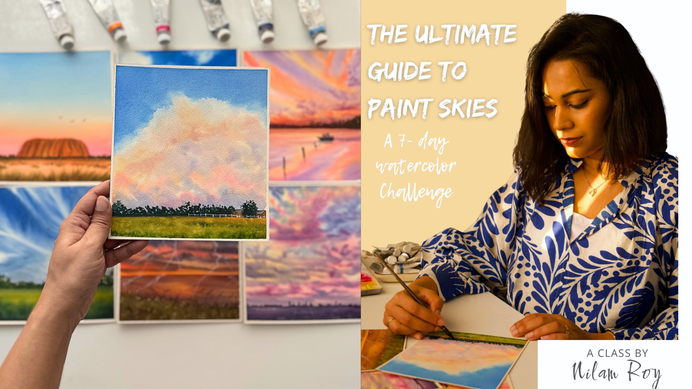
on my Skillshare profile. Welcome back to my class, atmospheric spring
landscape secrets to create womb factor in your
watercolor landscapes. In this class, I will
be explaining you the concept of
atmospheric perspective, why it is important in
a landscape painting, and what is the
relationship between atmospheric perspective
and tonal values. Once you get the hang of
this basic fundamentals, we are then going to paint for beautiful spring
inspired landscapes. Before we begin
with our projects, we will first discuss about
the basic supplies needed, planning the projects,
watching out colors, and practicing the
elemental composition in a thumbnail format. This will help you
to be confident and prepared before painting
your final project. The glasses curated in a way to benefit artists at all levels. Someone who is looking to build your watercolor
landscape skills, then I'm here to help you. I'm very sure that by the end
of this four day challenge, you will not only
be able to attempt any landscape
reference with ease, but will also learn to
add depth and textures to create that vow are all
factor in your paintings. If you are someone who
wants to understand these concepts and level up
your watercolor landscapes. Then this class is for you. Join me in the
next video where I share a detailed
overview of the class.
2. Class Project Overview: Thank you for joining
in the class. I'm thrilled to have you here. Let's take a walk through
of our class structure. To begin with the class, I will take you
through the supplies that we are going
to need in detail discussing about the quality of paper difference between artist grade and
student grade paints. Russia still have and any other necessary accessories required to complete
their projects. Next, I will explain you the concept of atmospheric
or aerial perspective and how this effect
can be achieved in a landscape painting to
render depth and move. I will also walk you through the basic watercolor
techniques section where you will broadly learn the foundational watercolor
concepts of wet on wet, wet on wet on dry
and dry on dry. As a big node, understanding
these concepts and applying them are very important to
build your watercolor skills. Especially when it
comes to controlling the wetness of your
paper, paint and brush. I see bigness struggle a lot. So in this technique section, I have got you covered. Now let's discuss about
the class projects. The class is set in a
four-day challenge format. You could paint all
for class projects or just paint your favorite
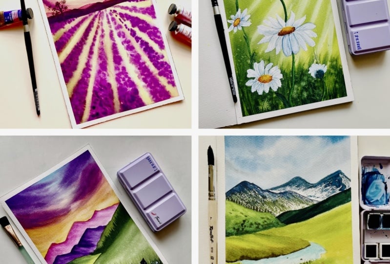
ones from the class, the choices totally up to you. Each day we will be
creating a new project, highlighting the key
elements of spring, applying basic
watercolor techniques along with atmospheric
perspective. Day one is going to
be all about painting bright blue clear skies
with fluffy clouds, lush green valleys, and a
stream flowing in between them. The perfect onset of spring. Before we start on
with our projects, we will do a quick
color palette study and learn to mix colors if it
is not present with us. Next, we will be going
ahead and practicing the techniques so that you are confident to start on
with your main project. They do is going to be
about painting beautiful, vibrant sunset sky
with dandelion fields. We will learn to create
depth and texture into our models by applying salt
and splattering technique. Similarly, D3 is going to
be painting a misty morning seen at a daisy me do with butterflies strong
enough to pollinate. This is one of my
favorite projects from the entire class. I really loved how these
daisies have turned out. Here. We're going to focus on
painting whites with watercolor without using
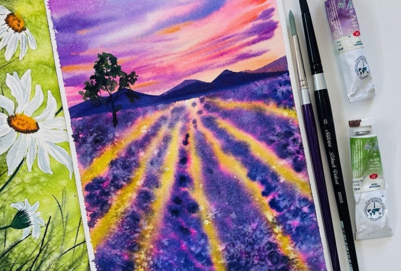
our white watercolor paint. The four is going to
be all about painting this dreamy sunset along
with lavender fields here we're going to incorporate a little bit of linear
perspective along with atmospheric perspective to give the painting its
depth and definition. Are you excited to
paint along with me this beautiful
spring landscapes? If yes, then do join the class and meet me at the next
lesson where I will be describing more in details
about what are the right kind of supplies that you should be using to create your projects.
3. About Supplies: Hi. Before we begin with
the class projects, let me quickly take you
through all the supplies that we're going to need
for creating our projects. First things first, let's quickly take a look
at the kind of people that we will be
requiring for our class. The watercolor paper that I'm
going to use for this class is from the brand Saunders
Waterford series. They are from cent
could put mills paper. Now this particular
waterfall series is their premium
acquittal paper. Here are some other details which are clearly mentioned
on the paper, e.g. the texture of the paper which is cold pressed, not green, fine color of the paper which
is white, blank, natural. And here are the
dimensions of the paper, which is ten into seven
inch and archival, great quality, acid
free, machine dried, cold pressed and 100%
cotton watercolor paper. Now, this is how the texture of my grain fine watercolor
paper looks like. Now, if you want, you can always size your sheets according to the size that
you want to paint on. If you want, you can cut
the sheets into this sizes. Now, especially if you are using some loose sheets and you
have a large chunk of paper, you can clearly cut them into your preferable
sizes and paint on. For our class, I'm going to use this full size of my paper, which is ten into seven inch. That is this size which is
roughly close to an A4 size, but there is no pressure. Feel free to use whatever
size is suitable for you. Now whenever you
are purchasing or buying your watercolor paper, always make sure that
your watercolor paper is 100% cotton and at least 300 GSM as the thickness
of the paper. This sketchbook that I will be using for swatching colors and the techniques creating
the thumbnails is also made up from 100% cotton, 300 GSM watercolor paper. This sketchbook is also made from Saunders Waterford paper. Ideally, it is
recommended that whatever paper that you are going to use to create your
final project, that same very paper you should use to practice your
techniques beforehand so that you get the feel of
your paper while practicing the techniques and know how the paper is going to react
to your water and paint. Now, in case if you're not having a sketchbook
handy with you and you do not want to waste your good watercolor paper on
swatching out your colors. And the alternative to this is having this cheaper
grade watercolor paper. It need not be PER
hundred percent cotton paper because you are just going to test
out your colors. You can cut this kind of thin
strips of paper and test your colors before you go ahead and create your final painting. Now that we have
known a lot about a paper and what kind of
paper we should choose. Let's take a look at the colors. The colors that I'm going to
use for this class is from the branch and an art supplies
PwC watercolor range. This is a premium professional watercolor range from the brand. If you have taken my
other Skillshare classes, you would know how much I love this brand because the
colors are so highly pigmented and give such beautiful vibrant
finish even after drying, the paintings look
absolutely spectacular. One of the major difference
that you would notice between artists grade supply and a student grade
paint is though, final outcome of the
painting after it dries. Student grade paints are
generally made up of lots of fillers and gives the appearance of a chalky finish
when it dries. So if in the lessons to follow, your results do
not match to mind, Do not be frustrated. It may be because you are
using a student grade paint, which has lots of fillers
and hence the vibrancy of the paint goes dull
after the paper dries. So my advice to you
would be to make your watercolor
learning journey to be easier and smoother
and less frustrating. Always try to invest in basic good-quality
watercolor supplies and that way your journey will be
much less frustrating. Now the next apply that
we're going to talk about is our brushes. So these are the
brushes that I'm going to use for our class. Don't get scared. I won't be
using all of these brushes, but to be exact, only these few brushes I'm going to use
throughout our projects. The brushes that you see here, a mix of natural or synthetic and natural
limitation brushes. Let's take a look at the functionality of
each of these brushes. The first one is from
Princeton Heritage Series. Now this is a synthetic brush which is of size number three. This brush has a very
nice pointed tip, which when it comes to a
very nice sharp pointy tip, I will be using this brush
for a lot of detailing into our paintings or where I need to create fine lines
are thinner lines. I will be using this brush. So let's take a look
at our next brush, which is this white brush. This brush is from Silver Atelier quill mop
brush of size number 20. The Brazils of this brush
is made up of gold hair, which is a natural
hair bristles. And that is the reason
the brush is so soft and holds lots
of paint and water. I love this brush because
it has made my life so much easier when it comes to
blending colors wet on wet. So it's a very good idea to have a natural hair brush in your watercolor
brush collection. Next, I'll be using
this round brushes from my absolute favorite,
silver black velvet. Three triple zero as series. So I'll be using my size number six and size
number eight round brushes. The next brush that
I'm going to use is this brush from
Princeton velvet series. This is also a
synthetic soft brush. This is a full word, greener brush, a
speciality brush. See the complex shape. The complex tips help you to achieve different
kinds of texture, especially when you are wanting to paint some loose
grasses nanometers. This brush comes
in really handy, serves the purpose of your regular fan brush or to create some
textured animal hair. The next bruce that
you would need is a square wash brush. You could use square wash
brush or a Hake brush. Now, here are some other
alternative brushes that it's good to have
in your collection. But let's take a look
in more details about this square wash brush from
Princeton Neptune series. This wash brush is from
squiggly limitation series. It's very soft and mimics the abilities of
natural hair brushes. Apart from this, you have this angle shader brush from
Princeton Aqua light series. This is also a very soft brush. Now, this is particularly
useful when you want to go with some inclined
or slanted strokes. This brush will come in really handy when you want to lift-off colors in a very angled stroke or the same angle shader brush. You can have it in
a smaller size, which is three by eight size. Now, this is a synthetic version from Princeton
velvet does series. Now, these are some additional
brushes that you can have for creating the angle
of incline strokes. Either you can have this flat brush or your
angle shader brushes. Now the next brush is this liner rigger brush from Scheme money, our
Fibonacci series. This has been my
recent favorite. One of the main advantage
of rigger liner brush is this long pointed
tip that you can see. It helps you to create
very long pointy strokes. So this is an optional brush. You need not have
all these brushes, just your regular sized
round brush of size number one or two
would do the job of going with some
fine thinner lines. If you do not have a liner
rigger brush, do not worry, but it is good to have different kinds of brushes
in your brush collection. I'm a hoarder or brushes and love hoarding different
kinds of brushes. Moving on to our next up play, which is having
two jars of water. One should be clean jar of
water and the other jar should be with the orange water
from your brushes. Next would be your tissue
paper or your tissue travels. Keep them always
handy by hillside. Whenever you are going
for watercolor paintings, this is an important
asset for you all and I almost forgot talking about this important supply, which is your masking fluid. This is from Leo Frank bar guys. This masking fluid is
particularly odorless. The use of this masking fluid is to preserve whitespaces when you are painting
tricky subjects with backgrounds where you
use lots of colors. This masking fluid comes
in real handy and we will be using this to paint
our project three. You will also need
masking tape to tape down your paper
on all four sides. Now instead of masking tape, you could also go ahead
and use your washi tape. Now if you're using
loose sheet of paper, you might want to tape
down your paper on a non-absorbing surface such
as acrylic sheet board. To create preliminary
outline of pencil sketching, you would require this pencil. The pencil that I'm using
here is a mechanical pins in using 0.3 MM HB lead, then eraser, this
is a normal eraser. There is another kind of eraser which is known as
kneading eraser, which looks like a dough. Literally you can
need it like a doe. This kneading eraser
you can use to lift off any excess graphite
marks from your papers simply by just going
over the paper surface. This is really, really handy. Next would be your
scale or a ruler. If you are someone
who is not very confident drawing a straight
line with free hand, then you can always take
the help of your ruler. I think we have pretty
much discussed about all the supplies
that we're going to need for creating our projects, except one, which is our palate. The palette that
I'm using here is a 42 wealth palette
and it is made up of polycarbonate plastic. And you can see I've
arranged my colors ranging from pinks, reds,
yellows, greens, reds and blues,
browns and blacks and some pieces shades
already on my palette. So this palette is
a 42 weld palette, but it is not necessary to, for you to have such
bigger pallets. You could go for smaller balance the plastic pallets of 12 or
24 wells totally up to you. This is from
Shanahan Art palate. Now, instead of this kind of plastic or
polycarbonate ballots, you could also go ahead with the ceramic palette,
something like this. And main advantage of
using this palaces. It does not leave stain
after you wash them. Now you can see on
this ceramic palette, I have some salt captain here. Some are bigger particle, rounded, bigger rock
salt particles, and some are this table salt, which is fine particles. We are going to use this
to create textures. These where the overall
list of materials that we are going to need
see you at the next lesson.
4. Understanding Aerial Prespective: Let's now take a look at what is atmospheric perspective and how does it affect our
landscape painting? Atmospheric perspective, also known as
aerial perspective, refers to the effect atmosphere has on appearance of objects. When you look at them
from a distance, you'll see objects further
back into the distance less clearly and they're
colored changes in value saturation and hue. This creates a greater illusion
of depth and distance and helps to establish the mood and feeling to your landscapes. For an artist to create the feeling of
depth and distance, you can use two types
of perspective, that is atmospherical
linear perspective. Linear perspective refers to how distance affects
the shape of things and makes
the objects appear smaller as they recede
into the distance. Whereas atmospheric
perspective refers to how the atmosphere affects the
color of things we see. Let's take a look
at this example. You can see that the hills further into the distance become progressively lighter
and lighter in color as compared to the ones which are
in the foreground. Okay, so now let's understand
the science behind why this fading of objects
at a distance happened. Now Let's understand this with
the help of this example. So when we look at
objects between us and the object are the presence of millions of
particles suspended. This particles are
generally the water vapor, moisture, dust particles
and pollutants. So the light scatters
from this particles, and the more scattering effect
from this particles is, the more hazier the objects in the distance appears to us. And because blue
and violet light is scattered more than
other wavelengths, objects further away appear
to be in these colors, then objects closer
to the viewer. Now that we have
known about what and why of atmospheric
perspective, let's come to now, how can we achieve atmospheric
perspective in a painting? We can mimic the effect of
atmospheric perspective by using Greer and more neutral
colors in the distance. By mixing more blues into
those objects which are further away and to the objects which are
close to the foreground, we can keep the value
contrast higher. So that was all about
atmospheric perspective. Now, join me in the
next lesson where we will talk more
in detail about the relationship between
aerial perspective and tonal values and how you can alter the tonal values of your color to create
depth in your paintings.
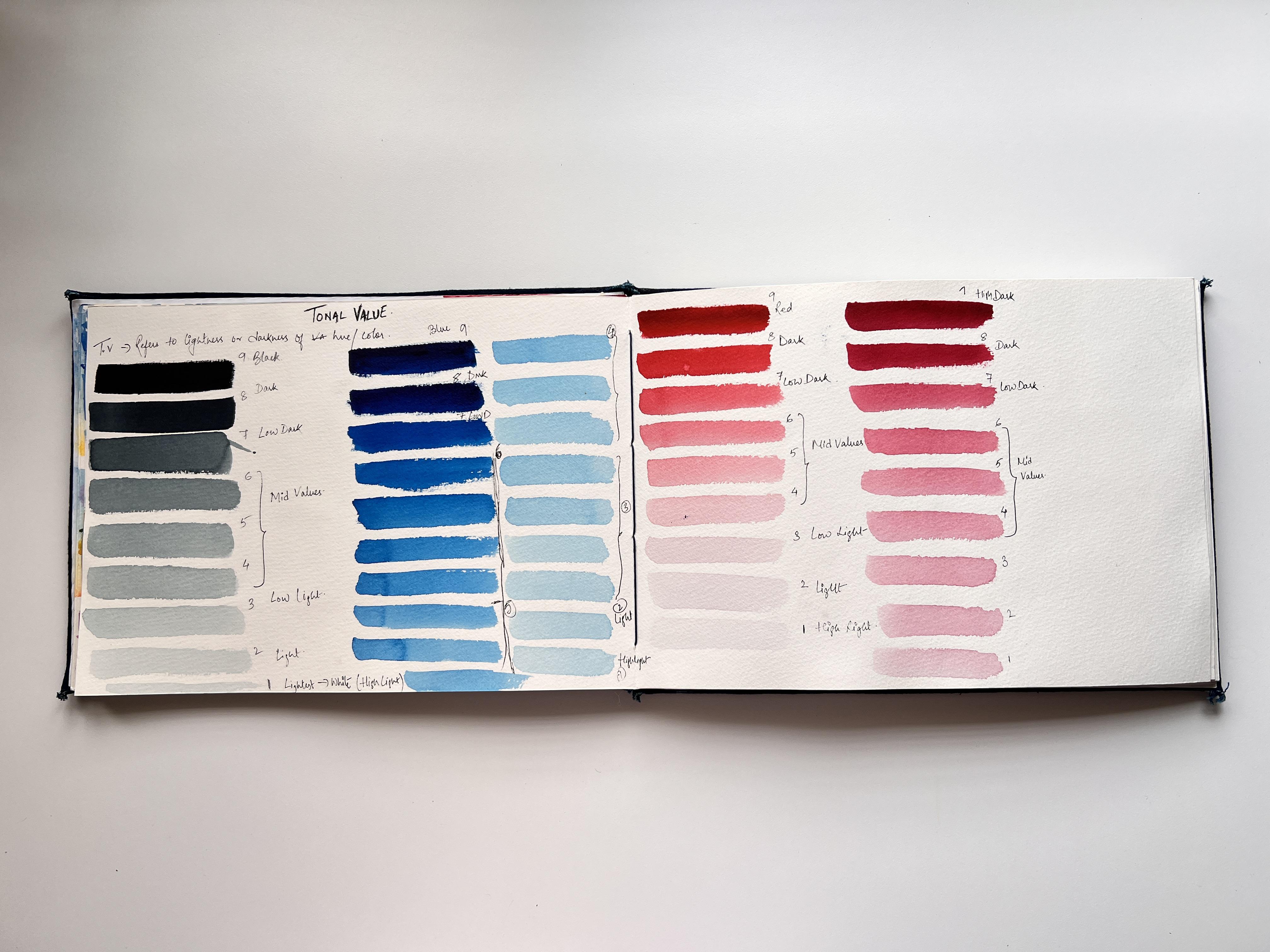
5. What is Tonal Value and Why It's Important?: Since you have been
hearing me talk a lot about tone
and tonal value, Let's now discuss what
exactly is tonal value. Tonal value describes
how light or dark a color is independent
of its huge cubing, the colour appearance, e.g. red, blue, green,
valid, et cetera. As an artist, out of all the factors that you need
to take into consideration, judging tone and value isn't essential
part in evaluating, assessing whether your
painting style is loose, bloody, or detailed and precise. If the relative tones
in your scene are true, you can produce a
believable sense of space, light, and form. As an artist, you should
be able to recognize by the different
values of light and dark of a color in watercolors, it is very important
to assess first the tonal graduations of the reference or the scene
that you are going to paint. Because the transparency of watercolor means
you need to make evaluations about the tone at the beginning of
the painting process. Because with watercolors, once you give a form a certain value, it is impossible to
make it lighter. And this is the reason why in watercolor paintings
were reserved the white areas of the paper for the lightest
tones in our scene. So what do we mean by
tonal value scale? This is a system to organize a values ranging
from black to white. As you can see, I'm layering the intense tone that my black can have using a very controlled amount of water in my brush and
reactivating my paint. So this is the darkest
my black can go. Now I'm going to
lift this black and form an original colorful mix to this original colorful mix, I'm going to add a drop of
water and mix it thoroughly. So this, I'm going to now
lay down on my paper. As you can see, it has toned down a bit. It has gotten a shade lighter. Now, I will go ahead and
wash my brush and add again a drop of water to the
same existing colorful mix. I'll mix it thoroughly and now I'm going to lay it on my paper. You can see it has
ten down, even more. I will keep on repeating the
same process until I have a color which is almost
close to the people, right? If you're a beginner and you are just starting out
with watercolors, I would highly
recommend you that you do or tonal value study of all your existing primary colors and secondary colors to get the feel of the
range that you're color can go for
doing this exercise, it will be extremely beneficial
because it is important to think of value first
when beginning a painting. Because without clear,
light and dark values, you are painting
will not work no matter how beautiful
your colors are. So here we have our
nine step value scale describing values changing
from black to white. For my Payne's gray, this is the range
that is possible for my color to sway
from the darkest, intense tone to the lightest, almost like people right? Now let's get to
know about the terms that is used to
describe this values. Please do refer to the
numbering system that you see on the screen
and not what I have written on the paper
because I have written in the reverse order
where I've started one from the black and nine being my highlight
or draw white. So that is not how you're
numbering should be. Your numbering
should be starting from the darkest tone
being the ninth. As you can see, this nine
variations in tone are very easy to observe
with our naked eye. And it helps us to analyze and break down any
scene that we would want to translate into a painting using this
tonal value range. Now, let's compare
my permanent violet against this Payne's
gray and see if it. Goes full range. It's a good idea
to practice making your own watercolor
value scale because it helps you to learn the
proportion of water needed to create lightness or
darkness for any one color. And we can also
use this chart for our future reference to evaluate the values that we want
to paint for a painting. So here I am practicing my watercolor value scale
for my permanent violet. This is the color
that we will be using in our upcoming projects. Hence, it will be a good idea to start with the value
scale practices, to know water, the color
tones that I will be using to paint a particular
element from our references. And here too, we observe that even a permanent violet gives us the full range value
of nine to one. Here one thing that you
must remember is that not all colors will give you this full value scale of nine. Some colors are less
saturated and a lighter. So in those cases you will
have shorter value scale. Hence, it is a good idea
that you go ahead and create or practice
this tonal value study of all the colors that you own. Doing so, you would be aware of value scale that
your color is having, and hence, you can plan
your paintings accordingly. Now let's take a look
at a classic example of how we can create depth by
controlling the tonal value. So here we are going
to create an exercise of a simplified scene of
a range of mountains. And we will illustrate
the right and the wrong way to use values to generate the
appearance of depth. Now let's take a look at our very first example
in which I'm going to create a range of mountains
which are in a distance. And for them to be
in the distance, they have to be in
the lighter tone, the same principle
that we have already seen in the atmospheric
perspective rate. Once I'm done applying
my lighter tone, now, I'll be going ahead and using my darker tonal value and create this Mountains
in the foreground. Now let's take a look at a second scenario where I'm going to reverse
the situation. I'm going to start with the darkest mountains
in the background. And then we'll paint the
lighter ones at the foreground. So here's what happens when the distinct mountains are
painted in the darker shade, they'd jump out at you and
the perception of depth. So confused rate. So the first scenario
is the right way to illustrate the depth
in your paintings.
6. Basic Watercolor Techniques: Part 1: Before we jump
start our projects, Let's quickly take you through the basic fundamental
watercolor techniques. Here in this lesson, I will walk you
through the Broad, fundamental watercolor
techniques which we will be using in this class. Wet-on-wet means
applying wet paint over your wet paper surface. So let's take a look
how we can do this. I will begin with first
dipping my paintbrush in water and using this
watery paint brush, I'm going to layer my paper with uniform even coat of water. I'll go over my people sofas as many times as required with my wet brush so that my paper stays wet for a
longer period of time. Now, with the help
of my **** brush, I'm going to go and
reactivate my dry paint, making it damp or wet. As soon as my brush loaded with paint touches the
wet paper surface, the paint starts spreading beautifully on the
wet paper surface, or wet on wet technique
painting results and very soft, wonderful and spontaneous
effects in watercolors. And hence, this is one of my most go-to watercolor technique. Now let's take a
look at this again. Technique, which is a
very important technique, which is controlled wet on wet, wet on dry technique. Here we will be controlling the amount of water which
is there on a paper, paint, as well as on brush, which is going to have
a big impact on how the watercolor behavior is
when painted with this method. Here in this first example, you see there is an
uneven layering of water, too much of water on my paper. You can see water flowing
through my paper, creating pools are puddles. Now the next step is to
load my brush with paint. The brush tip is full of water. So using this watery paint, when I drop it on the
wet paper surface, you'll see the
paint is flowing on the wet paper areas
uncontrollably. Do you see that the paint is flowing without any control on the wet paper surface
giving you less control over the way the paint is
behaving on the paper. This is not the correct way
to go for when we want to exercise control
over the wetness of our paint as well
as offer paper. This will give you a
very messy outcomes, especially when you are
going and painting skies or any other backgrounds where little details
that are involved. Now let's take a look at this second example where
I will be exercising control on the amount of water that I'm
layering on my paper. When your paper is perfectly
coated with water, you will observe this
reflective Shean when held against light. This is the indication that your paper is perfectly coated. Another way to
remove excess water from the paper is
still damp your brush, dry on tissue paper,
tissue towel, and just go over
those areas again. This will ensure that your
paper is just optimally wet. Now go and exercise water
control on the paint. See here, the water that I have on my brush tip
is very minimum, just so perfect that to
reactivate my paint, I will start spreading it across my wet paper
surface like this. And you can see how
beautifully it spreads. Now, observe here this
loaded paintbrush when I agrees it on the dry
part of my paper surface, I am obtaining this
dry brush strokes, but the very same when I use it on a painting
on my wet background, you will notice that you
will be able to smoothly, without any introduction
of bleeds are blooms when there is too much of water on the tip of your brush. What I mean to say is here, you will be exercising
control on how the paint is going to behave on
your wet paper surface, thereby giving you the full
autonomy of controlling the wetness of your paint
on your wet background. This is the technique which almost all beginners
fail to understand and control the amount of
water that they have on the paper paint as well
as on their brush. Now here in this example, if I had my brush tip loaded
with too much of water, I would have introduced
unnecessary bleeding into the tree-like shapes that I was doing on
the wet background. And hence the shape of the
tree which looks so fine and integrate and yet soft into the distance would or
wouldn't have been. So if there were
bleeding and they're very fuzzy edges to
it, once, you know, to control the amount of water that is there on
your paper paint as well as on your
brush and make it exactly do what
we want to do. You will easily be
able to master the wet-on-wet technique
and create beautiful, stunning results. Let me show you here
another example of how you can
exercise water control on your paint and your
brush to create a smooth, well blended, dramatic sky. Going ahead and
layering my paper with an even coat of water, making sure there is
no uneven standing or pooling of water
on the paper surface. The brush that I'm using
here to let the water on my paper is soft
quill mop brush, which is made out of goat hair. Now, this brush
will tend to hold more water and
paint and to create water control when
you are going to go on a limited area or the
smallest surface area, it is recommended that you go for a smaller size brush, e.g. here I have switched my to my size number eight
brush and look at the amount of water that
I have in my brush. Every time that I
will wash my brush, I will debit to dry
on tissue, paper, tissue travel, and Lord
the paint on my brush. Now when I load, I see there is too
much of water. I will dab it on
the tissue paper. And here you can see
that I have exercised water control on the amount of water that was
there in the paint. Understanding to
control the amount of water in your paint, paper and your brush
comes only with practice. So do not forget
to keep practicing these techniques
prior to start of your project because
this will give you an overall idea
of how you can control the wetness and find the right balance
while painting. Now, observe your,
how I'm playing around with my tonal values. Here at the left corner, I'm going ahead with a
very light tonal value. Here. I have used
my blue gray mix. Now towards the right, I will confine with the darker tones that
I'm using of the colors. And now to create the
shape of the clouds. Observe, I have not watched or loaded the paint with water. I am just using
my damp brush and picking up the color and
loading it on the paper, creating the shape of the
clouds that I want here. If you do not exercise
water control and use too watery paint mix to
paint clouds over here, you would get feathering or
blended edges to your clouds, which would have
been difficult to control when your paper is wet and your paint
mixes too watery. So in that way, yard shape of the
clouds wouldn't have stayed when the
paper dried out. You can play around with the
shape of the clouds as long as your paper is wet once your paper starts
drying out, e.g. here at this bottom section, the paper has already
started to dry out. You will see if you
start letting the paint, the paint is not going to smoothly blend into
the background. Here. You must stop and
not go any further. So this is why understanding the wetness
of your paper and your brush is very important when going with wet
on wet technique. Now let's take a look
at the next technique, which is us flattering
technique and see how water control over
here also plays an important role. Here too. As you can observe, I'm going with wet-on-wet technique and creating
a background. Now, once I'm happy and
satisfied with the background, I will be going and
washing my brush and using the wash brush. I will be just tapping the brush on this
wet paper surface and you will see that you are getting blooms on your paper. So this creates a very
beautiful dreamy texture. But since I have used
your bigger brush here, I got bigger blooms. Now when you switch
to a smaller size, brush size number six over here, and exercise water controlled
by dabbing it on paper. You see you would
get smaller blooms.
7. Basic Watercolor Techniques: Part 2: Now let's take a look
at the next technique, which is also an example
of wet-on-wet technique. But here we will be creating
texture using salt. Here too, I will
be showing you how the salt texture will
vary when your paper is having too much of
water or when you have too much of watery paint mix
on loaded on your paper. I'm here now
dropping the salt on this patch of wet
paper that I have. Now I will let it dry. And in the next example, I will be showing you though, controlled way of creating
this salt texture by controlling the amount
of water that you have on your paper as
well as on the paint. For the second example, I'm going ahead and
creating a wet background, but I see that my brushes already having
too much of water. So what I will do is I
will try to squeeze out that extra water by squeezing the water out from the
bristles of the brush. Now, with that wet brush, I will load the brush
again with paint and smear it on the paper going to
and fro from top to bottom. This way, I have created a very controlled
background wash. Now I will be going and
splattering the salt. Now, wait for the
solid to dry up. And then we will compare the results between
both of this technique. While we wait for
a paper to dry, let's take a look at
the next technique, which is wet-on-dry technique. As the name suggest, here we will be sharing our wet paint over
dry paper surface. In this case, a lack of
moisture on the surface means that your paint won't be able to bleed into other areas, which will allow you to
paint with more detail and create more heavily
saturated colors. Here I will be outlining
my flower petal. So the outline that
I have created is on the dry paper and you can see how saturated the
color looks like. Now, when I start filling
the shape of the petal and I use a little bit
more watery paint here. You'll see I have achieved
to obtain that smooth, well blended edges
inside the petal. As you can see, wet-on-dry allows us to obtain more detail and sharper edges and well-defined shapes, e.g. this flower petal, which I have created using this technique, the paper has dried and you can clearly make out the
difference between the salt textures where we
had no control on the water. There we have produce larger splattered
blooms of this salt, which looks well
blended because it has started to dissolve in
the very wet background. But wearables, the one which had water control limit has
more defined crisp edges. Now let's take a look
at the next technique, which is a lifting technique. Lifting technique
essentially means removing the wet paint when the
background is still wet. To do this technique, you would need clean damp brush where you have to exercise
what are controlled by dabbing it on tissue paper
and then apply pressure to lift the paint
from the dam surface. You can lift the paint
and expose though underneath white of the paper only when the background is wet. Lifting technique is also dependent whether the color
that you are lifting is a staining or a non
staining pigment staining pigments are generally hard to lift from
the wet paper surface. It will not expose the
complete white of your people. Let me show you this with
the help of an example. Generally, all blues are very
highly staining pigments. Here I have my Prussian blue and now I will try to lift
it using my damp brush. When I tried to lift off this glue paint,
Did you see that? I was not able to lift the paint completely
of the people. There is still that
undertone of blue visible. So this is the difference
between lifting technique, between staining and
non staining pigment. Now that our paper has dried. Now you can see up close the texture that you received when there
was water control, but that's all texture and where there was no
control of water, can you see the bleeds
that we have got? It doesn't even look like that. We have splattered
salt over there. So this is not the
right way of doing so. This is almost similar to
that of the blooms that we have received on the paper when we had used
too much of water. And hence now you see how
important water control is. Oh, I almost forgot
to show you who are very last technique which
is dry on dry technique. This technique means
you are going to use dry paint over your
dry paper surface, thereby obtaining very dry
brush marks on your paper. See here, I have
this **** dry brush. I'm going to try to lift
the paint over here, but since the paint
has no water to it, I will not be able
to load my brush. For this reason, I will
have to dip the tip of my brush and reactivate the paint with little
amount of water in it. Now, before I go and
load it on my paper, I will use the tissue
paper, tissue, towel and dab it nicely so that all that extra
water is absorbed. Now you see we are getting this dry brush
marks on the paper. So this brush marks
can create a lot of textures based on which object or element you are
painting, e.g. you can create this dry
brush marks on the bark or stems of the tree to
create some textures. Or you can create the textures
on the mountains as well. So these are the broad overall techniques
that we are going to use unimplemented to
create our projects.
8. Plan Of Action : Before we get started
with our painting, Let's first try to break down our reference and simplify it. First, we will begin
by determining the horizon line
of our reference. So you can see here, somewhere around here
is my horizon line, where both sides of the
valley mountains are merging. And then you have your
distant background. Here is your reference
of the horizon line. Now let's begin by marking our lightest and
the shadow parts. So your tours my right is the area of the mountains
which is under the shadows. And you can see towards the distant background is
the idea of the mountains, which is very brightly lit, but it's very faded out. Here comes our aerial
perspective in play. Here is the illusion of distance using different tonal values. You can see here, right? Because of the sky, it is faded out in the distance, so it is having that
bluish gray color. Now towards your foreground, you can see the
colors are becoming more brighter and greener. It is the brightest
area where it is receiving maximum
of light, right? So these are the areas which is directly under the
influence of sun. Can you notice the cross
mark that I have created? So this is the part
that I'm going to eliminate from our landscape. I'm not going to
complicate this subject. We're adding those
for the more details. So when you turn this
painting into grayscale, you would be able to see the tonal contrast
of colors over your and plan your tonal
values of each of the colors. Once you have this gets simplified and your
tonal values done right? The next is to plan
your techniques. Join me in the next
lesson where I'll be sketching out this reference.
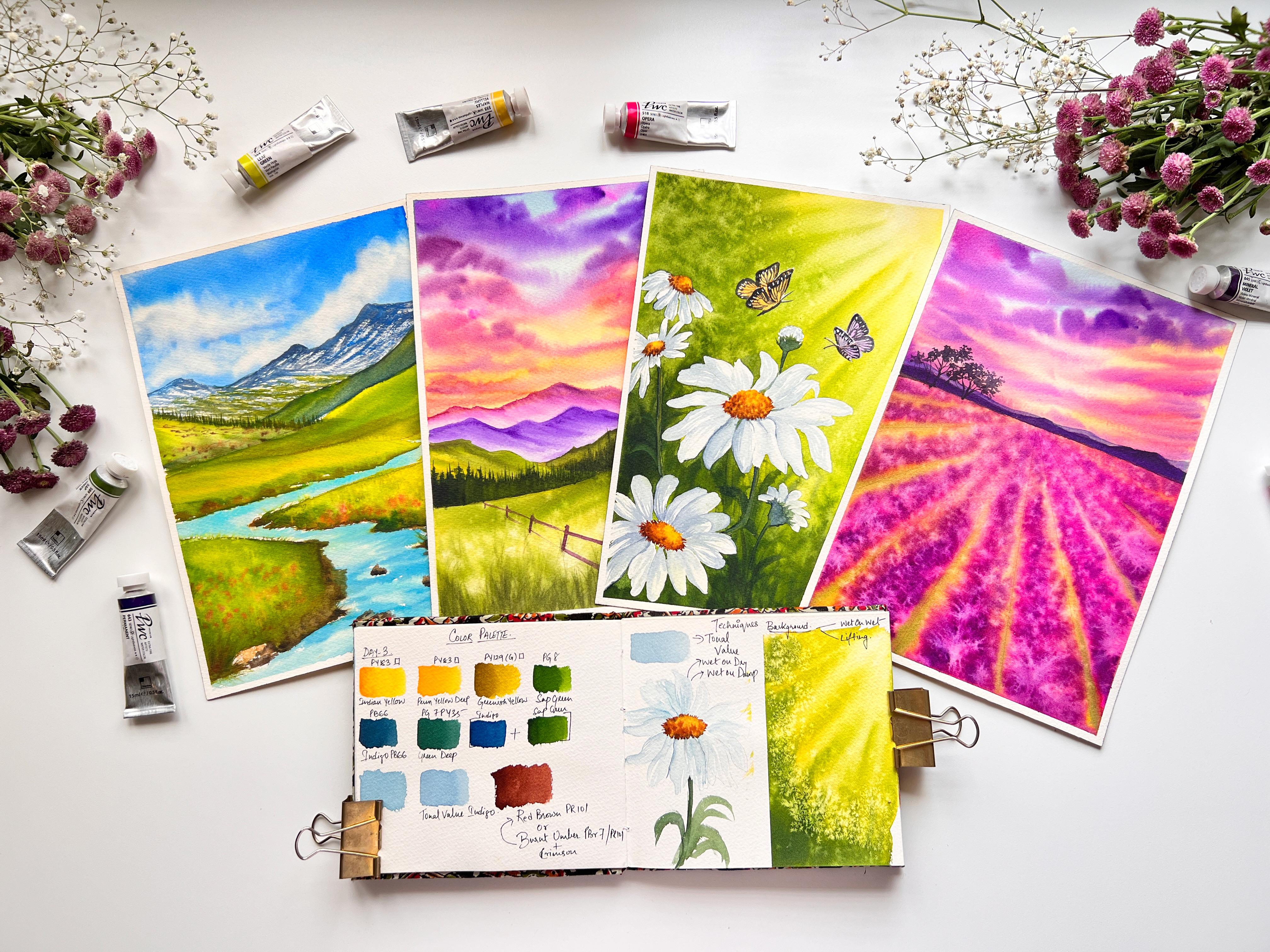
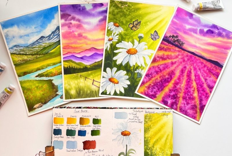
9. Day 1: Color Palette: Before we begin our project, let's take a look at
the color palette. The first color
that I'm going to swatch is the sky color. This is Taylor Blue, a warmer blue, yellow, blue, red shade I'm using. Instead of this, you
could also substitute it with cobalt blue
or ultramarine blue. The choice is totally up to you. For this background mountains, I'm going to create a
grayish tone of blue by mixing my tailor blue
along with some brown. So here I am using my brown red. But you could also use your Bunsen burner or burnt
sienna and create the same. This is how I'm going to use. Now. I have already
a blue gray color, which is nothing
but a mixture of my cool blue along with white. So when you use white, you turn your color into
opaque color rate a paste, it'll shade your form. So that is what my
blue-gray is all about. It's a pistol shade with that blue grave and you
mix your reddish brown, you get this bluish gray color. Next is my leaf green color. Now, leave green color is
already available with me. It's yellowish green color. Now, if this is not
available with you, here is the alternative you can mix and your lemon yellow, I have my lemon yellow, which has the pigment BY A21, but your lemon yellow might
have a different pigment. So check out your
pigment information labeled on your tubes and pans. This lemon yellow, I'll be
mixing with my green here, the green that I'm
using, sap green. You could use any green
which is available with you. Try to create a color
combination which will resemble very
close to my leaf green shade or any
yellowish green that you might formulate
with your colors. Next album, swatching out my burnt sienna or burnt sienna. When you add an indigo or any darker shade of blue or
even Payne's gray or black, you turn it into a darker
shade of brown. Witches CPR.
11. Day 1: Onset of Spring- Sky & Mountain: Welcome to day one project. Let's get started with the sky. For this guy, I'm going
to go with wet-on-wet technique to layer your paper
with a flat wash of water. You may either go
ahead and do so using a mop brush,
ora hake brush. The advantage of
using a mop brushes that the tip of the
brush would allow you to reach for this kind of curves or crevices that you have
outlined on your paper. So I'm quite comfortable with
using these brushes because I is more brushes for layering
flat wash on my papers, especially when I
have such kind of mountains or any areas
where I need to go around the tricky shapes where
it might be difficult to going around with a flat brush when coating your
paper with water, always ensure that
you are going ahead with an uniform
code of layering. As you can see here, my paper is uniformly
coated with water. Always make sure that
there are no pools, are puddles of water getting accumulated on
your paper because that would result into a very uneven layering
of color on the paper. So always try to move
across the brush uniformly on your paper surface
to reactivate my paint, I'm using my spray bottle. This is a very effective way
to reactivate your paint, ensuring that you do not
have too much of water. As you can see, my paint
mix here was little dry, so I added in just
a drop of water. Now using the tip
of my mop brush, I'm layering my paint
pigment onto my paper. Here. I'm going to leave
out some vital spaces in between to denote the
fluffy white clouds onto a bright sky. To create the
movement of clouds, always ensure that you
are going with very free handedly or loose strokes. As you can see, I have
held my brush very loosely over your and with
just the tip of my brush, I'm moving around the
colors on my paper. Your brushstrokes
need to be fluid to have this very
softer looking clouds. I'm going to switch to my
size number eight brush and try to give some
shape to those clouds, especially those white clouds. And you can see the bleeds
happening over there. So I'm just going to
use my damp brush and lift out those
colors from there, creating some shape
to the clouds. When lifting off the
colors from your people, always make sure that
every time you lift the colors of you are
cleaning your brush, washing your rinsing
your brush into water, and dabbing it damp onto
your tissue, paper, tissue towels so that all the lifted colors are
removed from your brush. While you are added, ensure that whenever
you are lifting out the colors,
especially for clouds, be very soft and try to do
it very loosely because the more soft and loose
strokes your brush will be creating more
of a spear and softer, the clouds are going to look. If you create too
much of pressure, you are going to create
very hard lines, which really doesn't
look pleasant at all. So I always prefer to go with
very loose strokes and do this when the paper is still
wet enough for me to do so. To create some depth
into my clouds. I'm going and wetting around these areas with a
very damp brush. I have used my mop brush
and with my mother, silver black velvet size
number eight brush. I'm going with very
light tonal value of my indigo mixed
with little bit of burnt sienna to create
some smoother edges. I'm going with the tip
of my damp mop brush and blending those indigo
mix very light handedly, but retaining the shape
of the clouds as well. This will give us the depth
that we want in our clouds. To ensure that whenever
you are trying to create depth and not
produce any hard edges, make sure that whenever
you are going and letting your colors use a very
lighter tonal value, and then use the dam
tip of your brush. But remember that your tape should not be loaded
with too much of water. Let me show you here
another cool trick that is by using our
damp tissue paper, you can create this
beautiful fluffy clouds. The trick is, use the dam
tip of the tissue paper and dab it very soft handedly lifting of the
colors from your paper. This will work only
when the paper is wet. Now, if you're wondering why I have used this damp tissue, the reason being generally
when we use your dry tissue, it creates a very hard
edges to your clouds. And that's my
personal preference that I do not like
those hard edges. That is why I have
devised this technique. Now, moving on to our
background element, which is this
background mountain. For that, I will be creating my blue gray shade that we have already seen in our
color palette section. For the color mix, I
have used one part of my cool blue consisting
of pigment BB 15 plus one part of my
white Titanium white to say PW 6.1 part of
my burnt sienna, which consists of the
pigment BBR seven or VR1 01. Using the pointed tip of
my size number eight, silver black velvet brush, I'm going with the
outline of the mountain. This is the first step. The same thing which we have seen in the technique section. I hope you guys
have practiced it. Once I'm done with the
outline of my mountain, the next step is to use
the wet on dry technique and create this semi dry brush
stroke patterns as well. So you need to have an optimum
consistency of your paint. I'm going here with
very loose strokes. And you can see with just
the tip of my brush, I'm creating some
dry brush lines marking the ridges
of the mountains. Here. It's not necessary to make the mountain to detail
because this is at a distance and
it's quite blurred out when you see it
from the foreground. So too much of detailing into the mountains
is not required. A little basic is just sufficient to create that rough
texture on the mountains. I'm going here with dry on dry technique using
my very dry brush with my damp color and I'm just grazing my brush
tip along the paper, you can see those
drivers patterns. You're applying the principle of atmospheric perspective where all the objects
which are near to the horizon at a
distance will always tend to replicate
the color from it. Nearby surroundings
here are sky, is this beautiful, soft blue, so you're at a distance, the colors will get replicated because of the
scattering effect of light. And hence, the
resulting color that our eyes perceive will be into that bluish
gray mixed tone. So one of the critical step
out here is that when you are letting this blue over
that blue gray mix, which is our base layer, ensure that you are going with an optimum water
control in your paint, as well as on your
brush as well, because too much of watery
paint will make the paper wet. And hence, when you start layering this blue
onto that gray, you might be lifting off
the base layer as well. So exercising water
control on your paint as well as on your brush when going with this wet
on dry technique. To create the texture on the mountains will give
you an added advantage, where you can use the tip
of your brush to create some broader and dry brush
patterns at the same time. Now, I will be creating
a watery paint mix to create some broader strokes
are lines on my mountains. Now with just the
tip of my brush, I'm going to go with very free
and loose random strokes, but I will be going with unidirectional strokes where
the slope of my mountain is. To create a more
realistic backdrop, we are going to create Dull or a muted green mix
by mixing my sap green with that of
my blue gray mix, which we have already created for creating the textures
on our mountains. I'm just going to
go ahead and mix my green into that
blue gray mix. Mix little bit of your burnt sienna into it and
create this duller green. If you have observed the
color mix that I have created on my palette
is not too watery. Now I'm loading the tip of
my brush and sharing that I dab off the extra water that might be
present on my brush, on my tissue paper. And just go with those free strokes using
just the tip of my brush. But here the strokes
that I'm creating is in-between those white
gaps that we have left. Just go ahead and fill
it in random position, but do not cover the entirety
of that blue gray mix. Confined this green and
strokes only towards the foot of my left mountain, as you can see here. So this would indicate that the glaciers at some part
has starting to melt. Once you have
completed the spot, take a break and I
will meet you at the next section where we are going to bend greener valleys.
12. Day 1: Onset of Spring: Green Valley's & Meadow : I hope you are refreshed
enough to start back. I'm starting with a value
which is towards the right. And this is the reference. As you can notice
in the reference, a portion of that right side
valley is into the shadows. And hence, I have used this muted tone of
bluish green mix, but this is a very
dull kind of green. I have mixed little
bit of brown, little bit of green and blue into this mix to
create this color. Going ahead with very, very medium tonal
value of this green, you can see it's not too dark. And in between, I'm
going to go and fill with some indigo strokes, leaving certain gaps in-between. I'll rinse my brush and I load my brush with that
of leaf green, which is yellowish green. And just the layer
it from the top, dragging it down below, something like that in-between, I will go and start filling with some strokes of my indigo. This will indicate the
darker shadow parts, which is towards
the ground level. Now I'll be starting with the
mountain. Towards the left. I have started from the
base using sap green, filling in tough and
keeping the top unfilled. Now, I'll load my brush
with that leaf green and try to blend both
the greens together, but ensuring that I do
not use too much of sap green and bring it up into that leave green
towards the top. Now, if you're
wondering why it is, because this top part is the area where the sundries
or directly hitting upon. So this is the area where the maximum light is
getting reflected. And hence, we have denoted it by using our light
yellowish green color. Now to add in more characteristic
feature to this mountain, I'm going and adding in some loose brush strokes
with my burnt umber. This will indicate the presence of scattered rocks and pebbles. Here at this point I feel there should be some more
light green apart. So I'm using my damp brush and light handedly lifting
off those darker greens. When I lifted off the greens, I had also lifted off the brown pebbles
that we had created. My paper is still
wet at this point. So using my synthetic brush and controlled
wet-on-wet technique, I'm going to layer
this dots of browns of varying shapes and sizes towards the base
of this foothills. Now to create a very soft
and well blended look, it is necessary that
you do this step when your paper is
still wet enough. It should not be completely
dry or else you will get, you notice rocks and pebbles standing out very prominently. Using my same synthetic Princeton round brush
size number two, I'm going to start creating some bindings into
these mountains. Observed my brushstrokes here, I'm creating a fatter belly and pointed tip indicating
the shape of the tree. Now, this step is
totally optional. If you are happy with how
your mountains are looking, you could totally
skip this step. I like to add in details
because I feel this little, little minute details give
realism to your paintings. But if you are NOT IN for it, you could totally
skip this step. Now, if you have
created the spines, the next step would be to blend the base of the spines
into our mountains. So use just the dam
tip of your brush. Do so. We have successfully
completed our midground. Now it's time to
start a foreground, which is a grassland. For the grassland, I'm going to go with wet-on-wet technique. Now, if you're wondering why for this
particular foreground, we're going with
wet-on-wet technique. The reason being this
area is much bigger. This grassland has a much
larger surface area. So if we were to go with
wet-on-dry technique, there might be chances
that our paper might start drying up and the colors will not
blend well together. To avoid these problems, I'm going to go with
wet-on-wet technique. Now, if you have observed
when young leaves proud, the color of the leaves will
resemble close to this, yellowish green in color. And as the leaves mature, they will turn into sap green
and then but yard with age, they will turn into
darker shades of green. So keeping this concept in mind, I have started
with the middle or the grassland with the base
coat of yellowish green. And then with my sap green, I'm going ahead and creating
some brush strokes to indicate some depth and
texture into our grassland. I'm going to repeat
this same process for the entire grassland. But occasionally I'll be
going ahead and changing my brush strokes to indicate a sense of depth
into the painting. So keep observing. Now towards the base of this grassland to give it
a more realistic feel, I'm going with this curved lines with my darkest tonal
value of sap green. Now, instead of sap green, you could use your
greenish brown mix by mixing a little bit of burnt sienna or burnt
umber into your, this greenish mix and create this sense of depth
into this grassland. Brushstrokes when done right, and kept very loose and bold, can create a lot more liveliness and energy into your painting. And that is why most
of the brushstrokes in realistic painting you would observe will
be very directional. This gives us a sense
of direction and hence, the 3D aspect of the
painting comes to life towards the base am going ahead with a mixture
of my bond Tom bar to indicate the soil or demand. Here at this point, my grassland at the top
is looking very flat, so I will just go ahead and include some of
these bulged curves, slanted lines of sap green. Now you see it has gotten
so much of that shape. Towards my right grassland. I'm going to go with wet-on-wet technique as we
have done before. I'm mixing in my greenish-yellow
with that of sap green to create this
very warm green yellow. Now switching to my
size number six, silver black velvet brush. And going ahead to add some directional strokes near to this base of my right grassland. To create the illusion
of depth into this grassland towards the base, I will go with just the tip of my number six brush loaded
with my burnt umber mixed. And I will start
layering it into the base so that it
blends into the greens. Making sure that I do this step when my
paper is still wet. Once your paper is or the
area has started drying out, this brush strokes that you are creating will leave
very ugly marks, are dry patches on your paper, which will not look very
appealing to your eyes. Here at this point, my paper has dried out already, so I'm going to go ahead with rewetting this particular
area of the paper. Because we will be
going ahead with wet-on-wet splattering technique to create the wildflowers. Now, going ahead with the
re-weighting technique, always bear in mind
that do not apply too much pressure on your
brush over the paper. By doing so, you will be lifting off the base colors
which you do not want. You have to slowly and gradually revert the surface
without lifting the colors. Time to create some
magical Blooms by splattering water onto
your wet background. Now instead of water, you could also go ahead and use your watery colored paint mix. Use bright mixes for to
create bright floral meters. Now, it is due to the
nature of watercolor that in wet it tries to
blend back together. My blooms have already started to blend with the background, and hence I splattered
one more time. Now using my filbert
greener brush, I'm just going and creating
this glass-like shapes. The tip of my brush
is practically dry, so I'm just loading
with my control the paint mix of sap green and creating this grasp
fully ages Neo just near to those
darker green areas. Whenever you are going
with the grass foliage, go with different
directions to denote the movement of the
grasses in wind. For this rock, which is towards the edge corner of my paper, I'm going with dry on
dry brush strokes. First I started with my
burnt sienna and then I'm layering it
with burnt umber. Now using the same darker
mix of my burnt umber, I'm going to add in little details towards
the base of this middle. Now it's time to move on to
our middles, to the left. It's going to be the
same process that we have done for the
middle on the right. So keep observing. Starting with wet-on-wet
technique with yellowish green initial layer. Towards the base, just
along the outline shapes of this rocks are the stones
that I have already created. I'm just going to go ahead
and fill those areas with this directional strokes
using my burnt umber mix. Join me in the next lesson
for the final completion.
13. Day 1: Onset of Spring - Stream & Final Details: For this meadow to, I'm repeating the
exact same process of what we had done
for the medial, which is onto our right. I'm layering my sap green, making sure that when the
layer of brown is still wet, I'm going ahead and
letting my greens into those darker shades of brown and blending it on to
the lighter areas. Towards the base of this middle, I'm going to go ahead and layer some more of that dark brown. I have mixed little bit of my indigo into my burnt sienna. Now, if you want to create your own mix of your
darker brown shades, always go ahead and add
either Payne's gray, that is, you're black or DR.
Darker shades of blue, you would get a
darker brown shade. Now before the top layer
of the medial dries out, I'm just going to go with a watery mix of my sap
green and layer it. Now at this point, this part of paper is wet, so it's a good time to go ahead and do the
splatter and tactic. Now here I'm using my lemon yellow to splatter,
but if you want, you can just use your damp brush and splatter water over
there to create blooms. Here the blooms will be little colorful that
is yellow in color. Or else you can just go ahead
and splatters some pinks, reds into yummy dough to indicate some
wildflower over there. Now, you're using my comb brush or the filbert greener brush. I'm just going
ahead and creating this grass leg patterns over here when my background
is still wet. Now it's time that we
move on to our stream. For stream, we're going here
with wet on wet technique. I'm going ahead and creating a very watery mix of my turquoise blue instead
of turquoise blue, you could use any shade of lighter blue,
preferably cool blue. Now, if you're wondering why I'm using turquoise blue for
these glacial stream. The reason being,
most of the times when the glaciers start melting, it erodes the rock or the
mineral particles which are present in these mountains
does giving this color. The minerals actually give out this bluish green
color of the water. And hence, I am going ahead
with this turquoise blue. If you want, you
can add in some of that Taylor blue and mix it with little bit of viridian
or emerald green and create bluish green color
of your mountain stream. As you'll come to this broader
part of the stream here, I'm going to replicate
the movement in water by using this curvy brushstrokes observed my
brushstrokes over here. I have left certain
white gaps or spaces in between to create
the illusion of that. For me, ripples
that are formed are the frothy area of the stream. So I'm not going to use your white paint
or white gouache. So I'm just going to add some more depth into
this string by adding in some darker tones
of my blue here I have used my mixture
of peacock blue, which is also a cool blue, and just going along the sides of the middles and filling
in the darker shades. I have led to my paper
dry out a bit and add this date when the
paper is almost semi dry, I'm going ahead and
adding in some rocks over there using my mixture
of burnt umber mixed with a little bit
of Van **** brown towards the base of this rocks I'm going in and adding the darker shade. Towards my left too, I have another piece
of rock or bolder. So for that too, I am repeating the same
steps as we have done for the one which is on our
right towards the base, I'm going ahead and feeling the darker colors and on
the surface of the rock, I'm going ahead with
dry brush patterns with my bond sienna
towards my left. Them we do has dried
out completely. Now I'm going to go
and reweighted very light handedly using
a very watery brush. I will wait for the paper
to absorb the water and then I will splatter
the pink flowers. I waited for my paper to
completely dry out and now I'm taking off the
masking tapes at an angle. I'm being patient enough. Do not try to remove your masking tapes when
your paper is still wet. Always wait for your
paper to dry out completely before you go
and remove the tapes. This will also ensure that
your paper has not warped. And here is the final look of a painting so refreshing
and beautiful, right? Perfect spring like with this, we have successfully
completed the one I'll see you next with
that day to project.
14. Day 2: Planning & Sketching: Now this is what we are
going to paint for D2. Before we get on with
the sketching part, let us first plan our painting. The first thing
that I'm going to start this with, my sky, as you can see for this guy, I'm going with wet on
wet technique for sky. We are then going to move on to our distant background mountain. We are going to do
this by manipulating the tonal values of a color, going with the lightest shade. And then we are moving to a
foreground where we are using the brighter and vibrant
contrasting colors to create greater impression of depth and textures
into a landscape. Now let's get started
with our painting. Before that, I'm
going to tape down my paper with the help
of my masking tape. Let's get started. On the right hand
corner of the screen, you can see the reference now you could pause
the screen over here and use this reference
and sketch out your outline. Or you could watch the entire video of my
process and then you could pause the screen
where I have completed the outline and go
on to make yours. Now as an important rule, I always tend to mark or gauge the area where I want
my horizon line to be. And then I start creating
the other elements. So just follow along me or go
through this entire video. And then once you have reached
the end of this video, you could pause the screen
and create your own outline. Now it's time to create the
fence into our foreground. Here, I'm going to implement
the linear perspective because the fence is going to recede back into the distance. So I'm going to use the smaller shapes to indicate that distance and depth into it. So here you go, and this is my finished sketch. So you could pause
the screen out here and create your own sketch. Once you are done
with your sketch, it's time to get started
with our watercolors.
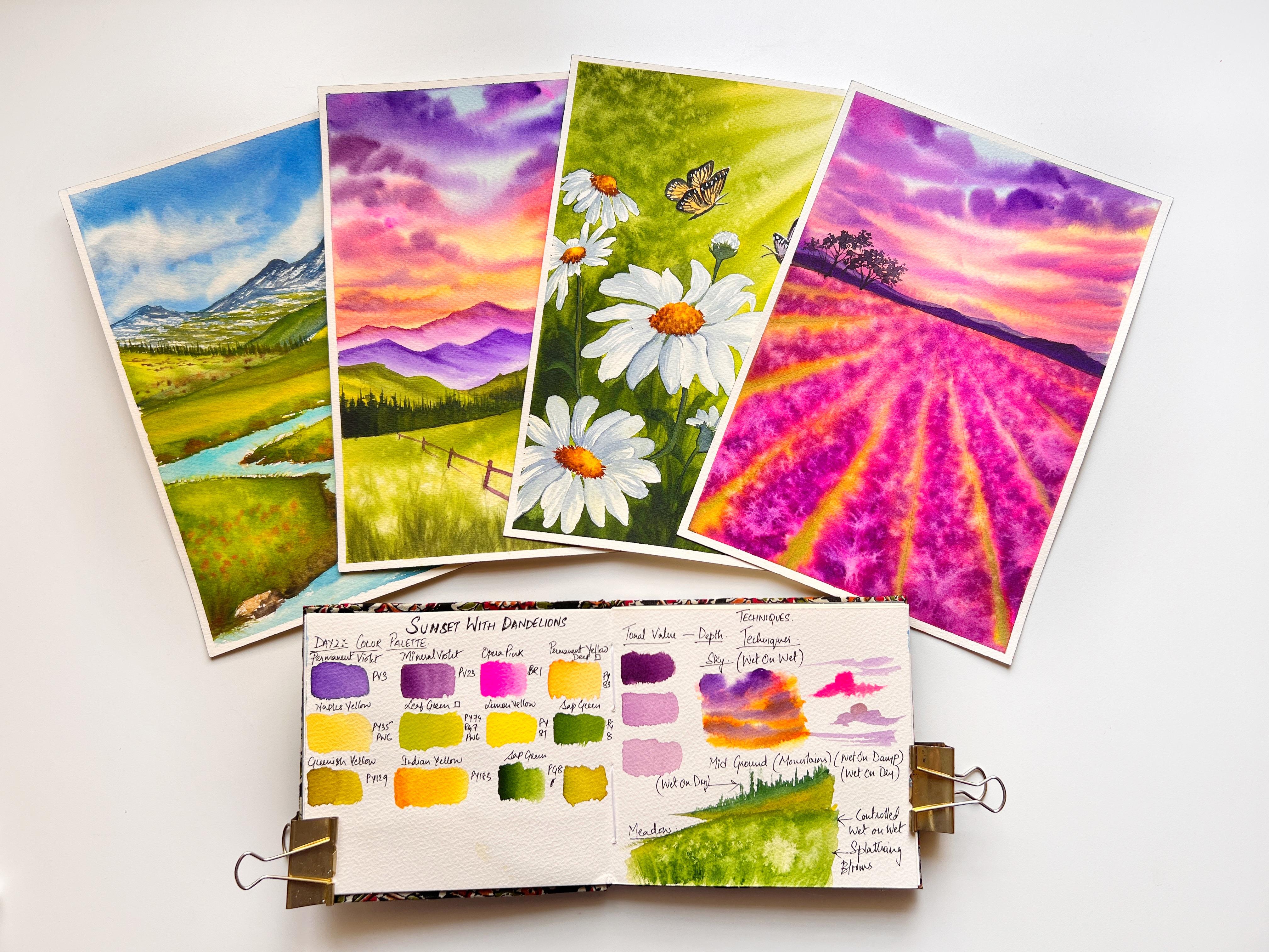
15. Day 2: Color Palette: Hi, welcome to day two. Let's quickly get started
with the color palette. First, we are going to
begin with the sky colors. I will first start out by
swatching out the cloud, especially the dramatic dark clouds that we are
going to paint. So that is going to be
with my permanent violet. Now, the permanent
valid that I'm using here has a little
bit of granulation. The next color would
be mineral violet. Now, when you mix permanent
violet along with your neon pink here in this case I have
swatch dot oprah pink. You would get this shade
of mineral violet. The next color that I'm going to swatch is my Indian yellow. This yellow is a very
warm golden yellow. Instead of this yellow, you could choose to swatch yard any cadmium yellow deep shade
that you have got with you. Now, when you mix in
this yellow deep, a little bit of your
titanium white, which is consist of
the pigment p W6, you would be closely having a color which is very similar to that of your Naples yellow. Naples yellow is the color
that we're going to use to create the sunset colors near to the horizon
line of the sky. So here you'll see it
has the pigment BY 35, which is the yellow pigment, and PW six, which is
the white pigment. So this is what I'm going to use the yellows for
my sunset colors. The next color that
we are going to need is this bright, beautiful,
yellowish green, which we are going to use a
little onto the mountains, the midground
mountains and layer it with our
foreground mountains. Now, you can create
leaf green by mixing your lemon yellow along
with your sap green. Remember to mix two parts of
lemon yellow and one part of sap green to give you
this bright leaf green mix. Now, another green
that I'm going to use is greenish-yellow. You could create the same
greenish yellow color, which is a little warm green. By mixing your warm yellow, which is your Indian yellow, or you could use your
permanent yellow deep and mix it with
your sap green. Remember to go again
with two parts and one part of your green, two parts of a yellow, I mean, so here I'm
mixing the color so that you get the idea of
how to create the shade. So I'm going to mix my
colors together and try to be very close to the color
that is my greenish-yellow. So YouTube could
follow the same step. Keep mixing the colors
until you are satisfied and create the shade which is very close or similar
to that of mine. Now, I'm going to
swatch my color, which we have a mixed. And here I can see that
the color is very close, but it needs some
more of that green. I will go ahead and mix some of their sap green
onto this mixture and see we have got our shared very close to
that of a greenish yellow. Now another color that
we would need is burnt sienna or red brown
color for the fences. So get your colors ready and
meet me at the next lesson, where we will be going
through the techniques.
16. Day 2: Techniques : Now that we have
our colors ready, let's get started with
our day two techniques. We are going to first
start with a tonal values, especially the ones that
we're going to use to create this background mountains in order to create that
illusion of depth. So I will be using this
mineral violet as well as my permanent violet to mimic the effect of
atmospheric perspective. As you approach the foreground, you see the colors
are getting more brighter and more saturated. So this is what we
are going to do. Let's quickly swatch out first tonal value for
our mineral violet. I'm exercising water
control on my brush and loading the color on my
brush and swatching it here. So this is my dark value
of mineral violet. This I'm going to use to create drama and depth into
the clouds of this guy. So this is the first value. Now I'm going to take some of this original pool
value and then I'm going to dilute it and thin
it down by adding some water. So the tonal value that
I have got here right now is almost towards
the lighter end, lighter end of the
tonal value range. So you could say I would
be using this value such as highlight
and low-light value. So now let's get started with the techniques first and
we starting with this guy, which I'm going to go with my favorite wet
on wet technique. The first step is
to let the paper with an uniform wash of water. I'm going to go
ahead and do this. Remember, the wash
should wait uniform, there should not be
any stagnant water or pools are puddles formed on the side or edges
of your paper. Now I'm going to load my
brush with the Naples yellow. The Naples yellow that
I have on my brush is in the lighter range
value, as you can see. So I'm just going to go ahead
and smooth out the paint, leaving some white
gaps in between. As I go up, I'll be using the tip there. The color value will be
much more lighter than what I will be initially starting
at the horizon line. We will be using
lighter tonal values at the top of this guy, because there we are
going to go with complimentary colors such
as violets and blues. Now violets and blues when
mixed with the yellow, will form a very muddy
or a greenish tint. So in order to avoid that, we are going to go ahead and use a combination of
analagous colors. Now, orange and yellow, the analagous colors that I'm
going to take is my pink. The opera pink forms
a beautiful coral, orangeish pink shade when
mixed with this both colors. So I'm going to
share my Skype with this shade and look at my brush movements over
here to create the clouds. So round, so colored half circular strokes and then spreading it
out on the other side. While doing this tape, make sure that you are very flexible with your
wrist movement, especially when you
are creating clouds, because when you are
flexible and very loose, the way you have healthier
brush strokes are going to be much more fluid and there is going to be much
more movement, fluid, long stride denoting
the movement in the clouds. Hence, it is very
important that you are not very stiff with
the hand movement. Now, do you observe this bleeds that is
happening around here? This might be because there
was too much of water. So an easy way to
prefixes to move around the tip of your brush around those areas to have this clean, smoother ends, but do this step when your
paper is still wet. Next, let's get started with
our midground mountains. But before we start them
at ground mountains, we have completely missed our misty mountains in
the background for which I'm going to use the
lighter tonal values of my mineral Violet
and permanent violet. So let's get started
with our mid grounds. Do not worry, those misty
mountains are very easy. We can directly see that
technique when we are painting our main project for the
midground mountains over here, I'm starting with
wet-on-dry technique. Why? Because I need the
colors to have more contrast and to be rich. That is the reason
I'm going here with this wet-on-dry technique, but when I'm blending or mixing two colors and
making sure that the paint mixes little watery so that the colors blend well together when there is
wetness and the paper. Now I'm going to switch to my size number three
synthetic brush from Princeton Heritage
Series took off all that extra moisture
from the brush by dabbing it on tissue
paper, tissue travel. And now I'm going to start
creating this vertical lines. Longer and shorter ones to
create or indicate the fine since these are almost pushed
towards the background, but not exactly in
the background, but not too in the foreground. Here, the details can be little blurred and the shape can
be something like this. You need not go and have a very detailed looking
pines over here. And that is the reason
I'm going ahead with this vertical
shorter, longer, and shorter strokes
because I wanted my underneath of the pines to be well blended
into the background. I created the shapes when
the paper was still wet. So it blended well. Now coming to the middle. So this is how I'm going
to start with my middle. You can go with
wet-on-wet or wet on dry. I'm here showing you the wet-on-dry process
because I'm painting here over a small piece of paper
or a small surface area. But if your surface
area is larger, like how we are going to do
it in the final painting, then I might suggest
you that you go with wet on wet technique so that you have much more time to let your colors blend
and play well together. Now this middle is
at the foreground. So here we will be creating
some long grass shapes. So for that, I'm going to
show you two techniques. One by using my disfavored
greener brush and the other by using this
squid and mop brush. Sorry, this is not secreted. This is goat hair, mop brush. This is a natural hair brush. Now the brush tip is just little damp and you see how I'm
creating the strokes, long vertical strokes by freeing the ends of my brush tip. So this is how you can move the colors and
create the strokes. Make sure that you
load your brush with some darker tones and
create this same patterns. Now, the very same can be done using my fieldwork
greener brush. So instead of this
kind of comb brush, you can also go ahead
and use a fan brush. This will give you
the same effect that I have got using
these two brushes. Now quickly, I'll
grab my other brush, which is my size number six, silver black velvet brush, load the tip with little water and splatter it
around this middle. This has to be done when
the paper is still wet. Because if the paper
starts drying, you will not be able
to get this blooms. So in order for you
to get this blooms, make sure that you do it when the paper is still wet enough. Now, instead of this blooms, you can also go ahead and use the salt there also you will be getting similar
kind of patterns. Now one more technique is to wet just the tip of
your tissue paper, something like this and dab it randomly at certain
places like this. So when you go and wet the
tip of your tissue paper, you are creating softer
edges instead of creating univary
dried out the edges. So this is actually a lifting technique which you are doing with the tissue paper. At this point, you can also go ahead and splatter some salt, as I've already mentioned. For the technique to work, your paper's still
should be wet enough. If the paper has started drying, you will not get this
dispersed blooms. We have almost covered
all the broad techniques. Now I think just
this one technique is left that is wet on dry technique for
the fence that we will see at the final painting. See you at our next lesson.
17. Day 2: Sky- Part 1: Let's get started with this guy. For this guy, I'm
going to go with wet-on-wet technique,
but before that, I made sure that my masking tape is well stuck or
glued to my paper. I'm going ahead and layering and uniform coat of
water on my paper, making sure that
I cover each and every corner till the
area where my skies, if necessary, go over these
areas again and again, ensuring that you are going ahead and spreading
the water uniformly. Because the more you spread the water uniformly
across the paper, the more time you will
have to paint wet on wet. I think I'm satisfied with
the layering of water. I will check it out. Yes, there is the
reflective sheen uniformly across the paper, so I will just stop
here and it's time now to go ahead and load
my brush with paints. I will dip my brush
in water and dab it dry on tissue,
paper, tissue table. This will ensure
that my brush has no extra amount of water in it. Does exercising water control. Now, I'm loading my brush
with Naples yellow. Look at the tonal value. I'm going with very light
tonal value over here. And observe my brushstrokes. I'm going very
light handedly and just going ahead with
this long strokes, leaving in some whiter
spaces in-between. Now also, my
brushstrokes out here. I'm going with very
soft, loose handed, horizontal
brushstrokes over here using just the tip of my brush. And as I move across
the paper upwards, my tonal value of Naples yellow
has gotten a bit lighter. Now towards the horizon line, I'm going ahead and letting
it with yellow deep color, which is a little
yellowish orange shade. So if you have orange, you could also go ahead
and use a medium to lighter tonal value of orange
and do the same sometimes, even if you exercise
water control, you would see that
the empty spaces that you wouldn't have left
in-between would be all blended. This is because it's the
nature of watercolor to go along the flow of water since your
background is wet, it will tend to blend out. So you could lift those areas using the
lifting technique. By looking at the paper, I can feel that the top part
has started to dry out. So I will just go with an even coat of watering
around this area, making sure that I do not touch
too much into the yellow. And even if I touch, I just blend it right? You must be wondering
why did I do this step? This is because I wanted my sky to look smooth and well blended. And since the paper
was drying out there, where chances that
I could develop some hard edges
when I started to layer with the pain
since we will have to also go ahead and create
some dramatic clouds, right? That was the reason I went
ahead and reweighted the area. Now you can see the
blue that I led was blue-gray and so nicely
blended into the background. Interesting thing to note here is as I approach
towards my yellow, the blue went very
lighter and hence it did not give any
greenish-yellow. And also because
the yellow that I have used here is Naples yellow. Next I've started
with my clouds. So for that, I'm using a mixture of oprah pink along
with my yellow deep. And you can see how
beautiful this coral, orangey pink color
is looking great. I love using this
color for clouds. And look at the shape that I'm trying to create for my clouds. I'm using just the tip of my brush and going
with this half random circles
using just the tip and flicking it very gently, applying very light pressure
and releasing the pressure. As I want those strokes to go through and make
sure that you do not apply too much pressure
at the tip of your brush because while doing so you might be lifting out the
background colors. I changed my brush
to my smaller size, number six, brush from
silver black velvet. Now using this brush, I'm loading it with
the darker shade of mineral Violet and using the same shapes that we
have created earlier, I'm going ahead and creating a dramatic layer to the clouds by adding
the darker tones. This brings the very much
depth needed for the clouds. I'm going to repeat
the same step using my permanent
violet as well. This I will be using to create the darker layer of
clouds at the top. I love painting sunset sky, especially the ones with this
kind of dramatic clouds. This has been my go-to subject
these days to paint with. If you're following
me on Instagram, you could see my
feet filled with such kind of bright
and beautiful skies. To find inspiration
about the colors that you could use alternatively
to paint your sunset sky, you could browse dramatic sunset sky
pictures on Unsplash, pixabay, or even pixels. These are copyright free sites. So find your own reference, select the color combination that you want to give it a try. And you could alter
the colors of this very project as well
and give them a try. One important if for
you here is that when you are painting dramatic
skies such as these kind, where there are multiple
colors involved, which might be
complimentary in nature, start to combine the
colors which are analagous and harmonious and nature by layering them one
after the other, and then use your
complementary colors. In doing so, you will avoid the challenge of creating
the muddy mixes when the complimentary
colors clash with one another and form
those kind of mixes. The perfect example is
this particular painting where we have started
letting my yellows, oranges, pink, then
my blues and then my violence does creating
a harmonious blend. Us guy has right time to
move on to our mountains. Let's get started with the
distant background mountain, where the principle of atmospheric perspective
will apply. I'm going to go ahead and use a very lighter tonal value
of my mineral violet. I have mixed little
bit of opera to match the color to
that of my sky, especially the one which is their near to the horizon line. Now, with another brush, I will switch to my size
number eight brush. And using this ****
tip of my brush, I'm going to share the water
at the base of the mountain. Doing this will make
sure that when I start with my mineral
violet from the top, the base will get
automatically blended. The colors will flow
down to the base, thus creating the misty
effect that I want. So here I'm going to go with the combination of wet
on wet and wet on dry, wet on dry for having the outline of the
mountain very crisp, undefined, but wet
on wet when I start filling the mountain and blend it to form them misty effect. Using the dam tip of my brush, I'm just going to
push down the colors towards the base of the
mountains which is already wet, thereby creating this very
soft blended Mr. looking effect. And that's it. We're done painting our
distant background mountain. Join me in the next lesson
where we are going to continue painting the
rest of the elements.
18. Day 2 : Mid ground Elements- Part 2: Continuing with my mountains, which is just below the
mountains at the top here, I'm going with my little
darker tonal value of permanent violet. I'm going here with wet-on-dry
technique because I want my mountains to have that
defined outline or shape. And towards the base, I'm just going to go and
use the same method that we have used in the very
first mountains. Okay, We're using
a watery brush. I'm going to go and pull the colors down
towards the base of the mountains so that the misty effect is
more pronounced here. Now, another reason
why I went with wet-on-dry technique
to create the outline of the mountains
was that the people behind the mountains
might be still wet because you just painted
your first mountains and there the wet-on-wet technique was used to create
them as defect rate. So that was the reason either you exercise water
controlling your brush or wait for the first layer of the mountains to get dry to
start your second layer. That way, you will be able
to control the bleeds. Now moving on to the mountains which will be closer
to the foreground. So these we are
going to paint with a combination of lighter
and darker green. First, I'll be letting
the base coat of the mountains with
this yellowish green. This is the leaf
green that I'm using. You could check out the
color palette section to know how we have created this mixture of leaf
green in case you do not have this
color handy with you. Now, here, if you have noticed, I'm going with
wet-on-dry technique but combining watery paint mix so that my pains are flowing
more easily onto my paper. And also, this would allow
my paper to be wet for the period that I want to go ahead and let it
with the darker shades. This will enable me to
give this Mountains the well blended look with some darker and
lighter green strokes. Now, I would go ahead and create a darker mix
of green by just mixing my green with blue or even your violet
would do the trick. So just go ahead and label this darker
tones of green onto the top side of the mountains in some
inclined strokes like this, but do not cover the
entire mountains. Leave some of those lighter
parts also to show through. And you can see I would have covered too much of that
darker green sheets. So I went ahead and lifted
out some of that colors. Now towards the
mountain on my right, I'm going to layer with this base coat of
greenish yellow mix, the same color that we
have used to create the base coat for the
mountains on my left. Now here, layering with a base coat of lighter
tones first will give you the added advantage of creating the darker tones to your
wish to create depth. Because once you lead your
people with darker tones, you really cannot
lighten it, right? So that's why it's easier. And as a best practice, it is easier to first start with your lighter tones and
then darken it out. Now, I'm layering my dad warm greenish yellow
towards the base of the mountains with this same long slanted strokes
that you can see. And here I'm starting to lead the darker tones from the base of the
mountains going upwards, leaving in-between some of those lighter colors
to show through. I'm really not happy with
how this is looking, so I will just go and clean it off using my damp
tip of my brush, lifting the colors
when required and creating these strokes
where required. Now, one beauty about wet-on-dry
technique is that if you know how to vary the amount
of water and work your way, controlling and manipulating
the paint to listen to you. You wouldn't be able
to still achieve this well blended look that you can go for wet on wet technique, but this is possible only
when you know how to control the water in your paint and work
it to your advantage. Now can you see the
effect that we have obtained by using the
lifting technique, we have created the illusion of two separate mountains right? Now. We are going to
take this into advantage and load the base of the
mountains with darker tones. So this would give
the illusion that There are two separate
mountain ranges, and the one which is closer
to the foreground or is under the shadows
is the darker one. Now can you understand this small little
things that you observe and try to implement in your landscapes
can make so much of difference and
bring in that depth and the feeling of distance that you want to create
in your paintings. I have prepared a
mix of my darker green using my sap
green and violet. Now, since the paper is
still wet over here, I would go and create this long and short
vertical strokes to create the illusion of pints. But this will be very
well blended into the background because this
is exactly what I want. Now during this part
of the painting is exactly the point
where you would want to exercise water control. If you go ahead with too watery
paint mix at this stage, you will create unnecessarily bleeds into the
background mountains. And that is kind of
ruining for your painting. To have better water control. I am now dabbing the brush on tissue,
paper, tissue travel, and going ahead and creating
these sharp tips of my pines using just the tip of my size number six silver
black velvet brush. Buddy, if you want, you could also go
ahead and do this step using yard pointes,
synthetic brush. Time to get started
with the middles. For the middle, I'm going to go with wet-on-wet technique. Why? Because I need to cover
a larger surface area. Going ahead with wet-on-dry
would also be possible, but there would be the
challenge of where certain areas of the
paper will start to dry out sooner
than the others. So in order to avoid that, I'm going to go with wet-on-wet. In this way, I will
have more time to create the depth and
allow the colors, especially the lighter and the darker tones
of greens that we would be using to look
well blended and soft. Now towards the base of
this darker mountains to our right and the
starting of the middles, I'm going to go
along the shape of the middle using darker tones. After I lead my darker green, I realize that It's
looking a little dull. So I switched that
part to my sap green. Now towards the
base of the paper, you can see I'm going ahead with this long vertical strokes, little inclined to create the movement in
the grass blades. Now switch to my filbert greener brush to create
the glass-like patterns. If you have a fan
brush with you, you could similarly
do this step here. See the amount of water
control that I'm exercising. Your paper is just
optimally wet. If you use too watery paint, you will create a kind of patchy blooms
in-between the middle. You do not want that, hence, you go ahead with this
controlled paint mix of your darker green to create
depth in the grasses, am going ahead with a
medium tonal value of green and also with the
darker tonal value, this would create the
depth that is required. Now it's time to create the magical textures
onto a middle. So I'm covering the top part of my painting with this papers that I prevent any
unwanted splatters near to the sky or
the mountain region. I want the splatters to be confined only along this region. So you could either
use this technique or splatter some
salt at this point. Now my paper is drying up a bit and I realized that the
grasp patterns that I had created using the
darker tones have almost gone like they have well blended
into the background. So I am here going quickly
with my filbert greener brush again to create those
darker patterns of grasses. Notice how beautiful those bloom effects
have occurred, right? So in order to
pronounce them more, I'm dabbing my tissue
paper to create the soft blended fuzzy
edges to this balls. This almost looks
like Dan de Leon's. Meet me at the next section
where we will be going ahead and completing our project
with the final details.
19. Day 2: Final details - Part 3 : Welcome back to the last and the final part here we are
going to paint the fence. Here in the middle of my paper has totally dried out over
here and that's very, I'm going ahead and creating the fence using
wet-on-dry technique. The mixture that
I'm using here is red brown mixed with little
bit of mineral violet. So you get this nice undertone
of violet to your browns. I really love using
this brown mix. While I'm filling the fence
with my red brown mix, I'm making sure that
one side of it or one part of this fence which
is facing against the light, is darker in color
than the other part. I'm going to repeat
the same process for this horizontal parts of the fence where
the top part will be a little darker
than the bottom part, or you could do vice versa. You could darken
the bottom areas and keep the top areas lighter. Now here, if you observe
the fence poles looks too out of proportion rate it
looks so standing out. So in order to cover them, I'm going ahead and creating this grass like patterns
near to the base of the fence using my mixture of sap green mixed with
little bit of violet. This is a darker grasses
that I'm creating out here because this is very
close to the viewer's side. Hence, to create that depth, this dresses would be fine. Now, using my white paint, Titanium white, this
is watercolor itself. Instead of watercolor,
you could go ahead and use your gouache. I'm going ahead and creating
some dry brush patterns, very soft and light handedly with the tip of my
filbert greener brush. Switching to my synthetic
size number t brush. And I'm going to
load my brush with this darker values
of violet mixed with my red brown to create this darker patterns
towards the fence poles. If you notice here
below the foothills of that green mountain
valley and the middle, that pleases kind
of looking empty. So it's looking
very weird to me. So I'm going to add some
filler elements over here, that is some vegetation
or growth to create this, I'm going to match the
same tonal value to the one which is
there on my right, the pine forests that we
had created on my right. Remember? So I'm going to
use medium tonal value and create the shape of
shrubs or bushes over here. But I think I'm not liking this growth of bushes over here. Instead, I think I'm
going to switch to pints because in this
landscape on my right, I already have the
pine shapes, right? So I think this will
be better complimented if I lead or towards
the left also, the spine shapes
landscape painting. What one thing I have
observed and noticed is that sometimes when you
try to copy a reference, not all the elements
that you try to create a new composition
will exactly fit well. Sometimes you have to use
your own imagination. Also. It's okay to accept
and you know, go ahead with your instinct
and your gut feeling. So don't be afraid to
try out new things. Learn to experiment,
trust your instinct and overall trust the
process and enjoy it. I really liked how this S-shaped up now it
feels complete. Our painting is
finally complete. Paper is also dry
time to take off those masking tapes
from all the foresight. Here we go. We have successfully
completed a D2 project. I can't wait to see
your creations. Please feel free
to upload them in the projects and resources
section under the class. I will see you tomorrow
again with a new project, which is one of my favorites.
20. Day 3: Planning & Sketching: Hey guys, welcome back to D3. Today we are going to paint this beautiful
daisies along with some butterflies
and learn how to create that beautiful
diffused Andres, along with this
misty background. On the right side of my screen, you could see the reference. So let's plan it out and break down a reference
and simplify. The first step is to
simplify a reference. Not everything that you see in the reference has to be
painted in the same way. So you could, once you
learn the techniques, you could use them to
break down your reference and proceed on planning how you want to
create those parts. E.g. here, this background there in the reference
there was bouquet effect. But instead of the
bouquet effect, I chose to go ahead and create some splatters to
give that magical effect. From the reference. I chose to alter
the positioning of the flowers here
for our project, I'm going ahead with this. One means central Florida, which is going to be placed somewhere around the
center position. Then along with it, I have created some
butterflies and the sidelines of those smaller
version of the daisies. So this is how we are going to proceed on with the painting. So let's first get started
with the sketching. So I'm going to show
you how we are going to go ahead and sketch
out our daisies. First, I will begin by marking the positions
of the disease, so it will become easier for us when we start
creating the disease. Now, I'm going ahead
with an oval shape. You can see the center Daisy is little bigger than that
of the other daisies. So I'm marking here the
center part of the daisy, something around like this. And then from now here, I'm going to start out
by making the petals. Now, in case if you're finding it difficult to
create your petals, what you can do here
is let me show you. You can use geometric
shapes such as a circle and then outline the petals using the circumference
of the petals. So this will ensure that
all the petals are off almost similar size based on how you have
created your circle. If you want your flower to be positioned in a
different angle way, then it's best that you go ahead and create a
oval-shaped like here. What I have done here. And use that oval shape as your guide to make the
arrangement of the petals. I will continue to
go ahead and make this petals until I
have the entire flower. Once done with the overall outlining or the
shape of the flower. Now it's time that we focus on the center
part of the flower. The center part of the flower, just around the
base of the petals. You'll have to go with this kind of long
elongated stroke, loading the tip of
your brush with some darker tones of brown and then create this illusion of the darker purlins at the
center of the flower. So similar way, I will go
ahead and create the shape of the other petals as well for the marks that we
have already created. Once done with the overall
shape of the flower, you could now erase the guided, so cool or the shape
that you had created. For the top corner most flower, I'm going to change
the orientation facing slightly tilted towards
my right angle. Okay, so I'm just going
to erase that shape and make an oval shape in
outlining towards my right. And here I'm repeating the same exact process to
create the shape of the petals. Let me show you here another technique of
how you can create this half bloomed floss or the flowers which are
about to open up fully. So here is the step. Now here just around the half, I will go and create a semi arc. And then from there, the center of the flower. Now I will start to fill it up using the shape of the
petals, something like this. Once done with the final
shape of the flower, erase those outer marks or the circle that
you had created. Now you can go back and you fix those petals which might
have gotten a raise. So instead of your
normal eraser, you can go ahead and use your
kneading eraser as well. It's simple and easy rate. If you want to
incorporate this kind of have bloomed flowers
in your painting, you can feel free to
go ahead and do so. I will just quickly show you
how you can create the bird. First, you go ahead and
create the shape of the PTO, and then create a
semiotic round shape. There you can create
some abrupt lines over there to indicate the
petal edges and that's it. And then join them with us. Stop. Here, I'm just
going to go and fill this bottom part
of the paper with those leafy grass shapes and
join the stock of the flask. Now let's create the
shape of the butterfly. Butterfly shape will
be streamlined, okay, So you create a slanted
line and then the body. And now for its wings, I'll just go ahead and
create a shape like this. Once you are done with this
basic layer of the wings, you have to just create the overlapping wings
next to the previous one, something like this and
that's all your butterfly. Flying butterfly is ready. I will go and create
the outline of another butterfly using
the same very process. And with that, we are done
with our sketching part. You could download
this sketch in the projects and resources
section of the class, or pause the screen out
here and start your sketch. I'll meet you in
the next lesson.
21. Day 3: Color palette: Hi, Welcome back. Now that we're ready
with our sketching. So let's quickly take
a look at the colors that we are going to need
for creating the project. First, I'm going to start
with my warm yellow here, I'm using my Indian yellow. But if you do not
have Indian yellow, you could substitute it with your permanent yellow deep
or cadmium yellow deep, any warmer shade of yellow, but makes sure that your yellow is
transparent and neater. So in this project, I'm not going to
use any new colors. These are the colors
that we already have been using from our
very first day. But remember that
whenever you are choosing your yellows for this
particular project, go and choose your yellow, which is transparent in nature. This is going to help
when we go ahead and do the lifting technique
to create the sundries. Next coming to our greens, I'm going to use your warm yellowish green
and our sap green, these two greens we have
already use for our project, one end to another color that I'm swatching
out is indigo. Now this indigo, you
can mix it with your sap green to create a
darker shade of green. So in case if you do not have
a darker shade of green, you could mix two colors and create your own shades
of darker green. Next, let me show you the tonal value that
we are going to use for our indigo to create the shadows in our
flower petals. So this is tonal value
that we're going to use. I'm going to create
lighter value of indigo. I'm mixing a little
bit of Prussian blue along with my indigo, mixed with a little
bit of my blue gray. Now here, if you do not have
blue-gray, not to worry, you can just go ahead and add a tinge of your white
watercolor pigment. It makes sure that you
are using titanium white, which has little opacity to it. I like your Chinese right? Now, another thing that you must remember is to use indigo, which is non granulating. I did not quite like
the results with granulating indigo and
hence my solution. Here I'm showing you the example of the tonal values
that we are going to work with using our Indigo
for the flower petals. So here is the recap
of the colors that you're going to need for
creating the project. So get your colors
ready and join me in the next section where we're going to learn the techniques.
22. Day 3: Techniques: I hope you are ready
with your colors. Now, let's quickly get started with our techniques section. I have already sketched
out my flower. I've sketched out
only one flower for the technique section
because it's going to be the same process that
you are going to use to create the
other flowers as well. Or if you want, you could further simplify this reference and
paint just one flower, that background along
with some butter flights. The choices totally
up to you how you want to go ahead and
create this project. To start with, I'm
going to first start with the background. That is how to create
the diffused Andres along with that dreamy
misty background. Okay, Then we are going to see how you are going to
paint the flowers. I think butterflies. We can leave it up to the final project because
those are really easy. We're going to go with wet
on dry for the butterflies. In the final project
when we start painting, you can have an idea, but first, let's break it down
into two parts. The main background,
Let's create that first and then the flat. Let me show you a quick fix. So when you have
this graphite marks, you could take them off
using this kneading eraser. Just roll it over the surface that you want to
lighten the graphite Max, and it's easy, it's very
simple and it's Hazel free. Kneading eraser comes to great
advantage when you want to lighten the pencil sketch just
before you start coloring. Can you see all that
graphite marks are here in case if you do not
have a kneading eraser, just go with a very light
pencil sketching of your flats. Okay, now starting
with our background, so we're going to go wet-on-wet. I'm going to lay flat
wash of water on it. Now, the flower that we have
already sketched out on the background will have to be masked using the masking fluid. Because this will be really tricky if you want to
go ahead and do with the help of negative painting
method because the daisies have this very light petals. So going around this very thin, narrow petals might
be difficult. So to ease up the process where it's best
to use the masking fluid. Before I begin, I'm trying to reactivate my Indian yellow, but looks like L
squids freshman. So here I have my
fresh Indian yellow. Now look at the tonal value. I'm going with a very light
tonal value of Indian yellow and going with
the slanted strokes. Here, your brushstrokes
is very important, especially how you lead
the background wash will clearly denote how your
sundries will look like. Using similar strokes. I'm going to go ahead and start layering with
my greenish yellow. Now observe that I have
left some gaps in-between. Now here we will
be going ahead and layering it with my
sap green as well. Now remember to leave
in between those gaps. Those gaps are very,
very important. Do not go and layer your
greens too much into it. To create that soft
diffuse background. It is important
that you do all of these steps using
wet-on-wet technique. And when the paper is still wet because the moment your
paper starts drying up, it will become very
difficult for you to get the colors to
blend with each other. So practice this
technique before you get started with
the main project. Now, I'm going to switch to my angle dagger brush to
do the lifting technique. Every time that I will be
lifting of the colors, I will be rubbing the tip of
my brush on my tissue paper. This will ensure that
my tip is residue free. And here at this
point, if you notice, I'm applying pressure just
at the beginning where I'm lifting of the color because that's the
starting point of Sandra. So my underneath of the paper
why it should be visible? But as you lift the colors, you should release the
pressure to get that soft blended sun rays
streaming into kind look. Once you are done with
the lifting technique, now quickly go ahead
and start layering the bottom of your paper with
some darker tones of green. Now observe my brushstrokes. I'm very light handedly applying the colors and very light
pressure I'm applying to live the colors and
flick it to create the glass-like patterns from
the bottom of the paper. So this is how we are
going to create this. Now it's time to go ahead and create this
flattering effect. So just splatter around the greens where you have
just lead your darker greens. So that would come
out more prominently. Now here, apart from this
flattering technique, you can also go ahead and drop
in your salt if you have, if you want to create some
more of that textured effect. You can go ahead and drop in your bigger granules of salt. Once you splattered the salt, you'll have to wait for the background to
dry out completely. So let the bag down dry out
completely on the site. We will start on the
other side with a flower. At this point I'm going to go and prepare my indigo color mix, the one which we have already seen in the
color palette section. This color mix is what exactly we are going to
paint petals with. First, I'll begin by
creating an outline. You'll have to work here
very quickly and have an understanding about
the water control that you must exercise. I'm going to go here with controlled
wet-on-wet technique. See here I firstly the
outline and then quickly use the watery brush
tip and then I'm just creating this
brush marks over here. Let me swatch out
the tonal value of indigo that I'm using to
create this flower petals. This is for your
reference so that you easily understand what is the tonal value that
I'm using here. I'm going to pretty
much use this same technique to create the petals. Now, what you need to
keep in mind is to see the arrangement of your petals that
you have outlined. When you see that some petals
are under one another. Those under petals are
the ones where you need to go ahead and layer
with little darker tones of indigo to create
the shadow of the petals which is
on top of the other. Okay, So that's the only
point that we will have to keep in mind to
keep it realistic. If you are someone who is
always skeptical about painting florals or are not very confident about going
ahead and trying florals, please do give it a try. Even I used to
think the same way, but ever since I gave it a try, I founded that using your basic watercolor
knowledge and observing the reference can be
really helpful when you try to create subjects
which is not your genre. So trust me on this, give it a try and you are
going to love this experience. Coming back to our project. Now I hope you're
observing the brushstrokes that I'm going ahead and
creating for my petals. I'm not going and
completely filling it out. I'm just somewhere. I'm creating those
strokes and filling it gently with very low water
loaded tip of my brush, but it shouldn't be
too watery as well. You should find your perfect
water mix over here. Refer back to the basic
watercolor techniques section about the water control that
I have described over there. And you will be good to go. Done with my petals. Now it's time to go ahead and do the
center of the flower. So for the center of the flower, I'm first going to go
with my Indian yellow. This is how I'm
going to go ahead. Now at the base of
this Indian yellow, I'm going to go and adding
some brown, red brown mix. Now along the sides, I'm just using the tip of my
brush and fringing it along. Using just the tip of my brush. I'm just going to blend those areas because I'm not liking it, how
it disappeared. I'm just going to go for
little perfection and this, by using the tip of the brush, I'm just creating this sharp pointy tips
around this petal. So this will give
the flower its look. And now using the very same tip, I'm just going and letting
some dots over there. Since the background is wet, it will be evenly
blended in, into it. Now, I'll be going ahead and creating the
stalk of the flower. I'll be using my mixture
of sap green and indigo. Indigo I'll be using it to layer the darker side of the stock
where the shadow is falling. For that, I'll be using the darker indigo and using
just the tip of my brush, I'm going to go and create
the leaf like this. We're almost done with the
techniques of this painting. It's super simple and easy rate. And when you break it
down into simpler parts, it becomes much more
easier to approach it. For the butterflies. I have not shown you
the technique out here. It's simple and easy. We're just going to go
with wet-on-dry technique. We will see that in
the final painting.
26. Day 4: Color Palette: Hey guys, welcome
back to day four. And this is what we are going to create for the full project, this beautiful lavender field
with that purple sunset. So I have renamed this file
to be as lavender dreams. Now let's quickly take a look at the color palette for this guy. I'm going ahead and swatching my blue
gray color now if you do not have blue-gray as already mentioned
in day one project, you could make a little bit
of Titanium white pigment, watercolor or
gouache into yards. Cerulean blue are cool blue, which consists of
the pigment PB 15. And you could get a
similar blue gray shade. The next is Naples yellow. This Naples yellow and
blue, gray or both, tens or paste, two shades which both have white
pigments in it. So when these two
are used together, they do not form that greenish
mix being yellow and blue, they rather form a
grayish kind of makes. So it's a perfect combination
when you want to go for skies using complementary colors and layer it with other
complimentary colors. Next color that
we would be using is our cadmium yellow deep. And this is a very bright and beautiful yellowish
orange color. The next color that
we are going to swatch out is my opera pink. Now oprah pink might be renamed as neon pink
and many other brands, especially in White Nights. So you could check out that. Next is my permanent violet. In all of the colors
that I'm swatching. As you can see, I have already
noted that the name of the color and the
pigment information. So always look for the pigment information when you are selecting your color, rather than by going
with the name. When you mix a permanent
violet and UOP wrapping, you create a very bright and
beautiful mineral violet. So when you mix both of this
violet and you're prepping, you get the pigment, which is similar to
my mineral violet, which consist of PV
23 as the pigment. Next, I would be using
my leaf green color. Now, leave drain
you could mix by mixing your lemon
yellow and sap green. Another color that you
would require is your Payne's gray or you
could use your black. I'll see you in the
next section where we would be discussing
about the techniques.
28. Day 4: Planning & Sketching: So before we begin
with our project, the first and foremost thing
that I'm going to do is Steve down my paper
using this masking tape. So let's do that. Our paper is all taped
and we're ready to start the planning
process or the sketching. Now, let's take a look
at the reference. So this is the reference
that I'm going to use to plan a painting. Now you can see our horizon line is separating the sky
and the lavender field. So for this parallel lines
of the lavender field, we're going to implement the concept of
aerial perspective, where this lavender
fields are converging at a point which is known
as the vanishing point. Now you can see the lines
are either diverging or it is converging at
one particular point. I hope by now you know where exactly in this
painting will come the aerial perspective and play the distant
background mountains is exactly the point
where we are going to apply the principle of
aerial perspective. See the distant
background mountain is faded into a tonal value, which is closer to
that of the sky color, since the sky color is also
in the range of purple, pinks, we're going
to apply the same. And first, we're going to go ahead and create the outline. So I have divided my
people and to one-third. One-third will be this guy and the rest will be
the lavender field. Since you're the focus point
is our lavender field. So we're using that as a
majority of the people. Now, if you want, you
can go with free hand. But if you're not comfortable
going with free hand, then you could use your ruler to outline your horizon line. And now it's the time that I have marked my vanishing point. I will go ahead and
create my parallel lines. Once you are done with
your parallel lines now, you could sketch out your distant background
mountains to remember to looping the concept of
aerial perspective here, your mountain should
not look bigger in size because they are receded
back into a distance. So it should be in this size. So get your sketch
ready and let's meet in the final section of our project where we will
start painting our sky.
29. Day 4: Lavender Dreams- Part 1: So getting started with my sky, I'm going with wet-on-wet
technique for my scaling a flat wash on this
part of the paper. Now using my ****
quill mop brush, I'm going to load the
tip of my brush with this creamy consistency
of Naples yellow. Remember, do not go with two watery paint mix
over here right now. And I'm going ahead with this very light to
medium tonal value. And to darken though sunset
use around the horizon line, I'm going to layer it
with my yellow deep, which is almost towards
the shade of orange by mixing a little bit of Oprah pink along
with my yellow deep. Here too. If you have observed, I have directly loaded this opera pink with
my yellow deep, did not go and wash the brush. Now I'm going in washing
the tip of my brush, loading some more of that Naples yellow at this top
part of the paper, I went with little
watery paint mix because I want the
tonal values to be lighter since we
will be working with complimentary colors at
this top part of the sky. I'm loading my same
washed my brush with my blue-gray and letting it with this line slanted strokes. The tonal value of my blue-gray, how light is that color? I'm going to darken little more just at the
top part corner. As soon as I come
down into the yellow, I make sure I go with
a very lighter tone. Now, I'm going to
load my brush with this mixture of opera pink with a little bit
of Naples, yellow. Now see the beautiful pink
color that we have got. It's a very pretty pink. I love using this for my skies. Now I'm going to load my brush, size number six brush
with this bright rose mixture and then mix it with
little bit of overlapping. Now, going ahead with a
very creamy consistency, not too thick, not too watery. It's just the optimum
medium consistency that I'm going width and layering
this wide angled, slanted strokes
with my brush tip. As you can see, I'm a little quick Gautier
because I'm quite used to it. So I have already shown you
in the technique section how you can be flexible
with your wrist and, you know, create this long
slanted brush strokes. To paint my dramatic
sensors, skies. I always prefer to go with
Beta1 **** technique. This is my most favorite
technique here. I make sure that I exercise water control on the amount
of paint that I have on the tip of my
brush while creating these strokes to create the dramatic effect
of the clouds, making sure that my paper is still wet enough
for me to do so. Because once your paper
has dried out unevenly, you would see that these colors are not blending
into the background, thus giving you those rough, patchy look to your sky. So it is essential that you know the wetness of your
paper when your paper is about to dry out
and when it is wet for you to perfectly plan
your dramatic skies. Or else you will always face the problem of your sky
drying out too quick. Hence, it is ideally
recommended that you practice the technique section on the very same paper that you're going to try out your project. Doing so will give you an idea about the
wetness of your paper, how long your paper is
able to retain the water, and which way you will be able
to work for a longer time, or how your colors are
behaving on the paper? Is it going down? Is it giving you brighter results that
you want to achieve? So all these factors will play an important role if you
know your people well. I'm really liking how
my sky is shaping up. It is all because of the brush strokes that
I'm exercising, the more fluid and quicker you are with
your brushstrokes, the more dramatic or movement in the clouds you will
be able to recreate, but makes sure that
you are really flexible with your hand
movements and lose. Now it's time to paint
a lavender fields. We are going to follow the same parallel lines
and start layering our colors just the same way that we have seen in
the technique section. Here. I'm using my quill mop brush to spread
the water evenly. Remember this is
a natural brush, so it has a tendency
of holding more water. I'm going here first with this three lines running along
the sides of each other. I will create them first, and then I will start
creating the others. Now, I have started
from the bottom of the paper to follow along
the parallel lines. Using this size number eight
mop brush and layering my leaf green mixture
into the field. So as you go near to
the vanishing point, your lines must narrow down. Here. You need to be really wary about the water that you have. You cannot be having very runny, watery mix over here. At the same time,
you should not be applying to thick paint over here because your paper needs to keep the moisture
retention levels. So it is advisable
that you start working with medium consistency, watery paint mix, just like
how I have it on my palette. Now, I'm going again with my
quill mop brush wetting down those areas all over again so that my paper is able to
stay wet for a longer time. And also ensuring that these
greens that we have lead is blending against the
background very nicely. This step out here is very important and crucial
because if you forget to wet your
paper at this time, you will always have the risk of having your paper dry out before you complete your fields. That's guaranteed. So make sure that you are
doing this step, right. Do not load too much
of water as well as do not skip this step. It is very essential. Now with the very light tonal
value of my Naples yellow, I'm going ahead and starting
from the vanishing point, I'm starting to fade
it out into this side, the bottom side of the paper. Now I'm loading my brush with this little watery paint
mix of opera pink. If you want to have
your lavender fields, little bit of that
violet ish tinge, then mixed little bit
of your mineral valid or your permanent
violent into your pink. And you can have those
purplish hue over here. I'm going here with this medium tonal value
of my overlapping. But once the paper will dry out, you will see that this
pink will be very faded. So go with a medium
tonal value at this point and use water
control when you are near to the vanishing point
because you do not want your watery paint mix
to bleed into the sky. So exercise water
control when you are going to close to
that vanishing point. Now, I'm loading my brush with this watery paint mix
of opera pink and layering it on the
fields because this will help me to keep my
paper wet for a longer time. But I will have to be quick
because this will also have a limited time value till when the water is going to
stay afloat on the paper. So you need to understand
your wetness of the paper really well for you to
execute and plan this step. Now I'll quickly switch
to my size number eight, brush and clean off this pinks which have
blended into the greens. I'll go and use the
lifting technique of tier. During this lifting technique, you might be lifting off some of that green paint
from the background. So do not worry, just
quickly go and use your leaf green mixture to layer back those greens in between. Now just like we have seen
in the technique section, I'm switching back to my this
quill mop brush and mixing my mineral valid along with that bright rose and
wrapping that I had. And I will just go ahead
and keep dabbing it. As I go closer to
the vanishing point, my dabs are going
to get smaller. You can see the paint is so beautifully blending
into the background. This is what you will achieve when the paper is optimally wet. Now use a smaller brush to have this dabbing strokes
near to the vanishing point. I'm here using my silver black
size number six brush to create those dabbing strokes are near to the vanishing point. I'll quickly switch back
to my quill mop brush, which already had
my paint loaded in. So if you want to go here with your permanent violet instead
of this mineral valid, you could go ahead and do so. That will give you those
violet, lavender fields here. I was matching with the
color tones of my sky, and hence I decided
to go with this. I have already
created one purple, lavender fields on my Instagram using the very same process. If you have followed
me on Instagram, you would be able
to see the process. I will show you at the end of this video about that painting. So it is just about
the selection of the colors instead
of mineral valid. If you choose to go ahead
with your permanent valid, you would get your
lavender fields closer to that of the violet shades. At this point, I will
really be quick in creating this dabbing strokes to create these patterns of
violets into the field. Because if your
paper starts drying out on the left
side of the paper, it will become very hard
for you to go back. We wet the paper again, lay the paint, so that
is quite a hazel. So try to be really quick
out here at this step. Practise it prayer before you get onto a larger
piece of paper. Do it on a small piece of paper, practice the technique section. Well, and then you
will be good to go. Now, I'm done with
creating that background. Now it's time to
go load your brush with clean water and start with this
splattering technique. This has to be done when
your paper is still wet. So you can understand
the importance of the wetness of the paper in
this patent painting rate. So these are the
critical points. You will not get
this bloom effect on your lavender field if
your paper has dried out. So be very particular
about this step. Make sure that you are keeping
your paper wet by using your watery paint mixes when going for
lettering technique. Here at the bottom
part of the paper, which is closer to our viewer. I can go ahead and use the watery tip of
my brush to create this bigger blooms into this part only of
the lavender fields. So bigger blooms
will be confined only to the bottom
part of the paper. Because as you go into the
distance you are bloom should get smaller and
smaller according to the principle of linear
perspective, right? So that's what we
are following here. I see my paper is still wet, so I will take my chance. And this lines in-between
the lavender fields with my sap green just to have a little greenish
component into my painting. Okay, so my paper is still wet, but if you feel your paper has
dried out, skip this step. No need of going ahead and
doing this because this will only give you hard edges if
your paper has dried out. Join me in the next section, we will go ahead and complete a painting by following
the further steps.
31. Spring Bonus Color Palette: The colors that we are going to use for this bonus project, are more is going to be the same color
combinations that we have seen in our previous projects with few here and there
extraditional colors. So this is the class project that we are going
to paint today. And if you would go back and recap our color palette
for our previous projects, you would see that
most of the colors you would already have in
your watercolor arsenal, or you would have
learned how to mix them. So this project is also going
to be using the same colors with some few exceptions of one or two colors that I'll show you how to mix
and create them. I'm really excited about
this class project, so let's dive into it and
create a color swatches. The first color that I'm spatching out is
my Naples yellow, followed by by yellow orange. Now, all these colors
we have already learned in our previous class projects
color palette lesson, how to mix them and create them in case if you
do not have them with you. Now, the next color
that I'm spatching out is my favorite opera pink. In case if you do
not have opera pink, you can go and use your Azerin crimson or your
any brighter shade of pink, which is available with you. The next color that we would
be requiring is a lilac. This we are going to
use it for the sky. So to prepare this
color is very easy. As you can see it
mentioned on the tube, it consists of a red pigment
purple and a white pigment. So if you already have a
purple or a violet pigment, which consists of PV 23, mix it with any of
your reds which consists of P R 122
or a similar shade. Along with some of that
titanium white PW six. In varying proportions,
you go mix and see whether the color is
closely resembling to mine, but make sure to use little of your white, not
too much of white. And you would have your color. The next color is
my blue gray color. Now, this is a pastel blue, which I love using
it for the sky. We have already seen how to mix this and form this color in
case if you do not have it. So refer back to the
color palette lesson for the class project one, you would have the
details over there. The next color that I'll be watching out is my bright rose. Now, instead of bright rose, you can opt for Azin crimson
crimson lake or rose madder. The next color is
my mineral violet. Now, you can always mix
your own mineral volet by mixing your bright pinks with that of your
purple or blue. The next color that I am
swatching out is my sap green. Now, most of the basic
watercolor palettes would already have this
green present in it. So go ahead and swatch it. Now we will form a darker
green mix by mixing our sap green along with my permanent violet
or mineral violet, and you would get this
very dark shade of green. Which we will be using to
create our background foliage. Now, this is how
you are going to mix your darker shade of green. So here I have already
have sap green. Now, if I mix in it a little bit of my pins gray or neutral tint, I can also create
a similar shade of darker looking green,
as you can see here. Here, it might not be that properly visible
on the screen, but I'll try to bring it
up close, so you can see, you can turn any
bright pigment into a dark or mutated pigment
by either going ahead and mixing its complimentary
color or mixing a little bit black or indigo
or paints gray neutral tint. Any of these darker mixes of black into it to create
your darker versions. So the next color that I'm going to swatch is my permanent red. Now, in case if you do not have permanent red which
consists of pigment pr209. In case if you do not have
this single pigment red, you can also swatch
out your other reds and find a closely
resembling color to this red so that we can create a combination
of an Aserin crimson. I'll show you in a while. So when you mix your
permanent red with your bright rose and a little bit of your
permanent violet, along with burnt sienna, you get a very beautiful
Pearline maroon color, and that's the color
that we are going to use for painting our cottage. So that is all from this
color color section. Join me in the next lesson where we get started with
a main project.
32. Misty Morning- The Sky Part 1 : So, let's get started
with the project. I hope your colors are ready. Now before we get started, I will quickly tape down the
paper on all four sides, and then we will proceed on to creating our pencil sketch. Let me now quickly show
you the reference. So this is the reference, and I'll be pinning this on the screen as well
so that you can take the outlook over
there and then draw it or sketch it as per
your own convenience. So I'm going to get started
with my sketching process. Now, if you can follow along, you are welcome to do so
or just watch through the entire video and then go ahead and do
the sketching part. Now, I'm proportioning my sky
and the foreground element. My sky is going to
cover up the majority. Hence, using my
ruler or a scale, two thirds of my paper
is going to be the sky where I'm going to again
partition it into midground, and then rest of it is
going to be my foreground. So I'll go quickly start sketching out the
background foliage, as well as the sweet
little cute cottage that we have over here. There is really not much
to explain at this point. Here, I'm just going ahead and with the help of
my slanted lines, I'm structuring the cottage. Now, you may follow along
and start the process, but I would best
recommend you to watch through the entire
process and see if I have made any further
changes so that you can incorporate it directly
into your final sketch. Now, we will be adding
in some of the windows. Now, if you're
someone who is very good at drawing perfect
straight lines, then feel free to go
free hand or else, take the help of your ruler and your pencil to get
the sketch ready. Cute little cottage is already, and I have went ahead
and just blocked in the general shape of
midground foliage, which is behind the cottage. And the rest of the area, we will be going ahead
and painting the sky using the wet on wet technique,
so let's get started. So I'm going to get started with my sky as the first element, and I'm going ahead with
wet on wet technique. Wet on wet technique means applying wet paint
over wet paper, but I'm also making sure
that I do not go wet around the areas where I have sketched out the ground foliage. So make sure that you
go around the area, even though You can still
come till the cottage line. But I would recommend you not to come and paint
till then because here we will be using some greens and darker greens
for our midground foley. So it might become
a little tricky to handle the lightness and the dark contrast
that we would get. But if you already
paint the sky, you would be layering on the colors of the
sky, your greens. So your greens may not look as vibrant as they are in general. So that is the reason I'm just going above the area of
that midground flie. Using the dam tip
of my mob brush, which is size number 20
from Silver Attila series, I'm going to load
my naples yellow, but make sure that
you are exercising water control at this tip and using just the
tip of my brush, I'm slowly going
to start spreading this naples yellow
from my left to right. As you can see, the
right will have a little bit more intense
tones of my naples yellow. The idea behind depicting this morning scene was the beautiful spring
sunrise morning. Hence, the light source for
my painting is tours right. But if you want to change
the source of light, you could feel free to do so. You could also shift it to the left and paint the
cottage on your right. It's totally up to you how you want to
arrange the elements. Here, at this point, I realize that the topmost part of my paper is
almost getting dry. So with the help of
my bigger mob brush, I'm going and layering again
a coat of water over there, but make sure you are not using too much
of water over there. So here is the tip
to ensure that even the bottom
part of the paper or the sky that you have
just painted remains wet. Goo over with your damn
tip of your brush. Spread over the colors
over there too. This will help the
wetness to be retained. Now you can start
layering the sky, the topmost part of the
sky using the liliac. Now, I have not started from
the top, but in between, and I have used a very lighter
tonal value of liliac. In order to have a
perfect analogous harmony of color blends in the sky, I'm going to layer it with a mixture of opera
pink and lilac and start blending it into the base layer of
that naples yellow, as you can observe out here. When creating sky
with multiple colors, I always try to go first with
a lighter wash of values, and then I darken it using some darker tones of my values. But make sure that you
are correctly analyzing the colors and
layering it because you don't want to create
muddy mixtures in the sky. For example, the sky has complimentary colors such as this blue gray and
my maple yellow. When you mix blue gray and
maple yellow together, you would form a grayish
band in between. In order to avoid
the grayish band, I mixed in the analogous
color of opera pink with liliac mixed into it because opera pink when
mixed with yellows, forms a very beautiful
and nice looking pink. So it gives a very
harmonious effect to look at in your sky while you keep your blues led on top of your
lilac or pink. Are you able to get me? So this is how I always
create a analogous sky. At this point, my
paper is still wet, so I'm just going
to quickly go into little bit medium tonal values of my opera pink
mixed with lilac, and I'm pushing it into the blue while blending
it into the yellow. Observe my brush
strokes out here. I'm going very smoothly using just the tip and the belly of the brush and very
gentle strokes, and you'll have the
perfectly blended sky. Now, the Naples yellow, when it starts to dry out, is going to fade
out even lighter, so I'm just going to
go in and go with mid tonal values of my
Naples yellow once more, very gently flicking
it onto the side, but not going too
much into the blue. Now, I'll be quickly
switching to my size number four
silver silt series. This is a synthetic brush, and using just the
tip of my brush, I'm going to mix in my
mineral violet with a little bit of my
blue gray and start the layering process of the clouds floating in the
sky using just the tip. Observe my brush
strokes out here. I'm not going with full strokes, but half broken
strokes in between. While creating those strokes, I also ensure that
I keep certain of that yellows to come out
beautifully in between. You cannot cover up the yellows, leave certain spaces of yellow in between while you
are painting your clouds. This gives a very
beautiful effect. Now, to create the depth into the clouds, towards the base, I start layering
my darker tones of permanent violet and using the same color mix of blue
gray and permanent violet. I start layering the
broken staggered strokes using the tip of my brush here and there at the
top and in between, making sure that I'm not covering the lighter
areas too much. I want the light to show through in between the clouds,
hence that step. Now, if you observe
the reference, you would find the clouds to be very fluffy and light in color. So I'm just trying to
retain the same effect, if not entirely
copying the reference. Now, I'm going to
retain the clouds on the right corner because our
cottage is the main element, which will be
focused on the left. So I'm just keeping it to that and very loose and fluffy
clouds towards the left. Cure, my paper is still wet
to create this fluffy clouds, which are well blended. But if your paper has
started to dry out, you need to go over the whole re wetting process over again. So that's all for the sky. Now we will move on to
our midground element, which is our foliage. I'm going ahead and
mixing my greens. In the meantime, my
sky is getting dried. I will see you in
the next lesson where we will start
painting our mid ground.
33. Misty Morning Mid ground- Part 2: Okay, so let's get started
with our midground element. I'm going to go ahead and lay a controlled amount of wet wash near to
this cottage area, ensuring that the water does not enter into the outlined
sketch of the cottage. Now, you must be wondering
why I am going ahead with controlled ton wet technique
and why not wet on dry. The answer lies, we want to create the mist defect starting at the base of this cottage and at the starting of the medoide. That's why we are going ahead
with ton wet so that once I start layering my sap green over here, you can see here. As I'm starting to
lay the sap green, it will create a very beautiful feathering
or bleeding effect when the pain starts to disperse into that
wet background. I'm not going too much
into the baseline. I'm leaving the white areas, the wet background over there, pulling my colors
towards it and leaving the rest for the pain to just do its job of flowing
and dispersing. Now, if you would have observed, I'm playing with
different tonal values of my Sab green over here. First, I started with a medium
tonal value of Sab green, and then as I'm moving
towards the sky, the top area, I'm going
ahead with darker colors. Remember the reference. So, this is the effect that I'm
trying to achieve. Now, playing with
different tonal values will bring so much depth here. Always remember to go with
first the lighter tones, and when the area is
still wet enough, go ahead with your darker tones. This will ensure that you have a very well and soft
blended background foliage. Now, notice that as I'm
moving towards the sky area, I'm going ahead with wet on right technique because
this part of the paper, I had not pre vetted it only near to the base and
around the cottage area, I had layered it
with water first because I wanted to create
this bleeding mist defect. And now with just the dam tip, I'm going ahead and creating this soft bleeding
blends over here. So what I would recommend you is to first observe this step, what I'm doing out here, and then go ahead and start the process
because you'll see me struggle a little bit
with, you know, dry, patchy areas here and there, because the paper will
have started to dry when I would be going
ahead and adding in these darker tones to my greens. So to bring the illusion
of depth in here, and because there is mist near to the base
line of the foliage, we are retaining the lighter
tones of my sap green, but the greens
will start getting darker as you move
towards the sky. Okay? So this is how your atmospheric perspective
effect will come into play. From this part onwards, you will see me change
the shape of the trees quite a lot because I
wanted some more toletries, but feel free to add
your own imagination. Now, I'm here aiming for some toletries, but
if you would like, you may also go ahead with some medium hide shrubby
foliage over there, just like how we had
initially painted. But make sure whenever
you are doing this step, remember to use different
tonal values of your greens, start first with the
light near the base, and then the medium tones, and then at the top will
come your darker most tones. Now, with my rigger brush, I'm just going to go ahead and create this little
leaves protruding out. Okay, that effect of the
trees is what you see, the outline of the tree. I'm just going to refine
it a little bit more. Using this fanning
strokes from the brush. Use shorter and
longer strokes with the tip of your brush to
give this tree its natural. Over here, you will see me go on increasing the
height of the tree and creating this dabbing
strokes with the tip of my brush to create the
effect of that foliage. As the tree is drying out, I realize that I need to go with a little bit
more darker tones, the darkest tone
probably with my greens. But here I notice that this area has started
to dry already, and it's giving me a patch look. So I need to go over this entire area all over
again with Sap green layer it, And then start putting
the darker tones. So this is what I'm going
to do here exactly. But when doing this step, please be a little mindful about the water content that
you will be having at the tip of your
brush when going ahead and rewating these
areas all over again, go with a light tonal value
of your green first and then start putting in your
medium tonal values of green and then
your darker tones. This will give the
depth that you wanted to have in this foliage. This bonus project is a culmination of all
the techniques that we have learned in
our previous projects from project one
to project four. So just go ahead and recap if you are coming and joining the bonus lesson
after a long time, or if you're someone just
starting from the bonus lesson, it would be advisable that you go back to the
previous lessons, see through it, and then come and attempt
this bonus lesson. This tree that I'm creating over here is with wet
on dry technique. I'm using just the tip of
my size number six brush and creating those lean
and short strokes, stubby strokes to create
the stubs of the tree. As you shift to the rightmost
part of your painting, here in this foliage, you are going to create a bright green glow
coming from the sun, that is just rising up. So here is the most
important part where we play with the atmospheric
perspective knowledge. Since it is closer
to the sun rising, so this part of it will
have that golden glow. Time to get started
with a cottage. For our cottage, I'm going
with wet on right technique. Here the color that I'm using. We have already watched it in
the color palette section, how we can make this color. It is made by using
combination of four colors, that is your permanent
tray burnt sienna, and a little bit of your opera or bright rose, whichever Okay. Towards the corner
of your cottage, there will be much more hues. First, initially, you go
and color block the areas, and then towards the center, we are going to go and
use a medium tonal value, keeping the base of the cottage
free with the white space retained so that we can blend the colors and create that
misty effect over year two. Once you're happy
with the blend of the mixture at the center
part of the cottage. Use tissue paper and dab
it near to the base. So you'll have that
misty effect over there. Okay. Now let's move on to
painting a roof for roof. We are going to use
a little bit more darker shade of brown, mixed with a little bit of red. So here you can also go ahead and use your
brown red if you have that readily available or mix it with your
pearlin maroon, a little bit more
of burn sienna, and you would be able to
get the similar shade. Now, for the roof to, I'm going to go with
similar technique. I'm going to use little
watery dam brush and pull the colors down. Here at the slope part, I want it to be a
little lighter while the top part of the roof
is going to be darker. Now, using my liner brush, I just went ahead and
created those lines over there to give it some
kind of form and shape. Now, using dry brush technique, you can go ahead and create some more textures on
the roof that I'm going to add in towards the end once this area has
dried out completely. Now I'm going ahead and
painting the chimney. I observe that once the
layer has dried out, the cottage is looking
a little faded out. I want the cottage to grab
the attention of the viewer, so I will darken it a bit
and create the shadows just underneath the roof and at the side corners
of left and right. So here you might
have this dry pad. What you do is use
your watery tip of the brush and just drag
the colors upwards. So this will ensure
that you have a smooth, blended effect retaining
the misty effect towards the base of the cottage. So that was all about
creating your midground. Your midground is ready. Now, time to get started
with our Fo ground. I'm going to go with wet
on wet for my Foe ground. So I'll see you in
the next lesson where we start our Foe ground.
34. Misty Spring Morning Final details: Okay, so it's time to get
started with a foreground. For a foreground, I'm going to go ahead and create
a lavender field. Now, if you have already seen through projects
two and project four, you would have already have some idea how to go ahead
and paint a floral meadow. Now look what
happened over here. As soon as you led that
water over your foreground, the colors from the
cottage will start bleeding into the white areas. So make sure that
your cottage is absolutely dried out before you start with your foreground. Okay. Paint this lupins
or lavender field, I'm going to go ahead with
a mixture of my bright rose and my mineral violet or
permanent violet over here. Now here, go with a light tonal wash of your
bright rose or opera pink, whichever you opt to go with, and then add in some little splatters of
your permanent violet, just like this or with just
the tip of your brush, go on and layer this. Now, using your bigger
size mop brush, I'm just going to go and blend this areas out smoothly,
something like this. There is water over
here in this area. So obviously, your paint
will start dispersing very smoothly and towards
the base of your paper. You go with this upward
vertical strokes creating the shapes of your lupin
or your lavender, okay? Now, here, I'm going to use this dual tone mixture
of my bright rose and my permanent violet over here and creating the varied strokes, smaller and bigger,
smaller when it is farther into the distance and bigger when it is nearer
to the foreground, which is near to us. So here is, again, the effect of perspective
coming into play. Here, observe my brush strokes. I'm leaving in certain
white gaps in between. This will create a glow and also will enable
us to go and fill in the greens later on when we are done filling it with
our purples and pinks. At this point, you really
need to be a little quick, and with my damp
tip of my brush, I'm going with vertical
strokes wetting the base of the paper so that when I start
laying my greens into it, it does not form any
dry patchy areas, and it is well blended and soft. So go ahead with some
medium tonal values of your sap green and towards the innermost corner or
the base of the paper, go with stronger
values of your greens, more towards the darker
shade, because at the base, it is behind the shadow, so these are the shadowy parts. Now, with the same
tip of my mob brush, I'm just going to
go ahead and create the thinner and
slender strokes of the grass shapes where in
between those whiter areas. Now here, you need to
be a little careful. And when the paper
is still wet enough, you need to go ahead and add in your darker tones to the
base of the greens as well. I'm switching to
my comb brush now, and using the medium
tonal values, I'm going to flank the colors upwards into the
white spaces or gaps, but not covering it fully, you also need the
white to show through. While the paper is still wet, you are welcome to go ahead and create the techniques
that we have seen in Project two
and Project four, the splattering effect
of salt and water into the floral meadows to create
a very dreamy effect. You are welcome to go ahead and create that effect
in this meadow two. But here, I wanted to create
a little differently, retaining the shapes
of the lupin. That's why I did not
go with that effect, but that effect is very
simple and easy to do, and it creates a
beautiful effect. So if you want, you
can go ahead and refer back to those two projects
and recreate the same. Now, here you can see that my paper has started to dry out, and it is giving me this dirty, dry patchy look, which
I'm not really liking, but with the help
of my comb brush, I'm just going and creating this flanking strokes to create the effect
of grass in here. So somehow I'm just
able to cover it. But if your paper is Fully dried, you will not
be able to do this tip, and it would look
very nasty and dirty. So make sure that you are a little quick in doing
this because this is the same problem
that you would have encountered in project
two and project four. If you're not fast
enough and you do not know the wetness
of your paper, then this problem
will keep on arising. To avoid going back and forth
this re wetting technique. I would advise you
to first watch the complete lesson and then go ahead and start in this way, you would know what
are the next steps to be done simultaneously, and you can paint along. Now I'm going ahead
with my co brush, adding in some darker
values of my bright rose mixed with a little bit of my violet and using
this cob brush effect, I'm trying to create the
shape of the lupins. Time. Okay, now, time to get started back again with our
background foliage. You know the reason
because it's looking very untidy over here because of too much of re
wetting technique. The colors have all faded, and most probably I would have
lifted out all the colors. So starting now, I'm
just going ahead and reapplying the colors
onto the wet background. I have reveted those
areas all over again with the light
mix of my sap green, lighter value of sap green, and then started again
layering my darker values. Here, make sure not to come back to this point and do
this step like I am doing. So when I was doing the
mid ground foliage, I have been continuously
telling how to lad the colors so that you
get it right in one shot. Okay, now, my meadow
has dried out totally, and I've switched to my
size number two brush. This is a synthetic brush. Now, using this brush, I'm going to add in my
very light tonal value of indigo into the windows to create that effect of
shadow into the windows. The innermost corners will be a, and then you will fade the colors out to be
lighter towards your right. This is the same step that we are going to follow
for both the windows. Now, I'll be going and repeating the same process for the
left window as well. The left corner of the window will be darker than
that of the right. So keep this in mind and
then go ahead and do this. Now, once the windows are ready, we will let it dry
in the meantime. I will just go ahead and start adding some birds into the sky, and then we will come
back to the windows and paint some white
grills onto it. Okay, now time to
add in the grill, so I'm here using my detailing brush and using
white guash to do this step, but you could also use your Posca markers or any
wide gel pen to do this step. I'm here going with a ruler, but make sure that
when doing this step, you use either a ruler or free if you are very comfortable
drawing straight lines. Otherwise, the windows are
going to look crooked. I'm going here with Free and to create the panes
for the windows. If you are not confident at this step going
and then use your. Using the same brush. Now I'm going to go
ahead and add in some dry brush strokes onto this roof to
create some textures. Here, make sure that your
brush is not having any water. It is absolutely with just
the color loaded in it. Hence, only then will you
get this dry brushes. Adding these textures onto the roof where the final steps. Now once it's completed, you let your painting
to dry out completely, and then we will be taking
off the masking tapes. Now, while taking off
your masking tapes, always be gentle with it. Do not try to rip it
off and especially let your paper very properly
or use your hot air gun, anything which is available
with you to dry it out fast, and then only do this step. So with that, our bonus
lesson comes to an end. I hope you have enjoyed
painting along with me as much as I did
creating this bonus lesson. I can't wait to see
your creations. I'll see you soon in
the next class. Okay.
35. That's a Wrap: Congratulations, you have made it to
the end of the class. Once you complete your projects, please do upload them in the projects and resources
section under the class. If you're uploading your
projects on Instagram, please do tag me. If you have any
questions or queries. Please feel free to post a
discussion under the class. I will be happy to help
you out with answers. Last but not least,
if you are loved. Hi class, please do
consider leaving a review. This would help my class reach a wider audience
and also keeps me motivated and energized to bring more such contained
to you and future. That's all from this class. Do share your ideas or suggestions that you would
like to learn from me. And I will try to make it into a glass until then stay
safe and happy painting.
 Nilam Roy, Art Instructor